With so many college football games on the slate last night, there was a fair amount of uni-related news. Here’s a rundown:
• FBS uni change that nobody saw coming: Kent State, which has changed from New Balance to Nike. Apparently yesterday’s game was the first time the new design had been shown in public.
• FBS uni change that we sort of saw coming but didn’t expect to see so soon: In my ESPN college football season-preview column, I mentioned that Tulane had been practicing in white helmets but quoted an article that said, “[Coach Bob] Toledo said the white helmets probably won’t transfer to games, but the program does have the white helmet game option if it desires.” I guess they so desired, because they went ivory-capped last night. As you can see in that photo, they’ve also added a fleur de lis at the base of the collar.
• In that same game, Southeastern Louisiana wore “C o G” on their helmets. That stands for “Children of the Gulf,” a gesture of support to all those affected by the BP oil gusher disaster. Nice idea, but that’s a brutal font choice. Further details here. (Big thanks to Chris Mycoskie for cluing me in on that one.)
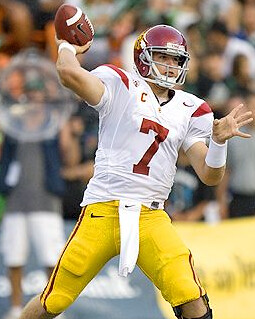
• As you can see in today’s splash photo, Matt Barkley wore a captain’s C. Is that a first for USC? (Weird thing about that photo: He’s not even close to having his fingers on the laces.)
• Buffalo has switched from white socks to black. (Credit Spencer Seaner for that one.)
Not a bad for the first day. And I got through the whole thing without using the words “Pro Combat” (oops).
Yellow Jackets Might Be Yellow After All: I’ve written a bit about Georgia Tech and their two white jerseys. But Douglas King, who’s apparently a Tech alum, has provided some interesting info indicating that the team probably won’t get away with wearing white for every game this year:
Georgia Tech will have to wear a colored jersey at least once this season, as NC State has denied our request to wear white, and rumors are that Miami will do the same. My guess (and hope) is that navy will never be worn under Paul Johnson again except for a particular occasion (which I’ll get to), as Tech actually has a terrible history wearing navy. They like to reference 1990, but I like to reference 1979-1984, 1985-1988, 1992-1994, 2006 (ACCCG), 2009 (Chic-fil-a Bowl)). So gold will likely be the color of choice for September 25th, when the Jackets face the wolfpack.
What’s interesting about the Miami game (November 13th) is that it will be the day that we celebrate the 20th anniversary of the 1990 national championship team. So if they do decline our request to wear white, it would make sense for the Jackets to break out the navy throwbacks worn that year. Such an occasion is the only time it is really appropriate to wear the navy, as it’s really the only time we had success in those colors.
Odds are that replicas of the current jersey design will start popping up in colors other than white. But until Tech actually wears them, the policy is often that they don’t exist (they don’t deny their existence but don’t acknowledge them either).
Uni Watch News Ticker: The Cardinals’ BFBS design made its on-field debut last night. Lots of additional photos here, but why not do something more fun, like slitting your wrists? … Like many catchers, Francisco Cervelli wears Wite-Out on his right-hand fingernails. But he also bats bare-handed, which makes for an interesting display in the batter’s box. ”¦ A’s pitcher Brett Anderson fell down while covering first base on Wednesday night. That led to a rare sight: an American League pitcher with a dirty uniform. ”¦ We all know about the Toronto Maple Leafs in the NHL, but there was also a minor league baseball team by that name. Is that a gorgeous jersey or what? And their caps were sometimes worn by Punch Imlach, coach of the NHL team (great find by Brian Codagnone). ”¦ Speaking of the Leafs, Eric Romain notes that Nazem Kadri was wearing Reebok-branded socks for a photo shoot the other day. The exact same thing happened with rookie photo shoots last season, but the logo creep didn’t carry over to the official game hosiery. Let’s hope that’s the case this time around as well. ”¦ Excellent spot by Mark Snider, who writes: “Oregon State is selling a 1942 Rose Bowl T-shirt, which says, ‘Pasadena, CA.’ But because of the bombing of Pearl Harbor a couple of weeks before the game, the Rose Bowl that year was moved out of California, due to military concerns about large public gatherings on the West Coast. The game was actually played in Durham, NC, in Duke’s stadium.” ”¦ Superb, thoughtful piece about the inherent conflicts between “Nike Pro Combat” and actual military combat here (big thanks to Matt Schudel). ”¦ When I was a kid, I was a nerd who played the violin. Today I’m less nerdy (well, somewhat), I’m much happier, and I wear Chucks. Which means this catalog cover sort of sums up my life (awesome find, Kirsten). ”¦ Great shot of the Blackhawks’ center-ice logo being painted on (with thanks to Jeff Wilk). ”¦ Did you know Colorado briefly wore blue sleeve stripes in the mid-1980s? I didn’t, until Matthew Robins sent me these screen shots from an ’86 game. Further background on the Buffs’ color history, including an explanation of the blue stripe, here. ”¦ The copyright dispute between the Ravens and the guy who designed their first logo refuses to die (with thanks to Todd Brock). ”¦ Ah, those merry Swooshkateers, always making new friends wherever they go. ”¦ It’s one thing for a Red Wings goalie to have octopus imagery on his mask, but what about Dr. Octopus? That’s Jimmy Howard’s new mask design (with thanks to John Muir). ”¦ You know what makes for surprisingly interesting reading? The history of marching band uniforms (great find by Lindsay Resnick). … Anyone else think it’s odd that Under Armour would produce a pant stripe that looks so much like a swoosh when it’s in motion?
Laborious Day Weekend Schedule: Phil’s taking some time off for a well-earned breather, so I’ll be handling the holiday weekend. I’ll have something of interest for each of the next three days, although they’ll probably be on the short-ish side. Might even run that rarest of animals, the weekend Ticker. In any event, we’ll get back to full-size entries on Tuesday.
Everyone have a great holiday, stay out of the way of hurricanes, eat as much meat as possible, and for chrissakes do not watch that Boise/VaTech game on Monday.
It’s “Southeastern Louisiana”, not “Southeast Louisiana.” Thanks.
Redskins/Lakers/Kings owner Jack Kent Cooke owned the baseball Maple Leafs at one point — that is probably him in the photo.
That is him…..good eye!
Oh if only the Cardinals wore a different helmet…
link
I think the uniform itself looks ok, but for a team called the Cardinals it’s still stupid.
It’s stupid times 1000…
-Jet
Agree with Jeff on the Cards.
precisely~
THE is the new voice of reason in the bearded spock universe…*shudders*
first off tho…the uniform, based on color alone, isn’t bad…the stupid bumpersticker piping and striping sort of ruin any good however; they didn’t go monochrome and if you give the cards the falcons logo, it’s palatable
but it’s BFBS, which in and of itself is the scourge of all uniform design, so in that respect, it’s a complete fail — for a team called the “cardinals” it’s even more of an affront
good p-shop on that falcs logo, THE…
of course…the falcons actually considered a white helmet in 1974, but it never saw the field
of course, if they actually want to improve their uni 100%, they don’t have to look that far for their inspiration (they got in right in 1966 and have been screwing it up ever since)
Just pray to God that he doesn’t have access to the Tantalus Field.
What?
or attack the halkans
that is the trouble with you trebles.
Those Falcons uniforms are nice — very similiar to the UGa. uniforms with the black jerseys they wore two to three years ago.
But yet, the CARDINALS need to ditch the black.
Don’t worry Phil, you aren’t in the Evil Spock universe, I still play my Madden games as color vs color.
I must’ve just hit my head or something, I’m sure I’ll be back to annoying everyone and arguing with Ricko soon enough.
What IS kind of interesting is how, and why, perspectives change.
Before the NFL began making such heavy use of “helmets as de facto logos”, when you thought of the planning and logic, etc., of a team’s color scheme, it was based on the home jersey. Pants and helmets were accent pieces. So a white helmet for Cardinals was just fine…matched the white jerseys numbers and the pants. And, when the bird head logo came along was ever better because it showed up well on the white helmet (especially on b&w low def TV; red on red wouldn’t have worked as well; still wouldn’t, actually). Likewise for the Gophers in their Rose Bowl years. Maroon & Gold jerseys, but still, white helmets…and no one thought it was odd at all.
Now, though, because the helmets have been so emphasized they have come to be a lead item in “color scheming.” Not saying anything is right or wrong…just that the thinking has been altered largely because of an NFL decision regarding it’s image visuals, rather than anything on the field.
—Ricko
kind’a nice to mix it up now and again, throw ’em a change up.
So, if the Falcons trade for Fratty Matt to be their back-up, does that make this post prophecy?
always thought the cars should have a red helmet. outline the bird in white.
Like this?
link (q&d)
i can’t believe i am going to say this, but that isn’t bad.
yeah boy, that’s it.
In fact, I like it so much, for today I am changing my name.
a while back, i played with a few colors for the cards’ lid…
cardinal red
gray
and…wait for it…
gold
/none of which is better than the current white, imho
of course, for shits/giggles, i had to see just how bad a bfbs lid would look
~~~~~~~~~~~~
if anyone cares, the whole set is here
Hmm: link
Interesting: link
Yes! link
YES!! link
I’d like to see what the current helmet would like if it had a cardinal stripe down the middle. As it stands now, I think the little bird decals are lost in the white background. The stripe may help offset this and add balance.
you mean kinda like this cardinals helmet?
Thanks, Phil. I actually think the striped helmet is an improvement.
The teeth, on the other hand, are not.
Since cardinals (the actual birds) have black faces…maybe the Cardinals (football team) could use black helmets…with red jerseys. That would seem more logical and maybe more easy to swallow? (Not the bird swallow)
With gold facemasks for beaks?
Gold facemask, then make the cardinal head as big as the helmet.
Great shot of the Blackhawks center ice logo being painted. I’ve done this type of work, mainly basketball courts and roller hockey rinks, and what isn’t conveyed is how brutal this is on your body. Note they’re all wearing knee pads. Besides that, there is no comfortable position to work in. If you favor your back like the guy with the glasses, then you have to put your non-painting hand on the hard surface, which kills your palm and wrist (I taped knee pad inserts around my palm). If you take the pressure off the hand, then you wind up like the woman in the gray sweatshirt, with your back hunched and getting pulled out of shape. The up-and-down between standing and kneeling can make you dizzy too. You’re hurting after a job like this.
-Jet
Here’s a time-lapse vid of the United Center ice being prepped and painted..
link
Phil Mushnick, in NY Post, channeling his inner Lukas and ranting against Nike Combat and BFBS:
link
At least Paul likes some things and dislikes others. I don’t think Mushnick has ever written a column that doesn’t rant.
A great column. I can’t stand anything about the “dog fighter outfits” look or attitude, which Va. Tech had adopted. If college ball wants to be a thug-o-rama, it will eventually lose fans. Appearances matter.
Appearances don’t matter nearly as much as the actual behavior of the players. College football is already “thug-o-rama,” with or without these new uniforms.
Of course the behavior is most important. I don’t want to judge books by their covers. Old-school Miami had great uniforms and plenty of thugs, for example. But it seems that these days thugs ADOPT an appearance to fit their mold.
College ball does have its problems, with or without the unis, but the NFL is worse and that is one reason I don’t follow it like I do college ball.
Sounds like it’s time to market my sweatshirt/t-shirt ideas…
BLOCKENTACKLE U.
“Another Perfect Season: 11 Arrests, 0 Convictions”
for hoops…
DRIBBLEGOOD STATE
“Nobody Does One Year Better”
—Ricko
Dribblegood State, btw, are the “Dunking Demons”
—Ricko
I blame a lot of the thug-o-rama in college football on the coaches.
Sure, The U has had their share of thugs over the years, but I believe that if you have strong disciplinarians such as Howard Schnellenberger and Jimmy Johnson, the thug-o-rama isn’t happening.
But these ego-maniac college coaches would rather have their teams look like East Coast/West Coast/South Side bangers than lose some recruit that probably will make absolutely no impact, that they have to tell their players to dress right.
There have been other minor-league baseball teams that have had major-league names from other sports. And vice-versa.
The All-American Football Conference had teams called Brooklyn Dodgers and New York Yanks (I have never seen that particular team called “Yankees”).
The Charlotte Hornets have also been a World Football League and a minor-league baseball team.
I also seem to remember the Baltimore Orioles as a basketball team … the old Eastern Basketball League?
To clarify, actually the AAFC team was called the Yankees. The Boston Yanks played in the NFL from 1944-1948 and the New York Yanks played in the NFL in 1950 and 1951.
Thanks for the (clarification of the) Yanks.
The Toronto Maple Leafs minor league club is still in existence:
link
Today’s baseball Leafs play in the semi-pro Intercounty Baseball League with teams in places like Guelph, Kitchener, Brantford and Hamilton to name a few. The Blue Jays should be the Maple Leafs today. The Toronto baseball team used the name well back into the 1800s. Conn Smythe didn’t name his hockey club the Maple Leafs until 1927. Jack Diminuco, who runs the current Leaf ball club, bought the naming rights after the minor-league team folded. The Blue Jays first primary owners weren’t willing to pay for the naming rights and also liked the tie-in of the name “Blue Jays” with their best-selling brew Labatt’s Blue. It’s a shame.
Also for Tulane, it also appears that they are wearing a decal for former linebacker Sule Osagiede who died in an accident in January. Look at the end of this article.
link
Couldn’t find a good picture.
That’s team owner Jack Kent Cooke in the middle of that Leafs baseball photo before he moved to LaLaLand, bought the Lakers and founded the Kings. Jack had tried several times to buy an existing MLB team to move to Toronto but was always turned down. So he cast his lot with Branch Rickey and the Continental League, only to be screwed by MLB again. That soured Jack on baseball and precipitated his move to LA. Cooke was an absentee owner for the Maple Leaf baseball team through 1963 when he sold it to a community group in Toronto. Even after winning back-to-back International League playoff championships as a Red Sox farm team with Dick Williams as manager the city’s baseball appetite had been soured by all of MLB’s shenanigans and the baseball Leafs folded after the 1967 season. The franchise was sold and still exists today as the Pawtucket Red Sox.
That marching band/Drum and Bugle Corps uniform article made my day. =) And the woman who wrote it (a recent grad of Syracuse) was the ‘Cuse Drum Major. Thanks, Paul…
Gotta say I am a big fan of that Tulane uni.
Agree. No unnecessary stripes or strange fonts. Just a simple uniform with a few modern touches. I love the white helmet. The dark green/ocean blue is a good color combination.
Tulane’s official colors are [were?] olive green and sky blue ….
Love that uni, too.
Anybody see Tulane’s baseball uniforms? Cardinals style with what I guess are cranes on the bats.
Pelicans ;)
I can’t see how Ga. Tech’s “bad luck” wearing navy blue outweighs their national championship wearing navy blue. Of course, if they don’t want to wear it because it’s not an official school color, that is fine, but the national championship tips the scales in favor of it pretty strongly.
Paul, I’m glad to see you have progressed from the awkward stage such that you are wearing Converse All-Stars, but as much as I loved that shoe as a kid, the rest of the athletic world has moved on to other footwear. ;)
Yeah, but haven’t you heard? All the cool kids are wearing Chucks. Only the jocks wear PF Flyers.
As a Tech alumni, I have mixed feelings. All this Uni-Watch discussion about my alma mater is great, as well as insight as to what’s coming up this season.
I just hate the fact that the football team has such ugly unis. Even the 1990 navy jerseys were trendy, though a throwback game would be great.
I don’t understand the comment regarding Miami not granting the request for GT to wear white uni’s. That game is in Atlanta. UM is the visiting team so the U wears what GT dictates.
Crazy rule allows the VISITING team a say in who wears which jersey. Home team is supposed to wear dark. If home team wants to wear white, the visiting team has to agree to wear dark.
It’s like when the Redskins started wearing white at home so the Cowboys would have to wear blue. Kinda like that, anyway.
Man, what do you call the placket piping on that Leafs uni? Double placket? Twin placket? Totally love that royal & white cap.
I still have a Leafs baseball ball cap that I got at Doug Laurie Sports in Maple Leaf Gardens back in the early ’80s. I always loved that Leaf cap with the “T-Leaf” logo.
– I hate, hate black athletic socks. Just hate ’em.
– Tulane’s look is pretty sweet, though the “TULANE” letters are tad big.
– Did I mention I don’t care for black athletic socks?
The black socks look even more out place on Buffalo’s opponent, Rhode Island:
link
I like bright colors, but man, that uni needs some more contrast.
Wait, so the ’42 Rose Bowl was in North Carolina? So that means Nike link? I refuse to believe that.
Oh, and I suppose that link hats were plaid and not link.
~~~~~~~~~~~~~~~~~~~~~~~~~~~
Hey, whaddaya know: the socks are link.
yeah, that stripe on the Hawaii pants DOES look like a Nike swoosh. i wish they had kept the garter stripe. it was unique:
link
Good article from NYT’s David Pogue on logo creep on laptops. Another reason to buy a Mac, I guess.
link
To a lesser extent (so far at least), phones are going this route.
Take a link for example: Motorola (wordmark and logo), Google, Verizon (front and back).
I like the idea of a component manufacturer paying me to use my computer. I might actually leave the sticker on if someone were to do that.
I’m not a fan of Jimmy Howard’s new mask. In the 1990s the wings had such great clean 2 color mask designs from guys like Cheveldae, Essensa, Vernon. Now you get guys like howard that make their mask look like a cheap airbrush job on the side of a harley. A goalie mask should only be allowed to use the official team colors. On the bright side, there’s no purple octopus!
is it possible that the colorado stripe was a hue of silver, not blue? i know that they have worn silver in the past, and that it is/was an official school color.
A. That stripe is almost certainly blue. B. Did you read the linked document explaining the timeline of CU Blue?
I’d like to think this fight was really about the Mets “ice cream” cap the one guy was wearing. link
link
Holy mother of crap that is a beautiful picture!
I’m not sure if you’d call them underrated or not, but the old Falcons quietly had one of the greatest helmets ever.
i know, right patrick?
that’s actually from the throwback game of (i think) 2 years ago…
but that’s the 1966 uni (or a close approximation) of it
they NEVER should have gone away from that
Well, I for one, liked the switch from a black falcon to a white falcon on the 1967 black jersey…
link
*blink* I never knew about the white falcon.
Fascinating.
has the whole galaxy gone crazy?! what kind of a uniform is this?! where’s your beard?! what’s going on?! where’s my personal guard?
i got’cha phil. now where did i put my red shirt.
in every revolution, there’s one man with a vision
i need to enlist one of those guys.
They wore those last year and will again this year. I miss the old Falcon logo. Still not a fan of the updated version.
Yeah, as much as I loved the late 70’s/80’s uniforms, the Falcons’ 1966 originals were absolutely perfect. As a kid living in the Atlanta suburbs I fell in love with that logo and drew it on everything. One of the all time great notebook-test logos.
I’m a sucker for well-balanced red and black.
The logo and the colors couldn’t be more perfect. Untouchable.
Like the original Canucks and Suns. Perfect.
There are many others…..
that’s cuz red and black are primal colours, they s’pozda fect you that way.
“Holy mother of crap that is a beautiful picture!”
Indeed!
I seem to remember Colorado basketball wearing light blue unis back in the mid 80’s. I couldn’t find any color pics (I did request one from si_vault’s twitter). This is the only pic I could find. Can Ricko or anyone else figure out what colors are in this b&w pic? link
watching stream of Ireland-Armenia soccer match. Ireland’s striped socks v. Armenia’s retro-inspired Hummel kits. And the stadium has cool arched architecture link
From last night:
Since Dave Diles is no longer around, I’ll give you the Slippery Rock score. They beat Merrimack 45-26, and looked good doing it:
link
From the VA Tech article featured in the ticker:
“So I put them in contact with the historians at the university and they came back that it was gray and black on the football uniforms and they said with those stripes they looked like convicts. So they changed the school colors to maroon and orange.”
Ah, for the days when people aspired to NOT look like convicts…
as long as im singing THE’s praises…i’ll do the same for powers…
at a gathering a couple years ago in new york, we got to talking about why the youth of today wear their pants below their hips and favor unlaced (or untied) kicks…being a teacher in a somewhat underprivileged school district, matt felt qualified to answer
he basically said that when one goes into prison, they take away one’s belt and one’s shoe laces, so as to discourage suicide attempts … when one gets released, apparently those items are either not returned, or the owner decides not to put them back on…
so the low riders and unlaced sneakers is actually the “i just got out of prison” look…
why that’s something those who’ve never actually been sent away strive for is beyond me, but i guess it’s just rebellious youth
/sounds as good a theory as i’ve ever heard
//score one for powers
I always thought the low-rider look was just to show off the boxers. Thanks, Phil and Matt, for edumacating me.
Yep, I can verify the “just out of jail” connection here. Taught in the county in California where the maximum security prison with Charlie Manson, Sirhan Sirhan, and Juan Corona were incarcerated. Notorious, gang-infested prison. We as teachers had to constantly deal with the whole sagging look. The kids thought it made them look tough–street cred, I guess. Where we are now (Illinois) I still see teens with shorts/pants with the waistband below the halfway mark between crotch and kneecap. Incredible…
On the topic of the Ravens… One thing I thought was unique was that they have a different logo on one side of the helmet than the other. To integrate the “B” into the bird correctly it’s a different logo. Never thought about that before as most teams logos (think Jets, 49ers or Giants) are just the same logo stuck on back to front on the right side and front to back on the left.
In other instances you have teams like the Redskins or Eagles using a reflected duplication or mirror image of their logo from one side to the other.
Because the Ravens bird is always facing forward it requires the B to be modified on the left side of the helmet. You’ll never see that logo on anything else however as they always show the traditional right side helmet logo. I’m sure this isn’t brand new news to anyone, but is anyone else aware of any team that does this (college or pro)?
The obvious one would be the KC Chiefs, who do the same thing with their arrowhead logos.
Boise State would be another one with the location of the text changing as the horse head is flipped.
Colorado University also does this with the CU on their logo.
…and if you get technical, the old GIANTS helmet did this as well. The text is italic, the letters slant forward on the right side, and backward on the left side.
Also the LA Express of the USFL had different LA logos, for at least one season.
No. The text was exactly the same on link helmets.
…so it is.
Well, it was different in my home universe. Or something.
Thanks… yeah as soon as I posted it I was looking at helmets and saw the Chiefs as an obvious choice. The Chiefs variation looks much better than the Ravens as the reverse side looks more “forced”.
Have a good weekend!
As for the Matt Barkley photo with his fingers not on the laces, its actually sometimes preferred by some quarterbacks. But the more logical explanation would be that he didn’t have a choice as to where he put his fingers. It’s quite common actually, at least in certain offenses and certain plays.
For example, when in a shotgun formation on quick passes, Quarterbacks only have time to catch the ball and throw, no matter where your hand is on the ball. Otherwise if you spend time to fumble your fingers around the ball trying to find the laces, the throw would be to late or even sometimes you would be sacked.
Regarding laces, it is sometimes preferred by QBs with smaller hands. The first time I was aware of it was with Troy Aikman (I would kill for a photo now), who swore by it.
I am a HS football coach. I have found that I throw a better spiral by not holding the laces. I have large hands. I do not teach my players this method, I would rather they use the laces.
From the dreaded Wikipedia…some pretty solid names there!
Thirteen members of the Toronto Maple Leafs have been inducted into the National Baseball Hall of Fame:
* Sparky Anderson
* Ed Barrow
* Dan Brouthers
* Hugh Duffy
* Charlie Gehringer
* Burleigh Grimes
* Carl Hubbell
* Willie Keeler
* Joe Kelley
* Ralph Kiner
* Nap Lajoie
* Heinie Manush
* Dick Williams
More on the Toronto Maple Leafs Baseball Club, and Maple Leaf Stadium…
link
link
link
New basketball court for Michigan State
link
Old one for comparison
link
Ohio State has a helmet decal honoring Jack Tatum.
link
Regarding Matt Barley wearing the captain’s “C” for USC last night, I believe that @ least one player on the defense had a similar designation. I didn’t get any screenshots, though …
/hangs head in uni-shame
link says USC has five captains this year — Barkley (1st soph to serve as USC capt.), fullback Stanley Havili, cornerback Shareece Wright and linebackers Michael Morgan and Malcolm Smith.
From link: “USC’s captains have a “C” on their jersey to signify their leadership role. That’s new to Kiffin era.”
That’s new to Kiffin era
other things you won’t find in the kiffin era:
scholarships, bowl bids, criminal activity, victories…
Well, whoever is their new coach next year after he leaves for NFL—-NCAA—-TV Network (choose one) can ditch the C’s if they want.
And for anyone trying to keep up with how the new Michigan State rebranding efforts have created a clear an concise identity for the Spartans…I present you:
link
Where exactly are their football and hockey courts located?
Dang. Still haven’t gotten the hang of this “new” reply feature.
I think they’re in between the baseball rink and the swimming field.
I keep hearing the new stadium referred to as:
The New Meadowlands Stadium
But there was never an “Old” Meadowlands Stadium…in fact there was never a Meadowlands Stadium at all. The old football facility was named Giant Stadium since its inception.
The arena has gone through several name changes, but never was it called “Meadowlands”…The only facility officially named Meadowlands is the racetrack.
So is the official name NEW MEADOWLANDS STADIUM or are the annoucers just taking it upon themselves to say the MEADOWLANDS STADIUM is “new”?
link
On the graphic of the stadium, the word “NEW” is right on the building itself.
Since Giants Stadium was part of the Meadowlands Sports Complex, I’m assuming that’s why they call the new one New Meadowlands Stadium.
noticed your reference to the Converse catalog, where I grew up, along the shore in New Jersey, we nicknamed the sneakers “CONS”. I wonder if their are other areas of the country where either ”Chucks or ”Cons” or any other name is more prevailing??
Midwest is Chucks, for sure.
Yeah, I’ve never heard Cons before. Always Chucks. (From Indiana, BTW)
This Ohioan used to say Cons during the Dr. J era.
Converse themselves have gone with “Cons” occasionally.
link
All Hail Grandmama.
For fun…
Go here…
eastbay.com
…and search “Chuck Taylor”
—Ricko
Maybe can link right to it…
link
—Ricko
Found this video on the FA’s youtube page, its how they prepare the England jerseys before the match. Not to mention they are the new England Home Kits.
link
So, this is entirely unrelated to anything in the post, but I certainly think Paul would appreciate knowing that the real reason that Nyjer Morgan threw a ball at some fans was that he was defending his right to wear high socks:
The fan said he was seated nine rows behind the wall in left-center field, and he confirmed that several fans had been harassing Morgan.
“Absolutely,” the fan said. “There were one or two guys in Section 148 that were riding him pretty hard for a couple of innings. Mostly they seemed to be heckling him about the way he wore his uniform. He was the only player on the field who was wearing his [uniform] old-style with the full stockings. They were screaming at him about looking like a jockey. . . . Stuff like that.
Yes, it was classless of those fans to harass Morgan, we all know jerks exist at every stadium. But Morgan has to be smarter than that, and not respond in such a stupid way. His best revenge would have been a great catch or knocking in a run for the Nats.
New York Rangers 85th anniversary logo?
link
Chargers will wear a “79” and an “Air Coryell” decal for their home opener (September 19) to mark the passing of Gary “Big Hands” Johnson and Coach Don Coryell during the offseason:
link
As a lifelong wearer of Chucks, I’m loving that ad. It looks like the kid is lacing up a pair of optical whites.
Here’s one for you…
If C.C. Sabathia wins 20 this year (and it certainly seems likely he will), he will become the 14th member of a unique club, so to speak.
Know what it is?
—Ricko
20 wins for two ball clubs?
20 wins for two ball clubs in a uniform that doesn’t fit?
most stripes on a yankee uniform?
Sabathia has never won more than 19 games. My guess is that he would become the 14th Yankee left-handed pitcher to win 20 games.
Enlighten us, Ricko! =)
Check out this database of Illinois high school football helmets. link
After the O’s, it switches to helmets that The MG’s helmet guy made. I have found few inaccuracies in his high school designs. I’m not dissing, though.