Been a long time since we checked in with screen-shot maven Steve K., who spends his time scrutinizing old NFL video (you can see the previous entries featuring his work here, here, here, and here). Here’s his latest batch of spectacular finds, many of which are NOB-related this time around:
• You may recall from some of Steve’s earlier posts that the 1975-77 Chargers sometimes put a player’s first initial after his surname back in the early 1970s. Steve has now documented another team using this odd format: the 1981 Browns. “But there were always exceptions, and not necessarily logical ones,” says Steve. “Here’s offensive lineman Matt Miller. The only other Miller on the squad was Cleo, so not sure why he needed his entire name spelled out. And look at the inconsistent treatments of Robert E. Jackson and Robert L. Jackson.”
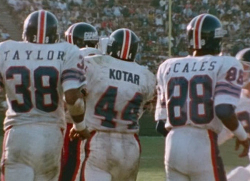
• “Rarely did a football team have as many NOB fonts as the late-1970s New York Giants,” says Steve.
• “Gotta love the size of the 1970 Rams’ NOBs,” says Steve. “Most of the Rams players had huge blocky font like this, which is similar to what was worn by Lance Mehl of the Jets in 1984. Unlike the Rams, however, the Jets used this large font for players with short names.”
• Here’s Mike Hogan going NNOB in 1976. “This was his second game with the Eagles and second in a green jersey, so I’m not sure what the story is there,” says Steve.
• Check out Floyd Rice sporting what might be the most ridiculously wide-spaced NOB in NFL history. “That’s from a 1973 game at Cleveland,” says Steve. “The Oilers tended to do this a lot in 1972-73.”
• Of all the ways to handle a McNOB, this seems like one of the most awkward-looking: a full-size superscript C. That’s Florida’s Lee McGriff, from the 1974 Sugar Bowl.
• FNOB alert. That’s Jerry Davis (duh) of the WFL’s Jacksonville Sharks.
• Does it count as FNOB when the first name is a pair of initials? The other Pearson on the Chiefs in 1980 was Aaron Pearson.
• Here’s a rarely seen Jets logo, as modeled by sadly misnamed head coach Charlie Winner.
• Speaking of New York logos, check out this jacket being worn by Tom Landry, from his late-’50s coaching stint with the Giants. Not sure I’ve seen that particular interlocking NY before.
• Steve usually sends me nothing but football shots, but this latest batch included some old WHA images, including this great view of the Birmingham Bulls wearing center-striped helmets!
Great stuff. And it’s particularly nice to see these old-school designs after yesterday’s Nike hype-athon. Speaking of which…
ESPN Reminder: In case you missed it yesterday afternoon, here’s my piece about yesterday’s Nike unveiling. I could have said a whole lot more, but (a) I had to knock out the piece really fast after the unveiling event, and (b) the whole Pro Combat program is so silly, trying to critique it via conventional standards seems pointless. Making a big fuss over it would just further legitimize it. I prefer to think that Nike’s approach here (i.e., corporate lifestyle branding masquerading as team branding, and merchandising masquerading as school spirit) pretty much speaks for itself, especially for Uni Watch readers.
That said, this excellent piece, which ran on Yahoo Sports yesterday, offers some good analysis of the Nike situation. Recommended reading.
Incidentally, about 30 seconds after I arrived at the unveiling event, a guy approached me and said, “Are you Paul?” He introduced himself as a Nike designer, shook my hand, and then said, “I know how you feel about us, but I’ve gotta tell you, I love your site. I read it every day.” At first I figured maybe he was an special operative assigned to soften me up, but he seemed pretty sincere. He even appeared to be disappointed that I wasn’t wearing stirrups.
In the unlikely event that you need still more info on these new Nike designs, here’s the mother lode.
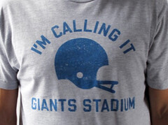
Pre-emptive Strike: The Giants haven’t announced a corporate sponsor for their stadium yet, but No Mas and I decided not to wait. The result: our “I’m Calling It Giants Stadium” shirt, which is now available. Yes, it’s a little pricey — sorry about that (I don’t have any say regarding the price point).
And as long as we’re talking T-shirts, remember that the Meats tee is available in gray and white, sizes M thru XXL, for a mere $13 + $3 shipping for the first shirt and $1.50 shipping for each additional shirt. To order, send the appropriate amount via Amazon Payments to plukas64 at gmail dot com (after paying, send me a separate e-mail with your size, color, and shipping info), or send a check to Paul Lukas, 671 DeGraw St., Brooklyn, NY 11217. Overnight shipping available if you want the shirts delivered in time for your Labor Day barbecue.
Uni Watch News Ticker: Now that’s a long NOB. That’s Mats Zuccarello Aasen, a Norwegian player recently signed by the Rangers. Let’s hope he makes the team. ”¦ Check this out: an NFL ref wearing blue gloves. Never seen that before (good spot by Scott Mason). ”¦ Lots of Knievel-style motorcyle suit designs — or “leathers,” as they’re apparently known — on display here (with thanks to John Weghorst). ”¦ New home soccer kit for England. Additional coverage here (with thanks to Stephen Wong and Michael Orr). ”¦ Lots of great old Syracuse sports photos here (with thanks to Jeremy Richardson). ”¦ Pretty cool shots of Blue Jackets goalie Steve Mason painting his own crease and teammate Mike Commodore working on the center ice logo (big thanks to John Muir). ”¦ Here’s a new spin on FNOB. I’m assuming that’s a spring training shot (with thanks to Paul Wiederecht). ”¦ Pretty good story about that high school that uses the Van Halen logo on its helmet (thanks, Brinke). ”¦ Here’s a good video about the Browns’ equipment staff (with thanks to Joseph Bailey). ”¦ Coupla interesting Dartmouth football practice photos from Tris Wykes: This one shows a coach using a “fumble strap” — it loops around the ball and the coach can tug or jerk on it while the back tries not to cough up the pigskin. And the large ball in this shot is part of a drill designed to teach backs how to shed low tackles. ”¦ David Teigland was at the Minnesota State Fair and reports that Timberwolves booth were being encouraged to vote on the team’s 2011-12 throwback uni. “The guy I talked to at the booth (probably a ticket sales rep) said it will definitely be one of those two designs,” says David. “They are also selling T-shirts with each design. The same guy said the Muskies one was leading in the fan voting (I’d guess it would win, since people in MN love their fishing). Though I’m sure the fan vote is not a binding ballot.” Further info here. ”¦ Phil probably covered this last month, but just in case: NFL officiating crews are wearing memorial cap patches for Bob Lawing, a back judge who died earlier this year. Further info here (big thanks to Daniel Dykstra).
link
wow… pretty close to perfect
Eagles in white helmets and kelly green
Eagles at Franklin Field
Eagles beating the Giants
Keith Jackson calling an NFL game
Never tire of watching Fran Tarkenton. On the football field that is, Those motivational speeches are brutal.
You no like “Francis the Talking Quarterback”?
For those who know the reference…
link
link
(no, not THAT David Stern)
link
link
—Ricko
Got to meet him a few times… in person is even worse.
Also any of the Eagles wearing SpotBilts are wearing kelly green cleats (not sure about the Riddells here and there).
And it was still the early days of white shoes. A few Giants (Spider Lockhart, Clifton McNeill and Fred Dryer, to name three) are wearing them.
—Ricko
This is still 4 years before a certain player (from the metro Philadelphia area, btw) created a moniker referencing his non-colored footwear…
link
Ugh… I feel like I need a shower after seeing the new Nike line of shameless marketing mayhem. However, the one silver lining (hate to use that metaphor on those generally hideous unis) is that the stripes on a shirt thing is starting to make inroads.
Wouldn’t that be a nice look on a Steelers, Packers, or Lions jersey?
What needs to be figured out is the reason why the sleeves have gotten so small. If it is to keep the players cool, then I don’t know that they’ll want to wear an elbow length baselayer under their jersey. Counterproductive to say the least. If it is because the players think it makes them harder to tackle or block, then the players are idiots, because the exposed (or nearly exposed) shoulder pads can only create a better grabbing point for opposing players. the better solution would be to keep the jersey sleeves extremely close-fitting, but extend them down to the elbow to eliminate exposing the shoulder pads and thus creating a spot that people can hook onto.
Chicks did big guns.
Chicks DIG
(That’s it, I gotta go get my glasses.)
—Ricko
Personally, I’m hoping that the Packers take notice. The sooner, the better. I’m an Oregon alum, but might have to pull for the Beavers in the Civil War game – they win big and we might see these uniforms again.
As to why uniform sleeves have disappeared, I’ve heard the argument about holding but am convinced that it’s really about æsthetics. Players want to look tough, and nobody’s stopping them, so they cut the sleeves back as far as they can.
I really believe it’s more of a utilitarian thing, that became the fashion statement. Players feel the opponent has too easy of an area to grab and get away with. Refs can’t catch it easy enough, especially on both sides of the line, receivers/RBs as well. Also, some players feel it hinders the mobility of their arms. Anything to get the edge. That is what I believe started the trend, and nowadays younger players don’t know any different.
You could be right.
In any case, link.
I remember reading a book by a former NFL ref – I think it was John McDonough, but I’m not certain – that the referee shown in the clip was Jack Vest, and the league office got so many letters about his blue gloves that it sent out an order to all officials: white or black gloves only.
As a long-suffering Timberwolves fan, the sad thing about the Muskies and Pipers throwbacks is that you could probably bring back many of the guys who originally wore those unis and have a competitive series versus the Tremblin’ Timberchihuahuas.
Soon, the Woofies will no longer have ticket offers where if you fill your gas tank you can win tickets…it will be if you have tickets, they’ll fill up your gas tank.
Pipers. Connie Hawkins.
One of truly great, largely forgotten basketball players.
Ever.
At least in the “Oh, my, what could have been” category.
Saw both the Muskies and Pipers play at Met Center.
Two sets of clssic unis.
I’d vote for the Pipers. And I will if I get ovet to the Fair.
—Ricko
You know it, Ricko.
link
I’d vote for the Pipers, too. And not because they came from Pittsburgh. I just like that design – very Bullets like:
link
link
Re: Pro “Combat” Unis —
I would be okay with these teams wearing military-inspired uniforms if they all agreed to give four years of service to the Army, Navy, Air Force, or Marines upon graduation. Otherwise, they’re just playing a game.
Kinda says, “I support our troops because they’re doing the job so nobody expects me to do it”, doesn’t it.
—Ricko
The Bronze Star on the Ohio State uniforms is in poor taste (though, correct me if I am wrong, Woody Hayes may have earned one while serving with the Navy in WWII). The only people who should wear anything resembling a Bronze Star Medal are those who have earned it.
link
As far as I can tell, only 1/10 of these uniforms (tOSU) are “military-inspired”.
Let’s ask Charles Csuri what he thinks of the gesture.
Maybe I’m confusing these with the camoflogue uniforms teams have worn or will wear. Then again, I think these are all military-inspired uniforms simply by their name, “pro combat” uniforms.
But I really don’t see what one Ohio State grad’s Bronze Star in World War II has to do with anything. Every college in the country can pull out a ball player who served heroically in WWII, and many pro teams too. That was the nature of our society then — all in. Today it would be the exception.
Those teams didn’t win a National Title in 1942. I suppose the 41, 43, 44, and 45 champs could do the same. But they aren’t … yet.
I can’t even begin to describe how much I hate the entire “pro combat” thing. The preconceived “logo created by hand gesture” gloves are the greatest example of uni-douchbaggery I’ve ever seen, ESPECIALLY when you’re touting the fact you’re “honoring” Bronze Star recipients. Nike and the NCAA should be ashamed.
So, and I agree, the general thought is…
“Wear, oh, say, stripes on your sleeve, not your ‘patriotism’.”
Putting the flag anywhere on your athletic uniform is flag desecration, pure and simple. Wearing camo unis or otherwise playing dress-up as a soldier to play a game is in bad taste. But wearing a military decoration you didn’t personally earn is a crime. At least in certain circumstances, and it ought to be an obvious-to-everybody-over-the-age-of-eight example of something that you just don’t do, ever, even if in your particular circumstances it’s not technically a criminal act.
“And the large ball in this shot is part of a drill designed to teach backs how to shed low tackles”
I know that ball very well. When I was on the equipment staff at Louisiana Tech University, I was the head EQ manager for Defense and one of my jobs was pushing that damn ball at the linemen for them to push away, and also to reset it after every low tackle drill. Funn stuff…and that thing was made ov very dense foam…and was heavier than it looks!
Haha. I hear ya James. We still use these balls for our defensive line. Gotta love when the foam soaks up their sweat or it rains. Heaviest things in the world!
The Dubuque Fighting Saints, an expansion hockey team in the USHL league, unveiled new uniforms yesterday. I will post pictures when they go live on the local newspaper.
THey are a classic red and white look.
While I like the preemptive “I’m Calling It Giants Stadium” strike, but what are Jets fans supposed to do? Even “I’m Calling It The Meadowlands” doesn’t sound quite right.
I bet we would CLEAN THE FUCK UP with an “I’m Calling It Jets Stadium” shirt, but it feels wrong to try to work both sides of the street.
Now THAT’s how a marketing person thinks.
—Ricko
New Pork!
I love it.
That’s really good, yes. Especially for Paul’s butcher shop.
Far superior to “Yankers”.
—Ricko
Now you need a counterpart shirt to “Meats”.
Perhaps “Yankers”?
—Ricko
Just, y’know, alter this wordmark a bit on a navy tee.
link
—Ricko
How about Franks?
-Jet
True story: I asked my local butcher shop if they’d carry the Meats shirt, and they said, “Only if you have a Yankees-based shirt to go with it. A lot of our customers are Yankees fans, so we can’t have a Mets shirt without a Yankees shirt.”
“Frankees?”
Or style it after their road uni: “New Pork.”
Go with Jet’s idea: take some hotdogs and strategically place them in an interlocking NY position. Slap that logo on a pinstripe or gray shirt, and there you go.
And when your done with that, spell “Pierogis” in the Pirates font. I’d wear that, and I’d buy it, too.
How’s link, Jim?
Yes! Love it.
Paul, think you can make a batch of those for the Yinzers?
I thought of that, and I agree it would sell, but since there never was any such place it just wouldn’t have the same cachet…
Definitely more of a “fan statement” than having much to do with architecture, yes.
—Ricko
Do it Paul. Work both sides of the street on this one. Better than seeing someone else run with it.
“I’m calling it the West Side Stadium.”
I bet we would CLEAN THE FUCK UP with an “I’m Calling It Jets Stadium” shirt, but it feels wrong to try to work both sides of the street.
there’s nothing wrong with working ‘both sides of the street’
however…that shit’s not right…
F*CK the jets
a better shirt would be “im calling it the house that rex built”
what about “the house that hoffa’s buried in?”
F*CK the Jets?
Good thing you censored that, Phil. Wouldn’t want to put any of your own profanity into the post that leads off with “I bet we would CLEAN THE FUCK UP…”
Because that shit’s not right.
you’re right jimbo
just a little sensative today…and i shouldn’t be (well, other than a bit of concern over earl)…
that and a chirpy jet fan co-worker pissed me off earlier
Clearly, a green and white shirt saying “I’m calling it Giants Stadium” is appropriate.
Because, like it or not, it’ll always be Giants Stadium, and the jets will always be boarders.
Sez who?
Besides, it would be a joke.
Okay, maybe not in New York, where lightening the hell up apparently is impossible.
—Ricko
And wouldn’t the green shirt say “Jets Stadium”?
It’s not about New York, it’s about the Jets, who have historically felt a little in the shadow of their older brother team.
The Mets have a little of this as well, but they never had to call Yankee Stadium home.
Can I have “I’m calling them the Gorton’s Fishermen” shirt…
Here’s a thought: How often do we see pitchers with a dirty uniform from the infield dirt? The reason why I bring this up because last night Brett Anderson (Oakland) fell while covering first base and got his uniform dirty. He returned to the mound it was a strange sight to see. It’s rare that a pitcher ever gets his uniform dirty by defense. I just thought it was one of the stranger sights in baseball because I don’t see it often.
Good point. You occasionally see N.L. pitchers with dirty uniforms, since they run the bases, but it’s unheard of in the A.L. I’ll try to get a screen shot for tomorrow’s Ticker.
Here’s a video of Texiera’s hit where you can see Anderson’s dirty uniform link
And for NL pitchers, most times they wear a jacket while running the bases so the top part of their uniform never gets that chance to get dirty.
Fewer and fewer pitchers wear jackets on the bases now. Not nearly as common as it used to be.
Being from an AL town, I always wondered exactly why NL pitchers wore jackets on the bases. I didn’t know it was for aesthetics… I’d always assumed it was something physical like keeping the arm warm or the like.
I think we have some cause/effect confusion here. I THINK it was meant to be a statement that pitchers tops don’t get dirty BECAUSE they were jackets on the basepaths.
I don’t believe he was trying to imply that pitchers wear/wore jackets to avoid getting dirty. Otherwise they’d be doing it in June and early September just as much as they do it in April and October.
I was about to make this same post, Jim, but I was afraid my sarcasm radar was broken.
Whether they decide to go with Muskies or Pipers, would it be possible to schedule that game either against another former ABA team or an NBA team that’s also paying tribute to an ABA team that played in their city?
And how about using a “new” Spalding ABA moneyball for the entire game, just like the ones used on the film “Semi-Pro”? It’s sad that they only use it for the 3-point contest at the All-Star games–and only as the moneyball.
Hmm…interesting.
Utah Stars?
New Orleans Bucs?
Carolina Cougars?
Anaheim Amigos (vs. Clippers, probably)?
Houston Mavericks (Dallas’d probably frown on that)?
Oakland Oaks?
Love it. Any of them. Maybe Mavericks, Oaks or Amigos the most, though. Amigos (saw them vs. Muskies) wore what was pretty much Tennesse Orange with royal and white (wasn’t bright Knicks/Browns/Orioles orange, that’s for sure).
—Ricko
Would Courtney Cox and Jennifer Anniston be the masocts of the Carolina Cougars?
If they could wear this, sure.
link
I know when the Pacers played a game at the old fieldhouse at the Indiana Fairgrounds they wanted to use an ABA ball, and the NBA shot that down. Lot of gnashing of teeth on sports radio around here about how the NBA is trying to scrub away any memory of the ABA. Not sure I’d go that far, but it seems to be a fairly wide-held view around here.
NBA was seriously considering going to the red, white and blue ball with the merger…but the ABA didn’t own the rights to it. Through some quirky bit of early ABA business the rights to that particular ball design belonged to an individual (Mike Storen, maybe?).
That meant the ABA didn’t have it to offer…and may explain why it still isn’t on the table.
(That’s according to my former partner, who had been the ABA’s first PR director and later was part of Dallas Chaparrals managment).
—Ricko
The joke, according to my former partner, was that because of that, Storen(?) may have made more money than any ABA team did…because he profited from owning that color combination on a basketball (don’t know that that’s still so, but it was at the time).
—Ricko
Just checked Wiki about Mike Storen to see if it mentioned the red, white and blue ball.
Doesn’t.
But I did learn that ESPN’s Hannah Storm is his daughter.
—Ricko
The new ABA uses it:
link
link
Interesting concept this version has – throw 50-60 franchises out there a year and see how many make it through the season.
And for all know one particular individual is getting paid in the process.
Storen (if it was him) had been ABA commissioner and perhaps the NBA just didn’t feel like paying anyone from the ABA anything.
—Ricko
So why is that Giants Stadium tee so expensive? It’s clearly a link.
Seriously though, when it says this in the item’s description: “All Naming Wrongs shirts are made in collaboration with Uni Watch” it sure sounds like you should have some say regarding the price point.
And I don’t see any problem with “working both sides of the street” by offering a Jets version of the shirt.
Genuine question here … What DO (did) Jets fans call the old place? Was it always Meadowlands Stadium, or did they ever use a name that made it more their own? True, Chase Field was never officially, BOB, I think I heard that a great deal more than the full name (at the time).
Along the same lines, you could also make a t-shirt for clueless Bear fans who want to show their lack of historical knowledge:
I’m STILL Calling it Soldiers Field!
Was it always Meadowlands Stadium?
uh…no
it was always GIANTS stadium
Wouldn’t Jet fans have worn “I’m Still Calling It Shea” shirts to the Meadowlands anyway?
LOL! Soldiers Field…
Technically, couldn’t one could make a case for a shirt reading “I’m Still Calling It link?”
I think they just called it “The Meadowlands.” I think the N.J. Generals called it that too, but I’ll have to check the ’85 Media Guide…
exactly, jay…
you’d see a concert or anything besides a giants game, and you’d simply say “the meadowlands”
but the stadium was NEVER known as “meadowlands stadium”
only, and always, “GIANTS STADIUM”
I have a say in certain aspects of the shirt (design, colors, concept, etc.), but not in others (production, fulfillment, price point). What’s so hard to understand about that?
I guess what’s hard to understand is why you collaborate with No Mas if you think the shirts are overpriced, especially since the (much cheaper) “Meats” shirts aren’t done with No Mas.
If it’s because you’re beholden to them because of some kind of intellectual property issue or sponsorship agreement, etc. then I understand.
The whole “I’m Calling It” concept was No Mas’s idea. They came up with the term “Naming Wrongs,” too.
I’m a partner/consultant with a financial stake, but I don’t have veto power or anything like that. I’ve had input on the designs, and the choice of which shirts we have (and haven’t) done after the first Shea shirt has been largely due to my advice. But I don’t have complete control — I’m just one voice among several.
As with any partnership, there are occasional disagreements, compromises, etc. Is every single thing about Naming Wrongs exactly the way I’d like it to be? No. But is it a project I’m generally happy with? Yes.
Fair enough.
It must be difficult to argue with the fellas from No Mas. At some point, you would have to say, “No more.” Chuckling would surely ensue.
Sort of like when the L.A. Angeles played a few seasons at Dodger Stadium. They called their home field, even in their media guide, “Chavez Ravine”.
Actually, at the time that name had become quite famous, and a lot of folks were disppointed that the Dodgers chose the name they did.
Maybe it should have been “Dodger Stadium at Chavez Ravine”.
—Ricko
Let’s make that “L.A. Angels”.
Don’t you mean the “Los Angeles Angels of Anaheim?”
Thanks for correcting that, Ricko … they don’t need any longer of a name than they already have!!!!
What, you mean “Los Angeles Angels of Anaheim at Dodger Stadium at Chavez Ravine” isn’t concise enough, Jim? :-)
“Don’t you mean the ‘Los Angeles Angels of Anaheim?'”
Not in the early ’60s.
—Ricko
With Manny joining my White Sox, I wondered how the team would handle the NOB situation with his fellow Ramirez, Alexei. In yesterday’s game, with the Sox wearing their black alts, both players were simply Ramirez.
I’ve got no screen shots to prove it, but it can be seen in these link link.
Good move. I’ve always figured in that situation the players’ numbers were a big aid in differentiating between them.
A lot of people evidently don’t pick up on that, but it really helps.
—Ricko
Hey, that short-haired, rail-thin Cuban wearing #10 and, um, link could easily be mistaken for Manny.
’tis true, ’tis true.
If the numbers are sufficient identifiers that you can have two players with the exact same NOB and it doesn’t cause or risk causing any confusion, then that right there is definitive proof that NOBs should be banned in all circumstances. I’ve never understood NOBs anyway; they’re not big enough to be read by fans in the stands, and before HD they were rarely readable on TV, and it’s not like the umpires even need to know the players’ names anyway. The numbers are more than adequate to all those purposes.
Any conceivable argument for the utility of a NOB is falsified if it is true that two guys named Ramirez can wear identical NOBs and not cause any problems.
Was, of course, a Bill Veeck innovation with the White Sox, which was quickly adopted by the AFL. From there it just took wing.
But NOB really is unnecessary if you get right down to it, yes.
—Ricko
I’m sure I’m not the only person who thinks that jerseys look better with a NOB, regardless of whether it *needs* to be there. A jersey with no NOB is too…empty. Too much unused space.
That why Nike always puts crap on the ass of football pants?
—Ricko
Yeah, probably. But as we all know, Nike doesn’t always know when enough is enough.
A jersey with no NOB is too…empty. Too much unused space.
well said jeff…
which perfectly explains the difference in your opinion of what constitutes a good uniform and mine
my opinion is that you don’t need to fill every bit of open space with piping, striping, patches, NOBs etc
to you, that’s boring
Fill open space, but just use a bigger number.
I used to like NOB jerseys, but it’s too much clutter for me now. And unless someone has serious ADD, you can tell the players by their numbers five minutes into a game.
I agree. I always wondered why we needed FIOB (First Initial on Back) with a huge number below it.
Nice job with the NOB screen grabs, Steve K
-Jet
Thanks Jet!
Not uni-related, but very funny, link takes your favorite record/CD covers and adds America’s favorite Mexican delight… I even made link…
link
link
About damn time! I always thought the cover for link was missing something.
I think I will call it “That Place on Route 3…near Moonachie”…
FNOB FYI: J.C. Pearson is not actually his actual name. His first name is Jayice.
Just thought I would clear that up.
That is correct and in the first year or two of his career he was actually referred to as Jayice (somehow the same pronunciation as “J.C.”!!) in team guides and NFL reference material. Then he magically became J.C.
I would have gone with Jay Ice, but that’s just me.
While my actual first name is James, I’d be sad if the media guides for all my college/pro sport ventures listed me as anything but Jim.
Funny thing about link of the Browns’ Robert E. Jackson… in the photo, he is standing next to teammate Doug Dieken who now is not only the color man on Browns’ radio broadcasts, but is Jackson’s business partner as well.
Here is an article with the Fighting Saints jerseys. Sorry, only 1 picture. They said they wanted to go for something “classic, not trendy”. Good call.
link
Now that is a sharp looking set. I would totally buy one of those.
Breaking news: baseball announcer fired:
link
Sorry, Paul, not your guy.
Whenever I see/hear Dibble’s name, can’t help but think of this: link
Almost a shame. I’ve never liked Dibble – and basically God would have been a disappointment coming off of Don Sutton – but he certainly wasn’t in the bottom half of TV announcers. On the plus side, Ray Knight, Dibble’s for-now replacement, is kind of awesome. He’s clearly very out of practice, but his voice, accent, and speaking cadence is like having Bill Clinton calling the game. Which has lent a kind of surreal hilarity to what has been an odd stretch of games for the Nats.
Whatever the hell the new stadium ends up being called, I’d love to see the Jets bring link back.
I would love to see the FUTURISTIC JET logo/uniform…love the NYJ too…surprised that has fallen through the cracks of logo history
Alaska Airlines will be the jersey sponsor for the Portland Timbers of MLS in 2011:
link
I’m calling it Enron Field
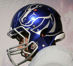
Does anybody else think that the Boise St. helmet logo is somewhat reminiscent of MLB turn ahead the clock unis?
Good point, it also looks like the old Michigan Panthers helmet in a sense. I wouldn’t be surprised if the Broncos end up using this helmet full time later on. This appears to one of the rare cases where the pro combat helmet is superior to the original. Boise State has had various helmets over the years, and none have really been outstanding.
I’m thinking maybe the Jets shirt should simply say, “I’m NOT Calling It Giants Stadium.”
there ya go
There you go.
Ah, great minds think alike…and so do ours, Phil.
Wouldn’t “I’m still not calling it Giants Stadium” be more appropriate?
That’s excellent.
Come on now Nike, doesn’t anyone see the striking similarity between the “Block O” on the Oregon St. unis and the traditional “Block O” logo that Ohio St. uses? Kinda looks like an Ohio State uniform got put in the laundry with a little too much bleach.
It’s a throwback uniform. Wouldn’t surprise me at all if the Beavers used that O in 1969.
I have a vague recollection of an early seventies NFL player who went FNOB (punctuation included) with “ROB’T.” Sadly I don’t remember the last name or even the team. Anybody else on this one?
AFNOB (Abbreviated First Name On Back)?
Maybe a strange question, but when looking at the “Naming Wrongs” T-Shirts… why are some titled “I still call it…” and some “I’m calling it”
Strange inconsistency?
“I still call it ________” is for stadiums which have been abandoned their traditional names in favor of a corporate one, and “I’m calling it ________” is for new stadiums with corporate names.
Under that logic, the Broncos one should probably be “I’m calling it”, but since the new facility was named “Mile High” by the fans long before the name was sold the shirt still works.
Ahhhh… makes perfect sense. You can’t “still” call the new Mets stadium “Shea” because it never was.
Nice Pro Combat uniforms Boise State. Way to show the world that you’re a clown college.
exactly!
because this, this and this hadn’t already confirmed that fact
Don’t like those uniforms, either. The Broncos used to have a solid uniform, in the mid 90s, I believe. Regardless, it would be tremendous for college football if the Broncos had the real opportunity to play for the national championship on the field this season.
Clown jersey and pants aside, Boise State has an absolutely god-awful helmet logo. The cartoon horse is bad enough, but having the actual words BOISE STATE underneath it is completely bush league. They’d be better off going with a scaled down version of the Pro Combat helmet logo, or even just a simple BSU. Just about anything would be better.
If Boise State really wants to be taken seriously, they should stop dressing like a Division III team.
They play on blue astroturf – why should they be worried about having a traditional uniform?
If you’re going to be weird, don’t be weird by half measures, go all out.
I’m guessing that link was from some sort of fantasy camp? Anybody recognize those ‘rups?
Cardinals. Pretty much only ones who’ve wore that striping pattern (meaning the widths of the stripes, so don’t someone go dragging up the late ’60s Indians). Not the same thing at all.
—Ricko
I wouldn’t be surprised if at Nike headquarters they had Paul on a list of #1 Public Enemies. If I was Paul, I’d sorta be afraid somebody in a dark suit & glasses while packing heat would jump me in public. Of course that’s just silly!
If I were Reebok, I’d sign Paul Lukas in a minute. Here, have a truckload of free stuff.
Nike launching itself into a real controversy (and if you’re from the region, it really is): link
First of all, where does Steve K. get all of this footage?
As for the “Giants Stadium” t-shirt…does anyone else think it comes across as a little bit disrespectful? The G-men are sharing this stadium now with the Jets, who paid for an equal share of it The Jets had to deal with their old home being called “Giants Stadium” for years. Now they finally have a neutral name, that also does not have a corporate sponsorship. So what’s the big deal Giants fans? And why show disrespect to the team that helped fund your new digs?
This is the first one I really don’t like. Crosses the line for me. (Though I’ll say the design of the shirt is pretty sweet).
Also, let me preemptively say that I know the two New York teams are rivals, don’t like each, etc. But this is different than saying “your team is worse than mine” or “hey your teams sucks.” It’s kind of like Giants fans are saying “We took your money and your partnership to help us build this incredible new facility, but you can shove it up your arse. This is still GIANTS stadium”
Don’t like the vibe personally.
The Jets will always be the second tenant in the place – they didn’t want to do be there, but thanks to those bastard Dolans it was their only option. The Giants laid the groundwork, worked the deal with New Jersey. The Jets came on board years into the process when their own stadium deal fell apart.
As was the case with the old stadium, there will be the perception that it really is the home of the Giants, which they share with the Jets. Maybe that will fade with time, maybe not.
dave
are you a jets fan?
and +1 to everything chance stated…the west side stadium (along with the olympic bid) was basically crushed in a self-serving maneuver by the goddam dolans…
it will always be “GIANTS STADIUM” and the new building still feels like it — im certainly calling it that
like chance said, will the new building always feel like it’s the giants new home? maybe, maybe not…only time will tell
here
First of all, I don’t really have any particular feelings towards the Jets or Giants. Just a “neutral” observer.
Unlike you guys, I don’t live in New York. So certainly, you probably have a much better pulse on this situation than I do. And all of your points are good. Maybe I’m totally off base here. But even if the Jets did just jump into this stadium, while the Giants took the initiative and did much of the planning, the Jets split the cost on this one. Last time around, when it was Giants Stadium, the Jets simply moved in roughly ten years after the Giants had been playing there. So it’s still a different situation.
And even though the Jets were self-serving in their pursuit of a new stadium, it probably was inspired by having to play at a place called “Giants Stadium” for so many years. Not that it justifies the behavior. But it seems like these shirts may just create more animosity and further accentuate the Jets’ inferiority complex.
So, I guess I don’t have a problem with the shirts. But I wouldn’t personally promote them either. Then again, maybe if I lived in New York (or dare I say, New Jersey) I’d feel differently.
Let me say right now that I hate the term “first of all” despite using it twice on here today. :)
Always wondered why they didn’t do this before, but now with a neutral-sounding stadium name I wonder even more – why can’t the Giants and Jets’ end zones be on the field at the same time? Since they both play there regularly, it’d save a lot of time and money.
Same with Heinz Field – why not have Steelers in one end zone and Panthers in the other? I wish I had my old childhood drawings, where I had Steelers/Panthers and Steelers/Maulers fields. They almost looked like how the Chiefs used to paint the field at old Municipal Stadium, with the home team and visitors displayed.
Look, the Giants and Jets have to share a stadium. No problem!
We happen to have two teams in the Bay Area. The Rayduhz and the Niners. Both play in absolute cesspools. Candlestick is rusting apart, and the Mausoleum is a concrete dump.
If we could ONLY get a share/stadium deal here, I would love it. Be thankful you have what you have, cause out here, the situation is dire.
Talk about an aesthetic no-win situation (here me out)…
IIRC, the new place in New Jersey is all-silver with blue or green LED’s. This way, when the lights are off, the building is totally neutral; with a flick of a switch, it’s truly the Giants’ or Jets’ stadium.
What color would you make a common Bay Area stadium? Not silver (clearly Raiders), not gold (surely 49ers), probably not black (definitely more Raiders than 49ers)…paint it white?
Why not silver and gold?
If your going to share a stadium, share the colors. And share the logos on the field. Or just put diagonal lines or diamonds in the end zones.
Just to make it clear: “I’m Calling It Giants Stadium” is not meant as a Giants vs. Jets thing, it’s not meant to rub anyone’s nose in anything, it’s not meant to be negative in any way to anyone (unless they try to sell the naming rights to a corporation, at which point it WILL be negative regarding that). It’s just a way of saying any building on that site will always be Giants Stadium, at least to Giants fans.
Jets fans are welcome to call the place whatever they want.
Jets fans are welcome to call the place whatever they want.
as long as it’s GIANTS STADIUM
I’m confused. Jets have been treated like something of a stepchild, they tried to do something that would have helped them escape that situation by perhaps having a stadium of their own…and that makes them self-serving?
—Ricko
no
the move to CRUSH the west side stadium was self-serving…done by the dolans…who own cablevision and MSG
Alert from the Superdome pressbox: Tulane coming out to warm up… Wearing white helmets. During camp, head coach Bob Toledo said the whites would probably not transfer to games: link
Here’s a picture from the Superdome just texted to me: link
Always liked the green/light blue combination Tulane uses, it’s unusual in a good way. Too bad the school made the decision to leave the SEC in 1966.
I like it, too. And I’m liking the white helmets:
link
How about “I”m still calling it Schwarzenagger” shirts?
link
Here in St. Looie, I just might start calling it the Trans World Dome again. Who is Ed Jones? Does he think he’s better than me?
And what happened to his middle initial?
Maybe the uniform isn’t the best, but I love that bright yellow on Norfolk State:
link
They’re wearing bike shorts in college football, too:
link
That photo doesn’t do justice to Fla. Atlantic’s wonderful unis:
link
The side piping is unfortunate, but green and gold is a great combo. Yes, I am partial to my high school’s colors, but this is my favorite pro uni I have seen, even if it is a throwback: link
And by side piping I meant the FAU jerseys
You mean UAB?
And yeah, that Eskimos throwback is pretty cool.
Damn! Read the wrong helmet.
Since Dave Diles is no longer around to tell you the Slippery Rock score, they beat Merrimack 45-26.
They looked pretty good, too:
link
bfbs cardinals looked
aightawfuldidn’t look as bad as i thought, but looked really stupid with a while helmet that has almost no black
When did Louisville get rid of the helmet stripe?
Oh yeah, forgot about the NFL preseason…
Kinda like those Mets.
i know im the only one on this board who gives a shit…
but this is pretty incredible
Some of USC’s captains are wearing Tackle Twill C’s on their jerseys. Cardinal-dominate trimmed in Athletic Gold. Has USC done this before?
Love that cold front heading my way.
Earl’s quite a sight as well.
Nike has absolutely no design integrity. Employees of that organization who work on the Pro Combat nonsense are sheep.
That is all.
Regarding the Michigan State uniforms… you mentioned that they have 2 sets of white pants, but ignored that the picture features 2 distinctly different green jerseys. In fact the picture shows 2 players, both in green jerseys and white pants, yet completely different uniforms. Bizarre no?
Completely unrelated to anything discussed on today’s post, but check out the absolutely craptastic photoshop job done on this B-Mets player’s photo.
link
Lukas needs to get off his high horse. The holier-than-thou crap is a tired gimmick. Rube.
Memo to all the Nike Pro Combat haters … take off your leather helmets and take a look at the calendar … the year is 2010 not 1950.
Just a show of hands here … anyone under 60 hate the uniforms?
Nike cares about moving the needle with the younger generation and they do a damn fine job.