By John Ekdahl
The same rich-get-richer mantra seemed to play itself out this year with the Angels, Yankees, Phillies and Dodgers adding both players and payroll. Big market teams were the big winners yesterday, with a few exceptions. Now it’s time to break down the winners and losers among the uniform-switchers.
Winners
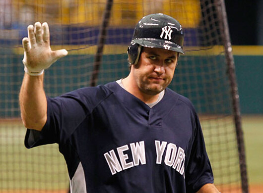
• Lance Berkman – Overall, a solid uniform upgrade going from the Astros to the Yankees. I think the iconic Yankee pinstripes will make him look much sharper as he lumbers down the first base line after popping out to the second baseman. All kidding aside, he seemed like a really nice guy during his interview with the MLB Network guys. Great sense of humor, too.
• Roy Oswalt – Major upgrade when the Phillies break out those beautiful alts.
• Ted Lilly – I’m probably going to catch hell from Cubs fans, but I’ve always been a fan of the Dodgers uniforms.
• Edwin Jackson – The White Sox uniforms are classics and once a year you get to wear this.
Push
• Kerry Wood and Austin Kearns – The standard Indians uniform is probably a cut below the Yankees, but the alternate is gorgeous.
• Scott Podsednik – The Royals and Dodgers have pretty similar unis.
Losers
• Miguel Tejada – Old-school black and orange to sand, sea and sky (or whatever). What a disaster.
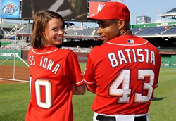
To close out the weekend, make sure to read up on the clumsy brilliance of Miguel Batista. When Stephen Strasburg had to be replaced on Tuesday because of injury, Batista is the guy who got the call. Unfortunately, the thousands of fans who showed up just to see Strasburg pitch weren’t too excited about it. So, they booed him loudly. Batista, being the light-hearted guy that he is, brushed it off in a postgame interview and said he understood. “Imagine if you go to see Miss Universe, then you end up having Miss Iowa, you might get those kind of boos,” Batista said. In an attempt to poke fun at himself, he mistakenly insulted a woman who he didn’t even know.
The next day, a Nationals reporter asked him if he’d ever seen a picture of Miss Iowa. Batista must have been aware that he had screwed up the day before and did a little research. He said, “You mean Katherine Connors? Yeah, she’s gorgeous. Gorgeous. It’s like you hear Miss Iowa, and you say, ‘Iowa?’ And then you see her up close and you say, ‘Wow, she’s gorgeous.’ ” Fantastic damage control. He also sent her flowers and the Nationals invited her to the ballpark to throw out the first pitch. Well, she showed up.
So, if you don’t see Miguel Batista in the postseason this year, it’s not because the Nationals are terrible. It’s because he has other plans. He’ll be judging the Miss Iowa USA Pageant. The man is a genius.
Ted Lilly — I’m probably going to catch hell from Cubs fans, but I’ve always been a fan of the Dodgers uniforms.
This Cubs fan agrees with you. The only thing the Cubs have on the Dodgers is a better sleeve patch. The interlocking LA logo is great, but keep in on the cap where it belongs.
Dodgers fan, and I think Dodgers-Cubs Unis are a push, as far as sharpness and tradition goes. The LA patch seems like a placeholder more than a statement, a case of patch-for-patch’s sake, maybe?
Or the dreaded one more bumper sticker syndrome?
Miss Iowa is not only great looking she’s obviously game & has a sense of humor. Good for her.
@Miguel Batista -best 180 of 2010 ( maybe longer!). AND- 51 left to go ( Puerto Rico & Virgin Islands). He better be single LLOL…
Miguel Batista just earned a spot in the HOW TO TAKE MY FOOT OUT OF MY MOUTH HALL OF FAME!!!!!
He should give AROD ( and a few other guys ) some pointers…maybe he’s learned a thing or being in DC so close to those politicians…
I watched that Nats/Braves game, as I do most all Braves games. Thanks for the interesting backstory. Like many UniWatch readers, my wife rolls her eyes when I get started on bloused pants or stirrups. But now whenever the Nats are on, she’s talking unis. I’m pointing out the good (Strasburg) & bad (N. Morgan).
As classic as the Yankee pinstripes may be, he’ll be losing out on the tequila sunrise and rainbow sleeves, which is a damn shame.
Not sure if it was posted yesterday, but if anyone saw the Royals game they were wearing Monarch uniforms. It looked like Greinke was having trouble with his pants. As he pitched his pants would rise to calf level and then back to ankles.
From yesterday’s game
link
It looks to me like the Orioles were throwing back to the Baltimore Elite Giants?
Is that one of the new grey jerseys designed to look like old-school flannel?
Yes they were throwing back to the Elite Giants, early 1950’s era. Posted link to the press release in yesterday’s comments. Royals were wearing the 1949 Monarchs.
Cleveland Browns training camp has opened and I see no one wearing those brown “poopy” pants as of yet. I am hoping this is a good sign!
Did you notice that Chris Cappiano on the Brewers yesterday was wearing a jersey that had “Brewers” on the front while everyone else was wearing jerseys that had “Milwaukee” on the front.
Jersey snafu
link
Katherine Connors has quite a brushback pitch there.
I agree with you, Ek – the Dodgers’ uni is great. Never liked the team when I was a kid, but I’ve grown to respect them now.
Love those red Nats jerseys, too.
Miguel Batista pulled off one of the greatest moments of press-conference athletic greatness in history. It was so incredibly well-played. It’s a shame they both had to both wear those uniforms. They’ve both been in better outfits, to say the least.
This story focuses on a lot of other stuff, but for you football helmet fans, it shows each MAC schools helmet for the 2010 season.
link
If I had to vote on best alt uniform I would definitely go with the Phillies.
Tough choice between those and the Indians’. Make it a coin flip.
More teams should try cream.
And not just in baseball. I’ve always thought Indiana University, whose colors are crimson and cream, would look terrific it the basketball team would take its basic look and swiitch cream for white with a white outline on the crimson.
I like the Twins cream uni
I’m not a big fan of the current Padre uni’s, but a disaster?
is this: link
really that much worse than this?: link
My biggest problem with the padres uniforms is the wordmark used on the away sandys. I like the gold color but that big D in the middle looks so incredibly awful, like it was designed by a first year junior hi art student. Fix that word mark and the entire package isn’t bad at all.
I’ll second that.
I’ll third that.
Anything that incorporates the Swinging Friar is okay in my book.
The Orioles definitely need an orange top. The Giants’ is beautiful. I did like the “Early Halloween” promo the two teams did with Orange vs. Black, though. Still, when you’re only one of three teams wearing orange, you should capitalize on that.
Just mentioned on Braves broadcast that Ankiel and Farnsworth didn’t have black cleats, only Royals blue. Said clubhouse kid spent and hour with a Sharpie trying to make the cleats black. Ankiel’s look to be regular running shoes though.
Are they regular running shoes with cleats attached? Or… are they cleats? Hahahahahahahahahahahahahahahahahahahahah.
look to be running shoes with cleat attached.
hahahahahahahahahahahahahahahahahahahahahahahahahahahahah!
link…
Mr. Ekdahl,
Can’t disagree with any of your traded uniform observations. That Indians alt. is simply gorgeous.
To the commenter who dissed the Dodgers’ sleeve patch: Spot on. Take it off and it’d be an immediate upgrade. As for giving it a push, I’d say it’s a move up for Pods. If the Royals would lose their powder blue alt, and especially that powder blue cap, I’d agree with you. But Kansas City loses points for both. (The Royal blue alt, I can live with, but still, it’s not necessary. L.A. gets along fine with home whites and road grays.)
As for Miguel Batista, between him and Armando Galarraga, we’ve had the privilege of witnessing two class acts. In that regard, this has been a wonderful season we shouldn’t forget – and there’s still all of August, September and October to come. Bring it on! I can’t wait.
(Just wish the Royals were a part of the action.)
I think this has already been discussed, but I really don’t like powder blues as home unis, particularly when it includes both pants and jerseys as displayed by the Blue Jays. In my view, powder blues work best when they are substitutes for road grays. I believe that was the original philosophy when they were first introduced.
Maybe baseball should go with white on the road like hockey and football. Problem solved.
yeah…or…maybe not
i love ya marty, but that’s what makes baseball beautiful…and different from the other sports
you don’t need a colored top or bottoms to make a baseball uni colorful…just a smart cap, nice piping and socks
get the guys to stop wearing pajama bottoms and proper cleats, and we’re good to go ;)
Dog gone it, LI Phil. I was being completely “feces-ish”. And who is this Marty?
Don’t make me start agreeing with you Phil.
resistence, like square toed shoes, is futile
A’s at White Sox today was Forest vs. Black.
Man, the White Sox must really hate those pinstriped jerseys. Cuz, y’know, it should have seemed like a really good day to wear them (that assumes anyone in MLB is in any way visually conscious these days, of course).
—Ricko
Actually, they wore the pins 5 out of the 7 games on the homestand. I think that was almost as many times as they wore them the first half of the season.
They also wore the gray ones for the last 6 games of the previous road trip. I’d be shocked if that wasn’t more than their total number of wearings before the all-star break.
Some kind of uni epiphany for the White Sox?
We will have to observe further developments (and I’m sure we will).
—Ricko
i love ya marty, but that’s what makes baseball beautiful…and different from the other sports
By the way, thank you for loving me. Do you love me more than all of those beautiful new helmet styles (or should I say “revolutions) that we will be seeing a shit load of in six weeks?
oh god yes
and we need special sarcasm tags for you, since the ones you used above didn’t show up on my screen
yay for sneakers and helmets
Why is a photo of Bob Golic in a Yankee uniform leading UW today?
(Is there a fecitiousiosousness tag available?)
—Ricko
MIKE Golic.
Jeez.
(Y’know, it’s one thing to schmutz up a good joke, but it really sucks to mess up a BAD one).
—Ricko
i don’t know if this has been covered already, but i just saw the viking’s 50th year patch here .
i mean on their website
Classic uni matchup on ESPN.
BEAT LA
These guys sure got my daily uniform (among everything else) down pat…
link
Love that video, but the Swagger Wagon video is better, ’cause you get to see Mommy’s unis as well…
Interesting fodder for a future column would be the history of baseball spring training jerseys. Reason I bring this up was the memory of the Astros “tequila sunrise” uniforms. I was living in Florida part of the time they wore those unis, but don’t remember if Houston wore something else for spring training purposes. Thought I once read something about teams wearing obsolete uniforms in spring training, maybe this applied to the Astros, who wore a different uniform prior to 1975.
here is the link to the link, somewhat reminds me of the loveboat incident
I like that logo. Normaly hate these patches cause they are usually lame but the boat and sail are cool. And the loveboat connection makes it rock even more. I’d let Vilk wear that.
and I would, too…
Just found out punter Bob Cameron was named to the 2010 CFL Hall of Fame, and deservedly so.
link
Not a Bombers fan, but I loved those 80s Winnipeg unis.
Yes, it’ll be interesting to see what nickname and uniform style Ottawa chooses when it reenters the league. They had a sharp uniform back in the day with the red pants and dark helmet adorned with a big “R”(Rough Riders).
I’d love to see them come back as the Rough Riders, but today’s marketing “geniuses” would advise against it, even though a majority of fans wanted that name when the previous incarnation of Ottawa football chose “Renegades” as its name.
Good point, I’m not that familiar with the current situation, but thought 2013 might be the year for Ottawa’s return. I seem to recall Ottawa had a one year experiment with a gold helmet before they became the Renegades, Andre Ware was playing for them at the time.
The gold helmet was back in the 90s, in the final years of the Rough Riders. The Renegades came along in 2002. Actually saw them play against Hamilton the following year. In fact, I got to see Lawrence Tynes, before he kicked for the Giants:
link