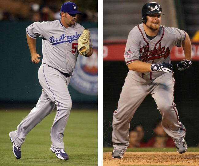
One of the gentlemen pictured above was credited with the save in Tuesday night’s All-Star Game. The other gentleman was named the game’s MVP (which apparently stands for “Massively Vexatious Pajamas”). Both looked like they were ready for a bedtime story, not a ballgame. Such is the current state of MLB pants.
I have an ESPN column today that examines baseball pants in considerable detail — look here. Meanwhile, someone please sneak into the Braves’ and Dodgers’ locker rooms, steal these guys’ pants, and send them to the tailor. Thanks.
Uni Watch News Ticker: Just scored this awesome vintage hoops warm-up shirt on Etsy. More details once it arrives from the seller (big thanks to Patrick Truby for pointing it out to me). ”¦ New court design for Texas A&M. ”¦ Just when you thought you’d seen everything, along comes a hat made of Bruins ticket stubs. ”¦ Someone spent five bucks on a Lebron pendant at a yard sale, and now it turns out to be worth ten grand (with thanks to Grant Goldman). ”¦ Not quite a white whale, so let’s call this a white porpoise: Sure enough, the Rockies did have logo-clad stirrups back in ’93. ”¦ Coupla great team portraits of baseball squads wearing those old double-breasted pea coats: the 1904 Phillies and 1904 Cardinals (nice finds by Mike Hersh). ”¦ Jon Smith recently got to manage his son’s Little League all-star team. “One of the perks is that I got to select the uniform,” he says. “I was a bit worried whether they’d buy in on going high-cuffed, but they all dig it.” Nice, but teach those kids how to blouse! ”¦ Temple University athletics is switching to Under Armour (with thanks to Alex Klein). ”¦ Amusing Mariners ad in yesterday’s Seattle Times, although it would’ve been better if they hadn’t shown their own pajama-clad players (with thanks to Daniel Carroll). … The U.S. Postal Service is about to issue two new Negro Leagues stamps (with thanks to Troy Griggsby). ”¦ This shot is from the 1930 Colgate/Columbia game. Looks like the Colgate player near the center of the frame is wearing an “executioner”-style full-face mask (nice spot by Ryan Dowgin). … John Daly is really outdoing himself at the British Open. ”¦ New logo for the Pac-10.
Manchester United new home kit officially released: link
I thought the pattern they have on the back was interesting. It reminds me of some of those nike basketball jerseys with prints on the back. I think Texas and Duke and some others wore them.
It looks like a pretty nice shirt from those first looks. Though it’s kind of a hodgepodge of different style periods…
70s collar
link
Mid 90s Nike lightning bolts (hot this year!)
link
Late 90s shoulder/arm braid
link
And the recent Nike back hologram
link
Liverpool also launched their third jersey: link
I thought it was really interesting to go with this look because it seems really similar to the news Chelea away jersey with different shades: link
But I like how the stripes fade on the Chelsea
I like the Liverpool shirt – and it looks like that will be a Europa League kit as it features non-Premier League numbering/lettering on the back.
NY Times on the Yankees patches for The Boss and Sheppard: link
Good lede, Paul! Now let’s get baseball to do something about it. Hire some NFL uniform cops.
Ditto.
Paul, the USPS isn’t just releasing two Negro League stamps, but a series including Josh Gibson, Cool Papa Bell, Willy, Hank, and Jackie.
make that Willie…
That’s not what the article says:
“A pair of 44-cent commemorative stamps will be dedicated in ceremonies at the Negro Leagues Baseball Museum in Kansas City, Mo.
One stamp shows a close play at home plate, while the other commemorates Andrew “Rube” Foster, founder of the leagues that operated from 1920 to 1960.”
The article mentions Gibson, Bell, Mays, Aaron, Banks and Jackie Robinson, but only as background information on the Negro Leagues. No indication that they’re getting stamps of their own.
I am a stamp collector and just bought the stamps.
Rube Foster is on one side and the left side players and umpire are not named.
The stamp is one of the better looking ones that the PO has issued in years
I was going on what the article said, and what I was told by the person at the post office when I asked about the stamps. It’s too bad that they are only issuing the two images for this…
You have to be dead to be commemorated on a USPS stamp, right? If so, that would definitely rule out stamps for Mays, Aaron, etc.
That should have been what tipped me off that the postal worker didn’t know what they were talking about. I spaced on the little issue of Mays and Aaron still being alive and not able to be on a stamp because of that…
What is Etsy?
here
Etsy began as a way for people — mostly 20something girls — to sell their handmade crafts online. That’s still the core of its business, but now there’s also a lot of vintage stuff. Several of the pencil sharpeners in my recently completed collection came from Etsy, for example.
Unlike eBay, Etsy isn’t an auction site. You don’t bid; everything has a set price.
Two nice things about Etsy are that the item photos tend to be much better than on eBay and the sellers are often extremely pleasant and surprisingly flexible. The basketball warm-up I just bought was originally part of a larger lot that included two jerseys, shorts, and socks. I asked the seller if she’d be willing to sell me the warm-up by itself (allowing her to still sell the rest of the uniform), she said yes, and we agreed on a price. Very unusual to strike that kind of arrangement on eBay, but I’ve been able to do it several times on Etsy.
Uh oh, one more addicting site where I can spend money. Thanks for the information.
What I don’t understand about pajama-style baseball pants, aside from the horrible aesthetics, is why more players don’t get their spikes tangled up in all that flapping material when they’re running.
what makes you think they haven’t?
Baseball will never create a rule and enforce it over the players. Why? The MLBPA. The day they get hard salary cap is the day they force players to dress like ball players.
Baseball needs a pants / socks rule. At least the clown pants were seen by the fewest ever at an ASG. From the Chicago Tribune:
Tuesday’s All-Star Game earned its lowest-ever television rating.
The National League’s 3-1 victory on Fox earned a 7.5 fast national rating and 13 share. That’s down 16 percent from the 8.9/15 for last season’s game, a 4-3 win by the AL.
The previous low was an 8.1/14 in 2005.
Yeah, and ratings will continue to go down every year. But so what? It doesn’t reflect the popularity of the sport, which is more popular and profitable than ever. So, in other words, who cares?
But I thought that making “this one count”, the eighth “one” that has counted btw, was supposed to keep increasing ratings. Can Bud Selig do wrong?
Anybody pick out the future Scott Boras client in the Little League (Northwest)pic? got him, didn’t you…
Mr. Loudmouth Golf shot himself a salty 66 this morning. Those pants are….well….I like em! link . I wouldn’t wear em, but he’s John Daly. Why not.
Those pants are brilliant! Not one person noticed he had a cigarette in his mouth, a beer in one hand, and was swinging the club single-handedly with the other. He was in his comfort zone, and got away with it because nobody noticed anything but his pants.
Careful, the Hosiery Crusade is wistful nostalgia only to a point, when it mutates into a “Han shot first”-style vendetta against The Man and makes your friends pretend not to know you in public. Don’t let it consume you!
Marty said it much nicer than I would have.
Let’s see, the NBA banned long tights. The NFL requires players to pull their socks up. Baseball has a rule that everyone’s undersleeves match. Why is it so darn difficult to require players to wear some form of hosiery? It’s very, very simple. And don’t argue that it’s not in the rules. There is 150 years of custom and tradition; that makes it a common-law rule that the commissioner could enforce. Just have some guts and put it out there, plain and simple.
Reality Check: Stirrups with lots of color and/or stripes showing has not been the standard look in MLB for almost 40 years. That’s just plain fact.
Most of today’s players have absolutely no frame of reference for that look. Just as basketball players can’t imagine playing in Julius Irving shortshorts.
Likewise, knickers (Plus-Fours) were once worn by just about every serious golfer on the planet (Jones, Hagen, Sarrazin…all of ’em, from the pros to country club players), and not by rule. So it would be kinda tough to suddenly make them a USGA or PGA requirement now, wouldn’t it.
—Ricko
That’s not what I proposed.
I don’t care if they wear stirrups or socks, and I don’t care about stripes. They just need to show something. It is only in the last five years that the absence of any kind of hosiery took hold. Sorry, but that’s not enough to overturn 150 years of tradition. Go back to the unwritten rule, period.
Ah, okay. Understand what you meant now.
And what I was saying, of course, was that the look that seems advocated here most often, which is low stirrups and high cuffs was, with few exceptions, all but gone by the mid-’70s. By then the overwhelmingly dominant look was becoming ribbon stirrups.
The last World Series team that showed lots of striped sock on almost all its players was the 1975 Red Sox. By just about any standard, that’s a long time ago.
There were some individual holdouts over the years such as Steve Bedrosian and a few others, and teams like the Reds and, for a few years, the Giants, but the traditional low stirrup sock largely has been dead meat since the ’70s. In the Majors, anyway.
It’s hard to call a look “traditional”–and certainly not “typical”–if almost no one’s worn it in the last four decades. “Historical,” yes. “Standard”, no.
—Ricko
or just add pleats and pockets to the pants so we can all wear them to the office. hahaha
Lest anyone misunderstand, while I have absolutely nothing against the long, draped pants, the ultra-baggy look shown above is just plain dopey.
That appears to be a “style” thing, though, so with any luck it will go away soon.
And, yeah, were I still playing a game that involved wearing steel cleats I’d be concerned about catching one in all that excess fabric. I mean, sometimes you have to (as I used to tell my kids) “turn your brain on.”
—Ricko
The bigger problem is that it’s tacitly sanctioned. When I was looking for my baseball pants, what drove me up the wall was that most of them were pajama pants with a 33″ inseam. That’s a problem for someone who is 5’7″ and doesn’t want to 1) look like a complete slob and 2) take a pair of baseball pants to the tailor that does my alterations.
I was thankful to find a pair of standard baseball pants – Rawlings Pro-Preferred – on sale for $30 because all the other pairs that were selling were the pajama pants (facepalm). Although there’s no pair of pajama pants that are as disgusting as the Easton Quantum pants – which have a 35″! inseam – unless you happen to have the legs of a giraffe…
Hey Paul
For someone who claims they are not “into collecting jerseys”, you do post the one’s you have won on auction.
As I’ve explained several times, I have zero interest in new jerseys — not even new throwbacks like the ones sold by Ebbets Field and Mitchell & Ness — but a big interest in vintage clothing. I buy all sorts of vintage shirts, some of which are occasionally sports-related. When I score a good one, I share it here. But I don’t think of it as part of my “uniform collection,” because I don’t collect uniforms. I just collect cool old clothing, and a subset of that collection is uni-related.
with all the things players have to worry about going into the CBA, you’d think (if the other side so desired) they’d willingly trade a pants height/stirrup mandate for something like, oh…i donno…a 26 man roster
that’s why the owners wouldn’t try to get one — the minute they try to place some kind of hosiery mandate, they need to give something back to the players…think they’d trade a roster spot or more revenue sharing for a high pants rule?
not likely
A couple of years ago, my beloved SCARLET Knights tried BFBS which I thought looked horrible ( sorry too lazy….umm busy to look for link ) red helmet, black jersey and pants with red numbers. But there was a huge number of fans that thought it was great…
Now the rumor back home in NJ, is that they are will be trying another “blackout”…but this time they will include black helmets….
Does anyone back in Jersey know if there is any truth to this?
You know, that might be the worst example of BFBS, when a team with a COLOR in its nickname wears a jersey that is black (or any other color, for that matter). Aesthetically speaking, it is about the dumbest thing a sports team can do. If my Crimson Tide ever tries to pull that stunt and wear a black jersey… my world will cease to have meaning.
I guess the only thing that makes the Scarlet Knights wearing black less tragic than the Crimson Tide doing it…is that Alabama is a powerhouse and only Alumni care about Rutgers…
But I know exactly what you mean, I almost fell over my chair when I get the email about going black… and now black helmets too!!!!!!
You can’t expect anything better from Rutgers, being so creative that they put the Radio Shack logo on the helmets!!
Slight correction: Colgate – Columbia game is 1930. Picture is from unwanted family and Colgate photos that belonged to John Orsi (Colgate ’32, College Football Hall of Fame) that I picked up on eBay.
Typo on my part. Now fixed.
You’d think the Mariners would have gotten the memo on the new Red Sox logo some time since the beginning of last season.
Memos on new logos can take a while. I got a thing in the mail maybe a month ago from Sports Illustrated, wanting me to subscribe, with some kind of free NFL gift involved – had a sheet of stickers (pick your team, stick it on X…) and it had the wrong helmets for the Colts, 49ers, Vikings and Cardinals.
Niners, Cardinals and even the Vikings I can sorta understand, but the Colts? How long has it been since they went back to the gray facemasks?
I don’t know if it’s because I’m a baseball guy and not a football guy, but I’m a big sports fan, and would NEVER have noticed any football team’s mask color changing – as long as the colors used are consistant with the team’s identity. I suppose if two players are standing next to each other with different color masks, I might see it. It’s not even like it’s a uniform part of the uniform, anyway. How many different shapes of masks are there to be found on any one squad?
According to the Helmet Project, they went back to gray in 2004. So, yeah, it’s been a while.
And in reply to JimWa, who it won’t let me reply directly to for some reason…
They may be different shapes, but they’re all the same color for everyone on the team. I think the team involved probably makes it more or less noticeable as well. The Colts pictured with blue instead of gray? Meh. The Redskins pictured with a burgundy mask instead of the yellow? I think it’d stand out a bit.
I guess the closest baseball equivalent would be the bill on the hats, maybe? Seeing the Colts helmet with the blue facemask they don’t use anymore still looks good and the average Joe probably doesn’t notice it. Kinda like, say, a Detroit Tigers hat with an orange bill. It’s in team colors so a non-baseball fan might not realize it’s wrong.
Shh, I like the old logo better. I still don’t understand why they changed it. IMO, it’s better than just the straight hanging sox, which didn’t belong on a game hat, but that’s another issue for another day. Maybe it was because I grew up with the other one that I’m attached to it.
“One of the perks is that I got to select the uniform,”
Love the Rojo Johnson t-shirt ad on the scoreboard in that photo
link
Today’s ESPN column is up:
link
two words:
awe some
I’m assuming most people around here despise the “pajama” look, or, Clemson Cut? I acually like the look. I also like the stirrups, and high socks, yet that scruffy pajama pants look is cool. Now, when it starts looking like skinny jeans(elastic ankle bands), that’s where it starts looking stupid.
Nope. Sadly, you are wrong. Scruffy pajama pants look like scruffy pajama pants.
Is there something I’m missing in the new Pac 10 logo? I like the shield idea but don’t really understand what the shapes on the inside are supposed to look like.
Looks like a link to me. I kinda dig it, but then again, I never liked the old logo.
Interesting that the mountain is coming into the logo right before Colorado and Utah join. And the wave is there to remind us of the Pac part. I think it’s pretty nice as well.
Are they going to change the name to Pac 12 in a couple years?
it does look like a mountain and a wave
seems to be a popular theme among new logos
Wondering about baseball pants? Well, this is hanging up in the Cubs locker room at Wrigley Field: link
It’s hanging (and largely ignored) in every MLB clubhouse.
Anyone got a hypothesis as to what link are? Gray?
I,for one, will not watch baseball untill they bring back stripped socks and mid calf pants. The All Stars made me sick to look at them. Screw the idiots.
Vagary?
From the ESPN article, the first picture with that guy in pinstripes … his belt buckle is WAY off center (in fact it appears there’s a beltloop where we’d place out buckle today). I’ve heard they used to be off-center, but the placement of the beltloop looks very odd, and while movement may cause distortion, it sure looks like his belt buckle would be right over the pointy part of his hip bone. Wouldn’t that be highly uncomfortable?
it’s a preference thing, i think — lots of the old tyme players wore their buckles almost on their left hip, for some reason — since they didn’t slide (for the most part) headfirst, i often wondered why they did it…but look at any old baseball photo and there’s probably a greater than 50% chance the belt buckle won’t be beneath their navel…
here’s the black & white of that 1917 WS photo i had colorized — eddie cicotte (left) has his buckle centered, while the coach has it off to the left — so it wasn’t even a “teamwide” thing either…
left hip puts the buckle up when sliding feet first.
I’ve written about this a lot. It used to be common to have a belt loop dead-center, right at 12 o’clock, so buckles were routinely rotated off-center. I know we’ve even seen a photos here on the blog of buckles positioned *toward the back,* between the hip and spine.
The 12 o’clock loop began to disappear in the 1930s and ’40s, and buckles began moving to the center as a result.
check out the 1917 WS pic again — the coach has the 12 noon loop plainly shown, and i’d bet cicotte has his 12 noon look COVERED with the belt
great call, paul
link
Posted this yesterday in the afternoon, but it never got addressed. Hoping maybe today it will.
Paul, are you okay with other non-black cleat colors?
Red: link…
Blue: link…
White: link…
I didn’t particularly like the orange cleats, but I don’t see much of a difference between them and red, blue, or even white ones in terms of the argument you are making — that they don’t belong on a baseball player on a baseball field. Are you arguing that traditional black baseball cleats are the way to go? If not, and red/blue/white cleats are okay, then it seems like more of a personal preference argument about what is right or beautiful.
Personally, I prefer black — it provides a nice grounding. Oh, but the A’s should keep their white, cuz that’s their thing.
That said, it doesn’t particularly bother me that the Phils wear red or that the Dodgers wear blue, etc. I think they’d look better in black, but it’s not a big deal.
But as someone pointed out yesterday, Wright wearing orange is not analagous to the Cubs wearing blue; it’s akin to the Cubs wearing *red,* because orange is a just a trim color in the Mets’ color scheme, not the main color.
Also, c’mon, let’s face it: Orange footwear is way too “Look at me!” It’s a very bold, aggressive color. Distracts from the rest of the uniform instead of complementing it, which is what footwear should do.
Here’s another thing to consider: What if Wright had worn an bright orange *belt*? Wouldn’t we all agree that that would look like shit, even though it’s “a team color”?
Great question. I tried to say the same thing yesterday, but didn’t do it nearly as well.
The fashion rule for men is…if others NOTICE the shoes, then they either do not match the rest of your clothing or they are just plain ugly ( Yes its different with women ).
I think the fact that Wright’s shoes stood out so much is what made it an issue. I think white, black, grey, dark green and for some teams blue and red are acceptable.
Orange, silver, purple, teal….this isn’t soccer where its all ABOUT THE FEET. Baseball shoes are supposed to blend into the background…the supporting cast and not the stars!!
Found a link of the poster on Flickr. Note the Nats’ version of the poster has lower pants than the Cubs’ version.
And under PANTS it sez:
“Pants cannot extend over the top of heel of the shoe. Cannot have shoes laced through them and cannot have straps attached to the bottom of the pants. Pants cannot be worn so excessively baggy that it provides a competitive advantage.”
Yeah, we all know that Prince Fielder gets his competitive advantage from his pants.
The point of the “competitive advantage” line is that your uniform shouldn’t make it easier for you to be hit by a pitch.
and yet you do still have players who are not as big as Prince Fielder who are wearing a uniform that would fit his girth.
I didn’t say the rule was followed or enforced. Just said that’s the purpose of the rule.
Paul, the other side of this are the few guys that wear the tight uniform (Moyer, Jeterm, A-rod). When did that trend start?
Tight uniforms arrived with stretch fabrics in the 1970s.
Here we go: 1930 photo of Art Shires wearing his belt buckle around on his back:
link
I feel like we’re officially beating a dead horse. Yes, pants in major league baseball are big and don’t look like the pants of 20 years ago. Yes, they look like pajamas. It’s still better than the spandex that were worn in the 80s.
“It’s still better than the spandex that were worn in the 80s”
im not sure why the hate on the 1970s look — it was the sansabelt poly that looked like crap, not the fit — you gonna tell me derek jeter isn’t wearing his uni about as tight as he can…and it looks great (despite the stupid high tops and low cut pants) — but the man knows how to wear a uni
baggy pants (even in the 1950’s and before) is a matter of tailoring (and lets face it, most unis before the 1960’s were basically off the rack); the reason players wear em baggy today is style…they could wear them like jeets does, but they choose not to
im not sure why the hate on the 1970s look – it was the sansabelt poly that looked like crap, not the fit
No, it’s the fit. It’s the same as why males should not wear “skinny jeans”. Derek Jeter can get away with it, because, he’s, well Derek Jeter! Now stirrups is a different story, and maybe having baggy pants to your knees (like the 50s), but spandex baseball pants were just like the mullet and “short shorts” in basketball – a fashion fop-ah from yesteryear.
im not gonna defend the mullet, which was never a good look in any time period, but i’ll disagree with you that the “tight” (and yes, they were tighter than today, but nothing like, for example, football players wear) was a fashion faux pas…
i’d say the “hip hop” fashion of today is just as much of anathama to the rest of the adult world is just as much of a faux pas as were the 1970’s uniform styles —
you do make a good point about jeter and “skinny jeans” — if you have the body to wear them, then you should — but i’d venture to say that most of today’s professional athletes have the bodies to support the jeteresque cut; the general public at large, not so much…
why is it that in all other sports, if you have guns, you show them off? i saw a photo of swisher the other day with his sleeves cut off (turns out he looks like this, but yet he wears a jersey that’s three sizes too big…why? it’s fashion
we’ll eventually “rebel” against this baggy look just like we came out of every other fashion statement, and none too soon
im not saying i want guys like prince to wear 1970’s fitting clothes, but by the same token, most of the slobs today (and they probably aren’t really slobs–just being fashionable) should wear properly fitting clothes
Agree with you Phil. But what’s more offensive is the way college basketball lets players wear dresses for “shorts” and baggy t-shirts and jerseys. Someday the ball is going to get lost in all that cloth just as the final shot of the NCAA tournament is taken (or not taken as the case may be).
I don’t agree that it’s better than ’80s.
As for beating a dead horse, the point of today’s column wasn’t so much to decry the current state of affairs (although I engaged in a little of that, yes) as to understand and document how we got here. A lot of factors influenced the cuff’s journey from kneecap to shoetop, and those factors had never — to my knowledge — been summarized in one place. I wanted to do that. Along the way, I learned a few things during my research (like the “Dominican style” — I’d had no idea that the Dominicans invented and popularized the heel-spike thing).
Thank you for your passion. I read uniwatch daily and think it’s excellent. I may be in the minority, but I feel like the whole baseball pants thing on this page has been more than amply covered. Before somebody says “if you don’t like it, don’t read this page!” the good (coverage of basketball, football, logos, etc.) FAR outweighs the not.
It’s like having your wife tell you something 18 times. You love her anyways because she’s great at so much else, but on that one issue the point was made 17 times ago.
But again, love the webpage and keep up the great work.
I’m not sure if either is better or worse. In my opinion, I don’t like the baggy look. But I also really do dislike the 80’s way-too-tight look.
I absolutely love the high-cuffed look with real stirrups. But the tightness of uniforms in the 80s was way too much.
At least for me.
Glad the ASB is over. This lack of Hagin bashing is leaving a great disruption in the fibers that this website is based upon.
There will be no more Hagin-bashing on this site. Further details coming soon.
You got Wayne Hagin fired?
Wow.
It’s incredibly easy to take an action shot of someone wearing pants over their cleats, look at all the wrinkles and puffiness, and complain that it looks stupid, but the reality is that it just looks at though they are wearing regular pants, making this look more natural and more comfortable than anything else.
So, if they just decided to start wearing Dockers on the field, you’d be cool with that?
It’s their prerogative and, personally, I think it looks better than the skin-tight capris yall seem to be in love with.
I’m not sure who “yall” refers to, but who’s saying skin-tight capris would be the way to go? It’s not an either/or proposition.
Baseball pants (whether worn high-cuffed or not) should look like baseball pants, not link and certainly not link.
And it’s their prerogative to wear dockers on the field? Really? So maybe they should just show up in aloha shirts and floppy hats while they’re at it.
That would certainly be a natural and comfortable look.
And it’s incredibly HARD to take a photo of high-cuffed pants that look bad. You know why? Long pants look like shit, and high-cuffed pants look good.
It’s not a trick of selective photography; it’s the way things are.
Firstly, if baseball players looked like that, I would have no problem with them going with the capri look.
However, stuff like this (link) just makes it seem as though the Nats ran out of adult sized pants, forcing Strasburg to bum a pair off of some twelve year-old. I’m not all against high cuffs, BUT high-cuff + tight is not a good look, regardless of how bloused the pants are. IMO, link looks much better and is more in touch with the baggy-ness of the old-time game (link).
Taking the history of baggyness in baseball into account, it can be said that baseball pants can, in fact, be baggy (if Cobb’s pants were extended to ankle-length, they would certainly look similar, if not more baggy, than McCann’s and Broxton’s).
The only thing that seems to still be of issue is the length of the pants. Certainly some people, such as Kinsler, can pull off the high-cuffed look. However, as a former baseball player who was also and offensive lineman, if that tells you anything about my physique, I can tell you that high-cuffed pants were not NEARLY as comfortable as “pajama” pants. To me, looking comfortable makes or breaks someone looking good, and there is a large proportion of baseball players who are less than skinny, if you catch my drift. For the others, the “pajama” look can be explained by the complexity of modern cleats (and thus, the potential clashing of cleats with socks) and the gravitation towards baggyness and non-chalance in modern fashion, hip-hop culture, ya-da ya-da. And if that doesn’t suit you, you’re too old.
No MLB uni police.
The NFL’s has proven to be ineffective:
link
link
link
One of the biggest factors is the final one in Paul’s Page 2 feature. Until fashion gets away from stuff like this link and this, link, we’re just going to have to ride it out until the next trend comes along. Fashion is cyclical…it’ll happen. And don’t say fashion didn’t dictate sports unis in the mid-20th century. Conformity was the fashion. Now it’s not.
Fining the players means nothing. The only way to enforce it is to affect the play of the game (penalties, expulsions, etc.) and that’s not going to happen. Not enough people would agree it’s worth throwing out a star player because he’s not dressed appropriately. Then there are those who would turn it into a whole human rights issue.
Just another reason to save money and not buy a big screen HDTV. Today’s players don’t look quite as bad on my little Standard Digital TV.
hey m’ver…
what did you google to find those pics? (what were your search terms)…
If you mean the “fashion” stuff, I googled “hip hop clothes” or something like that. The players I just googled by name.
i was referring to the search terms you used for the two examples of fashion trends you don’t like
Nice grab, Paul. Great warmup.
I don’t think the pajama pants of today are related to the baggy trousers people wear … seems that trend has faded and jeans are actually fitting now. Who wears baggy jeans anymore? (A few wannabes, the everyday suburban rapper) The trend for two years has been toward the skinny, or fitted jeans.
Nevertheless, pajama pants on the ballfield render a game completely unwatchable for me. Sabbathia, or those two clowns shown in the photos above? I’d immediately turn the channel.
Clowns. Unwatchable. It’s that much of a distraction.
Skinny jeans are only popular amongst a certain hipster crowd and cowboys. Other than that whack lyric machine with Kanye West written on his birth certificate, you won’t really find painted-ons on the hip hop scene.
Skinny jeans cause nerve damage. Heard it on the John Tesh Radio Show!!!
pssst …. dude …
That’s supposed to be intelligence for your WIFE!
Haha. Driving through Central California yesterday, I didn’t have a plethora of stations to choose from.
Paul- Thanks for the shout out in the ESPN Column today. Its funny because our league playoffs start in two weeks and I am thinking of throwing everybody for a loop by going high cuffed.I am headed to Twin Cities page now to look for some royal and red stripped ‘rups for the guys!
Here’s what I wear for my team: link
Interesting little video clip about the Richfield Coliseum, including construction, discussing the traffic/parking situation, and some nice-looking footage of the 70s Cavs and Nets:
link
Paul, is there a flickr album or something similar of your classic collection?
My classic collection of what — vintage clothing? Old jerseys?
Whatever that State Farm shirt was added to.
Paul,
Look on the bright side. With the skinny jeans fad we are currently in, tighter pants will hit MLB in 5 to 10 years. I mean, wasn’t that the case with the baggy pants trend of the 90s?
link
Wonder what it was like to wear that executioner style helmet or mask. Had to be hard to breathe and sweaty.
They are cool to look at.
Jon Smith, you’re a good dad!!! What stadium is that picture taken at?
-Jet
We can blame George Hendrick for the current rash of players wearing their pants down to their shoe tops.
But, the sole blame for the pajama-look rides on the shoulders of Derek Bell when he played for the Mets in 2000.
He wore the “hip-hop” style of jersey and pants first and at the time, was made to wear a more tailored look in subsequent games.
That was the beginning of the end and the top of the slippery slope.
Hendrick didn’t wear his pants all that low, not compared to what was to follow. He just wore them longer that his peers.
For totally covered socks, look to guys like Jose Lind, Jose Offerman and, I seem to remember, OF Glen Wilson of the Phillies in ’84 or ’85 wore is pants really long. Just not sure HOW long.
Know who else? Ron Darling of the Mets. Didn’t cover the socks, but longer than Hendrick.
—Ricko
Rick, I did a fair amount of photo research on Lind and Offerman, based on your frequent mentions of them. They were behind Hendrick’s curve.
Darling, who I mentioned in my article, went lower than Hendrick, but five seasons later.
Guess we’re hair-splitting. My point is, and always will be, that Hendrick never covered his socks completely.
Guys like Lind and Offerman did. They were among the first to tuck their pants into the lowcut cleats, or have something extending under the arch to hold the pants down. Not externally, but inside the shoe. Particularly I remember seeing the stretching of that Rhett Butler look on Offerman when he was with the Dodgers (sitting in the dugout where it was really apparent). Likewise, that the black-gold-black Pirates’ pants stripe kept going until it disappeared into Lind’s cleats. Tough to mistake a black stirrup for striping with yellow-gold in it.
—Ricko
this guy?
or this 2 in 1 POS or
this homocidal bat-wielding maniac
real prince, that one
Nobody asked me, but what I have always loved about the baseball All Star Game is that the players get to wear their actual uniforms, unlike football, hockey and hoops.
I used to love watching as a kid, when they lined up along the first and third base line. Looking up and down the line for the lone Met, or Astro, or Senator, or Padre. Those colorful uniforms!!!! The All Star Games were like a time capsule of sorts, i.e. you could find an old pic of the players lined up and get an idea of which were the good teams and which were the bad teams that year just by how many players they had represented. Five Red Sox, one Indian, okay that tells me something about both teams…
-Jet
Didn’t the NBA All-Star Game use regular jerseys a few years ago? It’s too bad they didn’t stick with that concept… special jerseys for ASG, as we’ve seen with the warm-up outfits in baseball, are usually not so good.
Paul, I’m liking the shorter columns and tickers over the past week. Not that I don’t love every little tidbit but the shorter ones are more manageable, i.e. I don’t spend half my work day on UniWatch, looking at pics and posting comments, and then getting stressed out because I didn’t get any work done!!!
-Jet
I liked the ESPN article today. When playing, I prefer wearing the high cuffs with stirrups but on some days its just more comfortable to go with the long pants. I’m even guilty of having a MacGyver pair but I put the elastic inside the shoe.
On a side note (And this seems like the best place to ask), Is there anywhere I can buy striped stirrups in just 1 or 2 pairs and not the minimum of 12 like every site I find?
Contact Robert Marhsall: link
I have to say, the new PAC-10 logo looks like a cheesy high school class ring design.
The new pac 10 logo looks a lot like a Police Athletic League (PAL) logo/shield.
in addition to that, poor design … so 90’s.
Ah, the days of the Indians in red socks, sleeves and cleats at home…
link
–Ricko
I dig the new PAC 10 logo. The number font is very old school. Love it!
F*CK!
/that is all
Carlos Beltran didn’t get re-injured already, did he?
For the “Ridiculously Bizarre” file: John Randle recently donated his shoulder pads to the Pro Football Hall of Fame. They were modified by having Harley-Davidson mudflaps attached to them! Here’s a pic:
link
The following article doesn’t explain why he had motorcycle mudflaps attached to his shoulder pads, but I can only guess it was for extra rib protection??? Here’s the article:
link
I have to admit that, as a fan, I have been following baseball less and less every year to the point where I pretty much only pay attention to the WS now. As a fan of uniforms, I think my declining baseball interest is directly proportional to the proliferation of the pajama pants look. The current uniform style in baseball is so visually unappealing to me that I no longer enjoy watching the game on t.v. And it’s hard to find things that don’t look good on an HDTV. The sloppy, long pants style combined with too many crappy uniforms (D-Backs, Blue Jays, Astros, Rockies, etc.) makes for a visual nightmare.
HELP! Calling on EQUIPMENT Experts!
Not to change from the current topic (again), but does anybody know the correct product name for the heavy mock turtleneck warm-up sweatshirts that were worn and used by many coaches and teams from the 1940s-1980s, similar to those worn by Ara Parseghian and Lou Holtz on the sidelines on gameday, and also recently shown in last week’s photo with one of the 1960s Green Bay Packers.
Are these warm-up/sweatshirts items still made and sold by any team outfitters? If I knew the correct product name it would make life a bit easier. Maybe somebody has an old or current team outfitter catologue with such an item listed?
Help, anybody. I’ve been looking to buy one for 15 years.
Your help will be greatly appreciated
Good luck Nick V trying to get one. I do not know enough to help you though
Any idea on the product name that the suppliers listed those under?
If you’re into retired jerseys…supposedly the University of Arizona will retire seven of them on November 13: Ricky Hunley, Chuck Cecil, Steve McLaughlin, Antoine Cason, Darryll Lewis, Chris McAlister and Rob Waldrop.
I’m going to guess it’s one of those “retire your jersey, but not the number on it” things that some colleges do. Because 7 numbers would be a lot to retire.
In other news (that wasn’t good enough for the ticker), the W-League’s Hudson Valley Quickstrike Lady Blues (a women’s soccer team), which is in just its fourth season, will retire a number worn by a player who played just one year with them. Seems a bit much.
link{48196EA0-7C83-4E5F-AF5E-D87DE8F9D639}]
LeBron fans (or ex-LeBron fans): The Akron Aeros will exchange gently used LeBron gear for free tickets to the Monday, July 19 game at Canal Park. All donated items will be delivered on an upcoming mission trip to the Caribbean or South America.
Details link.
Getting past the baggy pants at the top, and noticing again the Braves helmet, here’s why the Braves all-navy hats and helmets are lame. Well, okay, that’s harsh. Let’s say “ill-thought uni design.”
Imagine the Orioles, with their current uniforms, have gone to hats and helmets that are all black with a white “B”. Wouldn’t anyone who paid even passing attention to unis think, “Shouldn’t there some orange on there somewhere?”
Or the Cardinals’ road hat was just a white “StL” on a navy hat.
—Ricko
On the other hand, how much worse would the Dodgers look with red trim around the LA? Or if one letter was white and the other red, a la the Twins (or more like the link)?
The only other team I can think of that is better for NOT having all of the team colors on the cap is the White Sox.
That’s my point, indeed. Someone has to make a call, one way or the other, on how endemic the second color is to the uni design. In the case of the Dodgers (even though the number is quite large), red is more of an “attachment” than it is part and parcel of the overall design.
Given that, red would seem terribly out of place on the Dodgers’ hats. Plus, back in ’58 they almost certainly kept the new two-letter city logo all white to be true to the look of the white “B” they had worn for so many years with that basic uniform.
In the case of the Braves, though, their entire uni is based on the pairing of navy and red, of them working in concert. For red to suddenly go away on the hat makes you want to ask the Braves, “Excuse me, have you even LOOKED at the rest of your uniform?”
—Ricko
Also, essentially the same “LA” was used by the last two unis of the PCL Angels. First in red on a royal hat and then, in 1957 on the final PCL Angels, the L was white and A red on a navy hat.
Just another reason for the Dodgers to go with the all-white. That version of “LA” hadn’t been white on a royal hat, whereas the red and white had been worn the previous season by a minor league club.
And, as I said, I think they rightly chose to continue looking as much as possible like the Dodgers. LA was pretty jazzed about the Dodgers—the frickin’ DODGERS—-moving to town.
—Ricko
—Ricko
I liked those uniforms.
Matt Holliday is wearing red cleats with yellow trim.
More “Livestrong” during the Tour de France, I imagine.
—Ricko
A friend of mine is playing in a summer baseball league in Alaska, and for the 4th of July I guess they wore camo-themed jerseys. This slide show has a good amount of pics from the game, starting at about picture 22.
link
While looking at other things on various team sites, I came across this gallery of Alaskan baseball pictures from the early 1900s and forward, including a women’s team and later on one of Satchel Paige.
link
To go through the slide show at your own pace, click “Gallery View” on the right side.
Oh, btw, Twins in navy vs. White Sox in black at Target Field tonight.
Do the White Sox even BRING their gray jerseys along on road trips anymore? (Ohhh, now, I know they do, but it sure looks like maybe they don’t).
—Ricko
I wouldn’t be surprised if they don’t. Maybe they do if they’re playing in the park of a team that wears a black alt.
Waitaminnit! Didn’t Ubaldo Jimenez want to wear that stupid sleeveless black jersey a few weeks back but the Rockies were forced to wear gray because the Twins wore the navy? Why is it OK for the Sox to wear black but the Rox can’t?
Photos from that link.
is there possibly a worse look than that incredibly stupid coolbase armpit breaking up a pinstriped jersey?
because im hard pressed to think of one
Coolbase armpit link?
Death is not an option.
I would always choose that vest over the ugly Coolbase armpit. There should never be a blank area within the whole pinstripe design. If it HAS to be different material, then put pinstripes on it to match!
The Rockies sleeveless is crap, but at least it is all the same.
This weekend’s IndyCar race will have Canadian driver Paul Tracy in a Blue Jays/ Make a Wish liveried car.
It can be seen here : link (car #15) I should be able to post some pics of the car, if they are online tomorrow.
Interesting bit of douchebaggery regarding the LeBron pendant mentioned in today’s ticker.
link
… Honestly think at this point, and the ESPN story pretty much underlines it, that Uni Watch currently exists as an outlet for American fans to find a new way to bash their major league athletes. It’s not enough that almost all fans in the U.S.A. attend a sporting event for the sole purpose of booing and cursing the players, and that there has to always be some new thing, some “rationale” for it … “oh they’re so greedy” … “the balls are juiced” … “the players are juiced” … “the pitching sucks”, and on and on.
Oh! I know! I know! I can bash the players for HOW THEY WEAR THEIR PANTS, now! At what point does it get old, honestly? Are people in this country that pathetic? They can’t be a “real fan” unless they hate everything about the players who play the sports of which they’re a fan? Are we next going to bash the current players because they don’t all have buzz-cut hairstyles, like the “good old” days when the game was “pure”? What’s next? Apparently, just enjoying the game is out of the question.
Because no one could possibly, in good faith, give a damn about the present topic? Have it your way, I guess.
“It’s not enough that almost all fans in the U.S.A. attend a sporting event for the sole purpose of booing and cursing the players…”
Ian Anderson of Jethro Tull, back in the early ’70s, said he hated performing for American audiences. “The don’t care about the music. For them, concerts are just a chance to smoke grass and thumb their noses at the police.”
The same sort of thing certainly can be said about sporting events, now moreso than ever. I’ve many times said thesedays too many people see going to game as a chance to get drunk and yell at the millionaires…any of whom they’d trade places with in a heartbeat, of course.
—Ricko
I don’t personally like the “pajama pants” look that much myself either, but, you know, maybe the players do. And seeing as how they’re the ones wearing them, I feel like it’s reasonable to let them wear what they think is comfortable.
Commented yesterday; didn’t respond in time. Is there an online album of whatever collection that State Farm shirt you got yesterday was added to? (I know this is a terribly constructed sentence)