Deep down — okay, maybe right at the surface — everyone knows there are always better things to do than watch the Pittsburgh Pirates, am I right? So I think I can be forgiven for being several weeks behind the curve regarding today’s topic. Maaaaybe I can even forgive all of you for not having brought it to my attention.
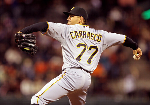
Here’s the deal: D.J. Carrasco has been wearing some nice stirrups this season. Early in the year they were basic black — I knew that. Then he switched to a set that included the team’s cap logo. I’m pretty sure I knew that too.
What I absolutely did not know is that at some point — I think around mid-June — Carrasco started wearing stirrups featuring the Buccos’ sleeve logo. But he didn’t retire the “P” version, which he wore as recently as July 3rd — he’s been switching back and forth between the two logos. I’ve tried to figure out of there’s a rhyme or reason to which set gets worn for which games (primary logo at home, secondary logo on the road?), but there doesn’t appear to be one — he’s all over the place. I even found a few games where he went low-cuffed, which means he’s had at least four different lower-leg looks this season. Hey, Pirates fans, one of your players actually leads the league in something!
Personally, I think the solid-black version is best — keep it simple, right? — but he should really pick one and stick with it. Still, that’s not the point. The real story here is how Carrasco exemplifies and reinforces the point I made two weeks ago when the Rays broke out their striped stirrups: Baseball hosiery is now so irrelevant, so far under the radar, that it’s treated more like personal equipment than like a genuine uniform component. The Pirates no longer have any official hose, so Carrasco can wear whatever style he chooses, just like he can wear a wristband, a Phiten necklace, or batting gloves. After all, it’s not as though the stirrups have anything to do with his uniform, right? Hey, why not slap the Pirates’ wordmark on there next time! Sigh.
And if any of you out there think I have a cushy job, you try poring over hours’ worth of Pirates video just to see what some journeyman middle reliever has been wearing on his socks. Believe me, it’s work.
Wilco Reminder: I’m currently giving away two pairs of tickets to see Wilco and Yo La Tengo in Indiana later this month. For details, look here.
Uni Watch News Ticker: The Canucks have unveiled a new throwback, which they plan to wear five times next season. Not sure I buy that they’ll really be going NNOB, but we’ll see. ”¦ This shot is from Opening Day, 1969. Note the little Dymo label on the base of the brim — never seen an equipment manager put something there before (good find by Mike Hersh). ”¦ We’ve seen teams’ jersey histories charted on T-shirts, but how about on a pennant? (Good find by Trevor Williams.) ”¦ James Spears visited Keeneland Race Track in Kentucky last weekend and saw this awesome horseshoe chart. ”¦ An electrician in northern California is totally ripping off the MLB logo (with thanks to Jeff Stricklin). ”¦ Maybe the Warriors should’ve gone with this design for their new jersey. That tee is supposedly popular in Oakland (with thanks to Jeff McClendon). ”¦ Weird scene in yesterday’s World Cup semifinal, as Germany’s Toni Kroos a sticker of the FIFA Fair Play logo obstructing the national crest on his jersey. Anyone know the story behind that? ”¦ “Italian cyclists Fausto Coppi and Gino Bartali were rival bike racers in the 1940s,” writes Sean Clancy. “It was such a rivalry that it divided Italian cycling fans for years. They also apparently had endorsement deals with competing razor blade companies.” Whoa, those are some really nice package designs, although I don’t think cycling and shaving make for a good mix. ”¦ I think it’s safe to say most of us have never seen a 1930s CFL all-star photo before (Mike Hersh again). ”¦ Great play last night at Shea, as Joey Votto snared an Ike Davis liner that nearly went through his mitt and ended up breaking his webbing. He switched to a new mitt immediately thereafter. ”¦ We’ve all seen boxers with ads temp-tattooed onto their backs (a trend that started with Bernard Hopkins in his 2001 fight against Felix Trinidad). But there’s a fighter up in Alaska who’s selling space on his body for real tattoos of ads. … How can Rodney Dangerfield say he got no respect when he got to wear Jon Matlack’s uni number? (Big thanks to Chris Flinn.) ”¦ Great find by Steven Presser, who writes: “This pic from April 14, 1976, the day before the the first game in the renovated Yankee Stadium. I’m only guessing here, but I’d say the team wanted to keep the home pinstripes clean for the big day, so the Yanks practiced in their road grays, resulting in the rare site of the Yankees, in Yankee Stadium, not wearing pinstripes.” … Scott Turner found a 1971 Topps NBA card with an unusual Buffalo Braves jersey. Anyone ever seen that one before?
I will also predict “false alarm” with respect to NNOB Canucks throwbacks. NOB’s have been mandatory since the late 1970s, and subsequently invaded the NHL 75th Anniversary jerseys and the Canadiens’ centenary jerseys. At that rate, I would be incredibly surprised if the Canucks hit the ice without their last names.
That being said, WOW! The nearly-forgotten V-on-the-sleeve originals! An unequivocal A+. Thing is though, I’m a Habs fan, so I’d have a hard time buying that. But, if it were gifted to me, I’d keep it (or exchange it for the right size) and wear it.
(OK, whoops, not “originals,” but nonetheless nearly forgotten among the many many Canucks jerseys.)
To be fair, they’re the original NHL uniform. They had several styles in the Western League. Good job on the historical accuracy (using the chunkier stick-in-rink) – and the “C” and “A” stylings are similar as well. The only thing that shouldn’t be there is the NHL crest at the neck opening. The striping is right but the shield patch is stupid.
The throwbacks will have NOB. Per NHL rule 9.2: ” Each player and each goalkeeper listed in the line-up of each team shall wear an individual identifying number at least ten inches (10”) high on the back of his sweater. Sweater numbers such as 00, ½ (fractions), .05 (decimals), 101 (three digit) are not permitted. In addition, each player and goalkeeper shall wear his surname in full, in block letters three inches (3”) high, across the back of his sweater at shoulder height.
The FIFA fair play patch in more like a sticker, because it is only worn during official FIFA events. You will not see a team wear this sticker in a friendly.
You can see the difference for Ghana here.
link
Even you can see it pulling off the referee here.
link
I watched the game on DVR last night and noticed that Kroos didn’t have the “sticker” on when he entered the game as a substitute. When did he put it on? Did he find it on the ground and slap it on?
The sticker over his crest and the patch on the sleeve aren’t the same as you can see in Paul’s photos. Also, the World Cup patches are just that – patches – not stickers. The addition and removal of a sleeve patch is fairly straightforward for a national sporting body don’t you think? Especially when the vast majority of teams will sport completely new shirts at least every tournament, if not every game (certainly the case for England for example)
I do know that for some tournaments (at least the Summer Olympic Games Soccer Tournament) Teams are not allowed to wear their crests, which means a lot of jerseys either sans patch, or with something covering it up.
link
link
As far as when/how/why he had his crest covered up, I haven’t found anything on it yet..
I dislike NNOB’s. I am not a baseball traditionalist in any way so I dislike them in baseball as well (I know, I’m a heathen). Other than that, I like the sweaters, they look great. I’d love to see some original blues as well as the whites, but you can’t have everything.
Actually the blurb at canucks.com basically says it will be NNOB: “The ‘original sweater’ worn by the club in their inaugural season also features a large ‘V’ for Vancouver on each sleeve with only the player number on the back and no name bar.”
Harold Bast, er, Ballard just called.
It will be white lettering on a white background.
Shaving WHILE cycling…no. Cyclists shaving…yes.
Once you get your first 30+ mph road rash, you discover the wisdom of the pros shaving their legs. LOL. Hair, bandages, and skin scabbing over don’t mix so well.
I’m SO excited about the hour-long “All About Me” Show tonight on ESPN.
Will there be a red carpet fashion analysis beforehand?
Gee, I hope so.
Will King James hold up a jersey or don a hat to reveal his choice? I’m just quivering with excitement.
Actually, I’d rather watch David Stern explain how, when players get to be good enough, taking two full steps is no longer considered Traveling.
The more you get to be “somebody” the less the rules apply. There’s a great message for basketball to send.
A close second is spending one-year in college “getting your education” and then jumping to the NBA.
If we ever needed proof that Americans value Shine above all and that Substance is irrelevant, this is it.
—Ricko
Nothing you’ve said here is inaccurate, but it has nothing to do with uniforms. Let’s move on.
Honestly, what I AM wondering most about is how they’ll stage it, and what uni props/loogs they might use.
Seriously.
There’s the News Conference approach, which would be to hold up a jersey.
There’s the Draft Day presentation, which would be a hat.
And perhaps even the Draft Lottery look, which would be a big card with the team logo…possibly pulled out of an envelope (if they go old school).
Or Wade and Bosch could show up as Mystery Guests.
The theatrics ARE intriguing, largely because there’s never been anything quite like this before. How does one stage a worldwide “This is who I’ve signed with” show? There’s no precedent.
—Ricko
So, question is, will they have the jerseys of the prospective teams up there for LaBron to select from and hold for the camera? And if there are multiple jerseys, will they all have JAMES on them to keep from the news leaking early?
I think the questions raised here could have led to some very funny “crap in the pants” moments at team HQs across the country over the last few days …
“Hey there! How are things going in Chicago? This is LaBron’s agent. We need one of your jerseys made up with LaBron’s name and number for the big announcement Thursday night. Could we get that overnighted to us?”
“Hey there! How are things going in Miami? This is LaBron’s agent. We need one of your jerseys made up with LaBron’s name and number for the big announcement Thursday night. Could we get that overnighted to us?”
…
lbj in suit, stands. removes jacket, tie, shirt to reveal heat jersey. smiles. waits a few moments. takes off bulls jersey. knicks jersey revealed….under that one is, of course, cavs.
“There’s no precedent.” Thank God for that. I hope (likely futilely) this is the first and last one.
Honestly, who gives a crap about where one basketball player is going or not going. I’m sick to death of athletes that think they are everything and the media outlets that enable and encourage the behavior. Get over yourselves!
It’s “won’t-see TV” for the Goaler….
Sadly, a lot of people in Cleveland have to give a crap about it since their livelihood depends on it. If LeBron leaves, the Cavaliers are instantly in rebuilding mode meaning lower attendance/fewer people frequenting local establishments on game night. Downtown Cleveland is a ghost town on non-game or poorly attended game nights. Folks in NY don’t have to worry so much about that stuff.
As for uni-ccoutrements for this evenings “Look At Me” show, I could honestly care less… unless it’s all Cavs gear.
How ’bout THIS for the big moment…?
Baby Lebron is lying in a manger in a stable. Three wise men (all from the East, appropriately enough) arrive bearing gifts, one wearing a New York jersey, one a Cleveland, one a Miami. Baby Lebron (the part being played by a flashlight, allowing for a Duracell commercial at the dramatic moment) shines his “light” on the “gift” he likes best.
(Had another notion of David Stern on a mountaintop and Lebron’s giant hand descending, its moving finger scribing the name of the team on a couple of stone tablets Stern is holding. But that would involve extensive CGI, and we don’t want the show to be in any way ostentatious.)
—Ricko
Paul,
Seeing that picture of the Yankees in their road unis at Yankee Stadium, and the Phillies earlier this season wearing their road unis at home, I am wondering how often have MLB teams worn their AWAY unis at HOME?
Maybe when the Kingdome roof collapsed in 1994 and the Mariners had to play a few series on the road instead of at home?
Answered my own question
link
“The Red Sox will be the home team this weekend. Boston will wear white and bat last. This means that the 1994 Red Sox stand to play 85 home games and only 77 on the road”
Unless . . . there’s a strike
There were pics posted where the Reds of the Crosley Field era wearing road unis at home for practice.
To better jog the memory, Frank Robinson was wearing his home cap with the road unis at Crosley Field.
I wish Carrasco would wear these stirrups…
link
Or these…
link
even though I guess they really don’t go with the Bucs’ current uni I’ve just always liked them.
Heck yes!
Something about LeBron that DOES have to do with uniforms is what Mario Chalmers stands to gain for giving up his #6 if he lands with the Heat. I assume he could always go back to the #15 he wore at Kansas, but I am sure he’ll collect a nice watch, car, or an SI football phone for his troubles.
Chalmers may well be gone anyways. In the NBA, if a player changes teams, they can switch their number without worry. Problem with Miami is that they retired 23, so he would have to go to something else and it doesn’t have to be 6. now if he goes to the Knicks or Nets, he could stay 23…
The Nets retired #23 for John Williamson back…
That was odd. Meant to say back in the mid-90s.
I know this has been beaten to a pulp…but against the Yanks last night, the A’s wore their BFBS alternates. I can’t get over how bad they looked.
I think there are certain teams that are associated with a particular color or colors. Even if the the unis change, the color remains. Although the A’s are not really “kelly green” anymore, when you hear Oakland A’s you still think green, maybe gold.
When they wear black, there is not a drop of green anywhere. Except for the lacing on Gio Gonzalez’s glove. I know this is the last year they will wear this alternate and that fact was mentioned on the YES broadcast by Ken Singleton, but man they look bad…almost as bad as the Eagles BFBS.
So I wonder why the A’s don’t just retire it right now and just not wear it again…
On a side note, the A’s home white is one of my favorite jerseys and one of only 3 MLB team jerseys ( not counting Yankees of course ) that I wear. The other 2 being the Cards home white and Dodgers road grey.
In no other sport do I own / wear a jersey of a team other than the one I root for ( NFL Giants, NBA Nets, NHL Devils, NCAA Rutgers ).
Does anyone wear a jersey because they like how the jersey looks, but not the team? In any sport?
I know. At least the A’s were wearing forest green sleeves (eyeroll).
Just another of those “head shaker” uni choices, isn’t it (beyond the obvious marketing aspects, that is).
—Ricko
Wasn’t there a report the A’s were doing the right thing and dumping the black jerseys next season in favor of a throwback yellow jersey?
It was mentioned during the game last night, that the black jersey would not be back next year….
They are dumping the black for a yellow. I don’t know if it’s a throwback yellow, but YFYS is certainly better than BFBS
I only have one jersey of a team for which I do not actively root. It’s an “old” (i.e., pre-lockout) blue Toronto Maple Leafs sweater. Being from Chicago and a big Blackhawks fan, I can appreciate the traditional elegance of an Original 6 sweater. I’m glad the Leafs are going back to it next season instead of the crap they have been wearing for the last few years.
“… How can Rodney Dangerfield say he got no respect when he got to wear Jon Matlack’s uni number? (Big thanks to Chris Flinn.) …”
*****
Stunningly beautiful. Rodney and Keith!
“No respect whatsoever. I ask the bellhop to take care of my bag and he feels up my wife.”
“I’d love to do a concert for the homeless…but I don’t know how to contact them.”
When I was born I was so ugly the doctor slapped my mother.
“Well anyway, today I just stick to real estate, ya know? With the market these days, if you own anything but land, you own a popcorn fart.”
Not only is Emmette Bryant’s uniform odd, it almost looks like his head has been stuck on someone else’s body. My take is the uniform was an airbrushed creation. I seem to recall Topps doing this a lot as well as blanking out team logos or having guys wear their jerseys backwards due to not having the rights to NBA logos.
That was the Braves’ road jersey from their inaugral season in 1970-71. The home jerseys had a script “Braves”. That’s the best colour picture I’ve ever seen of that uni – Getty Images has a couple of Bryant in b/w, and I’ve got some poor quality colour images in my own collection. I’ve still never seen a colour picture of the home uniforms.
The unis were only used that first season. The following season they changed the logo, changed the team colours to black, white and orange and introduced the unis with the diagonal stripes.
In fact, here’s a better picture of that road jersey:
link
Opening day 1969 was the Royals first-ever game. Perhaps they were sorting through the best way to designate each player’s helmets, but you’re certainly right, unusual to have the name label on the front.
The text on the one visible Dymo label is very brief and it looks like there’s a slash in the middle of it. Is it indicating the size of the helmet?
Lebron’s little shindig won’t top Kevin Hart’s.
link
VIVA CLEMENTE! Enough said……
” I think it’s safe to say most of us have never seen a 1930s CFL all-star photo before (Mike Hersh again). ”
Pretty safe bet because the CFL didn’t exist until 1958. The photo is from the Ontario Rugby Football Union.
The player is Hugh Stirling and he’s a member of the Canadian Sports Hall of Fame.
link
The team is the Sarnia Imperials and my guess is that the stars are part of their regular uniform, not an all-star jersey.
link
Beat me to it. I’ll just add that Sarnia, Ontario, across the St. Clair River from Port Huron, Michigan, is a leading centre of the petrochemical industry in Canada. Shell, Sunoco and Imperial Oil (Esso) all have refineries there.
The three stars on the sweaters are probably a reference to Imperial’s Three-Star brand of gasoline, the same brand that the three-star selections at the end of each NHL game originally promoted.
Good call on the Imperial Three Stars.
link
Logo creep, 1931 edition?
Ricko said:
I’m SO excited about the hour-long “All About Me” Show tonight on ESPN.
Will there be a red carpet fashion analysis beforehand?
Gee, I hope so.
Will King James hold up a jersey or don a hat to reveal his choice? I’m just quivering with excitement.
Actually, I’d rather watch David Stern explain how, when players get to be good enough, taking two full steps is no longer considered Traveling.
The more you get to be “somebody” the less the rules apply. There’s a great message for basketball to send.
A close second is spending one-year in college “getting your education” and then jumping to the NBA.
If we ever needed proof that Americans value Shine above all and that Substance is irrelevant, this is it.
~~~~~~~~
wow…someone got up on the wrong side of the bed
the mere fact that “it’s all come down to this” proves he’s only concerned about himself (was there any doubt) and yet, like the oj bronco chase, it wouldn’t shock me to see this being one of espn’s highest rated shows
reality tv…the new twitter account…the drama
welcome to lebron tv
now as far as uniforms…do you think he tipped nike wise to his choice, so they can get whatever ‘knockoffs’ they’re allowed pre-printed with his new team, to beat the three stripes to market by a day? will he be wearing the cap of his new team (after he takes off that stupid yankee cap he loves so much)?
im actually glad i won’t be near a tv when this whole thing goes down, because i’d probably be forced to watch…
/done with LBJ for the day
I think it’s safe to say most of us have never seen a CFL season without any grass fields…until this year.
Watched the replay of BC/Edmonton the other day, and found out that Commonwealth Stadium now has field turf. Sigh.
Actually, from an aesthetic standpoint, the field didn’t look too different, except the “00” line (as opposed to the “G” line in other stadia) is white instead the yellow they used to use. Still, too bad there will be no more mud bowls in the Great White North.
Sorry to hear that about Commonwealth Stadium. I knew they were the last grass field in the CFL and hate to see them give it up. Guess the maintenance bills got too high.
Commonwealth has always stood out to me with the “00” at the goal line instead of a “G”.
I know this is OT, but I have always been a stadium nut. The way a lot of UW fans feel about unis is the way I am about stadiums. I am always interested in hearing about teams getting new homes and look forward to seeing artist renditions, etc.
Today’s lead photo of D.J. Carrasco reminds me of one of my Pirate pet peeves: using that font for the numbers.
I liked the old block numbers so much better. There are times when it looks as if D.J. is wearing 22 instead of 77.
Almost as annoying as that 17-year string of losing seasons…
On the other hand, 22 is a much better pitcher’s number than 77.
But I agree with you. That is a crap font for the numerals.
heh…only on UW would a team’s choice of font be “almost” as annoying as 17 (going on 18) straight losing seasons
all the more reason to bring back the bumblebee look permanently, right?
Agreed. The block numbers were much nicer. Wish the Steelers would go back to ’em as well.
I’m elated over those first-year Canucks throwbacks, but does anyone else think the logo is TOO LARGE? With the “A” or “C” (granted only the captains will be wearing that) and that 40 year patch, it looks cluttered. Also I think the logo is too rounded at the corners compared to the original. Small details, but I do think the logo needs to be a little smaller. Looks sweet otherwise…
-Jet
The logo on the original sweater was quite large. link
link
It’s the addition of the anniversary patch that makes it look “busy” (and the stupid NHL shield on the collar.
And Reebok probably loves the NNOB as now the logo is the only thing on the back besides the number.
First link screwed up – this should work
link
I think they look great but agree that it’s a tad cluttered with the 40th anniversary patch and the silly NHL logo on the neck but overally a passing grade from me. I was always a fan of the original blue = ocean and green = land colour scheme.
Here’s a pic of the original jersey:
link
I held my breath before I clicked on the link…..
link
…and let out a sigh of relief. There it is, the stick-in-rink logo in all of it’s glory. They did it right.
Then I got to thinking: Wait, they’re going to wear that AND the bastardized version of it next season? Do they not ask themselves, “Why did we fiddle with that iconic logo in the first place? Are we not setting ourselves up for ridicule here by trotting out the original, held in high esteem by long time Canuck fans, along side of that cartoonized, “action” update? Who are we? What IS our identity? Are we embracing history? Mocking it? ”
It seems only a few short years ago, this was their alternate jersey. And people loved it, right? So they bring it back, but with the bastardized logo.
And now…this.
Oh Vancouver, you vex me?
Didn’t intend to put a ? there. Vancouver you DO vex me.
I’m terribly, terribly vexed by the Canucks as well, TC. That throwback clearly should have been the design they went with instead of the goofy marriage of Orca and blue/green. Maybe they’re phasing the stick in rink in gradually, eventually making it the primary and relegating Orca to the alternate. They certainly should.
Carrasco explains the stirrups a bit in this article:
link
from that article:
Don’t expect the veteran reliever to mix and match — say, with a “P” on the left leg and a logo on the right.
“That would be too much,” he said, laughing.
~~~~~~~
yes…even dj knows the limits of good taste (tpfic)
i know paul LOVES that 9″ look, but really, if he’s gonna wear them that high, then he needs to wear his pants lower…
but the ideal solution would be to keep his pants at their current height and just go with a perfect 4-5″ cut
Agreed, Phil. 4-5″ cut would look much better (and always does).
didn’t someone post a while back that the knicks are to get an alternate jersey this year (Possibly a NYC one)? is that still on?
link would be a great home alt. With today’s baggier unis, I think it might actually look better than the original did.
Dang. I meant that as a reply to Mr. Fonzarelli.
I remember there was something so weirdly compelling about those uniforms at the time.
link
Odd, since I am a devotee of the Knicks glory years uniform.
Meanwhile, not uniform related, but Ray Williams, pictured above, has fallen on hard times.
link
I’d wear that!
I have a stirrup etiquette question for the the group.
I have purchased a few sets of stirrups from Robert Marshall & am planning on unveiling them during my softball game this weekend.
My question is can they be worn (with sanis) with shorts or do I need to wear baseball pants with them. (high-cuffed of course)? I’m not talking 70’s length shorts, but shorts that will at a minimum come to me knees.
Dumb question, I know, but I don’t know where else to look for an answer. :)
Thanks!
You can wear them with shorts. You should wear them with baseball pants.
Seriously, the only rule that counts is that you should wear what you feel comfortable and confident wearing. If you’re at ease wearing something – anything! – you’ll wear it with style. And if wearing something – anything! – makes you constantly squirm with uncertainty about whether it makes you look like a doofus, you’ll look like a doofus. This is true of bow ties or waistcoats or pocket squares or cowboy boots – or stirrups.
So if wearing stirrups under shorts is going to make you feel self-conscious, then break out the baseball pants and show ’em how the big boys roll. But if you’re cool with stirrups under shorts and you know you won’t be wondering in the back of your head, “does this make me look like a dork,” then sport the shorts and make your stirrup statement!
Sorry about the unclosed italic there. I blame lack of preview button!
Exactly.
Just look how link does it.
And now we see what a dual-flapped fiberglass batting helmet looks like after it explodes.
—Ricko
well…you could wear shorts
but i wouldn’t recommend it (there are myriad reasons why you shouldn’t wear shorts for softball that don’t have anything to do with showing off your hosiery…not the least of which is cuts, scrapes and skinned knees)
unless it’s 95 and humid, wear the pants…you’ll thank me later
Thanks all! I appreciate the responses!
Wearing pants as a rule will be news to my squad. I think we all wore shorts last year the entire season. :)
I wore the patriotic stirrups on July 4th with shorts. Figured I’d keep them on until I was overcome by embarrassment or heat stroke, whichever came first. As it happened, I managed to keep them on all day.
link — I didn’t keep them on all day, but I did wear them in our neighborhood parade.
The original Braves logo had the colors of the Bills (blue and red) and Sabres (blue and yellow). It lasted one year. (Note: he is wearing yellow warm-up pants on the card)
link
link
link
Of course, the worst part of the design is the full feather headdress. The traditional look for a “brave” is one feather.
link
link
link
Wilco and Yo La Tengo, what a show! Too bad I am nowhere near Indiana.
Ditto.
Except for the “nowhere near”.
Not near enough.
Whoever is standing behind the Royals player has what looks like a syringe or tire gauge sticking out of his back pocket. I can’t figure out what that might be – it looks bigger than a pen. Anyhow, that reminds me of a baseball back pocket issue that’s begun to bother me: players who carry chewing tobacco tins in their back pocket while on the field. I see this frequently. Does any player actually refresh his dip in the middle of an inning? Can’t they leave the tin in the dugout? And I’m used to seeing batting gloves shoved in back pockets, but do you ever see players with gum, sunflower seed packets, or other snacks in their back pockets while they’re on the field? I’ve seen plenty of shots of the likes of Jim Leyland smoking in the dugout, but does he ever walk out to the mound to make a pitching change with a pack of smokes in his back pocket?
Manny Ramirez had a Poland Spring water bottle in his back pocket while playing left field at Fenway at least once.
Yes, I remember that now. LAME!
I remember seeing players at their defensive positions getting out the tin or pouch (back in those days) and grabbing some during pitching changes. Certainly not between pitches or batters, though.
Wasn’t all that uncommon.
—Ricko
I don’t see that it’s a problem at the major league level but I remember in the minors guys never wanted to leave their dip anywhere but on their person for fear the moochers who were too cheap to buy their own would steal it all. Maybe it got to be such a habit for those guys they are more comfortable with it in their pocket. Also I remember back in the early 80’s in the College World Series Dennis Cook, who was a good hitter at Texas as well as a pitcher, called time out during a critical at bat to put a dip in.
Random weirdness: I don’t think I’ve ever seen a Red Sox cap that had the hanging socks logo with the socks colored blue until Monday, when I was sitting right behind link.
And then again last night, I sat right behind link.
Time to rant on this LeBron James thing. (Disclaimer: not a hoops fan.)
ESPN is absolutely prostituting itself here. Here’s our channel- take it, please! “The Decision,” sponsored by Bing! (what?)
I’m watching SportsCenter, and oh I guess there is no other story.
Did this guy win an NBA title and I just missed it? Must be, otherwise why is he called the King.
Sheesh, enough.
Strange seeing Nebraska in all-white on ESPN Classic against Georgia Tech in ’91, I think they did that one other time against Iowa State years later. But I don’t follow the Huskers very closely, so could be wrong. I do recall the ’87 Oklahoma contest when Nebraska went all-red, not sure if that’s been attempted again. If I’m not mistaken, Nebraska lost the three games I listed.
That Citrus Bowl was the first time for the all-white. They wore all-white for the first 3 road games of ’92, but after losing 2 of the 3, they switched back to red. In ’02 they went to all white on the road and had their worst season in 40 years. The last time time they wore all white was Bill Callahan’s last game. The all red against Oklahoma was in ’86 and was the only time all red was worn.
These were the road uniforms for 2002: link
While looking for a picture of those, I came across a couple of other items:
A collage of Nebraska football uniforms: link
An interesting story that I hadn’t seen before, includes a picture of Nebraska football uniform from the early 1890’s: link
RIP Melvin Turpin — apparent suicide in his home in Lexington — part of the University of Kentucky Twin Towers with Sam Bowie in the early 80s, one of the first UK teams that I can remember watching. Man, they were good in college . . .
link — Here’s a good photo of Turpin.
More proof the Pirates wore their home white pinstripes at Shea. Funny, I’ve looked at these cards probably a million times, but its taken all these years to “see” them.
link
Try that link again, or post on Flickr so we don’t need to sign in to anything.
whoops, gotcha, sorry
Here’s a better link I believe…. and Larry looks like he got up a little too early for this photo…
link
And while I was on the 1978 set, first time I think I’ve seen a professional baseball player wearing a “truckers” hat. I’m assuming it’s a spring training thing.
link
Better link for Jose Cruz’ truckers hat…
link
That’s what I’m looking for when I hire an link, someone who can conjure up lightning bolts and hit bulbs with ’em…
get to the Heat website now, your King jersey awaits.
I’ve heard some talk about LeBron playing a more “Magic Johnson-type” role in Miami. So if the Heat win some championships, is LeBron really their Magic Johnson or is he more like their James Worthy?
he’s not worthy
I’m not gonna lie. I’d have loved to see him pick the Bulls. I knew it wasn’t gonna happen, though. He went the “safe” route. He wins (a) championship(s)? Great, he’s got his championship(s). If not? Well, it won’t be all pinned on him.
I’ll say one thing, though. I can’t say I’m unhappy that he avoided the Knicks, if for no other reason than the fact that we had to put up with link for the last couple years.
Oh, well… Amar’e now and Carmelo next year, right?
im not gonna lie either…i’d have loved to see him pick the knicks
but i’ll watch as many games next season as i watched this season
which is zero
melo and amare do nothing…it really was all or nothing for many knicks fans
better he ended up in miama than tried to stick it out with the cavs tho, right? loyalty is nothing if not overrated
and at least he’s not on the bulls, so it’s not all bad
link
In Lebron’s official website they are showing the old Heat logo (the one they used until 1999) Does that mean they are going back to the old logo, or is it too late to change before next season..
Stupid is as stupid does.
I never liked the guy for his initial number choice, and now I hate him for his second uni # choice.
LI Phil | July 8, 2010 at 2:42 pm | Reply
“well…you could wear shorts
but i wouldn’t recommend it (there are myriad reasons why you shouldn’t wear shorts for softball that don’t have anything to do with showing off your hosiery…not the least of which is cuts, scrapes and skinned knees)
unless it’s 95 and humid, wear the pants…you’ll thank me later”
Well, how about wiffleball?
Ah, we know I’m going to do it anyway…
Joel D. Ford | July 8, 2010 at 7:58 pm | Reply
“RIP Melvin Turpin – apparent suicide in his home in Lexington – part of the University of Kentucky Twin Towers with Sam Bowie in the early 80s, one of the first UK teams that I can remember watching. Man, they were good in college”
Wow, “Dinner Bell Mel” is gone? Sad to hear that one.
I remember him with the Cavs:
link
Man, I miss both of those unis.
These threads were much better than Turp the Burp’s uni.
link
and looking for that one I found this beauty.
link
egad.
It’s bad enough you had to show those hideous unis, you showed Shawn Kemp in the process?
Egad indeed.
So now that the decision has been made, is it time for the annual Favre Watch?