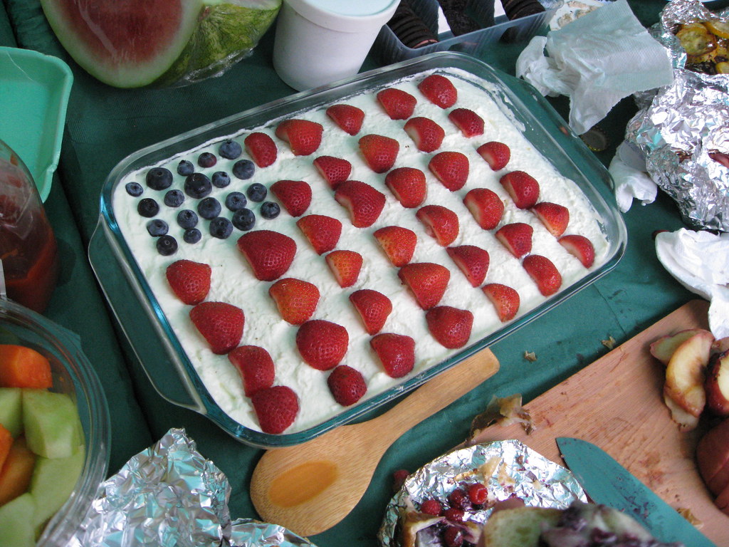
I’m still recovering from yesterday’s foodtivities, which were highlighted by the patriotic dessert you see above (prepared and brought to my back yard by a Canadian, ironically enough). It was one of many fine sweetstuffs we had on hand, including homemade ice cream, cherry pie, peach cobbler, and millionaire’s bars.
I made a few of my stand-bys — herb-crusted rack of lamb and jerk chicken wings (both prepared in my smoker) — along with some basic stuff like pork chops sausages. All in all, an excellent Independence Day, although I have a major food hangover today — oof.
Uni Watch News Ticker: Brandon Phillips has a brother named P.J., which presumably has something to do with the inscription on his cap the other day (with thanks to David Sonny). ”¦ Former Cardinals prospect Cory Rauschenberger was right up there with Salty in the race for MLB’s longest NOB, but he never made it to the bigs. In fact, he dropped out of baseball altogether, but now Sara Corman informs me that he’s back in the Cards’ system. Of Salty’s back in the minors himself these days, which means the longest NOB currently in the bigs is, uh, who? ”¦ The cricket world is considering the use of pink balls for day-night matches, an idea that’s been tried before (with thanks to Jeremy Brahm). ”¦ The Dayton Gems — that’s a minor league hockey team — are the latest organization to let fans vote on their uniform (with thanks to Sean Molina). ”¦ The Dodgers have changed the style of the uni numbers on their batting helmets, and not for the better (as noted by Robert Montenegro). ”¦ That’s quite an NOB (screen shot by Paul Cathel). ”¦ Speaking of NOBs, here’s an amusing one (from Paul Wiederecht). ”¦ Also from Paul: If you go to this page and drag the viewer over to the top-left corner, you’ll see one of the first assessments of the Pittsburgh Penguins’ team name and uniform. ”¦ Awesome slideshow of those World Cup fan hardhats here. ”¦ The South Bend Silverhawks recently wore some really nice throwbacks (with thanks to Sam McAlear). ”¦ Here’s something pretty wild: a video that shows Pantone guides being printed (thanks, Kirsten). ”¦ reprinted from Friday’s comments: The batboy in this 1976 Astros team portrait is wearing tequila sunrise stirrups! I don’t think those were ever worn by a player on the field, were they? But they must have been part of the original uni concept, since they were obviously manufactured and available. ”¦ You’ve heard of rally caps? The South Carolina baseball team tried rally socks (with thanks to Gerry Dincher). ”¦ NHL news from Jeff Barak, who writes: “Several Minnesota Wild players will be changing numbers next year following the departure of former teammates who where wearing coveted numbers. Martin Havlat will change to his career-long number of 24 next season after Derek Boogaard’s departure; Greg Zanon will change to No. 5 (Kim Johnsson); Cam Barker will change from No. 45 to 25 (Eric Belanger); Matt Cullen will likely get No. 11 and Eric Nystrom No. 23. Not sure yet on Brad Staubitz.” ”¦ Warren Humphrey sent along a bunch of 1950s and ’60s photos of longtime Tigers equipment manager John Hand. ”¦ The Jets apparently will not be wearing their Titans throwbacks this season. ”¦ Timothy McGlone notes that Adidas is now making gloves for NASCAR’s Sprint Cup racing. ”¦ You’ve heard of game-used items? How about pregame-used? That’s supposedly the story with these Darren Daulton shorts (with thanks to Christopher Leopardi).
It’s not just the gloves that Adidas is making, they make Dale Jr’s fire suit as well. He sports the 3 stripes.
link
As of right now, he is the only driver I’m aware of sporting an Adidas fire suit.
It’s not just gloves also fire suits. Drivers that wear the 3stripes. Dale Jr., Mark Martin, and Brad Keselowski are the ones that jump out at me right now. I really doubt Adidas actually manufactures the fire suits.
Dale Jr. isn’t the only one wearing adidas firesuits, so do Mark Martin, Brad Keselowski, and anyone driving for JR Motorsports.
Not Everyone at JR Motorsports, Danica wears Alpinestars when in the cabs, just like when she’s in the IndyCars.
They’ve been making those for quite some time. He’s worn the adidas firesuit and gloves for a couple years now:
link
<>
That’s quite an NOB (screen shot by Paul Cathel).
<>
It’s quite a name: Washington Sebastian Abreu Gallo, a.k.a. “El Loco.” He’s played for 20 teams in 6 countries over a 14 year career and is often described as “as crazy as he is intelligent.” Fun guy, a real character.
I’ve mentioned those Tequila Sunrise Asrots stirrups a couple of times. Nice to see a color photo. In far right of front row, one of the coaches appears to be wearing them, too. Can see just the bottom of the stripes.
link
From very early-on in that set (first year?)…still wearing black cleats.
Speaking of stirrups…
Most (meaning more than half) of the Rays who went with striped socks vs. the Twins yesterday were NOT wearing stirrups. They were navy striped tubes. As I feared, it appears the players may have bitched about having to screw around with sanis, etc., so the club order the second batch as tubes.
—Ricko
“Astros”
(see Ricko going to fetch his glasses)
I think I see a stirrup that needs to be offered…
Also notice that one of the trainers is wearing an old Shooting Star dugout jacket.
If so, should be 7-inchers, because no way 4″ or 5″ were the cut of that era. Honestly, neither 4″ nor 5″ was the cut for most of the Stirrup Club selections to date.
Not like TC Knitting should know that. They’re only in the stirrup sock business.
—Ricko
The team picture would have to be from 1975, since the card is from the 1976 season. I looked through all 29 Astros in the 1976 set but had no luck…every single card was a posed shot showing either just the player’s head, or from the knees up. Not a single stirrup in sight. There were two player, though, that had helmets without a logo (link and Cesar Cedeno, #460)
And how cool is it now that Topps has every single card of theirs on their website. link can help you find a particular card if you know the year and the card number.
Messed up the Cedeno link…try link
Also, ’75 was only season of black cleats with that uni.
In ’76 Astros went to white cleats with stripeless navy knit-in stirrup socks. At least early that season. Before too long they returned to navy stirrups and white sanis as separate items.
Remember thinking it looked like they were wearing really light powder blue sanis (which kinda made sense to visually separate the socks from the shoes)…but I later figured it likely was just have the navy fading…a problem that very well could have precipitated the return to regular stirrups and sanis.
—Ricko
You can see some stirrup stripes here:
link
And here: link
And just barely here: link
So it probably was a standard 1975 team issue, but most players hid the stripes.
Person seated 4th from the right also clearly wearing the striped stirrups (can see his right leg between the two batboys).
It’s quite surprising who makes what. Kasey Kahne has been wearing Puma suits, gloves and shoes for quite a while. Adidas has been outfitting Jr for the last couple of years as well. I also believe Oakley is doing firesuits and gloves and shoes as well. Pretty sure that Juan Pablo Montoya wears Oakley.
Try this link for the pink cricket balls.
link
Got it. Thanks.
The first article for the pink balls is from 2007 and the second one (the “it’s been tried before” one) is from February 2010, so it reads a bit odd since the first one’s being reported like it’s news, but this is a few years old.
Paul, column title is “Auto Draft” again.
Thanks. Now fixed.
Hope everybody had a good 4th.
Those pink cricket balls are interesting – baseball has been experimenting with colored balls (for
increased visibility) since link. Never pink, although the British aren’t quite so defensive about their masculinity as we Yanks.
Here’s another white elephant: Looking for a photo of the 1976 Houston Astros wearing the pillbox hat. It would have been a strange sight, given the style of those uniforms. On Saturday’s board, I was told all NL teams wore a pillbox hat at least once that regular season.
The Astros never wore the pillbox cap, but I did buy this a couple years ago…with no information as to where it came from…
link
link
link
link
How awesome would an Astros pillbox have been while following the tequila sunrise pattern? OK, maybe not with the uniform for fear of tequila intoxication, but by itself, it might look kind of funky-cool.
I don’t believe that’s true, that every NL club wore the pillboxes at least once. As far as I know, the Cardinals and Pirates wore them all season, and the Mets and Phillies may have worn them on occasion.
Cubs, Dodgers, Giants, Braves and others? No, just don’t think so.
—Ricko
What the Phillies DID do in 1976 was wear white cleats.
link
—Ricko
There was a Mets pillbox on ebay a while back. Description “said” it was game used. No screenshot though.
I don’t think the Reds did either. As many pictures of The Big Red Machine that are out there, there would be at least 1 picture of a Red in a pillbox hat somewhere except for the 1976 ASG pre-game when they wore the white NL pillboxes.
I would tend to agree with you, Ricko. But near the end of Saturday’s board, a Montreal Expos fan saw the pillboxes in action in ’76. Is it possible another NL club wore them just once, and it has been forgotten?
Oh, I suppose once is possible. But that would make the current Patriotic hats more common and more “part of the uniform”, wouldn’t it?
Expos with three encircling horizontal stripes on a hat that had no side panels?
What, the round top was red? No, probably royal bill and top with red stripes on a white “tube”. Or maybe…
No matter how they might have adapted it, that hadda be one goofy-looking hat, certainly the most far afield from the team’s normal hat.
(Then, of course, there’s the confusion with the fact that players wore pillboxes on the Japan tour that year, or around that time, anyway…and that anything’s possible in spring training).
—Ricko
link
From the ticker, May 22, 2008
link
The Phillies wore the pillboxes in the 1976 home opener series with the Pirates. They were swept and did not wear them again all season. I think I remember Dave Parker crushed Johnny Oates in a home plate collision from that series.
The Expos wore the pillboxes as shown in the link at home when the Phillies clinched the NL East.
Right, I have a detailed description at the end of the July 3 comments of that Parker-Oates collision (I’m trusting your memory on Parker, I’m certain about Oates). I remember it vividly and can guarantee the Phils had the pillbox hats that day, I can clearly remember the photos in the next day’s paper. Oates was either wearing no helmet or had his pillbox hat under the helmet because there was a flying pillbox hat in the background of that collision. One detail I may have had wrong in my earlier comment — I called it the home opener but it was a Saturday game, so you’re probably right to refer to it more generally as the home-opening series, probably Friday, Saturday, Sunday. I myself can’t vouch for what the Phils wore during the rest of the series but can definitely confirm the pillboxes on Saturday.
And again, I loved those hats and wore a Chisox pillbox hat for many years on the softball field. Obviously not to everyone’s taste, but I loved them.
“asrots”
beautiful
Especially lately.
it’s pronounced rasros
LOL!
Another interesting aspect of the 1976 NL pillbox season were the batting helmets. It appears only the Cardinals employed batting helmets with the striping pattern, which is surprising. One would have thought the Pirates would have done so, but I don’t believe they ever utilized those type of batting helmets during the entire 1976-85 era of pillbox hats.
This may have indicated the Cardinals originally planned on wearing their pillboxes far more often than they did. Maybe the organization disliked the hats once they saw them early in the 1976 season. I’m sure a Cards fan from that era knows the real story. How often did the Cards wear those hats in ’76, was it just for home games?
Not the biggest images, but here are a mess of Cardinals 1977 cards (many photos from ’76)…
link
—Ricko
As I mentioned, as far as I know (and as I remember it), only Cards and Pirates wore them all season.
—Ricko
I’ve mentioned this before, but it appears the Pirates added the stripes to the mustard pillbox hat just before the start of the 1976 season. I have a ’76 yearbook packed away somewhere with spring training photos of those pillbox hats minus the stripes. I wonder if the 1976 Cards yearbook also includes versions of their pillbox hats without the stripes. Obviously, pillbox hats aren’t for everyone, but they look much better with the stripes, just like the old Philadelphia A’s.
I’m with Ricko on this – 1976 was the first year that I REALLY paid attention, and I could not get enough baseball – any magazine, any TV show, anything I could get my hands on baseball-wise was good. And I just don’t remember from highlights, magazines, etc., seeing all these hats. And for the record, I think I’m in the minority here, but I LOVE the pillbox hats.
I know a lot of teams put out pillbox hats as souvenir items but didn’t wear them, and I believe (the Phillies and Reds come to mind) that a couple wore them as one off things. But I would be stunned to find out that everyone wore them at least once. Dressed to the Nines website only has a handful of teams – not to say that’s the end of the debate or they’re never wrong, but it’s a place to start.
And Gusto, you’re right, the ’76 Pirates cap was the mustard color with stripes. Jerry Reuss’s flickr page referenced that exact topic in the tags of some pictures from the ’76 Pirates. Reuss’s flickr page was discussed in one of the posts awhile back – I’ll try to find the link.
Is link the cap Gusto is talking about?
Jerry Reuss’s flickr – although Phil posted a pic of Reuss in the cap below.
link
On a side note, it seems the 1976 mustard hat is tough to find, no one seems to be producing it anymore. That’s odd, since we’ve seen replicas of hats dating back to the early 1900s.
Nice BGE Paul!
For the uninitiated, he’s referring to my smoker, which is called a Big Green Egg. Had it for years and can’t imagine living without it. If it was struck by lightning today, I’d go buy another one tomorrow. Uni Watch’s highest rating!
about the stars n’ stripes caps: if any two teams had an argument to get rid of them, its the padres and astros.
link
And that’s not even the worst of yesterday. Marlins at Braves. Black tops, red tops, and white hats for both. Yikes. I wouldn’t wear any of that.
link anyone?
(Actually, I thought the Texases looked OK, but the Sox looked ridiculous — although pic #3 in that gallery is friggin’ fantastic and just slightly surreal.)
Astros and Rangers look good, but the Padres and Sox? Not so much.
This image is beyond wonderful…..
link
pirates 1976 mustard pillbox
Regular mustard hat was sooo much better. The only time the pillboxes were tolerable were with the pinstripe unis.
Those mustard pillbox hats without the pinstripes were ugly, glad they made the switch. If anyone else has the ’76 Pirates yearbook, you’ll understand. I think Uniwatch should delve further into the 1976 pillbox season in the National League, it would make for interesting reading. For instance, I vaguely recall the Mets and Phillies also wore these hats, but does anyone have visual proof? Being that the Reds and Cubs were longtime NL teams, it does seem strange they didn’t participate.
According to DTTN, the Reds did have a pillbox. link
the mets definitely wore them
photo (not sure how authentic that is), but i was at a game when they wore them; i’ve also seen several games in footage from the 1976 season (“mets yearbook” usually shown during mets rain delays on SNY)
DTTN confirms
paul has posted this pic of willie (who had retired) and hank from 1976
the umps also wore them in 1976
here’s the NL all stars wearing the generic one
Thanks, that’s good to know about the Reds. For all we know, they may have wore that hat in only one game, before dropping the idea. This is one of those subjects that’s difficult to track down.
A few of them made it onto the 1977 cards…
link
—Ricko
Sparky Anderson at the ASG and a pillbox cap.
link
What is that logo? ‘N’ for national?
Hey Paul,
Love when you post pictures of the things you cook. Any chance we could get a peek at the recipes for the wings and lamb you prepared?
The wings were simple. I just put all the wings (fully intact — flat, drumette, and tip) in a bowl and tossed them with about 1/2 jar of this stuff:
link
Cooked them in the smoker for about 25 mins. at 350 degrees.
For the lamb, I got an eight-rib rack of lamb and had the butcher french the bones. Early in the day, I put a little olive oil in a skillet and seared the rack for about 90 seconds per side.
Then I made an herb paste by combining the following in a food processor:
1/2 cup fresh rosemary leaves
1/2 cup fresh thyme leaves
1/2 cup olive oil
8 cloves garlic
2 teaspoons coarse salt
2 teaspoons freshly ground pepper
I slathered the paste onto the top side of the rack and let it sit for an hour or three. Smoked it alongside the wings — same time frame (25 mins at 350). I had a little of the herb paste left over, so I tossed some little new potatoes in that and ended up putting those in the smoker too.
fearless leader~
our bag~a~que crrrrrrrrrrrrrrushed yours! sorry, i am bitter after an 0~3 day that had rolling~thunder and myself ousted early. it was unprecedented, and baggers breathed a sigh of relief that they would not have to face the powerhouses in the final, which was won by the dagger bagger/bagarazzi team over bagnikov/the bagger to be named later. i got beat by the chelsea bagger for the corn’s sake, it was embarrassing. EMBARRASSING! i might add the fireworks from the rooftop were best ever too, what recession.
Yeah. The link was deeeee-licious.
At the risk of losing my membership privileges, can we get those tequila sunrise stirrups in a soccer sock version?
I may eventually get the ’71 Buccos stirrups or the old Senators ones, but that’s about it. If all the designs could be soccer socks as well, I’d buy more.
I’m assuming the TB Rays will be one of the next designs?
i don’t do the hosiery thing to sell more, i do it to proliferate stirrups, end story, no fußball socks.
link
Heh, in the Braves system currently. Maybe we will see a double decker NOB.
Not only in the Braves system, but quickly on his way up. I really wonder how they will manage that one, maybe a NickNOB “RSF”. Has anyone ever had a abbreviationNOB?
You can tell the flag cake was made by a Canadian. The stripes are vertical instead of horizontal. Maybe it’s payback for link.
I think the intent was for horizontal stripes, but the spacing created more vertical white space than expected. Great catch!
Good to see the photo evidence of the Mets 1976 pillbox hat, the reply option was missing from above. Are there any game action photos of the Mets with those hats around?
Proof that the Mets wore the pillbox hats at least once.
link
Scroll through to page 25.
Here is a direct link.
link
Awesome find Dwayne.
Can someone explain how this uni was so bad, so non-distinctive, that it just cried out for the addition of black to make it better?
Seriously.
I’d like to read a legitimate, design-based (and design-knowledgeable) argument FOR the additon of black to the color scheme. Mostly because I haven’t read (or heard) one yet. “Black is cool” doesn’t count; that would be a marketing issue, not a design reason.
link
link
—Ricko
After the game yesterday I saw this display at the Westward Expansion museum at the St.Louis Arch. link
So the Pirates (three versions – mustard, black, yellow), the Phillies, Mets, Cardinals, umpires, NL all stars, and possibly the Expos are the current confirmations. Let’s keep this going.
I still wonder about the White Sox and Yankees. I said before that each of these hats were up for auction at bidding prices of close to $1,000 for each earlier this year. The White Sox was white with a black (or navy) bill. Whether it was spring training or Japan, who knows.
The only picture of the Cardinals helmet stripes is that 1977 Lou Brock card though. I think we need more confirmation on that one.
I had a Cubs hat (adjustable) just like that Astros hat. Bought it at Wrigley in 1985ish.
Speaking of giving the fans a vote on uniforms, though there’s nothing binding about it, the New England Patriots website had a “Debate Friday” item last week asking fans to vote their preference on the team logo, the old Pat the Patriot, the new “Flying Elvis” or both. Here’s the link…
link
Last I checked, Pat the Patriot had a small lead, at 34.9% to 32.6% for Flying Elvis and 32.5% for both. As an ardent supporter of Pat, which to my taste is the best logo in sports history, I think it’s interesting that two-thirds of the respondents at least want Pat used sometimes and Pat has a plurality (by a narrow margin). Considering that the team’s success has come almost exclusively with the new logo, it seems pretty remarkable to me that the fans have such a loyalty to the old one.
Michael Russo, beat writer for the Minnesota Wild, posted on his Twitter account that Matt Cullen will wear No. 7 next year, which used to belong to Clayton Stoner, and Stoner will choose a new number.
Great story about the Penguins’ name and uniforms. Both of the team’s sweaters for ’67-’68 were made by General Athletic of Greenville, Ohio and had the Rangers-style step-down lettering “PITTSBURGH” with “NCAA-style” numbers and no logo or team name anywhere to be found. Jack Riley, the Pens’ first GM, was the GM of the Rochester Americans from 1959-64 and bought the Amerks’ uniforms from us at Ruby’s. Jack left the Amerks in ’64 to become the President of the American Hockey League. I’m one of those people who feel that the Penguins should have been the “HORNETS” while the Buffalo Sabres should be the “BISONS.”
tenz said:
Considering that the team’s success has come almost exclusively with the new logo, it seems pretty remarkable to me that the fans have such a loyalty to the old one.
i think when a bad (or team without prolongued success) in a good uni has success in a shitty uni, the fans will associate the good uni/logo with winning…which is unfortunate
actually did a piece on that a few months back, using the patriots in their beautiful “pat patriot” unis versus their horrid “flying elvis” ones
you know if they won all those SB’s in the patriot, elvis would have been LONG GONE
Thanks for the link. A great write-up and I loved the positive references to the classic Patriots uniform. That tendency of the fans to associate victories with the uniforms worn at the time (and I think that tendency is also strong with management, players, the press and fans of rival teams) makes it even more remarkable to me that Patriots fans are so attached to the old uniforms and logo.
UNI ALERT! Watching the Brewers/Giants game on FS Wisconsin, and in the bottom of the 4th Alcides Escobar was picked off trying to steal 2nd. When he came back to the dugout, he was cleaning the dirt off his pants, and I noticed he has the Brewer logo on his socks… or at least I think it was. Like I said I am at work and not watching the game like I normally do at home. And since I don’t have a camera or my DVR I could not get a screen grab.
Anyone with a DVR watching the game or MLBTV, it was in the bottom of the 4th during Dave Bush’s at bat after Escobar got picked off at 2nd base. (happened around 4:30 CT if that helps too)
link.
This isn’t the link you’re looking for. You can go about your business. Move along
Wow, Bob Probert died today here in Windsor:
link
Been out of town for the weekend. Just reading todays column and saw a Buckeye picture. I had posted a picture of Nein on Ohio State boards a while back. Some poster was either related to him or knew him.
Nein was # 85 as an underclassmen until his senir year in 1967.
NHL Network is starting the “Raising the Cup”series tonight, where they are showing the Syanley Cup clinching telecasts since 1975. Tonight, they are showing the Philadelphia telecast (what, no HNIC???) with Gene Hart and Don Earle on the call of game six of the 1975 series against the Sabres.
I love how low the back numerals are positioned on both teams’ jerseys, without NOB’s. Barely a helmet on any head.
I just read all of the caption about Nein. That is interesting to know about a single digit Buckeye.
I do know that in the early years of numbers the Buckeyes had numbers in numerical order starting with 1,2,3.4,5 and so on. But seems like many or most teams of the early years did so.
Not sure if anyone has mentioned it, but Kevin Cash was called up the other day by the Red Sox. Cash is still rocking the forward facing catcher’s helmet.
Mark Martin rocking the tri-stripes:
link
All of the Hendrick guys use Adidas-branded apparel. I know the crews for Jeff Gordon, Dale Jr. and Jimmie Johnson use Adidas-branded caps (in fact, I own a couple of them), but only Dale Jr. and Mark Martin wear firesuits with the tri-stripes on them.
Ricko said:
Can someone explain how this uni was so bad, so non-distinctive, that it just cried out for the addition of black to make it better?
Seriously.
I’d like to read a legitimate, design-based (and design-knowledgeable) argument FOR the additon of black to the color scheme. Mostly because I haven’t read (or heard) one yet. “Black is cool” doesn’t count; that would be a marketing issue, not a design reason.
link
link
~~~~~~~~~~
no, rick…there was NO GOOD REASON why they added black — one might make the argument that it works (a little) on the snow whites, causing the wordmark to “pop”; but that’s no reason to add it
the mets were one of the few teams who “got it right” from the beginning and have never had a better uni than their original
if you follow the progression from the Henderson Guide, they went downhill as soon as they went from flannel to doubleknit; they kinda righted the ship in 1995 thru 1997, only to add the black beginning in 1998 — and have never recovered
i know a lot of fans love the racing stripes, but that was as bad as (can’t say worse) than the black; but nothing has ever equaled the original
the mets were one of the few teams who “got it right” from the beginning and have never had a better uni than their original
Almost. The inaugural design, which only had the script on the jersey front, was improved upon when they added the front uni number in 1965.
PL, could you package up some of those Millionaire bars, and some of that whatever it is with the strawberries and blueberries…pack it carefully, and Fedex it out so I can have it, say, Wednesday AM?
I’d appreciate it.
PS,
I’d paint some stripes around the bottom of the smoker, just so you can say that The Big Green Egg Gets Itâ„¢.
traxel said:
“The only picture of the Cardinals helmet stripes is that 1977 Lou Brock card though. I think we need more confirmation on that one.”
Here is Lou Brock wearing the pillbox cap from the St. Pete Times 06/29/1976.
link
Another Cardinal pillbox.
link
Ron Fairly, the last pre-Twins St. Paul Saint active in MLB.
Anyone know the last such Minneapolis Miller?
—Ricko
Hey all,
Open question for the peanut gallery: do you know what it’s called when a word is designed so that the letters of the word make the shape of the word’s meaning? I think it was a brief design fad in the 60s, and I remember seeing a few sports logos like it. In any case, I was messing around and made a few examples based on MLB teams, check it out:
link
Groovy, man!
I was searching for more pictures of the mid-’70s Astros in the tequilla sunrise stirrups when I came across this photo of Dave Smith with the Astros’ Alaska Goldpanners minor league team:
link
The staggered lettering on the jersey is unusual. The goldpanner character looks promising. The white trim on the eyeholes on the hat are cool, but man that polyester waistband looks uncomfortable!
If you ask me, anyone who link for the “new comments format” is pretty much Satan. And not the link, either.
And that’s all I’ve got to say about that.
re: Astros Tequila Sunrise hats
In New Era’s attempt to saturate the market (or kill it) with every treatment available, there have been a number of striped treatments of caps:
link
This is just one of them.
Longest Major Leaguer NOB: Rowland-Smith?