Friday, Saturday, and Sunday were an unusually busy time in the uni-verse. Here’s a rundown:
ITEM! More Warriors-osity: We had previously seen a mock-up of what the new jersey would look like, but here’s the real thing — I like, although I wish we could see a rear view. Meanwhile, here’s the new floor design. I like that too.
ITEM! Cubs have lost played a shitload of ballgames: Saturday was apparently the 20,000th game in Cubs history, and they marked they occasion by wearing a rather underwhelming sleeve patch. Is this the first time a team has celebrated this type of milestone on its uniform?
ITEM! Rays are my new favorite team: They wore the striped stirrups again on Saturday and Sunday. Sunday’s game was particularly notable because the entire starting lineup wore the striped hose. The big question now is whether they’ll pack them along for their upcoming road trip, which kicks off tomorrow night at Fenway.
ITEM! NHL stands for “new hockey looks”: Had we seen the Wild’s 10th-anniversary patch before? If so, I missed it. And that’s just one of the news flashes from the NHL draft, which has also provided our first official looks at the Isles’ new road jersey, the Kings’ new throwback, and the Sharks’ left-sleeve anniversary patch in situ (if just barely). I’ll have more to say about all of these, along with some other NHL developments, later this week on ESPN.
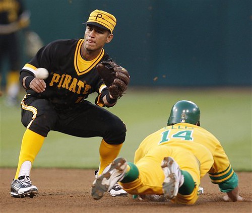
• ITEM! Throwback-o-rama: As many of you are aware by now, there were several throwback games over the weekend, including Brewers/Mariners, O’s/Nats, and the seizure-inducing spectacle of A’s/Buccos. Let’s take a closer look at some of these:
• For the Brewers/M’s game, the MLB Network played along by using throwback logos — I like that. Similarly, for Oakland/Pittsburgh game, the A’s TV production featured 1970s-style graphics. (My thanks to Sean Robins and Kenn Tomasch for the screen shots.)
• The Nats/O’s game featured what reader Casey B. aptly refers to as “the prettiest wild pitch ever.”
• One of the oddest sights in that A’s/Pirates game was Daric Barton, whose stirrups showed through the little window thingies in his high-top cleats. (Disappointingly, one of his teammates went with two-in-ones.)
• The Pirates’ caps featured two black stars, presumably meant to evoke Stargell Stars. But as someone on the Chris Creamer site pointed out, there was never any such thing as black Stargell Stars — they were always gold. When worn on the gold caps, they were placed on the black bill.
• One thing the A’s always get right for these throwback games: They have their coaches wear white caps (although I don’t think that’s a throwback do-rag in the second photo).

• Finally, there had been a lot of discussion as to whether the A’s had ever worn gold-on-gold. We had long ago established that Vida Blue wore that combo in the 1975 All-Star Game, but was that the only example? No! In yesterday’s comments, reader Matt (who didn’t give his last name) came up with this 1974 Topps card. I think it’s still safe to say that solid-gold was a rare look for the A’s — and hence an odd choice for a throwback game — but at least we now know it wasn’t just an All-Star Game one-off.
World Cup Sock Giveaway: In honor of the World Cup, Stephen Wong has designed a series of soccer-inspired socks, and we’re going to give away a pair to one lucky reader. To enter, send an e-mail with your name, mailing address, and preferred sock design to the giveaway address by this Thursday, July 1st, 7pm eastern. One e-mail per person. I’ll announce the winner on Friday.
Collector’s Corner, by Brinke Guthrie
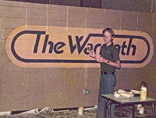
Photo: Prob’ly summer ’75, Mariemont High School, painting the newspaper logo [Your school paper was called ‘The Warpath’? — PL]. Note cool digital watch.
Okay, our latest eBay finds for your consideration:
• Ah, the ’60s Falcons look with the gold stripe.
• Very interesting backstory on this White Sox jersey.
• Here’s a neat sticker album for “Today’s” 1971 Minnesota Twins and “Today’s” California Angels. [I had the Mets version of this when I was a kid! Don’t know what happened to it, alas. — PL]
• If it’s a Smuckers MLB mini-helmet display, it’s got to be good.
• Kids, let your mom do the ironing for this Giants transfer, OK?
• Speaking of the Giants, here’s a nice 1960’s placemat from spring camp.
• Adidas ABA Americana sneakers were just the best.
• Want some lung cancer with your football? Then you’ll love this Packers ashtray.
• Can never get enough of that NFL bedspread goodness.
• Hey, you’ve probably seen this SI cover showing Jim Taylor with his white-striped single-bar helmet. But you probably haven’t seen this photo.
• Today’s Mets item for Lukas: Have a Rheingold lager (extra dry) while following those Amazin’ Mets. [Oh, please — like any serious Mets fan doesn’t already have a full set of those. — PL]
• And as a bonus, look at this Mr. Met plaque. Get that e-snipe locked in, Paulie.

Seen something on eBay that you think would make good Collector’s Corner fodder? Send your submissions here.
Culinary Corner: No recipes from me this time. Instead, I defer to the folks over at The New Yorker, who recently published my second-favorite recipe column ever (I’ll tell you about the first one some other time). Enjoy, and/or be depressed.
Uni Watch News Ticker: The Reading Phillies wore baby blue throwbacks the other day (with thanks to Gary Dincher). ”¦ World Cup weirdness: One of Denmark’s players was forced to color in part of his socks with a marker (big thanks to Mike Kemezis). ”¦ Shaq and Dwight Howard, eat your hearts out. The original caption: “Orioles right fielder Frank Robinson reveals a Superman shirt to the New York Yankees’ Curt Blefary during batting practice. Before the series, Blefary told his teammates that they could overtake the Orioles because they didn’t have a big “S” on their shirts” (big thanks to Jack Krabbe). ”¦ New turf design for Oregon football, including another glimpse of the new Pac 10 logo (with thanks to Alex Peerenboom). ”¦ Joe Alvernaz reports that the uni numbers on Adidas’s rugby jerseys are often peeling off or missing altogether. “I have noticed this for years, typically in the first game or two a team plays in a new set of jerseys,” he says. ”¦ The Portland Timbers, whose new logo was greeted by a chorus of disapproval when it was unveiled two weeks ago, have already updated the design, and have also released some secondary marks (with thanks to Jeremy Brahm). ”¦ I didn’t get a very good photo of it, but I swear the scoreboard photo of Ruben Tejada makes it look like he’s had his eyebrows done. ”¦ Spotted this guy in a cool Sir Saint tee over the weekend. ”¦ New road kit for Sunderland of the EPL (with thanks to Jesse Spector). ”¦ Over at the NHL draft, teams were having their first-round picks pose in jerseys with No. 10 (you know, for 2010). But the Stars took it a step further by adding an apostrophe to the uni number for goalie Jack Campbell. Never seen that before (great catch by Brooks Simpson, who also points out that Florida’s first-rounder, Erik Gudbranson, had some nameplate issues). ”¦ Tiger Stadium is gone, but the field is still there — and it’s surprisingly accessible (with thanks to Dave Murray). ”¦ The Charlotte Checkers have moved from the ECHL to the AHL and are now affiliated with the Carolina Hurricanes, which of course means new uniforms. ”¦ Dan Cichalski found a great old photo of Babe Ruth. “What I found particularly interesting is that it looks like he’s in a pinstriped road jersey, with ‘New York’ across the front, which the Yankees only wore in 1916-17 — when Babe was still in Boston,” notes Dan. “Of course, it could be a barnstorming uni, like the old Bustin’ Babes design.” That photograph, incidentally, comes from this great Flickr set of old ballpark photos. ”¦ Sports cartoonist Willard Mullin’s name has come up a few times here on the site lately, which prompted Richard Stover to send me the following note: “In 1972, WBZ Channel 4 in Boston was awarded the rights to broadcast the Red Sox for three years, and they produced this cool schedule to promote their new sports programming. The schedule had a Mullin cartoon for each team in the division except, unfortunately, the Indians — I’d like to see what kind of un-p.c. treatment he would have given the Tribe.” ”¦ A.J. Burnett used A-Rod’s batting gloves on Saturday (good spot by Ryan Farrell). ”¦ Here’s a good round-up of the new EPL shirts (with thanks to Coachie Ballgames). ”¦ The Springfield Cardinals wore “patriotic” jerseys on Saturday (all photos courtesy of Kate Sutter). ”¦ Why Paul Loves Wisconsin, #573: these awesome Packers needlepoint coasters, which showed up in my friends Julie Lindemann and Johnie Shimon‘s Flickr stream. Julie explains: “It’s from a place called Samantha’s, which in Valders. It’s a beautiful old-timey tavern that serves family-style meals on Sundays. Though it’s in the town where I went to high school, I’d never been there until Johnie’s parents insisted we all go for Father’s Day. They had the nifty Packers coasters with all the drinks along the bar. Not sure if you can tell, but they’re the type with that synthetic yarn woven through a plastic mesh.” ”¦ Many readers noted that Argentina was wearing their home shirt with their away shorts for yesterday’s match against Mexico. I don’t know enough about soccer to know if this is a common thing — is it? ”¦ Pretty cool throwbacks for the Seibu Lions over the weekend (thanks, Jeremy). ”¦ Not sure if this is a case of uni-based rookie hazing or just an honest mistake, but when Tigers pitcher Andrew Oliver made his MLB debut the other day, his “i” wasn’t dotted (great spot by Tom Marquand). ”¦ “Chico State Normal School started out as at teaching college in the late 1880s and is now California State University, Chico,” writes Jushua Knudson. “Here are some great photos of the school’s 1900 baseball and 1902 softball teams.” ”¦ Quick, who was the last Chicago Bull to wear No. 23 before Michael Jordan? Answer: Mike Bratz. “He played 15 games for the 1982-83 Bulls, and that’s the only action photo of him I’ve ever seen,” says Warren Humphrey. ”¦ As you all know, the Phils wore road uniforms for last weekend’s three-game series against the Blue Jays. Morris Levin attended Sunday’s game and reports that ticket takers were greeting fans with, “Welcome to Toronto!” … With Senator Robert Byrd’s death last night, this uni-based photo has surfaced. Never seen that one before.
The Sir Saint shirt features a poorly done faux-back logo. I’m not gonna delve too much into the obvious fact that light blue isn’t a Saints color. But the wordmark used in that guy’s shirt is the current wordmark, which is not what the original Sir Saint logo used. Note the differences below.
link — current wordmark
link — original Sir Saint wordmark.
The shirt color, I agree, is unfortunate. He told me he got the shirt at one of those shops where you can choose a blank tee and choose a design and they make it for you on the spot. For some reason, he chose light blue. I was so happy to see Sir Saint on a shirt that I didn’t give him any shit about the base color
Had a flashback when I saw that shirt. I used to have a green football helmet, which Dad painted light blue for me. I wanted an Oilers helmet, but then I got a set of Sir Saint stickers in the mail for some reason (I think they were part of a package deal with some other sports decals). Anyway, I decided to put the Saints stickers on the blue helmet and I kept it like that for years.
Many readers noted that Argentina was wearing their home shirt with their away shorts for yesterday’s match against Mexico. I don’t know enough about soccer to know if this is a common thing – is it?
It’s more common in the World Cup, where you have pre-approved kit components (primary and change shirts, shorts, and socks) and where you can’t deviate from them for a one-time occasion. Also, FIFA tells you what you wear in each match.
In the match in question, they were apparently fine with both teams wearing their regular jerseys, but wanted a contrast in team socks (both teams wear white socks with their primary kit). So they put Argentina in matching blue socks and shorts, Mexico has contrasting white socks and shorts…problem solved.
Plus, Mexico’s alternate kit is all black which would also clash with Argentina’s black shorts. It’s unfortunate, because Argentina looked absolutely horrible.
Having dealt with soccer referees before, I have been told that there’s a hierarchy of contrast that they need that goes something like this:
1 – Shirts must contrast.
2 – Then socks. Which makes sense if you think about it, so that you can more easily see that the guy with the white sock got kicked by the guy in the black sock when all you see is a tangle of legs.
3 – Then shorts.
Goalkeepers are supposed to have shirts that are different from:
1 – Their teammates
2 – The other team (obviously)
3 – The officials
4 – The other goalkeeper (sometimes you see this one ignored)
Refering to the Rugby pics, this is EXACTLY why I always say that screenprint, heat-pressed, or any pure ink-based embellishment is the embellishment of the Devil. Just go with tackle twill, and the Uni-verse will be a lot better off.
Strange sights at the Yes concert on Saturday night…
A young man sitting in front of me was wearing a New Orleans Saints Super Bowl XLIV Champions hat.
Another young man sitting to my right was wearing an Indianapolis Colts Super Bowl XLIV Champions hat.
Ha-ha, you went to a Yes concert.
10 bucks for a night at Jones Beach… seemed too good to pass up.
What a great post this morning. A few thoughts:
1. I thought I remembered seeing baseball cards with the A’s wear all-gold and all-green, but couldn’t be sure. The reader who produced Holtzman’s card confirming the all-gold in a regular-season game was awesome, exactly why I read this site. (I am glad the all-gold was a rarity.) Last summer’s treasure trove included Vida Blue in all-gold in the All-Star Game and the Indians in blue-on-red and white-on-red, which I had never seen before. All this great stuff brings back a flood of good memories.
2. That 1977 MLB helmet display is not 1977. Check out the helmets — they were not from 1977.
3. So great to see the Mariners wear the throwback helmets with their uniforms. The helmets are a vital piece of the uniform, but so many teams take the lazy approach and go with the current helmets with the throwbacks.
coming summer 2010:
1) indians wearing all blue uni
2) bucs vs. mets @ shea with both teams in pins
3) blue broncos helmet
4) the easter bunny & tooth fairy
Phil — How about this bet: If the guy doing the Bucco tracker finds proof of that all-pins affair at Shea, you lay off the anti-colored jerseys soapbox for the rest of the summer.
it’s not colored jerseys that’s my problem…colored jersey’s are fine
it’s the softball look with which i have a problem…
The “softball” look is open for debate. Are the Mets’ black jerseys a “softball” look? They match the white pants perfectly. Same with some other teams’ dark jerseys.
My omly complaint is that too many teams are wearing red these days, but that’s an easy fix unrelated to dark jerseys; that has to do with team colors. You don’t see a wide variety of colors in MLB like you do in college. Look at the CWS: UCLA (gorgeous light blue and gold) vs. South Carolina (nice garnet and black). You wouldn’t see that matchup in the majors.
By the way, have you noticed that when college teams wear dark jerseys as the visiting team, they often wear white pants, the way it used to be in the majors? Not sure I like that, but it looks okay visually at least.
“the way it used to be in the majors?”
for what…4 or 5 teams in a 3-4 year stretch? while i’ll grant you that the softball top/white pant bottom looks better than the softball top/gray pants, that’s not saying i want to see that look
if they want to come up with a full blown uni to wear with the softball tops, then that’s different
phillies, indians, twins, astros, even mets — have alternate tops which are paired with alternate bottoms — which therefore constitute a uniform
the black tops on the mets? yeah, um no…that’s a softball look
as bad as this look would be, that’s a uniform, and i’d prefer the blackmono to the black jersey
i DON’T want either, of course, but at least the second look is a uniform, not a third jersey paired with pants
2. Black is now a Mets’ team color.
since when? (yeah..1999 when they added it)
if that’s the case then it’s also an a’s color, case closed
gold may be an a’s color (duh) but they don’t have a yellow alt…does that make it any less a team color? but they do have a black alt…does that make IT any less a team color? they even have black socks (and stirrups) they wear with the black tops AND black caps
but it’s not an a’s color?
this is how the mets got started…
Geeman,
Drop me a note at link and I’ll see what I have.
Per your suggestion below: The Pirates are taking enough time. If somebody else wants to document the A’s, or any other team, that’s great, but the Bucs are enough for me.
Nah, the black jerseys and white pants look fine, especially compared to that.
neither looks good, but the softball top with white pants is just awful
let me ask you this, do you like the black a’s jersey?
No, can’t stand it — but for a different reason: It’s not one of the team colors. They should have a gold jersey if they’re going to have a fourth jersey. I also can’t stand all the black uniforms in college ball for schools whose colors aren’t black. And I’d rather see the Mets wear a blue alternate jersey, as in their mid-1980s glory years; not a fan of the black.
so the mets black jerseys “match the white pants perfectly” but that’s okie dokie, despite the fact that it’s not a team color?
ok, you’ve totally lost me
a uniform “looks good” to you because it just looks good, team colors be damned?
you say you don’t like the a’s & mets jerseys because they’re black (and not team colors) but you like how the mets black jersey matches the pants…
so, you’d LIKE a green and yellow red sox uniform if it “looked good” despite the fact that those wouldn’t be red sox colors
i guess that makes sense (either a uniform looks good or it doesn’t), but i can’t separate the team color from the ‘looks good’ aspect…to my mind, if it’s NOT team colors, it can’t look good, by definition, right?
otherwise, why even have a visual identity
We’ve really gotten far afield here. I don’t think dark jerseys and white pants (or grey pants) are bad. They’re not ruining baseball. If anything, steroids and sockless/stirrupless ball players are hurting baseball.
Anyway, separate issues:
1. The Mets’ black jersey does match the white pants. I think a lot of dark jerseys match white or grey pants. On that, we just have a difference of opinion.
2. Black is now a Mets’ team color. I don’t like, but that does not matter. I don’t think black is one of the A’s traditional team colors; it’s nowhere else in the team’s uniforms; green and gold are the colors. I like the A’s green jersey, but not the black.
By the way, my money is on July 15, 1977, or June 23, 1978, for the pins-on-pins affair. If some enterprising reader wants to go through newspaper microfilm from the day after those two games, I bet you’ll find it.
My guess that helmet rack is from 1991. And $135, WTF!
Separate issues. You’re confusing things. I wish the A’s and Mets did not have black jerseys. But I like colored jerseys. I wish the Mets had blue and the A’s had green and gold as alternates. But the Mets’ black does match the white pants, and the grey (and, it should be noted, however unfortunate it is, black is now a Mets team color).
to me they’re not separate
the fact remains that the a’s and mets have black jerseys
they could be the best damn looking black jerseys in the history of the planet, but if they’re NOT in team colors, isn’t that a problem for you?
if you want a good looking uniform, that’s fine, so do i (not arguing whether softball tops look good)…but if a uniform is NOT in team colors, to me, BY DEFINITION it can’t look good
im sure there’s a beautiful seer-sucker suit that would look damn fine in august but you wouldn’t wear it to a funeral
so too with black…
Now I can’t wear my black suit to a funeral?? These unwritten rules should be written down somewhere.
We’ve gotten far afield here. I don’t like the fact that black is a Mets color. If I’m in charge, I get rid of it. Substitute that black jersey for a blue jersey, though, and you and I are still having the same disagreement.
Note that black is nowhere else in the A’s uniforms, unlike with the Mets, who have it all over.
I do agree with you that, if it’s not a team color, the team should not wear it. Let’s rope our discussion back to whether teams with dark jerseys and white or grey pants look good (assuming such jerseys are in team colors). I think they do. You prefer a totally separate alternate uniform. I understand that, but to me it seems silly to have either a monochromatic baseball uniform and/or a second white (or grey) uniform as an alternate. My view is colored (no pun intended) by the way that I saw alternates first worn, by the A’s in the ’70s.
By the way — off-topic — but I like the old comments format better, though this new format at least looks better.
no…you wouldn’t wear a seer sucker suit to a funeral
well, maybe you would, but in general, one wouldn’t
what im saying is a seer sucker suit is (or can be beautiful) on a hot august day (just like a black uniform, even with white pants, can be beautiful)
but, as you wouldn’t wear a seer sucker suit (beautiful as it may be) to a funeral, you wouldn’t wear a softball uniform to a baseball game
we need a tag in the next upgrade
Sarcasm tag, that is. I guess the invisible tag works.
I miss the stirrup logo on the favorites link.
Adidas came up with a modern-day version of the ABA American sneakers a few years ago, in the form of the 2G’s with red and blue stripes. Wish they would bring them back — they look sweet.
Modern version.
link
Meh.
These ebay sellers must take us for fools… the NFL bedspread is not from the ’60s – it’s got AFC teams on it & looks very much like the bedspread I had in 1975.
Re: the Mariners throwbacks: this shows again that racing stripes don’t look good on baggy uniforms. You gotta have the sleek.
Are you using Word Press? If so then the Auto Draft issue comes from the Post Options fields. I’m guessing your Body Title Single Pages and Body Title Multi Post Pages are blank? Put the title in those fields and you should be ok.
Thanks, that did the trick.
How about this shot of the Stargell Stars on their black hats with the stars only on the brim, but the other player has them on the cap.
link
great shot, but they’re still gold stars and a black pillbox…not black stars on a gold cap
I’ve spent a half hour trying to find a picture.
I can’t tell if there is a star on the brim.
link
I’m finding more black hats than the gold.
Willie handed out gold stars. Not black ones. Some guys stuck them on the gold caps, where you can see them on the brim, but most were on the black caps.
The black stars on Saturday’s caps were an indication that someone only had a vague idea of what they were doing. Similarly, you would never have seen a player’s zodiac sign listed on a ’70s scoreboard.
If I ain’t mistaken, The Bucs started out with the stars in 1978 and they were plain gold stars. In 1979, they were a pinch larger and had a black “S”.
I was really impressed with the O’s 1970 throwback effort. Getting everyone to wear the stirrups was great, and like a previous commenter mentioned, I really liked the fact that they took the extra step wear the throwback helmets as well. In years past, the O’s have definitely been lazy in both of these departments while doing throwbacks. The one that would have tied it all together would have been vertically-arched letting for the names on the back (which I believe, but am not 100% certain the O’s were still wearing in 1970).
I think they were arched.
link
The O’s had orange (with thin black outline)radial arched NOB’s on the aways from 1966-1970 and in the same period had black vertical arched NOB’s on the homes. I think on the alternate home vests worn in 1969 and 1970, the NOB’s were also vertically arched. When the Birds went to knits in 1971, the home NOB’s matched the aways as worn since 1966.
The 1970 Orioles home white NOBs were radially arched. This is a photo of Boog Powell sliding into home as Johnny Bench waits for the throw. I know doing that for the current roster would have been tough, but would have liked to see the right arching for the ’70 players’ jerseys.
link
not sure if this was mentioned over the weekend or not, but I noticed that some of Ghana’s players had Under Armour compression shorts on- I went back then and saw that they’ve also worn Nike and Puma. Are compression shorts considered equipment(like cleats) and not uniform and players can wear the brand of their choice?
link
link
link
Lotsa Nike shoes with those Puma kits as well.
Actually the Panthers were the first to add ’10 to their sweater at the draft. You can see it in the pic of Gudbranson.
link
The apostrophes were on the Panthers’ sleeves too.
link
Wow, wish I woulda seen that Bucs/As game on the teevee, with the old-timey graphics and whatnots. This kinda thing is all we Pirate fans have.
we also have ice cream bowls on friday july 2nd! eat that boston, NY, philly, atlants, LA!!! lol
…and all we a’s have too…
re: Oddities on the Giants’ Spring Training placemat… 1.) A humongous amount of white space on the left with a bunch of stuff crammed onto the right. 2.) Why an illo of the ‘Stick? Did they move it to Arizona in the spring? Why not show the local park? Was it not paper placemat worthy? 3.) What’s up with the dick-shaped pool?
Quoting…”Oddities on the Giants’ Spring Training placemat… (snip) 3.) What’s up with the dick-shaped pool?”
Um, it’s not “dick shaped”, it’s BAT shaped. With a hot tub for the ball.
Looking at Google Earth, I notice the hotel is still there (although STILL miles from anything else), but not the sign. The bat and ball pools are still there.
Best of all, you can still see the outline of 4 baseball diamonds on the north side of the complex.
re: the shot of Frank Robinson in the Superman shirt: Why does he have different ‘rups than his teammates? His look black while theirs look orange.
Hmmm… looking again, the guy behind Blefary seems to match Robinson, but everyone on the left doesn’t.
I think you’re just seeing different shadows/light/etc. They’re all the same.
Absolutely. For one thing, black in the shade (Robinson) certainly would not look LIGHTER than the black on the socks of the player to his right…which Robinson’s stirrups do.
When we look at photos like this (and believe me, I’ve been doing this longer than many of you have been alive), first find the “standard”. In this case, the socks of the guy to FRobby’s right establish for us what’s black and what’s orange. We then gauge everything else in the photo compared to that, taking into account what’s in sunshine and what’s in shadow, and how the “standard” would be altered in those different circumstances.
And thank you for signing up for “UniWatching in Black & White 101.” ;)
—Ricko
“We then gauge everything else IN THAT AREA OF the photo compared to that”
Fixed.
Point being, the direct sun on the hats, for example, sets up different parameters.
—Ricko
Slovakia’s already down a goal. Grrr.
Netherlands orange over black looks good, but I don’t like the number font at all. #6 looks like a lower case b.
If I’m reading the lineups right, The Netherlands starting lineup includes players in jersey numbers 1-11 in succession, and everyone on the bench is wearing #12 and above, how common is that?! I know that numbers 1-11 are the players in your projected starting lineup when you hand out jerseys before the World Cup starts, but it almost never works out that way!
In this gallery…
link
Look at the second photo, the one of Ryan Rowland-Smith….is it me or is his “S” upside down?
Frank
Good catch. I think you’re right.
I’d wear that GS Warriors jersey. So what if they used the un-original copperplate font. Beats some jagged font that seems to be the rage these days.
All the throwback games were awesome. Looking forward to next year, when the Pirates almost certainly will throwback to 1971. Please, please don’t skimp on the helmets when you do. I want to see mustard, not black helmets with that uni.
And the TV graphics for the Bucs/A’s game were perfect! Clean, simple, brilliant. I could almost hear Joe Garagiola and Tony Kubek when I saw those.
A couple things about the Babe Ruth photo..
link
1) Considering the vastness of the ballpark, I think it’ s a pretty good bet it’s a barnstorming uni, and nothing Yankee-issue.
2) If you really zoom in on it, the lettering is a kissin’ cousin to the “fancy block” style of the original Angels in 1961 (also Senators homes the same year and Mets roads in ’62).
—Ricko
In the Argentina-Mexico game yesterday, it seemed that Argentina had a silver outline on their number.
link
But in their earlier games they did not have this.
link
Anyone know why this occurred?
They definitely had a change in lettering from the earlier games.
You do realize there’s a different set of jersey’s for each game. The players whip them off after the match and exchange them with a player from the opposing side. Lends an opportunity to tweak them a bit, since they’re always being replaced.
Now, if I could put a word in for the poor goalies, who are obviously forced to provide their own uniforms…
Will Oregon’s new field design be interchangeable based on their uni-du jour?
They should weave some fiber optics into the turf to allow them to change designs on the fly.
Of the new EPL jerseys, I’d only wear Stoke City’s or Tottenham’s…especially if they stay sponsor-free. Liverpool’s are classic, but that Standard Chartered logo is so corporately boring.
There you go, Paul, Put the UW logo on the Tottenham jersey. Can’t cost that much to sponsor them, right?
That Orioles-Senators matchup was a thing of beauty. I can’t stop looking at the pics.
Not so thrilled over Seattle-Milwaukee since I wasn’t a fan of most unis from the double-knit pullover era. The guy on Milwaukee who hit his first HR, there’s one pic of him in that set where his waistband appears to be hiked up way too high, looks silly.
A’s-Pirates looks pretty good too, although I would have liked to see Oakland in a different combo than all gold…
-Jet
Oh, and I got my USA stirrups in the mail today from Robert Marshall, sweeeeeet. Just in time for the 4th.
“That Orioles-Senators matchup was a thing of beauty.”
Indeed. They did a nice job for it.
I think, if you pinned me down and asked which set of stirrups I miss most in MLB, I’d probably pick that Oriole version of the Red Sox socks. Just a great-looking stirrup that, combined with the orange bill on the hats, made the O’s instantly recognizable back then.
Second probably would be a tossup between the Braves and Red Sox.
So that makes for a good question….
If you could be pick ONE team to go back to stirrups, striped or solid…which team would it be, and which stirrups? Notice I said “go back”, meaning something they’ve actually worn in the past, and something that would still work with their current unis.
—Ricko
Although this is arguably a more interesting stirrup:
link
I think I’d like to see the Bucs go back to these, since I believe they’d work a little better with their current uniform:
link
and because you own the sock version…
On the Orioles website, the caps and jerseys from both teams are being auctioned off for charity, if anyone interested.
Ricko, I’m in agreement on your choice of teams to return to striped socks — O’s first, then probably Boston. For solids, gotta go with the Dodgers since they still have their traditional uni.
-Jet
The Rays’ powder blue uniform coupled with the striped socks? Really, really pretty. Best uniform I’ve seen since the Patriots’ AFL 50th Anniversary throwbacks. I mean, WOW.
Definitely better than the Royals’ powder blue uniforms. They paired with the link. I didn’t like it for some reason.
The Royals uniforms would look great with the Rays socks.
Royals’ powder blues are acceptable w/o the powder blue cap. That cap just sucks. The royal blue helmet proves that.
In the entire history of the Royals they have never worn striped stirrups.
Some teams, based on the longevity of commitment to a certain style, sort of become Striped sock teams or Solid socks teams. The Royals I would be put in the “Solid” category…for the reason stated above.
Conversely, teams such as the White Sox, Indians, Padres, Red Sox, Orioles, Braves and others that have either often dabbled with stripes, or had a long period (or a particularly memorable period) where stripes became part and parcel of their “look” would be Stripes teams.
Yankees, Dodgers, Giants, Twins and others (with 40 to 50 or more consecutive years in solids) kinda are Solid.
Too many years of images of George Brett in royal blue stirrups to even think of the Royals as a Stripes team.
There is, of course, absolutely nothing absolute about these delineations…just a kind of “word association” thing. Say a team, say right away if they’re Stripes or Solids. Responses will differ from person to person, and how long they’re been following baseball, of course.
Astros: Solid
Cardinals: Stripes
Phillies: Solid
Pirates: Stripes
Mets: Solid
…and so on.
—Ricko
Agreed, Royals in stripes just doesn’t work.
– Mets w/ three orange stripes would be cool.
– Indians, yes
– Astros, yes
– Cubs, three red stripes
– White Sox, all kinds of options
– Of course Red Sox and Orioles with their familiar stripes
– Giants, I’d prefer solid, but I’m OK w/ three orange
– Mariners could go with something resembling the Pilots’ stripes
– Rockies, three purple or purple feathered
– Diamondbacks, gosh they’ve changed so many times, anything would work, especially a variation of the first Pirate double knit stripe.
– Rangers could do NW stripes
– Braves, yes to old NW version, one of the sweetest looks to take the diamond
– Brewers, something could work
– Reds, stripes in history, but I like the solid low-cut versions of the Big Red Machine.
– Dodgers, no
– Blue Jays, another opportunity to introduce some blue in that atrocious uniform
– Yankees, ummmmmmmm, don’t think so.
Really?
Is the issue whether they’ve ever worn striped stirrups before? And if they haven’t, they can’t ever wear them?
Once a team gets to a certain age, it can’t innovate whether or not the innovation looks good?
Shouldn’t a team (no matter how old) be able to say “that’s a nice change” and implement it?
I didn’t say they couldn’t ever wear them.
Where did I say that? Really not good to put words in someone’s mouth.
Just meant it’s very real that teams sort of get associated with certain looks, get categorized if you will.
For example, the Cubs are a pinstripes team (having worn pins uninterrupted since 1957, I’d say so). And I think of the White Sox as a pins team, too. Over the past 60 years they may wander away from time to time, but always seem to come back to them.
But, despite the bumblebee unis with their tri-color “pins”, it’s hard to think of the Pirates as a pinstripes team.
That’s all I meant. And, well, yes, that maybe a team, in its rush to wear striped socks if some kind of “trend” develops, ought to ponder how true it is to any particular style they may have developed over the past four decades, or longer.
I mean, lime green may have been a hot color for VW Beetles a few years ago, but you didn’t see Jaguar scurrying to get a lime green XJ into production.
—Ricko
no…they were saving the lime green for xkr
/just sayin
You did say it didn’t work which I took to imply they couldn’t wear them.
My #1 question for “does it work” is whether it looks good or not. Yes consider whether its true to their style, but first consider whether it looks good.
I guess I’m bothered by the idea that at some point a team gets put into a straightjacket by its past. The Rays can do striped stirrups because they’re a new team, but at some point does their history (and what they’ve worn before) become the sole factor in their uniform design.
Lots of changes look like crap. The Royals (and most teams) adding black looks like crap. Changes that look like crap should be rejected, but because they look like crap, not because they don’t fit with a team’s history.
Agreed about the Rays. In my book, the columbia blue jersey with the socks makes the best solid-color-jersey uniform in MLB history. Just beautiful, and I say that as a committed hater of the softball look.
As to the Royals, I think KC could make stripes work as long as they kept it simple. Northwestern stripes, white on royal, could work, or powder on royal, or even royal on white. Narrower stripes, or a third color, just wouldn’t work.
I went to the A’s/Pirates game and I took some pictures.
Check out the graphics they used for the batting lineups.
link
Sam – love the font…and the fact that they added everyone’s zodiac sign….groovy, man
Hmmmm… Although the A’s coaches wore white caps, the base coaches apparently did NOT wear white helmets:
link
Interesting. There was no white helmet to throw back to, of course, but they would have been more true to the throwback concept if they had invented one. I think.
Wonder if that guy doing the Buc tracker could do an A’s tracker from 1972-86? LOL. Lots of hours spent in Bay Area libraries reading microfilm!
And a lot of the bench coaches wore the team’s green dugout jacket, making it a very interesting look.
Here’s manager Bob Geren with the white cap, green jacket, and gold pants.
link
a lot of the bench coaches wore the team’s green dugout jacket
sounds like a great birthday present ;)
Sam — Love your note that you “loaded up on free jerseys” for 70’s night at the Coliseum, I’m on the A’s email distro list and was jealous when I saw that giveaway.
The effort to get “more than one” at Coors Field T-Shirt Jersey giveaway games here in Denver is always in effect with me and the guys I attend games with.
Nice sweep by the A’s too by the way…
Picture #10: love the guy in the front row with the Stargell jersey.
Hey Brinke, I like that photo! Did you become a signpainter? That’s what I do, except I gradually moved into computer-cut vinyl
-Jet
well, I did a lot of graphic design in HS. Didn’t create the “Warpath” logo- (our school was the Warriors) but I took the logo, shot it up on the wall with an overhead projector, traced it onto the wall, and then painted it. Did that for two or three summers I think. Just for fun, didn’t get paid for it for some reason.
Loved the old ballpark photos. A handful of items stuck out:
– Never thought the Astrodome was built with the top of the dome first then out. Fascinating piece of engineering.
– Liked the tiny, tiny backstop screens.
– The Candlestick shots were neat, especially the boat landing thrown together. Californians genuinely looked pleased to get their teams.
– Saw a lot of semi-pro ball games in my youth at Lawrence Stadium in Wichita, Kan., which resembled a lot of those old grandstands. The poles supporting the roof were never a problem, and the seating permitted you to get much, much closer to the action than newer ballparks. Is it worth larger concourses, spanking clean restrooms? Dunno. But the slides were great.
The only Mike Bratz item in my collection. Game used NIKE Blazer “Nickname” model. “ICE” and “SIR SWISH” were already taken.
link
Smuckers MLB Helmet collection showed the Reds in the NL East and Cubs in the NL West. As a Dodgers fan during this era (looks like Late 70s), that would have been a great trade off.
Don’t know what the thingy on the URL is called that identifies various websites. The UW magnifying glass may better define what this blog is, but it’s really, really faint on my list of bookmarks. Always liked the previous stirrup. Especially the color combinations.
The official term is “favicon.” And I agree on this one – a magnifying glass could be anything, a stirrup is only UniWatch.
Or a gynecologist.
I reallyreallyreally like the magnifying glass — it’s staying.
But I agree that it looks too faint. We hope to swap in a bolder version soon.
Guthrie’s from Mariemont? Man I went to high school right up the road at CCD!
yup lived in Terrace Park, and played on the CCD tennis courts MANY times
I’m really diggin’ the O’s throwbacks. With this heat, reminds me of the DC summers back in the day. *sigh* Uni gold right here: link
Looks like my posts are spammed with my website link again? Golly jeepers!
this is getting too hard to follow, so imo move it down here…
Geeman said:
We’ve really gotten far afield here. I don’t think dark jerseys and white pants (or grey pants) are bad. They’re not ruining baseball. If anything, steroids and sockless/stirrupless ball players are hurting baseball.
Anyway, separate issues:
1. The Mets’ black jersey does match the white pants. I think a lot of dark jerseys match white or grey pants. On that, we just have a difference of opinion.
2. Black is now a Mets’ team color. I don’t like, but that does not matter. I don’t think black is one of the A’s traditional team colors; it’s nowhere else in the team’s uniforms; green and gold are the colors. I like the A’s green jersey, but not the black.
if black is a mets color, it’s an a’s color…the same way the “black is now a Mets’ team color” is how black became an a’s color — the mets introduced a black jersey and cap…and socks & stirrups
the a’s have a black jersey, cap, socks and stirrups
but they don’t have a yellow (gold) jersey…
and no, dark jerseys and gray pants aren’t ruining baseball…not in the same way roids almost did
but they ARE ruining the aesthetics of baseball, which is germane to this board; we could argue (and have) that the DH and interplague are ruining baseball (they are), but when i do the usual response is “well they’re here to stay, deal with it”…but those are best left to other sites
You’re right. Thanks, good move.
Very refreshing to see a team listening to their fans; i.e. Portland Timbers. Unlike what the Sabres have been doing in dragging out the slug. Love the revision and the secondary marks: link
Phil — Last post for now, since it’s gotten too confusing for me to follow.
Let’s take the discussion away from the Mets and A’s and to the Red Sox, who are a better example. I like the red and the blue jerseys as alternates. I think they go with the uniform (they’re even in team colors). I would not like any other color (except grey or white). But as they are now, great. I like to see them once or twice a week (would even like to see red on the road and blue at home).
I don’t think the new Warriors uniform looks good.
When the new logo was leaked, I was enthusiastic, I admit. I guess I was thrilled that they were dropping that odd robot-looking “identity” and going back to the regional theme. And I thought the unusual perspective of the bridge was a surprisingly whimsical choice (and whimsy is virtually absent from sports uniforms and logos these days).
But… that jersey is an eyesore. Yes, my preference is for old-timey skinny shoulder straps–is that the word?– (because of my age, I associate those thick straps with women’s basketball jerseys–not that there’s anything wrong with women’s basketball!), and I could do without the side panels, and I hate how the collar stripes just stop in the front….but the real problem is the logo itself.
Could someone with skills clean that thing up? For instance: make the crest much bigger, remove the blue background, remove excessive border, remove either Golden State or Warriors (with a font that doesn’t cry “dated”), change the number font to something more traditional, simplify the bridge (make it more…I dunno…architectural, or something…less greeting card).
I appreciate the idea of the warriors new/old identity. But the execution is…off.
I don’t like the DH, and interleague play is overdone. I do like the wild card, but the Series should not be played in November. I don’t like pajama pants or Manny’s do-rag, or the fact that there is a new Yankee Stadium. I do love the palm trees over the left field wall at Dodger Stadium, and the old Citgo sign at Fenway. I love diving catches by centerfielders and watching Big Poppy knock one out. All in all, it’s still a great game.
Hey, Paul — an we go back to chronological postings? Keep this look, just do it in order. Easier to follow.
I mean, “can” we go back?
trust me…it’s something both paul and i would like…and im sure many readers as well
it a question of (and i have no idea how to do it — this is ek’s territory) how to implement it — apparently the software is set up for comments (replies) to be to post, not sequentially like the old days
“we’re workin’ on it”
Understood. Still a great site. Keep it up.
Probably a lone dissenter, but I actually prefer the nested comments. Never thought I would, but I really like how individual conversations and topics are much easier to follow now. Of course, I’m only checking the comments like twice a day, so I don’t face any issues with not knowing right off the bat which are the new comments since I last refreshed my browser five minutes ago. If I were as devoted to seeing the comments in real time as some others here are, then I’m sure I’d hate the nested comment threads too. Just to, you know, undercut my own dissent a bit.
It makes it a lot easier to follow discussions, and it makes it a lot easier to skip over crap you don’t care about, but it makes it a lot harder to follow the whole thing. If I post now and want to come back in three hours and see what else has developed here, it’s going to be a giant pain in the ass. So there’s your 50/50 comment. I really like the feeling of a solid picket fence.
to reply to mr rogers & mr ocker…
exactly
those of us (there aren’t many…maybe a hundred? maybe more?) who “live” at the bottom of the comments page…we hate this, because it’s almost IMPOSSIBLE to follow and “follow-ups”
i have teh benefit of “seeing” the last 5 comments made so at least if i refresh my control panel, i can tell there’s something new that’s NOT at the bottom (i though ek was building that feature into the side panel?)…
anyway…it’s awesome if you don’t stay on UW for a long period of time, like those who only check the comments infrequently, but it’s absolutelyfuckingannoying for those of us who ‘refresh’ often
the nesting definitely has it’s advantages, but also MAJOR disadvantages
link really don’t do justice to how lousy those patches looked.
The design itself wasn’t atrocious, but the patches just looked incredibly chintzy in the closeups on the HD broadcast.
I’d really like to know who thought it would be a good idea to go with a gray background and no contrasting-colored border. They might have looked OK if the gray color matched the fabric of the jerseys, but naturally, that was not the case.
Lets hope the Rays use of stirrups catches on. Team in a slump? Socks up!
If that’s not a great way to give stirrups/socks an even more pejorative connotation for professional ballplayers (“Only teams that are sucking wear stirrups!”), then I don’t know what is.
Oh, I forgot to add;
BEAT LA
That is all.
This issue of Sports Illustrated, has Oakland in all green – roughly page 20. Not all gold – but consistent with the notion that Oakland occaisionally went mono-chrome in 1973.
link
Yeah, it’s the clipping from my files that I scanned and sent Paul almost two years ago, and that gets used here over and over (including by Phil over the weekend)…because they are only two images out there, it seems.
Note the puckering bagginess on the pants in the bottom photo. A good indication they didn’t intend to use them for long. No tailoring, strictly off the rack. Baggy definitely was not “in” in 1973.
—Ricko
Woah, am I the only person who didn’t realize you can browse every page of every Sports Illustrated online for free?
I thought it was only covers.
BTW, to be exact, its page 27 of your link.
heh…no…we can all see them too
i think they put every issue on line, what…about 2 years ago (maybe a little longer)?
you can get lost in there
This comes in extremely handy during my Trivia contest every April. My personal job this year for my Trivia team was to take notes on every single advertisement from Sports Illustrated from the 1960’s. Believe me, you CAN get lost looking through those old SI’s. I am only 26 and was not around in the 60’s, so it is like going into a time machine. I loved every minute of my research this winter.
From the above post/link, love this cover: link
Of course there’s a logo for the Marlins/Mets series in Puerto Rico.
link
The stands are already packed too!
link a few link of the Stargell stars on the brims of the link.
I too loved the flickr old ball parks series
The deal with the Pirates hats with the superimposed Stargell Stars on the stripes is that they appear to be made and sold by American Needle. Here’s the black one: link
South Carolina wears Under Armour uniforms, and I cant tell if their jerseys are pullovers, with faux buttons on the front like Missouri’s that Paul wrote about or if they are traditional button-downs. Anyone know/remember if the pullover was UA’s jersey template for all their teams?
They don’t make real button-fronts. Gotta be faux.
Here’s one for THE UW RESEARCH DEPARTMENT (meaning anyone who’d be interested)…
Sometime in the mid-’70s, on a Saturday afternoon, I was helping a friend move. We stopped at a neighborhood bar for a burger and beer. On the TV, the network game of the week, the Rangers were playing at Detroit.
I did sort of a double take, then watched for 20 minutes or so. Rangers were wearing their white home pants with their powder blue road jerseys. Don’t know how often they did that, but I definitely know they did it at least that one time. Looked for photos the next day and thereafter; never found any.
So, can someone run down a photo from that game? A black and white will do, because even that will enable us to confirm the difference in the jersey and pant colors.
—Ricko
Just realized I can narrow it down. Didn’t meet the guy who was moving until after my time with WTT, so it would have been ’75 or later.
—Ricko
not really…rangers didn’t start wearing powderblue until 1975 ;)
Hey, I was going by who I was with, didn’t even ponder specifics of Rangers uni history. But it WAS a Saturday, which should help make the search easier, especially for anyone with access to the newspaper archives for Detroit and/or Dallas-Ft. Worth.
Just check either team’s schedules for possible games, and then Sunday paper the following day.
—Ricko
Other possibilities at Detroit include April 24 1976, August 6, 1977, and April 22, 1978.
link cross-referenced with an online calendar site.
May 10, 1975 was a Saturday. The Rangers beat the Tigers 5-2. However, I thought our photo proof from May 10 showed the Rangers in all powder blues.
Perhaps your memory is a little faulty.
A week later (Saturday, May 17) they played in Texas and the Tigers won 6-4. Maybe we could find some visual of that game?
So, what are we going to do with our Autumn Sundays and Monday nights in 2011?
link
—Ricko
Watch English Premier League soccer, of course…
While looking for something else, I came across this awesome footage of Albert Belle de-cleating Fernando Vina in the base paths back in 1996. I remember this brewhaha (pun strongly intended) with the Tribe and Crew hit home to me because the Tribe and Crew have always been my two favorite teams.
Anyways, here is the video:
link
…please excuse my ignorance, but for what reason is the home plate umpire wearing a red shirt? If that was indeed standard for the time, how long did that last for? Again, sorry if this was common at the time, but even though I watched a lot of baseball in the mid 90’s, but 13 year old mind didn’t process uni detail like it does now.
The use of the term “forearm shiver” really spiked among sportscasters after that play. In fact, for a few months you almost never heard the words “Albert Belle” without the words “forearm shiver.”
A.L. umps wore some goofy shit over over the years. Red jackets, red polos, etc. Always struck me as odd — while growing up, I saw them as the more traditional umps, because of the inflatable/outside chest protectors. But then they were very NON-traditional when it came to their attire.
Sigh. I miss the days of distinct league ump stylings….
Those mid-90s caps were terrible (for the NL umps also). The logos were way too busy.
And I distinctly recall the AL home plate umps occasionally wearing the red shirts, but I don’t remember them being worn by base umps.
I also don’t remember the red shirts lasting more than a season or two.
boy, do i MISS the umps in lapelled sport coats and neckties.
i remember that moment pretty vividly…im 99.99% positive that was actually vina’s second chance at a force out on joey that night…and (memory’s a little less vivid here), after the first one, which was mellow (joey pretty much just turned sideways and let fernando tag him), he basically said to him “next time i’ll make it count” (vina may have applied a hard tag to him at the time)…sure enough, joey got his roided out chance
then, while he took his head music pretty much like a man, the chickenshit indians didn’t let that be the payback, they had to go hunting too (to what, protect joey’s honor?)…which precipitated that brawl
i never liked belle even before that incident, hated him profusely after…didn’t realize at the time he was on more drugs than cammy and sosa combined
Classic uni alert…If you have NFL Network, they are currently showing the 1981 AFC Championship game, San Diego at Cincinnati. I believe this game was played in arctic conditions so you’ll see a lot of toques, facemasks, capes, etc on the sidelines. And of course, the first season of the new Bengals helmet!
Replying to my own post, the game even has its own wiki page
link
and I was at that game. -69 WC. If you haven’t experienced that type of cold, it’s like being on the moon. Everything is cold, a very white glare, and it’s DRY. My radio station was passing out free adhesive patches based on this artwork.
link
here is the car that we drove- this photo is from the morning of the game. two students from nearby Miami U painted their car like that, and I painted the sign you see on top.
link
You were at that game!? The greatest moment in Bengals history. What a day.
False advertising on eBay, big surprise. Those ‘1977 MLN SPC Smuckers Mini Helmets’ are NOT from 1977. Right from the first glance, the Padres, Twins and White Sox didn’t wear those until the 90s. Surprised they didn’t toss the Marlins, Rockies and Diamondbacks in there too.
The A’s helmet is a product of the 90s too.
hey marshall!!!
i got my 4th of july rups!
dude, they’re AWESOME
I’m not too sure what I’ll be doing on Sundays and Mondays in the fall/winter of 2011, but I’m certain that I won’t be watching LeBron James playing any link.
Ahem, seems to me I said here a couple months ago (maybe more) that he’d end up in Chicago.
And don’t anyone start with, “He doesn’t wanna play in Micheal’s shadow.” First off, how do you know that? You on Lebron’s speed dial or something? Secondly, like such a thing ever stopped Kobe from playing with the Lakers…or anybody from signing with the Yankees.
Lebron needs titles to get a worldwide deal the caliber of Kobe’s. The Bulls have the most pieces in place to allow him to do that. Knicks don’t. Miami doesn’t. New Jersey certainly doesn’t. And we’ve seen that Cleveland doesn’t.
Not being any kind of midwest homer, or half-assed soothsayer, just looking at the situation and the way things work in the world of pro sports and shoe marketing these days. The Bulls makes the most sense.
And anyone who doesn’t think Chicago is a major media center and an ad agency mecca, just plain isn’t paying attention.
Hell, I could be wrong. Easily. But since about April it just has looked like that’s where all this is headed. If things stay as they are now.
Of course, something could happen tomorrow to change everything (see: Jackson, Phil, future).
—Ricko
he doesn’t wanna play in michael’s shadow
there’s a huge difference between the bulls and the yankees, cowboys, canadiens or lakers/celtics
those teams have won spanning DECADES
no one person can be called “mr. yankee” not even ruth, although he’s as close as one could or would ever come…but they won a lot more titles without him than they won with him…same thing with the other clubs
the bulls? other than maybe scottie, and he was, to be sure, a great player and an excellent fiddle without whom MJ probably doesn’t have six rings…
but if you think michael jordan’s shadow won’t ALWAYS be over the bulls, then YOU’RE mistaken
that’s not being a northeast homer or city slicker soothsayer…that’s fact
and might he end up in chicago? aboslutely
but if you think new york is out because 1) he won’t get six rings…well, here’s a secret…he’s not getting six rings ANYWHERE…not unless the dream team part trois is reforming
will his career be a failure without a few titles? maybe…maybe not…he’ll never have the most (see russell, bill)…but he CAN be the richest athlete on the planet…and it’s not because of salary
and if you don’t think he has as good a chance of that happening in new york or LA (which is, obviously, out)…
i’d say chicago has a very good chance of signing him, but i’d also say that the knicks will do a very good job of pitching the “other” opportunities…
he’s not on my speed dial, but i think that at this point in his life, with 0 titles and one (failed) finals, going to a team where he can pick any free agent to play with to put on a good show, sell out the greatest arena in sports for the next six years, and make a billion dollars (and hey, maybe win a title or three)…will bode quite well for new york
we’ll see soon enough
Yes, we will see.
It’s about more than this country.
There is no “other opportunity” bigger than marketing to the 300 million Chinese now playing basketball. That’s the entire population of the United States. How much in sales of basketball gear, shoes and other athletic apparel you reckon that represents? And, from everything I’ve read and heard, all that matters when marketing to them is championships.
Lebron’s already made big money and not won. Why keep doing the same thing, just doing it somewhere else? While Kobe gets the wordlwide deal because he wins it all?
As long as everyone seems to be playing, “I’m inside Lebron’s head,” I’ll say he’s beginning to think something like…”I’ll go stand WITH Micheal, and there isn’t ANYBODY so far who can say that. Me and Michael will put the Bulls up there with the Lakers and Celtics, maybe even make the Bulls the Yankees of basketball.”
No one thinks that’s a viable scenario?
—Ricko
so now it’s not about titles, but marketing to china?
ok…im done with this…no matter how i counter your argument, you come up with some other scenario
i don’t see how playing with the bulls guarantees him more titles than playing anywhere else…are the bulls presently better than the knicks? absolutely
but if you don’t think the knicks can get real good real fast, then YOU are sorely mistaken
if you haven’t been paying attention, but i know you have, you’d realize that, leading up to this year, the knicks have been dumping salary faster than bp is polluting the gulf
they have roughly 18M guaranteed this season (and like 70% of that is to that fat, heartless, worthless POS isiah couldn’t wait to trade for)…so, not only can the knicks sign two max cappers (lebron plus [fill in the blank]), they can get some other guys who actually don’t suck to fill in the holes…will they? maybe, maybe not…but they CAN
and that is appealing as well
if you think lebron’s only dream is to sell nikes to chinese who can’t afford them, well, maybe it is…but your argument was michael’s shadow and titles
i’d say he has as good a chance of getting the same amount of titles in NY as chi…which would, in your estimation, move those $140 nikes in china
you fail to realize ONE facet of lebron’s mind — his ego
he’ll NEVER be the greatest bull…ever…even if he wins six titles there…he’s be michael’s equal? nope…no one will be his equal, just like no one will be ruth’s or gretzky’s
but he could be the greatest knick and he’d unquestionably be playing in the world’s greatest arena
those two (not so subtle drawing cards), plus any titles (and shoe deals) that will come his way, may have some bearing on his decision
no one thinks that’s a viable scenario?
WARNING.
If you don’t like watching an athlete in pain, do NOT watch highlights of the Tigers-Twins tonight.
Not as bad as Dave Dravecky…but, man, you just hurt for Joel Zumaya. Rarely do you see an adult athlete so unashamedly feeling pain.
–Ricko
well what happened? I saw Tom Browning break his arm after a pitch against SD- he looked like he had been shot.
link
I have a new (to me, anyway) entry to Uni Watch’s 3-letter NOB Hall Of Fame.
Ladies and gentlemen, direct from the 2004-05 Hartford Wolfpack, here’s Morten Ask!
link
link
Looks great with the Rangers’ trademark drop-shadow arched lettering!
Ok, Am I wrong…..That whole Smuckers mini helmet thing is claiming to be from 1977, but are any of those helmets being displayed from the 70’s? They look more like 1987.
Help me out here
The Nationals should have been dressed in throwback Expos uniforms not the Senators unis. The Nationals have as much to do with the Senators as the Milwaukee Brewers have to do with the Milwaukee Braves.
That 1977 Smuckers mini-helmet collection is clearly not from 1977. The Twins’ helmet on there wasn’t in use until 1987. The White Sox’s not until the early 90’s. Same for the Padres, Mariners, and Orioles. This is a fraud.
We watched the Pirates-A’s game on cable, and the telecast was fantastic. The announcers even wore MNF-style gold jackets with “csn” logos for Comcast Sports Net.
I attended an A’s game late in September 1974. The A’s wore all gold for that game. When I looked it up on Baseball Reference today, I discovered that Ron Santo got his final MLB hit in that game.