Can’t get enough of these tremendous football photos from Robert Harvell’s library of images. Here’s the latest batch:
• I seem to recall that there’s a story behind Bob Lilly’s honeycomb pad, but I can’t remember what it is. Little help..?
• Never mind Johnny U’s helmet — what I really like about that photo is the totally cool Dixie cup.
• Wish we could get a better view of that Chiefs visor.
• Could one of you DIYers out there kindly make me one of these Packers equipment bags? Thanks.
• We’ve all seen uni numbers handwritten onto the back of helmets, but it’s surprising to see one written on the front.
• Sort of charming to see a stadium ad for pickles and kraut.
• Here’s something I’ve never seen before: eye black applied over a nose bandage.
• Here’s a rare shot from the first AFL All-Star Game.
• I love this design, but what team is it? “I’m pretty certain it’s Purdue, who wore those helmets in the early to mid-’50s or so,” says Robert. Yup, sure enough.
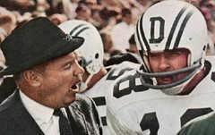
• This Dartmouth helmet design was so great. Why didn’t this design style catch on?
• What’s going on here? Looks like the Michelin Man or something. “That’s from the Packers’ training camp, circa early ’60s,” says Robert. “Apparently typical football pads weren’t enough for the hard-hitting packers — they had to resort to catcher’s gear as well! I’m not sure if those are special leg pads or simply two more chest protectors wrapped around each leg.”
• Speaking of the Pack, ya gotta love the uni-numbered knit caps they used to wear. That’s defensive tackle Dave Hanner, and here we have Jim Ringo chatting with Lee Roy Caffey.
• FiNOB? Nope: “That’s a 1965 shot of RB Billy Joe (William Joe),” says Robert. “After pro football he had a tremendous college football coaching career and was recently inducted into the College Football Hall of Fame.” I love the looong nameplate despite the super-short NOB.
That’s it for this round. More photos from Robert’s archive soon.

Mr. Met Paternity Update: No definitive word yet on who designed Mr. Met, although I’ve gotten several good leads that I’m investigating. The most frustrating thing that’s come in so far is this Mr. Met “birth announcement” that ran in the Amazins’ 1963 yearbook (forwarded my way by reader Andrew Harris). Like, if you were gonna go thru the trouble to create that page, wouldn’t you wanna say who the illustrator was? Grrrrrr.
ESPN Reminder: In case you missed it yesterday, my piece on the old Negro Leagues ballpark Hinchliffe Stadium is available here.
Brinke Guthrie’s Collector’s Corner
Photo: Christmas ’68, with the original Matt Mason Space Station. Which I just replaced on eBay.
Speaking of which:
• Here’s a nice set of vintage 1970s NHL puck stickers. Let’s not quibble on the fact the auction title mention the San Jose Sharks, who didn’t even exist then.
• Love the cover design of this 1974 Dolphins press guide.
• Great old Canadiens blanket.
• Here’s a nice 1970s AFC drinking glass.
• Nice Rams helmet evolution shown on the cover of this 1978 yearbook.
• Yeah, this fellow looks like a Big Leaguer. More like a high school driver’s ed teacher.
• Here’s an official 1972 NFL toy chest. Not like the one I had, but fairly close.
• Maybe it’s just the lighting, but this Cubbies bobble looks vaguely diabolical.
• And today’s Mets item for Lukas: a 1960s Mr. Met doll. Fairly certain he’ll bid on this one. [He’s right, even though it has “ripped to shreds by the cats” written all over it. — PL]
Found something on eBay that you think would make good Collector’s Corner fodder? Click here.
Uni Watch News Ticker: Hey, you know that Washington Capitals secondary logo that looks like an eagle with an old-fashioned oil can shoved up its ass? That design is now the source of a lawsuit (with thanks to Jeremy Brahm). ”¦ It may not be college football season yet, but I’ll happily have a slice of this LSU cake (with thanks to Kevin Forrest). ”¦ I think we may have seen this before, but you can never have too many views of Fenway made out of Lego. ”¦ Reprinted from yesterday’s comments: Good story on the history of scoreboards. ”¦ The Pats will be wearing their throwbacks at home on October 31st (as reported by Brett Paci). ”¦ The Lake Erie Crushers will be wearing Cavs-themed jerseys on June 30 as part of their “Keep Lebron in Cleveland Night” promotion. ”¦ I believe this is a first: The process of how a Ticker item ended up in the Ticker has become a small news item elsewhere. ”¦ The Saskatchewan Roughriders just announced record profits, thanks in part to their throwback jersey sales. ”¦ Brett Paci points out that the Lions and Pats went color-on-color way back in 2002. Who knew? ”¦ Peter Chen reports that Lastings Milledge and Andrew McCutcheon wore those blue Father’s Day wristbands in their dreads on Sunday. ”¦ Never knew Akeem the Dream went FiNOB in college (and neither did Andrew Jobe until he recently found that photo). ”¦ Also from Andrew: several shots of the Flyers in Cooperalls that I hadn’t seen before. ”¦ Can’t recall if we previously ran photos of Oregon’s spring football game, which featured camo-patterned uni numbers and “Support Our Troops” NOBs, but there’s a bunch of shots on this page (with thanks to Terrance Vanderhall). ”¦ Looks like Jamie Hoffman was wearing an S100 helmet back in spring training (good catch by Grant Goldman). ”¦ Here’s this year’s Home Run Derby logo. … The Cavs have finally gone public with their new team colors, which were leaked ages ago. Details here.
re: Lions/Pats color on color
I’m pretty sure that was the Thanksgiving where the Cowboys and Broncos also went color on color, which was pretty sweet.
Thanksgiving color-on-color makes those games even more unbearable to watch. Didn’t the Bears and Cowboys also do color-on-color one year?
Didn’t the Bears and Cowboys also do color-on-color one year?
Yes, the Cowboys were in navy and the Bears wore orange.
Patriots to wear 85 throwbacks on Halloween: link
Paul, you can always get a Mr. Met from Build-A-Bear: link
I got one from the Manhattan Flagship Store back last Christmas…and he has stirrups!
Best pic I can find of camo invading (sorry) cricket . . .
Whatever, I can’t get the hyperlink to work. It’s here: link
I bet the Dartmouth folks got tired of the “D” decal getting knocked off of linemen helmets and just ditched the design.
Ok
Look alikes from the above links:
Cubs bobblehead = Stephen King
Rich Rollins = Joe Maddon
Number 60 talking with Jim Ringo is “Concrete Charlie” Bednarik.
I bet the Dartmouth folks got tired of the “D” decal getting knocked off of linemen helmets and just ditched the design.
Nope, we still use the same design link
link
UCLA again looked sweet last night. Anybody realize there’s a College World Series going on and some pretty nice unis there?
Not sure if anyone has posted this yet (translation: I searched the page and couldn’t find it), the Blue Jackets officially released their 10-year logo (I know we saw it earlier): link
[quote comment=”395350″]Didn’t the Bears and Cowboys also do color-on-color one year?
Yes, the Cowboys were in navy and the Bears wore orange.[/quote]
Here’s a pic link
[quote comment=”395360″]http://www.latimes.com/sports/la-spw-ucla-baseball22-sl,0,7514891.story
UCLA again looked sweet last night. Anybody realize there’s a College World Series going on and some pretty nice unis there?[/quote]
UCLA has the best looking uniform in college ball.
Oops, that wasn’t right…
link
What’s up with that Texans helmet in that AFL photo? Is it just me or does there appear to be some sort of design behind the Texas logo? It looks like a sort of silhouette of something. Anyone else see this?
“Brett Paci points out that the Lions and Pats went color-on-color way back in 2002. Who knew?”
Ummm… apparently, Brett Paci. ;-)
Golden State Warriors discussed on Brand New today.
link
Paul, see this?
link
Whole lotta awesome today. Lego Fenway is amazing. I want
ProgressiveJacobs Field!Striped Purdue helmet is very cool. I’m a sucker for old gold and black.
Just like Paul, I’m a sucker for the old-school Dixie cup design in that pic of Unitas’ helmet. I wonder if the guy who took that photo could have ever imagined that 50 years later, some people would be marveling at that cup moreso than the helmet.
@jukierules: “What’s up with that Texans helmet in that AFL photo?” I was wondering that too. Weird wild stuff.
@ Philly Al in NoCal: “Number 60 talking with Jim Ringo is “Concrete Charlie” Bednarik.” I love how Bednarik, on gameday, still used his Brylcreem… or maybe it’s Vitalis. That was back when men were men and dammit, their hair stayed in place even on the gridiron.
[quote comment=”395368″]Paul, see this?
link
Yeah, saw that about 20 mins. after I posted today’s entry. Already slated for tomorrow’s Ticker.
Love those hand-written numbers on the helmets. Seems like that was link back in the day.
And good on Dartmouth for holding on to their dictinctive front-lettered helmets. Wish link had been so bold.
Paul, the Cyclones were wearing tye-dye uniforms yesterday in honor of the Grateful Dead
[quote comment=”395372″]Paul, the Cyclones were wearing tye-dye uniforms yesterday in honor of the Grateful Dead
link
I keep screwing up the link
link
link
Alright, here it is finally
[quote comment=”395358″]Number 60 talking with Jim Ringo is “Concrete Charlie” Bednarik.[/quote]
you are correct, sir
[quote comment=”395372″]Paul, the Cyclones were wearing tye-dye uniforms yesterday in honor of the Grateful Dead
[/quote]
here ya go
More football awesomeness from Mr. Harvell. Is it any wonder I have no interest in watching modern football after looking back on the magnificent uni designs of my youth?
-Jet
Interesting Mr. Met page from the ’63 yearbook. The running, batting and “rain-out” Mr. Met are iconic, but this is the first time I’m seeing the pitching and the autograph-signing rendering of this character. So the artist drew him in quite a few poses. WHO THE HECK IS THE ARTIST?! Good grief.
-Jet
Interesting how the Cooperalls never caught on in ice hockey yet are often seen in rec roller hockey (albeit not actual Cooperalls, but a similar over-pants). Gotta figure those black Flyers Cooperalls made finding the black puck a nightmare for opposing goalies!!
-Jet
[quote comment=”395378″]More football awesomeness from Mr. Harvell. Is it any wonder I have no interest in watching modern football after looking back on the magnificent uni designs of my youth?
-Jet[/quote]
I concur.
[quote comment=”395377″][quote comment=”395372″]Paul, the Cyclones were wearing tye-dye uniforms yesterday in honor of the Grateful Dead
[/quote]
link[/quote]
Single digit pitcher?
Actually, Jim Ringo is talking to Chuck Bednarik prior to a game, not Lee ROy Caffey in the photo showing the uni numbers on the hat.
[quote comment=”395380″]Interesting how the Cooperalls never caught on in ice hockey yet are often seen in rec roller hockey (albeit not actual Cooperalls, but a similar over-pants). Gotta figure those black Flyers Cooperalls made finding the black puck a nightmare for opposing goalies!!
-Jet[/quote]
Yes, because traditional hockey socks are too damn hot and don’t hold up on court as well as on ice.
[quote comment=”395383″][quote comment=”395377″][quote comment=”395372″]Paul, the Cyclones were wearing tye-dye uniforms yesterday in honor of the Grateful Dead
[/quote]
link[/quote]
Single digit pitcher?[/quote]
Not so unusual in the minors.
The Cavs new colors look like they’re forcing the issue. The original colors for the “new expression of wine and gold” (their quote, not mine) worked much better with the blue. For me, the “wine” just ain’t workin’. It’s got too much blue in it, there’s just not enough contrast between them. They should have left the red alone and just tweaked the gold so it looks like link… but what do I know?
Bob Blackman brought the Dartmouth helmet design to Illinois when he was hired as coach in 1971. Still my favorite FB helmet.
Forgot the link.
One more time.
link
I think I can follow directions.
During the Yanks-Dbacks game last night…ESPN went back and showed some replays of the 2001 World Series…..I had forgotten how HORRIBLE those grey, purple, teal, black, blue and green “vest” home uniforms were…. as much as I am not a fan of so many teams wearing red… Dbacks current unis are light years better than those abominations!!!!
Ah, the Harvell files, what a great start to the day. As well, a fantastic thing to peruse at lunch. Thanks!
[quote comment=”395388″]Bob Blackman brought the Dartmouth helmet design to Illinois when he was hired as coach in 1971. Still my favorite FB helmet.
[/quote]
[quote comment=”395389″]Forgot the link.
[/quote]
here ya go
Re: the ’70s NHL stickers… Did anyone else notice that once again we see a Blackhawks logo that’s off-model? It appears the red and white warpaint is black and the feathers are different. This is the second time in recent memory that a ’70s-era NHL auction linked here has featured an off-model Blackhawks head. I just don’t get it… it seems it would be way easier to just copy the regular logo than to create a slightly different but equally complex logo.
Great pictures Robert.
can you no longer read comments from the previous days? i like to go back and read over the completed string of comments from the day before and they are not coming up anymore
[quote comment=”395387″]The Cavs new colors look like they’re forcing the issue. The original colors for the “new expression of wine and gold” (their quote, not mine) worked much better with the blue. For me, the “wine” just ain’t workin’. It’s got too much blue in it, there’s just not enough contrast between them. They should have left the red alone and just tweaked the gold so it looks like link… but what do I know?[/quote]
The blue should be very minimal, which is why dark wine was a better choice. The Cavs wouldn’t look good in red and yellow.
[quote comment=”395392″]Ah, the Harvell files, what a great start to the day. As well, a fantastic thing to peruse at lunch. Thanks![/quote]
Don’t know which I like more, the Harvell Files or No Service Like Wire Service or the Ricko Files or, …
nice posting today but a few questions: with the helmet (ie revo style) front getting bigger in football why dont more teams start using it like Dartmouth does. secondly what ever happened to the drop shadow drop numbers on uniforms college and pro they have kinda disappeared. finally through a couple other pages there is rumors of ucla dropping a light blue in favor of navy?
[quote comment=”395396″]can you no longer read comments from the previous days? i like to go back and read over the completed string of comments from the day before and they are not coming up anymore[/quote]
I had the same problem. The page will load the main content, then the google ad, but nothing below that.
[quote comment=”395397″][quote comment=”395387″]The Cavs new colors look like they’re forcing the issue. The original colors for the “new expression of wine and gold” (their quote, not mine) worked much better with the blue. For me, the “wine” just ain’t workin’. It’s got too much blue in it, there’s just not enough contrast between them. They should have left the red alone and just tweaked the gold so it looks like link… but what do I know?[/quote]
The blue should be very minimal, which is why dark wine was a better choice. The Cavs wouldn’t look good in red and yellow.[/quote]
Yeah, but the blue isn’t minimal. It’s a jersey color. My point is the new red doesn’t contrast well enough with the blue.
[quote comment=”395400″][quote comment=”395396″]can you no longer read comments from the previous days? i like to go back and read over the completed string of comments from the day before and they are not coming up anymore[/quote]
I had the same problem. The page will load the main content, then the google ad, but nothing below that.[/quote]
Weird. Yesterday’s comments were there this morning, but now they’re gone.
And I’ve gone back through the entire month of June and it appears that most, but not all, of the comment sections are missing.
For instance, Phil’s last three posts still have the comments intact, as does Paul’s Hinchliffe Stadium post from the 5th.
i went to an antique mall yesterday and found some cool stuff. most of it is sports related including a golf club with a swastika on it. i was floored. here’s a link to the flickr page for it.
link
[quote comment=”395393″][quote comment=”395388″]Bob Blackman brought the Dartmouth helmet design to Illinois when he was hired as coach in 1971. Still my favorite FB helmet.
[/quote]
[quote comment=”395389″]Forgot the link.
[/quote]
link[/quote]
I never thought of the connection to those Illinois helmets.
[quote comment=”395391″]During the Yanks-Dbacks game last night…ESPN went back and showed some replays of the 2001 World Series…..I had forgotten how HORRIBLE those grey, purple, teal, black, blue and green “vest” home uniforms were…. as much as I am not a fan of so many teams wearing red… Dbacks current unis are light years better than those abominations!!!![/quote]
Disagree. For one, you aren’t even remotely accurate in describing what the Diamondbacks wore. The vests used in game 7 were white with pinstripes, with the team logo on the left chest. I thought that was a good, classic and unique look. The home whites the D-Backs now wear does not have a unique color scheme and the lettering across the jerseys is just too weird.
[quote comment=”395403″]i went to an antique mall yesterday and found some cool stuff. most of it is sports related including a golf club with a swastika on it. i was floored. here’s a link to the flickr page for it.
link
Swastikas from St. Louis, great … I’d almost rather be associated with the Cardinals …
[quote comment=”395405″][quote comment=”395391″]During the Yanks-Dbacks game last night…ESPN went back and showed some replays of the 2001 World Series…..I had forgotten how HORRIBLE those grey, purple, teal, black, blue and green “vest” home uniforms were…. as much as I am not a fan of so many teams wearing red… Dbacks current unis are light years better than those abominations!!!![/quote]
Disagree. For one, you aren’t even remotely accurate in describing what the Diamondbacks wore. The vests used in game 7 were white with pinstripes, with the team logo on the left chest. I thought that was a good, classic and unique look. The home whites the D-Backs now wear does not have a unique color scheme and the lettering across the jerseys is just too weird.[/quote]
here’s what they wore in game 7
at least back then you’d look at the uni and say, “d-backs”…now…you have to make sure they’re not the astros
but that doesn’t mean that 2001 uni was any good
I had Major Matt Mason when I was a kid! Loved it!
[quote comment=”395407″][quote comment=”395405″][quote comment=”395391″]During the Yanks-Dbacks game last night…ESPN went back and showed some replays of the 2001 World Series…..I had forgotten how HORRIBLE those grey, purple, teal, black, blue and green “vest” home uniforms were…. as much as I am not a fan of so many teams wearing red… Dbacks current unis are light years better than those abominations!!!![/quote]
Disagree. For one, you aren’t even remotely accurate in describing what the Diamondbacks wore. The vests used in game 7 were white with pinstripes, with the team logo on the left chest. I thought that was a good, classic and unique look. The home whites the D-Backs now wear does not have a unique color scheme and the lettering across the jerseys is just too weird.[/quote]
here’s what they wore in link
at least back then you’d look at the uni and say, “d-backs”…now…you have to make sure they’re not the astros
but that doesn’t mean that 2001 uni was any good[/quote]
Did the D-Backs start the off-white uni trend?
[quote comment=”395410″][quote comment=”395407″][quote comment=”395405″][quote comment=”395391″]During the Yanks-Dbacks game last night…ESPN went back and showed some replays of the 2001 World Series…..I had forgotten how HORRIBLE those grey, purple, teal, black, blue and green “vest” home uniforms were…. as much as I am not a fan of so many teams wearing red… Dbacks current unis are light years better than those abominations!!!![/quote]
Disagree. For one, you aren’t even remotely accurate in describing what the Diamondbacks wore. The vests used in game 7 were white with pinstripes, with the team logo on the left chest. I thought that was a good, classic and unique look. The home whites the D-Backs now wear does not have a unique color scheme and the lettering across the jerseys is just too weird.[/quote]
here’s what they wore in link
at least back then you’d look at the uni and say, “d-backs”…now…you have to make sure they’re not the astros
but that doesn’t mean that 2001 uni was any good[/quote]
Did the D-Backs start the off-white uni trend?[/quote]
I love those caps
Those 2001 D-Backs caps are one of my faves:
link
[quote comment=”395410″][quote comment=”395407″][quote comment=”395405″][quote comment=”395391″]During the Yanks-Dbacks game last night…ESPN went back and showed some replays of the 2001 World Series…..I had forgotten how HORRIBLE those grey, purple, teal, black, blue and green “vest” home uniforms were…. as much as I am not a fan of so many teams wearing red… Dbacks current unis are light years better than those abominations!!!![/quote]
Disagree. For one, you aren’t even remotely accurate in describing what the Diamondbacks wore. The vests used in game 7 were white with pinstripes, with the team logo on the left chest. I thought that was a good, classic and unique look. The home whites the D-Backs now wear does not have a unique color scheme and the lettering across the jerseys is just too weird.[/quote]
here’s what they wore in link
at least back then you’d look at the uni and say, “d-backs”…now…you have to make sure they’re not the astros
but that doesn’t mean that 2001 uni was any good[/quote]
Did the D-Backs start the off-white uni trend?[/quote]
San Fran has been off-white for ages.
[quote comment=”395414″][quote comment=”395410″][quote comment=”395407″][quote comment=”395405″][quote comment=”395391″]During the Yanks-Dbacks game last night…ESPN went back and showed some replays of the 2001 World Series…..I had forgotten how HORRIBLE those grey, purple, teal, black, blue and green “vest” home uniforms were…. as much as I am not a fan of so many teams wearing red… Dbacks current unis are light years better than those abominations!!!![/quote]
Disagree. For one, you aren’t even remotely accurate in describing what the Diamondbacks wore. The vests used in game 7 were white with pinstripes, with the team logo on the left chest. I thought that was a good, classic and unique look. The home whites the D-Backs now wear does not have a unique color scheme and the lettering across the jerseys is just too weird.[/quote]
here’s what they wore in link
at least back then you’d look at the uni and say, “d-backs”…now…you have to make sure they’re not the astros
but that doesn’t mean that 2001 uni was any good[/quote]
Did the D-Backs start the off-white uni trend?[/quote]
San Fran has been off-white for ages.[/quote]
For the last ten years or so, yes. But didn’t the D-Backs do it when they came into the league back in ’98?
[quote comment=”395406″][quote comment=”395403″]i went to an antique mall yesterday and found some cool stuff. most of it is sports related including a golf club with a swastika on it. i was floored. here’s a link to the flickr page for it.
link
Swastikas from St. Louis, great … I’d almost rather be associated with the Cardinals …[/quote]
my guess is that the clubs date back to pre-hitler when the swastika was used quite a bit.
[quote comment=”395415″][quote comment=”395414″][quote comment=”395410″][quote comment=”395407″][quote comment=”395405″][quote comment=”395391″]During the Yanks-Dbacks game last night…ESPN went back and showed some replays of the 2001 World Series…..I had forgotten how HORRIBLE those grey, purple, teal, black, blue and green “vest” home uniforms were…. as much as I am not a fan of so many teams wearing red… Dbacks current unis are light years better than those abominations!!!![/quote]
Disagree. For one, you aren’t even remotely accurate in describing what the Diamondbacks wore. The vests used in game 7 were white with pinstripes, with the team logo on the left chest. I thought that was a good, classic and unique look. The home whites the D-Backs now wear does not have a unique color scheme and the lettering across the jerseys is just too weird.[/quote]
here’s what they wore in link
at least back then you’d look at the uni and say, “d-backs”…now…you have to make sure they’re not the astros
but that doesn’t mean that 2001 uni was any good[/quote]
Did the D-Backs start the off-white uni trend?[/quote]
San Fran has been off-white for ages.[/quote]
For the last ten years or so, yes. But didn’t the D-Backs do it when they came into the league back in ’98?[/quote]
Don’t know that the D-Backs purple era homes ever were off-white. Think it’s just that they were hardly ever been seen in sunlight. Only inside the BOB (or whatever it’s called these days).
—Ricko
[quote comment=”395399″]nice posting today but a few questions: with the helmet (ie revo style) front getting bigger in football why dont more teams start using it like Dartmouth does. secondly what ever happened to the drop shadow drop numbers on uniforms college and pro they have kinda disappeared. finally through a couple other pages there is rumors of ucla dropping a light blue in favor of navy?[/quote]
I think the biggest challenge for helmet designers is to come up with a shape that utilizes all of the newer concussive dampening properties, yet, is very decal friendly to every team. The Revo Speed helmet is right on the fringe of those parameters. In my opinion, to design a team’s helmet decal based on the shape of the helmet is going backwards; i.e. Michigan Wolverines. That being said, in some ways it’s also kind of cool & retro., thus I see your point. heh heh
I am just not a fan of the vest and I just think there were too many colors involved in the Dback uniforms back then. I do like them now ( except for the BFBS alt ).
What I did like about the old unis was the “A” logo (with less colors)… there is just something kind of “minor leagueish” about the “D” logo…
Also I guess if you are a fan of the Dbacks you would know if they wore true white at home…but for some reason I seem to remember them being kind of off-white…. maybe the color combinations and the pinstripes just made it seem that way…
[quote comment=”395420″]Also I guess if you are a fan of the Dbacks you would know if they wore true white at home…but for some reason I seem to remember them being kind of off-white…. maybe the color combinations and the pinstripes just made it seem that way…[/quote]
appears they were a little off white
link
I think dome lighting tends to dull white uniforms in photos and on TV. All colors, in fact. When the Blue Jays wear their blue alts at home they look a different color then when they used to wear them on the road.
For some reason the domes in Arizona and Milwaukee seem to have brutal lighting.
I have no idea why this would be any different from an outdoor night game.
[quote comment=”395422″]I think dome lighting tends to dull white uniforms in photos and on TV. All colors, in fact. When the Blue Jays wear their blue alts at home they look a different color then when they used to wear them on the road.
For some reason the domes in Arizona and Milwaukee seem to have brutal lighting.
I have no idea why this would be any different from an outdoor night game.[/quote]
[quote comment=”395401″][quote comment=”395397″][quote comment=”395387″]The Cavs new colors look like they’re forcing the issue. The original colors for the “new expression of wine and gold” (their quote, not mine) worked much better with the blue. For me, the “wine” just ain’t workin’. It’s got too much blue in it, there’s just not enough contrast between them. They should have left the red alone and just tweaked the gold so it looks like link… but what do I know?[/quote]
The blue should be very minimal, which is why dark wine was a better choice. The Cavs wouldn’t look good in red and yellow.[/quote]
Yeah, but the blue isn’t minimal. It’s a jersey color. My point is the new red doesn’t contrast well enough with the blue.[/quote]
Okay, let me rephrase: The blue will be minimal, thus eliminating the need for the wine to contrast it well. Remember, the Cavaliers are unveiling new uniforms this offseason, which means blue is no longer a uniform color.
Watching a Argentine v Greece….. it always seems odd to see Argentine in anything other than the light blue stripes / black shorts…..
Just like when brazil wears a blue jersey…..
“Brett Paci points out that the Lions and Pats went color-on-color way back in 2002. Who knew?”
Skins and the Cowboys did that as well, in a great battle of the throw backs in ’02.
Took some research but here is a picture.
link
Deadspin’s take on the new NBA logos.
link
[quote comment=”395421″][quote comment=”395420″]Also I guess if you are a fan of the Dbacks you would know if they wore true white at home…but for some reason I seem to remember them being kind of off-white…. maybe the color combinations and the pinstripes just made it seem that way…[/quote]
appears they were a little off white
link
Good example. (Here’s the link since that site appears to block direct linking.)
Also, check out link. McGwire & Bonds have unis that are noticeably brighter than the one worn by the ironically-named Devon White.
here’s some info about the trojan horse thing that I get when coming here
link
it’s the same edisonsbar thing described in the link
In the picture of Frank Ryan and Jim Brown, the part of the Pesta Pickles ad hidden by Ryan’s helmet reads “OLIVES”. So the ad is about Pesta Pickles which also sold olives and sauerkraut.
Love the Darmouth helmet jfor its distinctiveness, and I’m glad it never caught on (‘cept linkn looked good). It’s Dartmouth’s and I’m glad the
IndiansBig Green returned to the look.Ditto for Temples’s link. Great for Temple, plagarizing for other schools. (Though I like this linkt)
If Purdue would go back to that striped helmet, that would be very cool.
[quote comment=”395428″][quote comment=”395421″][quote comment=”395420″]Also I guess if you are a fan of the Dbacks you would know if they wore true white at home…but for some reason I seem to remember them being kind of off-white…. maybe the color combinations and the pinstripes just made it seem that way…[/quote]
appears they were a little off white
link
Good example. (Here’s the link since that site appears to block direct linking.)
Also, check out link. McGwire & Bonds have unis that are noticeably brighter than the one worn by the ironically-named Devon White.[/quote]
In 1998 were all unis made by the same manufacturer as they are now?
If not, it could be nothing more than a supplier variation.
I ask because just last night I was looking at three pair of white baseball pants I have with navy pins. All from different manufacturers, and the “white” is a different shade on all three. None of the three match.
I also have probably five or six pair of gray baseball pants. None of them are the same color GRAY, either.
—Ricko
As a temple Alum I am a big fan of the box stripe pants and the diamond collar on the neck
[quote comment=”395429″]here’s some info about the trojan horse thing that I get when coming here
link
it’s the same edisonsbar thing described in the link[/quote]
Thanks. I’m looking into it now.
“In 1998 were all unis made by the same manufacturer as they are now?”
That is to say, were all teams supplied by the same manufacturer, the way they are today, or did teams still have individual deals with the supplier of their choosing?
Hope everyone followed that.
—Ricko
Nothing innovative on the list of potential names for Tucson’s new Indoor Football League team.
link
[quote comment=”395421″][quote comment=”395420″]Also I guess if you are a fan of the Dbacks you would know if they wore true white at home…but for some reason I seem to remember them being kind of off-white…. maybe the color combinations and the pinstripes just made it seem that way…[/quote]
appears they were a little off white
link
They certainly do. Yet not at all in this pic from an auction site:
link
[quote comment=”395436″]Nothing innovative on the list of potential names for Tucson’s new Indoor Football League team.
link
Maybe name them after a lead character in 50-some B-Westerns during the late ’30s and early ’40s?
Tucson Smiths
—Ricko
[quote comment=”395435″]”In 1998 were all unis made by the same manufacturer as they are now?”
That is to say, were all teams supplied by the same manufacturer, the way they are today, or did teams still have individual deals with the supplier of their choosing?
Hope everyone followed that.
—Ricko[/quote]I got what you meant.
And I can’t say whether they supplied all of the teams in 1998, but it looks like Russell was making both the link and the link unis.
About time someone honored furniture.
Tucson Futons
[quote comment=”395436″]Nothing innovative on the list of potential names for Tucson’s new Indoor Football League team.
link
i donno
i kinda chuckled at desert storm
maybe they could wear brown camo
[quote comment=”395436″]Nothing innovative on the list of potential names for Tucson’s new Indoor Football League team.
link
Tucson Titty Twisters
[quote comment=”395433″]As a temple Alum I am a big fan of the box stripe pants and the diamond collar on the neck[/quote]
As a non-Temple alum, I’m a fan too.
[quote comment=”395441″]
i kinda chuckled at desert storm
[/quote]
Warmonger. :)
Uni Watch just tried to hit me with a Javascript virus. I didn’t write the link down though. Sorry.
[quote comment=”395448″]Uni Watch just tried to hit me with a Javascript virus. I didn’t write the link down though. Sorry.[/quote]
On it.
[quote comment=”395448″]Uni Watch just tried to hit me with a Javascript virus. I didn’t write the link down though. Sorry.[/quote]
better than when betty from the u tried to hit you with chlamydia
[quote comment=”395359″]I bet the Dartmouth folks got tired of the “D” decal getting knocked off of linemen helmets and just ditched the design.
Nope, we still use the same design link[/quote]
That’s a photo of two classic uniforms: Dartmouth with the helmet “D’ and four stripes, Princeton with the “winged” helmet and three stripes as they wore it back in the 1930s (before their coach moved to Ann Arbor and established the now-traditional Michigan helmet).
It would be even more “classic” if the jerseys had genuine sleeves (e.g., if the Princeton stripes went from shoulder to, at least, the elbow).
[quote comment=”395427″]Deadspin’s take on the new NBA logos.
link
Can’t believe that’s the first place I’ve seen new vs. old side by side for all those at the same time. My take on the Cavs?
It’s like the movie Multiplicity. You take the orginal, scan it, and print it and it generally looks pretty good. Now scan and print the new image, and things look slightly off, but no big deal. Scan and print the newest image, and ladies and gents, you have the Cav’s new logo for 2010-11!
[quote comment=”395452″][quote comment=”395448″]Uni Watch just tried to hit me with a Javascript virus. I didn’t write the link down though. Sorry.[/quote]
better than when betty from the u tried to hit you with chlamydia[/quote]
Let’s see if you’re still saying that if the entire site comes down for a couple days! THEN which would be worse???
That Purdue helmet is a modern-day plastic revival of their old leather helmets from the 30s and 40s. The latter had three leather strips running from front to back in a contrasting color.
[quote comment=”395452″][quote comment=”395448″]Uni Watch just tried to hit me with a Javascript virus. I didn’t write the link down though. Sorry.[/quote]
better than when betty from the u tried to hit you with chlamydia[/quote]
Um, where’s your tan box?
[quote comment=”395457″][quote comment=”395452″][quote comment=”395448″]Uni Watch just tried to hit me with a Javascript virus. I didn’t write the link down though. Sorry.[/quote]
better than when betty from the u tried to hit you with chlamydia[/quote]
Um, where’s your tan box?[/quote]
sshhhh …. Paul was trying to demote him slowly …
[quote comment=”395445″][quote comment=”395433″]As a temple Alum I am a big fan of the box stripe pants and the diamond collar on the neck[/quote]
As a non-Temple alum, I’m a fan too.[/quote]
I’d wear that, for sure!
[quote comment=”395451″][quote comment=”395448″]Uni Watch just tried to hit me with a Javascript virus. I didn’t write the link down though. Sorry.[/quote]
On it.[/quote]
Firefox just shuts me down sometimes when I come here, then I restart my browsing and carry on.
[quote comment=”395457″]Um, where’s your tan box?[/quote]
we split a few years back
Looking at the images from EA’s NHL11…The triangles on the Hawks’ alternate uniform shorts look huge when compared with the ones now. I have a couple shots to compare….Am I just being picky, or do you think they’ll be making a change to the current alt?
EA: link
Current: link
– Jennifer
Crud….sorry for the double post….Oh, UniWatch Gods, please delete post #106! Thanks.
[quote comment=”395463″]Looking at the images from EA’s NHL11…The triangles on the Hawks’ alternate uniform shorts look huge when compared with the ones now. I have a couple shots to compare….Am I just being picky, or do you think they’ll be making a change to the current alt?
EA: link
Current: link
– Jennifer[/quote]
I think the Hawks are one of the teams listed as having no uniform changes for the forthcoming year, but I’d welcome this change if they imposed it on the black-n-tans. The triangles on the actual pants seem out of place.
Then again, it’s a change so subtle, maybe they could make the change and no one (except those actually looking) would notice.
this a old 2001 tampa bay devil rays jersey with the home link without the devils part very unusual
“and here we have Jim Ringo chatting with Lee Roy Caffey” actually, it’s Jim Ringo chatting with Philly’s Chuck Bednarik
[quote comment=”395384″]Actually, Jim Ringo is talking to Chuck Bednarik prior to a game, not Lee ROy Caffey in the photo showing the uni numbers on the hat.[/quote]
Whoever they are, boy do I like that old-style beanie the #, and the sweatshirt. Nice.
[quote comment=”395466″]this a old 2001 tampa bay devil rays jersey with the home link without the devils part very unusual[/quote]
That’s a 2001 card and Baldelli didn’t make the majors until 2003, so its probably a minor league jersey – Orlando Rays?
link
Wanna see that Purdue helmet on a football card?
Tom Bettis’ college PR photo could lead someone to think he’d discovered a long lost Packer helmet, huh.
link
—Ricko
Let’s try the general link…
link
first: the new cavs colors are ugly
second: why do the o’s keep wearing their warmups? theyre doin it again tonite
[quote comment=”395472″]why do the o’s keep wearing their warmups?[/quote]
because they can
[quote comment=”395406″][quote comment=”395403″]i went to an antique mall yesterday and found some cool stuff. most of it is sports related including a golf club with a swastika on it. i was floored. here’s a link to the flickr page for it.
link
Swastikas from St. Louis, great … I’d almost rather be associated with the Cardinals …[/quote]
St. Louis? Could be from an Illinois Nazi.
Man, I hate Illinois Nazis.
Can someone please help me out with the website with cartoon recaps of Mets games?
[quote comment=”395475″]Can someone please help me out with the website with cartoon recaps of Mets games?[/quote]
link
[quote comment=”395388″]Bob Blackman brought the Dartmouth helmet design to Illinois when he was hired as coach in 1971. Still my favorite FB helmet.
[/quote]
…and when he subsequently coached at Cornell, he brought the design with him link, link.
Great poster on the evolution of the World Cup Ball
link
If there was any doubt about the likeness of John Axford and Rollie Fingers in Milwaukee… those doubts can be laid to rest link
[quote comment=”395469″][quote comment=”395466″]this a old 2001 tampa bay devil rays jersey with the home link without the devils part very unusual[/quote]
That’s a 2001 card and Baldelli didn’t make the majors until 2003, so its probably a minor league jersey – Orlando Rays?
link
I also think it is an Orlando Rays hat/uniform too, but it’s hard to be sure.
–link
–link
[quote comment=”395474″][quote comment=”395406″][quote comment=”395403″]i went to an antique mall yesterday and found some cool stuff. most of it is sports related including a golf club with a swastika on it. i was floored. here’s a link to the flickr page for it.
link
Swastikas from St. Louis, great … I’d almost rather be associated with the Cardinals …[/quote]
St. Louis? Could be from an Illinois Nazi.
Man, I hate Illinois Nazis.[/quote]
Particularly the Illinios Nazis that look like evil versions of Laugh-In’s Henry Gibson!
test
[quote comment=”395468″][quote comment=”395384″]Actually, Jim Ringo is talking to Chuck Bednarik prior to a game, not Lee ROy Caffey in the photo showing the uni numbers on the hat.[/quote]
Whoever they are, boy do I like that old-style beanie the #, and the sweatshirt. Nice.[/quote]
What is the proper name for those team-issued, heavy duty sweatshirts that Jim Ringo is wearing in that pic and that were popular in that era?
A great many coaches wore them (Lou Holtz at ND looks like the last high profile coach to regularly wear one), in mock turtleneck styles, and many teams issued them for team warm-ups, but they are extrememy hard to locate even in secondary markets like EBAY and I do not believe that manufacterers even offer them anymore – I have looked and looked to no avail. I suspect that I am not looking for the proper description (“coaches’ sweatshirt”, “mock turtleneck sweatshirt/warmup”). Isf there’s anybody out their with any answers, they will be greatly appreciated.
Anybody know the true name for those pieces?
Paging Terry Proctor, or Ricko, or the Packers’ 1960 Equipment Mgr.!
I read “Akeem the Dream” and thought of this:
link
[quote comment=”395470″]Wanna see that Purdue helmet on a football card?
Tom Bettis’ college PR photo could lead someone to think he’d discovered a long lost Packer helmet, huh.
link
—Ricko[/quote]
There it is, the lost Packer three-stripe helmet, in a cave on a shelf sitting right next to a game-worn AFL Broncos helmet with a BROWN horse on it, which is next to the plain Silver Seahawks 1976 helmet worn for their inaugural regular season game ….Imagine what we can make from that Grey Flannel Auction!
Phil, I get trojans to avoid the clap.
I think both the new and old DBacks unis will be favorites in years to come. I much prefer the creativity in the DBacks logotype than, say, that bland serifed font that Colorado uses. But I suppose even that will become a classic someday. The uglier now, the more awesome in the future. It’s true.
I hate to say it, but the white Oregon jersey numerals look pretty nice with that green camo scheme.
I shall now walk away with my head down in shame, and give myself 30 lashes with a stirrup…
[quote comment=”395488″]Phil, I get trojans to avoid the clap.[/quote]
And remember: when the world slips you a Jeffrey, stroke the furry wall.
Very cool glasses. Of course, however, first thing I thought of when I saw them was McDonalds current issue with the Shrek glassses!
[quote comment=”395493″]Very cool glasses. Of course, however, first thing I thought of when I saw them was McDonalds current issue with the Shrek glassses![/quote]
Heh. We’ve got a couple of those that need to be returned.
I did mention to Paul that they’re probably best used as decorations and for the occasional beverage rather than everyday drinking vessels.
[quote comment=”395494″][quote comment=”395493″]Very cool glasses. Of course, however, first thing I thought of when I saw them was McDonalds current issue with the Shrek glassses![/quote]
Heh. We’ve got a couple of those that need to be returned.
I did mention to Paul that they’re probably best used as decorations and for the occasional beverage rather than everyday drinking vessels.[/quote]
Uh huh … next, send a pallet of crack to the Betty Ford clinic, and tell the “guests” it’s just there to look at. :^)
What, do the Cavs change their uni EVERY YEAR, or does it just seem that way?
Can’t remember the player, but the guy in the hat in that photo is legendary Dartmouth football coach Bob Blackman, circa 1968. The 9-0 1970 Dartmouth team was the last time an Ivy League team finished the season ranked in the AP Top 20. Dartmouth brought back those helmets a few seasons ago.
i believe that’s chuck bednarik chatting with jim ringo, and not leroy caffrey
/not sure if anyone mentioned that