Reader Sean Robbins just alerted me to some weird stuff that went down two nights ago in San Diego, and it relates to something that came up in my ESPN column last week, so I want to spend some time with it today.
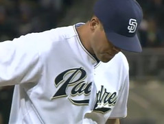
It all started with two outs in the top of the 5th, when Padres starter Clayton Richard had a few buttons come undone on his jersey. To his credit, he recognized the problem right away and fixed it. Only problem is, he botched it (additional images here).
Richard got the final out of the inning on the very next pitch, so that should have been that. But his spot in the order was due to lead off the bottom of the inning, so he grabbed a bat a strode up to the plate with his buttons still askew (additional screen shots here). After he struck out and returned to the dugout, someone must have alerted him to his problematic placket, because he looked shipshape when he went out to pitch the top of the 6th.
Meanwhile, in that very same game, Giants starter Matt Cain was sporting a Pedro porthole.
All of which leads me to a question that came up toward the end of last week’s ESPN column: Why do baseball jerseys have buttons? Wouldn’t pullovers make more sense, or at least zippers? It’s a bit of a conundrum for me, because I think buttons look snazzier (and we all enjoy seeing little snafus like the one being showcased here today), but I also believe in form following function, and I see no functional utility to a button-front jersey. I only see buttons coming undone, balls getting lost inside jerseys, unsightly gaps in the placket, team logos that look like crap as they cross the divide, and related problems. What do you folks think? What about Under Armour’s solution, which is to provide two functional buttons at the top and then have non-functional ornamental buttons down the length of a faux placket? I confess that I kinda like this — you can’t even tell that the buttons are just there for show, and you avoid all the problems presented by a real button-front placket.
Incidentally, in that same game, the first letter of Matt Cain’s NOB was floating a bit high. And the following night (i.e., last night), Eugenio Velez came up to the plate in the 12th inning sporting a look that gave new meaning to the term “pajama-style.” As the Giants announcers pointed out, it looked like he thought the game was over and had already started to take off his uniform. Velez, you may recall, has already been at the center or one major jersey story this season, so he’s on a roll.
Uni Watch News Ticker: Speaking of button-related problems, you know how the Phils’ jersey insignia sometimes looks like it has an extra l? Ross Bergman has made a DIY T-shirt version of that phenomenon, which I think is pretty brilliant. He’s also done lots of other DIY stuff. “It’s not all sports-related, as I’ve made stuff for friends and family who aren’t into sports too much, but it all comes from a love for uniforms,” he says. “Most of the work I make with felt, but I’ve also done some with tackle twill. It’ll be cool to see what people in the Uni Watch community think of it.” ”¦ Oh man, how awesome is this old Levi’s ad (great find by Ryan Connelly). ”¦ Hahahahahaha (with thanks to Clint Yarborough). ”¦ According to the “News of the Day” section near the top of this article, Colorado football is going NNOB this fall (with thanks to Matthew Robins). ”¦ Uni Watch’s favorite table tennis player, Naomi Yotsumoto, now has her own line of trading cards. “You can even get a card with some her costume (with real sweat, hopefully not) and the rubber of her table tennis racket,” says Jeremy Brahm. ”¦ Several soccer-related items from Jeremy Richardson: a new logo for Bundesliga; a video clip about the U.S. equipment managers; and — the real prize — a great site devoted to World Cup player portraits. ”¦ Here’s the oldest swatch-inclusive baseball uniform catalog I’ve ever come across. It’ll no doubt end up selling for way more than I’m willing to spend, but it’s still exciting just to see the photos. ”¦ Really wonderful video clip about a small NYC tailor’s shop here. Highly recommended. ”¦ Wanna get absolutely nothing done today? Check out — if you dare — this astonishingly good site of old photos (blame Kirsten). ”¦ The new “Flannel of the Month” blog entry from Ebbets Field has a really interesting story about Rube Waddell. ”¦ We’ve talked a bit lately about the baseball centennial logo, and now Bruce Menard has found it lurking in an unusual place — check it out. That’s Commissioner Landis buying the first set of baseball centennial stamps from the U.S. Postmaster General in Cooperstown on June 12, 1939. “Dig the centennial caps they’re wearing!” says Bruce. “I’ve never seen that before. I’ve also attached a pic of what those stamps looked like and a First Day Issue letter with a peculiar version of the centennial logo — looks like the Japanese rising sun!” Great stuff, and here’s an additional note: The caption to that photo refers to Landis not just as Commissioner but as “High Commissioner,” which sounds disturbingly close to grand poobah or imperial wizard or something. ”¦ Matt Ryburn sent along some scans from this book about ballparks. Among the highlights: great cartoons about Dodger Stadium and Shea; a really tremendous early shot of the Big A; patriotic marching formations by the St. Louis Browns and Washington Senators; Mary Ebbets raising the flag — with spectacular sweaters in the background — at the opening of Ebbets Field in 1913; and one more shot of the Astrodome grounds crew. ”¦ Best flocked-helmet photo ever. Even better, that’s Roy Face, who was a pitcher (great find, Phil).
I like that baseball uniforms have buttons on the jerseys and belts for the pants. I was never a fan of the ’70s pullover jerseys and elastic pants. Yeah, the occasional odd thing can happen with a button-down jersey, such as a ball getting stuck inside the uniform. But that adds an element of interest. I’d hate to see baseball return to ballparks with standard dimensions and artificial turf, and I’d also hate to see pullovers ever become the norm again. Leave the pullovers to softball.
In your ESPN baseball uniform preview, you noted that the Orioles had tweaked their script to clean up the transition from the second “o” to the “l” which can be seen on Tejada’s jersey (right). You can also see that Adam Jones (left)is clearly wearing last year’s jersey as the transition is clunkier:
link
re: under armour’s solution…
im not a pullover fan, but i think that’s only because we associate them with the early 70’s polyester explosion, coupled with beltless pants; i agree that they solve many problems, however, and UA seems to provide a “happy medium”
certainly the problems you mention would be solved, including jersey names that get messed up (like this or this, although that’s easily remedied by not adding the “l” on the right side)…
if the faux placket were to be used, i gotta say, i like the way UA has done it — but i don’t think i’d want to see a return to the days of the full pullover
just my $.02
[quote comment=”390777″]I like that baseball uniforms have buttons on the jerseys and belts for the pants. I was never a fan of the ’70s pullover jerseys and elastic pants. Yeah, the occasional odd thing can happen with a button-down jersey, such as a ball getting stuck inside the uniform. But that adds an element of interest. I’d hate to see baseball return to ballparks with standard dimensions and artificial turf, and I’d also hate to see pullovers ever become the norm again. Leave the pullovers to softball.[/quote]
Jeez, all I did was mention pullovers, and now you’ve got me playing in a cookie-cutter stadium on Astroturf. But just because all of those things came into vogue at the same time does NOT mean they have to be a package deal today. A pullover with belted pants would be fine, methinks. And when I say “pullover,” I’m including options like a one- or two-button collar, much like today’s BP jerseys, which look fine from a fit/drape perspective.
This should be an interesting comment day.
I recall getting blasted for saying that pullovers were better than button down jerseys due to the split wordmark issues.
Yankees logo on an astronaut suit:
link
Those Missouri unis are so cool. And by the way, how the hell did majestic ever get the MLB deal. Maybe majestic for the minor leagues. But MLB should never have gone with majestic. They look so cheap. Also, their official t-shirts are so weak. Boo Majestic!
[quote comment=”390783″]Those Missouri unis are so cool.[/quote]
they are
but don’t forget, UA also makes this for the same team
nike makes some pretty sweet unis too, but they make their fair share of, shall we say…not so good
the problem with UA, like every uni manufacturer, is how much say the company has over the team’s uni…
im not gonna defend majestic, but they are a US based company, making the unis (as far as i know) in the states; i really don’t think we want the giants getting back into MLB…since i see them having far more sway over teams to introduce pitstains, horns and odd piping just because they can
Happy 4th anniversary of the first link.
*wink*
And this
link
is why nameplates are better!!!!!!!!!
Doesn’t Majestic make its uniforms in the U.S.? That’s enough reason to have them.
The Under Armour unis look nice. Not a fan of pullovers, but that seems to do the trick and not offend sensibilities.
The REAL issue is why are we allowing slobs like that Giants player on the field? Dress like a ball player please.
Maybe baseball jerseys had buttons initially so they could be donned and doffed without removing the cap? And ever since then (except in the 70’s) that tradition was maintained?
[quote comment=”390780″][quote comment=”390777″]I like that baseball uniforms have buttons on the jerseys and belts for the pants. I was never a fan of the ’70s pullover jerseys and elastic pants. Yeah, the occasional odd thing can happen with a button-down jersey, such as a ball getting stuck inside the uniform. But that adds an element of interest. I’d hate to see baseball return to ballparks with standard dimensions and artificial turf, and I’d also hate to see pullovers ever become the norm again. Leave the pullovers to softball.[/quote]
Jeez, all I did was mention pullovers, and now you’ve got me playing in a cookie-cutter stadium on Astroturf. But just because all of those things came into vogue at the same time does NOT mean they have to be a package deal today. A pullover with belted pants would be fine, methinks. And when I say “pullover,” I’m including options like a one- or two-button collar, much like today’s BP jerseys, which look fine from a fit/drape perspective.[/quote]
I don’t know that I agree with you on this one, Paul. The Blue Jay just wouldn’t look right in a classic pinstripe NNOB jersey playing at Skydome (or whatever). The Cardinals looked about right in pullovers playing on Astroturf, and “updated” BSII to natural grass and green trim just about the time that button downs came back into fashion.
Logical or not, most baseball fans will associate the pullovers with cookie cutters and Astroturf. They came in together, they went out together (approximately), and they are therefore forver linked in our hearts.
With that said …
It is quite interesting to me that baseball is the only sport (major or otherwise) where the majority of high-level teams wear buttoned tops. Someone with freetime (and Photoshop) should try the same look on a football, basketball, hockey, futbol, rugby, curling, or any other jersey and see if it looks even thinkable anywhere else in sport.
But don’t you think it’s only a matter of time before an MLB team takes a uni-leap and experiments with some of the more modern design styles (or modern approaches to old-style baseball unis)? Whether it’s Majestic or Nike or UA, someone is going to do it. I’m not saying that’s a good thing or a bad thing, but I think it will happen. The new uniforms released over the past 5-10 years haven’t really pushed the envelope. The fonts for team-names and numbers have become more elaborate, but the design style of the uniform has remained stagnant.
I’d like to see a team try the full-colored placket:
link
link
link
I even think there’s a place for the abbreviated pants striping:
link
And I agree that the faux buttons are a better approach. This
link
looks better than this
link
Oops, here’s the correct link for the abbreviated pants striping.
link
[quote comment=”390790″]But don’t you think it’s only a matter of time before an MLB team takes a uni-leap and experiments with some of the more modern design styles (or modern approaches to old-style baseball unis)? Whether it’s Majestic or Nike or UA, someone is going to do it. I’m not saying that’s a good thing or a bad thing, but I think it will happen. The new uniforms released over the past 5-10 years haven’t really pushed the envelope. The fonts for team-names and numbers have become more elaborate, but the design style of the uniform has remained stagnant.
I’d like to see a team try the full-colored placket:
link
link
link
I even think there’s a place for the abbreviated pants striping:
link
And I agree that the faux buttons are a better approach. This
link
looks better than this
link
You can’t find too many better uniforms than Auburn in football. Everyone should start with that in mind, whatever the sport. Thank goodness UA has not ruined that, yet.
You cannot find too many better uniforms than Auburn in football. Everyone should try to approach that standard. Thank goodness UA hasn’t ruined those — yet.
There’s a reasonable utilitarian argument against full-button jerseys. But there is no conceivable way in which that argument, once accepted for jerseys, would not also require the immediate end to stirrups. Stirrups serve literally no function anymore, and are even more prone to error and misuse than are the plackets of full-button jerseys. It’s a logical twofer: full-button jerseys and stirrups, or pullover jerseys and goodbye stirrups.
What I can’t abide, however, is the UA partial-placket solution. Merely decorative buttons are the worst possible option here. But that’s just an aesthetic bugaboo of mine; that level of ornamental artifice bugs me in all things. It’s like taking a big lick of what you think is a vanilla ice cream cone only to discover that the white scoops are actually hot mashed potatoes. It doesn’t matter how much you normally love mashed potatoes: that will be the worst thing you’ve ever tasted.
Rondo with three different pairs of shoes in last night’s game
link
“Rondo started the game in whites, but after going down on a drive late in the opening half, he took a pit stop, team travel and equipment manager John Connor sprinting to the locker room for a pair of greens to get Rondo to halftime. Then, while the Celtics were devising second-half strategy, Rondo switched to another pair of whites, these with the properly sticky soles”
Keep the buttons. I would miss the flaws and the gaps and errors and mis-matches, the old-timey connection. It’s charming.
The Square America site looks great….but later, I’ve gotta go to work.
Why in the world aren’t helmets required equipment for pole vaulters, at least the amateur ones? “GRINNELL, Iowa – Grinnell College says a pole vaulter on the school’s track team has died from injuries suffered in a fall at a meet in Illinois last week.”
Well, in reality, every athlete in every sport could just wear unitards and be done with it. But that’s not how it works. “Style” is still a part of sports. That’s why buttons, belts and stirrups are still part of baseball. Faux plackets are just a way to introduce modern efficiency to a uniform while retaining some semblance of the traditional look of a baseball uniform.
[quote comment=”390789″][quote comment=”390780″][quote comment=”390777″]I like that baseball uniforms have buttons on the jerseys and belts for the pants. I was never a fan of the ’70s pullover jerseys and elastic pants. Yeah, the occasional odd thing can happen with a button-down jersey, such as a ball getting stuck inside the uniform. But that adds an element of interest. I’d hate to see baseball return to ballparks with standard dimensions and artificial turf, and I’d also hate to see pullovers ever become the norm again. Leave the pullovers to softball.[/quote]
Jeez, all I did was mention pullovers, and now you’ve got me playing in a cookie-cutter stadium on Astroturf. But just because all of those things came into vogue at the same time does NOT mean they have to be a package deal today. A pullover with belted pants would be fine, methinks. And when I say “pullover,” I’m including options like a one- or two-button collar, much like today’s BP jerseys, which look fine from a fit/drape perspective.[/quote]
I don’t know that I agree with you on this one, Paul. The Blue Jay just wouldn’t look right in a classic pinstripe NNOB jersey playing at Skydome (or whatever). The Cardinals looked about right in pullovers playing on Astroturf, and “updated” BSII to natural grass and green trim just about the time that button downs came back into fashion.
Logical or not, most baseball fans will associate the pullovers with cookie cutters and Astroturf. They came in together, they went out together (approximately), and they are therefore forver linked in our hearts.
With that said …
It is quite interesting to me that baseball is the only sport (major or otherwise) where the majority of high-level teams wear buttoned tops. Someone with freetime (and Photoshop) should try the same look on a football, basketball, hockey, futbol, rugby, curling, or any other jersey and see if it looks even thinkable anywhere else in sport.[/quote]
Here’s a Q&D for curling:
link
I think these are the reasons buttons have survived in baseball:
1. They *can* be used. Unlike football, hockey and other contact sports, baseball players are not smashing into each other (usually) and so buttons do not come undone (usually).
2. Baseball is more of a gentleman’s game than most other sports. Thus, players are expected to look like gentlemen.
3. Baseball is all about tradition and so uniforms change very slowly.
On a separate note: I have a hard time believing that’s it’s really such a big deal to have functioning buttons all the way down the front. I applaud UA for at least making the jerseys *look* traditional, but I think the faux buttons are a step in the wrong direction. I think if that becomes the norm, then eventually, someone will say, “why do we have these stupid fake buttons? Let’s just have pull-overs.”
[quote comment=”390794″]There’s a reasonable utilitarian argument against full-button jerseys. But there is no conceivable way in which that argument, once accepted for jerseys, would not also require the immediate end to stirrups. Stirrups serve literally no function anymore, and are even more prone to error and misuse than are the plackets of full-button jerseys. It’s a logical twofer: full-button jerseys and stirrups, or pullover jerseys and goodbye stirrups.
What I can’t abide, however, is the UA partial-placket solution. Merely decorative buttons are the worst possible option here. But that’s just an aesthetic bugaboo of mine; that level of ornamental artifice bugs me in all things. It’s like taking a big lick of what you think is a vanilla ice cream cone only to discover that the white scoops are actually hot mashed potatoes. It doesn’t matter how much you normally love mashed potatoes: that will be the worst thing you’ve ever tasted.[/quote]
What stirrups? With the pajama look, they’re already a rare site in the majors anyway. It wouldn’t be a very big visual change at all to start using pullover jerseys.
[quote comment=”390794″]There’s a reasonable utilitarian argument against full-button jerseys. But there is no conceivable way in which that argument, once accepted for jerseys, would not also require the immediate end to stirrups. It’s a logical twofer: full-button jerseys and stirrups, or pullover jerseys and goodbye stirrups.[/quote]
im not sure i follow your line of reasoning…the 70’s featured a majority of teams wearing pullovers (and many of those wore sansabelts)…yet they all wore stirrups
i see the ‘logic’ in that in buttons are no longer necessary, neither are stirrups…but i don’t see how one necessrily dictates the other
The point is that, if you are going to be utilitarian with pullover jerseys, what is the purpose of a non-utilitarian item such as a stirrup? I think button jerseys and stirrups look good, but it’s form over function.
I’m surprised Paul would suggest such a radical change in tradition. I can’t see, for example, the Yankees ever wearing pullover jerseys — unless, of course, they wear those blue BP jerseys. Nor the Dodgers. But, of course, the tradition-laden Red Sox, Giants, and Reds all did so in the 1970s.
Fair warning: I am fairly grumpy today.
While the Celtics wear pullovers and not button-ups, I reached a breaking point on their clover leaf on the back of their jerseys last night. It’s totally unneccesary and ruins an ionic/iconic uniform. The more I looked at it, the more I equated it to a trampstamp. Is it a salute to Red that I forgot in my rage of fury or just a bumper sticker?
So much to comment on today!
That “Square America” site with the vintage photos… if you scroll down to about the seventh one on the list, “Paul of Nazareth”, there are a few football and marching band uni photos among the lot.
-Jet
The 1880’s baseball uniform with the fabric swatches is great! There are even some samples of early powder blues! I can’t imagine wearing some of the darker colors as a flannel uniform for a summer sport.
That cartoon about Shea Stadium has arrows pointing to different spots on the field: “Here’s where Swoboda made the diving catch in the ’69 series…”, “Here’s where Met fans pelted Pete Rose with garbage after his fight with Bud Harrelson in the ’73 playoffs…” etc.
So how the heck is THIS one of their memorable moments?! Arrow pointing to the plate saying, “Here’s where Joe Torre grounded into four double plays against the Astros, July 21, 1975.” Yeah, it’s quite a feat but I’ve always been a pretty good Mets historian for 60’s/70’s and that hardly comes to mind…
-Jet
Interesting discussion about buttons vs. no buttons. I remember being excited when my high school team switched from pullovers to button-ups before my sophomore season, but I think that had more to do with the fact that the pullovers were garish yellow holdovers from the 80’s (this was in the mid-90’s) and the new unis were a much nicer looking gray with and maroon trim.
For some reason I feel like button up jerseys are more comfortable – maybe there is more “give” in the front so they don’t feel as tight or restrictive. But maybe I just imagine that because I like the look of button-ups better.
As an old-time Padres fan, I look at their current uni/cap and there’s no reason I’d want to own either. But change that dull navy blue to brown with a hint of yellow trim and I’d be all over those babies…
-Jet
[quote comment=”390802″][quote comment=”390794″]There’s a reasonable utilitarian argument against full-button jerseys. But there is no conceivable way in which that argument, once accepted for jerseys, would not also require the immediate end to stirrups. It’s a logical twofer: full-button jerseys and stirrups, or pullover jerseys and goodbye stirrups.[/quote]
im not sure i follow your line of reasoning…the 70’s featured a majority of teams wearing pullovers (and many of those wore sansabelts)…yet they all wore stirrups
i see the ‘logic’ in that in buttons are no longer necessary, neither are stirrups…but i don’t see how one necessrily dictates the other[/quote]
I don’t think that he’s suggesting that one dictates the other, only that all the arguments which can be made against buttons have equal merit against the use of stirrups.
Paul’s faux buttons are the above-the-belt version of link, copying some of the visual impact, but none of the charm, of the original.
Forgive if this has been mentioned, but Wikipedia user “JohnnySeoul”, who makes the NFL uniform templates for each team’s page, has leaked the new link and link throwback alts for next year (weren’t the Jints’ alts supposed to be 2011?).
[quote comment=”390789″]…
It is quite interesting to me that baseball is the only sport (major or otherwise) where the majority of high-level teams wear buttoned tops. Someone with freetime (and Photoshop) should try the same look on a football, basketball, hockey, futbol, rugby, curling, or any other jersey and see if it looks even thinkable anywhere else in sport.[/quote]
The only team sport that springs to mind (i.e. not golf or tennis) is rugby.
Rugby is an odd sport to have buttoned jerseys because its such a violent sport.
Interestingly, buttons on rugby shirts(at least the ones I’ve worn, by Barbarian) are made of rubber for safety reasons.
If I’m out of date on my knowledge of rugby shirts and they’ve gone buttonless (its been a few years), I stand corrected in advance.
Honestly, I’m not totally against faux buttons, but if the porthole where the script crosses the placket is that bothersome, the velcro strip that some teams use to fasten it down seems to work pretty well. I don’t mind it, so I’d prefer to leave it as it is, but to each his own.
Personally I prefer pullovers & 2-button tops, because it just looks better, and I consider myself a traditionalist. One thing that got me, was that pretty much every single pullover in MLB had collar trim. Is it really necessary every single time?
Police uniform companies dealt with the whole button thing years ago – basically most duty uniform shirts have a zipper front with a placket with fake buttons “for the ‘traditional’ look the public expects”:
link
From my own experience – keeping the buttons secure with no gaping over body armor while moving around all day would be a total pain. They also make an “over the shirt” body armor vest that closes with Velcro that has fake pockets, buttons, etc. to look like a traditional uniform shirt (of course I couldn’t find a link…)
Loving the 1880s base ball catalog. Promise not to bid against you.
A big part of why button fronts survive in baseball is the ability to add or remove undersleeves, based on changing weather conditions, without having to pull your jersey off and on over your head.
And, in the typical low dugout (NOT meaning MLB) you can do it standing up. Pulling over your head, probably have to sit down.
Convenience a factor, too, is what I’m saying.
—Ricko
[quote comment=”390788″]Maybe baseball jerseys had buttons initially so they could be donned and doffed without removing the cap? And ever since then (except in the 70’s) that tradition was maintained?[/quote]
Agreed – I think this is why there were buttons to begin with. Remember on Seinfeld when George tried to change the material…?
[quote comment=”390816″]Loving the 1880s base ball catalog. Promise not to bid against you.[/quote]
Link:
link
[quote comment=”390807″]That cartoon about Shea Stadium has arrows pointing to different spots on the field: “Here’s where Swoboda made the diving catch in the ’69 series…”, “Here’s where Met fans pelted Pete Rose with garbage after his fight with Bud Harrelson in the ’73 playoffs…” etc.
So how the heck is THIS one of their memorable moments?! Arrow pointing to the plate saying, “Here’s where Joe Torre grounded into four double plays against the Astros, July 21, 1975.” Yeah, it’s quite a feat but I’ve always been a pretty good Mets historian for 60’s/70’s and that hardly comes to mind…
-Jet[/quote]
It’s notable because it had never happened before or since. As I recall too, it ruined a pretty good day for Felix Milan who was 4 for 4 hitting in front of Slow-Footed Joe . . .
[quote comment=”390790″]
I’d like to see a team try the full-colored placket:
link
[/quote]
Man, I just love these unis and am sooo proud that is my alma mater. And look at those stirrups! I even like that the shoes have three stripes instead of a swoosh… There is just so much right with this picture!
[quote comment=”390794″]There’s a reasonable utilitarian argument against full-button jerseys. But there is no conceivable way in which that argument, once accepted for jerseys, would not also require the immediate end to stirrups.[/quote]
Arguably. But I’d argue, strongly, that there’s still a good functional reason for exposed hosiery, and that’s to show your team colors. And yes, that IS a function of a uniform. I’m probably the biggest stirrups partisan here (or anywhere), but I’d accept the following trade: No more stirrups, but everyone goes high-cuffed to show their hose.
Not a fan of pullovers, and zippers have a tendency to break and/or get messed up, and zippers are just too strongly associated with tacky clothing from the 70s for my taste (both baseball uniforms and not baseball uniforms), so I like the buttons. I suppose the faux-button idea is a nice compromise, but I really don’t like pullovers. One of my favorite things about the jerseys I own is that they aren’t pullovers – they are so much nicer to put on!
[quote comment=”390823″]I suppose the faux-button idea is a nice compromise…[/quote]
Phil has come up with a great name for this: The Missouri Compromise!
[quote comment=”390822″]I’m probably the biggest stirrups partisan here (or anywhere), but I’d accept the following trade: No more stirrups, but everyone goes high-cuffed to show their hose.[/quote]
Much as I prefer proper stirrups over full socks, I’d take that trade in a heartbeat.
[quote comment=”390815″]Police uniform companies dealt with the whole button thing years ago – basically most duty uniform shirts have a zipper front with a placket with fake buttons “for the ‘traditional’ look the public expects”:
link
Very interesting. But here’s the thing: Policemen are authority figures, and buttons are a more formal look, so it makes sense that cops would need to maintain that look of official formality.
One of the weirdest things about baseball right now is that the players wear button-fronts while the umpires — the authority figures — wear pullovers! The ump used to be the most formally attired person on the field; now he’s the most casual-Friday person. Sad.
[quote comment=”390811″]Forgive if this has been mentioned, but Wikipedia user “JohnnySeoul”, who makes the NFL uniform templates for each team’s page, has leaked the new link and link throwback alts for next year (weren’t the Jints’ alts supposed to be 2011?).[/quote]
I just double-checked with Skeebs, who tells me that the Jints image is “as wrong as wrong can be.”
Oh, and Paul, or whoever else might be interested in this – I have in my collection the video the Phillies produced commemorating Mike Schmidt’s 500th home run in 1987. What’s interesting, from a uni perspective, is that the Phillies were clearly wearing their 1986 zipper-up, no-squiggly-line-inside-the-P uniforms in spring training that year, but then switched to the 1987 button-up, squiggly-line-inside-the-P uniforms for the regular season. I thought it was interesting that such a subtle change was made to go from spring training to opening day, but then it might just have been that they didn’t want to ruin any of the new ones until the regular season started. For the most part, I think the Phils wore solid maroon BP tops in ST back then, but there is some footage of players, including Schmidt, wearing their tops from 1986. In Schmidt’s case, it might just be that he brought his old one with him to ST!
[quote comment=”390808″]Interesting discussion about buttons vs. no buttons. I remember being excited when my high school team switched from pullovers to button-ups before my sophomore season, but I think that had more to do with the fact that the pullovers were garish yellow holdovers from the 80’s (this was in the mid-90’s) and the new unis were a much nicer looking gray with and maroon trim.
For some reason I feel like button up jerseys are more comfortable – maybe there is more “give” in the front so they don’t feel as tight or restrictive. But maybe I just imagine that because I like the look of button-ups better.[/quote]
Another good point, when you need some extra give, the buttons allow the possibility without looking like some of those slobs who wear their jerseys link (or just link three sizes too big).
You know, re-reading Paul’s article about different methods of jersey construction (button/zipper/pull-over) has me thinking: how many teams in the history of ever have done what the Pirates did in 1970 – change uniforms in mid season? Can anyone think of any others?
Here is a huge problem I envision with my Buffs going nameless this coming football season. The athletic department has already announced they are going to honor the 1990 Co-National Championship Team by having throwback uniforms worn at many if not all home games. Now there were names on the back of those uniforms so does that mean names will be removed from those, too? Wouldn’t really be a true throwback now, would it? I think this is a silly gimmick that desperate teams think will spark some type of team unity, but in the end our head coach is hanging on by a thread, and I guess anything to try and squeeze out a victory, huh? Penn State & USC are the exception for nameless in college football.
[quote comment=”390822″][quote comment=”390794″]There’s a reasonable utilitarian argument against full-button jerseys. But there is no conceivable way in which that argument, once accepted for jerseys, would not also require the immediate end to stirrups.[/quote]
Arguably. But I’d argue, strongly, that there’s still a good functional reason for exposed hosiery, and that’s to show your team colors. And yes, that IS a function of a uniform. I’m probably the biggest stirrups partisan here (or anywhere), but I’d accept the following trade: No more stirrups, but everyone goes high-cuffed to show their hose.[/quote]
As always, Paul Gets It™. I’m not saying the functional argument against buttons leads inevitably to no hosiery. I’m saying it leads inevitably to no stirrups. Since modern sock dye won’t poison you if someone spikes you in the shin, there’s no function served by stirrups over sanitaries. Might as well just wear a colored sock. I could live with that compromise too.
Though I do think there’s real value for youth sports in maintaining some tradition-for-tradition’s-sake in uniforms, including full-button shirts and stirrups. It can be a powerful thing for a kid to “graduate” to a grown-up uniform with all the trappings. Almost a rite of passage. This requires a good coach – like the one Paul recently profiled, who’s truly an all-time hero of youth sports – but it also requires that the big leagues maintain some traditions for boys to aspire to. Even on the t-ball and coach-pitch teams I’ve coached, showing the kids how to secure their socks to show team color is a big deal for the kids, and it helps instill exactly the kind of self- and team-respect that’s the real purpose of youth sports.
[quote comment=”390830″]You know, re-reading Paul’s article about different methods of jersey construction (button/zipper/pull-over) has me thinking: how many teams in the history of ever have done what the Pirates did in 1970 – change uniforms in mid season? Can anyone think of any others?[/quote]
Not exactly MID-season, but the link.
Unless, of course, you were referring to the fact that that Pirates went from button-front vests to pullovers…
If so, then, like, never mind.
[quote comment=”390833″][quote comment=”390830″]You know, re-reading Paul’s article about different methods of jersey construction (button/zipper/pull-over) has me thinking: how many teams in the history of ever have done what the Pirates did in 1970 – change uniforms in mid season? Can anyone think of any others?[/quote]
Not exactly MID-season, but the link.[/quote]
I’m about 99.9% confident that the 1991 roads did not appear in September of 1990. I remember thinking “I wonder what the roads will look like”. And I’m about 99.9% sure the new black pinstripes were only around in that last 1990 homestand against Seattle.
Some of these buttoning problems would be solved if teams went with “French-Front” stitching, meaning folding the fabric inside the shirt so that you don’t see the stitching, and a “Fly-Front” placket, meaning the buttons are hidden underneath. I think this would fix the logo problem and the gap problem and it would just look cleaner.
link
(Scroll down a bit)
[quote comment=”390835″][quote comment=”390833″][quote comment=”390830″]You know, re-reading Paul’s article about different methods of jersey construction (button/zipper/pull-over) has me thinking: how many teams in the history of ever have done what the Pirates did in 1970 – change uniforms in mid season? Can anyone think of any others?[/quote]
Not exactly MID-season, but the link.[/quote]
I’m about 99.9% confident that the 1991 roads did not appear in September of 1990. I remember thinking “I wonder what the roads will look like”. And I’m about 99.9% sure the new black pinstripes were only around in that last 1990 homestand against Seattle.[/quote]
I believe you are correct. The full new uni set was officially unveiled, but the way I remember it was that they only wore the pins for the final home series.
Clemson got new football uniforms a few years ago, have they made another change?
I noticed on the new NCAA Football 11 screenshots that the white piping on Clemson’s orange jersey’s were gone. Is it a mistake on EA Sports’ part or is that a change for the 2010 season? Last year they made a change to the pant stripes.
does anyone know? there is a photo at the bottom of this page.
link
[quote comment=”390837″][quote comment=”390835″][quote comment=”390833″][quote comment=”390830″]You know, re-reading Paul’s article about different methods of jersey construction (button/zipper/pull-over) has me thinking: how many teams in the history of ever have done what the Pirates did in 1970 – change uniforms in mid season? Can anyone think of any others?[/quote]
Not exactly MID-season, but the link.[/quote]
I’m about 99.9% confident that the 1991 roads did not appear in September of 1990. I remember thinking “I wonder what the roads will look like”. And I’m about 99.9% sure the new black pinstripes were only around in that last 1990 homestand against Seattle.[/quote]
I believe you are correct. The full new uni set was officially unveiled, but the way I remember it was that they only wore the pins for the final home series.[/quote]
Looks like they did indeed wear the roads.
Confirming weeks of speculation, the White Sox said Wednesday they will wear their new uniforms the last week of the season.
The new home suits are white with black pinstripes and have a black, silver-trimmed “SOX” in Old English script on the left breast. On the road, the uniforms are gray with black-and-white trim and a black, white-trimmed script of “Chicago” across the chest.
Doesn’t mention just the last home stand but “the last week”. The Sox closed out 1990 in Boston.
To me, the interrupted wording found on button-down jerseys looks more bush league than pajama pants. And I’m not a fan of pajama pants.
I like pullovers…and button-downs…and faux plackets. There’s room in the majors for all of them.
My suggestions:
– If you have a two-word script name, or a short one-word script name (where the capital letter is on one side and the rest is on the other), link or a logo off to the side, link then button-downs are great.
– If you have one longer script word across the front, link then you may want to consider a pullover or a faux placket.
I like how the Tigers used to handle it:
link
Now with block letters, that’s more up in the air. I just don’t like when they have the back-up letter (or whatever they call it) on the placket.
[quote comment=”390840″][quote comment=”390837″][quote comment=”390835″][quote comment=”390833″][quote comment=”390830″]You know, re-reading Paul’s article about different methods of jersey construction (button/zipper/pull-over) has me thinking: how many teams in the history of ever have done what the Pirates did in 1970 – change uniforms in mid season? Can anyone think of any others?[/quote]
Not exactly MID-season, but the link.[/quote]
I’m about 99.9% confident that the 1991 roads did not appear in September of 1990. I remember thinking “I wonder what the roads will look like”. And I’m about 99.9% sure the new black pinstripes were only around in that last 1990 homestand against Seattle.[/quote]
I believe you are correct. The full new uni set was officially unveiled, but the way I remember it was that they only wore the pins for the final home series.[/quote]
Looks like they did indeed wear the roads.
Confirming weeks of speculation, the White Sox said Wednesday they will wear their new uniforms the last week of the season.
The new home suits are white with black pinstripes and have a black, silver-trimmed “SOX” in Old English script on the left breast. On the road, the uniforms are gray with black-and-white trim and a black, white-trimmed script of “Chicago” across the chest.
Doesn’t mention just the last home stand but “the last week”. The Sox closed out 1990 in Boston.[/quote]
Pics or it didn’t happen.
[quote comment=”390828″]Oh, and Paul, or whoever else might be interested in this – I have in my collection the video the Phillies produced commemorating Mike Schmidt’s 500th home run in 1987. What’s interesting, from a uni perspective, is that the Phillies were clearly wearing their 1986 zipper-up, no-squiggly-line-inside-the-P uniforms in spring training that year, but then switched to the 1987 button-up, squiggly-line-inside-the-P uniforms for the regular season. I thought it was interesting that such a subtle change was made to go from spring training to opening day, but then it might just have been that they didn’t want to ruin any of the new ones until the regular season started. For the most part, I think the Phils wore solid maroon BP tops in ST back then, but there is some footage of players, including Schmidt, wearing their tops from 1986. In Schmidt’s case, it might just be that he brought his old one with him to ST![/quote]
Phillies also wore their 1991 unis in spring of 1992, I believe. I don’t think the new pinstriped unis were unveiled until they actually wore them vs. the Cubs on opening day.
Speaking of the Cubs, I distinctly recall them wearing their 1989 unis (pullovers) in spring of 1990. I remember this because I was really looking forward to seeing them go back to button-fronts and gray road unis and I was afraid they’d changed their minds and decided to stick with their old unis.
Although, in retrospect, it might have been kinda cool if they stuck with the pullovers. I picked up a “new for 1990” home jersey before that spring training started and I could have had something fairly unique (at least for one season).
Didn’t the Twins wear their old unis (at least the road pants) this spring as well?
[quote comment=”390831″]Here is a huge problem I envision with my Buffs going nameless this coming football season. The athletic department has already announced they are going to honor the 1990 Co-National Championship Team by having throwback uniforms worn at many if not all home games. Now there were names on the back of those uniforms so does that mean names will be removed from those, too? Wouldn’t really be a true throwback now, would it? I think this is a silly gimmick that desperate teams think will spark some type of team unity, but in the end our head coach is hanging on by a thread, and I guess anything to try and squeeze out a victory, huh? Penn State & USC are the exception for nameless in college football.[/quote]
In all honesty, I think the NNOB will be the least of your discrepency worries on the throwbacks…. just can’t acurately make throwbacks with today’s fabrics and technology. You are being a bit too obesessive… oh wait – by definition, that is who we are! ;)
[quote comment=”390842″][quote comment=”390840″][quote comment=”390837″][quote comment=”390835″][quote comment=”390833″][quote comment=”390830″]You know, re-reading Paul’s article about different methods of jersey construction (button/zipper/pull-over) has me thinking: how many teams in the history of ever have done what the Pirates did in 1970 – change uniforms in mid season? Can anyone think of any others?[/quote]
Not exactly MID-season, but the link.[/quote]
I’m about 99.9% confident that the 1991 roads did not appear in September of 1990. I remember thinking “I wonder what the roads will look like”. And I’m about 99.9% sure the new black pinstripes were only around in that last 1990 homestand against Seattle.[/quote]
I believe you are correct. The full new uni set was officially unveiled, but the way I remember it was that they only wore the pins for the final home series.[/quote]
Looks like they did indeed wear the roads.
Confirming weeks of speculation, the White Sox said Wednesday they will wear their new uniforms the last week of the season.
The new home suits are white with black pinstripes and have a black, silver-trimmed “SOX” in Old English script on the left breast. On the road, the uniforms are gray with black-and-white trim and a black, white-trimmed script of “Chicago” across the chest.
Doesn’t mention just the last home stand but “the last week”. The Sox closed out 1990 in Boston.[/quote]
Pics or it didn’t happen.[/quote]
Video… believe it or not! at 38 sec:
link
[quote comment=”390832″]Even on the t-ball and coach-pitch teams I’ve coached, showing the kids how to secure their socks to show team color is a big deal for the kids, and it helps instill exactly the kind of self- and team-respect that’s the real purpose of youth sports.[/quote]
Wow… nail on the head! Best arguement I have heard supporting stirrups. And best arguement I have heard explaining the problem with the “I” in baseball! If all current day players had that respect, think of what our fields of dreams would look like!
[quote comment=”390846″][quote comment=”390832″]Even on the t-ball and coach-pitch teams I’ve coached, showing the kids how to secure their socks to show team color is a big deal for the kids, and it helps instill exactly the kind of self- and team-respect that’s the real purpose of youth sports.[/quote]
Wow… nail on the head! Best arguement I have heard supporting stirrups. And best arguement I have heard explaining the problem with the “I” in baseball! If all current day players had that respect, think of what our fields of dreams would look like![/quote]
I can’t spell, by the way. I am an engineer…
[quote comment=”390841″]To me, the interrupted wording found on button-down jerseys looks more bush league than pajama pants. And I’m not a fan of pajama pants.
I like pullovers…and button-downs…and faux plackets. There’s room in the majors for all of them.
My suggestions:
– If you have a two-word script name, or a short one-word script name (where the capital letter is on one side and the rest is on the other), link or a logo off to the side, link then button-downs are great.
– If you have one longer script word across the front, link then you may want to consider a pullover or a faux placket.
I like how the Tigers used to handle it:
link
Now with block letters, that’s more up in the air. I just don’t like when they have the back-up letter (or whatever they call it) on the placket.[/quote]
I respectfully disagree. I know photos show up every now and then showing a gap or philllies or whatever (and of course uni-watchers see them ALL), but for the vast majority of the time it looks just fine, doesn’t it? I’m a pretty casual baseball fan, so I’m open to listening to arguments from more devoted fans, but how often do you really see a problem with the buttons in a game?
[quote comment=”390845″]
Video… believe it or not! at 38 sec:
link
And another:
link
I guess it did happen.
[quote comment=”390849″][quote comment=”390845″]
Video… believe it or not! at 38 sec:
link
And another:
link
I guess it did happen.[/quote]
My apologies for doubting you, Mr. Okkonen.
[quote comment=”390842″]
Pics or it didn’t happen.[/quote]
Ah, you kids with your Interwebs.
I can’t seem to find any pics. Getty seems to have zip.
link
[quote comment=”390787″]Doesn’t Majestic make its uniforms in the U.S.? That’s enough reason to have them.
The Under Armour unis look nice. Not a fan of pullovers, but that seems to do the trick and not offend sensibilities.
The REAL issue is why are we allowing slobs like that Giants player on the field? Dress like a ball player please.[/quote]
Eugenio Velez deserves the wrath of every true Giants’ fan. Mainly because of his absolute incompetence as a ball player, but his untucked display last night is icing on the cake. The announcers (Duane Kuiper and Mike Krukow) weren’t joking when they said “its like he thought the game was over.” The Giants had just taken a 2-run lead in the top of the 12th. Velez likely really did think the game was over, and untucked his jersey, only to learn he was supposed to be on-deck. The guy is a waste.
Apologies to any Velez family members on this blog. I’m sure he’s a swell guy, and a helluva good cook…
[quote comment=”390848″][quote comment=”390841″]To me, the interrupted wording found on button-down jerseys looks more bush league than pajama pants. And I’m not a fan of pajama pants.
I like pullovers…and button-downs…and faux plackets. There’s room in the majors for all of them.
My suggestions:
– If you have a two-word script name, or a short one-word script name (where the capital letter is on one side and the rest is on the other), link or a logo off to the side, link then button-downs are great.
– If you have one longer script word across the front, link then you may want to consider a pullover or a faux placket.
I like how the Tigers used to handle it:
link
Now with block letters, that’s more up in the air. I just don’t like when they have the back-up letter (or whatever they call it) on the placket.[/quote]
I respectfully disagree. I know photos show up every now and then showing a gap or philllies or whatever (and of course uni-watchers see them ALL), but for the vast majority of the time it looks just fine, doesn’t it? I’m a pretty casual baseball fan, so I’m open to listening to arguments from more devoted fans, but how often do you really see a problem with the buttons in a game?[/quote]
I’ll meet you halfway – if you eliminate the backup letter so there’s no chance of a “Philllies,” or a “Cardiinals,” then I could live with a long script on a button-down. I’d still prefer my suggestions, but I wouldn’t complain.
[quote comment=”390831″]Here is a huge problem I envision with my Buffs going nameless this coming football season. The athletic department has already announced they are going to honor the 1990 Co-National Championship Team by having throwback uniforms worn at many if not all home games. Now there were names on the back of those uniforms so does that mean names will be removed from those, too? Wouldn’t really be a true throwback now, would it? I think this is a silly gimmick that desperate teams think will spark some type of team unity, but in the end our head coach is hanging on by a thread, and I guess anything to try and squeeze out a victory, huh? Penn State & USC are the exception for nameless in college football.[/quote]
I agree, going with no names is a bad move. It’s just a big step backwards for no reason. Maybe if they actually move the numbers up to compensate for it, but I just don’t see that happening. Modern football jerseys all have the numbers positioned in a way that pretty much requires a NOB to be there as well, or they just look bad.
[quote comment=”390844″][quote comment=”390831″]Here is a huge problem I envision with my Buffs going nameless this coming football season. The athletic department has already announced they are going to honor the 1990 Co-National Championship Team by having throwback uniforms worn at many if not all home games. Now there were names on the back of those uniforms so does that mean names will be removed from those, too? Wouldn’t really be a true throwback now, would it? I think this is a silly gimmick that desperate teams think will spark some type of team unity, but in the end our head coach is hanging on by a thread, and I guess anything to try and squeeze out a victory, huh? Penn State & USC are the exception for nameless in college football.[/quote]
In all honesty, I think the NNOB will be the least of your discrepency worries on the throwbacks…. just can’t acurately make throwbacks with today’s fabrics and technology. You are being a bit too obesessive… oh wait – by definition, that is who we are! ;)[/quote]
Oh, I’m expecting the addition of a Nike swoosh on the front and the lettering to be the wrong size and of course the material to be off, I think the jerseys back them were sort of mesh link and link and I doubt we will see a “Big 8” patch on them, but NNOB would just be a complete disaster. I also doubt any of the players will go with the cut off jersey look that was a tad more popular back then. link
[quote comment=”390836″]Some of these buttoning problems would be solved if teams went with “French-Front” stitching, meaning folding the fabric inside the shirt so that you don’t see the stitching, and a “Fly-Front” placket, meaning the buttons are hidden underneath. I think this would fix the logo problem and the gap problem and it would just look cleaner.
link
(Scroll down a bit)[/quote]
nice call, GC…
that style has been worn in the past
would today’s players actually ‘accept’ it…would the public?
im not so sure i’d like to see that particular style on every jersey, but it’d be cool if a couple teams tried it…at least to give an idea of how it would look
link in Sugarland. Will be in Atlantic League… naming contest to follow.
[quote comment=”390850″][quote comment=”390849″][quote comment=”390845″]
Video… believe it or not! at 38 sec:
link
And another:
link
I guess it did happen.[/quote]
My apologies for doubting you, Mr. Okkonen.[/quote]
My apologies to Mr. Okkonen as well. I just had a 20-year myth broken today. Date of game: October 3rd, 1990. My pocket schedule shows September 30 as the last game of the season, but because of the 1990 lockout, the April 6-8 road Boston series was moved to the end on Oct 1-3.
[quote comment=”390856″][quote comment=”390836″]Some of these buttoning problems would be solved if teams went with “French-Front” stitching, meaning folding the fabric inside the shirt so that you don’t see the stitching, and a “Fly-Front” placket, meaning the buttons are hidden underneath. I think this would fix the logo problem and the gap problem and it would just look cleaner.
link
(Scroll down a bit)[/quote]
nice call, GC…
that style link
would today’s players actually ‘accept’ it…would the public?
im not so sure i’d like to see that particular style on every jersey, but it’d be cool if a couple teams tried it…at least to give an idea of how it would look[/quote]
Not a fan of having the name go down the placket, but I do like putting the team colors there:
link
can anyone help me out and figure out which angels game that image is from?
Thanks much!
-Adam J
Speaking of button problems… I mentioned this last night, and it fits perfect for today’s topic.
Weird velcro on the Brewer’s “Milwaukee” unis. I have noticed this all year, but the AP got a real good pic of Manny Parra yesterday. It really breaks up “Milwaukee” weird:
link
Here is a picture I took close up of mid-reliever Marco Estrada:
link
As you may know I LOVE that the Crew put “Milwaukee” back on the road uni, but the more and more the season rolls on, the more things I find wrong with it. Or…maybe that is because the Brewers are the worst team in Major League Baseball right now.
Yep, I agree this is brilliant.
link
[quote comment=”390827″][quote comment=”390811″]Forgive if this has been mentioned, but Wikipedia user “JohnnySeoul”, who makes the NFL uniform templates for each team’s page, has leaked the new link and link throwback alts for next year (weren’t the Jints’ alts supposed to be 2011?).[/quote]
I just double-checked with Skeebs, who tells me that the Jints image is “as wrong as wrong can be.”[/quote]
I can not stand those clown suit football uniform templates he uses. They make everything look like shit.
[quote comment=\”390843\”][quote comment=\”390828\”]Oh, and Paul, or whoever else might be interested in this – I have in my collection the video the Phillies produced commemorating Mike Schmidt\’s 500th home run in 1987. What\’s interesting, from a uni perspective, is that the Phillies were clearly wearing their 1986 zipper-up, no-squiggly-line-inside-the-P uniforms in spring training that year, but then switched to the 1987 button-up, squiggly-line-inside-the-P uniforms for the regular season. I thought it was interesting that such a subtle change was made to go from spring training to opening day, but then it might just have been that they didn\’t want to ruin any of the new ones until the regular season started. For the most part, I think the Phils wore solid maroon BP tops in ST back then, but there is some footage of players, including Schmidt, wearing their tops from 1986. In Schmidt\’s case, it might just be that he brought his old one with him to ST![/quote]
Phillies also wore their 1991 unis in spring of 1992, I believe. I don\’t think the new pinstriped unis were unveiled until they actually wore them vs. the Cubs on opening day.
Speaking of the Cubs, I distinctly recall them wearing their 1989 unis (pullovers) in spring of 1990. I remember this because I was really looking forward to seeing them go back to button-fronts and gray road unis and I was afraid they\’d changed their minds and decided to stick with their old unis.
Although, in retrospect, it might have been kinda cool if they stuck with the pullovers. I picked up a \”new for 1990\” home jersey before that spring training started and I could have had something fairly unique (at least for one season).
Didn\’t the Twins wear their old unis (at least the road pants) this spring as well?[/quote]
Yes, but it\’s one thing to withhold truly NEW uniforms, as the Phillies were in 1992 or the Twins this year, until opening day. Indeed, that makes a lot of sense.
But to withhold what is to most fans a, let\’s face it, pretty subtle little change like switching from a zipper to buttons as a clasping mechanism until opening day struck me as a little odd.
I guess you might say the truly big change for the Phils from 1986 to 1987 was not the change in clasping mechanism but the change in the jersey logo, to have it match the hat and the wordmark by including the line inside the P that makes that negative space resemble a baseball. I\’ve never quite settled my own mind on whether I like the jersey with the line:
link
Or without:
link
I guess the Phillies couldn\’t make up their minds either, as even the road blues had the line in their first year:
link
GRRRRRR…
You think there’s a lot of navy and red (with gray) in MLB, try 55+ traveling softball.
So I get picked up by a team I know for a tournament this weekend, and I’m thinking, “Cool, I can wear yellow-gold and black for a change.”
Wrong.
“Oh,” says the manager, “btw, we switched to gray with red and navy. We’ll wear gray on Saturday and navy on Sunday.”
Grumble, grumble, grumble.
—Ricko
That swatch catalog is a thing of beauty. Any veteran ebayers venture to take a shot at what that will end up costing?
[quote comment=”390822″][quote comment=”390794″]There’s a reasonable utilitarian argument against full-button jerseys. But there is no conceivable way in which that argument, once accepted for jerseys, would not also require the immediate end to stirrups.[/quote]
Arguably. But I’d argue, strongly, that there’s still a good functional reason for exposed hosiery, and that’s to show your team colors. And yes, that IS a function of a uniform. I’m probably the biggest stirrups partisan here (or anywhere), but I’d accept the following trade: No more stirrups, but everyone goes high-cuffed to show their hose.[/quote]
That’s a good rule, but I would amend it say you can go high or low, just show.
Won’t pullover jerseys lead to a more pajama like look? I mean baggy pants couple with pullovers screams “time for bed.” Additionally, I think it needs to be acknowledged that the players won’t be wearing them as they did in the old days that so many feverishly want to return to. How would Prince Fielder look in an oversized pullover, that is coupled with circus tent pants?
[quote comment=”390780″][quote comment=”390777″]I like that baseball uniforms have buttons on the jerseys and belts for the pants. I was never a fan of the ’70s pullover jerseys and elastic pants. Yeah, the occasional odd thing can happen with a button-down jersey, such as a ball getting stuck inside the uniform. But that adds an element of interest. I’d hate to see baseball return to ballparks with standard dimensions and artificial turf, and I’d also hate to see pullovers ever become the norm again. Leave the pullovers to softball.[/quote]
Jeez, all I did was mention pullovers, and now you’ve got me playing in a cookie-cutter stadium on Astroturf. But just because all of those things came into vogue at the same time does NOT mean they have to be a package deal today. A pullover with belted pants would be fine, methinks. And when I say “pullover,” I’m including options like a one- or two-button collar, much like today’s BP jerseys, which look fine from a fit/drape perspective.[/quote]
good googly-moogly, i can’t believe i just read this, you’re off your rocker. but i should expect it from a 7ist…
yup, misery looks great. doesn’t hurt that they are flannelized, but it is a fine look. the problem, eventually the superfluous buttons will go the way of the stirrup and disappear, and we will be left with BP jersey’s, just like you said.
sure, you’ll say “but robert, you big dumb palooka, that does not mean they will turn into abominations.” my answer to that would be baloney! what potato garden have you been tending here the last 4 years? you know uni manufactures love to bruise the tomatoes. the only thing that keeps baseball uniforms remotely sane is that they are bound by traditions, if you take that away, majestic or whomever will add cinnamon to the applesauce and futz up our pork chop dinner.
why do the BP’s have the stupid side pannels? because they can man, and that is the kind of mess that will happen if you take away the buttons. i can live with the occasional philllies pixture, it does not dent my brain~pan. what happened when the corn mother allowed the first 7ist to split his stirrup for evil? you know the answer. stripes went away, then the stirrup became a stripe, the the stripe was sewn into the sock, then people just wore socks that they could now cover over by cleating their pants. and all because some ishkabbible messed with the stirrup, and took away the gams.
now i know you don’t advocate crazy BP jerseys, but even that one small change will eventually start the spiral, i just know it. before you know it, you will wake up in an upside down planet run by apes in nike’s baseball version of the oregon football uni screaming as they blast you with a firehose, “it’s a mad house! a maaaaaaaaaad house!!!” later you’ll take a ride down the coast and find an old button down jersey washed up on the shore, and you’ll fall to you knees as you remember the begats you started, pounding the surf. “oh my corn, i’m back, i’m home. i finally really did it. i’m a maniac, i blew it up. oh damn me, damn me to hell.” and you will go insane, live with underground mutants, and eventually blow up the earth. paul, i don’t think this is hyperbole, do you want a planet run by apes in duck gear?
[quote comment=”390841″]To me, the interrupted wording found on button-down jerseys looks more bush league than pajama pants.[/quote]
I strongly disagree. I find a certain charm in seeing the team nickname or city divided by the buttons. But then again, I like that baseball is played on dirt and grass. I don’t need the sterile perfection of artificial turf, which is exactly what pullovers are equivalent to.
[quote comment=”390868″]How would Prince Fielder look in an oversized pullover, that is coupled with circus tent pants?[/quote]
sadly, we already know
One of the many problems with pullovers was that the players worn them so tight.
[quote comment=”390865″]GRRRRRR…
You think there’s a lot of navy and red (with gray) in MLB, try 55+ traveling softball.
So I get picked up by a team I know for a tournament this weekend, and I’m thinking, “Cool, I can wear yellow-gold and black for a change.”
Wrong.
“Oh,” says the manager, “btw, we switched to gray with red and navy. We’ll wear gray on Saturday and navy on Sunday.”
Grumble, grumble, grumble.
—Ricko[/quote]
There’s gotta be plenty of gray in 55+ softball already…why add it to the unis? ;)
[quote comment=”390868″]Won’t pullover jerseys lead to a more pajama like look? I mean baggy pants couple with pullovers screams “time for bed.” Additionally, I think it needs to be acknowledged that the players won’t be wearing them as they did in the old days that so many feverishly want to return to. How would Prince Fielder look in an oversized pullover, that is coupled with circus tent pants?[/quote]
And, if they take off their gloves and hold them against their bodies with a forearm it’ll kinda look like they’re all holding teddy bears.
Oh, for CUUUUUTE.
Perfect for Hanley Ramirez.
—Ricko
[quote comment=”390873″][quote comment=”390865″]GRRRRRR…
You think there’s a lot of navy and red (with gray) in MLB, try 55+ traveling softball.
So I get picked up by a team I know for a tournament this weekend, and I’m thinking, “Cool, I can wear yellow-gold and black for a change.”
Wrong.
“Oh,” says the manager, “btw, we switched to gray with red and navy. We’ll wear gray on Saturday and navy on Sunday.”
Grumble, grumble, grumble.
—Ricko[/quote]
There’s gotta be plenty of gray in 55+ softball already…why add it to the unis? ;)[/quote]
Exactly. I’m surprised they don’t tell us to make sure the jerseys are nice and wrinkled, too.
This is not a theme I can endorse.
Nossir.
Couple observations on the button debate today:
I’m a supporter of buttons on MLB jerseys, was elated even as a young’un when all the teams started moving away from pullovers in the early 90s. Having always played my ball in pullovers, I agree buttons were a sign of “graduating.”
Origin wise, I think it is a formality thing.
I’ve had many a discussion with friends of mine from overseas who are jealous that baseball jerseys have remained so “traditional.” My reasoning has always been that baseball more than any other sport is built on its history.
With that said, I also wish teams would be a little more creative, todays unis while sublime are pretty cookie-cutter. I’d love to see the return of shoulder stripes
(link or link) or better use of the placket and flanks.
I like that UA uses many different design features, one of these days they’re going to hit on a nice mix of cutting edge and traditional and we’ll all be mighty impressed. Well, at least some of us.
re rugby: the traditional rugby shirts I’ve seen for civilians all have the rubber buttons, but the pros all wear link closer to skin tight soccer than anything else.
[quote comment=”390870″][quote comment=”390841″]To me, the interrupted wording found on button-down jerseys looks more bush league than pajama pants.[/quote]
I strongly disagree. I find a certain charm in seeing the team nickname or city divided by the buttons. But then again, I like that baseball is played on dirt and grass. I don’t need the sterile perfection of artificial turf, which is exactly what pullovers are equivalent to.[/quote]
Hmm, first guy respectfully disagreed, you strongly disagreed…guess the next guy will say I’m nucking futs. :)
I love dirt and grass, and there’s not much wrong with this: link or this link
But this link and this link seem less charming and more Natinals-like. It’s just bad design.
One last thing, in regards to the pajama look, I think it’s pretty ridiculous and would wholeheartedly support a ‘show some sock’ mandate, but old-school unis were also quite baggy.
Also I’m sure I’m not the first to notice that 3 of the biggest offenders happen to be 3 of the biggest players in the game; Prince, CC, and Ryan Howard. I don’t doubt that there is a correlation between the XXL unis and their XXL stature. Especially in Prince’s case since his father took a lot of heat for being so big.
Regardless, Velez still looks like an idiot.
[quote comment=”390857″]link in Sugarland. Will be in Atlantic League… naming contest to follow.[/quote]
IMHO – isn’t it really overkill to have 2 minor league teams here in the Houston area?
rpm wins for “Post of the Day.” In, fact, the award is now known as the “rpm Post of the Day, Sponsored by rpm.”
[quote comment=”390841″]To me, the interrupted wording found on button-down jerseys looks more bush league than pajama pants. And I’m not a fan of pajama pants.
I like pullovers…and button-downs…and faux plackets. There’s room in the majors for all of them.
My suggestions:
– If you have a two-word script name, or a short one-word script name (where the capital letter is on one side and the rest is on the other), link or a logo off to the side, link then button-downs are great.
– If you have one longer script word across the front, link then you may want to consider a pullover or a faux placket.
I like how the Tigers used to handle it:
link
Now with block letters, that’s more up in the air. I just don’t like when they have the back-up letter (or whatever they call it) on the placket.[/quote]
shameless plug:
away jersey:
link
and, home throwback:
link
both handled pretty well, if i do say so myself. hee hee
oops… try again…
home throwback:
link
[quote comment=”390878″]One last thing, in regards to the pajama look, I think it’s pretty ridiculous and would wholeheartedly support a ‘show some sock’ mandate, but old-school unis were also quite baggy.
Also I’m sure I’m not the first to notice that 3 of the biggest offenders happen to be 3 of the biggest players in the game; Prince, CC, and Ryan Howard. I don’t doubt that there is a correlation between the XXL unis and their XXL stature. Especially in Prince’s case since his father took a lot of heat for being so big.
Regardless, Velez still looks like an idiot.[/quote]
Yup, you can bet them are some big pants that Shaq is wearin’ around town.
Take a looser cut baseball in a 36″ waist, and take the pattern up to 48″ waist, and it isn’t just the waist that’s gonna get larger, folks.
—Ricko
[quote comment=”390869″][quote comment=”390780″][quote comment=”390777″]I like that baseball uniforms have buttons on the jerseys and belts for the pants. I was never a fan of the ’70s pullover jerseys and elastic pants. Yeah, the occasional odd thing can happen with a button-down jersey, such as a ball getting stuck inside the uniform. But that adds an element of interest. I’d hate to see baseball return to ballparks with standard dimensions and artificial turf, and I’d also hate to see pullovers ever become the norm again. Leave the pullovers to softball.[/quote]
Jeez, all I did was mention pullovers, and now you’ve got me playing in a cookie-cutter stadium on Astroturf. But just because all of those things came into vogue at the same time does NOT mean they have to be a package deal today. A pullover with belted pants would be fine, methinks. And when I say “pullover,” I’m including options like a one- or two-button collar, much like today’s BP jerseys, which look fine from a fit/drape perspective.[/quote]
good googly-moogly, i can’t believe i just read this, you’re off your rocker. but i should expect it from a 7ist…
yup, misery looks great. doesn’t hurt that they are flannelized, but it is a fine look. the problem, eventually the superfluous buttons will go the way of the stirrup and disappear, and we will be left with BP jersey’s, just like you said.
sure, you’ll say “but robert, you big dumb palooka, that does not mean they will turn into abominations.” my answer to that would be baloney! what potato garden have you been tending here the last 4 years? you know uni manufactures love to bruise the tomatoes. the only thing that keeps baseball uniforms remotely sane is that they are bound by traditions, if you take that away, majestic or whomever will add cinnamon to the applesauce and futz up our pork chop dinner.
why do the BP’s have the stupid side pannels? because they can man, and that is the kind of mess that will happen if you take away the buttons. i can live with the occasional philllies pixture, it does not dent my brain~pan. what happened when the corn mother allowed the first 7ist to split his stirrup for evil? you know the answer. stripes went away, then the stirrup became a stripe, the the stripe was sewn into the sock, then people just wore socks that they could now cover over by cleating their pants. and all because some ishkabbible messed with the stirrup, and took away the gams.
now i know you don’t advocate crazy BP jerseys, but even that one small change will eventually start the spiral, i just know it. before you know it, you will wake up in an upside down planet run by apes in nike’s baseball version of the oregon football uni screaming as they blast you with a firehose, “it’s a mad house! a maaaaaaaaaad house!!!” later you’ll take a ride down the coast and find an old button down jersey washed up on the shore, and you’ll fall to you knees as you remember the begats you started, pounding the surf. “oh my corn, i’m back, i’m home. i finally really did it. i’m a maniac, i blew it up. oh damn me, damn me to hell.” and you will go insane, live with underground mutants, and eventually blow up the earth. paul, i don’t think this is hyperbole, do you want a planet run by apes in duck gear?[/quote]
This is exactly what I was trying to say earlier, but I wasn’t able to be as um… eloquent. As always, a treat to read, rpm.
Notice many of the players competing in the Hockey World Championship are wearing their NHL issued gloves, not their country’s colors.
Satan is not wearing a visor. He usually does during the season. Maybe he is just trying to show his age, bc the youngsters have to wear a visor.
link
[quote comment=”390877″][quote comment=”390870″][quote comment=”390841″]To me, the interrupted wording found on button-down jerseys looks more bush league than pajama pants.[/quote]
I strongly disagree. I find a certain charm in seeing the team nickname or city divided by the buttons. But then again, I like that baseball is played on dirt and grass. I don’t need the sterile perfection of artificial turf, which is exactly what pullovers are equivalent to.[/quote]
Hmm, first guy respectfully disagreed, you strongly disagreed…guess the next guy will say I’m nucking futs. :)
I love dirt and grass, and there’s not much wrong with this: link or this link
But this link and this link seem less charming and more Natinals-like. It’s just bad design.[/quote]
I agree that the doubled letters which cause philllies and RAAYS are unnecessary. If there’s a slight gap when a player stretches in a certain way, it’s not going to confuse anyone.
“OMG! What team does he play for? It kind of looks like the Dodgers, but his jersey has ‘Do’ on one side and ‘dgers’ on the other with a slight gap in the middle. I’m so confused!”
Fuuuuuudge…
Not only is there rain in the forecast Sunday, but my son, who I would need to get a Pirates wind-up pierogy link may not be able to go to the game.
Hey yinzers, anyone going to the game with their kids? I have lots of Pirates/Steelers memorabilia I could trade with them for a wind-up pierogy (Cheese Chester only – I don’t want that Jalapeno Hannah at all).
[quote comment=”390878″]Also I’m sure I’m not the first to notice that 3 of the biggest offenders happen to be 3 of the biggest players in the game; Prince, CC, and Ryan Howard. I don’t doubt that there is a correlation between the XXL unis and their XXL stature. Especially in Prince’s case since his father took a lot of heat for being so big.
[/quote]
bout the first thing i learned (and learned well once i was married) about “wearing clothes” was that if you’re skinny or small, you generally wear tighter fitting garments, as they will make you appear larger…and much larger garments than you require when you’re large or fat, as they will tend to be slimming
the same can be said for colors
i have no doubt the big guys go EXTRA big to appear a bit smaller, as one would in a non-uniformed environment
when they go to those extremes, however, especially cc and prince…those tents no longer appear slimming
say what you will, for example, about babe ruth, (slim), a little larger and probably about the same size/shape as cc sabbathia (albeit 3 inches or so shorter)…
he always had a well tailored uniform…even back then…no one is saying skintight is the ideal, but it’d be nice if they weren’t XXXLs either
[quote comment=”390887″]Fuuuuuudge…
Not only is there rain in the forecast Sunday, but my son, who I would need to get a Pirates wind-up pierogy link may not be able to go to the game.
Hey yinzers, anyone going to the game with their kids? I have lots of Pirates/Steelers memorabilia I could trade with them for a wind-up pierogy (Cheese Chester only – I don’t want that Jalapeno Hannah at all).[/quote]
OK, they won’t let me show the toy, so here’s the real thing:
link
[quote comment=”390873″][quote comment=”390865″]GRRRRRR…
You think there’s a lot of navy and red (with gray) in MLB, try 55+ traveling softball.
So I get picked up by a team I know for a tournament this weekend, and I’m thinking, “Cool, I can wear yellow-gold and black for a change.”
Wrong.
“Oh,” says the manager, “btw, we switched to gray with red and navy. We’ll wear gray on Saturday and navy on Sunday.”
Grumble, grumble, grumble.
—Ricko[/quote]
There’s gotta be plenty of gray in 55+ softball already…why add it to the unis? ;)[/quote]
because white will make your rump look big.
and thanks scott, but i just like to have some fun when i disagree so that the person i disagree with does not take it personal. granted, fearless leader does not need that treatment, but i do think him off the trolley on this one.
[quote comment=”390881″]shameless plug:
away jersey:
link
and, home throwback:
link
both handled pretty well, if i do say so myself. hee hee[/quote]
See, you got it right. Well, have to take your word on that second one. ;) I can live with that.
[quote comment=”390822″][quote comment=”390794″]There’s a reasonable utilitarian argument against full-button jerseys. But there is no conceivable way in which that argument, once accepted for jerseys, would not also require the immediate end to stirrups.[/quote]
Arguably. But I’d argue, strongly, that there’s still a good functional reason for exposed hosiery, and that’s to show your team colors. And yes, that IS a function of a uniform. I’m probably the biggest stirrups partisan here (or anywhere), but I’d accept the following trade: No more stirrups, but everyone goes high-cuffed to show their hose.[/quote]
i was going to get a slice of huckleberry pie, but i can’t find my knife. oh, it’s in the small of my back. while i tend to agree with big PLuka on this, i have a feeling every time the cornmother hears those words, she kills a kitten, or kicks a baby seal in the nuts or something.
Oh man! I had that Take Me Out to the Ballgame book as a kid. I read and looked through it over and over again. Wonderful book – now I need to find a secondhand copy!
[quote comment=”390886″][quote comment=”390877″][quote comment=”390870″][quote comment=”390841″]To me, the interrupted wording found on button-down jerseys looks more bush league than pajama pants.[/quote]
I strongly disagree. I find a certain charm in seeing the team nickname or city divided by the buttons. But then again, I like that baseball is played on dirt and grass. I don’t need the sterile perfection of artificial turf, which is exactly what pullovers are equivalent to.[/quote]
Hmm, first guy respectfully disagreed, you strongly disagreed…guess the next guy will say I’m nucking futs. :)
I love dirt and grass, and there’s not much wrong with this: link or this link
But this link and this link seem less charming and more Natinals-like. It’s just bad design.[/quote]
I agree that the doubled letters which cause philllies and RAAYS are unnecessary. If there’s a slight gap when a player stretches in a certain way, it’s not going to confuse anyone.
“OMG! What team does he play for? It kind of looks like the Dodgers, but his jersey has ‘Do’ on one side and ‘dgers’ on the other with a slight gap in the middle. I’m so confused!”[/quote]
i don’t think it’s a matter of being confused at all… it’s a matter of the team’s (and design team’s) product looking like (lazy) shite
[quote comment=”390891″][quote comment=”390881″]shameless plug:
away jersey:
link
and, home throwback:
link
both handled pretty well, if i do say so myself. hee hee[/quote]
See, you got it right. Well, have to take your word on that second one. ;) I can live with that.[/quote]
it’s the yellow button down that reads “burritos”… i suck at technology! LOL
[quote comment=”390889″][quote comment=”390887″]Fuuuuuudge…
Not only is there rain in the forecast Sunday, but my son, who I would need to get a Pirates wind-up pierogy link may not be able to go to the game.
whatever he offers i’ll double it, i need it to race my wind up snail and caterpillar in the 7th inning stretch of strat-o-matic games.
Hey yinzers, anyone going to the game with their kids? I have lots of Pirates/Steelers memorabilia I could trade with them for a wind-up pierogy (Cheese Chester only – I don’t want that Jalapeno Hannah at all).[/quote]
OK, they won’t let me show the toy, so here’s the real thing:
link
Am I a fan of the pullover jersey? With sansabelts? Absolutely not. With belted pants? Hmmmm… that’s a bit better, but I’m still not crazy about it.
I’ll tell you what I’m really not a fan of. Identical styles for every jersey in Major League Baseball. Give me zippers, cadet collars, whatever you call it when there are like four buttons that go almost, but link (henley?), let’s see some two- or three-button designs. Dare I say a full-velcro placket?
Shit, I don’t think a few teams in full-on pullovers (and belts) would be such a bad thing. (I guess I should thank the Blue Jays for that.)
You know what? If everyone needs to have buttons, why not a few teams with contrasting-color buttons? (No, I don’t mean link.)
Despite the paranoid delusional rant above, there will always be teams that refuse to break with tradition. And maybe we’ll see some of the others with crazy designs for a while, but when all is said and done, they’ll come to their senses and say, “gee, that’s what a baseball uniform is supposed to look like.”
It’s one of the reasons I could never bring myself to hate the Yankees and Dodgers. Amidst all of the 70s & 80s lunacy, they kept their heads about them and held fast to tradition. Eventually, everyone realized that they were on to something and returned to a more classic look.
But right now, nobody’s taking any chances. It’s all standard button-ups (certain throwbacks excepted, of course). Let’s see some disasters so that we can all breathe a sigh of relief when these fashion victims inevitably come back down to earth and embrace the boring once again.
[quote comment=”390784″][quote comment=”390783″]Those Missouri unis are so cool.[/quote]
they are
but don’t forget, UA also link for the same team
nike makes some pretty sweet unis too, but they make their fair share of, shall we say…not so good
the problem with UA, like every uni manufacturer, is how much say the company has over the team’s uni…
im not gonna defend majestic, but they are a US based company, making the unis (as far as i know) in the states; i really don’t think we want the giants getting back into MLB…since i see them having far more sway over teams to introduce pitstains, horns and odd piping just because they can[/quote]
point well taken. And I didn’t know that about Majestic being all american. I totally respect that.
By the way, I wonder who is in charge of all the uni designs and materials at a place like majestic. You wonder how big their team is.
[quote comment=”390779″]re: under armour’s solution…
im not a pullover fan, but i think that’s only because we associate them with the early 70’s polyester explosion, coupled with beltless pants; i agree that they solve many problems, however, and UA seems to provide a “happy medium”
certainly the problems you mention would be solved, including jersey names that get messed up (like link or link, although that’s easily remedied by not adding the “l” link)…
if the faux placket were to be used, i gotta say, i like the way UA has done it — but i don’t think i’d want to see a return to the days of the link
just my $.02[/quote]
The I on the right side looks really really good in that pic!!!
In the mid-80s, when pullovers trended out and button-downs started their comback, it was interesting to see teams change, one by one. Exciting to see which one was next and what design they would choose. It was a league wide retro uni-upheaval that fans responded to and I think, influenced the “old timey” architecture of the new stadiums. With that came a backlash against anything 1970s, (not just in baseball.)
Over time, trends return with new perspective, making them fresh again. I loved the uni-change of the Oakland A’s in 1987. Nowadays, it looks bland and outdated. I now prefer their pullover look of of the 1970s. As a fan, it is now the look of a championship era. I identify their current duds with futility and steroids. However, today’s uniforms are tailored differently and would probably make the pullovers look like sloppy pajamas.
What does it all mean? I dunno. It’s all a big ugly mess.
I do know that if the A’s played in a retro downtown stadium in pullovers, it would look like Hamlet, set in a castle, with Star Trek uniforms.
[quote comment=”390897″]
But right now, nobody’s taking any chances. It’s all standard button-ups (certain throwbacks excepted, of course). Let’s see some disasters so that we can all breathe a sigh of relief when these fashion victims inevitably come back down to earth and embrace the boring once again.[/quote]
Well put, James. This:
link
Is a helluva lot more interesting than this:
link
Not even close.
[quote comment=”390897″]Am I a fan of the pullover jersey? With sansabelts? Absolutely not. With belted pants? Hmmmm… that’s a bit better, but I’m still not crazy about it.[/quote]
Definitely HAVE to be worn with belted pants. It’s funny, I remember hating pullovers when they were so popular in the 80s. Specifically the Brewers, Cardinals and Stanford University. Now I look back at jerseys like these and think they’re pretty sweet…
link
link
I like how Stanford’s kept the jersey look but upgraded the pants over the years.
[quote comment=”390901″][quote comment=”390897″]
But right now, nobody’s taking any chances. It’s all standard button-ups (certain throwbacks excepted, of course). Let’s see some disasters so that we can all breathe a sigh of relief when these fashion victims inevitably come back down to earth and embrace the boring once again.[/quote]
Well put, James. This:
link
Is a helluva lot more interesting than this:
link
Not even close.[/quote]
Damn straight.
Said it before. Many times. Uni-wise, baseball in the ’70s was helluva lot more interesting that what we’re seeing today.
It isn’t today’s dark jerseys that make some people think of softball…it’s that they’re so basic. The MLB equivalent of a dark teeshirt with “Ed’s Friendly Lube” silk-screened on the chest.
Yawn.
—Ricko
[quote comment=”390901″][quote comment=”390897″]
But right now, nobody’s taking any chances. It’s all standard button-ups (certain throwbacks excepted, of course). Let’s see some disasters so that we can all breathe a sigh of relief when these fashion victims inevitably come back down to earth and embrace the boring once again.[/quote]
Dammit. That’s a good point by JTH and good visual by Bernard. While I almost all the current uniforms better individually, I think there is something to be said for having some variety.
Well put, James. This:
link
Is a helluva lot more interesting than this:
link
Not even close.[/quote]
[quote comment=”390901″][quote comment=”390897″]
But right now, nobody’s taking any chances. It’s all standard button-ups (certain throwbacks excepted, of course). Let’s see some disasters so that we can all breathe a sigh of relief when these fashion victims inevitably come back down to earth and embrace the boring once again.[/quote]
Well put, James. This:
link
Is a helluva lot more interesting than this:
link
Not even close.[/quote]
Dammit. That’s a good point by JTH and good visual by Bernard. While I almost all the current uniforms better individually, I think there is something to be said for having some variety.
[quote comment=”390879″][quote comment=”390857″]link in Sugarland. Will be in Atlantic League… naming contest to follow.[/quote]
IMHO – isn’t it really overkill to have 2 minor league teams here in the Houston area?[/quote]
Not at all!
After all, I need something to do while I’m there for three weeks this coming September. :o)
[quote comment=”390869″][quote comment=”390780″][quote comment=”390777″]I like that baseball uniforms have buttons on the jerseys and belts for the pants. I was never a fan of the ’70s pullover jerseys and elastic pants. Yeah, the occasional odd thing can happen with a button-down jersey, such as a ball getting stuck inside the uniform. But that adds an element of interest. I’d hate to see baseball return to ballparks with standard dimensions and artificial turf, and I’d also hate to see pullovers ever become the norm again. Leave the pullovers to softball.[/quote]
Jeez, all I did was mention pullovers, and now you’ve got me playing in a cookie-cutter stadium on Astroturf. But just because all of those things came into vogue at the same time does NOT mean they have to be a package deal today. A pullover with belted pants would be fine, methinks. And when I say “pullover,” I’m including options like a one- or two-button collar, much like today’s BP jerseys, which look fine from a fit/drape perspective.[/quote]
good googly-moogly, i can’t believe i just read this, you’re off your rocker. but i should expect it from a 7ist…
yup, misery looks great. doesn’t hurt that they are flannelized, but it is a fine look. the problem, eventually the superfluous buttons will go the way of the stirrup and disappear, and we will be left with BP jersey’s, just like you said.
sure, you’ll say “but robert, you big dumb palooka, that does not mean they will turn into abominations.” my answer to that would be baloney! what potato garden have you been tending here the last 4 years? you know uni manufactures love to bruise the tomatoes. the only thing that keeps baseball uniforms remotely sane is that they are bound by traditions, if you take that away, majestic or whomever will add cinnamon to the applesauce and futz up our pork chop dinner.
why do the BP’s have the stupid side pannels? because they can man, and that is the kind of mess that will happen if you take away the buttons. i can live with the occasional philllies pixture, it does not dent my brain~pan. what happened when the corn mother allowed the first 7ist to split his stirrup for evil? you know the answer. stripes went away, then the stirrup became a stripe, the the stripe was sewn into the sock, then people just wore socks that they could now cover over by cleating their pants. and all because some ishkabbible messed with the stirrup, and took away the gams.
now i know you don’t advocate crazy BP jerseys, but even that one small change will eventually start the spiral, i just know it. before you know it, you will wake up in an upside down planet run by apes in nike’s baseball version of the oregon football uni screaming as they blast you with a firehose, “it’s a mad house! a maaaaaaaaaad house!!!” later you’ll take a ride down the coast and find an old button down jersey washed up on the shore, and you’ll fall to you knees as you remember the begats you started, pounding the surf. “oh my corn, i’m back, i’m home. i finally really did it. i’m a maniac, i blew it up. oh damn me, damn me to hell.” and you will go insane, live with underground mutants, and eventually blow up the earth. paul, i don’t think this is hyperbole, do you want a planet run by apes in duck gear?[/quote]
I basically agree with all of this. HOWEVER, I’m surprised that nobody — not even you, RPM — can give even a token nod to the “form follows function” line of thinking.
Buttons on a baseball jersey don’t make sense — that’s what I’m trying to say. If we get rid of them, will a flood of poor design follow? Maybe. Okay, probably. But that has more to do with Majestic and merchandising and such. And it doesn’t change the basic fact that buttons on a baseball jersey don’t make sense.
Am I really the only one who’s mildly disturbed by that?
[quote comment=”390905″][quote comment=”390901″][quote comment=”390897″]
But right now, nobody’s taking any chances. It’s all standard button-ups (certain throwbacks excepted, of course). Let’s see some disasters so that we can all breathe a sigh of relief when these fashion victims inevitably come back down to earth and embrace the boring once again.[/quote]
Well put, James. This:
link
Is a helluva lot more interesting than this:
link
Not even close.[/quote]
Dammit. That’s a good point by JTH and good visual by Bernard. While I almost all the current uniforms better individually, I think there is something to be said for having some variety.[/quote]
Holy cow! According to DTTN, the death of the stirrup occured between 2003-04 seasons. It was a slow, painful death, if you look through the years.
I think, too, that you can have a ton of variety without resorting to pullovers (see colored plackets, old-style shoulder piping, big sleeve stripes, etc.).
[quote comment=”390908″][quote comment=”390905″][quote comment=”390901″][quote comment=”390897″]
But right now, nobody’s taking any chances. It’s all standard button-ups (certain throwbacks excepted, of course). Let’s see some disasters so that we can all breathe a sigh of relief when these fashion victims inevitably come back down to earth and embrace the boring once again.[/quote]
Well put, James. This:
link
Is a helluva lot more interesting than this:
link
Not even close.[/quote]
Dammit. That’s a good point by JTH and good visual by Bernard. While I almost all the current uniforms better individually, I think there is something to be said for having some variety.[/quote]
Holy cow! According to DTTN, the death of the stirrup occured between 2003-04 seasons. It was a slow, painful death, if you look through the years.[/quote]
If you look closely at the profile view in the MLB Style Guides, you can see a sliver of stirrup between the pant hem and shoe top.
As I said, part of the reason button fronts have hung around in baseball (baseball in general) is somewhat simply due to convenience. In small towns and minor league parks or high school fields where there’s no locker room to go to and the dugouts are small and low…it makes changing easier, for whatever reason a change might be necessary.
Plus, most of those kinds of teams take BP and infield (esp. the home team which has the field first) in sleeves or tees. They only don the actual jerseys as it gets close to game time. That, too, is easier to do in a small dugout.
Not saying it’s why buttons were there in the first place. Rather that they have worked pretty well at all levels of the game…not just MLB…so they’ve just stayed.
—Ricko
[quote comment=”390903″]
Said it before. Many times. Uni-wise, baseball in the ’70s was helluva lot more interesting that what we’re seeing today.
It isn’t today’s dark jerseys that make some people think of softball…it’s that they’re so basic. The MLB equivalent of a dark teeshirt with “Ed’s Friendly Lube” silk-screened on the chest.[/quote]
i thought you were the prime person to argue against these “kids today” not wanting to stick with a classic uniform because “they’re bored”
so…you don’t mind colorful unis and alternates, just not what we have today?
what’s wrong with having colorful caps, some colorful piping, or pinstripes, or stirrups…or even a full blown uniform that isn’t white or gray?
you could pretty much tell any team on the field in the 50’s by their uniform, but they were all either white or gray…but they got their color (and identification) from their caps rups and some neat design features…not from a solid red top
[quote comment=”390907″][quote comment=”390869″][quote comment=”390780″][quote comment=”390777″]I like that baseball uniforms have buttons on the jerseys and belts for the pants. I was never a fan of the ’70s pullover jerseys and elastic pants. Yeah, the occasional odd thing can happen with a button-down jersey, such as a ball getting stuck inside the uniform. But that adds an element of interest. I’d hate to see baseball return to ballparks with standard dimensions and artificial turf, and I’d also hate to see pullovers ever become the norm again. Leave the pullovers to softball.[/quote]
Jeez, all I did was mention pullovers, and now you’ve got me playing in a cookie-cutter stadium on Astroturf. But just because all of those things came into vogue at the same time does NOT mean they have to be a package deal today. A pullover with belted pants would be fine, methinks. And when I say “pullover,” I’m including options like a one- or two-button collar, much like today’s BP jerseys, which look fine from a fit/drape perspective.[/quote]
good googly-moogly, i can’t believe i just read this, you’re off your rocker. but i should expect it from a 7ist…
yup, misery looks great. doesn’t hurt that they are flannelized, but it is a fine look. the problem, eventually the superfluous buttons will go the way of the stirrup and disappear, and we will be left with BP jersey’s, just like you said.
sure, you’ll say “but robert, you big dumb palooka, that does not mean they will turn into abominations.” my answer to that would be baloney! what potato garden have you been tending here the last 4 years? you know uni manufactures love to bruise the tomatoes. the only thing that keeps baseball uniforms remotely sane is that they are bound by traditions, if you take that away, majestic or whomever will add cinnamon to the applesauce and futz up our pork chop dinner.
why do the BP’s have the stupid side pannels? because they can man, and that is the kind of mess that will happen if you take away the buttons. i can live with the occasional philllies pixture, it does not dent my brain~pan. what happened when the corn mother allowed the first 7ist to split his stirrup for evil? you know the answer. stripes went away, then the stirrup became a stripe, the the stripe was sewn into the sock, then people just wore socks that they could now cover over by cleating their pants. and all because some ishkabbible messed with the stirrup, and took away the gams.
now i know you don’t advocate crazy BP jerseys, but even that one small change will eventually start the spiral, i just know it. before you know it, you will wake up in an upside down planet run by apes in nike’s baseball version of the oregon football uni screaming as they blast you with a firehose, “it’s a mad house! a maaaaaaaaaad house!!!” later you’ll take a ride down the coast and find an old button down jersey washed up on the shore, and you’ll fall to you knees as you remember the begats you started, pounding the surf. “oh my corn, i’m back, i’m home. i finally really did it. i’m a maniac, i blew it up. oh damn me, damn me to hell.” and you will go insane, live with underground mutants, and eventually blow up the earth. paul, i don’t think this is hyperbole, do you want a planet run by apes in duck gear?[/quote]
I basically agree with all of this. HOWEVER, I’m surprised that nobody — not even you, RPM — can give even a token nod to the “form follows function” line of thinking.
Buttons on a baseball jersey don’t make sense — that’s what I’m trying to say. If we get rid of them, will a flood of poor design follow? Maybe. Okay, probably. But that has more to do with Majestic and merchandising and such. And it doesn’t change the basic fact that buttons on a baseball jersey don’t make sense.
Am I really the only one who’s mildly disturbed by that?[/quote]
If the argument is that form follows function, then why do we have buttons anywhere anymore? Isn’t velcro easier? Or stretchy waistbands. Crocs, t-shirts and sweatpants for everyone! I think form following function is a valid argument if the item actually doesn’t function properly. It just seems to me that the cases where the buttons don’t function properly are so rare in the big scheme of things. The vast majority of the time, buttons *function* just as well as pull-overs, so which one you choose to wear has to come down to which *form* you prefer.
[quote comment=”390907″]
I basically agree with all of this. HOWEVER, I’m surprised that nobody — not even you, RPM — can give even a token nod to the “form follows function” line of thinking.
Buttons on a baseball jersey don’t make sense — that’s what I’m trying to say. If we get rid of them, will a flood of poor design follow? Maybe. Okay, probably. But that has more to do with Majestic and merchandising and such. And it doesn’t change the basic fact that buttons on a baseball jersey don’t make sense.
Am I really the only one who’s mildly disturbed by that?[/quote]
Heck, I’ll nod. But I can’t give it much more than that.
Pulling up pants and showing socks doesn’t make much more sense. They’re certainly not needed to identify one club from another. It’s only æsthetics and tradition which make players put them on in the first place.
[quote comment=”390908″][quote comment=”390905″][quote comment=”390901″][quote comment=”390897″]
But right now, nobody’s taking any chances. It’s all standard button-ups (certain throwbacks excepted, of course). Let’s see some disasters so that we can all breathe a sigh of relief when these fashion victims inevitably come back down to earth and embrace the boring once again.[/quote]
Well put, James. This:
link
Is a helluva lot more interesting than this:
link
Not even close.[/quote]
Dammit. That’s a good point by JTH and good visual by Bernard. While I almost all the current uniforms better individually, I think there is something to be said for having some variety.[/quote]
Holy cow! According to DTTN, the death of the stirrup occured between 2003-04 seasons. It was a slow, painful death, if you look through the years.[/quote]
I think the last time STRIPED stirrups were relatively common on a World Series team was the 1975 Red Sox.
Not again until maybe a Cardinal or two in ’87.
Since then, nada.
Been a long, long time since the move to ribbons, then solids, then ankle length pants took over.
Stirrups, especially striped ones, are a lot like the bowtie. Once really fashionable. Now largely, but not totally, gone. Certain guys still like to wear them. And those who really know men’s fashion are totally cool with it when they do.
—Ricko
[quote comment=”390897″]Am I a fan of the pullover jersey? With sansabelts? Absolutely not. With belted pants? Hmmmm… that’s a bit better, but I’m still not crazy about it.
I’ll tell you what I’m really not a fan of. Identical styles for every jersey in Major League Baseball. Give me zippers, cadet collars, whatever you call it when there are like four buttons that go almost, but link (henley?), let’s see some two- or three-button designs. Dare I say a full-velcro placket?
Shit, I don’t think a few teams in full-on pullovers (and belts) would be such a bad thing. (I guess I should thank the Blue Jays for that.)
You know what? If everyone needs to have buttons, why not a few teams with contrasting-color buttons? (No, I don’t mean link.)
Despite the paranoid delusional rant above, there will always be teams that refuse to break with tradition. And maybe we’ll see some of the others with crazy designs for a while, but when all is said and done, they’ll come to their senses and say, “gee, that’s what a baseball uniform is supposed to look like.”
It’s one of the reasons I could never bring myself to hate the Yankees and Dodgers. Amidst all of the 70s & 80s lunacy, they kept their heads about them and held fast to tradition. Eventually, everyone realized that they were on to something and returned to a more classic look.
But right now, nobody’s taking any chances. It’s all standard button-ups (certain throwbacks excepted, of course). Let’s see some disasters so that we can all breathe a sigh of relief when these fashion victims inevitably come back down to earth and embrace the boring once again.[/quote]
Understand what you’re saying, but some non traditional uniform styles will always have a winning connection in baseball history. The 1970s Oakland A’s and Pittsburgh Pirates uniforms come to mind. The LA Dodgers have made changes to their uniform albeit minor, since moving from Brooklyn. I think the bottom line is winning, if the 1990s Yankees had won those world titles wearing an occasional alternate uniform, I have trouble envisioning mass protests. If done properly, alternate or throwbacks are just fine. There’s plenty of room at the table of baseball tradition for both.
Getting off the buttons, I love that Baseball Centennial cover. By coincidence, I just scanned link for my blog a few days ago. Guess teams were able to issue their own.
[quote comment=”390868″]Won’t pullover jerseys lead to a more pajama like look? I mean baggy pants couple with pullovers screams “time for bed.” Additionally, I think it needs to be acknowledged that the players won’t be wearing them as they did in the old days that so many feverishly want to return to. How would Prince Fielder look in an oversized pullover, that is coupled with circus tent pants?[/quote]
I kinda agree. These looks:
link
link
weren’t quite the same when they became pajama-style throwbacks. I still like the Phillies jersey, b/c it has the shoulder stripes and thick pants stripes. That look could work today. The plain Brewers jersey looks awful as a loose-fitting uni.
link
link
[quote comment=”390912″][quote comment=”390903″]
Said it before. Many times. Uni-wise, baseball in the ’70s was helluva lot more interesting that what we’re seeing today.
It isn’t today’s dark jerseys that make some people think of softball…it’s that they’re so basic. The MLB equivalent of a dark teeshirt with “Ed’s Friendly Lube” silk-screened on the chest.[/quote]
i thought you were the prime person to argue against these “kids today” not wanting to stick with a classic uniform because “they’re bored”
so…you don’t mind colorful unis and alternates, just not what we have today?
what’s wrong with having colorful caps, some colorful piping, or pinstripes, or stirrups…or even a full blown uniform that isn’t white or gray?
you could pretty much tell any team on the field in the 50’s by their uniform, but they were all either white or gray…but they got their color (and identification) from their caps rups and some neat design features…not from a solid red top[/quote]
Not about right or wrong.
Just said the ’70s were a helluva lot more interesting.
And they were.
I never minded the Indians when they rotated the red and navy jerseys with the white pants, home and road.
Or the Braves’ “715” unis.
Or the A’s kelly, gold and Sunday white sets.
And others.
If everyone had done it, though, it would have sucked bilge water.
But it was more colorful, that no one can deny, and done with some design sense and style. Can’t say that about today’s unis.
All you need do is look at the Braves’ navy lettering-on-navy All and the all-navy hat to see a prime example of “Ooo, how ‘Matrix’ can we get?”
What also messes with my head is games like Rangers-Angels the other night. Wouldn’t you think the Rangers would have brains enough to stick with their royal gear against the Angels? No, they come out in red hats and jerseys. Looked like a frickin’ intrasquard game. Seriously, does ANYONE think?
—Ricko
[quote comment=”390903″][quote comment=”390901″][quote comment=”390897″]
But right now, nobody’s taking any chances. It’s all standard button-ups (certain throwbacks excepted, of course). Let’s see some disasters so that we can all breathe a sigh of relief when these fashion victims inevitably come back down to earth and embrace the boring once again.[/quote]
Well put, James. This:
link
Is a helluva lot more interesting than this:
link
Not even close.[/quote]
Damn straight.
Said it before. Many times. Uni-wise, baseball in the ’70s was helluva lot more interesting that what we’re seeing today.
It isn’t today’s dark jerseys that make some people think of softball…it’s that they’re so basic. The MLB equivalent of a dark teeshirt with “Ed’s Friendly Lube” silk-screened on the chest.
Yawn.
—Ricko[/quote]
Clothing styles in the 1970s were more interesting, too, but I wouldn’t stock up my closet with them these days. The modern uniform picture looks bland only because the alternate jerseys are not included; if they were, the current uniforms would look pretty colorful and interesting (what with throwbacks, multiple alternates, sleevless jerseys, and such — all too much in my mind, but very interesting). I don’t like the cookie-cutter BP jerseys, though. NBA warmups are the same.
It’s difficult to tell from the current DDTN examples, but I find the Giants’ “solution” to dealing with the placket problem particularly egregious. The earlier examples of their unis illustrate the problem more clearly:
link
The spacing/kerning between the “A” and the “N” allows for too much of a gap. It is especially glaring because these two letters are slanted in opposite directions. Although I love the classic look of the uniform, the Giants had better remedies when they went the cursive route (pullover) or used a different font.
link
[quote comment=”390919″][quote comment=”390912″][quote comment=”390903″]
Said it before. Many times. Uni-wise, baseball in the ’70s was helluva lot more interesting that what we’re seeing today.
It isn’t today’s dark jerseys that make some people think of softball…it’s that they’re so basic. The MLB equivalent of a dark teeshirt with “Ed’s Friendly Lube” silk-screened on the chest.[/quote]
i thought you were the prime person to argue against these “kids today” not wanting to stick with a classic uniform because “they’re bored”
so…you don’t mind colorful unis and alternates, just not what we have today?
what’s wrong with having colorful caps, some colorful piping, or pinstripes, or stirrups…or even a full blown uniform that isn’t white or gray?
you could pretty much tell any team on the field in the 50’s by their uniform, but they were all either white or gray…but they got their color (and identification) from their caps rups and some neat design features…not from a solid red top[/quote]
Not about right or wrong.
Just said the ’70s were a helluva lot more interesting.
And they were.
I never minded the Indians when they rotated the red and navy jerseys with the white pants, home and road.
Or the Braves’ “715” unis.
Or the A’s kelly, gold and Sunday white sets.
And others.
If everyone had done it, though, it would have sucked bilge water.
But it was more colorful, that no one can deny, and done with some design sense and style. Can’t say that about today’s unis.
All you need do is look at the Braves’ navy lettering-on-navy All and the all-navy hat to see a prime example of “Ooo, how ‘Matrix’ can we get?”
What also messes with my head is games like Rangers-Angels the other night. Wouldn’t you think the Rangers would have brains enough to stick with their royal gear against the Angels? No, they come out in red hats and jerseys. Looked like a frickin’ intrasquard game. Seriously, does ANYONE think?
—Ricko[/quote]
But you would have been okay with a Reds-Cardinals game in 1973 or 1985? Come on. A lot teams back then had similiar unis too. The proliferation of pale blue road jerseys is merely one example. I am glad those (for the most part) are gone. But seemed like every one had ’em. The A’s didn’t, though, and their uniforms were great. Same with the Orioles (who had orange alternate jerseys) and the Red Sox in their Carlton Fisk red cap years.
[quote comment=”390901″][quote comment=”390897″]
But right now, nobody’s taking any chances. It’s all standard button-ups (certain throwbacks excepted, of course). Let’s see some disasters so that we can all breathe a sigh of relief when these fashion victims inevitably come back down to earth and embrace the boring once again.[/quote]
Well put, James. This:
link
Is a helluva lot more interesting than this:
link
Not even close.[/quote]
Yep. As I said earlier, there’s room in the majors for all these styles.
Maybe a few too many pullovers in that example, but still a good variety.
The AL from that year was similar, including the White Sox’ collared jerseys:
link
[quote comment=”390919″]
Not about right or wrong.
Just said the ’70s were a helluva lot more interesting.
And they were.
I never minded the Indians when they rotated the red and navy jerseys with the white pants, home and road.
Or the Braves’ “715” unis.
Or the A’s kelly, gold and Sunday white sets.
And others.
If everyone had done it, though, it would have sucked bilge water.
But it was more colorful, that no one can deny, and done with some design sense and style. Can’t say that about today’s unis.
All you need do is look at the Braves’ navy lettering-on-navy All and the all-navy hat to see a prime example of “Ooo, how ‘Matrix’ can we get?”
—Ricko[/quote]
Good points, Ricko. While you wouldn’t want every team to be as outrageous as the rainbow Astros, having one team that way made for some good variety.
It’s just mind-boggling to me why the Padres just could not stick with their distinctive brown color.
-Jet
[quote comment=”390918″][quote comment=”390868″]Won’t pullover jerseys lead to a more pajama like look? I mean baggy pants couple with pullovers screams “time for bed.”[/quote]
I kinda agree. These looks:
link
link
weren’t quite the same when they became pajama-style throwbacks.[/quote]
Hey, some guys know how to do the pullover throwback look the right way…
link
More and more college kids are wearing their uniforms well – that could be a good sign.
[quote comment=”390920″][quote comment=”390903″][quote comment=”390901″][quote comment=”390897″]
But right now, nobody’s taking any chances. It’s all standard button-ups (certain throwbacks excepted, of course). Let’s see some disasters so that we can all breathe a sigh of relief when these fashion victims inevitably come back down to earth and embrace the boring once again.[/quote]
Well put, James. This:
link
Is a helluva lot more interesting than this:
link
Not even close.[/quote]
Damn straight.
Said it before. Many times. Uni-wise, baseball in the ’70s was helluva lot more interesting that what we’re seeing today.
It isn’t today’s dark jerseys that make some people think of softball…it’s that they’re so basic. The MLB equivalent of a dark teeshirt with “Ed’s Friendly Lube” silk-screened on the chest.
Yawn.
—Ricko[/quote]
Clothing styles in the 1970s were more interesting, too, but I wouldn’t stock up my closet with them these days. The modern uniform picture looks bland only because the alternate jerseys are not included; if they were, the current uniforms would look pretty colorful and interesting (what with throwbacks, multiple alternates, sleevless jerseys, and such — all too much in my mind, but very interesting). I don’t like the cookie-cutter BP jerseys, though. NBA warmups are the same.[/quote]
I dunno. Until recently, the Braves had a navy alt with red lettering and tomahawk (A) but opted for the new navy-on-navy look instead (B).
Fact: B is far less colorful than A was.
That’s all I was saying.
Was not advocating a return to anything, Just stated something that was/is true. The ’70s were far more colorful and interesting (visually speaking) than today.
That’s an all-but-undebatable point. Only have to look at the uniforms to make that assessment.
—Ricko
[quote comment=”390924″][quote comment=”390919″]
Not about right or wrong.
Just said the ’70s were a helluva lot more interesting.
And they were.
I never minded the Indians when they rotated the red and navy jerseys with the white pants, home and road.
Or the Braves’ “715” unis.
Or the A’s kelly, gold and Sunday white sets.
And others.
If everyone had done it, though, it would have sucked bilge water.
But it was more colorful, that no one can deny, and done with some design sense and style. Can’t say that about today’s unis.
All you need do is look at the Braves’ navy lettering-on-navy All and the all-navy hat to see a prime example of “Ooo, how ‘Matrix’ can we get?”
—Ricko[/quote]
Good points, Ricko. While you wouldn’t want every team to be as outrageous as the rainbow Astros, having one team that way made for some good variety.
It’s just mind-boggling to me why the Padres just could not stick with their distinctive brown color.
-Jet[/quote]
Because it’s ugly (though the jerseys worn in the 1984 Series were distinctive and made me hungry for tacos).
Not sure why they didn’t stick wtih blue and orange and the pinstripes. Such a great uniform and they went to the Series in it.
Sooner or later someone’s going to try the full-color uni again, and not just for a throwback. If baseball unis have become “softball-ed,” then it’s bound to happen, right?
Hell, Cuba already does it.
link
The White Sox wore a solid navy pins jersey a couple years ago vs. the Tigers, too.
And as for some other weird things, how about the abreviated placket, a la the White Sox 2006 home alt uni.
link
[quote comment=”390924″]
It’s just mind-boggling to me why the Padres just could not stick with their distinctive brown color.
-Jet[/quote]
As I recall the culture of the late 80s & early 90s, brown was the absolute last color anybody wanted to wear. Thus the revolt to all-things 70s & 80s. But the time has come to bring it back.
[quote comment=”390926″][quote comment=”390920″][quote comment=”390903″][quote comment=”390901″][quote comment=”390897″]
But right now, nobody’s taking any chances. It’s all standard button-ups (certain throwbacks excepted, of course). Let’s see some disasters so that we can all breathe a sigh of relief when these fashion victims inevitably come back down to earth and embrace the boring once again.[/quote]
Well put, James. This:
link
Is a helluva lot more interesting than this:
link
Not even close.[/quote]
Damn straight.
Said it before. Many times. Uni-wise, baseball in the ’70s was helluva lot more interesting that what we’re seeing today.
It isn’t today’s dark jerseys that make some people think of softball…it’s that they’re so basic. The MLB equivalent of a dark teeshirt with “Ed’s Friendly Lube” silk-screened on the chest.
Yawn.
—Ricko[/quote]
Clothing styles in the 1970s were more interesting, too, but I wouldn’t stock up my closet with them these days. The modern uniform picture looks bland only because the alternate jerseys are not included; if they were, the current uniforms would look pretty colorful and interesting (what with throwbacks, multiple alternates, sleevless jerseys, and such — all too much in my mind, but very interesting). I don’t like the cookie-cutter BP jerseys, though. NBA warmups are the same.[/quote]
I dunno. Until recently, the Braves had a navy alt with red lettering and tomahawk (A) but opted for the new navy-on-navy look instead (B).
Fact: B is far less colorful than A was.
That’s all I was saying.
Was not advocating a return to anything, Just stated something that was/is true. The ’70s were far more colorful and interesting (visually speaking) than today.
That’s an all-but-undebatable point. Only have to look at the uniforms to make that assessment.
—Ricko[/quote]
True, the Braves botched the navy jersey. That alternate they use to have was the BP jersey. They should have just reversed the image from their current red home alternate jersey.
[quote comment=”390925″]
Hey, some guys know how to do the pullover throwback look the right way…
link
More and more college kids are wearing their uniforms well – that could be a good sign.[/quote]
GAH
that’s no way to wear a stirrup
[quote comment=”390907″]
I basically agree with all of this. HOWEVER, I’m surprised that nobody — not even you, RPM — can give even a token nod to the “form follows function” line of thinking.
Buttons on a baseball jersey don’t make sense — that’s what I’m trying to say. If we get rid of them, will a flood of poor design follow? Maybe. Okay, probably. But that has more to do with Majestic and merchandising and such. And it doesn’t change the basic fact that buttons on a baseball jersey don’t make sense.
Am I really the only one who’s mildly disturbed by that?[/quote]
I’m a form/function guy (actually most recent blog post was ‘When form is function’), so the question is What is/was the function of buttons on a baseball jersey?
Buttons on a football jersey wouldn’t work for obvious reasons, same with rugby. A quick look at link shows a couple of button downs with a number of two button styles. Hockey has had lace-ups, I’m assuming because of pads.
So what in baseball makes buttons ideal? Obviously a lot of arm/shoulder/torso movements. It’s an outdoor summer sport, ventilation purposes maybe? As I said before baseball is a tradition sport, there is some function to holding on to tradition. Unless your tradition is futility. Mets fan hangs his head in shame.
[quote comment=”390907″][quote comment=”390869″][quote comment=”390780″][quote comment=”390777″]I like that baseball uniforms have buttons on the jerseys and belts for the pants. I was never a fan of the ’70s pullover jerseys and elastic pants. Yeah, the occasional odd thing can happen with a button-down jersey, such as a ball getting stuck inside the uniform. But that adds an element of interest. I’d hate to see baseball return to ballparks with standard dimensions and artificial turf, and I’d also hate to see pullovers ever become the norm again. Leave the pullovers to softball.[/quote]
Jeez, all I did was mention pullovers, and now you’ve got me playing in a cookie-cutter stadium on Astroturf. But just because all of those things came into vogue at the same time does NOT mean they have to be a package deal today. A pullover with belted pants would be fine, methinks. And when I say “pullover,” I’m including options like a one- or two-button collar, much like today’s BP jerseys, which look fine from a fit/drape perspective.[/quote]
good googly-moogly, i can’t believe i just read this, you’re off your rocker. but i should expect it from a 7ist…
yup, misery looks great. doesn’t hurt that they are flannelized, but it is a fine look. the problem, eventually the superfluous buttons will go the way of the stirrup and disappear, and we will be left with BP jersey’s, just like you said.
sure, you’ll say “but robert, you big dumb palooka, that does not mean they will turn into abominations.” my answer to that would be baloney! what potato garden have you been tending here the last 4 years? you know uni manufactures love to bruise the tomatoes. the only thing that keeps baseball uniforms remotely sane is that they are bound by traditions, if you take that away, majestic or whomever will add cinnamon to the applesauce and futz up our pork chop dinner.
why do the BP’s have the stupid side pannels? because they can man, and that is the kind of mess that will happen if you take away the buttons. i can live with the occasional philllies pixture, it does not dent my brain~pan. what happened when the corn mother allowed the first 7ist to split his stirrup for evil? you know the answer. stripes went away, then the stirrup became a stripe, the the stripe was sewn into the sock, then people just wore socks that they could now cover over by cleating their pants. and all because some ishkabbible messed with the stirrup, and took away the gams.
now i know you don’t advocate crazy BP jerseys, but even that one small change will eventually start the spiral, i just know it. before you know it, you will wake up in an upside down planet run by apes in nike’s baseball version of the oregon football uni screaming as they blast you with a firehose, “it’s a mad house! a maaaaaaaaaad house!!!” later you’ll take a ride down the coast and find an old button down jersey washed up on the shore, and you’ll fall to you knees as you remember the begats you started, pounding the surf. “oh my corn, i’m back, i’m home. i finally really did it. i’m a maniac, i blew it up. oh damn me, damn me to hell.” and you will go insane, live with underground mutants, and eventually blow up the earth. paul, i don’t think this is hyperbole, do you want a planet run by apes in duck gear?[/quote]
I basically agree with all of this. HOWEVER, I’m surprised that nobody — not even you, RPM — can give even a token nod to the “form follows function” line of thinking.
Buttons on a baseball jersey don’t make sense — that’s what I’m trying to say. If we get rid of them, will a flood of poor design follow? Maybe. Okay, probably. But that has more to do with Majestic and merchandising and such. And it doesn’t change the basic fact that buttons on a baseball jersey don’t make sense.
Am I really the only one who’s mildly disturbed by that?[/quote]
why open the door for majestic? that is really my point, i just know the wheels will fall off the applecart in no time.
i understand your line of thinking that says the form should follow function, i just don’t agree with you here. maybe i just associate the button down look with the bigs. maybe i would miss designs like the red sox employ. maybe i fear what would take its place. as you suggested, zippers would be cool by me, but i don’t like the idea of a zipper tab be jammed in my neck. i don’t know, you know me paul, i am a very liberal thinking cat that does not subscribe to most standard mores, but i fear change when it comes to baseball, and the occasional uni~glllitch does not make my skin craw in this case.
I’ve always felt that the WHA was a fascinating uniform study.
Take the first season, 1972-73:
link
Just look at all the cool and unusual things about that year. Only twelve teams in the league – and THREE of them have orange as their road (dark) color! The Philadelphia Blazers had yellow home and orange road unis.
Conversely, the Chicago Cougars had yellow unis, but that was their ROAD color (white for home). Green was the dominant trim color on the home whites, and you would think the road jerseys would logically be green, but they really throw you a curveball there. What happened when the yellow-clad Cougars played the yellow-clad Blazers in Philly?!?!?!
Only two teams had any black in their unis and it was a minor trim color – Cleveland Crusaders and LA Sharks, although the Sharks did have black pants (road jerseys were red).
They even had a powder blue jersey (Quebec Nordiques, road).
What a great set of unis that was.
-Jet
[quote comment=”390931″][quote comment=”390925″]
Hey, some guys know how to do the pullover throwback look the right way…
link
More and more college kids are wearing their uniforms well – that could be a good sign.[/quote]
GAH
that’s no way to wear a stirrup[/quote]
You’d take that over PJ’s though! Am I right?
Here’s the all-navy negro league throwback the White Sox wore in 2008:
link
[quote comment=”390936″]Here’s the all-navy negro league throwback the White Sox wore in 2008:
link
I’d wear that!
[quote comment=\”390927\”]
Because it\’s ugly (though the jerseys worn in the 1984 Series were distinctive and made me hungry for tacos).
Not sure why they didn\’t stick wtih blue and orange and the pinstripes. Such a great uniform and they went to the Series in it.[/quote]
Okay, the early 80\’s Padre unis may have been eyesores (but I loved \’em nonetheless), but is this brown version ugly?
link
actually I was quoting Geeman who said the Padres brown unis were ugly. I can’t seem to grab the right quote functions when snipping the posts…
-Jet
[quote comment=”390938″][quote comment=\”390927\”]
Because it\’s ugly (though the jerseys worn in the 1984 Series were distinctive and made me hungry for tacos).
Not sure why they didn\’t stick wtih blue and orange and the pinstripes. Such a great uniform and they went to the Series in it.[/quote]
Okay, the early 80\’s Padre unis may have been eyesores (but I loved \’em nonetheless), but is this brown version ugly?
link
The problem was that those unis were WAY too similar to what the Giants were wearing up the coast during that same time period. They were nearly identical.
link
[quote comment=”390928″]Sooner or later someone’s going to try the full-color uni again, and not just for a throwback. If baseball unis have become “softball-ed,” then it’s bound to happen, right?
Hell, Cuba already does it.
link
The White Sox wore a solid navy pins jersey a couple years ago vs. the Tigers, too.
And as for some other weird things, how about the abreviated placket, a la the White Sox 2006 home alt uni.
link
That last link is a great uniform and a great example of some of the variety that is needed in uniforms. Bring some of this stuff back: Partial placket that’s much larger than a henley but not a full buttondown, piping on the cap, nice chest monogram. The jersey could use a little ornamentation and obviously some blue stirrups or socks, but great looking nonetheless.
[quote comment=”390937″][quote comment=”390936″]Here’s the all-navy negro league throwback the White Sox wore in 2008:
link
I’d wear that![/quote]
Would love to see the Nationals throw-back to these navy blues…
link
[quote comment=”390935″][quote comment=”390931″][quote comment=”390925″]
Hey, some guys know how to do the pullover throwback look the right way…
link
More and more college kids are wearing their uniforms well – that could be a good sign.[/quote]
GAH
that’s no way to wear a stirrup[/quote]
You’d take that over PJ’s though! Am I right?[/quote]
That’s quintessential 1970’s Little League style for pants and stirrups. With stirrups that high, players in The Show (with a few exceptions, of course) simply did NOT wear their pantlegs higher than med to med-high calf. The elastic did NOT belong where the leg begins to narrow again above the calf. Serious little kid look on those ASU throwback. Pants that high were for really low stirrups only.
Not MY rule. Not making it up. Just saying what was. The way they were worn was not, nearly universally, anything like the ASU kids.
—Ricko
[quote comment=”390927″][quote comment=”390924″][quote comment=”390919″]
Not about right or wrong.
Just said the ’70s were a helluva lot more interesting.
And they were.
I never minded the Indians when they rotated the red and navy jerseys with the white pants, home and road.
Or the Braves’ “715” unis.
Or the A’s kelly, gold and Sunday white sets.
And others.
If everyone had done it, though, it would have sucked bilge water.
But it was more colorful, that no one can deny, and done with some design sense and style. Can’t say that about today’s unis.
All you need do is look at the Braves’ navy lettering-on-navy All and the all-navy hat to see a prime example of “Ooo, how ‘Matrix’ can we get?”
—Ricko[/quote]
Good points, Ricko. While you wouldn’t want every team to be as outrageous as the rainbow Astros, having one team that way made for some good variety.
It’s just mind-boggling to me why the Padres just could not stick with their distinctive brown color.
-Jet[/quote]
Because it’s ugly (though the jerseys worn in the 1984 Series were distinctive and made me hungry for tacos).
Not sure why they didn’t stick wtih blue and orange and the pinstripes. Such a great uniform and they went to the Series in it.[/quote]
When the Padres wore those brown things they just looked like sh …
… oh, never mind.
[quote comment=”390937″][quote comment=”390936″]Here’s the all-navy negro league throwback the White Sox wore in 2008:
link
I’d wear that![/quote]
2nd.
And kudos to whoever mentioned Cuba. In all the monochrome discussions, how could we forget link?
And to add to the “outfield of evil”, link in this photo as well.
I think both of those (the Chisox throwback to a lesser extent) are a good representation of monochrome in modern baseball. Much better than that cricket photo Ricko threw out there a couple weeks ago.
[quote comment=”390940″]
The problem was that those unis were WAY too similar to what the Giants were wearing up the coast during that same time period. They were nearly identical.
link
In my early days, I always had the Giants and Fathers sorted next to each other in my baseball card sets. Thought of them as “related”.
[quote comment=”390940″][quote comment=”390938″][quote comment=\”390927\”]
Because it\’s ugly (though the jerseys worn in the 1984 Series were distinctive and made me hungry for tacos).
Not sure why they didn\’t stick wtih blue and orange and the pinstripes. Such a great uniform and they went to the Series in it.[/quote]
Okay, the early 80\’s Padre unis may have been eyesores (but I loved \’em nonetheless), but is this brown version ugly?
link
The problem was that those unis were WAY too similar to what the Giants were wearing up the coast during that same time period. They were nearly identical.
link
A good uniform, but it’s brown. Swap the brown for navy blue (which they did) and you’re good to go and not hungry for shrimp tacos.
[quote comment=”390935″][quote comment=”390931″][quote comment=”390925″]
Hey, some guys know how to do the pullover throwback look the right way…
link
More and more college kids are wearing their uniforms well – that could be a good sign.[/quote]
GAH
that’s no way to wear a stirrup[/quote]
You’d take that over PJ’s though! Am I right?[/quote]
if those two are my only choices?
i love the colored sani under the darker rup — and i’ll grant that that style needs to be worn higher than the standard rup…but that’s WAY too high
the colored sani is a VERY tough look to pull off well however, and because there is so much color involved, it generally needs to be pulled high
strangely, i loved this look, and this look, because the sani matched the jersey…
it doesn’t look nearly as good (to me) when paired with a different color shirt — UNLESS it’s worn at almost the proper height (that’s a tad too high)
however…when the sani is the SAME color as the jersey, i think it doesn’t look as good worn low as compared to when worn as a ribbon (although vida always got carried away)
if you’re talking colored sanis, there’s a different focal point and a different metric…you need more sani showing then…
but would i take every single one of those before the “pajamas” … absolutely
[quote comment=”390943″]
Not MY rule.
—Ricko[/quote]
wait, what???
[quote comment=”390945″][quote comment=”390937″][quote comment=”390936″]Here’s the all-navy negro league throwback the White Sox wore in 2008:
link
I’d wear that![/quote]
2nd.
And kudos to whoever mentioned Cuba. In all the monochrome discussions, how could we forget link?
And to add to the “outfield of evil”, link in this photo as well.
I think both of those (the Chisox throwback to a lesser extent) are a good representation of monochrome in modern baseball. Much better than that cricket photo Ricko threw out there a couple weeks ago.[/quote]
Jeez, for about the fourth time, I pointed to the cricket photo only for the monochrome. Not the specific cut, not the graphics, not the color of the shoes (which was white). Just saw something head-to-toe the same color with baggy pants…because, like it or not, the pants would be pretty baggy on lots of players. Wouldn’t be the slim cut legs most here would like to see. Just another fact. Dealing with facts is always good. There’s the world as it should be, and the world as it is.
And if we can’t see a lot of the general sort of “cricket look” in MLB today, they we really aren’t paying attention. MLB has, almost exclusively, gone to “trousers”.
Not saying I like it. Just that’s what is.
Someday maybe suits and neckties in a workplace other than legal, government, finance and funeral homes will come back, too. But right now…ain’t happening.
—Ricko
[quote comment=”390949″][quote comment=”390943″]
Not MY rule.
—Ricko[/quote]
link[/quote]
“Rules” almost all based on observation of what was done, and by whom, and how it was regarded. Not by me “anointing” anything.
—Ricko
—Ricko
[quote comment=”390950″]Jeez, for about the fourth time, I pointed to the cricket photo only for the monochrome. [/quote]
Oooh, can we talk cricket some more?
Poor one-day (which purists call “pyjama cricket”) monochrome
link
Awesome one-day monochrome
link
Nothing beats the classic long form whites though…
link
link
link
[quote comment=”390812″]
The only team sport that springs to mind (i.e. not golf or tennis) is rugby.
Rugby is an odd sport to have buttoned jerseys because its such a violent sport.
Interestingly, buttons on rugby shirts(at least the ones I’ve worn, by Barbarian) are made of rubber for safety reasons.
If I’m out of date on my knowledge of rugby shirts and they’ve gone buttonless (its been a few years), I stand corrected in advance.[/quote]
At present, a good many [most?] rugby teams sport buttonless (and collarless) jerseys. That’s unfortunate because such jerseys look like T-shirts. :(
[quote comment=”390950″][quote comment=”390945″][quote comment=”390937″][quote comment=”390936″]Here’s the all-navy negro league throwback the White Sox wore in 2008:
link
I’d wear that![/quote]
2nd.
And kudos to whoever mentioned Cuba. In all the monochrome discussions, how could we forget link?
And to add to the “outfield of evil”, link in this photo as well.
I think both of those (the Chisox throwback to a lesser extent) are a good representation of monochrome in modern baseball. Much better than that cricket photo Ricko threw out there a couple weeks ago.[/quote]
Jeez, for about the fourth time, I pointed to the cricket photo only for the monochrome. Not the specific cut, not the graphics, not the color of the shoes (which was white). Just saw something head-to-toe the same color with baggy pants…because, like it or not, the pants would be pretty baggy on lots of players. Wouldn’t be the slim cut legs most here would like to see. Just another fact. Dealing with facts is always good. There’s the world as it should be, and the world as it is.
And if we can’t see a lot of the general sort of “cricket look” in MLB today, they we really aren’t paying attention. MLB has, almost exclusively, gone to “trousers”.
Not saying I like it. Just that’s what is.
Someday maybe suits and neckties in a workplace other than legal, government, finance and funeral homes will come back, too. But right now…ain’t happening.
—Ricko[/quote]
Factually, I didn’t point out anything besides the monochrome colors. My point was if we’re going to debate monochrome unis in baseball, lets look at baseball unis. That was all.
And while I think I look my best in a full suit, I would not advocate wearing it every day of the week to the office.
[quote comment=”390948″][quote comment=”390935″][quote comment=”390931″][quote comment=”390925″]
Hey, some guys know how to do the pullover throwback look the right way…
link
More and more college kids are wearing their uniforms well – that could be a good sign.[/quote]
GAH
that’s no way to wear a stirrup[/quote]
You’d take that over PJ’s though! Am I right?[/quote]
if those two are my only choices?
i love the colored sani under the darker rup — and i’ll grant that that style needs to be worn higher than the standard rup…but that’s WAY too high
the colored sani is a VERY tough look to pull off well however, and because there is so much color involved, it generally needs to be pulled high
strangely, i link, and link, because the sani matched the jersey…
it doesn’t look nearly as good (to me) when paired with a different color shirt — UNLESS it’s worn at link (that’s a tad too high)
however…when the sani is the SAME color as the jersey, i think it doesn’t look as good link as compared to link (although link)
if you’re talking colored sanis, there’s a different focal point and a different metric…you need more sani showing then…
but would i take every single one of those before the “pajamas” … absolutely[/quote]
You have way too many rules.
Was that a picture of Rollie in a game? Because I didn’t think the Padres wore gold jerseys when he was there, only brown. So I guess they had three sets?
Interesting that Vida went from green, gold, and white jsrseys with the A’s to across the bay in S.F. with black, orange, and white jerseys.
[quote comment=”390952″][quote comment=”390950″]Jeez, for about the fourth time, I pointed to the cricket photo only for the monochrome. [/quote]
Oooh, can we talk cricket some more?
Poor one-day (which purists call “pyjama cricket”) monochrome
link
Awesome one-day monochrome
link
Nothing beats the classic long form whites though…
link
link
link
The purists I know just call one-day cricket “shite”.
Saw a 20/20 at the Oval a few years back, I equated it to the 9th inning of a tie ballgame; Team1 scores. Team2 tries to score more. Everybody goes home.
[quote comment=”390953″]At present, a good many [most?] rugby teams sport buttonless (and collarless) jerseys. That’s unfortunate because such jerseys look like T-shirts. :([/quote]
Rugby shirts were ruined when they went high tech, with skin tight Under Armour looking stuff…
link
The new look is all about practicality (like the awful tank tops that offensive lineman wear in football) – but erased a classic look…
link
Anent the Levi’s ad: Back in the 1940s and 50s, that’s how we wore our jeans, i.e., with turned-up cuffs. [Why? Damn if I know. We did it because everone else did it.]
Wearing jeans with turned-up cuffs today might well mark you out as some sort of “Little Lord Fauntleroy.”
link
When I was younger I never knew what they called those Pirate helmets. I always liked them though.
I remember going to go Pirate game when I was a kid with my dad. I told him I wanted to see Elroy Face pitch since that 18-1 record impressed me. But my dad told me that things would not be going well for the Pirates if they had Face pitch.
Those were the days of more complete games by starters.
[quote comment=”390955″]
You have way too many rules.
[/quote]
i have no rules…i have opinions, like yourself
just as you don’t always agree with mine, i don’t always agree with yours
you like softball tops…i prefer actual uniforms…but i’ll allow for softball tops under some very rare conditions — such as when they are worn like the a’s did, or those giants/padres w/matching sanis dealios
i’d been holding off (for a year actually) on doing a “monochrome baseball” piece…but i think the time has come
stay tuned…
[quote comment=”390936″]Here’s the all-navy negro league throwback the White Sox wore in 2008:
link
Here’s a shot with the link.
They wore a link last year vs. KC as well.
I’m not sure if they’ve ever gone with link for a tribute game, but I really want to see it.
[quote comment=”390957″][quote comment=”390953″]At present, a good many [most?] rugby teams sport buttonless (and collarless) jerseys. That’s unfortunate because such jerseys look like T-shirts. :([/quote]
Rugby shirts were ruined when they went high tech, with skin tight Under Armour looking stuff…
link
The new look is all about practicality (like the awful tank tops that offensive lineman wear in football) – but erased a classic look…
link
I’m “old school” when it comes to rugby. Jerseys ought have long sleeves, a collar, and [rubber] buttons. Solid colors are fine, though I’m partial to “hooped” (striped) and “quartered” jerseys.
[quote comment=”390961″]
I’m not sure if they’ve ever gone with link for a tribute game, but I really want to see it.[/quote]
That just made my day.
[quote comment=”390960″][quote comment=”390955″]
You have way too many rules.
[/quote]
i have no rules…i have opinions, like yourself
just as you don’t always agree with mine, i don’t always agree with yours
you like softball tops…i prefer actual uniforms…but i’ll allow for softball tops under some very rare conditions — such as when they are worn like the a’s did, or those giants/padres w/matching sanis dealios
i’d been holding off (for a year actually) on doing a “monochrome baseball” piece…but i think the time has come
stay tuned…[/quote]
Okay, as long as they’re not rules.
I don’t like monochrome white and grey excepted) for baseball or football (with some football exceptions). But I suppose anything except monochrome would look bad in basketball. Go figure. It’s all what we’re used to.
As I’ve said many times, I’m a traditionalist (give me the Yankees, Dodgers, Red Sox, Notre Dame and Alabama football, and UCLA basketball any day), but the A’s my have my all-time favorite baseball uniforms, along with the 1975 Orioles. Maybe it’s because I loved them when I was a kid. But they were individual yet classic in their own way.
The Oilers announced their new AHL affiliate in Oklahoma City would be the named the Barons. The jerseys are pretty much the same thing as the but with the Barons logo, which I must admit, I am a fan of.
link
[quote comment=”390962″][quote comment=”390957″][quote comment=”390953″]At present, a good many [most?] rugby teams sport buttonless (and collarless) jerseys. That’s unfortunate because such jerseys look like T-shirts. :([/quote]
Rugby shirts were ruined when they went high tech, with skin tight Under Armour looking stuff…
link
The new look is all about practicality (like the awful tank tops that offensive lineman wear in football) – but erased a classic look…
link
I’m “old school” when it comes to rugby. Jerseys ought have long sleeves, a collar, and [rubber] buttons. Solid colors are fine, though I’m partial to “hooped” (striped) and “quartered” jerseys.[/quote]
Short sleeves are appropriate if you’re playing the Hong Kong Sevens. Otherwise, no.
i didnt read through all the comments so excuse me if someone already posted this. in last nights game, with 20 seconds to go in the first half, rajon rondo changed his shoes during foul shots. he changed from white shoes to black shoes with green accents. the announcers also noticed it and mentioned it. i found it interesting that a player would change shoes at such an odd time (only 20 seconds away from going into the locker room for halftime) anybody have some insight into this?
[quote comment=”390938″][quote comment=\”390927\”]
Because it\’s ugly (though the jerseys worn in the 1984 Series were distinctive and made me hungry for tacos).
Not sure why they didn\’t stick wtih blue and orange and the pinstripes. Such a great uniform and they went to the Series in it.[/quote]
Okay, the early 80\’s Padre unis may have been eyesores (but I loved \’em nonetheless), but is this brown version ugly?
link
They were OK.
And yes, even I will admit these link and these link had one or two aesthetic shortcomings, but these link were just plain cool.
[quote comment=”390964″]
As I’ve said many times, I’m a traditionalist (give me the Yankees, Dodgers, Red Sox, Notre Dame and Alabama football, and UCLA basketball any day), but the A’s my have my all-time favorite baseball uniforms, along with the 1975 Orioles. Maybe it’s because I loved them when I was a kid. But they were individual yet classic in their own way.[/quote]
ditto…we grew up with the same unis in the same time period…so what to many is “garish” or “what were they thinking” is actually what we were “accustomed to” as the norm (including high stirrups)
but i think you and i both agree that as we’ve aged, our tastes have changed and we can look back on those teams of the early-mid 70’s thru the 80’s with different lenses
i used to LOVE the high stirrup look…why? that was the norm…the higher the better
now…not so much…give me ernie banks and stan musial anyday…those two knew how to wear a uni
(hey…maybe there’s a post there too…)
but (and i think we agree on this as well)…when one or maybe two teams do something unique and cool…it’s unique and cool
when everyone does it…you know what happens…that’s why the white/gray have lasted so long…they’re classic, and they can be colorful without being over the top
fanciful and businesslike at the same time…not some wild “color of the month/year/decade” run amok
like others have opined today…i wouldn’t mind seeing a few teams try new things — hell i LOVE unis…good, bad, indifferent — lets see what they got…then we can render an opinion, but im all for trying something once
[quote comment=”390968″][quote comment=”390938″][quote comment=\”390927\”]
Because it\’s ugly (though the jerseys worn in the 1984 Series were distinctive and made me hungry for tacos).
Not sure why they didn\’t stick wtih blue and orange and the pinstripes. Such a great uniform and they went to the Series in it.[/quote]
Okay, the early 80\’s Padre unis may have been eyesores (but I loved \’em nonetheless), but is this brown version ugly?
link
They were OK.
And yes, even I will admit these link and these link had one or two aesthetic shortcomings, but these link were just plain cool.[/quote]
Not sure why this says I called them ugly…
never mind i found an article explaining the change. seems rondo has special shoes with appropriate grip and when he blew those making a save he had to swith until he could get a new pair of the nike hypers (white) in the locker room
[quote comment=”390942″][quote comment=”390937″][quote comment=”390936″]Here’s the all-navy negro league throwback the White Sox wore in 2008:
link
I’d wear that![/quote]
Would love to see the Nationals throw-back to these navy blues…
link
Yes!
Wow. That Square America site is indeed a vicious time sink.
[quote comment=”390957″][quote comment=”390953″]At present, a good many [most?] rugby teams sport buttonless (and collarless) jerseys. That’s unfortunate because such jerseys look like T-shirts. :([/quote]
Rugby shirts were ruined when they went high tech, with skin tight Under Armour looking stuff…
link
The new look is all about practicality (like the awful tank tops that offensive lineman wear in football) – but erased a classic look…
link
Thanks for that – the classic look is the one I’m more familiar with. I claarly haven’t followed rugby in a long time.
[quote comment=”390907″]…I’m surprised that nobody — not even you, RPM — can give even a token nod to the “form follows function” line of thinking.
Buttons on a baseball jersey don’t make sense — that’s what I’m trying to say. If we get rid of them, will a flood of poor design follow? Maybe. Okay, probably. But that has more to do with Majestic and merchandising and such. And it doesn’t change the basic fact that buttons on a baseball jersey don’t make sense.
Am I really the only one who’s mildly disturbed by that?[/quote]
I’d dispute the conclusion that button-placket jerseys “don’t make sense.” They make perfect sense – a button-front jersey is easier to don and doff when the jersey has large stretches of rigid tackle twill stitched to it. Easier to clean, as well. It’s not that it doesn’t make sense, it’s that there are other criteria by which other jersey styles might be said to make more or better sense.
Granting that button-front jerseys don’t make sense, it follows logically that fake decorative buttons make even less sense. From a form-should-follow-function perspective, the UA false-button jersey is worse than an actual fully buttoned jersey. Real, functional buttons are at least internally consistent, in that they serve the useful function of buttoning the shirt together. The UA style of fake buttons lack even that thin virtue.
But hear hear to the calls for more experimentation and variety of treatments. Two-button plackets (think BP unis that don’t suck), two-thirds plackets, fully colored plackets, pullovers, shoulder stripes, light pins on dark, bring ’em all back. Powder blue roads, too, and pillbox caps and soutache striped caps and sun collars and laces.
Well, OK, bring ’em all back except v-neck pullovers, which looked bush-league even when I was a tiny tot in the 1970s. If you let form follow function too far, eventually you wind up with a white box with “Cereal” stenciled in black on the front, and no one wants that for breakfast. Seriously, who wants a six-pack of this:
link
[quote comment=”390923″][quote comment=”390901″][quote comment=”390897″]
But right now, nobody’s taking any chances. It’s all standard button-ups (certain throwbacks excepted, of course). Let’s see some disasters so that we can all breathe a sigh of relief when these fashion victims inevitably come back down to earth and embrace the boring once again.[/quote]
Well put, James. This:
link
Is a helluva lot more interesting than this:
link
Not even close.[/quote]
Yep. As I said earlier, there’s room in the majors for all these styles.
Maybe a few too many pullovers in that example, but still a good variety.
The AL from that year was similar, including the White Sox’ collared jerseys:
link
That was definitely an interesting year. Lotsa pullovers, of course, but there were zippers, full buttons, a couple teams with the two-button look (Mets with belts, Rangers without), some teams did buttons and pullovers (O’s, Tigers) and then you had the Sox with their kinda-sorta throwbackish — but not really — Bill Veeck innovations that were awesome an abominable at the same time.
…awesome *and* abominable…
London 2012 Olympics mascots… very strange:
link
[quote comment=”390934″]I’ve always felt that the WHA was a fascinating uniform study.
Take the first season, 1972-73:
link
Just look at all the cool and unusual things about that year. Only twelve teams in the league – and THREE of them have orange as their road (dark) color! The Philadelphia Blazers had yellow home and orange road unis.
Conversely, the Chicago Cougars had yellow unis, but that was their ROAD color (white for home). Green was the dominant trim color on the home whites, and you would think the road jerseys would logically be green, but they really throw you a curveball there. What happened when the yellow-clad Cougars played the yellow-clad Blazers in Philly?!?!?!
Only two teams had any black in their unis and it was a minor trim color – Cleveland Crusaders and LA Sharks, although the Sharks did have black pants (road jerseys were red).
They even had a powder blue jersey (Quebec Nordiques, road).
What a great set of unis that was.
-Jet[/quote]
Yes, and that brings up a point I’d like to see Uniwatch tackle some day-the diminishing use of yellow in sports uniforms in recent years. In college football, we’ve seen schools like Pitt replace yellow with gold. NHL Stars and Kings, NBA Rockets, MLB Padres, NFL Rams, are a few of the teams who downgraded their uniforms IMO, by removing yellow from the color scheme. I think if the Packers and Steelers had different ownership, we’d probably see those storied franchises switch to gold, unfortunately.
[quote comment=”390958″]Anent the Levi’s ad: Back in the 1940s and 50s, that’s how we wore our jeans, i.e., with turned-up cuffs. [Why? Damn if I know. We did it because everone else did it.]
Wearing jeans with turned-up cuffs today might well mark you out as some sort of “Little Lord Fauntleroy.”[/quote]
I’m 24 and I turn up the cuffs on all my jeans, and I always have. Only once, though, and they don’t ride above the ankle like in the ad, just right at the shoetops. Don’t know why I started doing that way back when. You’d be surprised at what kinds of treasure you can find in the cuff after you’ve been wearing them awhile. Mostly dirt and grass clippings, but sometimes pennies and beetles.
[quote comment=”390922″][quote comment=”390919″][quote comment=”390912″][quote comment=”390903″]
Said it before. Many times. Uni-wise, baseball in the ’70s was helluva lot more interesting that what we’re seeing today.
It isn’t today’s dark jerseys that make some people think of softball…it’s that they’re so basic. The MLB equivalent of a dark teeshirt with “Ed’s Friendly Lube” silk-screened on the chest.[/quote]
i thought you were the prime person to argue against these “kids today” not wanting to stick with a classic uniform because “they’re bored”
so…you don’t mind colorful unis and alternates, just not what we have today?
what’s wrong with having colorful caps, some colorful piping, or pinstripes, or stirrups…or even a full blown uniform that isn’t white or gray?
you could pretty much tell any team on the field in the 50’s by their uniform, but they were all either white or gray…but they got their color (and identification) from their caps rups and some neat design features…not from a solid red top[/quote]
Not about right or wrong.
Just said the ’70s were a helluva lot more interesting.
And they were.
I never minded the Indians when they rotated the red and navy jerseys with the white pants, home and road.
Or the Braves’ “715” unis.
Or the A’s kelly, gold and Sunday white sets.
And others.
If everyone had done it, though, it would have sucked bilge water.
But it was more colorful, that no one can deny, and done with some design sense and style. Can’t say that about today’s unis.
All you need do is look at the Braves’ navy lettering-on-navy All and the all-navy hat to see a prime example of “Ooo, how ‘Matrix’ can we get?”
What also messes with my head is games like Rangers-Angels the other night. Wouldn’t you think the Rangers would have brains enough to stick with their royal gear against the Angels? No, they come out in red hats and jerseys. Looked like a frickin’ intrasquard game. Seriously, does ANYONE think?
—Ricko[/quote]
But you would have been okay with a Reds-Cardinals game in 1973 or 1985? Come on. A lot teams back then had similiar unis too. The proliferation of pale blue road jerseys is merely one example. I am glad those (for the most part) are gone. But seemed like every one had ’em. The A’s didn’t, though, and their uniforms were great. Same with the Orioles (who had orange alternate jerseys) and the Red Sox in their Carlton Fisk red cap years.[/quote]
Say what?
The Rangers had the OPTION of creating/preserving great visual difference between the teams. It’s at their discretion. They CHOSE to go with sameness when they could have done otherwise. So the Reds-Cardinals example you offered isn’t relevant, because it isn’t the same circumstance.
I thought my point was so obvious that I didn’t need to explain it. Guess I was wrong.
—Ricko
[quote comment=”390954″][quote comment=”390950″][quote comment=”390945″][quote comment=”390937″][quote comment=”390936″]Here’s the all-navy negro league throwback the White Sox wore in 2008:
link
I’d wear that![/quote]
2nd.
And kudos to whoever mentioned Cuba. In all the monochrome discussions, how could we forget link?
And to add to the “outfield of evil”, link in this photo as well.
I think both of those (the Chisox throwback to a lesser extent) are a good representation of monochrome in modern baseball. Much better than that cricket photo Ricko threw out there a couple weeks ago.[/quote]
Jeez, for about the fourth time, I pointed to the cricket photo only for the monochrome. Not the specific cut, not the graphics, not the color of the shoes (which was white). Just saw something head-to-toe the same color with baggy pants…because, like it or not, the pants would be pretty baggy on lots of players. Wouldn’t be the slim cut legs most here would like to see. Just another fact. Dealing with facts is always good. There’s the world as it should be, and the world as it is.
And if we can’t see a lot of the general sort of “cricket look” in MLB today, they we really aren’t paying attention. MLB has, almost exclusively, gone to “trousers”.
Not saying I like it. Just that’s what is.
Someday maybe suits and neckties in a workplace other than legal, government, finance and funeral homes will come back, too. But right now…ain’t happening.
—Ricko[/quote]
Factually, I didn’t point out anything besides the monochrome colors. My point was if we’re going to debate monochrome unis in baseball, lets look at baseball unis. That was all.
And while I think I look my best in a full suit, I would not advocate wearing it every day of the week to the office.[/quote]
Jesus, I just had a vision of Fielder or Sabathia in monochrome maroon when I saw these cricket unis. That was the “horror” ;) of it. Wasn’t trying suggest that, by god, this is what all baseball unis will look like. But they might on the large people, mightn’t they.
I should have known, though, that it would bring out the anal/OCD in too many people. I won’t ever do any such a thing again. God forbid anything should be whimsical around here. All business. No fun. Zero fun, sir.
Even though most MLB players DO wear trousers now.
Like cricket.
Or golf.
Or jai lai.
—Ricko
Off topic, but check out the team name, logo and jerseys for the new AHL franchise in Oklahoma City: link.
[quote comment=”390983″]Off topic, but check out the team name, logo and jerseys for the new AHL franchise in Oklahoma City: link
That’s what the NBA franchise should have come up with, instead of the bland “Thunder”. Don’t know much about minor league hockey, but always liked the nickname “blades”. The defunct Kansas City entry in the IHL had that nickname, as did the WHA’s New York franchise.
[quote comment=”390975″](think BP unis that don’t suck)[/quote]
how far back do we need to go?
because MAYBE with the exception of the giants, circa 2010, i can’t think of any in the past decade that didn’t suck…like ROYALLY suck
[quote comment=”390869″] paul, i don’t think this is hyperbole, do you want a planet run by apes in duck gear?[/quote]
Vote The Hemogoblin for Supreme Aviary Of Earth!
Watching the Braves-Reds on Peachtree TV in Atlanta in the top of the 3rd inning. The Braves’ announcer, Joe Simpson noticed that Kenshin Kawakami had on a different pair of shoes than what he started in. They flashed back to the 1st inning, and showed Kawakami wearing Nike, and then switched to Mizuno at some point between the 1st and 3rd inning.
I have no pics/screen-caps/video… but it did happen.
I’ve emailed Paul some screenshots and the story about Kawakami.
[quote comment=”390860″]can anyone help me out and figure out which angels game that image is from?
Thanks much!
-Adam J[/quote]
Adam I sent in the photos and the book says its from 1966, no specific date but I’m sure if you check the lineups you’ll find your answer.
Something about the Sun Devils (and college baseball in general) has been rolling around in my head all day. It’s somewhat off topic to the discussions on hand, but I don’t feel it’s really fair to make the comparison between college baseball and the majors.
Take pants for instance. There are some schools that only order ONE length of pants (ie Nebraska and (I believe) Dallas Baptist). Another type of thing would be the “softball” top. While sometimes it seems ridiculous for the big boys to wear all the tops they do, it’s almost a necessity on campus. Say a team travels with 2 gray pants, 1 white pant, and 3 jerseys there would be no laundry to be done (with the exception of the base layer).
I know, I know. None of that is probably relevant to any discussion and a few, if not most, of y’all are rolling your eyes. But hey, thought I’d throw it out there!
Orange (Suns) vs. Yellow (Lakers … yeah … they’re yellow to me) … a little tough to watch.
I’m glad I checked the archives and saw that Paul wrote about chest protectors a couple of years ago. I can see his rationale of cutting catchers some slack for all they go through, but I have to draw a line somewhere. At tonight’s Phils-Cubs game I was annoyed by Geovany Soto’s Spiderman-style chest protector. I wish I could quickly find a photo of it. Is this something new?
The Angels Game was Saturday May 7th 1966!
Thanks all,
-Adam J
This is kind’ve clever…
link
This was offered as a tee-shirt on TeeFury today… but it will already be gone by the time most of you read this. (its one of those “t-shirt a day” sites)
link
And one of the Dodgers in that photo was a young guy named Charlie Stengel (hard as it is to imagine Casey as being young).
rpm said:
good googly-moogly, i can’t believe i just read this, you’re off your rocker. but i should expect it from a 7ist…
yup, misery looks great. doesn’t hurt that they are flannelized, but it is a fine look. the problem, eventually the superfluous buttons will go the way of the stirrup and disappear, and we will be left with BP jersey’s, just like you said.
sure, you’ll say “but robert, you big dumb palooka, that does not mean they will turn into abominations.” my answer to that would be baloney! what potato garden have you been tending here the last 4 years? you know uni manufactures love to bruise the tomatoes. the only thing that keeps baseball uniforms remotely sane is that they are bound by traditions, if you take that away, majestic or whomever will add cinnamon to the applesauce and futz up our pork chop dinner.
why do the BP’s have the stupid side pannels? because they can man, and that is the kind of mess that will happen if you take away the buttons. i can live with the occasional philllies pixture, it does not dent my brain~pan. what happened when the corn mother allowed the first 7ist to split his stirrup for evil? you know the answer. stripes went away, then the stirrup became a stripe, the the stripe was sewn into the sock, then people just wore socks that they could now cover over by cleating their pants. and all because some ishkabbible messed with the stirrup, and took away the gams.
now i know you don’t advocate crazy BP jerseys, but even that one small change will eventually start the spiral, i just know it. before you know it, you will wake up in an upside down planet run by apes in nike’s baseball version of the oregon football uni screaming as they blast you with a firehose, “it’s a mad house! a maaaaaaaaaad house!!!” later you’ll take a ride down the coast and find an old button down jersey washed up on the shore, and you’ll fall to you knees as you remember the begats you started, pounding the surf. “oh my corn, i’m back, i’m home. i finally really did it. i’m a maniac, i blew it up. oh damn me, damn me to hell.” and you will go insane, live with underground mutants, and eventually blow up the earth. paul, i don’t think this is hyperbole, do you want a planet run by apes in duck gear?
—–
Two word counter argument: Hawaiian shirt.
Buttons on a shirt do not mean it can’t get weird looking.
[quote comment=”390992″]I’m glad I checked the archives and saw that Paul wrote about chest protectors a couple of years ago. I can see his rationale of cutting catchers some slack for all they go through, but I have to draw a line somewhere. At tonight’s Phils-Cubs game I was annoyed by Geovany Soto’s Spiderman-style chest protector. I wish I could quickly find a photo of it. Is this something new?[/quote]
link