The Kansas Relays were held a few weeks ago Lawrence, maintaining a track and field tradition that began in 1923. The program cover design that first year was nothing special, but things began looking a lot better the following year. That began a long string of outstanding covers, many of them absolute classics of two-color design. Here are some of my faves:
1926: I love the jayhawk lurking in the background of this design.
1929: This design’s a little busy, but I really like how the “crowd” is actually letters spelling out the names of the participating schools. I like the starter’s gun, too.
1930: You know, you can do a lot with a simple illo and lots of curves.
1931: I love the series of little colored panels that columinate in the price tag.
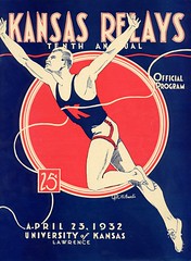
1932: Simple, basic beautiful.
1933: I don’t know if this medal-based design was actually used as the basis for a medal, but it should have been.
1939: Beautiful composition here, but the illo is surprisingly weak. Like, does that stubby guy look like a sprinter to you?
1941: You don’t often see American sports designs with a yin-yang graphic.
1942: This year marked the first full-color design. Not an improvement, methinks.
1948: Back to two-color, but with the typography reduced to little more than an afterthought. Nice illo, but overall design is disappointing.
1950: Bit of a misleading statement on this cover. The Relays’ true silver anniversary year would have been 1948, but the event was cancelled in 1943-45 due to World War II. So 1950 was the 25th installment of the Relays — noteworthy, but not a silver anniversary.
1955: Here’s one of the nicest designs from the 1950s. The organizers apparently agreed, because they used it again the following year.
1960s: A weak decade. In 1961 they started using photography, mostly to underwhelming effect. C’mon, this looks like it’s promoting a high school track meet. Pretty much a lost decade, with one notable exception.
1970s: Even worse.
1980s: A surprising return to form, with several fine two-color designs. There’s also a Warhol-ish experiment (I kinda like it) and one serious bit of weirdness.
The more recent stuff has mostly been predictably silly, but that’s digital design for ya. Want to see the full set of covers dating back to 1923? Look here.
(Thanks to Steve Stern for bringing this one to my attention.)
Collector’s Corner
By Brinke “Vote JFK” Guthrie
Our featured subject today is NFL helmet banks. Helmets make great banks because of their size and design. The slot always goes on the top in the helmet seam, and the plug in the base. Let’s take a look:
• This Saints bank comes complete with a klunky facemask.
• I had this! (Still have a Cowboys one from ’71.) This one, like mine, says “Hunter Savings” on it; as I recall, Hunter was a bank in suburban Kenwood. The auction listing says ’60s, but it feels like ’72 to me.
• That same seller also has a Rayduhz version, along with the Steelers (bad striping), Bills, and others.
• Heck, let’s sneak in this NBA bank, just for the logos on the base.
• Moving on to non-bank items, I like this old San Diego Clippers logo. Rather abstract, and so much better than their LA look, which the worst in the NBA (it’s always reminded me of someone who just sketched it out on a notepad and said, “Here”).
• Always liked this Cavs logo. But did anyone besides me wonder why the name went on top and the city on the bottom?
• I thought I’d seen all the vintage Tudor NFL stuff. I ordered so many complete teams from them, I even remember their address — 176 Johnson Street in Brooklyn (maybe Paul knows where this is [about a mile from my house, but I’m fairly certain no Tudor activities are currently taking place — PL]). So I was surprised to come across this 1975 game I hadn’t seen before, Power Sweep.
• I wore these spiral-bound NFL Record Manuals out.
• Love thi slogan: Baseball: the NOW career. [I’ve never seen this before and am fascinated by it. Ricko and/or other graybeards, you know anything about this? — PL]
• I have this exact bobble, and mine has an inscription on the bottom: “12-21-75, CIN 47, SD 17.”
• Whoa, look at these NHL logo stickers. Way cool.
• Ladies and gentlemen, your Atlanta Flames. One of my favorite logos ever.
• Hmmm, Pat Patriot as a sleeve logo. Interesting.
And now back to Paul for today’s Ticker.
Uni Watch News Ticker: The Fukuoka Softbank Hawks have given their captain a “C” (with thanks to Jeremy Brahm). ”¦ Stephen Boyd reports that Chelsea had a new red-accented collar for the FA Cup Final. ”¦ The last Plaxico Burress fan on Earth showed up at Drake University’s commencement ceremony the other day (photos taken by Matt Strum). ”¦ Cool throwback ballgame the other day between Bowling Green and Kent State. Photo No. 3 is of particular interest (with thanks to Tom Konecny). ”¦ Several Titans players have been helping with the clean-up from the Nashville floods, including Kerry Collins, who appears to have been wearing NFL gloves for the task (good spot by Mat Orefice). ”¦ While looking for something else, I spotted a shot of Clayton Kershaw with some serious Pedro Porthole action. ”¦ The Cavs have supposedly been fined for wearing their alts in the postseason, which doesn’t make any sense to me, what with Los Suns and all. Anyone know more about this? ”¦ Wes Rickards was watching the movie Spy Game the other day and noticed a uni glitch: “There’s a scene that supposedly took place in 1985 Beirut. But in that scene, the Padres hat that Brad Pitt was wearing featured Padres colors from the 1990s, and thus would not have been available in 1985.” ”¦ I week or two ago I linked to a photo of Brewers-branded airplane. Now Dwayne White has come up with some time-lapse video of the paint being applied to the jet (annoying soundtrack, though, so you might wanna hit the mute button). ”¦ Marc Viquez reports that the Coastal Bend Kingfish of the Continental Baseball League have patterned their graphics after the Expos (here’s a closer look), but is that an actual Expos batting helmet? ”¦ “Some friends of mine went to Gonzaga University during spring break to visit a friend,” writes Kyle Leeman. “Their friend is a graduate student in the sports management department and gave them a tour of the men’s locker room. Notice what is written on the bottom of the board.” ”¦ Sam Forster notes that Big Papi was wearing a 2008 All-Star Game undershirt last night. ”¦ “Cleveland High School in Portland, Oregon, has switched from one interesting football helmet to another,” writes Sam Nichols, who attends that school. “Last season, our team wore a green helmet with a yellow middle stripe and a wishbone C for Cleveland. Now it looks like we’re switching to a yellow helmet with an eerily familiar O — excuse me, C — logo. Veeery similar to U of O’s Civil War helmets. Phil Knight is an alum, which probably explains it.” … RIP, Hank.
Appears to be a glitch somewhere in the coding of today’s piece. Depending on which browser I’m using, it looks a little wonky. If anyone else is having this same problem, please let me know. Thanks.
Looks good to me, today (Windows Vista, Firefox latest version.)
That soundtrack for the making of Brewers 1? I’m pretty certain it’s just random clips from Garageband’s (link) library thrown together. Heh. The plane looks pretty cool, though.
Stephen Boyd reports that Chelsea had a new red-accented collar for the FA Cup Final.
That will be Chelsea’s kit for the 2010-2011 season; the red is to evoke the coats worn by the Chelsea Pensioners.
Whoa! What happened in 1977 with that KU relays program? Yikes.
The NBA fined the Cavs for wearing their throwbacks?!
1) Those arent even really throwbacks. Theyre just al alt jersey that looks different from their regular set.
2) Did the NBA fine the Nets when they wore their throwbacks in the 2003 Finals? link
link
I call shenanigans.
I don’t think the Coastal Bend Kingfish are still wearing the hats patterned after the Expos. At least one of those photos was from the 2009 season, taken in Alexandria, La., which no longer has a team in the league. And the Kingfish’ website also has this to say: “The Kingfish will keep their same colors with the exception of solid red pro style hats. No more clown hats!”
Technically, those aren’t “spiral-bound” record books; rather, they are “comb-bound.”
Always thought taped football shoes owed to track. Runners used it for two reasons: Held down the laces; make spikes feel form-fit.
Tape on cleats/spikes here? link
Must be, pretty sure Velcro wasn’t around in 1942.
—Ricko
[quote comment=”390620″]The NBA fined the Cavs for wearing their throwbacks?!
1) Those arent even really throwbacks. Theyre just al alt jersey that looks different from their regular set.
2) Did the NBA fine the Nets when they wore their throwbacks in the 2003 Finals? link
link
I call shenanigans.[/quote]
It’s not that the Cavs wore alts, it’s that they didn’t tell the league that they were wearing them.
And regarding the Nets, I think they had permission to wear the old New York throwbacks, seeing as it was the first all-ABA finals. Still wish the league would have let ’em use the old red, white & blue ball though…
[quote comment=\”390619\”]Whoa! What happened in 1977 with that KU relays program? Yikes.[/quote]
I\’m not sure I follow. That\’s easily the best one in the 70s, and one of the best ones in the entire gallery.
[quote comment=”390623″]Always thought taped football shoes owed to track. Runners used it for two reasons: Held down the laces; make spikes feel form-fit.
Tape on cleats/spikes here? link
Must be, pretty sure Velcro wasn’t around in 1942.
—Ricko[/quote]
Also in ’48…
link
[quote comment=”390625″][quote comment=\”390619\”]Whoa! What happened in 1977 with that KU relays program? Yikes.[/quote]
I\’m not sure I follow. That\’s easily the best one in the 70s, and one of the best ones in the entire gallery.[/quote]
Hah… I was thinkin’ the same thing.
[quote comment=”390625″][quote comment=\”390619\”]Whoa! What happened in 1977 with that KU relays program? Yikes.[/quote]
I\’m not sure I follow. That\’s easily the best one in the 70s, and one of the best ones in the entire gallery.[/quote]
that the one with the b/w starter’s pistol? yeah…that one’s the best of that decade, i agree
certainly better than the pornstaches on parade that preceded it
Interesting to see the high jump technique on the ’67 cover. I wonder when they started turning over in the jump?
[quote comment=”390629″]Interesting to see the high jump technique on the ’67 cover. I wonder when they started turning over in the jump?[/quote]
The Fosbury Flop.
Plenty of places on line to read all about it…and get the answer.
—Ricko
NC State Baseball joins the Natinals.
link
[quote comment=”390631″]NC State Baseball joins the Natinals.
link
Damn. Wolpfack has always been one of my favorite ninkcames.
Paul, I gotta tell you, those old Kansas Relay program covers are superb. One of the best historical features you’ve ever run. They certainly contribute to an overall narrative of a general decline — not without some great exceptions here and there — of American sports illustration in the postwar era. Particularly poignant (for this old half-miler, at least) is the decline of Track & Field as a popular American spectacle. Runners and jumpers of today go faster and higher, but the sense that T&F is a bigtime major sport lies by the wayside, I’m afraid, except for when the Olympics roll around. Too bad.
That Spy Game thing has bothered me for years. I think I even posted about it before. You would think that would be an easy mistake to catch, unless everybody doesn’t care about this stuff…
I found it interesting that so many of the covers of the “Kansas Relays” featured runners without batons. Of course, I always enjoyed our track meets in high school where they’d hold a “weightman’s relay”, where the throwers would use a shot put instead. Sometimes these events were a planned event at a relay-specific meet, sometimes they were thrown in at the end of a meet for comic relief. Either way, they were always fun!
Also … question for the “old-time print savy” folks … How the heck were the fancier fonts of the 1930s produced?
link
Seems to clean to be hand-drawn, but hard to imagine letter plates for designs that wouldn’t be regularly used.
Lastly … I lived up to my word last night, and signed up to be an official member around here. Anyone else do the same to celebrate four years yesterday?
“You know, you can do a lot with a simple illo and lots of curves.”
That’s what Robert Ullman says. ;)
link
Looks like an illustration from Mad Magazine. Maybe a Dave Berg?
[quote comment=”390635″]I found it interesting that so many of the covers of the “Kansas Relays” featured runners without batons. Of course, I always enjoyed our track meets in high school where they’d hold a “weightman’s relay”, where the throwers would use a shot put instead. Sometimes these events were a planned event at a relay-specific meet, sometimes they were thrown in at the end of a meet for comic relief. Either way, they were always fun!
Also … question for the “old-time print savy” folks … How the heck were the fancier fonts of the 1930s produced?
link
Seems to clean to be hand-drawn, but hard to imagine letter plates for designs that wouldn’t be regularly used.
Lastly … I lived up to my word last night, and signed up to be an official member around here. Anyone else do the same to celebrate four years yesterday?[/quote]
Actually, a lot (most) of that lettering was done by hand. My dad, for example, was good at it, but his partner was amazing, one of the best handlettering guys in the Midwest, if not in the country.
Scroll down to the Minnesota Buckskins. I drew the figure, my dad did the lettering. By hand, on that arc. Too bad it isn’t larger, you could see how clean and exacting his technique was.
—Ricko
Those Coastal Bend boys, caps looking like they’re giving you the finger.
Alternatively, the initials CB, with a logo that looks like wang? Someone had a fun time coming up with that one.
[quote comment=”390638″][quote comment=”390635″]I found it interesting that so many of the covers of the “Kansas Relays” featured runners without batons. Of course, I always enjoyed our track meets in high school where they’d hold a “weightman’s relay”, where the throwers would use a shot put instead. Sometimes these events were a planned event at a relay-specific meet, sometimes they were thrown in at the end of a meet for comic relief. Either way, they were always fun!
Also … question for the “old-time print savy” folks … How the heck were the fancier fonts of the 1930s produced?
link
Seems to clean to be hand-drawn, but hard to imagine letter plates for designs that wouldn’t be regularly used.
Lastly … I lived up to my word last night, and signed up to be an official member around here. Anyone else do the same to celebrate four years yesterday?[/quote]
Actually, a lot (most) of that lettering was done by hand. My dad, for example, was good at it, but his partner was amazing, one of the best handlettering guys in the Midwest, if not in the country.
Scroll down to the Minnesota Buckskins. I drew the figure, my dad did the lettering. By hand, on that arc. Too bad it isn’t larger, you could see how clean and exacting his technique was.
—Ricko[/quote]
Maybe should include the link, huh.
link
re: reversed city/team names in the Cleveland logo – FWIW, both the Indians and the Crusaders in the 70s had similar reversed names.
For example:
link
and
link
ed
What a jabroni to wear a jersey to a college commencement, have it tucked in his pants, and wears a cap indoors too boot? Sheesh.
I like this program cover from the 50s, featuring the ultimate opponent – the stopwatch:
link
By the way, the Chariots of Fire theme gets played by the California University (PA) band every time the Vulcans score a touchdown.
[quote comment=”390641″]re: reversed city/team names in the Cleveland logo – FWIW, both the Indians and the Crusaders in the 70s had similar reversed names.
For example:
link
and
link
ed[/quote]
Nike Mileti owned those teams at that time. Good bet the same design house did both.
What did Cavaliers’ logo look like then? Mileti owned them, too.
—Ricko
Wow, that old Clippers logo had some serious promise. An art director should consider mining that concept and finishing it for use today … oh, Donald Sterling stands in the way. Sorry.
PS, that Coastal Bend logo looks like some middle schooler drew it on his science book, and they reproduced it on their uniforms. lol
[quote comment=”390644″][quote comment=”390641″]re: reversed city/team names in the Cleveland logo – FWIW, both the Indians and the Crusaders in the 70s had similar reversed names.
For example:
link
and
link
ed[/quote]
Nike Mileti owned those teams at that time. Good bet the same design house did both.
What did Cavaliers’ logo look like then? Mileti owned them, too.
—Ricko[/quote]
LOL…let’s make that “Nick” Mileti
—Ricko
[quote comment=”390646″][quote comment=”390644″][quote comment=”390641″]re: reversed city/team names in the Cleveland logo – FWIW, both the Indians and the Crusaders in the 70s had similar reversed names.
For example:
link
and
link
ed[/quote]
Nike Mileti owned those teams at that time. Good bet the same design house did both.
What did Cavaliers’ logo look like then? Mileti owned them, too.
—Ricko[/quote]
LOL…let’s make that “Nick” Mileti
—Ricko[/quote]
Ah, missed the Cavs logo in bg’s Collection Corner.
[quote comment=”390634″]That Spy Game thing has bothered me for years. I think I even posted about it before. You would think that would be an easy mistake to catch, unless everybody doesn’t care about this stuff…[/quote]
HA! I remember watching that movie years ago and noticing that. It bugged the shit out of me. It damn near took me right out of the movie, as a matter of fact.
[quote comment=”390648″][quote comment=”390634″]That Spy Game thing has bothered me for years. I think I even posted about it before. You would think that would be an easy mistake to catch, unless everybody doesn’t care about this stuff…[/quote]
HA! I remember watching that movie years ago and noticing that. It bugged the shit out of me. It damn near took me right out of the movie, as a matter of fact.[/quote]
Like Max Klinger in that Texas Rangers’ hat on M*A*S*H all those years.
—Ricko
Not a big Patriots fan, but that jersey with Pat on the sleeves is fantastic.
Great overview of the Kansas Relay covers. It’s astonishing how, when photographs were added, the whole enterprise just fell… flat.
I will say, though, my very favorite of them all includes photographs (many of them): it’s the Warhol-ish cover. That is so cool.
Once again, Brinke, you unearth more of my stash. I own that very NBA bank and the Bengals bobblehead!
[quote comment=”390649″][quote comment=”390648″][quote comment=”390634″]That Spy Game thing has bothered me for years. I think I even posted about it before. You would think that would be an easy mistake to catch, unless everybody doesn’t care about this stuff…[/quote]
HA! I remember watching that movie years ago and noticing that. It bugged the shit out of me. It damn near took me right out of the movie, as a matter of fact.[/quote]
Like Max Klinger in that Texas Rangers’ hat on M*A*S*H all those years.
—Ricko[/quote]
link.
About those Kansas Relay programs. The other thing to notice is the pricing. For 20 or so years, the program cost was 25 cents, and later, for another decade or so, it rose to a mere 50 cents. It was information tool, not, as they are today, a means to make money.
On the 1932 cover, the runner’s left arm is covering the space of two letters, but the only unseen letter from the word ANNUAL is the 2nd N.
I’m thinking the illustrator put the runner’s arm there in order to cover what must have been a spelling mistake…like ‘ANNNUAL’ maybe.
[quote comment=”390647″][quote comment=”390646″][quote comment=”390644″][quote comment=”390641″]re: reversed city/team names in the Cleveland logo – FWIW, both the Indians and the Crusaders in the 70s had similar reversed names.
For example:
link
and
link
ed[/quote]
Nike Mileti owned those teams at that time. Good bet the same design house did both.
What did Cavaliers’ logo look like then? Mileti owned them, too.
—Ricko[/quote]
LOL…let’s make that “Nick” Mileti
—Ricko[/quote]
Ah, missed the Cavs logo in bg’s Collection Corner.[/quote]
Y’know, I can only think of three current logos that go nickname first: 76ers, Thunder and
Blackhawks (for their fauxback 3rd jerseys). Does superimposing the nickname over the city count? If so, throw in the Jets.
link
an English artist is selling portraits of a member of each of the 32 world cup squad- cool stuff
[quote comment=”390624″][quote comment=”390620″]The NBA fined the Cavs for wearing their throwbacks?!
1) Those arent even really throwbacks. Theyre just al alt jersey that looks different from their regular set.
2) Did the NBA fine the Nets when they wore their throwbacks in the 2003 Finals? link
link
I call shenanigans.[/quote]
It’s not that the Cavs wore alts, it’s that they didn’t tell the league that they were wearing them.
And regarding the Nets, I think they had permission to wear the old New York throwbacks, seeing as it was the first all-ABA finals. Still wish the league would have let ’em use the old red, white & blue ball though…[/quote]
It didn’t occur to me that it was an all-ABA affair, but you’re right, it was. Pretty cool.
Two issues with the NBA uniforms:
1. Never seen an NBA team use orange as the “home” uniform. Gold, yes (Lakers, Warriors); but orange, no. That was more newsworthy to me.
2. Lost in all the discussion about throwbacks and alternates is this point: Teams are losing their identity by constantly wearing them. Can anyone really tell me what the Cavaliers’ uniforms are anymore? They have more combinations than Oregon.
[quote comment=”390652″][quote comment=”390649″][quote comment=”390648″][quote comment=”390634″]That Spy Game thing has bothered me for years. I think I even posted about it before. You would think that would be an easy mistake to catch, unless everybody doesn’t care about this stuff…[/quote]
HA! I remember watching that movie years ago and noticing that. It bugged the shit out of me. It damn near took me right out of the movie, as a matter of fact.[/quote]
Like Max Klinger in that Texas Rangers’ hat on M*A*S*H all those years.
—Ricko[/quote]
link.[/quote]
I always thought that the hat Klingler wore was for the Toledo Mud Hens minor league team.
[quote comment=”390638″][quote comment=”390635″]I found it interesting that so many of the covers of the “Kansas Relays” featured runners without batons. Of course, I always enjoyed our track meets in high school where they’d hold a “weightman’s relay”, where the throwers would use a shot put instead. Sometimes these events were a planned event at a relay-specific meet, sometimes they were thrown in at the end of a meet for comic relief. Either way, they were always fun!
Also … question for the “old-time print savy” folks … How the heck were the fancier fonts of the 1930s produced?
link
Seems to clean to be hand-drawn, but hard to imagine letter plates for designs that wouldn’t be regularly used.
Lastly … I lived up to my word last night, and signed up to be an official member around here. Anyone else do the same to celebrate four years yesterday?[/quote]
Actually, a lot (most) of that lettering was done by hand. My dad, for example, was good at it, but his partner was amazing, one of the best handlettering guys in the Midwest, if not in the country.
Scroll down to the Minnesota Buckskins. I drew the figure, my dad did the lettering. By hand, on that arc. Too bad it isn’t larger, you could see how clean and exacting his technique was.
—Ricko[/quote]
Whoever did the lettering on that 1934 cover kinda messed up…or at least made a stylistic choice that I don’t understand. The lines cutting across the A’s are backwards compared to the other letters. (bold line on the right, instead of the left)
/yes, I feel like being nitpicky today.
[quote comment=”390638″][quote comment=”390635″]I found it interesting that so many of the covers of the “Kansas Relays” featured runners without batons. Of course, I always enjoyed our track meets in high school where they’d hold a “weightman’s relay”, where the throwers would use a shot put instead. Sometimes these events were a planned event at a relay-specific meet, sometimes they were thrown in at the end of a meet for comic relief. Either way, they were always fun!
Also … question for the “old-time print savy” folks … How the heck were the fancier fonts of the 1930s produced?
link
Seems to clean to be hand-drawn, but hard to imagine letter plates for designs that wouldn’t be regularly used.
Lastly … I lived up to my word last night, and signed up to be an official member around here. Anyone else do the same to celebrate four years yesterday?[/quote]
Actually, a lot (most) of that lettering was done by hand. My dad, for example, was good at it, but his partner was amazing, one of the best handlettering guys in the Midwest, if not in the country.
Scroll down to the Minnesota Buckskins. I drew the figure, my dad did the lettering. By hand, on that arc. Too bad it isn’t larger, you could see how clean and exacting his technique was.
—Ricko[/quote]
A little more on this. Most lettering was done by hand. People also did it with film in the subsequent decades. You can yell this particulr piece is done by hand because if you look very closely and compare the letters (like the three As in KANSAS RELAYS), you can see that they are all minutely different. Also check out and compare the letters around the medal. The smaller letters were harder to draw consistently, so in many cases you can see the differences better.
[quote comment=”390658″][quote comment=”390652″][quote comment=”390649″][quote comment=”390648″][quote comment=”390634″]That Spy Game thing has bothered me for years. I think I even posted about it before. You would think that would be an easy mistake to catch, unless everybody doesn’t care about this stuff…[/quote]
HA! I remember watching that movie years ago and noticing that. It bugged the shit out of me. It damn near took me right out of the movie, as a matter of fact.[/quote]
Like Max Klinger in that Texas Rangers’ hat on M*A*S*H all those years.
—Ricko[/quote]
link.[/quote]
I always thought that the hat Klingler wore was for the Toledo Mud Hens minor league team.[/quote]
Now where did you get link from?
[quote comment=”390654″]On the 1932 cover, the runner’s left arm is covering the space of two letters, but the only unseen letter from the word ANNUAL is the 2nd N.
I’m thinking the illustrator put the runner’s arm there in order to cover what must have been a spelling mistake…like ‘ANNNUAL’ maybe.[/quote]
Or, the artist moved the letters over after realizing the arm left “ANAL” uncovered.
In addition, there’s no way to arch the top of the ‘Twelfth Annual’ type unless doing it by hand. That’s another dead giveaway that the lettering of an old piece is hand done.
[quote comment=”390658″][quote comment=”390652″][quote comment=”390649″][quote comment=”390648″][quote comment=”390634″]That Spy Game thing has bothered me for years. I think I even posted about it before. You would think that would be an easy mistake to catch, unless everybody doesn’t care about this stuff…[/quote]
HA! I remember watching that movie years ago and noticing that. It bugged the shit out of me. It damn near took me right out of the movie, as a matter of fact.[/quote]
Like Max Klinger in that Texas Rangers’ hat on M*A*S*H all those years.
—Ricko[/quote]
link.[/quote]
I always thought that the hat Klingler wore was for the Toledo Mud Hens minor league team.[/quote]
I’m pretty sure it was. This would be the first time I’ve seen anyone say it wasn’t, and I’m originally from Toledo.
Re: the link that Brinke linked to. Anybody else notice that the Blackhawks (or, at the time, Black Hawks) Indian head logo is different than the one used on the jersey at that time (or any time, for that matter)? In fact, I don’t believe I’ve EVER seen that version of the Indian head. All the other teams look right, so why that one is off-model is a mystery to me…
[quote comment=”390664″][quote comment=”390658″][quote comment=”390652″][quote comment=”390649″][quote comment=”390648″][quote comment=”390634″]That Spy Game thing has bothered me for years. I think I even posted about it before. You would think that would be an easy mistake to catch, unless everybody doesn’t care about this stuff…[/quote]
HA! I remember watching that movie years ago and noticing that. It bugged the shit out of me. It damn near took me right out of the movie, as a matter of fact.[/quote]
Like Max Klinger in that Texas Rangers’ hat on M*A*S*H all those years.
—Ricko[/quote]
link.[/quote]
I always thought that the hat Klingler wore was for the Toledo Mud Hens minor league team.[/quote]
I’m pretty sure it was. This would be the first time I’ve seen anyone say it wasn’t, and I’m originally from Toledo.[/quote]
In fact… a little searching found this:
link
“As the series went on, Farr started to get a lot of attention for the fact that his character was wearing women’s clothing week after week,” remarked Joe Napoli, the Mud Hens current vice president and general manager. “So Gene Cook sent a Mud Hens care package to the show, as if it was to Corporal Klinger in Korea. The care package had a jersey, cap, T-shirts and souvenirs, and basically said ‘Well, if you ever decide to stop dressing up as a woman, here’s all this Mud Hens stuff you can wear.'”
The writing staff of M*A*S*H loved the idea (especially Ken Levine, who went on to broadcast Major League Baseball games for the Orioles, Mariners, and Padres), and Corporal Klinger was soon sporting a Toledo Mud Hens cap in front of tens of millions of attentive television viewers.
[quote comment=”390628″][quote comment=”390625″][quote comment=\”390619\”]Whoa! What happened in 1977 with that KU relays program? Yikes.[/quote]
I\’m not sure I follow. That\’s easily the best one in the 70s, and one of the best ones in the entire gallery.[/quote]
that the one with the b/w starter’s pistol? yeah…that one’s the best of that decade, i agree
certainly better than the pornstaches on parade that preceded it[/quote]
I dig the punk-rock/film-noir-ish look of link, and I also like linkbecause it looks like a jazz record cover…
[quote comment=”390666″][quote comment=”390664″][quote comment=”390658″][quote comment=”390652″][quote comment=”390649″][quote comment=”390648″][quote comment=”390634″]That Spy Game thing has bothered me for years. I think I even posted about it before. You would think that would be an easy mistake to catch, unless everybody doesn’t care about this stuff…[/quote]
HA! I remember watching that movie years ago and noticing that. It bugged the shit out of me. It damn near took me right out of the movie, as a matter of fact.[/quote]
Like Max Klinger in that Texas Rangers’ hat on M*A*S*H all those years.
—Ricko[/quote]
link.[/quote]
I always thought that the hat Klingler wore was for the Toledo Mud Hens minor league team.[/quote]
I’m pretty sure it was. This would be the first time I’ve seen anyone say it wasn’t, and I’m originally from Toledo.[/quote]
In fact… a little searching found this:
link
“As the series went on, Farr started to get a lot of attention for the fact that his character was wearing women’s clothing week after week,” remarked Joe Napoli, the Mud Hens current vice president and general manager. “So Gene Cook sent a Mud Hens care package to the show, as if it was to Corporal Klinger in Korea. The care package had a jersey, cap, T-shirts and souvenirs, and basically said ‘Well, if you ever decide to stop dressing up as a woman, here’s all this Mud Hens stuff you can wear.'”
The writing staff of M*A*S*H loved the idea (especially Ken Levine, who went on to broadcast Major League Baseball games for the Orioles, Mariners, and Padres), and Corporal Klinger was soon sporting a Toledo Mud Hens cap in front of tens of millions of attentive television viewers.[/quote]
The sarcasm tags are busted again? Something really needs to be done about that.
[quote comment=”390665″]Re: the link that Brinke linked to. Anybody else notice that the Blackhawks (or, at the time, Black Hawks) Indian head logo is different than the one used on the jersey at that time (or any time, for that matter)? In fact, I don’t believe I’ve EVER seen that version of the Indian head. All the other teams look right, so why that one is off-model is a mystery to me…[/quote]
You’re right, something in the face looks off.
Incidentally, the Seals logo shown there was their “print” version of the lettering, which was different than what was actually on the jerseys:
link
Note the lettering is more spaced out and the first “S” and “L” are larger than the remaining letters in comparison to the print version.
-Jet
Twelfth Anuual relays, you have two guys who look like they could be twins, yet apparently on different teams passing baton to each other?
Expect Plaxico to show up at StraightCashHomey soon!
[quote comment=”390639″]Those Coastal Bend boys, caps looking like they’re giving you the finger.
Alternatively, the initials CB, with a logo that looks like wang? Someone had a fun time coming up with that one.[/quote]
Both observations are VERY obvious. How do they wear that logo with a straight face?!
-Jet
[quote comment=”390668″]
The sarcasm tags are busted again? Something really needs to be done about that.[/quote]
I’m not so sure if was sarcasm from Ricko. That Rangers hat thing actually shows up on imbd.com in the trivia section.
[quote comment=”390669″][quote comment=”390665″]Re: the link that Brinke linked to. Anybody else notice that the Blackhawks (or, at the time, Black Hawks) Indian head logo is different than the one used on the jersey at that time (or any time, for that matter)? In fact, I don’t believe I’ve EVER seen that version of the Indian head. All the other teams look right, so why that one is off-model is a mystery to me…[/quote]
You’re right, something in the face looks off.
Incidentally, the Seals logo shown there was their “print” version of the lettering, which was different than what was actually on the jerseys:
link
Note the lettering is more spaced out and the first “S” and “L” are larger than the remaining letters in comparison to the print version.
-Jet[/quote]
It’s not just the face. The coloring on the feathers is way off as well.
[quote comment=”390674″][quote comment=”390669″][quote comment=”390665″]Re: the link that Brinke linked to. Anybody else notice that the Blackhawks (or, at the time, Black Hawks) Indian head logo is different than the one used on the jersey at that time (or any time, for that matter)? In fact, I don’t believe I’ve EVER seen that version of the Indian head. All the other teams look right, so why that one is off-model is a mystery to me…[/quote]
You’re right, something in the face looks off.
Incidentally, the Seals logo shown there was their “print” version of the lettering, which was different than what was actually on the jerseys:
link
Note the lettering is more spaced out and the first “S” and “L” are larger than the remaining letters in comparison to the print version.
-Jet[/quote]
It’s not just the face. The coloring on the feathers is way off as well.[/quote]
Yeah, the first think I noticed was the lack of warpaint on the face, but it seems like a complete redesign all around. I’m curious if they just made it up themselves or if that was actually used by the team at some point. As a lifelong Hawks fan I’ve come across my fair share of throwback stuff and I’ve certainly never seen it before.
[quote comment=”390666″][quote comment=”390664″][quote comment=”390658″][quote comment=”390652″][quote comment=”390649″][quote comment=”390648″][quote comment=”390634″]That Spy Game thing has bothered me for years. I think I even posted about it before. You would think that would be an easy mistake to catch, unless everybody doesn’t care about this stuff…[/quote]
HA! I remember watching that movie years ago and noticing that. It bugged the shit out of me. It damn near took me right out of the movie, as a matter of fact.[/quote]
Like Max Klinger in that Texas Rangers’ hat on M*A*S*H all those years.
—Ricko[/quote]
link.[/quote]
I always thought that the hat Klingler wore was for the Toledo Mud Hens minor league team.[/quote]
I’m pretty sure it was. This would be the first time I’ve seen anyone say it wasn’t, and I’m originally from Toledo.[/quote]
In fact… a little searching found this:
link
“As the series went on, Farr started to get a lot of attention for the fact that his character was wearing women’s clothing week after week,” remarked Joe Napoli, the Mud Hens current vice president and general manager. “So Gene Cook sent a Mud Hens care package to the show, as if it was to Corporal Klinger in Korea. The care package had a jersey, cap, T-shirts and souvenirs, and basically said ‘Well, if you ever decide to stop dressing up as a woman, here’s all this Mud Hens stuff you can wear.'”
The writing staff of M*A*S*H loved the idea (especially Ken Levine, who went on to broadcast Major League Baseball games for the Orioles, Mariners, and Padres), and Corporal Klinger was soon sporting a Toledo Mud Hens cap in front of tens of millions of attentive television viewers.[/quote]
Soooooo – Bob Short basically “borrowed” an existing minor-league team’s cap design when he re-branded the former Senators, go figure…
[quote comment=”390675″][quote comment=”390674″][quote comment=”390669″][quote comment=”390665″]
Yeah, the first think I noticed was the lack of warpaint on the face, but it seems like a complete redesign all around. I’m curious if they just made it up themselves or if that was actually used by the team at some point. As a lifelong Hawks fan I’ve come across my fair share of throwback stuff and I’ve certainly never seen it before.[/quote]
Oh yeah, how’d I miss the warpaint.
-Jet
[quote comment=”390676″]
Soooooo – Bob Short basically “borrowed” an existing minor-league team’s cap design when he re-branded the former Senators, go figure…[/quote]
I’m not really sure. I can’t seem to find a Mud Hens hat history to help me out here. I think the Mud Hens use of that style of T dates back farther, but most of the time it’s also had their bird on top of it. They may very well have switched to the plain T at the same time that it made it’s way onto the show, after the Rangers had already started using theirs. The hat with the bird wouldn’t be as clear and recognizable on TV… and of course if you’re using the show to cash in, you gotta sell people the same thing they’re seeing on TV.
The Mud Hens do currently sell a plain T hat from their website, but it’s specifically listed as a Klinger hat.
We’ve done this all before, but here goes.
You know that for a portion of the Korean War the Toledo Mudhens didn’t exist. The team left Toledo in 1952 to become Charleston Senators. The Milwaukee Brewers moved to Toledo in 1953, but were the Toledo Sox.
Since M.A.S.H. ran about three times as long as the Korean War it’s difficult to figure out when Max should haven been heartbroken that the Mudhens had left Swayne Field. Maybe we could fix it to the episode that occurs over a year and includes the pennant chase.
[quote comment=”390679″]We’ve done this all before, but here goes.
You know that for a portion of the Korean War the Toledo Mudhens didn’t exist. The team left Toledo in 1952 to become Charleston Senators. The Milwaukee Brewers moved to Toledo in 1953, but were the Toledo Sox.
Since M.A.S.H. ran about three times as long as the Korean War it’s difficult to figure out when Max should haven been heartbroken that the Mudhens had left Swayne Field. Maybe we could fix it to the episode that occurs over a year and includes the pennant chase.[/quote]
Oh sure, ruin all the fun. Next you’ll be telling us the Seahawks actually did use a logo in their first season.
/or the show takes place in a parallel universe that branched off from our own when they discovered the Stargate in 1924
I know it was an anniversary year for the Cavaliers, but I thought they wore their throwbacks way too many times this season. It seemed like half the games were in them.
And if they really wanted to remember their entire history, they’d have worn the link a few times too!
[quote comment=”390678″][quote comment=”390676″]
Soooooo – Bob Short basically “borrowed” an existing minor-league team’s cap design when he re-branded the former Senators, go figure…[/quote]
I’m not really sure. I can’t seem to find a Mud Hens hat history to help me out here. I think the Mud Hens use of that style of T dates back farther, but most of the time it’s also had their bird on top of it. They may very well have switched to the plain T at the same time that it made it’s way onto the show, after the Rangers had already started using theirs. The hat with the bird wouldn’t be as clear and recognizable on TV… and of course if you’re using the show to cash in, you gotta sell people the same thing they’re seeing on TV.
The Mud Hens do currently sell a plain T hat from their website, but it’s specifically listed as a Klinger hat.[/quote]
I tried to find some sort of Mud Hens hat history as well with no luck. My favorite MiLB reference source – Cooperstown Caps Company’s excellent website – is, alas, no more.
[quote comment=”390630″][quote comment=”390629″]Interesting to see the high jump technique on the ’67 cover. I wonder when they started turning over in the jump?[/quote]
The Fosbury Flop.
Plenty of places on line to read all about it…and get the answer.
—Ricko[/quote]
And here’s Mr. Fosbury in 1968 to show us link.
Are those Pumas he’s wearing?
While watching the Rays/Indians game last night saw something interesting going on with Fausto Carmona’s hat…still has the stickers under the brim of the cap. Check it out: link
I grew up in Kansas, and track and field was huge at KU. The Kansas Relays were a big deal. Cunningham, Santee, Mills, Ryan, Oerter, there were a number of stud athletes.
I’ve tried, without success, to find pictures when Bill Timmons was coach. For years, the team had hot pink singlets and baby blue shorts. It was quite the look.
Of course, I went to K-State when DeLoss Dodds was coach. The Wildcats performed well. Dodds, now, is athletic director at Texas raking in the major bucks. It’s a good gig considering how he was so impoverished at K-State.
I appreciate lifting the purple moratorium – even if it was for a single day – so I could get my membership card. Maligned as it is, purple remains a beautiful and honorable color.
[quote comment=”390679″]We’ve done this all before, but here goes.
You know that for a portion of the Korean War the Toledo Mudhens didn’t exist. The team left Toledo in 1952 to become Charleston Senators. The Milwaukee Brewers moved to Toledo in 1953, but were the Toledo Sox.
[/quote]
Originally, the Toledo Glass Sox. Which sounds painful to me, and makes just about as much sense as “Colorado Springs Sky Sox”
[quote comment=”390684″]While watching the Rays/Indians game last night saw something interesting going on with Fausto Carmona’s hat…still has the stickers under the brim of the cap. Check it out: link
Wow! What a sloppy looking set of pajamas, oops uniform, Carmona’s wearing.
[quote comment=”390681″]I know it was an anniversary year for the Cavaliers, but I thought they wore their throwbacks way too many times this season. It seemed like half the games were in them.
And if they really wanted to remember their entire history, they’d have worn the link a few times too![/quote]
Almost nobody wants to remember those unis…or Shawn Kemp. I had fonder memories of the Stepien years.
[quote comment=”390686″][quote comment=”390679″]We’ve done this all before, but here goes.
You know that for a portion of the Korean War the Toledo Mudhens didn’t exist. The team left Toledo in 1952 to become Charleston Senators. The Milwaukee Brewers moved to Toledo in 1953, but were the Toledo Sox.
[/quote]
Originally, the Toledo Glass Sox. Which sounds painful to me, and makes just about as much sense as “Colorado Springs Sky Sox”[/quote]
Glass Sox = worn by Cinderella when her feet get cold
Sky Sox = another name for Anti-Gravity Boots
[quote comment=”390686″][quote comment=”390679″]We’ve done this all before, but here goes.
You know that for a portion of the Korean War the Toledo Mudhens didn’t exist. The team left Toledo in 1952 to become Charleston Senators. The Milwaukee Brewers moved to Toledo in 1953, but were the Toledo Sox.
[/quote]
Originally, the Toledo Glass Sox. Which sounds painful to me, and makes just about as much sense as “Colorado Springs Sky Sox”[/quote]
Also Glasox. This is what happens when you leave it up to committee.
I’ve never been clear if the sky in Sky Sox is meant to be the color or the sky itself Or maybe it was going to be Ski Sox and someone just got it wrong.
Back to the Mud Hens (which I keep turning into one word) I’ll recommend again WGTE’s link. It’s about 42 minutes long and worth the time. At the 22:22 mark, they’re discussing the Mud Hens leaving in 1952 and there’s a team photo. Unfortunately, the hat isn’t very clear. They’re wearing jerseys that say Toledo in a rounded script.
Why…or rather, how…is it that the 60th anniversary link and the 75th anniversary link can both be the “Diamond Anniversary?”
[quote comment=”390691″]Why…or rather, how…is it that the 60th anniversary link and the 75th anniversary link can both be the “Diamond Anniversary?”[/quote]
Call it a link.
Anyone have a shot of the new cavs logo. it was taken down before I could see it. Thanks
[quote comment=”390690″][quote comment=”390686″][quote comment=”390679″]We’ve done this all before, but here goes.
You know that for a portion of the Korean War the Toledo Mudhens didn’t exist. The team left Toledo in 1952 to become Charleston Senators. The Milwaukee Brewers moved to Toledo in 1953, but were the Toledo Sox.
[/quote]
Originally, the Toledo Glass Sox. Which sounds painful to me, and makes just about as much sense as “Colorado Springs Sky Sox”[/quote]
Also Glasox. This is what happens when you leave it up to committee.
I’ve never been clear if the sky in Sky Sox is meant to be the color or the sky itself Or maybe it was going to be Ski Sox and someone just got it wrong.
Back to the Mud Hens (which I keep turning into one word) I’ll recommend again WGTE’s link. It’s about 42 minutes long and worth the time. At the 22:22 mark, they’re discussing the Mud Hens leaving in 1952 and there’s a team photo. Unfortunately, the hat isn’t very clear. They’re wearing jerseys that say Toledo in a rounded script.[/quote]
link Believe that’s from 1953 (the file name is wrong), after the Brewers moved to Toledo.
Interesting paragraph in this story on two WVU players returning for their senior football season: link
(Coach Bill) “Stewart awarded different colored jerseys to each player during the winter conditioning program based upon each individual’s effort. A gold jersey meant the player was working at a championship level. Blue signified solid if not spectacular performance. A brown jersey — well, you can probably figure out what brown stood for.”
[quote comment=”390693″]Anyone have a shot of the new cavs logo. it was taken down before I could see it. Thanks[/quote]
The new draft cap, or the link?
Don’t throw out those Brandon Marshall jerseys – these folks will DIY it into a Tebow:
link
[quote comment=”390667″][quote comment=”390628″][quote comment=”390625″][quote comment=\”390619\”]Whoa! What happened in 1977 with that KU relays program? Yikes.[/quote]
I\’m not sure I follow. That\’s easily the best one in the 70s, and one of the best ones in the entire gallery.[/quote]
that the one with the b/w starter’s pistol? yeah…that one’s the best of that decade, i agree
certainly better than the pornstaches on parade that preceded it[/quote]
I dig the punk-rock/film-noir-ish look of link, and I also like linkbecause it looks like a jazz record cover…[/quote]
Yep, that 1975 cover is superb! Also, reminds me of those 1970 Pro! covers.
LOVE the Bowling Green-Kent State throwback match-up. Might be the best baseball uni combo of the season thus far. Well, till the Nats and Pirates (hopefully) bring back the Grays v Grays game next month.
Any other candidates? Brewers-Phillies from the other night, maybe?
Whats so wrong with Gonzaga reminding everyone to wear Nike. They are sponsored by Nike and going on a trip as Gonzaga, not individuals. It’s basically official business in an athletic setting. If you worked for Microsoft and were traveling somewhere on business you really think it would be fine to wear an Apple shirt on the flight, and pass the time rocking out to tunes on your iPod? Same thing with Gonzaga. They are traveling as a team that just happens to be sponsored by Nike. It’s standard procedure, not Nike being an evil diabolical and cruel company.
[quote comment=”390697″]Don’t throw out those Brandon Marshall jerseys – these folks will DIY it into a Tebow:
link
…with the wrong font.
It’s a good idea though.
/I said I was being nitpicky today
[quote comment=”390697″]Don’t throw out those Brandon Marshall jerseys – these folks will DIY it into a Tebow:
link
Cute, yet a pretty shitty job on that NOB. Color and font are not even close.
[quote comment=”390694″][quote comment=”390690″]
Back to the Mud Hens (which I keep turning into one word) I’ll recommend again WGTE’s link. It’s about 42 minutes long and worth the time. At the 22:22 mark, they’re discussing the Mud Hens leaving in 1952 and there’s a team photo. Unfortunately, the hat isn’t very clear. They’re wearing jerseys that say Toledo in a rounded script.[/quote]
link Believe that’s from 1953 (the file name is wrong), after the Brewers moved to Toledo.[/quote]
Thinking out loud – if that really is a re-purposed Brewers uniform, then the colors are navy and red, and the cap is most likely navy crown, red bill and simple white “T”.
[quote comment=”390700″]Whats so wrong with Gonzaga reminding everyone to wear Nike. They are sponsored by Nike and going on a trip as Gonzaga, not individuals. It’s basically official business in an athletic setting. If you worked for Microsoft and were traveling somewhere on business you really think it would be fine to wear an Apple shirt on the flight, and pass the time rocking out to tunes on your iPod? Same thing with Gonzaga. They are traveling as a team that just happens to be sponsored by Nike. It’s standard procedure, not Nike being an evil diabolical and cruel company.[/quote]
Speaking of that list:
link
What are crunchies?
Is that the official snack of Gonzaga?
link
[quote comment=”390700″]Whats so wrong with Gonzaga reminding everyone to wear Nike…[/quote]
I tend to agree with this. Nike pays Few and the university quite a bit of money for them to wear Nike – and Nike has done a ton to help Gonzaga step into the college hoops limelight. Though I guess it does look a bit tacky when they feel the need to stress ‘Nike only’ on a whiteboard like that.
[quote comment=”390694″][quote comment=”390690″][quote comment=”390686″][quote comment=”390679″]We’ve done this all before, but here goes.
You know that for a portion of the Korean War the Toledo Mudhens didn’t exist. The team left Toledo in 1952 to become Charleston Senators. The Milwaukee Brewers moved to Toledo in 1953, but were the Toledo Sox.
[/quote]
Originally, the Toledo Glass Sox. Which sounds painful to me, and makes just about as much sense as “Colorado Springs Sky Sox”[/quote]
Also Glasox. This is what happens when you leave it up to committee.
I’ve never been clear if the sky in Sky Sox is meant to be the color or the sky itself Or maybe it was going to be Ski Sox and someone just got it wrong.
Back to the Mud Hens (which I keep turning into one word) I’ll recommend again WGTE’s link. It’s about 42 minutes long and worth the time. At the 22:22 mark, they’re discussing the Mud Hens leaving in 1952 and there’s a team photo. Unfortunately, the hat isn’t very clear. They’re wearing jerseys that say Toledo in a rounded script.[/quote]
link Believe that’s from 1953 (the file name is wrong), after the Brewers moved to Toledo.[/quote]
Similar. The stirrups are different and I think the ‘l’ is more tilted. (It touches the piping on the player’s left hand side.) It doesn’t look like the letters are red like the link.
[quote comment=”390700″]Whats so wrong with Gonzaga reminding everyone to wear Nike. They are sponsored by Nike and going on a trip as Gonzaga, not individuals. It’s basically official business in an athletic setting. If you worked for Microsoft and were traveling somewhere on business you really think it would be fine to wear an Apple shirt on the flight, and pass the time rocking out to tunes on your iPod? Same thing with Gonzaga. They are traveling as a team that just happens to be sponsored by Nike. It’s standard procedure, not Nike being an evil diabolical and cruel company.[/quote]
As is often the case, this isn’t really about Nike but about corporate douchebaggery in general. If Nike appears to get the most blame, it’s because they play that game better than anyone.
And in this case, yes. It is regrettable that we have reached a state where a team’s uniform manufacturer should be allowed to dictate the clothes athletes are allowed to pack for their trip.
But seriously – Microsoft employees aren’t allowed to be seen using iPods?
There is something absolutely fantastic about this link. I swear I saw Birdman move?
[quote comment=”390649″][quote comment=”390648″][quote comment=”390634″]That Spy Game thing has bothered me for years. I think I even posted about it before. You would think that would be an easy mistake to catch, unless everybody doesn’t care about this stuff…[/quote]
HA! I remember watching that movie years ago and noticing that. It bugged the shit out of me. It damn near took me right out of the movie, as a matter of fact.[/quote]
Like Max Klinger in that Texas Rangers’ hat on M*A*S*H all those years.
—Ricko[/quote]
I agree totally. I was never able to get through that movie all the way and I think it was because I got confused and lost thinking that since he had that newer Padres hat on it must be a different time frame. Uni-watching and ADD sometimes a good mix don’t make.
[quote comment=”390706″][quote comment=”390694″][quote comment=”390690″][quote comment=”390686″][quote comment=”390679″]We’ve done this all before, but here goes.
You know that for a portion of the Korean War the Toledo Mudhens didn’t exist. The team left Toledo in 1952 to become Charleston Senators. The Milwaukee Brewers moved to Toledo in 1953, but were the Toledo Sox.
[/quote]
Originally, the Toledo Glass Sox. Which sounds painful to me, and makes just about as much sense as “Colorado Springs Sky Sox”[/quote]
Also Glasox. This is what happens when you leave it up to committee.
I’ve never been clear if the sky in Sky Sox is meant to be the color or the sky itself Or maybe it was going to be Ski Sox and someone just got it wrong.
Back to the Mud Hens (which I keep turning into one word) I’ll recommend again WGTE’s link. It’s about 42 minutes long and worth the time. At the 22:22 mark, they’re discussing the Mud Hens leaving in 1952 and there’s a team photo. Unfortunately, the hat isn’t very clear. They’re wearing jerseys that say Toledo in a rounded script.[/quote]
link Believe that’s from 1953 (the file name is wrong), after the Brewers moved to Toledo.[/quote]
Similar. The stirrups are different and I think the ‘l’ is more tilted. (It touches the piping on the player’s left hand side.) It doesn’t look like the letters are red like the link.[/quote]
My photo is definitely Glass Sox – those are the Braves/Brewers stirrups my guy’s wearing. It would be possible for Klinger to be wearing the white-T cap, but only for the final few months of the Korean War.
Colorado Buffaloes to go with nameless uniforms for the upcoming football season:
link
Not a fan at all. The numbers are going to look too low and I’m sure a Buffaloes logo will be replacing the names like how they do it for basketball:
link
The point of the Toledo-native Klinger deal is that the costume department found him a Mudhens jersey styled after the ’40s, which made sense. But they topped it with a contemporary (at the time of filming) Rangers hat they found at the mall or something.
Know how we can tell? Klinger’s hat is ROYAL blue with a red visor. Block T, script T…whatever…on the hat isn’t the point. Mudhens never, in any era that would have been in any way relevant to the Korean War, wore royal blue.
—Ricko
[quote comment=”390704″][quote comment=”390700″]Whats so wrong with Gonzaga reminding everyone to wear Nike. They are sponsored by Nike and going on a trip as Gonzaga, not individuals. It’s basically official business in an athletic setting. If you worked for Microsoft and were traveling somewhere on business you really think it would be fine to wear an Apple shirt on the flight, and pass the time rocking out to tunes on your iPod? Same thing with Gonzaga. They are traveling as a team that just happens to be sponsored by Nike. It’s standard procedure, not Nike being an evil diabolical and cruel company.[/quote]
Speaking of that list:
link
What are crunchies?
Is that the official snack of Gonzaga?
link
I thought those were what you got at the bottom of a box from Long John Silvers. I respect the desire to eat them, but can’t help but wonder of those things wouldn’t travel really well.
[quote comment=”390712″]The point of the Toledo-native Klinger deal is that the costume department found him a Mudhens jersey styled after the ’40s, which made sense. But they topped it with a contemporary (at the time of filming) Rangers hat they found at the mall or something.
Know how we can tell? Klinger’s hat is ROYAL blue with a red visor. Block T, script T…whatever…on the hat isn’t the point. Mudhens never, in any era that would have been in any way relevant to the Korean War, wore royal blue.
—Ricko[/quote]
link
That doesn’t look like royal blue to me.
[quote comment=”390714″][quote comment=”390712″]The point of the Toledo-native Klinger deal is that the costume department found him a Mudhens jersey styled after the ’40s, which made sense. But they topped it with a contemporary (at the time of filming) Rangers hat they found at the mall or something.
Know how we can tell? Klinger’s hat is ROYAL blue with a red visor. Block T, script T…whatever…on the hat isn’t the point. Mudhens never, in any era that would have been in any way relevant to the Korean War, wore royal blue.
—Ricko[/quote]
link
That doesn’t look like royal blue to me.[/quote]
Watch any episode wear the hat shows up.
To answer an earlier MASH question, in A War for all Seasons (Season 9 episode 6) the camp bets on the 1951 NL pennant race which ends with the Shot Heard ‘Round the World.
[quote comment=”390700″]Whats so wrong with Gonzaga reminding everyone to wear Nike. They are sponsored by Nike and going on a trip as Gonzaga, not individuals. It’s basically official business in an athletic setting. If you worked for Microsoft and were traveling somewhere on business you really think it would be fine to wear an Apple shirt on the flight, and pass the time rocking out to tunes on your iPod? Same thing with Gonzaga. They are traveling as a team that just happens to be sponsored by Nike. It’s standard procedure, not Nike being an evil diabolical and cruel company.[/quote]
…I agree, except they spelled link wrong on the board. That’s the REAL problem.
[quote comment=”390709″][quote comment=”390649″][quote comment=”390648″][quote comment=”390634″]That Spy Game thing has bothered me for years. I think I even posted about it before. You would think that would be an easy mistake to catch, unless everybody doesn’t care about this stuff…[/quote]
HA! I remember watching that movie years ago and noticing that. It bugged the shit out of me. It damn near took me right out of the movie, as a matter of fact.[/quote]
Like Max Klinger in that Texas Rangers’ hat on M*A*S*H all those years.
—Ricko[/quote]
I agree totally. I was never able to get through that movie all the way and I think it was because I got confused and lost thinking that since he had that newer Padres hat on it must be a different time frame. Uni-watching and ADD sometimes a good mix don’t make.[/quote]
Here’s a movie goof that bothered the crap out of me … and I loved the movie. Check this …
link
I know it’s blurry, but the pennant under the California flag is a Dodger pennant from the 80s, not the 60s. It’s one of these …
link
Such a good film, one of the best of all time, but that thing shows up in two different scenes and just kinds tweeks me everytime I see it.
[quote comment=”390705″][quote comment=”390700″]Whats so wrong with Gonzaga reminding everyone to wear Nike…[/quote]
I tend to agree with this. Nike pays Few and the university quite a bit of money for them to wear Nike – and Nike has done a ton to help Gonzaga step into the college hoops limelight. Though I guess it does look a bit tacky when they feel the need to stress ‘Nike only’ on a whiteboard like that.[/quote]
If Nike really just wanted to “help out” colleges and universities, they’d help out without asking for anything in return. When I help out someone or a cause I beleive in or hell just picking someone up at the airport, I never expect a “thanks” or to be reimbursed for expenses, I’m doing it because its something I believe in.
I think it is corp duecebaggery when a company like Nike forces college kids to wear their stuff off the court. If Nike was really interested in helping out colleges and universities they’d have their name on the tag of the clothes and thats it, or at least a swoosh the same background color of the garment so its nearly unnoticeable.
It’s not like Nike is reinventing physics or something, they’re freaking making shirts. Same with reebok in the NHL, do I give a crap which company makes the jerseys? Hell No.
/rant off/
Or in the original film M*A*S*H, Fred Williamson plays in that football game wearing a 1960s helmet and facemask and white cleats all spatted up…nothing at all like an early ’50s player.
He looks like mid-60’s player who went back in time to the Korean War.
—Ricko
[quote comment=”390684″]While watching the Rays/Indians game last night saw something interesting going on with Fausto Carmona’s hat…still has the stickers under the brim of the cap. Check it out: link
funny… i keep the same (authentic) sticker on my hats:
link
pic explanation: my friend steph is a jays lover, indians hater so i was goofing around… also, that’s my new TKearns/Powers style hat. LOL
and i just noticed pop’s stirrups in the upper right of the pic (macfarlane).
lots of stuff going on in that pic. haha
[quote comment=”390715″][quote comment=”390714″][quote comment=”390712″]The point of the Toledo-native Klinger deal is that the costume department found him a Mudhens jersey styled after the ’40s, which made sense. But they topped it with a contemporary (at the time of filming) Rangers hat they found at the mall or something.
Know how we can tell? Klinger’s hat is ROYAL blue with a red visor. Block T, script T…whatever…on the hat isn’t the point. Mudhens never, in any era that would have been in any way relevant to the Korean War, wore royal blue.
—Ricko[/quote]
link
That doesn’t look like royal blue to me.[/quote]
Watch any episode wear the hat shows up.[/quote]
So are you saying that in SOME of the episodes, the “Mud Hens” cap is actually royal blue?
Because I really don’t remember a royal blue cap. Granted, I probably haven’t seen an episode where Klinger wears it since the show went off the air damn near 30 years ago, but it sure looks to me like that picture showing the navy cap is a screen grab from the show.
And while I’m at it, a while ago Paul had eluded to a comparison of NHL jersey with the Reebok logo on it to a car with the manufacturers wordmark/logo on it, however, after thinking about that post for 6+ months or more, I have to take issue with that comparison, sorry Paul.
Think of it this way, you own a company, Joes Flooring, and you want to rent 100 trucks from Chevy, you’re going to paint the trucks in your color and plaster Joes Flooring all over the trucks. You have one requirement though, there can’t be a Chevy bowtie or wordmark or model name or anything on the truck, nothing that identifies the manufacturer or model as a Chevy.
Same with the NHL, Reebok, we’ll buy every single of the 1400+ (700 players home and away and then some) jerseys from you (and then some for however many times they change a season, like 5 times?) for what, a total of nearly 10,000 jerseys a year, with one catch, the reebok symbol has to be the same color as the field in which it appears or not on there at all.
I mean, is Reebok giving the NHL these jerseys for free? If so by all means keep the logo on there and prominent. Is reebok charging them $400+ a jersey? then hell, get that thing off of there. You’re not even building a car, you’re making jerseys for crying out loud, are those jerseys such masterpieces of garment engineering we just HAVE TO know who manufactured it?
ok I’m glad thats off my chest.
[quote comment=”390720″][quote comment=”390705″][quote comment=”390700″]Whats so wrong with Gonzaga reminding everyone to wear Nike…[/quote]
I tend to agree with this. Nike pays Few and the university quite a bit of money for them to wear Nike – and Nike has done a ton to help Gonzaga step into the college hoops limelight. Though I guess it does look a bit tacky when they feel the need to stress ‘Nike only’ on a whiteboard like that.[/quote]
If Nike really just wanted to “help out” colleges and universities, they’d help out without asking for anything in return. [/quote]
Well, I certainly didn’t mean ‘help’ in the sense of altruism or charity. I meant ‘help’ in the sense that their professional, contractual work with the Gonzaga program has worked to boost it’s status. I’m not naive to think that Nike should or would do this out of the kindness of their hearts. This is big money sports we’re talking about – Gonzaga knows what they’re getting into – as does Nike. You may not like the fact that shoe companies are a big deal in “amateur” basketball, but they are. And it would be foolish for a coach or AD to turn their backs on a big Nike contract, when they are going to assist you in landing good recruits, games and exposure.
Of course sometimes schools take a high road…
link
[quote comment=”390712″]The point of the Toledo-native Klinger deal is that the costume department found him a Mudhens jersey styled after the ’40s, which made sense. But they topped it with a contemporary (at the time of filming) Rangers hat they found at the mall or something.
Know how we can tell? Klinger’s hat is ROYAL blue with a red visor. Block T, script T…whatever…on the hat isn’t the point. Mudhens never, in any era that would have been in any way relevant to the Korean War, wore royal blue.
—Ricko[/quote]
Ricko – The wealth of your knowledge is staggering. I’m impressed.
[quote comment=”390723″][quote comment=”390715″][quote comment=”390714″][quote comment=”390712″]The point of the Toledo-native Klinger deal is that the costume department found him a Mudhens jersey styled after the ’40s, which made sense. But they topped it with a contemporary (at the time of filming) Rangers hat they found at the mall or something.
Know how we can tell? Klinger’s hat is ROYAL blue with a red visor. Block T, script T…whatever…on the hat isn’t the point. Mudhens never, in any era that would have been in any way relevant to the Korean War, wore royal blue.
—Ricko[/quote]
link
That doesn’t look like royal blue to me.[/quote]
Watch any episode wear the hat shows up.[/quote]
So are you saying that in SOME of the episodes, the “Mud Hens” cap is actually royal blue?
Because I really don’t remember a royal blue cap. Granted, I probably haven’t seen an episode where Klinger wears it since the show went off the air damn near 30 years ago, but it sure looks to me like that picture showing the navy cap is a screen grab from the show.[/quote]
Way too many opinions around here are formed based on one old photo or one screen grab.
And I’m saying EVERY time they used it on TV it was the same hat. A Texas Rangers hat from the ’70s. Royal blue, red visor. I have very likely seen every episode of M*A*S*H several times. From the first time I saw the hat and thought “Typical. They just bought a Rangers hat and think that’s close enough” through the end of the show’s run, was the same hat.
Also, if you saw the show in syndication (which I’m guessing most of you did), the prints every often are pretty dark. When you see them now on TV Land or Hallmark Channel, digitally re-mastered from the originals, the colors are quite true, and the hat’s royal blue. Just saw the “Boxing Day” episode recently where Col. Potter wears both the hat and the jersey. Hat is most definitely a ’70s Rangers. Is almost impossible, if the lighting is right, for navy to look royal. Royal can look navy (as in that screen grab), but not the other way around.
I also don’t believe that at any time in the ’40s or early ’50s did the Mud Hens have a red visor. Perhaps after the Brewers moved there with their Braves affiliation, but not before. And certainly not in the era of the jersey Klinger wears.
At least i don’t believe so. Mud Hens images of that area are tough to find (I’ll watch that vid when I get home; looking forward to it).
—Ricko
[quote comment=”390700″]Whats so wrong with Gonzaga reminding everyone to wear Nike…[/quote]
nothing
[quote comment=”390724″]And while I’m at it, a while ago Paul had eluded to a comparison of NHL jersey with the Reebok logo on it to a car with the manufacturers wordmark/logo on it, however, after thinking about that post for 6+ months or more, I have to take issue with that comparison, sorry Paul.
Think of it this way, you own a company, Joes Flooring, and you want to rent 100 trucks from Chevy, you’re going to paint the trucks in your color and plaster Joes Flooring all over the trucks. You have one requirement though, there can’t be a Chevy bowtie or wordmark or model name or anything on the truck, nothing that identifies the manufacturer or model as a Chevy.
Same with the NHL, Reebok, we’ll buy every single of the 1400+ (700 players home and away and then some) jerseys from you (and then some for however many times they change a season, like 5 times?) for what, a total of nearly 10,000 jerseys a year, with one catch, the reebok symbol has to be the same color as the field in which it appears or not on there at all.
I mean, is Reebok giving the NHL these jerseys for free? If so by all means keep the logo on there and prominent. Is reebok charging them $400+ a jersey? then hell, get that thing off of there. You’re not even building a car, you’re making jerseys for crying out loud, are those jerseys such masterpieces of garment engineering we just HAVE TO know who manufactured it?
ok I’m glad thats off my chest.[/quote]
No doubt in my mind that the size, location, color, and any other aspect of the logo on any and every major sports league’s uniforms is well studied, documented, tracked, and contracted. I’m sure in negotiations, the price to the league for the uniforms is X with a huge honkin’ logo above the players’ names, or Y without, or Z if the logo appears ______ (insert any imaginable size, shape, color, and location). These things don’t happen by Reebok “sneaking one by” the NHL and hoping they never catch on.
I hope.
… not to mention, while I’ve never purchased a fleet of vehicles from a major automotive manufacturer, I would suspect that they, too, have a clause in their contract that the maker’s logo be presented in a certain way.
*head explodes*
[quote comment=”390713″][quote comment=”390704″][quote comment=”390700″]Whats so wrong with Gonzaga reminding everyone to wear Nike. They are sponsored by Nike and going on a trip as Gonzaga, not individuals. It’s basically official business in an athletic setting. If you worked for Microsoft and were traveling somewhere on business you really think it would be fine to wear an Apple shirt on the flight, and pass the time rocking out to tunes on your iPod? Same thing with Gonzaga. They are traveling as a team that just happens to be sponsored by Nike. It’s standard procedure, not Nike being an evil diabolical and cruel company.[/quote]
Speaking of that list:
link
What are crunchies?
Is that the official snack of Gonzaga?
link
I thought those were what you got at the bottom of a box from Long John Silvers. I respect the desire to eat them, but can’t help but wonder of those things wouldn’t travel really well.[/quote]
Oh man, those are good.
According to this press release (4th paragrpah), they’re actually registered as Crumblies. Learned something new today.
And yeah, I’m not sure how well they’d travel. The hushpuppies might fare better.
[quote comment=”390732″][quote comment=”390713″][quote comment=”390704″][quote comment=”390700″]Whats so wrong with Gonzaga reminding everyone to wear Nike. They are sponsored by Nike and going on a trip as Gonzaga, not individuals. It’s basically official business in an athletic setting. If you worked for Microsoft and were traveling somewhere on business you really think it would be fine to wear an Apple shirt on the flight, and pass the time rocking out to tunes on your iPod? Same thing with Gonzaga. They are traveling as a team that just happens to be sponsored by Nike. It’s standard procedure, not Nike being an evil diabolical and cruel company.[/quote]
Speaking of that list:
link
What are crunchies?
Is that the official snack of Gonzaga?
link
I thought those were what you got at the bottom of a box from Long John Silvers. I respect the desire to eat them, but can’t help but wonder of those things wouldn’t travel really well.[/quote]
Oh man, those are good.
According to this press release (4th paragrpah), they’re actually registered as Crumblies. Learned something new today.
And yeah, I’m not sure how well they’d travel. The hushpuppies might fare better.[/quote]
Whoops. link
JimWa, yeah I’m sure reebok isn’t getting it passed the NHL by “sneaking” their logo onto the jersey. Like you said, I’m sure it’s studied and whatnot to find out the best positioning, size, etc.
The whole thing is just sad, because I’m sure NOBODY is tuning into NHL games because they’re wearing reebok jerseys. The maker of the jersey just doesn’t matter yet it gets such a prominent mark. I’d take the CCM logo on the hemline any day.
Lest, I digress.
[quote comment=”390734″]I’d take the CCM logo on the hemline any day.
Lest, I digress.[/quote]
You and me both, sir. How I miss the days…
[quote comment=”390729″][quote comment=”390724″]And while I’m at it, a while ago Paul had eluded to a comparison of NHL jersey with the Reebok logo on it to a car with the manufacturers wordmark/logo on it, however, after thinking about that post for 6+ months or more, I have to take issue with that comparison, sorry Paul.
Think of it this way, you own a company, Joes Flooring, and you want to rent 100 trucks from Chevy, you’re going to paint the trucks in your color and plaster Joes Flooring all over the trucks. You have one requirement though, there can’t be a Chevy bowtie or wordmark or model name or anything on the truck, nothing that identifies the manufacturer or model as a Chevy.
Same with the NHL, Reebok, we’ll buy every single of the 1400+ (700 players home and away and then some) jerseys from you (and then some for however many times they change a season, like 5 times?) for what, a total of nearly 10,000 jerseys a year, with one catch, the reebok symbol has to be the same color as the field in which it appears or not on there at all.
I mean, is Reebok giving the NHL these jerseys for free? If so by all means keep the logo on there and prominent. Is reebok charging them $400+ a jersey? then hell, get that thing off of there. You’re not even building a car, you’re making jerseys for crying out loud, are those jerseys such masterpieces of garment engineering we just HAVE TO know who manufactured it?
ok I’m glad thats off my chest.[/quote]
No doubt in my mind that the size, location, color, and any other aspect of the logo on any and every major sports league’s uniforms is well studied, documented, tracked, and contracted. I’m sure in negotiations, the price to the league for the uniforms is X with a huge honkin’ logo above the players’ names, or Y without, or Z if the logo appears ______ (insert any imaginable size, shape, color, and location). These things don’t happen by Reebok “sneaking one by” the NHL and hoping they never catch on.
I hope.[/quote]
I can’t speak specifically for the NHL, but I can speak for the NFL. The licensee does not dictate where their logo goes on an NFL uniform. The NFL on-field style guides specifically call out the location and size parameters of the licensee logo. Thus, no matter who manufactures NFL uniforms, their logo must be less than 2.25 square inches and it must not exceed 2.25 inches in either direction (height or width).
Not saying you’re doing this, but in general, the way people immediately place blame on the producer of the item without knowing anything about the workflow or design process is more than unfair. In fact, more often than not, it’s the client (in this case, the NFL) who drives the decisions that people often lament, like where or what color the licensee logo will appear on a uniform.
well said, mr. harrington
Reading all this Mud Hen talk has got me thinking that Uniwatch should compile a list of uni-related errors common in pop culture / mythology.
Things such as Klinger’s baseball cap is Toledo.
The Yankees were NOT the first team to wear numbers.
The reason a Mets cap is featured in City Slickers.
etc.
What else ya got?
Things such as Klinger’s baseball cap is supposed to be Toledo.
[quote comment=”390736″]
I can’t speak specifically for the NHL, but I can speak for the NFL. The licensee does not dictate where their logo goes on an NFL uniform. The NFL on-field style guides specifically call out the location and size parameters of the licensee logo. Thus, no matter who manufactures NFL uniforms, their logo must be less than 2.25 square inches and it must not exceed 2.25 inches in either direction (height or width).
Not saying you’re doing this, but in general, the way people immediately place blame on the producer of the item without knowing anything about the workflow or design process is more than unfair.[/quote]
Yes, but to what extent is this negotiated between the parties? When the NFL went to single-supplier, did Reebok have no say in the size/placement/color of their logo, or was the eventual licensing fee determined by those factors?
[quote comment=”390736″][quote comment=”390729″][quote comment=”390724″]And while I’m at it, a while ago Paul had eluded to a comparison of NHL jersey with the Reebok logo on it to a car with the manufacturers wordmark/logo on it, however, after thinking about that post for 6+ months or more, I have to take issue with that comparison, sorry Paul.
Think of it this way, you own a company, Joes Flooring, and you want to rent 100 trucks from Chevy, you’re going to paint the trucks in your color and plaster Joes Flooring all over the trucks. You have one requirement though, there can’t be a Chevy bowtie or wordmark or model name or anything on the truck, nothing that identifies the manufacturer or model as a Chevy.
Same with the NHL, Reebok, we’ll buy every single of the 1400+ (700 players home and away and then some) jerseys from you (and then some for however many times they change a season, like 5 times?) for what, a total of nearly 10,000 jerseys a year, with one catch, the reebok symbol has to be the same color as the field in which it appears or not on there at all.
I mean, is Reebok giving the NHL these jerseys for free? If so by all means keep the logo on there and prominent. Is reebok charging them $400+ a jersey? then hell, get that thing off of there. You’re not even building a car, you’re making jerseys for crying out loud, are those jerseys such masterpieces of garment engineering we just HAVE TO know who manufactured it?
ok I’m glad thats off my chest.[/quote]
No doubt in my mind that the size, location, color, and any other aspect of the logo on any and every major sports league’s uniforms is well studied, documented, tracked, and contracted. I’m sure in negotiations, the price to the league for the uniforms is X with a huge honkin’ logo above the players’ names, or Y without, or Z if the logo appears ______ (insert any imaginable size, shape, color, and location). These things don’t happen by Reebok “sneaking one by” the NHL and hoping they never catch on.
I hope.[/quote]
I can’t speak specifically for the NHL, but I can speak for the NFL. The licensee does not dictate where their logo goes on an NFL uniform. The NFL on-field style guides specifically call out the location and size parameters of the licensee logo. Thus, no matter who manufactures NFL uniforms, their logo must be less than 2.25 square inches and it must not exceed 2.25 inches in either direction (height or width).
Not saying you’re doing this, but in general, the way people immediately place blame on the producer of the item without knowing anything about the workflow or design process is more than unfair. In fact, more often than not, it’s the client (in this case, the NFL) who drives the decisions that people often lament, like where or what color the licensee logo will appear on a uniform.[/quote]
I actually quite agree with you. I personally don’t blame the manufacturers nor do I blame the leagues. They’re going with public opinion. If people stopped buying jerseys because they didn’t like the logo, believe me – the logos would go.
It’s like the guy who buys $100 seats for his family, $20 pennants, $8 beers, $7 hot dogs, and sits in his seats complaining about the outrageous prices. If you don’t agree with it, don’t buy it.
Another example: Fox liked Family Guy. Fox aired family guy. Public didn’t like/watch Family Guy. Family Guy went away. Some members of public cried because Family Guy went away. Squeeky wheel got the grease, and Family Guy came back. Enough fuss was made that enough people watched Family Guy to make it viable on Fox’s schedule. Family Guy is still on the air, first run and syndication.
JimWa, I’m not sure that it’s entirely reasonable to lay the blame at the feet of the consumer.
Consumers don’t have a lot of ability to influence a monopoly. The only leverage we have is the “cut off your nose” variety – stop going to the games?
[quote comment=”390743″]JimWa, I’m not sure that it’s entirely reasonable to lay the blame at the feet of the consumer.
Consumers don’t have a lot of ability to influence a monopoly. The only leverage we have is the “cut off your nose” variety – stop going to the games?[/quote]
If we were talking about the electric company or the water company, I might be more likely to agree with you. (which is one reason I’ve never understood advertising from these entities … should I turn on an extra light tonight because I know they’re working hard for me?).
Sports, however, are different. The Yankees $2000 seats behind home plate: I’m pretty sure I’ve read those have been adjusted because the public wasn’t buying them.
When we go to a ballgame, we go to a nice filling dinner ahead of time. That saves my family of five $50-100 compared to comparable food at the ballpark. Enough people do that, you’ll see the prices adjusted accordingly.
I love football, but I’ve been to one NFL game in my life because its simply too expensive. My couch is more comfortable, the food is better at home, and only between 6-7 a.m. is there a line to use the toilet.
[quote comment=”390740″][quote comment=”390736″]
I can’t speak specifically for the NHL, but I can speak for the NFL. The licensee does not dictate where their logo goes on an NFL uniform. The NFL on-field style guides specifically call out the location and size parameters of the licensee logo. Thus, no matter who manufactures NFL uniforms, their logo must be less than 2.25 square inches and it must not exceed 2.25 inches in either direction (height or width).
Not saying you’re doing this, but in general, the way people immediately place blame on the producer of the item without knowing anything about the workflow or design process is more than unfair.[/quote]
Yes, but to what extent is this negotiated between the parties? When the NFL went to single-supplier, did Reebok have no say in the size/placement/color of their logo, or was the eventual licensing fee determined by those factors?[/quote]
If I recall correctly, before the NFL went exclusive and teams were allowed to choose their own suppliers, the Nike Swoosh, Puma Cat, Adidas Three Bars, LogoAthletic Planet L and the Wilson W all appeared at the top of each sleeve and on the wearer’s right hip in a similar size as the Reebok Vector, which would lead me to believe that the NFL adopted and has been enforcing these regulations ever since merchandising started to take over the world in the early 1990s.
I should say, at least since the early 1990s. I didn’t do any research into the origins of NFL logo creep. That’s just when I first noticed it, or paid attention, or both.
And I should also note that it is more than possible that the suppliers of the era came up to the NFL and said, “We want more exposure on such a big stage!” and the NFL then adopted this policy in order to appease all of them.
Another NHL eye-roller: they’ve got an NOB misspelled in the official NHL Store in Manhattan and on the NHL Network: link
[quote comment=”390717″]“I agree, except they spelled link wrong on the board. That’s the REAL problem.”[/quote]
You meant they wanted to write link I assume?
1. What film is the Dodgers pennant mistake from, Faso?
2. Nike Bashing with the Gonzaga bit? Methinks yes.
[quote comment=”390750″]1. What film is the Dodgers pennant mistake from, Faso?
2. Nike Bashing with the Gonzaga bit? Methinks yes.[/quote]
1. Full Metal Jacket
[quote comment=”390750″]1. What film is the Dodgers pennant mistake from, Faso?[/quote]
are those…live rounds?
Pedro Porthole on Kershaw? That’s a freakin’ escape hatch!
“Watching” Braves/Mets on ESPN Gamecast and notice that Mets logos are shown as Black and Orange, looking a lot like the Giants. Does anyone know if Gamecast always Mets in Giants colors?
[quote comment=”390745″][quote comment=”390740″][quote comment=”390736″]
I can’t speak specifically for the NHL, but I can speak for the NFL. The licensee does not dictate where their logo goes on an NFL uniform. The NFL on-field style guides specifically call out the location and size parameters of the licensee logo. Thus, no matter who manufactures NFL uniforms, their logo must be less than 2.25 square inches and it must not exceed 2.25 inches in either direction (height or width).
Not saying you’re doing this, but in general, the way people immediately place blame on the producer of the item without knowing anything about the workflow or design process is more than unfair.[/quote]
Yes, but to what extent is this negotiated between the parties? When the NFL went to single-supplier, did Reebok have no say in the size/placement/color of their logo, or was the eventual licensing fee determined by those factors?[/quote]
If I recall correctly, before the NFL went exclusive and teams were allowed to choose their own suppliers, the Nike Swoosh, Puma Cat, Adidas Three Bars, LogoAthletic Planet L and the Wilson W all appeared at the top of each sleeve and on the wearer’s right hip in a similar size as the Reebok Vector, which would lead me to believe that the NFL adopted and has been enforcing these regulations ever since merchandising started to take over the world in the early 1990s.[/quote]
In my diligent research of NFL uniforms, suppliers’ logos started popping up on a few teams around 1988 and they started to appear on the left sleeve at first, then both sleeves. In addition to the above suppliers, there was also Champion, Russell, Apex (One) and Starter. Medalist SandKnit was also there, but did not display their logo.
In 1991, the NFL added their brand to the base of the neck of the jersey and the left thigh of the pants. By 1994, supplier marks were positioned on both sleeves and the right thigh. For a year or two in the mid-90’s Nike supplied the Cowboys, but because they were not officially licensed to be a supplier, they could not display their mark.
In 2002, Reebok became the exclusive uniform supplier to the NFL and in the same year, the NFL logo was revised with an “Equipment NFL” mark. It has been relatively unchanged since then (except for the modified NFL shield in 2008).
[quote comment=”390738″]Reading all this Mud Hen talk has got me thinking that Uniwatch should compile a list of uni-related errors common in pop culture / mythology.
Things such as Klinger’s baseball cap is Toledo.
The Yankees were NOT the first team to wear numbers.
The reason a Mets cap is featured in City Slickers.
etc.
What else ya got?[/quote]
Not an error, but a back story…
McLean Stevenson, being a Northwestern graduate, wanted to wear a Northwestern sweater as Col. Henry Blake on TV’s M*A*S*H. The producers didn’t like the way the purple photographed, though, so Henry became an Illinois graduate…much to Stevenson’s chagrin.
Now, for M*A*S*H episode comparison purposes, THAT sweater is navy blue. ;)
(And, yes, I know, Stevenson left the show while Klinger was still in drag. I meant from episode to episode, and what photographs like what).
—Ricko
Here’s another misconception.
Joe Namath was first in pro football to wear white shoes.
Namath broke out his in ’65, his rookie year.
Fred Williamson wore them in ’64 with the Raiders, his final season in Oakland before moving on to the Chiefs.
—Ricko
[quote comment=”390757″]Here’s another misconception.
Joe Namath was first in pro football to wear white shoes.
Namath broke out his in ’65, his rookie year.
Fred Williamson wore them in ’64 with the Raiders, his final season in Oakland before moving on to the Chiefs.
—Ricko[/quote]
The ultimate misconception: the H in the Canadiens’ logo does not stand for Habs, it stands for Hockey.
No uni-related by in one episode of M*A*S*H, Radar mentions Godzilla.
That film (meaning the original Japanese version without the Raymond Burr footage inserted) wasn’t made until after the Korean War.
In a long forgotten but great old show, TALES OF THE GOLD MONKEY, the hero, Jake Cutter, once pitched for the Duluth Dukes. In one episode where a “Babe Ruth” characer is on tour through the South Pacific, Jake pitches against him, and wears what I think is a pretty acccurate Dukes jersey.
But, hey, it’s a Don Bellasario show (MAGNUM, P.I., N.C.I.S. and others). Almost always, the sports references and gear are spot on.
—Ricko
Here’s a really good one.
In the original THE LONGEST YARD, when Burt Reynolds runs for the winning score, he wears both Spot Bilts and Riddells on the same play.
Honest. Watch closely next time.
—Ricko
Weird velcro on the Brewer’s “Milwaukee” unis. I have noticed this all year, but the AP got a real good pic of Manny Parra today:
link
OK maybe it isn’t “weird” velcro, but it seems very large.
Doesn’t Reebok own CCM? Don’t get me wrong, I love that CCM logo on the bottom right of my early 90’s jerseys just as much as the next guy, but at this point isn’t it just liking one logo (one beautiful red, white and blue block letter logo)http://www.skatetexas.com/images/ccmlogosmall.jpg over the other, since they are in the same family? Or is it the logo’s location? Hmmm, maybe that is part of it too…
[quote comment=”390762″]Doesn’t Reebok own CCM? Don’t get me wrong, I love that CCM logo on the bottom right of my early 90’s jerseys just as much as the next guy, but at this point isn’t it just liking one logo (one beautiful red, white and blue block letter logo)http://www.skatetexas.com/images/ccmlogosmall.jpg over the other, since they are in the same family? Or is it the logo’s location? Hmmm, maybe that is part of it too…[/quote]
link
Misconception addendum.
The AFL – as a whole – adopted names on the backs of jerseys from the start in 1960.
Not so. As far as I can tell, only the Chargers had NOB’s right off the bat. Several others (Broncos, Bills, Texans, Oilers and Raiders) added them as the season moved along and at least the NY Titans and very possibly the Patriots never wore them at all in 1960.
Watched the nba draft lottery, and the Warriors, Jazz, Clippers and Kings all used their old logos. So I guess the new logos won’t be revealed until draft day.
Watching Mets/Braves and they just showed a bullpen shot. I’d forgotten that the Turner Field ’pens have three mounds, instead of the usual two. When the ballpark opened, that was a unique thing. Is it still, or are there now other stadiums with three-mound bullpens?
[quote comment=”390764″]Misconception addendum.
The AFL – as a whole – adopted names on the backs of jerseys from the start in 1960.
Not so. As far as I can tell, only the Chargers had NOB’s right off the bat. Several others (Broncos, Bills, Texans, Oilers and Raiders) added them as the season moved along and at least the NY Titans and very possibly the Patriots never wore them at all in 1960.[/quote]
Adding to the knowledge base.
Patriots appear to at least have had NOB on the road in ’60.
link
My Kid Cards show them on the red jerseys, too.
Only two teams my cards show without NOB in’60 are Broncos and Titans…for what that’s worth.
—Ricko
Backtracking a bit…
After Squiddie posted the color version of the LIFE photo of the NFL quarterbacks, there was discussion of the Bears’ Billy Wade having only orange stripes on this jersey, but white feather-edged stripes on his socks.
I had a vague recollection of a year when the Bears were mismatched like that.
Here’s my 1960 Bears Kid Card. Mismatched, but off from the year in the LIFE photo.
Maybe Wade just grabbed an old jersey for the shoot?
Hey, Tittle had the wrong socks.
link
—Ricko
[quote comment=”390766″]Watching Mets/Braves and they just showed a bullpen shot. I’d forgotten that the Turner Field ’pens have three mounds, instead of the usual two. When the ballpark opened, that was a unique thing. Is it still, or are there now other stadiums with three-mound bullpens?[/quote]
I know link does. Not sure of any others.
[quote comment=”390769″][quote comment=”390766″]Watching Mets/Braves and they just showed a bullpen shot. I’d forgotten that the Turner Field ’pens have three mounds, instead of the usual two. When the ballpark opened, that was a unique thing. Is it still, or are there now other stadiums with three-mound bullpens?[/quote]
I know link does. Not sure of any others.[/quote]
And wouldn’t it likely have been unique in Cleveland first, since that stadium is three years older?
[quote comment=”390766″]Watching Mets/Braves and they just showed a bullpen shot. I’d forgotten that the Turner Field ’pens have three mounds, instead of the usual two. When the ballpark opened, that was a unique thing. Is it still, or are there now other stadiums with three-mound bullpens?[/quote]
question on that (and i spose i could look it up, but maybe someone knows the answer)…
when there are three mounds, is there some kind of “rule” that only permits 2 relievers to warm up at the same time? i don’t think i’ve ever seen three warming up at the same time, but that could be because most fields only HAVE two mounds
but is there something in the actual rulebook that prohibits it, or have i just never seen it
thanks
[quote comment=”390772″][quote comment=”390766″]Watching Mets/Braves and they just showed a bullpen shot. I’d forgotten that the Turner Field ’pens have three mounds, instead of the usual two. When the ballpark opened, that was a unique thing. Is it still, or are there now other stadiums with three-mound bullpens?[/quote]
question on that (and i spose i could look it up, but maybe someone knows the answer)…
when there are three mounds, is there some kind of “rule” that only permits 2 relievers to warm up at the same time? i don’t think i’ve ever seen three warming up at the same time, but that could be because most fields only HAVE two mounds
but is there something in the actual rulebook that prohibits it, or have i just never seen it
thanks[/quote]
I’ll take an educated guess that the third mound is for a starting pitcher to get off-day work done, and doesn’t count as warming up.
[quote comment=”390772″][quote comment=”390766″]Watching Mets/Braves and they just showed a bullpen shot. I’d forgotten that the Turner Field ’pens have three mounds, instead of the usual two. When the ballpark opened, that was a unique thing. Is it still, or are there now other stadiums with three-mound bullpens?[/quote]
question on that (and i spose i could look it up, but maybe someone knows the answer)…
when there are three mounds, is there some kind of “rule” that only permits 2 relievers to warm up at the same time? i don’t think i’ve ever seen three warming up at the same time, but that could be because most fields only HAVE two mounds
but is there something in the actual rulebook that prohibits it, or have i just never seen it
thanks[/quote]
Pretty sure it’s kosher to have three guys warming up. I recall a situation in which Bobby Cox bamboozled the Bobby V.-era Mets by having three relievers warming up and thereby being ready for any possible combination of pinch-hitters, etc.
[quote comment=”390760″]Here’s a really good one.
In the original THE LONGEST YARD, when Burt Reynolds runs for the winning score, he wears both Spot Bilts and Riddells on the same play.
Honest. Watch closely next time.
—Ricko[/quote]
When Pee Wee was chaining his bike to the clown in “Pee Wee’s Big Adventure”, you could see the everlasting chain going into the bottom of the bike’s side compartment.
Clemson got new football uniforms a few years ago, have they made another change?
I noticed on the new NCAA Football 11 screens that the white piping on Clemson’s orange jersey’s were gone. Is it a mistake on EA Sports’ part or is that a change for the 2010 season? Last year they made a change to the pant stripes.