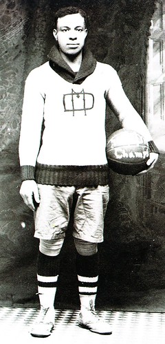
I spent most of Wednesday up in Bristol for some ESPN meetings. At one point I was sitting in the office of Chris Ramsay, who’s the ESPN.com basketball editor (and also happens to be Dr. Jack Ramsay’s son), and I noticed a little publication on his desk. It turned out to be a Black Fives postcard booklet.
I think most of you know about Black Fives, right? For those who don’t: It’s Claude Johnson’s ongoing project to celebrate, document, and, yes, merchandize early-1900s black basketball teams. Reader Nana Kwamie wore one of their jerseys to the Uni Watch party in Toronto back in 2007.
The postcard booklet was published in 2006, but I’d never seen it until I found there on Chris’s desk. He encouraged me to take it, so I did. Once I got home, I was blown away by the material. Here are some highlights:
• The biggest revelation for me is that many of these teams used warm-up sweaters. And not just any sweaters, but shawl-collared cardigans very much like the baseball sweaters used around that same time (and also very similar to classic curling sweaters). One shawl-collared pullover, too. I’ve gathered all the sweater shots into this set.
• I’ve always been a sucker for jerseys with sash designs. I suspect those sashes were just added for the team portrait (which is for the spectacularly named Independent Pleasure Club), but these look like they were a permanent part of the jerseys.
• Several teams used jersey designs with a chest yoke with a center point, which I really like. Here’s a more acutely pointed example (with quilted shorts!) and a design that combined the chest yoke with horizontal stripes.
• The Alpha Physical Culture Club used a stylized “A” very much like the one used today by the A’s.
• As noted in the Uni Watch Glossary, northwestern stripes got their name from the 1928 Northwestern football team. The basic concept of northwestern striping — a thick stripe bordered by two thinner stripes — clearly predates that team, as you can see on the socks in this 1915 team portrait.
• Check out the second guy from the right — interesting that his knee pads aren’t plain like all the others, no?
• Here’s a rarity: an all-black women’s team.
• Here’s one more women’s squad. The rather chaotic looking chest logo stands for Spartan Athletic Club.
The postcard booklet appears to be out of print now, but a copies are available here.
Yellowjackets, Blue Jackets, varisty jackets: Yesterday I mentioned that Stewart & Strauss was running a sale on its chenille letters and numbers, which I thought would be of interest to DIYers. But even if you’re not into the DIY thing, S&S also has a nifty online tool that lets you design and purchase your own jacket. It’s just like one of those uniform-builder applications except it’s for a varsity jacket, allowing you to specify everything from the base color to the snap colors. Good stuff.
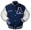
Membership Update: We’re fully caught up on memberships. Every single order is now represented in the design gallery (including Peter Hymas’s Greg Lemond cycling jersey treatment, shown at right) and all but the last two designs in the gallery have been printed, laminated, and shipped. If you haven’t received yours, let e know. And if you want to sign up for membership, here’s where to do it.
Also: Someone from Blue Springs, Missouri, sent me a $15 money order, presumably for a membership payment. But I couldn’t read the person’s signature and there was no note enclosed with the payment, so I have no idea who it was from. If this sounds like you, please speak up. Thanks.
Uni Watch News Ticker: While driving home from Bristol on Weds. night, I listened to the Yanks/Nats game on the radio and heard something odd: Instead of assigning high uni numbers like 79 and 93 to non-roster scrubs, the Nationals just double up on the more traditional numbers. In other words, they had two players wearing No. 15, two players wearing No. 27, and so on. I’d never heard of this before. Do other teams do this? ”¦ Here we have what is arguably the greatest stripe-o-rama photo ever (great find by Don Gale). ”¦ The NFL is tweaking its uni number regulations (as noted by Brinke Guthrie). ”¦ Great gallery of early Wayne Gretzky photos, including many of the uniforms he wore while he was a kid, here (with thanks to Ian M.). ”¦ Dig Lamar Hunt’s groovy Chiefs stocking cap (cool find by Jason Gomez). ”¦ It’s hard to see in this photo, but the Devils used a throwback puck, as well as throwback uniforms, on March 17th. The parts of the design that are usually black were green (with thanks to Kevin Clark). ”¦ John Donovan recently scored this gorgeous varsity jacket. Interesting to see the name embroidered on the sleeve instead of the chest — don’t see that very often. ”¦ Looks like Frosty has a new DIY client: one of Vince‘s co-workers. ”¦ No surprise that David Wright is on the cover of Maple Street Press’s 2010 Mets annual. But it is a surprise that they chose a photo of him wearing stirrups. ”¦ “The Columbus Blue Jackets have done the world’s laziest redesign to their new AHL affiliate, the Springfield Falcons (formerly partnered with the Oilers),” writes Erik Gallant. “But at least they’ve mastered the ‘Paint Bucket’ tool in Photoshop.” ”¦ Weirdest logo creep development in quite some time: Former Oasis singer Noel Gallagher has had an Adidas logo on his guitar lately (good spot by Andy McNeel). ”¦ Some really nice curling sweaters on display in this video clip (with thanks to Jim Vilk). ”¦ New alternate uniform for the Tohoku Rakuten Golden Eagles (courtesy of Jeremy Brahm). ”¦ Also from Jeremy: New clash jersey for the Brisbane Lions. … Someone on the Chris Creamer board has performed a valuable public service. ”¦ Totally digging the design on this old Westinghouse curtain.
– Here’s a rarity: an all-black women’s team.
one would assume the tall gentleman in that photo is the coach, yes?
/great pics
link is another one that should probably go in the FAQs.
[quote comment=”382934″]link is another one that should probably go in the FAQs.[/quote]
Good call. I’ve always vastly preferred the cap version.
With regards to the ticker item of the Nats doubling up numbers instead of using high numbers….
SHOULD it be a surprise that the Nats do something that stupid? I mean this is the same team who is reusing a Squigle “W” for a logo, then cant spell their jersey names right and the biggest abortion of there’s, NOT keeping the Expos numbers retired and forgetting there history!
So should this be a surprise?
It’s unfortunate that the Springfield Falcons ditched their uni’s in favor of just going with the Blue Jacket’s system. Always like those even if they did have the goofy Falcon Claws on the bottom of the sleeves and the fact that all the players wore the Edmonton Pants. That Orange piping never seemed to work with the Falcons powder blue. At least Columbus has a nicer uni design than say the Kings or Carolina. At least we still have a team.
Last Saturday, when the Pirates played the Orioles the Pirates had someone else wearing Akinori Iwamura’s 3. I think what happens is that these “scrubs” minor leaguers they call up for a few days just to use late in games get to have normal numbers because they weren’t part of the true major league spring training.
i didn’t know link time-traveled back to 1913 to play basketball.
When the Red Sox ended Spring Training in Phoenix in 2005, they had 3 #15’s in the lineup and a couple of #11’s, IIRC. I may have even posted about it with a photo here back then
Not sports related, but definately in the “advertising where it probably doesn’t belong” category.
link
Diggin’ the results of our little contest: link
[quote comment=”382939″]i didn’t know link time-traveled back to 1913 to play basketball.[/quote]
I second that emotion.
[quote comment=”382934″]link is another one that should probably go in the FAQs.[/quote]
The jacket is also different.
link
[quote comment=”382943″][quote comment=”382939″]i didn’t know link time-traveled back to 1913 to play basketball.[/quote]
I second that emotion.[/quote]
Nah. Pretty sure that’s link.
[quote comment=”382934″]link is another one that should probably go in the FAQs.[/quote]
I like the hat the best. The crossbar on the ‘N’ is a little straighter, not as wavy. And the ‘Y’ isn’t as rounded like a wine glass as it is especially on the jersey.
great work frosty!
Wow. Those are some great early pictures of The Great Guy!
[quote comment=”382939″]i didn’t know link time-traveled back to 1913 to play basketball.[/quote]
Actually Eddie Murphy all those players are Eddie Murphy.
[quote comment=”382950″][quote comment=”382939″]i didn’t know link time-traveled back to 1913 to play basketball.[/quote]
Actually Eddie Murphy all those players are Eddie Murphy.[/quote]
Dammit, ruined my joke with a typo. Let’s try this again: Actually, all those players are Eddie Murphy.
[quote comment=”382944″][quote comment=”382934″]link is another one that should probably go in the FAQs.[/quote]
The jacket is also different.
link
That looks exactly like the jersey logo. What difference do you see?
[quote comment=”382942″]Diggin’ the results of our little contest: link
how is that logo affixed?
is that heat pressed? doesn’t look stitched (not that i expected it to be)…
anyone?
[quote comment=”382953″][quote comment=”382942″]Diggin’ the results of our little contest: link
how is that link?
is that heat pressed? doesn’t look stitched (not that i expected it to be)…
anyone?[/quote]
Is that even the real deal or just a mock-up?
Either way, it really is a great logo.
[quote comment=”382947″][quote comment=”382934″]link is another one that should probably go in the FAQs.[/quote]
I like the hat the best. The crossbar on the ‘N’ is a little straighter, not as wavy. And the ‘Y’ isn’t as rounded like a wine glass as it is especially on the jersey.[/quote]
There’s a certain charm in using link, but the Yankees just take it overboard.
Drop the print logo completely (which isn’t on any on-field gear anyway) and match the batting helmets to the caps.
[quote comment=”382954″][quote comment=”382953″][quote comment=”382942″]Diggin’ the results of our little contest: link
how is that link?
is that heat pressed? doesn’t look stitched (not that i expected it to be)…
anyone?[/quote]
Is that even the real deal or just a mock-up?
Either way, it really is a great logo.[/quote]
Looks like a Photoshop deal there?
[quote comment=”382953″][quote comment=”382942″]Diggin’ the results of our little contest: link
how is that link?
is that heat pressed? doesn’t look stitched (not that i expected it to be)…
anyone?[/quote]
“embroidered team name on visor”
How awesome is this Yankees vendor hat: link
[quote comment=”382957″][quote comment=”382953″][quote comment=”382942″]Diggin’ the results of our little contest: link
how is that link?
is that heat pressed? doesn’t look stitched (not that i expected it to be)…
anyone?[/quote]
“embroidered team name on visor”[/quote]
oops… nevermind, i read that wrong.
Regarding NFL numbering article, I was under the impression that 50-79 was long thought of as an acceptable range for any OL. For example, the last four Steelers’ centers (Hartwig, Mahan, Hartings, Dawson) all wore/wear numbers in the 60s. Is this something that was just relaxed and not enforced (although I find that hard to believe in the No Fun League)?
This page on the Black Five site shows the various team logos and the are pretty spectacular, I think…
link
[quote comment=”382960″]Regarding NFL numbering article, I was under the impression that 50-79 was long thought of as an acceptable range for any OL. For example, the last four Steelers’ centers (Hartwig, Mahan, Hartings, Dawson) all wore/wear numbers in the 60s. Is this something that was just relaxed and not enforced (although I find that hard to believe in the No Fun League)?[/quote]Centers are “supposed” to have numbers in the 50s, unless there aren’t any available. Teams are carrying so many linebackers these days and the vast majority of them have numbers in the 50s so there really aren’t many o-linemen at all with numbers in that range.
Olin Kreutz and a guy (whose name escapes me at the moment) who was a rookie with the Bengals last year are the only centers with numbers in the 50s I can think of off the top of my head.
[quote comment=”382953″][quote comment=”382942″]Diggin’ the results of our little contest: link
how is that link?
is that heat pressed? doesn’t look stitched (not that i expected it to be)…
anyone?[/quote]
Whastsa matta, itsa broken?
—Chico Marx
Q: Why is Pedro Feliz wearing #77?
A: New Astros third baseman Pedro Feliz raised his eyebrows when told before Thursday’s game that his new jersey number is considered a “hockey number.” “Really? A hockey number?” Feliz said, surprised. “Is he a good player?” Well, he was a great player. Feliz’s No. 77 was the number worn by Hall of Fame defenseman Ray Bourque, who played 23 seasons with the Bruins and Avalanche. “That’s right, man,” Feliz said jokingly when informed. “He’s my new favorite.” Feliz, who signed a one-year, $4.5 million contract with the Astros during the offseason, settled on No. 77 because his former No. 7 belongs to former Astros great Craig Biggio. Interestingly enough, Bourque began his illustrious NHL career wearing No. 7 but changed it after the Bruins retired Phil Esposito’s number. – Houston Chronicle
Check out link from this weekend’s Heritage Auctions offerings. A 1940s “M_____ Power & Light Co.” team uniform.
The jersey is cool enough, but the real treasure is the cap. Reddy freaking Kilowatt!
[quote comment=”382965″]Check out link from this weekend’s Heritage Auctions offerings. A 1940s “M_____ Power & Light Co.” team uniform.
[/quote]
that may be the first time in history that “MPower” and a functioning link have appeared in the same comment
[quote comment=”382953″][quote comment=”382942″]Diggin’ the results of our little contest: link
how is that link?
is that heat pressed? doesn’t look stitched (not that i expected it to be)…
anyone?[/quote]
It’s affixed with Adobe Photoshop, and a little bit of elbow grease.
Sports Illustrated gets their own name wrong on the 20th photo of the Gretzky archive:
The Great One and his wife Janet graced the 1998 Sports Illustraded swimsuit issue.
In regards to the Noel Gallagher Adidas logo creep on his acoustic guitar, he has had the small “classic” Adidas logo on his acoustic guitars for quite some time. I believe you can even go back to the late 90’s and see the logo on his acoustic guitars. To my knowledge (and I’m a HUGE oasis and Noel fan), he has never had any logos on his electric guitars. But that’s the first one that I’ve seen where it’s a mult-colored logo.
For anyone in Atlanta this weeked…here is a great event to attend…Baconfest 2010
link
Couple of Tennessee basketball notes here. Nothing major. First off, since the Lady Vols have added the NCAA patch to their jerseys for the tournament, their jerseys look link. The patch above the SEC logo there is a Vol Scholar patch, which is awarded to players who meet a certain academic standard, so not everyone has that one. Second, unless you’re a Tennessee fan link whole video may not look all that great to you, but at the end there’s a few shots of some of the managers putting the NCAA patches on our orange jerseys. I thought it was pretty interesting. Hopefully all the HTML coding worked there. I haven’t done any in a while, so please bare with me if it doesn’t end up working right.
The second guy from the right in this picture of the Alpha Physical Culture Club sure looks like President Obama to me.
link
[quote comment=”382971″]Couple of Tennessee basketball notes here. Nothing major. First off, since the Lady Vols have added the NCAA patch to their jerseys for the tournament, their jerseys look link. The patch above the SEC logo there is a Vol Scholar patch, which is awarded to players who meet a certain academic standard, so not everyone has that one. Second, unless you’re a Tennessee fan link whole video may not look all that great to you, but at the end there’s a few shots of some of the managers putting the NCAA patches on our orange jerseys. I thought it was pretty interesting. Hopefully all the HTML coding worked there. I haven’t done any in a while, so please bare with me if it doesn’t end up working right.[/quote]
You’re right – way too cluttered.
Howasbout we remove the American flag? Surely anyone who’s earned a Vol Scholar patch can remember what country they’re in.
[quote comment=”382970″]For anyone in Atlanta this weeked…here is a great event to attend…Baconfest 2010
link
awesome
SI.com’s Luke Winn’s style guide
link
[quote comment=”382939″]i didn’t know link time-traveled back to 1913 to play basketball.[/quote]
“The James Brown Celebrity Hot Tub Time Machine”
The new Springfield Falcons logo just proves that western MA is still basketball country. Because I live there, it will be interesting to see the reaction.
I’ve been browsing through a set of Life photos about Ohio State University in 1948. It’s only tangentially related to unis so you may wish to skip these links.
link
link and a link.
link. (Google Welgrume)
link
link
link
link may be best known for the photograph link
link
link
[quote comment=”382952″][quote comment=”382944″][quote comment=”382934″]link is another one that should probably go in the FAQs.[/quote]
The jacket is also different.
link
That looks exactly like the jersey logo. What difference do you see?[/quote]
It’s most similar to the jersey but look close it’s different. It’s slightly thicker and the “branches” of the Y are closer to diagonal of the N
Love the Black Fives photos, but the link are even better!
Not only does the Smart Set Athletic Club of Brooklyn have a fantastic name, but their link kinda reminds me of one of my all-time favorites, the link.
Hell, even the SSAC crest looks like the inverted crest of the link – which while I understand why they created, still doesn’t trump the link.
For the ‘sneakerheads’ that are out there (and I know there are a few) here is an article on Time.com about the big Chinese athletic shoe company opening up a west coast store to link
[quote comment=”382980″][quote comment=”382952″][quote comment=”382944″][quote comment=”382934″]link is another one that should probably go in the FAQs.[/quote]
The jacket is also different.
link
That looks exactly like the jersey logo. What difference do you see?[/quote]
It’s most similar to the jersey but look close it’s different. It’s slightly thicker and the “branches” of the Y are closer to diagonal of the N[/quote]
I think you might be reaching here. The jersey “NY” is taken from a picture of a player in motion and is therefore a little warped.
[quote comment=”382980″][quote comment=”382952″][quote comment=”382944″][quote comment=”382934″]link is another one that should probably go in the FAQs.[/quote]
The jacket is also different.
link
That looks exactly like the jersey logo. What difference do you see?[/quote]
It’s most similar to the jersey but look close it’s different. It’s slightly thicker and the “branches” of the Y are closer to diagonal of the N[/quote]
Looks like maybe the first version was created when someone traced around a navy logo yet to be sewn onto a jersey on white fabric…and then left the pencil lines in, instead of cutting them off, when cutting out the white version. That’d make every part of it the width of a pencil line bigger.
I know cuz I’ve made the same mistake. You trace it backwards on the BACK of white fabric so you don’t have to remove pencil marks from the front. But, if you aren’t careful you get a version slightly “fatter” than the original.
—Ricko
[quote comment=”382981″]Love the Black Fives photos, but the link are even better!
Not only does the Smart Set Athletic Club of Brooklyn have a fantastic name, but their link kinda reminds me of one of my all-time favorites, the link.
Hell, even the SSAC crest looks like the inverted crest of the link – which while I understand why they created, still doesn’t trump the link.[/quote]
As a longtime Arsenal fan, I miss the blackletter. But other than the wordmark I really prefer the new crest – the other one always bothered me as being too busy. Maybe it was the ermine, running into the wordmark.
Nothing, but nothing, beats the Art Deco Crest. Glad to see Arsenal’s finally link the link in link it.
“Postcard? What the Hell’s a Postcard?”
It’s old-school tweeting.
aaaaaaaaaaaaaaaaaaaaaaaaaaaaaah…he says as his brain sinks into a warm pool of sweaters.
[quote comment=”382985″][quote comment=”382981″]Love the Black Fives photos, but the link are even better!
Not only does the Smart Set Athletic Club of Brooklyn have a fantastic name, but their link kinda reminds me of one of my all-time favorites, the link.
Hell, even the SSAC crest looks like the inverted crest of the link – which while I understand why they created, still doesn’t trump the link.[/quote]
As a longtime Arsenal fan, I miss the blackletter. But other than the wordmark I really prefer the new crest – the other one always bothered me as being too busy. Maybe it was the ermine, running into the wordmark.
Nothing, but nothing, beats the Art Deco Crest. Glad to see Arsenal’s finally link the link in link it.[/quote]
This T rocks! link
Miami FC (division II soccer) link.
[quote comment=”382938″]Last Saturday, when the Pirates played the Orioles the Pirates had someone else wearing Akinori Iwamura’s 3. I think what happens is that these “scrubs” minor leaguers they call up for a few days just to use late in games get to have normal numbers because they weren’t part of the true major league spring training.[/quote]
And those might be those guys’ minor league numbers.
I’d rather see a couple guys wearing #3 than one guy wearing #85. Yes, White Sox, I’m looking at you.
[quote comment=”382991″][quote comment=”382938″]Last Saturday, when the Pirates played the Orioles the Pirates had someone else wearing Akinori Iwamura’s 3. I think what happens is that these “scrubs” minor leaguers they call up for a few days just to use late in games get to have normal numbers because they weren’t part of the true major league spring training.[/quote]
And those might be those guys’ minor league numbers.
I’d rather see a couple guys wearing #3 than one guy wearing #85. Yes, White Sox, I’m looking at you.[/quote]
Harold Baines might disagree with you there.
Sorry, cross-team pollination there.
If the Pirates had a couple of guys wearing #3, that’s better than a guy wearing #85, to me. Only the second part was directed at the White Sox.
Baines, incidentally, is wearing his #3 as he’s a coach.
[quote comment=”382961″]This page on the Black Five site shows the various team logos and the are pretty spectacular, I think…
link
I agree, those logos are spectacular. Love to see these vintage minimalistic designs resurrected in the modern day; Kevin Bennett’s winning Hawkeye’s logo, to, Matt Ryan Miller’s wonderful vintage flavored style:
link
[quote comment=”382978″]The new Springfield Falcons logo just proves that western MA is still basketball country. Because I live there, it will be interesting to see the reaction.[/quote]
I’m not exactly sure what was meant by that comment. How is western Mass basketball country, exactly? Because of the Springfield Armor? Ha.
[quote comment=”382987″]”Postcard? What the Hell’s a Postcard?”
It’s old-school tweeting.[/quote]
Best line of the day.
Maybe of the week.
Seriously.
—Ricko
so…um…yeah
it is friday after all
[quote comment=”382997″]so…um…yeah
it is link after all[/quote]
why the orange sock? looks odd seeing the orange sock under those Colt 45 stirrups.
Re Nats’ duplicate spring training uniform numbers: I don’t know if it’s unique or a first, but it’s nothing I’m getting worked up over. Doubling up numbers happens all the time on big college football teams. If Washington MLB v3.0 had a winning tradition I don’t think that, or their jersey typos, would be such a big deal.
Astro’s pitcher Bud Norris was again forced to change his glove while on the mound. this time he was apparently using a glove that was “too bright” accordign to the home plate ump and was forced to switch to a black glove for his start.
[quote comment=”382998″][quote comment=”382997″]so…um…yeah
it is link after all[/quote]
why the orange sock? looks odd seeing the orange sock under those Colt 45 stirrups.[/quote]
That’s just the natural copper glow of Phil’s new artificial tanner. He’s actually sockless.
[quote comment=”382998″][quote comment=”382997″]so…um…yeah
it is link after all[/quote]
why the orange sock? looks odd seeing the orange sock under those Colt 45 stirrups.[/quote]
because stirrups don’t ‘zactly work under dress slacks…so this way, they’re semi stirrurreptitious
I’m totally confused by why the Yankees have 4 slightly different logos.
They’re a billion dollar corporation. Any corporation even near that size has like 50 pages in their brand identity manuals, and every tiny part of the logo is specified, measured in perfect detail.
[quote comment=”383002″][quote comment=”382998″][quote comment=”382997″]so…um…yeah
it is link after all[/quote]
why the orange sock? looks odd seeing the orange sock under those Colt 45 stirrups.[/quote]
because stirrups don’t ‘zactly work under dress slacks…so this way, they’re semi stirrurreptitious[/quote]
Bah!
At least you have socks that match them…
When I have worn my stirrups to work on Fridays, it’s been easier to go with the white sany because we are allowed jeans and sneaks on Fridays. Now, with that said, I wear the stirrups all weekend but I am not allowed to roll my jean cuffs high to show them off. My wife will not let me go that far with them.
On the doubling up on the Nats numbers:
This is not unusual in spring training, especially the last two weeks (not just for the Nats). The doubled-up numbers are probably players from the minor league camp who are over for the day (as opposed to non-roster invitees to the major league camp). They often wear their uniform from the minor league camp, which very well might duplicate a number of somebody in the major league camp. (In spring training, the minor leaguers all wear major league uniforms; Tiger players do not wear Mud Hen, Seawolves, etc., uniforms.)
For example, Tiger minor-leaguer Jeff Frazier wore his #12 in several Tiger spring training games, even though major league coach Lloyd McClendon wears #12 for the Tigers. There were other similar situations for the Tigers this year as I recall.
In the old days (mid-80’s), the Tigers used to have a “Tigers 68” jersey (NOB “Tigers”, number 68) for the minor league guest of the day. that made it pain to figure out who the player was. The current system is better because you can tell who the minor leaguer is.
Awesome eBay auction!
link
It would be awesome is someone from the Uni Nation would win this and scan the pages so we could all enjoy the patches and the little history presented with them.
[quote comment=”383002″][quote comment=”382998″][quote comment=”382997″]so…um…yeah
it is link after all[/quote]
why the orange sock? looks odd seeing the orange sock under those Colt 45 stirrups.[/quote]
because stirrups don’t ‘zactly work under dress slacks…so this way, they’re semi stirrurreptitious[/quote]
from the desk of the revolution:
i have no problem with this in the office, the point is the pain of the stirrup penance, not the fact that you are wearing the proper sani on stirrup friday, more on that subject sunday. i am thinking of putting together a coloured sani package, so that you could have exact matches for the office(or you could go navy) the problem is sanis both white and colour have minimums, so i can’t just go buying a thousand dollars worth of sanis to sell 3. but i am working on office related solutions to our stirrup needs.
from each according his stirrvp,
to each according his strype
comrade flebus
[quote comment=”383004″][quote comment=”383002″][quote comment=”382998″][quote comment=”382997″]so…um…yeah
it is link after all[/quote]
why the orange sock? looks odd seeing the orange sock under those Colt 45 stirrups.[/quote]
because stirrups don’t ‘zactly work under dress slacks…so this way, they’re semi stirrurreptitious[/quote]
Bah!
At least you have socks that match them…
When I have worn my stirrups to work on Fridays, it’s been easier to go with the white sany because we are allowed jeans and sneaks on Fridays. Now, with that said, I wear the stirrups all weekend but I am not allowed to roll my jean cuffs high to show them off. My wife will not let me go that far with them.[/quote]
And at least he has an excuse. What the hell link? (Forest over navy, since you probably can’t tell.)
I’ve worked Spring Training Games in the past and a few times, players were called up from the minor league camp just for a game or two. Instead of assigning new uniforms they would just wear the minor league unis. In the Detroit Tigers’ case I believe all of their players wear the big team uniforms for spring training – both major and minor leaguers.
[quote comment=”382989″]
This T rocks! link
Yes, it does. May have to get one for myself.
comrade james~
also an acceptable stirrup friday look, no right and wrong in combos. if anything it is an excuse to mix and match.
teahs,feahs
comrade flebus
[quote comment=”383003″]I’m totally confused by why the Yankees have 4 slightly different logos.
They’re a billion dollar corporation. Any corporation even near that size has like 50 pages in their brand identity manuals, and every tiny part of the logo is specified, measured in perfect detail.[/quote]
Because that’s the way it’s always been. The Yankees logos would have been hand drawn back in the day, leading to variations by different manufacturers of jerseys, caps, jackets and whatnot, and the yankees don’t like to change much. The hat is iconic and the jersey is iconic, so if you change to one logo, you screw up one or the other. Or both.
Besides, somebody did a mockup before- it didn’t look that good. The logos are adapted well to what they’re on- the cap logo looks weak on the jersey, and the jersey logo looks like a mess on the cap.
[quote comment=”383007″]
from the desk of the revolution:
i have no problem with this in the office, the point is the pain of the stirrup penance, not the fact that you are wearing the proper sani on stirrup friday, more on that subject sunday. i am thinking of putting together a coloured sani package, so that you could have exact matches for the office(or you could go navy) the problem is sanis both white and colour have minimums, so i can’t just go buying a thousand dollars worth of sanis to sell 3. but i am working on office related solutions to our stirrup needs.
from each according his stirrvp,
to each according his strype
comrade flebus[/quote]
comrade preston
your concern for the needs of the proletariat is commendable…those oppressed by the capitalist overlords would be forever in your debt should that which you are proposing come to the fore
[quote comment=”382994″][quote comment=”382961″]This page on the Black Five site shows the various team logos and the are pretty spectacular, I think…
link
I agree, those logos are spectacular. Love to see these vintage minimalistic designs resurrected in the modern day; Kevin Bennett’s winning Hawkeye’s logo, to, Matt Ryan Miller’s wonderful vintage flavored style:
link
I think minimalistic is the wrong word here, cuz it gets perdy ornate with scripts. Raw, is a good word.
[quote comment=”382995″][quote comment=”382978″]The new Springfield Falcons logo just proves that western MA is still basketball country. Because I live there, it will be interesting to see the reaction.[/quote]
I’m not exactly sure what was meant by that comment. How is western Mass basketball country, exactly? Because of the Springfield Armor? Ha.[/quote]
Because of the Basketball Hall of Fame, located in Springfield.
Nice segue – tomorrow the HOF will host the Divison II men’s basketball championship between Cal Poly Pomona link and Indiana University of Pennsylvania. link
The game is on CBS at 1pm Eastern, noon Central.
[quote comment=”383018″][quote comment=”382995″][quote comment=”382978″]The new Springfield Falcons logo just proves that western MA is still basketball country. Because I live there, it will be interesting to see the reaction.[/quote]
I’m not exactly sure what was meant by that comment. How is western Mass basketball country, exactly? Because of the Springfield Armor? Ha.[/quote]
Because of the Basketball Hall of Fame, located in Springfield.
Nice segue – tomorrow the HOF will host the Divison II men’s basketball championship between Cal Poly Pomona link and Indiana University of Pennsylvania. link
The game is on CBS at 1pm Eastern, noon Central.[/quote]
I think there are probably far more baseball and football fans in western Mass than basketball fans. Unlike Cooperstown, which is very much defined by the Baseball Hall of Fame, the same most definitely can’t be said of Springfield.
[quote comment=”383015″][quote comment=”383007″]
from the desk of the revolution:
i have no problem with this in the office, the point is the pain of the stirrup penance, not the fact that you are wearing the proper sani on stirrup friday, more on that subject sunday. i am thinking of putting together a coloured sani package, so that you could have exact matches for the office(or you could go navy) the problem is sanis both white and colour have minimums, so i can’t just go buying a thousand dollars worth of sanis to sell 3. but i am working on office related solutions to our stirrup needs.
from each according his stirrvp,
to each according his strype
comrade flebus[/quote]
comrade preston
your concern for the needs of the proletariat is commendable…those oppressed by the capitalist overlords would be forever in your debt should that which you are proposing come to the fore[/quote]
Capitalist overlords? I thought the Pajamists were our opressors.
Anyway, it’s not so much the navy socks under the Oaks ‘rups. Had I gone with a different color shoe, all would have been fine. Unfortunately, I went with royal blue.
[quote comment=”383002″][quote comment=”382998″][quote comment=”382997″]so…um…yeah
it is link after all[/quote]
why the orange sock? looks odd seeing the orange sock under those Colt 45 stirrups.[/quote]
because stirrups don’t ‘zactly work under dress slacks…so this way, they’re semi stirrurreptitious[/quote]
Ah, stealth stirrups.
—Ricko
[quote comment=”383017″][quote comment=”382994″][quote comment=”382961″]This page on the Black Five site shows the various team logos and the are pretty spectacular, I think…
link
I agree, those logos are spectacular. Love to see these vintage minimalistic designs resurrected in the modern day; Kevin Bennett’s winning Hawkeye’s logo, to, Matt Ryan Miller’s wonderful vintage flavored style:
link
I think minimalistic is the wrong word here, cuz it gets perdy ornate with scripts. Raw, is a good word.[/quote]
Minimalistic…raw…both are accurate. Smart and Original come to mind, too. That St. Louis Gorillas floors me.
wait…you mean not all stuff on the net isn’t true?
/would love TO hear to say ‘i love my qb’ … wait…is he still ON the bills?
fuck, im so confused now
[quote comment=”383020″]
Capitalist overlords? I thought the Pajamists were our opressors.
[/quote]
you aint met my boss
Nice to see the Cooperstown Hawkeyes stuff for sale but…whatever happened to the high school that had the logos done by a uniwatcher? They had a storefront but the caps weren’t ready yet. I think it was the Sartell Sabres, maybe? I’m still anxious to buy a cap.
[quote comment=”383024″][quote comment=”383020″]
Capitalist overlords? I thought the Pajamists were our opressors.
[/quote]
you aint met my boss[/quote]
i was going to say to james, yes the pajamist is our enemy, i think he was talking about his boss man, not the system. too funny.
like i said yesterday, i am taking care of a neighbor’s cats, and one is sick so i have to give it some oral drops and a shot of cat steroids. anyway, i accidentally stuck myself with the needle today. i didn’t hit the plunger, but still, is that bad? am i going to chase bugs with extra gusto? recover faster from naps?
[quote comment=”383026″][quote comment=”383024″][quote comment=”383020″]
Capitalist overlords? I thought the Pajamists were our opressors.
[/quote]
you aint met my boss[/quote]
i was going to say to james, yes the pajamist is our enemy, i think he was talking about his boss man, not the system. too funny.
like i said yesterday, i am taking care of a neighbor’s cats, and one is sick so i have to give it some oral drops and a shot of cat steroids. anyway, i accidentally stuck myself with the needle today. i didn’t hit the plunger, but still, is that bad? am i going to chase bugs with extra gusto? recover faster from naps?[/quote]
You looking to score some catnip? I can hook you up. It may be homegrown, but it’s dank. Not like that schwag they try to pass off at Petsmart.
i can’t believe it didn’t occur to me to work in catnip. i are dumb.
lovin’ these purdue uniforms.
[quote comment=”382997″]so…um…yeah
it is link after all[/quote]
Next Friday…..high cuffs. Come on, do it! Maybe a Youppi….with a baby blue sani….
Can’t wait for my Browns to get here! Maybe it’ll come with a free furball.
[quote comment=”383029″][quote comment=”382997″]so…um…yeah
it is link after all[/quote]
Next Friday…..high cuffs. Come on, do it! Maybe a Youppi….with a baby blue sani….
Can’t wait for my Browns to get here! Maybe it’ll come with a free furball.[/quote]
yeah…ok
maybe some knickers?
[quote comment=”383010″]I’ve worked Spring Training Games in the past and a few times, players were called up from the minor league camp just for a game or two. Instead of assigning new uniforms they would just wear the minor league unis. In the Detroit Tigers’ case I believe all of their players wear the big team uniforms for spring training – both major and minor leaguers.[/quote]
That is right about the Tigers. They are one of the few teams who don’t wear their pajama tops–oops, batting practice jerseys–in spring games. I think Tigers fans would revolt if they did. In 1994 or 1995 I believe it was, the Tigers wore a blue jersey with the tiger-through-the-D logo for one Sunday home game. One game, that was enough for the fans to convince the team to never do it again.
[quote comment=”383030″][quote comment=”383029″][quote comment=”382997″]so…um…yeah
it is link after all[/quote]
Next Friday…..high cuffs. Come on, do it! Maybe a Youppi….with a baby blue sani….
Can’t wait for my Browns to get here! Maybe it’ll come with a free furball.[/quote]
yeah…link
maybe some knickers?[/quote]
Stick with the stripes and the stirrups.
link
What’s with the people in red shirts in St. Louis? They all appear to be wearing red polos and nametags, and they’re all around the court, not just where they would be seen on TV. Part of the NCAA’s “uniform courts”?
[quote comment=”383031″][quote comment=”383010″]I’ve worked Spring Training Games in the past and a few times, players were called up from the minor league camp just for a game or two. Instead of assigning new uniforms they would just wear the minor league unis. In the Detroit Tigers’ case I believe all of their players wear the big team uniforms for spring training – both major and minor leaguers.[/quote]
That is right about the Tigers. They are one of the few teams who don’t wear their pajama tops–oops, batting practice jerseys–in spring games. I think Tigers fans would revolt if they did. In 1994 or 1995 I believe it was, the Tigers wore a blue jersey with the tiger-through-the-D logo for one Sunday home game. One game, that was enough for the fans to convince the team to never do it again.[/quote]
I do remember a while ago, someone posted a photo of the Tigers wearing orange in a game and we tracked it back to an exhibition game they played against Toronto in BC Place in about 1994.
link
[quote comment=”383007″][quote comment=”383002″][quote comment=”382998″][quote comment=”382997″]so…um…yeah
it is link after all[/quote]
why the orange sock? looks odd seeing the orange sock under those Colt 45 stirrups.[/quote]
because stirrups don’t ‘zactly work under dress slacks…so this way, they’re semi stirrurreptitious[/quote]
from the desk of the revolution:
i have no problem with this in the office, the point is the pain of the stirrup penance, not the fact that you are wearing the proper sani on stirrup friday, more on that subject sunday. i am thinking of putting together a coloured sani package, so that you could have exact matches for the office(or you could go navy) the problem is sanis both white and colour have minimums, so i can’t just go buying a thousand dollars worth of sanis to sell 3. but i am working on office related solutions to our stirrup needs.
from each according his stirrvp,
to each according his strype
comrade flebus[/quote]
Da! I was blind to the fact that the stirrup was still being worn reguardless of the color of the sani.
Phil, I proudly salute you.
now i just need to order more stirrups…
Random question…
Why does Duke’s jersey hole design thing on the back of the jersey cover the whole back, but the other schools like Kentucky, Michigan State, etc. have only part of the back with a graphic design?
[quote comment=”383035″]
Da! I was blind to the fact that the stirrup was still being worn reguardless of the color of the sani.
Phil, I proudly salute you.
now i just need to order more stirrups…[/quote]
comrade james…the salute is returned
check back sunday, btw…i have a feeling things are gonna be rupalicious
The things you find when you log off from your email:
link
Maybe Venus is considering switching to ice dancing?