
By Phil Hecken, with Timmy Brulia, Rick Pearson & Larry Bodnovich
Several weeks ago, Paul posted the following picture, taken at the 1948 NHL All Star Game. It’s a wonderful photo, leading Paul to quip, “Oh baby, how sweet is this 1948 NHL All-Star uni? The player is Doug Bentley.” The next day, reader Marc Swanson colorized that very photo, and he did a great job.
There was only one problem: he had the colors wrong. The actual sweater that was worn by the 1948 NHL All Stars was red, with blue and white stripes on the sleeves. But, at first glance, one would (as did I) assume that the sweater was actually blue, due to how we view the differences in color values of black and white photographs we see in newspapers and other media today. But why is that? And, how are we to know, when looking at old photographs, what the colors are?
This is a problem that has been plaguing sports historians and uni watchers for decades. Later that day, another Uni Watch reader, Doug Brei addressed the matter, via email. Here’s what Doug had to say:
(L)et me try to enlighten the readers about old-time photojournalism on black & white film and how this may have affected the particular photo in question.
In the old days, photojournalists/photographers often used a photo filter to distinguish colors as they transfer to the gray pallete on black and white film. For example, if a photographer took a picture of an apple tree, the red apple and the green leaves might look almost identical when transferred to black & white film, making them look almost indistinguishable from one another. Thus the photographer might use a red filter which would lighten the apple and darken the leaves, making the apple stand out in the photo.
In this photo of the hockey sweater in question, the photographer used a blue filter, which darkened the red torso of the sweater and lightened the blue stripes. (In this particular instance it creates what appears to be an optical illusion, as we often tend to think of blue as a darker color than red.) However, in the grand scheme of his photography assignment that day, the blue filter was likely chosen to best distinguish the colors of his subjects increasing the tone of his photos.
Incidentally, had he used a red filter on his camera, the VERY SAME PHOTO would have appeared as if the torso was lighter and the stripes were darker.
Choosing the black and white feature on Photoshop or MS Paint wouldn’t make a fair comparison because the effect was caused by a filter on the camera that originally took the picture and created the original negative. Thus, the argument or confusion made by one or more of your forum “posters” failed to recognize the fact that on that day 62 years ago, the photographer used the technology of the day to help better define the color subjects as they transferred onto black-and-white film.
Make any sense?
In 2010, I’m not sure how a blue filter would effect digital photography, but if I can somehow find a blue filter I’ll try to do a little experimentation one of these days.
Armed with that information, I asked Uni Watch historian Timmy Bruilia, the grand sage of UW Rick Pearson, and UW’s resident “black and white colorizer” Larry Bodnovich, to assist me in exploring this important historical complexity in much greater detail — that is, when we look at a black and white photograph from the past, how can we be sure what the colors are?
Tim, who has spent years researching this subject, will provide an historical perspective. Ricko, who has been facing this quandry for decades of uni watching, will supply anecdotal evidence of the problems in ascertaining proper colors when viewing a black and white photograph. Larry, who has been colorizing black and white photographs for years (and assisted me on just such a project), will be asked to colorize some photographs for which the team colors are not known to him, to show why it’s so difficult to view a black and white picture and know the true colors.
So sit back and enjoy this amazing and wonderful look at the art of black and white in color.
Part I-An Historical Perspective
by Tim Brulia
As a sports uniform historian/geek, I have always been fascinated by the history of and the evolution of sports uniforms; football, hockey and baseball in particular.
Apart from the logos, lettering, trim, piping, numeral fonts, that are all vital to the cause, the most important key to make this research accurate is the team colors. While we may know the way the uni looked based on photographic evidence, as we go back deeper in time, we may not know how a team’s colors played a role in the look.
In particular, as we go before the 1950’s, the use of color photography in sports is quite rare. So, we have no choice but to use black & white photography. Many years ago, I remember thumbing thru a hockey magazine which had many photos from the early days of the NHL. I was jolted to see pics of players with the Montreal Canadiens, New York Rangers and the defunct New York Americans where the Rangers looked like they were wearing red jerseys, the Habs in blue sweaters and the Amerks in God knows what! It then hit me some time later as I ordered and received a set of the Hockey Hall of Fame artist postcards (similar to the Baseball Hall of Fame Perez-Steele art cards) that the pics were playing tricks with me. In those 1910’s-1920’s pics of Bad Joe Hall, Howie Morenz, Aurel Joliat, Bun Cook, Ching Johnson and others, the red was very dark, almost black, while the blue tinted a very pale shade of gray! Some years ago when I did research for Andy Greenstein’s nhluniforms.com site, this issue was particularly evident when digging thru additional historical pics of these teams.
Also, when geeking through the New York (football) Giants in the 1930’s. I think many of the UW faithful might be familiar with the “evolution of the uniform” portraits (Jim Thorpe, Ernie Nevers, Bob Waterfield, Bob Lilly, to name a few) done for the book “The First 50 Years“. One of those is a nice portrait of Mel Hein in the 1934 Giants uni. It is actually wrong. The Giants wore RED jerseys as opposed to blue!!
Another color that — back in the day — ran way off kilter in old B/W shots is yellow (or as the sports world calls it, “gold”). When researching 1920’s Boston Bruns unis and yes, Pittsburgh Pirates hockey and football, posed (Bruins, hockey Pirates) and action (football Pirates) shots makes the jerseys look like dark blobs. The yellow was that dark in some shots. There was in the early 2000’s a tremendous hockey photo website with an incredible array of posed shots and some action pics from the early days of the NHL. These included a load of posed shots of black/gold uni teams like the Hamilton Tigers, Boston Bruins (in their brown/gold years) and the Pittsburgh Pirates. Sad to say, this site is long gone (2006 or so).
Also, the few 1933 and 1934 pics I have seen of the Philadelphia Eagles in action with the blue/yellow color scheme, the “colors” are so murky that the numbers/stripes are rather indistinguishable.
Without the benefit of surviving jerseys/uniforms from this era, we can only rely on educated guesswork, IF we know the colors the teams wore during these years. I’m thinking Marc Okkonen himself, the godfather of baseball uniform research, may have done educated guesswork in the 1900-1935 era in terms of the colors baseball teams wore.
Even when the b/w shots started looking a little more “natural”, we run into the problem of seeing how close red & blue are when used together. A few weeks ago, in the UW, a contributor saw a b/w pic of the 1948 NHL All-Star Game jersey. The red and blue looked exactly alike. He attempted to colorize the classic sweater (as seen in the introduction). Alas, it was wrong. Not his fault. Without us knowing what the sweater actually looked like, anyone of us (including me) could have gotten the combination wrong. Another perfect example of this issue is the football Giants unis of the 1937-1952 era. The Giants sported helmets from 1937-1947 that very much resembled the Michigan “wing” pattern, with the base color of the leather lid being blue, with the “wings” being red. But virtually any b/w pic of the Giants in this era would show the helmet with no discernable difference at all in the “color” of the helmet, unlike the Eagles helmet of the 40’s, where the silver and green portions of their helmet are plainly visible in b/w.
As I have said many times before, I am NOT a photography expert by any means, nor am I a colorologist (word?), but having studied lots of early era sportspix, hockey and football in particular, I am quite aware of the trickiness of getting the color schemes right.
Part II-Ancedotal Evidence
by Rick Pearson
I’ll keep this part as short as I can and stuff it with lots of photos that, if you can put yourself in a late ”˜50s-early ”˜60s mindset and go ONLY by the photos, will you keep you scratching your heads as to what is/was what color.
First, a brief summary. Before color TV, before instant replays, all there was on TV every weekend was one college football game and one pro game (two after AFL game around, and they pretty much invented the TV doubleheader, as I recall). You also had 65-line screen b&w newspapers photos and, if you were lucky, maybe a weekly highlight show”¦really nothing more than newsreel type film shot from the bird’s eye view roof of the stadium press box. Good luck checking details in those.
I can tell you positively it was this Robert Riger illustration in Sports Illustrated that showed me the Giants had red numbers, socks, etc. on the road. Remember the moment well.
So let’s pretend it’s 1960 and you’re trying to figure out the unis in this new AFL. Some annuals bothered with them, but only included rosters. New logos ready yet, no team colors listed. Maybe half the play-by-play guys would bother to describe the unis. If they did, it was early, so if you tuned in late you were screwed. You were left listening for lines like, “surrounded by blue jerseys” or something. Let’s say you’re trying to figure out the Buffalo Bills unis. For one thing, you compare photos to known teams. Okay, one of the teams pictured here wears red with their silver helmets and pants, the other a shade of blue. Based ONLY on the look of these photos, what color would you say the Bills’ jerseys are? I mean, those numbers look to be the same color as the center of the Pats loops, which appears to be red. Honestly, now, if you didn’t already know.
And the Broncos? Hmm”¦based only on the way they look on TV or in a couple newspaper photos you saw, those jerseys could be Old Gold, Athletic Gold, Tennessee Orange or even Powder Blue. Pants/helmets could be navy, red, maroon, brown, forest”¦ But the Oilers, unless they’re in Athletic Gold, would seem to be Powder Blue, so you can sort rule that out.
Now, Regarding this business of color filters wigging things out in black and white, check these nice PR photos of the original Broncos. Not so fast. They’re Titans of New York.
The Patriots certainly appear to be wearing maybe navy jersey with red at the center of the shoulder loops in these photos from a ’61 annual, don’t they. Wrong again. Team photo didn’t exactly clear anything up. And how about the roads”¦are those loops red-royal-red or the other way around? Sadly, Fleer never used that photo for a card, so no help there. Not much to go on in this night game photo vs. the Titans, either.
And, of course, you’re all messed up because you’re already realized something’s hinky because you’ve seen photos like these. And you KNOW in both cases the hats are royal, as are stirrups”¦with red striping”¦but they sure as hell don’t look that way.
TimmyB mentioned gold getting weird. Check this out. One of these guys is wearing Athletic Gold pants. (Hint: It’s Hornung; the other guy is Billy Stacy of the Cardinals).
Or these: The original Los Angeles Chargers had a dark edge on their numbers and around the shoulder bolts? No, they did not.
So if some of us don’t seem all that fixated on helmet types and facemask color, forgive us. We had enough details on our plates to check already. LOL
Part III-Black & White in Color
by Larry Bodnovich
[Phil here. For this portion of the post, Ricko provided Larry with three black and white photographs — Photo 1, Photo 2, and Photo 3; we didn’t tell him any of the colors, but based on his expertise in colorization of black and white photography, asked him for his “best guess” as to what the teams actually wore. Here’s Larry with the results:]
Some of these were a little hard to do because of the quality of the original. But I thought it was fun to guess at the colors. For this one I thought blue was the number color and sock and stripes. The jersey color though I was not sure of. To me it did not look white. It could have been a light orange or yellow and I went with gray. Most of the time I think I can tell when a color was white. Such as the socks. I have no idea who the guy or team is. But I have seen old Auburn pictures and it kind of reminds me of that style.
This one I went with my gut and thought ok red and blue. But what parts were red and what may have been blue. Again the guy with the blue? helmet and uniform, I was not sure about the pants. I almost went red vertical stripes on the socks but gut said try blue. This one was most fun to guess at.
This last one I did see what looked like Bill Dudleys name. The only team I know of Bill Dudley was the Steelers. And the uniform did not look like Steelers. It kind of reminded me of the Bears blue and orange. The numbers and stripes seemed too dark to be yellow or gold. The tricky thing is the other unis looked to me like the Eagles But I was wondering if it was a college game. I do not remember where Dudley went to college and the other team I would have no idea of. If college the other team could have been Dartmouth or Cornell?? Dartmouth was green and Cornell red.
So even though I knew Dudley’s name I did just guess at the picture.
I have colorized mostly old Ohio State pictures so I know that the color was red for them. If I try and figure out the other team I usually have good idea of how it may be. Obviously dark colors or colors like red blue green and maybe dark purple are hard to guess. White black silver and gold seem easier to guess. Light orange or yellow are hard to tell.
I can usually tell white from gray.
Wow. Big thanks to Ricko, Timmy & Larry for those amazing contributions. Stay tuned throughout the day, because we’ll be revealing the actual colors of the teams in the photos Larry colorized, to see how close he came to their true colors, and Lance “Squiddie” Smith will be periodically posting some Life photos for which you guys can try to guess the teams and the colors, so keep checking back. Should prove a fun and educational exercise all wrapped into one!

Last call for alcohol votes: For any of you who haven’t yet voted in the “Design-An-NFL-Jersey Contest,” the polls close down today. Don’t know what I’m talking about? You can check it out here. So far, more than 5,000 people have voted, and we’ll soon know the results. So, give it a look-see and cast your lot. Big shout out to Alain Nana-Sinkham of Classic Old School Gear for providing the grand prize to the winner and James Huening for constructing the poll.

Happy Early Birthday Paul…the man who makes this wonderful blog all possible is having another birthday this Sunday, March 21st — so to all you readers who don’t normally check in over the weekend, be sure to wish him an early Happy Special Day. Cheers, buddy. See ya at the Beefsteak (and I hope you kick some curling ass in Duluth).
And speaking of the birthday boy… Paul here. Big day yesterday, highlighted by a trip over the state line to Superior, Wisconsin, where I had a doozy of a lunch at the very excellent Anchor Bar (every bit as awesome as that photo suggests). It’s amazing how a mere five-mile jaunt to the east can vastly improve your life when those five miles put you in Wisconsin.
After lunch it was time for a bit more curling practice, and a few hours after that I finally learned who my teammates will be for the bonspiel. My celebrity skip is multi-time national champion Craig Brown, which is another way of saying I totally lucked out. Our third is Becca Jensen (a league curler from the Twin Cities) and our second is Matt Cartier (a local league curler). Since I’m a beginner, I’ll be throwing lead.
For those interested in seeing our team compete, we have a game today at 3pm (which we have a decent chance of winning) and another at 5:30pm (not sure how good our opponents will be for that one). There will also be a round of matches at 8pm, but my team isn’t scheduled for that slate.
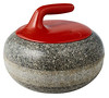
Also of note: I’m seriously intrigued by this photo, which is hanging on one of the walls at the club. Appears to be a hockey team whose jerseys feature a curling rock! Could Ebbets Field Flannels please put this design into production, pronto? Thanks.
All in all, a very good day — except that I was so busy having fun that I forgot to bid on that Packers dickie, which ended up going for a relative song. Dang.
Meanwhile: New ESPN column today — look here.
And now back to Phil for today’s Ticker.

Uni Watch News Ticker: “Did you see this great blog entry by Joe Pelletier on the $38,000 green Toronto Maple Leafs sweater?” asks Jacob Pomrenke. “Fascinating stuff — especially the part about King Clancy entering his ‘King Clancy Night’ game on a throne and then getting soot thrown in his face.” … Good spot by Joe Carney about a tremendous article in the NY Times about the small apparel company (Crons) that makes the uniforms for the Robert Morris basketball team. “As a Pittsburgh native, I was particularly fascinated by this story,” writes Joe. “RMU is from Pittsburgh, and the founder of Crons was a walk-on (and good outside shooter if I recall) for the Pitt basketball team more than 20 years alone. Great bit of detail is someone quoted in the article bemoans the fact that when the Nikes of the world makes unis for the Robert Morris’s of the world, they are merely providing them with other, larger schools’ unis, and are merely switching the colors on this template– a state of affairs I have been bemoaning for years.” … Steven Wojtowicz brings up an excellent question, “Not sure if this has been asked or not, but, does anyone know why Ryota Igarashi gets his FiNOC (First Name On Collar)?” … Joining the parade of green for St. Patty’s Day was UVA, who got into the St. Paddy’s Day green hat act on the 17th against JMU (thanks to Kevin Zdancewicz … Pirates infielder Bobby Crosby refuses to be caught with his pants down on the field — why? he likes showing off his socks. … More follow-up for the St. Patty’s Day follies comes from Ben Hendel, who notes a couple of things to report from the Red Sox game on 3/17. First off, for what he recalls as the first time ever, Pedroia was rocking high socks. Looked a bit odd with the green uni, looked really confusing when he threw on a blue batting helmet; Secondly, the Mets were truly wearing adjustable ball caps, as you can clearly see here. Says, Ben “You can clearly see a rainbow-and-pot-of-gold on the back, as well as an additional patch on the right side. I have no idea what that one was. Also, in yesterday’s ticker (your picture of the Dodgers and their green uni/caps), the pitcher isn’t wearing either a regular season 59FIFTY or BP 39THIRTY. He’s wearing a Twins ’47 Franchise cap.” … JJ Sully noticed yet yet another MLB logo ripoff, this one from AMA Superbike. … Here’s something we all missed the other day: North Carolina, relegated to the NIT, broke out throwbacks — and still almost lost … Kenn Tomasch saw this interesting article from the Tampa Bay Rowdies blog, detailing a ‘match worn, Ringo Cantillo American Soccer League jersey.’ … Add another to the list of one batting gloved MLBers. That’s Clete Thomas of the Tigers. According to George Flory, he has been in and out the Majors for the past couple seasons. … What’s better than an unobstructed view of the “Horseshoe Casino” sign across the street? Why, a sign in the park for 2010 Toyota Recall. Seriously, they put the “liability” in “reliability.” … Reprinted from yesterday’s comments: the Kalamazoo Wings not only wore green uniforms for St. Patty’s Day, they had green ice … Who’s that skinny kid with the sleeves shooting the ball? Why, it’s Pat Riley, taken from an archived article of The Palm Beach Post (scroll up and to the right). Thanks to Morris Levin for the tip … Coming on the heels of unveiling new uniforms, the Tulsa Drillers are getting ready to unveil a new stadium … Keith Goggin saw yesterday’s ticker query on Siena’s practice jerseys, which appeared to be “dazzle,” and has the answer: “They are not dazzle cloth. Actually, they are quite far from it — more like a muted polyester fabric with no sheen whatsoever. They are also reversible with screened on numbers. They are from Anaconda Sports, a company that outfits quite a few teams here in the northeast (these Anaconda uniforms fall under “The Rock” basketball line). I know this because they are the exact uniforms that my team wears where I coach — Holy Cross High School in Flushing, Queens. We wear green and gold, and the reversible feature of these jerseys is very cost effective for us as well. We’ve been wearing these for the past 6 years and they hold up great.” Thanks, Keith (who’s on the left in the white shirt). … So you weren’t quite good enough to earn your way into the Winter Olympics, but you can still wear an olympic uniform — for a price. … “We need to stick to the same paint scheme…You don’t see the Green Bay Packers changing the color of their uniforms.” To find out who uttered those words (and may not be aware of the Packers new alternate uni), check this out — more love for NASCAR on UW. … And finally, the best thing about tying for 333rd place in the UW NC2A pool after the first day? I can watch spring training games this weekend.
Everybody pulls for David, nobody roots for Goliath. — Wilt Chamberlain
Beautiful collection!
New professional baseball team in Pittsfield, Mass., which according to this article will be wearing “vintage uniforms” made by the general manager’s own Connecticut-based company:
link
New professional baseball team in Pittsfield, Mass., which according to this story will be wearing vintage uniforms made by the general manager’s Connecticut-based company:
link
Okay…
FOR THE RECORD…
LarryB got the colors pretty much correct in one of the three photos. No, let’s call it one and a half.
Anyone care to venture a guess what the real colors are in any of them?
link
link
link
—Ricko
[quote comment=”382258″]Okay…
FOR THE RECORD…
LarryB got the colors pretty much correct in one of the three photos. No, let’s call it one and a half.
Anyone care to venture a guess what the real colors are in any of them?
link
link
link
—Ricko[/quote]
First pic I don’t really have a clue.
2nd pic, I’m thinking he got the blue team correct, but the other team should have the red & blue reversed (blue numbers, not red). It looks like it ought to be red numbers/blue outline but I’m going to assume it’s the same visual trick that the damn hockey jersey had.
And the 3rd pic he’s got right except the pants were probably closer to tan than orange.
One of the teams in #2 must be the Denver Broncos, so I assume gold and brown would be in there (the Patriots, to the best of my knowledge, never wore vertical-striped socks).
The first pic is Ernie Nevers of the Duluth Eskimos. The jersey is white with black logo and stripes. Depending on who you ask, one might say it’s a very dark blue, but that’s personal perception. Let’s call it a bluish black, because it’s very dark (this is reference from the actual specimien at the H.O.F., not just B&W photos). When I look at it, to me the jersey looks to be the same color as the sanitary socks, so white would have been by first guess, unlike Larry, who thought the jersey looked darker. Black or blue would have been my natural guess for the socks and stripes/logo.
[quote comment=”382260″]One of the teams in #2 must be the Denver Broncos, so I assume gold and brown would be in there (the Patriots, to the best of my knowledge, never wore vertical-striped socks).[/quote]
The Broncos aren’t the only team in history to use silly vertical striped socks.
[quote comment=”382260″]One of the teams in #2 must be the Denver Broncos, so I assume gold and brown would be in there (the Patriots, to the best of my knowledge, never wore vertical-striped socks).[/quote]
Nowhere does it say that it’s an NFL photo. The Broncos never wore light colored helmets or shoulder loops with their gold and brown jerseys, so… WRONG! ;-)
Well, that’s what I get for assuming. :-P
As for the Bill Dudley photo, I know the Steelers (Pirates) wore jerseys like that, and I know Bill Dudley wore 35 as a member of the team, so I’m going to guess that it’s a Steelers/Pirates uniform, black with gold numerals and stripes. Gold or natural leather helmet. Gold or khaki pants with a black stripe. I didn’t cheat and look it up on Timmy Brulia’s history article, either. It’s a real guess based on what I know.
For my money, the other team has got to be the Eagles. I’m guessing white helmets with green earflaps, and green jerseys with white yoke and white numerals. The pants look lighter than green, so I’ll guess khaki pants. Green socks.
I see Larry thought of the Eagles as well. I don’t think the bears ever wore NW striping, though, so I don’t think the blue and orange is correct, HOWEVER, he did go to college at UVa, which is blue and orange, but I think the resemblance of the two teams as the Eagles and Steelers is too much of a coincidence.
The middle photo, I’m guessing blue/red/blue on the shoulder loops, red on the numerals, and blue/white on the vertical stripes. I think the guy on the ground is wearing blue and silver.
Another tidbit: Ansel Adams famously used a red filter on most of his images to create that signature contrast between the clouds and the dramatic, dark sky.
More evidence that B&W can not be trusted. Too much manual manipulation.
Happy birthday, Paul! How did they manage to arrange it so that all the cool kids are born in March? Einstein, Gorbachev, Booker T, Ira Glass, Kurasawa, Steve McQueen, my friend Karin in London, Spock, Kirk, Costas, Mr. Rogers, the other Mr. Rogers, and Paul.
[quote comment=”382269″]Happy birthday, Paul! How did they manage to arrange it so that all the cool kids are born in March? Einstein, Gorbachev, Booker T, Ira Glass, Kurasawa, Steve McQueen, my friend Karin in London, Spock, Kirk, Costas, Mr. Rogers, the other Mr. Rogers, and Paul.[/quote]
My birthday is also in March. I rock.
Wow – outstanding article. Great job!
Just out of curiosity, what time do the polls close today?
A little insight from a Duluth native about the curling-hockey team: I’d put money on the reason for a hockey team sporting curling images on their sweaters being that up until 1962 (give or take a couple years) when the current arena was built, the main indoor ice rink in Duluth was the Duluth Curling Club, which I believe was located at 13th Ave E and London Rd. Therefore, most of the teams skating from there were the Curling Club teams.
Happy early birthday Paul
Am I the only one really liking the big ol’ stylized “D” on the front of this jersey?
link
And it IS a “D”. Trust me.
—Ricko
[quote comment=”382274″]Am I the only one really liking the big ol’ stylized “D” on the front of this jersey?
link
And it IS a “D”. Trust me.
—Ricko[/quote]
Looks like an igloo to me. Was it supposed to be a reclining “D”?
link
Have a fine B-Day, Paul.
There are ways to guess what color filter the photographer used. If it’s a field shot, the filter was likely green in order to wash out the grass and make the players stand out. Grass is always a good reference. If it looks very light, the filter was green. Dark and it was probably red. Up close portrait type shots are most often taken with a red, orange, or yellow filter to even out skin tones. Blue filters reduce contrast in landscapes and make people’s skin look veiny. They’re not popular.
Paul,
Wishing you a very Happy COLORFUL B-Day!!
Thanks for all you do.
[quote comment=”382275″][quote comment=”382274″]Am I the only one really liking the big ol’ stylized “D” on the front of this jersey?
link
And it IS a “D”. Trust me.
—Ricko[/quote]
Looks like an igloo to me. Was it supposed to be a reclining “D”?
link
Well, damn. Thought was a little-known different version of that team’s jersey because bottom appears to turn upward rather than continue across (forming the “D”…but now that I zoom in on it, I see it’s just that his kicking leg is in precisely the position to create that illusion.
Nice catch, Chance.
And, of course, the selection of that photo had everything to do with a certain wanderer of ours curling in a certain city this weekend.
“All things join and intertwine, Grasshoppers”
…said the supposed “grand sage of UW”
(y’know, if we were Shriners, a guy would get a really cool special hat with a title that)
—Ricko
wow… i can’t believe my colorizing goof would make for such a great article jam-packed with useful info. great work, guys! i’ll never look at b&w the same way again.
my comment requarding the kalamazoo wings…just wanted to let you know that playing on green ice isnt all that rare. they have been doing it for 20 or so years. and other notible colored ice games( valentines day with pink ice, and halloween with orange ice)
it is funny-the st. patrick’s day hats and unis.
i remember the grand time when teams took time to put something nice together. of course too that was before everything was put into a template as well.
i have a replica 76 (do not quote me on that) reds st. patrick’s day hat-i love it-got it for a great price about 8 years ago-one of my fav hats of of my 200 plus hat collection. just green with a raised wishbone C.
oh and on a rollerderby note-derby started here in cleveland….
link
-Stoops
[quote comment=”382271″]Wow – outstanding article. Great job!
Just out of curiosity, what time do the polls close today?[/quote]
I’ve got it set for 5 pm. The timezone is listed as EST so it should actually be 5pm CDT, but I’m not 100% sure about that.
The Onion also realized how ridiculous Latino Appreciation jerseys are:
link
As promised, I have some college football photos from Life. They’re from the 50s when the world was black and white. (See Calvin and Hobbes.) I’ve paired each photo with a hint photo that I can post later if necessary.
For example, let’s take this link. It’s pretty generic, but maybe you all have sharper eyes than I do.
If not, I’d post this link and you’d instantly say, “Hedges! It must be Georgia!” Or at least that’s the plan. (That’s the 1947 Georgia team.)
Let’s start with an easy one. Ready?
link
And in honor of Paul’s birthday:
link
(Which really ought to be the national anthem of Uni Watch Nation. It’s about a uniform! With stripes!)
[quote comment=”382285″]As promised, I have some college football photos from Life. They’re from the 50s when the world was black and white. (See Calvin and Hobbes.) I’ve paired each photo with a hint photo that I can post later if necessary.
For example, let’s take this link. It’s pretty generic, but maybe you all have sharper eyes than I do.
If not, I’d post this link and you’d instantly say, “Hedges! It must be Georgia!” Or at least that’s the plan. (That’s the 1947 Georgia team.)
Let’s start with an easy one. Ready?
link[/quote]
Not a lot of people are not aware of this, but the Georgia Bulldog on the very, very far right in this…
link
…is “Cooter” Ruettiger.
His nephew is much better known, though.
—Ricko
Phil & Co. – Helluva post today. Good job guys.
Paul – Happy early Bday. Thanks for what Uni Watch adds to my day.
Bueller? Bueller?
The year is 1952 and here is
link
Great post today, gang!
[quote comment=”382289″]Bueller? Bueller?
The year is 1952 and here is
link[/quote]
Home team orange and black.
Visitors crimson and black.
Just as importantly, perhaps, is a striped sleeves-vs-striped sleeves game. Don’t see THAT real often.
(and you’re right, that one was kinda easy.)
—Ricko
[quote comment=”382291″][quote comment=”382289″]Bueller? Bueller?
The year is 1952 and here is
link[/quote]
Home team orange and black.
Visitors crimson and black.
Just as importantly, perhaps, is a striped sleeves-vs-striped sleeves game. Don’t see THAT real often.
(and you’re right, that one was kinda easy.)
—Ricko[/quote]
So what teams are those?
It’s probably stupidly obvious, but I’m drawing a blank on any pre-1968 teams with a tiger mascot actually using orange and black. The tiger hint had me thinking LSU.
[quote comment=”382292″][quote comment=”382291″][quote comment=”382289″]Bueller? Bueller?
The year is 1952 and here is
link[/quote]
Home team orange and black.
Visitors crimson and black.
Just as importantly, perhaps, is a striped sleeves-vs-striped sleeves game. Don’t see THAT real often.
(and you’re right, that one was kinda easy.)
—Ricko[/quote]
So what teams are those?
It’s probably stupidly obvious, but I’m drawing a blank on any pre-1968 teams with a tiger mascot actually using orange and black. The tiger hint had me thinking LSU.[/quote]
Home team: Princeton.
Visitors (and I’m having a serious brain fart on this; have seen photos of the unis, just can’t but a “school” on it)…Cornell? Colgate? Harvard even? Might possibly be Penn, in which case would be nayv and red.
—Ricko
I always found this interesting. Besides loving sports uniforms I’m a big fan of The Adventures Of Superman television series with George Reeves. The first two seasons of the series was shot in B&W and there was no contrast in the costume of blue and red. George Reeves Superman costume was actually brown and gray to show more contrast. They didn’t make him a red and blue costume until season three when they shot the show in color. If you ever see the episode where George Reeves did a guest spot on I Love Lucy he’s wearing his red and blue costume and it all looks the same color.
[quote comment=”382292″][quote comment=”382291″][quote comment=”382289″]Bueller? Bueller?
The year is 1952 and here is
link[/quote]
Home team orange and black.
Visitors crimson and black.
Just as importantly, perhaps, is a striped sleeves-vs-striped sleeves game. Don’t see THAT real often.
(and you’re right, that one was kinda easy.)
—Ricko[/quote]
So what teams are those?
It’s probably stupidly obvious, but I’m drawing a blank on any pre-1968 teams with a tiger mascot actually using orange and black. The tiger hint had me thinking LSU.[/quote]
With cheers and song we’ll rally ’round
the cannon as of yore,
And Nassau’s walls will echo with
the Princeton Tiger’s roar:
1952 Penn-Princeton. 13-7
(Would Penn’s jersey be black or navy? I thought navy.)
link
I have no hint for this one. I don’t think you’ll need one.
Totally off subject. Nice photo…
link
Have a pretty good idea who MOST of them are.
—Ricko
[quote comment=”382296″]Totally off subject. Nice photo…
link
Have a pretty good idea who MOST of them are.
—Ricko[/quote]
’52 Giants. Lined up according to defensive positions.
Think I got ’em all now.
[quote comment=”382295″][quote comment=”382292″][quote comment=”382291″][quote comment=”382289″]Bueller? Bueller?
The year is 1952 and here is
link[/quote]
Home team orange and black.
Visitors crimson and black.
Just as importantly, perhaps, is a striped sleeves-vs-striped sleeves game. Don’t see THAT real often.
(and you’re right, that one was kinda easy.)
—Ricko[/quote]
So what teams are those?
It’s probably stupidly obvious, but I’m drawing a blank on any pre-1968 teams with a tiger mascot actually using orange and black. The tiger hint had me thinking LSU.[/quote]
With cheers and song we’ll rally ’round
the cannon as of yore,
And Nassau’s walls will echo with
the Princeton Tiger’s roar:
1952 Penn-Princeton. 13-7
(Would Penn’s jersey be black or navy? I thought navy.)
link
I have no hint for this one. I don’t think you’ll need one.[/quote]
Gold & blue vs red & white?
[quote comment=”382298″][quote comment=”382295″][quote comment=”382292″][quote comment=”382291″][quote comment=”382289″]Bueller? Bueller?
The year is 1952 and here is
link[/quote]
Home team orange and black.
Visitors crimson and black.
Just as importantly, perhaps, is a striped sleeves-vs-striped sleeves game. Don’t see THAT real often.
(and you’re right, that one was kinda easy.)
—Ricko[/quote]
So what teams are those?
It’s probably stupidly obvious, but I’m drawing a blank on any pre-1968 teams with a tiger mascot actually using orange and black. The tiger hint had me thinking LSU.[/quote]
With cheers and song we’ll rally ’round
the cannon as of yore,
And Nassau’s walls will echo with
the Princeton Tiger’s roar:
1952 Penn-Princeton. 13-7
(Would Penn’s jersey be black or navy? I thought navy.)
link
I have no hint for this one. I don’t think you’ll need one.[/quote]
Gold & blue vs red & white?[/quote]
Give The Jeff a cee-gar.
Well, Indians in cardinal, of course.
Indians one of the few two-panted teams of that era, btw.
Wore white pants at home.
btw, Phil’s boss actually is in the office today.
Don’t you just hate it when, on top of spending all day there, they expect you to WORK, too,
Damn Capitalists.
[quote comment=”382298″][quote comment=”382295″]
link
I have no hint for this one. I don’t think you’ll need one.[/quote]
Gold & blue vs red & white?[/quote]
1954 Stanford – UCLA. 0 -72.
(Let’s hope the editing worked right there.)
link
[quote comment=”382302″][quote comment=”382298″][quote comment=”382295″]
link
I have no hint for this one. I don’t think you’ll need one.[/quote]
Gold & blue vs red & white?[/quote]
1954 Stanford – UCLA. 0 -72.
(Let’s hope the editing worked right there.)
link[/quote]
I’m staying out of this. Let someone else do some color figgerin’.
—Ricko
Things to note in this…
link
1. Check the location of the helmet TV numbers on team in white. Only team that ever moved them back like that. Distinctive.
2. I believe #88 chasing the loose ball is now in the Pro Football Hall of Fame. Second at his position to be inducted.
—Ricko
[quote comment=”382294″]I always found this interesting. Besides loving sports uniforms I’m a big fan of The Adventures Of Superman television series with George Reeves. The first two seasons of the series was shot in B&W and there was no contrast in the costume of blue and red. George Reeves Superman costume was actually brown and gray to show more contrast. They didn’t make him a red and blue costume until season three when they shot the show in color. If you ever see the episode where George Reeves did a guest spot on I Love Lucy he’s wearing his red and blue costume and it all looks the same color.[/quote]
Good point.
link, and they needed it because this is what the full-color link.
link
STIRRUPS ARE SUPER!!!!
(oh, okay, not really)
In my other “uni” hobby (military history & militaria), I learned that in 19th Century photos there is an emulsion process where yellow processes as black in a photo – so many archive photos of, for example, Spanish-American War cavalry troopers look like their unis have black trim when the trim was actually yellow.
Honest-fer-true.
First time I saw this costume on my black and white TV…
link
I thought, “They must be filming this in color now.”
God, I was a weird kid.
—Ricko
[quote comment=”382303″][quote comment=”382302″][quote comment=”382298″][quote comment=”382295″]
link
I have no hint for this one. I don’t think you’ll need one.[/quote]
Gold & blue vs red & white?[/quote]
1954 Stanford – UCLA. 0 -72.
(Let’s hope the editing worked right there.)
link[/quote]
I’m staying out of this. Let someone else do some color figgerin’.
—Ricko[/quote]
Is that Wisconsin/Illinois?
[quote comment=”382304″]Things to note in this…
link
1. Check the location of the helmet TV numbers on team in white. Only team that ever moved them back like that. Distinctive.
2. I believe #88 chasing the loose ball is now in the Pro Football Hall of Fame. Second at his position to be inducted.
—Ricko[/quote]
Thanks for the number hint. That’d make it orange & white with blue numbers vs either red or orange and white.
So, the moral of today’s story is that old black & white photography absolutely SUCKS for trying to identify colors.
[quote comment=”382306″]http://www.66batman.com/yabbfiles/Attachments/original-superman-costumes-indiana-state-museum-flickr.jpg
STIRRUPS ARE SUPER!!!!
(oh, okay, not really)[/quote]
Or look at it this way…
Back in the ’50s even SUPERMAN worried about infection from dyes; seeing as it appears likely he wore sanitaries.
Sanis and crew socks ARE historically accurate. Full color full socks are NOT.
So there. ;)
–Ricko
[quote comment=”382309″][quote comment=”382303″][quote comment=”382302″][quote comment=”382298″][quote comment=”382295″]
link
I have no hint for this one. I don’t think you’ll need one.[/quote]
Gold & blue vs red & white?[/quote]
1954 Stanford – UCLA. 0 -72.
(Let’s hope the editing worked right there.)
link[/quote]
I’m staying out of this. Let someone else do some color figgerin’.
—Ricko[/quote]
Is that Wisconsin/Illinois?[/quote]
No on both. Though the color scheme is close to one of those teams. Time for the hint?
I wish I could remember the technical names of the films. Most early black and white films showed red as much darker than black or blue. Even during WW 2 the Cardinals’ caps and the Cubs’ home logo had almost the quality of a photographic negatives on cheaper films Check out pages 200 and 245 of Donald Honig’s history of the National League.
More expensive b&w film corresponded more to reality.
[quote comment=”382312″][quote comment=”382309″]
Is that Wisconsin/Illinois?[/quote]
No on both. Though the color scheme is close to one of those teams. Time for the hint?[/quote]
I think that’s enough of a hint on it’s own.
It’s Syracuse & Tennessee.
link
link
[quote comment=”382314″][quote comment=”382312″][quote comment=”382309″]
Is that Wisconsin/Illinois?[/quote]
No on both. Though the color scheme is close to one of those teams. Time for the hint?[/quote]
I think that’s enough of a hint on its own.
It’s Syracuse & Tennessee.[/quote]
Half right. Syracuse is correct and a good start on the second team.
Today’s ESPN column is up:
link
— Paul, from Duluth
[quote comment=”382315″]link
link[/quote]
Assuming that’s the game I believe it is, the uniforms could have said, in unison, “We’re just alike, only different.”
But then the white helmets said, somewhat ominously, “Oh, wait, you have some dark parts on yours.”
And, ironically, it was the race issue, both around and in the game itself, that is what that bowl game is most remembered for.
Strangely and sadly symbolic, I thought.
Like I said, I was a weird kid.
—Ricko
Quick non-Uni question:
I’ve been wanting to go to a beefsteak ever since I learned from Paul what one was. Being from L.A. I had never even heard of it. Does anyone know of any beefsteaks out here in L.A. or even West Coast? From what I read its mostly a NY thing, but not going out there any time soon.
I can answer the question about Ryota Igarashi’s undershirt — it’s a very popular thing in Japanese baseball.
Igarashi himself did it while link, as did link (surname in his case). I guess the Mets are letting Ryota stick with what he’s used to.
[quote comment=”382316″][quote comment=”382314″][quote comment=”382312″][quote comment=”382309″]
Is that Wisconsin/Illinois?[/quote]
No on both. Though the color scheme is close to one of those teams. Time for the hint?[/quote]
I think that’s enough of a hint on its own.
It’s Syracuse & Tennessee.[/quote]
Half right. Syracuse is correct and a good start on the second team.[/quote]
Well drat. Assuming Ricko is right, it must be Texas then.
I think I’m done playing now.
[quote comment=”382321″][quote comment=”382316″][quote comment=”382314″][quote comment=”382312″][quote comment=”382309″]
Is that Wisconsin/Illinois?[/quote]
No on both. Though the color scheme is close to one of those teams. Time for the hint?[/quote]
I think that’s enough of a hint on its own.
It’s Syracuse & Tennessee.[/quote]
Half right. Syracuse is correct and a good start on the second team.[/quote]
Well drat. Assuming Ricko is right, it must be Texas then.
I think I’m done playing now.[/quote]
Yup, lotsa stuff in that game…
link
—Ricko
Sweet picture of the curling/hockey team. One question: What is the goalie wearing on his head? Is it a yarmukle? Part of the team uniform?
[quote comment=”382321″][quote comment=”382316″][quote comment=”382314″][quote comment=”382312″][quote comment=”382309″]
Is that Wisconsin/Illinois?[/quote]
No on both. Though the color scheme is close to one of those teams. Time for the hint?[/quote]
I think that’s enough of a hint on its own.
It’s Syracuse & Tennessee.[/quote]
Half right. Syracuse is correct and a good start on the second team.[/quote]
Well drat. Assuming Ricko is right, it must be Texas then.
I think I’m done playing now.[/quote]
1960 Cotton Bowl Syracuse and Texas 23-14
If anyone is still playing we’re up to
link
(I should note no team will appear more than once.)
[quote comment=”382317″]Today’s ESPN column is up:
link
— Paul, from Duluth[/quote]
Cool column.
There’s something magical about the tiny scraps of cardboard – the stub from my own first ballgame is long gone, but I’ve framed the stubs from my sons’ first games.
[quote comment=”382321″][quote comment=”382316″][quote comment=”382314″][quote comment=”382312″][quote comment=”382309″]
Is that Wisconsin/Illinois?[/quote]
No on both. Though the color scheme is close to one of those teams. Time for the hint?[/quote]
I think that’s enough of a hint on its own.
It’s Syracuse & Tennessee.[/quote]
Half right. Syracuse is correct and a good start on the second team.[/quote]
Well drat. Assuming Ricko is right, it must be Texas then.
I think I’m done playing now.[/quote]
Correct. Note the signature skinny helmet numbers on UT, along with the thin white stripes on the sleeves. The placement of the helmet numbers on the Orangemen is a dead giveaway. Only team I ever saw like that.
[quote comment=”382324″][quote comment=”382321″][quote comment=”382316″][quote comment=”382314″][quote comment=”382312″][quote comment=”382309″]
Is that Wisconsin/Illinois?[/quote]
No on both. Though the color scheme is close to one of those teams. Time for the hint?[/quote]
I think that’s enough of a hint on its own.
It’s Syracuse & Tennessee.[/quote]
Half right. Syracuse is correct and a good start on the second team.[/quote]
Well drat. Assuming Ricko is right, it must be Texas then.
I think I’m done playing now.[/quote]
1960 Cotton Bowl Syracuse and Texas 23-14
If anyone is still playing we’re up to
link
(I should note no team will appear more than once.)[/quote]
Is that, by any chance, an Old Oaken Bucket game?
Or (more likely) the white-helmeted team is Wisconsin.
Yep, Wisonsin/Purdue is my official guess.
quote comment=\”382269\”]Happy birthday, Paul! How did they manage to arrange it so that all the cool kids are born in March? Einstein, Gorbachev, Booker T, Ira Glass, Kurasawa, Steve McQueen, my friend Karin in London, Spock, Kirk, Costas, Mr. Rogers, the other Mr. Rogers, and Paul.[/quote]
You forgot Scotty, too! link
Not to mention Alexander Graham Bell….and moi – all March 3rders
Happy Birfday Paul!!!!!!!!!!!!!!!!!!!
[quote comment=”382327″][quote comment=”382324″]
If anyone is still playing we’re up to
link
(I should note no team will appear more than once.)[/quote]
Is that, by any chance, an Old Oaken Bucket game?
Or (more likely) the white-helmeted team is Wisconsin.[/quote]
Right on the second go.
1954 Purdue-Wisconsin 6-20 (Wisconsin was ranked #2 and Purdue was #5)
link
Paul!
You gotta hate that all the NCAA teams that wear purple yesterday won!
Kansas St.
Washington
Northern Iowa
I think the only other team left is Clemson so they could make it 4-4. I might be forgetting a team though.
Here’s a story on CNN.com about the rise in popularity of protective clothing under basketball unis …
link
on the ESPN column, why would the cubs have printed WS tickets in 1995? They were 73-71 and 12 games out of first. its not like they fell apart at the end of the season to fall out of contention either they were a game or 2 over 500 in each of the last 3 months of the season.
[quote comment=”382330″][quote comment=”382327″][quote comment=”382324″]
If anyone is still playing we’re up to
link
(I should note no team will appear more than once.)[/quote]
Is that, by any chance, an Old Oaken Bucket game?
Or (more likely) the white-helmeted team is Wisconsin.[/quote]
Right on the second go.
1954 Purdue-Wisconsin 6-20 (Wisconsin was ranked #2 and Purdue was #5)
link[/quote]
Oh, man, if that’s who I think it is, that’s a color-on-color game I would LOVE to see…as long as it didn’t rain so the color of the jerseys of the team shown on defense started to turn darker.
On a bright, sunny day, though, would be great. Assuming the defensive team wore the accurate shade of that color.
—Ricko
link
link
[quote comment=”382335″]link
link[/quote]
Let’s go with Army/Navy
[quote comment=”382334″][quote comment=”382330″][quote comment=”382327″][quote comment=”382324″]
If anyone is still playing we’re up to
link
(I should note no team will appear more than once.)[/quote]
Is that, by any chance, an Old Oaken Bucket game?
Or (more likely) the white-helmeted team is Wisconsin.[/quote]
Right on the second go.
1954 Purdue-Wisconsin 6-20 (Wisconsin was ranked #2 and Purdue was #5)
link[/quote]
Oh, man, if that’s who I think it is, that’s a color-on-color game I would LOVE to see…as long as it didn’t rain so the color of the jerseys of the team shown on defense started to turn darker.
On a bright, sunny day, though, would be great. Assuming the defensive team wore the accurate shade of that color.
—Ricko[/quote]
Notre Dame / Navy
Today’s link sponsored by a troubled Japanese automaker and the Cubs.
[quote comment=”382333″]on the ESPN column, why would the cubs have printed WS tickets in 1995? They were 73-71 and 12 games out of first. its not like they fell apart at the end of the season to fall out of contention either they were a game or 2 over 500 in each of the last 3 months of the season.[/quote]
As a Cub fan in 1995, I can tell you that 73-71 FELT like a trip to the World Series.
The last two answers just about got it.
1958 #3 Army at #4 Notre Dame 14-2
link
[quote comment=”382340″]The last two answers just about got it.
1958 #3 Army at #4 Notre Dame 14-2
link[/quote]
#6 looks like LSU and Ole Miss. But what do I know about B&W? I’m only 21.
the day started off so well…
even put on mah special ’57 cubs rups for rup friday…
then i got into work and it all went down the shitter
/carry on yo
[quote comment=”382302″][quote comment=”382298″][quote comment=”382295″]
link
I have no hint for this one. I don’t think you’ll need one.[/quote]
Gold & blue vs red & white?[/quote]
1954 Stanford – UCLA. 0 -72.
(Let’s hope the editing worked right there.)
link[/quote]
orange and blue vs. burnt orange and white
[quote comment=”382341″][quote comment=”382340″]The last two answers just about got it.
1958 #3 Army at #4 Notre Dame 14-2
link[/quote]
#6 looks like LSU and Ole Miss. But what do I know about B&W? I’m only 21.[/quote]
Half right. (We’ll you’re probably right about being 21, too.)
Would it help if I said one of these teams was ranked #1 at the time of this game?
[quote comment=”382340″]The last two answers just about got it.
1958 #3 Army at #4 Notre Dame 14-2
link[/quote]
With, it should be noted, Notre Dame in bright Kelly Green.
[quote comment=”382343″][quote comment=”382302″][quote comment=”382298″][quote comment=”382295″]
link
I have no hint for this one. I don’t think you’ll need one.[/quote]
Gold & blue vs red & white?[/quote]
1954 Stanford – UCLA. 0 -72.
(Let’s hope the editing worked right there.)
link[/quote]
orange and blue vs. burnt orange and white[/quote]
Funny thing about that, Texas wore pretty much the same orange as everyone else back then. Wasn’t until somewhere around the time of Earl Campbell that the shade actually moved to the true Burnt Orange they wear today.
Scrounge up color shots of the Longhorns against Staubach/Navy and/or Theismann/Notre Dame. Straight up orange. Like Browns. Or Bears. Or Orioles, for that matter. Not the Burnt Orange now associated with them.
—Ricko
Wait, I can do that.
link
Those Navy shoulder emblems are pretty sweet.
[quote comment=”382347″]Wait, I can do that.
link
Those Navy shoulder emblems are pretty sweet.[/quote]
looks burnt-ish
[quote comment=”382344″][quote comment=”382341″][quote comment=”382340″]The last two answers just about got it.
1958 #3 Army at #4 Notre Dame 14-2
link[/quote]
#6 looks like LSU and Ole Miss. But what do I know about B&W? I’m only 21.[/quote]
Half right. (We’ll you’re probably right about being 21, too.)
Would it help if I said one of these teams was ranked #1 at the time of this game?[/quote]
Would Chinese Bandits be involved?
[quote comment=”382349″][quote comment=”382344″][quote comment=”382341″][quote comment=”382340″]The last two answers just about got it.
1958 #3 Army at #4 Notre Dame 14-2
link[/quote]
#6 looks like LSU and Ole Miss. But what do I know about B&W? I’m only 21.[/quote]
Half right. (We’ll you’re probably right about being 21, too.)
Would it help if I said one of these teams was ranked #1 at the time of this game?[/quote]
Would Chinese Bandits be involved?[/quote]
Yes. Yes they would.
[quote comment=”382333″]on the ESPN column, why would the cubs have printed WS tickets in 1995? They were 73-71 and 12 games out of first. its not like they fell apart at the end of the season to fall out of contention either they were a game or 2 over 500 in each of the last 3 months of the season.[/quote]
Because this was the first year of the Wild Card, and the Cubs only finished 4 games back in that race…
[quote comment=”382350″][quote comment=”382349″][quote comment=”382344″][quote comment=”382341″][quote comment=”382340″]The last two answers just about got it.
1958 #3 Army at #4 Notre Dame 14-2
link[/quote]
#6 looks like LSU and Ole Miss. But what do I know about B&W? I’m only 21.[/quote]
Half right. (We’ll you’re probably right about being 21, too.)
Would it help if I said one of these teams was ranked #1 at the time of this game?[/quote]
Would Chinese Bandits be involved?[/quote]
Yes. Yes they would.[/quote]
Would there also be some purple involved? (sorry Paul)
[quote comment=”382353″][quote comment=”382350″][quote comment=”382349″][quote comment=”382344″][quote comment=”382341″][quote comment=”382340″]The last two answers just about got it.
1958 #3 Army at #4 Notre Dame 14-2
link[/quote]
#6 looks like LSU and Ole Miss. But what do I know about B&W? I’m only 21.[/quote]
Half right. (We’ll you’re probably right about being 21, too.)
Would it help if I said one of these teams was ranked #1 at the time of this game?[/quote]
Would Chinese Bandits be involved?[/quote]
Yes. Yes they would.[/quote]
Would there also be some purple involved? (sorry Paul)[/quote]
…that is, on both teams…
[quote comment=”382353″][quote comment=”382350″][quote comment=”382349″][quote comment=”382344″][quote comment=”382341″][quote comment=”382340″]The last two answers just about got it.
1958 #3 Army at #4 Notre Dame 14-2
link[/quote]
#6 looks like LSU and Ole Miss. But what do I know about B&W? I’m only 21.[/quote]
Half right. (We’ll you’re probably right about being 21, too.)
Would it help if I said one of these teams was ranked #1 at the time of this game?[/quote]
Would Chinese Bandits be involved?[/quote]
Yes. Yes they would.[/quote]
Would there also be some purple involved? (sorry Paul)[/quote]
Yes. Though not so much in this photo.
(As a follow-up to the previous question, I should note that these are second year Chinese Bandits.)
Just to wrap this up, I’ll ask what is a staple of the Chinese diet?
[quote comment=”382355″][quote comment=”382353″][quote comment=”382350″][quote comment=”382349″][quote comment=”382344″][quote comment=”382341″][quote comment=”382340″]The last two answers just about got it.
1958 #3 Army at #4 Notre Dame 14-2
link[/quote]
#6 looks like LSU and Ole Miss. But what do I know about B&W? I’m only 21.[/quote]
Half right. (We’ll you’re probably right about being 21, too.)
Would it help if I said one of these teams was ranked #1 at the time of this game?[/quote]
Would Chinese Bandits be involved?[/quote]
Yes. Yes they would.[/quote]
Would there also be some purple involved? (sorry Paul)[/quote]
Yes. Though not so much in this photo.
(As a follow-up to the previous question, I should note that these are second year Chinese Bandits.)
Just to wrap this up, I’ll ask what is a staple of the Chinese diet?[/quote]
Frogs?
OK, that’s an hour. LSU was easy but their opponents, not so much.
1959 Rice at #1 LSU 3-26.
link
[quote comment=”382357″]OK, that’s an hour. LSU was easy but their opponents, not so much.
1959 Rice at #1 LSU 3-26.
link[/quote]
Darn! off on #6 by 1 week! (thought TCU)
For # 7 is an “i” dotted at halftime?
[quote comment=”382358″][quote comment=”382357″]OK, that’s an hour. LSU was easy but their opponents, not so much.
1959 Rice at #1 LSU 3-26.
link[/quote]
Darn! off on #6 by 1 week! (thought TCU)
For # 7 is an “i” dotted at halftime?[/quote]
Traditionally to Le Régiment de Sambre et Meuse
[quote comment=”382339″][quote comment=”382333″]on the ESPN column, why would the cubs have printed WS tickets in 1995? They were 73-71 and 12 games out of first. its not like they fell apart at the end of the season to fall out of contention either they were a game or 2 over 500 in each of the last 3 months of the season.[/quote]
As a Cub fan in 1995, I can tell you that 73-71 FELT like a trip to the World Series.[/quote]
I was born a cub fan, but to print those tix when you are that far out and end in 3rd seems odd.
Up to the minute: Paul in the Hack
IMG_1683.JPG
first stone out the back of the house
[quote comment=”382351″][quote comment=”382333″]on the ESPN column, why would the cubs have printed WS tickets in 1995? They were 73-71 and 12 games out of first. its not like they fell apart at the end of the season to fall out of contention either they were a game or 2 over 500 in each of the last 3 months of the season.[/quote]
Because this was the first year of the Wild Card, and the Cubs only finished 4 games back in that race…[/quote]
Oh I forgot that’s then the wildcard stupidity started.
[quote comment=”382360″][quote comment=”382358″][quote comment=”382357″]OK, that’s an hour. LSU was easy but their opponents, not so much.
1959 Rice at #1 LSU 3-26.
link[/quote]
Darn! off on #6 by 1 week! (thought TCU)
For # 7 is an “i” dotted at halftime?[/quote]
Traditionally to Le Régiment de Sambre et Meuse[/quote]
This French is making me Ill…. (Ironically, my daughter is at a H.S. French Convention, so she can’t help me)
link
So stripey.
[quote comment=”382348″][quote comment=”382347″]Wait, I can do that.
link
Those Navy shoulder emblems are pretty sweet.[/quote]
looks burnt-ish[/quote]
Bad scan. Way too pink.
[quote comment=”382362″]Up to the minute: Paul in the Hack
IMG_1683.JPG
first stone out the back of the house[/quote]
can you email me that image? i’ll host/post it here
[quote comment=”382366″][quote comment=”382348″][quote comment=”382347″]Wait, I can do that.
link
Those Navy shoulder emblems are pretty sweet.[/quote]
looks burnt-ish[/quote]
Bad scan. Way too pink.[/quote]
Doesn’t look pink at all on this end. Are you calibrated?
sweet
thanks to steve king
paul curling 1
paul curling 2
says steve: “Not great shots, but they are live.
John Shuster is on the next sheet and his garb is fabulous, but I don’t have a good picture of it.”
The answer to Squid Challenge Seven was the 1950 Rose Bowl appearance of Ohio State v California. 17-14
Here’s what the program artists expect it would link.
link
[quote comment=”382368″][quote comment=”382366″][quote comment=”382348″][quote comment=”382347″]Wait, I can do that.
link
Those Navy shoulder emblems are pretty sweet.[/quote]
looks burnt-ish[/quote]
Bad scan. Way too pink.[/quote]
Doesn’t look pink at all on this end. Are you calibrated?[/quote]
All other images look fine here (looked at the above scan on mac at work and on pc now that I’m home, and looks same both places). Too pink.
Skin tones too pink, too. Whole thing alos is washed out. We all know the color of those Navy pants, and that ain’t it.
Texas just flat weren’t burnt orange back then. Oklahoma State was, wore burnt orange jerseys with black helmets.
How do I know? Because I noticed when Texas changed TO burnt orange. Dig out photos of James Street, Marty Eakins, Cotton Speyrer and folks like that.
Orange.
Nobody wants to believe me, largely because it doesn’t compute for them, I guess.
Here, I color corrected it. Not based on the orange, based on skin tones and gold on Navy unis.
Is better, no?
link
—Ricko
—Ricko
[quote comment=\”382370\”]The answer to Squid Challenge Seven was the 1950 Rose Bowl appearance of Ohio State v California. 17-14
Here\’s what the program artists expect it would link.
link[/quote]
Looks like an Iron Bowl to me – Auburn/Alabama
[quote comment=”382370″]The answer to Squid Challenge Seven was the 1950 Rose Bowl appearance of Ohio State v California. 17-14
Here’s what the program artists expect it would link.
link[/quote]
Okay, everyone, who was the first African-
American to QB a major college team AND be the first African-American All-America QB?
Most people, even self-proclaimed sports fans, honestly don’t know the answer.
link
—Ricko
Every year when watching the tournament, I can’t help but wonder when these teams that wear the wide shoulder look will realize they look like women’s jerseys.
Specifically, I mean the jerseys like Montana is wearing…
link
Just because I wanted to post this photo
link
and I think this is what the game looked like in link.
[quote comment=”382370″]The answer to Squid Challenge Seven was the 1950 Rose Bowl appearance of Ohio State v California. 17-14
Here’s what the program artists expect it would link.
link[/quote]
Iowa at Minnesota.
That last comment went totally awry.
Squid Challenge Eight was 1960 Iowa at Minnesota 10-27
Just had an interesting thought (based on European soccer), would you rather have sponsorships on jerseys, and no tv timeouts (since ad revenue is covered), so games ran quickly, and as they should, or, as is, with ad-less jerseys, and tv timeouts that disrupt the flow of games, and ruin a lot of viewing experience? I’m torn on this one.
Today’s column is one of my favorites because of my interest in old photos and what the teams were wearing. We all know they wore colorful uniforms. But with just black and white film I have guessed or wondered what the unis really looked like.
Great job today by Ricko and Timmy B
It was fun to help and great to learn.
The input by Dave Brei was greatly appreciated.
As TimmyB said many of the pictures of the 1910’s and 20’s the red looks very dark and even close ot black. Ohio State’s 1st superstar was Chic Harley from 1917 era. I have colorized many of his single pose photos or some of the backfield. It was always hard to get the red right since the original red looks so dark in b&w.
I just carefully read the Squid challenge questions before I saw the answers. I got all of them right except for Rice. But mostly because I have studied or looked at so many college football questions.
By the way squiddie those were fun. And I was not aware they had pictures of the Ohio State Cal Rose Bowl game.
[quote comment=”382294″]I always found this interesting. Besides loving sports uniforms I’m a big fan of The Adventures Of Superman television series with George Reeves. The first two seasons of the series was shot in B&W and there was no contrast in the costume of blue and red. George Reeves Superman costume was actually brown and gray to show more contrast. They didn’t make him a red and blue costume until season three when they shot the show in color. If you ever see the episode where George Reeves did a guest spot on I Love Lucy he’s wearing his red and blue costume and it all looks the same color.[/quote]
I just remembered that bit of trivia about Superman’s cape. That was interesting.
Bot sure if this site was posted here before. Not sports uniforms but WW1 photos in color.
link
[quote comment=”382346″][quote comment=”382343″][quote comment=”382302″][quote comment=”382298″][quote comment=”382295″]
link
I have no hint for this one. I don’t think you’ll need one.[/quote]
Gold & blue vs red & white?[/quote]
1954 Stanford – UCLA. 0 -72.
(Let’s hope the editing worked right there.)
link[/quote]
orange and blue vs. burnt orange and white[/quote]
Funny thing about that, Texas wore pretty much the same orange as everyone else back then. Wasn’t until somewhere around the time of Earl Campbell that the shade actually moved to the true Burnt Orange they wear today.
Scrounge up color shots of the Longhorns against Staubach/Navy and/or Theismann/Notre Dame. Straight up orange. Like Browns. Or Bears. Or Orioles, for that matter. Not the Burnt Orange now associated with them.
—Ricko[/quote]
NEVER, EVER doubt ‘The Master’:
link
If you skip to the last paragraph, you’ll cut right to the chase; I found the whole page quite informative though.
While I didn’t doubt you Ricko, I was somewhat skeptical; I apologize for my skepticism. Thanks for opening my mind, too.
With OneOK Field replacing the old Drillers Stadium in Tulsa, I say its time for a “I’m calling it Drillers Stadium” tee.
Great post today, gentlemen. Thank you.
I’ve seen Louisville play a couple of times this season, but I don’t remember the backs for their jerseys being so damn busy:
link
That’s 3SOB (Three Stripes on Back), TNiOB (Team Nickname on Back, CLOB (Conference Logo on Back) and NOB. All at the same time.