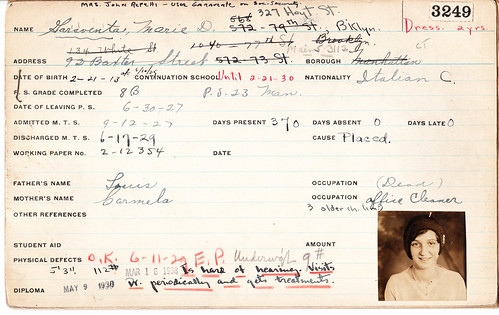
Meet Marie Garaventa. What you see above is her report card from the Manhattan Trade School for Girls, which she attended in the late 1920s. If you take a closer look, you can see she was of Italian descent, hard of hearing, slightly underweight, and never absent from class even once. If she’s still alive, she will turn 97 years old this Sunday.
I have almost 100 of these report cards (never mind where I got them). Each one is actually a packet several cards stapled together, with each packet featuring class grades, notes regarding job placements, and, in many cases, letters of reference and related paperwork. In short, each report card is its own fascinating little story, and collectively the cards form a larger story about New York during the Depression.
I’ve started working on a book in which I plan to tell these stories. No publisher yet, but I have an agent and a battle plan — the wheels are turning. Right now I’m working on the proposal, which will take me a couple of months. Working title: Permanent Record.
A big part of the project will entail tracking down the women shown on the report cards — or, more likely, tracking down some of their relatives, since most of the women themselves are probably deceased (Marie was one of the younger ones). I could use some research assistance for that, preferably from people who are particularly research-savvy (that would be you, Trevor Williams) and who, ideally, have Lexis/Nexis access (which, sadly, I don’t have, although I do have access to ancestry.com, which should be helpful).
What’s in it for you? Not much, unless I get a really big advance (highly unlikely) or unless you’re the kind of person who gets a kick out of plumbing the depths of a particularly deep, interesting rabbit hole (maybe not so unlikely if you’re a Uni Watch reader, right?). The one thing I can promise is that the report cards are endlessly fascinating, so you’ll probably find the project plenty interesting.
I’m also curious about ways of using social media to help find these women and their families. Which message boards should I be posting queries to? Should I start a new blog called “Desperately Seeking Depression-Era Manhattan Trade School for Girls Students”? How might Facebook be of use?
If you have any suggestions along those lines, and/or if you’re interested in signing on as a research intern, please let me know.
Thanks for reading this far. We now return you to your regularly scheduled uni-related content.

Best news of the year so far: Oh. My. God. That’s Giants pitcher Henry Sosa yesterday. “As a Giants fan, I almost squealed with delight,” says Alex Moggridge, one of several readers who sent me that photo. “If those are the official socks, my life is complete. Any idea if that’s the real deal?”
I figured there was no way those were team-issued socks. But then I saw this video clip, in which we learn that the socks are not only team-issued but are the brainchild of team CEO Bill Newcomb, who just won himself the Executive of the Year award in a landslide.
Sure, it’d be nice if they were striped stirrups instead of just socks, but I think trading ’rups for stripes is actually a fair swap. Only question now is how many San Francisco players will wear their pants high-cuffed — and how many teams will follow the Giants’ lead in the striped-hose sweepstakes.
Uni Watch News Ticker: Interesting DIY project by Matt Wooster, who’s been making his own logo magnets. “I recently started into this because of the lack of merchandise with the vintage logos — i.e., Expos, Whalers, Oilers,” he says. “I make them using a Xacto-type knife, adhesive magnetic sheet, cutting mini-mat, letter-size paper, and a laminater with laminate sheets. I print the logos onto letter-size paper and laminate it. Then I cut out the logos and press them onto the magnetic sheet. Once the logo is stuck onto the magnetic sheet, I cut the shape out.” ”¦ New team name and logo for the Sioux Falls Canaries, who are now the Fighting Pheasants. ”¦ What’s going on here? According to Jeremy Brahm, “The Yomiuri Giants are asking kids to design their own uniforms for a three-game series at the Tokyo Dome in July. The winner will have their uniform worn by the team for the entire series. The uniforms have to look like they would in a game and they have to be hand-drawn, not computer designed.” There they go, de-valuing design again. ”¦ “Your coverage of the Blues’ blue-and-white skates reminded me of these,” writes Jake Elwell. “The top-of-the-line yellow Rally Bobby Orr model was the ultimate skate in the Boston area ca. early ’70s. Don’t think the B’s ever wore ’em, though.” ”¦ Easton hockey will be debuting a new ultra-light helmet on Monday. ”¦ Now there’s a nice set of stripes (great find by Marc Burgess). ”¦ Okay, after yesterday’s false start, here are solid pics of the Brewers’ new road jersey. ”¦ Mike Hersh found something weird: a 1969-70 Philadelphia Flyers media photo of Bobby Clarke wearing No. 10. “10 was Bill Sutherland’s jersey number that year,” notes Mike. “In this Flyers team photo from the same season, Sutherland is in the front row wearing 10 and Clarke is in the second row wearing his usual 16 — their jersey numbers are clearly visible. Clarke was always known to wear 16 throughout his career, but I have an action shot of Clarke down at my parents’ house where he is again wearing #10. I’d ask them to scan it, but they’d never find it.” Dude, make them find it! ”¦ The construction crew working on the Penguins’ new arena is wearing T-shirts showing a hard-hatted Pens logo (with thanks to Rob Ullman). ”¦ New uni numbers for the Tigers and the Mets. ”¦ Looks like Purdue Pete is on the way out. ”¦ Tons of old Indiana high school basketball photos in this gallery (with thanks to Dan Netser). ”¦ NBC News correspondents covering the Olympics have removed the Polo logo from their jackets (with thanks to Brinke Guthrie). ”¦ Oooh, check out this 1939 Ebbets Field usher — not to be confused with the chief usher (great find by Lance Smith). ”¦ Very interesting artwork based on NBA courts and arenas here (with thanks to Kate Perryman). ”¦ Awesome collection of old Olympic posters here. Click around — recommended (with thanks to Stan Olechowski). ”¦ Coupla Olympic hockey observations from Steven Wojtowicz: rings on the net, and a new form of logo creep. ”¦ New design forthcoming for the reverse side of the penny (with thanks to Adam Brodsky). ”¦ Jeff Czuba notes that the Canadian and Swiss hockey teams took different approaches regarding how to position their “A” and “C” designations on their contrast-colored yokes. Jeff likes the Swiss approach because the letter doesn’t overlap from one color to the other, but I think the Swiss letter is positioned too high. The real problem is that yoke is more of an old-style football yoke instead of a hockey-style design — the color break is too low on the chest, which is the cause of the letter-positioning problem. ”¦ Good spot by Grant Goldman, who noticed that the armhole trim and NOB lettering on Toney Douglas’s roster photo don’t match the Knicks’ actual jersey style. ”¦ Was a traveler at the Philadelphia airport pulled out of the security line and subjected to a high-intensity search simply because she was wearing a Cowboys jersey? I sure fucking hope so She thinks so (with thanks to Chris Flinn). ”¦ No photo, but Thom Dennis says No. 15 on the Russian women’s hockey team is wearing white skates. ”¦ The Mets marked the beginning of spring training by engaging in that time-honored routine, “How many hats can we fit in one photo?” (As noted by Terence Kearns.) ”¦ “Norwegian goalie Pal Grotnes has a very odd superstition,” writes Tyler Hull. “During the first and third periods he wears a Reebok Revoke blocker. But during the second period he switches to a Reebok Premier Series 3. Never seen this before.” ”¦ Topps’s new baseball card set includes insert cards with cap logos.
We’re all happy about the Giants new sox, but it doesn’t need to be in the ticker right after the bigger entry.
I do not think the book would be to everyone’s tastes but if you are going to do this card project you should read Jose Saramago’s “All the Names”. It is fiction but it is related (and the guy won a Nobel Prize and all). I am big fan and that may be my least favorite book of his (but again it is about a records clerk who decides to find out all he can about a “record”).
[quote comment=”378476″]We’re all happy about the Giants new sox, but it doesn’t need to be in the ticker right after the bigger entry.[/quote]
Now fixed. Thanks.
[quote comment=”378477″]I do not think the book would be to everyone’s tastes but if you are going to do this card project you should read Jose Saramago’s “All the Names”. It is fiction but it is related (and the guy won a Nobel Prize and all). I am big fan and that may be my least favorite book of his (but again it is about a records clerk who decides to find out all he can about a “record”).[/quote]
Interesting tip. Thanks!
Does the Norwegian goalie switch because of superstition or mositure?
There are hockey players who change gloves numerous times during a game because they get too wet and need to be blow-dried to get rid of the moisture.
“How many hates can we fit in one photo?”
how many different hates or hats?
Ancestry/Rootsweb is your best website bet. They have a ton of message boards and if you shell out the cash for membership – or go to a library that does – you’ll have access to records that might potentially help, such as a few birth and death records.
The Reds cap logo from the last ticker item doesn’t match the picture. The cap logo looks to be more like a Cubs-style “C” while the picture has a wishbone-style “C”
hate hate hate hate hate hate hate hate hate
Paul Lukas Said
“Was a traveler at the Philadelphia airport pulled out of the security line and subjected to a high-intensity search simply because she was wearing a Cowboys jersey? I sure fucking hope so She thinks so”
Well as a cowboys fan, I can say that if she was fucking stupid enough to a)wear the blue jersey and b) wear it in philadelphia, then she deserves whatever heckling she gets. All she had to say was “0-3gles”.
1) Checkout the Islander jerseys at the Olympics.
link
2) Has anyone discussed why all the NHL player who don’t normally wear a visor are forced to wear a visor in the Olympics?
I head during the Canada Norway game that if you were born before 1/1/1975 you can choose to wear no visor. If you were born after 1975, you have to wear a visor. Brutal.
3) I love to see which players are wearing hockey gloves that dont match their team jerseys. I have seen green gloves on red white and blue teams; yellow and blue on blue and white teams.
I guess their countries dont have a budget.
Don’t have a screenshot, but last night on ESPN they were “advertising” Tiger’s press conference for today. He was wearing his typical Sunday combo of black hat/red shirt except the Nike swooshes were photoshopped out…poorly. Anyone know why they did that?
The Fleer Project.com has a bunch of shots of Reggie in an O’s uni that i havent seen.
link
That Brewers jersey is a disaster.
White drop-shadow alongside a white script letter?!? Can you possibly make a bigger design faux-pas?!
The way the L, W and A bleed together, thanks to the shadow, makes those letters hard to distinguish.
Grade: F
-Jet
WOW – those Topps cap logo cards…
Someone at Topps GETS IT…
-Jet
When I was 16-years-old I worked one summer for my school district (painting, mowing, etc) at a small elementary school that once served as the jr. high and high school. It was built in 1901.
Anyways, one day while painting the boys bathroom, I got curious and weaseled my way into a door that had been painted over dozens of times and rendered permanently (until me) closed for who knows how long.
It was filled with rusting, waist high file cabinets. I started poking around and realized that they held the report cards and permanent records of all the students from the early part of the century! My grandmother and grandfather had met at the school in the 30s, and sure enough I found all their report cards and presented them to my grandfather as a birthday present one year.
[quote comment=”378490″]WOW – those Topps cap logo cards…
Someone at Topps GETS IT…
-Jet[/quote]
how’d they get those? did they destroy old caps to do so?
[quote comment=”378486″]1) Checkout the Islander jerseys at the Olympics.
link
[/quote]
They could have been blank Minnesota Fighting Saints (WHA) jerseys…
-Jet
The Sioux Falls Pheasant link appears to be a depiction of South Dakota’s state bird, the Ring-necked Pheasant link (the only state bird not native to North America)
[quote comment=”378492″][quote comment=”378490″]WOW – those Topps cap logo cards…
Someone at Topps GETS IT…
-Jet[/quote]
how’d they get those? did they destroy old caps to do so?[/quote]
And they don’t get it too much…at least make sure the logo in the phot matches the stitched version!
link
In the 60’s & 70’s the O’s bird was more round. The Orioles new spring training facility gets it!
link
[quote comment=”378492″][quote comment=”378490″]WOW – those Topps cap logo cards…
Someone at Topps GETS IT…
-Jet[/quote]
how’d they get those? did they destroy old caps to do so?[/quote]
I kind of doubt it Phil. Most cap logos are applied over the panel seam on the front of the cap. No seams visible on the card logos
and that’s the wrong bird all together!
link
Who thinks of the 89′ bird when you mention Palmer???
[quote comment=”378488″]The Fleer Project.com has a bunch of shots of Reggie in an O’s uni that i havent seen.
link
Which one? They are all the basic standard issues.
[quote comment=”378496″][quote comment=”378492″][quote comment=”378490″]WOW – those Topps cap logo cards…
Someone at Topps GETS IT…
-Jet[/quote]
how’d they get those? did they destroy old caps to do so?[/quote]
I kind of doubt it Phil. Most cap logos are applied over the panel seam on the front of the cap. No seams visible on the card logos[/quote]
so…they’re not authentic then?
i didn’t have time to fully delve into the article, but i got the impression those were supposed to be limited edition swatches from the caps of the day (not necessarily the players’ cap…but from a cap produced in that year for that team — or they modern day repros?)
am i incorrect?
Regarding the Topps cap logo cards.
They are listed on the press release as Manufactured Hat Logos.
The key word there is manufactured.
Topps has already released series 2 (more hat logos) and it’s not even the start of spring training.
There’s a stray ‘=’ at the end of the URL for the Brooklyn usher captain.
[quote comment=”378489″]That Brewers jersey is a disaster.
White drop-shadow alongside a white script letter?!? Can you possibly make a bigger design faux-pas?!
The way the L, W and A bleed together, thanks to the shadow, makes those letters hard to distinguish.
Grade: F
-Jet[/quote]
I believe that is a gold drop shadow you are looking at, not white. Plus, isn’t this new design that same script as the alt “Brewers” uniform? I don’t think they changed the lettering or shadowing just for this new alt.
Brewers alt:
link
Milwaukee alt:
link
[quote comment=”378489″]That Brewers jersey is a disaster.
White drop-shadow alongside a white script letter?!? Can you possibly make a bigger design faux-pas?!
The way the L, W and A bleed together, thanks to the shadow, makes those letters hard to distinguish.
Grade: F
-Jet[/quote]
You may wish to revisit your grading system – it’s not a white drop-shadow.
White letters, blue outline, gold drop-shadow. Same pattern the Brewers have been using for the last decade.
The construction crew working on the Penguins’ new arena is wearing T-shirts showing link
And that, my friends, is why mascot logos are inherently superior to wordmark logos.
[quote comment=”378504″]The construction crew working on the Penguins’ new arena is wearing T-shirts showing link
And that, my friends, is why mascot logos are inherently superior to wordmark logos.[/quote]
win.
[quote comment=”378499″][quote comment=”378496″][quote comment=”378492″][quote comment=”378490″]WOW – those Topps cap logo cards…
Someone at Topps GETS IT…
-Jet[/quote]
how’d they get those? did they destroy old caps to do so?[/quote]
I kind of doubt it Phil. Most cap logos are applied over the panel seam on the front of the cap. No seams visible on the card logos[/quote]
so…they’re not authentic then?
i didn’t have time to fully delve into the article, but i got the impression those were supposed to be limited edition swatches from the caps of the day (not necessarily the players’ cap…but from a cap produced in that year for that team — or they modern day repros?)
am i incorrect?[/quote]
Speaking of Topps and patches… I got really excited when they released these:
link
After buying a few on eBay, I flipped the card over and read, “The commemorative patch embedded in this card is a replica of a logo of a Historic MLB All Star game. The relic in this card is not from a specific game or season.”
So I would kind of question if they are the real deal. The only thing holding me back from saying they are reproductions for sure is that the cards are numbered /99. I
[quote comment=”378501″]There’s a stray ‘=’ at the end of the URL for the Brooklyn usher captain.[/quote]
Thanks. Now fixed.
Stump Merrill rockin’ some stirrups at Yankees camp:
link
[quote comment=”378486″]
2) Has anyone discussed why all the NHL player who don’t normally wear a visor are forced to wear a visor in the Olympics?
I head during the Canada Norway game that if you were born before 1/1/1975 you can choose to wear no visor. If you were born after 1975, you have to wear a visor. Brutal.
[/quote]
The IIHF made it mandatory for all players born in 1975 or later to wear visors or some form of facial protection. Takes it out of the hands of the players and is no different than implementing the rule for helmets. Won’t make much of a difference going forward soon anyways since most players are wearing visors now. The only times it won’t be mandatory will be in NHL games and World Cup games, since that is an NHL/NHLPA baby.
The trade off on that was that all players 18 and older can now wear just a visor on their helmets, before anyone U20 were required to wear full faceshields. As it stands now, anyone U18 must wear the full faceshield and a neckguard in an IIHF tourney.
Matt Wooster – great idea making your own logo magnets!
If you go to a ballgame on opening day and they pass out those magnet schedules, you could just use them instead of buying a magnetic sheet. My brother has tons of old magnet schedules, and he’s given me some. I’ve used them for photos and other things, but never thought about making sports magnets…until now. Thanks.
Wow, i freaked out when i saw you had hundreds of those cards, first thing came to mind was that i had decent odds to win one of the coolest raffles yet, but cant wait to see the book! great find!
why is purdue pete being shelved?
That Purdue Pete thing sounds like a ploy to boost sales. Wouldn’t be surprised to hear them say “Due to an overwhelming repsonse we’re keeping Pete after all.” I could be wrong, though.
Been wishing the Pirates would bring back striped socks link for years. Good move, Giants.
re: Sosa’s socks.
Without stirrups showing, that looks ridiculous.
And stripes WAY too high on leg.
Baseball socks don’t look like soccer socks.
Or football socks.
I’m all for the return of striped socks.
Done correctly for baseball, that is.
Sosa’s look is ludicrous. Some kind of “modern” interpretation of striped socks in baseball, I guess.
Here’s a better idea. Look at some old photos and get it right, please.
—Ricko
[quote comment=”378515″]re: Sosa’s socks.
Without stirrups showing, that looks ridiculous.
And stripes WAY too high on leg.
Baseball socks don’t look like soccer socks.
Or football socks.
I’m all for the return of striped socks.
Done correctly for baseball, that is.
Sosa’s look is ludicrous. Some kind of “modern” interpretation of striped socks in baseball, I guess.
Here’s a better idea. Look at some old photos and get it right, please.
—Ricko[/quote]
I completely disagree. A smidge too high? Maybe. “Ludicrous”? I think not. Anyway, look at the stripe placement on the players in the video — looks fine. Just a matter of sock length, leg length, how much you pull up the hose, etc.
Ummmmmmm….
link can’t be right, can it?
I wouldn’t be surprised if Purdue Pete is being shelved because he’s not an angry enough mascot. (what is it with things like angry pheasants for god’s sake?!)
The Pens’ hard hat shirt (which, were I not a very staunch Capitals fan, I would consider owning) would be even cooler if the penguin had a jackhammer or something…maybe they could make one with a welding torch and mask or something.
Of note from the Olympic Ladies’ Bonspiel: The Danish team looks quite traditional in (albeit somewhat short) skirts and hose. It’s a refreshingly good look next to all of the plain black slacks.
oh yeah…forgot the photo of the Danish ladies. link on NBC’s way-too-graphics-heavy photo site.
[quote comment=”378517″]Ummmmmmm….
link can’t be right, can it?[/quote]
No it cant be right especially when it doesnt work either
looks like Ovechkin got to keep his blade art…whatever it was….
link
[quote comment=”378512″]why is purdue pete being shelved?[/quote]
Pete isn’t our primary mascot, the Boilermaker Special (the train) is. I think they’re going to shift the focus to that and phase Pete out. This was a rumor in the fall, evidently the materials and aerospace labs that fabricate and upkeep the Pete heads got rid of the molds.
That said, I liked the guy. He will be missed.
200 Indiana high school photos.
There goes my day, Crawfordsville Athenians, John Wooden rocking the sideburns, and accidentally homoerotic team pix of the Franklin Wonder Five.
The uniforms for the cleaning staff at the games are specific for two reasons.
1. It allows that building management of the arena for the games to see where certain staff is.
2. Differentiates themselves from regular Olympic staff.
Even in the venue, normal ushers had different color sleeves to show who was a leader.
[quote comment=”378518″]I wouldn’t be surprised if Purdue Pete is being shelved because he’s not an angry enough mascot. (what is it with things like angry pheasants for god’s sake?!)
The Pens’ hard hat shirt (which, were I not a very staunch Capitals fan, I would consider owning) would be even cooler if the penguin had a jackhammer or something…maybe they could make one with a welding torch and mask or something.
Of note from the Olympic Ladies’ Bonspiel: The Danish team looks quite traditional in (albeit somewhat short) skirts and hose. It’s a refreshingly good look next to all of the plain black slacks.[/quote]
Agreed on all three counts.
[quote comment=”378504″]The construction crew working on the Penguins’ new arena is wearing T-shirts showing link
And that, my friends, is why mascot logos are inherently superior to wordmark logos.[/quote]
Yes, tell me about it; maybe Purdue Pete is relocating to Pittsburgh to work on that new arena? He’s probably going to stay at his cousin Steely McBeam’s house.
I’m pretty sure that Pete just going in for a much needed makeover; the last one was about 28-29 years ago. I think the biggest reason Purdue is doing it is so the Pete mascot that roams the sidelines of football and basketball games will have an updated look.
I just hope it ends up being an improvement… and that Purdue ditches that awful ‘Vegas gold’ in their athletic wear.
Here’s a fun story about a hotel in D.C. whose manager decided he wanted to make his hotel the place to be for curling fans. Entrepreneurship at its best there. link
[quote comment=”378525″][quote comment=”378518″]I wouldn’t be surprised if Purdue Pete is being shelved because he’s not an angry enough mascot. (what is it with things like angry pheasants for god’s sake?!)
The Pens’ hard hat shirt (which, were I not a very staunch Capitals fan, I would consider owning) would be even cooler if the penguin had a jackhammer or something…maybe they could make one with a welding torch and mask or something.
Of note from the Olympic Ladies’ Bonspiel: The Danish team looks quite traditional in (albeit somewhat short) skirts and hose. It’s a refreshingly good look next to all of the plain black slacks.[/quote]
Agreed on all three counts.[/quote]
Here’s the real question: Would Jim Vilk wear those skirts?
link
In fact, it\’s a labor union football team. To stay with popular uni-watch topics:
link
[quote comment=”378516″][quote comment=”378515″]re: Sosa’s socks.
Without stirrups showing, that looks ridiculous.
And stripes WAY too high on leg.
Baseball socks don’t look like soccer socks.
Or football socks.
I’m all for the return of striped socks.
Done correctly for baseball, that is.
Sosa’s look is ludicrous. Some kind of “modern” interpretation of striped socks in baseball, I guess.
Here’s a better idea. Look at some old photos and get it right, please.
—Ricko[/quote]
I completely disagree. A smidge too high? Maybe. “Ludicrous”? I think not. Anyway, look at the stripe placement on the players in the video — looks fine. Just a matter of sock length, leg length, how much you pull up the hose, etc.[/quote]
All I know is in the still of all the pitchers, the guy throwing appears to be wearing soccer socks. And for baseball, that’s just wrong.
Stripes that high are fine (with pants covering the sock above the stripes), if there’s a whole mess of white sani almost coming up to meet them (although that a distinctly ’70s Hawk Harrelson look). Unless, I suppose, we’re assuming the late ’30 and ’40s was the prime era of stirrups (which it may be). But even then the stripes should sit more toward the midway point between the bottom of the pants and shoe (or stirrup). Stripes way up on (and almost over) the calf, with a huge expanse of solid color down to the shoe has virtually never been a look that lasted for long, or was worn by many teams, in MLB.
I’ll say again, and there are tons of photos to back it up…stripes that high is a position for soccer and football socks. The proper baseball position is lower. And through the ’50s, ’60s and ’70s such were manufactured and sold differently…all had stirrups but the stripes way high were football socks. The lower striped ones were labelled as baseball and basketball socks.
Bottom line…a substantial amount of sock should show ABOVE the stripes, too…to be proper baseball striping.
—Ricko
Forgot to mention earlier that Permanent Record sounds like a blast.
Can you imagine the lawsuits and general commotion if someone tried to use that report card format today? Between “father” and “mother”, their occupations, “physical defects” . . .
The Astros will be breaking out their 1965 throwback unis for a game against the Phillies April 10th. link
[quote comment=”378491″]When I was 16-years-old I worked one summer for my school district (painting, mowing, etc) at a small elementary school that once served as the jr. high and high school. It was built in 1901.
Anyways, one day while painting the boys bathroom, I got curious and weaseled my way into a door that had been painted over dozens of times and rendered permanently (until me) closed for who knows how long.
It was filled with rusting, waist high file cabinets. I started poking around and realized that they held the report cards and permanent records of all the students from the early part of the century! My grandmother and grandfather had met at the school in the 30s, and sure enough I found all their report cards and presented them to my grandfather as a birthday present one year.[/quote]
Great Story, Tim. you were a good boy! :)
what was your Grandparent’s reaction to your present?
The Swiss goalie’s mask is really cool. Looks like he let a Swiss graphic designer go nuts.
link
link
[quote comment=”378528″][quote comment=”378525″][quote comment=”378518″]I wouldn’t be surprised if Purdue Pete is being shelved because he’s not an angry enough mascot. (what is it with things like angry pheasants for god’s sake?!)
The Pens’ hard hat shirt (which, were I not a very staunch Capitals fan, I would consider owning) would be even cooler if the penguin had a jackhammer or something…maybe they could make one with a welding torch and mask or something.
Of note from the Olympic Ladies’ Bonspiel: The Danish team looks quite traditional in (albeit somewhat short) skirts and hose. It’s a refreshingly good look next to all of the plain black slacks.[/quote]
Agreed on all three counts.[/quote]
Here’s the real question: Would Jim Vilk wear those skirts?[/quote]
Okay, that’s the third person to suggest something like that…
I’d rather see Mrs. Vilk in that, but if it was for a good cause (say if Uni Watch raises a significant wad of cash to Haiti…or to the Buy Jim Vilk a Mac Fund) I’d consider it.
[quote comment=”378514″]Been wishing the Pirates would bring back striped socks link for years. Good move, Giants.[/quote]
Not those!!!!!!
These !!!!!!! link
i still cant understand why usa curling “captains” suck so bad!!!!
[quote comment=”378536″][quote comment=”378514″]Been wishing the Pirates would bring back striped socks link for years. Good move, Giants.[/quote]
Not those!!!!!!
These !!!!!!! link
Overall, that uni is my favorite. But with the current uni, I think the three stripes would be a better fit.
I know someone posted this late yesterday regarding Boston Red Sox number news, but the reporter from the Boston Globe didn’t mention Jacoby Ellsbury is now number 2 (was 46), Clay Buchholz is now number 11 was (61), and Daniel Bard is now number 51 (was 60).
link
Jeremy Hermida wore No. 27 during his career with the Marlins and asked for it when he was traded to Boston.
But those digits, as any good Red Sox fan knows, were retired in honor of one Carlton Ernest “Pudge” Fisk.
“I found that out right away,” Hermida said. “No deal.”
Hermida then tried for 23, but that Mike Cameron used his veteran status to claim that. He finally got his third choice, 32.
“Good solid number,” Hermida said. “There was no special reason, I just liked it.”
As for the other prominent (or semi-prominent) newcomers, here are the numbers they have:
16: Marco Scutaro
22: Bill Hall
23: Mike Cameron
29: Adrian Beltre
30: Boof Bonser
40: John Lackey
46: Joe Nelson
55: Brian Shouse
70: Tug Hulett
76; Jose Iglesias
89: Gaby Hernandez
[quote comment=”378538″][quote comment=”378536″][quote comment=”378514″]Been wishing the Pirates would bring back striped socks link for years. Good move, Giants.[/quote]
Not those!!!!!!
These !!!!!!! link
Overall, that uni is my favorite. But with the current uni, I think the three stripes would be a better fit.[/quote]
That just my point, Jim. Bring back the entire uni from the early 70’s. Perhaps w/ the good juju the Bucco’s can uncover another Rob that the organization WILL NOT trade away. :(
Watched both of Team USA’s prelim hockey games and noticed two helmet related things. The flag on the right side of their helmets has the stars on the left. I think it would have been better to go with the military type style where you have the flag reversed so that it looks like its flowing in the wind when on the right side. Also, Joe Pavelski didn’t have any flags on his helmet for both games. Can’t find a good pic that shows it though.
[quote comment=”378536″]
These !!!!!!! link
coincidentally…or perhaps not…im wearing those very rups to work today…
Guess I wasn’t the only one who thought of making a mini curling game:
link
[quote comment=”378542″][quote comment=”378536″]
These !!!!!!! link
coincidentally…or perhaps not…im wearing those very rups to work today…[/quote]
That comment needs verification, Phil. Take a snapshot!
Ever wonder what kind of underwear John Daly wears under his Loud Mouth golf pants? Well, mean either. But, here ya go anyways:
link
[quote comment=”378545″]Ever wonder what kind of underwear John Daly wears under his Loud Mouth golf pants? Well, mean either. But, here ya go anyways:
link
What’s that? You want a pic of Big John in his undies? OK:
link
[quote comment=”378542″][quote comment=”378536″]
These !!!!!!! link
coincidentally…or perhaps not…im wearing those very rups to work today…[/quote]
Tryin’ to impress the ladies in the office, eh?
[quote comment=”378543″]Guess I wasn’t the only one who thought of making a mini curling game:
link
Then there’s this one:
link
[quote comment=”378544″][quote comment=”378542″][quote comment=”378536″]
These !!!!!!! link
coincidentally…or perhaps not…im wearing those very rups to work today…[/quote]
That comment needs verification, Phil. Take a snapshot![/quote]
here ya go
[quote comment=”378549″][quote comment=”378544″][quote comment=”378542″][quote comment=”378536″]
These !!!!!!! link
coincidentally…or perhaps not…im wearing those very rups to work today…[/quote]
That comment needs verification, Phil. Take a snapshot![/quote]
link[/quote]
Wow, what a striking resemblance to Richie Hebner!
Just amazing.
—Ricko
Or is it Ken Brett (yes, for those who don’t know, brother of George)?
He was one of the truly legendary “hounds” of MLB.
[quote comment=”378549″][quote comment=”378544″][quote comment=”378542″][quote comment=”378536″]
These !!!!!!! link
coincidentally…or perhaps not…im wearing those very rups to work today…[/quote]
That comment needs verification, Phil. Take a snapshot![/quote]
link[/quote]
I slowtossed you a nice fat one over the plate, didn’t I?
Took a brief (ugh) glimpse thru that SLIX site and was somewhat disappointed that their undershirt offerings were limited to the ‘influencer’ and the ‘downsizer’ … seems they completely blew an opportunity on the ‘wife beater’. ;) Seemed a natural.
[quote comment=”378549″][quote comment=”378544″][quote comment=”378542″][quote comment=”378536″]
These !!!!!!! link
coincidentally…or perhaps not…im wearing those very rups to work today…[/quote]
That comment needs verification, Phil. Take a snapshot![/quote]
link[/quote]
Oh My Freakin’ God! I wouldn’t believe it if I didn’t see it lol
The Topps hat logos rock. Only issue I have is that so much care was taken to properly represent the logos, and prominent players with those franchises, that some lesser covered clubs will feel slighted. As a life long Jays fan, having Rickey Henderson and Frank Thomas on the cards are insults. I’m sure that a decent pic of Dave Stieb, Tony Fernandez, Pat Hentgen or Roberto Alomar would be found. Someone who played an integral part in building the franchise. Roy Halladay is a magnificent choice, but the other two are jokes. Sure they performed to Hall of Fame credentials for other franchises, but I certainly don’t think of them fondly when I think of the history of the Jays.
Weird, the ‘C’ and ‘A’ on the Flyers’ 69-70 team pic are reversed. I wonder if that was normal, due to thrift, or due to laziness.
if we r going to suck at curling atleast send hot chicks like russia did not overweight old soccer moms
[quote comment=”378526″][quote comment=”378504″]The construction crew working on the Penguins’ new arena is wearing T-shirts showing link
And that, my friends, is why mascot logos are inherently superior to wordmark logos.[/quote]
Yes, tell me about it; maybe Purdue Pete is relocating to Pittsburgh to work on that new arena? He’s probably going to stay at his cousin Steely McBeam’s house.
I’m pretty sure that Pete just going in for a much needed makeover; the last one was about 28-29 years ago. I think the biggest reason Purdue is doing it is so the Pete mascot that roams the sidelines of football and basketball games will have an updated look.
I just hope it ends up being an improvement… and that Purdue ditches that awful ‘Vegas gold’ in their athletic wear.[/quote]
My concern is that this isn’t just a redesign on apparel, which wouldn’t suprise me, since U Spirit loves that kind of crap, but a wider rebranding. I hope he doesn’t get angrier. I want him to stay in that same, shove-my-helmet, go-to-work attitude, rather than the hammer-biting big chin version that bounced around in the late ’90s.
Good luck going back to Old Gold. Nike loves them some Vegas Gold.
[quote comment=”378554″]The Topps hat logos rock. Only issue I have is that so much care was taken to properly represent the logos, [/quote]
Well, kinda. The Milwaukee Braves and 1970-77 Brewers logos are close but not right.
You’d think a block M would be easy, but….
[quote comment=”378556″]if we r going to suck at curling atleast send hot chicks like russia did not overweight old soccer moms[/quote]
And if u r going to suck at posting “humorous” comments, maybe you should just give it a rest. Thanks.
Does anyone know where I can find out what font the Pittsburgh Pirates use or where I can find the exact font? Trying a DIY project for the first time…
[quote comment=”378560″]Does anyone know where I can find out what font the Pittsburgh Pirates use or where I can find the exact font? Trying a DIY project for the first time…[/quote]
Try this site: link
Scroll down just a tiny bit and you’ll find the Pirates. Hope that helps.
Paul,
I would love to help out in your research for your new book. I am unable to contact you through the link you provided. Please respond to the email I have provided so I can contact you about your project in the future. Thanks.
Glenn
JimV19 thank you very much. Exactly what I am looking for.
[quote comment=”378543″]Guess I wasn’t the only one who thought of making a mini curling game:
link
I’ve got a couple more in my collection (w/ pictures) here:
link
link
And some memorabilia of Curling Legend Hec Gervais, Curling’s Babe Ruth/Mickey Mantle in all things Curling and debauchery.
link
I’ve got a couple more vintage games I’ve picked up in the last year; I have to get some pics up on the blog..
Not sports oriented, but a SF Chronicle blogger has a list of the seven worst fast food chain uniforms of all time:
link
[quote comment=”378565″]Not sports oriented, but a SF Chronicle blogger has a list of the seven worst fast food chain uniforms of all time:
link
I did a story on fast food uniforms back around 2005! Interviewed lots of fast food marketing people, uniform designers, and manufacturers, etc. But the story never ran, I think because the magazine folded, or they got a new editor, or something — can’t remember the details. Hot Dog on a Stick was the star of the show…. Wonder if I still have the text file and notes. [1 minute later] Yup, I do.
[quote comment=”378564″][quote comment=”378543″]Guess I wasn’t the only one who thought of making a mini curling game:
link
I’ve got a couple more in my collection (w/ pictures) here:
link
link
And some memorabilia of Curling Legend Hec Gervais, Curling’s Babe Ruth/Mickey Mantle in all things Curling and debauchery.
link
I’ve got a couple more vintage games I’ve picked up in the last year; I have to get some pics up on the blog..[/quote]
Those are fantastic! When I first saw them I thought they were warped from age. Hadn’t thought about a curved surface to make the pieces “curl.” Genius.
Hmm, along with the first game I made link I also have a long piece of poster board with the designs drawn in colored pencil. I could raise the edges somehow to get the same effect.
Thanks!
[quote comment=”378489″]That Brewers jersey is a disaster.
White drop-shadow alongside a white script letter?!? Can you possibly make a bigger design faux-pas?!
The way the L, W and A bleed together, thanks to the shadow, makes those letters hard to distinguish.
Grade: F
-Jet[/quote]
I was just looking at how Sedar’s thumb is actually wider than the i or l, and that blockshadow isn’t doing it any favors. It’s just not a good font to spell out Milwaukee.
Paul, what an inspired book idea. You are going unearth some magnificent stories. Hell, every story will be precious–to someone, or some family. It’ll touch many people’s lives. Good luck.
I couldn’t help but think of the Triangle Shirtwaist Fire when I read your entry. Though it looks like that event pre-dated the set of cards you have. The fire (1911) may have taken the lives of girls who attended MTSFG, which apparently was established in 1904.
link
[quote comment=”378563″]JimV19 thank you very much. Exactly what I am looking for.[/quote]
Anytime. Glad to help with a Pirates DIY.
By the way, you’re not this Drago, link are you?
Easton hockey will be debuting a new ultra-light helmet on Monday.
This will be very similar to a bike helmet in that one blow and you need a new one…ultra-protective and cheaper to manufacture than the current helmets on the market but guarantee they will charge just as much if not more.
OK, I’m looking at some photos of the 1938 Pirates. Were link a good idea?
Kenosha-born Ray Berres looks like he’s wearing a link as he meets the press.
In the days before signature equipment, Al Todd’s leg guards say link and his chest guard says link. (I’m guessing it’s Todd. It might be Berres wearing Todd’s stuff.)
The ‘P’ looks smaller and there are more lines of stitching in the bill of link
You get link with those old jerseys.
[quote comment=”378494″]The Sioux Falls Pheasant link appears to be a depiction of South Dakota’s state bird, the Ring-necked Pheasant link (the only state bird not native to North America)[/quote]
That is the exact reason. Plus, pheasant hunting is huge in SD. There is a lot of money that comes in to the state from hunting. So far, the public has not been too happy with the change from what I have seen.
I gotta say I am digging the Team Canada hockey unis worn last night. I’m not sure if the white sweaters were intended as a throwback design, but they do give off that effect in my opinion. Very cool, even if the team wearing them played like dogsh_t and was lucky to win.
Wanna go to the gold medal game in curling? One ticket’s available:
link
[quote comment=”378565″]Not sports oriented, but a SF Chronicle blogger has a list of the seven worst fast food chain uniforms of all time:
link
Holy crap, that blog posting made my day. Very funny. Thanks for the link.
I wore a Wendy’s uni for about three months a long time ago. Wow, that sucked. And the Buffy TVS at Doublemeat Palace uni is actually what they wear at Texas’ regional chain Whataburger and have since I can remember.
[quote comment=”378573″][quote comment=”378494″]The Sioux Falls Pheasant link appears to be a depiction of South Dakota’s state bird, the Ring-necked Pheasant link (the only state bird not native to North America)[/quote]
That is the exact reason. Plus, pheasant hunting is huge in SD. There is a lot of money that comes in to the state from hunting. So far, the public has not been too happy with the change from what I have seen.[/quote]
For those who know their history of minor league baseball in the Dakotas, it’s long-used name from the Northern League.
And this beauty is one of the Ebbets Field Flannels I covet most (affiliated with the Orioles at the time)…
link
—Ricko
[quote comment=”378567″][quote comment=”378564″][quote comment=”378543″]Guess I wasn’t the only one who thought of making a mini curling game:
link
I’ve got a couple more in my collection (w/ pictures) here:
link
link
And some memorabilia of Curling Legend Hec Gervais, Curling’s Babe Ruth/Mickey Mantle in all things Curling and debauchery.
link
I’ve got a couple more vintage games I’ve picked up in the last year; I have to get some pics up on the blog..[/quote]
Those are fantastic! When I first saw them I thought they were warped from age. Hadn’t thought about a curved surface to make the pieces “curl.” Genius.
Hmm, along with the first game I made link I also have a long piece of poster board with the designs drawn in colored pencil. I could raise the edges somehow to get the same effect.
Thanks![/quote]
The curved surface works great for the games, too; I use a bit of shuffleboard wax on the original linked game and it works like a charm!
I saw your game a few weeks ago on the net and it’s gorgeous; let me know if you need any mini stones to use and I’ll be glad to send you a set of some I’ve been using for the Munro game…
Norwegian goalie Grotne’s switching blockers likely has nothing to do with superstition. A goalie gets mighty sweaty and he may switch blockers so the glove is dry and he can hang on to his stick more easily. Chances are the first-period blocker is in the locker room with a hair dryer pointed into it during the second period.
[quote comment=”378558″][quote comment=”378554″]The Topps hat logos rock. Only issue I have is that so much care was taken to properly represent the logos, [/quote]
Well, kinda. The Milwaukee Braves and 1970-77 Brewers logos are close but not right.
You’d think a block M would be easy, but….[/quote]
I found these cap cards on ebay a few days ago. Some of these contain logos stitched flat-embroidered for the first time. As some of the errors go:
Old Angels halo is shaped wrong
1970s A’s cap logo on dark green
Astros Shooting Star with extra long streak
Old Blue Jays bird head not light blue
1970s Braves “a” shaped wrong
1970s Brewers “M” shaped wrong
White outline around original Expos logo
No silver spots on Marlins tail
1980-84 Padres logo wrong shape / is just ’70s version outlined in orange
1985-90 Padres is some kind of weird hybrid of the current logo
1991-03 Padres is another weird hybrid of the modern logo but has the correct “D” serifs
1970s & 80s Phillies logo way too fat
(not shown) the mid-80s-93 Rangers logo is wrong & they just reversed the original logo
Using batting helmet logo on Royals version
1970s & 80s White Sox cap logos using the incorrect Cooperstown Collection version (the batter logo is wrong & it drives me nuts and is why I won’t buy any CC stuff)
Yankees logo is wrong; the cap logo was more subtle, less pointiness like on Rickey’s cap.
Some of these logos are just artwork logos (like the Yankees, A’s, rather than genuine cap logo versions. And I’m sure there’s even more mistakes on these cap logo cards (like they didn’t even bother with royal stitching on the ’92-’04 Expos).
[quote comment=”378577″][quote comment=”378573″][quote comment=”378494″]The Sioux Falls Pheasant link appears to be a depiction of South Dakota’s state bird, the Ring-necked Pheasant link (the only state bird not native to North America)[/quote]
That is the exact reason. Plus, pheasant hunting is huge in SD. There is a lot of money that comes in to the state from hunting. So far, the public has not been too happy with the change from what I have seen.[/quote]
For those who know their history of minor league baseball in the Dakotas, it’s long-used name from the Northern League.
And this beauty is one of the Ebbets Field Flannels I covet most (affiliated with the Orioles at the time)…
link
—Ricko[/quote]
The Pheasant name, though, has always been used in Aberdeen, not in Sioux Falls. So while it is a traditional name, it’s most certainly not a traditional name to the people of Sioux Falls. Does anyone know if the two cities have a rivalry such that this name is just wrong to give to a sports team in Sioux Falls?
[quote comment=”378556″]if we r going to suck at curling atleast send hot chicks like russia did not overweight old soccer moms[/quote]
It’s interesting that the American women who competed in 2006 were criticized by some in the curling community for being nothing more than eye candy. Yet it appears they were as skilled, if not more so, than the current team. :(
[quote comment=”378577″][quote comment=”378573″][quote comment=”378494″]The Sioux Falls Pheasant link appears to be a depiction of South Dakota’s state bird, the Ring-necked Pheasant link (the only state bird not native to North America)[/quote]
That is the exact reason. Plus, pheasant hunting is huge in SD. There is a lot of money that comes in to the state from hunting. So far, the public has not been too happy with the change from what I have seen.[/quote]
For those who know their history of minor league baseball in the Dakotas, it’s long-used name from the Northern League.
And this beauty is one of the Ebbets Field Flannels I covet most (affiliated with the Orioles at the time)…
link
—Ricko[/quote]
Ricko, dropping hints for the next bday present???
I’d have to dig out my old cards, but I think either Fleer or Score did something similar to what Topps is doing now. I know I have a Frank Thomas card somewhere with a raised felt White Sox cap logo on it.
I was disappointed in the laziness of that Chronicle writer for including fictitious fast food uniforms. Those are MEANT to be humorous and poke fun at real hideous uniforms.
Don’t have time to read the comments, as I have class in ten minutes…
Paul, through the University of Oregon’s library, I can dig through Lexis-Nexis… and I’m staying in town over spring break (women…), so I would have a good share of time to look some of these people up for you. Drop me an email.
[quote comment=”378579″]Norwegian goalie Grotne’s switching blockers likely has nothing to do with superstition. A goalie gets mighty sweaty and he may switch blockers so the glove is dry and he can hang on to his stick more easily. Chances are the first-period blocker is in the locker room with a hair dryer pointed into it during the second period.[/quote]
Yeah, but why not just have a dupe of the same model?
[quote comment=”378583″][quote comment=”378577″][quote comment=”378573″][quote comment=”378494″]The Sioux Falls Pheasant link appears to be a depiction of South Dakota’s state bird, the Ring-necked Pheasant link (the only state bird not native to North America)[/quote]
That is the exact reason. Plus, pheasant hunting is huge in SD. There is a lot of money that comes in to the state from hunting. So far, the public has not been too happy with the change from what I have seen.[/quote]
For those who know their history of minor league baseball in the Dakotas, it’s long-used name from the Northern League.
And this beauty is one of the Ebbets Field Flannels I covet most (affiliated with the Orioles at the time)…
link
—Ricko[/quote]
Ricko, dropping hints for the next bday present???[/quote]
Always.
Oh, and I KNOW the difference between Aberdeen and Sioux Falls. Not even in the same state, for example. That’s why I said minor league history “in the Dakotas.” Now if some doofus (what’s the plural, “doofusses” or “doofi”?) wants to find a low-end 50+ year-old feud, then I guess they will.
—Ricko
[quote comment=”378587″][quote comment=”378579″]Norwegian goalie Grotne’s switching blockers likely has nothing to do with superstition. A goalie gets mighty sweaty and he may switch blockers so the glove is dry and he can hang on to his stick more easily. Chances are the first-period blocker is in the locker room with a hair dryer pointed into it during the second period.[/quote]
Yeah, but why not just have a dupe of the same model?[/quote]
Remember the other night when Jeff P. and I were discussing the marketing reasons behind the Nike Swift jersey? You know, they include the mesh panel for additional cooling?
The Swift jerseys don’t breathe as well as some of the other air-knit jerseys do – despite one commentors protests that they do. Because of this, I’m assuming that Grotne is using his spare or secondary blocker when the first is wet. Most goaltenders have a second set of equipment just in case, and that this is a blocker he’s been working in or keeps as a spare in case he ever runs into an equipment malfunction.
Here is a thread from another website (from 2006) about a new Purdue Pete logo. I would be surprised if they took four years to decide to implement an upgrade, but I do like the “new” one.
link
[quote comment=”378589″][quote comment=”378587″][quote comment=”378579″]Norwegian goalie Grotne’s switching blockers likely has nothing to do with superstition. A goalie gets mighty sweaty and he may switch blockers so the glove is dry and he can hang on to his stick more easily. Chances are the first-period blocker is in the locker room with a hair dryer pointed into it during the second period.[/quote]
Yeah, but why not just have a dupe of the same model?[/quote]
Remember the other night when Jeff P. and I were discussing the marketing reasons behind the Nike Swift jersey? You know, they include the mesh panel for additional cooling?
The Swift jerseys don’t breathe as well as some of the other air-knit jerseys do – despite one commentors protests that they do. Because of this, I’m assuming that Grotne is using his spare or secondary blocker when the first is wet. Most goaltenders have a second set of equipment just in case, and that this is a blocker he’s been working in or keeps as a spare in case he ever runs into an equipment malfunction.[/quote]
so…he doesn’t want a dupe of the same model?
The US Army announced today that a new camouflage patterned uniform will be issued units in Afghanistan. link The current Army Combat Uniform (ACU)in Universal Camouflage Pattern link will be replace by a uniform using Multicam link
Multicam was also the basis for the British Army’s recently adopted Multi Terrain Pattern(MTP)uniforms link
[quote comment=”378591″][quote comment=”378589″][quote comment=”378587″][quote comment=”378579″]Norwegian goalie Grotne’s switching blockers likely has nothing to do with superstition. A goalie gets mighty sweaty and he may switch blockers so the glove is dry and he can hang on to his stick more easily. Chances are the first-period blocker is in the locker room with a hair dryer pointed into it during the second period.[/quote]
Yeah, but why not just have a dupe of the same model?[/quote]
Remember the other night when Jeff P. and I were discussing the marketing reasons behind the Nike Swift jersey? You know, they include the mesh panel for additional cooling?
The Swift jerseys don’t breathe as well as some of the other air-knit jerseys do – despite one commentors protests that they do. Because of this, I’m assuming that Grotne is using his spare or secondary blocker when the first is wet. Most goaltenders have a second set of equipment just in case, and that this is a blocker he’s been working in or keeps as a spare in case he ever runs into an equipment malfunction.[/quote]
so…he doesn’t want a dupe of the same model?[/quote]
Like cars, block models change. Depending on how old the blocker model is, it may be discontinued.
FINALLY
US Womens Curlers win.
[quote comment=”378590″]Here is a thread from another website (from 2006) about a new Purdue Pete logo. I would be surprised if they took four years to decide to implement an upgrade, but I do like the “new” one.
link
*sigh*. There is just something really creepy about the new Purdue Pete. Looks too… Village People-ish. What’s with the wristbands & big belt buckle?
[quote comment=”378596″][quote comment=”378590″]Here is a thread from another website (from 2006) about a new Purdue Pete logo. I would be surprised if they took four years to decide to implement an upgrade, but I do like the “new” one.
link
*sigh*. There is just something really creepy about the new Purdue Pete. Looks too… Village People-ish. What’s with the wristbands & big belt buckle?[/quote]
My main concern is the butt chin.
[quote comment=”378596″][quote comment=”378590″]Here is a thread from another website (from 2006) about a new Purdue Pete logo. I would be surprised if they took four years to decide to implement an upgrade, but I do like the “new” one.
link
*sigh*. There is just something really creepy about the new Purdue Pete. Looks too… Village People-ish. What’s with the wristbands & big belt buckle?[/quote]
More like a ‘roided up Quagmire, if you ask me
link
[quote comment=”378588″][quote comment=”378583″][quote comment=”378577″][quote comment=”378573″][quote comment=”378494″]The Sioux Falls Pheasant link appears to be a depiction of South Dakota’s state bird, the Ring-necked Pheasant link (the only state bird not native to North America)[/quote]
That is the exact reason. Plus, pheasant hunting is huge in SD. There is a lot of money that comes in to the state from hunting. So far, the public has not been too happy with the change from what I have seen.[/quote]
For those who know their history of minor league baseball in the Dakotas, it’s long-used name from the Northern League.
And this beauty is one of the Ebbets Field Flannels I covet most (affiliated with the Orioles at the time)…
link
—Ricko[/quote]
Ricko, dropping hints for the next bday present???[/quote]
Always.
Oh, and I KNOW the difference between Aberdeen and Sioux Falls. Not even in the same state, for example. That’s why I said minor league history “in the Dakotas.” Now if some doofus (what’s the plural, “doofusses” or “doofi”?) wants to find a low-end 50+ year-old feud, then I guess they will.
—Ricko[/quote]
sorry to chime in again… but I’ve always gone w/ doofi myself.
[quote comment=”378596″][quote comment=”378590″]Here is a thread from another website (from 2006) about a new Purdue Pete logo. I would be surprised if they took four years to decide to implement an upgrade, but I do like the “new” one.
link
*sigh*. There is just something really creepy about the new Purdue Pete. Looks too… Village People-ish. What’s with the wristbands & big belt buckle?[/quote]
I liked a comment from that blog:
‘I like the new one, he’s got a biggerf F&%#’N hammer’.
The new guy doesn’t look any more menacing or determined as current pete…. just more lascivious and muscled up— sh*t, come to think of it is quite Village ppl-ish. :)
[quote comment=”378596″][quote comment=”378590″]Here is a thread from another website (from 2006) about a new Purdue Pete logo. I would be surprised if they took four years to decide to implement an upgrade, but I do like the “new” one.
link
*sigh*. There is just something really creepy about the new Purdue Pete. Looks too… Village People-ish. What’s with the wristbands & big belt buckle?[/quote]
Simplifies spelling, though.
(everybody, sing!)
“P….R….D-U,
I’m goin’ to…
P….R….D-U.”
(I guess for the “R” you stick one leg out while you’re doing “P”.)
—Ricko
[quote comment=”378542″][quote comment=”378536″]
These !!!!!!! link
coincidentally…or perhaps not…im wearing those very rups to work today…[/quote]
you are observing stirrup friday?! that’s great phil, feels great doesn’t it? i love that it can be totally covert too, nobody has to know.
once we get to 52 plus enough for holidays(flag day, poonch~key day, etc), i am going to put out a calendar. some people have asked for poster versions of my “revolution” images, maybe it would be fun as a calendar. or maybe postcards.
[quote comment=”378602″]
you are observing stirrup friday?![/quote]
well…the revolution has begun
plus, i eat meat and shit on fridays, so i gotta observe something
when’s the next batch coming up????
[quote comment=”378602″][quote comment=”378542″][quote comment=”378536″]
These !!!!!!! link
coincidentally…or perhaps not…im wearing those very rups to work today…[/quote]
you are observing stirrup friday?! that’s great phil, feels great doesn’t it? i love that it can be totally covert too, nobody has to know.
once we get to 52 plus enough for holidays(flag day, poonch~key day, etc), i am going to put out a calendar. some people have asked for poster versions of my “revolution” images, maybe it would be fun as a calendar. or maybe postcards.[/quote]
Once you send me the batch I just paid for, I too will celebrate Fridays with ‘rups.
[quote comment=”378603″][quote comment=”378602″]
you are observing stirrup friday?![/quote]
well…the revolution has begun
plus, i eat meat and shit on fridays, so i gotta observe something
when’s the next batch coming up????[/quote]
ask teebz, or pepe le huppé, i am big outside of the nations borders for early orders.
Does anyone know where i can purchase an official “on-field” Yomiuri Giants cap without spending 3 billion dollars?
Domo Arrigato, Mr. Roboto.
[quote comment=”378606″]Does anyone know where i can purchase an official “on-field” Yomiuri Giants cap without spending 3 billion dollars?
Domo Arrigato, Mr. Roboto.[/quote]
Hey Bandito…ARe you sure you’re not misreading the cost to be 3 million YEN?
[quote comment=”378607″][quote comment=”378606″]Does anyone know where i can purchase an official “on-field” Yomiuri Giants cap without spending 3 billion dollars?
Domo Arrigato, Mr. Roboto.[/quote]
Hey Bandito…ARe you sure you’re not misreading the cost to be 3 million YEN?[/quote]
…I think it would be 275.963573 billion yen. Thanks Google! :)
Now… does someone have an answer?
link
“Boxing could be finally returning to Yankee Stadium …”
Funny – can you return a competition to a venue where it’s never been? Wouldn’t that be like the Orioles “returning” to Busch Stadium (albeit 2 incarnations later)?
[quote comment=”378602″][quote comment=”378542″][quote comment=”378536″]
These !!!!!!! link
coincidentally…or perhaps not…im wearing those very rups to work today…[/quote]
you are observing stirrup friday?! that’s great phil, feels great doesn’t it? i love that it can be totally covert too, nobody has to know.
once we get to 52 plus enough for holidays(flag day, poonch~key day, etc), i am going to put out a calendar. some people have asked for poster versions of my “revolution” images, maybe it would be fun as a calendar. or maybe postcards.[/quote]
Coincidentally (or not really) I went with the Pirates last Friday (over Saints socks). Colt .45s today.
Oh, and does today mark Pineapple’s first official ticker submission?
[quote comment=”378610″][quote comment=”378602″][quote comment=”378542″][quote comment=”378536″]
These !!!!!!! link
coincidentally…or perhaps not…im wearing those very rups to work today…[/quote]
you are observing stirrup friday?! that’s great phil, feels great doesn’t it? i love that it can be totally covert too, nobody has to know.
once we get to 52 plus enough for holidays(flag day, poonch~key day, etc), i am going to put out a calendar. some people have asked for poster versions of my “revolution” images, maybe it would be fun as a calendar. or maybe postcards.[/quote]
Coincidentally (or not really) I went with the Pirates last Friday (over Saints socks). Colt .45s today.
Oh, and does today mark Pineapple’s first official ticker submission?[/quote]
look at the big brain on brad. good catch, and yes, her first post, but i don’t think first submission.
[quote comment=”378603″]plus, i eat meat and shit on fridays, so i gotta observe something[/quote]
I think eating the second item might make up for eating the first item.
[quote comment=”378541″]Watched both of Team USA’s prelim hockey games and noticed two helmet related things. The flag on the right side of their helmets has the stars on the left. I think it would have been better to go with the military type style where you have the flag reversed so that it looks like its flowing in the wind when on the right side. Also, Joe Pavelski didn’t have any flags on his helmet for both games. Can’t find a good pic that shows it though.[/quote]
Bravo to Pavelski, then. The U.S. Flag Code explicitly forbids using the flag, or any part of the flag, on an athletic uniform. It doesn’t matter whether you put the union – that’s the bit with the stars – on the left or the right. If it’s on a sports uniform, then it’s flag desecration either way.
link
It’s as simple as this: Would you consider hitting the flag with a stick to be patriotic? No? Then you shouldn’t put the flag anywhere on a hockey uniform, where it is liable to be beaten with a stick. Would you consider rubbing the flag in the mud or trampling it under your shoe to be patriotic? No? Then you shouldn’t put the flag on your baseball or football or soccer jersey, where it will be smeared in the dirt and mud and stepped on by your opponent.
[quote comment=”378602″][quote comment=”378542″][quote comment=”378536″]
These !!!!!!! link
coincidentally…or perhaps not…im wearing those very rups to work today…[/quote]
you are observing stirrup friday?! that’s great phil, feels great doesn’t it? i love that it can be totally covert too, nobody has to know.
once we get to 52 plus enough for holidays(flag day, poonch~key day, etc), i am going to put out a calendar. some people have asked for poster versions of my “revolution” images, maybe it would be fun as a calendar. or maybe postcards.[/quote]
I vote for a calendar. Wait, does one vote in a revolution, or does one just wait to see what el generalissimo produces? ;)
[quote comment=”378614″][quote comment=”378602″][quote comment=”378542″][quote comment=”378536″]
These !!!!!!! link
coincidentally…or perhaps not…im wearing those very rups to work today…[/quote]
you are observing stirrup friday?! that’s great phil, feels great doesn’t it? i love that it can be totally covert too, nobody has to know.
once we get to 52 plus enough for holidays(flag day, poonch~key day, etc), i am going to put out a calendar. some people have asked for poster versions of my “revolution” images, maybe it would be fun as a calendar. or maybe postcards.[/quote]
I vote for a calendar. Wait, does one vote in a revolution, or does one just wait to see what el generalissimo produces? ;)[/quote]
you vote mothervilker, but it’s rigged.
actually james, she might have had one last summer too. i’ll have to ask when she calls me all gassed up tonight after a long week.
Did anybody notice the Russian women’s curling team wearing mismatched jackets? Sorry, I have no idea how to do a screengrab, so I can’t provide visual evidence, but one player had her name under “Russia” instead of above, and the font on “Russia” was quite different.
Kind of hidden in the Sioux Falls Argus Leader’s webpage is a set of pictures with various new “Fighting Pheasants” logos, uniforms, etc. The secondary logo (no reason why there is one, but there it is) is wearing stirrups (picture 6/11 on the page below):
link
[quote comment=”378564″]
I’ve got a couple more vintage games I’ve picked up in the last year; I have to get some pics up on the blog..[/quote]
You got one like link
By the way, Aberdeen is in South Dakota…
I didn’t get a chance to post a comment yesterday, so I will today. Even though I probably shouldn’t. Because I should stop talking.
That St. Louis Blues stuff was rad! Like a mug.
I realize that most people think of St. Louis as being either a little city, or a big town. Regardless, I have become rather fond of my town/city in recent years. I wasn’t always so sure.
I have many reasons to love St. Louis, and that entry yesterday illustrated a plenty.
Pros:
1. Great city name – St. Louis (or St. Looie to
Paul)
2. Team name – St. Louis Blues… Dynamite!
3. Best stirrups in baseball… still.
Cons:
1. Rams’ blue pants
2. Rams’ white pants
Pardon the self-absorbed ramble.
[quote comment=”378566″][quote comment=”378565″]Not sports oriented, but a SF Chronicle blogger has a list of the seven worst fast food chain uniforms of all time:
link
I did a story on fast food uniforms back around 2005! Interviewed lots of fast food marketing people, uniform designers, and manufacturers, etc. But the story never ran, I think because the magazine folded, or they got a new editor, or something — can’t remember the details. Hot Dog on a Stick was the star of the show…. Wonder if I still have the text file and notes. [1 minute later] Yup, I do.[/quote]
I wonder if my circa-1985 BK uni got a mention. brown & yellow plaid, shiny maroon faux-corduroy. It was a big day when I started working the front of the store and I was issued the matching pants.
[quote comment=”378618″][quote comment=”378564″]
I’ve got a couple more vintage games I’ve picked up in the last year; I have to get some pics up on the blog..[/quote]
You got one like link[/quote]
Yeah, that’s a question, not a statement. There should have been a question mark:
You got one like link?
[quote comment=”378620″]Pros:
1. Great city name – St. Louis (or St. Looie to
Paul)
2. Team name – St. Louis Blues… Dynamite!
3. Best stirrups in baseball… still.
Cons:
1. Rams’ blue pants
2. Rams’ white pants[/quote]
Con #3, The Rams.
[quote comment=”378619″]By the way, Aberdeen is in South Dakota…[/quote]
2.5 hours north of my home town of SF.
I just looked up the cover of the May 1970 issue of Playboy. The Doc Ellis vid did it right. Of course.
Perhaps this has been shared before.
[quote comment=”378557″][quote comment=”378526″][quote comment=”378504″]The construction crew working on the Penguins’ new arena is wearing T-shirts showing link
And that, my friends, is why mascot logos are inherently superior to wordmark logos.[/quote]
Yes, tell me about it; maybe Purdue Pete is relocating to Pittsburgh to work on that new arena? He’s probably going to stay at his cousin Steely McBeam’s house.
I’m pretty sure that Pete just going in for a much needed makeover; the last one was about 28-29 years ago. I think the biggest reason Purdue is doing it is so the Pete mascot that roams the sidelines of football and basketball games will have an updated look.
I just hope it ends up being an improvement… and that Purdue ditches that awful ‘Vegas gold’ in their athletic wear.[/quote]
My concern is that this isn’t just a redesign on apparel, which wouldn’t suprise me, since U Spirit loves that kind of crap, but a wider rebranding. I hope he doesn’t get angrier. I want him to stay in that same, shove-my-helmet, go-to-work attitude, rather than the hammer-biting big chin version that bounced around in the late ’90s.
Good luck going back to Old Gold. Nike loves them some Vegas Gold.[/quote]
I remember when they updated Pete in 1982, the previous Pete had a papier-mache head that was as wide as the wearer’s shoulders and a happy look on his face. The new Pete was downsized, constructed out of composite and had a scowl; I also remember that he had been given interchangeable hats — the square, folded-newspaper hat, and the hard hat.
That scowl only lasted about 2 years… when Pete would be in parades or at events, he made too many little kids cry! True story.
You can see some of Pete’s evolution here:
link
Here’s a good shot of scowling Pete (who doesn’t look like he’s doing too bad there):
link
I don’t know about that possible new one…
“Quagmire on ‘roids”??!! Giggety-giggety!
It’s not bad, could be better; I sure hope it will be better.
Nike supplies Mizzou and don’t forget LSU’s throwback helmets… that color would look great with black.
The vocational school records project is a winner. Focusing on women who wanted a trade at a time when men were the primary earners is interesting. Each must have their own motivation. The woman featured at the top of the blog, Marie Garavente, lost her father, necessitating extra income to support her mother and siblings.
Finding decedents of the subjects should provide a wealth of info. And many of the lives people of the same age, in the same proximity, were probably intertwined for many years afterward.
I could stare at Shorpy pics for hours. This is better.
[quote comment=”378612″][quote comment=”378603″]plus, i eat meat and shit on fridays, so i gotta observe something[/quote]
I think eating the second item might make up for eating the first item.[/quote]
First – You beat me to it but I was going to go with the Happy Gilmour “You eat shit?”
Second – I love those Topps insert cards. They are awesome. I know some are wrong but still very nice.
Third – The US men’s curling skip has been benched for today’s match.
[quote comment=”378628″]The US men’s curling skip has been benched for today’s match.[/quote]
you say that as tho it’s not a good thing
C’MON lads…3-3 in the 10th…
woo hoo!
A good day for US Curling…finally
[quote comment=”378629″][quote comment=”378628″]The US men’s curling skip has been benched for today’s match.[/quote]
you say that as tho it’s not a good thing
C’MON lads…3-3 in the 10th…[/quote]
No, I say that as it is a VERY good thing.
[quote comment=”378630″]woo hoo![/quote]
How about that last shot for the USA in the 10th end.
[quote comment=”378588″][quote comment=”378583″][quote comment=”378577″][quote comment=”378573″][quote comment=”378494″]The Sioux Falls Pheasant link appears to be a depiction of South Dakota’s state bird, the Ring-necked Pheasant link (the only state bird not native to North America)[/quote]
That is the exact reason. Plus, pheasant hunting is huge in SD. There is a lot of money that comes in to the state from hunting. So far, the public has not been too happy with the change from what I have seen.[/quote]
For those who know their history of minor league baseball in the Dakotas, it’s long-used name from the Northern League.
And this beauty is one of the Ebbets Field Flannels I covet most (affiliated with the Orioles at the time)…
link
—Ricko[/quote]
Ricko, dropping hints for the next bday present???[/quote]
Always.
Oh, and I KNOW the difference between Aberdeen and Sioux Falls. Not even in the same state, for example. That’s why I said minor league history “in the Dakotas.” Now if some doofus (what’s the plural, “doofusses” or “doofi”?) wants to find a low-end 50+ year-old feud, then I guess they will.
—Ricko[/quote]
Like someone else said, Aberdeen is in South Dakota. Sioux Falls is in the southeast corner of the state and Aberdeen is north a little ways away from the border. I really do not think there is a rivalry between the cities but just that fact that SF is using a name that has already been used in the last 20 years upsets some people.
Anyone know how to make blue hone granite? The future of curling may depend on it:
link
I didn’t see the start of it, but the Olympics are showing men’s ski jumping. I wasn’t paying attention to it… just had it in the background. But, if my hearing is correct, is Matt Vasgersian announcing this?
And speaking of the Skip for the US Men’s team, evidently he was having a hard few days from “choking”. His wiki page was changed a lot, and he was having a tough time. I feel for the guy, but if it was one thing he wasn’t the last few days was clutch.
[quote comment=”378633″][quote comment=”378630″]woo hoo![/quote]
How about that last shot for the USA in the 10th end.[/quote]
that was schweet, but i think the french just gave up
[quote comment=”378636″]I didn’t see the start of it, but the Olympics are showing men’s ski jumping. I wasn’t paying attention to it… just had it in the background. But, if my hearing is correct, is Matt Vasgersian announcing this?[/quote]
Yes, it is Matt. You gotta be quick when ski jumping’s on. They zip through my favorite sport so fast he’s off before you know it.
Finals are on tomorrow afternoon.
[quote comment=”378638″][quote comment=”378636″]I didn’t see the start of it, but the Olympics are showing men’s ski jumping. I wasn’t paying attention to it… just had it in the background. But, if my hearing is correct, is Matt Vasgersian announcing this?[/quote]
Yes, it is Matt. You gotta be quick when ski jumping’s on. They zip through my favorite sport so fast he’s off before you know it.
Finals are on tomorrow afternoon.[/quote]
Ain’t that the truth. They have showed way more cross country skiing than they have ski jumping.
[quote comment=”378639″][quote comment=”378638″][quote comment=”378636″]I didn’t see the start of it, but the Olympics are showing men’s ski jumping. I wasn’t paying attention to it… just had it in the background. But, if my hearing is correct, is Matt Vasgersian announcing this?[/quote]
Yes, it is Matt. You gotta be quick when ski jumping’s on. They zip through my favorite sport so fast he’s off before you know it.
Finals are on tomorrow afternoon.[/quote]
Ain’t that the truth. They have showed way more cross country skiing than they have ski jumping.[/quote]
I don’t mind the cross country, but put that snowboarding, moguls and short track speedskating on cable, and put hockey, curling and lots more ski jumping on NBC.
[quote comment=”378640″][quote comment=”378639″][quote comment=”378638″][quote comment=”378636″]I didn’t see the start of it, but the Olympics are showing men’s ski jumping. I wasn’t paying attention to it… just had it in the background. But, if my hearing is correct, is Matt Vasgersian announcing this?[/quote]
Yes, it is Matt. You gotta be quick when ski jumping’s on. They zip through my favorite sport so fast he’s off before you know it.
Finals are on tomorrow afternoon.[/quote]
Ain’t that the truth. They have showed way more cross country skiing than they have ski jumping.[/quote]
I don’t mind the cross country, but put that snowboarding, moguls and short track speedskating on cable, and put hockey, curling and lots more ski jumping on NBC.[/quote]
What really sucks is the USA/Canada game is on MSNBC which is NOT Hi-Def on DirecTV. Put that game on USA or CNBC or better yet NBC!
I have not been impressed by the hockey sweaters so far at the Olympics, but Latvia looks pretty sweet.
[quote comment=”378571″]Easton hockey will be debuting a new ultra-light helmet on Monday.
This will be very similar to a bike helmet in that one blow and you need a new one…ultra-protective and cheaper to manufacture than the current helmets on the market but guarantee they will charge just as much if not more.[/quote]
False. It will be constructed in a similar manner, but it’s made with a EPP variant foam, not the EPS that bike helmets are made of. It’s not a one impact helmet at all.
[quote comment=”378641″]What really sucks is the USA/Canada game is on MSNBC which is NOT Hi-Def on DirecTV. Put that game on USA or CNBC or better yet NBC![/quote]
I assumed it was on NBC. There go my Sunday plans…
[quote comment=”378644″][quote comment=”378641″]What really sucks is the USA/Canada game is on MSNBC which is NOT Hi-Def on DirecTV. Put that game on USA or CNBC or better yet NBC![/quote]
I assumed it was on NBC. There go my Sunday plans…[/quote]
you can still watch hockey on sunday…only it’s the early game and it’s the czechs against the russians
primetime you should be all over — the ice dancing finals
the rest of us will be watching msnbc at night
[quote comment=”378645″][quote comment=”378644″][quote comment=”378641″]What really sucks is the USA/Canada game is on MSNBC which is NOT Hi-Def on DirecTV. Put that game on USA or CNBC or better yet NBC![/quote]
I assumed it was on NBC. There go my Sunday plans…[/quote]
you can still watch hockey on sunday…only it’s the early game and it’s the czechs against the russians
primetime you should be all over — the ice dancing finals
the rest of us will be watching msnbc at night[/quote]
Man, I can’t even get Slovakia! Oh well, Mrs. V will be happy with the ice dancing.
Speaking of which, I think Samuelson and Bates are in the running for the compulsory dance Top 5.
[quote comment=”378635″]Anyone know how to make blue hone granite? The future of curling may depend on it:
link
For what its worth, the entire rock isn’t made from Ailsa Craig granite anymore. They use a small insert to make the running surface on the bottom of the rock out of that granite, and the rest of the rock is more ordinary granite.
link
link
Curling looks like a really fun sport to play. However, I find it rather boring to watch.
I am intrigued by the amount of love it currently receives in the Uni Watch community.
Again, I would love to play this game. Watching it? Shitty.
[quote comment=”378648″]Curling looks like a really fun sport to play. However, I find it rather boring to watch.
I am intrigued by the amount of love it currently receives in the Uni Watch community.
Again, I would love to play this game. Watching it? Shitty.[/quote]
marty…quick question:
do you enjoy a crisp 1-0 baseball game, especially on TV…or do you find it boring?
i only ask because there are a few people i know (and even fewer i associate with) who find baseball to be boring…but im guessing it’s the same sort of principle at work…watching a few ends of a 1-0 curling match is kind of like watching a pair of two hitters being thrown
ok…maybe it’s not the same at all, but i equate curling much more to baseball than to any of the “timed” sports (despite there actually being a ‘clock’ in curling)
personally, i find soccer boring (although i will watch it and im pumped for the world cup)…but it’s different strokes, no?
OTOH, i don’t find basketball boring, but yet, i do find it almost unwatchable…at least the NBA…college hoop at tourney time is great, and when the knicks get lebron, maybe i’ll change my tune
[quote comment=”378648″]Curling looks like a really fun sport to play. However, I find it rather boring to watch.
I am intrigued by the amount of love it currently receives in the Uni Watch community.
Again, I would love to play this game. Watching it? Shitty.[/quote]
I thought it was dull to watch until I started to play. Now I find it very exciting. Its like I play along at home, planning shots, thinking what would I do if I was the skip.
If you ever go to a curling club bar when a game is on, you’ll see a hundred curlers playing along, arguing about what to throw, calling sweepers on and off.
But if I didn’t curl myself, I’d find it pretty dull too.
[quote comment=”378649″]do you enjoy a crisp 1-0 baseball game, especially on TV…or do you find it boring?
i only ask because there are a few people i know (and even fewer i associate with) who find baseball to be boring…but im guessing it’s the same sort of principle at work…watching a few ends of a 1-0 curling match is kind of like watching a pair of two hitters being thrown
ok…maybe it’s not the same at all, but i equate curling much more to baseball than to any of the “timed” sports (despite there actually being a ‘clock’ in curling)
personally, i find soccer boring (although i will watch it and im pumped for the world cup)…but it’s different strokes, no?[/quote]
I try to use that logic with my dad. He loves baseball, and as a former pitcher he LOVES a 1-0 pitchers duel. Yet he can’t believe it when I say one of the best soccer games I ever saw was the 0-0 World Cup game between Sweden and Trinidad&Tobago.
Last time I was at his house I programmed his TV to switch to curling. Once he realized what happened he started commenting on how boring he thought it was. Granted it was the first end, so they were just blasting rocks out of the house, but how is that different from a 3-up 3-down first inning of baseball?
I have found curling to be pretty interesting. There is alot more strategy involved than I first thought. We have watched it at work quite a bit and everyone seems to like it.
[quote comment=”378649″][quote comment=”378648″]Curling looks like a really fun sport to play. However, I find it rather boring to watch.
I am intrigued by the amount of love it currently receives in the Uni Watch community.
Again, I would love to play this game. Watching it? Shitty.[/quote]
marty…quick question:
do you enjoy a crisp 1-0 baseball game, especially on TV…or do you find it boring?
i only ask because there are a few people i know (and even fewer i associate with) who find baseball to be boring…but im guessing it’s the same sort of principle at work…watching a few ends of a 1-0 curling match is kind of like watching a pair of two hitters being thrown
ok…maybe it’s not the same at all, but i equate curling much more to baseball than to any of the “timed” sports (despite there actually being a ‘clock’ in curling)
personally, i find soccer boring (although i will watch it and im pumped for the world cup)…but it’s different strokes, no?
OTOH, i don’t find basketball boring, but yet, i do find it almost unwatchable…at least the NBA…college hoop at tourney time is great, and when the knicks get lebron, maybe i’ll change my tune[/quote]
Very good quotes.
I do like baseball. But… I agree with the sober Homer Simpson saying, “I never realized how boring this game is.”
Basically, everything under the sun is what you make of it. I am simply intrigued by the number of people on this site that love watching curling.
I love croquet. Big time.
However, you couldn’t pay me to watch it on TV.
I choose not one person to dis. And I will once again state, “I should stop talking.”
J to the R O C said it best when he said, “Know what I’m sayin? See what I’m sayin? Know what I’m sayin?”
wait…there’s croquet on tv?
I can’t believe how much I like that little shoulder treatment with the tv numbers on the USA hockey uniforms. Did not see that coming.*
Why are the NORGE wearing white helmets? Do Olympic hockey teams still wear fucked up helmets? I liked when Mike “Eruption” and the boys wore blue helmets with their white jerseys back in 1980. I wish that was practiced in the NHL (ex: Blackhawks with red helmet/white jersey/black breezers). The Penguins did it for a spell (yellow).
White helmet with everything else dark? Shitty.
*Saw it coming on this site over the weekend. However, I did not see myself liking it.
[quote comment=”378653″]We have watched it at work quite a bit and everyone seems to like it.[/quote]
I need a new job.
[quote comment=”378655″]wait…there’s croquet on tv?[/quote]
Some day.
And I will be league founder and commissioner.
[quote comment=”378657″][quote comment=”378653″]We have watched it at work quite a bit and everyone seems to like it.[/quote]
I need a new job.[/quote]
When you work at an appliance and TV store, there tends to be some tv watching. I work in warehouse so we don’t get all the nice tv’s that are on the sales floor but we usually have a couple going during the day.
I don’t think anyone has said anything about this, but it’s Bill Neukom, not Newcomb.
Anyways, keep an eye on guys like Nate Schierholtz and Barry Zito, both of whom on the Giants who wear high socks.
[quote comment=”378649″][quote comment=”378648″]Curling looks like a really fun sport to play. However, I find it rather boring to watch.
I am intrigued by the amount of love it currently receives in the Uni Watch community.
Again, I would love to play this game. Watching it? Shitty.[/quote]
marty…quick question:
do you enjoy a crisp 1-0 baseball game, especially on TV…or do you find it boring?
i only ask because there are a few people i know (and even fewer i associate with) who find baseball to be boring…but im guessing it’s the same sort of principle at work…watching a few ends of a 1-0 curling match is kind of like watching a pair of two hitters being thrown
ok…maybe it’s not the same at all, but i equate curling much more to baseball than to any of the “timed” sports (despite there actually being a ‘clock’ in curling)
personally, i find soccer boring (although i will watch it and im pumped for the world cup)…but it’s different strokes, no?
OTOH, i don’t find basketball boring, but yet, i do find it almost unwatchable…at least the NBA…college hoop at tourney time is great, and when the knicks get lebron, maybe i’ll change my tune[/quote]
Three catagories. Boring, Entertaining, and Incredible. From a “watching on TV” standpoint.
Hockey – entertaining
Playoff hockey – incredible
NBA – boring
Playoff NBA – entertaining
College basketball – entertaining
NCAA tournament – incredible for two weeks only unless my team makes the final 4 (which it never does)
NFL – entertaining
College football – entertaining (incredible for my team)
MLB – entertaining (incredible from an “its everyday” standpoint)
Soccer – boring
X games – entertaining
Olympics – half boring, half entertaining
Pro wrestling – boring
Nascar – boring
Golf – boring (majors are entertaining)
Fishing/hunting – boring
Noodling/gigging – incredible
Cycling – boring
Ultimate fighting – borderline boring/entertaining
Boxing – borderline boring/entertaining
[quote comment=”378649″][quote comment=”378648″]Curling looks like a really fun sport to play. However, I find it rather boring to watch.
I am intrigued by the amount of love it currently receives in the Uni Watch community.
Again, I would love to play this game. Watching it? Shitty.[/quote]
marty…quick question:
do you enjoy a crisp 1-0 baseball game, especially on TV…or do you find it boring?
i only ask because there are a few people i know (and even fewer i associate with) who find baseball to be boring…but im guessing it’s the same sort of principle at work…watching a few ends of a 1-0 curling match is kind of like watching a pair of two hitters being thrown
ok…maybe it’s not the same at all, but i equate curling much more to baseball than to any of the “timed” sports (despite there actually being a ‘clock’ in curling)
personally, i find soccer boring (although i will watch it and im pumped for the world cup)…but it’s different strokes, no?
OTOH, i don’t find basketball boring, but yet, i do find it almost unwatchable…at least the NBA…college hoop at tourney time is great, and when the knicks get lebron, maybe i’ll change my tune[/quote]
The Knicks have David Lee.
Chaminade College Prep/St. Louis, MO
[quote comment=”378565″]Not sports oriented, but a SF Chronicle blogger has a list of the seven worst fast food chain uniforms of all time:
link
Hey – I wore the male version of the Mickey-D’s uni. Like the article said, it was both heat and stink retaining. But I can’t help having pleasant memories of the female “crewmembers” in those formfitting numbers…
[quote comment=”378661″]
Noodling/gigging – incredible
[/quote]
the fuck?
is that the shit where they like grab 19′ catfishes from logs and get their arms bit off?
[quote comment=”378660″]I don’t think anyone has said anything about this, but it’s Bill Neukom, not Newcomb.
Anyways, keep an eye on guys like Nate Schierholtz and Barry Zito, both of whom on the Giants who wear high socks.[/quote]
How will Brad Penny wear his socks this year? He normally goes high cuffed but with solid socks, not stirrups. Cardinals don’t sport that look, just striped stirrups like Brendan Ryan wears. Hmm.
[quote comment=”378515″]re: Sosa’s socks.
Without stirrups showing, that looks ridiculous.
And stripes WAY too high on leg.
Baseball socks don’t look like soccer socks.
Or football socks.
I’m all for the return of striped socks.
Done correctly for baseball, that is.
Sosa’s look is ludicrous. Some kind of “modern” interpretation of striped socks in baseball, I guess.
Here’s a better idea. Look at some old photos and get it right, please.
—Ricko[/quote]
I agree Ricko, but Sosa’s socks are still light years better than the pajama pants look that rules in baseball today.
[quote comment=”378664″][quote comment=”378661″]
Noodling/gigging – incredible
[/quote]
the fuck?
is that the shit where they like grab 19′ catfishes from logs and get their arms bit off?[/quote]
Noodling is psychotic. Great to watch. I bet you have too many teeth to do it though. Hell, hockey players have too many teeth to do it.
Gigging is spearing. And you don’t end up with a cottonmouth hanging off the end of your thumpkin. Unless you do it wrong. Way wrong.
it looks like the toney douglas photo is a photoshop of this picture of him wearing their away jersey:
link
Just noticed someone in the crowd cheering on the Canadian women’s curling team in a Jonathan Toews #19 Team Canada jersey.
link.
[quote comment=”378656″]I can’t believe how much I like that little shoulder treatment with the tv numbers on the USA hockey uniforms. Did not see that coming.*
Why are the NORGE wearing white helmets? Do Olympic hockey teams still wear fucked up helmets? I liked when Mike “Eruption” and the boys wore blue helmets with their white jerseys back in 1980. I wish that was practiced in the NHL (ex: Blackhawks with red helmet/white jersey/black breezers). The Penguins did it for a spell (yellow).
White helmet with everything else dark? Shitty.
*Saw it coming on this site over the weekend. However, I did not see myself liking it.[/quote]
Red helmets? That would look terrible. It’d be like a maraschino cherry on top of a sundae. Red helmets might look OK with the red jerseys, but not with the white. There’s really link to pull off that look.
[quote comment=”378649″][quote comment=”378648″]Curling looks like a really fun sport to play. However, I find it rather boring to watch.
I am intrigued by the amount of love it currently receives in the Uni Watch community.
Again, I would love to play this game. Watching it? Shitty.[/quote]
marty…quick question:
do you enjoy a crisp 1-0 baseball game, especially on TV…or do you find it boring?
i only ask because there are a few people i know (and even fewer i associate with) who find baseball to be boring…but im guessing it’s the same sort of principle at work…watching a few ends of a 1-0 curling match is kind of like watching a pair of two hitters being thrown
ok…maybe it’s not the same at all, but i equate curling much more to baseball than to any of the “timed” sports (despite there actually being a ‘clock’ in curling)
personally, i find soccer boring (although i will watch it and im pumped for the world cup)…but it’s different strokes, no?
OTOH, i don’t find basketball boring, but yet, i do find it almost unwatchable…at least the NBA…college hoop at tourney time is great, and when the knicks get lebron, maybe i’ll change my tune[/quote]
the marty hick has it right. watching curling is like watching bowling. on the other hand bowling and curling are both fun to participate in.
there is a pregnant curler for the corn’s sake!!!
motherv~ don’t complain about the high def, some of us don’t have cable and only get nbc, so forgive me if i don’t cry for you on your direct cable tip. i have 6 basketball games to work sunday night, but i will be getting caught up on the late night figure skate recap for sure, tell the wife not to leak the results to me.
[quote comment=”378670″]
Red helmets? That would look terrible. It’d be like a maraschino cherry on top of a sundae. Red helmets might look OK with the red jerseys, but not with the white. There’s really link to pull off that look.[/quote]
i donno man…i don’t think it looks that bad
[quote comment=”378664″][quote comment=”378661″]
Noodling/gigging – incredible
[/quote]
the fuck?
is that the shit where they like grab 19′ catfishes from logs and get their arms bit off?[/quote]
croquet, curling, next is noodling: play date 3 ozark place to be.
[quote comment=”378672″][quote comment=”378670″]
Red helmets? That would look terrible. It’d be like a maraschino cherry on top of a sundae. Red helmets might look OK with the red jerseys, but not with the white. There’s really link to pull off that look.[/quote]
i donno man…i don’t think it looks link[/quote]
It really doesn’t look good, though. Black would be an improvement over the white, but if given the choice of red or white, I’ll stick with white.
[quote comment=”378671″]motherv~ don’t complain about the high def, some of us don’t have cable and only get nbc, so forgive me if i don’t cry for you on your direct cable tip. i have 6 basketball games to work sunday night, but i will be getting caught up on the late night figure skate recap for sure, tell the wife not to leak the results to me.[/quote]
I think it was aflfan talking about the hi-def. I’m happy with my standard-def. I don’t have cable, either, so I’m in the same boat as you.
I can’t promise Mrs. V will keep quiet about the skating results, but I promise not to leak my ice dancing Top 5 list before its time.
don’t curl. did it once when a local club had an open house. it was fun but I don’t have time to start another hobby.
but I find it fascinating and can’t watch enough of it. it’s really a tremendous sport/game/however you term it.
watched the US women earlier today and then taped the men’s game. came out of that game to find the Danes and Canadians in a close one and can’t go to bed until it concludes!
curling rocks (okay someone had to say it)!
The link do it link.
[quote comment=”378676″]the Danes and Canadians in a close one and can’t go to bed until it concludes!
[/quote]
was a great one…time for bed
right on teh button
Forget goalie masks – check out this helmet from skeleton racer Jeff Pain:
link
Fear the beaver, eh?
[quote comment=”378675″][quote comment=”378671″]motherv~ don’t complain about the high def, some of us don’t have cable and only get nbc, so forgive me if i don’t cry for you on your direct cable tip. i have 6 basketball games to work sunday night, but i will be getting caught up on the late night figure skate recap for sure, tell the wife not to leak the results to me.[/quote]
I think it was aflfan talking about the hi-def. I’m happy with my standard-def. I don’t have cable, either, so I’m in the same boat as you.
I can’t promise Mrs. V will keep quiet about the skating results, but I promise not to leak my ice dancing Top 5 list before its time.[/quote]
my brother. beg her not to leak the best event of the olympics to me. to be honest, 2nd best, all the cross country is the best.
Here are the Braves Spring Training number changes according to the active roster on their website:
Juan Abreu – #56, from Vacant since early ’09 Blaine Boyer trade
Jesse Chavez – #51, from Mike Gonzalez
Jeff Lyman – #65, from Vacant in ’09
Jose Ortegano – #67, from Vacant in ’09
James Parr – #59, Vacant in ’09, Switched from #40 for Takashi Saito
Todd Redmond – #61, from Vacant in ’09
Takashi Saito – #40, from James Parr and coming from #24 with Red Sox
Jonny Venters – #68, from Vacant in ’09
Billy Wagner – #13, from Nate McLouth
Troy Glaus – #25, from Ryan Church and briefly worn by Barbaro Canizares in ’09, coming from #8 with Cardinals
Melky Cabrera – #53, from Vacant, Hold-over from Yankees
Eric Hinske – #20, from Greg Norton and coming from #14 with Yankees
Nate McLouth – #24, Switched from #13 for Billy Wagner
Jordan Schafer – #2, from Kelly Johnson, Switched from #24 for Nate McLouth
Obviously, the big news from that for braves fans would be the #13 swap between McLouth and The Wag’, thus bumping Schafer further down the ladder. It’s alright though considering the most action Schafer will ever see at Turner Field again is on Kids-Run-The-Bases day or Free Fireworks Fridays. The big swap isn’t very surprising either, though there’s a bunch of $25 McLouth shirts hanging in closets somewhere that have now been rendered useless. Glaus also reclaims #25, which he wore for the majority of his career before his stint with the Cards.
OMG OMG OMG OMG OMG
The new Giants socks *faints* I need a pair.