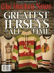
Okay, so I’m way late on this, but better late than never: As most of you know by now, The Hockey News has published a special issue devoted to jerseys, and it’s a doozy. It includes features on uni numbers, white being worn at home vs. on the road, the terms “sweater” vs. “jersey,” the best jerseys, the worst jerseys (that piece was written by Uni Watch reader Jeff Barak), jersey fabrics (did you know the Canadiens were still wearing wool in 1971?!), team-by-team jersey histories, and more. Essential for any Uni Watch reader.
The best part, of course, is the photography. The THN crew had access to the Hockey Hall of Fame’s extensive sweater archives, and they got some great pics that really show the texture of the old designs (there’s a great video about their photo sessions here). I was going to scan my copy, but Larry Bodnovich ended up scanning his copy before I got around to that, so here are a bunch of images, courtesy of Larry:
• This is the oldest sweater in the HoF’s collection — Montreal Wanderers, circa 1908. I love the little championship crest.
• Here’s a good view of the Bruins jersey that this season’s Winter Classic design is based on.
• Nice view of the Maple Leafs’ logo evolution here. I’m sorry to keep harping on this word, but look at that texture! So tactile, so inviting, makes me want to reach out and touch it.
• I especially loved all the great designs from teams I’d rarely (or, in some cases, never) heard of before, including the St. Louis Eagles (1934-35), Atlantic City Seagulls (1930s), Flin Flon Bombers (1968-69), Buffalo Bisons (1932-33), Cleveland Falcons (1936-37), Whitby Dunlops (1958), Victoria Cougars (1923-24), Trail Smoke Eaters (1938-39), and a lot more.
• There are lots of great pics of foreign teams.
• The issue features an excellent article about WHA jerseys. Something I hadn’t known before: When the WHA launched and poached some of the biggest NHL stars, the Hall of Fame was told not to archive any WHA artifacts.
And so on. If you don’t have a copy of this yet, track one down at a newsstand pronto. Can’t find it? You can mail-order a copy here.
Uni Watch News Ticker: Need to add uni numbers to your hockey helmet? Look here (with thanks to Alan Kreit). ”¦ Rob Ullman recently had David Frost make him this 1967-68 Penguins jersey. “The best part is the uni numbers — rounded sans serif with a drop shadow,” says Rob. “I chose the number 2 because I thought a low number would look good on an old-timey sweater, but now I’ve learned that diminutive defenseman Leo Boivin wore that number. Alas, the Pens went NNOB in that first season, so only the most knowlegeable of fans will pick up on that. Anyway, Frosty did a great job with it — can’t recommend his services highly enough.” ”¦ Unfortunate undersleeves being worn by this Northwest Missouri State player (as spotted by Brady Graham). ”¦ The city of Philadelphia has a new logo, and at least one design critic doesn’t like it (with thanks to Alain Nana-Sinkam). ”¦ Several readers have noted that Laron Landry appears to have been wearing a wristwatch, or something that looks very much like one, for several weeks now. Here, I’ll say it for you: Reggie Roby. Now that that’s out of the way, ”¦ Oooh, here’s a really nice piece tracking the evolution of the FC Barcelona crest (with thanks to Joshua Gardner). ”¦ David Ward notes that the International Bowl is featuring the Bulls vs. the Huskies for the second straight year — only last time is was UCOnn vs. Buffalo, while this time it’s Northern Illinois vs. USF. Weird. ”¦ Reprinted from yesterday’s comments: Great photo gallery of World Cup soccer balls, past and present, here. Oooh, which reminds me, I have an item on that topic over on the Page 2 blog this morning — look here. ”¦ New football uniforms on tap next year for Indiana — yeesh, let’s hope that collar doesn’t catch on with other schools. … And speaking of Indiana, they’re now offering what’s believed to be the nation’s first masters program in sports journalism. So if you want to go into hock just so you can cover junior high track meets for The Bozeman Daily Chronicle and then get laid off because it was either you or “Hi and Lois,” now you know where to enroll. ”¦ Adidas is incorporating its Techfit undergarment technology into its World Cup uniforms (with thanks to Joseph Gaudreau). ”¦ Lots of pics of the Raptors in their Huskies throwbacks here. ”¦ New Nike Kobe Sis-Boom-Bah-Whatever sneakers, but be careful — they’re NSFW. … Slideshow of college logos that have moved away from Native American motifs here (with thanks to Joshua Paster).
What the heck is a Dunlop?
The University of Illinois didn’t actually retire Chief Illiniwek…they just gradually moved him farther and farther west.
[quote comment=”365881″]The University of Illinois didn’t actually retire Chief Illiniwek…they just gradually moved him farther and farther west.[/quote]
Don’t know what you mean by this comment. The Chief is definitely retired, does not appear in any official university publications or at any events and the regalia he wore has been given to a tribe (can’t remember which) somewhere in the Dakotas.
[quote comment=”365880″]What the heck is a Dunlop?[/quote]
In 1954 the team was sponsored by the Dunlop Rubber Co.
[quote comment=”365882″][quote comment=”365881″]The University of Illinois didn’t actually retire Chief Illiniwek…they just gradually moved him farther and farther west.[/quote]
Don’t know what you mean by this comment. The Chief is definitely retired, does not appear in any official university publications or at any events and the regalia he wore has been given to a tribe (can’t remember which) somewhere in the Dakotas.[/quote]
I’m sure it was meant to be a jab at history and the way the natives were pushed west as America expanded. …and the Dakotas are in fact west of Illinois, so there’s that too.
woot! even though it was an obscure “several readers” I do believe this may be my first ticker submission mention.. awwesome!
Was Stanford the first school to move away from a Native American mascot? Anyone know what the Stanford logo was before 1972? I’ve found these possibilities but I don’t know if any were official:
link
link
link
I like that faux belt look on Toronto’s throwbacks:
link
link
[quote comment=”365881″]The University of Illinois didn’t actually retire Chief Illiniwek…they just gradually moved him farther and farther west.[/quote]
awesome!
I shall now have to pick up a copy of that Hockey News, I know they also did one for goalie masks I believe earlier this year. Wow, that 1967-68 Penguins sweater looks fantastic! Great stuff on the Barca crest as well. Those Kobe shoes near the bottom of the ticker well some things are better left unsaid.
I’m wondering which Buffalo sports team was the first to use a Bison as their mascot. Has every team over the years in that city used the same mascot? I can only think of the Buffalo Braves that wouldn’t have used a Bison.
[quote comment=”365890″]I’m wondering which Buffalo sports team was the first to use a Bison as their mascot. Has every team over the years in that city used the same mascot? I can only think of the Buffalo Braves that wouldn’t have used a Bison.[/quote]
well, technically a “buffalo” is not a “bison” (the two are only distantly related; true buffalo are from africa and asia; the “american bison” is usually used interchangably with ‘american buffalo’, but isn’t really a true buffalo)
but yes, other teams from buffalo don’t use a bison/buffalo for their mascots
The Indiana football jersey apparently is just one of three being considered…and basketball will have a new design next season according to Coach Crean.
[quote comment=”365892″]The Indiana football jersey apparently is just one of three being considered…and basketball will have a new design next season according to Coach Crean.[/quote]
What?!!! New basketball uniforms at IU – that is BIG news!
Where did this info come from?
Those new Kobe Nikes at the end of the ticker are the ugliest pair of shoes on the planet.
The Hoosiers aren’t exactly a football powerhouse, but a one-handed mannikin? That’s quite a slam.
So if you want to go into hock just so you can cover junior high track meets for The Bozeman Daily Chronicle and then get laid off because it was either you or “Hi and Lois,” now you know where to enroll
As a j-school grad I gotta tell you that line made me laugh out loud. ‘Hi and Lois’…. thats classic.
[quote comment=”365894″]Those new Kobe Nikes at the end of the ticker are the ugliest pair of shoes on the planet.[/quote]
That noise you just heard was your name being crossed of Powers’s Xmas card list.
[quote comment=”365890″]I can only think of the Buffalo Braves that wouldn’t have used a Bison.[/quote]
You sure about that?
link
No words for this picture…
link
oh yeah…forgot to give huge props to frosty for that awesome pens sweater he did for rob ullman
as someone who is equally fond of the number “2”, that was double awesome
Yeah Whitby Dunlops. The story’s never been clear to me how they became any good, but the team is about the only thing worthwhile to see in the Whitby Sports Hall of Fame, which, true to its name is a corridor in the local rink complex (there’s six rinks, a pool, and a sportsbar) that I used to walk through on a reasonably regular basis.
And we complain about advertising on jerseys now…
[quote comment=”365896″]So if you want to go into hock just so you can cover junior high track meets for The Bozeman Daily Chronicle and then get laid off because it was either you or “Hi and Lois,” now you know where to enroll
As a j-school grad I gotta tell you that line made me laugh out loud. ‘Hi and Lois’…. thats classic.[/quote]
I get the point being made but Boseman, Montana is a very cool, beautiful, college town. Never lived there but a great place to vist! Just sayin..
More info about why Laron Landry wears a wristwatch: link
Love that number font on the new IU jersey. Reminds me of the NY Titans numbers (which I wish the Jets would use with their current unis).
[quote comment=”365893″][quote comment=”365892″]The Indiana football jersey apparently is just one of three being considered…and basketball will have a new design next season according to Coach Crean.[/quote]
What?!!! New basketball uniforms at IU – that is BIG news!
Where did this info come from?[/quote]
Crean mentioned something during a big Q&A session a couple months ago about a new design from Adidas that he approved. All the chatter about that was that it was intended for this season and obviously, that didn’t come to pass.
Anything but a slight tweak to the basketball unis would piss of a whole lot of “influential” people so I can’t imagine that if there’s a new uni next year, it’ll be a radical redesign.
As for football, there are supposedly three new designs under consideration? Any more info on this?
[quote comment=”365905″]
As for football, there are supposedly three new designs under consideration? Any more info on this?[/quote]
im interested too…perhaps someone can lend a hand with that?
I’d put up with the zany collar on the Indiana jersey for the number font and UCLA striping.
Didn’t read the review of the new Philadelphia logo. Didn’t wanna prejudice my thinking.
First reaction: Seems a little, I dunno…PlaySkool, doesn’t it.
link
–Rick
[quote comment=”365906″][quote comment=”365905″]
As for football, there are supposedly three new designs under consideration? Any more info on this?[/quote]
im interested too…perhaps someone can lend a hand with that?[/quote]
Are you the creator of Hi and Lois? link.
They were not around long but I always loved the Michigan Stags uniforms. I even saw them played the Minnesota Fighting Saints at Cobo Arena.
link
[quote comment=”365910″]They were not around long but I always loved the Michigan Stags uniforms. I even saw them played the Minnesota Fighting Saints at Cobo Arena.
link
Minor point, I suppose, but a team name also should be interesting to say, and to hear.
While the franchise may have failed, “Michigan Stags” remains a really great team name, for that and lots of other reasons: short name, hard consonant sound, strong vowel, good image (a stag). “Detroit” would have worked, too, but “Michigan” works even better.
Short-lived, yes, but a good one.
(Same goes for, “Milwaukee Hawks”, now in Atlanta, of course, after a stop in St. Louis)
—Ricko
Speaking of raptors, here’s your Marlin Perkins “Mutual of Omaha’s Wild Kingdom” Trivia Question of the Day…
Where in the U.S. would we find the largest nesting population of Peregrine Falcons?
—Ricko
Speaking of the World Cup. You know what I never noticed? In the 1966 World Cup Final, England against West Germany, the West German keeper is wearing a cap!
link
^check around the 1:30 mark, and the whole clip for awesome 1966 England action.
Southeast Missouri State was not mentioned in the Indian logo slideshow but changed from the Indians to the Red Hawks. This link shows Ohio Valley Conference helmets and you can see the logo design change.
link
I got to take a tour of the Indianapolis Colts locker room yesterday and I took some pictures of some of the uni related signs on the wall
link
The old Bradley Braves logo was quite endearing.
link
[quote comment=”365912″]Speaking of raptors, here’s your Marlin Perkins “Mutual of Omaha’s Wild Kingdom” Trivia Question of the Day…
Where in the U.S. would we find the largest nesting population of Peregrine Falcons?
—Ricko[/quote]
Atlanta?
Colorado Springs?
Bowling Green?
Waltham, MA?
I keep going back to that Victoria Cougars jersey.
What a beauty.
[quote comment=”365912″]Speaking of raptors, here’s your Marlin Perkins “Mutual of Omaha’s Wild Kingdom” Trivia Question of the Day…
Where in the U.S. would we find the largest nesting population of Peregrine Falcons?
—Ricko[/quote]
didn’t DDT like wipe em all out?
(serious question)
seem to recall something about that…guess there’s some kind of ‘renesting’ program going on now…no idea where we’d find the most of em…
mall of america, maybe?
As to the FC Barcelona crests, what’s fascinating about that is: if you look at the Franco years, they changed the wording from F.C.B. to C.F.B. The reason was that Franco forced all clubs to change their names to Spanish spellings. Barça’s official name is Fútbol Club Barcelona due to their Catalan heritage, while the correct grammar in Castilian would be Club de Fútbol Barcelona. Look at Athletic Bilbao (from the Basque region), who’s official name is merely Athletic Club. They had to change to Atlético Bilbao for the same reasons.
[quote comment=”365913″]Speaking of the World Cup. You know what I never noticed? In the 1966 World Cup Final, England against West Germany, the West German keeper is wearing a cap!
[/quote]
It’s a fairly unknown FIFA rule that only the goalkeeper is allowed to wear a cap. Petr Cech wears a skull cap to protect his head after he fractured his skull two years ago. Miguel Calero wears a baseball cap consistently to shield his eyes from the sun. link
[quote comment=”365919″][quote comment=”365912″]Speaking of raptors, here’s your Marlin Perkins “Mutual of Omaha’s Wild Kingdom” Trivia Question of the Day…
Where in the U.S. would we find the largest nesting population of Peregrine Falcons?
—Ricko[/quote]
didn’t DDT like wipe em all out?
(serious question)
seem to recall something about that…guess there’s some kind of ‘renesting’ program going on now…no idea where we’d find the most of em…
mall of america, maybe?[/quote]
Manhattan Island.
—Ricko
[quote comment=”365912″]Speaking of raptors, here’s your Marlin Perkins “Mutual of Omaha’s Wild Kingdom” Trivia Question of the Day…
Where in the U.S. would we find the largest nesting population of Peregrine Falcons?
—Ricko[/quote]
Pittsburgh?
[quote comment=”365899″]No words for this picture…
link
lemieux has that look on his face that says “i own you” all the while ignoreing the guy in the white glove. lol
[quote comment=”365922″][quote comment=”365912″]Speaking of raptors, here’s your Marlin Perkins “Mutual of Omaha’s Wild Kingdom” Trivia Question of the Day…
Where in the U.S. would we find the largest nesting population of Peregrine Falcons?
—Ricko[/quote]
Pittsburgh?[/quote]
Or, Manhattan Island, maybe?
[quote comment=”365899″]No words for this picture…
link
Why are there no words for it? Ceremonial puck drops happen all the time. This one just happened to feature Michael Jackson.
[quote comment=”365911″][quote comment=”365910″]They were not around long but I always loved the Michigan Stags uniforms. I even saw them played the Minnesota Fighting Saints at Cobo Arena.
link
Minor point, I suppose, but a team name also should be interesting to say, and to hear.
While the franchise may have failed, “Michigan Stags” remains a really great team name, for that and lots of other reasons: short name, hard consonant sound, strong vowel, good image (a stag). “Detroit” would have worked, too, but “Michigan” works even better.
Short-lived, yes, but a good one.
(Same goes for, “Milwaukee Hawks”, now in Atlanta, of course, after a stop in St. Louis)
—Ricko[/quote]
[quote comment=”365913″]Speaking of the World Cup. You know what I never noticed? In the 1966 World Cup Final, England against West Germany, the West German keeper is wearing a cap!
link
^check around the 1:30 mark, and the whole clip for awesome 1966 England action.[/quote]
Beautiful color footage! Thank you! For non-soccer people, that England goal (also around 1:30) came in extra time and gave England its first (and so far only) World Cup. It’s also one of the most controversial goals in history, with some people (especially Germans) maintaining to this day that the ball never crossed the line (that is, the ENTIRE ball, which is required for a goal to count).
hockey news, i could look at that shit all day long.
comment #2, in my finest quebecois accent, dat waz ggginuuuse.
just sent out my first pair of stirrups/socks to a person with the last name that starts with “a”. not that i can’t be mistaken, but i try to track all the pairs. not exactly earth shattering news i grant you, but it has been 6/7 months of revolution.
So, in this picture (link), what is the team on the far left? May have found my first DIY (either that or the Victoria Cougars)
[quote comment=”365926″][quote comment=”365911″][quote comment=”365910″]They were not around long but I always loved the Michigan Stags uniforms. I even saw them played the Minnesota Fighting Saints at Cobo Arena.
link
Minor point, I suppose, but a team name also should be interesting to say, and to hear.
While the franchise may have failed, “Michigan Stags” remains a really great team name, for that and lots of other reasons: short name, hard consonant sound, strong vowel, good image (a stag). “Detroit” would have worked, too, but “Michigan” works even better.
Short-lived, yes, but a good one.
(Same goes for, “Milwaukee Hawks”, now in Atlanta, of course, after a stop in St. Louis)
—Ricko[/quote][/quote]
huh … don’t know what happened there …
I would absolutely LOVE to see a team from a certain city in Arizona be, simply:
Phoenix
The mascot/logo, of course would be a fiery bird. It could even drive into the arena/field in an old Trans Am.
[quote comment=”365930″][quote comment=”365926″][quote comment=”365911″][quote comment=”365910″]They were not around long but I always loved the Michigan Stags uniforms. I even saw them played the Minnesota Fighting Saints at Cobo Arena.
link
Minor point, I suppose, but a team name also should be interesting to say, and to hear.
While the franchise may have failed, “Michigan Stags” remains a really great team name, for that and lots of other reasons: short name, hard consonant sound, strong vowel, good image (a stag). “Detroit” would have worked, too, but “Michigan” works even better.
Short-lived, yes, but a good one.
(Same goes for, “Milwaukee Hawks”, now in Atlanta, of course, after a stop in St. Louis)
—Ricko[/quote][/quote]
huh … don’t know what happened there …
I would absolutely LOVE to see a team from a certain city in Arizona be, simply:
Phoenix
The mascot/logo, of course would be a fiery bird. It could even drive into the arena/field in an old Trans Am.[/quote]
As a resident of said city (well technically former resident), ummmm yeah.. probably not.
[quote comment=”365925″][quote comment=”365899″]No words for this picture…
link
Why are there no words for it? Ceremonial puck drops happen all the time. This one just happened to feature Michael Jackson.[/quote]
The player reactions. Usually players at least pretend to want to be associated with the person dropping the puck.
On another note, I was amused to note that link come in link colors.
[quote comment=”365911″][quote comment=”365910″]They were not around long but I always loved the Michigan Stags uniforms. I even saw them played the Minnesota Fighting Saints at Cobo Arena.
link
Minor point, I suppose, but a team name also should be interesting to say, and to hear.
While the franchise may have failed, “Michigan Stags” remains a really great team name, for that and lots of other reasons: short name, hard consonant sound, strong vowel, good image (a stag). “Detroit” would have worked, too, but “Michigan” works even better.
Short-lived, yes, but a good one.
(Same goes for, “Milwaukee Hawks”, now in Atlanta, of course, after a stop in St. Louis)
—Ricko[/quote]
As opposed to say….Minnesota Timberwolves? A mouthful indeed. “Wolves” would have been better, kinda like their current throwbacks (is “current throwbacks” an oxymoron BTW?). The other name that was voted on was Minnesota Polars. Given today’s weather…maybe more appropriate?
I’m curious, and all i am really looking for is a link, but what are the raptors throwbacks to?
[quote comment=”365886″]Was Stanford the first school to move away from a Native American mascot? Anyone know what the Stanford logo was before 1972? I’ve found these possibilities but I don’t know if any were official:
link
link
link
University of Massachusetts changed from Redmen to Minutemen in 1972. And almost changed to Gray Wolves in 2003.
The simplicity of those Huskies throwbacks reminds me of System of Dress jerseys.
link
link
[quote comment=”365920″]As to the FC Barcelona crests, what’s fascinating about that is: if you look at the Franco years, they changed the wording from F.C.B. to C.F.B. The reason was that Franco forced all clubs to change their names to Spanish spellings. Barça’s official name is Fútbol Club Barcelona due to their Catalan heritage, while the correct grammar in Castilian would be Club de Fútbol Barcelona. Look at Athletic Bilbao (from the Basque region), who’s official name is merely Athletic Club. They had to change to Atlético Bilbao for the same reasons.
[/quote]
On the other side of that coin, I used to wonder about the spelling of the Barcelona club Espanyol. It seems like a stubborn refusal to use the letter “ñ” but it actually reflects the lack of that letter in the Catalan language (perhaps along with the subtext of Catalan patriotism).
[quote comment=”365934″]I’m curious, and all i am really looking for is a link, but what are the raptors throwbacks to?[/quote]
link
The first ever BAA (predecessor to the NBA game) was played in Toronto in 1946 against the Knicks. The team only lasted one year.
[quote comment=”365921″][quote comment=”365919″][quote comment=”365912″]Speaking of raptors, here’s your Marlin Perkins “Mutual of Omaha’s Wild Kingdom” Trivia Question of the Day…
Where in the U.S. would we find the largest nesting population of Peregrine Falcons?
—Ricko[/quote]
didn’t DDT like wipe em all out?
(serious question)
seem to recall something about that…guess there’s some kind of ‘renesting’ program going on now…no idea where we’d find the most of em…
mall of america, maybe?[/quote]
Manhattan Island.
—Ricko[/quote]
The peregrine falcon has indeed come to be associated with New York. It was the basis for the name and logo of the New York CityHawks, which played in the Arena Football League in 1997 and 1998.
The opening of the CityHawks’ broadcasts featured a beautiful animation sequence showing the cityhawk (falcon) taking off from a perch on the the Empire State Building and flying over the city.
(As a side note, after the CityHawks moved away and changed their name and logo, elements of the their helmet design (link) were borrowed by the Baltimore Ravens (link) in order to replace an earlier logo (link) which the Ravens had entirely ripped off from someone else.)
Sorry, the link to the CityHawks’ helmet doesn’t work. Here is a link to a different pic of it: link
More about Spanish soccer.. I just looked up Espanyol on Wiki and, indeed, it says that under General Franco the team were forced to spell their name Español. Interestingly they only reverted to Espanyol nearly 20 years after Franco’s death.
This Espanyol entry also contains an interesting uni-related tidbit: the original uni of the team was bright yellow jerseys paired with whatever color shorts the individual players cared to wear.
[quote comment=”365933″][quote comment=”365911″][quote comment=”365910″]They were not around long but I always loved the Michigan Stags uniforms. I even saw them played the Minnesota Fighting Saints at Cobo Arena.
link
Minor point, I suppose, but a team name also should be interesting to say, and to hear.
While the franchise may have failed, “Michigan Stags” remains a really great team name, for that and lots of other reasons: short name, hard consonant sound, strong vowel, good image (a stag). “Detroit” would have worked, too, but “Michigan” works even better.
Short-lived, yes, but a good one.
(Same goes for, “Milwaukee Hawks”, now in Atlanta, of course, after a stop in St. Louis)
—Ricko[/quote]
As opposed to say….Minnesota Timberwolves? A mouthful indeed. “Wolves” would have been better, kinda like their current throwbacks (is “current throwbacks” an oxymoron BTW?). The other name that was voted on was Minnesota Polars. Given today’s weather…maybe more appropriate?[/quote]
Not a big fan of “singular” nicknames, but i always thought that they, and later the Wild, should have been the “Minnesota Blizzard”. Nice big BLIZ on alt. jerseys (with snowflake dotting the ‘i”?), on for basketball maybe on regular homes.
In case of the Wolves,could have used old Laker colors: royal, powder and white.
For hockey, same thing, since Penguins had not yet resurrected the powder blue.
“Bliz” great for headline writers, too (old old old rule of thumb, always pick a nickname that can be made to work in a one column headline).
—Ricko
The famous hawk’s name is Pale Male. He lives in a nest on a ledge high above 5th avenue overlooking the Metropolitan Museum of Art. I had a serious close encounter with him once that I won’t soon forget.
[quote comment=”365942″]
Not a big fan of “singular” nicknames[/quote]
didn’t you (with WTT & WHA) like…invent the damn singular name(s)? ;)
[quote comment=”365899″]No words for this picture…
link
Just to be clear – that is an impersonator. It was actually a good joke – the game was the same day the Jacksons were perfomring their Victory Tour show at BC Place, on the other side of town.
[quote comment=”365942″][quote comment=”365933″][quote comment=”365911″][quote comment=”365910″]They were not around long but I always loved the Michigan Stags uniforms. I even saw them played the Minnesota Fighting Saints at Cobo Arena.
link
Minor point, I suppose, but a team name also should be interesting to say, and to hear.
While the franchise may have failed, “Michigan Stags” remains a really great team name, for that and lots of other reasons: short name, hard consonant sound, strong vowel, good image (a stag). “Detroit” would have worked, too, but “Michigan” works even better.
Short-lived, yes, but a good one.
(Same goes for, “Milwaukee Hawks”, now in Atlanta, of course, after a stop in St. Louis)
—Ricko[/quote]
As opposed to say….Minnesota Timberwolves? A mouthful indeed. “Wolves” would have been better, kinda like their current throwbacks (is “current throwbacks” an oxymoron BTW?). The other name that was voted on was Minnesota Polars. Given today’s weather…maybe more appropriate?[/quote]
Not a big fan of “singular” nicknames, but i always thought that they, and later the Wild, should have been the “Minnesota Blizzard”. Nice big BLIZ on alt. jerseys (with snowflake dotting the ‘i”?), on for basketball maybe on regular homes.
In case of the Wolves,could have used old Laker colors: royal, powder and white.
For hockey, same thing, since Penguins had not yet resurrected the powder blue.
“Bliz” great for headline writers, too (old old old rule of thumb, always pick a nickname that can be made to work in a one column headline).
—Ricko[/quote]
Agree 100% on Blizzard. So obvious….maybe because so appropriate!? But of course it’s all about selling jerseys to 12 year olds so…
Northeastern State University,located in the Capitol of the Cherokee Nation -Oklahoma, changed their mascot from Redman to Riverhawks in 2006 link
Following up on this from the other day, who exactly designed the Oregon “O” — Nike or Oregon — and who had trademarked it? And does it reflect a mallard’s head or eye?
[quote comment=”365948″]Following up on this from the other day, who exactly designed the Oregon “O” — Nike or Oregon — and who had trademarked it? And does it reflect a mallard’s head or eye?[/quote]
A mallard’s head? Don’t see that in there.
[quote comment=”365939″][quote comment=”365921″][quote comment=”365919″][quote comment=”365912″]Speaking of raptors, here’s your Marlin Perkins “Mutual of Omaha’s Wild Kingdom” Trivia Question of the Day…
Where in the U.S. would we find the largest nesting population of Peregrine Falcons?
—Ricko[/quote]
didn’t DDT like wipe em all out?
(serious question)
seem to recall something about that…guess there’s some kind of ‘renesting’ program going on now…no idea where we’d find the most of em…
mall of america, maybe?[/quote]
Manhattan Island.
—Ricko[/quote]
The peregrine falcon has indeed come to be associated with New York. It was the basis for the name and logo of the New York CityHawks, which played in the Arena Football League in 1997 and 1998.
The opening of the CityHawks’ broadcasts featured a beautiful animation sequence showing the cityhawk (falcon) taking off from a perch on the the Empire State Building and flying over the city.
(As a side note, after the CityHawks moved away and changed their name and logo, elements of the their helmet design (link) were borrowed by the Baltimore Ravens (link) in order to replace an earlier logo (link) which the Ravens had entirely ripped off from someone else.)[/quote]
I think you’re stretching a bit there. Yeah, they’re both bird heads on a black helmet, but that’s about it. The Ravens had the colors first, and the CityHawks logo looks much closer to a recolored Eagles than it does the Ravens.
(Unless of course using a bird head as a logo is the “ripoff” and in that case, they’re both ripoffs of the Cardinals)
[quote comment=”365944″][quote comment=”365942″]
Not a big fan of “singular” nicknames[/quote]
didn’t you (with WTT & WHA) like…invent the damn singular name(s)? ;)[/quote]
Blame copycat mentality.
I mentioned it to two WFL teams, because I figured if ONE of them took the suggestion it would be cool. Chicago Fire (were gonna be “Fires”, which made NO sense because there was only one Great Chicago Fire, and I pointed that out to Ed Grusin) and Southern California Sun (were gonna be “Cobras”, after a song about a car), and I suggested “Warm California Sun”, another song title of that era, to Tim Grandi).
And, like Dr. Frankenstein, I watched my little experiment turn into a monster. Next thing I knew there was the Bell and the Storm…and it went on from there.
I am now contrite as hell. Although, had it stopped at Chicago Fire, it WOULD have been cool.
—Ricko
[quote comment=”365949″][quote comment=”365948″]Following up on this from the other day, who exactly designed the Oregon “O” — Nike or Oregon — and who had trademarked it? And does it reflect a mallard’s head or eye?[/quote]
A mallard’s head? Don’t see that in there.[/quote]
read this and you will
if you don’t have time to read the article…
check it out
[quote comment=”365949″][quote comment=”365948″]Following up on this from the other day, who exactly designed the Oregon “O” — Nike or Oregon — and who had trademarked it? And does it reflect a mallard’s head or eye?[/quote]
A mallard’s head? Don’t see that in there.[/quote]
The green helmet that the Ducks football teams wear is the mallard head helmet, which will have blue tinges in the right light angle, just like a mallard’s head.
The O was designed by Nike, as was the mallard’s head helmet. The O signifies two athletic fields that were the home for Oregon’s football programs. The inner O is the shape of Hayward Field. The outer O is the original shape of Autzen stadium, which you can see in the shot below.
Hayward Field
link
Autzen Stadium
link
“gonna be “Cobras”, after a song about a car”
“Hey, Little Cobra” by the Rip Chords
[quote comment=”365948″]Following up on this from the other day, who exactly designed the Oregon “O” — Nike or Oregon — and who had trademarked it? And does it reflect a mallard’s head or eye?[/quote]
I think it’s to resemble the letter “O”, and not use the same old collegiate-style “O” that had used by tons of others, Oregon included.
Stick in on a metallic forest green helmet and people naturally gonna start seeing ducks.
LOL
—Ricko
[quote comment=”365951″][quote comment=”365944″][quote comment=”365942″]
Not a big fan of “singular” nicknames[/quote]
didn’t you (with WTT & WHA) like…invent the damn singular name(s)? ;)[/quote]
Blame copycat mentality.
I mentioned it to two WFL teams, because I figured if ONE of them took the suggestion it would be cool. Chicago Fire (were gonna be “Fires”, which made NO sense because there was only one Great Chicago Fire, and I pointed that out to Ed Grusin) and Southern California Sun (were gonna be “Cobras”, after a song about a car), and I suggested “Warm California Sun”, another song title of that era, to Tim Grandi).
And, like Dr. Frankenstein, I watched my little experiment turn into a monster. Next thing I knew there was the Bell and the Storm…and it went on from there.
I am now contrite as hell. Although, had it stopped at Chicago Fire, it WOULD have been cool.
—Ricko[/quote]
Question: Had they not gone with Sun, were they still going to be magenta and orange as the Cobras? Because that’d be a freakin weird looking snake.
[quote comment=”365952″][quote comment=”365949″][quote comment=”365948″]Following up on this from the other day, who exactly designed the Oregon “O” — Nike or Oregon — and who had trademarked it? And does it reflect a mallard’s head or eye?[/quote]
A mallard’s head? Don’t see that in there.[/quote]
link[/quote]
Excellent, thanks. Knew I vaugely remembered that.
I guess it doesn’t work with those yellow helmets they wore last week.
[quote comment=”365956″][quote comment=”365948″]Following up on this from the other day, who exactly designed the Oregon “O” — Nike or Oregon — and who had trademarked it? And does it reflect a mallard’s head or eye?[/quote]
I think it’s to resemble the letter “O”, and not use the same old collegiate-style “O” that had used by tons of others, Oregon included.
Stick in on a metallic forest green helmet and people naturally gonna start seeing ducks.
LOL
—Ricko[/quote]
Esp. with an orange face mask. (Why not? Not a school color, but that’s no barrier for Oregon.)
[quote comment=”365954″][quote comment=”365949″][quote comment=”365948″]Following up on this from the other day, who exactly designed the Oregon “O” — Nike or Oregon — and who had trademarked it? And does it reflect a mallard’s head or eye?[/quote]
A mallard’s head? Don’t see that in there.[/quote]
The green helmet that the Ducks football teams wear is the mallard head helmet, which will have blue tinges in the right light angle, just like a mallard’s head.
The O was designed by Nike, as was the mallard’s head helmet. The O signifies two athletic fields that were the home for Oregon’s football programs. The inner O is the shape of Hayward Field. The outer O is the original shape of Autzen stadium, which you can see in the shot below.
Hayward Field
link
Autzen Stadium
link
Which I STILL think is after-the-fact symbolism. It’s an extended “O” similar to about a bazillion serf fonts. And I’m sure someone said, “Hey, it also becomes the shape of the stadium and the track. Cool.”
I have serious doubt anyone started with the two shapes. Just not nearly as likely as the happenstance scenario.
—Ricko
Ricko,
Wouldn’t it be sans serif?
Anyways, the Ducks had been leaders in track (Hayward) and were looking to succeed at football (Autzen). The designs probably went through Phil Knight to some degree because he is a leading donor to the university, let alone the U of O President.
[quote comment=”365957″][quote comment=”365951″][quote comment=”365944″][quote comment=”365942″]
Not a big fan of “singular” nicknames[/quote]
didn’t you (with WTT & WHA) like…invent the damn singular name(s)? ;)[/quote]
Blame copycat mentality.
I mentioned it to two WFL teams, because I figured if ONE of them took the suggestion it would be cool. Chicago Fire (were gonna be “Fires”, which made NO sense because there was only one Great Chicago Fire, and I pointed that out to Ed Grusin) and Southern California Sun (were gonna be “Cobras”, after a song about a car), and I suggested “Warm California Sun”, another song title of that era, to Tim Grandi).
And, like Dr. Frankenstein, I watched my little experiment turn into a monster. Next thing I knew there was the Bell and the Storm…and it went on from there.
I am now contrite as hell. Although, had it stopped at Chicago Fire, it WOULD have been cool.
—Ricko[/quote]
Question: Had they not gone with Sun, were they still going to be magenta and orange as the Cobras? Because that’d be a freakin weird looking snake.[/quote]
Name was coming from a song, “Little Cobra”, about a car.
Colors definitely were derived from the name. That I know for sure.
We still about “never seen a purple wildcat”, etc.?
Thought we laid that nonsense to rest with green helmet stickers.
(btw, looked up Sunday night and damned if there isn’t a lime green sticker on my desk lamp at home. Not much good, though, cuz Vikes were in Arizona. Next time they’re home gonna see if I can pick up someone talking to Favre.
(Of course, it could be there from a couple years ago when I coded everything for the movers, I suppose…)
—Ricko
Dave Frohnmayer was the U of O president at the time of the logo change.
“(btw, looked up Sunday night and damned if there isn’t a lime green sticker on my desk lamp at home. Not much good, though, cuz Vikes were in Arizona. Next time they’re home gonna see if I can pick up someone talking to Favre.”
Is it me, or…..
Related to the mascot change from Native American Motifs, William & Mary is seeking feedback on five mascot concepts.
link
I hope they go with the king and queen, only because of how embarrassing they look to be.
[quote comment=”365962″]
Thought we laid that nonsense to rest with green helmet stickers.
[/quote]
as long as you don’t say mallards have yellow feet, we’re good ;)
WTH:
link
[quote comment=”365961″]Ricko,
Wouldn’t it be sans serif?
Anyways, the Ducks had been leaders in track (Hayward) and were looking to succeed at football (Autzen). The designs probably went through Phil Knight to some degree because he is a leading donor to the university, let alone the U of O President.[/quote]
How you gonna put serifs on an “O”? lol
Most serif fonts have verticals wider than horizontals, and sharp corners only when necessary (top of letter “T”, for example) so the first assumption if trying to identify the font would be to begin the search in the serifs.
Oh, I know that the Oregon “O” is a design, don’t get me wrong. But aImost guarantee the process began by looking for an “O” that wasn’t the traditional one. Hard to believe would begin by saying, “What if we took the track and the stadium…?” That’s just SO oblique. Yeah, I think a sharp designer would have spotted and developed it. Just don’t think he’d have STARTED there, that’s all.
—Ricko
[quote comment=”365966″][quote comment=”365962″]
Thought we laid that nonsense to rest with green helmet stickers.
[/quote]
as long as you don’t say mallards have yellow feet, we’re good ;)[/quote]
Excuse me, I suggested that before it was determined that Oregon was not limited to school colors. Well, plus black.
Ergo, yellow would have been the best option for webbed representation. At the time.
Now, of course, we know orange would be perfectly acceptable.
And perhaps a blue band on one ankle of some players to indicate they’ve been banded by naturalists. Or that they’re married?
—Ricko
[quote comment=”365906″][quote comment=”365905″]
As for football, there are supposedly three new designs under consideration? Any more info on this?[/quote]
im interested too…perhaps someone can lend a hand with that?[/quote]
Like the number of women linked to Tiger, the number of prototypes for the new IU football kit keeps growing — we’re up to 5:
link
[quote comment=”365965″]Related to the mascot change from Native American Motifs, William & Mary is seeking feedback on five mascot concepts.
link
I hope they go with the king and queen, only because of how embarrassing they look to be.[/quote]
And call them the “Royal Scam”?
[quote comment=”365971″][quote comment=”365965″]Related to the mascot change from Native American Motifs, William & Mary is seeking feedback on five mascot concepts.
link
I hope they go with the king and queen, only because of how embarrassing they look to be.[/quote]
And call them the “Royal Scam”?[/quote]
How ’bout a woman in a deli booth faking an…
Oh, wait, that was Harry & Sally.
—Ricko
[quote comment=”365971″][quote comment=”365965″]Related to the mascot change from Native American Motifs, William & Mary is seeking feedback on five mascot concepts.
link
I hope they go with the king and queen, only because of how embarrassing they look to be.[/quote]
And call them the “Royal Scam”?[/quote]
tried to warn you about chino and daddy gee
[quote comment=”365965″]Related to the mascot change from Native American Motifs, William & Mary is seeking feedback on five mascot concepts.
link
I hope they go with the king and queen, only because of how embarrassing they look to be.[/quote]
Does anyone notice that the “griffin” and the “phoenix” look like the same character with minor changes?
Looking at that IU football prototype, it looks like Adidas has figured out how to make a D-ring lighter than Nike…by eliminating it altogether!
What about Miami of Ohio???
Redskins —-> Redhawks. Way to miss that one, new york times
Here’s one for the UW Grammar School.
link.
[quote comment=”365963″]Dave Frohnmayer was the U of O president at the time of the logo change.[/quote]
Frohny is one of only two Republicans out of the 111 law, journalism, political science, sociology, and economics departments at UO.
Liberal arts for the win!
[quote comment=”365953″]if you don’t have time to read the article…
link[/quote]
Wow…bit of a stretch…and I am usually pretty good at seeing the abstract
And now, to get TOTALLY arcane (because we NEVER do that around here) in the blending pop culture and sports, and with a totally appropriate throwback spin on both counts…
re: Wolves vs. “Huskies” last night. Those two can mate, y’know.
For example, Yukon King—the “swiftest and strongest lead dog in the Northwest, blazing a trail for Sergeant Preston of the Yukon”—was the son of a husky named Silver Boy and a she-wolf named Kala.
There. Betcha didn’t know THAT before today, huh.
—Ricko
Check the stirrups on German player.
link
[quote comment=”365969″][quote comment=”365966″][quote comment=”365962″]
Thought we laid that nonsense to rest with green helmet stickers.
[/quote]
as long as you don’t say mallards have yellow feet, we’re good ;)[/quote]
Excuse me, I suggested that before it was determined that Oregon was not limited to school colors. Well, plus black.
Ergo, yellow would have been the best option for webbed representation. At the time.
Now, of course, we know orange would be perfectly acceptable.
And perhaps a blue band on one ankle of some players to indicate they’ve been banded by naturalists. Or that they’re married?
—Ricko[/quote]
LOL…love the idea of the blue band. Could be a new sock idea?!
[quote comment=”365980″]And now, to get TOTALLY arcane (because we NEVER do that around here) in the blending pop culture and sports, and with a totally appropriate throwback spin on both counts…
re: Wolves vs. “Huskies” last night. Those two can mate, y’know.
For example, Yukon King—the “swiftest and strongest lead dog in the Northwest, blazing a trail for Sergeant Preston of the Yukon”—was the son of a husky named Silver Boy and a she-wolf named Kala.
There. Betcha didn’t know THAT before today, huh.
—Ricko[/quote]
Wolf-dog hybrids are some of the most beautiful animals I’ve seen, but they’re pretty dangerous. A co-worker has a coyote-labrador retriever (accidentally of course). That’s a weird critter.
[quote comment=”365979″][quote comment=”365953″]if you don’t have time to read the article…
link[/quote]
Wow…bit of a stretch…and I am usually pretty good at seeing the abstract[/quote]
It’s a frickin’ “O”. Americana or Bookman or something like that…and manipulated a bit.
In 1969 was in service Ft. Ben Harrison in Indiana. Armstrong about to land on the moon. Newspaper had headline: “Apollo to land near Terra Haute.” Graphic was state of Indiana and the moon superimposed…it placed the Sea of Tranquility and Terra Haute relatively close together.
First time someone told me about the Oregon “O” being designed to represent the track and the stadium, I thought about how Terra Haute and the Sea of Tranquility have so much in common, too.
—Ricko
[quote comment=”365983″][quote comment=”365980″]And now, to get TOTALLY arcane (because we NEVER do that around here) in the blending pop culture and sports, and with a totally appropriate throwback spin on both counts…
re: Wolves vs. “Huskies” last night. Those two can mate, y’know.
For example, Yukon King—the “swiftest and strongest lead dog in the Northwest, blazing a trail for Sergeant Preston of the Yukon”—was the son of a husky named Silver Boy and a she-wolf named Kala.
There. Betcha didn’t know THAT before today, huh.
—Ricko[/quote]
Wolf-dog hybrids are some of the most beautiful animals I’ve seen, but they’re pretty dangerous. A co-worker has a coyote-labrador retriever (accidentally of course). That’s a weird critter.[/quote]
What you’re supposed to do (according the lore of such things) is watch the wolf-dog pups drink water. If they lap up the water, fine. If they stick their whole snout in to drink, drown ’em. Too much wolf.
—Ricko
What you’re supposed to do (according the lore of such things) is watch the wolf-dog pups drink water. If they lap up the water, fine. If they stick their whole snout in to drink, drown ‘em. Too much wolf.
–Ricko
Take 2 Schrutebucks out of petty cash!
[quote comment=”365971″][quote comment=”365965″]Related to the mascot change from Native American Motifs, William & Mary is seeking feedback on five mascot concepts.
link
I hope they go with the king and queen, only because of how embarrassing they look to be.[/quote]
And call them the “Royal Scam”?[/quote]
or the “Royal Flush”?
[quote comment=”365985″]What you’re supposed to do (according the lore of such things) is watch the wolf-dog pups drink water. If they lap up the water, fine. If they stick their whole snout in to drink, drown ’em. Too much wolf.[/quote]
uh oh
[quote comment=”365988″][quote comment=”365985″]What you’re supposed to do (according the lore of such things) is watch the wolf-dog pups drink water. If they lap up the water, fine. If they stick their whole snout in to drink, drown ’em. Too much wolf.[/quote]
link[/quote]
it’s not like he said electrocute ’em…
[quote comment=”365988″][quote comment=”365985″]What you’re supposed to do (according the lore of such things) is watch the wolf-dog pups drink water. If they lap up the water, fine. If they stick their whole snout in to drink, drown ’em. Too much wolf.[/quote]
link[/quote]
Just sayin’…it’s what’s been done that way for hundreds, perhaps thousands, of years.
It’s an admittedly-rule-of-thumb measurement of the animal’s genetic makeup, and the likelihood (or lack thereof) if it being truly a domesticated animal.
Good friend had wolf-dog that seemed to be great, but often had a strange look in its eye. Then I saw it drink water. Stuck damn near it’s whole head in the lake. Keep my young kids away from the “dog” after that. Told friend. Couple years later it damn near bit the head off their other dog.
Glad I kept my kids away.
—Ricko
[quote comment=”365985″][quote comment=”365983″][quote comment=”365980″]And now, to get TOTALLY arcane (because we NEVER do that around here) in the blending pop culture and sports, and with a totally appropriate throwback spin on both counts…
re: Wolves vs. “Huskies” last night. Those two can mate, y’know.
For example, Yukon King—the “swiftest and strongest lead dog in the Northwest, blazing a trail for Sergeant Preston of the Yukon”—was the son of a husky named Silver Boy and a she-wolf named Kala.
There. Betcha didn’t know THAT before today, huh.
—Ricko[/quote]
Wolf-dog hybrids are some of the most beautiful animals I’ve seen, but they’re pretty dangerous. A co-worker has a coyote-labrador retriever (accidentally of course). That’s a weird critter.[/quote]
What you’re supposed to do (according the lore of such things) is watch the wolf-dog pups drink water. If they lap up the water, fine. If they stick their whole snout in to drink, drown ’em. Too much wolf.
—Ricko[/quote]
when i was in school i had a roommate that developed a smack problem, but her boyfriend/dealer that got her hooked had one of those wolfdogs, tough to say what was a bigger pain in the ass her new habit, or his stupid wolfdog.
Adidas Techfit? I’m sure they didn’t take that from Nikefit, Nike Drifit, Nike Stormfit etc.
Pure coincidence
Apologies if this is old news, but the Seahakws’ neon jerseys are toast.
link
[quote comment=”365993″]Apologies if this is old news, but the Seahakws’ neon jerseys are toast.
link
wait, jim mora coaches the seahags? what rock have i been under? the playoffs guy? or his kid?
[quote comment=”365994″][quote comment=”365993″]Apologies if this is old news, but the Seahakws’ neon jerseys are toast.
link
wait, jim mora coaches the seahags? what rock have i been under? the playoffs guy? or his kid?[/quote]
His kid, the “My future is tied to Mike Vick’s future? Crap” guy.
[quote comment=”365886″]Was Stanford the first school to move away from a Native American mascot?[/quote]
There might be earlier changes but Dartmouth switched from Indians to Big Green in 1969.
Did you check UW sponsor link for some of the Stanford mascot art?
[quote comment=”365994″][quote comment=”365993″]Apologies if this is old news, but the Seahakws’ neon jerseys are toast.
link
wait, jim mora coaches the seahags? what rock have i been under? the playoffs guy? or his kid?[/quote]
everytime i hear that…i have to post this
/actually timely, now…what with the answer back in the city that cheered michael irvin breaking his neck…
[quote comment=”365976″]What about Miami of Ohio???
Redskins —-> Redhawks. Way to miss that one, new york times[/quote]
How about the University of Chattanooga. They changed the Moc to the Moc. Originally named for the bend in the river “Moccasin Bend” and now named after the state bird – the Mocking Bird.
[quote comment=”365882″][quote comment=”365881″]The University of Illinois didn’t actually retire Chief Illiniwek…they just gradually moved him farther and farther west.[/quote]
Don’t know what you mean by this comment. The Chief is definitely retired, does not appear in any official university publications or at any events and the regalia he wore has been given to a tribe (can’t remember which) somewhere in the Dakotas.[/quote]
Holy cow, that sound you hear is the joke going over your head. Look quickly, you might still be able to see it.
[quote comment=”365949″][quote comment=”365948″]Following up on this from the other day, who exactly designed the Oregon “O” — Nike or Oregon — and who had trademarked it? And does it reflect a mallard’s head or eye?[/quote]
A mallard’s head? Don’t see that in there.[/quote]
Me neither; usually, crazy as it sounds, I see an “F” in there…
link
[quote comment=”365995″][quote comment=”365994″][quote comment=”365993″]Apologies if this is old news, but the Seahakws’ neon jerseys are toast.
link
wait, jim mora coaches the seahags? what rock have i been under? the playoffs guy? or his kid?[/quote]
His kid, the “My future is tied to Mike Vick’s future? Crap” guy.[/quote]
well i’ll be a monkey’s uncle. i don’t watch much nfl football, prefer the college game, but i swear i had no idea. i lost the coats in 83, and then my adopted paulbrowns moved to baltimore and wear purple. if i can quote the wicked which of the east whataworld whataworld, who would of thought a little girl like the nfl could punch me in the footballs.
[quote comment=”365908″]Didn’t read the review of the new Philadelphia logo. Didn’t wanna prejudice my thinking.
First reaction: Seems a little, I dunno…PlaySkool, doesn’t it.
link
–Rick[/quote]
I read it, but it didn’t change my opinion – I’d wear that logo. Figured the Eagles fans were placated, since there’s a BFBS alternate logo towards the bottom. Speaking of Iggles fans, they should change the slogan to “Life, Liberty and BOOOOOOOO!”
[quote comment=”365997″][quote comment=”365994″][quote comment=”365993″]Apologies if this is old news, but the Seahakws’ neon jerseys are toast.
link
wait, jim mora coaches the seahags? what rock have i been under? the playoffs guy? or his kid?[/quote]
everytime i hear that…i have to link
/actually timely, now…what with the answer back in the city that cheered michael irvin breaking his neck…[/quote]
Is that the mashup? Brilliant work, and I’ve never even seen the video.
If I did an NBA Top 5, this would be #1 for this week: link
Actually, the Huskies jerseys are a little too plain in the front, but I love that font. Keep these unis, Toronto.
You too, Minnesota. That’s a great shade of blue and green.
[quote comment=”365997″][quote comment=”365994″][quote comment=”365993″]Apologies if this is old news, but the Seahakws’ neon jerseys are toast.
link
wait, jim mora coaches the seahags? what rock have i been under? the playoffs guy? or his kid?[/quote]
everytime i hear that…i have to link
/actually timely, now…what with the answer back in the city that cheered michael irvin breaking his neck…[/quote]
i must be off my mora’s, i hadn’t seen that either, pretty funny.
[quote comment=”365968″]How you gonna put serifs on an “O”? lol[/quote]
link?
[quote comment=”365993″]Apologies if this is old news, but the Seahakws’ neon jerseys are toast.
link
(heavy sigh)
hey greenogoblin…link
we need to come up with something for this game sir.
How about serifs on zeros?
Anaheim & Colorado
link
[quote comment=”365991″]when i was in school i had a roommate that developed a smack problem, but her boyfriend/dealer that got her hooked had one of those wolfdogs, tough to say what was a bigger pain in the ass her new habit, or his stupid wolfdog.[/quote]
Cripes. What kind of people do you associate with? See, I have standards. My crackhead roommate’s degenerate girlfriend tried to stab me and my other roommate with a broken champagne bottle.
Champagne is far classier than a wolf-dog hybrid.
[quote comment=”365961″]Ricko,
Wouldn’t it be sans serif?
Anyways, the Ducks had been leaders in track (Hayward) and were looking to succeed at football (Autzen). The designs probably went through Phil Knight to some degree because he is a leading donor to the university, let alone the U of O President.[/quote]
The O doesn’t combine the outlines of Hayward and Autzen because they have been leaders in track. It’s because the first place they played football was at Hayward, now they play at Autzen. Its a past to present thing.
[quote comment=”366000″][quote comment=”365949″][quote comment=”365948″]Following up on this from the other day, who exactly designed the Oregon “O” — Nike or Oregon — and who had trademarked it? And does it reflect a mallard’s head or eye?[/quote]
A mallard’s head? Don’t see that in there.[/quote]
Me neither; usually, crazy as it sounds, I see an “F” in there…
link
Good joke, but that is a cricket field, not a football (American) field.
Seahawks retire neon green jerseys (pardon if it’s a repost)
link
[quote comment=”366011″][quote comment=”365961″]Ricko,
Wouldn’t it be sans serif?
Anyways, the Ducks had been leaders in track (Hayward) and were looking to succeed at football (Autzen). The designs probably went through Phil Knight to some degree because he is a leading donor to the university, let alone the U of O President.[/quote]
The O doesn’t combine the outlines of Hayward and Autzen because they have been leaders in track. It’s because the first place they played football was at Hayward, now they play at Autzen. Its a past to present thing.[/quote]
Chris, do not forget the track thing though. Which sport did Phil Knight participate in? Track. Which sport do the Ducks have more national championships in? Track. Yes, the Ducks had played football there as well.
Paul, Paul, Paul, how you frustrate me. I am a high school senior planning on going into journalism (sports, of course) next year, and while I applied to and was accepted to Indiana, IU isn’t one of the two schools I’m completely torn between. I was planning on forcing myself to make a decision this weekend. Now you’ve got me completely starting back from square one, Indiana included. Thanks a lot.
[quote comment=”366008″]hey greenogoblin…link
we need to come up with something for this game sir.[/quote]
relax there roberto…i got my best men on it
/you want in too?
[quote comment=”366015″]Paul, Paul, Paul, how you frustrate me. I am a high school senior planning on going into journalism (sports, of course) next year, and while I applied to and was accepted to Indiana, IU isn’t one of the two schools I’m completely torn between. I was planning on forcing myself to make a decision this weekend. Now you’ve got me completely starting back from square one, Indiana included. Thanks a lot.[/quote]
What’s the other school you’re considering?
…or schools, I guess.
[quote comment=”366017″][quote comment=”366015″]Paul, Paul, Paul, how you frustrate me. I am a high school senior planning on going into journalism (sports, of course) next year, and while I applied to and was accepted to Indiana, IU isn’t one of the two schools I’m completely torn between. I was planning on forcing myself to make a decision this weekend. Now you’ve got me completely starting back from square one, Indiana included. Thanks a lot.[/quote]
What’s the other school you’re considering?[/quote]
Missouri (great J-school) and Illinois (I’m from Chicago, my whole family went to Champaign, and I’ve been a huge Illini fan my whole life).
[quote comment=”365993″]Apologies if this is old news, but the Seahakws’ neon jerseys are toast.
link
(ignoring the name calling of my favorite team and their coach) WOOHOO! I never was a fan of the green jerseys. I hoped the loss would make them RIP. One and done, now bring out some throwbacks
That edition of The Hockey News is fantastic. Besides the great pictures it has some good articles. One that I enjoyed was about the quest for a Hamilton Tiger jersey.
I still have more if it to read.
[quote comment=”365904″]Love that number font on the new IU jersey. Reminds me of the NY Titans numbers (which I wish the Jets would use with their current unis).[/quote]
Like the idea of adding UCLA striping to Indiana Football – but no need for TNOF (team name o front) when you have UCLA striping … And while we are at it, lose the Star Wars bedroom wear collar.
UCLE striping, even truncated, looks good on Maroon/Red/Crimson and White. Numeral font pretty cool also.
Now, if they could only get them to use full UCLA striping – that would be AWESOME !!!
[quote comment=”366020″][quote comment=”365993″]Apologies if this is old news, but the Seahakws’ neon jerseys are toast.
link
(ignoring the name calling of my favorite team and their coach) WOOHOO! I never was a fan of the green jerseys. I hoped the loss would make them RIP. One and done, now bring out some throwbacks[/quote]
Wasn’t Hasslebeck hurt that game? That’s probably why they picked then to wear them. “Aw, we lost in them, they must be bad luck.” Lame. I miss the neon already.
I do agree on the throwbacks, though. I was intrigued with the uni change in ’02, but that dreary blue just isn’t right. A different shade of blue and you woulda had a modern classic.
How ’bout throwbacks with a regular green alt?
[quote comment=”365911″][quote comment=”365910″]They were not around long but I always loved the Michigan Stags uniforms. I even saw them played the Minnesota Fighting Saints at Cobo Arena.
link
Minor point, I suppose, but a team name also should be interesting to say, and to hear.
While the franchise may have failed, “Michigan Stags” remains a really great team name, for that and lots of other reasons: short name, hard consonant sound, strong vowel, good image (a stag). “Detroit” would have worked, too, but “Michigan” works even better.
Short-lived, yes, but a good one.
(Same goes for, “Milwaukee Hawks”, now in Atlanta, of course, after a stop in St. Louis)
—Ricko[/quote]
Cool name, cool logo also!
[quote comment=”366019″][quote comment=”366017″][quote comment=”366015″]Paul, Paul, Paul, how you frustrate me. I am a high school senior planning on going into journalism (sports, of course) next year, and while I applied to and was accepted to Indiana, IU isn’t one of the two schools I’m completely torn between. I was planning on forcing myself to make a decision this weekend. Now you’ve got me completely starting back from square one, Indiana included. Thanks a lot.[/quote]
What’s the other school you’re considering?[/quote]
Missouri (great J-school) and Illinois (I’m from Chicago, my whole family went to Champaign, and I’ve been a huge Illini fan my whole life).[/quote]
Well, if you already ruled out IU, the fact that they now offer a master’s program in something that interests you should not influence your decision at this point.
As for the other two, you get in-state tuition with U of I and their journalism school is decent but Mizzou’s is regarded as the better one, no?
One thing’s for sure. You’ll end up running into a lot more people that you already know at U of I or IU.
[quote comment=”366023″]I miss the neon already.
[/quote]
of course you do
[quote comment=”366012″][quote comment=”366000″][quote comment=”365949″][quote comment=”365948″]…who exactly designed the Oregon “O”… And does it reflect a mallard’s head or eye?[/quote]
A mallard’s head? Don’t see that in there.[/quote]
Me neither; usually, crazy as it sounds, I see an “F” in there…
link
Good joke, but that is a cricket field, not a football (American) field.[/quote]
No, my Australian buddy insists it’s a football field, or rather, as he puts it, “A REAL football field!”
link
I told that drunk kangaroo that it looked like a squished tennis ball to me.
[quote comment=”365890″]I’m wondering which Buffalo sports team was the first to use a Bison as their mascot. Has every team over the years in that city used the same mascot? I can only think of the Buffalo Braves that wouldn’t have used a Bison.[/quote]
In the 70s and 80s there was the Major Indoor Soccer League’s Buffalo Stallions.
link
[quote comment=”366010″][quote comment=”365991″]when i was in school i had a roommate that developed a smack problem, but her boyfriend/dealer that got her hooked had one of those wolfdogs, tough to say what was a bigger pain in the ass her new habit, or his stupid wolfdog.[/quote]
Cripes. What kind of people do you associate with? See, I have standards. My crackhead roommate’s degenerate girlfriend tried to stab me and my other roommate with a broken champagne bottle.
Champagne is far classier than a wolf-dog hybrid.[/quote]
true that.
she wasn’t like that when i met her, the punk rock scene in cowlumbus had some sketchy leaches, she just fell in with the wrong morons. just glad i avoided it, i have enough problems. as for the wolfdog, no good can come from combining a domestic and wild animal, it’s like the link that is a serval~housecat mix, just asking for trouble.
[quote comment=”366023″][quote comment=”366020″][quote comment=”365993″]Apologies if this is old news, but the Seahakws’ neon jerseys are toast.
link
(ignoring the name calling of my favorite team and their coach) WOOHOO! I never was a fan of the green jerseys. I hoped the loss would make them RIP. One and done, now bring out some throwbacks[/quote]
Wasn’t Hasslebeck hurt that game? That’s probably why they picked then to wear them. “Aw, we lost in them, they must be bad luck.” Lame. I miss the neon already.
I do agree on the throwbacks, though. I was intrigued with the uni change in ’02, but that dreary blue just isn’t right. A different shade of blue and you woulda had a modern classic.
How ’bout throwbacks with a regular green alt?[/quote]
Notice how Jim Mora Jr. starts in about one sentence into the uni discussion … “I can’t believe that we are talking about uniforms”.
One thing I reallllllllly hate about some of these coaches and football types are how they feign disdain for even discussing uniforms, as any moment spent on the subject is a waste of time, and how ignoring the discussion will somehow make them be seen as more focused or authentic “football men”.
Ya’ notice how these guys are usually coaching teams wearing crap, as in the tortured Seahawks Blue/Blue/Blue – enough already – wear the White pants with the Blue jersey at least maybe twice in TEN YEARS !
seahawks retire puke green jerseys after 1 game.
link
Not that it is at all uni related, but let’s all together now, say it out loud ……
THE SANCHISE !!!!!
I can’t help myself from throwing that jab with every monumentally negative/bad news headline about Mark “The Sanchise” Sanchez after having to hear about his can’t-miss greatness from my NY relatives all off-season and through the 3-0 start until the Saints beating the Jets.
Sorry, like Belushi shattering that guitar on the steps – “He gave his love a chicken that had no bone” – I can’t resist …
YES !!!! THE SANCHISE !!!!!
[quote comment=”366014″][quote comment=”366011″][quote comment=”365961″]Ricko,
Wouldn’t it be sans serif?
Anyways, the Ducks had been leaders in track (Hayward) and were looking to succeed at football (Autzen). The designs probably went through Phil Knight to some degree because he is a leading donor to the university, let alone the U of O President.[/quote]
The O doesn’t combine the outlines of Hayward and Autzen because they have been leaders in track. It’s because the first place they played football was at Hayward, now they play at Autzen. Its a past to present thing.[/quote]
Chris, do not forget the track thing though. Which sport did Phil Knight participate in? Track. Which sport do the Ducks have more national championships in? Track. Yes, the Ducks had played football there as well.[/quote]
I know track is huge at Oregon. I’m just saying where the origins of the O came from. I went to Oregon when the logo came out and that was their reasoning. The inside of the O is the outline of Hayward the first place they played football. The outside of the O is the outline of Autzen. Sure, track is big, but that wasn’t any part of the stated reason for including it in the O logo.
link
As for the (Seahawks) pants, Mora said that the players actually said they like the feel of those pants in comparison to the other pants. I don’t know how much of a role it played.
“It’s a little thing, but it does matter,” he said.
re Jason Landry Watch: link
Speaking of blizzards, the Green Bay Blizzard may have to change their name if the new owner can’t buy the name from AF2 (the team is out of there and in the Indoor League.) They’re holding a tentative Name the Team contest, just in case, link
FWIW, the Toronto Blizzard of the NASL:
link
link
Soccer just looks wrong on astroturf. I mean, no sport looks good on astroturf, but soccer is particularly bad.
[quote comment=”366008″]hey greenogoblin…link
we need to come up with something for this game sir.[/quote]
Agreed.
(and screw you for that video, just a little bit)
Phil, did you get the copy of that letter that I sent to CM?
[quote comment=”366039″][quote comment=”366008″]hey greenogoblin…link
we need to come up with something for this game sir.[/quote]
Agreed.
(and screw you for that video, just a little bit)[/quote]
i would have posted that no matter who won just be cause it was a rose bowl that featured those teams. i love those buckeye uniforms, just scarlet and grey. did you see that old school ducks shirt i found on ebay the other day? it was sweet~ass.
link
[quote comment=”366042″]link[/quote]
That’s really cool. I’d totally wear that.
Whenever it was that Paul had on that vintage (vintage vintage vintage) University of Oregon sweater, I had a new keyboard moment.
Now, if only I had a credit card.
[quote comment=”365989″][quote comment=”365988″][quote comment=”365985″]What you’re supposed to do (according the lore of such things) is watch the wolf-dog pups drink water. If they lap up the water, fine. If they stick their whole snout in to drink, drown ’em. Too much wolf.[/quote]
link[/quote]
it’s not like he said electrocute ’em…[/quote]
Last night on TCM they had one of those fillers. From the 1930’s a Dogtown or something like that short. They had dogs all dressed up and they walk around and act like they are talking. Anyhow the one last night was about a dog who got arrested for shooting another dog. He was going to get electrocuted until the real killer admitted his crime.
Had to tell ya about it since dogs and Peta and electrocution were being discussed.
And to keep it a uniform topic. I did see one of those episodes where the dogs were playing football. One had a name like Red Grange
[quote comment=”365998″][quote comment=”365976″]What about Miami of Ohio???
Redskins —-> Redhawks. Way to miss that one, new york times[/quote]
How about the University of Chattanooga. They changed the Moc to the Moc. Originally named for the bend in the river “Moccasin Bend” and now named after the state bird – the Mocking Bird.[/quote]
They used to be the Moccasins (with Native American mascot) when they were a regular bordeline Top 25 team from 1982-97.
Hey I found a clip of the football scene. They were Dogville and it was Red Mange for Red Grange
If anybody has not seen these check them out.
link
link
[quote comment=”366040″]Phil, did you get the copy of that letter that I sent to CM?[/quote]
you betcha kenny
fingers crossed
Here is a clip of the short I was saying about the execution by electric chair
link
[quote comment=”366043″][quote comment=”366042″]link[/quote]
That’s really cool. I’d totally wear that.
Whenever it was that Paul had on that vintage (vintage vintage vintage) University of Oregon sweater, I had a new keyboard moment.
Now, if only I had a credit card.[/quote]
In the late 1970’s I did buyt 2 jerseys that may have been that company One sort of looked like USC colors and I did have a green one too. Both had the shoulder stripes or loops. No numbers on the jersey but they did look like a football jersey.
The ST. L. Blues are playing in Detroit tonight. The Blues came out for the pre-game skate in their home blue Jerseys. Of course, the Red Wings were in red. Mickey Redmond & Larry Murphy (color announcers) wanted them to play color -v- color. But of course, the powers that be made Detroit change into their whites between the pregame skate & the start of the game.
When I went to IU, there was a “sports communication” degree available, but it was through the HPER school and not the Journalism school.
/English & History grad
[quote comment=”366050″]The ST. L. Blues are playing in Detroit tonight. The Blues came out for the pre-game skate in their home blue Jerseys. Of course, the Red Wings were in red. Mickey Redmond & Larry Murphy (color announcers) wanted them to play color -v- color. But of course, the powers that be made Detroit change into their whites between the pregame skate & the start of the game.[/quote]
If they’re color announcers, how could they not condone this action?
[quote comment=”366052″][quote comment=”366050″]The ST. L. Blues are playing in Detroit tonight. The Blues came out for the pre-game skate in their home blue Jerseys. Of course, the Red Wings were in red. Mickey Redmond & Larry Murphy (color announcers) wanted them to play color -v- color. But of course, the powers that be made Detroit change into their whites between the pregame skate & the start of the game.[/quote]
If they’re color announcers, how could they not condone this action?[/quote]
Groan. Or instant rim shot.
[quote comment=”366023″][quote comment=”366020″][quote comment=”365993″]Apologies if this is old news, but the Seahakws’ neon jerseys are toast.
link
(ignoring the name calling of my favorite team and their coach) WOOHOO! I never was a fan of the green jerseys. I hoped the loss would make them RIP. One and done, now bring out some throwbacks[/quote]
Wasn’t Hasslebeck hurt that game? That’s probably why they picked then to wear them. “Aw, we lost in them, they must be bad luck.” Lame. I miss the neon already.
I do agree on the throwbacks, though. I was intrigued with the uni change in ’02, but that dreary blue just isn’t right. A different shade of blue and you woulda had a modern classic.
How ’bout throwbacks with a regular green alt?[/quote]
Seneca Wallace did indeed start that game. On the other hand, the Bears are 1-5 on the road this year.
The NFL should make them wear those things again as a cautionary tale.
[quote comment=”366053″][quote comment=”366052″][quote comment=”366050″]The ST. L. Blues are playing in Detroit tonight. The Blues came out for the pre-game skate in their home blue Jerseys. Of course, the Red Wings were in red. Mickey Redmond & Larry Murphy (color announcers) wanted them to play color -v- color. But of course, the powers that be made Detroit change into their whites between the pregame skate & the start of the game.[/quote]
If they’re color announcers, how could they not condone this action?[/quote]
Groan. Or instant rim shot.[/quote]
link?
[quote comment=”366055″][quote comment=”366053″][quote comment=”366052″][quote comment=”366050″]The ST. L. Blues are playing in Detroit tonight. The Blues came out for the pre-game skate in their home blue Jerseys. Of course, the Red Wings were in red. Mickey Redmond & Larry Murphy (color announcers) wanted them to play color -v- color. But of course, the powers that be made Detroit change into their whites between the pregame skate & the start of the game.[/quote]
If they’re color announcers, how could they not condone this action?[/quote]
Groan. Or instant rim shot.[/quote]
link?[/quote]
*The Hemogoblin was a trombonist in high school*
[quote comment=”365913″]Speaking of the World Cup. You know what I never noticed? In the 1966 World Cup Final, England against West Germany, the West German keeper is wearing a cap!
link
^check around the 1:30 mark, and the whole clip for awesome 1966 England action.[/quote]
Brillant find ! Thanks for this, it’s extremely emotional w/ the sea of waving Union Jacks in the stands. Three things stand out:
1. awesome blood red tops on the Brits
2. typical Brit commentary ‘ running himself daft on the wing’. that was great.
3. those Umbro number fonts are the only ones football kits should ever use!!!!
[quote comment=”365927″][quote comment=”365913″]Speaking of the World Cup. You know what I never noticed? In the 1966 World Cup Final, England against West Germany, the West German keeper is wearing a cap!
link
^check around the 1:30 mark, and the whole clip for awesome 1966 England action.[/quote]
Beautiful color footage! Thank you! For non-soccer people, that England goal (also around 1:30) came in extra time and gave England its first (and so far only) World Cup. It’s also one of the most controversial goals in history, with some people (especially Germans) maintaining to this day that the ball never crossed the line (that is, the ENTIRE ball, which is required for a goal to count).[/quote]
Good points, Perry. It doesn’t look like the even 30% of the ball crosses the line to me. Notice the LinO was calling it a corner kick???
this one time, at band camp, the hemogoblin stuc
[quote comment=”366059″]this one time, at band camp, the hemogoblin stuc[/quote]
That comment better stay cut off.
Didn’t see it mentioned in the article but Eastern Michigan changed from Hurons to Eagles a few years ago. I was hoping they’d change to Emus, at least that would have been unique! Even so, I still call them the Fightin’ Emus.
[quote comment=”366061″]Didn’t see it mentioned in the article but Eastern Michigan changed from Hurons to Eagles a few years ago. I was hoping they’d change to Emus, at least that would have been unique! Even so, I still call them the Fightin’ Emus.[/quote]
Have you seen their record the last couple of years? They aren’t fighting anyone.
[quote comment=”366035″]http://blog.thenewstribune.com/seahawks/
As for the (Seahawks) pants, Mora said that the players actually said they like the feel of those pants in comparison to the other pants. I don’t know how much of a role it played.
“It’s a little thing, but it does matter,” he said.[/quote]
I know I’m quoting myself, but I was thinking since posting this. WHY are the darker pants more comfortable? Both pairs are made by Reebok. Does someone know if the pants are a different uniform line?
Seahawks endorse throwbacks, email the execs…
link
[quote comment=”366063″][quote comment=”366035″]http://blog.thenewstribune.com/seahawks/
As for the (Seahawks) pants, Mora said that the players actually said they like the feel of those pants in comparison to the other pants. I don’t know how much of a role it played.
“It’s a little thing, but it does matter,” he said.[/quote]
I know I’m quoting myself, but I was thinking since posting this. WHY are the darker pants more comfortable? Both pairs are made by Reebok. Does someone know if the pants are a different uniform line?[/quote]
that doesn’t make sense…at least, not from a physical comfort sense — i don’t believe the pants are made from a different material and they have the same striping pattern as on the white and the suicide blue pants…maybe they’re more comfortable from a fashion standpoint in the dark navy?
as a contrast, supposedly the browns liked their solid brown pants because those DON’T have a stripe on them, in comparison to the white pants…while that makes no sense, at least it’s a semi-valid rationale
and with regard to the players wanting to wear a throwback AND liking the neon…i’d venture a guess the poor things are bored…and they’d like a change…doesn’t matter what the change is…but because it’s DIFFERENT, it MUST BE GOOD
now, im not a huge fan of the current seahawk uni to begin with, and i’d welcome the throwbacks as much as anyone…but i really think these guys are beginning to exhibit a new mentality amongst ballers…the current duds (no matter how good or bad they are) are simply a CHORE to put on each and every week, and they need a change
goddam, i’d hate to be as bored as these guys…getting paid millions to play a game
it’s a uniform…respect it…for 16 games a year it’s your identity, something the fans know and cheer for…the laundry…the uniforms will be around (well, in theory) longer than any individual…if you have no identity, then you’ve lost an extremely important part of what you stand for…and what your loyal fans cheer for
Reggie Roby!
[quote comment=”366065″][quote comment=”366063″][quote comment=”366035″]http://blog.thenewstribune.com/seahawks/
As for the (Seahawks) pants, Mora said that the players actually said they like the feel of those pants in comparison to the other pants. I don’t know how much of a role it played.
“It’s a little thing, but it does matter,” he said.[/quote]
I know I’m quoting myself, but I was thinking since posting this. WHY are the darker pants more comfortable? Both pairs are made by Reebok. Does someone know if the pants are a different uniform line?[/quote]
that doesn’t make sense…at least, not from a physical comfort sense — i don’t believe the pants are made from a different material and they have the same striping pattern as on the white and the suicide blue pants…maybe they’re more comfortable from a fashion standpoint in the dark navy?
as a contrast, supposedly the browns liked their solid brown pants because those DON’T have a stripe on them, in comparison to the white pants…while that makes no sense, at least it’s a semi-valid rationale
[/quote]
That’s what I was thinking, but thought I would ask incase I was missing something. Thanks Phil
[quote comment=”366065″][quote comment=”366063″][quote comment=”366035″]http://blog.thenewstribune.com/seahawks/
As for the (Seahawks) pants, Mora said that the players actually said they like the feel of those pants in comparison to the other pants. I don’t know how much of a role it played.
“It’s a little thing, but it does matter,” he said.[/quote]
I know I’m quoting myself, but I was thinking since posting this. WHY are the darker pants more comfortable? Both pairs are made by Reebok. Does someone know if the pants are a different uniform line?[/quote]
that doesn’t make sense…at least, not from a physical comfort sense — i don’t believe the pants are made from a different material and they have the same striping pattern as on the white and the suicide blue pants…maybe they’re more comfortable from a fashion standpoint in the dark navy?
as a contrast, supposedly the browns liked their solid brown pants because those DON’T have a stripe on them, in comparison to the white pants…while that makes no sense, at least it’s a semi-valid rationale
and with regard to the players wanting to wear a throwback AND liking the neon…i’d venture a guess the poor things are bored…and they’d like a change…doesn’t matter what the change is…but because it’s DIFFERENT, it MUST BE GOOD
now, im not a huge fan of the current seahawk uni to begin with, and i’d welcome the throwbacks as much as anyone…but i really think these guys are beginning to exhibit a new mentality amongst ballers…the current duds (no matter how good or bad they are) are simply a CHORE to put on each and every week, and they need a change
goddam, i’d hate to be as bored as these guys…getting paid millions to play a game
it’s a uniform…respect it…for 16 games a year it’s your identity, something the fans know and cheer for…the laundry…the uniforms will be around (well, in theory) longer than any individual…if you have no identity, then you’ve lost an extremely important part of what you stand for…and what your loyal fans cheer for[/quote]
I take it this would be a bad time to announce that for Christmas I got my sister one of the six different football jerseys that Oregon has worn this year. (I apologize for the color [BFBS], but it was the only one I could get with the correct number/size combination. She <3's MA-SEOUL-YI!)
Any photos of the Portland Rose Buds? Years ago Ebbetts Field Flannels had a remake you could buy, but I missed out on getting one.