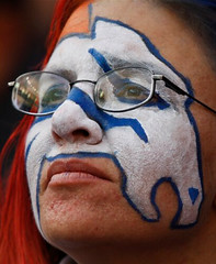
I had planned to clean up the back yard and then go bike-shopping yesterday, but fate had other ideas: I came down with chickenpox. Yes, really. Never had it as a kid. Not really so bad, at least so far, because the pockmarks don’t itch or hurt yet. The photo at right, however, shows an artist’s rendering of what my face now looks like. Scary stuff, right?
Anyway, I ended up spending the entire day on the sofa — my first couch-bound Sunday in ages. The plus side is that I had plenty of time to watch football. Here’s some of what I saw:
• Hey, if you’re gonna play like a high school team, why not dress like one too? This should definitely be the final nail in Zorn’s coffin. (Lots of additional pics here, if you really want to torture yourself.)
• Weird to see the Bucs wearing white pants with their red jerseys. Looks good from an aesthetic standpoint, but somehow it just doesn’t look like the Bucs, y’know? Stick with the pewter.
• On the other hand, what a nice change of pace to see the Seahawks going white over fog (or whatever that color’s supposed to be). Now if we can just get them to invert that configuration at home.
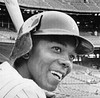
• Most amazing thing about Dallas Clark’s one-handed TD catch: No gloves! Upon further review, it turns out Clark never wears gloves. Aside from QBs, punters, and kickers, is there any other eligible receiver in the league we can say that about?
• Just What the World Needs, Part 273: Mike Smith’s play-calling crib sheet had an ad for an Atlanta parking lot. (Thanks to Brian Povio for the screen shot.)
• This isn’t a new point, but it’s worth revisiting every now and again: Nobody love striped socks more than I do, but the Jets should not be wearing this pants/socks combo, which is every bit as leotard-ish as a dark-on-dark pairing. The whole point of football socks is to provide contrast at the pant/sock intersection point. Look, it’s easy: When you wear the colored pants, wear the white socks; when you wear the white pants, wear the color-topped socks. And don’t try telling me the jersey has anything to do with it — it doesn’t.
• Again with the officials’ cap pom-poms. Pretty obvious by now that it’s a microphone thingie, but Sam Graves points out that both sightings so far have been from Sunday-night games, so maybe it’s just an NBC thing..? Will investigate.
• And finally, the Windy City was a little windier than usual last night. (Blame John Okray for ruining your morning.)

In case Titans/Texans doesn’t quite float your boat: If there’s one thing Monday nights are known for, it’s, uh, new NHL alternate jerseys! Or at least that’s what the Panthers think, because they’ll be unveiling their new alt this evening.
I’ve seen the design but am not allowed to talk about it until 7:30pm eastern, at which point I’ll post an insta-review here on the site. So check back then, okay? Okay.
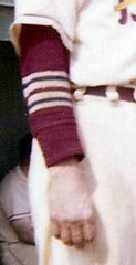
The Most Important Thing Any Mammal Has Ever Done, Update: Dave Eskenazi has come up with still more photos of the 1956 Portland Beavers’ striped undersleeves, including some action shots (note that there are actually two different stripe patterns in that photo). You can see the full set here.
Incidentally, in case you missed it on Friday, I’m trying to gauge how many people would be interested in buying one of these Beavers undershirts if we could get a manufacturer to produce a small quantity of them. Would you be on board if they were reasonably priced? If so, let me know.
Flap Jacks Update: For years we’ve known that Earl Battey of the Twins wore an improvised earflap in 1963. Then we recently learned that Tony Oliva of the Twins did likewise, at least in BP, in 1964. And now there’s this, from reader Paul Hirsch:
On Nov. 21 I was watching Game 4 of the 1965 World Series when Jimmie Hall came to bat late in seventh or eighth inning. Ray Scott, the Twins announcer that season, noted Hall’s earflap (very crude, much like the one you featured for Earl Battey), and said that Hall had been wearing it since being beaned “several years ago.”
Unfortunately, Paul wasn’t DVRing the game, so no screen shot, but I already have some wheels turning on that front — stay tuned the game was rebroadcast early this morning and James Huening got these shots. He also posted video of Hall’s 7th-inning AB to YouTube (watch it quick before MLB makes them take it down).
Meanwhile, it’s interesting to see that the Twins kept relying on these makeshift earflaps for several years. Didn’t anyone at ABC Helmet see an opportunity here?
Uni Watch News Ticker: Hey, lookie what I got — a super-cool varsity jacket in Uni Watch colors, with a lipsticked Indian on the back (that’s not offensive, it’s just bizarre). Dig the super-textured chenille graphics. ”¦ Okay, Florida riflery, whatever. Oh, but have you seen the pants? Classy. ”¦ Meanwhile, here’s the weekend riflery roundup: Florida State, Ohio State, and Oklahoma. ”¦ Still more riflery on tap for today, as LSU’s set will be officially unveiled at 2:30pm eastern. … Regarding Troy Polamalu and the little cross on his jersey, Vincent Ward writes: “For years Jon Kitna has worn a non-NFL-licensed hat with a cross embroidered on it. When he played with the Bengals he was actually fined by the NFL for wearing the hat during a post-game interview, but the fine was later resencinded. Maybe they learned their lesson and are going to avoid any controversy with Polamalu.” ”¦ Rich Christy found some old baseball uniforms in his father’s attic. “I’ve always been told he was one of the best baseball players ever in my hometown of Piqua, Ohio,” he writes. “That’s me in the gray pinstripe uni, which is wool and extremely heavy. The team was a factory team in town, Hartzell Fan, TNOB. The red uni was a Lear Avia team before there was Learjet.” ”¦ Was flea-marketing on Friday and spotted this chick wearing some mod eyewear that kinda reminded me of Raymond Berry’s goggles. ”¦ Love love love this 1928 Furman football uni that Michael Orr sent along. It’s from this article, which appears in the Fall 2009 issue of Furman Magazine. ”¦ Here’s a new one, at least to me: cheerleaders wearing play-calling wristbands (with thanks to Tony Bruno). ”¦ Nice little collection of bus tickets here (thanks, Kirsten). ”¦ Remember how the Missouri Mavericks were gonna wear Harry Truman jerseys? Here’s how they looked on the ice (with thanks to Zach Brady). ”¦ I’m not generally a big fan of the Gap (there’s a shocker, right?), but every now and then they get it just right. ”¦ “I found these two tykes at a Dartmouth football game in Hanover, N.H., of all places,” writes Tris Wykes. “Their dad explained they’d gotten the outfits at a recent Tide game and wanted to wear them to the Dartmouth-Princeton game as well.” Am I the only one who finds this more than a little bit creepy? ”¦ Pretty cool logo for the Chinese Basketball Assocation’s 2010 all-star game (with thanks to Jeremy Brahm). ”¦ Oregon used white-letered nameplates on Saturday, creating the illusion of NNOB. ”¦ Several interesting uni-related notes from the OSU/Michigan game here. ”¦ Kudos to the Cleveland Planning Commission, who told Nike to take your douchebag “mural” and stuff it (with thanks to Zac Neubauer). ”¦ Throwbacks in the pipeline for Wichita State hoops (with thanks to Patrick Chippeaux). ”¦ Really interesting article about how the throwback trend has benefited a Tennessee uni manufacturer here. If you read deep into the article, you’ll see NFL spokesperson Joanna Hunter quoted thusly: “There has been demand by fans, and with the popularity of the Legacy uniforms we’ll see them again next year.” That was news to me, so I double-checked with her, and she said she was just referring to retail, not on-field (with thanks to Ian Morris). ”¦ Pretty groovy vintage rowing jersey here. ”¦ Other eBay finds: a spectacular Little League jacket, a fantastic varsity skating jacket (check out those patches!), and a truly magnificent varsity hockey jacket.
Hey Paul,
It looks like the letterman jacket you got is an old one from Lane Tech High School in Downtown Chicago…their new letterman jackets have the exact same logos take a look for yourself..click on clothing on the webpage in the 2nd row down
link
Dallas Clark is also wearing the new Xenith helmet:
link
link
Why does the Florida base layer shirt have 4-6 written on it?
Bucs’ white pants are not that out of the ordinary. They’ve gone red jerseys/pewter pants most of the time, but red/white and white/white on occasion.
For the custom striped-sleeve shirts, did link occur to anyone but me?
(Sorry for the crappy MS paint rendering.)
“I found these two tykes at a Dartmouth football game in Hanover, N.H., of all places,” writes Tris Wykes. “Their dad explained they’d gotten the outfits at a recent Tide game and wanted to wear them to the Dartmouth-Princeton game as well.” Am I the only one who finds this more than a little bit creepy?
um…yes?
those are awesome getups…perhaps the venue is a bit odd, but c’mon…if they were, say, 3 or so years older, i’d agree…but that houndstooth is sweet
As for Florida….ooomph. When they wore long white socks with orange near the knees for the first time in seemingly forever against South Carolina, I thought “Maybe the orange will make a comeback.” No, now we’re blue/blue. Oy.
History lesson: Florida wore blue primarily in the 60s and 70s until the 0-10-1 season of 1979, when they broke out orange against Florida State (didn’t help). They wore orange (as did most, if not all, of the university’s sports teams) all through the 1980s.
When Spurrier returned in 1990, so did the blue jerseys (and grass on Florida Field), and the football team (along with most of the other teams) have worn primarily blue ever since. I was hoping we’d see orange broken out at some point, but that was just wishful thinking.
Not a big fan of the monochromatic look. And, to be honest, the orange helmet is one of the few things that hadn’t changed over the last 30 years or so. So, the white helmet with the orange F…not a huge fan, purely from a traditional standpoint. But that’s just me.
[quote comment=”362577″]Bucs’ white pants are not that out of the ordinary. They’ve gone red jerseys/pewter pants most of the time, but red/white and white/white on occasion.[/quote]
I believe it’s the first time they’ve worn that combo since last year. And THAT was the first time they’d worn it in seven years. Or something like that.
[quote comment=”362576″]http://procombat.nikemedia.com/index.php?team=florida#/photos
Why does the Florida base layer shirt have 4-6 written on it?[/quote]
Don’t know for sure, but it might be this (which would be stupid, because it’s not 4-6) from the press release:
Nike utilized a four-way stretch twill that does not hold sweat or water and as a result, the new uniforms are 46 percent lighter than the current designs when wet.
That’s the only reference to 46 I can see.
[quote comment=”362582″][quote comment=”362576″]http://procombat.nikemedia.com/index.php?team=florida#/photos
Why does the Florida base layer shirt have 4-6 written on it?[/quote]
Don’t know for sure, but it might be this (which would be stupid, because it’s not 4-6) from the press release:
Nike utilized a four-way stretch twill that does not hold sweat or water and as a result, the new uniforms are 46 percent lighter than the current designs when wet.
That’s the only reference to 46 I can see.[/quote]
either that or it’s a size 46
The Nike Pro Combat uniforms are a thing of beauty.
Retro but futuristic at the same time. Nike got it right with the arm stripes,numbering and back names.. Clean and legible not distorted like the mess that is the RBK NY Giants.
[quote comment=”362581″][quote comment=”362577″]Bucs’ white pants are not that out of the ordinary. They’ve gone red jerseys/pewter pants most of the time, but red/white and white/white on occasion.[/quote]
I believe it’s the first time they’ve worn that combo since last year. And THAT was the first time they’d worn it in seven years. Or something like that.[/quote]
You may be right. It seems to me like they go red/white or white/white at least once a year, but, to be honest, everything since January 2003 has kind of run together into a big mismash of awful.
They went link on 10/14/07 against Tennessee, link vs. St. Louis and link vs. New Orleans.
In 2008, they went white on white against link, link, link (link
and red/white against link. I can’t find where they went red/white last year in the regular season.
So, the pants are seen often, but, yeah, apparently not with the red jerseys that often.
OK, maybe it’s just me. But I can’t seem to see any wristband on those cheerleaders, and I was staring quite hard.
That should say I can’t find another instance of red/white last year in the regular season, Seattle was it, and that may have been the first time in a while. Seems to me there was another game somewhere along the way, but I’m not inclined to search for it.
Those playbook wristbands are probably game scripts, so the cheerleaders know what routines to use at what times. Most of the backstage personnel at a sports event carry scripts to coordinate everything, but cheerleaders have to be out on the field or in the stands most of the time, so they need something more portable and less bulky than five pages. My guess is that at least one of them also has an earbud connected to the producer.
They’re definitely microphones. Heard it directly from an NFL umpire last week.
[quote comment=”362586″]OK, maybe it’s just me. But I can’t seem to see any wristband on those cheerleaders, and I was staring quite hard.[/quote]
This would be a good time to remind everyone that comments like this one are the quickest way to get banned from posting (not because it’s sexist or offensive to women but because it’s so pathetically predictable and is therefore offensive to MEN). We’ll let it slide this time, because it’s been a long time since the policy was stated. But from here on: “Wristband? What wristband?” gets you booted, no questions asked.
The Oregon white names on a white background was easily the most stupid uni item I’ve seen in a while.
At least someone made 20 cents a week sewing on the letters.
[quote comment=”362576″]http://procombat.nikemedia.com/index.php?team=florida#/photos
Why does the Florida base layer shirt have 4-6 written on it?[/quote]
Because that will be Urban’s record at Notre Dame next year?
Chicken Pox? Bummer. What a way to spend the days leading up to Thanksgiving. That jacket, though, should make you feel better.
Tampa Bay? My favorite look link
Agree with you regarding the Jets’ socks, but it never bothered me when the Chiefs did it. link
Like the Shockers’ MXTE uniforms: Mental Toughness, Extra Effort.
Posted this yesterday, but it got lost in the clutter. Worth a read: You, too, can design a ski helmet for the winter Olympics. link
[quote comment=”362584″]The Nike Pro Combat uniforms are a thing of beauty.
Retro but futuristic at the same time. Nike got it right with the arm stripes,numbering and back names.. Clean and legible not distorted like the mess that is the RBK NY Giants.[/quote]
Or Jaguars. A complete mess yesterday.
the Parking Spot ad looks like it might actually be part of a package of instructions where the team is staying, etc.
the top of the page says “Directions to the Parking Spot” — am wondering if that is where players and coaches leave their cars?
below the ad and the map for the Parking Spot it says “meetings and meals on the third floor.”
so I don’t think this is an advertisement. I think it’s part of his travel plans packet.
Jimmy Hall earflap item now updated with screen shots (courtesy JTH):
link
[quote comment=”362578″]For the custom striped-sleeve shirts, did link occur to anyone but me?
(Sorry for the crappy MS paint rendering.)[/quote]
Too much, I think.
I was thinking a henley design, perhaps in a waffle knit, which would be pretty faithful to the undershirts of the day (at least the cold weather ones).
MICHAEL VICK Jersey Discrepancy:
I noticed that Vick’s Eagle head sleeve patches are smaller than those on other team members’ jerseys. Why is that? Is it because of the sleeve cut on his jersey?
[quote comment=”362583″][quote comment=”362582″][quote comment=”362576″]http://procombat.nikemedia.com/index.php?team=florida#/photos
Why does the Florida base layer shirt have 4-6 written on it?[/quote]
Don’t know for sure, but it might be this (which would be stupid, because it’s not 4-6) from the press release:
Nike utilized a four-way stretch twill that does not hold sweat or water and as a result, the new uniforms are 46 percent lighter than the current designs when wet.
That’s the only reference to 46 I can see.[/quote]
either that or it’s a size 46[/quote]
Nope, this question has been asked before on numerous boards.
I thought someone would find some info.
Looks like I’m gonna have to do some snoopin around.
[quote comment=”362593″]Chicken Pox? Bummer. What a way to spend the days leading up to Thanksgiving. That jacket, though, should make you feel better.
Tampa Bay? My favorite look link
Agree with you regarding the Jets’ socks, but it never bothered me when the Chiefs did it. link
Like the Shockers’ MXTE uniforms: Mental Toughness, Extra Effort.
Posted this yesterday, but it got lost in the clutter. Worth a read: You, too, can design a ski helmet for the winter Olympics. link
Wow…check out Montana’s LA Gears!
I also noticed the ad on Mike Smith’s playlist during the game yesterday — thanks for the screen capture. The question is: who prepares those, and why the heck is there an ad on it? Or is that where the players park their cars and they put it there so they know how to find the place? I’m stumped.
Is everyone hating the Reebok sideline gear as much as I am? The kit stocking caps and the other cover-up stuff worn by coaches and players appears to have a contrasting overprinted graduated-dot pattern on it that looks really 1980s, and is bound to look like crap after a short time. Ug-lee.
… Regarding Troy Polamalu and the little cross on his jersey, Vincent Ward writes: “For years Jon Kitna has worn a non-NFL-licensed hat with a cross embroidered on it. When he played with the Bengals he was actually fined by the NFL for wearing the hat during a post-game interview, but the fine was later resencinded. Maybe they learned there lesson and are going to avoid any controversy with Polamalu.”
c’mon, THEIR not there
Grammar is in the commode these days.
[quote comment=”362602″]… Regarding Troy Polamalu and the little cross on his jersey, Vincent Ward writes: “For years Jon Kitna has worn a non-NFL-licensed hat with a cross embroidered on it. When he played with the Bengals he was actually fined by the NFL for wearing the hat during a post-game interview, but the fine was later resencinded. Maybe they learned there lesson and are going to avoid any controversy with Polamalu.”
c’mon, THEIR not there
Grammar is in the commode these days.[/quote]
Poor editing on my part. Now fixed.
The Redskins should ban burgundy pants. No burgundy pants. Ever. not with white jerseys. not in a boat. not with a goat.
[quote comment=”362601″]I also noticed the ad on Mike Smith’s playlist during the game yesterday — thanks for the screen capture. The question is: who prepares those, and why the heck is there an ad on it? Or is that where the players park their cars and they put it there so they know how to find the place? I’m stumped.
Is everyone hating the Reebok sideline gear as much as I am? The kit stocking caps and the other cover-up stuff worn by coaches and players appears to have a contrasting overprinted graduated-dot pattern on it that looks really 1980s, and is bound to look like crap after a short time. Ug-lee.[/quote]
had this discussion with my family watching the games yesterday. the only thing that would be more 80s about that design is if it were in neon
Maybe they learned there lesson and are going to avoid any controversy with Polamalu.”
c’mon, THEIR not there
Grammar is in the commode these days.
Technically, that is a spelling error rather than a grammatical one. Now, if he had written “Maybe they learned there lesson and IS going to avoid any controversy….”, now that would have been a grammatical error.
:)
[quote comment=”362595″]the Parking Spot ad looks like it might actually be part of a package of instructions where the team is staying, etc.
the top of the page says “Directions to the Parking Spot” — am wondering if that is where players and coaches leave their cars?
below the ad and the map for the Parking Spot it says “meetings and meals on the third floor.”
so I don’t think this is an advertisement. I think it’s part of his travel plans packet.[/quote]
I hope you are correct. Otherwise it is a case of douchebaggery creep.
[quote comment=”362599″][quote comment=”362583″][quote comment=”362582″][quote comment=”362576″]http://procombat.nikemedia.com/index.php?team=florida#/photos
Why does the Florida base layer shirt have 4-6 written on it?[/quote]
Don’t know for sure, but it might be this (which would be stupid, because it’s not 4-6) from the press release:
Nike utilized a four-way stretch twill that does not hold sweat or water and as a result, the new uniforms are 46 percent lighter than the current designs when wet.
That’s the only reference to 46 I can see.[/quote]
either that or it’s a size 46[/quote]
Nope, this question has been asked before on numerous boards.
I thought someone would find some info.
Looks like I’m gonna have to do some snoopin around.[/quote]
Alright, here we go.
I just called the UF equipment manager and they said that it stands for “46 seconds of extreme effort”.
case closed
Rick Christy’s dad’s baseball unis are excellent. Too bad the whites have what are probably hanger rust stains ( I learned about them much to my regret ). BUT they are both the real deal for the look.
[quote comment=”362604″]The Redskins should ban burgundy pants. No burgundy pants. Ever. not with white jerseys. not in a boat. not with a goat.[/quote]
You are entitled to your opinion, but never take #9’s name in vain! Die with festering boils, blasphemer! A pox upon you!
saw this work in progress, thought it was interesting, but no details as to who it is for
link
Wondering if some might find this offensive to have on a goalie mask?
BTW, it’s “Jurgensen”
spelling is in the toilet
[quote comment=”362608″][quote comment=”362599″][quote comment=”362583″][quote comment=”362582″][quote comment=”362576″]http://procombat.nikemedia.com/index.php?team=florida#/photos
Why does the Florida base layer shirt have 4-6 written on it?[/quote]
Don’t know for sure, but it might be this (which would be stupid, because it’s not 4-6) from the press release:
Nike utilized a four-way stretch twill that does not hold sweat or water and as a result, the new uniforms are 46 percent lighter than the current designs when wet.
That’s the only reference to 46 I can see.[/quote]
either that or it’s a size 46[/quote]
Nope, this question has been asked before on numerous boards.
I thought someone would find some info.
Looks like I’m gonna have to do some snoopin around.[/quote]
Alright, here we go.
I just called the UF equipment manager and they said that it stands for “46 seconds of extreme effort”.
case closed[/quote]
Well yes, but isnt it 4 to 6 seconds? If you ever hear Urban give a pre game talk, he always talks about 100% effort for 6 seconds at a time.
[quote comment=”362613″][quote comment=”362608″][quote comment=”362599″][quote comment=”362583″][quote comment=”362582″][quote comment=”362576″]http://procombat.nikemedia.com/index.php?team=florida#/photos
Why does the Florida base layer shirt have 4-6 written on it?[/quote]
Don’t know for sure, but it might be this (which would be stupid, because it’s not 4-6) from the press release:
Nike utilized a four-way stretch twill that does not hold sweat or water and as a result, the new uniforms are 46 percent lighter than the current designs when wet.
That’s the only reference to 46 I can see.[/quote]
either that or it’s a size 46[/quote]
Nope, this question has been asked before on numerous boards.
I thought someone would find some info.
Looks like I’m gonna have to do some snoopin around.[/quote]
Alright, here we go.
I just called the UF equipment manager and they said that it stands for “46 seconds of extreme effort”.
case closed[/quote]
Well yes, but isnt it 4 to 6 seconds? If you ever hear Urban give a pre game talk, he always talks about 100% effort for 6 seconds at a time.[/quote]
then I misheard him…but yes
Guys, you do know there is already one giant 10 foot mural of LeBron James with a giant Nike swoosh on it. Cleveland just objected to a new one. Do they really deserve praise for telling Nike to shove it? ahhhhh, No.
[quote comment=”362610″]A pox upon you![/quote]
Kind of a sensitive term in my house this week.
The Florida Panthers dish out their Thirds tonight right?
[quote comment=”362611″]saw this work in progress, thought it was interesting, but no details as to who it is for
link
Wondering if some might find this offensive to have on a goalie mask?[/quote]
no more so than having it on the back of your steeler jersey
The NFL sideline gear IS more dreadful than the usual dreadful stuff Reebok comes out with. The dot pattern is awful, though it doesnt look quite as bad on the zippers of some items. Sort of a cool look with the random colored zipper teeth.
link
Also, is there some reason why every piece of gear (from coats to polo shirts) has to have the divison name on it? Do you really care about your team’s divison so much that you want it on your clothes?
[quote comment=”362611″]saw this work in progress, thought it was interesting, but no details as to who it is for
link
Wondering if some might find this offensive to have on a goalie mask?[/quote]
I certainly think it’s in bad taste, but since the majority of this continent is Christian and so are pro sports, I don’t think there would be much of a fuss.
Besides, it’s probalby for some rec leaguer.
And before people start wondering why I’m anti Christian or whatnot, I think any public expression of worship is in bad taste. If you’re particularly religious, you might be familiar with Luke 18: 9-14.
Earflap item now includes video of Jimmie Hall’s at-bat:
link
[quote comment=”362616″][quote comment=”362610″]A pox upon you![/quote]
Kind of a sensitive term in my house this week.[/quote]
Oops, sorry.
Scratch that.
The official name for Sqwaks’ fog blue is “gun metal blue…”
“Upon further review, it turns out Clark never wears gloves. Aside from QBs, punters, and kickers, is there any other eligible receiver in the league we can say that about?”
Vladimir Guerrero. Oh, wait…
[quote comment=”362613″][quote comment=”362608″][quote comment=”362599″][quote comment=”362583″][quote comment=”362582″][quote comment=”362576″]http://procombat.nikemedia.com/index.php?team=florida#/photos
Why does the Florida base layer shirt have 4-6 written on it?[/quote]
Don’t know for sure, but it might be this (which would be stupid, because it’s not 4-6) from the press release:
Nike utilized a four-way stretch twill that does not hold sweat or water and as a result, the new uniforms are 46 percent lighter than the current designs when wet.
That’s the only reference to 46 I can see.[/quote]
either that or it’s a size 46[/quote]
Nope, this question has been asked before on numerous boards.
I thought someone would find some info.
Looks like I’m gonna have to do some snoopin around.[/quote]
Alright, here we go.
I just called the UF equipment manager and they said that it stands for “46 seconds of extreme effort”.
case closed[/quote]
Well yes, but isnt it 4 to 6 seconds? If you ever hear Urban give a pre game talk, he always talks about 100% effort for 6 seconds at a time.[/quote]
Too bad the players at Notre dame won’t be hearing that pregame speech anytime soon!
[quote comment=”362620″]since the majority of this continent is Christian and so are pro sports[/quote]
what?
since when is religion attached to pro sports?
or did i not understand that correctly
[quote comment=”362604″]The Redskins should ban burgundy pants. No burgundy pants. Ever. not with white jerseys. not in a boat. not with a goat.[/quote]
The only way they should even think about considering the possibility of doing that is if they were to bring back gold/yellow pants to replace them.
The Va Tech seniors have elected to wear the all-white Nike Pro Combat uniforms for the Virginia-Virginia Tech game this weekend.
So much for this being a one-time thing…
I believe the “4-6” on the means 4 out of 6 meaning winning 4th National Championship out of 6 National Championship games.
[quote comment=”362627″][quote comment=”362620″]since the majority of this continent is Christian and so are pro sports[/quote]
what?
since when is religion attached to pro sports?
or did i not understand that correctly[/quote]
Sure there’s no official connection, but you can’t deny the amount of post game interviews that involve a player thanking God for something.
There’s also the Saints, Angels and Padres.
“… I’m not generally a big fan of the Gap (there’s a shocker, right?), but every now and then they get it just right.”
I’m getting some sinister ideas for a DIY Hockey “Sweater”!! I have visions of Felt lettering/numbering and maybe use this:
link
to do one with a lace collar….
Thanks for being my Muse, Paul!
Terence
[quote comment=”362615″]Guys, you do know there is already one giant 10 foot mural of LeBron James with a giant Nike swoosh on it. Cleveland just objected to a new one. Do they really deserve praise for telling Nike to shove it? ahhhhh, No.[/quote]
If I read the article correctly, then it addresses this exact issue. Basically the mural of LeBron James that is currently up is okay because he is wearing a Cavaliers jersey and is viewed as a source of city pride (and after losing to the Lions…Cleveland needs all the help they can get).
The new mural is just Lebron James whored out in the latest nike crap. There is no real connection to the city.
[quote comment=”362629″]The Va Tech seniors have elected to wear the all-white Nike Pro Combat uniforms for the Virginia-Virginia Tech game this weekend.
So much for this being a one-time thing…[/quote]
Well..when you design them to appeal to testosterone jacked teenagers and then let them pick the uniforms that they will wear…
Personally I say burn them in the diag.
[quote comment=”362608″]
Alright, here we go.
I just called the UF equipment manager and they said that it stands for “46 seconds of extreme effort”.
case closed[/quote]
awesome
what would we do without you matt?
[quote comment=”362629″]The Va Tech seniors have elected to wear the all-white Nike Pro Combat uniforms for the Virginia-Virginia Tech game this weekend.
So much for this being a one-time thing…[/quote]
I love myself some Commonwealth Cup football….especially since Tech will destroy UVA…but this is very unsettling. Those throwback Tech kits are gorgeous… the white ones particularly….and when I was in Blacksburg it seemed general consensus was that the new stuff sucked, and the old stuff was awesome. Bummer.
[quote comment=”362597″][quote comment=”362578″]For the custom striped-sleeve shirts, did link occur to anyone but me?
(Sorry for the crappy MS paint rendering.)[/quote]
Too much, I think.
I was thinking a henley design, perhaps in a waffle knit, which would be pretty faithful to the undershirts of the day (at least the cold weather ones).[/quote]
Not a henley, but link?
[quote comment=”362615″]Guys, you do know there is already one giant 10 foot mural of LeBron James with a giant Nike swoosh on it. Cleveland just objected to a new one. Do they really deserve praise for telling Nike to shove it? ahhhhh, No.[/quote]
i believe the issue was with the particular board and the message it appeared to send, not that anyone changed a policy toward Nike or James.
In other words, you’re reaching for a reason to call anyone hypocritical.
Good rule: Always check one more fact, or ask you more question, to be doubly sure a conclusion makes sense.
—Ricko
[quote comment=”362622″][quote comment=”362616″][quote comment=”362610″]A pox upon you![/quote]
Kind of a sensitive term in my house this week.[/quote]
Oops, sorry.
Scratch that.[/quote]
Scratching it is probably not a good idea, either.
Paul, link is for you.
Also relevant because:
Check out Elmo’s sweet-ass uniform
AND
Speaking of grammar/spelling going to the toilet, what is a worse example than a red muppet that speaks in the third person?
[quote comment=”362627″][quote comment=”362620″]since the majority of this continent is Christian and so are pro sports[/quote]
what?
since when is religion attached to pro sports?
or did i not understand that correctly[/quote]
Pretty sure he meant the majority of participants likely are Christian, too, given that the likely makeup of that group is would be similar to the whole.
Or maybe that some teams have someone sing “God Bless America” during the 7th Inning Stretch.
Not sure, but probably one of the other.
—Ricko
[quote comment=”362641″]Paul, link is for you.
Also relevant because:
Check out Elmo’s sweet-ass uniform
AND
Speaking of grammar/spelling going to the toilet, what is a worse example than a red muppet that speaks in the third person?[/quote]
Mongo not know.
[quote comment=”362627″][quote comment=”362620″]since the majority of this continent is Christian and so are pro sports[/quote]
what?
since when is religion attached to pro sports?
or did i not understand that correctly[/quote]
I was about to say the same thing. I for one, am NOT a fan of seeing religious displays during sports events….in any regard. Do your religious thing on your own time. Wear a cross UNDER your shirt. Pray BEFORE or AFTER a game, not after a touchdown….
[quote comment=”362634″][quote comment=”362615″]Guys, you do know there is already one giant 10 foot mural of LeBron James with a giant Nike swoosh on it. Cleveland just objected to a new one. Do they really deserve praise for telling Nike to shove it? ahhhhh, No.[/quote]
If I read the article correctly, then it addresses this exact issue. Basically the mural of LeBron James that is currently up is okay because he is wearing a Cavaliers jersey and is viewed as a source of city pride (and after losing to the Lions…Cleveland needs all the help they can get).
The new mural is just Lebron James whored out in the latest nike crap. There is no real connection to the city.[/quote]
There is no real connection to the city…uh oh? Foreshadowing?! I HOPE NOT…they should have a mural with him in the Mark Price throwbacks
[quote comment=”362628″][quote comment=”362604″]The Redskins should ban burgundy pants. No burgundy pants. Ever. not with white jerseys. not in a boat. not with a goat.[/quote]
The only way they should even think about considering the possibility of doing that is if they were to bring back gold/yellow pants to replace them.[/quote]
1. they looked AWFUL in monochrome.
2. they should have to wear Ron Burgundy pants:
link
“it’s the pleats”.
Didn’t Harold Ballard get in trouble for doing white on white and blue on blue NOBs up in Toronto when they became mandatory? But then, what didn’t Harold Ballard get in trouble for?
[quote comment=”362644″][quote comment=”362627″][quote comment=”362620″]since the majority of this continent is Christian and so are pro sports[/quote]
what?
since when is religion attached to pro sports?
or did i not understand that correctly[/quote]
I was about to say the same thing. I for one, am NOT a fan of seeing religious displays during sports events….in any regard. Do your religious thing on your own time. Wear a cross UNDER your shirt. Pray BEFORE or AFTER a game, not after a touchdown….[/quote]
polamalu’s cross is under his hair, you can’t see it during the game. and he’s religious, so he prays after every play. that’s what he’s comfortable with
[quote comment=”362643″][quote comment=”362641″]Paul, link is for you.
Also relevant because:
Check out Elmo’s sweet-ass uniform
AND
Speaking of grammar/spelling going to the toilet, what is a worse example than a red muppet that speaks in the third person?[/quote]
Mongo not know.[/quote]
All kidding aside, Sesame Street is rife with characters with speech impediments.
From a literacy and articulation standpoint, parents should steer their children away from watching it.
“From a literacy and articulation standpoint, parents should steer their children away from watching it.”
Sports interviews too.
[quote comment=”362636″][quote comment=”362608″]
Alright, here we go.
I just called the UF equipment manager and they said that it stands for “46 seconds of extreme effort”.
case closed[/quote]
awesome
link without you matt?[/quote]
It looks like Phil will be toiling in the remedial photoshop class for the forseeable future.
Mrs. Powers > Heather Graham.
[quote comment=”362650″]”From a literacy and articulation standpoint, parents should steer their children away from watching it.”
Sports interviews too.[/quote]
I made the mistake of listening to the Giants post-game intervies on the radio yesterday.
If memory serves, Mario Manningham scored worse on the Wonderlic than Vince Young and it sounded like it.
link
link
[quote comment=”362649″][quote comment=”362643″][quote comment=”362641″]Paul, link is for you.
Also relevant because:
Check out Elmo’s sweet-ass uniform
AND
Speaking of grammar/spelling going to the toilet, what is a worse example than a red muppet that speaks in the third person?[/quote]
Mongo not know.[/quote]
All kidding aside, Sesame Street is rife with characters with speech impediments.
From a literacy and articulation standpoint, parents should steer their children away from watching it.[/quote]
Matt, it’s so that we learn to accept those around us who cannot speak as eloquently as we do. Either that, or the people who created Sesame Street were higher than a kite and thought it would be “totally hilarious, dude”.
[quote comment=\”362633\”]\”… I’m not generally a big fan of the Gap (there’s a shocker, right?), but every now and then they get it just right.\”
I\’m getting some sinister ideas for a DIY Hockey \”Sweater\”!! I have visions of Felt lettering/numbering and maybe use this:
link
to do one with a lace collar….
Thanks for being my Muse, Paul!
Terence[/quote]
Hockey sweater, wrong villain.
Terence, that sweater reminds me more of this guy:
link
which coincidentally reminds me of these \”killer\” Nike dunks:
link
[quote comment=”362653″][quote comment=”362649″][quote comment=”362643″][quote comment=”362641″]Paul, link is for you.
Also relevant because:
Check out Elmo’s sweet-ass uniform
AND
Speaking of grammar/spelling going to the toilet, what is a worse example than a red muppet that speaks in the third person?[/quote]
Mongo not know.[/quote]
All kidding aside, Sesame Street is rife with characters with speech impediments.
From a literacy and articulation standpoint, parents should steer their children away from watching it.[/quote]
Matt, it’s so that we learn to accept those around us who cannot speak as eloquently as we do. Either that, or the people who created Sesame Street were higher than a kite and thought it would be “totally hilarious, dude”.[/quote]
Can’t it be both? I grew up with Sesame Street and I turned out close enough to normal.
*****Pics of a Charger RB wearing molded baseball cleats:
link
Vick wearing his signature cleats from about 4 years ago:
link
[quote comment=”362648″][quote comment=”362644″][quote comment=”362627″][quote comment=”362620″]since the majority of this continent is Christian and so are pro sports[/quote]
what?
since when is religion attached to pro sports?
or did i not understand that correctly[/quote]
I was about to say the same thing. I for one, am NOT a fan of seeing religious displays during sports events….in any regard. Do your religious thing on your own time. Wear a cross UNDER your shirt. Pray BEFORE or AFTER a game, not after a touchdown….[/quote]
polamalu’s cross is under his hair, you can’t see it during the game. and he’s religious, so he prays after every play. that’s what he’s comfortable with[/quote]
Oooo, I hate when people wear their Christianity above their nameplate.
Seriously, there are ways to practice your faith and ways to make a show of your faith. As long as the practioneers understand that and don’t choose the latter, the former shouldn’t be too big a problem.
Kinda like the batter who quickly crosses himself in a small gesture, so it’s a personal thing, before stepping up to the plate. That seems okay. But If he did it before every pitch, or knelt on one knee just outside the batter’s box, then it would quickly slide over into the “look how religious I am” category. And that becomes offensive, if for no other reason that its preachy, or worse, theatrical.
—Ricko
[quote comment=”362637″][quote comment=”362629″]The Va Tech seniors have elected to wear the all-white Nike Pro Combat uniforms for the Virginia-Virginia Tech game this weekend.
So much for this being a one-time thing…[/quote]
I love myself some Commonwealth Cup football….especially since Tech will destroy UVA…but this is very unsettling. Those throwback Tech kits are gorgeous… the white ones particularly….and when I was in Blacksburg it seemed general consensus was that the new stuff sucked, and the old stuff was awesome. Bummer.[/quote]
Maybe I missed it, but what happens to the uniforms and helmets after the marketing game? I saw where TCU went back to its traditional helmet, which was too bad, those red stripes were pretty cool.
[quote comment=”362650″]”From a literacy and articulation standpoint, parents should steer their children away from watching it.”
Sports interviews too.[/quote]
Back when Mike Easler was with the Pirates, Sports Illustrated transcribed a TV soundbite with him.
He said, “y’know” something like 17 times in 20 seconds.
—Ricko
[quote comment=”362656″]*****Pics of a Charger RB wearing molded baseball cleats:
link
Vick wearing his signature cleats from about 4 years ago:
link
And they’re still ugly.
Bengals uniform article from The Onion
link
[quote comment=”362604″]The Redskins should ban burgundy pants. No burgundy pants. Ever. not with white jerseys. not in a boat. not with a goat.[/quote]
Always with white jerseys and white socks. No all white for the ‘Skins. They’ve until recently they had never worn that combination.
[quote comment=”362657″]
Oooo, I hate when people wear their Christianity above their nameplate.[/quote]
thanks, he’ll be here all week
try the veal
[quote comment=”362660″][quote comment=”362656″]*****Pics of a Charger RB wearing molded baseball cleats:
link
Vick wearing his signature cleats from about 4 years ago:
link
And they’re still ugly.[/quote]
Five yards behind the ballcarrier… Al Afalava and Danieal Manning’s signature look.
[quote comment=”362648″][quote comment=”362644″][quote comment=”362627″][quote comment=”362620″]since the majority of this continent is Christian and so are pro sports[/quote]
what?
since when is religion attached to pro sports?
or did i not understand that correctly[/quote]
I was about to say the same thing. I for one, am NOT a fan of seeing religious displays during sports events….in any regard. Do your religious thing on your own time. Wear a cross UNDER your shirt. Pray BEFORE or AFTER a game, not after a touchdown….[/quote]
polamalu’s cross is under his hair, you can’t see it during the game. and he’s religious, so he prays after every play. that’s what he’s comfortable with[/quote]
So would you be ok with all of the long haired players sticking symbols on their jerseys? It shouldn’t be there. In this case it’s a cross. What if another player wanted to put a pentagram there? Would that still be ok?
[quote comment=\”362657\”][quote comment=\”362648\”][quote comment=\”362644\”][quote comment=\”362627\”][quote comment=\”362620\”]since the majority of this continent is Christian and so are pro sports[/quote]
what?
since when is religion attached to pro sports?
or did i not understand that correctly[/quote]
I was about to say the same thing. I for one, am NOT a fan of seeing religious displays during sports events….in any regard. Do your religious thing on your own time. Wear a cross UNDER your shirt. Pray BEFORE or AFTER a game, not after a touchdown….[/quote]
polamalu\’s cross is under his hair, you can\’t see it during the game. and he\’s religious, so he prays after every play. that\’s what he\’s comfortable with[/quote]
Oooo, I hate when people wear their Christianity above their nameplate.
Seriously, there are ways to practice your faith and ways to make a show of your faith. As long as the practioneers understand that and don\’t choose the latter, the former shouldn\’t be too big a problem.
Kinda like the batter who quickly crosses himself in a small gesture, so it\’s a personal thing, before stepping up to the plate. That seems okay. But If he did it before every pitch, or knelt on one knee just outside the batter\’s box, then it would quickly slide over into the \”look how religious I am\” category. And that becomes offensive, if for no other reason that its preachy, or worse, theatrical.
—Ricko[/quote]
If memory serves me correctly, there is a passage in one of the Gospels where Jesus said that if you really believe you should not put yourself at the forefront but should go to your room and shut the door when you pray. Of course there is a long tradition of marking oneself with the cross: link
Can’t believe I’m saying this, as a Redskins fan and with the horrible results while wearing them, but I kind of like the all burgundy. I don’t really care if it’s “high school” – kind of prefer monochrome. Certainly like the Skins white on white look better than white on burgundy pants.
What this Skins need is to go back to actual gold, not safety patrol yellow. This look (minus the spear helmet, too FSU), for the win…
link
Just ignore who’s actually in that sharp uniform
Oregon didn’t have white names on white jerseys. Coach Kelly had the names removed from their jerseys after they lost to Stanford and you can now see a faint impression of where the letters were once sewn on…
[quote comment=”362665″][quote comment=”362648″][quote comment=”362644″][quote comment=”362627″][quote comment=”362620″]since the majority of this continent is Christian and so are pro sports[/quote]
what?
since when is religion attached to pro sports?
or did i not understand that correctly[/quote]
I was about to say the same thing. I for one, am NOT a fan of seeing religious displays during sports events….in any regard. Do your religious thing on your own time. Wear a cross UNDER your shirt. Pray BEFORE or AFTER a game, not after a touchdown….[/quote]
polamalu’s cross is under his hair, you can’t see it during the game. and he’s religious, so he prays after every play. that’s what he’s comfortable with[/quote]
So would you be ok with all of the long haired players sticking symbols on their jerseys? It shouldn’t be there. In this case it’s a cross. What if another player wanted to put a pentagram there? Would that still be ok?[/quote]
i can’t believe im actually agreeing with THE jeff on something ;)
but i wholeheartedly agree…no symbols, religious or otherwise, belong on the jersey
…especially religious symbols, since that’s the sort of shit people go to war over (yes im exaggerating…but only slightly)
[quote comment=”362667″]Can’t believe I’m saying this, as a Redskins fan and with the horrible results while wearing them, but I kind of like the all burgundy. I don’t really care if it’s “high school” – kind of prefer monochrome. Certainly like the Skins white on white look better than white on burgundy pants.
What this Skins need is to go back to actual gold, not safety patrol yellow. This look (minus the spear helmet, too FSU), for the win…
link
Just ignore who’s actually in that sharp uniform[/quote]
And that right there is the only Redskins jersey in the past, what, 70 years that was maroon rather than burgundy?
In the proper PMS color, great. As it shows there, not so good.
Remember seeing it in action and thinking, “Hello, are you front office people conscious? Even a little?”
—Ricko
[quote comment=”362668″]Oregon didn’t have white names on white jerseys. Coach Kelly had the names removed from their jerseys after they lost to Stanford and you can now see a faint impression of where the letters were once sewn on…[/quote]
You sure about that? Granted, I didn’t see the game, and it’s hard to tell from the photos, but LOTS of people — like, over a dozen — wrote in to tell me that they were using white lettering.
[quote comment=”362660″][quote comment=”362656″]*****Pics of a Charger RB wearing molded baseball cleats:
link
Vick wearing his signature cleats from about 4 years ago:
link
And they’re still ugly.[/quote]
oh ricko, i must disagree.
[quote comment=”362667″]Can’t believe I’m saying this, as a Redskins fan and with the horrible results while wearing them, but I kind of like the all burgundy. I don’t really care if it’s “high school” – kind of prefer monochrome. Certainly like the Skins white on white look better than white on burgundy pants.
What this Skins need is to go back to actual gold, not safety patrol yellow. This look (minus the spear helmet, too FSU), for the win…
link
Just ignore who’s actually in that sharp uniform[/quote]
Sorry, but this uni is a mish-mash of several different eras, made up for the bogus “70th” anniversary celebration, created only to sell merchandise. Allow me to deconstruct (and going mostly by memory here, so feel free to correct me):
That dark color was gone after the Lombardi re-design, so having the sock stripes are incorrect because he introduced them (Packer-like). I can’t recall them ever having a sleeve stripe like that-they should have matched the socks. I also don’t remember them ever having spear symbols on the sleeve or pants. So they have elements of 50’s, 60’s and 70’s unis forced into this mess. Maybe that was their intention, but to me, it’s like wearing plaid, stripes and checks together. And I agree about Danny Wuerfel: Bill Kilmer or Doug Williams, he ain’t.
[quote comment=”362671″][quote comment=”362668″]Oregon didn’t have white names on white jerseys. Coach Kelly had the names removed from their jerseys after they lost to Stanford and you can now see a faint impression of where the letters were once sewn on…[/quote]
You sure about that? Granted, I didn’t see the game, and it’s hard to tell from the photos, but LOTS of people — like, over a dozen — wrote in to tell me that they were using white lettering.[/quote]
if i call the u of o, i am sending uw headquarters a bill.
[quote comment=”362672″][quote comment=”362660″][quote comment=”362656″]*****Pics of a Charger RB wearing molded baseball cleats:
link
Vick wearing his signature cleats from about 4 years ago:
link
And they’re still ugly.[/quote]
oh ricko, i must disagree.[/quote]
So would this guy, I imagine. Same basic look. Big white toes.
link
—Ricko
[quote comment=”362675″][quote comment=”362672″][quote comment=”362660″][quote comment=”362656″]*****Pics of a Charger RB wearing molded baseball cleats:
link
Vick wearing his signature cleats from about 4 years ago:
link
And they’re still ugly.[/quote]
oh ricko, i must disagree.[/quote]
So would this guy, I imagine. Same basic look. Big white toes.
link
—Ricko[/quote]
Those are Nike Updox, btw.
As a fan of throwbacks and even “fauxbacks” I gotta say that I liked the Ohio State unis on Saturday, and I thought the Oklahoma unis were spectacular. That stupid spider web weave pattern is a lot less noticible on a white jersey, and without that, they frankly just looked like normal football uniforms.
I saw how some of the Ohio State players hated the throwbacks, and they did look awful clunky (especially the pants), but football uniforms of the fifties just kinda looked that way.
Overall, I must salute Nike, at least on these two efforts. I’m sure that this salute will be instantly withdrawn once I see what the Oregon Ducks wear in a few weeks to besmurch the Rose Bowl.
[quote comment=”362676″]
Those are Nike Updox, btw.[/quote]
what’s “updox”?
Who pays for the new Nike college football uniforms? Nike or the school?
[quote comment=”362674″][quote comment=”362671″][quote comment=”362668″]Oregon didn’t have white names on white jerseys. Coach Kelly had the names removed from their jerseys after they lost to Stanford and you can now see a faint impression of where the letters were once sewn on…[/quote]
You sure about that? Granted, I didn’t see the game, and it’s hard to tell from the photos, but LOTS of people — like, over a dozen — wrote in to tell me that they were using white lettering.[/quote]
if i call the u of o, i am sending uw headquarters a bill.[/quote]
I can’t tell from the pics in these two galleries.
link
[quote comment=”362680″][quote comment=”362674″][quote comment=”362671″][quote comment=”362668″]Oregon didn’t have white names on white jerseys. Coach Kelly had the names removed from their jerseys after they lost to Stanford and you can now see a faint impression of where the letters were once sewn on…[/quote]
You sure about that? Granted, I didn’t see the game, and it’s hard to tell from the photos, but LOTS of people — like, over a dozen — wrote in to tell me that they were using white lettering.[/quote]
if i call the u of o, i am sending uw headquarters a bill.[/quote]
I can’t tell from the pics in these two galleries.
link
Paul,
I am definitely earning that t-shirt today.
I called the Eugene athletic department’s equipment manager and they said that against Zona the nameplates were silver.
link
[quote comment=”362652″][quote comment=”362650″]”From a literacy and articulation standpoint, parents should steer their children away from watching it.”
Sports interviews too.[/quote]
I made the mistake of listening to the Giants post-game intervies on the radio yesterday.
If memory serves, Mario Manningham scored worse on the Wonderlic than Vince Young and it sounded like it.
link
link
I heard that too… except for a second, I thought it may have been Russ Salzburg. LOL
[quote comment=”362678″][quote comment=”362676″]
Those are Nike Updox, btw.[/quote]
what’s “updox”?[/quote]
Not much, Bugs. What’ up with you?
… and in ballpark news, The Cubs are battling (again) with a building owner in Wrigleyville over signage for a Casino on top of his building (formerly The Budweiser Building, and also formerly an ad space for the Ricketts family):
link
[quote comment=”362667″]Can’t believe I’m saying this, as a Redskins fan and with the horrible results while wearing them, but I kind of like the all burgundy. I don’t really care if it’s “high school” – kind of prefer monochrome. Certainly like the Skins white on white look better than white on burgundy pants.
What this Skins need is to go back to actual gold, not safety patrol yellow. This look (minus the spear helmet, too FSU), for the win…
link
Just ignore who’s actually in that sharp uniform[/quote]
Now you’re talkin’. I say go back to B4 the Ron burgundy pants.
link
In the picture of those god-Awful Harry S Truman jerseys, is that an ad on the crossbar?
link
I can’t say I’ve ever seen such a thing.
[quote comment=”362684″][quote comment=”362678″][quote comment=”362676″]
Those are Nike Updox, btw.[/quote]
what’s “updox”?[/quote]
Not much, Bugs. What’ up with you?
… and in ballpark news, The Cubs are battling (again) with a building owner in Wrigleyville over signage for a Casino on top of his building (formerly The Budweiser Building, and also formerly an ad space for the Ricketts family):
link
If the ground can’t cause a fumble, how can someone expect empty space to stop light from passing from a billboard to eyeballs?
(okay, that’s a little esoteric, but this is the place, I figure.)
—Ricko
I didn’t get a picture, but an official in the Bengals/Raiders game on Sunday afternoon had the pom-pom’s.
[quote comment=”362687″][quote comment=”362684″][quote comment=”362678″][quote comment=”362676″]
Those are Nike Updox, btw.[/quote]
what’s “updox”?[/quote]
Not much, Bugs. What’ up with you?
… and in ballpark news, The Cubs are battling (again) with a building owner in Wrigleyville over signage for a Casino on top of his building (formerly The Budweiser Building, and also formerly an ad space for the Ricketts family):
link
If the ground can’t cause a fumble, how can someone expect empty space to stop light from passing from a billboard to eyeballs?
(okay, that’s a little esoteric, but this is the place, I figure.)
—Ricko[/quote]
That article’s got something dead wrong.
The only signage currently in view in the bleachers are the Under Armour ads on the outfield doors. Budweiser previously bought ad space under the center field scoreboard during the 1980’s.
A) The link are link, nor can you see them from the bleachers.
B) There is, surprisingly enough, link currently in view in the Bud Light Bleachers.
OMG where did you find that “windier” picture? That’s hilarious.
And agreed- the Jets made a sock error there.
Forgot to mention, those Updox also introduced Nike’s revolutionary SNU technology.
—Ricko
Polishing a turd?
link
Mike Smith’s Parking Spot Ad:
Did it occur to anyone else the it is a “dummy” sheet that is always the last page so that his actual play sheet would never face the TV camera or some other more nefarious character’s (read opponent) camera?
The best thing about the 65 World Series clip was the changing of the 3rd base bag. I never knew they were strapped in like that back then. I am more familiar with the bag being on a post which goes into a metal hole in the ground. See, you learn something new every day.
[quote comment=”362691″]Forgot to mention, those Updox also introduced Nike’s revolutionary SNU technology.
—Ricko[/quote]
what’s “SNU”?
[quote comment=”362695″][quote comment=”362691″]Forgot to mention, those Updox also introduced Nike’s revolutionary SNU technology.
—Ricko[/quote]
what’s “SNU”?[/quote]
updox, snu…the day that we have been dreading is finally upon us…its been 85 years in the making, but Ricko has gone scenile.
Those Ohio State riflery jersey’s looked really good! Traditional but modern. It seems most of the other ones just look like generic templates that look nothing like their respective teams. Oklahoma looks like they forgot to put their logo on the uniforms.
[quote comment=”362689″]
That article’s got something dead wrong.
The only signage currently in view in the bleachers are the Under Armour ads on the outfield doors. Budweiser previously bought ad space under the center field scoreboard during the 1980’s.
A) The link are link, nor can you see them from the bleachers.
B) There is, surprisingly enough, link currently in view in the Bud Light Bleachers.[/quote]
And I see that’s not the only thing that’s wrong about the article.
A likely sponsor is Bud Light, which bought naming rights to the bleachers during the reconstruction project before the 2006 season. The only building directly affected by the sign is the one at the corner of Sheffield and Kenmore Avenues, commonly referred to as the “Budweiser building” after the beer company that advertised on its roof for years.
Oh, cripes. Who wrote that? Some intern? Wait. Cubs beat writer Paul Sullivan?
Ummm… Sheffield is the one that runs north-south. Y’know, behind the right field bleachers.
[quote comment=”362683″][quote comment=”362652″][quote comment=”362650″]”From a literacy and articulation standpoint, parents should steer their children away from watching it.”
Sports interviews too.[/quote]
I made the mistake of listening to the Giants post-game intervies on the radio yesterday.
If memory serves, Mario Manningham scored worse on the Wonderlic than Vince Young and it sounded like it.
link
link
I heard that too… except for a second, I thought it may have been Russ Salzburg. LOL[/quote]
Bob Loblaw, ,does that reference mean that you are from the New York metropolitan area?
[quote comment=”362696″][quote comment=”362695″][quote comment=”362691″]Forgot to mention, those Updox also introduced Nike’s revolutionary SNU technology.
—Ricko[/quote]
what’s “SNU”?[/quote]
updox, snu…the day that we have been dreading is finally upon us…its been 85 years in the making, but Ricko has gone scenile.[/quote]
Hopefully he’s enjoying the senery.
john niyo of the detroit news just posted on twitter that the lions are wearing their regular uniforms on thursdy bec its the only chance to show off the new jerseys on national tv. so no throwbacks for the lions. judging from last weeks comments there will be mixed reaction.
[quote comment=”362669″][quote comment=”362665″][quote comment=”362648″][quote comment=”362644″][quote comment=”362627″][quote comment=”362620″]since the majority of this continent is Christian and so are pro sports[/quote]
what?
since when is religion attached to pro sports?
or did i not understand that correctly[/quote]
I was about to say the same thing. I for one, am NOT a fan of seeing religious displays during sports events….in any regard. Do your religious thing on your own time. Wear a cross UNDER your shirt. Pray BEFORE or AFTER a game, not after a touchdown….[/quote]
polamalu’s cross is under his hair, you can’t see it during the game. and he’s religious, so he prays after every play. that’s what he’s comfortable with[/quote]
So would you be ok with all of the long haired players sticking symbols on their jerseys? It shouldn’t be there. In this case it’s a cross. What if another player wanted to put a pentagram there? Would that still be ok?[/quote]
i can’t believe im actually agreeing with THE jeff on something ;)
but i wholeheartedly agree…no symbols, religious or otherwise, belong on the jersey
…especially religious symbols, since that’s the sort of shit people go to war over (yes im exaggerating…but only slightly)[/quote]
One might even consider it to be a form of logo creep.
[quote comment=”362700″][quote comment=”362696″][quote comment=”362695″][quote comment=”362691″]Forgot to mention, those Updox also introduced Nike’s revolutionary SNU technology.
—Ricko[/quote]
what’s “SNU”?[/quote]
updox, snu…the day that we have been dreading is finally upon us…its been 85 years in the making, but Ricko has gone scenile.[/quote]
Hopefully he’s enjoying the senery.[/quote]
And to think we’re entrusting our young to Powers.
Ah, c’mon, it’s still fun to see if you get someone to walk right into one once in awhile.
Speaking of new gear, though, has anyone seen the Rhode Island Henway?”
—Ricko
Yes, Paul, that is a jacket from Albert G. Lane Technical High School (Lane Tech) located at Addison Street and Western Avenue on the northwest side of Chicago about a mile and half west of Wrigley Field. Probably from the 1950s-60s.
They had great letterman jackets in the late 1960s-70s, the most famous was a green wool body with leather sleeves in gold!
Go Lane Go!
Ted
Class of 1974
[quote comment=”362701″]john niyo of the detroit news just posted on twitter that the lions are wearing their regular uniforms on thursdy bec its the only chance to show off the new jerseys on national tv. so no throwbacks for the lions. judging from last weeks comments there will be mixed reaction.[/quote]
And possibly because they’ve won one in a row wearing them?
Here’s the rest of the Pro Combat Uniforms….
Clemson:
link
link
link
link
link
link
LSU:
link
link
link
link
link
link
Mizzou:
link
link
link
link
link
link
Texas:
link
link
link
link
link
link
[quote comment=”362627″][quote comment=”362620″]since the majority of this continent is Christian and so are pro sports[/quote]
what?
since when is religion attached to pro sports?
or did i not understand that correctly[/quote]
I was referring more to the athletes in them. Professional athletes in north american pro sports are overwhelmingly Christian.
[quote comment=”362705″][quote comment=”362701″]john niyo of the detroit news just posted on twitter that the lions are wearing their regular uniforms on thursdy bec its the only chance to show off the new jerseys on national tv. so no throwbacks for the lions. judging from last weeks comments there will be mixed reaction.[/quote]
And possibly because they’ve won one in a row wearing them?[/quote]
And will anyone but us even notice?
[quote comment=”362701″]john niyo of the detroit news just posted on twitter that the lions are wearing their regular uniforms on thursdy bec its the only chance to show off the new jerseys on national tv. so no throwbacks for the lions. judging from last weeks comments there will be mixed reaction.[/quote]
Heard that as well. I never thought I would be happy that the Lions will be wearing their new uniforms.
[quote comment=”362703″]
Speaking of new gear, though, has anyone seen the Rhode Island Henway?”
[/quote]
what’s a “henway”?
Funny article. “Bengals’ Uniforms No Longer Look Stupid Now That Team is Good.”
link
[quote comment=”362627″][quote comment=”362620″]since the majority of this continent is Christian and so are pro sports[/quote]
what?
since when is religion attached to pro sports?
or did i not understand that correctly[/quote]
Hail Mary?
By the way, I’m a Catholic who doesn’t like that term in football. It trivializes a very special prayer. Why not call it a Jiminy Cricket (didn’t he sing “When You Wish Upon A Star”) instead?
If people live their faith, or at least try to, it’ll show up in their actions. They won’t need to wear anything for people to know.
[quote comment=”362708″][quote comment=”362705″][quote comment=”362701″]john niyo of the detroit news just posted on twitter that the lions are wearing their regular uniforms on thursdy bec its the only chance to show off the new jerseys on national tv. so no throwbacks for the lions. judging from last weeks comments there will be mixed reaction.[/quote]
And possibly because they’ve won one in a row wearing them?[/quote]
And will anyone but us even notice?[/quote]
Hey, I’m just happy they’re playing the Packers.
Seems like old times.
Which, of course, the throwbacks would have made even better, but I can live with it.
Damn, I miss not having a touch football game to play Thursday morning. Played in a “Turkey Bowl” from ’65-’90, at which time most of the guys figured that 45-or-so was too old for such things. Buncha pansies. LOL
—Ricko
“Love love love this 1928 Furman football uni that Michael Orr sent along.”
link
I think the folks at Target Stores would like to see that look make a comeback…
I find it odd that when you go to the U of zero team shop you can’t actually buy any football jerseys.
[quote comment=”362711″]Funny article. “Bengals’ Uniforms No Longer Look Stupid Now That Team is Good.”
link
Similar article in Cleveland, maybe? “Browns’ Uniforms No Longer Look Good Now That Team is Stupid.”
—Ricko
[quote comment=”362710″][quote comment=”362703″]
Speaking of new gear, though, has anyone seen the Rhode Island Henway?”
[/quote]
what’s a “henway”?[/quote]
Oh, about 5 pounds.
The Onion has a great take on uniforms.
link
[quote comment=”362713″][quote comment=”362708″][quote comment=”362705″][quote comment=”362701″]john niyo of the detroit news just posted on twitter that the lions are wearing their regular uniforms on thursdy bec its the only chance to show off the new jerseys on national tv. so no throwbacks for the lions. judging from last weeks comments there will be mixed reaction.[/quote]
And possibly because they’ve won one in a row wearing them?[/quote]
And will anyone but us even notice?[/quote]
Hey, I’m just happy they’re playing the Packers.
Seems like old times.
Which, of course, the throwbacks would have made even better, but I can live with it.
Damn, I miss not having a touch football game to play Thursday morning. Played in a “Turkey Bowl” from ’65-’90, at which time most of the guys figured that 45-or-so was too old for such things. Buncha pansies. LOL
—Ricko[/quote]
I agree – prefer the throwbacks, can live with the new ones, at least it’s the Packers, and I’ve been itchin’ for a touch/flag football game for several years now. If you add football in the snow to the list of things to do at the UW Winter Classic, I may have to REALLY consider going.
[quote comment=”362715″]I find it odd that when you go to the U of zero team shop you can’t actually buy any football jerseys.[/quote]
Well, see, Casey Martin would decide which one they’d send you, and he got so far backed up they just shut down the whole deal.
—Ricko
[quote comment=”362719″][quote comment=”362713″][quote comment=”362708″][quote comment=”362705″][quote comment=”362701″]john niyo of the detroit news just posted on twitter that the lions are wearing their regular uniforms on thursdy bec its the only chance to show off the new jerseys on national tv. so no throwbacks for the lions. judging from last weeks comments there will be mixed reaction.[/quote]
And possibly because they’ve won one in a row wearing them?[/quote]
And will anyone but us even notice?[/quote]
Hey, I’m just happy they’re playing the Packers.
Seems like old times.
Which, of course, the throwbacks would have made even better, but I can live with it.
Damn, I miss not having a touch football game to play Thursday morning. Played in a “Turkey Bowl” from ’65-’90, at which time most of the guys figured that 45-or-so was too old for such things. Buncha pansies. LOL
—Ricko[/quote]
I agree – prefer the throwbacks, can live with the new ones, at least it’s the Packers, and I’ve been itchin’ for a touch/flag football game for several years now. If you add football in the snow to the list of things to do at the UW Winter Classic, I may have to REALLY consider going.[/quote]
With softball definitely out of the question, I have been pondering exactly that.
—Ricko
“Weird to see the Bucs wearing white pants with their red jerseys. Looks good from an aesthetic standpoint, but somehow it just doesn’t look like the Bucs, y’know?”
Stick with the creamsicle: link
Hey, how would this like for a great color vs. color matchup?
link
[quote comment=”362604″]The Redskins should ban burgundy pants. No burgundy pants. Ever. not with white jerseys. not in a boat. not with a goat.[/quote]
…as the browns should ban brown pants. no brown pants. ever. not with a clown. not with a frown. i do not like brown pants with white shirts. i do not like pants the color of dirt.
[quote comment=”362722″]Hey, how would this like for a great color vs. color matchup?
link
Is link about right?
[quote comment=”362722″]”Weird to see the Bucs wearing white pants with their red jerseys. Looks good from an aesthetic standpoint, but somehow it just doesn’t look like the Bucs, y’know?”
Stick with the creamsicle: link
Hey, how would this like for a great color vs. color matchup?
link
How ’bout this…
Bucs go back to creamsicles,
then take the current Buc unis, change any orange trim to royal…
and give ’em to the Bills?
Bills change the logos, of course.
Oh, I know, I now. Not realistic, but it get rid of the Bills’ horrors and keep the creamsicles without it beng at the cost of a solid, modern design.
[quote comment=”362716″][quote comment=”362711″]Funny article. “Bengals’ Uniforms No Longer Look Stupid Now That Team is Good.”
link
Similar article in Cleveland, maybe? “Browns’ Uniforms No Longer Look Good Now That Team is Stupid.”
—Ricko[/quote]
LMAO!
Staying in Ohio, what were the Buckeyes thinking, especially during Michigan Week? Bad, bad, bad, bad, bad. It ain’t the Bucks without TV numbers on a jersey and merit decals. Did I mention they looked bad?
[quote comment=”362707″][quote comment=”362627″][quote comment=”362620″]since the majority of this continent is Christian and so are pro sports[/quote]
what?
since when is religion attached to pro sports?
or did i not understand that correctly[/quote]
I was referring more to the athletes in them. Professional athletes in north american pro sports are overwhelmingly Christian.[/quote]
not disagreeing but do you have any statistics that bear this out?
or are you just going with the general population and extrapolating that a roughly equal percentage of that translates to professional sports? cuz, i’d venture the pro-sports playing demographic is vastly different the overall demographic of north america
just curious as to whether you have data on that
“Most amazing thing about Dallas Clark’s one-handed TD catch: No gloves!”
link
It was a catch? Here I thought he was striking a very bad Heisman pose…
Anyway, Bud Grant would be proud of Mr. Clark. The old coach would be proud of Ricko’s older brother, too: link
His opponents yesterday didn’t look bad, but that’s just a depressing shade of blue on the Hawks. It just screams for neon to accompany it.
[quote comment=”362724″][quote comment=”362722″]Hey, how would this like for a great color vs. color matchup?
link
Is link about right?[/quote]
I KNEW I’d seen that combo somewhere before!
[quote comment=”362694″]The best thing about the 65 World Series clip was the changing of the 3rd base bag. I never knew they were strapped in like that back then. I am more familiar with the bag being on a post which goes into a metal hole in the ground. See, you learn something new every day.[/quote]
That was interesting. I was impressed by how quickly the guy changed the bag with 56,000 people (and a national television audience) watching every move.
[quote comment=”362715″]I find it odd that when you go to the U of zero team shop you can’t actually buy any football jerseys.[/quote]
What school did you/do you go to?
[quote comment=”362725″][quote comment=”362722″]”Weird to see the Bucs wearing white pants with their red jerseys. Looks good from an aesthetic standpoint, but somehow it just doesn’t look like the Bucs, y’know?”
Stick with the creamsicle: link
Hey, how would this like for a great color vs. color matchup?
link
How ’bout this…
Bucs go back to creamsicles,
then take the current Buc unis, change any orange trim to royal…
and give ’em to the Bills?
Bills change the logos, of course.
Oh, I know, I now. Not realistic, but it get rid of the Bills’ horrors and keep the creamsicles without it beng at the cost of a solid, modern design.[/quote]
I’d go for that. As I said yesterday, I think the Bills would be good in red. How ’bout it Phil? Good chance to practice your new photoshop know-how.
[quote comment=”362732″][quote comment=”362725″][quote comment=”362722″]”Weird to see the Bucs wearing white pants with their red jerseys. Looks good from an aesthetic standpoint, but somehow it just doesn’t look like the Bucs, y’know?”
Stick with the creamsicle: link
Hey, how would this like for a great color vs. color matchup?
link
How ’bout this…
Bucs go back to creamsicles,
then take the current Buc unis, change any orange trim to royal…
and give ’em to the Bills?
Bills change the logos, of course.
Oh, I know, I now. Not realistic, but it get rid of the Bills’ horrors and keep the creamsicles without it beng at the cost of a solid, modern design.[/quote]
I’d go for that. As I said yesterday, I think the Bills would be good in red. How ’bout it Phil? Good chance to practice your new photoshop know-how.[/quote]
did you see yesterday’s reader uni tweaks?
here’s one Andrew Wagner did for the bills — in red
as for the other thing…you want me to take the current bucs template, change their orange trim and make it royal and give that to the bills (and put the bills helmet on them)
do i have that correct?
[quote comment=”362733″][quote comment=”362732″][quote comment=”362725″][quote comment=”362722″]”Weird to see the Bucs wearing white pants with their red jerseys. Looks good from an aesthetic standpoint, but somehow it just doesn’t look like the Bucs, y’know?”
Stick with the creamsicle: link
Hey, how would this like for a great color vs. color matchup?
link
How ’bout this…
Bucs go back to creamsicles,
then take the current Buc unis, change any orange trim to royal…
and give ’em to the Bills?
Bills change the logos, of course.
Oh, I know, I now. Not realistic, but it get rid of the Bills’ horrors and keep the creamsicles without it beng at the cost of a solid, modern design.[/quote]
I’d go for that. As I said yesterday, I think the Bills would be good in red. How ’bout it Phil? Good chance to practice your new photoshop know-how.[/quote]
did you see yesterday’s reader uni tweaks?
here’s one Andrew Wagner did link — in red
as for the other thing…you want me to take the current bucs template, change their orange trim and make it royal and give that to the bills (and put the bills helmet on them)
do i have that correct?[/quote]
correct. Unless that gets to looking too muddy. Then change the black to royal and the orange to white. (was just looking at Bucs unis thinking would be one or the others)
Oregon’s nameplates are intentionally done in the same color as the jerseys. IIRC, in the video of the release of the uniforms, the designer said that the players or Chip Kelly wanted the team name/logo to stand out more than the name to reinforce that the team is more important than one player.
[quote comment=”362668″]Sorry, but this uni is a mish-mash of several different eras, made up for the bogus “70th” anniversary celebration, created only to sell merchandise. Allow me to deconstruct (and going mostly by memory here, so feel free to correct me):
That dark color was gone after the Lombardi re-design, so having the sock stripes are incorrect because he introduced them (Packer-like). I can’t recall them ever having a sleeve stripe like that-they should have matched the socks. I also don’t remember them ever having spear symbols on the sleeve or pants. So they have elements of 50’s, 60’s and 70’s unis forced into this mess. Maybe that was their intention, but to me, it’s like wearing plaid, stripes and checks together. And I agree about Danny Wuerfel: Bill Kilmer or Doug Williams, he ain’t.[/quote]
Good info – I don’t disagree on the historical accuracy front. I just would like for them to wear gold instead of yellow. And I think a helmet change would be fine. Gentle re-branding would not be the worst thing for the franchise right now.
[quote comment=”362632″][quote comment=”362627″][quote comment=”362620″]since the majority of this continent is Christian and so are pro sports[/quote]
what?
since when is religion attached to pro sports?
or did i not understand that correctly[/quote]
Sure there’s no official connection, but you can’t deny the amount of post game interviews that involve a player thanking God for something.
There’s also the Saints, Angels and Padres.[/quote]
There is no connection between religion and pro sports and many religions are represented across sports at all levels, but anyone who has spent time around a college or pro team knows that the majority of- and most vocally religious members of- the team will be christians, rather than jews, muslims, or people of other faiths. Take John Kitna or Ray Lewis as extreme examples. The only non-christians I can think of who were so vocal about their religions were Muhammad Ali, an avid supporter of the Nation of Islam pre-Farrakhan, and Lou Boudreau, known as a major figure in both the Chicago and Cleveland jewish communities.
I think the helmet is in poor taste and if I was the equipment manager for the goalie’s team, I’d recommend he tone it down, but I’d never deny someone the right to display his faith publicly.
[quote comment=”362699″][quote comment=”362683″][quote comment=”362652″][quote comment=”362650″]”From a literacy and articulation standpoint, parents should steer their children away from watching it.”
Sports interviews too.[/quote]
I made the mistake of listening to the Giants post-game intervies on the radio yesterday.
If memory serves, Mario Manningham scored worse on the Wonderlic than Vince Young and it sounded like it.
link
link
I heard that too… except for a second, I thought it may have been Russ Salzburg. LOL[/quote]
Bob Loblaw, ,does that reference mean that you are from the New York metropolitan area?[/quote]
Of course…. I practice my ‘peculiar’ brand of law in Union County, NJ.
[quote comment=\”362706\”]Here\’s the rest of the Pro Combat Uniforms….
Mizzou:
link
link
link
link
link
link
[/quote]
I\’m sure purists in Missouri and beyond hate those – but I think it\’s a fantastic design. Even though I\’m guessing it\’s sort of \”black out\” style, just a little Missouri gold in it would make it even better.
[quote comment=”362706″]Here’s the rest of the Pro Combat Uniforms….
Mizzou:
link
link
link
link
link
link
[/quote]
I’m sure purists in Missouri and beyond hate those – but I think it’s a fantastic design. Even though I’m guessing it’s sort of “black out” style, just a little Missouri gold in it would make it even better.
[quote comment=”362733″][quote comment=”362732″][quote comment=”362725″][quote comment=”362722″]”Weird to see the Bucs wearing white pants with their red jerseys. Looks good from an aesthetic standpoint, but somehow it just doesn’t look like the Bucs, y’know?”
Stick with the creamsicle: link
Hey, how would this like for a great color vs. color matchup?
link
How ’bout this…
Bucs go back to creamsicles,
then take the current Buc unis, change any orange trim to royal…
and give ’em to the Bills?
Bills change the logos, of course.
Oh, I know, I now. Not realistic, but it get rid of the Bills’ horrors and keep the creamsicles without it beng at the cost of a solid, modern design.[/quote]
I’d go for that. As I said yesterday, I think the Bills would be good in red. How ’bout it Phil? Good chance to practice your new photoshop know-how.[/quote]
did you see yesterday’s reader uni tweaks?
here’s one Andrew Wagner did link — in red
as for the other thing…you want me to take the current bucs template, change their orange trim and make it royal and give that to the bills (and put the bills helmet on them)
do i have that correct?[/quote]
That’s why I said, “As I said yesterday…” Andrew’s design was my 3rd favorite of the day. I also would like to see Ricko’s idea of a Bills log on a pewter helmet.
A Bills LOGO on a pewter helmet, that is…
[quote comment=”362671″][quote comment=”362668″]Oregon didn’t have white names on white jerseys. Coach Kelly had the names removed from their jerseys after they lost to Stanford and you can now see a faint impression of where the letters were once sewn on…[/quote]
You sure about that? Granted, I didn’t see the game, and it’s hard to tell from the photos, but LOTS of people — like, over a dozen — wrote in to tell me that they were using white lettering.[/quote]
I was watching the game. That was white lettering. It was raised on top of the nameplate, not a line of perforations like you’d have after removing letters.
Okay, design-a-uni people, get ready – Ottawa appears to be headed back to the CFL in 4 years:
link
There’s talk of expansion into Quebec City and the Maritimes as well. We could be the first to propose unis for the teams.
[quote comment=”362722″]”Weird to see the Bucs wearing white pants with their red jerseys. Looks good from an aesthetic standpoint, but somehow it just doesn’t look like the Bucs, y’know?”
Stick with the creamsicle: link
Hey, how would this like for a great color vs. color matchup?
link
It could be sponsored by Dreyer’s!
After going to see Akron beat USF in soccer yesterday link I can see why the Zips go NNOB on their jerseys. The guy who scored the only two goals of the game is Anthony Ampaipitakwong.
ok ricko…not quite sure this is what you’re looking for, but here ya go
[quote comment=”362604″]The Redskins should ban burgundy pants. No burgundy pants. Ever. not with white jerseys. not in a boat. not with a goat.[/quote]
The Redskins’ White over Burgundy is my (admittedly biased) all-time favorite NFL set. It’s a classic that hearkens back to the days of Riggo, Monk, Green, & Theisman.
This is a football uniform:
link
Now if we can just get them to wear the right socks with the burgundy pants and go back to the white shoes.
Photo of Vick’s small Eagle head sleeve logo:
link
I’ve always felt like there has never been enough vitriol spilled over Tampa’s pewter/red color scheme. I voted them a notch below Buffalo and Cincinnati in the worst NFL uni poll.
The redskins look is the exact reason there shouldnt be color on color or white on white in the NFL. I understand it in college and hs because of limited money, it isn’t going away. In a league where a kicker makes roughly 3 million, they can afford multiple pants.
[quote comment=”362736″]Oregon’s nameplates are intentionally done in the same color as the jerseys. IIRC, in the video of the release of the uniforms, the designer said that the players or Chip Kelly wanted the team name/logo to stand out more than the name to reinforce that the team is more important than one player.[/quote]
I dig it! Old school college football mentality, all the while, still personalizing each jersey w/NOB. Win win.
Vikings will wear throwbacks against the Bears on Sunday.
link
[quote comment=”362753″]The redskins look is the exact reason there shouldnt be color on color or white on white in the NFL. I understand it in college and hs because of limited money, it isn’t going away. In a league where a kicker makes roughly 3 million, they can afford multiple pants.[/quote]
Lemme get this straight…
1) No color on color
B) No white on white
III) Only one set of pants per team
So what color pants should a team like, say, the Colts wear?
[quote comment=”362753″]The redskins look is the exact reason there shouldnt be color on color or white on white in the NFL. I understand it in college and hs because of limited money, it isn’t going away. In a league where a kicker makes roughly 3 million, they can afford multiple pants.[/quote]
What about when multiple pants look like crap?
link
[quote comment=”362754″][quote comment=”362736″]Oregon’s nameplates are intentionally done in the same color as the jerseys. IIRC, in the video of the release of the uniforms, the designer said that the players or Chip Kelly wanted the team name/logo to stand out more than the name to reinforce that the team is more important than one player.[/quote]
I dig it! Old school college football mentality, all the while, still personalizing each jersey w/NOB. Win win.[/quote]
As I stated before, I called Oregon today and spoke to someone in the E.M. office. They said that the nameplates were silver.
I saw nothing of that.
[quote comment=”362752″]I’ve always felt like there has never been enough vitriol spilled over Tampa’s pewter/red color scheme. I voted them a notch below Buffalo and Cincinnati in the worst NFL uni poll.[/quote]
I disagree. The pewter helmets/pants are very good looking.
[quote comment=”362756″][quote comment=”362753″]The redskins look is the exact reason there shouldnt be color on color or white on white in the NFL. I understand it in college and hs because of limited money, it isn’t going away. In a league where a kicker makes roughly 3 million, they can afford multiple pants.[/quote]
Lemme get this straight…
1) No color on color
B) No white on white
III) Only one set of pants per team
So what color pants should a team like, say, the Colts wear?[/quote]
Oops. I guess I misread that.
Where’s that delete button?
oh goodness! drew brees new mcfarlane:
link
Unusual, but I have seen it before:
link
A very cool trick pass in football.
[quote comment=”362762″]Unusual, but I have seen it before:
link
A very cool trick pass in football.[/quote]
Nothing like being up three scores late in the game and pulling trick plays…
[quote comment=”362706″]Here’s the rest of the Pro Combat Uniforms….
Clemson:
link
link
link
link
link
link
LSU:
link
link
link
link
link
link
Mizzou:
link
link
link
link
link
link
Texas:
link
link
link
link
link
link
From someone who LOVES Clemson’s colors, I am throroughly disappointed.
[quote comment=\”362706\”]Here\’s the rest of the Pro Combat Uniforms….
Clemson:
link
link
link
link
link
link
LSU:
link
link
link
link
link
link
Mizzou:
link
link
link
link
link
link
Texas:
link
link
link
link
link
link
From someone who LOVES Clemson\’s colors, I am thoroughly disappointed.
[quote comment=”362763″][quote comment=”362762″]Unusual, but I have seen it before:
link
A very cool trick pass in football.[/quote]
Nothing like being up three scores late in the game and pulling trick plays…[/quote]
Didn’t notice when it happened. Okay, cool in theory, not so cool in the timing.
I am thoroughly disappointed by the Clemson Riflery unis.
And I LOVE Clemson’s colors!
Here’s a photo of a TEAM that uses crosses on their helmets: link
Here’s a TEAM that wears crosses on their helmets: link
[quote comment=”362627″][quote comment=”362620″]since the majority of this continent is Christian and so are pro sports[/quote]
what?
since when is religion attached to pro sports?
or did i not understand that correctly[/quote]
Religion has been “attached” to pro [and collegiate] sports for some time now. One has to wonder why, given that it’s difficult to envision a deity concerned with athletics, favoring one team v. another. (I’ve often wondered which team God roots for, say, when two Baptist or Lutheran or Roman Catholic teams go against each other.)
[quote comment=”362743″]A Bills LOGO on a pewter helmet, that is…[/quote]
you’re nuts jim
[quote comment=”362769″]Here’s a TEAM that wears crosses on their helmets: link
I think no matter what your stance on religious displays in sports, religious schools get a pass on imagery. Not the Templar uniforms the Dallas Knights wore in Any Given Sunday, but Holy Cross having a small cross on their helmets doesn’t seem out of place.
[quote comment=”362771″][quote comment=”362743″]A Bills LOGO on a pewter helmet, that is…[/quote]
link jim[/quote]
That shit ain’t right.
[quote comment=”362644″][quote comment=”362627″][quote comment=”362620″]since the majority of this continent is Christian and so are pro sports[/quote]
what?
since when is religion attached to pro sports?
or did i not understand that correctly[/quote]
I was about to say the same thing. I for one, am NOT a fan of seeing religious displays during sports events….in any regard. Do your religious thing on your own time. Wear a cross UNDER your shirt. Pray BEFORE or AFTER a game, not after a touchdown….[/quote]
The “attachment” of religion to professional [and collegiate] sports unfortunately has been with us for some time now. It’s silly, it’s illogical, it has no theological basis, it’s a purely human fabrication: can you imagine the deity favoring, say, Detroit over the Packers, the Longhorns over the Red Raiders? God likely has more important things to worry about ….
{Of course, certain charlatans in the religio-sports realm make money bvecause of this “attachment.”}
[quote comment=”362758″][quote comment=”362754″][quote comment=”362736″]Oregon’s nameplates are intentionally done in the same color as the jerseys. IIRC, in the video of the release of the uniforms, the designer said that the players or Chip Kelly wanted the team name/logo to stand out more than the name to reinforce that the team is more important than one player.[/quote]
I dig it! Old school college football mentality, all the while, still personalizing each jersey w/NOB. Win win.[/quote]
As I stated before, I called Oregon today and spoke to someone in the E.M. office. They said that the nameplates were silver.
I saw nothing of that.[/quote]
Yes, the nameplates were silver, however, you couldn’t see them for shit over everything else; i.e. team ID, Nike logo….. heh heh
[quote comment=”362775″]can you imagine the deity favoring, say, Detroit over the Packers, the Longhorns over the Red Raiders? [/quote]
depends on the spread, no?
The Immaculate Reception
The Music City Miracle
Baptism under fire
Touchdown Jesus
Take a knee
A host of tacklers
The names on the back of Oregon jerseys seem to be interchangeable. Some have clearly visible names, others the name is the same as the jersey or very close to it so you can hardly see it.
Oh yeah, the Jiminy Cricket Pass
Going back to last year in college basketball, there were several teams (I believe Duke, Oregon, Michigan State, and Gonzaga) that had the back of their jerseys have designs within the holes of the jerseys.
Are there any other teams doing that this year?
[quote comment=”362774″][quote comment=”362771″][quote comment=”362743″]A Bills LOGO on a pewter helmet, that is…[/quote]
link jim[/quote]
That shit ain’t right.[/quote]
Move the colors around and…
link?
Didn’t realize that the “riflery” helmets at FSU would have “riflery” merit decals attached. Talk about attention to detail.
I had shingles twice last year.
Got my Black Beach Flag Boys tee today.
Thanks for bringing it to me, Uniwatch.
[quote comment=”362778″]The Immaculate Reception
The Music City Miracle
Baptism under fire
Touchdown Jesus
Take a knee
A host of tacklers[/quote]
holy roller
[quote comment=\”362654\”][quote comment=\\\”362633\\\”]\\\”… I’m not generally a big fan of the Gap (there’s a shocker, right?), but every now and then they get it just right.\\\”
I\\\’m getting some sinister ideas for a DIY Hockey \\\”Sweater\\\”!! I have visions of Felt lettering/numbering and maybe use this:
link
to do one with a lace collar….
Thanks for being my Muse, Paul!
Terence[/quote]
Hockey sweater, wrong villain.
Terence, that sweater reminds me more of this guy:
link
which coincidentally reminds me of these \\\”killer\\\” Nike dunks:
link
Powers,
Maybe I\’ll do a Freddy themed Sweater…The Kranston Kruegers?…
I was looking at an AP photo from the Seahawks/Vikings game. DD Lewis is sitting on the bench and the bench has a sticker of the Seahawks helmet in silver with the current logo. The silver helmet was created with the new uniform sets in 2002 but the fans voted for the blue ones. Does anyone have info on this?
link
Anyone see the Missouri helmet for their rivalry uniforms yet? I finally saw a side view of it. Not only is it a black helmet, but the M logo is black too. Nike calls it a stealth helmet inspired by the stealth bombers near the Mizzou campus.
[quote comment=”362785″][quote comment=”362778″]The Immaculate Reception
The Music City Miracle
Baptism under fire
Touchdown Jesus
Take a knee
A host of tacklers[/quote]
holy roller[/quote]
Purple Jesus
Why is Clemson not being promoted like the other Pro Combat schools? This is the first confirmation we have of their unis. They weren’t included with the “ten storied programs” on the website.
link
[quote comment=”362782″][quote comment=”362774″][quote comment=”362771″][quote comment=”362743″]A Bills LOGO on a pewter helmet, that is…[/quote]
link jim[/quote]
That shit ain’t right.[/quote]
Move the colors around and…
link?[/quote]
I was thinking something like that. Good thing I saw yours before I responded.
[quote comment=”362788″]Anyone see the Missouri helmet for their rivalry uniforms yet? I finally saw a side view of it. Not only is it a black helmet, but the M logo is black too. Nike calls it a stealth helmet inspired by the stealth bombers near the Mizzou campus.[/quote]
That is just offensively stupid.
[quote comment=”362780″]Oh yeah, the Jiminy Cricket Pass[/quote]
I think that could catch on…
[quote comment=”362790″]Why is Clemson not being promoted like the other Pro Combat schools? This is the first confirmation we have of their unis. They weren’t included with the “ten storied programs” on the website.
link
maybe because one of the qualifications is “storied program”?
[quote comment=”362782″][quote comment=”362774″][quote comment=”362771″][quote comment=”362743″]A Bills LOGO on a pewter helmet, that is…[/quote]
link jim[/quote]
That shit ain’t right.[/quote]
Move the colors around and…
link?[/quote]
See, I thought of the pewter helmet first, since Ricko said only take out the orange from the Bucs’ unis. I thought that meant leaving the pewter helmet, but slapping a Bills logo on it. I could see the blue, though, or white or red.
Then again, I was the one who liked the blue and yellow proposal for Buffalo…
Hey, when they move to Toronto, it’s a clean slate, right? Just as long as they don’t wipe out my CFL. In fact, then the Argonauts could move to Halifax, since the league wants to expand there. I could live with that.
[quote comment=”362778″]The Immaculate Reception
The Music City Miracle
Baptism under fire
Touchdown Jesus
Take a knee
A host of tacklers[/quote]
link
[quote comment=”362796″][quote comment=”362778″]The Immaculate Reception
The Music City Miracle
Baptism under fire
Touchdown Jesus
Take a knee
A host of tacklers[/quote]
link
Paul,
I received the package…The temporaries are a hit with my children…Sincerely, thank you.
[quote comment=”362786″][quote comment=\”362654\”][quote comment=\\\”362633\\\”]\\\”… I’m not generally a big fan of the Gap (there’s a shocker, right?), but every now and then they get it just right.\\\”
I\\\’m getting some sinister ideas for a DIY Hockey \\\”Sweater\\\”!! I have visions of Felt lettering/numbering and maybe use this:
link
to do one with a lace collar….
Thanks for being my Muse, Paul!
Terence[/quote]
Hockey sweater, wrong villain.
Terence, that sweater reminds me more of this guy:
link
which coincidentally reminds me of these \\\”killer\\\” Nike dunks:
link
Powers,
Maybe I\’ll do a Freddy themed Sweater…The Kranston Kruegers?…[/quote]
to mix movie references:
Fred Felcher? From Cranston?
Your idea could be interesting, TMK!
[quote comment=”362773″][quote comment=”362769″]Here’s a TEAM that wears crosses on their helmets: link
I think no matter what your stance on religious displays in sports, religious schools get a pass on imagery. Not the Templar uniforms the Dallas Knights wore in Any Given Sunday, but Holy Cross having a small cross on their helmets doesn’t seem out of place.[/quote]
I have always loved how dartmouth’s green really contrasts nicely with the white.
They are very sharp.
[quote comment=”362796″][quote comment=”362778″]The Immaculate Reception
The Music City Miracle
Baptism under fire
Touchdown Jesus
Take a knee
A host of tacklers[/quote]
link
I know the comments section back then wasn’t quite what it is today, but only 36 comments?
Did a bunch of them get eaten during the recent upgrade or something?
[quote comment=”362797″][quote comment=”362796″][quote comment=”362778″]The Immaculate Reception
The Music City Miracle
Baptism under fire
Touchdown Jesus
Take a knee
A host of tacklers[/quote]
link
Paul,
I received the package…The temporaries are a hit with my children…Sincerely, thank you.[/quote]
Cosmetic dentistry via mail?
[quote comment=”362800″][quote comment=”362796″][quote comment=”362778″]The Immaculate Reception
The Music City Miracle
Baptism under fire
Touchdown Jesus
Take a knee
A host of tacklers[/quote]
link
I know the comments section back then wasn’t quite what it is today, but only 36 comments?
Did a bunch of them get eaten during the recent upgrade or something?[/quote]
The blog was less than one month old then. Rome wasn’t built in a day, etc….
Friendly reminder: A new post will be published in a few minutes. If you simply keep refreshing this page to see new comments, you will NOT see the new post. You’ll have to go to the home page to access it.
Hate the tramp stamp on the back of the pro combat pants.
Correct me if I am wrong, but didn’t former Supreme Court justice Byron “Whizzer” White attend and play at Michigan?
link
[quote comment=”362802″][quote comment=”362800″][quote comment=”362796″][quote comment=”362778″]The Immaculate Reception
The Music City Miracle
Baptism under fire
Touchdown Jesus
Take a knee
A host of tacklers[/quote]
link
I know the comments section back then wasn’t quite what it is today, but only 36 comments?
Did a bunch of them get eaten during the recent upgrade or something?[/quote]
The blog was less than one month old then. Rome wasn’t built in a day, etc….[/quote]
Oh, I know that, but I seem to recall the comments section catching on really quickly.
Perhaps not. Maybe a couple dozen comments per post just seemed like a lot to me back then.
[quote comment=”362805″]Correct me if I am wrong, but didn’t former Supreme Court justice Byron “Whizzer” White attend and play at Michigan?
link
Nope. Remember, CU did throwbacks vs. Wyoming back in September? That was done partially in tribute to White.
[quote comment=”362805″]Correct me if I am wrong, but didn’t former Supreme Court justice Byron “Whizzer” White attend and play at Michigan?
link
Perhaps you are thinking of Gerald Ford.
[quote comment=”362748″]ok ricko…not quite sure this is what you’re looking for, but link[/quote]
I meant keep everything EXACTLY as it is with Bucs, pewter and all. Change nothing but any orange trim to royal (and helmet and sleeve logo, too, obviously). Those logos would continue to need the white outline, though. That’s why it didn’t look good on the helmet you did. A dark-colored logo most times does on anything but a light background, especially on metallic. Helps define the shape of the logo, keeps light from dissolving it into the metaliic color. And probably the colors on the logo would have to be flipfloppeed. Red buffalo, royal “speed stripe” or whatever it is…seeing as the jerseys would now be red.
And for those who get don’t keeping the pewter, there are two reasons I went there.
1. It’s unique. In this mythical scenario, Bucs going back to creamsicles, remember.
2. Bills originally wore silver (’60 & ’61). The pewter is a decent updating of that. Plus, it can get a sort of brownish cast to it once in a while so would be mindful of a bronze statue of a buffalo…or something like that.
Don’t actually DO it, Phil. Not worth the time. I was just farting around with a way to keep both the creamsicles and the intriguing design of the current Bucs in the league and rid ourselves of the current Bills. LOL
—Ricko
[quote comment=”362828″][quote comment=”362805″]Correct me if I am wrong, but didn’t former Supreme Court justice Byron “Whizzer” White attend and play at Michigan?
link
Perhaps you are thinking of Gerald Ford.[/quote]
White went to Colorado, of course.
[quote comment=”362795″][quote comment=”362782″][quote comment=”362774″][quote comment=”362771″][quote comment=”362743″]A Bills LOGO on a pewter helmet, that is…[/quote]
link jim[/quote]
That shit ain’t right.[/quote]
Move the colors around and…
link?[/quote]
See, I thought of the pewter helmet first, since Ricko said only take out the orange from the Bucs’ unis. I thought that meant leaving the pewter helmet, but slapping a Bills logo on it. I could see the blue, though, or white or red.
Then again, I was the one who liked the blue and yellow proposal for Buffalo…
Hey, when they move to Toronto, it’s a clean slate, right? Just as long as they don’t wipe out my CFL. In fact, then the Argonauts could move to Halifax, since the league wants to expand there. I could live with that.[/quote]
Hard to imagine the CFL surviving as it is now without a team in Toronto. Like the NFL with no team in NY.
Probably would dwindle, long term, to minor league status…maybe turn into a feeder league for the NFL? Come to think of it, that might be what the NFL is thinking. Hmmm…season starts earlier, is over by U.S. Thanksgiving. I’ll have to ponder that one a bit.
Any major “corporation” as large as the NFL always has some kind of 10- or 20-year plan/projection. They change it as things change…but they have one.
Don’t think so? Shortly before plans for the first Niketown were announced, I remember reading that Phil Knight had been asked who Nike’s competition would be in 20 years. His answer came in one word: “Disney.”
I’ll wager they’ve adusted it some, but it gives you an idea of the scope of such visions.
—Ricko
[quote comment=”362839″][quote comment=”362795″][quote comment=”362782″][quote comment=”362774″][quote comment=”362771″][quote comment=”362743″]A Bills LOGO on a pewter helmet, that is…[/quote]
link jim[/quote]
That shit ain’t right.[/quote]
Move the colors around and…
link?[/quote]
See, I thought of the pewter helmet first, since Ricko said only take out the orange from the Bucs’ unis. I thought that meant leaving the pewter helmet, but slapping a Bills logo on it. I could see the blue, though, or white or red.
Then again, I was the one who liked the blue and yellow proposal for Buffalo…
Hey, when they move to Toronto, it’s a clean slate, right? Just as long as they don’t wipe out my CFL. In fact, then the Argonauts could move to Halifax, since the league wants to expand there. I could live with that.[/quote]
Hard to imagine the CFL surviving as it is now without a team in Toronto. Like the NFL with no team in NY.
Probably would dwindle, long term, to minor league status…maybe turn into a feeder league for the NFL? Come to think of it, that might be what the NFL is thinking. Hmmm…season starts earlier, is over by U.S. Thanksgiving. I’ll have to ponder that one a bit.
Any major “corporation” as large as the NFL always has some kind of 10- or 20-year plan/projection. They change it as things change…but they have one.
Don’t think so? Shortly before plans for the first Niketown were announced, I remember reading that Phil Knight had been asked who Nike’s competition would be in 20 years. His answer came in one word: “Disney.”
I’ll wager they’ve adusted it some, but it gives you an idea of the scope of such visions.
—Ricko[/quote]
There is alot of bashing of Nike done here on this website, some just, alot unjust but noone can argue that Nike is an incredibly successful business.
[quote comment=”362840″][quote comment=”362839″][quote comment=”362795″][quote comment=”362782″][quote comment=”362774″][quote comment=”362771″][quote comment=”362743″]A Bills LOGO on a pewter helmet, that is…[/quote]
link jim[/quote]
That shit ain’t right.[/quote]
Move the colors around and…
link?[/quote]
See, I thought of the pewter helmet first, since Ricko said only take out the orange from the Bucs’ unis. I thought that meant leaving the pewter helmet, but slapping a Bills logo on it. I could see the blue, though, or white or red.
Then again, I was the one who liked the blue and yellow proposal for Buffalo…
Hey, when they move to Toronto, it’s a clean slate, right? Just as long as they don’t wipe out my CFL. In fact, then the Argonauts could move to Halifax, since the league wants to expand there. I could live with that.[/quote]
Hard to imagine the CFL surviving as it is now without a team in Toronto. Like the NFL with no team in NY.
Probably would dwindle, long term, to minor league status…maybe turn into a feeder league for the NFL? Come to think of it, that might be what the NFL is thinking. Hmmm…season starts earlier, is over by U.S. Thanksgiving. I’ll have to ponder that one a bit.
Any major “corporation” as large as the NFL always has some kind of 10- or 20-year plan/projection. They change it as things change…but they have one.
Don’t think so? Shortly before plans for the first Niketown were announced, I remember reading that Phil Knight had been asked who Nike’s competition would be in 20 years. His answer came in one word: “Disney.”
I’ll wager they’ve adusted it some, but it gives you an idea of the scope of such visions.
—Ricko[/quote]
There is alot of bashing of Nike done here on this website, some just, alot unjust but noone can argue that Nike is an incredibly successful business.[/quote]
And in other news, 2+2 is still 4. I find it depressing beyond words that so many readers apparently think being a successful business somehow equates with being a successful creative enterprise. I’m only mildly interested in the former; this site is primarily interested in the latter.
Incidentally, be careful with the word “bashing,” which implies victimization, bullying, the strong picking on the weak, etc. I do not “bash” Nike; I criticize them (relentlessly, yes) because I strongly oppose what they stand for. That is not “bashing.” And whatever it is, I wouldn’t need to do so much of it if Nike didn’t relentless stuff the pipeline with so much utterly unnecessary crap.
(And, lest ye forget, I also praise Nike now and again when their work warrants it — the current Oregon football set, e.g., and many SoD designs.)
[quote comment=”362840″] noone can argue that Nike is an incredibly successful business.[/quote]
you’re on a roll today powers
to follow up on something james said a week ago, you and ryco get that middle east thing figured out yet?
Ricko said:
“Hard to imagine the CFL surviving as it is now without a team in Toronto. Like the NFL with no team in NY.”
I thought the NFL would suffer without a team in LA. They’ve adapted quite nicely, though. Yeah, losing NY would be even bigger, and for the CFL losing Toronto would be huge.
It’s definitely not something I want to see. But, the league’s almost lost the Argos before, and they might anyway without the Bills coming. Personally, I’d like to see the Argos play at BMO Field, where Toronto FC of Major League Soccer plays. Looks like a great place. Let the Bills have the dome and see if they can coexist.
Or maybe the CFL has a long term plan that includes playing in smaller markets. They’re not only looking at Halifax and Ottawa, but Quebec City and Moncton. Since they’ll never compete with the NFL, maybe downsizing is the way to ensure survival.
That reminds me: Dear US TV networks, when the NFL takes a break in two years, please show the CFL. I know you tried it before and it didn’t work out, but as the PC guy in the Mac commercials says, “It’ll be different this time, trust me.”
Houston’s “battle reds” actually look pretty sharp paired with white pants.
[quote comment=”362851″]Houston’s “battle reds” actually look pretty sharp paired with white pants.[/quote]
Those should have been their primary uniforms from day 1.
[quote comment=”362851″]Houston’s “battle reds” actually look pretty sharp paired with white pants.[/quote]
Do the Titans have the light blue pants? If so that would be a great looking matchup.
If the Texans’ blue was just a little bit lighter, say royal, I’d like the regular unis. But with the dark dark blue helmet, I really like the battle reds.
[quote comment=”362831″][quote comment=”362748″]ok ricko…not quite sure this is what you’re looking for, but link[/quote]
I meant keep everything EXACTLY as it is with Bucs, pewter and all. Change nothing but any orange trim to royal (and helmet and sleeve logo, too, obviously). Those logos would continue to need the white outline, though. That’s why it didn’t look good on the helmet you did. A dark-colored logo most times does on anything but a light background, especially on metallic. Helps define the shape of the logo, keeps light from dissolving it into the metaliic color. And probably the colors on the logo would have to be flipfloppeed. Red buffalo, royal “speed stripe” or whatever it is…seeing as the jerseys would now be red.
And for those who get don’t keeping the pewter, there are two reasons I went there.
1. It’s unique. In this mythical scenario, Bucs going back to creamsicles, remember.
2. Bills originally wore silver (’60 & ’61). The pewter is a decent updating of that. Plus, it can get a sort of brownish cast to it once in a while so would be mindful of a bronze statue of a buffalo…or something like that.
Don’t actually DO it, Phil. Not worth the time. I was just farting around with a way to keep both the creamsicles and the intriguing design of the current Bucs in the league and rid ourselves of the current Bills. LOL
—Ricko[/quote]
aight…i think this is a little closer to what you want
i synched up the bills helmet stripes with the pants stripes…think the white pants is a MUCH better look (i know you love the pewter), but im NOT making the buffalo helmet pewter too…that’s gotta stay red
[quote comment=”362855″][quote comment=”362851″]Houston’s “battle reds” actually look pretty sharp paired with white pants.[/quote]
Do the Titans have the light blue pants? If so that would be a great looking matchup.
If the Texans’ blue was just a little bit lighter, say royal, I’d like the regular unis. But with the dark dark blue helmet, I really like the battle reds.[/quote]
Yep they have the light blue pants.
[quote comment=”362787″]I was looking at an AP photo from the Seahawks/Vikings game. DD Lewis is sitting on the bench and the bench has a sticker of the Seahawks helmet in silver with the current logo. The silver helmet was created with the new uniform sets in 2002 but the fans voted for the blue ones. Does anyone have info on this?
link
Don’t think that’s silver Mickel. Just looks like silver with that reflection, yet, I believe it’s Seahawk blue.
On a similar note, I have seen some weird hybrid concoctions of the new logo/old helmet via media sites.
[quote comment=”362851″]Houston’s “battle reds” actually look pretty sharp paired with white pants.[/quote]
Again with the battle/combat marketing metaphors. Just because they call it that doesn’t mean anyone else has to. Look how easy it is: The jersey is red. Not battle red; just red.
LI Phil said:
“aight…i think this is a little closer to what you want
i synched up the bills helmet stripes with the pants stripes…think the white pants is a MUCH better look (i know you love the pewter), but im NOT making the buffalo helmet pewter too…that’s gotta stay red”
Then you could go with James’ idea and make the blue buffalo pewter?
This is gonna sound weird, and I’ve never been able to explain it, even to myself, but here it is: I think the Texans logo/helmet looks great when viewed from this side:
link
But somehow it looks horribly awkward to me from this side:
link
They’re mirror images of each other — they should both look equally good (or bad). Why does one look so wrong to me? Am I the only one suffering from this visualization problem?
[quote comment=”362864″]This is gonna sound weird, and I’ve never been able to explain it, even to myself, but here it is: I think the Texans logo/helmet looks great when viewed from this side:
link
But somehow it looks horribly awkward to me from this side:
link
They’re mirror images of each other — they should both look equally good (or bad). Why does one look so wrong to me? Am I the only one suffering from this visualization problem?[/quote]
The first one does look better. Why did they bother with mirrored logos? It’s not like a flag – the first logo could go on either side.
[quote comment=”362862″][quote comment=”362851″]Houston’s “battle reds” actually look pretty sharp paired with white pants.[/quote]
Again with the battle/combat marketing metaphors. Just because they call it that doesn’t mean anyone else has to. Look how easy it is: The jersey is red. Not battle red; just red.[/quote]
For some reason the word battle doesn’t bug me as much. Maybe since there’s the term “battle of wits.” I use that word a lot more than I use the word combat. I could see it being annoying, though, if overused.
[quote comment=”362864″]This is gonna sound weird, and I’ve never been able to explain it, even to myself, but here it is: I think the Texans logo/helmet looks great when viewed from this side:
link
But somehow it looks horribly awkward to me from this side:
link
They’re mirror images of each other — they should both look equally good (or bad). Why does one look so wrong to me? Am I the only one suffering from this visualization problem?[/quote]
not weird at all, but a fucked up optical illusion
look at the logos & helmets side by side
doesn’t look so wrong or bad, does it?
when viewed by itself (on the left side of the helmet)…i agree, it looks “odd”
but when viewed next to it’s mirror…it doesn’t look as bad, does it?
[quote comment=”362868″][quote comment=”362864″]This is gonna sound weird, and I’ve never been able to explain it, even to myself, but here it is: I think the Texans logo/helmet looks great when viewed from this side:
link
But somehow it looks horribly awkward to me from this side:
link
They’re mirror images of each other — they should both look equally good (or bad). Why does one look so wrong to me? Am I the only one suffering from this visualization problem?[/quote]
not weird at all, but a fucked up optical illusion
look at the logos & helmets side by side
doesn’t look so wrong or bad, does it?
when viewed by itself (on the left side of the helmet)…i agree, it looks “odd”
but when viewed next to it’s mirror…it doesn’t look as bad, does it?[/quote]
Thanks for doing the side-by-side thing that I was too lazy to do (I get a pox dispensation this time, OK?). But, frankly, it STILL looks wrong to me when it’s “facing west.” Probably just my own hang-up.
Incidentally, if these jerseys are “battle reds,” what does that make their two standard jerseys — “pacifist blues” and “DMZ whites”?
[quote comment=”362864″]This is gonna sound weird, and I’ve never been able to explain it, even to myself, but here it is: I think the Texans logo/helmet looks great when viewed from this side:
link
But somehow it looks horribly awkward to me from this side:
link
They’re mirror images of each other — they should both look equally good (or bad). Why does one look so wrong to me? Am I the only one suffering from this visualization problem?[/quote]
I’ve always thought the same thing. I always thought it was because the lower left of the first logo looks more like the Rio Grande border between Texas and Mexico Viejo.
BTW – I just got home and opened up my new custom jersey from Frosty (baseball – my own fantasy team, the Paisanos). It’s absolutely amazing.
here mr. pox
does that look “more normal”?
(i’d actually agree the logo looks better facing that direction)
[quote comment=”362870″][quote comment=”362868″][quote comment=”362864″]This is gonna sound weird, and I’ve never been able to explain it, even to myself, but here it is: I think the Texans logo/helmet looks great when viewed from this side:
link
But somehow it looks horribly awkward to me from this side:
link
They’re mirror images of each other — they should both look equally good (or bad). Why does one look so wrong to me? Am I the only one suffering from this visualization problem?[/quote]
not weird at all, but a fucked up optical illusion
look at the link
doesn’t look so wrong or bad, does it?
when viewed by itself (on the left side of the helmet)…i agree, it looks “odd”
but when viewed next to it’s mirror…it doesn’t look as bad, does it?[/quote]
Thanks for doing the side-by-side thing that I was too lazy to do (I get a pox dispensation this time, OK?). But, frankly, it STILL looks wrong to me when it’s “facing west.” Probably just my own hang-up.
Incidentally, if these jerseys are “battle reds,” what does that make their two standard jerseys — “pacifist blues” and “DMZ whites”?[/quote]
According to their website the are liberty white and deep steel blue. How lame can you get.
[quote comment=”362844″][quote comment=”362840″][quote comment=”362839″][quote comment=”362795″][quote comment=”362782″][quote comment=”362774″][quote comment=”362771″][quote comment=”362743″]A Bills LOGO on a pewter helmet, that is…[/quote]
link jim[/quote]
That shit ain’t right.[/quote]
Move the colors around and…
link?[/quote]
(And, lest ye forget, I also praise Nike now and again when their work warrants it — the current Oregon football set, e.g., and many SoD designs.)[/quote]
Wow – talk about “to each his own”. Oregon’s current football set and the Nike SoD are at the top of my shit list.
whoops…forgot the
side by side
(yes, i had to “recreate” the reverse on the right helmet)
Niiiiiice
link
But it would like even nicer with the same logo on both sides of the helmet.
[quote comment=”362876″]here mr. pox
does that look “more normal”?
(i’d actually agree the logo looks better facing that direction)[/quote]
Interesting. I didn’t expect that to look good at all, but it does! Of course, seeing a two-dimensional digi-rendering is a lot different than seeing it in on a 3-D helmet, esp. given the curvature of the logo.
Still, intriguing. Thanks!
arrrrrrrrrrrrrrr
forgot the goddam middle white piece in the helmet
(need coffee)
here’s the new side by side
Looking through possible presents for my wife to give me this year, I stumbled upon the Packers/Bears game program for the 1st game of the season at Lambeau. I don’t recall seeing that old Bears logo often at all. Is it used often in Chicago for gear or anything?
link
[quote comment=”362858″][quote comment=”362831″][quote comment=”362748″]ok ricko…not quite sure this is what you’re looking for, but link[/quote]
I meant keep everything EXACTLY as it is with Bucs, pewter and all. Change nothing but any orange trim to royal (and helmet and sleeve logo, too, obviously). Those logos would continue to need the white outline, though. That’s why it didn’t look good on the helmet you did. A dark-colored logo most times does on anything but a light background, especially on metallic. Helps define the shape of the logo, keeps light from dissolving it into the metaliic color. And probably the colors on the logo would have to be flipfloppeed. Red buffalo, royal “speed stripe” or whatever it is…seeing as the jerseys would now be red.
And for those who get don’t keeping the pewter, there are two reasons I went there.
1. It’s unique. In this mythical scenario, Bucs going back to creamsicles, remember.
2. Bills originally wore silver (’60 & ’61). The pewter is a decent updating of that. Plus, it can get a sort of brownish cast to it once in a while so would be mindful of a bronze statue of a buffalo…or something like that.
Don’t actually DO it, Phil. Not worth the time. I was just farting around with a way to keep both the creamsicles and the intriguing design of the current Bucs in the league and rid ourselves of the current Bills. LOL
—Ricko[/quote]
aight…i think link to what you want
i synched up the bills helmet stripes with the pants stripes…think the white pants is a MUCH better look (i know you love the pewter), but im NOT making the buffalo helmet pewter too…that’s gotta stay red[/quote]
Nope, I meant change nothing but the orange to royal. Never thought it would be a good as the Bucs becuase the accent brightness of the orange actually helps the whole thing work, but might not be as bad as the current Bills.
Or maybe it would be. LOL
link
—Ricko
[quote comment=”362794″][quote comment=”362790″]Why is Clemson not being promoted like the other Pro Combat schools? This is the first confirmation we have of their unis. They weren’t included with the “ten storied programs” on the website.
link
maybe because one of the qualifications is “storied program”?[/quote]
Ba-zing
[quote comment=”362883″]arrrrrrrrrrrrrrr
forgot the goddam link in the helmet
(need coffee)
here’s the link[/quote]
Problem is, when it’s flipped it’s heading toward the rear on the left side.
I know exactly what Paul means, though.
I farted around trying see what would solve it and gave up.
Finally came to this conclusion. Or more like a question, I guess.
I wonder if maybe on some subconsiouse level we notice that, when it’s reversed as it is on the helmets tonight, the star switches from the right eye to left eye, and our minds have touble with that. That eye changing places just…screws with our minds.
—Ricko
[quote comment=”362885″]Looking through possible presents for my wife to give me this year, I stumbled upon the Packers/Bears game program for the 1st game of the season at Lambeau. I don’t recall seeing that old Bears logo often at all. Is it used often in Chicago for gear or anything?
link
Yeah, you can get stuff from the link with that logo.
I would really like link, if not for that stupid “distressed” effect… and the $72 price tag.
[quote comment=”362778″]The Immaculate Reception
The Music City Miracle
Baptism under fire
Touchdown Jesus
Take a knee
A host of tacklers[/quote]
‘the holy roller’.
[quote comment=”362889″][quote comment=”362883″]arrrrrrrrrrrrrrr
forgot the goddam link in the helmet
(need coffee)
here’s the link[/quote]
Problem is, when it’s flipped it’s heading toward the rear on the left side.
I know exactly what Paul means, though.
I farted around trying see what would solve it and gave up.
Finally came to this conclusion. Or more like a question, I guess.
I wonder if maybe on some subconsiouse level we notice that, when it’s reversed as it is on the helmets tonight, the star switches from the right eye to left eye, and our minds have touble with that. That eye changing places just…screws with our minds.
—Ricko[/quote]
Also, when heading left to right, the inner ring of the horns and the white face-stripe create a subliminal script “T”.
When flipped, the “T” isn’t a “T” anymore. Or not anything but a severely whacked out, backslanting “T”, anyway. And our minds can’t sort that out, either.
—Ricko
[quote comment=”362886″]
Nope, I meant change nothing but the orange to royal. Never thought it would be a good as the Bucs becuase the accent brightness of the orange actually helps the whole thing work, but might not be as bad as the current Bills.
Or maybe it would be. LOL
link
—Ricko[/quote]
alright
this?
[quote comment=”362878″][quote comment=”362870″][quote comment=”362868″][quote comment=”362864″]This is gonna sound weird, and I’ve never been able to explain it, even to myself, but here it is: I think the Texans logo/helmet looks great when viewed from this side:
link
But somehow it looks horribly awkward to me from this side:
link
They’re mirror images of each other — they should both look equally good (or bad). Why does one look so wrong to me? Am I the only one suffering from this visualization problem?[/quote]
not weird at all, but a fucked up optical illusion
look at the link
doesn’t look so wrong or bad, does it?
when viewed by itself (on the left side of the helmet)…i agree, it looks “odd”
but when viewed next to it’s mirror…it doesn’t look as bad, does it?[/quote]
Thanks for doing the side-by-side thing that I was too lazy to do (I get a pox dispensation this time, OK?). But, frankly, it STILL looks wrong to me when it’s “facing west.” Probably just my own hang-up.
Incidentally, if these jerseys are “battle reds,” what does that make their two standard jerseys — “pacifist blues” and “DMZ whites”?[/quote]
According to their website the are liberty white and deep steel blue. How lame can you get.[/quote]
Unfortunately, those are the actual names of those colors, too. The team registered them with Pantone. Battle red is a bright form of crimson, rather than a true red. Deep steel blue is close to a true royal (a darker form of navy), but with more magenta in it. I think liberty white is just white, though it might be solar white. Either way, that’s just their name for it, not a registered shade.
[quote comment=”362893″][quote comment=”362886″]
Nope, I meant change nothing but the orange to royal. Never thought it would be a good as the Bucs becuase the accent brightness of the orange actually helps the whole thing work, but might not be as bad as the current Bills.
Or maybe it would be. LOL
link
—Ricko[/quote]
alright
link?[/quote]
That looks pretty good. A lot better than I expected.
OK, I just stumbled across link and it looks bizarre to me.
The Chief is always link.
[quote comment=”362893″][quote comment=”362886″]
Nope, I meant change nothing but the orange to royal. Never thought it would be a good as the Bucs becuase the accent brightness of the orange actually helps the whole thing work, but might not be as bad as the current Bills.
Or maybe it would be. LOL
link
—Ricko[/quote]
alright
link?[/quote]
Ding! Ding! Winner!
Best observation so far on Texans logo?
In 3-D it isn’t nearly as bad. Perhaps because we can “see” the curl of the horns. Must easier to “get” that it’s a longhorn.
Doesn’t track as quickly in flat art, especially on the helmet drawing.
—Ricko
[quote comment=”362902″]Best observation so far on Texans logo?
In 3-D it isn’t nearly as bad. Perhaps because we can “see” the curl of the horns. Must easier to “get” that it’s a longhorn.
Doesn’t track as quickly in flat art, especially on the helmet drawing.
—Ricko[/quote]
Someone should get out a mirror and watch the game that way for a few minutes. That’ll give us an idea of how it would look.
[quote comment=”362900″]OK, I just stumbled across link and it looks bizarre to me.
The Chief is always link.[/quote]
Reminds me that the Minnesota Wild logo always appears backward to me. Kansas State’s power cat goes primarily to the right but also always faces forward on the helmet. The Wild logo goes primarily to the left. Maybe it’s political.
An even better shot of tonight’s action:
link
Do you think the Houston fans would be appreciative or bitter if the Titans had gone with the legacy unis?
[quote comment=”362908″]An even better shot of tonight’s action:
link
I dunno. These are nice, but I think I prefer the navy jerseys for the Texans. The crimson trim stands out better. The navy trim just kind of gets lost on these.
And the Titans really are just a tweak away from having really nice unis.
Stupid question that has always bugged me but that I’ve never voiced until now: Why is tripping illegal in football? You’re allowed to tackle someone by sticking out your arm; why not your leg?
[quote comment=”362911″]Stupid question that has always bugged me but that I’ve never voiced until now: Why is tripping illegal in football? You’re allowed to tackle someone by sticking out your arm; why not your leg?[/quote]
Apparently any use of the leg aside from running is considered unmanly. Look at the scorn heaped upon kickers and punters from “real” football players. That plus if your shoe hits someone’s shin it could really smart, I suppose.
[quote comment=”362911″]Stupid question that has always bugged me but that I’ve never voiced until now: Why is tripping illegal in football? You’re allowed to tackle someone by sticking out your arm; why not your leg?[/quote]
Good question. I was just wondering the same thing.
When we played as kids, it was a “holding penalty” if you tackled by pulling on someone’s clothes (nobody wanted to get in trouble for ripped clothes) so we tripped each other all the time.
[quote comment=”362912″]Apparently any use of the leg aside from running is considered unmanly.[/quote]
Don’t tell that to Marcus Vick.
[quote comment=”362914″][quote comment=”362912″]Apparently any use of the leg aside from running is considered unmanly.[/quote]
Don’t tell that to Marcus Vick.[/quote]
or izzy alcantara
[quote comment=”362913″][quote comment=”362911″]Stupid question that has always bugged me but that I’ve never voiced until now: Why is tripping illegal in football? You’re allowed to tackle someone by sticking out your arm; why not your leg?[/quote]
Good question. I was just wondering the same thing.
When we played as kids, it was a “holding penalty” if you tackled by pulling on someone’s clothes (nobody wanted to get in trouble for ripped clothes) so we tripped each other all the time.[/quote]
Generally speaking, you can’t use your legs to block OR tackle. The idea is to keep the game played with the upper body. A strength contest, not a free-for-all brawl.
Powers or other who officiate? Your dice.
—Ricko
Are you guys seriously asking why tripping is illegal in football????
Wow
It’s a cheap, wuss-out, thing to do as a way to try to ‘tackle’ someone.
What is the next question going to be? Why can’t you knee someone in the balls? I mean you can tackle someone with your arm out, why not by hitting em in the ol family jewels?
[quote comment=”362915″][quote comment=”362914″][quote comment=”362912″]Apparently any use of the leg aside from running is considered unmanly.[/quote]
Don’t tell that to Marcus Vick.[/quote]
or izzy alcantara[/quote]
Or Albert Haynesworth?
[quote comment=”362917″]Are you guys seriously asking why tripping is illegal in football????
Wow
It’s a cheap, wuss-out, thing to do as a way to try to ‘tackle’ someone.
What is the next question going to be? Why can’t you knee someone in the balls? I mean you can tackle someone with your arm out, why not by hitting em in the ol family jewels?[/quote]
Well, they grab the jewels in those fumble piles, supposedly…
I’m not saying that’s right, and I’m not condoning tripping…but compared to spearing a downed player with your helmet or going helmet to helmet with someone (which is far too prevalent these days), tripping doesn’t seem as bad.
[quote comment=”362917″]Are you guys seriously asking why tripping is illegal in football????[/quote]
yes…
(well not i, but paul was)
nice to see your mature answer to a serious question
[quote comment=”362917″]Are you guys seriously asking why tripping is illegal in football????
Wow
It’s a cheap, wuss-out, thing to do as a way to try to ‘tackle’ someone.
What is the next question going to be? Why can’t you knee someone in the balls? I mean you can tackle someone with your arm out, why not by hitting em in the ol family jewels?[/quote]
I think he was asking more about the rules of the game developed. You act like he asked why eye gouging wasn’t legal.
Well, just goes to show a History professor of mine was right when he said, “There are no stupid questions, only stupid answers.”
—Ricko
[quote comment=”362911″]Stupid question that has always bugged me but that I’ve never voiced until now: Why is tripping illegal in football? You’re allowed to tackle someone by sticking out your arm; why not your leg?[/quote]
You don’t have a weapon attached to the end of your arm. Football cleats have a toe spike, something illegal in every spot called football because those sports generally allow players more leg leeway.
[quote comment=”362922″][quote comment=”362911″]Stupid question that has always bugged me but that I’ve never voiced until now: Why is tripping illegal in football? You’re allowed to tackle someone by sticking out your arm; why not your leg?[/quote]
You don’t have a weapon attached to the end of your arm. Football cleats have a toe spike, something illegal in every spot called football because those sports generally allow players more leg leeway.[/quote]
Sorry, should say ‘every other sport called football.’
[quote comment=”362916″][quote comment=”362913″][quote comment=”362911″]Stupid question that has always bugged me but that I’ve never voiced until now: Why is tripping illegal in football? You’re allowed to tackle someone by sticking out your arm; why not your leg?[/quote]
Good question. I was just wondering the same thing.
When we played as kids, it was a “holding penalty” if you tackled by pulling on someone’s clothes (nobody wanted to get in trouble for ripped clothes) so we tripped each other all the time.[/quote]
Generally speaking, you can’t use your legs to block OR tackle. The idea is to keep the game played with the upper body. A strength contest, not a free-for-all brawl.
Powers or other who officiate? Your dice.
—Ricko[/quote]
1. Just got back from my first rec league hoops game…dropped 15 points but Whoa, Nellie…that treadmill is gonna get some work! Gotta cut back on the Newcastles.
2. Allow me to ammend my “bashing” statement. Criticism and debate is a healthy characteristic of discourse, especially here.
When considering Nike and their business methods I can’t help but admire their zeal and effectiveness.
3. Tripping…many rules in football are created with safety as the highest priority…facemask, blocking in the back, chop blocking etc.
I have never read or had any other reasons explained to me that would lead me to believe that tripping is illegal only becasue of the players safety.
One of the more experiences officials in my association was quoting Red Cashen, who he had met at a clinic some years ago, when he relayed that the most surefire way to tell that holding is taking place is when the defender “loses his legs”.
This doesn’t necessarily mean that he is falling to the ground, but rather he has become prone and subject to the holder’s grasp, not able to push forward or create any leverage.
I have to believe that a player throwing his leg out to stop 200 to 300 pound runners with a head of steam is disaster waiting to happen…all I can think of is Tim Krumrie in the John Taylor Super Bowl.
[quote comment=”362925″][quote comment=”362916″][quote comment=”362913″][quote comment=”362911″]Stupid question that has always bugged me but that I’ve never voiced until now: Why is tripping illegal in football? You’re allowed to tackle someone by sticking out your arm; why not your leg?[/quote]
Good question. I was just wondering the same thing.
When we played as kids, it was a “holding penalty” if you tackled by pulling on someone’s clothes (nobody wanted to get in trouble for ripped clothes) so we tripped each other all the time.[/quote]
Generally speaking, you can’t use your legs to block OR tackle. The idea is to keep the game played with the upper body. A strength contest, not a free-for-all brawl.
Powers or other who officiate? Your dice.
—Ricko[/quote]
1. Just got back from my first rec league hoops game…dropped 15 points but Whoa, Nellie…that treadmill is gonna get some work! Gotta cut back on the Newcastles.
2. Allow me to ammend my “bashing” statement. Criticism and debate is a healthy characteristic of discourse, especially here.
When considering Nike and their business methods I can’t help but admire their zeal and effectiveness.
3. Tripping…many rules in football are created with safety as the highest priority…facemask, blocking in the back, chop blocking etc.
I have never read or had any other reasons explained to me that would lead me to believe that tripping is illegal only becasue of the players safety.
One of the more experiences officials in my association was quoting Red Cashen, who he had met at a clinic some years ago, when he relayed that the most surefire way to tell that holding is taking place is when the defender “loses his legs”.
This doesn’t necessarily mean that he is falling to the ground, but rather he has become prone and subject to the holder’s grasp, not able to push forward or create any leverage.
I have to believe that a player throwing his leg out to stop 200 to 300 pound runners with a head of steam is disaster waiting to happen…all I can think of is Tim Krumrie in the John Taylor Super Bowl.[/quote]
Oh yeah…and my jersey is PURPLE!
[quote comment=”362864″]This is gonna sound weird, and I’ve never been able to explain it, even to myself, but here it is: I think the Texans logo/helmet looks great when viewed from this side:
link
But somehow it looks horribly awkward to me from this side:
link
They’re mirror images of each other — they should both look equally good (or bad). Why does one look so wrong to me? Am I the only one suffering from this visualization problem?[/quote]
It’s probably because the good side looks more like the link. We’re used to seeing white stars on blue on the left side, not the right.
Did the kids in the Bama gear have bottles of Coke and Golden Flake chips for snacks? And yes, all the Bear Bryant love is creepy no matter what your age.
[quote comment=”362930″]
It’s probably because the good side looks more like the link. We’re used to seeing white stars on blue on the left side, not the right.[/quote]
I agree on this interpretation about the flags. And also, I think reading left to right is part of it too. The blue/star on the left is closer than the right red side, but when reversed, the right side is “closer” to us, but we started looking at it (“reading”) from the left side. Interesting thing about logos, especially on helmets.
[quote comment=”362918″][quote comment=”362915″][quote comment=”362914″][quote comment=”362912″]Apparently any use of the leg aside from running is considered unmanly.[/quote]
Don’t tell that to Marcus Vick.[/quote]
or izzy alcantara[/quote]
Or Albert Haynesworth?[/quote]
Or Christian Laettner!