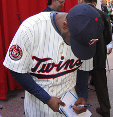
The Twins unveiled their new uni set yesterday afternoon, and reader Jeff Barak was on hand to take some photos and get some crucial info. Let’s take a look:
• The new home uni: Pretty much the same as the old one, except they’ve tweaked the insignia (personally, I never liked the old one, so I wasn’t looking for tiny incremental changes — I was hoping for an overhaul) and added the obligatory inaugural season stadium patch (nice enough — here’s a closer look). But the big news, according to Jeff Barak, who specifically asked about this, is that they’re finally scrapping the nameplates and going with direct-sewn lettering, which means no more pinstripus interruptus. So is it good or is it stupid? The NOB change alone is enough to make it good.
• The new road uni: Love the jersey, hate the two-tone cap. There’s already been some griping that the jersey looks too much like the Nats’ road design, but I’m okay with it (and let’s face it, it’s a huge improvement over the old road pinstripes). Other pluses: Direct-sewn NOBs, an anniversary sleeve patch that doesn’t suck (although it also isn’t great — enough already with the beveled numerals, and doesn’t the zero look a little too bulbous?). Only potential pitfall: The insignia breaks across the placket at a less than graceful spot. Overall, though, quite good.
• The new home throwback: Ding-ding-ding-ding! Even better than last season’s throwback, because they won’t be wearing them with that stupid red cap I hated. Plus the pins are nice, the cream base fabric is nice, the sleeve patch is nice (and yes, the cap patch is idiotic, but whaddaya gonna do — endure it for one year and then we can all pretend it never happened), and hey, NNOB! They’ll be wearing this beauty on Opening Day and then for Saturday home games. Very, very good.
• The new solid navy alternate: More of less the same as the old one, except for the insignia tweak, plus they’ll be wearing this one with a navy “M” cap instead of a red “TC” cap (or at least that’s the plan — headwear protocols tend to get very laissez faire after the first month or so). Whatever, solid alternates are always stupid.
• The new home pinstriped vest: Can’t believe they didn’t git rid of this thing. You’ve heard of addition by subtraction? Well this is subtraction by continuation. And it’ll look even worse this year, because they’re gonna put the stadium-opening patch on the upper-right chest, where it’s gonna stick out like a festering sore. ¡Estúpido!
Overall: The Twins will be a better-looking team in 2010 than they were in 2009, but not by as much as they could have been. Maybe next time they’ll have the balls to scrap the home insignia and “M” cap, which reek of 1980s.
(Further press release-y details here and here.)
Uni Watch News Ticker: Hey look, they fished an old billboard out of Puget Sound! Oh wait, no they didn’t. Douchebags. ”¦ Underbill alert from Andy Chalifour, who spotted something written under Dave Dravecky’s brim. ”¦ A girls’ soccer team in Pittsburgh recently played a benefit game to raise funds to fight children’s blindness, and Tony Bruno‘s niece wore a Braille NOB. ”¦ There are football gloves and then there are football gloves. “That’s Hamilton Tiger-Cat receiver Dave Stala,” says Jim Vilk. “I kind of like them, even though the first thing I thought of was Audrey Hepburn.” ”¦ Yesterday I asked about cross-sport memorials, and Lendsey Thomson came up with this one: “That’s me chucking it when I played at Bradley. On my left sleeve you will see the cross patch that was in memory of Danny Dalquist, a Bradley soccer player killed in a fire before school started in 2007. All of the Bradley teams had this patch or some variation on their jerseys.” ”¦ Latest apostrophe catastrophist: Pizza Hut. ”¦ Officially speaking, the Orioles do not have any uni changes in store for next season. Unofficially, however, they appear to have made a small tweak to their script, as discussed here. ”¦ Is there anything Nike won’t swoosh-ify? Nope (with thanks to Maks Skuz). ”¦ Did you know there’s gonna be a National High School Sports Hall of Fame opening in Larry Holmes’s hometown? I didn’t, until Kirsten told me yesterday. ”¦ My friends Charles and Carrie have started a “Brooklyn Jews” T-shirt project (available here). Nice, but it ain’t no Jewboys. ”¦ Nice shot of Terry Bradshaw wearing the 1969 centennial decal. And man, look at the size of his uni number! (With thanks to Josh McDaniel.) ”¦ Check out this interesting front-helmet logo. “It’s a semi-pro team called the Kings, but I’m not sure where they’re from,” says Brian Schulz. ”¦ Slideshow of Oklahoma’s riflery uniforms here. “The gloves and cleats are nice, but everything else looks like a knock-off Sooner uni you would find at Wal-Mart,” says Tulsa resident Jordan Guthmann. “Also, no images of the white helmet, but thankfully they took a close-up of the belt buckle. Bogus.” Press release that reads like a love letter to (or, more likely from) the Nike Propaganda Minister here. ”¦ Lots of new rugby uniforms in New Zealand (with thanks to Dylan Moran). ”¦ Reprinted from yesterday’s comments: Wearing the wrong uniform can land you in the hoosegow. … Jason Bini says this poster is hanging on the wall at Memorial Sloan-Kettering Cancer Center in NYC. “It’s in the middle of a hallway filled with inspirational pro, college, and Olympic athlete photos,” he says. ”¦ Reprinted from last night’s comments: Check out the tremendous old AFL and NFL patches available here (thanks, Ricko). … Lots to like in this Shorpy pic, esp. the caded collars on the jerseys and the overall feeling of texture — so much texture! That’s what got me interested in uniforms in the first place (with thanks to Stuart Greenlee). ”¦ The U.S. World Cup jersey may have been leaked. If that really is the design, I’m gonna be pretty happy — the swoosh notwithstanding, it’s a beauty. ”¦ Skeebs gave Brandon Jacobs the cow-catcher treatment for yesterday’s practice but says it was just a one-and-done kinda thing. “Would look better with a visor,” he notes.
Because selling them is easier than dusting them: After weeks of selling old indie singles on eBay, I’ve now moved on to a few select LPs and zines. Anyone who bids on the Suckdog LP and the copy of Siltbreeze gets a free dinner (well, assuming you’re willing to go a restaurant and walk out on the check, which should be no problem for anyone interested in Suckdog and Siltbreeze); anyone who bids on all five issues of The Baffler gets to hear some funny stories about Tom Frank (he and I share a birthday, which was really fucking annoying in 1998); and anyone who bids on the three copies of Disaster gets a free scan of My Wife (a hilarious one-sheet zine from the same era) featuring a Bill Callahan comic. Bid early and often, etc., etc.
Nice shot of Terry Bradshaw wearing the 1969 centennial decal.
Also a great shot of a “bird cage” on one of his linemen, still my all time favorite face mask.
haha, ‘ikea’ was my anti-spam word…
As for the Twinkies’ unis, on the whole, good job.
I agree, the vest I would have got rid of. I was also disappointed in their home and alt unis. They aren’t terrible looking, but I was expecting more.
I love, love, love the alt throwbacks. I wonder why they didn’t just use that as the primary home uni, and then since they seem to love the navy, use that as an alt.
The road jerseys, IMO are a major flop, but not because of the look, which is pretty good.
It’s because it looks exactly like the Nats’ road uniform. Look at the sleeve and neck piping, it’s very similar…as well as the colors. I mean, it’s the first thing I thought when I saw it.
link
I mean, the only diff is the red font with navy shadow is reversed for the Twins.
Overall, good, but a few flaws. Solid B.
Here’s the article from the SF Chronicle about the guy dressing up as a Marine, with photos. The dude couldn’t decide whether he wanted to be an Officer or an NCO apparently…
link
Anybody know what other MLB teams are planning new uniforms for the upcoming season?
Paul — I’m a uniform traditionalist and usually agree with most of your opinions, but I have to disagree with your dismissing of solid-colored alternates in baseball. I think they add color to the game (though some teams use them too much, perhaps; see Houston Astros). What bothers me is having more than one white uniform. That seems unnecessary. Maybe my views are just colored by the era I grew up in (1970s).
I also like two-toned hats (again, a product of the 1970s). The Twins’ blue hat with red bill is a reverse of their 1970s/1980s hat. Since they’ve also had all-blue hats, the only hat they’re missing (and let’s hope they keep it that way) is the all-red one. But more than two hats per team is too much.
The long gloves on the receiver made me think of Darth Vader.
Why do people keep saying that the Twins’ new road jersey looks too much like the Nationals’ design, as if it belongs to them? The design originated with the franchise that was the Senators and is now the Twins sixty years before the Nats did it.
Hmmm… Have to say, if those are the true US World Cup unis, the United States is going to have some sharp-dressed teams in international competition next year, especially when paired with the US Hockey team.
Good news about the Twins’ new home throwbacks.
link
Key quotes, “Indeed, fans could be seeing more of that ’61-throwback look by 2011, St. Peter acknowledged.
‘I suspect there will be a heavy dose of lobbying to make that our permanent home uniform,’ St. Peter said.”
Yes, let’s hope this happens. Maybe Mauer can get some throwback colors for his catching gear too-similar to the goalies during the Winter Classic.
[quote comment=”360958″]Paul — I’m a uniform traditionalist and usually agree with most of your opinions, but I have to disagree with your dismissing of solid-colored alternates in baseball. I think they add color to the game (though some teams use them too much, perhaps; see Houston Astros).[/quote]
Wait, how can you be a uniform traditionalist and support solid-colored alts? That makes no sense, considering that they didn’t exist until the 1970s.
[quote comment=”360958″]I have to disagree with your dismissing of solid-colored alternates in baseball. I think they add color to the game.[/quote]
no
no no no no no no no
and no
i will give there may be a team or two on whom a decent softball top isn’t horrible, if sporadically worn, but any team who wears pins (home or road, which now means only the rockies are left) or a dark top at home should never be allowed to take the field (wearing a dark top)
IF you’re going to wear a dark (or any color top), the pants should match, and stirrups/socks must be worn
like this or this…
or (gasp) even something as nuts as this
keep the different colored tops/bottoms in football and hockey…baseball unis should look like uniforms, not garanamals
Love that Jacobs helmet and mask…Schutt should become the official helmet supplier…it would look killer with a shield. In a way looks like LTs mask he wore last year.
Paul Lukas said:
“Even better than last season’s throwback, because they won’t be wearing them with that stupid red cap I hated”
You know, once again I know this is YOUR blog there Mr. Lukas, but I must say, if you had your way with Uniforms in sports, then the players would have all sorts of stripped DORKY Socks up to there crotches, with dull, dingy, MET inspired colors with no differences at all. YOU hate a uniform b/c of the inclusion of purple, YOU hate somethign b/c of a 2 tone cap…
I get it, your blog, your opinion, but sometimes, I think you need to let up…
Minny’s new unis are NOT that different from the old ones at home… IMHO, the Roads are Awesome…IMHO and the alternates are dumb, IMHO
That Bulldog facemask on Jacobs helmet is funky.
It looks much chunkier than the DNA version:
link
link
P.S. A visor would have been an improvement.
I still can’t get enough of those nose bumpers.
Double P.S. The Twins cream pins are gorgeous.
[quote comment=”360965″]Love that Jacobs helmet and mask…Schutt should become the official helmet supplier…it would look killer with a shield. In a way looks like LTs mask he wore last year.[/quote]
I have not seen ANYTHING similar to LDT’s mask from last year. None of the three variations that he wore have been spotted anywhere else, which leads me to believe that he had it custom made.
The USA jersey is killer, I am not a Nike hater, but I think that the logo should be a bit smaller
[quote comment=”360968″][quote comment=”360965″]Love that Jacobs helmet and mask…Schutt should become the official helmet supplier…it would look killer with a shield. In a way looks like LTs mask he wore last year.[/quote]
I have not seen ANYTHING similar to LDT’s mask from last year. None of the three variations that he wore have been spotted anywhere else, which leads me to believe that he had it custom made.[/quote]
I see that but the rounded bar that comes up towards the bumper, either way I like it
I thought I had posted that pic of TB with the Centennial decal here once before back when this topic was first brought up… Interesting point about the jerseys Louisiana Tech is wearing is that they do not have the UCLA shoulder stripes that they normally wore, but these were not special jeresys or anything for the Greatland Rice Bowl, it was just their Away Whites…
I have sent that image and others–including a color shot–of that helmet to the Helmet Project so they can add another helmet to theis Centennial listings, but nothing came of it.
I agree with Geeman. Way too many baseball uniforms end up as all-white or all-gray with a dark hat.
You can’t even tell what team you’re looking at on TV until you get a good shot of a hat logo or front of a jersey.
More color wouldn’t hurt anyone.
The Twins road nameplate was a guilty uni pleasure for me. As much as the front of the jersey, that nameplate just said “Twins” to me. I’ll miss that less than ideal feature.
I’m also one who prefers the current Twins script. Mostly because the throwback script highlights how bad a capital T looks in that style.
[quote comment=”360967″]That Bulldog facemask on Jacobs helmet is funky.
It looks much chunkier than the DNA version:
link
link
P.S. A visor would have been an improvement.
I still can’t get enough of those nose bumpers.
Double P.S. The Twins cream pins are gorgeous.[/quote]
Terelle Smith, formerly of the Cardinals, now with the Lions, wore an interestu=ing variation of the Bulldog:
link
link
Now with the lions, he is wearing a more traditional Eric Dickerson style mask on a Schutt DNA:
link
I think the Ivars thing was pretty clever. It’s like some of the stunts Bill Veeck pulled off in his tenure.
I also wish I was from Brooklyn. Those shirts are great.
The Sooners script along the back waistband is a nice touch. NOT! Who ‘thinks’ up these designs? Sheesh.
Question for you (geeks) out there. Over the weekend I bought a USA Hockey Jersey. I cannot find on the web where to determine which year this jersey is from.
Any one know of any sites devoted to the different team USA Hockey jersies of the last 20 years?
There’s also rumors of a red version of the new U.S. soccer kit.
link
It’s true about the Twins 50th Anniversary patch. They came so close, showed restraint… then blew it with the unecessary, bloated, beveled ’50’ over the state and the awkward ribbon thing at the bottom.
Less is more. (See the home retros).
I like that leaked USA soccer design, but my biggest problem with U.S. Soccer has always been the crest. The three stars should not been included. The use of stars should be sacred – they should only be used to represent the number of times a country has won the World Cup. Period. Brazil, Italy, Germany, Argentina, France, England, etc., only use stars to denote a World Cup title. I understand that the United States are “the Stars and Stripes,” but those starts just look like they stand for something we haven’t done – win the whole effing thing. It’s as if we have some insecurity that we haven’t won the World Cup, so we’re just gonna put some stars on there because we can.
“This” means something:
link
link
link
“This” is just pretentious:
link
I think we’d be better off with a logo that didn’t have stars in it (until we win the World Cup, of course). Take the swoosh away, and this would work:
link
Or return to the logo that didn’t have stars, circa 1994:
link
Am I alone on an island with this, or is anyone else bothered by the stars on the US Soccer crest?
UW Community:
That USA jersey is a mock up off of what has been rumored for the away kit. The home kit has been confirmed (not officially, but it has leaked). I know this as I’ve designed these mock ups.
The home will look like this:
link
That one has been verified by a leaked photo. I simply went off the rumors circulating as to what the away might look like. Possibly either of these:
link
link
So, home kit is for sure, away kit is based off the rumors.
More info in this thread:
link
My apologies if this has been discussed elsewhere, but some Ohio State players aren’t real happy with the shoes that are to be worn with those goofy uniforms on Saturday.
Here’s a link from the Cleveland Plain Dealer:
link
[quote comment=”360982″]UW Community:
That USA jersey is a mock up off of what has been rumored for the away kit. The home kit has been confirmed (not officially, but it has leaked). I know this as I’ve designed these mock ups.
The home will look like this:
link
That one has been verified by a leaked photo. I simply went off the rumors circulating as to what the away might look like. Possibly either of these:
link
link
So, home kit is for sure, away kit is based off the rumors.
More info in this thread:
link
The gray stripe is not an improvement to the current polo whites the USMNT is wearing. I’m digging the red, though.
I’d get one if they decide to sell it in a long sleeve (which doesn’t usually happen with the MNT jerseys).
One thing that everyone seems to agree on is that the US needs to establish a visual identity with their kits. It’s yet another reason the rest of the international football community will not take us seriously.
That article about the OSU shoes mentions Clemson as one of the schools, but we haven’t seen/heard anything about their unis?
[quote comment=”360983″]My apologies if this has been discussed elsewhere, but some Ohio State players aren’t real happy with the shoes that are to be worn with those goofy uniforms on Saturday.
Here’s a link from the Cleveland Plain Dealer:
link
That really amuses me for some reason. You’d think a shoe company wouldn’t screw that part up.
[quote comment=”360966″]Paul Lukas said:
“Even better than last season’s throwback, because they won’t be wearing them with that stupid red cap I hated”
You know, once again I know this is YOUR blog there Mr. Lukas, but I must say, if you had your way with Uniforms in sports, then the players would have all sorts of stripped DORKY Socks up to there crotches, with dull, dingy, MET inspired colors with no differences at all. YOU hate a uniform b/c of the inclusion of purple, YOU hate somethign b/c of a 2 tone cap…
I get it, your blog, your opinion, but sometimes, I think you need to let up…
Minny’s new unis are NOT that different from the old ones at home… IMHO, the Roads are Awesome…IMHO and the alternates are dumb, IMHO[/quote]
Cracks me up when people give me shit for thinking, uh, what I think, and for being consistent about it. This is like saying, “You know, it would be nice if rain wasn’t always WET. Yeah, that rain, it’s really in a rut. Jeez.”
Look, if you want dipshit opinions along the lines of “Let’s change things up a bit, why not, seems like fun, I need a new excuse to waste money on a new jersey, whee!”, then go read some other blog. Until then, don’t act all surprised when I call bullshit as bullshit.
I get it, YOUR comment, YOUR opinion, whatever…
Twins Away (back)= Atlanta Braves
That Twins throwback script is still just terrible, and so is the road uni. The “Minnesota” script is, eh, okay. But the whole thing’s just much too dark and drab, even with the red number sticking out like a sore thumb.
Then again, I was a fan of the road pins.
I do agree with the assessment of the red cap and the silly two-tone road cap. Stick with the solid navy already.
The changes to the “Twins” script, on the other hand, are very nice.
[quote comment=”360975″][quote comment=”360967″]That Bulldog facemask on Jacobs helmet is funky.
It looks much chunkier than the DNA version:
link
link
P.S. A visor would have been an improvement.
I still can’t get enough of those nose bumpers.
Double P.S. The Twins cream pins are gorgeous.[/quote]
Terelle Smith, formerly of the Cardinals, now with the Lions, wore an interestu=ing variation of the Bulldog:
link
link
Now with the lions, he is wearing a more traditional Eric Dickerson style mask on a Schutt DNA:
link
looks like barry’s mask:
link
i don’t like those big chunky/busy LT “bulldog” masks. if i was on offence especially, i’d think less is more. i want to see as much as possible. and i’m well aware about the saftey issues, but maybe that’s just the hockey player in me…
[quote comment=”360960″]Why do people keep saying that the Twins’ new road jersey looks too much like the Nationals’ design, as if it belongs to them? The design originated with the franchise that was the Senators and is now the Twins sixty years before the Nats did it.[/quote]
[quote comment=”360960″]Why do people keep saying that the Twins’ new road jersey looks too much like the Nationals’ design, as if it belongs to them? The design originated with the franchise that was the Senators and is now the Twins sixty years before the Nats did it.[/quote]
Did not. Griffith Senators never had colored braid trim at neck and sleeve ends or down pantlegs. At least not since before WWII sometime, if at all.
Roads were virtually always plain gray with no trim. Even the expansion Senators (now Rangers) never had anything but plain gray road unis. Never had red numbers, either. Well, exp. Senators did, but not the Griffith Senators.
You can look it up.
—Ricko
Powers,
You mentioned that Ice Pirates movie yesterday. I’ve not seen it but I have heard tell that it’s awful (confirming your opinion of it)and will probably skip it. We had some guys on the team in the movie industry and we kicked around the idea of making a movie out of our collective adventures. If it ever happens I’ll be sure to consult everyone here about uniforms, etc.
$36 for the jewboys tshirt?! oy vey! if i ever spend $36 for a tshirt, someone punch me
[quote comment=”360989″]That Twins throwback script is still just terrible, and so is the road uni. The “Minnesota” script is, eh, okay. But the whole thing’s just much too dark and drab, even with the red number sticking out like a sore thumb.
Then again, I was a fan of the road pins.
I do agree with the assessment of the red cap and the silly two-tone road cap. Stick with the solid navy already.
The changes to the “Twins” script, on the other hand, are very nice.[/quote]
The throwback script (assuming you mean the new home alts) is exactly what they wore at the beginning here. That’s what a throwback is.
—Ricko
[quote comment=”360981″]I like that leaked USA soccer design, but my biggest problem with U.S. Soccer has always been the crest. The three stars should not been included. The use of stars should be sacred – they should only be used to represent the number of times a country has won the World Cup. Period. Brazil, Italy, Germany, Argentina, France, England, etc., only use stars to denote a World Cup title. I understand that the United States are “the Stars and Stripes,” but those starts just look like they stand for something we haven’t done – win the whole effing thing. It’s as if we have some insecurity that we haven’t won the World Cup, so we’re just gonna put some stars on there because we can.
“This” means something:
link
link
link
“This” is just pretentious:
link
I think we’d be better off with a logo that didn’t have stars in it (until we win the World Cup, of course). Take the swoosh away, and this would work:
link
Or return to the logo that didn’t have stars, circa 1994:
link
Am I alone on an island with this, or is anyone else bothered by the stars on the US Soccer crest?[/quote]
i totally agree!!!
[quote comment=”360984″][quote comment=”360982″]UW Community:
That USA jersey is a mock up off of what has been rumored for the away kit. The home kit has been confirmed (not officially, but it has leaked). I know this as I’ve designed these mock ups.
The home will look like this:
link
That one has been verified by a leaked photo. I simply went off the rumors circulating as to what the away might look like. Possibly either of these:
link
link
So, home kit is for sure, away kit is based off the rumors.
More info in this thread:
link
The gray stripe is not an improvement to the current polo whites the USMNT is wearing. I’m digging the red, though.
I’d get one if they decide to sell it in a long sleeve (which doesn’t usually happen with the MNT jerseys).
One thing that everyone seems to agree on is that the US needs to establish a visual identity with their kits. It’s yet another reason the rest of the international football community will not take us seriously.[/quote]
I actually like the white alot. I liked the current set we’ve got, but I’m looking forward to this set. I think they will look rather smart. I’m cool with either the aways (btw those aren’t just random guesses, its what everyone has been saying. That if its blue, it will have a white sash, and if its red, then a blue sash. I went ahead and used the same template as the confirmed home). We had long sleeves of the last WC kit, and a few player issue shirts in long sleeve released on eBay of the current kits. I managed to snag the gray one.
[quote comment=”360964″][quote comment=”360958″]I have to disagree with your dismissing of solid-colored alternates in baseball. I think they add color to the game.[/quote]
no
no no no no no no no
and no
i will give there may be a team or two on whom a decent softball top isn’t horrible, if sporadically worn, but any team who wears pins (home or road, which now means only the rockies are left) or a dark top at home should never be allowed to take the field (wearing a dark top)
IF you’re going to wear a dark (or any color top), the pants should match, and stirrups/socks must be worn
like link or link…
or (gasp) even something as nuts as link
keep the different colored tops/bottoms in football and hockey…baseball unis should look like uniforms, not garanamals[/quote]
I half agree…
If you’re wearing a Pinstriped top, then you so absolutely wear pinstriped pants. As a Rockies fan, it pains me to see the Rockies wear their link. But link looks gorgeous.
But something like link looks a million times better than an all solid color uniform.
[quote comment=”360992″]Powers,
You mentioned that Ice Pirates movie yesterday. I’ve not seen it but I have heard tell that it’s awful (confirming your opinion of it)and will probably skip it. We had some guys on the team in the movie industry and we kicked around the idea of making a movie out of our collective adventures. If it ever happens I’ll be sure to consult everyone here about uniforms, etc.[/quote]
It’s a good bad movie. It’s perfect for the MST3k treatment.
[quote comment=\”360981\”]I like that leaked USA soccer design, but my biggest problem with U.S. Soccer has always been the crest. The three stars should not been included. The use of stars should be sacred – they should only be used to represent the number of times a country has won the World Cup. Period. Brazil, Italy, Germany, Argentina, France, England, etc., only use stars to denote a World Cup title. I understand that the United States are \”the Stars and Stripes,\” but those starts just look like they stand for something we haven\’t done – win the whole effing thing. It\’s as if we have some insecurity that we haven\’t won the World Cup, so we\’re just gonna put some stars on there because we can.
\”This\” means something:
link
link
link
\”This\” is just pretentious:
link
I think we\’d be better off with a logo that didn\’t have stars in it (until we win the World Cup, of course). Take the swoosh away, and this would work:
link
Or return to the logo that didn\’t have stars, circa 1994:
link
Am I alone on an island with this, or is anyone else bothered by the stars on the US Soccer crest?[/quote]
That has ALWAYS bothered me, too…It makes me wonder if the people who designed the logo just thought the badge would look cool with stars b/c some of the european countries do it.
I think we’re all calling the Twins’ new roads “Nationals-ish” for a couple of reasons. 1) The Twins franchise a) GAVE UP similar roads and b) became heavily identified with the ‘road pins’ look and 2) the Nationals have gotten an inordinate amount of uni attention the last couple of years for reasons good and bad.
[quote comment=\”360981\”]
Am I alone on an island with this, or is anyone else bothered by the stars on the US Soccer crest?[/quote]
That has ALWAYS bothered me, too…It makes me wonder if the people who designed the logo just thought the badge would look cool with stars b/c some of the European countries do it.
[quote comment=”360986″][quote comment=”360983″]My apologies if this has been discussed elsewhere, but some Ohio State players aren’t real happy with the shoes that are to be worn with those goofy uniforms on Saturday.
Here’s a link from the Cleveland Plain Dealer:
link
That really amuses me for some reason. You’d think a shoe company wouldn’t screw that part up.[/quote]
(Laughing) Way to go, Nike, neglect the design and viability of the shoes of all things.
And therein lies perhaps the key haywire high-profile element in this whole deal: Nike has lost its original focus.
—Ricko
[quote comment=”360987″][quote comment=”360966″]Paul Lukas said:
“Even better than last season’s throwback, because they won’t be wearing them with that stupid red cap I hated”
You know, once again I know this is YOUR blog there Mr. Lukas, but I must say, if you had your way with Uniforms in sports, then the players would have all sorts of stripped DORKY Socks up to there crotches, with dull, dingy, MET inspired colors with no differences at all. YOU hate a uniform b/c of the inclusion of purple, YOU hate somethign b/c of a 2 tone cap…
I get it, your blog, your opinion, but sometimes, I think you need to let up…
Minny’s new unis are NOT that different from the old ones at home… IMHO, the Roads are Awesome…IMHO and the alternates are dumb, IMHO[/quote]
Cracks me up when people give me shit for thinking, uh, what I think, and for being consistent about it. This is like saying, “You know, it would be nice if rain wasn’t always WET. Yeah, that rain, it’s really in a rut. Jeez.”
Look, if you want dipshit opinions along the lines of “Let’s change things up a bit, why not, seems like fun, I need a new excuse to waste money on a new jersey, whee!”, then go read some other blog. Until then, don’t act all surprised when I call bullshit as bullshit.
I get it, YOUR comment, YOUR opinion, whatever…[/quote]
The reason I read this blog every day is that it has a good combination of fact and opinion and there are plenty of times in which I disagree with the opinion. I do like color tops in baseball, but I’d like to see it only on the road and definitely no color on color games in baseball for example. Keep opining, Paul.
[quote comment=”360981″]I like that leaked USA soccer design, but my biggest problem with U.S. Soccer has always been the crest. The three stars should not been included. The use of stars should be sacred – they should only be used to represent the number of times a country has won the World Cup. Period. Brazil, Italy, Germany, Argentina, France, England, etc., only use stars to denote a World Cup title. I understand that the United States are “the Stars and Stripes,” but those starts just look like they stand for something we haven’t done – win the whole effing thing. It’s as if we have some insecurity that we haven’t won the World Cup, so we’re just gonna put some stars on there because we can.
“This” means something:
link
link
link
“This” is just pretentious:
link
I think we’d be better off with a logo that didn’t have stars in it (until we win the World Cup, of course). Take the swoosh away, and this would work:
link
Or return to the logo that didn’t have stars, circa 1994:
link
Am I alone on an island with this, or is anyone else bothered by the stars on the US Soccer crest?[/quote]
Well I for one am perfectly fine with the stars being inside the crest. We are represented by stars just as much as stripes on the flag. Also, for the most part, teams that have won the WC typically wear the stars above the crest, not within the crest such as the US.
The German DFB crest (the circular logo) sits below the stars. link
Brazil has the stars above their crest link
Argentina same story. link
Italy is about the lone exception. I think it is perfectly acceptable for the US to wear those stars within the crest, it would only be too much if they were above the crest. However, I would be happier if we returned to the 1950 crest.
link
[quote comment=”360997″]
If you’re wearing a Pinstriped top, then you so absolutely wear pinstriped pants.[/quote]
ya got that backwards, but at least we’re on the same page
…i’ve never see a team wear a pinstriped TOP and solid bottoms (except maybe the bumblebee pirates)…it’s always pin bottoms and dark top…and that is perhaps THE WORST and MOST EGREGIOUS violation of uni protocol in baseball
as far as teh softball top, you know my feelings on that…but at least limit its use to road games, please
Well, it would look great on a small town American Legion team (which is the same thing I used to say about the powder blues)….
link
Like watching a homeowner in a gorgeous, high-end, tree-lined old neighborhood trying to decide what would be the best color to paint his house. He knows there’s such a thing as the right color for the situation but has absolutely no idea whatsoever how to determine what it is…so it narrows it down to lime or lavender.
—Ricko
I don’t care what the Twins uniforms look like, I just realized they are going to be 50 years old, which means it’s been 51 years since I attended my first major league baseball game (Pedro Ramos vs. the Go-Go Sox). It’s 50? Really? Are they sure?
[quote comment=”361001″][quote comment=\”360981\”]
Am I alone on an island with this, or is anyone else bothered by the stars on the US Soccer crest?[/quote]
That has ALWAYS bothered me, too…It makes me wonder if the people who designed the logo just thought the badge would look cool with stars b/c some of the European countries do it.[/quote]
Here’s what a good USA kit and badge would be:
link
on another note…
did anyone think of JTH’s retro sox jersey when the twins released this beauty?
[quote comment=”361006″]Well, it would look great on a small town American Legion team (which is the same thing I used to say about the powder blues)….
link
Like watching a homeowner in a gorgeous, high-end, tree-lined old neighborhood trying to decide what would be the best color to paint his house. He knows there’s such a thing as the right color for the situation but has absolutely no idea whatsoever how to determine what it is…so it narrows it down to lime or lavender.
—Ricko[/quote]
I probably shouldn’t admit this, but I had to live in a lavender house while growing up. The reaction to it wasn’t quite as bad as you’d expect. My father painted it that color when I was like 6 or 7, specifically to piss off one particular neighbor – and they liked it because it was different. This also caused another neighbor to go with pink.
/see, there’s a reason I’m as messed up as I am
[quote comment=”361009″]on another note…
did anyone think of link when the twins released link?[/quote]
Not sure why, but I thought more of this:
link
I’m in the minority that really digged the ’87 makeover for the Twins. It’s cleaner, bigger and emphasizes the “Twins, Win” slogan.
Never cared for the T in the original script. Oh well. That said, I have no real problems with the new roadies. But the Minnesota block type worked for me, too. Never was a fan of the road pins.
Alt blues? OK. Vests? Ugh.
The major,major, major upgrade was scrapping the NOB nameplates. So amateurish.
I’ll give yesterday’s unveiling a C+. What they had just needed tweaking.
Absolutely in love with the Twins new road uni’s and the USMNT Red mock-up, that thing is gorgeous. I’m glad the Twinkies have a new road uni, as a Tigers fan, I hate watching them play Minny and see those horrid grey blocky MINNESOTA away’s, or god forbid, the navy alternate which is WORSE.
In regards to the US crest- I for one am perfectly fine with the stars being inside the crest. We are represented by stars just as much as stripes on the flag. Also, for the most part, teams that have won the WC typically wear the stars above the crest, not within the crest such as the US.
The German DFB crest (the circular logo) sits below the stars.
link
Brazil has the stars above their crest link
Argentina same story. link
Italy is about the lone exception. I think it is perfectly acceptable for the US to wear those stars within the crest, it would only be too much if they were above the crest. However, I would be happier if we returned to the 1950 crest.
link
From late last night…
UW WINTER CLASSIC ADVISORY!!!
Even as we speak, Teebz and I are beginning plans.
Pond Hockey, Jan 22-23-24 (Fri., Sat., Sun.)
T-Wolves home to New Orleans 22nd. Special on tickets ($20, including some kind of vintage teeshirt)
Wild home to Columbus 23rd (Wild is a tough ticket)
Possibility of NFC Championship at Metrodome 24th (said “possibility”, lol). Tickets pretty much impossible but we could tailgate.
Teebz checking on hotel group rates tomorrow.
Will be between downtown and Pond Hockey, which is in western suburb.
–Ricko
[quote comment=”360998″][quote comment=”360992″]Powers,
You mentioned that Ice Pirates movie yesterday. I’ve not seen it but I have heard tell that it’s awful (confirming your opinion of it)and will probably skip it. We had some guys on the team in the movie industry and we kicked around the idea of making a movie out of our collective adventures. If it ever happens I’ll be sure to consult everyone here about uniforms, etc.[/quote]
It’s a good bad movie. It’s perfect for the MST3k treatment.[/quote]
Watching the Health Care Reform debate on C-SPAN the other weekend and Twittering at the same time. Some wag suggested mashing C-SPAN with MST3K. Now THAT would be marketable!
[quote comment=”360983″]My apologies if this has been discussed elsewhere, but some Ohio State players aren’t real happy with the shoes that are to be worn with those goofy uniforms on Saturday.
Here’s a link from the Cleveland Plain Dealer:
link
As a Buckeye fan, I am glad to see that Raymont Harris has found some work.
I typically don’t like dark alternates. However, I think the Twins could make one work — but it needs some work. My biggest gripe is that the piping on the navy jersey doesn’t match anything else in the uni sets. Now, if they would have used no piping, or piping similar to the new road uni (only white & red instead of navy & red), then maybe they’d have something there. And PLEASE get rid of the white numbers on the front — just make them red with white trim like “Twins” insignia — or else get rid of the front numbers all together.
#52 in that Giants uniform history poster appears to be wearing the home gray pants with white jerseys. I can’t tell what year it says, but isn’t that new for this season (if they have every worn those with the white roads at all)?
[quote comment=”361014″]In regards to the US crest- I for one am perfectly fine with the stars being inside the crest. We are represented by stars just as much as stripes on the flag. Also, for the most part, teams that have won the WC typically wear the stars above the crest, not within the crest such as the US.
The German DFB crest (the circular logo) sits below the stars.
link
Brazil has the stars above their crest link
Argentina same story. link
Italy is about the lone exception. I think it is perfectly acceptable for the US to wear those stars within the crest, it would only be too much if they were above the crest. However, I would be happier if we returned to the 1950 crest.
link
I see your point about teams putting the star above and separate from their national crest (France, England), but that new German jersey really ties the stars and crest together by having them all on the black patch. And, as you said, the stars are incorporated within the Italian crest).
The stars on the US Soccer crest just wreak of “wannabe” to me.
What happens if we ever win the thing? Stars and stars? The women’s team has to put the stars denoting their 2 World Cup wins on the sleeves or the back of the neckline, so as not to create confusion. Otherwise, they would appear to have 5 stars.
Sleeve:
link
Neckline:
link
[quote comment=”360987″][quote comment=”360966″]Paul Lukas said:
“Even better than last season’s throwback, because they won’t be wearing them with that stupid red cap I hated”
You know, once again I know this is YOUR blog there Mr. Lukas, but I must say, if you had your way with Uniforms in sports, then the players would have all sorts of stripped DORKY Socks up to there crotches, with dull, dingy, MET inspired colors with no differences at all. YOU hate a uniform b/c of the inclusion of purple, YOU hate somethign b/c of a 2 tone cap…
I get it, your blog, your opinion, but sometimes, I think you need to let up…
Minny’s new unis are NOT that different from the old ones at home… IMHO, the Roads are Awesome…IMHO and the alternates are dumb, IMHO[/quote]
Cracks me up when people give me shit for thinking, uh, what I think, and for being consistent about it. This is like saying, “You know, it would be nice if rain wasn’t always WET. Yeah, that rain, it’s really in a rut. Jeez.”
Look, if you want dipshit opinions along the lines of “Let’s change things up a bit, why not, seems like fun, I need a new excuse to waste money on a new jersey, whee!”, then go read some other blog. Until then, don’t act all surprised when I call bullshit as bullshit.
I get it, YOUR comment, YOUR opinion, whatever…[/quote]
Nice one, Paul. I know I disagree with you a lot (see the Ivar’s comment above), but this guy needs to learn the difference between intelligent discussion or friendly ribbing and being an ass about it.
As far as IMHO goes, I think Terry Pratchett said it best when he speculated that there was no such thing as a humble opinion.
“As far as IMHO goes, I think Terry Pratchett said it best when he speculated that there was no such thing as a humble opinion.”
That’s his opinion.
For help in preventing apostrophe catastrophes.
link
[quote comment=”361011″][quote comment=”361009″]on another note…
did anyone think of link when the twins released link?[/quote]
Not sure why, but I thought more of this:
link
I make a point of never thinking of JTH.
BTW, AL Rookie of the Year, Andrew Bailey.
Another Wagner alum made good!
Agree 100% with War Eagle on the stars. We need a new crest.
RE: Stars on the US jerseys
I’m far more bothered by the fact that Nike is putting the swoosh link rather than, oh, just about anywhere else on the jersey.
[quote comment=”361018″][quote comment=”360983″]My apologies if this has been discussed elsewhere, but some Ohio State players aren’t real happy with the shoes that are to be worn with those goofy uniforms on Saturday.
Here’s a link from the Cleveland Plain Dealer:
link
As a Buckeye fan, I am glad to see that Raymont Harris has found some work.[/quote]
One MAJOR gripe from someone who likes the uniforms:
Why doesn’t the number font on the helmet match the font on the jersey, c’mon!
The Twins had the right track when they altered the unis. Unfortunately they went a little too far.
The home uniform is nice. Thank god they got rid of the nameplates. They modernized the logo but not so much that fans with older jerseys will stick out too much. A nice change of pace over teams that change everything to try and milk dollars out of a fanbase.
The road uniform is exceptional as well. I like that they didn’t add a white outline like the Tigers (wish they would get rid of their white outline on the roads). I agree that the two tone cap is stupid. I think it was the line of thinking that the uniform was a little too dull and needed a bit more color. Stupid assumption.
The alt is epic in too many ways to name. Once the anniversary patch is removed, it might be one of my favorite alts. Although, I would prefer them to wear them for Sunday home games, since the cream colored jerseys look better (and more natural) being used during the day.
I think the U.S. Women’s National Team is the only team that puts its World Cup stars somewhere other than above or near the crest on the front of the jersey:
Germany women:
link
Norway appears to have no stars at all denoting their win in 1995:
link
link
link
And I can’t think of any country that has won the men’s World Cup that puts the star in another location. We’ve covered all the winners, except Uruguay. They have 4 stars, 2 for their World Cup wins in ’30 and ’50, and 2 for their Olympic golds in ’24 and ’28.
link
And those 4 stars are inside the crest on the jersey.
link
The Twins uni redesign is a mitigated disaster. (Mitigated only by the beautifully improved home script and the removal of the nameplate.)
1. Road pins. Losing the road pins is an absolute disaster for the Twins. Since 1987, the Twins have had one of the simplest and most distinctive identities in baseball: pinstripes, red jersey script, navy caps. The Twins, and only the Twins, wore that combo home and away. The new unis destroy that identity. Plus, road pinstripes make road grays darker and therefore more distinct from the other team’s home whites, which is the whole point of road uniforms in the first place. This is both a subjectively and an objectively bad move.
2. Road script bears no resemblance whatsoever to the home script, or to the cap logo. The problem isn’t that it looks like the Nats road jerseys — it’s actually much better than the Nats — it’s that, like the Nats, the Twins now have home and road uniforms that not only appear to come from different teams, they appear to come from teams with two different color schemes.
3. The road caps, along with the plain road grays, make the Twins look way too much like the Cleveland Indians. Not a good thing, considering that the Indians are A. a terrible ballclub and B. a heated division rival. The TC on the new road caps doesn’t stand for Twin Cities, it stands for Cleveland Tribe. Indians fans, say hello to your new alt cap, in Cleveland’s distinctive navy crown, red bill color scheme.
4. Paul wrote a thorough takedown of the Twins uniforms here some years ago, and most of these changes have made the things Paul complained about then worse, not better. The uniforms are more mismatched than ever.
Almost every element of the new Twins uniform set, except the vest, is terrific on its own. But taken together as a uniform set, this is a monumental failure. There is no consistency among elements, no uniform identity for the team. The Twins are now that Washington Nationals of the American League, as far as the quality of their uniforms goes. The Twins unis are quite as bad as the Jays, but they’re close, and certainly now the second-worst in the league, maybe the fourth-worst in MLB.
For most of the last decade, the Twins were a team with excellent uniforms ruined by bad alternate jerseys and caps. Now the Twins are a team with terrible uniforms only barely redeemed by one very good alternate jersey.
link is a Web Xtra from The Columbus Dispatch titled “A look back at OSU football uniforms.”
It links to link, which is a page from an August 2006 edition prior to the start of that season in light of OSU’s most recent minor uniform adjustments, the current home and away sleeve stripes and dull gray pants replacing silverish gray.
Sorry, not quite as bad as the Jays, but they’re close.
[quote comment=”361025″]I make a point of never thinking.[/quote]
Fixed.
[quote comment=”360983″]My apologies if this has been discussed elsewhere, but some Ohio State players aren’t real happy with the shoes that are to be worn with those goofy uniforms on Saturday.
Here’s a link from the Cleveland Plain Dealer:
link
Maybe a dumb question, but…
Why does Nike keep on selling the idea that they need to make the uniform lighter? if you look at some of their ridiculous designs, wouldn’t the addition of numerous panels (increasing seams) and multi-colored numbers and NOB offset the small incremental weight loss in changing the belt loop from aluminum to titanium?
You would think that the “lightest” uniform of all would be a solid color with the least amount of seams possible, single color numbers, solid colored pants with no stripe.
of course, what real difference would that make?
[quote comment=”361018″][quote comment=”360983″]My apologies if this has been discussed elsewhere, but some Ohio State players aren’t real happy with the shoes that are to be worn with those goofy uniforms on Saturday.
Here’s a link from the Cleveland Plain Dealer:
link
As a Buckeye fan, I am glad to see that Raymont Harris has found some work.[/quote]
If I recall, Raymont Harris played at tOSU when they wore all-red cleats.
link
That is also when they ad HUGE TV numbers and, gasp, strange stripes on their, gasp again, actual sleeves.
link
I love the new Twins home alternate — number-only! — but (and I’ve complained about this with many other jerseys in the last 10 years or so) the number is positioned terribly. It’s link. If a smaller guy like Mike Fontenot were to be sent to the Twins, the bottom of his jersey number would be sticking into his pants.
Is is the stupid little MLB collar logo that pushes the number down an inch or two?
Whatever it is, it needs to be fixed.
[quote comment=”361037″]I love the new Twins home alternate — number-only! — but (and I’ve complained about this with many other jerseys in the last 10 years or so) the number is positioned terribly. It’s link. If a smaller guy like Mike Fontenot were to be sent to the Twins, the bottom of his jersey number would be sticking into his pants.
Is is the stupid little MLB collar logo that pushes the number down an inch or two?
Whatever it is, it needs to be fixed.[/quote]
I agree. The Yankees have the NNOB look perfected. The weird thing is that the difference is no more than a couple of inches, but it makes a world of difference
link
link
[quote comment=”361036″][quote comment=”361018″][quote comment=”360983″]My apologies if this has been discussed elsewhere, but some Ohio State players aren’t real happy with the shoes that are to be worn with those goofy uniforms on Saturday.
Here’s a link from the Cleveland Plain Dealer:
link
As a Buckeye fan, I am glad to see that Raymont Harris has found some work.[/quote]
If I recall, Raymont Harris played at tOSU when they wore all-red cleats.
link
That is also when they ad HUGE TV numbers and, gasp, strange stripes on their, gasp again, actual sleeves.
link
Harris is catually wearing Pony cleats!
And Spielman left tp play for the Lions, who apparently were in the World League, based on their facemasks:
link
[quote comment=”361038″][quote comment=”361037″]I love the new Twins home alternate — number-only! — but (and I’ve complained about this with many other jerseys in the last 10 years or so) the number is positioned terribly. It’s link. If a smaller guy like Mike Fontenot were to be sent to the Twins, the bottom of his jersey number would be sticking into his pants.
Is is the stupid little MLB collar logo that pushes the number down an inch or two?
Whatever it is, it needs to be fixed.[/quote]
I agree. The Yankees have the NNOB look perfected. The weird thing is that the difference is no more than a couple of inches, but it makes a world of difference
link
link
Sorry about that
link
link
link
[quote comment=”361034″][quote comment=”361025″]I make a point of never thinking.[/quote]
Fixed.[/quote]
I guess if I come out to Chicago to see Wrigley and Not-Comiskey, I will try and stay at the Marshall residence instead of the Huenings, hmm.
[quote comment=”361042″][quote comment=”361034″][quote comment=”361025″]I make a point of never thinking.[/quote]
Fixed.[/quote]
I guess if I come out to Chicago to see Wrigley and Not-Comiskey, I will try and stay at the Marshall residence instead of the Huenings, hmm.[/quote]
you’re assuming you’d be welcome at either
never assume
[quote comment=”361030″]I think the U.S. Women’s National Team is the only team that puts its World Cup stars somewhere other than above or near the crest on the front of the jersey:
Germany women:
link
Norway appears to have no stars at all denoting their win in 1995:
link
link
link
And I can’t think of any country that has won the men’s World Cup that puts the star in another location. We’ve covered all the winners, except Uruguay. They have 4 stars, 2 for their World Cup wins in ’30 and ’50, and 2 for their Olympic golds in ’24 and ’28.
link
And those 4 stars are inside the crest on the jersey.
link
Uruguay needs to get a grip. If all the other federations start popping stars for Olympic golds or U20,U17 & less competitions –it’d be a invitation to ‘disaster’.
Everyone wants more stars to enhance their ‘prestige’ factor–and everyone would like to see 5 Stars on their kit a la Brasil, but as an Argentine, I wouldn’t want my jersey w/ 8 stars because we’ve decided to add one for each u20/17/15 or olympic golds we’ve won in the past 25 yrs.
Have some self-respect, Uruguay! You can put all the stars you want, it will not hide the fact that you’ve done nothing since 1950 & for the past 3 WCQ have had to use the ‘backdoor’ entry vs. the likes of Costa Rica (not diss’ing the Ticos) and the Socceroos.
There, I said it.
The site with the Red US Soccer shirt also has a white version posted as well link
[quote comment=”361039″][quote comment=”361036″][quote comment=”361018″][quote comment=”360983″]My apologies if this has been discussed elsewhere, but some Ohio State players aren’t real happy with the shoes that are to be worn with those goofy uniforms on Saturday.
Here’s a link from the Cleveland Plain Dealer:
link
As a Buckeye fan, I am glad to see that Raymont Harris has found some work.[/quote]
If I recall, Raymont Harris played at tOSU when they wore all-red cleats.
link
That is also when they ad HUGE TV numbers and, gasp, strange stripes on their, gasp again, actual sleeves.
link
Harris is catually wearing Pony cleats!
And Spielman left tp play for the Lions, who apparently were in the World League, based on their facemasks:
link
Ah!!!!! the Lomas Brown memorial facemask !
Re: The Puget Sound debacle. Aww wook, Lukas is fwowing yet another tempa tantum. Watch him pound his ittle fists on the floor!!! Listen to him shriek like a frshly branded cat!!!! Watch him froth at the mouth!!!!! Uh, oh, smells like he shit and pissed his pants yet again. I’d have Kristen look into adult diapers for you Paulie.
I can’t exactly see the reason for any outrage, let alone the visceral hatred that you display over this non-issue. Only thing I can think of is that you are jealous of someone else for coming up with a cool and semi-controversial marketing plan and then actually, unlike you having the guts to go ahead with it.
By the way, Lukas,I’m just waiting for your next tempa tanturm over a team or uni company that dares to try and make uniforms more comfortable for players to wear. I mean, if you had your way, all baseball players would be required under pain of death to wear wool uniforms that they could only wash every 4th day, and no protective batting helmets, right?
Tool.
Good luck rooting for your loser Mets team for the next 30 years.
[quote comment=”361035″][quote comment=”360983″]My apologies if this has been discussed elsewhere, but some Ohio State players aren’t real happy with the shoes that are to be worn with those goofy uniforms on Saturday.
Here’s a link from the Cleveland Plain Dealer:
link
Maybe a dumb question, but…
Why does Nike keep on selling the idea that they need to make the uniform lighter? if you look at some of their ridiculous designs, wouldn’t the addition of numerous panels (increasing seams) and multi-colored numbers and NOB offset the small incremental weight loss in changing the belt loop from aluminum to titanium?
You would think that the “lightest” uniform of all would be a solid color with the least amount of seams possible, single color numbers, solid colored pants with no stripe.
of course, what real difference would that make?[/quote]
You can’t make a significant difference to the overall weight of a football uniform as long as the pads still weigh between 10 and 20 pounds total. The advantages of a new material would be in improved mobility and moisture wicking, not weight.
What may actually be the biggest improvement of Nike’s new set is the closed-cell foam construction of the ancillary pads and they’re not really even talking about it. Between the thigh, tailbone, hip, knee, and flak pads, they probably save a couple pounds over open-cell, foam rubber pads by increasing the strength and resilience of the material and allowing less pad to be necessary.
But we mere mortals don’t understand things like materials science or kinesiology, so they have to dumb it down to “Look at us! We have a new belt buckle!”
I think we may be overlooking the deceptively simple Twins insignia. It’s not quite as artful as the Big Ten’s hidden 11 or the FedEx hidden arrow, but seeing “win” underlined in “Twins” is still clever.
Old “Win! Twins!” logo: link
[quote comment=”361049″]I think we may be overlooking the deceptively simple Twins insignia. It’s not quite as artful as the Big Ten’s hidden 11 or the FedEx hidden arrow, but seeing “win” underlined in “Twins” is still clever.
Old “Win! Twins!” logo: link
Pic no hotlinky, Tater.
[quote comment=”361050″][quote comment=”361049″]I think we may be overlooking the deceptively simple Twins insignia. It’s not quite as artful as the Big Ten’s hidden 11 or the FedEx hidden arrow, but seeing “win” underlined in “Twins” is still clever.
Old “Win! Twins!” logo: link
Pic no hotlinky, Tater.[/quote]
Here you go.
link
The new roadies are nothing short of beautiful. I always thought that the Twins old uniforms were the least recognized hideous jerseys in baseball and I’m thrilled they scrapped that.
The new throwback alts are also nice, but I gotta say, I’m not quite sure it is an upgrade over last year. Unlike Paul, I was a big fan of the red TC cap.
LOVE the throwback and the new road uniforms. Twins, please make them your everyday duds!
Does anyone else see a face silhouette in the zero on the Twins 50th anniversary patch?
[quote comment=”361038″][quote comment=”361037″]I love the new Twins home alternate — number-only! — but (and I’ve complained about this with many other jerseys in the last 10 years or so) the number is positioned terribly. It’s link. If a smaller guy like Mike Fontenot were to be sent to the Twins, the bottom of his jersey number would be sticking into his pants.
Is is the stupid little MLB collar logo that pushes the number down an inch or two?
Whatever it is, it needs to be fixed.[/quote]
I agree. The Yankees have the NNOB look perfected. The weird thing is that the difference is no more than a couple of inches, but it makes a world of difference
link
link
It’s because teams and/or manufacturers insist on being too lazy to re-orient things to putting the number in the standard position for the pre-NOB era. Look at any NOB baseball uni. Remove the name and that’s the position the number still gets stuck…even if the NOB isn’t there.
Stupid. Lazy. Lacking in any innate design sense. Just position the frickin’ number higher. How blind does a team/manufacturer have to be to see that’s all it is.
Well, as I I’ve said, left to their own devices, historically the Twins are the Cliff Clavens of MLB, in terms of design sense.
And obviously someone left them on their own again.
—Ricko
[quote comment=”361047″]Re: The Puget Sound debacle. Aww wook, Lukas is fwowing yet another tempa tantum. Watch him pound his ittle fists on the floor!!! Listen to him shriek like a frshly branded cat!!!! Watch him froth at the mouth!!!!! Uh, oh, smells like he shit and pissed his pants yet again. I’d have Kristen look into adult diapers for you Paulie.
I can’t exactly see the reason for any outrage, let alone the visceral hatred that you display over this non-issue. Only thing I can think of is that you are jealous of someone else for coming up with a cool and semi-controversial marketing plan and then actually, unlike you having the guts to go ahead with it.
By the way, Lukas,I’m just waiting for your next tempa tanturm over a team or uni company that dares to try and make uniforms more comfortable for players to wear. I mean, if you had your way, all baseball players would be required under pain of death to wear wool uniforms that they could only wash every 4th day, and no protective batting helmets, right?
Tool.
Good luck rooting for your loser Mets team for the next 30 years.[/quote]
Well I’m glad we’ve cleared up who was throwing a tantrum.
An Appeal:
For some time now, I have been looking for a Washington Redskins Lombardi-Era helmet logo patch. If anyone out there can turn me on to a potential source of such an item, I would appreciate it. I frequent the E-Bay, er, frequently, but no help so far. Many of the sites from Google searches also. I would rather not resort to buying a throwback hat and removing the logo.
In lieu of shiny metal, I am including a link to a site which will graphically depict the logo of which I speak.(1970-71).
Thanking you in advance, I remain sincerely yours, etc. etc.
link
When the Twinkies went to the road pinstripes, it was a fashion statement. When several teams (Reds, Pirates, Rockies) copied it, it became known as pajamas.
Now, wouldn’t it be great if they actually went to white trim on the homes atop the navy so that everything pops out better? IMHO, the navy trim makes everything bleed into the letters or the trim. Or maybe swapping the red with the navy?
[quote comment=”361052″]The new roadies are nothing short of beautiful. I always thought that the Twins old uniforms were the least recognized hideous jerseys in baseball and I’m thrilled they scrapped that.
The new throwback alts are also nice, but I gotta say, I’m not quite sure it is an upgrade over last year. Unlike Paul, I was a big fan of the red TC cap.[/quote]
You forget something very, very important. In the entire time the Twins wore that red cap—originally—they absolutely sucked. The franchise’s worst years…on the field and, but for the newness of the Dome attracting fans, in attendance, too.
The Puckett-Hrbek Era began in those caps, but they didn’t really get it together til the uni change in ’87. Before that, was just a struggle on top of battle inside an ordeal to win consistently.
Anyone who’s been here through it all isn’t a real fan of the red hats. The low ebb, that’s for sure.
—Ricko
[quote comment=”360953″][quote comment=”360952″]Yeah, Paul, the one day I’m up until 8:15 EST, you would be late with the blog…[/quote]
still watching the 24 hours of hoop are ya?[/quote]
No, I was all-nightering a 1,200 word profile on the campus proselytizer that is due tomorrow at 9 AM with a friend… which is why you haven’t seen me in a few days.
[quote comment=”361054″]
Well, as I I’ve said, left to their own devices, historically the Twins are the Cliff Clavens of MLB, in terms of design sense.
[/quote]
it’s a well documented fact that the female of the species is irresistibly drawn to men in uniform
[quote comment=”361059″]I was all-nightering a 1,200 word profile on the campus proselytizer[/quote]
Phil Knight?
And here is the photo which I used to create the mock ups of the USA World Cup kits.
link
[quote comment=”360994″][quote comment=”360989″]That Twins throwback script is still just terrible, and so is the road uni. The “Minnesota” script is, eh, okay. But the whole thing’s just much too dark and drab, even with the red number sticking out like a sore thumb.
Then again, I was a fan of the road pins.
I do agree with the assessment of the red cap and the silly two-tone road cap. Stick with the solid navy already.
The changes to the “Twins” script, on the other hand, are very nice.[/quote]
The throwback script (assuming you mean the new home alts) is exactly what they wore at the beginning here. That’s what a throwback is.
—Ricko[/quote]
Memo to Dave St. Peter: Wonderful to see changes happening with the Twins. We the appreciate the use of proper detail in the newly released home throwback and understand the serif revisions to the typical home jerseys. The squad will be dressed respectably at home. Thank you also for not encouraging the reincarnation of the baby-blue pullovers; it may be best to remember them only. However, serious questions must be posed for the road uniforms. For years the pinstriped away uniforms were distinctive among the usual competition in the American League. These new jerseys do little to distinguish the team from others in baseball, especially the Indians and Braves. I will watch expectantly for the first series at Cleveland to see if the residents of Ohio are confused for which team to cheer for. Also, the blue alternate jerseys must be questioned. Most everyone with historical taste tolerate them about much as snow in July up here. Home or away they do nothing to provide distinction required by a team in a mid-sized market. Now, any of the vests are simply embarrassing and remind the locals of the sad days when the St. Paul Saints out-drew fans to games. Again, thanks for the changes at home. I’m sure the jersey sales will offset the payroll increases required to build a championship team around Mr. Mauer. Please do remember though, there’s no fault in changing your mind on the away uniforms or other alternates – opening day is just a number of blizzards away.
[quote comment=”361005″][quote comment=”360997″]
If you’re wearing a Pinstriped top, then you so absolutely wear pinstriped pants.[/quote]
ya got that backwards, but at least we’re on the same page
…i’ve never see a team wear a pinstriped TOP and solid bottoms (except maybe the bumblebee pirates)…it’s always pin bottoms and dark top…and that is perhaps THE WORST and MOST EGREGIOUS violation of uni protocol in baseball
as far as teh softball top, you know my feelings on that…but at least limit its use to road games, please[/quote]
You are correct on the bumblebee Pirates.
While I don’t take a hard line on the softball tops issue, I agree with limiting it to road games. Color vs. color just doesn’t work in baseball. I also like the idea of matching softball pants, or just wearing plain gray pants.
Actually, Phil, the worst and most egregious violation would be if you had home and road pinstripes and you mixed them (say last year’s Twins wearing home striped jerseys on top of road striped pants). Could you picture such a thing?
[quote comment=”360978″]Question for you (geeks) out there. Over the weekend I bought a USA Hockey Jersey. I cannot find on the web where to determine which year this jersey is from.
Any one know of any sites devoted to the different team USA Hockey jersies of the last 20 years?[/quote]
Mada,
Post the pic! I bet one of us can figure it out with a glance!
Terence
P.S. Who’s with me in think in the Giants Uni poster the ’33 Uni looks the Canadiens and the ’34 & ’36 looks like the Maple Leaf ’70’s desing? Anyone?
[quote comment=”361014″]In regards to the US crest- I for one am perfectly fine with the stars being inside the crest. We are represented by stars just as much as stripes on the flag. Also, for the most part, teams that have won the WC typically wear the stars above the crest, not within the crest such as the US.
The German DFB crest (the circular logo) sits below the stars.
link
Brazil has the stars above their crest link
Argentina same story. link
Italy is about the lone exception. I think it is perfectly acceptable for the US to wear those stars within the crest, it would only be too much if they were above the crest. However, I would be happier if we returned to the 1950 crest.
link
Agreed on all counts.
Does anyone know when/if the Mets will make an announcement on their uniform change for next season?
[quote comment=”361064″]Actually, Phil, the worst and most egregious violation would be if you had home and road pinstripes and you mixed them (say last year’s Twins wearing home striped jerseys on top of road striped pants). Could you picture such a thing?[/quote]
why yes, jim … i could…
that would almost be as egregious as combining “vests” (which are really sleeveless sweaters) with pins AND making them solid colors
check out this post from july
skip past ricko’s rules, where i give three of mine…
i used this picture as an example of what NOT to do with a baseball uniform
home pin tops over road pin bottoms is a frightening thought tho
[quote comment=”360981″]I like that leaked USA soccer design, but my biggest problem with U.S. Soccer has always been the crest. The three stars should not been included. The use of stars should be sacred – they should only be used to represent the number of times a country has won the World Cup. Period. Brazil, Italy, Germany, Argentina, France, England, etc., only use stars to denote a World Cup title. I understand that the United States are “the Stars and Stripes,” but those starts just look like they stand for something we haven’t done – win the whole effing thing. It’s as if we have some insecurity that we haven’t won the World Cup, so we’re just gonna put some stars on there because we can.
“This” means something:
link
link
link
“This” is just pretentious:
link
I think we’d be better off with a logo that didn’t have stars in it (until we win the World Cup, of course). Take the swoosh away, and this would work:
link
Or return to the logo that didn’t have stars, circa 1994:
link
Am I alone on an island with this, or is anyone else bothered by the stars on the US Soccer crest?[/quote]
WDE,
I’m with ya to a point but stars, if done right, on a soccer shirt can look smart, whether they have some kind of accomplishment reference or not AND it’s not like there is precedent with it:
here
Terence
RE: Alts.
How ’bout this?
1. Limited to being worn only once per series, to keep them truly “Alts.” (If Zambrano chooses dark alt for first game of a series, well, tough for other Cubs starters for the rest of that series).
2. Dark-on-dark not allowed (one team must in be regular home white or gray road).
Home team adjusts to road team, since home has full complement of unis on had.
[quote comment=”361058″][quote comment=”361052″]The new throwback alts are also nice, but I gotta say, I’m not quite sure it is an upgrade over last year. Unlike Paul, I was a big fan of the red TC cap.[/quote]
You forget something very, very important. In the entire time the Twins wore that red cap—originally—they absolutely sucked. The franchise’s worst years…on the field and, but for the newness of the Dome attracting fans, in attendance, too.
The Puckett-Hrbek Era began in those caps, but they didn’t really get it together til the uni change in ’87. Before that, was just a struggle on top of battle inside an ordeal to win consistently.
Anyone who’s been here through it all isn’t a real fan of the red hats. The low ebb, that’s for sure.
—Ricko[/quote]
I kind of liked the red hats, but since they’re only my 3rd or 4th favorite team, and I don’t live there, I understand the reason most Twins fans don’t like them. I’d like to see some other team try it, though…perhaps Cleveland? Take out the T and you have a nice alternative to a Wahoo hat.
Good God, link is a beautiful baseball jersey. That old Twins script is FANTASTIC! Please make these the permanent home uni’s already!
[quote comment=”361071″]
I kind of liked the red hats, but since they’re only my 3rd or 4th favorite team, and I don’t live there, I understand the reason most Twins fans don’t like them. I’d like to see some other team try it, though…perhaps Cleveland? Take out the T and you have a nice alternative to a Wahoo hat.[/quote]
you talkin’ aboot something like this or like this?
Have you seen what the US athletes will be wearing for the closing ceremonies in the winter Olympics? They are designed by Ralph Lauren, and that huge polo pony makes Nike’s usual logo placement look restrained: link
Horrible!
After watching the CFL yesterday,
Why do the Tiger-Cats have red pinstriping in their pants? It would look better if it were not there.
Also, did anyone else notice that the diagonal stripe on the leg does not always slant the same way. Most of the players, the stripe was lower towards the front but some (like the kicker) the stripe went the other way. I think some were even different from one leg to the other.
That seamstresse must have been in a hurry.
[quote comment=”361072″]Good God, link is a beautiful baseball jersey. That old Twins script is FANTASTIC! Please make these the permanent home uni’s already![/quote]
Yup. Was then. Is now.
Permanent? A lot of us were hoping for exactly that, what with them going back outdoors and all.
—Ricko
[quote comment=”361043″][quote comment=”361042″][quote comment=”361034″][quote comment=”361025″]I make a point of never thinking.[/quote]
Fixed.[/quote]
I guess if I come out to Chicago to see Wrigley and Not-Comiskey, I will try and stay at the Marshall residence instead of the Huenings, hmm.[/quote]
you’re assuming you’d be welcome at either
never assume[/quote]
That ivitation for Mr. Hecken to the residence of the Powerseses is qickly becoming a figment of his imagination ;(
[quote comment=”361073″][quote comment=”361071″]
I kind of liked the red hats, but since they’re only my 3rd or 4th favorite team, and I don’t live there, I understand the reason most Twins fans don’t like them. I’d like to see some other team try it, though…perhaps Cleveland? Take out the T and you have a nice alternative to a Wahoo hat.[/quote]
you talkin’ aboot something link or link?[/quote]
Neither. Take this link and take out the T.
[quote comment=”361075″]After watching the CFL yesterday,
Why do the Tiger-Cats have red pinstriping in their pants? It would look better if it were not there.
Also, did anyone else notice that the diagonal stripe on the leg does not always slant the same way. Most of the players, the stripe was lower towards the front but some (like the kicker) the stripe went the other way. I think some were even different from one leg to the other.
That seamstresse must have been in a hurry.[/quote]
We theorized over the weekend that perhaps is because the tiger’s tongue in the updated logo is now red.
Which makes adding red actually to the uniform is one of the serious “reaches” of all-time. Like the Black Hawks adding a green stripes and justifying it by saying, “Well, it’s in the CREST.”
[quote comment=”361074″]Have you seen what the US athletes will be wearing for the closing ceremonies in the winter Olympics? They are designed by Ralph Lauren, and that huge polo pony makes Nike’s usual logo placement look restrained: link
Horrible![/quote]
Ralph Lauren appears to be dressing the as 14 year-olds from 1912
I really like that Twins home cream alternate, because it\’s the only one of its kind that features the darker color as the main script color (as opposed to every other navy / royal team (Braves, home Twins & Red Sox, Angels, Indians, Nationals, Cardinals using the primary script color as red).
The Orioles script has been screwed up since 1989. It\’s just the wrong group of letters to be making all different sizes. They should go back to the old consistent-width script & add a flourish if they must.
[quote comment=”361075″]After watching the CFL yesterday,
Why do the Tiger-Cats have red pinstriping in their pants? It would look better if it were not there.
Also, did anyone else notice that the diagonal stripe on the leg does not always slant the same way. Most of the players, the stripe was lower towards the front but some (like the kicker) the stripe went the other way. I think some were even different from one leg to the other.
That seamstresse must have been in a hurry.[/quote]
Ricko and I were musing about that Sunday. He wondered if the red tongue on the new logo link was the inspiration.
Here’s the old logo: link
[quote comment=”360994″]The throwback script (assuming you mean the new home alts) is exactly what they wore at the beginning here. That’s what a throwback is.[/quote]
This is true. That fact makes it no less terrible to look at.
[quote comment=”361082″][quote comment=”361075″]After watching the CFL yesterday,
Why do the Tiger-Cats have red pinstriping in their pants? It would look better if it were not there.
Also, did anyone else notice that the diagonal stripe on the leg does not always slant the same way. Most of the players, the stripe was lower towards the front but some (like the kicker) the stripe went the other way. I think some were even different from one leg to the other.
That seamstresse must have been in a hurry.[/quote]
Ricko and I were musing about that Sunday. He wondered if the red tongue on the new logo link was the inspiration.
Here’s the old logo: link
Oh, and I’d rather see a plain yellow pant. Never noticed the different slants – good eye.
Why does everyone have a problem with Nike ‘swooshifiying’ things? They are just doing what any company would do. Is it just that they do it more since they are the biggest dog in the yard?
So a banner has a swoosh. If Adidas was a sponsor it would have the Adidas logo.
Be consistent.
[quote comment=”361078″][quote comment=”361073″][quote comment=”361071″]
I kind of liked the red hats, but since they’re only my 3rd or 4th favorite team, and I don’t live there, I understand the reason most Twins fans don’t like them. I’d like to see some other team try it, though…perhaps Cleveland? Take out the T and you have a nice alternative to a Wahoo hat.[/quote]
you talkin’ aboot something link or link?[/quote]
Neither. Take this link and take out the T.[/quote]
so…like this then?
[quote comment=”361086″][quote comment=”361078″][quote comment=”361073″][quote comment=”361071″]
I kind of liked the red hats, but since they’re only my 3rd or 4th favorite team, and I don’t live there, I understand the reason most Twins fans don’t like them. I’d like to see some other team try it, though…perhaps Cleveland? Take out the T and you have a nice alternative to a Wahoo hat.[/quote]
you talkin’ aboot something link or link?[/quote]
Neither. Take this link and take out the T.[/quote]
so…link?[/quote]
Or like this link & switch the crown and brim colors
[quote comment=”361086″][quote comment=”361078″][quote comment=”361073″][quote comment=”361071″]
I kind of liked the red hats, but since they’re only my 3rd or 4th favorite team, and I don’t live there, I understand the reason most Twins fans don’t like them. I’d like to see some other team try it, though…perhaps Cleveland? Take out the T and you have a nice alternative to a Wahoo hat.[/quote]
you talkin’ aboot something link or link?[/quote]
Neither. Take this link and take out the T.[/quote]
so…link?[/quote]
There ya go!
[quote comment=”360981″]Am I alone on an island with this, or is anyone else bothered by the stars on the US Soccer crest?[/quote]
I can’t disagree more. Don’t get me wrong; I don’t actually like the current crest. But not having stars and stripes involved would be ludicrous.
An off-the-top-of-my-head example would be Ghana, known as the Black Stars; their crest features the black star from their flag: link
Other examples, pulled from a cursory search through Wikipedia:
link
link
link
link
link
link
link
link
link
link
link
link
link
[quote comment=”360955″]I love, love, love the alt throwbacks. I wonder why they didn’t just use that as the primary home uni, and then since they seem to love the navy, use that as an alt.[/quote]
Agreed 100%
[quote comment=”361088″][quote comment=”361086″][quote comment=”361078″][quote comment=”361073″][quote comment=”361071″]
I kind of liked the red hats, but since they’re only my 3rd or 4th favorite team, and I don’t live there, I understand the reason most Twins fans don’t like them. I’d like to see some other team try it, though…perhaps Cleveland? Take out the T and you have a nice alternative to a Wahoo hat.[/quote]
you talkin’ aboot something link or link?[/quote]
Neither. Take this link and take out the T.[/quote]
so…link?[/quote]
There ya go![/quote]
Better yet, can you add those…what are they called…soutaches?
[quote comment=”361067″]Does anyone know when/if the Mets will make an announcement on their uniform change for next season?[/quote]
Just read about it actually. Bart Hubbuch (beat writer for the NY Post) tweeted that the Mets are going to announce some of the “changes” to Citi Field as well as the uniforms early next month.
[quote comment=”361088″][quote comment=”361086″][quote comment=”361078″][quote comment=”361073″][quote comment=”361071″]
I kind of liked the red hats, but since they’re only my 3rd or 4th favorite team, and I don’t live there, I understand the reason most Twins fans don’t like them. I’d like to see some other team try it, though…perhaps Cleveland? Take out the T and you have a nice alternative to a Wahoo hat.[/quote]
you talkin’ aboot something link or link?[/quote]
Neither. Take this link and take out the T.[/quote]
so…link?[/quote]
There ya go![/quote]
Or just put a navy visor on a 1968 Indians hat. It was Red with a Navy wishbone “C” edged in white…and had a Navy button.
This here one right here…
link
That would be just like the Reds road caps, almost. See how quickly we forget some teams even exist during the off season?
—Ricko
[quote comment=”361093″][quote comment=”361088″][quote comment=”361086″][quote comment=”361078″][quote comment=”361073″][quote comment=”361071″]
I kind of liked the red hats, but since they’re only my 3rd or 4th favorite team, and I don’t live there, I understand the reason most Twins fans don’t like them. I’d like to see some other team try it, though…perhaps Cleveland? Take out the T and you have a nice alternative to a Wahoo hat.[/quote]
you talkin’ aboot something link or link?[/quote]
Neither. Take this link and take out the T.[/quote]
so…link?[/quote]
There ya go![/quote]
Or just put a navy visor on a 1968 Indians hat. It was Red with a Navy wishbone “C” edged in white…and had a Navy button.
This here one right here…
link
That would be just like the Reds road caps, almost. See how quickly we forget some teams even exist during the off season?
—Ricko[/quote]
Yeah, the Reds came to mind as soon as I posted, which made me think of adding soutaches.
Classic Mike Francesa moment just went down on WFAN. A caller said, “You became a Yankees fan in the early 1960s..”
Francesa immediately cuts him off: “I became a Yankees fan when I was born, actually.”
In a manger, no doubt.
[quote comment=”361067″]Does anyone know when/if the Mets will make an announcement on their uniform change for next season?[/quote]
Later this month.
I don’t get the USMNT. The new designs are classy, I like them, but I also like the current design. US Soccer has never been as successful as they are with the current design. Why screw up this new winning identity with something else?
[quote comment=”361085″]Why does everyone have a problem with Nike ‘swooshifiying’ things? They are just doing what any company would do. Is it just that they do it more since they are the biggest dog in the yard?
So a banner has a swoosh. If Adidas was a sponsor it would have the Adidas logo.
Be consistent.[/quote]
Here, suck on this consistency: It would blow just as hard if an Adidas or Reebok or Umbro logo was part of the jersey. Logo creep ALWAYS blows.
“They are just doing what any company would do” — right, it’s just business, the classic useless response to any rational argument about corporate practices. Sad.
[quote comment=”361097″]I don’t get the USMNT. The new designs are classy, I like them, but I also like the current design. US Soccer has never been as successful as they are with the current design. Why screw up this new winning identity with something else?[/quote]
Two words: Cha Ching!
Thanks for the main piece. I, too, had much higher hopes, but the retro uniform is a vast improvement over the “current” look. The new logo–wow, the team name over a baseball. What design.
I’ve read the blue looks far more blue in person than photos. A big annoyance of mine is that the Twins fudge between black and navy. There are great things they could do if they’d go black and red as two bold colors, but if they want blue they should pick a Pantone color that shows up blue.
[quote comment=”361097″]I don’t get the USMNT. The new designs are classy, I like them, but I also like the current design. US Soccer has never been as successful as they are with the current design. Why screw up this new winning identity with something else?[/quote]
Because basically every team gets new kits every 2 years. Doesn’t matter what brand. Just part of the business. As a collector, I like the cycle of new kits constantly coming out. Gives me stuff to look forward to, and they rarely disappoint.
[quote comment=”361098″][quote comment=”361085″]Why does everyone have a problem with Nike ‘swooshifiying’ things? They are just doing what any company would do. Is it just that they do it more since they are the biggest dog in the yard?
So a banner has a swoosh. If Adidas was a sponsor it would have the Adidas logo.
Be consistent.[/quote]
Here, suck on this consistency: It would blow just as hard if an Adidas or Reebok or Umbro logo was part of the jersey. Logo creep ALWAYS blows.
“They are just doing what any company would do” — right, it’s just business, the classic useless response to any rational argument about corporate practices. Sad.[/quote]
Yup. As much as I love Ralph Lauren’s sense as a design house (they rarely miss the mark), the just-a-bit-too-large-to-be-classy logo on the Olympic teams, both last summer and for the coming Winter Games, is in its way an example of exactly the same thing.
—Ricko
While searching for the old Tiger-Cats logo, I found this site (complete with apostrophe catastrophe right at the top): link
Towards the bottom there is an interesting history of the CFL team names. Did you know if they hadn’t changed names, we would have had an Altomas vs. Winged Wheelers Grey Cup last year?
[quote comment=”361069″][quote comment=”360981″]I like that leaked USA soccer design, but my biggest problem with U.S. Soccer has always been the crest. The three stars should not been included. The use of stars should be sacred – they should only be used to represent the number of times a country has won the World Cup. Period. Brazil, Italy, Germany, Argentina, France, England, etc., only use stars to denote a World Cup title. I understand that the United States are “the Stars and Stripes,” but those starts just look like they stand for something we haven’t done – win the whole effing thing. It’s as if we have some insecurity that we haven’t won the World Cup, so we’re just gonna put some stars on there because we can.
“This” means something:
link
link
link
“This” is just pretentious:
link
I think we’d be better off with a logo that didn’t have stars in it (until we win the World Cup, of course). Take the swoosh away, and this would work:
link
Or return to the logo that didn’t have stars, circa 1994:
link
Am I alone on an island with this, or is anyone else bothered by the stars on the US Soccer crest?[/quote]
WDE,
I’m with ya to a point but stars, if done right, on a soccer shirt can look smart, whether they have some kind of accomplishment reference or not AND it’s not like there is precedent with it:
link
Terence[/quote]
But that’s a club team. I’m talking about national teams. It’s not like EPL teams wear stars for Premiership titles. I think some clubs use a star to designate a European championship (or, today, The Champions League). If so, then Man City could wear 1 star.
In any event, Go Clarets!
[quote comment=”361103″]While searching for the old Tiger-Cats logo, I found this site (complete with apostrophe catastrophe right at the top): link
Towards the bottom there is an interesting history of the CFL team names. Did you know if they hadn’t changed names, we would have had an Altomas vs. Winged Wheelers Grey Cup last year?[/quote]
Okay, link’s broken, so here are teams I mentioned:
CALGARY STAMPEDERS
In 1908, the city of Alberta formed the Calgary Tigers. The club was disbanded for the war year, then reformed as the 50th Battalions, then later the Altomas, then the Bronks in 1935. During WWII Calgary had been entertained by several North Hill Blizzards and East End Stampeders games. In 1945, these teams combined to become the Calgary Stampeders.
MONTREAL ALOUETTES
Following tours as the Hornets, Indians, and Winged Wheelers, in 1946 the Montreal Alouettes joined the Canadian Football League. The franchise folded in 1981 due to bankruptcy but then reborn as the Concordes in 1982. The Concordes did not last long because in 1985 they returned the name to the Alouettes, symbolized by a fictional red bird made popular in a French-Canadian children’s song.
[quote comment=”361095″]Classic Mike Francesa moment just went down on WFAN. A caller said, “You became a Yankees fan in the early 1960s..”
Francesa immediately cuts him off: “I became a Yankees fan when I was born, actually.”
In a manger, no doubt.[/quote]
christ
[quote comment=”361105″][quote comment=”361103″]While searching for the old Tiger-Cats logo, I found this site (complete with apostrophe catastrophe right at the top): link
Towards the bottom there is an interesting history of the CFL team names. Did you know if they hadn’t changed names, we would have had an Altomas vs. Winged Wheelers Grey Cup last year?[/quote]
Okay, link’s broken, so here are teams I mentioned:
CALGARY STAMPEDERS
In 1908, the city of Alberta formed the Calgary Tigers. The club was disbanded for the war year, then reformed as the 50th Battalions, then later the Altomas, then the Bronks in 1935. During WWII Calgary had been entertained by several North Hill Blizzards and East End Stampeders games. In 1945, these teams combined to become the Calgary Stampeders.
MONTREAL ALOUETTES
Following tours as the Hornets, Indians, and Winged Wheelers, in 1946 the Montreal Alouettes joined the Canadian Football League. The franchise folded in 1981 due to bankruptcy but then reborn as the Concordes in 1982. The Concordes did not last long because in 1985 they returned the name to the Alouettes, symbolized by a fictional red bird made popular in a French-Canadian children’s song.[/quote]
Ah, yes, the “jaunty Alouette”.
[quote comment=”361058″][quote comment=”361052″]The new roadies are nothing short of beautiful. I always thought that the Twins old uniforms were the least recognized hideous jerseys in baseball and I’m thrilled they scrapped that.
The new throwback alts are also nice, but I gotta say, I’m not quite sure it is an upgrade over last year. Unlike Paul, I was a big fan of the red TC cap.[/quote]
You forget something very, very important. In the entire time the Twins wore that red cap—originally—they absolutely sucked. The franchise’s worst years…on the field and, but for the newness of the Dome attracting fans, in attendance, too.
The Puckett-Hrbek Era began in those caps, but they didn’t really get it together til the uni change in ’87. Before that, was just a struggle on top of battle inside an ordeal to win consistently.
Anyone who’s been here through it all isn’t a real fan of the red hats. The low ebb, that’s for sure.
—Ricko[/quote]
Ricko – agree that they represent a low point era and who wants to go back to that? And they just look bad. 0-2.
“Maybe next time they’ll have the balls to scrap the home insignia and “M” cap, which reek of 1980s.”
Hey, if you’re gonna reek, you could do a lot worse than reeking of the 80s…
Ah, if only they played it at the Palestra…
link
And there was an Ed Pinckney sighting last night! Go Wildcats!
[quote comment=”361101″][quote comment=”361097″]I don’t get the USMNT. The new designs are classy, I like them, but I also like the current design. US Soccer has never been as successful as they are with the current design. Why screw up this new winning identity with something else?[/quote]
Because basically every team gets new kits every 2 years. Doesn’t matter what brand. Just part of the business. As a collector, I like the cycle of new kits constantly coming out. Gives me stuff to look forward to, and they rarely disappoint.[/quote]
Yeah, I get that, but even when everyone else redesigns, the elements remain the same. You don’t see other countries radically changing their look. The US needs to find an identity already.
[quote comment=”361063″]
Memo to Dave St. Peter: Wonderful to see changes happening with the Twins. We the appreciate the use of proper detail in the newly released home throwback and understand the serif revisions to the typical home jerseys.[/quote]
Problem is, and it hasn’t been adressed anywhere, that they didn’t pay attention to detail with the throwbacks. Throwbacks should have caps with a navy button to match the rest of the cap which is what the Twins wore 1961-1972 — not the current incarnation with the red button. Frankly, I’ve been waiting for the Twins to fix this for years, as that red button sticks out like a sore thumb on that cap. It’s fine and it worked with the 1987 “m” revision and I think it works well with the new red billed roads, but not the classic solid navy. If they can’t even get it right on the throwbacks…
[quote comment=”361029″] nice change of pace over teams that change everything to try and milk dollars out of a fanbase.[/quote]
Hold on. The Twins not trying to milk dollars out of their fanbase? They have FIVE current jerseys right, probably will be sold next season in jersey or shirt form, along with their three hats that they will wear next season. This doesn’t include last year’s alternate throwback and red hat, which would make SIX different jerseys sold and worn by the team. They’re milking their fanbase.
[quote comment=”361053″]
Does anyone else see a face silhouette in the zero on the Twins 50th anniversary patch?[/quote]
It’s called “Wisconsin”
[quote comment=”360981″]
I think we’d be better off with a logo that didn’t have stars in it (until we win the World Cup, of course). Take the swoosh away, and this would work:
link
[/quote]
I like it! The snake coiled around the ball totally screams link… Definitely lose the swoosh, though…
[quote comment=”361113″][quote comment=”361029″] nice change of pace over teams that change everything to try and milk dollars out of a fanbase.[/quote]
Hold on. The Twins not trying to milk dollars out of their fanbase? They have FIVE current jerseys right, probably will be sold next season in jersey or shirt form, along with their three hats that they will wear next season. This doesn’t include last year’s alternate throwback and red hat, which would make SIX different jerseys sold and worn by the team. They’re milking their fanbase.[/quote]
You most definitely took that sentence out of context. I was referring to how the Twins didn’t not significantly change their font. My point was that someone could wear last year’s Twins home jersey and no one would really notice to difference. Compare that to teams that needlessly change their color scheme and try to force people to buy new gear.
In respect to the WC jerseys, I think stars are ok, as long as you differentiate which ones are to mean something. Like with the US, ok, use the blue/white stars in the crest, but if we should ever win the World Cup, the middle one becomes gold and so on. For the women, there should be 2 gold stars in the crest with no blue/white one.
And if you want to puff out your chest for the Olympics or whatever, then do a silver star, and a bronze one for the Confederations Cup. I mean, its whatever.
I have always been a Brewer fan first and foremost, but the Twins have been pretty much my 2nd favorite team. I must admit, I have always like the Twins unis since the 1987 redesign, were some of the leagues best (Top 5-10). The homes I thought were beautiful, and the roads, while somewhat blan, were distinctive as pins on the grey. I never like the M logo hats, but then the T/C came back and that was great (I don’t even mind the red ones with the alts last year). I HATED the blue Alt (one of the leagues worst IMO), and I never got the vest.
The new unis make the home uniform even better. Very similar to the last one that I really liked, but the tweaks make it a bit better.
The roads, IMO, are a downgrade. Why take away the distinctive road pins? I would have like a new Minnesota logo on the template of a grey pinstipe.
The Blue Alt? Still terrible, one of the leagues worst. Wish it would just go away.
The new home Alt? Beautiful, love the cream colored pinstripes. I think the regular home uni is a major hit, but this may actually be even better.
The vests? Still say, WHY?????
The home uni and the home alt are awesome, the rest, range from “eh” to suck.
[quote comment=”361118″]Why take away the distinctive road pins? [/quote]
because they don’t belong on a road uni?
[quote comment=”361119″][quote comment=”361118″]Why take away the distinctive road pins? [/quote]
because they don’t belong on a road uni?[/quote]
Eh, says who?
Just playing devil’s advocate :)
I was just listening to Larry Bird on the Dan Patrick Show (it is on delay here in Utah) and they were talking about Lebron wanting to retire Jordan’s number league-wide. Dan asked Larry about wearing Kareem’s #33 and he said he respected Kareem a lot. Dan then asked him if he hadn’t worn 33 what would he have picked. Larry said 7 cause he always like it. He said he likes 3, 7, and 33.
Pretty cool insight.
[quote comment=”360981″]…
I think we’d be better off with a logo that didn’t have stars in it (until we win the World Cup, of course). Take the swoosh away, and this would work:
link
…[/quote]
You can’t “take the swoosh away” because it’s a Nike marketing program. Don’t get me wrong, I own my red DTOM t-shirt, but it’s Nike’s product. USSF licenses it, but it’s Nike through-and-through.
[quote comment=”361119″][quote comment=”361118″]Why take away the distinctive road pins? [/quote]
because they don’t belong on a road uni?[/quote]
Is this from the same rulebook that says:
No “softball shirts” (solid color alts) in baseball. All unis MUST be white home/grey away ?
If so, I would like to add my own rule to the football section –
No “baseball unis” (dark hat/white jersey/white pants) in football.
Thanks and alert me when the update is made. :)
On a more serious note, I am a child of the 70’s, so I don’t have a problem with all solid color baseball jerseys.
And, I like the Rockies road pins as well (probably my favorite of their set, and I like them better than the old twins actually).
[quote comment=”361123″][quote comment=”361119″][quote comment=”361118″]Why take away the distinctive road pins? [/quote]
because they don’t belong on a road uni?[/quote]
Is this from the same rulebook that says:
No “softball shirts” (solid color alts) in baseball. All unis MUST be white home/grey away ?[/quote]
nope…not at all…
the only rule is pants and shirts must be same color and style (ie no solids over pins)
if you’re going to wear a softball top, just make sure the pants match
[quote comment=”361114″][quote comment=”361053″]
Does anyone else see a face silhouette in the zero on the Twins 50th anniversary patch?[/quote]
It’s called “Wisconsin”[/quote]
really?
link
[quote comment=”361125″][quote comment=”361114″][quote comment=”361053″]
Does anyone else see a face silhouette in the zero on the Twins 50th anniversary patch?[/quote]
It’s called “Wisconsin”[/quote]
really?
link
Nevermind… I see what you’re talking about now. I rescind my snarky comment.
[quote comment=”360981″]I like that leaked USA soccer design, but my biggest problem with U.S. Soccer has always been the crest. The three stars should not been included. The use of stars should be sacred – they should only be used to represent the number of times a country has won the World Cup. Period. Brazil, Italy, Germany, Argentina, France, England, etc., only use stars to denote a World Cup title. I understand that the United States are “the Stars and Stripes,” but those starts just look like they stand for something we haven’t done – win the whole effing thing. It’s as if we have some insecurity that we haven’t won the World Cup, so we’re just gonna put some stars on there because we can.
“This” means something:
link
link
link
“This” is just pretentious:
link
I think we’d be better off with a logo that didn’t have stars in it (until we win the World Cup, of course). Take the swoosh away, and this would work:
link
Or return to the logo that didn’t have stars, circa 1994:
link
Am I alone on an island with this, or is anyone else bothered by the stars on the US Soccer crest?[/quote]
I’m with ya. Someone at US Soccer needs to lead this…NOT NIKE!!! Love the “Don’t Tread…”
[quote comment=”361119″][quote comment=”361118″]Why take away the distinctive road pins? [/quote]
because they don’t belong on a road uni?[/quote]
Another “rule”?
Talk to the 1917 White Sox.
A little undated vintage can be a nice idea.
—Ricko
If the Rockies switched away from their road pinstripes so no team had them, they should switch to this:
link
Mets need to dump the black jerseys, black caps etc…go back to the pinstrips and blue caps…
[quote comment=”361130″]Mets need to dump the black jerseys, black caps etc…go back to the pinstrips and blue caps…[/quote]
preachin to the choir joe!
I like solid alts, and agree they add color but should be limited in use. I don’t really understand the hatred of them. How often are your pants the same color as your shirt? Maybe if you’re wearing a suit, but I would argue this is the exception, not the rule.
I can see the argument that pinstripes need to match up top and bottom, but I’ll counter, the stripes down the sides of the pants don’t (and shouldn’t) go all the way up the shirt to the armpit (I realize this has been done before). So why can’t the pants be pinstriped with a solid top?
I’m all for variety within reason. I love the balance between innovation and classic style in baseball uniforms. I think of all the major leagues, baseball has done the best job of incorporating modern ideas into it’s classic format without becoming cartoonish, like the NFL.
And finally, my two cents on the Twins new unis: road greys are bland, awkward, and don’t seem to match the rest of the set. Home throwback is nice (love the cream) but I’m not a huge fan of the script. T looks terrible. I actually really like the road alt (always did). Not sure what the objection to it is either. Is it the script? Piping? What, exactly, is so bad about it?
[quote comment=”361042″][quote comment=”361034″][quote comment=”361025″]I make a point of never thinking.[/quote]
Fixed.[/quote]
I guess if I come out to Chicago to see Wrigley and Not-Comiskey, I will try and stay at the Marshall residence instead of the Huenings, hmm.[/quote]
well sure powers, you can stay here, but it is less a residence then it is an art studio that i crash in. um, within the “residence” there is no running water. showers, sinks,stuff like that are down the hall, and i refill a 5 gallon jug every couple days for drinking water. in the winter the heat comes on for two hours in the morning, and two hours in the evening, other times you see your breathe. in the summer, since i am on the top floor of a black top warehouse it is 10 degrees hotter inside then it is outside. oh, and there are cats. but sure, you’re welcome to stay here any time.
How ’bout just lose the cliche red visor and equally cliche colored striping?
link
—Ricko
also i have to go down state tomorrow for traffic court. never had a moving violation, he had to see that, could have given me a warning, but not only did he not do that, this guy gave me 3 tickets, one of which was for a plackard on my rear view. also, knowing that i was in chicago, he did me the honour of checking the must appear boxes. i treated the guy with respect, but looking back, he really fucked me. and i am less then happy that i have to wake up at 5am to make the proceedings, so i am going to give the court and officer young all the respect they deserve. so should i go bobby pins or pigtails?
[quote comment=\”361134\”]How \’bout just lose the cliche red visor and equally cliche colored striping?
link
—Ricko[/quote]
You know, as much as people always say the road pins are pajamas, I\’ve always felt the Cubs and Cardinals road grays (no piping) looked like baggy pajamas (the pants always remind me of sweats). I\’ve been hoping the Cubs would add some piping on their road grays, which I find very boring.
[quote comment=”361134″]How ’bout just lose the cliche red visor and equally cliche colored striping?
link
—Ricko[/quote]
so…sorta like this, only with “minnesota” instead of “twins” (and they could lose the front number too)
Why is it douchebaggery when Ivar’s goes through with a hoax…but not when people post April Fool’s jokes on widely-read blogs (not just this one, so all you minions can get your panties out of the bunch)?
Just doesn’t make sense to me. The hoax was well thought out, well designed, and carried out perfectly…all in good fun and in the name of promotion. How does that make them d-bags? To me, it makes them a smart marketing team for a successful restaurant.
[quote comment=”361137″][quote comment=”361134″]How ’bout just lose the cliche red visor and equally cliche colored striping?
link
—Ricko[/quote]
so…sorta like link, only with “minnesota” instead of “twins” (and they could lose the front number too)[/quote]
Kinda. Was just trying marry the old and new. Stay away from the “road must have stripes” mentality. Only time Twins ever had colored pant or sleeve striping was during the sansabelt era. Not a lot of pleasant memories of winning (or of looking like an MLB team) from those years.
—Ricko
link
More photos of the “unveiled” U Miami Combat Uni
link
[quote comment=”361061″][quote comment=”361059″]I was all-nightering a 1,200 word profile on the campus proselytizer[/quote]
Phil Knight?[/quote]
No… on the friendly neighborhood Jesus Guy.
[quote comment=”361138″]THESE are the original cowcatcher, hope the links work
masks.cowcatcher/Users/abbaistereo/Desktop/CowCatcherNJOP.jpg
/Users/abbaistereo/Desktop/ccBrwn5-180.jpg[/quote]
Methinks this is what you were aiming for:
link
Hey Ricko and the rest of you old fogeys, feats your eyes on this pic:
link
[quote comment=”361140″]Why is it douchebaggery when Ivar’s goes through with a hoax…but not when people post April Fool’s jokes on widely-read blogs (not just this one, so all you minions can get your panties out of the bunch)?
Just doesn’t make sense to me. The hoax was well thought out, well designed, and carried out perfectly…all in good fun and in the name of promotion. How does that make them d-bags? To me, it makes them a smart marketing team for a successful restaurant.[/quote]
For the record,
Not EVERYONE here at UW dislikes:
a. purple
b. nike
c. modern uiforms
d. unorthodox advertising
e. the Yankees
f. Mike Francessa
g. JTH, RyCo 40, and anyone from Long Island
h. Solid colored baseball jerseys
i. S.O.D. hoops unis
or anything else mentioned by a certain Brooklynite on HIS blog.
The beauty of the interwebs is that we have the ability to disagree and debate our opinions.
And look up pictures of USC cheerleaders.
[quote comment=”361136″][quote comment=\”361134\”]How \’bout just lose the cliche red visor and equally cliche colored striping?
link
—Ricko[/quote]
You know, as much as people always say the road pins are pajamas, I\’ve always felt the Cubs and Cardinals road grays (no piping) looked like baggy pajamas (the pants always remind me of sweats). I\’ve been hoping the Cubs would add some piping on their road grays, which I find very boring.[/quote]
That is why I CAN NOT stomach the Red Sox new road grays:
link
[quote comment=”361144″]
No… on the friendly neighborhood Jesus Guy.[/quote]
mike francesa?
The day I missed reading UniWatch (yesterday) is the day my son’s stirrup photos were in the Ticker…a big thank you for posting them!
A friend noted the catcher was a lefty…one of five southpaws that team fielded (including the Shortstop!).
[quote comment=”361146″][quote comment=”361140″]Why is it douchebaggery when Ivar’s goes through with a hoax…but not when people post April Fool’s jokes on widely-read blogs (not just this one, so all you minions can get your panties out of the bunch)?
Just doesn’t make sense to me. The hoax was well thought out, well designed, and carried out perfectly…all in good fun and in the name of promotion. How does that make them d-bags? To me, it makes them a smart marketing team for a successful restaurant.[/quote]
For the record,
Not EVERYONE here at UW dislikes:
a. purple
b. nike
c. modern uiforms
d. unorthodox advertising
e. the Yankees
f. Mike Francessa
g. JTH, RyCo 40, and anyone from Long Island
h. Solid colored baseball jerseys
i. S.O.D. hoops unis
or anything else mentioned by a certain Brooklynite on HIS blog.
The beauty of the interwebs is that we have the ability to disagree and debate our opinions.
And look up pictures of USC cheerleaders.[/quote]
I believe our certain Brooklynite friend likes the SOD hoops unis, actually. I, on the other hand, think they’re a POS. But as you said, that’s the beauty of the interwebs.
Gonna miss USC in the Rose Bowl this year…
[quote comment=”361135″]also i have to go down state tomorrow for traffic court. never had a moving violation, he had to see that, could have given me a warning, but not only did he not do that, this guy gave me 3 tickets, one of which was for a plackard on my rear view. also, knowing that i was in chicago, he did me the honour of checking the must appear boxes. i treated the guy with respect, but looking back, he really fucked me. and i am less then happy that i have to wake up at 5am to make the proceedings, so i am going to give the court and officer young all the respect they deserve. so should i go bobby pins or pigtails?[/quote]
Wear the mask from your curling escapade.
And as I told Paul, I was given zero input in my son’s baseball uniform.
[quote comment=”361146″][quote comment=”361140″]Why is it douchebaggery when Ivar’s goes through with a hoax…but not when people post April Fool’s jokes on widely-read blogs (not just this one, so all you minions can get your panties out of the bunch)?
Just doesn’t make sense to me. The hoax was well thought out, well designed, and carried out perfectly…all in good fun and in the name of promotion. How does that make them d-bags? To me, it makes them a smart marketing team for a successful restaurant.[/quote]
For the record,
Not EVERYONE here at UW dislikes:
a. purple
b. nike
c. modern uiforms
d. unorthodox advertising
e. the Yankees
f. Mike Francessa
g. JTH, RyCo 40, and anyone from Long Island
h. Solid colored baseball jerseys
i. S.O.D. hoops unis
or anything else mentioned by a certain Brooklynite on HIS blog.
The beauty of the interwebs is that we have the ability to disagree and debate our opinions.
And look up pictures of USC cheerleaders.[/quote]
Hear, Hear, Powers! Similar interecst, differing opinions but mutual respect!
Terence
P.S. and those Cheerleader pics too…
[quote comment=”361096″][quote comment=”361067″]Does anyone know when/if the Mets will make an announcement on their uniform change for next season?[/quote]
Later this month.[/quote]
You are correct, sir
link
[quote comment=”361154″][quote comment=”361146″][quote comment=”361140″]Why is it douchebaggery when Ivar’s goes through with a hoax…but not when people post April Fool’s jokes on widely-read blogs (not just this one, so all you minions can get your panties out of the bunch)?
Just doesn’t make sense to me. The hoax was well thought out, well designed, and carried out perfectly…all in good fun and in the name of promotion. How does that make them d-bags? To me, it makes them a smart marketing team for a successful restaurant.[/quote]
For the record,
Not EVERYONE here at UW dislikes:
a. purple
b. nike
c. modern uiforms
d. unorthodox advertising
e. the Yankees
f. Mike Francessa
g. JTH, RyCo 40, and anyone from Long Island
h. Solid colored baseball jerseys
i. S.O.D. hoops unis
or anything else mentioned by a certain Brooklynite on HIS blog.
The beauty of the interwebs is that we have the ability to disagree and debate our opinions.
And look up pictures of USC cheerleaders.[/quote]
Hear, Hear, Powers! Similar interecst, differing opinions but mutual respect!
Terence
P.S. and those Cheerleader pics too…[/quote]
“Interests”
[quote comment=”361155″][quote comment=”361096″][quote comment=”361067″]Does anyone know when/if the Mets will make an announcement on their uniform change for next season?[/quote]
Later this month.[/quote]
You are correct, sir
link[/quote]
Really?? Are you Cole Hamels’ publicist?
[quote comment=”361155″][quote comment=”361096″][quote comment=”361067″]Does anyone know when/if the Mets will make an announcement on their uniform change for next season?[/quote]
Later this month.[/quote]
You are correct, sir
link[/quote]
an oldie, but a goodie
[quote comment=”361132″]I like solid alts, and agree they add color but should be limited in use. I don’t really understand the hatred of them. How often are your pants the same color as your shirt? Maybe if you’re wearing a suit, but I would argue this is the exception, not the rule.
I can see the argument that pinstripes need to match up top and bottom, but I’ll counter, the stripes down the sides of the pants don’t (and shouldn’t) go all the way up the shirt to the armpit (I realize this has been done before). So why can’t the pants be pinstriped with a solid top?
I’m all for variety within reason. I love the balance between innovation and classic style in baseball uniforms. I think of all the major leagues, baseball has done the best job of incorporating modern ideas into it’s classic format without becoming cartoonish, like the NFL.
And finally, my two cents on the Twins new unis: road greys are bland, awkward, and don’t seem to match the rest of the set. Home throwback is nice (love the cream) but I’m not a huge fan of the script. T looks terrible. I actually really like the road alt (always did). Not sure what the objection to it is either. Is it the script? Piping? What, exactly, is so bad about it?[/quote]
I’m with you on your first three paragraphs. As for the Twins, I like the home, road and home alts. Even though I don’t mind softball tops, I’m not a fan of Minnesota’s. Not sure why, maybe the blue is too dark. Anyway, I could take or leave the vest as well.
[quote comment=”361112″][quote comment=”361063″]
Memo to Dave St. Peter: Wonderful to see changes happening with the Twins. We the appreciate the use of proper detail in the newly released home throwback and understand the serif revisions to the typical home jerseys.[/quote]
Problem is, and it hasn’t been adressed anywhere, that they didn’t pay attention to detail with the throwbacks. Throwbacks should have caps with a navy button to match the rest of the cap which is what the Twins wore 1961-1972 — not the current incarnation with the red button. Frankly, I’ve been waiting for the Twins to fix this for years, as that red button sticks out like a sore thumb on that cap. It’s fine and it worked with the 1987 “m” revision and I think it works well with the new red billed roads, but not the classic solid navy. If they can’t even get it right on the throwbacks…[/quote]
Point taken, however I was speaking largely to the script ‘Twins’ only. I understand (and appreciate) the minutia of the old style jerseys, but as the franchise demonstrated last year with the 1982 fauxbacks, they’re not capable of producing an accurate throwback. I was just excited to see the script restored (even though the ‘T’ looks hideous when scripted).
I do not get the road-pins notes being branded as softballish. Colored tops are like a sports mullet – the casual fan trying say that they’re serious but really, you’re know there to get trashed in the outfield stands. Vests = ridiculous, go play golf. Of all the softball fields I hang around you’ll have one team in a 100 wear them, and typically it’s in poor taste (solid top w/pin bottoms) which invalidates the comment anyway. Since the 1987 revisions it’s been a distinctive away uni, only to be followed by a Cleveland rip-off.
[quote comment=\\\”361112\\\”][quote comment=\\\”361063\\\”]
Memo to Dave St. Peter: Wonderful to see changes happening with the Twins. We the appreciate the use of proper detail in the newly released home throwback and understand the serif revisions to the typical home jerseys.[/quote]
Problem is, and it hasn\\\’t been adressed anywhere, that they didn\\\’t pay attention to detail with the throwbacks. Throwbacks should have caps with a navy button to match the rest of the cap which is what the Twins wore 1961-1972 — not the current incarnation with the red button. Frankly, I\\\’ve been waiting for the Twins to fix this for years, as that red button sticks out like a sore thumb on that cap. It\\\’s fine and it worked with the 1987 \\\”m\\\” revision and I think it works well with the new red billed roads, but not the classic solid navy. If they can\\\’t even get it right on the throwbacks…[/quote]
Point taken, however I was speaking largely to the script ‘Twins’ only. I understand (and appreciate) the minutia of the old style jerseys, but as the franchise demonstrated last year with the 1982 fauxbacks, they’re not capable of producing an accurate throwback. I was just excited to see the script restored (even though the ‘T’ looks hideous when scripted).
I do not get the road-pins notes being branded as softballish. Colored tops are like a sports mullet – the casual fan trying say that they’re serious but really, you’re know there to get trashed in the outfield stands. Vests = ridiculous, go play golf. Of all the softball fields I hang around you’ll have one team in a 100 wear them, and typically it’s in poor taste (solid top w/pin bottoms) which invalidates the comment anyway. Since the 1987 revisions it’s been a distinctive away uni, only to be followed by a Cleveland rip-off.
For those who enjoy the tight-top baggy-bottom look, the Xavier Musketeers have switched over to the SOD
link
For those who enjoy Nike’s idea of Innovation: taking old shoes and revamping them a little:
Old School Bo Jackson Air Trainers SC:
link
New School Bo Jackson Air Trainers SC 2010 with Flywire:
link
a few more colors:
link
link
link
WooHoo!
[quote comment=”361163″]For those who enjoy Nike’s idea of Innovation: taking old shoes and revamping them a little:
Old School Bo Jackson Air Trainers SC:
link
New School Bo Jackson Air Trainers SC 2010 with Flywire:
link
a few more colors:
link
link
link
WooHoo![/quote]
Uh Oh
link
[quote comment=”361162″]For those who enjoy the tight-top baggy-bottom look, the Xavier Musketeers have switched over to the SOD
link
UNC got it right. Use the nice, fitted tops and pair them with normal shorts.
These baggy abominations are an awful look. They make players look like they’re wearing dresses.
[quote comment=”361165″][quote comment=”361162″]For those who enjoy the tight-top baggy-bottom look, the Xavier Musketeers have switched over to the SOD
link
UNC got it right. Use the nice, fitted tops and pair them with normal shorts.
These baggy abominations are an awful look. They make players look like they’re wearing dresses.[/quote]
Exactly. I don’t like either part of the SOD, but I can live with the fitted tops if paired with actual shorts.
i was wondering if you could get some info about whats on the back of the nike college basketball jerseys such as duke and michigan state, it obviously reminds me of the olympic basketball jerseys with the intricate patterns on the back of the jerseys and i was just wondering if you could put the word out bc i would like to see them and hear who all has them
[quote comment=”361167″]i was wondering if you could get some info about whats on the back of the nike college basketball jerseys such as duke and michigan state, it obviously reminds me of the olympic basketball jerseys with the intricate patterns on the back of the jerseys and i was just wondering if you could put the word out bc i would like to see them and hear who all has them[/quote]
Paul had a write up about those in last year’s season preview.
[quote comment=”361166″][quote comment=”361165″][quote comment=”361162″]For those who enjoy the tight-top baggy-bottom look, the Xavier Musketeers have switched over to the SOD
link
UNC got it right. Use the nice, fitted tops and pair them with normal shorts.
These baggy abominations are an awful look. They make players look like they’re wearing dresses.[/quote]
Exactly. I don’t like either part of the SOD, but I can live with the fitted tops if paired with actual shorts.[/quote]
Rice is a SoD school, but I think they trim their shorts to where they’re real shorts and not the shants that Ohio State wears. Still baggy, but they don’t look like skirts when they’re short enough. I remember some of the players last year complaining about how the long shorts were slowing them down.
The floor at Scottrade Center in St. Louis for the Hall of Fame Showcase is a real clusterfuck of advertisements (Bud Light near center court, Resse’s in the lanes, O’Reilly’s Auto Parts in the sub box, PNY at the benches and something called SpiderTech on the end lines). Of course, that doesn’t count the swoosh of Nike uber alles on the basket supports and GoDaddy.com on the bench chairs. Real douchebaggery to the nth degree.
[quote comment=”361140″]Why is it douchebaggery when Ivar’s goes through with a hoax…but not when people post April Fool’s jokes on widely-read blogs (not just this one, so all you minions can get your panties out of the bunch)?
Just doesn’t make sense to me.[/quote]
Here, see if this “makes sense” to you:
1) Our hoax wasn’t selling anything. We were just playing a prank for pranking’s sake. Ivar’s is lying in order to sell their product.
2) We didn’t, um, DUMP A LOAD OF CRAP IN PUGET SOUND.
“It’s just good marketing,” you fucking sheep never fail to astound me. And people wonder why Americans will buy anything. (OK, no they don’t. But still…)
[quote comment=”361145″][quote comment=”361138″]THESE are the original cowcatcher, hope the links work
masks.cowcatcher/Users/abbaistereo/Desktop/CowCatcherNJOP.jpg
/Users/abbaistereo/Desktop/ccBrwn5-180.jpg[/quote]
Methinks this is what you were aiming for:
link
Hey Ricko and the rest of you old fogeys, feats your eyes on this pic:
link
Old Fogey, i’m not, but I can certainly appreciate a good picture of Kramer and Thurston!
[quote comment=”361171″][quote comment=”361140″]Why is it douchebaggery when Ivar’s goes through with a hoax…but not when people post April Fool’s jokes on widely-read blogs (not just this one, so all you minions can get your panties out of the bunch)?
Just doesn’t make sense to me.[/quote]
Here, see if this “makes sense” to you:
1) Our hoax wasn’t selling anything. We were just playing a prank for pranking’s sake. Ivar’s is lying in order to sell their product.
2) We didn’t, um, DUMP A LOAD OF CRAP IN PUGET SOUND.
[/quote]
plus, we like, did it ON april fools day
and maybe we should have dumped the “hoax” in the puget sound
Dang the road and the throwback sure are sharp, don’t really like the back of the road. Not a major complaint because this is vastly superior to last year’s jersey. Too bad they can’t wear the throwback all the time at home. It would probably make the Twins my 4th-6th favorite uni set in major league baseball.
looks like WSU wore gray alternates last night against Eastern Washington
link
[quote comment=”361173″][quote comment=”361171″][quote comment=”361140″]Why is it douchebaggery when Ivar’s goes through with a hoax…but not when people post April Fool’s jokes on widely-read blogs (not just this one, so all you minions can get your panties out of the bunch)?
Just doesn’t make sense to me.[/quote]
Here, see if this “makes sense” to you:
1) Our hoax wasn’t selling anything. We were just playing a prank for pranking’s sake. Ivar’s is lying in order to sell their product.
2) We didn’t, um, DUMP A LOAD OF CRAP IN PUGET SOUND.
[/quote]
plus, we like, did it ON april fools day
and maybe we should have dumped the “hoax” in the puget sound[/quote]
I enjoy a good hoax. It didn’t hurt anyone and you have to admit, it’s a lot more clever than most advertising.
My favorite part of the article was where they said it worked because it sounded like something the original owner would have done. They put a lot of thought and research into it and they made it look right. That’s why it was a good hoax.
i was wondering when the lugnut with the hoax fish in a barrel comment would be shot, it’s about time.
re: court date
decided on pig tails.
[quote comment=”361164″][quote comment=”361163″]For those who enjoy Nike’s idea of Innovation: taking old shoes and revamping them a little:
Old School Bo Jackson Air Trainers SC:
link
New School Bo Jackson Air Trainers SC 2010 with Flywire:
link
a few more colors:
link
link
link
WooHoo![/quote]
Uh Oh
link
I think I would actually consider wearing those.
[quote comment=”361176″]I enjoy a good hoax. It didn’t hurt anyone…[/quote]
Um, hello? Dumping a load of crap in Puget Sound?! Aren’t there, uh, LAWS AGAINST THAT? And for good reason.
[quote comment=\”361168\”][quote comment=\”361167\”]i was wondering if you could get some info about whats on the back of the nike college basketball jerseys such as duke and michigan state, it obviously reminds me of the olympic basketball jerseys with the intricate patterns on the back of the jerseys and i was just wondering if you could put the word out bc i would like to see them and hear who all has them[/quote]
Paul had a write up about those in last year\’s season preview.[/quote]
ok….thanks…i dont remember anyone wearing them last year though? have anymore teams jumped onto this bandwagon and if so do you know who and i would love to see some pics?
[quote comment=”361180″][quote comment=\”361168\”][quote comment=\”361167\”]i was wondering if you could get some info about whats on the back of the nike college basketball jerseys such as duke and michigan state, it obviously reminds me of the olympic basketball jerseys with the intricate patterns on the back of the jerseys and i was just wondering if you could put the word out bc i would like to see them and hear who all has them[/quote]
Paul had a write up about those in last year\’s season preview.[/quote]
ok….thanks…i dont remember anyone wearing them last year though? have anymore teams jumped onto this bandwagon and if so do you know who and i would love to see some pics?[/quote]
They were introduced for several teams during last season’s NCAA tourney.
[quote comment=”361177″]i was wondering when the lugnut with the hoax fish in a barrel comment would be shot, it’s about time.
re: court date
decided on pig tails.[/quote]
If come 5 AM, you remember…pictures?
PS: Consider pairing pigtails with stirrups?
Might evoke link in a way…
[quote comment=”361177″]i was wondering when the lugnut with the hoax fish in a barrel comment would be shot, it’s about time.
re: court date
decided on pig tails.[/quote]
dude, when paul visited you for cornholio, your hair was pretty freakin short…how the hell fast does it grow?
and to echo what mr. engle said — you gotta take pixtures of your tails…
gonna wear a bow tie?
Why haven’t we heard anything about Clemson being a pro combat team before? Obviously they’ll be wearing the uniforms against Carolina, but I’m surprised we haven’t seen/heard anything before.
link
[quote comment=”361062″]And here is the photo which I used to create the mock ups of the USA World Cup kits.
link
Yah, Yah, new Target Field gonna be GREAT to see a game in April. Snow-city.
[quote comment=”361182″][quote comment=”361177″]i was wondering when the lugnut with the hoax fish in a barrel comment would be shot, it’s about time.
re: court date
decided on pig tails.[/quote]
If come 5 AM, you remember…pictures?
PS: Consider pairing pigtails with stirrups?
Might evoke link in a way…[/quote]
i am wearing my new patriotic red white and blue salmon belly stirrups that i just ordered for a canadian lacross team. i have not put the images of them up yet on the site, but they are ssssswwwwweet ass. i will have someone take a pixture with my camera phone, send it to jth, and have him post it for me while i am on my way back, or just post it myself when i get back. power to the peopole.
well, color mestupid, woulda been nice to quote the right post. Anyway, Target Field looks fine..but it is gonna be brutal in April and probably most of May.
AT&T Park is brutal here, at least we don’t get snow. I have frozen solid in late July, believe it or not.
[quote comment=”360993″]$36 for the jewboys tshirt?! oy vey! if i ever spend $36 for a tshirt, someone punch me[/quote]
I got an uncle could get you the same shirt wholesale.
[quote comment=”361183″][quote comment=”361177″]i was wondering when the lugnut with the hoax fish in a barrel comment would be shot, it’s about time.
re: court date
decided on pig tails.[/quote]
dude, when paul visited you for cornholio, your hair was pretty freakin short…how the hell fast does it grow?
and to echo what mr. engle said — you gotta take pixtures of your tails…
gonna wear a bow tie?[/quote]
i used to wear a bow tie everyday with a cardigan sweater. i think i still have a few around, but i was going to go with a short fat ralph cramden tie. i have not had a haircut since. and it isn’t that long, but my bangs go lower then my chin, which is why i wear the bobby pins, so it will work in tails. power to the people.
And yet another source confirming Clemson as a Pro Combat Team:
link
Is anyone tracking NBA unis the way people were tracking MLB unis? I decided to start tracking the Cavs and found that while they’re winning in all three uniforms they’ve used this year, their average margin of victory is more than 6 in the whites, vs. 2 in the blues and 3.3 in the reds.
[quote comment=”361187″]well, color mestupid, woulda been nice to quote the right post. Anyway, Target Field looks fine..but it is gonna be brutal in April and probably most of May.
AT&T Park is brutal here, at least we don’t get snow. I have frozen solid in late July, believe it or not.[/quote]
Yeah, cause we’ve never played in the snow in Cleveland or Detroit. At least Minneapolis is west of the lake, not south or east.
[quote comment=”361175″]looks like WSU wore gray alternates last night against Eastern Washington
link
Love em!!!
hey paul is that the new spring training hat design on Chris Creamer’s Twins page? i dont know how to link to it… but its the only team with this new design… or is this old news? cuz i have a feeling this has been shown before. whatever… any info?
[quote comment=”361193″][quote comment=”361175″]looks like WSU wore gray alternates last night against Eastern Washington
link
Love em!!![/quote]
Check out this gallery:
link;
link;
The Wisconsin Badgers have released a wallpaper that shows the set up at Camp Randall Stadium for the “Culver’s Camp Randall Hockey Classic”. Yes, they added a sponsor to the name and the logo. It sucks, and doesn’t fit, but in the end, at least it is Culvers. (For those of you who don’t know, Culver’s is a fast food chain known for their butter burgers)
Here is the wallpaper”
link
[quote comment=”361196″]The Wisconsin Badgers have released a wallpaper that shows the set up at Camp Randall Stadium for the “Culver’s Camp Randall Hockey Classic”. Yes, they added a sponsor to the name and the logo. It sucks, and doesn’t fit, but in the end, at least it is Culvers. (For those of you who don’t know, Culver’s is a fast food chain known for their butter burgers)
Larger view for larger viewing:
link
Here is the wallpaper”
link
Long time reader, first time message poster.
Need some help finding a larger version of the “Irish” script on this jersey:
link
I’ve already tried Google extensively, and also looked through Chris Creamer’s site. Thanks for any help.
[quote comment=”361197″][quote comment=”361196″]The Wisconsin Badgers have released a wallpaper that shows the set up at Camp Randall Stadium for the “Culver’s Camp Randall Hockey Classic”. Yes, they added a sponsor to the name and the logo. It sucks, and doesn’t fit, but in the end, at least it is Culvers. (For those of you who don’t know, Culver’s is a fast food chain known for their butter burgers)
Larger view for larger viewing:
link
Here is the wallpaper”
link
Looks like my stuff isn’t linking. Try this:
link
PAUL- USA World Cup update!
My work and picture have been picked up by Football Shirt Culture, a great website for soccer kits. Here is the link.
link
[quote comment=”361190″]And yet another source confirming Clemson as a Pro Combat Team:
link
Clemson isn’t one of the teams. Why would they spend all this time hyping the other schools and then surprise!! Clemson too!! If anything I bet these rumors started because Dabo Sweeney wanted to totally redesign everything when he became coach but Nike made him wait. Maybe Clemson will be wearing Pro Combat next year when it’s not just a promotion but Nike’s primary thing starting 2010.
Hey Paul, how would you re-design the Nets’ Logo & Uniforms?
I don’t like how the red in “Minnesota” is a different shade than the red of Baker’s “30” on the front of the road jersey.
Twins stuff is nice – but makes me sad as a Washingtonian, because all of their style (essentially) still comes from the old Senators.
link
The Nationals are still inching their way towards the old Senators look. In fact, check out the similarities between Twins away and Nats away…
link
link