Who do those stripe-clad shins at right belong to? As if you didn’t know. That’s me, Scott M.X. Turner, and Phil Hecken engaging in a classic “sock-off” outside Sheep Station during yesterday’s Uni Watch party. Here’s a rundown of who wore what:
• Ryan Connelly came all the way from Pittsburgh to attend the festivities. Okay, so he was already in town to visit friends, but still. If he jersey looks familiar, it’s because he recently wrote about it. Meant to ask him about that “Analog cap but never got around to it. What’s the scoop on that, Ryan?
• Another long-distance attendee: Daniel Dingerson (shown with his galpal, Meghan Dalton), who came down from Boston. Daniel’s Reds cap, incidentally, is a DIY effort: He bought a blank red cap and sewed the logo patch onto it. He said he wants to make more of these but the sleeve patches he finds online are usually too wide. “Most of them are about five inches wide; I’d prefer about three inches wide,” he explained to me. Anyone got a good source for smaller logo patches?
• There were several ooohs and ahhhs when Jeff Lang walked in wearing his Wahlers sweater. And as my flash made apparent, he was wearing a New Zealand All Blacks T-shirt underneath the jersey.
• It was great to meet Ed Westfield Jr., who recently ordered a membership card with infinity as his uni number. He said the T-shirt he was wearing was a recent thrift store find. I was happy to see that he availed himself of Sheep Station’s excellent meat pie.
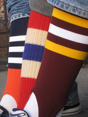
• Scott Turner wore an umpire’s shirt with really cool patches on the chest and sleeve. Underneath that he had a super-cool German soccer jersey.
• I first met Terence Kearns a week ago at the Brooklyn Beefsteak, where he dressed very appropriately. This time around he was wearing a Sydney FC jersey. My bad for not getting a better photo of him (that’s Scott Turner’s hand making a cameo), esp. since Terence was truly the life of the party — lots of good chatter, good stories, and good cheer. He has a doozy of a membership card design idea, too. Here’s to you, buddy.
• Here’s David Vines, a mere high school lad. His family is from St. Louis, which is what his T-shirt is referring to.
• Kenny Jacobson wore a hockey jersey from a European barnstorming team he used to play on (and also took the photo at the top of this page — in fact, he’s a professional sports photographer).
• I was mildly obsessed with the odd collar on bench coach L.I. Phil‘s 2007 Chivas Guadalajara jersey. And hey, see that hole near the end of the sleeve? That’s so you can do this!
• My pal Carrie Klein was recently going through some stuff in her mom’s storage locker and came up with this 1984 Celtics jersey, which she hadn’t seen since high school. As you can see, the back design was definitely a product of its era.
• Carrie brought her buddy Kevin Haley, guitarist in the Bon Savants.
• What would a Uni Watch party be without a new DIY hoodie from Matt Powers? This one featured sleeve patches from variouis eras, along with a questionable NOB and a massive uni number. Say what you want, but Powers actually makes these things himself while the rest of us just gab, and I say good for him. Oh, and he was very excited to see this sign across the street from the party venue.
• Jeff Cohen just moved to NYC a few weeks ago. Can you guess which town he left behind? Looks like he hasn’t quite let go yet.
• Confession: I’d forgotten all about this shirt design (created by former intern Nina Dubin) until Brad Eckensberger showed up wearing it. And look, SOB — that’s slogan on back. (Want to get this shirt for yourself? Look here.)
• Toward the end of the party, I glanced over to a nearby table and noticed some guy who had nothing to do with our group wearing this amazing jacket. “CMYK,” of course, stands for the four color of process printing — cyan, magenta, yellow, and black. The little numbers next to each letter represent the percentage of each color needed to create the green color of the jacket — pretty damn clever. Turns out the jacket was made by a company specializing in design-related apparel.
All in all, a swell day, which made for a happy editor. My thanks to all who attended, and especially to Ed Westfield Jr., who took lots of photos.
Holiday Reminder: I’m about to start working on my annual Uni Watch Holiday Gift Guide column for ESPN. So if you have suggestions for cool uni-related gift ideas, I’m all ears.
Annoying Tech Reminder #1: If you’re so inclined, you can now follow Uni Watch on the Twitter and on the Facebook. If you’re not so inclined, that’s fine too.
Annoying Tech Reminder #2: If you use Firefox or Internet Explorer, webmaster Johnny Ek and I would greatly appreciate it if you could take a sec and add the Alexa add-on to your browser, which will help us crunch some site-traffic numbers (plus you’ll get access to cool analytics for every site you visit). It only takes a few minutes and would really help us out. If you’re willing, the Firefox add-on is here and the IE add-on is here. After downloading them, you’ll need to fill out a very short registration form (age, gender, etc.). Can do?

And as long as I’m bugging you to do stuff”¦: Wouldn’t it be nice if you nominated Uni Watch as “Best Sports Blog”? Yes, it would. You can do that by going to this comment and clicking on the little green plus sign. Thanks.
Uni Watch News Ticker: The Twins will unveil their new uni set today at 1pm eastern. ”¦ Look at Joey Mullen in a neck-roll thingie, circa 1991 (with thanks to Zak McGinniss). ”¦ Like I’ve been saying all along, the Bengals’ helmet is very problematic (with thanks to Matt Shevin). ”¦ Here’s what the U.S. hockey team will be wearing at the Vancouver Olympics. ”¦ One side of the “Don’t give your designs away for free” argument is neatly summarized by this poster (thanks, Kirsten). ”¦ Also from Kirsten: Check out these amazing Chinese public health posters. ”¦ Last item on this page notes that University of Alaska Anchorage goalie Bryce Christianson forgot his practice jerseys and game jerseys for a series against Wisconsin and ended up practicing in an inside-out Wisco jersey (with thanks to Nathan Fiala). ”¦ RPI hockey recently held its “Black Friday” game. “It’s an annual thing they do to celebrate the first home ECAC league game at the Fieldhouse, and they raffle off the jerseys at the end of the game,” explains Jared Sharpe. ”¦ In a related item, Louisville Trinity High, a Catholic school in Kentucky that normally wears green and white, celebrated Friday the 13th and the school’s 666th game with blackout uniforms, which just proves that solid-black unis are the mark of the beast, or something like that. ”¦ New kit for the Philadelphia Union. ”¦ Check out this awesome shot of the 1930 Bolivian World Cup team — love it (thanks, Coachie Ballgames). ”¦ David Murphy‘s son is my kind of ballplayer. ”¦ Lots of photos of TCU’s riflery uniforms in action here, and Virginia Tech’s here. The Hokies, of course, were playing against the U.S. military Maryland. ”¦ Remember the Colorado Caribous, who won Phil’s worst-uni poll yesterday? Rob Bryant found an awesome team portrait of them. ”¦ Browns vs. Browns? Nope, that’s two high school teams, the Heath Bulldogs and the Ironton Tigers — both from Ohio, natch. Lots of additional photos here. ”¦ AirTran has created team-themed jets honoring the Colts, Falcons, and Ravens. ” Ironically, no Jets jet,” notes Dave Montgomery. ”¦ All of this season’s U. of Arizona hoops players were recently asked the same set of questions by the Arizona Star. Among the questions: “Who has the best uniform in basketball?” Some of the responses are interesting. Look here (with thanks to Orlando Rodriquez). ”¦ Bernard Scott had his belt undone yesterday (good spot by Steven Wyder). ”¦ The Avs’ new blue alts made their on-ice debut on Saturday. Lots of pics here and here. ”¦ Nice. ”¦ Even nicer. ”¦ Not so nice at all. ”¦ What did Jamaal Charles have in his sock during pregame warm-ups yesterday. ”¦ Here’s an interesting question: Is this guy the heaviest No. 11 currently playing college football? The heaviest No. 11 ever? (As pointed out by Matt Mitchell.) ”¦ Interesting look at where logos fall on the color spectrum (with thanks to Chad Todd). ”¦ New volleyball uniforms for the Japanese team in the Grand Champions Cup (with thanks to Jeremy Brahm). ”¦ Also from Jeremy: Instead of NOB, how about NOS, for name on side? That’s Perugia Volley, a volleyball team in Italy’s Serie A Volleyball League. ”¦ Benn Wineka, the man behind the Roy Williams Tie Tracker, has put together a list of the UNC hoops team’s sneaker choices. ”¦ Here’s a new one: The Missouri Mavericks (CHL) will be wearing Harry Truman jerseys on November 27th. Proceeds from the subsequent jersey auction will benefit the Truman Heritage Library. Give ’em hell, Mavs (with thanks to Jared Speckman). ”¦ Big collision in Saturday’s Georgia/Auburn game resulted in at least one of Bacarri Rambo’s interior helmet pads being knocked clean out of the shell — you can see one of them airborne here and landing next to him here (big thanks to Brent Hardman). ”¦ Also from Brent: Georgia wore a baseball-themed helmet decal for UGA baseball player Chance Veasey, who was seriously injured in a scooter accident on campus a couple of weeks ago. “Kinda wierd to see a baseball logo on a football helmet,” Can you think of any other cross-sport memorial/honor decals or patches like this?” The most famous example, of course, is the “9” that the Expos wore in memory of Rocket Richard in 2000. I know there are other examples, but my memory banks are failing me at the moment. Anyone..? ”¦ Speaking of the Expos, while looking for something else I came across their 1969 yearbook cover — niiiiice. ”¦ Still more Expos arcana: What’s up with that rear helmet decal? Photo is from 1969, showing the first homer ever hit at Jarry Park. ”¦ Looks like some of the Colts have gone to that same super-stretchy seamless jersey that the Jints and Jags have been using. Further evidence here (screen shot courtesy of Jackson Bungart).
MICHAEL VICK HAS A SMALLER SLEEVE LOGO
Did anyone else notice that the Eagle head logo on Vick’s sleeves were substantially smaller than those on the other jerseys?
Anybody have a screencap/photo?
Paul, can you find out why there was this inconsistency?
My best guess is that Jamaal Charles had is mouth piece tucked in his sock. It kind of has that sort of shape.
I’m guessing (and that is all it is) that the Analog hat comes from Analog clothing (link) … again, just a guess.
Anyone know what the additional line of text is on Donovan McNabb’s helmet, just above the warning decal?
You can see it here, photo 17 in the gallery…
link
“Also from Kirsten: Check out these amazing Chinese public health posters“
no condom posters?
[quote comment=”360708″]“Also from Kirsten: Check out these amazing link“
no condom posters?[/quote]
or MSG?
When you talk about the term “pro” think of the guy who posed for the poster “Cholera, 1951” (also a great name for a band).
Rocket Richard passed away in 2000, not 1990.
This is for Dan Martell:
Didn’t look at the site over the weekend, but I have to say I LOVE your tweak of the Giants uniform. I like the current helmet and pants, but the jersey is too plain, boring, and off colored looking. Your tweak, IMO, instantly makes the Giants a Top 5 uni. Kudos from me!
In the story with the US Hockey jerseys, it said we had to change our design because the flag was on the old jerseys and the IOC doesn’t like that. How does Canada get to keep the leaf on their jersey?
That thing in Jamaal Charles’ sock looks like his mouthguard. Why you would stick something in your sock that will ultimately end up in your mouth is beyond me.
[quote comment=”360705″]My best guess is that Jamaal Charles had is mouth piece tucked in his sock. It kind of has that sort of shape.[/quote]
I would agree with that.
[quote comment=”360707″]Anyone know what the additional line of text is on Donovan McNabb’s helmet, just above the warning decal?
You can see it here, photo 17 in the gallery…
link
They talked about it a few games back, but it had to do with when Mike Vick is also in and they could not have both players with the radio transistor helmet inside.
[quote comment=”360707″]Anyone know what the additional line of text is on Donovan McNabb’s helmet, just above the warning decal?
You can see it here, photo 17 in the gallery…
link
here
paul wrote about it in a recent MMUW
[quote comment=”360714″]In the story with the US Hockey jerseys, it said we had to change our design because the flag was on the old jerseys and the IOC doesn’t like that. How does Canada get to keep the leaf on their jersey?[/quote]
Canada had to change their logo too. They can’t use the Maple Leaf Logo with the skater in it.
Oregon Ducktracker update! Looking at the Ducktracker yesterday, I just didn’t feel I captured what they really looked like this past Sat. night. Thus, I revised it a tad:
link
link
I noticed the stretchy colts jerseys on defense and it makes the “shoulder loops” look even worse. Like top shoulder stripes really, don’t go down on the jersey at all. Hopefully they fix that so the jerseys look better.
[quote comment=”360712″]Rocket Richard passed away in 2000, not 1990.[/quote]
Sorry, brain cramp. Now fixed.
[quote comment=”360721″]Oregon Ducktracker update! Looking at the Ducktracker yesterday, I just didn’t feel I captured what they really looked like this past Sat. night. Thus, I revised it a tad:
link
link[/quote]
Great job. I would imagine the Ducks will retire the white jersey/white pants set considering they are 0-2 in those.
[quote comment=”360720″][quote comment=”360714″]In the story with the US Hockey jerseys, it said we had to change our design because the flag was on the old jerseys and the IOC doesn’t like that. How does Canada get to keep the leaf on their jersey?[/quote]
Canada had to change their logo too. They can’t use the Maple Leaf Logo with the skater in it.[/quote]
Yeah, but link
[quote comment=”360722″]I noticed the stretchy colts jerseys on defense and it makes the “shoulder loops” look even worse. Like top shoulder stripes really, don’t go down on the jersey at all. Hopefully they fix that so the jerseys look better.[/quote]
Can we just start calling them “Shoulder Straps”. This is essentially what they’ve become…
link
[quote comment=”360724″][quote comment=”360721″]Oregon Ducktracker update! Looking at the Ducktracker yesterday, I just didn’t feel I captured what they really looked like this past Sat. night. Thus, I revised it a tad:
link
link[/quote]
Great job. I would imagine the Ducks will retire the white jersey/white pants set considering they are 0-2 in those.[/quote]
Ninja Duck Assassin, kinda catchy.
Hopefully, the white jersey/white pants isn’t penciled in on Casey Martin’s uniform calendar? Might need to revise it, if that’s the case.
[quote comment=”360714″]In the story with the US Hockey jerseys, it said we had to change our design because the flag was on the old jerseys and the IOC doesn’t like that. How does Canada get to keep the leaf on their jersey?[/quote]
As I understand it, only official Olympic Committee logos can be used and not “sport-specific federation” logos. So it’s just a maple leaf, not the Hockey Canada logo.
Stretchy-unis: Do manufacturers perform ‘live’ tests or demos of new uniform materials before they actually mass produce them? Or do they just go forth and multiply? Hell, even the DIYers’ uni projects look better.
Seeing how the kid with the Bengal-striped haircut is in HAMILTON (Ohio), attending GARFIELD Middle School, I think all students there should be required to have “cat” haircuts!
first off, what a great group of people at the party! powers, thanks for chauffeuring me around all weekend!
“Meant to ask him about that “Analog cap but never got around to it”
i think that was a company that was owned by burton snowboarding back in the day (if anyone can verify this?). anyway, it has a decepticon logo on the front, and it’s “flexfit” so i had to have it as i am a huge transformers fan. but i found that hat at a willy’s ski shop here in pittsburgh YEARS ago. (like, 8-10 years ago). by far my favorite hat! plus, i didn’t want to wear my pirates hat because a) i didn’t know what gang i’d be representing (kidding… sort of), and b) it’s a curved bill low-pro with the plastic cut out… didn’t want powers to burn it or feed it to his dogs!
paul and friends, great time at the party!!! i wish i could have stayed longer, but it was awesome to meet and talk to such fun people!
also, phil had his “i’m calling it shea” shirt on
thanks again guys!
[quote comment=”360728″][quote comment=”360714″]In the story with the US Hockey jerseys, it said we had to change our design because the flag was on the old jerseys and the IOC doesn’t like that. How does Canada get to keep the leaf on their jersey?[/quote]
As I understand it, only official Olympic Committee logos can be used and not “sport-specific federation” logos. So it’s just a maple leaf, not the Hockey Canada logo.[/quote]
This is correct. The wavy flag thingy is the US Hockey Federation logo, and the leaf with skater is Hockey Canada’s logo.
This boiled up during the last summer Olympics when a lot of soccer federations went logo-less/badgeless.
I was watching the Ohio State-Michigan game from 1981. Among the buckeye stickers on OSU’s helmets was a single Georgia/Green Bay/Grambling style “G” decal. It appeared to be a black G outlined in yellow. Anyone know anything about this?
Not only a new kit for the Philadelphia Union– a new team for the Philadelphia Union! The Union is the first of three MLS expansion teams to come between now and the 2011 season, the other two teams hosted by Portland and Vancouver. They’re so new that they link.
Hmmmm…. where have I seen that Caribous team photo link?
Supreme Court declines to take Redskins’ naming case; Native American activists had claimed that team’s nickname is so offensive that it does not deserve trademark protection.
Re.The back of the 1969 Expos helmet.
I am guessing that it is just very thick
white tape with the player’s number written in
black marker.
The Colts have been sporting the stretchy unis all season, with Robert Mathis tending to look particularly ridiculous. The major thing I’ve notice is that, on some players’ jerseys, the sleeves are stitched in such a way that the two white stripes come together at their end point — which looks entirely ridiculous, imo.
Ugh, yeah. The Colts look terrible with those super-stretchy uniforms. Cool to see the accent on Pierre Garçon’s name plate, though!
[quote comment=”360738″]Supreme Court declines to take Redskins’ naming case; Native American activists had claimed that team’s nickname is so offensive that it does not deserve trademark protection.[/quote]
Well, guess it’s up to the next owner to change the name. That’s the most likely circumstance. As discussed here before, Daniel Snyder’s in a lose-lose if he were to change the name now. He either would appear to have succumbed to pressure, or look like an insensitive dolt for not changing it long ago.
What’s he gonna do, claim an “epiphany” of sorts?
Hardly. Would be a pretty expensive revelation, completely rebranding a team, that is.
New owners, though, might just consider it part of the process.
May I offer this thought, though. Having worked in and around Native American Gaming from the late 80s until 2004 or so, I know a few tribes, or a consortium of a few, that could afford to buy the Redskins in a heartbeat. If it’s that big a deal, they could buy the team and change the name.
Although “Washington Kikes” probably wouldn’t go over all that well, either.
It’s a joke! It’s a joke! Lighten up.
—Ricko
[quote comment=”360727″][quote comment=”360724″][quote comment=”360721″]Oregon Ducktracker update! Looking at the Ducktracker yesterday, I just didn’t feel I captured what they really looked like this past Sat. night. Thus, I revised it a tad:
link
link[/quote]
Great job. I would imagine the Ducks will retire the white jersey/white pants set considering they are 0-2 in those.[/quote]
Ninja Duck Assassin, kinda catchy.
Hopefully, the white jersey/white pants isn’t penciled in on Casey Martin’s uniform calendar? Might need to revise it, if that’s the case.[/quote]
As I said yesterday, if anyone is going to do BFBS, and done extremely well, it is going to be the Ducks.
Re: TCU’s pro combat unis: As ridiculous as the majority of these uniforms are, I really like TCU’s version. The “lizard skin” pattern on the helmets and pants, the “blood” stripes meant to represent a real horned frog’s reaction when cornered, the way the violet and grey “lizard” look mix together…if you took the swooshes off the uniform, it could be considered classic-cool for the mascot-specific touches.
[quote comment=”360741″]Ugh, yeah. The Colts look terrible with those super-stretchy uniforms. Cool to see the accent on Pierre Garçon’s name plate, though![/quote]
Mathis’ stripes, that’s a stretch by the way, were barely existant:
link
[quote comment=”360745″][quote comment=”360741″]Ugh, yeah. The Colts look terrible with those super-stretchy uniforms. Cool to see the accent on Pierre Garçon’s name plate, though![/quote]
Mathis’ stripes, that’s a stretch by the way, were barely existant:
link
Loops? Loops are old hat, passe. What looks MUCH better are “forward-facing whacked-off shoulder stripes”. Besides, computers just aren’t smart enough to figure out how to make a pattern for the Colts’ recognizable, storied jersey.
Riiiiiiiiiiiiiiiight.
Where’s my shovel? Getting deep in here.
—Ricko
[quote comment=”360745″][quote comment=”360741″]Ugh, yeah. The Colts look terrible with those super-stretchy uniforms. Cool to see the accent on Pierre Garçon’s name plate, though![/quote]
Mathis’ stripes, that’s a stretch by the way, were barely existant:
link
yup, we discussed it late last night
mathis’ has almost FLAT (when the jersey is pulled tight, they appear to stop just under the where his chin ends) stripes
the other repeat offender is dwight freeney, who loves it when the truncated stripes form a point…
The Colts’ stretchy jerseys looked even more ridiculous because half the defense was still wearing the traditional ones. The two of them mixed-and-matched looked very, very silly.
What amazes me is that the players haven’t figured out that all this “pinching” of striping, et al, up the shoulders toward the neck makes them look like narrow-shouldered ninnies.
Yeah, that’s the super hero look, alright, weak shoulders and love handles.
Unless, of course, you think Tom Arnold is a superhero. In that case, it’s right on the mark.
—Ricko
just wanted to see if terence kearns could tell me where the “NY” hat is from?
[quote comment=”360721″]Oregon Ducktracker update! Looking at the Ducktracker yesterday, I just didn’t feel I captured what they really looked like this past Sat. night. Thus, I revised it a tad:
link
link[/quote]
Well done, you nailed it. See now that is how a team does a black out. Ninja Duck! link
The thing I hate the most about the stretchy unis is that it totally messes with the names on some of the players. Super arched looking, and not in a good way. Clint Session, I’m looking at you, here. That annoyed me so much last night.
[quote comment=”360750″]just wanted to see if terence kearns could tell me where the “NY” hat is from?[/quote]
It is a Mel Ott era New York Giants cap.
You can pick them up at Mickey’s Place:
link
That Caribous team snapshot is indeed missing someone: Napoleon Dynamite’s Uncle Rico. He would slot in nicely amongst the ‘lads’ here.
[quote comment=”360753″][quote comment=”360750″]just wanted to see if terence kearns could tell me where the “NY” hat is from?[/quote]
It is a Mel Ott era New York Giants cap.
You can pick them up at Mickey’s Place:
link
Check this pic out:
link
Here are some more Giants caps:
link
[quote comment=”360750″]just wanted to see if terence kearns could tell me where the “NY” hat is from?[/quote]
Until Terence replies, try browsing around “Cooperstown Collection” (click banner ad at UW, upper right). I’ve bought a number of hats there over the years. No complaints.
Could be very early NY Giants, for one.
—Ricko
[quote comment=”360756″][quote comment=”360750″]just wanted to see if terence kearns could tell me where the “NY” hat is from?[/quote]
Until Terence replies, try browsing around “Cooperstown Collection” (click banner ad at UW, upper right). I’ve bought a number of hats there over the years. No complaints.
Could be very early NY Giants, for one.
—Ricko[/quote]
Ah, forgot about Mickey’s. Another good choice.
[quote comment=”360750″]just wanted to see if terence kearns could tell me where the “NY” hat is from?[/quote]
it’s a new york giants cap worn from 1940-46
(and i must say, [doing best johnny carson] “i did not know that”, but he told us at the gathering that’s the style)
the date on the cooperstown collection is wrong…(says 1948), but by 48 the giants had gone back to black (or VERY dark blue)…the 40-46 (unless okkonen is wrong) is when the giants were wearing red and blue, not black and orange
The Reebok logos on some of the Panthers were moved to a weird spot b/c there wasn’t enough room to place it above the Panthers logo. Look at pic #4, and the difference b/w Jordan Gross and Muhsin Muhammed.
link
[quote comment=”360754″]That Caribous team snapshot is indeed missing someone: Napoleon Dynamite’s Uncle Rico. He would slot in nicely amongst the ‘lads’ here.[/quote]
Memory has it that Rico was more of an american football player:
link
Another cross-sport tribute:
2007, when the Red Sox wore green jerseys and caps in memory of Red Auerbach who had passed away recently.
link
[quote comment=”360760″]The Reebok logos on some of the Panthers were moved to a weird spot b/c there wasn’t enough room to place it above the Panthers logo. Look at pic #4, and the difference b/w Jordan Gross and Muhsin Muhammed.
link
Looks like Deangelo Williams is losing his I-Pod.
It sounds like we have a new uni-mystery to solve with the Giants cap.
On a different note:
Last night, Ricko posted a humorous photo of Paul Hornung playing against Iowa.
Who is this a pic of and what school is this?
link
[quote comment=”360761″][quote comment=”360754″]That Caribous team snapshot is indeed missing someone: Napoleon Dynamite’s Uncle Rico. He would slot in nicely amongst the ‘lads’ here.[/quote]
Memory has it that Rico was more of an american football player:
link
Yes, that’s understood. I referred to Rico’s coiff/facial hair thing— you can see where I was going, right?
[quote comment=”360764″]It sounds like we have a new uni-mystery to solve with the Giants cap.
On a different note:
Last night, Ricko posted a humorous photo of Paul Hornung playing against Iowa.
Who is this a pic of and what school is this?
link
Or is it the steelers?
Good article link on anachronistic font appearances, and similar obsessions about fonts.
And that collision involving Georgia’s Bacarri Rambo knocked him out too. I just looked for an update, and thankfully he just had a concussion. The helmet did its job and mostly absorbed that rough impact, but it was still unsettling.
[quote comment=”360764″]It sounds like we have a new uni-mystery to solve with the Giants cap.
On a different note:
Last night, Ricko posted a humorous photo of Paul Hornung playing against Iowa.
Who is this a pic of and what school is this?
link
That’s Crazy Bobby Lane as a Pittsburgh Steeler
[quote comment=”360767″]Good article link on anachronistic font appearances, and similar obsessions about fonts.
And that collision involving Georgia’s Bacarri Rambo knocked him out too. I just looked for an update, and thankfully he just had a concussion. The helmet did its job and mostly absorbed that rough impact, but it was still unsettling.[/quote]
Very good read!
[quote comment=”360751″][quote comment=”360721″]Oregon Ducktracker update! Looking at the Ducktracker yesterday, I just didn’t feel I captured what they really looked like this past Sat. night. Thus, I revised it a tad:
link
link[/quote]
Well done, you nailed it. See now that is how a team does a black out. Ninja Duck! link
*lol* Finally, a rubber ducky that I can relate to.
[quote comment=”360759″]the date on the cooperstown collection is wrong…(says 1948), but by 48 the giants had gone back to black (or VERY dark blue)…the 40-46 (unless okkonen is wrong) is when the giants were wearing red and blue, not black and orange[/quote]
Didn’t check Cooperstown Collection before referencing them, just knew of them. Knew that was a ’40s Giants cap, and thought CC was where I’d seen it.
And yes, Giants wore royal and white with red, supposedly to express patriotism, during WWII. In years after war was the black and orange they still wear.
—Ricko
[quote comment=”360768″][quote comment=”360764″]It sounds like we have a new uni-mystery to solve with the Giants cap.
On a different note:
Last night, Ricko posted a humorous photo of Paul Hornung playing against Iowa.
Who is this a pic of and what school is this?
link
That’s Crazy Bobby Lane as a Pittsburgh Steeler[/quote]
Cool, look at this great pic of the Steelers and Giants:
link
[quote comment=”360768″][quote comment=”360764″]It sounds like we have a new uni-mystery to solve with the Giants cap.
On a different note:
Last night, Ricko posted a humorous photo of Paul Hornung playing against Iowa.
Who is this a pic of and what school is this?
link
That’s Crazy Bobby Lane as a Pittsburgh Steeler[/quote]
What a coincidence! There’s an article about someone of the same name headlined in the upper right.
[quote comment=”360768″][quote comment=”360764″]It sounds like we have a new uni-mystery to solve with the Giants cap.
On a different note:
Last night, Ricko posted a humorous photo of Paul Hornung playing against Iowa.
Who is this a pic of and what school is this?
link
That’s Crazy Bobby Lane as a Pittsburgh Steeler[/quote]
probably taken soon after: “Lions would “not win for 50 years,”…” lol
[quote comment=”360768″][quote comment=”360764″]It sounds like we have a new uni-mystery to solve with the Giants cap.
On a different note:
Last night, Ricko posted a humorous photo of Paul Hornung playing against Iowa.
Who is this a pic of and what school is this?
link
That’s Crazy Bobby Lane as a Pittsburgh Steeler[/quote]
“Ah ain’t DRUNK, ah’m from TEXAS!”
—Bobby Layne to cop who pulled him over and thought the QB was slurring his words.
—Ricko
For the Harry Truman tribute they can use the slogan “The Puck Stops Here”
[quote comment=”360772″][quote comment=”360768″][quote comment=”360764″]It sounds like we have a new uni-mystery to solve with the Giants cap.
On a different note:
Last night, Ricko posted a humorous photo of Paul Hornung playing against Iowa.
Who is this a pic of and what school is this?
link
That’s Crazy Bobby Lane as a Pittsburgh Steeler[/quote]
Cool, look at this great pic of the Steelers and Giants:
link
What year is that from? i see the DL has the ny on the helmet — post ’60 I assume.
[quote comment=”360776″]For the Harry Truman tribute they can use the slogan “The Puck Stops Here”[/quote]
Supposedly, during Truman’s first run for pubic office in Missouri someone booked him to speak at a group of citizens. Turned out to be a Klan meeting.
Well, ol’ “Give ’em Hell Harry” went ahead and spoke anyway. Said, “I don’t know who organized the Klan, but it must have been a Jew…because only a Jew could sell you a two-dollar bedsheet for twenty dollars.”
I think we can safely say Harry didn’t care much about courting their vote.
—Ricko
[quote comment=”360777″][quote comment=”360772″][quote comment=”360768″][quote comment=”360764″]It sounds like we have a new uni-mystery to solve with the Giants cap.
On a different note:
Last night, Ricko posted a humorous photo of Paul Hornung playing against Iowa.
Who is this a pic of and what school is this?
link
That’s Crazy Bobby Lane as a Pittsburgh Steeler[/quote]
Cool, look at this great pic of the Steelers and Giants:
link
What year is that from? i see the DL has the ny on the helmet — post ’60 I assume.[/quote]
1962, most likely.
Long story on Steelers unis of that era here (from Super Bowl Sunday, I believe)…
link
Scroll down a ways.
—Ricko
FYI pertaining to Seahawks uniforms.
Phil hooked me up with some nice uniform concepts, including the retro hip matte gray pants. I’ve got a link at Greenglare now. Thanks again Phil.
link
[quote comment=”360743″][quote comment=”360727″][quote comment=”360724″][quote comment=”360721″]Oregon Ducktracker update! Looking at the Ducktracker yesterday, I just didn’t feel I captured what they really looked like this past Sat. night. Thus, I revised it a tad:
link
link[/quote]
Great job. I would imagine the Ducks will retire the white jersey/white pants set considering they are 0-2 in those.[/quote]
Ninja Duck Assassin, kinda catchy.
Hopefully, the white jersey/white pants isn’t penciled in on Casey Martin’s uniform calendar? Might need to revise it, if that’s the case.[/quote]
As I said yesterday, if anyone is going to do BFBS, and done extremely well, it is going to be the Ducks.[/quote]
Now, let’s examine this whole notion of even attempting to make a duck scary in the first place, shall we?
link
[quote comment=”360774″]probably taken soon after: “Lions would “not win for 50 years,”…” lol[/quote]
nice pull ry!
in case anyone is wondering what the hell the quote is about…it’s the (sorry, wiki seems the most concise here) “curse of bobby layne”
Meat pies? There were meat pies? Oh man, wish I could have been there yesterday.
And Phil, I always knew you were a closet soccer fan. Nice Bimbo jersey. So are those considered stirrup sleeves?
Has the site (or Skiba) given a technical description beyond “super stretchy” with the Jints and Colts new uniforms? Are they produced somewhere on the net commercially so that we could read about them more in depth?
Thanks in advance.
[quote comment=”360770″][quote comment=”360751″][quote comment=”360721″]Oregon Ducktracker update! Looking at the Ducktracker yesterday, I just didn’t feel I captured what they really looked like this past Sat. night. Thus, I revised it a tad:
link
link[/quote]
Well done, you nailed it. See now that is how a team does a black out. Ninja Duck! link
*lol* Finally, a rubber ducky that I can relate to.[/quote]
I believe that would Rafael of the Teenage Mutant Ninja Rubber Duckies.
He’s the one in the red mask, correct?
—Ricko
[quote comment=”360782″][quote comment=”360774″]probably taken soon after: “Lions would “not win for 50 years,”…” lol[/quote]
nice pull ry!
in case anyone is wondering what the hell the quote is about…it’s the (sorry, wiki seems the most concise here) link[/quote]
The curse is pretty amazing. Check the Humiliations page:
link
[quote comment=”360705″]My best guess is that Jamaal Charles had is mouth piece tucked in his sock. It kind of has that sort of shape.[/quote]
Yeah, I think Doug Flutie used to do that, so that was my first guess.
[quote comment=”360787″][quote comment=”360705″]My best guess is that Jamaal Charles had is mouth piece tucked in his sock. It kind of has that sort of shape.[/quote]
Yeah, I think Doug Flutie used to do that, so that was my first guess.[/quote]
Hard to see here, but check Flutie’s left sock…
link
—Ricko
[quote comment=”360788″][quote comment=”360787″][quote comment=”360705″]My best guess is that Jamaal Charles had is mouth piece tucked in his sock. It kind of has that sort of shape.[/quote]
Yeah, I think Doug Flutie used to do that, so that was my first guess.[/quote]
Hard to see here, but check Flutie’s left sock…
link
—Ricko[/quote]
That’s not an “Is it?”, btw.
That’s an “It is.”
Remember that cover well, and there’s clearly a mouth guard in his sock. That’s just the largest scan I could find online.
—Ricko
[quote comment=”360789″][quote comment=”360788″][quote comment=”360787″][quote comment=”360705″]My best guess is that Jamaal Charles had is mouth piece tucked in his sock. It kind of has that sort of shape.[/quote]
Yeah, I think Doug Flutie used to do that, so that was my first guess.[/quote]
Hard to see here, but check Flutie’s left sock…
link
—Ricko[/quote]
That’s not an “Is it?”, btw.
That’s an “It is.”
Remember that cover well, and there’s clearly a mouth guard in his sock. That’s just the largest scan I could find online.
—Ricko[/quote]
Not only that, a few issues later SI confirmed it and had a closeup photo as well. That was the one year I had an SI subscription, and I can remember that photo to this day.
Given that the US Supreme Court has chosen to ignore the Washington Redskins, does anyone haver any suggestions for a more appropriate team name, logo, and uniform modifications?
link
and twinsbaseball.com
[quote comment=”360790″][quote comment=”360789″][quote comment=”360788″][quote comment=”360787″][quote comment=”360705″]My best guess is that Jamaal Charles had is mouth piece tucked in his sock. It kind of has that sort of shape.[/quote]
Yeah, I think Doug Flutie used to do that, so that was my first guess.[/quote]
Hard to see here, but check Flutie’s left sock…
link
—Ricko[/quote]
That’s not an “Is it?”, btw.
That’s an “It is.”
Remember that cover well, and there’s clearly a mouth guard in his sock. That’s just the largest scan I could find online.
—Ricko[/quote]
Not only that, a few issues later SI confirmed it and had a closeup photo as well. That was the one year I had an SI subscription, and I can remember that photo to this day.[/quote]
Or it may have been the same issue – I just know they made a note of it somewhere.
[quote comment=”360792″]http://minnesota.twins.mlb.com/news/press_releases/press_release.jsp?ymd=20091116&content_id=7671650&vkey=pr_min&fext=.jsp&c_id=min
and twinsbaseball.com[/quote]
forgot to say Twins new unis
my anti spam word was toast…. twice in a row
[quote comment=”360791″]Given that the US Supreme Court has chosen to ignore the Washington Redskins, does anyone haver any suggestions for a more appropriate team name, logo, and uniform modifications?[/quote]
Deadskins?
Minnesota Twins
Home : link
Road: link
Alternate New: link
Alternate Blue: link
Alternate Vest: link
[quote comment=”360794″][quote comment=”360792″]http://minnesota.twins.mlb.com/news/press_releases/press_release.jsp?ymd=20091116&content_id=7671650&vkey=pr_min&fext=.jsp&c_id=min
and twinsbaseball.com[/quote]
forgot to say Twins new unis
my anti spam word was toast…. twice in a row[/quote]
Script ‘Minnesota’ on plain gray with slight piping… So simple… I like it…
Twins’ new roadies look very Nationals-ish. I’m lukewarm on the homes. Kinda wish they’d have just blown it all up and started over. Also, no mention of cap logos? TC or M…?
[quote comment=”360791″]Given that the US Supreme Court has chosen to ignore the Washington Redskins, does anyone haver any suggestions for a more appropriate team name, logo, and uniform modifications?[/quote]
Without getting into a certain discussion again, the most obvious one would be calling them the Warriors and using the spear logo.
I’ve also had the idea to drop Washington from the name and call them the DC Dragons. I don’t know why, but I just like the sound of it and you could probably keep the same general color scheme.
Thanks to the Twins for getting rid of the pinstripes on the road unis. I think only the Rockies are left…
[quote comment=”360798″]Twins’ new roadies look very Nationals-ish. I’m lukewarm on the homes. Kinda wish they’d have just blown it all up and started over. Also, no mention of cap logos? TC or M…?[/quote]
I was thinking that,
link
link
But I like both of them.
Twins:
Home, eh; road, good; alt, fabulous; blue, awful; vest, awful.
[quote comment=”360799″][quote comment=”360791″]Given that the US Supreme Court has chosen to ignore the Washington Redskins, does anyone haver any suggestions for a more appropriate team name, logo, and uniform modifications?[/quote]
Without getting into a certain discussion again, the most obvious one would be calling them the Warriors and using the spear logo.
I’ve also had the idea to drop Washington from the name and call them the DC Dragons. I don’t know why, but I just like the sound of it and you could probably keep the same general color scheme.[/quote]
I don’t know, DC Dragons just has a soccer team feel to me.
[quote comment=”360798″]Twins’ new roadies look very Nationals-ish. I’m lukewarm on the homes. Kinda wish they’d have just blown it all up and started over. Also, no mention of cap logos? TC or M…?[/quote]
they’ll have 3 caps
one tc (all blue), one m (all blue) and the road cap will be tc, blue crown with red brim
now they’ll be able to play more mix and match than the mets
love the gray roadies without pins…script minnesota is nice, but not spectacular
Better Twins Uniforms Representation:
link
[quote comment=”360804″][quote comment=”360798″]Twins’ new roadies look very Nationals-ish. I’m lukewarm on the homes. Kinda wish they’d have just blown it all up and started over. Also, no mention of cap logos? TC or M…?[/quote]
they’ll have 3 caps
one tc (all blue), one m (all blue) and the road cap will be tc, blue crown with red brim
now they’ll be able to play more mix and match than the mets
love the gray roadies without pins…script minnesota is nice, but not spectacular[/quote]
The underlining of only “win” on the home jersey makes sense, but why only underline “innesot” on the roadie?
Other than that, it’s a nice jersey. I like the sleeve and collar piping.
[quote comment=”360799″][quote comment=”360791″]Given that the US Supreme Court has chosen to ignore the Washington Redskins, does anyone haver any suggestions for a more appropriate team name, logo, and uniform modifications?[/quote]
Without getting into a certain discussion again, the most obvious one would be calling them the Warriors and using the spear logo.
I’ve also had the idea to drop Washington from the name and call them the DC Dragons. I don’t know why, but I just like the sound of it and you could probably keep the same general color scheme.[/quote]
Eventually there will be a pro sports team with the name Dragons. I know the Arena League had the NY Dragons, but since they’re gone someone else will use the name. Not long ago Paul linked to a history of NBA names, and Dragons was a finalist with quite a few teams.
Not saying I approve or disapprove, just saying it’s likely to happen.
[quote comment=”360798″]Twins’ new roadies look very Nationals-ish. I’m lukewarm on the homes. Kinda wish they’d have just blown it all up and started over. Also, no mention of cap logos? TC or M…?[/quote]
Don’t the Nationals actually look very Senators/Twins-ish?
[quote comment=”360802″]Twins:
Home, eh; road, good; alt, fabulous; blue, awful; vest, awful.[/quote]
Well, I figure the homes deserve to be seen in the sunshine during the regular season, having been worn only in the Dome.
Road, way, WAY too much like the Nationals. Or the Indian Just bad. Well, figures. Near as I can tell the Twins organization is close to sound asleep about this whole uniform business anyway. Don’t seem to even notice what other teams wear. And calling that the logo from the ’60s jackets is a bit of stretch. It’s just script. Big whoop.
Home alt. Okay, that’s excellent.
Alt Navy. Whatcha gonna do. Alts are here to stay.
Vest? Frickin’ things. Thought they’d had the brains to do away with them. No innate design sense with that front office at all. Hard to explain how the new home alts ever came to be.
One of those flukes, I guess. An infinite number of monkeys and and an infinite number of typewriters…
—Ricko
[quote comment=”360807″][quote comment=”360799″][quote comment=”360791″]Given that the US Supreme Court has chosen to ignore the Washington Redskins, does anyone haver any suggestions for a more appropriate team name, logo, and uniform modifications?[/quote]
Without getting into a certain discussion again, the most obvious one would be calling them the Warriors and using the spear logo.
I’ve also had the idea to drop Washington from the name and call them the DC Dragons. I don’t know why, but I just like the sound of it and you could probably keep the same general color scheme.[/quote]
Eventually there will be a pro sports team with the name Dragons. I know the Arena League had the NY Dragons, but since they’re gone someone else will use the name. Not long ago Paul linked to a history of NBA names, and Dragons was a finalist with quite a few teams.
Not saying I approve or disapprove, just saying it’s likely to happen.[/quote]
i was going to suggest “washington potomacs”, since then they could keep their “symbols” (well, except for the one on the helmet) and colors, but it seems the name has been used before
still think that might be a viable compromise
[quote comment=”360810″][quote comment=”360807″][quote comment=”360799″][quote comment=”360791″]Given that the US Supreme Court has chosen to ignore the Washington Redskins, does anyone haver any suggestions for a more appropriate team name, logo, and uniform modifications?[/quote]
Without getting into a certain discussion again, the most obvious one would be calling them the Warriors and using the spear logo.
I’ve also had the idea to drop Washington from the name and call them the DC Dragons. I don’t know why, but I just like the sound of it and you could probably keep the same general color scheme.[/quote]
Eventually there will be a pro sports team with the name Dragons. I know the Arena League had the NY Dragons, but since they’re gone someone else will use the name. Not long ago Paul linked to a history of NBA names, and Dragons was a finalist with quite a few teams.
Not saying I approve or disapprove, just saying it’s likely to happen.[/quote]
i was going to suggest “washington potomacs”, since then they could keep their “symbols” (well, except for the one on the helmet) and colors, but it seems link
still think that might be a viable compromise[/quote]
don’t forget the Barcelona Dragons of NFL Europe
[quote comment=”360805″]Better Twins Uniforms Representation:
link
Just noticed on the MLB Style Guide that just above the shoe tops, you can see a slight sliver of stirrup. The battle rages on!
Re: alexa add on
I will happily add this to the browser on my home laptop. can’t do any add ons for the work computer, unfortunately.
[quote comment=”360812″][quote comment=”360805″]Better Twins Uniforms Representation:
link
Just noticed on the MLB Style Guide that just above the shoe tops, you can see a slight sliver of stirrup. The battle rages on![/quote]
close up: link
I have a new take on the whole Nike Rivalry uniform thing. People have been wondering why they call it ‘Rivalry’ when a lot of the teams aren’t playing rivals. I don’t know if it has been discussed yet, but TCU played Utah, and Va. Tech played Maryland. They are both Under Armour schools. Ohio State is playing Michigan when they wear theirs, a rival, but also they wear Adidas. I think Oklahoma is playing A&M, an Adidas school. Isn’t FSU wearing their new ones against NC State…an Adidas school?
Maybe it isn’t the rivalry on the field, but the ‘rivalry’ in the marketplace.
[quote comment=”360815″]I have a new take on the whole Nike Rivalry uniform thing. People have been wondering why they call it ‘Rivalry’ when a lot of the teams aren’t playing rivals. I don’t know if it has been discussed yet, but TCU played Utah, and Va. Tech played Maryland. They are both Under Armour schools. Ohio State is playing Michigan when they wear theirs, a rival, but also they wear Adidas. I think Oklahoma is playing A&M, an Adidas school. Isn’t FSU wearing their new ones against NC State…an Adidas school?
Maybe it isn’t the rivalry on the field, but the ‘rivalry’ in the marketplace.[/quote]
paul may have covered that in his mothership piece…
ah yes, here it is:
“Not buying that Team Nike argument? Consider this: All these uniforms will be worn in games against non-Nike schools. Can’t have a team playing against itself, after all.”
I can’t even tell the difference in the Twins new home uni’s.
The roads are an improvement. Definite upgrade.
The retro alt is amazing!
[quote comment=”360810″][quote comment=”360807″][quote comment=”360799″][quote comment=”360791″]Given that the US Supreme Court has chosen to ignore the Washington Redskins, does anyone haver any suggestions for a more appropriate team name, logo, and uniform modifications?[/quote]
Without getting into a certain discussion again, the most obvious one would be calling them the Warriors and using the spear logo.
I’ve also had the idea to drop Washington from the name and call them the DC Dragons. I don’t know why, but I just like the sound of it and you could probably keep the same general color scheme.[/quote]
Eventually there will be a pro sports team with the name Dragons. I know the Arena League had the NY Dragons, but since they’re gone someone else will use the name. Not long ago Paul linked to a history of NBA names, and Dragons was a finalist with quite a few teams.
Not saying I approve or disapprove, just saying it’s likely to happen.[/quote]
i was going to suggest “washington potomacs”, since then they could keep their “symbols” (well, except for the one on the helmet) and colors, but it seems link
still think that might be a viable compromise[/quote]
my logo nemesis is the dragon! curtis martin and i were “allderdice dragons” (not at the same time…). i always wanted to do a re-do for the school and use it as a diy post and possibly even submit it to the school (don’t kill me Scott Misner. kidding)), but could never sketch up a good logo! they always end up looking like a muscle-head tattoo, or a beanie and cecil cartoon. also, i’ve never really seen a great dragon logo. there are a few dragons in minor league baseball, and of course barcelona and various other sports (i’d have to research creamer’s site)… but i have yet to see the difinitive dragon logo. know what i mean? just ranting…
So the Twins have 3 home alternates, only one set has the stupid “M” cap, and a retro cream road w/ NNOB that should had been the primary home uni in the first place. I like the new roads & the new sleeve patch. Any idea what the primary logo is?
From last night’s comments (and thanks, Ricko, for the backup):
Ricko said:
Hoolie said:
Hey Jim Vilk, the Big Ten is NOT overrated. It’s the SEC that’s overrated. The conference is a joke and the unis are a joke. The Big Ten is filled with classic, traditional unis that stand the test of time while the SEC is filled with a bunch of clown acts. AND, if you’re going to mention the ANF sticker on Iowa’s helmet, show a picture where you can see it.
The games you pick. What is your criteria?? Week in and week out you pick some of the worst unis in college football and call them great uni matchups. Colored facemasks? White cleats? Dopey color schemes? Overdesigned unis that the Nike machine continues to crank out? Maybe you need to do a article telling us how you decide on these Top 5 uni match ups. And to the classic question I know you are asking, “oh, and you can do better?” Yes, I can do better.
Black cleats inherently good. White inherently evil. Okay, got it.
Anything else that would automatically disqualify a uni from looking good…before you’ve even seen it?
Hate orange? Purple? Green?
Not defending The Selector. He has said in the past what his preferences are, no secret about them. And, while he does generally favor traditional gear, he still picks his fair share of “crazy newbie one-offs,” so he certainly doesn’t deserve to be categorized in one camp or the other.
Do I agree with him all the time? Hell, no. From a straight color standpoint, Miami at North Carolina was a great watch on Saturday…but the Hurricanes “cut paper” graphics just don’t seem to get much love here, and the game got no mention one way or the either.
But, hey, if he wants to pore over all those game photos every Saturday, good for him. Lotta work. And it gives us something to talk about.
–Ricko
Thanks for commenting. It’s good to know you’re reading.
Just a couple of things: first, both the Big Ten and the SEC have their share of classic and forgettable unis. They both get noticed in the Top 5…more than I would like. I’d like to showcase other conferences as well, but not at the expense of a classically great matchup.
Second, you must be a new reader, because the ANF sticker gets mentioned and/or shown every week in the comments. Ricko usually answers the inevitable question about it, so I just beat him to the punch this time. Sorry for forgetting there are infrequent or first-time readers.
As for the teams I pick, it’s basically whatever catches my eye. I never ever ever proclaim this to be THE Top 5 list, just MY Top 5 list. Why are my choices featured? Because Phil asked me to do it. He and I have different tastes in unis, but he knows I take this seriously and, as Ricko said, I go through a LOT of photos every Saturday.
To be honest, I don’t pay much attention to facemasks and cleats. Too minute of a detail for me. The helmet, jersey and pants are my main focus, followed by the socks. Big details, like Miami’s graphics, do make a difference. Number fonts, striping, piping and other similar features take precedence over facemasks and shoes for me. But that’s just me.
If you’re not a new reader, you would know that I routinely ask people to suggest matchups and provide photos. Almost no one does, so it’s my pick. Now if Phil wants to open up the Top 5 to other people, that’s his call. Just make sure you go through as many photos as I do and don’t just select five Big Ten matchups every week.
Finally, three letters, Hoolie — B. C. S. Get a conference title game, win some Rose Bowls and we’ll talk. And I’m a Penn State (and sort of Michigan) fan, so it pains me to say it, but yes, the Big Ten is overrated.
I didn’t copy that right – Hoolie had the first two paragraphs, followed by Ricko, then me.
[quote comment=”360817″]I can’t even tell the difference in the Twins new home uni’s. [/quote]
The biggest difference is the “s”. Instead of a squared serif it’s now a 1/4 circle. The rest of the serifs are now tapered to a peak instead of a blocked square. From a distance you can’t even tell.
[quote comment=”360819″]So the Twins have 3 home alternates, only one set has the stupid “M” cap, and a retro cream road w/ NNOB that should had been the primary home uni in the first place. I like the new roads & the new sleeve patch. Any idea what the primary logo is?[/quote]
Ooops… ‘retro cream home’ I meant.
[quote comment=”360818″][quote comment=”360810″][quote comment=”360807″][quote comment=”360799″][quote comment=”360791″]Given that the US Supreme Court has chosen to ignore the Washington Redskins, does anyone haver any suggestions for a more appropriate team name, logo, and uniform modifications?[/quote]
Without getting into a certain discussion again, the most obvious one would be calling them the Warriors and using the spear logo.
I’ve also had the idea to drop Washington from the name and call them the DC Dragons. I don’t know why, but I just like the sound of it and you could probably keep the same general color scheme.[/quote]
Eventually there will be a pro sports team with the name Dragons. I know the Arena League had the NY Dragons, but since they’re gone someone else will use the name. Not long ago Paul linked to a history of NBA names, and Dragons was a finalist with quite a few teams.
Not saying I approve or disapprove, just saying it’s likely to happen.[/quote]
i was going to suggest “washington potomacs”, since then they could keep their “symbols” (well, except for the one on the helmet) and colors, but it seems link
still think that might be a viable compromise[/quote]
my logo nemesis is the dragon! curtis martin and i were “allderdice dragons” (not at the same time…). i always wanted to do a re-do for the school and use it as a diy post and possibly even submit it to the school (don’t kill me Scott Misner. kidding)), but could never sketch up a good logo! they always end up looking like a muscle-head tattoo, or a beanie and cecil cartoon. also, i’ve never really seen a great dragon logo. there are a few dragons in minor league baseball, and of course barcelona and various other sports (i’d have to research creamer’s site)… but i have yet to see the difinitive dragon logo. know what i mean? just ranting…[/quote]
You can call off the search. Here’s link.
[quote comment=”360825″]
You can call off the search. Here’s link.[/quote]
you can’t leave us with just teh still…post the damn video link!
[quote comment=”360816″][quote comment=”360815″]I have a new take on the whole Nike Rivalry uniform thing. People have been wondering why they call it ‘Rivalry’ when a lot of the teams aren’t playing rivals. I don’t know if it has been discussed yet, but TCU played Utah, and Va. Tech played Maryland. They are both Under Armour schools. Ohio State is playing Michigan when they wear theirs, a rival, but also they wear Adidas. I think Oklahoma is playing A&M, an Adidas school. Isn’t FSU wearing their new ones against NC State…an Adidas school?
Maybe it isn’t the rivalry on the field, but the ‘rivalry’ in the marketplace.[/quote]
paul may have covered that in his link…
ah yes, here it is:
“Not buying that Team Nike argument? Consider this: All these uniforms will be worn in games against non-Nike schools. Can’t have a team playing against itself, after all.”[/quote]
I have now read that Florida is wearing theirs against Florida State though. I guess FIU isn’t a big enough opponent to bother with?
[quote comment=”360829″]
I have now read that Florida is wearing theirs against Florida State though. I guess FIU isn’t a big enough opponent to bother with?[/quote]
i know that’s the hot rumor, but im not buying it
three reasons: 1) both nike schools…wouldn’t make sense to wear the pro combat unis against one another
2) both color — now i know the ncaa allows color v. color under certain circumstances, but nike went to teh trouble of creating 7 white topped unis for their riflery teams…why would they have two (out of 3) be color and playing each other in a color vs. color game?
3) see 1) and 2)
[quote comment=”360827″][quote comment=”360825″]
You can call off the search. Here’s link.[/quote]
you can’t leave us with just teh still…post the damn video link![/quote]
link?
[quote comment=”360827″][quote comment=”360825″]
You can call off the search. Here’s link.[/quote]
you can’t leave us with just teh still…post the damn video link![/quote]
LOL. That’s so retarded. I love it.
[quote comment=”360831″][quote comment=”360827″][quote comment=”360825″]
You can call off the search. Here’s link.[/quote]
you can’t leave us with just teh still…post the damn video link![/quote]
link?[/quote]
OK, I am now sold on the “DC Dragons”…lol
[quote comment=”360817″]I can’t even tell the difference in the Twins new home uni’s.
The roads are an improvement. Definite upgrade.
The retro alt is amazing![/quote]
Yes, having watched the Twins since 1961, it is so good to know their road unis now strongly resemble the Wahington Natinals.
Always advisable to model your appearance after a team that would have to get better to be good enough suck Potomac runoff. And has boring, off-the-rack-looking unis to boot.
Wow. Serious check-swing-dribbler-back-to-the-mound on the roads, Twins.
–Ricko
[quote comment=”360825″][quote comment=”360818″][quote comment=”360810″][quote comment=”360807″][quote comment=”360799″][quote comment=”360791″]Given that the US Supreme Court has chosen to ignore the Washington Redskins, does anyone haver any suggestions for a more appropriate team name, logo, and uniform modifications?[/quote]
Without getting into a certain discussion again, the most obvious one would be calling them the Warriors and using the spear logo.
I’ve also had the idea to drop Washington from the name and call them the DC Dragons. I don’t know why, but I just like the sound of it and you could probably keep the same general color scheme.[/quote]
Eventually there will be a pro sports team with the name Dragons. I know the Arena League had the NY Dragons, but since they’re gone someone else will use the name. Not long ago Paul linked to a history of NBA names, and Dragons was a finalist with quite a few teams.
Not saying I approve or disapprove, just saying it’s likely to happen.[/quote]
i was going to suggest “washington potomacs”, since then they could keep their “symbols” (well, except for the one on the helmet) and colors, but it seems link
still think that might be a viable compromise[/quote]
my logo nemesis is the dragon! curtis martin and i were “allderdice dragons” (not at the same time…). i always wanted to do a re-do for the school and use it as a diy post and possibly even submit it to the school (don’t kill me Scott Misner. kidding)), but could never sketch up a good logo! they always end up looking like a muscle-head tattoo, or a beanie and cecil cartoon. also, i’ve never really seen a great dragon logo. there are a few dragons in minor league baseball, and of course barcelona and various other sports (i’d have to research creamer’s site)… but i have yet to see the difinitive dragon logo. know what i mean? just ranting…[/quote]
You can call off the search. Here’s link.[/quote]
No way would I call this a “definitive” dragon logo, but I think I can live with this:
link
You’re right, though – a good dragon logo is pretty hard to come by. I think you probably need to stick with a coat of arms/medieval knight kind of vibe:
link
Does anyone know what’s going on with the collar on Cowboy’s WR Crayton? It looks like there are eyelets for laces. This is the best picture I could find of them:
link
in regards to the “curse of bobby layne”: the 50 years ended in the middle of last season and we have one win since then. either Layne extended it or the lions just suck. personally i think they suck.
I don’t know why the Twins need FIVE different uniforms. I’m a Tigers fan, so I’m used to just one home and one away, but at most, only one alt is needed, whether it is a different design or a throwback. I don’t like the new unis. Just removing pinstripes off the roads would’ve been fine. And for an alt, last year’s alts with the red hat were beautiful. Terrible organization decision.
Going off Baseball Uniforms of the 20th Century, 1949 was the year they went back to black.
Now that the Twins have unveiled their new unis…any idea when the Mets cream-colored ones will be released??
[quote comment=”360834″][quote comment=”360817″]I can’t even tell the difference in the Twins new home uni’s.
The roads are an improvement. Definite upgrade.
The retro alt is amazing![/quote]
Yes, having watched the Twins since 1961, it is so good to know their road unis now strongly resemble the Wahington Natinals.
Always advisable to model your appearance after a team that would have to get better to be good enough suck Potomac runoff. And has boring, off-the-rack-looking unis to boot.
Wow. Serious check-swing-dribbler-back-to-the-mound on the roads, Twins.
–Ricko[/quote]
Hey Ricko,
Chill out.
I like the Twins new road uniforms, but I agree that they’re too similar to the Nationals. That said, the Twins road probably bests the Nationals road, because:
1. Nats use white trim on the script, which dumb (and I’m talking to you, too, Detroit).
2. Nats still have that stupid gold accenting the numbers.
The Twins kept it simple with two colors.
But for the lack of placket stripes, the Twins will look an awful lot like the Braves, especially with the road hat having a red brim (yes, I know the Braves now wear a solid navy cap on the road).
Also, why can’t the throwback alt be the only home uniform? It’s perfect. They really only need 3 unis, not 5:
1. Throwback home pins
2. Navy alt (so they can use the updated Twins logo)
3. Solid gray roadie
[quote comment=”360836″]Does anyone know what’s going on with the collar on Cowboy’s WR Crayton? It looks like there are eyelets for laces. This is the best picture I could find of them:
link
yup…that’s exactly what it is…
paul did a fantastic article on this and other cowboys uni quirks a couple years back…hopefully most of the links still work
great read
The object inside Jamal Charles’ sock is his mouthpiece. Many players use the sock as a storage place for their mouthpiece instead of their helmet because it frequently falls out of the helmet.
So, are Hebrew letter tattoos a hot new thing now? Are they the new Chinese characters? Have my (or our, as I know at least Paul is a member of the tribe too, and I’m sure there are others) people finally become ancient and mysterious enough to receive the tattoo treatment?
Huge differences between the new “Minnesota” road logo and the logo from the 1960’s jackets referenced by the team press release.
Old
link
New
link
[quote comment=”360844″][quote comment=”360836″]Does anyone know what’s going on with the collar on Cowboy’s WR Crayton? It looks like there are eyelets for laces. This is the best picture I could find of them:
link
yup…that’s exactly what it is…
paul did a fantastic article on this and other link a couple years back…hopefully most of the links still work
great read[/quote]
Thanks! Crayton seems to have two parallel columns of them. Definitely more than the single eyelet that most of them have. Makes it look like he’s ready for the rink.
Twins new roadie made me think of this, too:
link
With the Twins moving into a new outdoor air stadium, these are going to be their official on-field caps during April and early May:
link
[quote comment=”360802″]Twins:
Home, eh; road, good; alt, fabulous; blue, awful; vest, awful.[/quote]
Hey Kenny,
Your jersey reminded me of this AWFUL Robert Urich movie from the early 80’s:
Ice Pirates:
link
Dig those long black gloves on Hamilton Ti-Cats receiver Dave Stala: link
Never seen those in a football game.
[quote comment=”360850″]With the Twins moving into a new outdoor air stadium, these are going to be their official on-field caps during April and early May:
link
they probably won’t be wearing last year’s road caps in the new yard, but it’s prolly cold enough those months to have some players donning fudds
[quote comment=”360851″][quote comment=”360802″]Twins:
Home, eh; road, good; alt, fabulous; blue, awful; vest, awful.[/quote]
Hey Kenny,
Your jersey reminded me of this AWFUL Robert Urich movie from the early 80’s:
Ice Pirates:
link
BTW, Yesterday, as soom as we got to Sheep Station, Jags O-Lineman Eben Britton:
link
link
ripped his jersey from his armpit across his chest.
I thought someone would have gotten a screen grab.
Great pic:
link
[quote comment=”360850″]With the Twins moving into a new outdoor air stadium, these are going to be their official on-field caps during April and early May:
link
I’ve seen a guy in downtown Pittsburgh rockin one of these gems lately:
link
[quote comment=”360831″][quote comment=”360827″][quote comment=”360825″]
You can call off the search. Here’s link.[/quote]
you can’t leave us with just teh still…post the damn video link![/quote]
link?[/quote]
i didn’t see a hidden link in that trogdor, they usually put one or two in. still great to see more homestar runner references.
[quote comment=”360851″][quote comment=”360802″]Twins:
Home, eh; road, good; alt, fabulous; blue, awful; vest, awful.[/quote]
Hey Kenny,
Your jersey reminded me of this AWFUL Robert Urich movie from the early 80’s:
Ice Pirates:
link
“It’s a space herpe!”
For you Twins fans, here are some great pics of Target Field.
link
I am excited for you considering I couldn’t wait to get to “Silly” Field this year.
[quote comment=”360856″][quote comment=”360831″][quote comment=”360827″][quote comment=”360825″]
You can call off the search. Here’s link.[/quote]
you can’t leave us with just teh still…post the damn video link![/quote]
link?[/quote]
i didn’t see a hidden link in that trogdor, they usually put one or two in. still great to see more homestar runner references.[/quote]
Office Dullard:
link
[quote comment=”360833″][quote comment=”360831″][quote comment=”360827″][quote comment=”360825″]
You can call off the search. Here’s link.[/quote]
you can’t leave us with just teh still…post the damn video link![/quote]
link?[/quote]
OK, I am now sold on the “DC Dragons”…lol[/quote]
haha! thanks jth! funny!
[quote comment=”360855″][quote comment=”360850″]With the Twins moving into a new outdoor air stadium, these are going to be their official on-field caps during April and early May:
link
I’ve seen a guy in downtown Pittsburgh rockin one of these gems lately:
link
I bet it was this guy right here:
link
[quote comment=”360859″][quote comment=”360856″][quote comment=”360831″][quote comment=”360827″][quote comment=”360825″]
You can call off the search. Here’s link.[/quote]
you can’t leave us with just teh still…post the damn video link![/quote]
link?[/quote]
i didn’t see a hidden link in that trogdor, they usually put one or two in. still great to see more homestar runner references.[/quote]
Office Dullard:
link
Other favorites:
A Jorb Well Done:
link
Trogdor:
link
No mention of the Cards all red link?
it’s official james
nobody fucking reads
[quote comment=”360742″][quote comment=”360738″]Supreme Court declines to take Redskins’ naming case; Native American activists had claimed that team’s nickname is so offensive that it does not deserve trademark protection.[/quote]
Well, guess it’s up to the next owner to change the name. That’s the most likely circumstance. As discussed here before, Daniel Snyder’s in a lose-lose if he were to change the name now. He either would appear to have succumbed to pressure, or look like an insensitive dolt for not changing it long ago.
What’s he gonna do, claim an “epiphany” of sorts?
Hardly. Would be a pretty expensive revelation, completely rebranding a team, that is.
New owners, though, might just consider it part of the process.
May I offer this thought, though. Having worked in and around Native American Gaming from the late 80s until 2004 or so, I know a few tribes, or a consortium of a few, that could afford to buy the Redskins in a heartbeat. If it’s that big a deal, they could buy the team and change the name.
Although “Washington Kikes” probably wouldn’t go over all that well, either.
It’s a joke! It’s a joke! Lighten up.
—Ricko[/quote]
You have offended my sensibilities, sir. I challenge you to a duel.
In seriousness though, I know at least Ricko and I agreed that no matter what your opinion on it is, it’s not a matter for the courts; it’s a matter for society to decide upon.
[quote comment=”360843″]I like the Twins new road uniforms, but I agree that they’re too similar to the Nationals. That said, the Twins road probably bests the Nationals road, because:
1. Nats use white trim on the script, which dumb (and I’m talking to you, too, Detroit).
2. Nats still have that stupid gold accenting the numbers.
The Twins kept it simple with two colors.
But for the lack of placket stripes, the Twins will look an awful lot like the Braves, especially with the road hat having a red brim (yes, I know the Braves now wear a solid navy cap on the road).
Also, why can’t the throwback alt be the only home uniform? It’s perfect. They really only need 3 unis, not 5:
1. Throwback home pins
2. Navy alt (so they can use the updated Twins logo)
3. Solid gray roadie[/quote]
Could not have said it better myself
[quote comment=”360846″]So, are Hebrew letter tattoos a hot new thing now? Are they the new Chinese characters? Have my (or our, as I know at least Paul is a member of the tribe too, and I’m sure there are others) people finally become ancient and mysterious enough to receive the tattoo treatment?[/quote]
Anyone else think it’s funny that we’re not supposed to have tattoos and people get Hebrew letters and Kabbalah symbol tats?
Um, let’s see:
Wizards
Dragons
Why not change the Nationals to Kleagles and go for the trifecta?
So it goes.
[quote comment=”360856″][quote comment=”360831″][quote comment=”360827″][quote comment=”360825″]
You can call off the search. Here’s link.[/quote]
you can’t leave us with just teh still…post the damn video link![/quote]
link?[/quote]
i didn’t see a hidden link in that trogdor, they usually put one or two in. still great to see more homestar runner references.[/quote]
There aren’t any at the end of the toon, but if you click on one of the letters Strong Mad is carving into the table, you get a Homsar cameo.
[quote comment=”360869″][quote comment=”360856″][quote comment=”360831″][quote comment=”360827″][quote comment=”360825″]
You can call off the search. Here’s link.[/quote]
you can’t leave us with just teh still…post the damn video link![/quote]
link?[/quote]
i didn’t see a hidden link in that trogdor, they usually put one or two in. still great to see more homestar runner references.[/quote]
There aren’t any at the end of the toon, but if you click on one of the letters Strong Mad is carving into the table, you get a Homsar cameo.[/quote]
…and I see that the YouTube version that Powers linked includes the Homsar part.
[quote comment=”360847″]Huge differences between the new “Minnesota” road logo and the logo from the 1960’s jackets referenced by the team press release.
Old
link
New
link
As I said, is a real reach to call those two logos one and the same. And just the fact that they THINK they are alike kinda proves what I’m about to say.
Twins upset me (mildy, not ranting, just stating what I’ve seen) because that had a classic uni starting in ’61 and gave it up for a badly put-together set of powder blues, because powder blue became “in” (and later added that red crown hat that didn’t match anything, in terms of red ever being that dominant in thir color scheme). It’s like as an organization they seem to have no intuitive sense for what looks good. When they changed in ’87 it was like they had found one, (with the help of their ad agency, btw). Hate the gray pins or love them, the Twins at least reintroduced gray road pins to MLB after 50 years or so.
BUT…then they go blow it with things like red and blue alts and later “vests”, and by wearing the surviving navy alt far too often.
And now this road ho-hum.
I swear, it’s like they decorate a house for Christmas and it’s perfect, gorgeous, classy, elegant, pride of the neigborhood…then someone tells him Barney is hot and and they fall all over themselves rushing to put a big inflatable light-up purple dinosaur in the middle of it cuz, well, “We heard it was the ‘in’ thing to do. Don’t have a clue on our own, but that’s what we read somewhere.”
Hey, I have had to look at them all summer long for coming up on 50 years soon. Trust me. With a couple notable exceptions, they just don’t get it.
—Ricko
[quote comment=”360858″]For you Twins fans, here are some great pics of Target Field.
link
I am excited for you considering I couldn’t wait to get to “Silly” Field this year.[/quote]
I think this place looks VERY cool. The Target shit is a bit over the top, but I like the pics quite a bit.
And for the record, Powers, I would totally rock that hoodie you made (NOB regardless)….and own the hat you were wearing yesterday, which has received many a compliment. Good work man.
[quote comment=”360853″][quote comment=”360850″]With the Twins moving into a new outdoor air stadium, these are going to be their official on-field caps during April and early May:
link
they probably won’t be wearing link in the new yard, but it’s prolly cold enough those months to have some players donning fudds[/quote]
Wanna know a secret? Shhh…don’t tell anyone.
Before Twins went indoors they’d almost always open the season with a couple series on the West Coast (in last years of the Met was Angels and A’s, always), and the home opener wouldn’t be until maybe as late as 10 days into the season. Don’t be suprised if they go back to that.
Sure, they had a few tricky home openers in those seasons at the Met, but I’d wager no more than other Midwest or Northeastern cities. Snow is possible in LOTS of MLB cities in April.
Was it Cleveland this year or last that got snowed out of its home opening series?
Check this out. Snows more in Cleveland and Denver, and a bit less in Detroit, than in Minneapolis…
link
—Ricko
[quote comment=”360868″]Um, let’s see:
Wizards
Dragons
Why not change the Nationals to Kleagles and go for the trifecta?
So it goes.[/quote]
Wizards? Dragons?
Washington Dumbledores?
No…
Washington Hogwarts (those “ladies” in the stands can keep their game outfits that way).
—Ricko
[quote comment=”360871″][quote comment=”360847″]Huge differences between the new “Minnesota” road logo and the logo from the 1960’s jackets referenced by the team press release.
Old
link
New
link
As I said, is a real reach to call those two logos one and the same. And just the fact that they THINK they are alike kinda proves what I’m about to say.
Twins upset me (mildy, not ranting, just stating what I’ve seen) because that had a classic uni starting in ’61 and gave it up for a badly put-together set of powder blues, because powder blue became “in” (and later added that red crown hat that didn’t match anything, in terms of red ever being that dominant in thir color scheme). It’s like as an organization they seem to have no intuitive sense for what looks good. When they changed in ’87 it was like they had found one, (with the help of their ad agency, btw). Hate the gray pins or love them, the Twins at least reintroduced gray road pins to MLB after 50 years or so.
BUT…then they go blow it with things like red and blue alts and later “vests”, and by wearing the surviving navy alt far too often.
And now this road ho-hum.
I swear, it’s like they decorate a house for Christmas and it’s perfect, gorgeous, classy, elegant, pride of the neigborhood…then someone tells him Barney is hot and and they fall all over themselves rushing to put a big inflatable light-up purple dinosaur in the middle of it cuz, well, “We heard it was the ‘in’ thing to do. Don’t have a clue on our own, but that’s what we read somewhere.”
Hey, I have had to look at them all summer long for coming up on 50 years soon. Trust me. With a couple notable exceptions, they just don’t get it.
—Ricko[/quote]
Let me put it this way. Ever see how Calvin Griffith dressed? A lack of fashion sense is seriously in the Twins genes.
So maybe that’s something of a “tradition” after all.
Shit. LOL
—Ricko
[quote comment=”360834″][quote comment=”360817″]I can’t even tell the difference in the Twins new home uni’s.
The roads are an improvement. Definite upgrade.
The retro alt is amazing![/quote]
Yes, having watched the Twins since 1961, it is so good to know their road unis now strongly resemble the Wahington Natinals.
Always advisable to model your appearance after a team that would have to get better to be good enough suck Potomac runoff. And has boring, off-the-rack-looking unis to boot.
Wow. Serious check-swing-dribbler-back-to-the-mound on the roads, Twins.
–Ricko[/quote]
The new roads may be boring and Natinals-esque (btw, the roads are the only remotely palatable part of Washington’s disastrous uni’s), but I always found the Twins road pins to be a tacky set. I think boring is an upgrade in this case.
In other uni-news, do NOT wear the wrong uniform or it could get you in trouble with the feds…
link
[quote comment=”360817″]I can’t even tell the difference in the Twins new home uni’s.
The roads are an improvement. Definite upgrade.
The retro alt is amazing![/quote]
I too love the retro alt, especially the off-white/cream base. I was at the unveiling about 10 feet from Denard Span and it looks even better close-up in person. Road is OK, will probably grow on me.
There are some very minor differences in home (and on the blue alt) as well as the updated primary mark.
The “s” in Twins now has tapered serifs instead of blocked. VERY minor but a change (for the better I would offer). The Twins actually acknowledged this when the Twins logo went up on the new scoreboard earlier this year.
Primary mark updates several things from the one intro’d in ’87. Change in the “s” as noted, gray shadow, blue circle ring, adds Minnesota and Baseball Club, and the stitching on the ball in the background is new – more like an actual baseball (nice touch IMHO). There might be a few more tweaks I missed.
Any comments on the other two marks? 50 Seasons is OK, a little busy for me. Target Field Inaugural also OK, tries to do a bit much with the skyline in the background.
[quote comment=”360877″]In other uni-news, do NOT wear the wrong uniform or it could get you in trouble with the feds…
link
true, but this still funny
FYI: I had a Bulldog facemask on Brandon Jacobs’ Ion for today’s practice…I know some of you enjoy that look…sad to say it’s a one and done…
[quote comment=”360876″][quote comment=”360834″][quote comment=”360817″]I can’t even tell the difference in the Twins new home uni’s.
The roads are an improvement. Definite upgrade.
The retro alt is amazing![/quote]
Yes, having watched the Twins since 1961, it is so good to know their road unis now strongly resemble the Wahington Natinals.
Always advisable to model your appearance after a team that would have to get better to be good enough suck Potomac runoff. And has boring, off-the-rack-looking unis to boot.
Wow. Serious check-swing-dribbler-back-to-the-mound on the roads, Twins.
–Ricko[/quote]
The new roads may be boring and Natinals-esque (btw, the roads are the only remotely palatable part of Washington’s disastrous uni’s), but I always found the Twins road pins to be a tacky set. I think boring is an upgrade in this case.[/quote]
Just saying they could have done a far better job of it. I mean, losing the two-color trim and just going with plain gray would have had some style and uniqueness in it’s simplicity (maybe a bit like the Red Sox, but Boston’s red sleeves and red socks would still make them different). Also, if the road numbers are red, why is the “Minnesota” navy? Just no sense of design to it. Looks like it was ordered out a catalog and someone screwed up filling out the order blank.
Going from distinctive and instantly recognizable without being garish to assembly-line boring is hardly a step up.
Among the navy-with-red road teams, Twins stood alone. Now they’re just sorta milling around with the Indians, Natinals and, to some extent, the Braves.
I’ve come to expect no real imagination or style from them. And they lived up to (or down to) their previous billing, that’s all.
—Ricko
[quote comment=”360880″]FYI: I had a Bulldog facemask on Brandon Jacobs’ Ion for today’s practice…I know some of you enjoy that look…sad to say it’s a one and done…[/quote]
I am this site’s biggest fan of that mask.
However, I have never seen an ION version of it.
I have only ever seen the DNA and the VSR-4/Air Advantage examples.
DNA:
link
VSR-4, on Lorenzo Neal #41:
link
I’ll send a picture to Paul for the website…
[quote comment=”360881″][quote comment=”360876″][quote comment=”360834″][quote comment=”360817″]I can’t even tell the difference in the Twins new home uni’s.
The roads are an improvement. Definite upgrade.
The retro alt is amazing![/quote]
Yes, having watched the Twins since 1961, it is so good to know their road unis now strongly resemble the Wahington Natinals.
Always advisable to model your appearance after a team that would have to get better to be good enough suck Potomac runoff. And has boring, off-the-rack-looking unis to boot.
Wow. Serious check-swing-dribbler-back-to-the-mound on the roads, Twins.
–Ricko[/quote]
The new roads may be boring and Natinals-esque (btw, the roads are the only remotely palatable part of Washington’s disastrous uni’s), but I always found the Twins road pins to be a tacky set. I think boring is an upgrade in this case.[/quote]
Just saying they could have done a far better job of it. I mean, losing the two-color trim and just going with plain gray would have had some style and uniqueness in it’s simplicity (maybe a bit like the Red Sox, but Boston’s red sleeves and red socks would still make them different). Also, if the road numbers are red, why is the “Minnesota” navy? Just no sense of design to it. Looks like it was ordered out a catalog and someone screwed up filling out the order blank.
Going from distinctive and instantly recognizable without being garish to assembly-line boring is hardly a step up.
Among the navy-with-red road teams, Twins stood alone. Now they’re just sorta milling around with the Indians, Natinals and, to some extent, the Braves.
I’ve come to expect no real imagination or style from them. And they lived up to (or down to) their previous billing, that’s all.
—Ricko[/quote]Your most recent baseball uniform update/makeover brought to you …..the folks at MLB Properties!!
[quote comment=”360883″]I’ll send a picture to Paul for the website…[/quote]
That would be great…a bunch of us were hoping that you would make a cameo appearance yesterday.
Question is: Would you have worn Giants gear or is that only an “on the clock” thing?
Any PCL San Francisco Seals fans here with a few grand lying around?
link
—Ricko
[quote comment=”360881″][quote comment=”360876″][quote comment=”360834″][quote comment=”360817″]I can’t even tell the difference in the Twins new home uni’s.
The roads are an improvement. Definite upgrade.
The retro alt is amazing![/quote]
Yes, having watched the Twins since 1961, it is so good to know their road unis now strongly resemble the Wahington Natinals.
Always advisable to model your appearance after a team that would have to get better to be good enough suck Potomac runoff. And has boring, off-the-rack-looking unis to boot.
Wow. Serious check-swing-dribbler-back-to-the-mound on the roads, Twins.
–Ricko[/quote]
The new roads may be boring and Natinals-esque (btw, the roads are the only remotely palatable part of Washington’s disastrous uni’s), but I always found the Twins road pins to be a tacky set. I think boring is an upgrade in this case.[/quote]
Just saying they could have done a far better job of it. I mean, losing the two-color trim and just going with plain gray would have had some style and uniqueness in it’s simplicity (maybe a bit like the Red Sox, but Boston’s red sleeves and red socks would still make them different). Also, if the road numbers are red, why is the “Minnesota” navy? Just no sense of design to it. Looks like it was ordered out a catalog and someone screwed up filling out the order blank.
Going from distinctive and instantly recognizable without being garish to assembly-line boring is hardly a step up.
Among the navy-with-red road teams, Twins stood alone. Now they’re just sorta milling around with the Indians, Natinals and, to some extent, the Braves.
I’ve come to expect no real imagination or style from them. And they lived up to (or down to) their previous billing, that’s all.
—Ricko[/quote]
I agree that they would have been better if they lost the trim and had navy numbers that matched the wordmark. I would love to have seen something like this road
link
Still, I understand your point about the uniqueness of the road pins.
on the clock thing, trust me…
[quote comment=”360888″]on the clock thing, trust me…[/quote]
I guess it’s similar to the Seinfeld episode when Jerry was dating a masseuse and he was unhappy because all she wanted to do was have sex!
Nonetheless, we missed your presence. Just keep us in the loop uni-wise!
[quote comment=”360887″][quote comment=”360881″][quote comment=”360876″][quote comment=”360834″][quote comment=”360817″]I can’t even tell the difference in the Twins new home uni’s.
The roads are an improvement. Definite upgrade.
The retro alt is amazing![/quote]
Yes, having watched the Twins since 1961, it is so good to know their road unis now strongly resemble the Wahington Natinals.
Always advisable to model your appearance after a team that would have to get better to be good enough suck Potomac runoff. And has boring, off-the-rack-looking unis to boot.
Wow. Serious check-swing-dribbler-back-to-the-mound on the roads, Twins.
–Ricko[/quote]
The new roads may be boring and Natinals-esque (btw, the roads are the only remotely palatable part of Washington’s disastrous uni’s), but I always found the Twins road pins to be a tacky set. I think boring is an upgrade in this case.[/quote]
Just saying they could have done a far better job of it. I mean, losing the two-color trim and just going with plain gray would have had some style and uniqueness in it’s simplicity (maybe a bit like the Red Sox, but Boston’s red sleeves and red socks would still make them different). Also, if the road numbers are red, why is the “Minnesota” navy? Just no sense of design to it. Looks like it was ordered out a catalog and someone screwed up filling out the order blank.
Going from distinctive and instantly recognizable without being garish to assembly-line boring is hardly a step up.
Among the navy-with-red road teams, Twins stood alone. Now they’re just sorta milling around with the Indians, Natinals and, to some extent, the Braves.
I’ve come to expect no real imagination or style from them. And they lived up to (or down to) their previous billing, that’s all.
—Ricko[/quote]
I agree that they would have been better if they lost the trim and had navy numbers that matched the wordmark. I would love to have seen something like this road
link
Still, I understand your point about the uniqueness of the road pins.[/quote]
Lose the one on the right (the Twins are NOT a vest team; would be—and is—just transparent gimmickry for a team like them) and I’d sign off on that one. Big time.
Using “Minnesota” on the roads is a nice updating of the original Twins set. Actually always wondered why they didn’t do it back then. “Minnesota” on chest and “TC” on hat (sybolizing “Twin Cities”, the reason for the nickname) and that’s a nicely conceived uni package. Plus, the logo’d socks are just enough to make it “traditional” but with a sort of “wink”…although we wouldn’t see the socks on many players anymore.
—Ricko
Anyone know what other MLB teams are doing uniform updates/tweaks this off season?
[quote comment=”360889″][quote comment=”360888″]on the clock thing, trust me…[/quote]
I guess it’s similar to the Seinfeld episode when Jerry was dating a masseuse and he was unhappy because all she wanted to do was have sex!
Nonetheless, we missed your presence. Just keep us in the loop uni-wise![/quote]
This is the closest I have seen to the bulldog, but this is very silimar to what he usually wears, minus the bullring.
link
link
[quote comment=”360878″][quote comment=”360817″]I can’t even tell the difference in the Twins new home uni’s.
The roads are an improvement. Definite upgrade.
The retro alt is amazing![/quote]
I too love the retro alt, especially the off-white/cream base. I was at the unveiling about 10 feet from Denard Span and it looks even better close-up in person. Road is OK, will probably grow on me.
There are some very minor differences in home (and on the blue alt) as well as the updated primary mark.
The “s” in Twins now has tapered serifs instead of blocked. VERY minor but a change (for the better I would offer). The Twins actually acknowledged this when the Twins logo went up on the new scoreboard earlier this year.
Primary mark updates several things from the one intro’d in ’87. Change in the “s” as noted, gray shadow, blue circle ring, adds Minnesota and Baseball Club, and the stitching on the ball in the background is new – more like an actual baseball (nice touch IMHO). There might be a few more tweaks I missed.
Any comments on the other two marks? 50 Seasons is OK, a little busy for me. Target Field Inaugural also OK, tries to do a bit much with the skyline in the background.[/quote]
Sorry…missed this posting…didn’t mean to be redundant
pflava said:
I can’t even tell the difference in the Twins new home uni’s.
The biggest difference is the “s”. Instead of a squared serif it’s now a 1/4 circle. The rest of the serifs are now tapered to a peak instead of a blocked square. From a distance you can’t even tell.
[quote comment=”360890″][quote comment=”360887″][quote comment=”360881″][quote comment=”360876″][quote comment=”360834″][quote comment=”360817″]I can’t even tell the difference in the Twins new home uni’s.
The roads are an improvement. Definite upgrade.
The retro alt is amazing![/quote]
Yes, having watched the Twins since 1961, it is so good to know their road unis now strongly resemble the Wahington Natinals.
Always advisable to model your appearance after a team that would have to get better to be good enough suck Potomac runoff. And has boring, off-the-rack-looking unis to boot.
Wow. Serious check-swing-dribbler-back-to-the-mound on the roads, Twins.
–Ricko[/quote]
The new roads may be boring and Natinals-esque (btw, the roads are the only remotely palatable part of Washington’s disastrous uni’s), but I always found the Twins road pins to be a tacky set. I think boring is an upgrade in this case.[/quote]
Just saying they could have done a far better job of it. I mean, losing the two-color trim and just going with plain gray would have had some style and uniqueness in it’s simplicity (maybe a bit like the Red Sox, but Boston’s red sleeves and red socks would still make them different). Also, if the road numbers are red, why is the “Minnesota” navy? Just no sense of design to it. Looks like it was ordered out a catalog and someone screwed up filling out the order blank.
Going from distinctive and instantly recognizable without being garish to assembly-line boring is hardly a step up.
Among the navy-with-red road teams, Twins stood alone. Now they’re just sorta milling around with the Indians, Natinals and, to some extent, the Braves.
I’ve come to expect no real imagination or style from them. And they lived up to (or down to) their previous billing, that’s all.
—Ricko[/quote]
I agree that they would have been better if they lost the trim and had navy numbers that matched the wordmark. I would love to have seen something like this road
link
Still, I understand your point about the uniqueness of the road pins.[/quote]
Lose the one on the right (the Twins are NOT a vest team; would be—and is—just transparent gimmickry for a team like them) and I’d sign off on that one. Big time.
Using “Minnesota” on the roads is a nice updating of the original Twins set. Actually always wondered why they didn’t do it back then. “Minnesota” on chest and “TC” on hat (sybolizing “Twin Cities”, the reason for the nickname) and that’s a nicely conceived uni package. Plus, the logo’d socks are just enough to make it “traditional” but with a sort of “wink”…although we wouldn’t see the socks on many players anymore.
—Ricko[/quote]
Thanks! I don’t remember why I even added the vest when I did those except that I figured every team will have an alternate anyway, and I hate dark colored alts. And yeah, I too wondered why they didn’t originally have “Minnesota” on the roads – would’ve been a beautiful look.
Some old school patches from this seller…
link
—Ricko
Sometimes I wonder if the sign at the new ballpark didn’t dictate the changes in “Twins” on the home unis. You san SEW anything…but if those letters have to placed on a specifically spaced superstructure you kinda have to let the framework say what’s what.
—Ricko
I don’t think white trim is bad on the Nats or Tigers at all. Its unique.
[quote comment=”360897″]I don’t think white trim is bad on the Nats or Tigers at all. Its unique.[/quote]
Well, not totally unique. But it does look good. Especially because some teams do it, and others don’t. There’s a kind of sameness that crept into baseball lately (Tigers style piping seemed to appear on just about every team that changed there for a while)…so a little “we’re not gonna do what everyone does” is always welcome.
—Ricko
THE BROWNS ARE ON TONIGHT!
THE BROWNS ARE ON TONIGHT!
Oh, if only they were playing the Texans or the Rams. A “Dance Fever” rerun might get better ratings.
(However, with any luck maybe we’ll get to witness a live Mangini Meltdown…cuz he’s about due, I think).
—Ricko
[quote comment=”360887″][quote comment=”360881″][quote comment=”360876″][quote comment=”360834″][quote comment=”360817″]I can’t even tell the difference in the Twins new home uni’s.
The roads are an improvement. Definite upgrade.
The retro alt is amazing![/quote]
Yes, having watched the Twins since 1961, it is so good to know their road unis now strongly resemble the Wahington Natinals.
Always advisable to model your appearance after a team that would have to get better to be good enough suck Potomac runoff. And has boring, off-the-rack-looking unis to boot.
Wow. Serious check-swing-dribbler-back-to-the-mound on the roads, Twins.
–Ricko[/quote]
The new roads may be boring and Natinals-esque (btw, the roads are the only remotely palatable part of Washington’s disastrous uni’s), but I always found the Twins road pins to be a tacky set. I think boring is an upgrade in this case.[/quote]
Just saying they could have done a far better job of it. I mean, losing the two-color trim and just going with plain gray would have had some style and uniqueness in it’s simplicity (maybe a bit like the Red Sox, but Boston’s red sleeves and red socks would still make them different). Also, if the road numbers are red, why is the “Minnesota” navy? Just no sense of design to it. Looks like it was ordered out a catalog and someone screwed up filling out the order blank.
Going from distinctive and instantly recognizable without being garish to assembly-line boring is hardly a step up.
Among the navy-with-red road teams, Twins stood alone. Now they’re just sorta milling around with the Indians, Natinals and, to some extent, the Braves.
I’ve come to expect no real imagination or style from them. And they lived up to (or down to) their previous billing, that’s all.
—Ricko[/quote]
I agree that they would have been better if they lost the trim and had navy numbers that matched the wordmark. I would love to have seen something like this road
link
Still, I understand your point about the uniqueness of the road pins.[/quote]
I’m actually pretty happy with the Twins new look. Though the cream retro should be the full-time home set. What a beauty.
pflava’s road concept would have been the ideal, for sure. But all things considered, I won’t miss the road pinstripes nor the M cap.
For once, the Twins mostly get it right.
Oh…and Paul, that Hot Dog ‘n Mustard t-shirt rules.
Hey, Bud Adams got fined $125,000 a finger.
–Ricko
[quote comment=”360899″]THE BROWNS ARE ON TONIGHT!
THE BROWNS ARE ON TONIGHT!
Oh, if only they were playing the Texans or the Rams. A “Dance Fever” rerun might get better ratings.
(However, with any luck maybe we’ll get to witness a live Mangini Meltdown…cuz he’s about due, I think).
—Ricko[/quote]
And “lucky” me, I get to see it. Some businesses bought up the remaining tickets, and the local FOX channel bought the rights to use the ESPN feed. That’s nice…maybe after “The Big Bang Theory” goes off I’ll take a peek.
[quote comment=”360903″][quote comment=”360899″]THE BROWNS ARE ON TONIGHT!
THE BROWNS ARE ON TONIGHT!
Oh, if only they were playing the Texans or the Rams. A “Dance Fever” rerun might get better ratings.
(However, with any luck maybe we’ll get to witness a live Mangini Meltdown…cuz he’s about due, I think).
—Ricko[/quote]
And “lucky” me, I get to see it. Some businesses bought up the remaining tickets, and the local FOX channel bought the rights to use the ESPN feed. That’s nice…maybe after “The Big Bang Theory” goes off I’ll take a peek.[/quote]
Damn straight. Browns and Ravens don’t have a prayer against Sheldon and Leonard.
For half an hour, anyway.
Charlie, Allen and Jake tough to pass up in this situation, too.
—Ricko
[quote comment=”360895″]Some old school patches from this seller…
link
—Ricko[/quote]
Nice! And the other ones the seller has at the bottom of the page are equally cool. Well, in my opinion…
[quote comment=”360905″][quote comment=”360895″]Some old school patches from this seller…
link
—Ricko[/quote]
Nice! And the other ones the seller has at the bottom of the page are equally cool. Well, in my opinion…[/quote]
Just passing along stuff. I got more DIY hats (and patches I haven’t attached to hats or polos yet) than I know what to do with as it is.
—Ricko
[quote comment=”360906″][quote comment=”360905″][quote comment=”360895″]Some old school patches from this seller…
link
—Ricko[/quote]
Nice! And the other ones the seller has at the bottom of the page are equally cool. Well, in my opinion…[/quote]
Just passing along stuff. I got more DIY hats (and patches I haven’t attached to hats or polos yet) than I know what to do with as it is.
—Ricko[/quote]
You putting up any of your stuff for auction?
[quote comment=”360900″][quote comment=”360887″][quote comment=”360881″][quote comment=”360876″][quote comment=”360834″][quote comment=”360817″]I can’t even tell the difference in the Twins new home uni’s.
The roads are an improvement. Definite upgrade.
The retro alt is amazing![/quote]
Yes, having watched the Twins since 1961, it is so good to know their road unis now strongly resemble the Wahington Natinals.
Always advisable to model your appearance after a team that would have to get better to be good enough suck Potomac runoff. And has boring, off-the-rack-looking unis to boot.
Wow. Serious check-swing-dribbler-back-to-the-mound on the roads, Twins.
–Ricko[/quote]
The new roads may be boring and Natinals-esque (btw, the roads are the only remotely palatable part of Washington’s disastrous uni’s), but I always found the Twins road pins to be a tacky set. I think boring is an upgrade in this case.[/quote]
Just saying they could have done a far better job of it. I mean, losing the two-color trim and just going with plain gray would have had some style and uniqueness in it’s simplicity (maybe a bit like the Red Sox, but Boston’s red sleeves and red socks would still make them different). Also, if the road numbers are red, why is the “Minnesota” navy? Just no sense of design to it. Looks like it was ordered out a catalog and someone screwed up filling out the order blank.
Going from distinctive and instantly recognizable without being garish to assembly-line boring is hardly a step up.
Among the navy-with-red road teams, Twins stood alone. Now they’re just sorta milling around with the Indians, Natinals and, to some extent, the Braves.
I’ve come to expect no real imagination or style from them. And they lived up to (or down to) their previous billing, that’s all.
—Ricko[/quote]
I agree that they would have been better if they lost the trim and had navy numbers that matched the wordmark. I would love to have seen something like this road
link
Still, I understand your point about the uniqueness of the road pins.[/quote]
I’m actually pretty happy with the Twins new look. Though the cream retro should be the full-time home set. What a beauty.
pflava’s road concept would have been the ideal, for sure. But all things considered, I won’t miss the road pinstripes nor the M cap.
For once, the Twins mostly get it right.[/quote]
WOW. Been in the car all day and just saw the Twins new unis. I have to agree with Ricko, the new road ones look as if they may have been designed by Bill Pohlad himself; come on guys hire a real design firm…that isn’t blind. First impression with the alt is that it’s a left-over fashion jersey found at the clearance rack at the Mall of America. 0 for 2 with duds.
The “new” home is pretty awesome. I do wonder is the texture of the fabric will have any semblance of the 1960s ones. Interesting. Overall, 1 for 3 – batting .333. That good in baseball, right? Let’s hope their off-season maneuvers outplay these uniforms.
[quote comment=”360904″][quote comment=”360903″][quote comment=”360899″]THE BROWNS ARE ON TONIGHT!
THE BROWNS ARE ON TONIGHT!
Oh, if only they were playing the Texans or the Rams. A “Dance Fever” rerun might get better ratings.
(However, with any luck maybe we’ll get to witness a live Mangini Meltdown…cuz he’s about due, I think).
—Ricko[/quote]
And “lucky” me, I get to see it. Some businesses bought up the remaining tickets, and the local FOX channel bought the rights to use the ESPN feed. That’s nice…maybe after “The Big Bang Theory” goes off I’ll take a peek.[/quote]
Damn straight. Browns and Ravens don’t have a prayer against Sheldon and Leonard.
For half an hour, anyway.
Charlie, Allen and Jake tough to pass up in this situation, too.
—Ricko[/quote]
That’s an option during commercial breaks as well.
It’s just strange watching ESPN programming, with ads for ABC shows, on a FOX station. Channel 8’s gotta be thinking, “This better be worth it.” Wonder how much they shelled out for this game, considering very few people (such as myself) don’t have ESPN these days.
I missed the beginning – did the fans stay in the hallway for the kickoff as they threatened?
[quote comment=”360898″][quote comment=”360897″]I don’t think white trim is bad on the Nats or Tigers at all. Its unique.[/quote]
Well, not totally unique. But it does look good. Especially because some teams do it, and others don’t. There’s a kind of sameness that crept into baseball lately (Tigers style piping seemed to appear on just about every team that changed there for a while)…so a little “we’re not gonna do what everyone does” is always welcome.
—Ricko[/quote]
I think the white trim looks OK on certain teams. I know I’m one of the few that likes it on the Yankees’ roads. I also preferred the Dodgers’ roads with the white trim. I’m not a big fan of their current look.
To me, white trim looks good around cool colors. I don’t think warm colors need it, though.
To use my local teams as examples, link: I don’t care for the white trim on the red numbers, but I think it looks OK on the blue letters. The jerseys would look a lot better if everything was blue with red trim, though.
link: I think the white trim works.
[quote comment=”360887″]they would have been better if they lost the trim and had navy numbers that matched the wordmark. I would love to have seen something like this road
link
Still, I understand your point about the uniqueness of the road pins.[/quote]
nice job on those patrick!
Interesting usage of “kinesio technology” built into new international Adidas soccer kit:
link
[quote comment=”360852″]Dig those long black gloves on Hamilton Ti-Cats receiver Dave Stala: link
Never seen those in a football game.[/quote]
Those look to be on loan from Cruela DEVille.
[quote comment=”360913″][quote comment=”360852″]Dig those long black gloves on Hamilton Ti-Cats receiver Dave Stala: link
Never seen those in a football game.[/quote]
Those look to be on loan from Cruela DEVille.[/quote]
Those are creepy as hell.
[quote comment=\”360908\”][quote comment=\”360900\”][quote comment=\”360887\”][quote comment=\”360881\”][quote comment=\”360876\”][quote comment=\”360834\”][quote comment=\”360817\”]
The \”new\” home is pretty awesome. I do wonder is the texture of the fabric will have any semblance of the 1960s ones. Interesting. Overall, 1 for 3 – batting .333. That good in baseball, right? Let\’s hope their off-season maneuvers outplay these uniforms.[/quote]
Fabric is standard double knit or whatever they are today. I know what you mean about the texture – the old ones had a coarseness to them that is much more appealing. Maybe not as comfortable but much better aesthetically.
Sorry…tried to edit the previous quote thread to the bare minimum but there were several posts in the thread. Must have pared down too much somewhere.
please, for the love of christ…someone tell boomer NOT to even attempt john facenda…like EVER again
[quote comment=”360917″]please, for the love of christ…someone tell boomer NOT to even attempt john facenda…like EVER again[/quote]
“Frosty the Snowman”
That’s like the cleverest nickname he’s come up with in about a decade.
[quote comment=”360750″]just wanted to see if terence kearns could tell me where the “NY” hat is from?[/quote]
Brian, Powers (awesome Dodgers hoody), Ricko & Phil,
I DID get that cap from Mickey’s Place in Cooperstown this past summer. I used the Dressed to the Nines database and it says the’40-’46 Uni had that blue cap with red and white interlocking NY and I tend to trust that d/b especially since I saw, first hand, it’s use in the HOF Research Library. A point to what Ricko said about it being a patriotic themed Uni, I remember my Dad (a HUGE Giants and Mel Ott fan) saying that too and he had said he preferred that Uni set over the black and orange they switched to in ’47. When I saw it in Cooperstown, I had to have it!
Terence
P.S. Sorry I got back to yous late. Interwebs down all day…Damn Dolans and Cablevision!
Dammit. I meant “Frostee the Snowman.”
[quote comment=”360917″]please, for the love of christ…someone tell boomer NOT to even attempt john facenda…like EVER again[/quote]
IMHO…Chris Berman needs to retire. Now. He is so 80s in his style in every bad aspect that the 80s gave us. “He…might…go…all…the…way!” Please Chris….go all the way. Away.
[quote comment=”360913″][quote comment=”360852″]Dig those long black gloves on Hamilton Ti-Cats receiver Dave Stala: link
Never seen those in a football game.[/quote]
Those look to be on loan from Cruela DEVille.[/quote]
Maybe he was planning on birthing a calf after the game?
(for those who don’t know what I’m talking about, think “Norman, CITY SLICKERS”)
(Drug test for Browns. Immediately.)
—Ricko
UW WINTER CLASSIC ADVISORY!!!
Even as we speak, Teebz and I are beginning plans.
Pond Hockey, Jan 22-23-24 (Fri., Sat., Sun.)
T-Wolves home to New Orleans 22nd. Special on tickets ($20, including some kind of vintage teeshirt)
Wild home to Columbus 23rd (Wild is a tough ticket)
Possibility of NFC Championship at Metrodome 24th (said “possibility”, lol). Tickets pretty much impossible but we could tailgate.
Teebz checking on hotel group rates tomorrow.
Will be between downtown and Pond Hockey, which is in western suburb.
—Ricko
[quote comment=”360921″][quote comment=”360917″]please, for the love of christ…someone tell boomer NOT to even attempt john facenda…like EVER again[/quote]
IMHO…Chris Berman needs to retire. Now. He is so 80s in his style in every bad aspect that the 80s gave us. “He…might…go…all…the…way!” Please Chris….go all the way. Away.[/quote]
–I love that the antispam word was ‘toast’. who knew that elvis patterson would this type of everlasting impact? —
But seriously, Berman has been a cariacature since at least 1988, you’re just noticing this now?
[quote comment=”360924″][quote comment=”360921″][quote comment=”360917″]please, for the love of christ…someone tell boomer NOT to even attempt john facenda…like EVER again[/quote]
IMHO…Chris Berman needs to retire. Now. He is so 80s in his style in every bad aspect that the 80s gave us. “He…might…go…all…the…way!” Please Chris….go all the way. Away.[/quote]
–I love that the antispam word was ‘toast’. who knew that elvis patterson would this type of everlasting impact? —
But seriously, Berman has been a cariacature since at least 1988, you’re just noticing this now?[/quote]
Of course not noticing “just now”. But I believe LI Phil made his comment “just now”. I could try and dial the time machine to go back to 1988 but…
[quote comment=”360910″][quote comment=”360898″][quote comment=”360897″]I don’t think white trim is bad on the Nats or Tigers at all. Its unique.[/quote]
Well, not totally unique. But it does look good. Especially because some teams do it, and others don’t. There’s a kind of sameness that crept into baseball lately (Tigers style piping seemed to appear on just about every team that changed there for a while)…so a little “we’re not gonna do what everyone does” is always welcome.
—Ricko[/quote]
I think the white trim looks OK on certain teams. I know I’m one of the few that likes it on the Yankees’ roads. I also preferred the Dodgers’ roads with the white trim. I’m not a big fan of their current look.
To me, white trim looks good around cool colors. I don’t think warm colors need it, though.
To use my local teams as examples, link: I don’t care for the white trim on the red numbers, but I think it looks OK on the blue letters. The jerseys would look a lot better if everything was blue with red trim, though.
link: I think the white trim works.[/quote]
I TOTALLY AGREE. The Cubs’ roadies would look much sharper with a red trim.
[quote comment=”360926″][quote comment=”360910″][quote comment=”360898″][quote comment=”360897″]I don’t think white trim is bad on the Nats or Tigers at all. Its unique.[/quote]
Well, not totally unique. But it does look good. Especially because some teams do it, and others don’t. There’s a kind of sameness that crept into baseball lately (Tigers style piping seemed to appear on just about every team that changed there for a while)…so a little “we’re not gonna do what everyone does” is always welcome.
—Ricko[/quote]
I think the white trim looks OK on certain teams. I know I’m one of the few that likes it on the Yankees’ roads. I also preferred the Dodgers’ roads with the white trim. I’m not a big fan of their current look.
To me, white trim looks good around cool colors. I don’t think warm colors need it, though.
To use my local teams as examples, link: I don’t care for the white trim on the red numbers, but I think it looks OK on the blue letters. The jerseys would look a lot better if everything was blue with red trim, though.
link: I think the white trim works.[/quote]
I TOTALLY AGREE. The Cubs’ roadies would look much sharper with a red trim.[/quote]
Like this…
link
One of the great road unis. Ever.
—Ricko
[quote comment=”360927″]
Like this…
link
One of the great road unis. Ever.
—Ricko[/quote]
Exactly. Another good example of a logo that’s not in “team colors” — that sleeve patch needs to come back as well.
[quote comment=”360846″]So, are Hebrew letter tattoos a hot new thing now? Are they the new Chinese characters? Have my (or our, as I know at least Paul is a member of the tribe too, and I’m sure there are others) people finally become ancient and mysterious enough to receive the tattoo treatment?[/quote]
just skimmed thru the posts and i might have missed the original one but did someone get a tattoo with hebrew letters on it? or did craig just bring it up as a side question?
[quote comment=”360923″]UW WINTER CLASSIC ADVISORY!!!
Even as we speak, Teebz and I are beginning plans.
Pond Hockey, Jan 22-23-24 (Fri., Sat., Sun.)
T-Wolves home to New Orleans 22nd. Special on tickets ($20, including some kind of vintage teeshirt)
Wild home to Columbus 23rd (Wild is a tough ticket)
Possibility of NFC Championship at Metrodome 24th (said “possibility”, lol). Tickets pretty much impossible but we could tailgate.
Teebz checking on hotel group rates tomorrow.
Will be between downtown and Pond Hockey, which is in western suburb.
—Ricko[/quote]
Ricko,
The Pond hockey is normally on Lake Nokomis, so it would actually be an easy drive north on Cedar to the dome!
[quote comment=”360930″][quote comment=”360923″]UW WINTER CLASSIC ADVISORY!!!
Even as we speak, Teebz and I are beginning plans.
Pond Hockey, Jan 22-23-24 (Fri., Sat., Sun.)
T-Wolves home to New Orleans 22nd. Special on tickets ($20, including some kind of vintage teeshirt)
Wild home to Columbus 23rd (Wild is a tough ticket)
Possibility of NFC Championship at Metrodome 24th (said “possibility”, lol). Tickets pretty much impossible but we could tailgate.
Teebz checking on hotel group rates tomorrow.
Will be between downtown and Pond Hockey, which is in western suburb.
—Ricko[/quote]
Ricko,
The Pond hockey is normally on Lake Nokomis, so it would actually be an easy drive north on Cedar to the dome![/quote]
Been moved to Lake Minnetonka this year. Better venue for spectators. Better parking, places to go inside and get warm, eat, have a drink (Maynards, Bayside, etc).
—Ricko
[quote comment=”360931″][quote comment=”360930″][quote comment=”360923″]UW WINTER CLASSIC ADVISORY!!!
Even as we speak, Teebz and I are beginning plans.
Pond Hockey, Jan 22-23-24 (Fri., Sat., Sun.)
T-Wolves home to New Orleans 22nd. Special on tickets ($20, including some kind of vintage teeshirt)
Wild home to Columbus 23rd (Wild is a tough ticket)
Possibility of NFC Championship at Metrodome 24th (said “possibility”, lol). Tickets pretty much impossible but we could tailgate.
Teebz checking on hotel group rates tomorrow.
Will be between downtown and Pond Hockey, which is in western suburb.
—Ricko[/quote]
Ricko,
The Pond hockey is normally on Lake Nokomis, so it would actually be an easy drive north on Cedar to the dome![/quote]
Been moved to Lake Minnetonka this year. Better venue for spectators. Better parking, places to go inside and get warm, eat, have a drink (Maynards, Bayside, etc).
—Ricko[/quote]
yeah…it’s gonna be great…
got a logo and everything
Pond Hockey website…
link
—Ricko
re: UW WINTER CLASSIC…
Look for premliminary details this weekend.
—Ricko (and Teebz)
[quote comment=”360931″][quote comment=”360930″][quote comment=”360923″]UW WINTER CLASSIC ADVISORY!!!
Even as we speak, Teebz and I are beginning plans.
Pond Hockey, Jan 22-23-24 (Fri., Sat., Sun.)
T-Wolves home to New Orleans 22nd. Special on tickets ($20, including some kind of vintage teeshirt)
Wild home to Columbus 23rd (Wild is a tough ticket)
Possibility of NFC Championship at Metrodome 24th (said “possibility”, lol). Tickets pretty much impossible but we could tailgate.
Teebz checking on hotel group rates tomorrow.
Will be between downtown and Pond Hockey, which is in western suburb.
—Ricko[/quote]
Ricko,
The Pond hockey is normally on Lake Nokomis, so it would actually be an easy drive north on Cedar to the dome![/quote]
Been moved to Lake Minnetonka this year. Better venue for spectators. Better parking, places to go inside and get warm, eat, have a drink (Maynards, Bayside, etc).
—Ricko[/quote]
i’m half tempted to make that trip! any chance you can sneak me on a team for the pond hockey games?
Actually, there are two different Pond Hockey tournaments. The US Championships, which will be January 22-24 at Nokomis. The North American Championship is the same weekend at Lake Minnetonka. How that happened, I do not know?
[quote comment=”360936″]Actually, there are two different Pond Hockey tournaments. The US Championships, which will be January 22-24 at Nokomis. The North American Championship is the same weekend at Lake Minnetonka. How that happened, I do not know?[/quote]
A-ha. When I first searched this a long time ago, the Nokomis group didn’t have their 2010 site up yet, apparently.
Guess we’ll have to decide which is the bigger deal. I know for a fact the “creature comforts” will be better at Minnetonka…and they appear to have a higher profile corporate sponsor (Great Clips). I’ll have to do some investigating this week, won’t I.
Thankfully, they’re the same weekend, so we sure can be flexible about things.
—Ricko
woohoo!
who’s up for 24 hours of hoops?
I was at the Monday Night game and got a picture of the other The Jeff. The one who sits in front of me. Also had the most exciting play of the night happen in my section. Right after the opening kickoff, some drunk guy in the row behind me wearing an Eric Metcalf throwback pitched sideways over my head and plowed through two more rows before he landed in the stairs on a guy way down below.
Incidentally, the other The Jeff had the comment of the night. He said, “Eric Metcalf up the middle for five yards,” after it happened.
The other The Jeff:
link
[quote comment=”360939″]I was at the Monday Night game and got a picture of the other The Jeff. The one who sits in front of me. Also had the most exciting play of the night happen in my section. Right after the opening kickoff, some drunk guy in the row behind me wearing an Eric Metcalf throwback pitched sideways over my head and plowed through two more rows before he landed in the stairs on a guy way down below.
Incidentally, the other The Jeff had the comment of the night. He said, “Eric Metcalf up the middle for five yards,” after it happened.
The other The Jeff:
link
Sorry, here it is without the image tags.
[quote comment=”360939″]I was at the Monday Night game and got a picture of the other The Jeff. The one who sits in front of me. Also had the most exciting play of the night happen in my section. Right after the opening kickoff, some drunk guy in the row behind me wearing an Eric Metcalf throwback pitched sideways over my head and plowed through two more rows before he landed in the stairs on a guy way down below.
Incidentally, the other The Jeff had the comment of the night. He said, “Eric Metcalf up the middle for five yards,” after it happened.
The other The Jeff:
link
two words joe:
awe sum
too bad that jersey’s not quite SCH material…
post of the night
[quote comment=”360940″][quote comment=”360939″]I was at the Monday Night game and got a picture of the other The Jeff. The one who sits in front of me. Also had the most exciting play of the night happen in my section. Right after the opening kickoff, some drunk guy in the row behind me wearing an Eric Metcalf throwback pitched sideways over my head and plowed through two more rows before he landed in the stairs on a guy way down below.
Incidentally, the other The Jeff had the comment of the night. He said, “Eric Metcalf up the middle for five yards,” after it happened.
The other The Jeff:
link
Sorry, here it is without the image tags.[/quote]
Having a Spartacus flashback…”I’m The Jeff!” “I’m The Jeff!”
Will the real The Jeff please stand up? :)
[quote comment=”360913″][quote comment=”360852″]Dig those long black gloves on Hamilton Ti-Cats receiver Dave Stala: link
Never seen those in a football game.[/quote]
Those look to be on loan from Cruela DEVille.[/quote]
Or Audrey Hepburn…
and yet I kinda like them…
[quote comment=”360941″][quote comment=”360939″]I was at the Monday Night game and got a picture of the other The Jeff. The one who sits in front of me. Also had the most exciting play of the night happen in my section. Right after the opening kickoff, some drunk guy in the row behind me wearing an Eric Metcalf throwback pitched sideways over my head and plowed through two more rows before he landed in the stairs on a guy way down below.
Incidentally, the other The Jeff had the comment of the night. He said, “Eric Metcalf up the middle for five yards,” after it happened.
The other The Jeff:
link
two words joe:
awe sum
too bad that jersey’s not quite SCH material…
post of the night[/quote]
I’ve finally made it! This is the happiest moment of my life! No, this is! No, this…
If you want material for Straight Cash Homey, I saw a guy in an orange Jeff Garcia #5. No pics, though.
I work about a three minute walk from where they unveiled the unis today. Unfortunately (fortunately?) I was in Duluth all day enjoying the nice weather and didn’t get a chance to see them before about ten minutes ago…
The creams are AMAZING, but I guess I’m in the minority when it comes to the roads. I dug the pinstripes. Then again, I was seven when they unveiled them back in 87, so I guess I have a little more of a nostalgic view on them. These new ones just look bland and boring. Not that I want a huge revamp, but these new roads just aren’t doing it for me.
[quote comment=”360923″]UW WINTER CLASSIC ADVISORY!!!
Even as we speak, Teebz and I are beginning plans.
Pond Hockey, Jan 22-23-24 (Fri., Sat., Sun.)
T-Wolves home to New Orleans 22nd. Special on tickets ($20, including some kind of vintage teeshirt)
Wild home to Columbus 23rd (Wild is a tough ticket)
Possibility of NFC Championship at Metrodome 24th (said “possibility”, lol). Tickets pretty much impossible but we could tailgate.
Teebz checking on hotel group rates tomorrow.
Will be between downtown and Pond Hockey, which is in western suburb.
—Ricko[/quote]
That sounds like fun. Haven’t been to Minnesota since ’91 – got to cover an Akron/Minnesota basketball game and see a Devils/North Stars game. This would be a great reason to return. Bit of a haul, though.
[quote comment=”360942″][quote comment=”360940″][quote comment=”360939″]I was at the Monday Night game and got a picture of the other The Jeff. The one who sits in front of me. Also had the most exciting play of the night happen in my section. Right after the opening kickoff, some drunk guy in the row behind me wearing an Eric Metcalf throwback pitched sideways over my head and plowed through two more rows before he landed in the stairs on a guy way down below.
Incidentally, the other The Jeff had the comment of the night. He said, “Eric Metcalf up the middle for five yards,” after it happened.
The other The Jeff:
link
Sorry, here it is without the image tags.[/quote]
Having a Spartacus flashback…”I’m The Jeff!” “I’m The Jeff!”
Will the real The Jeff please stand up? :)[/quote]
I don’t think I have a proper comment for this.
I’ll just say that I have no plans of using The Jeff for NOB on any jersey I might happen to get. The one jersey I own has my actual last name on it, and doesn’t represent a real team.
[quote comment=”360904″][quote comment=”360903″][quote comment=”360899″]THE BROWNS ARE ON TONIGHT!
THE BROWNS ARE ON TONIGHT!
Oh, if only they were playing the Texans or the Rams. A “Dance Fever” rerun might get better ratings.
(However, with any luck maybe we’ll get to witness a live Mangini Meltdown…cuz he’s about due, I think).
—Ricko[/quote]
And “lucky” me, I get to see it. Some businesses bought up the remaining tickets, and the local FOX channel bought the rights to use the ESPN feed. That’s nice…maybe after “The Big Bang Theory” goes off I’ll take a peek.[/quote]
Damn straight. Browns and Ravens don’t have a prayer against Sheldon and Leonard.
For half an hour, anyway.
Charlie, Allen and Jake tough to pass up in this situation, too.
—Ricko[/quote]
Not only did Sheldon and Leonard win, so did the back of my eyelids. Nodded off at halftime and missed the rest of the game. Woke up in time to see the “Magic Loogie” episode of Seinfeld, though.
[quote comment=”360949″][quote comment=”360904″][quote comment=”360903″][quote comment=”360899″]THE BROWNS ARE ON TONIGHT!
THE BROWNS ARE ON TONIGHT!
Oh, if only they were playing the Texans or the Rams. A “Dance Fever” rerun might get better ratings.
(However, with any luck maybe we’ll get to witness a live Mangini Meltdown…cuz he’s about due, I think).
—Ricko[/quote]
And “lucky” me, I get to see it. Some businesses bought up the remaining tickets, and the local FOX channel bought the rights to use the ESPN feed. That’s nice…maybe after “The Big Bang Theory” goes off I’ll take a peek.[/quote]
Damn straight. Browns and Ravens don’t have a prayer against Sheldon and Leonard.
For half an hour, anyway.
Charlie, Allen and Jake tough to pass up in this situation, too.
—Ricko[/quote]
Not only did Sheldon and Leonard win, so did the back of my eyelids. Nodded off at halftime and missed the rest of the game. Woke up in time to see the “Magic Loogie” episode of Seinfeld, though.[/quote]
You didn’t miss much. I think Brady Quinn had the best tackle for the Browns in the second half.
[quote comment=”360830″][quote comment=”360829″]
I have now read that Florida is wearing theirs against Florida State though. I guess FIU isn’t a big enough opponent to bother with?[/quote]
i know that’s the hot rumor, but im not buying it
three reasons: 1) both nike schools…wouldn’t make sense to wear the pro combat unis against one another
2) both color — now i know the ncaa allows color v. color under certain circumstances, but nike went to teh trouble of creating 7 white topped unis for their riflery teams…why would they have two (out of 3) be color and playing each other in a color vs. color game?
3) see 1) and 2)[/quote]
I think UF will wear them vs FSU because that game is on national tv, while the FIU game is only on pay-per-view. Plus, I think I read that this new uni won’t be officially revealed until Nov 23. I don’t know if FSU will wear theirs too, on the road for color vs color, but I wish the Gators’ last home game didn’t feature these one-off specials.
Yeah, Paul, the one day I’m up until 8:15 EST, you would be late with the blog…
[quote comment=”360952″]Yeah, Paul, the one day I’m up until 8:15 EST, you would be late with the blog…[/quote]
still watching the 24 hours of hoop are ya?
[quote comment=\”360929\”][quote comment=\”360846\”]So, are Hebrew letter tattoos a hot new thing now? Are they the new Chinese characters? Have my (or our, as I know at least Paul is a member of the tribe too, and I\’m sure there are others) people finally become ancient and mysterious enough to receive the tattoo treatment?[/quote]
just skimmed thru the posts and i might have missed the original one but did someone get a tattoo with hebrew letters on it? or did craig just bring it up as a side question?[/quote]
Sorry – look at the picture of the Maryland football players.
The day I didn’t check UinWatch was the day my son’s pics were posted…THANKS!
Someone pointed out the lefty catcher in the batting photo, which I missed. That team fielded FIVE lefties, including the shortstop.
The logo on the back of the 1969 Montreal Expos batting helmets aren’t logos, but in fact a white patch that allowed the equipment manager to write on a player’s respective uniform number with a marker… I was 8 years old and at that first game against the St. Louis Cardinals and was close enough to see the hand written numbers!