Alright, our first full-on football weekend of the season. Here’s what caught my eye:
• The Golden Gophers lived up to their name for their first game in their new stadium on Saturday — yikes. And here’s an interesting conspiracy theory from Chris Lampling: See how the jerseys developed orange-streaked sweat stains? Looks a lot like a TCF check card — and the new stadium is called TCF Bank Stadium. Coincidence or stealth branding?
• At least Minnesota had a vague name-based reason for their stupid-ass solid-colored uniforms. What was Western Kentucky‘s excuse?
• Lots of NFL teams wore white at home yesterday, including the Panthers, Bengals, Texans, Ravens, Saints, and Bucs. For what it’s worth, those teams went 2-4.
• The Jets are wearing a 50th-season patch after all (they hadn’t worn it during the preseason). As a result, they’re not wearing captaincy patches.
• Speaking of captains’ patches, I believe you-know-who is the first player to wear the “C” for three different teams.
• Still more on captaincy patches: They make a bad design look even worse.
• Lots of players seem to be wearing this new helmet design that looks fairly ProCap-ish.
• Ouch.
• Not often that you see a kicker wearing gloves. Upon further review, it turns out Jay Feely has done this before — on kickoffs, too — but I hadn’t noticed. Do any other kickers wear gloves?
• Look, if a guy has to wear a knee brace, then he has to wear a knee brace. But sometimes it really looks like shit.
• And sometimes it really, really looks like shit.
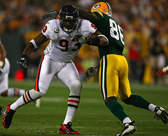
• Good to see Al Harris and Devon Hester both up to their old tricks.
• Is that a new logo on the Gatorade towels?
And there you have it — Week 1, in the books. And now, before we get to the Ticker, a few small announcements:
Stirrup Club Reminder: Robert Marshall is now taking orders for a new round of stirrups. Details here.
E-Mail Reminder: My Earthlink account — which is on the verge of becoming an ex-Earthlink account — is still very spotty. For now, the best way to contact me is at beerframeguy [at] yahoo.com. (And if you sent me awesome Ticker material that I’m not using, it’s almost certainly because I never received it and not even a little bit because I didn’t think it was as awesome as you did, or because I wasn’t in the mood to plow through a few dozen Ticker contributions, or because I thought your observation was a bit arcane even by Uni Watch standards. Nope, no chance of any of those at all.)
Attention Jordan Cutler: Tried to write to you but my e-mails keep bouncing back (which I think is actually due to problems with your e-mail account, not mine), so I’ll say it here: I got the package — thanks so much! You da man and all that.
And speaking of people are who da man”¦: Let’s hear it for Phil, who kicked some serious Uni Watch ass over the weekend, am I right?
OK, now then”¦
Uni Watch News Ticker: Lots of great new pin-up illos from Rob Ullman (and yes, if you’ve ordered a commission from him, he’s working on it — busy fella!). I’m particularly fond of this one. ”¦ The Winter Classic jerseys will look like this and this. Both perfectly nice, but not the huge blast from the past that we’ve seen in other Winter Classics. ”¦ “Coincidence, or long-term parental planning?” asks Les Holmlund. ”¦ Reprinted from Friday’s comments: arguably the Shorpy’s finest moment. ”¦ Hilarious scene at the Angry Samoans merch table on Saturday night, because the band is still pulling the old punk rock move of buying up used T-shirts at Goodwill for 25 ¢ (or whatever), screen-printing the band name onto them, and selling them for $5 — very cool. That baseball tee was swell, but the best sports-related design was this one (underneath the photo, it said, “1962 Green Bay Packers, Greatest Football Team Ever”), which I totally would’ve bought if it had been my size. There was also this one, which I couldn’t decide if I loved or hated. Best one of the batch was worn onstage by Metal Mike. ”¦ Good video of the Penn State shoes getting polished — to the strains of Kiss! — here (with thanks to Gerry Dincher). ”¦ We’ve had several discussions over the years about pre-Nazi uses of swastikas on uniforms, and now Bruce Menard has found one I hadn’t seen before. That’s Rabbit Maranville, circa 1915, and Bruce says the cap was worn to commemorate the sinking of the Lusitania. I know the swastika has a lengthy pre-Nazy history, so let’s not rehash all of that, but I didn’t know about this Lusitania connection. Anyone know more? ”¦ Kudos to Santa Clara High, whose football team wears these socks (with thanks to Don D.). ”¦ New York Mets baseball and steaks, chops, and wings, these are a few of my favorite things. ”¦ Fresno State is wearing black nose bumpers with “D.B.” initials. “It’s for the late much appreciated Dan Brown, their defensive coordinator from last year, who died of cancer during the off season,” says Jake Moorhead. “Also, his son Travis Brown is a freshmen linebacker on the team and is being allowed to wear number 9 (the retired number of Kevin Sweeney).” ”¦ Daniel Listoe was poking around the SI archives and found something from the 12/14/81 issue: a critique of football helmet logos. To read it, go to page 8 here. ”¦ New goalie gear for Henrik Lundqvist (with thanks to Matt Harris), and a new mask design for Semyon Varlamov. ”¦ Love this mid-’70s design from Texas A&M. And check out the up-back in a four-point stance! (Big thanks to Clayton Weber.) ”¦ FNOB alert from 19 years ago (nice find by Matt Ryburn). ”¦ Unfortunate byproduct of the new CHL uni changes: Because all teams are using the Edge template, the Ottawa 67’s had to scrap their longtime barber pole design. Instead, they’re going with this (as noted by Jeff Baker). ”¦ New men’s and women’s hockey jerseys for North Dakota. Lots of additional pics here. Note the the unusual uni number placement for the ladies (with thanks to Brad Reissig). ”¦ Check this out: pancakes crossed with Alpha-bits! Here’s how to do it (thanks, Kirsten!). ”¦ Mark Kluczynski notes that the CFO patch being worn by college football officials is bigger this year than last year. ”¦ Couldn’t happen to a nicer diva. ”¦ Bit of a buttoning problem for the guy in the back row, second from the right (as spotted by Brinke Guthrie’s wife). ”¦ Live by douchebag branding, die by douchebag branding. ”¦ Steve Mandich has put together a cool Ichiro tribute page, including tons of good uni pics. ”¦ Meanwhile, Steve’s wife Eliza Truitt has a tote bag blog (why not, right?), which is currently featuring this. ”¦ Here’s a new one: The Predators’ third jersey was sort of unveiled, sort of leaked, when Taylor Swift wore it onstage. ”¦ According to a post on the Chris Creamer board, there are rumors a-flyin’ about Michigan possibly wearing white pants on October 10th at Iowa. If so, it wouldn’t be the first time they’ve worn white pants on the road. ”¦ “Besides having the longest losing streak in Div-I football (29 and counting), Indiana State also has inconsistent uniform number typefaces,” says Orion Buckingham. To see what he means, look for Nos. 18, 26, and 95 in these photos. ”¦ Here’s a different kind of DIY (with thanks to Jeff Ash). ”¦ His future looks, uh, bright. ”¦ Why weren’t these losers home watching football where they belonged? But they’re right about one thing: There’s nothing worse than seeing our precious national identity being watered down by foreign influence. ”¦ Special Uni Watch feliz cumpleaños wishes to Cooperstown deputy mayor Jeff Katz — hope you get everything you wish for when you blow and the candles, buddy. ”¦ The Basketball Diarist has died, died. RIP, brother.
It is a new logo on the Gatorade towels. They changed to this logo a few months ago (maybe in December?) around the time Pepsi did their rebranding. They’ve had this on all swag coming out on at least the college circuits.
Uni reference on Mad Men last night:
Dennis, the prison guard mentions that Sing Sing’s team played the Yankees in ’29. Don’s reply: “Everybody in stripes.” LMAO
Chad Ochocinco wore golden cleats and gloves in yesterday’s debacle.
[quote comment=”347538″]Chad Ochocinco wore golden cleats and gloves in yesterday’s debacle.[/quote]
This time with the link. link
The Pro-Cap-like helmet design is the rear view of the Revolution Speed:
link
link
Also notice the Vikings #38 wearing a rare Schutt helmet. Almost noone on that team does, except for you-know-who.
link
the link for the pancakes, meaning how to do them for each letter is not coming up.
New goalie & blocker pad design for Marc-Andre Fleury:
Then:
link
Now:
link
That Fresno State picture also shows a slight change to the Bulldogs logo – “V” medallion around bulldogs neck.
I mean the article for the pancake letters, if it is an article. I see the pictures because it is the same link.
My alma mater, The Wagner College Seahawks have undergone some interesting uni upgrades this year.
Within the linked photo gallery, you will find brand new Home jerseys made my Nike. complete with a new silver grey number font that I am IN LOVE WITH.
The headgear upgrades are more up my ally.
Not only are they wearing the traditional Schutt Air Advantage, but the Schutt Air XP, the Schutt DNA as well as the ION,most prominently seen on Penn State.
link
There are also many a Riddell Revo, Revo Speed, and interestingly enough a few Zeniths on the field.
Pretty cool, if you ask me. I am already planning on asking Santa for a #16 home jersey!
Photo Gallery:
link
Feely has been wearing gloves on-and-off ever since he got to the NFL.
link
I thought that I remembered him wearing gloves way back at Michigan, but photographic proof of that eludes me.
I’m liking the North Dakota jerseys. Nothing too crazy with the striping or anything like that as they’ve done in the past with nike, and the best logo in college sports certainly helps.
And of course, with Edge uniforms comes edge prices. North Dakota’s fans are going to be a little surprised with the pricetag. College jerseys run about $80. Reebok’s going to up that pretty significantly.
[quote comment=”347541″]the link for the pancakes, meaning how to do them for each letter is not coming up.[/quote]
Thanks. Now fixed in the text, and here’s the link:
link
Sort of related:
Thanks to the NY Times for shortening the sports pages by eliminating every scoring play in the NFL.
Their response: You can get this information elsewhere!!
It looked like multiple Notre Dame players had their numbers affixed backwards Saturday – taller numbers on the front, shorter numbers on the back… NOT a good look.
Slideshow for Flyers’ Winter Classic jersey unveiling: link
Sorry I missed the Seahawk discussion yesterday, but here’s some mock-ups I did a while back that pretty accurately show what those color combinations could look like:
link
link
link
link
[quote comment=”347540″]The Pro-Cap-like helmet design is the rear view of the Revolution Speed:
link
link
Also notice the Vikings #38 wearing a rare Schutt helmet. Almost noone on that team does, except for you-know-who.
link
I happen to really like this new Riddell Revolution Speed helmet. I noticed it being introduced on to NFL teams late last year. It is now everywhere in the college ranks.
From the rear, the raised ridge detail makes this helmet look a little like the Pro-cap, but only from the rear. It looks nothing like it in any other view. The Speed helmet looks really tough. I particularly like the aggressive lines and how they are carried into the facemask.
One thing that really bothers me about this helmet is the air vent detail on the side near the rear. This detail seems to really croud a team’s helmet logo.
link
I would guess that there are several teams that would never consider this helmet since it would force them to alter the location or appearance of their team’s helmet logo.
Does this bother anyone else?
Though white teams at home only went 2-4, the Cowboys went 1-0 in their bad-luck blues. I still think the Bucs made the right decision making Dallas wear blue.
[quote comment=”347552″]Sorry I missed the Seahawk discussion yesterday, but here’s some mock-ups I did a while back that pretty accurately show what those color combinations could look like:
link
link
link
link
I remember those, yes, indeed! When Phil and I were putting together Sunday’s piece I was trying to remember who did them. Actually, was kinda hoping we could have tapped into your photoshop skills for the story.
Another time, perhaps?
—Ricko
What happens when the captains using the patches go over 4 years? There are only 4 stars? I don’t know if this has been covered or not, but I haven’t seen it yet.
[quote comment=”347556″]What happens when the captains using the patches go over 4 years? There are only 4 stars? I don’t know if this has been covered or not, but I haven’t seen it yet.[/quote]
I’ve been told that they have a design solution for that waiting in the wings, although I haven’t been told what that solution is. Probably just another row of stars (which will make the patch even bigger and clunkier).
the geniuses in the nfl will probably just make this the new captaincy patch
[quote comment=”347556″]What happens when the captains using the patches go over 4 years? There are only 4 stars? I don’t know if this has been covered or not, but I haven’t seen it yet.[/quote]
Maybe they’ll use this design for the mega-captain patch:
link
[quote comment=”347558″]the geniuses in the nfl will probably just make link[/quote]
Using Noriega’s hat as the perfect model for displaying status and leadership, no doubt.
—Ricko
[quote comment=”347556″]What happens when the captains using the patches go over 4 years? There are only 4 stars? I don’t know if this has been covered or not, but I haven’t seen it yet.[/quote]
Hello? Stargell stars anyone?
Glad to see the Miami Dolphins have continued wearing link into the regular season. But it seems link got the memo.
Re: Knee races looking like shit.
Ok, ok, we get it Paul. You don’t give a fuck about players safety or preventing potentially serious or career ending injuries if it messes with the design of their precious uniforms.
Give me a fucking break. Your endless whining about the new thicker padded batting helmets was sickening. O NOES!!!!!! The helmets are too big for the players heads!!!! They make the players look stupid!!!!!!!!!!! Therefore the new helmets are the SUXOR!!!!!!!!!!!!!!!!!! They must be banned from the game of baseball!!!!!!!!!!!!!!!!
As for knee braces they are bulky for a reason, TO PROTECT THE PLAYERS KNEE AS MUCH AS POSSIBLE. Why haven’t you called up the maufacturer of the knee braces up and bitched at them about how their bulky design ruins the precious aesthetics of the uniforms and therefore the braces must be re-designed to be less obtrusive. And if that means less safety for the player well too fucking bad, right?
It’s a real shame that Ottawa had to change their unique look because it don’t fit the Reebok Edge template. The same thing happened with the Dallas Stars who had one of the best NHL sweaters, IMHO. Personally, I think it’s more likely that Reebok wants a recognizable look rather than the Edge design being inflexible. And if it is that inflexible, why go with it? Oh, yeah, $$$.
[quote comment=”347563″]Re: Knee races looking like shit.
Ok, ok, we get it Paul. You don’t give a fuck about players safety or preventing potentially serious or career ending injuries if it messes with the design of their precious uniforms.
Give me a fucking break. Your endless whining about the new thicker padded batting helmets was sickening. O NOES!!!!!! The helmets are too big for the players heads!!!! They make the players look stupid!!!!!!!!!!! Therefore the new helmets are the SUXOR!!!!!!!!!!!!!!!!!! They must be banned from the game of baseball!!!!!!!!!!!!!!!!
As for knee braces they are bulky for a reason, TO PROTECT THE PLAYERS KNEE AS MUCH AS POSSIBLE. Why haven’t you called up the maufacturer of the knee braces up and bitched at them about how their bulky design ruins the precious aesthetics of the uniforms and therefore the braces must be re-designed to be less obtrusive. And if that means less safety for the player well too fucking bad, right?[/quote]
Actually, if you read what I wrote about the S100 helmet, you’ll see that I had no problem with how it looks:
link
Get back to us when you know what the fuck you’re talking about.
Re: Jets Patches/Giants Uni’s
I was surprised to see them…my personal verdict is still out on them, though (way back), I originally bitched about how clunky/boring it looked on paper (pixels), I think I like it better on the Jersey…not 100% if I want one yet…
2)WTF is with the NYG Jerseys? Are they cheap heat pressed backs like you order from NFL.Com? They stretch and bend more than gumby!
[quote comment=”347565″][quote comment=”347563″]Re: Knee races looking like shit.
Ok, ok, we get it Paul. You don’t give a fuck about players safety or preventing potentially serious or career ending injuries if it messes with the design of their precious uniforms.
Give me a fucking break. Your endless whining about the new thicker padded batting helmets was sickening. O NOES!!!!!! The helmets are too big for the players heads!!!! They make the players look stupid!!!!!!!!!!! Therefore the new helmets are the SUXOR!!!!!!!!!!!!!!!!!! They must be banned from the game of baseball!!!!!!!!!!!!!!!!
As for knee braces they are bulky for a reason, TO PROTECT THE PLAYERS KNEE AS MUCH AS POSSIBLE. Why haven’t you called up the maufacturer of the knee braces up and bitched at them about how their bulky design ruins the precious aesthetics of the uniforms and therefore the braces must be re-designed to be less obtrusive. And if that means less safety for the player well too fucking bad, right?[/quote]
Actually, if you read what I wrote about the S100 helmet, you’ll see that I had no problem with how it looks:
link
Get back to us when you know what the fuck you’re talking about.[/quote]
why would he let facts get in the way of proving himself a dumbass?
[quote comment=”347561″][quote comment=”347556″]What happens when the captains using the patches go over 4 years? There are only 4 stars? I don’t know if this has been covered or not, but I haven’t seen it yet.[/quote]
Hello? Stargell stars anyone?[/quote]
Seriously now, for those who want to know how long someone’s been a captain, can’t they just look it up? Is it necessary to WEAR it? Don’t see hockey farting around with something like (at least hope they haven’t started that).
In terms of the jersey (which is for GAME use) all that matters is that he’s captain TODAY. That’s the only game day releveance.
“Let’s see, you’ve been captain four times, he’s been captain three times…okay, YOU call the toss.”
—Ricko
I was just going to check and see if there was any chatter about the Gophers lemon pops over the weekend, and there it is: the first item on Monday morning. I was at the game and I couldn’t believe they marked a historic event like the opening of a new stadium with those atrocities. I would have liked them to be much more traditional for the opening of the new stadium. That’s going to be an ongoing source of embarrasment in future years when someone runs clips or pictures of that first game.
The worst part was the two-tone appearance, as mentioned. It actually wasn’t as glaring while watching the players on the field, but on the jumbotron the bottom portion practically looked blaze orange.
On an unrelated topic, it was fun to see a link to the Grant County Herald over the weekend. I grew up in Ashby in Grant County. In case you didn’t know how rural that area is, supposedly Grant County is the only county in MN that doesn’t have a stoplight!
[quote comment=”347568″][quote comment=”347561″][quote comment=”347556″]What happens when the captains using the patches go over 4 years? There are only 4 stars? I don’t know if this has been covered or not, but I haven’t seen it yet.[/quote]
Hello? Stargell stars anyone?[/quote]
Seriously now, for those who want to know how long someone’s been a captain, can’t they just look it up? [/quote]
I have no idea where you would look that up. Not defending the patches, which I think are silly. Just sayin’.
[quote comment=”347566″]2)WTF is with the NYG Jerseys? Are they cheap heat pressed backs like you order from NFL.Com? They stretch and bend more than gumby![/quote]
New fabric. Looks like crap, but don’t tell Skeebs I said that (because I’d rather tell him myself).
[quote comment=”347569″]I was just going to check and see if there was any chatter about the Gophers lemon pops over the weekend, and there it is: the first item on Monday morning. I was at the game and I couldn’t believe they marked a historic event like the opening of a new stadium with those atrocities. I would have liked them to be much more traditional for the opening of the new stadium. That’s going to be an ongoing source of embarrasment in future years when someone runs clips or pictures of that first game.
The worst part was the two-tone appearance, as mentioned. It actually wasn’t as glaring while watching the players on the field, but on the jumbotron the bottom portion practically looked blaze orange.
On an unrelated topic, it was fun to see a link to the Grant County Herald over the weekend. I grew up in Ashby in Grant County. In case you didn’t know how rural that area is, supposedly Grant County is the only county in MN that doesn’t have a stoplight![/quote]
We do know the Gophers wore monochrome gold (including helmets!) for virtually all of their glory years during the 30’s and 40’s, don’t we? Those years included the school’s only Heismann winner, Bruce Smith (’34). That’s also what led to “Golden” being officially attached to the nickname, after local sportswriter-broadcaster Halsey Hall began referring to them as the “Golden” Gophers.
So, while I hate the “two-tones” (mentioned it yesterday) and really don’t care for the all-gold look and hope they Deep Six it, I get why they did it for the opening of the new stadium that brought football back to campus.
In that context, the mono gold was an appropriate nod to the team’s history…and fun, too, for a special event. But now it also should go away forever. LOL
—Ricko
What purpose do “captains” serve in pro football anyway? Calling “heads” or “tails”? Presumably they are told beforehand which option to pick should they win/lose the toss. They always check with sideline over decline/accept penalty calls. Half of them are wired to the coaches anyway. Presumably they are chosen by teammates/coaches so they don’t need them identified. Don’t think the refs need them. And the star system? What is this, some quasi-military thing? (Oh, that’s right, it is). What’s next, helmet decals for good plays?
BTW, I get the purpose it serves in the NHL.
Ricko, I saw the gold jerseys as a nod to the Gophers’ return to campus. New stadium looks really nice, with the horseshoe open to face campus and downtown.
The Basketball Diarist has died, died. RIP, brother.
He sure got some bitchin’ proof. I salute you, my brother.
[quote comment=”347572″]We do know the Gophers wore monochrome gold (including helmets!) for virtually all of their glory years during the 30’s and 40’s, don’t we? Those years included the school’s only Heismann winner, Bruce Smith (’34).[/quote]
i thought he was a va tech alum
I don’t mind NFL teams wearing captains patches, but I don’t like the fact that the NFL created a uniform design for every single team. I think the teams should each be allowed to create their own “captain C’s” to put on their own jerseys.
Thanks again for getting politcal Paul. I’m glad you payed attention to the email I sent you several months ago. You’ve just lost a loyal reader. I’m done with this site for good now.
[quote comment=”347553″][quote comment=”347540″]The Pro-Cap-like helmet design is the rear view of the Revolution Speed:
link
link
Also notice the Vikings #38 wearing a rare Schutt helmet. Almost noone on that team does, except for you-know-who.
link
I happen to really like this new Riddell Revolution Speed helmet. I noticed it being introduced on to NFL teams late last year. It is now everywhere in the college ranks.
From the rear, the raised ridge detail makes this helmet look a little like the Pro-cap, but only from the rear. It looks nothing like it in any other view. The Speed helmet looks really tough. I particularly like the aggressive lines and how they are carried into the facemask.
One thing that really bothers me about this helmet is the air vent detail on the side near the rear. This detail seems to really croud a team’s helmet logo.
link
I would guess that there are several teams that would never consider this helmet since it would force them to alter the location or appearance of their team’s helmet logo.
Does this bother anyone else?[/quote]
I really like them too, although I hated the original revos.
link
Boom Herron wore an awesome speed version of the Eric Dickerson mask the other night…can’t find pics.
[quote comment=\”347553\”][quote comment=\”347540\”]The Pro-Cap-like helmet design is the rear view of the Revolution Speed:
link
link
Also notice the Vikings #38 wearing a rare Schutt helmet. Almost noone on that team does, except for you-know-who.
link
I happen to really like this new Riddell Revolution Speed helmet. I noticed it being introduced on to NFL teams late last year. It is now everywhere in the college ranks.
From the rear, the raised ridge detail makes this helmet look a little like the Pro-cap, but only from the rear. It looks nothing like it in any other view. The Speed helmet looks really tough. I particularly like the aggressive lines and how they are carried into the facemask.
One thing that really bothers me about this helmet is the air vent detail on the side near the rear. This detail seems to really croud a team\’s helmet logo.
link
I would guess that there are several teams that would never consider this helmet since it would force them to alter the location or appearance of their team\’s helmet logo.
Does this bother anyone else?[/quote]
I really like them too, although I hated the original revos.
link
Boom Herron wore an awesome speed version of the Eric Dickerson mask the other night…can\’t find pics.
Uni reference on Mad Men last night:
Dennis, the prison guard mentions that Sing Sing’s team played the Yankees in ‘29. Don’s reply: “Everybody in stripes.” LMAO
It makes sense to me that a man as stylish as Don Draper would be a bit of a UW man.
Ouch, a slam on my beloved Hilltoppers near the top.
WKU promoted a “black out theme” for the game. The reason — South Florida being the biggest D1 school to visit Bowling Green, plus the first home game of the season & WKU entering full BCS status.
Promoted as the fans wearing all black out … yes, I know fad, but worth the effort … once.
The team did not tell the players that black uniforms existed until the walk through. For this generation of players, black unis are still a plus.
Die hard / long-time / older Hilltopper fans cringe at the use of black. One, because it’s not a traditional school color. Two, because it is way too similar to Looeyville. Thirdly, because black has become trite in unis. (See the WKU Basketball unis for a much more traditional look — red, grey-silver, and white).
No such thing as “bad” publicity, even on Uni Watch?!?! ;)
How about Swaztika-free Uni Watch? Why the fascination with the most horrific symbol of all time. It needs to stop. It is inappropriate to the highest, most indefensable level ever.
[quote comment=”347570″][quote comment=”347568″][quote comment=”347561″][quote comment=”347556″]What happens when the captains using the patches go over 4 years? There are only 4 stars? I don’t know if this has been covered or not, but I haven’t seen it yet.[/quote]
Hello? Stargell stars anyone?[/quote]
Seriously now, for those who want to know how long someone’s been a captain, can’t they just look it up? [/quote]
I have no idea where you would look that up. Not defending the patches, which I think are silly. Just sayin’.[/quote]
Media Guide? Website? Rosters in game programs? Lots more places “years as captain” could be noted. Absolutely no need that info to be on the jerseys.
—Ricko
Not sure if anyone here is responsible for these link, yet, I really like them. Love the braided shoulder striping idea, and the sword pants striping.
Also, from yesterday’s uniwatching, those Ravens black pants made some of the players look like they were going to a bottom less party.
………..and those Jag’s helmets, well, what a contrast to the Colt’s matte white helmets.
[quote comment=”347582″]How about Swaztika-free Uni Watch? Why the fascination with the most horrific symbol of all time. It needs to stop. It is inappropriate to the highest, most indefensable level ever.[/quote]
I completely disagree. For starters, if a team wore it, it’s relevant to Uni Watch. Secondly, denying the fact that teams wore the swastika is as pointless as denying the Holocaust — they both happened. More importantly, you can’t fully understand or appreciate the swastika’s terrible power without understanding its history and evolution, and part of that history is its use by sports teams during the pre-Nazi period.
[quote comment=”347582″]How about Swaztika-free Uni Watch? Why the fascination with the most horrific symbol of all time. It needs to stop. It is inappropriate to the highest, most indefensable level ever.[/quote]
I disagree with you. Paul has provided a unique door to see how an evolution of a symbol has occured. It’s uses & meanings obviously have changed, but so has our language, customs & heritages. It’s just as important to be informed & educated to how these things happen and remember that every society is reflective of it’s time and place…and for a brief moment, we are in ours…I’m sure in 50-75 years, there will be symbols/logo’s, etc. that will be either offensive to some and people will say “how could they” (yadda yadda yadda), but they weren’t there, but the history is.
ON ANOTHER NOTE:
Paul: NYG Fabric: Are they the only team using this? Is it a test season?
[quote comment=”347582″]How about Swaztika-free Uni Watch? Why the fascination with the most horrific symbol of all time. It needs to stop. It is inappropriate to the highest, most indefensable level ever.[/quote]
Did you even read what Paul wrote after posting the pictures or did you see the word “swastika” and race to the comments section to voice your opinion?
It was on a uniform, and this is a uniform website. I don’t see the difficulty in finding the connection.
[quote]I’m sure in 50-75 years, there will be symbols/logo’s, etc. that will be either offensive to some and people will say “how could they” (yadda yadda yadda), but they weren’t there, but the history is.[/quote]
there already are
[quote comment=”347577″]Thanks again for getting politcal Paul. I’m glad you payed attention to the email I sent you several months ago. You’ve just lost a loyal reader. I’m done with this site for good now.[/quote]
Have I mentiond that I’ve been having e-mail problems? Must not have gotten Brad’s email, because otherwise I’d certainly run this site in precise accordance with his instructions. I’m happy he read today’s Ticker all the way thru to the end, sorry he was so offended by one sentence, and certain he’ll find other good outlets for his loyal readership. Life goes on.
[quote comment=”347586″]Paul: NYG Fabric: Are they the only team using this? Is it a test season?[/quote]
Some Packers players are also wearing it. Not sure if other teams will be joining in.
[quote comment=”347582″]How about Swaztika-free Uni Watch? Why the fascination with the most horrific symbol of all time. It needs to stop. It is inappropriate to the highest, most indefensable level ever.[/quote]
What??? Hitler ripped off a design??? What did he think he was doing, designing a uni for his high school speed-painting team????
Seeing this as a “revelation” of some kind comes across a little like the now-tiresome story of the kid asking, “Did you know Paul McCartney had another band before Wings?” It doesn’t need to be told again. And again.
—Ricko
Could the 49ers names on the jerseys look any more amateurish? Did they have them applied at the mall kiosk?
[quote comment=”347585″][quote comment=”347582″]How about Swaztika-free Uni Watch? Why the fascination with the most horrific symbol of all time. It needs to stop. It is inappropriate to the highest, most indefensable level ever.[/quote]
I completely disagree. For starters, if a team wore it, it’s relevant to Uni Watch. Secondly, denying the fact that teams wore the swastika is as pointless as denying the Holocaust — they both happened. More importantly, you can’t fully understand or appreciate the swastika’s terrible power without understanding its history and evolution, and part of that history is its use by sports teams during the pre-Nazi period.[/quote]
Not only that, but it speaks to the power of design. The Nazis were committers of great atrocities, but they were masters of two things; propaganda and design. They very effectively used design to pull people to their political point of veiw, (look at the cut, color, and badging on an SS uniform sometime). Additionally, the use of the Swastika speaks to their understanding of how the use of a simple symbol can become a rallying point for an entire nation / ideology.
[quote comment=”347591″]”Did you know Paul McCartney had another band before Wings?”
—Ricko[/quote]
Wait, what?
[quote comment=”347592″]Could the 49ers names on the jerseys look any more amateurish? Did they have them applied at the mall kiosk?[/quote]
Agreed. As a Niners fan, I was kinda wincing over those NOBs — very clunky, very Div.III. A major fly in the ointment of that new uni.
[quote comment=”347584″]Not sure if anyone here is responsible for these link, yet, I really like them. Love the braided shoulder striping idea, and the sword pants striping.
Also, from yesterday’s uniwatching, those Ravens black pants made some of the players look like they were going to a bottom less party.
………..and those Jag’s helmets, well, what a contrast to the Colt’s matte white helmets.[/quote]
Jags new unis? Saw ’em vs. Colts yesterday during commercials in Vikings-Browns.
Very, VERY AF2.
Looked like the Pocatello PotatoHawks
(or something).
—Ricko
[quote comment=”347589″][quote comment=”347577″]Thanks again for getting politcal Paul. I’m glad you payed attention to the email I sent you several months ago. You’ve just lost a loyal reader. I’m done with this site for good now.[/quote]
Have I mentiond that I’ve been having e-mail problems? Must not have gotten Brad’s email, because otherwise I’d certainly run this site in precise accordance with his instructions. I’m happy he read today’s Ticker all the way thru to the end, sorry he was so offended by one sentence, and certain he’ll find other good outlets for his loyal readership. Life goes on.[/quote]
I was wondering which “political” issue got Brad’s attention. I am assuming from Paul’s response, it was not the swastika reference, but rather the Glen Beck lemmings photo. Hope so.
[quote comment=”347563″]Re: Knee races looking like shit.
Ok, ok, we get it Paul. You don’t give a fuck about players safety or preventing potentially serious or career ending injuries if it messes with the design of their precious uniforms.
Give me a fucking break. Your endless whining about the new thicker padded batting helmets was sickening. O NOES!!!!!! The helmets are too big for the players heads!!!! They make the players look stupid!!!!!!!!!!! Therefore the new helmets are the SUXOR!!!!!!!!!!!!!!!!!! They must be banned from the game of baseball!!!!!!!!!!!!!!!!
As for knee braces they are bulky for a reason, TO PROTECT THE PLAYERS KNEE AS MUCH AS POSSIBLE. Why haven’t you called up the maufacturer of the knee braces up and bitched at them about how their bulky design ruins the precious aesthetics of the uniforms and therefore the braces must be re-designed to be less obtrusive. And if that means less safety for the player well too fucking bad, right?[/quote]
What in the hell are you talking about? Paul never said that the braces shouldn’t be worn or that he doesn’t care about players’ safety. He merely said that the braces look like shit.
Guess what, Flappy?
They DO look like shit.
Wanna know how I know this? Because I wear one. Every single day. I have worn it for four years, and will continue to wear it for the rest of my life so that I can walk upright. It has saved me from falling on more than one occasion, and keeps my knee from collapsing without warning.
But it still looks like shit.
When I’m sitting in my office working, wearing shorts and a tshirt, I don’t care. But there are occasions in which I would like to dress up, look sharp, maybe even sexy. Try doing that with an SCL brace. Not happening.
The fact that the brace looks unattractive whether it’s worn under or over clothing is simply that: a fact. Now go crawl back under your rock and quit putting words in Paul’s mouth.
[quote comment=”347597″][quote comment=”347589″][quote comment=”347577″]Thanks again for getting politcal Paul. I’m glad you payed attention to the email I sent you several months ago. You’ve just lost a loyal reader. I’m done with this site for good now.[/quote]
Have I mentiond that I’ve been having e-mail problems? Must not have gotten Brad’s email, because otherwise I’d certainly run this site in precise accordance with his instructions. I’m happy he read today’s Ticker all the way thru to the end, sorry he was so offended by one sentence, and certain he’ll find other good outlets for his loyal readership. Life goes on.[/quote]
I was wondering which “political” issue got Brad’s attention. I am assuming from Paul’s response, it was not the swastika reference, but rather the Glen Beck lemmings photo. Hope so.[/quote]
I am pretty sure it was, but regardless of which side the crazies are on, they will at least provide a little humor.
link
I am pretty sure it was, but regardless of which side the crazies are on, they will at least provide a little humor.
link…
are you referring to the omission of the “r”?
:)
[quote comment=”347593″][quote comment=”347585″][quote comment=”347582″]How about Swaztika-free Uni Watch? Why the fascination with the most horrific symbol of all time. It needs to stop. It is inappropriate to the highest, most indefensable level ever.[/quote]
I completely disagree. For starters, if a team wore it, it’s relevant to Uni Watch. Secondly, denying the fact that teams wore the swastika is as pointless as denying the Holocaust — they both happened. More importantly, you can’t fully understand or appreciate the swastika’s terrible power without understanding its history and evolution, and part of that history is its use by sports teams during the pre-Nazi period.[/quote]
Not only that, but it speaks to the power of design. The Nazis were committers of great atrocities, but they were masters of two things; propaganda and design. They very effectively used design to pull people to their political point of veiw, (look at the cut, color, and badging on an SS uniform sometime). Additionally, the use of the Swastika speaks to their understanding of how the use of a simple symbol can become a rallying point for an entire nation / ideology.[/quote]
I’m with you on this one, Paul. It’s relevant to this blog and you can’t just ignore stuff like this. Keep it coming.
(And that political reference didn’t seem bent one way or the other, just saying they should have been watching football instead of protesting, regardless of Dem or GOP.)
-Greenie
I know this is not a popular thing to say around here but, I like the Jaguars new digs. I think that the teal flecks in the helmet give it a touch that makes it look good with both the predominantly teal home set and predominantly black road set. For a team with a tough defensive mentality, the new block numerals are great. Yes they have piping, but is far simpler and less offensive than anything out there, including the Broncos.
[quote comment=”347591″]
What??? Hitler ripped off a design??? What did he think he was doing, designing a uni for his high school speed-painting team????
—Ricko[/quote]
If only they had stolen the Motion-W instead of the swastika, the whole Third Reich could have been stopped before it got started by U of Wisconsin’s lawyers.
WKU had their first blackout in school history this weekend, hence the black uniforms.
If only they had stolen the Motion-W
At risk of sounding clueless or bringing up something that has been discussed to death, what’s a Motion-W?
“Not only that, but it speaks to the power of design. The Nazis were committers of great atrocities, but they were masters of two things; propaganda and design. They very effectively used design to pull people to their political point of veiw, (look at the cut, color, and badging on an SS uniform sometime). Additionally, the use of the Swastika speaks to their understanding of how the use of a simple symbol can become a rallying point for an entire nation / ideology.”
While all that is true, it’s nothing new (well, to some here I suppose maybe it is).
How it was used on unis—particularly athletic unis—before and after it became associated with the Nazi movement, is intriguing and belongs here.
I’m just tired of any forehead-slapping “I am shocked, SHOCKED to learn the symbol goes back centuries farther than Mr. Hyphen-for-a-Mustache and his band of crazies.”
And of anyone who says, “We shouldn’t hate it so much because it goes farther back.” No, we SHOULD hate it. What something has come to mean is what it means, no matter what went before.
Also tired of people claiming that analysis of something, or portraying it, is the same as supporting it.
—Ricko
As a life-long Giants fan, I have to say that the new jersey look is just awful. The names and numbers were getting distorted and folded down into the shoulder pads during the game. Plus, they just look like crap.
Really wishing they would go back to the last incarnation, there was nothing wrong with them.
:(
[quote comment=”347602″]I know this is not a popular thing to say around here but, I like the Jaguars new digs. I think that the teal flecks in the helmet give it a touch that makes it look good with both the predominantly teal home set and predominantly black road set. For a team with a tough defensive mentality, the new block numerals are great. Yes they have piping, but is far simpler and less offensive than anything out there, including the Broncos.[/quote]
Like anyone is going to see it anyway…ESPECIALLY in Jacksonville…
[quote comment=”347605″]If only they had stolen the Motion-W
At risk of sounding clueless or bringing up something that has been discussed to death, what’s a Motion-W?[/quote]
google is your friend
The Bruins jersey does have elements of previous jerseys. If that mockup is right, it’s the 58-59 jersey ( link ) with the original spoked-B logo from 48-49 ( link ).
[quote comment=”347602″]I know this is not a popular thing to say around here but, I like the Jaguars new digs. I think that the teal flecks in the helmet give it a touch that makes it look good with both the predominantly teal home set and predominantly black road set. For a team with a tough defensive mentality, the new block numerals are great. Yes they have piping, but is far simpler and less offensive than anything out there, including the Broncos.[/quote]
I would like to know if the majority of Jags fans actually like those new uniforms, I bet they don’t, it’s a downgrade. Always felt a teal or gold helmet and uniform with black as a secondary color would have been better. Along with the Bills, Ravens, Titans, and Bengals, it’s the worst look in the AFC.
There does seem to be a link between the best uniforms and teams with a winning tradition. Only the Ravens have won a Super Bowl among the teams I listed.
[quote comment=”347605″]If only they had stolen the Motion-W
At risk of sounding clueless or bringing up something that has been discussed to death, what’s a Motion-W?[/quote]
You didn’t sound clueless, I sounded jargon-y.
(but its hard to tell a snarky joke in one sentence if you have to precede it with a story about trademark litigation)
[quote comment=”347607″]As a life-long Giants fan, I have to say that the new jersey look is just awful. The names and numbers were getting distorted and folded down into the shoulder pads during the game. Plus, they just look like crap.
Really wishing they would go back to the last incarnation, there was nothing wrong with them.
:([/quote]
Isn’t it obvious? Became especially clear yesterday. Football players are supposed to look like that guitar-playing robot transformer thing on the Fox NFL graphics. I think Oregon on Saturday made that painfully clear.
link
—Richard
Sorry. Having terrible time finding photos from Oregon-Purdue Saturday night.
—Ricko
[quote comment=\”347589\”][quote comment=\”347577\”]Thanks again for getting politcal Paul. I\’m glad you payed attention to the email I sent you several months ago. You\’ve just lost a loyal reader. I\’m done with this site for good now.[/quote]
Have I mentiond that I\’ve been having e-mail problems? Must not have gotten Brad\’s email, because otherwise I\’d certainly run this site in precise accordance with his instructions. I\’m happy he read today\’s Ticker all the way thru to the end, sorry he was so offended by one sentence, and certain he\’ll find other good outlets for his loyal readership. Life goes on.[/quote]
You really are a pathetic, angry man. Amazing how you just can\’t leave politics off the site but are so offended when people comment on, or have a differing opinion than yours. Then you attack. Way to be tolerant, everyone else is stupid except yourself, right? Look in the mirror! If you don\’t want political comments then don\’t always post your whiny liberal BS! Are you that angry just because you live in some little shit hole in Brooklyn?
[quote comment=”347612″][quote comment=”347605″]If only they had stolen the Motion-W
At risk of sounding clueless or bringing up something that has been discussed to death, what’s a Motion-W?[/quote]
You didn’t sound clueless, I sounded jargon-y.
(but its hard to tell a snarky joke in one sentence if you have to precede it with a story about trademark litigation)[/quote]
Following the advice of a certain “Phil” from LI., I availed myself of what the kids are calling a “search engine” (named “Google”, if you can believe it). I was totally unaware of the motion-w controversy, but now I’m not. Now, having raised my consciousness over this issue, I can appreciate where you were coming from. Further, you’re right about the difficulty in setting up a joke, especially if you don’t know your audience. I’ll always encourage everyone to cast their pearls and I’ll try not to play the role of swine. Thank you for letting me down easy. Now, let’s kill all the lawyers. :)
[quote comment=”347615″][quote comment=\”347589\”][quote comment=\”347577\”]Thanks again for getting politcal Paul. I\’m glad you payed attention to the email I sent you several months ago. You\’ve just lost a loyal reader. I\’m done with this site for good now.[/quote]
Have I mentiond that I\’ve been having e-mail problems? Must not have gotten Brad\’s email, because otherwise I\’d certainly run this site in precise accordance with his instructions. I\’m happy he read today\’s Ticker all the way thru to the end, sorry he was so offended by one sentence, and certain he\’ll find other good outlets for his loyal readership. Life goes on.[/quote]
You really are a pathetic, angry man. Amazing how you just can\’t leave politics off the site but are so offended when people comment on, or have a differing opinion than yours. Then you attack. Way to be tolerant, everyone else is stupid except yourself, right? Look in the mirror! If you don\’t want political comments then don\’t always post your whiny liberal BS! Are you that angry just because you live in some little shit hole in Brooklyn?[/quote]
When did I say I was offended by anyone’s comment? As for differing opinions, yes, there’s a good chance I’ll defend my position, correct people when they misstate my position (like saying I was against the new S100 helmet), etc., especially since it’s, y’know, MY WEB SITE. For some reason that appears to bother you. Boo-fucking-hoo.
I liked Minnesota’s uniforms. They were like the old Gophers unis from the 1930’s. Minnesota was a national power in that era
Here are color grabs of 1939 Gophers vs Iowa
link
link
link
[quote comment=”347618″]I liked Minnesota’s uniforms. They were like the old Gophers unis from the 1930’s. Minnesota was a national power in that era
Here are color grabs of 1939 Gophers vs Iowa
link
link
link
Awesome grabs, Larry — thanks for the history lesson!
[quote comment=”347617″][quote comment=”347615″][quote comment=\”347589\”][quote comment=\”347577\”]Thanks again for getting politcal Paul. I\’m glad you payed attention to the email I sent you several months ago. You\’ve just lost a loyal reader. I\’m done with this site for good now.[/quote]
Have I mentiond that I\’ve been having e-mail problems? Must not have gotten Brad\’s email, because otherwise I\’d certainly run this site in precise accordance with his instructions. I\’m happy he read today\’s Ticker all the way thru to the end, sorry he was so offended by one sentence, and certain he\’ll find other good outlets for his loyal readership. Life goes on.[/quote]
You really are a pathetic, angry man. Amazing how you just can\’t leave politics off the site but are so offended when people comment on, or have a differing opinion than yours. Then you attack. Way to be tolerant, everyone else is stupid except yourself, right? Look in the mirror! If you don\’t want political comments then don\’t always post your whiny liberal BS! Are you that angry just because you live in some little shit hole in Brooklyn?[/quote]
When did I say I was offended by anyone’s comment? As for differing opinions, yes, there’s a good chance I’ll defend my position, especially on my own web site. For some reason that appears to bother you. Boo-fucking-hoo.[/quote]
I’m gonna sound like an idiot asking this (I really don’t know much about politics), but whats going on here? Can anyone fill me in…
Anyway that motion-W line by Rick 2 just gave me the laugh I need to get through the morning.
If you don\’t want political comments then don\’t always post your whiny liberal BS!
I, for one, enjoy whiny liberal BS. Can you direct me to where you have posted it?
And here is Bruce Smith Heisman trophy winner of the Gophers. In Ted Watts great work.
link
Dang.
Lots of anger out there today. Is it full moon or sumthin? Didja take a bath on the games yesterday?
The Jags helmets are nice, if you ask me.
The Flyers black nameplate for 1/1/10 is awful.
SORRY, motion-W line by Mike 2
[quote]Following the advice of a certain “Phil” from LI., I availed myself of what the kids are calling a “search engine” (named “Google”, if you can believe it). I was totally unaware of the motion-w controversy, but now I’m not.[/quote]
i apologize leon, if my “google” quip sounded condescending
i couldn’t think of a better way to phrase “here ya go”, since we’ve all thrown the “google is your friend” quip about here
we have discussed it in the past, true, but not everyone on UW is aware of it (just don’t ask about the green dot, the buccaneers font or the 21 sticker — we may have to kill you then) ;)
it is amazing though (cuz i refreshed my own memory) just what lengths UW (that’s u of sconie, not uni watch) will go to protect that logo
cheers!
It never ceases to amuse and amaze me: “You shouldn’t put points of view that I disagree with on your web page!”
Hey, can I come over to your house and tell you what music you should play, what food you should cook?
[quote comment=”347579″][quote comment=\”347553\”][quote comment=\”347540\”]The Pro-Cap-like helmet design is the rear view of the Revolution Speed:
link
link
Also notice the Vikings #38 wearing a rare Schutt helmet. Almost noone on that team does, except for you-know-who.
link
I happen to really like this new Riddell Revolution Speed helmet. I noticed it being introduced on to NFL teams late last year. It is now everywhere in the college ranks.
From the rear, the raised ridge detail makes this helmet look a little like the Pro-cap, but only from the rear. It looks nothing like it in any other view. The Speed helmet looks really tough. I particularly like the aggressive lines and how they are carried into the facemask.
One thing that really bothers me about this helmet is the air vent detail on the side near the rear. This detail seems to really croud a team\’s helmet logo.
link
I would guess that there are several teams that would never consider this helmet since it would force them to alter the location or appearance of their team\’s helmet logo.
Does this bother anyone else?[/quote]
I really like them too, although I hated the original revos.
link
Boom Herron wore an awesome speed version of the Eric Dickerson mask the other night…can\’t find pics.[/quote]
I’m good:
link
link
link
link
OSU #44 wearing a Zenith:
link
[quote comment=”347613″][quote comment=”347607″]As a life-long Giants fan, I have to say that the new jersey look is just awful. The names and numbers were getting distorted and folded down into the shoulder pads during the game. Plus, they just look like crap.
Really wishing they would go back to the last incarnation, there was nothing wrong with them.
:([/quote]
Isn’t it obvious? Became especially clear yesterday. Football players are supposed to look like that guitar-playing robot transformer thing on the Fox NFL graphics. I think Oregon on Saturday made that painfully clear.
link
—Richard[/quote]
It takes a special skill to fit shoulder pads under what is essentially a tank top. I’m surprised the NFL uni police has not addressed how far the length should be of the jersey sleeve.
i apologize leon, if my “google” quip sounded condescending
Not at all. I realized after the fact that I probably should have gone there first. I didn’t know it was something so mundane and thought it might need some UWers to ‘splain. No offense taken.
since I can’t see flickr, and none of the other links appear to be “controversially political” can someone throw me a bone?
Dang, the bee hive has been stirred with this post! But at least this site and its commenters are willing to stick to their guns and talk it out rather than just ignoring or ban-hammering those who have contrary opinions.
And I’m also in agreement about how interesting the history of the swastika is, especially on how its displayment is even banned in Germany. I think all of us should recognize the symbol’s pre-Nazi history, as the plight of the stolen symbol can have very modern parallels.
Hey Ricko!!!!!!!!!!!!!!!!
Here’s your gallery of Purdue and the Ducks:
link;
[quote comment=”347617″][quote comment=”347615″][quote comment=\”347589\”][quote comment=\”347577\”]Thanks again for getting politcal Paul. I\’m glad you payed attention to the email I sent you several months ago. You\’ve just lost a loyal reader. I\’m done with this site for good now.[/quote]
Have I mentiond that I\’ve been having e-mail problems? Must not have gotten Brad\’s email, because otherwise I\’d certainly run this site in precise accordance with his instructions. I\’m happy he read today\’s Ticker all the way thru to the end, sorry he was so offended by one sentence, and certain he\’ll find other good outlets for his loyal readership. Life goes on.[/quote]
You really are a pathetic, angry man. Amazing how you just can\’t leave politics off the site but are so offended when people comment on, or have a differing opinion than yours. Then you attack. Way to be tolerant, everyone else is stupid except yourself, right? Look in the mirror! If you don\’t want political comments then don\’t always post your whiny liberal BS! Are you that angry just because you live in some little shit hole in Brooklyn?[/quote]
When did I say I was offended by anyone’s comment? As for differing opinions, yes, there’s a good chance I’ll defend my position, correct people when they misstate my position (like saying I was against the new S100 helmet), etc., especially since it’s, y’know, MY WEB SITE. For some reason that appears to bother you. Boo-fucking-hoo.[/quote]
Nope, actually it doesn’t bother me at all. It’s a great site and you should be proud of it. Where I disagree is why you tarnish it with all your liberal crap? What point does it serve to put that on today? And yes, you do get very condescending to anyone with differing political opinions. Like you said though, it’s your site have at it, but know that you send away some readers when doing so.
But it would be okay if it were “conservative crap”?
Just sayin’…
(I have a serious knee-jerk negative reaction to double standards, no matter where I encounter them, so I like to make sure when I am, or am not, running into a set of them).
—Ricko
[quote comment=”347633″][quote comment=”347617″][quote comment=”347615″][quote comment=\”347589\”][quote comment=\”347577\”]Thanks again for getting politcal Paul. I\’m glad you payed attention to the email I sent you several months ago. You\’ve just lost a loyal reader. I\’m done with this site for good now.[/quote]
Have I mentiond that I\’ve been having e-mail problems? Must not have gotten Brad\’s email, because otherwise I\’d certainly run this site in precise accordance with his instructions. I\’m happy he read today\’s Ticker all the way thru to the end, sorry he was so offended by one sentence, and certain he\’ll find other good outlets for his loyal readership. Life goes on.[/quote]
You really are a pathetic, angry man. Amazing how you just can\’t leave politics off the site but are so offended when people comment on, or have a differing opinion than yours. Then you attack. Way to be tolerant, everyone else is stupid except yourself, right? Look in the mirror! If you don\’t want political comments then don\’t always post your whiny liberal BS! Are you that angry just because you live in some little shit hole in Brooklyn?[/quote]
When did I say I was offended by anyone’s comment? As for differing opinions, yes, there’s a good chance I’ll defend my position, correct people when they misstate my position (like saying I was against the new S100 helmet), etc., especially since it’s, y’know, MY WEB SITE. For some reason that appears to bother you. Boo-fucking-hoo.[/quote]
Nope, actually it doesn’t bother me at all. It’s a great site and you should be proud of it. Where I disagree is why you tarnish it with all your liberal crap? What point does it serve to put that on today? And yes, you do get very condescending to anyone with differing political opinions. Like you said though, it’s your site have at it, but know that you send away some readers when doing so.[/quote]
It’s always touching when people give me free business advice like this. But as I like to point out in such situations, if I was worried about maximizing my readership, I’d run a porn site (maybe with a sidebar of “liberal crap”). Can’t believe there’s such a fuss over one fucking sentence in which I called the tea partyers a bunch of losers. Maybe I should have said *sore* losers..? Whatever. Let’s call it a draw and move on, shall we?
Visiting this site is a lot more enjoyable when you don’t let you liberal dismissiveness interfere with your topics. How constructive is it to take a backhanded swipe at a group of people who have little or nothing to do with you subject matter. The less politics on this site the better.
[quote comment=”347631″]Dang, the bee hive has been stirred with this post! But at least this site and its commenters are willing to stick to their guns and talk it out rather than just ignoring or ban-hammering those who have contrary opinions.
And I’m also in agreement about how interesting the history of the swastika is, especially on how its displayment is even banned in Germany. I think all of us should recognize the symbol’s pre-Nazi history, as the plight of the stolen symbol can have very modern parallels.[/quote]
And it really is such a damn shame- it’s a great geometric design, which makes for a really interesting graphic element.
Symbols in themselves don’t have any power whatsoever. Show a kindergartener a swastika and they won’t give a shit. They have no association with it, and the most advanced thought they’ll have is “That looks pretty cool”. The swastika is not an evil symbol, nor is it indefensible. What the nazis did was indefensible, but the swastika did not begin with the Nazis. It will not end with them either, eventually they’ll fade from our collective memory and somebody will find another use for it.
Life goes on and all that.
[quote comment=”347634″]But it would be okay if it were “conservative crap”?
Just sayin’…
(I have a serious knee-jerk negative reaction to double standards, no matter where I encounter them, so I like to make sure when I am, or am not, running into a set of them).
—Ricko[/quote]
The point is that it’s political! period! Dumb ass!
[quote comment=”347635″][quote comment=”347633″][quote comment=”347617″][quote comment=”347615″][quote comment=\”347589\”][quote comment=\”347577\”]Thanks again for getting politcal Paul. I\’m glad you payed attention to the email I sent you several months ago. You\’ve just lost a loyal reader. I\’m done with this site for good now.[/quote]
Have I mentiond that I\’ve been having e-mail problems? Must not have gotten Brad\’s email, because otherwise I\’d certainly run this site in precise accordance with his instructions. I\’m happy he read today\’s Ticker all the way thru to the end, sorry he was so offended by one sentence, and certain he\’ll find other good outlets for his loyal readership. Life goes on.[/quote]
You really are a pathetic, angry man. Amazing how you just can\’t leave politics off the site but are so offended when people comment on, or have a differing opinion than yours. Then you attack. Way to be tolerant, everyone else is stupid except yourself, right? Look in the mirror! If you don\’t want political comments then don\’t always post your whiny liberal BS! Are you that angry just because you live in some little shit hole in Brooklyn?[/quote]
When did I say I was offended by anyone’s comment? As for differing opinions, yes, there’s a good chance I’ll defend my position, correct people when they misstate my position (like saying I was against the new S100 helmet), etc., especially since it’s, y’know, MY WEB SITE. For some reason that appears to bother you. Boo-fucking-hoo.[/quote]
Nope, actually it doesn’t bother me at all. It’s a great site and you should be proud of it. Where I disagree is why you tarnish it with all your liberal crap? What point does it serve to put that on today? And yes, you do get very condescending to anyone with differing political opinions. Like you said though, it’s your site have at it, but know that you send away some readers when doing so.[/quote]
It’s always touching when people give me free business advice like this. But as I like to point out in such situations, if I was worried about maximizing my readership, I’d run a porn site (maybe with a sidebar of “liberal crap”). Can’t believe there’s such a fuss over one fucking sentence in which I called the tea partyers a bunch of losers. Maybe I should have said *sore* losers..? Whatever. Let’s call it a draw and move on, shall we?[/quote]
deal
[quote comment=”347638″][quote comment=”347634″]But it would be okay if it were “conservative crap”?
Just sayin’…
(I have a serious knee-jerk negative reaction to double standards, no matter where I encounter them, so I like to make sure when I am, or am not, running into a set of them).
—Ricko[/quote]
The point is that it’s political! period! Dumb ass![/quote]
Really? Then why bother to call it “liberal crap?”
Just making sure where you’re coming from.
Entitled to know that, under the circumstances.
Now, if that really was your point, I don’t disagree.
But, it’s Paul’s site.
—Ricko
Should be Metamucil Mike, now.
[quote comment=”347632″]Hey Ricko!!!!!!!!!!!!!!!!
Here’s your gallery of Purdue and the Ducks:
link
link;
…and on another note…
im not saying that ziggy stole from ricko…
but this appeared a few weeks ago…
and i was reading the comics @ lunch just now…and…this is today’s ziggy
coinkidink?
i’d rather be reading benchies than ziggy anyway…so, if anyone from the papers is reading…time to add benchies to yer stable
[quote comment=”347642″][quote comment=”347632″]Hey Ricko!!!!!!!!!!!!!!!!
Here’s your gallery of Purdue and the Ducks:
link
link
The links don’t work…Must be the fault o those effin elitist liberals in West Lafayette.
[quote comment=”347641″]Should be Metamucil Mike, now.[/quote]
Comment of the day.
[quote comment=”347638″][quote comment=”347634″]But it would be okay if it were “conservative crap”?
Just sayin’…
(I have a serious knee-jerk negative reaction to double standards, no matter where I encounter them, so I like to make sure when I am, or am not, running into a set of them).
—Ricko[/quote]
The point is that it’s political! period! Dumb ass![/quote]
Right. And I’m next in line to the English throne.
If you don’t like what Paul puts on his blog, feel free to never come back to the site and comments section again. Paul has his beliefs, he is perfectly free to express them on his personal blog. You need to calm down, get a grip, perhaps take an asprin or two, all this anger can’t be good for your heart, and with your heart having a ‘pre existing condition’ in your blood pressure, the insurance company isn’t going to pay for your heart attack without somebody like the government forcing it to.
After that, you could use a search engine created by godless hippies in California to find another blog to read.
[quote comment=”347643″]…and on another note…
im not saying that ziggy stole from ricko…
but this appeared a few weeks ago…
and i was reading the comics @ lunch just now…and…this is today’s ziggy
coinkidink?
i’d rather be reading benchies than ziggy anyway…so, if anyone from the papers is reading…time to add benchies to yer stable[/quote]
The real scandal here is that Phil admits to reading Ziggy…. That said, Ricko, call your lawyer!
[quote comment=”347549″]
Thanks to the NY Times for shortening the sports pages by eliminating every scoring play in the NFL.
Their response: You can get this information elsewhere!![/quote]
MOST of the news that’s fit to print.
Wow. Oodles and scads of bitterness today! Fellow red state conservatives (and I am one), just cool it. His site, his comments. So what. We’re not here saving the world. Just making it look better for the children. Carry on Paul. Down with jersey litter! Off with the serious black! All hail striped strups! All hail the strup!
Right. And I’m next in line to the English throne.
You’re posting from a loo?
(trying to lighten the mood).
[quote comment=”347572″]We do know the Gophers wore monochrome gold (including helmets!) for virtually all of their glory years during the 30’s and 40’s, don’t we? Those years included the school’s only Heismann winner, Bruce Smith (’34). That’s also what led to “Golden” being officially attached to the nickname, after local sportswriter-broadcaster Halsey Hall began referring to them as the “Golden” Gophers.
So, while I hate the “two-tones” (mentioned it yesterday) and really don’t care for the all-gold look and hope they Deep Six it, I get why they did it for the opening of the new stadium that brought football back to campus.
In that context, the mono gold was an appropriate nod to the team’s history…and fun, too, for a special event. But now it also should go away forever. LOL
[/quote]
Okay Ricko, I’ll buy that the monochrome gold was a nod to their original glory years: but in that case they should have completed the look and gone with the gold helmets.
Paul, when you turn Uni Watch into a porn site, it’s still going to be uniform related, right? Pictures of cheerleaders, and the like?
Thanks to Paul, for not saying, “I swear to God, I’m gonna take this f*cking blog and I’m gonna shove it down your mother f*cking throat…OK?…”
And thanks to Paul’s readers for not shouting, “You lie!” back at him.
Now, can those of us on both sides of the fence take a deep breath and start over?
[quote]Off with the serious black![/quote]
din’t he die in order of teh phoenix? bellatrix offed him, right?
[quote comment=”347652″]Paul, when you turn Uni Watch into a porn site, it’s still going to be uniform related, right? Pictures of cheerleaders, and the like?[/quote]
Nah it’ll be gay porn. That’ll really get the [s]conservatives[/s] only people with a right to an opinion riled up!
[quote comment=”347650″]Right. And I’m next in line to the English throne.
You’re posting from a loo?[/quote]
Hey, if he wants to wait for a specific one, more power to him. I just want to get in and out and back to the tailgate.
eh, someday i’ll get that strikethru thing figured out.
“Love this mid-’70s design from Texas A&M.”
link
Now if this jersey came out this year, would you guys consider it a “one more bumpersticker” look? ;)
I think the Jags have exactly what they wanted out of their new uniforms. I was at the game in Indy on Sunday and the majority of the Jags fans I saw had on the new gear. In fact I only saw one old jersey.
We all know that revenue is the tail that wags the uniform dog. Redesigns, alternates and throwback designs are a convenient way to flood the market with new stuff for fans to buy.
Maybe the Jags made them ugly so they can have another redesign in a few years.
[quote comment=”347655″][quote comment=”347652″]Paul, when you turn Uni Watch into a porn site, it’s still going to be uniform related, right? Pictures of cheerleaders, and the like?[/quote]
Nah it’ll be gay porn. That’ll really get the
conservativesonly people with a right to an opinion riled up![/quote]You guys think that Nike’s sponsorship is annoying, just wait until you see how bad AstroGlide is.
[quote comment=”347651″] after local sportswriter-broadcaster Halsey Hall[/quote]That’s a name from the Simpsons, right?
[quote comment=”347659″]I think the Jags have exactly what they wanted out of their new uniforms. I was at the game in Indy on Sunday and the majority of the Jags fans I saw had on the new gear. In fact I only saw one old jersey.
We all know that revenue is the tail that wags the uniform dog. Redesigns, alternates and throwback designs are a convenient way to flood the market with new stuff for fans to buy.
Maybe the Jags made them ugly so they can have another redesign in a few years.[/quote]
Or maybe they made them so bad so people will stay away from the stadium in droves, opening up the possibility of moving to LA…
[quote comment=”347660″]
You guys think that Nike’s sponsorship is annoying, just wait until you see how bad AstroGlide is.[/quote]
Oh man, when that happens I’ll really feel like I’m taking it up the….
[quote comment=”347662″][quote comment=”347659″]I think the Jags have exactly what they wanted out of their new uniforms. I was at the game in Indy on Sunday and the majority of the Jags fans I saw had on the new gear. In fact I only saw one old jersey.
We all know that revenue is the tail that wags the uniform dog. Redesigns, alternates and throwback designs are a convenient way to flood the market with new stuff for fans to buy.
Maybe the Jags made them ugly so they can have another redesign in a few years.[/quote]
Or maybe they made them so bad so people will stay away from the stadium in droves, opening up the possibility of moving to LA…[/quote]
To become the Hollywood Elites?
Sorry, with the mood of the comments today…
[quote comment=”347643″]…and on another note…
im not saying that ziggy stole from ricko…
but link…
and i was reading the comics @ lunch just now…and…link
coinkidink?
i’d rather be reading benchies than ziggy anyway…so, if anyone from the papers is reading…time to add benchies to yer stable[/quote]
Wow, that particular Benchies was drawn in about 1993.
—Ricko
[quote comment=”347654″][quote]Off with the serious black![/quote]
din’t he die in order of teh phoenix? bellatrix offed him, right?[/quote]
Yup. I liked his name.
2010 powder blue alert…….is this a prelude to the unknown powder hat of next year? link About halfway down there is a picture of George Brett wearing a powder blue hat and a comment about it…
Finally catching up from all the posts since Friday. Just want to share some things:
*The Gators are one of the few schools that don’t have goalpost nets, so that is why the Allstate logo is digital for the kicks there. I’d rather it be digital than have to watch a kick thru that net from those endzone seats.
*The NY Giants uniforms looked awful. Way too tight, the player name was too close to the number, and it just didn’t look good. That Favre loose-fitting jersey is what I think all football jerseys should look like, including sleeves.
*The Golden Gophers of Minnesota sounded like a good idea, but the unmatchable colors were bad.
*I loved seeing the sparkly Ohio State helmets before they get covered with buckeyes. I like the stickers, but it was nice to see the shiny helmet for a change.
*My favorite new little Uniwatch feature is the top 5 uni matchups of the day/weekend. I don’t like some uniforms/teams, but link just look great together. I look forward to seeing more matchups featured, especially games that fly under the television radar. Good job.
[quote comment=”347658″]”Love this mid-’70s design from Texas A&M.”
link
Now if this jersey came out this year, would you guys consider it a “one more bumpersticker” look? ;)[/quote]
no, james, because the only “bumpersticker” there IS the shoulder stipes on sleeves
that being said, im not a fan of that look…and there’s probably a reason it went away and no one copied it
[quote comment=”347658″]”Love this mid-’70s design from Texas A&M.”
link
[/quote]
IIRC, photo experts here will be able to find TAMU photos with the double stripes on the pants too.
[quote comment=”347668″][quote comment=”347658″]”Love this mid-’70s design from Texas A&M.”
link
Now if this jersey came out this year, would you guys consider it a “one more bumpersticker” look? ;)[/quote]
no, james, because the only “bumpersticker” there IS the shoulder stipes on sleeves
that being said, im not a fan of that look…and there’s probably a reason it went away and no one copied it[/quote]
My high school team had that look, it sure looks better than the pointless striping patterns we see today on many college teams. Sometimes the reason a particular look goes away is a lack of imagination, not because it’s poorly done.
Thank you very much for calling out Western Kentucky for their stupid blackout uniforms. As a WKU alum, it is bad enough to have a gray helmet when the school colors are Red and White, but to have the gray helmet with black uniforms is just taking it too far. Blackouts are tired and played out, so please, enough already.
‘Pocatello PotatoHawks’
Yes! I finally have my fantasy football team name.
Thanks Ricko!
[quote comment=”347661″][quote comment=”347651″] after local sportswriter-broadcaster Halsey Hall[/quote]That’s a name from the Simpsons, right?[/quote]
link
Halsey was a legend in these parts, and I was lucky enough, as a kid, to know him a little. He and his wife were best friends of my next door neighbors. Every once in a while Halsey would sit and talk baseball with me. I was, maybe, 11. Was before Twins arrived, and he became part of their broadcast team.
Later got the opportunity to do a painting of him for an awards banquet. I have a photo of it (in B&W) at home somewhere.
—Ricko
[quote comment=”347647″][quote comment=”347643″]…and on another note…
im not saying that ziggy stole from ricko…
but link…
and i was reading the comics @ lunch just now…and…link
coinkidink?
i’d rather be reading benchies than ziggy anyway…so, if anyone from the papers is reading…time to add benchies to yer stable[/quote]
The real scandal here is that Phil admits to reading Ziggy…. That said, Ricko, call your lawyer![/quote]
J. Peterman on Seinfeld was a hige Ziggy fan. Phil is a huge Ziggy fan. Peterman was eccentric with his love of exotic clothing. Phil is eccentric with his love of sports clothing. Peterman lives in NYC. Phil lives in NYC.
That can’t be a coincidence, either. “… characters are not based on any person, living or deceased…” = my ass!
KIDDING, PHIL! LOL ;o)
[quote comment=”347572″][quote comment=”347569″]I was just going to check and see if there was any chatter about the Gophers lemon pops over the weekend, and there it is: the first item on Monday morning. I was at the game and I couldn’t believe they marked a historic event like the opening of a new stadium with those atrocities. I would have liked them to be much more traditional for the opening of the new stadium. That’s going to be an ongoing source of embarrasment in future years when someone runs clips or pictures of that first game.
The worst part was the two-tone appearance, as mentioned. It actually wasn’t as glaring while watching the players on the field, but on the jumbotron the bottom portion practically looked blaze orange.
On an unrelated topic, it was fun to see a link to the Grant County Herald over the weekend. I grew up in Ashby in Grant County. In case you didn’t know how rural that area is, supposedly Grant County is the only county in MN that doesn’t have a stoplight![/quote]
We do know the Gophers wore monochrome gold (including helmets!) for virtually all of their glory years during the 30’s and 40’s, don’t we? Those years included the school’s only Heismann winner, Bruce Smith (’34). That’s also what led to “Golden” being officially attached to the nickname, after local sportswriter-broadcaster Halsey Hall began referring to them as the “Golden” Gophers.
So, while I hate the “two-tones” (mentioned it yesterday) and really don’t care for the all-gold look and hope they Deep Six it, I get why they did it for the opening of the new stadium that brought football back to campus.
In that context, the mono gold was an appropriate nod to the team’s history…and fun, too, for a special event. But now it also should go away forever. LOL
—Ricko[/quote]
Thanks for the historical context, Ricko. My reaction when I saw the all-golds was that that they were gimmicky in the “this is what the kids like so it’s good for recruiting” vein, which is the reason they abandoned what I thought was a great, classic-looking design before last season. I hadn’t thought about the fact that they went all-gold during the program’s glory days. In that context, this weekend’s look makes more sense.
The big question is, will you be able to provide similar historical context next time they break out the all-maroons?
[quote comment=”347674″][quote comment=”347647″][quote comment=”347643″]…and on another note…
im not saying that ziggy stole from ricko…
but link…
and i was reading the comics @ lunch just now…and…link
coinkidink?
i’d rather be reading benchies than ziggy anyway…so, if anyone from the papers is reading…time to add benchies to yer stable[/quote]
The real scandal here is that Phil admits to reading Ziggy…. That said, Ricko, call your lawyer![/quote]
J. Peterman on Seinfeld was a hige Ziggy fan. Phil is a huge Ziggy fan. Peterman was eccentric with his love of exotic clothing. Phil is eccentric with his love of sports clothing. Peterman lives in NYC. Phil lives in NYC.
That can’t be a coincidence, either. “… characters are not based on any person, living or deceased…” = my ass!
KIDDING, PHIL! LOL ;o)[/quote]
you most likely know it as myanmar, but it will always be burma to me
[quote comment=”347675″][quote comment=”347572″][quote comment=”347569″]I was just going to check and see if there was any chatter about the Gophers lemon pops over the weekend, and there it is: the first item on Monday morning. I was at the game and I couldn’t believe they marked a historic event like the opening of a new stadium with those atrocities. I would have liked them to be much more traditional for the opening of the new stadium. That’s going to be an ongoing source of embarrasment in future years when someone runs clips or pictures of that first game.
The worst part was the two-tone appearance, as mentioned. It actually wasn’t as glaring while watching the players on the field, but on the jumbotron the bottom portion practically looked blaze orange.
On an unrelated topic, it was fun to see a link to the Grant County Herald over the weekend. I grew up in Ashby in Grant County. In case you didn’t know how rural that area is, supposedly Grant County is the only county in MN that doesn’t have a stoplight![/quote]
We do know the Gophers wore monochrome gold (including helmets!) for virtually all of their glory years during the 30’s and 40’s, don’t we? Those years included the school’s only Heismann winner, Bruce Smith (’34). That’s also what led to “Golden” being officially attached to the nickname, after local sportswriter-broadcaster Halsey Hall began referring to them as the “Golden” Gophers.
So, while I hate the “two-tones” (mentioned it yesterday) and really don’t care for the all-gold look and hope they Deep Six it, I get why they did it for the opening of the new stadium that brought football back to campus.
In that context, the mono gold was an appropriate nod to the team’s history…and fun, too, for a special event. But now it also should go away forever. LOL
—Ricko[/quote]
Thanks for the historical context, Ricko. My reaction when I saw the all-golds was that that they were gimmicky in the “this is what the kids like so it’s good for recruiting” vein, which is the reason they abandoned what I thought was a great, classic-looking design before last season. I hadn’t thought about the fact that they went all-gold during the program’s glory days. In that context, this weekend’s look makes more sense.
The big question is, will you be able to provide similar historical context next time they break out the all-maroons?[/quote]
Yes, Darryl Thompson wore it when they sucked. I mention Thompson to help narrow it down to a particular year or two. LOL
—Ricko
[quote comment=”347676″][quote comment=”347674″][quote comment=”347647″][quote comment=”347643″]…and on another note…
im not saying that ziggy stole from ricko…
but link…
and i was reading the comics @ lunch just now…and…link
coinkidink?
i’d rather be reading benchies than ziggy anyway…so, if anyone from the papers is reading…time to add benchies to yer stable[/quote]
The real scandal here is that Phil admits to reading Ziggy…. That said, Ricko, call your lawyer![/quote]
J. Peterman on Seinfeld was a hige Ziggy fan. Phil is a huge Ziggy fan. Peterman was eccentric with his love of exotic clothing. Phil is eccentric with his love of sports clothing. Peterman lives in NYC. Phil lives in NYC.
That can’t be a coincidence, either. “… characters are not based on any person, living or deceased…” = my ass!
KIDDING, PHIL! LOL ;o)[/quote]
you most likely know it as myanmar, but it will always be burma to me[/quote]
I can’t think of any other warrior poets who read Ziggy and watch Harry Potter!
Nex year, the Mets will be wearing black urban sombreros.
How could you say that any Glenn Beck followers have anything right to say?!?!?!?
I was bouncing around the website for the Cleveland Browns, hit front office tab and was surprised to see listed under football support staff a “Team Seamstress” (Kathy Fritz).
Too obsessive about aesthetics?
I can never get enough of this look (especially with the accurate throwback helmet):
link
link
[quote comment=”347680″]I was bouncing around the website for the Cleveland Browns, hit front office tab and was surprised to see listed under football support staff a “Team Seamstress” (Kathy Fritz).
Too obsessive about aesthetics?[/quote]
Good on the Browns – they actually keep one on staff. The Packers have Marge Switzer, but she’s an independent contractor and doesn’t get the website shout-out.
[quote comment=”347666″][quote comment=”347654″][quote]Off with the serious black![/quote]
din’t he die in order of teh phoenix? bellatrix offed him, right?[/quote]
Yup. I liked his name.
2010 powder blue alert…….is this a prelude to the unknown powder hat of next year? link About halfway down there is a picture of George Brett wearing a powder blue hat and a comment about it…[/quote]
Not just the hat; he’s got powder blue pants on too! Let’s see this as the Royals’ regular road uniform next year:
link
re: “Coincidence, or long-term parental planning?”
Neither–a sample/test page. No stats, and no such player on the roster page.
link
link
Curious of the UW opinions on these two looks. (Assuming my links work)
Iowa at ISU. If it interests you, my team (ISU) got shelled 35 to 3…ouch.
Anyway, I think these are two really sharp unis. They both used to have more stripes (and Iowa had those gawd awful shoulder wings back in the 80’s I think).
Anyway, what are some opinions on the ISU look?
Bah, links didn’t work….stupid galleries. Let me find some examples.
Maybe it will work this time.
link
link
There….maybe that worked.
[quote comment=”347679″]How could you say that any Glenn Beck followers have anything right to say?!?!?!?[/quote]
Let’s not deal in absolutes, people, and let’s move on.
Anyway, thanks for the ticker item regarding the SI article. Wonder what the writer thinks of the current state of helmets…
Also didn’t know you could read the actual SI pages until today. I spent a good long time looking at old MISL and USFL pictures and articles before I finished today’s piece. Next time a sports collectors show comes to town, I’m going to ignore Bill Simmons’ advice and spend some time looking through old Sports Illustrateds. At least I know which ones to look for now.
[quote comment=”347678″][quote comment=”347676″][quote comment=”347674″][quote comment=”347647″][quote comment=”347643″]…and on another note…
im not saying that ziggy stole from ricko…
but link…
and i was reading the comics @ lunch just now…and…link
coinkidink?
i’d rather be reading benchies than ziggy anyway…so, if anyone from the papers is reading…time to add benchies to yer stable[/quote]
The real scandal here is that Phil admits to reading Ziggy…. That said, Ricko, call your lawyer![/quote]
J. Peterman on Seinfeld was a hige Ziggy fan. Phil is a huge Ziggy fan. Peterman was eccentric with his love of exotic clothing. Phil is eccentric with his love of sports clothing. Peterman lives in NYC. Phil lives in NYC.
That can’t be a coincidence, either. “… characters are not based on any person, living or deceased…” = my ass!
KIDDING, PHIL! LOL ;o)[/quote]
you most likely know it as myanmar, but it will always be burma to me[/quote]
I can’t think of any other warrior poets who read Ziggy and watch Harry Potter!
Nex year, the Mets will be wearing black urban sombreros.[/quote]
Well, they have plenty of time to design them…
I’ll say it – I LOVE the gophers in all yellow. wish Mizzou would have done that against KU rather than the yellow over black look. There, I said it.
[quote comment=”347681″]I can never get enough of this look (especially with the accurate throwback helmet):
link
link
I think that first photo needs to be the official photo of this website. VT’s uni is a thing of beauty while Marshall’s monochrome monstrosity is needlessly outlined in black.
Seems fitting that one is leaving the other in the dust.
[quote comment=”347687″][quote comment=”347679″]How could you say that any Glenn Beck followers have anything right to say?!?!?!?[/quote]
Let’s not deal in absolutes, people, and let’s move on.
Anyway, thanks for the ticker item regarding the SI article. Wonder what the writer thinks of the current state of helmets…
Also didn’t know you could read the actual SI pages until today. I spent a good long time looking at old MISL and USFL pictures and articles before I finished today’s piece. Next time a sports collectors show comes to town, I’m going to ignore Bill Simmons’ advice and spend some time looking through old Sports Illustrateds. At least I know which ones to look for now.[/quote]
Absolutes?
Reprising a relevant BENCHIES…? :)
link
–Ricko
[quote comment=”347686″]Bah, links didn’t work….stupid galleries. Let me find some examples.
Maybe it will work this time.
link
link
There….maybe that worked.[/quote]
Iowa and Iowa State are two schools in serious need of uniform makeovers. I know ISU just switched a couple of years ago, but the Cyclones erred in trying to copy USC. Instead, ISU should have adopted something like their throwback unis of the Dexter Green era, yellow helmets with the big “I”.
Also, in the category of the copy never being as goodf as the original, it’s time for Iowa to retire the Steelers style uniforms they’ve copied since the late 1970s. Keep the helmet, but come up with something new for the jersey and pants.
“… New York Mets baseball and steaks, chops, and wings, these are a few of my favorite things. …”
Paul,
Where did you get that AWESOME Tee?? Gotta post or email the link! I need one!
Terence
P.S. You should make one with your ‘Tournament of Meat” Bracket! I’d buy it…
[quote comment=”347692″][quote comment=”347686″]Bah, links didn’t work….stupid galleries. Let me find some examples.
Maybe it will work this time.
link
link
There….maybe that worked.[/quote]
Iowa and Iowa State are two schools in serious need of uniform makeovers. I know ISU just switched a couple of years ago, but the Cyclones erred in trying to copy USC. Instead, ISU should have adopted something like their throwback unis of the Dexter Green era, yellow helmets with the big “I”.
Also, in the category of the copy never being as goodf as the original, it’s time for Iowa to retire the Steelers style uniforms they’ve copied since the late 1970s. Keep the helmet, but come up with something new for the jersey and pants.[/quote]
In Iowa’s defense, they made no secret of their “copying”. When Hayden Fry got there, he said, “I want them to dress like winners.” At the time, the Steelers were about the biggest winners around…and the colors were the same. Voila, the Iowa Steelers.
Not saying they couldn’t stand a change, just that there never was anything underhanded about their decision to wear what they wear.
—Ricko
[quote comment=”347693″]”… New York Mets baseball and steaks, chops, and wings, these are a few of my favorite things. …”
Paul,
Where did you get that AWESOME Tee?? Gotta post or email the link! I need one![/quote]
Here you go:
link
The Nike folks may want to quickly come up with another ad. Currently on the ESPN site is an ad saying, “Click to unleash Urlacher,” next to a headline that reads, “Urlacher has season-ending surgery.”
Hmm, interesting. Odd that here its either that it is too busy and has too much going on, or its a rip off, sometimes.
I don’t think you can say that anyone with a simple color scheme that happens to match USC is copying them. Those are the actual ISU colors. They had become very bastardized through the 80’s and 90’s, but if you look back, the older unis had the same colors. I think it has more to do with everyone using the same Nike jersey, than any actual copying. Though, lord knows, they are no USC, so anything they could do to be like them would be a blessing.
As for Iowa, they have tried changes in the past and they were all met with much griping from the fans. Pretty sure the “steelers rip-off’ is here to stay.
Can’t really blame them for trying to look like either of those teams, though. I think both look pretty swell. Any idea for what they could change, then?
Also, I agree with the helmet for ISU. They had a very nice 70’s or 60’s throwback for last years game that they should have stuck with. Yellow helmet with Cyclones in cursive script. Looked very sweet.
[quote comment=”347695″][quote comment=”347693″]”… New York Mets baseball and steaks, chops, and wings, these are a few of my favorite things. …”
Paul,
Where did you get that AWESOME Tee?? Gotta post or email the link! I need one![/quote]
Here you go:
link
[quote comment=”347695″][quote comment=”347693″]”… New York Mets baseball and steaks, chops, and wings, these are a few of my favorite things. …”
Paul,
Where did you get that AWESOME Tee?? Gotta post or email the link! I need one![/quote]
Here you go:
link
Hey Paul–
Out of curiosity, has MLB contacted you in any way about the zazzle stuff? I hear their lawyers are real Nazis(sorry, couldn’t resist) when they find this sort of stuff.
Remember the “Dreams of Obama” shirts–they got pulled down pretty quick–hopefully you can keep getting these out. If only I were a Mets fan…
[quote comment=”347694″][quote comment=”347692″][quote comment=”347686″]Bah, links didn’t work….stupid galleries. Let me find some examples.
Maybe it will work this time.
link
link
There….maybe that worked.[/quote]
Iowa and Iowa State are two schools in serious need of uniform makeovers. I know ISU just switched a couple of years ago, but the Cyclones erred in trying to copy USC. Instead, ISU should have adopted something like their throwback unis of the Dexter Green era, yellow helmets with the big “I”.
Also, in the category of the copy never being as goodf as the original, it’s time for Iowa to retire the Steelers style uniforms they’ve copied since the late 1970s. Keep the helmet, but come up with something new for the jersey and pants.[/quote]
In Iowa’s defense, they made no secret of their “copying”. When Hayden Fry got there, he said, “I want them to dress like winners.” At the time, the Steelers were about the biggest winners around…and the colors were the same. Voila, the Iowa Steelers.
Not saying they couldn’t stand a change, just that there never was anything underhanded about their decision to wear what they wear.
—Ricko[/quote]
I like both looks (at least ISU’s is a big improvement from recent years), but I would like to see Iowa go back to this helmet: link
Both teams have some really sweet old looks, but I don’t see them going back to those, even if the small percentage of people that flock here would love it.
I guess I should have thrown in, that ISU’s last uniform before this one was simply horrible. Though this newer look may not be very original, at least it is clean, classic and the correct color.
:)
Sorry, but a good way to show that you are a second class football team in the Big Ten is to redesign your uniform every three years and end up looking ridiculous.
I don’t usually post on this, so I don’t know how to link to a photo… but Nick Harris, the Detroit Lions’ punter wears gloves. You’ll notice this when he’s place holding as well. A quick Google search shows that at point he used to just wear one, but yesterday vs. the Saints, he was wearing two.
Question for all.
What was that logo on Lovie Smith’s cap last night? It was a sort of old style looking capital cursive “B”–definitely not the Chicago “C”.
I didn’t notice it on any of the other coaches or players.
Looking for a screen shot. Thanks.
[quote comment=”347702″]I don’t usually post on this, so I don’t know how to link to a photo… but Nick Harris, the Detroit Lions’ punter wears gloves. You’ll notice this when he’s place holding as well. A quick Google search shows that at point he used to just wear one, but yesterday vs. the Saints, he was wearing two.[/quote]
Here ya go: link
Wait, I thought this was a blog dedicated to the uniforms of athletics, not a commentary on Americans giving voice to their opinions and exercising their rights under the constitution to peacefully demonstrate and petition their elected officials to make good and informed decisions.
Yet the liberal crazies and hipsters like those that author this site would rather marginalize those who have something to say as idiots and lemmings and such. I had a whole commentary prepared on collegiate football uniforms, but the hypocrisy of people doing the same thing liberals were doing not 11 months earlier is astounding. You’ve lost more than one loyal reader, I’m sick of it. What a joke this site has become.
[quote comment=”347701″]Sorry, but a good way to show that you are a second class football team in the Big Ten is to redesign your uniform every three years and end up looking ridiculous.[/quote]
Very good point, and very true. Also, a good way to show you are a second class team in the Big 12 is to be named Iowa State. :) But I am still a fan. ISU had that shoddy looking McCarney Era uniform for far too long. Now, if we could just find some players. Hehe. Sorry, not looking very good for ISU football this year, as if that is something new.
[quote comment=”347703″]Question for all.
What was that logo on Lovie Smith’s cap last night? It was a sort of old style looking capital cursive “B”–definitely not the Chicago “C”.
I didn’t notice it on any of the other coaches or players.
Looking for a screen shot. Thanks.[/quote]
Current version of Papa Bear Halas’s coach’s cap?
link
Interesting how the “all white” home unis all lost, while the white with colored pants went 2-1. Finally a little Kharma agains tthe all white uni combo.
[quote comment=”347705″]Wait, I thought this was a blog dedicated to the uniforms of athletics, not a commentary on Americans giving voice to their opinions and exercising their rights under the constitution to peacefully demonstrate and petition their elected officials to make good and informed decisions.
Yet the liberal crazies and hipsters like those that author this site would rather marginalize those who have something to say as idiots and lemmings and such. I had a whole commentary prepared on collegiate football uniforms, but the hypocrisy of people doing the same thing liberals were doing not 11 months earlier is astounding. You’ve lost more than one loyal reader, I’m sick of it. What a joke this site has become.[/quote]
Oh please. This hasn’t been put to bed yet? Go find a teabag at your tea party.
i am always late to the comments, but i knew they were going to be good today. i know everyone wants to move on, so continue with your convos, but…
[quote comment=”347577″]Thanks again for getting politcal Paul. I’m glad you payed attention to the email I sent you several months ago. You’ve just lost a loyal reader. I’m done with this site for good now.[/quote]
wow! a retirement, and on comment 42. paul, can you discontinue the use of comment 42 in honour of us losing most important reader.
[quote comment=”347582″]How about Swaztika-free Uni Watch? Why the fascination with the most horrific symbol of all time. It needs to stop. It is inappropriate to the highest, most indefensable level ever.[/quote]
wha wha wha what? on second thought, paul is pretty arian, just been undercover.
Nope, actually it doesn’t bother me at all. It’s a great site and you should be proud of it. Where I disagree is why you tarnish it with all your liberal crap? What point does it serve to put that on today? And yes, you do get very condescending to anyone with differing political opinions. Like you said though, it’s your site have at it, but know that you send away some readers when doing so.
oh no! he came out of retirement in comment 98, and then again 103 and 104. is jeff really brett favre?
[quote comment=”347707″][quote comment=”347703″]Question for all.
What was that logo on Lovie Smith’s cap last night? It was a sort of old style looking capital cursive “B”–definitely not the Chicago “C”.
I didn’t notice it on any of the other coaches or players.
Looking for a screen shot. Thanks.[/quote]
Current version of Papa Bear Halas’s coach’s cap?
link
Thanks!
Why do the Saints wear white at home in a dome? Heat obviously isn’t an issue, and the black and gold is such a classic look. I’m disappointed
[quote] on second thought, paul is pretty arian[/quote]
well, his birthday is March 21, so yes, he’s in the aries cusp
oh wait…you meant aryan..
sorry…carry on ;)
I don’t think enough emphasis has been put on just how shitty the new Giants jerseys look. Everything from the numbers and nameplate placement to the overall cut and fit is just a HUGE downgrade. I liked Eli’s loose sleeved quarterback cut from the past few seasons, and now he looks like he’s playing in the Mountain West. Boo.
Also I wanted to thank Phil and Ricko for their outstanding entry from yesterday. Keep those coming, guys.
[quote comment=”347711″][quote comment=”347707″][quote comment=”347703″]Question for all.
What was that logo on Lovie Smith’s cap last night? It was a sort of old style looking capital cursive “B”–definitely not the Chicago “C”.
I didn’t notice it on any of the other coaches or players.
Looking for a screen shot. Thanks.[/quote]
Current version of Papa Bear Halas’s coach’s cap?
link
Thanks![/quote]
No problem. As someone who resides north of the Illinois-Wisconsin border, I’d normally ignore a question regarding the Bears, but for some reason I’m feeling expansive today. (tehe)
Speaking of Mr. Favre, have any of you seen his Sears commercial? I know most people in the free world are sick of hearing about Brett, including me, but it is a pretty funny commercial. Kind of have to give him credit for having some fun at his own expense.
[quote comment=”347715″][quote comment=”347711″][quote comment=”347707″][quote comment=”347703″]Question for all.
What was that logo on Lovie Smith’s cap last night? It was a sort of old style looking capital cursive “B”–definitely not the Chicago “C”.
I didn’t notice it on any of the other coaches or players.
Looking for a screen shot. Thanks.[/quote]
Current version of Papa Bear Halas’s coach’s cap?
link
Thanks![/quote]
No problem. As someone who resides north of the Illinois-Wisconsin border, I’d normally ignore a question regarding the Bears, but for some reason I’m feeling expansive today. (tehe)[/quote]
Yeah–I don’t usually watch either of those teams, but the game pulled me in last night–had a near sports induced coma after two Phillies games, an Eagles game and then an interesting midwestern battle opener–that “B” was buggin me all day!
[quote comment=”347714″]I don’t think enough emphasis has been put on just how shitty the new Giants jerseys look. Everything from the numbers and nameplate placement to the overall cut and fit is just a HUGE downgrade. I liked Eli’s loose sleeved quarterback cut from the past few seasons, and now he looks like he’s playing in the Mountain West. Boo.
Also I wanted to thank Phil and Ricko for their outstanding entry from yesterday. Keep those coming, guys.[/quote]
I totally agree. I hope they do something about them, because they make my eyes bleed currenly.
Would an IP check on “Brian” reveal that he his actually “Brad” or “Jeff”?
Finkle is Einhorn….
[quote comment=”347713″][quote] on second thought, paul is pretty arian[/quote]
well, his birthday is March 21, so yes, he’s in the aries cusp
oh wait…you meant aryan..
sorry…carry on ;)[/quote]
haaaaaaaaaaa!!! damn, you always get me phil, i never typo anything that gets past you:)
by the way, nice post yesterday to you and the ricko, i was hammered by the flu all weekend, and couldn’t get the energy to comment. i might not have liked some of the solutions(never a logo on a sleeve for instance), but the concept was fabulous, and well executed.
[quote comment=”347712″]Why do the Saints wear white at home in a dome? Heat obviously isn’t an issue, and the black and gold is such a classic look. I’m disappointed[/quote]
I don’t have an answer to your question, however, I can say that these link
[quote comment=”347721″][quote comment=”347712″]Why do the Saints wear white at home in a dome? Heat obviously isn’t an issue, and the black and gold is such a classic look. I’m disappointed[/quote]
I don’t have an answer to your question, however, I can say that these link[/quote]
Is it me, or does something about the long sleeved t-shirt under the pads scream “high school football playoffs”. Especially if you live somewhere like I do, when it gets pretty dern cold by that time.
Anyway, they are awesome, and therefore will never be seen in the NFL again.
[quote comment=”347707″][quote comment=”347703″]Question for all.
What was that logo on Lovie Smith\’s cap last night? It was a sort of old style looking capital cursive “B”–definitely not the Chicago “C”.
I didn’t notice it on any of the other coaches or players.
Looking for a screen shot. Thanks.[/quote]
Current version of Papa Bear Halas’s coach’s cap?
link
You can have link.
Or, if you prefer, a link version.
[quote comment=”347722″][quote comment=”347721″][quote comment=”347712″]Why do the Saints wear white at home in a dome? Heat obviously isn’t an issue, and the black and gold is such a classic look. I’m disappointed[/quote]
I don’t have an answer to your question, however, I can say that these link[/quote]
Is it me, or does something about the long sleeved t-shirt under the pads scream “high school football playoffs”. Especially if you live somewhere like I do, when it gets pretty dern cold by that time.
Anyway, they are awesome, and therefore will never be seen in the NFL again.[/quote]
agreed, and i’ll take it one further. why don’t teams make a sleeved shirt that is tight? that way we get our sleeves, and they can have their slick space aged polymers.
[quote]why don’t teams make a sleeved shirt that is tight? that way we get our sleeves, and they can have their slick space aged polymers.[/quote]
check back next weekend for part 2 of ricko & me fixin the NFL unis…you’ll have your answer
Does anyone else think that the Texans would look better with a white helmet rather than the navy?
You’d think that with the AFL’s 50th, the Pats would bring link at the 50 and link in the endzones. MRRRP! *Price is Right losing horns*
Epic Anniversary Fail.
[quote comment=”347705″]Wait, I thought this was a blog dedicated to the uniforms of athletics, not a commentary on Americans giving voice to their opinions and exercising their rights under the constitution to peacefully demonstrate and petition their elected officials to make good and informed decisions.
Yet the liberal crazies and hipsters like those that author this site would rather marginalize those who have something to say as idiots and lemmings and such. I had a whole commentary prepared on collegiate football uniforms, but the hypocrisy of people doing the same thing liberals were doing not 11 months earlier is astounding. You’ve lost more than one loyal reader, I’m sick of it. What a joke this site has become.[/quote]
So true. One sentence in the Ticker — ONE SENTENCE — has made a complete mockery of everything this site once stood for.
And since the site’s credibility is now shot to shit anyway, maybe I’ll throw in a few more sentences along those same lines tomorrow! Should be fun!!
Kidding, kidding….
[quote comment=”347699″][quote comment=”347694″][quote comment=”347692″][quote comment=”347686″]Bah, links didn’t work….stupid galleries. Let me find some examples.
Maybe it will work this time.
link
link
There….maybe that worked.[/quote]
Iowa and Iowa State are two schools in serious need of uniform makeovers. I know ISU just switched a couple of years ago, but the Cyclones erred in trying to copy USC. Instead, ISU should have adopted something like their throwback unis of the Dexter Green era, yellow helmets with the big “I”.
Also, in the category of the copy never being as goodf as the original, it’s time for Iowa to retire the Steelers style uniforms they’ve copied since the late 1970s. Keep the helmet, but come up with something new for the jersey and pants.[/quote]
In Iowa’s defense, they made no secret of their “copying”. When Hayden Fry got there, he said, “I want them to dress like winners.” At the time, the Steelers were about the biggest winners around…and the colors were the same. Voila, the Iowa Steelers.
Not saying they couldn’t stand a change, just that there never was anything underhanded about their decision to wear what they wear.
—Ricko[/quote]
I like both looks (at least ISU’s is a big improvement from recent years), but I would like to see Iowa go back to this helmet: link
Forgot about that helmet, maybe have the current logo with a yellow helmet would be the best look of all. Regarding Iowa State, my original post was misunderstood. Never had a problem with the color scheme, which just happens to mirror USC. But it’s boring to basically copy the same uniform design the Trojans have worn for many years. Why not come up with something original, something that actually screams Iowa State?
Another school with a boring uniform is North Carolina State, who wanted to look like Stanford. Sad.
Wow. I never knew that I was so creative with the breakfast. I’ve been making pancakes in the shapes of my kids’ initials for a while now, except I use a link.
The Q and the A are easy, but I always have trouble with the R.
[quote comment=”347731″]“The Q and the A are easy, but I always have trouble with the R.”[/quote]
You and pirates have problem,s with the “Arrrrrr.” ;-)
[quote comment=”347626″]It never ceases to amuse and amaze me: “You shouldn’t put points of view that I disagree with on your web page!”
Hey, can I come over to your house and tell you what music you should play, what food you should cook?[/quote]
You can come over to my place and tell us what color we should paint our bathroom. We’re having a hell of a time deciding.
[quote comment=”347733″][quote comment=”347626″]It never ceases to amuse and amaze me: “You shouldn’t put points of view that I disagree with on your web page!”
Hey, can I come over to your house and tell you what music you should play, what food you should cook?[/quote]
You can come over to my place and tell us what color we should paint our bathroom. We’re having a hell of a time deciding.[/quote]
post of the day!
[quote comment=”347733″][quote comment=”347626″]It never ceases to amuse and amaze me: “You shouldn’t put points of view that I disagree with on your web page!”
Hey, can I come over to your house and tell you what music you should play, what food you should cook?[/quote]
You can come over to my place and tell us what color we should paint our bathroom. We’re having a hell of a time deciding.[/quote]
Green! When in doubt, always green!!
Actually, now that I look around, I don’t have a single green-painted wall in my house. But I do have a green sofa, green bathroom towels, green sheets on the bed, and green tiles in the bathroom….
White! When in doubt, always white!!
[quote comment=”347651″][quote comment=”347572″]We do know the Gophers wore monochrome gold (including helmets!) for virtually all of their glory years during the 30’s and 40’s, don’t we? Those years included the school’s only Heismann winner, Bruce Smith (’34). That’s also what led to “Golden” being officially attached to the nickname, after local sportswriter-broadcaster Halsey Hall began referring to them as the “Golden” Gophers.
So, while I hate the “two-tones” (mentioned it yesterday) and really don’t care for the all-gold look and hope they Deep Six it, I get why they did it for the opening of the new stadium that brought football back to campus.
In that context, the mono gold was an appropriate nod to the team’s history…and fun, too, for a special event. But now it also should go away forever. LOL
[/quote]
Okay Ricko, I’ll buy that the monochrome gold was a nod to their original glory years: but in that case they should have completed the look and gone with the gold helmets.[/quote]
Post#83 or so I posted screen grabs of the Gophers in color. 1939 vs Iowa. They did wear dark helmets too. As they did in the Iowa game
link
In late 30’s Minnesota wore gold helmets (have seen many photos of my uncle, the backup center on those teams), so either would have been appropriately “throwbackish”.
I honestly wasn’t sure it they had worn maroon, which means those screen grabs, as always, were great, LarryB. Thanks.
—Ricko
[quote comment=”347735″][quote comment=”347733″][quote comment=”347626″]It never ceases to amuse and amaze me: “You shouldn’t put points of view that I disagree with on your web page!”
Hey, can I come over to your house and tell you what music you should play, what food you should cook?[/quote]
You can come over to my place and tell us what color we should paint our bathroom. We’re having a hell of a time deciding.[/quote]
Green! When in doubt, always green!!
Actually, now that I look around, I don’t have a single green-painted wall in my house. But I do have a green sofa, green bathroom towels, green sheets on the bed, and green tiles in the bathroom….
White! When in doubt, always white!![/quote]
Two good choices, but our bedroom walls are green so we wanted to go with something different. And there’s white subway tile, so we want something to contrast with the white — probably a rust-type color. (basically, anything but green or white for the bathroom)
~~~~~~~~~~~~~~~~~~~~~~~~~~~
incidentally, what’s the significance of the photo up top? I didn’t seen any accompanying text, unless I just missed it.
Ogunleye’s sock stripes do look a bit wider than normal and Lee has the really low whites, is that it?
~~~~~~~~~~~~~~~~~~~~~~~~~~~
Also, in between all the misplaced anger, there have been some top-notch comments today that just made me crack up.
I was recently intoduced to the UniWatch glossary.
One definition has generated a question, oh Masters.
I quote:
NFL stripes: A stripe pattern consisting of a white stripe sandwiched by two colored stripes, all on a colored background.
The Skins sport a Golden stripe sandwiched by two White Stripes, all on a Burgundy background. Not to get all particular on your but-tocks, but does this pattern qualify as an “NFL Stripe”?
Your faithful student
Grasshopper
[quote comment=”347738″]incidentally, what’s the significance of the photo up top?[/quote]
None. Just a random NFL shot to signify the beginning of the season.
[quote comment=”347737″]In late 30’s Minnesota wore gold helmets (have seen many photos of my uncle, the backup center on those teams), so either would have been appropriately “throwbackish”.
I honestly wasn’t sure it they had worn maroon, which means those screen grabs, as always, were great, LarryB. Thanks.
—Ricko[/quote]
Wow Ricko your uncle was on those Gopher teams? That is something to be proud of.
Minnesota has a good site for some older pictures and football footage. I can not find it right now. I found it when UW was on break.
Good lord some people here got a case of the mondays… this is the 3rd time ive checked up on comments today and i STILL dont understand how some readers dont understand what a blog is… give it a fucking rest and try commenting about stuff like UNIFORMS. im sure there are plenty of websites that you people can go to argue day and night about politics, but this isnt the place.
[quote comment=”347739″]I was recently intoduced to the UniWatch glossary.
One definition has generated a question, oh Masters.
I quote:
NFL stripes: A stripe pattern consisting of a white stripe sandwiched by two colored stripes, all on a colored background.
The Skins sport a Golden stripe sandwiched by two White Stripes, all on a Burgundy background. Not to get all particular on your but-tocks, but does this pattern qualify as an “NFL Stripe”?
Your faithful student
Grasshopper[/quote]
By my standards, no (and “NFL stripe” is one of the few terms in the glossary that I came up with myself, so I’d say I get to define it). For starters, NFL striping must be white in the center. Moreover, it must consist of only three stripes — color/white/color, all butting together. The Redskins’ helmets have thin bands of burgundy in between the white and gold bands:
link
[quote comment=”347734″][quote comment=”347733″][quote comment=”347626″]It never ceases to amuse and amaze me: “You shouldn’t put points of view that I disagree with on your web page!”
Hey, can I come over to your house and tell you what music you should play, what food you should cook?[/quote]
You can come over to my place and tell us what color we should paint our bathroom. We’re having a hell of a time deciding.[/quote]
post of the day![/quote]
No way. I agree with Paul. That honor goes to “Metamucil Mike.”
I think this was the site. This link is mostly about the old Memorial Stadium. But you can check around it.
link
Is there a good site for CFL football. I mean the years for the throwbacks they have been wearing.
I have seen some CFL games online and love the throwbacks. Maybe I have not tried hard enough to find out the years they are from.
I know of this site.
link
[quote]tell us what color we should paint our bathroom[/quote]
once got into a huge fight with the (then) wife over just such a concern…i wanted to go with pure white (as in, the mr. blandings kind)
her response was something akin to “but that looks so anticeptic, so sterile” (which, i donno, clean, absence of germs … ) i always thought that was a good thing … one thing led to another and we ended up putting up wallpaper
so, james, i’d say white, but if she nixes that, don’t argue…trust me on that
how was lambeau? pics?
[quote comment=”347733″]
You can come over to my place and tell us what color we should paint our bathroom. We’re having a hell of a time deciding.[/quote]Orange and Blue of course.
BTW, did you really go up to Lambeau yesterday? Started off well enough…
As soon as I find my camera, I’ll post some Lambeau pics if any are decent…
[quote comment=”347723″][quote comment=”347707″][quote comment=”347703″]Question for all.
What was that logo on Lovie Smith\’s cap last night? It was a sort of old style looking capital cursive “B”–definitely not the Chicago “C”.
I didn’t notice it on any of the other coaches or players.
Looking for a screen shot. Thanks.[/quote]
Current version of Papa Bear Halas’s coach’s cap?
link
You can have link.
Or, if you prefer, a link version.[/quote]
Screen shot: if you check out “Brian’s Song” the actor who played Poppa Bear wore that hat.
[quote comment=”347743″][quote comment=”347739″]I was recently intoduced to the UniWatch glossary.
One definition has generated a question, oh Masters.
I quote:
NFL stripes: A stripe pattern consisting of a white stripe sandwiched by two colored stripes, all on a colored background.
The Skins sport a Golden stripe sandwiched by two White Stripes, all on a Burgundy background. Not to get all particular on your but-tocks, but does this pattern qualify as an “NFL Stripe”?
Your faithful student
Grasshopper[/quote]
By my standards, no (and “NFL stripe” is one of the few terms in the glossary that I came up with myself, so I’d say I get to define it). For starters, NFL striping must be white in the center. Moreover, it must consist of only three stripes — color/white/color, all butting together. The Redskins’ helmets have thin bands of burgundy in between the white and gold bands:
link
So that would be a pattern of a different stripe?
larryB: is this the site you were looking for?
link
[quote comment=”347747″][quote]tell us what color we should paint our bathroom[/quote]
once got into a huge fight with the (then) wife over just such a concern…i wanted to go with pure white (as in, the mr. blandings kind)
her response was something akin to “but that looks so anticeptic, so sterile” (which, i donno, clean, absence of germs … ) i always thought that was a good thing … one thing led to another and we ended up putting up wallpaper
so, james, i’d say white, but if she nixes that, don’t argue…trust me on that
[/quote]
White just seems right for a bathroom… i remember looking at a place we were thinking about getting and it had a bathroom with yellow walls and a brown toilet, sinks, and tub. you want your bathroom to look clean
Don’t think Pats have worn the red throwbacks before, have they (can’t remember if they did in ’94)? Black shoes for tonight, too. Good for them.
Kinda wish Bills were in their originals (this is from ’61, but they wore same thing in ’60). Nothing notable, cuz basically are just the Lions in royal blue instead of Honolulu blue…but would be fun to see them in “living color”, since they never were televised in anything but black and white.
link
—Ricko
[quote comment=”347754″]Don’t think Pats have worn the red throwbacks before, have they (can’t remember if they did in ’94)? Black shoes for tonight, too. Good for them.—Ricko[/quote]
thanksgiving 2002
Wow, Pats vs Bills. Dig the throwbacks! Sure beats both of their awful regular unis.
Anybody know if Curt Gowdy and Al DeRogatis are the anouncing team?
note the much better job they did on shoulder loops back then
[quote comment=”347739″]I was recently intoduced to the UniWatch glossary.
One definition has generated a question, oh Masters.
I quote:
NFL stripes: A stripe pattern consisting of a white stripe sandwiched by two colored stripes, all on a colored background.
The Skins sport a Golden stripe sandwiched by two White Stripes, all on a Burgundy background. Not to get all particular on your but-tocks, but does this pattern qualify as an “NFL Stripe”?
Your faithful student
Grasshopper[/quote]
speaking of the glossary, i think i have a new term. and let me clarify, i am not picking on red staters, or “red state” politics, just the reactionaries who don’t understand they don’t pay a subscription, complain about content, say they will quit the crack, but never do…
redtt favre~a uniwatch reader, usually from a red state, who says they give up uw because of the commie politics of the author, but never actually goes the f*ck away.
Damn, those Bills unis are light years better than their current design! Love the “pinstripes” on the sleeve tops.
There’s a player named “Corner” playing db for the Bills.
[quote comment=”347760″]There’s a player named “Corner” playing db for the Bills.[/quote]
Kinda like Quentin Jammer shoulda been in Roller Derby.
[quote comment=”347761″][quote comment=”347760″]There’s a player named “Corner” playing db for the Bills.[/quote]
Kinda like Quentin Jammer shoulda been in Roller Derby.[/quote]
Cecil Fielder?
Any ideas why Buffalo uses the red slanting stripe in their primarly logo. It looks like it got speared to the head.
Can someone photoshop a helmet removing the slanted stripe to see what it looks like?
The two-tone Gophers things weren’t sweat stains. They are actually a different fabric piece that is kind of like a basketball jersey if you cut a hole in the middle. Look at this picture of Eskridge. link
When the players sweat, the difference was made more obvious, but it is not inherently sweat stains only.
Darn that gallery, it’s photo 11 in that set.
[quote comment=”347764″]The two-tone Gophers things weren’t sweat stains. They are actually a different fabric piece that is kind of like a basketball jersey if you cut a hole in the middle. Look at this picture of Eskridge. link
When the players sweat, the difference was made more obvious, but it is not inherently sweat stains only.[/quote]
Yeah, noticed that while watching the game. Definitely a fabric thing, involving the fabric gettting wet. Was a very warm night (still 73 degrees at about 11 p.m.) and those areas on the bigger guys darkened almost immediately. Took longer on the slimmer players. Kickers never changed at all. LOL
—Ricko
[quote comment=”347763″]Any ideas why Buffalo uses the red slanting stripe in their primarly logo. It looks like it got speared to the head.
Can someone photoshop a helmet removing the slanted stripe to see what it looks like?[/quote]
LOL. Have often thought that, but I guess it’s to indicate the buffalo’s speed, normally reserved for ramming or when being run over a cliff…
link
—Ricko
[quote comment=”347763″]Any ideas why Buffalo uses the red slanting stripe in their primarly logo. It looks like it got speared to the head.
Can someone photoshop a helmet removing the slanted stripe to see what it looks like?[/quote]
link
for comparison
[quote comment=”347749″]As soon as I find my camera, I’ll post some Lambeau pics if any are decent…[/quote]
Please do…
And I need to get my act together and post my wedding reception pics from Lambeau Field from the 4th of July. I will try and get on that ASAP for those interested. Is anyone interested? It isn’t very “uni friendly”, but there are lots of good Lambeau Field pics. Just let me know and I will start working on an album.
[quote comment=”347768″][quote comment=”347763″]Any ideas why Buffalo uses the red slanting stripe in their primarly logo. It looks like it got speared to the head.
Can someone photoshop a helmet removing the slanted stripe to see what it looks like?[/quote]
link[/quote]
Now rotate it clockwise about 15 minutes. ;)
Wow, buncha morons came out earlier in the posts I see. Give ’em hell Paul. It’s good for the blood.
Now, on to the game here. I LOVE it. Color, dentity and tradition. No swoopy piping, no horns. It’s like a really good beer. Satisfying.
Damn truncated loops.
Otherwise, cool.
on a helmet
[quote comment=”347746″]Is there a good site for CFL football. I mean the years for the throwbacks they have been wearing.
I have seen some CFL games online and love the throwbacks. Maybe I have not tried hard enough to find out the years they are from.
I know of this site.
link
Try this: link
[quote comment=”347773″]link[/quote]
That’s looks much better. Kinda like removing another bumper sticker. Thanks Phil!
Federer’s losing in the fifth set. More importantly, both players are wearing black. Yeah, Del Potro has white socks, a yellow headband and a sleeveless shirt, but…oh, never mind, guess it’s just a photo negative of Wimbledon…
[quote comment=”347772″]Damn truncated loops.
Otherwise, cool.[/quote]
i would love to see the 50 gophers, or even what they just abandoned, but i for one loved the golden gophers saturday. bring it out for big games like the domers do the greens. might be my favourite colour combo on a team too. and this for sure is a team that should have no white in their uni.
[quote comment=”347776″]Federer’s losing in the fifth set. More importantly, both players are wearing black. Yeah, Del Potro has white socks, a yellow headband and a sleeveless shirt, but…oh, never mind, guess it’s just a photo negative of Wimbledon…[/quote]
does this have anything to do with the two pirates i just passed on cbs on my way up the dial?
the king is dead…long live the king
no, not patrick swayze…the fed
[quote comment=”347774″][quote comment=”347746″]Is there a good site for CFL football. I mean the years for the throwbacks they have been wearing.
I have seen some CFL games online and love the throwbacks. Maybe I have not tried hard enough to find out the years they are from.
I know of this site.
link
Try this: link
New addition to the site – this picture of Jimmy Jones (USC) of the ’70s Ti-Cats: link
Weather.com is trying to identify that huge sucking noise coming from the National Tennis Center..some type of huge sucking vortex. Maybe a tornado?
Oh wait, that’s The Fed going down the tubes.
Never mind.
[quote comment=”347617″][quote comment=”347615″][quote comment=\”347589\”][quote comment=\”347577\”]Thanks again for getting politcal Paul. I\’m glad you payed attention to the email I sent you several months ago. You\’ve just lost a loyal reader. I\’m done with this site for good now.[/quote]
Have I mentiond that I\’ve been having e-mail problems? Must not have gotten Brad\’s email, because otherwise I\’d certainly run this site in precise accordance with his instructions. I\’m happy he read today\’s Ticker all the way thru to the end, sorry he was so offended by one sentence, and certain he\’ll find other good outlets for his loyal readership. Life goes on.[/quote]
You really are a pathetic, angry man. Amazing how you just can\’t leave politics off the site but are so offended when people comment on, or have a differing opinion than yours. Then you attack. Way to be tolerant, everyone else is stupid except yourself, right? Look in the mirror! If you don\’t want political comments then don\’t always post your whiny liberal BS! Are you that angry just because you live in some little shit hole in Brooklyn?[/quote]
When did I say I was offended by anyone’s comment? As for differing opinions, yes, there’s a good chance I’ll defend my position, correct people when they misstate my position (like saying I was against the new S100 helmet), etc., especially since it’s, y’know, MY WEB SITE. For some reason that appears to bother you. Boo-fucking-hoo.[/quote]
Post O’ The Day nominee
[quote comment=”347726″]Does anyone else think that the Texans would look better with a white helmet rather than the navy?[/quote]
Yes! And I think that was the original intention.
[quote comment=”347783″][quote comment=”347726″]Does anyone else think that the Texans would look better with a white helmet rather than the navy?[/quote]
Yes! And I think that was the original intention.[/quote]
They had a white helmet on Madden 2002 (the last version with Pat Summerall, btw). The blue helmet looks better, although I’d love to see it in Oiler blue.
[quote comment=”347784″][quote comment=”347783″][quote comment=”347726″]Does anyone else think that the Texans would look better with a white helmet rather than the navy?[/quote]
Yes! And I think that was the original intention.[/quote]
They had a white helmet on Madden 2002 (the last version with Pat Summerall, btw). The blue helmet looks better, although I’d love to see it in Oiler blue.[/quote]
To quote John Wayne in THE SEARCHERS:
“THAT’LL be the day.”
[quote comment=\”347774\”][quote comment=\”347746\”]Is there a good site for CFL football. I mean the years for the throwbacks they have been wearing.
I have seen some CFL games online and love the throwbacks. Maybe I have not tried hard enough to find out the years they are from.
I know of this site.
link
Try this: link
Thanks and I forgot I had seen that site here.
I was mainly wondering about the Edmonton throwbacks. I have seen or remember seeing pictures or film of the other CFL tb\’s But those Edmonton green and gold ones I do not think I ever saw before.
Patriots look good. Bills look not so good. Legacy uni wise that is
Okay, I am already bored of the AFL 50 Anniversary Throwback Celebration. The upstart exicting AFL was in existence for eight years then absorbed into the boring vanilla white NFL. The game has never recovered. NFL games overall are dull and predictable. If it was not for Fantasy Football (and betting on games) the NFL would suck. As any sport some games are exceptions, but overall snoooozeee…
[quote comment=”347619″][quote comment=”347618″]I liked Minnesota’s uniforms. They were like the old Gophers unis from the 1930’s. Minnesota was a national power in that era
Here are color grabs of 1939 Gophers vs Iowa
link
link
link
Awesome grabs, Larry — thanks for the history lesson![/quote]
Agreed – awesome grabs. Thank you. So a nice nod to history but the gold back in those days was a darker mustard gold. Even in the 70s the gold was a much darker shade and looked OK. The current bright banana look is atrocious (and I am a big Gopher fan), even more so in two-tone!
[quote comment=”347789″][quote comment=”347619″][quote comment=”347618″]I liked Minnesota’s uniforms. They were like the old Gophers unis from the 1930’s. Minnesota was a national power in that era
Here are color grabs of 1939 Gophers vs Iowa
link
darkening the yellow would be nice, but notice the lack of white. that’s what makes the look.
link
link
Awesome grabs, Larry — thanks for the history lesson![/quote]
Agreed – awesome grabs. Thank you. So a nice nod to history but the gold back in those days was a darker mustard gold. Even in the 70s the gold was a much darker shade and looked OK. The current bright banana look is atrocious (and I am a big Gopher fan), even more so in two-tone![/quote]
[quote comment=”347788″]Okay, I am already bored of the AFL 50 Anniversary Throwback Celebration. The upstart exicting AFL was in existence for eight years then absorbed into the boring vanilla white NFL. The game has never recovered. NFL games overall are dull and predictable. If it was not for Fantasy Football (and betting on games) the NFL would suck. As any sport some games are exceptions, but overall snoooozeee…[/quote]
The Commissioner does make one valid point. The AFL was giving us Lance Alworth, Joe Namath and the “Mad Bomber” in Oakland while the NFL was still telling us how exiting a 9-6 game was. I watched both leagues all the time, and there was far more electricity in the AFL.
And, frankly, I think the NFL knew it. Will never admit it, of course. But they did. They’d have to have been unconscious (and completely unable to evaluate trends in TV ratings numbers) not to.
—Ricko
[quote comment=”347789″][quote comment=”347619″][quote comment=”347618″]I liked Minnesota’s uniforms. They were like the old Gophers unis from the 1930’s. Minnesota was a national power in that era
Here are color grabs of 1939 Gophers vs Iowa
link
link
link
Awesome grabs, Larry — thanks for the history lesson![/quote]
Agreed – awesome grabs. Thank you. So a nice nod to history but the gold back in those days was a darker mustard gold. Even in the 70s the gold was a much darker shade and looked OK. The current bright banana look is atrocious (and I am a big Gopher fan), even more so in two-tone![/quote]
They weren’t as yellow as they looked in today’s photo here. Pretty true to typical Athletic Gold (yellow-gold; Steelers, etc.). Except for the “stains”. They were Tennessee/Tampa Bay orange…and looked just, wrong.
—Ricko
[quote comment=”347784″]They had a white helmet on Madden 2002 (the last version with Pat Summerall, btw). The blue helmet looks better, although I’d love to see it in Oiler blue.[/quote]
just for you jim
let us never speak of this again
[quote comment=”347784″][quote comment=”347783″][quote comment=”347726″]Does anyone else think that the Texans would look better with a white helmet rather than the navy?[/quote]
Yes! And I think that was the original intention.[/quote]
They had a white helmet on Madden 2002 (the last version with Pat Summerall, btw). The blue helmet looks better, although I’d love to see it in Oiler blue.[/quote]
I remember being quite disappointed when the bills helmets changed from white to red in 198whatever. Still think its too much red. Changed to a slightly warm looking aura when it previously look cool (as in colder). White is much better. That event started the downfall into disaster univille for a once proud getup.
[quote comment=”347792″][quote comment=”347789″][quote comment=”347619″][quote comment=”347618″]I liked Minnesota’s uniforms. They were like the old Gophers unis from the 1930’s. Minnesota was a national power in that era
Here are color grabs of 1939 Gophers vs Iowa
link
link
link
Awesome grabs, Larry — thanks for the history lesson![/quote]
Agreed – awesome grabs. Thank you. So a nice nod to history but the gold back in those days was a darker mustard gold. Even in the 70s the gold was a much darker shade and looked OK. The current bright banana look is atrocious (and I am a big Gopher fan), even more so in two-tone![/quote]
They weren’t as yellow as they looked in today’s photo here. Pretty true to typical Athletic Gold (yellow-gold; Steelers, etc.). Except for the “stains”. They were Tennessee/Tampa Bay orange…and looked just, wrong.
—Ricko[/quote]
The two tone has to be fixed. Agreed looks very wrong. I commented on it late Saturday on UW but didn’t see much about it until today. Actually I have to ‘fess up – my fiancee noticed it first. She said “hey what’s up with the two-tone jerseys? They look even worse now.” Then she said – “Happy? Now you have me noticing little details on unis and logos!”. Happy? Actually very!
[quote comment=”347789″][quote comment=”347619″][quote comment=”347618″]I liked Minnesota’s uniforms. They were like the old Gophers unis from the 1930’s. Minnesota was a national power in that era
Here are color grabs of 1939 Gophers vs Iowa
link
link
link
Awesome grabs, Larry — thanks for the history lesson![/quote]
Agreed – awesome grabs. Thank you. So a nice nod to history but the gold back in those days was a darker mustard gold. Even in the 70s the gold was a much darker shade and looked OK. The current bright banana look is atrocious (and I am a big Gopher fan), even more so in two-tone![/quote]
Could be the quality of the 1939 film. The Ted Watts art of Bruce Smith has the uniforms closer to that the Gophers wore. The stadium is very nice. I hope to see a game there someday.
link
Damn, the comments are just piling up, so sorry if this has been mentioned tonight, but do the Bills’ and Pats’ helmets look slightly cream/off-white tonight? I don’t remember the Bills looking that way vs. the
OilersTitans link, so maybe it’s just the lighting in Foxboro?Oh, and it ain’t just my TV. I was at a restaurant watching it earlier tonight and that’s where I first noticed it.
[quote comment=”347793″][quote comment=”347784″]They had a white helmet on Madden 2002 (the last version with Pat Summerall, btw). The blue helmet looks better, although I’d love to see it in Oiler blue.[/quote]
just for you jim
link[/quote]
You’re too good to me! Thanks, man.
Years ago when the AFC East had all the white helmets I did not care for them. It was the white helmet division. But after a few years of the Pats silver helmet, seeing the famous patriot again on a white helmet is welcome.
I like the Bills standing red buffalo but think it looked better with single red stripe.
This is cool.
link
[quote comment=”347791″][quote comment=”347788″]Okay, I am already bored of the AFL 50 Anniversary Throwback Celebration. The upstart exicting AFL was in existence for eight years then absorbed into the boring vanilla white NFL. The game has never recovered. NFL games overall are dull and predictable. If it was not for Fantasy Football (and betting on games) the NFL would suck. As any sport some games are exceptions, but overall snoooozeee…[/quote]
The Commissioner does make one valid point. The AFL was giving us Lance Alworth, Joe Namath and the “Mad Bomber” in Oakland while the NFL was still telling us how exiting a 9-6 game was. I watched both leagues all the time, and there was far more electricity in the AFL.
And, frankly, I think the NFL knew it. Will never admit it, of course. But they did. They’d have to have been unconscious (and completely unable to evaluate trends in TV ratings numbers) not to.
—Ricko[/quote]
Yea, but then he lost it by saying the “NFL has never recovered”……..”NFL games overall are dull and predictable”………Only get’s his jollies from the game if he’s betting on games? WTF?!?! Next he’ll be saying some other ill shit like how the AFL2 revolutionized the game.
[quote comment=”347795″][quote comment=”347792″][quote comment=”347789″][quote comment=”347619″][quote comment=”347618″]
The two tone has to be fixed. Agreed looks very wrong. I commented on it late Saturday on UW but didn’t see much about it until today. Actually I have to ‘fess up – my fiancee noticed it first. She said “hey what’s up with the two-tone jerseys? They look even worse now.” Then she said – “Happy? Now you have me noticing little details on unis and logos!”. Happy? Actually very![/quote]
i am having similar conversations with my pineapple, it’s a good thing, and not surprising either. and i would venture to say she knows more about stirrups then the average guy sports fan even. now i don’t know where she gets that one.
Some of those Patriot helmets have a yellowed vintage look to them? Or, is that just my eyes playin’ tricks on me?
[quote comment=”347803″]Some of those Patriot helmets have a yellowed vintage look to them? Or, is that just my eyes playin’ tricks on me?[/quote]
OK, so it’s not just me.
I’ve always wondered this:
Everyone loves throwbacks, but do they love them because they are actually better…or just because they are rare? Probably some of both, but I have to imagine some people would criticize throwbacks just like today’s unis if they were used everyday.
I could care more about the AFC East, but I hate seeing Angry Homeless Man get a win tonight, when the Bills and their staff did such a great coordinating the retro gear, and the Pats just didn’t care, and BB looked even worse than normal. He couldn’t get a throwback sweater and cut those sleeves off at least?
[quote comment=”347805″]I’ve always wondered this:
Everyone loves throwbacks, but do they love them because they are actually better…or just because they are rare? Probably some of both, but I have to imagine some people would criticize throwbacks just like today’s unis if they were used everyday.[/quote]
im not sure every throwback is a good one
but these two sure are
now, the next game won’t look all that different from the uni’s you’re used to
but buffalo and new england look WAAAYYYY better in throwbacks
The raiders jersey look awesome! they should definitely use these instead of the ones they have now.
Also, what happens with the Captains Patch on the 5th year as captain? Do they get a new row of 4 the next year?
[quote comment=”347727″]You’d think that with the AFL’s 50th, the Pats would bring link at the 50 and link in the endzones. MRRRP! *Price is Right losing horns*
Epic Anniversary Fail.[/quote]
I missed that comment until now. I was telling my brother the same thing about the endzone
I like the Raiders uni’s tonight too. The silver numbers with a black outline is really slick.
[quote comment=”347611″]
There does seem to be a link between the best uniforms and teams with a winning tradition. Only the Ravens have won a Super Bowl among the teams I listed.[/quote]
True that. In fact, the Giants are the only team to win Super Bowls in two substantially different uniform sets (Steelers’ numerals don’t count). No other team has won a Super Bowl in one uniform, then changed the uniform and won another one.
Can’t find anything not to like uni-wise in the Raiders-Chargers game. Thought the Pats looked better than the Bills. Not a fan of the all-white. I like the Bills blue-jersey retro’s better.
The overly thick black outlines on the raiders uni numbers seem more USFL than AFL.
[quote comment=”347808″]The raiders jersey look awesome! they should definitely use these instead of the ones they have now.
[/quote]
Totally agreed. I’ve wanted them to switch to silver numbers ever since they wore them in 1994’s throwback games.
[quote comment=”347753″][quote comment=”347747″][quote]tell us what color we should paint our bathroom[/quote]
once got into a huge fight with the (then) wife over just such a concern…i wanted to go with pure white (as in, the mr. blandings kind)
her response was something akin to “but that looks so anticeptic, so sterile” (which, i donno, clean, absence of germs … ) i always thought that was a good thing … one thing led to another and we ended up putting up wallpaper
so, james, i’d say white, but if she nixes that, don’t argue…trust me on that
[/quote]
White just seems right for a bathroom… i remember looking at a place we were thinking about getting and it had a bathroom with yellow walls and a brown toilet, sinks, and tub. you want your bathroom to look clean[/quote]
Whatever you do to your bathroom please do not ask Hayden Fry what color to paint it. Ref: away locker room – Kinnick Stadium
[quote comment=”347810″]I like the Raiders uni’s tonight too. The silver numbers with a black outline is really slick.[/quote]
I too have always thought the numbers on those Raiders uniforms just makes the overall uniform that much better.
I liked when the Saints had the gold numbers outlines in black.
[quote comment=”347812″]Can’t find anything not to like uni-wise in the Raiders-Chargers game. Thought the Pats looked better than the Bills. Not a fan of the all-white. I like the Bills blue-jersey retro’s better.[/quote]
I was really pulling for the Bills tonight, but aside from the improved uniforms, it was same old Buffalo. Losing when the chips are down, and the best player in team history is behind bars.
[quote comment=”347731″]“The Q and the A are easy, but I always have trouble with the Rs.”[/quote]
*Darrell Hammond as Sean Connery impression* “That’s not what your mother told me last night, Trebek!”
[quote comment=”347815″][quote comment=”347753″][quote comment=”347747″][quote]tell us what color we should paint our bathroom[/quote]
once got into a huge fight with the (then) wife over just such a concern…i wanted to go with pure white (as in, the mr. blandings kind)
her response was something akin to “but that looks so anticeptic, so sterile” (which, i donno, clean, absence of germs … ) i always thought that was a good thing … one thing led to another and we ended up putting up wallpaper
so, james, i’d say white, but if she nixes that, don’t argue…trust me on that
[/quote]
White just seems right for a bathroom… i remember looking at a place we were thinking about getting and it had a bathroom with yellow walls and a brown toilet, sinks, and tub. you want your bathroom to look clean[/quote]
Whatever you do to your bathroom please do not ask Hayden Fry what color to paint it. Ref: away locker room – Kinnick Stadium[/quote]
Ha! The bathroom has been totally redone, but when we moved in 10 years ago, the sink, tub and toilet were all pink. One of the first semi-major home improvement tasks I took care of was to replace the toilet with a white one. We left the other two alone — the tub was mostly hidden behind the shower curtain and the sink was an undermount job so it was kind of inconspicuous.
But that damned toilet was just loud and proud right there in the middle of the room.
So, a color has been picked. Painting tomorrow. Photos tomorrow night.
[quote comment=”347543″]That Fresno State picture also shows a slight change to the Bulldogs logo – “V” medallion around bulldogs neck.[/quote]
Yep. Changed the logo… three or four years ago. Gotta love the Bulldog helmets though.
Uni-wise, can’t recall a better MNF.
Both games.
Chargers loops are magnificent, too bad Boston, er NE, couldn’t make it happen.
link
link
BTW, New England should unretire Pat.
And those helmets clearly have a cream hue.
[quote comment=”347812″]Can’t find anything not to like uni-wise in the Raiders-Chargers game. [/quote]
I’ll throw in my usual dislike for helmet numbers. I know it is what they used to have, but I’ll never like the look of it. The rest looks fine though.
[quote comment=”347822″][quote comment=”347812″]Can’t find anything not to like uni-wise in the Raiders-Chargers game. [/quote]
I’ll throw in my usual dislike for helmet numbers. I know it is what they used to have, but I’ll never like the look of it. The rest looks fine though.[/quote]
Have to agree, ‘cept for the Chargers. The bolt-only look just doesn’t look right. I love the black and I love the font.
link
Indeed, both MNF games are aesthetically PHENOMENAL. Not a single complaint from me.
NE looks so good it’s absolutely jarring.
The Bills, as expected, look great.
And, seeing the Chargers in their real powder blues is a refreshing change from those modern, video game powder blues they usually wear.
[quote comment=”347769″][quote comment=”347749″]As soon as I find my camera, I’ll post some Lambeau pics if any are decent…[/quote]
Please do…
And I need to get my act together and post my wedding reception pics from Lambeau Field from the 4th of July. I will try and get on that ASAP for those interested. Is anyone interested? It isn’t very “uni friendly”, but there are lots of good Lambeau Field pics. Just let me know and I will start working on an album.[/quote]
You know damn well that everyone wants to see those. What are you waiting for?
Border on first Raider silver numbers was really thick. Also, on the road they wore striped socks (can barely see them on player to far left). Narrow Northwestern style. Silver/Gray center, two white outside stipres.
link
—Ricko
Hey, waitaminnit. The Raiders are wearing white at home? They’ve only done that, like, once… ever, right?
[quote comment=”347826″]Border on first Raider silver numbers was really thick. Also, on the road they wore striped socks (can barely see them on player to far left). Narrow Northwestern style. Silver/Gray center, two white outside stipres.
link
—Ricko[/quote]
Problem – Black shield. Unless the team switched logos in mid-season, that makes it 1970. Did they switch mid season? I’ve had a hell of a time figuring that out.
There’s also shots like this which really screw everything up…. colored sleeve numbers, black on the front
link
[quote comment=”347828″][quote comment=”347826″]Border on first Raider silver numbers was really thick. Also, on the road they wore striped socks (can barely see them on player to far left). Narrow Northwestern style. Silver/Gray center, two white outside stipres.
link
—Ricko[/quote]
Problem – Black shield. Unless the team switched logos in mid-season, that makes it 1970. Did they switch mid season? I’ve had a hell of a time figuring that out.
There’s also shots like this which really screw everything up…. colored sleeve numbers, black on the front
link
Bo Roberson (in photo, which is from a 1965 pub) was long gone from Raiders by 1970. By then he’d done stints with the Bills and Dolphins and was, I think, out of football.
And the Raiders did mess with the road numbers. About midseason of first year of the silver numbers, they changed the front and back numbers to black. Silver ones were hard to read on b&W TV.
Notice also how much thicker the pants stripe is in the first photo (Roberson) than in the second.
—Ricko
Another photo from ’65 mag, showing ’64 (or possibly ’63). Black front & back numbers, silver TVs, striped socks, narrow pants stripe.
link
—Ricko
So when did the shield change?
I was under the impression they switched to the silver helmets with the silver shield in 1963, then to the black shield in 1964. I also thought the numbers started silver (or possibly gold based on football card pictures) then turned black, obviously while still using the silver version of the logo like in the picture I posted. At what point, other than 1970, did they actually use both a black shield and silver numbers? I’m confused as hell here.
[quote comment=”347808″]The raiders jersey look awesome! they should definitely use these instead of the ones they have now.
Also, what happens with the Captains Patch on the 5th year as captain? Do they get a new row of 4 the next year?[/quote]
Sorry, but I do not agree. The Raiders current unis are the best in the NFL, IMO.
[quote comment=”347552″]Sorry I missed the Seahawk discussion yesterday, but here’s some mock-ups I did a while back that pretty accurately show what those color combinations could look like:
link
link
link
link
Despite my absolute love for the WLAF Orlando Thunder Lime green jerseys, and my 20 year obsession with donating enough money to the Tulane endowment to make them wear them for football, I am now convinced, by these prototype/mock-up screen grabs, that there is NO WAY that the Seahawks’ Lime Greens can look good in ANY combination. The Blue hemet makes it look like CRAP in any combo with the pants.
Let it die, leave it on Madden, and let’s hope that those other uni combo improvements can be made.
Kirk Out.
Numbers NEVER were gold, not once they went to the silver rhelmets (those gold numbers are a football card screwup). What makes it confusing was that in 1970 (I think, the year of all the Blanda miracles) they went back to the silver numbers after several seasons with black.
—Ricko
—Ricko
So the silver numbers were too hard to read on B/W TV? Good thing the TV numbers stayed the same and they changed the ones on the front and back to black…
[quote comment=”347835″]So the silver numbers were too hard to read on B/W TV? Good thing the TV numbers stayed the same and they changed the ones on the front and back to black…[/quote]
Well, I think they fixed the most glaring problem and lived with silver TVs.
[quote comment=\”347834\”]Numbers NEVER were gold, not once they went to the silver rhelmets (those gold numbers are a football card screwup). What makes it confusing was that in 1970 (I think, the year of all the Blanda miracles) they went back to the silver numbers after several seasons with black.
—Ricko
—Ricko[/quote]
Ok. So…
1963 – silver logo, silver numbers, changed to black in mid-season.
1964 – black logo, silver numbers (again?)
1965-69 – black logo, black numbers
1970 – black logo, silver numbers
1971-Now – black logo, black numbers
Is that right?
If that’s not it, it’s real close. The guy to ask for sure is TimmyB.
—Ricko
[quote comment=”347836″][quote comment=”347835″]So the silver numbers were too hard to read on B/W TV? Good thing the TV numbers stayed the same and they changed the ones on the front and back to black…[/quote]
Well, I think they fixed the most glaring problem and lived with silver TVs.[/quote]
Yeah. It’s just something that struck me as funny at 11:52 CDT.
[quote comment=”347651″][quote comment=”347572″]We do know the Gophers wore monochrome gold (including helmets!) for virtually all of their glory years during the 30’s and 40’s, don’t we? Those years included the school’s only Heismann winner, Bruce Smith (’34). That’s also what led to “Golden” being officially attached to the nickname, after local sportswriter-broadcaster Halsey Hall began referring to them as the “Golden” Gophers.
So, while I hate the “two-tones” (mentioned it yesterday) and really don’t care for the all-gold look and hope they Deep Six it, I get why they did it for the opening of the new stadium that brought football back to campus.
In that context, the mono gold was an appropriate nod to the team’s history…and fun, too, for a special event. But now it also should go away forever. LOL
[/quote]
Okay Ricko, I’ll buy that the monochrome gold was a nod to their original glory years: but in that case they should have completed the look and gone with the gold helmets.[/quote]
I believe that they did thatin the late 1970s-early 1980s. it was a bit much – and I am the biggest defender of Old Gold jerseys or pants (just not both together).
Ricko, what coach before Holtz was that who had them in all-Old Gold?
[quote comment=”347670″][quote comment=”347668″][quote comment=”347658″]”Love this mid-’70s design from Texas A&M.”
link
Now if this jersey came out this year, would you guys consider it a “one more bumpersticker” look? ;)[/quote]
no, james, because the only “bumpersticker” there IS the shoulder stipes on sleeves
that being said, im not a fan of that look…and there’s probably a reason it went away and no one copied it[/quote]
My high school team had that look, it sure looks better than the pointless striping patterns we see today on many college teams. Sometimes the reason a particular look goes away is a lack of imagination, not because it’s poorly done.[/quote]
I totally remember and dig that jersey style and that entire uni. LSU played Texas A&M every season home and home during this era, and those unis were impressive and of course unique to that program. They once beat LSU about 30-0 or 36-0 in Tiger Stadium wearing those unis. They had a FB that was about 300 pounds – mammoth for that time – and he would literally wade into the pile and push it forward in slow motion. Impressive to watch. After 1 or 2 seasons he literally ate his way off of the Texas A&M team, hitting about 350 pounds before he left the team.
In the 1980s the Miss. State Bulldogs wore these same jerseys after Texas A&M coach Emory Bellard moved over to MSU. I believe MSU kept their traditional Maroon helmets with this striped shoulder yoke jersey.
What a good set of memories.
[quote comment=”347712″]Why do the Saints wear white at home in a dome? Heat obviously isn’t an issue, and the black and gold is such a classic look. I’m disappointed[/quote]
______________________________________________
I was at this past Sunday’s Saints game, as I have been to every game for the past many years.
Since Jim Haslett (2000) The Saints have worn White at home about 35-40% of the time, with no real rhyme or reason.
They put out very little info on why they wear what they wear, and to my knowledge do not put out a uni schedule. They wear White or Black at home, with both Gold or Black pants. You show up at the Superdome nd you never know what they are going to wear until they come out for warmups.
For the entire time from Bum Phillips’ second year (1982) through Mora and Ditka and Jim Haslett’s first year (2000) they wore Black for EVERY home game. For the Playoff game Haslett’s first year he wanted to wear White at home, and they did and they won the playoff game, so then Haslett wanted to wear White at home. They often wore Black toward the end of the season, and during the Haslett era they would start the season wearing White jerseys then switch to Black jerseys because Haslett was quoted as saying the players lobbied him to wear Black at home.
I believe that they are going to wear White at home this year, for at least the entire first portion of their schedule – its just a vibe that I have., as they have for both preseason games and the home opener vs. Detroit.
More importantly, they have worn GOLD PANTS for EVERY GAME so far this season, including when wearing Black jerseys on the road vs. somebody this preseason. That may, just may mean that they have packed away the HORRIBLE Black unitard pants.
I truly hope that they have – FOR GOOD !!!!
[quote comment=”347816″][quote comment=”347810″]I like the Raiders uni’s tonight too. The silver numbers with a black outline is really slick.[/quote]
I too have always thought the numbers on those Raiders uniforms just makes the overall uniform that much better.
I liked when the Saints had the gold numbers outlines in black.[/quote]
Me too. It is a much sharper look.
I wear a White #17 Jim Everett jersey with Gold numerals from 1996 to all of the Saints home games. I am pretty much the only one wearing that look. (it was made up for Jim Everett before Ditka cut him – which turned out to be a pretty STUPID move if you saw all of Ditka’s Saints QBs)
The Gold numerals on modern-era Saints White jerseys were worn 1995-1996, then switched back to current Black numerals. I get a pretty good reaction from the comments on the Gold numeral look. My only gripe is that they would look even better in Old Gold numerals trimmed in Black – like the 1967-1970 Saints jerseys.
Speaking of Gold numerals on White jerseys, I saw a couple of authentic UCLA prototype White jerseys with Old Gold numerals in the current style on EBAYS last year. They were AWESOME.
Forgive me Uniwatch, but that would be the one and ONLY improvement on this p[ast Saturday’s UCLA vs. Tenn. uni matchup …..
[quote comment=”347540″]The Pro-Cap-like helmet design is the rear view of the Revolution Speed:
link
link
Also notice the Vikings #38 wearing a rare Schutt helmet. Almost noone on that team does, except for you-know-who.
link
Farve no longer wears that Schutt helmet as he has switched back to Riddell
The creme (or yellowed vintage) look to the Patriots helmets was simply the fact that Patriots used a non-painted white helmet for their throwback helmet last night
The (non-painted) white impregnated colored helmet shell is not near as bright a white as the white painted shell.
The Bills wore a painted white helmet