Remember those halcyon days when MLB made everyone wear American flag patches on July 4th, leading to unforgettable moments like this? Definitely made for a fun-filled holiday.
Alas, there are no more flag patches. Fortunately, MLB unveiled those stupid new ALS patches on Saturday, and those may end up being even more entertaining than the flag patches were. Now, I didn’t watch any baseball on Saturday (was too busy hosting on buncha folks in my back yard and cooking a perfect herb-crusted rack of lamb, among other goodies), and I spent most of Sunday recovering from Saturday’s festivities, so I’m still kinda catching up on all of this, but here’s what I’ve been able to ascertain so far:
• Nats starter John Lannan began the game without a patch. Someone must have noticed, because he suddenly was wearing the patch when he came out for the top of the second (and you thought that jersey couldn’t look any clunkier). But then he was patch-free again in the top of the 3rd and 4th, and I stopped checking after that.
• In that same game, Braves starting pitcher Tommy Hanson’s patch fell off as he delivered his first pitch in the bottom of the 2nd. You can see it fluttering off to his left in this sequence (if you want to see it in real time, I’ve made a short video file available for download here; first time I’ve tried that, so let me know if it doesn’t work). Not sure when, or if, the patch was picked up from the mound, but Hanson went patchless for the rest of the game.
• The same thing happened to Francisco Lariano over in Minnesota, except his patch fluttered off to his right, as seen in this sequence (video download here).
• Orioles starter Jason Berken had the patch at the beginning of Saturday’s game, but as you can see, it was already beginning to peel off. By the time he left the game in the bottom of the 5th, it was gone. Not sure when it came off.
• Lots of other players had trouble with peeling patches, including Roy Halladay and Brian Bass, among many others.
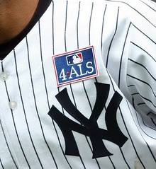
• Here’s a possible record: The Angels and Phillies both found themselves wearing two left-chest patches.
• One other player with two chest patches: Jason Varitek. And as you can see, his patch was peeling off too.
• As Phil noted yesterday, the Royals wore their patch on the other side, presumably because their “uphill” insignia would have forced them to position the patch too high up on the jersey (a situation that apparently didn’t both the Cardinals, not to mention the White Sox).
• These patches had been announced way back in March. But I don’t think there way any advance word that the patch design would also be used as a helmet decal. Because, as you know, anything worth doing is also worth overdoing, at least to MLB.
And yes, the red caps looked awful too, but we all knew that already.
(Special thanks to Josh Wilson, Dan Cichalski, Joe Alvaro, and Jack Krabbe for their contributions to today’s post.)
Uni Watch News Ticker: Actually, one team did wear America flag cap patches over the weekend: the Twins, who wore armed forces caps yesterday. ”¦
Bit of a snafu on the MLB Network. Look at the date tag at the top-left of this screen shot. Then look at Junior Griffey’s T-shirt (good spot by Alex Melendez). ”¦ I was out for my daily bike ride in Prospect Park on Friday when I passed a guy wearing old-school Orioles stirrups. I hit the brakes, turned around, approached the guy, and said, “You must be a Uni Watch reader.” Sure enough, it was Mike Noble, who’d obtained the stirrups as part of Robert Marshall’s stirrup club and was wearing them for the very first time. ”¦ Caleb Borchers declares that the most interesting jersey in international rugby belongs to Fiji. “One of the great things about rugby, is the role of tiny nations that are so delightfully non-corporate,” he writes. “The Fijans have some sort of traditional, ancestral mask on one side of the jersey. When I first saw it I thought it might be a little gimmicky, plus I’m not a fan of asymmetry. Given how lazy many nations are, however, just taking corporate templates, it’s nice to see something original and thoughtful. I love the traditional hooped socks, too.” ”¦ New Haven has become the second college football team to have a blue gridiron, and Boise State apparently isn’t too happy about it. ”¦ “These graphics were posted by an anonymous poster on 4chan.org’s sports board,” writes Dennis Abrams. “He took sprites and banners from NHLPA Hockey 93 for Super Nintendo but applied the colors and designs of the current NHL teams. The original thread in which each team was posted individually can be found here. He also took requests in that thread and created some designs not pictured in the compilation of NHL teams.” ”¦ Another new member of Stirrup Nation (or at least new to me): John Baker (with thanks to Doug Keklak). ”¦ Good news from Michigan, where Lisa Lark reports that high schools will not be allowed to have ads on uniforms. ”¦ You may know that Gold Glove winners who wear Rawlings gear get to wear a gold-colored Rawlings logo patch on their gloves. But here’s something I hadn’t seen before: Yadier Molina also has the gold logo patch on his chest protector (great spot by Laife Fulk). ”¦ Lots of good sports photos in this gallery of 1970s photos from Philadelphia (with thanks to Marc Malfara). ”¦ Is it really possible that a Central Connecticut State volleyball player was wearing an iPod during a game? ”¦ Carlton Football Club, an Aussie rules football team, wore yellow Livestrong uniforms yesterday (with thanks to Alyssa Miller). ”¦ Here’s a great shot of Grover Cleveland Alexander wearing the Cards’ 1927 World Champs uni (with thanks to Bruce Menard). ”¦ Nice shot of the Kings’ old subscript NOB format man. Man, the lettering was huge (with thanks to Brett Sawyer). ”¦ Back in 1983, Mariners pitcher Bill Caudill shaved off half of his beard in between innings, pitched the next half-inning, and then shaved off the rest of it. I’ve written about this story before but had never seen Caudill’s half-and-half look until Steve Mandich sent along this screen shot. I’m frankly a bit disappointed to discover that Caudill didn’t also shave off half of his moustache. ”¦ Speaking of facial hair, all the Cardinals’ starting pitchers are growing slump-buster moustaches. There’s some discussion of it in the first minute or so of this video clip (with thanks to Mark Nothum). ”¦ Cricket umps apparently don’t wear helmets. But maybe that will change after this. ”¦ An Italian swimmer wearing one of those new high-tech swimsuits was DQ’d from a meet last week when her suit split open in an unfortunate spot. Additional pics and details — all safe for work — here and here. ”¦ Here’s a real beauty. That jersey was worn by Julian Grant‘s uncle when he was in second grade, circa 1936! Here’s the team portrait, although Julian’s uncle isn’t actually shown in the photo. As Julian explains, “There’s a notation on the back of the picture that said he had the mumps that day!” ”¦ Canada wore Mountie-themed uniforms at the recent Classic Eagles vs Classic Canada rugby match (with thanks to Roberto Santiago, who also notes that Canterbury released some very odd footwear; additional view here). ”¦ Also from Roberto: “A harlot rugby tournament is one where players register as individuals and are randomly assigned a team on the day of the event. Most of these tournaments will include a game jersey as part of the registration fee, so as a player you get a quality game jersey and a fun day of rugby. But it makes it hard to match up your full kit, since you never know which color you’ll be wearing until you get there. This makes it easy to spot the players who ‘get it’ (or are just lucky) and are able to match their socks with the random jersey they are given. Some participants plan ahead and bring a lot of socks.” ”¦ Good view here of the “15” on Roger Federer’s jacket (with thanks to Brinke Guthrie). ”¦ Gumball maven Bill Jones made himself a full set of the red stars/stripes caps, including both versions of the Indians design (the Chief Wahoo one wasn’t worn on the field but Bill saw a retail version for sale and figured he’d execute that one as well). ”¦ Livan Hernandez continues to wear blue undersleeves on the road while the rest of the team wears black. ”¦ Latest player with the annoying Phiten-branded socks: Mike Napoli. Fortunately, they’re mostly covered up by his shinguards for half the game. ”¦ Speaking of socks, for a second I thought I’d spotted the most gratuitous American flag placement ever — take a look at the player high-fiving on the right side of this photo. Looks like a flag on his sock, right? But it’s just a really big laundry tag. ”¦ Even with the crummy jersey and ridiculous cap, Ubaldo Jimenez looks my-t-fine. ”¦ Awesome article on the artist who created Pat Patriot here (with thanks to Anil Adyanthaya). ”¦ Does Ryan Sadowski’s cap look a bit big? It’s fitted with a plastic insert, due to a brain injury he suffered in 2003. Details in the last six grafs of this story (with thanks to Brandon Davis). ”¦ Very interesting analysis of the new Yankee Stadium by design historian (and my longtime friend) Steve Heller here (thanks, Kirsten). … Several readers have noted that a new wordmark has shown up on the Astros’ home page. Hmmmm.
Isn’t that Junior Griffey in that 1992 ASG photo, not HR?
Yes. Harold Reynolds wishes he was good enough to win an All-Star Game MVP.
[quote comment=”338142″]Isn’t that Junior Griffey in that 1992 ASG photo, not HR?[/quote]
Duh. Sorry, the report was by HR, and I had a brain cramp while typing. Will fix now.
If you’re talking about the header on the Astros.com site, I don’t think that wordmark is a precursor to any change. Check the Pirates’ Web site.
link
That’s a different font than what the Pirates normally use (except for the P’s), and the word “Pirates” is part of that. All of the MLB team sites seem to now have custom headers instead of standardized fonts. But I think the Astros’ Web person was just lazy and used the original Star Trek font.
Despite all the nonsensical hoopla about tradition, the Yankees interlocking NY, used all over the Stadium, including back of home plate, is not the same as the one appearing on the uniform shirt or cap.
I might have been distracted, but i can’t see the IPOD.
Could the earphones just be for someone that is hearing impaired?
[quote comment=”338147″]I might have been distracted, but i can’t see the IPOD.[/quote]
Yeah, there was what where?
Those Mountie-themed uniforms don’t look very breathable. In fact they look like they probably trapped all the heat inside.
Did I correctly see that the umps for last night’s Rays/Rangers game did not wear the red caps?
1. The Astros new wordmark looks pretty good considering that the font closely resembles the one used for Star Trek, get it… Astros?
link
link
2. Ryan Connelly, is that you?
link
3. Big Day today…My first time at the New Yankee Stadium as well as my daughter’s first Major league ballgame.
I’m going with the Yankees/VaTech 5950…she’s going with the watermelon scratch and sniff NY cap.
[quote comment=”338152″]1. The Astros new wordmark looks pretty good considering that the font closely resembles the one used for Star Trek, get it… Astros?
link
link
2. Ryan Connelly, is that you?
link
3. Big Day today…My first time at the New Yankee Stadium as well as my daughter’s first Major league ballgame.
I’m going with the Yankees/VaTech 5950…she’s going with the watermelon scratch and sniff NY cap.[/quote]
That’s great! I took my one year old to his first ballgame — albeit a AAA game (Memphis Redbirds) but it’s something I’ll remember forever. Have a great time!
[quote comment=”338152″]3. Big Day today…My first time at the New Yankee Stadium as well as my daughter’s first Major league ballgame.
I’m going with the Yankees/VaTech 5950…she’s going with the watermelon scratch and sniff NY cap.[/quote]
matt, that’s excellent! have a great time
two things: 1. what sneakers will you we wearing and will they coordinate with your t-shirt?
2. to save you time and innings, here is the most important part of NYS. These should also be of interest and are must-sees for you
have fun!
Those 4 ALS patches would look a lot better if they put them on the players’ sleeves, on top of the useless manufacturer’s logo.
Jimenez looks fine? A serious case of stirrup-tunnel-vision there, Paul. (And even at that, the solid black ones aren’t even that good to begin with.)
His glove is formally illegal b/c it has 2 colors, and pitchers are supposed to have solid colored gloves. Besides, the team colors include purple… bad choice for a team color maybe, but wearing a partially red glove with it doesn’t help anything!
Under the ‘ridiculous’ vest-style shirt he decided to wear what looks like compression shirt with the sleeves cut to just above the elbow. That looks like shit… just wear a black T-shirt (preferably with a sleeveless compression shirt underneath, but even with the cut-off it would have looked better). And if you decide to wear the compression shirt like this, AT LEAST MAKE SURE THAT THE BODY ISN’T A DIFFERENT COLOR, which shows through the arm holes.
Besides that, he should have used black shoe laces under the classic looking pants-stirrups combo.
He looks good from the knees down to the ankles though.
Patch question…the Angels, in addition to the ALS patch, are currently wearing a chest memorial patch and sleeve memorial patch. Does anyone know the record for most simultaneous memorial patches? Did anyone wear more than two?
The links for Julian Grant’s uncle pics aren’t working.
did anyone else laugh when they saw the pictures of the swimsuit”malfunction” and then the very next ticker entry said, here’s a real beauty..
no? just me? *sigh*
[quote comment=”338156″]Jimenez looks fine? A serious case of stirrup-tunnel-vision there, Paul. (And even at that, the solid black ones aren’t even that good to begin with.)
His glove is formally illegal b/c it has 2 colors, and pitchers are supposed to have solid colored gloves. Besides, the team colors include purple… bad choice for a team color maybe, but wearing a partially red glove with it doesn’t help anything!
Under the ‘ridiculous’ vest-style shirt he decided to wear what looks like compression shirt with the sleeves cut to just above the elbow. That looks like shit… just wear a black T-shirt (preferably with a sleeveless compression shirt underneath, but even with the cut-off it would have looked better). And if you decide to wear the compression shirt like this, AT LEAST MAKE SURE THAT THE BODY ISN’T A DIFFERENT COLOR, which shows through the arm holes.
Besides that, he should have used black shoe laces under the classic looking pants-stirrups combo.
He looks good from the knees down to the ankles though.[/quote]
Glove you have a point on, but he undershirt is the standard MLB issue one.
And talk to Ricko about the white laces. I think it was him talking about that anyway, but the white laces for athletic shoes are a properly done old timey look. As Ricko will tell you, black laces just looked like street shoes, white laces made them sporty.
[quote comment=”338152″]1. The Astros new wordmark looks pretty good considering that the font closely resembles the one used for Star Trek, get it… Astros?
link
link
2. Ryan Connelly, is that you?
link
3. Big Day today…My first time at the New Yankee Stadium as well as my daughter’s first Major league ballgame.
I’m going with the Yankees/VaTech 5950…she’s going with the watermelon scratch and sniff NY cap.[/quote]
yes sir! robert did a diy of a diy! and did a great job too! i love that picture.
my diy jersey project is almost finished so i’ll get pics out to paul sometime in the near future.
have fun at the game! that must be exciting for the you and your daughter! hope you have a great time!!!
The Pennant Race shop’s ad for new summer items released on July 2nd caught my attention with this new link.
But I don’t get why they drew Willy Mays Hayes batting left-handed when both link and link played the role of Willy Mays Hayes batting right-handed…
“… Awesome article on the artist who created Pat Patriot here (with thanks to Anil Adyanthaya). …
Phil Bissell, creator of Pat, is second only to the sainted Willard Mullin in the pantheon of great sports cartoonist. Some of his best work was for Harvard football program covers during the 1950s and 1960s. Ivy football had certainly fallen from its proud tower by then, and Harvard was only fair-to-middling even within that context, but Bissell’s stuff was among the best ever done.
link
OK. Now for a humiliating confession. What does one do to a URL (as above) so that it becomes instantly linkable, the way that everybody else on this site appears to know?
Shamefacedly Yours, BC
Oh, Isee, you just write the URL…. Duh
[quote comment=”338163″]”… Awesome article on the artist who created Pat Patriot here (with thanks to Anil Adyanthaya). …
Phil Bissell, creator of Pat, is second only to the sainted Willard Mullin in the pantheon of great sports cartoonist. Some of his best work was for Harvard football program covers during the 1950s and 1960s. Ivy football had certainly fallen from its proud tower by then, and Harvard was only fair-to-middling even within that context, but Bissell’s stuff was among the best ever done.
link
OK. Now for a humiliating confession. What does one do to a URL (as above) so that it becomes instantly linkable, the way that everybody else on this site appears to know?
Shamefacedly Yours, BC[/quote]
I am such an effing idiot. Those cool posters were by Vic Johnson, not Phil Bissell. It’s Vic who’s in the pantheon with the sainted Willard Mullin, etc. Phil’s goof, though. I am such an effing idiot.
quote comment=\”338165\”] Phil\’s goof, though.[/quote]
Phil was and is very good. I’m the goof. Back to bed.
[quote comment=”338162″]The Pennant Race shop’s ad for new summer items released on July 2nd caught my attention with this new link.
But I don’t get why they drew Willy Mays Hayes batting left-handed when both link and link played the role of Willy Mays Hayes batting right-handed…[/quote]
I am more concerned with the fact that a simple t-shirt is $26…maybe that is just me.
I’d be willing to bet the volleyball player with the ear buds in is participating in warmups and is merely retrieving practice serves from the other side of the net.
[quote comment=\”338160\”][quote comment=\”338156\”]Jimenez looks fine? A serious case of stirrup-tunnel-vision there, Paul. (And even at that, the solid black ones aren\’t even that good to begin with.)
His glove is formally illegal b/c it has 2 colors, and pitchers are supposed to have solid colored gloves. Besides, the team colors include purple… bad choice for a team color maybe, but wearing a partially red glove with it doesn\’t help anything!
Under the \’ridiculous\’ vest-style shirt he decided to wear what looks like compression shirt with the sleeves cut to just above the elbow. That looks like shit… just wear a black T-shirt (preferably with a sleeveless compression shirt underneath, but even with the cut-off it would have looked better). And if you decide to wear the compression shirt like this, AT LEAST MAKE SURE THAT THE BODY ISN\’T A DIFFERENT COLOR, which shows through the arm holes.
Besides that, he should have used black shoe laces under the classic looking pants-stirrups combo.
He looks good from the knees down to the ankles though.[/quote]
Glove you have a point on, but he undershirt is the standard MLB issue one.
And talk to Ricko about the white laces. I think it was him talking about that anyway, but the white laces for athletic shoes are a properly done old timey look. As Ricko will tell you, black laces just looked like street shoes, white laces made them sporty.[/quote]
Okay… I\’ll give you the laces. I\’m standing by the shirt though, even if it is a standard issue MLB thing. I\’m pretty sure MLB issued black T-shirts exist. I do understand why this would feel better, but a cotton black T would look better.
Additional point: could MLB get someone to make them elbow-length performance undershirts? About every second pitcher you see has cut off sleeves these days.
Notre Dame’s 2009 Student Shirt revealed:
link
[quote comment=”338169″][quote comment=\”338160\”][quote comment=\”338156\”]Jimenez looks fine? A serious case of stirrup-tunnel-vision there, Paul. (And even at that, the solid black ones aren\’t even that good to begin with.)
His glove is formally illegal b/c it has 2 colors, and pitchers are supposed to have solid colored gloves. Besides, the team colors include purple… bad choice for a team color maybe, but wearing a partially red glove with it doesn\’t help anything!
Under the \’ridiculous\’ vest-style shirt he decided to wear what looks like compression shirt with the sleeves cut to just above the elbow. That looks like shit… just wear a black T-shirt (preferably with a sleeveless compression shirt underneath, but even with the cut-off it would have looked better). And if you decide to wear the compression shirt like this, AT LEAST MAKE SURE THAT THE BODY ISN\’T A DIFFERENT COLOR, which shows through the arm holes.
Besides that, he should have used black shoe laces under the classic looking pants-stirrups combo.
He looks good from the knees down to the ankles though.[/quote]
Glove you have a point on, but he undershirt is the standard MLB issue one.
And talk to Ricko about the white laces. I think it was him talking about that anyway, but the white laces for athletic shoes are a properly done old timey look. As Ricko will tell you, black laces just looked like street shoes, white laces made them sporty.[/quote]
Okay… I\’ll give you the laces. I\’m standing by the shirt though, even if it is a standard issue MLB thing. I\’m pretty sure MLB issued black T-shirts exist. I do understand why this would feel better, but a cotton black T would look better.
Additional point: could MLB get someone to make them elbow-length performance undershirts? About every second pitcher you see has cut off sleeves these days.[/quote]
Well, players can wear their own undershirts or have a clubhouse guy order them for them, but they aren’t issued. Just those stupid Nike ones. Yeah a solid one would look better, but I’m not going to fault him on that when it’s better blamed on Nike and MLB, who designed the damn thing and decided that would be the standard issue. If he had actively chosen that undershirt instead of just taken what was given to him, then rag on him all you want.
As for the sleeve length, that’s just way to complicated. They already have compression, loose fit, long sleeve, short sleeve, cotton, performance stuff, and if you decide to make a third length, What do you do it at? Elbow? Just below the elbow? 3/4 length? Cutting long sleeve shirts is the easiest way for every guy to get what he wants.
And striped socks need to come back in a big way. And soon.
[quote comment=”338170″]Notre Dame’s 2009 Student Shirt revealed:
link
Maybe it is the picture, but that color is UGLY. It looks too flesh-toned.
What? No photos of Mike Noble decked out in his O’s stirrups? I thought you had your camera with you at all times, Paul.
link
Did a blog this morning on ditching the black A’s uniform in favor of a revision to the 80’s alternate’s, as well as a mix of old and new.
[quote comment=”338171″][quote comment=”338169″][quote comment=\”338160\”][quote comment=\”338156\”]Jimenez looks fine? A serious case of stirrup-tunnel-vision there, Paul. (And even at that, the solid black ones aren\’t even that good to begin with.)
His glove is formally illegal b/c it has 2 colors, and pitchers are supposed to have solid colored gloves. Besides, the team colors include purple… bad choice for a team color maybe, but wearing a partially red glove with it doesn\’t help anything!
Under the \’ridiculous\’ vest-style shirt he decided to wear what looks like compression shirt with the sleeves cut to just above the elbow. That looks like shit… just wear a black T-shirt (preferably with a sleeveless compression shirt underneath, but even with the cut-off it would have looked better). And if you decide to wear the compression shirt like this, AT LEAST MAKE SURE THAT THE BODY ISN\’T A DIFFERENT COLOR, which shows through the arm holes.
Besides that, he should have used black shoe laces under the classic looking pants-stirrups combo.
He looks good from the knees down to the ankles though.[/quote]
Glove you have a point on, but he undershirt is the standard MLB issue one.
And talk to Ricko about the white laces. I think it was him talking about that anyway, but the white laces for athletic shoes are a properly done old timey look. As Ricko will tell you, black laces just looked like street shoes, white laces made them sporty.[/quote]
Okay… I\’ll give you the laces. I\’m standing by the shirt though, even if it is a standard issue MLB thing. I\’m pretty sure MLB issued black T-shirts exist. I do understand why this would feel better, but a cotton black T would look better.
Additional point: could MLB get someone to make them elbow-length performance undershirts? About every second pitcher you see has cut off sleeves these days.[/quote]
Well, players can wear their own undershirts or have a clubhouse guy order them for them, but they aren’t issued. Just those stupid Nike ones. Yeah a solid one would look better, but I’m not going to fault him on that when it’s better blamed on Nike and MLB, who designed the damn thing and decided that would be the standard issue. If he had actively chosen that undershirt instead of just taken what was given to him, then rag on him all you want.
As for the sleeve length, that’s just way to complicated. They already have compression, loose fit, long sleeve, short sleeve, cotton, performance stuff, and if you decide to make a third length, What do you do it at? Elbow? Just below the elbow? 3/4 length? Cutting long sleeve shirts is the easiest way for every guy to get what he wants.
And striped socks need to come back in a big way. And soon.[/quote]
I don’t think stripes are mandatory for stirrups to look good. Can’t imagine Giants, Dodgers or Yankees (for example) in striped stirrups. Sure, the Giants and Dodgers both wore them in their pre-1950 New York days. But, as it is with most of us here, our major frame of reference—and our affection for certain things—often has a lot to do with our kidhood. Watching MLB in the ’50s, I can tell you that the socks helped ID the team. White Sox and Indians, they has stirped socks with pins. Yankees and Cubs (‘cept for ’57) did not.
Part of the reason stirrups were interesting WAS the way different teams used them. Some used stripes, some used solid. That was part of the deal. A visually interesting part of it.
—Ricko
[quote comment=”338171″][quote comment=”338169″][quote comment=\”338160\”][quote comment=\”338156\”]Jimenez looks fine? A serious case of stirrup-tunnel-vision there, Paul. (And even at that, the solid black ones aren\’t even that good to begin with.)
His glove is formally illegal b/c it has 2 colors, and pitchers are supposed to have solid colored gloves. Besides, the team colors include purple… bad choice for a team color maybe, but wearing a partially red glove with it doesn\’t help anything!
Under the \’ridiculous\’ vest-style shirt he decided to wear what looks like compression shirt with the sleeves cut to just above the elbow. That looks like shit… just wear a black T-shirt (preferably with a sleeveless compression shirt underneath, but even with the cut-off it would have looked better). And if you decide to wear the compression shirt like this, AT LEAST MAKE SURE THAT THE BODY ISN\’T A DIFFERENT COLOR, which shows through the arm holes.
Besides that, he should have used black shoe laces under the classic looking pants-stirrups combo.
He looks good from the knees down to the ankles though.[/quote]
Glove you have a point on, but he undershirt is the standard MLB issue one.
And talk to Ricko about the white laces. I think it was him talking about that anyway, but the white laces for athletic shoes are a properly done old timey look. As Ricko will tell you, black laces just looked like street shoes, white laces made them sporty.[/quote]
Okay… I\’ll give you the laces. I\’m standing by the shirt though, even if it is a standard issue MLB thing. I\’m pretty sure MLB issued black T-shirts exist. I do understand why this would feel better, but a cotton black T would look better.
Additional point: could MLB get someone to make them elbow-length performance undershirts? About every second pitcher you see has cut off sleeves these days.[/quote]
Well, players can wear their own undershirts or have a clubhouse guy order them for them, but they aren’t issued. Just those stupid Nike ones. Yeah a solid one would look better, but I’m not going to fault him on that when it’s better blamed on Nike and MLB, who designed the damn thing and decided that would be the standard issue. If he had actively chosen that undershirt instead of just taken what was given to him, then rag on him all you want.
As for the sleeve length, that’s just way to complicated. They already have compression, loose fit, long sleeve, short sleeve, cotton, performance stuff, and if you decide to make a third length, What do you do it at? Elbow? Just below the elbow? 3/4 length? Cutting long sleeve shirts is the easiest way for every guy to get what he wants.
And striped socks need to come back in a big way. And soon.[/quote]
Just to be clear: I don’t fault him for anything really. The glove could be the only color it comes in for now, it could be something he got from someone else and really liked, maybe he/the airline lost his and got a spare one from the D-backs equipment staff… could be anything. The shirt is just shitty design, and he can’t do anything about. It’s just stating that he looks ‘mighty fine’ was kinda pushing it…
(You can’t fault anyone for driving a UPS truck either, but to say it looks mighty fine is kinda weird)
National and American Leagues, 1958…
link
Nice balance of striped stirrups and non-striped stirrups.
—Ricko
oops, here’s AL
link
3. Big Day today…My first time at the New Yankee Stadium as well as my daughter’s first Major league ballgame.
I’m going with the Yankees/VaTech 5950…she’s going with the watermelon scratch and sniff NY cap.
matt, that’s excellent! have a great time
two things: 1. what sneakers will you we wearing and will they coordinate with your t-shirt?
2. to save you time and innings, here is the most important part of NYS. These should also be of interest and are must-sees for you
have fun!
Thanks, Phil…I think that she’s more excited about the train ride from Tarrytown.
I’ve got the New Era store all scoped out already.
All kidding aside, there are a few shops right along Ocean Ave that have GREAT stuff as well.
Someone has to say it:
Nice rack at that barbecue.
Now let’s return to intelligent, meaningful discourse.
… Here’s a great shot of Grover Cleveland Alexander wearing the Cards’ 1927 World Champs uni (with thanks to Bruce Menard).
Can we get someone to colorized that pic? Great shot!!
[quote comment=”338177″]National and American Leagues, 1958…
link
Nice balance of striped stirrups and non-striped stirrups.
—Ricko[/quote]
Did the dodgers actually wear the stirups higher with their Home uni’s? all the other teams appear to be the same height with both sets. That just jumped out at me when i was looking over those pics.
Re. the volleyball picture, I would guarantee that picture was taken during warmups (she’s probably listening to her “get psyched” music). No way any coach or referee would allow an ipod during a game.
[quote comment=”338182″][quote comment=”338177″]National and American Leagues, 1958…
link
Nice balance of striped stirrups and non-striped stirrups.
—Ricko[/quote]
Did the dodgers actually wear the stirups higher with their Home uni’s?
all the other teams appear to be the same height with both sets. That just jumped out at me when i was looking over those pics.[/quote]
Doubt it. I think Okkonen was copy/pasting templates. That’d be my guess, anyway.
[quote comment=”338181″]… Here’s a great shot of Grover Cleveland Alexander wearing the Cards’ 1927 World Champs uni (with thanks to Bruce Menard).
Can we get someone to colorized that pic? Great shot!![/quote]
y’know…i had that same EXACT thought…since it combines two weekend bits i did — the “worlds champion” on a uni (would have killed for that pic then), and the colorization of old baseball unis…
lemme put out a feeler for larry bodnovich, who is my colorizing guru…
great call terence!
Good news from Michigan, where Lisa Lark reports that high schools will not be allowed to have ads on uniforms.
Yeah, that’s great news… unless you happen to be a.) a taxpayer or b.) a student in an organization that just got cut for lack of funding. If a local business wants to subsidize a program, why not let them? Nobody seems to care when Gieshe Shoes sponsors a little league team, right?
I know the red hats aren’t popular around here, but they actually didn’t look bad with the Twins’ alternate jerseys on Saturday:
link
Also, a few of the armed forces caps from yesterday were white (can’t find a picture), so it was interesting over the weekend to see what the Twins would look like with red or white caps. I think I’ll stick with the dark blue though.
Nicest IPod I Have Ever Seen
Cannot get over the ugliness of the red had. Did you see it on the Padre’s camo unis?
Is this the worst baseball uni ever?
link
Ugh.
I don’t see the difference in the Astros wordmark. Did they switch it back?
Eric Perkins, who is a Twin Cities sports anchor, had this to say on Twitter,
“somebody please make these commemorative baseball caps stop!”
One of us or just showing good taste?
Did Bill Caudill ever room with Dock Ellis?
I had some fun, over the weekend, with this awesome picture of Charlie Taylor I found in my 1973 ‘The Gladiators’ book.
link
[quote comment=”338188″]Nicest IPod I Have Ever Seen[/quote]
Bold statement since you can’t even see the iPod!!!
It might be during warmups, but the opposing player is there ready too. I can’t remember if both sides help warm up together like in tennis.
[quote comment=”338191″]Eric Perkins, who is a Twin Cities sports anchor, had this to say on Twitter,
“somebody please make these commemorative baseball caps stop!”
One of us or just showing good taste?[/quote]
You should let Perk know about Uni Watch. He’s a good guy, funny, and probably wold appreciate the shared dislike of the “special” hats.
My daughter (21) was at the Twins game Saturday. Because the Twins were wearing their 80s throwbacks, the red hats didn’t look all that bad, or abnormal. But of the Tigers she said, “…looked really stupid with the orange and navy blue.”
—Ricko
An Italian swimmer wearing one of those new high-tech swimsuits was DQ’d from a meet last week when her suit split open in an unfortunate spot.
she should have worn one of these:
link
Just got back from my wonderful weekend wedding at Lambeau Field. I won’t post any pics until we get them all back so I can put them in slideshow. Well, maybe I will throw a few up in the next few days… but the entire wedding day was filled with Pack and Lambeau-related things. It was absolutly amazing! My wife got me Super Bowl I Championship cuff links, she loved her Rob Ullman pin up, our colors were obviously green and gold… trust me, much more to follow.
And thanks to all the members of Uni Watch who wished me a happy day. Our little UW community is amazing, and it never ceases to amaze me how great and thoughtful everyone is. Thanks again!
[quote comment=”338185″][quote comment=”338181″]… Here’s a great shot of Grover Cleveland Alexander wearing the Cards’ 1927 World Champs uni (with thanks to Bruce Menard).
Can we get someone to colorized that pic? Great shot!![/quote]
y’know…i had that same EXACT thought…since it combines two weekend bits i did — the link (would have killed for that pic then), and link…
lemme put out a feeler for larry bodnovich, who is my colorizing guru…
great call terence![/quote]
I’ve been trying to find a picture for a potential DIY project of the old english STL that was worn on the sleeve for a few years by the Cards. The closest I can get is link, and link, which leaves the L very unclear. Help please!
Congrats Johnny O! Look forward to seeing the pics.
[quote comment=”338151″]Did I correctly see that the umps for last night’s Rays/Rangers game did not wear the red caps?[/quote]
Yeah, that’s correct. I was at the game, but it didn’t cross my mind. Although Ian Kinsler’s pants are getting increasingly blousy to accompany his high sock look.
really who is looking at her ears? (god bless the volleyball uni) link
[quote comment=”338159″]did anyone else laugh when they saw the pictures of the swimsuit”malfunction” and then the very next ticker entry said, here’s a real beauty..
no? just me? *sigh*[/quote]
I did the same thing.
how is it Ryan Sadowski needs extra head protection, stands in the middle of the playing field, and gets to wear a hat w/ a plastic insert. But Base coaches have to wear stupid Olerud style helmets?
[quote comment=”338175″][quote comment=”338171″][quote comment=”338169″][quote comment=\”338160\”][quote comment=\”338156\”]
I don’t think stripes are mandatory for stirrups to look good. Can’t imagine Giants, Dodgers or Yankees (for example) in striped stirrups. Sure, the Giants and Dodgers both wore them in their pre-1950 New York days. But, as it is with most of us here, our major frame of reference—and our affection for certain things—often has a lot to do with our kidhood. Watching MLB in the ’50s, I can tell you that the socks helped ID the team. White Sox and Indians, they has stirped socks with pins. Yankees and Cubs (‘cept for ’57) did not.
Part of the reason stirrups were interesting WAS the way different teams used them. Some used stripes, some used solid. That was part of the deal. A visually interesting part of it.
—Ricko[/quote]
Very true. I love striped stirrups, but they’re not for everyone – especially if you have a pinstriped uni.
[quote comment=”338181″]… Here’s a great shot of Grover Cleveland Alexander wearing the Cards’ 1927 World Champs uni (with thanks to Bruce Menard).
Can we get someone to colorized that pic? Great shot!![/quote]
Just to pick a nit, the Cardinals won the 1926 Series and wore the World Champs uniforms during 1927. The Murderers Row Yankees won the 1927 World Series, beating Pittsburgh.
Dear MLB,
Not one of your better weekends. The red hat idea is a (nearly) complete failure, and the peeling ALS patches really made you look like cheapskates. Lose the hats, and whenever you want to add a patch, hire one of the fine Uni Watch DIYers to sew it on for you.
Sincerely,
Concerned in UW-land
[quote comment=”338145″]If you’re talking about the header on the Astros.com site, I don’t think that wordmark is a precursor to any change. Check the Pirates’ Web site.
link
That’s a different font than what the Pirates normally use (except for the P’s), and the word “Pirates” is part of that. All of the MLB team sites seem to now have custom headers instead of standardized fonts. But I think the Astros’ Web person was just lazy and used the original Star Trek font.[/quote]
The “Pride. Passion…” is more of a local tagline and isn’t part of the official branding standards. The “Pirates” font is just too hard to read when used heavily, so it’s typically usually used in conjunction with a different font, depending on the type of project. Sometimes even having the team name in the “Pirates” font doesn’t work since the branding standard is just the “P.”
Anyway, I wouldn’t read into the Astros’ header changing. It was most likely a request from marketing to jazz it up, a designer thought a Star Trek-look would be cool, and that was that.
[quote comment=”338145″]If you’re talking about the header on the Astros.com site, I don’t think that wordmark is a precursor to any change. Check the Pirates’ Web site.
link
That’s a different font than what the Pirates normally use (except for the P’s), and the word “Pirates” is part of that. All of the MLB team sites seem to now have custom headers instead of standardized fonts. But I think the Astros’ Web person was just lazy and used the original Star Trek font.[/quote]
The link also use a different font, one that is commonly used in print and television ads.
[quote comment=”338195″][quote comment=”338191″]Eric Perkins, who is a Twin Cities sports anchor, had this to say on Twitter,
“somebody please make these commemorative baseball caps stop!”
One of us or just showing good taste?[/quote]
You should let Perk know about Uni Watch. He’s a good guy, funny, and probably wold appreciate the shared dislike of the “special” hats.
My daughter (21) was at the Twins game Saturday. Because the Twins were wearing their 80s throwbacks, the red hats didn’t look all that bad, or abnormal. But of the Tigers she said, “…looked really stupid with the orange and navy blue.”
—Ricko[/quote]
My dad went to the SF/Houston game on Friday and told me that he kept waiting for the Giants to take the field! He thought there was some sort of special pre-game game (like when little kids play at halftime, or whatever). He reported that it was especially disconcerting because the Giants were playing the red-clad Astros.
[quote comment=”338208″][quote comment=”338145″]If you’re talking about the header on the Astros.com site, I don’t think that wordmark is a precursor to any change. Check the Pirates’ Web site.
link
That’s a different font than what the Pirates normally use (except for the P’s), and the word “Pirates” is part of that. All of the MLB team sites seem to now have custom headers instead of standardized fonts. But I think the Astros’ Web person was just lazy and used the original Star Trek font.[/quote]
The link also use a different font, one that is commonly used in print and television ads.[/quote]
Dear Boise State,
Before you get any crazy ideas, don’t even think of suing New Haven over the blue field. Or else I may sue you for assaulting my eyes with your new unis.
You may have been the first to have the blue field, but you don’t own the idea. You didn’t really think no one else would try it, did you? Remember that imitation is the sincerest form of flattery and let it go.
Sincerely,
Someone who wants to remember you for the ’07 Fiesta Bowl, not for whining about the loss of your uniqueness.
[quote comment=”338170″]Notre Dame’s 2009 Student Shirt revealed:
link
Interesting that in the unofficial link above you can clearly see that adidas triangle: but in the official link for bookstore sales…
link
…the triangle isn’t visible. (Even the larger image seems logo-free.) Shouldn’t it be the other way around, the official site should be flogging the official sponsor?
[quote comment=”338208″][quote comment=”338145″]If you’re talking about the header on the Astros.com site, I don’t think that wordmark is a precursor to any change. Check the Pirates’ Web site.
link
That’s a different font than what the Pirates normally use (except for the P’s), and the word “Pirates” is part of that. All of the MLB team sites seem to now have custom headers instead of standardized fonts. But I think the Astros’ Web person was just lazy and used the original Star Trek font.[/quote]
The link also use a different font, one that is commonly used in print and television ads.[/quote]
Oops. Anyway, what I was gonna say before accidentally hitting Return…
Since you linked to the Giants’ site: link.
[quote comment=”338197″]Just got back from my wonderful weekend wedding at Lambeau Field. I won’t post any pics until we get them all back so I can put them in slideshow. Well, maybe I will throw a few up in the next few days… but the entire wedding day was filled with Pack and Lambeau-related things. It was absolutly amazing! My wife got me Super Bowl I Championship cuff links, she loved her Rob Ullman pin up, our colors were obviously green and gold… trust me, much more to follow.
And thanks to all the members of Uni Watch who wished me a happy day. Our little UW community is amazing, and it never ceases to amaze me how great and thoughtful everyone is. Thanks again![/quote]
Johnny O, congrats to you and good luck to your bride.
Can I ask if you mean that you two held your marriage ceremony on the field at Lambeau; or that the reception was held in the newly-expanded stadium?
Or maybe both? ;-)
[quote comment=”338198″][quote comment=”338185″][quote comment=”338181″]… Here’s a great shot of Grover Cleveland Alexander wearing the Cards’ 1927 World Champs uni (with thanks to Bruce Menard).
Can we get someone to colorized that pic? Great shot!![/quote]
y’know…i had that same EXACT thought…since it combines two weekend bits i did — the link (would have killed for that pic then), and link…
lemme put out a feeler for larry bodnovich, who is my colorizing guru…
great call terence![/quote]
I’ve been trying to find a picture for a potential DIY project of the old english STL that was worn on the sleeve for a few years by the Cards. The closest I can get is link, and link, which leaves the L very unclear. Help please![/quote]
Hey Nick W!
As per the “Dressed to the Nines” HOF Data Base they wore it on their left sleeve from ’27 to ’30,
link
I’m taking a trip to Cooperstown next week with the Fam and I will try to grab a pic of it, if I can. If you’re on the DIY Facebook Group look me up. Last name: Kearns
Finally, I remembered to ask the question I came here to write:
For all the NYC contributors: given that this was the 70th anniversary of Gehrig’s “luckiest man on the face of the earth” speech, was the site of the speech in the OLD Yankee Stadium noted in any way over the weekend?
Nice to see the old Kings unis…and Wayman Tisdale wearing them. A classy look and a classy guy. Think I’ll listen to some of his tunes on my iPod (but I won’t do it while playing volleyball).
My only comment on the 4th of July hats: as I watched Chicago baseball highlights all weekend, I had to wonder “does anyone in MLB marketing think that either Cubs or Royals fans are running out to buy a hat in Cardinals Red?”
Why not let each team design their own 4th of July hats and wear them only on say, oh let’s just pick a date out at random: maybe the FOURTH OF JULY?
[quote comment=”338167″][quote comment=”338162″]The Pennant Race shop’s ad for new summer items released on July 2nd caught my attention with this new link.
But I don’t get why they drew Willy Mays Hayes batting left-handed when both link and link played the role of Willy Mays Hayes batting right-handed…[/quote]
I am more concerned with the fact that a simple t-shirt is $26…maybe that is just me.[/quote]
Good point…I didn’t even notice the price because the erroneous ambidexterity of Willie Mays Hayes was discouraging enough…Haha!!
[quote comment=”338215″][quote comment=”338198″][quote comment=”338185″][quote comment=”338181″]… Here’s a great shot of Grover Cleveland Alexander wearing the Cards’ 1927 World Champs uni (with thanks to Bruce Menard).
Can we get someone to colorized that pic? Great shot!![/quote]
y’know…i had that same EXACT thought…since it combines two weekend bits i did — the link (would have killed for that pic then), and link…
lemme put out a feeler for larry bodnovich, who is my colorizing guru…
great call terence![/quote]
I’ve been trying to find a picture for a potential DIY project of the old english STL that was worn on the sleeve for a few years by the Cards. The closest I can get is link, and link, which leaves the L very unclear. Help please![/quote]
Hey Nick W!
As per the “Dressed to the Nines” HOF Data Base they wore it on their left sleeve from ’27 to ’30,
link
I’m taking a trip to Cooperstown next week with the Fam and I will try to grab a pic of it, if I can. If you’re on the DIY Facebook Group look me up. Last name: Kearns[/quote]
Fantastic! I’ll look you up on FB tonight. I knew I could count on the UniWatchers
whoa
wonder if hank had a problem with that sleeve patch
On the subject of today’s “vests” that aren’t “vest” but jerseys with no sleeves (Colorado being the specific example today), here’s a REAL vest…and a good look at Ol’ Bill on the Redlegs’ ’56 road set.
link
—Ricko
[quote comment=”338221″]link
wonder if hank had a problem with that sleeve patch[/quote]
Ah, the last Milwaukee-first Atlanta look. As much I like the tomahawk and the extensive three-color trim of it precursors, that’s still a great looking uni. Thought so at the time, still think so now.
—Ricko
[quote comment=”338221″]link
wonder if hank had a problem with that sleeve patch[/quote]
I love the seam shadowing on the Cap & Uni and especially LOVE the ribbing on the undershirt sleeve cuff!!!
[quote comment=”338224″]…LOVE the ribbing on the undershirt sleeve cuff!!![/quote]I wonder if that’s an “offical” undershirt or if Hank just took something out of his locker for the sitting?
[quote comment=”338223″]Ah, the last Milwaukee-first Atlanta look. As much I like the tomahawk and the extensive three-color trim of it precursors, that’s still a great looking uni. Thought so at the time, still think so now.[/quote]
Braves do a great job with the red/blue combo: and that’s a difficult combo to work with IMHO.
[quote comment=”338203″]how is it Ryan Sadowski needs extra head protection, stands in the middle of the playing field, and gets to wear a hat w/ a plastic insert. But Base coaches have to wear stupid Olerud style helmets?[/quote]
That’s a damn good question
[quote comment=”338205″][quote comment=”338181″]… Here’s a great shot of Grover Cleveland Alexander wearing the Cards’ 1927 World Champs uni (with thanks to Bruce Menard).
Can we get someone to colorized that pic? Great shot!![/quote]
Just to pick a nit, the Cardinals won the 1926 Series and wore the World Champs uniforms during 1927. The Murderers Row Yankees won the 1927 World Series, beating Pittsburgh.[/quote]
True, but… they WERE the 1927 World Champions’ unis, because that’s the year they WORE them. You could more specifically say “the 1927 World Champions’ unis, that designated their winning the 1926 World Series”.
There’s a subtle difference between:
1927, World Champions’ uniforms and
1927 World Champions’ uniforms
Not so fast – the Broncos are extremely protective of the tradition they started with the original blue turf in 1986.
“For the past 22 years, the blue field has been an iconic symbol for Boise State University and Boise,” said Rachael Bickerton, the university’s director of trademark licensing and enforcement. “It is recognized near and far as the home of Broncos. While New Haven’s imitation is flattering, we consider the blue turf to be part of our identity, and we place great value on that uniqueness.”
Not quite the NIKE-intensive level of douchebaggery, but does a school like Boise State really need a “Director of Trademark licensing and enforcement” ? I put it at Level II Douchebaggery ….
ENOUGH ALREADY!
link
RTT’s Create Your Own UT Uniform Contest
Have Fun….
[quote comment=”338229″]Not quite the NIKE-intensive level of douchebaggery, but does a school like Boise State really need a “Director of Trademark licensing and enforcement” ? I put it at Level II Douchebaggery ….[/quote]
Pretty sure all schools have someone working in that capacity for a variety of reasons.
Granted, I’m pretty sure the blue field itself is not trademarked, but if so, then Boise St. is pretty douchebaggerish. Maybe next they’ll try to sue any football program with the blue and orange color scheme, since thats they’re ‘brand’ as well. Florida Gators, Virginia Cavaliers, and Denver Broncos, look out, Boise St is comin for you!
(may I also note how ironic it is that Boise St is getting their panties in a wad over this when they stole their entire image from the Denver Broncos?
[quote comment=”338150″]Those Mountie-themed uniforms don’t look very breathable. In fact they look like they probably trapped all the heat inside.[/quote]
It didn’t seem to bother Canada, they won 35-5.
I thought the biggest danger would be feeling silly. I know when I played if I didn’t look right I didn’t feel right. But I guess Classic Canada feels good playing in those silly shirts.
[quote comment=”338227″][quote comment=”338203″]how is it Ryan Sadowski needs extra head protection, stands in the middle of the playing field, and gets to wear a hat w/ a plastic insert. But Base coaches have to wear stupid Olerud style helmets?[/quote]
That’s a damn good question[/quote]
Just a guess:
Sadowski is always going to wear the insert, because, well, if he doesn’t, he knows full-well he could be seriously injured.
Base coaches, on the other hand, HATE wearing the batting helmets (See Bowa, Larry). If you allow them to wear the inserts inside their caps, I’d bet you a few paychecks that most of them would not actually put the insert inside the cap. Umpires aren’t going to bother checking them before each inning, either. Therefore, they wear the batting helmet. Sadowski doesn’t.
Wonder if we’ll hear this next from Boise:
“For the past several years, the hook-and-lateral and the Statue of Liberty plays have been an iconic symbol for Boise State University and Boise,” said Rachael Bickerton, the university’s director of trademark licensing and enforcement. “While any team’s imitation is flattering, we consider those plays to be part of our identity, and we place great value on that uniqueness.”
[quote comment=”338231″][quote comment=”338229″]Not quite the NIKE-intensive level of douchebaggery, but does a school like Boise State really need a “Director of Trademark licensing and enforcement” ? I put it at Level II Douchebaggery ….[/quote]
Pretty sure all schools have someone working in that capacity for a variety of reasons.
Granted, I’m pretty sure the blue field itself is not trademarked, but if so, then Boise St. is pretty douchebaggerish. Maybe next they’ll try to sue any football program with the blue and orange color scheme, since thats they’re ‘brand’ as well. Florida Gators, Virginia Cavaliers, and Denver Broncos, look out, Boise St is comin for you!
(may I also note how ironic it is that Boise St is getting their panties in a wad over this when they stole their entire image from the Denver Broncos?[/quote]
I was under the impression that the NCAA has long since required all playing surfaces to be green, and that Boise State was grandfathered on the deal.
That not so?
—Ricko
[quote comment=”338233″][quote comment=”338227″][quote comment=”338203″]how is it Ryan Sadowski needs extra head protection, stands in the middle of the playing field, and gets to wear a hat w/ a plastic insert. But Base coaches have to wear stupid Olerud style helmets?[/quote]
That’s a damn good question[/quote]
Just a guess:
Sadowski is always going to wear the insert, because, well, if he doesn’t, he knows full-well he could be seriously injured.
Base coaches, on the other hand, HATE wearing the batting helmets (See Bowa, Larry). If you allow them to wear the inserts inside their caps, I’d bet you a few paychecks that most of them would not actually put the insert inside the cap. Umpires aren’t going to bother checking them before each inning, either. Therefore, they wear the batting helmet. Sadowski doesn’t.[/quote]
Through most of the early ’50s the Pirates didn’t even have softcaps. Wore suede-flocked helmets both on offense and defense. About the time they switched to the vests in ’57 they relaxed the policy a bit, and the softcaps returned for many of the players, especially the pitchers.
In Joe Garagiola’s BASEBALL IS A FUNNY GAME there’s mention of the permanent hard hats (Joe G. was with the Pirates at the time).
link
—Ricko
[quote comment=”338232″][quote comment=”338150″]Those Mountie-themed uniforms don’t look very breathable. In fact they look like they probably trapped all the heat inside.[/quote]
It didn’t seem to bother Canada, they won 35-5.
I thought the biggest danger would be feeling silly. I know when I played if I didn’t look right I didn’t feel right. But I guess Classic Canada feels good playing in those silly shirts.[/quote]
I always thought if Ottawa got another CFL team and they didn’t go with the Rough Riders name, they should be the Mounties and have a uni somewhat like the rugby ones…well, color-wise, not with THAT much detail. I liked them, though.
More Pirate helmets…
(l to r) Felipe Montemayor, Roman Mejias, Roberto Clemente
link
btw…Pirates Gulden Golden (mustard) set…
link
[quote comment=”338238″]More Pirate helmets…
(l to r) Felipe Montemayor, Roman Mejias, Roberto Clemente
link
btw…Pirates Gulden Golden (mustard) set…
link
“Pirates” looks much better vertically arched, rather than radially arched.
Ah, the Vancouver Mounties…
link
link
—Ricko
If any school has a right to be pissed about the use of the blue turf, it would be Kentucky.
(cue “Dueling Banjoes”).
The “VM” jersey is the road gray.
[quote comment=”338235″][quote comment=”338231″][quote comment=”338229″]Not quite the NIKE-intensive level of douchebaggery, but does a school like Boise State really need a “Director of Trademark licensing and enforcement” ? I put it at Level II Douchebaggery ….[/quote]
Pretty sure all schools have someone working in that capacity for a variety of reasons.
Granted, I’m pretty sure the blue field itself is not trademarked, but if so, then Boise St. is pretty douchebaggerish. Maybe next they’ll try to sue any football program with the blue and orange color scheme, since thats they’re ‘brand’ as well. Florida Gators, Virginia Cavaliers, and Denver Broncos, look out, Boise St is comin for you!
(may I also note how ironic it is that Boise St is getting their panties in a wad over this when they stole their entire image from the Denver Broncos?[/quote]
I was under the impression that the NCAA has long since required all playing surfaces to be green, and that Boise State was grandfathered on the deal.
That not so?
—Ricko[/quote]
The article states that New Haven checked with the NCAA to make sure they would be able to install the blue field before doing so, so in that regard, I don’t believe the rule exists.
Such a shame, because now you just know that Oregon is going to go to a yellow field with green lines, the word ‘Oregon’ ghosted with white on white on the sidelines, and a black diamond plating look for the end-zone. Only a matter of time…
[quote comment=”338241″]If any school has a right to be pissed about the use of the blue turf, it would be Kentucky.
(cue “Dueling Banjoes”).[/quote]
Because of the Wildcats’ kick-ass football tradition or because it’s the “Blueturf State”? ;)
[quote comment=”338239″][quote comment=”338238″]More Pirate helmets…
(l to r) Felipe Montemayor, Roman Mejias, Roberto Clemente
link
btw…Pirates Gulden Golden (mustard) set…
link
“Pirates” looks much better vertically arched, rather than radially arched.[/quote]
Agreed. Ah, my first love – the Gulden mustard jerseys. Wonder what they would look like as a button-down set.
[quote comment=”338243″][quote comment=”338235″][quote comment=”338231″][quote comment=”338229″][/quote]The article states that New Haven checked with the NCAA to make sure they would be able to install the blue field before doing so, so in that regard, I don’t believe the rule exists.
Such a shame, because now you just know that Oregon is going to go to a yellow field with green lines, the word ‘Oregon’ ghosted with white on white on the sidelines, and a black diamond plating look for the end-zone. Only a matter of time…[/quote]
As much as I hated it on the jerseys, I think the diamond plating would be cool in the end zones. Good idea! Okay, photoshop guys…
[quote comment=”338237″][quote comment=”338232″][quote comment=”338150″]Those Mountie-themed uniforms don’t look very breathable. In fact they look like they probably trapped all the heat inside.[/quote]
It didn’t seem to bother Canada, they won 35-5.
I thought the biggest danger would be feeling silly. I know when I played if I didn’t look right I didn’t feel right. But I guess Classic Canada feels good playing in those silly shirts.[/quote]
I always thought if Ottawa got another CFL team and they didn’t go with the Rough Riders name, they should be the Mounties and have a uni somewhat like the rugby ones…well, color-wise, not with THAT much detail. I liked them, though.[/quote]
One problem – I think the RCMP has Disney to monitor the use of the Mountie name – so knowing them – they’ll price it out of reach just to be difficult
[quote comment=”338234″]Wonder if we’ll hear this next from Boise:
“For the past several years, the hook-and-lateral and the Statue of Liberty plays have been an iconic symbol for Boise State University and Boise,” said Rachael Bickerton, the university’s director of trademark licensing and enforcement. “While any team’s imitation is flattering, we consider those plays to be part of our identity, and we place great value on that uniqueness.”[/quote]
Not to mention “cheesy on-field marriage proposals including (but not limited to) those between player and cheerleader.”
[quote comment=”338227″][quote comment=”338203″]how is it Ryan Sadowski needs extra head protection, stands in the middle of the playing field, and gets to wear a hat w/ a plastic insert. But Base coaches have to wear stupid Olerud style helmets?[/quote]
That’s a damn good question[/quote]
coaches don’t wear gloves, maybe???
[quote comment=”338249″][quote comment=”338227″][quote comment=”338203″]how is it Ryan Sadowski needs extra head protection, stands in the middle of the playing field, and gets to wear a hat w/ a plastic insert. But Base coaches have to wear stupid Olerud style helmets?[/quote]
That’s a damn good question[/quote]
coaches don’t wear gloves, maybe???[/quote]
i’d rather wear a flapless helmet that fit than a softcap with what felt like a Tupperware container inside it, wouldn’t you?
More not-light-gold-but-old-gold Pirates…
link
And Dick Allen (“Richie” at the time) of the Phillies playing 1b wearing a helmet. He continued to wear a helmet on defense for the rest of his career, even when he played LF for the Dodgers.
link
George Scott of Red Sox and Brewers did the same.
—Ricko
That CCS volleyball player wearing the iPod? I’m sorry, but I would NOT have noticed that. Not to be a dirty old man here, but — yo! — it wasn’t the ears I was looking at.
re: Philly.com’s photo journey
Amazing seeing younger versions of Bob Dole, Jimmy Carter, etc.
Also great to see the 1970-71 “Eventy Ixers” jersey — though there was one whose “eventy” was so thin it looked like an afterthought.
I would have liked to have seen more of the Bicentennial Cup uniforms — the U.S. was red, the English were canary yellow. And too damn many empty seats (which will NOT happen in Chester next year).
Not sure if anyone commented this but here is a large version of the Fiji home Rugby kits. These are awesome.
link;?portal=afffut&network=AF
This blog is awesome as well. Thanks!
[quote comment=”338229″]Not so fast – the Broncos are extremely protective of the tradition they started with the original blue turf in 1986.
“For the past 22 years, the blue field has been an iconic symbol for Boise State University and Boise,” said Rachael Bickerton, the university’s director of trademark licensing and enforcement. “It is recognized near and far as the home of Broncos. While New Haven’s imitation is flattering, we consider the blue turf to be part of our identity, and we place great value on that uniqueness.”
Not quite the NIKE-intensive level of douchebaggery, but does a school like Boise State really need a “Director of Trademark licensing and enforcement” ? I put it at Level II Douchebaggery ….
ENOUGH ALREADY![/quote]
I sent an email to Ms. Bickerton (I was nice…didn’t mention Uni Watch, but as a member I don’t want to tarnish this fine group in any way) expressing my concerns. Can’t wait to read the response. If it’s in legalese I may need a translator, though.
[quote comment=”338251″]More not-light-gold-but-old-gold Pirates…
link
ah yes…’72 ASG pics from steve …
he added a shitload more recently too…including some twinkies, just for you rick ;)
[quote]And Dick Allen (“Richie” at the time) of the Phillies playing 1b wearing a helmet. He continued to wear a helmet on defense for the rest of his career, even when he played LF for the Dodgers.
link
here’s a great, early pic of dick wearing a helmet & glove (pretty sure he wore that in the field)
great stuff mr. pearson
Pitt’s Dejuan Blair announced on his twitter page about a half hour ago that he will keep his #45 with the Spurs.
[quote comment=”338256″][quote comment=”338251″]More not-light-gold-but-old-gold Pirates…
link
ah yes…’72 ASG pics from steve …
link recently too…including some twinkies, just for you rick ;)
[quote]And Dick Allen (“Richie” at the time) of the Phillies playing 1b wearing a helmet. He continued to wear a helmet on defense for the rest of his career, even when he played LF for the Dodgers.
link
here’s a link of dick wearing a helmet & glove (pretty sure he wore that in the field)
great stuff mr. pearson[/quote]
Among those new Twins photos is a shot of Jim Nettles in the one-year-wonder gray roads they wore the first season of double knits. Great-looking uni, absolutely, positively. Then the next year…powder blue. Yuk.
—Ricko
[quote comment=”338203″]how is it Ryan Sadowski needs extra head protection, stands in the middle of the playing field, and gets to wear a hat w/ a plastic insert. But Base coaches have to wear stupid Olerud style helmets?[/quote]
Here’s a WAG… if Sadowski wore a link, it would likely fall off when he threw the ball! The plastic insert inside a tight cap will stay where it belongs. If the base coaches were allowed to use inserts, most of ’em would probably ditch ’em; the helmet rule is easier to enforce.
As far as the red “Stars and Stripes” caps… they looked okay on link that usually wear link. Everybody else… yechhh!!!
[quote comment=”338259″]As far as the red “Stars and Stripes” caps… they looked okay on link that usually wear link. Everybody else… yechhh!!![/quote]
It was also interesting to see how the Phils would look with red caps with their fauxback unis…
[quote comment=”338258″][quote comment=”338256″][quote comment=”338251″]Among those new Twins photos is a shot of Jim Nettles in the one-year-wonder gray roads they wore the first season of double knits. Great-looking uni, absolutely, positively. Then the next year…powder blue. Yuk.
—Ricko[/quote]
If a team has blue in its colors, then I like the powder blue for the away unis. It definitely wouldn’t work on the Athletics, of course, but I’d like to see them try a powder green away set.
[quote comment=”338254″]Not sure if anyone commented this but here is a large version of the Fiji home Rugby kits. These are awesome.
link;?portal=afffut&network=AF
This blog is awesome as well. Thanks![/quote]
Oh yea! I dig those.
Dan Uggla has gone with his pants up recently showing his Phiten socks.
link
I’d like to see them try a powder green away set.
Powder green?!
link
[quote comment=”338261″]If a team has blue in its colors, then I like the powder blue for the away unis. It definitely wouldn’t work on the Athletics, of course, but I’d like to see them try a powder green away set.[/quote]
wow jim…you just gave me an idea (to add to something ive been working on for a while)…
in the meantime…
im not sure you’d call this ‘powder green’…but it’s an interesting concept…
…hmmmm
[quote comment=”338265″][quote comment=”338261″]If a team has blue in its colors, then I like the powder blue for the away unis. It definitely wouldn’t work on the Athletics, of course, but I’d like to see them try a powder green away set.[/quote]
wow jim…you just gave me an idea (to add to something ive been working on for a while)…
in the meantime…
im not sure you’d call this link…but it’s an interesting concept…
…hmmmm[/quote]
That’s the idea, but in more of a grayish-green shade.
Remember those old t-shirts from the ’70s…the ones with the red, blue or green neck and sleeve trim with the rest of the shirt in a “powdered” look? If done right, the powdered red wouldn’t even look pink.
[quote comment=”338266″][quote comment=”338265″][quote comment=”338261″]If a team has blue in its colors, then I like the powder blue for the away unis. It definitely wouldn’t work on the Athletics, of course, but I’d like to see them try a powder green away set.[/quote]
wow jim…you just gave me an idea (to add to something ive been working on for a while)…
in the meantime…
im not sure you’d call this link…but it’s an interesting concept…
…hmmmm[/quote]
That’s the idea, but in more of a grayish-green shade.
Remember those old t-shirts from the ’70s…the ones with the red, blue or green neck and sleeve trim with the rest of the shirt in a “powdered” look? If done right, the powdered red wouldn’t even look pink.[/quote]
Like this: link
Like this: link…
I believe the Land’s End catalogue refers to that as Green Heather.
[quote comment=”338265″][quote comment=”338261″]If a team has blue in its colors, then I like the powder blue for the away unis. It definitely wouldn’t work on the Athletics, of course, but I’d like to see them try a powder green away set.[/quote]
wow jim…you just gave me an idea (to add to something ive been working on for a while)…
in the meantime…
im not sure you’d call this link…but it’s an interesting concept…
…hmmmm[/quote]
I don’t think it’s winner just yet.
[quote comment=”338266″]That’s the idea, but in more of a grayish-green shade.
Remember those old t-shirts from the ’70s…the ones with the red, blue or green neck and sleeve trim with the rest of the shirt in a “powdered” look? If done right, the powdered red wouldn’t even look pink.[/quote]
so more like this or even like this (ever so slight a green tint to the last one)…
or say, something like such for a red-based team (perhaps with more gray than i used in that last one)?
something like that???
[quote comment=”338270″][quote comment=”338266″]That’s the idea, but in more of a grayish-green shade.
Remember those old t-shirts from the ’70s…the ones with the red, blue or green neck and sleeve trim with the rest of the shirt in a “powdered” look? If done right, the powdered red wouldn’t even look pink.[/quote]
so more link or even link (ever so slight a green tint to the last one)…
or say, something link for a red-based team (perhaps with more gray than i used in that last one)?
something like that???[/quote]
MUCH more gray in the Reds one, and something in between the two Oakland options, but yeah, something like that.
[quote comment=”338268″]Like this: link…
I believe the Land’s End catalogue refers to that as Green Heather.[/quote]
Yeah, sort of. And I liked your link to Comet Cleanser, by the way!
[quote comment=”338271″][quote comment=”338270″][quote comment=”338266″]That’s the idea, but in more of a grayish-green shade.
Remember those old t-shirts from the ’70s…the ones with the red, blue or green neck and sleeve trim with the rest of the shirt in a “powdered” look? If done right, the powdered red wouldn’t even look pink.[/quote]
so more link or even link (ever so slight a green tint to the last one)…
or say, something link for a red-based team (perhaps with more gray than i used in that last one)?
something like that???[/quote]
MUCH more gray in the Reds one, and something in between the two Oakland options, but yeah, something like that.[/quote]
Yeah. that.
[quote comment=”338266″][quote comment=”338265″][quote comment=”338261″]If a team has blue in its colors, then I like the powder blue for the away unis. It definitely wouldn’t work on the Athletics, of course, but I’d like to see them try a powder green away set.[/quote]
wow jim…you just gave me an idea (to add to something ive been working on for a while)…
in the meantime…
im not sure you’d call this link…but it’s an interesting concept…
…hmmmm[/quote]
That’s the idea, but in more of a grayish-green shade.
Remember those old t-shirts from the ’70s…the ones with the red, blue or green neck and sleeve trim with the rest of the shirt in a “powdered” look? If done right, the powdered red wouldn’t even look pink.[/quote]
It’s hard to desribe, but my brother had a shirt like this – with tiny flecks of red and gray that, from a distance, looked like powdered red. Might be hard to duplicate on a computer.
[quote comment=”338271″]MUCH more gray in the Reds one, and something in between the two Oakland options, but yeah, something like that.[/quote]
so, more like this and this then?
[quote comment=”338275″][quote comment=”338271″]MUCH more gray in the Reds one, and something in between the two Oakland options, but yeah, something like that.[/quote]
so, more like link and link then?[/quote]
I think those look good in terms of what you’re going for.
btw…here’s the 70’s show “green” … and it’s pretty gray
[quote comment=”338243″][quote comment=”338235″][quote comment=”338231″][quote comment=”338229″]Not quite the NIKE-intensive level of douchebaggery, but does a school like Boise State really need a “Director of Trademark licensing and enforcement” ? I put it at Level II Douchebaggery ….[/quote]
Pretty sure all schools have someone working in that capacity for a variety of reasons.
Granted, I’m pretty sure the blue field itself is not trademarked, but if so, then Boise St. is pretty douchebaggerish. Maybe next they’ll try to sue any football program with the blue and orange color scheme, since thats they’re ‘brand’ as well. Florida Gators, Virginia Cavaliers, and Denver Broncos, look out, Boise St is comin for you!
(may I also note how ironic it is that Boise St is getting their panties in a wad over this when they stole their entire image from the Denver Broncos?[/quote]
I was under the impression that the NCAA has long since required all playing surfaces to be green, and that Boise State was grandfathered on the deal.
That not so?
—Ricko[/quote]
The article states that New Haven checked with the NCAA to make sure they would be able to install the blue field before doing so, so in that regard, I don’t believe the rule exists.
Such a shame, because now you just know that Oregon is going to go to a yellow field with green lines, the word ‘Oregon’ ghosted with white on white on the sidelines, and a black diamond plating look for the end-zone. Only a matter of time…[/quote]
Oregon used to have unique turf at Autzen Stadium… until Nebraska copped the design.
[quote comment=”338211″]Dear Boise State,
Before you get any crazy ideas, don’t even think of suing New Haven over the blue field. Or else I may sue you for assaulting my eyes with your new unis.
You may have been the first to have the blue field, but you don’t own the idea. You didn’t really think no one else would try it, did you? Remember that imitation is the sincerest form of flattery and let it go.
Sincerely,
Someone who wants to remember you for the ’07 Fiesta Bowl, not for whining about the loss of your uniqueness.[/quote]
I heard that God is pissed that so many teams are using green turf.
[quote comment=”338227″][quote comment=”338203″]how is it Ryan Sadowski needs extra head protection, stands in the middle of the playing field, and gets to wear a hat w/ a plastic insert. But Base coaches have to wear stupid Olerud style helmets?[/quote]
That’s a damn good question[/quote]
Keith Olbermann wrote about this topic last month. And mentioned umpires too.
link
[quote comment=”338276″][quote comment=”338275″][quote comment=”338271″]MUCH more gray in the Reds one, and something in between the two Oakland options, but yeah, something like that.[/quote]
so, more like link and link then?[/quote]
I think those look good in terms of what you’re going for.[/quote]
Good work! I think the only problem with Cincy is that their red is too light. Maybe if they had brick red hats and trim it would work better. I really like Oakland’s. Thanks!
link
Lacoste ad for Roddick in NYT
[quote comment=”338256″][quote comment=”338251″]More not-light-gold-but-old-gold Pirates…
link
ah yes…’72 ASG pics from steve …
link recently too…including some twinkies, just for you rick ;)
[quote]And Dick Allen (“Richie” at the time) of the Phillies playing 1b wearing a helmet. He continued to wear a helmet on defense for the rest of his career, even when he played LF for the Dodgers.
link
here’s a link of dick wearing a helmet & glove (pretty sure he wore that in the field)
great stuff mr. pearson[/quote]
Dick is looking a little like Preach from Cooley High.
[quote comment=”338280″][quote comment=”338227″][quote comment=”338203″]how is it Ryan Sadowski needs extra head protection, stands in the middle of the playing field, and gets to wear a hat w/ a plastic insert. But Base coaches have to wear stupid Olerud style helmets?[/quote]
That’s a damn good question[/quote]
Keith Olbermann wrote about this topic last month. And mentioned umpires too.
link
The funny part of that argument is that Olbermann’s mother was brained by a Chuck Knoblauch throw behind first base.
He might be against helmets in the field, but you think he’d be in favour of extending the home plate screens into right field.
Congrats, Johnny!
Just got back from the game.
I might catch heat for this but I’m not in love with the NYS.
WAY TOO MUCH going on.
It was quite overwhelming
The New Era shop only had Yanks gear.
[quote comment=”338285″]Congrats, Johnny!
Just got back from the game.
I might catch heat for this but I’m not in love with the NYS.
WAY TOO MUCH going on.
It was quite overwhelming
The New Era shop only had Yanks gear.[/quote]
It doesn’t surprise me that the New Era store only had Yanks gear. I have been to a few stadiums this year with New Era stores (Turner Field, PNC Park, Citizens Bank Park, Nationals Park) – all of which only sold the home team’s gear.
The O’s don’t have a New Era store at Camden Yards, but you certainly won’t find any other team’s gear sold anywhere on the premises.
As for the vendors outside the stadium – that’s a different story.
The last set of A’s sleeveless unis had gold, white and gray-green versions (“Sea Foam Green”, they called it). Because the fabric pre-dated doubleknit, it had a bit of green woven in anong the white and gray threads. In that sense, they were very similar to the White Sox’ powder blue. Not real intense, but definitety not typical gray.
—Ricko
[quote comment=”338287″]The last set of A’s sleeveless unis had gold, white and gray-green versions (“Sea Foam Green”, they called it). Because the fabric pre-dated doubleknit, it had a bit of green woven in anong the white and gray threads. In that sense, they were very similar to the White Sox’ powder blue. Not real intense, but definitety not typical gray.
—Ricko[/quote]
so…this?
[quote comment=”338214″][quote comment=”338197″]Just got back from my wonderful weekend wedding at Lambeau Field. I won’t post any pics until we get them all back so I can put them in slideshow. Well, maybe I will throw a few up in the next few days… but the entire wedding day was filled with Pack and Lambeau-related things. It was absolutly amazing! My wife got me Super Bowl I Championship cuff links, she loved her Rob Ullman pin up, our colors were obviously green and gold… trust me, much more to follow.
And thanks to all the members of Uni Watch who wished me a happy day. Our little UW community is amazing, and it never ceases to amaze me how great and thoughtful everyone is. Thanks again![/quote]
Johnny O, congrats to you and good luck to your bride.
Can I ask if you mean that you two held your marriage ceremony on the field at Lambeau; or that the reception was held in the newly-expanded stadium?
Or maybe both? ;-)[/quote]
Good question anotherguy… I should have specified:
Our wedding ceremony was at St. Norbert College church (Old St. Joe’s) My bride and I both graduated from SNC in 2006. Our wedding reception was held at the Legends Ballroom in the Lambeau Field Atrium. We combined the four separate rooms into one, and the rooms were named after legends like Bart Starr, Paul Hornung, Willie Davis, and Johnny Blood. The Ledgends Ballroom is located on the 4th floor of the Atrium in the Club Level seating area. And yes, we even got a private box so you could look over Lambeau Field if you wished. What was even better was that we had a balcony outside over looking Green Bay and we could all go out and see the fireworks. It was an amazing day. From my understanding, no one is allowed to have a wedding on the field. You have to get special permission, you can’t wear heels, and only a few dozen people are allowed to witness the ceremony. I guess a coach had his daughter married their not too long ago, but i don’t believe the general public can do so. On a different note, I got to park in Ted Thompson’s parking spot in the loading area to set things up the day before, so that was cool. Here is just a tease of some of the photos I will be posting:
link
link
link
link
link
link
link
[quote comment=”338288″][quote comment=”338287″]The last set of A’s sleeveless unis had gold, white and gray-green versions (“Sea Foam Green”, they called it). Because the fabric pre-dated doubleknit, it had a bit of green woven in anong the white and gray threads. In that sense, they were very similar to the White Sox’ powder blue. Not real intense, but definitety not typical gray.
—Ricko[/quote]
so…link?[/quote]
I have a photo or two (I think of Vida Blue) that show the green cast a bit better. Will try to dig them out soon (still rearranging stuff around here).
—Ricko
[quote comment=”338289″]was held at the Legends Ballroom in the Lambeau Field Atrium. We combined the four separate rooms into one, [/quote]Man, sounds like a HUGE wedding!
[quote comment=”338289″]day. From my understanding, no one is allowed to have a wedding on the field. You have to get special permission, you can’t wear heels, and only a few dozen people are allowed to witness the ceremony. I guess a coach had his daughter married their not too long ago, but i don’t believe the general public can do so.[/quote]Fair enough: I’m sure there would be a huge demand so at the most I figured the Pack would say something like Memorial Day to 1 week before the season.
I’ve been to weddings on college campuses: lends even more of a festive air to things IMHO.
[quote comment=”338279″]I heard that God is pissed that so many teams are using green turf.[/quote]
And He has a good lawyer, so watch out!
[quote comment=”338273″][quote comment=”338271″][quote comment=”338270″][quote comment=”338266″]That’s the idea, but in more of a grayish-green shade.
Remember those old t-shirts from the ’70s…the ones with the red, blue or green neck and sleeve trim with the rest of the shirt in a “powdered” look? If done right, the powdered red wouldn’t even look pink.[/quote]
so more link or even link (ever so slight a green tint to the last one)…
or say, something link for a red-based team (perhaps with more gray than i used in that last one)?
something like that???[/quote]
MUCH more gray in the Reds one, and something in between the two Oakland options, but yeah, something like that.[/quote]
Yeah. that.[/quote]
What about link
So I’m watching the A’s play the Red Sox, and I’m marveling at the A’s white cleats in contrast to the Red Sox black cleats. That go me to thinking- with baseball spikes typically black, red, royal blue or white, why hasn’t navy become more prominent (or even existent) as a spike color?
By my estimation, there are 11 teams who have navy in their uniforms but wear black spikes- the Red Sox, Rays, Yankees, Indians, Tigers, Twins, Mariners, Braves, Nationals, Brewers and Padres. That’s over a third of the league with spikes that don’t really match.
I know black spikes are traditional, but that didn’t stop teams from going to red, blue or white. Has any team or player even tried it? If not, why not? Isn’t color-coordination something to strive towards?
[quote comment=”338189″]Cannot get over the ugliness of the red had. Did you see it on the Padre’s camo unis?
Is this the worst baseball uni ever?
link
Ugh.[/quote]
I’ve always wondered why the Padres camo jerseys are the old style camo and not the new pixelated/digital camo????
at the yanks game today and saw bruney with the stadium patch. no photos but i saw it on the big screen
[quote comment=”338266″]Remember those old t-shirts from the ’70s…the ones with the red, blue or green neck and sleeve trim with the rest of the shirt in a “powdered” look? If done right, the powdered red wouldn’t even look pink.[/quote]
Those t-shirts are technically called “heather ringers.” “Heather” after the “powdered” light color/pattern of the fabric, and “ringers” after the neck and sleeve trim, because it looks like rings around your neck and arms.
[quote comment=”338293″][quote comment=”338273″][quote comment=”338271″][quote comment=”338270″][quote comment=”338266″]What about link[/quote]
I like that too! Funny, my son’s team just scrimmaged an A’s team today with almost the exact same look. They wore gray pants and didn’t have the elephant logo – otherwise the color scheme was identical.
By the way, tomorrow’s scrimmage is at 8:30…pm. I know it’s summer, but who the fudge schedules a bunch of 10-year-olds to play that late? I have a 2-year-old, and she’s definitely not staying that late.
[quote comment=”338194″][quote comment=”338188″]Nicest IPod I Have Ever Seen[/quote]
Bold statement since you can’t even see the iPod!!!
It might be during warmups, but the opposing player is there ready too. I can’t remember if both sides help warm up together like in tennis.[/quote]
Yeah, if it’s warmups, why is there an opposing player in a white jersey and green shorts on the other side of the net??? Do opposing teams in college volleyball “help” each other warm up by volleying the ball back and forth?
[quote comment=”338290″][quote comment=”338288″][quote comment=”338287″]The last set of A’s sleeveless unis had gold, white and gray-green versions (“Sea Foam Green”, they called it). Because the fabric pre-dated doubleknit, it had a bit of green woven in anong the white and gray threads. In that sense, they were very similar to the White Sox’ powder blue. Not real intense, but definitety not typical gray.
—Ricko[/quote]
so…link?[/quote]
I have a photo or two (I think of Vida Blue) that show the green cast a bit better. Will try to dig them out soon (still rearranging stuff around here).
—Ricko[/quote]
That’s what I’m picturing. Looking forward to seeing the photos.
[quote comment=”338168″]I’d be willing to bet the volleyball player with the ear buds in is participating in warmups and is merely retrieving practice serves from the other side of the net.[/quote]
Good theory, but retrieving practice serves from the opposing team??? You can see an opposing player in a white jersey and green shorts on the other side of the net. Do opposing college volleyball teams “help” each other warm up before games / matches?
[quote comment=”338255″][quote comment=”338229″]Not so fast – the Broncos are extremely protective of the tradition they started with the original blue turf in 1986.
“For the past 22 years, the blue field has been an iconic symbol for Boise State University and Boise,” said Rachael Bickerton, the university’s director of trademark licensing and enforcement. “It is recognized near and far as the home of Broncos. While New Haven’s imitation is flattering, we consider the blue turf to be part of our identity, and we place great value on that uniqueness.”
Not quite the NIKE-intensive level of douchebaggery, but does a school like Boise State really need a “Director of Trademark licensing and enforcement” ? I put it at Level II Douchebaggery ….
ENOUGH ALREADY![/quote]
I sent an email to Ms. Bickerton (I was nice…didn’t mention Uni Watch, but as a member I don’t want to tarnish this fine group in any way) expressing my concerns. Can’t wait to read the response. If it’s in legalese I may need a translator, though.[/quote]
I actually got a response – no legalese but she sidestepped the topic altogether. Here it is:
Dear Mr Vilk,
Thank you for your correspondence and views. It’s great to know we have a fan in Akron.
We hope that you enjoy our season-opener on ESPN against Oregon Sept. 3rd.
With best wishes
Rachael
Rachael Bickerton
Director, Trademark Licensing and Enforcement, Office of General Counsel
Today, I consider myself…pretty darn lucky. I got my membership card in the mail. Thanks Paul!
Anyone know what team this is?
link
“Canterbury released some very odd footwear”
I’m guessing those textured rubber patches on top are both to protect your foot and give yourself a better “feel” on texture-less rugby balls when you kick the ball?
[quote comment=”338185″][quote comment=”338181″]… Here’s a great shot of Grover Cleveland Alexander wearing the Cards’ 1927 World Champs uni (with thanks to Bruce Menard).
Can we get someone to colorized that pic? Great shot!![/quote]
y’know…i had that same EXACT thought…since it combines two weekend bits i did — the “worlds champion” on a uni (would have killed for that pic then), and the colorization of old baseball unis…
lemme put out a feeler for larry bodnovich, who is my colorizing guru…
great call terence![/quote]
ok! colorizer extraordinare larry bodnovich has come through again…
here and here
fantastic work larry!
I stumbled across this link today, I has a bunch of helmets from fictional TV shows and movie football teams.
link
I think this is going to come in handy for fantasy football season!
“Gumball maven Bill Jones made himself a full set of the red stars/stripes caps”
link
It looks like the Blue Jays cap was red, but their logo doesn’t have the stars/stripes inside. I can’t tell if it has a red maple leaf inside instead. Is this the cap they wore on Canada Day? I’d also guess that a team from Canada wouldn’t wear a Canadian flag cap on the 4th of July, and they especially wouldn’t wear an American flag cap on ANY day!
link
[quote comment=”338306″]I stumbled across this link today, I has a bunch of helmets from fictional TV shows and movie football teams.
link
I think this is going to come in handy for fantasy football season![/quote]
Great site! My favorite helmets: The ones from The Replacements and Friday Night Lights. Least favorite: from Any Given Sunday…especially the Dallas Knights.
I like how Dwayne Johnson paid homage to his Stampeders in Gridiron Gang.
[quote comment=”338300″][quote comment=”338290″][quote comment=”338288″][quote comment=”338287″]The last set of A’s sleeveless unis had gold, white and gray-green versions (“Sea Foam Green”, they called it). Because the fabric pre-dated doubleknit, it had a bit of green woven in anong the white and gray threads. In that sense, they were very similar to the White Sox’ powder blue. Not real intense, but definitety not typical gray.
—Ricko[/quote]
so…link?[/quote]
I have a photo or two (I think of Vida Blue) that show the green cast a bit better. Will try to dig them out soon (still rearranging stuff around here).
—Ricko[/quote]
That’s what I’m picturing. Looking forward to seeing the photos.[/quote]
this prolly isn’t the pic ricko’s talking about, but it’s definitely in the proper timeframe…i can see a lil bit of “seafoam” to that
[quote comment=”338309″][quote comment=”338306″]I stumbled across this link today, I has a bunch of helmets from fictional TV shows and movie football teams.
link
I think this is going to come in handy for fantasy football season![/quote]
Great site! My favorite helmets: The ones from The Replacements and Friday Night Lights. Least favorite: from Any Given Sunday…especially the Dallas Knights.
I like how Dwayne Johnson paid homage to his Stampeders in Gridiron Gang.[/quote]
I have been exploring this site, that have all kinds of helmets, NFL, NCAA, High Schools, and even some cool concept helmets.
In his FAQ’s he says he even does custom jobs for your fantasy team!
Here’s the link to the main page:
link
[quote comment=”338311″][quote comment=”338309″][quote comment=”338306″]I stumbled across this link today, I has a bunch of helmets from fictional TV shows and movie football teams.
link
I think this is going to come in handy for fantasy football season![/quote]
Great site! My favorite helmets: The ones from The Replacements and Friday Night Lights. Least favorite: from Any Given Sunday…especially the Dallas Knights.
I like how Dwayne Johnson paid homage to his Stampeders in Gridiron Gang.[/quote]
I have been exploring this site, that have all kinds of helmets, NFL, NCAA, High Schools, and even some cool concept helmets.
In his FAQ’s he says he even does custom jobs for your fantasy team!
Here’s the link to the main page:
link
Wow! Check out his NFL concept page and his custom page. Fantastic! I like the Green Lantern and Flash helmets, the M&M helmets…I’m going to be looking at this for a while…
The vendors outside of YS that had always been a treasure trove of MLB gear were nil as well.
A moment of single-digit pitcher in Cincinnati at Philadelphia today, as infielder Paul Janish did mop-up duty on the mound.
link
(The ESPN caption is wrong. It’s not Josh Roenicke.)
Mariners catcher Rob Johnson still has the “4ALS” decal on him helmet that he wears under his catchers mask. Trying to get a good screen grab.
A follow up for the screen grabs of the Fiji Rugby Union jerseys today. A better look from the front.
link
link
Old news by now, but wow, this road uniform is just so stupid. The font stinks, the bevels suck, the NOB font doesn’t match (carryover for the sake of carryover…the previous roads matched the homes), AND they’re wearing the wrong cap. (Never mind a black cap on the Blue Jays looks wrong.)
(Yes, Murrow, we know McCarthy’s a bastard.)
Sorry, I just had to vent. Again.
link
[quote comment=”338304″]”Canterbury released some very odd footwear”
I’m guessing those textured rubber patches on top are both to protect your foot and give yourself a better “feel” on texture-less rugby balls when you kick the ball?[/quote]
That’s what the guy who owned the store guessed. Still, I’ll take soft kangaroo leather over that debacle of a shoe any day.
Last weekend in Australia two teams from the two main football codes (Australian rules and Rugby League) wore jerseys that are to be auctioned off this week for Lance Armstrong’s Livestrong charity.
Here is the comparison between the livestrong jerseys and their normal ones.
link
As a graduate of CCSU, I never let the university or it’s students surprise me.
[quote comment=”338312″][quote comment=”338311″][quote comment=”338309″][quote comment=”338306″]I stumbled across this link today, I has a bunch of helmets from fictional TV shows and movie football teams.
link
I think this is going to come in handy for fantasy football season![/quote]
Great site! My favorite helmets: The ones from The Replacements and Friday Night Lights. Least favorite: from Any Given Sunday…especially the Dallas Knights.
I like how Dwayne Johnson paid homage to his Stampeders in Gridiron Gang.[/quote]
I have been exploring this site, that have all kinds of helmets, NFL, NCAA, High Schools, and even some cool concept helmets.
In his FAQ’s he says he even does custom jobs for your fantasy team!
Here’s the link to the main page:
link
Wow! Check out his NFL concept page and his custom page. Fantastic! I like the Green Lantern and Flash helmets, the M&M helmets…I’m going to be looking at this for a while…[/quote]
link… link? Aside from that and the fact that the inverted bolt is link, I really like that helmet.
Seriously.
Thank u r information
slightly off topic. does anyone know the name of the hat the fellow is wearing in that picture from the backyard (the black/grey one)? been looking for that for quiet some time.
cheers michael
[quote comment=”338301″][quote comment=”338168″]I’d be willing to bet the volleyball player with the ear buds in is participating in warmups and is merely retrieving practice serves from the other side of the net.[/quote]
Good theory, but retrieving practice serves from the opposing team??? You can see an opposing player in a white jersey and green shorts on the other side of the net. Do opposing college volleyball teams “help” each other warm up before games / matches?[/quote]
I believe that the last two minutes or so of warmups prior to the match starting are serve practice with each team on their side of the court. Some players practice receiving serve and most practice serving.