Got a note the other day from reader Michael Princip. As many of you know, he’s the guy behind the fairly comprehensive Seahawks memorabilia site Greenglare. Now he’s got a new project in the works, as he explains here:
My friend Dan Tearle and I have launched a web site called Illustrated NFL, which will focus on NFL illustrations — mainly works by Chuck Ren, but we’ll also cover other artists. We really just tried concentrating on the artists who contributed to the Damac NFL poster series, but there are some other artists featured who did work for the early ‘Pro!’ magazine sets”¦.
This is an ongoing project and there is so much more material that we have yet to include, including writeups on particular pieces, analysis and source pics. There are also some interseting vintage ads we will be adding soon, including some British ads from Dan’s collection. Dan and I are also thinking of making a blog section to the site, where we can generate some feedback and learn more about these incredible illustrations from other collectors and fans of the art.
The site may still be a work in progress, but it’s already a freakin’ gold mine of magnificent NFL artwork. I hadn’t realized Michael was such a vintage illustration buff, so I asked him for more background on the project. Here’s his response:
I met Dan, who’s from the UK, through a sports memorabilia discussion thread about the Damac poster series. I contacted him and told him I collect vintage ‘Pro!’ magazines and would be happy to scan any illustrations he might like to see, in particular Chuck Ren’s work. I soon learned that Dan is an amazing illustrator in his own right and that he actually does illustrations for the NFL offices in London.
I suggested we collaborate on doing some Damac poster-type illustrations, and he really loved what I came up with as far as the backgrounds [you can see five examples of Michael and Dan’s Damac-style illos at the bottom of this page — PL]. Through these collaborations, we came up with the idea to start a site where we can share our collections. We also wanted to create some discussion through our site and hopefully find new artwork from other fans of this genre.
I’m familiar with the type of artwork Michael and Dan are featuring here, but until now it had never occurred to me that it was essentially its own category and that there would be collectors devoted to it (which of course is a big “duh” on my part). It’s a great genre to focus on, in large part because it documents so much of the texture that’s lacking in most of today’s uniforms. Gorgeous depictions of a classic era — big props to Michael and Dan for undertaking such a cool project.
Uni Watch News Ticker: Interesting to see Ervin Santana has “El Magic” on his glove (good spot by Brendon Yarian). ”¦ New jersey sponsor for Man U (with thanks to Steven Winner). ”¦ While conducting family business on Long Island yesterday, I passed this sign. I love how Mr. Mandelbaum’s “MHM” initials were incorporated into his logo. ”¦ A high school long jumper in Vermont was recently disqualified for having an oversized Under Armour on his shorts. The controversy has spawned its own Facebook group (with thanks to Mario Morgado). ”¦ Great vintage Little League photo, circa 1963, from Upper Uwchlan Township, Chester County, Pennsylvania (with thanks to Craig Hughes). ”¦ Mike Thomas asks a good question: Why did the Oilers’ 1961 Topps cards show the team in pink jerseys, especially since the ’61 Fleer set showed them in blue? ”¦ Spectacularly worded Baseball Digest article about the 1963 A’s uniforms here, full of terms like “Brooklyn’s daffiness boys” and “their Kelly green an Tulane gold play suits” (great find by Morris Levin). ”¦ Remember that great panoramic 1909 Browns portrait from a few days ago? Here’s the 1910 version — same caps, different sweaters (this one, like the last one, courtesy of Bruce Menard). ”¦ Hayden Jackson reports that the Memphis Redbirds dipped into the city’s minor league history and wore Memphis Chicks throwbacks last Friday. ”¦ Laurence Davies was helping to clear out his parents’ house when he came upon his old tabletop hockey set, which he received as a Christmas gift in 1968. “There probably wasn’t a November or December day that year that I did not look at this page from the Eaton’s Christmas Wish Book Catalogue (longtime Canadian institution),” he writes. “We quickly tried out every team, formed leagues, and played it to death that winter.” I had a similar set myself in the early 1970s — a hand-me-down from my older brothers. My set, like Laurence’s, had bare-faced goalies, so I made little paper masks and taped them to the goalies’ faces — except for the Red Wings’ goalie, because of Andy Brown. ”¦ Jack Looney’s book Now Batting, Number”¦ lists Randy Johnson as having worn Nos. 51 and 57 during his brief late-’80s stint with the Expos. But Michael Kramer came across this (looks like 20something or 30something) and this. Anyone know more? ”¦ I’m OK with this, as long as the sponsor is Koz’s Mini-Bowl, Kopp’s Custard, or the House on the Rock. … RIP, Koko.
Oh, man I could really go for a Kopp’s custard right now, and its only 6:30am. Thanks, Paul.
Mandelbaum! Mandelbaum!
It’s go time…
The Redbirds-Chicks throwbacks look pretty well done above the equator, but the fact that they didn’t extend the courtesy to the pants and stirrups is troubling. I suppose authenticity is low-priority on your average AAA team’s budget, but…the fans would like it, I think, if the players came out in stirrups and high cuffs. It would get the crowd talking.
[quote comment=”332799″]Mandelbaum! Mandelbaum!
It’s go time…
The Redbirds-Chicks throwbacks look pretty well done above the equator, but the fact that they didn’t extend the courtesy to the pants and stirrups is troubling. I suppose authenticity is low-priority on your average AAA team’s budget, but…the fans would like it, I think, if the players came out in stirrups and high cuffs. It would get the crowd talking.[/quote]
Or the cap – that’s the current Redbirds cap, no?
Last week, someone posted a link to a site that shows how to remove the lining/stitching from the front part of the inside of a baseball cap (I hope that makes sense). I’ve searched all over and can’t seem to find it – could someone please post it again? I’m not saying I will or won’t try it, but I am curious to see how it’s done. Thanks in advance!
Using a Packers photo as a source for a Bears illo and a Bills photo for a Dolphins illo is just Blasphemy
[quote comment=”332799″]Mandelbaum! Mandelbaum!
It’s go time…
[/quote]
I was going to post:
5.
Oh, that’s give or take the number of posts before we get a “Mandelbaum” Seinfeld reference.
In Green Bay, it would by Storheim’s Custard. But yeah, Kopp’s is great.
The guys in Chick’s “throwbacks” look pretty douchey with baggy pants and under-blackened flat brims. Judging by the crowd they’re drawing, the club must be in dire straights to boost jersey sales revenue. If a throwback night is in order, lets see some effort.
[quote comment=”332801″]Last week, someone posted a link to a site that shows how to remove the lining/stitching from the front part of the inside of a baseball cap (I hope that makes sense). I’ve searched all over and can’t seem to find it – could someone please post it again? I’m not saying I will or won’t try it, but I am curious to see how it’s done. Thanks in advance![/quote]
Buy a lottery ticket today, I just happened to have that link bookmarked (I was the one who asked the question…)
link
Josh Outman still sporting the fine leg wear last night against the White Sox.
link
NOOOOOOOOOOOOOOOO:
link
Love this quote: “It’s always exciting when the league opens new categories for sponsorship, particularly one that is so closely linked to our players and our jerseys”
[quote comment=”332803″]Using a Packers photo as a source for a Bears illo and a Bills photo for a Dolphins illo is just Blasphemy[/quote]
Such things happened all the time during that era. The cereal box MLB posters from the ’70s (and others) are full of instances of it. For one thing, it was a way around paying “use of image” rights to specific players. For another, it kept teams from winding up with a player who’d been traded or run afoul of the law or whatever on its poster. Generic players were far preferable.
The Expos painting, for example, used a figure that clearly was Mickey Mantle. Willie McCovey showed up “playing” for someone other than the Giants. Might have been on the Expo poster, too, come to think of it.
Whenever I did that (in particular, some pieces for Green Giant a few years ago) I always used relatively obscure photos. Never could understand why other artists didn’t do the same. For example, the McCovey image I mentioned had appeared as a full page photo in SI’s baseball preview issue a year or two before the cereal posters.
—Ricko
did anybody see the Florida Gators logo on the Home Plate umpire during the yanks/rangers game last night??
Let me get this straight. Kopp’s Custard = Good. Reebok = Bad. So it’s not the advertising that you hate but the size of the company?
MPowers,
Did you catch the blurb on Sportscenter that Pietrus was originally considering wearing Air Jordans in the Finals to guard Kobe, but he is now going to wear Kobe’s shoes (not literally, b/c, you know, then Kobe would have to play without shoes, but you get the point).
Did the New England Patriots pants striping ever really look like this?
link
I have nothing to add to the Johnson mystery. I’m just weeping because this link morphed into this link
These illos are amazing! Are they available as full size prints anywhere?
[quote comment=”332811″]did anybody see the Florida Gators logo on the Home Plate umpire during the yanks/rangers game last night??[/quote]
No, but I saw the same thing a couple weeks ago when a homeplate ump was calling a Yankees-Indians game. It’s on his chest protector, right?
[quote comment=”332809″]NOOOOOOOOOOOOOOOO:
link
Love this quote: “It’s always exciting when the league opens new categories for sponsorship, particularly one that is so closely linked to our players and our jerseys”[/quote]
Oh, why not, patches all over the place looked so good in NFL Europe and Arena Football. And lord knows that NASCAR feeling would give the NFL a little class.
(eyeroll)
—Ricko
[quote comment=”332814″]Did the New England Patriots pants striping ever really look like this?
link
looks like it
[img] link [/img]
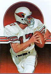
I’m also a little teary-eyed at that wonderful illustration of Jim Hart. The St. Louis Cardinals of that era had some of the finest, most under-rated uniforms going. The numbers were solid and well-propoortioned. The black-red-black stripe on the pants was perfecto. The helmet, of course, was gorgeous. Too bad the team never enjoyed real success. Others may have copied a uniform design that doesn’t get its due.
link
link
oops, forgot no IMG tags here
link
[quote comment=”332814″]Did the New England Patriots pants striping ever really look like this?
link
Sure did.
link
I emailed Paul this morning but didnt make the ticker cut- Ozzie Guillen was wearing a black cap last night that said “Market” insdie a banner in white letters. Dont know what its about.
Go to this link for the video menu and watch “”Ozzie Guillen on Gordan Beckham promotion- 6/3”
link
Anyone?
I love that Mandelbaum logo.
It’s as if each of the characters are resigned to their predicament, shrugging their shoulders as if to say, “Well, who else but Mendelbaum?”
[quote comment=”332822″][quote comment=”332814″]Did the New England Patriots pants striping ever really look like this?
link
Sure did.
link
First year of switch to Flying Elvis, wasn’t it?
WOW… well, NFL Illustrated has just made it into my daily must-read category. That’s just amazing.
Let me get this straight. Kopp’s Custard = Good. Reebok = Bad. So it’s not the advertising that you hate but the size of the company?
The difference is that Kopp’s is face-meltingly awesome while Reebok is just a shoe company. After a three-day drive home from California, the very first thing I did upon arriving — before I even got home to see Mom — was stop at Kopp’s. Totally worth three days in a cramped VW.
[quote comment=”332812″]Let me get this straight. Kopp’s Custard = Good. Reebok = Bad. So it’s not the advertising that you hate but the size of the company?[/quote]
Actually, no.
I don’t want to speak for Paul, but I believe that the real equation is “practice uniforms = Okay, game uniforms = Bad.”
For my own part, there’s a mighty important distinction. Game uniforms ought to represent the team, and the team alone. I don’t care about practice uniforms, so long as ads on game uniforms are prohibited. Even better, if we could trade one for the other.
Thanks for the write-up Paul. One thing I forgot to mention was that Dan conducted all of the interviews with the link, and they are golden. I just love hearing about the inner workings of the NFL Properties design team back in the day, as well as, working with the legendary David Boss.
If anyone has a picture of a team poster that isn’t listed at our site, please send it to us and we’ll post it. Thanks!
[quote comment=”332806″]The guys in Chick’s “throwbacks” look pretty douchey with baggy pants and under-blackened flat brims. Judging by the crowd they’re drawing, the club must be in dire straights to boost jersey sales revenue. If a throwback night is in order, lets see some effort.[/quote]
Two words: Memphis Blues.
“Mike Thomas asks a good question: Why did the Oilers’ 1961 Topps cards show the team in pink jerseys, especially since the ’61 Fleer set showed them in blue? ”
Because the Fleer set is color photos, and the Topps set is generally black and white photos hand-tinted by a clueless artist. Gold numbers? Oh, right. Fersure.
The Jim Norton Fleer card does rather show than the Oilers 1960 road numbers and sock stripes were red edged in columbia blue, not the other way around as the throwbacks for this season have them.
—Ricko
Per the brilliant Chris Botta at NYI Point Blank, the Islanders’ first round selection(s) will be presented with the Islanders “third” royal blue jersey at the podium.
link
And sad non-uni news, David Carradine has passed away at the age of 72.
“And sad non-uni news, David Carradine has passed away at the age of 72.”
So long, grasshopper.
the inspiration for link?
[quote comment=”332834″]the inspiration for link?[/quote]
First thing I noticed too!
[quote comment=”332834″]the inspiration for link?[/quote]
And I’d wager the “inspiration” for #10 there was Patriot WR Randy Vataha (#18).
That huge advertising market did wonders for AIG didn’t it? I’m not sure if it’s funny or sad that Manchester United turned down a casino for that spot because they didn’t think that a casino had the scruples for a Man U shirt. Oi…
[quote comment=”332825″][quote comment=”332822″][quote comment=”332814″]Did the New England Patriots pants striping ever really look like this?
link
Sure did.
link
First year of switch to Flying Elvis, wasn’t it?[/quote]
Bingo.
[quote comment=”332837″]Spectacularly worded Baseball Digest article about the 1963 A’s uniforms here, full of terms like “Brooklyn’s daffiness boys” and “their Kelly green and Tulane gold play suits” (great find by Morris Levin). [/quote]
“gay departure” was my favorite pull from that piece…
[quote comment=”332836″][quote comment=”332834″]the inspiration for link?[/quote]
And I’d wager the “inspiration” for #10 there was Patriot WR Randy Vataha (#18).[/quote]
Good call. This is the type of stuff we’re lookin’ for.
What is the status of the “Gross Research” project?
“…… While conducting family business on Long Island yesterday, I passed this sign. I love how Mr. Mandelbaum’s “MHM” initials were incorporated into his logo. …”
Fabulous. Makes you think that maybe this country will make it after all. What I want to know, Paul, is whether you got out of the car to take the photo or whether you just did a fine job of leaning out the front left window?
“…… RIP, Koko.”
Yes.
PS My Robert Marshall baseball bobblehead is now — according to the FedEX tracking system — on a truck somewhere between Brooklyn and Manhattan. I’m dyin’.
“Mike Thomas asks a good question: Why did the Oilers’ 1961 Topps cards show the team in pink jerseys, especially since the ’61 Fleer set showed them in blue? “
I’ve heard anecdotally around Houston that Bud Adams sent someone to the fabric store to find what was cheap, and that’s how Columbia Blue came to be the team’s color. I wonder if he may have used the same principle for an alt/practice jersey.
Either that or like Ricko said, it was some dude with a crayon.
Anyone here ever read “The Life and Times of the Thunderbolt Kid”, by Bill Bryson? The author, a linguist and newspaper columnist, write this book full of reminiscences about being a kid in the ’50s in Iowa. Wonderful stuff, and at one point he talks about meeting Ernie Banks and handing baseballs to him to sign. (Baseballs have a distinctive aroma and are “always worth spending time around”.)
That link is written by Bill Bryson, Sr.
Seems that good writing ability runs in the family!
Oh, and Bill Sr. is wrong about when they had the position-based uniform colors. That was in 1882, not 1883.
[quote comment=”332835″][quote comment=”332834″]the inspiration for link?[/quote]
First thing I noticed too![/quote]
From a Getty Images search, keywording ‘Patriots 1978’, I found these proposed helmet designs:
link
link
[quote comment=”332844″]“Mike Thomas asks a good question: Why did the Oilers’ 1961 Topps cards show the team in pink jerseys, especially since the ’61 Fleer set showed them in blue? “
I’ve heard anecdotally around Houston that Bud Adams sent someone to the fabric store to find what was cheap, and that’s how Columbia Blue came to be the team’s color. I wonder if he may have used the same principle for an alt/practice jersey.
Either that or like Ricko said, it was some dude with a crayon.[/quote]
I’ve told this story here before. While working with World Team Tennis in the mid-70s, I met the guy who’d been the Oilers first PR director (Jack Halligan was his name, maybe?). He told me he’d suggested black and gold to Bud Adams (oil, “black gold”, he figured, a natural). But Adams pointed to a big turquoise ring he always wore and said, “I want ’em to wear this color.”
—Ricko
I have a copy of the book “The Professionals” which I will scan ASAP. The hard cover NFL book was produced in 1980 and is full of great NFL art by, Chuck Ren, Cliff Spohn, George Gaadt, Merv Corning and more. Found a copy on line @ link
Check back issues of SI.
This, I’m almost certain, is John Stallworth (vs. Cowboys in Super Bowl, I believe…might even be a cover shot)
link
—Ricko
This receiver…
link
…is Darryl Stingely.
Maybe Stanley Morgan.
—Ricko
The Big Unit apparently wore 32 at one time.
link
link Oneida Bingo & Casino ending up as the advertiser on the Packers’ practice jerseys
[quote comment=”332850″]Check back issues of SI.
This, I’m almost certain, is John Stallworth (vs. Cowboys in Super Bowl, I believe…might even be a cover shot)
link
—Ricko[/quote]
or maybe vs. Rams
See?
link
—Ricko
…and Stallworth.
link
—Ricko
[quote comment=”332848″][quote comment=”332844″]“Mike Thomas asks a good question: Why did the Oilers’ 1961 Topps cards show the team in pink jerseys, especially since the ’61 Fleer set showed them in blue? “
I’ve heard anecdotally around Houston that Bud Adams sent someone to the fabric store to find what was cheap, and that’s how Columbia Blue came to be the team’s color. I wonder if he may have used the same principle for an alt/practice jersey.
Either that or like Ricko said, it was some dude with a crayon.[/quote]
I’ve told this story here before. While working with World Team Tennis in the mid-70s, I met the guy who’d been the Oilers first PR director (Jack Halligan was his name, maybe?). He told me he’d suggested black and gold to Bud Adams (oil, “black gold”, he figured, a natural). But Adams pointed to a big turquoise ring he always wore and said, “I want ’em to wear this color.”
—Ricko[/quote]
Just like me and my bobblehead…
Man, how link were those old link?
If your answer is anything resembling “not the least bit” then you are dead wrong.
And of course the artwork is great, too.
[quote comment=”332848″][quote comment=”332844″]“Mike Thomas asks a good question: Why did the Oilers’ 1961 Topps cards show the team in pink jerseys, especially since the ’61 Fleer set showed them in blue? “
I’ve heard anecdotally around Houston that Bud Adams sent someone to the fabric store to find what was cheap, and that’s how Columbia Blue came to be the team’s color. I wonder if he may have used the same principle for an alt/practice jersey.
Either that or like Ricko said, it was some dude with a crayon.[/quote]
I’ve told this story here before. While working with World Team Tennis in the mid-70s, I met the guy who’d been the Oilers first PR director (Jack Halligan was his name, maybe?). He told me he’d suggested black and gold to Bud Adams (oil, “black gold”, he figured, a natural). But Adams pointed to a big turquoise ring he always wore and said, “I want ’em to wear this color.”
—Ricko[/quote]
And that is how a uniform should be created. I hate that any new uniform has to have way too much marketing strategy behind it. If the Oilers were created today, I am sure their colors would be black & gold (the marketing writes itself). I like the owner just said, “screw it…i like this color”. that is awesome.
On a related note, is there any recently created teams that do not have an overly-busy design that looks like someone went way too far with the computer design program? I would say the Washington Nationals, but their cap logo was thiefted from the old franchise.
[quote comment=”332858″]Man, how link were those old link?
If your answer is anything resembling “not the least bit” then you are dead wrong.
And of course the artwork is great, too.[/quote]
WR in the first one is from a photo of Jets’ George Sauer. Have it in my files at home.
—Ricko
I’d buy a Packers practice jersey if Koz’s Mini Bowl was the sponsor. But I have to agree with JTH, Oneida is a strong possibility. I wonder if the NFL would allow casino advertising on a jersey. The NFL used to be staunchly against gambling, but not so much recently.
[quote comment=”332860″][quote comment=”332858″]Man, how link were those old link?
If your answer is anything resembling “not the least bit” then you are dead wrong.
And of course the artwork is great, too.[/quote]
WR in the first one is from a photo of Jets’ George Sauer. Have it in my files at home.
—Ricko[/quote]
Pretty sure the QB is Roger Staubach or Craig Morton flipped to make the figure left-handed.
—Ricko
[quote comment=”332859″]On a related note, is there any recently created teams that do not have an overly-busy design that looks like someone went way too far with the computer design program?[/quote]
link, maybe? Or are you looking for something more recent than that?
Came across this Johnson jersey… looks like for a 1994 baseball card. Johnson wearing #3x for the Mariners?
link
[quote comment=”332860″][quote comment=”332858″]Man, how link were those old link?
If your answer is anything resembling “not the least bit” then you are dead wrong.
And of course the artwork is great, too.[/quote]
WR in the first one is from a photo of Jets’ George Sauer. Have it in my files at home.
—Ricko[/quote]
Ricko, thanks for these finds. Please send over that Jets George Sauer pic, since I have been wondering who the source pic. was for Largent in that Ren painting for sometime now.
About those vintage Seahawks unis, yea, they were awesome. Interesting & sad that they replaced the cool black shoes to white in the Damac poster.
[quote comment=”332862″][quote comment=”332860″][quote comment=”332858″]Man, how link were those old link?
If your answer is anything resembling “not the least bit” then you are dead wrong.
And of course the artwork is great, too.[/quote]
WR in the first one is from a photo of Jets’ George Sauer. Have it in my files at home.
—Ricko[/quote]
Pretty sure the QB is Roger Staubach or Craig Morton flipped to make the figure left-handed.
—Ricko[/quote]
Interesting that you say that, because I always thought the same because of the blue/grayish pants.
Paul
Thanks for the recognition of the great Aligator Records recording star, Koko Taylor. She will be missed. link RIP “Queen of the Blues.”
[quote comment=”332858″]Man, how link were those old link?[/quote]
Blue-green-white is a great look for a “maritime” team. The Canucks are using it very, very well, although their orca crest leaves quite a bit to be desired. The Hartford Whalers were probably the ne plus ultra of this color scheme, and the ‘Hawks did it very well too, esp. with the sea-blue pants.
[quote comment=”332864″]Came across this Johnson jersey… looks like for a 1994 baseball card. Johnson wearing #3x for the Mariners?
link
#34, briefly, as a wearable “Thank You” note to Nolan Ryan. Ryan was responsible for a change in Johnson’s delivery that paid humongous results.
[quote comment=”332858″]Man, how link were those old link?
If your answer is anything resembling “not the least bit” then you are dead wrong.
And of course the artwork is great, too.[/quote]
Those uniforms were fantastic. I would love to see an illustration of their 1976 uniforms without the logo on their helmet.
[quote comment=”332870″][quote comment=”332858″]Man, how link were those old link?
If your answer is anything resembling “not the least bit” then you are dead wrong.
And of course the artwork is great, too.[/quote]
Those uniforms were fantastic. I would love to see an illustration of their 1976 uniforms without the logo on their helmet.[/quote]
But with a green dot?
—Ricko
[quote comment=”332863″][quote comment=”332859″]On a related note, is there any recently created teams that do not have an overly-busy design that looks like someone went way too far with the computer design program?[/quote]
link, maybe? Or are you looking for something more recent than that?[/quote]
how recent are we talking???
[quote comment=”332863″][quote comment=”332859″]On a related note, is there any recently created teams that do not have an overly-busy design that looks like someone went way too far with the computer design program?[/quote]
link, maybe? Or are you looking for something more recent than that?[/quote]
I happen to think the Houston Texans look pretty good when they don’t go monochromatic.
Relatively simple design elements: basic straight stripes on the pants, “USC” shoulder wedge (thanks for not cramming a wedge, number AND logo on the same sleeve like the Patriots), solid, distinct, legible numbers…add the helmet logo, which I really like, and I think I’d probably call this the best uniform for a team younger than me.
[quote comment=”332817″][quote comment=”332811″]did anybody see the Florida Gators logo on the Home Plate umpire during the yanks/rangers game last night??[/quote]
No, but I saw the same thing a couple weeks ago when a homeplate ump was calling a Yankees-Indians game. It’s on his chest protector, right?[/quote]
Absolutely saw this last night, too. Even bothered to point it out to my GF. Looked like the logo was on a tee shirt under the chest protector to me.
[quote comment=”332858″]Man, how link were those old link?
If your answer is anything resembling “not the least bit” then you are dead wrong.
The #1 reason I began drawing uniforms at age 5.
And of course the artwork is great, too.[/quote]
[quote comment=”332875″][quote comment=”332858″]Man, how link were those old link?
If your answer is anything resembling “not the least bit” then you are dead wrong.
The #1 reason I began drawing uniforms at age 5.
And of course the artwork is great, too.[/quote][/quote]
What?
The second to last line is what I was saying.
[quote comment=”332870″][quote comment=”332858″]Man, how link were those old link?
If your answer is anything resembling “not the least bit” then you are dead wrong.
And of course the artwork is great, too.[/quote]
Those uniforms were fantastic. I would love to see an illustration of their 1976 uniforms without the logo on their helmet.[/quote]
Buy a link, put a Photoshop filter on it and all of your Seahawks logoless fantasies can come true.
On that Illustrated NFL website, I found a Patriots illustration that shows, in the background, a minuteman’s head and American flag that looks EERILY similar to the Flying Elvis logo, but the illustration was made in the 60’s or 70’s. Was the artist psychic, or did this image influence the creation of Flying Elvis in the early 90’s? Go here to see it:
link
[quote comment=”332872″][quote comment=”332863″][quote comment=”332859″]On a related note, is there any recently created teams that do not have an overly-busy design that looks like someone went way too far with the computer design program?[/quote]
link, maybe? Or are you looking for something more recent than that?[/quote]
how recent are we talking???[/quote]
Uh, a week or two?
good story with a photo gallery as well:
link
[quote comment=”332813″]MPowers,
Did you catch the blurb on Sportscenter that Pietrus was originally considering wearing Air Jordans in the Finals to guard Kobe, but he is now going to wear Kobe’s shoes (not literally, b/c, you know, then Kobe would have to play without shoes, but you get the point).[/quote]
I did. PTI had a funny bit about it too. Kornheiser suggested that Pietrus first deface the shoes in effigy and then guard Kobe obnoxiously.
Does anyone know why the refs changed jerseys at halftime of the US Men’s World Cup Quailfer the other night vs. Costa Rica? The first half they were in red but at half they were in a grey shirt
I’m not proud of it, but I was watching some of Wipeout last night and one of the contestants was wearing faux stirrups.
You can see him link on the far left.
The woman falling into the water was wearing socks with a skull motif.
In regards to the Randy Johnson Expos numbers, they appear to be pictures of him with the minor league Jacksonville Expos. If you look closely, there is no blue “b” on the cap logo, therefore leaving a red and white “eJ”.
Then on to the ’61 Topps and Fleer AFL cards, that’s a good one. There is a great pic of Jim Otto wearing the black and gold of the Oakland Radiers (link) on that site. But what I’m really curious about is the brown/copper helmet seen on the Al Jamison card — link Is this a result of colorizing a b&w photo?
[quote comment=”332883″]I’m not proud of it, but I was watching some of Wipeout last night and one of the contestants was wearing faux stirrups.
You can see him link on the far left.
The woman falling into the water was wearing socks with a skull motif.[/quote]
On Most Extreme Elimination Challenge or Takeshi’s Castle for Jeremy Brahm, the contestants would often be wearing vintage baseball unis.
Not an example, but a funny pic nonetheless:
link
Love the old table hockey pics. I used to have a Munro WHA table set that my parents picked up for me at a garage sale for a couple of bucks. It was missing the scoreboard and the puck – but nothing a little marble (or the “pucks” from the old “Rebound” game) couldn’t fix. Spent a lot of quality time with it. Only had two generic “WHA” jerseys though. I always wanted the fancy NHL one with all the teams, but…sigh….
link
[quote comment=”332878″]On that Illustrated NFL website, I found a Patriots illustration that shows, in the background, a minuteman’s head and American flag that looks EERILY similar to the Flying Elvis logo, but the illustration was made in the 60’s or 70’s. Was the artist psychic, or did this image influence the creation of Flying Elvis in the early 90’s? Go here to see it:
link
I sincerely doubt there’s any connection. The Flying Elvis (or flying anything) is hardly a unique idea when it comes to football helmet logos. Essentially, the Ravens, Cardinals and other helmet logos are the same basic notion.
Just a coincidence, that’s my bet.
—Ricko
[quote comment=”332884″]In regards to the Randy Johnson Expos numbers, they appear to be pictures of him with the minor league Jacksonville Expos. If you look closely, there is no blue “b” on the cap logo, therefore leaving a red and white “eJ”.
Then on to the ’61 Topps and Fleer AFL cards, that’s a good one. There is a great pic of Jim Otto wearing the black and gold of the Oakland Radiers (link) on that site. But what I’m really curious about is the brown/copper helmet seen on the Al Jamison card — link Is this a result of colorizing a b&w photo?[/quote]
I’d say yes because the color looks pretty flat. Have NO idea why the helmet is that color, though. Football cards back then were just a mess. Not much care taken. Not many color photos taken, either, for that matter. You’re apt to see just about anything on cards from that era (Claude Gibson, according to the colorist, using yellow-gold training tape to hold up his black knee socks, for example).
—Ricko
[quote comment=”332831″]”Mike Thomas asks a good question: Why did the Oilers’ 1961 Topps cards show the team in pink jerseys, especially since the ’61 Fleer set showed them in blue? ”
Because the Fleer set is color photos, and the Topps set is generally black and white photos hand-tinted by a clueless artist. Gold numbers? Oh, right. Fersure.[/quote]
Not uncommon, like the link Bowman thought the Packers wore in the late 1940s and early 1950s.
Unfortunately, mistakes like that tend to take on link.
[quote comment=”332837″]That huge advertising market did wonders for AIG didn’t it? I’m not sure if it’s funny or sad that Manchester United turned down a casino for that spot because they didn’t think that a casino had the scruples for a Man U shirt. Oi…[/quote]
Actually, the issue with Manchester United and Casinos may have to do with the NFL, when Glazer took over the club, the NFL did not like a venture that was being looked at with the Sands hotel
link
Also, the sponsor that your talking about (Mansion) is an online gaming site and did not offer the bucks that AIG did. Says more about AIG than united if you ask me.
link{48C41513-A376-4D1F-981D-660FC5BB193E}&newsid=319039
[quote comment=”332884″]In regards to the Randy Johnson Expos numbers, they appear to be pictures of him with the minor league Jacksonville Expos. If you look closely, there is no blue “b” on the cap logo, therefore leaving a red and white “eJ”.
[/quote]
link
Bingo!
Weird that the Jacksonville Expos had their own logo on their hat but the parent club’s logo on the jersey – I guess they got new hats but hand-me-down jerseys?
“While conducting family business on Long Island yesterday, I passed this sign. I love how Mr. Mandelbaum’s “MHM” initials were incorporated into his logo.”
I like the logo too, but, just asking…couldn’t M.H.Mandelbaum be a female medical practitioner, or did you know for sure he’s male?
[quote comment=”332844″]“Mike Thomas asks a good question: Why did the Oilers’ 1961 Topps cards show the team in pink jerseys, especially since the ’61 Fleer set showed them in blue? “
I’ve heard anecdotally around Houston that Bud Adams sent someone to the fabric store to find what was cheap, and that’s how Columbia Blue came to be the team’s color. I wonder if he may have used the same principle for an alt/practice jersey.
Either that or like Ricko said, it was some dude with a crayon.[/quote]
That’s a great story, but pretty silly on its face. Were the Oilers sewing their own uniforms from bolts of fabric?
I’d believe that the color was chosen because it was cheap, but if so it’d be more like him asking the supplier “What do you have a lot of, and what will you give me a discount on?”
[quote comment=”332892″]”While conducting family business on Long Island yesterday, I passed this sign. I love how Mr. Mandelbaum’s “MHM” initials were incorporated into his logo.”
I like the logo too, but, just asking…couldn’t M.H.Mandelbaum be a female medical practitioner, or did you know for sure he’s male?[/quote]
He’s all MAN:
link
[quote comment=”332863″][quote comment=”332859″]On a related note, is there any recently created teams that do not have an overly-busy design that looks like someone went way too far with the computer design program?[/quote]
link, maybe? Or are you looking for something more recent than that?[/quote]
I always thought the Rockies’ original road uniforms were there best uni. The only uni combo they’ve had that incorporated no pinstripes.
link
I guess the only complaint would be that it had “Rockies” and not “Colorado.”
[quote comment=”332894″][quote comment=”332892″]”While conducting family business on Long Island yesterday, I passed this sign. I love how Mr. Mandelbaum’s “MHM” initials were incorporated into his logo.”
I like the logo too, but, just asking…couldn’t M.H.Mandelbaum be a female medical practitioner, or did you know for sure he’s male?[/quote]
He’s all MAN:
link
That’s the exact reason why I never wear any of my #1 Dad or Best Dad, etc. gear in public.
[quote comment=”332818″]Oh, why not, patches all over the place looked so good in NFL Europe and Arena Football. And lord knows that NASCAR feeling would give the NFL a little class.
(eyeroll)
—Ricko[/quote]
Don’t you just love the rationalizations from the PR weasels?
“Well, as long as it’s such a good idea, do we have your endorsement for ads on the game day jerseys? Can we get you saying that video to forward to the Roger Goodell? Will we take that as the official position of the Green Bay Packers”
“And when will you personally be out here talking to us in a offically sponsored shirt with a huge logo plastered all over it? For that matter, a cap too!”
[quote comment=”332891″][quote comment=”332884″]In regards to the Randy Johnson Expos numbers, they appear to be pictures of him with the minor league Jacksonville Expos. If you look closely, there is no blue “b” on the cap logo, therefore leaving a red and white “eJ”.
[/quote]
link
Bingo!
Weird that the Jacksonville Expos had their own logo on their hat but the parent club’s logo on the jersey – I guess they got new hats but hand-me-down jerseys?[/quote]
Ugh, I had a Jax Expos hat as a kid (grandparents lived there). I wish I still had it. Always thought it was clever to just take a part of the Montreal logo that formed a J.
[quote comment=”332886″][quote comment=”332883″]I’m not proud of it, but I was watching some of Wipeout last night and one of the contestants was wearing faux stirrups.
You can see him link on the far left.
The woman falling into the water was wearing socks with a skull motif.[/quote]
On Most Extreme Elimination Challenge or Takeshi’s Castle for Jeremy Brahm, the contestants would often be wearing vintage baseball unis.
Not an example, but a funny pic nonetheless:
link
Most of the one’s that you would see on Takeshi Castle would be of their own clubs or colleges, because they probably went as a group to the show, similar to that on the Price is Right.
[quote comment=”332858″]Man, how link were those old link?
If your answer is anything resembling “not the least bit” then you are dead wrong.[/quote]I never hated the original Seahawks look: but IMHO they were trying too hard to get a Cowboys lookalike effect.
And I’d say their latest helmets are an improvement over the original. But (and this is a hard-and-fast NFL rule) do NOT go dark monochromatic under any circumstances.
[quote comment=”332896″][quote comment=”332894″][quote comment=”332892″]”While conducting family business on Long Island yesterday, I passed this sign. I love how Mr. Mandelbaum’s “MHM” initials were incorporated into his logo.”
I like the logo too, but, just asking…couldn’t M.H.Mandelbaum be a female medical practitioner, or did you know for sure he’s male?[/quote]
He’s all MAN:
link
That’s the exact reason why I never wear any of my #1 Dad or Best Dad, etc. gear in public.[/quote]
Besides the fact that I currently hold the title!
[quote comment=”332884″]In regards to the Randy Johnson Expos numbers, they appear to be pictures of him with the minor league Jacksonville Expos. If you look closely, there is no blue “b” on the cap logo, therefore leaving a red and white “eJ”.
Then on to the ’61 Topps and Fleer AFL cards, that’s a good one. There is a great pic of Jim Otto wearing the black and gold of the Oakland Radiers (link) on that site. But what I’m really curious about is the brown/copper helmet seen on the Al Jamison card — link Is this a result of colorizing a b&w photo?[/quote]
Hey, that helmet looks link (scroll down to “Tennessee Copperheads”).
In honor of the Sonics 30th anniversary of thier NBA title, The Seattle P.I. posted a photo gallery from 1978-1979. I came across this photo:
( link ) I haven’t seen that uniform before. Did they have a 3rd uniform way back then? and what color would that be? It looks kinda dark for the traditional Sonics Green.
[quote comment=”332853″]link Oneida Bingo & Casino ending up as the advertiser on the Packers’ practice jerseys[/quote]
I would have said Vicodan (with the same sound effect).
[quote comment=”332823″]I emailed Paul this morning but didnt make the ticker cut- Ozzie Guillen was wearing a black cap last night that said “Market” insdie a banner in white letters. Dont know what its about.
link
Anyone?[/quote]
This might have something to do with the restaurant that Kenny Williams co-owns. Its at about 1000 West, perhaps on Randolph but definitely in the area that once was called the Randolph Street Market.
[quote comment=”332898″][quote comment=”332891″][quote comment=”332884″]In regards to the Randy Johnson Expos numbers, they appear to be pictures of him with the minor league Jacksonville Expos. If you look closely, there is no blue “b” on the cap logo, therefore leaving a red and white “eJ”.
[/quote]
link
Bingo!
Weird that the Jacksonville Expos had their own logo on their hat but the parent club’s logo on the jersey – I guess they got new hats but hand-me-down jerseys?[/quote]
Ugh, I had a Jax Expos hat as a kid (grandparents lived there). I wish I still had it. Always thought it was clever to just take a part of the Montreal logo that formed a J.[/quote]
Here’s a better view of the Jax Expos logo, and it also backs up the point that the Expos logo consisted of 3 letters (e-l-b) formed to shape an “M” for Montreal. This Jax program uses the logo as the J for Jacksonville and the e for expos.
link
[quote comment=”332898″][quote comment=”332891″][quote comment=”332884″]In regards to the Randy Johnson Expos numbers, they appear to be pictures of him with the minor league Jacksonville Expos. If you look closely, there is no blue “b” on the cap logo, therefore leaving a red and white “eJ”.
[/quote]
link
Bingo!
Weird that the Jacksonville Expos had their own logo on their hat but the parent club’s logo on the jersey – I guess they got new hats but hand-me-down jerseys?[/quote]
Ugh, I had a Jax Expos hat as a kid (grandparents lived there). I wish I still had it. Always thought it was clever to just take a part of the Montreal logo that formed a J.[/quote]
Interesting to see a young Larry Walker , he certainly bulked up.
[quote comment=”332880″]good story with a photo gallery as well:
link
Kek, up until last year I played softball at the Crosley Field replica here in Cincinnati. Unfortunately, we had to play on one of the three outlier fields, as high school teams played there all the time. It is a beautiful and (from what I hear) accurate representation/re-creation.
[quote comment=”332901″][quote comment=”332896″][quote comment=”332894″][quote comment=”332892″]”While conducting family business on Long Island yesterday, I passed this sign. I love how Mr. Mandelbaum’s “MHM” initials were incorporated into his logo.”
I like the logo too, but, just asking…couldn’t M.H.Mandelbaum be a female medical practitioner, or did you know for sure he’s male?[/quote]
He’s all MAN:
link
That’s the exact reason why I never wear any of my #1 Dad or Best Dad, etc. gear in public.[/quote]
Besides the fact that I currently hold the title![/quote]
It’s go time.
Love those panoramics. Given what I’ve heard about Rube Waddell, I’m surprised they were able to get him to show up for team photos. Must have either had a keg of beer there or threatened him with a stiff fine for not showing up.
[quote comment=”332909″][quote comment=”332901″]Besides the fact that I currently hold the title![/quote]
It’s go time.[/quote]
matt powers…father of the year
[quote comment=”332845″]Anyone here ever read “The Life and Times of the Thunderbolt Kid”, by Bill Bryson? The author, a linguist and newspaper columnist, write this book full of reminiscences about being a kid in the ’50s in Iowa. Wonderful stuff, and at one point he talks about meeting Ernie Banks and handing baseballs to him to sign. (Baseballs have a distinctive aroma and are “always worth spending time around”.)
That link is written by Bill Bryson, Sr.
Seems that good writing ability runs in the family![/quote]
Anything by Bill Bryson (jr.) is great reading! Thunderbolt Kid is one of the funniest things I’ve ever read in my life!
[quote comment=”332910″]Love those panoramics. Given what I’ve heard about Rube Waddell, I’m surprised they were able to get him to show up for team photos. Must have either had a keg of beer there or threatened him with a stiff fine for not showing up.[/quote]
Maybe they told him the link would be there.
[quote comment=”332904″][quote comment=”332853″]link Oneida Bingo & Casino ending up as the advertiser on the Packers’ practice jerseys[/quote]
I would have said Vicodan (with the same sound effect).[/quote]
Nah, they’re in negotiations to sign a deal with the Vikings.
[quote comment=”332882″]Does anyone know why the refs changed jerseys at halftime of the US Men’s World Cup Quailfer the other night vs. Costa Rica? The first half they were in red but at half they were in a grey shirt[/quote]
Probably because Costa Rica was playing in red.
Without stopping and looking, a quick glance could mistake a ref for an opposing player.
[quote comment=”332843″]”……
PS My Robert Marshall baseball bobblehead is now — according to the FedEX tracking system — on a truck somewhere between Brooklyn and Manhattan. I’m dyin’.[/quote]
Mine arrives tomorrow. Much anticipation.
[quote comment=”332892″]”While conducting family business on Long Island yesterday, I passed this sign. I love how Mr. Mandelbaum’s “MHM” initials were incorporated into his logo.”
I like the logo too, but, just asking…couldn’t M.H.Mandelbaum be a female medical practitioner, or did you know for sure he’s male?[/quote]
It’s link. You can call him Marty.
[quote comment=”332882″]Does anyone know why the refs changed jerseys at halftime of the US Men’s World Cup Quailfer the other night vs. Costa Rica? The first half they were in red but at half they were in a grey shirt[/quote]
The orange (nearly red) shirts the crew wore in the first half were probably deemed too close in color to Costa Rica’s shirts, which were mostly red, with blue. The switch to black (actually these days more of a dark grey) was an improvement.
I’m surprised they didn’t go with yellow, another standard referee color, from the beginning. One team or the other must have complained about the orange, though, prompting the change.
[quote comment=”332915″][quote comment=”332882″]Does anyone know why the refs changed jerseys at halftime of the US Men’s World Cup Quailfer the other night vs. Costa Rica? The first half they were in red but at half they were in a grey shirt[/quote]
Probably because Costa Rica was playing in red.
Without stopping and looking, a quick glance could mistake a ref for an opposing player.[/quote]
If it was that close of a match, why did they wait until the half?
[quote comment=”332914″]Nah, they’re in negotiations to sign a deal with the Vikings.[/quote]
I thought the Vikes had a deal with that Lake Minnetonka cruise line?
[quote comment=”332911″]matt powers…father of the year[/quote]
I thought it was Max Power. There’s the right way, the wrong way and the Max Power way.
I know it’s not Fred Garvin.
[quote comment=”332921″][quote comment=”332911″]matt powers…father of the year[/quote]
I thought it was Max Power. There’s the right way, the wrong way and the Max Power way.[/quote]
“Isn’t that the wrong way?”
“Yeah, but faster!”
[quote comment=”332918″][quote comment=”332882″]Does anyone know why the refs changed jerseys at halftime of the US Men’s World Cup Quailfer the other night vs. Costa Rica? The first half they were in red but at half they were in a grey shirt[/quote]
The orange (nearly red) shirts the crew wore in the first half were probably deemed too close in color to Costa Rica’s shirts, which were mostly red, with blue. The switch to black (actually these days more of a dark grey) was an improvement.
I’m surprised they didn’t go with yellow, another standard referee color, from the beginning. One team or the other must have complained about the orange, though, prompting the change.[/quote]
well the decision is entirely down to the officials, must have been looking at their own selection of jerseys in a funny light. And not had a preference for yellow…
[quote comment=”332809″]NOOOOOOOOOOOOOOOO:
link
Love this quote: “It’s always exciting when the league opens new categories for sponsorship, particularly one that is so closely linked to our players and our jerseys”[/quote]
I would love to see Kroll’s West as a sponsor on the Pack’s practice jersey. Mmmmmmm… chili…
[quote comment=”332920″][quote comment=”332914″]Nah, they’re in negotiations to sign a deal with the Vikings.[/quote]
I thought the Vikes had a deal with that Lake Minnetonka cruise line?[/quote]
That would be link
having lived in Milwaukee for 6 years, i appreciate the shout out to Kopp’s!
[quote comment=”332926″]having lived in Milwaukee for 6 years, i appreciate the shout out to Kopp’s![/quote]
Just nobody mention Gilles, or we’ll have another frozen custard war on our hands….
[quote comment=\”332911\”][quote comment=\”332909\”][quote comment=\”332901\”]Besides the fact that I currently hold the title![/quote]
It\’s go time.[/quote]
matt powers…father of the year[/quote]
I’ll take fictional titles for $1000 please Alex..
Having just realized that the Pirates (who are now dead to me) have a Single-A squad in Charleston, WV (West Virginia Power), I went to their website to see what their gear looks like. Two promotions of note: Obama bobblehead night (just missed it, May 30), and “Crunk Day & Kids Eat Free”, apparently every Monday. Gotta love minor league ball!
link
[quote comment=”332928″][quote comment=\”332911\”][quote comment=\”332909\”][quote comment=\”332901\”]Besides the fact that I currently hold the title![/quote]
It\’s go time.[/quote]
matt powers…father of the year[/quote]
I’ll take fictional titles for $1000 please Alex..[/quote]
Your answer: “This man, awarded Father of the Year, received the accolade by making all of his daughters’ clothes by hand rather than buying into consumerism.”
LOL! ;o) Kidding, Matt.
…he’s got the name that you love to touch…
[quote comment=”332929″]Having just realized that the Pirates (who are now dead to me) have a Single-A squad in Charleston, WV (West Virginia Power), I went to their website to see what their gear looks like. Two promotions of note: Obama bobblehead night (just missed it, May 30), and “Crunk Day & Kids Eat Free”, apparently every Monday. Gotta love minor league ball!
link
i had put this item in my “This and That” section last weekend…
the Obama bobblehead giveaway hit a little snag…
[quote comment=”332917″][quote comment=”332892″]”While conducting family business on Long Island yesterday, I passed this sign. I love how Mr. Mandelbaum’s “MHM” initials were incorporated into his logo.”
I like the logo too, but, just asking…couldn’t M.H.Mandelbaum be a female medical practitioner, or did you know for sure he’s male?[/quote]
It’s link. You can call him Marty.[/quote]
The honorable firm of MHM has NEVER seen this much attention paid to their company before this great day!
[quote comment=”332927″][quote comment=”332926″]having lived in Milwaukee for 6 years, i appreciate the shout out to Kopp’s![/quote]
Just nobody mention Gilles, or we’ll have another frozen custard war on our hands….[/quote]
Rita’s and Kohr Brothers respectfully enter this fray.
[quote comment=”332911″][quote comment=”332909″][quote comment=”332901″]Besides the fact that I currently hold the title![/quote]
It’s go time.[/quote]
matt powers…father of the year[/quote]
I went to my daughter’s field day today…what a hoot!
As far as unis are concerned, all of the classes made up t-shirts for the occasion, hence uniforms…very well done until I saw Luke’s Leaping Leopards. Their banner had a modified Jacksonville Jaguar.
Speaking of the Broncos, has anyone else noticed that the proposed expansion team St. Louis Stallions prototype logo looks ALOT like the current Broncos logo? The current Broncos logo first appeared in ’97, and the St. Louis Stallions were proposed for the ’95 season. The designer and owner of the Broncos logo could have seen the Stallions logo, and maybe it somehow influenced the design of the final horse head logo the Broncos chose, either intentionally or subconsciously. Then again, designs from the same era tend to look similar due to aesthetic tastes and trends of the time, so it could be just a coincidence. Here are a couple views of the St. Louis Stallions horse head logo and helmet:
link
link
And here’s the current Broncos logo and helmet:
link
link
Also, the old Broncos “D with snorting horse logo” looks extremely similar to the Durham Bulls minor league baseball team cap logo. Same colors (orange D on a royal blue background), same team name initials (DB), both have an animal coming out of the D towards the right, and both animals are snorting steam out of their noses. I first noticed this coincidence in 1988 when the movie Bull Durham came out. I was a kid, and was already familiar with the Broncos logo, and when I saw promo shots from Bull Durham showing their logo on the uniforms, I was like, “WTF??? They ripped off the Broncos logo!!!” Does anybody know if there’s a connection between the two logos or if it’s just a coincidence??? Here’s a pic of the Durham Bulls logo as it appears on their caps:
link
And here’s the old Broncos logo:
link
[quote comment=”332812″]Let me get this straight. Kopp’s Custard = Good. Reebok = Bad. So it’s not the advertising that you hate but the size of the company?[/quote]
I hate the advertising, but if it’s going to happen I’d prefer it have a local tie to it: think Heinz for the Steelers, Skyline Chili for the Bengals, Microsoft for Seattle, M.H. Mandelbaum for the Giants or Jets…
[quote comment=”332935″][quote comment=”332911″][quote comment=”332909″][quote comment=”332901″]Besides the fact that I currently hold the title![/quote]
It’s go time.[/quote]
matt powers…father of the year[/quote]
I went to my daughter’s field day today…what a hoot!
As far as unis are concerned, all of the classes made up t-shirts for the occasion, hence uniforms…very well done until I saw Luke’s Leaping Leopards. Their banner had a modified Jacksonville Jaguar.[/quote]
Where did the field trip head to? Were the shirts appropriately themed?
[quote comment=”332937″][quote comment=”332812″]Let me get this straight. Kopp’s Custard = Good. Reebok = Bad. So it’s not the advertising that you hate but the size of the company?[/quote]
I hate the advertising, but if it’s going to happen I’d prefer it have a local tie to it: think Heinz for the Steelers, Skyline Chili for the Bengals, Microsoft for Seattle, M.H. Mandelbaum for the Giants or Jets…[/quote]
Fair enough, but to consider Microsoft a local tie could be a stretch for a global brand. Like Nike and Oregon.
[quote comment=”332920″][quote comment=”332914″]Nah, they’re in negotiations to sign a deal with the Vikings.[/quote]
I thought the Vikes had a deal with that Lake Minnetonka cruise line?[/quote]
Prince loved to drink from the refrshing waters of Lake Minnetonka:
link
[quote comment=”332932″][quote comment=”332929″]Having just realized that the Pirates (who are now dead to me) have a Single-A squad in Charleston, WV (West Virginia Power), I went to their website to see what their gear looks like. Two promotions of note: Obama bobblehead night (just missed it, May 30), and “Crunk Day & Kids Eat Free”, apparently every Monday. Gotta love minor league ball!
link
i had put this item in my “This and That” section last weekend…
the link hit a little snag…[/quote]
I actually rather like this cap, a throwback for the Charleston Charlies:
link
Closeup of that logo:
link
These caps are not what the name might suggest:
link
[quote comment=”332900″][quote comment=”332858″]Man, how link were those old link?
If your answer is anything resembling “not the least bit” then you are dead wrong.[/quote]I never hated the original Seahawks look: but IMHO they were trying too hard to get a Cowboys lookalike effect.
And I’d say their latest helmets are an improvement over the original. But (and this is a hard-and-fast NFL rule) do NOT go dark monochromatic under any circumstances. [/quote]
Are we to believe that the Cowboys were trying to look like the Lions?
The new Seahawk helmet is super wack. There were plenty of existing colors to choose from. Why invent one? What do you call it, anyway?
Their problems stretch far beyond the monochrome madness.
[quote comment=”332887″][quote comment=”332878″]On that Illustrated NFL website, I found a Patriots illustration that shows, in the background, a minuteman’s head and American flag that looks EERILY similar to the Flying Elvis logo, but the illustration was made in the 60’s or 70’s. Was the artist psychic, or did this image influence the creation of Flying Elvis in the early 90’s? Go here to see it:
link
I sincerely doubt there’s any connection. The Flying Elvis (or flying anything) is hardly a unique idea when it comes to football helmet logos. Essentially, the Ravens, Cardinals and other helmet logos are the same basic notion.
Just a coincidence, that’s my bet.
—Ricko[/quote]
Yes, profile/side views of the mascot’s head are very common on football helmets. The Broncos are another example. But if you look at that Pats illustration, it shows a profile view of a minuteman’s head wearing a blue tri-corner hat with red and white American flag stripes extending from his face, just like Flying Elvis. Not to mention the shadows/features of the minuteman’s face are very reminiscent of Flying Elvis’ face, at least in my eyes. It’s totally possible that this illustration was used as reference material when the Flying Elvis logo was being developed/designed, and it somehow influenced the final logo that was chosen.
Speaking of the Broncos, has anyone else noticed that the proposed expansion team St. Louis Stallions prototype logo looks ALOT like the current Broncos logo? The current Broncos logo first appeared in ’97, and the St. Louis Stallions were proposed for the ’95 season. The designer and owner of the Broncos logo could have seen the Stallions logo, and maybe it somehow influenced the design of the final horse head logo the Broncos chose, either intentionally or subconsciously. Then again, designs from the same era tend to look similar due to aesthetic tastes and trends of the time, so it could be just a coincidence. Here are a couple views of the St. Louis Stallions horse head logo and helmet:
link
link
And here’s the current Broncos logo and helmet:
link
link
Also, the old Broncos “D with snorting horse logo” looks extremely similar to the Durham Bulls minor league baseball team cap logo. Same colors (orange D on a royal blue background), same team name initials (DB), both have an animal coming out of the D towards the right, and both animals are snorting steam out of their noses. I first noticed this coincidence in 1988 when the movie Bull Durham came out. I was a kid, and was already familiar with the Broncos logo, and when I saw promo shots from Bull Durham showing their logo on the uniforms, I was like, “WTF??? They ripped off the Broncos logo!!!” Does anybody know if there’s a connection between the two logos or if it’s just a coincidence??? Here’s a pic of the Durham Bulls logo as it appears on their caps:
link
And here’s the old Broncos logo:
link
[quote comment=”332929″]Having just realized that the Pirates (who are now dead to me) have a Single-A squad in Charleston, WV (West Virginia Power), I went to their website to see what their gear looks like. Two promotions of note: Obama bobblehead night (just missed it, May 30), and “Crunk Day & Kids Eat Free”, apparently every Monday. Gotta love minor league ball!
link
just be glad nate finally got called up to a major league team!
[quote comment=”332938″][quote comment=”332935″][quote comment=”332911″][quote comment=”332909″][quote comment=”332901″]Besides the fact that I currently hold the title![/quote]
It’s go time.[/quote]
matt powers…father of the year[/quote]
I went to my daughter’s field day today…what a hoot!
As far as unis are concerned, all of the classes made up t-shirts for the occasion, hence uniforms…very well done until I saw Luke’s Leaping Leopards. Their banner had a modified Jacksonville Jaguar.[/quote]
Where did the field trip head to? Were the shirts appropriately themed?[/quote]
Something must have been lost in the translation!
In America, field day is a wonderful tradition where grade school children illustrate their fitness by undertaking various feats of strength.
Today was that day!
[quote comment=”332937″]I hate the advertising, but if it’s going to happen I’d prefer it have a local tie to it: think Skyline Chili for the Bengals…[/quote]
Just extend the tiger-stripe pattern to the back of the pants to emulate skid marks…
:: dodges thrown tomatoes ::
[quote comment=”332941″][quote comment=”332932″][quote comment=”332929″]Having just realized that the Pirates (who are now dead to me) have a Single-A squad in Charleston, WV (West Virginia Power), I went to their website to see what their gear looks like. Two promotions of note: Obama bobblehead night (just missed it, May 30), and “Crunk Day & Kids Eat Free”, apparently every Monday. Gotta love minor league ball!
link
i had put this item in my “This and That” section last weekend…
the link hit a little snag…[/quote]
I actually rather like this cap, a throwback for the Charleston Charlies:
link
Closeup of that logo:
link
These caps are not what the name might suggest:
link
Those throwback hats with the Charlies logo are much better than the current logo (although caps with the colors of wheat and moss is, uh… different).
I like the banner ad that incorporates both the Charlies’ logo and the newer Pirates’ logo.
Regarding the trade of McLouth, I have no words. The boycott of PNC Park continues.
just be glad nate finally got called up to a major league team!
Aren’t we still a week or so away from paying attention to the Pirates?
[quote comment=”332948″]just be glad nate finally got called up to a major league team!
Aren’t we still a week or so away from paying attention to the Pirates?[/quote]
lets hope so! lol
[quote comment=”332937″][quote comment=”332812″]Let me get this straight. Kopp’s Custard = Good. Reebok = Bad. So it’s not the advertising that you hate but the size of the company?[/quote]
I hate the advertising, but if it’s going to happen I’d prefer it have a local tie to it: think Heinz for the Steelers, Skyline Chili for the Bengals, Microsoft for Seattle, M.H. Mandelbaum for the Giants or Jets…[/quote]
So Heinz = Good, Reebok = Bad, for the Steelers? And Reebok = Good, Heinz = Bad for the Patriots?
[quote comment=”332893″]
I’ve heard anecdotally around Houston that Bud Adams sent someone to the fabric store to find what was cheap, and that’s how Columbia Blue came to be the team’s color. I wonder if he may have used the same principle for an alt/practice jersey.
Either that or like Ricko said, it was some dude with a crayon.[/quote]
That’s a great story, but pretty silly on its face. Were the Oilers sewing their own uniforms from bolts of fabric?
I’d believe that the color was chosen because it was cheap, but if so it’d be more like him asking the supplier “What do you have a lot of, and what will you give me a discount on?”[/quote]
The October 13, 1959 edition of the Houston Chronicle ran a story covering the Houston Football Club’s inaugural press conference. The team was introduced as the Oilers, the team colors were announced as Columbia Blue and White, and a price schedule was set (top seat: $8). This anecdotal story has more to do with Bud’s reputation as a miser, than reality. Bud saw a Columbia football game in his younger days, and thought the uniforms were jaunty. That’s why he chose the color.
“Mascot emerging through letter” is a sports logo design–or product design–that goes back a long, long way.
Likewise, the current Bronco and the Flying Elvis are from the long standing “hood ornament” design family.
That there are a number of logos that look similar is hardly unexpected, or unique.
Now, the Senators-Walgreens thing more likely goes to neither of them bothering to protect the “W”, so it’s the property of neither. For the Senators, it was just their hat letter, not a logo per se. For Walgreens, was simply the first letter of their logo. Kind of a no harm, no foul thing….at least the way corporations and people thought about things back then.
Or (and this for the full-time designers and/or students of design history) is it just the “W” from a basic old-time sign painter’s font? I mean, it would be pretty tough to protect an unembellished Arial “W” (for example), wouldn’t it?
—Ricko
[quote comment=”332949″][quote comment=”332948″]just be glad nate finally got called up to a major league team!
Aren’t we still a week or so away from paying attention to the Pirates?[/quote]
lets hope so! lol[/quote]
Quit yer bitchin:
link
[quote comment=”332945″][quote comment=”332938″][quote comment=”332935″][quote comment=”332911″][quote comment=”332909″][quote comment=”332901″]Besides the fact that I currently hold the title![/quote]
It’s go time.[/quote]
matt powers…father of the year[/quote]
I went to my daughter’s field day today…what a hoot!
As far as unis are concerned, all of the classes made up t-shirts for the occasion, hence uniforms…very well done until I saw Luke’s Leaping Leopards. Their banner had a modified Jacksonville Jaguar.[/quote]
Where did the field trip head to? Were the shirts appropriately themed?[/quote]
Something must have been lost in the translation!
In America, field day is a wonderful tradition where grade school children illustrate their fitness by undertaking various feats of strength.
Today was that day![/quote]
“Field day” in school in my neck o’ the woods = class excursion to some place of higher learning.
For example: a zoo, Parliament buildings, a museum, etc.
Regional dialect, perhaps?
[quote comment=”332952″]”Mascot emerging through letter” is a sports logo design–or product design–that goes back a long, long way.
Likewise, the current Bronco and the Flying Elvis are from the long standing “hood ornament” design family.
That there are a number of logos that look similar is hardly unexpected, or unique.
Now, the Senators-Walgreens thing more likely goes to neither of them bothering to protect the “W”, so it’s the property of neither. For the Senators, it was just their hat letter, not a logo per se. For Walgreens, was simply the first letter of their logo. Kind of a no harm, no foul thing….at least the way corporations and people thought about things back then.
Or (and this for the full-time designers and/or students of design history) is it just the “W” from a basic old-time sign painter’s font? I mean, it would be pretty tough to protect an unembellished Arial “W” (for example), wouldn’t it?
—Ricko[/quote]
LOL
I’ll stick with the version I heard. I can imagine a Texas oil man having a turquoise ring and loving it more than I can him seeing a Columbia football game once upon a time and liking the unis.
Is that what it said in the story?
—Ricko
[quote comment=”332954″][quote comment=”332945″][quote comment=”332938″][quote comment=”332935″][quote comment=”332911″][quote comment=”332909″][quote comment=”332901″]Besides the fact that I currently hold the title![/quote]
It’s go time.[/quote]
matt powers…father of the year[/quote]
I went to my daughter’s field day today…what a hoot!
As far as unis are concerned, all of the classes made up t-shirts for the occasion, hence uniforms…very well done until I saw Luke’s Leaping Leopards. Their banner had a modified Jacksonville Jaguar.[/quote]
Where did the field trip head to? Were the shirts appropriately themed?[/quote]
Something must have been lost in the translation!
In America, field day is a wonderful tradition where grade school children illustrate their fitness by undertaking various feats of strength.
Today was that day![/quote]
“Field day” in school in my neck o’ the woods = class excursion to some place of higher learning.
For example: a zoo, Parliament buildings, a museum, etc.
Regional dialect, perhaps?[/quote]
Field Trip…MOMA, Museum of Natural History, Bronx Zoo Liberty Science Center, etc.
[quote comment=”332950″][quote comment=”332937″][quote comment=”332812″]Let me get this straight. Kopp’s Custard = Good. Reebok = Bad. So it’s not the advertising that you hate but the size of the company?[/quote]
I hate the advertising, but if it’s going to happen I’d prefer it have a local tie to it: think Heinz for the Steelers, Skyline Chili for the Bengals, Microsoft for Seattle, M.H. Mandelbaum for the Giants or Jets…[/quote]
So Heinz = Good, Reebok = Bad, for the Steelers? And Reebok = Good, Heinz = Bad for the Patriots?[/quote]
I wouldn’t use the word “good,” rather “the lesser of two evils.”
Ooops, quoted wrong entry. That comment’s about the story in the Houston paper and Oiler team colors.
—Ricko
[quote comment=”332953″][quote comment=”332949″][quote comment=”332948″]just be glad nate finally got called up to a major league team!
Aren’t we still a week or so away from paying attention to the Pirates?[/quote]
lets hope so! lol[/quote]
Quit yer bitchin:
link
Good to see you’re getting appropriate use out of that smartboard, Powers! ;)
[quote comment=”332956″]
Field Trip…MOMA, Museum of Natural History, Bronx Zoo Liberty Science Center, etc.[/quote]
OHHHH… Trip vs. Day.
We use both here. There’s where the confusion lies. Thanks, Matt!
Powers, the admonition to “represent yourselves as well as me well during my absence” illustrates better than almost anything your dedication to teaching.
[quote comment=”332937″][quote comment=”332812″]Let me get this straight. Kopp’s Custard = Good. Reebok = Bad. So it’s not the advertising that you hate but the size of the company?[/quote]
I hate the advertising, but if it’s going to happen I’d prefer it have a local tie to it: think Heinz for the Steelers, Skyline Chili for the Bengals, Microsoft for Seattle, M.H. Mandelbaum for the Giants or Jets…[/quote]
Most likely it’ll be Jones Soda for the Seahawks practice jersey patch. However, I would prefer it be link, or, the likes of such brewer of the bean elixirs.
[quote comment=”332961″]Powers, the admonition to “represent yourselves as well as me well during my absence” illustrates better than almost anything your dedication to teaching.[/quote]
rough draft
[quote comment=”332950″][quote comment=”332937″][quote comment=”332812″]Let me get this straight. Kopp’s Custard = Good. Reebok = Bad. So it’s not the advertising that you hate but the size of the company?[/quote]
I hate the advertising, but if it’s going to happen I’d prefer it have a local tie to it: think Heinz for the Steelers, Skyline Chili for the Bengals, Microsoft for Seattle, M.H. Mandelbaum for the Giants or Jets…[/quote]
So Heinz = Good, Reebok = Bad, for the Steelers? And Reebok = Good, Heinz = Bad for the Patriots?[/quote]
2nd try on that one???
[quote comment=”332959″][quote comment=”332953″][quote comment=”332949″][quote comment=”332948″]just be glad nate finally got called up to a major league team!
Aren’t we still a week or so away from paying attention to the Pirates?[/quote]
lets hope so! lol[/quote]
Quit yer bitchin:
link
Good to see you’re getting appropriate use out of that smartboard, Powers! ;)[/quote]
as long as it’s the smartboard and not the fire extinguisher…though if the Mets lose to the NL’s favorite AAA team, it might be needed at Uni Watch HQ.
[quote comment=”332959″][quote comment=”332953″][quote comment=”332949″][quote comment=”332948″]just be glad nate finally got called up to a major league team!
Aren’t we still a week or so away from paying attention to the Pirates?[/quote]
lets hope so! lol[/quote]
Quit yer bitchin:
link
Good to see you’re getting appropriate use out of that smartboard, Powers! ;)[/quote]
School’s done at 2:40 for me…We were working on Orthographic drawings and PowerPoint Animations during class. When the kids left, I turned the ballgame on.
Nonetheless, something has been bothering me. What is the Rays’ justification for leaving the manta ray on their current unis?
[quote comment=”332960″][quote comment=”332956″]
Field Trip…MOMA, Museum of Natural History, Bronx Zoo Liberty Science Center, etc.[/quote]
OHHHH… Trip vs. Day.
We use both here. There’s where the confusion lies. Thanks, Matt![/quote]
Uniwatch… Bringing Yanks and Hosers closer together since 1999.
[quote comment=”332952″]”Mascot emerging through letter” is a sports logo design–or product design–that goes back a long, long way.
Likewise, the current Bronco and the Flying Elvis are from the long standing “hood ornament” design family.
That there are a number of logos that look similar is hardly unexpected, or unique.
Now, the Senators-Walgreens thing more likely goes to neither of them bothering to protect the “W”, so it’s the property of neither. For the Senators, it was just their hat letter, not a logo per se. For Walgreens, was simply the first letter of their logo. Kind of a no harm, no foul thing….at least the way corporations and people thought about things back then.
Or (and this for the full-time designers and/or students of design history) is it just the “W” from a basic old-time sign painter’s font? I mean, it would be pretty tough to protect an unembellished Arial “W” (for example), wouldn’t it?
—Ricko[/quote]
Speaking of similar Ws, I always thought link looked suspiciously similar to link.
[quote comment=”332937″][quote comment=”332812″]Let me get this straight. Kopp’s Custard = Good. Reebok = Bad. So it’s not the advertising that you hate but the size of the company?[/quote]
I hate the advertising, but if it’s going to happen I’d prefer it have a local tie to it: think Heinz for the Steelers, Skyline Chili for the Bengals, Microsoft for Seattle, M.H. Mandelbaum for the Giants or Jets…[/quote]
The gold on the Mandelbaum logo would match the NY Titans throwbacks, eh? Not that I’m endorsing such a thing…
Although, for those of us who dig the old-school threads, this isn’t new territory. Weren’t the Pistons originally named after a company? Then there were the old industrial leagues, where the Akron Goodyears played basketball before throngs of fans in the former Rubber Capital of the World. I don’t think the folks back then cried foul. Yeah, it wasn’t a major league, but still…
Bottom line, it’s tacky, but it can be a lot less tacky (and maybe even cool in isolated cases) if the sponsor fits the town or the team name.
Here’s a compromise – forbid sponsors on the jerseys, but allow them on the hip or thigh (no butt signage allowed either). I could live with that.
[quote comment=”332965″][quote comment=”332959″][quote comment=”332953″][quote comment=”332949″][quote comment=”332948″]just be glad nate finally got called up to a major league team!
Aren’t we still a week or so away from paying attention to the Pirates?[/quote]
lets hope so! lol[/quote]
Quit yer bitchin:
link
Good to see you’re getting appropriate use out of that smartboard, Powers! ;)[/quote]
as long as it’s the smartboard and not the fire extinguisher…though if the Mets lose to the NL’s favorite AAA team, it might be needed at Uni Watch HQ.[/quote]
They’ve lost two in a row to them, and are going for three (not that I’m defending the Pirates, who are now dead to me).
Speaking of similar Ws, I always thought this looked suspiciously similar to this.
A lot of cartoonist’s signatures back then are imitative of Disney’s mark: Very round characters, a certain brush-stroke “flourishness.” Because of the same first name, Eisner’s is among the most obvious.
Although I don’t think anyone ever mistook The Spirit for Donald Duck.
—Ricko
I’m in the very early process of a DIY project. I’m creating a semi-pro football league based in Pennsylvania. I have the team names, and some designs in mind for logos, and jerseys, but I’d love some help from my fellow uni-watch lovers. When I’m all done I’ll submit them!
TEAMS
Erie Brigade (Inspired by the War on Lake Erie)
Oil City Stags
New Castle Brawlers
Allegheny Mountain Thunderbirds
Punxatawney Shadows (if Phil see what?)
Southern Penn Miners
Homestead Coasters (inspired by Kennywood)
Fort Pitt Generals
Fayette Timber Rattlers
Three Rivers Pilots
Dwight Howard will be lighter tonight, thanks to adidas.
link
[quote comment=”332971″]Speaking of similar Ws, I always thought this looked suspiciously similar to this.
A lot of cartoonist’s signatures back then are imitative of Disney’s mark: Very round characters, a certain brush-stroke “flourishness.” Because of the same first name, Eisner’s is among the most obvious.
Although I don’t think anyone ever mistook The Spirit for Donald Duck.
—Ricko[/quote]
Hey, at least Eisner could write his own signature. There are lots of stories about Walt having to be taught “his,” but never quite getting it.
[quote comment=”332954″]”Field day” in school in my neck o’ the woods = class excursion to some place of higher learning.
For example: a zoo, Parliament buildings, a museum, etc.
Regional dialect, perhaps?[/quote]
“Field Day” (proper noun) v. “field trip” (common noun)
(edited the school newspaper way back when, sorry to be anal)
Or maybe you were just confused b/c a man in his thirties referred to something as a “hoot.” Time for your tapioca pudding, Matt! ;)
[quote comment=”332966″]Nonetheless, something has been bothering me. What is the Rays’ justification for leaving the manta ray on their current unis?[/quote]
rays=manta & sun
get it?
[quote comment=”332932″]i had put this item in my “This and That” section last weekend…[/quote]
Are we back to Seinfeld trivia here? :-)
[quote comment=”332972″]I’m in the very early process of a DIY project. I’m creating a semi-pro football league based in Pennsylvania. I have the team names, and some designs in mind for logos, and jerseys, but I’d love some help from my fellow uni-watch lovers. When I’m all done I’ll submit them!
TEAMS
Erie Brigade (Inspired by the War on Lake Erie)
Oil City Stags
New Castle Brawlers
Allegheny Mountain Thunderbirds
Punxatawney Shadows (if Phil see what?)
Southern Penn Miners
Homestead Coasters (inspired by Kennywood)
Fort Pitt Generals
Fayette Timber Rattlers
Three Rivers Pilots[/quote]
what kind of help?
[quote comment=”332937″][quote comment=”332812″]Let me get this straight. Kopp’s Custard = Good. Reebok = Bad. So it’s not the advertising that you hate but the size of the company?[/quote]
I hate the advertising, but if it’s going to happen I’d prefer it have a local tie to it: think Heinz for the Steelers, Skyline Chili for the Bengals, Microsoft for Seattle, M.H. Mandelbaum for the Giants or Jets…[/quote]
link for the Broncos? Gotta love the vertically arched lettering!
[quote comment=”332925″]That would be link[/quote]
From the unintentional humor file:
Al and Alma’s Fleet is the perfect solution to creating one of the Twin Cities most unique entertainment experiences.
:-) Not just unique, but MOST unique. Because it’s certainly possible to be the second-most unique experience….
[quote comment=”332937″]I hate the advertising, but if it’s going to happen I’d prefer it have a local tie to it: think Heinz for the Steelers, Skyline Chili for the Bengals, Microsoft for Seattle, M.H. Mandelbaum for the Giants or Jets…[/quote]
I think Paul would silently nod in approval of a Rutt’s Hut, Johnny & Hanges or River View East logo on Eli’s QB reds…
[quote comment=”332976″]
rays=link & link
get it?[/quote]
What, no Man Ray link?
[quote comment=”332938″]Where did the field trip head to? Were the shirts appropriately themed?[/quote]And of course, was the entire class wearing stirrups?
LOL
[quote comment=”332976″][quote comment=”332966″]Nonetheless, something has been bothering me. What is the Rays’ justification for leaving the manta ray on their current unis?[/quote]
rays=link & link
get it?[/quote]
And that’s why I don’t like it.
Pick on, either one. But trying to be all things to all people results in a muddled brand. Like the Rays.
not help, as much as ideas
[quote comment=”332975″]”Field Day” (proper noun) v. “field trip” (common noun)
(edited the school newspaper way back when, sorry to be anal)
[/quote]
Curious: what about the expression “he’s having a field day with…” to refer to something that he’s just using up totally or without abandon?
[quote comment=”332982″][quote comment=”332976″]
rays=link & link
get it?[/quote]
What, no Man Ray link?[/quote]
link
[quote comment=”332981″][quote comment=”332937″]I hate the advertising, but if it’s going to happen I’d prefer it have a local tie to it: think Heinz for the Steelers, Skyline Chili for the Bengals, Microsoft for Seattle, M.H. Mandelbaum for the Giants or Jets…[/quote]
I think Paul would silently nod in approval of a Rutt’s Hut, Johnny & Hanges or River View East logo on Eli’s QB reds…[/quote]
i JUST saw a special that had a piece on rutt’s hut like 2 nights ago! that place look SO awesome! count me in for a ripper! hope to try that place someday…
[quote comment=”332828″][quote comment=”332812″]Let me get this straight. Kopp’s Custard = Good. Reebok = Bad. So it’s not the advertising that you hate but the size of the company?[/quote]
Actually, no.
I don’t want to speak for Paul, but I believe that the real equation is “practice uniforms = Okay, game uniforms = Bad.”
For my own part, there’s a mighty important distinction. Game uniforms ought to represent the team, and the team alone. I don’t care about practice uniforms, so long as ads on game uniforms are prohibited. Even better, if we could trade one for the other.[/quote]
I don’t even think its that. I think the issue is that Reebok is not a sponsor, they are the manufacturer. The team is being paid by a sponsor for the ad on the jersey, but they are paying the manufacturer for the jersey, so they should at least have the option of having it unbranded.
[quote comment=”332988″]i JUST saw a special that had a piece on rutt’s hut like 2 nights ago! that place look SO awesome! count me in for a ripper! hope to try that place someday…[/quote]
I, personally, am not a fan of Rutt’s — it’s actually too skeevy, if that is possible, and the menu outside of the ripps is simply brutal. But I acknowledge that many, included our fearless leader Paul, have a differing opinion.
All that said, I’d meet any interested UWers there for a ripp anytime.
These are prolly the best helmets I will see all year!
link
[quote comment=”332990″][quote comment=”332988″]i JUST saw a special that had a piece on rutt’s hut like 2 nights ago! that place look SO awesome! count me in for a ripper! hope to try that place someday…[/quote]
I, personally, am not a fan of Rutt’s — it’s actually too skeevy, if that is possible, and the menu outside of the ripps is simply brutal. But I acknowledge that many, included our fearless leader Paul, have a differing opinion.
All that said, I’d meet any interested UWers there for a ripp anytime.[/quote]
might have to take you up on that one day…
[quote comment=”332972″]I’m in the very early process of a DIY project. I’m creating a semi-pro football league based in Pennsylvania. I have the team names, and some designs in mind for logos, and jerseys, but I’d love some help from my fellow uni-watch lovers. When I’m all done I’ll submit them!
TEAMS
Erie Brigade (Inspired by the War on Lake Erie)
Oil City Stags
New Castle Brawlers
Allegheny Mountain Thunderbirds
Punxatawney Shadows (if Phil see what?)
Southern Penn Miners
Homestead Coasters (inspired by Kennywood)
Fort Pitt Generals
Fayette Timber Rattlers
Three Rivers Pilots[/quote]
For the Miners, I’d suggest a logo along the lines of link, but with the shovel blade-down.
The link have an obvious choice, as do the link.
thanks for the pics of the table top hockey game! I had one (that same model) in 1969, Pens vs Habs. I used to spray Pledge Furniture Polish on the surface and it made it lightening fast! Great memories! :-)
[quote comment=”332992″][quote comment=”332990″]All that said, I’d meet any interested UWers there for a ripp anytime.[/quote]
might have to take you up on that one day…[/quote]
My father-in-law swears by Syd’s, on or near Route 22 — Matt B. could probably chime in here.
(I should stop posting before I get nominated to organize a North Jersey UW Food Excursion akin to the Munchmobile or Guy Fieri’s Jersey Diner Tour on DDD… Or before I eat my mouse pad…)
[quote comment=”332993″]The link have an obvious choice[/quote]
…not just for the logo, but for the link as well.
[quote comment=”332993″][quote comment=”332972″]I’m in the very early process of a DIY project. I’m creating a semi-pro football league based in Pennsylvania. I have the team names, and some designs in mind for logos, and jerseys, but I’d love some help from my fellow uni-watch lovers. When I’m all done I’ll submit them!
TEAMS
Erie Brigade (Inspired by the War on Lake Erie)
Oil City Stags
New Castle Brawlers
Allegheny Mountain Thunderbirds
Punxatawney Shadows (if Phil see what?)
Southern Penn Miners
Homestead Coasters (inspired by Kennywood)
Fort Pitt Generals
Fayette Timber Rattlers
Three Rivers Pilots[/quote]
For the Miners, I’d suggest a logo along the lines of link, but with the shovel blade-down.
The link have an obvious choice, as do the link.[/quote]
I was thinking that the minors helmet would have the blade at the face mask, and the handle would extend down the top of the helmet like the stripe
I would have bet money that Avril Lavigne didn’t own a glove . . . and I would have been wrong.
But no jersey?
link
[quote comment=”332998″]I would have bet money that Avril Lavigne didn’t own a glove . . . and I would have been wrong.
But no jersey?
link
Correction, she’s wearing a jersey, you just can’t tell b/c it’s not buttoned.
[quote comment=”332907″][quote comment=”332898″][quote comment=”332891″][quote comment=”332884″]In regards to the Randy Johnson Expos numbers, they appear to be pictures of him with the minor league Jacksonville Expos. If you look closely, there is no blue “b” on the cap logo, therefore leaving a red and white “eJ”.
[/quote]
link
Bingo!
Weird that the Jacksonville Expos had their own logo on their hat but the parent club’s logo on the jersey – I guess they got new hats but hand-me-down jerseys?[/quote]
Ugh, I had a Jax Expos hat as a kid (grandparents lived there). I wish I still had it. Always thought it was clever to just take a part of the Montreal logo that formed a J.[/quote]
Interesting to see a young Larry Walker , he certainly bulked up.[/quote]
I have a hard time believing it’s the same Larry Walker. The Larry Walker I remember from the Colorado Rockies (in between stints with the Expos and the St. Louis Cardinals) batted left-handed. The Larry Walker in the baseball card is posing right-handed. Doesn’t make sense to switch unnaturally like that.
[quote comment=”332995″]
My father-in-law swears by Syd’s, on or near Route 22 — Matt B. could probably chime in here.
[/quote]
Well I am a vegetarian, full disclosure. But I wasn’t always. I’ve been many times to Syd’s…great burgers (actually much easier to take the GSP south to exit 140 and left on Morris Ave). Also been to Jimmy Buff’s which is on Route 22 in Scotch Plains. There are a couple of Texas Weiners and Red Towers on 22 as well further west.
Man, is there some great food around here…
[quote comment=”332972″]I’m in the very early process of a DIY project. I’m creating a semi-pro football league based in Pennsylvania. I have the team names, and some designs in mind for logos, and jerseys, but I’d love some help from my fellow uni-watch lovers. When I’m all done I’ll submit them!
TEAMS
Erie Brigade (Inspired by the War on Lake Erie)
Oil City Stags
New Castle Brawlers
Allegheny Mountain Thunderbirds
Punxatawney Shadows (if Phil see what?)
Southern Penn Miners
Homestead Coasters (inspired by Kennywood)
Fort Pitt Generals
Fayette Timber Rattlers
Three Rivers Pilots[/quote]
No “Indiana Fightin’ Jimmy Stewarts”? Bummer…
What is “Tulane gold”? As far as I know Tulane’s official colors are olive green and sky blue.
[quote comment=”332996″][quote comment=”332993″]The link have an obvious choice[/quote]
…not just for the logo, but for the link as well.[/quote]
And, of course, a theme song:
link
Interesting article here:
link
Begs two questions:
Will the Nike swoop be more of a symbol than the Arch at All Star game?
Why the heck is the Bowling Hall of Fame not in Milwaukee, Wisconsin? Texas, come on!
[quote comment=”332988″]i JUST saw a special that had a piece on rutt’s hut like 2 nights ago! that place look SO awesome! count me in for a ripper! hope to try that place someday…[/quote]
Hey, I had no idea what was going on with this exchange until you posted “ripper”. I’ve seen something on that hot dog place that deep fries the sausages all to hell.
I’ve yet to find anything like that in or near Chicago.
[quote comment=”332987″]link[/quote]
Hey, that guy’s winking at me!!
NTTAWWT OC
those posters are just…………..reaaalllly nice.
Just to say thanks to Paul for the great write up and all the favourable comments about Illustrated NFL. Michael and myself have been putting a lot of work into the site and I’m really pleased to see it’s a relevant topic, so thanks to all.
We’ll be adding more artists as and when time allows, as well as more examples of their work as we come locate them – any scans/links always gratefully received!
I hope it continues to be of interest as it expands :)
[quote comment=”332997″][quote comment=”332993″][quote comment=”332972″]I’m in the very early process of a DIY project. I’m creating a semi-pro football league based in Pennsylvania. I have the team names, and some designs in mind for logos, and jerseys, but I’d love some help from my fellow uni-watch lovers. When I’m all done I’ll submit them!
TEAMS
Erie Brigade (Inspired by the War on Lake Erie)
Oil City Stags
New Castle Brawlers
Allegheny Mountain Thunderbirds
Punxatawney Shadows (if Phil see what?)
Southern Penn Miners
Homestead Coasters (inspired by Kennywood)
Fort Pitt Generals
Fayette Timber Rattlers
Three Rivers Pilots[/quote]
For the Miners, I’d suggest a logo along the lines of link, but with the shovel blade-down.
The link have an obvious choice, as do the link.[/quote]
I was thinking that the minors helmet would have the blade at the face mask, and the handle would extend down the top of the helmet like the stripe[/quote]
Nice idea. Probably better than the spear that link use.
[quote comment=”333004″][quote comment=”332996″][quote comment=”332993″]The link have an obvious choice[/quote]
…not just for the logo, but for the link as well.[/quote]
And, of course, a theme song:
link
This is the only theme song you’ll ever need.
link
[quote comment=”333002″][quote comment=”332972″]I’m in the very early process of a DIY project. I’m creating a semi-pro football league based in Pennsylvania. I have the team names, and some designs in mind for logos, and jerseys, but I’d love some help from my fellow uni-watch lovers. When I’m all done I’ll submit them!
TEAMS
Erie Brigade (Inspired by the War on Lake Erie)
Oil City Stags
New Castle Brawlers
Allegheny Mountain Thunderbirds
Punxatawney Shadows (if Phil see what?)
Southern Penn Miners
Homestead Coasters (inspired by Kennywood)
Fort Pitt Generals
Fayette Timber Rattlers
Three Rivers Pilots[/quote]
No “Indiana Fightin’ Jimmy Stewarts”? Bummer…[/quote]
The Zelienople Zephyrs – they could ZZ Top sing the national anthem for the first game.
PA team names:
Gettysburg Address
Susquehanna Cannona
Scranton Iron
[quote comment=”332993″][quote comment=”332972″]I’m in the very early process of a DIY project. I’m creating a semi-pro football league based in Pennsylvania. I have the team names, and some designs in mind for logos, and jerseys, but I’d love some help from my fellow uni-watch lovers. When I’m all done I’ll submit them!
TEAMS
Erie Brigade (Inspired by the War on Lake Erie)
Oil City Stags
New Castle Brawlers
Allegheny Mountain Thunderbirds
Punxatawney Shadows (if Phil see what?)
Southern Penn Miners
Homestead Coasters (inspired by Kennywood)
Fort Pitt Generals
Fayette Timber Rattlers
Three Rivers Pilots[/quote]
For the Miners, I’d suggest a logo along the lines of link, but with the shovel blade-down.
The link have an obvious choice, as do the link.[/quote]
Wow, I wish I kept my childhood drawings! I had a team called the Uniontown (PA) Coalminers with a logo almost exactly like that! Only difference is I had a miner’s helmet pictured above the pick and shovel. If you tell me you have yellow-gold helmets in mind I’ll start whistling the Twilight Zone theme.
[quote comment=”332847″][quote comment=”332835″][quote comment=”332834″]the inspiration for link?[/quote]
First thing I noticed too![/quote]
From a Getty Images search, keywording ‘Patriots 1978’, I found these proposed helmet designs:
link
link
Dude, OMFG, if those proposed logos are even what I think they are, I seriously can’t thank you enough. I’ve been looking for those FOR YEARS!!! Apparently, In 1979 the Patriots had the public vote between a proposed new logo and the Pat Patriot logo. Pat Patriot won in a landslide. I know this from an “All About 1979” birthday card/booklet my mom got for me ten years ago. The card/booklet described what happened historically for almost every single day of that year. I was born in ’79, and the entry describing the day I was born explained the Patriots logo election, but it didn’t show the proposed new logo. This was a crazy coincidence, ’cause Pat Patriot is one of my all-time favorite logos. I’ve been wondering what this “proposed new logo” from 1979 looked like for a decade! THANK YOU SO MUCH FOR FINDING IT!!! I’m sure there’d be articles in the Boston Globe from 1979 showing the old and new logos and explaining how fans can vote, but I never got around to researching it. I’m sure Paul or a Uni Watch reader could find some articles.
[quote comment=”333003″]What is “Tulane gold”? As far as I know Tulane’s official colors are olive green and sky blue.[/quote]
Maybe it’s “Two-lane gold” for the center lines on the road…
[quote comment=”333013″]PA team names:
Gettysburg Address
Susquehanna Cannona
Scranton Iron[/quote]
Grove City Outlets
[quote comment=”333013″]PA team names:
Gettysburg Address
Susquehanna Cannona
Scranton Iron[/quote]
Pittsburgh Pikers (or Breezewood Pikers, or New Stanton Pikers…for the turnpike, first of its kind. You could have pavement-colored helmets, with a white dotted line down the middle, and an interstate sign for the logo, with the player’s number replacing the route number. I’m doing something similar for a book I’m writing about a fictional team called the Pittsburgh Iron Horses. They use the keystone logo, just as you see for the state routes.
Mike, I wish I could help more with the logos and uni designs but I’m more of a word guy, so I can only suggest team names. (Perhaps you can get up to a 32-team league.)
Lewisburg Wardens (maybe Bucknell orange and blue)
State College Keggers (blue and white, of course)
Reading Engineers
Lancaster Pretzels (perhaps a return of brown/yellow)
Altoona Alleghenies (the Allies for short)
Haverford Main Liners (oxblood red and cream)
New Hope Rivermen (light blue/green)
Carlisle Thorpes (red and black?)
Latrobe Brewers (gold and green)
[quote comment=”333001″][quote comment=”332995″]
My father-in-law swears by Syd’s, on or near Route 22 — Matt B. could probably chime in here.
[/quote]
Well I am a vegetarian, full disclosure. But I wasn’t always. I’ve been many times to Syd’s…great burgers (actually much easier to take the GSP south to exit 140 and left on Morris Ave). Also been to Jimmy Buff’s which is on Route 22 in Scotch Plains. There are a couple of Texas Weiners and Red Towers on 22 as well further west.
Man, is there some great food around here…[/quote]
Unfortunately, Syd’s is no longer with us – the strip mall it was in got gentrified, and the owner simply could find a decent place to relocate…
A bunch of us from link have been getting together for the mother of all food tours, the great New Jersey Hot Dog Tour, which be celebrating its 6th tour this year…we sell out a 50 passenger bus every year!
[quote comment=”333015″][quote comment=”332847″][quote comment=”332835″][quote comment=”332834″]the inspiration for link?[/quote]
First thing I noticed too![/quote]
From a Getty Images search, keywording ‘Patriots 1978’, I found these proposed helmet designs:
link
link
Dude, OMFG, if those proposed logos are even what I think they are, I seriously can’t thank you enough. I’ve been looking for those FOR YEARS!!! Apparently, In 1979 the Patriots had the public vote between a proposed new logo and the Pat Patriot logo. Pat Patriot won in a landslide. I know this from an “All About 1979” birthday card/booklet my mom got for me ten years ago. The card/booklet described what happened historically for almost every single day of that year. I was born in ’79, and the entry describing the day I was born explained the Patriots logo election, but it didn’t show the proposed new logo. This was a crazy coincidence, ’cause Pat Patriot is one of my all-time favorite logos. I’ve been wondering what this “proposed new logo” from 1979 looked like for a decade! THANK YOU SO MUCH FOR FINDING IT!!! I’m sure there’d be articles in the Boston Globe from 1979 showing the old and new logos and explaining how fans can vote, but I never got around to researching it. I’m sure Paul or a Uni Watch reader could find some articles.[/quote]
I was quite surprised finding it when I did the initial search. I guess you could buy the image without the watermark, however, one good with Photoshop skills could render a nicer version.
[quote comment=”332946″][quote comment=”332937″]I hate the advertising, but if it’s going to happen I’d prefer it have a local tie to it: think Skyline Chili for the Bengals…[/quote]
Just extend the tiger-stripe pattern to the back of the pants to emulate skid marks…
:: dodges thrown tomatoes ::[/quote]
CTM (chuckling to myself) For some reason I don’t like typing LOL…
I’ve always loved those Damac posters, I can’t explain it, but the setup of the large faces and figures in the background and action shots in the foreground…so cool.
I first saw those posters on this site and in addition to those I’ve just loved these beauties. I hope these guys get some info on these someday. I’m bookmarking that site for sure!
link
Similar ideas, but a little more late 60’s trippy, not as crisp and polished at the Damac stuff.
maybe this could be a leak of the sixers new uniforms since they are reportedly going back to the old unis.
link
[quote comment=”333023″]I’ve always loved those Damac posters, I can’t explain it, but the setup of the large faces and figures in the background and action shots in the foreground…so cool.
I first saw those posters on this site and in addition to those I’ve just loved these beauties. I hope these guys get some info on these someday. I’m bookmarking that site for sure!
link
Similar ideas, but a little more late 60’s trippy, not as crisp and polished at the Damac stuff.[/quote]
Thanks. Check back to the site periodically because as Dan said, we will be updating it as often as we can. I really would like to add some David Boss illustrations I have, similar to the style you linked to from the sports poster warehouse site. Classic old school.
link
Anybody check out wordle.com before? i like it.
link
Great photo, eh? Purple N’ all.
[quote comment=”333022″][quote comment=”332946″][quote comment=”332937″]I hate the advertising, but if it’s going to happen I’d prefer it have a local tie to it: think Skyline Chili for the Bengals…[/quote]
Just extend the tiger-stripe pattern to the back of the pants to emulate skid marks…
:: dodges thrown tomatoes ::[/quote]
CTM (chuckling to myself) For some reason I don’t like typing LOL…[/quote]
(Homer:) “Oooooooooooooooo, Skill-eeeneeee’s…..
link
looks like uconn is going to a penn state look
University of Florida cuts sportswear ties with Russell Athletic
link
I actually prefer those NFL Collectors posters