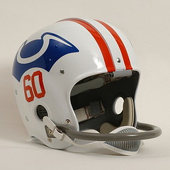
Several people have complained that the Patriots’ AFL throwbacks feature the Pat Patriot helmet instead of the team’s original helmet design, which used the old tri-corner hat logo. “If you’re gonna honor the AFL’s origins, go with the team’s original 1960 uniform!” these people say.
I haven’t added my voice to this chorus, mainly because I love Pat Patriot. And really, who doesn’t? Not only is he a great logo character, but there’s the great story of how he originally appeared in a 1959 cartoon by Boston Globe artist Phil Bissell (who later ridiculed his own creation, saying Pat looked like “a lopsided Chinaman”) and became the team’s logo because team owner Billy Sullivan was a tightwad who got permission from the Globe to use the character for free. How could the tri-corner hat compete with that?
Ah, but it turns out that the tri-corner hat has its own backstory, and it’s a good one. I learned about it from reader Rick Subrizio, who recently visited the Pats’ Hall of Fame at Patriot Place in Foxboro. Turns out they’ve got a small display devoted to the original design, which was submitted to the team by a fan named Walter Pingree. Pingree sent the original logo concept to Billy Sullivan in either late 1959 or early 1960, along with this handwritten letter, which read as follows:
Dear Mr. Sullivan,
As a rapid [sic] football fan and delighted with our new Boston Patriot’s [sic], Pro-football team, I would respectfully like to submit my original idea for the Patriot’s [sic] uniforms. Red, white, and blue colors are a symbol for patriotism. I believe this uniform to be unique and colorful, and indeed worthy of the fine team I know we will have here in Boston. I am looking forward the the [sic] coming season with eagerness and much enthusiasm and you can count on me as one who will be there to root the team on, win, lose, or draw.
Sincerely,
Walter J. Pingree
Mr. Pingree’s faith was soon rewarded with this letter from Billy Sullivan, on the letterhead of Sullivan’s company, the Metropolitan Coal and Oil Company. Here’s what it said:
Dear Mr. Pingree:
I can’t begin to tell you how much we appreciate your thoughtfulness in reference to the uniform.
I am sure it will please you to learn that we are planning to adopt it, and, as the first step, we are having a uniform designed along the lines of that which you suggested.
A couple of changes have been made, but they are relatively slight. I think you will be happy to learn that the Boston Globe is taking a color picture of one of our players wearing the new uniform, and it will appear before long in that fine publication.
I will look forward to meeting you in the near future, but meanwhile, I do want you to know that we are very grateful for your thoughtfulness.
Sincerely,
William H. Sullivan
So it looks like ol’ Billy got that logo as a freebie too. Wonder if Pingree got so much as a free pair of tickets out of the deal. Meanwhile, I’d love to see Pingree’s original uniform drawing and that Boston Globe photo. Anyone want to hunt for that in the newspaper’s archives?
As if providing these photos and letter transcriptions wasn’t enough, Rick Subrizio also decided to do a little research on Walter Pingree. “I found a reference on a Patriots fan board saying that he was ‘an employee of the Boston and Maine Railroad who designed these unis based on those he remembered from his days at Somerville High,'” says Rick. “Not sure if that is accurate, as Somerville High’s teams are called the Highlanders, but perhaps they were the Patriots in the past.”
And now that I know the story, I find the original logo a bit more appealing, a bit more endearing. Here’s hoping they finally revive it for a throwback game at some point — if not for this season, then at some point down the road.
Research Query: If you’re a past or current member of the military, I’d like to hear your opinions on baseball teams that wear camouflage uniforms. Again, this is only for past or current military members. If you fit that description, and would like to chime in, contact me here.

My Dinner with Joba: Did you know there’s a steakhouse inside the new Yankee Stadium? It’s true! And since red meat and baseball are two great tastes that taste great together, one of my ESPN editors and I had dinner at the new restaurant last week. A full account of the evening’s events is now up on Page 2.
Maybe not such a great idea after all..?: People who’ve placed ads in the Uni Watch Classifieds tell me that response has been good. But very few people are actually placing ads. If you folks aren’t into this, no biggie — maybe it wasn’t meant to be. Here, let’s try a price break: Instead of $25 per week (and $20 for members), let’s make it $15/week (and $10 for members). Full submission instrux here.
Uni Watch News Ticker: While preparing today’s entry, I realized that the favicon Kirsten designed for our Candela Structures site looks a lot like an upside-down tri-corner hat. ”¦ Man, there’s quite a bit going on in this photo. Details here. … Two days ago I mentioned that former bench coach Bryan Redemske had been involved in a cycling crash. If you can stomach it, here are the somewhat gruesome results. Heal up fast, Bry! ”¦ FNOB alert. That’s Mike Roberto (duh) of the SBHL’s Fayetteville FireAntz, whose roster also includes Mike’s twin brother, Matt Roberto (with thanks to Denis Kirstein). ”¦ This guy sells a lot of cool sports-related printed matter (with thanks to Larry Weiderecht). ”¦ Marc Wermund has taken lots of photos of the Fort Wayne Tin Caps’ new stadium, Parkview Field. “It has the second-largest jumbotron in all of the minors, ‘rooftop’ seating beyond right field, a home run deck, seats with waitstaff, some lawn seating, a kids’ play area, and dollar beers on Thursday — you can’t beat that,” he says. Check out his photo albums here and here. ”¦ “Here’s a weird hockey sock that goes back to the early ’50s,” says Terry Proctor. “It was worn by the old Quebec Aces. They were white with green knees (no jokes, please) and the two stripes were red. Looked like Christmas stockings. That’s Jean Beliveau in his Aces uniform. The club kept that style of socks through 1967. I saw them play in Rochester several times from 1960 on.” ”¦ There are sooooo many things wrong with this cap (as spotted by Doug McConnell). ”¦ It’s all true, the only reason ESPN lets me write for them is that I’m a Mets fan, otherwise I’d be out on my ass. ”¦ Actually, my editor and his boss are both serious Seattle fans, so there goes that theory. ”¦ Oooh, this is cool: NFL pencils (good find by Roger Faso). ”¦ Brian Erni notes that yesterday’s edition of Newsday had a slight Cardinals mix-up. ”¦ Josh Outman and his picture-perfect stirrups were on the mound for one inning at Yankee Stadium last night. It was a drizzly, foggy night in the Bronx, but Outman’s exemplary hose cut through the gloom like a beacon in the night. ”¦ Oooh, wait, fellow Outmaniac Ted Kerwin attended last night’s game and got several additional pics of Outman in all his glory. ”¦ Dan Cichalski notes that Outman didn’t always wear stirrups. … The other day I mentioned that the Mariners’ compass was missing Ichiro’s jersey. Ben Cook says this is nothing new. “He appears to wear it all the time on the dark and grey jerseys but seems to go back and forth with the white jersey.” I suspect there’s no master plan here — more likely the compass is missing from one of his home jerseys, so he’s compass-clad when that other jersey is in the wash and then compass-free the next day when the normal jersey is in the wash. ”¦ It’s gotta be the shoes pants (with thanks to Stephen Melton). ”¦ Tallegega Superspeedway now has a 40th-anniversary logo (as noted by Josh Neisler). ”¦ Breaking news from Robert Marshall: “Chance just had a record-setting turn at cat bowling. Six eclipses the previous record of five set by Jesco. He way behind before that, and if he manages a two or better with his second ‘shot’ in the 10th frame, he’ll have the high game by one. It was some seriously clutch cat bowling, Paul — comeback of the ages!” ”¦ Interesting piece on the authentication of MLB memorabilia here. ”¦ CC Sabathia’s shoes, donated to the Hall of Fame after his first Yankee Stadium start, are the largest shoes in the HoF’s extensive collection (with thanks to HoF curator Tom Shieber). ”¦ Central Michigan is switching from New Balance to Adidas, which means new football uniforms. “I think its big and ugly, especially compared to last year’s design,” says CMU alum Jason Bowman. “You’ve got no white, no third color to outline or give a pop to the letters or numbers or anything. The New Balance font was at least unique and it worked for their scheme, but the big block lettering needs some white outline or something. The piping is unnecessary as well, but you’ve got to live with it. The rumor is the away uniform is the same except white with maroon letters, numbers, and piping.” ”¦ Speaking of new football uniforms, Washington’s new set will be unveiled on Saturday (with thanks to Lee Ziegler). ”¦ Ingenious page here: It lets you search Flickr by color (very cool, Kirsten). ”¦ Jeffrey Moulden notes that Tennessee has been wearing a seriously ugly baseball uniform. To see, go to this page and click on the March 27th game. ”¦ Someone in the comments a few days ago mentioned that Rogers Hornsby served as a Mets coach in the franchise’s early days. That prompted Phil to track down this. Man, that really does not compute. … Speaking of Phil, he’s all decked out for a trip to Flushing. ”¦ Good spot by Matt DeMazza, who writes: “Apparently the Ducks use the old-school B-shaped nets (which haven’t been used by the NHL since the early ’80s) during warmups. I go to plenty of Rangers games and have never seen this. I don’t think I’ve seen it anywhere else, either.” This is the part where I say how I always liked that net design and kinda miss it, and then you say, “Geez, Paul, you always like everything old, it’s so predictable — stop living in the past!” And since we’re both right, we shake hands and go out for a beer. ”¦ Either there was some dust on the lens, or else someone was throwing their rosary beads at Lem Barney (with thanks to Aaron Bell). ”¦ Annals of Youthful Sports Journalism, Vol. 1: Some journo student from Penn State called me yesterday and spent about 10 minutes asking me a bunch of questions for a survey of sports bloggers being conducted by him and some of his classmates. Among the questions, and my responses, were these: “Is homophobia a problem in women’s sports?” (I have no idea, but it wouldn’t surprise me), “Should bloggers be held to a high ethical standard?” (sure), “Are professional journalists too close to the athletes they cover?” (good question), and “Have you ever had to censor discussions on your site?” (only when Powers posts too many photos of his snowblower). They said they’d send me the full survey results when they finish crunching all the numbers. ”¦ Annals of Youthful Sports Journalism, Vol. 2: Yesterday morning, a reader sent me a link for a article-plus-slideshow about uniform typos over at the Bleacher Report site (which encourages people to write but doesn’t pay them). The author of the article turned out to be a high school kid who, according to his bio on the site, is looking forward to studying journalism in college this fall and is using Bleacher Report “to hone my writing skills,” or something along those lines. Apparently by “hone” he meant “steal,” and by “writing skills” he meant “material from other people,” because almost all of his story’s photos, and some of its text, were lifted wholesale from an ESPN column I wrote in 2007. I wanted to drop him a quick “WTF?” line, but I couldn’t find a “Contact” link, so I just left a comment congratulating him on his plagiarism skills. Things got mildly surreal about two hours later, when a Bleacher Report “community coordinator” (I believe this is slang for “intern”) tried to pimp the kid’s story — which was based on my story — to me. “Hey Paul,” he wrote, “I have one article for you to take a look at today. Here is a great top-10 list of the worst typos on modern sports uniforms. Thanks and I hope this is something you could use on the blog.” I sent back a note suggesting that he scroll down to the comment I’d left. About half an hour after that, I got a note from a Bleacher Report “community GM” (the site’s co-founder, as it turns out), who apologized for the whole thing, said the article had been taken down, and said the writer would be reprimanded. Can’t wait to hear how they handle that — what are they gonna do, cut the kid’s non-existent pay? Of course, given the current state of journalism, plagiarism is probably the only viable career path the industry has left, so the kid’s on the right track. I figure it should take him about, oh, 11 years to become an editor at some place I write for. And then he’ll get assigned to me, and I’ll remember this whole incident, and he’ll be too clueless to remember and be a real moron of an editor to boot. And then I’ll have no choice but to feed him to a crocodile or something. … And speaking of uni typos, I got a note last night from former MLB pitcher Jeff Bajenaru (who, by coincidence, was born on 3/21, just like me), as follows: “I saw your article from two years back on uni name typos. I made my major league debut in Sept. of ’04 and my name was misspelled on the back of my jersey (Bajhenaru) for the White Sox. I do have a hard name to spell and pronounce (‘Badge-in-arrow’).” He’s looking for a photo and will send it along later.
The Quebec Aces unis are pretty classic, although I like Beliveau in the Aces jerseys with the bilingual logo…
link
Still, that’s the first time I’ve seen socks like that. Awesome find, Terry.
[quote comment=”325026″]The Quebec Aces unis are pretty classic, although I like Beliveau in the Aces jerseys with the bilingual logo…
link
Still, that’s the first time I’ve seen socks like that. Awesome find, Terry.[/quote]
Oh man, look at the fuzzy edges of his backlit sweater — TEXTURE! God I love natural fabrics…
Great crazy looking socks on the Aces. I asked my brother whether or not that Central Michigan jersey looks old school since it misses that extra color to make the colors pop. I don’t usually care for extra piping(ex: Minnesota Gopher’s) for a team’s new jersey, but I think it works for them.
Paul, your plagarism story reminds me of one of my favorite qoutes; “Creativity is great, but plagarism is faster.”
3 hours and counting to new Jags uni’s!!
Oh, and I disagree that plagiarism is the only remaining option for journalists. There’s always baseless fabrication or sensationalism. :) I kid, I kid.
[quote comment=”325030″]3 hours and counting to new Jags uni’s!![/quote]
you’ll probably love ’em
…but they are as BAD as the yankee unis are good
I love the original Boston helmet. It’s a hat that has a picture of another hat. Not something you see elsewhere.
Sure link, link and even link are wearing hats, but there’s more to those logos than just the hats.
Wow, major trip down memory lane with those NFL pencils. I went through a couple of sets of them when I was a kid.
1. Andrew Bailey, an alum of my alma mater pitched against the Yamks last night.
Question: The A’s were wearing their all green road caps, but their batting helmets had the yellow brim. Is this the norm?
2. You must check out this Cav’s commercial which seems to be a spoof of the Heineken walk in closet commercial:
link
Oh, man… Those NFL pencils bring back the memories. There was a vending machine in the main hallway of my grade school that was stocked with those in the fall and stocked with MLB pencils in the spring.
Any time someone had a spare dime, it went straight into that machine.
[quote comment=”325034″]Wow, major trip down memory lane with those NFL pencils. I went through a couple of sets of them when I was a kid.[/quote]
I only had one set, but it lasted me an entire year. Great memories. The sad part is, with most expansion teams and new uni designs using 3 and 4 colors, items like those pencils are becoming harder and harder to make.
I think the Uni Watch classifieds would be received better if they were on the main page, or, perhaps on the comment page.
A dedicated RSS feed for them would be a great help too. I like the idea (and perhaps would be interested in advertising), but I don’t want to make the effort to go to a separate page just for ads.
[quote comment=”325038″]I think the Uni Watch classifieds would be received better if they were on the main page, or, perhaps on the comment page.
A dedicated RSS feed for them would be a great help too. I like the idea (and perhaps would be interested in advertising), but I don’t want to make the effort to go to a separate page just for ads.[/quote]
Putting the classifieds on the main page wouldn’t be fair to my display advertisers who pay much more to be listed on the main page.
An RSS feed is a good idea, though. Let me see about that.
[quote comment=”325035″]The A’s were wearing their all green road caps, but their batting helmets had the yellow brim. Is this the norm?[/quote]
No more solid-green helmets for the A’s. They added black helmets this year for their alt uniform and something had to give (not enough storage space for umpteen helmet sets).
“I realized that the favicon Kirsten designed for our Candela Structures site looks a lot like an upside-down tri-corner hat.” Or even the Flying Nun link
[quote comment=”325040″][quote comment=”325035″]The A’s were wearing their all green road caps, but their batting helmets had the yellow brim. Is this the norm?[/quote]
No more solid-green helmets for the A’s. They added black helmets this year for their alt uniform and something had to give (not enough storage space for umpteen helmet sets).[/quote]
i know what you mean…it’s a good thing the mets don’t have to pack the blue helmets for road trips
[quote comment=”325037″][quote comment=”325034″]Wow, major trip down memory lane with those NFL pencils. I went through a couple of sets of them when I was a kid.[/quote]
I only had one set, but it lasted me an entire year. Great memories. The sad part is, with most expansion teams and new uni designs using 3 and 4 colors, items like those pencils are becoming harder and harder to make.[/quote]
I can honestly say that the only reason I ever went into the school’s office as a young lad was to buy an NFL pencil with a spare quarter from lunch. Several friends and I did this and tried to trade with each other until we each had full sets. There must’ve been some odd stocking though, as each of us typically had 5 or 6 LA Rams on hand.
Compare the Lions uni of Lem Barney (nice shot of the stickum on his socks) to that featured in yesterday’s column. I’ll take the old uni and logo any day over the new and “improved”.
[quote comment=”325043″][quote comment=”325037″][quote comment=”325034″]Wow, major trip down memory lane with those NFL pencils. I went through a couple of sets of them when I was a kid.[/quote]
I only had one set, but it lasted me an entire year. Great memories. The sad part is, with most expansion teams and new uni designs using 3 and 4 colors, items like those pencils are becoming harder and harder to make.[/quote]
I can honestly say that the only reason I ever went into the school’s office as a young lad was to buy an NFL pencil with a spare quarter from lunch. Several friends and I did this and tried to trade with each other until we each had full sets. There must’ve been some odd stocking though, as each of us typically had 5 or 6 LA Rams on hand.[/quote]
I hear that. It was virtually impossible to get a Bears or Steelers pencil out of our machine.
Why do numbers and logos have to “pop” these days? And when did that expression come into vogue?
I have a couple different NFL pencils from the late 80’s/early 90’s that include the team wordmark logo as well as the helmet design.
Still have an LA Rams one around somewhere…
(as I typed that last ‘.’ Martin Brodeur let in a goal)
link
Don’t think I’ve ever seen that Pirates’ logo before.
[quote comment=”325032″][quote comment=”325030″]3 hours and counting to new Jags uni’s!![/quote]
you’ll probably love ’em
…but they are as BAD as the yankee unis are good[/quote]
I’m stayin’ positive Phil. (Mumbling) Serenity now, serenity now, serenity now . . .
[quote comment=”325047″]I have a couple different NFL pencils from the late 80’s/early 90’s that include the team wordmark logo as well as the helmet design.
Still have an LA Rams one around somewhere…
(as I typed that last ‘.’ Martin Brodeur let in a goal)[/quote]
…now he broke another stick in frustration!
[quote comment=”325047″]I have a couple different NFL pencils from the late 80’s/early 90’s that include the team wordmark logo as well as the helmet design.
Still have an LA Rams one around somewhere…
(as I typed that last ‘.’ Martin Brodeur let in a goal)[/quote]
A quick search of eBay finds nothing from that “golden era” of NFL pencils. During the late 80’s and early 90’s the team’s name and helmet design were foil stamped in the team’s secondary color directly onto the pencil, which was the team’s primary color.
I really think those pencils were the start of a lifelong obsession, leading me directly here.
GSP logo contest
link
[quote comment=”325032″][quote comment=”325030″]3 hours and counting to new Jags uni’s!![/quote]
you’ll probably love ’em
…but they are as BAD as the yankee unis are good[/quote]
For the reoord, (as I bitched yesterday) I could care less about the Yankees…I’m only excited about the Jags uni’s so I can rip on them…The rash of NFL Uni changes the last few years haven’t been the best…
and besides, being a Jets fan, I hate all Florida teams!!
[quote comment=”325050″][quote comment=”325047″]I have a couple different NFL pencils from the late 80’s/early 90’s that include the team wordmark logo as well as the helmet design.
Still have an LA Rams one around somewhere…
(as I typed that last ‘.’ Martin Brodeur let in a goal)[/quote]
…now he broke another stick in frustration![/quote]
Sitting 2 rows directly in front of Lou Lamoriello during last night’s game was the icing on an otherwise totally awesome game.
WOW…those are the ugliest baseball uniforms I have ever seen (Tennessee)….Even worse than the Oregon football Unis
When I see the Candela Structures, I think of this:
link
[quote comment=”325035″]1. Andrew Bailey, an alum of my alma mater pitched against the Yamks last night.
Question: The A’s were wearing their all green road caps, but their batting helmets had the yellow brim. Is this the norm?
2. You must check out this Cav’s commercial which seems to be a spoof of the Heineken walk in closet commercial:
link
Paul said they dropped the road helmets to make room for black helmets to wear with their black hats. This seems really silly, and doesn’t look good. If you have home and away hats, the helmets should match them. The only exception is when, like the Twins or Brewers in the 1970s or ’80s, your helmet is completely different from either your home or away hat.
[quote comment=”325053″][quote comment=”325032″][quote comment=”325030″]3 hours and counting to new Jags uni’s!![/quote]
you’ll probably love ’em
…but they are as BAD as the yankee unis are good[/quote]
For the reoord, (as I bitched yesterday) I could care less about the Yankees…I’m only excited about the Jags uni’s so I can rip on them…The rash of NFL Uni changes the last few years haven’t been the best…
and besides, being a Jets fan, I hate all Florida teams!![/quote]
Two words: Kellen. Clemens.
Anyone else see a striking resemblance?
link
and
link
I guess I shouldn’t wear my “Shea” shirt then.
Instead I’ve found these:
link
or
link
or
link
Sorry — I didn’t scroll down to see Paul’s answer to you on the A’s helmets before I posted.
Anyway, it seems strange to match the black hat with a black helmet when you rarely wear the black hats, but not to match the green hat with a green helmet when that is your primary road hat.
[quote comment=”325032″][quote comment=”325030″]3 hours and counting to new Jags uni’s!![/quote]
you’ll probably love ’em
…but they are as BAD as the yankee unis are good[/quote]
3 hours??? i thought paul already posted the newest “jags uni”:
link
haha! please don’t kill me phil… :-)
[quote comment=”325058″][quote comment=”325053″][quote comment=”325032″][quote comment=”325030″]3 hours and counting to new Jags uni’s!![/quote]
you’ll probably love ’em
…but they are as BAD as the yankee unis are good[/quote]
For the reoord, (as I bitched yesterday) I could care less about the Yankees…I’m only excited about the Jags uni’s so I can rip on them…The rash of NFL Uni changes the last few years haven’t been the best…
and besides, being a Jets fan, I hate all Florida teams!![/quote]
Two words: Kellen. Clemens.[/quote]
I don’t care…I rooted for Chad, Quincy, Bollinger,Lucas, Vinny,Foley, O’Brien, O’Donnell (blech-still have that Jersey some ewhere),Brister,Reich,Todd, Nagle and a few others that I’ve left out (note: HATED Favre…)
Can’t keep a Jets fan down!! It’s going to be a great season!!
I don’t think it was mentioned in the ticker but the Central Michigan helmet has “Hold The Rope” on the bumper or whatever it’s called. Was that on last years helmet as well?
link
[quote comment=”325046″]Why do numbers and logos have to “pop” these days? And when did that expression come into vogue?[/quote]
It’s been around forever. Goes, I suppose, to ad designers talking about making things “pop up off the page,” as in “leap up” not pop like a firecracker.
Visually speaking, a black drop shadow can give something a bit of 3-D effect.
Not arguing for or against anything here, just explaining.
—Ricko
[quote comment=”325049″][quote comment=”325032″][quote comment=”325030″]3 hours and counting to new Jags uni’s!![/quote]
you’ll probably love ’em
…but they are as BAD as the yankee unis are good[/quote]
I’m stayin’ positive Phil. (Mumbling) Serenity now, serenity now, serenity now . . .[/quote]
Serenity now, Insanity later..
Typo alert in the ticker – Talladega not Tallagega…
That flickr search tool is amazing. I only wish I had something I could use it for.
Maybe if I needed to make a photomosaic of something… those are fun.
link
[quote comment=”325027″][quote comment=”325026″]The Quebec Aces unis are pretty classic, although I like Beliveau in the Aces jerseys with the bilingual logo…
link
Still, that’s the first time I’ve seen socks like that. Awesome find, Terry.[/quote]
Oh man, look at the fuzzy edges of his backlit sweater — TEXTURE! God I love natural fabrics…[/quote]
That’s a Life photo, Paul. There are a number of excellent olde-tyme hockey pictures in the gallery like that of random amateur teams.
I should know because that link goes to my Photobucket. LOL
[quote comment=”325064″][quote comment=”325046″]Why do numbers and logos have to “pop” these days? And when did that expression come into vogue?[/quote]
It’s been around forever. Goes, I suppose, to ad designers talking about making things “pop up off the page,” as in “leap up” not pop like a firecracker.
Visually speaking, a black drop shadow can give something a bit of 3-D effect.
Not arguing for or against anything here, just explaining.
—Ricko[/quote]
Its also good to have the numbers on a jersey pop because you don’t want them to blend into the jersey itself. The hideous orange Virginia Tech football unis are a prime example of uni numbers that don’t pop… and its not a good thing
[quote comment=”325063″]I don’t think it was mentioned in the ticker but the Central Michigan helmet has “Hold The Rope” on the bumper or whatever it’s called. Was that on last years helmet as well?
link
I was wondering the same thing. I’m not sure if this is from last year or two years ago, but CMU has “Central” on its nose bumpers.
link
Also, I’m glad to see that the rib cage horns didn’t make their way from Ann Arbor to Mt. Pleasant.
In the obvious damage control move of the week, the Mets are keeping Doc’s signature on the wall.
link
Congrats to the Fort Wayne Tin Caps for a successful debut of their new ballpark. Looks awesome. FW native who adores the city but hasn’t lived there in 19 years.
And a GIGANTIC F-You to the chucklehead suburban SUV set who thought moving the stadium downtown was a bad idea. Worry not, Wal-Mart is still open for you!
And, finally, EEEGADS Tennessee!
Anybody remember when they were sherbet orange, light blue and white. NO BLACK!
Here’s what’s wrong with that O’s hat: the dude’s wearing it at “Natinals” Park! WTF?! I know we’re desperate for people to buy our seats, but if you’re attending a “Natinals”-Braves game at “Natinals” Park, leave the O’s hat at home! It’s even more insulting that it’s such an ugly hat and there isn’t a hint of orange or black anywhere in it…
[quote comment=”325068″][quote comment=”325027″][quote comment=”325026″]The Quebec Aces unis are pretty classic, although I like Beliveau in the Aces jerseys with the bilingual logo…
link
Still, that’s the first time I’ve seen socks like that. Awesome find, Terry.[/quote]
Oh man, look at the fuzzy edges of his backlit sweater — TEXTURE! God I love natural fabrics…[/quote]
That’s a Life photo, Paul. There are a number of excellent olde-tyme hockey pictures in the gallery like that of random amateur teams.
I should know because that link goes to my Photobucket. LOL[/quote]
That’s hilarious! I had known that the uniform existed, so I found that picture using google image search. It is a brilliant pic. Sorry for linking from your photo bucket, Teebz.
For this link for Bajenaru
link
The Diamondbacks logo on the right is the older one, while he is pictured with the hat from the new logo.
Paul,
I believe the Detroit Lions photo is of Lem not Len Barney.
[quote comment=”325076″]Paul,
I believe the Detroit Lions photo is of Lem not Len Barney.[/quote]
Indeed. Will fix.
[quote comment=”325071″]In the obvious damage control move of the week, the Mets are keeping Doc’s signature on the wall.
link
I’m sure that the Mets fans won’t like this because of their uproar over the Dodger Stadium East/Citi-Field but doesn’t Dodger Stadium West/Chavez Ravine have former players signatures and pictures along the outfield wall?
West Michigan Whitecaps (Class A) will be wearing breast cancer awareness tequila sunrise jerseys:
link
[quote comment=”325054″][quote comment=”325050″][quote comment=”325047″]I have a couple different NFL pencils from the late 80’s/early 90’s that include the team wordmark logo as well as the helmet design.
Still have an LA Rams one around somewhere…
(as I typed that last ‘.’ Martin Brodeur let in a goal)[/quote]
…now he broke another stick in frustration![/quote]
Sitting 2 rows directly in front of Lou Lamoriello during last night’s game was the icing on an otherwise totally awesome game.[/quote]
Ah, playoff hockey in person, nothing quite like it eh? I’ll be at Game 5 in the Igloo tomorrow night…hoping to send the Flyers home. Last year was my first taste of being in the building during the playoffs and it was quite the experience.
These NHL playoffs haven’t disappointed yet as far as my interest. First, it was great to have St. Louis and Chicago back in the second season (despite the far-better Canucks completing the sweep last night). Then, Flyers-Pens, Rangers-Caps, Bruins-Habs, those series are great and then you add the super-entertaining ‘Canes-Devils series to mix, and you got some really good first round action. I only wish the Center Ice channels would come in HD.
Detroit has welcomed Columbus to the big boys’ club but the Jackets will hopefully learn from this experience and be back. I like CLB, Umberger being a Pittsburgh-area guy and I really like Nash’s game.
Anaheim-San Jose is an underrated match-up, the Ducks, to steal a line from Kobe, aren’t a typical #8 seed.
Plus you get the lovely Lindsay Soto covering the game on VERSUS!
Great story on the original Patriots helmets.
But still nobody has ever answered why the Patriots originally made red their dominant color when the British were the redcoats…
[quote comment=”325075″]For this link for Bajenaru
link
The Diamondbacks logo on the right is the older one, while he is pictured with the hat from the new logo.[/quote]
Considering that Bajenaru only pitched one inning in ’06 for the D-Backs, and the red wasn’t introduced until the ’07 season, my guess is that the red hat picture was a spring training or similar picture, while the old color logo is the actual uni he wore during the game.
Doesn’t make it any less odd.. just sayin
matt…those jackets would be an awesome DIY — and while you’re at it, score me a mr. met patch (and a giant ‘lighthouse‘ from the isles fisherman sweater)
ryan…if your goal was to jump ahead of powers on the ‘favorite poster to bust on’ list, congratulations
/at least in that photo paul ran, he had the good sense to crop out the dead hooker in the corner…
I thought the favicon (for all you Tintin fans) looked like Marshal Kurvi-Tasch’s mustache:
link
[quote comment=”325074″][quote comment=”325068″][quote comment=”325027″][quote comment=”325026″]The Quebec Aces unis are pretty
jerseys with the bilingual logo…
link
Still, that’s the first time I’ve seen socks like that. Awesome find, Terry.[/quote]
Oh man, look at the fuzzy edges of his backlit sweater — TEXTURE! God I love natural fabrics…[/quote]
That’s a Life photo, Paul. There are a number of excellent olde-tyme hockey pictures in the gallery like that of random amateur teams.
I should know because that link goes to my Photobucket. LOL[/quote]
That’s hilarious! I had known that the uniform existed, so I found that picture using google image search. It is a brilliant pic. Sorry for linking from your photo bucket, Teebz.[/quote]
Nothing to be sorry about whatsoever!
I have a whole bunch more from Life in there, so I just wanted Paul (and anyone else interested) to know where it came from. :o)
[quote comment=”325063″]I don’t think it was mentioned in the ticker but the Central Michigan helmet has “Hold The Rope” on the bumper or whatever it’s called. Was that on last years helmet as well?
link
Yes, it was there last year. It has been the motto for Butch Jones since he was hired a couple of years ago.
Also since I contributed it, my reasoning for really not liking them is that we look just like Minnesota’s uniforms. At least before, we stood out and were different. We have the cookie cutter Adidas style now.
[quote comment=”325057″][quote comment=”325035″]1. Andrew Bailey, an alum of my alma mater pitched against the Yamks last night.
Question: The A’s were wearing their all green road caps, but their batting helmets had the yellow brim. Is this the norm?
2. You must check out this Cav’s commercial which seems to be a spoof of the Heineken walk in closet commercial:
link
Paul said they dropped the road helmets to make room for black helmets to wear with their black hats. This seems really silly, and doesn’t look good. If you have home and away hats, the helmets should match them. The only exception is when, like the Twins or Brewers in the 1970s or ’80s, your helmet is completely different from either your home or away hat.[/quote]
Those white-on-blue Brewers helmets always bothered me, because I always wanted the Brew Crew to wear a link (like the link).
For a time in the 1970s, the Brewers used a special link (to match the link).
This is a write up about the Chiefs Mini camp that the new coach Todd Hailey has them practicing without their arrowhead logos, that they have to earn them…nice concept.
link
Aren’t there more teams per square foot in the NorthEast anyway? You’d have to ‘some sort’ of bias when most of your material is rooted in a certain area! Thats like Gary Cherone fans complaining that music journalists write too much about David Lee Roth.
And as far as I can tell, Manny Ramirez’s face graces ESPN.com just as much as it did when he was a Blue Sox player, am I right?
Woops. Sorry Hank @15, didn’t mean to steal. Should’ve read the previous posts.
[quote comment=”325083″]matt…those jackets would be an awesome DIY — and while you’re at it, score me a mr. met patch (and a giant ‘link‘ from the isles fisherman sweater)
[/quote]
Yeah, it’ll be especially awesome on or about July 30th when he’s done making it.
[quote comment=”325034″]Wow, major trip down memory lane with those NFL pencils. I went through a couple of sets of them when I was a kid.[/quote]
Me, too … Clover stores near Philadelphia! Awesome!
[quote comment=”325044″]Compare the Lions uni of Lem Barney (nice shot of the stickum on his socks) to that featured in yesterday’s column. I’ll take the old uni and logo any day over the new and “improved”.[/quote]
I totally agree Dave…the old uni looks much better. Besides the stickum, I could not help but notice the height and thickness of the grass/turf at what appears to be Wrigley Field.
[quote comment=”325091″][quote comment=”325083″]matt…those jackets would be an awesome DIY — and while you’re at it, score me a mr. met patch (and a giant ‘link‘ from the isles fisherman sweater)
[/quote]
Yeah, it’ll be especially awesome on or about July 30th when he’s done making it.[/quote]
are you kiddin’? he’s got a whole class full of students and a seamstress working on it right now!
Wow, I have a complete set of those pencils too, never been used. 50 bucks?
[quote comment=”325046″]Why do numbers and logos have to “pop” these days? And when did that expression come into vogue?[/quote]
Probably when Snoop Dogg hizzled his nizzle. “Drop it like it’s hoooot ….”
[quote comment=”325089″]Aren’t there more teams per square foot in the NorthEast anyway? You’d have to ‘some sort’ of bias when most of your material is rooted in a certain area! Thats like Gary Cherone fans complaining that music journalists write too much about David Lee Roth.
And as far as I can tell, Manny Ramirez’s face graces ESPN.com just as much as it did when he was a Blue Sox player, am I right?[/quote]
One thing sure, with the Red Sox and Yankees playing this weekend, those who claim the Northest ESPN bias will get, unfairly, plenty more fodder.
re: Manny’s kisser on ESPN. Haven’t seen any increase in the number of Dodger games on the national TV schedule thus far, though, have we.
Oh, I kid. Sorta. In all fairness to ESPN, in case no one has noticed, the Red Sox, Yankees, Patriots, Giants, Celtics and Mets (right up to their annual fold) have been pretty damn good lately. And there was that thing with Favre coming to the Jets. They NOT supposed to cover that stuff?
—Ricko
No one else is commenting on the Mets wearing their ‘home black Mets’ on the road last night?
Or maybe I just missed it…
I’m kinda excited about the Jags unis. Expectations are so low, I’m almost expecting to like them a bit.
but, since I feel about teal like Paul feels about purple, probably not.
[quote comment=”325079″]“West Michigan Whitecaps (Class A) will be wearing breast cancer awareness tequila sunrise jerseys:”
link
Looking more like Cotton Candy Daquari Sunrise…
[quote comment=”325055″]WOW…those are the ugliest baseball uniforms I have ever seen (Tennessee)….Even worse than the Oregon football Unis[/quote]
Oh?
link
[quote comment=”325086″][quote comment=”325063″]I don’t think it was mentioned in the ticker but the Central Michigan helmet has “Hold The Rope” on the bumper or whatever it’s called. Was that on last years helmet as well?
link
Yes, it was there last year. It has been the motto for Butch Jones since he was hired a couple of years ago.
Also since I contributed it, my reasoning for really not liking them is that we look just like Minnesota’s uniforms. At least before, we stood out and were different. We have the cookie cutter Adidas style now.[/quote]
Can’t say for sure, but I’d guess that Jones picked up “Hold the Rope” while as a WR coach at WVU in 2005-2006. It was one of Rich Rodriguez’s favorite sayings:
link
Needless to say, WVU alums like myself don’t care for it too much anymore.
[quote comment=”325094″][quote comment=”325091″][quote comment=”325083″]matt…those jackets would be an awesome DIY — and while you’re at it, score me a mr. met patch (and a giant ‘link‘ from the isles fisherman sweater)
[/quote]
Yeah, it’ll be especially awesome on or about July 30th when he’s done making it.[/quote]
are you kiddin’? he’s got a whole class full of students and a seamstress working on it right now![/quote]
Oh, the “first draft” will be cranked out in record time. That part I don’t doubt. But I’m talking about the finished product after the various and sundry errors are corrected.
“Hold the Rope”?
All I think of is Wile E. Coyote standing there while the shadow of that big brown boulder gets bigger…and bigger.
—Ricko
[quote comment=”325098″]No one else is commenting on the Mets wearing their ‘home black Mets’ on the road last night?
Or maybe I just missed it…[/quote]
I would love to see them wear these as their full time road unis, albeit with the blue caps:
link
link
I think they wore them once last year.
[quote comment=”325080″][quote comment=”325054″][quote comment=”325050″][quote comment=”325047″]I have a couple different NFL pencils from the late 80’s/early 90’s that include the team wordmark logo as well as the helmet design.
Still have an LA Rams one around somewhere…
(as I typed that last ‘.’ Martin Brodeur let in a goal)[/quote]
…now he broke another stick in frustration![/quote]
Sitting 2 rows directly in front of Lou Lamoriello during last night’s game was the icing on an otherwise totally awesome game.[/quote]
Ah, playoff hockey in person, nothing quite like it eh? I’ll be at Game 5 in the Igloo tomorrow night…hoping to send the Flyers home. Last year was my first taste of being in the building during the playoffs and it was quite the experience.
These NHL playoffs haven’t disappointed yet as far as my interest. First, it was great to have St. Louis and Chicago back in the second season (despite the far-better Canucks completing the sweep last night). Then, Flyers-Pens, Rangers-Caps, Bruins-Habs, those series are great and then you add the super-entertaining ‘Canes-Devils series to mix, and you got some really good first round action. I only wish the Center Ice channels would come in HD.
Detroit has welcomed Columbus to the big boys’ club but the Jackets will hopefully learn from this experience and be back. I like CLB, Umberger being a Pittsburgh-area guy and I really like Nash’s game.
Anaheim-San Jose is an underrated match-up, the Ducks, to steal a line from Kobe, aren’t a typical #8 seed.
Plus you get the lovely Lindsay Soto covering the game on VERSUS![/quote]
Oh, the Center Ice channels come in HD, its just that the games aren’t being broadcasted in HD thanks to Bettman bending over and taking it up the pooper. You have a game where its actually a million times better to watch in HD, and the channels broadcast in HD, yet you don’t require them to broadcast your games in HD. Unbelievable, especially in the playoffs.
Hi
If the Mets are dropping a Black jersey they should have droped the home “Mets” black and kept the road “New York” black, that way we would have a home home and home alt ,and also a road and road alt.
Thanks
Les
from Ireland
And there was that thing with Favre coming to the Jets. They NOT supposed to cover that stuff?
I think its hilarious at the beginning of ’08 that he tried to pawn off the notion that he wouldn’t join the Say Hey/MJ/Broadway Joe club.
Yeah, and I think you’re right about the Dodgers games, Ricko. Although, I listen to a lot of sports talk on FOX radio and all you hear about is the Lakers and the Dodgers.
So at this point, is it fair to say the Mets primary colors are black and white, with blue and orange being used for trim?
[quote comment=”325079″]West Michigan Whitecaps (Class A) will be wearing breast cancer awareness tequila sunrise jerseys:
link
Holy kronk, those are awesome!
Paul,
My brother-in-law (a Marine) and I had a discussion about the camo jerseys recently. It led to me doing an informal poll of my friends who are serving in the military. I’m excited to hear how your story turns out.
[quote comment=”325073″]Here’s what’s wrong with that O’s hat: the dude’s wearing it at “Natinals” Park! WTF?! I know we’re desperate for people to buy our seats, but if you’re attending a “Natinals”-Braves game at “Natinals” Park, leave the O’s hat at home! It’s even more insulting that it’s such an ugly hat and there isn’t a hint of orange or black anywhere in it…[/quote]
Also, they’re Barcelona colors. Or the Brisbane Lions.
[quote comment=”325106″][quote comment=”325080″][quote comment=”325054″][quote comment=”325050″][quote comment=”325047″]I have a couple different NFL pencils from the late 80’s/early 90’s that include the team wordmark logo as well as the helmet design.
Still have an LA Rams one around somewhere…
(as I typed that last ‘.’ Martin Brodeur let in a goal)[/quote]
…now he broke another stick in frustration![/quote]
Sitting 2 rows directly in front of Lou Lamoriello during last night’s game was the icing on an otherwise totally awesome game.[/quote]
Ah, playoff hockey in person, nothing quite like it eh? I’ll be at Game 5 in the Igloo tomorrow night…hoping to send the Flyers home. Last year was my first taste of being in the building during the playoffs and it was quite the experience.
These NHL playoffs haven’t disappointed yet as far as my interest. First, it was great to have St. Louis and Chicago back in the second season (despite the far-better Canucks completing the sweep last night). Then, Flyers-Pens, Rangers-Caps, Bruins-Habs, those series are great and then you add the super-entertaining ‘Canes-Devils series to mix, and you got some really good first round action. I only wish the Center Ice channels would come in HD.
Detroit has welcomed Columbus to the big boys’ club but the Jackets will hopefully learn from this experience and be back. I like CLB, Umberger being a Pittsburgh-area guy and I really like Nash’s game.
Anaheim-San Jose is an underrated match-up, the Ducks, to steal a line from Kobe, aren’t a typical #8 seed.
Plus you get the lovely Lindsay Soto covering the game on VERSUS![/quote]
Oh, the Center Ice channels come in HD, its just that the games aren’t being broadcasted in HD thanks to Bettman bending over and taking it up the pooper. You have a game where its actually a million times better to watch in HD, and the channels broadcast in HD, yet you don’t require them to broadcast your games in HD. Unbelievable, especially in the playoffs.[/quote]
Wait a minute……wha???? So those games are in HD if you were local and watched them (i.e. I watched the Pens-Flyers last night on FSN HD) but when they put them on the Center Ice channels they are standard def? That’s CRAP. Hockey is one of the few sports I think that widespread HD would actually help fans, how can they do that?
Even when VS does the bonus game and they get the feed from TSN, CBC or, like last night, MSG, it’s in HD.
I’m wondering if Comcast is at it too here, because I’ve noticed that games on the extra innings channels have an HD watermark on them from the local FSN or whatever, but they aren’t HD. I’m thinking it’s because the channel range isn’t the HD range but when you look at the listings of the games on the channel sometimes it says (HD) by a game so that leads me to believe that it’s MLB’s intent to have the game in HD.
[quote comment=”325109″]So at this point, is it fair to say the Mets primary colors are black and white, with blue and orange being used for trim?[/quote]
This won’t end well.
I live in Somerville, MA and I have no real idea of the connection between Somerville Highlanders unis and the early Boston Patriots. However, the Highlanders are a primarily red team so maybe that was part of the design influence.
Also, Somerville are the Highlanders partly because of the fact that they are on slightly higher ground than Boston/Comabridge but mostly because the high school was built (in 1851) on Highland avenue. There are no great connections to Scottish people. The name of Somerville was not chosen to honor any person but just because it sounded good when it was shaved off of Charlestown (in 1842).
[quote comment=”325113″]Wait a minute……wha???? So those games are in HD if you were local and watched them (i.e. I watched the Pens-Flyers last night on FSN HD) but when they put them on the Center Ice channels they are standard def? That’s CRAP. Hockey is one of the few sports I think that widespread HD would actually help fans, how can they do that?
Even when VS does the bonus game and they get the feed from TSN, CBC or, like last night, MSG, it’s in HD.
I’m wondering if Comcast is at it too here, because I’ve noticed that games on the extra innings channels have an HD watermark on them from the local FSN or whatever, but they aren’t HD. I’m thinking it’s because the channel range isn’t the HD range but when you look at the listings of the games on the channel sometimes it says (HD) by a game so that leads me to believe that it’s MLB’s intent to have the game in HD.[/quote]
Its actually worse than that. For the most part, all games are recorded in HD, but the games aren’t always broadcasted in HD. You’ll generally see one market has an HD feed for a game and the other doesn’t… for the same matchup!
This is true for the Canes-Devils series right now. FoxSports is not broadcasting the games in HD, but MSG is. The games are being filmed in HD, but only one of the markets is getting that feed. Its pathetic, really. This is actually the case for most FSN broadcasts. Every game is filmed in HD, but only a select few (only 11/41 home games this year were broadcasted in HD for the Canes in the Raleigh market) are actually broadcasted in true HD to the viewers at home.
[quote comment=”325079″]West Michigan Whitecaps (Class A) will be wearing breast cancer awareness tequila sunrise jerseys:
link
Wouldn’t that be a Pepto-Bismol Sunrise?
[quote comment=”325114″][quote comment=”325109″]So at this point, is it fair to say the Mets primary colors are black and white, with blue and orange being used for trim?[/quote]
This won’t end well.[/quote]
Nope, but at the same time, can you really argue it?
[quote comment=”325110″][quote comment=”325079″]West Michigan Whitecaps (Class A) will be wearing breast cancer awareness tequila sunrise jerseys:
link
Holy kronk, those are awesome![/quote]
Tom Collins Sunrise?
Cosmopolitan Sunrise?
Pink Lady Sunrise?
But, yeah, for the the sport involved and the purpose, a really fun idea.
—Ricko
[quote comment=”325119″][quote comment=”325110″][quote comment=”325079″]West Michigan Whitecaps (Class A) will be wearing breast cancer awareness tequila sunrise jerseys:
link
Holy kronk, those are awesome![/quote]
Tom Collins Sunrise?
Cosmopolitan Sunrise?
Pink Lady Sunrise?
But, yeah, for the the sport involved and the purpose, a really fun idea.
—Ricko[/quote]
Hadn’t seen Pepto-Bismol Sunrise.
I think we have a winner.
—Ricko
ESPN writeup of the steakhouse is up. Fun stuff.
Although Bubblicious Sunrise does have merit.
We don’t get ESPN in Canada so I can’t comment on the alleged East Coast bias.
But the running joke is that the Canadian equivalent, TSN, stands for Toronto Sports Network, and there are similar jokes about the national newspapers and their Toronto-centric coverage.
Both the Canadian sports networks and the national newspapers have a well-deserved reputation for focusing on the Toronto sports scene to the exclusion of other areas. Even this week, with Vancouver going to the second round, Calgary fighting for its playoff lives and Montreal circling the drain, the most prominent item on the national sports news has been Maple Leafs trade talk.
Which leads me to this point: the one thing that didn’t get discussed in the USA Today article with respect to bias is that its not just the volume of game coverage, its also the volume of talk about the teams. In our case, even if our networks don’t show more Toronto games than the other teams, their talk shows spend an awful lot of time talking about the Toronto teams.
Are you racist? You hate black in every jersey. Mets and Lions use black and it doesn’t look that bad, but you make a huge deal about it.
Do you hate black people because we are victimized more than jewish people like you?
And on a uniform-related note, my task of keeping track of the Jays record in various uni combinations (4 so far) is up to date and linked via my name. I’ll be travelling the next few days so it might be the weekend before another update.
There was story on NPR this morning that the starting bat boy for Saturday’s Red Sox – Yankees game will be a 100 year old who had been a bat boy in the 20s.
HIs NOB will be Big Pappy and his number will be 100.
He’ll only be there for the first batter so get the screen grabs early.
RE: UT baseball uniforms: the big fear is this type of thoughtless design will lead to similarly heinous football uniform design — of Oregon State flavor (no offense OSU fans: just not my end of the ice cream freezer): effectively wrecking significant tradition around black as an accent hue. Hopefully Lane Kiffin plays on said tradition with the same reverence Pete Carroll has…
[quote comment=”325124″]Are you racist? You hate black in every jersey. Mets and Lions use black and it doesn’t look that bad, but you make a huge deal about it.
Do you hate black people because we are victimized more than jewish people like you?[/quote]
yowsas. you make carl lewis look bad with a jump like that.
[quote comment=”325124″]Are you racist? You hate black in every jersey. Mets and Lions use black and it doesn’t look that bad, but you make a huge deal about it.
Do you hate black people because we are victimized more than jewish people like you?[/quote]
Yes. I think the Raiders should wear silver and white. And my beloved Giants should wear orange and white (OK, cream is acceptable).
[quote comment=”325124″]Are you racist? You hate black in every jersey. Mets and Lions use black and it doesn’t look that bad, but you make a huge deal about it.
Do you hate black people because we are victimized more than jewish people like you?[/quote]
*grabs a bag of popcorn and prepares to enjoy the show*
this oughtta be interesting
[quote comment=”325124″]Are you racist? You hate black in every jersey. Mets and Lions use black and it doesn’t look that bad, but you make a huge deal about it.
Do you hate black people because we are victimized more than jewish people like you?[/quote]
I am going to save this comment, have it bronzed, and keep it in a very special place close to my heart.
Meanwhile, the Yankees steakhouse piece is up:
link
[quote comment=\”325124\”]Are you racist? You hate black in every jersey. Mets and Lions use black and it doesn\’t look that bad, but you make a huge deal about it.
Do you hate black people because we are victimized more than jewish people like you?[/quote]
Not everything in life is a racial issue. This is a discussion of uniform aesthetics. Get over yourself and stop thinking that anyone is slighting you because they would rather not see black on so many uniforms. People all have their own opinions. You like black and some people dont. Thats life and the beauty of discussion. Not everything in life is a racial issue. Grow up.
I, too an a Central Michigan alum and I really like the new uni’s. The athetic department at CMU is switching to the Adidas brand to try and streamline their athletic apparel. Last year, CMU teams were outfitted by New Balance, Nike and Adidas. The switch also benefits groups like URec, the intramural outfit on campus.
As for “Hold the Rope,” it definitely is something Butch Jiones took from WVU. The coaching staff also has “Hold the Rope” on siledine sweatshirts as well as nose-bumpers on helmets (no image, sorry).
jaguars are showing the new uni’s live online from their website in about 15 minutes
[quote comment=”325122″]Although Bubblicious Sunrise does have merit.[/quote]
Does anyone remember link?
[quote comment=”325125″]And on a uniform-related note, my task of keeping track of the Jays record in various uni combinations (4 so far) is up to date and linked via my name. I’ll be travelling the next few days so it might be the weekend before another update.[/quote]
thanks mike!
btw…anyone who missed it, mike had a great piece with me this past sunday — if you haven’t seen it you should check it out
[quote comment=”325130″][quote comment=”325124″]Are you racist? You hate black in every jersey. Mets and Lions use black and it doesn’t look that bad, but you make a huge deal about it.
Do you hate black people because we are victimized more than jewish people like you?[/quote]
*grabs a bag of popcorn and prepares to enjoy the show*
this oughtta be interesting[/quote]
This has more potential than:
A. Cry Black
B. Cup Stacking
C. Yankee Elitism
D. Making my own MF stirrups
E. Al of the Above
Disliking black uniforms = racist?
link
Boy, the guy fishing for bites with the racist comment has alot of takers so far.
That CAN’T be a serious comment, he had to just be fishing.
[quote comment=”325124″]Are you racist? You hate black in every jersey. Mets and Lions use black and it doesn’t look that bad, but you make a huge deal about it.
Do you hate black people because we are victimized more than jewish people like you?[/quote]
Yeah. This blog’s just overflowing with criticism of the Steelers, Raiders, Pirates, Saints, Penguins, Bruins, Buffaloes, Boilermakers, etc. Besides isn’t it better to have openness to people and items “of color” than not?
[quote comment=”325137″][quote comment=”325130″][quote comment=”325124″]Are you racist? You hate black in every jersey. Mets and Lions use black and it doesn’t look that bad, but you make a huge deal about it.
Do you hate black people because we are victimized more than jewish people like you?[/quote]
*grabs a bag of popcorn and prepares to enjoy the show*
this oughtta be interesting[/quote]
This has more potential than:
A. Cry Black
B. Cup Stacking
C. Yankee Elitism
D. Making my own MF stirrups
E. Al of the Above[/quote]
Al of the Above sounds like a movie title *yuk yuk yuk*
Live Unveiling of the Jags unis… link
[quote comment=”325120″][quote comment=”325119″][quote comment=”325110″][quote comment=”325079″]West Michigan Whitecaps (Class A) will be wearing breast cancer awareness tequila sunrise jerseys:
link
Holy kronk, those are awesome![/quote]
Tom Collins Sunrise?
Cosmopolitan Sunrise?
Pink Lady Sunrise?
But, yeah, for the the sport involved and the purpose, a really fun idea.
—Ricko[/quote]
Hadn’t seen Pepto-Bismol Sunrise.
I think we have a winner.
—Ricko[/quote]
I mourn that I only have a b/w photo of this.
link
Personally, I believe the reason no team in the NFL, MLB or NHL wears kelly green is because they hate Irish people.
Seriously, how many O’Briens or Kellys are there anymore, huh? Explain that!
Celtics? They don’t have a choice. Boston is dominated by those Sons of Erin.
That’s all I have to say, because right now I’m too busy filling out my application for membership in the Impossibly Dumb Club…and getting ready to point out that the new Jag unis are just another example proving my theory.
—Ricko
[quote comment=”325110″][quote comment=”325079″]West Michigan Whitecaps (Class A) will be wearing breast cancer awareness tequila sunrise jerseys:
link
Holy kronk, those are awesome![/quote]
There is something about awful looking jerseys that just give you a full body shiver that I kind of like…just like the electrician who has come to enjoy the occasional shocks that come with the job.
re: Jagsthey feel that the “black” jersey’s have taken away from the teams identity
Home : Teal Away: Black…im confused
[quote comment=”325145″]re: Jagsthey feel that the “black” jersey’s have taken away from the teams identity[/quote]
Well everybody knows how racist Jacksonville is, so, yeah, makes sense.
OK, I’ll stop.
Re: The Jags new logo.
Thats…it?
Live Unveiling of the Jags unis… link…
Not sure about the bare midriff…oh, wait, that’s the cheerleaders.
I honestly think the logo sucks…its a small chancge…the fonts are the birthing of the LA Jaguars
[quote comment=”325149″]Live Unveiling of the Jags unis… link…
Not sure about the bare midriff…oh, wait, that’s the cheerleaders.[/quote]
Gak! I can’t get streaming video at work, what’s happening?
they have made a WAY TOO BIG of deal about this…
Aside from the font, how is the Jags logo different?
[quote comment=”325146″]Home : Teal
Away: Black…im confused[/quote]
That was a misstatement on his part (I think he was just confused). They are NOT wearing black jerseys on the road.
[quote comment=”325152″]they have made a WAY TOO BIG of deal about this…[/quote]
^5 there. after seeing the “new logo”, jerseys better be freakin red and brown for all this hoopla now
[quote comment=”325152″]they have made a WAY TOO BIG of deal about this…[/quote]
Dear Jack Del Rio…. shut up, nobody cares about what you have to say. They’re unveiling a jersey, not electing you to the Hall of Fame
“we start the day to start moving towards[sic]LA”…the new helmet is sparkling?
[quote comment=”325156″][quote comment=”325152″]they have made a WAY TOO BIG of deal about this…[/quote][/quote]
They learned from the masters…the Lions.
[quote comment=”325143″]Personally, I believe the reason no team in the NFL, MLB or NHL wears kelly green is because they hate Irish people.
Seriously, how many O’Briens or Kellys are there anymore, huh? Explain that!
Celtics? They don’t have a choice. Boston is dominated by those Sons of Erin.
That’s all I have to say, because right now I’m too busy filling out my application for membership in the Impossibly Dumb Club…and getting ready to point out that the new Jag unis are just another example proving my theory.
—Ricko[/quote]
Green is an Irish colour, but so is orange. And we don’t need religious battles in hockey when players are already bleeding for their own pride. LOL
Lame-O!
Is that a green helmet, or a black helmet with green flakes?
Interesting
New helmet…Huh. Thats gonna show up real well on my 10 year old TV.
Paul, still waitin on your “doozy” haha
(yeah, I have no patience)
Spectraflare Bright Silver?
IT BURNS! IT BURNS!
New helmet looks like a fishing boat.
Was Del Rio expecting Heidi Klum to walk out and discuss fashion with him or something?
Worst. Unveiling. Ever.
That dude from Reebok looks like a troll….classic
[quote comment=”325152″]they have made a WAY TOO BIG of deal about this…[/quote]
I agree! Aside from the paint, how did the logo change? It hasn’t, right? I only see a wordmark change thus far.
[quote comment=”325162″]Is that a green helmet, or a black helmet with green flakes?
Interesting[/quote]
Oregon redux(reducks)?
I took had the NFL pencils as a kid, although it bothered me that the color of the helmets on the pencil often did not match the color of the helmets the team actually wore.
link|66%3A2|65%3A12|39%3A1|240%3A1318|301%3A1|293%3A9|294%3A50#ebayphotohosting
See Giants white helmet, Bengals white helmet, Chiefs white helmet, 49ers (whose pencil always got broken or thrown in the trash as a Bengals fan) red, etc.
I have a feeling Paul meant “doozy” as in a monstrous “meh”
the new jersey is ….that’s it? it looks like a poor falcons upgradEE!!!
oh! look! they let the college players come on the stage! can’t wait for the real uniform…
gah…it’s worse in 3D
yawn…other than the wraparound strap it’s not that bad
Bwaaaahahahahahahahahahahahahaha
*gasp*
aaaaaaaaaaaaahahahahahahahahahahaha
They’re… *gasp* they’re… they’re the friggen Utah Utes with green instead of red
Bwaaaaaaaahahahahahahahahahaha
Didn’t know NFL players did part time gigs as Sith Lords
Just saw the Jags new unis….first, man, Jones-Drew has HUGE THIGHS! That’s coming from someone with 17 inch claves too(circumfrence). The Jungle theme wit h the stripes make them look sleek and the numbers are a great font! Good Job!
the away uniform….a stripe? Paul…you mislead us…its terrible
And (and this is really fashion-forward) on the left pantleg it forms a giant “J”.
So wait, are the Jaguars are moving to the WAC or the Arena League?
Also, looks like there’s virtually no teal whatsoever in that road uniform. So much for black being bad for their identity or whatever.
oooh….no side panels…..still…what the hell is the big deal….
Hahaha I officially declare myself a uniform nut. I wasted valuable recording time watching this.
I should say that the numbers aren’t as garish as I expected. But it looks like a college uniform!!
A “clean, classic look” is exactly what I was thinking when they walked out.
*still laughing*
So who quit Nike and started working for Reebok? This is just hilarious!
This was worth a live online news conference?
I just threw up. I can’t deal with these uniforms/logos anymore!
And as is the case with the Lions…
casual fans will not even notice this change.
Huh? The new Jags unis aren’t THAT bad…I prefer the old ones just because I liked the crawling jaguar logo on the shoulders, but otherwise, not too bad (and definitely not as apocalyptic as made out to be).
I already see a Black Alt in the future, although we here, have a problem with that.
No stripe on the socks…Major Downgrade.
I like how the Jags trotted out half of their roster to model all 2 uniform combinations.
“Next we see two of our players in the home teal/white combo, and the road white/black combo. Not to be confused, obviously, with the previous home teal/white combo, and road white black combo.”
If I never hear the words “technology” and “system” in a discussion about uniforms again, it’ll be too soon.
so the REAL question is, with all the new “technology”…how much is getting passed onto the fans to re-coup costs?
What a joke…
[quote]A woman named Alexa — approximately the 37th staffer we’ve come in contact with — stops by our table and introduces herself as one of the managers. She takes approving note of our menu choices and asks, “Are you food experts?” I say, “No, but I like to eat.” She says, “Oooh, do you like to travel too?” I say, “Sure.” She says, “Oooh, are you single?”[/quote]
pics?
[quote comment=”325183″]oooh….no side panels…..still…what the hell is the big deal….[/quote]
Again, I agree what’s the big deal? Worst part of the uni change, I guess, is the defining fat fold between the shoulder and breast.
The Jaguars’ new uniforms would be a lot better without the random stripe on the sides…and pants…and the bling’n helmet…and the logo on the pants…and, still, the lack of uniformity of team colors for Home(Teal/White) and Away(White/Black).
In fact, just meh. MEH! I say, meh!
To quote Del Rio, “Wordmark.”
The Edmonton Oielrs are going to go with the Dynasty Era jersey as their home jersey with the Midnight Blue jersey becoming the third jersey.
link
Figures – the owner is trying to relive the glory years even though they’re long gone – it still won’t make the team play better…
I don’t mind em at all. Teal for me = purple for Paul, so I actually kinda like the road unis. The homes, aside from the teal, don’t bother me either. Not great, but not bad, IMO, average.
These are no where NEAR Bills bad, as I was expecting.
I was expecting worse from the new Jags unis
Last night on the My9 (had to say it, Paul) broadcast of the Yankee-A’ game, Michael Kay and Al Leiter had a discussion on the “real” stirrups worn in the game.
Leiter even went so far as to say something like “where did he get those things, I don’t even think they have them in the clubhouse any more.”
You know you’ve been on a board like this too long when you say to yourself “I’m sure someone on UniWatch already has this thing posted somewhere.”
As for NYY Steak, a buddy of mine and I went in there on opening day and they let us walk around. Does look kind of nice. I’ll probably eat there on an off day.
Mr. Lukas, in our expert opinion, what IS the big deal?
[quote comment=”325195″][quote]A woman named Alexa — approximately the 37th staffer we’ve come in contact with — stops by our table and introduces herself as one of the managers. She takes approving note of our menu choices and asks, “Are you food experts?” I say, “No, but I like to eat.” She says, “Oooh, do you like to travel too?” I say, “Sure.” She says, “Oooh, are you single?”[/quote]
pics?[/quote]
Didn’t get a shot of Alexa. But if Kirsten dumps me tomorrow, I don’t think Alexa’s gonna be the one I go running to…. wait, except that Alexa has access to a lot of high-end meat. Hmmmmm….
“Actually, I got the idea for the piping from some throw pillows I bought for my breezeway.”
I didn’t have the sound on (I’m at work). I assume that guy said something like that?
—Ricko
[quote comment=”325202″]Mr. Lukas, in our expert opinion, what IS the big deal?[/quote]
I’ll have my say on the Jags’ uniforms tomorrow.
I don’t think these are the changes to end all changes to the team’s identity. That press conference was horrible!
Are random piping and goofy number fonts what passes for “clean and classic” these days?
I think the worst part is how the home and road ensemble seem completely unrelated.
If anything is innovative, it is the new curvature of the Riddell VSR-4 facemasks.
You can see it on the sample helmet that the Super-Duper Paint-O 3000 guy was displaying.
[quote comment=”325203″]
Didn’t get a shot of Alexa. But if Kirsten dumps me tomorrow, I don’t think Alexa’s gonna be the one I go running to…. wait, except that Alexa has access to a lot of high-end meat. Hmmmmm….[/quote]
and Kirsten doesn’t???
[quote comment=”325190″]Huh? The new Jags unis aren’t THAT bad…I prefer the old ones just because I liked the crawling jaguar logo on the shoulders, but otherwise, not too bad (and definitely not as apocalyptic as made out to be).[/quote]
Really, not that bad? They go from a traditional, professional look, and one of the better looks in the league to the look of a 2nd-rate NCAA football program. Ridiculous. Stripes under the number on the back just kills me. Unbelievable.
Well, im glad the NFL allowed the Jags to invest that kind of money instead of saving a ew Jobs over At NFL films or some of hte low level staffers that got laid off around the leauge.
New Jersey’s are obviously the most important thing
How great is “Outman” as a name for a pitcher?!
OK, so the Reebok guy mentioned something about a change to the “numbering system” but he didn’t elaborate. It was hard to tell, but the numbers didn’t look like tackle twill. So anyone know what’s the deal?
[quote comment=”325207″]
I think the worst part is how the home and road ensemble seem completely unrelated.[/quote]
Agreed.
[quote comment=”325198″]The Edmonton Oielrs are going to go with the Dynasty Era jersey as their home jersey with the Midnight Blue jersey becoming the third jersey.
link
Figures – the owner is trying to relive the glory years even though they’re long gone – it still won’t make the team play better…[/quote]
Might not make the team play better but proves, ironically enough, that maybe the first uniform set you make isn’t so bad after all. Hint hint
[quote comment=”325203″][quote comment=”325195″][quote]A woman named Alexa — approximately the 37th staffer we’ve come in contact with — stops by our table and introduces herself as one of the managers. She takes approving note of our menu choices and asks, “Are you food experts?” I say, “No, but I like to eat.” She says, “Oooh, do you like to travel too?” I say, “Sure.” She says, “Oooh, are you single?”[/quote]
pics?[/quote]
Didn’t get a shot of Alexa. But if Kirsten dumps me tomorrow, I don’t think Alexa’s gonna be the one I go running to…. wait, except that Alexa has access to a lot of high-end meat. Hmmmmm….[/quote]
Getting involved with a chick that has access to a lot of meat, regardless of the quality, is never a good idea…
Anybody get screencaps of the uni unveiling?
[quote comment=”325212″]How great is “Outman” as a name for a pitcher?![/quote]
billy beane’s a genius
[quote comment=”325212″]How great is “Outman” as a name for a pitcher?![/quote]
I was thinking the same thing.
I think there is a general conspiracy behind the evolution of these uniforms. I think they are following the Goodell mantra which states, and I quote “Do bodly undue the heritage of our past”! Something tells me that if given the choice Goodell and his merry band of Good-doers would plant some stargazers in the endzone and paint swooshes EVERYWHERE…WEEEEEE!
Anyone have screengrabs of the new Jags look? I can’t get the stream to work, and it’s probably over soon anyway.
[quote comment=”325221″]Anyone have screengrabs of the new Jags look? I can’t get the stream to work, and it’s probably over soon anyway.[/quote]
here
[quote comment=”325215″][quote comment=”325198″]The Edmonton Oielrs are going to go with the Dynasty Era jersey as their home jersey with the Midnight Blue jersey becoming the third jersey.
link
Figures – the owner is trying to relive the glory years even though they’re long gone – it still won’t make the team play better…[/quote]
Might not make the team play better but proves, ironically enough, that maybe the first uniform set you make isn’t so bad after all. Hint hint[/quote]
More or less a question for Teebz, but I’ll put it out there…
I wonder if any players complain about the fact they have to wear so many different colored gloves for different uniforms. I’m sure they’re broken in, but it can’t be the same amount of ‘broken in’ as they used to be.
Consider the Oilers: They will wear their ‘retro’ jersey 2/3 of the time at home, and the ‘RBK’ the other 1/3 at home. Since they are different shades of blue and orange, the players will have to wear different gloves.
Since hands are pretty much at least tied for first in most important to a hockey player, does this affect their play?
[quote comment=”325219″][quote comment=”325212″]How great is “Outman” as a name for a pitcher?![/quote]
I was thinking the same thing.[/quote]
Almost as good as Jammer for a defensive back.
pics for the rest of uni watch of the jags horrid uni’s…i was thinking, my seats in sec 108 @ giants stadium, how the hell am i going to see that sparkle? it looks like it was developed for HD cameras only
link
MLBTV has been running the old World Series films, and in watching 1968, I notice that Detroit’s road unis have the numbers on either sleeve. I always thought they were on the left from old photos and cards I’ve seen. In watching the film, there seems to be no reason for which sleeve has the number (batting side or throwing arm). Anybody have the answer to this great mystery? By the way, the films are great for stadium history as well as unis. 1964 has alot of great footage of the old Busch Stadium, etc.
In the picture of Lem Barney of the Lions
link
you can barely make out the number or sleeve striping. And there may or may not be a logo on the helmet – it’s just too hard to tell. Thank God the Lions eventually added black outlines so that these details finally became visible.
They actually aren’t that terrible. They aren’t really an improvement or… uh… disprovement? What’s the opposite of improvement? Exprovement? Downgrade. Anyway, I don’t really mind it that much. From far away the numbers look like a combination of the Falcons and my beloved Red Raiders.
Jags uni’s released (Pause for dramatic effect)
link
[quote comment=”325212″]How great is “Outman” as a name for a pitcher?![/quote]
Not quite up to Early Wynn, but getting there.
Actually, the more I look at it, I think they just ripped off the Falcons. Ha.
[quote comment=”325228″]What’s the opposite of improvement?[/quote]
ocho’s verdict
Saw this on espn.com: link
I like the idea of making the Wizards more ferocious by returning them to the Bullets (which as a Washington fan I’m totally in agreement with).
I give that NYY steakhouse 10 months … to either change concept or go out of business.
Can’t have that kind of server “chattiness” in an upscale establishment … combined with few patrons … combined with no game access.
= disaster.
Expect a change in concept by Spring 2010.
And those Jags unis … glad to know there’s a shitty Eagles design in the AFC, as well.
According to link, the Boston Globe archives from 1924-1979 are not available on the web. It might take some old school digging to get a copy of the photo Paul mentioned in today’s main article.
I take offense to the news ticker claiming that the old new balance Central Michigan uniforms were better. Anytime a team rids itself of NASCAR numbers for traditional numbers is always an upgrade. Plus their colors are maroon and gold, not white, maroon, and poop gold. Now they just need to get rid of the piping.
[quote comment=”325203″][quote comment=”325195″][quote]A woman named Alexa — approximately the 37th staffer we’ve come in contact with — stops by our table and introduces herself as one of the managers. She takes approving note of our menu choices and asks, “Are you food experts?” I say, “No, but I like to eat.” She says, “Oooh, do you like to travel too?” I say, “Sure.” She says, “Oooh, are you single?”[/quote]
pics?[/quote]
Didn’t get a shot of Alexa. But if Kirsten dumps me tomorrow, I don’t think Alexa’s gonna be the one I go running to…. wait, except that Alexa has access to a lot of high-end meat. Hmmmmm….[/quote]
that’s what she said…
…seriously, something might be wrong with my man-status but lobster mac&cheese was the most appealing part of that meal to me!!!
[quote comment=”325215″][quote comment=”325198″]The Edmonton Oielrs are going to go with the Dynasty Era jersey as their home jersey with the Midnight Blue jersey becoming the third jersey.
link
Figures – the owner is trying to relive the glory years even though they’re long gone – it still won’t make the team play better…[/quote]
Might not make the team play better but proves, ironically enough, that maybe the first uniform set you make isn’t so bad after all. Hint hint[/quote]
Or how about, “Good looks transcend templates, so don’t design for the template, otherwise you get a color-by-number job that looks like crap.”
On this note, I’d like to nominate the whole city of Edmonton for an honorary Uni Watch membership card. They saw the new-soon-to-be-old Oilers jerseys, and asked, “Where’s the stripe?” Good question, Edmonton. Hockey jerseys DO have stripes, and now they’re back, because Edmonton Gets It(tm). Enjoy.
[quote comment=”325222″][quote comment=”325221″]Anyone have screengrabs of the new Jags look? I can’t get the stream to work, and it’s probably over soon anyway.[/quote]
link[/quote]
looks like something I could make in 10 minutes with the Madden preset uniform patterns
[quote comment=”325223″][quote comment=”325215″][quote comment=”325198″]The Edmonton Oielrs are going to go with the Dynasty Era jersey as their home jersey with the Midnight Blue jersey becoming the third jersey.
link
Figures – the owner is trying to relive the glory years even though they’re long gone – it still won’t make the team play better…[/quote]
Might not make the team play better but proves, ironically enough, that maybe the first uniform set you make isn’t so bad after all. Hint hint[/quote]
More or less a question for Teebz, but I’ll put it out there…
I wonder if any players complain about the fact they have to wear so many different colored gloves for different uniforms. I’m sure they’re broken in, but it can’t be the same amount of ‘broken in’ as they used to be.
Consider the Oilers: They will wear their ‘retro’ jersey 2/3 of the time at home, and the ‘RBK’ the other 1/3 at home. Since they are different shades of blue and orange, the players will have to wear different gloves.
Since hands are pretty much at least tied for first in most important to a hockey player, does this affect their play?[/quote]
They go through a lot of gloves in a season anyway. And gloves these days don’t need as much breaking in as they used to as materials evolve and such. Segmented fingers instead of one piece, which take ages to break in.
When you’re using them every day, they break in pretty fast. You can also bake them to break them in faster.
I don’t think it’s much of an issue, especially as a lot of guys switch pairs between periods without any trouble, or even between shifts on occasion.
Yep. The new Jags unis are pretty crappy. I’m with you, DJK: teal is my purple, so they were never going to make my faves list, but the piping, numbers, etc. are a definite downgrade from their old look.
[quote comment=”325222″][quote comment=”325221″]Anyone have screengrabs of the new Jags look? I can’t get the stream to work, and it’s probably over soon anyway.[/quote]
link[/quote]
I’m at work, and the blocker is up and working. This got blocked. The reason? Obscene and tasteless. I assume the web filter got an early look at the Jags’ unis too.
[quote comment=”325142″][quote comment=”325120″][quote comment=”325119″][quote comment=”325110″][quote comment=”325079″]West Michigan Whitecaps (Class A) will be wearing breast cancer awareness tequila sunrise jerseys:
link
Holy kronk, those are awesome![/quote]
Tom Collins Sunrise?
Cosmopolitan Sunrise?
Pink Lady Sunrise?
But, yeah, for the the sport involved and the purpose, a really fun idea.
—Ricko[/quote]
Hadn’t seen Pepto-Bismol Sunrise.
I think we have a winner.
—Ricko[/quote]
I mourn that I only have a b/w photo of this.
link
Quite — since Furman is PURPLE!!!!!
So there is no black alternate Jacksonville Jaguars jersey anymore for fear of diluting the team’s identity, but there’s still as little teal and as much black in the white top/black pants ensemble as before?
Mission NOT accomplished. Thank you, better luck next time.
[quote comment=”325223″][quote comment=”325215″][quote comment=”325198″]The Edmonton Oielrs are going to go with the Dynasty Era jersey as their home jersey with the Midnight Blue jersey becoming the third jersey.
link
Figures – the owner is trying to relive the glory years even though they’re long gone – it still won’t make the team play better…[/quote]
Might not make the team play better but proves, ironically enough, that maybe the first uniform set you make isn’t so bad after all. Hint hint[/quote]
More or less a question for Teebz, but I’ll put it out there…
I wonder if any players complain about the fact they have to wear so many different colored gloves for different uniforms. I’m sure they’re broken in, but it can’t be the same amount of ‘broken in’ as they used to be.
Consider the Oilers: They will wear their ‘retro’ jersey 2/3 of the time at home, and the ‘RBK’ the other 1/3 at home. Since they are different shades of blue and orange, the players will have to wear different gloves.
Since hands are pretty much at least tied for first in most important to a hockey player, does this affect their play?[/quote]
It all depends on who you are. As Jeff said above, the players have a large number of gloves available to them at any time. If you have your own equipment deal with Rbk/Warrior/etc, they send out whenever you request more.
Like goalie pads, 99% of NHL players break in a minimum of two pairs of gloves of each colour during practices. That way, if there is a problem with Pair A, they go to Pair B. If Pair A’s problem cannot be fixed, they rotate Pair B up, and start breaking in another pair. So while it can be a pain for the players, the equipment manager is the guy who really has to be on the ball when it comes to gloves.
re: Jags new unis.
Computer games try to emulate reality.
Reality tries to emulate computer games.
Computer games try to emulate new reality.
Reality tries to emulate newer computer games.
Computer games try to emulate revised reality.
Reality tries to emulate revised computer games.
So, ultimately, the benchmark is no longer Reality?
Anyone else find the direction this spiral is headed more than a little disturbing?
Rollerball, here we come?
—Ricko
RE: The NYY Steak review
Paul, it’s too bad you didn’t get to complete your “A-Rod on the choking sign” mission. I’m a 30-year (!) Yankee fan and I thought that was friggin’ hilarious.
What do you think the prospects are of people coming to visit NYY Steak (or the Hard Rock) during the off-season? Somehow, I doubt people are going to venture to the South Bronx in the winter to get a steak, no matter how good the place is. Especially not when there are at least a half-dozen top-notch steakhouses in Manhattan alone, and Luger’s in Brooklyn.
Ever thought of doing a steakhouse bracket, by the way? Maybe put Keen’s up against Luger’s? Ben Benson’s against NYY Steak? Gallagher’s vs. Smith & Wollensky? Might be fun (and filling) to do.
[quote comment=”325246″]re: Jags new unis.
Computer games try to emulate reality.
Reality tries to emulate computer games.
Computer games try to emulate new reality.
Reality tries to emulate newer computer games.
Computer games try to emulate revised reality.
Reality tries to emulate revised computer games.
So, ultimately, the benchmark is no longer Reality?
Anyone else find the direction this spiral is headed more than a little disturbing?
Rollerball, here we come?
—Ricko[/quote]
As I’ve been saying for years (including in this site’s very first entry), it’s no longer about designing uniforms for athletes; it’s about designing costumes for superheroes.
Speaking of the Jean Believeau photo. I was looking at the others in the set at Life and I was wondering about link.
The team the Aces is playing against has some great uni stripes on the shoulders and sides.
The photo is dated 1952 so it would be the Quebec Senior Hockey League.
Looking at link you can just about make out the name. I’m guessing it’s the link. They still wear stripes like those.
[quote comment=”325247″]Ever thought of doing a steakhouse bracket, by the way? Maybe put Keen’s up against Luger’s? Ben Benson’s against NYY Steak? Gallagher’s vs. Smith & Wollensky? Might be fun (and filling) to do.[/quote]
NYC doesn’t have 64 bracket-worthy steakhouses (although it probably has 64 worthy steaks, if you include non-steakhouse restaurants)…. Hey, if you bankroll it, I’ll write it!
Might be enough to do a bracket of 16. Maybe 32 if you include Jersey and Philly :).
Alas, I wish I could bankroll it. And, given the shrinking budgets of the media world, I’m pretty sure no one else could bankroll it, either. Maybe it’s something you do over a few years of random dinners.
Nice to see the mix-and-match days are over for the Jaguars. Having a consistent uniform will surely help them better brand their product. And if they really will be wearing white pants at home all the time, that gets my support.
[quote comment=”325248″][quote comment=”325246″]re: Jags new unis.
Computer games try to emulate reality.
Reality tries to emulate computer games.
Computer games try to emulate new reality.
Reality tries to emulate newer computer games.
Computer games try to emulate revised reality.
Reality tries to emulate revised computer games.
So, ultimately, the benchmark is no longer Reality?
Anyone else find the direction this spiral is headed more than a little disturbing?
Rollerball, here we come?
—Ricko[/quote]
As I’ve been saying for years (including in this site’s very first entry), it’s no longer about designing uniforms for athletes; it’s about designing costumes for superheroes.[/quote]
This guy, for example.
link
A slight change of color scheme and a few minor adjustments and he’s a character in Halo3. They even LIT the mannequin that way, not like that of outdoors on a autumn afternoon.
—Ricko
[quote comment=”325249″]Speaking of the Jean Believeau photo. I was looking at the others in the set at Life and I was wondering about link.
The team the Aces is playing against has some great uni stripes on the shoulders and sides.
The photo is dated 1952 so it would be the Quebec Senior Hockey League.
Looking at link you can just about make out the name. I’m guessing it’s the link. They still wear stripes like those.[/quote]
That’s correct, Squiddie! Gorgeous jerseys, might I add. :o)
Well, okay, that lighting was an accident. LOL
Unless “kitchen dramatic” is a lighting scheme.
But let’s recall how the masked, caped Jaguar walked out in today’s “unveiling.” Oooo…dramatic. The Vince MacMahon School of DumbAss Theatrics.
[quote comment=”325141″][quote comment=”325137″][quote comment=”325130″][quote comment=”325124″]Are you racist? You hate black in every jersey. Mets and Lions use black and it doesn’t look that bad, but you make a huge deal about it.
Do you hate black people because we are victimized more than jewish people like you?[/quote]
Check this out…. link
*grabs a bag of popcorn and prepares to enjoy the show*
this oughtta be interesting[/quote]
This has more potential than:
A. Cry Black
B. Cup Stacking
C. Yankee Elitism
D. Making my own MF stirrups
E. Al of the Above[/quote]
Al of the Above sounds like a movie title *yuk yuk yuk*
Live Unveiling of the Jags unis… link
[quote comment=”325248″][quote comment=”325246″]re: Jags new unis.
Computer games try to emulate reality.
Reality tries to emulate computer games.
Computer games try to emulate new reality.
Reality tries to emulate newer computer games.
Computer games try to emulate revised reality.
Reality tries to emulate revised computer games.
So, ultimately, the benchmark is no longer Reality?
Anyone else find the direction this spiral is headed more than a little disturbing?
Rollerball, here we come?
—Ricko[/quote]
As I’ve been saying for years (including in this site’s very first entry), it’s no longer about designing uniforms for athletes; it’s about designing costumes for superheroes.[/quote]
The problem is the athletes think they ARE superheroes and most of these designs are sanctioned by the players themselves. They have no sense of heritage for their sport.
NYY Steak review: Couldn’t help but have visions of Jake and Elwood dining at Chez Paul.
link
[quote comment=”325257″][quote comment=”325248″][quote comment=”325246″]re: Jags new unis.
Computer games try to emulate reality.
Reality tries to emulate computer games.
Computer games try to emulate new reality.
Reality tries to emulate newer computer games.
Computer games try to emulate revised reality.
Reality tries to emulate revised computer games.
So, ultimately, the benchmark is no longer Reality?
Anyone else find the direction this spiral is headed more than a little disturbing?
Rollerball, here we come?
—Ricko[/quote]
As I’ve been saying for years (including in this site’s very first entry), it’s no longer about designing uniforms for athletes; it’s about designing costumes for superheroes.[/quote]
The problem is the athletes think they ARE superheroes and most of these designs are sanctioned by the players themselves. They have no sense of heritage for their sport.[/quote]
“Clutching the scroll that would change him forever, young Chad stepped from the darkened hallways of Justice into the sunlight. He thrust his hand skyward, offering the precious paper to the Heavens that watched his every move. ‘I am, now and forevermore,’ he proclaimed, ‘Ocho Cinco!!!’ ”
—Ricko
My early reaction to the new Jags threads:
1. They seem “collegiate,” for lack of a better word. And I’m not saying that’s a bad thing. I can’t put my finger on it, but the plain-ness of the sleeves and collars (no logos, no stripes, no contrasting colors) gives it an NCAA feel for me. Almost a “System of Dress” approach to a football uniform. The front view immediately made me think of the Broncos. Not sure why, but it did.
I think I’m ok with this. I’d rather err on the side of simplicity, instead of overly-busy uniforms like Minnesota, Buffalo or Arizona. I’d say 90% of uniform redesigns make the uniform “busier.” See: Cincinnati Bengals. Nice to see someone dial it back, instead, whether you agree with the new look or not.
2. They did not address one of the major issues with the road uniform: it still has virtually no teal. In fact, it probably has less teal. I’m not exactly sure how you deal with that, however. One thing I would change – no black socks on the road. The unitard effect remains, unfortunately. A white sock with black and teal striping would have been preferrable.
3. The jury is still out for me on “bass boating” the helmet. I need to see it in the sunshine before I know for sure.
4. Kudos to them for not having an alternate. They really have only 2 ways to go for an alt jersey, black or gold. And of course, most people would prefer black. Black as an alt jersey is pretty played out, so I’m glad they didn’t keep it.
5. I’m ok with the new typeface. Props for the vertical arching, of course. I also like that the uniform numbers and nameplates have been pared down from 3 colors to 2 (at least, I think it’s 2 now; hard to tell from the pics and screengrabs).
Johnny Damon just pulled a Daniel Murphy play in LF.
Paul – loved the NYY Steak article. It would be fun to see a Met’s one for comparison, either that or a baseball hot dog article.
[quote comment=”325260″]it still has virtually no teal. In fact, it probably has less teal. I’m not exactly sure how you deal with that, however. [/quote]
Probably by adding more teal?
[quote comment=”325237″][quote comment=”325203″][quote comment=”325195″][quote]A woman named Alexa — approximately the 37th staffer we’ve come in contact with — stops by our table and introduces herself as one of the managers. She takes approving note of our menu choices and asks, “Are you food experts?” I say, “No, but I like to eat.” She says, “Oooh, do you like to travel too?” I say, “Sure.” She says, “Oooh, are you single?”[/quote]
pics?[/quote]
Didn’t get a shot of Alexa. But if Kirsten dumps me tomorrow, I don’t think Alexa’s gonna be the one I go running to…. wait, except that Alexa has access to a lot of high-end meat. Hmmmmm….[/quote]
that’s what she said…
…seriously, something might be wrong with my man-status but lobster mac&cheese was the most appealing part of that meal to me!!![/quote]
Yadda-yadda-yadda
[quote comment=”325263″][quote comment=”325260″]it still has virtually no teal. In fact, it probably has less teal. I’m not exactly sure how you deal with that, however. [/quote]
Probably by adding more teal?[/quote]
Teal pants? Teal numbers? I think it would then be too “Miami Dolphins.”
I think white pants on the road with teal numbers was the better option. Maybe it’s not about “more teal,” but “less black.”
[quote comment=”325263″][quote comment=”325260″]it still has virtually no teal. In fact, it probably has less teal. I’m not exactly sure how you deal with that, however. [/quote]
Probably by adding more teal?[/quote]
A point about that. If teal over white is okay at home, and you’re to get away from the black, why wouldn’t white over teal have worked on the road?
Not saying I’d have liked it, just saying wouldn’t that have been more logical?
Oh, wait, listen to me. What does logic have to do with it.
—Ricko
The new jags uniforms remind me of Texas Tech’s font used for their numbers and nameplates. Its just teal instead of black.
[quote comment=”325265″][quote comment=”325263″][quote comment=”325260″]it still has virtually no teal. In fact, it probably has less teal. I’m not exactly sure how you deal with that, however. [/quote]
Probably by adding more teal?[/quote]
Teal pants? Teal numbers? I think it would then be too “Miami Dolphins.”
I think white pants on the road with teal numbers was the better option. Maybe it’s not about “more teal,” but “less black.”[/quote]
White pants for sure — teal pants with the (sorta) black helmet would be a complete disaster.
I like teal, so I think a teal helmet would have been the way to go. It would certainly have been unique in the NFL.
[quote comment=”325265″][quote comment=”325263″][quote comment=”325260″]it still has virtually no teal. In fact, it probably has less teal. I’m not exactly sure how you deal with that, however. [/quote]
Probably by adding more teal?[/quote]
Teal pants? Teal numbers? I think it would then be too “Miami Dolphins.”
I think white pants on the road with teal numbers was the better option. Maybe it’s not about “more teal,” but “less black.”[/quote]
You’re onto something. White jerseys, white pants, teal numbers and teal tops on the road socks. That would look pretty good. I mean, as another option, anyway. Certainly less black.
[quote comment=\”325265\”][quote comment=\”325263\”][quote comment=\”325260\”]it still has virtually no teal. In fact, it probably has less teal. I\’m not exactly sure how you deal with that, however. [/quote]
Probably by adding more teal?[/quote]
Teal pants? Teal numbers? I think it would then be too \”Miami Dolphins.\”
I think white pants on the road with teal numbers was the better option. Maybe it\’s not about \”more teal,\” but \”less black.\”[/quote]
They could also just man up and stop using teal all together. What is it about Florida teams and teal?
[quote comment=”325219″][quote comment=”325212″]How great is “Outman” as a name for a pitcher?![/quote]
I was thinking the same thing.[/quote]
He probably wanted to be a power hitter, but then everybody realized his destiny was a pitcher.
[quote comment=”325260″]My early reaction to the new Jags threads:
1. They seem “collegiate,” for lack of a better word. And I\’m not saying that\’s a bad thing. I can\’t put my finger on it, but the plain-ness of the sleeves and collars (no logos, no stripes, no contrasting colors) gives it an NCAA feel for me. Almost a \”System of Dress\” approach to a football uniform. The front view immediately made me think of the Broncos. Not sure why, but it did.
[/quote]
My first thought upon seeing the side horns was Cal! It immediately reminds me of the University of California, I\’m not sure why.
[quote comment=”325266″]If teal over white is okay at home, and you’re to get away from the black, why wouldn’t white over teal have worked on the road?[/quote]
It’s another of “those things”. Personally, I don’t care for the Packers’ road unis, but I’d never want to see them wear green pants with their white jerseys.
To me, it just looks bad to have contrasting colors broken up by the white jersey. (I’m looking at you, Steelers.)
[quote comment=”325271″][quote comment=”325219″][quote comment=”325212″]How great is “Outman” as a name for a pitcher?![/quote]
I was thinking the same thing.[/quote]
He probably wanted to be a power hitter, but then everybody realized his destiny was a pitcher.[/quote]
Tell me about it!
New Jags unis:
Jags colors and logo
Oregon Ducks helmet
Texas Tech typeface and numbers
Utah Utes uni design
With their powers combined, they are Captain Shipwreck!
[quote comment=”325269″][quote comment=”325265″][quote comment=”325263″][quote comment=”325260″]it still has virtually no teal. In fact, it probably has less teal. I’m not exactly sure how you deal with that, however. [/quote]
Probably by adding more teal?[/quote]
Teal pants? Teal numbers? I think it would then be too “Miami Dolphins.”
I think white pants on the road with teal numbers was the better option. Maybe it’s not about “more teal,” but “less black.”[/quote]
You’re onto something. White jerseys, white pants, teal numbers and teal tops on the road socks. That would look pretty good. I mean, as another option, anyway. Certainly less black.[/quote]
Going with teal pants would not be unlike Texas Tech’s red pants, since we’re doing a lot of comparisons between the Red Raiders and the Jags new unis.
link
It COULD work, but only if you stick with black socks and black shoes.
agreed, War Damn Eagle. There is nothing about the uniform that impresses me, but I think
1. too simple is a welcome complaint these days
2. the black set was horrible, and now its gone.
3. I prefer the little S-pipe to splotchy shoulder coloring like the Cardinals or Bengals.
They moved to the middle of the league, in my opinion from near the bottom. So I’m ok.
[quote comment=”325087″][quote comment=”325057″][quote comment=”325035″]1. Andrew Bailey, an alum of my alma mater pitched against the Yamks last night.
Question: The A’s were wearing their all green road caps, but their batting helmets had the yellow brim. Is this the norm?
2. You must check out this Cav’s commercial which seems to be a spoof of the Heineken walk in closet commercial:
link
Paul said they dropped the road helmets to make room for black helmets to wear with their black hats. This seems really silly, and doesn’t look good. If you have home and away hats, the helmets should match them. The only exception is when, like the Twins or Brewers in the 1970s or ’80s, your helmet is completely different from either your home or away hat.[/quote]
Those white-on-blue Brewers helmets always bothered me, because I always wanted the Brew Crew to wear a link (like the link).
For a time in the 1970s, the Brewers used a special link (to match the link).[/quote]
Yes, and that’s when they had matching home and road caps and helmets. When they went to the “mb” ball-in-glove logo, they got one helmet but had home and road caps. Not authoritative evidence, but a good example:
link
link
Speaking of “Throwups:”
Speaking of AFL throwbacks, I’m interested to see if the Denver Broncos will go all the way this season by featuring the thoroughly hideous horizontal-striped socks. I mean, “let’s get UGLY!” Have you heard anything?
[quote comment=”325279″]Speaking of “Throwups:”
Speaking of AFL throwbacks, I’m interested to see if the Denver Broncos will go all the way this season by featuring the thoroughly hideous horizontal-striped socks. I mean, “let’s get UGLY!” Have you heard anything?[/quote]
Yes, and they will also be using the light blue helmet logo and numbers like their original uni-set had.
[quote comment=”325269″][quote comment=”325265″][quote comment=”325263″][quote comment=”325260″]it still has virtually no teal. In fact, it probably has less teal. I’m not exactly sure how you deal with that, however. [/quote]
Probably by adding more teal?[/quote]
Teal pants? Teal numbers? I think it would then be too “Miami Dolphins.”
I think white pants on the road with teal numbers was the better option. Maybe it’s not about “more teal,” but “less black.”[/quote]
You’re onto something. White jerseys, white pants, teal numbers and teal tops on the road socks. That would look pretty good. I mean, as another option, anyway. Certainly less black.[/quote]
You could argue that the Jags merely have the opposite approach of the Panthers. Carolina emphasizes their black (jersey) and silver (pants) at home, with blue accents. On the road they emphasize the blue (with white jerseys and white pants), but black accents. Jacksonville has inverted that, focusing on the lighter color at home and the darker color on the road.
Ow…my eyes:
link
That comes from this auction:
link
According the team website, the glitter on the Jags helmet is teal-colored.
link
There is something VERY wrong here
link
[quote comment=”325285″]According the team website, the glitter on the Jags helmet is teal-colored.
link
“When I grow up, I wanna play in the NFL so I can have glitter on my helmet.”
Someday soon, some little kid probably is gonna express such a dream. Let’s ponder that for moment.
—Ricko
[quote comment=”325285″]According the team website, the glitter on the Jags helmet is teal-colored.
link
That effect actually sounded cool in the press room; too bad it will look terrible on the field, because lights can’t hit each helmet at the same angle, with the same intensity, at once. It’s not going to look uniform at all.
maybe this wasn’t so bad, after all
[quote comment=”325279″]Speaking of “Throwups:”
Speaking of AFL throwbacks, I’m interested to see if the Denver Broncos will go all the way this season by featuring the thoroughly hideous horizontal-striped socks. I mean, “let’s get UGLY!” Have you heard anything?[/quote]
Aren’t most striped socks horizontally striped? I believe Denver’s socks had vertical stripes
[quote comment=\”325106\”]Oh, the Center Ice channels come in HD, its just that the games aren\’t being broadcasted in HD thanks to Bettman bending over and taking it up the pooper. You have a game where its actually a million times better to watch in HD, and the channels broadcast in HD, yet you don\’t require them to broadcast your games in HD. Unbelievable, especially in the playoffs.[/quote]
Believe me, this has nothing to do with Bettman. I listen to his radio show every week, and he wants nothing more than to have every NHL game available in HD on every platform – cable, satellite, streaming, etc. But it\’s not entirely up to him.
1. The NHL (or MLB or NBA) is only one of the rights holders for the broadcast, along with the network and (usually) the host team. They have to agree to redistribute the broadcast to Center Ice. One of the biggest complaints this year is that none of the games shown by MSG Networks were available in HD on Center Ice, because of the legal issues between the NHL and the NY Rangers. Also, there are some teams (e.g. Florida Panthers) who don\’t even have all 82 games televised, let alone in HD. (Center Ice got around that one night by streaming the Jumbotron feed w/o audio.)
2. As cable companies add more HD channels, they are usually reducing the quality instead of increasing capacity. There was a pretty good report of Comcast\’s compression last year (link).
At least the NHL lets us see all the out-of-market games. I\’m looking at you, NFL Commissioner Greed-ell!
[quote comment=”325289″]maybe this wasn’t so bad, after all[/quote]
Comment of the day (well, second-best, after the guy who called me out for being anti-black).
A bit OT but is this an oxymoron or what?
link
I was upset by the downgrade to the Jags unis considering that theirs were one of the better sets in the league.
However, they could have been much worse, as one poster had mentioned.
Think Buffalo.
[quote comment=”325292″][quote comment=”325289″]maybe link wasn’t so bad, after all[/quote]
Comment of the day (well, second-best, after the guy who called me out for being anti-black).[/quote]
[quote comment=”325293″]A bit OT but is this an oxymoron or what?
link
you write “born to kill” on your helmet and you wear a peace button. what’s that supposed to be, some kind of sick joke?
Re: NYY Steak
link
I got better quality seafood at Robert’s Steakhouse, which may be the only dinner location lower than at a sports venue.
[quote comment=”325266″][quote comment=”325263″][quote comment=”325260″]it still has virtually no teal. In fact, it probably has less teal. I’m not exactly sure how you deal with that, however. [/quote]
Probably by adding more teal?[/quote]
A point about that. If teal over white is okay at home, and you’re to get away from the black, why wouldn’t white over teal have worked on the road?
Not saying I’d have liked it, just saying wouldn’t that have been more logical?
Oh, wait, listen to me. What does logic have to do with it.
—Ricko[/quote]
Actually, even with my hatred of teal, if the team really is saying teal is your identity, I agree wtih this.
Anything but the boring ass white jersey-white pants look. The ONLY teams I think that works with at all is a team like the Colts taht goes head to toe white. Otherwise it’s just a baseball uni on a football field.
Special kudos for the “bassboat” look comment above (as I look out the window at my sparkyl bassboat I will be fishing in in 3 hours! :)
[quote comment=”325294″][quote comment=”325292″][quote comment=”325289″]maybe link wasn’t so bad, after all[/quote]
Comment of the day (well, second-best, after the guy who called me out for being anti-black).[/quote][/quote]
Ooof, the logo that had to go b/c of trademark infringement. Never liked that one. I’m glad that never made it on the field, b/c it would have robbed us their greatest look, and the look that I think will go down in history as their BEST look – the white on white road unis from 1995-96, which were worn during their improbable playoff run in 1996.
link
link
[quote comment=”325282″][quote comment=”325269″][quote comment=”325265″][quote comment=”325263″][quote comment=”325260″]it still has virtually no teal. In fact, it probably has less teal. I’m not exactly sure how you deal with that, however. [/quote]
Probably by adding more teal?[/quote]
Teal pants? Teal numbers? I think it would then be too “Miami Dolphins.”
I think white pants on the road with teal numbers was the better option. Maybe it’s not about “more teal,” but “less black.”[/quote]
You’re onto something. White jerseys, white pants, teal numbers and teal tops on the road socks. That would look pretty good. I mean, as another option, anyway. Certainly less black.[/quote]
You could argue that the Jags merely have the opposite approach of the Panthers. Carolina emphasizes their black (jersey) and silver (pants) at home, with blue accents. On the road they emphasize the blue (with white jerseys and white pants), but black accents. Jacksonville has inverted that, focusing on the lighter color at home and the darker color on the road.[/quote]
Panthers would look better though with the blue jerseys as their primary home jerseys, and the silver pants on the road. Actually, just changing to the silver pants on the road may be enough.
[quote comment=”325295″][quote comment=”325293″]A bit OT but is this an oxymoron or what?
link
link. what’s that supposed to be, some kind of sick joke?[/quote]
I think the Gap was trying to suggest something about the duality of money sir.
[quote comment=”325295″][quote comment=”325293″]A bit OT but is this an oxymoron or what?
link
link. what’s that supposed to be, some kind of sick joke?[/quote]
I guess a reference to that film is appropriate today considering what Paul was called.
Phil, I think it’s about the duality of man. Heard it from some guy named Joker.
[quote comment=”325042″][quote comment=”325040″][quote comment=”325035″]The A’s were wearing their all green road caps, but their batting helmets had the yellow brim. Is this the norm?[/quote]
No more solid-green helmets for the A’s. They added black helmets this year for their alt uniform and something had to give (not enough storage space for umpteen helmet sets).[/quote]
i know what you mean…it’s a good thing the mets don’t have to pack the blue helmets for road trips[/quote]
link
I will give a full report.
[quote comment=”325303″][quote comment=”325042″][quote comment=”325040″][quote comment=”325035″]The A’s were wearing their all green road caps, but their batting helmets had the yellow brim. Is this the norm?[/quote]
No more solid-green helmets for the A’s. They added black helmets this year for their alt uniform and something had to give (not enough storage space for umpteen helmet sets).[/quote]
i know what you mean…it’s a good thing the mets don’t have to pack the blue helmets for road trips[/quote]
link
I will give a full report.[/quote]
A full report of how you’re treated by security when they deny you access to the park due to someone printing up counterfeit tickets and using them before you use those?
[quote comment=”325291″][quote comment=\”325106\”]Oh, the Center Ice channels come in HD, its just that the games aren\’t being broadcasted in HD thanks to Bettman bending over and taking it up the pooper. You have a game where its actually a million times better to watch in HD, and the channels broadcast in HD, yet you don\’t require them to broadcast your games in HD. Unbelievable, especially in the playoffs.[/quote]
Believe me, this has nothing to do with Bettman. I listen to his radio show every week, and he wants nothing more than to have every NHL game available in HD on every platform – cable, satellite, streaming, etc. But it\’s not entirely up to him.
1. The NHL (or MLB or NBA) is only one of the rights holders for the broadcast, along with the network and (usually) the host team. They have to agree to redistribute the broadcast to Center Ice. One of the biggest complaints this year is that none of the games shown by MSG Networks were available in HD on Center Ice, because of the legal issues between the NHL and the NY Rangers. Also, there are some teams (e.g. Florida Panthers) who don\’t even have all 82 games televised, let alone in HD. (Center Ice got around that one night by streaming the Jumbotron feed w/o audio.)
2. As cable companies add more HD channels, they are usually reducing the quality instead of increasing capacity. There was a pretty good report of Comcast\’s compression last year (link).
At least the NHL lets us see all the out-of-market games. I\’m looking at you, NFL Commissioner Greed-ell![/quote]
That’s not necessarily true…
Most of what Bettman says is just horsecrap. He wants a TV station to offer him a deal like MLB or the NFL has and until then, he’s content with not really doing anything. For example, here in NC, Fox Sports has their own HD channel. It is ONLY activated whenever there is a sporting event on that is being broadcasted in HD. Thats either an ACC basketball game, or on the rare event that the Canes are broadcast in HD (11 total games this year). If Bettman really wants this, then make sure these games are broadcasted on the unused channels that are available. The games are being filmed in HD, the channel is an HD channel, but it is inactivated because the league isn’t willing to spend the money to make sure everyone gets a HD feed. Thats crap.
[quote comment=”325304″][quote comment=”325303″][quote comment=”325042″][quote comment=”325040″][quote comment=”325035″]The A’s were wearing their all green road caps, but their batting helmets had the yellow brim. Is this the norm?[/quote]
No more solid-green helmets for the A’s. They added black helmets this year for their alt uniform and something had to give (not enough storage space for umpteen helmet sets).[/quote]
i know what you mean…it’s a good thing the mets don’t have to pack the blue helmets for road trips[/quote]
link
I will give a full report.[/quote]
A full report of how you’re treated by security when they deny you access to the park due to someone printing up counterfeit tickets and using them before you use those?[/quote]
Unfortunately, you could be right, so here’s what the view will be like:
link
[quote comment=”325298″][quote comment=”325294″][quote comment=”325292″][quote comment=”325289″]maybe link wasn’t so bad, after all[/quote]
Comment of the day (well, second-best, after the guy who called me out for being anti-black).[/quote][/quote]
Ooof, the logo that had to go b/c of trademark infringement. Never liked that one. I’m glad that never made it on the field, b/c it would have robbed us their greatest look, and the look that I think will go down in history as their BEST look – the white on white road unis from 1995-96, which were worn during their improbable playoff run in 1996.
link
link
Yes — what in the world was wrong with those fine uniforms? The ones they had last year were fine too, and I don’t see much difference with the new ones. (Just like the Lions — “Oh, let’s have a press conference to announce we’ve changed fonts and stripes!” Sheesh).
[quote comment=”325307″]Yes — what in the world was wrong with those fine uniforms? The ones they had last year were fine too, and I don’t see much difference with the new ones. (Just like the Lions — “Oh, let’s have a press conference to announce we’ve changed fonts and stripes!” Sheesh).[/quote]
Better than the New England ‘Lets hold a press conference to discuss Tom Brady’s most recent bowel movement’ from last year
Interesting column about the Patriots hat logo.
And I think it was Kek that commented on the NHL playoffs. I am a Blue Jackets fan and they are getting taken to school by the Redwings. The Redwings uniforms have been one of my favorite hockey uniforms. Along with the Black Hawks. The away Red Wing uniforms look great.
And Kek was saying about hockey in HD. Hockey does look great in HD. But my Time Warner has limted HD channels. Versus is not in HD. And I did not know Lindsey Soto was on Versus. I would like to see her in HD.
At least the Cavs are a brighter spot for Ohio fans. I watched them and the CBJ last night. This Cavs team is a joy to watch.
[quote comment=”325307″][quote comment=”325298″][quote comment=”325294″][quote comment=”325292″][quote comment=”325289″]maybe link wasn’t so bad, after all[/quote]
Comment of the day (well, second-best, after the guy who called me out for being anti-black).[/quote][/quote]
Ooof, the logo that had to go b/c of trademark infringement. Never liked that one. I’m glad that never made it on the field, b/c it would have robbed us their greatest look, and the look that I think will go down in history as their BEST look – the white on white road unis from 1995-96, which were worn during their improbable playoff run in 1996.
link
link
Yes — what in the world was wrong with those fine uniforms? The ones they had last year were fine too, and I don’t see much difference with the new ones. (Just like the Lions — “Oh, let’s have a press conference to announce we’ve changed fonts and stripes!” Sheesh).[/quote]
I never liked the sprawling cat on the sleeve. So, dig the fact they did away with it. Hey, what was it Paul said about uniforms and super heroes? Are those Captain America’s boots I see in this pic(tattoo)?
This pic., that is:
link
If anybody see this or knows the answer. What is the rule for NHL blackout areas?
I am a mile from Pa line and have Time Warner. We do get Fox N or Fox Ohio which has the Cavs games all year in HD. But the guide will show the Blue Jackets games but they are always blacked out. Fox Pittsburgh has the Penguins games. I am closer to Pittsbugh.
Bad thing is when you call and ask most of the phone workers have no idea.
[quote]I did not know Lindsey Soto was on Versus. I would like to see her in HD[/quote]
if by *HD* you mean a
soft core porn flicka tastefully written article on page 2, then i’d agree[quote comment=”325305″][quote comment=”325291″][quote comment=\”325106\”]Oh, the Center Ice channels come in HD, its just that the games aren\’t being broadcasted in HD thanks to Bettman bending over and taking it up the pooper. You have a game where its actually a million times better to watch in HD, and the channels broadcast in HD, yet you don\’t require them to broadcast your games in HD. Unbelievable, especially in the playoffs.[/quote]
Believe me, this has nothing to do with Bettman. I listen to his radio show every week, and he wants nothing more than to have every NHL game available in HD on every platform – cable, satellite, streaming, etc. But it\’s not entirely up to him.
1. The NHL (or MLB or NBA) is only one of the rights holders for the broadcast, along with the network and (usually) the host team. They have to agree to redistribute the broadcast to Center Ice. One of the biggest complaints this year is that none of the games shown by MSG Networks were available in HD on Center Ice, because of the legal issues between the NHL and the NY Rangers. Also, there are some teams (e.g. Florida Panthers) who don\’t even have all 82 games televised, let alone in HD. (Center Ice got around that one night by streaming the Jumbotron feed w/o audio.)
2. As cable companies add more HD channels, they are usually reducing the quality instead of increasing capacity. There was a pretty good report of Comcast\’s compression last year (link).
At least the NHL lets us see all the out-of-market games. I\’m looking at you, NFL Commissioner Greed-ell![/quote]
That’s not necessarily true…
Most of what Bettman says is just horsecrap. He wants a TV station to offer him a deal like MLB or the NFL has and until then, he’s content with not really doing anything. For example, here in NC, Fox Sports has their own HD channel. It is ONLY activated whenever there is a sporting event on that is being broadcasted in HD. Thats either an ACC basketball game, or on the rare event that the Canes are broadcast in HD (11 total games this year). If Bettman really wants this, then make sure these games are broadcasted on the unused channels that are available. The games are being filmed in HD, the channel is an HD channel, but it is inactivated because the league isn’t willing to spend the money to make sure everyone gets a HD feed. Thats crap.[/quote]
Local TV has nothing to do with the NHL. That’s between the team and the local channel. The hurricanes negotiate their local TV contract, Bettman has nothing to do with it. Yell at Jim Rutherford.
The Hurricanes phone number is 919.467.7825. You want to complain about the local TV contract, that’s who you call.
And keep in mind HD is still a relatively new thing, and it’s not an absolute right. There’s nothing in the universal code of human rights guaranteeing every hockey game in HD.
Eventually it’ll get there. But patience is required.
Keep in mind that I say this as a Canes fan who has to watch nearly every game on a pirated Internet feed. You get the game on TV at least, suck it up.
[quote comment=”325313″][quote]I did not know Lindsey Soto was on Versus. I would like to see her in HD[/quote]
if by *HD* you mean a
soft core porn flicka tastefully written article on page 2, then i’d agree[/quote]Phil, back to work!
{/sarcasm>
[quote comment=”325248″][quote comment=”325246″]re: Jags new unis.
Computer games try to emulate reality.
Reality tries to emulate computer games.
Computer games try to emulate new reality.
Reality tries to emulate newer computer games.
Computer games try to emulate revised reality.
Reality tries to emulate revised computer games.
So, ultimately, the benchmark is no longer Reality?
Anyone else find the direction this spiral is headed more than a little disturbing?
Rollerball, here we come?
—Ricko[/quote]
As I’ve been saying for years (including in this site’s very first entry), it’s no longer about designing uniforms for athletes; it’s about designing costumes for superheroes.[/quote]
I absolutely agree with this, and I dislike virtually all new uniform designs that get away from traditional styles and sensibilities. However, I can’t help but wonder if this is me being a 32-year-old fogey, who thinks “everything was better in my day”. Sometimes I have to remind myself to step back and realize that there are people out there who DON’T like the way things were. And designers take them into account too.
Again, I ABSOLUTELY agree with the “costumes for superheroes” angle. But wouldn’t a fan of this:
link
say the same thing about this?
link
Don’t get me wrong, though. The Jags unis suck.
For Cleveland Browns fans, I stumbled upon this site today: link Love the name!
[quote comment=”325311″]This pic., that is:
link
Not sure about the Cap boots but for some reason these Jags unis make me want to get drunk on Crown Royal. Damn, it just “popped” into my head for some reason.
[quote comment=”325316″]wouldn’t a fan of this:
link
say the same thing about this?
link
the bears uni has stood the test of time…
there is, however a reason they don’t make unis like this today
[quote comment=”325318″][quote comment=”325311″]This pic., that is:
link
Not sure about the Cap boots but for some reason these Jags unis make me want to get drunk on Crown Royal. Damn, it just “popped” into my head for some reason.[/quote]
I fail to see the connection between a teal-clad Florida-based football team and a Canadian whiskey in a purple bag.
“There’s nothing in the universal code of human rights guaranteeing every hockey game in HD.”
Although I think we’re working on that here in Canada. :)
On the Yankees restaurant review: seems to read as though the chef really loves Top Chef, since everything from the style of that ribeye to the side dish is straight out of that show.
(Or Toronto steakhouses are still too traditional-minded and all NY steakhouses are like that.)
And the manager’s questions seem to be to ID you as restaurant critics / travel magazine writers / etc. No idea if any critic would be dumb enough to self-identify in that situation, but points for trying, right?
Not every NHL team has all of their games in HD?
Pity.
[quote comment=”325320″][quote comment=”325318″][quote comment=”325311″]This pic., that is:
link
Not sure about the Cap boots but for some reason these Jags unis make me want to get drunk on Crown Royal. Damn, it just “popped” into my head for some reason.[/quote]
I fail to see the connection between a teal-clad Florida-based football team and a Canadian whiskey in a purple bag.[/quote]
Pay no attention to the ad above the curtain.
[quote comment=”325319″][quote comment=”325316″]wouldn’t a fan of this:
link
say the same thing about this?
link
the bears uni has stood the test of time…
there is, however a reason they don’t make unis link today[/quote]
Haha! I get that, believe me. Like I said, I’m definitely a fan of what you and I consider classic design.
All I’m saying is there’s probably more than a few kids in Jacksonville (or Minneapolis, or Atlanta) who think these new jerseys are the shit, and will blog longingly about them in 30 years, when jerseys feature LED billboards.
[quote comment=”325319″]
there is, however a reason they don’t make unis link today[/quote]
They’ve got nowhere to put the piping?
[quote comment=”325270″][quote comment=\”325265\”][quote comment=\”325263\”][quote comment=\”325260\”]it still has virtually no teal. In fact, it probably has less teal. I\’m not exactly sure how you deal with that, however. [/quote]
Probably by adding more teal?[/quote]
Teal pants? Teal numbers? I think it would then be too \”Miami Dolphins.\”
I think white pants on the road with teal numbers was the better option. Maybe it\’s not about \”more teal,\” but \”less black.\”[/quote]
They could also just man up and stop using teal all together. What is it about Florida teams and teal?[/quote]
JEEE-SUUUS CHRIST, the dolphins don’t use teal, they use AQUA!!! and aside from the helmet the jags unis look a little generic. they do look better tho.
[quote comment=”325323″][quote comment=”325320″][quote comment=”325318″][quote comment=”325311″]This pic., that is:
link
Not sure about the Cap boots but for some reason these Jags unis make me want to get drunk on Crown Royal. Damn, it just “popped” into my head for some reason.[/quote]
I fail to see the connection between a teal-clad Florida-based football team and a Canadian whiskey in a purple bag.[/quote]
Pay no attention to the ad above the curtain.[/quote]
Wow, I totally missed that. Actually.
Go figure, I pay so much attention to the uniform because it’s a jersey unveiling on Uni Watch, and I’m blind to the rest of the picture.
(Maybe I should resume ignoring that ad above the curtain?)
[quote comment=”325319″][quote comment=”325316″]wouldn’t a fan of this:
link
say the same thing about this?
link
the bears uni has stood the test of time…
there is, however a reason they don’t make unis link today[/quote]
So they’ve gone from making unis looks like Knight’s armor to making them look like Superhero leotards
I guess thats an upgrade… *shrug*
New Era has a whole line of MLB hats with teams using other teams color schemes, i.e. a green and yellow Phillies hat. I know its just a way to make money but personally it disgusts me. I saw a blue and orange Yankees hat.
I hate the guy with all my being, but I caught Jim Rome’s show today, and his forum guests ripped the Lions’ new logo to shreds. One guest (missed his name) said that the limp paw made it look like it stepped on a thumbtack. They made a good point, though, in that the logo wasnt the one who made the bad draft picks or went 0-16 last season. Win a game, then prove to us how “ferocious” you are.
[quote comment=”325324″][quote comment=”325319″][quote comment=”325316″]wouldn’t a fan of this:
link
say the same thing about this?
link
the bears uni has stood the test of time…
there is, however a reason they don’t make unis link today[/quote]
Haha! I get that, believe me. Like I said, I’m definitely a fan of what you and I consider classic design.
All I’m saying is there’s probably more than a few kids in Jacksonville (or Minneapolis, or Atlanta) who think these new jerseys are the shit, and will blog longingly about them in 30 years, when jerseys feature LED billboards.[/quote]
count me as one of those kids that youre talking about. i love everything about modern jerseys. the cards have one of my favorite sets in the nfl. i dont love the vikings unis but theyre, to me, a hell of a lot better than the one they wore three or four years ago (that said i like their throwback more than either of them). in fact, i can honestly say the new jags threads are TOO BORING for me. thats right. not enough bells and whistles. there needs to be something in all the blank space on the sleeve. dig the font tho.
Did the Jags tweak their helmet logo?
My reaction to those Jags (wow, #304 comment today- hot!)- ‘meh.’
I mean, I guess they’re………………OK. But nothing to rave on. Just like the Lions. Just….OK. Who designs these things, anyway? Reebok?
My Niners are NOW on the Uni-clock.
[quote comment=”325293″]A bit OT but is this an oxymoron or what?
link
I was upset by the downgrade to the Jags unis considering that theirs were one of the better sets in the league.
However, they could have been much worse, as one poster had mentioned.
Think Buffalo.[/quote]
Good one. Yup, (speaking of being ‘on the clock,’ _I think Buffalo now has the worse mish-mash combo in the league. Just use the throwbacks fulltime and PL will love ’em.
Outman back on the mound today in the 11th.
Beautiful.
out-man’s stirrups looking very sharp again today
Hey Paul, don’t know if you saw these, but I know how much you loved to write about Joe Maddon’s “Elmer Fudd” caps from the World Series last year. Apparently New Era is selling them now, but only for the Cubs, White Sox, Tigers, Dodgers, and Pirates.
link
Am I the only one who thinks its too early to vote for the ASG? link
[quote comment=”325338″]Hey Paul, don’t know if you saw these, but I know how much you loved to write about Joe Maddon’s “Elmer Fudd” caps from the World Series last year. Apparently New Era is selling them now, but only for the Cubs, White Sox, Tigers, Dodgers, and Pirates.
link
Blue Sox Version: link
[quote comment=”325336″]Outman back on the mound today in the 11th.
Beautiful.[/quote]
link
PS- funny FUNNY steakhouse article. belongs in GQ.
From my buddy Robert who was at the Yankees Game Tuesday Night. I do not like the Yankees, but maybe this stadium really is that good! link
looking at pics on the kentucky site catspause.com. it appears they are adding a single white stripe to the helmet.
[quote comment=”325036″]Oh, man… Those NFL pencils bring back the memories. There was a vending machine in the main hallway of my grade school that was stocked with those in the fall and stocked with MLB pencils in the spring.
Any time someone had a spare dime, it went straight into that machine.[/quote]
I still have at least 20 of these NFL pencils. From 1981 to 1983 of my elementary school days it was THE craze to use them for pencil fights.
It was pencil vs. pencil action with your favorite NFL team. While one kid held his pencil horizontally by gripping it on each end the other kid would take a snap at the opponent’s pencil by aiming the metal part of his pencil for effective damage. Each kid would rotate turns until one pencil broke thus declaring a winner. Our school eventially banned the sale of NFL pencils because of this “contact” sportwhich created a big mess of broken pencils scattered around the playground.
link
Larry Weiderecht’s find of the ebay seller. That guy does have a lot of interesting things. It says 1948 for this magazine. I was wondering about Detroit wearing Indiana colors or who is on this cover
[quote comment=”325332″]Did the Jags tweak their helmet logo?[/quote]
Wait, did they?
A bit of hype for the candela structures exhibit over at gothamist:
link
I was wondering about Detroit wearing Indiana colors or who is on this cover
The Lions’ coach, Bo McMillin, was an IU guy, and he apparently talked management into switching to scarlet and black in ’48 and ’49. By 1950 they were back in Honolulu blue and silver.
Apologies. McMillin went to Centre College, but he’d been a successful coach at IU.
[quote comment=”325281″][quote comment=”325279″]Speaking of “Throwups:”
Speaking of AFL throwbacks, I’m interested to see if the Denver Broncos will go all the way this season by featuring the thoroughly hideous horizontal-striped socks. I mean, “let’s get UGLY!” Have you heard anything?[/quote]
Yes, and they will also be using the light blue helmet logo and numbers like their original uni-set had.[/quote]
That is Soooooo cruel……
[quote comment=”325264″][quote comment=”325237″][quote comment=”325203″][quote comment=”325195″][quote]A woman named Alexa — approximately the 37th staffer we’ve come in contact with — stops by our table and introduces herself as one of the managers. She takes approving note of our menu choices and asks, “Are you food experts?” I say, “No, but I like to eat.” She says, “Oooh, do you like to travel too?” I say, “Sure.” She says, “Oooh, are you single?”[/quote]
pics?[/quote]
Didn’t get a shot of Alexa. But if Kirsten dumps me tomorrow, I don’t think Alexa’s gonna be the one I go running to…. wait, except that Alexa has access to a lot of high-end meat. Hmmmmm….[/quote]
that’s what she said…
…seriously, something might be wrong with my man-status but lobster mac&cheese was the most appealing part of that meal to me!!![/quote]
Yadda-yadda-yadda[/quote]
I mentioned the bisssss-que.
Once again, a team can’t get their colors in order. Which is the main? Black or teal? The only bit of teal on the helmet is the Jag’s tongue. The majority of the logo is gold. I didn’t see any gold anywhere on the rest of the uniform.
And that “Kill Whitey” guy from earlier? Bet you anything he isn’t black. For the record, my comment was not racist.
[quote comment=”325292″][quote comment=”325289″]maybe link wasn’t so bad, after all[/quote]
Comment of the day (well, second-best, after the guy who called me out for being anti-black).[/quote]
I wonder if, besides the prototype jersey, Champion ever made any more of these?
[quote comment=”325302″]Phil, I think it’s about the duality of man. Heard it from some guy named Joker.[/quote]
Is “grabastic” actually a word?
I like the fact that the Jaguars are doing away with the mix& match combinations and attempting to establish a true identity with their uniform.
And while I absolutely HATE the Teal/Purple/Silver/Black cookie cutter sucky lemming combos of 18 of the last 19 pro franchises, I always liked the Black helmet, Teal jersey, White pants Jaguar home uni.
by the way, did the original Dolphins wear a “more green” version of Aqua, or is it my imagination. I recall into the 1980s thinking that the Dolphins’ Aqua was morphing into the Teal/Baby blue of other teams, though that may just be my TV.
Anybody know whether the Dolphins’ Aqua has morphed/changed over the years?
what’s the all time highest # of Comments in one day? this is the first time I’ve seen it 300+….and Im sure after Mr. Lukas’ report on his take on the Blah-guars new* look…we may hit 300+ again!!
[quote comment=”325346″]http://imagehost.vendio.com/bin/imageserver.x/00000000/bthoven14/hk82.jpg
Larry Weiderecht’s find of the ebay seller. That guy does have a lot of interesting things. It says 1948 for this magazine. I was wondering about Detroit wearing Indiana colors or who is on this cover[/quote]
It looks like Packers-Cardinals to me. Thoughts?
Has any NFL team TRULY retired the No. 85?
I think it would be the joke of ALL-TIME if Chad Ochcinco/Johnson was traded to a team where it was impossible for him to wear No. 85 ……
Any thoughts on that ?
[quote comment=”325349″]I was wondering about Detroit wearing Indiana colors or who is on this cover
The Lions’ coach, Bo McMillin, was an IU guy, and he apparently talked management into switching to scarlet and black in ’48 and ’49. By 1950 they were back in Honolulu blue and silver.[/quote]
Yes I found that to be very interesting. I found some old Lions in blue doing my screen grabs but none of the Lions in red.
i think whomever sets the record should get a free “i’m calling it shea” t-shirt.
Speaking of the Quebec Aces. That ebay seller has this 196061 Hershey Bears program vs Providence Reds, The Aces logo is there with others.
I am sort of familiar with all the others, But what is Buffalo’s?
link
[quote comment=”325359″]Has any NFL team TRULY retired the No. 85?
I think it would be the joke of ALL-TIME if Chad Ochcinco/Johnson was traded to a team where it was impossible for him to wear No. 85 ……
Any thoughts on that ?[/quote]
Rams
[quote comment=”325359″]Has any NFL team TRULY retired the No. 85?
I think it would be the joke of ALL-TIME if Chad Ochcinco/Johnson was traded to a team where it was impossible for him to wear No. 85 ……
Any thoughts on that ?[/quote]
If Barry Bonds couldn’t do it in San Fran in 93, Mr. Johnson won’t do it if somewhere a number is retired (although I can’t think of anywhere 85 is retired anyway)
Check out the old Lions logo on Lem’s jacket pocket in this picture: link
It appears to be this one: link
I’ve never seen that one in action.
[quote comment=”325360″][quote comment=”325349″]I was wondering about Detroit wearing Indiana colors or who is on this cover
The Lions’ coach, Bo McMillin, was an IU guy, and he apparently talked management into switching to scarlet and black in ’48 and ’49. By 1950 they were back in Honolulu blue and silver.[/quote]
Yes I found that to be very interesting. I found some old Lions in blue doing my screen grabs but none of the Lions in red.[/quote]
So which teams are those of the two players on that cover? Cards & Rams (or maybe Pack)?
[quote comment=”325363″][quote comment=”325359″]Has any NFL team TRULY retired the No. 85?
I think it would be the joke of ALL-TIME if Chad Ochcinco/Johnson was traded to a team where it was impossible for him to wear No. 85 ……
Any thoughts on that ?[/quote]
Rams[/quote]
If I were the Rams I’d open it up to get him
[quote comment=”325124″]Are you racist? You hate black in every jersey. Mets and Lions use black and it doesn’t look that bad, but you make a huge deal about it.
Do you hate black people because we are victimized more than jewish people like you?[/quote]
Just to add my two cents, I hate teams that add black to the uni for no reason other than to “update” the uni in a cynical marketing or trendy motivation.
For doing so, the Mets, Lions, KNICKS (WTF did adding Black ever add for them – they seem to be in an ugly contest with the Mets?) and 49ers can all GO TO HELL FOR GRATUITOUSLY ADDING THE BLACK, even though the 49ers have a 3% excuse of having previously worn black drop-shadow numbers some time back. THEY CAN STILL GO TO HELL for jumping on that train.
That said, the very first time that I saw the Mets in their Black/Blue/Orange MONSTROSITIES my very first thought was, why don’t the Mets simply DITCH THE BLUE on the alternates and go for a cleaner Black/Orange/White look? It’s an ALTERNATE anyway, no more of an alternate than a dozen other nonsensical alternates.
This would be a MUCH CLEANER, MORE SENSIBLE look, and would have the added (weird) bonus of connecting to the older NY BASEBALL GIANTS (which is allegedly why the have orange in the first place), despite the fact that you’d be honoring and connecting to a team that still exists and had abandoned your city, but why not, it’s still a better look on the uni !!!
I challenge the guys on UW that have recently been mocking up certain variations of the Mets uni (with certain features) to do one with Black/Orange?White only to test my theory.
That said, they should all JUST DITCH THE BLACK, and leave it for the Pirates, Saints, Steelers, Raiders and the Jags pants.
[quote comment=”325367″][quote comment=”325363″][quote comment=”325359″]Has any NFL team TRULY retired the No. 85?
I think it would be the joke of ALL-TIME if Chad Ochcinco/Johnson was traded to a team where it was impossible for him to wear No. 85 ……
Any thoughts on that ?[/quote]
Rams[/quote]
If I were the Rams I’d open it up to get him[/quote]
If I were the Bengals I’d open it up to get him out… anywhere… but St. Louis would be sweet
[quote comment=”325366″][quote comment=”325360″][quote comment=”325349″]I was wondering about Detroit wearing Indiana colors or who is on this cover
The Lions’ coach, Bo McMillin, was an IU guy, and he apparently talked management into switching to scarlet and black in ’48 and ’49. By 1950 they were back in Honolulu blue and silver.[/quote]
Yes I found that to be very interesting. I found some old Lions in blue doing my screen grabs but none of the Lions in red.[/quote]
So which teams are those of the two players on that cover? Cards & Rams (or maybe Pack)?[/quote]
My best take on it is (red)Lions vs (navy)Packers
Chipper Jones has his shin guard protecting his back leg right now while batting right-handed. He has a LARGE bruise that he is trying to protect, hence the guard on the right leg and not the left. No pics… :(
For a team whose logo is primarily gold, there is none to be found in the uniform. I always thought it made a great accent color.
[quote comment=”325372″]For a team whose logo is primarily gold, there is none to be found in the uniform. I always thought it made a great accent color.[/quote]
Never thought of that! Maybe they’ll change the “LOVE THE CHILDREN” kids logo from pink to gold
[quote comment=”325368″]49ers can all GO TO HELL FOR GRATUITOUSLY ADDING THE BLACK, even though the 49ers have a 3% excuse of having previously worn black drop-shadow numbers some time back. THEY CAN STILL GO TO HELL for jumping on that train.[/quote]
you may be pleasantly surprised come friday then
[quote]the very first time that I saw the Mets in their Black/Blue/Orange MONSTROSITIES my very first thought was, why don’t the Mets simply DITCH THE BLUE on the alternates and go for a cleaner Black/Orange/White look?[/quote]
OK nick, you may need a banning now ;)
[quote]It’s an ALTERNATE anyway, no more of an alternate than a dozen other nonsensical alternates.[/quote]
true, but they don’t need an alternate, ESPECIALLY not a black one
[quote]This would be a MUCH CLEANER, MORE SENSIBLE look, and would have the added (weird) bonus of connecting to the older NY BASEBALL GIANTS (which is allegedly why the have orange in the first place), despite the fact that you’d be honoring and connecting to a team that still exists and had abandoned your city, but why not, it’s still a better look on the uni !!![/quote]
um…no
[quote]I challenge the guys on UW that have recently been mocking up certain variations of the Mets uni (with certain features) to do one with Black/Orange?White only to test my theory.[/quote]
that’d be me (and maybe jay [who posts as “graf zeppelin”] — he did the “home/away” caps deal) — and gimme some time, and i’ll take your challenge — i’ll also see if my boy paulie can mock something up as well
[quote]That said, they should all JUST DITCH THE BLACK, and leave it for the Pirates, Saints, Steelers, Raiders and the Jags pants.[/quote]
the jags pants should be white, just like the saints pants should be gold…
/end of discussion
[quote comment=”325372″]For a team whose logo is primarily gold, there is none to be found in the uniform. I always thought it made a great accent color.[/quote]
Ding-ding-ding! Someone has finally hit the nail on the head.
CMU’s uniforms look much better from a neutral standpoint (not a Chip[sp?] fan), could use some white trim though. Also, Southern Miss is rumored to be getting new uniforms, but its been kept hush hush.
[quote comment=”325374″][quote comment=”325368″]49ers can all GO TO HELL FOR GRATUITOUSLY ADDING THE BLACK, even though the 49ers have a 3% excuse of having previously worn black drop-shadow numbers some time back. THEY CAN STILL GO TO HELL for jumping on that train.[/quote]
you may be pleasantly surprised come friday then
[quote]the very first time that I saw the Mets in their Black/Blue/Orange MONSTROSITIES my very first thought was, why don’t the Mets simply DITCH THE BLUE on the alternates and go for a cleaner Black/Orange/White look?[/quote]
OK nick, you may need a banning now ;)
[quote]It’s an ALTERNATE anyway, no more of an alternate than a dozen other nonsensical alternates.[/quote]
true, but they don’t need an alternate, ESPECIALLY not a black one
[quote]This would be a MUCH CLEANER, MORE SENSIBLE look, and would have the added (weird) bonus of connecting to the older NY BASEBALL GIANTS (which is allegedly why the have orange in the first place), despite the fact that you’d be honoring and connecting to a team that still exists and had abandoned your city, but why not, it’s still a better look on the uni !!![/quote]
um…no
[quote]I challenge the guys on UW that have recently been mocking up certain variations of the Mets uni (with certain features) to do one with Black/Orange?White only to test my theory.[/quote]
that’d be me (and maybe jay [who posts as “graf zeppelin”] — he did the “home/away” caps deal) — and gimme some time, and i’ll take your challenge — i’ll also see if my boy paulie can mock something up as well
[quote]That said, they should all JUST DITCH THE BLACK, and leave it for the Pirates, Saints, Steelers, Raiders and the Jags pants.[/quote]
the jags pants should be white, just like the saints pants should be gold…
/end of discussion[/quote]
Speaking of Jay, anybody heard from Jay “Shaftman” Palmer lately? He seemed like a sensible Mets fan (which definitely means he’s older than me). Kind of miss his “voice” here.
(Assuming Shaftman hasn’t reincarnated himself as Graf Zeppelin.)
30 second MS Paint job…Mets orange/black/white
link
[quote comment=”325357″]what’s the all time highest # of Comments in one day? this is the first time I’ve seen it 300+….and Im sure after Mr. Lukas’ report on his take on the Blah-guars new* look…we may hit 300+ again!![/quote]
The highest comment total I have ever seen was on the day that Paul condemned the former Yankee Stadium.
[quote comment=”325329″]New Era has a whole line of MLB hats with teams using other teams color schemes, i.e. a green and yellow Phillies hat. I know its just a way to make money but personally it disgusts me. I saw a blue and orange Yankees hat.[/quote]
The “Twisted” line
[quote]Speaking of Jay, anybody heard from Jay “Shaftman” Palmer lately? He seemed like a sensible Mets fan (which definitely means he’s older than me). Kind of miss his “voice” here.
(Assuming Shaftman hasn’t reincarnated himself as Graf Zeppelin.)[/quote]
two different jays — jay braiman (sp?) = graf; jay palmer = shaft
jay palmer checks in on the weekends — think he checked in last sunday, in fact
Oh my god, these red sox earth day jerseys are horrendous. Why the hell is there a clover on the sleeve?
I’m watching the Twins-Red Sox game (the night cap) and I’ve noticed two uniform notes. The first one, maybe people knew this was coming and I’m just in the dark, but Boston is wearing these minor league looking jerseys for earth day. It’s a pull over jersey with no piping and Red Sox in green. One sleeve has some kind of recycling symbol with the two stockings red sox logo in the middle. The other side has a shamrock which makes me ask did they recycle their St Pat’s day jerseys and just add an earth day patch to them (how environmental of them). They have matching green hats, but all the players are still wearing their red undershirts and socks. Looks quite bad.
The other uniform note is with the Twins. Apparently they ditched their road alternates? I noticed they are wearing the blue jersey with “Twins” vs the blue with “Minnesota.” Now, not that the Twins need another jersey (three home alternate jerseys, Jesus…) but I always liked the Road alts. Especially with the history nugget associated with them. They wore those both at home and on the road for like 3 years before making a blue jersey with Twins on it. Why wear a road alternate at home? Are they the Mets? No, cause the home alternate was those horrible red jerseys and instead of just replacing them they just wore the road alts.
I’ll stop my ramblings now.
[quote comment=”325375″][quote comment=”325372″]For a team whose logo is primarily gold, there is none to be found in the uniform. I always thought it made a great accent color.[/quote]
Ding-ding-ding! Someone has finally hit the nail on the head.[/quote]
Meh. The Blackhawks’ crest is primarily gold. I don’t think anyone’s clamoring for more gold in their uniform.
The Steelers’ logo has red, blue and gray in addition to the black & yellow. Do we need all of those colors in their uniform?
ok…quick and dirty…
METS IN ORANGE & BLACK with no blue
/looks like a shitty giants ripoff
[quote comment=”325386″]ok…quick and dirty…
link with no blue
/looks like a shitty giants ripoff[/quote]
Try it with just black, white & blue
[quote comment=”325362″]Speaking of the Quebec Aces. That ebay seller has this 196061 Hershey Bears program vs Providence Reds, The Aces logo is there with others.
I am sort of familiar with all the others, But what is Buffalo’s?
link
The Buffalo franchise was owned by the same gentleman who owned the local Pepsi bottling company.
[quote comment=”325357″]what’s the all time highest # of Comments in one day? this is the first time I’ve seen it 300+….and Im sure after Mr. Lukas’ report on his take on the Blah-guars new* look…we may hit 300+ again!![/quote]
Here’s what I have:
1. It’s Entirely Possible They Won’t Send Me A Christmas Card this Year (9/22/08) 431 comments
2. And I Bet He’s Got A Pushy Agent, Too (7/15/08) 387 comments
(the last comment I see now is #357)
4. See Spot Run (9/20/07) 344 comments
5. The Real First Day of Spring (4/1/08) 340 comments
6. Just One Little Problem (1/11/07) 332 comments
7. It’s Academic (6/20/07) 299 comments
The Red Sox are wearing their green caps and green-lettered beer-league jerseys for Earth Day. The Mets must be wearing black to express that there’s no such thing as “clean coal.”
[quote comment=\”325389\”][quote comment=\”325357\”]what\’s the all time highest # of Comments in one day? this is the first time I\’ve seen it 300+….and Im sure after Mr. Lukas\’ report on his take on the Blah-guars new* look…we may hit 300+ again!![/quote]
Here\’s what I have:
1. It\’s Entirely Possible They Won\’t Send Me A Christmas Card this Year (9/22/08) 431 comments
2. And I Bet He’s Got A Pushy Agent, Too (7/15/08) 387 comments
(the last comment I see now is #357)
4. See Spot Run (9/20/07) 344 comments
5. The Real First Day of Spring (4/1/08) 340 comments
6. Just One Little Problem (1/11/07) 332 comments
7. It’s Academic (6/20/07) 299 comments[/quote]
Dang it. Corrected.
1. It’s Entirely Possible They Won’t Send Me A Christmas Card this Year (9/22/08) 431 comments
2. And I Bet He’s Got A Pushy Agent, Too (7/15/08) 387 comments
3. Hat Trick (4/22/09) 360 comments and counting.
4. See Spot Run (9/20/07) 344 comments
5. The Real First Day of Spring (4/1/08) 340 comments
6. What’s In A Name (4/13/09) 335 comments
7. Just One Little Problem (1/11/07) 332 comments
8. Flag Day (9/12/07) 326 comments
9. The Ricko Files, Vol. 5 (8/5/08) 323 comments
9. Portrait Of The Artist As A Young TV Viewer (4/24/07) 323 comments
11. Frame Game: Lame? (4/4/08) 322 comments
12. No, Not Those Brownies (12/21/06) 313 comments
13. Uni Watch Book Club: The College Vault Series (9/11/08) 305 comments
14. The Pleasures of Sending a Big, Heavy Ball into a Bunch of Innocent Little Pins (12/11/08) 303 comments
15. It’s Academic (6/20/07) 299 comments
[quote comment=”325358″][quote comment=”325346″]http://imagehost.vendio.com/bin/imageserver.x/00000000/bthoven14/hk82.jpg
Larry Weiderecht’s find of the ebay seller. That guy does have a lot of interesting things. It says 1948 for this magazine. I was wondering about Detroit wearing Indiana colors or who is on this cover[/quote]
It looks like Packers-Cardinals to me. Thoughts?[/quote]
Major caveat: we don’t know how accurate the hand-tinting actually is. Presuming for the sake of argument that they got the basic colors right, that has to be the Packers.
Can’t see the gold shoulder yoke in that pic, but the only other navy/gold team was the Rams, and they had their navy (gold-horned) helmets in 1948.
[quote comment=”325388″][quote comment=”325362″]Speaking of the Quebec Aces. That ebay seller has this 196061 Hershey Bears program vs Providence Reds, The Aces logo is there with others.
I am sort of familiar with all the others, But what is Buffalo’s?
link
The Buffalo franchise was owned by the same gentleman who owned the local Pepsi bottling company.[/quote]
Thanks for the info
[quote]1. It’s Entirely Possible They Won’t Send Me A Christmas Card this Year (9/22/08) 431 comments
2. Tony Miller Has Way Too Much Time on His Hands (7/15/08) 387 comments
3. Hat Trick (4/22/09) 360 comments and counting.
4. See Spot Run (9/20/07) 344 comments
5. The Real First Day of Spring (4/1/08) 340 comments
6. What’s In A Name (4/13/09) 335 comments
7. Just One Little Problem (1/11/07) 332 comments
8. Flag Day (9/12/07) 326 comments
9. The Ricko Files, Vol. 5 (8/5/08) 323 comments
9. Portrait Of The Artist As A Young TV Viewer (4/24/07) 323 comments
11. Frame Game: Lame? (4/4/08) 322 comments
12. No, Not Those Brownies (12/21/06) 313 comments
13. Uni Watch Book Club: The College Vault Series (9/11/08) 305 comments
14. The Pleasures of Sending a Big, Heavy Ball into a Bunch of Innocent Little Pins (12/11/08) 303 comments
15. It’s Academic (6/20/07) 299 comments[/quote]
(fixed) ;)
link
I hope that is how they look. But why is there a 49ers wordmark on the jersey? Keep them clean boys, don\’t mess up that beautiful new/old look!!! Can\’t wait for the new duds to be released! Too bad this is the only way Alex Smith can look good on the field
[quote comment=”325394″][quote]1. It’s Entirely Possible They Won’t Send Me A Christmas Card this Year (9/22/08) 431 comments
2. Tony Miller Has Way Too Much Time on His Hands (7/15/08) 387 comments
3. Hat Trick (4/22/09) 360 comments and counting.
4. See Spot Run (9/20/07) 344 comments
5. The Real First Day of Spring (4/1/08) 340 comments
6. What’s In A Name (4/13/09) 335 comments
7. Just One Little Problem (1/11/07) 332 comments
8. Flag Day (9/12/07) 326 comments
9. The Ricko Files, Vol. 5 (8/5/08) 323 comments
9. Portrait Of The Artist As A Young TV Viewer (4/24/07) 323 comments
11. Frame Game: Lame? (4/4/08) 322 comments
12. No, Not Those Brownies (12/21/06) 313 comments
13. Uni Watch Book Club: The College Vault Series (9/11/08) 305 comments
14. The Pleasures of Sending a Big, Heavy Ball into a Bunch of Innocent Little Pins (12/11/08) 303 comments
15. It’s Academic (6/20/07) 299 comments[/quote]
(fixed) ;)[/quote]
I know. So do those around me.
[quote comment=”325396″][quote comment=”325394″][quote]1. It’s Entirely Possible They Won’t Send Me A Christmas Card this Year (9/22/08) 431 comments
2. Tony Miller Has Way Too Much Time on His Hands (7/15/08) 387 comments
3. Hat Trick (4/22/09) 360 comments and counting.
4. See Spot Run (9/20/07) 344 comments
5. The Real First Day of Spring (4/1/08) 340 comments
6. What’s In A Name (4/13/09) 335 comments
7. Just One Little Problem (1/11/07) 332 comments
8. Flag Day (9/12/07) 326 comments
9. The Ricko Files, Vol. 5 (8/5/08) 323 comments
9. Portrait Of The Artist As A Young TV Viewer (4/24/07) 323 comments
11. Frame Game: Lame? (4/4/08) 322 comments
12. No, Not Those Brownies (12/21/06) 313 comments
13. Uni Watch Book Club: The College Vault Series (9/11/08) 305 comments
14. The Pleasures of Sending a Big, Heavy Ball into a Bunch of Innocent Little Pins (12/11/08) 303 comments
15. It’s Academic (6/20/07) 299 comments[/quote]
(fixed) ;)[/quote]
I know. So do those around me.[/quote]
Though the post you changed was what prompted me to come up with the list.
link
Check out these red and white camo jerseys being worn by Cabell Midland High School in WV. I am not a regular commenter so excuse me if they’ve been discussed.
F-minus-minus to the
JacksonvilleSan Antonio Jaguars on their uniform change.Everyone knows that either the Chargers or Vikings will move to LA before the Jags.
Question: How often do players wear brand new jerseys? It seams that with all the “shirt off your back” promotions, cold/warm jerseys, misspelled jerseys, different styles every night, etc. that they never wear a shirt twice anymore. Anyone know?
I remember Willie McGee taking his ripped pants home for Mom to sew them up once, now they all seem to be disposable.
[quote comment=”325386″]ok…quick and dirty…
link with no blue
/looks like a shitty giants ripoff[/quote]
Yeah, the JERSEY looks fine!
I dont think any teams fans wear the teams jerseys like the Calgary Flames fans do. Anyboyd else give them a battle in that department?
I know Ohio State fans wear a lot of replicas. For college football that seems to be a northern type thing.
By the way a hockey game in person is my 2nd favorite sport to see. After an Ohio State home game or college football in person. I have not been to that many hockey games but love it when I do go.
[quote comment=”325400″]Question: How often do players wear brand new jerseys?[/quote]
If a person has signed with Steiner or Upper Deck, God knows how many jerseys the player uses over the course of a year. Some will change jerseys every inning for crissake.
Some governing bodies of sport are better aware of blood-borne illnesses and make teams change uniforms if there’s blood on them (Curt Schilling a notable exception).
During the 70s, remember when the Lakers would sometimes look they had two shades of purple between their top and shorts? Also, there was a period when Maurice Cheeks’ white home jersey had a perfectly round zero for his 10, and he wore that jersey forever. Only later did he have a block zero on his uniform top. Those were the days when authentics were really tough to get and the replicas were cheesy.
[quote comment=”325402″]I dont think any teams fans wear the teams jerseys like the Calgary Flames fans do. Anyboyd else give them a battle in that department?
[/quote]
Ummm … Philadelphia Flyers?
D.C. United.
Liverpool.
Pittsburgh Steelers, too.
I might as well get in on this record attempt (431) – it’s become a magical number – like 756. And because reading through all the comments today would be analogues to reading War and Peace, I will apologize in advance if what I’m about to say, has already been said.
1. In terms of needless gratuitous black in uniforms – the Toronto Blue Jays have to be one of the worst examples – it’s non-sensical that their prominent colour is black.
2. I’m OK with the Jags new uni – I was suspecting a lot worse, and by no means has it entered the top three of ugliness (Seattle, Buffalo and Cincinnati). While I suspect Paul will rip it tomorrow, in its defense I will say a couple of positive, from what I can tell -only three colours appear in the uni, other than the logo, which I consider a plus, and overall the look is pretty clean – other than the unnecessary stripe that appears. I suspect the NFL is still experimenting with what can replace sleeve striping, which should go by the way of the do-doe bird, with the exception of the traditionals.
3. The Blackhawks logo I think is more brown than gold. I also think the Blackhawks should be credited for I think (could be wrong) originating the secondary logo craze. As a kid, I was always fascinated by the “C” that appears on the shoulder.
[quote comment=”325386″]ok…quick and dirty…
link with no blue
/looks like a shitty giants ripoff[/quote]
For a second I thought you just linked to a photo of the Orioles.
[quote comment=”325403″][quote comment=”325400″]Question: How often do players wear brand new jerseys?[/quote]
If a person has signed with Steiner or Upper Deck, God knows how many jerseys the player uses over the course of a year. Some will change jerseys every inning for crissake.[/quote]
I had forgotten about the slice up your uniform into a gazillion pieces big of douchebaggery. What happened to getting something worn in? Every hat looks like it has a crease over the top from ear to ear right out of the box (not counting Vladimer’s helmet of course).
Darren O’Day is pitching for the Texas Rangers right now. The thing is, he’s so new, he doesn’t even have a jersey, so he’s wearing Gabbard’s jersey.
They couldn’t even give him a generic number with NNOB.
… and he subsequently gave up the walk-off single…
Blame it on the jersey.
O’Day arrived in Toronto and went straight from Airport to the game and is wearing Gabbards uniform who was sent down to Triple A. He entered the game having never met any of his teammates.
Darren O’Day just came into the game for the Rangers – just picked up on waivers after the Mets dropped the Rule 5 draftee.
He was wearing Kason Gabbard’s jersey when he came in for his appearance. He arrived at Rogers at 9:45 PM according to the Rangers’ PR guy, game time was 7 PM.
[quote comment=”325407″][quote comment=”325403″][quote comment=”325400″]Question: How often do players wear brand new jerseys?[/quote]
If a person has signed with Steiner or Upper Deck, God knows how many jerseys the player uses over the course of a year. Some will change jerseys every inning for crissake.[/quote]
I had forgotten about the slice up your uniform into a gazillion pieces big of douchebaggery. What happened to getting something worn in? Every hat looks like it has a crease over the top from ear to ear right out of the box (not counting Vladimer’s helmet of course).[/quote]
While I find the term a bit off-color, I acknowledge the “douchebaggery” term as having appropriate meaning in the context of this site. Should it have a â„¢ next to it, like “..GETS ITâ„¢”?
Darren O’Day (spelling?) just acquired by the Texas Rangers just pitched in another players uniform because the team had no had enough time to make him one.
[quote comment=”325405″]I might as well get in on this record attempt (431) – it’s become a magical number – like 756. And because reading through all the comments today would be analogues to reading War and Peace, I will apologize in advance if what I’m about to say, has already been said.
1. In terms of needless gratuitous black in uniforms – the Toronto Blue Jays have to be one of the worst examples – it’s non-sensical that their prominent colour is black.
2. I’m OK with the Jags new uni – I was suspecting a lot worse, and by no means has it entered the top three of ugliness (Seattle, Buffalo and Cincinnati). While I suspect Paul will rip it tomorrow, in its defense I will say a couple of positive, from what I can tell -only three colours appear in the uni, other than the logo, which I consider a plus, and overall the look is pretty clean – other than the unnecessary stripe that appears. I suspect the NFL is still experimenting with what can replace sleeve striping, which should go by the way of the do-doe bird, with the exception of the traditionals.
3. The Blackhawks logo I think is more brown than gold. I also think the Blackhawks should be credited for I think (could be wrong) originating the secondary logo craze. As a kid, I was always fascinated by the “C” that appears on the shoulder.[/quote]
OOOOOOOOOOOOOO my bad. I referenced earlier the Bills as being the worst. My bad. The all-blue Seahawks with the neon green- the worst. And to think it would be OK if they just went blue/white or white/blue. The all blue- the worst. The Bills all-blue is also the worst, but the Hawks win the tie due to the pukey neon. WHich is appropriate as I believe the Seahawk is a NW- native bird that tends to throw up a lot.
In case you missed it, Stephen Colbert had a hilarious take on George Will’s moronic piece of drivel…er…interesting opinion on denim.
link
I’m hoping his term “Satan’s leg tubes” catches on…
Also, I’m building a new baseball field for my high school team this year and I’m inspired to include a hand operated scoreboard similar to the one posted a few days ago. What I’m wondering is what else should I include? I’d love to do a real dugout with a low fence for the kids to lean over, but I suspect I’ll get vetoed for liability reasons. Other ideas?
Was just watching the Rangers vs. Blue Jays game and Darren O’Day, who was just claimed off waivers by the Rangers from the Mets, entered the game in the bottom of the 11th wearing Kason Gabbard’s jersey. Apparently the Rangers were unable to get an O’Day jersey in time.
[quote comment=”325404″][quote comment=”325402″]I dont think any teams fans wear the teams jerseys like the Calgary Flames fans do. Anyboyd else give them a battle in that department?
[/quote]
Ummm … Philadelphia Flyers?
D.C. United.
Liverpool.
Pittsburgh Steelers, too.[/quote]
Ya I saw some of the Flyers games and I know the Steelers do so too. I watch some soccer and they do so too.
But man the Flames fans sure do wear the jerseys
[quote comment=”325415″]Also, I’m building a new baseball field for my high school team this year and I’m inspired to include a hand operated scoreboard similar to the one posted a few days ago. What I’m wondering is what else should I include? I’d love to do a real dugout with a low fence for the kids to lean over, but I suspect I’ll get vetoed for liability reasons. Other ideas?[/quote]
link
How about one of Charlie Finley’s ideas – an underground pop up baseball dispensor? (pan halfway down the link for a pic)
Off-color? Like….say….purple?
O’day grabs
link
link
link
[quote comment=”325418″][quote comment=”325415″]Also, I’m building a new baseball field for my high school team this year and I’m inspired to include a hand operated scoreboard similar to the one posted a few days ago. What I’m wondering is what else should I include? I’d love to do a real dugout with a low fence for the kids to lean over, but I suspect I’ll get vetoed for liability reasons. Other ideas?[/quote]
link
How about one of Charlie Finley’s ideas – an underground pop up baseball dispensor? (pan halfway down the link for a pic)
Off-color? Like….say….purple?[/quote]
Beatles tickets for $ 8.50
[quote comment=”325417″][quote comment=”325404″][quote comment=”325402″]I dont think any teams fans wear the teams jerseys like the Calgary Flames fans do. Anyboyd else give them a battle in that department?
[/quote]
Ummm … Philadelphia Flyers?
D.C. United.
Liverpool.
Pittsburgh Steelers, too.[/quote]
Ya I saw some of the Flyers games and I know the Steelers do so too. I watch some soccer and they do so too.
But man the Flames fans sure do wear the jerseys[/quote]
In terms of wearing the actual jersey, as opposed to simply wearing the team colours – I agree, Calgary is right up there. As a separate note, the uni, could be cleaned up a bit, the side striping is very busy.
I’ve been in Pittsburgh on a Monday, of when they were going to appear on MNF, what amazed me, was just how many people wear Steelers jerseys to work, they were everywhere that day.
For all the Canuckleheads out there, has TSN relegated Gord Miller to the “B” team?
From all the bashing that had been done all these days before the Jags unveiling, I was expecting something ghastly. I think I remember them being described as “garbage,” “horrible,” “an eyesore,” and so on. Not so sirs, not so.
[quote comment=”325417″]
But man the Flames fans sure do wear the jerseys[/quote]
Sea of Red in Calgary met the Winnipeg White-Out during the 1980s and the battle to see who would lose to the Oilers.
[quote comment=”325419″]O’day grabs
link
link
link
The guys on MLB Network have spent the past 10 minutes talking about this.
[quote comment=”325424″][quote comment=”325419″]O’day grabs
link
link
link
The guys on MLB Network have spent the past 10 minutes talking about this.[/quote]
Considering he gave up the winning hit, maybe this should be a case of one and done, which would be the ultimate brief stay, i.e you don’t even get to appear with a proper uni
[quote comment=”325416″]Was just watching the Rangers vs. Blue Jays game and Darren O’Day, who was just claimed off waivers by the Rangers from the Mets, entered the game in the bottom of the 11th wearing Kason Gabbard’s jersey. Apparently the Rangers were unable to get an O’Day jersey in time.[/quote]
According to the Rangers’ TV broadcast team (Josh Lewin & Tom Grieve), O’Day arrived at the Rogers Centre sometime during the 9th or 10th innings, was immediately handed a jersey (Gabbard’s), pants etc. and sent to the pen to warm up.
FYI, Gabbard pitched yesterday in Triple-A.
[quote comment=”325421″]
For all the Canuckleheads out there, has TSN relegated Gord Miller to the “B” team?[/quote]
Not that I am aware of. Pierre was all over the Calgary-Chicago games, and he selected that series as the series he wanted to work. Miller, on the other hand, prefers to work the eastern timezone.
Just a preference of assignments.
I’m sorry, but the fact that the Rangers don’t carry at least one blank jersey with them on the road is simply unfathomable. No offense to anyone involved, but that’s embarrassing and unacceptable for all parties involved.
(sorry for the mini-rant)
O’Day is a waiver pickup, not a farm club callup…he’s got major league experience in a proper uni already :-D
link
link
[quote comment=”325428″]I’m sorry, but the fact that the Rangers don’t carry at least one blank jersey with them on the road is simply unfathomable. No offense to anyone involved, but that’s embarrassing and unacceptable for all parties involved.
(sorry for the mini-rant)[/quote]
what size should the jersey be?
As a Cmu Student iI would much rather we keep the current jerseys that go with thos pieces of crap. Lets get 400!
Is this the biggest number of comments that we have ever gotten??
[quote comment=”325430″][quote comment=”325428″]I’m sorry, but the fact that the Rangers don’t carry at least one blank jersey with them on the road is simply unfathomable. No offense to anyone involved, but that’s embarrassing and unacceptable for all parties involved.
(sorry for the mini-rant)[/quote]
48
what size should the jersey be?[/quote]
On the new Jags unifrom: the colors seem dull. The old uniforms had sharp colors that were classic. Oh well, it’s not too bad.
[quote comment=”325406″][quote comment=”325386″]ok…quick and dirty…
link with no blue
/looks like a shitty giants ripoff[/quote]
For a second I thought you just linked to a photo of the Orioles.[/quote]
heh…would have been easier and wouldn’t look that much different
/i’d say that’s a big “fail” on that particular uni scheme for the metropolitans
New Jags jerseys are horrible! Pipping, does not belong on football or hockey jerseys!
Yes I was talking about fans wearing replica jerseys when talking about Calgary. I do know about the Steeler fans wearing Steeler jerseys all day too since I live a mile from Pa and used to work with way too many Steeler fans.
Being a Browns fan what can I say. The Steelers have a good organization now. No doubt about it.
[quote comment=”325392″][quote comment=”325358″][quote comment=”325346″]http://imagehost.vendio.com/bin/imageserver.x/00000000/bthoven14/hk82.jpg
Larry Weiderecht’s find of the ebay seller. That guy does have a lot of interesting things. It says 1948 for this magazine. I was wondering about Detroit wearing Indiana colors or who is on this cover[/quote]
It looks like Packers-Cardinals to me. Thoughts?[/quote]
Major caveat: we don’t know how accurate the hand-tinting actually is. Presuming for the sake of argument that they got the basic colors right, that has to be the Packers.
Can’t see the gold shoulder yoke in that pic, but the only other navy/gold team was the Rams, and they had their navy (gold-horned) helmets in 1948.[/quote]
Color v. color?
BTW, I’ve always loved the Pat Patriot helmet and never could understand the Flying Elvis preference over it. Still, that tri-corner job is sweet.
Did anyone notice the yahoo link that showed the supposed leak of 49ers uniforms? the helmet logo had a black outline around it, just like the 49er logo from 1996-2008. I really hope this is an inaccuracy and the 49ers go completely 80s with the logo and uniforms. Don’t screw up such a minor yet important detail!
[quote comment=”325440″]Did anyone notice the yahoo link that showed the supposed leak of 49ers uniforms? the helmet logo had a black outline around it, just like the 49er logo from 1996-2008. I really hope this is an inaccuracy and the 49ers go completely 80s with the logo and uniforms. Don’t screw up such a minor yet important detail![/quote]
Based on leaked pictures I’ve seen, it’s not an all-out throwback. It’s a hybrid of the two most recent styles. Some current features (like the SF oval circle in the middle of the three sleeve stripes) are staying, while many (like the maroon, the fussy numbers, and the extraneous black) are going away.
Should be a really good look. Possibly the first full-time “faux-back” since Parcells’ Jets? I lose track.
[quote comment=”325433″]
48
what size should the jersey be?[/quote]
Well, O’Day is 6’4″ and 225…so the 48 wouldn’t have fit anyway.
[quote comment=”325443″][quote comment=”325433″]
48
what size should the jersey be?[/quote]
Well, O’Day is 6’4″ and 225…so the 48 wouldn’t have fit anyway.[/quote]
Happens to fit some of the guys I dress that are that size, but I digress. I guess what I was trying to say is that it’s just a little silly that a professional team wouldn’t have some backup jerseys to use for when these types of situations arise. I know a lot of minor league teams do this, and heck even us college schools carry a couple extras. Just can’t see why the Rangers wouldn’t (kind of like the GT/VT stolen jersey game from last season).
link
Anyone besides the Astros wear special green hats last night?
I believe the old B-shaped hockey nets were eliminated from the NHL for safety reasons. As you can imagine, when one gets flipped on its back during a game, the pointy middle part of the ‘B’ sticks into the air. Apparently in one game, this happened and a player got pushed backwards onto the point, stabbing him in the back (I’m seriously not making this up) and very narrowly missing injuring his spine. After that, the NHL realized they had a dangerous piece of equipment on their hands and switched to the current rounded design.
[quote comment=”325428″]I’m sorry, but the fact that the Rangers don’t carry at least one blank jersey with them on the road is simply unfathomable. No offense to anyone involved, but that’s embarrassing and unacceptable for all parties involved.
(sorry for the mini-rant)[/quote]
Derek Holland was called up two days earlier, so it is conceivable that they gave him the blank jersey (assuming one was on hand).
I just don’t understand why they didn’t bust out the seam ripper and de-letter it.
I got a set of the NFL pencils when I was around seven or eight. Twenty five years later, I think I still have one or two of them lying around somewhere! Don’t ask me how. Of course, I used the Cowboys one first (my team), so that one is long gone. Like everyone else, I saw those and they brought back good memories.
Hahaha…digging around my junk drawer in the kitchen, I just found a Los Angeles Raiders pencil! Too funny.