[Editor’s Note: Jim Ransdell, editor of the excellent Sports Design Blog has found some good stuff lurking in his childhood notebooks. Enjoy. — PL]
By Jim Ransdell
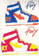
In 1985, when I was in high school, I set out to design my own shoe line, complete with apparel, equipment, sporting goods, celebrity clients, and NBA uniform affiliations.
I called the project Pegasus Shoes. I designed several lines of shoes (I know, they look like the Air Jordan 1s, but hey”¦) and matched them up with some good but not A-list NBA players. I designed a shoe for each player, with product names and even retail prices. I even went as far as designing the tread.
In addition to the shoe designs, I created a unique apparel line for each player. The gear was made to pair up with the shoes and create an entire look for the player represented. I even gave each player his own personal basketball design!
Not to be outdone by Nike or Reebok, the Pegasus line was also going to provide the uniforms for several NBA teams, so I did six uniform concepts for the Sonics, Warriors, Nets, Suns, Spurs, and Kings. Why I chose these teams, I have no idea.
My high school notebooks were full of stuff like this. As it turns out, it was a good indicator as to what my future was going to be, because somehow I’ve managed to stay in the sports design field for nearly 25 years. This was one of my earliest, most formative works.
Paul here. As you all know, I’m not a sneaker guy, but I remain fascinated by this childhood designs. Please keep ’em coming.Extracurricular News, Part 1: Kirsten and I are happy to announce that our upcoming museum exhibit (about the super-cool fiberglass structures located just north of Shea Stadium, don’tcha know) now has its own web site. We’ll be adding additional components to the site soon.
Extracurricular News, Part 2: “I’m Calling It Shea” doesn’t yet have its own web site (it will soon), but response to the T-shirt has been huge — we’ve already sold out of the first batch and ordered a bunch more.
Meanwhile, the Rev. Vince Anderson, who’s the guiding spirit behind this whole project, has written a new song called, of course, “I’m Calling It Shea,” which he’ll be debuting tonight, 10pm, at Black Betty in Williamsburg. I’ll be there, and hopefully some of you will attend as well. The proceedings will be videotaped, so we should have the song up on YouTube shortly.
Uni Watch News Ticker: Good work by David Teigland, who writes: “I flipped on the TV before the Bulls/Celts game on ESPN on Saturday and caught the obligatory pregame ‘Get on Your Boots’ montage. It seemed to feature most of the playoff teams, but I noticed something very wrong when the Jazz image came up. It looks like a Jerry Sloan clone talking to actors (wearing passes around their necks) who are wearing cut-rate replica purple musical note jerseys, without ‘Utah’ on them. I don’t know what this could be from — maybe it’s an inside joke from an ESPN staffer or something.” ”¦ Could Logan Paulsen’s foot injury be due to Adidas’s unusually narrow cleats? Rick Neuheisel thinks so (with thanks to Seth Fisher). ”¦ FIFA has introduced a new badge for the women’s world champions. Details here (with thanks to Jeremy Brahm). ”¦ Ed Hickox, working the plate during Saturday’s Yanks/Tribe game, had his mask damaged by a foul tip plus he was laughing so fucking hard over the Yanks getting slaughtered, so he disappeared into the clubhouse and came back wearing a spare Yankees mask (screen grabs courtesy of Becky Taylor). ”¦ Here’s Salty’s NOB on the red jersey. ”¦ Jay Danbom notes that some Oklahoma State players have solid-black hose, while others are wearing stripes. ”¦ The Twins’ throwback alts have uni numbers on the front, but Delmon Young’s number was missing on Saturday night (good spot by Jesse Larson). ”¦ If you go here and click on “2009 Clemson Series Game Two,” you’ll see lots of pics of Virginia Tech’s tequila sunrise throwbacks. ”¦ Good gallery of atypical NHL jerseys, including an excellent old Cali Seals shot, here (with thanks to Skott Daltonic). ”¦ Saw Sugar over the weekend. Really good, on many levels. But as you can see on the movie’s home page, they used old Quad Cities Swing uniforms, which have those bizarro mismatched numeral sizes. ”¦ Runners in today’s Boston Marathon will, for the first time, have their names printed on their bibs (with thanks to Anil Adyanthaya). ”¦ Speaking of Boston, the Red Sox will be playing their annual Patriots’ Day game at Fenway today. One of my favorite sports-related moments of my life was attending the 2001 Pats’ Day game and hearing the P.A. announcer say, “Here are the starting lineups for this morning’s game.” ”¦ And another favorite moment came a few hours later, when the Boston Marathon crowd cheered the runners on by with chants of “Yankees suck!!” (which really seemed to confused the Kenyans at the front of the pack). ”¦ Kirsten and I were thrift-sopping on Friday and found something really funny: softball uniform sponsored by a uniform company. Unfortunately, it was way too big for me, so I didn’t buy it. ”¦ Sean Wilson got this shot of the Pirates bullpen buggy from the 1971 World Series. Note the incorrect cap logo. Then again, it’s impressive that the Orioles had a Pittsburgh “cap” for their visiting-team cart, since they normally wouldn’t have stocked N.L. teams’ caps. ”¦ For reasons that we can only guess at, the four male finalists for the Australian version of So You Think You Can Dance wore Red Sox uniforms. ”¦ Good spot by Jeff Sak, who noticed that the little compass icon on the Mariners’ jersey insignia is missing from Ichiro’s uni. ”¦ Killer auction discovery by Bruce Menard: a Milwaukee Braves usher’s jacket. ”¦ Josh Skattum notes that Angels pitcher Shane Loux appeared to have a guardian angel pin on his cap yesterday. After some quick photo research, I found that Loux had worn a Nick Adenhart patch or pin on his cap in his previous start, so he probably leads the league in headwear adornments. … Interesting softball shot here. Note how the helmet has FiNOB (first name on back) and merit decals (with thanks to Vince LoBosco). ”¦ What was that lapel pin being worn by NBA coaches during the playoffs? Answer here (with thanks to Eddie Brewer). ”¦ Wouldn’t it be nice if hospital gowns didn’t leave everyone’s ass hanging out? Why yes, it would (with thanks to John Muir). ”¦ If you scroll down to the last letter on this page, you’ll see a very interesting anti-douchebag proposal directed toward Tiger Woods. ”¦ Interesting TV number alignment here. I believe we’ve seen this before on an old CFL jersey, no? If anyone remembers the specifics, please post them in the comments (with thanks to Ben Traxel). ”¦ Personally, I don’t really care about what brand of cleats Vicente Padilla is wearing, but Brinke Guthrie wants to know. Anyone..? ”¦ Chris Oxford says he had — get this — a uni-related dream the other night: “I was watching the University of Miami (Florida, not Ohio) football team, which I despise, playing a game in which I got increasingly frustrated at the fact that, although they were wearing their white jerseys, their lineman were wearing green pants, while the other players were wearing orange pants. The part where the character John Carter of ER fame was sitting next to me, telling me in confidence that he was to be selected the next Secretary of Defense, is irrelevant, but I thought you might like to know.” ”¦ When Adam Cohen graduated from high school in 1998, a friend’s mom made him a quilt made from T-shirts, many of them sports-related. Check out his full set of quilt photos here. ”¦ You know how advertisers aren’t allowed to say the words “Super Bowl” unless they pay a licensing fee? That same “logic” now appears to have been applied to the MLB All-Star Game. This is so completely asinine, I think I’ll convene a tea party full of boorish losers to protest just start calling it the Midsummer Douchebag Classic, so as not to run afoul of MLB’s licensing guidelines (with thanks to Don Sherman).
The Jerry Sloan Clone was a set of fans who had dressed up like that during one of the games. Awesome? Yes.
Dont forget, today is the day the Los Angeles…Err Detroit Lions ‘unveil’ their new crappy Bengals font ripoffs….err…uniforms,
with new and improved Bubbles the lion! Now with a certain bodily fluid stuck in his mane!
can someone who’s computer inclined make up a mock of what the new stuff wouldve looked like with blue pants circa 1990s?
LA once again loses a football team….
link
What “tea parties” have to do with uniforms is anyones guess. I read this site so I don’t have to deal with the news, but somehow the real world seeps into even uniwatch, yuck!
1. I actually don’t.
2. VaTech’s tequilas are OUTSTANDING.
3. Padilla’s cleats…I’m on it!
“I’ll convene a tea party full of boorish losers to protest”
Classy.
the soon to be extinct AFL, could we have a entry based on some of their more “memorable” uni’s?
Let’s start with the LA Avengers and their ALT
link
I believe Padilla is wearing Akadema spikes.
They are a baseball company from NJ.
Great Stuff.
Note to Jim…your stuff is fantastic. The shoes actually remind me more of the Nike Dunk!
I used to do all thi type of doodling, but alas it was all recycled.
That definately looks like the Akadema logo… Ive seen alot of their softball stuff from around the diamonds.
The NC State professor has been working on a new hospital gown design for two and a half years? And they’ll be ready for market in another two years?
Seems like this (seemingly simple) project is taking four and a half years too long.
Sad to read about the passing of “Mr. Inside.” Those mid-1940’s Army football unis were classic.
[quote comment=”324472″]I believe Padilla is wearing Akadema spikes.
They are a baseball company from NJ.
Great Stuff.[/quote]
Nice work, Glen…you are correct:
link
[quote comment=”324474″]That definately looks like the Akadema logo… Ive seen alot of their softball stuff from around the diamonds.[/quote]
Doogie…You have made the jump to UW….Welcome!
great stuff jim!
i’m sure half the readers on here tried their hand at something similar in their formative days, only to either fail or not pursue it — great to see a success story
(i know i personally tried to introduce a line of tenniswear, even designed my own logo and wore it on a blank white shirt for a high school match — which was met with disdain, mockery and ridicule, leading to additional angst and soul crushing which continued into my adult years)
very interesting designs on those kicks and such…and man…remember when NBA ballers wore those short-shorts? good stuff!
[quote comment=”324480″]i know i personally tried to introduce a line of tenniswear, even designed my own logo and wore it on a blank white shirt for a high school match…[/quote]
I beg your pardon?
Phil, you’ve been holding out on me/us. You have to dig out (or re-create) all this old material. NOW!
Also, folks, I’ve been bugging Phil to do an entry on his tennis stylings (the guy plays several times a week and even missed the Mets’ Opening
DayNight game because it was his regular tennis night, which will give you an idea of how dedicated he is), but he keeps saying, “Nah, nobody’s interested in that.” I think he’s wrong about that. What say ye, readers — are you interested? Let him hear it!I have a small piece about the Nats’ jersey typos up now on the Page 2 index page, lower-left area:
link
And introducing your Washington “Natinals”
link
from 4/18
[quote comment=”324483″]And introducing your Washington “Natinals”
link
from 4/18[/quote]
another photo – link
[quote comment=”324470″]”I’ll convene a tea party full of boorish losers to protest”
Classy.[/quote]
It’s so boorish and loser-like to participate in a constitutionally protected right. What a bunch of jerks for convening peacefully for something that they believe in. The nerve.
[quote comment=”324480″]great stuff jim!
i’m sure half the readers on here tried their hand at something similar in their formative days, only to either fail or not pursue it — great to see a success story
(i know i personally tried to introduce a line of tenniswear, even designed my own logo and wore it on a blank white shirt for a high school match — which was met with disdain, mockery and ridicule, leading to additional angst and soul crushing which continued into my adult years)
very interesting designs on those kicks and such…and man…remember when NBA ballers wore those short-shorts? good stuff![/quote]
wait… ya lost me…
“met with disdain, mockery and ridicule, leading to additional angst and soul crushing which continued into my adult years”
the logo? or the fact that that you were ACTUALLY on the tennis team?!?! haha! kidding… sort of…
interesting question though, phil… do you hold an extra tennis ball in your hand while you play… or do you tuck it into your bloomers under your skirt??? haha. KIDDING NOW, FOR SURE!!!
Just throwing this out there, but I usually only read at work(i.e. monday-friday) and it is only by chance that I caught saturday’s entry. You may want to post a link in the ticker routing back to it for the rest out there.
FUN STUFF JIM!!! i really enjoyed todays post! thanks for sharing!
p.s.
i think my favorite is the ralph sampson “50” jersey!
all cool stuff though!
Love the new website…the whole endeavor, really.
Wish I was in NYC to see it. Good Luck!
Phil, thanks for the shoutout in Sunday’s post.
Also, did anyone notice during yesterday’s TBS broadcast of Yankees-Indians that the homeplate umpire (whose chest-protector was visible underneath his blazer) had a Florida Gators logo sticker on it. Just above the button of the blazer. I don’t have a screen grab, but I thought I’d mention it just in case anyone else saw the same.
It was this logo:
link
re: UCLA tight end’s injury possibly being related to his adidias cleats (item in the Ticker)…
About five years ago I always wore adidas for softball (or anything else athletic), playing virtually year ’round because of our access to a domed private high school football field a couple mornings a week.
My Achilles tendons began to hurt so badly afterward I sometimes could barely walk, and the pain would wake me at night every time I rolled over. After several trips to orthopedists and foot specialists (was it related to Planter Fasciitis; who knew), I was almost certain I was going to need surgery on both heels. Finally, I dug out a pair of Nike MCS Slams I had bought a long time time earlier and gave them a try. I stuck to Nike for awhile and, after two weeks, both my Achilles stopped hurting altogether.
I switched to Nike completely, gave all the adidas cleats to the Twins’ RBI Program for Inner City Baseball (sure hope I didn’t give some kid Achilles issues) and have been fine ever since.
Not saying Nike is wonderful, just that I can tell you first-hand (or is it first-foot?) that the brand of shoe/cleat CAN be the issue.
—Ricko
That TSN gallery is great, but I added it to the comments about a week ago. However, nice to see the “uglier” jerseys get some love. :o)
Phil, get on the tennis stuff. Women’s tennis alone has had many design stylings. And I’m not even referring to Serena Williams’ catsuit. LOL
[quote comment=”324481″][quote comment=”324480″]i know i personally tried to introduce a line of tenniswear, even designed my own logo and wore it on a blank white shirt for a high school match…[/quote]
I beg your pardon?
Phil, you’ve been holding out on me/us. You have to dig out (or re-create) all this old material. NOW!
Also, folks, I’ve been bugging Phil to do an entry on his tennis stylings (the guy plays several times a week and even missed the Mets’ Opening Day Night game because it was his regular tennis night, which will give you an idea of how dedicated he is), but he keeps saying, “Nah, nobody’s interested in that.” I think he’s wrong about that. What say ye, readers — are you interested? Let him hear it![/quote]
Yeah. Definitely.
Also, I want to know if any video (or photos, at the very least) of that high school tennis match.
[quote comment=”324484″]And introducing your Washington “Natinals”
link
from 4/18[/quote]
For those who missed it, this was covered in detail on Saturday:
link
[quote comment=”324485″][quote comment=”324470″]”I’ll convene a tea party full of boorish losers to protest”
Classy.[/quote]
It’s so boorish and loser-like to participate in a constitutionally protected right. What a bunch of jerks for convening peacefully for something that they believe in. The nerve.[/quote]
The protests in and of themselves are fine. However, some of the tactics employed by these protesters certainly cross the line into the realm of boorishness.
P.S. Anyone who equates a tax increase with tyranny really needs to do a little research as to what the word truly means.
Really like the idea of the candela structures. Important design that shouldn’t be forgotten.
Can anyone HONESTLY say that those VaTech uniforms aren’t spectacular?
“Taquila Sunrise” should only be reserved for the originators … henceforth, these VT unis can be deemed “Sangria Sunrise.”
[quote comment=”324496″]”Taquila Sunrise” should only be reserved for the originators … henceforth, these VT unis can be deemed “Sangria Sunrise.”[/quote]
Genius.
[quote comment=”324493″]
Also, I want to know if he has any video (or photos, at the very least) of that high school tennis match.[/quote]
Fixed.
[quote comment=”324497″][quote comment=”324496″]”Taquila Sunrise” should only be reserved for the originators … henceforth, these VT unis can be deemed “Sangria Sunrise.”[/quote]
Genius.[/quote]
And the blue version would be the “Blue Curacao Sunrise”.
(Or the “Tidy Bowl Sunset”, depending on one’s opinion of them, I suppose.)
I recall a burgundy-gray version, too. “Sloe Gin Fizz Sunrise”?
LOL
—Ricko
[quote comment=”324497″][quote comment=”324496″]”Taquila Sunrise” should only be reserved for the originators … henceforth, these VT unis can be deemed “Sangria Sunrise.”[/quote]
Genius.[/quote]
And that blue riff on that template that was showcased on eBay a while back…the Bombay Sapphire Sunrise?
Was a forest-kelly-lime one, too.
“Midori Sunrise”?
Might have to update the Glossary, Paul.
[quote comment=”324500″][quote comment=”324497″][quote comment=”324496″]”Taquila Sunrise” should only be reserved for the originators … henceforth, these VT unis can be deemed “Sangria Sunrise.”[/quote]
Genius.[/quote]
And that blue riff on that template that was showcased on eBay a while back…the Bombay Sapphire Sunrise?[/quote]
I thought of that one, Mike. But then realized only the bottle’s blue. Trust me, I mix it with tonic and a lime allllllll summer long. :)
—Ricko
I thought that comment about the tea-party people was pretty weak. Especially since it’s the 2nd or 3rd time that it’s made its way into this blog about sports uniforms.
Remember how under the last president, “dissent is patriotic.” Now, under the new president, not so much?
Care to comment on that Paul ?
Don’t listen to these fools, Paul! I love the tea party jokes! Keep ’em coming!
Besides, it’s clear, at least to me, that he doesn’t have a problem with the fact that they’re protesting so much as the fact that (a) they think our current situation is equivalent to the one that incited the original tea party and (b) there were signs like “Hitler=Obama” and this well-educated fellow: link
After all, who could argue that descent is the highest form of patriotic?
Wow, I wasn’t trying to slam Jersey Joe. Just bad timing I guess. Sorry, random guy.
[quote comment=”324504″]Don’t listen to these fools, Paul! I love the tea party jokes! Keep ’em coming!
Besides, it’s clear, at least to me, that he doesn’t have a problem with the fact that they’re protesting so much as the fact that (a) they think our current situation is equivalent to the one that incited the original tea party and (b) there were signs like “Hitler=Obama” and this well-educated fellow: link
After all, who could argue that descent is the highest form of patriotic?[/quote]
His pants are totally wrong for the era. Should be high-cuffed with long socks. There, a valid uni-related Tea Party post.
—Ricko
[quote comment=”324495″][quote comment=”324485″][quote comment=”324470″]”I’ll convene a tea party full of boorish losers to protest”
Classy.[/quote]
It’s so boorish and loser-like to participate in a constitutionally protected right. What a bunch of jerks for convening peacefully for something that they believe in. The nerve.[/quote]
The protests in and of themselves are fine. However, some of the tactics employed by these protesters certainly cross the line into the realm of boorishness.
P.S. Anyone who equates a tax increase with tyranny really needs to do a little research as to what the word truly means.[/quote]
Maybe it’s just Monday morning, but how did we get on this again? I re-read the ticker and unless something there hasn’t jumped off the page and slapped me in the face, I don’t see where we got down this path again.
The tea party in my hometown (Johnstown, PA) was supposedly a success, but I’m not so sure how much, they held it three days late! I guess they thought that more people would be off on Saturday, I don’t know.
Or are those new unis for the Raiders?
As in “Paul Revere and the…”
[quote comment=”324507″][quote comment=”324495″][quote comment=”324485″][quote comment=”324470″]”I’ll convene a tea party full of boorish losers to protest”
Classy.[/quote]
It’s so boorish and loser-like to participate in a constitutionally protected right. What a bunch of jerks for convening peacefully for something that they believe in. The nerve.[/quote]
The protests in and of themselves are fine. However, some of the tactics employed by these protesters certainly cross the line into the realm of boorishness.
P.S. Anyone who equates a tax increase with tyranny really needs to do a little research as to what the word truly means.[/quote]
Maybe it’s just Monday morning, but how did we get on this again? I re-read the ticker and unless something there hasn’t jumped off the page and slapped me in the face, I don’t see where we got down this path again.
The tea party in my hometown (Johnstown, PA) was supposedly a success, but I’m not so sure how much, they held it three days late! I guess they thought that more people would be off on Saturday, I don’t know.[/quote]
Nevermind, I see the strike through.
[quote comment=”324503″]I thought that comment about the tea-party people was pretty weak. Especially since it’s the 2nd or 3rd time that it’s made its way into this blog about sports uniforms.
Remember how under the last president, “dissent is patriotic.” Now, under the new president, not so much?
Care to comment on that Paul ?[/quote]
Joe, you don’t get to decide what this site is about. I do. The end.
But in any case, who said you couldn’t dissent?
And who said I couldn’t make fun of people who (a) invoke the specter of “Taxation without representation is tyranny” yet (b) have full representation and are not tyrannized? Grow up.
Now let’s move on.
[quote comment=”324511″][quote comment=”324503″]I thought that comment about the tea-party people was pretty weak. Especially since it’s the 2nd or 3rd time that it’s made its way into this blog about sports uniforms.
Remember how under the last president, “dissent is patriotic.” Now, under the new president, not so much?
Care to comment on that Paul ?[/quote]
Joe, you don’t get to decide what this site is about. I do. The end.
But in any case, who said you couldn’t dissent?
And who said I couldn’t make fun of people who (a) invoke the specter of “Taxation without representation is tyranny” yet (b) have full representation and are not tyrannized? Grow up.
Now let’s move on.[/quote]
You couldn’t be more wrong Paul….the King of England could just walk in here any time he wants, and start shoving you around. Do you want that? Huh? Do you?
Here’s the link from Deadspin about those Jazz fans:
link
[quote comment=”324504″]Don’t listen to these fools, Paul! I love the tea party jokes! Keep ’em coming!
Besides, it’s clear, at least to me, that he doesn’t have a problem with the fact that they’re protesting so much as the fact that (a) they think our current situation is equivalent to the one that incited the original tea party and (b) there were signs like “Hitler=Obama” and this well-educated fellow: link
After all, who could argue that descent is the highest form of patriotic?[/quote]
I still say that guy’s pants are too damn long.
[quote comment=”324504″]this well-educated fellow: link
we gots words for dem
[quote comment=”324514″]Here’s the link from Deadspin about those Jazz fans:
link
Where’s Billy Joe Cuthbert in that picture?
[quote comment=”324516″][quote comment=”324504″]this well-educated fellow: link
link[/quote]
What’s he got against Rick Moranis?
[quote comment=”324515″][quote comment=”324504″]Don’t listen to these fools, Paul! I love the tea party jokes! Keep ’em coming!
Besides, it’s clear, at least to me, that he doesn’t have a problem with the fact that they’re protesting so much as the fact that (a) they think our current situation is equivalent to the one that incited the original tea party and (b) there were signs like “Hitler=Obama” and this well-educated fellow: link
After all, who could argue that descent is the highest form of patriotic?[/quote]
I still say that guy’s pants are too damn long.[/quote]
He clearly doesn’t Get Itâ„¢.
[quote comment=”324516″][quote comment=”324504″]this well-educated fellow: link
link[/quote]
He also has a teeshirt that reads:
SPELLING CHIMP
[quote comment=”324513″][quote comment=”324511″][quote comment=”324503″]I thought that comment about the tea-party people was pretty weak. Especially since it’s the 2nd or 3rd time that it’s made its way into this blog about sports uniforms.
Remember how under the last president, “dissent is patriotic.” Now, under the new president, not so much?
Care to comment on that Paul ?[/quote]
Joe, you don’t get to decide what this site is about. I do. The end.
But in any case, who said you couldn’t dissent?
And who said I couldn’t make fun of people who (a) invoke the specter of “Taxation without representation is tyranny” yet (b) have full representation and are not tyrannized? Grow up.
Now let’s move on.[/quote]
You couldn’t be more wrong Paul….the King of England could just walk in here any time he wants, and start shoving you around. Do you want that? Huh? Do you?[/quote]
Well played, Kek. That Simpsons episode has one of my all-time favorite lines: The bit where Homer says that holding gun “makes me feel all-powerful — like God must feel, when he has a gun.”
[quote comment=”324520″][quote comment=”324516″][quote comment=”324504″]this well-educated fellow: link
link[/quote]
He also has a teeshirt that reads:
SPELLING CHIMP[/quote]
Or NATINALS.
[quote comment=”324513″][quote comment=”324511″][quote comment=”324503″]I thought that comment about the tea-party people was pretty weak. Especially since it’s the 2nd or 3rd time that it’s made its way into this blog about sports uniforms.
Remember how under the last president, “dissent is patriotic.” Now, under the new president, not so much?
Care to comment on that Paul ?[/quote]
Joe, you don’t get to decide what this site is about. I do. The end.
But in any case, who said you couldn’t dissent?
And who said I couldn’t make fun of people who (a) invoke the specter of “Taxation without representation is tyranny” yet (b) have full representation and are not tyrannized? Grow up.
Now let’s move on.[/quote]
You couldn’t be more wrong Paul….the King of England could just walk in here any time he wants, and start shoving you around. Do you want that? Huh? Do you?[/quote]
Moe Syzlak for the NRA!!
[quote comment=”324522″][quote comment=”324520″][quote comment=”324516″][quote comment=”324504″]this well-educated fellow: link
link[/quote]
He also has a teeshirt that reads:
SPELLING CHIMP[/quote]
Or NATINALS.[/quote]
So is maybe “actual photo of Majestic Quality Control Supervisor”?
[quote comment=”324515″][quote comment=”324504″]Don’t listen to these fools, Paul! I love the tea party jokes! Keep ’em coming!
Besides, it’s clear, at least to me, that he doesn’t have a problem with the fact that they’re protesting so much as the fact that (a) they think our current situation is equivalent to the one that incited the original tea party and (b) there were signs like “Hitler=Obama” and this well-educated fellow: link
After all, who could argue that descent is the highest form of patriotic?[/quote]
I still say that guy’s pants are too damn long.[/quote]
Not only are his pants to long (they look like damn pajamas!) but his jacket has far to little acoutramant on the sleves. Additionally, ribbon wasn’t worn on the edges of the hat until after the revolution by any self respecting protestor. I’ve looked in Dressed to the (Seventeen Eighty) Nines, and clearly the protestors of the “tea-party” era wore tall socks with buttoned plus-fours, as opposed to this clown and his “rolled” pants, and what appear to be dress socks as opposed to silk socks. And no wig!
Don’t even get me started on the shoes….LACES? I demand the buckles which are period appropriate! If you’re going to do a throw-back, do it properly.
[/sarcasm]
[quote comment=”324525″][quote comment=”324515″][quote comment=”324504″]Don’t listen to these fools, Paul! I love the tea party jokes! Keep ’em coming!
Besides, it’s clear, at least to me, that he doesn’t have a problem with the fact that they’re protesting so much as the fact that (a) they think our current situation is equivalent to the one that incited the original tea party and (b) there were signs like “Hitler=Obama” and this well-educated fellow: link
After all, who could argue that descent is the highest form of patriotic?[/quote]
I still say that guy’s pants are too damn long.[/quote]
Not only are his pants to long (they look like damn pajamas!) but his jacket has far to little acoutramant on the sleves. Additionally, ribbon wasn’t worn on the edges of the hat until after the revolution by any self respecting protestor. I’ve looked in Dressed to the (Seventeen Eighty) Nines, and clearly the protestors of the “tea-party” era wore tall socks with buttoned plus-fours, as opposed to this clown and his “rolled” pants, and what appear to be dress socks as opposed to silk socks. And no wig!
Don’t even get me started on the shoes….LACES? I demand the buckles which are period appropriate! If you’re going to do a throw-back, do it properly.
[/sarcasm][/quote]
My point EXACTLY. Thank you.
[quote comment=”324522″][quote comment=”324520″][quote comment=”324516″][quote comment=”324504″]this well-educated fellow: link
link[/quote]
He also has a teeshirt that reads:
SPELLING CHIMP[/quote]
Or NATINALS.[/quote]
how funny is it that he’s wearing a cardinals t-shirt tho? but…with a natinals alt-thursday doo rag
[quote comment=”324518″][quote comment=”324516″][quote comment=”324504″]this well-educated fellow: link
link[/quote]
What’s he got against Rick Moranis?[/quote]
Think he goes striped-side-out on the do-rag when he wears a white Cards t-shirt?
[quote comment=”324497″][quote comment=”324496″]”Taquila Sunrise” should only be reserved for the originators … henceforth, these VT unis can be deemed “Sangria Sunrise.”[/quote]
Genius.[/quote]
Or, for Tulane, the Creme-De-Menthe Sunrise? What would the South Alabama Jaguars (red, white, and two shades of blue) have been?
We could go with the term that Medalist/Sand Knit came up with — UltraStripe. I don’t think that’s trademarked yet!
[quote comment=”324528″][quote comment=”324518″][quote comment=”324516″][quote comment=”324504″]this well-educated fellow: link
link[/quote]
What’s he got against Rick Moranis?[/quote]
Think he goes striped-side-out on the do-rag when he wears a white Cards t-shirt?[/quote]
Yes. And people argue that he should wear it that way on the road, too.
[quote comment=”324528″][quote comment=”324518″][quote comment=”324516″][quote comment=”324504″]this well-educated fellow: link
link[/quote]
What’s he got against Rick Moranis?[/quote]
Think he goes striped-side-out on the do-rag when he wears a white Cards t-shirt?[/quote]
I thought it was directed at actress Erin Moran. Maybe he thought spinning off “Joannie Loves Chachi” was a bad idea.
[quote comment=”324530″][quote comment=”324528″][quote comment=”324518″][quote comment=”324516″][quote comment=”324504″]this well-educated fellow: link
link[/quote]
What’s he got against Rick Moranis?[/quote]
Think he goes striped-side-out on the do-rag when he wears a white Cards t-shirt?[/quote]
Yes. And people argue that he should wear it that way on the road, too.[/quote]
Also, it’s good to see Kenny Powers fell on his feet with the redbirds after the deal with Tampa Bay fell through.
I thought these political bitchfests were put to rest last week…
I do find it interesting that people are railing on people who are protesting by linking Obama to Hitler but protests like link are accepted as normal everyday practice.
[quote comment=”324531″]“I thought it was directed at actress Erin Moran. Maybe he thought spinning off ‘Joannie Loves Chachi’ was a bad idea.”[/quote]
You sir, have just “Jumped the Shark”.
Or at least link, the sutible replacement after TV Guide killed JtS.
[quote comment=”324511″][quote comment=”324503″]I thought that comment about the tea-party people was pretty weak. Especially since it’s the 2nd or 3rd time that it’s made its way into this blog about sports uniforms.
Remember how under the last president, “dissent is patriotic.” Now, under the new president, not so much?
Care to comment on that Paul ?[/quote]
Joe, you don’t get to decide what this site is about. I do. The end.
But in any case, who said you couldn’t dissent?
And who said I couldn’t make fun of people who (a) invoke the specter of “Taxation without representation is tyranny” yet (b) have full representation and are not tyrannized? Grow up.
Now let’s move on.[/quote]
Your site, your rules. Fair enough. You can make fun of them if you want, I didn’t say anything to the contrary.
I still stand by what I said.
Re #65: link
[quote comment=”324533″]I thought these political bitchfests were put to rest last week…
I do find it interesting that people are railing on people who are protesting by linking Obama to Hitler but protests like link are accepted as normal everyday practice.[/quote]
Just curious Beardface, what day on uniwatch specifically was that picture linked? I don’t recall a post with that photo with supporting verbiage. That’s quite an assumption.
Okay, enough politics. We’ve had enough teabagging jokes to supply a centry’s worth of episodes for Most Extreme Elimination Challenge (MXC). Can we PLEASE get back to talking about uniforms before Paul or Phil decide to close this thread down early?
Just found out my Monday night softball team is getting new jerseys (well, t-shirts) this year. Same logo, etc., just navy shirts instead of white, with red & white lettering instead red & black, so I’ll maybe pick up an all-navy Braves hat for ’09. Sponsor is Absolute Bail Bonds. Honest. Feels like playing for Buttermaker sometimes.
Anyone else getting (or got) new unis this year?
—Ricko
On the subject of minor typos…
… Kirsten and I were thrift-sopping on Friday and found something really funny: softball uniform …
…nothing that would cause a Natinal uproar, however…
[quote comment=”324537″][quote comment=”324533″]I thought these political bitchfests were put to rest last week…
I do find it interesting that people are railing on people who are protesting by linking Obama to Hitler but protests like link are accepted as normal everyday practice.[/quote]
Just curious Beardface, what day on uniwatch specifically was that picture linked? I don’t recall a post with that photo with supporting verbiage. That’s quite an assumption.[/quote]
Its more of a statement toward the way society views things, and definitely how Paul views things on here. If you’re gonna bash a Republican, you don’t need any supporting evidence because the media (i.e. the ones with the ability to control the flow of information (and often the flow of misinformation)) is largely Democratic and will take anything with the slightest bit of truth as hard facts in relating to bashing the Reps. However, if you’re going to say anything negative about a Democrat, you better have prepared a 300 page thesis on the subject because there is no way any of it could possibly be true.
The 5th paragraph in Boz’s column from the Post says Elijah Dukes had a “NATINALS” jersey as well…
link
[quote comment=”324532″][quote comment=”324530″][quote comment=”324528″][quote comment=”324518″][quote comment=”324516″][quote comment=”324504″]this well-educated fellow: link
link[/quote]
What’s he got against Rick Moranis?[/quote]
Think he goes striped-side-out on the do-rag when he wears a white Cards t-shirt?[/quote]
Yes. And people argue that he should wear it that way on the road, too.[/quote]
Also, it’s good to see Kenny Powers fell on his feet with the redbirds after the deal with Tampa Bay fell through.[/quote]
I’ve been trying to hide this fact from all of you for sometime…but alas Phil unearthed a vital clue last night:
link
Keny Powers wearing the road gray in addition to the navy cap in my driveway puts the nail in the coffin!
He is my “Tyler Durden”.
[quote comment=”324539″]Just found out my Monday night softball team is getting new jerseys (well, t-shirts) this year. Same logo, etc., just navy shirts instead of white, with red & white lettering instead red & black, so I’ll maybe pick up an all-navy Braves hat for ’09. Sponsor is Absolute Bail Bonds. Honest. Feels like playing for Buttermaker sometimes.
Anyone else getting (or got) new unis this year?
—Ricko[/quote]
We have a new sponsor..no longer “The Porch”. So no more Pirates 5950’s.
We are now sponsored by the Oak Tree Inn and are getting Tees.
Mums the word on the color, so I have to wait on buying a cap and piped pants/stirrups!
“Red Elmos”? Really?
Srsly, that quilt is awesome. Props to Adam Cohen’s friend’s mom.
BTW…what do y’all think the full text on the poster to the right of Powers reads?
link
French Ricko?
[quote comment=”324533″]I thought these political bitchfests were put to rest last week…
I do find it interesting that people are railing on people who are protesting by linking Obama to Hitler but protests like link are accepted as normal everyday practice.[/quote]
There are two kinds of people who would equate a politician to Hitler: people who think hyperbole is equivalent to a valid point, and 7th graders who want their friends to think they’re cool. And that goes for both sides.
Sorry, I kind of feel like I’ve been an instigator on the political stuff. It’s my major at school, and I seriously can’t get enough. I’ll try and keep it under control from now on. Ha.
[quote comment=”324541″][quote comment=”324537″][quote comment=”324533″]I thought these political bitchfests were put to rest last week…
I do find it interesting that people are railing on people who are protesting by linking Obama to Hitler but protests like link are accepted as normal everyday practice.[/quote]
Just curious Beardface, what day on uniwatch specifically was that picture linked? I don’t recall a post with that photo with supporting verbiage. That’s quite an assumption.[/quote]
Its more of a statement toward the way society views things, and definitely how Paul views things on here. If you’re gonna bash a Republican, you don’t need any supporting evidence because the media (i.e. the ones with the ability to control the flow of information (and often the flow of misinformation)) is largely Democratic and will take anything with the slightest bit of truth as hard facts in relating to bashing the Reps. However, if you’re going to say anything negative about a Democrat, you better have prepared a 300 page thesis on the subject because there is no way any of it could possibly be true.[/quote]
It just been a 10 days or so of Double Standards at their best.
“Protesting is just plain wrong, and dissent is unpatriotic. Oh, wait, WE have something to protest? Okay, then, protests are okay when WE stage one. You likened a sitting President to Hitler? Horrible, just horrible. Oh, wait, someone on MY side of the aisle wants to do the same thing about the new President. Well, that’s okay, too, I guess. But only when WE say so. This is, after all, the United States of People Who Agree With Me.”
Can’t have it both ways, folks. If your absolutes are so changeable, then we’re entitled to ask…what do you REALLY stand for, other than, “I want everything MY way”? (and I ask that of both sides, btw).
—Ricko
—Ricko
[quote comment=”324541″][quote comment=”324537″][quote comment=”324533″]I thought these political bitchfests were put to rest last week…
I do find it interesting that people are railing on people who are protesting by linking Obama to Hitler but protests like link are accepted as normal everyday practice.[/quote]
Just curious Beardface, what day on uniwatch specifically was that picture linked? I don’t recall a post with that photo with supporting verbiage. That’s quite an assumption.[/quote]
Its more of a statement toward the way society views things, and definitely how Paul views things on here. If you’re gonna bash a Republican, you don’t need any supporting evidence because the media (i.e. the ones with the ability to control the flow of information (and often the flow of misinformation)) is largely Democratic and will take anything with the slightest bit of truth as hard facts in relating to bashing the Reps. However, if you’re going to say anything negative about a Democrat, you better have prepared a 300 page thesis on the subject because there is no way any of it could possibly be true.[/quote]
Fair enough, but Hitler comparisons are always a slippery slope. I get what you were trying to say though. I’ve got a big hangup on Hitler comparisons, look, I disagreed with 98% of what President Bush did in office and stood for, but to compare him to Hitler is obscene. I don’t accept that as “normal everyday practice”.
Plus, I think there was some chuckling to the idea that these parties were supposedly non-partisan yet the “Obama’s a Socialist”, “Obama=Hitler” and “Go back to Africa” signs took all of 15 minutes to come out.
[quote comment=”324539″]Just found out my Monday night softball team is getting new jerseys (well, t-shirts) this year. Same logo, etc., just navy shirts instead of white, with red & white lettering instead red & black, so I’ll maybe pick up an all-navy Braves hat for ’09. Sponsor is Absolute Bail Bonds. Honest. Feels like playing for Buttermaker sometimes.
Anyone else getting (or got) new unis this year?
—Ricko[/quote]
The prevailing rumour for us is that we’re doing a kelly green this season for our “new” team of two combined teams. Both of us wore red last season, and there was a third team who wore red as well. Needless to say, red got out of hand.
No design or team name yet, but we’re getting there.
[quote comment=”324548″][quote comment=”324541″][quote comment=”324537″][quote comment=”324533″]I thought these political bitchfests were put to rest last week…
I do find it interesting that people are railing on people who are protesting by linking Obama to Hitler but protests like link are accepted as normal everyday practice.[/quote]
Just curious Beardface, what day on uniwatch specifically was that picture linked? I don’t recall a post with that photo with supporting verbiage. That’s quite an assumption.[/quote]
Its more of a statement toward the way society views things, and definitely how Paul views things on here. If you’re gonna bash a Republican, you don’t need any supporting evidence because the media (i.e. the ones with the ability to control the flow of information (and often the flow of misinformation)) is largely Democratic and will take anything with the slightest bit of truth as hard facts in relating to bashing the Reps. However, if you’re going to say anything negative about a Democrat, you better have prepared a 300 page thesis on the subject because there is no way any of it could possibly be true.[/quote]
It just been a 10 days or so of Double Standards at their best.
“Protesting is just plain wrong, and dissent is unpatriotic. Oh, wait, WE have something to protest? Okay, then, protests are okay when WE stage one. You likened a sitting President to Hitler? Horrible, just horrible. Oh, wait, someone on MY side of the aisle wants to do the same thing about the new President. Well, that’s okay, too, I guess. But only when WE say so. This is, after all, the United States of People Who Agree With Me.”
Can’t have it both ways, folks. If your absolutes are so changeable, then we’re entitled to ask…what do you REALLY stand for, other than, “I want everything MY way”? (and I ask that of both sides, btw).
—Ricko
—Ricko[/quote]
Well said Ricko.
Help! I am looking to purchase the authentic 2009/2010 Spartak Moscow home kit, well the jersey only. They are a Russian side. So far, no luck. Anyone got any suggestions. They are a Nike team, but Nike doesn’t sell the jersey on their website.
did someone mention they wanted to see a chiefs helmet with a yellow stripe?
here ya go (sorry, my skills at this are so bad)
but, as long as im at it…
how fuckin’ great would this be?
Let’s not make this another political blog. There are enough out there already. I have my political views, but this is the only real place to come for sports uniforms.
[quote comment=”324544″][quote comment=”324539″]Just found out my Monday night softball team is getting new jerseys (well, t-shirts) this year. Same logo, etc., just navy shirts instead of white, with red & white lettering instead red & black, so I’ll maybe pick up an all-navy Braves hat for ’09. Sponsor is Absolute Bail Bonds. Honest. Feels like playing for Buttermaker sometimes.
Anyone else getting (or got) new unis this year?
—Ricko[/quote]
We have a new sponsor..no longer “The Porch”. So no more Pirates 5950’s.
We are now sponsored by the Oak Tree Inn and are getting Tees.
Mums the word on the color, so I have to wait on buying a cap and piped pants/stirrups![/quote]
The O’s? Oh-oh. Don’t be tempted by the backwards apostrophe hat.
Maybe Oregon forest and yellow? No black or tire tracks, though, okay?
There are a couple of Oakland Oaks hats available at Ebbets Field Flannels.
Or a nice dull Ohio State baseball hat? Red with a simple block “O”. Meh.
Hey, speaking of Ohio State, howcum their football team never gets mentioned in the BFBS discussions? Black ain’t an official color of TOSU, and it’s nowhere to be found on their varsity baseball unis, for example.
—Ricko
[quote comment=”324504″]Don’t listen to these fools, Paul! I love the tea party jokes! Keep ’em coming!
Besides, it’s clear, at least to me, that he doesn’t have a problem with the fact that they’re protesting so much as the fact that (a) they think our current situation is equivalent to the one that incited the original tea party and (b) there were signs like “Hitler=Obama” and this well-educated fellow: link
After all, who could argue that descent is the highest form of patriotic?[/quote]
You know, I’d buy this argument if Paul had been equally vitriolic about the liberal protesters who, for 8 years, compared Bush to Hitler incessantly. But I didn’t hear a peep out of him about them.
It’s total hypocritical bullshit to claim for 8 years that dissent (you meant “dissent” and not “descent”, right?) is patriotic, but then, as soon as your guy is in charge, claim that it’s boorish.
(It’s also hypocritical bullshit to take low blows at entire groups of people on a daily basis and then act annoyed when people are offended and the comments become about politics not uniforms. Guess what? If you don’t want the comments to become politicized, then stop making political jabs in your columns! But if you’re going to keep making the jabs, you’d better expect people to respond in the comments.)
I agree as much as anyone that comparing Bush or Obama to Hitler is ridiculous. But to lump all conservatives into a pile and call them “boors” is equally ridiculous. There are some extremely intelligent and thoughtful conservatives who have some very valid concerns about what Obama is doing. Just today it was announced that the administration is considering fully nationalizing some banks. I’m sorry, but that’s pretty scary to me.
[quote comment=”324555″][quote comment=”324544″][quote comment=”324539″]Just found out my Monday night softball team is getting new jerseys (well, t-shirts) this year. Same logo, etc., just navy shirts instead of white, with red & white lettering instead red & black, so I’ll maybe pick up an all-navy Braves hat for ’09. Sponsor is Absolute Bail Bonds. Honest. Feels like playing for Buttermaker sometimes.
Anyone else getting (or got) new unis this year?
—Ricko[/quote]
We have a new sponsor..no longer “The Porch”. So no more Pirates 5950’s.
We are now sponsored by the Oak Tree Inn and are getting Tees.
Mums the word on the color, so I have to wait on buying a cap and piped pants/stirrups![/quote]
The O’s? Oh-oh. Don’t be tempted by the backwards apostrophe hat.
Maybe Oregon forest and yellow? No black or tire tracks, though, okay?
There are a couple of Oakland Oaks hats available at Ebbets Field Flannels.
Or a nice dull Ohio State baseball hat? Red with a simple block “O”. Meh.
Hey, speaking of Ohio State, howcum their football team never gets mentioned in the BFBS discussions? Black ain’t an official color of TOSU, and it’s nowhere to be found on their varsity baseball unis, for example.
—Ricko[/quote]
Options all…Depending on the color, I might buy one of those mentioned and DIY the rest of the logo/name!
[quote comment=”324552″]Help! I am looking to purchase the authentic 2009/2010 Spartak Moscow home kit, well the jersey only. They are a Russian side. So far, no luck. Anyone got any suggestions. They are a Nike team, but Nike doesn’t sell the jersey on their website.[/quote]
The jerseys aren’t like North American quality, meaning they use sublimation rather than stitching for names and numbers. That being said, finding them in North America is usually an ebay search.
There are websites that offer them, though.link has them decently priced. link has a good assortment of KHL jerseys as well, but they don’t guarantee their shipping.
Caveat emptor is the only advice I can give.
[quote comment=”324556″]Just today it was announced that the administration is considering fully nationalizing some banks. I’m sorry, but that’s pretty scary to me.[/quote]
Nationalizing has many forms. Canada has nationalized banks in terms of all of them abiding by the same rules and regulations set out, and we haven’t had one close yet despite this terrible banking problem.
De-regulation was/is the problem. The only way to re-regulate is to take them over for a short period of time, institute proper rules, and then turn them over to people who will uphold those rules. Without some sort of starting point, no one will be on the same page.
[quote comment=”324553″]did someone mention they wanted to see a chiefs helmet with a yellow stripe?
link (sorry, my skills at this are so bad)
but, as long as im at it…
link?[/quote]
Needs stripes or the NY logo.
Better yet, throw Mr. Met on them and they’d be gold, Jerry, gold!
[quote comment=”324556″][quote comment=”324504″]Don’t listen to these fools, Paul! I love the tea party jokes! Keep ’em coming!
Besides, it’s clear, at least to me, that he doesn’t have a problem with the fact that they’re protesting so much as the fact that (a) they think our current situation is equivalent to the one that incited the original tea party and (b) there were signs like “Hitler=Obama” and this well-educated fellow: link
After all, who could argue that descent is the highest form of patriotic?[/quote]
You know, I’d buy this argument if Paul had been equally vitriolic about the liberal protesters who, for 8 years, compared Bush to Hitler incessantly. But I didn’t hear a peep out of him about them.
It’s total hypocritical bullshit to claim for 8 years that dissent (you meant “dissent” and not “descent”, right?) is patriotic, but then, as soon as your guy is in charge, claim that it’s boorish.
(It’s also hypocritical bullshit to take low blows at entire groups of people on a daily basis and then act annoyed when people are offended and the comments become about politics not uniforms. Guess what? If you don’t want the comments to become politicized, then stop making political jabs in your columns! But if you’re going to keep making the jabs, you’d better expect people to respond in the comments.)
I agree as much as anyone that comparing Bush or Obama to Hitler is ridiculous. But to lump all conservatives into a pile and call them “boors” is equally ridiculous. There are some extremely intelligent and thoughtful conservatives who have some very valid concerns about what Obama is doing. Just today it was announced that the administration is considering fully nationalizing some banks. I’m sorry, but that’s pretty scary to me.[/quote]
This blog has only been around since May 2006.
[quote comment=”324560″][quote comment=”324553″]did someone mention they wanted to see a chiefs helmet with a yellow stripe?
link (sorry, my skills at this are so bad)
but, as long as im at it…
link?[/quote]
Needs stripes or the NY logo.
Better yet, throw Mr. Met on them and they’d be gold, Jerry, gold![/quote]
How ’bout these link?
[quote comment=”324556″][quote comment=”324504″]Don’t listen to these fools, Paul! I love the tea party jokes! Keep ’em coming!
Besides, it’s clear, at least to me, that he doesn’t have a problem with the fact that they’re protesting so much as the fact that (a) they think our current situation is equivalent to the one that incited the original tea party and (b) there were signs like “Hitler=Obama” and this well-educated fellow: link
After all, who could argue that descent is the highest form of patriotic?[/quote]
You know, I’d buy this argument if Paul had been equally vitriolic about the liberal protesters who, for 8 years, compared Bush to Hitler incessantly. But I didn’t hear a peep out of him about them.
It’s total hypocritical bullshit to claim for 8 years that dissent (you meant “dissent” and not “descent”, right?) is patriotic, but then, as soon as your guy is in charge, claim that it’s boorish.
(It’s also hypocritical bullshit to take low blows at entire groups of people on a daily basis and then act annoyed when people are offended and the comments become about politics not uniforms. Guess what? If you don’t want the comments to become politicized, then stop making political jabs in your columns! But if you’re going to keep making the jabs, you’d better expect people to respond in the comments.)
I agree as much as anyone that comparing Bush or Obama to Hitler is ridiculous. But to lump all conservatives into a pile and call them “boors” is equally ridiculous. There are some extremely intelligent and thoughtful conservatives who have some very valid concerns about what Obama is doing. Just today it was announced that the administration is considering fully nationalizing some banks. I’m sorry, but that’s pretty scary to me.[/quote]
Much as I like talking about politics, can we please stop this discussion; we all have differing opinions, we get it, now can we stop?
[quote comment=”324562″][quote comment=”324560″][quote comment=”324553″]did someone mention they wanted to see a chiefs helmet with a yellow stripe?
link (sorry, my skills at this are so bad)
but, as long as im at it…
link?[/quote]
Needs stripes or the NY logo.
Better yet, throw Mr. Met on them and they’d be gold, Jerry, gold![/quote]
How ’bout these link?[/quote]
Hmmm, an interesting development here. Since the Mets have never had striped socks in their more than 40 years, are we coming dangerously close to SFSS? Are stripes the new black?
—Ricko
[quote comment=”324559″][quote comment=”324556″]Just today it was announced that the administration is considering fully nationalizing some banks. I’m sorry, but that’s pretty scary to me.[/quote]
Nationalizing has many forms. Canada has nationalized banks in terms of all of them abiding by the same rules and regulations set out, and we haven’t had one close yet despite this terrible banking problem.
De-regulation was/is the problem. The only way to re-regulate is to take them over for a short period of time, institute proper rules, and then turn them over to people who will uphold those rules. Without some sort of starting point, no one will be on the same page.[/quote]
It depends on what the eventual goal is, and how the gov’t plans on getting there.
As an Econ graduate, I believe it would be in the Nation’s best interest if the gov’t would temporarily take control of the failing banks in order to stabilize them. That said, once stable, they should hand them back over to the private sector with no strings attached so they can be run, but without the influence of the gov’t. Strict nationalization would be dangerous, and an all-around bad idea.
This TARP stuff was a piece of crap to begin with. You’re mortgaging the future of the nation to stabilize something that for all intents and purposes, should be allowed to die.
[quote comment=”324553″]how fuckin’ great would this be?[/quote]
Brings back fond memories from last summer: “Fuck this, I’ll make my own motherfuckin’ stirrups.”
[quote comment=”324556″]
I agree as much as anyone that comparing Bush or Obama to Hitler is ridiculous. But to lump all conservatives into a pile and call them “boors” is equally ridiculous. There are some extremely intelligent and thoughtful conservatives who have some very valid concerns about what Obama is doing.[/quote]
Not all conservatives. Just the boorish losers who decided to join in “The Official Fox News Channel Protests 2009.”
[quote comment=”324560″][quote comment=”324553″]did someone mention they wanted to see a chiefs helmet with a yellow stripe?
link (sorry, my skills at this are so bad)
but, as long as im at it…
link?[/quote]
Needs stripes or the NY logo.
Better yet, throw Mr. Met on them and they’d be gold, Jerry, gold![/quote]
no, matt…
just…no
[quote comment=”324566″][quote comment=”324553″]link?[/quote]
Brings back fond memories from last summer: “Fuck this, I’ll make my own motherfuckin’ stirrups.”[/quote]
The best quote of 2008, perhaps the best quote ever.
[quote comment=”324564″][quote comment=”324562″][quote comment=”324560″][quote comment=”324553″]did someone mention they wanted to see a chiefs helmet with a yellow stripe?
link (sorry, my skills at this are so bad)
but, as long as im at it…
link?[/quote]
Needs stripes or the NY logo.
Better yet, throw Mr. Met on them and they’d be gold, Jerry, gold![/quote]
How ’bout these link?[/quote]
Hmmm, an interesting development here. Since the Mets have never had striped socks in their more than 40 years, are we coming dangerously close to SFSS? Are stripes the new black?
—Ricko[/quote]
Don’t forget, the Mets’ socks were originally supposed to be striped:
link
[quote comment=\”324558\”][quote comment=\”324552\”]Help! I am looking to purchase the authentic 2009/2010 Spartak Moscow home kit, well the jersey only. They are a Russian side. So far, no luck. Anyone got any suggestions. They are a Nike team, but Nike doesn\’t sell the jersey on their website.[/quote]
The jerseys aren\’t like North American quality, meaning they use sublimation rather than stitching for names and numbers. That being said, finding them in North America is usually an ebay search.
There are websites that offer them, though.This place has them decently priced. This place has a good assortment of KHL jerseys as well, but they don\’t guarantee their shipping.
Caveat emptor is the only advice I can give.[/quote]
Thanks Teebz. I should have been more clear though. I am looking for FC Spartak Moscow (Football/Soccer). Sorry
[quote comment=”324566″][quote comment=”324553″]link?[/quote]
Brings back fond memories from last summer: “Fuck this, I’ll make my own motherfuckin’ stirrups.”[/quote]
This quote is 2nd to only “well fuck you, Jobu, I do it myself” from Major League
[quote comment=”324553″]did someone mention they wanted to see a chiefs helmet with a yellow stripe?
link (sorry, my skills at this are so bad)
but, as long as im at it…
link?[/quote]
What would be “great” is if this non-clutch loser depicted in the photo would drive in a run once in a while.
I agree we should avoid the “tea-party protests” here as much as we can, although they do relate to sports in a way. There’s been a lot of talk on the board about “double standards,” about how everyone’s opinions and behaviors have now switched because the party in power has switched; what was acceptable (or unconscionable) three years ago is now the opposite. So let’s get real: these “tea parties,” and American politics in general, is no different from sport.
These people (meaning the highly-visible nutjobs, not everyone who identifies himself as “Republican”/”conservative”/”on the right”) are not serious about tax policy or budgeting; they don’t even know what “socialism” is. Most of them are not even conservatives, in the truest sense of the word. They’re fans, pure and simple, just like sports fans. They root for their team and cast aspersions on their opponents. Tea-partiers ripping on Obama are no different than Red Sox fans hating the Yankees, or Michigan fans hating Ohio State. That’s the mentality.
During the last 8 years, the antiwar demonstrators (who in March 2003 vastly outnumbered the teabaggers last week and yet were hardly reported in the media) were continuously denounced as traitors by Rush, Hannity, Coulter, Savage, and O’Reilly. These people called for the arrest of antiwar protestors and critics – even their torture and murder! Even the arrest of congressmen who opposed Bush!
The people calling for this violence were paid millions of dollars by multinational corporations who were receiving tax breaks from Bush. During a war where a multinational corporation was sending mercenaries to fight and kill. During a time when Karl Rove was coordinating with these media outlets on a daily basis (talking points).
I don’t have a corporate “news” outlet. I haven’t heard Keith Olbermann call for my governor’s arrest for sedition when he broadly hinted at Texas’ right to secession if the federal government becomes too liberal (but not too conservative). Where is the equivalence?
They fear for their tax rates and racial caste status. I feared for my safety.
[quote comment=”324570″][quote comment=”324564″][quote comment=”324562″][quote comment=”324560″][quote comment=”324553″]did someone mention they wanted to see a chiefs helmet with a yellow stripe?
link (sorry, my skills at this are so bad)
but, as long as im at it…
link?[/quote]
Needs stripes or the NY logo.
Better yet, throw Mr. Met on them and they’d be gold, Jerry, gold![/quote]
How ’bout these link?[/quote]
Hmmm, an interesting development here. Since the Mets have never had striped socks in their more than 40 years, are we coming dangerously close to SFSS? Are stripes the new black?
—Ricko[/quote]
Don’t forget, the Mets’ socks were originally supposed to be striped:
link
And, according to TSN their first home unis weren’t pins. They were white with orange piping. :)
We know the Mets went through a few revisions before taking the field, so I was limiting my point to what they’d actually worn. Also because it was part of the same post that thought the Chiefs maybe could use a stripe on their helmet, it seemed like Stripes were the solution to everything.
Just sayin’.
(Now back to scheduled programming, which for me is coming up with a tagline for the Bible station here in town. Honest. Was toying with “We Get It” but that’s already being used.)
—Ricko
[quote comment=”324557″][quote comment=”324555″][quote comment=”324544″][quote comment=”324539″]Just found out my Monday night softball team is getting new jerseys (well, t-shirts) this year. Same logo, etc., just navy shirts instead of white, with red & white lettering instead red & black, so I’ll maybe pick up an all-navy Braves hat for ’09. Sponsor is Absolute Bail Bonds. Honest. Feels like playing for Buttermaker sometimes.
Anyone else getting (or got) new unis this year?
—Ricko[/quote]
We have a new sponsor..no longer “The Porch”. So no more Pirates 5950’s.
We are now sponsored by the Oak Tree Inn and are getting Tees.
Mums the word on the color, so I have to wait on buying a cap and piped pants/stirrups![/quote]
The O’s? Oh-oh. Don’t be tempted by the backwards apostrophe hat.
Maybe Oregon forest and yellow? No black or tire tracks, though, okay?
There are a couple of Oakland Oaks hats available at Ebbets Field Flannels.
Or a nice dull Ohio State baseball hat? Red with a simple block “O”. Meh.
Hey, speaking of Ohio State, howcum their football team never gets mentioned in the BFBS discussions? Black ain’t an official color of TOSU, and it’s nowhere to be found on their varsity baseball unis, for example.
—Ricko[/quote]
Options all…Depending on the color, I might buy one of those mentioned and DIY the rest of the logo/name![/quote]
Ricko, did you mean these?
link?
pid=20107947
link
I’m only hoping that the team colors end up being green and yellow, so that I can justify wearing this:
link
link
The RiverSharks MF stirrups comment was and is the best I’ve ever read on UW…Clowns sucking at Football is #2 and Phil’s report on Quakers not having any F’n electricity is a close third.
[quote comment=”324576″][quote comment=”324570″]Don’t forget, the Mets’ socks were originally supposed to be striped:
link
And, according to TSN their first home unis weren’t pins. They were white with orange piping. :)
We know the Mets went through a few revisions before taking the field, so I was limiting my point to what they’d actually worn.[/quote]
I’d love to see a real mockup of those. Ah, what could have been.
link
Not bad.
[quote comment=”324570″]Don’t forget, the Mets’ socks were originally supposed to be striped:
link
what’s very instructive in that photo is NOT the b & w rendering of the stripes nor casey nor the primitive logo…
it’s bob moses (or william shea’s) rendering of what was to become shea stadium (or, in that rendering “Flushing Meadow Park Municipal Stadium” — which was originally part of moses’ abortive attempt to keep the dodgers from fleeing west
funny how it took two full years to get the thing built, forcing the mets to play at the polo grounds in 62 & 63 (cuz, back then, they put up stadia in a matter of months, not years)
but i guess we should be talking about unis, so i’ll get off this non-uni tangent
Today in the Bay area local morning radio show on KNBR mentioned the “Im still calling it Shea” shirts…they didn’t “get it”…as a loyal UniWatch reader…this was not news to me :-)
[quote comment=”324576″]
Now back to scheduled programming, which for me is coming up with a tagline for the Bible station here in town.[/quote]
How about “HERE is your Messiah now!” (Works best when delivered via an Edward G. Robinson impression.)
[quote comment=”324571″]
Thanks Teebz. I should have been more clear though. I am looking for FC Spartak Moscow (Football/Soccer). Sorry[/quote]
Oh… um… anyone with footy knowledge? LOL :o)
Regarding those link mismatched uni numbers… the only other example of differently-sized numbers I can recall are link link the St. Louis Blues wore for a time… link were pretty lame, as well.
[quote comment=”324565″][quote comment=”324559″][quote comment=”324556″]Just today it was announced that the administration is considering fully nationalizing some banks. I’m sorry, but that’s pretty scary to me.[/quote]
Nationalizing has many forms. Canada has nationalized banks in terms of all of them abiding by the same rules and regulations set out, and we haven’t had one close yet despite this terrible banking problem.
De-regulation was/is the problem. The only way to re-regulate is to take them over for a short period of time, institute proper rules, and then turn them over to people who will uphold those rules. Without some sort of starting point, no one will be on the same page.[/quote]
It depends on what the eventual goal is, and how the gov’t plans on getting there.
As an Econ graduate, I believe it would be in the Nation’s best interest if the gov’t would temporarily take control of the failing banks in order to stabilize them. That said, once stable, they should hand them back over to the private sector with no strings attached so they can be run, but without the influence of the gov’t. Strict nationalization would be dangerous, and an all-around bad idea.
This TARP stuff was a piece of crap to begin with. You’re mortgaging the future of the nation to stabilize something that for all intents and purposes, should be allowed to die.[/quote]
Turning them back over to the same people who drove them into the ground is what got you into the problem in the first place.
I’m not saying that the banks have to be owned and operated by the government. That’s dangerous (as you pointed out). I’m saying the industry as a whole needs to restore the regulations that made it good. Dubya de-regulated banks to allow people to buy homes at rates that were, at the time, amazing. Little did he know that he set the country up for the biggest recession since 1930.
Canada has these regulations in place, and they are monitored by the Bank of Canada. All of the private banks and credit unions adhere to the Charter that was signed into law, and all are still relatively healthy because of the Charter.
That’s the nationalization that US Banks and FIs need. Something that will remove the pitfalls of greed by closing loopholes that can be exploited. And to do that, one needs to start by having everyone on-board.
Good comment, though, BF. We’re on the same page. :o)
[quote comment=”324585″]Regarding those link mismatched uni numbers… the only other example of differently-sized numbers I can recall are link link the St. Louis Blues wore for a time… link were pretty lame, as well.[/quote]
C’mon, Goaler… Isles’ Fishermen were mismatched horribly too. ;o)
Wait, I may be the only person who cares about the Fisherman. :o( LOL
Phil,
I will wear your gear for my matches for the rest of the season down here in MD. My mixed team more than likely won’t make it to the districts, but my men’s team may have a chance. I started playing in HS in South Jersey and I know how big tennis is in NJ.
[quote comment=”324587″][quote comment=”324585″]Regarding those link mismatched uni numbers… the only other example of differently-sized numbers I can recall are link link the St. Louis Blues wore for a time… link were pretty lame, as well.[/quote]
C’mon, Goaler… Isles’ Fishermen were mismatched horribly too. ;o)
Wait, I may be the only person who cares about the Fisherman. :o( LOL[/quote]
beat me to it teebz
I have a random question that someone here may be able to answer. Last year, I bought an authentic Carlos Gomez Twins jersey – the standard Twins’ home white. I noticed that the pinstripes are sort of a royal blue, rather than navy. It is obvious when comparing the color of the stripes to the navy trim around the numbers and lettering.
My question is: Is this really how the Twins jerseys are? Or did the manufacturer screw up and apply Twins graphics to a Mets base or something?
[quote comment=”324552″]Help! I am looking to purchase the authentic 2009/2010 Spartak Moscow home kit, well the jersey only. They are a Russian side. So far, no luck. Anyone got any suggestions. They are a Nike team, but Nike doesn’t sell the jersey on their website.[/quote]
Nathan,
They are hard to find in America. Their website translates to English link but their shop “Red and White Sport” reverts back to Russian when you hit the link. I would call them directly (the shop) and hope I could find somone who speaks english to see if they would sell you a jersey over the phone. Maybe not, but it is worth a shot. The website says the shop number is “011-7-499-252-05-68” or you can try to use the e-mail option on the site.
[quote comment=”324578″][quote comment=”324576″][quote comment=”324570″]Don’t forget, the Mets’ socks were originally supposed to be striped:
link
And, according to TSN their first home unis weren’t pins. They were white with orange piping. :)
We know the Mets went through a few revisions before taking the field, so I was limiting my point to what they’d actually worn.[/quote]
I’d love to see a real mockup of those. Ah, what could have been.[/quote]
link
link
[quote comment=”324593″][quote comment=”324578″][quote comment=”324576″][quote comment=”324570″]Don’t forget, the Mets’ socks were originally supposed to be striped:
link
And, according to TSN their first home unis weren’t pins. They were white with orange piping. :)
We know the Mets went through a few revisions before taking the field, so I was limiting my point to what they’d actually worn.[/quote]
I’d love to see a real mockup of those. Ah, what could have been.[/quote]
link
link
Or look at, say, 1960 Indians Topps cards and kinda imagine royal and orange instead of navy and red.
[quote comment=”324581″][quote comment=”324570″]Don’t forget, the Mets’ socks were originally supposed to be striped:
link
what’s very instructive in that photo is NOT the b & w rendering of the stripes nor casey nor the primitive logo…
it’s bob moses (or william shea’s) rendering of what was to become shea stadium (or, in that rendering “Flushing Meadow Park Municipal Stadium” — which was originally part of moses’ abortive attempt to keep the dodgers from fleeing west[/quote]
But that rendering does not date from the late-’50s Moses proposal. It’s part of the 1964 World’s Fair promotional package (of which Shea Stadium was a part).
If you look at the upper-left portion of the photo, you’ll see the World’s Fair Marina. The elongated oval strip of land at the waterfront (looks sort of like a hot dog) is exactly where link were assembled (and where two of them still stand today).
[quote comment=”324595″][quote comment=”324593″][quote comment=”324578″][quote comment=”324576″][quote comment=”324570″]Don’t forget, the Mets’ socks were originally supposed to be striped:
link
And, according to TSN their first home unis weren’t pins. They were white with orange piping. :)
We know the Mets went through a few revisions before taking the field, so I was limiting my point to what they’d actually worn.[/quote]
I’d love to see a real mockup of those. Ah, what could have been.[/quote]
link
link
20Styles/category/Baseball%20slash_%20Softball/browse/1/MenuGroup/Home/desc/Three%20Stripes%20with%20Featheredge.htm[/quote]
Or look at, say, 1960 Indians Topps cards and kinda imagine royal and orange instead of navy and red.[/quote]
link
[quote comment=”324595″][quote comment=”324593″][quote comment=”324578″][quote comment=”324576″][quote comment=”324570″]Don’t forget, the Mets’ socks were originally supposed to be striped:
link
And, according to TSN their first home unis weren’t pins. They were white with orange piping. :)
We know the Mets went through a few revisions before taking the field, so I was limiting my point to what they’d actually worn.[/quote]
I’d love to see a real mockup of those. Ah, what could have been.[/quote]
link
link
Or look at, say, 1960 Indians Topps cards and kinda imagine royal and orange instead of navy and red.[/quote]
Looking a little closer at that photo Casey is holding up, is there any white around the orange stripe? Looks like it’s just blue stirrup with orange stripes.
I still think Casey is holding up a picture of David Wright…
[quote comment=”324596″][quote comment=”324581″][quote comment=”324570″]Don’t forget, the Mets’ socks were originally supposed to be striped:
link
what’s very instructive in that photo is NOT the b & w rendering of the stripes nor casey nor the primitive logo…
it’s bob moses (or william shea’s) rendering of what was to become shea stadium (or, in that rendering “Flushing Meadow Park Municipal Stadium” — which was originally part of moses’ abortive attempt to keep the dodgers from fleeing west[/quote]
But that rendering does not date from the late-’50s Moses proposal. It’s part of the 1964 World’s Fair promotional package (of which Shea Stadium was a part).
If you look at the upper-left portion of the photo, you’ll see the World’s Fair Marina. The elongated oval strip of land at the waterfront (looks sort of like a hot dog) is exactly where link were assembled (and where two of them still stand today).[/quote]
oh indeed…didn’t mean to imply what was behind casey was this pie in the sky bullshit moses tried to sell to o’malley to keep the dodgers in brooklyn — moses wanted the site in queens all along (for myriad reasons, not the least of which was that NYC would own the park, charging the dodgers rent, the “new suburbia” etc. etc.)
but moses did in fact get his stadium in queens, with or without the dodgers
[quote comment=”324559″][quote comment=”324556″]Just today it was announced that the administration is considering fully nationalizing some banks. I’m sorry, but that’s pretty scary to me.[/quote]
Nationalizing has many forms. Canada has nationalized banks in terms of all of them abiding by the same rules and regulations set out, and we haven’t had one close yet despite this terrible banking problem.
De-regulation was/is the problem. The only way to re-regulate is to take them over for a short period of time, institute proper rules, and then turn them over to people who will uphold those rules. Without some sort of starting point, no one will be on the same page.[/quote]
Actually, no, deregulation was NOT the problem. Bush was not the problem. Corporate greed was not the problem.
The problem was legislation passed by liberal Democrats in the early part of this decade which FORCED banks to make risky loans to people with poor credit in the name of allowing more minorities to buy houses. When the legislation was passed, the banks protested and said that if they were forced to make such risky loans they would be in danger of failing.
But did anyone listen? Nope. Now the banks are being blamed by the government for their greed and speculation when it was actually the government who forced them to do the things that caused their failure.
Thus, the solution to this problem isn’t for the government to become even more involved in the banks. The solution is for the government to leave the banks alone and let them give loans to the people that actually qualify for loans.
Phil–
Interesting post yesterday on the Mets’ unis. I don’t mind the black trim, but I don’t like the black jerseys or caps. However, I do wish they would bring back the 1980s alternate blue jersey (which they never wore at home for some reason) from 1982-85. They also need to ditch the all-whites in favor of just the pinstripes. (Makes no sense to me to have two white uniforms, even if one is pinstriped. The Pirates didn’t keep their pinstripes in 1980 afer they went to their all-white uniform.) If they did these things, and kept black as a trim color (even wearing the two-tone hate or black sleeves or socks), those would be good changes.
And that’s enough banking policy debate for today. Thanks.
[quote comment=”324578″][quote comment=”324576″]according to TSN their first home unis weren’t pins. They were white with orange piping. :)
[/quote]
I’d love to see a real mockup of those. Ah, what could have been.[/quote]
like this?
or would the sleeves and socks been orange too (yeesh)
or was ricko just having a little fun
RE: Hospital Gowns
Richard Nixon used to when in hospitals wear his gown backwards and let ol’ tricky dick get some fresh air, to the surprise of the nurses.
[quote comment=”324539″]Just found out my Monday night softball team is getting new jerseys (well, t-shirts) this year. Same logo, etc., just navy shirts instead of white, with red & white lettering instead red & black, so I’ll maybe pick up an all-navy Braves hat for ’09. Sponsor is Absolute Bail Bonds. Honest. Feels like playing for Buttermaker sometimes.
Anyone else getting (or got) new unis this year?
—Ricko[/quote]
awesome question ricko!
i’m actually making jerseys for my ice hocky team as we speak. i ordered a jersey online. created the logo. making the stencils now. going to trace it out on duck cloth and make a prototype. designed the number font too! i’d go into more detail, but i’d rather send in the finished project pics later (like next week i think).
man do i wish i could play softball though. i have a bum shoulder from a hockey injury and cant throw a ball without it popping out!
[quote comment=”324602″]Phil–
Interesting post yesterday on the Mets’ unis. I don’t mind the black trim, but I don’t like the black jerseys or caps. However, I do wish they would bring back the 1980s alternate blue jersey (which they never wore at home for some reason) from 1982-85. They also need to ditch the all-whites in favor of just the pinstripes. (Makes no sense to me to have two white uniforms, even if one is pinstriped. The Pirates didn’t keep their pinstripes in 1980 afer they went to their all-white uniform.) If they did these things, and kept black as a trim color (even wearing the two-tone hate or black sleeves or socks), those would be good changes.[/quote]
And now they’re primarily without pinstripes, except for a home alternate they have. Go figure.
[quote comment=”324604″][quote comment=”324578″][quote comment=”324576″]according to TSN their first home unis weren’t pins. They were white with orange piping. :)
[/quote]
I’d love to see a real mockup of those. Ah, what could have been.[/quote]
link?
or would the sleeves and socks been orange too (yeesh)
or was ricko just having a little fun[/quote]
I think the first thing I ever sent Paul after I finally bought a scanner was a page of detailed written descriptions of every team’s uni (home and road) from TSN’s 1962 Baseball Preview. Therein it describes the Mets’ home unis as white with royal blue script “Mets” (no mention of an orange edge) and orange piping. Thereafter it does, however, give an incredibly detailed description of the sleeve patch with NY skyline and all. Of course, when the season started they were sporting royal pins.
—Ricko
[quote comment=”324607″]
man do i wish i could play softball though. i have a bum shoulder from a hockey injury and cant throw a ball without it popping out![/quote]
Please don’t say you’re doing black jerseys, Ry. LOL
Actually, I am trying to convince my hockey team to link. I love the look of those jerseys.
[quote comment=”324600″][quote comment=”324596″][quote comment=”324581″][quote comment=”324570″]Don’t forget, the Mets’ socks were originally supposed to be striped:
link
what’s very instructive in that photo is NOT the b & w rendering of the stripes nor casey nor the primitive logo…
it’s bob moses (or william shea’s) rendering of what was to become shea stadium (or, in that rendering “Flushing Meadow Park Municipal Stadium” — which was originally part of moses’ abortive attempt to keep the dodgers from fleeing west[/quote]
But that rendering does not date from the late-’50s Moses proposal. It’s part of the 1964 World’s Fair promotional package (of which Shea Stadium was a part).
If you look at the upper-left portion of the photo, you’ll see the World’s Fair Marina. The elongated oval strip of land at the waterfront (looks sort of like a hot dog) is exactly where link were assembled (and where two of them still stand today).[/quote]
oh indeed…didn’t mean to imply what was behind casey link bullshit moses tried to sell to o’malley to keep the dodgers in brooklyn — moses wanted the site in queens all along (for myriad reasons, not the least of which was that NYC would own the park, charging the dodgers rent, the “new suburbia” etc. etc.)
but moses did in fact get his stadium in queens, with or without the dodgers[/quote]
I have never heard the actual story but what is the story behind the NY baseball Giants logo and Tiffany’s?
[quote comment=”324609″][quote comment=”324604″][quote comment=”324578″][quote comment=”324576″]according to TSN their first home unis weren’t pins. They were white with orange piping. :)
[/quote]
I’d love to see a real mockup of those. Ah, what could have been.[/quote]
link?
or would the sleeves and socks been orange too (yeesh)
or was ricko just having a little fun[/quote]
I think the first thing I ever sent Paul after I finally bought a scanner was a page of detailed written descriptions of every team’s uni (home and road) from TSN’s 1962 Baseball Preview. Therein it describes the Mets’ home unis as white with royal blue script “Mets” (no mention of an orange edge) and orange piping. Thereafter it does, however, give an incredibly detailed description of the sleeve patch with NY skyline and all. Of course, when the season started they were sporting royal pins.
—Ricko[/quote]
Here you go. Found in the first Ricko Files, from way back whenever.
link
—Ricko
[quote comment=”324610″][quote comment=”324607″]
man do i wish i could play softball though. i have a bum shoulder from a hockey injury and cant throw a ball without it popping out![/quote]
Please don’t say you’re doing black jerseys, Ry. LOL
Actually, I am trying to convince my hockey team to link. I love the look of those jerseys.[/quote]
Teebz – one of the teams in my league got those last year and I could not have been more jealous. It was worse when we got the Wild forest greens.
[quote comment=”324613″][quote comment=”324609″][quote comment=”324604″][quote comment=”324578″][quote comment=”324576″]according to TSN their first home unis weren’t pins. They were white with orange piping. :)
[/quote]
I’d love to see a real mockup of those. Ah, what could have been.[/quote]
link?
or would the sleeves and socks been orange too (yeesh)
or was ricko just having a little fun[/quote]
I think the first thing I ever sent Paul after I finally bought a scanner was a page of detailed written descriptions of every team’s uni (home and road) from TSN’s 1962 Baseball Preview. Therein it describes the Mets’ home unis as white with royal blue script “Mets” (no mention of an orange edge) and orange piping. Thereafter it does, however, give an incredibly detailed description of the sleeve patch with NY skyline and all. Of course, when the season started they were sporting royal pins.
—Ricko[/quote]
Here you go. Found in the first Ricko Files, from way back whenever.
link
—Ricko[/quote]
Also says roads were gray with “orange trim”.
I posted the following late last night/early this morning. Can anyone recall a similar instance? I can’t imagine this is the first time.
re: Harry Kalas
Ex-Phil and current ESPNer John Kruk is wearing the HK memorial patch on his suit lapel during Baseball Tonight. Seeing it on civvies threw me for a loop at first, but I suppose it’s not so different from the traditional black armband. I do wish he’d oriented the patch appropriately. It wouldn’t look so cramped if it were moved to the thicker portion of the lapel, and the letters need to be leveled horizontally.
I decided to post this as a passing curiosity, but it actually opens a whole can of worms. Will Kruk wear the patch throughout the season? If so, will the patch be sewn onto a number of jackets, or temporarily applied to each night’s suit? Is the patch actually a patch, or just a sticker? Will ESPN be forced to hire an equipment manager? (Let’s hope so. The more I look at that shoddy, slanted application, the more it bugs me.)
By the way, you can find the Kruk footage at link. Look for the “April Surprises/BBTN” video in the Top Stories window.
what’s the point of just issuing a press release? such a tease…
link
[quote comment=”324612″][quote comment=”324600″][quote comment=”324596″][quote comment=”324581″][quote comment=”324570″]Don’t forget, the Mets’ socks were originally supposed to be striped:
link
what’s very instructive in that photo is NOT the b & w rendering of the stripes nor casey nor the primitive logo…
it’s bob moses (or william shea’s) rendering of what was to become shea stadium (or, in that rendering “Flushing Meadow Park Municipal Stadium” — which was originally part of moses’ abortive attempt to keep the dodgers from fleeing west[/quote]
But that rendering does not date from the late-’50s Moses proposal. It’s part of the 1964 World’s Fair promotional package (of which Shea Stadium was a part).
If you look at the upper-left portion of the photo, you’ll see the World’s Fair Marina. The elongated oval strip of land at the waterfront (looks sort of like a hot dog) is exactly where link were assembled (and where two of them still stand today).[/quote]
oh indeed…didn’t mean to imply what was behind casey link bullshit moses tried to sell to o’malley to keep the dodgers in brooklyn — moses wanted the site in queens all along (for myriad reasons, not the least of which was that NYC would own the park, charging the dodgers rent, the “new suburbia” etc. etc.)
but moses did in fact get his stadium in queens, with or without the dodgers[/quote]
I have never heard the actual story but what is the story behind the NY baseball Giants logo and Tiffany’s?[/quote]
I think you’re thinking of the Yankees’ NY logo. Tiffany and Co once made an award to be awarded at a FDNY banquet. THIS is where the fused NY logo debuted, and the Yankees adopted it as their own.
[quote comment=”324591″]I have a random question that someone here may be able to answer. Last year, I bought an authentic Carlos Gomez Twins jersey – the standard Twins’ home white. I noticed that the pinstripes are sort of a royal blue, rather than navy. It is obvious when comparing the color of the stripes to the navy trim around the numbers and lettering.
My question is: Is this really how the Twins jerseys are? Or did the manufacturer screw up and apply Twins graphics to a Mets base or something?[/quote]
I recall that the pin stripes were a lighter blue up close than i expected, but definately not royal blue…Does anyone have a better answer to this?
[quote comment=”324544″][quote comment=”324539″]Just found out my Monday night softball team is getting new jerseys (well, t-shirts) this year. Same logo, etc., just navy shirts instead of white, with red & white lettering instead red & black, so I’ll maybe pick up an all-navy Braves hat for ’09. Sponsor is Absolute Bail Bonds. Honest. Feels like playing for Buttermaker sometimes.
Anyone else getting (or got) new unis this year?
—Ricko[/quote]
We have a new sponsor..no longer “The Porch”. So no more Pirates 5950’s.
We are now sponsored by the Oak Tree Inn and are getting Tees.
Mums the word on the color, so I have to wait on buying a cap and piped pants/stirrups![/quote]
May I recommend: link
The Oaks are now the rawhide so I don’t think they’ll mind too much!
Ha, ha, LOL at all the chuckleheads who keep trying to get their points across regarding tea parties, banks, fuzzy Bush, liberals, etc.
Back to our regularly scheduled programming about SPORTS AESTHETICS!!
So, I’m intrigued that Purdue baseball wears Majestic, even though the school has a Nike agreement.
Check out their current home unis on this header — a nod to the 70s Braves.
link
In trying to come up with better images, I ran across these old photos of interest.
STRIPED socks:
link
QUILTED pants:
link
[quote comment=”324592″][quote comment=”324552″]Help! I am looking to purchase the authentic 2009/2010 Spartak Moscow home kit, well the jersey only. They are a Russian side. So far, no luck. Anyone got any suggestions. They are a Nike team, but Nike doesn’t sell the jersey on their website.[/quote]
Nathan,
They are hard to find in America. Their website translates to English link but their shop “Red and White Sport” reverts back to Russian when you hit the link. I would call them directly (the shop) and hope I could find somone who speaks english to see if they would sell you a jersey over the phone. Maybe not, but it is worth a shot. The website says the shop number is “011-7-499-252-05-68” or you can try to use the e-mail option on the site.[/quote]
Thanks Cathy. I ran the Spartak shop through Google translate, which worked surprisingly well. They only list the authentic jersey for 07/08, and that is sold, which leads me to believe they will post the 09/10s soon.
BTW, the Russian soccer teams have some of the most gorgeous crests you will ever find. I highly suggest checking out Spartak Moscow, Zenit St. Petersburg and Dynamo (Dinamo) Moscow. Particularly Dynamo. That “D” is out of this world.
[quote comment=”324610″][quote comment=”324607″]
man do i wish i could play softball though. i have a bum shoulder from a hockey injury and cant throw a ball without it popping out![/quote]
Please don’t say you’re doing black jerseys, Ry. LOL
Actually, I am trying to convince my hockey team to link. I love the look of those jerseys.[/quote]
ha! there will be a little bit of black in the logo and numbers… but only to match our pants (breezers (i hate that term. lol)), skates, and gloves.
wow! that jersey you posted is nice!!!
SI.com is alawys full of great looking pictures that show a lot of detail on old uniforms. I wasw looking at the galery of the greatest players in the NBA that never won the MVP, and it had this picture. link
What is up with the uniform of the guy trailing behind Elvin Hayes? Wrong shirt, wrong shorts. Just thought it was interesting.
Black & Teal gave a sneak peak at the Jags new unis.
link
[quote comment=”324625″]SI.com is alawys full of great looking pictures that show a lot of detail on old uniforms. I wasw looking at the galery of the greatest players in the NBA that never won the MVP, and it had this picture. link
What is up with the uniform of the guy trailing behind Elvin Hayes? Wrong shirt, wrong shorts. Just thought it was interesting.[/quote]
Tony R. – I think the picture was taken during the playoffs in the spring of 1979. Some of the Spurs’ equipment was stolen and a few of their players had to wear Bullet uniforms. Notice that the jersey is inside out and has no number. Also, his socks have silver and black trim.
hmmm…what if the mets had gone with orange sleeves & stirrups back in 1962 (and no pins)?
[quote comment=”324631″]hmmm…what if the mets had gone with link back in 1962 (and no pins)?[/quote]
Wouldn’t been without the TV number on front, too, wouldn’t it
(trying to see how mortifyingly bad it really would have been, that’s all).
[quote comment=”324618″]“What’s the point of just issuing a press release?”[/quote]
Especially with the Lions’ site down as of 2:35 EDT…
Lions new uniforms link
[quote comment=”324622″]Ha, ha, LOL at all the chuckleheads who keep trying to get their points across regarding tea parties, banks, fuzzy Bush, liberals, etc.
Back to our regularly scheduled programming about SPORTS AESTHETICS!!
So, I’m intrigued that Purdue baseball wears Majestic, even though the school has a Nike agreement.
Check out their current home unis on this header — a nod to the 70s Braves.
link
In trying to come up with better images, I ran across these old photos of interest.
STRIPED socks:
link
QUILTED pants:
link
Vandy used to have a uni that was a fantastic homage to the Cardinals of the 1940s. Here’s David Price wearing them:
link
Worst kept secret ever…
link
“Starting with a sharper logo, the Lions appear to have put the scourge of 0-16 behind them.”…wow so many things wrong with that sentence
[quote comment=”324583″]“How about ‘HERE is your Messiah now!’ (Works best when delivered via an Edward G. Robinson impression.)”[/quote]
A +INFINITY for the hidden Billy Crystal reference. You look mahvelous!
[quote comment=”324637″]Worst kept secret ever…
link
“Starting with a sharper logo, the Lions appear to have put the scourge of 0-16 behind them.”…wow so many things wrong with that sentence[/quote]
First look at Lions’ new unis.
And, in a related story, a tree fell in the woods.
—Ricko
And the new logo’s name: Owen Sixteen.
[quote comment=”324621″][quote comment=”324544″][quote comment=”324539″]Just found out my Monday night softball team is getting new jerseys (well, t-shirts) this year. Same logo, etc., just navy shirts instead of white, with red & white lettering instead red & black, so I’ll maybe pick up an all-navy Braves hat for ’09. Sponsor is Absolute Bail Bonds. Honest. Feels like playing for Buttermaker sometimes.
Anyone else getting (or got) new unis this year?
—Ricko[/quote]
We have a new sponsor..no longer “The Porch”. So no more Pirates 5950’s.
We are now sponsored by the Oak Tree Inn and are getting Tees.
Mums the word on the color, so I have to wait on buying a cap and piped pants/stirrups![/quote]
May I recommend: link
The Oaks are now the rawhide so I don’t think they’ll mind too much![/quote]
I like the cap but alas, I wear a 7 1/4.
[quote comment=”324639″]”…but even owner William Clay Ford Sr. agreed last fall it was time to freshen-up the Lions’ appearance.” [/quote]
Uhm, isn’t that what they did a few years back with the black trim? Wasn’t that done to “freshen up” the Lions’ appearance?
You know, I’m really beginning to wonder whether William Clay Ford Sr. even watches Lions’ games anymore.
[quote comment=”324639″][quote comment=”324637″]Worst kept secret ever…
link
“Starting with a sharper logo, the Lions appear to have put the scourge of 0-16 behind them.”…wow so many things wrong with that sentence[/quote]
First look at Lions’ new unis.
And, in a related story, a tree fell in the woods.
—Ricko[/quote]
Aparently nfl.com didn’t even get the message
The Lions officially unveiled their logo.
Here’s the helmet
link
And the new jerseys
link
Paul – I haven’t seen any response to the TV numbers – the Ottawa Rough Riders (as opposed to the Saskatchewan Roughriders) did this back in the day…
link
when do the new Jags jerseys come out? Draft day?
Oh, yeah…
link
…major change. Everybody in the division pretty much has the snot intimidated out of them upon seeing this photo, I’ll bet.
—Ricko
[quote comment=”324644″]The Lions officially unveiled their logo.
Here’s the helmet
link
And the new jerseys
link
I fail to see how this will help their increase sales of their link
[quote comment=”324646″]when do the new Jags jerseys come out? Draft day?[/quote]
Wednesday.
[quote comment=”324647″]Oh, yeah…
link
…major change. Everybody in the division pretty much has the snot intimidated out of them upon seeing this photo, I’ll bet.
—Ricko[/quote]
At least they didn’t go the arena league route like the Vikes and Cards with the piping and panels ridiculosity…
-Packer Fan
[quote comment=”324648″][quote comment=”324644″]The Lions officially unveiled their logo.
Here’s the helmet
link
And the new jerseys
link
I fail to see how this will help their increase sales of their link[/quote]
P.O.T.D.!!!!!
[quote comment=”324644″]The Lions officially unveiled their logo.
Here’s the helmet
link
And the new jerseys
link
ouch! black mask!
all in all though, i really don’t mind the lion’s new helmet. looks pretty sharp, and could be WAY worse!
the jerseys on the other hand… yuk! stick with the block numbering and ditch the black! lol.
you think if the lions went with a navy blue instead of black as an accent color that it would look better? or any blue a couple shades darker than their uniform/lion blue (not sure the name)??? might look alright
“F” those stupid numbers though! lol
[quote comment=”324644″]The Lions officially unveiled their logo.
Here’s the helmet
link
And the new jerseys
link
Why is the Lions’ primary color blue? Shouldn’t it be tan or brown or something closer to the actual color of a lion?
Is it something to do with Detroit and cars and Ford or something?
[quote comment=”324653″][quote comment=”324644″]The Lions officially unveiled their logo.
Here’s the helmet
link
And the new jerseys
link
ouch! black mask!
all in all though, i really don’t mind the lion’s new helmet. looks pretty sharp, and could be WAY worse!
the jerseys on the other hand… yuk! stick with the block numbering and ditch the black! lol.
you think if the lions went with a navy blue instead of black as an accent color that it would look better? or any blue a couple shades darker than their uniform/lion blue (not sure the name)??? might look alright
“F” those stupid numbers though! lol[/quote]
Honolulu Blue
[quote comment=”324633″][quote comment=”324631″]hmmm…what if the mets had gone with link back in 1962 (and no pins)?[/quote]
Wouldn’t been without the TV number on front, too, wouldn’t it
(trying to see how mortifyingly bad it really would have been, that’s all).[/quote]
here (i made the uni whiter too)
[quote comment=”324655″][quote comment=”324653″][quote comment=”324644″]The Lions officially unveiled their logo.
Here’s the helmet
link
And the new jerseys
link
ouch! black mask!
all in all though, i really don’t mind the lion’s new helmet. looks pretty sharp, and could be WAY worse!
the jerseys on the other hand… yuk! stick with the block numbering and ditch the black! lol.
you think if the lions went with a navy blue instead of black as an accent color that it would look better? or any blue a couple shades darker than their uniform/lion blue (not sure the name)??? might look alright
“F” those stupid numbers though! lol[/quote]
Honolulu Blue[/quote]
More like ‘Carolina blue’
I like how they added black to their color schemes as if they thought people would confuse the Lions for a 2nd-rate ACC program…
and now on a lighter note, from someone who does not have his panties in a twist, the overall consensus from comments on the ESPN story on the Lions new threads- “THUNDERCATS! HOOOOOOO!”
let’s have a tea party where we throw wasteful jersey redesigns into some body of water in Beaverton undoubtedly named “No I in TEAM” pond
Paul,
Looking at the photos on the Candela Structures webpage I was struck by the familiar NYC parks flagpole w/ yardarm in the 1964 photo. It looks like there are two American flags on it (not to mention one empty space) where typically there is an American, NYC, and Parks flag. Or is it a Coast Guard flag? Hmmm.
According to ProfootballTalk’s blurb, the fans were chanting, “Don’t draft Stafford.” Yeah, this new Lions brain trust is real inspiring.
Not to be Captain Obvious here, but how is what they switched to that different from what they had before?
If their pre-Millen unis were 1, then the Millen changes were 1(a) and this is 1(b). Or maybe even 1(a)(1).
Not that they were any good, but the Vikings’ and Cardinals’ and Falcons’ switches were true changes. I guess Detroit’s brass weren’t kidding when they called this a “freshening up” of their uniforms.
We have a team deal with Akadema. Their cleats suck.
look teebz… the uniwatch “political wing” is a MUCH more angry group then the “hockey wing”! LOL!!!
[quote comment=”324661″]Paul,
Looking at the photos on the Candela Structures webpage I was struck by the familiar NYC parks flagpole w/ yardarm in the 1964 photo. It looks like there are two American flags on it (not to mention one empty space) where typically there is an American, NYC, and Parks flag. Or is it a Coast Guard flag? Hmmm.[/quote]
Here are the flags you’re referring to:
link
And here’s the Coast Guard flag:
link
Tough to say — the smaller flag COULD be the USCG flag. Either way, odd.
[quote comment=”324620″][quote comment=”324591″]I have a random question that someone here may be able to answer. Last year, I bought an authentic Carlos Gomez Twins jersey – the standard Twins’ home white. I noticed that the pinstripes are sort of a royal blue, rather than navy. It is obvious when comparing the color of the stripes to the navy trim around the numbers and lettering.
My question is: Is this really how the Twins jerseys are? Or did the manufacturer screw up and apply Twins graphics to a Mets base or something?[/quote]
I recall that the pin stripes were a lighter blue up close than i expected, but definately not royal blue…Does anyone have a better answer to this?[/quote]
Yeah, royal probably isn’t the right description. Darker than that, but definitely lighter than the trim on the numbers and lettering. I should have taken a picture. Not that I’d be able to figure out how to post it here.
[quote comment=”324652″][quote comment=”324648″][quote comment=”324644″]The Lions officially unveiled their logo.
Here’s the helmet
link
And the new jerseys
link
I fail to see how this will help their increase sales of their link[/quote]
P.O.T.D.!!!!![/quote]
Aren’t these the Baltimore CFL Colts uniforms?
Lions, please go back to the Greg Landry thru Barry Sanders era unis. Everything else “is just camping out”.
Pathetic
has anyone seen this before?
link
i meant this.
the NFL proposed expansion St. Louis Stallions
[quote comment=”324673″]has anyone seen this before?[/quote]
[quote comment=”324674″]http://www.ssur.org/research/CK_NFLUniforms/images/stlstallions.jpg
i meant this.[/quote]
[quote comment=”324675″]the NFL proposed expansion St. Louis Stallions[/quote]
All things considered, they’re a better uni-set than most of the new designs nowadays…
[quote comment=”324675″]the NFL proposed expansion St. Louis Stallions[/quote]
lost out to j-ville for an nfl team in ’93 (for ’95 season)
but since the EJ dome was built (expecting a franchise), the lambs moved there for ’95
/problem solved…and thankfully those unis never saw the light of day
speaking of j’ville — look at the bookmark for the “new” unis…which, btw, look better than what the real unis will
and speaking of the lambs, check out their home, away and alt uni listings…does this mean the gold pants are forever gone? (and dig the throwback)
It’s gone. But I have a screen capture.
[quote comment=”324630″][quote comment=”324625″]SI.com is alawys full of great looking pictures that show a lot of detail on old uniforms. I wasw looking at the galery of the greatest players in the NBA that never won the MVP, and it had this picture. link
What is up with the uniform of the guy trailing behind Elvin Hayes? Wrong shirt, wrong shorts. Just thought it was interesting.[/quote]
Tony R. – I think the picture was taken during the playoffs in the spring of 1979. Some of the Spurs’ equipment was stolen and a few of their players had to wear Bullet uniforms. Notice that the jersey is inside out and has no number. Also, his socks have silver and black trim.[/quote]
Those days seem way behind us, unless you are Virginia Tech playing a game at Georgia Tech in football – when certain VT players had to wear GT road jerseys after a locker room burglary.
Reminds me of a picture of OJ Simpson in his heyday wearing #36 for the Bills after his #32 was stolen from the locker room.
Security is generally better today for at least the pros, and teams probably have numerous back-up jerseys today.
You know, if such a thing were to ever happen today (assuming the Equipment Manager did not bring back-ups), even the road team could probably find a fan wearing an authentic replica of the missing jersey, or something close, and get the fan to let the player use it for the game. Can you imaging the emotional (or EBAY) value of a Game Worn fan-purchased jersey?
Back in the late 1970s you could probably go to an NBA Playoff game and not see ONE jersey for the home or road team worn by a fan. I attended dozens of N.O. Jazz games in the 1970s and never recall ever seeing a Jazz jersey on a fan, unless they may have given away (very cheap) repilcas to the first 1000 fans, etc.
Good debate going on 2 Live Stews regarding “CD” pins. Doug is like “Chuck Daly isn’t dead yet” while Ryan is like “it’s OK, because it’s pretty bad and he’ll probably die so let Daly see the appreciation.”
I’m going to have side with Doug, and not just because he’s got the better first name, I think it’s kind of odd.
Yes it’s pancreatic cancer which is a BITCH, but who is to say he wouldn’t beat.
Even if he won’t, I still think it’s odd to honor someone that isn’t dead yet.
I mean, why not just put a black armband on every team’s jersey in every sport all the time. SOMEONE will die SOMETIME right? Where do you draw the line?
Personally, I put this pre-death pin in the same light as guys that right player numbers on their hats for guys that are hurt.
new uniforms…..check….actually buckling the belt so that it looks good the first time you wear it in front of the media…not so fast Sims…
link
[quote comment=\”324683\”]new uniforms…..check….actually buckling the belt so that it looks good the first time you wear it in front of the media…not so fast Sims…
link
Since he bears more than passing resemblance to adam “pacman” jones in that picture..
Nice bike shorts- link
Paul, please man, enough with the tea party stuff. We get it, you’re a liberal.
With the introduction of the new Lions logo, the helmet now features the new logo on each side.” ( link)
Check me if I’m wrong…but haven’t they had a logo on each side of their helmets for a while now?
post number 200 sure to axed soon by the site nazi! And so will this one! lol
The thing about the updated Lions uniforms, besides them sucking, is that the average fan probably will not notice the change at all.
“Reminds me of a picture of OJ Simpson in his heyday wearing #36 for the Bills after his #32 was stolen from the locker room.”
Not true. That’s a uni-related old wives’ tale that pops up every so often. Simpson first worse #36 because another member of the Bills—Bob Cappadonna, I believe it was—already had worn #32 for a season or two. After Cappadonna was cut during training camp, Simpson took #32.
—Ricko
[quote comment=”324687″]With the introduction of the new Lions logo, the helmet now features the new logo on each side.” ( link)
Check me if I’m wrong…but haven’t they had a logo on each side of their helmets for a while now?[/quote]
As opposed to keeping the old logo on one side, and putting the new logo on the other?
Don’t know if this has been mentioned yet but checking out the Kansas City Chiefs Website and noticed a little something it looks like the chiefs are changing the lettering on the nameplates on the back of the jerseys.
Here is the new
link
and the old
link
If I’m looking at this right, the new lettering is the same as the patriots lettering…hmmmmm
[quote comment=”324693″]Don’t know if this has been mentioned yet but checking out the Kansas City Chiefs Website and noticed a little something it looks like the chiefs are changing the lettering on the nameplates on the back of the jerseys.
Here is the new
link
and the old
link
If I’m looking at this right, the new lettering is the same as the patriots lettering…hmmmmm[/quote]
I’m going to call “false alarm.” It’s easier to keep the Patriots font for Photoshop purposes if you need a picture to post next to “Matt Cassel #7 KC Chiefs jersey” for sale on the web or at the team store.
[quote comment=”324694″][quote comment=”324693″]Don’t know if this has been mentioned yet but checking out the Kansas City Chiefs Website and noticed a little something it looks like the chiefs are changing the lettering on the nameplates on the back of the jerseys.
Here is the new
link
and the old
link
If I’m looking at this right, the new lettering is the same as the patriots lettering…hmmmmm[/quote]
I’m going to call “false alarm.” It’s easier to keep the Patriots font for Photoshop purposes if you need a picture to post next to “Matt Cassel #7 KC Chiefs jersey” for sale on the web or at the team store.[/quote]
Agreed. Web shop pics are never a good source to go by for small details like NOBs (or even for big details in some cases).
“Interesting TV number alignment here. I believe we’ve seen this before on an old CFL jersey, no?”
The Ottawa Rough Riders wore their TV numbers like that for a while in the 60’s. I know they had them in the 1966 Grey Cup Game.
[quote comment=”324691″]”Reminds me of a picture of OJ Simpson in his heyday wearing #36 for the Bills after his #32 was stolen from the locker room.”
Not true. That’s a uni-related old wives’ tale that pops up every so often. Simpson first worse #36 because another member of the Bills—Bob Cappadonna, I believe it was—already had worn #32 for a season or two. After Cappadonna was cut during training camp, Simpson took #32.
—Ricko[/quote]
Ricko,
I trust your explanation. I originally got that info from a cheap paperback book that I bought on OJ and other RB’s right after (I believe) he led the league in rushing in 1973, but before the 2000+ yard season. They had a #36 picture with the “stolen jersey” caption in the book.
Thanks for the correct info, as I stay up at night contemplating how the future and fate of the world would have been altered had OJ kept #36 and had Bears QB Bobby Douglass kept the #14 of his rookie year.
Now that I have the correct info, I will be better able to channel and direct my personal “chi” to a more centered place.
– Nick
Cubs Uniform Statistics through Sunday, Apr. 19
(Overall Record: 7-4; road 4-2, home 3-2)
By Uniform Top/Pants
Blue/Gray 2-1
Gray/Gray 2-1
White/White 2-2
Blue/White 1-0
By Pitcher (I combined White/White and Gray/Gray into “standard”, since the only option is the appropriate home/road top or the alternate blue.)
Carlos Zambrano: blue 3-0
Ryan Dempster: std. 1-1
Ted Lilly: std. 2-0
Rich Harden: std. 0-1, blue 0-1
Sean Marshall: std. 1-1
[quote comment=”324695″][quote comment=”324694″][quote comment=”324693″]Don’t know if this has been mentioned yet but checking out the Kansas City Chiefs Website and noticed a little something it looks like the chiefs are changing the lettering on the nameplates on the back of the jerseys.
Here is the new
link
and the old
link
If I’m looking at this right, the new lettering is the same as the patriots lettering…hmmmmm[/quote]
I’m going to call “false alarm.” It’s easier to keep the Patriots font for Photoshop purposes if you need a picture to post next to “Matt Cassel #7 KC Chiefs jersey” for sale on the web or at the team store.[/quote]
Agreed. Web shop pics are never a good source to go by for small details like NOBs (or even for big details in some cases).[/quote]
I seriously doubt that the Chiefs are changing their nameplate font, as the ownership is VERY involved and committed to tradition and continuity with the entire Chiefs uni.
My bet would be that it was somehow EASIER to quickly print up and/or display and sell Cassel Chiefs jerseys with the “Patriot” font, and they quickly printed/displayed them ….
Speaking of NOB’s, and recent discussions of the original Oakland Raiders’ unis of the Black Helmet/Gold trim “Bears” template unis of 1960-1962, the website HELMET HUT has a discussion of the 1960-1962 Raiders unis and state that they were the only AFL team, and probably the only pro football team EVER, to have a FULL NAME ON BACK tradition for their unis for that era.
(See “Helmet News” section of the website,
March, 2009 re: Clem Daniels)
Anybody know about this?
[quote comment=”324697″][quote comment=”324691″]”Reminds me of a picture of OJ Simpson in his heyday wearing #36 for the Bills after his #32 was stolen from the locker room.”
Not true. That’s a uni-related old wives’ tale that pops up every so often. Simpson first worse #36 because another member of the Bills—Bob Cappadonna, I believe it was—already had worn #32 for a season or two. After Cappadonna was cut during training camp, Simpson took #32.
—Ricko[/quote]
Ricko,
I trust your explanation. I originally got that info from a cheap paperback book that I bought on OJ and other RB’s right after (I believe) he led the league in rushing in 1973, but before the 2000+ yard season. They had a #36 picture with the “stolen jersey” caption in the book.
Thanks for the correct info, as I stay up at night contemplating how the future and fate of the world would have been altered had OJ kept #36 and had Bears QB Bobby Douglass kept the #14 of his rookie year.
Now that I have the correct info, I will be better able to channel and direct my personal “chi” to a more centered place.
– Nick[/quote]
Sorry, Nick, wasn’t meant as a criticism of you, but it realize it probably sounded tha way. I was correcting the old story, not the person recounting it. Really. My beef is with the guy who saw a photo of Simpson wearing #36 and invented that story to explain it instead of doing his homework…or using a little common sense and asking, “Was someone already wearing #32 when Simpson got to the Bills?”
Again, I apologize for sounding like I was ragging on you. I wasn’t. Truly.
—Ricko
[quote comment=”324699″][quote comment=”324695″][quote comment=”324694″][quote comment=”324693″]Don’t know if this has been mentioned yet but checking out the Kansas City Chiefs Website and noticed a little something it looks like the chiefs are changing the lettering on the nameplates on the back of the jerseys.
Here is the new
link
and the old
link
If I’m looking at this right, the new lettering is the same as the patriots lettering…hmmmmm[/quote]
I’m going to call “false alarm.” It’s easier to keep the Patriots font for Photoshop purposes if you need a picture to post next to “Matt Cassel #7 KC Chiefs jersey” for sale on the web or at the team store.[/quote]
Agreed. Web shop pics are never a good source to go by for small details like NOBs (or even for big details in some cases).[/quote]
I seriously doubt that the Chiefs are changing their nameplate font, as the ownership is VERY involved and committed to tradition and continuity with the entire Chiefs uni.
My bet would be that it was somehow EASIER to quickly print up and/or display and sell Cassel Chiefs jerseys with the “Patriot” font, and they quickly printed/displayed them ….
Speaking of NOB’s, and recent discussions of the original Oakland Raiders’ unis of the Black Helmet/Gold trim “Bears” template unis of 1960-1962, the website HELMET HUT has a discussion of the 1960-1962 Raiders unis and state that they were the only AFL team, and probably the only pro football team EVER, to have a FULL NAME ON BACK tradition for their unis for that era.
(See “Helmet News” section of the website,
March, 2009 re: Clem Daniels)
Anybody know about this?[/quote]
Check out the DB (#22, Wayne Crow) to the right.
link
—Ricko
link
I’m not trying to be funny or mock the Lions, but with the new logo all I see are two scratches on the face. I doubt that’s the look they were going for, but to me it looks like battle scars (in a negative way).
link
Kind of reminds me of the Falcons. Their old logo was simple and stylish (although a black bird on a black helmet was not a good look). But the new logo looks like a bird that just got shot (you know, with the separated feathers and all).
And, for the record, the Raiders had the Bears style helmets only in ’60 and ’61. For ’62 (and thereafter) they wore more typical headgear.
—Ricko
[quote comment=”324689″]The thing about the updated Lions uniforms, besides them sucking, is that the average fan probably will not notice the change at all.[/quote]
I agree. I feel like the changes were so subtle that hosting a press conference on it was a complete waste of time.
Pardon the Interruption on ESPN talked about the “NATINALS” jersey in the showdown
[quote comment=”324703″]And, for the record, the Raiders had the Bears style helmets only in ’60 and ’61. For ’62 (and thereafter) they wore more typical headgear.
—Ricko[/quote]
No offense taken, because with the Mo’ better info, the mo’ better “chi” for the me and the universe !!!!
[quote comment=”324644″]The Lions officially unveiled their logo.
Here’s the helmet
link
And the new jerseys
link
Meh. It’s fine, except for the numerals.
PTI just discussed the “Natinals”.
Kornheiser is calling for people to be fired.
[quote comment=”324705″]Pardon the Interruption on ESPN talked about the “NATINALS” jersey in the showdown[/quote]
Tony said somebody “gots to be fired” for the mistake.
PTI will be discussing the Lions new logo during Sports Center.
What I would really love to know, and we rarely get to hear about, are how the different teams chose their nicknames, unis and colors.
I understand how the older teams used geography, ownership business connections, and area tradition to pick names and unis. See the Packers or the Colts or the Cardinals or the NY Giants. And we also know that by the late 1980s-on every new team nickname and colors were market-tested, then sanded-down and then slammed down our throats by the marketing boys and logo designers.
(What do we hate more, the advent of pullover polyester in baseball unis, or that 18 of the last 19 franchises in almost every sport adopting some variation of the sucky Teal/Black/Silver/Purple lemming uni?)
It’s the 1950’s – 1980’s teams’ unis and nicknames that to me were the “open territory” of adoption of tradition. Those are the stories I’d love to hear.
I am sure there are stories for every team, and palace intrigue within the ownership and the families, wives, girlfriends, and the staff – some of it true, some of it fable. Rarely do we see that part of the story, and those would be a set of stories really worth hearing.
[quote comment=”324570″][quote comment=”324564″][quote comment=”324562″][quote comment=”324560″][quote comment=”324553″]did someone mention they wanted to see a chiefs helmet with a yellow stripe?
link (sorry, my skills at this are so bad)
but, as long as im at it…
link?[/quote]
Needs stripes or the NY logo.
Better yet, throw Mr. Met on them and they’d be gold, Jerry, gold![/quote]
How ’bout these link?[/quote]
Hmmm, an interesting development here. Since the Mets have never had striped socks in their more than 40 years, are we coming dangerously close to SFSS? Are stripes the new black?
—Ricko[/quote]
Don’t forget, the Mets’ socks were originally supposed to be striped:
link
I must have forgotten that Rogers Hornsby was a Mets batting coach.
[quote comment=”324613″][quote comment=”324609″][quote comment=”324604″][quote comment=”324578″][quote comment=”324576″]according to TSN their first home unis weren’t pins. They were white with orange piping. :)
[/quote]
I’d love to see a real mockup of those. Ah, what could have been.[/quote]
link?
or would the sleeves and socks been orange too (yeesh)
or was ricko just having a little fun[/quote]
I think the first thing I ever sent Paul after I finally bought a scanner was a page of detailed written descriptions of every team’s uni (home and road) from TSN’s 1962 Baseball Preview. Therein it describes the Mets’ home unis as white with royal blue script “Mets” (no mention of an orange edge) and orange piping. Thereafter it does, however, give an incredibly detailed description of the sleeve patch with NY skyline and all. Of course, when the season started they were sporting royal pins.
—Ricko[/quote]
Here you go. Found in the first Ricko Files, from way back whenever.
link
—Ricko[/quote]
And that is interesting. I don’t see much about the Colt 45’s before they became the Astros.
Good read overall.
[quote comment=”324717″][quote comment=”324613″][quote comment=”324609″][quote comment=”324604″][quote comment=”324578″][quote comment=”324576″]according to TSN their first home unis weren’t pins. They were white with orange piping. :)
[/quote]
I’d love to see a real mockup of those. Ah, what could have been.[/quote]
link?
or would the sleeves and socks been orange too (yeesh)
or was ricko just having a little fun[/quote]
I think the first thing I ever sent Paul after I finally bought a scanner was a page of detailed written descriptions of every team’s uni (home and road) from TSN’s 1962 Baseball Preview. Therein it describes the Mets’ home unis as white with royal blue script “Mets” (no mention of an orange edge) and orange piping. Thereafter it does, however, give an incredibly detailed description of the sleeve patch with NY skyline and all. Of course, when the season started they were sporting royal pins.
—Ricko[/quote]
Here you go. Found in the first Ricko Files, from way back whenever.
link
—Ricko[/quote]
And that is interesting. I don’t see much about the Colt 45’s before they became the Astros.
Good read overall.[/quote]
I should have grabbed the link to the A.L. teams, too. Here it is…
link
—Ricko
[quote comment=”324715″]What I would really love to know, and we rarely get to hear about, are how the different teams chose their nicknames, unis and colors.
I understand how the older teams used geography, ownership business connections, and area tradition to pick names and unis. See the Packers or the Colts or the Cardinals or the NY Giants. And we also know that by the late 1980s-on every new team nickname and colors were market-tested, then sanded-down and then slammed down our throats by the marketing boys and logo designers.
(What do we hate more, the advent of pullover polyester in baseball unis, or that 18 of the last 19 franchises in almost every sport adopting some variation of the sucky Teal/Black/Silver/Purple lemming uni?)
It’s the 1950’s – 1980’s teams’ unis and nicknames that to me were the “open territory” of adoption of tradition. Those are the stories I’d love to hear.
I am sure there are stories for every team, and palace intrigue within the ownership and the families, wives, girlfriends, and the staff – some of it true, some of it fable. Rarely do we see that part of the story, and those would be a set of stories really worth hearing.[/quote]
Well, the Lions have been “Honolulu Blue” at least back to the early ’50s, if not not a little longer. I read somewhere that it had to do with Ford having a home in Hawaii. Or something like that.
—Ricko
[quote comment=”324715″]What I would really love to know, and we rarely get to hear about, are how the different teams chose their nicknames, unis and colors.
I understand how the older teams used geography, ownership business connections, and area tradition to pick names and unis. See the Packers or the Colts or the Cardinals or the NY Giants. And we also know that by the late 1980s-on every new team nickname and colors were market-tested, then sanded-down and then slammed down our throats by the marketing boys and logo designers.
(What do we hate more, the advent of pullover polyester in baseball unis, or that 18 of the last 19 franchises in almost every sport adopting some variation of the sucky Teal/Black/Silver/Purple lemming uni?)
It’s the 1950’s – 1980’s teams’ unis and nicknames that to me were the “open territory” of adoption of tradition. Those are the stories I’d love to hear.
I am sure there are stories for every team, and palace intrigue within the ownership and the families, wives, girlfriends, and the staff – some of it true, some of it fable. Rarely do we see that part of the story, and those would be a set of stories really worth hearing.[/quote]
I definitely hate the modern uni designs more than the polyester pullovers of the 70’s and 80’s.
I hate to admit it…but I actually bought a Detroit Tigers 1972-1984 Road polyester pullover (Alan Trammell #3). It is probably my favorite uni to wear to the game. I get compliments all the time.
The Lions should go back and use these helmets and I also prefer the uniforms
link
link
“BFBS?” What have I missed?
and thanks for AL link Ricko
[quote comment=”324722″]”BFBS?” What have I missed?[/quote]
BFBS=beardface’s bullshit
I agree with Nick. It would be nice to know the reasons why teams chose certain colors in the early years or some of the changes later.
A fellow helmet club member said in an email abot a rumor of the Saints wanting to change colors when Benson bought the team. The rumor was his late wife wanted her favorite color combo red white and blue. The NFL said no. I had not heard that rumor before.
What a duchebag move with the rangers again…now instead of subway they’re promoting Cablevisions Cable service…talk about free advertising
link
Somebody else posted this link above. It has about the Lions uniform history. I checked TimmyB’s site quickly.
How about the explanation of the Lions in 1948.
1934-1947: The first uniform donned by the Detroit Lions included a blue jersey with gleaming silver numerals, silver pants and a silver helmet. The shoes were black. The shade of blue used for the jersey became known as ‘Honolulu’ blue.
1948: Alvin ‘Bo’ McMillin joined the Lions after having success as a college coach at Indiana University. Soon after his arrival, McMillin changed the colors of the Lions’ uniforms with the new colors resembling those of his Hoosier teams. The organization retained Honolulu blue and silver as their official colors. The jersey was scarlet with white numbers and the pants were white with a thin black stripe between two thin scarlet stripes. The helmets were black. All the players wore leather helmets that season due to the league’s ban on plastic helmets. The team had a second, all-black uniform, which would be worn only for certain important games that McMillin particularly wished to win. The jersey was black with white numbers and the pants were black with a thin scarlet stripe between two thin white stripes. The two uniform sets ended up being worn in four different combinations (scarlet/white; black/black; scarlet/black; black/white).
[quote comment=”324724″][quote comment=”324722″]”BFBS?” What have I missed?[/quote]
BFBS=beardface’s bullshit[/quote]
Seriously, folks, it means “Black For Black’s Sake”
[quote comment=”324724″][quote comment=”324722″]”BFBS?” What have I missed?[/quote]
BFBS=beardface’s bullshit[/quote]
yowsa.
**
What I would really love to know, and we rarely get to hear about, are how the different teams chose their nicknames, unis and colors.
Most of that stuff would be on Wikipedia or the team site, no?
Problem is, you have lots of relocated-but-kept-the-surname teams, most notably the Utah (formerly New Orleans) Jazz…the most oddball ‘kept’ name IMO in sports today.
**
They fear for their tax rates and racial caste status. I feared for my safety.
I fear Sarah Palin in 2012. :)
Morgan #3 for the Pirates was in stirrups tonight on ESPN.
[quote comment=”324731″]Problem is, you have lots of relocated-but-kept-the-surname teams, most notably the Utah (formerly New Orleans) Jazz…the most oddball ‘kept’ name IMO in sports today.[/quote]
Los Angeles Lakers is a close second.
Arizona Cardinals isn’t much better. If they had stayed in St. Louis, it might have been the best “kept” name ever.
That title probably goes to the Detroit Pistons.
I kind of feel blah about the new Lions logo, personally. Its not really saying much.
Going from link to link is basically same as from link to link. Needs to say something new (if it even needed messed with in the first place).
Whoops, flip the last two. Not like anyone reads or comments after 7 pm anyway. LOL
[quote comment=”324733″][quote comment=”324731″]Problem is, you have lots of relocated-but-kept-the-surname teams, most notably the Utah (formerly New Orleans) Jazz…the most oddball ‘kept’ name IMO in sports today.[/quote]
Los Angeles Lakers is a close second.
Arizona Cardinals isn’t much better. If they had stayed in St. Louis, it might have been the best “kept” name ever.
That title probably goes to the Detroit Pistons.[/quote]
This is why hockey rules. At least we change the team names!!
[quote comment=”324560″][quote comment=”324553″]did someone mention they wanted to see a chiefs helmet with a yellow stripe?
link (sorry, my skills at this are so bad)
but, as long as im at it…
link?[/quote]
Needs stripes or the NY logo.
Better yet, throw Mr. Met on them and they’d be gold, Jerry, gold![/quote]
GREAT Seinfeld reference.
Are those new Lions unis–still have the black? Or is it navy blue? I still hate the sleeve stripes.
[quote comment=”324724″][quote comment=”324722″]”BFBS?” What have I missed?[/quote]
BFBS=beardface’s bullshit[/quote]
Hey!
Well… at least its named after me, so I got that goin for me… which is nice
[quote comment=”324738″][quote comment=”324724″][quote comment=”324722″]”BFBS?” What have I missed?[/quote]
BFBS=beardface’s bullshit[/quote]
Hey!
Well… at least its named after me, so I got that goin for me… which is nice[/quote]
Can’t disagree how nice it is to be mentioned on UniWatch. Good or bad…at least its publicity!
link
[quote comment=”324739″][quote comment=”324738″][quote comment=”324724″][quote comment=”324722″]”BFBS?” What have I missed?[/quote]
BFBS=beardface’s bullshit[/quote]
Hey!
Well… at least its named after me, so I got that goin for me… which is nice[/quote]
Can’t disagree how nice it is to be mentioned on UniWatch. Good or bad…at least its publicity![/quote]
I’m like Sean Avery… might be an annoying little bitch, but you’ll remember me after its all done…
haha!
[quote comment=”324739″][quote comment=”324738″][quote comment=”324724″][quote comment=”324722″]”BFBS?” What have I missed?[/quote]
BFBS=beardface’s bullshit[/quote]
Hey!
Well… at least its named after me, so I got that goin for me… which is nice[/quote]
Can’t disagree how nice it is to be mentioned on UniWatch. Good or bad…at least its publicity![/quote]
Tell me about it…I’m still amped up about being called out in the Entry Title.
[quote comment=”324733″][quote comment=”324731″]Problem is, you have lots of relocated-but-kept-the-surname teams, most notably the Utah (formerly New Orleans) Jazz…the most oddball ‘kept’ name IMO in sports today.[/quote]
Los Angeles Lakers is a close second.
Arizona Cardinals isn’t much better. If they had stayed in St. Louis, it might have been the best “kept” name ever.
That title probably goes to the Detroit Pistons.[/quote]
To quote from Baseketball:
Soon it was commonplace for entire teams to change cities in search of greater profits. The Minneapolis Lakers moved to Los Angeles where there are no lakes. The Oilers moved to Tennessee where there is no oil. The Jazz moved to Salt Lake City where they don’t allow music.
(you know its a slow day when you’re quoting Baseketball)
[quote comment=”324744″][quote comment=”324733″][quote comment=”324731″]Problem is, you have lots of relocated-but-kept-the-surname teams, most notably the Utah (formerly New Orleans) Jazz…the most oddball ‘kept’ name IMO in sports today.[/quote]
Los Angeles Lakers is a close second.
Arizona Cardinals isn’t much better. If they had stayed in St. Louis, it might have been the best “kept” name ever.
That title probably goes to the Detroit Pistons.[/quote]
To quote from Baseketball:
Soon it was commonplace for entire teams to change cities in search of greater profits. The Minneapolis Lakers moved to Los Angeles where there are no lakes. The Oilers moved to Tennessee where there is no oil. The Jazz moved to Salt Lake City where they don’t allow music.
(you know its a slow day when you’re quoting Baseketball)[/quote]
Ooh. I forgot about the Memphis Grizzlies. I don’t think there are even grizzly bear fossils within 100 miles of Memphis.
[quote comment=”324735″]Whoops, flip the last two. Not like anyone reads or comments after 7 pm anyway. LOL[/quote]
Ya, why is that?
[quote comment=”324726″]I agree with Nick. It would be nice to know the reasons why teams chose certain colors in the early years or some of the changes later.
A fellow helmet club member said in an email abot a rumor of the Saints wanting to change colors when Benson bought the team. The rumor was his late wife wanted her favorite color combo red white and blue. The NFL said no. I had not heard that rumor before.[/quote]
Partly true and partly not true.
I’m a Lifelong Saints fan and uni-obsessor/obsessee, and have a pretty good recollection of this from the reports at the time as well as from reliable discussion that has occurred after the fact. Much of the info since comes from former 1980’s Saints Hokie Gajan and Bobby Hebert, who now do Saints talk and telecasts, and Gajan was on the team when the Benson ownership came in.
When Tom Benson bought the Saints he was really not a true follower of the team or the NFL, and in fact, he was a plurality owner of a very large group of millionaire investors that put together enough money to buy the team from original owner John Mecom, who already had a verbal deal with investors that wanted to relocate the Saints to Jacksonville. The Jacksonville deal was practically done, and La. Gov. Edwin Edwards, yes, the convict, practically DRAFTED the local group together and saved the Saints for New Orleans. Over time, Benson has eventually bought out all of the other investors and is poised to transfer ownership to his grandaughter sometime in the future, in order to avoid the family losing the team to inheritance taxes.
When Benson first bought the Saints in 1984, they were in the DEEP dooldrums of the end of the Bum Phillips era and had just missed the playoffs a couple of times in heartbreaking fashion. Benson remarked, at his first inspection of the team and facilities, that the Saints team may need “new costumes”, in order to change what he opined may have been the bad luck that the dominant color Black brought to the uniforms. Reportedly, Benson had to be told that football teams wore uniforms, and not costumes.
Upon Benson’s remarks about Black jerseys perhaps being bad luck, there was some press discussion – but not a team statement or move of any kind – of a possible fan contest to rename the team, or to pick new team colors, but the talk soon faded and the team never pursued it. The press speculation included some talk of Red,White and Blue, along with an alternative to Black to match with keeping the Old Gold, as well as other possibilities. My best guess is that Benson may have talked to reporters out loud, but never really took any initiative with changing the team colors or name.
There was a bit more press discussion later – again informal – that Benson, a N.O. native, likely wanted to respect the tradition and continuity that the original colors offered. So later there was some talk about going to Old Gold jerseys, instead of Black – again because of the “bad luck” issue, but that too faded away with no real statements or steps taken by the team.
I DO NOT BELIEVE THAT THE NFL EVER BECAME INVOLVED, because the proposals went nowhere.
Benson did, however, banish the older logos of the team – word was he wanted to get away from much of the previous ownership’s image – and did incorporate the newer image of the Saints as “Louisiana’s Team”, with the State Logo dominating the teams’ marketing for many years.
After Hurricane Katrina, there was a wave of fan nostalgia for the older 1960’s “Iron Jaw”/”BigHead” logo that Benson refused license or use for about 20 years. Literally 1000’s of bootleg shirts were produced and worn with that logo, produced by literally dozens of different fans. In 2007, he got with it and now the older logos are widely used in marketing the team.
[quote comment=”324726″]I agree with Nick. It would be nice to know the reasons why teams chose certain colors in the early years or some of the changes later.
A fellow helmet club member said in an email abot a rumor of the Saints wanting to change colors when Benson bought the team. The rumor was his late wife wanted her favorite color combo red white and blue. The NFL said no. I had not heard that rumor before.[/quote]
News on the Portland Beavers’ NOBs on the home unis.
Vertically arched NOBs. Saw it on FCS Pacific tonight.
[quote comment=”324728″]http://www.detroitlions.com/document_display.cfm?document_id=483672
Somebody else posted this link above. It has about the Lions uniform history. I checked TimmyB’s site quickly.
How about the explanation of the Lions in 1948.
1934-1947: The first uniform donned by the Detroit Lions included a blue jersey with gleaming silver numerals, silver pants and a silver helmet. The shoes were black. The shade of blue used for the jersey became known as ‘Honolulu’ blue.
1948: Alvin ‘Bo’ McMillin joined the Lions after having success as a college coach at Indiana University. Soon after his arrival, McMillin changed the colors of the Lions’ uniforms with the new colors resembling those of his Hoosier teams. The organization retained Honolulu blue and silver as their official colors. The jersey was scarlet with white numbers and the pants were white with a thin black stripe between two thin scarlet stripes. The helmets were black. All the players wore leather helmets that season due to the league’s ban on plastic helmets. The team had a second, all-black uniform, which would be worn only for certain important games that McMillin particularly wished to win. The jersey was black with white numbers and the pants were black with a thin scarlet stripe between two thin white stripes. The two uniform sets ended up being worn in four different combinations (scarlet/white; black/black; scarlet/black; black/white).[/quote]
I read an Indiana Hoosiers Uni History where the team once had a coach that outfitted the Hoosiers in “Light Blue” jerseys for certain games. I wonder if that Hoosier coach was McMillan? He would then have the distinction of having outfitted both teams in the other teams’ jerseys – a bit odd, dont’cha say …..
As for the NFL stopping the Saints relative to uniforms, in 1969 the Saints owner John Mecom bought new Black helmets for the Saints, and the Saints did a big marketing campaign about the Black helmets with posters and pennants and free stickers for the cars and the kids and everything – the City of N.O. was flooded with images of the new Black Saints helmet. The Saints practiced and wore the Black helmets for their 1969 preseason games.
HOWEVER, the Saints ownership forgot to notify the NFL of the change, and the NFL ordered to Saints to go back to their Gold Helmets for the regular season, and they did.
Apparently, the NFL rules forced teams making such changes to simply notify he league at least one year prior to doing so. The Saints didn’t pursue the Black helmets the following season, and I for one am glad they did not.
I own two remakes of that Black Saints helmet, and while they look good on a shelf, they are inferior to the Gold helmet when worn on the field. They just do not look as good. Further, the lighting in the Superdome is horrible for dark helmets.
Tulane plays in the Superdome and switched from White to Dark Green helmets in maybe 1998, and it simply does not look as good.
Heck with the helmet cars. The M’s need to bring back the tugboat!
link