As I think you all know by now, yesterday was a very important day — a day marked by stirring tributes around the nation, as people paused to reflect upon an important moment in our history and shared a sense of renewed purpose and commitment to the things that make our country great.
I’m sure you know exactly what I’m referring to. (Additional coverage here.)
But of course that’s the beauty of April 15th: It can stand for anything you want it to stand for, like footwear marketing or gay marriage. It’s also the best day ever for scoreboard watching.
New ESPN column today — here. — Paul
Uni Watch News Ticker: No Mas prexy Chris Isenberg says the “I’m Calling It Shea” T-shirt is “the fastest-selling product in No Mas history.” Very cool — thanks for making me proud, people (and remember, you can get a 10% discount by using the checkout code “uniwatch”). ”¦ And in the interests of equal time, No Mas has also produced a great little video about Fred Schuman (aka Freddie Sez, a fixture at Yankee Stadium). It’s totally aces — check it out here. ”¦ Last night’s Phillies/Nats game was rained out, so the Phillies’ Harry Kalas memorial patch will make its debut tonight. ”¦ “On Sunday the Islanders held their ‘jerseys off our backs’ fan appreciation event,” writes John Muir. “When Thomas Pock’s name was called, he peeled off his jersey to reveal .. Andy Sutton’s shoulder pads.” ”¦ Also from John: Here’s a different kind of DIY uniform. ”¦ Scott Turner notes that one of Larry Bodnovich‘s old football screen shots from last week featured what appears to be a reverse-field Chiefs helmet. “Not sure what the story is there,” says Larry. “The DVD audio didn’t mention it, but I figured that was unusual so I did a grab of it.” ”¦ “The new Frank Howard statue [outside Nationals Park] has the wrong number for the uniform he is wearing,” says William Yurasko. “The Senators had pinstripes through 1967, but Howard wore #9 through 1968. He gave up the number when Ted Williams was hired to manager the Senators. He started wearing #33 in 1969. Also: The bands playing outside the park on Opening Day were all wearing surplus jerseys of former players.” ”¦ It’s hard to see, but Jason Clark says that the Vanderbilt baseball uniforms in these photos are not white. “They are a very light vegas gold, and at first appeared to be satin, as they were somewhat pearlescent in the sun,” he says. ”¦ Reprinted from yesterday’s comments: The Chicago Bulls’ logo has more than meets the eye. ”¦ Also from yesterday: This comment links to a series of great softball uniform photos. ”¦ New football uniforms for Mississippi State (with thanks to Rob Hammond). ”¦ Andrew Wagner recently acquired a game-used Richmond Braves cap, whose underbrim includes two inscriptions: ” “Living the Dream” and “No Mercy.” ”¦ Wow, what a gorgeous jacket (big thanks to Roger Faso). ”¦ Hmmm, does the Wisconsin spring football game logo remind you of anything? More importantly, why does a spring scrimmage need a logo to begin with? (With thanks to Dustin Pomprowitz). ”¦ Good spot by Joe DeAngelis, who writes: “The Maple Leafs decided to used a photo of Tie Domi for the box of a video that they produced — but it’s a Photoshopped version of a photo from when Domi was with the Rangers. Small hint: The Rangers’ on-ice logo in part is still present in the VHS cover.” ”¦ The Oklahoma City RedHawks are retiring No. 1 for Bobby Murcer. The thing is, as Paul Deaver explains, “Murcer is from Oklahoma but never played professional baseball for any Oklahoma City franchise.” ”¦ Awesome Chicago sports summit meeting captured here (thanks, Phil). ”¦ Rob Ullman‘s annual NHL playoff preview predictions, complete with illos of jersey-clad cuties, can be found here and here (plus he’s taken out a Uni Watch Classified ad, whoop-whoop). ”¦ Pardon me while I go off on a small rant: SNY has unveiled this completely annoying new replay feature in which they use some rudimentary graphics to compare the catcher’s target to where the pitch actually ends up. So whenever there’s a base hit, the announcers are all tsk-tsk and second-guessy, pointing out that the pitch wasn’t where it was supposed to be, so OF COURSE it resulted in a hit. This gimmick, which of course is sponsored (as in “Let’s check the Douchebag ‘Where’s That Pitch?’ Replay,” or whatever the fuck they’re calling it), is irksome on several levels: (1) It assumes that the catcher’s target is the correct place for the pitch and that a pitch right at the catcher’s glove would have produced a better result. (2) It plays into the fallacy that every base hit is the result of a pitcher’s mistake, which is utter bullshit. (3) Naturally, they never compare the pitch’s location vs. its target for pitches that result in outs (or foul balls, or other unsexy plays), even though plenty of those pitches miss the target as well. (4) There’s absolutely zero acknowledgment that it’s really fucking hard to put a pitch right in the catcher’s glove. If a pitcher could do that every time he wanted, batting averages would hover around .100 and Selig would be making plans to turn the mound into a trench. The single best thing about listening to baseball on the radio instead of TV is that the radio guys can’t employ stupid-ass “technology” features like this. OK, end of rant, go back to your tax protests.
If you go to the following page…
link
Top right hand corner, you’ll see a video of Fred Taylor wearing one of the Patriots AFL throwbacks. Looks pretty sweet from what I can see.
[quote comment=”323782″]If you go to the following page…
link
Top right hand corner, you’ll see a video of Fred Taylor wearing one of the Patriots AFL throwbacks. Looks pretty sweet from what I can see.[/quote]
Oooh, nice! I believe that’s from a Reebok/NFL photo shoot that took place yesterday in Boston — several players were wearing various AFL throwbacks. I was invited to the shoot but wasn’t able to attend. I’ve been promised some photos, however — stay tuned.
Domi’s TV number was also “re-coloured” incorrectly. It’s reversed.
1. The Pats throwbacks look great.
2. Vandy’s number font is AWESOME!
[quote comment=”323786″]1. The Pats throwbacks look great.
2. Vandy’s number font is AWESOME![/quote]
those 2 uniforms are great all around! esp. vandy!
Paul, I noticed that you have a DIY link on the right but you don’t have it link to anything, like yesterday’s post for example. Could you do that please in the future?
Pardon me while I go off on a small rant: SNY has unveiled this completely annoying new replay feature in which they use some rudimentary graphics to compare the catcher’s target to where the pitch actually ends up. So whenever there’s a base hit, the announcers are all tsk-tsk and second-guessy, pointing out that the pitch wasn’t where it was supposed to be, so OF COURSE it resulted in a hit. This gimmick, which of course is sponsored (as in “Let’s check the Douchebag ‘Where’s That Pitch?’ Replay,” or whatever the fuck they’re calling it), is irksome on several levels: (1) It assumes that the catcher’s target is the correct place for the pitch and that a pitch right at the catcher’s glove would have produced a better result. (2) It plays into the fallacy that every base hit is the result of a pitcher’s mistake, which is utter bullshit. (3) Naturally, they never compare the pitch’s location vs. its target for pitches that result in outs (or foul balls, or other unsexy plays), even though plenty of those pitches miss the target as well. (4) There’s absolutely zero acknowledgment that it’s really fucking hard to put a pitch right in the catcher’s glove. If a pitcher could do that every time he wanted, batting averages would hover around .100 and Selig would be making plans to turn the mound into a trench. The single best thing about listening to baseball on the radio instead of TV is that the radio guys can’t employ stupid-ass “technology” features like this. OK, end of rant, go back to your tax protests.
It assumes that the batter knows where the pitch is going to be, and because the pitcher missed the spot, the hitter is all over it. Silly concept. Plus the catcher may put the glove in a particular spot for the pitcher wich may help the pitcher throw the ball in another spot
Â
Man, oh, man. Can the Nats do anything right? They have another lousy team. They goofed-up the unis. They’re president has to solicit fans from other teams to come to the park because they don’t draw locals. And now they screw-up the statue for the greatest player in DC baseball history. At least they’re carrying on the tradition of Les Expos de Montréal.
[quote comment=”323789″]Pardon me while I go off on a small rant: SNY has unveiled this completely annoying new replay feature in which they use some rudimentary graphics to compare the catcher’s target to where the pitch actually ends up. So whenever there’s a base hit, the announcers are all tsk-tsk and second-guessy, pointing out that the pitch wasn’t where it was supposed to be, so OF COURSE it resulted in a hit. This gimmick, which of course is sponsored (as in “Let’s check the Douchebag ‘Where’s That Pitch?’ Replay,” or whatever the fuck they’re calling it), is irksome on several levels: (1) It assumes that the catcher’s target is the correct place for the pitch and that a pitch right at the catcher’s glove would have produced a better result. (2) It plays into the fallacy that every base hit is the result of a pitcher’s mistake, which is utter bullshit. (3) Naturally, they never compare the pitch’s location vs. its target for pitches that result in outs (or foul balls, or other unsexy plays), even though plenty of those pitches miss the target as well. (4) There’s absolutely zero acknowledgment that it’s really fucking hard to put a pitch right in the catcher’s glove. If a pitcher could do that every time he wanted, batting averages would hover around .100 and Selig would be making plans to turn the mound into a trench. The single best thing about listening to baseball on the radio instead of TV is that the radio guys can’t employ stupid-ass “technology” features like this. OK, end of rant, go back to your tax protests. It assumes that the batter knows where the pitch is going to be, and because the pitcher missed the spot, the hitter is all over it. Silly concept. Plus the catcher may put the glove in a particular spot for the pitcher wich may help the pitcher throw the ball in another spot[/quote]
crap, how do i stop the italics???
didn’t see recaps of every game, but question: did every team wear their “standard” (as in, no alts, softball tops, wednesday afternoon colors, etc etc) yesterday?
if nothing else, then some good came from the JRR tributes
Â
*EDIT…of course the mets wore their snow whites and black/blue caps…so not EVERYONE wore their standard unis….leave it to the mets to mess that one up…jesuschristo
**EDIT #2: let me not forget to praise the as
sholestros for their uni digression as well[quote comment=”323788″]Paul, I noticed that you have a DIY link on the right but you don’t have it link to anything, like yesterday’s post for example. Could you do that please in the future?[/quote]
The “Categories” function has been giving me problems for a while. Basically, it won’t let me add posts to newly added categories, including the DIY category. In fact, I didn’t realize the DIY link was visible on the page. I’ll remove it now.
I realize this is frustrating — believe me, I want there to be a functional DIY category over there. When we redesign the site (any
weekmonthyear now), this will be fixed. But for now, my best advice is to go to the Archives page (linked at the top of this page) and search on “DIY” since I always include “DIY” in the headline of a DIY-themed post.Sorry for the hassle.
I was looking through the life archives at ND football pictures. I didnt know the Irish ever had stripes on their helmets.
link
link
Here are some more. (Helmet Hut and the Helmet project didnt have anything on it either)
link
link
i figured it was something like that. Alright, thank you anyways!
Oh, and I have to totally agree with that rant. It’s even worse in football in my opinion when they talk about what a player should have done in a situation. Meanwhile, these guys have been programmed to react in certain ways to certain things and I can’t help but wonder whether or not a play that looks like a blown coverage isn’t in fact a strategic move aimed at preventing something else happening that the defensive coordinator worried more about that previous week! It’s like a story Mike Ditka always brings up when he talks about playing the Vikings as coach of the Saints and they were worried about Randy Moss beating them, so they double teamed him and he only ended up getting one catch, but the tight end got 9 catches and killed them.
Will there ever come a time when previous entries about specific teams (from the NFL/MLB/NBA/NHL say) get listed under pages just for those teams? If I say, search for Uni related guff about the Rams, it can be a little bewildering searching through big texts just for a line or two and a link about the team I’m looking for.
Enjoyed the Chicago Bulls logo link. That site also features the London 2012 logo, now living in Britain I see that all the time on billboards etc, but am I the only one who now no longer sees 2012 in an odd font, but Lisa Simpson giving head. I’m a sick man.
[quote comment=”323798″]Will there ever come a time when previous entries about specific teams (from the NFL/MLB/NBA/NHL say) get listed under pages just for those teams?[/quote]
Mmmmmm, probably not.
But if you’re interested in the Mets, just randomly look up any post in the blog’s archives.
[quote comment=”323789″]Pardon me while I go off on a small rant: SNY has unveiled this completely annoying new replay feature in which they use some rudimentary graphics to compare the catcher’s target to where the pitch actually ends up. So whenever there’s a base hit, the announcers are all tsk-tsk and second-guessy, pointing out that the pitch wasn’t where it was supposed to be, so OF COURSE it resulted in a hit. This gimmick, which of course is sponsored (as in “Let’s check the Douchebag ‘Where’s That Pitch?’ Replay,” or whatever the fuck they’re calling it), is irksome on several levels: (1) It assumes that the catcher’s target is the correct place for the pitch and that a pitch right at the catcher’s glove would have produced a better result. (2) It plays into the fallacy that every base hit is the result of a pitcher’s mistake, which is utter bullshit. (3) Naturally, they never compare the pitch’s location vs. its target for pitches that result in outs (or foul balls, or other unsexy plays), even though plenty of those pitches miss the target as well. (4) There’s absolutely zero acknowledgment that it’s really fucking hard to put a pitch right in the catcher’s glove. If a pitcher could do that every time he wanted, batting averages would hover around .100 and Selig would be making plans to turn the mound into a trench. The single best thing about listening to baseball on the radio instead of TV is that the radio guys can’t employ stupid-ass “technology” features like this. OK, end of rant, go back to your tax protests.
It assumes that the batter knows where the pitch is going to be, and because the pitcher missed the spot, the hitter is all over it. Silly concept. Plus the catcher may put the glove in a particular spot for the pitcher wich may help the pitcher throw the ball in another spot
 [/quote]
Sorry i didnt think you could insult the NY Mets on this forum
Sue ’em. link
Paul, spot on with the catcher’s mitt thing.
As well, doesn’t a catcher often set up exactly where he DOESN’T want the ball to go, so a baserunner trying to predict pitches for the batter gets fooled?
Secondly, pitchers don’t aim! You’re taught that in little league. Don’t just aim for the mitt, you have to follow through from wind-up to throw, etc.
I mean, the catcher can keep his mitt down his friggin’ pants as long as its there when the pitch gets there.
[quote]am I the only one who now no longer sees 2012 in an odd font, but Lisa Simpson giving head[/quote]
wait…what?
Here’s a frightening thought: Celine Dion could be singing “O Canada” before Canadiens games. For, like, EVERY game:
link
Incredible irony that the University of Wisconsin, with the world’s largest and most thorough logo police (they should be the folks hunting Bin Laden), went and ripped off the Super Bowl’s logo.
[quote comment=”323792″]didn’t see recaps of every game, but question: did every team wear their “standard” (as in, no alts, softball tops, wednesday afternoon colors, etc etc) yesterday?
if nothing else, then some good came from the JRR tributes
Â
*EDIT…of course the mets wore their snow whites and black/blue caps…so not EVERYONE wore their standard unis….leave it to the mets to mess that one up…jesuschristo[/quote]
The Rangers wore their standard blue caps with their home unis for the first time this year.
[quote comment=”323803″][quote]am I the only one who now no longer sees 2012 in an odd font, but Lisa Simpson giving head[/quote]
wait…what?[/quote]
link
There’s gotta be a Mets angle on this story somewhere:
link
Rarely is there a photo that shows a team that “gets it” vs. a team that clearly “doesn’t get it” than the Vandy/Florida pics.
[quote comment=”323807″][quote comment=”323803″][quote]am I the only one who now no longer sees 2012 in an odd font, but Lisa Simpson giving head[/quote]
wait…what?[/quote]
link
Oh. My. God.
That designer should be ashamed of himself. (I didn’t do it!)
Thomas Pock appears to be wearing a shoulder pads extender pad, the one with Sutton’s names on it. Such a thing is usually stitched on to cover the gap between elbow and upper bicep, where shoulder pads often stop. So Pock may only be wearing Sutton’s extender pad, if it was taken off and sewn on Pock’s gear.
AARRGGHH!!!
That new Miss. state helmet is AWFUL!!! I hate it when schools with a nice classic designed helmet think it needs changing! (see Arizona and New Mexico state) I know Miss St. only had those helmets for a few years, but they were damn nice!!
anyway… BOOOOOO MSU!!!!
[quote comment=”323807″][quote comment=”323803″][quote]am I the only one who now no longer sees 2012 in an odd font, but Lisa Simpson giving head[/quote]
wait…what?[/quote]
link
OMG he is right
[quote comment=”323807″][quote comment=”323803″][quote]am I the only one who now no longer sees 2012 in an odd font, but Lisa Simpson giving head[/quote]
wait…what?[/quote]
link
well…sure…if you wanna color it in
i guess the people who see that also see something wrong with this too?
[quote comment=”323814″][quote comment=”323807″][quote comment=”323803″][quote]am I the only one who now no longer sees 2012 in an odd font, but Lisa Simpson giving head[/quote]
wait…what?[/quote]
link
well…sure…if you link
i guess the people who see that also see something link too?[/quote]
NO just you
[quote comment=\”323807\”][quote comment=\”323803\”][quote]am I the only one who now no longer sees 2012 in an odd font, but Lisa Simpson giving head[/quote]
wait…what?[/quote]
link
It is a ridiculous logo, but your imagination is disturbing.
[quote comment=\”323792\”]
if nothing else, then some good came from the JRR tributes
[/quote]
Tolkien?
[quote comment=”323790″]Man, oh, man. Can the Nats do anything right? They have another lousy team. They goofed-up the unis. They’re president has to solicit fans from other teams to come to the park because they don’t draw locals. And now they screw-up the statue for the greatest player in DC baseball history. At least they’re carrying on the tradition of Les Expos de Montréal.[/quote]
Walter Johnson might take exception to that.
[quote comment=”323789″]“Go back to your tax protests.”
Insert your double entendre teabaggging jokes here.
East Carolina’s new logo? link
Uh oh. DIYer getting taken to the pokey. link
Somewhere, Butch Huskey and Mo Vaughn are feeling slighted by today’s post.
link
link
Considering how universally popular he was in Philly and elsewhere for that matter, and how team president Dave Montgomery rightly proclaimed Monday, “We lost our voice (today),” I am completely underwhelmed by the simple circular black “HK” patch to honor the memory of Harry Kalas. I know the A’s had a portion of the off-season in ’05-’06 to come up with the beautiful tribute patch for Bill King, including a microphone and his “Holy Toledo” catchphrase, and the Phillies are still in shock from the sudden death of Kalas just days ago, but he deserves a unique tribute patch of his own that truly captures his essence as the King patch did for Bay Area sports fans.
Butch Huskey…
link
[quote comment=”323823″]Considering how universally popular he was in Philly and elsewhere for that matter, and how team president Dave Montgomery rightly proclaimed Monday, “We lost our voice (today),” I am completely underwhelmed by the simple circular black “HK” patch to honor the memory of Harry Kalas. I know the A’s had a portion of the off-season in ’05-’06 to come up with the beautiful tribute patch for Bill King, including a microphone and his “Holy Toledo” catchphrase, and the Phillies are still in shock from the sudden death of Kalas just days ago, but he deserves a unique tribute patch of his own that truly captures his essence as the King patch did for Bay Area sports fans.[/quote]
What else would you have them do?
They’re already obligated to wear the WS Champs patches on their right sleeve all season, they have uni-numbers on the left sleeve, and anything bigger would have majorly cluttered up the jersey.
Plus, Harry wasn’t the kind of guy who would have wanted an over-the-top memorial on the jerseys. Plus, this is the standard memorial they use. Remember the black circle ‘VUK’ from a couple years ago?
[quote comment=”323800″][quote comment=”323789″]Pardon me while I go off on a small rant: SNY has unveiled this completely annoying new replay feature in which they use some rudimentary graphics to compare the catcher’s target to where the pitch actually ends up. So whenever there’s a base hit, the announcers are all tsk-tsk and second-guessy, pointing out that the pitch wasn’t where it was supposed to be, so OF COURSE it resulted in a hit. This gimmick, which of course is sponsored (as in “Let’s check the Douchebag ‘Where’s That Pitch?’ Replay,” or whatever the fuck they’re calling it), is irksome on several levels.
 [/quote]
Sorry i didnt think you could insult the NY Mets on this forum[/quote]
Oh you can insult the inhabitants of Debits Field on this forum, especially after Los Mets had yet another tribute to their 1969 team last night, to the one and only Ron Taylor. Dr. Taylor to you and to millions of Canadians and hockey fans in the United States and Newfoundland.
FYI SNY can do all this for a gimmick, yet cannot provide closed captioning on any of their games. Cheap.
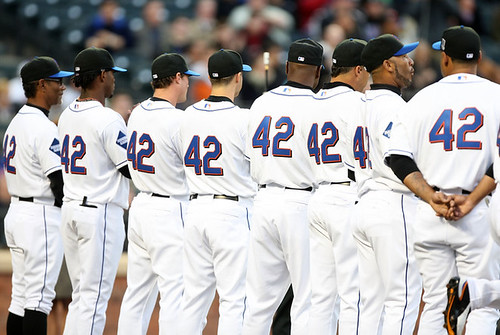
While I loved seeing #42 out of retirement yesterday, quite a few teams still seem to ahve forgotten how to make a jersey with only a number on the back.
link, since they have NNOB at home. Why is that ugly gap there for these special uniforms?
link They could move it up an inch or so, though. So could the link (and boy does that jersey look classy without the name).
No, wait, I take that back. Poor 5’9″ Rafael Furcal looks link
I hesitate to wonder what 5’7″ Mike Fontenot must have looked like — this is blatant discrimination against under-6-foot players!
More terrible positioning from link, but those jerseys look pretty nice without names on them. Suddenly all the extra layers, number warts, etc. don’t look so “busy”.
The link
Fortunately the link, whatever flaws they may have, know how to put a number on a jersey. They’ve never had the chance to forget. Why can’t all the other teams handle it like this?
[quote comment=”323822″]Somewhere, Butch Huskey and Mo Vaughn are feeling slighted by today’s post.[/quote]
Among others:
link
But Hodges wore that number for a dozen years, so he’ll always be 42 to me. It’s hard to imagine a more marginal player who had a longer career. A true paragon of uselessness.
[quote comment=”323823″]Considering how universally popular he was in Philly and elsewhere for that matter, and how team president Dave Montgomery rightly proclaimed Monday, “We lost our voice (today),” I am completely underwhelmed by the simple circular black “HK” patch to honor the memory of Harry Kalas. I know the A’s had a portion of the off-season in ’05-’06 to come up with the beautiful tribute patch for Bill King, including a microphone and his “Holy Toledo” catchphrase, and the Phillies are still in shock from the sudden death of Kalas just days ago, but he deserves a unique tribute patch of his own that truly captures his essence as the King patch did for Bay Area sports fans.[/quote]
Maybe some fireworks and a banner and some olive branches and a Phillies logo and the flagship station call letters and a caricature and Independence Hall and a silhouette of the Vet and…
Sheesh.
I agree with the person yesterday who said he respected the Yankees for sticking with a simple black mourning band in such situations.
What, has dignity and class TOTALLY left pro sports? Does EVERYTHING have to look like it was conceived by someone who lives in a trailer with two dozen plastic lawn flamingoes out front?
“One more bumper sticker and my car will be PERFECT!”
—Ricko
[quote comment=”323826″][quote comment=”323800″][quote comment=”323789″]Pardon me while I go off on a small rant: SNY has unveiled this completely annoying new replay feature in which they use some rudimentary graphics to compare the catcher’s target to where the pitch actually ends up. So whenever there’s a base hit, the announcers are all tsk-tsk and second-guessy, pointing out that the pitch wasn’t where it was supposed to be, so OF COURSE it resulted in a hit. This gimmick, which of course is sponsored (as in “Let’s check the Douchebag ‘Where’s That Pitch?’ Replay,” or whatever the fuck they’re calling it), is irksome on several levels.
 [/quote]
Sorry i didnt think you could insult the NY Mets on this forum[/quote]
Oh you can insult the inhabitants of Debits Field on this forum, especially after Los Mets had yet another tribute to their 1969 team last night, to the one and only Ron Taylor. Dr. Taylor to you and to millions of Canadians and hockey fans in the United States and Newfoundland.
FYI SNY can do all this for a gimmick, yet cannot provide closed captioning on any of their games. Cheap.[/quote]
Shhhh it is blasfamous to bad mouth the NY Mets here, the moderator / creator doesnt stand for it!
great job Dan Mullen! You haven’t even played a game yet and you’ve already ruined what may have been the classiest uni in college football. Now, Miss St will not only stink, they will do it looking like a WAC team. have a coke and a smile!
[quote comment=”323829″][quote comment=”323823″]Considering how universally popular he was in Philly and elsewhere for that matter, and how team president Dave Montgomery rightly proclaimed Monday, “We lost our voice (today),” I am completely underwhelmed by the simple circular black “HK” patch to honor the memory of Harry Kalas. I know the A’s had a portion of the off-season in ’05-’06 to come up with the beautiful tribute patch for Bill King, including a microphone and his “Holy Toledo” catchphrase, and the Phillies are still in shock from the sudden death of Kalas just days ago, but he deserves a unique tribute patch of his own that truly captures his essence as the King patch did for Bay Area sports fans.[/quote]
Maybe some fireworks and a banner and some olive branches and a Phillies logo and the flagship station call letters and a caricature and Independence Hall and a silhouette of the Vet and…
Sheesh.
I agree with the person yesterday who said he respected the Yankees for sticking with a simple black mourning band in such situations.
What, has dignity and class TOTALLY left pro sports? Does EVERYTHING have to look like it was conceived by someone who lives in a trailer with two dozen plastic lawn flamingoes out front?
“One more bumper sticker and my car will be PERFECT!”
—Ricko[/quote]
Agreed. Simple, succinct, doesn’t deter from the already good unis–no bells and whistles. Nice patch.
[quote comment=”323831″]great job Dan Mullen! You haven’t even played a game yet and you’ve already ruined what may have been the classiest uni in college football. Now, Miss St will not only stink, they will do it looking like a WAC team. have a coke and a smile![/quote]
What bugs me about that gallery of photos, besides the obvious “stripes and piping for the hell of it” thing is that there are no pictures of a player wearing a helmet. Put it on so we can get what the overall uniform looks like.
I don’t have a picture of it, but did anyone else notice Torii Hunter in last nights Angels/Mariners game? I thought it was a great look and a great tribute. Going one step further to recreate Jackie Robinson’s look with showing the socks. Wish that more players would start wearing their uni’s this way.
[quote comment=”323804″]Here’s a frightening thought: Celine Dion could be singing “O Canada” before Canadiens games. For, like, EVERY game:
link
Actually, when Celine sung O Canada in Philadelphia for the All-Star Game, she actually did a nice job.
I was at the Met game last night and from my seats down the right field line Carlos Delgado manning 1st base wearing #42 almost gave me a heart attack. I thought it was 2002 and Mo Vaughn was back in action.
[quote comment=”323830″][quote comment=”323826″][quote comment=”323800″][quote comment=”323789″]Pardon me while I go off on a small rant: SNY has unveiled this completely annoying new replay feature in which they use some rudimentary graphics to compare the catcher’s target to where the pitch actually ends up. So whenever there’s a base hit, the announcers are all tsk-tsk and second-guessy, pointing out that the pitch wasn’t where it was supposed to be, so OF COURSE it resulted in a hit. This gimmick, which of course is sponsored (as in “Let’s check the Douchebag ‘Where’s That Pitch?’ Replay,” or whatever the fuck they’re calling it), is irksome on several levels.
 [/quote]
Sorry i didnt think you could insult the NY Mets on this forum[/quote]
Oh you can insult the inhabitants of Debits Field on this forum, especially after Los Mets had yet another tribute to their 1969 team last night, to the one and only Ron Taylor. Dr. Taylor to you and to millions of Canadians and hockey fans in the United States and Newfoundland.
FYI SNY can do all this for a gimmick, yet cannot provide closed captioning on any of their games. Cheap.[/quote]
Shhhh it is blasfamous to bad mouth the NY Mets here, the moderator / creator doesnt stand for it![/quote]
Trouble with those “strike zone pitch cams” is that, unless the camera is dead-solid behind the pitcher (and even then it wouldn’t mean much) is that they’re trying to make a two-dimensional determination against a three-dimensional background. Even if the camera position is skewed only a degree or two, you get a parallax view. It simply can’t be anything better than a rough idea of where the pitch was relative to the strike zone or anything else.
Anyone who took science as far as eighth grade should know that.
Better would be a field-level camera directly at 90 degrees to the hitter (for high/low) and another directly above the plate (for inside/outside). Then compare the two. Now there’d be a nice time-waster between pitches. Not to mention umps probably wouldn’t like it a helluva lot.
—Ricko
[quote comment=”323816″][quote comment=\”323807\”][quote comment=\”323803\”][quote]am I the only one who now no longer sees 2012 in an odd font, but Lisa Simpson giving head[/quote]
wait…what?[/quote]
link
It is a ridiculous logo, but your imagination is disturbing.[/quote]
It is not just one mans imaginantion, it was a big source of discussion when the logo was unveiled, and pretty much trashed by everyone who saw it.
link
[quote comment=”323821″]Uh oh. DIYer getting taken to the pokey. link
Now was it for wearing the shirt or for quoting the fictional player?
[quote comment=”323837″]Trouble with those “strike zone pitch cams” is that, unless the camera is dead-solid behind the pitcher (and even then it wouldn’t mean much) is that they’re trying to make a two-dimensional determination against a three-dimensional background. Even if the camera position is skewed only a degree or two, you get a parallax view. It simply can’t be anything better than a rough idea of where the pitch was relative to the strike zone or anything else.
Anyone who took science as far as eighth grade should know that.
Better would be a field-level camera directly at 90 degrees to the hitter (for high/low) and another directly above the plate (for inside/outside). Then compare the two. Now there’d be a nice time-waster between pitches. Not to mention umps probably wouldn’t like it a helluva lot.
—Ricko[/quote]
but ricko, that’s why espn invented this
next month the first sunday night game without a home plate umpire is scheduled — aren’t you excited?
[quote comment=”323833″][quote comment=”323831″]great job Dan Mullen! You haven’t even played a game yet and you’ve already ruined what may have been the classiest uni in college football. Now, Miss St will not only stink, they will do it looking like a WAC team. have a coke and a smile![/quote]
What bugs me about that gallery of photos, besides the obvious “stripes and piping for the hell of it” thing is that there are no pictures of a player wearing a helmet. Put it on so we can get what the overall uniform looks like.[/quote]
Multiple things
1) Could have been worse… Could have been a lot worse… Trust a Virginia Tech alum… could have been A LOT WORSE
2) MSU had good unis, but I wouldn’t call them the only classic jersey left. There are many classic jerseys still out there, many in the SEC alone.
3) Complaining about those pictures without helmets is like complaining that we didn’t put lipstick on a pig.
[quote comment=”323833″][quote comment=”323831″]great job Dan Mullen! You haven’t even played a game yet and you’ve already ruined what may have been the classiest uni in college football. Now, Miss St will not only stink, they will do it looking like a WAC team. have a coke and a smile![/quote]
What bugs me about that gallery of photos, besides the obvious “stripes and piping for the hell of it” thing is that there are no pictures of a player wearing a helmet. Put it on so we can get what the overall uniform looks like.[/quote]
I’m with you, Stuby. Put on your helmet! And, of course, I didn’t see the rib horns coming at all.
link
link
i’ve been saying this since the pirates changed their number font… they HAVE to go NNOB for the white home uniform!!! that jersey would look SO sharp! of course, there are no good shots from yesterday’s games so i cant show you what i’m talking about…
well… here are the buccos with NNOB, but not the same number font. anyone ever see that picture? haha
link
[quote comment=”323840″][quote comment=”323837″]Trouble with those “strike zone pitch cams” is that, unless the camera is dead-solid behind the pitcher (and even then it wouldn’t mean much) is that they’re trying to make a two-dimensional determination against a three-dimensional background. Even if the camera position is skewed only a degree or two, you get a parallax view. It simply can’t be anything better than a rough idea of where the pitch was relative to the strike zone or anything else.
Anyone who took science as far as eighth grade should know that.
Better would be a field-level camera directly at 90 degrees to the hitter (for high/low) and another directly above the plate (for inside/outside). Then compare the two. Now there’d be a nice time-waster between pitches. Not to mention umps probably wouldn’t like it a helluva lot.
—Ricko[/quote]
but ricko, that’s why espn invented link
next month the first sunday night game without a home plate umpire is scheduled — aren’t you excited?[/quote]
The bottom portion being the strike zone of Freddie Patek, of course.
The bottom yellow line being the strike zone of Eddie Gaedel.
—Ricko
[quote comment=”323842″][quote comment=”323833″][quote comment=”323831″]great job Dan Mullen! You haven’t even played a game yet and you’ve already ruined what may have been the classiest uni in college football. Now, Miss St will not only stink, they will do it looking like a WAC team. have a coke and a smile![/quote]
What bugs me about that gallery of photos, besides the obvious “stripes and piping for the hell of it” thing is that there are no pictures of a player wearing a helmet. Put it on so we can get what the overall uniform looks like.[/quote]
I’m with you, Stuby. Put on your helmet! And, of course, I didn’t see the rib horns coming at all.
link
link
After a second look at Miss. State’s jerseys, I did fine one silver lining. Black shoes!
link
re: London 2012 Logo…
That is old news… link
this link is over 2 years old, when they first promoted that horrid design…are we so short minded/ritalin a-d-h-d that this very logo gave seizures?
He is not alone in viewing the logo in a twisted way
Don’t know if anyone else caught this last night, but Alex Ovechkin’s helmet was knocked off during the NYR-Caps game. Instead of going to pick it up, he went and got another player’s helmet from the bench, and wore it for almost an entire minute.
I don’t have any screen-grab capabilities, but I’m going to see if Hulu has the game available tonight. If they do, I’ll grab it from there.
[quote comment=”323830″]Shhhh it is blasfamous to bad mouth the NY Mets here, the moderator / creator doesnt stand for it![/quote]
What the fuck are you talking about? It would be hard to find anyone who’s tougher on the Mets than I am. Sleeve patch, stadium name, black uniforms, marketing cluelessness, blah-blah-blah. I’m their toughest critic!
John Madden retires!
[quote comment=”323837″]
Trouble with those “strike zone pitch cams” is that, unless the camera is dead-solid behind the pitcher (and even then it wouldn’t mean much) is that they’re trying to make a two-dimensional determination against a three-dimensional background. Even if the camera position is skewed only a degree or two, you get a parallax view. It simply can’t be anything better than a rough idea of where the pitch was relative to the strike zone or anything else.
Anyone who took science as far as eighth grade should know that.
Better would be a field-level camera directly at 90 degrees to the hitter (for high/low) and another directly above the plate (for inside/outside). Then compare the two. Now there’d be a nice time-waster between pitches. Not to mention umps probably wouldn’t like it a helluva lot.
—Ricko[/quote]
I agree. The “K Zone” on ESPN is such garbage. I’ve been complaining about it since its inception. You can’t accurately know exactly where the ball crossed the plate without multiple cameras positioned on each side of the plate, above the plate, hell maybe built into home plate. So where the circle that represents the ball just shows up wherever they want it to, usually to echo whether the announcers agree or disagree with the previous ball/strike call. Or they just put it about where the catcher catches the ball, which 1) is not where the ball crossed the plate and 2) we can already see from watching the replay.
Today’s ESPN column is up:
link
[quote comment=”323849″]John Madden retires![/quote]
link
[quote comment=”323818″][quote comment=”323790″]Man, oh, man. Can the Nats do anything right? They have another lousy team. They goofed-up the unis. They’re president has to solicit fans from other teams to come to the park because they don’t draw locals. And now they screw-up the statue for the greatest player in DC baseball history. At least they’re carrying on the tradition of Les Expos de Montréal.[/quote]
Walter Johnson might take exception to that.[/quote]
You got a point. Forgot about The Big Train. I should have used “one of the greatest” in the post.
[quote comment=”323848″][quote comment=”323830″]Shhhh it is blasfamous to bad mouth the NY Mets here, the moderator / creator doesnt stand for it![/quote]
What the fuck are you talking about? It would be hard to find anyone who’s tougher on the Mets than I am. Sleeve patch, stadium name, black uniforms, marketing cluelessness, blah-blah-blah. I’m their toughest critic![/quote]
He’s not even afraid to Flush his own team down the toilets…he would (and has) been the first to do so!!
So, with that…the Mets can suck it up in September and once again ride the bench in October!!
[quote comment=”323823″]Considering how universally popular he was in Philly and elsewhere for that matter, and how team president Dave Montgomery rightly proclaimed Monday, “We lost our voice (today),” I am completely underwhelmed by the simple circular black “HK” patch to honor the memory of Harry Kalas. I know the A’s had a portion of the off-season in ’05-’06 to come up with the beautiful tribute patch for Bill King, including a microphone and his “Holy Toledo” catchphrase, and the Phillies are still in shock from the sudden death of Kalas just days ago, but he deserves a unique tribute patch of his own that truly captures his essence as the King patch did for Bay Area sports fans.[/quote]
I don’t know if Harry Kalas’ catch phrase of “Outta Here” would be terribly appropriate.
And as stated above, the ‘HK’ black circle patch matches the ‘VUK’ black circle patch.
You can’t go around making spiffy memorial patches for everyone. If you’ve got a standard, stick with it.
[quote comment=”323814″][quote comment=”323807″][quote comment=”323803″][quote]am I the only one who now no longer sees 2012 in an odd font, but Lisa Simpson giving head[/quote]
wait…what?[/quote]
link
well…sure…if you link
i guess the people who see that also see something link too?[/quote]
go to the Orioles (www.theorioles.com) website and scroll over “Community” now that’s a logo with a couple of meanings.
Look a third of the way down this article to see what went into getting the Phillies’ “HK” patch ready for game-time.
link
[quote comment=”323806″]didn’t see recaps of every game, but question: did every team wear their “standard” (as in, no alts, softball tops, wednesday afternoon colors, etc etc) yesterday?
if nothing else, then some good came from the JRR tributes
*EDIT…of course the mets wore their snow whites and black/blue caps…so not EVERYONE wore their standard unis….leave it to the mets to mess that one up…jesuschristo[/quote]
Astros wore their brick reds in Pittsburgh.
[quote comment=”323859″][quote comment=”323806″]didn’t see recaps of every game, but question: did every team wear their “standard” (as in, no alts, softball tops, wednesday afternoon colors, etc etc) yesterday?
if nothing else, then some good came from the JRR tributes
*EDIT…of course the mets wore their snow whites and black/blue caps…so not EVERYONE wore their standard unis….leave it to the mets to mess that one up…jesuschristo[/quote]
Astros wore their brick reds in Pittsburgh.[/quote]
yeah…go back up to my orig post — i re-edited it after i saw the pitty unis (was looking for better pics for ryco)
[quote comment=”323852″][quote comment=”323849″]John Madden retires![/quote]
link[/quote]
Brett Favre is still retired as of April 16…
John Madden retires
Coincidence?
[quote comment=”323823″]Considering how universally popular he was in Philly and elsewhere for that matter, and how team president Dave Montgomery rightly proclaimed Monday, “We lost our voice (today),” I am completely underwhelmed by the simple circular black “HK” patch to honor the memory of Harry Kalas. I know the A’s had a portion of the off-season in ’05-’06 to come up with the beautiful tribute patch for Bill King, including a microphone and his “Holy Toledo” catchphrase, and the Phillies are still in shock from the sudden death of Kalas just days ago, but he deserves a unique tribute patch of his own that truly captures his essence as the King patch did for Bay Area sports fans.[/quote]
Harry the K was a simple and understated kind of guy. Despite his love for loud sportscoats. The HK is proper and honorable.
By the way, the Phillies are having a tribute to Harry at CBP over the weekend. There will be a memorial service at the ballpark on Saturday morning where his casket will be at home plate and fans will be allowed to pay their last repects. link
[quote comment=”323851″]Hmmm, does the Wisconsin spring football game logo remind you of anything? More importantly, why does a spring scrimmage need a logo to begin with? (With thanks to Dustin Pomprowitz).[/quote]
Personally, it reminds me of the comment I made about a week ago: and the fact that it is reminiscent of the recent Super Bowl logo was first voiced by another commenter just a few moments after I posted last week.
THAT’S what it reminds me of.
Maybe Dustin was that other commenter, I don’t know.
[quote comment=”323862″][quote comment=”323852″][quote comment=”323849″]John Madden retires![/quote]
link[/quote]
Brett Favre is still retired as of April 16…
John Madden retires
Coincidence?[/quote]
After Madden takes a job in the Raiders front office, look for Favre to come out of retirement and play for the Raidahs. Bro-mances never die!
[quote comment=”323851″]Today’s ESPN column is up:
link
i’m halfway surprised that the pirates don’t have something for vince lascheid
link
he was a huge part of the pirates (and pens) for a long time.
no biggie though! great article as usual!
[quote comment=”323865″][quote comment=”323862″][quote comment=”323852″][quote comment=”323849″]John Madden retires![/quote]
link[/quote]
Brett Favre is still retired as of April 16…
John Madden retires
Coincidence?[/quote]
After Madden takes a job in the Raiders front office, look for Favre to come out of retirement and play for the Raidahs. Bro-mances never die![/quote]
I think the point was…is Favre’s next gig working with Al Michaels?
The (unfortunate) number of memorials popping up on uniforms lately made me question, what is the ‘criteria’ for ‘deserving’ a tribute by a former organization?
For example, the 49ers would surely honor Jerry Rice with a device when his time came. But, would Jeff Kemp get the same treatment? I think not.
So, how does each team decide who does and who does not get memorials? Do they just wing it with each passing? Do they have standards? I need to know, its highly important!
I wonder who will replace Madden
[quote comment=”323864″]Maybe Dustin was that other commenter, I don’t know.[/quote]
link
-Comment by “EL”, number 87.
-My comments numbered 80 and 91.
[quote comment=”323867″][quote comment=”323865″][quote comment=”323862″][quote comment=”323852″][quote comment=”323849″]John Madden retires![/quote]
link[/quote]
Brett Favre is still retired as of April 16…
John Madden retires
Coincidence?[/quote]
After Madden takes a job in the Raiders front office, look for Favre to come out of retirement and play for the Raidahs. Bro-mances never die![/quote]
I think the point was…is Favre’s next gig working with Al Michaels?[/quote]
whomever the choice is, PLEEEEAAAAASE don’t let it be a choice like link
[quote comment=”323849″]John Madden retires![/quote]
Anyone else think it humorous that he retired the day after the schedule for the upcoming year was released?
[quote comment=”323829″][quote comment=”323823″]Considering how universally popular he was in Philly and elsewhere for that matter, and how team president Dave Montgomery rightly proclaimed Monday, “We lost our voice (today),” I am completely underwhelmed by the simple circular black “HK” patch to honor the memory of Harry Kalas. I know the A’s had a portion of the off-season in ’05-’06 to come up with the beautiful tribute patch for Bill King, including a microphone and his “Holy Toledo” catchphrase, and the Phillies are still in shock from the sudden death of Kalas just days ago, but he deserves a unique tribute patch of his own that truly captures his essence as the King patch did for Bay Area sports fans.[/quote]
I agree with the person yesterday who said he respected the Yankees for sticking with a simple black mourning band in such situations.
—Ricko[/quote]
I would have put a temporary black band with “42” on the sleeves yesterday on the regular instead making up to 1,000 jerseys used just for *one* day. It seems rather wasteful in these times. And what’s going to happen to those jerseys? If they’re going to be auctioned, proceeds better end up to charties or somewhere in the team’s community.
[quote comment=”323868″]The (unfortunate) number of memorials popping up on uniforms lately made me question, what is the ‘criteria’ for ‘deserving’ a tribute by a former organization?
For example, the 49ers would surely honor Jerry Rice with a device when his time came. But, would Jeff Kemp get the same treatment? I think not.
So, how does each team decide who does and who does not get memorials? Do they just wing it with each passing? Do they have standards? I need to know, its highly important![/quote]
Active players, active Coaches, active GM’s, retired numbers, Hall of Famers, Owners, and any prominant Captain, Coach, or GM that has led the franchise to sustained success…
Thats pretty much the way I’ve thought of it… would be interesting to see any that don’t fall in those categories.
[quote comment=”323840″]next month the first sunday night game without a home plate umpire is scheduled — aren’t you excited?[/quote]
What? Serious or sarcasm?
[quote comment=”323867″][quote comment=”323865″][quote comment=”323862″][quote comment=”323852″][quote comment=”323849″]John Madden retires![/quote]
link[/quote]
Brett Favre is still retired as of April 16…
John Madden retires
Coincidence?[/quote]
After Madden takes a job in the Raiders front office, look for Favre to come out of retirement and play for the Raidahs. Bro-mances never die![/quote]
I think the point was…is Favre’s next gig working with Al Michaels?[/quote]
I highly doubt it. I would be extremely surprised if Collinsworth did not get the job. NBC has already auditioned Millen for his job in studio. Also, most speculation has Favre eventually going to ESPN, which is why they treated him with kid gloves and were always pro Favre when he was trying to decide if he should stay or go.
[quote comment=”323865″][quote comment=”323862″][quote comment=”323852″][quote comment=”323849″]John Madden retires![/quote]
link[/quote]
Brett Favre is still retired as of April 16…
John Madden retires
Coincidence?[/quote]
After Madden takes a job in the Raiders front office, look for Favre to come out of retirement and play for the Raidahs. Bro-mances never die![/quote]
Nah, I think they’re both really done. Probably buying a nice place together in the Hamptons so they can enjoy their golden years together at last. Kind of feel bad for their wives, but they had to see it coming.
I love these Boston Bruins ads and they’re even slightly uni related.
link
link
Are there any more out there?
[quote comment=”323874″][quote comment=”323829″][quote comment=”323823″]Considering how universally popular he was in Philly and elsewhere for that matter, and how team president Dave Montgomery rightly proclaimed Monday, “We lost our voice (today),” I am completely underwhelmed by the simple circular black “HK” patch to honor the memory of Harry Kalas. I know the A’s had a portion of the off-season in ’05-’06 to come up with the beautiful tribute patch for Bill King, including a microphone and his “Holy Toledo” catchphrase, and the Phillies are still in shock from the sudden death of Kalas just days ago, but he deserves a unique tribute patch of his own that truly captures his essence as the King patch did for Bay Area sports fans.[/quote]
I agree with the person yesterday who said he respected the Yankees for sticking with a simple black mourning band in such situations.
—Ricko[/quote]
I would have put a temporary black band with “42” on the sleeves yesterday on the regular instead making up to 1,000 jerseys used just for *one* day. It seems rather wasteful in these times. And what’s going to happen to those jerseys? If they’re going to be auctioned, proceeds better end up to charties or somewhere in the team’s community.[/quote]
Last year, they auctioned them off. Pretty sure that the proceeds went to the Jackie Robinson foundation.
[quote comment=”323875″][quote comment=”323868″]The (unfortunate) number of memorials popping up on uniforms lately made me question, what is the ‘criteria’ for ‘deserving’ a tribute by a former organization?
For example, the 49ers would surely honor Jerry Rice with a device when his time came. But, would Jeff Kemp get the same treatment? I think not.
So, how does each team decide who does and who does not get memorials? Do they just wing it with each passing? Do they have standards? I need to know, its highly important![/quote]
Active players, active Coaches, active GM’s, retired numbers, Hall of Famers, Owners, and any prominant Captain, Coach, or GM that has led the franchise to sustained success…
Thats pretty much the way I’ve thought of it… would be interesting to see any that don’t fall in those categories.[/quote]
Fair enough… but not scientific enough for my tastes. Specifically the ‘led the franchise to sustained success’ is troublesome. My sustained success might be 3 good years of 2nd place finishes. Its not, but it might be.
[quote comment=”323875″][quote comment=”323868″]The (unfortunate) number of memorials popping up on uniforms lately made me question, what is the ‘criteria’ for ‘deserving’ a tribute by a former organization?
For example, the 49ers would surely honor Jerry Rice with a device when his time came. But, would Jeff Kemp get the same treatment? I think not.
So, how does each team decide who does and who does not get memorials? Do they just wing it with each passing? Do they have standards? I need to know, its highly important![/quote]
Active players, active Coaches, active GM’s, retired numbers, Hall of Famers, Owners, and any prominant Captain, Coach, or GM that has led the franchise to sustained success…
Thats pretty much the way I’ve thought of it… would be interesting to see any that don’t fall in those categories.[/quote]
…and long-time announcers.
[quote comment=”323881″]Fair enough… but not scientific enough for my tastes. Specifically the ‘led the franchise to sustained success’ is troublesome. My sustained success might be 3 good years of 2nd place finishes. Its not, but it might be.[/quote]
Thats open for debate on a franchise-by-franchise basis. It just depends on how that franchise defines success. Like, success for the Florida Panthers might not be the same as the Detroit Red Wings.
[quote comment=”323882]…and long-time announcers.[/quote]
Most long-term announcers are already in the Hall-of-Fame, especially ones worthy of a memorial patch…
General Rule I have learned on my way to becoming the old fart that I am:
The bigger the show someone makes of their grief, the less genuine the feeling…and the more it’s about the show.
(I said a “General” Rule, not an absolute).
How ’bout this way to approach such things?:
People die.
We miss them like crazy, and we should smile when we think of them.
But life goes on.
(And it’s good that it does.)
—Ricko
[quote comment=”323876″][quote comment=”323840″]next month the first sunday night game without a home plate umpire is scheduled — aren’t you excited?[/quote]
What? Serious or sarcasm?[/quote]
Wow. You actually ASKED!?
check ot the “free extras” with the pirates.
link
or maybe Mr. Met is more your speed
link
I’m no Mets fan – not even by a longshot (Braves fan here), but I enjoy the coverage they get here. No high profile major sports team I can think of keeps screwing up their look on an ongoing basis more, essentially taking a HUGE dump on one of the great baseball uniforms of all time (the original Mets “New York” road grays are the absolute pinnacle IMO).
Here’s something for the Mets fans/Citi Field haters on the board…
link
[quote comment=”323887″]I’m no Mets fan – not even by a longshot (Braves fan here), but I enjoy the coverage they get here. No high profile major sports team I can think of keeps screwing up their look on an ongoing basis more, essentially taking a HUGE dump on one of the great baseball uniforms of all time (the original Mets “New York” road grays are the absolute pinnacle IMO).[/quote]
damn straight (ok, so it’s not 1962, but essentially unchanged from what kooz is wearing)
and…why are the mets wearing “NEW YORK” on their unis in the polo grounds? just a photo op?
In Oakland it was Dave Henderson day as he wore #42 for both teams, Athletics and Red Sox.
[quote comment=”323887″]I’m no Mets fan – not even by a longshot (Braves fan here), but I enjoy the coverage they get here. No high profile major sports team I can think of keeps screwing up their look on an ongoing basis more, essentially taking a HUGE dump on one of the great baseball uniforms of all time (the original Mets “New York” road grays are the absolute pinnacle IMO).[/quote]
You’d think that on a day they were honoring Robinson, they would have worn the uniform set that most closely resembled the Dodgers. They sort of did with the snow-white unis, but I don’t recall Brooklyn ever wearing a black cap and socks like that when Robinson played.
Broadcaster uniwatch, Costas and Reynolds on MLB Network are wearing the network logo on their jackets.
[quote comment=”323887″]I’m no Mets fan – not even by a longshot (Braves fan here), but I enjoy the coverage they get here. No high profile major sports team I can think of keeps screwing up their look on an ongoing basis more, essentially taking a HUGE dump on one of the great baseball uniforms of all time (the original Mets “New York” road grays are the absolute pinnacle IMO).[/quote]
Love that original Mets home-road combo. Just a classy, classy look. Can even live with the black drop shadow on the lettering and numbers (does make them “pop” a little)…but no more black than that.
At the same time, though, I also loved the A’s sleeveless rotation of white, gold and grayish green (early Vida Blue era) just because they WEREN’T so traditional. Sometimes it’s about sticking with something you’ve hit upon that works, not flitting about trying to be “trendy.”
—Ricko
on mlb 09 the show on playstation the red sox are wearing, well, red socks with their road uniforms. i don’t think they look that great with the red socks but i do agree with paul’s compromise in his espn column today
[quote comment=”323879″]I love these Boston Bruins ads and they’re even slightly uni related.
link
link
Are there any more out there?[/quote]
yes
link
WOW!!! I think our estimates of CC’s pinstripes is way too low
[quote comment=”323796″]Here are some more. (Helmet Hut and the Helmet project didnt have anything on it either)
link
link
For whatever reason Notre Dame used plastic helmets for a bit in the 1940’s and went back to the leather in the early to mid 1950’s. I have asked Helmet Hut why and others.
They had to be one of college football’s last teams to wear leather helmets.
[quote comment=”323890″]In Oakland it was Dave Henderson day as he wore #42 for both teams, Athletics and Red Sox.[/quote]
too bad henderson wore 40 for the sawx
Sidenote. I was thinking of these sweatshirts that were popular maybe 15-20 years ago. They were kind of busy but had the throwback look to them. I had one with Ohio State’s 1954 National Championship team picture on it. The shirt had that and the season record and a lot more.
I remember seeing guys with say the 1948 Indians team picture or old Yankee or Chicago Bears teams. I was trying to think of the name or company. It may have been something like Long Gone.
They were actually neat and popular for a while. Anybody remember those if my explanation was good enough? If I ever find my Ohio State one I will post a picture.
[quote comment=”323790″]Man, oh, man. Can the Nats do anything right? They have another lousy team. They goofed-up the unis. They’re president has to solicit fans from other teams to come to the park because they don’t draw locals. And now they screw-up the statue for the greatest player in DC baseball history. At least they’re carrying on the tradition of Les Expos de Montréal.[/quote]
Don’t forget skimming signing bonus money from Latin American players.
Nice face mask for the Ragin Cajuns softball pitcher…
link
Frank
[quote comment=”323839″][quote comment=”323821″]“Uh oh. DIYer getting link[/quote]
“Now was it for wearing the shirt or for quoting the fictional player?”[/quote]
No, me thinks it was for the, uh, plumbers’ crack.
[quote comment=”323847″]Don’t know if anyone else caught this last night, but Alex Ovechkin’s helmet was knocked off during the NYR-Caps game. Instead of going to pick it up, he went and got another player’s helmet from the bench, and wore it for almost an entire minute.
I don’t have any screen-grab capabilities, but I’m going to see if Hulu has the game available tonight. If they do, I’ll grab it from there.[/quote]
IIRC Ovechkin played a bit without the lid, then after trying to playing in front of the net, he went to the bench where Matt Bradley gave his helmet to Ovi. They showed the return exchange on the jumbotron.
Hmmm…
Don’t remember these AT ALL.
link|66%3A2|65%3A12|39%3A1|240%3A1318|301%3A1|293%3A1|294%3A50
—Ricko
[quote comment=”323884″]General Rule I have learned on my way to becoming the old fart that I am:
The bigger the show someone makes of their grief, the less genuine the feeling…and the more it’s about the show.
(I said a “General” Rule, not an absolute).
How ’bout this way to approach such things?:
People die.
We miss them like crazy, and we should smile when we think of them.
But life goes on.
(And it’s good that it does.)
—Ricko[/quote]
well said ricko!
[quote comment=”323886″]check ot the “free extras” with the pirates.
link
or maybe Mr. Met is more your speed
link
my goodness!!! kek, did you see that?!?!
great find there!
(still not worth a flippin $80 though!!!)
[quote comment=”323885″][quote comment=”323876″][quote comment=”323840″]next month the first sunday night game without a home plate umpire is scheduled — aren’t you excited?[/quote]
What? Serious or sarcasm?[/quote]
Wow. You actually ASKED!?[/quote]
I would not put any gimmick past Bud Selig.
[quote comment=”323893″][quote comment=”323887″]I’m no Mets fan – not even by a longshot (Braves fan here), but I enjoy the coverage they get here. No high profile major sports team I can think of keeps screwing up their look on an ongoing basis more, essentially taking a HUGE dump on one of the great baseball uniforms of all time (the original Mets “New York” road grays are the absolute pinnacle IMO).[/quote]
Love that original Mets home-road combo. Just a classy, classy look. Can even live with the black drop shadow on the lettering and numbers (does make them “pop” a little)…but no more black than that.[/quote]
Gotta take issue with that – far from making anything “pop”, the black drop-shadow obscures the letters. Maybe a black outline would make it pop, but one of the things I hate about the black drop-shadow is the muddying effect it has on the script.
Look at the spaces – link script is a whole lot easier to read than link.
I don’t get why people have a problem with the Jackie Robinson shoe. Any tribute is good tribute and it beats players writing on their shoes themselves as has happened in sports before. Leads me to believe perhaps is the problem that its coming from Nike…which of course means they are out to make a quick buck on the memory of Jackie Robinson? I wonder what the reaction would have been if Adidas made this same shoe. I especially have no problem with the shoe because it is coming from Ken Griffey Jr’s line of Swingman shoes. He’s always been one of the biggest backers of the Jackie Robinson tributes. If I remember correctly he was one of the first, if not the first, player to go to MLB requesting to wear 42, before someone on every team did and of course before everyone wore 42 on every team.
[quote comment=”323904″]Hmmm…
Don’t remember these AT ALL.
link|66%3A2|65%3A12|39%3A1|240%3A1318|301%3A1|293%3A1|294%3A50
I have these!! they are sitting in an attick…I only took one out …the Don Mattingly!!
—Ricko[/quote]
[quote comment=”323908″][quote comment=”323893″][quote comment=”323887″]I’m no Mets fan – not even by a longshot (Braves fan here), but I enjoy the coverage they get here. No high profile major sports team I can think of keeps screwing up their look on an ongoing basis more, essentially taking a HUGE dump on one of the great baseball uniforms of all time (the original Mets “New York” road grays are the absolute pinnacle IMO).[/quote]
Love that original Mets home-road combo. Just a classy, classy look. Can even live with the black drop shadow on the lettering and numbers (does make them “pop” a little)…but no more black than that.[/quote]
Gotta take issue with that – far from making anything “pop”, the black drop-shadow obscures the letters. Maybe a black outline would make it pop, but one of the things I hate about the black drop-shadow is the muddying effect it has on the script.
Look at the spaces – link script is a whole lot easier to read than link.[/quote]
When it eliminates the spacing like those Nashville unis someone (you?) posted a couple days ago, yes. You’re absolutely right, Chance, looks crappy. Like anything, it’s about the execution. A slight drop shadow that doesn’t alter legibility does, visually, lift the letters a bit. When it’s badly done and smashes everything together it does just the opposite and therefore fails miserably.
(And in all fairness, I didn’t say I liked it with the Mets, just said I could “live with it.”)
Okay, just for fun, let’s list the teams we think should “ditch the black” (meaning those who practice BFBS).
I’ll start with four that come readily to mind…
New York Mets
Detroit Lions
San Francisco 49ers
Oregon Ducks
—Ricko
[quote comment=”323893″][quote comment=”323887″]I’m no Mets fan – not even by a longshot (Braves fan here), but I enjoy the coverage they get here. No high profile major sports team I can think of keeps screwing up their look on an ongoing basis more, essentially taking a HUGE dump on one of the great baseball uniforms of all time (the original Mets “New York” road grays are the absolute pinnacle IMO).[/quote]
Love that original Mets home-road combo. Just a classy, classy look. Can even live with the black drop shadow on the lettering and numbers (does make them “pop” a little)…but no more black than that.
At the same time, though, I also loved the A’s sleeveless rotation of white, gold and grayish green (early Vida Blue era) just because they WEREN’T so traditional. Sometimes it’s about sticking with something you’ve hit upon that works, not flitting about trying to be “trendy.”
—Ricko[/quote]
Agreed. The Yankees, Dodgers, Red Sox, and Cardinals have the best uniforms in baseball, but my child’s heart belongs to the colorful A’s and Orioles uniforms of the 1970s.
[quote comment=”323906″][quote comment=”323886″]check ot the “free extras” with the pirates.
link
or maybe Mr. Met is more your speed
link
my goodness!!! kek, did you see that?!?!
great find there!
(still not worth a flippin $80 though!!!)[/quote]
they run deals from time to time. they have also started to pop up in local stores.
[quote comment=”323909″]I don’t get why people have a problem with the Jackie Robinson shoe. Any tribute is good tribute and it beats players writing on their shoes themselves as has happened in sports before. Leads me to believe perhaps is the problem that its coming from Nike…which of course means they are out to make a quick buck on the memory of Jackie Robinson? I wonder what the reaction would have been if Adidas made this same shoe. I especially have no problem with the shoe because it is coming from Ken Griffey Jr’s line of Swingman shoes. He’s always been one of the biggest backers of the Jackie Robinson tributes. If I remember correctly he was one of the first, if not the first, player to go to MLB requesting to wear 42, before someone on every team did and of course before everyone wore 42 on every team.[/quote]
The Jackie Robinson shoe just seems so anachronistic and lacking in knowledge of baseball equipment through the years. Makes me wonder if Nike’s design staff is so dense they think high tops were the general rule in MLB in 1947.
No, no, girls, those were FOOTBALL photos you were looking at. Not the same thing.
It’s a little like marketing a revolutionary new titanium driver to honor Bobby Jones. Huh???
—Ricko
[quote comment=”323906″][quote comment=”323886″]check ot the “free extras” with the pirates.
link
[/quote]
my goodness!!! kek, did you see that?!?!
great find there!
(still not worth a flippin $80 though!!!)[/quote]
ryan…if you’re balking at the price, you could still give your room a piratey feel for less
Re: your EPSN article – I’m glad to note that the Tigers haven’t gone overboard with the arm patch thing. They’ve kept their uniforms pretty simple, and stuck with the classic, unadorned English D for most of their history.
Still, Chuck Dressen?
[quote comment=”323859″][quote comment=”323806″]didn’t see recaps of every game, but question: did every team wear their “standard” (as in, no alts, softball tops, wednesday afternoon colors, etc etc) yesterday?
if nothing else, then some good came from the JRR tributes
*EDIT…of course the mets wore their snow whites and black/blue caps…so not EVERYONE wore their standard unis….leave it to the mets to mess that one up…jesuschristo[/quote]
Astros wore their brick reds in Pittsburgh.[/quote]
Has anyone noticed the Astros have been wearing their softball red tops on the road exclusively since last year? The only time they go to the gray roads is when the home team (i.e. Reds, Braves) choose to wear a solid red top at home. Apparently Drayton McLane, the owner, has some kind of weird fixation with the red shirts. It’s unfortunate because the Astros have a really nice road gray uniform. Too bad we never get to see it.
[quote comment=”323903″][quote comment=”323847″]Don’t know if anyone else caught this last night, but Alex Ovechkin’s helmet was knocked off during the NYR-Caps game. Instead of going to pick it up, he went and got another player’s helmet from the bench, and wore it for almost an entire minute.
I don’t have any screen-grab capabilities, but I’m going to see if Hulu has the game available tonight. If they do, I’ll grab it from there.[/quote]
IIRC Ovechkin played a bit without the lid, then after trying to playing in front of the net, he went to the bench where Matt Bradley gave his helmet to Ovi. They showed the return exchange on the jumbotron.[/quote]
Awesome! TSN didn’t talk about whose helmet is was, so that’s even better. Thanks!
[quote comment=”323918″][quote comment=”323903″][quote comment=”323847″]Don’t know if anyone else caught this last night, but Alex Ovechkin’s helmet was knocked off during the NYR-Caps game. Instead of going to pick it up, he went and got another player’s helmet from the bench, and wore it for almost an entire minute.
I don’t have any screen-grab capabilities, but I’m going to see if Hulu has the game available tonight. If they do, I’ll grab it from there.[/quote]
IIRC Ovechkin played a bit without the lid, then after trying to playing in front of the net, he went to the bench where Matt Bradley gave his helmet to Ovi. They showed the return exchange on the jumbotron.[/quote]
Awesome! TSN didn’t talk about whose helmet it was, so that’s even better. Thanks![/quote]
Ek, I need that edit button… STAT! LOL
[quote]It’s a little like marketing a revolutionary new titanium driver to honor Bobby Jones[/quote]
exactly
…wait
[quote comment=”323911″][quote comment=”323908″][quote comment=”323893″][quote comment=”323887″]I’m no Mets fan – not even by a longshot (Braves fan here), but I enjoy the coverage they get here. No high profile major sports team I can think of keeps screwing up their look on an ongoing basis more, essentially taking a HUGE dump on one of the great baseball uniforms of all time (the original Mets “New York” road grays are the absolute pinnacle IMO).[/quote]
Love that original Mets home-road combo. Just a classy, classy look. Can even live with the black drop shadow on the lettering and numbers (does make them “pop” a little)…but no more black than that.[/quote]
Gotta take issue with that – far from making anything “pop”, the black drop-shadow obscures the letters. Maybe a black outline would make it pop, but one of the things I hate about the black drop-shadow is the muddying effect it has on the script.
Look at the spaces – link script is a whole lot easier to read than link.[/quote]
When it eliminates the spacing like those Nashville unis someone (you?) posted a couple days ago, yes. You’re absolutely right, Chance, looks crappy. Like anything, it’s about the execution. A slight drop shadow that doesn’t alter legibility does, visually, lift the letters a bit. When it’s badly done and smashes everything together it does just the opposite and therefore fails miserably.
(And in all fairness, I didn’t say I liked it with the Mets, just said I could “live with it.”)
Okay, just for fun, let’s list the teams we think should “ditch the black” (meaning those who practice BFBS).
I’ll start with four that come readily to mind…
New York Mets
Detroit Lions
San Francisco 49ers
Oregon Ducks
—Ricko[/quote]
philly flyers
dallas stars
carolina hurricanes (sorry beardface. lol)
ott senators
phx yotes
sj sharks
pittsburgh pirates alt
[quote comment=”323915″][quote comment=”323906″][quote comment=”323886″]check ot the “free extras” with the pirates.
link
[/quote]
my goodness!!! kek, did you see that?!?!
great find there!
(still not worth a flippin $80 though!!!)[/quote]
ryan…if you’re balking at the price, you could still give your room link for less[/quote]
HAHA! i just spit water all over my keyboard!
yes, thats much better and much more affordable!!!
[quote comment=”323920″][quote]It’s a little like marketing a revolutionary new titanium driver to honor Bobby Jones[/quote]
link
…wait[/quote]
Wow, just like the one Bobby used at Interlachen.
(This in no way diminishes the Dorky Factor of such thinking…that all eras of a sport can and should be mashed together).
I want one, though, gonna put it right next to my official Babe Ruth composite softball bat. Cuz I know how much The Babe hated wooden bats and used some of the first aluminum ones during that last stint with the Braves.
In fact, didn’t they try to call those homers in his final game the “Pings Heard ‘Round the World”? Pretty sure I heard that somewhere.
Okay, okay…I’ll come up with another analogy…Like marketing George Washington Water Skis to honor his crossing the Delaware.
—Ricko
No Mas..$2.50 for the homeless.$2.00 for screening and tee. Jack up the shipping.$25.00+ profit in the pockets of someone.
[quote comment=”323924″]No Mas..$2.50 for the homeless.$2.00 for screening and tee. Jack up the shipping.$25.00+ profit in the pockets of someone.[/quote]
Thanks for defining the American Dream (aka capitalism).
[quote comment=”323925″][quote comment=”323924″]No Mas..$2.50 for the homeless.$2.00 for screening and tee. Jack up the shipping.$25.00+ profit in the pockets of someone.[/quote]
Thanks for defining the American Dream (aka capitalism).[/quote]
Welcome to the business world. Making money is why we all work and No Mas is doing a good job. I admire them and wish them luck.
More on Miss. State’s new football uniforms.
link
If you read the article, it states, “the uniform will feature the new university athletic wordmark in the center of the chest, marking the first time in the modern era the full ‘Mississippi State’ name has ever been displayed on the jersey.” I’m sure all MSU fans will appreciate this even though it’s so small you can’t tell what it says.
[quote comment=”323911″][quote comment=”323908″][quote comment=”323893″][quote comment=”323887″]I’m no Mets fan – not even by a longshot (Braves fan here), but I enjoy the coverage they get here. No high profile major sports team I can think of keeps screwing up their look on an ongoing basis more, essentially taking a HUGE dump on one of the great baseball uniforms of all time (the original Mets “New York” road grays are the absolute pinnacle IMO).[/quote]
Love that original Mets home-road combo. Just a classy, classy look. Can even live with the black drop shadow on the lettering and numbers (does make them “pop” a little)…but no more black than that.[/quote]
Gotta take issue with that – far from making anything “pop”, the black drop-shadow obscures the letters. Maybe a black outline would make it pop, but one of the things I hate about the black drop-shadow is the muddying effect it has on the script.
Look at the spaces – link script is a whole lot easier to read than link.[/quote]
When it eliminates the spacing like those Nashville unis someone (you?) posted a couple days ago, yes. You’re absolutely right, Chance, looks crappy. Like anything, it’s about the execution. A slight drop shadow that doesn’t alter legibility does, visually, lift the letters a bit. When it’s badly done and smashes everything together it does just the opposite and therefore fails miserably.
(And in all fairness, I didn’t say I liked it with the Mets, just said I could “live with it.”)
Okay, just for fun, let’s list the teams we think should “ditch the black” (meaning those who practice BFBS).
I’ll start with four that come readily to mind…
New York Mets
Detroit Lions
San Francisco 49ers
Oregon Ducks
—Ricko[/quote]
Oakland Athletics for christ’s sake!!!!
Ricko, I had a set of those. Little books, in 2 1/2 x 3 1/2″ size (same as a card), with little stories and stats. I really liked them, though I have no idea what happened to mine. I know my Ryne Sandberg book is with my other Cubs stuff, but the others… who knows?
Am I the only one who prefers the Astros’ red jerseys? Gray polyester is drab enough, but the Astros don’t even have much color in theirs, choosing to wear the black hats with it. I say wear the red all the time on the road.
And drop shadows look a lot better on NNOB jerseys. With names, they look clunky and they take up way too much space. When they’re just numbers, and there isn’t much else to make the jerseys look cluttered, link.
April 15
Justice for the 96.
YNWA
Paul, if you think those sites with the “teabagging” jokes are funny, you should check out this song: link
It’s a song called “I Love College” by Asher Roth, about drinking and smoking and college and girls and keg stands and things.
[quote comment=”323911″]. . . Okay, just for fun, let’s list the teams we think should “ditch the black” (meaning those who practice BFBS).
I’ll start with four that come readily to mind…
New York Mets
Detroit Lions
San Francisco 49ers
Oregon Ducks
—Ricko[/quote]
Great choices all. I’d add
Cincinnati Reds and
Philadelphia Eagles
Speaking of drop shadows, anyone notice how the New York Rangers started using drop shadows when it was more common, maintained them all through the non-drop-shadow era of the ’80s and ’90s, and now still have them when they’re back in fashion?
I love seeing teams do this — ride out eras of unfashionableness for long enough for their old style to be new again. The Bears are another example — curved numbers were more common when the Bears first got them, but then starting around the ’70s and for a very long time, nobody else had curved numbers on their jerseys. Now seemingly everyone does.
Another example might be the Yankees’ refusal to wear any color in the ’70s or ’80s — their gray became normal again by 1995. What else is there?
As soon as I typed it, I remembered another one. In the ’80s most NFL teams went with iron-on jersey numbers, and seemingly only the 49ers stuck with sewn-on twill. Then in the ’90s everyone went back to sewn-on digits again.
[quote comment=”323933″]Speaking of drop shadows, anyone notice how the New York Rangers started using drop shadows when it was more common, maintained them all through the non-drop-shadow era of the ’80s and ’90s, and now still have them when they’re back in fashion?
I love seeing teams do this — ride out eras of unfashionableness for long enough for their old style to be new again. The Bears are another example — curved numbers were more common when the Bears first got them, but then starting around the ’70s and for a very long time, nobody else had curved numbers on their jerseys. Now seemingly everyone does.
Another example might be the Yankees’ refusal to wear any color in the ’70s or ’80s — their gray became normal again by 1995. What else is there?[/quote]
Dodgers?
[quote comment=”323932″][quote comment=”323911″]. . . Okay, just for fun, let’s list the teams we think should “ditch the black” (meaning those who practice BFBS).
I’ll start with four that come readily to mind…
New York Mets
Detroit Lions
San Francisco 49ers
Oregon Ducks
—Ricko[/quote]
Great choices all. I’d add
Cincinnati Reds and
Philadelphia Eagles[/quote]
Boston Celtics
[quote comment=”323936″][quote comment=”323932″][quote comment=”323911″]. . . Okay, just for fun, let’s list the teams we think should “ditch the black” (meaning those who practice BFBS).
I’ll start with four that come readily to mind…
New York Mets
Detroit Lions
San Francisco 49ers
Oregon Ducks
—Ricko[/quote]
Great choices all. I’d add
Cincinnati Reds and
Philadelphia Eagles[/quote]
Boston Celtics[/quote]
even tho isn’t black, it really burned me when the dolphins started incorporating navy into their color scheme.
[quote comment=”323936″][quote comment=”323932″][quote comment=”323911″]. . . Okay, just for fun, let’s list the teams we think should “ditch the black” (meaning those who practice BFBS).
I’ll start with four that come readily to mind…
New York Mets
Detroit Lions
San Francisco 49ers
Oregon Ducks
—Ricko[/quote]
Great choices all. I’d add
Cincinnati Reds and
Philadelphia Eagles[/quote]
Boston Celtics[/quote]
NY Knicks
Duke Basketball
[quote comment=”323924″]No Mas..$2.50 for the homeless.$2.00 for screening and tee. Jack up the shipping.$25.00+ profit in the pockets of someone.[/quote]
What?! A business isn’t allowed to make a profit? That is a ridiculous statment.
I always liked this memorial patch:
link
[quote comment=”323926″][quote comment=”323925″][quote comment=”323924″]No Mas..$2.50 for the homeless.$2.00 for screening and tee. Jack up the shipping.$25.00+ profit in the pockets of someone.[/quote]
Thanks for defining the American Dream (aka capitalism).[/quote]
Welcome to the business world. Making money is why we all work and No Mas is doing a good job. I admire them and wish them luck.[/quote]
Exactly,
Thanks for making my point stupid.
Can’t have it both ways..
Pot calling the kettle black.
No mas and Uniwatch are no different then a company
who sponsors jerseys or pay for naming rights..
It’s like you said the “American dream.”
Anybody wanna take an educated guess as to what year this jacket may have been made? It seems pretty old (though the anaheim description is a bit off).
I am interested in it, but curious as to its era. I was thinking late 70’s……
link
[quote comment=”323836″]I was at the Met game last night and from my seats down the right field line Carlos Delgado manning 1st base wearing #42 almost gave me a heart attack. I thought it was 2002 and Mo Vaughn was back in action.[/quote]
as an Angels fan, that gives me the shivers as well.
[quote comment=”323941″][quote comment=”323926″][quote comment=”323925″][quote comment=”323924″]No Mas..$2.50 for the homeless.$2.00 for screening and tee. Jack up the shipping.$25.00+ profit in the pockets of someone.[/quote]
Thanks for defining the American Dream (aka capitalism).[/quote]
Welcome to the business world. Making money is why we all work and No Mas is doing a good job. I admire them and wish them luck.[/quote]
Exactly,
Thanks for making my point stupid.
Can’t have it both ways..
Pot calling the kettle black.
No mas and Uniwatch are no different then a company
who sponsors jerseys or pay for naming rights..
It’s like you said the “American dream.”[/quote]
pot calling the kettle black for blacks sake???
haha. c’mon, i HAD to say it!!!
[quote comment=”323942″]Anybody wanna take an educated guess as to what year this jacket may have been made? It seems pretty old (though the anaheim description is a bit off).
I am interested in it, but curious as to its era. I was thinking late 70’s……
link
One-color lettering? Looks more like maybe a 1980s Big A grounds crew jacket than anything the players ever wore.
—Ricko
[quote comment=”323945″][quote comment=”323942″]Anybody wanna take an educated guess as to what year this jacket may have been made? It seems pretty old (though the anaheim description is a bit off).
I am interested in it, but curious as to its era. I was thinking late 70’s……
link
One-color lettering? Looks more like maybe a 1980s Big A grounds crew jacket than anything the players ever wore.
—Ricko[/quote]
Cool, thank you Ricko.
So the Pyramid brand was an official MLB licensee in the 80s?
Let me rephrase that. At BEST it’s a grounds crew jacket or some such. More likely low-end fan gear.
—Ricko
Toronto Blue Jays
Calgary Flames
[quote comment=”323947″]Let me rephrase that. At BEST it’s a grounds crew jacket or some such. More likely low-end fan gear.
—Ricko[/quote]
Thank You again, Ricko. I knew I could ask you guys and have a definitive answer in no time.
I have a much nicer jacket I that was my grandmother’s years ago at home. I just saw that and was intrigued.
Thanks again gentlemen!
[quote comment=”323933″]Speaking of drop shadows, anyone notice how the New York Rangers started using drop shadows when it was more common, maintained them all through the non-drop-shadow era of the ’80s and ’90s, and now still have them when they’re back in fashion?
I love seeing teams do this — ride out eras of unfashionableness for long enough for their old style to be new again. The Bears are another example — curved numbers were more common when the Bears first got them, but then starting around the ’70s and for a very long time, nobody else had curved numbers on their jerseys. Now seemingly everyone does.
Another example might be the Yankees’ refusal to wear any color in the ’70s or ’80s — their gray became normal again by 1995. What else is there?[/quote]
But actually, starting in 1994 or so, teams started getting colorful again. I distinctly remember 1994 (which was the strike year) for this. Many teams broke out colored jerseys for the first time.
[quote comment=”323941″][quote comment=”323926″][quote comment=”323925″][quote comment=”323924″]No Mas..$2.50 for the homeless.$2.00 for screening and tee. Jack up the shipping.$25.00+ profit in the pockets of someone.[/quote]
Thanks for defining the American Dream (aka capitalism).[/quote]
Welcome to the business world. Making money is why we all work and No Mas is doing a good job. I admire them and wish them luck.[/quote]
Exactly,
Thanks for making my point stupid.
Can’t have it both ways..
Pot calling the kettle black.
No mas and Uniwatch are no different then a company
who sponsors jerseys or pay for naming rights..
It’s like you said the “American dream.”[/quote]
I have no idea what you’re getting at, but please keep promoting our shirt — thanks!
And if you really know where we can get shirts+screening for $2/per, do tell. There’s a free shirt in it for ya!
That was me, Eric Lovejoy. I don’t comment often but do remember our discussion about it.
[quote comment=”323871″][quote comment=”323864″]Maybe Dustin was that other commenter, I don’t know.[/quote]
link
-Comment by “EL”, number 87.
-My comments numbered 80 and 91.[/quote]
General Motors has a couple commercials out with people wearing baseball caps inside out rally cap style and explain why they’re doing it. Now they’re playing commercials using the same footage of people wearing their rally caps but never say a word about it. So we’re seeing people washing cars, going to work, etc with inside out ballcaps and no explanation as to why. I imagine this looks pretty strange to someone who hadn’t seen the first round of commercials.
[quote comment=”323953″]General Motors has a couple commercials out with people wearing baseball caps inside out rally cap style and explain why they’re doing it. Now they’re playing commercials using the same footage of people wearing their rally caps but never say a word about it. So we’re seeing people washing cars, going to work, etc with inside out ballcaps and no explanation as to why. I imagine this looks pretty strange to someone who hadn’t seen the first round of commercials.[/quote]
Are you suggesting that General Motors management doesn’t know what it’s doing?
[quote comment=”323951″][quote comment=”323941″][quote comment=”323926″][quote comment=”323925″][quote comment=”323924″]No Mas..$2.50 for the homeless.$2.00 for screening and tee. Jack up the shipping.$25.00+ profit in the pockets of someone.[/quote]
Thanks for defining the American Dream (aka capitalism).[/quote]
Welcome to the business world. Making money is why we all work and No Mas is doing a good job. I admire them and wish them luck.[/quote]
Exactly,
Thanks for making my point stupid.
Can’t have it both ways..
Pot calling the kettle black.
No mas and Uniwatch are no different then a company
who sponsors jerseys or pay for naming rights..
It’s like you said the “American dream.”[/quote]
I have no idea what you’re getting at, but please keep promoting our shirt — thanks!
And if you really know where we can get shirts+screening for $2/per, do tell. There’s a free shirt in it for ya![/quote]
Try Alstyle , Sanmar or Broder Brothers for a quality NAFTA friendly 5oz Tee.Whites will run you about a buck 35 and colors $1.60.I see you usually screen in your logo and size so ask for a rip out label.Guaranteed the tees are thicker then your skin!
A good screener with automatics will charge 30 cents per color as long as the numbers are there…sounds like these babies are selling like hotcakes…
But don’t let me tell you how to run your business!
[quote comment=”323953″]General Motors has a couple commercials out with people wearing baseball caps inside out rally cap style and explain why they’re doing it. Now they’re playing commercials using the same footage of people wearing their rally caps but never say a word about it. So we’re seeing people washing cars, going to work, etc with inside out ballcaps and no explanation as to why. I imagine this looks pretty strange to someone who hadn’t seen the first round of commercials.[/quote]
I missed/don’t remember the first round of commercials and had exactly that thought. So, do you remember the explanation?
[quote comment=”323952″]That was me, Eric Lovejoy. I don’t comment often but do remember our discussion about it.
[quote comment=”323871″][quote comment=”323864″]Maybe Dustin was that other commenter, I don’t know.[/quote]
link
-Comment by “EL”, number 87.
-My comments numbered 80 and 91.[/quote][/quote]
I tried to give you all the credit you deserved. I know you picked up on the Super Bowl connection virtually as soon as I posted: and I remember thinking how silly it was that someone had even thought of creating a logo for a Spring football game.
The original discussion started even a few days before that; we were throwing around how some teams use a football helmet’s “look” for hats and helmets of other sports.
That “gorgeous jacket” on Ebay is indeed gorgeous, but it’s not 1950s vintage. Mid-70s vintage, in good shape nonetheless, but the Oakland Buccaneers were an American Soccer League team in 1976.
The ASL had been around since the 1920s, but in the mid-70s soccer boom tried to get past their ethnic roots (e.g. clubs like Philadelphia Ukrainians) and expand nationally to piggyback on the NASL’s brief success.
[quote comment=”323955″][quote comment=”323951″][quote comment=”323941″][quote comment=”323926″][quote comment=”323925″][quote comment=”323924″]No Mas..$2.50 for the homeless.$2.00 for screening and tee. Jack up the shipping.$25.00+ profit in the pockets of someone.[/quote]
Thanks for defining the American Dream (aka capitalism).[/quote]
Welcome to the business world. Making money is why we all work and No Mas is doing a good job. I admire them and wish them luck.[/quote]
Exactly,
Thanks for making my point stupid.
Can’t have it both ways..
Pot calling the kettle black.
No mas and Uniwatch are no different then a company
who sponsors jerseys or pay for naming rights..
It’s like you said the “American dream.”[/quote]
I have no idea what you’re getting at, but please keep promoting our shirt — thanks!
And if you really know where we can get shirts+screening for $2/per, do tell. There’s a free shirt in it for ya![/quote]
Try Alstyle , Sanmar or Broder Brothers for a quality NAFTA friendly 5oz Tee.Whites will run you about a buck 35 and colors $1.60.I see you usually screen in your logo and size so ask for a rip out label.Guaranteed the tees are thicker then your skin!
A good screener with automatics will charge 30 cents per color as long as the numbers are there…sounds like these babies are selling like hotcakes…
But don’t let me tell you how to run your business![/quote]
Paul has explained in this blog, and in the comments section, many times the difference between what you THINK his blog stands for and what his points really are. I believe you are way off base. Any person with an average intelligence level can comprehend Paul’s points and objectives…but since you resorted to name calling in your first post I shouldn’t be surprised that you just “don’t get it.”
[quote comment=”323866″][quote comment=”323851″]Today’s ESPN column is up:
link
i’m halfway surprised that the pirates don’t have something for vince lascheid
link
he was a huge part of the pirates (and pens) for a long time.
no biggie though! great article as usual![/quote]
They do. The organ music is still Vince. They recorded all his stuff, and they will use it all season long.
[quote comment=”323917″]Has anyone noticed the Astros have been wearing their softball red tops on the road exclusively since last year? The only time they go to the gray roads is when the home team (i.e. Reds, Braves) choose to wear a solid red top at home. Apparently Drayton McLane, the owner, has some kind of weird fixation with the red shirts. It’s unfortunate because the Astros have a really nice road gray uniform. Too bad we never get to see it.[/quote]
The Astro players did wear the road grays in the All-Star Game last year, too. But otherwise, the brick reds appear to be the regular road set.
It’s Military Night at the Phillies-Nats game and the Nats have broken out the horrendous blue alts.
::SHUDDERS::
I’m diggin the HK patches over the hearts of the road grays on the Phils.
[quote comment=”323956″][quote comment=”323953″]General Motors has a couple commercials out with people wearing baseball caps inside out rally cap style and explain why they’re doing it. Now they’re playing commercials using the same footage of people wearing their rally caps but never say a word about it. So we’re seeing people washing cars, going to work, etc with inside out ballcaps and no explanation as to why. I imagine this looks pretty strange to someone who hadn’t seen the first round of commercials.[/quote]
I missed/don’t remember the first round of commercials and had exactly that thought. So, do you remember the explanation?[/quote]
link
pretty dumb
[quote comment=”323877″][quote comment=”323867″][quote comment=”323865″][quote comment=”323862″][quote comment=”323852″][quote comment=”323849″]John Madden retires![/quote]
link[/quote]
Brett Favre is still retired as of April 16…
John Madden retires
Coincidence?[/quote]
After Madden takes a job in the Raiders front office, look for Favre to come out of retirement and play for the Raidahs. Bro-mances never die![/quote]
I think the point was…is Favre’s next gig working with Al Michaels?[/quote]
I highly doubt it. I would be extremely surprised if Collinsworth did not get the job. NBC has already auditioned Millen for his job in studio. Also, most speculation has Favre eventually going to ESPN, which is why they treated him with kid gloves and were always pro Favre when he was trying to decide if he should stay or go.[/quote]
Collinsworth did get the job, he’s replacing John.
[quote comment=”323962″]“It’s Military Night at the Phillies-Nats game and the Nats have broken out the horrendous blue alts.”[/quote]
Even worse, it’s with the red hats and socks. A reverse Texas Texasers if you will.
Thank you Rob for showing link some love.
I no longer stand alone on this forum.
[quote comment=”323962″]It’s Military Night at the Phillies-Nats game and the Nats have broken out the horrendous blue alts.
::SHUDDERS::
I’m diggin the HK patches over the hearts of the road grays on the Phils.[/quote]
everytime someone gets a hit i for some reason expect fireworks to come out of the bat – the uniforms look cartoonish
As a Nats fan, I don’t know what to say. The concept of the red bill/blue crown cap is good, like their original BP cap, not a fan of the jerseys.
Not sure if this has been put up in the comments yet, so forgive me if its old news already, but this is probably what the new 49s unis are going to be:
link
which means, yeah the one day logo is there, but why is there black on the helmet logo and no where else?
so that makes it Lions and 9ers leaked,
who’s got jaguars?
[quote comment=”323970″]Not sure if this has been put up in the comments yet, so forgive me if its old news already, but this is probably what the new 49s unis are going to be:
link
which means, yeah the one day logo is there, but why is there black on the helmet logo and no where else?
so that makes it Lions and 9ers leaked,
who’s got jaguars?[/quote]
I like it, if only because I’d rather the SF oval logo break up the sleeve stripes instead of the goddamn Reebok vector.
[quote comment=”323968″]As a Nats fan, I don’t know what to say. The concept of the red bill/blue crown cap is good, like their original BP cap, not a fan of the jerseys.[/quote]
And now that the Nats won in these jerseys does it mean they’ll have to keep wearing them?
[quote comment=”323941″]
It’s like you said the “American dream.”[/quote]
When the American dream becomes “dropping $400 million dollars for naming rights to a stadium”, you’re effed in the head in so many ways.
A $25 t-shirt is a long way from writing checks with eight zeroes.
Give your head a shake. See if anything rattles around inside.
[quote comment=”323972″][quote comment=”323968″]As a Nats fan, I don’t know what to say. The concept of the red bill/blue crown cap is good, like their original BP cap, not a fan of the jerseys.[/quote]
And now that the Nats won in these jerseys does it mean they’ll have to keep wearing them?[/quote]
yes
you don’t mess with a streak — and you know why
Albuquerque Isotopes, the AAA affiliate for the Dodgers, paid tribute last night by wearing an assortment of Negro League uniforms. The players wore their standard ballcaps, though.
[quote comment=”323966″]Thank you Rob for showing link some love.
I no longer stand alone on this forum.[/quote]
I’ve always thought the late 70’s-early 80’s Canucks jerseys were awesome! Probably because they were my first exposure to hockey jerseys I suppose. While I do love the current Vancouver colours, that vintage design still makes me smile.
from what I could see on tv today, the Yanks did a great job with the ceremony stuff for their new digs. Putting one of Babe Ruths bats on home plate was very cool! It turned out to be a great game though, as my fav team put a whipping on em! :-) Go Tribe!
The Nats jerseys looked bad enough alone, but they were horrendous with the red helmets and socks. I refuse to believe that they didnt have blue batting helmets. And something has to be done about the beveled number font. Whats wrong with a simple block font like everyone else?
[quote comment=”323973″]
A $25 t-shirt is a long way from writing checks with eight zeroes.[/quote]
Teebz, you insensitive clod, I wrote link in Zimbabwe and all I could get for it was a T-shirt!
(OK, that had more to do with “checks with zeroes” than with uniforms. But I can’t help laughing every time I look at that picture!)
Those Patriot throwbacks look awesome. I thought I remembered reading in Uni Watch that it’s an NFL rule that shoelace color has to be the same as shoe color. Will the AFL teams really get to wear white shoelaces? That’d be great.
best. headline. ever.