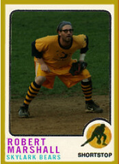
Last week’s ESPN column about DIYers mainly featured people whose projects had already appeared here on the blog. The primary exception was Robert Marshall, a self-described “OCD DIYer” who’s been peppering me with tons of fascinating material over the past few weeks. Here’s his quick bio, from an e-mail he recently sent me:
I’m a Baltimore native, an Ohio State graduate, and a Chicago resident. Now 38, I make my living as an artist, with a small studio in the Pilsen neighborhood. My bread and butter is stained and blown glass, a skill I picked up over the years, but my roots are in painting, sculpture, and alternated materials like plastic resin.
“I started drawing uniforms as a kid, which turned into obsessive black-and-white pencil drawings of players and coloring in my Strat-O-Matic cards as a pre-teen. I later designed uniforms for various intramural squads in high school, where I also made sure my football uniform looked respectable with accoutrements like spatted shoes, and I double wrapped my stirrups with a cuffed pant in baseball during the high-stirrup era because it was just downright proper. In college I hand-sculpted and -painted bobbleheads that I would sell to alumni at football games, before I was arrested for this practice. Like many others, I still obsess over uniforms, and sometimes I take a break from my workday art to envelop myself in this escapist OCD-DIY ‘art.’ “
As you’ve probably gathered from that little screed, Robert’s a bit of a character. He appears to have some seemingly irrational dislikes (capital letters, the number 8, any use of white in a home football uniform), although I’m obviously in no position to rag on someone over those sorts of eccentricities. And at one point during our correspondence, he off-handedly mentioned that he would have attended the Chicago Uni Watch party in 2007, “but I have this policy of not going to bars where they let third-trimester pregnant women bartend while they smoke cigarettes and get hammered (I do both, but am not pregnant either).” Um, right.
Anyway, Marshall is also a fairly ingenious artist, at least judging by several of the projects he’s shared with me. His work is clever, gorgeous, and clearly based on the same sort of detail-obsessive sports passion that fuels Uni Watch. He also appears to be extremely prolific — one of those people who make you realize how little you’ve accomplished.
Some people might find that depressing; personally, I find it inspiring. With that in mind, here’s a look at Marshall’s oeuvre:
• Big Ten duckpin bowling set: I love this! Marshall has a set of pins that he originally used for a game called cat bowling (“It consisted of me keeping track of all the pins that they or I knock down in the studio on this homemade Baltimore-themed score sheet”). More recently, he’s given them a Big Ten paint job, with his alma mater serving as the fierce ball that plows into the hapless pins. You can see close-ups of each pin design here — they’re brilliant, although you may notice that Marshall has taken a few liberties with some of the uni designs. He provided a lengthy explanation for that, and also gave the rationale for each pin’s facial expression, all of which is so involved that I’ve chosen to give it its own separate page. It’s totally worth checking out, so open it in a separate window now and go back to it after you finish reading the rest of this entry.
• Softball trading cards: In 2007, Marshall started designing trading cards for his local artists/musicians softball team. The best part (aside from his team’s striped socks) is that he included details like the rear-card cartoon, the trophy graphic, even a checklist!
“Everyone on the team got three cards, complete with personal fact comics, fictional stats, and I packaged everyone’s cards in wax paper with gum (fruit stripe, of course),” says Marshall. “This year’s 1959-based designs were far superior, but the disc where those are saved is on the fritz.”
• Natty Boh jersey: I’ll let Marshall tell the story of this one:
A few years back I started playing in a table hockey league here in Chicago. ”¦ When I joined the league, I decided to represent my hometown of Charm City, and introduce these Chicago natives the Land of Pleasant Living’s version of Old Style, otherwise known as National Bohemian beer, with a homemade sweater. Now, I never ever wear jerseys, but I made an exception when playing thockey in this (before you get any ideas about “Grizzly,” it refers to a bear encounter I had in Banff, Alberta, some years ago — a story for another time).
The jersey is an old striped Cleveland Barons sweater dyed with a bit of yellow Rit, giving it more of a “vintage” cream look. Twill numbers were cut and sewn. And what sweater is complete without a stupid, out of place sleeve patch? As with all Balto-based teams, I went with the flag, which I covered with a crab because nothing goes better with an ice-cold Natty Boh then Maryland blue crabs.
• And speaking of table hockey”¦: Marshall’s extended family is big on table hockey and he’s created all sorts of projects to facilitate their activities, including custom-designed teams, Baltimore-based board advertisements (total genius, right?), and team T-shirts for family members and significant others.
And there’s more:
For my brother’s kids, I’ve hand-painted players representing 10 international teams — everything from USA 1980 to Canada 1972, and so on — so they could interchange the teams, have tournaments, stay out of their parents’ hair, etc. Other teams represented include the Russians (I used the jersey from ’72 and the breezers from ’80), the Swedes, the Fins (I wouldn’t paint this for a pile of cash, so instead I used their lion and their actual flag color), the Czechs, the Poles, and the Deutsch.
And then there’s my favorite project: the game I made for myself featuring the North Stars and Capitals. Now, for this game, the players are not real, in that there is no Dino or Dino, but I used some sculpture skills to manufacture mock players with 3-D hair, beards, etc. I hope you can see the detail okay.
• Jackson Pawlicks cap: “An old neighbor used to say I was a lot like Jackson Pollock, locking myself away for extended periods of time (drinking too much) and working working working on my art,” says Marshall. “I don’t know that I agree with her, but that very night, I crafted this hat. It is cut felt sewn to an old KC Monarchs lid. I have a lot of cats, so it’s a mythological team, the Jackson Pawlicks. Har.”
• Jackalopes jersey: Marshall’s been working on this jersey, which I believe he plans to wear on Opening Day (or, as he calls it, “the holiest of holy days”). At some point in the process he was undecided on whether to go with navy numbers or red (for now he’s opted for navy) and whether his sleeve patch should include a crown (I think he’s gone with “yes”). More photos to come, I’m assuming, when the jersey is finished.
• Natty Boh Cornhole set: Marshall is also a cornhole devotee, which has given him excuse for him to create another tribute to his favorite beer. He also notes that this cornhole design bears at least a superficial resemblance to a certain baseball uni component.
Ladies and gentlemen, that brings today’s show to its conclusion. I hope you found it as edifying as I did. And I don’t mind saying that if this remarkable procession of creativity hasn’t filled you with wonder and inspiration, I’m afraid there’s no hope for you.
That thing that happens every year around this time: Yesterday was National Act Like a Moron Day, so the Red Sox wore green jerseys and caps. So did the Phillies. All the other teams resorting to this now-rote stunt just took the lazy route and wore green caps, including the Braves, Tigers, Cubs, and Giants. As usual, though, the Mets really outdid themselves, packing their cap with five colors. I tried to ask Jeff Wilpon about this but his secretary said he was busy with a clerical matter.
In addition, the Bulls wore green (forcing the Celtics to wear white on the road), this guy wore green-trimmed sneakers, the Coyotes wore green warm-up sweaters (pre-autographed for subsequent auction), and FSN Pittsburgh’s Dan Potash wore an old Pittsburgh Shamrocks sweater on the air (thanks, Kek). Can I have my favorite color back now?
And now another note from Vince: As some of you have discovered, we maxed out the number of entries for our NCAA Tournament contest group, so I created another group, UniWatch2 (ID# 171936, password: stirrups), which you can join by heading to this link. If you’ve already joined the first group, please don’t enter again. Honor system here, people. And since I can see everyone’s e-mail addresses as the administrator, if I catch any double entries, you’ll be disqualified.
I think you can join anytime up to tip-off tomorrow, but sooner is obviously better, so sign up now. (For details on the prizes, look here.)
Uni Watch News Ticker: Getting back to DIY for a sec, gumball collector Bill Jones (who, as an aside, is trying to get Guinness World Record certification for his helmet collection) created a nice birthday present for his son by taking an old Starting Lineup hockey figurine and repainting it to match his son’s hockey uniform — voila! Here’s the rear view. ”¦ And Terence Kearns made himself a nice New York Giants sweatshirt. “I bought a black 50/50 hoody on eBay for $16, iron-on transfer paper (25 sheets for $25), and awesome felt lettering ($15) and put it all together for $33 total!” he says. “I found the cool 1951 Giants logo for the right sleeve and the 1932 cap insignia for the left sleeve on Chris Creamer’s site, ironed them on, lined up the felt letters and pressed them on as well (since they had fabric adhesive backing), and presto — a throwback hoody my Dad would’ve been proud to wear!” ”¦ Interesting old basketball uni design shown here (with thanks to Jason Adkins). ”¦ Does this mean Fred Wilpon can sign some more free agents? Oh wait, there aren’t any decent free agents left. Thanks a lot, IRS! ”¦ Can anyone remember why the 1992 Cowboys wore two memorial decals? (As submitted by Steve H.) ”¦ Ryan Connelly found some cool old stuff, including an early helmet lamp and Chief Wahoo’s long-lost cousin. ”¦ Alex Edler of the Canucks caught his pant leg on the on the gate latch while coming out of the penalty box on Sunday night and ended up having the stripe ripped clean off his left pant leg. He played like that for the reset of the game (major props to Canucks exec Jonathan Wall). ”¦ Great googly-moogly! That ugly-ass uniform belongs to the Mahoning Valley Phantoms of the NAHL. ”¦ Tons of really beautiful old modernist posters here (thanks, Kirsten). ”¦ Vertically striped sock alert! That’s Taylor County (Georgia), circa 1967 (big thanks to Becky Taylor). ”¦ Also from Becky: This shot shows a Marietta High School player with a facemask and also shows Beach High with SNOB (school name on back). ”¦ Always weird to see Joe D. dressed like this (with thanks to Paul Wiederecht). ”¦ New identity set for the West Virginia Power here and here (with thanks to Joshua Exline). ”¦ The new Wisconsin state slogan is a total fucking embarrassment a bit controversial (with thanks to Brinke Guthrie). ”¦ A few days ago I asked what the “Pops” patch was for. The answer is here (good detective work by Doug Kalemba). ”¦ Under Armour is planning to get ’em while they’re young (thanks, Phil). ”¦ I like Curtis Granderson, but I may have to revise that assessment if he keeps doing stupid stuff like wearing “USA” eye black (with thanks to Bernie Langer).
Nice story about the “throwback hoodie”. I’m not sure I would have used the left sleeve logo, which the Giants used forever until 1949.
But – why can’t somebody reproduce the cap logo properly? The Mets’ logo is quite different, and not well proportioned, but that’s what’s on his head.
The kind of stuff being offered by supposedly reliable reproducers of authentic memorabilia is virtually all poorly done, which is surprising considering all the available memories and photographs.
major props to mr. marshall! incredible stuff
those topps cards are incredible (reminds me of the days of my youth when i attempted to make something similar for my LL team…with white out, a polaroid and some bic pens…needless to say the project was a huge FAIL)
/love it!
link
being a Hoosier, I found the mayflower ad to be funny. A subtle jab at the midnight move…lol
Information about NyI’s 3rd uni.
link
[quote comment=”318547″]http://farm4.static.flickr.com/3355/3198331384_f8b19240af_o.gif
being a Hoosier, I found the mayflower ad to be funny. A subtle jab at the midnight move…lol[/quote]
You know, I hadn’t picked up on that — nice catch. And just another example of Marshall’s greatness.
wow robert, great work!!! i had to go through the post TWICE and look at the pics 4-5 times! what great ideas?!?! you made a baseball card for beer (one of my favorites, by the way)! LOVE the maryland theme everywhere! blue crabs! you made a beer themed jersey NOT look like a beer company hand-out, awesome! ugh! just really great work all around!
can’t wait to see the jackalopes jersey!
Paul:
Going over a bit much with the DIY stuff, eh?
Move along….
“what great ideas?!?! ”
oops, i meant that to read like: “wow, what great ideas you have” as a compliment!
[quote comment=”318551″]Paul:
Going over a bit much with the DIY stuff, eh?
Move along….[/quote]
Not your cuppa? Boo-fucking-hoo.
Wisconsin had a contest years back for a new state motto and my favorite entry was, “Eat Cheese or Die.”
LaBron, just for today, you’re a douche.
It’s one thing for others to call you “King James” … it’s another to wear a rubber band proclaiming yourself as King James.
Don’t care how good you are. Seems like a great rep for the league. But that’s a douchebag move …
The North Stars are playing the Caps with both Dallas Stars and Minnesota Wild logos on the boards. Time to update the rink with some of those Baltimore-style ads- those are sweet!
“this homemade Baltimore-themed score sheet”
I can see that hanging on the walls at Nacho Mama’s already!!!!
FYI, Under Armour is already the rage among the 7-10 year-old set. My nephew and all his friends have been wearing that stuff in school pictures since first grade.
Take that Nike.
Mr. Marshall you are, indeed, a modern Renaissance Man. There wasn’t a thing I didn’t like about everything posted (save for those damn cats, but I can’t hold that against you).
Paul, it seems the UniWatch B-ball bracket group is full. Just as FYI for anyone else who wants to wait until the last minute to submit a bracket.
Re: Wisconsin state slogan, they obviously decided to save the money they would have paid a professional branding agency to come up with ideas, so they either bit off someone else’s or just mailed a blah idea in. I would have said something like “Wisconsin: Tasteful” alluding to beers, brats and cheese curds, among the other Midwestern culinary delights unique to the Badger State…
And I was away yesterday so I didn’t get to bring this up. The Atlanta Thrashers third jerseys…well, they’re worse than the Gorton’s Fisherman. link The number on the front, the busy shoulders, the four-colour side panel…along with the 10th Season logo that Paul lampooned the other day I think the Atlanta franchise needs to be shut down for a redesign.
The custom team unis for table top hockey look great. The first one has the never been actually seen tangerine colour uni for hockey. I personally think it’s the colour the Nashville Predators should have for their 3rd jersey next year. I think if they set it off by going old school for the design, it would look great – i.e. maybe just have Nashville written diagonally across the jersey – (i.e. like the NY Rangers)
The red silhouette man in the Wisconsin logo, looks like he’s just jumped from a building, which might be appropriate in these economic times
[quote comment=”318559″]Paul, it seems the UniWatch B-ball bracket group is full. Just as FYI for anyone else who wants to wait until the last minute to submit a bracket.[/quote]
Let me check with Vince, who’s running that contest.
Those cards are awesome! (But how is it that seemingly everybody has a batting average in the .700s?)
I also loved making cards when I was a kid, and we had a serious sandlot league going which was a lot of fun. We made one set of cards where we placed pictures of our heads over ’33 Goudey cards (I had a reprint set) and then put printed stats on the back. I think I was Carl Hubbell; it was great!
See this is what i dont get. When there is an obvious knock off or DIY thing it is one thing to rip someone over it. IE, a HOME yankees jersey with a NOB. But when someone makes a homemade sweatshirt like our NY Giants man here and someone knocks it b/c a logo is a few years off, WHO F**KING cares…his attempt is awesome and I KNOW I couldnt have done it any better, and wish I could…so why are you guys always so quick to criticize???
You’re right – the slogan is a disaster. But there’s something I really like about the typeface.
[quote comment=”318565″]See this is what i dont get. When there is an obvious knock off or DIY thing it is one thing to rip someone over it. IE, a HOME yankees jersey with a NOB. But when someone makes a homemade sweatshirt like our NY Giants man here and someone knocks it b/c a logo is a few years off, WHO F**KING cares…his attempt is awesome and I KNOW I couldnt have done it any better, and wish I could…so why are you guys always so quick to criticize???[/quote]
Constructive criticism is part of how we show our love. If we didn’t respect the hell out of him for doing it, we wouldn’t talk about it at all.
Besides, I think most of the criticism was really about inaccuracies in official Cooperstown Collection merchandise and not his awesome hoodie.
[quote comment=”318549″][quote comment=”318547″]http://farm4.static.flickr.com/3355/3198331384_f8b19240af_o.gif
being a Hoosier, I found the mayflower ad to be funny. A subtle jab at the midnight move…lol[/quote]
You know, I hadn’t picked up on that — nice catch. And just another example of Marshall’s greatness.[/quote]
As a Marylander myself, I love these ads…it’s everything that’s so great about the State.
I love how all the Big Ten pins are “protecting themselves” against the Ohio State ball except for the Michigan head pin. LOL
WOW.
Marshall!
i’m blown away and might be a tad in love…
I just want to say that Natty Boh is the best beer of all time. Pity that they don’t brew in Baltimore any longer. It’s still our beer though. Wish they sold 30 cases, although I guess they want you to buy the bottles. There is not a better beer to have when floating on the Bay.
The softball trading cards are the best!
link
The 1973 Topps design is my all-time favorite, and the softball uniforms remind me of several 1973 Padres cards.
link
Looks like the NCAA bracket group is full.
The table hockey players are amazing! I’ve really been impressed with everyone’s DIY projects but I think Marshall takes the cake!
[quote comment=”318573″]Looks like the NCAA bracket group is full.[/quote]
We’re setting up a new group — hang in there.
Mr. Marshall,
You have a best-seller (at least in the OSU bookstore and alumni shop) on your hands! Get to work mass producing it at once. That will land you some coin to finance more Topps cards for your softball team.
Well done!
The Skylark’s softball team plays 12″? I’m not sure if I’ll ever be able to go back there. On the other hand, their Bloody Mary onion rings are to die for. What’s a Chicago native who plays real (i.e. 16″) softball to do?
OK, we’ve set up a new group for the NCAA contest. If you haven’t already entered and want to do so, go back to the NCAA logo in the middle of today’s entry — you’ll find new info there.
[quote comment=”318572″]The softball trading cards are the best!
link
The 1973 Topps design is my all-time favorite, and the softball uniforms remind me of several 1973 Padres cards.
link
what is the logo on robert’s baseball card checklist???
[quote comment=”318577″]The Skylark’s softball team plays 12″? I’m not sure if I’ll ever be able to go back there. On the other hand, their Bloody Mary onion rings are to die for. What’s a Chicago native who plays real (i.e. 16″) softball to do?[/quote]
I would imagine it’s 12″ due to it being a coed league.
I stopped reading when we got to the DIY trading cards – those are incredibly awesome. Any chance we can get detailed instructions?
[quote comment=”318555″]LaBron, just for today, you’re a douche.
It’s one thing for others to call you “King James” … it’s another to wear a rubber band proclaiming yourself as King James.
Don’t care how good you are. Seems like a great rep for the league. But that’s a douchebag move …[/quote]
I’m guessing you don’t know that he has a “King James” tattoo?
[quote comment=”318548″]Information about NyI’s 3rd uni.
link
I love the ad on the right side of the page for a John Tavares Islanders jersey. The Isles don’t even have the #1 pick yet!!
I would imagine it’s 12″ due to it being a coed league.
I play in two 16″ co-ed leagues (they let the women play with gloves), so that’s not a good excuse. Anyway, I’m just giving him crap since he’s an Ohio transplant (my Michigan-born wife must be rubbing off on me) and taking this as an opportunity to pimp for the greatest game nobody outside of Chicago knows about. Truthfully, I’d lower myself to playing 12″ to get my mug on one of those trading cards! And if it means hanging out at the Skylark afterward, all the better.
Anyone in Pittsburgh able to get us a report/screenshots of this program on FSN Pittsburgh tonight:
FSN’s Dan Potash examines the history of hockey in Pittsburgh, from the Schenley Casino to Duquesne Gardens to the Stanley Cups and beyond, in “Pittsburgh is Hockeytahn,” airing for the first time Wednesday at 8:00 pm.
The one-hour special will take a look at the roots of hockey here, and touch on some of the great players and unique teams who called Pittsburgh home long before the Penguins came into existence. It will then chronicle the birth of the Pens, the Mario Lemieux years, the Stanley Cups, the new era of Crosby and Malkin and the amazing progress of youth hockey development in Western Pennsylvania.
From one Ohio State alumni to another, I really enjoyed the Big Ten bowling set. Especially the facial expression on the head pin – scUM.
Go Bucks!!
[quote comment=”318585″]Anyone in Pittsburgh able to get us a report/screenshots of this program on FSN Pittsburgh tonight:
FSN’s Dan Potash examines the history of hockey in Pittsburgh, from the Schenley Casino to Duquesne Gardens to the Stanley Cups and beyond, in “Pittsburgh is Hockeytahn,” airing for the first time Wednesday at 8:00 pm.
The one-hour special will take a look at the roots of hockey here, and touch on some of the great players and unique teams who called Pittsburgh home long before the Penguins came into existence. It will then chronicle the birth of the Pens, the Mario Lemieux years, the Stanley Cups, the new era of Crosby and Malkin and the amazing progress of youth hockey development in Western Pennsylvania.[/quote]
Doug Keklak has already told me that he plans to DVR it and get screen grabs.
Lebrons kicks were actually the SVSM edition of the Nike Zoom Lebron VI.
Home:
link
Road:
link
SVSM=Saint Vincent Saint Mary’s of Akron, Ohio…his alma mater, whose mascot happens to be a laeprechaun.
With each annual model, there is a special SVSM edition of each.
[quote comment=”318584″]I would imagine it’s 12″ due to it being a coed league.
I play in two 16″ co-ed leagues (they let the women play with gloves), so that’s not a good excuse. Anyway, I’m just giving him crap since he’s an Ohio transplant (my Michigan-born wife must be rubbing off on me) and taking this as an opportunity to pimp for the greatest game nobody outside of Chicago knows about. Truthfully, I’d lower myself to playing 12″ to get my mug on one of those trading cards! And if it means hanging out at the Skylark afterward, all the better.[/quote]
Here in Minnesota, co-ed teams use a different ball depending on who’s batting, i.e., 12″ for men, 11″ for women. The third base coach keeps the ball not in use. Everyone uses gloves, and many of the women hit the crap out of the 11″. The 12″ usually is ball low compression (40 core, maybe) to minimize the times guys drill someone. Anyway, it keeps the game lively.
How’s it done elsewhere?
Love your stuff, Robert. Inventive, whimsical. Just plain great. This whole uni business, to me anyway, should be fun. Last thing we need is to turn into a bunch of trainspotters.
—Ricko
LOVING all the Natty Boh love from Chitown! My fantasy football team in one league, this year, was the National Bohemians…and the logo was Natty Boh (who was seperated at birth from the Pringles guy, and a local, now defunct pizza place in the Baltimore area called Pappys).
Digging that NattyBoh Hockey jersey!
In addition, the Bulls wore green (forcing the Celtics to wear white on the road)
Now that’s just wrong! If any team should be able to wear the greenest of the green on 3/17, it should be the Celtics.
That North Stars/Capitals hockey game might be the coolest thing I’ve ever seen. I’m blown away. Just … the detail! I love it. Keep the DIY train rolling, folks.
Robert Marshall is the man.
I, too, loved every single one of his projects. And he has a great uniform sensibility as well – I am totally with him on the “unnecessary white” thing (especially on road grays in baseball).
Keep up the excellent work.
RE: … Great googly-moogly! That ugly-ass uniform belongs to the Mahoning Valley Phantoms of the NAHL. …
Not sure what the heck they are wearing in that photo, but their regular jerseys might appeal to certain comic book geeks among us:
link
Apparently the team is owned/sponsored/co-opted by Phantom Fireworks – pretty cool to have blowing things up and hockey tied together, IMHO
[quote comment=”318593″]Robert Marshall is the man.
I, too, loved every single one of his projects. And he has a great uniform sensibility as well – I am totally with him on the “unnecessary white” thing (especially on road grays in baseball).
Keep up the excellent work.[/quote]
Amen!
“the Red Sox wore green jerseys”
They wore white jerseys. They’ve worn the tacky green ones since ’90, but this year they broke out whites with green lettering/numerals. As dumb stuff goes, it was a welcome change, for this Sox fan anyway. Weird how they use the special caps and shirts, but the pants and socks (and other gear, undershirts, etc.) stay normal. The one exception to gear is Varitek’s catcher’s gear. So he’s got green on the shirt, a green hat (but a regular helmet), pants with red piping, pulled up bright red socks, and a green chest protector and shin guards. Merry effin’ Xmas.
…and speaking of new uniforms: link
Pic at home page: link
A less-than-stellar “homage” to the current Atlanta Falcons atrocities – about par for the course for Arena League
sorry, just getting to the computer, and i wasn’t expecting this, i am blown away. thank you for the nice comments, my ocd-diy is not something i am always proud of. to answer a couple of comments…
1)the shot of the mayflower, is the shot of the actual mayflower that move my colts.
2)batting averages and stats on cards are INVERSELY proportional to skill. and i would be happy to show you how it is done.
3)the logo on the checklist is the same as the one i screen printed to the jersey, it is a skylark(sponsor bar) doing a header into second base.
The West Virginia Power totally has co-mingled a variety of stuff for that secondary logo. The smiling baseball with the derby hat was the old logo for the Charleston Charlies. Now, however, the smile is a smirk, the stogie is gone (can’t promote smoking!), and the derby hat has a red bandanna on it (presumably because it’s now a Pittsburgh Pirates’ affiliate?).
Oh, and having TWO vertically-striped sock references in one blog entry — Boffo!!!
I’m going to quote myself here:
[quote comment=”318486″]With all the Milwaukee Braves talk going around lately, I want to add something into the mix.
On May 14, 2004 I went to a Brewers game at Miller Park agasint the Atlanta Braves. It was a special “Turn Back the Clock Night” with the theme being “Braves vs. Braves.” The Brewers wore the home white Milwaukee Braves jerseys while Atlanta wore their standard gray road uniforms. So both teams were wearing Braves jerseys. Old Milwaukee Braves legends like Hank Aaron were in attendance and the whole stadium pretended that the Milwaukee Braves were the home team. The PA announcer introduced the team “and now your Milwaukee Braves” and for the first few innings of the game the scoreboard read “Braves” for both teams. The announcer would say “Now batting for the Braves, Bill Hall.”
At the time, most Milwaukee fans were sick of the Brewers after over a decade of embarrassing baseball and losing seasons. Not to mention 22 years without a playoff birth. 2002 had been the worst season in franchise history and Miller Park had done little to make the Brewers an immediate contender (as promised). So we as fans were more than happy to accept the illusion that the Braves were our team again..a team with a successful tradition. It was a lot of fun. Thankfully the Brewers have put together a good, fun team in recent years, and fan pride in the Brew Crew has been revivied. But for one night during a dark era, this game was a welcome distraction.
Does anyone have any pictures from this game? I believe they may have done this promotion another time as well. If you have more info or photos of the game, I would be very interested. Let me know if you have any questions/comments.[/quote]
I’m pretty sure the Brewers have done this on more than that one occasion. Looking for photos.
Huge Buckeye fan here so I loved the Big Ten bowling set and Buckeye ball.
great work Robert on everything.
#54 by Hurnf
The West Virginia Power totally has co-mingled a variety of stuff for that secondary logo. The smiling baseball with the derby hat was the old logo for the Charleston Charlies. Now, however, the smile is a smirk, the stogie is gone (can’t promote smoking!), and the derby hat has a red band
that was the goal. they’ve sold Charlies stuff at the new ballpark ever since it opened and it’s been a huge success. so, when the new affiliation with the Pirates came into play this year the team wanted pay homage to the tradition of Charleston baseball (i.e. the Charlies) and throw a nod towards the parent club (who were, back in the day, the parent club of the Charlies. Dave Parker played here. Tekulve too I think..but don’t quote me on that. among others)
in fact (maybe i’ll remember to take a picture of it this year and send it in once the season starts) the ushers at “The App” have worn bowler hats/white shirt/black pants/red suspenders since Day One at the new park. Charleston is quite proud of it’s baseball tradition.
I personally love the new alt Charlie Pirate logo, and can’t wait to get my hands on a fitted 59/50. through my affiliation with the team/friendships with people there i’ve been telling them they need to do a Charlies throwback uni night (complete with actual stirrups!) and hold out hope that one of these days they’ll actually do it.
“..the wolverine is the only Big Ten pin not smart enough to cover up his junk to protect himself from the Buckeye crotch shot.”
Robert Marshall is a friggin genius.
[quote comment=”318594″]RE: … Great googly-moogly! That ugly-ass uniform belongs to the Mahoning Valley Phantoms of the NAHL. …
Not sure what the heck they are wearing in that photo, but their regular jerseys might appeal to certain comic book geeks among us:
link
Apparently the team is owned/sponsored/co-opted by Phantom Fireworks – pretty cool to have blowing things up and hockey tied together, IMHO[/quote]
Actually, when I saw that jersey, I thought more of this link
Glad to see that I’m not the only one who doesn’t like Wisconsin’s “Motion W”.
some more natty boh love: link
[quote comment=”318606″]Glad to see that I’m not the only one who doesn’t like Wisconsin’s “Motion W”.[/quote]
You’re definitely not. It’s a crap logo that replaced a perfectly good one.
The best part of the Red Sox game yesterday?
link
“Dressed as a leprechaun, Tedi Valentine of Cape Coral, Fla. talked to fans as Red Sox designated hitter David Ortiz taped No. 15, Dustin Pedroia’s number, on his back. The Red Sox wore green uniforms Tuesday in honor of St. Patrick’s Day.”
[quote comment=”318608″][quote comment=”318606″]Glad to see that I’m not the only one who doesn’t like Wisconsin’s “Motion W”.[/quote]
You’re definitely not. It’s a crap logo that replaced a perfectly good one.[/quote]
I’d like to have seen the original design, with the tail that Alvarez jettisoned.
Not that I think it would have improved the design, but just out of curiosity.
as if you didn’t get your fill of my bs already…
i have to say, this is all a bit overwhelming, and i show my (non sport)art work at our second friday art walk every month in my pilsen studio, or in shows and whatnot, and i never feel quite this giddy. maybe it is because i tend to hide this side of my work, it is something i have only kept for myself until now, a true labour of love. anyway, thanks get itsâ„¢
a few quick things…
1)thank you to all the positive feedback, especially master ricko, whose willingness to share his own ocd, compelled me to share mine. and yes, i try to be, as you said, “whimsical”, that is really the point of it all, thank you for noticing that.
2)anybody who wants to know how anything is done, i would be happy to share, my email is link. but be forewarned, if time is averaged out, the cards are an easy hour a piece, stars/caps players are 2 hours per, and the bowling pins and jackalopes, you don’t even want to know.
3)vintage boards needed on caps/stars game. i know, i know, all projects are a work in progress.
4)adverts and score sheet that are balto specific. again, if you knew the time you would be frightened for my sanity. but most are based in truth, others on family, and images were painstakingly researched, i appreciate the feedback from those of you who appreciate the beauty of charm city, i miss her.
5)the tangerine comment. ha, yeah, it might be a bit much, but i was trying to give it a vintage feel, a washed out orange, and make it a nice complimentary colour to the blue team. picking colour for projects is uber important(remember your colour theory class!), if you get that wrong, the whole thing is blown. you might not subjectively like orange, but i think objectively the shade fits the game. next time i visit pops, i will snap the shots, the ice is the best part.
6)yes, it is a 12 inch league, but the skylark no longer sponsor’s the team, they are too cool for that. we are currently looking for new sponsorship. but, we do have 4 roster spots open for guys and gals(2 each). so, clubmedsux, or any other chicago southside uniwatcher, let’s talk. or can someone say chicago based uniwatch team? stirrups like the ones on the UW logo would be a must.
7)i have the utmost respect for the university of michigan, there is even a former early 80’s scUM fullback on the softball team. i look forward to the day i fear them again, i truly do, it makes the big ten better, but i wouldn’t be a tosu graduate if i didn’t make fun of the scUM. as for all the comments, i had no idea people would like them so much.
8)critics. there were some apt exchanges today, and while i feel the giants comment was about the vintage manufacturer, and not the diyer, it does bring up a point. i have thick skin, i deal with critics of my work all the time, so if you ripped me, i wouldn’t care so much, but for those of you who rip diy’ers, and i am not talking about teasing on the drunkenmiller, or how i could use some updated boards. but for anyone who thought or typed “that sucks”, try doing it yourself, if you knew the time, the learning from mistakes, and all that goes into a project, you just might zip it. these projects that i have seen on this site are extremely ambitious at times. anybody who has ever had the guts to show what they made on this site, you are my hero. for instance, my favourite diyer was that cop from st louis who decided to paint logos on what i believe was canvas board. was it perfect, hell no, but that guy has it figured out, tough day on the beat, come home and diy relax, and have fun, mix in one or 12 cocktails, rock some modern lovers, and turn around and doit all over again.
i might also add, there was someone who today said, enough of the diy. did something happen to your mouse that you couldn’t just scroll passed it and go to the ticker? the same thing happened a couple weekends ago to our johnstown(my dad’s home town) boy when they said it was too long, so to both critics, if you don’t like the content, try scrolling past, or start your own site, we will see how easy it is to keep us all entertained beyond just the minutia of things, which just gets old. we all appreciate different things about this glorious site, i think we should thank paul/phil for their efforts in keeping it fresh. as for for me, i say more proctor! more ricko! shit, more apostrophe even!
9) a cross post! that is all cool jasper’s rink. but any of you chicagoans who want to play the caps/stars game, the next second friday art walk is april 10th from 6 to 10, come to pilsen, i will be open, and am on the 5th floor of the 1932 s. halsted building. i don’t care that people will be walking in to look at art, let’s play some thockey.
great article
link
[quote comment=”318608″][quote comment=”318606″]Glad to see that I’m not the only one who doesn’t like Wisconsin’s “Motion W”.[/quote]
You’re definitely not. It’s a crap logo that replaced a perfectly good one.[/quote]
100% agreement with both statements; and I’ll offer the caveat that I’m anything but a Wisconsin fan so all are free to asign as much credence to my opinion as they see fit.
And the same thing goes for Purdue’s “Motion P” (hold the jokes please).
Here is a link to some info on the florida panthers third jersey
link
How about these Wisconsin W’s
link
Pictures of the gold trimmed jerseys the Phillies will wear on opening night.
Don’t know if you people have seen them yet.
link
[quote comment=”318616″]Pictures of the gold trimmed jerseys the Phillies will wear on opening night.
Don’t know if you people have seen them yet.
link
I kind of love the gold idea for the Series winner and would not be opposed to the idea of them wearing it all season.
[quote comment=\”318617\”][quote comment=\”318616\”]Pictures of the gold trimmed jerseys the Phillies will wear on opening night.
Don\’t know if you people have seen them yet.
link
I kind of love the gold idea for the Series winner and would not be opposed to the idea of them wearing it all season.[/quote]
I agree…is it gimmicky and reeking of marketing? Sure.
But, think of it this way;
Boxers and Wrestlers and MMA fighters get to carry a Gold Belt that signifies their standing as a World Champion. Why shouldn\’t baseball (and MAYBE the NBA…dunno though. Seriously doubt it\’d work in the NFL) do something to make their reigning world series champ stand out a little for the course of an entire season?
[quote comment=”318613″][quote comment=”318608″][quote comment=”318606″]Glad to see that I’m not the only one who doesn’t like Wisconsin’s “Motion W”.[/quote]
You’re definitely not. It’s a crap logo that replaced a perfectly good one.[/quote]
100% agreement with both statements; and I’ll offer the caveat that I’m anything but a Wisconsin fan so all are free to asign as much credence to my opinion as they see fit.
And the same thing goes for Purdue’s “Motion P” (hold the jokes please).[/quote]
I could not agree more. I’m an ’02 grad of Purdue and despise the “Action P”; as athletics insists on calling it. I say go back to the 1969 throwbacks they wore earlier this year (but use them on the road) and something from the Bob Griese era link
Here’s a great view of Wisconsin’s pre-motion (and far superior) W…
link
now THAT is perfect! that is the w they need to replace the w, it is simple.
A couple of other Wisconsin related observations while I was looking for the old block W pics…
I didn’t remember their oval W from the 70’s, probably because I was too young…
link
I love the tiny Buckys on this tie…
link
[quote comment=”318619] I could not agree more. I’m an ’02 grad of Purdue and despise the “Action P”; as athletics insists on calling it. I say go back to the 1969 throwbacks they wore earlier this year (but use them on the road) and something from the Bob Griese era link[/quote]
Great minds think alike. :-) Exactly my call, dump the numbers on helmets, use the P that was there for say Jim Everette and STICK WITH IT!
As an Illini, I hate the idea that we’re constantly changing uniforms. I’ve always felt that tradition is important in college football (uni’s, stadiums, etc.) and “modernity” rules in hoops.
It galls me to say this, but those two $%* schools that dominate our Big Ten football history have the best uni’s in the conference-and IMHO the reason why is because you can look at pictures of people like Archie Griffin and Rob Lyttle and its the SAME %&* UNIFORM AS TODAY.
[quote comment=”318620″]Here’s a great view of Wisconsin’s pre-motion (and far superior) W…
link
[quote comment=”318622″]A couple of other Wisconsin related observations while I was looking for the old block W pics…
I didn’t remember their oval W from the 70’s, probably because I was too young…
link
I love the tiny Buckys on this tie…
link
Thanks-I was searching Google with keywords like “Al Toon”, “Wisconsin” and “helmet” and got nothing. :-)
A number of years back I saw a game at Camp Randall and some law school tradition was upheld: the grads were attempting to throw canes so they would go thru the uprights and then catch them on the other side (okay, you had to be there). Do they still do that?
[quote comment=”318617]I kind of love the gold idea for the Series winner and would not be opposed to the idea of them wearing it all season.[/quote]
Has any other Series winner even displayed a patch (much less the gold trim) for a single game?
I have to disagree-IMHO, not a good idea even for opening day.
[quote comment=”318625″][quote comment=”318617]I kind of love the gold idea for the Series winner and would not be opposed to the idea of them wearing it all season.[/quote]
Has any other Series winner even displayed a patch (much less the gold trim) for a single game?
I have to disagree-IMHO, not a good idea even for opening day.[/quote]
link in 2005.
The Cardinals did after they won.
link
link
Cubs retire 31
More Wisconsin W’s
link
[quote comment=”318604″]”..the wolverine is the only Big Ten pin not smart enough to cover up his junk to protect himself from the Buckeye crotch shot.”[/quote]
Robert Marshall IS a genius — his stuff is great — but not for the quite above.
As a Michigan man, I’ve never met a Buckeye yet who could hit the head pin in a week’s worth of bowling… :)
[quote comment=”318630″][quote comment=”318604″]”..the wolverine is the only Big Ten pin not smart enough to cover up his junk to protect himself from the Buckeye crotch shot.”[/quote]
Robert Marshall IS a genius — his stuff is great — but not for the quote above.
As a Michigan man, I’ve never met a Buckeye yet who could hit the head pin in a week’s worth of bowling… :)[/quote]
[quote comment=”318625″][quote comment=”318617]I kind of love the gold idea for the Series winner and would not be opposed to the idea of them wearing it all season.[/quote]
Has any other Series winner even displayed a patch (much less the gold trim) for a single game?
I have to disagree-IMHO, not a good idea even for opening day.[/quote]
the 1906 giants, 1921 indians and 1927 cardinals all wore “world champions” (or “worlds champions”) in huge block letters for an entire season…in fact, that’s going to be one of my weekend posts…if i can find enough pics and have a spare 2 minutes one of these days
[quote comment=”318629″]More Wisconsin W’s
link
I love those.
I’d be in favor of a return to the front/back block “W” – it’s distinctive and creative, while hearkening back to a grand period in Wisconsin’s football history.
The Motion W is already tired. Time to put it out to pasture.
[quote comment=”318624″][quote comment=”318620″]Here’s a great view of Wisconsin’s pre-motion (and far superior) W…
link
[quote comment=”318622″]A couple of other Wisconsin related observations while I was looking for the old block W pics…
I didn’t remember their oval W from the 70’s, probably because I was too young…
link
I love the tiny Buckys on this tie…
link
Thanks-I was searching Google with keywords like “Al Toon”, “Wisconsin” and “helmet” and got nothing. :-)
A number of years back I saw a game at Camp Randall and some law school tradition was upheld: the grads were attempting to throw canes so they would go thru the uprights and then catch them on the other side (okay, you had to be there). Do they still do that?[/quote]
Pretty sure they still do it – my brother did it when he graduated from the law school, about 5 years ago.
Am I one of the few who liked the Bucky Badger on the red helmet?
[quote comment=”318634″][quote comment=”318624″][quote comment=”318620″]Here’s a great view of Wisconsin’s pre-motion (and far superior) W…
link
[quote comment=”318622″]A couple of other Wisconsin related observations while I was looking for the old block W pics…
I didn’t remember their oval W from the 70’s, probably because I was too young…
link
I love the tiny Buckys on this tie…
link
Thanks-I was searching Google with keywords like “Al Toon”, “Wisconsin” and “helmet” and got nothing. :-)
A number of years back I saw a game at Camp Randall and some law school tradition was upheld: the grads were attempting to throw canes so they would go thru the uprights and then catch them on the other side (okay, you had to be there). Do they still do that?[/quote]
Pretty sure they still do it – my brother did it when he graduated from the law school, about 5 years ago.[/quote]
They sure do! My best friend is graduating this Spring from UW-Madison, and he did the cane tossing this past Fall. They do this at the Homecoming game. From Wiki:
“Another tradition of the law school is homecoming cane toss, which dates from the 1930s. Before the University’s homecoming football game, third-year law students run from the north end of the football field at Camp Randall Stadium to the south end wearing bowler hats and carrying canes. When the students reach the goalpost on the south end of the field, they attempt to throw their canes over the goalpost. Legend has it that if the student successfully throws the cane over the goalpost and catches it, he will win his first case; if he fails to catch it, the opposite will hold true.”
Also… here is that great summary from Helmet Hut, when they did the throwback game for Wisconsin a few years back. LOTS of great Sconnie helmets on display, and a overall view of them at the bottom of the page.
link
Also… who is with me that Bucky should go to this full time?
link
I mean, look how sweet it was back in the day?
link
And here is the picture of all Wisconsin’s helmets as a solo image:
link
if they stopped using the motion w, could they still continue suing the shit out of every high school that uses it?
Wow, all the Baltimore stuff that Robert includes in his work really makes me homesick. And the trading cards made me laugh. Nice job!
Robert Marshall: Holy shit!
Amazing.
Continued inspiration to you.
Damn.
[quote comment=”318603″]
that was the goal. they’ve sold Charlies stuff at the new ballpark ever since it opened and it’s been a huge success. so, when the new affiliation with the Pirates came into play this year the team wanted pay homage to the tradition of Charleston baseball (i.e. the Charlies) and throw a nod towards the parent club (who were, back in the day, the parent club of the Charlies. Dave Parker played here. Tekulve too I think..but don’t quote me on that. among others)
[/quote]
You’re right – I remember a lot of Charlies merchandise at the new stadium, which surprised me considering there hadn’t been any sold at Watt Powell when I visited there.
Why doesn’t the team drop the Power name and return to the far more interesting and visually pleasing Charlies logo and nickname?
Marshall rocks. You need your own TV show, dude. Purely awsome stuff. Makes me want to quit my day job and get to all the DIY’s I’ve had in my head for 30 years. Don’t think the fam damily will let that happen any time soon…..
Oh, and having TWO vertically-striped sock references in one blog entry — Boffo!!!
Got a couple more pictures of those Taylor County socks. I’m a yearbook collector and picked this particular annual up last year for $10. It was well worth it.
link
Mr. Marshall, I had to link up your stuff on my blog. That’s the kind of DIY stuff that I would kill to be able to do. Simply phenomenal.
And for all those who want to rain on your parade, Mr. Marshall, I say eff them all. You worked your ass off, and you deserve your time in the spotlight. They’d be bitching and moaning if they had worked half as hard and weren’t recognized.
Stick to it, my good man. The Hockey Wing is green with envy! :o)
Seriously, I’ve already piped up once, but I have to again. I’ve been reading through this entry all day, and every project is incredible. The bowling pins, the cards, all the hockey figures, everything. I really take my hat off to you, sir.
Marshall your work is fucking awesome!
The softball cards are the best part… and that Kate Perryman is not only cute but can hit .910 37 rbis and 5 hrs in 33 ab?!?
I personally would of made the red on navy my choice but whatever floats your boat.
All right! Who wants it?
link
And the Knicks were wearing GREEN uniforms tonight. That must violate every law of nature!!!!!
Would that basketball team in Boston wear blue and orange unis?
Robert Marshall, you are a King among Buckeyes!!!
Michigan Man- 1-7
O-H
[quote comment=\”318649\”]All right! Who wants it?
link
I would consider picking it up and replacing the fisherman logo with the current crest (e.g. the 1997-98 version of the unis). I have a road blue 97-98 sweater, unnamed, and a Fisherman #4 Berard from 96-97…but the fact this guy is charging $18 for shipping makes me want to go tell him to stick it.
[quote comment=”318654″][quote comment=\”318649\”]All right! Who wants it?
link
I would consider picking it up and replacing the fisherman logo with the current crest (e.g. the 1997-98 version of the unis). I have a road blue 97-98 sweater, unnamed, and a Fisherman #4 Berard from 96-97…but the fact this guy is charging $18 for shipping makes me want to go tell him to stick it.[/quote]
Since it’s a cheap replica, why not get one of the three pro Fisherman jerseys for the same price off eBay? Higher quality, and better fit, people.
Do it right. Go pro.
but, we do have 4 roster spots open for guys and gals(2 each). so, clubmedsux, or any other chicago southside uniwatcher, let’s talk.
Damn, that’s tempting. However, seeing that we just had baby #2 and I’m already in three leagues, I’m thinking that might not be the best idea right now (at least if I want to stay married). I might try to stop by the Art Walk, though. It’ll be a good excuse to say hi and grab dinner at Nuevo Leon while I’m at it…
[quote comment=”318638″]if they stopped using the motion w, could they still continue suing the shit out of every high school that uses it?[/quote]
You’d think they would award those HS’ pity points instead of suing.
Or would be flattered-this should say “look, 1000 Wisconsin high schools can’t all be wrong, can they? They wouldn’t all purposely pick a dumb logo.”
:-)
[quote comment=”318636″]They sure do! My best friend is graduating this Spring from UW-Madison, and he did the cane tossing this past Fall. They do this at the Homecoming game. From Wiki:
“Another tradition of the law school is homecoming cane toss, which dates from the 1930s. Before the University’s homecoming football game, third-year law students run from the north end of the football field at Camp Randall Stadium to the south end wearing bowler hats and carrying canes. When the students reach the goalpost on the south end of the field, they attempt to throw their canes over the goalpost. Legend has it that if the student successfully throws the cane over the goalpost and catches it, he will win his first case; if he fails to catch it, the opposite will hold true.”[/quote]
First, its unfortunate that all I remember from Homecoming ceremonies is this.
Second-run??? Well, maybe walk fast. Or at least faster than usual. :-) IIRC it was pretty much a party atmosphere; stroll would have been the word I chose.
Finally, I do remember a costume now that I think of it and the bowler hats might have been it.
Thanks for the info!
[quote comment=”318655″]
Since it’s a cheap replica, why not get one of the three pro Fisherman jerseys for the same price off eBay? Higher quality, and better fit, people.
Do it right. Go pro.[/quote]
Three reasons:
1. I wouldn’t buy it in the first place, except I can get the replica on the real cheap and I won’t be pissed off if I screw up the DIY crest.
2. The pro jerseys I saw were all un-named and numbered. Particularly with that wave style the Isles used, the name and numbers are going to be hell to get positioned right.
3. I’m saving my money for a 1985-86 Hartford Whalers #16 Turgeon.
[quote comment=”318632″]the 1906 giants, 1921 indians and 1927 cardinals all wore “world champions” (or “worlds champions”) in huge block letters for an entire season…in fact, that’s going to be one of my weekend posts…if i can find enough pics and have a spare 2 minutes one of these days[/quote]
I guess the earlier teams (especially 1906) could be excused for doing some self-promotion in those days when gate receipts meant salary.
Thanks to all who pointed out the more recent patches. I personally think that’s over the top, but many must disagree.
“Sorry folks, the moose out front should have told you.”
Couldn’t resist…. :-)
[quote comment=”318659″]
Three reasons:
1. I wouldn’t buy it in the first place, except I can get the replica on the real cheap and I won’t be pissed off if I screw up the DIY crest.
2. The pro jerseys I saw were all un-named and numbered. Particularly with that wave style the Isles used, the name and numbers are going to be hell to get positioned right.
3. I’m saving my money for a 1985-86 Hartford Whalers #16 Turgeon.[/quote]
You need to take it to a reputable company who has experience in numbering the jerseys. My Kasparaitis still get a ton of chatter where ever I go.
Sure, 3/5 people say it’s “uglier than sh*t”, but the true hockey people always get a kick out of it. I got mine done at Ripoff… er, River City Sports, and it still looks good.
As for the Turgeon Whale jersey, I’m still holding my breath for a Shanny Whale jersey.
[quote comment=”318659″][quote comment=”318655″]
Since it’s a cheap replica, why not get one of the three pro Fisherman jerseys for the same price off eBay? Higher quality, and better fit, people.
Do it right. Go pro.[/quote]
Three reasons:
1. I wouldn’t buy it in the first place, except I can get the replica on the real cheap and I won’t be pissed off if I screw up the DIY crest.
2. The pro jerseys I saw were all un-named and numbered. Particularly with that wave style the Isles used, the name and numbers are going to be hell to get positioned right.
3. I’m saving my money for a 1985-86 Hartford Whalers #16 Turgeon.[/quote]
Um… link, either.
Size 48 = man’s large.
[quote comment=\”318656\”]
Damn, that\’s tempting. However, seeing that we just had baby #2 and I\’m already in three leagues, I\’m thinking that might not be the best idea right now (at least if I want to stay married). I might try to stop by the Art Walk, though. It\’ll be a good excuse to say hi and grab dinner at Nuevo Leon while I\’m at it…[/quote]
get sitter, bring the wife, all the galleries will have wine, take her to dinner, she will have a nice night, and you will score points. and when you get to my studio, i’ll kick your ass at thockey:)
as for this islander jersey convo. i think wearing that jersey would be awesome because it is so horrible, but why on gods green earth would you put the regular isles crest on that?! i know they did, but go big or go home, wear the gordon’s proud man, otherwise, it’s just an awful jersey.
but if you must, it will be no problem getting the crest right. if you so choose to destroy that wonderfully disgusting uniform, you can sew that crest on right proper, i promise it, but save it and send it to me. seriously, even if you do it shitty, it will look fine. it is the numbers and letters that take some practice, and proper sewing utensils, because you can tell craftmanship on those. as for removing the numbers and letters of a bum, that is hit and miss, depending on the fabric, how old the jersey is, how many times it was washed, and the price of tea in china.
do i now have uw street cred when i say that?
Really nice work Robert.
link a look at some cards I did for my softball team a couple seasons ago.
derek~
those are perfect man. you have everything you need, the cheesy pose, and strong design set(similar to the 82 topps i believe). and the backs are great. and a perfect use of colour, you compliment the picture with its use, and the design, rather take away from it. very very strong work. i must say, impressive, because it is the seemingly easy projects that are the most difficult. by the way, slightly off point, great lid on ugs.
[quote comment=”318664″]
as for this islander jersey convo. i think wearing that jersey would be awesome because it is so horrible, but why on gods green earth would you put the regular isles crest on that?! i know they did, but go big or go home, wear the gordon’s proud man, otherwise, it’s just an awful jersey.
[/quote]
If I want to be proud while still catcalled and made light of, I have another Fisherman sweater I can wear out…the reason I was considering this DIY is to a) get myself the home white version of the “interim” wave jersey with the original crest…I have the away blue version of the “interim”…and b) my current Fisherman is home white and I don’t need two.
You’re damn right about the crest being easy but the letters/numbers being extraordinarily difficult…especially with the funky lettering placement. It would have to be done professionally, so I wouldn’t change it on this particular item. Fitchy was short-lived between the pipes, but he has a great French-Canadian hockey name, plus this would give me my second single-digit hockey jersey (other one is #4 Berard).
[quote comment=”318665″]Really nice work Robert.
link a look at some cards I did for my softball team a couple seasons ago.[/quote]
Merkle’s Athletics??? Not Fred Merkle, is it?
:-)
[quote comment=”318669″][quote comment=”318665″]Really nice work Robert.
link a look at some cards I did for my softball team a couple seasons ago.[/quote]
Merkle’s Athletics??? Not Fred Merkle, is it?
:-)[/quote]
saw that too…almost got a boner
For those of you who don’t get the March Madness package online or on DirecTV, guess which arena doesn’t have a custom made floor out of the first day’s action and is going with those dangerous decals?
That’s right, the WalkAllOverYou Center.
i stand corrected on the isles, didn’t no you could already go big. i suppose i should have known, but that makes it even better that you would have options.
also, my favoutite sweater or jersey that i see people in always features the random player. i think that is as great as the fisherman.
it is one thing to do a single layer number, if you are careful, you can pull it off, but you start adding strokes, forget it, i agree, not worth the headache.
[quote comment=”318670″]saw that too…almost got a boner[/quote]
They’ve got pills for that these days….
:-)))
[quote comment=”318671″]For those of you who don’t get the March Madness package online or on DirecTV, guess which arena doesn’t have a custom made floor out of the first day’s action and is going with those dangerous decals?
That’s right, the WalkAllOverYou Center.[/quote]
If you are on Facebook, and have the CBSports Bracket app. you can get all games live, for free, and in near HD. They even have a fun “Boss Button” that brings up a spreadsheet in case you don’t want your game up. Here is the link to the app. Hope it works. This save a lot of money on the March Madness package. (Although with the package you can watch a lot of games at once, and it’s in HD…but nevertheless, it’s pretty cool.)
link
woohoo…for someone who doesn’t follow the college game much…just wanted to say…11 for 12 so far…tied for 3rd in the uniwatch2 group!
/what’s that they say about the blind squirrel? ;)
[quote comment=”318674″][quote comment=”318671″]For those of you who don’t get the March Madness package online or on DirecTV, guess which arena doesn’t have a custom made floor out of the first day’s action and is going with those dangerous decals?
That’s right, the WalkAllOverYou Center.[/quote]
If you are on Facebook, and have the CBSports Bracket app. you can get all games live, for free, and in near HD. They even have a fun “Boss Button” that brings up a spreadsheet in case you don’t want your game up. Here is the link to the app. Hope it works. This save a lot of money on the March Madness package. (Although with the package you can watch a lot of games at once, and it’s in HD…but nevertheless, it’s pretty cool.)
link
you don’t need to go through facebook
link
Merkle’s is indeed named after Fred Merkle and the infamous ‘Merkle Boner.’ The back of their menu tells the story of his base running mistake against the Cubs.
The bar is just down the street from Wrigley Field and they’ve been the sponsor for out team for 3 or 4 years. They’re an Iowa bar and most of us went to Iowa.