And I’m back, just in time to get snowed in.
First and foremost: Major, major props to Phil for keeping everything running without a hitch during my absence. You da man, buddy.
Pittsburgh was a hoot. I’ll have more to say about that tomorrow, but today I want to showcase the work of reader Steve K. As you may recall, he’s the guy who provided us with a bunch of amazing 1970s NFL screen grabs back in December. He’s back with more, and there’s some killer stuff in this batch. Dig:
• Check out the directional hashmarks in these shots from Arrowhead Stadium — they’re shaped like little arrowheads. And the sideline yard markers were printed in Chiefs colors! Never seen that before.
• Remember that shot of Mike Williams with the initial at the end of his NOB? That was from 1975, and it turns out they were still using that same format for him in 1977 (good shot of Joe Washington’s double-decker FNOB, too). Even better, here’s a similar NOB treatment for Gary “Big Hands” Johnson in 1975. “Interestingly, he was the only Johnson on the Chargers that season,” says Steve.
• Great view here of Bob Griese as four-eyes. Also, note his orange-filled TV numeral — different than what his teammates were wearing in the same game. Just one of many Miami inconsistencies during that 1970s.
• “There have only been four players in NFL history with the surname ‘Seymour,’ and Paul Seymour was the only one to play for the Bills,” says Steve. “So why did he need an initial for this 1974 game against the Raiders? Interestingly, his white jersey did not have the ‘P.'”
• Speaking of NOB inconsistencies, Mike McCoy’s home NOB in 1975 had a superscript “c” while his road jersey was all-caps with a space
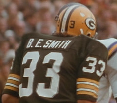
• Here’s a weird one. “That’s Barty Smith from the 1975 Packers,” says Steve. “Green Bay also had a Barry Smith, who wore ‘B. B. Smith,’ but I couldn’t get a clean shot of his NOB.”
• Still more Packers NOB minutiae: Steve thinks John Hadl’s nameplate was very off-center. It’s a little off, but if you measure it, I think you’ll find that it’s not as bad as it looks. I agree that it feels off-center, though, because of the white space in the “L” and unbalanced weight between the “2” and the “1.” Scott and I wrestle with this sort of issue all the time when working on Uni Watch membership cards.
• The interesting thing about this goalpost shot is that it’s from a 1975 game in Minnesota. I have a vague recollection of home teams putting the visiting club’s name on the goalpost like this back in the day, but I wouldn’t swear as to how common it was. Seems almost quaint by today’s standards, no?
• Who’s even more anonymous than a replacement player during the 1987 strike? A replacement player with no NOB. The other St. Louis players were fully nameplated, including Leonard Smith (who went FNOB because the team also included Lance Smith).
• “That same game was probably Ray Brown’s only FNOB game in his 20-year, 261-game career,” says Steve. “Why the first name? Because the Cardinals also had Ron Brown that day (a replacement player, not the former Rams sprinter). He was released after the game.”
Big thanks again to Steve for taking the time to prepare these screen grabs, and for his eagle-eyed attention to detail.

March Raffle: Our friends at SoccerPro.com are back on board for another raffle. The winner will get his or her choice of any soccer jersey shown here, home or road. To enter, send a blank e-mail with your name in the subject line to the raffle address (not to the usual Uni Watch e-mail address, please) by this Friday, March 6th, at 10pm eastern. One entry per person, but anyone enrolled in the Uni Watch membership program at the time of the drawing can send four entries. I’ll announce the winner next Monday.
Uni Watch News Ticker: Okay, so I’ve tried to catch up on all the e-mails, comments, and news that went down while I was away, but I’m still catching up on a few things, so forgive me if this Ticker overlooks some obvious stuff and/or repeats some stuff you already know. ”¦ The Phillies are going to wear gold-trimmed jerseys on Opening Day (with thanks to Joseph Chiaccio). ”¦ Good background info on lots of college mascots here (with thanks to Ryan Connelly). ”¦ Check this out: An untucked jersey was up for auction and nobody bid on it (great find by Scott M.X. Turner). ”¦ And hmmm, what have we here? Possibly a Royals prototype. ”¦ Here’s the first time I’ve ever seen a Revolution helmet used as a windshield decal (good spot by Alan Borock). ”¦ Here’s a Blackhawks goalie who doesn’t have thicker sleeve stripes than his teammates (with thanks to John Muir). ”¦ Lots of great old Tennessee football pics here. If you check out the links toward the bottom of the page, you’ll find lots of program covers, ticket stubs, and so on (great find by Luke Pellegra). ”¦ Aaron Stilley has created a Kansas City Scouts blog. Among his finds is this passage from the 1/27/75 edition of the Kansas City Star: “The Scouts will wear players’ names on the back of the home uniforms for the rest of the season. The road uniforms will remain nameless. The home team, for reasons of program sales, has the option of forbidding them.” ”¦ Aaron also turned up this photo of Gary Bergman. Look closely at that helmet decal — is that a men’s room symbol? ”¦ Jason Terry wore a protective glove on his non-shooting hand on Sunday (with thanks to Michael Korczynski). ”¦ I recently asked if anyone could get pics of the Pacers prototype jerseys rumored to be displayed at Conseco Fieldhouse. “That didn’t sound right to me, as I have spent HOURS perusing the cases at Conseco, and would have been struck by something so awesome,” says Tim Lofton. “But I checked it out anyway. There are a few pieces that look like prototypes, and a couple more things that might have fallen under that category. Anyway, I took about 45 pics and I’ve got a GREAT gallery of vintage barnstorming and pro jerseys from the ’20s to today.” You can see his tremendous photo gallery here. ”¦ “I went to Phillies Phantasy Camp last month,” writes Rob Riegert. “Prior to the trip, all the campers go to Citizens Bank Park to be fitted for uniforms. I overheard someone ask about stirrups, only to be told, ‘No, we only give you redsocks. No one wears stirrups anymore, except maybe Moyer.’ Now that I knew the trip was BYO-stirrups, I bought some online. I didn’t wear them the first day — I was afraid of being brought up on charges in Kangaroo Court for the non-standard uniform. But I was feeling more sure of myself on days two and three, so I busted them out and got nothing but compliments. I did bungle it somewhat with the black cleats, but I still thought the look was pretty sharp. One of my teammates followed my lead on the last day. You can see him in the background. I think we were the only two out of 140 campers.” ”¦ Paul Kalomiris says he was recently at a hockey game and saw someone wearing a Blackhawks jersey with Homer Simpson’s face in place of the Indian’s profile. No photo, alas, but I think he’s referring to this. ”¦ Glossary question: Someone suggested that I add the term “squatchee,” which supposedly refers to the little button on top of a baseball cap. Two thoughts here: (1) I could find only one mention of this term on the web, and (2) I once asked a New Era exec if there was any special term for the button on the cap, and he said, “No, it’s just the button.” I’d be willing to add “squatchee” if a decent number of people use it, but I don’t want to use it just because Bob Brenley once used the term on a broadcast. Anyone out there familiar with this term? ”¦ Gumball helmet king Bill Jones has started a gumball blog, which looks really good. ”¦ Also from Bill: The new Ottawa entry in the Can-Am Baseball League is conducting a logo-design contest. ”¦ South Carolina has a new baseball uni set, which can be seen in the background here. They also have a new stadium, which is showcased in this photo album. ”¦ Remember how Southern Miss added logos and stripes to their facemasks last year? Here’s the company that came up with that concept. ”¦ The Chiefs will supposedly wear a Dallas Texans throwback next season. ”¦ There’s a new independent baseball league in Japan. The uniforms are nothing special, but I really like the league logo (with thanks to Jeremy Brahm). ”¦ New crest for English soccer here (with thanks to Mark Coale). ”¦ Martin St. Pierre of the Providence Bruins has his nickname — Saintsy — embroidered onto his gloves (with thanks to Tris Wykes). ”¦ Justin Bowers and his wife were recently in Ireland and visited Croke Park, the national stadium for Gaelic games (Gaelic football and hurling) and headquarters of the Gaelic Athletic Association. “The stadium is incredible,” he writes. “An 82,300-capacity stadium set right in suburban Dublin, bordered on all sides by houses, not parking lots. They have an excellent museum that details the history of Gaelic Games and their importance in Irish culture, plus we also toured Croke Park itself. One very cool area we got to see was, of course, the dressing rooms. In Gaelic games, the teams that compete are divided up by county, so the dressing room had jerseys from all the counties. I also bought myself a County Kerry jersey [here’s the rear view].” ”¦ Chris Edwards notes that the Stetson hoops team has an interesting NOB format: white lettering on a colored nameplate. ”¦ Hosiery observation from the Rev. Nørb, who recently had a very good seat for a Bucks/Wizards game and noticed that Nick Young of the Wizards had two NBA logos on the outside of his black road socks — an upper one and a lower one. “Now you’re saying, ‘Well, geez, Nørb, he was probably just double-bagging his socks for some reason, which is curious, but not necessarily newsworthy,'” says Nørb, “to which i respond, HA! I don’t believe this is the case! Nick Young has only got the ONE logo on the INSIDE of his socks, which would not be the case if he were wearing two pairs of socks!” Hmmmmm. ”¦ Mike Chamernik reports that one of Comiskey Park’s old pinwheels is at the Sports Authority on La Salle Drive in Chicago. ”¦ Bryan Duklewski notes that Cool-Flo helmets are nowhere to be seen at Orioles camp this spring. “Even players who used Coolflo last year have been using the normal helmets in spring training this year,” he writes. ”¦ The Nats’ new mascot is wearing the team’s “DC” sleeve patch on the wrong sleeve (with thanks to William Yurasko). ”¦ “How many games did Kevin Durant play as a Texas Longhorn?” asks Matt Mitchell. “It’s easy to remember since it’s the same as his jersey number, which was retired prior to last Wednesday night’s win over Texas Tech. Current Longhorns wore T-shirts emblazoned with the number 35 on the back and the initials ‘KD’ on the front during warm-ups.” And then there were these sneakers. ”¦ Bit of a typo on Roque Santa Cruz’s NOB (with thanks to Marcio Kogut). ”¦ The NBA’s annual Noche Latina promotion kicks off tonight, with Los Lakers hosting the Grizzlies (who’ll just be wearing their regular road jerseys). The full Noche Latina schedule can be found on this page. ”¦ I’m sure you’ve all weighed in on this. My take: Thanks to the patch design, it makes the cap look like an adjusta-strap model. ”¦ “We got this mailer from a politician who’s running for Rahm Emmanuel’s vacated seat in the House,” says James Huening. “The rip across the infield dirt is courtesy of Erin, my wife. She took one look at that pink Cubs cap, declared that she will not be voting for this candidate and started to tear up the leaflet. I managed to get it away from her before she could do any more damage.” ”¦ Last week I linked to photos showing LSU baseball’s new chest patch, commemorating their new stadium. But now Chris Mycoskie reports that the patch has moved to the right sleeve and has been replaced on the chest area by an SEC patch. This change appears to hold true throughout their uni set. ”¦ Tough to see in these pics, but Spencer Pierce says Betis goalkeeper Ricardo’s NOB is actually R1CARDO. ”¦ Two accused bank robbers tried to use uni-numeric code while communicating with each other, but it backfired. ”¦ Very odd to see Nate Odoms wearing a wristwatch during practice (good spot by Greg Riffenburgh). ”¦ You like risky sports? Try auto polo (big thanks to Jay Winkler). ”¦ Okay, this Reebok wordmark thing has officially gotten out of hand (disturbing find by Brooks Simpson). ”¦ Remember how LaTroy Hawkins initially wore No. 21 with the Yanks last season, as a tribute to Roberto Clemente (before Paul O’Neill fans hounded him to change it)? Obviously, he can’t wear No. 42 while playing for an MLB team, but he can — and is — for the WBC (with thanks to Dan Cichalski). … Good article here about Indiana’s basketball uniforms (courtesy of Dan Netser).
Washington Nationals unveil a new verision of their mascot Screech: link
1) Does anyone have a decent picture of Antti Niemi’s mask? (He’s the Blackhawks goalie mentioned in the ticker.)
2) Bob Brenly uses the word “squatchee” all the time.
Let’s hear it for Conseco Fieldhouse and the city of Indianapolis. In this era of crappy, suburban, antiseptic new sports facilities, or urban versions with pseudo-retro history, that place stands out as a true museum of basketball history. All the way down to the entrance with old-school out of town scoreboards, the windows in reference to Hinkle Fieldhouse, to the underground practice facility with street-level windows.
Easily the nicest basketball arena in the land … and it’s not even close. Wonder why other cities don’t use it as a model and incorporate their own “history”?
I remember the Cowboys always putting the opposing team’s name on the goalpost too. In fact, I believe when the Chiefs played at their old Municipal Stadium, they would paint the opposing teams’s helmet on the field facing the opposite direction of their own.
About Stetson’s colored nameplate on its home whites: I went to see the FSU-Stetson game at FSU. Stetson’s road unis are just the opposite. Green uniform, white nameplate, and green letters. Sorry, no pictures. I didn’t have a camera at the game.
I hate the new Screech. The old one was rather feminine, but we liked that about her/him.
I recall seeing the Chiefs unique directional markings and yard markers. Mostly from watching classic NFL Films shows. Those were the days when each team could have a unique identity before the NFL assimilated everyone.
is it just me, or does it look like link correctly says “21” in this pic, but link (or 40-something) in this one?
1. On the last item in the Ticker, on Indiana’s jersey tradition: Good for Indiana. UCLA is the same way. They’re the Yankees of the sport. One would think a program as rich in history as Notre Dame would follow suit. Notre Dame’s black jerseys are mentioned in the article. There is no excuse for Notre Dame to wear black. If the football team, which hardly ever changes its uniforms, wore black, people would scream.
2. Are the Orioles wearing the helmets with the orange brims just at home to match their caps, or at home and on the road?
Next time we are told about a logo contest please tell us before the submission deadline! :)
Submissions due Monday, March 2, 2009 at noon EST.
I’m actually looking to do one of these, so if anyone knows of any others please post. My “real” graphic design job doesn’t allow me the luxury to do any logos at all!
JTH-
I’m glad you brought up Niemi’s mask. I too was trying to figure out who the hell was depicted on it. I might actually write into the HawkCast podcast and see if I can get an answer.
On an unrelated note, while browsing the soccer jerseys that will be auctioned off, I realized one more thing that sucks about logos on jerseys: they make them much less interesting to non-fans. For example, I’m not a soccer fan at all but studied in southern Germany and thought it might be cool to get a Bayern jersey. But why the hell would I want a shirt with “T-Mobile” written in huge letters across the front? Sorta takes the fun out of getting a foreign jersey.
Oops… Should have specified “CORPORATE logos” in my comment above. Jerseys without ANY logo would be quite boring.
weird that the reebok-logo islanders jersey doesn’t have the nhl shield on the orange collar part (whatever that area is called) on the front.
i think i’m to the point where i’m going to start to “sharpie-out” logo creep!
I was watching the 1963 World Series highlight film on the MLB Network yesterday and saw something interesting….
On the Yankees home uniforms, the numbers are the standard MLB numbers (no serifs, currently the style worn by Tampa, for example).
On the road uniforms, the numbers were the varsity block font, much closer to what the Yankees wear now.
It’s very obvious if you look at Mickey Mantle (7) and Joe Pepitone (25, I think).
[quote comment=”316862″]is it just me, or does it look like link correctly says “21” in this pic, but link (or 40-something) in this one?[/quote]
I think that is the ‘2’ on the helmet, but with the glare and the dark edge of the center stripe it looks like a large ‘4’
One would think a program as rich in history as Notre Dame would follow suit. Notre Dame’s black jerseys are mentioned in the article. There is no excuse for Notre Dame to wear black.
Oddly, part of the tradition of ND basketball is constant change of uniforms. Digger Phelps was notorious for this. He would keep a design for two seasons, then move on. He went to pale mint green and pale beige home uniforms because he was told that pure white looked worse on TV. He broke out lurid flourescent green uniforms for a home game against Syracuse. It seems that ND is settling into some constants, such as the script “Irish.” I don’t think the blacks will last beyond Mike Brey’s tenure.
The sock discrepancy may be that he is wearing an ankle brace and there is only a logo on the outside of the brace. Just a thought.
I’m fascinated by blogs that profile shortlived pro teams so I poked around the KC Scout blog a bit. I always thought their logo (at least when seen on their sweaters) looked like lost guy on a llama.
Anyway I apprecite the link. Fun stuff.
One of the interesting things about the comment about opposing teams on the goalpost, was the practice of painting the endzone with the visiting team name and color. I noticed this watching the 1977 AFC Championship game with one of the endzones at Mile High Stadium painted with “RAIDERS” (what kind of blasphemy is that???). I do also remember this as recently as the 1986 AFC Championship game in Cleveland, one of the endzones was painted BRONCOS as well.
Can’t spell worth a damn today :-(
Wait a sec – Texas link Kevin Durant’s jersey? Only 35 games culminating with a second-round exit to the Big Dance? Am I out of touch with colleges but something doesn’t seem to add up here. At least their last link played a few years and took them to the Final Four.
This is a minor detail about IUs uniforms that I hate…after they went to the Final Four in 2002, they switched from RED and white uniforms to CRIMSON and white, a darker shade of red.
Now I know the official colors are Cream & Crimson, but the basketball team has always worn RED, and I pray that Coach Crean will bring it back.
GO BIG RED!
[quote comment=”316867″]weird that the reebok-logo islanders jersey doesn’t have the nhl shield on the orange collar part (whatever that area is called) on the front.
i think i’m to the point where i’m going to start to “sharpie-out” logo creep![/quote]
It’s a fake. It won’t have the NHL shield on it.
That Royals jersey link is sweet. I always wondered what it would look like adding a bit of royal to the white.
Royals and Chiefs groundskeeper George Toma was the best — and still is. link
In the Ticker, that’s not O’Neill’s name in the LaTroy Hawkins story. My favorite Yankee has two l’s in his last name.
Speaking of NOB inconsistencies, Mike McCoy’s home NOB in 1975 had a superscript “c” while his road jersey was all-caps with a space
link
In the picture of McCoy’s home jersey, why would the Packers be playing a home game on artificial turf? Did County Stadium have astroturf at one time? Or is this some type of neutral site game? I would have assumed that they are wearing home jerseys on the road for some reason but the 49ers have never played home games on Astroturf either to my knowledge.
Great article on the IU uniforms. As seen in the photo of Damon Bailey, I always loved the Champion Uniforms they wore from 1987-1994. They were that thicker mesh that nobody wears anymore. In the 1994 NCAA tournamant they changed to Starter. Is Starter still around? If you look close in that Bailey pic, you can see that Knight actually has a Starter sweater. For some reason they didn’t actually change uniforms until later that season, but Knight started wearing the sweater sooner.
[quote comment=”316873″]One of the interesting things about the comment about opposing teams on the goalpost, was the practice of painting the endzone with the visiting team name and color. I noticed this watching the 1977 AFC Championship game with one of the endzones at Mile High Stadium painted with “RAIDERS” (what kind of blasphemy is that???). I do also remember this as recently as the 1986 AFC Championship game in Cleveland, one of the endzones was painted BRONCOS as well.[/quote]
This was quite common practice for the conference championship games. I also remember seeing it in the ’83 & ’85 AFC Championship games. Like you said, I believe ’86 was the last time I remember seeing it.
[quote comment=”316869″][quote comment=”316862″]is it just me, or does it look like link correctly says “21” in this pic, but link (or 40-something) in this one?[/quote]
I think that is the ‘2’ on the helmet, but with the glare and the dark edge of the center stripe it looks like a large ‘4’[/quote]
thanks…when i got into work, i clicked that link, and you’re absolutely correct, it looks like a “2”…now, at work, i have a 19″ monitor, whereas at home, where i have a 23″ one, it looked like a “4” to me
of course, im also wearing my glasses now
[quote comment=”316881″]Speaking of NOB inconsistencies, Mike McCoy’s home NOB in 1975 had a superscript “c” while his road jersey was all-caps with a space
link
In the picture of McCoy’s home jersey, why would the Packers be playing a home game on artificial turf? Did County Stadium have astroturf at one time? Or is this some type of neutral site game? I would have assumed that they are wearing home jerseys on the road for some reason but the 49ers have never played home games on Astroturf either to my knowledge.[/quote]
That appears to be a game in New Orleans. My guess is that the Saints chose to wear white that game. Actually, the 49ers did have astroturf at Candlestick Park through most of the ’70’s. I believe they got rid of it when they acquired O.J. Simpson.
Looks like a bunch of guys on team USA (Rollins, Youkilis, Wright, Braun, Victorino) are wearing numbers that are different from their normal ones, even though their regular number is available.
Re: The NY Islanders custom jersey – all blank RBK Edge jerseys have the wordmark below the collar. When I first saw them (and before I knew of Reebok’s logo change), I thought they were cheap knockoffs. Little did I know…
I believe that Antti Niemi’s mask has the character from Saw painted on it. Also, the Blackhawks goalie stripe issue only impacts the white “road” jerseys, not the red or black alternates for some reason.
[quote comment=”316877″][quote comment=”316867″]weird that the reebok-logo islanders jersey doesn’t have the nhl shield on the orange collar part (whatever that area is called) on the front.
i think i’m to the point where i’m going to start to “sharpie-out” logo creep![/quote]
It’s a fake. It won’t have the NHL shield on it.[/quote]
but, why not go all out and include the shield???
[quote comment=”316884″][quote comment=”316869″][quote comment=”316862″]is it just me, or does it look like link correctly says “21” in this pic, but link (or 40-something) in this one?[/quote]
I think that is the ‘2’ on the helmet, but with the glare and the dark edge of the center stripe it looks like a large ‘4’[/quote]
thanks…when i got into work, i clicked that link, and you’re absolutely correct, it looks like a “2”…now, at work, i have a 19″ monitor, whereas at home, where i have a 23″ one, it looked like a “4” to me
of course, im also wearing my glasses now[/quote]
So it was an optical delusion.
[quote comment=”316856″]1) Does anyone have a decent picture of Antti Niemi’s mask? (He’s the Blackhawks goalie mentioned in the ticker.)
2) Bob Brenly uses the word “squatchee” all the time.[/quote]
Here ya go… link; link.
And Bob Brenly uses words unknown to others all the time!
[quote comment=”316879″]In the Ticker, that’s not O’Neill’s name in the LaTroy Hawkins story. My favorite Yankee has two l’s in his last name.[/quote]
Only Yankee fans would think Paul O’Neill in any way whatsoever trumps Roberto Clemente. Well, maybe in bats thrown and water fountains abused.
(After Mickey Mantle once wailed on a plumbing fixture, Casey Stengel looked over at him and said, calmly, “It is not the watercooler which is getting you out.”)
Reality check: If the number ain’t retired, no reason someone can’t wear it.
Damn! I’m gonna have to wait until I get home to see these Steve K pics. I’m at a Flickr foe site.
[quote comment=”316891″][quote comment=”316856″]1) Does anyone have a decent picture of Antti Niemi’s mask? (He’s the Blackhawks goalie mentioned in the ticker.)
2) Bob Brenly uses the word “squatchee” all the time.[/quote]
Here ya go… link; link.
And Bob Brenly uses words unknown to others all the time![/quote]
Thanks. The only thing I was able to clearly see so far (and you can’t really see it very well in the side views) is that the front of the mask has a different take on the shoulder patch logo — it’s an Old English C with crossed tomahawks.
One of Brenly’s other favorites is “drug” as the past tense of “drag.” As in, “He drug his foot across the bag”
[quote comment=”316865″]
On an unrelated note, while browsing the soccer jerseys that will be auctioned off, I realized one more thing that sucks about logos on jerseys: they make them much less interesting to non-fans. For example, I’m not a soccer fan at all but studied in southern Germany and thought it might be cool to get a Bayern jersey. But why the hell would I want a shirt with “T-Mobile” written in huge letters across the front? Sorta takes the fun out of getting a foreign jersey.[/quote]
I’ve got an older jersey with an Opel logo on it, which doesn’t bother me that much because Opel vehicles aren’t sold in America. If it had a BMW, VW, etc. logo on it, I probably wouldn’t have bought it.
Likewise, if the current jersey had Deutsche Telekom instead of T-Mobile on it, I’d consider buying it.
Maybe that watch (Odom at what looks like Seahawks training camp) is from a heart rate monitor?
THE coolest thing a team did with its home field was when the Raiders used the ‘shield’ for its yard markers…anybody have a pic?
In the picture of McCoy’s home jersey, why would the Packers be playing a home game on artificial turf? Did County Stadium have astroturf at one time?
That appears to be a game in New Orleans. My guess is that the Saints chose to wear white that game.
They did. I have the ’75 Packers highlight film, and the Saints wore white at home for that game.
But … you guys remind me of something I found, years ago, in the Nov. 2, 1968 issue of The Sporting News. Bill Oates did a Q&A with Vince Lombardi, who was in his one season as Packers general manager (but not head coach). I clipped it out of the TSN issue and put it into a scrapbook. Heres a transcription:
Oates: Can you give me an example of what you’ve been up to this week?
Lombardi: I’ve been down in Tennessee looking at artificial grass. I don’t suppose that means much in California — but good artificial turf would be an advantage on rainy days here in the Midwest. The Packers have two fields, one in Milwaukee and one here, so we have to think about the expense. But when it’s perfected, we’ll put it in, maybe in two or three years.
Lombardi has rightly been identified as a football fundamentalist — “Football is blocking and tackling. You block and tackle better than the other team, you’ll win.” And yet, he was talking, apparently seriously, about installing artificial turf at Lambeau Field. Wild, isn’t it?
[quote comment=”316889″][quote comment=”316877″][quote comment=”316867″]weird that the reebok-logo islanders jersey doesn’t have the nhl shield on the orange collar part (whatever that area is called) on the front.
i think i’m to the point where i’m going to start to “sharpie-out” logo creep![/quote]
It’s a fake. It won’t have the NHL shield on it.[/quote]
but, why not go all out and include the shield???[/quote]
I have never seen an NHL neckline shield logo produced for anything. I’m guessing Reebok makes those exclusively for their jerseys at their plant in Quebec, and affixes them there before shipping the jerseys out.
RE: Hadl’s off-center name on back. I’m convinced most of the time this happens its because a name was misspelled with an extra letter at the beginning or end.
To fix it, someone quickly ripped off the offending letter.
In this example, I bet it was spelled “Hadle”… someone noticed, ripped off the “e” and sent it along.
Just a wild guess here, I have no evidence of this.
[quote comment=”316868″]I was watching the 1963 World Series highlight film on the MLB Network yesterday and saw something interesting….
On the Yankees home uniforms, the numbers are the standard MLB numbers (no serifs, currently the style worn by Tampa, for example).
On the road uniforms, the numbers were the varsity block font, much closer to what the Yankees wear now.
It’s very obvious if you look at Mickey Mantle (7) and Joe Pepitone (25, I think).[/quote]
The 1957 Milwaukee Braves are commonly credited with having two different number sets for home and road (probably started by Mitchell & Ness, which for years sold a reproduction home with varsity block and road with pro block.
Doing a little searching on Corbis, I think I’ve found that this was not a home/road discrepancy, but something more interesting – they got new uniforms for the Series. During the season, they wore the link with which I think they’re most often identified (check out the serifs on that 4). This was seen on both the home and link jerseys.
In the Series, they broke out the snazzy link, which they wore at link and on the road link.
Being thrifty Midwesterners, the pro block jerseys would be used link.
By the 1958 World Series, the Braves were back to wearing varsity block (at least in link). Guess the pro block was lucky.
So did the Braves wear two different number fonts, home and road, in 1958? Or was this another case of break-out-new-unis-for-the-Classic?
“Interestingly, he was the only Johnson on the Chargers that season,”
Betcha there was someone else in training camp named Johnson. Likely the same sort of thing with Paul Seymour. My guess is maybe former Notre Dame/Bears WR Jim Seymour was in camp with the Bills one year. Their careers were somewhat concurrent.
Can’t apply today’s thinking to the NFL of 30 or 35 years ago. It’s like saying, “Why’d didn’t Mrs. Lincoln use her cell phone to call for help? Was their use prohibited in Ford’s Theater or something?” Gotta see things in their own time.
The NFL simply wasn’t as anal about such things back then. A player would get his jerseys in preseason, and unless they were damaged they wouldn’t be replaced. Many teams wouldn’t think a new nameplate—just to delete a first initial—would be worth the expense. Hell, if the jersey style didn’t change, a player might use one from a previous season if he thought it fit better.
—Ricko
[quote comment=”316885″][quote comment=”316881″]Speaking of NOB inconsistencies, Mike McCoy’s home NOB in 1975 had a superscript “c” while his road jersey was all-caps with a space
link
In the picture of McCoy’s home jersey, why would the Packers be playing a home game on artificial turf? Did County Stadium have astroturf at one time? Or is this some type of neutral site game? I would have assumed that they are wearing home jerseys on the road for some reason but the 49ers have never played home games on Astroturf either to my knowledge.[/quote]
That appears to be a game in New Orleans. My guess is that the Saints chose to wear white that game. Actually, the 49ers did have astroturf at Candlestick Park through most of the ’70’s. I believe they got rid of it when they acquired O.J. Simpson.[/quote]
Ahh, that makes sense. At first glance I thought that was a 49ers jersey on the opponent, but now that you mention it, I guess it is a Saints jersey.
Interesting that Candlestick had astrotuf at one point too. I hadn’t realized that.
this article says the photos are from “2/2/09” but it appears to have been just posted (3/2)…
anyway…yankee fans, get wet…yankee haters…well
i can see why it cost a $1B+
>The Chiefs will supposedly wear a Dallas Texans throwback next season.
I wonder if they’ll wear it vs the Cowboys?
[quote comment=”316906″]this article says the photos are from “2/2/09” but it appears to have been just posted (3/2)…
anyway…yankee fans, get wet…yankee haters…well
link[/quote]
“The House That A-Rod Performance-Enhanced”?
[quote comment=”316896″][quote comment=”316865″]
On an unrelated note, while browsing the soccer jerseys that will be auctioned off, I realized one more thing that sucks about logos on jerseys: they make them much less interesting to non-fans. For example, I’m not a soccer fan at all but studied in southern Germany and thought it might be cool to get a Bayern jersey. But why the hell would I want a shirt with “T-Mobile” written in huge letters across the front? Sorta takes the fun out of getting a foreign jersey.[/quote]
I’ve got an older jersey with an Opel logo on it, which doesn’t bother me that much because Opel vehicles aren’t sold in America. If it had a BMW, VW, etc. logo on it, I probably wouldn’t have bought it.
Likewise, if the current jersey had Deutsche Telekom instead of T-Mobile on it, I’d consider buying it.[/quote]
If I were to EVER buy a soccer jersey… I would want the Opel logo! Only because I have an Opel GT and I think it would be cool. I have looked a bit and not been so successful – I guess the team that used to have it, doesn’t anymore.
[quote comment=”316908″][quote comment=”316906″]this article says the photos are from “2/2/09” but it appears to have been just posted (3/2)…
anyway…yankee fans, get wet…yankee haters…well
link[/quote]
“The House That A-Rod Performance-Enhanced”?[/quote]
ooops…
“The House That Roger, Jason and A-Rod Performance Enhanced”
[quote comment=”316906″]this article says the photos are from “2/2/09” but it appears to have been just posted (3/2)…
anyway…yankee fans, get wet…yankee haters…well
link[/quote]
Looks like a beautiful museum. However, it looks like an ugly over-done baseball stadium.
In looking at the new Yankee Gold Mine, a bit of news needed to be passed on.
Pitcher Tom Sturdivant passed away at age 78.
The New York Yankees pitcher, nicknamed Snake for his infamous curveball, was vital to the Yankees in the 1956 World Series. He died on Saturday at Integris Southwest Medical Center in his hometown Oklahoma City. No cause of death was given.
Good hunting, Chance! I’ve been looking at Braves photos for years, and I’d never noticed the numeric distinction.
By the way — for you and for any other Milwaukee Braves buffs — there is a new book out about them that is excellent. “Milwaukee Braves: Heroes and Heartbreak.”
link
The photo collection is extensive and outstanding. It’s well-written, too, which I think we all know is not guaranteed in a sports book.
[quote comment=”316872″]I’m fascinated by blogs that profile shortlived pro teams so I poked around the KC Scout blog a bit. I always thought their logo (at least when seen on their sweaters) looked like lost guy on a llama.
Anyway I apprecite the link. Fun stuff.[/quote]
Glad you’re enjoying the site, Bob!
Thanks for the link Paul.
I’m nearing completion on a DIY Scouts jersey. I’ll have photos on the blog when it’s done.
Aaron
[quote comment=”316907″]>The Chiefs will supposedly wear a Dallas Texans throwback next season.
I wonder if they’ll wear it vs the Cowboys?[/quote]
That would be interesting, although I would suppose it would make more sense to wear it against an original AFL team.
topps ’57 Sturdivant…
link
[quote comment=”316863″]1. On the last item in the Ticker, on Indiana’s jersey tradition: Good for Indiana. UCLA is the same way. They’re the Yankees of the sport. One would think a program as rich in history as Notre Dame would follow suit. Notre Dame’s black jerseys are mentioned in the article. There is no excuse for Notre Dame to wear black. If the football team, which hardly ever changes its uniforms, wore black, people would scream.
2. Are the Orioles wearing the helmets with the orange brims just at home to match their caps, or at home and on the road?[/quote]
Their road cap now has the orange brim too. No more all black cap. It’s mentioned around 7 minutes into this link.
[quote comment=”316915″][quote comment=”316907″]>The Chiefs will supposedly wear a Dallas Texans throwback next season.
I wonder if they’ll wear it vs the Cowboys?[/quote]
That would be interesting, although I would suppose it would make more sense to wear it against an original AFL team.[/quote]
Have a feeling it’ll be against the Chargers.
Didn’t the Chiefs used to have the tomahawk logo on the field at the kickoff spot instead of the X? I used to think that was the coolest thing ever.
[quote comment=”316909″][quote comment=”316896″][quote comment=”316865″]
On an unrelated note, while browsing the soccer jerseys that will be auctioned off, I realized one more thing that sucks about logos on jerseys: they make them much less interesting to non-fans. For example, I’m not a soccer fan at all but studied in southern Germany and thought it might be cool to get a Bayern jersey. But why the hell would I want a shirt with “T-Mobile” written in huge letters across the front? Sorta takes the fun out of getting a foreign jersey.[/quote]
I’ve got an older jersey with an Opel logo on it, which doesn’t bother me that much because Opel vehicles aren’t sold in America. If it had a BMW, VW, etc. logo on it, I probably wouldn’t have bought it.
Likewise, if the current jersey had Deutsche Telekom instead of T-Mobile on it, I’d consider buying it.[/quote]
If I were to EVER buy a soccer jersey… I would want the Opel logo! Only because I have an Opel GT and I think it would be cool. I have looked a bit and not been so successful – I guess the team that used to have it, doesn’t anymore.[/quote]
How about
link?
Or maybe link is to your liking?
link?
Otherwise, just search for “Bayern Munich/Muenchen/Munchen/München” jerseys and you’ll be able to find several.
I think Opel sponsored AC Milan in the past as well.
Below is a link to the b&w photo of NY Rangers practicing, circa 1934. In this color- vs- color practice, what colors are the Rangers wearing? If the squad in the lighter gray uniforms is wearing the traditional Ranger’s blue, what jerseys (sweaters) are the boys in dark wearing? Comparing the arm stripes of the dark jersey to that of the lighter jerseys, I am guessing red. Has anyone ever seen the Rangers of this era in a red jersey?
link
P.S. if you want to see a day vanish, browse through the NY Public library’s digital collection: link Many great sports photos!
one thing you missed about LSU’s baseball uniforms is the new hat. As far as I know they have never worn those in a game before. I personally don’t like it.
link
[quote comment=”316918″][quote comment=”316915″][quote comment=”316907″]>The Chiefs will supposedly wear a Dallas Texans throwback next season.
I wonder if they’ll wear it vs the Cowboys?[/quote]
That would be interesting, although I would suppose it would make more sense to wear it against an original AFL team.[/quote]
Have a feeling it’ll be against the Chargers.[/quote]
Or the Oilers(Titans). Played them in that double OT ’62 AFL title game, when Abner Haynes lost both the ball and a significant wind for the first OT. Chiefs won the OT toss and Haynes said, “We’ll kick to the clock”, meaning he was taking the wind (they had a mic out there, and I remember thinking, “Oops”). Because the choices are kick, receive or chose a goal to defend, technically his choice was “We’ll kick”. Rest of the sentence didn’t matter. Oilers then took the wind, too.
Betcha a lot of people here haven’t heard that story.
—Ricko
[quote comment=”316922″]one thing you missed about LSU’s baseball uniforms is the new hat. As far as I know they have never worn those in a game before. I personally don’t like it.
link
I messed up the link but it’s the one with the white in front that they are wearing with the purple jerseys
[quote comment=”316899″]THE coolest thing a team did with its home field was when the Raiders used the ‘shield’ for its yard markers…anybody have a pic?[/quote]
i agree. Steve, you got any screengrabs of the Raider “Field-Shields”?
LOL, Geemans’ comment about the Irish basketball “tradition.” That tradition being what, the Digger era?
Sure, if you consider being, at best, the fourth best college basketball program in the state of Indiana … behind Indiana, Purdue and Butler.
With apologies to Ball State, Evansville, IUPUI, ISU and Valparaiso … all of whom have been to the big tourney roughly the same amount as Notre Dame in the last 25 years. Ha.
[quote comment=”316921″]Below is a link to the b&w photo of NY Rangers practicing, circa 1934. In this color- vs- color practice, what colors are the Rangers wearing? If the squad in the lighter gray uniforms is wearing the traditional Ranger’s blue, what jerseys (sweaters) are the boys in dark wearing? Comparing the arm stripes of the dark jersey to that of the lighter jerseys, I am guessing red. Has anyone ever seen the Rangers of this era in a red jersey?
link
P.S. if you want to see a day vanish, browse through the NY Public library’s digital collection: link Many great sports photos![/quote]
Probably just the other way around. In most B&W photos blue photographs darker, especially indoors because it absorbs far more light than red. The dark jerseys likely are their regular blues…and the grays are the oddballs, probably red.
Breezers were still sorta khaki at the time, weren’t they? Cuz if they were red, then that cinches it.
—Ricko
I’ve got an older jersey with an Opel logo on it, which doesn’t bother me that much because Opel vehicles aren’t sold in America. If it had a BMW, VW, etc. logo on it, I probably wouldn’t have bought it.
Good point… I would definitely be willing to buy a link with “link” on the front, but than again I’m a sucker for Altbier.
[quote comment=”316927″][quote comment=”316921″]Below is a link to the b&w photo of NY Rangers practicing, circa 1934. In this color- vs- color practice, what colors are the Rangers wearing? If the squad in the lighter gray uniforms is wearing the traditional Ranger’s blue, what jerseys (sweaters) are the boys in dark wearing? Comparing the arm stripes of the dark jersey to that of the lighter jerseys, I am guessing red. Has anyone ever seen the Rangers of this era in a red jersey?
link
P.S. if you want to see a day vanish, browse through the NY Public library’s digital collection: link Many great sports photos![/quote]
Probably just the other way around. In most B&W photos blue photographs darker, especially indoors because it absorbs far more light than red. The dark jerseys likely are their regular blues…and the grays are the oddballs, probably red.
Breezers were still sorta khaki at the time, weren’t they? Cuz if they were red, then that cinches it.
—Ricko[/quote]
according to nhl uniforms.com, the pants in 1933-34 (and 34-35) were indeed red
[quote comment=”316856″]1) Does anyone have a decent picture of Antti Niemi’s mask? (He’s the Blackhawks goalie mentioned in the ticker.)
2) Bob Brenly uses the word “squatchee” all the time.[/quote]
just google image it, it comes right up both sides. I just cant decide whos on it. I know its assassins creed on one side but im not sure about the other, my wife thinks Nico from GTA4.
link
[quote comment=”316891″][quote comment=”316856″]1) Does anyone have a decent picture of Antti Niemi’s mask? (He’s the Blackhawks goalie mentioned in the ticker.)
2) Bob Brenly uses the word “squatchee” all the time.[/quote]
Here ya go… link; link.
And Bob Brenly uses words unknown to others all the time![/quote]
I think Brenly is just very well read and remembers Rich Hall’s ‘Sniglets’ from back in the ’80s. Though, according to my copy of it, the name for the button on top of the baseball cap is “Squatcho.” Not to mention “Blossor”, which are the little wings you get on your hair from wearing a ballcap for too long. :)
Betcha a lot of people here haven’t heard that story.
I have, Ricko. ESPN did a piece on it on their Monday night pregame show sometime in the mid-’90s.
Remarkably, videotape of that game still exists. (But not of Super Bowl I.) ABC did the game, with Curt Gowdy on play-by-play and Jack Buck as the sideline reporter. In some photos of Haynes’ coin-toss gaffe, you can see Buck sticking his microphone in there, enabling everyone watching the game to hear the gaffe.
It’s too bad that that’s the only thing for which Haynes is usually remembered. He led the AFL in rushing TDs in each of the league’s first three years.
[quote comment=”316923″][quote comment=”316918″][quote comment=”316915″][quote comment=”316907″]>The Chiefs will supposedly wear a Dallas Texans throwback next season.
I wonder if they’ll wear it vs the Cowboys?[/quote]
That would be interesting, although I would suppose it would make more sense to wear it against an original AFL team.[/quote]
Have a feeling it’ll be against the Chargers.[/quote]
Or the Oilers(Titans). Played them in that double OT ’62 AFL title game, when Abner Haynes lost both the ball and a significant wind for the first OT. Chiefs won the OT toss and Haynes said, “We’ll kick to the clock”, meaning he was taking the wind (they had a mic out there, and I remember thinking, “Oops”). Because the choices are kick, receive or chose a goal to defend, technically his choice was “We’ll kick”. Rest of the sentence didn’t matter. Oilers then took the wind, too.
Betcha a lot of people here haven’t heard that story.
—Ricko[/quote]
Yep, it could be the Titans, since the Chiefs are slated to play an AFC South team on the road. Great story, thanks for sharing.
[quote comment=”316906″]this article says the photos are from “2/2/09” but it appears to have been just posted (3/2)…
anyway…yankee fans, get wet…yankee haters…well
link[/quote]
being a die-hard pirates fan (which, if you’re a pirates fan at all at this point, you’re pretty much at “die-hard with a vengeance” stage right now), if they had a snowball’s chance i would probably hate the yankees. as it stands though, i’m completely indifferent. but, i HAVE to love how the yanks celebrate their history. some of you think it’s “overdone” and it probably is a little. but i love how it’s everywhere in the new stadium. what did it for me was that awesome crest with the eagle and the bats and the catchers equipment. i don’t know… just a thought. maybe it’s me just trying to hold on to my teams past, because there SURE isn’t a present! and the future, well, you be the judge…
[quote comment=”316888″]I believe that Antti Niemi’s mask has the character from Saw painted on it. Also, the Blackhawks goalie stripe issue only impacts the white “road” jerseys, not the red or black alternates for some reason.[/quote]
The extra-wide goalie stripes are definitely in effect on the black jerseys. Look at Cristobal Huet’s red stripes in the first and seventh photos of link.
The Brighton and Hove Albion shirt used to be sponsored by Skint which given its financial history in the 90s was oddly appropriate.
[quote comment=”316913″]Good hunting, Chance! I’ve been looking at Braves photos for years, and I’d never noticed the numeric distinction.
By the way — for you and for any other Milwaukee Braves buffs — there is a new book out about them that is excellent. “Milwaukee Braves: Heroes and Heartbreak.”
link
The photo collection is extensive and outstanding. It’s well-written, too, which I think we all know is not guaranteed in a sports book.[/quote]
Thanks for the heads-up. I’d love to check it out.
[quote comment=”316932″]Betcha a lot of people here haven’t heard that story.
I have, Ricko. ESPN did a piece on it on their Monday night pregame show sometime in the mid-’90s.
Remarkably, videotape of that game still exists. (But not of Super Bowl I.) ABC did the game, with Curt Gowdy on play-by-play and Jack Buck as the sideline reporter. In some photos of Haynes’ coin-toss gaffe, you can see Buck sticking his microphone in there, enabling everyone watching the game to hear the gaffe.
It’s too bad that that’s the only thing for which Haynes is usually remembered. He led the AFL in rushing TDs in each of the league’s first three years.[/quote]
That’s sure true. Haynes was SO exciting. One of the largely forgotten players who made those first AFL seasons so much fun to watch. In that respect, a lot like Art Powell, about whom I went on and on a while back.
–Ricko
[quote comment=”316900″]In the picture of McCoy’s home jersey, why would the Packers be playing a home game on artificial turf? Did County Stadium have astroturf at one time?
That appears to be a game in New Orleans. My guess is that the Saints chose to wear white that game.
They did. I have the ’75 Packers highlight film, and the Saints wore white at home for that game.
But … you guys remind me of something I found, years ago, in the Nov. 2, 1968 issue of The Sporting News. Bill Oates did a Q&A with Vince Lombardi, who was in his one season as Packers general manager (but not head coach). I clipped it out of the TSN issue and put it into a scrapbook. Heres a transcription:
Oates: Can you give me an example of what you’ve been up to this week?
Lombardi: I’ve been down in Tennessee looking at artificial grass. I don’t suppose that means much in California — but good artificial turf would be an advantage on rainy days here in the Midwest. The Packers have two fields, one in Milwaukee and one here, so we have to think about the expense. But when it’s perfected, we’ll put it in, maybe in two or three years.
Lombardi has rightly been identified as a football fundamentalist — “Football is blocking and tackling. You block and tackle better than the other team, you’ll win.” And yet, he was talking, apparently seriously, about installing artificial turf at Lambeau Field. Wild, isn’t it?[/quote]
Sure is.
You don’t happen to have a scan of that article, do you? I’d love to put it on my site.
And just curious – what’s your connection to the Braves book?
[quote comment=”316932″]Betcha a lot of people here haven’t heard that story.
I have, Ricko. ESPN did a piece on it on their Monday night pregame show sometime in the mid-’90s.
Remarkably, videotape of that game still exists. (But not of Super Bowl I.) ABC did the game, with Curt Gowdy on play-by-play and Jack Buck as the sideline reporter. In some photos of Haynes’ coin-toss gaffe, you can see Buck sticking his microphone in there, enabling everyone watching the game to hear the gaffe.
It’s too bad that that’s the only thing for which Haynes is usually remembered. He led the AFL in rushing TDs in each of the league’s first three years.[/quote]
Speaking of Gowdy and Buck and them.
In the early AFL years, Gowdy’s booth partner was Al DiRogattis (sp?).
Other broadcasting teams were…
Jack Buck and George Ratterman
Charlie Jones and Paul Christman.
There had to have been a fourth combo (eight-team league) but for the life of me I cannot remember who they were.
Anyone know? I’m guessing the two individuals might have been West Coast-based (if that help jogs someone’s memory).
—Ricko
ricko…
does this help?
Chance, I don’t have the whole article, but I’ll the scan the snippet for you.
As for me and the book? I’m just a Brewers fan with a Milwaukee Braves fascination. The copy my better half ordered for me from Amazon showed up Thursday.
Ricko, Timmy B will surely have an answer for you. Others may know as much about pro football announcing teams as he does. but I’m certain nobody knows more.
Whoa; apparently I meant every word of that. Sorry for all the boldface.
Hokey Smoke, George Ratterman! I actually got to know him in the early ’90s, at which point he lived in Denver and was in the real estate business. Heck of a nice guy. Had been Otto Graham’s backup with the Browns.
[quote comment=”316941″]ricko…
link?[/quote]
Yes, indeed it does, because even the “Remember the AFL” site lists only the six I mentioned. Almost sure it was Les Keiter and Elmer Angsman.
Wow, you wouldn’t believe how many years I’ve been trying remember that. Thanks.
—Ricko
[quote comment=”316945″][quote comment=”316941″]ricko…
link?[/quote]
Yes, indeed it does, because even the “Remember the AFL” site lists only the six I mentioned. Almost sure it was Les Keiter and Elmer Angsman.
Wow, you wouldn’t believe how many years I’ve been trying remember that. Thanks.
—Ricko[/quote]
well, if you can’t trust wikipedia, who can you trust?
[quote comment=”316856″]2) Bob Brenly uses the word “squatchee” all the time.[/quote]
Mr Brenly use it but it’s an Uni Watch glossary. If it isn’t used here, should it not be in it?. :)
These Reebok jerseys are supposed to sold for team sales only.
Notice the absence of the NHL logo on the neck plate.
The guy selling them on Ebay has crested a blank jersey no licensed jersey.
I went to the Iowa Chops (AHL team for the Ducks) hockey game on Saturday night and they were playing the Milwaukee Admirals (AHL team for the Predators). During the game I noticed that the Admirals had a patch on the right side of their jersey that was the Brewers logo from the 80s. Does anyone know why they wear that patch?
Chance, here’s the link:
link
[quote comment=”316946″][quote comment=”316945″][quote comment=”316941″]ricko…
link?[/quote]
Yes, indeed it does, because even the “Remember the AFL” site lists only the six I mentioned. Almost sure it was Les Keiter and Elmer Angsman.
Wow, you wouldn’t believe how many years I’ve been trying remember that. Thanks.
—Ricko[/quote]
well, if you can’t trust wikipedia, who can you trust?[/quote]
Wikipedia never paired them up, I just looked for names that leaped out and sounded familiar together. Angsman struck me first. Then dug a little saw Keiter’s name (mentioned only once as being sideline reporter for the first AFL title game), and it was the old lightning flash bit: Les Keiter and Elmer Angsman. They were, like, the D team, though. Got the game with the least “marquee” value every week, as I recall.
Plus, now recall at the time thinking how quirky it was that two of the guys on the AFL broadcasting teams had been NFL teammates. Christman and Angsman were Chicago Cardinals in the ’40s.
[quote comment=”316950″]Chance, here’s the link:
link
The Lion in the photo is Earl McCullough, I’ll bet. :)
—Ricko
[quote comment=”316949″]I went to the Iowa Chops (AHL team for the Ducks) hockey game on Saturday night and they were playing the Milwaukee Admirals (AHL team for the Predators). During the game I noticed that the Admirals had a patch on the right side of their jersey that was the Brewers logo from the 80s. Does anyone know why they wear that patch?[/quote]
The Brewers are a link. They pay to have their logo on the Admirals’ jerseys, just like other sponsors do. The Brewers also sponsor ads on the boards, as well as promotional giveaways.
Brewers owner Mark Attanasio is a minority owner of the Ads as well (so is/was pitcher Ben Sheets, don’t know if he’s sold his stake since leaving Milwaukee).
The first year, they wore the Brewers’ link. Then they changed it to the link, and it’s been that way ever since.
Sean, the Brewers and Admirals have had a partnership of some kind for the past few years. I’m not sure of the particulars, other than Uecker doing some commercials for the Admirals.
[quote comment=”316950″]Chance, here’s the link:
link
Brilliant – thanks!
You don’t mine if I use it, do you? With a hat tip, natch.
I’m glad Chance had some actual, you know, information on the Brewers-Admirals connection. ;-)
The Lion in the photo is Earl McCullough, I’ll bet. :)
He wore 25, right Ricko? Because that’s the number on the guy Willie Wood’s chasing into the end zone.
You don’t mine if I use it, do you? With a hat tip, natch.
Of course not! Link/upload away.
[quote comment=”316926″]LOL, Geemans’ comment about the Irish basketball “tradition.” That tradition being what, the Digger era?
Sure, if you consider being, at best, the fourth best college basketball program in the state of Indiana … behind Indiana, Purdue and Butler.
With apologies to Ball State, Evansville, IUPUI, ISU and Valparaiso … all of whom have been to the big tourney roughly the same amount as Notre Dame in the last 25 years. Ha.[/quote]
link
According to the above, Indiana is No. 10 all-time in winningest D-I basketball programs. Notre Dame is No. 11. Then there’s the 1978 trip to the Final Four, the upsets of UCLA and other top teams, the NCAA tournament appearances, and many all-America players. Yes, there is tradition.
The stripes on Chicago Blackhawks sleeves are sewn on. On the white jersey, red and white stripes are sewn on a black elbow panel. (Similar idea on the black alt where red and black stripes are sewn on a white panel.) The elbow panel is larger on a goalie than a regular player, the resulting stripe from the exposed portion of the contrasting colour elbow panel results in a wider stripe visually since the sewn on portions are the same size on all jerseys. Since the elbow panel on the red jersey is red. Only the sewn on bits appear as stripes so they are the same size.
Had I been Chicago, I would have made RBK make the sewn on stripes slightly wider on the goalie jerseys so that the resulting stripes were all the same width. From the looks of it, adding 1/8 of an inch to the sewn on striped would probably even things out.
[quote comment=”316917″][quote comment=”316863″]
2. Are the Orioles wearing the helmets with the orange brims just at home to match their caps, or at home and on the road?[/quote]
Their road cap now has the orange brim too. No more all black cap. It’s mentioned around 7 minutes into this link.[/quote]
You know what’s next, right? They’ll add a white front to their caps and helmets. When they had the cartoon bird, they started with an all-black cap, then put orange bills on it, and then went with the white (and briefly orange alternate) front.
Okay I’m going to plead ignorance on this one… I absolutely don’t “get” the Pacer’s blue 1985-90 design… what’s that white line suppose to represent, and why is it in the P-A- -E-R-S but not the C? And shouldn’t the E’s white dash be cut in half? And I think that Pacers 1974-76 home & road script style would be perfect for the Cleveland Indians & San Diego Padres.
[quote comment=”316959″]The stripes on Chicago Blackhawks sleeves are sewn on. On the white jersey, red and white stripes are sewn on a black elbow panel. (Similar idea on the black alt where red and black stripes are sewn on a white panel.) The elbow panel is larger on a goalie than a regular player, the resulting stripe from the exposed portion of the contrasting colour elbow panel results in a wider stripe visually since the sewn on portions are the same size on all jerseys. Since the elbow panel on the red jersey is red. Only the sewn on bits appear as stripes so they are the same size.
Had I been Chicago, I would have made RBK make the sewn on stripes slightly wider on the goalie jerseys so that the resulting stripes were all the same width. From the looks of it, adding 1/8 of an inch to the sewn on striped would probably even things out.[/quote]
they’re sewn on stripes?!?! learn something new everyday on this site! i figured the stripes were just in the material like most other jerseys…
The interesting thing about this goalpost shot is that it’s from a 1975 game in Minnesota. I have a vague recollection of home teams putting the visiting club’s name on the goalpost like this back in the day, but I wouldn’t swear as to how common it was. Seems almost quaint by today’s standards, no?
The Cowboys used these visiting goal post cushions at Texas Stadium through the 80’s at least if not the 90’s.
Here’s who called AFL games (on a regular basis ) for ABC, 1960-1964:
1960:
Jack Buck – George Ratterman
Les Keiter – Elmer Angsman
Other pxp: Charlie Jones, Bob Wolff, Bob Neal, John Ferguson
Other color: Dick Danehe, Bill Dudley, Paul Mannaseh, Ron Waller, Fred Benners
1961:
Jack Buck – George Ratterman
Bob Neal – Elmer Angsman
Charlie Jones (working solo)
Lee Giroux may have also called a game.
1962:
Curt Gowdy – Paul Christman
Jack Buck – George Ratterman
Charlie Jones (solo)
1963:
Curt Gowdy – Paul Christman
Jack Buck – George Ratterman
Charlie Jones with Max Boydston helping out for a couple late season games.
1964:
Curt Gowdy – Paul Christman
Charlie Jones – George Ratterman
Charlie Brockman – Elmer Angsman
Bill Flemming – Johnny Lujack for a couple of games and Keith Jackson worked a couple of games with Elmer.
[quote comment=”316876″]This is a minor detail about IUs uniforms that I hate…after they went to the Final Four in 2002, they switched from RED and white uniforms to CRIMSON and white, a darker shade of red.
Now I know the official colors are Cream & Crimson, but the basketball team has always worn RED, and I pray that Coach Crean will bring it back.
GO BIG RED![/quote]
Always thought that a true cream-and-crimson combination (with white trim) would look outstanding. Whatcha say Indiana? Oklahoma?
another of the comiskey park pinwheels is on a rooftop across the street from wrigley field. it has the harry caray logo in it.
link
second picture with the guy standing in front of it.
[quote comment=”316906″]this article says the photos are from “2/2/09” but it appears to have been just posted (3/2)…
anyway…yankee fans, get wet…yankee haters…well
link[/quote]
We Yankee haters are just envious … of the stadium … of the titles … of the history …. of those damn close games that went the other way …
I posted this last night, a slide show of the Kauffman Stadium updates (for a mere $250 M)
link
link
so, i’m watching the Arsenal v WBA game (for those that know what i’m talking about) and it looks like some arsenal players have some serious high whites (no, not just tape) which i’ve never seen in soccer before. its even more confusing since wba is wearing white socks.
[quote comment=”316965″][quote comment=”316876″]This is a minor detail about IUs uniforms that I hate…after they went to the Final Four in 2002, they switched from RED and white uniforms to CRIMSON and white, a darker shade of red.
Now I know the official colors are Cream & Crimson, but the basketball team has always worn RED, and I pray that Coach Crean will bring it back.
GO BIG RED![/quote]
Always thought that a true cream-and-crimson combination (with white trim) would look outstanding. Whatcha say Indiana? Oklahoma?[/quote]
I agree. If IU ever does an alternate, I hope this is the route they take.
And I seem to recall Oklahoma wearing a cream-colored alt earlier this season…
[quote comment=”316969″]so, i’m watching the Arsenal v WBA game (for those that know what i’m talking about) and it looks like some arsenal players have some serious high whites (no, not just tape) which i’ve never seen in soccer before. its even more confusing since wba is wearing white socks.[/quote]
Arsenal almost wears white socks. I’d rather they use red, or even better the traditional navy hoops, but white it is.
[quote comment=”316948″]These Reebok jerseys are supposed to sold for team sales only.
Notice the absence of the NHL logo on the neck plate.
The guy selling them on Ebay has crested a blank jersey no licensed jersey.[/quote]
Nope. That’s the retail edge with logos sewn on after market. No NHL shield because that’s directly embroidered for the licensed jerseys only.
link link
[quote comment=”316971″][quote comment=”316969″]so, i’m watching the Arsenal v WBA game (for those that know what i’m talking about) and it looks like some arsenal players have some serious high whites (no, not just tape) which i’ve never seen in soccer before. its even more confusing since wba is wearing white socks.[/quote]
Arsenal almost wears white socks. I’d rather they use red, or even better the traditional navy hoops, but white it is.[/quote]
they seem mostly red today with just the white bottom. its hard to tell since i’m watching an online stream and it isn’t known for its clarity.
[quote comment=”316958″][quote comment=”316926″]LOL, Geemans’ comment about the Irish basketball “tradition.” That tradition being what, the Digger era?
Sure, if you consider being, at best, the fourth best college basketball program in the state of Indiana … behind Indiana, Purdue and Butler.
With apologies to Ball State, Evansville, IUPUI, ISU and Valparaiso … all of whom have been to the big tourney roughly the same amount as Notre Dame in the last 25 years. Ha.[/quote]
link
According to the above, Indiana is No. 10 all-time in winningest D-I basketball programs. Notre Dame is No. 11. Then there’s the 1978 trip to the Final Four, the upsets of UCLA and other top teams, the NCAA tournament appearances, and many all-America players. Yes, there is tradition.[/quote]
Updating that to include this season:
Notre Dame is now 10th all-time with 1,646 wins.
Indiana slips to 11th with 1,641. Utah is right on their heels with 1,633.
[quote comment=”316964″]Here’s who called AFL games (on a regular basis ) for ABC, 1960-1964:
1960:
Jack Buck – George Ratterman
Les Keiter – Elmer Angsman
Other pxp: Charlie Jones, Bob Wolff, Bob Neal, John Ferguson
Other color: Dick Danehe, Bill Dudley, Paul Mannaseh, Ron Waller, Fred Benners
1961:
Jack Buck – George Ratterman
Bob Neal – Elmer Angsman
Charlie Jones (working solo)
Lee Giroux may have also called a game.
1962:
Curt Gowdy – Paul Christman
Jack Buck – George Ratterman
Charlie Jones (solo)
1963:
Curt Gowdy – Paul Christman
Jack Buck – George Ratterman
Charlie Jones with Max Boydston helping out for a couple late season games.
1964:
Curt Gowdy – Paul Christman
Charlie Jones – George Ratterman
Charlie Brockman – Elmer Angsman
Bill Flemming – Johnny Lujack for a couple of games and Keith Jackson worked a couple of games with Elmer.[/quote]
I should have said that I knew they scrambled them up all the time, and I was trying to pair the names and figure it out. So Al DeRogatis didn’t come along until the AFL signed with NBC? I know that eventually he and Gowdy worked together quite a bit. A lot of those years run together. Not the unis or the players, but the guys in the booth. Nice to finally remember Keiter and Angsman, though.
—Ricko
[quote comment=”316956″]I’m glad Chance had some actual, you know, information on the Brewers-Admirals connection. ;-)
The Lion in the photo is Earl McCullough, I’ll bet. :)
He wore 25, right Ricko? Because that’s the number on the guy Willie Wood’s chasing into the end zone.[/quote]
Yup, and he was the only Lions WR to tape his shoes back then.
—Ricko
[quote comment=”316925″][quote comment=”316899″]THE coolest thing a team did with its home field was when the Raiders used the ‘shield’ for its yard markers…anybody have a pic?[/quote]
i agree. Steve, you got any screengrabs of the Raider “Field-Shields”?[/quote]
guys,
don’t forget the Chargers blue diamond yard markers, too!
and teams that used 5 yard numeric yard markers (like LSU still does). I recall the Bills, Giants, Chiefs did that and that’s how the field was marked off in Super Bowl I.
[quote comment=”316975″][quote comment=”316964″]Here’s who called AFL games (on a regular basis ) for ABC, 1960-1964:
1960:
Jack Buck – George Ratterman
Les Keiter – Elmer Angsman
Other pxp: Charlie Jones, Bob Wolff, Bob Neal, John Ferguson
Other color: Dick Danehe, Bill Dudley, Paul Mannaseh, Ron Waller, Fred Benners
1961:
Jack Buck – George Ratterman
Bob Neal – Elmer Angsman
Charlie Jones (working solo)
Lee Giroux may have also called a game.
1962:
Curt Gowdy – Paul Christman
Jack Buck – George Ratterman
Charlie Jones (solo)
1963:
Curt Gowdy – Paul Christman
Jack Buck – George Ratterman
Charlie Jones with Max Boydston helping out for a couple late season games.
1964:
Curt Gowdy – Paul Christman
Charlie Jones – George Ratterman
Charlie Brockman – Elmer Angsman
Bill Flemming – Johnny Lujack for a couple of games and Keith Jackson worked a couple of games with Elmer.[/quote]
I should have said that I knew they scrambled them up all the time, and I was trying to pair the names and figure it out. So Al DeRogatis didn’t come along until the AFL signed with NBC? I know that eventually he and Gowdy worked together quite a bit. A lot of those years run together. Not the unis or the players, but the guys in the booth. Nice to finally remember Keiter and Angsman, though.
—Ricko[/quote]
I remember Al DeRogatis teamed with Marty Glickman doing the NYG games in the early 60s. Listening to them with my Dad is a great childhood memory.
[quote comment=”316973″][quote comment=”316971″][quote comment=”316969″]so, i’m watching the Arsenal v WBA game (for those that know what i’m talking about) and it looks like some arsenal players have some serious high whites (no, not just tape) which i’ve never seen in soccer before. its even more confusing since wba is wearing white socks.[/quote]
Arsenal almost wears white socks. I’d rather they use red, or even better the traditional navy hoops, but white it is.[/quote]
they seem mostly red today with just the white bottom. its hard to tell since i’m watching an online stream and it isn’t known for its clarity.[/quote]
here’s a picture of what i’m talking about: link
and i wouldn’t mind a return to the white and navy hoops, but it’d look too much like tottenham’s socks this year.
Lombardi has rightly been identified as a football fundamentalist – “Football is blocking and tackling. You block and tackle better than the other team, you’ll win.” And yet, he was talking, apparently seriously, about installing artificial turf at Lambeau Field. Wild, isn’t it?
In 1968, artificial turf was a nifty new idea. Every team was probably giving it some thought, and many ended up using it. (It seemed like the year 2000 would find people driving their flying cars to the local domed stadium to see games on artificial turf.)
[quote comment=”316920″][quote comment=”316909″][quote comment=”316896″][quote comment=”316865″]
On an unrelated note, while browsing the soccer jerseys that will be auctioned off, I realized one more thing that sucks about logos on jerseys: they make them much less interesting to non-fans. For example, I’m not a soccer fan at all but studied in southern Germany and thought it might be cool to get a Bayern jersey. But why the hell would I want a shirt with “T-Mobile” written in huge letters across the front? Sorta takes the fun out of getting a foreign jersey.[/quote]
I’ve got an older jersey with an Opel logo on it, which doesn’t bother me that much because Opel vehicles aren’t sold in America. If it had a BMW, VW, etc. logo on it, I probably wouldn’t have bought it.
Likewise, if the current jersey had Deutsche Telekom instead of T-Mobile on it, I’d consider buying it.[/quote]
If I were to EVER buy a soccer jersey… I would want the Opel logo! Only because I have an Opel GT and I think it would be cool. I have looked a bit and not been so successful – I guess the team that used to have it, doesn’t anymore.[/quote]
How about
link?
Or maybe link is to your liking?
link?
Otherwise, just search for “Bayern Munich/Muenchen/Munchen/München” jerseys and you’ll be able to find several.
I think Opel sponsored AC Milan in the past as well.[/quote]
link is an example of the best Bayern München sponsored jersey; though sadly a hack-job late 2000’s adidas repro and not an example of the real deal from 1979.
[quote comment=”316959″]The stripes on Chicago Blackhawks sleeves are sewn on. On the white jersey, red and white stripes are sewn on a black elbow panel. (Similar idea on the black alt where red and black stripes are sewn on a white panel.) The elbow panel is larger on a goalie than a regular player, the resulting stripe from the exposed portion of the contrasting colour elbow panel results in a wider stripe visually since the sewn on portions are the same size on all jerseys. Since the elbow panel on the red jersey is red. Only the sewn on bits appear as stripes so they are the same size.
Had I been Chicago, I would have made RBK make the sewn on stripes slightly wider on the goalie jerseys so that the resulting stripes were all the same width. From the looks of it, adding 1/8 of an inch to the sewn on striped would probably even things out.[/quote]
I have a Blackhawks Reebok Edge Jersey (yes, the $300 game-issue one and not the replica version), and the stripes are not sewn on. They are separate fabric elements sewn between the solid-color fabric panels that make up the upper sleeve and the lower sleeve. So you’ll have to provide some evidence to get me to believe your claim.
Colorado Rapids have posted a photo gallery featuring their new 2009 kits here. (Click the link and then “2009 Rapids marketing photo shoot”).
link
Same basic colors and design, but they’ve removed the “Rapids” wordmark from the home shirts and “Colorado” from the roadies. All that’s on the front is the club crest (and of course the Adidas logo, alas). Hopefully that’s not just to clear space for the addition of a shirt sponsor.
They say there’s an American flag on the left sleeve, but in the photo gallery it’s only visible on the away shirts.
[quote comment=”316983″][quote comment=”316959″]The stripes on Chicago Blackhawks sleeves are sewn on. On the white jersey, red and white stripes are sewn on a black elbow panel. (Similar idea on the black alt where red and black stripes are sewn on a white panel.) The elbow panel is larger on a goalie than a regular player, the resulting stripe from the exposed portion of the contrasting colour elbow panel results in a wider stripe visually since the sewn on portions are the same size on all jerseys. Since the elbow panel on the red jersey is red. Only the sewn on bits appear as stripes so they are the same size.
Had I been Chicago, I would have made RBK make the sewn on stripes slightly wider on the goalie jerseys so that the resulting stripes were all the same width. From the looks of it, adding 1/8 of an inch to the sewn on striped would probably even things out.[/quote]
I have a Blackhawks Reebok Edge Jersey (yes, the $300 game-issue one and not the replica version), and the stripes are not sewn on. They are separate fabric elements sewn between the solid-color fabric panels that make up the upper sleeve and the lower sleeve. So you’ll have to provide some evidence to get me to believe your claim.[/quote]
I never took a real close look at them but saw the stitching. How it seemed to be raised, led me to believe they were stitched on. I’ll take your word that they are not. Sorry. Regardless, the premise is the same. The three center elements are the same size on all the jerseys. Since the elbow section on a goalie jersey is larger that a player’s jersey, the two outside elements that make up the rest of the elbow section have to be wider to compensate thus making those stripes appear wider. They should have make all sections wide to make the stripes the same size. This does not happen on the red jersey since they outside sections of the elbow are red like the main colour of the jersey.
Watched Team Canada against the Jays on MLB Net, and Canada wears Home Hardware patch on the left sleeve in a sponsorship deal. LOGO CREEP INDEED!
Well, it looks like the interwebs chewed up this note I tried to post earlier:
Team Canada was wearing a Home Hardware patch in their pre-WBC game against the Toronto Blue Jays. LOGO COMMERCIAL CREEP!
nothing we haven’t seen before, but nice view of the Minnesota Wolves negative space logo here
i kinda like that
Oaky so I don’t know if this has already been discussed, but the Chicago Bulls have a jersey patch to honor both Norm Van Lier and Johnny ‘Red’ Kerr.
link
(Sorry, i do not know how to create a hyperlink)
Anyways, i think the patch is good. Red never actually played for the bulls so to have his nickname in the red background works. Honestly, I think that they should wear them the rest of the year seeing how important both of these people were for the organization.
By the way, that link above works fine.
[quote comment=”316961″]Okay I’m going to plead ignorance on this one… I absolutely don’t “get” the Pacer’s blue 1985-90 design… what’s that white line suppose to represent, and why is it in the P-A- -E-R-S but not the C? And shouldn’t the E’s white dash be cut in half?[/quote]
We call it the “ferrari” jersey in Indy, but as I always understood it (I’ll try to back this up,) the stripe represents the racing stripe on an open-wheeled racer, or Indycar. (“Pacer” is the nickname for a pacecar) The C then sticks out as the “cockpit” for where the driver sits. Again, that’s just what I was always told. I’ll try to get more info on that.
Paul, thanks for the love on showing my gallery! I hope you guys all have the chance to visit Conseco sometime and see our Uni history that has been collected there!
[quote comment=”316885″][quote comment=”316881″]Speaking of NOB inconsistencies, Mike McCoy’s home NOB in 1975 had a superscript “c” while his road jersey was all-caps with a space
link
In the picture of McCoy’s home jersey, why would the Packers be playing a home game on artificial turf? Did County Stadium have astroturf at one time? Or is this some type of neutral site game? I would have assumed that they are wearing home jerseys on the road for some reason but the 49ers have never played home games on Astroturf either to my knowledge.[/quote]
That appears to be a game in New Orleans. My guess is that the Saints chose to wear white that game. Actually, the 49ers did have astroturf at Candlestick Park through most of the ’70’s. I believe they got rid of it when they acquired O.J. Simpson.[/quote]
########################
That was a 1975 Saints home game in the Superdome’s Inaugural season. The Saints wore white jerseys and white pants for that season’s first 4 home gamers, and almost all of the road games (Black pants came in 1976 with Hank Stram).
The piss-poor Superdome lighting and the Saints side-shoulder TV numerals give it away.
The Saints won that game vs. Packers with on a 2 minute drill – After the scoreboard clock was dark for the entire drive. Only game won by Saints coach John North that year.
Archie Manning (single bar facemask that year) threw to ex-LSU WR Andy Hamilton for about 12 catches that day. The next year he was out of the NFL, along with that season’s NFL leading punt returner, Gil Chapman – who also never played again. The Saints had at least ten STARTERS from 1975 who were out of the NFL forever after that season.
That was the 1970s Saints.
The 1970s Astroturf 49ers occasionally wore white at home. I have a picture of 1976 Saints QB Bobby Douglass (!!!) with the offense on the Candlestick turf wearing black jerseys.
[quote comment=”316932″]Betcha a lot of people here haven’t heard that story.
I have, Ricko. ESPN did a piece on it on their Monday night pregame show sometime in the mid-’90s.
Remarkably, videotape of that game still exists. (But not of Super Bowl I.) ABC did the game, with Curt Gowdy on play-by-play and Jack Buck as the sideline reporter. In some photos of Haynes’ coin-toss gaffe, you can see Buck sticking his microphone in there, enabling everyone watching the game to hear the gaffe.
It’s too bad that that’s the only thing for which Haynes is usually remembered. He led the AFL in rushing TDs in each of the league’s first three years.[/quote]
I remember reading a long article about this episode in a paperback book o football heroes or something in the very early 1970s. The article basically focused on the Abner Haynes’ blunder and how the Texan’s overcame it, I believe with Haynes playing a role in driving for the game-winning FG by Tommy Brooker (?)
[quote comment=”316981″]Lombardi has rightly been identified as a football fundamentalist – “Football is blocking and tackling. You block and tackle better than the other team, you’ll win.” And yet, he was talking, apparently seriously, about installing artificial turf at Lambeau Field. Wild, isn’t it?
In 1968, artificial turf was a nifty new idea. Every team was probably giving it some thought, and many ended up using it. (It seemed like the year 2000 would find people driving their flying cars to the local domed stadium to see games on artificial turf.)[/quote]
AFTER the 1969 Super Bowl Chiefs vs. Vikings, which was played on a miserably cold and somewhat wet field, it was widely thought in New Orleans that in order to get another Super Bowl in N.O. that there would have to be Astroturf installed in Tulane Stadium (The Superdome wasn’t due to come online until 1975 or later)
I vividly remember Public Service Announcements in 1971 or 1970 with Saints favorite Danny Abramowitz asking TV viewers donate money or buy something or bid on something in order to help contribute $$$ to buy Astroturf for Tulane Stadium and to help bring another Super Bowl to N.O.
Every Day for months the PSA was on TV. They eventually put in turf and we got the 1972 Super Bowl (Dolphins vs. Cowboys)
Imaging today a public plea to donate $$$ for artificial turf …..
[quote comment=”316920″][quote comment=”316909″][quote comment=”316896″][quote comment=”316865″]
On an unrelated note, while browsing the soccer jerseys that will be auctioned off, I realized one more thing that sucks about logos on jerseys: they make them much less interesting to non-fans. For example, I’m not a soccer fan at all but studied in southern Germany and thought it might be cool to get a Bayern jersey. But why the hell would I want a shirt with “T-Mobile” written in huge letters across the front? Sorta takes the fun out of getting a foreign jersey.[/quote]
I’ve got an older jersey with an Opel logo on it, which doesn’t bother me that much because Opel vehicles aren’t sold in America. If it had a BMW, VW, etc. logo on it, I probably wouldn’t have bought it.
Likewise, if the current jersey had Deutsche Telekom instead of T-Mobile on it, I’d consider buying it.[/quote]
If I were to EVER buy a soccer jersey… I would want the Opel logo! Only because I have an Opel GT and I think it would be cool. I have looked a bit and not been so successful – I guess the team that used to have it, doesn’t anymore.[/quote]
How about
link?
Or maybe link is to your liking?
link?
Otherwise, just search for “Bayern Munich/Muenchen/Munchen/München” jerseys and you’ll be able to find several.
I think Opel sponsored AC Milan in the past as well.[/quote]
THANKS!!!!!!!!!!!!!!!!!!!!!!!!!!
The Homer Hawks play in an Iron-man tournament at the rink I manage in Orlando, so it is a common theme for a jersey
I live in Greenville and I actually worked at the scorer’s table for the entire boys regional tournament. What is interesting is that in the girls regional tournament Weldon High School had to borrow Rose’s girls jerseys earlier in the week because they didn’t bring their white uniforms. I have lived in Greenville for 20 years and think that the color combination is attractive. The school uses kelly as the dominant color in baseball and they go back in forth in football. The unusual color combination is due to school integration in the 60’s. The African-American school had colors of columbia and white and the white school was blue and white. When the schools integrated officials allowed each team to keep their colors.
On my earlier post I meant to say the African-American school was Columbia and white and the white school was Kelly green and white. Thus, the odd, but I think attractive color combination that Rose High wears.