[Editor’s Note: Here’s yet another DIY story, this time from reader Josh Jarmon, who created a very different kind of homemade project than the ones we’ve previously seen. — PL]
By Josh Jarmon
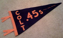
This past fall, my baseball team, the Dallas Colt .45s, ended up winning our amateur league championship. To honor the occasion, I decided to make up some felt pennants for the whole team.
Most standard pennants are 30″ x 12″ x 30″, but I decided to make my pennants smaller — 19″ x 9″ x 19″. Cost was the primary factor here, because I was planning on making 20-plus of these, so I didn’t want this project to end up costing a ton.
Once I settled on a design, I consulted with my mother, who’s great at creating random things of this nature — plus it just so happened that I’d gotten her one of these for Christmas. These machines are mainly used by people who do scrapbooking or other arts and crafts stuff. They can cut out different styles of letters, numbers, or graphics. I realize that this was a huge shortcut, but the results were worth it.
We went to a local fabric store and got three yards of navy blue felt for the pennants themselves, one yard of orange broadcloth for the lettering (I had hoped to use felt letters but we realized that would be too thick for the machine to cut), half a yard of orange felt for the binding and ribbons (that’s the trim that goes on the end of a pennant), and one yard of heavy heat-and-bond backing to adhere the broadcloth letters to the felt.
With all of the materials gathered, we ironed the heat-and-bond backing onto the broadcloth and used the machine to cut out the letters to our specified sizes. Next, we cut out the pennant-shaped triangles from the navy felt. After that, we cut out thin strips from the orange felt for the binding and ribbons. Each binding strip was about half an inch wide and nine inches long; the ribbons were half an inch wide, six inches long.
Now that all of the pieces were cut and ready to go, I used a sewing machine that is capable of doing minor embroidery to sew in “Fall 2008 Champs” on the end of each pennant. We did this before applying the other lettering, so we could adjust as needed in case it got a little off-center. After carefully ironing on the letters, we attached the binding and ribbons. The ribbons were folded under the binding as it was sewn to the pennant. Then, on the back side of each pennant, we ironed on another strip of broadcloth, which we numbered and signed.
The total cost for 28 pennants was around $35. If you only wanted to make a few, it could be done for much less. I think the end results were pretty good.
And as long as we’re at it”¦: Paul here. As long as we’re talking DIY, here are few additional projects that have recently been submitted:
• From Tim Forster: “About four years ago, during a summer break from college, I set out to make a coffee table patterned after the Cleveland Cavaliers’ court back from the Richfield Coliseum days. I always loved that ’80s Cavs logo and color scheme. I dug up some copies of the logo online and even found a great image of the court. It took me about two weeks of work on and off. A neighbor lent me his workshop to cut all the pieces, and I painted/varnished the table in my parents’ garage. It’s always been a great conversation piece and the perfect place to rest a cold one when watching the game.”
• From John Rossman: “In light of the whole Orioles apostrophe controversy, I decided to make a Baltimore Orioles hoodie that captured the old ’50s-style Baltimore logo and the ultra-cool line-drawn orange bird. After I downloaded the logos online, I scaled them in AutoCAD and printed them out. I then cut out the lettering and logos. I found the right color of felt and used iron-on adhesive to mount the letters after I had cut them out. I was about halfway through the word ‘Baltimore’ when I suddenly wished that I rooted for a city like ‘New York’ — anything with less curves and ‘O’s. But those feelings quickly dissipated when I looked at the final product, which turned out much better than I could have hoped. I like it even more than the Orioles hoodie I purchased at the stadium store three years ago for $60. This cost me about $20.”
• And here’s a note that may be of interest to DIYers: There are lots of hockey crests and patches available here (with thanks to Ross Bergman for the tip).
To those who’ve sent me additional DIY projects in recent days, don’t worry — your stories are coming.
Housekeeping Note: I may have a new ESPN column today — or maybe not until tomorrow. Once I know for sure, I’ll update this note (and post the link, if it turns out to be today). Either way, we’ll have abbreviated content here on the site tomorrow.
Raffle Reminder: I’m currently raffling off a soccer club jacket. For details, look here.
Uni Watch News Ticker: Yesterday I mentioned that I’d never seen a baseball jersey with UCLA inserts, but Scott Turner quickly turned my attention to this 2006 shot of Rice and Texas A&M/Corpus Christi both wearing that style. What is this? For the answer, look here. ”¦ Floozie. ”¦ Here’s another early version of the NFL logo, from 1953 (with thanks to Andy Moursund). ”¦ UCLA football may wear throwbacks next season. ”¦ Cool restaurant matchbook designs from Ted Kluszewski (here’s the back) and Pete Rose (with thanks to Robert Eden). ”¦ Lots of cool old Cincy sports photos here. ”¦ Iowa will be wearing new jerseys this Saturday against Purdue (with thanks to Zach Rieger). ”¦ Super-cool Bruins/Bosox crossover photo here. What’s it all about? Details here (very nice find by Matt Campbell). ”¦ Formula 1 driver Sebastian Vettel has a new helmet (with thanks to Kenny Ocker). ”¦ Michael Princip found this fantastic Chuck Ren illustration in the 11/21/76 issue of Pro magazine. The article was about players with advanced college degrees, including Tom Casanova (Bengals), Walter Payton (Bears), Bob Klein (Rams), Gerald Irons (Browns), Blaine Nye (Cowboys), and Dr. Bill Lenkaitis (Patriots),” he writes. ”¦ A high school is in trouble for using the Washington State logo (with thanks to Michael Carman). ”¦ Bit of a logo fuck-up in Philadelphia (with thanks to Paul Ricciardi). ”¦ Phil found something really weird: Yahoo Sports Canada ran a fairly boilerplate story yesterday about Miguel Tejada’s legal problems. But look at the second link in the first graf — that’s not a real Astros player, it’s Uni Watch reader and doubleknit era historian Bill Henderson! Someone at Yahoo must have done a simple Google image search on “Astros rainbow uniforms” and not realized what he’d come up with. ”¦ Also from Phil: More IOC/Hockey Canada tension, and the Wisconsin legislature may crack down on un-PC logos. … Rob Leavell reports that the Iranian soccer team has CNOB — that’s country name on back, for “Islamic Republic of Iran.”
My wife has one of those Cricut machines and I must say, it is an impressive device. For you hardcore DIYers, that might be worth a look. Can get pricey though. The same company that makes the Cricut also came out with a silk-screen-like machine that you can create custom shirt graphics with. The DIY possibilities are endless!
Late last night =bg= mentioned a photo of Frank Robinson in Indians all-red clutching a hot water bottle. This one?
link
I’d forgotten the Indians unis of that era hat the “baseball with batting Wahoo” patch.
—Ricko
It was Color on Color last night for the Michigan/Michigan state
Hello y’all…I’ve been AWOL the last few days.
Between the nicer weather in the Northeast, actually doing work at work and working on this:
link
link
link
link
link
To John and Tim, you two have combined my two favorite hobbies…woodworking and UW DIY!
That table is GREAT and I love the simplicity of the O’s sweatshirt.
BTW, those Hawkeye Unis are definitely SOD. The shorts remind me of Novas’!
[quote comment=”314386″]Late last night =bg= mentioned a photo of Frank Robinson in Indians all-red clutching a hot water bottle. This one?
link
I’d forgotten the Indians unis of that era hat the “baseball with batting Wahoo” patch.
—Ricko[/quote]
That is a great photo.
And feel free to put me before a firing squad for having an unpopular opinion, but I kind of like red baseball pants. The ones that Cuba wore a while back were nifty.
link
link
(I fully acknowledge that this goes against my usual traditionalist thinking, but I can’t help it. I . . . just . . . love . . . red . . . so . . . much.)
THe Uni Watch related link in the Tejada story is awesome. Spread the Uni related gospel however possible.
nice work josh, tim & john!
simply more proof that if you want something done right…
and powers, nice job, but are we ever gonna see any “in progress” shots, or just your finished products? (which also looks pretty schweet)
“UCLA football may wear throwbacks next season.” But, they will more than likely ruin it by wearing their wussy boy white cleats.
Let’s wait and see on the new Iowa uni. The diamond on the pants looks like it is going to be over the top, but the wing like stripes under the arms are going to look good. Hey Nike, lose the butt logo type that you do. Sheez.
[quote comment=”314386″]Late last night =bg= mentioned a photo of Frank Robinson in Indians all-red clutching a hot water bottle. This one?
link
I’d forgotten the Indians unis of that era hat the “baseball with batting Wahoo” patch.
—Ricko[/quote]
That’s it, thats the photo.
PS, great Cincy photo retrospective. I remember just about every one of those photos from the 70’s on. And the 1982 Chargers-Bengals game- I tell you, it was like being on another planet.
Last night, the Bulls honored Johnny “Red” Kerr ( link ). They wore red jerseys at home, and the court had an additional adornment. Also there is a great photo gallery here of old pictures of Red:
link
Lots of great old Illinois jerseys and pro basketball jerseys.
[quote comment=”314391″]nice work josh, tim & john!
simply more proof that if you want something done right…
and powers, nice job, but are we ever gonna see any “in progress” shots, or just your finished products? (which also looks pretty schweet)[/quote]
I took a bunch of pics this time…I would love to share them.
I’m always interested to read that many DIYers use CAD to resize the copied logos.
It is just as easy to use MS Word.
1. Right click on the image on the web.
2. Copy
3. Paste into MS Word
4. Right-click on the image
5. Format layout-Tight so that you can move it around
6. Crop as necessary
7. Either Pull from the corners, using the visible rulers or Right Click…Format Size.
Much easier
[quote comment=”314388″]Hello y’all…I’ve been AWOL the last few days.
Between the nicer weather in the Northeast, actually doing work at work and working on this:
link
link
link
link
link
To John and Tim, you two have combined my two favorite hobbies…woodworking and UW DIY!
That table is GREAT and I love the simplicity of the O’s sweatshirt.
BTW, those Hawkeye Unis are definitely SOD. The shorts remind me of Novas’![/quote]
Isn’t link name Druckenmiller?
this time he MEANS it
/no really, this time it’s for real
As a daily rider I can tell you that everything SEPTA does is a fuck up, so the NYC syline does not surprise me.
I like the new IOWA uniforms.
The diamond logo on the shorts is kinda retro, reminds me a lot of uniforms in the ’70s.
[quote comment=”314396″][quote comment=”314388″]Hello y’all…I’ve been AWOL the last few days.
Between the nicer weather in the Northeast, actually doing work at work and working on this:
link
link
link
link
link
To John and Tim, you two have combined my two favorite hobbies…woodworking and UW DIY!
That table is GREAT and I love the simplicity of the O’s sweatshirt.
BTW, those Hawkeye Unis are definitely SOD. The shorts remind me of Novas’![/quote]
Isn’t link name Druckenmiller?[/quote]
That was almost one of those “Wanna get Away” commercials!
Good catch…I’m glad I didnt iron down the letters yet!
Actually, Drunkenmiller sounds funnier…think he’d change his name for me?
the Cavs coffee table is awesome. minor flaw: you used the high school three point line (19′ 9″) rather than the NBA three (23′ 9″/22′) but that is a minor detail. Seriously, it’s really cool. You’ve given me an idea for my next DIY project
[quote comment=”314396″]Isn’t link name Druckenmiller?[/quote]
not anymore
One other minor flaw with the Cavs coffee table: you don’t have Jordan posterizing Craig Ehlo. ;-)
Here we go:
1. Find logo online:
link
2. Copy:
link
3. Paste and Format:
link
4. Resize:
link
5. Print onto cardstock:
link
Today’s mishap provides us with a little problems-solving:
I don’t have the font on my computers at school and I cannot download them…so I used the stencils from the other DIY’s.
1. I used a G from another project;
link
2. Cut the interior out with a untility knife…not my tool of choice…I prefer matte knives:
link
3. Trace the letter backwards on the “wrong” side of the fabric.
link
4. Place accordingly:
link
Not bad, huh?
[quote comment=”314397″]link
/no really, this time it’s for real[/quote]
THANK YOU PHIL!!!
YOU JUST MADE MY DAY!!!
BEST NEWS I’VE HEARD IN A LONG TIME!!
NOW WE JUST NEED TO GET A QB!!
link
Thanks for the kind words everyone.
[quote comment=”314401″]the Cavs coffee table is awesome. minor flaw: you used the high school three point line (19′ 9″) rather than the NBA three (23′ 9″/22′) but that is a minor detail. Seriously, it’s really cool. You’ve given me an idea for my next DIY project[/quote]
Thanks for pointing out the one thing I regret about the table, ha! The way it went down was this: when researching the design I found a generic image of the court with two three-point lines, an orange “college” line (maybe for CSU or some pre-season tourney?) and a blue NBA line. I went with the line that matched the rest of the court and looked the best aesthetically and geometrically.
Almost as soon as the first layer of varnish went down I regretted it.
[quote comment=”314406″]http://i256.photobucket.com/albums/hh169/mpowerrs1634/DSC02959.jpg[/quote]
is that black piece of material above “drunkenmiller” for the reebok vector logo??? haha. kidding. great work!!! looks awesome!
[quote comment=”314407″]Thanks for the kind words everyone.
[quote comment=”314401″]the Cavs coffee table is awesome. minor flaw: you used the high school three point line (19′ 9″) rather than the NBA three (23′ 9″/22′) but that is a minor detail. Seriously, it’s really cool. You’ve given me an idea for my next DIY project[/quote]
Thanks for pointing out the one thing I regret about the table, ha! The way it went down was this: when researching the design I found a generic image of the court with two three-point lines, an orange “college” line (maybe for CSU or some pre-season tourney?) and a blue NBA line. I went with the line that matched the rest of the court and looked the best aesthetically and geometrically.
Almost as soon as the first layer of varnish went down I regretted it.[/quote]
We are all just OCD about this stuff…don’t seat it…your work is GREAT!
You’ve gotta get Daugherty, Nance, Harper, Price, and Ehlo over to sign it!
[quote comment=”314408″][quote comment=”314406″]http://i256.photobucket.com/albums/hh169/mpowerrs1634/DSC02959.jpg[/quote]
is that black piece of material above “drunkenmiller” for the reebok vector logo??? haha. kidding. great work!!! looks awesome![/quote]
oops… not “drunken” LOL
[quote comment=”314408″][quote comment=”314406″]http://i256.photobucket.com/albums/hh169/mpowerrs1634/DSC02959.jpg[/quote]
is that black piece of material above “drunkenmiller” for the reebok vector logo??? haha. kidding. great work!!! looks awesome![/quote]
Where’s Beardface when you need him?
That’s the mourning band…I had half a mind to ethc 4.16.07 so that the orange underneath would come through.
BTW…if you noticed…the coaches caps at the Pro Bowl had the wordmark on them.
[quote comment=”314411″][quote comment=”314408″][quote comment=”314406″]http://i256.photobucket.com/albums/hh169/mpowerrs1634/DSC02959.jpg[/quote]
is that black piece of material above “drunkenmiller” for the reebok vector logo??? haha. kidding. great work!!! looks awesome![/quote]
Where’s Beardface when you need him?
That’s the mourning band…I had half a mind to ethc 4.16.07 so that the orange underneath would come through.
BTW…if you noticed…the coaches caps at the Pro Bowl had the wordmark on them.[/quote]
nice, i like it!
i want to do a hooded sweatshirt but a) i’m still working on my first 2 DIY jerseys (STILL have to finish the gray one), and b) just dont know what pittsburgh team to do… i’m leaning towards a pirates theme
[quote comment=”314412″][quote comment=”314411″][quote comment=”314408″][quote comment=”314406″]http://i256.photobucket.com/albums/hh169/mpowerrs1634/DSC02959.jpg[/quote]
is that black piece of material above “drunkenmiller” for the reebok vector logo??? haha. kidding. great work!!! looks awesome![/quote]
Where’s Beardface when you need him?
That’s the mourning band…I had half a mind to ethc 4.16.07 so that the orange underneath would come through.
BTW…if you noticed…the coaches caps at the Pro Bowl had the wordmark on them.[/quote]
nice, i like it!
i want to do a hooded sweatshirt but a) i’m still working on my first 2 DIY jerseys (STILL have to finish the gray one), and b) just dont know what pittsburgh team to do… i’m leaning towards a pirates theme[/quote]
I LOVE the Pirates unis, especially their font!
The baseball Giants of New York used it as well.
link
Another interesting find…while working on my VaTech DIY, I realized that the font within their wordmark:
link
is the same as the Steelers number and nameplate font:
link
Attention, DIYers. Stopped at JC Penney last night to pick up another pair of Levis (toe when though the thigh of my slightly distressed fashionable favorite pair, making it a large hole and rendering the jeans unwearable except for, oh, house painting).
Anyway, I picked up two $42 hoodies for less than $10 each. I imagine sizes and colors vary by store, but I got a decent forest green (may affix the Edmonton Eskimos patch I have to left chest, and a little CFL patch just above right wrist or on right sleeve) and an almost-Texas burnt orange. Plus, they had some $40-or-so cotton crewneck sweaters in colors like red, royal, forest, black, burgundy, brown and silver-gray (may pick up that royal one for my original WHA Winnipeg Jets 3″ patch), also for less than $10.
Just sayin…might be great time to go searching. I imagine most stores have some great prices on cooler weather apparel these days.
—Ricko
[quote comment=”314400″][quote comment=”314396″][quote comment=”314388″]Hello y’all…I’ve been AWOL the last few days.
Between the nicer weather in the Northeast, actually doing work at work and working on this:
link
link
link
link
link
To John and Tim, you two have combined my two favorite hobbies…woodworking and UW DIY!
That table is GREAT and I love the simplicity of the O’s sweatshirt.
BTW, those Hawkeye Unis are definitely SOD. The shorts remind me of Novas’![/quote]
Isn’t link name Druckenmiller?[/quote]
That was almost one of those “Wanna get Away” commercials!
Good catch…I’m glad I didnt iron down the letters yet!
Actually, Drunkenmiller sounds funnier…think he’d change his name for me?[/quote]
I just figured there was one of those legends about Druckenmiller while he was at VT. Like he got so trashed at a party that he ended up making out with the Provost. God I miss college…
[quote comment=”314413″][quote comment=”314412″][quote comment=”314411″][quote comment=”314408″][quote comment=”314406″]http://i256.photobucket.com/albums/hh169/mpowerrs1634/DSC02959.jpg[/quote]
is that black piece of material above “drunkenmiller” for the reebok vector logo??? haha. kidding. great work!!! looks awesome![/quote]
Where’s Beardface when you need him?
That’s the mourning band…I had half a mind to ethc 4.16.07 so that the orange underneath would come through.
BTW…if you noticed…the coaches caps at the Pro Bowl had the wordmark on them.[/quote]
nice, i like it!
i want to do a hooded sweatshirt but a) i’m still working on my first 2 DIY jerseys (STILL have to finish the gray one), and b) just dont know what pittsburgh team to do… i’m leaning towards a pirates theme[/quote]
I LOVE the Pirates unis, especially their font!
The baseball Giants of New York used it as well.
link
Another interesting find…while working on my VaTech DIY, I realized that the font within their wordmark:
link
is the same as the Steelers number and nameplate font:
link
Which was, in turn, the link font.
(That was my favorite show as a six-year old. Even though it was really easy…)
[quote comment=”314414″]Attention, DIYers. Stopped at JC Penney last night to pick up another pair of Levis (toe when though the thigh of my slightly distressed fashionable favorite pair, making it a large hole and rendering the jeans unwearable except for, oh, house painting).
Anyway, I picked up two $42 hoodies for less than $10 each. I imagine sizes and colors vary by store, but I got a decent forest green (may affix the Edmonton Eskimos patch I have to left chest, and a little CFL patch just above right wrist or on right sleeve) and an almost-Texas burnt orange. Plus, they had some $40-or-so cotton crewneck sweaters in colors like red, royal, forest, black, burgundy, brown and silver-gray (may pick up that royal one for my original WHA Winnipeg Jets 3″ patch), also for less than $10.
Just sayin…might be great time to go searching. I imagine most stores have some great prices on cooler weather apparel these days.
—Ricko[/quote]
costco seems to have some good deals from time to time too (and free food samples at lunch)…
saw a zip down hooded sweatshirt yesterday. may go back and get it!
[quote comment=”314413″][quote comment=”314412″][quote comment=”314411″][quote comment=”314408″][quote comment=”314406″]http://i256.photobucket.com/albums/hh169/mpowerrs1634/DSC02959.jpg[/quote]
is that black piece of material above “drunkenmiller” for the reebok vector logo??? haha. kidding. great work!!! looks awesome![/quote]
Where’s Beardface when you need him?
That’s the mourning band…I had half a mind to ethc 4.16.07 so that the orange underneath would come through.
BTW…if you noticed…the coaches caps at the Pro Bowl had the wordmark on them.[/quote]
nice, i like it!
i want to do a hooded sweatshirt but a) i’m still working on my first 2 DIY jerseys (STILL have to finish the gray one), and b) just dont know what pittsburgh team to do… i’m leaning towards a pirates theme[/quote]
I LOVE the Pirates unis, especially their font!
The baseball Giants of New York used it as well.
link
Another interesting find…while working on my VaTech DIY, I realized that the font within their wordmark:
link
is the same as the Steelers number and nameplate font:
link
i think the “o” in the steelers font is a little more oval shaped
[quote comment=”314400″][quote comment=”314396″][quote comment=”314388″]Hello y’all…I’ve been AWOL the last few days.
Between the nicer weather in the Northeast, actually doing work at work and working on this:
link
link
link
link
link
To John and Tim, you two have combined my two favorite hobbies…woodworking and UW DIY!
That table is GREAT and I love the simplicity of the O’s sweatshirt.
BTW, those Hawkeye Unis are definitely SOD. The shorts remind me of Novas’![/quote]
Isn’t link name Druckenmiller?[/quote]
That was almost one of those “Wanna get Away” commercials!
Good catch…I’m glad I didnt iron down the letters yet!
Actually, Drunkenmiller sounds funnier…think he’d change his name for me?[/quote]
Maybe you just need to find a drinking buddy named Miller and make it a gift….
i meant to say, “saw a zip down hooded sweatshirt for $15… made by champion”
I think it is ridiculous that WSU is picking on a high school. Most high schools use some college or a pro logo. Most colleges, if they even care, allow the school to use their logo – in whatever weird ass color rendition – for a dollar a year. WSU are Douchebags!
[quote comment=\”314421\”]I think it is ridiculous that WSU is picking on a high school. Most high schools use some college or a pro logo. Most colleges, if they even care, allow the school to use their logo – in whatever weird ass color rendition – for a dollar a year. WSU are Douchebags![/quote]
Here is the logo… same shape – but give me a break!!!
Now that I finished DIY #3…I can get back to work.
Our Spring Musical is “Damn Yankees”.
As part of the Tech Ed dept., we manges set design and stagecraft, which is a blast but since sports and unis are involved, I just had to be part of this.
The director and assembled people had no idea about baseball or uniforms, so I directed them to DTTN:
link
Then as I was helping the seamstress, I came up with my Princeton DIY idea and she taught me how to do it.
Well, now she is looking for blank caps that we can turn into those of the Senators as well as…in her words, “those stripey baseball socks”.
While I was searching online for them, a task I don’t mind doing by the way, I found this gem of a site:
link
Where you can actually do this:
link
Pretty cool!
St. Louis wore link last night against Vancouver.
[quote comment=”314422″][quote comment=\”314421\”]I think it is ridiculous that WSU is picking on a high school. Most high schools use some college or a pro logo. Most colleges, if they even care, allow the school to use their logo – in whatever weird ass color rendition – for a dollar a year. WSU are Douchebags![/quote]
Here is the logo… same shape – but give me a break!!![/quote]
Theft is theft. It’s as simple as that.
Had they gone to Washington first with a request, maybe a deal could have been worked out. But what incentive does the University have to create one now, after the theft is pointed out to them?
I knew people at Yahoo! Googled!
[quote comment=”314399″]I like the new IOWA uniforms.
The diamond logo on the shorts is kinda retro, reminds me a lot of uniforms in the ’70s.[/quote]
Yeah, they don’t look too bad. As an alum, I’ve been pretty excited for our makeover from the Alford era. The short stripes remind me of the pants our football team wore in the 90s with our banana peel jerseys, and now wear for practice.
link
I could do without the collar treatment and the dated ass stamp, but overall not a bad upgrade.
[quote comment=”314420″]i meant to say, “saw a zip down hooded sweatshirt for $15… made by champion”[/quote]
I should have noted the hoodies I found are zipdowns.
Great find on that stirrup site there, Powers!
Now you can order your vintage referee stirrups (since the Twin City site through Amazon from a while ago isn’t avail. anymore)
—Ricko
[quote comment=”314425″][quote comment=”314422″][quote comment=\”314421\”]I think it is ridiculous that WSU is picking on a high school. Most high schools use some college or a pro logo. Most colleges, if they even care, allow the school to use their logo – in whatever weird ass color rendition – for a dollar a year. WSU are Douchebags![/quote]
Here is the logo… same shape – but give me a break!!![/quote]
Theft is theft. It’s as simple as that.
Had they gone to Washington first with a request, maybe a deal could have been worked out. But what incentive does the University have to create one now, after the theft is pointed out to them?[/quote]
Allow it and consider it a compliment/form of promotion? WSU is the ONLY school out there suing high schools and such, and they’re not exactly the only logo being used. Traditionally High schools have just used pro or college logos and paid a dollar fee at most.
link
More then half are copyright violations. Virtually none of them have ever been sued.
I’ll echo it again, because it’s true. WSU is full of douchebaggery.
[quote comment=”314428″][quote comment=”314420″]i meant to say, “saw a zip down hooded sweatshirt for $15… made by champion”[/quote]
I should have noted the hoodies I found are zipdowns.
Great find on that stirrup site there, Powers!
Now you can order your vintage referee stirrups (since the Twin City site through Amazon from a while ago isn’t avail. anymore)
—Ricko[/quote]
Really?
Old man…you need to leanr how to use the Interweb!
link
[quote comment=”314430″][quote comment=”314428″][quote comment=”314420″]i meant to say, “saw a zip down hooded sweatshirt for $15… made by champion”[/quote]
I should have noted the hoodies I found are zipdowns.
Great find on that stirrup site there, Powers!
Now you can order your vintage referee stirrups (since the Twin City site through Amazon from a while ago isn’t avail. anymore)
—Ricko[/quote]
Really?
Old man…you need to leanr how to use the Interweb!
link
Yes, the irony…I need to learn how to type…or use spell-check.
Loved the new Vettel helmet, very nice looking. As far as the IOC vs Canada mess I figure it’s the IOC’s games therefore they set the rules. If Hockey Canada does not like it then they should not participate. I am not surprised that the democrats are the ones looking to be the PC police, waste of time as far as I can see.
Re: Wisconsin bill to eliminate Native American logos
Does anyone else find this to be ridiculous? I can certainly understand the argument that names like “Redmen” or “Redskins” are racially insensitive and offensive. But a name like the “Chiefs” with a logo of a headdress that was designed by the school district and the Indian tribe the logo was created to honor? I just don’t see how that is offensive. If the tribe has no problem with it, who is the legislature to say any of these names or logos are offensive?
I know this topic has probably been debated before on this blog, and when I took sports law in law school we discussed this topic for two days, but whenever I hear a new story about it, I get fired up.
When teams adopt these nicknames and logos, they do so because they are seeking to honor regional history. The intent is to bring the community together, not to ostracize a portion of it. That’s not to say that sometimes good intentions may still breed bad ideas, but I think these legislatures need to chill out and gain some perspective rather than assume a name or logo is offensive simply because it references Native Americans.
link
That is why…I DIY!WOW
[quote comment=”314421″]I think it is ridiculous that WSU is picking on a high school. Most high schools use some college or a pro logo. Most colleges, if they even care, allow the school to use their logo – in whatever weird ass color rendition – for a dollar a year. WSU are Douchebags![/quote]
Tough luck for Blanco High School. You would think that they could work out some kind of deal with WSU like SWC Susan mentioned. link are the helmets they use in football.
This could spell trouble for my high school alma mater’s arch-rival: the link. They are the 2-time defending 5A state football champions and have been using the same logo on their helmets for as long as I can remember (at least 15 years). And they don’t just use it for athletic purposes, it’s the school’s link.
can’t believe nobody suggested this yet, but wouldn’t that cavs table be an excellent quarters table?
and i think we need a new diy category…diywmh, or do it yourself with mom’s help.
[quote comment=”314431″][quote comment=”314430″][quote comment=”314428″][quote comment=”314420″]i meant to say, “saw a zip down hooded sweatshirt for $15… made by champion”[/quote]
I should have noted the hoodies I found are zipdowns.
Great find on that stirrup site there, Powers!
Now you can order your vintage referee stirrups (since the Twin City site through Amazon from a while ago isn’t avail. anymore)
—Ricko[/quote]
Really?
Old man…you need to leanr how to use the Interweb!
link
Yes, the irony…I need to learn how to type…or use spell-check.[/quote]
i just meant last time I checked the Amazon link I’d bookmarked way back when, it was dead. I hadn’t bothered to look for Twin City directly, but I did wonder if perhaps they had got out of the biz of selling onesys and twoseys. Especially cuz you mentioned that if you could find a site to order ref socks you’d wear them.
See? Mass confusion. Dogs and cats, living together…
Yeah, what IS this Interweb and net-site stuff I’ve heared about?
—Ricko
[quote comment=”314403″]One other minor flaw with the Cavs coffee table: you don’t have Jordan posterizing Craig Ehlo. ;-)[/quote]
ouch.
[quote comment=”314437″][quote comment=”314431″][quote comment=”314430″][quote comment=”314428″][quote comment=”314420″]i meant to say, “saw a zip down hooded sweatshirt for $15… made by champion”[/quote]
I should have noted the hoodies I found are zipdowns.
Great find on that stirrup site there, Powers!
Now you can order your vintage referee stirrups (since the Twin City site through Amazon from a while ago isn’t avail. anymore)
—Ricko[/quote]
Really?
Old man…you need to leanr how to use the Interweb!
link
Yes, the irony…I need to learn how to type…or use spell-check.[/quote]
i just meant last time I checked the Amazon link I’d bookmarked way back when, it was dead. I hadn’t bothered to look for Twin City directly, but I did wonder if perhaps they had got out of the biz of selling onesys and twoseys. Especially cuz you mentioned that if you could find a site to order ref socks you’d wear them.
See? Mass confusion. Dogs and cats, living together…
Yeah, what IS this Interweb and net-site stuff I’ve heared about?
—Ricko[/quote]
You are absolutely right…and when I order a dozen stirrups for the play…I’ll toss in a couple NW striped white on black.
However, for softball, I definitely want to get these:
link
[quote comment=”314435″][quote comment=”314421″]I think it is ridiculous that WSU is picking on a high school. Most high schools use some college or a pro logo. Most colleges, if they even care, allow the school to use their logo – in whatever weird ass color rendition – for a dollar a year. WSU are Douchebags![/quote]
Tough luck for Blanco High School. You would think that they could work out some kind of deal with WSU like SWC Susan mentioned. link are the helmets they use in football.
This could spell trouble for my high school alma mater’s arch-rival: the link. They are the 2-time defending 5A state football champions and have been using the same logo on their helmets for as long as I can remember (at least 15 years). And they don’t just use it for athletic purposes, it’s the school’s link.[/quote]
not anymore
[quote comment=”314400″]
Actually, Drunkenmiller sounds funnier…think he’d change his name for me?[/quote]
Dude, when you posted those pics last night, I thought you were referencing some famous jersey NOB “typo” or something. I was combing the interwebs looking for something about it.
What I found: a lot of people mistakenly refer to him as “Drunkenmiller.”
link
link
link
[quote comment=”314429″][quote comment=”314425″][quote comment=”314422″][quote comment=\”314421\”]I think it is ridiculous that WSU is picking on a high school. Most high schools use some college or a pro logo. Most colleges, if they even care, allow the school to use their logo – in whatever weird ass color rendition – for a dollar a year. WSU are Douchebags![/quote]
Here is the logo… same shape – but give me a break!!![/quote]
Theft is theft. It’s as simple as that.
Had they gone to Washington first with a request, maybe a deal could have been worked out. But what incentive does the University have to create one now, after the theft is pointed out to them?[/quote]
Allow it and consider it a compliment/form of promotion? WSU is the ONLY school out there suing high schools and such, and they’re not exactly the only logo being used. Traditionally High schools have just used pro or college logos and paid a dollar fee at most.
link
More then half are copyright violations. Virtually none of them have ever been sued.
I’ll echo it again, because it’s true. WSU is full of douchebaggery.[/quote]
Look at Abilene Cooper’s helmet on the Texas high school page. Looks a lot like WSU to me…
link
[quote comment=”314441″][quote comment=”314400″]
Actually, Drunkenmiller sounds funnier…think he’d change his name for me?[/quote]
Dude, when you posted those pics last night, I thought you were referencing some famous jersey NOB “typo” or something. I was combing the interwebs looking for something about it.
What I found: a lot of people mistakenly refer to him as “Drunkenmiller.”
link
link
link
By the way, are there any DIY projects in your future that don’t involve the color orange?
Anybody found a website where it’s possible to order only one pair of stripped stirrup? It seem there’s always a minimum of 6 to 12 required for ordering.
Thanks
That Cleveland Cavs table reminds me of my Villanova pong table:
link
link
link
It folds in half, the one side is the Villanova bball court, the other side is astroturf:
link
The astroturf is not only decorative, but also functional — the pong balls do not bounce nearly as far when they hit the turf!
I’m confused…
This photo is captioned “Bengals coach Forrest Gregg carried off the field at 1981 AFC title game”
link
But in the title game between the Bengals and Chargers, shown here
link
you can clearly see Cincy wearing their black jerseys.
[quote comment=”314446″]I’m confused…
This photo is captioned “Bengals coach Forrest Gregg carried off the field at 1981 AFC title game”
link
But in the title game between the Bengals and Chargers, shown here
link
you can clearly see Cincy wearing their black jerseys.[/quote]
clearly the first pic is mislabled…link (game nicknamed the “freezer bowl”) that day, and the bengals wore black
Â
/how often do you see O-linemen wearing sleeves?
//at -59F with windchill ya do
And in another Cincy pic…
Reds shortstop Barry Larkin puts a rose on third base before a 2000 game. Pete Rose was barred by MLB from attending the Big Red Machine reunion. Enquirer file/Jeff Swinger
It’s nine years overdue, but kudos to the Reds for doing the right thing with those throwbacks. I’m not crazy about the solid-colored socks, but at least they went with the green underbrim, elastic waistband and pullover jersey.
Josh:
Aren’t there the same number of o’s in Baltimore as there are in New York? ;-)
[quote comment=”314447″][quote comment=”314446″]I’m confused…
This photo is captioned “Bengals coach Forrest Gregg carried off the field at 1981 AFC title game”
link
But in the title game between the Bengals and Chargers, shown here
link
you can clearly see Cincy wearing their black jerseys.[/quote]
clearly the first pic is mislabled…link (game nicknamed the “freezer bowl”) that day, and the bengals wore black
Â
/how often do you see O-linemen wearing sleeves?
//at -59F with windchill ya do[/quote]
I figured it was probably mislabeled, but what threw me was Gregg being carried off the field. Maybe that was when they clinched the division?
“ESPN is reporting that Brett Favre sent an e-mail Ed Werder indicating that he will soon inform the New York Jets that he is retiring from professional football after 17 years.”
Did he say when he’d inform them that he’s changed his mind?
—Ricko
Pink Ice soon
link
[quote comment=”314435″][quote comment=”314421″]I think it is ridiculous that WSU is picking on a high school. Most high schools use some college or a pro logo. Most colleges, if they even care, allow the school to use their logo – in whatever weird ass color rendition – for a dollar a year. WSU are Douchebags![/quote]
Tough luck for Blanco High School. You would think that they could work out some kind of deal with WSU like SWC Susan mentioned. link are the helmets they use in football.
This could spell trouble for my high school alma mater’s arch-rival: the link. They are the 2-time defending 5A state football champions and have been using the same logo on their helmets for as long as I can remember (at least 15 years). And they don’t just use it for athletic purposes, it’s the school’s link.[/quote]
Your alma mater should be okay – those are different enough that they would for sure win in court (provided the big bad bully doesn’t scare them away). WSU can not copyright a jaw element!!!!! Technically, without spelling out any letters inside, all that would be required was a simple, tiny change in shape or whisker!
Here are the uniforms in the original stage version of Damn Yankees:
link
link
link
[quote comment=”314442″][quote comment=”314429″][quote comment=”314425″][quote comment=”314422″][quote comment=\”314421\”]I think it is ridiculous that WSU is picking on a high school. Most high schools use some college or a pro logo. Most colleges, if they even care, allow the school to use their logo – in whatever weird ass color rendition – for a dollar a year. WSU are Douchebags![/quote]
Here is the logo… same shape – but give me a break!!![/quote]
Theft is theft. It’s as simple as that.
Had they gone to Washington first with a request, maybe a deal could have been worked out. But what incentive does the University have to create one now, after the theft is pointed out to them?[/quote]
Allow it and consider it a compliment/form of promotion? WSU is the ONLY school out there suing high schools and such, and they’re not exactly the only logo being used. Traditionally High schools have just used pro or college logos and paid a dollar fee at most.
link
More then half are copyright violations. Virtually none of them have ever been sued.
I’ll echo it again, because it’s true. WSU is full of douchebaggery.[/quote]
Look at Abilene Cooper’s helmet on the Texas high school page. Looks a lot like WSU to me…
link
Maybe we should quit making the Douchebags’ jobs easy and quit pointing out the Texas High Schools with similar logos!!! Ooops – looks like that is the original WSU logo from the 60s (all I ever remember being on Abilene Cooper’s helmets).
Paul – the Miguel Tejada article is a Yahoo! Sports article. They are a pretty big operation, aren’t they.
Don’t they need permission to use someone else’s photo? Flickr doesn’t mean public use.
Or is it OK, because it’s just a link?
[quote comment=”314455″][quote comment=”314442″][quote comment=”314429″][quote comment=”314425″][quote comment=”314422″][quote comment=\”314421\”]I think it is ridiculous that WSU is picking on a high school. Most high schools use some college or a pro logo. Most colleges, if they even care, allow the school to use their logo – in whatever weird ass color rendition – for a dollar a year. WSU are Douchebags![/quote]
Here is the logo… same shape – but give me a break!!![/quote]
Theft is theft. It’s as simple as that.
Had they gone to Washington first with a request, maybe a deal could have been worked out. But what incentive does the University have to create one now, after the theft is pointed out to them?[/quote]
Allow it and consider it a compliment/form of promotion? WSU is the ONLY school out there suing high schools and such, and they’re not exactly the only logo being used. Traditionally High schools have just used pro or college logos and paid a dollar fee at most.
link
More then half are copyright violations. Virtually none of them have ever been sued.
I’ll echo it again, because it’s true. WSU is full of douchebaggery.[/quote]
Look at Abilene Cooper’s helmet on the Texas high school page. Looks a lot like WSU to me…
link
Maybe we should quit making the Douchebags’ jobs easy and quit pointing out the Texas High Schools with similar logos!!! Ooops – looks like that is the original WSU logo from the 60s (all I ever remember being on Abilene Cooper’s helmets).[/quote]
There’s at least 100 stolen logos from the NFL and NCAA on the Texas helmet page. I saw Kansas State and Texas U alot. The Longhorns are already douchebags enough as it is…
Does anyone know where I can find a Minnesota Twins Jersey Script patch? I’m looking for one of the 12-16 inch patches that runs across the front of their home jersey for a DIY project. Any thoughts from the group? Couldn’t find one for them on teampatch.com. Thanks all!
[quote comment=”314429″][quote comment=”314425″][quote comment=”314422″][quote comment=\”314421\”]I think it is ridiculous that WSU is picking on a high school. Most high schools use some college or a pro logo. Most colleges, if they even care, allow the school to use their logo – in whatever weird ass color rendition – for a dollar a year. WSU are Douchebags![/quote]
Here is the logo… same shape – but give me a break!!![/quote]
Theft is theft. It’s as simple as that.
Had they gone to Washington first with a request, maybe a deal could have been worked out. But what incentive does the University have to create one now, after the theft is pointed out to them?[/quote]
Allow it and consider it a compliment/form of promotion? WSU is the ONLY school out there suing high schools and such, and they’re not exactly the only logo being used.[/quote]
Oh, please. You’ve never heard of the University of Wisconsin?
Besides, stealing doesn’t somehow magically become right if more people do it.
wow… NCAA Football want to be like the NFL?
link?
[quote comment=”314454″]Here are the uniforms in the original stage version of Damn Yankees:
link
link
link[/quote]
Yowza – whatever she wants, she gets!
[quote comment=”314454″]Here are the uniforms in the original stage version of Damn Yankees:
link
link
I played the coach in Damn Yankees back in high school. I got to wear the coolest satin bench jacket. The stirrups were plain navy, sort of boring, but the hats were glorious, broken-in wool models.
link[/quote]
[quote comment=”314447″][quote comment=”314446″]I’m confused…
This photo is captioned “Bengals coach Forrest Gregg carried off the field at 1981 AFC title game”
link
But in the title game between the Bengals and Chargers, shown here
link
you can clearly see Cincy wearing their black jerseys.[/quote]
clearly the first pic is mislabled…link (game nicknamed the “freezer bowl”) that day, and the bengals wore black
Â
/how often do you see O-linemen wearing sleeves?
//at -59F with windchill ya do[/quote]
And the beauty of that was the Cincy linemen coming out without sleeves; just some vaseline on the arms to keep them from getting chapped. Talk about an intimidation factor. If I remember correctly, San Diego played a week earlier in 70+ degree temperatures so they went well over 100+ degree difference.
[quote comment=”314404″]Here we go:
1. Find logo online:
link
2. Copy:
link
3. Paste and Format:
link
4. Resize:
link
5. Print onto cardstock:
link
Today’s mishap provides us with a little problems-solving:
I don’t have the font on my computers at school and I cannot download them…so I used the stencils from the other DIY’s.
1. I used a G from another project;
link
2. Cut the interior out with a untility knife…not my tool of choice…I prefer matte knives:
link
3. Trace the letter backwards on the “wrong” side of the fabric.
link
4. Place accordingly:
link
Not bad, huh?[/quote]
Great work Matt, and I like how you shared this info with pictures of the steps.
[quote comment=”314461″][quote comment=”314454″]Here are the uniforms in the original stage version of Damn Yankees:
link
link
link[/quote]
Yowza – whatever she wants, she gets![/quote]
I dunno, she doesn’t really fit my conception of the character. I always imagined Lola as the sultry latin-type. That actress seems more like the Shirley MacLaine type, which, while appropriate due to “The Apartment” home-wrecker associations, doesn’t strike me as the grand-temptress archtype.
Anyway, I wish I knew more about unis back when I was younger, because I saw several productions of Damn Yankees during the ’90s, including the Jerry Lewis lead revival when it was at the Kennedy Center. It was good stuff, but I can’t remember one wit about the costumes.
As a Cav fan I liked the table done by Tim. And having some of those old style pennants when I was a kid, I enjoyed the DIY pennants by Josh.
so… anybody (8+ people at least) want to go in together and make some 60s era pirates socks???
link
here:
link
(i’d suggest strriups… but socks you can get away with at work!)
sound interesting???
[quote comment=”314465″][quote comment=”314461″][quote comment=”314454″]Here are the uniforms in the original stage version of Damn Yankees:
link
link
link[/quote]
Yowza – whatever she wants, she gets![/quote]
I dunno, she doesn’t really fit my conception of the character. I always imagined Lola as the sultry latin-type. That actress seems more like the Shirley MacLaine type, which, while appropriate due to “The Apartment” home-wrecker associations, doesn’t strike me as the grand-temptress archtype.
Anyway, I wish I knew more about unis back when I was younger, because I saw several productions of Damn Yankees during the ’90s, including the Jerry Lewis lead revival when it was at the Kennedy Center. It was good stuff, but I can’t remember one wit about the costumes.[/quote]
But the gams, man! The gams!
Not a lot of pictures seem available from the 1990s revival, except for link.
link is from last year’s City Center revival (as is this shot of link as Lola.
[quote comment=”314465″][quote comment=”314461″][quote comment=”314454″]Here are the uniforms in the original stage version of Damn Yankees:
link
link
link[/quote]
Yowza – whatever she wants, she gets![/quote]
I dunno, she doesn’t really fit my conception of the character. I always imagined Lola as the sultry latin-type. That actress seems more like the Shirley MacLaine type, which, while appropriate due to “The Apartment” home-wrecker associations, doesn’t strike me as the grand-temptress archtype.
Anyway, I wish I knew more about unis back when I was younger, because I saw several productions of Damn Yankees during the ’90s, including the Jerry Lewis lead revival when it was at the Kennedy Center. It was good stuff, but I can’t remember one wit about the costumes.[/quote]
The original Broadway “Lola” was Gwen Verdon (who also stared in the movie version). A redhead. Not that you’re wrong about the Latin image, especially because of the style of “Whatever Lola Wants”, just saying what the creators went for. I think the part was written for her, actually.
Trivia question. Gwen Verdon later played the mother of leading TV character who was a pretty big baseball fan. Anyone name that character?
—Ricko
she STARRED in the movie version. Just got back from lunch. Fingers cold. Typing sucks. LOL
Just saw this jersey on ebay: link
1980s Cleveland Browns jersey with Name, First Initial on Back (whatever acronym that is). Anyway, pretty cool looking shirt.
She starred, WE stared. :D
Looks like the 1994 revival used the same link – but I can’t tell if they have pinstripes.
“I’d sell my soul for one long ball hitter.”
In the movie version, the wife of the guy who turns into Joe Hardy is played by Jean Stapleton (Edith Bunker).
Musical is based on a book, “The Year The Yankees Lost The Pennant.”
link
(Cover art by famed sports cartoonist Willard Mullen)
—Ricko
just got sent this…
link
i don’t necessarily agree with the choices or the batting order…but it’s a pretty cool little list
[quote comment=”314453″][quote comment=”314435″][quote comment=”314421″]I think it is ridiculous that WSU is picking on a high school. Most high schools use some college or a pro logo. Most colleges, if they even care, allow the school to use their logo – in whatever weird ass color rendition – for a dollar a year. WSU are Douchebags![/quote]
Tough luck for Blanco High School. You would think that they could work out some kind of deal with WSU like SWC Susan mentioned. link are the helmets they use in football.
This could spell trouble for my high school alma mater’s arch-rival: the link. They are the 2-time defending 5A state football champions and have been using the same logo on their helmets for as long as I can remember (at least 15 years). And they don’t just use it for athletic purposes, it’s the school’s link.[/quote]
Your alma mater should be okay – those are different enough that they would for sure win in court (provided the big bad bully doesn’t scare them away). WSU can not copyright a jaw element!!!!! Technically, without spelling out any letters inside, all that would be required was a simple, tiny change in shape or whisker![/quote]
Actually, it’s my alma mater’s arch rival. But they are using the same logo as Blanco High in Texas. I could definitely see a problem arise.
What I find interesting are the logos that some high schools use that are from different sports or not from sport at all. Football helmet logos are my main interest when it comes to uniform design.
[quote comment=”314473″]”I’d sell my soul for one long ball hitter.”
In the movie version, the wife of the guy who turns into Joe Hardy is played by Jean Stapleton (Edith Bunker).
Musical is based on a book, “The Year The Yankees Lost The Pennant.”
link
(Cover art by famed sports cartoonist Willard Mullen)
—Ricko[/quote]
My bad. Jean Stapleton played the best friend of the guy’s wife.
[quote comment=”314468″][quote comment=”314465″][quote comment=”314461″][quote comment=”314454″]Here are the uniforms in the original stage version of Damn Yankees:
link
link
link[/quote]
Yowza – whatever she wants, she gets![/quote]
I dunno, she doesn’t really fit my conception of the character. I always imagined Lola as the sultry latin-type. That actress seems more like the Shirley MacLaine type, which, while appropriate due to “The Apartment” home-wrecker associations, doesn’t strike me as the grand-temptress archtype.
Anyway, I wish I knew more about unis back when I was younger, because I saw several productions of Damn Yankees during the ’90s, including the Jerry Lewis lead revival when it was at the Kennedy Center. It was good stuff, but I can’t remember one wit about the costumes.[/quote]
But the gams, man! The gams!
Not a lot of pictures seem available from the 1990s revival, except for link.
link is from last year’s City Center revival (as is this shot of link as Lola.[/quote]
Whenever I see Krakowski, I think of “Me Want Food:
link
and “Muffin Top” from 30 Rock:
link
[quote comment=”314477″][quote comment=”314468″][quote comment=”314465″][quote comment=”314461″][quote comment=”314454″]Here are the uniforms in the original stage version of Damn Yankees:
link
link
link[/quote]
Yowza – whatever she wants, she gets![/quote]
I dunno, she doesn’t really fit my conception of the character. I always imagined Lola as the sultry latin-type. That actress seems more like the Shirley MacLaine type, which, while appropriate due to “The Apartment” home-wrecker associations, doesn’t strike me as the grand-temptress archtype.
Anyway, I wish I knew more about unis back when I was younger, because I saw several productions of Damn Yankees during the ’90s, including the Jerry Lewis lead revival when it was at the Kennedy Center. It was good stuff, but I can’t remember one wit about the costumes.[/quote]
But the gams, man! The gams!
Not a lot of pictures seem available from the 1990s revival, except for link.
link is from last year’s City Center revival (as is this shot of link as Lola.[/quote]
Whenever I see Krakowski, I think of “Me Want Food:
link
and “Muffin Top” from 30 Rock:
link
And didn’t Lilith from Cheers, Bebe Neuwirth play Lola for awhile?
link
Another ebay find: link
Vintage All-Star game jersey. Great looking tag, too.
[quote comment=”314470″]she STARRED in the movie version. Just got back from lunch. Fingers cold. Typing sucks. LOL[/quote]
I remember the movie version, I think. “Whatever Lola Wants” was the tamest striptease ever. Nothing like that still. She basically just stood in place and got increasingly naked. Stupid film censors.
[quote comment=”314478″]
And didn’t Lilith from Cheers, Bebe Neuwirth play Lola for awhile?
link
Yep, she was the original Lola in the 1994 revival. She was gone by the time Jerry Lewis took over Applegate.
[quote comment=”314474″]just got sent this…
link
i don’t necessarily agree with the choices or the batting order…but it’s a pretty cool little list[/quote]
Wesley Snipes in there twice. Might have to have Omar Epps (W.M. Hayes in MLII and currently on “House”) bat leadoff.
Just sayin’. Since we’re dealing with reality an’ all.
No mention of William Peterson’s character in “Long Gone”? Or anyone from “Bingo Long’s Traveling All-Stars and Motor Kings”?
—Ricko
—Ricko
DIYs are the UniWatch equivalent of the swimsuit issue- getting us through until spring training.
[quote comment=”314469″][quote comment=”314465″][quote comment=”314461″][quote comment=”314454″]Here are the uniforms in the original stage version of Damn Yankees:
link
link
link[/quote]
Yowza – whatever she wants, she gets![/quote]
I dunno, she doesn’t really fit my conception of the character. I always imagined Lola as the sultry latin-type. That actress seems more like the Shirley MacLaine type, which, while appropriate due to “The Apartment” home-wrecker associations, doesn’t strike me as the grand-temptress archtype.
Anyway, I wish I knew more about unis back when I was younger, because I saw several productions of Damn Yankees during the ’90s, including the Jerry Lewis lead revival when it was at the Kennedy Center. It was good stuff, but I can’t remember one wit about the costumes.[/quote]
The original Broadway “Lola” was Gwen Verdon (who also stared in the movie version). A redhead. Not that you’re wrong about the Latin image, especially because of the style of “Whatever Lola Wants”, just saying what the creators went for. I think the part was written for her, actually.
Trivia question. Gwen Verdon later played the mother of leading TV character who was a pretty big baseball fan. Anyone name that character?
—Ricko[/quote]
Magnum P.I.
This is probably old, so I apologize in advance if this has been brought up already. I just came across another one of those ugly uniform listings, this time on the NY Daily News site.
link
There are some pics I hadn’t seen before…
[quote comment=”314485″][quote comment=”314469″][quote comment=”314465″][quote comment=”314461″][quote comment=”314454″]Here are the uniforms in the original stage version of Damn Yankees:
link
link
link[/quote]
Yowza – whatever she wants, she gets![/quote]
I dunno, she doesn’t really fit my conception of the character. I always imagined Lola as the sultry latin-type. That actress seems more like the Shirley MacLaine type, which, while appropriate due to “The Apartment” home-wrecker associations, doesn’t strike me as the grand-temptress archtype.
Anyway, I wish I knew more about unis back when I was younger, because I saw several productions of Damn Yankees during the ’90s, including the Jerry Lewis lead revival when it was at the Kennedy Center. It was good stuff, but I can’t remember one wit about the costumes.[/quote]
The original Broadway “Lola” was Gwen Verdon (who also stared in the movie version). A redhead. Not that you’re wrong about the Latin image, especially because of the style of “Whatever Lola Wants”, just saying what the creators went for. I think the part was written for her, actually.
Trivia question. Gwen Verdon later played the mother of leading TV character who was a pretty big baseball fan. Anyone name that character?
—Ricko[/quote]
Magnum P.I.[/quote]
I didn’t say it was a HARD trivia question. LOL
Cool. Just got boss’ Wild tickets for tonight. 4th row in the corner, on the aisle. Avalanche in town.
What about Shoeless Joe Jackson (Ray Liotta) from field of dreams?
[quote comment=”314484″]DIYs are the UniWatch equivalent of the swimsuit issue- getting us through until spring training.[/quote]
Now, that there is a true fersure statement.
[quote comment=”314488″]What about Shoeless Joe Jackson (Ray Liotta) from field of dreams?[/quote]
not a fictional character
I don’t want to argue, but….
Wouldn’t the ghost of Shoeless Joe be a fictional character?
A while back, someone posted a link with nhl jerseys, without the crest… I was wondering if anyone knew the link. Thanks!
[quote comment=”314492″]A while back, someone posted a link with nhl jerseys, without the crest… I was wondering if anyone knew the link. Thanks![/quote]
link
Thank you!
[quote comment=”314491″]I don’t want to argue, but….
Wouldn’t the ghost of Shoeless Joe be a fictional character?[/quote]
Somebody’d bitch about him being a ringer, probably.
The rumor in Boiler country (Purdue) is that the old Gold and Black will unveil their new unis vs. Iowa on saturday. I believe this was posted on this site last week. The unis for retail purposes will be released on 2/17.
No offense to Hawkeye Nation, but I hope the Boilers don’t mimic the pattern of Iowa’s new unis.
I hope we run out something like this:
link
That’s Rick the Rocket Mount!!!
A few weeks ago, there was discussion regarding high school teams using an XFL helmet logo, specifically the logo for the New York/New Jersey Hitmen. Several examples were mentioned by the Uni Watch readership but the question was posed as to why only that logo? Well, I have found another school that is using a former XFL logo, the link use the helmet logo of the link with the addition of a “W” and the word “Dons.”
[quote comment=”314496″]The rumor in Boiler country (Purdue) is that the old Gold and Black will unveil their new unis vs. Iowa on saturday. I believe this was posted on this site last week. The unis for retail purposes will be released on 2/17.
No offense to Hawkeye Nation, but I hope the Boilers don’t mimic the pattern of Iowa’s new unis.
I hope we run out something like this:
link
That’s Rick the Rocket Mount!!![/quote]
When did Purdue stop being the Boilermakers?
And if “Boilers” is shorthand, how is reference to a mechanical thing better than to a person?
Kinda like Nebraska shortening it to “Husks”.
Or the Edmonton “Oils.”
Or West Virginia “Mountains”.
Not saying shouldn’t do it, just saying I don’t get it. Especially because, as someone who writes a ton of radio commercials, I can accurately tell you that “Boilermakers” has a lot more going for it, aurally speaking. Just a far, far more interesting word to say, and hear. Anything with a hard “K” sound is almost impossible to ignore.
Personally, I still think it started cuz some uptight church lady type discovered there was a drink called a Boilermaker. Oh…MY!!!
—Ricko
Make that an “INANIMATE mechanical thing.”
Is Iowa phasing out white jerseys (which I personally wouldn’t mind, or are they just not shown?
I absolutely would love to see a high school team use one of those MLB logos on a football helmet. I think the best one’s are STL, Houston, Washington, and Cincy
plus the Celtics one under NBA
link
Ricko,
I totally agree with you on the boilers vs. Boilermakers deal.
The use of it probably derives from the inebriated student section after they attend “Breakfast Club” on Saturday Mornings before Home Games.
[quote comment=”314388″]Hello y’all…I’ve been AWOL the last few days.
Between the nicer weather in the Northeast, actually doing work at work and working on this:
link
link
link
link
link
To John and Tim, you two have combined my two favorite hobbies…woodworking and UW DIY!
That table is GREAT and I love the simplicity of the O’s sweatshirt.
BTW, those Hawkeye Unis are definitely SOD. The shorts remind me of Novas’![/quote]
Love the old VT logo being used, (hope the ‘n’ hasn’t been permanently fixed on yet though). I may have to do my own Tech DIY soon
[quote comment=”314387″]It was Color on Color last night for the Michigan/Michigan state[/quote]
And according to link, that could happen more frequently on the gridiron:
“The [rules] committee did recommend the following 2009 rules changes: …
– Both teams can wear colored jerseys if approved by a conference office and both teams. When an agreement is unable to be reached, the visiting team will wear white.
much better than their current shitty helmets
link
[quote comment=”314505″][quote comment=”314387″]It was Color on Color last night for the Michigan/Michigan state[/quote]
And according to link, that could happen more frequently on the gridiron:
“The [rules] committee did recommend the following 2009 rules changes: …
– Both teams can wear colored jerseys if approved by a conference office and both teams. When an agreement is unable to be reached, the visiting team will wear white.[/quote]
Actually, I’ve been wondering why it took this long, considering it’s almost impossible to even FIND a black and white television these days.
Plus, everything on the web is in color. That, coupled with the extraordinary drop in newspaper importance a source of information, is what turned out to be the tipping point, I imagine.
[quote comment=”314474″]just got sent this…
link
i don’t necessarily agree with the choices or the batting order…but it’s a pretty cool little list[/quote]
This team needs coaches:
First base, Joe Jaros (Phil Foster): link
Third base, Red Blow (Richard Farnsworth): link
Pitching coach, Larry Hockett (Robert Wuhl): link
If you can bend the rules, Charlie Lau (Max Dugan Returns) can be hitting coach.
[quote comment=”314414″]Attention, DIYers. Stopped at JC Penney last night to pick up another pair of Levis (toe when though the thigh of my slightly distressed fashionable favorite pair, making it a large hole and rendering the jeans unwearable except for, oh, house painting).
Anyway, I picked up two $42 hoodies for less than $10 each. I imagine sizes and colors vary by store, but I got a decent forest green (may affix the Edmonton Eskimos patch I have to left chest, and a little CFL patch just above right wrist or on right sleeve) and an almost-Texas burnt orange. Plus, they had some $40-or-so cotton crewneck sweaters in colors like red, royal, forest, black, burgundy, brown and silver-gray (may pick up that royal one for my original WHA Winnipeg Jets 3″ patch), also for less than $10.
Just sayin…might be great time to go searching. I imagine most stores have some great prices on cooler weather apparel these days.
—Ricko[/quote]
Rick, if there are any heavy-fabric zip-up green sweaters/fleeces like the hoodies you picked up, let me know. I’ll have cash for you in a heartbeat.
Michigan-Ohio State football color-on-color does sound like fun, doesn’t it.
Or Texas-Texas Tech?
Oregon-Oregon State? Hmmm, guess that depends on Oregon’s choice.
“link“
[quote comment=”314511″]”link“[/quote]
“Candlesticks are always a nice gift.”
[quote comment=”314508″][quote comment=”314474″]just got sent this…
link
i don’t necessarily agree with the choices or the batting order…but it’s a pretty cool little list[/quote]
This team needs coaches:
First base, Joe Jaros (Phil Foster): link
Third base, Red Blow (Richard Farnsworth): link
Pitching coach, Larry Hockett (Robert Wuhl): link
If you can bend the rules, Charlie Lau (Max Dugan Returns) can be hitting coach.[/quote]
Still no love for the coaching/managing skills of Stud Cantrell (William Peterson) of the Tampico Stogies in LONG GONE?
Well, it was made for HBO, I think, so it probably doesn’t count.
Although his girlfriend was named Dixie Lee Boxx.
That must count for SOMETHING.
[quote comment=”314509″]
Rick, if there are any heavy-fabric zip-up green sweaters/fleeces like the hoodies you picked up, let me know. I’ll have cash for you in a heartbeat.[/quote]
Let me add – NO HOODIES! I hate hoods. That’s all for now. Carry on. :o)
[quote comment=”314515″][quote comment=”314509″]
Rick, if there are any heavy-fabric zip-up green sweaters/fleeces like the hoodies you picked up, let me know. I’ll have cash for you in a heartbeat.[/quote]
Let me add – NO HOODIES! I hate hoods. That’s all for now. Carry on. :o)[/quote]
Gotcha.
love the flying vh on van horn’s helmet from texas…
What does that make you? Larry!
Lollygaggers!
Now that’s an inspirational manager.
[quote comment=”314501″]I absolutely would love to see a high school team use one of those MLB logos on a football helmet. I think the best one’s are STL, Houston, Washington, and Cincy[/quote]
Ask and ye shall receive:
link
link
link
link
link
link
Cincy? Well that logo is practically the same as the Bears’ logo. Is it not?
[quote comment=”314490″][quote comment=”314488″]What about Shoeless Joe Jackson (Ray Liotta) from field of dreams?[/quote]
not a fictional character[/quote]
I believe in Shoeless Joe’s ghost…every time I visit the HOF, it feels cold and empty…he haunts it until they let him in…but they never will…therefore the ghost is real!!
[quote comment=”314507″][quote comment=”314505″][quote comment=”314387″]It was Color on Color last night for the Michigan/Michigan state[/quote]
And according to link, that could happen more frequently on the gridiron:
“The [rules] committee did recommend the following 2009 rules changes: …
– Both teams can wear colored jerseys if approved by a conference office and both teams. When an agreement is unable to be reached, the visiting team will wear white.[/quote]
Actually, I’ve been wondering why it took this long, considering it’s almost impossible to even FIND a black and white television these days.
Plus, everything on the web is in color. That, coupled with the extraordinary drop in newspaper importance a source of information, is what turned out to be the tipping point, I imagine.[/quote]
If this does happen soon I think it will be great. But I noted when I look at old football pictures I now get a charge when I see a team wearing white jerseys. You do not see many pictures from the 1920’s,30’s,40’s wearing white jerseys.
I hope they do change this old rule soon.
[quote comment=”314411″][quote comment=”314408″][quote comment=”314406″]http://i256.photobucket.com/albums/hh169/mpowerrs1634/DSC02959.jpg[/quote]
is that black piece of material above “drunkenmiller” for the reebok vector logo??? haha. kidding. great work!!! looks awesome![/quote]
Where’s Beardface when you need him?
That’s the mourning band…I had half a mind to ethc 4.16.07 so that the orange underneath would come through.
BTW…if you noticed…the coaches caps at the Pro Bowl had the wordmark on them.[/quote]
Dude, I was in training all day at work…
Just read over this… fucking awesome
But… MPowers, you do realize VT never wore the black stripe, right?
All our sports teams wore the link and the rest of the ACC wore the stripe.
Good work, though… Really liked it.
[quote comment=”314463″][quote comment=”314447″][quote comment=”314446″]I’m confused…
This photo is captioned “Bengals coach Forrest Gregg carried off the field at 1981 AFC title game”
link
But in the title game between the Bengals and Chargers, shown here
link
you can clearly see Cincy wearing their black jerseys.[/quote]
clearly the first pic is mislabled…link (game nicknamed the “freezer bowl”) that day, and the bengals wore black
Â
/how often do you see O-linemen wearing sleeves?
//at -59F with windchill ya do[/quote]
And the beauty of that was the Cincy linemen coming out without sleeves; just some vaseline on the arms to keep them from getting chapped. Talk about an intimidation factor. If I remember correctly, San Diego played a week earlier in 70+ degree temperatures so they went well over 100+ degree difference.[/quote]
Yup I couldn’t take it, I left. My radio station was down there passing out free Bengals stickers to people, and it was just….amazing. Everything was hazy gray, and very still and quiet. When it’s that cold, nothing moves. Just remarkable. Walked on the Ohio River, too. ON it.
Has DeMarcus Beasley always worn these bright yellow kicks on the pitch?
link
Also, USA had some pretty sweet warm-up jackets!
link
Why does the Bruins player have pinstripes on? It kinda looks like a Yankees’ jersey. Any ideas?
I’m watching Law & Order… a mob of people recognized an alleged fire-bomber by the “uncommon font” on his high school sweatshirt. No doubt it was a mob of Uni-Watchers with that attention to detail! hahaha
[quote comment=”314521″][quote comment=”314507″][quote comment=”314505″][quote comment=”314387″]It was Color on Color last night for the Michigan/Michigan state[/quote]
And according to link, that could happen more frequently on the gridiron:
“The [rules] committee did recommend the following 2009 rules changes: …
– Both teams can wear colored jerseys if approved by a conference office and both teams. When an agreement is unable to be reached, the visiting team will wear white.[/quote]
Actually, I’ve been wondering why it took this long, considering it’s almost impossible to even FIND a black and white television these days.
Plus, everything on the web is in color. That, coupled with the extraordinary drop in newspaper importance a source of information, is what turned out to be the tipping point, I imagine.[/quote]
If this does happen soon I think it will be great. But I noted when I look at old football pictures I now get a charge when I see a team wearing white jerseys. You do not see many pictures from the 1920’s,30’s,40’s wearing white jerseys.
I hope they do change this old rule soon.[/quote]
I hope they don’t change the rule. If on rare occasions teams want to go color on color, fine. But I’m not keen on this becoming a regular occurence.
it’s prolly too late for anyone to answer, but i’m inspired to make a couple shirts and i’d like to know if theres a way to print a crest (like john’s “Baltimore”) in microsoft word. im really bad at the DIY stuff but i’d like to start. help me out if you can!
thanks in advance
[quote comment=”314529″]it’s prolly too late for anyone to answer, but i’m inspired to make a couple shirts and i’d like to know if theres a way to print a crest (like john’s “Baltimore”) in microsoft word. im really bad at the DIY stuff but i’d like to start. help me out if you can!
thanks in advance[/quote]
Check out post #20.
With a larger image, you might have to:
1. find the image online
2. copy and paste into word.
3. resize the image
4. copy that finished image
5. using the rulers, halve or quarter the image and resize onto different pages so that your size is correct.
[quote comment=”314530″][quote comment=”314529″]it’s prolly too late for anyone to answer, but i’m inspired to make a couple shirts and i’d like to know if theres a way to print a crest (like john’s “Baltimore”) in microsoft word. im really bad at the DIY stuff but i’d like to start. help me out if you can!
thanks in advance[/quote]
Check out post #20.
With a larger image, you might have to:
1. find the image online
2. copy and paste into word.
3. resize the image
4. copy that finished image
5. using the rulers, halve or quarter the image and resize onto different pages so that your size is correct.[/quote]
oh ok thank you so much. i appreciate the help
[quote comment=”314448″]And in another Cincy pic…
Reds shortstop Barry Larkin puts a rose on third base before a 2000 game. Pete Rose was barred by MLB from attending the Big Red Machine reunion. Enquirer file/Jeff Swinger
It’s nine years overdue, but kudos to the Reds for doing the right thing with those throwbacks. I’m not crazy about the solid-colored socks, but at least they went with the green underbrim, elastic waistband and pullover jersey.[/quote]
Nike Air Clipper Anniversary…Barry Larking was always a class act
[quote comment=”314532″][quote comment=”314448″]And in another Cincy pic…
Reds shortstop Barry Larkin puts a rose on third base before a 2000 game. Pete Rose was barred by MLB from attending the Big Red Machine reunion. Enquirer file/Jeff Swinger
It’s nine years overdue, but kudos to the Reds for doing the right thing with those throwbacks. I’m not crazy about the solid-colored socks, but at least they went with the green underbrim, elastic waistband and pullover jersey.[/quote]
Nike Air Clipper Anniversary…Barry Larking was always a class act[/quote]
Larkin
[quote comment=”314443″][quote comment=”314441″][quote comment=”314400″]
Actually, Drunkenmiller sounds funnier…think he’d change his name for me?[/quote]
Dude, when you posted those pics last night, I thought you were referencing some famous jersey NOB “typo” or something. I was combing the interwebs looking for something about it.
What I found: a lot of people mistakenly refer to him as “Drunkenmiller.”
link
link
link
By the way, are there any DIY projects in your future that don’t involve the color orange?[/quote]
Good catch, J…it is my favorite color!
Iowa U. is breaking out new basketball uniforms next week. LOOONNNGGG Overdue. Check ’em out:
link
[quote comment=”314455″][quote comment=”314442″][quote comment=”314429″][quote comment=”314425″][quote comment=”314422″][quote comment=\”314421\”]I think it is ridiculous that WSU is picking on a high school. Most high schools use some college or a pro logo. Most colleges, if they even care, allow the school to use their logo – in whatever weird ass color rendition – for a dollar a year. WSU are Douchebags![/quote]
Here is the logo… same shape – but give me a break!!![/quote]
Theft is theft. It’s as simple as that.
Had they gone to Washington first with a request, maybe a deal could have been worked out. But what incentive does the University have to create one now, after the theft is pointed out to them?[/quote]
Allow it and consider it a compliment/form of promotion? WSU is the ONLY school out there suing high schools and such, and they’re not exactly the only logo being used. Traditionally High schools have just used pro or college logos and paid a dollar fee at most.
link
More then half are copyright violations. Virtually none of them have ever been sued.
I’ll echo it again, because it’s true. WSU is full of douchebaggery.[/quote]
Look at Abilene Cooper’s helmet on the Texas high school page. Looks a lot like WSU to me…
link
Maybe we should quit making the Douchebags’ jobs easy and quit pointing out the Texas High Schools with similar logos!!! Ooops – looks like that is the original WSU logo from the 60s (all I ever remember being on Abilene Cooper’s helmets).[/quote]
************************************
How about Congress or State Legislatures passing a bill protecting High Schools and Playgrounds from lawsuits or cease-and-desist orders for using identifiable logos of douchecbag colleges and pro teams on the basis that they are in no way in competition with those entities, and further, that here are thousands of teams with only hundreds of nicknames, thus inherently calling for some duplication along the way.
While we are at it, let’s do the same for the douchebag pro teams that sue minor league teams for adopting similar nicknames – for the exact same reason.
And how about giving the Indian/Redskin nickname issue a rest. If the actual Indian tribes want to sue for being offended, I can understand an argument about it – but how about the do-gooder lawyers and public interest law foundation types going back to their miserable little cubicles and find another eighth grade Christmas play to seek an injunction against.