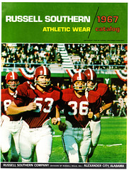
My latest vintage catalog acquisition is a 1967 Russell Southern beauty. Ninety-six pages, color throughout, and it only cost me $10. Among the many, many highlights:
• How awesome would it be to see a football team wearing one of these?
• Look at the bottom-center illo on this page — interesting to see they were actually suggesting a TNOB format.
• You’ve got to love a catalog that has an entire page of football parkas.
• Here’s something I’ve not sure I’ve seen before: a baseball jersey with UCLA inserts. Love the gold belt tunnels and pocket flaps on the pants, too. Note that the vest jersey at the bottom is described as “Cincinnati style.”
• 1967 was when Frank Robinson and a few other MLBers were redefining stirrup protocol. This is reflected in the baseball hose listing, which touts the “popular new high stirrup style.”
• These baseball undershirts — colored on top, white on the bottom — were popular in the 1960s, and I never fully understood why. Why not go with the basic raglan model? Another thing I never understood: What’s the deal with the off-center button placket? Meanwhile, check out the baseball dickey!
• The catalog features an amazing softball section. There are too many pages to go over individually, so I’ve grouped them into this slideshow.
• Similarly amazing: the incredible assortment of basketball shorts. Again, the selection is so vast that I’ve grouped it into its own gallery.
• Dig this: a whole page of sleeved hoops jerseys.
There’s even more, but my scanner and I both need a break. Meanwhile, remember when catalogs proudly devoted pages to the company’s factory? Why doesn’t anyone do that anymore? Oh right — because then they’d have to mention that the factory is in Malaysia.
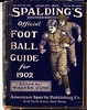
And while we’re at it”¦: I’m not the only one who collects old uniform catalogs. Andy Moursund (who runs the excellent Historic Football Posters operation) has a bunch of old early-1900s Spalding football guides and recently offered to scan a bunch of pages for everyone to see. There’s a bunch of amazing old cover designs here and a selection of two-page spreads from the 1902 edition here.
Andy also came up with a unique photo-driven project. You know how old football teams used to wear lettered jerseys? Andy’s come up with a sequence of 26 old team portraits — one for every letter of the alphabet. Tremendous work, Andy — thanks-a-plenty.
“You want fries with that?” — Weekend Road Trip Report: You probably know that Ernie Terrell insisted on referring to Muhammad Ali as Cassius Clay prior to their 1967 title bout (which became known as the “What’s my name?” fight). But check out this — even the promotional posters were referring to Ali as Clay!
That poster was on the wall of a hot dog joint in New Jersey, which was one of several fun stops Kirsten and I made while knocking around the Jersey Shore last weekend. Among the other notable observations:
• That same hot dog shop had a different kind of boxing artifact.
• In Allenhurst, we stopped at an antiques shop that had an awesome wool bathing suit with a gorgeous stripe (and although you can’t really see it, there are little shorts sewn into the suit!). The shop also this very groovy shirt, but it was a bit too small for me, so I reluctantly passed it up. In the non-apparel category, I really liked this old arts and crafts rug.
• Frank’s Deli in Asbury Park had this great photo of Mickey Mantle hitting a snowball, which I’d never seen before. Turns out he was celebrating his new contract.
• Our weekend also included lots of fun architecture (see also here, here, here, and here), some awesome signage (additional examples here, here, and here), a very sweet little motel (complete with old-style room numbers and a Dixie cup dispenser in the bathroom), plenty of shore pizza, a bit of sadness, a bit of weirdness (that’s a giant cassette tape, which was installed over a music shop’s storefront), and, of course the beach. Nice, nice”¦.
Raffle Reminder: I’m currently raffling off a soccer club jacket. For details, look here.
Uni Watch News Ticker: Last week I mentioned that I’d love to see a color version of this photo. Brandon Means happily obliged. ”¦ According to Sportslogos.net (which, granted, isn’t always the most accurate source for historical matters), the NFL started using the striped shield logo in 1960. But Larry Wiederecht found a stylized version of it appearing on the cover of a 1950 program. ”¦ This should blow a nice hole in your day: an entire site devoted to baseball card packaging (blame Jeff Barak for your entire day being flushed down the toilet). ”¦ No more black jerseys for the Lions. I wish I could tell you they were also ditching all the black trim, but unfortunately that’s not the case. ”¦ Great archive of Army/Navy photos here (great find by Mike Althouse). ”¦ Russ Chibe notes that the RBK logo has been showing up on a few NHL goalie masks — not as a small maker’s mark, but as a part of the design. “As a very, VERY amateur graphic designer, I couldn’t imagine including a corporate logo unless expressly told to do so,” he writes. “This makes me wonder if Reebok is trying to cut deals with goalies (or the NHL itself) to get its mark on the masks, as if it’s not everywhere else already.” ”¦ You know uniforms have reached a new plateau when an unveiling is being pimped on Facebook (with thanks to Adam Taylor). ”¦ Buncha TATC pics I hadn’t seen before here (big thanks to Trevor Williams). ”¦ Wright Aeronautical, which built aircraft engines, used to be located in Paterson, New Jersey, which explains why Jordan Fraser spotted this the other day at the Paterson Museum. ”¦ Two great old Flyers photos from Tris Wykes: First did anyone buy one of these windbreakers? And man, that’s a quite a unusual football helmet details. ”¦ Wouldja believe that this is Bob Gibson, circa 1968? That photo comes from this page of great old baseball photos. The same site also has lots of good boxing pics and one of the greatest magazine covers I’ve ever seen (all this courtesy of Jennifer Muller). ”¦ As most of you know, for the past few days I’ve been inviting readers to send me stories about unsolicited uniform ideas they’ve submitted to their favorite teams (thanks for all the good response). One reader, who prefers to remain anonymous, had a particularly good story to share. It’s too lengthy for me to use in the article I’m working on, but you can read his full account here. ”¦ What’s the smart thing to do in an economic crisis? Launch a new football league, natch. Why should we give a shit about a business venture that will be belly-up by this time next year? Because the new league’s COO “says there will be advertising on jerseys and sponsors in eight categories will have exclusivity.” Actually, never mind, I still don’t give a shit. ”¦ Major find by Chris Kane, who’s discovered a photo of the ProCap being worn by Eagles lineman Joe Panos. Definitely never seen a Philly ProCap before. I’m guessing Panos only wore it practice, but does anyone know more? ”¦ Very nice page devoted to Team Canada jersey history (with thanks to Alan Kreit). ”¦ Bit of a T-shirt kerfuffle over at the Golf Channel. ”¦ Matt Campbell reports that the Kinston Indians have unveiled a 60th-anniversary stadium logo. No word yet on whether it’ll be worn as a patch. ”¦ The Pro Bowl uniforms looked like crap, as usual were made out of a new mesh fabric that’s slated to be used NFL-wide next season (thanks, Phil). ”¦ Anyone know the story behind this hockey helmet? (As spotted by Dan Kroll.) ”¦ I’ll take any kind of baseball news I can get at this time of year, including this tidbit from John Okray: “My friend reports that at the Brewers’ recent ‘Winter Warm-Up’ [which featured Brewers players competing in game-show-ish games], there was a game involving Trevor Hoffman and Mike Cameron, and Cam made Hoff un-tuck his dress shirt when the game ended. Now, I know you and I differ on the un-tucking situation, but I have got to say un-tucking a dress shirt is going too far. Waaaaaaaaay too far.” ”¦ Are some of these players wearing sunglasses, or does it just look that way? That photo and this one were both found in the Grand Rapids photo archives by Zac Neubauer, plus he also sent along this incredible shot of baseball players at a Japanese internment camp. … Pitt wore gold uniforms at home last night. ”¦ If you skip ahead to the one-minute mark of this video clip, you can see workers assembling the court for the NBA All-Star Game.
Don’t recall if this photo’s been posted here (probably has) but I found it in my files over the weekend…and it’s from somewhat the same era as today’s featured catalog.
Three pretty fair ballplayers, too. FRobby, BRobby and Paul Blair…
link
—Ricko
All-Alphabet uniforms: I guess that Z team was a real sleeper in their league. (Couldn’t resist.)
Was this a Russell catalog directed to Southern states, or was Russell Southern a distinct entity? Or was Russell always known as Russell Southern? Or am I just very confused on all counts?
[quote comment=”314249″]Was this a Russell catalog directed to Southern states, or was Russell Southern a distinct entity? Or was Russell always known as Russell Southern? Or am I just very confused on all counts?[/quote]
I think it was two companies that merged.
Calling Terry Proctor…
so…hungry…now
I’m assuming the “facebook” announcement is the unveiling of the new Purdue basketball unis. (Have to be on facebook to see the link)
Here’s an article in the university newspaper..
link
Things that make you sigh:
1. Players had no input, have no idea what the design is going to be
2. Sounds like they are the “tight” type from Nike currently worn by OSU, MSU et al.
3. They’ll probably look like sh*t
Wright-Patterson Air Base is in Dayton, Ohio.
[quote comment=”314252″]
Things that make you sigh:
1. Players had no input, have no idea what the design is going to be[/quote]
I have no problem with the players having no input, and in fact prefer it that way. The team’s uniform decisions are too important to be placed into the hands of a bunch of kids who are likely unaware of the team’s history and tradition, and who will only be at the school for a few years.
[quote comment=”314254″][quote comment=”314252″]
Things that make you sigh:
1. Players had no input, have no idea what the design is going to be[/quote]
I have no problem with the players having no input, and in fact prefer it that way. The team’s uniform decisions are too important to be placed into the hands of a bunch of kids who are likely unaware of the team’s history and tradition, and who will only be at the school for a few years.[/quote]
to wit: also from that article, a quote from a player:
[quote]We don’t really have a choice, but I mean if I could pick one, I like the one that Memphis wore where it was one color on one side and then another color on the other side.[/quote]
this is why the players should have no input
[quote comment=”314255″][quote comment=”314254″][quote comment=”314252″]
Things that make you sigh:
1. Players had no input, have no idea what the design is going to be[/quote]
I have no problem with the players having no input, and in fact prefer it that way. The team’s uniform decisions are too important to be placed into the hands of a bunch of kids who are likely unaware of the team’s history and tradition, and who will only be at the school for a few years.[/quote]
to wit: also from that article, a quote from a player:
[quote]We don’t really have a choice, but I mean if I could pick one, I like the one that Memphis wore where it was one color on one side and then another color on the other side.[/quote]
this is why the players should have no input[/quote]
Exactly.
[quote comment=”314253″]Wright-Patterson Air Base is in Dayton, Ohio.[/quote]
Ugh — I got mixed up between Patterson (two “t”s, like the AFB spells it) and Paterson (one “t,” the way the New Jersey town spells it). But now I don’t know why the Paterson Museum in NJ would have a “Wright Aero” baseball jersey. Anyone..?
[quote comment=”314257″][quote comment=”314253″]Wright-Patterson Air Base is in Dayton, Ohio.[/quote]
Ugh — I got mixed up between Patterson (two “t”s, like the AFB spells it) and Paterson (one “t,” the way the New Jersey town spells it). But now I don’t know why the Paterson Museum in NJ would have a “Wright Aero” baseball jersey. Anyone..?[/quote]
Wright Aeronautical Corporation, Paterson, N. J., was the aircraft engine manufacturing division of the Curtiss-Wright Corporation. link
[quote comment=”314254″][quote comment=”314252″]
Things that make you sigh:
1. Players had no input, have no idea what the design is going to be[/quote]
I have no problem with the players having no input, and in fact prefer it that way. The team’s uniform decisions are too important to be placed into the hands of a bunch of kids who are likely unaware of the team’s history and tradition, and who will only be at the school for a few years.[/quote]
And Nike’s designs take into account “the team’s history and tradition”? Gimme a break.
I don’t agree with Grant’s desire to see a Memphis style uni, but what we’re going to end up seeing is the same damn “cookie cutter” design that OSU sports. Plain and dull.
Check out the “Sonics” wordmark on Xavier McDaniel’s link. I’ve never noticed that before…
Just an OT question here, can someone tell me the maker of this turf shoe? It’s an indoor astroturf shoe that Steve Largent wore in the first year games at the Kingdome(1976). Actually, from what I can tell Zorn and Largent were the only two who wore it. Looks to have some sort of velcro flap on the side?
link
Wright Aeronautics had some operations other than in Ohio, I’m pretty sure. Perhaps in New Jersey? (It came up back when when we were dicussing the “why” of Columbus Clippers as a nickname, and I don’t recall the particulars.)
—Ricko
Ouch, the United Football League’s debut on Uni Watch didn’t go as smoothly as I’d hoped.
[quote comment=”314261″]Just an OT question here, can someone tell me the maker of this turf shoe? It’s an indoor astroturf shoe that Steve Largent wore in the first year games at the Kingdome(1976). Actually, from what I can tell Zorn and Largent were the only two who wore it. Looks to have some sort of velcro flap on the side?
link
Bauer. The skate people.
link
—Ricko
And Hank cleared up the Wright Aero thing. Thanks.
[quote comment=”314259″][quote comment=”314254″][quote comment=”314252″]
Things that make you sigh:
1. Players had no input, have no idea what the design is going to be[/quote]
I have no problem with the players having no input, and in fact prefer it that way. The team’s uniform decisions are too important to be placed into the hands of a bunch of kids who are likely unaware of the team’s history and tradition, and who will only be at the school for a few years.[/quote]
And Nike’s designs take into account “the team’s history and tradition”? Gimme a break.
I don’t agree with Grant’s desire to see a Memphis style uni, but what we’re going to end up seeing is the same damn “cookie cutter” design that OSU sports. Plain and dull.[/quote]
I never said that Nike should be in charge of these decisions either. (And for the record, it shouldn’t.)
[quote comment=”314258″][quote comment=”314257″][quote comment=”314253″]Wright-Patterson Air Base is in Dayton, Ohio.[/quote]
Ugh — I got mixed up between Patterson (two “t”s, like the AFB spells it) and Paterson (one “t,” the way the New Jersey town spells it). But now I don’t know why the Paterson Museum in NJ would have a “Wright Aero” baseball jersey. Anyone..?[/quote]
Wright Aeronautical Corporation, Paterson, N. J., was the aircraft engine manufacturing division of the Curtiss-Wright Corporation. link
Ah, thanks! I’ll adjust the text accordingly.
[quote comment=”314264″][quote comment=”314261″]Just an OT question here, can someone tell me the maker of this turf shoe? It’s an indoor astroturf shoe that Steve Largent wore in the first year games at the Kingdome(1976). Actually, from what I can tell Zorn and Largent were the only two who wore it. Looks to have some sort of velcro flap on the side?
link
Bauer. The skate people.
link
—Ricko
And Hank cleared up the Wright Aero thing. Thanks.[/quote]
Thanks Ricko! Thought I saw those lines somewhere before. I was thinking more like Kangaroos…………no……….???lol
Paul:
Love to go down the Shore in the wintertime. Next trip, be sure to make some time to go see the Barnegat Lighthouse, which dates back to before the Civil War.
I saw a picture of the new Purdue uniforms early last fall, as NIKE sends pics to the teams for approval.
I do not remember them exactly, but it was a new design. Something with multiple wide stripes-daggers vertically on the shorts.
I remember not being impressed, but maybe they will grow on me.
I think it is good for Purdue though, as they are usually behind the curve when it comes to uniforms.
[quote comment=”314268″]Paul:
Love to go down the Shore in the wintertime. Next trip, be sure to make some time to go see the Barnegat Lighthouse, which dates back to before the Civil War.[/quote]
And this past January the Barnegat Light was returned to full operations. link
The link made me think of link.
Apparently the Russell factory was underwater.
[quote comment=”314269″]I saw a picture of the new Purdue uniforms early last fall, as NIKE sends pics to the teams for approval.
I do not remember them exactly, but it was a new design. Something with multiple wide stripes-daggers vertically on the shorts.
I remember not being impressed, but maybe they will grow on me.
I think it is good for Purdue though, as they are usually behind the curve when it comes to uniforms.[/quote]
Might not be the same design, since the article states that no one on the team has any clue to what they are going to look like.
I agree about being “behind the curve”. I’d still like to see them do a retro design from the late 70’s (think Joe Barry Carrol-era)
Hi all,
Can anyone tell me about a brand new book coming out about the history of NFL uniforms, “Colors” by Jim Finks, Jr.?
I’d like to see Paul’s take on this book, I don’t have a link to share.
[quote comment=”314274″]Hi all,
Can anyone tell me about a brand new book coming out about the history of NFL uniforms, “Colors” by Jim Finks, Jr.?
I’d like to see Paul’s take on this book, I don’t have a link to share.[/quote]
I haven’t seen it yet. Helmet Hut is selling it:
link
I’ll be raffling off a copy of it next week.
Russell was still making the link undershirt in 1985. Had the exact style in college.
I’m putting my Brewers jersey on right now just to untuck it for UniWatch ;)
Interesting take on logos.
link
I highly recommend the 1955 Program Cover from that Army-Navy archive. Hell, all the program covers are good.
I think it’s hysterical to see Reebok putting their logo on NHL masks. While they do market masks under their name, no NHL goalies wear them. They all wear custom fit and made masks by Warwick, Sportmask, etc. Nobody is actually wearing Reebok masks. I’ve also seen some with the Nike Bauer logo. I thought I had seen something on Uniwatch about a year ago that said Nike was getting out of the hockey business.
Just ordered by parka – thanks buddy!
[quote comment=”314279″]I highly recommend the 1955 Program Cover from that Army-Navy archive. Hell, all the program covers are good.[/quote]
As Scott Turner just pointed out to me, the 1961 cover is kinda creepy:
link
Go to page 138 of this online catalog (it is in the print version as well) and you will see a page devoted to the factory. You will like the shape of the factory.
link
[quote]Here’s something I’ve not sure I’ve seen before: a baseball jersey with UCLA inserts. [/quote]
The Hollywood Stars wore jerseys with UCLA inserts in, I believe, the early 1950s. Ebbets Field Flannels used to make a reproduction, but it doesn’t seem to be in their catalogue now.
[quote comment=”314273″][quote comment=”314269″]I saw a picture of the new Purdue uniforms early last fall, as NIKE sends pics to the teams for approval.
I do not remember them exactly, but it was a new design. Something with multiple wide stripes-daggers vertically on the shorts.
I remember not being impressed, but maybe they will grow on me.
I think it is good for Purdue though, as they are usually behind the curve when it comes to uniforms.[/quote]
Might not be the same design, since the article states that no one on the team has any clue to what they are going to look like.
I agree about being “behind the curve”. I’d still like to see them do a retro design from the late 70’s (think Joe Barry Carrol-era)[/quote]
They SHOULD break out some throwbacks and they should do it for a home matchup against Indiana. Classic Purdue uni vs. IU’s never-changing uniform could look really nice. Also, I think purdue’s black uniforms are decent enough as is, but it’s hard to beat the link of the football team
A uni-watch type of lighthouse (800 yrs old….)
link
Vertically striped ‘natch
20% lighter 2-way stretch material for the new reebok football jerseys, designed to “improve performance”. I think we heard the exact same thing about the hockey jerseys. I also remember the hockey jerseys getting shredded in fights. This should be real fun watching those things get stretched and destroyed while players are getting tackled, I thought they outlawed tear aways.
Two thumbs up for the gold Pitt unis last night. I thought they looked great, much better than the boring home whites.
Three, four, five whatever thumbs up to the Lions ditching the black jerseys. However, they also should have ditched the throwbacks. Why not just go back to the classic Honolulu Blue and silver threads of the Barry Sanders era?
The site featuring the Bob Gibson photo also showed link Brooklyn Dodger fan trying to “Kill the Umpire!” The original cutline says:
The story may be apocryphal, but the judge supposedly asked the fan just why he attacked the umpire… with the fan allegedly replying, “Uh, Judge, I had a partner in the stands… between you and me, we were doing a little ‘business’ that day.”
Meanwhile, link in Northeast Arkansas is wet today… ;)
[quote comment=”314289″]Two thumbs up for the gold Pitt unis last night. I thought they looked great, much better than the boring home whites.
Three, four, five whatever thumbs up to the Lions ditching the black jerseys. However, they also should have ditched the throwbacks. Why not just go back to the classic Honolulu Blue and silver threads of the Barry Sanders era?[/quote]
They’ve definitely grown on me, wasn’t crazy about them at first. They seemed easier to see last night. I was in person for both games they’ve worn them and the first time, the white numbers were hard for me to pick up. Not sure if it’s the lighting or if the trim was changed.
More importantly, they’re 2-0 in them. If I had to fathom a guess, I’d say they bring them out against UConn for the regular season finale on 3/7.
Speaking of being immortalized on facebook, someone started a UW group.
link
(no clue how to make that a link)
[quote comment=”314282″][quote comment=”314279″]I highly recommend the 1955 Program Cover from that Army-Navy archive. Hell, all the program covers are good.[/quote]
As Scott Turner just pointed out to me, the 1961 cover is kinda creepy:
link
Kind of like the Son of Man by Magritte.
link
“In this cover, we see how modern America is alientated by the weight of football in today’s society.”
Note also that the cover predates the painting. Now we know where Magritte got his ideas.
Paul, the Rice baseball team used to wear the UCLA style stripes on their navy uniforms – not sure if they still do.
link
link
BTW, when I did a Google search for “rice baseball” this picture came up…
link
Awesome.
IMO the Lions need all new uniforms. Keep the Lion logo, but a new design around that logo would be nice.
And ditch the black!
RE: Pro-Bowl “mesh” Jersey’s…
WHen they were doing the defensive starting line ups for the AFC, I noticed Kris Jenkins saying “this Jersey is way too tight”…..I laughed my ass off
link
JETS!! JETS!! JETS!!
[quote comment=”314288″]20% lighter 2-way stretch material for the new reebok football jerseys, designed to “improve performance”. I think we heard the exact same thing about the hockey jerseys. I also remember the hockey jerseys getting shredded in fights. This should be real fun watching those things get stretched and destroyed while players are getting tackled, I thought they outlawed tear aways.[/quote]
They did, they did! If the football jerseys are anything like the hockey jerseys, sweat will collect where the players aren’t expecting it; like, on their hands. That’ll be useful…
Just to, y’know, make something of a point. Lions won their last NFL title in the uni those throwbacks represent.
But I agree; just go back the Sanders era, adjusted for today uniform styling. Including the white shoes. Players still like ’em. Notice how many, because they have a choice, wear white in the Pro Bowl every year.
—Richard
Two comments today…
1) The baseball undershirts have the top part in color as opposed to just raglan so the color can be view behind the neck opening. I have no idea however why baseball undershirts aren’t then just full color.
2) The links were annoying today because they opened in the same window as the main post instead of a new window. It’s slower that way because the main page has to reload every time.
link is especially prescient. Look at that number font. That’s a Russell Athletic font, as seen in the LLWS the past two years, and hardly ever in between.
[quote comment=”314299″]2) The links were annoying today because they opened in the same window as the main post instead of a new window.[/quote]
Not on any of my browsers. Nobody else has mentioned this problem, either. I suspect you may want to check your browser settings.
[quote comment=”314280″]I think it’s hysterical to see Reebok putting their logo on NHL masks. While they do market masks under their name, no NHL goalies wear them. They all wear custom fit and made masks by Warwick, Sportmask, etc. Nobody is actually wearing Reebok masks. I’ve also seen some with the Nike Bauer logo. I thought I had seen something on Uniwatch about a year ago that said Nike was getting out of the hockey business.[/quote]
Nike did get out of the hockey business. They allowed them to keep the name so they could phase it back out without letting them market and sell a year’s worth of product. This year’s Bauer line will be Nike free.
And Luongo is sponsored by Reebok already, not too shocked at the logo.
Wow, thanks for posting that Russell Catalog! They are one of my all time favs for vintage t-shirts and uniforms.
A Google Maps search reveals that the (mostly former) factory in Alexander City, Alabama in in fact not under water and there seems to be no body of water nearby. There is a Thomas C. Russell Airport in town. I imagine the factory as being stacked floor to ceiling with cool old stuff, but i’m just dreaming.
Nearby hamlets include Fishpond, Eclectic and Our Town.
[quote comment=”314301″][quote comment=”314299″]2) The links were annoying today because they opened in the same window as the main post instead of a new window.[/quote]
Not on any of my browsers. Nobody else has mentioned this problem, either. I suspect you may want to check your browser settings.[/quote]
You’re correct Paul. It was something on my end. I opened a fresh browser and everything worked as normal. Not sure what the problem was. My apologies.
Here’s my opinion on the baseball undershirts half-color/half-white. First, so if the top jersey button(s) were unbuttoned, it would show as solid color. And, they were white on the bottom so they wouldn’t show through on flannel pants and bleed dye into pants. This is based on my past baseball experience. I didn’t wear flannels, but the early double-knits, which were kind of transparent. I hated the raglan tops, as the seams bugged me when it was super-hot. That also might be a reason for the half and half.
Isn’t there something missing from the All-Star Game court in PHX? Specifically, “Game” is nowhere to be found. All the logos on the various intergoogles seem to just say “NBA All-Star 2009” as well. That’s kind of a silly trend, no?
[quote comment=”314306″]Isn’t there something missing from the All-Star Game court in PHX? Specifically, “Game” is nowhere to be found. All the logos on the various intergoogles seem to just say “NBA All-Star 2009” as well. That’s kind of a silly trend, no?[/quote]
they’re still debating whether to use “game” or “look at me” in the text
[quote comment=”314307″][quote comment=”314306″]Isn’t there something missing from the All-Star Game court in PHX? Specifically, “Game” is nowhere to be found. All the logos on the various intergoogles seem to just say “NBA All-Star 2009” as well. That’s kind of a silly trend, no?[/quote]
they’re still debating whether to use “game” or “look at me” in the text[/quote]
Or…mIght wanna add “Duck & Cover”. Sorta the unspoken sub theme.
[quote comment=”314282″][quote comment=”314279″]I highly recommend the 1955 Program Cover from that Army-Navy archive. Hell, all the program covers are good.[/quote]
As Scott Turner just pointed out to me, the 1961 cover is kinda creepy:
link
Reminds me of Trout Mask Replica by Captain Beefheart & his magic band
link
Paul,
Are you saying you’ve confirmed the Lions will have the same black-trim uniforms next year?
[quote comment=”314302″]And Luongo is sponsored by Reebok already, not too shocked at the logo.[/quote]
I’m shocked because Goalie masks were the only equipment not have a brand logo a few years ago. Now the logo is thrice the size of of a players helmet logo. Goalie masks are customizable to allow the goalie to have a unique way to express individuality. How long until goalies start selling the whole mask as ad space?
(i still find it hilarious that Chris Osgood’s old cooper bucket has a nike/bauer logo.)
From the ticker:
“My friend reports that at the Brewers’ recent ‘Winter Warm-Up’ [which featured Brewers players competing in game-show-ish games], there was a game involving Trevor Hoffman and Mike Cameron, and Cam made Hoff un-tuck his dress shirt when the game ended. Now, I know you and I differ on the un-tucking situation, but I have got to say un-tucking a dress shirt is going too far. Waaaaaaaaay too far.”
__________________________________________
I found the answer to my own question. Someone posted the clip on Youtube. About 30 sec. into the clip you see Hoffman un-tucking his dress shirt. As a Brewer fan, I hope to see Hoffman un-tucking his jersey about 50 times this year on the baseball field.
link
[quote comment=”314251″]link[/quote]
wow…an East Coast pizza that actually looks good
Frank’s in Asbury Park is the best. I’m drooling just thinking about their pork roll, egg and cheese on a hard roll.
[quote comment=”314282″][quote comment=”314279″]I highly recommend the 1955 Program Cover from that Army-Navy archive. Hell, all the program covers are good.[/quote]
As Scott Turner just pointed out to me, the 1961 cover is kinda creepy:
link
I am never going to sleep again
Anybody know the answer:
Why did the Lakers wear purple on Sunday when the Cavs wore gold? I thought the Lakers were the only team that could wear gold as a home uniform these days. The Cavs have worn gold as a road uniform (even at home) for all previous games they wore gold.
link
Bulls are wearing their red unis tonight at home vs. the Pistons as part of their link. This seems like kind of a half-assed effort, though. It actually would be a good reason to break out some 1966-’67 throwbacks.
I actually like the Lions’ throwbacks: simple, classic – just silver and blue, no logo, no stripes. Not saying those should be their regular unis; going back to the Barry (or Charlie!) Sanders-era unis would be brilliant.
I was a huge O’s fan as a kid, when B. Robby and F. Robby were leading the charge, but those all-orange suits (from 1971, by the way) were a terrible, terrible mistake. Couldn’t immediately find a photo, but can you imagine what it would have been like to see Boog in one of those? Like a giant citrus, haunting your dreams for days….
Anyone know the story behind this hockey helmet?
It’s obviously Don Luce, and I found a bigger version of that picture link. Other than that, I wish I had more info on it also. I can’t recall ever seeing this photo, or anyone else wearing “racing stripes” on their hockey helmet. The chevron shaped vents ought to give someone more savvy than I a clue as to who made the helmet.
[quote comment=”314318″]I was a huge O’s fan as a kid, when B. Robby and F. Robby were leading the charge, but those all-orange suits (from 1971, by the way) were a terrible, terrible mistake. Couldn’t immediately find a photo, but can you imagine what it would have been like to see Boog in one of those? Like a giant citrus, haunting your dreams for days….[/quote]
not sure if it was in the comments or the article paul ran on the subject, or perhaps i heard it elsewhere, but i think boog is one of the reasons they stopped wearing the orange unis…for just that reason
Pardon me if I’m an idiot-but regarding the golf channel t-shirt kerfuffle…How is the brownie joke sexually tinged?
[quote comment=”314319″]Anyone know the story behind this hockey helmet?
It’s obviously Don Luce, and I found a bigger version of that picture link. Other than that, I wish I had more info on it also. I can’t recall ever seeing this photo, or anyone else wearing “racing stripes” on their hockey helmet. The chevron shaped vents ought to give someone more savvy than I a clue as to who made the helmet.[/quote]
That’s actually Don Luce in the foreground. Craig Ramsey is the dude in the helmet. The helmet itself is an old Cooper model- not sure of specifics on model number etc. It’s been custom striped though as they usually didn’t come like that.
I know it’s Crig Ramsey as he might be one of the only guys that ever wore a helmet like that in the NHL. He had a blue one too. Anybody who wore a helmet back then was usually rockin’ the CCM, or a Northland/Lange. (the “Stan Mikita” helmet.)
Here’s another pic of Ramsey in the white helmet, this time unstriped (it’s about halfway down the page):
link
The correspondence about the ND equipment manager was awesome. Nice to know that some people care enough to respond to letters sent to big football programs, major league teams, players, etc.
When I worked for the California League (Single A minor league baseball), I created the position of league media relations director and developed the league’s first “media guide.” Very amateur, but it was fun to do and it was offered to anyone to buy. Got a decent response and I still have a handful of those at home.
In the past, the league had only a record book which was updated yearly by a guy who had followed the league for years and years (a league historian of sorts). The record book and his weekly (or monthly Cal League notes) were typewritten and copied before being sent out to folks who had requested and paid for the service. He was a great resource for baseball in CA and would have been an amazing uniform historian (if he is still alive). I think I need to see if he is and/or if I can track him down somehow.
Sorry for the long rant.
[quote comment=”314321″]Pardon me if I’m an idiot-but regarding the golf channel t-shirt kerfuffle…How is the brownie joke sexually tinged?[/quote]
does this help?
[quote comment=”314321″]Pardon me if I’m an idiot-but regarding the golf channel t-shirt kerfuffle…How is the brownie joke sexually tinged?[/quote]
link.
I would NEVER have worn the Flyerjak because, as a Buffalo Sabres fan, the Flyers were much hated. I proudly wore the version of this windbreaker JC Penny sold in the Buffalo area, the “Sabrejak.” link Stay classy Buffalo!
Bill Weiss was/is the Cal League historian.
link
Now I need to see where/how someone can get their hands on those sketchbooks mentioned in the wikipedia narrative.
[quote comment=”314320″][quote comment=”314318″]I was a huge O’s fan as a kid, when B. Robby and F. Robby were leading the charge, but those all-orange suits (from 1971, by the way) were a terrible, terrible mistake. Couldn’t immediately find a photo, but can you imagine what it would have been like to see Boog in one of those? Like a giant citrus, haunting your dreams for days….[/quote]
not sure if it was in link paul ran on the subject, or perhaps i heard it elsewhere, but i think boog is one of the reasons they stopped wearing the orange unis…for just that reason[/quote]
I assume you saw photo in today’s Post #1.
Here’s Boog in orange in black & white…
link
—Ricko
Anyone know the story behind this hockey helmet? (As spotted by Dan Kroll.)
I believe football helmets were converted to become some of the original hockey helmets. Used without facemacks they had larger ventilation holes on the top.
[quote]I assume you saw photo in today’s Post #1.[/quote]
yeah…i seen that somewhere before ;)
[quote comment=”314329″]Anyone know the story behind this hockey helmet? (As spotted by Dan Kroll.)
I believe football helmets were converted to become some of the original hockey helmets. Used without facemacks they had larger ventilation holes on the top.[/quote]
Go to page 8 of this section and you can see another example: link
[quote comment=”314330″][quote]I assume you saw photo in today’s Post #1.[/quote]
yeah…i seen that somewhere before ;)[/quote]
A factor that often gets forgotten regarding that era of “serious color” in MLB is that around 1970 is when the prices of color televisions finally dropped to within the reach of everyday families. Because of that, the percentage of homes with color television drastically increased. Coupled with the whole era of brighter clothes, etc., it was only natural that everything on TV opted for bright colors. It was a new era for that sort of thing. Baseball, having so long been gray and white, looked pretty drab by comparison to the other sports. So, voila!, bright unis for the national pastime. Needed to look as exciting on TV as everyone–and everything–else.
—Ricko
[quote comment=”314280″]I think it’s hysterical to see Reebok putting their logo on NHL masks. While they do market masks under their name, no NHL goalies wear them. They all wear custom fit and made masks by Warwick, Sportmask, etc. Nobody is actually wearing Reebok masks. I’ve also seen some with the Nike Bauer logo. I thought I had seen something on Uniwatch about a year ago that said Nike was getting out of the hockey business.[/quote]
Well, close…
Reebok NHL masks, while completely different compared to their retail masks are related to their goaltending business. They are designed my Michel Lefebvre (the designer for Koho and the current Reebok lines) and custom manufactured by Protechsport in Montreal. They differ from the Protechsport masks that any schmo can buy in that they are padded by and have cages by Lefebvre. These masks are the NHL Reebok Masks – Sportmask, Warwick and the such do not get tagged up as Reebok.
(Nike) Bauer is a similar but recently confusing story. Their masks are manufactured by Pro’s Choice in MA (most are the vapor model – marked with the v shaped ear holes) and are tagged as Bauer when painted. Now, this season, Bauer (no longer associated with Nike) has purchased Itech (who’s custom mask maker, Jerry Wright left a few years ago), and we will likely be seeing Itech shaped masks custom produced by Pro’s Choice labeled as Bauer! None of which are identical to the Bauer/Itech retail masks.
Arr… That said, Bauer and Nike have one source each for their NHL masks. You’ll see Warwick, SportMask, and others in the pro’s but they will not be marked as those companies have not paid the $25,000ish fees to have their names shown.
Good stuff. I was wondering if any past columns had anything about how they made uniforms in the past. Like 1910′ and 1920’s Has anybody seen pictures of the actual making of old uniforms?
I liked seeing the head harness as they were called. When did they start calling headgear helmets?
I liked the A-Z football sweaters.
1876 Yale
link
1890 Harvard
link
1902 Racine Cardinals
link
1905 Alabama
link
1906 Washington
link
[quote comment=”314328″][quote comment=”314320″][quote comment=”314318″]I was a huge O’s fan as a kid, when B. Robby and F. Robby were leading the charge, but those all-orange suits (from 1971, by the way) were a terrible, terrible mistake. Couldn’t immediately find a photo, but can you imagine what it would have been like to see Boog in one of those? Like a giant citrus, haunting your dreams for days….[/quote]
not sure if it was in link paul ran on the subject, or perhaps i heard it elsewhere, but i think boog is one of the reasons they stopped wearing the orange unis…for just that reason[/quote]
I assume you saw photo in today’s Post #1.
Here’s Boog in orange in black & white…
link
—Ricko[/quote]
But didn’t he go to the Indians and in the mid-1970s suffer the indignity of all-red?
The hockey helmet in question is one worn by Craig Ramsay, the former Sabres great and current Bruins assistant coach. He was an early proponent of wearing helmets. The helmets he wore were usually Cooper or CCM. None were actually converted football helmets. The center stripe in this particular helmet was only worn for one year. I seem to recall that the NHL has a rule against “football style” helmet stripes, but that may be incorrect.
[quote comment=”314336″][quote comment=”314328″][quote comment=”314320″][quote comment=”314318″]I was a huge O’s fan as a kid, when B. Robby and F. Robby were leading the charge, but those all-orange suits (from 1971, by the way) were a terrible, terrible mistake. Couldn’t immediately find a photo, but can you imagine what it would have been like to see Boog in one of those? Like a giant citrus, haunting your dreams for days….[/quote]
not sure if it was in link paul ran on the subject, or perhaps i heard it elsewhere, but i think boog is one of the reasons they stopped wearing the orange unis…for just that reason[/quote]
I assume you saw photo in today’s Post #1.
Here’s Boog in orange in black & white…
link
—Ricko[/quote]
But didn’t he go to the Indians and in the mid-1970s suffer the indignity of all-red?[/quote]
Yes. The Giant Blood Clot era.
Saw this on eBay – sleeved hoops jerseys on the link.
[quote comment=”314335″]1876 Yale
link
1890 Harvard
link
1902 Racine Cardinals
link
1905 Alabama
link
1906 Washington
link
Man, I love these things. Keep ’em coming.
Were mustaches mandatory in football back then?
1902 Philadelphia A’s
link
1918Akron Pros
link
1894 Dartmouth
link
1895Latrobe Pros
link
1896 Pennhttp://img.photobucket.com/albums/v478/Larrymb/1896Penn.jpg?t=1234297485
Was flipping through TV channels and see Popeye on the Boomerang channel has the old football scene with Popeye as kid.
The Popeyes have yellow jerseys, blue pants, yellow socks and leather helmets
The Blutos have red jerseys, white pants with black belt, red socks and leather helmets
[quote comment=”314340″][quote comment=”314335″]1876 Yale
link
1890 Harvard
link
1902 Racine Cardinals
link
1905 Alabama
link
1906 Washington
link
Man, I love these things. Keep ’em coming.
Were mustaches mandatory in football back then?[/quote]
Yes. And it also was important that, if you didn’t wear a helmet, you looked a lot like B.J. Hunnicut.
—Ricko
Paul and Crew,
Just a reminder that a lot of us out here think this is about the best website there is. Keep up the great work.
[quote comment=”314343″]Was flipping through TV channels and see Popeye on the Boomerang channel has the old football scene with Popeye as kid.
The Popeyes have yellow jerseys, blue pants, yellow socks and leather helmets
The Blutos have red jerseys, white pants with black belt, red socks and leather helmets[/quote]
See? Cal DOES look like a cartoon.
Hey Paul,
After this past summers MLB All-Star game, you profiled a guy who was a master at getting game used baseballs…Do you or anyone else know where I can find that post or the guys website…? Thanks.
[quote comment=”314345″]Paul and Crew,
Just a reminder that a lot of us out here think this is about the best website there is. Keep up the great work.[/quote]
Hey, thanks, man. Much appreciated.
[quote comment=”314347″]Hey Paul,
After this past summers MLB All-Star game, you profiled a guy who was a master at getting game used baseballs…Do you or anyone else know where I can find that post or the guys website…? Thanks.[/quote]
I did? Are you sure that was me? Not ringing a bell…
[quote comment=”314347″]Hey Paul,
After this past summers MLB All-Star game, you profiled a guy who was a master at getting game used baseballs…Do you or anyone else know where I can find that post or the guys website…? Thanks.[/quote]
i don’t think you’re referring to this guy, but there are a few who claim to be able to get at least one ball per game they go to and some guys who claim they’ve gotten like 3,000 or so…guy you’re referring to i don’t think ‘charges’ for the privilege
found a color of Boog in all orange:
link
been a long day….
[quote comment=”314303″]Wow, thanks for posting that Russell Catalog!
They are one of my all time favs for vintage t-shirts and uniforms.
A Google Maps search reveals that the (mostly former) factory in Alexander City, Alabama in in fact not under water and there seems to be no body of water nearby. There is a Thomas C. Russell Airport in town. I imagine the factory as being stacked floor to ceiling with cool old stuff, but i’m just dreaming.
Nearby hamlets include Fishpond, Eclectic and Our Town.[/quote]
Oh man, Alexander City…
I briefly worked in that area in the textile business and had dealings with Russell. I never got to see where in the factory they kept vintage samples, but their factory store often produced some amazing jerseys, both embroidered and blank. With the “DIY” bug hitting everyone, I would reccommend a roadtrip if you’re anywhere nearby.
I could’ve of swore it was on here…hmm wonder what UniWatch knock off was I looking at then…?
[quote comment=”314342″]1902 Philadelphia A’s
link
1918Akron Pros
link
1894 Dartmouth
link
1895Latrobe Pros
link
1896 Pennhttp://img.photobucket.com/albums/v478/Larrymb/1896Penn.jpg?t=1234297485[/quote]
The Akron guy kinda looks like he’s wearing brown Daisy Dukes over his pants. Now there’s a look I can get behind!
Ricko: Your right, they do kinda look like Mike Farrell. Personally, I would prefer if they looked more like “Hawkeye” Pierce (Alan Alda edition, natch).
[quote comment=”314295″]IMO the Lions need all new uniforms. Keep the Lion logo, but a new design around that logo would be nice.
And ditch the black![/quote]
IMHO, All they need to do is ditch the black trim. Their unis and logo are fine.
[quote comment=”314349″][quote comment=”314347″]Hey Paul,
After this past summers MLB All-Star game, you profiled a guy who was a master at getting game used baseballs…Do you or anyone else know where I can find that post or the guys website…? Thanks.[/quote]
I did? Are you sure that was me? Not ringing a bell…[/quote]
link
[quote comment=”314347″]Hey Paul,
After this past summers MLB All-Star game, you profiled a guy who was a master at getting game used baseballs…Do you or anyone else know where I can find that post or the guys website…? Thanks.[/quote]
Hey Gabe.. were you thinking of this guy?
link
I can’t remember if it was on Uni Watch, but I remember reading an article about him after the all-star home run derby as well.
Thanks Phil,
That is not him though. This guy had a ton of photos on his website of everything from players blowing him off to a story about a friend of his letting him on the field after a game, and the security people at the park giving him a hard time…maybe I am mixing a few stories together…I don’t know…Thanks though…
[quote comment=\”314357\”][quote comment=\”314347\”]Hey Paul,
After this past summers MLB All-Star game, you profiled a guy who was a master at getting game used baseballs…Do you or anyone else know where I can find that post or the guys website…? Thanks.[/quote]
Hey Gabe.. were you thinking of this guy?
link
I can\’t remember if it was on Uni Watch, but I remember reading an article about him after the all-star home run derby as well.[/quote]
YES…! Thank you…now my coworkers will accept me…haha
WOW!! Brings back memories
First Buffalo’s link then Philly’s link and I thought it was local because I had (and still have) an Islanderjak. It was Dark Blue with Orange collar. (sorry no pic — jacket in storage)
1896 Penn
link
1898 Cal
link
1898 Morgan Athletic Club later became Cardinals
link
1899 Carlisle
link
1900 Carlisle
link
First, thanks to those who corrected my reference yesterday to a “pornmeister” and Intercourse, Pennsylvania.
Secondly, those photos of Army-Navy games throughout the years are interesting, not least because, if my eyes didn’t lie, Army was sporting plastic helmets as early as the 1942 game, while Navy, at least some of their players, wore leather well into the 1950s.
In honor of of the letter sweaters, These were all the pictures of those figures I saved with letters
1901 Homestead LEAC
link
1901 Pittsburgh Pros
link
1901-02 Michiganhttp://img.photobucket.com/albums/v478/Larrymb/1902Michigan.jpg?t=1234301478
1902 Rosebowl Michigan vs Stanford
link
1904 Vanderbilt
link
1923 Canton Bulldogs
link
1876 Yale
link
Great photo of the internment camp team. That’s from the Heart Mountain, Wyoming camp. At least 4 of the players are from the pre-war San Jose Asahi team (you can just make out the “S.J.” on their sleeves), and 1 is from the Florin Athletic, from the Sacramento area.
I’d guess that “Hawaii” on 2 jerseys is a club name or a camp-made shirt. Japanese-Americans in Hawaii were not interned. These guys may have been Hawaii-born, but living on the west coast when the war broke out.
The Three-Star jersey took a little more digging. It may be from a team sponsored by 3-Star Produce, apparently a chain of J-A stores in the LA area before the war.
The “Azucar” t-shirt I can’t explain. Could have been a neighborhood team from LA or SF Bay Area.
Here is a link from the Japanese-American National Museum with some surprising info on the many good teams, both pre-war and in camp:
link
link
Trying the 1901-02 Michigan individual one again
Actually I found a couple more. SOme dont have a single letter but here they are
1914 Rochester Jeffs
link
1916 Canton Bulldogs
link
1918 Acme Packers
link
1920 Canton Bulldogs
link
1926 Frankford Yellowjackets
link
and lastly here are 3 of the Youngstown Patricians. I am from the Youngstown area. I did buy the 1914 Youngstown Patricians and 1918 Akron Pros and 1923 Canton Bulldogs before the guy quit selling the figures.
He had one Youngstown Patrician in yellow. I told him I had read in a book I have, the Patricians colors in around 1914 were gray and maroon so he did one in that color
Below is a team photo of a Youngstown Patricians team but I think it said it was a junior team of younger kids
link
link
link
Ok I posted enough for now, lol
[quote comment=”314366″]1918 Acme Packers
link
[/quote]
Oy vey.
The Packers weren’t sponsored by Acme in 1918. They weren’t in existence in 1918. In 1918, Curly Lambeau was a student at Notre Dame.
The Packers were founded in August of 1919. Acme didn’t take over the sponsorship until 1921.
In this picture from a Penguins Fantasy Camp, it looks like they’ve put the current logo onto the 80’s era jersey. The gold and Vegas gold definitely clash.
link
[quote comment=”314368″][quote comment=”314366″]1918 Acme Packers
link
[/quote]
Oy vey.
The Packers weren’t sponsored by Acme in 1918. They weren’t in existence in 1918. In 1918, Curly Lambeau was a student at Notre Dame.
The Packers were founded in August of 1919. Acme didn’t take over the sponsorship until 1921.[/quote]
Ya I said I wondered about the 100% accuracy of everything. Like I said I corrected some of his work for him.
He did a michigan Sttate late 1930s guy in green and white. I told him the Spratans wore black and gold for a while because the coach was former ND guy Bachman I think it was
[quote comment=”314327″]Bill Weiss was/is the Cal League historian.
link
Now I need to see where/how someone can get their hands on those sketchbooks mentioned in the wikipedia narrative.[/quote]
No human being on the planet has more knowledge of minor league baseball than Bill Weiss and he’s a very nice man. I hope he is well and doin’ his thing.
Bill Weiss is an extremely nice man and I enjoyed any and all correspondence with him while I was at the Cal League. A wealth of minor league baseball knowledge, especially West Coast ball.
Another road trip chronicled beautifully…..
Freeman’s Bakery. The Dixie Cup Dispenser. Vesuvio Pizza. Tomato Pies.
…and that sweet little place closed up after 50 years. *sigh*
I’ve never been to New Jersey, but I like what I see.
[quote comment=”314251″]link[/quote]
Looks like Vic’s still has the same paper placemats since at least the early 80s. Very nice montage of the area where I grew up.
Where exactly is (was) Roey’s? Only place I don’t remember.
[quote comment=”314359″][quote comment=\”314357\”][quote comment=\”314347\”]Hey Paul,
After this past summers MLB All-Star game, you profiled a guy who was a master at getting game used baseballs…Do you or anyone else know where I can find that post or the guys website…? Thanks.[/quote]
Hey Gabe.. were you thinking of this guy?
link
I can\’t remember if it was on Uni Watch, but I remember reading an article about him after the all-star home run derby as well.[/quote]
YES…! Thank you…now my coworkers will accept me…haha[/quote]
Yeah… I’ve followed his blog for about a year and a half now – he is an incredible guy. His stats are flat-out rediculous. You’ll be amazed by just scrolling through the archives from this past summer.
BTW, I did find the UW Post that featured him over the summer – link
He’s mentioned about half way down or so in the Ticker.
[quote comment=”314336″][quote comment=”314328″][quote comment=”314320″][quote comment=”314318″]I was a huge O’s fan as a kid, when B. Robby and F. Robby were leading the charge, but those all-orange suits (from 1971, by the way) were a terrible, terrible mistake. Couldn’t immediately find a photo, but can you imagine what it would have been like to see Boog in one of those? Like a giant citrus, haunting your dreams for days….[/quote]
not sure if it was in link paul ran on the subject, or perhaps i heard it elsewhere, but i think boog is one of the reasons they stopped wearing the orange unis…for just that reason[/quote]
I assume you saw photo in today’s Post #1.
Here’s Boog in orange in black & white…
link
—Ricko[/quote]
But didn’t he go to the Indians and in the mid-1970s suffer the indignity of all-red?[/quote]
Heavens, I never saw the all-orange. But I do recall seeing a photo of F-Rob kneeling on deck, I think he was holding a hot water bottle,waiting to hit, and I swear I thought, ‘wow, a big blood clot.’
[quote comment=”314275″][quote comment=”314274″]Hi all,
Can anyone tell me about a brand new book coming out about the history of NFL uniforms, “Colors” by Jim Finks, Jr.?
I’d like to see Paul’s take on this book, I don’t have a link to share.[/quote]
I haven’t seen it yet. Helmet Hut is selling it:
link
I’ll be raffling off a copy of it next week.[/quote]
I’d like to own that. And my birthday isn’t til…oh, NOVEMBER.
SI put up some galleries of “iconic” Duke and UNC pictures in anticipation of tomorrow’s game.
Duke’s: link
The first picture really caught me off guard, I never knew that Duke had red trim back in the early 60’s
DIY #3:
1. link
2. link
3. link
4. link
[quote comment=”314381″]DIY #3:
1. link
2. link
3. link
4. link
5.
link
[quote comment=”314382″][quote comment=”314381″]DIY #3:
1. link
2. link
3. link
4. link
5.
link
Great work. Where do you get your ideas? I mean how do you pick what team or whatever you want to try and do?
[quote comment=”314383″][quote comment=”314382″][quote comment=”314381″]DIY #3:
1. link
2. link
3. link
4. link
5.
link
Great work. Where do you get your ideas? I mean how do you pick what team or whatever you want to try and do?[/quote]
Now THERE the truncated shoulder loops look good.