Who’s that dude with the stickum and the white ball? It is, of course, one Rick Pearson, aka Ricko, doing his best Fred Biletnikoff impression. Here’s the latest batch of scans from his photo archives:
• You probably know that Princeton used to wear tiger-striped sleeves. But I’d never seen this 1970 helmet design before. Ricko says it reminds him of bugles.
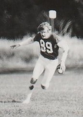
• Ricko’s one of those guys who really did read Playboy for the articles (yeah, sure). Here’s the corresponding offensive photo.
• In 1973, Minnesota wore this monochromatic design. But they also had this stripped-down version — no TV numbers, no white outlining on the numbers.
• Speaking of monochrome outfits, lots of teams were wearing them in the early ’60s, including Rice (navy with gray trim), North Texas State (kelly green), South Carolina (burgundy), and Holy Cross (purple). Plus Virginia went with solid orange in 1980.
• “I’d forgotten that West Virginia once wore white helmets around 1980,” says Ricko. “Quite unlike what they wear now.”
• Ricko says the first example of white football cleats he ever saw was the Massillon Tigers. That’s a high school team, subject of this excellent movie.
• So weird to see the Bears wearing block numbers instead of their usual rounded font. Here’s another example; note that the Vikings’ sleeve stripes are missing in that shot. And speaking of missing sleeve stripes, here’s another Bears shot that simply does not compute.
• Thing of beauty. That’s Oilers vs. Chargers, circa 1963.
• Long before there were fantasy leagues, there were games like these. That ad’s from the early ’60s.
• This web site should really be using this photo, no? That’s from the Jets/Chiefs playoff game that sent KC to Super Bowl IV.
• “Here’s Ernie Ladd chasing Jack Kemp in 1965,” says Ricko. “Chargers blue not as dark as Bills royal, but still not truly powder.”
• “I put these two shots together because sometimes we forgot just how blue those Cowboys pants were during the Staubach era,” says Ricko.
• Speaking of the Cowboys, here’s a great shot of Eddie LeBaron, the team’s first QB, who was somewhere between 5’7″ and 5’9″, depending on which source you believe.
• More NFLers playing basketball. “That’s Warren McVea of the Chiefs (in shorts that match Chiefs’ road pants) popping a jumper over Dave Costa and the Broncos team (wearing their game socks, it appears),” notes Ricko. According to the accompanying text, someone once had ideas about staging an NFL basketball tournament — yikes.
• “Here’s Ollie Matson, probably the Chicago Cardinals’ best player ever, in tennis shoes in 1958,” says Rickko. “After that season, Cards traded him to LA Rams for 11 players. No draft choices — 11 players.”
• “Here’s something pretty rare: a color shot of the Raiders’ 1960-’61 road jerseys (’62 were white without any gold trim). ’63, of course, was switch to silver and black.”
That’s enough for now. Incidentally, another reader has recently come forward and begun sharing images from his own archive of old photos and clips. More on that development soon.
Apostrophe Catastrophe, Continued: This is the Baltimore Orioles’ official team art/logo sheet (and please don’t bother asking me where I got it or how you can get a bigger version of it). Seems straightforward enough, until you take a closer look at these.
Can you fucking believe that?
Now, I realize an argument can be made that there shouldn’t be an apostrophe there at all, because plurals don’t take apostrophes. But you could also argue that the apostrophe is standing in for “riole,” plus “O’s” is less visually awkward than “Os” would be, plus-plus there’s a strong precedent for using an apostrophe in this type of logo. So let’s assume that the apostrophe belongs there.
But once you’ve decided it belongs there, how can anyone who got past the third grade orient it incorrectly?
This small but telling example of illiteracy (and make no mistake, that’s exactly what it is) extends to Baltimore’s alternate cap, BP cap, “portion of the proceeds” cap, and other gear. It’s been part of the team’s official graphics program since 2005, and I’m embarrassed not to have noticed it until now.
But the people who should really be embarrassed are the IQ-32 types who executed and approved this logo design. C’mon, a backwards apostrophe? Being worn by a major league sports franchise? And the culpability isn’t limited to the Orioles’ front office — how come nobody at MLB Properties said anything when this logo design came across their desks? How come nobody at New Era said, “Y’know, that cap doesn’t look quite right”? Guilty, each and every one of them.
And people wonder why America’s going down the crapper.
Raffle Reminder: I’m currently raffling off a free print from Sports Propaganda. For details, look here.
Uni Watch News Ticker: MLB has designated July 4th as an ALS-awareness day, to coincide with the 70th anniversary of Lou Gehrig’s famous speech. According to this story, “MLB will ask all players to wear a ‘4♦ALS’ patch on their chest.” Interesting that they say they’ll “ask” players to wear the patch, instead of simply saying “All players will wear the patch” — not sure if this means the patch is optional. Also not sure what, if anything, this means for the bogus stars/stripes caps. I’ll try to find out. ”¦ “As part of their ‘RAC in Black’ promotion, University of Maryland-Baltimore County wore black at home Monday night against Boston University,” writes Bob Nolte. “While BU probably could have worn their red road jerseys, they opted for home whites on the road.” ”¦ This is completely brilliant (thanks, Kirsten). ”¦ I consider myself a reasonably serious bowler, so you’d think I’d know what AMF stands for. Fact is, though, I’d never even thought about it until Scott Turner loaned me this old magazine, which has this ad on the back cover. Note the company name at the bottom — I had no idea. ”¦ Also from Scott: Two photos of bowling teams wearing neckties. ”¦ Roger Faso notes that This eBay seller has some really cool posters (and also a lot of fairly pedestrian jerseys, so skip those and just dig the cool poster action). ”¦ How awesome is this? That’s the 1922 baseball team from the Massachusetts College of Pharmacy. “They had many great victories including an 8-5 triumph over Harvard Dental,” says John Donovan, who scanned the photo from an old yearbook. ”¦ Douchebags. ”¦ Brad Richardson was missing a letter last night (screen grab courtesy of Lucas Burdick). ”¦ If you liked that Astros baseball card book I showed scans of yesterday, here’s the Indians version from that same series of books (with thanks to Tom Pachuta). ”¦ According to this 2008 story, after Maryland lost a game while wearing black uniforms in 2004, they more or less decided never to wear black again. But that changed last night against UNC — and they lost again (with thanks to MJ Kurs-Lasky). ”¦ The Rangers retired Adam Graves’s number last night. The pregame ceremonies featured some old Rangers in white jerseys, other old Rangers in blue jerseys, and the current Rangers squad wearing full white uniforms with a “9” in the captain/alternate position (a nice touch). Interestingly, these white jerseys were CCM-made and straight hemmed (although the NOB typography was way off), while the old-timers in blue were given Reebok (as was Graves himself). The Rangers then switched to their home blues for the actual game. All jerseys — pregame white, pregame blue, and game-worn — featured this patch, which was worn on the shoulder, as per the Rangers’ usual protocol. Oh, and for some reason there was also this (all screen grabs courtesy of Mark Kluczynski).
Paul–
You can call them “douchebags” all you want, but Citi is doing exactly what every trademark owner is required to do to protect their mark. There is no exception in the law for “these are really small guys, why bother them.” A trademark owner has to stop all infringing uses. To use an analogy from another world, “Don’t hate the playa; hate the game.”
The Rangers also had an extra decal on the back of their helmets last night with a “9” superimposed over the Garden graphic. Don’t know if anyone has a picture of it.
(Sorry for the double post, but they were two entirely different thoughts.)
[quote comment=”313395″]Paul–
You can call them “douchebags” all you want, but Citi is doing exactly what every trademark owner is required to do to protect their mark. There is no exception in the law for “these are really small guys, why bother them.” A trademark owner has to stop all infringing uses. To use an analogy from another world, “Don’t hate the playa; hate the game.”[/quote]
Dude, get a clue: Thanks to the bailout and the Mets fiasco, the company is mired in the worst shitstorm of PR they’ve ever endured. So they decide this is a good time to pick on a PAWN BROKER, thereby inviting all sorts of bailout-related jokes? Yeah, that’s smart corporate strategy.
Douchebags.
[quote comment=”313397″][quote comment=”313395″]Paul–
You can call them “douchebags” all you want, but Citi is doing exactly what every trademark owner is required to do to protect their mark. There is no exception in the law for “these are really small guys, why bother them.” A trademark owner has to stop all infringing uses. To use an analogy from another world, “Don’t hate the playa; hate the game.”[/quote]
Dude, get a clue: Thanks to the bailout and the Mets fiasco, the company is mired in the worst shitstorm of PR they’ve ever endured. So they decide this is a good time to pick on a PAWN BROKER, thereby inviting all sorts of bailout-related jokes? Yeah, that’s smart corporate strategy.
Douchebags.[/quote]
no worries, paul the good folks at fark have that covered already
From the Ticker: According to this 2008 story, after Maryland lost a game while wearing black uniforms in 2004, they more or less decided never to wear black again. But that changed last night against UNC – and they lost again (with thanks to MJ Kurs-Lasky). …
***
Maryland wore black in the first round of the 2006 ACC tournament and lost.
Here’s the link:
link
Happy National Letter of Intent Signing Day fellow Uni Watchers!
For how many years have the Orioles been a part of the Apostrophe Catastrophe? With this issue bothering our Glorious Leader to such an extent, I am surprised that it took so long for us to read about it.
And yes, the Orioles should be ashamed . . . .
Man, when you said “corresponding offensive photo,” I thought you meant offensively full of nudity! Very disappointing.
Some ad wizard at the Buffalo Sabres has decided to have everyone wear “red for women” for their home game this Friday.
Against Montreal.
Duh.
link
As you all may recall the George Mason Partriots got rid of their old mascot “Gunston” link, nd replaced him with this link. Good upgrade. They had a two month “naming” contest with thousands of entries. Yesterday the revealed the “winning” name. It is….get ready this is witty…some genious came up with….”The Patriot”! ugh.
Any 60’s era shots of Chargers v. anybody is great.
Was there ever a color-on-color San Diego game then?
I was reading an ESPN piece on signing day and at the bottle of the page was a grid saying who had the best facilities, who was the best recruiter, etc for each conference. One of the categories was uniforms and here’s how it shook out:
ACC – Wake Forest
Big East – W. Virginia
Big Ten – Michigan
Big 12- Colorado
Pac Ten – Cal
SEC – Georgia
I just feel like some of these dont make sense. Here’s the link:
link
The Massillon Tigers white shoes photo is an old Canton (OH) Repository newspaper photo from an early 60’s Canton McKinley – Massillon game (note the cool shoulder stripes on the red McKinley jerseys). This is the oldest and greatest high school football rivalry in the nation. This year was the 116th contest, including several state playoff meetings. Massillon actually went back to a uniform similar to that this past season (link to photo from this year’s McKinley – Massillon game, home black version).
link
The situation regarding the faulty apostrophe is surely even more embarrassing for the Orioles since they play baseball and could surely just have referenced the Oakland Athletics if they had any doubt…
As someone from Scotland who only occasionally watches baseball, even I know what the Oakland cap logo looks like. It has a technically incorrect but visually necessary apostrophe but at least it’s in the correct direction.
I really need some help from the Uni Watch faithful on this one. I have been exchanging e-mails with the Director of Merchandise Branding at the Milwaukee Brewers about their uniforms, and more specifically their road uniforms. I submitted a statement to him saying that the Brewers should have their city name on their road gray uniforms and that Milwaukee is only a handful of teams that doesn’t have their city on their road uniform. I also stated the Orioles have place “Baltimore” back on their roadies with much applause from their fans and the baseball world after being absent for so long. He obviously stated no changes can be done for 2009, but they are looking already to next year already and would like me to submit a rendering of what they Brewers uniforms would look like with the city script on them. I don’t know why he is asking me to do this…perhaps he wants to know if I am serious or not. I have zero photoshop skills, and am pleading with someone to help me out. I would need someone to take the “Milwaukee script” and apply it to a rendering of their road gray. Now, the road gray I have a pic. of has the “Milwaukee” patch on the sleeve, so that would obviously need to be either replaced, or taken off. I would suggest putting the “M” with the Wisconsin state outline in the background on the sleeve as a patch.
It would really be awesome to get this guys attention early, and maybe we can make the uni world a better place by having the Brewers have “Milwaukee” on their road grays which hasn’t happened since 2000, (and in my opinion, they were terrible). Attached are the pics that one might need to start with.
Thanks again for any help with this. I really appreciate it.
link
link
link
[quote comment=”313408″]I was reading an ESPN piece on signing day and at the bottle of the page was a grid saying who had the best facilities, who was the best recruiter, etc for each conference. One of the categories was uniforms and here’s how it shook out:
ACC – Wake Forest
Big East – W. Virginia
Big Ten – Michigan
Big 12- Colorado
Pac Ten – Cal
SEC – Georgia
I just feel like some of these dont make sense. Here’s the link:
link
Colorado in the Big 12? Huh? These days, only Mizzou and Texas Tech have flakier and therefore worse uniforms than Colorado.
I am making a call of “erroneous” concerning never seeing the “Bugles” Princeton stripes before.
When explaining my motivation for my Princeton DIY, I linkled to theis pic of my friend larry Chollet at Princeton in the early 70’s:
link
[quote comment=”313408″]I was reading an ESPN piece on signing day and at the bottle of the page was a grid saying who had the best facilities, who was the best recruiter, etc for each conference. One of the categories was uniforms and here’s how it shook out:
ACC – Wake Forest
Big East – W. Virginia
Big Ten – Michigan
Big 12- Colorado
Pac Ten – Cal
SEC – Georgia
[/quote]
If by “best” they mean worst then it’d be closer.
[quote comment=”313405″]As you all may recall the George Mason Partriots got rid of their old mascot “Gunston” link, nd replaced him with this link. Good upgrade. They had a two month “naming” contest with thousands of entries. Yesterday the revealed the “winning” name. It is….get ready this is witty…some genious came up with….”The Patriot”! ugh.[/quote]
Having lived across the street from GMU and having a brother who’s worked there the last 10 years I can def say it’s an upgrade, although the new mascot looks like a hybrid Mel Gibson from The Patriot and Brave Heart.
And Gunston isn’t going away, they’re just going to use him as an “Ambassador” for GMU. They gave him an upgrade as well and the results are quite scary. Here’s a link to a video transformation:
link
That Playboy all-americans photo reminded me of a story.
In the 90’s my town had an alumni that was an all-american at west virginia, eric degroh, he was a center. this was a huge deal since he’s from such a small town (a lot of pride when they’d do a profile on him on national tv and we saw his hometown.) anyway, he was invited to the playboy mansion and declined. just wonder how many all-americans decline that offer.
[quote comment=”313413″]I am making a call of “erroneous” concerning never seeing the “Bugles” Princeton stripes before.
When explaining my motivation for my Princeton DIY, I linkled to theis pic of my friend larry Chollet at Princeton in the early 70’s:
link
He was fixated on the sleeves.
Ricko,
I think the cleats in the Swann/Washington Super Bowl X photo are Riddell’s version of the artificial turf shoe. I beleive I have an old Riddell advertisement with them. I will check tonite when I get home.
[quote comment=”313413″]I am making a call of “erroneous” concerning never seeing the “Bugles” Princeton stripes before.
When explaining my motivation for my Princeton DIY, I linkled to theis pic of my friend larry Chollet at Princeton in the early 70’s:
link
that would imply 1) paul actually looked at one of your links and 2) out of all the links and pics people send him, he’d remember every one and 3) that this piece was written after he saw your DIY (which was awesome, btw…you should have used that helmet design instead of the michigan/delaware/princeton flying wing) and motivational picture
i believe 3) is the most likely, and he prolly had this entry prepared before he ever saw your pic
AMF=American Machine and Foundry
Used to be in everything, bowling, lawn darts, boats. Even owned Harley Davidson (and drove it into the ground) during the 70’s and 80’s.
Where is that game being played in that second Minnesota football photo? Looks like turf. Was that a color-on-color game, I didn’t think the Met had turf (furthermore, I’m not aware one way or another that they played there).
There was discussion yesterday about pro keds. As I was capping for the Steeler Super Bowl piece, it appeared that Bradshaw was either wearing Pro Keds or white Chucks. I really couldn’t get a good shot though.
Also, funny story regarding Bugles. My best friend woke up one morning and went downstairs for breakfast. His father is sitting at the table with a sour look on his face. My friend asks “what’s the matter?” The father says “don’t ever get that cereal again, it’s awful.”. My friend says “which one?”
His father says, “the one over there in the red box.”
My friend says, “there’s no cereal in a red box over here. The only thing in a red box are these bugles…..”
That’s right ladies and gentlemen, my man dumped milk over a bowl of bugles and ate them!!!!!
I’m an O’s fan and never noticed the wrong apostrophe before, but now it’s going to bother me incessantly until they change it. Thanks a lot, Paul!
In the Playboy photo, Tom Jackson of Louisville is holding a helmet with an American Flag decal. Is this really a Louisville helmet? If the photo was from 1976 it might make more sense.
I don’t post much (and do believe I have forgotten the last name I posted under), but I do come out of the lurking world when language is the topic of conversation.
Languages are not static entities as they change through/because of use. There’s always going to be the argument that languages are based on definite rules, and it is on these rules that the language survives. There’s also the argument that users of a language define the rules, and the rules are always in flux as a result of usage.
The question for me is whether the misuse disrupts meaning making/understanding. Seems that there is not an issue of (mis)understanding in play in regards to the misuse of the apostrophe in the cited examples over the last few days. The “apostrophe,” whether facing in the “right” or “wrong” direction, is still accomplishing the social/linguistical role it is meant to serve. If more people continue to “misuse” the apostrophe the rule might change – or the rule might stay the same but not be followed in popular usage. Only time will tell.
In this sense, it’s not an issue of America going down the crapper. Instead, it’s merely an issue of the changing nature that all languages go through. Yes, such changes might be the result of technological laziness, but they remain real, active changes.
If you liked that Astros baseball card book I showed scans of yesterday, here’s the Indians version from that same series of books (with thanks to Tom Pachuta)
I remember having a Mets version of that same book!
I should also say that the ability to change language comes through certain avenues, cultural/economic capital being one such avenue.
In this sense, the “misuse” of the apostrophe in prominent locations – such as baseball hats – should lead to “incorrect” mimicry, and, in turn, speed up the advancement of such “error.”
During the Adam Graves retirement ceremony, the old-timers in blue jerseys were the players who have had their numbers retired (Gilbert, Giacomin, Messier, Richter and Leetch), and those in white were those who had not. At the end of the ceremony Graves was given a blue jersey to wear for pictures with the previous honorees.
The great thing about the Surf baseball card books, is they make a great item to have autographed.
[quote comment=”313418″]Ricko,
I think the cleats in the Swann/Washington Super Bowl X photo are Riddell’s version of the artificial turf shoe. I beleive I have an old Riddell advertisement with them. I will check tonite when I get home.[/quote]
Could be. I know Riddell had a molded sole shoe (red sole) with the customary Snug-Tie design around the heel that they promoted for turf in the early ’70s. I had both a black pair and a white pair (still have the white ones). Eventually they introduced a Snug-Fit version, too (that’s the lace-up stirrup up from under the arch) that also had a red sole. The shoe we’re discussing does have that look, and could well be a third model. It has the “Snug-Fit” image, even if just a sewn-on, most certainly…but so did at least one other shoe from some unknown maker i a removable cleat. Maybe it was that maker who created this particular turf shoe? As I said, I never have figured it out.
—Ricko
The Brewers should go back to the ball in glove design full time.
[quote comment=”313424″]I don’t post much (and do believe I have forgotten the last name I posted under), but I do come out of the lurking world when language is the topic of conversation.
Languages are not static entities as they change through/because of use. There’s always going to be the argument that languages are based on definite rules, and it is on these rules that the language survives. There’s also the argument that users of a language define the rules, and the rules are always in flux as a result of usage.
The question for me is whether the misuse disrupts meaning making/understanding. Seems that there is not an issue of (mis)understanding in play in regards to the misuse of the apostrophe in the cited examples over the last few days. The “apostrophe,” whether facing in the “right” or “wrong” direction, is still accomplishing the social/linguistical role it is meant to serve. If more people continue to “misuse” the apostrophe the rule might change – or the rule might stay the same but not be followed in popular usage. Only time will tell.
In this sense, it’s not an issue of America going down the crapper. Instead, it’s merely an issue of the changing nature that all languages go through. Yes, such changes might be the result of technological laziness, but they remain real, active changes.[/quote]
Two things:
1) This isn’t an issue of “language.” It’s an issue of punctuation, symbology, typography, and design. It’s more akin to the proper use of a plus sign than, say, the question of whether “ain’t” is really a word.
2) The “Everyone understands what it means, so it’s OK” argument is rooted in selfishness. It basically assumes that if enough people keep doing things the right way (and thereby establish a climate of general understanding), it’s OK for a few people do it the wrong way, because the overriding climate of understanding will provide a context in which the wrong way can still function. It’s a bogus argument, because it depends on certain people who essentially intellectually subsidize other people. If EVERYONE started (mis)using apostrophes however they wanted, this prevailing context would disappear, and so would the whole concept of an apostrophe. If we can’t ALL do it incorrectly, why should ANYONE get to do it incorrectly? Answer: Nobody should do it incorrectly. It’s a fucking apostrophe, not rocket science — use it the right way.
[quote comment=”313419″][quote comment=”313413″]I am making a call of “erroneous” concerning never seeing the “Bugles” Princeton stripes before.
When explaining my motivation for my Princeton DIY, I linkled to theis pic of my friend larry Chollet at Princeton in the early 70’s:
link
that would imply 1) paul actually looked at one of your links and 2) out of all the links and pics people send him, he’d remember every one and 3) that this piece was written after he saw link (which was awesome, btw…you should have used that helmet design instead of the michigan/delaware/princeton flying wing) and motivational picture
i believe 3) is the most likely, and he prolly had this entry prepared before he ever saw your pic[/quote]
Of all people, you not catching sarcasm is a disappointment
AMF used to make golf balls and Golfers have long understood the acronym, especially vis-a-vis balls lost by way of errant tee shots, to mean “Adios motherfucker.”
/preparing to get pummeled
I understand the apostrophe issue, but it doesn’t bother me. to me this is akin to the English language losing the hyphen. so many word pairs that used to be hyphenated are now accepted as compounds and have even be added to dictionaries.
Like anything, the English language is evolving. Some things evolve for different reasons, whether it be because it makes more sense, it is easier or in this case because of word processing programs.
But the truth is (and the O’s cap is the perfect example) that obviously proper use in this case DOESN’T MATTER. Paul admits himself that he never noticed before now. And can anybody tell me they didn’t know what it meant? No. We as a cosiety now accept the single open quote as being interchangeable with an apostrophe.
In fact when used with nothing in front of it (ie. ’08), I personally think the single open quote more aesthetically pleasing.
I know some are sticklers for the rules and hate change. But this is something you better get used to.
And quite frankly I really doubt this has anything to do with why “America is going down the crapper”. I mean the country survived when Americans started always putting the period inside quotation markslink.
Anyone notice that the Playboy defensive team photo includes Ray Guy and Tom Jackson?
[quote]It’s a fucking apostrophe, not rocket science[/quote]
quote of the day
Ricko,
It is not the snug fit with the red molded sole I was referring to. I agree I think it was a third version, with like 50, tiny little astroturf cleats. The other difference is that the ‘third’ Riddell version had a white rubber ‘border’ (like on converse chuck t’s) between the leather uppers and the actual cleats. In fact the cleats themselves appear to be gum soled (brownish/grey) in color. Swann, Bradshaw, and many Oilers (Dan Pastorini) wore them in the 1978/79 AFC championships game.
I mean the country survived when Americans started always putting the period inside quotation marks(something the British don’t do).
There’s a difference between your example and the O’s thing. The former is a purely stylistic call, while what Paul wrote about represents a fundamental misunderstanding of what the apostrophe represents. The latter is a more serious case.
FWIW, I think the British style is ugly because of the gaping negative space bounded by the final letter, the raised quotes, and the end punctuation. The American style might lead to ambiguity in meaning, but at least it doesn’t look like ass. Personally, I set a LaTeX command to put commas and periods UNDER closing quotes.
[quote comment=”313437″]Ricko,
It is not the snug fit with the red molded sole I was referring to. I agree I think it was a third version, with like 50, tiny little astroturf cleats. The other difference is that the ‘third’ Riddell version had a white rubber ‘border’ (like on converse chuck t’s) between the leather uppers and the actual cleats. In fact the cleats themselves appear to be gum soled (brownish/grey) in color. Swann, Bradshaw, and many Oilers (Dan Pastorini) wore them in the 1978/79 AFC championships game.[/quote]
Oh, I knew what you meant. Was just saying there are some turg Riddells we can clearly identify. Question is, is the shoe from Sunday’s UW another one? And that’s what we’re trying to figure out> (I’ve decided to “>” instead of a period every once in a while; I assume that’s okay, seeing we now function under the “What does it really matter” school of punctuation)>
—Ricko
Not only were the rangers in CCM jeresys, they were in *old* CCM jerseys. They were hem tagged and had the orange downhill NHL logo, which then changed to downhill silver, and now its uphill silver. Those had to go back to the early or mid 90’s.
[quote comment=”313424″]
In this sense, it’s not an issue of America going down the crapper. Instead, it’s merely an issue of the changing nature that all languages go through. Yes, such changes might be the result of technological laziness, but they remain real, active changes.[/quote]
If it’s not right, then it’s wrong. There is no gray area. Language changes, but punctuation does not.
“turg Riddells”?
Typo could have been worse, that’s for sure.
[quote comment=”313425″]If you liked that Astros baseball card book I showed scans of yesterday, here’s the Indians version from that same series of books (with thanks to Tom Pachuta)
I remember having a Mets version of that same book![/quote]
I have my Reds version sitting on my shelf. It was a valuable resource back in those days.
[quote]
Oh, I knew what you meant. Was just saying there are some turg Riddells we can clearly identify. Question is, is the shoe from Sunday’s UW another one? And that’s what we’re trying to figure out> (I’ve decided to “>” instead of a period every once in a while; I assume that’s okay, seeing we now function under the “What does it really matter” school of punctuation)>
—Ricko
[/quote]
Turg Riddell would be the most awesome action hero name ever. :-)
The player wearing #89 in the Playboy Offensive photo looks like Greg Oden. I knew he was older than 21.
[quote comment=”313411″]I really need some help from the Uni Watch faithful on this one. I have been exchanging e-mails with the Director of Merchandise Branding at the Milwaukee Brewers about their uniforms, and more specifically their road uniforms. I submitted a statement to him saying that the Brewers should have their city name on their road gray uniforms and that Milwaukee is only a handful of teams that doesn’t have their city on their road uniform. I also stated the Orioles have place “Baltimore” back on their roadies with much applause from their fans and the baseball world after being absent for so long. He obviously stated no changes can be done for 2009, but they are looking already to next year already and would like me to submit a rendering of what they Brewers uniforms would look like with the city script on them. I don’t know why he is asking me to do this…perhaps he wants to know if I am serious or not.
I have zero photoshop skills, and am pleading with someone to help me out. I would need someone to take the “Milwaukee script” and apply it to a rendering of their road gray. Now, the road gray I have a pic. of has the “Milwaukee” patch on the sleeve, so that would obviously need to be either replaced, or taken off. I would suggest putting the “M” with the Wisconsin state outline in the background on the sleeve as a patch.
It would really be awesome to get this guys attention early, and maybe we can make the uni world a better place by having the Brewers have “Milwaukee” on their road grays which hasn’t happened since 2000, (and in my opinion, they were terrible). Attached are the pics that one might need to start with.
Thanks again for any help with this. I really appreciate it.
link
link
link
I’m no Photoshop guy, but I can hastily put stuff together on MS paint. Here’s what I came up with: link
[quote comment=”313431″]
And quite frankly I really doubt this has anything to do with why “America is going down the crapper”. I mean the country survived when Americans started always putting the period inside quotation markslink.[/quote]
If you put a period inside parentheses, you deserve to be shot. A period ENDS A STATEMENT. It is not to be used anywhere but the end of a sentence (or in abbreviations, but that’s a different function altogether).
As for the hyphens, that’s a function of language changing. Punctuation does not change, and periods are a part of punctuation.
[quote comment=”313446″][quote comment=”313411″]I really need some help from the Uni Watch faithful on this one. I have been exchanging e-mails with the Director of Merchandise Branding at the Milwaukee Brewers about their uniforms, and more specifically their road uniforms. I submitted a statement to him saying that the Brewers should have their city name on their road gray uniforms and that Milwaukee is only a handful of teams that doesn’t have their city on their road uniform. I also stated the Orioles have place “Baltimore” back on their roadies with much applause from their fans and the baseball world after being absent for so long. He obviously stated no changes can be done for 2009, but they are looking already to next year already and would like me to submit a rendering of what they Brewers uniforms would look like with the city script on them. I don’t know why he is asking me to do this…perhaps he wants to know if I am serious or not.
I have zero photoshop skills, and am pleading with someone to help me out. I would need someone to take the “Milwaukee script” and apply it to a rendering of their road gray. Now, the road gray I have a pic. of has the “Milwaukee” patch on the sleeve, so that would obviously need to be either replaced, or taken off. I would suggest putting the “M” with the Wisconsin state outline in the background on the sleeve as a patch.
It would really be awesome to get this guys attention early, and maybe we can make the uni world a better place by having the Brewers have “Milwaukee” on their road grays which hasn’t happened since 2000, (and in my opinion, they were terrible). Attached are the pics that one might need to start with.
Thanks again for any help with this. I really appreciate it.
link
link
link
I’m no Photoshop guy, but I can hastily put stuff together on MS paint. Here’s what I came up with: link
D’oh! Hence the failure to put the other half of the shoulder patch on the back side of the jersey. I also didn’t fill in all the little spaces with gray instead of white.
According to my middle school education, when talking about single letters as plural things, you use an apostrophe. O’s is correct, I don’t know why you would even bring it up.
And I think Maryland wore black because they saw that changing to gold for home brought a victory, so why not try a change on the road? (Of course it didn’t work out for us, but at least we didn’t lose by 41)
[quote comment=”313449″]According to my middle school education, when talking about single letters as plural things, you use an apostrophe. O’s is correct, I don’t know why you would even bring it up.[/quote]
Why is it correct? There has to be some sort of reasoning for a teacher – someone instructed in the basis of higher learning – to make such a claim.
If you were to spell “correct”, you would use two Cs, an O, two Rs, an E, and a T. No apostrophes needed.
[quote comment=\”313435\”]Anyone notice that the Playboy defensive team photo includes Ray Guy and Tom Jackson?[/quote]
. . . and the offense has Otis Armstrong. Quite a nice find for a fan of the AFC west in the 70s.
I was struck by how similar the Purdue and Colorado socks were, by how much better Wyo looked in those days and that there were 8 players from the Big 8 and 2 from the old WAC between the two shots with darned few from the SEC or ACC. Also I had forgotten that \’zona wore so much red back then.
O’s is correct. O`s is not.
jeebus christo…it’s NOT that complicated
classic… just read the name and number out loud:
link
found on mondesishouse.com
I think this discussion is seriously shortening Paul’s life span. All that blood-a-boilin’ can’t be healthy.
(If I were less lazy, I would intentionally make those apostrophes incorrect, but as it is, I’ll just let the computer handle it.)
[quote comment=”313453″]classic… just read the name and number out loud:
link
found on mondesishouse.com[/quote]
damn, link didnt work! was a guy with a lions jersey. the nameplate says “owen” and the jersey number is 16. haha
According to the AP Stylebook, under the punctuation section:
PLURALS OF A SINGLE LETTER: Mind your p’s and q’s. He learned the three R’s and brought home a report card with four A’s and two B’s. The Oakland A’s won the pennant.
I think that settles that–as an editor, to me the AP Stylebook is as good as gold.
Also, the U of Minnesota played at Memorial Stadium until 1981, and it had fake grass (“Tartan Turf”) for several years in the ’70s.
[quote comment=”313397″][quote comment=”313395″]Paul–
You can call them “douchebags” all you want, but Citi is doing exactly what every trademark owner is required to do to protect their mark. There is no exception in the law for “these are really small guys, why bother them.” A trademark owner has to stop all infringing uses. To use an analogy from another world, “Don’t hate the playa; hate the game.”[/quote]
Dude, get a clue: Thanks to the bailout and the Mets fiasco, the company is mired in the worst shitstorm of PR they’ve ever endured. So they decide this is a good time to pick on a PAWN BROKER, thereby inviting all sorts of bailout-related jokes? Yeah, that’s smart corporate strategy.
Douchebags.[/quote]
I have to agree with Seth H. They have to protect their trademark regardless of the economic times we’re in. Now, I would have loved to have actually seen the logo in question. And well, I think they HAVE gone overboard in suing for all the company’s profits since they began using the logo. They could have just filed suit to have the logo removed. That would have been enough.
[quote comment=”313448″][quote comment=”313446″][quote comment=”313411″]I really need some help from the Uni Watch faithful on this one. I have been exchanging e-mails with the Director of Merchandise Branding at the Milwaukee Brewers about their uniforms, and more specifically their road uniforms. I submitted a statement to him saying that the Brewers should have their city name on their road gray uniforms and that Milwaukee is only a handful of teams that doesn’t have their city on their road uniform. I also stated the Orioles have place “Baltimore” back on their roadies with much applause from their fans and the baseball world after being absent for so long. He obviously stated no changes can be done for 2009, but they are looking already to next year already and would like me to submit a rendering of what they Brewers uniforms would look like with the city script on them. I don’t know why he is asking me to do this…perhaps he wants to know if I am serious or not.
I have zero photoshop skills, and am pleading with someone to help me out. I would need someone to take the “Milwaukee script” and apply it to a rendering of their road gray. Now, the road gray I have a pic. of has the “Milwaukee” patch on the sleeve, so that would obviously need to be either replaced, or taken off. I would suggest putting the “M” with the Wisconsin state outline in the background on the sleeve as a patch.
It would really be awesome to get this guys attention early, and maybe we can make the uni world a better place by having the Brewers have “Milwaukee” on their road grays which hasn’t happened since 2000, (and in my opinion, they were terrible). Attached are the pics that one might need to start with.
Thanks again for any help with this. I really appreciate it.
link
link
link
I’m no Photoshop guy, but I can hastily put stuff together on MS paint. Here’s what I came up with: link
D’oh! Hence the failure to put the other half of the shoulder patch on the back side of the jersey. I also didn’t fill in all the little spaces with gray instead of white.[/quote]
Thanks for the help Namhob. Looks pretty good to me. If no one else comes up with a better design, I will for sure use that. Again, thank you!
The Rangers in Blue jerseys were players with their numbers retired.
[quote comment=”313452″]O’s is correct. O`s is not.
jeebus christo…it’s NOT that complicated[/quote]
Wait… found something of interest, Phil. And this answers my question of why it is right.
“The traditional style of pluralizing single letters with -‘s was naturally extended to acronyms when they were commonly written with periods. This form is still preferred by some people for all initialisms and thus -‘s as a suffix is often seen in informal usage.”
However, one must not mistake the O’ to mean “of” in such phrases as cat-o’-nine-tails or jack-o’-lantern.
Baltimore Ofs. Classy, yet incomplete thought. LMAO
[quote comment=”313456″]According to the AP Stylebook, under the punctuation section:
PLURALS OF A SINGLE LETTER: Mind your p’s and q’s. He learned the three R’s and brought home a report card with four A’s and two B’s. The Oakland A’s won the pennant.
I think that settles that–as an editor, to me the AP Stylebook is as good as gold.
Also, the U of Minnesota played at Memorial Stadium until 1981, and it had fake grass (“Tartan Turf”) for several years in the ’70s.[/quote]
And a awful surface it was. Played touch football on it a couple times and had shin splits for a week both times. Damn, it was hard. Like a concrete driveway with green carpet glued to it. And the drainage hump was so high I half expected the Gophers to win a coin toss and say, “We’ll defend the hill.”
—Rick
[quote comment=”313460″][quote comment=”313452″]
“The traditional style of pluralizing single letters with -‘s was naturally extended to acronyms when they were commonly written with periods. This form is still preferred by some people for all initialisms and thus -‘s as a suffix is often seen in informal usage.”
However, one must not mistake the O’ to mean “of” in such phrases as cat-o’-nine-tails or jack-o’-lantern.[/quote]
But how can that be? Teebz said “Language changes, but punctuation does not. ”
Also, I could be wrong, but hasn’t the use of the ellipsis evolved over the years?
Given enough time, EVERYTHING changes…Especially rules.
This is neither new, nor especially uni-related, but it came up in my daily calender, and it is both beautiful and hilarious.
link
The only problem I can see is that the player appears to be wearing a Lions uniform, implying that the Lions got a first down, which is highly questionable.
[quote comment=”313450″][quote comment=”313449″]According to my middle school education, when talking about single letters as plural things, you use an apostrophe. O’s is correct, I don’t know why you would even bring it up.[/quote]
Why is it correct? There has to be some sort of reasoning for a teacher – someone instructed in the basis of higher learning – to make such a claim.
If you were to spell “correct”, you would use two Cs, an O, two Rs, an E, and a T. No apostrophes needed.[/quote]
What you’ve just said is one of the most insanely idiotic things I have ever heard. At no point in your rambling, incoherent response were you even close to anything that could be considered a rational thought. Everyone in this room is now dumber for having listened to it. I award you no points, and may God have mercy on your soul.
According to link blog, the Rangers will honor another #9, link, along with Harry Howell, Feb. 22. The Rangers weren’t very good during his playing days, but Bathgate was! He was inducted into the Hockey Hall of Fame in 1978.
On the subject of costumed mascots, Arkansas State University introduced a character called link when the NCAA started their anti-Indian campaign… when the school changed their team name to Red Wolves, a new mascot named link took over the job. No word on what happened to “Red”… I’m afraid “Howl” may have eaten him!
[quote comment=”313465″][quote comment=”313450″][quote comment=”313449″]According to my middle school education, when talking about single letters as plural things, you use an apostrophe. O’s is correct, I don’t know why you would even bring it up.[/quote]
Why is it correct? There has to be some sort of reasoning for a teacher – someone instructed in the basis of higher learning – to make such a claim.
If you were to spell “correct”, you would use two Cs, an O, two Rs, an E, and a T. No apostrophes needed.[/quote]
What you’ve just said is one of the most insanely idiotic things I have ever heard. At no point in your rambling, incoherent response were you even close to anything that could be considered a rational thought. Everyone in this room is now dumber for having listened to it. I award you no points, and may God have mercy on your soul.[/quote]
Quoting the movie Billy Madison doesn’t strengthen your position. However, since I answered my own question above, thanks for adding nothing.
Oh, and “a simple ‘wrong’ would have done just fine, but uh…”.
[quote comment=”313414″][quote comment=”313408″]I was reading an ESPN piece on signing day and at the bottle of the page was a grid saying who had the best facilities, who was the best recruiter, etc for each conference. One of the categories was uniforms and here’s how it shook out:
ACC – Wake Forest
Big East – W. Virginia
Big Ten – Michigan
Big 12- Colorado
Pac Ten – Cal
SEC – Georgia
[/quote]
If by “best” they mean worst then it’d be closer.[/quote]
Maybe they just wanted to see if we were watching….
Quoting the movie Billy Madison doesn’t strengthen your position. However, since I answered my own question above, thanks for adding nothing.
Oh, and “a simple ‘wrong’ would have done just fine, but uh…”.[/quote]
Teachers make no sense
LOL skip, point, and pour it on
“Douchebags” really is the right word for Citi. A simple “your logo looks too much like ours; please change it” wouldn’t merit such a word, but suing for all the company’s profits certainly does.
First[quote comment=”313470″]”Douchebags” really is the right word for Citi. A simple “your logo looks too much like ours; please change it” wouldn’t merit such a word, but suing for all the company’s profits certainly does.[/quote]
First defense is to quit using the image/logo/whatever in question.
After that, the plaintiff has to prove they were damaged by your use of the image/logo/whatever.
Citi may have a tough time with that one.
What they WILL probably do is put the pawnshop owner out of business because of the legal expenses he’ll incur…which is probably what Citi really wants anyway, to destroy the guy.
They haven’t had many Wins lately, so I guess they’re just looking to feel powerful for a few seconds.
Bullies, y’know, need that every once in a while. That’s why they’re bullies.
—Ricko
y’all need to sit down by the fire with nice mug of hot chocolate and curl up with an e e cummings book of poetry
[quote comment=”313436″][quote]It’s a fucking apostrophe, not rocket science[/quote]
quote of the day[/quote]
And this was my take yesterday – I have far more important technical content to proof than the direction of an apostrophe (I’m an engineer, a rocket scientist in fact, and not and editor or writer). And therefore, I had never even noticed this phenomenom. HOWEVER… the backward apostrophe on the O’s logo is inexcuseable – it is not a factor of the program thinking it is a smart quote. Someone HAD to make it do that…
[quote comment=”313415″][quote comment=”313405″]As you all may recall the George Mason Partriots got rid of their old mascot “Gunston” link, nd replaced him with this link. Good upgrade. They had a two month “naming” contest with thousands of entries. Yesterday the revealed the “winning” name. It is….get ready this is witty…some genious came up with….”The Patriot”! ugh.[/quote]
Having lived across the street from GMU and having a brother who’s worked there the last 10 years I can def say it’s an upgrade, although the new mascot looks like a hybrid Mel Gibson from The Patriot and Brave Heart.
And Gunston isn’t going away, they’re just going to use him as an “Ambassador” for GMU. They gave him an upgrade as well and the results are quite scary. Here’s a link to a video transformation:
link
Yeah, I saw that video of Gunston. Although the new mascon is an upgrade, the name “The Patriot” is hardly creative. Was THAT the best name in the contest?
Not unlike the comments section today and yesterday!
link
(Ill B HEAR all WEAK!)
Seriously, I never thought I’d see so many references to the AP Style Guide in my life!!!!
[quote comment=”313475″]
Not unlike the comments section today and yesterday!
link
(Ill B HEAR all WEAK!)
Seriously, I never thought I’d see so many references to the AP Style Guide in my life!!!![/quote]
I’m sure I’m not the only one who’s tired of the apostrophe discussion, but this is Paul’s website, so I think I’ll preempt his response by saying if we don’t like it, we can make like an Arizona Super Bowl Broadcast video clip.
[quote comment=”313475″]
Not unlike the comments section today and yesterday!
link
(Ill B HEAR all WEAK!)
Seriously, I never thought I’d see so many references to the AP Style Guide in my life!!!![/quote]
Great find, Kek!
[quote comment=”313458″][quote comment=”313448″][quote comment=”313446″][quote comment=”313411″]I really need some help from the Uni Watch faithful on this one. I have been exchanging e-mails with the Director of Merchandise Branding at the Milwaukee Brewers about their uniforms, and more specifically their road uniforms. I submitted a statement to him saying that the Brewers should have their city name on their road gray uniforms and that Milwaukee is only a handful of teams that doesn’t have their city on their road uniform. I also stated the Orioles have place “Baltimore” back on their roadies with much applause from their fans and the baseball world after being absent for so long. He obviously stated no changes can be done for 2009, but they are looking already to next year already and would like me to submit a rendering of what they Brewers uniforms would look like with the city script on them. I don’t know why he is asking me to do this…perhaps he wants to know if I am serious or not.
I have zero photoshop skills, and am pleading with someone to help me out. I would need someone to take the “Milwaukee script” and apply it to a rendering of their road gray. Now, the road gray I have a pic. of has the “Milwaukee” patch on the sleeve, so that would obviously need to be either replaced, or taken off. I would suggest putting the “M” with the Wisconsin state outline in the background on the sleeve as a patch.
It would really be awesome to get this guys attention early, and maybe we can make the uni world a better place by having the Brewers have “Milwaukee” on their road grays which hasn’t happened since 2000, (and in my opinion, they were terrible). Attached are the pics that one might need to start with.
Thanks again for any help with this. I really appreciate it.
link
link
link
I’m no Photoshop guy, but I can hastily put stuff together on MS paint. Here’s what I came up with: link
D’oh! Hence the failure to put the other half of the shoulder patch on the back side of the jersey. I also didn’t fill in all the little spaces with gray instead of white.[/quote]
Thanks for the help Namhob. Looks pretty good to me. If no one else comes up with a better design, I will for sure use that. Again, thank you![/quote]
Not to one up Namhob but I figured I’d give him a hand…link
Citi may be doucebags, but the fact is if they don’t protect their trademarks they lose them.
[quote comment=”313478″][quote comment=”313458″][quote comment=”313448″][quote comment=”313446″][quote comment=”313411″]I really need some help from the Uni Watch faithful on this one. I have been exchanging e-mails with the Director of Merchandise Branding at the Milwaukee Brewers about their uniforms, and more specifically their road uniforms. I submitted a statement to him saying that the Brewers should have their city name on their road gray uniforms and that Milwaukee is only a handful of teams that doesn’t have their city on their road uniform. I also stated the Orioles have place “Baltimore” back on their roadies with much applause from their fans and the baseball world after being absent for so long. He obviously stated no changes can be done for 2009, but they are looking already to next year already and would like me to submit a rendering of what they Brewers uniforms would look like with the city script on them. I don’t know why he is asking me to do this…perhaps he wants to know if I am serious or not.
I have zero photoshop skills, and am pleading with someone to help me out. I would need someone to take the “Milwaukee script” and apply it to a rendering of their road gray. Now, the road gray I have a pic. of has the “Milwaukee” patch on the sleeve, so that would obviously need to be either replaced, or taken off. I would suggest putting the “M” with the Wisconsin state outline in the background on the sleeve as a patch.
It would really be awesome to get this guys attention early, and maybe we can make the uni world a better place by having the Brewers have “Milwaukee” on their road grays which hasn’t happened since 2000, (and in my opinion, they were terrible). Attached are the pics that one might need to start with.
Thanks again for any help with this. I really appreciate it.
link
link
link
I’m no Photoshop guy, but I can hastily put stuff together on MS paint. Here’s what I came up with: link
D’oh! Hence the failure to put the other half of the shoulder patch on the back side of the jersey. I also didn’t fill in all the little spaces with gray instead of white.[/quote]
Thanks for the help Namhob. Looks pretty good to me. If no one else comes up with a better design, I will for sure use that. Again, thank you![/quote]
Not to one up Namhob but I figured I’d give him a hand…link
Ok sorry about that fiasco…here ya go!
link
[quote comment=”313458″][quote comment=”313448″][quote comment=”313446″][quote comment=”313411″]I really need some help from the Uni Watch faithful on this one. I have been exchanging e-mails with the Director of Merchandise Branding at the Milwaukee Brewers about their uniforms, and more specifically their road uniforms. I submitted a statement to him saying that the Brewers should have their city name on their road gray uniforms and that Milwaukee is only a handful of teams that doesn’t have their city on their road uniform. I also stated the Orioles have place “Baltimore” back on their roadies with much applause from their fans and the baseball world after being absent for so long. He obviously stated no changes can be done for 2009, but they are looking already to next year already and would like me to submit a rendering of what they Brewers uniforms would look like with the city script on them. I don’t know why he is asking me to do this…perhaps he wants to know if I am serious or not.
I have zero photoshop skills, and am pleading with someone to help me out. I would need someone to take the “Milwaukee script” and apply it to a rendering of their road gray. Now, the road gray I have a pic. of has the “Milwaukee” patch on the sleeve, so that would obviously need to be either replaced, or taken off. I would suggest putting the “M” with the Wisconsin state outline in the background on the sleeve as a patch.
It would really be awesome to get this guys attention early, and maybe we can make the uni world a better place by having the Brewers have “Milwaukee” on their road grays which hasn’t happened since 2000, (and in my opinion, they were terrible). Attached are the pics that one might need to start with.
Thanks again for any help with this. I really appreciate it.
link
link
link
I’m no Photoshop guy, but I can hastily put stuff together on MS paint. Here’s what I came up with: link
D’oh! Hence the failure to put the other half of the shoulder patch on the back side of the jersey. I also didn’t fill in all the little spaces with gray instead of white.[/quote]
Thanks for the help Namhob. Looks pretty good to me. If no one else comes up with a better design, I will for sure use that. Again, thank you![/quote]
Great job to Namhob…milwaukee faithful here, and I to have inquired about it – though through friends that work in the sales / marketing dept. Their fear is that if they do something like this, the rest of the state will start to disown them, hence the state sleeve patch still being part of the design. They are weening it out though (2009 BP hat is the primary logo only).
best of luck –
David
link
the Citi Pawn logo as it appears on the building.
About punctuation, I’m with Paul. It makes me steam when I hear someone say, Hey, it doesn’t matter! If people are all doing something wrong, that doesn’t turn the right to wrong, it just means everybody’s stupid. A few days ago, link talked about similar things. You can see where my comment brings up the movie “Idocracy,” which, if you haven’t seen it, is about America…when it’s down the crapper.
Adam Graves? 280 goals with the rangers. You’d think an original six team would have higher standard than that.
[quote comment=”313485″]Adam Graves? 280 goals with the rangers. You’d think an original six team would have higher standard than that.[/quote]
If you listen to his teammates, he was literally the heart and soul for the Rangers. And his charitable work for the Rangers is second to none.
The man is a stand-up individual, and one helluva community guy.
RE: Brewers Road uniform re-design
link
Thanks a lot Pretty Boy Paulie! That looks great. I will submit that today in an e-mail and let ya know what goes down.
I love Uni Watch.
[quote comment=”313484″]link
the Citi Pawn logo as it appears on the building.
About punctuation, I’m with Paul. It makes me steam when I hear someone say, Hey, it doesn’t matter! If people are all doing something wrong, that doesn’t turn the right to wrong, it just means everybody’s stupid. A few days ago, link talked about similar things. You can see where my comment brings up the movie “Idocracy,” which, if you haven’t seen it, is about America…when it’s down the crapper.[/quote]
Oh wow…. they should be sued!
[quote comment=”313431″][quote comment=”313424″]I don’t post much (and do believe I have forgotten the last name I posted under), but I do come out of the lurking world when language is the topic of conversation.
Languages are not static entities as they change through/because of use. There’s always going to be the argument that languages are based on definite rules, and it is on these rules that the language survives. There’s also the argument that users of a language define the rules, and the rules are always in flux as a result of usage.
The question for me is whether the misuse disrupts meaning making/understanding. Seems that there is not an issue of (mis)understanding in play in regards to the misuse of the apostrophe in the cited examples over the last few days. The “apostrophe,” whether facing in the “right” or “wrong” direction, is still accomplishing the social/linguistical role it is meant to serve. If more people continue to “misuse” the apostrophe the rule might change – or the rule might stay the same but not be followed in popular usage. Only time will tell.
In this sense, it’s not an issue of America going down the crapper. Instead, it’s merely an issue of the changing nature that all languages go through. Yes, such changes might be the result of technological laziness, but they remain real, active changes.[/quote]
Two things:
1) This isn’t an issue of “language.” It’s an issue of punctuation, symbology, typography, and design. It’s more akin to the proper use of a plus sign than, say, the question of whether “ain’t” is really a word.
2) The “Everyone understands what it means, so it’s OK” argument is rooted in selfishness. It basically assumes that if enough people keep doing things the right way (and thereby establish a climate of general understanding), it’s OK for a few people do it the wrong way, because the overriding climate of understanding will provide a context in which the wrong way can still function. It’s a bogus argument, because it depends on certain people who essentially intellectually subsidize other people. If EVERYONE started (mis)using apostrophes however they wanted, this prevailing context would disappear, and so would the whole concept of an apostrophe. If we can’t ALL do it incorrectly, why should ANYONE get to do it incorrectly? Answer: Nobody should do it incorrectly. It’s a fucking apostrophe, not rocket science — use it the right way.[/quote]
I’m fine with that it’s an issue of design. But it’s an issue of design rooted in language. Punctuation would not exist if it did not exist in a linguistical sign-based system.
And I spelled “Idiocracy” wrong because I was…testing you!
[quote comment=”313481″]Citi may be doucebags, but the fact is if they don’t protect their trademarks they lose them.[/quote]
Not disagreeing. They should force them to stop.
But to claim they have been “materially damaged” by this particular illegal use is a tad farfetched, especially considering the self-inflicted damage they done lately, or that entities far larger and more powerful that this pawnbroker have done to them.
If all they are doing is keeping the logo from slipping into the public domain, a “cease and desist” accomplishes that.
Beyond that is just grinding the guy.
[quote comment=”313436″][quote]It’s a fucking apostrophe, not rocket science[/quote]
quote of the day[/quote]
I like to see it more as Paul’s typical turn to hyperbole. There are many good ideas discussed on this site. Having said that, the degree to which hyperbolic language is called on to “cement” arguments is astounding. Standard internet sensationalism. Paul’s point (although I disagree with it) was well-made before the turn to cheap word tricks.
[quote comment=”313484″]link
the Citi Pawn logo as it appears on the building.[/quote]
Wow, that is a pretty blatant attempt to confuse consumers. Again, they have every right to sue under trademark law (and should rightfully do so)…but I’m not sure trying to get the Company’s profits from prior months is necessary. As I stated before (as well as several of you), simply force them to change their logo and stop using that sign.
[quote comment=”313493″][quote comment=”313484″]link
the Citi Pawn logo as it appears on the building.[/quote]
Wow, that is a pretty blatant attempt to confuse consumers. Again, they have every right to sue under trademark law (and should rightfully do so)…but I’m not sure trying to get the Company’s profits from prior months is necessary. As I stated before (as well as several of you), simply force them to change their logo and stop using that sign.[/quote]
And just for the record, I had not read that the guy had taken it down and they were still going after him. There is a fine line between making an example and bullying…
Paul,
not sure if youve mentioned this before, but here
link
talks about how unis make a difference to recruits in signing with colleges.
In the middle of the article, some kid thinks he’d look good for LSU because he looks good in purple.
Someone shoudl tell him they 95% of the time go with White/Yellow uni combo
and if this is a re-post i apologize, just came scross it on page 2 today
A Brunswick mechanic will tell you what AMF really stands for…another mechanical fuckup
YEA! I’ll be here all week, tip your waitresses.
I don’t understand. The apostrophe debate started not as a debate over usage but presentation. The O’s aren’t using the apostrophe incorrectly, they’re just presenting it “backwards.” I don’t see any difference between the two apostrophes and, say, different presentations of a lower case “a” in different fonts. It’s still an “a” either way. Likewise, the apostrophe is functioning as an apostrophe, it’s just a different style.
Paul’s right that this has its limits (you can’t start putting, like, an exclamation point in place of an apostrophe and call it one because it’s performing the same function), but in this case it’s the same small symbol, just turned a different direction.
[quote comment=”313486″][quote comment=”313485″]Adam Graves? 280 goals with the rangers. You’d think an original six team would have higher standard than that.[/quote]
If you listen to his teammates, he was literally the heart and soul for the Rangers. And his charitable work for the Rangers is second to none.
The man is a stand-up individual, and one helluva community guy.[/quote]
link
Just an old article about Gravy that outlines what he means to NYC, this as much as anything is why his number now hangs in the rafters of MSG.
Hey Teebz,
I forgot to ask if you won the option to buy one of the University of Wisconsin Badger hockey jersey/sweater in that auction???
[quote comment=”313478″][quote comment=”313458″][quote comment=”313448″][quote comment=”313446″][quote comment=”313411″]I really need some help from the Uni Watch faithful on this one. I have been exchanging e-mails with the Director of Merchandise Branding at the Milwaukee Brewers about their uniforms, and more specifically their road uniforms. I submitted a statement to him saying that the Brewers should have their city name on their road gray uniforms and that Milwaukee is only a handful of teams that doesn’t have their city on their road uniform. I also stated the Orioles have place “Baltimore” back on their roadies with much applause from their fans and the baseball world after being absent for so long. He obviously stated no changes can be done for 2009, but they are looking already to next year already and would like me to submit a rendering of what they Brewers uniforms would look like with the city script on them. I don’t know why he is asking me to do this…perhaps he wants to know if I am serious or not.
I have zero photoshop skills, and am pleading with someone to help me out. I would need someone to take the “Milwaukee script” and apply it to a rendering of their road gray. Now, the road gray I have a pic. of has the “Milwaukee” patch on the sleeve, so that would obviously need to be either replaced, or taken off. I would suggest putting the “M” with the Wisconsin state outline in the background on the sleeve as a patch.
It would really be awesome to get this guys attention early, and maybe we can make the uni world a better place by having the Brewers have “Milwaukee” on their road grays which hasn’t happened since 2000, (and in my opinion, they were terrible). Attached are the pics that one might need to start with.
Thanks again for any help with this. I really appreciate it.
link
link
link
I’m no Photoshop guy, but I can hastily put stuff together on MS paint. Here’s what I came up with: link
D’oh! Hence the failure to put the other half of the shoulder patch on the back side of the jersey. I also didn’t fill in all the little spaces with gray instead of white.[/quote]
Thanks for the help Namhob. Looks pretty good to me. If no one else comes up with a better design, I will for sure use that. Again, thank you![/quote]
Not to one up Namhob but I figured I’d give him a hand…link
Thank God! I was afraid he was going to have to use my crappy version. After all, I’m only a sound engineer.
Must have been great to go NOF (name on front):
link
[quote comment=”313487″]RE: Brewers Road uniform re-design
link
Thanks a lot Pretty Boy Paulie! That looks great. I will submit that today in an e-mail and let ya know what goes down.
I love Uni Watch.[/quote]
With mention that the Orioles went back to their roadies having the city name prominent, however, their unis also have the Oriole logo on their caps. I love the Brewers MB glove logo, so, maybe adding this revised gold and blue MB glove, on the caps, could also be a nice element to this uniform ensemble.
link
Cork #39. The period always goes inside the quote!
Associated Press style … learn it, live it, love it.
Frankly, if you haven’t taken journalism classes you wouldn’t know the importance of AP Style, so you get a pass for this. Seriously, though, there are NO, read NO, and I do mean NO, excuses for the apostrophe catastrophe. It’s a word-processing bug, it needs to get fixed, and people need to care about it. If you don’t, no problem. Just stop making excuses for it. Move on.
That Mass College of Pharmacy victory over Harvard School of Dentistry would have been accompanied by significant bragging rights, they are across the street from one another (and now totally surrounded by Harvard Medical School and affiliated hospitals).
[quote comment=”313464″]This is neither new, nor especially uni-related, but it came up in my daily calender, and it is both beautiful and hilarious.
link
The only problem I can see is that the player appears to be wearing a Lions uniform, implying that the Lions got a first down, which is highly questionable.[/quote]
Hercules is signaling a penalty, not a first down. Pretty obvious.
[quote comment=”313498″][quote comment=”313486″][quote comment=”313485″]Adam Graves? 280 goals with the rangers. You’d think an original six team would have higher standard than that.[/quote]
interesting point. If we base it only on Goals scored for the Rangers then a few of those numbers must come down. I mean #11 only scored 250 in his 10 years on broadway.
Sometimes it has to be more then just the numbers. (Being a Islander and Cap fan I can’t believe I’m defending something the Rangers did. — But Graves was more then just a good forward. (ie: Clancy and Masterson Award Winner)
[quote comment=”313487″]RE: Brewers Road uniform re-design
link
Thanks a lot Pretty Boy Paulie! That looks great. I will submit that today in an e-mail and let ya know what goes down.
I love Uni Watch.[/quote]
Looks good on paper but it’s gonna be tough to break that workmark at the seam of the shirt. Will be worse than the RAAYS.
hyphen and an apostrophe
link
[quote comment=”313503″][quote comment=”313487″]RE: Brewers Road uniform re-design
link
Thanks a lot Pretty Boy Paulie! That looks great. I will submit that today in an e-mail and let ya know what goes down.
I love Uni Watch.[/quote]
With mention that the Orioles went back to their roadies having the city name prominent, however, their unis also have the Oriole logo on their caps. I love the Brewers MB glove logo, so, maybe adding this revised gold and blue MB glove, on the caps, could also be a nice element to this uniform ensemble.
link
I know you’re pulling this from the Orioles example, but as a Wisconsinite, I cringe at seeing the old ball-and-glove in the same set as the new jerseys. You can’t mix the two. The ball-and-glove yellow would have to turn gold, which I don’t even wish to imagine.
BUT, I do agree that the Brewers need their city name on the road grays. Kudos to Johnny O and his quest.
[quote comment=”313510″][quote comment=”313503″][quote comment=”313487″]RE: Brewers Road uniform re-design
link
Thanks a lot Pretty Boy Paulie! That looks great. I will submit that today in an e-mail and let ya know what goes down.
I love Uni Watch.[/quote]
With mention that the Orioles went back to their roadies having the city name prominent, however, their unis also have the Oriole logo on their caps. I love the Brewers MB glove logo, so, maybe adding this revised gold and blue MB glove, on the caps, could also be a nice element to this uniform ensemble.
link
I know you’re pulling this from the Orioles example, but as a Wisconsinite, I cringe at seeing the old ball-and-glove in the same set as the new jerseys. You can’t mix the two. The ball-and-glove yellow would have to turn gold, which I don’t even wish to imagine.
BUT, I do agree that the Brewers need their city name on the road grays. Kudos to Johnny O and his quest.[/quote]
Point taken. There’s a clash happening there that I am not as sensitive to. Just felt that there should be some B (Brewer) representation.
[quote comment=”313488″][quote comment=”313484″]link
the Citi Pawn logo as it appears on the building.
About punctuation, I’m with Paul. It makes me steam when I hear someone say, Hey, it doesn’t matter! If people are all doing something wrong, that doesn’t turn the right to wrong, it just means everybody’s stupid. A few days ago, link talked about similar things. You can see where my comment brings up the movie “Idocracy,” which, if you haven’t seen it, is about America…when it’s down the crapper.[/quote]
Oh wow…. they should be sued![/quote]
I gotta agree with this. I was all prepared to agree that Citigroup was guilty of douchebaggery, but this pawn shop directly stole their logo, line for line, color for color.
Sorry, that’s bad. Real bad.
Look, there’s the innocent ma-and-pa coffee shop that calls themselves something-bucks and gets sued, and theres the pawn shop that directly copies a logo. Two different things.
As someone who designs logos, I hope the judge throws the book at these theves.
I’m walking into a mine field here (as I’m not a design expert), but isn’t there a visual fluidity that comes with the wrongly used apostrophe? As the eye moves from left to right, doesn’t it make some sense that the “motion” of the apostrophe would do the same?
Maybe I’m just trying to come up with a design reason for the switch beyond ignorance. I like to have more faith in people more so than a certain ringleader around here.
[quote comment=”313497″]I don’t understand. The apostrophe debate started not as a debate over usage but presentation. The O’s aren’t using the apostrophe incorrectly, they’re just presenting it “backwards.” I don’t see any difference between the two apostrophes and, say, different presentations of a lower case “a” in different fonts. It’s still an “a” either way. Likewise, the apostrophe is functioning as an apostrophe, it’s just a different style.
Paul’s right that this has its limits (you can’t start putting, like, an exclamation point in place of an apostrophe and call it one because it’s performing the same function), but in this case it’s the same small symbol, just turned a different direction.[/quote]
Woah, woah, woah. You have to have some sort of proof (as in it has to be clearly intentional) before you start making stuff up about it being intentional.
The backwards “r” in Toys R Us is obviously intentional, for example.
Otherwise its like the clutz who drops something and says “I meant to do that!”
[quote comment=”313513″]I’m walking into a mine field here (as I’m not a design expert), but isn’t there a visual fluidity that comes with the wrongly used apostrophe? As the eye moves from left to right, doesn’t it make some sense that the “motion” of the apostrophe would do the same?
Maybe I’m just trying to come up with a design reason for the switch beyond ignorance. I like to have more faith in people more so than a certain ringleader around here.[/quote]
Its more visually fluid to use it correctly in the eyes of people that know how to use an apostrophe correctly.
[quote comment=”313511″][quote comment=”313510″][quote comment=”313503″][quote comment=”313487″]RE: Brewers Road uniform re-design
link
Thanks a lot Pretty Boy Paulie! That looks great. I will submit that today in an e-mail and let ya know what goes down.
I love Uni Watch.[/quote]
With mention that the Orioles went back to their roadies having the city name prominent, however, their unis also have the Oriole logo on their caps. I love the Brewers MB glove logo, so, maybe adding this revised gold and blue MB glove, on the caps, could also be a nice element to this uniform ensemble.
link
I know you’re pulling this from the Orioles example, but as a Wisconsinite, I cringe at seeing the old ball-and-glove in the same set as the new jerseys. You can’t mix the two. The ball-and-glove yellow would have to turn gold, which I don’t even wish to imagine.
BUT, I do agree that the Brewers need their city name on the road grays. Kudos to Johnny O and his quest.[/quote]
Point taken. There’s a clash happening there that I am not as sensitive to. Just felt that there should be some B (Brewer) representation.[/quote]
Even though I am I die hard Cubs fan…I really do like that Brewers “ball-n-glove” logo. I don’t have any problems with modernizing old logos..it can be a disaster (Canucks third Jersey logo) or it can be briliant (Arizona Cardinals helmet logo). I will agree it doesn’t look right on the cap but I do think it wouldn’t be too bad on an alternate jersey sleeve. But with the Brewers already wearing their throwback jerseys featuring the “ball-n-glove” logo, it wouldn’t be right all together.
Now these wouldn’t be so bad either…
Cardinals on the Road…
link
Rays on the Road…
link
[quote comment=”313499″]Hey Teebz,
I forgot to ask if you won the option to buy one of the University of Wisconsin Badger hockey jersey/sweater in that auction???[/quote]
Nope. Couldn’t stand to part with $300+ USD at this time. I originally got in the bidding when they were $175 USD, but as soon as they broke the price of an NHL authentic, I walked away.
[quote comment=”313508″][quote comment=”313487″]RE: Brewers Road uniform re-design
link
Thanks a lot Pretty Boy Paulie! That looks great. I will submit that today in an e-mail and let ya know what goes down.
I love Uni Watch.[/quote]
Looks good on paper but it’s gonna be tough to break that workmark at the seam of the shirt. Will be worse than the RAAYS.[/quote]
If you get rid of the underline, it can probably be easily split between the w and a. Alternately, moving the word up a few inches (on a jersey) might make it more balanced even if split between the l and w, and keeping the underline.
Other than that, it looks prettty good. As do those Cardinals and Rays ones too.
Or they could have a pullover!
[quote comment=”313447″][quote comment=”313431″]
And quite frankly I really doubt this has anything to do with why “America is going down the crapper”. I mean the country survived when Americans started always putting the period inside quotation markslink.[/quote]
If you put a period inside parentheses, you deserve to be shot. A period ENDS A STATEMENT. It is not to be used anywhere but the end of a sentence (or in abbreviations, but that’s a different function altogether).
As for the hyphens, that’s a function of language changing. Punctuation does not change, and periods are a part of punctuation.[/quote]
Actually, periods do go inside parenthesis in certain instances. I’ll try to link to a reference so you can see for yourself.
link
[quote comment=”313433″]AMF used to make golf balls and Golfers have long understood the acronym, especially vis-a-vis balls lost by way of errant tee shots, to mean “Adios motherfucker.”[/quote]
We always said the same about their bowling balls in regards to the pins. Loved my Angles!
[quote comment=”313517″]Now these wouldn’t be so bad either…
Cardinals on the Road…
link
Rays on the Road…
link
Rumor has it here in the St. Pete area that “Tampa Bay” will appear on next year’s away jerseys.
[quote comment=”313496″]A Brunswick mechanic will tell you what AMF really stands for…another mechanical fuckup
YEA! I’ll be here all week, tip your waitresses.[/quote]
Yup….even though AMFs are more electrical than mechanical.
A2s FTW!!! :)
[quote comment=”313517″]Now these wouldn’t be so bad either…
Cardinals on the Road…
link
Rays on the Road…
link
On that note:
link
[quote comment=”313524″][quote comment=”313496″]A Brunswick mechanic will tell you what AMF really stands for…another mechanical fuckup
YEA! I’ll be here all week, tip your waitresses.[/quote]
Yup….even though AMFs are more electrical than mechanical.
A2s FTW!!! :)[/quote]
Man, that sounded snarky! I’m sorry Scott. Didn’t mean it to read like that.
[quote]The O’s aren’t using the apostrophe incorrectly, they’re just presenting it “backwards.” I don’t see any difference between the two apostrophes and, say, different presentations of a lower case “a” in different fonts.[/quote]
yes. they. are.
if it faces like such: ` … it’s NOT a fucking apostrophe anymore, it’s an open single quote
there is a big difference…one is correct the other is not
end of fucking story
/end rant…can we please talk about unis now? or the ricko files? there’s some good shit in rick’s archives, and the man has some wonderful stories to tell, ifn yer interested…k, thanks
[quote comment=”313521″][quote comment=”313447″][quote comment=”313431″]
And quite frankly I really doubt this has anything to do with why “America is going down the crapper”. I mean the country survived when Americans started always putting the period inside quotation markslink.[/quote]
If you put a period inside parentheses, you deserve to be shot. A period ENDS A STATEMENT. It is not to be used anywhere but the end of a sentence (or in abbreviations, but that’s a different function altogether).
As for the hyphens, that’s a function of language changing. Punctuation does not change, and periods are a part of punctuation.[/quote]
Actually, periods do go inside parenthesis in certain instances. I’ll try to link to a reference so you can see for yourself.
link
The examples cited are good ones. Great find, Chase!
However, the parentheses containing the periods are separate statements on their own, thus enforcing my comment. I was referencing only the common usage of parentheses (like this). ;o)
Maryland just doesn’t look right in black. Stick with the white and red, and sometimes gold. We also need some throwbacks.
On the advice of some members of our community, let me open a general question for debate:
What do you feel the standard should be for retiring a number?
Should it be based entirely on on-field performance? How does being the “heart & soul” of a team factor into the decision? What about off-the-field areas, such as community service?
There are no right or wrong answers, just a collection of opinions.
[quote comment=”313447″][quote comment=”313431″]
And quite frankly I really doubt this has anything to do with why “America is going down the crapper”. I mean the country survived when Americans started always putting the period inside quotation markslink.[/quote]
If you put a period inside parentheses, you deserve to be shot. A period ENDS A STATEMENT. It is not to be used anywhere but the end of a sentence (or in abbreviations, but that’s a different function altogether).
As for the hyphens, that’s a function of language changing. Punctuation does not change, and periods are a part of punctuation.[/quote]
Don’t know if this has been closed yet, but actually, if the thought in the parenthesis (It’s called a parenthetical thought.) is a complete thought, you use the period in the parenthesis. That’s what the professor known as the “Grammar Bitch” taught me.
Surprised no one mentioned this Mariners logo from the late Eighties (’80s):
link
[quote comment=”313532″]Surprised no one mentioned this Mariners logo from the late Eighties (’80s):
link
I thought the M’s came into the league in 1995.
Joe Namath’s giant mittens look like the ones worn by the guy on the sideline who signals commercial breaks to the game officials (does that job have an actual title?).
look, here is the way I see it.
You would write a parenthetical notation as such:
Paul Lukas writes for Page 2. )He also has a blog at uniwatchblog.com)
So why would it be ok to have the apostrophe/SOQ pointing the wrong way?
If I start inverting my parentheses, would it eventually become accepted? Probably not.
Shit, I fucked up.
Periods go after the parentheses. That’s what I was trying to think of… then again parentheses are generally frowned upon in journalistic writing.
[quote comment=”313519″][quote comment=”313508″][quote comment=”313487″]RE: Brewers Road uniform re-design
link
Thanks a lot Pretty Boy Paulie! That looks great. I will submit that today in an e-mail and let ya know what goes down.
I love Uni Watch.[/quote]
Looks good on paper but it’s gonna be tough to break that workmark at the seam of the shirt. Will be worse than the RAAYS.[/quote]
If you get rid of the underline, it can probably be easily split between the w and a. Alternately, moving the word up a few inches (on a jersey) might make it more balanced even if split between the l and w, and keeping the underline.
Other than that, it looks prettty good. As do those Cardinals and Rays ones too.[/quote]
Teampatch.com actually sells some cursive jersey fronts and most of them are broken into 3 parts:
right side with connected curl, left side, and detached curl.
link
Mount St. Mary’s is auctioning there throwback unis from there homecoming game vs. wagner on jan. 31. they are pretty link
[quote comment=”313538″]Mount St. Mary’s is auctioning there throwback unis from there homecoming game vs. wagner on jan. 31. they are pretty link[/quote]
Homecoming in January sounds strange.
Wagner losing does not.
[quote comment=”313537″][quote comment=”313519″][quote comment=”313508″][quote comment=”313487″]RE: Brewers Road uniform re-design
link
Thanks a lot Pretty Boy Paulie! That looks great. I will submit that today in an e-mail and let ya know what goes down.
I love Uni Watch.[/quote]
Looks good on paper but it’s gonna be tough to break that workmark at the seam of the shirt. Will be worse than the RAAYS.[/quote]
If you get rid of the underline, it can probably be easily split between the w and a. Alternately, moving the word up a few inches (on a jersey) might make it more balanced even if split between the l and w, and keeping the underline.
Other than that, it looks prettty good. As do those Cardinals and Rays ones too.[/quote]
Teampatch.com actually sells some cursive jersey fronts and most of them are broken into 3 parts:
right side with connected curl, left side, and detached curl.
link
Just shorten the underline a tad, so it doesn’t cross over.
christ, i can’t spell or link properly. here are the link that are being auctioned. sorry about the last post.
Howsabout a topic that touches on both good communication and sports uniforms?
The caption on Ricko’s North Texas State pic is a piece of work: “Bobby Smith (25) outruns Tulsa players for a 10 yard t.d. [sic]against North Texas.” I was just hoping to see some nice green threads and I got word salad instead.
Has anyone seen the helmet of top recruit, Bryce Brown, of Wichita East High? link
They’re the Blue Aces and feature a mascot Max, a WWI flying ace.
[quote comment=”313540″][quote comment=”313537″][quote comment=”313519″][quote comment=”313508″][quote comment=”313487″]RE: Brewers Road uniform re-design
link
Thanks a lot Pretty Boy Paulie! That looks great. I will submit that today in an e-mail and let ya know what goes down.
I love Uni Watch.[/quote]
Looks good on paper but it’s gonna be tough to break that workmark at the seam of the shirt. Will be worse than the RAAYS.[/quote]
If you get rid of the underline, it can probably be easily split between the w and a. Alternately, moving the word up a few inches (on a jersey) might make it more balanced even if split between the l and w, and keeping the underline.
Other than that, it looks prettty good. As do those Cardinals and Rays ones too.[/quote]
Teampatch.com actually sells some cursive jersey fronts and most of them are broken into 3 parts:
right side with connected curl, left side, and detached curl.
link
Just shorten the underline a tad, so it doesn’t cross over.[/quote]
I hope I’m not too late…
link
[quote comment=”313515″][quote comment=”313513″]I’m walking into a mine field here (as I’m not a design expert), but isn’t there a visual fluidity that comes with the wrongly used apostrophe? As the eye moves from left to right, doesn’t it make some sense that the “motion” of the apostrophe would do the same?
Maybe I’m just trying to come up with a design reason for the switch beyond ignorance. I like to have more faith in people more so than a certain ringleader around here.[/quote]
Its more visually fluid to use it correctly in the eyes of people that know how to use an apostrophe correctly.[/quote]
When I see something odd, I have to figure out some reason for it… and this whole O’s thing is driving me nuts! Is it possible on some event logo they had an O’s and a ’05 (whoa… you see that – it changed within a web comment box!) on one graphic and chose to match the two marks?
[quote comment=”313544″][quote comment=”313540″][quote comment=”313537″][quote comment=”313519″][quote comment=”313508″][quote comment=”313487″]RE: Brewers Road uniform re-design
link
Thanks a lot Pretty Boy Paulie! That looks great. I will submit that today in an e-mail and let ya know what goes down.
I love Uni Watch.[/quote]
Looks good on paper but it’s gonna be tough to break that workmark at the seam of the shirt. Will be worse than the RAAYS.[/quote]
If you get rid of the underline, it can probably be easily split between the w and a. Alternately, moving the word up a few inches (on a jersey) might make it more balanced even if split between the l and w, and keeping the underline.
Other than that, it looks prettty good. As do those Cardinals and Rays ones too.[/quote]
Teampatch.com actually sells some cursive jersey fronts and most of them are broken into 3 parts:
right side with connected curl, left side, and detached curl.
link
Just shorten the underline a tad, so it doesn’t cross over.[/quote]
I hope I’m not too late…
link
Oops wrong one…here ya go. Johnny O, you should take a look at this…
link
[quote comment=”313545″][quote comment=”313515″][quote comment=”313513″]I’m walking into a mine field here (as I’m not a design expert), but isn’t there a visual fluidity that comes with the wrongly used apostrophe? As the eye moves from left to right, doesn’t it make some sense that the “motion” of the apostrophe would do the same?
Maybe I’m just trying to come up with a design reason for the switch beyond ignorance. I like to have more faith in people more so than a certain ringleader around here.[/quote]
Its more visually fluid to use it correctly in the eyes of people that know how to use an apostrophe correctly.[/quote]
When I see something odd, I have to figure out some reason for it… and this whole O’s thing is driving me nuts! Is it possible on some event logo they had an O’s and a ’05 (whoa… you see that – it changed within a web comment box!) on one graphic and chose to match the two marks?[/quote]
Or maybe they just flipped it because it fits in there better… could you just call them already and ask, Paul?
that mister mittens website is designed for david carr by his carolina teammates is believe. they used to make fun of his glove wearing by calling him mister mittens. now that is the name of his website.
Here goes my entry for the Cubs alternate Jerseys..
Home:
Still simple but I can’t stand the “walking cub” logo and swapped it with the primary “Cubs” logo. The National league shield got scrapped as well and was replaced by the Wrigley Field shield. This would be worn at home obviously. The original logo featured the primary Cubs logo and I flipped it out because I felt it would be too repetitive.
link
Road:
Still the same jersey but a different sleeve patch. It features an old favorite, the “Frowning Cub” head.
link
Color picture of Minnesota Gophers all gold vs Ohio State in the early to mid 1970’s
link
[quote comment=”313506″][quote comment=”313464″]This is neither new, nor especially uni-related, but it came up in my daily calender, and it is both beautiful and hilarious.
link
The only problem I can see is that the player appears to be wearing a Lions uniform, implying that the Lions got a first down, which is highly questionable.[/quote]
Hercules is signaling a penalty, not a first down. Pretty obvious.[/quote]
“Removing your helmet in the field of play, number 8, Detroit. That’s a fifteen yard penalty.”
Back in the old days quite a few teams had monochromatic uniforms.
link
I went to Emerson College in Boston from ’89 to ’91. I was surprised to learn that Emerson had a baseball team. The only thing I remember of them was that they lost, regularly and spectacularly, to the Mass College of Pharmacy. I had no idea they (the MCP) had such a rich history in the sport.
[quote comment=”313431″][quote comment=”313424″]I don’t post much (and do believe I have forgotten the last name I posted under), but I do come out of the lurking world when language is the topic of conversation.
Languages are not static entities as they change through/because of use. There’s always going to be the argument that languages are based on definite rules, and it is on these rules that the language survives. There’s also the argument that users of a language define the rules, and the rules are always in flux as a result of usage.
The question for me is whether the misuse disrupts meaning making/understanding. Seems that there is not an issue of (mis)understanding in play in regards to the misuse of the apostrophe in the cited examples over the last few days. The “apostrophe,” whether facing in the “right” or “wrong” direction, is still accomplishing the social/linguistical role it is meant to serve. If more people continue to “misuse” the apostrophe the rule might change – or the rule might stay the same but not be followed in popular usage. Only time will tell.
In this sense, it’s not an issue of America going down the crapper. Instead, it’s merely an issue of the changing nature that all languages go through. Yes, such changes might be the result of technological laziness, but they remain real, active changes.[/quote]
Two things:
1) This isn’t an issue of “language.” It’s an issue of punctuation, symbology, typography, and design. It’s more akin to the proper use of a plus sign than, say, the question of whether “ain’t” is really a word.
2) The “Everyone understands what it means, so it’s OK” argument is rooted in selfishness. It basically assumes that if enough people keep doing things the right way (and thereby establish a climate of general understanding), it’s OK for a few people do it the wrong way, because the overriding climate of understanding will provide a context in which the wrong way can still function. It’s a bogus argument, because it depends on certain people who essentially intellectually subsidize other people. If EVERYONE started (mis)using apostrophes however they wanted, this prevailing context would disappear, and so would the whole concept of an apostrophe. If we can’t ALL do it incorrectly, why should ANYONE get to do it incorrectly? Answer: Nobody should do it incorrectly. It’s a fucking apostrophe, not rocket science — use it the right way.[/quote]
Just as an aside here–do we know of any fonts that use an open quote and/or apostrophe as the same thing? I think I remember Helvetica does, but…
BTW–I suspect most UW readers/writers would love the documentary “Helvetica”.
[quote comment=”313552″]Back in the old days quite a few teams had monochromatic uniforms.
link
And that’s when local sportswriter/broadcaster Halsey Hall first called them the “Golden” Gophers. Prior to that they were just the “13-Striped Ground Squirrels.” No, they were just “Gophers.”
—Ricko
[quote comment=\”313550\”]Color picture of Minnesota Gophers all gold vs Ohio State in the early to mid 1970\’s
link
notice the stripes on the ballcarrier\’s(?) shoes corresponding to the pants stripes.
[quote comment=”313550″]Color picture of Minnesota Gophers all gold vs Ohio State in the early to mid 1970’s
link
No wonder Cornelius Greene busted that memorable long run. Even the Gophers on the sideline don’t seem to know he has the ball. And he’s right in front of them.
[quote comment=”313556″][quote comment=\”313550\”]Color picture of Minnesota Gophers all gold vs Ohio State in the early to mid 1970\’s
link
notice the stripes on the ballcarrier\’s(?) shoes corresponding to the pants stripes.[/quote]
adidas Superlights, as I recall.
The Brewer redesign (which I actually like) brings up another pet peeve of mine: when the font on the front of the jersey and/or cap doesn’t match the NOB font, then just drop the NOB! I HATE seeing that fancy cursive script across the chest, with block letters on the back (and I’m not advocating going to a cursive NOB!). Block letters may be a lot easier to read from the stands or on TV or whatever, but seriously…. why can’t these teams show a little aesthetic consistency and integrity?
Anybody else out there feel this way? Or am I being a little OCD/anal, even by UniWatch standards?
[quote comment=”313557″][quote comment=”313550″]Color picture of Minnesota Gophers all gold vs Ohio State in the early to mid 1970’s
link
No wonder Cornelius Greene busted that memorable long run. Even the Gophers on the sideline don’t seem to know he has the ball. And he’s right in front of them.[/quote]
HAHA They do look rather bewildered.
Longtime reader, infrequent poster, but I was at the Rangers game last night and wanted to drop my 2 cents on the various sweaters.
The blue RBK jerseys worn by Graves, Messier and the other players who had their numbers retired were authentic jerseys from the 2006-07 season (before the switch to EDGE). I’m sure they have a stock of these left over from previous seasons and brought them out for this occasion.
The white CCM jerseys worn by the current players and some of the returning players was to honor the 1994 Cup Champs. The Rangers switched to the ‘tie’ and changed the spacing on their white unis in 1998, so had they used the 06-07 jersey, it would not have reflected the 1994 sweater.
Interestingly, the players that were on the 1994 cup team (Glenn Healy, Sergei Nemchinov, Jeff Beukeboom) had the Stanley Cup patch on the shoulder while the other players that were there but not on the cup team had no patch (Mike Gartner, Tie Domi, Darren Langdon).
I believe these white jerseys were NOT authentics, but rather ‘Vintage Replicas’ that can be purchased like this one here: link
They were selling these in the gift shop as well (and they had the Vintage tag on them). My Rangers nitpickiness picked up on it, but you’ll notice the red line on the shoulders is a tad thicker than they would have been on the 1994 jersey. I believe the on-ice version from last night also did not have a fight strap (meaning they were replicas).
I almost had a uni-induced heart attack when the teams BOTH warmed up in their white uniforms. I was pretty sure the Rangers would change before faceoff since Drury, Gomez, and Naslund did not have their customary C and A on the white ‘replica’ sweater. Once the game started, the Rangers were back in their ‘home’ blues.
I took many, many pics though unfortunately I’m at work and they are on my camera at home.
On the Sopranos uni – apparently Adam Graves is a HUGE fan of the show (a fact I learned when my buddy interned for Adam a couple years ago). So the cast paraded out and gave him a signed mural and jersey.
Sorry for the long post, but was very excited by what I saw last nite uni-wise and I suppose this is the only place it would be appreciated!
[quote comment=”313543″]“Has anyone seen the helmet of top recruit, Bryce Brown, of Wichita East High? link
“They’re the Blue Aces and feature a mascot Max, a WWI flying ace.”[/quote]
Change the colors to dark green, Vegas Gold, midnight navy and white and that could be a new look for the Jets when they move to the new stadium in 2010.
I liked the Playboy All American shots. At first I was looking for Buckeyes. Then I remembered Woody Hayes would not let his players go for that photo shoot
[quote comment=”313554″]Just as an aside here–do we know of any fonts that use an open quote and/or apostrophe as the same thing? I think I remember Helvetica does.[/quote]
the typewriter apostrophe (if memory serves, it was located above the “8” on the old underwood i grew up with)Â was inherited by computer keyboards..it is also the only apostrophe character available in the (7-bit) ASCII character encoding, which is the original basis for the computer representation of the latin alphabet…as such, it is a highly overloaded character…in ASCII, it represents a right single quotation mark, left single quotation mark, apostrophe, vertical line or prime (punctuation marks), or an apostrophe modifier or acute accent (modifier letters)
we can thank/blame the inventors of the typewriter for not introducing a keyboard with 700 keys, but that’s no excuse for not knowing the difference between an apostrophe and an open single quote…
[quote comment=”313560″][quote comment=”313557″][quote comment=”313550″]Color picture of Minnesota Gophers all gold vs Ohio State in the early to mid 1970’s
link
No wonder Cornelius Greene busted that memorable long run. Even the Gophers on the sideline don’t seem to know he has the ball. And he’s right in front of them.[/quote]
HAHA They do look rather bewildered.[/quote]
I probably would be too, surrounded by that much gold.
Just noticed that the February 2009 Knights of Columbus magazine features the picture of a “K of C sponsored African-AMerican baseball team outside of K of C Army Hut in Kentucky circa WWI”. Looks like the guy in the middle row far right has what appears to be white or light colored cleats.
link
[quote comment=”313557″][quote comment=”313550″]Color picture of Minnesota Gophers all gold vs Ohio State in the early to mid 1970’s
link
No wonder Cornelius Greene busted that memorable long run. Even the Gophers on the sideline don’t seem to know he has the ball. And he’s right in front of them.[/quote]They’re not on the sidelines, that’s the Minnesota defense.
Not a lot of team speed in those days.
[quote comment=”313559″]The Brewer redesign (which I actually like) brings up another pet peeve of mine: when the font on the front of the jersey and/or cap doesn’t match the NOB font, then just drop the NOB! I HATE seeing that fancy cursive script across the chest, with block letters on the back (and I’m not advocating going to a cursive NOB!). Block letters may be a lot easier to read from the stands or on TV or whatever, but seriously…. why can’t these teams show a little aesthetic consistency and integrity?
Anybody else out there feel this way? Or am I being a little OCD/anal, even by UniWatch standards?[/quote]
You may be just a liiiiiiiiitle bit OCD/anal, even by UniWatch standards. But I see your point.
It doesn’t bother me personally though.
What does bother me is plain block numbers and font. I like it a little flair, whether it be beveled, drop shadows, 3 layers of different colors or a different font types all together.
[quote comment=”313546″][quote comment=”313544″][quote comment=”313540″][quote comment=”313537″][quote comment=”313519″][quote comment=”313508″][quote comment=”313487″]RE: Brewers Road uniform re-design
link
Thanks a lot Pretty Boy Paulie! That looks great. I will submit that today in an e-mail and let ya know what goes down.
I love Uni Watch.[/quote]
Looks good on paper but it’s gonna be tough to break that workmark at the seam of the shirt. Will be worse than the RAAYS.[/quote]
If you get rid of the underline, it can probably be easily split between the w and a. Alternately, moving the word up a few inches (on a jersey) might make it more balanced even if split between the l and w, and keeping the underline.
Other than that, it looks prettty good. As do those Cardinals and Rays ones too.[/quote]
Teampatch.com actually sells some cursive jersey fronts and most of them are broken into 3 parts:
right side with connected curl, left side, and detached curl.
link
Just shorten the underline a tad, so it doesn’t cross over.[/quote]
I hope I’m not too late…
link
Oops wrong one…here ya go. Johnny O, you should take a look at this…
link
Thanks again Pretty Boy Paulie…you have some great renderings. Not just the Milwaukee images, but with the Cards and Rays too. I have e-mailed my contact your images, so now we must wait. I even added the information mtjaws gave about splitting the “Milwaukee”. Hopefully the Brewers love this idea. I, of course, will keep you all updated.
Nice work on the Brewers, Cards, and Rays road unis.
[quote comment=”313558″][quote comment=”313556″][quote comment=\”313550\”]Color picture of Minnesota Gophers all gold vs Ohio State in the early to mid 1970\’s
link
notice the stripes on the ballcarrier\’s(?) shoes corresponding to the pants stripes.[/quote]
adidas Superlights, as I recall.[/quote]
Ricko — Notre Dame had the same shoes, in basketball, in the late 1970s, only with a blue, green, and gold stripe. I’d give anything for a pair (albeit updated with modern cushioning). — G.
[quote comment=”313549″]Here goes my entry for the Cubs alternate Jerseys..
Home:
Still simple but I can’t stand the “walking cub” logo and swapped it with the primary “Cubs” logo. The National league shield got scrapped as well and was replaced by the Wrigley Field shield. This would be worn at home obviously. The original logo featured the primary Cubs logo and I flipped it out because I felt it would be too repetitive.
link
Road:
Still the same jersey but a different sleeve patch. It features an old favorite, the “Frowning Cub” head.
link
Are the Cubs ditching their blue jerseys?
[quote comment=”313564″][quote comment=”313554″]Just as an aside here–do we know of any fonts that use an open quote and/or apostrophe as the same thing? I think I remember Helvetica does.[/quote]
the typewriter apostrophe (if memory serves, it was located above the “8” on the old underwood i grew up with)Â was inherited by computer keyboards..it is also the only apostrophe character available in the (7-bit) ASCII character encoding, which is the original basis for the computer representation of the latin alphabet…as such, it is a highly overloaded character…in ASCII, it represents a right single quotation mark, left single quotation mark, apostrophe, vertical line or prime (punctuation marks), or an apostrophe modifier or acute accent (modifier letters)
we can thank/blame the inventors of the typewriter for not introducing a keyboard with 700 keys, but that’s no excuse for not knowing the difference between an apostrophe and an open single quote…[/quote]
AMF = Always Mal-Functioning
AMF = Al-Most Fun
Along those lines, how many people are aware that 3M is actually short for Minnesota Mining and Manufacturing?
[quote comment=”313573″][quote comment=”313564″][quote comment=”313554″]Just as an aside here–do we know of any fonts that use an open quote and/or apostrophe as the same thing? I think I remember Helvetica does.[/quote]
the typewriter apostrophe (if memory serves, it was located above the “8” on the old underwood i grew up with)Â was inherited by computer keyboards..it is also the only apostrophe character available in the (7-bit) ASCII character encoding, which is the original basis for the computer representation of the latin alphabet…as such, it is a highly overloaded character…in ASCII, it represents a right single quotation mark, left single quotation mark, apostrophe, vertical line or prime (punctuation marks), or an apostrophe modifier or acute accent (modifier letters)
we can thank/blame the inventors of the typewriter for not introducing a keyboard with 700 keys, but that’s no excuse for not knowing the difference between an apostrophe and an open single quote…[/quote][/quote]
Whoops–hit return tab–dumb computer thought it knew what I wanted!
Anyhow–if you happened to be a font designer, why wouldn’t it be perfectly reasonable to make these both the same character. It’s your dam design, right? I could totally see a designer being bugged by this issue and saying “Same dam thing!” and calling it a day.
Also–just checked the old Royal Portable(1930ish)
link
and the apostrophe is above the 8, but is shaped like an upside-down teardrop and both open quotes are identical. Wonder who designed that font. Think Paul would consider that an apostrophe!?
[quote comment=”313572″][quote comment=”313549″]Here goes my entry for the Cubs alternate Jerseys..
Home:
Still simple but I can’t stand the “walking cub” logo and swapped it with the primary “Cubs” logo. The National league shield got scrapped as well and was replaced by the Wrigley Field shield. This would be worn at home obviously. The original logo featured the primary Cubs logo and I flipped it out because I felt it would be too repetitive.
link
Road:
Still the same jersey but a different sleeve patch. It features an old favorite, the “Frowning Cub” head.
link
Are the Cubs ditching their blue jerseys?[/quote]
They will not…still the same rule as last season. “LIMITED WEAR”…which means when Zambrano pitches.
Good. It’s a nice change of pace every once in a while.
[quote comment=”313561″]
I believe these white jerseys were NOT authentics, but rather ‘Vintage Replicas’ that can be purchased like this one here: link
Correct – the ones worn last night are part of the Vintage collection and they are “authentic” when it comes to double shoulders/elbows and fight strap. The CCM jersey worn in 1994 was quite different though – the Air-Knit holes were much bigger, the stripes were all individual pieces sewn into the jersey, and the CCM logo was team-specific in terms of the color. Back then, you could easily spot the difference between an auth and a replica – not so much anymore :(
[quote comment=”313575″][quote comment=”313573″][quote comment=”313564″][quote comment=”313554″]Just as an aside here–do we know of any fonts that use an open quote and/or apostrophe as the same thing? I think I remember Helvetica does.[/quote]
the typewriter apostrophe (if memory serves, it was located above the “8” on the old underwood i grew up with)Â was inherited by computer keyboards..it is also the only apostrophe character available in the (7-bit) ASCII character encoding, which is the original basis for the computer representation of the latin alphabet…as such, it is a highly overloaded character…in ASCII, it represents a right single quotation mark, left single quotation mark, apostrophe, vertical line or prime (punctuation marks), or an apostrophe modifier or acute accent (modifier letters)
we can thank/blame the inventors of the typewriter for not introducing a keyboard with 700 keys, but that’s no excuse for not knowing the difference between an apostrophe and an open single quote…[/quote][/quote]
Whoops–hit return tab–dumb computer thought it knew what I wanted!
Anyhow–if you happened to be a font designer, why wouldn’t it be perfectly reasonable to make these both the same character. It’s your dam design, right? I could totally see a designer being bugged by this issue and saying “Same dam thing!” and calling it a day.
Also–just checked the old Royal Portable(1930ish)
link
and the apostrophe is above the 8, but is shaped like an upside-down teardrop and both open quotes are identical. Wonder who designed that font. Think Paul would consider that an apostrophe!?[/quote]
Jesus Christ!!! Enough with the damn grammar lesson. It was a fantastic entry and definitely something to talk about but this is just getting to be overkill.
Okay, now, under the category of just being a smartass, and in appreciation of our shared geekiness…
Confucius say…
“Single man who distress over apostrophe
much less likely ever to distress
over missed period.”
This is my last one for the day…
I would love to see the Bulls drop their current “CHICAGO” block wordmark and go back to their classic script wordmark…and yes that is the White Sox road script.
link
Troy Polomalu with his Wedding Ring on in full pads in the locker room
link
[quote comment=”313527″][quote]The O’s aren’t using the apostrophe incorrectly, they’re just presenting it “backwards.” I don’t see any difference between the two apostrophes and, say, different presentations of a lower case “a” in different fonts.[/quote]
yes. they. are.
if it faces like such: ` … it’s NOT a fucking apostrophe anymore, it’s an open single quote
there is a big difference…one is correct the other is not
end of fucking story
/end rant…can we please talk about unis now? or the ricko files? there’s some good shit in rick’s archives, and the man has some wonderful stories to tell, ifn yer interested…k, thanks[/quote]
Clearly it’s the end of the story because you call it such – and you have a special colored box.
I regret coming out of “lurkdom” to participate in a conversation begun by material Paul pasted on the main page. It’s not as if the conversation was generated in the comments and is subverting the great material (such as the ricko material).
I’ll continue to read the page, but I’ll think twice before actually trying to participate in a conversation around here.
[quote comment=”313579″][quote comment=”313575″][quote comment=”313573″][quote comment=”313564″][quote comment=”313554″]Just as an aside here–do we know of any fonts that use an open quote and/or apostrophe as the same thing? I think I remember Helvetica does.[/quote]
the typewriter apostrophe (if memory serves, it was located above the “8” on the old underwood i grew up with)Â was inherited by computer keyboards..it is also the only apostrophe character available in the (7-bit) ASCII character encoding, which is the original basis for the computer representation of the latin alphabet…as such, it is a highly overloaded character…in ASCII, it represents a right single quotation mark, left single quotation mark, apostrophe, vertical line or prime (punctuation marks), or an apostrophe modifier or acute accent (modifier letters)
we can thank/blame the inventors of the typewriter for not introducing a keyboard with 700 keys, but that’s no excuse for not knowing the difference between an apostrophe and an open single quote…[/quote][/quote]
Whoops–hit return tab–dumb computer thought it knew what I wanted!
Anyhow–if you happened to be a font designer, why wouldn’t it be perfectly reasonable to make these both the same character. It’s your dam design, right? I could totally see a designer being bugged by this issue and saying “Same dam thing!” and calling it a day.
Also–just checked the old Royal Portable(1930ish)
link
and the apostrophe is above the 8, but is shaped like an upside-down teardrop and both open quotes are identical. Wonder who designed that font. Think Paul would consider that an apostrophe!?[/quote]
Jesus Christ!!! Enough with the damn grammar lesson. It was a fantastic entry and definitely something to talk about but this is just getting to be overkill.[/quote]
Hey, Paul started it.
“Dude, get a clue: Thanks to the bailout and the Mets fiasco, the company is mired in the worst shitstorm of PR they’ve ever endured. So they decide this is a good time to pick on a PAWN BROKER, thereby inviting all sorts of bailout-related jokes? Yeah, that’s smart corporate strategy.”
This “argument” completely ignores the issue, that is, Citi’s right to protect its marks.
As to Ricko’s point, he just assumes that Citi did not first ask this guy to stop using the infringing mark before filing suit.
BTW, I always enjoy when “creative types” who rely on intellectual property get all worked up when big bad corporations decided to protect their intellectual property.
I wonder how Paul would feel if two other people started calling themselves “The Forewords” and sat in big chairs to dispense arcana to hipster crowds in Brooklyn. Or if someone else started a “Uniwatch” blog. Could you imagine how Paul would react if someone from the “other” Uniwatch was quoted in the media saying that the best uniforms are purple baseball pants that go down to the players’ shoes and are directed with swooshes?
Don’t know if this has been brought up but maybe it’s a lowercase b not a backwards apostrophe. At least it kind of looks like that to me.
[quote comment=”313585″]”Dude, get a clue: Thanks to the bailout and the Mets fiasco, the company is mired in the worst shitstorm of PR they’ve ever endured. So they decide this is a good time to pick on a PAWN BROKER, thereby inviting all sorts of bailout-related jokes? Yeah, that’s smart corporate strategy.”
This “argument” completely ignores the issue, that is, Citi’s right to protect its marks.[/quote]
Actually, no, that’s NOT the issue. Nobody’s denying Citi’s right to swat a fly with a sledgehammer. I just think it might be nice — and a good PR move — if they didn’t, y’know, swat a fly with a sledgehammer.
[quote comment=”313585″]I wonder how Paul would feel if two other people started calling themselves “The Forewords” and sat in big chairs to dispense arcana to hipster crowds in Brooklyn. Or if someone else started a “Uniwatch” blog.[/quote]
If anyone figures out how to make a lot of money from either of those ventures, I’ll be the first one asking them for advice on how to do it. And then we’ll all go over to your house for ice cream… For a variety of reasons, I don’t think anyone’s ever gonna mistake an imposter’s work for mine. And I don’t think anyone’s ever gonna mistake a pawn shop for Citibank.
Ricko–
If you look at paragraph 39 of the Complaint, which is available here — link — you will see that Citi states that it tried to get the pawn shop to stop using the mark, but the pawn shop refuse
[quote comment=”313523″][quote comment=”313517″]Now these wouldn’t be so bad either…
Cardinals on the Road…
link
Rays on the Road…
link
Rumor has it here in the St. Pete area that “Tampa Bay” will appear on next year’s away jerseys.[/quote]
The club has addressed the issue and there is no factual basis for the rumor.
[quote comment=”313401″]Happy National Letter of Intent Signing Day fellow Uni Watchers![/quote]
Uniwatch may want to consider “adopting” this young man as he begins his collegiate career: link
I love you period
Do you love me question mark
Please please exclamation point
I wanna hold you in parentheses
Incidentally, the notion that companies “have to protect their trademarks or else” is bullshit. Three blocks from my house is a little TV/electronics shop called J&R Television. You can sort of see their sign here:
link
As you may know, “J&R” is also the name of a massive music/electronics shop in Manhattan:
link
A while back I asked the guys at the neighborhood TV shop if they were somehow connected with the “other” J&R in Manhattan, and they said, “No, no connection at all.” So then I asked them how they could get away with using the same name for such a similar business, and they said, “When we opened up, we heard from them — at first they wanted us to change our name, but then they saw that we’re just a little neighborhood storefront, so they decided not to bother. Basically, they wished us good luck and said we’d better not expand into Manhattan!”
That would be an example of NOT being a douchebag.
[quote comment=”313591″]I love you period
Do you love me question mark
Please please exclamation point
I wanna hold you in parentheses[/quote]
Ah, Dan Baird. If only he’d included a line about apostrophes….
once again
link
– Long before there were fantasy leagues, there were games like link. That ad’s from the early ’60s.
Beautiful. Honestly, I didn’t know the good people of link were so into other sports like basketball, football and baseball! I’m totally gonna head up I-35, jump off at highway 23 and head to link. I love how the hockey player is a Canadien and the batter looks to be a Cub. The hoopster looks like he’s wearing a
’74’74 link jersey with better socks.Oh, Ricko how was link
[quote comment=\”313595\”]…hoopster looks like he\’s wearing a
\’74\’74 Marquette jersey with better socks.[/quote]Dr. Apostrophe strikes again.
[quote comment=”313588″]Ricko–
If you look at paragraph 39 of the Complaint, which is available here — link — you will see that Citi states that it tried to get the pawn shop to stop using the mark, but the pawn shop refuse[/quote]
As to Ricko’s point, he just assumes that Citi did not first ask this guy to stop using the infringing mark before filing suit.
No, quite the opposite. I used the term “cease and desist” because I assumed they’d been forced to seek such an order from the Courts. That’s only necessary when the plaintiff has refused to comply with the rightsholder’s requests to stop using the protected material. As I understand it, you can’t go to court for a C&D order until the defendant HAS refused such requests. My point was that if protecting the logo were all they were after, a C&D would be enough.
And, frankly, I’ll admit the financial element may just be their way of letting the guy know he probably ought to take the whole thing seriously.
Which he should, btw. The issue will be how far Citi pursues it. They don’t want to turn into the guy in D.C. with the $54 million-dollar slacks. Wouldn’t be a real swift PR move on their part.
—Ricko
[quote comment=”313583″][quote comment=”313527″][quote]The O’s aren’t using the apostrophe incorrectly, they’re just presenting it “backwards.” I don’t see any difference between the two apostrophes and, say, different presentations of a lower case “a” in different fonts.[/quote]
yes. they. are.
if it faces like such: ` … it’s NOT a fucking apostrophe anymore, it’s an open single quote
there is a big difference…one is correct the other is not
end of fucking story
/end rant…can we please talk about unis now? or the ricko files? there’s some good shit in rick’s archives, and the man has some wonderful stories to tell, ifn yer interested…k, thanks[/quote]
Clearly it’s the end of the story because you call it such – and you have a special colored box.
I regret coming out of “lurkdom” to participate in a conversation begun by material Paul pasted on the main page. It’s not as if the conversation was generated in the comments and is subverting the great material (such as the ricko material).
I’ll continue to read the page, but I’ll think twice before actually trying to participate in a conversation around here.[/quote]
matthew d.
i owe you an apology, and i’m sorry…my venemous post (and if you know me, that’s NOT me) wsan’t directed solely at you, it’s just that yours was the last in about 2 days worth of hemming and hawing on the boards about the proper use of an apostrophe; i do a lot of writing in my REAL job, and work with some younger chaps who, shall we say, don’t respect the proper usage of the english language, whether spoken or written, and lets just say i let a work-related issue fester and i took it out on here
i apologize for my comments, which while certrainly directed at you, were more of an overall rant…and yes, i did feel better for having gotten it off my chest, so to speak
that being said, in the world of uniforms and uniform watching, there can be few absolutes…what you think is a good uni and what i think is a good uni may be polar opposites, and we’re both right, since we’re both entitled to our opinions…in the world of grammar, diction and such, there are a few absolutes, however, and one of those is the apostrophe…
i had a grammar teacher back in the one room schoolhouse i used to walk uphill to, both ways, five miles in the snow…who explained it to me the way i should have, instead of venting…quote marks, whether they be single or double, should always be thought of as little numbers…a double quote mark (“), when preceding a quote, would be considered a 66; after a quote a 99, since those are the numbers they resemble…a six or a nine, would stand for a single (open or closed respectively) quote. an APOSTROPHE can ONLY look like a 9…there is no other look it can take…if it looks like a 6, as the one does on the orioles cap, it’s WRONG…it is NOT an apostrophe, and it is therefore INCORRECT…i don’t care if it ‘slants’ left or right — if it looks like a 6, it’s a mistake
and the symbol on the orioles cap is WRONG
period
again, im sorry for having vented on you; i was as wrong as the crap on the orioles cap, and i apologize
cheers,
PH
[quote comment=”313405″]As you all may recall the George Mason Partriots got rid of their old mascot “Gunston” link, nd replaced him with this link. Good upgrade. They had a two month “naming” contest with thousands of entries. Yesterday the revealed the “winning” name. It is….get ready this is witty…some genious came up with….”The Patriot”! ugh.[/quote]
As a Mason alum, I really liked Gunston. He was funny and I think (most) GMUers liked him. I’m sure the new one will grow on me, but looks kinda Jim Carrey/Mask-esque.
Things I think:
-I love the star spangled 4th of July hats and hope they are used again this year.
-The Cubs should forevermore get rid of the blue alternate jersey.
-Illinois has the best helmet in the Big Ten, Buckeyes and Wolverines be damned.
Over the past month or so, Adidas has unveiled the 2009-10 MLS kits for the link, link, link, link, link, and new away kits for link and the link. I don’t think words can sum up my thoughts on some of these.
Also, clearly golfer Ryan Moore is the link.
[quote comment=”313592″]Incidentally, the notion that companies “have to protect their trademarks or else” is bullshit. Three blocks from my house is a little TV/electronics shop called J&R Television. You can sort of see their sign here:
link
As you may know, “J&R” is also the name of a massive music/electronics shop in Manhattan:
link
A while back I asked the guys at the neighborhood TV shop if they were somehow connected with the “other” J&R in Manhattan, and they said, “No, no connection at all.” So then I asked them how they could get away with using the same name for such a similar business, and they said, “When we opened up, we heard from them — at first they wanted us to change our name, but then they saw that we’re just a little neighborhood storefront, so they decided not to bother. Basically, they wished us good luck and said we’d better not expand into Manhattan!”
That would be an example of NOT being a douchebag.[/quote]
You’ve neglected the bigger picture.
Shouldn’t Domino’s Pizza go after Citi for stealing their logo?
I’m not sure what’s been written so far, but the pic of Oilers vs. Chargers was amazing. Not only for the grat uniforms of the players but of the officials as well. Great photography.
**snarky dickhead comment warning**
[quote comment=”313598″]some younger chaps who, shall we say, don’t respect the proper usage of the english language, whether spoken or written[/quote]
I wonder if they know that “English” should be capitalized?
My point is, the writing in your post (which ignores capitalization rules and most punctuation) is perfectly fine. Internet comments and forum posts don’t have to follow strict rules like other writings. It’s an accepted exception. Another accepted exception, I argue, is for stylized pieces, like the Orioles logo.
[quote comment=”313604″]**snarky dickhead comment warning**
[quote comment=”313598″]some younger chaps who, shall we say, don’t respect the proper usage of the english language, whether spoken or written[/quote]
I wonder if they know that “English” should be capitalized?
My point is, the writing in your post (which ignores capitalization rules and most punctuation) is perfectly fine. Internet comments and forum posts don’t have to follow strict rules like other writings. It’s an accepted exception. Another accepted exception, I argue, is for stylized pieces, like the Orioles logo.[/quote]
the writing in my posts is one thing…if you notice on the weekends, i follow all proper capitalization and punctuation rules in the lead…i realize how annoying reading a “story” in the format in which i compose my posts would be…at work i likewise obey the accepted norms of grammar, diction, punctuation and such when im writing
there is however, a HUGE difference between my comments and a MAJOR LEAGUE ENDORSED AND APPROVED PRODUCT…i don’t give a SHIT how “stylin'” the orioles want to be…the punctuation mark they’re using is WRONG…now if that’s done on purpose, which is what i believe you’re arguing, that’s shameful…fine…but if what i believe is the case, and that they simply DON’T know the punctuation mark they’re using is WRONG, that’s even more egregious…and someone should really lose a job over it
perhaps someone *coughpaulcough* may wish to contact the baltimore organization and inquire as to whether this is some new “style” or if they really did mean to put an apostrophe where they currently have an ‘open single quote’
[quote comment=”313604″]**snarky dickhead comment warning**
[quote comment=”313598″]some younger chaps who, shall we say, don’t respect the proper usage of the english language, whether spoken or written[/quote]
I wonder if they know that “English” should be capitalized?
My point is, the writing in your post (which ignores capitalization rules and most punctuation) is perfectly fine. Internet comments and forum posts don’t have to follow strict rules like other writings. It’s an accepted exception. Another accepted exception, I argue, is for stylized pieces, like the Orioles logo.[/quote]
I wonder if you realize that the sentence “I wonder if he knows ‘English’ should be captalized” is a statement, and not a question and should therefore end with a period, not a question mark.
Sorry, but thats one of my pet peeves.
Looks like even athletes love uniforms as much as their fans! link
If anyone cares, SMU wore red at home tonight vs. Memphis (who wore white).
The photo of Namath with the big mittens mentioned in this post is from a Jets-Chiefs playoff game, but that game didn’t send the Chiefs to Super Bowl IV. The Chiefs beat the Jets in that game and then beat the Raiders in the 1969 AFL championship game to advance to Super Bowl IV against the Vikings.
AMF, that’s funny since they have primarily become nothing but a brand in the Global 300 family. Whenever I bowl, which my league is in an AMF house, we always have a problem with the pinsetters. That seems to be a generic problem at all So Cal AMF centers. It has gone on for years and my friends and I have refered to AMF as standing for Another Mechanical Fuckup. LOL
[quote comment=”313605″][quote comment=”313604″]**snarky dickhead comment warning**
[quote comment=”313598″]some younger chaps who, shall we say, don’t respect the proper usage of the english language, whether spoken or written[/quote]
I wonder if they know that “English” should be capitalized?
My point is, the writing in your post (which ignores capitalization rules and most punctuation) is perfectly fine. Internet comments and forum posts don’t have to follow strict rules like other writings. It’s an accepted exception. Another accepted exception, I argue, is for stylized pieces, like the Orioles logo.[/quote]
the writing in my posts is one thing…if you notice on the weekends, i follow all proper capitalization and punctuation rules in the lead…i realize how annoying reading a “story” in the format in which i compose my posts would be…at work i likewise obey the accepted norms of grammar, diction, punctuation and such when im writing
there is however, a HUGE difference between my comments and a MAJOR LEAGUE ENDORSED AND APPROVED PRODUCT…i don’t give a SHIT how “stylin'” the orioles want to be…the punctuation mark they’re using is WRONG…now if that’s done on purpose, which is what i believe you’re arguing, that’s shameful…fine…but if what i believe is the case, and that they simply DON’T know the punctuation mark they’re using is WRONG, that’s even more egregious…and someone should really lose a job over it
perhaps someone *coughpaulcough* may wish to contact the baltimore organization and inquire as to whether this is some new “style” or if they really did mean to put an apostrophe where they currently have an ‘open single quote'[/quote]
Maybe it’s a “turned comma” as in abbreviated Foreign names. Such as in “O’Brien” in which it would be correct, if you’re anal about it, which it seems everyone is.
Now I’m sure it’s a stretch to say that the O’s think they’re Irish. But this would be one example where a apostrophe that looks like an starting single quotation mark would be appropriate.
I’m not trying to be an ass. I personally hate grammar but I love the O‘s.
Minnesota wore an all-gold uniform versus Ohio State in 2007. I think that the Gophers’ all-gold uni would have been better received if the color leaned more towards the old gold of the 1973 uniform, or at least a deeper golden yellow.