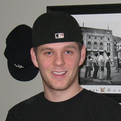
[Editor’s Note: I recently got a note from reader Brandon Stirpe (that’s him at right), who had news of a logo-related Uni Watch success story. I’ve decided to let him tell the story in his own words. See you after the mainbar. — PL]
By Brandon Stirpe
Last year my father and brother started a printing business called Global Press Solutions, or GPS. I was assigned the “marketing position,” and we needed a logo, so I posted a comment on Uni Watch — something along the lines of, “Calling all graphic designers: Need a good designer to put a face to my father’s company, serious inquiries only.”
About two or three days later I received an e-mail a fellow Uni Watch reader named Eric Davis. He pointed me toward his web site to see what he had to offer. My father liked his ideas, so we told him what we wanted: the letters GPS, with some sort of paper/roller symbolism, like a printing press, with the CMYK colors (cyan, magenta, yellow, and black, which are the four tones of four-color printing) in the mix of things.
Eric went to the drawing board and came up with a set of preliminaries (you can see the whole proposal here). From there we narrowed it down. At this point, I also sent him a set of drawings I did, because after his preliminaries, we liked the globe incorporated into the design.
Eric enhanced those drawings a bit and came up with these and these. We liked the globe designs, as they had the paper rolling along the outside of the globe to make a “G,” not to mention a nice touch with the little fold.
After we narrowed it down to that main concept, we had him tinker with colors, the rotation of the globe, and other minor details, as you can see here, then and moved forward to these.
We ruled out the CMYK effort and decided to stick with the Global “G” with the GPS right next to it. Next, we had Eric finalize some of the colors and eventually chose the one on top.
With the logo taken care of, we moved to cover pages (choosing this one, with the this one proposals) and business cards (choosing the lower-left version for the front and the upper-right ersion for the back).
Finally, it was time to get decked out in some GPS gear. We worked with Virginia Lee Embroidery out of Millersburg, Pennsylvania, a company that happens to do a lot of T-shirts dealing with the NFL, NBA, and other pro leagues (including many of the screen-printed “Division Champs” shirts). So we worked with them on a logo concept and they sent us this.
From there we came up with some GPS polos for the important people in the company. I did not want to use Nike, but my father and brother insisted on Dri-Fit because they often travel to the Middle East. We came up with a compromise that we’d use Nike as long as there was no logo on the front. Sleeve was okay, I guess. We also bought versions n white, blue, and green (for the lady of the house). My favorite part of the design was the CNOB (company name on back).
Finally, for the grunts we got black tees with chest pockets and the company name on the sleeve. That’s me sporting my GPS gear.

Raffle Reminder: Paul here. Remember, today’s the last day for the holiday raffle. Full details here, and I’ll post the winners tomorrow.
Uni Watch News Ticker: Good radio piece here about athletes who are forced to raise cash by selling their championship rings (thanks, Kirsten). ”¦ While looking for something else, I discovered something I’d never seen before in this video clip from Super Bowl VI. At the 1:20 mark, you’ll see Cowboys kicker Mike Clark preparing to kick off without a tee. The ball didn’t blow off the tee or anything like that, and it’s not an onsides attempt — the announcers imply that he’s kicking it that way to create a squib-kick effect (although they don’t use the term “squib,” which I guess wasn’t in common parlance yet). Somewhat predictably, the kick goes out of bounds, leading to a re-kick with a conventional tee. ”¦ The Rocky Mountain News ran a logo and uni quiz yesterday. ”¦ What the hell is going on here, here, here, and here? Answers here (with thanks to Frank Hanney). ”¦ Remember the tequila sunrise prototype and “Washington Padres” prototype I recently linked? Gumball helmet king Bill Jones has created helmets based on those designs. ”¦ Racine Lutheran in Wisconsin wears some pretty rad socks (with thanks to Tom Farley). ”¦ Someone on the Chris Creamer boards posted some video-game screen shots of the uniforms that will be worn in the NBA All-Star Game, which I guess means I may as well go ahead and show you this, this, this, and this (and no, the Adidas logo will not appear on the game jerseys). ”¦ Think all the uni-related Winter Classic news is about Reebok’s “Where’s Waldo?” promotion? Think again (thanks, Phil).
Holiday Schedule: I’ll announce the raffle winners tomorrow. No other content, but I’ll leave the comments open for those who want to chatter. The site will be closed on Friday (no content, no comments — play with your Xmas toys), and Phil will handle the weekend as usual. Ho-ho-ho to one and all, and be sure the stockings you’re hanging are striped.
Merry Christmas/Happy Hanukkah/Happy Kwanzaa/happy holidays, Uni Watchers!
All the best to you and yours over the next couple of days, and I hope all of your athletic aesthetic wishes are fulfilled this holiday season!
Thanks for all your work and efforts, Paul, Phil, and Bryan, and here’s to a fantastic Christmas/Hanukkah/Kwanzaa/holiday season for you three after all the work you guys have put in this year thus far.
I thought Paul deserved a day off, so I posted a bunch of comments at the end of yesterday’s comments section (topics: black and purple football uniforms; Pirates throwbacks; color on color in college hoops).
Here’s the only comment worthwhile that I posted.
[quote comment=”307224″][quote comment=”307206″][quote comment=”307204″]it’s not often boise state has less horrible unis that it’s opponents…
but tonight they do[/quote]
Black over purple. I hope Paul isn’t near a TV.[/quote]
Beats purple over black, which they have worn also in recent years.
link
Last night’s uniforms reminded me of Northwestern of ’95-’96 (Rose Bowl team).
link
Those NBA All Star unis are awful! Seriously, do we need to reinvent the wheel every time we make a uniform?
Besides, there is nothing better than an all-star game where every player wears their actual team jersey…
We used to call those kickoffs a “Navy Kick,” though I’m not sure why. When the ball was kicked into a strong wind, it would start to curl backwards, making it very difficult to catch.
Ian K, can’t you talk to your alma mater (TCU) about doing away with that dreadful look from last night and returning to something less hideous? I rather like purple and think that some quality uniforms can come from using it, so it isn’t like TCU is forced to dress its players like clowns.
[quote comment=”307230″]Those NBA All Star unis are awful! Seriously, do we need to reinvent the wheel every time we make a uniform?
Besides, there is nothing better than an all-star game where every player wears their actual team jersey…[/quote]
worse than this, this two-tone shit, or this?
ok…maybe they are…the whole damn game’s just a “look at me” show anyway…
they should go back to wearing their own unis, tho…i agree with that
[quote comment=”307229″]Here’s the only comment worthwhile that I posted.
[quote comment=”307224″][quote comment=”307206″][quote comment=”307204″]it’s not often boise state has less horrible unis that it’s opponents…
but tonight they do[/quote]
Black over purple. I hope Paul isn’t near a TV.[/quote]
Beats purple over black, which they have worn also in recent years.
link
Last night’s uniforms reminded me of Northwestern of ’95-’96 (Rose Bowl team).
link
Watched a bit of that game. Am always kind of amazed (in such a situation) that Boise State—assuming their knew what TCU’s uni choice was going to be, them being the home team an all—wouldn’t wear their orange pants. Not so much for looks, but just to clearly make its own players recognizable from the other team. I mean, it’s that a big part of what it’s all about? Supposedly?
—Ricko
[quote comment=”307234″][quote comment=”307229″]Here’s the only comment worthwhile that I posted.
[quote comment=”307224″][quote comment=”307206″][quote comment=”307204″]it’s not often boise state has less horrible unis that it’s opponents…
but tonight they do[/quote]
Black over purple. I hope Paul isn’t near a TV.[/quote]
Beats purple over black, which they have worn also in recent years.
link
Last night’s uniforms reminded me of Northwestern of ’95-’96 (Rose Bowl team).
link
Watched a bit of that game. Am always kind of amazed (in such a situation) that Boise State—assuming their knew what TCU’s uni choice was going to be, them being the home team an all—wouldn’t wear their orange pants. Not so much for looks, but just to clearly make its own players recognizable from the other team. I mean, it’s that a big part of what it’s all about? Supposedly?
—Ricko[/quote]
Ricko: Yes, tactical employment of uniforms would be good. But we are in an era of form over substance. — G.
[quote comment=”307233″][quote comment=”307230″]Those NBA All Star unis are awful! Seriously, do we need to reinvent the wheel every time we make a uniform?
Besides, there is nothing better than an all-star game where every player wears their actual team jersey…[/quote]
worse than link, link, or link?
ok…maybe they are…the whole damn game’s just a “look at me” show anyway…
they should go back to wearing their own unis, tho…i agree with that[/quote]
link.
Players should wear their team’s uniform in every all-star game, especially the Pro Bowl.
All the examples you linked were much worse. I actually kind of like those — not so much the jerseys, but I like the link.
Shouldn’t the link have 09 on them?
[quote]and no, the Adidas logo will not appear on the game jerseys[/quote]
For all the 3-stripe side panel shit, it may as well be on there.
[quote]I actually kind of like those [/quote]
I was referring to the ’09 NBAASG unis.
[quote comment=”307236″][quote comment=”307233″][quote comment=”307230″]Those NBA All Star unis are awful! Seriously, do we need to reinvent the wheel every time we make a uniform?
Besides, there is nothing better than an all-star game where every player wears their actual team jersey…[/quote]
worse than link, link, or link?
ok…maybe they are…the whole damn game’s just a “look at me” show anyway…
they should go back to wearing their own unis, tho…i agree with that[/quote]
link.
Players should wear their team’s uniform in every all-star game, especially the Pro Bowl.
All the examples you linked were much worse. I actually kind of like those — not so much the jerseys, but I like the link.
Shouldn’t the link have 09 on them?
[quote]and no, the Adidas logo will not appear on the game jerseys[/quote]
For all the 3-stripe side panel shit, it may as well be on there.[/quote]
Simply horrid. I love Adidas shoes and such, but they’ve become like Nike with the over-use of their images. I long ago went away from Nike for that reason.
Actually, for all the clout TV allegedly has, you’d think they’d preview the unis and give their two cents’ worth. Guess not, though.
Boise State in orange pants sure would have made that game more visually appealing to watch. Was somber and dull.
Not speaking about the football now, just the way it looked as you channel surfed onto it.
—Ricko
[quote comment=”307234″]Watched a bit of that game. Am always kind of amazed (in such a situation) that Boise State—assuming their knew what TCU’s uni choice was going to be, them being the home team an all—wouldn’t wear their orange pants. Not so much for looks, but just to clearly make its own players recognizable from the other team. I mean, it’s that a big part of what it’s all about? Supposedly?
—Ricko[/quote]
ricko, i love ya but…link weren’t enough to differentiate the two teams? :D
[quote comment=”307236″]… but I like the link.
[/quote]
Yeah, the jersey is kinda meh, but I like the “Phoenix Rising” graphics on the shorts too.
Isn’t it funny that in football, hockey, and baseball we rely on the jerseys only to designate the teams, while in basketball we rely on the whole uniform? For example, in college baseball at least, you can have two teams wear white pants if one is wearing a colored jersey, and the same in football or hockey; but in basketball, not so. (In major league baseball, that used to be the case, until teams started wearing gray pants on the road with their colored jerseys, sticking with white pants at home.)
[quote comment=”307241″][quote comment=”307236″]… but I like the link.
[/quote]
Yeah, the jersey is kinda meh, but I like the “Phoenix Rising” graphics on the shorts too.[/quote]
But maybe there’s link for link there as well.
Always kinda figured in the very, very, very early days of basketball they opted for “monochrome” to make it very, very, very clear they were NOT running up and down the court in their undies; wanted to make it obvious they we wearing UNIFORMS.
Just my socio-psycho-anthropo-logical supposing. Feel free to blast holes in that theory.
[quote comment=”307240″][quote comment=”307234″]Watched a bit of that game. Am always kind of amazed (in such a situation) that Boise State—assuming their knew what TCU’s uni choice was going to be, them being the home team an all—wouldn’t wear their orange pants. Not so much for looks, but just to clearly make its own players recognizable from the other team. I mean, it’s that a big part of what it’s all about? Supposedly?
—Ricko[/quote]
ricko, i love ya but…link weren’t enough to differentiate the two teams? :D[/quote]
Oh, of course, but if you have another option (orange pants) why maximize the effect, especially in a night game.
Happy Holidays to all!
Brandon, I’m sure that you’ll be getting many a request but allow me to be the first.
How can I get my hands on one of the GPS tee-shirts?
[quote comment=”307233″][quote comment=”307230″]Those NBA All Star unis are awful! Seriously, do we need to reinvent the wheel every time we make a uniform?
Besides, there is nothing better than an all-star game where every player wears their actual team jersey…[/quote]
worse than link, link, or link?
ok…maybe they are…the whole damn game’s just a “look at me” show anyway…
they should go back to wearing their own unis, tho…i agree with that[/quote]
Hey, lets face it, basketball uniforms have evolved into clown costumes, plain and simple.
i was reading/listening about the rings…i didn\’t know they gave out ring for all star games..do they still do that?
[quote comment=”307248″][quote comment=”307233″][quote comment=”307230″]Those NBA All Star unis are awful! Seriously, do we need to reinvent the wheel every time we make a uniform?
Besides, there is nothing better than an all-star game where every player wears their actual team jersey…[/quote]
worse than link, link, or link?
ok…maybe they are…the whole damn game’s just a “look at me” show anyway…
they should go back to wearing their own unis, tho…i agree with that[/quote]
Hey, lets face it, basketball uniforms have evolved into clown costumes, plain and simple.[/quote]
And, sadly, the game has become a circus.
The Rocky Mountain News Quiz is wrong. The Steelers also have stars on their helmet logo.
link
Not your traditional 5 point stars, but stars never-the-less.
And NBA All-Star Weekend an annual SuperStars, HangersOn & Wannabes ThugFest.
Class acts all.
Wasn’t it Charles Barclay who said it’s a good thing there’s an NBA or else a lot of these guys would be in prison?
They may be a bit out there, but I really like the look of those all-star unis. And I’ll echo the thoughts about the shorts, those are great.
[quote comment=”307251″]The Rocky Mountain News Quiz is wrong. The Steelers also have stars on their helmet logo.
link
Not your traditional 5 point stars, but stars never-the-less.[/quote]
Those are link.
Charles Barkley.
Sheesh. I’m outta here in an hour. Brain not functioning.
[quote comment=”307250″][quote comment=”307248″][quote comment=”307233″][quote comment=”307230″]Those NBA All Star unis are awful! Seriously, do we need to reinvent the wheel every time we make a uniform?
Besides, there is nothing better than an all-star game where every player wears their actual team jersey…[/quote]
worse than link, link, or link?
ok…maybe they are…the whole damn game’s just a “look at me” show anyway…
they should go back to wearing their own unis, tho…i agree with that[/quote]
Hey, lets face it, basketball uniforms have evolved into clown costumes, plain and simple.[/quote]
And, sadly, the game has become a circus.[/quote]
OH MY GOD!!! I seriously didn’t want to believe those are the actual All-Star game jerseys.
I don’t think wearing their own team uniforms is actually any better….did everybody forget about these atrocities?!
link
link
link
link
link
[quote comment=”307252″]And NBA All-Star Weekend an annual SuperStars, HangersOn & Wannabes ThugFest.
Class acts all.
Wasn’t it Charles Barclay who said it’s a good thing there’s an NBA or else a lot of these guys would be in prison?[/quote]
LOL! The same could be said for a lot of guys in other sports too.
On a related topic: Why is every catch, every first down, cause for excessive celebration in the NFL? What ever happened to the class of Barry Sanders, who handed the ball to the ref when he scored a touchdown?
The Cowboys Mike Clark had been featured in one of those Punt, Pass, & Kick booklets back in the very early 70’s. Wonder why he was number 83? it was before the NFL instituted a manditory numbering system, by position.
Note in the same video, Lance Alworth sitting on the sidelines…in sunglasses! Don’t think I’ve ever been that! I loved Alworth’s socks, high pants, taped black shoes, and single bar face mask…a look quite similar to Fred Biletnikoff.
Also Jim Kiick…#21 of the Dolphins. Another under-rated uni-wearer. In high school I wore 21 in his honor, and fashioned the rest of my uni after Biletnikoff.
a 1930 wimbledon poster along with some other old advertising posters link
[quote comment=”307254″][quote comment=”307251″]The Rocky Mountain News Quiz is wrong. The Steelers also have stars on their helmet logo.
link
Not your traditional 5 point stars, but stars never-the-less.[/quote]
Those are link.[/quote]
Plus, they’re referred to as diamonds in another question.
~~~~~~~~~~~~~~~~~~~~~~~~~~~~~~~~~~
If I had a time machine, I’d travel back and tell Bing Crosby and Irving Berlin to take their white Christmas and shove it up their asses.
It’s 33 degrees and there’s something that’s not quite snow and not quite sleet (it’s slush, basically) falling from the sky.
If Teebz is keeping score, link for my snow removal chores.
[quote comment=”307258″]The Cowboys Mike Clark had been featured in one of those Punt, Pass, & Kick booklets back in the very early 70’s. Wonder why he was number 83? it was before the NFL instituted a manditory numbering system, by position.
Note in the same video, Lance Alworth sitting on the sidelines…in sunglasses! Don’t think I’ve ever been that! I loved Alworth’s socks, high pants, taped black shoes, and single bar face mask…a look quite similar to Fred Biletnikoff.
Also Jim Kiick…#21 of the Dolphins. Another under-rated uni-wearer. In high school I wore 21 in his honor, and fashioned the rest of my uni after Biletnikoff.[/quote]
Far fewer players on active NFL roster back then. Technically, I think, Clark also was way down on the depth chart as a wide receiver.
The year before, Jim O’Brien (#80) kicked the game-winning Super Bowl FG for the Colts. He was also listed as a backup WR. Don’t think he caught many balls, though. LOL
[quote comment=”307261″][quote comment=”307258″]The Cowboys Mike Clark had been featured in one of those Punt, Pass, & Kick booklets back in the very early 70’s. Wonder why he was number 83? it was before the NFL instituted a manditory numbering system, by position.
Note in the same video, Lance Alworth sitting on the sidelines…in sunglasses! Don’t think I’ve ever been that! I loved Alworth’s socks, high pants, taped black shoes, and single bar face mask…a look quite similar to Fred Biletnikoff.
Also Jim Kiick…#21 of the Dolphins. Another under-rated uni-wearer. In high school I wore 21 in his honor, and fashioned the rest of my uni after Biletnikoff.[/quote]
Far fewer players on active NFL roster back then. Technically, I think, Clark also was way down on the depth chart as a wide receiver.
The year before, Jim O’Brien (#80) kicked the game-winning Super Bowl FG for the Colts. He was also listed as a backup WR. Don’t think he caught many balls, though. LOL[/quote]
When he was on the team, link was the Bears’ best offensive player (until a kid named Walter came along). But I think he was drafted as a tight end, so the #86 made sense for a punter.
[quote]On a related topic: Why is every catch, every first down, cause for excessive celebration in the NFL? What ever happened to the class of Barry Sanders, who handed the ball to the ref when he scored a touchdown?[/quote]
as long as we’re ventin’, what up with the d-lineman, whose team is getting smoked, 38-7 in the fourth quarter, finally making a stop and doing one of these?
dude…your team sucks, you suck…just get back in the huddle and STFU…
/off vent
[quote comment=”307262″][quote comment=”307261″][quote comment=”307258″]The Cowboys Mike Clark had been featured in one of those Punt, Pass, & Kick booklets back in the very early 70’s. Wonder why he was number 83? it was before the NFL instituted a manditory numbering system, by position.
Note in the same video, Lance Alworth sitting on the sidelines…in sunglasses! Don’t think I’ve ever been that! I loved Alworth’s socks, high pants, taped black shoes, and single bar face mask…a look quite similar to Fred Biletnikoff.
Also Jim Kiick…#21 of the Dolphins. Another under-rated uni-wearer. In high school I wore 21 in his honor, and fashioned the rest of my uni after Biletnikoff.[/quote]
Far fewer players on active NFL roster back then. Technically, I think, Clark also was way down on the depth chart as a wide receiver.
The year before, Jim O’Brien (#80) kicked the game-winning Super Bowl FG for the Colts. He was also listed as a backup WR. Don’t think he caught many balls, though. LOL[/quote]
When he was on the team, link was the Bears’ best offensive player (until a kid named Walter came along). But I think he was drafted as a tight end, so the #86 made sense for a punter.[/quote]
He actually played some tight end, too, didn’t he? At least for a while?
In those days, and before, punters more often than not were position players. Max McGee was the Packer’s punter for awhile, I know. Yale Lary, a DB, was the Lions punter for years. As late as 1970, NFL game rosters were only 40 players. Vikings’ Super Bowl IV team’s motto was “40 for 60″…forty men for 60 minutes.
Yeah, Gastineau clearly was an early prototype of the modern d-bag. Would love to see Barry Sanders juke him out of his ’80s mullet.
I do like those clean, classic Jets unis, though.
[quote comment=”307257″][quote comment=”307252″]And NBA All-Star Weekend an annual SuperStars, HangersOn & Wannabes ThugFest.
Class acts all.
Wasn’t it Charles Barclay who said it’s a good thing there’s an NBA or else a lot of these guys would be in prison?[/quote]
LOL! The same could be said for a lot of guys in other sports too.
On a related topic: Why is every catch, every first down, cause for excessive celebration in the NFL? What ever happened to the class of Barry Sanders, who handed the ball to the ref when he scored a touchdown?[/quote]
Cuz the game is fun and the players work damn hard. While celebrating a first down on 2nd and 3 is absolutely stupid (Jerome Bettis, Roy E. Williams), I am 100% fine with them celebrating a touchdown. It makes it more entertaining. The fans celebrate a TD, why can’t the players who put forth the effort?
[quote comment=”307264″]
He actually played some tight end, too, didn’t he? At least for a while?[/quote]
Good question. Probably. But I only remember him as a punter.
[quote comment=”307257″]Why is every catch, every first down, cause for excessive celebration in the NFL? What ever happened to the class of Barry Sanders, who handed the ball to the ref when he scored a touchdown?[/quote]
OK, we get it: Today’s athletes are jerks.
We all knew that already. Let’s move on, please.
— Paul McScrooge
[quote comment=”307268″][quote comment=”307257″]Why is every catch, every first down, cause for excessive celebration in the NFL? What ever happened to the class of Barry Sanders, who handed the ball to the ref when he scored a touchdown?[/quote]
OK, we get it: Today’s athletes are jerks.
We all knew that already. Let’s move on, please.
— Paul McScrooge[/quote]
No fair!
link
[quote comment=”307260″]
If Teebz is keeping score, link for my snow removal chores.[/quote]
Atta boy, JTH. Not below freezing = hoodie/sweatshirt weather. I’ll be honest, though: it looked like Matt was warm the other day, and that’s the entire point.
Besides, I almost mistook him for Dennis Quaid from The Day After Tomorrow. LOL
Matt, I’m just poking fun at you. All good, and your driveway was a thing of beauty. Well done, sir. Merry Christmas to you and yours!
That slush that’s falling is called “sleet” in some parts of the world. Terrible weather situation considering you could be saddled with ice all over.
Backtracking a bit, I thought one of the insightful points of the past couple weeks was when someone wondered whether no two of the “snowflake” patches we’ll see on the NBA teams playing tomorrow would be the alike.
I’m pretty sure that was a first, slicing and dicing the idea of a totally unnecessary patch by questioning its “meteorological correctness”.
I DO love this site. I really, really do.
And I am outta the office til Monday (see Ricko smile).
Merry Christmas to all!
—Ricko
[quote comment=”307270″][quote comment=”307260″]
If Teebz is keeping score, link for my snow removal chores.[/quote]
Atta boy, JTH. Not below freezing = hoodie/sweatshirt weather. I’ll be honest, though: it looked like Matt was warm the other day, and that’s the entire point.
[/quote]
Agreed. I’m of the opinion that no winter clothing is fashionable unless it keeps you warm.
And if you have to dress up like Admiral Peary to stay warm (even if it’s 40 degrees out), then so be it.
Out of the office = no posts??
[quote comment=”307273″]Out of the office = no posts??[/quote]
Just don’t have to go to office. Always a plus.
LOL
[quote comment=”307251″]The Rocky Mountain News Quiz is wrong. The Steelers also have stars on their helmet logo.
link
Not your traditional 5 point stars, but stars never-the-less.[/quote]
I thought the same thing
What the hell is going on here, here, here, and here?
Looks like that coach was an early proponent of strength training with the makeshift “weight vest” and the “no looking down” while dribbling glasses.
Happy holidays to all!
Hey MPowers! Took your advice and trudged through the snow of Northern Wisconsin today and visited the New Balance Store in Appleton, WI. The guys were great about helping me out, and I ended up getting a pair of 993 GL’s. They felt great in the store, so I can’t wait to run with them. Thanks for all your help, and your suggestions. This is just one of the many reasons I love Uni Watch. People helping people. Even my fiancee was like, “So this Uni Watch guy actually helped you out!” Tis the season.
As far as the All-Star game uni’s go, I don’t hate them, but I don’t love ’em either. The low NOB really sucks, but I actually really love the phoenix on the sides of the shorts. Other than that, too many Adidas stripes.
Have a great holiday every one! Go easy on the egg nog! (OK, let the egg nog rip!)
[quote comment=”307273″]Out of the office = no posts??[/quote]
is that a good thing or a bad thing?
[quote comment=”307272″]If Teebz is keeping score, link for my snow removal chores.[/quote]
in the spirit of fairness, i present you teebz’ snow removal getup when it’s -10 (F, not C)
;o)
[quote comment=”307279″][quote comment=”307272″]If Teebz is keeping score, link for my snow removal chores.[/quote]
in the spirit of fairness, i present you link when it’s -10 (F, not C)
;o)[/quote]
Oh, great, another photo of some asshole blowing snow.
(ba dum bum…see, LI Phil serves up these softballs and ya just gotta take a swing at ’em)
—Ricko
Interesting pictures over at the Capitol (Madison) Times. They’ve compiled a best by uniform number. While much of the list id of fairly recent vintage (’cause Wisconsin Football stunk for a looooooong time), there’s some interesting stuff if you scroll through:
link
[quote comment=”307279″][quote comment=”307272″]If Teebz is keeping score, link for my snow removal chores.[/quote]
in the spirit of fairness, i present you link when it’s -10 (F, not C)
;o)[/quote]
Teebz, got a question for you…
What color would you classify that uniform as?
In the old basketball practice pictures, I can explain a couple of things: The aprons are actually weighted with sandbags – the forerunners of the weighted vests you’ll see players practicing in. The glasses are made to prevent the dribbler from looking at the ball while practicing, and the gloves are an old trick to help try to develop ball control by instinct instead of touch. Of course, the larger balls are weighted as well – like medicine balls – for strength purposes.
Merry Christmas to all y’all out there in Uni Watch land!! May your holiday season be happy, healthy and aesthetically pleasing!
Here’s hopin’ Santa brings you something right up your alley.
link
[quote comment=”307241″][quote comment=”307236″]… but I like the link.
[/quote]
Yeah, the jersey is kinda meh, but I like the “Phoenix Rising” graphics on the shorts too.[/quote]
…agree with the jersey being so-so. However, the phoenix flame thingy on the shorts is interesting but also made me realize something about the NBA all-star jerseys that I haven’t noticed before (too much puck time coupled with the MN Timberpuppies). The NBA logo is link instead of the standard link logo. Do the other sports change their logo for the all-star game?
Oh and a case can be made that the Steelers logo doesn’t have stars; they’re link. Just kidding – link.
[quote comment=”307279″][quote comment=”307272″]If Teebz is keeping score, link for my snow removal chores.[/quote]
in the spirit of fairness, i present you link when it’s -10 (F, not C)
;o)[/quote]
Nice. Although it would be nice to have link.
[quote comment=”307282″]
Teebz, got a question for you…
What color would you classify that uniform as?[/quote]
I’m going with “rosy pink”. Bloody cold out there! LOL
Phil, your Google search skills are boundless. Great picture… despite the person in question not wearing the Fisherman jersey. ;o)
I want a GPS t-shirt!
Thank you for sharing the desing process for your company logo. It looks great!
[quote comment=”307270″][quote comment=”307260″]
If Teebz is keeping score, link for my snow removal chores.[/quote]
Atta boy, JTH. Not below freezing = hoodie/sweatshirt weather. I’ll be honest, though: it looked like Matt was warm the other day, and that’s the entire point.
Besides, I almost mistook him for Dennis Quaid from The Day After Tomorrow. LOL
Matt, I’m just poking fun at you. All good, and your driveway was a thing of beauty. Well done, sir. Merry Christmas to you and yours!
That slush that’s falling is called “sleet” in some parts of the world. Terrible weather situation considering you could be saddled with ice all over.[/quote]
Instead of dressing up and snowblowing, you COULD do what we do here in Erie, and after a huge snowstorm that drops over a foot in town and causes major traffic delays with 10 degree (F) temps…wait two days later for it to be 48 degrees and blinding frickin rain…….
I don’t know if this has been mentioned on a previous post or not, but you can link to a specific time in YouTube clips by adding a little tag to the end of the URL.
So, if Paul wanted to link to the 1 minute 20 second mark of the clip of the Mike Clark clip he would just have to add #t=1m45s to the end of the URL.
Kind of handy and certainly saves users a lot of time.
Sorry, to link to the 1 minute 20 second mark it would be #t=1m20s
[quote comment=”307288″][quote comment=”307279″][quote comment=”307272″]If Teebz is keeping score, link for my snow removal chores.[/quote]
in the spirit of fairness, i present you link when it’s -10 (F, not C)
;o)[/quote]
Nice. Although it would be nice to have link.[/quote]
Egad. Willie Wonka’s snowblower.
They just showed Jimmy Clausen warming up it and looks like Notre Dame will be wearing names on their jerseys for the first time in a long time.
Page 2 link the worst “NFL” team ever. Check out link from the ’76 game between TB and Seattle. Two things to note on the Hawks unis: the helmets are NOT plain silver, as Ricko has so adamantly pointed out over the ages, and they have…gasp!…sleeves! Plus, you gotta love Bucco Bruce and the Creamsicles.
[quote comment=”307294″][quote comment=”307288″][quote comment=”307279″][quote comment=”307272″]If Teebz is keeping score, link for my snow removal chores.[/quote]
in the spirit of fairness, i present you link when it’s -10 (F, not C)
;o)[/quote]
Nice. Although it would be nice to have link.[/quote]
Egad. Willie Wonka’s snowblower.[/quote]
It would be “Kanow Rewolbons”. (Like Willy does with Wonka Wash. Just spells it backwards.)
Who ever got the idea to put names on Notre Dame’s jerseys should be hanged.
Okay, I’ll be the one to say it: Notre Dame wide receiver Golden Tate should have gone to Hawaii.
Then they’d be the Golden Tate Warriors.
(I am SO sorry, but somedbody had to take one for the team on this.)
—Ricko
Fr the first time since 1986, Notre Dame is wearing NOBs on their jerseys in the Sheaton Hawai’i Bowl.
[quote comment=”307298″]Who ever got the idea to put names on Notre Dame’s jerseys should be hanged.[/quote]
Maybe they’re a reward for the Irish having such a great season.
(eye-roll)
Notre Dame is wearing NOB’s in the Hawaii Bowl. I thought they were one of the few teams in sports that are still nameless. Why on earth would they give up this look: link
[quote comment=”307301″][quote comment=”307298″]Who ever got the idea to put names on Notre Dame’s jerseys should be hanged.[/quote]
Maybe they’re a reward for the Irish having such a great season.
(eye-roll)[/quote]
Agree, jerseys look horrible. They need to pull the name plates off and go back to when they would not put bowl patches on the jerseys as well. What a hot mess!!!
What is going on with Hawai’i’s uniforms? They look like shit.
Re: Notre Dame’s NOBs…
Another board I frequent quoted a press release:
The blue Irish jerseys for the game tonight have player names on the backs — renewing a tradition from the Ara Parseghian years when Irish teams did not have names on the backs of their jerseys during the regular season but added them for bowl games. It also becomes a nice personal touch for the players who are allowed to keep their bowl jerseys. It’s the first time an Irish team has worn names on its jerseys since the Cotton Bowl against Texas A&M that ended the 1987 season (Tim Brown’s final game as a collegian).
Also, do Notre Dame always trim their numbers in gold?
Howdy all! One quick note, before I hit the rum and eggnog….
Was anyone else disappointed when neither ESPN announcer took advantage of the big Jimmy CLAUSEn pass to RUDOLPH?
Is it just me, or is this a MAJOR whiff by the ESPN TV crew?!?!?
On that note, Merry Christmas guys!
[quote comment=”307306″]Also, do Notre Dame always trim their numbers in gold?[/quote]
Almost never. However, the few times they wore white jerseys with kelly numbers, the numbers had a relatively thick light gold edge (Montana era, roughly).
—Ricko
[quote comment=”307296″]Page 2 link the worst “NFL” team ever. Check out link from the ’76 game between TB and Seattle. Two things to note on the Hawks unis: the helmets are NOT plain silver, as Ricko has so adamantly pointed out over the ages, and they have…gasp!…sleeves! Plus, you gotta love Bucco Bruce and the Creamsicles.[/quote]
I’d have to say the biggest thing to notice in that photo is the clear tape holding up #70’s socks. Don’t see a hockey tape job on the gridiron very often.
[quote comment=”307309″][quote comment=”307296″]Page 2 link the worst “NFL” team ever. Check out link from the ’76 game between TB and Seattle. Two things to note on the Hawks unis: the helmets are NOT plain silver, as Ricko has so adamantly pointed out over the ages, and they have…gasp!…sleeves! Plus, you gotta love Bucco Bruce and the Creamsicles.[/quote]
I’d have to say the biggest thing to notice in that photo is the clear tape holding up #70’s socks. Don’t see a hockey tape job on the gridiron very often.[/quote]
Very true. There were a few teams that did that for a while. Can’t remember which ones, but do remember noticing it from time to time.
Also, never could figure out why that orange was bad in Tampa Bay but is considered classic and great at U of Tennessee? It’s the same color, exactly.
Guess it depends on if you win. Tell you what, had the Bucs not been so stupid as to let Doug Williams get away when they did, that orange might still be around–and loved–at Raymond James.
A couple other notes: Those first-year Bucs are the only NFL team I can recall that has ever done total monochrome white, including the shoes. For the second season, however, they scrapped the white high socks, wearing the same light orange socks home and road, as well as flip-flopping the colors on their white jersey’s numbers (changing to red edged in orange).
Also, that first season the Bucs played their home games on Saturday nights, because a poll showed that’s what Tampa Bay fans wanted. And the league let them do it…anything to help get an expansion team started right, I guess.
—Ricko
Ricko! Haven’t the Irish trimmed thier numbers in gold the last several years? And the trim has been a little thicker than tonight’s bowl jerseys? Sure, I could be wrong.
Anyway, Mike Clark sure didn’t have the body of a WR, but Max McGee was no Adonis, was he?
Other sometime kickers…Jerry Kramer, George Blanda, Paul Hornug, Lou Groza, Larry Seiple. The Falcons’ punter Billy Lothridge was a Heisman runnerup QB at Georgia Tech, and filled in at safety in the pros.
[quote comment=”307313″]Ricko! Haven’t the Irish trimmed thier numbers in gold the last several years? And the trim has been a little thicker than tonight’s bowl jerseys? Sure, I could be wrong.
Anyway, Mike Clark sure didn’t have the body of a WR, but Max McGee was no Adonis, was he?
Other sometime kickers…Jerry Kramer, George Blanda, Paul Hornug, Lou Groza, Larry Seiple. The Falcons’ punter Billy Lothridge was a Heisman runnerup QB at Georgia Tech, and filled in at safety in the pros.[/quote]
“Almost never” might have been overstating, yes. Maybe is more like 50/50 or 60/40 not. Generally it’s so thin that sometimes is hard to tell it’s there. I’m not sure, but I think the first appearance of the gold edge may have come with Lou Holtz, and can’t say it’s been their continuously since then. Seem to recall the Montana-era navy jerseys (and all the years of them before that) had just white numbers.
On a somewhat-related note, here’s the Faust royal…and the Faust green that included a royal stripe.
link
—Ricko
btw, according to MSNBC’s “Santa Tracker” he’s in Hobart, Tasmania, probably on his way up to Australia.
I’ll let you all be the judge of when you’d better get the milk and cookies set out and head for bed.
—Ricko
[quote comment=”307315″]On a somewhat-related note, here’s the Faust royal…and the Faust green that included a royal stripe.
link
—Ricko[/quote]
now i know that some of you put rick up to this, but he has refused to say who…but those who did it know their blame, and i’m sure that the guilt you must feel would be far worse than any punishment you might receive…now, don’t you feel terrible? don’t you feel remorse for what you have done? well, that’s all I’m going to say about poor rick…
Merry Christmas to everyone in the Uni Watch family.
I have to politely disagree with an element in the main story. The designer, in his proposal to GPS, states a logo is “the ultimate reduction or distillation of a brand’s promise. The goal of effective logo design is to achieve immediate recognition, to inspire trust, admiration, loyalty and an implied superiority.”
As a graphic designer, I have to disagree completely with his view on the goal of a logo. The logo does not inspire trust, loyalty, or admiration. That is the job of the COMPANY. Your product inspires these qualities, not your logo. A great logo for a terrible company will not save the company. A decent logo for a good company is miles better than a great logo for a bad company. Let me refer you to a thought from Paul Rand.
A good logo, according to Paul Rand, provides the “pleasure of recognition and the promise of meaning.” The promise, of course, is only fulfilled over time. “It is only by association with a product, a service, a business, or a corporation that a logo takes on any real meaning,” Rand wrote in 1991. “It derives its meaning and usefulness from the quality of that which it symbolizes.
Just continuing my thought from earlier, use the Nike Swoosh as an example.
On its own, it’s nothing great. A slightly abstracted checkmark. Meh. Even Phil Knight wasn’t sure about it at first– but he thought it could grow on him.
Now attach the Nike Swoosh to the products and history of the company and it takes on an entirely different stature.
And ND’s gold-trim has been there for quite a while. 60/40 not and 50/50 are both overstatements.
[quote comment=”307317″][quote comment=”307315″]On a somewhat-related note, here’s the Faust royal…and the Faust green that included a royal stripe.
link
—Ricko[/quote]
now i know that some of you put rick up to this, but he has refused to say who…but those who did it know their blame, and i’m sure that the guilt you must feel would be far worse than any punishment you might receive…now, don’t you feel terrible? don’t you feel remorse for what you have done? well, that’s all I’m going to say about poor rick…[/quote]
“The guilt you feel is far worse than any punishment you might receive.”
Bench coaches love to say things like that, but UW commenters know the truth — it’s always better not to get caught.
Did anybody notice on about the 3rd play of the game, the first big hit between ND and UH? A massive dusting of gold sparkle magically appeared … methinks it was from the “freshly” painted ND helmets. #3 got up and had big-time gashes in his helmet paint job.
PS – Under Armour’s design for the Hawai’i uniforms blows chunks … compare the cool pants from last year, with the hawaiian print stripe around the leg: link
… with this year’s pinstripe: link
Blech!
Agree with you Sebs. There are lots of ways to define a logo … and that description from within the main story isn’t one of the best.
Frankly, I thought about posting a lengthy commentary … I appreciate the fact that this company found a designer here on UW … I don’t really appreciate the fact the company dictated much of the design/concepting process and it shows (let the professional do his job) … yet, it’s Christmas, there’s no reason to get into it. If they like the end result, cool, that’s what matters.
Anyone see Michael Floyd get the gold flake knocked off his helmet tonight?
It is right at the start of the highlights (about 33% into) the clip on the ESPN page.
link
[quote comment=”307325″]Anyone see Michael Floyd get the gold flake knocked off his helmet tonight?
It is right at the start of the highlights (about 33% into) the clip on the ESPN page.
link
damn
[quote comment=”307323″]Did anybody notice on about the 3rd play of the game, the first big hit between ND and UH? A massive dusting of gold sparkle magically appeared … methinks it was from the “freshly” painted ND helmets. #3 got up and had big-time gashes in his helmet paint job.
PS – Under Armour’s design for the Hawai’i uniforms blows chunks … compare the cool pants from last year, with the hawaiian print stripe around the leg: link
… with this year’s pinstripe: link
Blech![/quote]
Instead of just dropping the “Rainbow” part of their nickname, they should have just changed it to “Ragin’ Homophobes.” link is a cheesy logo, but at least it had character. link is just an eyesore. Put some color on it and you’ve got some potential.
[quote comment=”307296″]Page 2 link the worst “NFL” team ever. Check out link from the ’76 game between TB and Seattle. Two things to note on the Hawks unis: the helmets are NOT plain silver, as Ricko has so adamantly pointed out over the ages, and they have…gasp!…sleeves! Plus, you gotta love Bucco Bruce and the Creamsicles.[/quote]
Ah, the Bucs of John McKay. Greatest coach quote ever IMO. Q:”Coach McKay, what do you think of your team’s execution?” A: “I’m in favor of it.”
[quote comment=”307321″]And ND’s gold-trim has been there for quite a while. 60/40 not and 50/50 are both overstatements.[/quote]
Guilt-schmilt. I just started using flickr so could finally post that Faust Green photo (which was talked about a while back).
But…you ARE right, Sebs, and I was wrong…in terms of the original question, which was if Notre Dame has had a gold edge most of the time “in recent years”. They have had a gold edge “almost always” during that time, of course. I let my mind wander to the navy jersey over its entire run since the Hornung era.
They switched to navy in mid to late 50s and wore it with plain white numbers (except for one year—or was it two?—when the numbers were all gold). Faust game along in ’81, changing the jerseys to royal, so that was 23-24 years of navy jerseys with plain white numbers (in QB terms, from George Izo through the Huarte-Hanratty-Theismann-Montana years).
Holtz brought back navy in ’84, adding the gold edge, and they have largely stayed that way…so that’s 25 seasons of the “most recent” change to navy.
Yup, I was indeed wrong for that question. In terms the history of the navy jersey over the past 50 years, though, it’s pretty close to even.
In other words, I “over-answered.”
—Ricko
Same with me on the quilt…I was thankful just be in the great conversation. Notre Dame has almost always had a clasic uni, trim or no trim. Merry Christmas, guys!
HEY! Leave it to me to not read UW on the day of my piece! First off, Merry Christmas to everyone! Second, if anyone wants a tee shirt, email me your name, address, and tee shirt size to
link and we’ll send some out on a first come first serve basis (consider it my gift to fellow Uniwatcher’s)!
Third, Eric was amazing to work with and we really did not dictate anything to anyone. He just wanted us to get the best logo for our company and we needed to do it rather quickly because we had a budget to keep to! So we needed quality in a short period of time. And I agree, it’s the company who makes their logo recognizable and my father and brother are working very hard to make that happen!
I’m glad everyone enjoyed the piece. My favorite was the embroidered concept Virginia Lee sent us, I thought that was pretty cool.
Anyways, like i said, email me if you would like a tee (remember, first come first serve). Enjoy the holidays, and hope everyone has a great afternoon!
-brandon