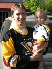
[Editor’s Note: Last month I got a note from Bryan Justman (shown at right with his son, Alex Crosby Justman), who said he’d been creating his own old-school hockey sweaters, using blank long-sleeve T-shirts. I asked if he could write a step-by-step guide to how he does this, and he happily obliged. — PL]
By Bryan Justman
I’ve always been into DIY. I learned how to sew in an art class while in fifth grade. I also built kites and learned how to sew the panels of nylon onto the frame.
I put those skills to use while growing up as a punk rock drummer. I’ve sewn patches of my favorite bands onto hoodies, backpacks, shorts, etc. I’m also nuts about hockey. I had many hockey sweaters in my closet that I bought for cheap on eBay with no names/numbers on the back. For example, I had an old Ottawa Senators road sweater that I had planned to send to River City Sports so they could customize it in honor of my favorite underappreciated Senator, Sylvain Turgeon, but it was like $80. So I thought, how hard could it be to do it myself? I found something in the Jo-Ann Fabrics remnant pile called “rubber sheeting,” which would be the white and I used Kunin eco-fiber felt (20 cents) for the red trim.
I liked the results so much, I went on to customize every blank jersey in my closet. I probably spent just about $15 total in materials.
I soon ran out of blank jerseys, but there were so many more that I wanted to have. I had lusted after some of those heritage sweaters, specifically the white Habs and any of the Leafs. I badly wanted a Maurice Richard sweater ever since reading Our Life with the Rocket. Additionally, I wanted Jean Beliveau, Ted Kennedy, and Frank Mahovlich. But those were all way too expensive, plus the weather here in northern California is too mild.
So instead, I decided to create my own.
I’ve now made four of these, so I’ve established my technique pretty well. When Paul asked me to document the process, I decided to make a 1960s Frank Mahovlich Maple Leafs jersey.
First, my materials: From Wal-Mart, I purchased a long-sleeve T-shirt ($6). At Jo-Ann Fabrics, I bought a hunk of blue twill from the remnant pile ($6), a bottle of white fabric paint ($5), a roll of blue grosgrain ribbon for the stripes ($4), and three sheets of blue felt and one sheet of white for (25 cents each). And at nhluniforms.com, I printed out the Leafs’ uniforms from the early 1960s. I found the Leafs logo online and sized it correctly, along with two block numbers. I printed them out onto cardstock so I could use them as stencils.
I like to start with the shoulder, because it’s the hardest. I measure the length from the shirt’s collar to the shoulder/sleeve seam then trace the yoke shape onto the twill (I folded over the material so the two sides of the yoke would be as even as possible). A protractor is the perfect shape for the yoke’s rounded edge, so I trace that too. Next, I cut out the shape.
After unfolding the doubled-over fabric, I’m left with the entire shoulder-to-shoulder yoke, but I need a hole for the collar. Again, the protractor is perfect for tracing the shape.
Here you see the yoke cut out and ready to be sewn. I use safety pins to hold it in place. There’s a piece of cardboard inside the shirt to hold it flat.
Next, I use the ribbon for the bottom stripes. Last time I made a shirt like this, I didn’t know grosgrain ribbon existed — this stuff saves me so much time. First, I pin the stripes in place (although I really should have used my hot glue gun; the safety pins actually made this harder than it should be), then I sew — voila!
Now for the blue sleeve cuffs. Basically, these are like extensions on the ends of the white sleeves. First I measure the circumference of the sleeve and then cut two identical pieces of twill. Then, for each piece of fabric, I sew the ends together to form a loop or cylinder, and then turn the loop of fabric inside-out, so the seam won’t show as much (I actually did this in our minivan while on the way to the beach [I assume someone else was driving, but you never know — Bryan strikes me as a serious multi-tasker. — PL]). In order to be able to get my hand through the sleeve once the cuff is attached, I have to stretch the cuff out. The only thing suitable in our van at the time was my son’s stuffed frog. Once the cuffs are properly stretched, I sew them onto the ends of the sleeves.
With the cuffs done, I pin ribbon onto the sleeves for striping. Then I sew again. Now I basically have a blank hockey sweater.
Next, it’s time to make the logo. First, I cut out the logo and letters to create a stencil, which I then use to trace out the leaf shape on blue felt.
Once the leaf is cut out, I hot-glue it onto a piece of white felt. Using fabric paint, I paint through the stencil and then do a bit of touch-up work with the paint bottle nozzle, which leaves me with this.
Now I cut out the logo, leaving a white border around the blue leaf, and then I hot-glue it onto another piece of blue felt. (I also added more white to compensate for an error in my cutting.)
With the fabric paint still drying, I turn my attention to the numbers. First I cut out the “2” and “7” stencils. Now, using a fabric marker, I trace the numbers onto the blue fabric. I do the tracing backwards or mirror-imaged, so any marks left on the fabric after cutting will be facing down and won’t show on the shirt.
Now I cut out the numbers and glue them onto the shirt, using a ruler to make sure they’re centered properly. Each number then gets sewn into place.
Meanwhile, with the paint finally dry, I sew the crest together and cut it out, leaving an additional blue border this time. Then glue it onto the shirt and sew it onto the chest.
The very last thing to do is to make the tie-down neck. First I cut the shirt’s crew-neck collar. Then I take the edges I’ve just cut, fold them under, and sew them into place to create a reinforced notch. Using an X-acto knife, I poke holes along each side for the laces.
This lace was actually from a discarded shoe (I ran it through the wash to clean it and it came out sparkling white). I cut it in half, cut off the tips, and thread it through the holes.
Here’s the finished product, front and back. The whole thing took a good 10 to 12 hours, spaced out over about a week (I can only do an hour or two before I need to take a break). A lot of work? Sure, but I have the satisfaction of having done it myself.
Cookie Monster: Paul here, with news regarding a very different sort of DIY project: Uni Watch’s personal holiday pastry chef, Elena Elms, has come through once again. This year, instead of stirrup-frosted cookies, she sent me a tin filled with cap cookies (I particularly appreciated the Brooklyn design), a variety of baseball cookies (the small-ish shortbread ones are particularly delicious), and this fella, described by Elena as “Mr. Met’s evil, illegible twin.”
I can’t even begin to describe how special it is to have readers like Elena, and how blown away I am that Uni Watch would inspire such generosity. Thank you, thank you, thank you.
Research Query: Reader Doug Keklak is working on a very specific research project, which I’ll let him describe:
I’m trying to compile a list of both current and defunct Pennsylvania high school football rivalry games. I’m looking for clear, documented matchups, either with a clever nickname for the game, a trophy, or both. Simply saying, “These two teams played each other back in the ’70s and it was rough” wouldn’t be enough.
If you can any info to contribute to this, contact Doug here.
Uni Watch News Ticker: In a follow-up to yesterday’s entry, it turns out that Jared Wheeler has a game-used Golden Triangle Steelers jersey (additional views here, here, and here). My favorite detail: The buttonholes on the crotch extension are trimmed in gold. ”¦ Reprinted from yesterday’s comments: Good article here about the Coyotes’ alt design. ”¦ Another team-branded prosthetic leg, this time being worn by Jim Otto, who owns a liquor store these days (courtesy of Roger Faso, who also sent along this Norman Rockwell illo and also-also pointed me toward a company that makes skull caps patterned after college football helmets). ”¦ Here’s a weird one: In the 1978 Independence Bowl, which featured Louisiana Tech vs. East Carolina, ECU wore BNOB — bowl name on back (great find by James Poisso). ”¦ The Padres have unveiled a 40th anniversary sleeve patch, to be worn next season. ”¦ Pretty cool piece here about movie studio logos (buy a bucket of popcorn for Brinke Guthrie). ”¦ Here’s another sleeved college hoops jersey. That’s Penn State, circa 1959. The photo comes from this three-page photo gallery of WVU hoops, which features some realy great stuff — take the time to click through all three pages (nice find by Sam Allison). ”¦ Lots to see in this photo: TNiONB (team nickname on nose bumper), TNiOCS (team nickname on chinstrap), FSU’s 50th-anniversary patch, two sets of hand-inscribed wrist tape, Warrick Dunn’s pants are unbuttoned, and what’s that patch on his left sleeve? (Thanks to Ethan Crooks.) ”¦ “FC Bayern Munich of Germany seems to have an irregularity,” says AJ Zydzik. “This year they added a fourth star above the team crest on their jerseys, after winning their 21st Bundesliga title last season. On the away and third jerseys, they aligned the stars in an arc, but on the home jersey they kept the three stars like they had last year and stacked the fourth star on top of them. It’s as if whoever designed the home jersey forgot that he had to add an extra star and just threw it in on top.” ”¦ Great catch by Paul Ricciardi, who notes that the Flyers appear to have changed the font and outlining weight of the numbers on their orange alts. Compare the “1” and the “2” from last Saturday to these shots from last night (lots of additional pics from last night here). ”¦ You know what this world really needs? Cats with stirrups (genetic engineering courtesy of Ron Verrecchio). ”¦ I just won the coolest softball uniform ever. Hope it fits on the galpal, cuz I sure can’t wear it. ”¦ Phil‘s uni news corner: Now that capitalism has been revealed as a bad joke, companies are making everyone wear socialist worker uniforms seeing the value of unique uniforms on the job; at least one writer is dreaming of a color-on-color matchup for Michigan and Ohio State; some soccer dude has a FNOB that sounds like an opera fan club; and Sports Illustrated has figured out that a few teams out there like to wear black. ”¦ The Canadiens wore 1915-16 throwbacks last night, and goalie Carey Price wore old-school brown leather gear. Lots of additional pics here. ”¦ Nice. … So Collateral Gammage and I are out last night grabbing a well-balanced meal at a local fine dining emporium and they’ve got the Rutgers/Louisville game on the teevee. I’m not really paying attention, but at one point I glance up and see a Rutgers player get tackled by his dreadlocks, one hefty clump of which ends up getting ripped out of his scalp and left on the field. As the camera shows a close-up of the detached dread on the turf, I say, “Right this very moment, someone is getting a screen grab of that and e-mailing it to me.” A few minutes later, the Louisville QB is rather dramatically tackled by the strap of his hand-warmer pouch. “Make that two screen grabs!” I say. So how many screen grabs are waiting for me when I get home? ZERO. I swear, it’s getting to the point where a guy can’t expect other people to do his job for him while he’s out on the town with his galpal. ”¦ In all seriousness: Let’s have an extra standing O for Bryan Justman, whose main entry is one of the greatest things ever to appear on this site.
Anyone got any inside info on this logo change:
link
Re: Warrick Dunn, ACC patch?
Two related items:
There is a company in Brooklyn that sells specialized yamulkes. I have a friend who has a fancy NY Ranger embroidered 1994 Stanley Cup yarmulke.
Also, today’s NY Times (page A21) has an article on how the NYC transit sysytem changed the typeface on their signs and there is a fellow (Paul’s long lost twin?) who looks for inconsistencies between Helvetica and Standard.
nice article paul…AMAZING job bryan
/talk about your labor of love
Creepy logo creep.
link
I aboslutley love the look of brown leather pads on a goalie. I wish goalies would do this full time. Looks so much better in my opinion. I think it’d be really nice to see a skater get some brown gloves made for a retro jersey night too…
Love the article, if I knew how to sew I’d would definitly give it a shot. Love how the homemade look actually makes it look more vintage than the professional manufactered vintage jerseys.
Too bad I don’t know how to sew… :(
Bryan – I respect on so many levels!
If there is ever another person who needs a heat press in their house its you! it will make your life a breeze!
link
And you can get the real twill here
link
and I don’t know if you discovered this product yet, but it seems like you could find a use for it!
link
Love DIY’er…but be careful…that’s how I ended up starting a business!
Price’s gear isn’t actually leather, but leather looking synthetic materials. It’s just a differently coloured version of the gear he normally wears and you can faintly see, in the gallery, the same striping pattern that you see on his regular gear.
Real leather pads used to soak up sweat and get ridiculously heavy by the end of a game.
Great work, Bryan. I love how you have done all that with scraps and remnants and no fancy equipment. And a ton of ingenuity.
regarding the skull cap helmet designs, link , obviously not a uni stickler as the designs for Iowa and Wisconsin are backwards/facing the wrong way.
Vagner Love isn’t FNOB
His full name is Vágner Silva de Souza.
Looks like an ACC patch to me on Warrick Dunn’s sleeve. Looks similar to the ACC logos found on their website:
link
[quote comment=”303580″]Anyone got any inside info on this logo change:
link
Good riddance. I always liked the Spinners’ first logo the best:
link
Despite my demand for the little things to be right (fonts, etc), Bryan has done the impossible: his designs are much better looking than Reebok’s crap, and costs a fraction of Reebok’s price.
Well done, Bryan!
Also of note last night on those Canadiens jerseys, check out link. They wore no TV numbers on the left side, but did wear the “CA” for “Clube Athletique de Canadien” much like they did in 1915.
Absolutely splendid job with the details!
the patch on Dunn’s shoulder is definitely the ACC patch that FSU used to wear. A little easier to see in these pics.
link
link
Here’s another Dunn pic of the ACC patch
link
Regarding the Bayern Munich stars, it might just be that the designer thought the gold stars wouldn’t show up on the white. The bottom three stars fall on the red/white border, but if they had made it into an arch, I bet at least two stars would have been much harder to see.
Why are toques called “skull caps”? I know how it forms to the skull and everything, but they already had a name.
They are clearly toques.
/Canadian-speak off (LOL)
Anyone else notice that in this pic the stripe on Miami’s helmet does not mimic the stripe on their pants?
link
[quote comment=”303594″]Despite my demand for the little things to be right (fonts, etc), Bryan has done the impossible: his designs are much better looking than Reebok’s crap, and costs a fraction of Reebok’s price.
Well done, Bryan!
Also of note last night on those Canadiens jerseys, check out link. They wore no TV numbers on the left side, but did wear the “CA” for “Clube Athletique de Canadien” much like they did in 1915.
Absolutely splendid job with the details![/quote]
I agree, MON is doing an excellent job so far with their vintage jerseys so far…
This is the one I am anxious to see:
link
My favorite out of the group.
[quote comment=”303600″]
I agree, MON is doing an excellent job so far with their vintage jerseys so far…
This is the one I am anxious to see:
link
My favorite out of the group.[/quote]
They don’t break those ones out until next season, Jim. Don’t hold your breath. ;o)
[quote comment=”303601″][quote comment=”303600″]
I agree, MON is doing an excellent job so far with their vintage jerseys so far…
This is the one I am anxious to see:
link
My favorite out of the group.[/quote]
They don’t break those ones out until next season, Jim. Don’t hold your breath. ;o)[/quote]
WHAT?!?! I thought they were wearing all their vintage unis this year… Or is it because 2009 is the 100th year they are saving some for next season?
you’re killing me Smalls! A picture of a corner bistro burger this early in the morning! How am I supposed to get through the rest of the day?
for those not familiar, New York Magazine had an issue once dedicated to the “Best Burgers in New York City, not from Corner Bistro”.
[quote comment=”303602″][quote comment=”303601″][quote comment=”303600″]
I agree, MON is doing an excellent job so far with their vintage jerseys so far…
This is the one I am anxious to see:
link
My favorite out of the group.[/quote]
They don’t break those ones out until next season, Jim. Don’t hold your breath. ;o)[/quote]
WHAT?!?! I thought they were wearing all their vintage unis this year… Or is it because 2009 is the 100th year they are saving some for next season?[/quote]
Yeah, they decided to wear the oldest jerseys at the beginning of next season to mark the 100th anniversary of the team, I guess.
The following season will feature both the 1909-10 jersey and the 1910-11 jersey before the end of the 2009 calendar year.
Braves introduce Javier Vazquez yesterday.
link
[quote comment=”303604″][quote comment=”303602″][quote comment=”303601″][quote comment=”303600″]
I agree, MON is doing an excellent job so far with their vintage jerseys so far…
This is the one I am anxious to see:
link
My favorite out of the group.[/quote]
They don’t break those ones out until next season, Jim. Don’t hold your breath. ;o)[/quote]
WHAT?!?! I thought they were wearing all their vintage unis this year… Or is it because 2009 is the 100th year they are saving some for next season?[/quote]
Yeah, they decided to wear the oldest jerseys at the beginning of next season to mark the 100th anniversary of the team, I guess.
The following season will feature both the 1909-10 jersey and the 1910-11 jersey before the end of the 2009 calendar year.[/quote]
That’s crap. lol I wanna see the 1910 now! (throwing a hockey tantrum)
Ah yes, a ticker mention with my last name spelled wrong…Sigh…
[quote comment=”303597″]Regarding the Bayern Munich stars, it might just be that the designer thought the gold stars wouldn’t show up on the white. The bottom three stars fall on the red/white border, but if they had made it into an arch, I bet at least two stars would have been much harder to see.[/quote]
But the 3rd jersey is all white and they seem to show up just fine there. If you are going to take that approach, why not just raise up all 4 stars a bit so they are all in a line on the red?
Yes, today’s Bryan Justman tutorial makes the Uniwatch Hall of Fame. Utterly charming (and educational).
Love the Corner Bistro photo, too.
Great article! Great work Bryan!
[quote comment=”303607″]Ah yes, a ticker mention with my last name spelled wrong…Sigh…[/quote]
Oops. Now fixed. Mea culpa.
About those college football skullcaps…
NewEra also does the same thing, except they have the ear warmers to go along with the skullcap. Don’t have a picture off-hand, but I seriously considered buying one when I was in Blacksburg for the VT-Duke game where the kickoff temp was ~26F.
Here’s Nike’s version: link
The New Era one is different because they also include the front and rear bumpers on the helmet
[quote comment=”303605″]Braves introduce Javier Vazquez yesterday.
link
Gotta love any name with a V, 2 Zs and a Q.
[quote comment=”303610″][quote comment=”303607″]Ah yes, a ticker mention with my last name spelled wrong…Sigh…[/quote]
Oops. Now fixed. Mea culpa.[/quote]
No prob, just giving you shit, I know its a lot of work to put all those ticker items and links together every day
The cookies are making me hungry.
I have a baseball cap cookie cutter at home that we never use. I never thought to put logos on them, though! Sounds like a fun project for me and my son. Thanks for the idea!
[quote comment=”303590″]regarding the skull cap helmet designs, link , obviously not a uni stickler as the designs for Iowa and Wisconsin are backwards/facing the wrong way.[/quote]
Yeah – they have the one on the right side backwards, or more precisely, they don’t have it backwards.
I’d buy one, but that would always bother me.
[quote comment=”303607″]Ah yes, a ticker mention with my last name spelled wrong…Sigh…
[quote comment=”303597″]Regarding the Bayern Munich stars, it might just be that the designer thought the gold stars wouldn’t show up on the white. The bottom three stars fall on the red/white border, but if they had made it into an arch, I bet at least two stars would have been much harder to see.[/quote]
But the 3rd jersey is all white and they seem to show up just fine there. If you are going to take that approach, why not just raise up all 4 stars a bit so they are all in a line on the red?[/quote]
I guess I can only speculate that it might be because, with the all-white, you get all four looking relatively hard to see, but with the red/white you would clearly see only two of the four. Maybe they were afraid that television audiences might mistake them for having won only two-stars worth of Bundesliga championships? You’re right, though, it doesn’t make much sense either way.
Bryan, I am in awe. Outstanding.
[quote comment=”303612″][quote comment=”303605″]Braves introduce Javier Vazquez yesterday.
link
Gotta love any name with a V, 2 Zs and a Q.[/quote]
indeed…reminds me of this…sorta
Here’s a tip for making picture-perfect numbers and letters on home-made jerseys/sweaters:
Using an inkjet printer, print the outlines (using stroke or a similar function) in reverse onto the non-waxy side of freezer paper (make sure you use freezer paper!).
Iron the waxy side to the fabric you intend to use, then x-acto out the number/letter. You can peel off the paper if you wish, but I’ve found that the paper is pretty resilient and helps stiffen-up the fabric for easier sewing. I did this to customize my Yakult Swallows jersey (with a #1 IWAMURA, of course) and it looks perfect.
[quote comment=”303595″]the patch on Dunn’s shoulder is definitely the ACC patch that FSU used to wear. A little easier to see in these pics.
link
link
That patch was actually an FSU patch they wore in 1996, for the 50th anniversary of the founding of FSU.
FSU dates back to 1851 but have had many different names. They became Florida State University in 1947 as it was one of the largest women’s colleges in the country before the change.
FSU wore a 40th year ACC patch in 1993, and the ACC celebrated its 50th in 2003 – that logo is still around a lot on Google.
Bryan, the work you do on those jerseys is awesome!! Very, very, VERY cool!
[quote comment=”303620″][quote comment=”303595″]the patch on Dunn’s shoulder is definitely the ACC patch that FSU used to wear. A little easier to see in these pics.
link
link
That patch was actually an FSU patch they wore in 1996, for the 50th anniversary of the founding of FSU.
FSU dates back to 1851 but have had many different names. They became Florida State University in 1947 as it was one of the largest women’s colleges in the country before the change.
FSU wore a 40th year ACC patch in 1993, and the ACC celebrated its 50th in 2003 – that logo is still around a lot on Google.[/quote]
I’m also an idiot – I just noticed that you meant the tiny patch on the side. My apologies.
link. Camoflauge helmets?
My understanding is that Navy’s uniforms for tomorrow are white jerseys with blue numbers/letters and blue pants with a link down the leg outlined in gold.
[quote comment=”303605″]Braves introduce Javier Vazquez yesterday.
link
Ah, link, we hardly knew ye…
As a card-carrying Cardfan, I’m waiting with bated breath for the sight of link wearing the link!
[quote comment=”303582″]Two related items:
There is a company in Brooklyn that sells specialized yamulkes. I have a friend who has a fancy NY Ranger embroidered 1994 Stanley Cup yarmulke.
Also, today’s NY Times (page A21) has an article on how the NYC transit sysytem changed the typeface on their signs and there is a fellow (Paul’s long lost twin?) who looks for inconsistencies between Helvetica and Standard.[/quote]
The full article by Paul Shaw is here – fascinating reading if you enjoy that sort of thing
link
[quote comment=”303603″]you’re killing me Smalls! A picture of a corner bistro burger this early in the morning! How am I supposed to get through the rest of the day?
for those not familiar, New York Magazine had an issue once dedicated to the “Best Burgers in New York City, not from Corner Bistro”.[/quote]
Ah yes, the Corner Bistro. My wife and I used to live around the corner and would frequent it regularly. When the Phils lost the World Series to the Blue Jays (Joe Carter, bastard), my wife (not a Phillies fan) was giving me a hard time. When I went to buy my next beer, the bartender gave it to me on the house, saying “you’ll need it”. I made sure to tell that story often since the recent Phils win, not her favorite (in her defense, she had had a few beers at the time, too).
[quote comment=”303623″]link. Camoflauge helmets?
My understanding is that Navy’s uniforms for tomorrow are white jerseys with blue numbers/letters and blue pants with a link down the leg outlined in gold.[/quote]
The less said about Army’s uniforms, the better.
But not all the Navy players are Marines. Wonder how they feel about the others wearing the blood stripe?
DIY and a half. Rad! I’m going to try my hand at these homeade jerseys (sweaters).
I’ve noticed many of these featured guests have some background in punk rock. Mike Watt, if your reading, you must be proud.
[quote comment=”303618″][quote comment=”303612″][quote comment=”303605″]Braves introduce Javier Vazquez yesterday.
link
Gotta love any name with a V, 2 Zs and a Q.[/quote]
indeed…reminds me of link…sorta[/quote]
Shaq cheats all the time. Claimed “Peanut Butter” was a dairy product playing Scatagories on Curb Your Enthusiasm.
Wow. This is great. And timely — I’ve been considering picking up a Blackhawks Winter Classic jersey (completely patch-free, if possible) and cannibalizing my old Chris Chelios jersey to create a kind of hybrid sweater. Basically, it would be the link with the modern link and link on it.
Screw that, though. I’m gonna try something like this. Too bad I can’t sew worth shit.
That Steelers triangle jersey is gorgeous. If they really wanted to create a unique look, they should have gone with that instead of the silly italic numbers.
[quote comment=”303627″][quote comment=”303623″]link. Camoflauge helmets?
My understanding is that Navy’s uniforms for tomorrow are white jerseys with blue numbers/letters and blue pants with a link down the leg outlined in gold.[/quote]
The less said about Army’s uniforms, the better.
But not all the Navy players are Marines. Wonder how they feel about the others wearing the blood stripe?[/quote]
Probably not too bad considering its only a football game and the team represents them, and most, if not all, of them spent at least a little time training/going to class at Annapolis.
[quote comment=”303630″]Wow. This is great. And timely — I’ve been considering picking up a Blackhawks Winter Classic jersey (completely patch-free, if possible) and cannibalizing my old Chris Chelios jersey to create a kind of hybrid sweater. Basically, it would be the link with the modern link and link on it.
Screw that, though. I’m gonna try something like this. Too bad I can’t sew worth shit.[/quote]
“Fuck this,” he said, heading over to cannibalize his old chelios sweater, “I’ll make my own motherfucking winter classic jersey.”
best quote ever here
The Padres patch reminded me…the ’09 season will also be the Mets 40th anniversary of the ’69 club.
Now, are they going to have a patch for that…somehow incorporating the NY logo () or are they just going to go with the Citi Field patch this year.
Paul, LI Phil? Anyone???
The Padres patch reminded me…the ‘09 season will also be the Mets 40th anniversary of the ‘69 club.
Now, are they going to have a patch for that…somehow incorporating the NY logo link or are they just going to go with the Citi Field patch this year?
Paul, LI Phil? Anyone???
WOW! GREAT WORK BRYAN!!! i will be starting my jersey on sunday (after my trip back to pittsburgh from the army/navy game)…
and great info Joe H in the comments!!!
what a great community filled with such interesting people we have here! Love it!!!
cant wait to start my jersey…
In terms of the Canadiens uniform last night, there were quite a few changes made:
Their helmets had a CA sticker instead of the usual CH sticker
The players wore blue gloves instead of the normal red, white and blue.
Years ago, the team would use black tape on their socks. Over the past few years they have swithed to red tape. Last night they went back to the black tape.
Finally, the red and white stripes were removed from their pants.
Here’s how they usually look:
link
Last night:
link
[quote comment=”303632″][quote comment=”303627″][quote comment=”303623″]link. Camoflauge helmets?
My understanding is that Navy’s uniforms for tomorrow are white jerseys with blue numbers/letters and blue pants with a link down the leg outlined in gold.[/quote]
The less said about Army’s uniforms, the better.
But not all the Navy players are Marines. Wonder how they feel about the others wearing the blood stripe?[/quote]
Probably not too bad considering its only a football game and the team represents them, and most, if not all, of them spent at least a little time training/going to class at Annapolis.[/quote]
Dunno – I had a cousin who went to Annapolis, and even in those halls the Navy/Marines rivalry was pretty strong.
Then again, it could be a case of “I can criticize my mother but don’t you dare” – maybe when facing Army they’re all brothers of the wave and other distinctions disappear.
[quote comment=”303598″]Why are toques called “skull caps”? I know how it forms to the skull and everything, but they already had a name.
They are clearly toques.
/Canadian-speak off (LOL)[/quote]
While I obviously can’t confirm it, the story I’ve heard is that “skull cap” is military jargon that has gained popular acceptance in general culture.
It goes back to basic training when recruits are given the buzz cut then issued their uniforms that include a toque. DI’s and recruits being perhaps a bit more blunt then others, gave them the name skull caps.
A friend from upstate New York was laughed at at Basic for calling them toques…
Bryan’s piece is my favorite uniwatch item yet. amazing.
army in camo? i mean, its not my favorite look, but if anyone in sports should use it at all i think Army should, right?
[quote comment=”303588″]Price’s gear isn’t actually leather, but leather looking synthetic materials. It’s just a differently coloured version of the gear he normally wears and you can faintly see, in the gallery, the same striping pattern that you see on his regular gear.
Real leather pads used to soak up sweat and get ridiculously heavy by the end of a game.[/quote]
it wasn’t so much the leather soaking up water as the fiber fill that was really soaking it in. I have a pair of old school goalie pads, they are heavy when dry even!
does anyone know what night Montreal will wear their old jerseys? I’m hoping march 31st against he Hawks is the striped one. love to see that.
Then again, it could be a case of “I can criticize my mother but don’t you dare” – maybe when facing Army they’re all brothers of the wave and other distinctions disappear.
A Band of Brothers, I daresay. (I’m rewatching the HBO miniseries. Still devastating and awe-inspiring.)
I love the Army-Navy game. I think it’s one of the coolest things in sports. But camo on a football uniform? Yuck. Sounds like Navy had a much better idea.
Love the stirrups on Paul’s cat. Well-done, Ron Verrecchio.
Great post indeed, Bryan. Thanks for sharing.
And Paul, do share pictures if you get the galpal to model the softball uni …
Bryan, great job. I might have to try and make that link River City’s selling for $135.
[quote comment=”303635″]The Padres patch reminded me…the ‘09 season will also be the Mets 40th anniversary of the ‘69 club.
Now, are they going to have a patch for that…somehow incorporating the NY logo link or are they just going to go with the Citi Field patch this year?
Paul, LI Phil? Anyone???[/quote]
i believe they’re just going with the citi field (or will they???) patch this year…still waiting to see how this whole citifiasco plays out, but as far as i am aware, that’s all the patches they’re planning
[quote comment=”303642″]does anyone know what night Montreal will wear their old jerseys? I’m hoping march 31st against he Hawks is the striped one. love to see that.[/quote]
The striped one is being played against Philly. Not sure when the date is, but I know its against Philly
here’s the video of the Rutgers player getting tackled by his dreadlocks on link
MLS’s Seattle Sounders FC unveiled their new kit/uni last night during a fashion show.
Here are the pics…
link
Anyone,
What month did GQ run that baseball piece that Paul wrote last year?
I apologize/ I should have said this before asking my question:
Bryan, your story is incredible!
I have always toyed with the idea of doing what you do, however neither had the talent nor patience to go through with it.
Absolutely incredible. You are the consummate Uni-Watcher.
[quote comment=”303642″]does anyone know what night Montreal will wear their old jerseys? I’m hoping march 31st against he Hawks is the striped one. love to see that.[/quote]
link
The first one is October 4 against the Panthers when they’ll wear the 1970 jersey. On November 15 against the Flyers, they’ll wear 1945. They’ll don the 1915 sweaters on December 4 against the Rangers. And on February 1 they’ll wear the 1912 jerseys against the Bruins.
Those jerseys are repeated in the same order for the last four Centennial Jersey Nights on February 21 against the Senators, March 14 when they face the Devils, a week later against the Maple Leafs, and on March 31 when they face the Blackhawks.
Looks like you get your wish – barber pole on March 31 vs. the Blackhawks.
i live down the street from the Double-O liquor store. i always wondered if i would run into the man himself.
thanks bryan for the wonderful inspiration you have given to me. i will start my collection by making all the oakland seals/california golden seals jerseys, then move on to the 1967 light blue pittsburgh pens jersey. here we go!
Random Question
Has anyone tried to buy a picture off of Getty Images? Found one I want, and for shits and giggles I tried to buy it and wanted to know what ‘organization’ I was with. Didn’t even find out how much it would cost. If anyone has bought one, how did you do it and how much was it?
Thanks
best article ever. i am so inspired to make some for myself in the next year. i just need to learn how to sew. i think a good whalers, nordiques, or a really old chicago blackhawks (my favorite team) creation will be in the works. thanks for the inspiration.
Link to images and video of the tackle of dreds!
link
By the way, in the Sout (US)_ we call tooques and domz, tobbogans!
[quote comment=”303633″][quote comment=”303630″]Wow. This is great. And timely — I’ve been considering picking up a Blackhawks Winter Classic jersey (completely patch-free, if possible) and cannibalizing my old Chris Chelios jersey to create a kind of hybrid sweater. Basically, it would be the link with the modern link and link on it.
Screw that, though. I’m gonna try something like this. Too bad I can’t sew worth shit.[/quote]
“Fuck this,” he said, heading over to cannibalize his old chelios sweater, “I’ll make my own motherfucking winter classic jersey.”
link[/quote]
yeah, we all know the quote.
[quote comment=”303645″][quote comment=”303635″]The Padres patch reminded me…the ‘09 season will also be the Mets 40th anniversary of the ‘69 club.
Now, are they going to have a patch for that…somehow incorporating the NY logo link or are they just going to go with the Citi Field patch this year?
Paul, LI Phil? Anyone???[/quote]
i believe they’re just going with the link (or will they???) patch this year…still waiting to see how this whole citifiasco plays out, but as far as i am aware, that’s all the patches they’re planning[/quote]
If that is the friggen patch they put on their sleeve, I will vomit.
My hope is that they do something with an image of the rotunda, at least.
[quote comment=\”303627\”][quote comment=\”303623\”]Oh dear God. Camoflauge helmets?
My understanding is that Navy\’s uniforms for tomorrow are white jerseys with blue numbers/letters and blue pants with a Marine Corps blood stripe down the leg outlined in gold.[/quote]
The less said about Army\’s uniforms, the better.
But not all the Navy players are Marines. Wonder how they feel about the others wearing the blood stripe?[/quote]
i’d imagine that the camo would make finding the open receiver a little difficult
[quote comment=”303645″][quote comment=”303635″]The Padres patch reminded me…the ‘09 season will also be the Mets 40th anniversary of the ‘69 club.
Now, are they going to have a patch for that…somehow incorporating the NY logo link or are they just going to go with the Citi Field patch this year?
Paul, LI Phil? Anyone???[/quote]
i believe they’re just going with the link (or will they???) patch this year…still waiting to see how this whole citifiasco plays out, but as far as i am aware, that’s all the patches they’re planning[/quote]
This brings back my question from a couple months ago about whether an MLB team has ever worn a patch with a corporate sponsor on it (other than those crazy Japanese/Chinese games nobody sees). The ones I remember don’t have a company name on them.
And I was just wondering if the Hawks were selling a Winter Classic long sleeve t-shirt… Maybe I’ll have to throw one together myself.
Bryan…
That is SO cool.
Ricko
I might be behind in comments or Ticker material but has anyone seen the Winter Classic preview? See the old-timer uniforms (sorta) of Detroit/Chicago game.
link
the horrible overseas hockey uniforms, with a great celebration by a goalie link
All these comments commending Bryan are confusing me. I’m used to seeing the words “Bryan” and “I hate you” in the same comment… haha.
[quote comment=”303659″][quote comment=”303645″][quote comment=”303635″]The Padres patch reminded me…the ‘09 season will also be the Mets 40th anniversary of the ‘69 club.
Now, are they going to have a patch for that…somehow incorporating the NY logo link or are they just going to go with the Citi Field patch this year?
Paul, LI Phil? Anyone???[/quote]
i believe they’re just going with the link (or will they???) patch this year…still waiting to see how this whole citifiasco plays out, but as far as i am aware, that’s all the patches they’re planning[/quote]
This brings back my question from a couple months ago about whether an MLB team has ever worn a patch with a corporate sponsor on it (other than those crazy Japanese/Chinese games nobody sees). The ones I remember don’t have a company name on them.[/quote]
Not that I know of…and I found link which seems to show that as well.
[quote comment=”303658″]i’d imagine that the camo would make finding the open receiver a little difficult[/quote]
Good point…unless you’re playing link
great article Bryan!
[quote comment=”303664″]All these comments commending Bryan are confusing me. I’m used to seeing the words “Bryan” and “I hate you” in the same comment… haha.[/quote]
Different Bryan.
Dirk trying to be like link
Pretty creative stuff in the entry today. Makes me feel pretty useles in that I couldn’t even figure a way to replace the C-A-R-R on my Texans #8 jersey with S-C-H-A-U-B.
[quote comment=”303655″]Link to images and video of the tackle of dreds!
link
By the way, in the Sout (US)_ we call tooques and domz, tobbogans![/quote]
Yup, they’re toboggans here in WV too.
Almost always had my Dolphins one on….
link
This is going to be the only thing I ask my mother to do for me for Christmas.
Thank you Bryan, and thank you Paul.
As for that poor Rutgers player with the missing dreadlock, I wonder what his scalp looks like where it came off….
[quote comment=”303672″]Almost always had my Dolphins one on….
link
Who has page one of that ad? I’d really like to look at the Seahawks one, so that I can be jealous of all of those 80’s kids who had that hat.
[quote comment=”303656″][quote comment=”303633″][quote comment=”303630″]Wow. This is great. And timely — I’ve been considering picking up a Blackhawks Winter Classic jersey (completely patch-free, if possible) and cannibalizing my old Chris Chelios jersey to create a kind of hybrid sweater. Basically, it would be the link with the modern link and link on it.
Screw that, though. I’m gonna try something like this. Too bad I can’t sew worth shit.[/quote]
“Fuck this,” he said, heading over to cannibalize his old chelios sweater, “I’ll make my own motherfucking winter classic jersey.”
link[/quote]
yeah, we all know the quote.[/quote]
what? are you offended?
link
[quote comment=”303643″]
I love the Army-Navy game. I think it’s one of the coolest things in sports. But camo on a football uniform? Yuck. Sounds like Navy had a much better idea.[/quote]
Reminds me of an episode of link (starts about the 5:30 mark). The chefs had to serve breakfast to a bunch of soldiers & sailors. The sailors wore dress blues and looked great. The soldiers wore camo fatigues and looked like crap by comparison.
[quote comment=”303671″][quote comment=”303655″]Link to images and video of the tackle of dreds!
link
By the way, in the Sout (US)_ we call tooques and domz, tobbogans![/quote]
Yup, they’re toboggans here in WV too.[/quote]
In Canada, a toboggan is link.
i’d imagine that the camo would make finding the open receiver a little difficult
Good point, Chad! But not to worry: The Black Knights have 503 passing yards for the season and 2,795 rushing yards. I don’t think their QBs look for receivers downfield too much.
[quote comment=”303672″]Almost always had my Dolphins one on….
link
Lions Bolts and Broncos are the best ones by far!!
[quote comment=”303634″]The Padres patch reminded me…the ’09 season will also be the Mets 40th anniversary of the ’69 club.
Now, are they going to have a patch for that…somehow incorporating the NY logo () or are they just going to go with the Citi Field patch this year.
Paul, LI Phil? Anyone???[/quote]
Nothing ’69-related on the uniform.
That’s an awesome project.
Maybe you know this, but, you can do that logo with “heat transfer paper”.
There are two types: for light fabrics and for dark fabrics.
Works like a charm.
Also great for putting a logo or decal, etc. on a small-run of shirts, such as a intramural team or a rec-league team.
Bryan… you are a god! However, how does one go about washing these little treasures? And do we need thicker thread?
After 30 years in NC, I’m still not used to girls saying, “I love your tobaggan, it’s so cute”. It’s just a knit cap to me.
link
Oh, wow … There’s a trip back in the time machine. I had the Packers jacket/hat combo, as did my little brother.
That was always my favorite page or spread in the Sears catalog: Seeing all the team jerseys or jackets at a glance. Still my favorite page of the much slimmer catalogs the NFL sends out.
[quote comment=”303677″][quote comment=”303671″][quote comment=”303655″]Link to images and video of the tackle of dreds!
link
By the way, in the Sout (US)_ we call tooques and domz, tobbogans![/quote]
Yup, they’re toboggans here in WV too.[/quote]
In Canada, a toboggan is link.[/quote]
In Wisconsin, too.
The article on black jersey summaries was one of the dumbest things I’ve ever read. In ranking her jerseys she chose the Stars 3rd as the worst jersey. Her main complaint? That it was white. So I guess black would be better? Oh wait, she had just finished bitching about that too.
[quote comment=”303635″]The Padres patch reminded me…the ‘09 season will also be the Mets 40th anniversary of the ‘69 club.
Now, are they going to have a patch for that…somehow incorporating the NY logo link[/quote]
It wasn’t incorporated for the patch – the interlocking sans-serif “NY” insignia was part of the Mets’ link from its inception through the 1998 season.
Subject of link. Hooked over nine years now.
[quote comment=”303686″]The article on black jersey summaries was one of the dumbest things I’ve ever read. In ranking her jerseys she chose the Stars 3rd as the worst jersey. Her main complaint? That it was white. So I guess black would be better? Oh wait, she had just finished bitching about that too.[/quote]
1) Her complaint is that they did nothing new or different with the new alternate jersey, which they didn’t. It’s exactly the same as the home jersey.
2) “But not only does this boring jersey bring absolutely nothing new or interesting to the table, it’s white. Who makes their third jersey for road games?”
If you want to create an alternate jersey to, y’know, INCREASE SALES, it’s probably best to have your HOME FANS see them. I’m no marketing or business major, but that seems pretty elementary… considering everyone else went with a dark colour.
As for Bayern Munich, the Home jersey is the same design that they wore last year. The away and Third are new this year. Therefore, the stars were properly accounted for on the new jerseys. They may have since redone the home jerseys, but in order to add the forth star to jerseys already in existence, they had to just put it up top.
I read UniWatch almost everyday, but I hardly ever comment…. but today’s piece by Bryan was awesome. I just wish I knew how to sew. Nice work man!
[quote comment=”303674″][quote comment=”303672″]Almost always had my Dolphins one on….
link
Who has page one of that ad? I’d really like to look at the Seahawks one, so that I can be jealous of all of those 80’s kids who had that hat.[/quote]
Check out link in the 1975 catalog. There’s (obviously) no Seahawks set, but there is something else on the page that makes it worth a look.
[quote comment=”303687″][quote comment=”303635″]The Padres patch reminded me…the ‘09 season will also be the Mets 40th anniversary of the ‘69 club.
Now, are they going to have a patch for that…somehow incorporating the NY logo link[/quote]
It wasn’t incorporated for the patch – the interlocking sans-serif “NY” insignia was part of the Mets’ link from its inception through the 1998 season.
Subject of link. Hooked over nine years now.[/quote]
Maybe I phrased it wrong, but I’m not sure what you mean by “not incorporating”
What I meant and showed with the image was that since the ’93 season, the Mets have had their logo on their sleeves, but to celebrate the ’69 team in ’94, they just added a border around it with “Miracle Mets” and “25th anniversary”
That’s what I was wondering about. If they did that, then it would be, in essence, still viable to have a Citi Field patch on the right sleeve.
[quote comment=”303677″][quote comment=”303671″][quote comment=”303655″]Link to images and video of the tackle of dreds!
link
By the way, in the Sout (US)_ we call tooques and domz, tobbogans![/quote]
Yup, they’re toboggans here in WV too.[/quote]
In Canada, a toboggan is link.[/quote]
I’m more concerned that you’ve linked to a place called “Sled Warehouse”!! ROSEBUD!!!!
[quote comment=”303680″][quote comment=”303634″]The Padres patch reminded me…the ’09 season will also be the Mets 40th anniversary of the ’69 club.
Now, are they going to have a patch for that…somehow incorporating the NY logo () or are they just going to go with the Citi Field patch this year.
[/quote]
Nothing ’69-related on the uniform.[/quote]
Is that just what you’ve heard or do you have inside knowledge on what’s coming?
Sorry about the Mets stuff, but Metsblog has a post up (and an unsubstantiated rumor and one that probably won’t come true) that the Mets may switch from a royal blue to a deeper blue and that it’s possible that the black may actually become more of a dark gray shade. Or perhaps getting rid of the black altogether?
I know how you feel about the black Paul, and while I don’t mind the drop-shadow as much, moving into a new park that is retro in all ways would be the perfect time to go back to a classic look. Any rumblings?
[quote comment=”303685″]
In Canada, a toboggan is link.[/quote]
In Wisconsin, too.[/quote]
That’s definitely a toboggan in Chicago. And probably any other place where those things are actually used.
speaking of black:
courtesy of metsblog.com
“I did hear a rumor, which I believe is false, that the dark, dark grey could eventually replace the modern black in the team’s uniform color scheme — or, could be removing the black altogether. Also, they may switch to a deeper blue, instead of the royal-blue of the last few decades. However, while this could happen in the future, I do not think it will be next season. Also, I’ll believe it when I see it, though I like the idea and hope it will eventually be true.”
obviously, the grey would be just as bad, but maybe the mets are finally inching their way towards ditching the black.
[quote comment=”303691″][quote comment=”303674″][quote comment=”303672″]Almost always had my Dolphins one on….
link
Who has page one of that ad? I’d really like to look at the Seahawks one, so that I can be jealous of all of those 80’s kids who had that hat.[/quote]
Check out link in the 1975 catalog. There’s (obviously) no Seahawks set, but there is something else on the page that makes it worth a look.[/quote]
Oh. My. God. I’ve. Got. To. Have. Them. All.
[quote comment=”303693″]
I’m more concerned that you’ve linked to a place called “Sled Warehouse”!! ROSEBUD!!!![/quote]
If you need a sled, would you go anywhere else? LOL
[quote comment=”303694″][quote comment=”303680″][quote comment=”303634″]The Padres patch reminded me…the ’09 season will also be the Mets 40th anniversary of the ’69 club.
Now, are they going to have a patch for that…somehow incorporating the NY logo () or are they just going to go with the Citi Field patch this year.
[/quote]
Nothing ’69-related on the uniform.[/quote]
Is that just what you’ve heard or do you have inside knowledge on what’s coming?
Sorry about the Mets stuff, but Metsblog has a post up (and an unsubstantiated rumor and one that probably won’t come true) that the Mets may switch from a royal blue to a deeper blue and that it’s possible that the black may actually become more of a dark gray shade. Or perhaps getting rid of the black altogether?
I know how you feel about the black Paul, and while I don’t mind the drop-shadow as much, moving into a new park that is retro in all ways would be the perfect time to go back to a classic look. Any rumblings?[/quote]
They are not adding anything ’69-related; they are not eliminating black; they are not changing their shade of blue. How do I know? It’s my job to know.
[quote comment=”303677″][quote comment=”303671″][quote comment=”303655″]Link to images and video of the tackle of dreds!
link
By the way, in the Sout (US)_ we call tooques and domz, tobbogans![/quote]
Yup, they’re toboggans here in WV too.[/quote]
In Canada, a toboggan is link.[/quote]
Yup, that’s a toboggan here too, but so is the woolen knit cap with the pom on top.
Honestly, ever since I heard these guys link refer to them as toques, I’ve preferred that term.
[quote comment=”303699″][quote comment=”303694″][quote comment=”303680″][quote comment=”303634″]The Padres patch reminded me…the ’09 season will also be the Mets 40th anniversary of the ’69 club.
Now, are they going to have a patch for that…somehow incorporating the NY logo () or are they just going to go with the Citi Field patch this year.
[/quote]
Nothing ’69-related on the uniform.[/quote]
Is that just what you’ve heard or do you have inside knowledge on what’s coming?
Sorry about the Mets stuff, but Metsblog has a post up (and an unsubstantiated rumor and one that probably won’t come true) that the Mets may switch from a royal blue to a deeper blue and that it’s possible that the black may actually become more of a dark gray shade. Or perhaps getting rid of the black altogether?
I know how you feel about the black Paul, and while I don’t mind the drop-shadow as much, moving into a new park that is retro in all ways would be the perfect time to go back to a classic look. Any rumblings?[/quote]
They are not adding anything ’69-related; they are not eliminating black; they are not changing their shade of blue. How do I know? It’s my job to know.[/quote]
who did you interview to confirm? I really really really want the black ditched
looks like everyone’s favorite memorabilia repo man will have some time to decide on a new profession
[quote comment=”303700″][quote comment=”303677″][quote comment=”303671″][quote comment=”303655″]Link to images and video of the tackle of dreds!
link
By the way, in the Sout (US)_ we call tooques and domz, tobbogans![/quote]
Yup, they’re toboggans here in WV too.[/quote]
In Canada, a toboggan is link.[/quote]
Yup, that’s a toboggan here too, but so is the woolen knit cap with the pom on top.
Honestly, ever since I heard these guys link refer to them as toques, I’ve preferred that term.[/quote]
That’s a beauty, eh? LOL
Mets uniform news courtesy of metsblog:
link
“I did hear a rumor, which I believe is false, that the dark, dark grey could eventually replace the modern black in the team’s uniform color scheme — or, could be removing the black altogether. Also, they may switch to a deeper blue, instead of the royal-blue of the last few decades. However, while this could happen in the future, I do not think it will be next season. Also, I’ll believe it when I see it, though I like the idea and hope it will eventually be true.”
Can anyone produce a picture of the color he is talking about?
[quote comment=”303645″][quote comment=”303635″]The Padres patch reminded me…the ‘09 season will also be the Mets 40th anniversary of the ‘69 club.
Now, are they going to have a patch for that…somehow incorporating the NY logo link or are they just going to go with the Citi Field patch this year?
Paul, LI Phil? Anyone???[/quote]
i believe they’re just going with the link (or will they???) patch this year…still waiting to see how this whole citifiasco plays out, but as far as i am aware, that’s all the patches they’re planning[/quote]
The fact that the Mets have deemed an “inaugural season” patch of greater importance than a commemorative for a particular championship club, IMO, begs the question why so many G-D patches? 10th’s, 20th’s, 30th’s, 35th’s, 40th’s , it TOO MUCH. 25th, 50th, 75th, 100th is enough. Nothing wrong with developing logos for events a club wants to promote in a particular season but why does it have to go on the uniform?
I realize this opinion opens up a bunch of “What about this, what about that”, all I’m saying if you memorialize something every five years, those milestones begin to lose their steam.
I look at the ‘Skins. In 2002, they decided to do a 70th Anniversary complete with a big to-do over the 70 greatest ‘Skins. Well, last year they busted out 75th stuff and it just seem like pete & repeat.
[quote comment=”303688″][quote comment=”303686″]The article on black jersey summaries was one of the dumbest things I’ve ever read. In ranking her jerseys she chose the Stars 3rd as the worst jersey. Her main complaint? That it was white. So I guess black would be better? Oh wait, she had just finished bitching about that too.[/quote]
1) Her complaint is that they did nothing new or different with the new alternate jersey, which they didn’t. It’s exactly the same as the home jersey.
2) “But not only does this boring jersey bring absolutely nothing new or interesting to the table, it’s white. Who makes their third jersey for road games?”
If you want to create an alternate jersey to, y’know, INCREASE SALES, it’s probably best to have your HOME FANS see them. I’m no marketing or business major, but that seems pretty elementary… considering everyone else went with a dark colour.[/quote]
Again… echoing her lack of ability, the Stars are wearing that boring 3rd jersey all over the place – home and away!
[quote comment=”303704″][quote comment=”303700″][quote comment=”303677″][quote comment=”303671″][quote comment=”303655″]Link to images and video of the tackle of dreds!
link
By the way, in the Sout (US)_ we call tooques and domz, tobbogans![/quote]
Yup, they’re toboggans here in WV too.[/quote]
In Canada, a toboggan is link.[/quote]
Yup, that’s a toboggan here too, but so is the woolen knit cap with the pom on top.
Honestly, ever since I heard these guys link refer to them as toques, I’ve preferred that term.[/quote]
That’s a beauty, eh? LOL[/quote]
And… a…. beer… in a tree…
[quote comment=”303706″][quote comment=”303645″][quote comment=”303635″]The Padres patch reminded me…the ‘09 season will also be the Mets 40th anniversary of the ‘69 club.
Now, are they going to have a patch for that…somehow incorporating the NY logo link or are they just going to go with the Citi Field patch this year?
Paul, LI Phil? Anyone???[/quote]
i believe they’re just going with the link (or will they???) patch this year…still waiting to see how this whole citifiasco plays out, but as far as i am aware, that’s all the patches they’re planning[/quote]
The fact that the Mets have deemed an “inaugural season” patch of greater importance than a commemorative for a particular championship club, IMO, begs the question why so many G-D patches? 10th’s, 20th’s, 30th’s, 35th’s, 40th’s , it TOO MUCH. 25th, 50th, 75th, 100th is enough. Nothing wrong with developing logos for events a club wants to promote in a particular season but why does it have to go on the uniform?
I realize this opinion opens up a bunch of “What about this, what about that”, all I’m saying if you memorialize something every five years, those milestones begin to lose their steam.
I look at the ‘Skins. In 2002, they decided to do a 70th Anniversary complete with a big to-do over the 70 greatest ‘Skins. Well, last year they busted out 75th stuff and it just seem like pete & repeat.[/quote]
Just to use the Mets as an example, they have rarely done what you so stated. Obviously they haven’t been around for long, but off the top of my head, the only anniversary patches they’ve worn (outside of the 1969/1976 MLB/NL anniversaries) are the link, 1994 (25th for ’69 Mets) and 2002 (40th season). Of course, they’ve had two stadium-related in
[quote comment=”303709″][quote comment=”303706″][quote comment=”303645″][quote comment=”303635″]The Padres patch reminded me…the ‘09 season will also be the Mets 40th anniversary of the ‘69 club.
Now, are they going to have a patch for that…somehow incorporating the NY logo link or are they just going to go with the Citi Field patch this year?
Paul, LI Phil? Anyone???[/quote]
i believe they’re just going with the link (or will they???) patch this year…still waiting to see how this whole citifiasco plays out, but as far as i am aware, that’s all the patches they’re planning[/quote]
The fact that the Mets have deemed an “inaugural season” patch of greater importance than a commemorative for a particular championship club, IMO, begs the question why so many G-D patches? 10th’s, 20th’s, 30th’s, 35th’s, 40th’s , it TOO MUCH. 25th, 50th, 75th, 100th is enough. Nothing wrong with developing logos for events a club wants to promote in a particular season but why does it have to go on the uniform?
I realize this opinion opens up a bunch of “What about this, what about that”, all I’m saying if you memorialize something every five years, those milestones begin to lose their steam.
I look at the ‘Skins. In 2002, they decided to do a 70th Anniversary complete with a big to-do over the 70 greatest ‘Skins. Well, last year they busted out 75th stuff and it just seem like pete & repeat.[/quote]
Just to use the Mets as an example, they have rarely done what you so stated. Obviously they haven’t been around for long, but off the top of my head, the only anniversary patches they’ve worn (outside of the 1969/1976 MLB/NL anniversaries) are the link, 1994 (25th for ’69 Mets) and 2002 (40th season). Of course, they’ve had two stadium-related in[/quote]
you’re right, the mets never go overboard with the patches. they did have a logo for the 20th anniversary of the 1986 team, (the redone 86 patch with the dates changed) but they never displayed them on the jersey…so I doubt the 40th anniversary for 69 team…maybe a 50th anniversary will be done.linkÂ
Â
[quote comment=”303708″][quote comment=”303704″][quote comment=”303700″][quote comment=”303677″][quote comment=”303671″][quote comment=”303655″]Link to images and video of the tackle of dreds!
link
By the way, in the Sout (US)_ we call tooques and domz, tobbogans![/quote]
Yup, they’re toboggans here in WV too.[/quote]
In Canada, a toboggan is link.[/quote]
Yup, that’s a toboggan here too, but so is the woolen knit cap with the pom on top.
Honestly, ever since I heard these guys link refer to them as toques, I’ve preferred that term.[/quote]
That’s a beauty, eh? LOL[/quote]
And… a…. beer… in a tree…[/quote]
So Teebz, when exactly is Wrestling Day?? ;0)
[quote comment=”303705″]Mets uniform news courtesy of metsblog:
link
“I did hear a rumor, which I believe is false, that the dark, dark grey could eventually replace the modern black in the team’s uniform color scheme — or, could be removing the black altogether. Also, they may switch to a deeper blue, instead of the royal-blue of the last few decades. However, while this could happen in the future, I do not think it will be next season. Also, I’ll believe it when I see it, though I like the idea and hope it will eventually be true.”
Can anyone produce a picture of the color he is talking about?[/quote]
I can only presume that he’s talking about the darker royal worn by the link and link, rather than the brighter one worn by the link and link.
[quote comment=”303709″][quote comment=”303706″][quote comment=”303645″][quote comment=”303635″]The Padres patch reminded me…the ‘09 season will also be the Mets 40th anniversary of the ‘69 club.
Now, are they going to have a patch for that…somehow incorporating the NY logo link or are they just going to go with the Citi Field patch this year?
Paul, LI Phil? Anyone???[/quote]
i believe they’re just going with the link (or will they???) patch this year…still waiting to see how this whole citifiasco plays out, but as far as i am aware, that’s all the patches they’re planning[/quote]
The fact that the Mets have deemed an “inaugural season” patch of greater importance than a commemorative for a particular championship club, IMO, begs the question why so many G-D patches? 10th’s, 20th’s, 30th’s, 35th’s, 40th’s , it TOO MUCH. 25th, 50th, 75th, 100th is enough. Nothing wrong with developing logos for events a club wants to promote in a particular season but why does it have to go on the uniform?
I realize this opinion opens up a bunch of “What about this, what about that”, all I’m saying if you memorialize something every five years, those milestones begin to lose their steam.
I look at the ‘Skins. In 2002, they decided to do a 70th Anniversary complete with a big to-do over the 70 greatest ‘Skins. Well, last year they busted out 75th stuff and it just seem like pete & repeat.[/quote]
Just to use the Mets as an example, they have rarely done what you so stated. Obviously they haven’t been around for long, but off the top of my head, the only anniversary patches they’ve worn (outside of the 1969/1976 MLB/NL anniversaries) are the link, 1994 (25th for ’69 Mets) and 2002 (40th season). Of course, they’ve had two stadium-related in[/quote]Rarely, but not never (2002). I was speaking specifically of SD’s (30th in ’99 & 40th next year). I guess I mention it because I’d be surprised if this “trends downward”.
[quote comment=”303709″][quote comment=”303706″][quote comment=”303645″][quote comment=”303635″]The Padres patch reminded me…the ‘09 season will also be the Mets 40th anniversary of the ‘69 club.
Now, are they going to have a patch for that…somehow incorporating the NY logo link or are they just going to go with the Citi Field patch this year?
Paul, LI Phil? Anyone???[/quote]
i believe they’re just going with the link (or will they???) patch this year…still waiting to see how this whole citifiasco plays out, but as far as i am aware, that’s all the patches they’re planning[/quote]
The fact that the Mets have deemed an “inaugural season” patch of greater importance than a commemorative for a particular championship club, IMO, begs the question why so many G-D patches? 10th’s, 20th’s, 30th’s, 35th’s, 40th’s , it TOO MUCH. 25th, 50th, 75th, 100th is enough. Nothing wrong with developing logos for events a club wants to promote in a particular season but why does it have to go on the uniform?
I realize this opinion opens up a bunch of “What about this, what about that”, all I’m saying if you memorialize something every five years, those milestones begin to lose their steam.
I look at the ‘Skins. In 2002, they decided to do a 70th Anniversary complete with a big to-do over the 70 greatest ‘Skins. Well, last year they busted out 75th stuff and it just seem like pete & repeat.[/quote]
Just to use the Mets as an example, they have rarely done what you so stated. Obviously they haven’t been around for long, but off the top of my head, the only anniversary patches they’ve worn (outside of the 1969/1976 MLB/NL anniversaries) are the link, 1994 (25th for ’69 Mets) and 2002 (40th season). Of course, they’ve had two stadium-related in [/quote]
I also think the whole anniversary patch thing has gotten more out of hand in recent years.
I don’t remember any of the expansion teams (Mets, Astros, Angels, etc) have 5 or even 10-year patches.
But so many teams now in the NBA, NHL have 5-year deals…5 years!!!
Â
I’m surprised that no one has mentioned that today is the 100th anniversary of college football players wearing numbers on their backs. “University of Pittsburgh Panthers proudly displayed their new numbers in a game with Washington and Jefferson.”
[quote comment=”303710″][quote comment=”303709″][quote comment=”303706″][quote comment=”303645″][quote comment=”303635″]The Padres patch reminded me…the ‘09 season will also be the Mets 40th anniversary of the ‘69 club.
Now, are they going to have a patch for that…somehow incorporating the NY logo link or are they just going to go with the Citi Field patch this year?
Paul, LI Phil? Anyone???[/quote]
i believe they’re just going with the link (or will they???) patch this year…still waiting to see how this whole citifiasco plays out, but as far as i am aware, that’s all the patches they’re planning[/quote]
The fact that the Mets have deemed an “inaugural season” patch of greater importance than a commemorative for a particular championship club, IMO, begs the question why so many G-D patches? 10th’s, 20th’s, 30th’s, 35th’s, 40th’s , it TOO MUCH. 25th, 50th, 75th, 100th is enough. Nothing wrong with developing logos for events a club wants to promote in a particular season but why does it have to go on the uniform?
I realize this opinion opens up a bunch of “What about this, what about that”, all I’m saying if you memorialize something every five years, those milestones begin to lose their steam.
I look at the ‘Skins. In 2002, they decided to do a 70th Anniversary complete with a big to-do over the 70 greatest ‘Skins. Well, last year they busted out 75th stuff and it just seem like pete & repeat.[/quote]
Just to use the Mets as an example, they have rarely done what you so stated. Obviously they haven’t been around for long, but off the top of my head, the only anniversary patches they’ve worn (outside of the 1969/1976 MLB/NL anniversaries) are the link, 1994 (25th for ’69 Mets) and 2002 (40th season). Of course, they’ve had two stadium-related in[/quote]
you’re right, the mets never go overboard with the patches. they did have a logo for the 20th anniversary of the 1986 team, (the redone 86 patch with the dates changed) but they never displayed them on the jersey…so I doubt the 40th anniversary for 69 team…maybe a 50th anniversary will be done.linkÂ
 [/quote]
No, never. link
Sorry Metsies, I know this was never a patch but it was so stupid/arrogant, I couldn’t resist.
[quote comment=”303716″][quote comment=”303710″][quote comment=”303709″][quote comment=”303706″][quote comment=”303645″][quote comment=”303635″]The Padres patch reminded me…the ‘09 season will also be the Mets 40th anniversary of the ‘69 club.
Now, are they going to have a patch for that…somehow incorporating the NY logo link or are they just going to go with the Citi Field patch this year?
Paul, LI Phil? Anyone???[/quote]
i believe they’re just going with the link (or will they???) patch this year…still waiting to see how this whole citifiasco plays out, but as far as i am aware, that’s all the patches they’re planning[/quote]
The fact that the Mets have deemed an “inaugural season” patch of greater importance than a commemorative for a particular championship club, IMO, begs the question why so many G-D patches? 10th’s, 20th’s, 30th’s, 35th’s, 40th’s , it TOO MUCH. 25th, 50th, 75th, 100th is enough. Nothing wrong with developing logos for events a club wants to promote in a particular season but why does it have to go on the uniform?
I realize this opinion opens up a bunch of “What about this, what about that”, all I’m saying if you memorialize something every five years, those milestones begin to lose their steam.
I look at the ‘Skins. In 2002, they decided to do a 70th Anniversary complete with a big to-do over the 70 greatest ‘Skins. Well, last year they busted out 75th stuff and it just seem like pete & repeat.[/quote]
Just to use the Mets as an example, they have rarely done what you so stated. Obviously they haven’t been around for long, but off the top of my head, the only anniversary patches they’ve worn (outside of the 1969/1976 MLB/NL anniversaries) are the link, 1994 (25th for ’69 Mets) and 2002 (40th season). Of course, they’ve had two stadium-related in[/quote]
you’re right, the mets never go overboard with the patches. they did have a logo for the 20th anniversary of the 1986 team, (the redone 86 patch with the dates changed) but they never displayed them on the jersey…so I doubt the 40th anniversary for 69 team…maybe a 50th anniversary will be done.linkÂ
 [/quote]
No, never. link
Sorry Metsies, I know this was never a patch but it was so stupid/arrogant, I couldn’t resist.[/quote]
Ahahaha. I remember that.
I think that was on their yearbook in 1989 or something? I could be mistaken, but I don’t recall seeing it anywhere else. I mean, I don’t think it was an official logo for anything.
And about overboard with “patches,” like I said, that was never a patch and we were talking about anniversary-types anyway.
Those vintage jerseys gave me a great christmas gift idea.
[quote comment=”303580″]Anyone got any inside info on this logo change:
link
I hope they go with a Spider for the logo.
[quote comment=”303716″]No, never. link
Sorry Metsies, I know this was never a patch but it was so stupid/arrogant, I couldn’t resist.[/quote]
that’s a good one…reminds me a little of this
As was stated “… a Rutgers player get tackled by his dreadlocks, one hefty clump of which ends up getting ripped out of his scalp and left on the field. As the camera shows a close-up of the detached dread on the turf…”.
How I wish this would happen on EVERY play in EVERY game that features these “freaks”…
Restore the game to its former glory when men like Marchetti, Nitschke, Butkus, Huff, “Night Train”, Mad Dog” and others roamed the gridirons with pride, determination, team-spirit and self-worth…!!!
Egad, are they not listening in Winston-Salem?
Purple as the primary color? Oh, the horror.
[quote comment=”303681″]That’s an awesome project.
Maybe you know this, but, you can do that logo with “heat transfer paper”.
There are two types: for light fabrics and for dark fabrics.
Works like a charm.
Also great for putting a logo or decal, etc. on a small-run of shirts, such as a intramural team or a rec-league team.[/quote]
That’s what I;ve been thinking about doing.
How do you get the unique fonts like the D-Backs or Pirates?
[quote comment=”303721″][quote comment=”303716″]No, never. link
Sorry Metsies, I know this was never a patch but it was so stupid/arrogant, I couldn’t resist.[/quote]
that’s a good one…reminds me a little link[/quote]
I know you’re just pulling my chain (as was I), why would it remind you of that?
That ’89 logo was, IMO not coincidentally, the last time the New York Nationals sniffed #1 for a decade. That group became quite full of themselves and their complete demise by 1992 not not altogether suprising.
KC’s futility, however pathetic, was never celebrated as a bunch of jerks getting their comeuppance.
Without naming them, the Royals were directly in my mind REGARDING THE SUBJECT. Never (not almost never, never) any lame patches celebrating “non-milestone” anniversaries (Padres), good teams (2007 Brewers), division/league championships (’84 Cubs, ’97 Indians), etc. And if it seems that I’m cherry-picking to praise my rooting interest, I believe I made my football team a prime example.
It all good, buddy!
[quote comment=”303725″][quote comment=”303681″]That’s an awesome project.
Maybe you know this, but, you can do that logo with “heat transfer paper”.
There are two types: for light fabrics and for dark fabrics.
Works like a charm.
Also great for putting a logo or decal, etc. on a small-run of shirts, such as a intramural team or a rec-league team.[/quote]
That’s what I;ve been thinking about doing.
How do you get the unique fonts like the D-Backs or Pirates?[/quote]
Matt-
Sometime back, someone made available some true-type fonts for a number of MLB clubs (which I downloaded). Would that be what you needed?
[quote comment=”303727″][quote comment=”303725″][quote comment=”303681″]That’s an awesome project.
Maybe you know this, but, you can do that logo with “heat transfer paper”.
There are two types: for light fabrics and for dark fabrics.
Works like a charm.
Also great for putting a logo or decal, etc. on a small-run of shirts, such as a intramural team or a rec-league team.[/quote]
That’s what I;ve been thinking about doing.
How do you get the unique fonts like the D-Backs or Pirates?[/quote]
Matt-
Sometime back, someone made available some true-type fonts for a number of MLB clubs (which I downloaded). Would that be what you needed?[/quote]
How many time can “some” be used in a sentance?
toques have a brim on them, if they dont have a brim they are not toques. Though technically a toque is any hat with a small brim.
Like this one link
Noticed that in tonight’s Lakers-Wizards game, the Wizards are wearing throwbacks from the time they were known as the Chicago Zephyrs (the second year of existence of the franchise and originally known as the Packers).
[quote comment=”303728″][quote comment=”303727″][quote comment=”303725″][quote comment=”303681″]That’s an awesome project.
Maybe you know this, but, you can do that logo with “heat transfer paper”.
There are two types: for light fabrics and for dark fabrics.
Works like a charm.
Also great for putting a logo or decal, etc. on a small-run of shirts, such as a intramural team or a rec-league team.[/quote]
That’s what I;ve been thinking about doing.
How do you get the unique fonts like the D-Backs or Pirates?[/quote]
Matt-
Sometime back, someone made available some true-type fonts for a number of MLB clubs (which I downloaded). Would that be what you needed?[/quote]
How many time can “some” be used in a sentance?[/quote]
I was going to do it, but I gave up.
It’s infinite.
[quote comment=”303729″]toques have a brim on them, if they dont have a brim they are not toques. Though technically a toque is any hat with a small brim.
Like this one link
Um, no. Not ever. That is NOT a toque whatsoever. That’s crap. I’d rather be dead from hypothermia than wear that thing.
[quote comment=”303725″][quote comment=”303681″]That’s an awesome project.
Maybe you know this, but, you can do that logo with “heat transfer paper”.
There are two types: for light fabrics and for dark fabrics.
Works like a charm.
Also great for putting a logo or decal, etc. on a small-run of shirts, such as a intramural team or a rec-league team.[/quote]
That’s what I;ve been thinking about doing.
How do you get the unique fonts like the D-Backs or Pirates?[/quote]
so you can put “PIRATES” or “D-BAGS” on the angry softball shirt?
;)
Iowa State University has completed their banner replacement program at Hilton Coliseum.
link
anyone notice a similarity between
link
and
link
?
[quote comment=”303735″]anyone notice a similarity between
link
and
link
?[/quote]
Yeah, they’re both blue logos representing empires run by New England-based Jews.
No, I really don’t see the resemblance.
UW,
Did you happen to watch the Rutgers-Louisville game Thurs. night? The ESPN announcers were color coordinating in your favorite color. That’s right, Chris Fowler, Jesse Palmer and Craig James were all wearing purple ties. No word on whether Erin Andrews was wearing purple on the sideline as well. (unfortunatley I couldnt’t get a pic, but thought it was noteworhty nonetheless).
[quote comment=”303730″]Noticed that in tonight’s Lakers-Wizards game, the Wizards are wearing throwbacks from the time they were known as the Chicago Zephyrs (the second year of existence of the franchise and originally known as the Packers).[/quote]
Packers — what a terrific name for a Chicago-based team in 1961-62. Anyone have an idea why it didn’t catch on?
By the by, those link are link. The wordmark’s a bit cheesy, but not in a bad way.
[quote comment=”303732″][quote comment=”303729″]toques have a brim on them, if they dont have a brim they are not toques. Though technically a toque is any hat with a small brim.
Like this one link
Um, no. Not ever. That is NOT a toque whatsoever. That’s crap. I’d rather be dead from hypothermia than wear that thing.[/quote]
I am Canadian, I wear a toque, the toque is a friend of mine, and that sir, is not a toque!
[quote comment=”303740″]I am Canadian![/quote]
like this dude?
[quote comment=”303732″][quote comment=”303729″]toques have a brim on them, if they dont have a brim they are not toques. Though technically a toque is any hat with a small brim.
Like this one link
Um, no. Not ever. That is NOT a toque whatsoever. That’s crap. I’d rather be dead from hypothermia than wear that thing.[/quote]
I’ve always called them sock hats, and I’ve never known how to pronounce toque. Cuz I’d pronounce it “toke,” and well, that doesn’t make me think of hats.
somehow…this is how i picture teebz’ first day at the uni watch home office (beginning of video)…
and, in the second part…why hockey is better than hoops
[quote comment=”303741″][quote comment=”303740″]I am Canadian![/quote]
link[/quote]
eh, he’s just making up for the inferiority complex that comes from living in the shitty loft above the nice apartment…
(that joke worked a lot better when the american dollar wasn’t in the toilet…)
As for the heat transfer paper questions, it works like this:
Say you like the Cleveland Brown’s Elf.
Do a Google image search to find a good image.
Download it. Reverse the image (make it backwards). Then print it on “heat transfer paper” for light fabrics (printonit.com, $3/sheet). It’s a thin sheet of clear vinyl, with paper backing. Cut it out, position properly on a shirt (image down, paper up). Then high dry heat, hard pressure, 10 seconds from your iron. Peel back a corner, slowly/carefully.
Bang-zoom, you’ve got a piece of fresh memorabilia!
This little trick will put officially licensed merchandise out of business. Oh, and if I end up dead … you’ll know why.
[quote comment=”303721″][quote comment=”303716″]No, never. link
Sorry Metsies, I know this was never a patch but it was so stupid/arrogant, I couldn’t resist.[/quote]
that’s a good one…reminds me a little link[/quote]
ouch.
i guess my feelings on this would be regarded by you as “collateral damage.”
the reason bayern munich’s fourth star is placed above the other three on their home jersey’s is because they decided to keep last years jersey
[quote comment=”303744″][quote comment=”303741″][quote comment=”303740″]I am Canadian![/quote]
link[/quote]
eh, he’s just making up for the inferiority complex that comes from living in the shitty loft above the nice apartment…
(that joke worked a lot better when the american dollar wasn’t in the toilet…)[/quote]
That’s still a good joke. The Canadian dollar is worth 78 cents American. And that means you don’t lose as much at the Niagra casinos. In theory.