Editor’s Note: I’ve made it pretty clear what I think about Nike’s Oregon shenanigans. But what about fans who actually live in Oregon? Happily, our own Jeremy Brahm hails from the Beaver State and has generously offered to provide the local perspective. I’ll have more Oregon info after his report. — PL]
By Jeremy Brahm
I will start with the following: I am a native of this great state, did not attend Oregon or Oregon State but have friends who attended both, have seen games at Reser (Parker) Stadium and Autzen Stadium, followed both programs growing up, and have lived and died with their challenges.
When I was a child, the Blazers were at the top of people’s sports priorities in Oregon, because they’d won the 1977 NBA title. The Ducks’ track program was dominant and the Beavers’ basketball program was a contender, but the both schools’ football teams were atrocious. Between 1964 and 1988, the Ducks managed five six-win seasons — in an 11-game season, that meant few bowl games. The Beavers were just as bad: After winning seven games in 1970, they didn’t win seven again until 1999.
1989 was the beginning of a rebirth of the Ducks program, with a trip to the Independence Bowl after a 7-4 season. In 1994, the Ducks did the impossible and went to the Rose Bowl against Penn State. I attended the Civil War game that year at then-Parker Stadium to see the Ducks win in the cold and rain, 17-13. I was there with one Japanese friend, who was studying at OSU, along with Oregon classmates from my time in Japan. The colors of the two schools are very distinct, and at the game you could see Ducks fans in the yellow and green the Beavers fans in their orange and black (more of the latter, of course, since the game was played in the Beavers’ stadium).
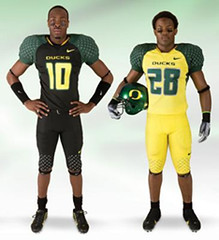
This is what the Ducks wore at that Rose Bowl — very traditional, as you can see. Several years later, in 1998, the Ducks and Nike introduced the mallard helmet with its single O (at the time, they didn’t know they’d put it on both sides of the helmet). Most people outside of the state don’t realize that the O is for two different homes of the Ducks — Hayward Field for the inner O and Autzen, after expansion, for the outer O.
Since then, the Ducks have worn all sorts of unusual designs. I will say this: As an Oregonian, I know which team I’m watching when I see a Ducks game on television. And when I was growing up, you wouldn’t see people wearing much Oregon gear, except for the obligatory college sweatshirt. Now you see it all over.
I’ll admit that Nike does go too far with the Ducks at times, but younger fans like it because they’re always looking for what they’ll come out with next, and older fans could care less, they just want the Ducks to win. The all-yellow look probably made most people here cringe, but one of the slogans for the Ducks is “Yell-O” (scream, “O” for Oregon, get it?). As for what others might think about the uniforms, I’d say Oregonians could care less about that too, which is probably a trait of this state, because we’re so distant from the rest of the country and major markets. We like seeing that we’re getting some recognition for something other than rain and Tonya Harding.
The ones who are bothered the most by Oregon’s uniforms are probably Oregon State and their fans, who resent that the Ducks get so much attention at the beginning of the season and love to watch them fail as the season progresses. The Beavers also believe the Ducks get things from Nike without earning them, such as unveiling a new uniform design when your team has three loses into a season for football. I would agree with this one.
As for Nike, Oregonians generally love the company because it’s a local brand gone global. I’ve worn Nikes since I was a kid and I still buy them — not all the time, but it’s one of my preferred brands. Most Oregonians realize that the university and Nike are joined at Phil Knight’s hip, which at times can make for strange circumstances. For example, Kevin Love, who’s from the Oregon town of Lake Oswego, actually chose not to attend Oregon because he had the audacity (in Nike’s opinion) to play at an Adidas camp because it had better players. After that incident, he went to UCLA and has worn Adidas since. He was one of the best high school players in Oregon history but he crossed the swoosh and the Ducks, and people here have not forgiven him. We like to see our own stay here and succeed, but it doesn’t always happen that way.
If it quacks like a douchebag duck”¦: Paul here. Big thanks to Jeremy for giving us the local take on all this, and for his countless contributions to the site.
Meanwhile, here’s yet more Oregon news: Ducks coach Mike Bellotti participated in a conference call yesterday, during which Seattle Post-Intelligencer reporter Bud Withers asked several questions about the Oregon/Nike design process. I wasn’t on the call, but reader Travis Demers had access to the audio and sent it to me as an MP3 file, which I’ve transcribed as follows:
Bud Withers: Mike, since your game last week wasn’t on TV, as you pointed out, did you guys wear the black helmets, or are those still in the box?
Mike Bellotti: We did, we wore ’em. We wore the black helmets and the black uniforms. Too bad you didn’t get a chance to see it, it looked awesome.
Withers: Huh, OK. Are these things, these innovations, just gonna keep on coming, or is there a limit to this?
Bellotti: No, they’re gonna keep on coming. You know, our tradition is innovation. So that’s become the buzzword, and I think the new uniforms are the lightest ever made, they’re reinforced in the shoulders, because of the lightness, to allow them to be usable over a longer period of time. The uniform we unveiled [this past Saturday] was sort of a special uniform. I think we’ll have this set for one more year, and then we’ll go into production for some new — y’know, a whole revamping for 2010. And now we have four helmets to choose from.
Withers: Can you explain what the process is? Does someone from Nike come to you and say, “Here’s the latest thing we’re looking at,” and then you screen them or something?
Bellotti: Yeah. We actually, uh — y’know, this was kind of a surprise to everyone. This was more of a one-shot deal that Nike wanted to do, and we had a chance to have input to it. And this was not with our players — this was just me as a coach. And we, I said some certain things, suggested this and that, and they came back with a prototype, and we said, “Yeah, that’s awesome, let’s go with it.” But when we go to the full uniform line, we involve our players. There’s a group right now, of younger players, freshmen and sophomores, who are meeting with the design people at Nike on a regular basis to kind of put ideas together for our future uniforms. And that’s a combination of color ideas, style ideas, just the whole look. And that will be the geneis, or — the next wave.
Withers: And your sense, I think, in the past has been that this is important to the players, correct?
Bellotti: Yeah — well — yeah, I think it’s imp.. — they, they love having some ownership in it. They love having some creative input. The reality is that they’re helping to design what they’re gonna wear, sort of like picking your own clothes. The other thing is that it does appeal to other people out there. And even if it doesn’t [appeal] to some, they’re talkin’ about it.
First, let’s all chip in and buy Bud Withers a computer and an internet connection, so he can see photos of games that he can’t get on his wind-up TV machine. Second: Whoa, “picking your own clothes” — revolutionary! Third: So the moral of the story is that even if something’s very, very stupid, all that really matters is that everyone’s talking about it. Hey, it worked (read: didn’t work) for Sarah Palin, so why not?
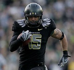
But what interested me most is that Withers and Bellotti both described last Saturday’s helmet as being black. And yeah, while it was technically a very dark green, c’mon, for practical purposes it’s black. Which is very interesting considering what Nike’s Tinker Hatfield told me back in 2006: “[A black helmet for the Ducks] was discussed ”” some players thought it’d be pretty cool. But I didn’t think it would be right, out of respect for Oregon State, because they have black helmets. So I vetoed any black helmet.” I’ve e-mailed Hatfield to ask him why he’s changed his tune on this one (and no, Matt Powers, you cannot have his e-mail address), but so far no response.
Uni Watch News Ticker: Canterbury, a New Zealand-based outfitter specializing in high-tech rugby gear, is moving into the soccer market (with thanks to Matt Brukman). ”¦ Gorgeous game-used 1950s Pirates uniform available here (with thanks to Ryan Connelly). ”¦ Iowa high school football observations from Jesse Gavin: (1) This guy‘s name isn’t Pride. That’s Sioux City Heelan’s team, and they all wear “Pride” nameplates. (2) Between the hip, the shoulder, the helmet, and the pride stickers, West Lyon is bordering on paw print overload. ”¦ Steve May reports that The Vancouver Sun recently held a contest in which they invited kids to design an alternate Canucks jersey. ”¦ Reprinted from yesterday’s comments: We missed yet another Gene Upshaw sleeve tribute, this time by Tennessee’s David Thornton. ”¦ Great illustration from last week’s New Yorker. ”¦ In yesterday’s comments, someone asked about the connection between Jerry West and the NBA logo. As I explained in a comment of my own, a very good story on that subject was written a few years ago. Oddly, it’s no longer on the web, but I have a printout of it and made a scan of it yesterday — you can read it by clicking through the six images shown here (for each page, click on the thumbnail and then click on “All Sizes” on the resulting screen to get a legible-sized version — a hassle, but it’s worth it). Contrary to what the article implies, however, the NBA logo isn’t based on this photo — it’s based on this one. ”¦ Reprinted from yesterday’s comments: The Niners are making a green dot switcheroo. ”¦ Not sure exactly what’s going on here, but Ryan Perkins sent it my way. ”¦ Brendon Yarian notes that Da’Rel Scott has “Faith” written on his wrist tape. … What do you do if your basketball program’s in the toilet, your most famous uniform element was your coach’s sweater, and your team is called the Red Storm? You do the same damn thing as everyone else: break out the black uniforms. Additional evidence of the world losing its mind here. … When the Cowboys acquired their second Roy Williams, we all started wondering what they’d do about the two players’ jersey nameplates. And the answer, of course, was nothing — they both just wore “Williams.” But Gordon Reid appears to have found a spot where their names are styled differently: on their helmet nameplates. Dig: The Williams who plays on offense has an unusually long Dymo Tape name label on his helmet — too long for just his surname. Compare that to this preseason shot of the other Williams. Looks like the new Williams must have his first and middle initials on the label, or some other identifier. … Speaking of Oregon, they did the blank-uni thing last night.
Interesting note about the ESPN.com frontpage this morning – the Vanderbilt players shown in the photo all appear to have “V” in the middle of the stars on their helmet, except for the lineman #70 on the right. He seems to have a “7”. What’s the deal huh?
[quote]I’ve e-mailed Hatfield to ask him why he’s changed his tune on this one (and no, Matt Powers, you cannot have his e-mail address), but so far no response. [/quote]
not often the “comment of the day” comes out of the main story…but it just did
Hasn’t Pompey (er..Portsmouth) been wearing Canterbury for a few years now? I think there are other clubs that wear it too.. checking…
I return from a 2.5 week absence from the site to see Phil has a tan box?!
What has the world come too! :)
“Not sure exactly what’s going on here, but Ryan Perkins sent it my way.”
Looks like a Favre autograph party. For his sake, I hope that’s a mirror in the background, or else he has a full day ahead of him.
Well played, Paul!
PL,
From last night’s UAB/Arizona game, Did anyone but the top of UAB’s rear numbers are literally starting even with the players’ elbows!
Coach Mike Davis must have an in with Nike because before he got to UAB, they were an Adidas school, as was Indiana, before he took over ftom the General.
UAB with Three Stripes:
link
link
Indiana with Adidas:
link
link
UAB with Nike:
link
link
Indiana with Nike:
link
link
UAB last night wearing new SOD:
link
[quote comment=”300927″]Well played, Paul!
From last night’s UAB/Arizona game, Did anyone notice that the top of UAB’s rear numbers are literally starting even with the players’ elbows!
UAB last night wearing new SOD:
link
Coach Mike Davis must have an in with Nike because before he got to UAB, they were an Adidas school, as was Indiana, before he took over ftom the General.
UAB with Three Stripes:
link
link
Indiana with Adidas:
link
link
UAB with Nike:
link
link
Indiana with Nike:
link
link
Um…anyone else notice that the team in black isn’t Oregon, According to the Ducks’ site, the team in black is Oakland, the Ducks are wearing their equally stupid looking nearly-all-whites
[quote comment=”300929″]Um…anyone else notice that the team in black isn’t Oregon, According to the Ducks’ site, the team in black is Oakland, the Ducks are wearing their equally stupid looking nearly-all-whites[/quote]
blank is not black
you know the saying “you don’t play for the name on the back of the uniform, you play for the name on the front”? it’s obvious, with only a visible number and a swoosh, who oregon is playing for
Lighten up Francis.
I like the Oregon uniforms, both football and basketball.
Change can be good, and it doesn’t really hurt anyone.
MORE BLACK 3-RD JERSEYS…HOW ORIGINAL
link
Senators looks like a UHL team
and SJ looks so boring…..
I don’t like the look of Oregon uniforms, but I’m glad the Ducks do what they do. They provide an interesting contrast to schools like Penn State who never change their uniforms. The Ducks give us something to talk about here whether your opinion is positive or negative.
It is pretty clear that Nike uses the Ducks football program as thier own personal R&D laboratory, which is understandable given Phil Knight’s ties to the school. Yes the uniforms are often ugly or non-traditional, but if you look past the appearrance there is some significance. The black jerseys from this past weekend were lighter material with reinforced shoulders. If the Ducks like these uniforms and they hold up to real game use, the fabric and construction can be used to improve the uniforms of teams all across the country.
I do wish they would at least stick to the school colors though. Thanks Jeremy for the info about the design of the mallard O. That’s pretty interesting. Liitle overlooked details like that are the ones that feed my Uniwatch habit.
The Oakland-Oregon game last night was interesting.
Not only were the Ducks wearing their WHITE out unis, Oakland was wearing their Colorado, Wright State template SOD gear.
link
Oregon is also known for getting super-exclusive Nike gear. This pic doesn’t let us down, the U of O player is wearing special Oregon exclusive Kobe 2’s.
link
Personally I love the new Oregon jerseys and I also love the fact that they push the envelope when it comes to uniform design. The anti Nike sentiment expressed on this site is also pretty amusing. Will everyone jump from a bridge if the swoosh gets the next MLB contract???
And no I don’t work for Nike.
[quote comment=”300935″]Will everyone jump from a bridge if the swoosh gets the next MLB contract?[/quote]
Yes.
[quote comment=”300936″][quote comment=”300935″]Will everyone jump from a bridge if the swoosh gets the next MLB contract?[/quote]
Yes.[/quote]
Couldn’t we just push Bud Selig and some Nike executives off a bridge instead?
[quote comment=”300921″]Interesting note about the ESPN.com frontpage this morning – the Vanderbilt players shown in the photo all appear to have “V” in the middle of the stars on their helmet, except for the lineman #70 on the right. He seems to have a “7”. What’s the deal huh?[/quote]
I think its just part of his chin strap covering part of the V.
[quote comment=”300928″][quote comment=”300927″]Well played, Paul!
From last night’s UAB/Arizona game, Did anyone notice that the top of UAB’s rear numbers are literally starting even with the players’ elbows!
UAB last night wearing new SOD:
link
Coach Mike Davis must have an in with Nike because before he got to UAB, they were an Adidas school, as was Indiana, before he took over ftom the General.
UAB with Three Stripes:
link
link
Indiana with Adidas:
link
link
UAB with Nike:
link
link
Indiana with Nike:
link
link
I dunno. That’s about the same time the IU football team was wearing link link link. I highly doubt someone in Davis’ position (interim coach who was begrudgingly given the full-time gig) would have had that much influence. It is an interesting coincidence, though.
It looks like #4 is signing helmets for a memorabilia sale. It would be nice if they were for a charity in these times.
Good article. FWIW, it looks like a strong connector between Jerry Dior and the MLB logo.
[quote comment=”300940″]It looks like #4 is signing helmets for a memorabilia sale. It would be nice if they were for a charity in these times.[/quote]
actually i think he’s changing the “Jets” to “bretts”
At the last Civil War I attended (2006? I don’t know, the last one at Reser), we all joked the Ducks mascot, Donald, would rather be seen pantless than wear yellow pants. The Ducks went with their pee-yellow. I’m an OSU alum (GO BEAVS!) so yep, I’m a little biased, and I’ve always like orange and black. Fun little quote from Oregon RB Jeremiah Johnson – “I think I speak for the whole town of Eugene when I say, black goes better with green and yellow. That’s my whole take on it. Black and orange don’t even look right to me. If that’s their color, we take it and make it look better.”
Great illustration from last week’s New Yorker. …
Simply beautiful. Thanks for pointing this out.
Try the link again:
link
Oh yeah, I’m also a fan of the white Beavers helmet. That’s classy.
[quote comment=”300933″]I don’t like the look of Oregon uniforms, but I’m glad the Ducks do what they do. They provide an interesting contrast to schools like Penn State who never change their uniforms. The Ducks give us something to talk about here whether your opinion is positive or negative.
It is pretty clear that Nike uses the Ducks football program as thier own personal R&D laboratory, which is understandable given Phil Knight’s ties to the school. Yes the uniforms are often ugly or non-traditional, but if you look past the appearrance there is some significance. The black jerseys from this past weekend were lighter material with reinforced shoulders. If the Ducks like these uniforms and they hold up to real game use, the fabric and construction can be used to improve the uniforms of teams all across the country.
I do wish they would at least stick to the school colors though. Thanks Jeremy for the info about the design of the mallard O. That’s pretty interesting. Liitle overlooked details like that are the ones that feed my Uniwatch habit.[/quote]
I tend to disagree with the Penn State theory.
We, on UW, tend to applaud PSU because of how strictly they adhere to tradition:
1. Cleats being totally blacked out
2. No Helmet emblems, etc.
However, their uniforms are still incredibly advanced technologically.
Moisture wicking, super light space-age fabrics are what the Nike elite teams wear, and PSU is DEFINITELY one of them.
A few years back, the U of O opened up their season at Mississippi State. Nike had outfitted them with an experimental “Cool Vest”.
Jackie Sherill, who is more commonly known as a man who likes to take the bull “by the horns”:
link
was extremely miffed:
link
The truth is…Phil Knight does seem to give preferential treatment to his ALMA MATER! There is what could be a conflict of interest, considering all Nike schools, let alone Non-Nike schools don’t receive the same gear…
Waddya gonna do?
As no surprise to anyone here, I LOVE everything Oregon.
The first time that I had been disappointed with their product, besides when Dennis Dixon got hurt last year, was when they broke out their SOD stuff. I was expecting some really revolutionary, innovative products. I was extremely underwhelmed.
link
Yeah, I’m pretty sure Good Roy’s dymo tape reads
R . E . WILLIAMS
The blank Oregon hoop unis, do they still have the name of the player stitched on the back? Take a look at the second picture, with #12 in the shot, and it seems like the players name is there also in white. Porter maybe is his name? Just adding to the oddity.
“I’ll admit that Nike does go too far with the Ducks at times, but younger fans like it because they’re always looking for what they’ll come out with next, and older fans could care less, they just want the Ducks to win. The all-yellow look probably made most people here cringe, but one of the slogans for the Ducks is “Yell-O” (scream, “O” for Oregon, get it?). As for what others might think about the uniforms, I’d say Oregonians could care less about that too”
So does that mean Oregonians really couldn’t care less? If they couldn’t care less, then it truly means they don’t care. If they could care less, then it means it bothers them what people think.
[quote comment=”300938″][quote comment=”300921″]Interesting note about the ESPN.com frontpage this morning – the Vanderbilt players shown in the photo all appear to have “V” in the middle of the stars on their helmet, except for the lineman #70 on the right. He seems to have a “7”. What’s the deal huh?[/quote]
I think its just part of his chin strap covering part of the V.[/quote]
Yep.
[quote comment=”300951″]”I’ll admit that Nike does go too far with the Ducks at times, but younger fans like it because they’re always looking for what they’ll come out with next, and older fans could care less, they just want the Ducks to win. The all-yellow look probably made most people here cringe, but one of the slogans for the Ducks is “Yell-O” (scream, “O” for Oregon, get it?). As for what others might think about the uniforms, I’d say Oregonians could care less about that too”
So does that mean Oregonians really couldn’t care less? If they couldn’t care less, then it truly means they don’t care. If they could care less, then it means it bothers them what people think.[/quote]
Yes, we all know that’s a malapropism. I considered editing it but left it because that’s how people talk, plus Jeremy is a careful writer who I’m sure was aware of the distinction and wanted it as “could” anyway. Let’s PLEASE not launch into a discussion of this. Thanks.
[quote comment=”300950″]The blank Oregon hoop unis, do they still have the name of the player stitched on the back? Take a look at the second picture, with #12 in the shot, and it seems like the players name is there also in white. Porter maybe is his name? Just adding to the oddity.[/quote]
Correct, Much to the Hemogoblin’s chagrin, it is Tajuan Porter:
link
link
link
I agree with Greg V…wish Nike would stick to the school colors.
What’s odd is black magically becoming a “neutral” color. Unlike white, it did not come to its current use as a natural result of uniform evolution.
White developed into a neutral color in football, basketball and hockey in the mid-50’s with the advent of required white jerseys, which was, of course, because of televison. Knowing they’d wear white half the time, teams began adding white (or increasing the use of it to separate colors like navy and orange, for ex.) as trim on other uniform elements, without declaring it one of their team colors (Lions, Redskins Bears, Ohio State, Iowa and, yes, Oregon just a few football examples).
Black has gone though no such process where there ever actually was a reason for it to part of everyone’s uni at one time or another. It is now an “everyman” color simply because a study came out a while back saying that teams in black were perceived as tougher and more aggressive. Well, hitch up the bandwagon, folks…
So the fact is, black-for-black’s-sake is exactly that. Black as a “neutral” color is not the natural outgrowth of anything. It’s just a desire to “look tough.”
And that’s phony.
—Ricko
Nice points by Ricko. It would be interesting to see how successful schools with black incorporated into their uniforms are. Vanderbilt (black and old gold) hasn’t been to a bowl game since 1982. Oregon is simply mediocore. USC, Florida, Ohio State, and other successful football schools haven’t needed black. In basketball, UCLA and UNC sport some of the best records and a similiar shade of light blue.
So much for tougher.
[quote comment=”300955″]I agree with Greg V…wish Nike would stick to the school colors.
What’s odd is black magically becoming a “neutral” color. Unlike white, it did not come to its current use as a natural result of uniform evolution.
White developed into a neutral color in football, basketball and hockey in the mid-50’s with the advent of required white jerseys, which was, of course, because of televison. Knowing they’d wear white half the time, teams began adding white (or increasing the use of it to separate colors like navy and orange, for ex.) as trim on other uniform elements, without declaring it one of their team colors (Lions, Redskins Bears, Ohio State, Iowa and, yes, Oregon just a few football examples).
Black has gone though no such process where there ever actually was a reason for it to part of everyone’s uni at one time or another. It is now an “everyman” color simply because a study came out a while back saying that teams in black were perceived as tougher and more aggressive. Well, hitch up the bandwagon, folks…
So the fact is, black-for-black’s-sake is exactly that. Black as a “neutral” color is not the natural outgrowth of anything. It’s just a desire to “look tough.”
And that’s phony.
—Ricko[/quote]
Right on, Ricko!!! Fantastic post!
Now we have heard from an Oregon native. I agree with the sentiment, tell everyone else to “get lost”. Let’s take that advice, consider this article a bit of dual Nike/Ducks catharsis, and declare a much needed respite from the subject. It is my experience that if you don’t give someone all the attention they crave, they tend to shut the hell up and go away. It’s worth a try.
Ironically, all those helmets he’s signing are for John Madden.
[quote comment=”300931″]Lighten up Francis.
I like the Oregon uniforms, both football and basketball.
Change can be good, and it doesn’t really hurt anyone.[/quote]
Change doesn’t really hurt anyone, Big Mike, but change for change’s sake is offensive to most, me included. That’s why most here apply the “Is it good or is it stupid” test.
Using that theory, I’m pretty sure that’s why Oregon gets a lot of heat for how they handle the changing of their digs…..it seems like there’s no good reason to do so.
As far as you liking them, good on ya. Differences of opinion are a good thing and make stuff lots more interesting…
Fitness really doesn’t come to mind when I think of McDonalds, but looke at what I ‘ve found:
link
[quote comment=”300945″]Great illustration from last week’s New Yorker. [/quote]
Personally, I enjoyed the one about the pig at the complaint department.
My apologies if this was mentioned yesterday, but I have to give a Flyers a FAIL on their new 3rd jersey’s white nameplate. Even if there is a historical significance, it just looks cheap to me.
link
About the Oregon uniforms: That picture from the ’94 Rose Bowl shows a classical uniform. However, and I never knew this before, designing the “O” on the green helmet in the likeness of a mallard is a great idea too, and it looks good. There’s good and bad in both tradition and innovation. The biggest two problems with the Oregon uniforms is (1) their use of a non-school color, which is a color of their primary rival; and (2) the lack of consistency in appearance. Pick two or three or even four designs, based on the school colors, and stick with them.
[quote comment=”300923″]Hasn’t Pompey (er..Portsmouth) been wearing Canterbury for a few years now? I think there are other clubs that wear it too.. checking…[/quote]
They were fitted in Canterbury shirts for the first time last season and they looked HORRIBLE. There was too much piping that made the shirt look like it had been stitched together from random pieces of blue cloth in the dark. Plus Canterbury seem to have changed Portsmouth’s traditional colours from blue shirts, white shorts and red socks to all blue. Not good.
Got the MLB Christmas catalog in the mail yesterday, and link item caught my eye. I’ve always hated Yankees fans who have jerseys with NOB, and this is just another step towards douchebaggery.
I’d much rather get link for Christmas (link the clip, in case you missed it).
[quote comment=”300962″][quote comment=”300945″]Great illustration from last week’s New Yorker. [/quote]
Personally, I enjoyed the one about the pig at the complaint department.[/quote]
Not that there’s anything wrong with that.
Paul
I was on vacation last week when you basketball preview came out and as I was reading it yesterday, you threw me a curve ball. I’m a huge Kentucky fan and once I saw these uniforms a few months back I knew you were going to go off on them eventually but I was suprised im my reading yesterday that you actually dug them.
I remember back in the ’60s, Wichita State de-emphasized the black in its school colors because of the racial tensions of the era – Black Power – and its basketball teams switched to gold road jerseys. How times change.
I’m in the school that Oregon should stick to its green and gold motif. The weird stuff it does is OK, it’s fodder for discussion and, as a previous post pointed out, provides contrast to the more traditionally clad schools.
[quote comment=”300968″]Paul
I was on vacation last week when you basketball preview came out and as I was reading it yesterday, you threw me a curve ball. I’m a huge Kentucky fan and once I saw these uniforms a few months back I knew you were going to go off on them eventually but I was suprised im my reading yesterday that you actually dug them.[/quote]
Against UNC last night, the unis looked pretty good.
link
link
link
Unfortunately for any UK fans, the unis looked FAR better than their play on the court!
“Unfortunately for any UK fans, the unis looked FAR better than their play on the court!”
Sad but true MPowers.
Love the Flyers white nameplates
Great article, Jeremy. However, I’ve read the paragraph that begins “This is what the Ducks wore at that Rose Bowl” three times and I’m still confused. Can you (or someone else) elaborate on the following?
1. You say Nike introduced the mallard helmet “nearly a decade later”, but wasn’t it 3 or 4 years (1994 to 1998)?
2. What is the mallard helmet? I don’t get it. It just looks like a stylized O to me.
3. Single O? Inner O? Outer O? The O is for two different homes of the Ducks? Sorry, I have no idea what you’re talking about. Again, all I can see is one O.
4. You write that they didn’t know they would put the O on both sides of the helmet. Is that true? Were they going to leave the other side blank or use a different logo?
[quote comment=”300964″]About the Oregon uniforms: That picture from the ’94 Rose Bowl shows a classical uniform. However, and I never knew this before, designing the “O” on the green helmet in the likeness of a mallard is a great idea too, and it looks good. There’s good and bad in both tradition and innovation. The biggest two problems with the Oregon uniforms is (1) their use of a non-school color, which is a color of their primary rival; and (2) the lack of consistency in appearance. Pick two or three or even four designs, based on the school colors, and stick with them.[/quote]
That’s a pretty good summary.
As an Oregon alum, I love the green helmet. But the lack of uniformity in the uniforms, not to mention the lack of school colors, bothers the hell out of me.
[quote comment=”300970″]
Against UNC last night, the unis looked pretty good.
[/quote]
Hmmm, even my wife, who rarely makes uni-related observations, said “Those are stupid” when she saw them last night.
[quote comment=”300973″]Great article, Jeremy. However, I’ve read the paragraph that begins “This is what the Ducks wore at that Rose Bowl” three times and I’m still confused. Can you (or someone else) elaborate on the following?
1. You say Nike introduced the mallard helmet “nearly a decade later”, but wasn’t it 3 or 4 years (1994 to 1998)?[/quote]
My fault. I misinterpreted something Jeremy wrote and imposed an error thru my editing. Will fix now.
[quote comment=”300973″]
2. What is the mallard helmet? I don’t get it. It just looks like a stylized O to me.
[/quote]
Not the O, but the color/paint technique…look at the helmet and then look at the pic of the mallard.
link
I asked this last night, but does anyone else know of a good source of Blackhawks uniform history? Teebz gave me some stuff. I’m putting together a little website for a class project, borrowed largely from this site, but I want to put some more detail than I can find about the Hawks and Bulls if anyone knows anything. I’ll post the site once it’s done, but it’s not going to be anything groundbreaking.
[quote comment=”300977″][quote comment=”300973″]
2. What is the mallard helmet? I don’t get it. It just looks like a stylized O to me.
[/quote]
Not the O, but the color/paint technique…look at the helmet and then look at the pic of the mallard.
link
Just for the record: I have always LOVED the mallard helmet. Aesthetically gorgeous, conceptually brilliant.
It’s the rest of the uniform that I have issues with…
[quote comment=”300973″]Great article, Jeremy. However, I’ve read the paragraph that begins “This is what the Ducks wore at that Rose Bowl” three times and I’m still confused. Can you (or someone else) elaborate on the following?
1. You say Nike introduced the mallard helmet “nearly a decade later”, but wasn’t it 3 or 4 years (1994 to 1998)?
2. What is the mallard helmet? I don’t get it. It just looks like a stylized O to me.
3. Single O? Inner O? Outer O? The O is for two different homes of the Ducks? Sorry, I have no idea what you’re talking about. Again, all I can see is one O.
4. You write that they didn’t know they would put the O on both sides of the helmet. Is that true? Were they going to leave the other side blank or use a different logo?[/quote]
The talk of the O logo confused the hell outta me as well. Inner and outer O? What? Sounded to me like another case of someone trying to be clever(Nike and Oregon, not Jeremy) to implying there was some grand meaning to what they did, insted of it just being a damn logo.
[quote comment=”300977″][quote comment=”300973″]
2. What is the mallard helmet? I don’t get it. It just looks like a stylized O to me.
[/quote]
Not the O, but the color/paint technique…look at the helmet and then look at the pic of the mallard.
link
So the green color is from the mallard. Got it.
Also, I just realized the inside of the O is shaped like the track field. And the outside is shaped like the round football stadium. So now the inner and outer O thing makes sense to me.
Dave, look at the Oregon helmet and then the mallard right behind it. Same color, no?
Also, regarding the Sioux City Heelan football Pride nameplate, the girls’ volleyball team also does that. No pic, but link should have some photos.
[quote comment=”300970″][quote comment=”300968″]Paul
I was on vacation last week when you basketball preview came out and as I was reading it yesterday, you threw me a curve ball. I’m a huge Kentucky fan and once I saw these uniforms a few months back I knew you were going to go off on them eventually but I was suprised im my reading yesterday that you actually dug them.[/quote]
Against UNC last night, the unis looked pretty good.
link
link
link
Unfortunately for any UK fans, the unis looked FAR better than their play on the court![/quote]
If by “looked pretty good” you mean looked like they were wearing pretty dresses, then I would agree wholeheartedly. Like most of the SOD unis, I like the general designs, but hate the Hammer-pants cut off at the shin.
[quote comment=”300973″]Great article, Jeremy. However, I’ve read the paragraph that begins “This is what the Ducks wore at that Rose Bowl” three times and I’m still confused. Can you (or someone else) elaborate on the following?
1. You say Nike introduced the mallard helmet “nearly a decade later”, but wasn’t it 3 or 4 years (1994 to 1998)?
2. What is the mallard helmet? I don’t get it. It just looks like a stylized O to me.
3. Single O? Inner O? Outer O? The O is for two different homes of the Ducks? Sorry, I have no idea what you’re talking about. Again, all I can see is one O.
4. You write that they didn’t know they would put the O on both sides of the helmet. Is that true? Were they going to leave the other side blank or use a different logo?[/quote]
1. Good point! Nationwide, people didn’t really start paying attention to the Ducks unis until this guy was plastered on a billboard in Times Square:
link
2.
A.Mallard Duck:
link
B. Mallard Helmet:
link
3. Got me…I was a bit confuced also, unless they are honoring both homes with a decal on either side!
4. Oregon often uses a secondary logo, affectionately known as DTO, or DucK Through the O.
link
link
link
Yell-O:
link
I have heard rumors, that thsi was goung to be used as a possible helmet decal.
Holy smokes, that Oregon basketball game looked AWFUL. On both sides of the ball!
[quote comment=”300925″]”Not sure exactly what’s going on here, but Ryan Perkins sent it my way.”
Looks like a Favre autograph party. For his sake, I hope that’s a mirror in the background, or else he has a full day ahead of him.[/quote]
True that. Here are some more.
link
Notice Favre signing the Titans throwback helmet. Wouldn’t it be funny if the Jets came out this Sunday as the “Titans of New York”, and you had Titans vs. Titans???
paul – you might find this interesting, but when they do helmet signings, such as in today’s pic with favre, they almost always use a style of facemask that nobody’s worn (that i know of) since neil o’donnell. observe where the facemask is physically clasped to the helmet. that middle connecting rib dealie is bent downwards (which effectively reduces the vertical rise of the front of the facemask). behold –
autographed helmets:
link
link
link
link
‘normal’ helmet for comparison:
link
neil o’ donnell:
link
pic of my new cell phone:
link
Ricko, I wanted to thank you for your history of Metropolitan Stadium post last night. I was unaware (or had forgotten) that the Giants could have moved to Minneapolis instead of SF.
I know it’s all hypothetical, but if the Giants had moved to Minnesota and the Senators had moved to SF, then Charlie O. probably wouldn’t have moved to Oakland. We might have had the Seattle, San Diego or Denver A’s.
[quote comment=”300934″]The Oakland-Oregon game last night was interesting.
Not only were the Ducks wearing their WHITE out unis, Oakland was wearing their Colorado, Wright State template SOD gear.
link
Oregon is also known for getting super-exclusive Nike gear. This pic doesn’t let us down, the U of O player is wearing special Oregon exclusive Kobe 2’s.
link
You sure that’s not just the ankle braces?
[quote comment=”300981″][quote comment=”300977″][quote comment=”300973″]
2. What is the mallard helmet? I don’t get it. It just looks like a stylized O to me.
[/quote]
Not the O, but the color/paint technique…look at the helmet and then look at the pic of the mallard.
link
So the green color is from the mallard. Got it.
Also, I just realized the inside of the O is shaped like the track field. And the outside is shaped like the round football stadium. So now the inner and outer O thing makes sense to me.[/quote]
Sure they might have meant it that way or, in my mind in went down kinda like this:
Logo Designer: Here’s the new helmet logo, isn’t the font pretty sweet?
Random fanboy in room: OMG! You even made it look like the stadiums, like the track field inside the football stadium! That’s sooo cool!
Logo Designer: Ummm, yes…..exactly. I’m glad that was so easy to pick up on, because that’s exactly what I was going for. (giggles to himself)
But what interested me most is that Withers and Bellotti both described last Saturday’s helmet as being black. And yeah, while it was technically a very dark green, c’mon, for practical purposes it’s black. Which is very interesting considering what Nike’s Tinker Hatfield told me back in 2006: “[A black helmet for the Ducks] was discussed — some players thought it’d be pretty cool. But I didn’t think it would be right, out of respect for Oregon State, because they have black helmets. So I vetoed any black helmet.†I’ve e-mailed Hatfield to ask him why he’s changed his tune on this one (and no, Matt Powers, you cannot have his e-mail address), but so far no response.
No matter what, I still want to get into the “Kitchen”.
link
[quote comment=”300954″][quote comment=”300950″]The blank Oregon hoop unis, do they still have the name of the player stitched on the back? Take a look at the second picture, with #12 in the shot, and it seems like the players name is there also in white. Porter maybe is his name? Just adding to the oddity.[/quote]
Correct, Much to the Hemogoblin’s chagrin, it is Tajuan Porter:
link
link
link
Looking at his profile, that kid’s overweight. I’m more than six inches taller than he is, and I don’t even weigh that much.
“I’ll admit that Nike does go too far with the Ducks at times, but younger fans like it because they’re always looking for what they’ll come out with next, and older fans could care less, they just want the Ducks to win.”
(Sorry, I don’t know how to quote something from the main entry without just pasting it into the comment box)
I thought this was an interesting point by Jeremy, and reflects my thoughts on the “old vs. new” uniform debate.
After the U of MN football team switched from last year’s classic desing to this year’s “modern” design, I was complaining about it to a buddy of mine who is active in posting on the Gophers sports message boards. The general consensus among fans on the boards was that the new uniforms suck, but the players like them so that’s more important. It’s a recruiting thing – young players want to look “sleek”, which I guess translates to form-fitting uniforms with a lot of random piping, innovative color schemes, etc.
When it comes down to it, as a Gophers fan, I would rather watch good players in bad uniforms than bad players in good uniforms. So if non-traditional uniforms help bring in talented recruits, I’m all for it.
[quote comment=”300984″][quote comment=”300973″]Great article, Jeremy. However, I’ve read the paragraph that begins “This is what the Ducks wore at that Rose Bowl” three times and I’m still confused. Can you (or someone else) elaborate on the following?
1. You say Nike introduced the mallard helmet “nearly a decade later”, but wasn’t it 3 or 4 years (1994 to 1998)?
2. What is the mallard helmet? I don’t get it. It just looks like a stylized O to me.
3. Single O? Inner O? Outer O? The O is for two different homes of the Ducks? Sorry, I have no idea what you’re talking about. Again, all I can see is one O.
4. You write that they didn’t know they would put the O on both sides of the helmet. Is that true? Were they going to leave the other side blank or use a different logo?[/quote]
1. Good point! Nationwide, people didn’t really start paying attention to the Ducks unis until this guy was plastered on a billboard in Times Square:
link
2.
A.Mallard Duck:
link
B. Mallard Helmet:
link
3. Got me…I was a bit confuced also, unless they are honoring both homes with a decal on either side!
4. Oregon often uses a secondary logo, affectionately known as DTO, or DucK Through the O.
link
link
link
Yell-O:
link
I have heard rumors, that thsi was goung to be used as a possible helmet decal.[/quote]
For #3:
The outside line of the O, the circular part, is the shape of Autzen. The inside boundary of the O is the shape of Hayward’s track.
Matt, the thing about the DTO is that we can literally only sell things with that on it in Eugene and in the Duck Stores in Portland and Bend. Other than that, we have to pay royalties out the bum.
Therefore, I propose that we go back to the old interlocked UO, because the damn O is corny.
And now for my shitty Wednesday to start in earnest.
[quote comment=”300992″][quote comment=”300954″][quote comment=”300950″]The blank Oregon hoop unis, do they still have the name of the player stitched on the back? Take a look at the second picture, with #12 in the shot, and it seems like the players name is there also in white. Porter maybe is his name? Just adding to the oddity.[/quote]
Correct, Much to the Hemogoblin’s chagrin, it is Tajuan Porter:
link
link
link
Looking at his profile, that kid’s overweight. I’m more than six inches taller than he is, and I don’t even weigh that much.[/quote]
he’s 5’6″, 150 lbs…
you’re 6′, 150?
An explanation as to explain why the Bishop Heelan Catholic football team from Sioux City, IA wears ‘PRIDE’ on the back of their jerseys. This is our school motto and as an alumnus we had this drilled into our heads during our years there.
P stands for ‘Practice’, R stands for ‘Running’, I stands for ‘Initiative’, D stands for ‘Determination’ and E stands for ‘Enthusiasm’.
Never knew why ‘running’ was in there but it was that way when I arrived as a freshman, didn’t think to question it.
[quote comment=”300978″]I asked this last night, but does anyone else know of a good source of Blackhawks uniform history? Teebz gave me some stuff. I’m putting together a little website for a class project, borrowed largely from this site, but I want to put some more detail than I can find about the Hawks and Bulls if anyone knows anything. I’ll post the site once it’s done, but it’s not going to be anything groundbreaking.[/quote]
Jefferson, if you like, I can send you all the photos I have as well. I have a number of Blackhawks jersey pictures simply due to my blog.
Did you want what I have?
The St. John’s Red Storm wearing black uniforms ranks right up there with — the Scarlet Knights of Rutgers wearing black football uniforms last year. Ah, what’s wrong with colleges in the New York metropolitan area?
oregon hoops, just change the wordmark to green or yellow and i’ll be in love!
[quote comment=”300956″]Nice points by Ricko. It would be interesting to see how successful schools with black incorporated into their uniforms are. Vanderbilt (black and old gold) hasn’t been to a bowl game since 1982. Oregon is simply mediocore. USC, Florida, Ohio State, and other successful football schools haven’t needed black. In basketball, UCLA and UNC sport some of the best records and a similiar shade of light blue.
So much for tougher.[/quote]
Sorry for two Indiana football comments (that’s a lot even for me to take) in one day, but in the five seasons the link wore link (’97-’01), they managed to win a whopping 18 games and went to exactly zero bowl games (6 bowl appearances from ’87 to ’93).
Since switching back to the crimson helmets, they’ve gone to, uh, one bowl game.
[quote comment=”300984″]
4. Oregon often uses a secondary logo, affectionately known as DTO, or DucK Through the O.
link
link
link
I have heard rumors, that thsi was goung to be used as a possible helmet decal.[/quote]
I have seen it link that the Ducks have only limited control of the DTO logo, due to the licensing agreement with Disney. Apparently, the University can’t sell Donald items out of state, only within the borders of Oregon. Seems fishy to me, since such items may link link link link link link link link.
So if the helmet is based on the mallard, will we ever see brown and white uniforms with these blue stripes???
link
[quote comment=”300994″]Matt, the thing about the DTO is that we can literally only sell things with that on it in Eugene and in the Duck Stores in Portland and Bend. Other than that, we have to pay royalties out the bum.
[/quote]
Again, that seems kinda odd, considering how much merchandise featuring Donald is actually on the website.
That seems to me to be a plausible cover story fot the athletic department, wanting to use their cutting-edge graphics as much as possible while flying in the face of so many Duck fans who love the DTO logo.
This way, they serve both. Oregonians can buy their Donald gear while the athletic department gets to export their tough image to the rest of the country.
[quote comment=”300932″]MORE BLACK 3-RD JERSEYS…HOW ORIGINAL
link
Senators looks like a UHL team
and SJ looks so boring…..[/quote]
Honestly, is this some sort of conspiracy or are the people designing uniforms for these teams just extremely stupid and boring?
there’s just not enough black in the NHL today
Huge hockey fan and flyers fan here, first post. On the new third jerseys, the senators is AWFUL, the side stripes look funny and don’t even get me started on the wordmark or the “black” thing with the third jerseys. As for the flyers, finallyy. Every fan i know wants ORANGE and not BLACK. Orange should always have uniform priority for the flyers. Just look at the history, and the white nameplate, a true throwback. I ordering one MIke Richards third jersey as soon as i can and i wake up with Uni-watch everyday. Great job
[quote comment=”301006″]there’s just not enough black in the NHL today[/quote]
6 more thirds to be unveiled and 5 of them are black (but to be fair, one of them is the B’s)
[quote comment=”301006″]there’s just not enough black in the NHL today[/quote]
It’s amazing…whenever I hear “Team So-and-So’s 3rd jersey was leaked today…” I picture some awful black version of a jersey I’ve already seen. And that has been the case, unfortunately, more often than not.
The real shame, is that when you look back into NHL jersey history, there are many AMAZING sweaters that could be incorporated into wonderful 3rd jersey options. Look at what Pittsburgh has done with the blue 3rd jersey.
Also- If I see one more cheesy nickname on a 3rd jersey… the Bolt Sens or something like that… I’m going to develop a twitch.
[quote comment=”301007″]Huge hockey fan and flyers fan here, first post. On the new third jerseys, the senators is AWFUL, the side stripes look funny and don’t even get me started on the wordmark or the “black” thing with the third jerseys. As for the flyers, finallyy. Every fan i know wants ORANGE and not BLACK. Orange should always have uniform priority for the flyers. Just look at the history, and the white nameplate, a true throwback. I ordering one MIke Richards third jersey as soon as i can and i wake up with Uni-watch everyday. Great job[/quote]
Althought the Flyers third is fantastic, it unfortunately won’t be a “true” throwback because of the ever-present “RBK” logo right above the awesome white nameplate no less- ugh!
[quote comment=”301007″]Huge hockey fan and flyers fan here, first post. On the new third jerseys, the senators is AWFUL, the side stripes look funny and don’t even get me started on the wordmark or the “black” thing with the third jerseys. As for the flyers, finallyy. Every fan i know wants ORANGE and not BLACK. Orange should always have uniform priority for the flyers. Just look at the history, and the white nameplate, a true throwback. I ordering one MIke Richards third jersey as soon as i can and i wake up with Uni-watch everyday. Great job[/quote]
Fan bias is funny…. those Flyers 3rd jerseys are ugggggly.
How ’bout this? (Just kidding… I just think it’s funny b/c it incorporates a couple things I hate. Bright orange jersey + stupid nickname)
link
[quote comment=”301010″][quote comment=”301007″]Huge hockey fan and flyers fan here, first post. On the new third jerseys, the senators is AWFUL, the side stripes look funny and don’t even get me started on the wordmark or the “black” thing with the third jerseys. As for the flyers, finallyy. Every fan i know wants ORANGE and not BLACK. Orange should always have uniform priority for the flyers. Just look at the history, and the white nameplate, a true throwback. I ordering one MIke Richards third jersey as soon as i can and i wake up with Uni-watch everyday. Great job[/quote]
Althought the Flyers third is fantastic, it unfortunately won’t be a “true” throwback because of the ever-present “RBK” logo right above the awesome white nameplate no less- ugh![/quote]
Is it just me, or is the orange wrong? I can’t pinpoint it… but the classic Flyer orange does not look like that.
How ’bout this?
link
[quote comment=”301009″][quote comment=”301006″]there’s just not enough black in the NHL today[/quote]
Also- If I see one more cheesy nickname on a 3rd jersey… the Bolt Sens or something like that… I’m going to develop a twitch.[/quote]
Get ready for “Los Bolts”
[quote comment=”300929″]Um…anyone else notice that the team in black isn’t Oregon, According to the Ducks’ site, the team in black is Oakland, the Ducks are wearing their equally stupid looking nearly-all-whites[/quote]
Did anyone else notice that OU went into Oregon and beath them AGAIN?
Go Grizzlies!
[quote comment=”300999″]The St. John’s Red Storm wearing black uniforms ranks right up there with — the Scarlet Knights of Rutgers wearing black football uniforms last year. Ah, what’s wrong with colleges in the New York metropolitan area?[/quote]
I”ll give you Two examples worse than the use of fictitious colors:
1. Wagner College in Staten Island, NY, awarded me not ONE, but TWO degrees!
2. Adelphi University, Garden City, LI, awarded me a Master’s Degree!
It must be all of the Pastrami!
[quote comment=”301013″][quote comment=”301009″][quote comment=”301006″]there’s just not enough black in the NHL today[/quote]
Also- If I see one more cheesy nickname on a 3rd jersey… the Bolt Sens or something like that… I’m going to develop a twitch.[/quote]
Get ready for “Los Bolts”[/quote]
Hahaha, touché Jim. We’re probably not that far from it. On a black jersey, with awful side panels, and huge RBK logos all over it.
[quote comment=”301006″]there’s just not enough black in the NHL today[/quote]
Earl Haffler: (confusion) We’re talking about people, right?
[quote comment=”301015″][quote comment=”300999″]The St. John’s Red Storm wearing black uniforms ranks right up there with — the Scarlet Knights of Rutgers wearing black football uniforms last year. Ah, what’s wrong with colleges in the New York metropolitan area?[/quote]
I”ll give you Two examples worse than the use of fictitious colors:
1. Wagner College in Staten Island, NY, awarded me not ONE, but TWO degrees!
2. Adelphi University, Garden City, LI, awarded me a Master’s Degree!
It must be all of the Pastrami![/quote]
That reminds me of my alma mater, Northern Kentucky University. When I first applied to go there I received a latter and a check refunding me of my application fee. The letter stated that graduates with either a bachelors, masters, or doctorate are not required to pay an application fee.
Naturally, I figured I received my doctorate and should expect it in the mail.
[quote comment=”301007″]Huge hockey fan and flyers fan here, first post. On the new third jerseys, the senators is AWFUL, the side stripes look funny and don’t even get me started on the wordmark or the “black” thing with the third jerseys. As for the flyers, finallyy. Every fan i know wants ORANGE and not BLACK. Orange should always have uniform priority for the flyers. Just look at the history, and the white nameplate, a true throwback. I ordering one MIke Richards third jersey as soon as i can and i wake up with Uni-watch everyday. Great job[/quote]
welcome mike
i must agree with some of the others on here in saying that while the flyers get a A+ for effort on the thirdback (third jersey+throwback), and i do LOVE the white nameplate…
the fucking reebok logo and hemline RUIN an otherwise beautiful ting
as an islander fan growing up with the fantastic rivalry “we” had with the flyers in the late 70’s early 80’s…there is no “black” sweater
l’orange is what fans remember (and hate)
[quote comment=”301019″][quote comment=”301015″][quote comment=”300999″]The St. John’s Red Storm wearing black uniforms ranks right up there with — the Scarlet Knights of Rutgers wearing black football uniforms last year. Ah, what’s wrong with colleges in the New York metropolitan area?[/quote]
I”ll give you Two examples worse than the use of fictitious colors:
1. Wagner College in Staten Island, NY, awarded me not ONE, but TWO degrees!
2. Adelphi University, Garden City, LI, awarded me a Master’s Degree!
It must be all of the Pastrami![/quote]
That reminds me of my alma mater, Northern Kentucky University. When I first applied to go there I received a latter and a check refunding me of my application fee. The letter stated that graduates with either a bachelors, masters, or doctorate are not required to pay an application fee.
Naturally, I figured I received my doctorate and should expect it in the mail.[/quote]
Wasn’t the grading policy at NKU something akin to the less teeth you have…the higher your GPA?
JK! ;)
[quote comment=”301020″]
i must agree with some of the others on here in saying that while the flyers get a A+ for effort on the thirdback (third jersey+throwback), and i do LOVE the white nameplate…
the link and hemline RUIN an otherwise beautiful ting
[/quote]
Historical significance or not, I’m loving the nameplate, too. the thing I like best about it is that it makes the FRL above it a lot less noticable.
Oregon native here (like it matters)
Donald Duck as your mascot = COOL!
0 logo reflecting shape of track and football stadiums = Cool!
Mallard green helmets = still cool! (I’ve yet to see an orange and blue aligator)
Non-uniform uniforms = Lame!
Using your rival schools colors in your uniform set = super duper mega lame!
The St. John’s Red Storm wearing black uniforms ranks right up there with — the Scarlet Knights of Rutgers wearing black football uniforms last year. Ah, what’s wrong with colleges in the New York metropolitan area?
I’ll give you two examples worse than the use of fictitious colors:
1. Wagner College in Staten Island, NY, awarded me not ONE, but TWO degrees!
2. Adelphi University, Garden City, LI, awarded me a Master’s Degree!
Lest we forget this guys’ degree from SUNY Stony Brook:
link
link
link
[quote comment=”301022″][quote comment=”301020″]
i must agree with some of the others on here in saying that while the flyers get a A+ for effort on the thirdback (third jersey+throwback), and i do LOVE the white nameplate…
the link and hemline RUIN an otherwise beautiful ting
[/quote]
Historical significance or not, I’m loving the nameplate, too. the thing I like best about it is that it makes the FRL above it a lot less noticable.[/quote]
actually, i think the sweater in the link i posted was a “leak”
the FRL is much more noticeable on this (which i think is what they will actually be wearing…now im confuzzled)
[quote comment=”300956″] USC, Florida, Ohio State, and other successful football schools haven’t needed black. In basketball, UCLA and UNC sport some of the best records and a similiar shade of light blue.
So much for tougher.[/quote]
But the Gators did introduce black basketball uniforms. Which I don’t like at all.
link
As for Oregon, I enjoyed hearing the mallard origins of the green helmet. Who knew? I think the school does have too many color combinations, but some of them work well, specifically the normal green shirts, paired green or white pants.
[quote comment=”301005″][quote comment=”300932″]MORE BLACK 3-RD JERSEYS…HOW ORIGINAL
link
Senators looks like a UHL team
and SJ looks so boring…..[/quote]
Honestly, is this some sort of conspiracy or are the people designing uniforms for these teams just extremely stupid and boring?[/quote]
What’s sad is that these people went to college…makes you think about corporate protocal…
I know many indie graphic designers who are too good for college and have made quite a good living on their own…
What’s next? All purple Capitals?
link
[quote comment=”301006″]there’s just not enough black in the NHL today[/quote]
What about Jerome Iginla?
[quote comment=”301028″][quote comment=”301006″]there’s just not enough black in the NHL today[/quote]
What about Jerome Iginla?[/quote]
Stupidest quote of the day….
[quote comment=”301025″][quote comment=”301022″][quote comment=”301020″]
i must agree with some of the others on here in saying that while the flyers get a A+ for effort on the thirdback (third jersey+throwback), and i do LOVE the white nameplate…
the link and hemline RUIN an otherwise beautiful ting
[/quote]
Historical significance or not, I’m loving the nameplate, too. the thing I like best about it is that it makes the FRL above it a lot less noticable.[/quote]
actually, i think the sweater in the link i posted was a “leak”
link is much more noticeable on this (which i think is what they will actually be wearing…now im confuzzled)[/quote]
Phil – try this:
link
Everyone thanks for the comments.
People are asking about the mallard helmet. When you look at a mallard duck’s head, it appears green in regular light. But if the light hits it at an angle, the color can turn blueish green.
So when you look at a Ducks’ helmet when they wear the “green” helmet, look closely because you can see it change from green to blueish green.
The original outline of Autzen can been seen on the satellite photo. The north side of the stadium has not changed, but the south side has been expanded and you can see a small roundish arch in the grandstand marking the old edge of the stadium. Hence the outer “O” of the logo.
[quote comment=”301030″]
Phil – try this:
link
thanks jim…so it IS the black RBK logo then…better than the white, i guess…maybe not so noticable
anyway…LOVE the new sweater!
First off, don’t get me wrong, I kinda like the mallard helmet. I love the iridescent paint, it really pops, and makes a lot of sense in this case. But, if they really trying to look like a duck, shouldn’t the facemask be yellow?
[quote comment=”301025″][quote comment=”301022″][quote comment=”301020″]
i must agree with some of the others on here in saying that while the flyers get a A+ for effort on the thirdback (third jersey+throwback), and i do LOVE the white nameplate…
the link and hemline RUIN an otherwise beautiful ting
[/quote]
Historical significance or not, I’m loving the nameplate, too. the thing I like best about it is that it makes the FRL above it a lot less noticable.[/quote]
actually, i think the sweater in the link i posted was a “leak”
link is much more noticeable on this (which i think is what they will actually be wearing…now im confuzzled)[/quote]
Scroll down on the icethetics.info website and you’ll see a view of 3 Flyers players sitting back towards the camera…
all the RBK logos are black, which won’t be very noticeable from a distance.
All in all, this is the best 3rd jersey released to date.
And another thing, with all the complaining about black jerseys, what would you expect some teams to do? I mean, black is incorporated in a majority of the colors schemes in hockey, and most teams already have the other 2 colors in their scheme used and the only other color available would look hideous as a main color (namely, the Nashville yellow, the SJ orange, the Anaheim orangish gold, the Ottawa gold, the Carolina silver, the Pitt yellow, the Buffalo yellow, etc)
[quote comment=”300939″]Coach Mike Davis must have an in with Nike because before he got to UAB, they were an Adidas school, as was Indiana, before he took over ftom the General.[/quote]
Y’know, this whole thing got me curious (and if I DON’T fuck up at least three of these links, I’ll be shocked)…
Actually, during RMK’s last season, IU was wearing link. their last season with Adidas was link.
1992-93 was link.
link was link.
Then the aforementioned linkfrom link.
link from 2000 (Davis’ first season) to 2003.
Then back to link since the ’04-’05 season.
Davis’ final season was ’05-’06, so they were actually wearing Adidas during his last two years in Bloomington.
OK, so I didn’t screw up the links, but I did screw up a date. It should have said Nike from 2000 to 2004.
[quote comment=”301035″][quote comment=”301025″][quote comment=”301022″][quote comment=”301020″]
i must agree with some of the others on here in saying that while the flyers get a A+ for effort on the thirdback (third jersey+throwback), and i do LOVE the white nameplate…
the link and hemline RUIN an otherwise beautiful ting
[/quote]
Historical significance or not, I’m loving the nameplate, too. the thing I like best about it is that it makes the FRL above it a lot less noticable.[/quote]
actually, i think the sweater in the link i posted was a “leak”
link is much more noticeable on this (which i think is what they will actually be wearing…now im confuzzled)[/quote]
Scroll down on the icethetics.info website and you’ll see a view of 3 Flyers players sitting back towards the camera…
all the RBK logos are black, which won’t be very noticeable from a distance.
All in all, this is the best 3rd jersey released to date.
And another thing, with all the complaining about black jerseys, what would you expect some teams to do? I mean, black is incorporated in a majority of the colors schemes in hockey, and most teams already have the other 2 colors in their scheme used and the only other color available would look hideous as a main color (namely, the Nashville yellow, the SJ orange, the Anaheim orangish gold, the Ottawa gold, the Carolina silver, the Pitt yellow, the Buffalo yellow, etc)[/quote]
Good point, however, why not just go with a different version of the existing main color? The Blues have black in their scheme but chose to this:
link
Which is pretty decent.
From yesterday: I don’t agree with any of those charges of “douchebaggery” that have been levelled at Lance Berkman for switching batting glove endorsements to get the style (all-white) that he wanted. Good for him, I say! With all of the (justified) denouncing of Nike for its dictating uni styles (the “tail wagging the dog” situation), it is more than a little odd to read knocks against Berkman.
It seems to me that the Berkman situation is the way it ought to work — the player decides what he wants, and finds a supplier that will meet his requirements, leaving behind one that won’t. Nothing to complain about there. If teams followed that policy, we would have been spared the System of Dress, the Oregon abominations, and many other crimes against aesthetics.
Nice work, JTH!
Humor me! The last time you named a pair of Nikes, you won “Post of the Day”, take a guess as to the name of either shoe in this pic:
link
[quote comment=”301034″]First off, don’t get me wrong, I kinda like the mallard helmet. I love the iridescent paint, it really pops, and makes a lot of sense in this case. But, if they really trying to look like a duck, shouldn’t the facemask be yellow?[/quote]
And yellow shoes with yellow socks.
[quote comment=”301039″]From yesterday: I don’t agree with any of those charges of “douchebaggery” that have been levelled at Lance Berkman for switching batting glove endorsements to get the style (all-white) that he wanted. Good for him, I say! With all of the (justified) denouncing of Nike for its dictating uni styles (the “tail wagging the dog” situation), it is more than a little odd to read knocks against Berkman.
It seems to me that the Berkman situation is the way it ought to work — the player decides what he wants, and finds a supplier that will meet his requirements, leaving behind one that won’t. Nothing to complain about there. If teams followed that policy, we would have been spared the System of Dress, the Oregon abominations, and many other crimes against aesthetics.[/quote]
I think you misconstrued, whose shoulders we were laying blame upon…I believe the consensus, myself included, believed Nike to be wrong, thus supporting the claims of being DB’s.
[quote comment=”301023″]
Using your rival schools colors in your uniform set = super duper mega lame![/quote]
There was one year when Arsenal and Liverpool both had red home and yellow away jerseys.
[quote comment=”301041″][quote comment=”301034″]First off, don’t get me wrong, I kinda like the mallard helmet. I love the iridescent paint, it really pops, and makes a lot of sense in this case. But, if they really trying to look like a duck, shouldn’t the facemask be yellow?[/quote]
And yellow shoes with yellow socks.[/quote]
Orange!
All this talk of black has me thinking of the true holders of the black jersey. New Zealand!
The All Blacks had a match in Limerick last night and there was a very cool moment when both teams performed a Haka, believe me it is worth a look
link
(the Black theme is my uni tie in, yes I know that it is weak!)
[quote comment=”301041″][quote comment=”301034″]First off, don’t get me wrong, I kinda like the mallard helmet. I love the iridescent paint, it really pops, and makes a lot of sense in this case. But, if they really trying to look like a duck, shouldn’t the facemask be yellow?[/quote]
And yellow shoes with yellow socks.[/quote]
wait…don’t mallards have orange feet?
[quote comment=”301040″]Nice work, JTH!
Humor me! The last time you named a pair of Nikes, you won “Post of the Day”, take a guess as to the name of either shoe in this pic:
link
Thanks.
OK, I’m gonna have to go with Hyperfade Supreme Bonghit Blast Zoom II.
On the Neil O’Donnell-Bret Favre helmet thing.
Those are 2 different masks-the Z bar OPO (the Z bar was supposed to “reduce” shock) by Riddell and the regular OPO by Schutt. Riddell is the official helmet supplier to the NFL so why would they put a Schutt mask on a Riddell helmet whne they are selling it thru NFL Properties? McNabb wears a Z bar mask as do several others-TJ H. from the Bengals wears one still I believe and several players who wear an EGOP mask wear the Z bar by Riddell.
MPowers1634: “I think you misconstrued, whose shoulders we were laying blame upon…I believe the consensus, myself included, believed Nike to be wrong, thus supporting the claims of being DB’s.”
Ah! Sorry for misunderstanding. Thanks for clarifying.
Post #119: Good job Hurnf…we need some different perspectives!
Post #121: Same idea, John T…Anything regarding the NZAB is VERY cool!
Back to more of the same old thing…My sister works in the Athletic Department at Fordham, yes, another fault by a NY school.
Anyway, I was checking out their Mens BB schedule online to see about going down to a game or two at the Rose Hill gym.
I noticed a pic from their loss to Columbia U. the other night. Check out the Lions’ shorts:
link
link
Here is a pic from last year:
link
Their unis are made by Nike, and the template they are using, was originally worn by Kansas, during the last year of Keith Langford and Aaron Miles, quite a few years back:
link
link
link
Vanderbilt used them as well:
link
link
link
I know that there are different levels of sponsorship and uniform budgets, I just don’t like how certain teams ala Wright State, Oakland are given older merchandise!
Iona:
link
Which is funny because before they were given the above OLD templates, they wore these Old templates:
link
[quote comment=”301047″][quote comment=”301040″]Nice work, JTH!
Humor me! The last time you named a pair of Nikes, you won “Post of the Day”, take a guess as to the name of either shoe in this pic:
link
Thanks.
OK, I’m gonna have to go with Hyperfade Supreme Bonghit Blast Zoom II.[/quote]
You’ve made my day, yet again!
[quote comment=”301044″][quote comment=”301041″][quote comment=”301034″]First off, don’t get me wrong, I kinda like the mallard helmet. I love the iridescent paint, it really pops, and makes a lot of sense in this case. But, if they really trying to look like a duck, shouldn’t the facemask be yellow?[/quote]
And yellow shoes with yellow socks.[/quote]
Orange![/quote]
Oh, for shame, for shame, not a team color. Let’s call the “Donald” look close enough so we can stick to team colors, rather than aim for ornithological correctness (we’ll leave that to the Orioles’ hat committee).
Plus, yellow shoes are already on-hand. Always a plus.
Rather than reply to a bunch of posts, I’ll hit on a bunch of shit in one shot:
Post #26 and the photo of Coach Sherill reminds me how much MORE I liked that old logo to the new one:
Old: link
New: link
I like the interlocking logo much better. Plus, remember, MSU used two helmets long before Ducks (I fondly remember that 2000 Independence Bowl when the snowstorm gave the Bulldogs a natural white out affect! link
I always thought the “O” on the Ducks’ helmet had a resemblance to the Oakley logo: link
I know it’s not exact, but I’m wondering if it was in mind when they designed it. I mean Oakley is a prominent brand and they could have been trying to generate that kind of buzz. (Similarly, was Nike just looking at a box of Newports upside down when then came up with the swoosh! link
Paul, thanks for squashing that could/couldn’t care less topic (last thing we want is another walk-off type discussion!). that type of stuff makes my head hurt! Sort of like when my wife says “it’s the least I could do” and I respond “no, the least you can do is absolutely nothing”
Post #37 on Brett Favre, post of the day!!!
#75, James regarding that PRIDE acronym, it was probably a precursor to all the damn running and conditioning drills you were about to get into!!!!
[quote comment=”300996″][quote comment=”300992″][quote comment=”300954″][quote comment=”300950″]The blank Oregon hoop unis, do they still have the name of the player stitched on the back? Take a look at the second picture, with #12 in the shot, and it seems like the players name is there also in white. Porter maybe is his name? Just adding to the oddity.[/quote]
Correct, Much to the Hemogoblin’s chagrin, it is Tajuan Porter:
link
link
link
Looking at his profile, that kid’s overweight. I’m more than six inches taller than he is, and I don’t even weigh that much.[/quote]
he’s 5’6″, 150 lbs…
you’re 6′, 150?[/quote]
Not quite 150, and on the plus side of 6′.
I’m skinny.
you sleep on the couch a lot douggie? ;)
Okay, this may be a real search challenge or it may be a piece of cake:
Anyone remember the African-American version of the Donald Duck logo Oregon either used, or was gonna use, for the track team? Had a big ‘fro and everything. Think he was hurdling…a hurdle. Sport Illustrated ran a little piece about it in the front of the mag. Almost certainly in the 70’s.
Anyone have that anywhere? I honestly don’t remember if I clipped it and saved it.
Or maybe it was discussed here before I discovered UW.
—Ricko
[quote comment=”301045″]All this talk of black has me thinking of the true holders of the black jersey. New Zealand!
The All Blacks had a match in Limerick last night and there was a very cool moment when both teams performed a Haka, believe me it is worth a look
link
(the Black theme is my uni tie in, yes I know that it is weak!)[/quote]
Correct me if I’m wrong, but at the 1:23 mark, are the “Toyota” workmarks different sizes on those two Limerick jerseys? One looks much larger than the other, even with his jersey not laying perfectly flat.
Or…
it may have been an African-American version of this.
link
(scroll about halfway down)
—Ricko
[quote comment=”301046″][quote comment=”301041″][quote comment=”301034″]First off, don’t get me wrong, I kinda like the mallard helmet. I love the iridescent paint, it really pops, and makes a lot of sense in this case. But, if they really trying to look like a duck, shouldn’t the facemask be yellow?[/quote]
And yellow shoes with yellow socks.[/quote]
wait…link link link link link?[/quote]
I have a really fucking awesome U of O hat with an orange duck foot on the front. It’s fucking amazing.
Fuck fuck fuck.
I hate Wednesdays.
Still:
Hat=amazing
[quote comment=”301038″][quote comment=”301035″][quote comment=”301025″][quote comment=”301022″][quote comment=”301020″]
i must agree with some of the others on here in saying that while the flyers get a A+ for effort on the thirdback (third jersey+throwback), and i do LOVE the white nameplate…
the link and hemline RUIN an otherwise beautiful ting
[/quote]
Historical significance or not, I’m loving the nameplate, too. the thing I like best about it is that it makes the FRL above it a lot less noticable.[/quote]
actually, i think the sweater in the link i posted was a “leak”
link is much more noticeable on this (which i think is what they will actually be wearing…now im confuzzled)[/quote]
Scroll down on the icethetics.info website and you’ll see a view of 3 Flyers players sitting back towards the camera…
all the RBK logos are black, which won’t be very noticeable from a distance.
All in all, this is the best 3rd jersey released to date.
And another thing, with all the complaining about black jerseys, what would you expect some teams to do? I mean, black is incorporated in a majority of the colors schemes in hockey, and most teams already have the other 2 colors in their scheme used and the only other color available would look hideous as a main color (namely, the Nashville yellow, the SJ orange, the Anaheim orangish gold, the Ottawa gold, the Carolina silver, the Pitt yellow, the Buffalo yellow, etc)[/quote]
Good point, however, why not just go with a different version of the existing main color? The Blues have black in their scheme but chose to this:
link
Which is pretty decent.[/quote]
Then you’d have people complaining about there being too much blue and red in hockey. Yes, the whole concept of 3rd jerseys is a marketing tool to make money, and if you’re trying to make money, unless you can come up with a REALLY good design that is better than the current, you’re not going to sell many jerseys because people will already have one of the same color. Teams like Buffalo, NYI, Edmonton, etc are able to do this because they are coming out with throwback jerseys that hearken back to yesteryear. Otherwise, it wouldn’t be very successful at all.
Its all bout the $. Granted, some of the 3rds are bad, like the wordmarks for Ottawa and TB, but for teams like SJ, Carolina, they did the best they could have with what they have to work with.
[quote comment=”301060″][quote comment=”301038″][quote comment=”301035″][quote comment=”301025″][quote comment=”301022″][quote comment=”301020″]
i must agree with some of the others on here in saying that while the flyers get a A+ for effort on the thirdback (third jersey+throwback), and i do LOVE the white nameplate…
the link and hemline RUIN an otherwise beautiful ting
[/quote]
Historical significance or not, I’m loving the nameplate, too. the thing I like best about it is that it makes the FRL above it a lot less noticable.[/quote]
actually, i think the sweater in the link i posted was a “leak”
link is much more noticeable on this (which i think is what they will actually be wearing…now im confuzzled)[/quote]
Scroll down on the icethetics.info website and you’ll see a view of 3 Flyers players sitting back towards the camera…
all the RBK logos are black, which won’t be very noticeable from a distance.
All in all, this is the best 3rd jersey released to date.
And another thing, with all the complaining about black jerseys, what would you expect some teams to do? I mean, black is incorporated in a majority of the colors schemes in hockey, and most teams already have the other 2 colors in their scheme used and the only other color available would look hideous as a main color (namely, the Nashville yellow, the SJ orange, the Anaheim orangish gold, the Ottawa gold, the Carolina silver, the Pitt yellow, the Buffalo yellow, etc)[/quote]
Good point, however, why not just go with a different version of the existing main color? The Blues have black in their scheme but chose to this:
link
Which is pretty decent.[/quote]
Then you’d have people complaining about there being too much blue and red in hockey. Yes, the whole concept of 3rd jerseys is a marketing tool to make money, and if you’re trying to make money, unless you can come up with a REALLY good design that is better than the current, you’re not going to sell many jerseys because people will already have one of the same color. Teams like Buffalo, NYI, Edmonton, etc are able to do this because they are coming out with throwback jerseys that hearken back to yesteryear. Otherwise, it wouldn’t be very successful at all.
Its all bout the $. Granted, some of the 3rds are bad, like the wordmarks for Ottawa and TB, but for teams like SJ, Carolina, they did the best they could have with what they have to work with.[/quote]
I love Carolina’s red uniforms, but I don’t understand the hullabaloo over their black ones. They’ve always had black as the accent color in their logo, and I thought the hurricane flags were always creative.
[quote comment=”301048″]On the Neil O’Donnell-Bret Favre helmet thing.
Those are 2 different masks-the Z bar OPO (the Z bar was supposed to “reduce” shock) by Riddell and the regular OPO by Schutt. Riddell is the official helmet supplier to the NFL so why would they put a Schutt mask on a Riddell helmet whne they are selling it thru NFL Properties? McNabb wears a Z bar mask as do several others-TJ H. from the Bengals wears one still I believe and several players who wear an EGOP mask wear the Z bar by Riddell.[/quote]
Many of the Chargers wear Z bar masks, on both Riddell and Schutt helmets.
In both High School,
link
link
and college,
link
link
I wore Schutt helmets with Riddell Z bar facemasks, not by choice!
You will also find MANY Z-Bar facemasks on Riddell-heavy teams like VaTech, BC, TOSU, and Wisconsin.
Laurinitis being one perp:
link
Clarett another:
link
Virginia Tech:
link
link
Even LDT’s old mask, which we call a Triple half:
link
link
[quote comment=”300963″]My apologies if this was mentioned yesterday, but I have to give a Flyers a FAIL on their new 3rd jersey’s white nameplate. Even if there is a historical significance, it just looks cheap to me.
link
Here’s a question…
On the RBK Premiere jerseys, letters are glued on and no jerseys have a nameplate. Does this mean that the RBK Premiere Flyers jerseys will just have a giant white chunk on the back. What about a jersey without a name?
Any thoughts?
[quote comment=”301062″][quote comment=”301048″]On the Neil O’Donnell-Bret Favre helmet thing.
Those are 2 different masks-the Z bar OPO (the Z bar was supposed to “reduce” shock) by Riddell and the regular OPO by Schutt. Riddell is the official helmet supplier to the NFL so why would they put a Schutt mask on a Riddell helmet whne they are selling it thru NFL Properties? McNabb wears a Z bar mask as do several others-TJ H. from the Bengals wears one still I believe and several players who wear an EGOP mask wear the Z bar by Riddell.[/quote]
Many of the Chargers wear Z bar masks, on both Riddell and Schutt helmets.
In both High School,
link
link
and college,
link
link
I wore Schutt helmets with Riddell Z bar facemasks, not by choice!
You will also find MANY Z-Bar facemasks on Riddell-heavy teams like VaTech, BC, TOSU, and Wisconsin.
Laurinitis being one perp:
link
Clarett another:
link
Virginia Tech:
link
link
Even LDT’s old mask, which we call a Triple half:
link
link
Does anyone know why Tomlinson switched to the Vader facemask anyways?
[quote comment=”301054″][quote comment=”300996″][quote comment=”300992″][quote comment=”300954″]Correct, Much to the Hemogoblin’s chagrin, it is Tajuan Porter:
link
link
link
Looking at his profile, that kid’s overweight. I’m more than six inches taller than he is, and I don’t even weigh that much.[/quote]
he’s 5’6″, 150 lbs…
you’re 6′, 150?[/quote]
Not quite 150, and on the plus side of 6′.
I’m skinny.[/quote]
5’6″, 150 is a link, basically the top end of healthy, and the ideal for an athlete. >6′ and
[quote comment=”300963″]My apologies if this was mentioned yesterday, but I have to give a Flyers a FAIL on their new 3rd jersey’s white nameplate. Even if there is a historical significance, it just looks cheap to me.
link
The reason they look cheap was because they originally were cheap. Originally, they never had nameplates on the back of the away jerseys only on the home whites. NBC asked the team to put names on the back whenever they aired games so the average viewer could learn the names easier, and to make it easier to announce the game correctly, so instead of making new nameplates, the Flyers just took the white nameplates off the home jerseys and sewn them on the aways.
It’s weird that the Cowboys would have to differentiate on the helmets like that, since the two Williamseseses wear totally different facemasks, and only the receiver wears a visor. See:
link
vs.
link
But I guess to non-uni obsessors like us, that kinda thing isn’t as easily identifiable as a different jersey number…
[quote comment=”301065″][quote comment=”301054″][quote comment=”300996″][quote comment=”300992″][quote comment=”300954″]Correct, Much to the Hemogoblin’s chagrin, it is Tajuan Porter:
link
link
link
Looking at his profile, that kid’s overweight. I’m more than six inches taller than he is, and I don’t even weigh that much.[/quote]
he’s 5’6″, 150 lbs…
you’re 6′, 150?[/quote]
Not quite 150, and on the plus side of 6′.
I’m skinny.[/quote]
5’6″, 150 is a link, basically the top end of healthy, and the ideal for an athlete. Under 6′ and…[/quote]
…over 150. Dude, eat a lot next Thursday! (I wonder why that last bit go cut off)
[quote comment=”300965″][quote comment=”300923″]Hasn’t Pompey (er..Portsmouth) been wearing Canterbury for a few years now? I think there are other clubs that wear it too.. checking…[/quote]
They were fitted in Canterbury shirts for the first time last season and they looked HORRIBLE. There was too much piping that made the shirt look like it had been stitched together from random pieces of blue cloth in the dark. Plus Canterbury seem to have changed Portsmouth’s traditional colours from blue shirts, white shorts and red socks to all blue. Not good.[/quote]
Of course, Canterbury technically got into Soccer when Petr Cech started wearing their helmet…
link
[quote comment=”301068″][quote comment=”301065″][quote comment=”301054″][quote comment=”300996″][quote comment=”300992″][quote comment=”300954″]Correct, Much to the Hemogoblin’s chagrin, it is Tajuan Porter:
link
link
link
Looking at his profile, that kid’s overweight. I’m more than six inches taller than he is, and I don’t even weigh that much.[/quote]
he’s 5’6″, 150 lbs…
you’re 6′, 150?[/quote]
Not quite 150, and on the plus side of 6′.
I’m skinny.[/quote]
5’6″, 150 is a link, basically the top end of healthy, and the ideal for an athlete. Under 6′ and…[/quote]
…over 150. Dude, eat a lot next Thursday! (I wonder why that last bit go cut off)[/quote]
Hahaha, I annihilate my campus meal points every week. I usually have to bum a dinner or two off of my friends.
I just can’t keep the weight, apparently.
Anyways, back to uniforms.
Here’s hoping the Ducks bust out the long-rumored camouflage uniforms for the basketball team so that nobody sees them tank this year.
[quote comment=”300925″]”Not sure exactly what’s going on here, but Ryan Perkins sent it my way.”
Looks like a Favre autograph party. For his sake, I hope that’s a mirror in the background, or else he has a full day ahead of him.[/quote]
Now we know why GB traded him … he’s a vampire! (Coming soon to a theater near you: Twilight – The Story of Brett Favre’s Career Status in New York)
[quote comment=”301061″]
I love Carolina’s red uniforms, but I don’t understand the hullabaloo over their black ones. They’ve always had black as the accent color in their logo, and I thought the hurricane flags were always creative.[/quote]
Creative, yes. Accurate, not really.
The problem I have with the black alts is that the flag is meaningless when rendered in black and white – colors are important for maritime flags.
Lorenzo Neal:
link
D. McNabb:
link
The U.
link
link
Ricky Williams at Texas:
link
Major Applewhite:
link
[quote comment=”300925″]”Not sure exactly what’s going on here, but Ryan Perkins sent it my way.”
Looks like a Favre autograph party. For his sake, I hope that’s a mirror in the background, or else he has a full day ahead of him.[/quote]
Not sure if this has been mentioned, but if it was a mirror…wouldn’t he be in the reflection as well? :)
Z Bar response, I am not saying you cannot wear them on Schutt or vice versa-what my point was. Riddell and NFL have a thing. So when selling the head gear.
Sorry about that. Did not mean to confuse anyone!Alot of teams and players do it.
[quote comment=”301072″][quote comment=”301061″]
I love Carolina’s red uniforms, but I don’t understand the hullabaloo over their black ones. They’ve always had black as the accent color in their logo, and I thought the hurricane flags were always creative.[/quote]
Creative, yes. Accurate, not really.
The problem I have with the black alts is that the flag is meaningless when rendered in black and white – colors are important for maritime flags.[/quote]
The flag still has its color.
The bottom trim’s a little busy for my taste, but still, it’s nothing compared to some of the NHL’s travesties.
[quote comment=”301065″][quote comment=”301054″][quote comment=”300996″][quote comment=”300992″][quote comment=”300954″]Correct, Much to the Hemogoblin’s chagrin, it is Tajuan Porter:
link
link
link
Looking at his profile, that kid’s overweight. I’m more than six inches taller than he is, and I don’t even weigh that much.[/quote]
he’s 5’6″, 150 lbs…
you’re 6′, 150?[/quote]
Not quite 150, and on the plus side of 6′.
I’m skinny.[/quote]
5’6″, 150 is a link, basically the top end of healthy, and the ideal for an athlete. >6′ and[/quote]
My old doctor once ranted for about 30 minutes to me about how the scale and formula to compute BMI was created by some Belgian doctor during a famine in the 1800’s as a way to show that some were overindulg in what little food they had. And how the insurance companies and healthcare as a whole was still using it(conspiracy) as a way to convince everyone they are fat and need to loose weight, thus fattening(pun) the pockets of the healthcare/insurance companies. I have no idea if its true, but it made sense at the time.
The worst facemasks in the modern era:
link
[quote comment=”301075″]Z Bar response, I am not saying you cannot wear them on Schutt or vice versa-what my point was. Riddell and NFL have a thing. So when selling the head gear.
Sorry about that. Did not mean to confuse anyone!Alot of teams and players do it.[/quote]
Dave…any chance to post facemask pics is a door left open for scavengers like me!
Your point, from a marketing point is well taken!
[quote comment=”301026″][quote comment=”300956″] USC, Florida, Ohio State, and other successful football schools haven’t needed black. In basketball, UCLA and UNC sport some of the best records and a similiar shade of light blue.
So much for tougher.[/quote]
But the Gators did introduce black basketball uniforms. Which I don’t like at all.
link
As for Oregon, I enjoyed hearing the mallard origins of the green helmet. Who knew? I think the school does have too many color combinations, but some of them work well, specifically the normal green shirts, paired green or white pants.[/quote]
But they didn’t wear them for any NCAA tournament games.
With regards to the Oregon basketball jerseys… I don’t know how many of them they have this year. I have seen lots of jerseys for sale in different designs. Many of the jerseys have a camouflage stripe up the side, and I think they have an all camouflage green jersey. Also those “blank” white jerseys actually say “DUCKS” up the side in ghost writing, as seen here: link
[quote comment=”301078″]The worst facemasks in the modern era:
link
How funny. I just caught a few minutes of “Necessary Roughness” the other night (that’s all you need, anyway) and all the players had that facemask. What made up for it was they also had sTu on their helmets.
[quote comment=”301081″]With regards to the Oregon basketball jerseys… I don’t know how many of them they have this year. I have seen lots of jerseys for sale in different designs. Many of the jerseys have a camouflage stripe up the side, and I think they have an all camouflage green jersey. Also those “blank” white jerseys actually say “DUCKS” up the side in ghost writing, as seen here: link
that’s pretty cool, but that’s not what they wear on the court (notice the swoosh near the collar)…anyone know if their on-court unis have the ghost duck?
[quote comment=”301076″][quote comment=”301072″][quote comment=”301061″]
I love Carolina’s red uniforms, but I don’t understand the hullabaloo over their black ones. They’ve always had black as the accent color in their logo, and I thought the hurricane flags were always creative.[/quote]
Creative, yes. Accurate, not really.
The problem I have with the black alts is that the flag is meaningless when rendered in black and white – colors are important for maritime flags.[/quote]
The flag still has its color.[/quote]
Not the row of flags around the hem.
*Except Scott Bakula
link
Google just announced a new LIFE photo archive here: link
Looks like plenty of old sports photos for someone to pore over!
[quote comment=”301084″][quote comment=”301076″][quote comment=”301072″][quote comment=”301061″]
I love Carolina’s red uniforms, but I don’t understand the hullabaloo over their black ones. They’ve always had black as the accent color in their logo, and I thought the hurricane flags were always creative.[/quote]
Creative, yes. Accurate, not really.
The problem I have with the black alts is that the flag is meaningless when rendered in black and white – colors are important for maritime flags.[/quote]
The flag still has its color.[/quote]
Not the row of flags around the hem.[/quote]
Yeah, I know, I thought I included that.
[quote comment=”300958″]Now we have heard from an Oregon native. I agree with the sentiment, tell everyone else to “get lost”. Let’s take that advice, consider this article a bit of dual Nike/Ducks catharsis, and declare a much needed respite from the subject. It is my experience that if you don’t give someone all the attention they crave, they tend to shut the hell up and go away. It’s worth a try.[/quote]
Amen to that! It’s pretty obviousl how the school has become a nike whore. Let’s all PLEASE just ignore their pathetic cries for attention.
Anothetr Interesting Hoops Note:
Clemson is still using a Nike “Horns” Template/
However, on the lower left thigh, next to the Tiger paw, there is a Cartoon Tiger graphic that I have never seen before:
link
I actually like the Sens and Bolts 3rd jerseys. It’s more original than just making the jersey black.
[quote comment=”301078″]The worst facemasks in the modern era:
link
link begs to differ.
*acually, I’m not entirely sure that’s the exact same facemask, but I’ll jump on any excuse to link a pic to an ’85 Bear *
Speaking of which, I always thought link was much worse.
[quote comment=”301073″]
Major Applewhite:
link
better look:
link
[quote comment=”301082″][quote comment=”301078″]The worst facemasks in the modern era:
link
How funny. I just caught a few minutes of “Necessary Roughness” the other night (that’s all you need, anyway) and all the players had that facemask. What made up for it was they also had sTu on their helmets.[/quote]
Good God those were awful!
link
[quote comment=”301038″][quote comment=”301035″][quote comment=”301025″][quote comment=”301022″][quote comment=”301020″]
i must agree with some of the others on here in saying that while the flyers get a A+ for effort on the thirdback (third jersey+throwback), and i do LOVE the white nameplate…
the link and hemline RUIN an otherwise beautiful ting
[/quote]
Historical significance or not, I’m loving the nameplate, too. the thing I like best about it is that it makes the FRL above it a lot less noticable.[/quote]
actually, i think the sweater in the link i posted was a “leak”
link is much more noticeable on this (which i think is what they will actually be wearing…now im confuzzled)[/quote]
Scroll down on the icethetics.info website and you’ll see a view of 3 Flyers players sitting back towards the camera…
all the RBK logos are black, which won’t be very noticeable from a distance.
All in all, this is the best 3rd jersey released to date.
And another thing, with all the complaining about black jerseys, what would you expect some teams to do? I mean, black is incorporated in a majority of the colors schemes in hockey, and most teams already have the other 2 colors in their scheme used and the only other color available would look hideous as a main color (namely, the Nashville yellow, the SJ orange, the Anaheim orangish gold, the Ottawa gold, the Carolina silver, the Pitt yellow, the Buffalo yellow, etc)[/quote]
Good point, however, why not just go with a different version of the existing main color? The Blues have black in their scheme but chose to this:
link
Which is pretty decent.[/quote]
No they don’t. They use a royal and a navy blue that can look black in some photos. This is them using their secondary color.
It’s the whole do the yankees have black caps thing…,/a>
[quote comment=”301057″][quote comment=”301045″]All this talk of black has me thinking of the true holders of the black jersey. New Zealand!
The All Blacks had a match in Limerick last night and there was a very cool moment when both teams performed a Haka, believe me it is worth a look
link
(the Black theme is my uni tie in, yes I know that it is weak!)[/quote]
Correct me if I’m wrong, but at the 1:23 mark, are the “Toyota” workmarks different sizes on those two Limerick jerseys? One looks much larger than the other, even with his jersey not laying perfectly flat.[/quote]
Yes, but one player has a warmup jacket on (stripe across the chest above the Toyota) while the other has jersey on.
[quote comment=\”301091\”]Another Interesting Hoops Note:
Clemson is still using a Nike \”Horns\” Template.
However, on the lower left thigh, next to the Tiger paw, there is a Cartoon Tiger graphic that I have never seen before:
link
I checked their unis from last years\’ tournament loss to Villanova, and they weren\’t there:
link
Help, anyone?
Being from oregon, attending the UO and having a majority of my class attending OSU I can assure you, the reason OSU doesn’t like them is because they are jealous of the contributions Phil Knight makes to his Alma Mater. I would be too if I were in their shoes. The real question is “Why does it matter?” An alumnus is willing to throw stuff our way, and allow our sports teams to do what they want, and the entire country either loves it or hates it. But the old saying goes “Any publicity, is good publicity”, and our recruiting is getting better every year. Now if Bellotti just wouldn’t choke every year.
[quote comment=”301098″][quote comment=\”301091\”]Another Interesting Hoops Note:
Clemson is still using a Nike \”Horns\” Template.
However, on the lower left thigh, next to the Tiger paw, there is a Cartoon Tiger graphic that I have never seen before:
link
I checked their unis from last years’ tournament loss to Villanova, and they weren’t there:
link
Help, anyone?[/quote]
If you want something done right, you gotta do it yourself!
I called the Equipment Manager at Clemson, Alphonso Smith, and whoever it was that answered, said, “Cartoon Tiger? No…it’s a 75th anniversarypatch for I.P.T.A.Y.”.
I.P.T.A.Y. stands for a I Pay Ten A Year..a fundraising group that supports the Tigers.
[quote comment=”301100″][quote comment=”301098″][quote comment=\”301091\”]Another Interesting Hoops Note:
Clemson is still using a Nike \”Horns\” Template.
However, on the lower left thigh, next to the Tiger paw, there is a Cartoon Tiger graphic that I have never seen before:
link
I checked their unis from last years’ tournament loss to Villanova, and they weren’t there:
link
Help, anyone?[/quote]
If you want something done right, you gotta do it yourself!
I called the Equipment Manager at Clemson, Alphonso Smith, and whoever it was that answered, said, “Cartoon Tiger? No…it’s a 75th anniversarypatch for I.P.T.A.Y.”.
I.P.T.A.Y. stands for a I Pay Ten A Year..a fundraising group that supports the Tigers.[/quote]
link
link
[quote comment=”301096″][quote comment=”301038″][quote comment=”301035″][quote comment=”301025″][quote comment=”301022″][quote comment=”301020″]
i must agree with some of the others on here in saying that while the flyers get a A+ for effort on the thirdback (third jersey+throwback), and i do LOVE the white nameplate…
the link and hemline RUIN an otherwise beautiful ting
[/quote]
Historical significance or not, I’m loving the nameplate, too. the thing I like best about it is that it makes the FRL above it a lot less noticable.[/quote]
actually, i think the sweater in the link i posted was a “leak”
link is much more noticeable on this (which i think is what they will actually be wearing…now im confuzzled)[/quote]
Scroll down on the icethetics.info website and you’ll see a view of 3 Flyers players sitting back towards the camera…
all the RBK logos are black, which won’t be very noticeable from a distance.
All in all, this is the best 3rd jersey released to date.
And another thing, with all the complaining about black jerseys, what would you expect some teams to do? I mean, black is incorporated in a majority of the colors schemes in hockey, and most teams already have the other 2 colors in their scheme used and the only other color available would look hideous as a main color (namely, the Nashville yellow, the SJ orange, the Anaheim orangish gold, the Ottawa gold, the Carolina silver, the Pitt yellow, the Buffalo yellow, etc)[/quote]
Good point, however, why not just go with a different version of the existing main color? The Blues have black in their scheme but chose to this:
link
Which is pretty decent.[/quote]
No they don’t. They use a royal and a navy blue that can look black in some photos. This is them using their secondary color.
link [/quote]
What I was trying to get at is that the Blues went blue (no matter what shade) instead of having a Black jersey…. but point taken.
Central Michigan to break out new link jerseys tonight against Ball State…..should look interesting.
[quote comment=”301087″]Google just announced a new LIFE photo archive here: link
Looks like plenty of old sports photos for someone to pore over![/quote]
Thanks, bobwool!! That is a great archive.
Not really uni-related, but Paul might find this interesting…. link
I have never seen ball returns placed every FOUR lanes instead of 2. Very odd…
[quote comment=”301101″]I called the Equipment Manager at Clemson, Alphonso Smith, and whoever it was that answered, said, “Cartoon Tiger? No…it’s a 75th anniversarypatch for I.P.T.A.Y.”.
[/quote]
OK, considering the exchanges we’ve already had here today, I’m totally setting myself up for a “get a room” type comment by posting this, but your commitment to this forum never ceases to amaze me.
[quote comment=”301103″]Central Michigan to break out new link jerseys tonight against Ball State…..should look interesting.[/quote]
Dear god those look bad… let’s see them on pads under the lights before we judge completely however.
#90 –
that is genius
i would love to see nike make a mallard color scheme whole uni.. hard.
[quote comment=”301105″][quote comment=”301101″]I called the Equipment Manager at Clemson, Alphonso Smith, and whoever it was that answered, said, “Cartoon Tiger? No…it’s a 75th anniversarypatch for I.P.T.A.Y.”.
[/quote]
OK, considering the exchanges we’ve already had here today, I’m totally setting myself up for a “get a room” type comment by posting this, but your commitment to this forum never ceases to amaze me.[/quote]
In your defense, Matt worries me too.
Not only were those masks like the ones from Necessary Roughness ugly, but they sucked for visibility. The wide bars created a blind spot of sorts when looking down. Not a big deal for us linemen, but the runners and other fancy “ball handler” guys hated them. They were really big in the 90s.
Last comment of the day, promise!
I have been pondering Oregons’ Hayward/Autzen O all day long.
I’ve always liked the graphic, however this new meaning adds much depth.
One question though: I can see Football, Track and Field, and any other teams that use those venues, wearing the O logo.
Why would basketball or any non-field team use it!
[quote comment=”301043″][quote comment=”301023″]
Using your rival schools colors in your uniform set = super duper mega lame![/quote]
There was one year when Arsenal and Liverpool both had red home and yellow away jerseys.[/quote]
That reminds me…FC Barcelona won’t produce a white change shirt (Come on, it’s white! The neutral TV color!) because white is the primary color of Real Madrid. So instead, they pick a contrasting pastel. Right now, I think it’s light blue, but past non-red/blue striped shirts have been lime green or highlighter orange.
So come on, U Oregon, you don’t need black, you shouldn’t have black, you have a nice shade of green and a kick-ass lightning yellow that’s practically all yours, so why have OSU’s primary color, may I ask?
[quote]Last comment of the day, promise![/quote]
im gonna hold you to that
Its cool.
I found that the Riddell masks do fit weird on a Schutt. I have a Riddell JOP on a Schutt and I have a Riddell EGOP on A Riddell they sit very different.
But funny thing is the Schutt mask..remarkably fit well on almost any helmet. Once we got past the red dot-green dot thing which was a pain for helemt sizes which were right in between the cut of size. Sometimes you had to re drill-kinda like they do now to make Riddell’s a high hook up. The Revolutions come with a mid hook up. I have a Revolution as well. Oh and I love the Nec. Roughness masks!
[quote comment=”301110″]Last comment of the day, promise!
I have been pondering Oregons’ Hayward/Autzen O all day long.
I’ve always liked the graphic, however this new meaning adds much depth.
One question though: I can see Football, Track and Field, and any other teams that use those venues, wearing the O logo.
Why would basketball or any non-field team use it![/quote]
Well, maybe because they’re representative of the athletic program past and present. Or maybe because the reference to the fields is so subtle that nobody feels slighted by not being included.
Was the big “O” originally designed just for football, like Wisconsin’s “Motion W”?
[quote comment=”301112″][quote]Last comment of the day, promise![/quote]
im gonna hold you to that[/quote]
Powers becomes the first banned commenter on Phil’s watch? LOL
[quote comment=”300999″]The St. John’s Red Storm wearing black uniforms ranks right up there with — the Scarlet Knights of Rutgers wearing black football uniforms last year. Ah, what’s wrong with colleges in the New York metropolitan area?[/quote]
Must be something they picked up from the Duke Black Devils…
Paul, any idea which company designed the black St. John’s jerseys? Oh, uh, never mind…
[quote comment=”301099″]Being from oregon, attending the UO and having a majority of my class attending OSU I can assure you, the reason OSU doesn’t like them is because they are jealous of the contributions Phil Knight makes to his Alma Mater. I would be too if I were in their shoes. The real question is “Why does it matter?” An alumnus is willing to throw stuff our way, and allow our sports teams to do what they want, and the entire country either loves it or hates it. But the old saying goes “Any publicity, is good publicity”, and our recruiting is getting better every year. Now if Bellotti just wouldn’t choke every year.[/quote]
The question I’d have for OSU is why not switch from Nike to another company? Wearing the swoosh makes it appear that you, OSU, are accepting your place in Phil Knight’s world.
Man that life gallery is sweet. Who cares about the sports photos, everything in there about everyday life is sweet. Especally the color WWII stuff- everything looks so different then how we think of it. Much more colorful…
Don’t get me wrong, the sports stuff is sweet too… But so is everything else.
The Senators had a black jersey as their away jersey until they incorporated their red old 3rd jersey to replace it in the 1999-2000 season. They also incorporated a black 3rd jersey featuring the updated senator head the next season
Original Away: link
Original 3rd jersey/black 3rd: link
[quote comment=”301118″]Man that life gallery is sweet. Who cares about the sports photos, everything in there about everyday life is sweet. Especally the color WWII stuff- everything looks so different then how we think of it. Much more colorful…[/quote]
It certainly is. I’ve killed a considerable chunk of my day looking through that.
[quote comment=”301120″]The Senators had a black jersey as their away jersey until they incorporated their red old 3rd jersey to replace it in the 1999-2000 season. They also incorporated a black 3rd jersey featuring the updated senator head the next season
Original Away: link
Original 3rd jersey/black 3rd: link
The original Senators away jerseys from 1993 were even more black that that – the white stripes on the arm waist and socks didn’t appear until a few years later. The only white was the numbers and in the crest.
link
LOLOLOLOLOLLLOLOL Palin. Paul, you are very funny.
[quote comment=”300955″]I agree with Greg V…wish Nike would stick to the school colors.
What’s odd is black magically becoming a “neutral” color. Unlike white, it did not come to its current use as a natural result of uniform evolution.
White developed into a neutral color in football, basketball and hockey in the mid-50’s with the advent of required white jerseys, which was, of course, because of televison. Knowing they’d wear white half the time, teams began adding white (or increasing the use of it to separate colors like navy and orange, for ex.) as trim on other uniform elements, without declaring it one of their team colors (Lions, Redskins Bears, Ohio State, Iowa and, yes, Oregon just a few football examples).
Black has gone though no such process where there ever actually was a reason for it to part of everyone’s uni at one time or another. It is now an “everyman” color simply because a study came out a while back saying that teams in black were perceived as tougher and more aggressive. Well, hitch up the bandwagon, folks…
So the fact is, black-for-black’s-sake is exactly that. Black as a “neutral” color is not the natural outgrowth of anything. It’s just a desire to “look tough.”
And that’s phony.
—Ricko[/quote]
Good comment. Sadly the Colorado Buffaloes had a lot to do with this in both the ’50s and the ’80s. School colors are silver and gold. Until the mid-50s, CU wore gold jerseys. Didn’t work on primitive TV, so black was introduced. During the disastrous Chuck Fairbanks experiment, CU switched from black to a vibrant blue, which looked pretty good. Since the teams that wore blue really stunk, the blue quickly got ditched for black. Details: link
Sorry that my team played a role. I hope for a return to gold jerseys myself.
Central Michigan have their “Vegas Gold” Jerseys on tonight. New from New Balance. Sorry no screen shot
sweet mother of Mary! I think these Central Michigan jerseys may be the ugliest I’ve seen all season – including any of the ones Oregon has run out. good night…wow.
link
here’s one of the replica gold CMU jerseys currently on sale. Paul, I know your primary color of hatred is purple, but for the love of God, please make mention that gold is not an acceptable color for a football jersey. Not for Purdue, Notre Dame, Georgia Tech, Central Michigan…nobody.
Don’t think this has been mentioned today, but a shout out to Paul for yesterday’s ESPN column getting a mention in today’s Hardball Times Business of Baseball column.
link
[quote comment=”301127″]https://www.nmnathletics.com/sellnew/ViewItem.dbml?_IN_STORE_=YES&DB_OEM_ID=10500&ITMID=27058&ITMCATID=911
here’s one of the replica gold CMU jerseys currently on sale. Paul, I know your primary color of hatred is purple, but for the love of God, please make mention that gold is not an acceptable color for a football jersey. Not for Purdue, Notre Dame, Georgia Tech, Central Michigan…nobody.[/quote]
The Winnipeg Blue Bombers look pretty sweet in gold & blue
link
Its late in the day so no one is gonna see this ill bet.
But the Oregon system of dress jerseys aren\’t \”blank\”. Ducks is embossed down the right hand side (left as you view it) or Ironed on, but either way its white on white. On TV it\’s near invisible but indeed it is there. The replicas do a better job or making it visible. They were supposed to feature Ducks in green while the names on the back remained white just like the all black uniforms from last year.
Also Chance asked about non-field sport teams using the O that is comprised of the silhouette of two fields. First off thats a very literal interpretation of what the symbol even means. Secondly, Quite literally Track and Football make up our athletic department. They are the biggest both in size and in budget. Any other team we have here at U. Of O is only here because track and football pay their way. Basketball may make profit as well but they dont have the history of track or intrinsic clout of football.
Jeremy,
FANTASTIC WORK. You conveyed the Oregon/Pac NW attitude to a tee.
At the bowling alley people constantly come up to me wanting to talk about what the Ducks wore last so n so. And, most of the youngsters thought the all white unis were boring…
Go Nike. Go Duck U.
“The Winnipeg Blue Bombers look pretty sweet in gold & blue
link… ”
NO, they dont.
go sit in the corner
[quote comment=”301131″]Jeremy,
FANTASTIC WORK. You conveyed the Oregon/Pac NW attitude to a tee.
At the bowling alley people constantly come up to me wanting to talk about what the Ducks wore last so n so. And, most of the youngsters thought the all white unis were boring…
Go Nike. Go Duck U.[/quote]
Apparently, I’m not normal.
Speaking of the Cowboys and their two Roy Williams’, what’s up with the injured one who plays defense wearing a different number every time I see a picture of him. Didn’t he wear 31 last year? Why the number 38 now? I’m so confused.
[quote comment=”301132″]”The Winnipeg Blue Bombers look pretty sweet in gold & blue
link… ”
NO, they dont.
go sit in the corner[/quote]
link’s broke…
btw…i was once a bomber fan (about 3 years and 30 lbs ago – don’t ask)…
/yeah…i went through that whole it’s cool to shave your head phase…can you say “douchebag”?
[quote comment=”301134″]Speaking of the Cowboys and their two Roy Williams’, what’s up with the injured one who plays defense wearing a different number every time I see a picture of him. Didn’t he wear 31 last year? Why the number 38 now? I’m so confused.[/quote]
Roy L. williams switched to his highschool/OU # this year…when he was drafted, 38 was already being used.
I’ll give the Chippewas’ gold jerseys a B-, but the overall look of the uniform gets a D+. Those pants are brutal.
[quote comment=”301135″][quote comment=”301132″]”The Winnipeg Blue Bombers look pretty sweet in gold & blue
link… ”
NO, they dont.
go sit in the corner[/quote]
link’s broke…
btw…i was once a bomber fan (about 3 years and 30 lbs ago – link)…
/yeah…i went through that whole link phase…can you say “douchebag”?[/quote]
What the Hecken was that?
[quote comment=”301129″][quote comment=”301127″]https://www.nmnathletics.com/sellnew/ViewItem.dbml?_IN_STORE_=YES&DB_OEM_ID=10500&ITMID=27058&ITMCATID=911
here’s one of the replica gold CMU jerseys currently on sale. Paul, I know your primary color of hatred is purple, but for the love of God, please make mention that gold is not an acceptable color for a football jersey. Not for Purdue, Notre Dame, Georgia Tech, Central Michigan…nobody.[/quote]
The Winnipeg Blue Bombers look pretty sweet in gold & blue
link
If they were the Winnipeg Gold Bombers.
Loved the Bombers back in the days of Dieter Brock, Joe Poplawksi, Rick House, et al. Early 80’s, it was.
—Ricko
[quote comment=”301139″][quote comment=”301135″][quote comment=”301132″]”The Winnipeg Blue Bombers look pretty sweet in gold & blue
link… ”
NO, they dont.
go sit in the corner[/quote]
link’s broke…
btw…i was once a bomber fan (about 3 years and 30 lbs ago – link)…
/yeah…i went through that whole link phase…can you say “douchebag”?[/quote]
What the Hecken was that?[/quote]
By the way, what’s the higher level of douchebaggery: shaving your head or bleaching your hair? I’ve done both.
The bleaching was nine years ago (I did it twice). The shaving was about six or seven years ago (not really a fashion statement, I just wanted to see what it looked like in case I actually do lose my hair).
[quote] what’s the higher level of douchebaggery: shaving your head or bleaching your hair? I’ve done both.[/quote]
yeah…but you’re not insane enough to post those pics
/thankfully there exist no photos of me in the 80’s with my mullet
[quote comment=”301142″][quote] what’s the higher level of douchebaggery: shaving your head or bleaching your hair? I’ve done both.[/quote]
yeah…but you’re not insane enough to post those pics
/thankfully there exist no photos of me in the 80’s with my mullet[/quote]
As is now becoming quite apparent, I failed to execute a proper vetting process on Phil….
[quote]As is now becoming quite apparent, I failed to execute a proper vetting process on Phil….[/quote]
hey…i got all my shots
OK, before I start
boasting aboutconfessing my ’80s mulletude, I have to pass link along.As the parent of a soon-to-be-five-year-old who’s actually pretty coordinated and reasonably athletic, that clip amazes me.
[quote comment=”301143″][quote comment=”301142″][quote] what’s the higher level of douchebaggery: shaving your head or bleaching your hair? I’ve done both.[/quote]
yeah…but you’re not insane enough to post those pics
/thankfully there exist no photos of me in the 80’s with my mullet[/quote]
As is now becoming quite apparent, I failed to execute a proper vetting process on Phil….[/quote]
You’ve worn unsanitary sanitaries yourself, so…
[quote comment=”301145″]OK, before I start
boasting aboutconfessing my ’80s mulletude, I have to pass link along.As the parent of a soon-to-be-five-year-old who’s actually pretty coordinated and reasonably athletic, that clip amazes me.[/quote]
she wearing the new SOD’s?
[quote comment=”301147″][quote comment=”301145″]OK, before I start
boasting aboutconfessing my ’80s mulletude, I have to pass link along.As the parent of a soon-to-be-five-year-old who’s actually pretty coordinated and reasonably athletic, that clip amazes me.[/quote]
she wearing the new SOD’s?[/quote]
System of Dresses?
[quote comment=”301141″]
By the way, what’s the higher level of douchebaggery: shaving your head or bleaching your hair? I’ve done both.[/quote]
Either one places the wearer at a high level of douchebagginess, esp. when accompanied with a goatee/van dyck/soul patch.
Phil-
My email server is down (blame my cheap-ass school). So, here’s a link to the pic you wanted- link
[quote comment=”300934″]The Oakland-Oregon game last night was interesting.
Not only were the Ducks wearing their WHITE out unis, Oakland was wearing their Colorado, Wright State template SOD gear.
link
Oregon is also known for getting super-exclusive Nike gear. This pic doesn’t let us down, the U of O player is wearing special Oregon exclusive Kobe 2’s.
link
Just out of curiousity, how do you figure those aren’t just the white/black Kobe IIIs?
[quote comment=”301140″][quote comment=”301129″][quote comment=”301127″]https://www.nmnathletics.com/sellnew/ViewItem.dbml?_IN_STORE_=YES&DB_OEM_ID=10500&ITMID=27058&ITMCATID=911
here’s one of the replica gold CMU jerseys currently on sale. Paul, I know your primary color of hatred is purple, but for the love of God, please make mention that gold is not an acceptable color for a football jersey. Not for Purdue, Notre Dame, Georgia Tech, Central Michigan…nobody.[/quote]
The Winnipeg Blue Bombers look pretty sweet in gold & blue
link
If they were the Winnipeg Gold Bombers.
Loved the Bombers back in the days of Dieter Brock, Joe Poplawksi, Rick House, et al. Early 80’s, it was.
—Ricko[/quote]
They went to blue helmets in the 90’s using that logic, it only lasted a couple of years before they went back to gold after fan outcry. I know “blue” is in the name but gold is pretty closely associated with the team.
Bud Withers is with the Seattle Times, not the P-I. He actually sued the P-I for gender discrimination back in the 90s. Not sure if that’s why he works for Fairview Fanny now.
Oregon Alum here. When Nike first unveiled the big uni change I didn’t like it. I thought the O logo looked like a rip off of the Oakley sunglasses, which I thought was really lame.
link
Also, no one’s talking about the wings on the Ducks’ jerseys last Saturday. I think they’re awful.
link
I wish Nike would do a throwback to the early 90’s Rose Bowl unis. Think those are classic. Love the Donald through the O as well. Wish they never would have taken that off the Autzen turf.
[quote comment=”301151″][quote comment=”300934″]The Oakland-Oregon game last night was interesting.
Not only were the Ducks wearing their WHITE out unis, Oakland was wearing their Colorado, Wright State template SOD gear.
link
Oregon is also known for getting super-exclusive Nike gear. This pic doesn’t let us down, the U of O player is wearing special Oregon exclusive Kobe 2’s.
link
Just out of curiousity, how do you figure those aren’t just the white/black Kobe IIIs?[/quote]
I think it was the Hemogoblin who also pointed this out before, but I made two major errors.
1. The shoes in question are Kobe 3’s.
2. The O, is part of the ankle brace, not the shoe.
Good correction, Jumpman!
The reason the DTO (Duck through O) and other Donald Duck gear is available on the website is probably because the sale is arguably taking place in the state of Oregon.
Under the agreement, the U of Oregon is also allowed to sell Donald gear at special events (e.g. Bowl games and NCAA tournament sites).
The original Disney agreement was and old-fashioned gentlemen’s handshake agreement. Nice summary here: link
Walt may have been influenced by the Oregon native who drew most of the ducks for Disney. bottom of page: link
Oregon’s Duck is, reportedly, the only sports mascot ever allowed inside the walls of Disneyland. I was at the park that day, and the souveneir stands were selling special green t-shirts.
My primary complaint about Oregon’s branding is the lowercase “n” at the end of “OREGOn” link
Women’s professional soccer link. The Santa Clara Gold Pride.
Nice idea on link, but poor execution. I like the un-cartoon-ey lioness, but it all looks like it was hand drawn by a middle school girl (especially the “Pride” wordmark incorporated in the logo).
[quote comment=”301156″]My primary complaint about Oregon’s branding is the lowercase “n” at the end of “OREGOn” link
oREGon, perhaps?
Blue Bombers do look good in blue and gold!!
(#8 on the list…NSFW)
link
…and when you link to the additional pics…god damn logo creep