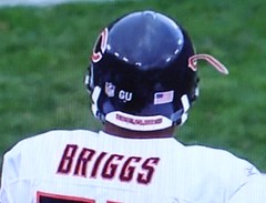
The weather is getting colder, which means we’re once again seeing lots of helmet decal problems. The poster boy for this phenomenon yesterday was Lance Briggs, whose “C” was flapping in the breeze during Sunday’s Bears/Packers game.
But that’s nothing compared to what happened on Saturday to Minnesota RB Shady Salamon, whose helmet decal was literally knocked clean off of his hat by a vicious head-to-head hit. The play in question has been preserved for posterity here — wait for the slo-mo replay to see a piece of Salamon’s brain Salamon’s decal landing several feet away from the point of impact. This ranks up there with this all-time great photo (here’s another view of the same play — the flying numeral is near the ball-carrier’s hands) in the knocked-his-block-off sweepstakes.
Please join me in thanking reader John Okray, who provided all of the Briggs and Salamon screen grabs and video captures. Great work, Johnny.
Vuke Revisited: No explanation yet regarding Pete Vuckovich’s mismatched cleats, but two readers had some interesting uni-related stories to tell about Vuke. First, from Jeff Ash:
I worked on the sports desk at the Wisconsin State Journal newspaper in Madison in the ’80s. One night, we ran a picture of Vuke from spring training. We picked the photo from a negative and didn’t see it full-size until the paper came up.
Unseen on the negative was that Vuke had drawn the finger on his glove. He was flipping our readers the bird in full color.
It is the only time in my 30 years in the business that we ever stopped the presses, but we stopped them immediately. One of our production guys grabbed the plates and etched out the finger as best we could. Those were the more primitive days before Photoshop. Wish I’d kept the papers as proof.
And then there’s this from Doug Keklak:
One of the things I always remember from Vuke’s days as the Pirates’ pitching coach was that no matter the weather, he always, ALWAYS wore that dugout jacket. And this was before all those breezers and windshirts and stuff were around — this was the heavy, quilted/lined Starter/Majestic jacket. One of the cool parts of this story was something his son once told me (we both worked at the Pirates clubhouse store in a Johnstown mall): The only time Pete went sans jacket was when they wore Homestead Grays Negro League throwbacks. He said that out of respect he didn’t wear the jacket and cover the jersey. Pretty cool.
Uni Watch News Ticker: Great 1937 Idaho Vandals team portrait here. Really interesting stripe patterns there (with thanks to Geoff Baker). ”¦ The Flyers will unveil their third jersey tomorrow. ”¦ Turns out I’m not the only one who thinks the words “Nike” and “toilet paper” belong together (courtesy of Brinke Guthrie). ”¦ Auburn’s Virgil Starks memorial decal, first worn on Saturday, looks like this. ”¦ While vintage-shopping over the weekend, I came across this beautiful nurse’s cape, which featured a really wonderful shoulder patch. ”¦ “I was at the Arkansas/Southeastern Louisiana basketball game last night and saw something I’d never seen before,” writes Charlie Shields. “SLU’s starting five wore uniform Nos. 1, 2, 3, 4, and 5.” ”¦ Oh goodie, the first down line is now a vehicle for corporate advertising, hoo-fucking-ray (with thanks to Michael Romero). ”¦ Some very cool old footage in this video tribute to Herb Score (with thanks to Mike Menner). ”¦ Douchebags. ”¦ Good article here about the Pens’ light-blue alternates (with thanks to Chris Hilf). ”¦ Arizona State wore late-’70s throwback helmets on Saturday. Here’s a close-up, courtesy of Randy Policar. ”¦ ” Please, please, find a photo of the Mississippi Valley State basketball warm-ups,” writes Brian Cobb. “They are short-sleeve hooded (yes, HOODED) sweatshirts with ‘VALLEY’ printed midway down the back. They’re the most ridiculous garments I’ve ever seen grace a basketball court.” If anyone has pics, let’s see ’em. ”¦ Super-wide nameplate lettering on 1980s Giants center Jim Clack (as captured by Jere Smith, who says he spotted something similar on the jersey of Green Bay’s Randy Scott in footage of a 1985 game but wan’t able to get a screen shot). ”¦ Two nice finds by Josh Handler, both from Game 3 of the 1997 ALCS: Jeff Juden wearing No. 7 on the mound and Brady Anderson wearing a helmet-borne shout-out to teammate Eric Davis, who was battling colon cancer at the time. ”¦ My friend Rob Walker (who runs the excellent Murketing site) had a good column about logo creep in yesterday’s New York Times Magazine. ”¦ How does a placekicker’s jersey become a hot-selling item? When a rock star wears it (with thanks to Chris Flinn). ”¦ Jonathan Sluss reports an interesting detail regarding the Virginia Tech women’s soccer team: “It appears they wear merit decals on their right sleeves. I am not aware of any other soccer teams that do this. The decal they use is what’s known as ‘Hokie Tracks’ — basically turkey footprints, which are used around campus and by some club teams, but this is the first instance I can think of them being used by a varsity team.” ”¦ Rather rote video treatment of personalized eye black messages here (with thanks to Trey Phillips). ”¦ We all know the Padres almost moved to DC in 1974, which is why Topps made cards like this one. What you might not know — and what I didn’t know until Morris Levin told me about it yesterday — is that new uniforms had been made for the team’s new locale: “In the first edition of Total Baseball (published in 1989 and edited by John Thorn and Pete Palmer), the Padres team history on page 88 reads: ‘Owner C. Arnholt Smith decided early in 1974 to sell the franchise to a buyer who planned to move the team to Washington, DC. New uniforms had been manufactured and the club’s files were packed for the move”¦” Anyone know more about these uniforms? ”¦ New Sens alts have been leaked. ”¦ One of major problems in American pop culture right now is that every good idea gets overdone to death until you no longer remember that it was a good idea to begin with. Case in point: This was clever, but this is asinine, and you just know he’s gonna keep doing it every fucking week now. Way to go, Jevon — you’ve gone from creative to lame-o in the space of seven days. … Nice eBay find by Jared Peterson. Note the chain-stitched NOB! … The Pirates wore NOBs in 1991, so Doug Keklak want to know why Jim Leyland going NNOB on the day they clinched the ’91 N.L. East title. And in case you’re wondering: The right-sleeve patch is a memorial H for former equipment manager John Hallahan, and the left-sleeve patch is a now-forgotten alternate logo based on the team’s 1987 centennial patch.
Just a word about that Pirates logo patch: That was the team’s primary logo from 1987 (their centennial) to 1996, when they changed it to the current logo. The centennial logo is still pretty popular among older fans, but I’m glad to see it gone.
In the second picture (of the Alabama helmet decal getting knocked off) it looks like the player’s jersey is #29 (definately not 49). Why does he have 49 on his helmet?
While I can kind of see how Oregon’s original set of unis could be used as a marketing ploy to recruit players, I can imagine that anyone would willingly go play for a team with cartoony wings on their shoulders…
I do like the matte look for the helmuts though.
Here’s the next over-hyped Japanese pitcher the Yanks and Red Sox are going to pay way too much for…
link
Why is there a white circle on the Minnesota guy’s helmet? Even if the decal was split and left a white underlay, the shape should be an M. Is it paint from the Wisconsin helmet?
[quote comment=”300391″]Just a word about that Pirates logo patch: That was the team’s primary logo from 1987 (their centennial) to 1996, when they changed it to the current logo. The centennial logo is still pretty popular among older fans, but I’m glad to see it gone.[/quote]
I had a Toledo Mudhens on-field cap during High School, that had that logo on the back of the cap, since they were a minor league affiliate of the Pirates.
Or maybe the Pirates were their minor league club.
[quote comment=”300395″]Why is there a white circle on the Minnesota guy’s helmet? Even if the decal was split and left a white underlay, the shape should be an M. Is it paint from the Wisconsin helmet?[/quote]
It is the primer underneath the maroon.
nice grabs johnny o!
[quote comment=”300397″][quote comment=”300395″]Why is there a white circle on the Minnesota guy’s helmet? Even if the decal was split and left a white underlay, the shape should be an M. Is it paint from the Wisconsin helmet?[/quote]
It is the primer underneath the maroon.[/quote]
BTW, I just realized that the helmet in question is the newfangled Xenith!
link
link
the heidi game took place 40 years ago today…not really uni-related, but just sayin’
[quote comment=”300392″]In the second picture (of the Alabama helmet decal getting knocked off) it looks like the player’s jersey is #29 (definately not 49). Why does he have 49 on his helmet?[/quote]
I often have thought about that…It could be the standing tacklers’ 6.
Crazy picture of Devin Hester on Peter King’s column. Due to sock shenanigans, his right leg looks like a bad photoshop: link
Nike’s SVP of Design should have his credentials checked for taste.
[quote comment=”300401″][quote comment=”300392″]In the second picture (of the Alabama helmet decal getting knocked off) it looks like the player’s jersey is #29 (definately not 49). Why does he have 49 on his helmet?[/quote]
I often have thought about that…It could be the standing tacklers’ 6.[/quote]
link
I guess not!
I heard on ESPN this morning that the Titans are saying they aren’t concerned with going 16-0, one game at a time, yadda, yadda, yadda. If that is the case then why is Javon Kearse keep coming up with these stupid reminders after the game of their record?
[quote comment=”300405″]I heard on ESPN this morning that the Titans are saying they aren’t concerned with going 16-0, one game at a time, yadda, yadda, yadda. If that is the case then why is Javon Kearse keep coming up with these stupid reminders after the game of their record?[/quote]
because if he walks around with a sign that says “Look At Me” it won’t get coverage
What a great day yesterday was and I missed it completely! I know Phil was calling all UW’ers but I’ll bet he was expecting link and I’m sorry that I did not participate in a timely manner. link (the uniform AND the kid) was the creation of my mom. Don’t really know the impetus for its creation except it was actually a LL uniform of my brothers stripped down and all the striping and lettering done exclusively by mom. She used link from the 1970 KC yearbook and hand cut the letters herself.
A side note from the second picture, you might notice the “cap from hell” (apologies to Richard Lewis). A day after the picture was taken, KC second baseman Cookie Rojas dropped link and appeared several years later.
I’m often asked why, having never lived in KC and been associated with several clubs in recent years, I still bleed blue. Well, them roots run deep.
Another thing about yesterday’s topic/comments. It seems you could almost assign a birth year to every contributor based on what they identified as their first jersey, less 5-7 years. I just thought that was kinda funny.
Oregon black unis look kinda hot. The wings are a step up from the diamond plate (at least it makes some sense). And about recruiting, 17-18 year olds don’t have taste, they like shinny things and for Oregon it is working.
Kentucky lost to VMI on Friday night. Serves them right for wearing dresses on the basketball court against a team of real men.
link
[quote comment=”300410″]Kentucky lost to VMI on Friday night. Serves them right for wearing dresses on the basketball court against a team of real men.
link
one thing about frocks for jocks that i still don’t understand…the BAGGY pants…you would think nike would try to get all their SOD teams to look like this, and while im not necessarily a fan of this look, the tight (compression?) top looks waaaaayyy better with the capri’s than the skirts
Arkansas played Southeastern Louisiana, not Northeastern.
[quote comment=”300411″][quote comment=”300410″]Kentucky lost to VMI on Friday night. Serves them right for wearing dresses on the basketball court against a team of real men.
link
one thing about frocks for jocks that i still don’t understand…the BAGGY pants…you would think nike would try to get all their SOD teams to look like link, and while im not necessarily a fan of this look, the tight (compression?) top looks waaaaayyy better with the capri’s than the skirts[/quote]
The only team that I’ve noticed without the ridiculously large shorts is UNC:
link
The fact Jim Leyland didn’t have a name on back is the pirates at that time had mesh white jerseys that may have been used for workouts. Leyland would wear this jersey all the time. I don’t think they were ever used for BP but I remember seeing him wear that many times over the years and wondering why. They had a Grey version as well. They might have been used in the minor leagues because if you look through old Baseball Cards you would sometimes see a “top Prospect” wearing one of those.
Funny how a number on a jersey just looks weird when not on the back of whom is it most recognizable. Jim Clack was obviously the next to last Giant to wear #56. To me, so does this: link
I know they are not owned by the parent club but it seems wrong not to acknowledge the organization’s retired numbers, especially since they, for all intent and purpose, mimic the big club’s jersey.
Interesting, when I hit the “Comments” button, the small icon to the left of where I type the website name into the browser for UniWatch becomes the Bank of America icon! Kind of ironic now that I think about it…
[quote comment=”300392″]In the second picture (of the Alabama helmet decal getting knocked off) it looks like the player’s jersey is #29 (definately not 49). Why does he have 49 on his helmet?[/quote]
He has 49 on his helmet because he’s number 49, that is a 4 even though from the angle of the pic it’s hard to tell.
I guess I’m not sure “douchebags” is the most appropriate term to use for Oregon Football. When I think of a douchebag, I think of some short little Italian guy who thinks he’s a mafioso (and really lives in a two room efficiency).
Are you calling the players douchebags? I’m sure some of them are, but which ones? Are Nike douchebags? Well, sure, we all know that’s a big 10-4. But you’re not showing a picture of the design team that did the Oregon uniform. Are you calling the uniforms themselves douchebags?
I love the term douchebag. Not sure why it’s being used here, though.
[quote comment=”300417″]Interesting, when I hit the “Comments” button, the small icon to the left of where I type the website name into the browser for UniWatch becomes the Bank of America icon! Kind of ironic now that I think about it…[/quote]
When the grey boxes have a BoA logo superimposed to each comment, then there’s your irony. Simply making unobtrusive space available for revenue purposes is hardly an issue. You didn’t see anything mentioned about the auto parts ad because it was place appropriately.
I think this has been brought up before, but what’s going on with the Niner’s helmet logo? They just can’t seem to get it on there right…
link
link
I don’t have a screen grab for it, but there was another Bears’ helmet snafu. Josh Beekman (I believe in the 2nd half) didn’t have a decal AT ALL on the right side of his helmet.
Paul – an excellent Pittsburgh-heavy theme today, as it should be. Two comments:(1) as a Pens fan since day one (and a proud holder of the first stick on stick night against the Minn North Stars), double blue and white was the color of Pens’ futility – I’ve always loved it but it’s interesting to see folks who can’t remember it snapping it up. (2) the Pirates’ alt logo lives on the scoreboard at PNC every home game. When the MLB bloopers are shown midgame, every Pirates’ cartoon Pirate in their history is seen laughing in turn at the end of the segment. Even the Village People Bucco from the 70s.
link
Come on Paul, it’s getting a little out of hand with the Nike bashing. You have a decent site, I enjoy reading it, but the daily shots at Nike are a little overboard. You rip on companys and teams for using cookie cutter templates, using the same colors, and putting out generic looks. But even when Nike breaks away from that and tries something different you still rip them. Personally I really like the helmets, and the jerseys are a little different, but overall the entire look works very well I think.
[quote comment=”300413″]
The only team that I’ve noticed without the ridiculously large shorts is UNC:
link
link
Both Brady Anderson and Roberto Alomar wore “24” stickers on their helmets in the ’97 All-Star Game in Cleveland, too, as tribute to Eric Davis.
[quote comment=”300426″][quote comment=”300413″]
The only team that I’ve noticed without the ridiculously large shorts is UNC:
link
link
Good call…I always seem to forget about Oakland, although their designs are crsip and clean!
[quote comment=”300424″]link
Come on Paul, it’s getting a little out of hand with the Nike bashing. You have a decent site, I enjoy reading it, but the daily shots at Nike are a little overboard. You rip on companys and teams for using cookie cutter templates, using the same colors, and putting out generic looks. But even when Nike breaks away from that and tries something different you still rip them. Personally I really like the helmets, and the jerseys are a little different, but overall the entire look works very well I think.[/quote]
Did this guy read my last ESPN column, in which I praised the clean, uncluttered look of Nike’s System of Dress?
When Nike (or anyone else) does good work, I’ll say so; when they (or anyone else) behave like douchebags — which, in the case of Nike, happens more often than not — I’ll say so. Simple as that.
[quote comment=”300423″]When the MLB bloopers are shown midgame, every Pirates’ cartoon Pirate in their history is seen laughing in turn at the end of the segment.[/quote]
Seriously?! That’s awesome. Someone please find a video clip of this.
Always good to hear from you, Terry.
[quote comment=”300428″][quote comment=”300426″][quote comment=”300413″]
The only team that I’ve noticed without the ridiculously large shorts is UNC:
link
link
Good call…I always seem to forget about Oakland, although their designs are crsip and clean![/quote]
crisp also!
“I was at the Arkansas/Northeastern Louisiana basketball game last night and saw something I’d never seen before,” writes Charlie Shields. “SLU’s starting five wore uniform Nos. 1, 2, 3, 4, and 5.”
I remember the Washington Wizards during the Chris Webber/Juwan Howard days not only could trot out a lineup wearing 1-5, the numbers roughly corresponded to the position they played.
Rod Strickland PG #1, God Shammgod “SG” #2, Lawrence Moten SF #3, Chris Webber PF #4, Juwan Howard C #5.
We all know the Padres almost moved to DC in 1974, which is why Topps made cards like this one.
There’s always the funny story that front office employees in San Diego were instructed to answer the phone “Washington Padres,” which of course, makes as little sense as the Utah Jazz or Los Angeles Lakers.
[quote comment=”300432″]“I was at the Arkansas/Northeastern Louisiana basketball game last night and saw something I’d never seen before,” writes Charlie Shields. “SLU’s starting five wore uniform Nos. 1, 2, 3, 4, and 5.”
I remember the Washington Wizards during the Chris Webber/Juwan Howard days not only could trot out a lineup wearing 1-5, the numbers roughly corresponded to the position they played.
Rod Strickland PG #1, God Shammgod “SG” #2, Lawrence Moten SF #3, Chris Webber PF #4, Juwan Howard C #5.[/quote]
Dude, a God Shammgod reference. Outstanding! It’s gonna be a good day. Anyone got an Archi Cianfrocco anecdote?
[quote comment=”300432″]“I was at the Arkansas/Northeastern Louisiana basketball game last night and saw something I’d never seen before,” writes Charlie Shields. “SLU’s starting five wore uniform Nos. 1, 2, 3, 4, and 5.”
I remember the Washington Wizards during the Chris Webber/Juwan Howard days not only could trot out a lineup wearing 1-5, the numbers roughly corresponded to the position they played.
Rod Strickland PG #1, God Shammgod “SG” #2, Lawrence Moten SF #3, Chris Webber PF #4, Juwan Howard C #5.[/quote]
God Shammgod “SG” #2
Man,I forgot all about Shamgod Wells:
link
link
link
[quote comment=”300429″][quote comment=”300424″]link
Come on Paul, it’s getting a little out of hand with the Nike bashing. You have a decent site, I enjoy reading it, but the daily shots at Nike are a little overboard. You rip on companys and teams for using cookie cutter templates, using the same colors, and putting out generic looks. But even when Nike breaks away from that and tries something different you still rip them. Personally I really like the helmets, and the jerseys are a little different, but overall the entire look works very well I think.[/quote]
Did this guy read my last ESPN column, in which I praised the clean, uncluttered look of Nike’s System of Dress?
When Nike (or anyone else) does good work, I’ll say so; when they (or anyone else) behave like douchebags — which, in the case of Nike, happens more often than not — I’ll say so. Simple as that.[/quote]
Isn’t that also the point of the comments section? If you do good work I’m allowed to voice my opinion on the subject and let you know, and when your work is subpar or biased I am also allowed to opine. As much as I hate to admit it, I have not missed one of your columns over the last two years, and I don’t think that I have missed reading a post on the site since its inception. I typically agree with your views, and enjoy your work, but the one thing I completely disagree with is your bias towards Nike. I’m sorry if voicing my opinion against those views has rubbed you the wrong way, but I thought that was what the open forum was for.
[quote comment=”300428″][quote comment=”300426″][quote comment=”300413″]
The only team that I’ve noticed without the ridiculously large shorts is UNC:
link
link
Good call…I always seem to forget about Oakland, although their designs are crsip and clean![/quote]
Those are non-SOD shorts they are wearing with SOD tops. They belong to this Nike template set.
link
link
Love the Vandals uniforms. You’d almost think they were Black Flag fans:
link
[quote comment=”300437″][quote comment=”300429″][quote comment=”300424″]link
Come on Paul, it’s getting a little out of hand with the Nike bashing. You have a decent site, I enjoy reading it, but the daily shots at Nike are a little overboard. You rip on companys and teams for using cookie cutter templates, using the same colors, and putting out generic looks. But even when Nike breaks away from that and tries something different you still rip them. Personally I really like the helmets, and the jerseys are a little different, but overall the entire look works very well I think.[/quote]
Did this guy read my last ESPN column, in which I praised the clean, uncluttered look of Nike’s System of Dress?
When Nike (or anyone else) does good work, I’ll say so; when they (or anyone else) behave like douchebags — which, in the case of Nike, happens more often than not — I’ll say so. Simple as that.[/quote]
Isn’t that also the point of the comments section? If you do good work I’m allowed to voice my opinion on the subject and let you know, and when your work is subpar or biased I am also allowed to opine. As much as I hate to admit it, I have not missed one of your columns over the last two years, and I don’t think that I have missed reading a post on the site since its inception. I typically agree with your views, and enjoy your work, but the one thing I completely disagree with is your bias towards Nike. I’m sorry if voicing my opinion against those views has rubbed you the wrong way, but I thought that was what the open forum was for.[/quote]
Yes, you’re welcome to voice your opinion (although calling the owner of a site you visit every day a douchebag isn’t necessarily the brightest thing). But complaining that I’m anti-Nike is like complaining about the rain — it’s gonna happen, get used to it. Today’s “bashing,” as you put it (a laughable concept, as if a single writer were capable of “bashing” a huge multinational — that’s like 1960s civil rights protesters “bashing” Jim Crow) consisted of exactly one word; perhaps you’d prefer if I had gone into a lengthy description of all the ways in which that Oregon uniform sucks?
Look, Nike has a corporate philosophy that I find repellent and that I believe threatens everything I hold dear from a uni-related standpoint. And I’m not gonna stop saying so.
Don’t know if this has been mentioned yet, but Brian Dawkins was wearing the “GU” black armband this past weekend against Cincinnati.
I wasn’t aware that anyone other than Matt Stover was wearing one.
After the talk about the NBA Logo on the comments Saturday, I thought this was appropriate.
link
And now from the Department of Athletic Aesthetics…
Never thought I’d say this, but I think the new U of Oregon football jerseys are better than the old ones. The diamond plates, though unique, were STUPID, whereas these feather jerseys almost evoke a cute kind of chuckle-inducing stupidity.
I’m not saying what they wore last game is good. They need TV numbers (so they look like game jerseys, not practice shirts), they need lightning yellow numbers (aside from being more visible more consistently, it’s actually a team color, go figure!), and they need to be NOT black (or black-not, pick your Borat-ism).
So there we go. My opinion’s on record. Phil Knight’s football team still doesn’t look good, but it’s a marginally successful makeover (wow, really low standards up in Eugene), and I feel as if I’d like to see the rest of the color combos (as opposed to the “Oh f*ck, which way will they jump the shark now” sentiment I had with the diamond plates).
[quote comment=”300435″][quote comment=”300432″]“I was at the Arkansas/Northeastern Louisiana basketball game last night and saw something I’d never seen before,” writes Charlie Shields. “SLU’s starting five wore uniform Nos. 1, 2, 3, 4, and 5.”
I remember the Washington Wizards during the Chris Webber/Juwan Howard days not only could trot out a lineup wearing 1-5, the numbers roughly corresponded to the position they played.
Rod Strickland PG #1, God Shammgod “SG” #2, Lawrence Moten SF #3, Chris Webber PF #4, Juwan Howard C #5.[/quote]
Dude, a God Shammgod reference. Outstanding! It’s gonna be a good day. Anyone got an Archi Cianfrocco anecdote?[/quote]
Never realised that he played in Japan, wonder how they said his name……
link
link
[quote comment=”300441″]Don’t know if this has been mentioned yet, but Brian Dawkins was wearing the “GU” black armband this past weekend against Cincinnati.
I wasn’t aware that anyone other than Matt Stover was wearing one.[/quote]
Good spot. But unlike Stover, who wears the black patch sewn over his jersey sleeve, it looks like Dawkins was wearing a black biceps band:
link
Anyone know if Dawkins is Philly’s player rep?
[quote comment=”300444″][quote comment=”300435″][quote comment=”300432″]“I was at the Arkansas/Northeastern Louisiana basketball game last night and saw something I’d never seen before,” writes Charlie Shields. “SLU’s starting five wore uniform Nos. 1, 2, 3, 4, and 5.”
I remember the Washington Wizards during the Chris Webber/Juwan Howard days not only could trot out a lineup wearing 1-5, the numbers roughly corresponded to the position they played.
Rod Strickland PG #1, God Shammgod “SG” #2, Lawrence Moten SF #3, Chris Webber PF #4, Juwan Howard C #5.[/quote]
Dude, a God Shammgod reference. Outstanding! It’s gonna be a good day. Anyone got an Archi Cianfrocco anecdote?[/quote]
Never realised that he played in Japan, wonder how they said his name……
link
link
Probably better than Harry Caray did.
[quote comment=”300445″][quote comment=”300441″]Don’t know if this has been mentioned yet, but Brian Dawkins was wearing the “GU” black armband this past weekend against Cincinnati.
I wasn’t aware that anyone other than Matt Stover was wearing one.[/quote]
Good spot. But unlike Stover, who wears the black patch sewn over his jersey sleeve, it looks like Dawkins was wearing a black biceps band:
link
Anyone know if Dawkins is Philly’s player rep?[/quote]
Has been for a while.
Kent State is hosting NC Central tonight.
Central will haver to wear their home whites because their new road unis were accidentally shipped to Europe!
link
[quote comment=”300438″][quote comment=”300428″][quote comment=”300426″][quote comment=”300413″]
The only team that I’ve noticed without the ridiculously large shorts is UNC:
link
link
Good call…I always seem to forget about Oakland, although their designs are crsip and clean![/quote]
Those are non-SOD shorts they are wearing with SOD tops. They belong to this Nike template set.
link
link
There was a higher profile team than Wright State who originally broke out that template:
Colorado:
link
link
The Colorado shorts are SOD!
I actually like the new Oregon uniforms. I’m not sure what it is. I’m usually not a big fan of all black (even though I know the helmets are some weird green/black thing) or Oregon in general (I kind of like the all white’s too… if they had a green helmet and green socks) but these did it for me.
I like the way that the wings were treated. They could have went way overboard with them sweeping them all the way across the back or something ridiculous like that. They could have made them yellow to make them stand out more. I don’t know what it is and I think it just proves Paul’s theory on uniforms becoming more and more like superhero outfits but it definitely worked for me.
[quote comment=”300420″][quote comment=”300417″]Interesting, when I hit the “Comments” button, the small icon to the left of where I type the website name into the browser for UniWatch becomes the Bank of America icon! Kind of ironic now that I think about it…[/quote]
When the grey boxes have a BoA logo superimposed to each comment, then there’s your irony. Simply making unobtrusive space available for revenue purposes is hardly an issue. You didn’t see anything mentioned about the auto parts ad because it was place appropriately.[/quote]
“Simply making unobtrusive space available for revenue purposes?”
um, isn’t that considered “logo creep”? Maybe you’ve heard it mentioned here once or twice before.
I think all the Orioles wore Davis’ number on their helmets that year.
I saw some of the Redskins players with long sleeve Tshirts (not the form fitting kind) under their jerseys last night with those half inch “sweat bands” over their arms. Ridiculous!
[quote comment=”300413″][quote comment=”300411″][quote comment=”300410″]Kentucky lost to VMI on Friday night. Serves them right for wearing dresses on the basketball court against a team of real men.
link
one thing about frocks for jocks that i still don’t understand…the BAGGY pants…you would think nike would try to get all their SOD teams to look like link, and while im not necessarily a fan of this look, the tight (compression?) top looks waaaaayyy better with the capri’s than the skirts[/quote]
The only team that I’ve noticed without the ridiculously large shorts is UNC:
link
Nah, UNC has the shorts just as ridiculously long as everyone else.
Thing is, they just look better on taller players. Unless specially ordered, the lengths of every short is the same. Look carefully at some pictures, the shorter players will look like they’re swimming in pants, and the tall players will look normal. Its stupidity at its highest form.
[quote comment=”300445″][quote comment=”300441″]Don’t know if this has been mentioned yet, but Brian Dawkins was wearing the “GU” black armband this past weekend against Cincinnati.
I wasn’t aware that anyone other than Matt Stover was wearing one.[/quote]
Good spot. But unlike Stover, who wears the black patch sewn over his jersey sleeve, it looks like Dawkins was wearing a black biceps band:
link
Anyone know if Dawkins is Philly’s player rep?[/quote]
From this article:
link
“Against Upshaw’s wishes, the committee appointed a four-man subcommittee that included Eagles safety Brian Dawkins to begin the process of identifying candidates to replace Upshaw when he retired.”
[quote comment=”300455″][quote comment=”300445″][quote comment=”300441″]Don’t know if this has been mentioned yet, but Brian Dawkins was wearing the “GU” black armband this past weekend against Cincinnati.
I wasn’t aware that anyone other than Matt Stover was wearing one.[/quote]
Good spot. But unlike Stover, who wears the black patch sewn over his jersey sleeve, it looks like Dawkins was wearing a black biceps band:
link
Anyone know if Dawkins is Philly’s player rep?[/quote]
From this article:
link
“Against Upshaw’s wishes, the committee appointed a four-man subcommittee that included Eagles safety Brian Dawkins to begin the process of identifying candidates to replace Upshaw when he retired.”[/quote]
BTW, the pic of Dawkins looks to hae him wearing a Nike Pro or Reebok NFL Equipment fitted tee with the patch sewn on.
[quote comment=”300443″]And now from the Department of Athletic Aesthetics…
Never thought I’d say this, but I think the new U of Oregon football jerseys are better than the old ones. The diamond plates, though unique, were STUPID, whereas these feather jerseys almost evoke a cute kind of chuckle-inducing stupidity.
I’m not saying what they wore last game is good. They need TV numbers (so they look like game jerseys, not practice shirts), they need lightning yellow numbers (aside from being more visible more consistently, it’s actually a team color, go figure!), and they need to be NOT black (or black-not, pick your Borat-ism).
So there we go. My opinion’s on record. Phil Knight’s football team still doesn’t look good, but it’s a marginally successful makeover (wow, really low standards up in Eugene), and I feel as if I’d like to see the rest of the color combos (as opposed to the “Oh f*ck, which way will they jump the shark now” sentiment I had with the diamond plates).[/quote]
What school would break out the color of its most hated rival? Black is not Oregon’s color, but it is Oregon State’s. This would be like UNC wearing Duke royal blue or N.C. State red, or UCLA wearing cardinal instead of blue. It’s absurd. Oregon just needs to be laughed away. They have great cheerleaders and that’s it.
Great uni-pics from the Cowboys-Skins game:
Sellers Ion:
link
link
Portis, sockless:
link
Air Jordan VI Cleats:
link
Barber wearing logoless Cutter brand gloves,
23 is gonna get a fine!
link
More Redskin Sock shenanigans:
link
Air Jordan III cleats:
link
Cowboys: Bad Luck jerseys match pants and helmet stripes much better than whites:
link
In the above pic, Barber is wearing Navy accented Nike Super Bad 2, the blocker in front is wearing black accented…?
Check out the Chromed sole on Newmans’ Super Speed D’s:
link
[quote comment=”300429″][quote comment=”300424″]link
Come on Paul, it’s getting a little out of hand with the Nike bashing. You have a decent site, I enjoy reading it, but the daily shots at Nike are a little overboard. You rip on companys and teams for using cookie cutter templates, using the same colors, and putting out generic looks. But even when Nike breaks away from that and tries something different you still rip them. Personally I really like the helmets, and the jerseys are a little different, but overall the entire look works very well I think.[/quote]
Did this guy read my last ESPN column, in which I praised the clean, uncluttered look of Nike’s System of Dress?
When Nike (or anyone else) does good work, I’ll say so; when they (or anyone else) behave like douchebags — which, in the case of Nike, happens more often than not — I’ll say so. Simple as that.[/quote]
Paul, one thing that I noticed last week when I read your ESPN article was that while you were kind to the SOD, you didn’t actually say anytihng nice about Nike or that their designers were doing something you liked. I think the nicest thing you said was they had “clean, no-nonsense designs.” People would be less harsh about the douchbag comments if, when Nike does well, you actually said so. I believe it is known as positive reinforcement.
the first down line sponsorship by overstock.com has occurred on fox sports broadcasts of college football for years. the usc-fresno state game where reggie bush had 500+ all-purpose yards included so many first downs that the announcers started getting a bit loopy. petros papadakis, after having to mention it a million times, said, “you know the great thing about the letter ‘o’? when you say it, your mouth makes an ‘o’.”
[quote comment=”300436″][quote comment=”300432″]“I was at the Arkansas/Northeastern Louisiana basketball game last night and saw something I’d never seen before,” writes Charlie Shields. “SLU’s starting five wore uniform Nos. 1, 2, 3, 4, and 5.”
I remember the Washington Wizards during the Chris Webber/Juwan Howard days not only could trot out a lineup wearing 1-5, the numbers roughly corresponded to the position they played.
Rod Strickland PG #1, God Shammgod “SG” #2, Lawrence Moten SF #3, Chris Webber PF #4, Juwan Howard C #5.[/quote]
God Shammgod “SG” #2
Man,I forgot all about Shamgod Wells:
link
link
link
i remember webber wearing #2 when he first went to washington (i had a jersey). how long did he wear it before switching to 4?
[quote comment=”300460″][quote comment=”300429″][quote comment=”300424″]link
Come on Paul, it’s getting a little out of hand with the Nike bashing. You have a decent site, I enjoy reading it, but the daily shots at Nike are a little overboard. You rip on companys and teams for using cookie cutter templates, using the same colors, and putting out generic looks. But even when Nike breaks away from that and tries something different you still rip them. Personally I really like the helmets, and the jerseys are a little different, but overall the entire look works very well I think.[/quote]
Did this guy read my last ESPN column, in which I praised the clean, uncluttered look of Nike’s System of Dress?
When Nike (or anyone else) does good work, I’ll say so; when they (or anyone else) behave like douchebags — which, in the case of Nike, happens more often than not — I’ll say so. Simple as that.[/quote]
Paul, one thing that I noticed last week when I read your ESPN article was that while you were kind to the SOD, you didn’t actually say anytihng nice about Nike or that their designers were doing something you liked. I think the nicest thing you said was they had “clean, no-nonsense designs.” People would be less harsh about the douchbag comments if, when Nike does well, you actually said so. I believe it is known as positive reinforcement.[/quote]
OK, now you’re just being ridiculous. I repeatedly — REPEATEDLY — said I liked Nike’s SoD uniform concept. None of that changes the fact that I think they’re an evil company whose policies and approach to team branding are diametrically opposed to my feelings about uniforms. Again: When they come up with a good design, I’ll say so; when they act like douchebags, I’ll say so. I’m not interested in “positively reinforcing” people regarding my feelings about Nike (or about anything else) — I’m simply interested in saying what I think. As always, you’re free to disagree.
Of course, the Jim Clack screen grab comes from the CBS broadcast of a certain Eagles @ Giants game 30 years ago in the Meadowlands.
Herm Edwards, where have you gone?
link
We now know that there no more “15 Years Of Lousy Football” banners above Giants Stadium.
Optical illusion alert:
If you go to the following link, click on the “latest cheerleader photos” goto photo 21 of 381, stare at it for a few minutes, you might be able to see the old NFL logo appear in the background.
link
[quote comment=”300465″]Optical illusion alert:
If you go to the following link, click on the “latest cheerleader photos” goto photo 21 of 381, stare at it for a few minutes, you might be able to see the old NFL logo appear in the background.
link
I think you meant the new NFL logo, but it did take a few minutes of staring.
may bad. thats the new one. Slap me with a splintered ruler.
[quote comment=”300461″]the first down line sponsorship by overstock.com has occurred on fox sports broadcasts of college football for years. the usc-fresno state game where reggie bush had 500+ all-purpose yards included so many first downs that the announcers started getting a bit loopy. petros papadakis, after having to mention it a million times, said, “you know the great thing about the letter ‘o’? when you say it, your mouth makes an ‘o’.”[/quote]
Meh… as a radio PBP guy, I can attest that broadcast sales-folk will sell ANYTHING they can…
For the past several years, broadcasting HIGH SCHOOL football, I’ve had to announce “That’s a First National Bank first down!” every time the home team gets a 1st and 10. (Since the broadcasts are only heard in one town, there’s no need to say which First National Bank; there’s only one!)
The silliest “in-game” sponsorship I’ve ever done was one for another bank in another town in another sport… they sponsored three-pointers, but the ad copy contained the words, “It’s a slam dunk!” I kept wanting to say, “No, it isn’t a slam-dunk, you idiot, it’s a three-pointer!!!”
Anybody seen link lately?
Are the Mets getting new uniforms, ditching the black, new blue alternates or not?
I have emailed Paul several times and he hasn’t even responded.
Dammit
[quote comment=”300465″]Optical illusion alert:
If you go to the following link, click on the “latest cheerleader photos” goto photo 21 of 381, stare at it for a few minutes, you might be able to see the old NFL logo appear in the background.
link
What were YOU searching for? Athletic Aesthetics, my ass!
[quote comment=”300469″]Are the Mets getting new uniforms, ditching the black, new blue alternates or not?
I have emailed Paul several times and he hasn’t even responded.
Dammit[/quote]
If they do, believe me, this will be the place to find out!
[quote comment=”300470″][quote comment=”300465″]Optical illusion alert:
If you go to the following link, click on the “latest cheerleader photos” goto photo 21 of 381, stare at it for a few minutes, you might be able to see the old NFL logo appear in the background.
link
What were YOU searching for? Athletic Aesthetics, my ass![/quote]
Actually I wanted to see what the incredibly “rare” NFL game result was. ho hum, its a tie.
I did hear that the steelers 11-10 win over whoever was the first time in an NFL game the score ever ended 11-10. Now thats alot more rare than a tie.
And I figured while I was at it, I’d take a gander at the newest 381 cheerleader photos.
[quote comment=”300463″][quote comment=”300460″][quote comment=”300429″][quote comment=”300424″]link
Come on Paul, it’s getting a little out of hand with the Nike bashing. You have a decent site, I enjoy reading it, but the daily shots at Nike are a little overboard. You rip on companys and teams for using cookie cutter templates, using the same colors, and putting out generic looks. But even when Nike breaks away from that and tries something different you still rip them. Personally I really like the helmets, and the jerseys are a little different, but overall the entire look works very well I think.[/quote]
Did this guy read my last ESPN column, in which I praised the clean, uncluttered look of Nike’s System of Dress?
When Nike (or anyone else) does good work, I’ll say so; when they (or anyone else) behave like douchebags — which, in the case of Nike, happens more often than not — I’ll say so. Simple as that.[/quote]
Paul, one thing that I noticed last week when I read your ESPN article was that while you were kind to the SOD, you didn’t actually say anytihng nice about Nike or that their designers were doing something you liked. I think the nicest thing you said was they had “clean, no-nonsense designs.” People would be less harsh about the douchbag comments if, when Nike does well, you actually said so. I believe it is known as positive reinforcement.[/quote]
OK, now you’re just being ridiculous. I repeatedly — REPEATEDLY — said I liked Nike’s SoD uniform concept. None of that changes the fact that I think they’re an evil company whose policies and approach to team branding are diametrically opposed to my feelings about uniforms. Again: When they come up with a good design, I’ll say so; when they act like douchebags, I’ll say so. I’m not interested in “positively reinforcing” people regarding my feelings about Nike (or about anything else) — I’m simply interested in saying what I think. As always, you’re free to disagree.[/quote]
Paul, I believe Nike is looking for an apology. Gosh darnit, we don’t know what they’re going to do next, but if you don’t give them some positive reinforcement when they DON’T screw something up, then they’re capable of lashing out and doing something awful. link
I just saw an article on CNN.com, that stated that Citigroup is laying off over 50,000 workers. It’s an effort to keep things alive for that company.
I immediately thought of CitiField….
If things go in the crapper for Citigroup, I wonder what would happen for the Mets’ new stadium. Enron part deux?
CitiField renamed… RecessionPark?
Does anyone else suspect that the “nice eBay find by Jared Peterson” may, in fact, be a hockey sweater, not a football jersey??
[quote comment=”300474″]I just saw an article on CNN.com, that stated that Citigroup is laying off over 50,000 workers. It’s an effort to keep things alive for that company.
I immediately thought of CitiField….
If things go in the crapper for Citigroup, I wonder what would happen for the Mets’ new stadium. Enron part deux?
CitiField renamed… RecessionPark?[/quote]
Here’s a better question: How many of those jobs might have been saved if Citibank hadn’t committed so much $$$ to having its name plastered on a stadium?
So, Michiganders are petitioning the Lions to move to LA. Check the swag they’re selling:
link
[quote comment=”300472″][quote comment=”300470″][quote comment=”300465″]Optical illusion alert:
If you go to the following link, click on the “latest cheerleader photos” goto photo 21 of 381, stare at it for a few minutes, you might be able to see the old NFL logo appear in the background.
link
What were YOU searching for? Athletic Aesthetics, my ass![/quote]
Actually I wanted to see what the incredibly “rare” NFL game result was. ho hum, its a tie.
I did hear that the steelers 11-10 win over whoever was the first time in an NFL game the score ever ended 11-10. Now thats alot more rare than a tie.
And I figured while I was at it, I’d take a gander at the newest 381 cheerleader photos.[/quote]
That blown call on Polamalu’s TD at the end of the 11-10 Pittsburg game cost bettors MILLIONS in Vegas.
I guess we could say some of the bettors got “Donaghy’d”.
[quote comment=”300476″][quote comment=”300474″]I just saw an article on CNN.com, that stated that Citigroup is laying off over 50,000 workers. It’s an effort to keep things alive for that company.
I immediately thought of CitiField….
If things go in the crapper for Citigroup, I wonder what would happen for the Mets’ new stadium. Enron part deux?
CitiField renamed… RecessionPark?[/quote]
Here’s a better question: How many of those jobs might have been saved if Citibank hadn’t committed so much $$$ to having its name plastered on a stadium?[/quote]
You’re right Paul…I was thinking the same thing. I’d rather have 53,000 workers with jobs, making 50k a year, than 26 ballplayers making 140million with the aid of a mega-sponsorship.
Some here might label me a commie… but….
[quote comment=”300463″][quote comment=”300460″][quote comment=”300429″][quote comment=”300424″]link
Come on Paul, it’s getting a little out of hand with the Nike bashing. You have a decent site, I enjoy reading it, but the daily shots at Nike are a little overboard. You rip on companys and teams for using cookie cutter templates, using the same colors, and putting out generic looks. But even when Nike breaks away from that and tries something different you still rip them. Personally I really like the helmets, and the jerseys are a little different, but overall the entire look works very well I think.[/quote]
Did this guy read my last ESPN column, in which I praised the clean, uncluttered look of Nike’s System of Dress?
When Nike (or anyone else) does good work, I’ll say so; when they (or anyone else) behave like douchebags — which, in the case of Nike, happens more often than not — I’ll say so. Simple as that.[/quote]
Paul, one thing that I noticed last week when I read your ESPN article was that while you were kind to the SOD, you didn’t actually say anytihng nice about Nike or that their designers were doing something you liked. I think the nicest thing you said was they had “clean, no-nonsense designs.” People would be less harsh about the douchbag comments if, when Nike does well, you actually said so. I believe it is known as positive reinforcement.[/quote]
OK, now you’re just being ridiculous. I repeatedly — REPEATEDLY — said I liked Nike’s SoD uniform concept. None of that changes the fact that I think they’re an evil company whose policies and approach to team branding are diametrically opposed to my feelings about uniforms. Again: When they come up with a good design, I’ll say so; when they act like douchebags, I’ll say so. I’m not interested in “positively reinforcing” people regarding my feelings about Nike (or about anything else) — I’m simply interested in saying what I think. As always, you’re free to disagree.[/quote]
If your view is logical or rational, then I’m OK being “ridiculous.” With all due respect, because I enjoy your site, but I just view Nike differently than you. That’s OK, this is a free site and you do a great job making your views known. The only thing I’ve never seen you discuss in any real detail is an alternantive view of today’s world. The two things I always think is 1) who today brands in a way you approve and 2) given the economic conditions that have driven school and pro teams to accept so much branding, what are REALISTIC ways you think the genie might go back into the bottle? I stress realistic, because I think Notre Dame, Ohio State, and Maryland (among others) have gotten pretty used to the large checks adidas, Nike, and UA give them for royalties every year.
Love the site, Paul, and think you are a talented writer, for what it’s worth. I just think you wish for a time that won’t ever exist again.
[quote comment=”300478″]That blown call on Polamalu’s TD at the end of the 11-10 Pittsburg game cost bettors MILLIONS in Vegas.
I guess we could say some of the bettors got “Donaghy’d”.[/quote]
don’t steal my shit, johnny ;)
Those Oregon unis, which I think don’t look as bad as some of their others, look to me like something out of a cheesy science fiction movie that takes place in the “future” and they show a football game where they have some stupid team like the Paris Hunchbacks and there’s, like, 100 guys on each team and the field is a mile long.
Jack, you stole my comment, I was going to break the link to the LA Lions site.
On the uni related side of things, the logo on that shirt sure beats the hell out of the one the Lions have now
thoughts Paul?
[quote comment=”300481″][quote comment=”300478″]That blown call on Polamalu’s TD at the end of the 11-10 Pittsburg game cost bettors MILLIONS in Vegas.
I guess we could say some of the bettors got “Donaghy’d”.[/quote]
link[/quote]
Shit man, guess I missed one. Good minds think alike? Or is it skeptical minds think alike?
Not uni-related but Mark Cuban is being charged with insider trading…. link
[quote comment=”300483″]Jack, you stole my comment, I was going to break the link to the LA Lions site.
On the uni related side of things, the logo on that shirt sure beats the hell out of the one the Lions have now
thoughts Paul?[/quote]
I think it’s obviously cribbed from the Lowenbrau logo:
link
[quote comment=”300476″][quote comment=”300474″]I just saw an article on CNN.com, that stated that Citigroup is laying off over 50,000 workers. It’s an effort to keep things alive for that company.
I immediately thought of CitiField….
If things go in the crapper for Citigroup, I wonder what would happen for the Mets’ new stadium. Enron part deux?
CitiField renamed… RecessionPark?[/quote]
Here’s a better question: How many of those jobs might have been saved if Citibank hadn’t committed so much $$$ to having its name plastered on a stadium?[/quote]
Yeah, NIKE hasn’t done that YET and they successfully employ Thousands of children!!!
[quote comment=”300477″]So, Michiganders are petitioning the Lions to move to LA. Check the swag they’re selling:
link
That is beyond dumb. I live in the Detroit area and do not know of one Lions fan who wants the team moved. We want new ownership, not a new team.
I was more hoping of a love/hate comparison between the current lions debaccle and the one on the site.
personally, when they move to LA, they should just go back to their throwbacks.
[quote comment=”300480″][quote comment=”300463″][quote comment=”300460″][quote comment=”300429″][quote comment=”300424″]link
Come on Paul, it’s getting a little out of hand with the Nike bashing. You have a decent site, I enjoy reading it, but the daily shots at Nike are a little overboard. You rip on companys and teams for using cookie cutter templates, using the same colors, and putting out generic looks. But even when Nike breaks away from that and tries something different you still rip them. Personally I really like the helmets, and the jerseys are a little different, but overall the entire look works very well I think.[/quote]
Did this guy read my last ESPN column, in which I praised the clean, uncluttered look of Nike’s System of Dress?
When Nike (or anyone else) does good work, I’ll say so; when they (or anyone else) behave like douchebags — which, in the case of Nike, happens more often than not — I’ll say so. Simple as that.[/quote]
Paul, one thing that I noticed last week when I read your ESPN article was that while you were kind to the SOD, you didn’t actually say anytihng nice about Nike or that their designers were doing something you liked. I think the nicest thing you said was they had “clean, no-nonsense designs.” People would be less harsh about the douchbag comments if, when Nike does well, you actually said so. I believe it is known as positive reinforcement.[/quote]
OK, now you’re just being ridiculous. I repeatedly — REPEATEDLY — said I liked Nike’s SoD uniform concept. None of that changes the fact that I think they’re an evil company whose policies and approach to team branding are diametrically opposed to my feelings about uniforms. Again: When they come up with a good design, I’ll say so; when they act like douchebags, I’ll say so. I’m not interested in “positively reinforcing” people regarding my feelings about Nike (or about anything else) — I’m simply interested in saying what I think. As always, you’re free to disagree.[/quote]
If your view is logical or rational, then I’m OK being “ridiculous.” With all due respect, because I enjoy your site, but I just view Nike differently than you. That’s OK, this is a free site and you do a great job making your views known. The only thing I’ve never seen you discuss in any real detail is an alternantive view of today’s world. The two things I always think is 1) who today brands in a way you approve and 2) given the economic conditions that have driven school and pro teams to accept so much branding, what are REALISTIC ways you think the genie might go back into the bottle? I stress realistic, because I think Notre Dame, Ohio State, and Maryland (among others) have gotten pretty used to the large checks adidas, Nike, and UA give them for royalties every year.
Love the site, Paul, and think you are a talented writer, for what it’s worth. I just think you wish for a time that won’t ever exist again.[/quote]
So in other words, as the saying goes, if rape is inevitable, relax and enjoy it? Sorry, I’d rather call “Bullshit!” when I see bullshit. Is it an uphill climb in today’s climate? Yes — most worthwhile things are. And that’s why I’ll continue to use tools like mockery and outrage, which perfectly reasonable approaches to use against a huge, monolithic, humorless, evil enemy.
NIKE presents:
THE PAUL LUKAS Retro’s
link
Paul,
Shouldn’t it read, “I was at the Arkansas/Southeastern Louisiana basketball game last night…”?
[quote comment=”300430″][quote comment=”300423″]When the MLB bloopers are shown midgame, every Pirates’ cartoon Pirate in their history is seen laughing in turn at the end of the segment.[/quote]
Seriously?! That’s awesome. Someone please find a video clip of this.
Always good to hear from you, Terry.[/quote]
Actually, the video with all of the logos is at the very beginning of the game–just after the historical montage. I think the MLB bloopers ends with just the ’87-’96 Pirate. After he’s done chuckling, he moves his mustache back and forth as he regains his composure. Adorable. (I’m a girl. I think its adorable.) I think we have different clips of the last four logos laughing or growling or whatever.
[quote comment=”300491″]NIKE presents:
THE PAUL LUKAS Retro’s
link
Did you try to link to these:
link
link
link
link
link
link
link
[quote comment=”300492″]Paul,
Shouldn’t it read, “I was at the Arkansas/Southeastern Louisiana basketball game last night…”?[/quote]
Yes, thanks. Now fixed.
Aside from the obvious new floor design at Arkansas, it also appears that a minor uniform change has occured.
The spacing and arching of the NOB appears to be altered from last season to this season. It could be my eyes, but it appears the new design has them arched a bit more.
Last season:
link
This season:
link
Last season’s design doesn’t appear to arch much at all, with the letters in the NOB close together. This year the name appears more spaced with a more dramatic arch.
[quote comment=”300429″][quote comment=”300424″]link
Come on Paul, it’s getting a little out of hand with the Nike bashing. You have a decent site, I enjoy reading it, but the daily shots at Nike are a little overboard. You rip on companys and teams for using cookie cutter templates, using the same colors, and putting out generic looks. But even when Nike breaks away from that and tries something different you still rip them. Personally I really like the helmets, and the jerseys are a little different, but overall the entire look works very well I think.[/quote]
Did this guy read my last ESPN column, in which I praised the clean, uncluttered look of Nike’s System of Dress?
When Nike (or anyone else) does good work, I’ll say so; when they (or anyone else) behave like douchebags — which, in the case of Nike, happens more often than not — I’ll say so. Simple as that.[/quote]
What saddens me the most is the System of Dress uniforms are BY FAR the worst thing Nike has come up with perhaps ever. Those pathetic pieces of garbage are ruining my viewing pleasure of college basketball.
How is it that of all the bullshit Nike produces that you are able to get behind those?
Also, the flapping wings on Oregon’s shoulders are a pretty cool idea even if the total package looks horrible.
[quote]What saddens me the most is the System of Dress uniforms are BY FAR the worst thing Nike has come up with perhaps ever. Those pathetic pieces of garbage are ruining my viewing pleasure of college basketball.[/quote]
why exactly, is that?
i happen to love the SOD tops, both for their fit and their (for most teams) simplicity…pants are another story
just curious as to why you dislike the frocks
[quote comment=”300477″]So, Michiganders are petitioning the Lions to move to LA. Check the swag they’re selling:
link
That has been my idea for three years. Someone stole it.
[quote comment=”300488″][quote comment=”300477″]So, Michiganders are petitioning the Lions to move to LA. Check the swag they’re selling:
link
That is beyond dumb. I live in the Detroit area and do not know of one Lions fan who wants the team moved. We want new ownership, not a new team.[/quote]
I know several people including me that want to ship the team to LA WITH THE OWNERS. That is the only way to get new ownership
[quote comment=”300475″]Does anyone else suspect that the “nice eBay find by Jared Peterson” may, in fact, be a hockey sweater, not a football jersey??[/quote]
Ain’t no way that thing’s a football jersey. Everything about it says “hockey.[quote comment=”300475”]Does anyone else suspect that the “nice eBay find by Jared Peterson” may, in fact, be a hockey sweater, not a football jersey??[/quote]
Ain’t no way that thing’s a football jersey. I’m guessing mid-60’s to early-70’s hockey sweater.
How the hell did that just happen?
I started typing the “everything about it says ‘hockey'” part and backspaced over it.
[quote comment=”300501″][quote comment=”300475″]Does anyone else suspect that the “nice eBay find by Jared Peterson” may, in fact, be a hockey sweater, not a football jersey??[/quote]
Ain’t no way that thing’s a football jersey. Everything about it says “hockey.[quote comment=”300475”]Does anyone else suspect that the “nice eBay find by Jared Peterson” may, in fact, be a hockey sweater, not a football jersey??[/quote]
Ain’t no way that thing’s a football jersey. I’m guessing mid-60’s to early-70’s hockey sweater.[/quote]
here’s the tag…did wilson ever make hockey sweaters?
Not everything Nike does is bad… they still make some kickass looking shoes, and they have really really comfy socks… and this sweatshirt is warm… but really, they need to not be so god damned overzealous with everything. Subtlety is amazing…
[quote comment=”300498″][quote]What saddens me the most is the System of Dress uniforms are BY FAR the worst thing Nike has come up with perhaps ever. Those pathetic pieces of garbage are ruining my viewing pleasure of college basketball.[/quote]
why exactly, is that?
i happen to love the SOD tops, both for their fit and their (for most teams) simplicity…pants are another story
just curious as to why you dislike the frocks[/quote]
Well, the long shorts, or should we call them short longs(?) are unforgivable, they are so foolish looking that regardless of what the tops look like the entire uniform is still comically horrible.
I hate the way that the shorts are so baggy and the tops are so tight, it just doesn’t look right. Granted, if they tops were even close to the baggyness of the shorts (perhaps as baggy as the Chicago Bulls tops) it would look foolish as well, not to mention that I think it would negatively impact the way players are physically able to play.
I also hate the “crisp and clean” look as you call it. I don’t see crips and clean, I see boring straight-forward unimaginative design and font I also don’t like how many teams (particularly Syracuse who is my team) have no sort of letter arching or letter outlining.
I don’t like the way the neck fits more like a t-shirt than a jersey, and I have never been a fan of the wide-shouldered jerseys, it reminds me of women’s basketball.
The one SOD design I find at least somewhat acceptable is Oklahoma’s. That’s it though.
I would also like to point out that I don’t really see the difference between the old horned “nikeland” jerseys that you all complained of as being cookie cutter and the SOD uniforms, because now that most teams are going to the SOD, the designs are all beginning to look the same again, just in a different way.
See, I like the wide-shouldered jerseys. They, to me, look like they’re shirts instead of bras… one man’s opinion.
thanks jim ;)
[quote comment=”300505″][quote comment=”300498″][quote]What saddens me the most is the System of Dress uniforms are BY FAR the worst thing Nike has come up with perhaps ever. Those pathetic pieces of garbage are ruining my viewing pleasure of college basketball.[/quote]
why exactly, is that?
i happen to love the SOD tops, both for their fit and their (for most teams) simplicity…pants are another story
just curious as to why you dislike the frocks[/quote]
Well, the long shorts, or should we call them short longs(?) are unforgivable, they are so foolish looking that regardless of what the tops look like the entire uniform is still comically horrible.
I hate the way that the shorts are so baggy and the tops are so tight, it just doesn’t look right. Granted, if they tops were even close to the baggyness of the shorts (perhaps as baggy as the Chicago Bulls tops) it would look foolish as well, not to mention that I think it would negatively impact the way players are physically able to play.
I also hate the “crisp and clean” look as you call it. I don’t see crips and clean, I see boring straight-forward unimaginative design and font I also don’t like how many teams (particularly Syracuse who is my team) have no sort of letter arching or letter outlining.
I don’t like the way the neck fits more like a t-shirt than a jersey, and I have never been a fan of the wide-shouldered jerseys, it reminds me of women’s basketball.
The one SOD design I find at least somewhat acceptable is Oklahoma’s. That’s it though.
I would also like to point out that I don’t really see the difference between the old horned “nikeland” jerseys that you all complained of as being cookie cutter and the SOD uniforms, because now that most teams are going to the SOD, the designs are all beginning to look the same again, just in a different way.[/quote]
All great points, but I’ll add that the Nike World horns were graphically obnoxious in that they were Nike swooshes without being Nike swooshes. (In NCAA men’s basketball, manufacturers may have a logo on the shorts, but not on the tops.) At least Nike doesn’t have that with the SoD.
[quote comment=”300505″]I would also like to point out that I don’t really see the difference between the old horned “nikeland” jerseys that you all complained of as being cookie cutter and the SOD uniforms, because now that most teams are going to the SOD, the designs are all beginning to look the same again, just in a different way.[/quote]
The difference is that the collarbone horns (a) look totally stupid and (b) were a branding move — anytime you saw the horns, you were supposed to think “Nike.” It was a move to get around the NCAA’s prohibition on maker’s marks on hoops jerseys. It was the latest in a long series of Nike moves to make the Nike brand more important than the individual team brands.
The SoD design is now becoming a big thing, but there’s nothing preventing any non-Nike school from going with tighter-fitting jerseys or clean design. It’s not branding (although I’m sure they’d like it to be) — it’s just a design approach. There’s a difference.
[quote comment=”300459″]
23 is gonna get a fine!
link
[/quote]
I pointed that out to my wife last night. I had mentioned the NFL’s uniform police to her the other day. (We were drinking Vitamin Water, I mentioned Brian Urlacher’s fine for wearing the hat at SB XLI’s media day and the conversation drifted to sock-related fines.) She asked me if I could sometimes spot potential fines as I’m watching games.
When I noticed those socks, I called her over and explained the problem .
She was convinced that all the white had just crept down into his shoes so you couldn’t see it and if he just pulled the socks up, he’d be in compliance.
Just checked.
Clue Haywood wore matching cleats.
[quote comment=”300510″][quote comment=”300459″]
23 is gonna get a fine!
link
[/quote]
I pointed that out to my wife last night. I had mentioned the NFL’s uniform police to her the other day. (We were drinking Vitamin Water, I mentioned Brian Urlacher’s fine for wearing the hat at SB XLI’s media day and the conversation drifted to sock-related fines.) She asked me if I could sometimes spot potential fines as I’m watching games.
When I noticed those socks, I called her over and explained the problem .
She was convinced that all the white had just crept down into his shoes so you couldn’t see it and if he just pulled the socks up, he’d be in compliance.[/quote]
What’s up with the NOB?
[quote comment=”300503″]
link…did wilson ever make hockey sweaters?[/quote]
Yeah, I was wondering that myself. According to link, they did:
[quote]Current and past manufacturers of NHL jerseys have been Reebok, CCM, Koho, Nike, Inc., Starter, Pro Player, Bauer, Inc., and Wilson Sporting Goods.[/quote]
And who am I to question the NationMaster?
If Jevon Kearse still wanted to be creative, he still could have used his own uniform. The “10” on the anniversary patch would have worked nicely.
mike engle said:
[quote comment=”300508″] I’ll add that the Nike World horns were graphically obnoxious in that they were Nike swooshes without being Nike swooshes. (In NCAA men’s basketball, manufacturers may have a logo on the shorts, but not on the tops.) At least Nike doesn’t have that with the SoD.[/quote]
paul lukas said:
[quote comment=”300509″]The difference is that the collarbone horns (a) look totally stupid and (b) were a branding move — anytime you saw the horns, you were supposed to think “Nike.” It was a move to get around the NCAA’s prohibition on maker’s marks on hoops jerseys. It was the latest in a long series of Nike moves to make the Nike brand more important than the individual team brands.[/quote]
hmmm
amazing when you see it on a duck uni, you’re like…pfft, friggin nike…
when you see it on a blue devil uni, you’re like…FUCKING NIKE
Can we agree on one thing here?
OREGON’S BASKETBALL UNIFORMS LOOK AS BAD AS OREGON’S BASKETBALL TEAM.
[quote comment=\”300462\”][quote comment=\”300436\”][quote comment=\”300432\”]
I remember the Washington Wizards during the Chris Webber/Juwan Howard days not only could trot out a lineup wearing 1-5, the numbers roughly corresponded to the position they played.
Rod Strickland PG #1, God Shammgod \”SG\” #2, Lawrence Moten SF #3, Chris Webber PF #4, Juwan Howard C #5.[/quote]
God Shammgod “SG†#2
Man,I forgot all about Shamgod Wells:
link
link
link
i remember webber wearing #2 when he first went to washington (i had a jersey). how long did he wear it before switching to 4?[/quote]
According to basketball reference, one season. Scott Skiles had #4 when Chris Webber joined the Bullets, so Webber took #2. After Skiles left, Webber switched to #4.
Indian cricket gets cheerleaders, with some nontraditional uniforms link
[quote comment=”300512″][quote comment=”300510″][quote comment=”300459″]
23 is gonna get a fine!
link
[/quote]
I pointed that out to my wife last night. I had mentioned the NFL’s uniform police to her the other day. (We were drinking Vitamin Water, I mentioned Brian Urlacher’s fine for wearing the hat at SB XLI’s media day and the conversation drifted to sock-related fines.) She asked me if I could sometimes spot potential fines as I’m watching games.
When I noticed those socks, I called her over and explained the problem .
She was convinced that all the white had just crept down into his shoes so you couldn’t see it and if he just pulled the socks up, he’d be in compliance.[/quote]
What’s up with the NOB?[/quote]
It’s there. If you look closely below the neck bumper, you can barely make out the bottoms of the letters. The angle makes it look like there’s no nameplate at all. In link, it’s fully visible. (Not the best example, since it’s a completely different play. Oh, and Hovan alert on Andre Gurode.)
[quote comment=”300513″]According to link, they did:[/quote]
OOPS! Make that link entry.
I guess that’s what happens when I go out of town for a few days.
[quote comment=”300509″][quote comment=”300505″]I would also like to point out that I don’t really see the difference between the old horned “nikeland” jerseys that you all complained of as being cookie cutter and the SOD uniforms, because now that most teams are going to the SOD, the designs are all beginning to look the same again, just in a different way.[/quote]
The difference is that the collarbone horns (a) look totally stupid and (b) were a branding move — anytime you saw the horns, you were supposed to think “Nike.” It was a move to get around the NCAA’s prohibition on maker’s marks on hoops jerseys. It was the latest in a long series of Nike moves to make the Nike brand more important than the individual team brands.
The SoD design is now becoming a big thing, but there’s nothing preventing any non-Nike school from going with tighter-fitting jerseys or clean design. It’s not branding (although I’m sure they’d like it to be) — it’s just a design approach. There’s a difference.[/quote]
I am one of the bigger Nike fans on UW, and I have to admit, as I have before, that I intially DESPISED th SOD gear. Syracuse was unimaginative and Florida with the gator print was too much.
However, as soon as I saw TOSU in the tournament, I was hooked.
Tight, sleek fitting tops and long flowing shorts mean more fluid movement. I for one love playing in them except for the shorts excessive length.
I am 5’10”, in cleats, and the Mediums drape below my knees!
link
As for the design aspect…most of the schools are going minimal, which is the exact opposite of the “Horns”.
As I said, I love the Ohio State gear, as well as Maryland and Villanova, to name a few.
link
Oregons’ were very disappointing, so much so, that I still wear my four pairs of the previous design!
Maybe not:
link
[quote comment=”300514″]If Jevon Kearse still wanted to be creative, he still could have used his own uniform. The “10” on the anniversary patch would have worked nicely.[/quote]
That’s what I was expecting. It would at least have been clever – this was just pathetic.
Congrats to the Titans for getting to 10-0, but c’mon, Jevon. Act like you’ve won a couple games before.
The D-UC– —S looked fast.
Usually when I click on pics of Oregon’s newest uniform abomination I end up frowning, seriously. Its weird to think that a team I have absolutely no rooting interest for, or against, could make me a little mad because they switched to a new uniform, but it does happen. Today I literally giggled for a minute or too. Seriously, Nike? Wings, Are you f’n kidding me?
Btw, I totally agree with what Hemogoblin said, I’ve always hated basketball jersey tanktops. And I always thought the broadshoudlered look worked way better on guys than girls, always thought it should be switched. So for that I give Nike props, ridiculous short length aside, must of the SOD unis look pretty good.
Some of the 2009 World Baseball Classic unis are out. Changes include: (1) the colored armpit for the USA, Mexico, Puerto Rico, and Dominican Republic home jerseys; (2) colored sleeves on the home jerseys for Canada and Puerto Rico:
link
They don’t have all the teams available, and so far they only have home unis for a few countries (and the Japan BP uni, which looks to be unchanged from 2006).
2009 Japan BP
link
2006 Japan BP
link
Jackets for the above-listed teams are out, too:
link
BTW, my fiancee walked in as I was watching highlights of the Bengals game and said something to the effect of…”That team looks like the football team from Starship Troopers.” Made me proud. And also sad that she’s aparently seen Starship troopers that many times.
[quote comment=”300527″]also sad that she’s aparently seen Starship troopers that many times.[/quote]
I beg to differ. Great, great movie — brilliant on so many different levels. Eerily predicted many aspects of the post-9/11 world, but it was clever, funny, and epic when it came out. Pretty much the only Verhoeven flick I like.
ok no one cares about all this but at least i get to put two cents in…
YES! someone agrees with me that “clean” more often than not means “boring as hell.”
and, to weigh in on nike, they are just like any other company. they just basically own the ncaa uniform market (yes there are other companies but nike clearly has the most schools) so they get seen more often. and yes some of their designs are a bit… ridiculous:
link
and:
~0/http://www.espnshop.com/catalog/productdetail/model–51680~15304824/supercat–home/mvpid–~0/
and who could forget:
link
but they also produce the most boring (yes, boring. i know theyre “traditional,” but my second grade flag football team put more ingenuity into their uniforms than these) uniforms in college football:
link
and
link
and then they make some very progressive uniforms that, in my opinion, are some of the best looking out there. when nike does a progressive uni thats not overboard they simply cannot be beaten. some examples:
link
and:
link
and especially:
link
on a seperate note, it seems that the team uniform is glorified here as some untouchable entity that symbolizes all that is good (or more likely in the present day) bad in sport. its not. its a shirt, a pair of pants or shorts, socks, shoes, maybe a helmet. its not some deified entity. its just a cool looking outfit (well, ideally) with a number on it. and if nike and adidas and reebok and underarmour want to make it known to the world that they are the ones making said cool looking outfits, more power to them, whether they do that with a maker’s mark or a design concept.
ok so fuck that my links dont work… the “ridiculous” jerseys are oregon’s home greens and virginia tech’s new maroon and orange. the “boring” ones are alabama and penn state. and the progressive ones are syracuse’s new football unis, kentucky’s new football unis, and maryland’s pre-under armour look by nike. sorry bout the links.
[quote comment=”300529″]it seems that the team uniform is glorified here as some untouchable entity that symbolizes all that is good (or more likely in the present day) bad in sport. its not. its a shirt, a pair of pants or shorts, socks, shoes, maybe a helmet. its not some deified entity.[/quote]
You’re right, a uniform isn’t even worth thinking about, much less discussing. I’ll shut down the site right now.
[quote comment=”300528″][quote comment=”300527″]also sad that she’s aparently seen Starship troopers that many times.[/quote]
I beg to differ. Great, great movie — brilliant on so many different levels. Eerily predicted many aspects of the post-9/11 world.[/quote]
Oh, it’s entertained me enough to see it at least a couple times, but getting past that Razzie caliber acting was tough. NPH aside, of course.
[quote comment=”300525″]Usually when I click on pics of Oregon’s newest uniform abomination I end up frowning, seriously. Its weird to think that a team I have absolutely no rooting interest for, or against, could make me a little mad because they switched to a new uniform, but it does happen. Today I literally giggled for a minute or too. Seriously, Nike? Wings, Are you f’n kidding me?
Btw, I totally agree with what Hemogoblin said, I’ve always hated basketball jersey tanktops. And I always thought the broadshoudlered look worked way better on guys than girls, always thought it should be switched. So for that I give Nike props, ridiculous short length aside, must of the SOD unis look pretty good.[/quote]
Man, I hate the skirts too. Not like I like nuthuggers or anything, but when I play basketball, I like my shorts to cut off JUST above my knees… anything lower than that restricts my leg movements.
[quote comment=”300476″][quote comment=”300474″]I just saw an article on CNN.com, that stated that Citigroup is laying off over 50,000 workers. It’s an effort to keep things alive for that company.
I immediately thought of CitiField….
If things go in the crapper for Citigroup, I wonder what would happen for the Mets’ new stadium. Enron part deux?
CitiField renamed… RecessionPark?[/quote]
Here’s a better question: How many of those jobs might have been saved if Citibank hadn’t committed so much $$$ to having its name plastered on a stadium?[/quote]
I actually saw something related to that on the news the other night. Xcel Energy users were complaining that their bills were more expensive, yet Xcel had enough money to sponsor the Wild’s arena in St. Paul.
The Xcel spokesman said basically that the money they charge for energy is based on the cost of energy, and they aren’t skimming the profits for anything else. I guess the naming money comes from entirely different funds. Now, that’s a different situation of course, since CitiGroup could really use that naming rights money probably, but it kind of answers a question about how the money for that stuff works…
Hockey Jersey Design Rule #1:
i really don’t like wordmark jerseys… give me a real logo!
(the Rangers the only team to be grandfathered in)…
TRUE>
[quote comment=”300533″]Man, I hate the skirts too. Not like I like nuthuggers or anything, but when I play basketball, I like my shorts to cut off JUST above my knees… anything lower than that restricts my leg movements.[/quote]
so…like this then?
According to this site …
link
… “In late 1992, it looked like the Giants were going to leave San Francisco. In fact, it got to the point that a prospective owner and total jerk started referring to the Tampa Bay Giants, and even made prototypical jerseys bearing this atrocious name.”
Does anyone know anything about THESE uniforms?
[quote comment=”300526″]Some of the 2009 World Baseball Classic unis are out. Changes include: (1) the colored armpit for the USA, Mexico, Puerto Rico, and Dominican Republic home jerseys; (2) colored sleeves on the home jerseys for Canada and Puerto Rico:
link
They don’t have all the teams available, and so far they only have home unis for a few countries (and the Japan BP uni, which looks to be unchanged from 2006).
2009 Japan BP
link
2006 Japan BP
link
Jackets for the above-listed teams are out, too:
link
Thanks for posting those, Mr. Damn Eagle. I hate templates to begin with, but it is made worse when all participants in a tournament wear the same couple of designs. I want to see what kind of creativity and garishness some of these countries would come up with on their own.
[quote comment=”300531″][quote comment=”300529″]it seems that the team uniform is glorified here as some untouchable entity that symbolizes all that is good (or more likely in the present day) bad in sport. its not. its a shirt, a pair of pants or shorts, socks, shoes, maybe a helmet. its not some deified entity.[/quote]
You’re right, a uniform isn’t even worth thinking about, much less discussing. I’ll shut down the site right now.[/quote]
thats not at all what i said. i feel like that was an unnecessary attack simply because we have different philosophies. im just saying that we’re making them out to be something they’re not. they are worth discussing, obviously, because they are a part of our culture. plus it’s fun to see people’s opinions on new products. but to imply that they are being “tainted” by the logo of the company that makes them is a bit of a stretch. and to then project that they are for some reason above such “tainting” is also a stretch, in my opinion.
[quote comment=”300509″][quote comment=”300505″]I would also like to point out that I don’t really see the difference between the old horned “nikeland” jerseys that you all complained of as being cookie cutter and the SOD uniforms, because now that most teams are going to the SOD, the designs are all beginning to look the same again, just in a different way.[/quote]
The difference is that the collarbone horns (a) look totally stupid and (b) were a branding move — anytime you saw the horns, you were supposed to think “Nike.” It was a move to get around the NCAA’s prohibition on maker’s marks on hoops jerseys. It was the latest in a long series of Nike moves to make the Nike brand more important than the individual team brands.
The SoD design is now becoming a big thing, but there’s nothing preventing any non-Nike school from going with tighter-fitting jerseys or clean design. It’s not branding (although I’m sure they’d like it to be) — it’s just a design approach. There’s a difference.[/quote]
Fair enough, though in all honesty I had never once seen the collarbone horns and thought “those really look like Nike Swooshes”
I also find Nike’s use of of extremely tight jerseys surprising from a marketing standpoint. I know at Syracuse at least that they do not sell official team jerseys, they sell a replica that is not nearly as tight (and also has a v-neck). I’m assuming most average fans don’t have the physique to pull off the SOD top, so I wonder how good SOD sales to the public are.
I guess I can compare my hatred of SOD to Paul’s hatred of purple uniforms. I hate certain aspects of them so much that I refuse to find any merit in other design aspects.
Another look that offends me so much that I have to turn away is the practice of many (I’ve been told its a “Euro-thing”) hockey players who tuck in their jersey. Fortunately I don’t watch much hockey, so my ire is only perked in that regard infrequently.
[quote comment=”300536″][quote comment=”300533″]Man, I hate the skirts too. Not like I like nuthuggers or anything, but when I play basketball, I like my shorts to cut off JUST above my knees… anything lower than that restricts my leg movements.[/quote]
so…link?[/quote]
I, for one, like showing off my legs.
link
Does anyone know why, in the NCAA, basketball uniforms can only have one logo on them while football and baseball can have two?
And I mean manufacturer’s logos, like Adidas or Nike.
[quote comment=”300538″][quote comment=”300526″]Some of the 2009 World Baseball Classic unis are out. Changes include: (1) the colored armpit for the USA, Mexico, Puerto Rico, and Dominican Republic home jerseys; (2) colored sleeves on the home jerseys for Canada and Puerto Rico:
link
They don’t have all the teams available, and so far they only have home unis for a few countries (and the Japan BP uni, which looks to be unchanged from 2006).
2009 Japan BP
link
2006 Japan BP
link
Jackets for the above-listed teams are out, too:
link
Thanks for posting those, Mr. Damn Eagle. I hate templates to begin with, but it is made worse when all participants in a tournament wear the same couple of designs. I want to see what kind of creativity and garishness some of these countries would come up with on their own.[/quote]
No prob. The colored armpits and sleeves really bug me. It looks too much like this:
link
link
link
If you want pros to play in this tournament, then dress them like pros.
[quote comment=”300542″]Does anyone know why, in the NCAA, basketball uniforms can only have one logo on them while football and baseball can have two?[/quote]
better question would be why do they have any at all
…but then, that’d just be silly
[quote comment=”300541″][quote comment=”300536″][quote comment=”300533″]Man, I hate the skirts too. Not like I like nuthuggers or anything, but when I play basketball, I like my shorts to cut off JUST above my knees… anything lower than that restricts my leg movements.[/quote]
so…link?[/quote]
I, for one, like showing off my legs.
link
(confused)
[quote comment=”300537″]According to this site …
link
… “In late 1992, it looked like the Giants were going to leave San Francisco. In fact, it got to the point that a prospective owner and total jerk started referring to the Tampa Bay Giants, and even made prototypical jerseys bearing this atrocious name.”
Does anyone know anything about THESE uniforms?[/quote]
Uh, no… but I did once see a girl at a 7-11 in Rolling Meadows, Illinois wearing a Tampa Bay Giants t-shirt.
[quote comment=”300539″][quote comment=”300531″][quote comment=”300529″]it seems that the team uniform is glorified here as some untouchable entity that symbolizes all that is good (or more likely in the present day) bad in sport. its not. its a shirt, a pair of pants or shorts, socks, shoes, maybe a helmet. its not some deified entity.[/quote]
You’re right, a uniform isn’t even worth thinking about, much less discussing. I’ll shut down the site right now.[/quote]
thats not at all what i said. i feel like that was an unnecessary attack simply because we have different philosophies. im just saying that we’re making them out to be something they’re not. they are worth discussing, obviously, because they are a part of our culture. plus it’s fun to see people’s opinions on new products. but to imply that they are being “tainted” by the logo of the company that makes them is a bit of a stretch. and to then project that they are for some reason above such “tainting” is also a stretch, in my opinion.[/quote]
Took longer than usual, but we’ve finally reached the point where I just shut up and point you toward this entry:
link
Dawkins has been wearing the bicep GU strap all year.
[quote comment=”300534″][quote comment=”300476″][quote comment=”300474″]I just saw an article on CNN.com, that stated that Citigroup is laying off over 50,000 workers. It’s an effort to keep things alive for that company.
I immediately thought of CitiField….
If things go in the crapper for Citigroup, I wonder what would happen for the Mets’ new stadium. Enron part deux?
CitiField renamed… RecessionPark?[/quote]
Here’s a better question: How many of those jobs might have been saved if Citibank hadn’t committed so much $$$ to having its name plastered on a stadium?[/quote]
I actually saw something related to that on the news the other night. Xcel Energy users were complaining that their bills were more expensive, yet Xcel had enough money to sponsor the Wild’s arena in St. Paul.
The Xcel spokesman said basically that the money they charge for energy is based on the cost of energy, and they aren’t skimming the profits for anything else. I guess the naming money comes from entirely different funds. Now, that’s a different situation of course, since CitiGroup could really use that naming rights money probably, but it kind of answers a question about how the money for that stuff works…[/quote]
I’d guess that it comes out of the advertising budget. Citi needs to keep advertising on television, in papers, and in ways such as naming rights.
Does the naming rights contract needlessly burden the ad budget, costing them the flexibility they need? Almost certainly. But is it responsible for the loss of a single job? Very, very doubtful.
The Cowboys are auctioning off just about everything in Texas Stadium. Included is this sweet link
Lots more cool stuff at link
[quote comment=”300539″][quote comment=”300531″][quote comment=”300529″]it seems that the team uniform is glorified here as some untouchable entity that symbolizes all that is good (or more likely in the present day) bad in sport. its not. its a shirt, a pair of pants or shorts, socks, shoes, maybe a helmet. its not some deified entity.[/quote]
You’re right, a uniform isn’t even worth thinking about, much less discussing. I’ll shut down the site right now.[/quote]
thats not at all what i said. i feel like that was an unnecessary attack simply because we have different philosophies. im just saying that we’re making them out to be something they’re not. they are worth discussing, obviously, because they are a part of our culture. plus it’s fun to see people’s opinions on new products. but to imply that they are being “tainted” by the logo of the company that makes them is a bit of a stretch. and to then project that they are for some reason above such “tainting” is also a stretch, in my opinion.[/quote]
Everyone is entitled to voice their opinion but statements like “I like black for the sake of black” and “uniform is glorified here as some untouchable entity that symbolizes all that is good (or more likely in the present day) bad in sport. It’s not”, ARE GONNA be construed as incendiary. Why wonder when an equally incendiary reply is made? C’mon, don’t pick a fight then gripe when you get one.
[quote comment=”300399″][quote comment=”300397″][quote comment=”300395″]Why is there a white circle on the Minnesota guy’s helmet? Even if the decal was split and left a white underlay, the shape should be an M. Is it paint from the Wisconsin helmet?[/quote]
It is the primer underneath the maroon.[/quote]
BTW, I just realized that the helmet in question is the newfangled Xenith!
link
link
Matt,
I am disappointed. When I saw that photo I was like “holy crap, that’s the Xenith, I have never seen it on the field before” and I was sure Paul would mention it, but nothing. Then you mention it in the first few comments so I think there will be some chatter about it…but nothing. This is easily the most interesting thing I have seen on Uniwatch in months yet all the comments are just bitching about whether Paul hates Nike or not.
I used to be so excited about reading Uniwatch and all the comments every morning, but now I just can’t. I live on the west coast, so by the time I check it out at like 8am there are already 100+ comments, 90% of which are about nothing and it ends up being too frustrating trying to read them all to catch up with the conversation.
Anyway, thats the end of my rant and sorry for being a grumpy (25 year) old man.
[quote comment=”300553″][quote comment=”300399″][quote comment=”300397″][quote comment=”300395″]Why is there a white circle on the Minnesota guy’s helmet? Even if the decal was split and left a white underlay, the shape should be an M. Is it paint from the Wisconsin helmet?[/quote]
It is the primer underneath the maroon.[/quote]
BTW, I just realized that the helmet in question is the newfangled Xenith!
link
link
Matt,
I am disappointed. When I saw that photo I was like “holy crap, that’s the Xenith, I have never seen it on the field before” and I was sure Paul would mention it, but nothing. Then you mention it in the first few comments so I think there will be some chatter about it…but nothing. This is easily the most interesting thing I have seen on Uniwatch in months yet all the comments are just bitching about whether Paul hates Nike or not.
I used to be so excited about reading Uniwatch and all the comments every morning, but now I just can’t. I live on the west coast, so by the time I check it out at like 8am there are already 100+ comments, 90% of which are about nothing and it ends up being too frustrating trying to read them all to catch up with the conversation.
Anyway, thats the end of my rant and sorry for being a grumpy (25 year) old man.[/quote]
It’s a helmet.
Not anything revolutionary. Just a helmet.
[quote comment=”300552″][quote comment=”300539″][quote comment=”300531″][quote comment=”300529″]it seems that the team uniform is glorified here as some untouchable entity that symbolizes all that is good (or more likely in the present day) bad in sport. its not. its a shirt, a pair of pants or shorts, socks, shoes, maybe a helmet. its not some deified entity.[/quote]
You’re right, a uniform isn’t even worth thinking about, much less discussing. I’ll shut down the site right now.[/quote]
thats not at all what i said. i feel like that was an unnecessary attack simply because we have different philosophies. im just saying that we’re making them out to be something they’re not. they are worth discussing, obviously, because they are a part of our culture. plus it’s fun to see people’s opinions on new products. but to imply that they are being “tainted” by the logo of the company that makes them is a bit of a stretch. and to then project that they are for some reason above such “tainting” is also a stretch, in my opinion.[/quote]
Everyone is entitled to voice their opinion but statements like “I like black for the sake of black” and “uniform is glorified here as some untouchable entity that symbolizes all that is good (or more likely in the present day) bad in sport. It’s not”, ARE GONNA be construed as incendiary. Why wonder when an equally incendiary reply is made?
C’mon, don’t pick a fight then gripe when you get one.[/quote]
Sorry Paul, should have been “an equally sarcastic reply is made” In any case the point’s the same.
[quote]“holy crap, that’s the Xenith, I have never seen it on the field before” and I was sure Paul would mention it, but nothing. Then you mention it in the first few comments so I think there will be some chatter about it…but nothing. This is easily the most interesting thing I have seen on Uniwatch in months[/quote]
within the uniform world, everyone has their own favorite niche…i don’t see much on here about tennis or golf, but that’s just the way it is
perhaps you feel 90% of the comments are ‘about nothing’ but certainly those who posted them don’t feel the same way
two suggestions
1) get up earlier
2) get in touch with matt, with whom i am planning on collaborating for a weekend piece…perhaps your desire to have the football helmet niche explored in greater depth will come to fruition
I’m glad there were a few other people who somewhat liked the Oregon FB unis, I ffelt strangely guilty for liking them when i looked through the slideshow. It was as if I got nervous that Paul was going to show up and ask for my charter membership card back. Seriously, looking through the slideshow the wings were original and looked good in every picture from every angle. My biggest problem was the color. I hate when any team uses an unofficial color in an attempt to look cool. If the unis were all green with yellow wings, i would have had no problem at all. See also Mets wearing black…
[quote comment=”300556″][quote]“holy crap, that’s the Xenith, I have never seen it on the field before” and I was sure Paul would mention it, but nothing. Then you mention it in the first few comments so I think there will be some chatter about it…but nothing. This is easily the most interesting thing I have seen on Uniwatch in months[/quote]
within the uniform world, everyone has their own favorite niche…i don’t see much on here about tennis or golf, but that’s just the way it is
perhaps you feel 90% of the comments are ‘about nothing’ but certainly those who posted them don’t feel the same way
two suggestions
1) get up earlier
2) get in touch with matt, with whom i am planning on collaborating for a weekend piece…perhaps your desire to have the football helmet niche explored in greater depth will come to fruition[/quote]
No, Chad’s on to something here. We should all wait until he checks in before we start with the commenting.
Come to think of it, I’m pissed at all you pricks for having the audacity to post comments over this past weekend. I was out of the country and didn’t have my laptop with me so I was not able to participate in the conversation.
[quote comment=”300556″][quote]“holy crap, that’s the Xenith, I have never seen it on the field before” and I was sure Paul would mention it, but nothing. Then you mention it in the first few comments so I think there will be some chatter about it…but nothing. This is easily the most interesting thing I have seen on Uniwatch in months[/quote]
within the uniform world, everyone has their own favorite niche…i don’t see much on here about tennis or golf, but that’s just the way it is
perhaps you feel 90% of the comments are ‘about nothing’ but certainly those who posted them don’t feel the same way
two suggestions
1) get up earlier
2) get in touch with matt, with whom i am planning on collaborating for a weekend piece…perhaps your desire to have the football helmet niche explored in greater depth will come to fruition[/quote]
I’m usually up around 6:30, so I still make morning comments as a west-coast swinger.
[quote comment=”300558″]I was out of the country and didn’t have my laptop with me so I was not able to participate in the conversation.[/quote]
The audacity!
Busy day, so don’t have time to read everything. Got a email this a.m. from these guys. Check the Rock Island Independents, Boston Shamrocks and Buffalo Stripes. Some serious sleeves on those babies.
link
—Ricko
Crap. Try this, and click on the Vintage Football Jerseys.
link
[quote comment=”300557″]I’m glad there were a few other people who somewhat liked the Oregon FB unis, I ffelt strangely guilty for liking them when i looked through the slideshow. It was as if I got nervous that Paul was going to show up and ask for my charter membership card back. Seriously, looking through the slideshow the wings were original and looked good in every picture from every angle. My biggest problem was the color. I hate when any team uses an unofficial color in an attempt to look cool. If the unis were all green with yellow wings, i would have had no problem at all. See also Mets wearing black…[/quote]
Such was my reaction.
Not bad, but not Oregon. Black is the other school, up the road.
speaking of everyone having a favorite niche, Paul should really incorporate more “little people” basketball outfits into the articles.
[quote comment=”300564″]speaking of everyone having a favorite niche, Paul should really incorporate more “little people” basketball outfits into the articles.[/quote]
[quote comment=”300560″][quote comment=”300558″]I was out of the country and didn’t have my laptop with me so I was not able to participate in the conversation.[/quote]
The audacity![/quote]
The lack of respect is appalling. If it continues, I’ll have no choice but to take my business elsewhere.
[quote]Chad’s on to something here. We should all wait until he checks in before we start with the commenting.[/quote]
no more hanging chads?
For the record, the paint that Xenith uses on their helmets is crap. Look at any team that didn’t repaint them themselves and you’ll see lots of missing paint.
Many of you are totally missing my point. And I am not saying I have more of a right to Uniwatch content than anyone else. Yes, I have read for a long time (since late summer ’06), but that doesn’t matter. My point is that the discussion has become diluted. For example look at the comments on deadspin or ESPN conversations, there are just too many comments for an intelligent discusion to take place.
P.S. Hemogoblin, actually this is revolutionary. Until just a couple of years ago when the Riddell Revolution was introduced, there where basically only 2 helmet types used, the standard Riddell or Schutt(aka, BIKE and AIR) models. Also Adams helmets where out there, but less common (LSU has many players in Adams models). But in the past few years we have seen 6 new models on the field (Riddell Revo and Revo Speed, Schutt DNA, ION and Air XP, and now the Xenith) while there was basically no change for the previous 20. So to me this is more interesting than basketball players wear baggy shorts, Oregon wears lots of different unis, what is that green dot that guy’s helmet for?, Paul hates Nike, the Tamba Bay Bucs have a new number font…wait no it’s just their practice jerseys and they’ve been that way for years. etc…
And FYI, I am not a helmet guru by any means, I am interested in everything. It was just that this was actually something new, not retreaded stuff we usually see.
Hey all,
Not even remotely uni related, but it’s a group with pretty eclectic knowledge base:
Anyone know the going rate for a AAA baseball franchise? New, expansion fee or purchase of an existing franchise. I know the rates could vary wildly, so I just need a >ahem
[quote comment=”300570″]Many of you are totally missing my point. And I am not saying I have more of a right to Uniwatch content than anyone else. Yes, I have read for a long time (since late summer ’06), but that doesn’t matter. My point is that the discussion has become diluted. For example look at the comments on deadspin or ESPN conversations, there are just too many comments for an intelligent discusion to take place.
P.S. Hemogoblin, actually this is revolutionary. Until just a couple of years ago when the Riddell Revolution was introduced, there where basically only 2 helmet types used, the standard Riddell or Schutt(aka, BIKE and AIR) models. Also Adams helmets where out there, but less common (LSU has many players in Adams models). But in the past few years we have seen 6 new models on the field (Riddell Revo and Revo Speed, Schutt DNA, ION and Air XP, and now the Xenith) while there was basically no change for the previous 20. So to me this is more interesting than basketball players wear baggy shorts, Oregon wears lots of different unis, what is that green dot that guy’s helmet for?, Paul hates Nike, the Tamba Bay Bucs have a new number font…wait no it’s just their practice jerseys and they’ve been that way for years. etc…
And FYI, I am not a helmet guru by any means, I am interested in everything. It was just that this was actually something new, not retreaded stuff we usually see.[/quote]
OK, I’ll give you that, but still, it’s not that different than an AIR or Revo. It’s not like the Buffalo prototype with the really weird facemask. That’s what I’m saying. While it may be a different name, it’s essentially the same product. It’s like the difference between Nike and Adidas shoes. They look a little different, but they’re really similar in their functions and structures.
Also, Chad, I wasn’t trashing you when I said that. I’m not a helmet guy (as far as structure… design-wise, they’re my favorite thing to analyze), and that’s definitely something you’re good at spotting (obviously), but I didn’t see it as earth-shaking, because it’s not my thing… It’s the same thing with Phil and ice boxing.
[quote comment=”300572″]Hey all,
Not even remotely uni related, but it’s a group with pretty eclectic knowledge base:
Anyone know the going rate for a AAA baseball franchise? New, expansion fee or purchase of an existing franchise. I know the rates could vary wildly, so I just need a >ahem[/quote]
link.
[quote comment=”300528″][quote comment=”300527″]also sad that she’s aparently seen Starship troopers that many times.[/quote]
I beg to differ. Great, great movie — brilliant on so many different levels. Eerily predicted many aspects of the post-9/11 world, but it was clever, funny, and epic when it came out. Pretty much the only Verhoeven flick I like.[/quote]
Dude! What about Robocop? A scathing satire!
[quote comment=”300574″]Also, Chad, I wasn’t trashing you when I said that. I’m not a helmet guy (as far as structure… design-wise, they’re my favorite thing to analyze), and that’s definitely something you’re good at spotting (obviously), but I didn’t see it as earth-shaking, because it’s not my thing… It’s the same thing with Phil and ice boxing.[/quote]
Hemo,
The thing about the Xenith is it uses an entirely different protection system than any other helmet and is a from a company that is not Schutt or Riddell. Click the link from Mpowers above, you’ll see.
[quote comment=”300458″][quote comment=”300443″]And now from the Department of Athletic Aesthetics…
Never thought I’d say this, but I think the new U of Oregon football jerseys are better than the old ones. The diamond plates, though unique, were STUPID, whereas these feather jerseys almost evoke a cute kind of chuckle-inducing stupidity.
I’m not saying what they wore last game is good. They need TV numbers (so they look like game jerseys, not practice shirts), they need lightning yellow numbers (aside from being more visible more consistently, it’s actually a team color, go figure!), and they need to be NOT black (or black-not, pick your Borat-ism).
So there we go. My opinion’s on record. Phil Knight’s football team still doesn’t look good, but it’s a marginally successful makeover (wow, really low standards up in Eugene), and I feel as if I’d like to see the rest of the color combos (as opposed to the “Oh f*ck, which way will they jump the shark now” sentiment I had with the diamond plates).[/quote]
What school would break out the color of its most hated rival? Black is not Oregon’s color, but it is Oregon State’s. This would be like UNC wearing Duke royal blue or N.C. State red, or UCLA wearing cardinal instead of blue. It’s absurd. Oregon just needs to be laughed away. They have great cheerleaders and that’s it.[/quote]
Black is a color for every team, though technically it’s the absence of all color. I always consider black and white to be universal to all color schemes, and therefore fair game for any possible alt unis.
[quote comment=”300578″][quote comment=”300458″][quote comment=”300443″]And now from the Department of Athletic Aesthetics…
Never thought I’d say this, but I think the new U of Oregon football jerseys are better than the old ones. The diamond plates, though unique, were STUPID, whereas these feather jerseys almost evoke a cute kind of chuckle-inducing stupidity.
I’m not saying what they wore last game is good. They need TV numbers (so they look like game jerseys, not practice shirts), they need lightning yellow numbers (aside from being more visible more consistently, it’s actually a team color, go figure!), and they need to be NOT black (or black-not, pick your Borat-ism).
So there we go. My opinion’s on record. Phil Knight’s football team still doesn’t look good, but it’s a marginally successful makeover (wow, really low standards up in Eugene), and I feel as if I’d like to see the rest of the color combos (as opposed to the “Oh f*ck, which way will they jump the shark now” sentiment I had with the diamond plates).[/quote]
What school would break out the color of its most hated rival? Black is not Oregon’s color, but it is Oregon State’s. This would be like UNC wearing Duke royal blue or N.C. State red, or UCLA wearing cardinal instead of blue. It’s absurd. Oregon just needs to be laughed away. They have great cheerleaders and that’s it.[/quote]
Black is a color for every team, though technically it’s the absence of all color. I always consider black and white to be universal to all color schemes, and therefore fair game for any possible alt unis.[/quote]
This is an extenuating circumstance. You never don the colors of your rival.
[quote comment=”300579″][quote comment=”300578″][quote comment=”300458″][quote comment=”300443″]And now from the Department of Athletic Aesthetics…
Never thought I’d say this, but I think the new U of Oregon football jerseys are better than the old ones. The diamond plates, though unique, were STUPID, whereas these feather jerseys almost evoke a cute kind of chuckle-inducing stupidity.
I’m not saying what they wore last game is good. They need TV numbers (so they look like game jerseys, not practice shirts), they need lightning yellow numbers (aside from being more visible more consistently, it’s actually a team color, go figure!), and they need to be NOT black (or black-not, pick your Borat-ism).
So there we go. My opinion’s on record. Phil Knight’s football team still doesn’t look good, but it’s a marginally successful makeover (wow, really low standards up in Eugene), and I feel as if I’d like to see the rest of the color combos (as opposed to the “Oh f*ck, which way will they jump the shark now” sentiment I had with the diamond plates).[/quote]
What school would break out the color of its most hated rival? Black is not Oregon’s color, but it is Oregon State’s. This would be like UNC wearing Duke royal blue or N.C. State red, or UCLA wearing cardinal instead of blue. It’s absurd. Oregon just needs to be laughed away. They have great cheerleaders and that’s it.[/quote]
Black is a color for every team, though technically it’s the absence of all color. I always consider black and white to be universal to all color schemes, and therefore fair game for any possible alt unis.[/quote]
This is an extenuating circumstance. You never don the colors of your rival.[/quote]
In that case Iowa State should never wear gold, because that’s a color of Iowa.
I agree with the last post. Everyone is using black these days in uniforms.
And here’s one thing not mentioned a lot. It’s not just a couple guys at Nike making something they think the players are going to like and get TV ratings. They are getting genuine input from the players as to what they would like to see. And these new uni’s also addressed durability issues at the shoulder pads. So it’s as much function as it is form.
I liked them. It certainly makes more sense than the diamond plates. The wings almost had a native-american influence to them and weren’t overdone.
On the other hand, the basketball uniforms are terrible.
[quote comment=”300580″][quote comment=”300579″][quote comment=”300578″][quote comment=”300458″][quote comment=”300443″]And now from the Department of Athletic Aesthetics…
Never thought I’d say this, but I think the new U of Oregon football jerseys are better than the old ones. The diamond plates, though unique, were STUPID, whereas these feather jerseys almost evoke a cute kind of chuckle-inducing stupidity.
I’m not saying what they wore last game is good. They need TV numbers (so they look like game jerseys, not practice shirts), they need lightning yellow numbers (aside from being more visible more consistently, it’s actually a team color, go figure!), and they need to be NOT black (or black-not, pick your Borat-ism).
So there we go. My opinion’s on record. Phil Knight’s football team still doesn’t look good, but it’s a marginally successful makeover (wow, really low standards up in Eugene), and I feel as if I’d like to see the rest of the color combos (as opposed to the “Oh f*ck, which way will they jump the shark now” sentiment I had with the diamond plates).[/quote]
What school would break out the color of its most hated rival? Black is not Oregon’s color, but it is Oregon State’s. This would be like UNC wearing Duke royal blue or N.C. State red, or UCLA wearing cardinal instead of blue. It’s absurd. Oregon just needs to be laughed away. They have great cheerleaders and that’s it.[/quote]
Black is a color for every team, though technically it’s the absence of all color. I always consider black and white to be universal to all color schemes, and therefore fair game for any possible alt unis.[/quote]
This is an extenuating circumstance. You never don the colors of your rival.[/quote]
In that case Iowa State should never wear gold, because that’s a color of Iowa.[/quote]
And do they have gold alternates? No? Exactly.
[quote comment=”300581″]I agree with the last post. Everyone is using black these days in uniforms.
And here’s one thing not mentioned a lot. It’s not just a couple guys at Nike making something they think the players are going to like and get TV ratings. They are getting genuine input from the players as to what they would like to see. And these new uni’s also addressed durability issues at the shoulder pads. So it’s as much function as it is form.
I liked them. It certainly makes more sense than the diamond plates. The wings almost had a native-american influence to them and weren’t overdone.
On the other hand, the basketball uniforms are terrible.[/quote]
Just because everyone does it, is it good?
[quote comment=”300582″][quote comment=”300580″][quote comment=”300579″][quote comment=”300578″][quote comment=”300458″][quote comment=”300443″]And now from the Department of Athletic Aesthetics…
Never thought I’d say this, but I think the new U of Oregon football jerseys are better than the old ones. The diamond plates, though unique, were STUPID, whereas these feather jerseys almost evoke a cute kind of chuckle-inducing stupidity.
I’m not saying what they wore last game is good. They need TV numbers (so they look like game jerseys, not practice shirts), they need lightning yellow numbers (aside from being more visible more consistently, it’s actually a team color, go figure!), and they need to be NOT black (or black-not, pick your Borat-ism).
So there we go. My opinion’s on record. Phil Knight’s football team still doesn’t look good, but it’s a marginally successful makeover (wow, really low standards up in Eugene), and I feel as if I’d like to see the rest of the color combos (as opposed to the “Oh f*ck, which way will they jump the shark now” sentiment I had with the diamond plates).[/quote]
What school would break out the color of its most hated rival? Black is not Oregon’s color, but it is Oregon State’s. This would be like UNC wearing Duke royal blue or N.C. State red, or UCLA wearing cardinal instead of blue. It’s absurd. Oregon just needs to be laughed away. They have great cheerleaders and that’s it.[/quote]
Black is a color for every team, though technically it’s the absence of all color. I always consider black and white to be universal to all color schemes, and therefore fair game for any possible alt unis.[/quote]
This is an extenuating circumstance. You never don the colors of your rival.[/quote]
In that case Iowa State should never wear gold, because that’s a color of Iowa.[/quote]
And do they have gold alternates? No? Exactly.[/quote]
Actually, both Iowa and Iowa State have had gold alts in the past, but I don’t think ISU has them with the new color scheme.
[quote comment=”300553″][quote comment=”300399″][quote comment=”300397″][quote comment=”300395″]Why is there a white circle on the Minnesota guy’s helmet? Even if the decal was split and left a white underlay, the shape should be an M. Is it paint from the Wisconsin helmet?[/quote]
It is the primer underneath the maroon.[/quote]
BTW, I just realized that the helmet in question is the newfangled Xenith!
link
link
Matt,
I am disappointed. When I saw that photo I was like “holy crap, that’s the Xenith, I have never seen it on the field before” and I was sure Paul would mention it, but nothing. Then you mention it in the first few comments so I think there will be some chatter about it…but nothing. This is easily the most interesting thing I have seen on Uniwatch in months yet all the comments are just bitching about whether Paul hates Nike or not.
I used to be so excited about reading Uniwatch and all the comments every morning, but now I just can’t. I live on the west coast, so by the time I check it out at like 8am there are already 100+ comments, 90% of which are about nothing and it ends up being too frustrating trying to read them all to catch up with the conversation.
Anyway, thats the end of my rant and sorry for being a grumpy (25 year) old man.[/quote]
I have to agree with Chad. The last few years have brought about more helmet innovation than ever before.
No matter the causes, higher frequency of serious head injuries, need for lighter yet stronger and more durable hardware, we have seen a boom, no pun intended, in the field.
The Big two have always been Riddell and Bike/AiR?Schutt. Over the years, companies like MaxPro, MacGregor, and Adams have challenged them but to no avail.
Adams and Bike collaborated and many, many players still wear them, LaRon Landry for one, and yes many LSU players still wear them! The XFL had an exclusive deal with them.
So I apologize for not beating the reeds a bit more!
[quote comment=”300556″][quote]“holy crap, that’s the Xenith, I have never seen it on the field before” and I was sure Paul would mention it, but nothing. Then you mention it in the first few comments so I think there will be some chatter about it…but nothing. This is easily the most interesting thing I have seen on Uniwatch in months[/quote]
within the uniform world, everyone has their own favorite niche…i don’t see much on here about tennis or golf, but that’s just the way it is
perhaps you feel 90% of the comments are ‘about nothing’ but certainly those who posted them don’t feel the same way
two suggestions
1) get up earlier
2) get in touch with matt, with whom i am planning on collaborating for a weekend piece…perhaps your desire to have the football helmet niche explored in greater depth will come to fruition[/quote]
Hey Phil,
Re: Golf
I’d be glad to offer up my knowledge on the sport, uni-related and what not. I’ve played golf my whole life, including some pretty big tournaments at the college level, was a supervisor at a golf course in the Caribbean, and am an avid golfer/equipment junkie. I also follow the tours very closely, and still have dreams of maybe making a dollar or two some day playing.
Anyway, if a golf project comes up… or some questions arise- feel free to get a hold of me!
[quote comment=”300585″]
I have to agree with Chad. The last few years have brought about more helmet innovation than ever before.
[/quote]
Do you think that might have a correlation with the number of concussions diagnosed in the last decade compared to the previous fifty years?
Come on, people. This is simply technology catching up with the epidemic. There are going to be more opportunities for companies to build a better mousetrap because there are more mice to catch (aka dollars to make).
If someone can eliminate the concussion altogether via a helmet, your “most interesting thing I have seen on Uniwatch in months” becomes the status quo, and all the pretenders to the throne go back to making tiddlywinks.
While the business is growing to combat the problem of concussions, there’s only one way for the trend to go: down. Why? Concussions aren’t evolving. Therefore, the end is in sight for helmet manufacturers. The only question is who wins the race to the finish line.
[quote comment=”300585″][quote comment=”300553″]BTW, I just realized that the helmet in question is the newfangled Xenith!
link
link
Matt,
I am disappointed. When I saw that photo I was like “holy crap, that’s the Xenith, I have never seen it on the field before” and I was sure Paul would mention it, but nothing. Then you mention it in the first few comments so I think there will be some chatter about it…but nothing.[/quote]
just in case you may have missed it paul does write about helmets
quite thoroughly, i might add, but there’s always more to explore
Another angle of that hit by Wisconsin DB Jay Valai against Minnesota. Its about a minute into the video.
link
[quote comment=”300587″][quote comment=”300585″]
I have to agree with Chad. The last few years have brought about more helmet innovation than ever before.
[/quote]
Do you think that might have a correlation with the number of concussions diagnosed in the last decade compared to the previous fifty years?
Come on, people. This is simply technology catching up with the epidemic. There are going to be more opportunities for companies to build a better mousetrap because there are more mice to catch (aka dollars to make).
If someone can eliminate the concussion altogether via a helmet, your “most interesting thing I have seen on Uniwatch in months” becomes the status quo, and all the pretenders to the throne go back to making tiddlywinks.
While the business is growing to combat the problem of concussions, there’s only one way for the trend to go: down. Why? Concussions aren’t evolving. Therefore, the end is in sight for helmet manufacturers. The only question is who wins the race to the finish line.[/quote]
TEEBZ: Here’ is the small fact you overlook: It is absolutley impossible to eliminate concussions with a helmet. No covering over the skull can stop your brain from smashing into the interior of the skull. As long as there is violent, jarring contact in sport, there will be brains accelerating into skull walls and getting bruised because of it.
You can make all the cases you want to keep the egg from cracking, but they can’t stop the yolk from breaking.
Ergo, this is a market that will absolutely thrive on hopes and gimmicks for many generations to come. Helmet evolution ain’t seen nothing yet.
SB
I really don’t get the Oregon football unis. Why do they have butter knives on the shoulders?
Ok, with all the talk about black not being an Oregon color and whether or not the feathers are silly, I almost missed those thigh pads. Did Nike come up with some odd shaped pads or are they incorporated into the material of the pants? Have they been doing this all along or is it new to the wing-ed glory unis?
Also, Matt, I noticed your link this weekend to the Michigan Maize shorts and Nike Barkleys. I know what you mean. I missed out on purchasing them the first time around because my parents thought it was silly to buy me replica stuff. I haven’t been able to buy the shorts yet but I did finally purchase a pair of those Barkleys at the local Nike outlet store this year. Talk about feeling giddy!
MNF: Coming back from the commercial they showed a dude who shaved his chest to paint a Bills logo and shaved his gut to paint “ESPN.” Aside from the obvious disgustingness of the whole thing, he did a nice job on the Bills logo, but the ESPN was totally half-assed (please, no shaving his ass jokes…).
I just watched that ESPN clip about the eye black. Near the end of it is a quote that pretty much defines things…
(paraphrasing) “it’s not worn to fight glare, it’s worn to show off”.
By showing off, a player is trying to put himself above the team. That’s not the point of collegiate athletics. One should make a name for him/herself by their abilities and skills, not how flashy the uniform can be worn.
It’s things like this that irritate me about sports. Too many athletes are trying way too hard to put themselves above the game, and bring as much attention to themselves in every other aspect of the game but their performance. And it follows them into their pro careers.
It’s one thing to show a little exuberance over a good play. That’s human nature. But when the average play results in a display of flexing and screaming reminiscent of a bodybuilding competition, I start turning the channel.
Case in point…during this Saturday’s Florida State-Boston College game, a few of the FSU players were celebrating a BC turnover. Long after the play ended, and while running off the field, a few FSU players did a jumping body-bump. The player who recovered the turnover landed awkardly and tore his ACL.
He hurt himself celebrating a play.
/rant over
So he pulled a Gramatica?
Paul, that kid’s your douchebag.
the bills unis are THE WORST in the nfl
but you knew that already
[quote comment=”300573″][quote comment=”300570″]Many of you are totally missing my point. And I am not saying I have more of a right to Uniwatch content than anyone else. Yes, I have read for a long time (since late summer ’06), but that doesn’t matter. My point is that the discussion has become diluted. For example look at the comments on deadspin or ESPN conversations, there are just too many comments for an intelligent discusion to take place.
P.S. Hemogoblin, actually this is revolutionary. Until just a couple of years ago when the Riddell Revolution was introduced, there where basically only 2 helmet types used, the standard Riddell or Schutt(aka, BIKE and AIR) models. Also Adams helmets where out there, but less common (LSU has many players in Adams models). But in the past few years we have seen 6 new models on the field (Riddell Revo and Revo Speed, Schutt DNA, ION and Air XP, and now the Xenith) while there was basically no change for the previous 20. So to me this is more interesting than basketball players wear baggy shorts, Oregon wears lots of different unis, what is that green dot that guy’s helmet for?, Paul hates Nike, the Tamba Bay Bucs have a new number font…wait no it’s just their practice jerseys and they’ve been that way for years. etc…
And FYI, I am not a helmet guru by any means, I am interested in everything. It was just that this was actually something new, not retreaded stuff we usually see.[/quote]
OK, I’ll give you that, but still, it’s not that different than an AIR or Revo. It’s not like the Buffalo prototype with the really weird facemask. That’s what I’m saying. While it may be a different name, it’s essentially the same product. It’s like the difference between Nike and Adidas shoes. They look a little different, but they’re really similar in their functions and structures.[/quote]
The thing is though if you wear that helmet, it makes a big difference. Function wise, yes, they’re all the same, but looks and comfort wise they are completely different.
[quote comment=”300597″]the bills unis are THE WORST in the nfl
link[/quote]
If you had to pick a single, worst element on their uni, what would it be? I think I’d choose the light blue frame around the name plate, just because it is totally pointless. Although the red armpits are pretty awful,l too.
[quote comment=”300599″][quote comment=”300597″]the bills unis are THE WORST in the nfl
link[/quote]
If you had to pick a single, worst element on their uni, what would it be? I think I’d choose the light blue frame around the name plate, just because it is totally pointless. Although the red armpits are pretty awful,l too.[/quote]
Yeah, I realize Phil’s comment was just a setup for the animated gif punchline, but those uniforms are so damned bad. Every time I see them, I’m amazed that they continue to look as bad to me as they do.
At least the University of Oregon’s ridiculous ensembles have grown on me to a certain extent. That is absolutely not the case with the team that’s hosting the Browns right now.
[quote comment=”300545″][quote comment=”300542″]Does anyone know why, in the NCAA, basketball uniforms can only have one logo on them while football and baseball can have two?[/quote]
better question would be why do they have any at all
…but then, that’d just be silly[/quote]
Simple question: Why shouldn’t the company that manufactures the uniforms get to identify themselves?
[quote comment=”300599″][quote comment=”300597″]the bills unis are THE WORST in the nfl
link[/quote]
If you had to pick a single, worst element on their uni, what would it be? I think I’d choose the light blue frame around the name plate, just because it is totally pointless. Although the red armpits are pretty awful,l too.[/quote]
the “license plate” NOB is bad, but what REALLY annoys me is the inconsistent, unmatched, uncoordinated, and seemingly random width of the red jersey stripes…
some guys jersey stripes are WIDER than the entire 3-color pants stripe, some are about even width, and some are THINNER
i don’t like the red leggings either, and they don’t need TWO different blues
but the stupid red jersey stripe, which doesn’t match the pants striping in any way…that’s the worst
As Shea goes down, and CitiField goes up…how ’bout a pic of Shea, as construction gets finished?
link
whoops…third link should have been this
[quote comment=”300593″]Also, Matt, I noticed your link this weekend to the Michigan Maize shorts and Nike Barkleys. I know what you mean. I missed out on purchasing them the first time around because my parents thought it was silly to buy me replica stuff. I haven’t been able to buy the shorts yet but I did finally purchase a pair of those Barkleys at the local Nike outlet store this year. Talk about feeling giddy![/quote]
My original love for the shoes could never be duplicated, mainly because they were unobtainable for me back then. But they are still near and dear to me!
As for the shorts, I have scoured the Earth for them…In talking with Jersey Joe,I know that he has a few actual team-issued pairs, but that’s the closest I’ve ever gotten.
With Michigan’s contract with Nike ending last Spring, I was hoping that they would release alot of old Fab Five gear…the original Huaraches were already retroed…ya never know!
[quote comment=”300570″]Many of you are totally missing my point. And I am not saying I have more of a right to Uniwatch content than anyone else. Yes, I have read for a long time (since late summer ’06), but that doesn’t matter. My point is that the discussion has become diluted. For example look at the comments on deadspin or ESPN conversations, there are just too many comments for an intelligent discusion to take place.[/quote]
Honestly, I knew what you were getting at. (OK, I thought I did at the time and what you wrote here confirmed it.) I didn’t really think you were trying to say that you have more of a right to be here than the rest of us. I was just twisting your words to fuck with you.
It’s like the age-old dilemma: you like a relatively unknown band that starts to get popular. It’s obviously good for the band that they’re having sucess, but now you have to share them with a whole lot more people, which is bad for you.
ANYWAY… by and large, the conversation is usually pretty good here (in my opinion, at least). The vast majority of the folks seem to take the time and effort to put together some pretty well-written and thoughtful comments.
It’s certainly not true of every single post/poster, but it’s a pretty good bet that what you read here isn’t just the cyber-equivalent of talking to hear the sound of one’s own voice. Just because there’s a lot being written doesn’t mean that what’s being written isn’t worth reading.
Ok, someone explain this to me- I’ve been considering getting a Star’s women’s jersey. However, I want to get a road jersey, becuase I split my time between WV and PA, so the only games I get to go to are away games. But, nhl.com only has the home jersey in women’s cut.
(Of course, I could get a grey and pink one, because it’s wayyy more important to look cute with “super glitter details” than to actually wear my teams colors.)
Anyway, does anyone know where I could find an away Stars jersey in a woman’s cut?
[quote comment=”300590″]
TEEBZ: Here’ is the small fact you overlook: It is absolutley impossible to eliminate concussions with a helmet. No covering over the skull can stop your brain from smashing into the interior of the skull. As long as there is violent, jarring contact in sport, there will be brains accelerating into skull walls and getting bruised because of it.
You can make all the cases you want to keep the egg from cracking, but they can’t stop the yolk from breaking.
Ergo, this is a market that will absolutely thrive on hopes and gimmicks for many generations to come. Helmet evolution ain’t seen nothing yet.
SB[/quote]
Ergo, you’ve proven my point. The better mousetrap is a gimmick too. Therefore, this is nothing more than re-inventing the wheel over and over.
If you’re in the equipment business, your number one job is TO PROTECT PLAYERS FROM SERIOUS INJURY, not to design some god-forsaken art piece. Otherwise, get the eff out of the business. You’ll just end up killing someone.
Why not just opt to go back to leather helmets if you’re not improving player safety?
That’s why football helmets shouldn’t be talked about as a major article. What all these manufacturers are doing is making the helmets more aerodynamic so players can hurl themselves at one another faster and harder. Combine that with defensive players who are taught to play “smashmouth” football, and that’s why we see an increase in concussions.
Thanks for nothing, Riddell.
[quote]Thanks for nothing, Riddell.[/quote]
how do you really feel, teebz?
:-)
[quote comment=”300610″][quote]Thanks for nothing, Riddell.[/quote]
how do you really feel, teebz?
:-)[/quote]
I could go on about how the single-bar facemask being replaced by the double-bar facemask was a major step on helmet safety. Or how the chinstrap being secured in four places instead of two was a major innovation.
But to commend a designer for making it more aerodynamic while not improving head protection and safety? Why not ask car manufacturers to build a car that goes 300 mph but leave out the seatbelts and airbags to reduce the weight of the car?
Aesthetics only goes so far in the equipment dialogue with me.
Just a tip on how to wear helmets- if you have long hair, do NOT put the base of your ponytail under your helmet. If you do, and a teammate trips you so that you fall on your back and smash your head into the ground, all the force that the helmet is supposed to disperse is driven into your ponytail base, which in turn is driven into your head. Ouch.
When they make a helmet that stops that from happening, I’ll be impressed. Lol.
The difference between Oregon/OSU and Iowa/ISU is that gold is a color of both schools. Oregon has never had black as an official color. Iowa State doesn’t wear black alts. Iowa doesn’t wear cardinal alts. Oregon State doesn’t wear green alts. Oregon wearing all black just doesn’t make sense.
[quote comment=”300613″]The difference between Oregon/OSU and Iowa/ISU is that gold is a color of both schools. Oregon has never had black as an official color. Iowa State doesn’t wear black alts. Iowa doesn’t wear cardinal alts. Oregon State doesn’t wear green alts. Oregon wearing all black just doesn’t make sense.[/quote]
Has Oregon State ever done black unis?
[quote comment=”300608″]Ok, someone explain this to me- I’ve been considering getting a Star’s women’s jersey. However, I want to get a road jersey, becuase I split my time between WV and PA, so the only games I get to go to are away games. But, nhl.com only has the home jersey in women’s cut.
(Of course, I could get a grey and pink one, because it’s wayyy more important to look cute with “super glitter details” than to actually wear my teams colors.)
Anyway, does anyone know where I could find an away Stars jersey in a woman’s cut?[/quote]
Dallas
[quote comment=”300614″][quote comment=”300613″]The difference between Oregon/OSU and Iowa/ISU is that gold is a color of both schools. Oregon has never had black as an official color. Iowa State doesn’t wear black alts. Iowa doesn’t wear cardinal alts. Oregon State doesn’t wear green alts. Oregon wearing all black just doesn’t make sense.[/quote]
Has Oregon State ever done black unis?[/quote]
yes they have
[quote comment=”300613″]The difference between Oregon/OSU and Iowa/ISU is that gold is a color of both schools. Oregon has never had black as an official color. Iowa State doesn’t wear black alts. Iowa doesn’t wear cardinal alts. Oregon State doesn’t wear green alts. Oregon wearing all black just doesn’t make sense.[/quote]
I think many of these schools/teams, view black as a neutral color, just like white. I think it’s sometimes viewed as school colors, on a black shirt, just like it would be school colors, on a white shirt. That black and white are interchangeable. (I don’t agree with this, just saying…)
And I know what your saying….I know I’d never see blue or yellow on a Hokie jersey….but I think it’s just a different way of looking at it with these guys, in regard to black and white.
Does that make sense?
[quote comment=”300603″][quote comment=”300599″][quote comment=”300597″]the bills unis are THE WORST in the nfl
link[/quote]
If you had to pick a single, worst element on their uni, what would it be? I think I’d choose the light blue frame around the name plate, just because it is totally pointless. Although the red armpits are pretty awful,l too.[/quote]
the “license plate” NOB is bad, but what REALLY annoys me is the link link link and seemingly link of the red jersey stripes…
some guys jersey stripes are WIDER than the entire 3-color pants stripe, some are about even width, and some are THINNER
i don’t like the red leggings either, and they don’t need TWO different blues
but the stupid red jersey stripe, which doesn’t match the pants striping in any way…that’s the worst[/quote]
Weren’t the home uniforms originally going to be the navy tops with the white pants? Then they went with the monochrome look instead. But if you notice, the stripe on the white pants lines up with the red stripe on the jerseys much better. Not perfect, but better.
The Bills are like the Seahawks then, no? Monochrome at home, all white on the road.
[quote comment=”300617″][quote comment=”300613″]The difference between Oregon/OSU and Iowa/ISU is that gold is a color of both schools. Oregon has never had black as an official color. Iowa State doesn’t wear black alts. Iowa doesn’t wear cardinal alts. Oregon State doesn’t wear green alts. Oregon wearing all black just doesn’t make sense.[/quote]
I think many of these schools/teams, view black as a neutral color, just like white. I think it’s sometimes viewed as school colors, on a black shirt, just like it would be school colors, on a white shirt. That black and white are interchangeable. (I don’t agree with this, just saying…)
And I know what your saying….I know I’d never see blue or yellow on a Hokie jersey….but I think it’s just a different way of looking at it with these guys, in regard to black and white.
Does that make sense?[/quote]
Yeah, I get it. I just don’t agree with it. I think when your team’s rival uses black as a primary color for its uniform, “neutral” is thrown out the door.
I just came back to the game after putting my three year old to bed and noticed that Brady Quinn has no green dot on his helmet! (no screen grabs, but, you can see it several times as he is heading back to the huddle, especially after a Lewis run just before the 6:00 mark) Are the comms not working? Is he wearing an alternate helmet (it’s got his number on it)?
[quote comment=”300618″]
Weren’t the home uniforms originally going to be the navy tops with the white pants? Then they went with the monochrome look instead. But if you notice, the stripe on the white pants lines up with the red stripe on the jerseys much better. Not perfect, but better.
The Bills are like the Seahawks then, no? Monochrome at home, all white on the road.[/quote]
yes…the original plans flipped the pants and jerseys for both link link and home link
[quote comment=”300619″][quote comment=”300617″][quote comment=”300613″]The difference between Oregon/OSU and Iowa/ISU is that gold is a color of both schools. Oregon has never had black as an official color. Iowa State doesn’t wear black alts. Iowa doesn’t wear cardinal alts. Oregon State doesn’t wear green alts. Oregon wearing all black just doesn’t make sense.[/quote]
I think many of these schools/teams, view black as a neutral color, just like white. I think it’s sometimes viewed as school colors, on a black shirt, just like it would be school colors, on a white shirt. That black and white are interchangeable. (I don’t agree with this, just saying…)
And I know what your saying….I know I’d never see blue or yellow on a Hokie jersey….but I think it’s just a different way of looking at it with these guys, in regard to black and white.
Does that make sense?[/quote]
Yeah, I get it. I just don’t agree with it. I think when your team’s rival uses black as a primary color for its uniform, “neutral” is thrown out the door.[/quote]
Remember this the next time Duke wears their black alts, black being a primary color of NC State.
[quote comment=”300620″]I just came back to the game after putting my three year old to bed and noticed that Brady Quinn has no green dot on his helmet! (no screen grabs, but, you can see it several times as he is heading back to the huddle, especially after a Lewis run just before the 6:00 mark) Are the comms not working? Is he wearing an alternate helmet (it’s got his number on it)?[/quote]
Don’t know the reason, but Trent Edwards had a dot on the previous possession.
Edwards
Quinn
Oops. Lemme try those links again…
link
link
[quote comment=”300621″][quote comment=”300618″]
Weren’t the home uniforms originally going to be the navy tops with the white pants? Then they went with the monochrome look instead. But if you notice, the stripe on the white pants lines up with the red stripe on the jerseys much better. Not perfect, but better.
The Bills are like the Seahawks then, no? Monochrome at home, all white on the road.[/quote]
yes…the original plans flipped the pants and jerseys for both link link and link link[/quote]
Wow. Those combinations still look fucking horrible.
I haven’t heard any comments on the black FSU uniforms from Saturday. They looked similar to last year’s. Any changeups I should know about?
Also, you can rip on the Oregon uniform all day long. Free speech. Some folks have different tastes in uniforms. Mine are all across the board. I am of the opinion that, although they were way out there, they looked fantastic. I liked the striped numbers. The helmets were fantastic looking too.
If they put that jersey on sale, I’ll be first in line to buy it. And smiling the whole time. Look for a picture of me wearing it in your inbox.
OK, serious late night special that may have been covered already. Memphis is on ESPN right now playing a midnight game. Their SODs are white on the front and gray/silver from behind. I thought it was the lighting at first, but it is clear from a side view.
[quote]Those combinations still look fucking horrible.[/quote]
you can’t polish a turd
It looks like Memphis’s unis are white on the front and some kind of off-white/beige/cream color on the back. Never seen that before on a basketball jersey. Nike’s at it again (Easy there, Paul).
[quote comment=”300623″][quote comment=”300619″][quote comment=”300617″][quote comment=”300613″]The difference between Oregon/OSU and Iowa/ISU is that gold is a color of both schools. Oregon has never had black as an official color. Iowa State doesn’t wear black alts. Iowa doesn’t wear cardinal alts. Oregon State doesn’t wear green alts. Oregon wearing all black just doesn’t make sense.[/quote]
I think many of these schools/teams, view black as a neutral color, just like white. I think it’s sometimes viewed as school colors, on a black shirt, just like it would be school colors, on a white shirt. That black and white are interchangeable. (I don’t agree with this, just saying…)
And I know what your saying….I know I’d never see blue or yellow on a Hokie jersey….but I think it’s just a different way of looking at it with these guys, in regard to black and white.
Does that make sense?[/quote]
Yeah, I get it. I just don’t agree with it. I think when your team’s rival uses black as a primary color for its uniform, “neutral” is thrown out the door.[/quote]
Remember this the next time Duke wears their black alts, black being a primary color of NC State.[/quote]
Two things:
One: NC State’s not Duke’s primary rival, that’s UNC.
Two: NC State is red. link
[quote comment=”300628″]OK, serious late night special that may have been covered already. Memphis is on ESPN right now playing a midnight game. Their SODs are white on the front and gray/silver from behind. I thought it was the lighting at first, but it is clear from a side view.[/quote]
Beat me to it, Mike Miller. Grizzlies have off tonight? (I apologize. That was really douchey).
Mike Miller is now on the T-Wolves.
[quote comment=”300629″][quote]Those combinations still look fucking horrible.[/quote]
you can’t polish a turd[/quote]
Uh, SPOILER ALERT!
I still haven’t finished watching last week’s episode of link.
ok, i apologize for making incendiary comments earlier. i guess i just got caught up in the whole nike thing. ill refrain from that in the futures. i really do apologize to paul for that. i guess i just felt a little abused when i wrote that retort.
besides, after seeing memphis tonight i agree about nike… holy crap they look as bad as the nba all stars last year.
hopefully i can be a productive member of this forum in the future rather than someone who causes fights.
[quote comment=”300633″]Mike Miller is now on the T-Wolves.[/quote]
My bad. Like I said, really douchey pun. (Oregon-ey pun?)
ok, i apologize for making incendiary comments earlier. i guess i just got caught up in the whole nike thing. ill refrain from that in the future. i really do apologize to paul for that. i guess i just felt a little abused when i wrote that retort.
besides, after seeing memphis tonight i agree about nike… holy crap they look as bad as the nba all stars last year.
hopefully i can be a productive member of this forum in the future rather than someone who causes fights.
[quote comment=”300636″][quote comment=”300633″]Mike Miller is now on the T-Wolves.[/quote]
My bad. Like I said, really douchey pun. (Oregon-ey pun?)[/quote]
No. I completely object to that one. No no no no no. Not on my (Uni) Watch.
[quote comment=”300632″][quote comment=”300628″]OK, serious late night special that may have been covered already. Memphis is on ESPN right now playing a midnight game. Their SODs are white on the front and gray/silver from behind. I thought it was the lighting at first, but it is clear from a side view.[/quote]
Beat me to it, Mike Miller. Grizzlies have off tonight? (I apologize. That was really douchey).[/quote]
To Butler grads like myself, that is the name that shall not be mentioned. I make the joke that Butler took away my degree because of what he did in 2000.
the buffalo jerseys always remind me of the fake jerseys that they sell at wal-mart or sumthing.
Anyone know what im talking about?
“Look, Nike has a corporate philosophy that I find repellent and that I believe threatens everything I hold dear from a uni-related standpoint.”
Really, Paul? Everything?
I personally think that Nike is on the right track with its ‘storytelling’ strategy .. ala Kentucky’s uniforms that respect the state’s horseracing heritage.
At least they show they actually care about a school’s personality, reather than just fit them into some ubiquitous template design garbage.
No Nike apologist here, certainly. I think the super baggy shorts trend is as stupid as the pajama bottoms for baseball players.
I was at the DePaul/Albany Men’s Basketball Game tonight on campus in Lincoln Park (Chicago, IL), and Albany had some wild Nike System of Dress Uniforms. These were tight on top and baggy on the bottom…complete with shorts in 5 colors! They were sort of like a knock off of what Syracuse wears. I did not have a camera, and am frantically searching for pictures, but the colors included: black, white, gold, grey, and yes…purple!
Digressing from any topic du jour: Seeing those contemporary Bills unis on MNF reminded me just how awful they are. It’s not the dark jerseys with dark pants. Well, not intrinsically that.
First, the dark blue of the jerseys and pants is not the same blue as the buffalo on the helmet. That dark blue is represented on the helmet only by the middle stripe. And the medium blue of the buffalo is represented only by a thin bib stripe on the jersey. And then there’s a kind of silvery-blue on the two helmet stripes on either side of the dark blue middle stripe. And on the jerseys the piping around the numerals is gray, as is the outside stripes running down the side of the pants.
Which is all in addition to the red and white.
It’s like the owner’s nieces all picked their favorite shade of blue or something, and they worked all of them in.
But what really bothers me (more than it should, I know) is the way the red panel running down the side of the jersey is just red, but on the pants the stripes that line up with it are red and white and the gray stripes.
I grasp that originally the dark blue pants were intended to go with the white jerseys (and the dark jersey with the white pants), which may not have looked as bad, but now that they’ve gone multiple seasons with this scheme, is it too much for them to get stripes that match from the jersey to the pants?
And to pick one frickin’ shade of blue, maybe two if they must.
Or maybe start wearing the white pants at home. Something, anything.
Or perhaps just don’t schedule them for home games on Mondays.
[quote comment=”300410″]Kentucky lost to VMI on Friday night. Serves them right for wearing dresses on the basketball court against a team of real men.
link
Wait….I bet Kentucky can’t hear your braying, over the cheering behind their 7 NCAA basketball championships.
How many does VMI have? 0
Found a picture!
link
TO Paul: As an Oregon student…is it really necessary to use the word douchebag? Did Nike slap a “fuck-you Paul lukas” on their helmet during one of their many combinations? no they did not. I am a fan of uniform technology and innovation as much as anyone else who reads the site, but hating Nike and throwing slurs at people are two different things.
Furthermore, i really think just reporting on the story would suffice. Why are there wings now instead of diamond plate? who thought these things up? Will they be permanent? All are questions I’m sure your readers would love to have answered.
I honestly don’t mind that much of what you say is opinion here. If I want facts I trust your espn column will provide it. But no college gives you more to talk about than the U of O, and yet all you can say is…you hate it.
While it’s not the most flattering analogy, we are much like the Paris Hilton to your TMZ. Often making an ass out ourselves in public, but you can be sure whatever moves we make your job of finding things to write about much easier.
I remember a while back there was discussion on the outfield wall at Shea stadium being a light green. Here is a b&w shot from a jets game in 64′ that shows the outfield wall was definitely a light color. I don’t know if this was resolved but It’s a cool pic anyways.
link
[quote comment=”300644″][quote comment=”300410″]Kentucky lost to VMI on Friday night. Serves them right for wearing dresses on the basketball court against a team of real men.
link
Wait….I bet Kentucky can’t hear your braying, over the cheering behind their 7 NCAA basketball championships.
How many does VMI have? 0[/quote]
[quote comment=”300647″]I remember a while back there was discussion on the outfield wall at Shea stadium being a light green. Here is a b&w shot from a jets game in 64′ that shows the outfield wall was definitely a light color. I don’t know if this was resolved but It’s a cool pic anyways.
link
BTW
Is that a “Jet” behind the bench???
[quote comment=”300649″][quote comment=”300647″]I remember a while back there was discussion on the outfield wall at Shea stadium being a light green. Here is a b&w shot from a jets game in 64′ that shows the outfield wall was definitely a light color. I don’t know if this was resolved but It’s a cool pic anyways.
link
BTW
Is that a “Jet” behind the bench???[/quote]
yes…it is…i believe that pic is from the first ever game at shea…and i believe (could be wrong, though), the debut of this hat
[quote comment=”300646″]TO Paul: As an Oregon student…is it really necessary to use the word douchebag? Did Nike slap a “fuck-you Paul lukas” on their helmet during one of their many combinations? no they did not. I am a fan of uniform technology and innovation as much as anyone else who reads the site, but hating Nike and throwing slurs at people are two different things.
Furthermore, i really think just reporting on the story would suffice. Why are there wings now instead of diamond plate? who thought these things up? Will they be permanent? All are questions I’m sure your readers would love to have answered.
I honestly don’t mind that much of what you say is opinion here. If I want facts I trust your espn column will provide it. But no college gives you more to talk about than the U of O, and yet all you can say is…you hate it.
While it’s not the most flattering analogy, we are much like the Paris Hilton to your TMZ. Often making an ass out ourselves in public, but you can be sure whatever moves we make your job of finding things to write about much easier.[/quote]
I happen to agree with you, but Paul’s just doing what we’re reading. I don’t think “douchebags” is the right word, because that insinuates that it’s the players who chose what they were wearing. “Want to see some nice, talented men dressed like douchebags?” would be a better link. It’s not these kids’s faults, it’s a combination of donor money and the free uniforms that come with it. Thank you Uncle Phil, for making our athletic uniforms the LAUGHINGSTOCK OF THE FUCKING ATHLETIC WORLD.
(Now THAT’s where our opinions should be, Paul/readers, and it’s something we can agree on)
Paul, is it possible that you could do a feature on this? I mean, there’s got to be someone in NikeLand who reads Page 2 who’d talk, and if not NikeLand, try DuckWorld.
Lastly, one very, very important question:
How many flippin’ Ducks comment here? There’s got to be half a dozen or so.
RE: NIKE
I’m horribly biased, but one school with a Nike deal and somehow looking clean and traditional is Tulane:
link
link
Ok, the men’s don’t look as good as…link
Volleyball uni needs work (like a logo on the front), but link
The back of those Memphis unis look very cream colored, as opposed to silver or gray.
[quote comment=”300649″][quote comment=”300647″]I remember a while back there was discussion on the outfield wall at Shea stadium being a light green. Here is a b&w shot from a jets game in 64′ that shows the outfield wall was definitely a light color. I don’t know if this was resolved but It’s a cool pic anyways.
link
BTW
Is that a “Jet” behind the bench???[/quote]
yup that was the jet cart that they had until they discontinued it because ppl were hucking stuff at it
[quote comment=”300651″][quote comment=”300646″]TO Paul: As an Oregon student…is it really necessary to use the word douchebag? Did Nike slap a “fuck-you Paul lukas” on their helmet during one of their many combinations? no they did not. I am a fan of uniform technology and innovation as much as anyone else who reads the site, but hating Nike and throwing slurs at people are two different things.
Furthermore, i really think just reporting on the story would suffice. Why are there wings now instead of diamond plate? who thought these things up? Will they be permanent? All are questions I’m sure your readers would love to have answered.
I honestly don’t mind that much of what you say is opinion here. If I want facts I trust your espn column will provide it. But no college gives you more to talk about than the U of O, and yet all you can say is…you hate it.
While it’s not the most flattering analogy, we are much like the Paris Hilton to your TMZ. Often making an ass out ourselves in public, but you can be sure whatever moves we make your job of finding things to write about much easier.[/quote]
I happen to agree with you, but Paul’s just doing what we’re reading. I don’t think “douchebags” is the right word, because that insinuates that it’s the players who chose what they were wearing. “Want to see some nice, talented men dressed like douchebags?” would be a better link. It’s not these kids’s faults, it’s a combination of donor money and the free uniforms that come with it. Thank you Uncle Phil, for making our athletic uniforms the LAUGHINGSTOCK OF THE FUCKING ATHLETIC WORLD.
(Now THAT’s where our opinions should be, Paul/readers, and it’s something we can agree on)
Paul, is it possible that you could do a feature on this? I mean, there’s got to be someone in NikeLand who reads Page 2 who’d talk, and if not NikeLand, try DuckWorld.
Lastly, one very, very important question:
How many flippin’ Ducks comment here? There’s got to be half a dozen or so.[/quote]
one here, and a proud member of link
[quote comment=”300640″]the buffalo jerseys always remind me of the fake jerseys that they sell at wal-mart or sumthing.
Anyone know what im talking about?[/quote]
The fake jerseys I’ve seen at Walmart (or at the flea market even) are ugly, but put one of those next to a current Bills jersey, the Bills jersey will still cause more intestinal distress. They’re worse than the LA Kings’ Burger King jerseys, the Pirates’ red vests or any of the mad scientist projects from Eugene.
1. Tulane’s Hoops unis are from a template that is almost 15 years old:
link
2. Anything coming out of Eugene and Beaverton is welcome with me, because it is innovative and different, good bad or indifferent!
Kings Jersey Leaked!!
link
[quote comment=”300655″][quote comment=”300651″][quote comment=”300646″]TO Paul: As an Oregon student…is it really necessary to use the word douchebag? Did Nike slap a “fuck-you Paul lukas” on their helmet during one of their many combinations? no they did not. I am a fan of uniform technology and innovation as much as anyone else who reads the site, but hating Nike and throwing slurs at people are two different things.
Furthermore, i really think just reporting on the story would suffice. Why are there wings now instead of diamond plate? who thought these things up? Will they be permanent? All are questions I’m sure your readers would love to have answered.
I honestly don’t mind that much of what you say is opinion here. If I want facts I trust your espn column will provide it. But no college gives you more to talk about than the U of O, and yet all you can say is…you hate it.
While it’s not the most flattering analogy, we are much like the Paris Hilton to your TMZ. Often making an ass out ourselves in public, but you can be sure whatever moves we make your job of finding things to write about much easier.[/quote]
I happen to agree with you, but Paul’s just doing what we’re reading. I don’t think “douchebags” is the right word, because that insinuates that it’s the players who chose what they were wearing. “Want to see some nice, talented men dressed like douchebags?” would be a better link. It’s not these kids’s faults, it’s a combination of donor money and the free uniforms that come with it. Thank you Uncle Phil, for making our athletic uniforms the LAUGHINGSTOCK OF THE FUCKING ATHLETIC WORLD.
(Now THAT’s where our opinions should be, Paul/readers, and it’s something we can agree on)
Paul, is it possible that you could do a feature on this? I mean, there’s got to be someone in NikeLand who reads Page 2 who’d talk, and if not NikeLand, try DuckWorld.
Lastly, one very, very important question:
How many flippin’ Ducks comment here? There’s got to be half a dozen or so.[/quote]
one here, and a proud member of link[/quote]
What Phil Knight and Nike has done to the design and style of Oregon’s uniforms is an embarrassment.
They took an iconic logo, link , and dumped it in favor of this, link
What they dress their kids in, to me, is akin to this, link
[quote comment=”300657″]1. Tulane’s Hoops unis are from a template that is almost 15 years old:
link
2. Anything coming out of Eugene and Beaverton is welcome with me, because it is innovative and different, good bad or indifferent![/quote]
Can’t simultaneously be both different and indifferent. Time for some coffee or hair o’ the dog for ya.
[quote comment=”300648″][quote comment=”300644″][quote comment=”300410″]Kentucky lost to VMI on Friday night. Serves them right for wearing dresses on the basketball court against a team of real men.
link
Wait….I bet Kentucky can’t hear your braying, over the cheering behind their 7 NCAA basketball championships.
How many does VMI have? 0[/quote][/quote]
All the more reason not to wear a dress.
[quote comment=”300409″]Oregon black unis look kinda hot. The wings are a step up from the diamond plate (at least it makes some sense). And about recruiting, 17-18 year olds don’t have taste, they like shinny things and for Oregon it is working.[/quote]
well, i don’t know about the “no taste thing”…speak for yourself. i was fly at 18! lol but these jersey are hella hot! i PROMISE they are getting recruits because of their kits. why else would someone go to Oregon to play football!?!
Take that Paul!