OK, so as everyone on the planet knows by now, the Orioles have unveiled their new uniform set. This took place about 19 entire hours ago, which means it’s already ancient history and everyone’s bored with it by now and has moved on to the next thing, but I know you’re all expecting me to write about it and I hate disappointing you (except for those times when I, y’know, enjoy disappointing you), so here we go:
• The new bird: Not exactly an earthshaking overhaul, and it’s tempting to just say, “Ah, they’re more or less the same, pass the popcorn,” but there are actually two things about the new bird that bug me: (1) The new gray beak is a decided downgrade from the old pale-ochre beak (and no, I’m not just looking for an excuse to say “ochre,” although that is a nice bonus); and (2) the new feet look fine when they’re perched on something, but they look incongruous when the bird is just perched on nothing, which is why the new cap doesn’t look as good as the old cap. So is it good or is it stupid? Stupid.
• The new road insignia: As we all know, the O’s haven’t worn “Baltimore” on their chest since 1783, so this is long overdue. Breaking up the “t” across the placket isn’t ideal, but whatever — seems to be par for the course these days. Some folks have already complained about how the script tapers. I don’t mind it on its own terms, although it doesn’t mesh well with the home script, since that one doesn’t taper. Then again, when will you ever see those two jerseys side-by-side again? No biggie. Good.
• The new left-sleeve patches: As we all know, the Maryland state flag is really cool cuz it’s really weird, and therefore it’s more or less mandatory that we give the thumbs-up to any patch based on that flag design. But here’s the thing: The O’s are actually using two flag-based patches — this one, which says “Baltimore Orioles” and is appearing on the home jersey, and this one, which says “Orioles Baseball” and is appearing on the road grays and the black alts. I much prefer the latter, because why include the word “Baltimore” on something that features the Maryland flag, esp. when Baltimore has its own flag? To all you O’s staffers reading this: Go down the clubhouse with a seam ripper, remove all the home patches from the home whites, and replace them with the other patch. NOW!! Mostly very good, but just a teeny bit stupid.
• The new right-sleeve patches: Script wordmarks are cool, but there are certain places that a script wordmark does not belong — like, say, here and here. Totally stupid.
• The new piping: As you’ve probably noticed, the home and road jerseys now have sleeve piping; as you might not be aware, that same piping pattern will now be appearing on the pants. My gut instinct here is negative (in a long-pants baseball world, pants piping just accentuates the sloppiness), but first I wanna see how it looks on the field. Too soon to say.
• The new headwear protocol: No more solid-black road cap — the orange-brimmed cap will now be worn at home and on the road (except when they wear the black jersey, which will always be paired with this cap). No more solid-black batting helmets either — they’ll now be orange-brimmed. Good.
• The new alt jersey protocol: The black jersey, which had previously been designated for Friday home games, will now be available for any game, home or road. Which is fine as long as the number of home and road games for which its worn is, um, zero. Stupid.
• The new BP jerseys: There’s an orange version that will be worn at home and a black road vers Who really gives a crap.
And there you have it: The square root of pi in three easy steps. Want more? There’s a family portrait here, pretty good video coverage here, a photo gallery of O’s uni history here, and reader Neal Shaffer attended the unveiling and snapped a bunch of pics that you can see here.

Douchebag Update: As the nation waits with breathless anticipation to see if college football’s favorite comic book publishes a new issue this Saturday, it now turns out that they’ll probably have a new helmet. According to this page, they’re not black — they’re “about equal parts flecks of black and green paint” See Orioles BP jersey graf.
Meanwhile, in more douchebag news, this article about FSU’s black uniforms (sent my way by Benji Boyter) includes the following passage:
The question was posed to the head coach why his team wears them at all, especially considering black isn’t a school color. “Well, really, we’re doing it for Nike,” Bowden said. “We’ve just got to be sure it’s not a [negative] factor. Nike wants us to do it, and we started doing it three years ago. We talked to our kids about the uniform is not going to win a game. And a uniform is not going to lose a game. It’s the guy inside of it.”
So much for the 2006 party line that the black design was a “tribute” to the Seminole nation.
And in yet another douchebag development, take a second to read this letter that was just issued by Iowa State athletic director Jamie Pollard (forwarded to me by Corey Munson). Tail, dog, wag, sigh, etc.

Raffle Reminder: I’m raffling off a free customized jersey from our friends at Classic Old School. For details, look here.
Uni Watch News Ticker: Yesterday I mentioned a TV report about some new NFL prototypes being developed by Reebok. That report is now available on the web — go here and click on “11/11: Inside 1265 – Prototye Jerseys” in the “Top Stories” menu listing. Joe Skiba’s reaction to the video: “That jersey’s already outdated.” … Speaking of Skeebs, you can see him at work in the opening scenes of this video clip (which also features a clear view of Antonio Pierce wearing one of the newfangled jerseys without the “ny” chest logo. ”¦ The New Yankee Stadium will be very high-tech. ”¦ Jason HiJuelos reports that the University of New Orleans is reviving its club football team after a 37-year absence from the gridiron. Unfortunately, the uniforms are a disaster. ”¦ See those signs? For details on what they mean, scroll down to the “Century of Regress” section on this page (with thanks to James T. Huening). ”¦ “Gamba Osaka just won the Asian Champions League Final in Australia,” says Jeremy Brahm. “But they changed into their home blue jerseys to accept the trophy.” ”¦ Several good contributions from Susan N. Freeman: First, it appears that Texas Tech used bicentennial-style stars as merit decals in 1976 (plus their kicker either used sock garters or had a bionic shin). Also: Dr. Pepper is selling Cowboys-themed cans in Dallas, although they appear to have gotten the number font wrong. ”¦ More interesting vintage magazine discoveries from Peter Macaluso: Check out the the unusual helmet construction at lower-left here, and Vanderbilt wearing solid yellow — with a triangular helmet crown! — here. ”¦ Sarah Palin cleaned out all the articles of clothing from every single store in America, so Barack Obama has to keep wearing the same ratty Chisox cap. ”¦ Guess what outdated logo is on the home page of the NFL Scouting Combine? (Good spot by Greg Scholand.) ”¦ Scott Nuzum reports that the Pleasanton High School football team in Kansas wears one blue sock and one gray. … And now, if you’ll excuse me, I have to go to the dentist and then run a bunch of other errands in Manhattan. Bryan will be minding the store (Phil’s busy today), so play nice and he’ll give everyone some candy at the end of the day, hooray!
Great Gram Parsons reference Paul.
I have the exact same New Era cap style for the SF Giants. Perfect fit, as opposed to the 5950.
..that is..Gram filtered through the Glaser Brothers…
[quote]Then again, when will you ever see those two jerseys side-by-side again? No biggie. Good.[/quote]
The problem is that they DO appear together because the arm patch ‘Baltimore’ tapers while the main logo ‘Orioles’ does not.
Can’t tell for sure whether the ‘Orioles’ sleeve patch tapers or not, but if it doesn’t taper, then you have a tapering jersey logo tapering with a sleeve patch not tapering. If it does taper, then you have an ‘Orioles’ sleeve patch that tapers while the main ‘Orioles’ jersey logo does not.
Kind of a mess.
[quote comment=”299749″]Great Gram Parsons reference Paul.[/quote]
Quoted For Fucking Truth
Streets of Baltimore is Sick
So, you don’t make enough money for Nike, you can’t have things made in your colors. Unbelievable.
Paul,
Regarding the Orioles’ Maryland flag patch:
I agree that having two patches is a bit overkill. I like the fact that it has the Maryland flag, though. The reason fans have been clamoring for “Baltimore” to reappear on the jersey, is because they resented that the city name was removed as an attempt to lure former Washington fans in the 70s.
By putting the city name back on the jersey, they have made the local, loyal fans a bit happier (although, they’d settle for a winning product). The presence of the Maryland flag is a nod to the team’s broader fan base across the state. I think it’s a CYA that actually works.
And for further hair splitting, the Baltimore City flag is based on the coat of arms of the Calvert family – the Lords Baltimore. The same coat of arms makes up half the Maryland flag. I think they’re covered.
Outdated logo for the combine probably has something to do with the fact that it’s for the 2008 combine, and the new NFL logo didn’t really make it’s debut until the draft in April.
“As we all know, the O’s haven’t worn “Baltimore” on their chest since 1783, ”
Now thats a team with some fucking history!
The new Oriole looks like it is standing en pointe, like a ballet dancer. I hate the pants piping most of all. It makes everyone look fat.
The only birds that curl their claws into fists like that, (when not perched,) are dead birds.
It’s Dr Pepper, not Dr. Pepper
Totally disagree with Paul on the Maryland Patch. Has there ever been an instance in ANY sport where the team actually wears the name of the sport they are playing on their uniforms? All the patched should read “Baltimore Orioles” (see post #6). “Orioles Baseball” is rediculous. I guess they didn’t want to get it mixed up with “Orioles Hockey” or “Orioles Football”. When we see these uniforms, we are watching baseball – I think we get it.
I dont know if anyone watched the NIU/Central Michigan game last night, but CM is endorsed by New Balance and let me tell you those uniforms were crap. During the game they showed highlights from Kent States game, and wow, even worse, I will try to get a pic of each. People bitch about Nike ruining uniforms, but adidas, Under Armour, and New Balance are just as much to blame.
As an Orioles fan I’m a little upset that the new bird looks like it’s about to crap on the players’ heads. Some of them might deserve it…but c’mon.
Is the jersey at the top of this picture from 1783?
link
Is anyone else ignoring the sock that Pleasanton wears and looking at the grey and black two-toned sleeves instead?
link
Central Michigan
link
Kent State
followup from the other day… logo on the back of pitt’s collar
link
just enlarge the rear view (ok that sounds strange…). i normally dont like these rear collar logos but it seems to work for us (i say us cuz im a pitt student). i wish it were the panther logo and thus a little smaller, however.
As for the Orioles uniforms, I’m glad that they will be making the bills of the batting helmets orange. Other MLB teams (like the Cubs and A’s) have alternated between home and away batting helmets with or without color on the bills to match their caps. But in past seasons, the Orioles would always have all black helmets no matter which cap they were wearing.
I know its probably borderline UW blasphemy but the different bird on the Oriole cap is so hardly noticeable that I wonder why they bothered and it looks just fine to me.
As on Oriole fan of about 48 years I am pleased with the unis overall. The Baltimoe script looks great on the roads and is long overdue. Some have knocked the fact that the letters get smaller but I think it looks great.
The only thing I dislike is the sleeve wordmark and the fact that there are gimmicky alts. Ditch the alts.
anyone else having problems linking to the raffle e-mail? someone please post it so i can enter. PRETTY PLEASE!
[quote comment=”299764″]Totally disagree with Paul on the Maryland Patch. Has there ever been an instance in ANY sport where the team actually wears the name of the sport they are playing on their uniforms? All the patched should read “Baltimore Orioles” (see post #6). “Orioles Baseball” is rediculous. I guess they didn’t want to get it mixed up with “Orioles Hockey” or “Orioles Football”. When we see these uniforms, we are watching baseball – I think we get it.[/quote]
I guess you’re not an Orioles fan. To Orioles fans the words “Orioles Baseball” doesn’t mean “We’re a baseball team from Baltimore called the Orioles” it means “We’re going to win baseball games the Oriole Way, with pitching, defense and three run home runs”.
I have yet to see a picture of the stirrups for the new O’s uniforms. Are they going to stay black, are they going to go to orange to match the striping, or (we can hope) go back to link.
Forget about how Tim Lincecum is dressed like a punk. link
I like the O’s new piping, particularly on the pants. I think it’s a generational thing. I was born in 85 so the O’s of my childhood, the early 90s, had a very similar piping and I loved it then, so I’m happy to see it now.
I absolutley love the road jersey’s, and I can forgive the right arm script, it’s overkill, but not a deal breaker for me.
The real problem is that online they only are seeling crappy cool base versions with NNOB, I’ll have to check around in the physical stores.
Also, would it kill them to restore the placket piping!
As an O’s fan, I love the new unis. I’d like to see how the new pants piping interacts with stirrups (or more likely high-socks). I love “Baltimore” returning to the roadies. As for the patch, I agree with Paul that there should be consistency, and that it should be “Orioles Baseball”.
As for the Bird, I agree that it’s worse, but as it’s a very minor change, I don’t really care.
Now, if they only play as good as they look next year. Orioles Magic.
Re: O’s uniforms.
Home and road batting practice jersyes. But gosh, you forgot to mention the new batting practice caps. A vital tool to the marketing arsenal. ;)
[quote comment=”299784″]Re: O’s uniforms.
Home and road batting practice jersyes. But gosh, you forgot to mention the new batting practice caps. A vital tool to the marketing arsenal. ;)[/quote]
Make that JERSEYS. Sorry.
[quote comment=”299764″]Totally disagree with Paul on the Maryland Patch. Has there ever been an instance in ANY sport where the team actually wears the name of the sport they are playing on their uniforms? All the patched should read “Baltimore Orioles” (see post #6). “Orioles Baseball” is rediculous. I guess they didn’t want to get it mixed up with “Orioles Hockey” or “Orioles Football”. When we see these uniforms, we are watching baseball – I think we get it.[/quote]
The Giants have been wearing a patch for the past few years that says “San Francisco Giants Baseball Club”. So yes.
link
hey guys long time reader first time posting…I understan back in 97 mlb had three versions of the jackie robionson 50th(dodgers, marlins, french-expos, and the regular) i have a 90s expos road pedro porthole jersey and want to add the jackie patch…..but did the expos just wear the french one @ home?
According to the lede in this article link the University of San Francisco mens hoops team’s new uniforms link are based on the glory days unis from the Bill Russell and K.C. Jones era. I don’t see the resemblance link
i don’t know if anyone has shown this before but ice-jerseys.com has the nhl all-star jerseys for sale..
link
link
sorry i posted the east twice, here’s the west
link
No orange uniforms for the O’s? Disappointing.
And did anyone notice on those Texas Tech helmets from ’76 that there were two different stripe patterns? Some of the helmets had the single white stripe, while others have the white-red-white stripe (yeah, I know that one of the single stripe helmets is from the other team, as the other team has gray facemasks and the Raiders have red, but look at the lineman on the right . . . clearly a Tech player with the single stripe).
Also, those Tech jerseys had the school name outlined in black, but the numbers were red with no outlining. I suppose back then college football programs were either low-budget or didn’t pay much attention to detail (or both, perhaps).
Obama’s particular Chisox cap may be old, or it may just be the “Franchise” model. They look just like that, faded and worn, when they’re brand new. That’s part of the appeal.
[quote comment=”299793″]Obama’s particular Chisox cap may be old, or it may just be the “Franchise” model. They look just like that, faded and worn, when they’re brand new. That’s part of the appeal.[/quote]
It’s not the Twins Enterprise Franchise (best cap made today), it’s New Era’s version of the Franchise. Hence the logo.
The New Era caps are similar to the Franchise in their cut and fit (low-profile, unstructured cotton), but have more saturated colors. So yes, it probably is that old.
[quote comment=”299764″]Totally disagree with Paul on the Maryland Patch. Has there ever been an instance in ANY sport where the team actually wears the name of the sport they are playing on their uniforms? All the patched should read “Baltimore Orioles” (see post #6). “Orioles Baseball” is rediculous. I guess they didn’t want to get it mixed up with “Orioles Hockey” or “Orioles Football”. When we see these uniforms, we are watching baseball – I think we get it.[/quote]
Have you ever watched a soccer match?
Ever wondered what the ‘FC’ in ‘FC Milan’, ‘FC Dallas’, etc stood for? Hint: Football Club
Oh, rumor has it that Miami (FL) will be wearing black uniforms for their game tonight against Virginia Tech.
The Hokies will be wearing their new whites (not the throwbacks, sorry)
[quote comment=”299761″]The new Oriole looks like it is standing en pointe, like a ballet dancer. I hate the pants piping most of all. It makes everyone look fat.[/quote]
Unfortunately, I think that there are two major reasons why they look badly:
1. The overall large size of the pants
2. The players ARE large. WE all are!
You posted an Oregon Duck cartoon featuring one jersey and two shoes and there’s no swoosh in sight? That 503 caller ID on your cell phone will be a Beaverton-based enforcer…
[quote comment=”299779″][quote comment=”299764″]Totally disagree with Paul on the Maryland Patch. Has there ever been an instance in ANY sport where the team actually wears the name of the sport they are playing on their uniforms? All the patched should read “Baltimore Orioles” (see post #6). “Orioles Baseball” is rediculous. I guess they didn’t want to get it mixed up with “Orioles Hockey” or “Orioles Football”. When we see these uniforms, we are watching baseball – I think we get it.[/quote]
I guess you’re not an Orioles fan. To Orioles fans the words “Orioles Baseball” doesn’t mean “We’re a baseball team from Baltimore called the Orioles” it means “We’re going to win baseball games the Oriole Way, with pitching, defense and three run home runs”.[/quote]
As opposed to how OTHER teams try to win – high ERA, lots of walks, errors, and station-to-station offense.
The text “Baltimore Orioles” should be used wholly in place of “Orioles Baseball” as a tribute to the old swiging bird primary logo that the O’s used in the past. Both patches are various of the old logo…
Also… it it pretty obvious that the addition of the MD state flag is a copy-cat version of the Ravens sleeve logo. The Ravens – knowing that O’s fans wanted to see an identity to the city and state – placed the “B” on the helmet logo and the state flag on the jersey patch in an effort to LISTEN TO THEIR FANS. Something the Orioles are just starting to do again.
Obama’s lid could be the same one he wore in link when he threw the first pitch at a White Sox game.
[quote comment=”299768″]As an Orioles fan I’m a little upset that the new bird looks like it’s about to crap on the players’ heads. Some of them might deserve it…but c’mon.[/quote]
Then Sherill better curve his brim or it’s gonna stay there!
The orange border with Baltimore Orioles on the sleeves is a nod to the old team logo of the 1960s and 1970s, which featured the border around the “Swinging” bird logo (the bird now used on the dugout jackets). They should have put that bird inside the circle and ditched the “Orioles” script on the road and alt sleeves. They also missed a chance to re-introduce the “cartoon” bird logo by wearing a cap with that logo with the alts. And for a franchise that wanted to re-connect with Baltimore fans, why use a Maryland patch in the center?
My WNST.net (Baltimore radio station) blog on the subject (with a nod to the UniWatch blog at the end): link.
[quote comment=”299781″]Forget about how Tim Lincecum is dressed like a punk. link[/quote]
Those aren’t little league jerseys. They’re SF Giants tshirts and I’d bet they have Lincecum’s name on the back. That’s how all MLB team player name “jersey tshirts” look.
link
[quote comment=”299804″]The orange border with Baltimore Orioles on the sleeves is a nod to the old team logo of the 1960s and 1970s, which featured the border around the “Swinging” bird logo (the bird now used on the dugout jackets). [/quote]
Wait, which dugout jackets?
The MLB shop indicates the link link had the standard cap logo.
[quote comment=”299759″]”As we all know, the O’s haven’t worn “Baltimore” on their chest since 1783, ”
Now thats a team with some fucking history![/quote]
but they’re shown wearing it in 1970
link pic 7
I like the pants piping, for exactly the reason Paul does not. With today’s long style, it accentuates the sloppiness of spat level pants. Maybe that can encourage the O’s to wear their pants correctly, where the piping will look sharp.
[quote comment=”299805″][quote comment=”299781″]Forget about how Tim Lincecum is dressed like a punk. link[/quote]
Those aren’t little league jerseys. They’re SF Giants tshirts and I’d bet they have Lincecum’s name on the back. That’s how all MLB team player name “jersey tshirts” look.
link
I have more of a problem with Lou Seal (the mascot) wearing a backwards cap, but with the SF logo still facing forward.
[quote comment=”299795″][quote comment=”299764″]Totally disagree with Paul on the Maryland Patch. Has there ever been an instance in ANY sport where the team actually wears the name of the sport they are playing on their uniforms? All the patched should read “Baltimore Orioles” (see post #6). “Orioles Baseball” is rediculous. I guess they didn’t want to get it mixed up with “Orioles Hockey” or “Orioles Football”. When we see these uniforms, we are watching baseball – I think we get it.[/quote]
Have you ever watched a soccer match?
Ever wondered what the ‘FC’ in ‘FC Milan’, ‘FC Dallas’, etc stood for? Hint: Football Club[/quote]
Pencil me in as someone that prefers the Baltimore Orioles patch as over the “baseball” patch, for similar reasons as others noted. But not because I don’t need to be reminded I’m watching baseball, but because they’re aren’t any other Orioles sports teams(that I know of, or care about), so they don’t need to be specific.
To your point, Beardface, I see the soccer references as totally different in that they are either “insert city name” FC or FC “insert city name”. Which would differentiate between other sports teams in that particular city, so it kinda makes more sense.
And it still irritates me that any MLS team would use FC in it’s name, we call it soccer here, it should be SC. Rant over.
Also, I shall hence forth be posting as Duck, in place of the former Duckstyle. IAfriend pointed out to me the “frat-guy” nature of the old name, I agreed, hence the change.
[quote comment=\”299791\”]And did anyone notice on those Texas Tech helmets from \’76 that there were two different stripe patterns? Some of the helmets had the single white stripe, while others have the white-red-white stripe (yeah, I know that one of the single stripe helmets is from the other team, as the other team has gray facemasks and the Raiders have red, but look at the lineman on the right . . . clearly a Tech player with the single stripe).[/quote]
No, the red stripe can be seen barely… just lighting and on the edge of the page. Look at it full size!
Aparently the name change has hindered my typing as well.
Ok, I’ll ask…
Regarding Texas Tech – “plus their kicker either used sock garters or had a bionic shin”.
What is this referencing? Was there supposed to be another picture showing Tech’s kicker? I just see the one with the QB handing off to number 30.
Re: Oregon’s new helmet…
link
I can’t believe I am saying this, but I kind of actually dig the black/green helmet. However, I do have to get something off my chest. I seriously don’t hate all of Oregon’s uni combos. I like how most of them are bright, and different than the norm not just in football, but in sports. The one thing that I hate about them, and a fact I think gets overlooked, is that there is no consistency. When a college team or pro team keeps changing identities every few years, how is it possible to create an identity? And now, while this new black concept seems to be OK, it is radically different than what they normally wear.
Maybe I am reading too much into this, but is it possible that Oregon’s identity is “change”? Is that what they are going for? To be the team in sports that is constantly changing?
just something i noticed about the “baltimore” script, and for those of you who complained about the fact that the “t” is broken by the button line in the jersey….
take a closer look at the script, especially at the slant in it. there is no vertical plane in that word that does not have a piece of a letter in it. so it really would be impossible for them to make it such that a double-letter or split-letter phenomenon cannot occur.
[quote comment=”299815″]Ok, I’ll ask…
Regarding Texas Tech – “plus their kicker either used sock garters or had a bionic shin”.
What is this referencing? Was there supposed to be another picture showing Tech’s kicker? I just see the one with the QB handing off to number 30.[/quote]
I was wondering the same thing. I figured there was a missing link somewhere.
To see the dugout jackets, look at the first picture of the photo gallery on the Orioles web site (shows manager Dave Trembley wearing it). They also have desktop wallpapers featuring the caps, jerseys and BP wear (although the jackets are cut off at the bottom of the photo).
[quote comment=”299795″]
Ever wondered what the ‘FC’ in ‘FC Milan’, ‘FC Dallas’, etc stood for? Hint: Football Club[/quote]
actually, it’s AC Milan which stands for “Associazione Calcio”. calcio is Italian for soccer.
[quote comment=”299819″]To see the dugout jackets, look at the first picture of the photo gallery on the Orioles web site (shows manager Dave Trembley wearing it). They also have desktop wallpapers featuring the caps, jerseys and BP wear (although the jackets are cut off at the bottom of the photo).[/quote]
Well, whattda ya know. I missed that. Good catch.
Strange to bring him back just for the jacket sleeves – if they’re going to do that then you’re right, put him on the alts at least.
[quote comment=”299812″][quote comment=”299795″][quote comment=”299764″]Totally disagree with Paul on the Maryland Patch. Has there ever been an instance in ANY sport where the team actually wears the name of the sport they are playing on their uniforms? All the patched should read “Baltimore Orioles” (see post #6). “Orioles Baseball” is rediculous. I guess they didn’t want to get it mixed up with “Orioles Hockey” or “Orioles Football”. When we see these uniforms, we are watching baseball – I think we get it.[/quote]
Have you ever watched a soccer match?
Ever wondered what the ‘FC’ in ‘FC Milan’, ‘FC Dallas’, etc stood for? Hint: Football Club[/quote]
Pencil me in as someone that prefers the Baltimore Orioles patch as over the “baseball” patch, for similar reasons as others noted. But not because I don’t need to be reminded I’m watching baseball, but because they’re aren’t any other Orioles sports teams(that I know of, or care about), so they don’t need to be specific.
To your point, Beardface, I see the soccer references as totally different in that they are either “insert city name” FC or FC “insert city name”. Which would differentiate between other sports teams in that particular city, so it kinda makes more sense.
And it still irritates me that any MLS team would use FC in it’s name, we call it soccer here, it should be SC. Rant over.
Also, I shall hence forth be posting as Duck, in place of the former Duckstyle. IAfriend pointed out to me the “frat-guy” nature of the old name, I agreed, hence the change.[/quote]
Can’t see it that great in this picture: link
but the shoulder patch on the Minnesota Wild away jersey says: “Minnesota Wild NHL Hockey.” Not aware of any othe rteam putting the league name on a patch like that (other than the NHL and NFL neck line logos.
Ever wondered what the ‘FC’ in ‘FC Milan’, ‘FC Dallas’, etc stood for?
Or link, perhaps?
Two notes from the Orioles’ press release — link: “The club’s batting practice jerseys will feature alterations as well. For the first time, the club will have separate BP jerseys for home and road games and will have the option of wearing their batting practice jerseys in games.” and “Other changes to Orioles apparel include the addition of the “swinging Bird” logo to the club’s official jackets and the enhanced Oriole bird logo and orange bill on the team’s batting helmets.”
[quote comment=”299781″]Forget about how Tim Lincecum is dressed like a punk. link[/quote]
Lincecum looks like they dragged him out of bed after an all-night bender ten minutes before the conference. You’d think the team management would clean him up before throwing him in front of a camera. Nice way to represent your franchise.
re: O’s new roadies
The tapered “Baltimore” insignia doesn’t seem to be a major gripe, but it’s been questioned by a few folks. Isn’t the tapering more a question of practicality than a design philosophy? If “Baltimore” weren’t tapered, the larger letters would wrap from underarm to underarm. If you tried to solve that problem by shrinking the insignia to fit lengthwise across the chest, the letters would be stumpy and less legible from any reasonable distance.
Also, the tapered insignia allows the player’s number to be link so it doesn’t slide bellyward, which looks link.
[quote comment=\”299766\”]I dont know if anyone watched the NIU/Central Michigan game last night, but CM is endorsed by New Balance and let me tell you those uniforms were crap. During the game they showed highlights from Kent States game, and wow, even worse, I will try to get a pic of each. People bitch about Nike ruining uniforms, but adidas, Under Armour, and New Balance are just as much to blame.[/quote]
As a recent CMU alum, I have to disagree with you. Our uniforms look fantastic. They are modern, they are classy and they look good. We got them in 2006, so they aren’t new or anything. Our uniforms before 2006 were even worse (link, link).
We’ve won 2 consecutive conference titles in those uniforms, they aren’t going away anytime soon. Not to mention, I don’t know what you think is so bad about them? The font for the numbers and name are unique and very cool, the stripe is weird ending on the side, but it still looks good. We wear all white on the road, all maroon at home. The home ones are 100 times better than the away jerseys. Check out the game vs. BSU next Wednesday.
[quote comment=”299828″][quote comment=”299781″]Forget about how Tim Lincecum is dressed like a punk. link[/quote]
Lincecum looks like they dragged him out of bed after an all-night bender ten minutes before the conference. You’d think the team management would clean him up before throwing him in front of a camera. Nice way to represent your franchise.[/quote]
I’d take Lincecum and his “all-night bender” look as the face of my franchise any day of the week over what they had before. You know, that guy that resembled a human bobblehead and basically thought everyone and their grandmother was unworthy of breathing the same air as him.
[quote comment=\”299816\”]Re: Oregon\’s new helmet…
link
I can\’t believe I am saying this, but I kind of actually dig the black/green helmet. However, I do have to get something off my chest. I seriously don\’t hate all of Oregon\’s uni combos. I like how most of them are bright, and different than the norm not just in football, but in sports. The one thing that I hate about them, and a fact I think gets overlooked, is that there is no consistency. When a college team or pro team keeps changing identities every few years, how is it possible to create an identity? And now, while this new black concept seems to be OK, it is radically different than what they normally wear.
Maybe I am reading too much into this, but is it possible that Oregon\’s identity is \”change\”? Is that what they are going for? To be the team in sports that is constantly changing?[/quote]
Oregon has stated that they don\’t have the tradition of a Penn St. or Ohio St. so they are using change and innovation as their tradition or identity. The uniforms are used as recruiting tools but are designed for performance (lighter materials and better moisture-wicking capability.)
Major yawner re: the new Orioles bird. It’s as microscopic of a change as when the Arizona Cardinals changed the bird on their helmets.
If you’re going to change your uniform or logo, than go all the way. Don’t do it half-assed.
[quote comment=”299773″]http://www.cmuchippewas.com/ViewArticle.dbml?SPSID=46371&SPID=4199&DB_OEM_ID=10500&ATCLID=1623682
Central Michigan[/quote]
[quote comment=”299774″]http://www.kentstatesports.com/HomePage.dbml?&DB_OEM_ID=11400&SPLASH_SET=YES&KEY=&DB_OEM_ID=11400&DB_LANG=&IN_SUBSCRIBER_CONTENT=
Kent State[/quote]
Blech, but I’ve seen way worse… live in Autzen Stadium.
[quote comment=”299815″]Ok, I’ll ask…
Regarding Texas Tech – “plus their kicker either used sock garters or had a bionic shin”.
What is this referencing? Was there supposed to be another picture showing Tech’s kicker? I just see the one with the QB handing off to number 30.[/quote]
The link…
[quote comment=”299792″]Also, those Tech jerseys had the school name outlined in black, but the numbers were red with no outlining. I suppose back then college football programs were either low-budget or didn’t pay much attention to detail (or both, perhaps).[/quote]
Texas Tech ech has tried a variety of different combinations over the years. It just takes one look at the Under Armour unis to see they still play around. Here is Donny Anderson with a link!
[quote comment=”299836″][quote comment=”299815″]Ok, I’ll ask…
Regarding Texas Tech – “plus their kicker either used sock garters or had a bionic shin”.
What is this referencing? Was there supposed to be another picture showing Tech’s kicker? I just see the one with the QB handing off to number 30.[/quote]
The link…[/quote]
Holy crap, that looks like a prosthesis.
[quote comment=”299838″][quote comment=”299836″][quote comment=”299815″]Ok, I’ll ask…
Regarding Texas Tech – “plus their kicker either used sock garters or had a bionic shin”.
What is this referencing? Was there supposed to be another picture showing Tech’s kicker? I just see the one with the QB handing off to number 30.[/quote]
The link…[/quote]
Holy crap, that looks like a prosthesis.[/quote]
It is
link
“In 1977, Brian Hall had just finished his career as a Texas Tech football player, one with a difference: His right foot had been torn off in a childhood accident, but a prosthetic leg allowed him to kick field goals. That peculiar talent earned him a spot on the game show “To Tell the Truth.” He came away with $167 and a few door prizes but no definitive proof that he had been on TV. “
[quote comment=”299813″][quote comment=\”299791\”]And did anyone notice on those Texas Tech helmets from \’76 that there were two different stripe patterns? Some of the helmets had the single white stripe, while others have the white-red-white stripe (yeah, I know that one of the single stripe helmets is from the other team, as the other team has gray facemasks and the Raiders have red, but look at the lineman on the right . . . clearly a Tech player with the single stripe).[/quote]
No, the red stripe can be seen barely… just lighting and on the edge of the page. Look at it full size![/quote]
You’re exactly right! You can see the edge of the red stripe. . . . MMM, I could go for a Red Stripe right about now! Hooray, Beer!
[quote comment=”299834″]Major yawner re: the new Orioles bird. It’s as microscopic of a change as when the Arizona Cardinals changed the bird on their helmets.
If you’re going to change your uniform or logo, than go all the way. Don’t do it half-assed.[/quote]
Can’t agree. Sometimes the basic idea of a logo is solid, it just needs a better execution.
The Cards and Orioles are perfect examples of just that.
[quote comment=”299840″][quote comment=”299813″][quote comment=\”299791\”]And did anyone notice on those Texas Tech helmets from \’76 that there were two different stripe patterns? Some of the helmets had the single white stripe, while others have the white-red-white stripe (yeah, I know that one of the single stripe helmets is from the other team, as the other team has gray facemasks and the Raiders have red, but look at the lineman on the right . . . clearly a Tech player with the single stripe).[/quote]
No, the red stripe can be seen barely… just lighting and on the edge of the page. Look at it full size![/quote]
You’re exactly right! You can see the edge of the red stripe. . . . MMM, I could go for a Red Stripe right about now! Hooray, Beer![/quote]
“I’m Oscar…dot com”.
Sorry, I had to get that A.D. reference in!
I have always liked those Central Michigan unis, Northern Illinois on the other hand has terrible uni combo for home games. I hate red jerseys with black pants.
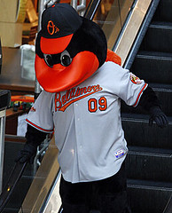
I’m surprised that no one has noticed that the O’s mascot is wearing mismatched apparel. He’s wearing the road gray with the alternate “O’s” cap. Wonder why they couldn’t make him accurate.
[quote comment=”299844″]I’m surprised that no one has noticed that the O’s mascot is wearing mismatched apparel. He’s wearing the road gray with the alternate “O’s” cap. Wonder why they couldn’t make him accurate.[/quote]
Because nobody goes to Camden Yards… that’s how it stays so beautiful.
[quote comment=”299824″]Ever wondered what the ‘FC’ in ‘FC Milan’, ‘FC Dallas’, etc stood for?
Or link, perhaps?[/quote]
If you really want to know how that “H” got there, you should read The Montreal Canadiens: 100 Years of Glory by D’Arcy Jenish.
If it wasn’t for a few lucky breaks, the Canadiens wouldn’t have celebrated 10 years, let alone 100 years.
Highly recommended reading for hockey fans.
Last Night Kid Rick and Lil Wayne performed on the CMA Awards with Kid Rock wearing a Rob Bironas jersey and Lil Wayne wearing a Chris Johnson jersey. They had their own names on the back though.
link
That black Oregon helmet is pretty sweet. It would look good with the black/green/yellow/white jerseys
i would like to see these combos from OU (top down):
black/green/black
white/yellow/white
black/yellow/black
black/white/black
white/black/white
yellow/white/yellow
yellow/black/yellow
link
“Highly recommended reading for hockey fans.”
Talk about an elite group! There must be dozens of you!
i suppose most you would like to see this gain in Eugene/Corvallis
link
I like the tighter jerseys..they look cleaner..
The one thing I noticed was when the Giants were wearing them..the people wearing tighter ones had a link red stripe on their sleeve..and when they were loose they were link, which makes them look like cheap replicas..
Although..I still think they need to make the sleeve stripes different colors like link anyways..
The MLS’s newest team, Seattle Sounders FC will be unveiling their entire kit (uniform) during a fashion show on December 4th.
details here-
link
While I do like the Palin joke inserted by Paul in regard to Obama-hat-gate, I think it’s honorable that he is sticking with it. Count me in as one who has a hard time parting with old, worn-in hats.
[quote comment=”299851″]I like the tighter jerseys..they look cleaner..
The one thing I noticed was when the Giants were wearing them..the people wearing tighter ones had a link red stripe on their sleeve..and when they were loose they were link, which makes them look like cheap replicas..
Although..I still think they need to make the sleeve stripes different colors like link anyways..[/quote]
I agree and I also believe Auburn has the nicest uniforms around. They are even outfitted by Under Armor and still looks nice.
[quote comment=”299852″]The MLS’s newest team, Seattle Sounders FC will be unveiling their entire kit (uniform) during a fashion show on December 4th.
details here-
link
Wow!! Let me mark my calendar!!
“Highly recommended reading for hockey fans.”
Talk about an elite group! There must be dozens of you!
Probably as many as those who care about what Air Jordan model a given player is wearing.
You’re welcome to make your shoe posts, Matt, and I’m allowed to skip over them, just like you can ignore hockey; it’s just the complaining (even friendly) that’s bothersome.
“Well, really, we’re doing it for Nike,” Bowden said.
Leave it to that SOB (Sweet ‘ole Bobby) to tell it like it is.
Good thing Nike doesn’t supply to your local favorite Mexican restaurant. “Well, we are a Mexican restaurant, so we really don’t want to sell sushi”. “TOO BAD, you are going to sell it anyway!!!!’
[quote comment=”299856″]“Highly recommended reading for hockey fans.”
Talk about an elite group! There must be dozens of you!
Probably as many as those who care about what Air Jordan model a given player is wearing.
You’re welcome to make your shoe posts, Matt, and I’m allowed to skip over them, just like you can ignore hockey; it’s just the complaining (even friendly) that’s bothersome.[/quote]
Touché.
The “this is for the [x amount] of you that follow hockey” jokes are getting kinda old. Sort of how the Ricko age jokes got stupid after a while.
And no, no one pissed in my corn flakes this morning and I didn’t almost throw up in my mouth either.
Phil, feel free to link to that beating-a-dead-horse .gif.
okay fellow hons
i am in agreement with the sleeve script, awful.i would prefer “oriole baseball”, but don’t care either way. more importantly,i love the flag incorporation.i would rather see the striping as orange-white-black like my childhood 70’s teams, as well as seeing those stripes on the neckline, but i’ll let both slide because we don’t have the red sox look anymore. but where i think people are missing the boat is the bird. sure in a perfect world, we would have gotten our cartoon back, but what we did get is, albeit subtle, a vast improvement. gone are the yellow highlights, and exaggerated neck that drove me crazy on orno-bird. sure he’s “perched”, but picking on that is complaining about nothing. he looks more alert, ready to take off, and maybe one day he can perch on a crown. in my eyes, it’s one step closer to what they should be wearing, which is this, a simple 2D bird… link
pass the scrapple
Regarding the new Orioles uniform — it is nothing new at all. The black/orange/black trim, the orange lettering are from the Orioles’ teams in their last days at Memorial Stadium (circa 1988-1991). The only difference are the caps (of course) and the city name on the road jerseys and an enlarged Orioles script. For a better reference — check out MLB Uniform Database — Dressed To the Nines and notice the similarity. These new uniforms scarcely resemble the uniforms of their 1966 and 1970 World Series Championship seasons.
My mistake — Only the home jerseys resemble that of the late 80’s Orioles. The road jerseys had inverted trim and Orioles script in black trimmed in orange — but this design is hardly new by any standards
Oops — another correction: The trim on the late 80’s Orioles road jerseys had the same trim as this new uniform. It’s the script that was different (black trimmed in orange).
A good example of this older set is to google Cal Ripken images.
Does it bother anyone that “O’s” is grammatically incorrect on the alt. hat?
[quote comment=”299779″][quote comment=”299764″]Totally disagree with Paul on the Maryland Patch. Has there ever been an instance in ANY sport where the team actually wears the name of the sport they are playing on their uniforms? All the patched should read “Baltimore Orioles” (see post #6). “Orioles Baseball” is rediculous. I guess they didn’t want to get it mixed up with “Orioles Hockey” or “Orioles Football”. When we see these uniforms, we are watching baseball – I think we get it.[/quote]
I guess you’re not an Orioles fan. To Orioles fans the words “Orioles Baseball” doesn’t mean “We’re a baseball team from Baltimore called the Orioles” it means “We’re going to win baseball games the Oriole Way, with pitching, defense and three run home runs”.[/quote]
OK, let’s say that “Orioles Baseball” means the “Oriole Way” – why not put “The Oriole Way” on the patch? And furthermore, if that’s “Orioles Baseball” how different is that from the “Baltimore Baseball” on the other patch?
I personally prefer the oriole caps with the black brim. The orange brim always appears too bright to me
[quote comment=”299863″]Does it bother anyone that “O’s” is grammatically incorrect on the alt. hat?[/quote]
Yeah, but it’s wrong on the A’s cap also. Whaddya gonna do?
[quote comment=”299866″][quote comment=”299863″]Does it bother anyone that “O’s” is grammatically incorrect on the alt. hat?[/quote]
Yeah, but it’s wrong on the A’s cap also. Whaddya gonna do?[/quote]
Well, apostrophes are used to indicate link, so the only real problem is that it’s backwards on the link cap. At least the link get that right.
[quote comment=”299851″]I like the tighter jerseys..they look cleaner..
[/quote]
You think so?
With all the wrinkles caused by stretching the material over uneven surfaces (pads and the like), they look like they’re swaddled in Saran Wrap.
Look at all the stretch marks – not attractive.
[quote comment=”299868″][quote comment=”299851″]I like the tighter jerseys..they look cleaner..
[/quote]
You think so?
With all the wrinkles caused by stretching the material over uneven surfaces (pads and the like), they look like they’re swaddled in Saran Wrap.
Look at all the stretch marks – not attractive.[/quote]
Sorry – forgot the link.
link.
[quote comment=”299868″][quote comment=”299851″]I like the tighter jerseys..they look cleaner..
[/quote]
You think so?
With all the wrinkles caused by stretching the material over uneven surfaces (pads and the like), they look like they’re swaddled in Saran Wrap.
Look at all the stretch marks – not attractive.[/quote]
Those shortened, tight sleeves are going to wreak havoc with stripes. As if the current trend of half stripes (see: Giants, Steelers) is not bad enough……
OK, let’s say that “Orioles Baseball” means the “Oriole Way” – why not put “The Oriole Way” on the patch? And furthermore, if that’s “Orioles Baseball” how different is that from the “Baltimore Baseball” on the other patch?
The home patch says “Baltimore Orioles,” the outline of the link The away patch says “Orioles Baseball” presumably because “Baltimore” is on the road jerseys.
I have to say, I’m a little shocked and dismayed by the Balmer blogosphere’s reaction to the uniforms. Fans have been screaming for years to get “Baltimore” back on the road unis, and now that they have — and they look pretty damn great — the next response is “The hats suck, bring back the cartoon bird.” There’s no pleasing some people. Can’t we celebrate a little bit? Can’t we take pride in one small victory amid 11 years of frustration? Can’t we appreciate the front office for genuinely re-connecting the franchise with the city and state that it resides in? Sure, I’d rather the uniform came with Mark Teixeira sewn inside it, but first things first…
And yeah, when the O’s announced a uniform change in 1989, I was kind of upset and didn’t know why they’d change such a great uniform. But dammit, I LIKE the more ornithologically-correct bird on the hat, and I like how they’ve cleaned up the logo in this latest iteration (and BTW, link — note the color of the beak, decidedly un-ochre).
Anyone else out there think the new paint job for Oregon looks a bit like a dark green powder coat?
Paul, on the Oregon Unis at this point is there even reason left to ridiucle them? I used to hate it, but as of the last year or so I’ve actually been waiting to see what they’ll do next. So long as they are the only team that does that crap I think I’ll be ok with it.
[quote comment=”299872″]Paul, on the Oregon Unis at this point is there even reason left to ridiucle them?[/quote]
No. And that’s why I’m simply saying “douchebags” and moving on.
The O’s all black cap was one of my favorite in the league. I think the orange bill is too brash
[quote comment=”299864″][quote comment=”299779″][quote comment=”299764″]Totally disagree with Paul on the Maryland Patch. Has there ever been an instance in ANY sport where the team actually wears the name of the sport they are playing on their uniforms? All the patched should read “Baltimore Orioles” (see post #6). “Orioles Baseball” is rediculous. I guess they didn’t want to get it mixed up with “Orioles Hockey” or “Orioles Football”. When we see these uniforms, we are watching baseball – I think we get it.[/quote]
I guess you’re not an Orioles fan. To Orioles fans the words “Orioles Baseball” doesn’t mean “We’re a baseball team from Baltimore called the Orioles” it means “We’re going to win baseball games the Oriole Way, with pitching, defense and three run home runs”.[/quote]
OK, let’s say that “Orioles Baseball” means the “Oriole Way” – why not put “The Oriole Way” on the patch? And furthermore, if that’s “Orioles Baseball” how different is that from the “Baltimore Baseball” on the other patch?[/quote]
I think that it is different because “Orioles Baseball” has been used to advertise the team in the past. In the 80’s, there was a terrifically cheesy jingle on the radio for the team, and I think it’s a marketing thing more than anything. They don’t refer to the team by “Oriole Way” or “Baltimore Baseball” in local adverts.
I could be wrong about that being the reasoning, but that’s how I made sense out of it.
Here’s my take on the Orioles unis. When I heard they were officially introducing new uniforms I was hoping for 4 things, listed here in the order of importance:
1) The return of the cartoon bird to the hat preferrably one similar to the link version.
2) The return of the Baltimore to the road uni.
3) The return of orange, black and white piping.
4) The return of the orange, black and white stirrups. (Ranked last because you’d only see them on Milar, and Burres.)
(After typing that up I realized it just really want a modernized version of the 1966 uniforms.)
But here’s what we got:
1) “Baltimore” on the road uni. Hell yes. I like the font, and the taper. I don’t get the complaining about it getting smaller, I think the tapering allows for the number to stay up fairly high without the text wrapping around the shoulder area.
2) A tweaked hat. Meh. Call me superstitious but the O’s won 3 championships with a “duck” on their hat and 0 with an ornithologicaly correct Oriole on it. (Although I would be ok with link.)
3) Orange piping. Nice. I thought the thin back was always too subtle.
4) The MD flag patch. Being a native Marylander and recent Baltimorian, I love it. It works on the UMD uniforms, it works on the Ravens uniforms and it works here. As I mentioned earlier, I understand the “Orioles Baseball” text. Personally I think that should be on both unis but I understand that they want the word “Baltimore” on all of the uniforms.
5) The “Baltimore” and “Orioles” script on the other sleeve. Unnecessary. I agree with earlier comments that this side should be available for memorial and commemorative patches.
6) Stirrup status: unknown. I doubt they’re orange black and white, but I’m hoping they’re orange for the home and away, and black for the alternate.
7) Black alternate. Ok. I would prefer the cartoon bird hat, but I like the “O’s” hat over the ornithologicaly correct bird. I think I’m the minority on that one. I would love an orange alt instead but I’ve like the black ones since their inception.
So overall I think it’s a step towards a perfect oriole uni. It’s better then the last couple years, it’s much better then the Ripken era ones with the black script instead of orange, but are not quite on par with 1966.
[quote comment=”299856″]“Highly recommended reading for hockey fans.”
Talk about an elite group! There must be dozens of you!
Probably as many as those who care about what Air Jordan model a given player is wearing.
You’re welcome to make your shoe posts, Matt, and I’m allowed to skip over them, just like you can ignore hockey; it’s just the complaining (even friendly) that’s bothersome.[/quote]
Thank you, thank you, thank you so much on behalf of uni-watching hockey fans. Matt, take your p3ning like a man and apologize to all of us.
I really like the tapered effect of the “Baltimore” script. It reminds me of the lettering effect on a pennant. After all, a pennant would be greatly appreciated in Poe’s hometown, right?
[quote comment=”299848″]That black Oregon helmet is pretty sweet. It would look good with the black/green/yellow/white jerseys
i would like to see these combos from OU (top down):
black/green/black
white/yellow/white
black/yellow/black
black/white/black
white/black/white
yellow/white/yellow
yellow/black/yellow
link
It’s U of O. We are not Oklahoma.
Gee whiz.
[quote comment=”299876″]Here’s my take on the Orioles unis. When I heard they were officially introducing new uniforms I was hoping for 4 things, listed here in the order of importance:
1) The return of the cartoon bird to the hat preferrably one similar to the link version.
2) The return of the Baltimore to the road uni.
3) The return of orange, black and white piping.
4) The return of the orange, black and white stirrups. (Ranked last because you’d only see them on Milar, and Burres.)
(After typing that up I realized it just really want a modernized version of the 1966 uniforms.)
But here’s what we got:
1) “Baltimore” on the road uni. Hell yes. I like the font, and the taper. I don’t get the complaining about it getting smaller, I think the tapering allows for the number to stay up fairly high without the text wrapping around the shoulder area.
2) A tweaked hat. Meh. Call me superstitious but the O’s won 3 championships with a “duck” on their hat and 0 with an ornithologicaly correct Oriole on it. (Although I would be ok with link.)
3) Orange piping. Nice. I thought the thin back was always too subtle.
4) The MD flag patch. Being a native Marylander and recent Baltimorian, I love it. It works on the UMD uniforms, it works on the Ravens uniforms and it works here. As I mentioned earlier, I understand the “Orioles Baseball” text. Personally I think that should be on both unis but I understand that they want the word “Baltimore” on all of the uniforms.
5) The “Baltimore” and “Orioles” script on the other sleeve. Unnecessary. I agree with earlier comments that this side should be available for memorial and commemorative patches.
6) Stirrup status: unknown. I doubt they’re orange black and white, but I’m hoping they’re orange for the home and away, and black for the alternate.
7) Black alternate. Ok. I would prefer the cartoon bird hat, but I like the “O’s” hat over the ornithologicaly correct bird. I think I’m the minority on that one. I would love an orange alt instead but I’ve like the black ones since their inception.
So overall I think it’s a step towards a perfect oriole uni. It’s better then the last couple years, it’s much better then the Ripken era ones with the black script instead of orange, but are not quite on par with 1966.[/quote]
I still wanted “Fuck Face” to return to the bottom of the bats.
CANDY?!?!?
Oh, and my TV Prod 1 teacher was going over advertising today. When he got to logos and bugs, I had to raise my hand for two reasons. 1) he had the old NFL logo on a screen with examples of logos, and then 2) he had a big ass Nike logo on the bugs (logo – words = bug) examples page.
CHRIST…you ever have one of those days???
anyway, haven’t had time to read any of the comments, yet…but…i did get to spend the day at my local county board of elections…joy of joys
however, it wasn’t without one comedic moment…
in light of PL’s recent posts and our comments…
i got a huge kick out of this
yes…that is an actual absentee ballot
/democracy in action, baby
I still wanted “Fuck Face” to return to the bottom of the bats.[/quote]
Funny, well played Hemogoblin.
Sorry, I messed up the quote thingy.
Phil, am I the only one who can’t make your link work or is there something wrong with it?
Check out how KIRO radio in Seattle announced their pending transition to an all-sports format.
link
Ick-tastic. I mean – it looks like they customzed those suckers to fit three digits. Couldn’t they have come up with anything better?
The Giants should call the Orioles and ask them how they got the sleeve piping
link
right. Same colors, same manufacturer – what went
link
wrong?
Concerning striped stirrups – I think a few more players might be encouraged to wear them if, by doing so, an interesting design was revealed. Until a few years ago, if a Braves player wore short pants and stirrups, there was that cool white/red/white striping pattern. Now, the Braves supply plain blue stirrups – eh, not much of a reward for taking a fashion risk.
[quote comment=”299858″]Phil, feel free to link to that beating-a-dead-horse .gif.[/quote]
here
[quote comment=”299885″]Phil, am I the only one who can’t make your link work or is there something wrong with it?[/quote]
here…lemme flickr it:
actual absentee ballot
vancouver canucks will be officially releasing their third jersey some point tonight. I believe it should be around 8pm
[quote comment=”299889″][quote comment=”299885″]Phil, am I the only one who can’t make your link work or is there something wrong with it?[/quote]
here…lemme flickr it:
link[/quote]
Thanks… although I could have gone without seeing that.
Yesterday’s comments included a few regarding the thickness and arching of the San Francisco Giants’ home uni insignia. I just ran across link which features the old vertically arched style. Am I wrong, or are the letters thinner than the ones in yesterday’s link? Could that be a photo quality issue? In any case, Willie’s insignia looks awfully sharp, far better than the link. Today’s teams, or at least their uni designers, seem intent on filling up as much space as possible on the jersey front. Are there any teams that use a font as spare as the old Giants? Can’t think of any off the top of my head. The look just seems (unfortunately) incongruous with today’s unis.
Come on, Phil. You’re missing the silver lining. link
[quote comment=”299877″]Matt, take your p3ning like a man and apologize to all of us.[/quote]
just insert “matt” for “steiner”
heh
[quote comment=”299876″]Here’s my take on the Orioles unis. When I heard they were officially introducing new uniforms I was hoping for 4 things, listed here in the order of importance:
(After typing that up I realized it just really want a modernized version of the 1966 uniforms.)
But here’s what we got:
1) “Baltimore” on the road uni. Hell yes. I like the font, and the taper. I don’t get the complaining about it getting smaller, I think the tapering allows for the number to stay up fairly high without the text wrapping around the shoulder area.[/quote]
Well, if you familiar with the 1966 version, you are aware that the lettering can be done without tapering.
Whether you like the tapering or not is a matter personal preference, but the justifying why it should be done is pretty pointless when there is a living example of how it could done without (and without the split ‘t’). link
Two items from Thursday Night Football:
Did anyone else notice the BB on Bill Belichick’s homemade sweatshirt tonight? Is this a first time thing?
A few weeks ago when the pats played the colts Matt Cassel was wear a helmet with the ear holes covered and now tonight the holes are open. Does he only have those covered on away games? are they used to reduce crowd noise?
[quote comment=”299896″]Two items from Thursday Night Football:
Did anyone else notice the BB on Bill Belichick’s homemade sweatshirt tonight? Is this a first time thing?[/quote]
ahm has had this for a while
[quote comment=”299896″]Two items from Thursday Night Football:
Did anyone else notice the BB on Bill Belichick’s homemade sweatshirt tonight? Is this a first time thing?
A few weeks ago when the pats played the colts Matt Cassel was wear a helmet with the ear holes covered and now tonight the holes are open. Does he only have those covered on away games? are they used to reduce crowd noise?[/quote]
He has worn it on his hoody before, but I think it was only on his “customized” (cut sleeves) version
Cut sleeves:
link
Regular hoody:
link
I’m not sure about Cassel’s helmet, it’s probably either crowd noise or the speaker/pad riding low
[quote comment=”299895″][quote comment=”299876″]Here’s my take on the Orioles unis. When I heard they were officially introducing new uniforms I was hoping for 4 things, listed here in the order of importance:
(After typing that up I realized it just really want a modernized version of the 1966 uniforms.)
But here’s what we got:
1) “Baltimore” on the road uni. Hell yes. I like the font, and the taper. I don’t get the complaining about it getting smaller, I think the tapering allows for the number to stay up fairly high without the text wrapping around the shoulder area.[/quote]
Well, if you familiar with the 1966 version, you are aware that the lettering can be done without tapering.
Whether you like the tapering or not is a matter personal preference, but the justifying why it should be done is pretty pointless when there is a living example of how it could done without (and without the split ‘t’). link
look at this execution of not splitting the tt
[quote comment=”299899″][quote comment=”299895″][quote comment=”299876″]Here’s my take on the Orioles unis. When I heard they were officially introducing new uniforms I was hoping for 4 things, listed here in the order of importance:
(After typing that up I realized it just really want a modernized version of the 1966 uniforms.)
But here’s what we got:
1) “Baltimore” on the road uni. Hell yes. I like the font, and the taper. I don’t get the complaining about it getting smaller, I think the tapering allows for the number to stay up fairly high without the text wrapping around the shoulder area.[/quote]
Well, if you familiar with the 1966 version, you are aware that the lettering can be done without tapering.
Whether you like the tapering or not is a matter personal preference, but the justifying why it should be done is pretty pointless when there is a living example of how it could done without (and without the split ‘t’). link
look at this execution of not splitting the tt[/quote]
Yeah, this notion that we wouldn’t know what it says because of a space is frankly a little insulting. I mean, what looks more dumb, Phil lies or Philllies?
[quote comment=”299891″][quote comment=”299889″][quote comment=”299885″]Phil, am I the only one who can’t make your link work or is there something wrong with it?[/quote]
here…lemme flickr it:
link[/quote]
Thanks… although I could have gone without seeing that.[/quote]
For real? That link from Phil, meant totally as a goof, offended you?
Seriously, if anything about that picture offends me, it’s that the guy who made that ballot didn’t take the time to arch the “Jesus” on it. I mean, if you’re going to get creative, go all out!
I’m just waiting for the day when someone brings a lawsuit against Paul/the mods/one of the posters because of something that they find “offensive”. GOD knows with our litigious society, we’re probably not that far from it.
[quote comment=”299879″]
It’s U of O. We are not Oklahoma.
Gee whiz.[/quote]
That doesn’t stop OU
link
unless that was your point, in which case…
link
[quote comment=”299901″][quote comment=”299891″][quote comment=”299889″][quote comment=”299885″]Phil, am I the only one who can’t make your link work or is there something wrong with it?[/quote]
here…lemme flickr it:
link[/quote]
Thanks… although I could have gone without seeing that.[/quote]
For real? That link from Phil, meant totally as a goof, offended you?
Seriously, if anything about that picture offends me, it’s that the guy who made that ballot didn’t take the time to arch the “Jesus” on it. I mean, if you’re going to get creative, go all out!
I’m just waiting for the day when someone brings a lawsuit against Paul/the mods/one of the posters because of something that they find “offensive”. GOD knows with our litigious society, we’re probably not that far from it.[/quote]
I want this guy as my goalie….
link
this guy cotchery’s pretty good
[quote comment=”299901″][quote comment=”299891″][quote comment=”299889″][quote comment=”299885″]Phil, am I the only one who can’t make your link work or is there something wrong with it?[/quote]
here…lemme flickr it:
link[/quote]
Thanks… although I could have gone without seeing that.[/quote]
For real? That link from Phil, meant totally as a goof, offended you?
Seriously, if anything about that picture offends me, it’s that the guy who made that ballot didn’t take the time to arch the “Jesus” on it. I mean, if you’re going to get creative, go all out!
I’m just waiting for the day when someone brings a lawsuit against Paul/the mods/one of the posters because of something that they find “offensive”. GOD knows with our litigious society, we’re probably not that far from it.[/quote]
No, it didn’t offend me. That was meant to be a lighthearted comment. I happen to be a really big fan of Jesus. I just can’t imagine he would be interested in participating in American politics.
[quote comment=”299894″][quote comment=”299877″]Matt, take your p3ning like a man and apologize to all of us.[/quote]
link
heh[/quote]
Ah, The Hockey goons decided to “put the foil on” or whatever your Hansons soundboard says.
Hockey is a very exciting sport, I agree. Teebz and Jim from MI are well aware of my growing interest in the game.
However, If you were offended or mildly annoyed by a good-natured jab…get over it!
[quote comment=”299903″][quote comment=”299901″][quote comment=”299891″][quote comment=”299889″][quote comment=”299885″]Phil, am I the only one who can’t make your link work or is there something wrong with it?[/quote]
here…lemme flickr it:
link[/quote]
Thanks… although I could have gone without seeing that.[/quote]
For real? That link from Phil, meant totally as a goof, offended you?
Seriously, if anything about that picture offends me, it’s that the guy who made that ballot didn’t take the time to arch the “Jesus” on it. I mean, if you’re going to get creative, go all out!
I’m just waiting for the day when someone brings a lawsuit against Paul/the mods/one of the posters because of something that they find “offensive”. GOD knows with our litigious society, we’re probably not that far from it.[/quote]
I want this guy as my goalie….
link
That picture’s inaccurate. Jesus couldn’t be goalie and captain, I don’t care if he’s the messiah.
It seems like people are a little sensitive here today. It just goes to prove that a lot is lost in communication when you can’t hear voice inflection. Matt, I know you joke around about hockey and I was never offended or even thought you were being offensive.
I just re-read my previous comment and I must admit it sounds a little nuts, I apologize. I’m fairly new to this site so maybe I would be better served to not comment so much.
[quote comment=”299908″]It seems like people are a little sensitive here today. It just goes to prove that a lot is lost in communication when you can’t hear voice inflection. Matt, I know you joke around about hockey and I was never offended or even thought you were being offensive.
I just re-read my previous comment and I must admit it sounds a little nuts, I apologize. I’m fairly new to this site so maybe I would be better served to not comment so much.[/quote]
I can’t believe you’d insult a sport as glorious as
ice fightinghockey.[quote]I’m fairly new to this site so maybe I would be better served to not comment so much.[/quote]
not at all…i knew you were joking, and anyone who knows me, knows im impossible to offend
keep right on posting! i thought your response was great ;)
[quote comment=”299910″][quote]I’m fairly new to this site so maybe I would be better served to not comment so much.[/quote]
not at all…i knew you were joking, and anyone who knows me, knows im impossible to offend
keep right on posting! i thought your response was great ;)[/quote]
I can offend you, Phil:
New. York. Islanders. Gorton. Fishstick. Uniform. Don’t. Care. If. You. Don’t. Like. Hockey. It’s. On. Your. Island.
[quote] I still wanted “Fuck Face” to return to the bottom of the bats.[/quote]
Maybe it’s on Aubry Huff’s…
[quote comment=”299908″]It seems like people are a little sensitive here today. It just goes to prove that a lot is lost in communication when you can’t hear voice inflection. Matt, I know you joke around about hockey and I was never offended or even thought you were being offensive.
I just re-read my previous comment and I must admit it sounds a little nuts, I apologize. I’m fairly new to this site so maybe I would be better served to not comment so much.[/quote]
Don’t ever think that way!
1. Welcome to UW! WE are an elite group, we need to support each other!
2. The Best part of this site is the posting of comments. God knows, my wife is sick of hearing about Schutt vs. Riddell helmets and what cleats the guys at LSU are wearing!
If you’ve got something to add to the comments, post it!!!
[quote comment=”299913″][quote comment=”299908″]It seems like people are a little sensitive here today. It just goes to prove that a lot is lost in communication when you can’t hear voice inflection. Matt, I know you joke around about hockey and I was never offended or even thought you were being offensive.
I just re-read my previous comment and I must admit it sounds a little nuts, I apologize. I’m fairly new to this site so maybe I would be better served to not comment so much.[/quote]
Don’t ever think that way!
1. Welcome to UW! WE are an elite group, we need to support each other!
2. The Best part of this site is the posting of comments. God knows, my wife is sick of hearing about Schutt vs. Riddell helmets and what cleats the guys at LSU are wearing!
If you’ve got something to add to the comments, post it!!![/quote]
Good. Bad. Good…that’s how you break news!
Good:
Salvamerican…you’ve heard it from me and Phil…keep posting!
Bad:
Burghfan…the shoe posts,and the helmet posts, the songgirl pics…they’ll all keep coming. Oh and maybe a Ricko jab once in a while too!
Maybe voice inflection, as SA mentioned, can’t be construed on the Interweb…but you definitely came across as a Dick!!!
Good:
Miami isn’t in all black tonight!
Since there’s been lots of talk about Oregon’s new black/green/bleen/spleen helmet to be worn on Saturday for their blackout game…
…does anyone have an inside scoop on whether Georgia Tech might pull out a white helmet for their ‘WHITE-OUT’ game against Miami next Thursday on ESPN??
[quote comment=”299913″]The Best part of this site is the posting of comments….[/quote]
Ouch.
[quote comment=”299895″][quote comment=”299876″]Here’s my take on the Orioles unis. When I heard they were officially introducing new uniforms I was hoping for 4 things, listed here in the order of importance:
(After typing that up I realized it just really want a modernized version of the 1966 uniforms.)
But here’s what we got:
1) “Baltimore” on the road uni. Hell yes. I like the font, and the taper. I don’t get the complaining about it getting smaller, I think the tapering allows for the number to stay up fairly high without the text wrapping around the shoulder area.[/quote]
Well, if you familiar with the 1966 version, you are aware that the lettering can be done without tapering.
Whether you like the tapering or not is a matter personal preference, but the justifying why it should be done is pretty pointless when there is a living example of how it could done without (and without the split ‘t’). link
Very true. I just don’t think it’s a big deal that it tapers. I mainly like the stylization on the “B”, I think it’s the loop in the link.
However, you can tell that using the same font on both jerseys was very important to their design. This makes sense from a branding point of view. The word “Baltimore” has all the letters in “Orioles” except for the “s”. This way the new away jersey still looks familiar.
I guess that they couldn’t get that font starting at that size, with the nice big loopy “B” to fit without tapering. You’d need to make the whole font size smaller.
As an O’s fan who lived in the Baltimore area for most of my life, it’ could have been in lime green spray-paint and I would be happy…well maybe orange spray-paint.
new canucks jersey
link
Hey, Ty Law is wearing real sleeves tonight. Too bad only 25% of the country can watch the game.
[quote comment=”299911″][quote comment=”299910″][quote]I’m fairly new to this site so maybe I would be better served to not comment so much.[/quote]
not at all…i knew you were joking, and anyone who knows me, knows im impossible to offend
keep right on posting! i thought your response was great ;)[/quote]
Best jersey ever!
I can offend you, Phil:
New. York. Islanders. Gorton. Fishstick. Uniform. Don’t. Care. If. You. Don’t. Like. Hockey. It’s. On. Your. Island.[/quote]
Looks like the Ducks are gonna try and blackout the Civil War at Oregon State, despite the fact that Black is an actual OSU color.
link
[quote comment=”299916″][quote comment=”299913″]The Best part of this site is the posting of comments….[/quote]
Ouch.[/quote]
Do I really need to elaborate?
My membership card, Uni-gatherings, Great uni-centric entries, interviews, Bikini Atom-Bomb, Phil’s sarcasm, Marty’s hatred of anything “traditional”, Teebz, Jim and Burghfan’s love for Hockey, Scott Little, Minna and her black/Eddie Guns/#43 obsession, Shorpy, Skiba, Radom, Collateral Gammage, theres is way too much to appreciate without leaving out so many other favorites!
[quote comment=”299922″]Phil’s sarcasm[/quote]
what?
Congratulations to the Glidden Paints Crew of Columbus who defeated the Chicago Best Buys to advance to their first ever Home Depot MLS Cup.
[quote comment=”299916″][quote comment=”299913″]The Best part of this site is the posting of comments….[/quote]
Ouch.[/quote]
It’s true. I have more than 30,000 internet comments. You’re only a fraction of it, yet I still keep coming back… muahuahuahua
[quote comment=”299918″]new canucks jersey
link
They caption the guys as assistants, but none of them have the A. Whoops.
Burghfan…the shoe posts,and the helmet posts, the songgirl pics…they’ll all keep coming. Oh and maybe a Ricko jab once in a while too!
As I said above, you’re welcome to keep posting that stuff. I found it ironic that someone who regularly posts in his own niches would comment, even smilingly, about how limited the audience for something else is.
Maybe voice inflection, as SA mentioned, can’t be construed on the Interweb…but you definitely came across as a Dick!!!
How does this comment of yours come across?
[quote comment=”299921″]Looks like the Ducks are gonna try and blackout the Civil War at Oregon State, despite the fact that Black is an actual OSU color.
link
They’ve tried blacking out twice this year (including AZ, not the ‘War), and they also did a yellow-out.
And I’m going in yellow to the Arizona game to give a big “fuck you” to Uncle Phil.
(Knight)
[quote comment=”299927″]Burghfan…the shoe posts,and the helmet posts, the songgirl pics…they’ll all keep coming. Oh and maybe a Ricko jab once in a while too!
As I said above, you’re welcome to keep posting that stuff. I found it ironic that someone who regularly posts in his own niches would comment, even smilingly, about how limited the audience for something else is.
Maybe voice inflection, as SA mentioned, can’t be construed on the Interweb…but you definitely came across as a Dick!!!
How does this comment of yours come across?[/quote]
link
[quote comment=”299927″]Burghfan…the shoe posts,and the helmet posts, the songgirl pics…they’ll all keep coming. Oh and maybe a Ricko jab once in a while too!
As I said above, you’re welcome to keep posting that stuff. I found it ironic that someone who regularly posts in his own niches would comment, even smilingly, about how limited the audience for something else is.
Maybe voice inflection, as SA mentioned, can’t be construed on the Interweb…but you definitely came across as a Dick!!!
How does this comment of yours come across?[/quote]
Exactly the way I intended it to…until I went back and re-read your initial comment, which wasn’t really all that insulting to begin with, so, consider the olive branch extended, or a round of Steel City on me!
[quote comment=”299928″][quote comment=”299921″]Looks like the Ducks are gonna try and blackout the Civil War at Oregon State, despite the fact that Black is an actual OSU color.
link
They’ve tried blacking out twice this year (including AZ, not the ‘War), and they also did a yellow-out.
And I’m going in yellow to the Arizona game to give a big “fuck you” to Uncle Phil.
(Knight)[/quote]
That’ll make it easier to pick you out on tv. You should come up with some kind of Uniwatch hand signal.
[quote comment=”299931″][quote comment=”299928″][quote comment=”299921″]Looks like the Ducks are gonna try and blackout the Civil War at Oregon State, despite the fact that Black is an actual OSU color.
link
They’ve tried blacking out twice this year (including AZ, not the ‘War), and they also did a yellow-out.
And I’m going in yellow to the Arizona game to give a big “fuck you” to Uncle Phil.
(Knight)[/quote]
That’ll make it easier to pick you out on tv. You should come up with some kind of Uniwatch hand signal.[/quote]
Hahaha… I should really just go to the game obnoxiously early, get front row seats, etc… but if I did that, I’d have to hold up a sign that pandered to the Atroo (a group of friends from a sports website that decided to abandon the sports website etc.,). You guys are second on the list…
But it shouldn’t be that hard to find me, seeings how I’ll be the only one there with taste!
[quote comment=”299931″]You should come up with some kind of Uniwatch hand signal.[/quote]
better yet…
wear this
[quote comment=”299933″][quote comment=”299931″]You should come up with some kind of Uniwatch hand signal.[/quote]
better yet…
link[/quote]
Haha, Phil. I still haven’t gotten my sister membership here… what makes you think I’d buy the shirt?
Exactly the way I intended it to…until I went back and re-read your initial comment, which wasn’t really all that insulting to begin with,
Thanks. It wasn’t meant to be.
…so, consider the olive branch extended, or a round of Steel City on me!
Consider the branch accepted. (If we’re having a round, we can do a lot better than Iron City.)
[quote comment=”299933″][quote comment=”299931″]You should come up with some kind of Uniwatch hand signal.[/quote]
better yet…
link[/quote]
Ironic, since that “fucking incredible” quote by Paul was in response to another one of my “state of UW” comments
[quote comment=”299934″][quote comment=”299933″][quote comment=”299931″]You should come up with some kind of Uniwatch hand signal.[/quote]
better yet…
link[/quote]
Haha, Phil. I still haven’t gotten my sister membership here… what makes you think I’d buy the shirt?[/quote]
if you buy the shirt, i’ll give your sister a free plug
[quote comment=”299937″][quote comment=”299934″][quote comment=”299933″][quote comment=”299931″]You should come up with some kind of Uniwatch hand signal.[/quote]
better yet…
link[/quote]
Haha, Phil. I still haven’t gotten my sister membership here… what makes you think I’d buy the shirt?[/quote]
if you buy the shirt, i’ll give your sister a free plug[/quote]
link
This Favre guy might be pretty good.
[quote comment=”299849″]”Highly recommended reading for hockey fans.”
Talk about an elite group! There must be dozens of you![/quote]
I assume that multi-syllabic words might be too much for NBA fans. Football fans won’t pick up a book unless it deals with Spygate, USC cheerleaders, or Tom Brady’s knee. And baseball fans are still reading Juiced while calling Raffy and Mark “cheaters” and “liars”.
Ok, I kid, everyone. I’m just poking fun at Mr. Powers. I didn’t send it on Nike letterhead nor did I post it on IluvPhilKnight.com nor did I write it in Sharpie on my latest shoe… so he probably missed this comment completely. LOL
Honestly, I love the good-natured jokes that Powers lobs at the hockey crew. We’re a small group, but we’re passionate and scrappy. Keep them coming, Matt. All good on my end, I assure you. ;o)
I just read this now and I found the BP strike-through hilarious.
[quote comment=”299937″][quote comment=”299934″][quote comment=”299933″][quote comment=”299931″]You should come up with some kind of Uniwatch hand signal.[/quote]
better yet…
link[/quote]
Haha, Phil. I still haven’t gotten my sister membership here… what makes you think I’d buy the shirt?[/quote]
if you buy the shirt, i’ll give your sister a free plug[/quote]
Good to know that you’re link.
I know it’s late and all, but really. Has nobody pointed out that Baltimore’s home jersey script does taper from left to right, and has for more than a decade? It’s just not as pronounced as the taper on the new road jersey script, but if you draw two lines connecting the tops of the letters “rioles” and the bottoms of the letters, you will find that the lines are not parallel. They converge to the right of the script.
I almost wept at the new Orioles uniforms. Sure, they have their flaws, such as the “Orioles” script on the right sleeve of the road uniforms and the uninspired Maryland flag patches. But all in all, this is a huge improvement, which is almost enough to bring this Nats fan to weep tears of embarrassment at how much better the Orioles now look than the Nats. In one week, two teams that could have been tied for, say, the sixteenth-best-dressed teams in baseball unveiled new uniforms. The Nats are now the ugliest team in baseball, and the Orioles are among the ten best-dressed teams. Argh!
I don’t think that’s a triangle on the Vanderbilt helmets. It looks like an elongated V on the front, somewhat like the W on the front of Wisconsin’s helmets in the 60’s (I believe).