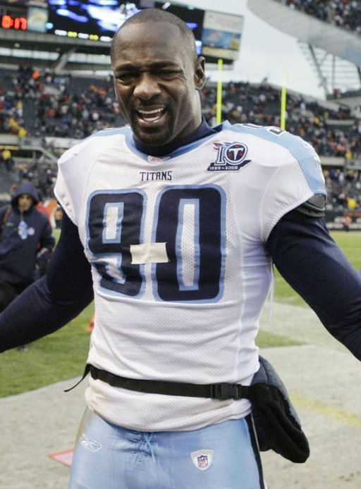
As the Titans pushed their record to 9-0 yesterday, Jevon Kearse celebrated by making creative use of some tape on his jersey. Pretty cool move, and nobody will be able to copy it next week because nobody’s wearing No. 100.
My annual college hoops season-preview column is up now on ESPN. Meanwhile, we’ve got lots of other stuff to address here today, beginning with”¦

November Raffle: Great opportunity on tap here, as reader Alain Nana-Sinkam, who runs Classic Old School, is offering a free custom-designed jersey — including basic numbers, NOB, and one patch — to one lucky winner (plus he’s offering a 10% discount to all other Uni Watch readers). To enter, send a blank e-mail with your name in the subject line to the raffle address (not to the usual Uni Watch address, please) by this Thursday at 10pm. One entry per person, except for Uni Watch membership enrollees, who can send four entries. I’ll announce the winner on Friday.
New Sponsor Shout-Outs: As you you’ve probably noticed, we’ve got several new advertisers, all specializing in vintage (or at least vintage-style):
• Asgard Press sells a variety of eco-friendly printed matter — calendars, postcards, stationery, etc. — all featuring killer old-timey football images.
• Historic Football Posters, as its name implies, sells a wide range of spectacular vintage gridiron posters.
• And Sports Propaganda Prints offers magnificent silk-screened baseball posters patterned after WWII-era propaganda art.
All three of these operations were brought to my attention by Uni Watch readers, and I’m happy to report that they’re all run by really great people who’ve been a pleasure to deal with as we’ve worked to get their ads up and running. Please keep them in mind for your holiday shopping. Thanks.
Uni Watch News Ticker: Boy howdie, can’t the Nats do anything right? As you may recall, their new road uni has plain, non-beveled uni numbers on the front — or at least it did at last week’s unveiling. But now a little birdie tells me that the jerseys shown at the unveiling were wrong and that the front numbers on the road jersey will be beveled after all. ”¦ On Friday I mentioned that Reebok was making a little hay over Nike’s snafu with that female marathon winner. Turns out there’s a little more to the story — begin reading with the third graf here (with thanks to Robert Tusso). ”¦ Another follow-up from Friday: I had linked to this photo showing someone wearing a swoosh-emblazoned black suit behind the USC end zone. Turns out it was ex-USC tailback Anthony Davis, who dresses up as a Nike billboard while selling his autograph for $10 a pop — money that may or may not go to a “foundation” of somewhat dubious propriety. Full details here. ”¦ Peter Macaluso has a job scanning old magazine pages and posting them on eBay, and sometimes he comes across some amazing sports-related stuff. Among his recent finds: Broadway Joe on a motorcycle, Frank Gifford whoring for the tobacco biz, Midwestern perfection, and a nice shot of Stan the Man. ”¦ eBay stuff: a tremendous vintage baseball jersey; a great old uniform; a truly magnificent set of basketball shorts; a cool old L.A. Angels merch catalog; some nice sporting goods catalogs here, here, and here; Tony the Tiger in a Marlins uniform; some kissing Patriots bobbleheads; a bunch of old hockey decals; and a bunch of 1960s NFL media guides. Meanwhile, can anyone tell me more about what the Rawlings Roundup was? ”¦ If you scroll about halfway down on this page, you’ll find a college hockey version of Uni Watch (with thanks to Seth Horowitz). ”¦ Super-spectacular 1939 NHL All-Star jersey up for auction here — wow! And scroll down to the bottom of that page for more jaw-dropping beauties (big thanks to Mike Hersh). ”¦ Cool video clip here that shows the All Blacks gearing up for a match (with thanks to Caleb Borchers). ”¦ “Parkview Baptist School (Baton Rouge, Louisiana) warmed up for Thursday night’s game against Redemptorist in their normal red uniforms,” writes Chris Mycoskie. “But then they came out for the game in black jerseys they’re never worn before — part of a ‘blackout’ thing where all the fans wore black, too.” ”¦ Matt Mitchell reports that Temple High School in Texas, has worn the same basic football uni design for at least 75 years — a design that includes two-tone pants. Lots of additional pics here. ”¦ This is just too brilliant not to share. ”¦ Tremendous little video clip about bare-faced hockey goalies and Jacques Plante here (nice find by Alan Kreit). ”¦ Check out the last item on this list. Several years too late, but better than nothing (with thanks to Jeremy Whiting). ”¦ 11/11 is almost here, so poppies have been showing up on the lapels of NHL coaches and Hall of Fame inductees, and also on the Arsenal jersey (those unfamiliar with this protocol should look here). ”¦ Speaking of the NHL HoF, the Leafs wore the Hall of Fame patch on Saturday, as is their custom for the annual induction-oriented game. ”¦ My recent ESPN column on the story behind the MLB logo came at a propitious time for webmaster John Ekdahl, who setting up cornhole league (if you’re unfamiliar with that unfortunately named sport, look here) and designed this logo for it. “Mine works both righty and lefty too, just like the MLB logo,” he says. ”¦ Also from John: “Since the start of the ’07 Giants season, my Tiki Barber jersey has sat in my closet, for obvious reasons. Last week I saw it hanging there and thought what a huge waste it was to buy an expensive jersey with an asshole’s name and number on it. Then it hit me: Reverse the 21 to make it a 12 and I have myself a brand new Steve Smith jersey (who I love). Dropped it off today at a specialty shop and they’re doing the whole thing (plus putting Smith’s name on it) for $35. Not bad, huh? Plus I’ll be the proud owner of the only Steve Smith jersey I’ve ever seen without teal in it.” ”¦ Still more from John: “Is it just me, or are the Yankees trying to match the blue tones in the new stadium blues to the blue of the uniform? Old Yankee Stadium’s blues were quite a bit brighter than the official color of the Yankees, but the seats and accent colors in the new stadium seem noticeably darker to me. It will be interesting to see what the outfield walls look like.” ”¦ Speaking of Yankee Stadium, this is pretty cool. ”¦ Mark Kaplowitz attended Thursday night’s Rangers game and saw someone wearing a Messier jersey — or was it a Mes5ier jersey? “Hope he got a refund,” says Mark. ”¦ This Korean video clip is the most bizarre baseball “brawl” ever. Can anyone explain? ”¦ Nice bit of on-the-spot jersey mending during Saturday’s OSU/Northwestern game (screen grab courtesy of Ben Kelly). ”¦ What happened to all those pieces of Shea Stadium? Lots of them are in a warehouse. Excellent photo gallery here (with thanks to Dwayne White). … All of you who complain that you can’t find Hartford Whalers merch should look here, here, and here. ”¦ Unusual college football sights from Saturday: UNC in navy, Wake Forest in gold, Tennessee-Martin in orange (with Auburn wearing white at home). ”¦ Reprinted from Saturday’s comments: Stewartville High School in Minnesota has some interesting ideas about what constitutes appropriate typography. I hasten to note that the worst-looking designs in real life make the best-looking membership cards, so someone please sign up with this motif, pronto. ”¦ Excellent article on collecting game-used hockey sweaters here (thanks to Alan Kreit). ”¦ Several notes from Saturday night’s Jones/Calzaghe bout: (1) Jones’s trunks featured little bow ties on each side — never seen anything like that before. (2) Calzaghe’s gloves and mouthpiece featured the colors of the Welsh flag. (3) At first glance, it looks like Calzaghe’s waistband featured his name, but it was actually his web site. ”¦ Oh, and there was just a wee bit of blood. ”¦ While looking for something else, I came across this shot of Orlando Cepeda with his left sleeve rolled up. ”¦ Jeremy Brahm, who lives in Portland, reports that his dentist is wearing these Trail Blazers scrubs. ”¦ Also from Jeremy: The Japanese V.League has added its logo to the uniforms of the current men’s and women’s champions. ”¦ Jevon Kearse wasn’t the only one making creative use of tape yesterday: Rams defensive back Oshiomogho Atogwe had some serious tape stripes on both arms at the outset of yesterday’s Jets/Rams game. “I was hoping for a better shot,” says new bench coach Phil Hecken, who provided the screen grabs, “but he removed the tape after the first set of downs (possibly due to fineage, possibly due to being toasted a couple times by Favre).” ”¦ Turns out the Pirates did wear the MLB 100th-anniversary patch after all — sort of. That shot is from the 1971 World Series. It’s not clear whether the Bucs also wore the patch on their jackets in 1969 (big thanks to Paul and Larry Wiederecht). ”¦ The Lions wore throwbacks yesterday and the retro motif even extended to coach Rod Marinelli’s cap and T-shirt. But why did he have to wear the tee tucked in with a pair of pleated dress slacks? Look, Rod, here’s how it works: T-shirts are worn with jeans. And you don’t tuck them in. Jesus fuck, no wonder this team can’t win a freaking game. ”¦ Brian Urlacher had helmet decal problems yesterday (with thanks to Mike Chamernik). ”¦ Lots of readers noticed that the Giants’ nameplate lettering looked smaller than usual last night, plus a few Jints didn’t have the “ny” logo on their chests. Equipment director Joe Skiba is playing coy for now, but I hope to have more details tomorrow. ”¦ New alternate uni for the single-A Rome Braves (thanks to Mickey Seward). ”¦ The intersection of stadiums and baking strikes again, this time in the form of a gingerbread Fenway Park. Details here (with thanks to Seth Horowitz). ”¦ What is that “Islanders” script that the Isles are wearing on their helmets when donning their throwback uniforms? I don’t recall the Isles using that logo back in the day — or, y’know, ever (good spot by John Muir). ”¦ Mark Kluczynski reports that D3 Rensselaer Polytechnic Institute wore black uniforms and an “86” patch on Saturday, in honor of the final game at historic ’86 Field, named after the class of 1886 (which donated funds for the field) and in use since 1912. ”¦ The famous Dave Parker smoking photo is apparently being sold on a T-shirt (with thanks to Alan Borock). ”¦ HNOB (that’s hyphenated NOB) alert: Mark Versteeg-Lytwyn of the Rocky Mountain Rage (with thanks to Michael Putlack, who also reports that one of his local shops has a Coors Light sign with the old NFL logo and, even weirder, the logo is missing the left column of stars). ”¦ The Pens’ powder blue alternate is a hot seller (with thanks to Chris Hilf). … Attention Omar Minaya: There’s a southpaw on the market.
Unless I’ve somehow forgotten the geography of my native state, Temple High School is located in Temple, Texas — not in Waco. As a teen, I saw them wear those two-toned pants in a game in San Antonio back in the late 1940s.
I got a postcard in the mail this weekend from the NFL, letting me know that I didn’t win the Super Bowl XLIII ticket lottery, and the logo was also old on there!
I, too, have never liked Giffors; but plenty of players shilled for the tobacco companies in the ’50’s.
Cha Cha Cepeda always batted with his LEFT sleeve rolled up in his Giant days.
Fred Smoot got hit for $5,000 for the Steelers game:
link
with the giants jerseys, also the “different” sets looked like they had the numbers closer together (def on the back, not sure about the front). need some details! haha
Is it me or does it look like Stan Musial has two different colors of stirrups?
Giants wearing a totally different type of jerseys last night. Anxiously waiting for what Skiba have for us about that.
According to the Winston-Salem Journal yesterday: Wake Forest wore gold for the first time since they moved from the town of Wake Forest (north of Raleigh) to Winston-Salem in 1956 and Carolina wore dark blue for the first time since the Eisenhower years.
I don’t know about Tennessee-Martin, but perhaps the orange was a preview of what Auburn (which has identical uniforms) might do one day.
[quote comment=”299082″]Is it me or does it look like Stan Musial has two different colors of stirrups?[/quote]
i thought the same thing, but if you enlarge the pic, you’ll see his left pant blouse is covering the top of his stirrup, and his right stirrup is partially obscured by the dugout…the stripe pattern is white-black-white-red-white-black-white, set on a red stirrup
btw…anyone know why stan the man has what appears to be a home jersey with away pants in this pic?
My wife picked u an Asgard Press calalog for me somewhere in DC last weekend. It’s really nice stuff!
Also, “But why did he have to wear the tee tucked in with a pair of pleated dress slacks?” = guffaw
[quote comment=”299084″]…Michael Putlack, who also reports that one of his local shops has a Coors Light sign with the old NFL logo and, even weirder, the logo is missing the left column of stars). … [/quote]
Why is it so weird that his “local shop” would have a neon sign with the old logo? Those things aren’t exactly cheap and I doubt “local shops” replaced their old neon signs just because the league switched to the new logo. Am I missing something here?
Now the missing left column of stars, THAT’S weird.
whoops…my bad
here’s stan the man with the unmatching home & away pants & jersey combo
AD sounds like a huckster to me.
Cornhole is a great tailgate game. If they called it “Beanbag Toss” no self respecting brat eating, beer drinking fan would play! I have made several board sets for friends and family. I recently made a set with a Steeler motif. And my UniWatch education was evident. I put the Steelers’ sleeve striping on the top and bottom of the boards with the helmet logo in the center. I made another set that looked like the Ohio State helmet. Silver with the helmet stripes running down the center. The boards for this game lends itself very nicely to Unicentric themes.
$60 bucks for a Whalers T?!? That’s way, way too much…
The Korean baseball brawl is a put-on. Supposedly it was a celebrity game and they were doing a “chicken fight” to entertain the fans.
link
I was wondering how long it would take for Temple’s two-tone pants to show up here (and yes, Temple High is in Temple, TX).
Palestine (-steen, not -stein) High in TX (Adrian Peterson’s alma mater) wore two-tone pants for a while, too.
[quote comment=”299090″]Cornhole is a great tailgate game. If they called it “Beanbag Toss” no self respecting brat eating, beer drinking fan would play! I have made several board sets for friends and family. I recently made a set with a Steeler motif. And my UniWatch education was evident. I put the Steelers’ sleeve striping on the top and bottom of the boards with the helmet logo in the center. I made another set that looked like the Ohio State helmet. Silver with the helmet stripes running down the center. The boards for this game lends itself very nicely to Unicentric themes.[/quote]
Washers kicks Cornhole’s cornhole.
link
I think Brian Urlacher should have put the tape between his numbers!! 5-4
Holy smokes, I’m only halfway through the news ticker and I’m delirious! What a great freakin’ edition today!
That LA Angels merchandise guide – sweeeeet!
Those old hockey jerseys up for auction – I’m feeling faint! I sooooo want those NY Americans sweaters… but the 30K estimated price put them way out of my league!
And the feature on Jacques Plante – wow!
I’m in Uni Heaven today!
Back to the ticker…
-Jet
GREAT old LA rams video link #51 needs to tone it down a little
is it an NFL rule that every team must have their name on the front of their jersey in Pt. 3 font? i wish an NFL team would follow a college example and use a larger font.
link
link
Wow. As an employee at the ECAC Hockey league, I gotta say, I was pretty surprised to see that link this morning.
“Jesus fuck, no wonder this team can’t win a freaking game.”
Paul,I love your blog, and I don’t want to go all PC on you. But is this really necessary?
[quote comment=”299100″]”Jesus fuck, no wonder this team can’t win a freaking game.”
Paul,I love your blog, and I don’t want to go all PC on you. But is this really necessary?[/quote]
If the Lions actually could win, it wouldn’t be…
Paul, if you noticed in the HHOF Game photos, the Montreal Canadiens opted out of wearing the patch. They are the first team to do so since the HHOF Game started in 1999, and I fully commend them for not cluttering their jerseys with a third patch.
Besides, every game this season is almost a HHOF Game for Les Habitants. :o)
[quote comment=”299100″]”Jesus fuck, no wonder this team can’t win a freaking game.”
Paul,I love your blog, and I don’t want to go all PC on you. But is this really necessary?[/quote]
I thought this was funny as hell!
[quote comment=”299100″]”Jesus fuck, no wonder this team can’t win a freaking game.”
Paul,I love your blog, and I don’t want to go all PC on you. But is this really necessary?[/quote]
ah for cryin out loud, dave. everyone knows, jesus no help with curveball.
[quote comment=”299082″]Is it me or does it look like Stan Musial has two different colors of stirrups?[/quote]
Sure. If it wasn’t a painting. The name of the artist is right there in the lower left corner.
jesus balls.
This pic, that Paul posted, has an extra poppy-wearing fan/woman in the crowd right behind the coach…and the woman behind her has her Tiffany’s bracelet on OVER her long sleeve. And I guess the ‘ole coach is one of those guys that wears a watch on his right hand. Just sayin’… Torontoh-no.
I forgot to post the pic I was discussing in the previous post… lord, it was a long weekend…
link
Jobu takes fear from bats
link
….try it one more time… :P
link
I was reading the Complete Handbook of Baseball: 1983 and Reggie Jackson’s bio paragraph mentioned that he had to wear an eyepatch during the 1982 playoffs.
Any pics of this?
Ricko?
I think that MES_IER is an upside-down 2.
[quote comment=”299088″]whoops…my bad
link with the unmatching home & away pants & jersey combo[/quote]
The seventh photo in link shows a better version of that Musial picture… he was wearing a road “gray” jersey!
By the way, the Cardinals’ socks are red, white, and navy… NOT black! (Nitpicking, I know, but this is UniWatch!)
Sam Mitchell the Toronto Raptors head coach was wearing a poppy on his lapel the other night against the pistons link
[quote comment=”299104″][quote comment=”299100″]”Jesus fuck, no wonder this team can’t win a freaking game.”
Paul,I love your blog, and I don’t want to go all PC on you. But is this really necessary?[/quote]
ah for cryin out loud, dave. everyone knows, jesus no help with curveball.[/quote]
“Are you trying to tell me Jesus Christ can’t hit a curveball?”
[quote comment=”299098″]is it an NFL rule that every team must have their name on the front of their jersey in Pt. 3 font? i wish an NFL team would follow a college example and use a larger font.
link
link
I don’t think it’s a rule. the steelers don’t have it. Neither do the Raiders.
Nice to see Rensselaer getting some face time on the Watch! Go Engineers…
[quote comment=”299090″]Cornhole is a great tailgate game. If they called it “Beanbag Toss” no self respecting brat eating, beer drinking fan would play! [/quote]
Around here, it’s known simply as “bags.” No corn. No hole. No bean. No toss.
~~~~~~~~~~~~~~~~~~~~~~~~~~~~~
Hey, Peter… watch out for your cornhole, bud.
ah for cryin out loud, dave. everyone knows, jesus no help with curveball.[/quote]
“Are you trying to tell me Jesus Christ can’t hit a curveball?”[/quote]
Oh, goodie: “Major League” quotes today. Just when I was afraid it would just be Costanza quotes again.
Is it me or does it look like Stan Musial has two different colors of stirrups?
i thought the same thing, but if you enlarge the pic, you’ll see his left pant blouse is covering the top of his stirrup, and his right stirrup is partially obscured by the dugout…the stripe pattern is white-black-white-red-white-black-white, set on a red stirrup
Thanks for the clarification.
New blue road hoops unis for UW-Platteville, to go along with their oranges and whites.
Big win vs D-1 Bradley yesterday!
link
temple high school is not in waco, texas…it is in temple,tx
these are just awesome..
link
i mean these..
link
[quote comment=”299119″]ah for cryin out loud, dave. everyone knows, jesus no help with curveball.[/quote]
“Are you trying to tell me Jesus Christ can’t hit a curveball?”[/quote]
Oh, goodie: “Major League” quotes today. Just when I was afraid it would just be Costanza quotes again.[/quote]
On a related note: when did it become cool to hijack forums with quotes? I must have missed the memo……
On a related note: when did it become cool to hijack forums with quotes? I must have missed the memo……
“Yeah. I got the memo. And I understand the policy. And the problem is just that I forgot the one time…”
Ill fwd you that memo
[quote comment=”299100″]”Jesus fuck, no wonder this team can’t win a freaking game.”
Paul,I love your blog, and I don’t want to go all PC on you. But is this really necessary?[/quote]
I was about to post the same thing. Disrespectful…
-Jet
“Did you see the memo?”
“Nuh…I have the memo right here”
“I’ll just go ahead and make sure you get another copy of that memo. Mkay?”
Hey, Thanks Paul for showing the pics I took at work…If I manage to see anymore really cool ones I’ll send em over..
Everyone check out the site! Thanks.
Peter Mac.
[quote comment=”299116″][quote comment=”299098″]is it an NFL rule that every team must have their name on the front of their jersey in Pt. 3 font? i wish an NFL team would follow a college example and use a larger font.
link
link
I don’t think it’s a rule. the steelers don’t have it. Neither do the Raiders.[/quote]
Plenty of teams are wordmark-free on their jersey fronts (Bears, Packers, Colts, Chiefs…). I think the question was more along the lines of whether the wordmarks, if present, are required to be tiny.
DJ Gallo at ESPN had a take on the Lions throwback that was much like mine only better expressed: “It’s kind of fitting that the Lions “throwback” uniforms are really just the same uniforms worn by every youth football team in America that is so embarrassingly awful it can’t wrangle up a single sponsor.”
Pretty lame unis, although I do like that logo that Rod was wearing on his t-shirt/slacks combo.
Lomion,
You prefer the lions wearing the black trimmed blues, or black alts?
I am of the opinion that just taking away the random sleeve panels from the Caps’ jerseys would make them look a lot better. What about you?
link
Also, I’m anxious for the college bball preview because I’ve only seen one picture of UVA’s jerseys and it looks like they might have turned to the dark side of system of dress.
Good lord, moving the old home plate to the new field is so lame.
The home plate is replaced regularly. It isn’t like it is a historic artifact.
Today’s ESPN column is up:
link
[quote]Also from John: “Since the start of the ’07 Giants season, my Tiki Barber jersey has sat in my closet, for obvious reasons. Last week I saw it hanging there and thought what a huge waste it was to buy an expensive jersey with an asshole’s name and number on it. Then it hit me: Reverse the 21 to make it a 12 and I have myself a brand new Steve Smith jersey (who I love). Dropped it off today at a specialty shop and they’re doing the whole thing (plus putting Smith’s name on it) for $35. Not bad, huh? Plus I’ll be the proud owner of the only Steve Smith jersey I’ve ever seen without teal in it.”[/quote]
Hey John, where did you get this done? I want to do something similar with a couple jerseys (get new player nameplate on jersey of traded player). Please email me and let me know the name of the spot that’s doing this for you.
[quote comment=”299134″]I am of the opinion that just taking away the random sleeve panels from the Caps’ jerseys would make them look a lot better. What about you?
link
Also, I’m anxious for the college bball preview because I’ve only seen one picture of UVA’s jerseys and it looks like they might have turned to the dark side of system of dress.[/quote]
the caps jerseys are one of the best sets in the nhl… why mess with them?
Just read the ESPN column and I have a problem. When was that picture of the new Michigan court taken? I was in Crisler on Saturday night and unless they redid the floor since then, that is not what the court looks like. Inside the arcs was not a different color two days ago.
link
eighth picture from this gallary shows a full view of the court. the pics are from sunday.
[quote comment=”299100″]”Jesus fuck, no wonder this team can’t win a freaking game.”
Paul,I love your blog, and I don’t want to go all PC on you. But is this really necessary?[/quote]
Dave, I have to agree with you on this one. It is just not necessary.
[quote comment=”299141″][quote comment=”299100″]”Jesus fuck, no wonder this team can’t win a freaking game.”
Paul,I love your blog, and I don’t want to go all PC on you. But is this really necessary?[/quote]
Dave, I have to agree with you on this one. It is just not necessary.[/quote]
It is very disrespectful and it is the only thing about this blog that I can’t stand. You can make your point without it.
[quote comment=”299099″]Wow. As an employee at the ECAC Hockey league, I gotta say, I was pretty surprised to see that link this morning.[/quote]
What I found interesting about ECAC Uni Watch was the writer not mentioning Reebok, Nike or any other company except for the little-known one making RPI’s Black jersey. Think he did that on purpose?[quote comment=”299134″]I am of the opinion that just taking away the random sleeve panels from the Caps’ jerseys would make them look a lot better. What about you?
link
Also, I’m anxious for the college bball preview because I’ve only seen one picture of UVA’s jerseys and it looks like they might have turned to the dark side of system of dress.[/quote]
Agree on the Caps jersey. I was watching them play the Rangers the other night and I said to myself I wish they would return to the original star-spangled unis. But that looks ok, even better without the “apron string” running down the sleeve
paul,
nice work with the espn column. it appears that the logo on the back of the collar is becoming a design element for adidas. pitt has one (which you cant see in any pictures yet but ive been to both of their games and its definitely there, tennessee has one, and michigan has one.
anyone know if any other adidas schools are goin with this design concept?
[quote comment=”299100″]”Jesus fuck, no wonder this team can’t win a freaking game.”
Paul,I love your blog, and I don’t want to go all PC on you. But is this really necessary?[/quote]
Don’t care if you take it off again. It is pitiful how you can let crap get posted and take off legitimate gripes.
[quote comment=”299145″][quote comment=”299100″]”Jesus fuck, no wonder this team can’t win a freaking game.”
Paul,I love your blog, and I don’t want to go all PC on you. But is this really necessary?[/quote]
Don’t care if you take it off again. It is pitiful how you can let crap get posted and take off legitimate gripes.[/quote]
I beg your fucking pardon..?
[quote comment=”299136″]Today’s ESPN column is up:
link
Those new Alabama threads are great, but the link kinda ruins it.
Hopefully, we won’t see that happen during the regular season.
[quote comment=”299136″]Today’s ESPN column is up:
link
(Special thanks to Uni Watch bench coach Phil Hecken for his photo research assistance.)
Anyone else?HMMMMMMMM?
[quote comment=”299144″]paul,
nice work with the espn column. it appears that the logo on the back of the collar is becoming a design element for adidas. pitt has one (which you cant see in any pictures yet but ive been to both of their games and its definitely there, tennessee has one, and michigan has one.
anyone know if any other adidas schools are goin with this design concept?[/quote]
Nice catch!!! I though the same thing.
If it were…UCLA, Kansas, Notre Dame, Louisville, and Wisconsin would all be major candidates as well!
[quote comment=”299146″][quote comment=”299145″][quote comment=”299100″]”Jesus fuck, no wonder this team can’t win a freaking game.”
Paul,I love your blog, and I don’t want to go all PC on you. But is this really necessary?[/quote]
Don’t care if you take it off again. It is pitiful how you can let crap get posted and take off legitimate gripes.[/quote]
I beg your fucking pardon..?[/quote]
Nice….That is exactly the point.
[quote comment=”299127″]On a related note: when did it become cool to hijack forums with quotes? I must have missed the memo……
“Yeah. I got the memo. And I understand the policy. And the problem is just that I forgot the one time…”
Ill fwd you that memo[/quote]
NOOOOOOOOOOOOOOOOOOOOOOOO!!! Please no more quotes!
link
…great article on Page 2!! Why is Kentucky….oh, wait can’t ask that….damn ADD
[quote comment=”299148″][quote comment=”299136″]Today’s ESPN column is up:
link
(Special thanks to Uni Watch bench coach Phil Hecken for his photo research assistance.)
Anyone else?HMMMMMMMM?[/quote]
Thanks, Matt, but you’re just one of many, many people who contributed info on upcoming changes — too many to name. But Phil provided all the photos of last year’s uniforms for my various “changing from this to this” sentences — a major undertaking.
[quote comment=”299150″][quote comment=”299146″][quote comment=”299145″][quote comment=”299100″]”Jesus fuck, no wonder this team can’t win a freaking game.”
Paul,I love your blog, and I don’t want to go all PC on you. But is this really necessary?[/quote]
Don’t care if you take it off again. It is pitiful how you can let crap get posted and take off legitimate gripes.[/quote]
I beg your fucking pardon..?[/quote]
Nice….That is exactly the point.[/quote]
link
[quote comment=”299150″][quote comment=”299146″][quote comment=”299145″][quote comment=”299100″]”Jesus fuck, no wonder this team can’t win a freaking game.”
Paul,I love your blog, and I don’t want to go all PC on you. But is this really necessary?[/quote]
Don’t care if you take it off again. It is pitiful how you can let crap get posted and take off legitimate gripes.[/quote]
I beg your fucking pardon..?[/quote]
Nice….That is exactly the point.[/quote]
As a Lions fan and a Christian, I took no offense at what Paul said, I’m sure that even the man upstairs uttered a few curses at Detroit’s inability to get a single W.
[quote comment=”299138″]
the caps jerseys are one of the best sets in the nhl… why mess with them?[/quote]
I disagree. Just think there is too much going on with the extra sleeve panels. Like they wanted to incorporate too many of the new “styles” that Reebok pushed with the Edge system. Eliminating those panels gives it a much cleaner look in my opinion.
[quote comment=”299153″][quote comment=”299148″][quote comment=”299136″]Today’s ESPN column is up:
link
(Special thanks to Uni Watch bench coach Phil Hecken for his photo research assistance.)
Anyone else?HMMMMMMMM?[/quote]
Thanks, Matt, but you’re just one of many, many people who contributed info on upcoming changes — too many to name. But Phil provided all the photos of last year’s uniforms for my various “changing from this to this” sentences — a major undertaking.[/quote]
Paul,
No worries! I was just trying to be a P.I.T.A.! Another well-done piece and we have all contributed to your work in some way or another!
I was honored that you would even ask for my help!
With “Attention Omar Minaya: There’s a southpaw on the market,” I was expecting to see link.
[quote comment=”299138″][quote comment=”299134″]I am of the opinion that just taking away the random sleeve panels from the Caps’ jerseys would make them look a lot better. What about you?
link
Also, I’m anxious for the college bball preview because I’ve only seen one picture of UVA’s jerseys and it looks like they might have turned to the dark side of system of dress.[/quote]
the caps jerseys are one of the best sets in the nhl… why mess with them?[/quote]
because they paneling on them is horrendous?
[quote]As a Lions fan and a Christian[/quote]
seems like they fed the lions to you ;)
I was looking for a picture of the Blues’ current trainwreck uniforms and came across this photo:
link
What a beautiful uniform. The darker royal and duller gold makes for an awesome combo.
Looooonnnng Ticker today
Paul ever thought of doing an entry that details what it takes to put a daily entry together?
On an entirely different note, you’re not going to like this Paul…
link
[quote comment=”299163″]On an entirely different note, you’re not going to like this Paul…
link
Ok so I read the title of the article wrong at first and saw it as Peeing in purple.
[quote comment=”299161″]I was looking for a picture of the Blues’ current trainwreck uniforms and came across this photo:
link
What a beautiful uniform. The darker royal and duller gold makes for an awesome combo.[/quote]
What adds to the beauty is TRADITIONAL SLEEVE AND WAIST STRIPING. I know that is such a difficult concept that modern teams can’t seem to wrap their brains around when designing third, fourth and seventy-fifth jerseys….
-Jet
[quote comment=”299155″]
As a Lions fan and a Christian, I took no offense at what Paul said, I’m sure that even the man upstairs uttered a few curses at Detroit’s inability to get a single W.[/quote]
And those of us that were offended – we’re just supposed to shut up and take it? No apology offered? It was just a joke? Yeah, okay.
-Jet
[quote comment=”299166″][quote comment=”299155″]
As a Lions fan and a Christian, I took no offense at what Paul said, I’m sure that even the man upstairs uttered a few curses at Detroit’s inability to get a single W.[/quote]
And those of us that were offended – we’re just supposed to shut up and take it? No apology offered? It was just a joke? Yeah, okay.
-Jet[/quote]
Jet if you are that easily offended you may want to turn off your connection to the internet among other things.
[quote][quote]Also from John: “Since the start of the ’07 Giants season, my Tiki Barber jersey has sat in my closet, for obvious reasons. Last week I saw it hanging there and thought what a huge waste it was to buy an expensive jersey with an asshole’s name and number on it. Then it hit me: Reverse the 21 to make it a 12 and I have myself a brand new Steve Smith jersey (who I love). Dropped it off today at a specialty shop and they’re doing the whole thing (plus putting Smith’s name on it) for $35. Not bad, huh? Plus I’ll be the proud owner of the only Steve Smith jersey I’ve ever seen without teal in it.”[/quote]
Hey John, where did you get this done? I want to do something similar with a couple jerseys (get new player nameplate on jersey of traded player). Please email me and let me know the name of the spot that’s doing this for you.[/quote]
I’m documenting the entire process with pictures and notes, because I feel like a lot of people get stuck in this situation (also a good example of why it’s probably best to spend the extra $30 on a premier jersey instead of a replica). Can you imagine if you spent $250 on an authentic DeAngelo Hall Raiders jersey this offseason? I’d like to get it completed before recommending them, but you can always reach me at webmaster*at*uniwatchblog.com.
That new Virginia Tech basketball uni in the ESPN column is, ahem, interesting.
I think I would like it better if all the lettering was in white or orange, and the number was the opposite color.
The font is pretty good though. I think that is the official athletic font of VPI&SU.
[quote comment=”299165″][quote comment=”299161″]I was looking for a picture of the Blues’ current trainwreck uniforms and came across this photo:
link
What a beautiful uniform. The darker royal and duller gold makes for an awesome combo.[/quote]
What adds to the beauty is TRADITIONAL SLEEVE AND WAIST STRIPING. I know that is such a difficult concept that modern teams can’t seem to wrap their brains around when designing third, fourth and seventy-fifth jerseys….
-Jet[/quote]
Great point.
When did NFL Officials start wearing link logos on the front of their caps?
[quote comment=”299171″]When did NFL Officials start wearing link logos on the front of their caps?[/quote]
Super Bowl XXXIX (Eagles/Pats, Feb. 2005).
[quote comment=”299149″][quote comment=”299144″]paul,
nice work with the espn column. it appears that the logo on the back of the collar is becoming a design element for adidas. pitt has one (which you cant see in any pictures yet but ive been to both of their games and its definitely there, tennessee has one, and michigan has one.
anyone know if any other adidas schools are goin with this design concept?[/quote]
Nice catch!!! I though the same thing.
If it were…UCLA, Kansas, Notre Dame, Louisville, and Wisconsin would all be major candidates as well![/quote]
Probably not what you had in mind, since it isn’t link, but IU is another link with a logo on the link.
I hope it stays put and doesn’t creep up any higher.
[quote]Can you imagine if you spent $250 on an authentic DeAngelo Hall Raiders jersey this offseason?[/quote]
ocho cinco feels your pain
[quote comment=”299138″][quote comment=”299134″]I am of the opinion that just taking away the random sleeve panels from the Caps’ jerseys would make them look a lot better. What about you?
link
Also, I’m anxious for the college bball preview because I’ve only seen one picture of UVA’s jerseys and it looks like they might have turned to the dark side of system of dress.[/quote]
the caps jerseys are one of the best sets in the nhl… why mess with them?[/quote]
I’ll agree with this. I like the Caps jerseys as is- taking away the contrast panels focuses too much on the piping, which alone just looks stupid rather then part of a design.
Leave it. It’s one of the rare new idea jerseys that looks really good.
[quote comment=”299174″][quote comment=”299149″][quote comment=”299144″]paul,
nice work with the espn column. it appears that the logo on the back of the collar is becoming a design element for adidas. pitt has one (which you cant see in any pictures yet but ive been to both of their games and its definitely there, tennessee has one, and michigan has one.
anyone know if any other adidas schools are goin with this design concept?[/quote]
Nice catch!!! I though the same thing.
If it were…UCLA, Kansas, Notre Dame, Louisville, and Wisconsin would all be major candidates as well![/quote]
Probably not what you had in mind, since it isn’t link, but IU is another link with a logo on the link.
I hope it stays put and doesn’t creep up any higher.[/quote]
That’s actually not bad. Primarily because of no NOB for Indiana, so it doesn’t look so cluttered.
[quote comment=”299177″][quote comment=”299174″][quote comment=”299149″][quote comment=”299144″]paul,
nice work with the espn column. it appears that the logo on the back of the collar is becoming a design element for adidas. pitt has one (which you cant see in any pictures yet but ive been to both of their games and its definitely there, tennessee has one, and michigan has one.
anyone know if any other adidas schools are goin with this design concept?[/quote]
Nice catch!!! I though the same thing.
If it were…UCLA, Kansas, Notre Dame, Louisville, and Wisconsin would all be major candidates as well![/quote]
Probably not what you had in mind, since it isn’t link, but IU is another link with a logo on the link.
I hope it stays put and doesn’t creep up any higher.[/quote]
That’s actually not bad. Primarily because of no NOB for Indiana, so it doesn’t look so cluttered.[/quote]
Oh, I like it. Enough so that my link is based on the road jersey. (Didn’t mean to give the impression that I don’t care for it.)
[quote comment=”299172″][quote comment=”299171″]When did NFL Officials start wearing link logos on the front of their caps?[/quote]
Super Bowl XXXIX (Eagles/Pats, Feb. 2005).[/quote]
I think they were actually a little larger in that game and today’s are somewhat toned down. Plus the black hats still had the white piping in the front which didn’t look good behind the logo. That has since been removed for a cleaner look.
Veni, Vidi, Icommentedi
My guess would be that the Giants were wearing the newer jersey that the Packers were wearing, supposed to be tighter and whatnot.
It’s not a question of necessity. Paul isn’t providing us with air, water, clothing, or shelter. This is a blog. The issue is self-expression. If you take issue with Paul’s opinion, language, or irrational hatred of the color purple (not an Alice Walker fan, Paul?), you have three options: roll your eyes and move on, stop visiting Uniwatch, or post a comment. You don’t have to read Uniwatch for long to realize that expressions of sincere remorse are not Paul’s forte. And do we really need to delve into the irony of your taking the opportunity to express your opinion by asking Paul to curtail his?
To encase my rant in a tidy nutshell: Sticks and stones, dude.
Jesus fuck? Really?
Thought it was hilarious to see Tennessee-Martin play against Auburn, what with them having the same uniforms and everything.
[quote comment=”299181″]My guess would be that the Giants were wearing the newer jersey that the Packers were wearing, supposed to be tighter and whatnot.[/quote]
New Packers what?
Haha, never change Paul, never change. Freedom of speech people! Once I stopped being offended by everything and looking for little fights, the world became a much happier place. :) In other words, take a chill pill I guess.
And that Dave Parker shirt is interesting. I noticed that the site it is on features a couple of 4:20 images in the corner. So ignoring how offended I am that you linked to a site with a marijuana reference ;) I must wonder, do they think he is smoking weed in the shot?
[quote comment=”299155″][quote comment=”299150″][quote comment=”299146″][quote comment=”299145″][quote comment=”299100″]”Jesus fuck, no wonder this team can’t win a freaking game.”
Paul,I love your blog, and I don’t want to go all PC on you. But is this really necessary?[/quote]
Don’t care if you take it off again. It is pitiful how you can let crap get posted and take off legitimate gripes.[/quote]
I beg your fucking pardon..?[/quote]
Nice….That is exactly the point.[/quote]
As a Lions fan and a Christian, I took no offense at what Paul said, I’m sure that even the man upstairs uttered a few curses at Detroit’s inability to get a single W.[/quote]
HAHAHA… like God is a Lions’ fan! Hahaha… [And yes, I am a Bears fan]
And those of us that were offended – we’re just supposed to shut up and take it? No apology offered? It was just a joke? Yeah, okay.
-Jet
Yes. You get to slap yours all over our money and in the pledge of allegiance. If you have to take some flack for it, DEAL.
[quote comment=”299188″]And those of us that were offended – we’re just supposed to shut up and take it? No apology offered? It was just a joke? Yeah, okay.
-Jet
Yes. You get to slap yours all over our money and in the pledge of allegiance. If you have to take some flack for it, DEAL.[/quote]
“the commish is wise…”
“amen!”
[quote comment=”299188″]And those of us that were offended – we’re just supposed to shut up and take it? No apology offered? It was just a joke? Yeah, okay.[/quote]
sorry
Actually, thanks to that patch the Titans are wearing, they can all do something uni-related should they go to 10-0.
[quote comment=”299188″]
Yes. You get to slap yours all over our money and in the pledge of allegiance. If you have to take some flack for it, DEAL.[/quote]
I don’t even know what this means
[quote comment=”299192″][quote comment=”299188″]
Yes. You get to slap yours all over our money and in the pledge of allegiance. If you have to take some flack for it, DEAL.[/quote]
I don’t even know what this means[/quote]
i believe it’s a reference to the “In God We Trust” found on the currency of the United States and “Under God” found in the Pledge…
how this relates to “jesus fuck” i’m not sure
[quote comment=”299190″][quote comment=”299188″]And those of us that were offended – we’re just supposed to shut up and take it? No apology offered? It was just a joke? Yeah, okay.[/quote]
link[/quote]
Phil, you’re an absolute Michaelangelo on MS Paint. ;o)
I came for the laughs and got to see the MS Paint Sistine Chapel. LOL
[quote comment=”299176″][quote comment=”299138″][quote comment=”299134″]I am of the opinion that just taking away the random sleeve panels from the Caps’ jerseys would make them look a lot better. What about you?
link
Also, I’m anxious for the college bball preview because I’ve only seen one picture of UVA’s jerseys and it looks like they might have turned to the dark side of system of dress.[/quote]
the caps jerseys are one of the best sets in the nhl… why mess with them?[/quote]
I’ll agree with this. I like the Caps jerseys as is- taking away the contrast panels focuses too much on the piping, which alone just looks stupid rather then part of a design.
Leave it. It’s one of the rare new idea jerseys that looks really good.[/quote]
but you are missing the point, take off the stupid panels AND the piping and the terrible fabric and then go back to the traditional box cut version, and just for good measure bring back the Norris!
[quote]take off the stupid panels AND the piping and the terrible fabric and then go back to the traditional box cut version, and just for good measure bring back the Norris![/quote]
old time hockey?
[quote comment=”299193″][quote comment=”299192″][quote comment=”299188″]
Yes. You get to slap yours all over our money and in the pledge of allegiance. If you have to take some flack for it, DEAL.[/quote]
I don’t even know what this means[/quote]
i believe it’s a reference to the “In God We Trust” found on the currency of the United States and “Under God” found in the Pledge…
how this relates to “jesus fuck” i’m not sure[/quote]
this made my day.
[quote comment=”299196″][quote]take off the stupid panels AND the piping and the terrible fabric and then go back to the traditional box cut version, and just for good measure bring back the Norris![/quote]
old time hockey?[/quote]
time to put the foil on.
[quote comment=”299161″]I was looking for a picture of the Blues’ current trainwreck uniforms and came across this photo:
link
What a beautiful uniform. The darker royal and duller gold makes for an awesome combo.[/quote]
Those unis dont get enough love. Aside from the slashie jerseys and the current meh set. The Blues have had great uis.
barack fuck?
link
completely inappropriate…but c’mon…God has to be a pats fan…all the injuries and they’re still in first?
[quote comment=”299146″][quote comment=”299145″][quote comment=”299100″]”Jesus fuck, no wonder this team can’t win a freaking game.”
Paul,I love your blog, and I don’t want to go all PC on you. But is this really necessary?[/quote]
Don’t care if you take it off again. It is pitiful how you can let crap get posted and take off legitimate gripes.[/quote]
I beg your fucking pardon..?[/quote]
Wow…I laughed so hard at that I peed a lil bit…
i was looking at some blackhawks pictures and came across this picture from the unveiling of the reebok edge jerseys in chicago last year: link
check out the footwear. flip-flops on toews and seabrook, crocs on kane, and gym shoes (pumas maybe?) on havlat. weird to see that with pads and full uniforms on.
From the ESPN article:
“Here’s your obligatory bit of annual weirdness from Oregon: Remember those bizarro black uniforms they broke out last year, with the illegible type? They appear to have added white and green versions this year. Let’s all treat this like some pathetic trenchcoat geezer who desperately seeks attention by flashing people in the park: Roll your eyes a little and then just continue on with your business.”
GENIUS.
Also- I’ve seen the new Tech basketball unis in person, and they actually look really nice. I’m not sure how they will translate on TV, as that’s how must of us see unis, but time will tell. I think it’s a significant upgrade.
And for the fans of UNC argyle… my alma mater has their own take… :)
link
That mean man wrote something offensive on his own free blog. The horror.
You absolutely have a right to be offended. If someone else thinks your offense-meter needs to be recalibrated a bit, well, that’s their opinion and is just as valid as yours. And not only does the original person have a right to laugh at you for taking offense, the rest of us have a right to ridicule you for being a tightass.
You don’t pay for this. Don’t like it, that’s your right. But whining about it isn’t going to solve the problem. As you perceive it to be a problem.
[quote comment=”299205″]That mean man wrote something offensive on his own free blog.[/quote]
Someone call Reverend Al…
Hey Paul, I just got the membership card,thanks, awesome job.
link
….I was gonna stay out of the latest bitching debate….but I couldn’t help it…
If you don’t like what you’re reading, go the fuck away. You’re not paying for it, nobody is forcing you here. Paul does a brilliant fucking job on this site, and we should all be thankful for his efforts.
Good lord, man.
[quote comment=”299202″][quote comment=”299146″][quote comment=”299145″][quote comment=”299100″]”Jesus fuck, no wonder this team can’t win a freaking game.”
Paul,I love your blog, and I don’t want to go all PC on you. But is this really necessary?[/quote]
Don’t care if you take it off again. It is pitiful how you can let crap get posted and take off legitimate gripes.[/quote]
I beg your fucking pardon..?[/quote]
Wow…I laughed so hard at that I peed a lil bit…[/quote]
Hahaha!
Not sure if anyone has mentioned it yet but the orange stripe on the Islanders throwback alternate is waaay thicker than it was on the originals. It’s still a better uni than their regular one but it looks kind of stupid.
[quote comment=”299193″][quote comment=”299192″][quote comment=”299188″]
Yes. You get to slap yours all over our money and in the pledge of allegiance. If you have to take some flack for it, DEAL.[/quote]
I don’t even know what this means[/quote]
i believe it’s a reference to the “In God We Trust” found on the currency of the United States and “Under God” found in the Pledge…
how this relates to “jesus fuck” i’m not sure[/quote]
OK Phil, thanks for clarifying that. But to the original person who wrote that, I didn’t design the money and I didn’t write the pledge, so I don’t see your comparison
-Jet
anyone know if the Orioles still plan on revealing their new BALTIMORE road jersey on 11/12?
[quote comment=”299208″]….I was gonna stay out of the latest bitching debate….but I couldn’t help it…
If you don’t like what you’re reading, go the fuck away. You’re not paying for it, nobody is forcing you here. Paul does a brilliant fucking job on this site, and we should all be thankful for his efforts.
Good lord, man.[/quote]
I think the replies to my objection have been rather nasty. I’ve had nothing but praise for Paul’s site on a daily basis; this is the first time I’ve complained about anything. I wasn’t one of those complaining about his political views.
Yes, it’s his site and he can write whatever he wants. But I just refer back to Dave’s post, #25, “is this really necessary?”
Anyone on the internet can start a blog and post whatever drivel they wish. Is it wrong to expect a different standard from a professional journalist’s blog, one that has paid membership (of which I am one), and one that also accepts paid advertising? Was it wrong to respectfully ask, “is this necessary?”
If it is wrong, I’m sure you’ll let me know with more angry flames. No matter. Paul wrote what he wrote. I, and a few others, objected. And that’s the end of it for me. Life goes on…
-Jet
[quote comment=”299195″][quote comment=”299176″][quote comment=”299138″][quote comment=”299134″]I am of the opinion that just taking away the random sleeve panels from the Caps’ jerseys would make them look a lot better. What about you?
link
Also, I’m anxious for the college bball preview because I’ve only seen one picture of UVA’s jerseys and it looks like they might have turned to the dark side of system of dress.[/quote]
the caps jerseys are one of the best sets in the nhl… why mess with them?[/quote]
I’ll agree with this. I like the Caps jerseys as is- taking away the contrast panels focuses too much on the piping, which alone just looks stupid rather then part of a design.
Leave it. It’s one of the rare new idea jerseys that looks really good.[/quote]
but you are missing the point, take off the stupid panels AND the piping and the terrible fabric and then go back to the traditional box cut version, and just for good measure bring back the Norris![/quote]
Did you see the Caps pre edge jerseys? Utter crap. Why would you go back to that?
I’m sorry, but I don’t and have not ever seen a problem with the RBK edge. The difference is the fit, and the new fit is a lot better to look at. In the years leading up to it Jerseys were loose to the point of being ridiculous.
I’ve said it before and I’ll wind up saying it a thousand more times- if your team fucked up the design it’s not RBK’s fault. They didn’t have to use a damned template. Rangers. Bruins. Red wings. Canadians. Did their designs go away from the traditional striping pattern? Bruins returned to it, they previously had the stupid little half stripes.
The RBK edge jersey did not kill the traditional jersey look. the hemline is stupid, yes, but it’s really a minor thing. What it did do is give teams an excuse to do something new.Only a few teams actually had to make changes. However, because of the desire for a quick buck, most changed anyway.
If you don’t like the design, fine. But it’s not the fault of the cut of the uniform. However, know that you’re in the minority on not liking that design. Most people I’ve talked to (on hockey boards, natch) consistently rate it as one of the best in the NHL.
But I’m sick of people saying the RBK edge design sucks because the team created designs suck.
Edge Jersey’s suck….they look, feel and wear artificial…
I play (casual) Hockey and I enjoy a looser feeling top…ask any player….
[quote comment=”299218″]Edge Jersey’s suck….they look, feel and wear artificial…
I play (casual) Hockey and I enjoy a looser feeling top…ask any player….[/quote]
Plus, the old sweaters go over the head better in fights…
I have overdosed. So much today. Man. I need to nap now.
My favorite: the feature on Jacque Plante. Those old goalie masks added such a great dimension to the position, to the personalities, to the mystique of one who would voluntarily squat in front of a speeding rubber disc. Today’s masks pale by comparison. I have no time for the air brushed stuff.
please tell me someone caught a screen cap of Hightowers helmet after that!
WOW! Looks like the DB’s face shield just blew up!
[quote comment=”299134″]I am of the opinion that just taking away the random sleeve panels from the Caps’ jerseys would make them look a lot better. What about you?
link
Also, I’m anxious for the college bball preview because I’ve only seen one picture of UVA’s jerseys and it looks like they might have turned to the dark side of system of dress.[/quote]
Clearly ‘shopped… But I don’t think so, I think it brightens it up with what would otherwise be a boring uniform. I’m one who likes the new designs generally, from UA to Oregon… Variety is the spice of life.
[quote comment=”299212″]anyone know if the Orioles still plan on revealing their new BALTIMORE road jersey on 11/12?[/quote]
Yes
link
Speaking of Carolina’s navy jersey’s, I spotted this on the Historic Football Posters site:
link
After reading about the home plate moving from one Yankee Stadium to another, I decided to check out Yankee Stadium on Google Earth, just for kicks. I discovered two interesting things: one, there is a game happening in the picture, judging by the people in the stands, and two, I can’t find the new Yankee Stadium. Can someone familiar with the area check it out and assure me that the view is old, i.e. before they started building the new one?
[quote comment=”299227″]After reading about the home plate moving from one Yankee Stadium to another, I decided to check out Yankee Stadium on Google Earth, just for kicks. I discovered two interesting things: one, there is a game happening in the picture, judging by the people in the stands, and two, I can’t find the new Yankee Stadium. Can someone familiar with the area check it out and assure me that the view is old, i.e. before they started building the new one?[/quote]
Quasi-related: can you still see Lou Piniella approaching his car, parked near a Wrigley bar?
Something doesn’t look right about that Pedro bobblehead? For a right handed pitcher, does the view have him looking at 2nd base?
The glove looks like it’s part of both hands as well.
Something just seems odd about it.
Here’s the link to the Pedro bobblehead, it was on the same page as the Patriots bobbleheads linked in the ticker.
link
[quote comment=”299211″][quote comment=”299193″][quote comment=”299192″][quote comment=”299188″]
Yes. You get to slap yours all over our money and in the pledge of allegiance. If you have to take some flack for it, DEAL.[/quote]
I don’t even know what this means[/quote]
i believe it’s a reference to the “In God We Trust” found on the currency of the United States and “Under God” found in the Pledge…
how this relates to “jesus fuck” i’m not sure[/quote]
OK Phil, thanks for clarifying that. But to the original person who wrote that, I didn’t design the money and I didn’t write the pledge, so I don’t see your comparison
-Jet[/quote]
indeed, jet…i believe your objection was based on paul’s original comment, which itself was taken out of context “jesus fuck blah blah blah” but the entire quote was necessary to put this verbiage into perspective…i myself have been known to use the perjorative term, usually lengthened to -ing christ, in an attempt to apply increased incredulity or frustration, not to ‘take the lord’s name in vain’…as would be your objection here…i believe paul’s use of this colorful vernacular was done to both emphasize and bemoan coach marinelli’s cap and t-shirt, with the t-shirt being tucked into a pair of dress pants…i mean…jesus fucking christ, you DON’T dress like that man
the objection to the placement of “in god we trust” on american paper and coinage, tho it’s roots can be traced back to francis scott key’s epic poem the star spangled banner (although key used the phrase “in god is our trust”), is in reaction to the united states’ imbroglio in the cold war during the 1950’s… was done primarily to promote the united states’ godliness in direct contast to the communistic athiesm…the phrase “in god we trust” was added to our currency, the simple “under god” (one nation, under god) was added to the original pledge of allegiance, and the phrase “so help me god” was added as a suffix to the oaths of office for federal justices and judges (but these words are not mandatory)
in sum then…apples and oranges…you took umbrage at the apparent (but obvious non-blasphemous) taking of jesus’ name in vain, in paul’s attempt (and it was well said) to dismiss mr. marinelli’s lack of sartorial splendor, whereas said poster is upset at the reactionary measures passed by a red-fearing, mccarthyistic congress whose insistence on adding “god” symbolically to our currency, our pledge and our federal practice of swearing in justices sought to make americans feel better because said god was obviously “on our side”
/clear?
[quote comment=”299230″]Here’s the link to the Pedro bobblehead, it was on the same page as the Patriots bobbleheads linked in the ticker.
link
Had the A-Rod one… came out of Corn Flakes, IIRC… A-Rod met the hammer as soon as I saw him in the Rangers get-up.
[quote comment=”299231″][quote comment=”299211″][quote comment=”299193″][quote comment=”299192″][quote comment=”299188″]
Yes. You get to slap yours all over our money and in the pledge of allegiance. If you have to take some flack for it, DEAL.[/quote]
I don’t even know what this means[/quote]
i believe it’s a reference to the “In God We Trust” found on the currency of the United States and “Under God” found in the Pledge…
how this relates to “jesus fuck” i’m not sure[/quote]
OK Phil, thanks for clarifying that. But to the original person who wrote that, I didn’t design the money and I didn’t write the pledge, so I don’t see your comparison
-Jet[/quote]
indeed, jet…i believe your objection was based on paul’s original comment, which itself was taken out of context “jesus fuck blah blah blah” but the entire quote was necessary to put this verbiage into perspective…i myself have been known to use the perjorative term, usually lengthened to -ing christ, in an attempt to apply increased incredulity or frustration, not to ‘take the lord’s name in vain’…as would be your objection here…i believe paul’s use of this colorful vernacular was done to both emphasize and bemoan coach marinelli’s cap and t-shirt, with the t-shirt being tucked into a pair of dress pants…i mean…jesus fucking christ, you DON’T dress like that man
the objection to the placement of “in god we trust” on american paper and coinage, tho it’s roots can be traced back to francis scott key’s epic poem the star spangled banner (although key used the phrase “in god is our trust”), is in reaction to the united states’ imbroglio in the cold war during the 1950’s… was done primarily to promote the united states’ godliness in direct contast to the communistic athiesm…the phrase “in god we trust” was added to our currency, the simple “under god” (one nation, under god) was added to the original pledge of allegiance, and the phrase “so help me god” was added as a suffix to the oaths of office for federal justices and judges (but these words are not mandatory)
in sum then…apples and oranges…you took umbrage at the apparent (but obvious non-blasphemous) taking of jesus’ name in vain, in paul’s attempt (and it was well said) to dismiss mr. marinelli’s lack of sartorial splendor, whereas said poster is upset at the reactionary measures passed by a red-fearing, mccarthyistic congress whose insistence on adding “god” symbolically to our currency, our pledge and our federal practice of swearing in justices sought to make americans feel better because said god was obviously “on our side”
/clear?[/quote]
J**** f****** C*****, Phil, drop the hammer why don’t you?
[quote]J**** f****** C*****, Phil, drop the hammer why don’t you?[/quote]
and you thought weekends were just gonna be a clown pic and a post, eh…;)
hey assholes who say freedom of speech when it pertains to making fun of wasps only.
Trade what paul said but put an anti semitic remark, or the n word, or sand n, or whatever, and shit would hit the fan. Paul is a dbag, but he likes uniforms, thats why i read the blog. But for you blind who suck at the power teet and always agree with paul when people bring up VALID points against him go follow the man off a cliff like the lemming sheep mother fuckers you are.
and to the god we trust….youre right swearing on something people find holy is the same as having some tiny words on money that is in no way offensive to you in the least, but you only bring it up to make a straw mans arguement to be antiestablishment. congrats antiestablishment, you win, but in the end you will always lose, because once you tear everyone else down you sure as hell wont be able to build shit back up again.
[quote comment=”299235″]hey assholes who say freedom of speech when it pertains to making fun of wasps only.
Trade what paul said but put an anti semitic remark, or the n word, or sand n, or whatever, and shit would hit the fan. Paul is a dbag, but he likes uniforms, thats why i read the blog. But for you blind who suck at the power teet and always agree with paul when people bring up VALID points against him go follow the man off a cliff like the lemming sheep mother fuckers you are.
and to the god we trust….youre right swearing on something people find holy is the same as having some tiny words on money that is in no way offensive to you in the least, but you only bring it up to make a straw mans arguement to be antiestablishment. congrats antiestablishment, you win, but in the end you will always lose, because once you tear everyone else down you sure as hell wont be able to build shit back up again.[/quote]
For a website that makes a big deal about little things, you should expect this to happen. Speaking about making big deals about little things… you may be right calling yourself a hypocrite, but you’re spelling it wrong.
I’m not going to get into to the whole taking the lord’s name in vain debate, but whenever something like this comes up, both sides of the argument invoke freedom of speech, and it really annoys me.
You have no freedom of speech in private forums; the only people who have the power to (unconstitutionally) restrict your freedom of speech are government actors. Therfore, Paul deleting posts he doesn’t like isn’t restricting anyone’s freedom of speech, becaues as far as I know, he’s doesn’t work for the government and this site isn’t funded by the government. In the same vain, the people who object to what he says aren’t attempting to restrict Paul’s freedom of speech because they don’t have that power. So can we please stop using it as an argument?
Ok, rant over, and on a positive note, I was really excited to see all the hockey related entries in the ticker. Now when are we gonna see a feature about field hockey? I’m telling you, it would be awesome.
Not shocked at all that those Penguins jerseys are selling so well, they’re beautiful.
I’m only a casual hockey fan, but I’m absolutely buying one.
Now that that’s over with, I wanna get back to this:
[quote comment=”299184″][quote comment=”299181″]My guess would be that the Giants were wearing the newer jersey that the Packers were wearing, supposed to be tighter and whatnot.[/quote]
New Packers what?[/quote]
New Packers what?
[quote comment=”299238″]Not shocked at all that those Penguins jerseys are selling so well, they’re beautiful.
I’m only a casual hockey fan, but I’m absolutely buying one.[/quote]
I’m tempted to as well.
I don’t have an NHL team. Never had – grew up with minor league hockey. So I’m leaning towards adopting one based on – what else? – uniforms, and the Pens have gone a long way towards earning my fandom with that beauty.
The referee SOUNDS like Rick Reilly.
Any truth to the rumor that second-string Clemson QB Willy Korn is wearing the “r” in his name backwards on his jersey just like the rock-band Korn does on their albums and t-shirts, etc.?
ok.
typing as ‘said poster’ that has apparently sparked some serious stuff on here…
I’m very upset at the Titan’s overuse of the light blue this year. Anniversary or not, I want navy/white white/navy navy/navy white/white combos back…damnit.
There’s a good chance the Titans will go deep into the playoffs and I have to control the urge to throw something when they show up in white helmet/light blue jersey/navy pants.
it just looks bad. ya know not concinnati bengals bad but just frustration that they HAVE done better and it was just a year ago…
Did Tony K just say these are BOTH giant franchises? It’s quite popular to rip the Lions, but the Cards are the worst franchise in pro sports history. The only reason they aren’t routinely ripped as such is that they are so irrelevant their futility is simply forgotten.
[quote comment=”299237″]Now when are we gonna see a feature about field hockey? I’m telling you, it would be awesome.[/quote]
I had field hockey updates every day during the Olympics. Where were you, Terri? LOL ;o)
If you want to read Paul without the colorful language, people, there’s a little site called ESPN.com. Move your tents and buses and whatever protest signs you have to that place. :o)
[quote comment=”299244″]Did Tony K just say these are BOTH giant franchises? It’s quite popular to rip the Lions, but the Cards are the worst franchise in pro sports history. The only reason they aren’t routinely ripped as such is that they are so irrelevant their futility is simply forgotten.[/quote]
when and where was the last cardinals home playoff game?
To add to your ESPN column, Northern Iowa has changed their men’s basketball uni’s slightly. At least for the home uni’s. I haven’t seen the roads yet. Same design…white. But everything that was purple last year (stripes, piping) is now yellow, and vice versa. Also, last year the name on the front said Panthers, now it says Northern above the number and Iowa below.
[quote comment=”299240″]
I don’t have an NHL team. Never had – grew up with minor league hockey.[/quote]
link
Join the Dark Side, Chance. You know you want to. ;o)
[quote comment=”299245″][quote comment=”299237″]Now when are we gonna see a feature about field hockey? I’m telling you, it would be awesome.[/quote]
I had field hockey updates every day during the Olympics. Where were you, Terri? LOL ;o)
If you want to read Paul without the colorful language, people, there’s a little site called ESPN.com. Move your tents and buses and whatever protest signs you have to that place. :o)[/quote]
with out a computer for a month…a very dark time
[quote comment=”299249″]
with out a computer for a month…a very dark time[/quote]
My deepest condolences go out to you and yours. But we’re glad to have you back!
[quote comment=”299249″][quote comment=”299245″]Now when are we gonna see a feature about field hockey? I’m telling you, it would be awesome.[/quote]
I had field hockey updates every day during the Olympics. Where were you, Terri? LOL ;o)[/quote]
if the uni’s are worthy, i’ll run a field hockey column for you on a weekend
and i’ll vouch for teebz…if there is ‘hockey’ in the sport (even hurling)…he’s covered it on his awesome blog
[quote comment=”299252″][quote comment=”299249″][quote comment=”299245″]Now when are we gonna see a feature about field hockey? I’m telling you, it would be awesome.[/quote]
I had field hockey updates every day during the Olympics. Where were you, Terri? LOL ;o)[/quote]
if the uni’s are worthy, i’ll run a field hockey column for you on a weekend
and i’ll vouch for teebz…if there is ‘hockey’ in the sport (even hurling)…he’s covered it on his awesome blog[/quote]
Ironically, the uniforms aren’t that spectacular from the Olympic scene. Locally, they might be more impressive. There were some cool features, though – Paul linked link in his ticker.
[quote comment=”299246″][quote comment=”299244″]Did Tony K just say these are BOTH giant franchises? It’s quite popular to rip the Lions, but the Cards are the worst franchise in pro sports history. The only reason they aren’t routinely ripped as such is that they are so irrelevant their futility is simply forgotten.[/quote]
when and where was the last cardinals home playoff game?[/quote]
That’s nothing. If a “good” season is defined as a 10 win year, just how many good seasons have they had since 1976? Hint: Dunkin’ sells ’em. Of course they did have three in a row (74-76) so what did they do when the coach went 7-7 in 1977? Fire him and bring in Bud Wilkinson.
You can talk about goats, bambinos but nothing kills like a Bidwell.
Why the hell is Mike Martz dressed like a Raider coach?
[quote comment=”299255″]Why the hell is Mike Martz dressed like a Raider coach?[/quote]
Campaigning.
The evolution of field hockey unis is actually pretty interesting…starting as a long skirt and sweater cuz it wasn’t appropriate for women to wear pants, then continually shortening, then a brief switch to shorts (at least in my area), then a fairly immediate change back to skirts. Basically, what started as society saying”you have to be proper” turned into players saying “we’re proud of our skirts”
[quote comment=”299254″][quote comment=”299246″][quote comment=”299244″]Did Tony K just say these are BOTH giant franchises? It’s quite popular to rip the Lions, but the Cards are the worst franchise in pro sports history. The only reason they aren’t routinely ripped as such is that they are so irrelevant their futility is simply forgotten.[/quote]
when and where was the last cardinals home playoff game?[/quote]
That’s nothing. If a “good” season is defined as a 10 win year, just how many good seasons have they had since 1976? Hint: Dunkin’ sells ’em. Of course they did have three in a row (74-76) so what did they do when the coach went 7-7 in 1977? Fire him and bring in Bud Wilkinson.
You can talk about goats, bambinos but nothing kills like a Bidwell.[/quote]
Oh yeah, Don Coryell made out ok in SD. Bud, not so good in STL.
[quote comment=”299254″][quote comment=”299246″][quote comment=”299244″]Did Tony K just say these are BOTH giant franchises? It’s quite popular to rip the Lions, but the Cards are the worst franchise in pro sports history. The only reason they aren’t routinely ripped as such is that they are so irrelevant their futility is simply forgotten.[/quote]
when and where was the last cardinals home playoff game?[/quote]
That’s nothing. If a “good” season is defined as a 10 win year, just how many good seasons have they had since 1976? Hint: Dunkin’ sells ’em. Of course they did have three in a row (74-76) so what did they do when the coach went 7-7 in 1977? Fire him and bring in Bud Wilkinson.
You can talk about goats, bambinos but nothing kills like a Bidwell.[/quote]
actually i was going for chicago, 1947
News flash, the NFC West has just been optioned to the SEC East, Florida, Georgia et al will play the remained of the season in the NFL.
[quote comment=”299257″]The evolution of field hockey unis is actually pretty interesting…starting as a long skirt and sweater cuz it wasn’t appropriate for women to wear pants, then continually shortening, then a brief switch to shorts (at least in my area), then a fairly immediate change back to skirts. Basically, what started as society saying”you have to be proper” turned into players saying “we’re proud of our skirts”[/quote]
Oh, and don’t even get me started on goalie equipment…the technology and selection (think pink leg pads) is amazing.
Holy. Fuck. Longest ticker ever?
[quote comment=”299259″][quote comment=”299254″][quote comment=”299246″][quote comment=”299244″]Did Tony K just say these are BOTH giant franchises? It’s quite popular to rip the Lions, but the Cards are the worst franchise in pro sports history. The only reason they aren’t routinely ripped as such is that they are so irrelevant their futility is simply forgotten.[/quote]
when and where was the last cardinals home playoff game?[/quote]
That’s nothing. If a “good” season is defined as a 10 win year, just how many good seasons have they had since 1976? Hint: Dunkin’ sells ’em. Of course they did have three in a row (74-76) so what did they do when the coach went 7-7 in 1977? Fire him and bring in Bud Wilkinson.
You can talk about goats, bambinos but nothing kills like a Bidwell.[/quote]
actually i was going for chicago, 1947[/quote]
Well yeah, that the more recognized futility, but my point was it merely scratches the surface.
This is one of the worst games I’ve ever seen. Entertaining yes, but who wants to win? Can the officials f-up anymore? Stay tuned!
There are two players on the whole field (#13 & #81) the rest should be in Saskatchewan.
[quote comment=”299263″][quote comment=”299259″][quote comment=”299254″][quote comment=”299246″][quote comment=”299244″]Did Tony K just say these are BOTH giant franchises? It’s quite popular to rip the Lions, but the Cards are the worst franchise in pro sports history. The only reason they aren’t routinely ripped as such is that they are so irrelevant their futility is simply forgotten.[/quote]
when and where was the last cardinals home playoff game?[/quote]
That’s nothing. If a “good” season is defined as a 10 win year, just how many good seasons have they had since 1976? Hint: Dunkin’ sells ’em. Of course they did have three in a row (74-76) so what did they do when the coach went 7-7 in 1977? Fire him and bring in Bud Wilkinson.
You can talk about goats, bambinos but nothing kills like a Bidwell.[/quote]
actually i was going for chicago, 1947[/quote]
Well yeah, that the more recognized futility, but my point was it merely scratches the surface.
This is one of the worst games I’ve ever seen. Entertaining yes, but who wants to win? Can the officials f-up anymore? Stay tuned!
There are two players on the whole field (#13 & #81) the rest should be in Saskatchewan.[/quote]
Just think: if the Niners actually had a quarterback, they might actually have a lead.
[quote comment=”299261″][quote comment=”299257″]The evolution of field hockey unis is actually pretty interesting…starting as a long skirt and sweater cuz it wasn’t appropriate for women to wear pants, then continually shortening, then a brief switch to shorts (at least in my area), then a fairly immediate change back to skirts. Basically, what started as society saying”you have to be proper” turned into players saying “we’re proud of our skirts”[/quote]
Oh, and don’t even get me started on goalie equipment…the technology and selection (think pink leg pads) is amazing.[/quote]
terri…
ok…i’ll bite…im most interested in working in a weekend thread on field hockey…if you’re interested, send an e-mail to phecken(at)yahoo.com
WTF!!!!!!!!!!!!!!!!!!!!!!!!!!!!!!!!!!!!!!!!!!!!!!!!!!!!!!!!!!!!!!!!!!!!!!!
did andy reid call in that last set of plays to singletary?
Ok, I’m not sure which announcer said it, but “longer than you were born”? Really?
And I get mixing up “longer than you’ve been alive” and “since before you were born,” but doing it three times in a row?
[quote comment=”299268″]Ok, I’m not sure which announcer said it, but “longer than you were born”? Really?
And I get mixing up “longer than you’ve been alive” and “since before you were born,” but doing it three times in a row?[/quote]
A Tony K gem. Steve Young just said “Wuss”. I know it’s cable and it’s 12:15, but I don’t think S&P approves.
[quote comment=”299269″][quote comment=”299268″]Ok, I’m not sure which announcer said it, but “longer than you were born”? Really?
And I get mixing up “longer than you’ve been alive” and “since before you were born,” but doing it three times in a row?[/quote]
A Tony K gem. Steve Young just said “Wuss”. I know it’s cable and it’s 12:15, but I don’t think S&P approves.[/quote]
Steve must be reading from the Mike Demone/Fast Times at Ridgemont High dictionary: “You are a wuss, part wimp part pussy”
[quote comment=”299263″][quote comment=”299259″][quote comment=”299254″][quote comment=”299246″][quote comment=”299244″]Did Tony K just say these are BOTH giant franchises? It’s quite popular to rip the Lions, but the Cards are the worst franchise in pro sports history. The only reason they aren’t routinely ripped as such is that they are so irrelevant their futility is simply forgotten.[/quote]
when and where was the last cardinals home playoff game?[/quote]
That’s nothing. If a “good” season is defined as a 10 win year, just how many good seasons have they had since 1976? Hint: Dunkin’ sells ’em. Of course they did have three in a row (74-76) so what did they do when the coach went 7-7 in 1977? Fire him and bring in Bud Wilkinson.
You can talk about goats, bambinos but nothing kills like a Bidwell.[/quote]
actually i was going for chicago, 1947[/quote]
Well yeah, that the more recognized futility, but my point was it merely scratches the surface.
This is one of the worst games I’ve ever seen. Entertaining yes, but who wants to win? Can the officials f-up anymore? Stay tuned!
There are two players on the whole field (#13 & #81) the rest should be in Saskatchewan.[/quote]
#13, #18 & #11.
[quote comment=”299271″][quote comment=”299263″][quote comment=”299259″][quote comment=”299254″][quote comment=”299246″][quote comment=”299244″]Did Tony K just say these are BOTH giant franchises? It’s quite popular to rip the Lions, but the Cards are the worst franchise in pro sports history. The only reason they aren’t routinely ripped as such is that they are so irrelevant their futility is simply forgotten.[/quote]
when and where was the last cardinals home playoff game?[/quote]
That’s nothing. If a “good” season is defined as a 10 win year, just how many good seasons have they had since 1976? Hint: Dunkin’ sells ’em. Of course they did have three in a row (74-76) so what did they do when the coach went 7-7 in 1977? Fire him and bring in Bud Wilkinson.
You can talk about goats, bambinos but nothing kills like a Bidwell.[/quote]
actually i was going for chicago, 1947[/quote]
Well yeah, that the more recognized futility, but my point was it merely scratches the surface.
This is one of the worst games I’ve ever seen. Entertaining yes, but who wants to win? Can the officials f-up anymore? Stay tuned!
There are two players on the whole field (#13 & #81) the rest should be in Saskatchewan.[/quote]
#13, #18 & #11.[/quote]
13, 81 & 11. ok, done.
[quote comment=”299227″]After reading about the home plate moving from one Yankee Stadium to another, I decided to check out Yankee Stadium on Google Earth, just for kicks. I discovered two interesting things: one, there is a game happening in the picture, judging by the people in the stands, and two, I can’t find the new Yankee Stadium. Can someone familiar with the area check it out and assure me that the view is old, i.e. before they started building the new one?[/quote]
i just looked at google maps, and the new yankee stadium is located on the land where that large track is and where those cars are parked. it’s definitely an onld image because construction preparation hadn’t even begun. you can compare the google maps image to this one:
link