How about that — the Nats are getting back to their Montreal roots.
No, not their Washington Senators roots. More like their Montreal Expos roots. I’m referring to their new road jersey, which was unveiled yesterday. The good news is that the script is a nice reminder of the old Senators days; the bad news is that it’s rendered in red, but they’re still gonna wear their navy road cap (the old road jersey, you’ll recall, had navy lettering to match the cap), so the net effect is somewhat Expos-esque, and not in a good way.
Also not good: They’ve dropped the beveled uni number on the front but they’re keeping it on the back and on the sleeve logo. [Correction: Turns out the front uni number will be beveled — the ones at the unveiling were wrong.] Toss in the script and you’ve got MLB’s worst mish-mash of typographic styles. I was never in love with the beveling to begin with, but at least it was consistent — this is just a mess.
Oh, and there’s also a new red alt jersey that looks a lot like someone else’s and a new blue alt jersey that they apparently picked up at a 99 ¢ store or something. It’ll be paired with this cap (not to be confused with this cap), creating an effect that Marc Fisher has aptly described as “something that would have emerged from the design studio of Up With People! if they’d hired the staff of the Independence Day parade.”
But I’m sure you don’t need my help to laugh at the alternate jerseys. The real shame is the road jersey, because they could have created something nice and instead just played mix-and-match.
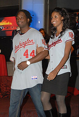
Party-line coverage here, video coverage here (a very good report) and here, some photos from reader Mike Page, who was at the unveiling, here, and you can actually download a Power Point file detailing all the changes here.
Uni Watch News Ticker: It’s kinda sad that there’s something called the Miami Xtreme Youth Football League. As you might expect, their uniforms practically qualify as child abuse (with thanks to Andrew Tanker). ”¦ Ken Clark attended Saturday’s USC/Washington game and noticed something interesting: a guy standing behind the end zone while wearing a black suit emblazoned with a giant swoosh. “Let me reiterate that he was wearing a suit, not a sports jersey or some other casualwear,” says Ken. “He also had a swoosh on the front, somewhere near his breast pocket. This guy carried a portable two-way radio/walkie-talkie, so I think he works for USC in some manner. Any idea what was going on there?” Nope. Anyone else..? ”¦ Tris Wykes has written an article about field hockey eyewear. ”¦ Check this out: Oregon State was wearing solid black way back in 1965 (nice find by Mike Mazzucchelli). ”¦ Here’s a good view of Andrew Raycroft’s new mask (with thanks to John Muir). ”¦ I’m generally no fan of Reebok, but I in this case I’ll make an exception (with thanks to Roger Faso). … The Tommie Agee marker lives! Dwayne White says he found that photo on a baseball-fever.com thread, but he didn’t provide any background info regarding what’s happening to the marker. Did someone buy it? Is it just sitting in the Meigray warehouse? I’ll follow up and have more info next week. … Reprinted from last night’s comments: Here’s another shot I’d never seen of NC State’s unitards. … Utah wore solid black last night. … Wampum in action! Great find by Larry Wiederecht.
And the female version of the jersey doesn’t match the real one. Quality control people, quality control.
The new road uniform, may be making their typography even more confusing, but its 100 times better looking than the old road uni.
And those stars and stripes alternates are gaud awful.
2 consecutive days of bad baseball jerseys makes me sad.
Virginia Tech’s monotone uniforms last night were nasty too.
The Xtreme need to pick one style of sock.
Does anyone else know anything about this Flutie Statue unveiling at BC? I heard about it on Mike and Mike. Like to see what he’s wearing. Think the swoosh will appear?
i thought i had read somewhere on uniwatch, can’t remember if it was paul’s post or in comments, that the dolphins were in discussions to change their uniforms. is this confirmed?
Overall, interesting observations about the new Nats unis. After thinking about it, and being in the service, the blue alts are a bit much. Mr. Lukas, 2 things: 1)are you going to make it to D.C. soon? and 2)there is a guy buy the name of Phil Wood who has a huge stash of Senators unis, etc. Definetly recommend you touch base(no pun intended) Anyway, at least it’s not purple
I don’t know about you guys, but im kinda mad a sub-par team (the Nationals) are stealing jerseys from my own favorite sub-par team (the Reds)…
Today’s NY Times has an article about the guy who is responsible for making sure that the MLB outfield ads do not the hide the pitch from the batters (too much white or yellow).
Did Todd Radom play any part in these Nationals changes, or did they just do this on their own?
It seems like such a departure from the consistency of his original design, that I’m guessing they didn’t ask his opinion.
I agree that some consistency on the Nats road unis would have been nice, but the script Washington, is TONS better than the WordArt inspired version.
What’s up with the DC and W’s on the alternates (men’s version) being so freakin’ huge?
And why does a team that doesn’t have two outfielders who can catch flyballs on a regular basis sporting two alternate uniforms?
The Virginia Tech Hokies wore all maroon for the first time since getting their new link. Apparently Darren Evans, who set the school’s single-game rushing record, had a few knee-pad problems.
i am so getting a link for casual fridays
Per the Nationals new jerseys…and here I thought Starter was dead and buried. It’s like 1994 again.
The swoosh on that suit looks homemade to me–it’s too fat at the tail end. It also looks like there’s a numeral 20 (or possibly 28) written in it on the left side.
Weird.
Never mind Oregon State in black, dig the vertical on that D-lineman!
[quote comment=”298706″]Never mind Oregon State in black, dig the vertical on that D-lineman![/quote]
Bill Yearby in the Rose Bowl. Michigan crushed the Ducks that year. Maybe the superstition of not wearing “unlucky” colors after a tough loss goes back to 1965 too!
Man in Nike suit = Mondo Toolo
[quote comment=”298693″]The new road uniform, may be making their typography even more confusing, but its 100 times better looking than the old road uni.
[/quote]
I liked the old Washington road jerseys. They had a nice, modern look without being too over the top.
Did anyone check out the all black uni’s for UTAH last night. Thought they were going to be a jinx. But they got lucky kicker missed fg’s. Love Fresno St tonight get full write up link
Ask and ye shall recieve… Hagerstown’s own Rodney Monroe in a unitard…
This is going to be a good day.
[quote comment=”298707″][quote comment=”298706″]Never mind Oregon State in black, dig the vertical on that D-lineman![/quote]
Bill Yearby in the Rose Bowl. Michigan crushed the Ducks that year. Maybe the superstition of not wearing “unlucky” colors after a tough loss goes back to 1965 too![/quote]
ducks or beavers?
The Nike suit is being worn by former Trojan Anthony Davis…here’s a front view:
link
See now i’m confused. Does the link not have the front numbers on it? If so, you could always sew on your own number with the same font as the back number if you were to buy one of these bad boys.
I think I may agree with most people when I say that they just missed a great jersey with these things. I like what they’re trying to do but they didn’t quite hit it.
Regarding the alternates (red/blue); the red could be good, but it’s not original at all (see reds fans above), the blue is bad, but as I read yesterday, it will only be seen 7 times in a season. Who knows, maybe they win all 7 and are tempted to redo their whole jersey design in ’10.
shudder..
Shouldn’t the T. Agee marker be displayed somewhere in or around the Mets new stadium?
Two different number styles on the front and back of a baseball jersey? A mistake, yes? That is just not done deliberatley.
[quote comment=”298713″][quote comment=”298707″][quote comment=”298706″]Never mind Oregon State in black, dig the vertical on that D-lineman![/quote]
Bill Yearby in the Rose Bowl. Michigan crushed the Ducks that year. Maybe the superstition of not wearing “unlucky” colors after a tough loss goes back to 1965 too![/quote]
ducks or beavers?[/quote]
oops, Beavers. I’m always confusing my Ducks and Beavers! And looking thru my library, that might not be Yearby. So I could be 0 and 2 on my comment!
[quote comment=”298715″]See now i’m confused. Does the link not have the front numbers on it? If so, you could always sew on your own number with the same font as the back number if you were to buy one of these bad boys.
[/quote]
Any jersey bought would be ‘uncustomized’ so they’d come blank on the back and the front number area would also be blank. So the only conflict would be between the sleeve DC and front Washington (ironic that there’d be stylistic differences within Washington DC). Effectively minimizing Paul’s big complaint.
They’d be better off ditching the bevels altogether.
[quote]I’m always confusing my Ducks and Beavers![/quote]
NTTAWWT
As inaccurate as the new Nat’s road jerseys are, I am rather fond of them. I love the script. I love the front number. I never was a fan of the beveled number or the beveled logo. I don’t know why they didn’t phase that out. But, as a whole, these are a massive improvement.
Local DC baseball scribe and uni-fan Phil Wood gives a pretty good breakdown on the new Nats garb.
link
[quote comment=”298719″][quote]I’m always confusing my Ducks and Beavers![/quote]
NTTAWWT[/quote]
Heh.
Clearly Marc Fisher (The Washinton Post columnist who made the “Up With People” comment) has been watching plenty of Caps hockey for the last couple seasons:
[quote]The old Bullets and Caps were deep into the red, white and blue years ago, and a fat lot of good it did them. You’ll notice that they’ve left that graphics legacy far behind them–and they’re doing far better these days.[/quote]
Yep. link, indeed.
[quote comment=”298714″]The Nike suit is being worn by former Trojan Anthony Davis…here’s a front view:
link
What a degenerate POS
I attended the U of Minnesota’s exhibition basketball game vs. D-II Northern State University last night and got my first look at their new uniforms. The most distinctive element is the maroon piping on the jersey and shorts. Rather than starting at the armpit and running straight down the side, it starts at about the shoulder blades and runs straight down the sides of the player’s back. On the shorts, the stripe swings toward the front ending up in front of the “M” logo centered on the side of the short. This page has the best photo I could find of it.
link
The biggest problem is the stripes on the jerseys rarely line up with the stripes on the shorts, and it seems more noticable when that intersection is located on the player’s back rather than his sides.
Another unique aspect is when the stripe meets the arm holes, it turns gold, so there is a gold border around the arm, as you can see in this picture.
link
The gold on the stripe appears to be shinier than the gold in the rest of the jersey so it stands out in person – basically a bright yellow strip on the shoulders.
There was also some RNOB action with Ralph Sampson III, although I don’t have a pic. And Northern State has a unique design on the front of the jersey. It says “WOLVES” in large letters, and underneath that it says “Northern State” in much smaller letters, which you can see in this gallery:
link
I am absolutely torn on what to think….
Pittsburgh penguins alternate jerseys.. they have sportd the light blue in the past and will again this year.. it’s a really nice jersey and looks good on the ice.. but…
one of my favorite anomalies in all of sports is the all professional teams from pittsburgh wear black and yellow.. now the black and yellow are still in the jersey, but not he prodominant color.. i just don’t know what to think.. I wish the penguins jerseys were were more ugly, that way I could give a more whole hearted complaint..
on a related note:: next time i see the steelers in those ugly yellow jerseys with the ugly helmets I’m probably gonna ralph.
[quote comment=”298714″]The Nike suit is being worn by former Trojan Anthony Davis…here’s a front view:
link
Wow.
I’m starting my own ‘foundation’ it’ll also go towards sending kids to school. But I’ll have more meager goals, only two kids…..I’ll start with my own.
Can’t this guy get a job as a WalMart greeter?
I am absolutely torn on what to think….
Pittsburgh penguins alternate jerseys.. they have sportd the light blue in the past and will again this year.. it’s a really nice jersey and looks good on the ice.. but…
one of my favorite anomalies in all of sports is the all professional teams from pittsburgh wear black and yellow.. now the black and yellow are still in the jersey, but not he prodominant color.. i just don’t know what to think.. I wish the penguins jerseys were were more ugly, that way I could give a more whole hearted complaint..
on a related note:: next time i see the steelers in those ugly yellow jerseys with the ugly helmets I’m probably gonna ralph.
I disagree. I think it’s fine the Pens and Steelers switch it up every now and then. Now, I will admit the Pirates look like Team Mickey D’s when they wear the red alt’s but at least the Pens and Steelers go back to their roots to find their alternates! Let’s just be thankful the Pens don’t have some gold alternate or the Steelers have a yellow alternate!
Throwbacks are nice. Red vests are not.
sorry for my bad html skills!
[quote comment=”298722″][quote comment=”298719″][quote]I’m always confusing my Ducks and Beavers![/quote]
NTTAWWT[/quote]
Heh.[/quote]
Not That There’s Anything Wrong With That
[quote comment=”298698″]I don’t know about you guys, but im kinda mad a sub-par team (the Nationals) are stealing jerseys from my own favorite sub-par team (the Reds)…[/quote]
They have our old GM, a good deal of our old players, and some of their coaches used to play for us (Lenny Harris, I believe) … Leather Pants wants DC to be Cincinnati east … he ruined 1 team and is going for another
[quote comment=”298695″]Does anyone else know anything about this Flutie Statue unveiling at BC? I heard about it on Mike and Mike. Like to see what he’s wearing. Think the swoosh will appear?[/quote]
Funny… BC is a link school, though.
[quote comment=”298725″]I attended the U of Minnesota’s exhibition basketball game vs. D-II Northern State University last night and got my first look at their new uniforms. The most distinctive element is the maroon piping on the jersey and shorts. Rather than starting at the armpit and running straight down the side, it starts at about the shoulder blades and runs straight down the sides of the player’s back. On the shorts, the stripe swings toward the front ending up in front of the “M” logo centered on the side of the short. This page has the best photo I could find of it.
link
The biggest problem is the stripes on the jerseys rarely line up with the stripes on the shorts, and it seems more noticable when that intersection is located on the player’s back rather than his sides.
Another unique aspect is when the stripe meets the arm holes, it turns gold, so there is a gold border around the arm, as you can see in this picture.
link
The gold on the stripe appears to be shinier than the gold in the rest of the jersey so it stands out in person – basically a bright yellow strip on the shoulders.
There was also some RNOB action with Ralph Sampson III, although I don’t have a pic. And Northern State has a unique design on the front of the jersey. It says “WOLVES” in large letters, and underneath that it says “Northern State” in much smaller letters, which you can see in this gallery:
link
Is that a teeny-tiny swoosh I see link on the collar?
[quote comment=”298714″]The Nike suit is being worn by former Trojan Anthony Davis[/quote]
the
expressautographer: theernieanthony davis story[quote] Throwbacks are nice. Red vests are not.[/quote]
agreed..
[quote comment=”298733″][quote comment=”298725″]I attended the U of Minnesota’s exhibition basketball game vs. D-II Northern State University last night and got my first look at their new uniforms. The most distinctive element is the maroon piping on the jersey and shorts. Rather than starting at the armpit and running straight down the side, it starts at about the shoulder blades and runs straight down the sides of the player’s back. On the shorts, the stripe swings toward the front ending up in front of the “M” logo centered on the side of the short. This page has the best photo I could find of it.
link
The biggest problem is the stripes on the jerseys rarely line up with the stripes on the shorts, and it seems more noticable when that intersection is located on the player’s back rather than his sides.
Another unique aspect is when the stripe meets the arm holes, it turns gold, so there is a gold border around the arm, as you can see in this picture.
link
The gold on the stripe appears to be shinier than the gold in the rest of the jersey so it stands out in person – basically a bright yellow strip on the shoulders.
There was also some RNOB action with Ralph Sampson III, although I don’t have a pic. And Northern State has a unique design on the front of the jersey. It says “WOLVES” in large letters, and underneath that it says “Northern State” in much smaller letters, which you can see in this gallery:
link
Is that a teeny-tiny swoosh I see link on the collar?[/quote]
No — just a reflection:
link
Maker’s marks are not allowed on college hoops jerseys.
[quote comment=”298735″][quote] Throwbacks are nice. Red vests are not.[/quote]
agreed..[/quote]
reminds me of link and link and link
[quote comment=”298736″]
No — just a reflection:
link
Maker’s marks are not allowed on college hoops jerseys.[/quote]
Ah, much easier to see with the bigger photo. I thought maybe there was some kind of loophole with it being an exhibition game or something.
Still looks a bit like a swoosh, though.
Not a big fan of the dull, lifeless gray road Nats jersey. I know the team’s in the nation’s capital, and their predecessor also had red, white, and blue, but these days it seems like half the league has red as its main color and I liked the primarily-navy-blue aspect of the old road outfits. The loss of the distinctive gold trim makes it that much more “blah”.
Take away the garish blue alternate and they’re Cincinnati Lite. The Diamondbacks did the same thing, becoming a clone of the Astros — it’s like there are two fewer teams in the league now.
I really liked the Nationals road and alternate uniforms..I thought they looked sharp. But now…I shake my head in disappointment.
[quote comment=”298736″][quote comment=”298733″][quote comment=”298725″]I attended the U of Minnesota’s exhibition basketball game vs. D-II Northern State University last night and got my first look at their new uniforms. The most distinctive element is the maroon piping on the jersey and shorts. Rather than starting at the armpit and running straight down the side, it starts at about the shoulder blades and runs straight down the sides of the player’s back. On the shorts, the stripe swings toward the front ending up in front of the “M” logo centered on the side of the short. This page has the best photo I could find of it.
link
The biggest problem is the stripes on the jerseys rarely line up with the stripes on the shorts, and it seems more noticable when that intersection is located on the player’s back rather than his sides.
Another unique aspect is when the stripe meets the arm holes, it turns gold, so there is a gold border around the arm, as you can see in this picture.
link
The gold on the stripe appears to be shinier than the gold in the rest of the jersey so it stands out in person – basically a bright yellow strip on the shoulders.
There was also some RNOB action with Ralph Sampson III, although I don’t have a pic. And Northern State has a unique design on the front of the jersey. It says “WOLVES” in large letters, and underneath that it says “Northern State” in much smaller letters, which you can see in this gallery:
link
Is that a teeny-tiny swoosh I see link on the collar?[/quote]
No — just a reflection:
link
Maker’s marks are not allowed on college hoops jerseys.[/quote]
What about on their shorts?
link
Son of a… Maybe this link will work.
link
[quote comment=”298713″][quote comment=”298707″][quote comment=”298706″]Never mind Oregon State in black, dig the vertical on that D-lineman![/quote]
Bill Yearby in the Rose Bowl. Michigan crushed the Ducks that year. Maybe the superstition of not wearing “unlucky” colors after a tough loss goes back to 1965 too![/quote]
ducks or beavers?[/quote]
Beavers in all-black goes even farther back, to ’60 or so, to the Terry Baker era (they wore black pants with a single orange stripe during his entire time there). Not sure about before that. Be interesting to see how far back it DOES go. During the Paul Brothers era (the QB shown in the photo) they switched to white pants and black helmets. I have a photo of him in that uni, too…somewhere.
Oregon State also was one of the first schools to go the Riddell cleats with the white arch support in addition to the around-the-heel Snug-Ties.
Baker in all-black:
link
Road uni, but show the shoes I mentioned.
link
Baker also changed numbers during his stay. He started as a single-wing tailback (really) wearing #47. When they switched to the T-formation and he became a quarterback, he wore #11. Have a game action photo of him wearing 47 somewhere, too.
Snowing here in Twin Cities, btw. And Vikings-Packers this weekend, too. Oh, the apprehension, anticipation and ever-present angst of “Packer Week”.
—Ricko
Oops, try this…
link
Well, shoot…
link
One more try…
link
ok a couple things. first, what did you want the nats to do with the red jerseys if you think they look too much like the reds’ alts? leave out the trim? ok now its just a blank red jersey with a logo slapped on. that would get complaints here too. make it blue trim? well then the trim doesnt match either logo, again drawing complaints. and we’ve already seen what happens here when they put gold in anything…
second, there is always talk about teams needing to “go back to x jersey or logo” rather than needing to “make a change.” is it really that bad for teams to try new things, even if it is a marketing ploy? gotta remember, sports is an industry. its not some hallowed ground untouched by business. why go back to something on a full-time basis when chances are you can sell products with that logo and sell a boatload of products with a new logo? it just makes more sense to do it that way (granted im a bit of a hypocrite on this cuz i wish my school would go back to a certain script logo it left in the early nineties).
i know everyone is entitled to their opinion and i respect that wholeheartedly, but when was the last time something new got brought up here that didnt look like it was from the 1950s and was widely accepted?
[quote comment=”298695″]Does anyone else know anything about this Flutie Statue unveiling at BC? I heard about it on Mike and Mike. Like to see what he’s wearing. Think the swoosh will appear?[/quote]
Probably not since they are now a Reebok school!
Anyone have any idea if the Mets are altering their unis in any way? How about ditching the black?
top 10 make me wanna ralph uniforms…
(pro teams only… sorry oregon)
(also, omitting Padres Cammo unis)
link
link
link
link
link
link
link
link
link
link
actually… I kinda like this one
[quote comment=”298738″][quote comment=”298736″]
No — just a reflection:
link
Maker’s marks are not allowed on college hoops jerseys.[/quote]
Ah, much easier to see with the bigger photo. I thought maybe there was some kind of loophole with it being an exhibition game or something.
Still looks a bit like a swoosh, though.[/quote]
NCAA regulations disallow maufacturers’ logos on the jersey however a 1 5/8 or 1.625″, for some people, is allowed on the shorts!
[quote comment=”298740″]I really liked the Nationals road and alternate uniforms..I thought they looked sharp. But now…I shake my head in disappointment.[/quote]
The road uniform from 2005 to 2008 was distinctive. Now it’s just ordinary.
[quote comment=”298724″][quote comment=”298714″]The Nike suit is being worn by former Trojan Anthony Davis…here’s a front view:
link
What a degenerate POS[/quote]
That really is sad…but on a uni-note…check out the USC Black alt#4, to the back left of AD!
link
I, for one, think that cursive script is overused in baseball and would like to see old english font used more often.
When did cursive script appear on the scene, in baseball? The 50’s?
[quote comment=”298724″][quote comment=”298714″]The Nike suit is being worn by former Trojan Anthony Davis…here’s a front view:
link
What a degenerate POS[/quote]
No shit! What an ass… and WHY would he run around with Nike logos??? Is he sponsored? Or just trying to look important? Loser with a capital L!
[quote comment=”298731″][quote comment=”298698″]I don’t know about you guys, but im kinda mad a sub-par team (the Nationals) are stealing jerseys from my own favorite sub-par team (the Reds)…[/quote]
They have our old GM, a good deal of our old players, and some of their coaches used to play for us (Lenny Harris, I believe) … Leather Pants wants DC to be Cincinnati east … he ruined 1 team and is going for another[/quote]
Ol’ Leatherpants…….everytime I hear that it makes me smile! That guy…wotta douche.
[quote comment=”298747″]ok a couple things. first, what did you want the nats to do with the red jerseys if you think they look too much like the reds’ alts? leave out the trim? ok now its just a blank red jersey with a logo slapped on. that would get complaints here too. make it blue trim? well then the trim doesnt match either logo, again drawing complaints. and we’ve already seen what happens here when they put gold in anything…[/quote]
Well, there are lots of things they could have done differently so that they wouldn’t look almost indistinguishable from another team in the same league. How about red with link? How about off-white with dark blue sleeves? (Contrasting sleeve colors is something you don’t see enough of these days.)
And in an era where colored socks are usually hidden, gray just looks boring. That dull gray road shirt would look a little more tolerable if the players pulled their pant legs up and had multi-striped socks.
I myself like the gold — it’s distinctive without actually looking garish. I wish they’d kept it.
[quote comment=”298747″]is it really that bad for teams to try new things, even if it is a marketing ploy? [/quote]
That’s kinda the point, isn’t it? They aren’t trying anything new. It’s just a clone of the Reds’ alt. If they’re going to re-do the red alt, they should at least make it distinctive. The link had that much going for it.
Paul, no notice of the Bruins’ Blake Wheeler switching from #42 to link and scoring a hat trick last night?
RE: the Dick “Wampum” Allen picture… If that is a picture of him in an A’s uni (and he never played for The Royals), and Baez is with the Mariners, why do they appear to be playing at (what was at the time) Royals stadium? I’m making an assumption considering the Royals logo behind them. Is there something else going on there that I’m not aware of?
[quote comment=”298757″][quote comment=”298747″]ok a couple things. first, what did you want the nats to do with the red jerseys if you think they look too much like the reds’ alts? leave out the trim? ok now its just a blank red jersey with a logo slapped on. that would get complaints here too. make it blue trim? well then the trim doesnt match either logo, again drawing complaints. and we’ve already seen what happens here when they put gold in anything…[/quote]
Well, there are lots of things they could have done differently so that they wouldn’t look almost indistinguishable from another team in the same league. How about red with link? How about off-white with dark blue sleeves? (Contrasting sleeve colors is something you don’t see enough of these days.)
And in an era where colored socks are usually hidden, gray just looks boring. That dull gray road shirt would look a little more tolerable if the players pulled their pant legs up and had multi-striped socks.
I myself like the gold — it’s distinctive without actually looking garish. I wish they’d kept it.[/quote]
i agree actually. see, thats the kind of thinking that needs to go on in uniform design. tho i think as a whole that idea wouldve been rejected here had it been tried. but i agree, that would look good.
[quote comment=”298760″]RE: the Dick “Wampum” Allen picture… If that is a picture of him in an A’s uni (and he never played for The Royals), and Baez is with the Mariners, why do they appear to be playing at (what was at the time) Royals stadium? I’m making an assumption considering the Royals logo behind them. Is there something else going on there that I’m not aware of?[/quote]
In the ’70s & ’80s, several parks had the logos of the leagues’ other teams on the outfield fences.
[quote comment=”298758″][quote comment=”298747″]is it really that bad for teams to try new things, even if it is a marketing ploy? [/quote]
That’s kinda the point, isn’t it? They aren’t trying anything new. It’s just a clone of the Reds’ alt. If they’re going to re-do the red alt, they should at least make it distinctive. The link had that much going for it.[/quote]
actually that was a completely different complaint than my first one. sorry about the confusion. i shouldve made that more clear, my bad.
[quote comment=”298750″]top 10 make me wanna ralph uniforms…
(pro teams only… sorry oregon)
(also, omitting Padres Cammo unis)
link
link
link
link
link
link
link
link
link
link
actually… I kinda like this one[/quote]
I have to put link up there as well, i love the jersey, it just didn’t work well on the field, especially with the link but those stirrups sure are sweet!
[quote comment=”298726″]I am absolutely torn on what to think….
Pittsburgh penguins alternate jerseys.. they have sportd the light blue in the past and will again this year.. it’s a really nice jersey and looks good on the ice..
but…
one of my favorite anomalies in all of sports is the all professional teams from pittsburgh wear black and yellow.. now the black and yellow are still in the jersey, but not he prodominant color..
i just don’t know what to think.. I wish the penguins jerseys were were more ugly, that way I could give a more whole hearted complaint..
on a related note:: next time i see the steelers in those ugly yellow jerseys with the ugly helmets I’m probably gonna ralph.[/quote]
theres more “pittsburgh gold” in that blue jersey than there is in what they wear now….
Strangely, Milledge’s jersey had the non-beveled numbers, but the powerpoint shows that the jersey front DOES have beveled numbers.
Also, it looks like the Nats got halfway through an identity refresh then got bored and quit. Still two very distinct styles (bevel vs. curly) that now are even more in conflict.
Personally, much though I love Mr. Radom’s designs in general, I’d love to see them go all-curly no-bevel.
So I was playing my daily morning game of NBA live 09 this morning, playing my franchise, when I stumbled across something very interesting. I was playing against the Warriors at home and obviously scroll through all the jerseys and choose the best ones for each team before the game… Interestingly enough, I stumbled upon the Warriors “second home” jersey which was the most hideous jersey I had ever seen.
link
link
link
After a little bit of research I found a gallery of quite possibly the ugliest jersey creations of all time. Scroll through them, I bet you cant find one nice one…
link
Basically, what I discovered, was that this warriors jersey was a contest winner and if your jersey wins for best, I mean ugliest, design, it gets put in the game
An update for any interested in the Auburn vs. UT-Martin game, in which two teams with functionally identical uniforms will face off: Auburn will allow UT-Martin to wear orange jerseys, while Auburn will wear white at home. Auburn wore their white jerseys at home last year vs. Vanderbilt as a nod to the ’57 national championship team.
Interesting info in the link about the 3 times back in the 70’s that Auburn wore orange home jerseys.
link
Checking in from Bloomington, Indiana. (Indiana/Northwestern men’s soccer on Big Ten Network tonight, 6:30pm ET, check your local listings.) (BTW, college soccer unis aren’t usually much to write home about and Indiana’s are as plain as they get.)
Too bad it’s Friday, Paul will likely have to wait until Monday to delve into the Broncos’ receiver with the black-and-white glove thing.
link
[quote comment=”298769″]Checking in from Bloomington, Indiana. (Indiana/Northwestern men’s soccer on Big Ten Network tonight, 6:30pm ET, check your local listings.) (BTW, college soccer unis aren’t usually much to write home about and Indiana’s are as plain as they get.)
Too bad it’s Friday, Paul will likely have to wait until Monday to delve into the Broncos’ receiver with the black-and-white glove thing.[/quote]
Unless our “weekend host” tackles it first. Perhaps the most anticipated debut since, well,….accepting suggestions.
[quote comment=”298771″][quote comment=”298769″]Checking in from Bloomington, Indiana. (Indiana/Northwestern men’s soccer on Big Ten Network tonight, 6:30pm ET, check your local listings.) (BTW, college soccer unis aren’t usually much to write home about and Indiana’s are as plain as they get.)
Too bad it’s Friday, Paul will likely have to wait until Monday to delve into the Broncos’ receiver with the black-and-white glove thing.[/quote]
Unless our “weekend host” tackles it first. Perhaps the most anticipated debut since, well,….accepting suggestions.[/quote]
bry is still on weekend duty till next weekend…
(but i’ll be accepting suggestions for weekend commentary as soon as paul gives me a tan box)
I really like the Nats new away uni’s, because the reference both the Senators and the Expos. The issue now is the home whites – how can they keep the block NATIONALS that doesn’t go with the pretzel W or the away script? I would make the home whites the reverse of the alternate red – plain white with a red pretzel W over the left breast. Their W is iconic, they need to feature it even more. Besides, it would de-emphasize the “Nationals” name, which is still a bit weak.
[quote]what did you want the nats to do with the red jerseys if you think they look too much like the reds’ alts?[/quote]
i donno…maybe keep them white or gray?
are they in a contest to see which NL east team has the most caps and alternates? christ, the mets are bad enough with 5 different unis…braves now have 4 different tops…marlins at least 3…
gotta say, i DO love the phillies creamy daytime homes tho…just wish they’d wear the red caps with those
[quote comment=”298769″]Checking in from Bloomington, Indiana. (Indiana/Northwestern men’s soccer on Big Ten Network tonight, 6:30pm ET, check your local listings.) (BTW, college soccer unis aren’t usually much to write home about and Indiana’s are as plain as they get.)[/quote]
That’s definitely true with the link, but the crimson are actually link.
[quote comment=”298747″]ok a couple things. first, what did you want the nats to do with the red jerseys if you think they look too much like the reds’ alts?[/quote]
Could always do some cross-marketing with the Caps and have a jersey with the weagle. IIRC Mark Lerner is a Caps’ minority owner.
[quote comment=”298770″]link[/quote]
so…he’s the guy who link?
[quote comment=”298755″][quote comment=”298724″][quote comment=”298714″]The Nike suit is being worn by former Trojan Anthony Davis…here’s a front view:
link
What a degenerate POS[/quote]
No shit! What an ass… and WHY would he run around with Nike logos??? Is he sponsored? Or just trying to look important? Loser with a capital L![/quote]
Even worse…check out the USC Black Alt in the background!
[quote comment=”298772″][quote comment=”298771″][quote comment=”298769″]Checking in from Bloomington, Indiana. (Indiana/Northwestern men’s soccer on Big Ten Network tonight, 6:30pm ET, check your local listings.) (BTW, college soccer unis aren’t usually much to write home about and Indiana’s are as plain as they get.)
Too bad it’s Friday, Paul will likely have to wait until Monday to delve into the Broncos’ receiver with the black-and-white glove thing.[/quote]
Unless our “weekend host” tackles it first. Perhaps the most anticipated debut since, well,….accepting suggestions.[/quote]
bry is still on weekend duty till next weekend…
(but i’ll be accepting suggestions for weekend commentary as soon as paul gives me a tan box)[/quote]
I was more referring to one of sport’s most overworked clichés: “Most anticipated debut since… (insert an over-hyped, probably over paid player, coach, stadium, etc.)” Difference is, this may live up to the hype ;-) Don’t forget to get Bryan’s bulls eye when he’s finished, pal!
[quote comment=”298779″]Don’t forget to get Bryan’s bulls eye when he’s finished, pal![/quote]
I’ll have a new one made for him — I’m keeping mine in case I’m needed for fill-in duty sometime. High school football playoffs are right around the corner.
[quote comment=”298777″][quote comment=”298770″]link[/quote]
so…he’s the guy who link?[/quote]
You know, I thought of him too. Looks more him than S.B.C., but he (I still don’t know his name) doesn’t have a well known “catch phrase” to attach to his picture.
[quote comment=”298780″][quote comment=”298779″]Don’t forget to get Bryan’s bulls eye when he’s finished, pal![/quote]
I’ll have a new one made for him — I’m keeping mine in case I’m needed for fill-in duty sometime. High school football playoffs are right around the corner.[/quote]
Maybe Phil can get one of those Oregon baseball jerseys and wear it backwards.
[quote comment=”298781″][quote comment=”298777″][quote comment=”298770″]link[/quote]
so…he’s the guy who link?[/quote]
You know, I thought of him too. Looks more him than S.B.C., but he (I still don’t know his name) doesn’t have a well known “catch phrase” to attach to his picture.[/quote]
SBC, aka borat, can look like anybody, whereas jason lee…well…he’s got that link even when he link link link
(or even link)
[quote comment=”298770″]link[/quote]
Bears a striking resemblence to this
Did anyone grab what Brady Quinn had written on the inside of his armband last night, i missed getting a screen grab.
forgot the link.
link
*Rant start*
I would love to know why most people got all over the Brewers this past season for un-tucking their jersey after a victory, showing team unity because of Cameron’s father tribute, and called their act “sloppy” and “inappropriate”…. but no one makes any mention of Brandon Roy of the Trail Blazers practically taking his jersey off after his winning 3-pointer yesterday versus the Rockets, when we all know it was a “look at me” moment:
link
*Rant over*
[quote comment=”298787″]*Rant start*
I would love to know why most people got all over the Brewers this past season for un-tucking their jersey after a victory, showing team unity because of Cameron’s father tribute, and called their act “sloppy” and “inappropriate”…. but no one makes any mention of Brandon Roy of the Trail Blazers practically taking his jersey off after his winning 3-pointer yesterday versus the Rockets, when we all know it was a “look at me” moment:
link
*Rant over*[/quote]
because it’s basketball, johnny
/no one gives a shit, since the whole league is “look at me”
[quote comment=”298788″][quote comment=”298787″]*Rant start*
I would love to know why most people got all over the Brewers this past season for un-tucking their jersey after a victory, showing team unity because of Cameron’s father tribute, and called their act “sloppy” and “inappropriate”…. but no one makes any mention of Brandon Roy of the Trail Blazers practically taking his jersey off after his winning 3-pointer yesterday versus the Rockets, when we all know it was a “look at me” moment:
link
*Rant over*[/quote]
because it’s basketball, johnny
/no one gives a shit, since the whole league is “look at me”[/quote]
Good call, Phil. I sometimes forget Milwaukee has a team. Turns out they got uniforms and everything. It’s really great!
[quote comment=”298788″][quote comment=”298787″]*Rant start*
I would love to know why most people got all over the Brewers this past season for un-tucking their jersey after a victory, showing team unity because of Cameron’s father tribute, and called their act “sloppy” and “inappropriate”…. but no one makes any mention of Brandon Roy of the Trail Blazers practically taking his jersey off after his winning 3-pointer yesterday versus the Rockets, when we all know it was a “look at me” moment:
link
*Rant over*[/quote]
because it’s basketball, johnny
/no one gives a shit, since the whole league is “look at me”[/quote]
Nicely put. Although I’ll happily go on record as saying it’s totally bogus on the field OR on the court.
I’m enjoying the Cameron-to-Yankees trade rumors, if only because there’s no way Cammy would get away with that shit in da Bronx (much less get everyone else on the team to go along with it).
[quote comment=”298773″]I really like the Nats new away uni’s, because the reference both the Senators and the Expos.[/quote]
Still don’t think that these really “reference” the Expos. Other than the fact that the Expos used a script wordmark in their final few years, but so did the Senators.
Think it’s much more likely that they’re referencing the Senators, frankly.
Not sure I’ve seen this before, in the Ticker or elsewhere. Ball State Head Coach Brady Hoke’s playcalling wristband is Nike-branded. This is a the best pic I could find (trust me, it’s a swoosh). Several other coaches on the sideline had the same ones. Noticed it while flipping across the game a couple of nights ago, but I don’t know how to make screen captures. If anyone can find a better image, great.
link
[quote comment=”298787″]*Rant start*
I would love to know why most people got all over the Brewers this past season for un-tucking their jersey after a victory, showing team unity because of Cameron’s father tribute, and called their act “sloppy” and “inappropriate”…. but no one makes any mention of Brandon Roy of the Trail Blazers practically taking his jersey off after his winning 3-pointer yesterday versus the Rockets, when we all know it was a “look at me” moment:
link
*Rant over*[/quote]
Johnny, I would be as critical of Brandon Roy as I am of the Brew Crew for this behavior, except that I pay very little attention to the NBA and was not aware of this behavior. Now that you have brought him to light, mark me down as an official critic.
[quote comment=”298793″][quote comment=”298787″]*Rant start*
I would love to know why most people got all over the Brewers this past season for un-tucking their jersey after a victory, showing team unity because of Cameron’s father tribute, and called their act “sloppy” and “inappropriate”…. but no one makes any mention of Brandon Roy of the Trail Blazers practically taking his jersey off after his winning 3-pointer yesterday versus the Rockets, when we all know it was a “look at me” moment:
link
*Rant over*[/quote]
Johnny, I would be as critical of Brandon Roy as I am of the Brew Crew for this behavior, except that I pay very little attention to the NBA and was not aware of this behavior. Now that you have brought him to light, mark me down as an official critic.[/quote]
I think someone needs to clip thier fingernails.
[quote comment=”298794″][quote comment=”298793″][quote comment=”298787″]*Rant start*
I would love to know why most people got all over the Brewers this past season for un-tucking their jersey after a victory, showing team unity because of Cameron’s father tribute, and called their act “sloppy” and “inappropriate”…. but no one makes any mention of Brandon Roy of the Trail Blazers practically taking his jersey off after his winning 3-pointer yesterday versus the Rockets, when we all know it was a “look at me” moment:
link
*Rant over*[/quote]
Johnny, I would be as critical of Brandon Roy as I am of the Brew Crew for this behavior, except that I pay very little attention to the NBA and was not aware of this behavior. Now that you have brought him to light, mark me down as an official critic.[/quote]
I think someone needs to clip thier fingernails.[/quote]
In case you are not getting what I’m getting at, looks like he gave himself a nice scratch while being an idiot.
[quote comment=”298732″][quote comment=”298695″]Does anyone else know anything about this Flutie Statue unveiling at BC? I heard about it on Mike and Mike. Like to see what he’s wearing. Think the swoosh will appear?[/quote]
Funny… BC is a link school, though.[/quote]
do we have to go through the whole sarcasm thing again? or do i need to post a link to the Ernie Davis statue article?
[quote comment=”298796″][quote comment=”298732″][quote comment=”298695″]Does anyone else know anything about this Flutie Statue unveiling at BC? I heard about it on Mike and Mike. Like to see what he’s wearing. Think the swoosh will appear?[/quote]
Funny… BC is a link school, though.[/quote]
do we have to go through the whole sarcasm thing again? or do i need to post a link to the Ernie Davis statue article?[/quote]
what’s even funnier is that the rbk thing was posted not once, but twice
Bitch. Bitch. Bitch. I can’t believe I’m reading so many negative comments about the Nat’s new road jersey. Everything about it says “baseball.” What’s the problem?
Sure, the two alts suck. But the script “Washington”, three color sleeve and collar piping – SO much better than the “tall-short-tall” block lettering rendered in like, five colors(?), of the old road jersey. Fix the home jersey to match the new road uni’s, and stop even trying to come up with alt’s – and the Nat’s could be next year’s Rays.
[quote comment=”298797″][quote comment=”298796″][quote comment=”298732″][quote comment=”298695″]Does anyone else know anything about this Flutie Statue unveiling at BC? I heard about it on Mike and Mike. Like to see what he’s wearing. Think the swoosh will appear?[/quote]
Funny… BC is a link school, though.[/quote]
do we have to go through the whole sarcasm thing again? or do i need to post a link to the Ernie Davis statue article?[/quote]
what’s even funnier is that the rbk thing was posted not once, but twice[/quote]
haha yea i noticed that when i got about halfway through the comments. i figured saying it once would be enough.. oh well.
by the way, i dont know if this has been posted here before but i came across this picture on google images when looking for a picture of the eagles all green look, of which i couldnt find so if anyone could help me out..
so any idea what the end zone celebration was going to be last night? i heard something about a black and white glove but…
link
try that
[quote comment=”298798″]Bitch. Bitch. Bitch. I can’t believe I’m reading so many negative comments about the Nat’s new road jersey. Everything about it says “baseball.” What’s the problem?
Sure, the two alts suck. But the script “Washington”, three color sleeve and collar piping – SO much better than the “tall-short-tall” block lettering rendered in like, five colors(?), of the old road jersey. Fix the home jersey to match the new road uni’s, and stop even trying to come up with alt’s – and the Nat’s could be next year’s Rays.[/quote]
Sure, the front of the jersey “says ‘baseball'” but unfortunately, the back of the jersey still says “XFL.”
If they’d do something about those beveled numbers, they’d have a very solid vanilla (that’s a compliment) uniform, but they’re trying to have it both ways. They need to pick a lane.
Out of curiosity, did anyone notice the nice fold-out in this week’s Sport Illustrated of all the college football players from various eras. I doesn’t seem like anyone has commented on it. My two cents: I was very impressed at accuracy of the uniforms, especially enjoyed the detail on some of the earliest players. I just love those heavy material pants, some with what looks like to be wooden inserts. Quite the contrast from Deion Sanders and his jewelery…
[quote comment=”298762″][quote comment=”298760″]RE: the Dick “Wampum” Allen picture… If that is a picture of him in an A’s uni (and he never played for The Royals), and Baez is with the Mariners, why do they appear to be playing at (what was at the time) Royals stadium? I’m making an assumption considering the Royals logo behind them. Is there something else going on there that I’m not aware of?[/quote]
In the ’70s & ’80s, several parks had the logos of the leagues’ other teams on the outfield fences.[/quote]
Ahhh… I guess I’m too young to remember that… Thanks.
[quote comment=”298804″]Out of curiosity, did anyone notice the nice fold-out in this week’s Sport Illustrated of all the college football players from various eras. I doesn’t seem like anyone has commented on it. My two cents: I was very impressed at accuracy of the uniforms, especially enjoyed the detail on some of the earliest players. I just love those heavy material pants, some with what looks like to be wooden inserts. Quite the contrast from Deion Sanders and his jewelery…[/quote]
I saw that. Great illustration. I’m sure Ricko is compiling his list of “mistakes”.
[quote comment=”298798″]and the Nat’s could be next year’s Rays.[/quote]
Just as soon as they find someone to take the likes of a guy such as Elijah Dukes (which is what the Rays did). Only problem is there are too many headcases on that club to relocate all of them. No, Mr. Bowden made his bed and Nats fans are going to have to sleep in it.
[quote comment=”298807″][quote comment=”298798″]and the Nat’s could be next year’s Rays.[/quote]
Just as soon as they find someone to take the likes of a guy such as Elijah Dukes (which is what the Rays did). Only problem is there are too many headcases on that club to relocate all of them. No, Mr. Bowden made his bed and Nats fans are going to have to sleep in it.[/quote]
Actually someone agrees: link
[quote comment=”298806″][quote comment=”298804″]Out of curiosity, did anyone notice the nice fold-out in this week’s Sport Illustrated of all the college football players from various eras. I doesn’t seem like anyone has commented on it. My two cents: I was very impressed at accuracy of the uniforms, especially enjoyed the detail on some of the earliest players. I just love those heavy material pants, some with what looks like to be wooden inserts. Quite the contrast from Deion Sanders and his jewelery…[/quote]
I saw that. Great illustration. I’m sure Ricko is compiling his list of “mistakes”.[/quote]
Actually, I haven’t seen it yet, but I’ll pick up an SI on the way home.
And, hey, I don’t go LOOKING for mistakes. I’m not THAT much of curmudgeon. I first love seeing all the old unis, but it’s normal to notice something that’s off. Like noticing a typo (plenty of them in my posts). Isn’t really passing judgment, just noticing.
I told Paul early-on, I’d never mean such things as criticism, just trying to add to the database. I’ve had quite a few many things VERY wrong and been straightened out since I started coming to Uni Watch. Always good to learn stuff I missed.
But I AM old, and you guys really don’t have to stop giving me grief about it. Shoot, was thinking just this a.m. that when I started following sports (and unis) the NBA consisted of New York, Boston, Philadelphia, Syracuse, Rochester, Fort Wayne, Minneapolis and St. Louis. Was at least two years before I finally figured out, for sure, the uni colors of the Rochester Royals (cuz never got a chance to see them when they came to town to play the Lakers).
Now, where’s my walker? Gotta get me that there new Sports Illy-strated.
[quote comment=”298800″]by the way, i dont know if this has been posted here before but i came across this picture on google images when looking for a picture of the eagles all green look, of which i couldnt find so if anyone could help me out..[/quote]
Ask and ye shall receive….
link
link
link
link
link
[quote comment=”298810″][quote comment=”298800″]by the way, i dont know if this has been posted here before but i came across this picture on google images when looking for a picture of the eagles all green look, of which i couldnt find so if anyone could help me out..[/quote]
Ask and ye shall receive….
link
link
link
link
link
I wish people would learn(read: agree with me) that the monochrome look works just fine, but only when paired with white, striped socks. Avoid the capri pants look at all costs, it doesn’t good on anyone, ever, and that includes when women wear them. It’s makes legs look stumpy and weird, not exactly the look an athlete or a woman would want to convey.
I tried to find that SI illustration online but wasn’t successful.
Regarding logos on outfield walls, a lot of teams definitely definitely did that. Montreal, St Louis, Three Rivers, Kingdome and Toronto on the walls, the Murph and Vet had theirs on the wall behind the outfield wall. Toronto had one AL division in right field and the other in left (there were only east and west back then). The logos were arranged based on the current standings. I’m not sure how many did that.
I’m sure there were others.
[quote comment=”298811″][quote comment=”298810″][quote comment=”298800″]by the way, i dont know if this has been posted here before but i came across this picture on google images when looking for a picture of the eagles all green look, of which i couldnt find so if anyone could help me out..[/quote]
Ask and ye shall receive….
link
link
link
link
link
I wish people would learn(read: agree with me) that the monochrome look works just fine, but only when paired with white, striped socks. Avoid the capri pants look at all costs, it doesn’t good on anyone, ever, and that includes when women wear them. It’s makes legs look stumpy and weird, not exactly the look an athlete or a woman would want to convey.[/quote]
Exactly. When high socks are involved, football unis seem to work better when there’s a color change at the knee.
Although, just because I was around when it was “cool” (and even before when it was what some teams wore; Bears, for example) I still kinda like white with white high socks. Again, that’s just me.
[quote comment=”298811″]
I wish people would learn(read: agree with me) that the monochrome look works just fine, but only when paired with white, striped socks.[/quote]
Wish not granted. I beg to differ:
link
link
link
[quote comment=”298815″][quote comment=”298811″]
I wish people would learn(read: agree with me) that the monochrome look works just fine, but only when paired with white, striped socks.[/quote]
Wish not granted. I beg to differ:
link
link
link
Wait a sec, I gotta amend what I said. SOME monochrome is helped but white knee socks. My thought was aimed more at “with dark pants”.
[quote comment=”298815″][quote comment=”298811″]
I wish people would learn(read: agree with me) that the monochrome look works just fine, but only when paired with white, striped socks.[/quote]
Wish not granted. I beg to differ:
link
link
link
Weeell, of course there are exceptions to every rule. And it was more of a guideline than a rule. You catch my drift. I like the monochrome look more on teams that have some kind of extra contrast, whether it be a contrasting helmet or sleeves. But you must admit, the pics would look a alot worse had the bears worn their other socks with the dark top stripes.
[quote comment=”298816″][quote comment=”298815″][quote comment=”298811″]
I wish people would learn(read: agree with me) that the monochrome look works just fine, but only when paired with white, striped socks.[/quote]
Wish not granted. I beg to differ:
link
link
link
Wait a sec, I gotta amend what I said. SOME monochrome is helped but white knee socks. My thought was aimed more at “with dark pants”.[/quote]
Ok ok, lets just say that 2 things are good when it comes to football unis, contrast, and striped socks and stop there.
JTH – Yeah, I didn’t get a good look at the backs. You’re right. If they simplified the font – maybe use something classic like the “Red Sox” font – I’d say they’d look pretty cool.
[quote comment=”298810″][quote comment=”298800″]by the way, i dont know if this has been posted here before but i came across this picture on google images when looking for a picture of the eagles all green look, of which i couldnt find so if anyone could help me out..[/quote]
Ask and ye shall receive….
link
link
link
link
link
Hahah I didnt mean to bring up the whole monochrome discussion. Thanks for the pics.
[quote comment=”298820″][quote comment=”298810″][quote comment=”298800″]by the way, i dont know if this has been posted here before but i came across this picture on google images when looking for a picture of the eagles all green look, of which i couldnt find so if anyone could help me out..[/quote]
Ask and ye shall receive….
link
link
link
link
link
Hahah I didnt mean to bring up the whole monochrome discussion. Thanks for the pics.[/quote]
Funny how there is picture of Champ Bailey as a ‘Skin. That means Clinton Portis was still in Denver and the uniforms were still in proper order.
I’ve managed to spend an entire day lurking… I’m talented!
The Nationals have all the beginnings of a f**king tragedy, uniformically.
I love those baby-blue Penguins jerseys.
I’ll absolutely be picking up a Crosby one ASAP.
I’m probably the least patriotic person I know…it’s not that I hate this country, I don’t. I just am not the type of person that feels the need to show off my love for it.
With that being said, I found it kind of ironic, but I love the blue alt. I just like how different it is. Is it silly? Probably. But it’s something that stands out and I just think it looks sharp.
[quote]Funny how there is picture of Champ Bailey as a ‘Skin. That means Clinton Portis was still in Denver and the uniforms were still in proper order.[/quote]
and, the skins would have looked sooooo much better if they had link on monday night
As far as I know they’ve only done this once, October 27, 2002. Interesting look:
link
[quote comment=”298827″]As far as I know they’ve only done this once, October 27, 2002. Interesting look:
link
Was gonna ask about that combo.
And I don’t recall: Have the Patriots worn their white jerseys with silver pants…since they changed from royal to navy, that is?
[quote comment=”298826″][quote]Funny how there is picture of Champ Bailey as a ‘Skin. That means Clinton Portis was still in Denver and the uniforms were still in proper order.[/quote]
and, the skins would have looked sooooo much better if they had link on monday night[/quote]
Or had Bruce Smith and Champ Bailey.
[quote comment=”298828″][quote comment=”298827″]As far as I know they’ve only done this once, October 27, 2002. Interesting look:
link
Was gonna ask about that combo.
And I don’t recall: Have the Patriots worn their white jerseys with silver pants…since they changed from royal to navy, that is?[/quote]
Since 2000 (when they switched to the navy uniforms), they’ve only worn the white tops with navy pants, and the silver tops with navy pants. Aside from the one game in 2002 when they went monochromatic, and the Thanksgiving game where they wore the red throwbacks, I don’t think they’ve ever deviated from the navy/silver and white/navy. And they’ve ALWAYS worn the striped socks with the navy pants.
[quote comment=”298826″][quote]Funny how there is picture of Champ Bailey as a ‘Skin. That means Clinton Portis was still in Denver and the uniforms were still in proper order.[/quote]
and, the skins would have looked sooooo much better if they had link on monday night[/quote]
And those matte pants look SO much better than the current shiny ones, IMHO.
[quote comment=”298831″][quote comment=”298826″][quote]Funny how there is picture of Champ Bailey as a ‘Skin. That means Clinton Portis was still in Denver and the uniforms were still in proper order.[/quote]
and, the skins would have looked sooooo much better if they had link on monday night[/quote]
And those matte pants look SO much better than the current shiny ones, IMHO.[/quote]
Duh. The uniform top wouldn’t match the bottom. Yeech. Shiny pants are for Elton John, not for football.
[quote comment=”298832″][quote comment=”298831″][quote comment=”298826″][quote]Funny how there is picture of Champ Bailey as a ‘Skin. That means Clinton Portis was still in Denver and the uniforms were still in proper order.[/quote]
and, the skins would have looked sooooo much better if they had link on monday night[/quote]
And those matte pants look SO much better than the current shiny ones, IMHO.[/quote]
Duh. The uniform top wouldn’t match the bottom. Yeech. Shiny pants are for Elton John, not for football.[/quote]
Note: not gay bashing, just saying the guy wears outlandish stuff
[quote comment=”298773″]I really like the Nats new away uni’s, because the reference both the Senators and the Expos. The issue now is the home whites – how can they keep the block NATIONALS that doesn’t go with the pretzel W or the away script? I would make the home whites the reverse of the alternate red – plain white with a red pretzel W over the left breast. Their W is iconic, they need to feature it even more. Besides, it would de-emphasize the “Nationals” name, which is still a bit weak.[/quote]
am I the only one that thinks the alt unis aren’t “uniform” – with respect to the number placement.
to me,
link
link
number placement on the horizontal plane across the chest is more uniform than
diagonal
link
Oh Come On!
I’ve been gone a couple days…. and LI Phil has the special “look at me, I’m important” yellow box around his comments?? What did I miss….
[quote comment=”298836″]I’ve been gone a couple days…. and LI Phil has the special “look at me, I’m important” yellow box around his comments?? What did I miss….[/quote]
LI Phil has been promoted to part-time moderator status by Paul.
[quote comment=”298836″]I’ve been gone a couple days…. and LI Phil has the special “look at me, I’m
importantimpotent” yellow box around his comments?? What did I miss….[/quote]fixed
;)
Interesting pic, uni-wise:
link
[quote comment=”298813″]Regarding logos on outfield walls, a lot of teams definitely definitely did that. Montreal, St Louis, Three Rivers, Kingdome and Toronto on the walls, the Murph and Vet had theirs on the wall behind the outfield wall. Toronto had one AL division in right field and the other in left (there were only east and west back then). The logos were arranged based on the current standings. I’m not sure how many did that.
I’m sure there were others.[/quote]
The Mets used to do this, too.
[quote comment=”298836″]I’ve been gone a couple days…. [/quote]
Well, let that be a lesson. Stay in touch, stay informed. Nothing wrong with being away, but coming back and popping off says “look at me” more than a yellow box.
[quote comment=”298836″]I’ve been gone a couple days…. and LI Phil has the special “look at me, I’m important” yellow box around his comments?? What did I miss….[/quote]
heh…it’s bench coach…although i prefer ‘intern’ or ‘boy’…(mr. lukas…you like extra starch, right?)
/the box is “tan”
//(shhhh…don’t tell bry, but paul tripled his salary for me ;))
[quote comment=”298839″]Interesting pic, uni-wise:
link
You know it’s bad logo creep when the PEOTUS has no less than three visible Nike trademarks in a press-release picture of himself.
[quote comment=”298842″][quote comment=”298836″]I’ve been gone a couple days…. and LI Phil has the special “look at me, I’m important” yellow box around his comments?? What did I miss….[/quote]
heh…it’s bench coach…although i prefer ‘intern’ or ‘boy’…(mr. lukas…you like extra starch, right?)
/the box is “tan”
//(shhhh…don’t tell bry, but paul tripled his salary for me ;))[/quote]
This place is an aesthetics place… so can someone explain why your box matches nothing else on the entire website?
[quote comment=”298842″][quote comment=”298836″]I’ve been gone a couple days…. and LI Phil has the special “look at me, I’m important” yellow box around his comments?? What did I miss….[/quote]
heh…it’s bench coach…although i prefer ‘intern’ or ‘boy’…(mr. lukas…you like extra starch, right?)
/the box is “tan”
//(shhhh…don’t tell bry, but paul tripled his salary for me ;))[/quote]
Also, I’m pretty sure Paul would cry if you starched his stirrups, Phil… or his jock, for that matter.
[quote comment=”298728″]I am absolutely torn on what to think….
Pittsburgh penguins alternate jerseys.. they have sportd the light blue in the past and will again this year.. it’s a really nice jersey and looks good on the ice.. but…
one of my favorite anomalies in all of sports is the all professional teams from pittsburgh wear black and yellow.. now the black and yellow are still in the jersey, but not he prodominant color.. i just don’t know what to think.. I wish the penguins jerseys were were more ugly, that way I could give a more whole hearted complaint..
on a related note:: next time i see the steelers in those ugly yellow jerseys with the ugly helmets I’m probably gonna ralph.
I disagree. I think it’s fine the Pens and Steelers switch it up every now and then. Now, I will admit the Pirates look like Team Mickey D’s when they wear the red alt’s but at least the Pens and Steelers go back to their roots to find their alternates! Let’s just be thankful the Pens don’t have some gold alternate or the Steelers have a yellow alternate!
Throwbacks are nice. Red vests are not.[/quote]
I happen to like the red vests. The Pirates did wear red at one time in their history.
[quote comment=”298829″][quote comment=”298826″][quote]Funny how there is picture of Champ Bailey as a ‘Skin. That means Clinton Portis was still in Denver and the uniforms were still in proper order.[/quote]
and, the skins would have looked sooooo much better if they had link on monday night[/quote]
Or had Bruce Smith and Champ Bailey.[/quote]
Well with Bruce Smith being 45 and Champ Bailey being hurt, how much better could they have done? Then again……
(do we really need sarcasm tags?)
[quote comment=”298846″]
I happen to like the red vests. The Pirates did wear red at one time in their history.[/quote]
So have over half the teams in baseball, but you don’t see them dressed like the guys you hand your car keys to when you pull up at a restaurant.
[quote comment=”298799″][quote comment=”298797″][quote comment=”298796″][quote comment=”298732″][quote comment=”298695″]Does anyone else know anything about this Flutie Statue unveiling at BC? I heard about it on Mike and Mike. Like to see what he’s wearing. Think the swoosh will appear?[/quote]
Funny… BC is a link school, though.[/quote]
do we have to go through the whole sarcasm thing again? or do i need to post a link to the Ernie Davis statue article?[/quote]
what’s even funnier is that the rbk thing was posted not once, but twice[/quote]
haha yea i noticed that when i got about halfway through the comments. i figured saying it once would be enough.. oh well.[/quote]
always fun to make fun of people who don’t read UW every day
nice tv numbers on the kids Miami Xtreme Youth Football League jerseys.
No Fun League strikes again:
link
Ah, the NFL sees the error of its ways:
link
WWE wrestler Kelly Kelly (yes, they really call her that) wore a Tampa Bay Lightning jersey on Monday. It can be seen in two of the photos in link.
[quote comment=”298773″]I really like the Nats new away uni’s, because the reference both the Senators and the Expos. The issue now is the home whites – how can they keep the block NATIONALS that doesn’t go with the pretzel W or the away script? I would make the home whites the reverse of the alternate red – plain white with a red pretzel W over the left breast. Their W is iconic, they need to feature it even more. Besides, it would de-emphasize the “Nationals” name, which is still a bit weak.[/quote]
Exactly right