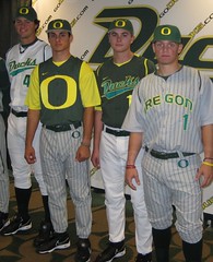
After a nearly three-decade gap, Oregon will be returning to the college baseball fray next spring, and yesterday Nike unveiled the team’s new baseball togs. At first glance, a few things jump out — the oddly truncated pants piping (vaguely reminiscent of Korea’s WBC design), the annoying thigh logo, the guy wearing his IQ on his chest. But if we take a closer look, a few subtler details become apparent:
• The reason the pants piping is truncated is that the pants have an odd tailoring pattern. Look at the seam wrapping around the hip here and here.
• You know how some hoops uniforms have contrasting rear necklines? Nike appears to be bringing that concept to the Oregon baseball team, as seen here and here.
• Similarly, it looks like the vests have partial outlining on the armholes. Looks like a new undershirt concept, too.
• Here’s the best part: According to the press release, the pinstripes on the gray uniforms “are made with the words of the Oregon fight song,” which you can sorta-kinda see here. (I’d be all in favor of doing this for the Mets’ pinstripes, as long as they included the rarely heard second verse of “Meet the Mets,” which includes the line “All the fans are true to the orange and blue” — no mention of black.)
I don’t follow college baseball (and let’s face it, neither does anyone else except MLB scouts), so for all I know maybe some of these elements have already been incorporated into other schools’ uniforms, although I kinda doubt it. But if nobody watches college baseball anyway, then does any of this even matter? Yes, and here’s why: Nike badly wants to get its hands on the MLB uniform contract when Majestic’s deal is up at the end of next year, which means some of these design concepts could be headed to a big league ballpark near you.
Meanwhile, if you take another look at Oregon’s press release, there’s a very telling choice of words lurking within the third graf:
Like uniforms for other Oregon sports programs, the Ducks new baseball uniforms are designed for performance as well as style, with the ultimate goal to remove any distractions so an athlete can perform to its full potential.
Note the choice of words at the end there — not “his potential” (or hers, as the case might be), but its potential. There’s the Nike/Oregon approach in a nutshell: the athlete as promotional robot, just a means to a marketing end. Is there any doubt that they’d replace the live athletes with androids if they could?
Personally, I’d use green and gold: On Tuesday I had a short Page 2 piece about how counterintuitive it is for red — normally a leftist-associated color — to be the unofficial “team color” of the Republican party (in case you missed it, scroll to the middle of this page). That prompted a response from Josh Starr, who said he could explain the “real history” behind the way red and blue got assigned to the two major parties. Here’s his story:
I was a polling analyst for Mark Penn and Doug Schoen in 1995, when we were brought in by Dick Morris and Bill Clinton to do the polling for Clinton’s 1996 re-election campaign.
In 1995 and 1996, there were private weekly meetings (Wednesday nights) held in the White House residence on Wendesday nights to plan the campaign. It was a small group (Clinton, Morris, Penn, Schoen, Al Gore, Leon Panetta, Bob Squier, Bill Knapp, George Stephenopolous, maybe a few others). These meetings were later detailed, I believe after the election, by The New York Times.
For each week’s meeting, I would develop maps of the status of the electoral college, as well as maps of media buys and visits by the Clinton and Dole campaigns. At the time, mapping software was making it easier to create these kinds of maps. I was known as “the Map Guy.”
When you sit down to develop an electoral map, you have to actively decide which colors to use. I did some research at the library (this was before the extensive online resources we have today) and found that the networks were inconsistent in their assignment of colors to the different parties, so that wasn’t helpful. And the parties themselves tended to use red, white, and blue — again, no help.
So I decided to assign the Democrats blue and Republicans red. I wavered between green and yellow for “toss-ups.”
After a few weeks of meetings using these maps, Mark Penn came back to my office (something he rarely did) and said something like, “Josh, they love the maps, they’re a big hit. The President loves it.” He then said the President had asked him why we chose these colors for the parties.
As I explained to Mark, there were several reasons. For one, the term “Blue Dog Democrats” was thrown around in the early and mid-’90s, so the association stuck with me. In addition, we were centrist Democrats and I never liked the association of our party with red communism. So I wanted to symbolically throw the red back at the Republicans. I also saw the Republicans as more angry/red in the face/out of control, since this was the era of the Newt Gingrich and the Contact with America. In addition, I associated red with a “red light” and stopping, while blue connotes something more positive and forward-thinking. All of these were reasons that went into my decision.
So that was the genesis of the color selection.
From these meetings, the shorthand vernacular turned to using the terms “red states” and “blue states” and spread from the private meetings to conversations with political professionals and the media. By 2000, these terms had been part of the DC language for years.
The funny thing is, I am a public opinion researcher and we never tested the branding impact of the colors red and blue — yet this is one decision that (unintentionally) has had long-lasting brand implications.
Accurate? I have no idea. But it’s pretty fascinating.
Uni Watch News Ticker: Maybe the scoop-hems on those Reebok hockey jerseys have a use after all. That’s the cover of Teeny Bikini, a 20-page chapbook of Rob Ullman‘s latest hockey-themed cheesecake sketches. You can get a copy for only $2 here. ”¦ Speaking of Rob, he’s done two more illustrations for Uni Watch readers. This one was commissioned Rick White, and this one by Trish Brickler and Ryan Johnston. … Looks like both Habs goaltenders are breaking in new “natural” pads to be worn with this season’s throwbacks (with thanks to Jonathan Deery). ”¦ Lookalike Bowl this Saturday, as Auburn hosts UT-Martin (as pointed out by Mike Pennington). ”¦ “I was Kansas’s first exhibition game to see how the NOBs would be handled for twin freshmen forwards Markieff Morris and Marcus Morris,” writes Brad Barker. “I was almost certain no first initials would be used, and I certainly did not foresee this solution.” ”¦ Reprinted from yesterday’s comments: An artist in Boston is making some truly magnificent silk-screened posters, many of which are only ten bucks. Click around the site to see more — great stuff. ”¦ Cam Ward has been trying out a new mask (with thanks to Chris Ashworth). ”¦ Yesterday I asked what this neck bumper inscription stood for. The answer comes from Chris Fleming: “Unless I am woefully out of touch, it is a reference to ‘Bad A$$ White Boy.’ Sort of a morph on the ‘Bad A$$ Yellow Boy’ tattoo over Kenyon Martin’s heart, and akin to Jason Williams’s ‘W-H-I-T-E-B-O-Y’ knuckle tattoos — an idea that Metal Mulisha’s ‘Twitch’ claims to have originated, although I would sooner douse myself in battery acid than referee that debate.” ”¦ Mike Pratt has come up with an amusing Missouri-themed T-shirt design. If you wanna score one for yourself before Mizzou and/or Jack Daniel’s serve him with a cease-and-desist, contact him here. ”¦ Beat writers rarely provide good uni-related coverage, but here’s an exception to that rule: a really good article about the Redskins’ solid-burgundy look (with thanks to Dan Steinberg). ”¦ In yesterday’s ESPN column, I mentioned that every MLB team wore the MLB 100th-anniversary patch either on their sleeves or on their vests (up high for the Indians, down low for the A’s)in 1969. But in yesterday’s comments, the pseudonymous PKK wrote, “I have never seen a picture of any Pirate with the patch. Did they wear it? And if not, why not?” This is something I’d completely missed over the years, but it turns out he was right — Okkonen shows no patch, and the same goes for all the 1969 Pirates photos I could find (additional examples here and here). I’ll see if I can get the full story behind this one. ”¦ Speaking yesterday’s ESPN column, Jerry Dior isn’t the only guy who’s never gotten credit for creating an iconic symbol (with thanks to Patrick Salvo). ”¦ Several good finds by Mako Mameli: a Texas A&M player with two sets of TV numbers (“I have never seen before and don’t know if they actually took the field with it,” he writes); Real Madrid’s Guti, whose unusual NOB is based on his first surname (Gutiérrez) and then the H is from Hernandez (his second surname), A from Aitor (his son’s name), and Z is from Zaira (his daughter’s name); and check out the lowercase letter in this NOB. ”¦ Lightning goalie Mike Smith’s has yet another new mask and says he might break out a new one every month. Details toward the end of this article (with thanks to John Muir). ”¦ A few more shots of purple-clad folks from Election Night, courtesy of Mike Hersh. ”¦ A few days ago I linked to a photo of a memorial decal on the front of a helmet, something I’d never seen before. But now Tris Wykes has come up with another example. “That’s Oscar Smith High in Chesapeake, Virginia,” he writes. “It’s in memory of RB Lonnie Andrews, who was shot and killed last summer. The same kid even has Andrews’s initials shaved into his head.” ”¦ Also from Tris: There’s nothing particularly remarkable about the Rockford Ice Hogs’ primary logo, but check out their alternate logo — I like. … The Penguins have unveiled their alternate jersey. … Look at this shot of Jim McMahon in his BYU days. Note that he’s got a blue facemask, while the running back and lineman have white (good spot by Jesse Agler). ”¦ Speaking of facemasks, Dan Wunderlich notes that several Florida players are wearing that new Revolution mask design, including Brandon Spikes, Dustin Doe, and Emmanuel Moody. ”¦ The Portland Pirates will be wearing a, uh, patriotic design for Veterans Day (with thanks to Ben Nickerson). ”¦ Tyler Hull reports that Real Madrid added a Spanish flag patch for yesterday’s Champions League match against Italy’s Juventus.
How about running an up-to-date electoral map that shows Obama winning Va. and N.C., and the election?
Really? You are going to whine about the tiny picture of the electoral map he posted? Why should he show that Obama won? 1) I’m pretty sure there are a few of us who already know and 2) There should be no need to post who the new President is seeing as how that has no connection to unis.
Paul has gotten so much crap recently for his political talk and now you are gonna complain about him not posting it?
The “O” jersey/vest looks like jockey silks.
Those Oregon unis range from almost traditional to the very very stupid. That huge “O” jersey looks like a leftover from MLBs Turn Ahead The Clock promo.
And why does a college baseball team need 6 unis?
[quote comment=”298460″]How about running an up-to-date electoral map that shows Obama winning Va. and N.C., and the election?[/quote]
Just a generic map. Not this year’s. Chill.
[quote]the guy wearing his IQ on his chest[/quote]
link
srsly?
is that the bp jersey? did nike actually think this was a good look?
/maybe the softball team would look good with a big O on their chest but this is awful
//as much as i love nike, please god, do NOT let mlb teams be outfitted by them…the last bastion of all that is good and pure in sports cannot be sullied by such silliness
Only 1 set of hats,where are the camoflague or diamond plated, glow in the dark or propeller beanies in green and yellow with a giant O on them…you’re loosing your touch Nike
I actually find it kind of odd that at a school with three differant colors of football helmets they introduce a set of baseball uniforms with one hat, while multiple hat designs seems to be the norm in college baseball and now MLB
nats 320, blog about the washington nationals has pics of the new alt cap the nats will be wearing. i will be going to the unveiling today will try to get some info. Paul, when are you going to make it to D.C.?
[quote comment=”298466″][quote]the guy wearing his IQ on his chest[/quote]
link
srsly?
is that the bp jersey? did nike actually think this was a good look?
/maybe the softball team would look good with a big O on their chest but this is awful
//as much as i love nike, please god, do NOT let mlb teams be outfitted by them…the last bastion of all that is good and pure in sports cannot be sullied by such silliness[/quote]
I’d hate to PITCH wearing that big “O”.
Looks like “Hit It Here.”
Followthrough would be more like Duck & Cover (oops, inadvertent duck reference).
—Ricko
Anyone else find it odd that the Penguin’s website press release about the new alts didn’t include a photo of it?
Paul, also on the nats 320 blog is an interview with a guy named Phil who has a large collection of Senators uniforms and memorabilia. Might be worth looking into
So Nike is under the impression that more complicated automatically means better? Despite the fact that just about every great jersey is incredibly simple? (I have the Detroit Tigers blue script D on white with blue trim in mind when I write this)
And someone beat me to it, but the big “O” makes that little tyke look like a jockey.
Interesting find on Guti. I seem to only remember his NOB being “Guti H.”
[quote comment=”298464″]Those Oregon unis range from almost traditional to the very very stupid. That huge “O” jersey looks like a leftover from MLBs Turn Ahead The Clock promo.
And why does a college baseball team need 6 unis?[/quote]
It seems many college baseball teams (and even minor league teams) have more variety of uniforms, and more silly looking uniforms, than major league teams do. I’ve got to think that even if Nike outfitted major league teams, we wouldn’t see many (if any) abominations of the traditional appearances.
[quote comment=”298470″]Anyone else find it odd that the Penguin’s website press release about the new alts didn’t include a photo of it?[/quote]
Or the fact that it states that the new thirds are based on the sweaters the Pens wore for their inaugural season, which is incorrect. They wore link in 67-68, and switched to the circular logo the next year.
PittsburghPenguins.com…it’s the Mellon Arena of websites!
[quote]I’ve got to think that even if Nike outfitted major league teams, we wouldn’t see many (if any) abominations of the traditional appearances./quote]
while im wont to agree with you, scott…lets not take any chances…i doubt hankenstein would change the yankees, but if you told the pirates there’s good coin in a red sleeveless alt (…wait)…who knows what they’d come up with
for ONCE i say, keep majestic in and keep nike, rbk and ESPECIALLY adidas and UA out of mlb
[quote comment=”298477″]I’ve got to think that even if Nike outfitted major league teams, we wouldn’t see many (if any) abominations of the traditional appearances.[/quote]
while im wont to agree with you, scott…lets not take any chances…i doubt hankenstein would change the yankees, but if you told the pirates there’s good coin in a red sleeveless alt (…wait)…who knows what they’d come up with
for ONCE i say, keep majestic in and keep nike, rbk and ESPECIALLY adidas and UA out of mlb
…and FIXED (dammit)
Hey Mr Lukas:
About the Morris twins, that’s Trajan on their jerseys, so they’re probably of Kansas, not Kentucky. Might want to change the Ticker, unless I’m reading something wrong.
[quote comment=”298463″]The “O” jersey/vest looks like jockey silks.[/quote]
And the hats are vaguely reminiscent of Cyclops.
Also, I graduated high school in 2000, which meant that all our letter jackets had “00” on them. We seemed to agree that it looked like a pair of eyes — one guy even put “2000” on his jacket instead. At least our colors weren’t green and yellow, though…
Normally, claims of “worst uniform ever” smack of empty hyperbole and leave one sounding like the Simpsons’ Comic Book Guy, but… those Oregon baseball uniforms are the worst baseball unis I’ve ever seen. The remarkable thing is, each variation is awful in its own way!
Gotta love Rob Ullman!
Some interesting uni tidbits from a newsletter I get from FootballGuys.com:
“The Bengals wore their orange jerseys and white pants Sunday. They are 5-1 since 2004 in games in which they wore the orange jerseys and white pants. The rest of the breakdown: Orange jerseys and black pants, 3-0; black and black, 6-5; white and black, 7-9; black and white, 9-14; white and white, 5-9. And since this was their first win of the year, I’d vote for keeping the Orange – White combo.”
“For the first time in franchise history, Washington chose to wear the burgundy jerseys and pants together. The Redskins have been doing this a long time. And they’ve been pretty darn successful. Is it really time to start trying new uniform combos here?”
Man utd in action last night, debut of their new 3rd jersey
link
Funny thing though, the shirt is supposed to have writing around the crest to mark 40th anniversary of first winning European cup
link
[quote comment=”298483″]Man utd in action last night, debut of their new 3rd jersey
link
Funny thing though, the shirt is supposed to have writing around the crest to mark 40th anniversary of first winning European cup
link
oops, try this, you can see in pic 10 of slide show what I refer to…..
link
I dig the Redskins all burgundy monochromatic look. I hope we see it again this year, however, with better results. Thus, we won’t have to hear this BS about the team not playing well because of their Unis.
Those pale blue Penguins jerseys sure do look great, but what’s with the link between the collar and the NOB? Move the stupid manufacturer’s logo (or ditch it entirely) and put the name in that area!
[quote comment=”298479″]Hey Mr Lukas:
About the Morris twins, that’s Trajan on their jerseys, so they’re probably of Kansas, not Kentucky.[/quote]
Thanks. Fixed.
In regards to the “new revolution facemask design” worn by the Florida football players, it is actually the mask for the new helmet called the Revolution Speed. Most guys that I have talked with think it is the most comfortable helmet they have ever worn.
As excesive as it may seem and although manufacturers can be more creative with multiple uniform sets they are necessary for college baseball. College baseball is played primarily in double header weekend series formats meaning a team could play 3+ games in a weekend. With laundry facilities and staff that would be required to clean the uniforms, having multiple sets especially road sets as Oregon is showing is necessary.
[quote comment=”298487″][quote comment=”298479″]Hey Mr Lukas:
About the Morris twins, that’s Trajan on their jerseys, so they’re probably of Kansas, not Kentucky.[/quote]
Thanks. Fixed.[/quote]
Great detective work, really. Was it the Trajan font that tipped you off, or the large “KANSAS” in the score box graphic?
Hey, I follow college baseball! Those with niche interest websites shouldn’t throw stones.
Those Oregon threads are flat out horrible. At least they haven’t trotted out yellow, black and white alternate caps to go with those horrid uniforms (yet).
[quote comment=”298491″]Hey, I follow college baseball! Those with niche interest websites shouldn’t throw stones.
Those Oregon threads are flat out horrible. At least they haven’t trotted out yellow, black and white alternate caps to go with those horrid uniforms (yet).[/quote]
Exactly… College baseball aficionados are a larger group than Uni-Watchers
“College baseball is played primarily in double header weekend series formats meaning a team could play 3+ games in a weekend.” Where? Not in the ACC. They have no double headers, unless a rainout is being made up. I do follow college baseball, and those are the most hideous uniforms I’ve ever seen. I hope Nike isn’t doing that to their other schools.
Hey Paul,
Speaking of “Meet the Mets”, and I don’t know if you’ve dealt with this already, but what’s going to happen to the lyric “Hot dogs, green grass, all out at Shea” when they move into Citifield?
I don’t even know where to begin with Oregon’s new baseball uni’s. Half of me is thinking, “WOW, really?” but the other half thinks, “Why are you surprised? It’s Nike and Oregon… duh.”
Either way, what a complete mess. and then to top-it-off, using words to make up the pinstriping. Seriously? Is this stitched? How much does that cost? Are the games that boring that you can glance down and recite the ‘fight song’? Or is it just one in a long series of “look-at-me” design flaws that Nike is so famous for?
…I think I need a drink.
[quote comment=”298464″]Those Oregon unis range from almost traditional to the very very stupid. That huge “O” jersey looks like a leftover from MLBs Turn Ahead The Clock promo.
And why does a college baseball team need 6 unis?[/quote]
Doesn’t Florida State have, like, 8 or 9 uniforms?
I was anticipating the worst with the Oregon baseball unis and these didn’t disappoint. Can’t wait to see what the batting helmets will look like! Gold with flames?
In 1976, NBC was the first network to go with the color maps – a big display behind the anchor desk, rather than created by computer. But they used blue for the GOP, red for the Dems – something I remember because of reading about Gerald Ford (old Michigan man, of course) cheering “Go Blue!” when he won a state.
If an Oregon player is number “0”…would he be then the first player since robert parish to be “00:
link
actually, the Big “O”….(HA!) reminds me of these
link
Speaking of “team colors” – the Republican National Committee softball team actually wore blue jerseys this year.
Gonna show her my O face…
[quote]Those with niche interest websites shouldn’t throw stones.[/quote]
lol…i’ll pretend you just wrote something witty up there ;)
Real Madrid has been wearing the Spanish flag patch since the beginning of their Champions League campaign back on link link. They go flagless for their La Liga matches.
[quote comment=”298475″][quote comment=”298464″]Those Oregon unis range from almost traditional to the very very stupid. That huge “O” jersey looks like a leftover from MLBs Turn Ahead The Clock promo.
And why does a college baseball team need 6 unis?[/quote]
It seems many college baseball teams (and even minor league teams) have more variety of uniforms, and more silly looking uniforms, than major league teams do. I’ve got to think that even if Nike outfitted major league teams, we wouldn’t see many (if any) abominations of the traditional appearances.[/quote]
Nike is no idiot. If they can convince a team to buy 5 sets of uniforms at $100s per uniform per person, more power to them. Gotta love capitalism and ADs with too much booster money to spend.
The story about the electoral colors is laughable. Blue used to designate the incumbent party and red the challenger. In ’92, Clinton was red, in ’96 he was blue. Gore was blue because the current president was from his party. The controversy surrounding the election and the ubiquity of those colors led to them becoming more permanent symbols of the two parties. It’s unlikely that if by chance they were reversed, they would have stuck as dems wouldn’t want to be painted commie and republicans wouldn’t want to be painted blue bloods.
[quote comment=”298464″]And why does a college baseball team need 6 unis?[/quote]
Why does ANY team need 6 unis?
link, or so it is said.
Wow, ya know I was going to try to make an attempt at choosing my favorite of those Oregon uni atrocities, but I’ve drawn a blank. I’d say the solid white with “Ducks” across the top would be my favorite, but these unis just remind me of the John Deere softball team. Yeesh!
“College baseball is played primarily in double header weekend series formats meaning a team could play 3+ games in a weekend.” Where? Not in the ACC. They have no double headers, unless a rainout is being made up. I do follow college baseball, and those are the most hideous uniforms I’ve ever seen. I hope Nike isn’t doing that to their other schools.”
Ahh yes but we are all not blessed with southern weather in the North we are forced to squeeze in as many games in on weekends. Trying to play baseball in February in Buffalo can be a difficult task you have to get as many games in before the snow falls again.
Somebody, or somebodys, need to go punch Phil Knight in his big, weird head. Good Lord those are terrible!
How on Earth do people not see just how ridiculous Nike’s design philosophy is?? Almost everything they’ve done with uniforms (especially football) in the past 10 years is unnecessary, unfinished, laughable, and just plain ugly.
I honestly can’t see the attraction that people have to Nike. It’s like they dream up the most ridiculous stuff just to see if people will buy it…….sadly, a great many do.
Do folks just not care anymore?
I don’t know if anyone else has noticed this. But the MLB.com logo incorporates the baseball from the MLB logo as the period in .com. link
[quote comment=”298489″]As excesive as it may seem and although manufacturers can be more creative with multiple uniform sets they are necessary for college baseball. College baseball is played primarily in double header weekend series formats meaning a team could play 3+ games in a weekend. With laundry facilities and staff that would be required to clean the uniforms, having multiple sets especially road sets as Oregon is showing is necessary.[/quote]
So because of laundry they need 6 different unis? Having extra gray and whites wouldn’t suffice? I can understand having a third jersey because young kids are fickle and like to look like the pros, most of which have a third of some sort. But 6? Or as another person pointed out, 8 or 9 in the case FSU….ridiculous. And to me, it seems counter productive from a consumer standpoint. People buy jerseys so they can look like the players form the team they support, if they have 6 whos to say they won’t buy a jersey only to have the team shelf that design for the rest of the season in faovr of one of the other 20 designs. I know I for one consider a jersey buy a small investment, mostly because I don’t want to buy a jersey that’s going to be replaced, or with a players name that might soon be gone. Why, I guess I’m silly and like to be current. Rant over.
[quote comment=”298501″]Gonna show her my O face…[/quote]
the new chick from logistics?
[quote comment=”298475″][quote comment=”298464″]Those Oregon unis range from almost traditional to the very very stupid. That huge “O” jersey looks like a leftover from MLBs Turn Ahead The Clock promo.
And why does a college baseball team need 6 unis?[/quote]
It seems many college baseball teams (and even minor league teams) have more variety of uniforms, and more silly looking uniforms, than major league teams do. I’ve got to think that even if Nike outfitted major league teams, we wouldn’t see many (if any) abominations of the traditional appearances.[/quote]
college teams have multiple unis b/c they tend to wear a different version on each day of a 3-game road series. that way they don’t have to worry about washing them while out of town. they might wear grey on friday, then 2 different colored alts on saturday and sunday.
Today=Hyperbole
quote comment=”298466″][quote]the guy wearing his IQ on his chest[/quote]
And the guy on the right is rumored to be a toilethead poopooface.
In regards to the McMahon picture, I’m pretty sure at that time Seniors wore white facemask and the rest of the players wore blue.
Lord help us all if Nike gets the MLB uniform contract.
It is going to seriously pain me to say this…I don’t like Oregon’s baseball uniforms…They are too busy!!!!!!!!!!!
[quote comment=”298517″]Lord help us all if Nike gets the MLB uniform contract.[/quote]
Yeah but it’s still up to the individual teams if they want to except a new design. If they just stand up to Nike like, say, Penn State has and say no, then it shouldn’t really matter who makes the unis. That being said I’m sure they’ll definitly go crazy with other merch, coats etc.
[quote comment=”298515″]Today=Hyperbole
quote comment=”298466″][quote]the guy wearing his IQ on his chest[/quote]
And the guy on the right is rumored to be a toilethead poopooface.[/quote]
[quote comment=\”298515\”]Today=Hyperbole
quote comment=\”298466\”][quote]the guy wearing his IQ on his chest[/quote]
And the guy on the right is rumored to be a toilethead poopooface.[/quote]
Hey Scott, he might be…at least he’s not going flatbrimmed like O-Boy
Hey Scott, he might be…at least he’s not going flatbrimmed like O-Boy
[quote comment=”298516″]In regards to the McMahon picture, I’m pretty sure at that time Seniors wore white facemask and the rest of the players wore blue.[/quote]
Seriously? I’d never heard that before. The Helmet Project’s BYU page simply states that the mask colors were inconsistent:
link
[quote comment=”298519″][quote comment=”298517″]Lord help us all if Nike gets the MLB uniform contract.[/quote]
Yeah but it’s still up to the individual teams if they want to except a new design. If they just stand up to Nike like, say, Penn State has and say no, then it shouldn’t really matter who makes the unis. That being said I’m sure they’ll definitly go crazy with other merch, coats etc.[/quote]
yeah…said it earlier and i’ll say it again…im sure some teams will be able to put the kibosh on any ‘liberties’ swoosh might take, but…for the love of god and all that is sacred…
let’s not take any chances
[quote comment=”298498″]If an Oregon player is number “0”…would he be then the first player since robert parish to be “00:
link
Tony Clark wore 00 for the Mets during the 2003 baseball season, although he gave it back to Mr. Met partway through the year and switched to 52.
You know, I like those Portland Pirates socks. Ther jersey……. not so much. I think I need a pair of those for my beer league.
that new nats cap is kinda minor league, if you know what i mean. i need to see it paired with the new navy alt jersey first, but i’m not liking where this is going. hopefully this hat and jersey are only worn for holiday games (memorial day, july 4th, 9-11)
That link “sweater” reminds me of the old link of the NHL…
also, the mlb logo on that back of that hat doesn’t match the other nats hats. the logo uses red and navy, where as the current nats hats use gold and navy as the logo colors.
link
[quote comment=”298526″]That link “sweater” reminds me of the old link of the NHL…[/quote]
Or the old Rochester Americans jerseys.
[quote comment=”298525″]that new nats cap is kinda minor league, if you know what i mean. i need to see it paired with the new navy alt jersey first, but i’m not liking where this is going.[/quote]
if you’re not liking where it’s going…then you won’t be disappointed
Maybe it is me, but these:
link
Remind me of these, a little:
link
And I just have to say that the “big O” uni is one of the worst baseball uni’s I have ever see.
Why didn’t Nike stick to the same “iron plate” template that they use for football? I kind of was expecting that.
I noticed that the Virginia Tech womens’ soccer team has been wearing what I can only describe as merit decals on their sleeves. I don’t think I’ve seen anything like this in soccer before, aside from the stars teams wear above their crests to signify championships. The Virginia Tech merit decals are a logo called “Hokie Tracks”, which are used around campus and as car decals, but this is the first instance I am aware of in which they have been used by a Varsity athletic team. To see a picture of the phenomena click on the Duke Gallery and go to picture 24. Each player seems to have a different number of decals.
this is why i think the new nats hat looks “minor league”: because it looks like a hat their a-ball affiliate wears.
link
[quote comment=”298471″]Paul, also on the nats 320 blog is an interview with a guy named Phil who has a large collection of Senators uniforms and memorabilia. Might be worth looking into[/quote]
That’s Phil Wood – he’s DC’s #1 baseball historian. He used to have a baseball radio show until Redskins Radio canned him. He also worked the Nats pregames on MASN. Of course, with only 9000 people tuning in, you wouldn’t know that.
[quote comment=”298527″]also, the mlb logo on that back of that hat doesn’t match the other nats hats. the logo uses red and navy, where as the current nats hats use gold and navy as the logo colors.
link
That hat looks like every other cheesy tourist hat you can get from any DC street vendor.
[quote comment=”298527″]also, the mlb logo on that back of that hat doesn’t match the other nats hats. the logo uses red and navy, where as the current nats hats use gold and navy as the logo colors.
link
They said in the press release earlier that they’d be doing away with the gold on the away jerseys I believe, might be the same with the paired blue jersey.
[quote comment=”298522″][quote comment=”298519″][quote comment=”298517″]Lord help us all if Nike gets the MLB uniform contract.[/quote]
Yeah but it’s still up to the individual teams if they want to except a new design. If they just stand up to Nike like, say, Penn State has and say no, then it shouldn’t really matter who makes the unis. That being said I’m sure they’ll definitly go crazy with other merch, coats etc.[/quote]
yeah…said it earlier and i’ll say it again…im sure some teams will be able to put the kibosh on any ‘liberties’ swoosh might take, but…for the love of god and all that is sacred…
let’s not take any chances[/quote]
perusing the Majestic site, basically the entire company is based on their MLB contract, with that in mind I can’t imagine they would ever lose the contract, they’ll either go broke outbidding Nike or go broke because their revenue streams were just eliminated, just can’t see them losing out on the contract…on the other hand poor planning by Majestic to throw almost all of their eggs into one basket (they do have some NHL and NBA apparel, as well as a European arm, which sells MLB apparel in Europe)
[quote comment=”298536″][quote comment=”298522″][quote comment=”298519″][quote comment=”298517″]Lord help us all if Nike gets the MLB uniform contract.[/quote]
Yeah but it’s still up to the individual teams if they want to except a new design. If they just stand up to Nike like, say, Penn State has and say no, then it shouldn’t really matter who makes the unis. That being said I’m sure they’ll definitly go crazy with other merch, coats etc.[/quote]
yeah…said it earlier and i’ll say it again…im sure some teams will be able to put the kibosh on any ‘liberties’ swoosh might take, but…for the love of god and all that is sacred…
let’s not take any chances[/quote]
perusing the Majestic site, basically the entire company is based on their MLB contract, with that in mind I can’t imagine they would ever lose the contract, they’ll either go broke outbidding Nike or go broke because their revenue streams were just eliminated, just can’t see them losing out on the contract…on the other hand poor planning by Majestic to throw almost all of their eggs into one basket (they do have some NHL and NBA apparel, as well as a European arm, which sells MLB apparel in Europe)[/quote]
link of what Majestic sells in Europe
[quote comment=”298535″][quote comment=”298527″]also, the mlb logo on that back of that hat doesn’t match the other nats hats. the logo uses red and navy, where as the current nats hats use gold and navy as the logo colors.
link
They said in the press release earlier that they’d be doing away with the gold on the away jerseys I believe, might be the same with the paired blue jersey.[/quote]
that would mean the navy curly W hat will no longer have gold in the mlb logo. also, the bp jersey has gold on it whatsoever, but the the bp cap still has the mlb logo with gold. my point is that a team usually has only one version of the mlb logo for all their hats and jerseys. i think the gold is going to be gone from their mlb logo in 2009. i might still be featured on the home jersey trim, however.
link
[quote comment=”298505″]The story about the electoral colors is laughable. Blue used to designate the incumbent party and red the challenger. In ’92, Clinton was red, in ’96 he was blue. Gore was blue because the current president was from his party. The controversy surrounding the election and the ubiquity of those colors led to them becoming more permanent symbols of the two parties. It’s unlikely that if by chance they were reversed, they would have stuck as dems wouldn’t want to be painted commie and republicans wouldn’t want to be painted blue bloods.[/quote]
Perhaps on one network. But every network used different color sets and reasoning. Now it’s standardized to party. Any other non-laughable idea as to how that came about?
re: Lyrics as pinstripes.
“Okay, you guys, listen up! Everyone WILL learn the words to the fight song! ALL the words! Understood? I don’t wanna see anyone standing out there reading his crotch!”
I guess it would be pretty embarrassing to be wearing those big “O” jerseys while you were getting shut out. It would provoke lots of taunting by the other team. Plus that jersey put that stupid “Saved by Zero” commercial song in my head now for the rest of the day.
And in that BYU McMahon picture, the center is sans sleeve stripes.
Holy Lord those Oregon Unis are horrible…the onlt one not worth burning is the far left all white one.
Why does a college baseball team need six jerseys? (or seven, in the case of LSU) It doesn’t — except as one more weapon in the recruiting battles.
Most teams have three sets — white, gray and school color — with two sets of pants, white and gray.
Nike had already performed some, uh, interesting design experiments at Oregon State’s baseball togs.
[quote comment=”298540″]re: Lyrics as pinstripes.
“Okay, you guys, listen up! Everyone WILL learn the words to the fight song! ALL the words! Understood? I don’t wanna see anyone standing out there reading his crotch!”[/quote]
I absolutely love the lyrics on the pinstripes. It personlizes the jersey. It’s subtle. It’s meaningful.
Everything else about the jersey can go into the trash can.
(wondering if “Go Cubs Go” would translate well to pintstripes …)
except Jeff P. that is exactly what the networks said happened.
it’s a lot more plausible then the cool coincidence of an idea that mark Penn got the networks to color the maps a certain way because his maps were that way.
[quote comment=”298490″][quote comment=”298487″][quote comment=”298479″]Hey Mr Lukas:
About the Morris twins, that’s Trajan on their jerseys, so they’re probably of Kansas, not Kentucky.[/quote]
Thanks. Fixed.[/quote]
Great detective work, really. Was it the Trajan font that tipped you off, or the large “KANSAS” in the score box graphic?[/quote]
Honestly, it was the Trajan font. It just didn’t look like Kentucky to me.
From the ticker: There’s nothing particularly remarkable about the Rockford Ice Hogs’ primary logo, but check out their alternate logo – I like.
That alternate logo is from Rockford’s UHL days. The IceHogs now wear the Blackhawks’ famed Native American face logo on their shoulders. The pig’s rear end has been filed away in the archives since they joined the AHL.
[quote comment=”298531″]I noticed that the Virginia Tech womens’ soccer team has been wearing what I can only describe as merit decals on their sleeves. I don’t think I’ve seen anything like this in soccer before, aside from the stars teams wear above their crests to signify championships. The Virginia Tech merit decals are a logo called “Hokie Tracks”, which are used around campus and as car decals, but this is the first instance I am aware of in which they have been used by a Varsity athletic team. To see a picture of the phenomena click on the Duke Gallery and go to picture 24. Each player seems to have a different number of decals.[/quote]
sorry, I forgot to put the link up:
link
[quote comment=”298512″]
So because of laundry they need 6 different unis? Having extra gray and whites wouldn’t suffice? I can understand having a third jersey because young kids are fickle and like to look like the pros, most of which have a third of some sort. But 6? Or as another person pointed out, 8 or 9 in the case FSU….ridiculous. And to me, it seems counter productive from a consumer standpoint. People buy jerseys so they can look like the players form the team they support, if they have 6 whos to say they won’t buy a jersey only to have the team shelf that design for the rest of the season in faovr of one of the other 20 designs. I know I for one consider a jersey buy a small investment, mostly because I don’t want to buy a jersey that’s going to be replaced, or with a players name that might soon be gone. Why, I guess I’m silly and like to be current. Rant over.[/quote]
I enjoyed your rant. It’s always puzzled me why baseball teams decide to have so many alternate jerseys, when it would seem that the bulk of their merchandise sales come from caps.
Evidence of early Elmer Fudd’s:
link
[quote comment=”298550″]Evidence of early Elmer Fudd’s:
link
I didn’t mind the ones at the WS because they stayed true to the “standard” cap design (including the MLB logo whether the flap was up or down). I sure hope caps like those linked to never make it onto a MLB field.
[quote comment=”298551″][quote comment=”298550″]Evidence of early Elmer Fudd’s:
link
I didn’t mind the ones at the WS because they stayed true to the “standard” cap design (including the MLB logo whether the flap was up or down). I sure hope caps like those linked to never make it onto a MLB field.[/quote]
They won’t, they’re 39THIRTY Youth hats…not even the real 39THIRTY batting practice hats
[quote comment=”298551″][quote comment=”298550″]Evidence of early Elmer Fudd’s:
link
I didn’t mind the ones at the WS because they stayed true to the “standard” cap design (including the MLB logo whether the flap was up or down). I sure hope caps like those linked to never make it onto a MLB field.[/quote]
That’s the one thing I noticed when looking for a Red Sox version; these aren’t official as there isn’t an MLB logo on the back.
[quote comment=”298521″][quote comment=”298516″]In regards to the McMahon picture, I’m pretty sure at that time Seniors wore white facemask and the rest of the players wore blue.[/quote]
Seriously? I’d never heard that before. The Helmet Project’s BYU page simply states that the mask colors were inconsistent:
link
link
link
link
This is the BYU vs Utah game – Nov. 30, 1981
and I think Jim was a senior that year
link
Ciao
Mako
[quote comment=”298550″]Evidence of early Elmer Fudd’s:
link
MLB’s take on the season running farther and farther into potentially outright Winter weather?
“Cool. We can sell hats with earflaps now.”
The first look at the Nats new away jersey is up along with two alternates. I like the new away as a nod to the Senators
link
[quote comment=”298556″]The first look at the Nats new away jersey is up along with two alternates. I like the new away as a nod to the Senators
link
very solid upgrade. and they kept the DC logo on the sleeves, which I think is a good idea. looks like they have the red/blue/red trim from the home jersey, instead of the blue/red/blue trim of the prior road jersey. will they still wear the navy hat on the road?
[quote comment=”298556″]The first look at the Nats new away jersey is up along with two alternates. I like the new away as a nod to the Senators
link
I like the concept … but it worries me that they couldn’t even make the wordmark line up on the one pictured.
not sure what to think of this alternate though:
link
reminds me of this:
link
still has gold trim on the DC logo.
[quote comment=”298556″]The first look at the Nats new away jersey is up along with two alternates. I like the new away as a nod to the Senators
link
It seems simplistic (read: good) I could do without the gold trim on the DC though and the blue trim seems way to dark, almost black to me
link shouldn’t it be on the Rangers’ website?
[quote comment=”298558″][quote comment=”298556″]The first look at the Nats new away jersey is up along with two alternates. I like the new away as a nod to the Senators
link
I like the concept … but it worries me that they couldn’t even make the wordmark line up on the one pictured.[/quote]
I don’t think it’s supposed to, I think the inspiration was this:
link
I actually expected the Oregon uni’s to be much worse (not counting the friggin Giant O one!). I would have done things different, no doubt, but all in all not as bad as I thought. I’m surprised there’s no black uni, so that’s nice. And I really like the Fight Song Pinstripe actually. Pretty unique.
The stores are also selling gray and green hats, and also green with yellow front (think 1980’s Padres). Neither were at the release.
Speaking of hats, they seem to have two different green ones (or maybe one’s just old). One version has yellow ‘vent holes’ and button on top. The other one, the one in the stores, is all green.
[quote comment=”298547″]From the ticker: There’s nothing particularly remarkable about the Rockford Ice Hogs’ primary logo, but check out their alternate logo – I like.
That alternate logo is from Rockford’s UHL days. The IceHogs now wear the Blackhawks’ famed Native American face logo on their shoulders. The pig’s rear end has been filed away in the archives since they joined the AHL.[/quote]
Not sure how I managed to skip right past a mention of my hometown team in the ticker, probably because it hockey. Anyhwho, yes Teebz is on the money here. The old logo was quite popular with the “white-trash-only-go-to-games-to-see-fights” crowd.
[quote comment=”298556″]The first look at the Nats new away jersey is up along with two alternates. I like the new away as a nod to the Senators
link
I am *so* going to buy one of those.
[quote comment=”298562″][quote comment=”298558″][quote comment=”298556″]The first look at the Nats new away jersey is up along with two alternates. I like the new away as a nod to the Senators
link
I like the concept … but it worries me that they couldn’t even make the wordmark line up on the one pictured.[/quote]
I don’t think it’s supposed to, I think the inspiration was this:
link
I dont know about that … “Senators” seems pretty seamless. On the new jersey depicted, “Was” seems to sit much lower than “hington” (and no, not just because it’s slanted).
[quote comment=”298554″]
link
link
link
This is the BYU vs Utah game – Nov. 30, 1981
and I think Jim was a senior that year
link
Ciao
Mako[/quote]
Actually Nov. 21, 1981 according to the BYU website… I’m sorry!
[quote comment=”298566″][quote comment=”298562″][quote comment=”298558″][quote comment=”298556″]The first look at the Nats new away jersey is up along with two alternates. I like the new away as a nod to the Senators
link
I like the concept … but it worries me that they couldn’t even make the wordmark line up on the one pictured.[/quote]
I don’t think it’s supposed to, I think the inspiration was this:
link
I dont know about that … “Senators” seems pretty seamless. On the new jersey depicted, “Was” seems to sit much lower than “hington” (and no, not just because it’s slanted).[/quote]
Sorry, thought you were talking about the angle of the wordmark
[quote comment=”298494″]Hey Paul,
Speaking of “Meet the Mets”, and I don’t know if you’ve dealt with this already, but what’s going to happen to the lyric “Hot dogs, green grass, all out at Shea” when they move into Citifield?[/quote]
Simple – go back to link (pre-Shea).
link
[quote comment=”298564″][quote comment=”298547″]From the ticker: There’s nothing particularly remarkable about the Rockford Ice Hogs’ primary logo, but check out their alternate logo – I like.
That alternate logo is from Rockford’s UHL days. The IceHogs now wear the Blackhawks’ famed Native American face logo on their shoulders. The pig’s rear end has been filed away in the archives since they joined the AHL.[/quote]
Not sure how I managed to skip right past a mention of my hometown team in the ticker, probably because it hockey. Anyhwho, yes Teebz is on the money here. The old logo was quite popular with the “white-trash-only-go-to-games-to-see-fights” crowd.[/quote]
I nearly needed the Heimlich after reading that while eating my lunch, Duckstyle. LOL
[quote comment=”298566″][quote comment=”298562″][quote comment=”298558″][quote comment=”298556″]The first look at the Nats new away jersey is up along with two alternates. I like the new away as a nod to the Senators
link
I like the concept … but it worries me that they couldn’t even make the wordmark line up on the one pictured.[/quote]
I don’t think it’s supposed to, I think the inspiration was this:
link
I dont know about that … “Senators” seems pretty seamless. On the new jersey depicted, “Was” seems to sit much lower than “hington” (and no, not just because it’s slanted).[/quote]
Pretty good jersey so far, I think. Random points:
*I want to see how the numbers affect it. Placement, color, font, lack of or presence of gold, etc.
*I would like it more if the home jersey could change with it too. I don’t like it when the home and road uniforms are too dissimilar. The Toronto “Blue” Jays suffer from that problem, among MANY others in their wardrobe.
*I’m sorry to see the circular star-spangled DC patch go. Reminiscent of the 13 colonies flag, and somehow appropriate, given Washington ballplayer Walter Johnson is a charter member of the Hall of Fame.
[quote]It’s in memory of RB Lonnie Andrews, who was shot and killed last summer. The same kid even has Andrews’s initials link.[/quote]
Nice tribute. It’s reminiscent of the link.
Good story in the Chron today about Stanford, with a few pics that show how little their uni has changed in 20 years (aside from facemask color)
link
[quote comment=”298489″]As excesive as it may seem and although manufacturers can be more creative with multiple uniform sets they are necessary for college baseball. College baseball is played primarily in double header weekend series formats meaning a team could play 3+ games in a weekend. With laundry facilities and staff that would be required to clean the uniforms, having multiple sets especially road sets as Oregon is showing is necessary.[/quote]
I don’t recall any Rice or Houston doubleheaders recently but I may be misremembering. Even granting a need for multiple unis on a road trip… whats wrong with a couple of sets of the same road uni? The need for a clean uniform set for a quick turnaround doesn’t mean they have to be different. Its just silliness.
And I am not bashing Nike. I hate those designs but I don’t hate everything they do. And I play their golf clubs. Best irons I’ve ever used.
And by the way, Mr. Lukas, shouldn’t the title be “…Out of Two Sports…?” I count football with the diamond plates and basketball with the black-on-black crime against uniforms they committed. And apparently you count baseball as well. So there you go.
link
Obama Throwback! Sorry, if this has been posted before…
[quote comment=”298576″]http://www.motheringhut.com/barackobama_throwback.html
Obama Throwback! Sorry, if this has been posted before…[/quote]
link…srsly…is he that difficult to spot in the picture?
the nats jerseys are fantastic! all three of them! the away jersey is just what i’d hoped they would come out with when they announced we were getting a team in d.c., and now they have them. the alternates are also both amazing. the first one (labeled 1 on the website, so the red) is gonna look great with their red hat, and the second one uses the stars & stripes as something different (which i love, BECAUSE its different, and in this case it most certainly works). way to go washington. i hope baltimore does half as well as the nats did.
Washington’s new red alternates look too much like the Reds’ red alternates.
Washington:
link
Cincy:
link
I’m not a huge fan of the DC flag logo though I do like the move to the dark navy blue jerseys and love the new roadies.
just thought of something cool about the pens blue jerseys… with them wearing the blue at home, that means other teams get to wear their dark on the road again! we get to see some color again at our nhl home games! sweet!
the nats’ new red alternate
link
[quote comment=”298579″]Washington’s new red alternates look too much like the Reds’ red alternates.
Washington:
link
Cincy:
link
I’m not a huge fan of the DC flag logo though I do like the move to the dark navy blue jerseys and love the new roadies.[/quote]
Well, Jim Bowden only wants players who’ve played for the Reds, so I guess it’s only natural to copy the uniform, too.
[quote comment=”298580″]just thought of something cool about the pens blue jerseys… with them wearing the blue at home, that means other teams get to wear their dark on the road again! we get to see some color again at our nhl home games! sweet![/quote]
Um… no. Road teams are to wear their white uniforms unless they get clearance from the league.
While the opportunity is there, I doubt many teams will want to bring two sets of uniforms when they’re on the road, specifically for only one game.
[quote comment=”298577″][quote comment=”298576″]http://www.motheringhut.com/barackobama_throwback.html
Obama Throwback! Sorry, if this has been posted before…[/quote]
link…srsly…is he that difficult to spot in the picture?[/quote]
Thank God! I thought I was the only one thinking he looked WAY different as a teenager…
[quote comment=”298580″]just thought of something cool about the pens blue jerseys… with them wearing the blue at home, that means other teams get to wear their dark on the road again! we get to see some color again at our nhl home games! sweet![/quote]
i doubt its going to work that way. if you remember the winter classic, buffalo wore white was pittsburgh wore the light blue. im pretty sure its gonna be the same way this year. i guess we’ll find out in a week and a half though.
[quote comment=”298578″]the nats jerseys are fantastic! all three of them! the away jersey is just what i’d hoped they would come out with when they announced we were getting a team in d.c., and now they have them. the alternates are also both amazing. the first one (labeled 1 on the website, so the red) is gonna look great with their red hat, and the second one uses the stars & stripes as something different (which i love, BECAUSE its different, and in this case it most certainly works). way to go washington. i hope baltimore does half as well as the nats did.[/quote]
Section 8j of the flag code:
No part of the flag should ever be used as a costume or athletic uniform. However, a flag patch may be affixed to the uniform of military personnel, firemen, policemen, and members of patriotic organizations. The flag represents a living country and is itself considered a living thing. Therefore, the lapel flag pin being a replica, should be worn on the left lapel near the heart.
[quote comment=”298544″]
I absolutely love the lyrics on the pinstripes. It personlizes the jersey. It’s subtle. It’s meaningful.
Everything else about the jersey can go into the trash can.
(wondering if “Go Cubs Go” would translate well to pintstripes …)[/quote]
Hmmm… How about link?
…
Anyway, I also like the lyrics-as-pinstripes thing, but why, oh, WHY are there pinstripes on the gray unis but not on the white?
Here’s the thing about green and gold. The colors suck. You can do them well (Packers, A’s) but you can also do them horribly wrong (A’s of the 1970’s).
I’ll say this about the Oregon baseball unis: they could be worse. My high school’s baseball uniforms of the early/mid-80s were essentially green and gold versions of the link.
[quote comment=”298582″][quote comment=”298579″]Washington’s new red alternates look too much like the Reds’ red alternates.
Washington:
link
Cincy:
link
I’m not a huge fan of the DC flag logo though I do like the move to the dark navy blue jerseys and love the new roadies.[/quote]
Well, Jim Bowden only wants players who’ve played for the Reds, so I guess it’s only natural to copy the uniform, too.[/quote]
Good ol’ Leather Pants
[quote comment=”298585″][quote comment=”298580″]just thought of something cool about the pens blue jerseys… with them wearing the blue at home, that means other teams get to wear their dark on the road again! we get to see some color again at our nhl home games! sweet![/quote]
i doubt its going to work that way. if you remember the winter classic, buffalo wore white was pittsburgh wore the light blue. im pretty sure its gonna be the same way this year. i guess we’ll find out in a week and a half though.[/quote]
aaaand i forgot that buffalo was the home team for that game so my logic doesnt make sense. i agree with Teebz though, theres no way thats gonna happen.
[quote comment=\”298540\”]re: Lyrics as pinstripes.
\”Okay, you guys, listen up! Everyone WILL learn the words to the fight song! ALL the words! Understood? I don\’t wanna see anyone standing out there reading his crotch!\”[/quote]
Lets hope China doesn\’t follow suit and put their national anthem in the pinstripes of their baseball pants. They may have to change them halfway through the Classic.
[quote comment=”298586″][quote comment=”298578″]the nats jerseys are fantastic! all three of them! the away jersey is just what i’d hoped they would come out with when they announced we were getting a team in d.c., and now they have them. the alternates are also both amazing. the first one (labeled 1 on the website, so the red) is gonna look great with their red hat, and the second one uses the stars & stripes as something different (which i love, BECAUSE its different, and in this case it most certainly works). way to go washington. i hope baltimore does half as well as the nats did.[/quote]
Section 8j of the flag code:
No part of the flag should ever be used as a costume or athletic uniform. However, a flag patch may be affixed to the uniform of military personnel, firemen, policemen, and members of patriotic organizations. The flag represents a living country and is itself considered a living thing. Therefore, the lapel flag pin being a replica, should be worn on the left lapel near the heart.[/quote]
hey if people are gonna argue we should be allowed to burn it, i think we should be allowed to wear it. lets be honest, we are not disrespecting the flag or the country by putting it there (insert nats mediocrity joke here). anyone who says that is just looking to argue about something.
Those Oregon uniforms are miserable. It’s a shame too, their club baseball team shows how good they could look.
link
[quote comment=”298587″]Here’s the thing about green and gold. The colors suck.[/quote]
link
don’t the Nats need to change the home jersey to a cursive font now? Otherwise, it just doesn’t seem to make much sense.
By the way, Jaroslav Halak and Carey Price breaking in “leather” pads for the throwback nights in Montreal?
Freaking genius!
I want to seee the waffle blocker though :)
link
[quote comment=”298591″][quote comment=”298586″][quote comment=”298578″]the nats jerseys are fantastic! all three of them! the away jersey is just what i’d hoped they would come out with when they announced we were getting a team in d.c., and now they have them. the alternates are also both amazing. the first one (labeled 1 on the website, so the red) is gonna look great with their red hat, and the second one uses the stars & stripes as something different (which i love, BECAUSE its different, and in this case it most certainly works). way to go washington. i hope baltimore does half as well as the nats did.[/quote]
Section 8j of the flag code:
No part of the flag should ever be used as a costume or athletic uniform. However, a flag patch may be affixed to the uniform of military personnel, firemen, policemen, and members of patriotic organizations. The flag represents a living country and is itself considered a living thing. Therefore, the lapel flag pin being a replica, should be worn on the left lapel near the heart.[/quote]
hey if people are gonna argue we should be allowed to burn it, i think we should be allowed to wear it. lets be honest, we are not disrespecting the flag or the country by putting it there (insert nats mediocrity joke here). anyone who says that is just looking to argue about something.[/quote]
I’m not judging it, i was merely providing the flag code which is part of the US Code. The use of the flag in unis is a continuing discussion my buddy and i have, it really heated up with the july 4th hats (which really, the canadian flag on the blue jays makes no sense whatsoever for american holidays, in fact its somewhat disrespectful in my opinion). the code also says that horizontal presentation (a la spreading it across the field for the super bowl or WS) is innappropriate…
gppittjk in reference to your comment, you should really say “if people are going to argue we should be able to burn it, we should argue that teams should be able to wear it”
Also, is their away cap still navy? It seems they either need to go to just the red (which along with white are DC\’s colors) or a navy blue with red text (a la Boston). But after the Dodgers and KC, that has gotta be the best road uni in the bigs.
Everyone’s talking about the American flag, and I can’t stop talking about the stinking Canadiens.
That being said… I wanna see Saku Koivu breaking in these for the games…
link
[quote comment=”298592″]Those Oregon uniforms are miserable. It’s a shame too, their club baseball team shows how good they could look.
link
those western washington unis are total nats ripoffs. well, the W logo, at least.
[quote comment=”298577″][quote comment=”298576″]http://www.motheringhut.com/barackobama_throwback.html
Obama Throwback! Sorry, if this has been posted before…[/quote]
link…srsly…is he that difficult to spot in the picture?[/quote]
Thanks a lot, I just spit Dr. Pepper into my desk fan. Believe it or not, it works better as a drink as opposed to a face wash.
[quote comment=”298594″]don’t the Nats need to change the home jersey to a cursive font now? Otherwise, it just doesn’t seem to make much sense.[/quote]
the giant thing above the scoreboard is probably why they’ll be sticking with the block letters on the home uniform.
link
[quote comment=”298593″][quote comment=”298587″]Here’s the thing about green and gold. The colors suck.[/quote]
link[/quote]
Ah, but that isn’t just green & gold, now is it?
Plus, I did say that the colors can be done well.
And to answer your question: no, I shan’t be ordering that. However, link is a possibility.
[quote comment=”298596″][quote comment=”298591″][quote comment=”298586″][quote comment=”298578″]the nats jerseys are fantastic! all three of them! the away jersey is just what i’d hoped they would come out with when they announced we were getting a team in d.c., and now they have them. the alternates are also both amazing. the first one (labeled 1 on the website, so the red) is gonna look great with their red hat, and the second one uses the stars & stripes as something different (which i love, BECAUSE its different, and in this case it most certainly works). way to go washington. i hope baltimore does half as well as the nats did.[/quote]
Section 8j of the flag code:
No part of the flag should ever be used as a costume or athletic uniform. However, a flag patch may be affixed to the uniform of military personnel, firemen, policemen, and members of patriotic organizations. The flag represents a living country and is itself considered a living thing. Therefore, the lapel flag pin being a replica, should be worn on the left lapel near the heart.[/quote]
hey if people are gonna argue we should be allowed to burn it, i think we should be allowed to wear it. lets be honest, we are not disrespecting the flag or the country by putting it there (insert nats mediocrity joke here). anyone who says that is just looking to argue about something.[/quote]
I’m not judging it, i was merely providing the flag code which is part of the US Code. The use of the flag in unis is a continuing discussion my buddy and i have, it really heated up with the july 4th hats (which really, the canadian flag on the blue jays makes no sense whatsoever for american holidays, in fact its somewhat disrespectful in my opinion). the code also says that horizontal presentation (a la spreading it across the field for the super bowl or WS) is innappropriate…
gppittjk in reference to your comment, you should really say “if people are going to argue we should be able to burn it, we should argue that teams should be able to wear it”[/quote]
im aware, but i really dont take my grammar into account when posting on blogs (hence the lack of capitalization or punctution). i dont really worry about matching clauses while writing here. and i wasnt saying that to tear you down or anything, its just my opinion that there are FAR worse things to do than to use the starts and stripes in a uniform (even though, yes, it is in a code not to). but as you pointed out, we ignore that very code in other circumstances in sports. in reality, i was just taking a shot at the whole “it must be a logo on a solid background with some sort of stripe and stirrups” mindset.
[quote comment=”298601″][quote comment=”298594″]don’t the Nats need to change the home jersey to a cursive font now? Otherwise, it just doesn’t seem to make much sense.[/quote]
the giant thing above the scoreboard is probably why they’ll be sticking with the block letters on the home uniform.
link
The light standard?
[quote comment=”298603″][quote comment=”298596″][quote comment=”298591″][quote comment=”298586″][quote comment=”298578″]the nats jerseys are fantastic! all three of them! the away jersey is just what i’d hoped they would come out with when they announced we were getting a team in d.c., and now they have them. the alternates are also both amazing. the first one (labeled 1 on the website, so the red) is gonna look great with their red hat, and the second one uses the stars & stripes as something different (which i love, BECAUSE its different, and in this case it most certainly works). way to go washington. i hope baltimore does half as well as the nats did.[/quote]
Section 8j of the flag code:
No part of the flag should ever be used as a costume or athletic uniform. However, a flag patch may be affixed to the uniform of military personnel, firemen, policemen, and members of patriotic organizations. The flag represents a living country and is itself considered a living thing. Therefore, the lapel flag pin being a replica, should be worn on the left lapel near the heart.[/quote]
hey if people are gonna argue we should be allowed to burn it, i think we should be allowed to wear it. lets be honest, we are not disrespecting the flag or the country by putting it there (insert nats mediocrity joke here). anyone who says that is just looking to argue about something.[/quote]
I’m not judging it, i was merely providing the flag code which is part of the US Code. The use of the flag in unis is a continuing discussion my buddy and i have, it really heated up with the july 4th hats (which really, the canadian flag on the blue jays makes no sense whatsoever for american holidays, in fact its somewhat disrespectful in my opinion). the code also says that horizontal presentation (a la spreading it across the field for the super bowl or WS) is innappropriate…
gppittjk in reference to your comment, you should really say “if people are going to argue we should be able to burn it, we should argue that teams should be able to wear it”[/quote]
im aware, but i really dont take my grammar into account when posting on blogs (hence the lack of capitalization or punctution). i dont really worry about matching clauses while writing here. and i wasnt saying that to tear you down or anything, its just my opinion that there are FAR worse things to do than to use the starts and stripes in a uniform (even though, yes, it is in a code not to). but as you pointed out, we ignore that very code in other circumstances in sports. in reality, i was just taking a shot at the whole “it must be a logo on a solid background with some sort of stripe and stirrups” mindset.[/quote]
*stars and stripes
i think faster than i type
Say, does anyone know who is starting tonight for my beloved Browns? ESPN, NFL.com, etc. aren’t saying.
lol
[quote comment=”298598″][quote comment=”298592″]Those Oregon uniforms are miserable. It’s a shame too, their club baseball team shows how good they could look.
link
those western washington unis are total nats ripoffs. well, the W logo, at least.[/quote]
I’m surprised, no comment on how splendid those stirrups look for the club team?
[quote comment=”298578″]
“it must be a logo on a solid background with some sort of stripe and stirrups” mindset.[/quote]
*stars and stripes
i think faster than i type[/quote]
If Paul was reading this, he’d point out you had it right the first time.
[quote comment=”298603″]
im aware, but i really dont take my grammar into account when posting on blogs (hence the lack of capitalization or punctution). i dont really worry about matching clauses while writing here. and i wasnt saying that to tear you down or anything, its just my opinion that there are FAR worse things to do than to use the starts and stripes in a uniform (even though, yes, it is in a code not to). but as you pointed out, we ignore that very code in other circumstances in sports. in reality, i was just taking a shot at the whole “it must be a logo on a solid background with some sort of stripe and stirrups” mindset.[/quote]
i whole-heartedly agree with you, i just think its funny that the flag laws are overlooked by sports…i wasn’t referring to your grammar at all, mine sure leaves something to be desired, i meant the matching clauses with using arguing for flag burning meaning you should be able to wear the flag as part of a uniform…its not a big deal and i’m not trying to be ass! i do however hate those july 4th hats!
[quote comment=”298490″][quote comment=”298487″][quote comment=”298479″]Hey Mr Lukas:
About the Morris twins, that’s Trajan on their jerseys, so they’re probably of Kansas, not Kentucky.[/quote]
Thanks. Fixed.[/quote]
Great detective work, really. Was it the Trajan font that tipped you off, or the large “KANSAS” in the score box graphic?[/quote]
god do I love this site
[quote comment=”298610″][quote comment=”298490″][quote comment=”298487″][quote comment=”298479″]Hey Mr Lukas:
About the Morris twins, that’s Trajan on their jerseys, so they’re probably of Kansas, not Kentucky.[/quote]
Thanks. Fixed.[/quote]
Great detective work, really. Was it the Trajan font that tipped you off, or the large “KANSAS” in the score box graphic?[/quote]
god do I love this site[/quote]
In Mike’s defense, I did not even see the score box until after the above comment.
Hey, since we’re still talking about the electoral maps, the best one of the night on Tuesday was probably the most low-tech of the bunch:
link
link
re: Ducks unis
I’m digging the Big O jersey, primarily because of its simplicity. Shocking that Nike resisted mucking it up! They definitely recall MLB’s Turn-Ahead-the-Clocks, but without the kooky off-center treatment. The pants are just puzzling, and there aren’t many looks worse than pinstriped vest/solid undershirt.
[quote comment=”298609″][quote comment=”298603″]
im aware, but i really dont take my grammar into account when posting on blogs (hence the lack of capitalization or punctution). i dont really worry about matching clauses while writing here. and i wasnt saying that to tear you down or anything, its just my opinion that there are FAR worse things to do than to use the starts and stripes in a uniform (even though, yes, it is in a code not to). but as you pointed out, we ignore that very code in other circumstances in sports. in reality, i was just taking a shot at the whole “it must be a logo on a solid background with some sort of stripe and stirrups” mindset.[/quote]
i whole-heartedly agree with you, i just think its funny that the flag laws are overlooked by sports…i wasn’t referring to your grammar at all, mine sure leaves something to be desired, i meant the matching clauses with using arguing for flag burning meaning you should be able to wear the flag as part of a uniform…its not a big deal and i’m not trying to be ass! i do however hate those july 4th hats![/quote]
yea i hear you. though i think for cities who a) have historical significance to the country (i.e. philly, washington, ny, boston) and b) whose colors work to pull it off (i.e. philly, washington, nyyanks, boston – funny how that worked, huh?) its an interesting concept. itll work better now that the jersey matches tho
The new Nats away’s are much better, but no reason at all for the white outline around the script. The Dodgers got this right on their grays – that white outline is very 70’s/80’s.
[quote comment=”298604″][quote comment=”298601″][quote comment=”298594″]don’t the Nats need to change the home jersey to a cursive font now? Otherwise, it just doesn’t seem to make much sense.[/quote]
the giant thing above the scoreboard is probably why they’ll be sticking with the block letters on the home uniform.
link
The light standard?[/quote]
Dude. I’m talking about “Nationals” above the scoreboard. Changing the home unis renders that rather large, and probably expensive, logo obsolete.
[quote comment=”298521″][quote comment=”298516″]In regards to the McMahon picture, I’m pretty sure at that time Seniors wore white facemask and the rest of the players wore blue.[/quote]
Seriously? I’d never heard that before. The Helmet Project’s BYU page simply states that the mask colors were inconsistent:
link
I remember hearing that from game I watched in that era. Helmet project does say the Blue were the prominent color which makes sense if only seniors had white.
[quote comment=”298614″][quote comment=”298609″][quote comment=”298603″]
im aware, but i really dont take my grammar into account when posting on blogs (hence the lack of capitalization or punctution). i dont really worry about matching clauses while writing here. and i wasnt saying that to tear you down or anything, its just my opinion that there are FAR worse things to do than to use the starts and stripes in a uniform (even though, yes, it is in a code not to). but as you pointed out, we ignore that very code in other circumstances in sports. in reality, i was just taking a shot at the whole “it must be a logo on a solid background with some sort of stripe and stirrups” mindset.[/quote]
i whole-heartedly agree with you, i just think its funny that the flag laws are overlooked by sports…i wasn’t referring to your grammar at all, mine sure leaves something to be desired, i meant the matching clauses with using arguing for flag burning meaning you should be able to wear the flag as part of a uniform…its not a big deal and i’m not trying to be ass! i do however hate those july 4th hats![/quote]
yea i hear you. though i think for cities who a) have historical significance to the country (i.e. philly, washington, ny, boston) and b) whose colors work to pull it off (i.e. philly, washington, nyyanks, boston – funny how that worked, huh?) its an interesting concept. itll work better now that the jersey matches tho[/quote]
Wow, did you really just say/imply that only those cities have a historical significance to the country? You heard it here first, if you don’t live in the northeast, your city has had no significant impact on the country.
*sorry, forgot to insert the ole sarcasm tag
[quote comment=”298614″][quote comment=”298609″][quote comment=”298603″]
im aware, but i really dont take my grammar into account when posting on blogs (hence the lack of capitalization or punctution). i dont really worry about matching clauses while writing here. and i wasnt saying that to tear you down or anything, its just my opinion that there are FAR worse things to do than to use the starts and stripes in a uniform (even though, yes, it is in a code not to). but as you pointed out, we ignore that very code in other circumstances in sports. in reality, i was just taking a shot at the whole “it must be a logo on a solid background with some sort of stripe and stirrups” mindset.[/quote]
i whole-heartedly agree with you, i just think its funny that the flag laws are overlooked by sports…i wasn’t referring to your grammar at all, mine sure leaves something to be desired, i meant the matching clauses with using arguing for flag burning meaning you should be able to wear the flag as part of a uniform…its not a big deal and i’m not trying to be ass! i do however hate those july 4th hats![/quote]
yea i hear you. though i think for cities who a) have historical significance to the country (i.e. philly, washington, ny, boston) and b) whose colors work to pull it off (i.e. philly, washington, nyyanks, boston – funny how that worked, huh?) its an interesting concept. itll work better now that the jersey matches tho[/quote]
i think my biggest issue with it is the blue hat, its just stupid, wear your own hat with the flag logo if anything…my favorite team has the best hat though, go TRIBE!! Chief Wahoo with the American flag is classic, but Chief Wahoo is my favorite logo in sports.
[quote comment=”298619″]*sorry, forgot to insert the ole sarcasm tag[/quote]
dammit, they broke again! Phil, i thought we fixed those yesterday?
[quote comment=”298607″][quote comment=”298598″]
link
those western washington unis are total nats ripoffs. well, the W logo, at least.[/quote][/quote]
engelberg all growed up?
In that Habs picture the player is also wearing blue gloves, while they normally wear red/blue. Looks like the whole team is breaking in new equipment to wear with the throwbacks.
[quote comment=”298616″][quote comment=”298604″][quote comment=”298601″][quote comment=”298594″]don’t the Nats need to change the home jersey to a cursive font now? Otherwise, it just doesn’t seem to make much sense.[/quote]
the giant thing above the scoreboard is probably why they’ll be sticking with the block letters on the home uniform.
link
The light standard?[/quote]
Dude. I’m talking about “Nationals” above the scoreboard. Changing the home unis renders that rather large, and probably expensive, logo obsolete.[/quote]
[sarcasm] Sorry. [/sarcasm] I JUST can’t get these things to work either!
just came back from the uni-unveiling in D.C. 1)the blue road cap will still be worn with the new away uni 2) the red jersey is for sundays, and some saturdays 3) the blue alt is for military apperciation nights, etc. will be worn approx 7 x a year. there is a new cap that goes with the blue alt. The old D.C alt cap/ red jersey are history.
Normally, I like what oregon does with the unis. but the Big “o” everyone seems to hate…reminds me of the “Turn Ahead the Clock” games by MLB
Huge unnecessary logo action ya know?
Those are great posters that guy did–I think they jumped the proverbial shark, though, when they were given away at Dunkin Donuts with breakfast sandwiches early last baseball season.
[quote comment=”298621″][quote comment=”298619″]*sorry, forgot to insert the ole sarcasm tag[/quote]
dammit, they broke again! Phil, i thought we fixed those yesterday?[/quote]
link
The Nats have a serious identity crisis with that new roadie. The script W on the lids didn’t match anything else (giant wordmark, DC logo, etc.), and now the roads don’t match the homes or the alternates. And it looks brutal with the DC logo right next to the W.
I like ’em both, but not together. Please choose wisely.
[quote comment=”298620″]
Chief Wahoo with the American flag is classic.[/quote]
A classic example of irony?
Now this is a great Oregon baseball uni:
link
Utah is going all-black tonight against TCU. Fans are encouraged to wear black as well, and 35,000 black towels to wave will be handed out. It’s only in the 30s here in SLC today, so we’ll see if everyone is wearing a black coat over their black attire.
link
[quote comment=”298486″]Those pale blue Penguins jerseys sure do look great, but what’s with the link between the collar and the NOB? Move the stupid manufacturer’s logo (or ditch it entirely) and put the name in that area![/quote]
The massive block of white space is only there on the replica jerseys. If you look at the authentic jerseys the white space looks nearly identical to the top of the Devils uniforms.
[quote comment=”298586″][quote comment=”298578″]the nats jerseys are fantastic! all three of them! the away jersey is just what i’d hoped they would come out with when they announced we were getting a team in d.c., and now they have them. the alternates are also both amazing. the first one (labeled 1 on the website, so the red) is gonna look great with their red hat, and the second one uses the stars & stripes as something different (which i love, BECAUSE its different, and in this case it most certainly works). way to go washington. i hope baltimore does half as well as the nats did.[/quote]
Section 8j of the flag code:
No part of the flag should ever be used as a costume or athletic uniform. However, a flag patch may be affixed to the uniform of military personnel, firemen, policemen, and members of patriotic organizations. The flag represents a living country and is itself considered a living thing. Therefore, the lapel flag pin being a replica, should be worn on the left lapel near the heart.[/quote]
great recommendations, but they have to power to enforce or discipline anyone (nor should they) breaking the code which makes it worthless. Its more of the pointless legislation that’s been passed in this country.
[quote comment=”298632″]Utah is going all-black tonight against TCU. Fans are encouraged to wear black as well, and 35,000 black towels to wave will be handed out. It’s only in the 30s here in SLC today, so we’ll see if everyone is wearing a black coat over their black attire.
link
Encouraging people to wear black while waving black towels … seems pretty well thought out. Are they going to include black face masks with sunglasses, so those towels stand out even less?
[quote comment=”298594″]don’t the Nats need to change the home jersey to a cursive font now? Otherwise, it just doesn’t seem to make much sense.[/quote]
Would love to see the Nationals in a white home vest with just a script “Nats” on the front.
[quote comment=”298592″]Those Oregon uniforms are miserable. It’s a shame too, their club baseball team shows how good they could look.
link
I know exactly why Nike didn’t use design elements from those unifroms. Those are distinctive and clean looking.
Now, if the jersey was cut up then sewed back together, and the stripes stopped at any ol’ random place, then it’d be a “performance garment” worthy of the swoosh.
While the Code empowers the President of the United States to alter, modify, repeal or prescribe additional rules regarding the Flag, [b]no federal agency has the authority to issue ‘official’ rulings legally binding on civilians or civilian groups.[/b] Consequently, different interpretations of various provisions of the Code may continue to be made. The Flag Code may be fairly tested: ‘No disrespect should be shown to the Flag of the United States of America.’ Therefore, [b]actions not specifically included in the Code may be deemed acceptable as long as proper respect is shown. [/b]
[quote comment=”298634″][quote comment=”298586″][quote comment=”298578″]the nats jerseys are fantastic! all three of them! the away jersey is just what i’d hoped they would come out with when they announced we were getting a team in d.c., and now they have them. the alternates are also both amazing. the first one (labeled 1 on the website, so the red) is gonna look great with their red hat, and the second one uses the stars & stripes as something different (which i love, BECAUSE its different, and in this case it most certainly works). way to go washington. i hope baltimore does half as well as the nats did.[/quote]
Section 8j of the flag code:
No part of the flag should ever be used as a costume or athletic uniform. However, a flag patch may be affixed to the uniform of military personnel, firemen, policemen, and members of patriotic organizations. The flag represents a living country and is itself considered a living thing. Therefore, the lapel flag pin being a replica, should be worn on the left lapel near the heart.[/quote]
great recommendations, but they have to power to enforce or discipline anyone (nor should they) breaking the code which makes it worthless. Its more of the pointless legislation that’s been passed in this country.[/quote]
Yup, if these codes were strictly enforced, the Rockettes, for example, would have been hauled off the women’s slammer a long time ago. Which, while it would have been stupid, sure would have made YouTube.
I liked the jersey ideas as a concept before the actual unveiling, but now that I have seen them I don’t like them. The road should be more blue centric. Also from what I hear, the numbers on the back will be block red trimmed in gold. They need to ditch the gold altogether. I don’t know what it is about my DC teams that have to have this awful color (previous capitals and wizards both). The flag jersey is atrocious as is it’s matching cap. This had the potential to be huge, but they messed it up big time. At least I can hold out hope for the Orioles coming up with something good next week.
That nats blue alt looks like something out of the K-mart discount bin. You stay classy, DC.
[quote comment=”298630″][quote comment=”298620″]
Chief Wahoo with the American flag is classic.[/quote]
A classic example of irony?[/quote]
Precisely! If they ever do change Chief Wahoo I’d be so pissed though…
Another Indians irony was pointed out to me at a game last year though, they we’re playing the charge cheer and a business person from out of town pointed out how funny it was that the Indians would be saying “CHARGE!!!”
“just thought of something cool about the pens blue jerseys… with them wearing the blue at home, that means other teams get to wear their dark on the road again! we get to see some color again at our nhl home games! sweet!
i doubt its going to work that way. if you remember the winter classic, buffalo wore white was pittsburgh wore the light blue. im pretty sure its gonna be the same way this year. i guess we’ll find out in a week and a half though.
aaaand i forgot that buffalo was the home team for that game so my logic doesnt make sense. i agree with Teebz though, theres no way thats gonna happen.”
i’ll be dammed… they (buffalo) DID wear white, didn’t they (and i was there too)? damn! wishful thinking on my part i guess!
I agree with the idea of the vest w/NATS in script on front, that would be classic. Also agree with the identity crisis too. The road uni is a HUGE improvement. Never have been crazy about the “fuddrucker” font. New red alts are good, minus the white piping. Don’t know what I think about the new blue alts/cap.
Latest school not to realize that blackout*s look like empty stadiums: link.
If anyone needs me, I’ll be crying in the corner.
[quote comment=”298561″][quote comment=”298556″]The first look at the Nats new away jersey is up along with two alternates. I like the new away as a nod to the Senators
link
It seems simplistic (read: good) I could do without the gold trim on the DC though and the blue trim seems way to dark, almost black to me
link shouldn’t it be on the Rangers’ website?[/quote]
i think the new unis are nice – creative, just unique enough without it being unbearable. I hope when “Dem O’s” release their unis that I will be equally satisfied. nice touch with the Blue alts. IMHO of course.
[quote comment=”298644″]I agree with the idea of the vest w/NATS in script on front, that would be classic. Also agree with the identity crisis too. The road uni is a HUGE improvement. Never have been crazy about the “fuddrucker” font. New red alts are good, minus the white piping. Don’t know what I think about the new blue alts/cap.[/quote]
Kinda like the old NBA Syracuse Nationals?
Yup, every time I drive past Fuddruckers I think the same thing.
link
[quote comment=”298561″][quote comment=”298556″]The first look at the Nats new away jersey is up along with two alternates. I like the new away as a nod to the Senators
link
It seems simplistic (read: good) I could do without the gold trim on the DC though and the blue trim seems way to dark, almost black to me
link shouldn’t it be on the Rangers’ website?[/quote]
MLB has been known to pair items on link over link.
Real nice job here by Nats radio guy – Charlie Slowes. It’s a video with some good description besides just the pictures and talks about front uni numbers.
[quote comment=”298648″][quote comment=”298561″][quote comment=”298556″]The first look at the Nats new away jersey is up along with two alternates. I like the new away as a nod to the Senators
link
It seems simplistic (read: good) I could do without the gold trim on the DC though and the blue trim seems way to dark, almost black to me
link shouldn’t it be on the Rangers’ website?[/quote]
MLB has been known to pair items on link over link.[/quote]
link
[quote comment=”298649″]Real nice job here by Nats radio guy – Charlie Slowes. It’s a video with some good description besides just the pictures and talks about front uni numbers.[/quote]
link
3rd time’s a charm?
link
If not, just copy and paste this: link
I like the new National jerseys. The road jersey is a big improvement. Anyone know if they will keep the same number font? I never really liked the one they have been using.
Also, I didn’t know that Majestic’s contract was up at the end of next season. Should we expect a Nike, Adidas, Majestic (possibly Rawlings, Russel Athletic) bidding war?
Adidas seems like the only one that would have the capital for that deal.
numbers without gold on the front, but with gold on the back??? WTF. ditch the gold!
here’s a pic of the front numbers, without gold. so much better:
link
[quote comment=”298655″]numbers without gold on the front, but with gold on the back??? WTF. ditch the gold!
here’s a pic of the front numbers, without gold. so much better:
link
They’re copying Boston, its for the championship they…nevermind
[quote comment=”298655″]numbers without gold on the front, but with gold on the back??? WTF. ditch the gold!
here’s a pic of the front numbers, without gold. so much better:
link
Does link have the Pedro Porthole going on? It’s hard to tell, but if you look really closely… ;-)
[quote comment=”298616″][quote comment=”298604″][quote comment=”298601″][quote comment=”298594″]don’t the Nats need to change the home jersey to a cursive font now? Otherwise, it just doesn’t seem to make much sense.[/quote]
the giant thing above the scoreboard is probably why they’ll be sticking with the block letters on the home uniform.
link
The light standard?[/quote]
Dude. I’m talking about “Nationals” above the scoreboard. Changing the home unis renders that rather large, and probably expensive, logo obsolete.[/quote]
That said, it’s one of the reasons why I hate wordmark scoreboards. But even if they did change the homes, it wouldn’t be the first time the logo’s wordmark didn’t match the uni’s, or the signs at the ballpark. Comerica Park, Pirates logo, Dodgers logo, old White Sox logo, Yankees logo script is nowhere but on jackets.
And now for something completely different, but semi-interesting nonetheless…
I got really bored this week, so I gathered together all of the link from my hometown high school and took photos of them, link and link. If you’re ever watching a high school state tournament and wonder how all those fans managed to wear the exact same color, they’re probably wearing something along the lines of these. I’d personally like to see if anyone else out there has any of these shirts in their collection.
[quote comment=”298583″][quote comment=”298580″]just thought of something cool about the pens blue jerseys… with them wearing the blue at home, that means other teams get to wear their dark on the road again! we get to see some color again at our nhl home games! sweet![/quote]
Um… no. Road teams are to wear their white uniforms unless they get clearance from the league.
While the opportunity is there, I doubt many teams will want to bring two sets of uniforms when they’re on the road, specifically for only one game.[/quote]
Also, look at the winter classic. The Sabres wore link
And the Thrashers. Their powder blue counts counts as a dark, with opponents wearing white.
Re: Who’s starting for Brownies…
A: Brady Quinn….he’s no “Mighty”….
If you want to see a use of the flag as clothing that simply can’t be considered disrespectful, you should check out today’s Page 3 girl.
I’m not linking to it. But if you know what it is, you should know where to find it. And if you don’t, don’t look while you’re at work.
Some insight from the Washington Post Sports Bog as to how the Redskins came to decide to wear “the abomination” on Monday night:
link
Another possible photo of the NC State unitard uniform, this one of their road uni. Found on a blog at The Politico:
link
link
Typical Paul, anything new unique, new or Nike is the end of western civilization. Some of the Oregon unis are terrible, but most of it looks nice
[quote comment=”298665″]Typical Paul, anything new unique, new or Nike is the end of western civilization. Some of the Oregon unis are terrible, but most of it looks nice[/quote]
Except for the fact that the Big O uni looks like something from Turn Ahead the Clock Night at the Oakland A’s.
[quote comment=”298665″]Typical Paul, anything new unique, new or Nike is the end of western civilization. Some of the Oregon unis are terrible, but most of it looks nice[/quote]
Dude, Nike sucks. They’re evil. I’ve hated Nike and its obnoxiousness and disrespect to tradition since the 1990s, especially during the Michael Jordan era. They make ugly, ugly, ugly shit. Putting the anthem on a uniform as pinstripes? Do they actually sit around and have contests to think of the stupidest things to put on uniforms or something?? It’s a sports uniform, not a fucking quilt or painting canvas.
Mono-y-mono – Virginia Tech in all maroon vs Maryland in all white.
[quote comment=”298665″]Typical Paul, anything new unique, new or Nike is the end of western civilization. Some of the Oregon unis are terrible, but most of it looks nice[/quote]
im one of nike’s biggest fans, but even i gotta say, oregon’s baseball unis look like shit…because they are over the top…they actually have a few nice elements, and then they gotta go and ruin it with all kinds of weird shit that just does NOT look right on a baseball uniform…PERIOD
i don’t mind O’s football or even basketball stuff, in fact i LOVE LOVE LOVE the link unis…
but what they have done to the baseball unis are inexcusable…ESPECIALLY when you see what they had when it was a link…soooo much better
that new alt (‘bp’?) jersey looks like the link shirt…or jockey silks…or a turn ahead the clock vest…take your pick…but not baseball
that being said…i do like some of the elements they’ve come up with, and i think the fight song as pinstripes is just short of fucking brilliant…but nike being nike…they have to keep pushing the envelope…in baseball, simpler=better…this fails the is it stupid test
/but hey…i guess link now anyway
While the new Nationals away script looks like it was inspired by the Senators, I think it also looks like the Montreal script on the expos away jerseys from 1992-2004.
[quote comment=”298663″]Some insight from the Washington Post Sports Bog as to how the Redskins came to decide to wear “the abomination” on Monday night:
link[/quote]
In today’s ticker. (I sent Paul the story yesterday.)
utah is breaking out black jerseys and pants tonight against tcu.
A few things… I always kinda like the new Nike stuff because it’s usually totally new and different. At the same time, i respect the fact that other people dislike the nike stuff, its a matter of opinion obviously. however, i think there is one thing we can all agree on… they could have been worse!
In terms of the pinstriping/lyrics, i think it’s pretty cool. I find it kinda similar to what Adidas did with the Michigan football uniforms. I think it reinforces a little tradition and school pride to players. Not saying that they should have to, but it reminds players that they are playing for something bigger than just them, or just the team. But rather the school and all those who have been there before and who will be there in the past.
[quote comment=”298632″]Utah is going all-black tonight against TCU. Fans are encouraged to wear black as well, and 35,000 black towels to wave will be handed out. It’s only in the 30s here in SLC today, so we’ll see if everyone is wearing a black coat over their black attire.
link
Anyone know if the Utes have ever worn black before?
[quote comment=”298668″]Mono-y-mono – Virginia Tech in all maroon vs Maryland in all white.[/quote]
I guess I should mess with the color and brightness on my TV. All of that maroon just looks purple to me…
As for the Portland Pirates hockey jerseys (the web site calls them jerseys but I’ve also heard sweaters? IDK…I’m not a hockey guy…) I find it interesting that they did them so that the blue field with the stars is in the upper left no matter whether you view the jersey from the front or the back. Further, they added red and white stripes at the low end of each sleeve such that, when the player’s arm is at his side, it gives a full(er) version of the “stars over the bars” look on the left side of the flag.
However, given that these are mock-ups or sketches, and that they took the time and made the effort to include the details of a wordmark on the large star on the front and getting 3 logos on the back (2 of which are the Reebok logo), along with the team’s logo on the front and the TNOB (which may or may not be replaced with NOBs), who in the hell, even on a mock-up, puts different sleeve numbers on a jersey than the number on the back of the jersey?!?
Lastly, as for the New York Americans hockey team photo (sorry, don’t yet know how to post the links; see post #65 for them): (1) the player standing at the left side of the window has bottom jersey stripes that are a different width than the rest of his teammates, (2) the goalkeeper on the left side has his jersey hemmed differently and his stripes are truncated because of it, (3) the player standing to the right of the window has on a completely different jersey than his teammates, and (4) I have no idea why the goalkeeper on the right is dressed in something completely different that even the players in items (2) and (3).
Since we’re in a look at the hideousness of Oregon type mood toady, does anyone know if Nike is responsible for this amobination ?
Or I could actually put a link in there
link
Speaking of Rob, he’s done two more illustrations for Uni Watch readers. link was commissioned Rick White,
Holy crap! is that marge schott?
[quote comment=”298677″]Since we’re in a look at the hideousness of Oregon type mood toady, does anyone know if Nike is responsible for this amobination ?[/quote]
i think nike is just along for the ride in the Oregon Uniform Tragedy Dept.
sheesh! as a band director, i know i would NEVER put someone on the field in that!
Change your uni number, score a hat trick!
link
I notice the officials in the Browns-Broncos game are wearing their cold-weather trousers. Is it even remotely cold in Cleveland tonight? I kinda doubt it, since Weather.com tells me it’s 52°.
Of course, you can’t believe everything you read on the web. But it’s been downright balmy in Chicago this week, and Cleveland usually gets our weather about a day or two later…
On an unrelated note, link in Blacksburg looks a hell of a lot like link in Bloomington.
[quote comment=”298679″]Speaking of Rob, he’s done two more illustrations for Uni Watch readers. link was commissioned Rick White,
Holy crap! is that marge schott?[/quote]
um…i think that is MRS rick white
Here’s my theory on the Pittsburgh Pirates not having the MLB Centennial patch. Every pic you’ve shown does not show the back of the jersey. Perhaps the patch was worn above the nameplate (if they wore NOB’s then) ala the Reebox.
[quote comment=”298629″]The Nats have a serious identity crisis with that new roadie. The script W on the lids didn’t match anything else (giant wordmark, DC logo, etc.), and now the roads don’t match the homes or the alternates. And it looks brutal with the DC logo right next to the W.
I like ’em both, but not together. Please choose wisely.[/quote]
I don’t understand why they’re changing the road uniforms. Geez, the team hasn’t even been in DC 5 years and it has to make wholesale changes?
Will they still be wearing the blue curly W cap on the road?
Interesting link about Darryl Hamilton’s MLB job, part of which “requires him to scrutinize the advertisements and other signage that dot outfield walls and the stands in baseball’s 30 stadiums to ensure that they do not hamper the ability of players and umpires to track the ball.”
Auburn hosts UT-Martin… in November? This is why the I think the SEC is a shit conference.
OVERRATED!
They do have some of the best fans though, I’ll give ’em that. Gigantic stadiums that are full every gameday.
[quote comment=”298688″]Auburn hosts UT-Martin… in November? This is why the I think the SEC is a shit conference.
OVERRATED!
They do have some of the best fans though, I’ll give ’em that. Gigantic stadiums that are full every gameday.[/quote]
Yes yes, damn them for having Homecoming in November. DAMN THEM!
Please, at least, insert a reason to your arguement, rather than just state that you have one.
Here’s my theory on the Pittsburgh Pirates not having the MLB Centennial patch. Every pic you’ve shown does not show the back of the jersey. Perhaps the patch was worn above the nameplate (if they wore NOB’s then) ala the Reebox.
Nope. There were no MLB patches anywhere (I noticed at the time, but Uni Watch was decades away). And there were no names on the backs.
This may be the first time in 7 months that i’ve been on uniwatch before the update. Did anyone else hear about this Flutie statue being unveiled today?
[quote comment=”298669″][quote comment=”298665″]Typical Paul, anything new unique, new or Nike is the end of western civilization. Some of the Oregon unis are terrible, but most of it looks nice[/quote]
/but hey…i guess link now anyway[/quote]
That is great, Phil!! Glad you posted that!
The Florida guys aren’t the only people who are wearing that facemask. Chris Cooley’s wearing it too, and it looks really sweet in the burgundy and gold.