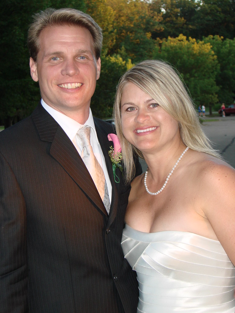
Meet Jason Hillyer and Alison Cherubini. They got hitched last Friday, and I’m proud to say Uni Watch had a small role in the proceedings. It began eight days before the wedding, when I got the following note from Allison:
I am engaged to be married next Friday, August 8th. It’s traditional for the bride and groom to buy one another a gift for the wedding, right? Well the only thing my fiancé wants (and is asking for) is a membership to your site and the membership card that goes with it.
He had a letter all typed up to send to you, but I confiscated it so that I could send it in on his behalf. I don’t have a PayPal account, so I am going to mail in his letter with a check for $15 per your site, for the membership fee. I don’t know if it’s possible for you to start creating the card before actually receiving the payment, but any kind of “rush” you can put on this order would be GREATLY appreciated!
Alison had retyped Jason’s membership card request, which concluded with the following note: “Have you noticed on Cheers that the producers made a mistake with Sam’s uniform when he pitched against Dutch Kincade at Yankee Stadium? They had him wearing a home ‘Red Sox’ jersey. And they had Kevin McHale in road greens after a home game in the [Boston] Garden. Just something I noticed.”
Clearly, Jason was our kinda guy.
Alison included her phone number, so I called her up and assured her that Scott and I would get cracking right away and do our best to have a laminated Uni Watch membership card in her hands in time for the wedding. The only tricky part was that Scott was about to go on a three-day trip and has also been busy with a family matter, so I couldn’t be positive he’d have time to design the card in the allotted time window, but he said he’d try.
As it turned out, Scott got the digital files to me two days before the wedding. I got them printed that afternoon, trimmed and laminated Jason’s card, and FedExed it to Alison so she’d receive it the day before her nuptials. The whole thing was fun, and Scott and I enjoyed participating, if just barely, in Alison and Jason’s happy event. At one point on Friday I thought of them and hoped all had gone as planned.
And I figured that was that. But on Sunday — two days after the wedding, when I figured Alison and Jason would be busy honeymooning — I got another note from Alison: “The card arrived Thursday morning, in plenty of time for our gift exchange Thursday evening after our rehearsal. He was REALLY excited, and the card looks perfect. I can’t tell you how much I appreciate he rush you put on it to get it to me on time.” Awwwwww. Isn’t that nice?
So I figured THAT was that. But yesterday I got a thank-you note from Jason, along with the photo shown above. He also included the following: “P.S. While watching SportsCenter Saturday morning, I noticed that Manuel had a blue button on top of his cap while the rest of the team wore caps with the orange button. (Sorry, no pic.)” About 25 minutes later he sent me another note, pointing out that this huddle format, used primarily by the Chiefs, was also used by the Browns. Like I said, our kinda guy.
Congrats, A + J, and thanks for the contact high.
Meanwhile: New ESPN column today — here’s the link.
Raffle Results: The winner of the 1996 Olympics banner is Mike Rempt. Congrats to him, and thanks to all who entered. More raffles coming soon.
Vacation Reminder: I’m heading off to Oregon later today. My original plan was to shut down the site while I was away, but Bryan volunteered to mind the store, so he’ll be running the site through next Wednesday (and maybe longer, depending on how much piled-up crap I have to deal with when I get back home). All e-mails sent to the usual Uni Watch address will automatically be forwarded to him, so feel free to continue contributing Ticker material. Please behave while I’m gone, make me proud, blah-blah-blah. Thanks.
One thing Bryan will not be covering, by the way, is the Little League World Series. Little League is great, but the level of media attention that’s focused on the LLWS every year is a disgrace. It’s bad for the kids who are playing, bad for kids who are watching, bad for sports. I refuse to participate in it, and Bryan has agreed to respect my boycott.
And for those of you in the Pacific northwest, remember, you can meet Jeremy Brahm (and also Rob Neyer, and also-also me) this Sunday, 2pm, at Kay’s. For all you Nike employees reading this — and I know there are many of you — we’ll reserve a special table just for you.
Uni Watch News Ticker: Thanks to the miracles of the Adidas marketing department modern technology, the names of 100,000 rugby fans will be printed onto a single thread that will be sewn into a special All Blacks jersey. Details here (with thanks to Caleb Borchers). ”¦ Reprinted from yesterday’s comments: Chad Johnson wants to legally change his surname to Ocho Cinco, which means he could wear this without being fined. ”¦ Nicole Haase reports that the Brewers’ victory-slob look has led to one of history’s most annoying web sites (turn down your volume before clicking, trust me). ”¦ A huge trove of boxing memorabilia has been willed to Brooklyn College. Details here, and there’s a slideshow here. ”¦ A few days ago I mentioned that I became a 49ers fan after pulling a Ken Willard 3-D football card out of a box of cereal back when I was six years old. I no longer have the card (as I recall, the 3-D coating cracked, which was a problem with that kind of card), but Ronnie Poore found one on the web. Look at that chiseled jaw, that fearsome pose — how could anyone not become a Niners fan after seeing that? ”¦ Ronnie also pointed me toward this page of North Dakota State pics, including some nice baseball, football, hockey, and beanie shots. ”¦ For those who like to follow every little thing I write, I had this on Page 2 yesterday. ”¦ Yesterday I suggested that the dark jersey in this photo must have been a prototype. But then Mike Hersh (subject of yesterday’s lead item, coincidentally) pointed me toward this, which appears to show the white/home version of the same design, complete with the “Seals” lettering, so this style must have seen at least a bit of on-ice action. ”¦ Goose Gossage apparently never liked the bullpen car (thanks, Vince). ”¦ For those who enjoyed yesterday’s bar and diner photos from my recent upstate road trip, my friends Jon and Karen have posted their own pics from the trip — many of them truly gorgeous — here. ”¦ Reprinted from yesterday’s comments: Yesterday I asked what the ref was holding in this shot. That led RP Burke to post the following: “The referee is holding the ‘down box,’ the predecessor of the sideline stake that shows the number of the down and the yard line of the snap. Each of the four sides of the box has a number ”” 1, 2, 3, or 4 ”” and the number facing the field is that of the down. Officiating mechanics have long since moved the ‘box’ (which is what officials usually call it, even though no one has used an actual box in probably 40 years), off the field.” ”¦ “I know Nick Punto doesn’t get on base very often,” says Jake Melbye, “but somebody needs to tell him to take off his shin guard when it happens.” ”¦ New logo for Western Carolina. … OK, that’s it for me. See you in a week or so.
[quote]A few days ago I mentioned that I became a 49ers fan after pulling a link out of a box … Look at that chiseled jaw, that fearsome pose – how could anyone not become a Niners fan after seeing that? …[/quote]
NTTAWWT
………….
also…congrats to the newlyweds…does mr. hillyer have a “handle” (username) when he posts here?
(that’s not duckstyle is it??? — apologies to him if it’s not)
Interesting note with this photo: link
The goalie on the right has the conference written on his pads. Odd.
And did pitchers used to wear different color uniforms like a goalie in soccer? judging from the P on this guy’s jacket, they must have done so at some point, at least on that team.
link
What would happen if Chad Johnson changed to “Ocho Cinco” and was traded to the Rams? 85 is retired by them….would he have to legal change his name again?
link
Here’s the link
Spotted at a Washington Nationals game.
link
Alison should have had me hook up Jason’s vest!
link
Both bowling and golf should be in the Olympics. Numerous countries of representation in both sports.
[quote comment=”284633″]Interesting note with this photo: link
The goalie on the right has the conference written on his pads. Odd.
[/quote]
It’s the schools initials. NDSU was originally link, hence NDAC.
The beanie shot reminded me of a story from my Dad. He entered college as a returning vet after fighting in the Philippines, and was given a beanie as an incoming freshman. He and the other vets refused to wear them and be subjected to hazing from some “20 year old upper classman”. After a discussion with the dean about the “silly-ass” beanies and hazing, the vets weren’t required to wear them.
RIP Dad.
Sweet story on the wedding-gift membership card. Almost makes up for all the boring football uni talk.
I was previously indifferent about the Brew Crew’s battle for the NL Central, but after reviewing the “untuckem” website, I have no choice but to wish failure on them. Dreadful.
Couldn’t agree more with Paul’s boycott of the LLWS. It is too much exposure and too much pressure on kids who aren’t mature enough to handle it.
Plus, it just gives the uniform manufacturers another excuse to come up with new and more garish color combinations each year.
I hope Chad changes his name because it’ll be wrong. “ocho cinco” is just “eight five,” not eighty five.
If you’re going to try using another language, try and do it right! lol
The only thing worse than the overexposure of Little League baseball is the complaints about the overexposure.
I agree that the Brewers untucking is reason enough to want them to lose. I would have been happy to have them knock out the Cubs, but it’s hard to root for a team like that. Buncha hot dogs.
UCLA also used that huddle format. As did the 1968 St. Benedict’s CYO team I coached to the Germantown District Championship.
[quote comment=”284633″]
And did pitchers used to wear different color uniforms like a goalie in soccer? judging from the P on this guy’s jacket, they must have done so at some point, at least on that team.
link
More likely, I think, is that it’s an old team sweater. It’s not common to see players from that era wearing outdated uniforms in team photos – uniform concerns were less meticulous then.
[quote comment=”284643″]I hope Chad changes his name because it’ll be wrong. “ocho cinco” is just “eight five,” not eighty five.
If you’re going to try using another language, try and do it right! lol[/quote]
I said it yesterday, but if he does this, then I hope the Bengals trade him to the Rams.
[quote comment=”284641″]I was previously indifferent about the Brew Crew’s battle for the NL Central, but after reviewing the “untuckem” website, I have no choice but to wish failure on them. Dreadful.[/quote]
NOOOOO
Hate the stupid, money-grubbing fans who made the site, don’t hate the team!
[quote comment=”284645″]I agree that the Brewers untucking is reason enough to want them to lose. I would have been happy to have them knock out the Cubs, but it’s hard to root for a team like that. Buncha hot dogs.[/quote]
I hate it when they do it, but I don’t think it can ever be described as hot dogging.
If it was one player doing it to draw attention to himself or individual accomplishments, I’d agree. But the Brewers do this as a team, as a gesture of team unity. That’s admirable, even if the result is ugly.
I still maintain those Oakland Seals jerseys with the wordmark were a prototype and perhaps used in some pre-season games (hence explaining that one action shot) before opting for the style sans wordmark.
Hard to prove exactly because in the early years of the first expansion, the far west teams, Oakland and the Los Angeles Kings, were like barren outposts, cut off from the rest of the hockey world. It was always tough for the remainder of the east coast cities to get any info or pictures of games from the west coast (which was part of the allure of becoming a Seals fan living in NY)…
-Jet
These are amazing…..
link
One of the great logo travesties has been corrected. Thank you, to Western Carolina for changing it. The new logo isnt great, but it’s a marked improvement of the last dreck you had!!!
[quote comment=”284652″]These are amazing…..
link
I’ve still got my California Golden Seals patch from back then, and I’ve seen the Flames and North Stars ones before, but the Washington Capitals one is a new one on me!!! Didn’t think they were still making those by the time the Caps came into the league in 1974, which now has me wondering if they also make a Kansas City Scouts one!!! That Caps one has gotta be considered rare…
-Jet
New ESPN column link.
I don’t get the whole untuckem thing. Manny has been doing it for years, and so has Orlando Cabrera. Much ado about nothing.
[quote comment=”284649″][quote comment=”284641″]I was previously indifferent about the Brew Crew’s battle for the NL Central, but after reviewing the “untuckem” website, I have no choice but to wish failure on them. Dreadful.[/quote]
NOOOOO
Hate the stupid, money-grubbing fans who made the site, don’t hate the team![/quote]
gotta agree with nicole here…there’s a story behind the ‘untuckem’ trend, and it basically began with mike cameron (overall great guy) and his tribute to his dad…we had some discussion on this i wanna say about a month ago (search feature is no working, and i don’t have time to dig thru the archives — maybe nicole can help)…
while i hate the look, there is at least a good reason for it
hate on the website and those who produced it (awful, awful ‘music’ — thanks for the heads up on the volume paul)…but, since the crew and my mets may be battling for the NL wild card on september 20, i’ll reserve my ‘hate’ until we’re down to the final week ;)
[quote comment=”284654″][quote comment=”284652″]These are amazing…..
link
I’ve still got my California Golden Seals patch from back then, and I’ve seen the Flames and North Stars ones before, but the Washington Capitals one is a new one on me!!! Didn’t think they were still making those by the time the Caps came into the league in 1974, which now has me wondering if they also make a Kansas City Scouts one!!! That Caps one has gotta be considered rare…
-Jet[/quote]
Found this one too..
link
Paul, your knowledge is incredible. I loved 5-pin bowling as a kid & had no idea that it existing only in Canada. What a great country.
Good catch, Mike. I had never seen them worn in a game. However, here’s a photo of link who played for the Seals in that opening season, and he never wore the “Seals” moniker across his chest, as seen link. Hicke and Bob Baun, who you have in your picture, were teammates that season. Charlie Hodge, link, doesn’t have it either, and he was their starting goaltender that season in 58 games.
If those Seals jerseys were worn officially in the NHL, they didn’t last very long. Maybe they “test drove” them during the pre-season?
Hey now!
link
not exactly a uni thing but carson palmer was wearing an lions turtleneck yesterday. towards the end of the chad johnson interview link
Linked to the video about the Browns huddle. Clicked it off as soon as I heard Cosell start blathering. Couldn’t you have warned us about THAT?
Crazy, I used to work with Hillyer at COSI Columbus. Now there are at least three COSI ex’s who are also UniWatch members.
“progr essive”? What’s up with that?
link
[quote comment=”284658″]
Found this one too..
link
Nice! The ad says its from the 60’s but I’m pretty sure these didn’t begin appearing until the early 70’s because the Seals one had the green/gold colors which they began wearing in 70-71. These patches appeared in the stores all at once, I’m fairly sure they weren’t a phenomenon that started in the 60’s, gradually adding more teams as they went along. Plus they had the Atlanta Flames who came into the league in 1972. I’m still surprised about that Capitals one, but my guess would be that these began appearing in 1972-73…
-Jet
On the Brewers … the untucking thing, while dumb, is at least after the game is over. Ben Sheets, Prince Fielder, CC Sabathia, Eric Gagne … hell, pretty much all of them … look like crap during the game, which is far more offensive.
[quote comment=”284660″]
If those Seals jerseys were worn officially in the NHL, they didn’t last very long. Maybe they “test drove” them during the pre-season?[/quote]
That’s my contention Teebz, I pretty much lived and breathed Seals hockey as a kid (from 3000 miles away) and those pics with the wordmark have always been very rare
-Jet
Quick pareidolic note on the USA men’s basketball team picture referenced in the espn article.
Does anybody else see an upside down swoosh formed in the curtains/empty space around the players? Start at Coach K’s shoulder, then go up and over Howard’s head and down the line. Kind of like this:
link
[quote comment=”284668″][quote comment=”284660″]
If those Seals jerseys were worn officially in the NHL, they didn’t last very long. Maybe they “test drove” them during the pre-season?[/quote]
That’s my contention Teebz, I pretty much lived and breathed Seals hockey as a kid (from 3000 miles away) and those pics with the wordmark have always been very rare
-Jet[/quote]
Seals went to green and gold after Finley bought them, right?
—Ricko
[quote comment=”284668″][quote comment=”284660″]
If those Seals jerseys were worn officially in the NHL, they didn’t last very long. Maybe they “test drove” them during the pre-season?[/quote]
That’s my contention Teebz, I pretty much lived and breathed Seals hockey as a kid (from 3000 miles away) and those pics with the wordmark have always been very rare
-Jet[/quote]
I had never seen them before in my life, Jet. Granted, I wasn’t around until the WHA merge, but I’ve tried to learn about as much of the game as I can, and I had never seen them before. Just goes to show you that history is always fascinating. :o)
[quote comment=”284655″]New ESPN column link.[/quote]
Alright…I’ll bite.
Why should silver better than gold in the olympics?
[quote comment=”284670″][quote comment=”284668″][quote comment=”284660″]
If those Seals jerseys were worn officially in the NHL, they didn’t last very long. Maybe they “test drove” them during the pre-season?[/quote]
That’s my contention Teebz, I pretty much lived and breathed Seals hockey as a kid (from 3000 miles away) and those pics with the wordmark have always been very rare
-Jet[/quote]
Seals went to green and gold after Finley bought them, right?
—Ricko[/quote]
Yep. Finley bought them during the 69-70 offseason, and changed their colours to kelly green and gold.
[quote comment=”284633″]Interesting note with this photo: link
The goalie on the right has the conference written on his pads. Odd.
And did pitchers used to wear different color uniforms like a goalie in soccer? judging from the P on this guy’s jacket, they must have done so at some point, at least on that team.
link
Looks more like NDAK for N dakota.
[quote comment=”284669″]Quick pareidolic note on the USA men’s basketball team picture referenced in the espn article.
Does anybody else see an upside down swoosh formed in the curtains/empty space around the players? Start at Coach K’s shoulder, then go up and over Howard’s head and down the line. Kind of like this:
link
That’s quite an imagination you’ve got there.
[quote comment=”284672″][quote comment=”284655″]New ESPN column link.[/quote]
Alright…I’ll bite.
Why should silver better than gold in the olympics?[/quote]
Because gold is chintzy, garish, and lame. And also for suckers.
[quote comment=”284671″][quote comment=”284668″][quote comment=”284660″]
If those Seals jerseys were worn officially in the NHL, they didn’t last very long. Maybe they “test drove” them during the pre-season?[/quote]
That’s my contention Teebz, I pretty much lived and breathed Seals hockey as a kid (from 3000 miles away) and those pics with the wordmark have always been very rare
-Jet[/quote]
I had never seen them before in my life, Jet. Granted, I wasn’t around until the WHA merge, but I’ve tried to learn about as much of the game as I can, and I had never seen them before. Just goes to show you that history is always fascinating. :o)[/quote]
I have never seen those ‘SEALS’ unis either. I too, love hockey, the history of hockey, and always try to learn more about the past, present, and future of the game, and the SEALS jerseys are a first for me…. kinda dig them too.
[quote comment=”284661″]Hey now!
link
glad that’s solved…who knew?
after the olympics, tho, she can turn pro in her chosen field of javelin tossing and won’t have to resort to modeling anymore
/heartwarming story with a happy ending
[quote comment=”284676″][quote comment=”284672″][quote comment=”284655″]New ESPN column link.[/quote]
Alright…I’ll bite.
Why should silver better than gold in the olympics?[/quote]
Because gold is chintzy, garish, and lame. And also for suckers.[/quote]
Oh, I thought there might be some sort of statistical or historical significance behind the claim.
But personal opinions are nice to…
[quote comment=”284678″][quote comment=”284661″]Hey now!
link
glad that’s solved…who knew?
after the olympics, tho, she can turn pro in her chosen field of javelin tossing and won’t have to resort to modeling anymore
/heartwarming story with a happy ending[/quote]
I used to be a javelin catcher on the pro circuit. Quit, though. Travelling was hell and the tips were, um, painful.
[quote comment=”284680″][quote comment=”284678″][quote comment=”284661″]Hey now!
link
glad that’s solved…who knew?
after the olympics, tho, she can turn pro in her chosen field of javelin tossing and won’t have to resort to modeling anymore
/heartwarming story with a happy ending[/quote]
I used to be a javelin catcher on the pro circuit. Quit, though. Travelling was hell and the tips were, um, painful.[/quote]
Speaking of javelin catching, link is the incorrect way to do it.
Wasn’t it also Finley who changed them from the “Oakland” Seals to the “California Golden” Seals?
[quote comment=”284681″][quote comment=”284680″][quote comment=”284678″][quote comment=”284661″]Hey now!
link
glad that’s solved…who knew?
after the olympics, tho, she can turn pro in her chosen field of javelin tossing and won’t have to resort to modeling anymore
/heartwarming story with a happy ending[/quote]
I used to be a javelin catcher on the pro circuit. Quit, though. Travelling was hell and the tips were, um, painful.[/quote]
Speaking of javelin catching, link is the incorrect way to do it.[/quote]
Well, for one thing, obviously her footwork was terrible. Or maybe just bad hands. I used stickum until the throwers complained. Seems the residual tackiness on the javelins often resulted in the always entertaining but rarely effective “pinwheel” technique.
[quote comment=”284645″]I agree that the Brewers untucking is reason enough to want them to lose. I would have been happy to have them knock out the Cubs, but it’s hard to root for a team like that. Buncha hot dogs.[/quote]
Right….because Soriano, Zambrano, and Ramirez arent hot dogs at all. That untuckem website isnt affiliated with the Brewers at all! GO BREWERS
[quote comment=”284681″][quote comment=”284680″][quote comment=”284678″][quote comment=”284661″]Hey now!
link
glad that’s solved…who knew?
after the olympics, tho, she can turn pro in her chosen field of javelin tossing and won’t have to resort to modeling anymore
/heartwarming story with a happy ending[/quote]
I used to be a javelin catcher on the pro circuit. Quit, though. Travelling was hell and the tips were, um, painful.[/quote]
Speaking of javelin catching, link is the incorrect way to do it.[/quote]
not much better
[quote comment=”284685″][quote comment=”284681″][quote comment=”284680″][quote comment=”284678″][quote comment=”284661″]Hey now!
link
glad that’s solved…who knew?
after the olympics, tho, she can turn pro in her chosen field of javelin tossing and won’t have to resort to modeling anymore
/heartwarming story with a happy ending[/quote]
I used to be a javelin catcher on the pro circuit. Quit, though. Travelling was hell and the tips were, um, painful.[/quote]
Speaking of javelin catching, link is the incorrect way to do it.[/quote]
not much better[/quote]
lets try that again:
link
[quote comment=”284682″]Wasn’t it also Finley who changed them from the “Oakland” Seals to the “California Golden” Seals?[/quote]
The name change came due to the change in colours that Finley instituted. But the short answer is “yes”. ;o)
Okay, I was digging through my college football clippings last night and found a shot of Alabama wearing gray helmets for a night game at USC in 1971. Anyone know why–beyond the obvious possible attempt to look different from the opposition–they did that?
Chance, this sounds like your area of expertise.
—Ricko
Look at those beautiful Cowboys blue jerseys! INFINITELY better than the navy/star dreck they currently (sometimes) wear.
link
Regarding the Team USA jerseys in the ESPN column:
I heard that Team USA Basketball uniforms have the player names in the same color as the jersey so that they are harder to read while the USA on the front is in bright red on the white and blue jerseys, to promote the idea that they are playing for the name on the front of the jersey not the one on the back. Could just be what they are saying after the fact though.
[quote comment=”284678″][quote comment=”284661″]Hey now!
link
glad that’s solved…who knew?
after the olympics, tho, she can turn pro in her chosen field of javelin tossing and won’t have to resort to modeling anymore
/heartwarming story with a happy ending[/quote]
Just my two cents:
She will make more money modeling….
link
…and thats LOTS (minus the apostrophe lol!)
[quote comment=”284691″][quote comment=”284678″][quote comment=”284661″]Hey now!
link
glad that’s solved…who knew?
after the olympics, tho, she can turn pro in her chosen field of javelin tossing and won’t have to resort to modeling anymore
/heartwarming story with a happy ending[/quote]
Just my two cents:
She will make more money modeling….
link
Yessir……verrrrrrrrrrrrrrrrrrry niiiiiiiiice.
[quote comment=”284687″][quote comment=”284682″]Wasn’t it also Finley who changed them from the “Oakland” Seals to the “California Golden” Seals?[/quote]
The name change came due to the change in colours that Finley instituted. But the short answer is “yes”. ;o)[/quote]
This’ll give Teebz and others (including me) fits.
My former partner was running the second Fighting Saints (the “New” Fighting Saints, a combo team of old Saints and Cleveland Crusaders). They had changed their colors from royal and yellow-gold to scarlet and yellow-gold (same unis, simply swapped blue and red; I know cuz was my idea). Anyway, the team folded in mid-season of ’75-’76, I think it was. I was in his office at the old St. Paul Civic Center after the last game. No one around but the two of us, following the news conference announcing the team’s demise. I hung around for awhile and, when I left a bit after midnight, I walked past a brand new white home game-jersey—the red-gold color scheme, a real rarity—hanging on wide open main office door. Absolutely perfect, never been worn. He was way the hell back in his office, and I stood and stared at it for moment or two, thinking I could bag that thing–stuff it into the briefcase I was carrying–and no one would know, or give a damn.
But I left it there and went home.
Think I ever second guess that decision?
[quote comment=”284695″]
This’ll give Teebz and others (including me) fits.
My former partner was running the second Fighting Saints (the “New” Fighting Saints, a combo team of old Saints and Cleveland Crusaders). They had changed their colors from royal and yellow-gold to scarlet and yellow-gold (same unis, simply swapped blue and red; I know cuz was my idea). Anyway, the team folded in mid-season of ’75-’76, I think it was. I was in his office at the old St. Paul Civic Center after the last game. No one around but the two of us, following the news conference announcing the team’s demise. I hung around for awhile and, when I left a bit after midnight, I walked past a brand new white home game-jersey—the red-gold color scheme, a real rarity—hanging on wide open main office door. Absolutely perfect, never been worn. He was way the hell back in his office, and I stood and stared at it for moment or two, thinking I could bag that thing–stuff it into the briefcase I was carrying–and no one would know, or give a damn.
But I left it there and went home.
Think I ever second guess that decision?[/quote]
Yes, you’re giving me fits!!! The scarlet version of the Fighting Saints is quite rare.
What’s even worse is that I was collecting game worn jerseys in the late 70’s when they were more readily available and had several WHA teams as well as a 1967-68 Bert Marshall green Seals jersey with the alternate captain’s “A” …. and sold them all a few years later. Yes, you may plant a boot firmly in my ass….
-Jet
[quote comment=”284681″][quote comment=”284680″][quote comment=”284678″][quote comment=”284661″]Hey now!
link
glad that’s solved…who knew?
after the olympics, tho, she can turn pro in her chosen field of javelin tossing and won’t have to resort to modeling anymore
/heartwarming story with a happy ending[/quote]
I used to be a javelin catcher on the pro circuit. Quit, though. Travelling was hell and the tips were, um, painful.[/quote]
Speaking of javelin catching, link is the incorrect way to do it.[/quote]
Agreed, the jeans make her look tacky… should be wearing something dressy. Obvious error on her part.
“The American squad is actually the entire student body of Choate.”
You’re wrong, they look like the tools who live in Newport and those who summer on the Cape.
[quote comment=”284689″]Look at those beautiful Cowboys blue jerseys! INFINITELY better than the navy/star dreck they currently (sometimes) wear.
link
Or THIS Royal (NOT navy)…
link
[quote comment=”284695″]
This’ll give Teebz and others (including me) fits.
My former partner was running the second Fighting Saints (the “New” Fighting Saints, a combo team of old Saints and Cleveland Crusaders). They had changed their colors from royal and yellow-gold to scarlet and yellow-gold (same unis, simply swapped blue and red; I know cuz was my idea). Anyway, the team folded in mid-season of ’75-’76, I think it was. I was in his office at the old St. Paul Civic Center after the last game. No one around but the two of us, following the news conference announcing the team’s demise. I hung around for awhile and, when I left a bit after midnight, I walked past a brand new white home game-jersey—the red-gold color scheme, a real rarity—hanging on wide open main office door. Absolutely perfect, never been worn. He was way the hell back in his office, and I stood and stared at it for moment or two, thinking I could bag that thing–stuff it into the briefcase I was carrying–and no one would know, or give a damn.
But I left it there and went home.
Think I ever second guess that decision?[/quote]
That would bother me to a great deal as I’d kill for that look, but the Saints only wore the red in their final season in the Twin Cities. Before the 1976-77 season, the Saints swapped from blue road jerseys to red road jerseys before the start of the season.
You can see them on the sister site of NHLuniforms.com called WHAuniforms.com.
[quote comment=”284655″]New ESPN column link.[/quote]
Is there anyway to set up the ESPN column to open a new page or tab rather than leaving the site (similar to what uniwatchblog does now)?
[quote comment=”284701″][quote comment=”284655″]New ESPN column link.[/quote]
Is there anyway to set up the ESPN column to open a new page or tab rather than leaving the site (similar to what uniwatchblog does now)?[/quote]
Right-click the link, and select “open in new tab”.
[quote comment=”284702″][quote comment=”284701″][quote comment=”284655″]New ESPN column link.[/quote]
Is there anyway to set up the ESPN column to open a new page or tab rather than leaving the site (similar to what uniwatchblog does now)?[/quote]
Right-click the link, and select “open in new tab”.[/quote]
I understand that, but I do not have to do that here :(
[quote comment=”284703″][quote comment=”284702″][quote comment=”284701″][quote comment=”284655″]New ESPN column link.[/quote]
Is there anyway to set up the ESPN column to open a new page or tab rather than leaving the site (similar to what uniwatchblog does now)?[/quote]
Right-click the link, and select “open in new tab”.[/quote]
I understand that, but I do not have to do that here :([/quote]
Use Firefox, alternatively.
And what do you mean “you don’t have that” there? Are right-clicks banned in your country? Are you reading this from China? ;o)
[quote comment=”284645″]I agree that the Brewers untucking is reason enough to want them to lose. I would have been happy to have them knock out the Cubs, but it’s hard to root for a team like that. Buncha hot dogs.[/quote]
Baseball’s loose look is simply sloppy. The Sand-Knit catalog posted yesterday had it down right.
link
[quote comment=”284703″][quote comment=”284702″][quote comment=”284701″][quote comment=”284655″]New ESPN column link.[/quote]
Is there anyway to set up the ESPN column to open a new page or tab rather than leaving the site (similar to what uniwatchblog does now)?[/quote]
Right-click the link, and select “open in new tab”.[/quote]
I understand that, but I do not have to do that here :([/quote]
your mouse has only a left click option?
[quote comment=”284700″][quote comment=”284695″]
This’ll give Teebz and others (including me) fits.
My former partner was running the second Fighting Saints (the “New” Fighting Saints, a combo team of old Saints and Cleveland Crusaders). They had changed their colors from royal and yellow-gold to scarlet and yellow-gold (same unis, simply swapped blue and red; I know cuz was my idea). Anyway, the team folded in mid-season of ’75-’76, I think it was. I was in his office at the old St. Paul Civic Center after the last game. No one around but the two of us, following the news conference announcing the team’s demise. I hung around for awhile and, when I left a bit after midnight, I walked past a brand new white home game-jersey—the red-gold color scheme, a real rarity—hanging on wide open main office door. Absolutely perfect, never been worn. He was way the hell back in his office, and I stood and stared at it for moment or two, thinking I could bag that thing–stuff it into the briefcase I was carrying–and no one would know, or give a damn.
But I left it there and went home.
Think I ever second guess that decision?[/quote]
That would bother me to a great deal as I’d kill for that look, but the Saints only wore the red in their final season in the Twin Cities. Before the 1976-77 season, the Saints swapped from blue road jerseys to red road jerseys before the start of the season.
You can see them on the sister site of NHLuniforms.com called WHAuniforms.com.[/quote]
76-77? Wasn’t sure. Knew where I was living at the time, but wasn’t sure which season. I can tell u who I had date with later that night, though. LOL
Yeah, I know they switched to red. As I said, it was my idea. I was working on their marketing/advertising. They wanted Saints to be same, but different. If you look closely, the litte Saints guy is altered, too–dark, more detailed updated gloves, among other things–only in the red-gold era. I know, I did the logo changes myself. And the letterhead design, and the game program covers…etc.
This isn’t bragging, btw, really hope u all know that. I’m just trying to pass along details someone might not have known or noticed. And the only source I can quote is me. Cuz I AM the source.
(god, I have SO many unmarketable talents)
[quote comment=”284706″][quote comment=”284703″][quote comment=”284702″][quote comment=”284701″][quote comment=”284655″]New ESPN column link.[/quote]
Is there anyway to set up the ESPN column to open a new page or tab rather than leaving the site (similar to what uniwatchblog does now)?[/quote]
Right-click the link, and select “open in new tab”.[/quote]
I understand that, but I do not have to do that here :([/quote]
your mouse has only a left click option?[/quote]
HAHA…that’s great. I do use Firefox and when clicking on links on uniwatchblog.com, it automatically opens in a new window.
[quote comment=”284708″][quote comment=”284706″][quote comment=”284703″][quote comment=”284702″][quote comment=”284701″][quote comment=”284655″]New ESPN column link.[/quote]
Is there anyway to set up the ESPN column to open a new page or tab rather than leaving the site (similar to what uniwatchblog does now)?[/quote]
Right-click the link, and select “open in new tab”.[/quote]
I understand that, but I do not have to do that here :([/quote]
your mouse has only a left click option?[/quote]
HAHA…that’s great. I do use Firefox and when clicking on links on uniwatchblog.com, it automatically opens in a new window.[/quote]
In Firefox, under Tools, go to the Options menu. From there, look for the “Tabs” tab. In there, you can change the radio button for “open in new window” to “open in new tab”.
That should do it. Get ‘er done! :o)
[quote comment=”284707″]
76-77? Wasn’t sure. Knew where I was living at the time, but wasn’t sure which season. I can tell u who I had date with later that night, though. LOL
Yeah, I know they switched to red. As I said, it was my idea. I was working on their marketing/advertising. They wanted Saints to be same, but different. If you look closely, the litte Saints guy is altered, too–dark, more detailed updated gloves, among other things–only in the red-gold era. I know, I did the logo changes myself. And the letterhead design, and the game program covers…etc.
This isn’t bragging, btw, really hope u all know that. I’m just trying to pass along details someone might not have known or noticed. And the only source I can quote is me. Cuz I AM the source.
(god, I have SO many unmarketable talents)[/quote]
Unmarketable, but so remarkable, Ricko. ;o)
For what it’s worth, both bowling and golf are already considered “recognized” Olympic sports. Here’s the full list:
link
Getting recognized seems to be the biggest hurdle to having an event actually contested in the Games, so I’m not sure what the next step would be.
[quote comment=”284711″]For what it’s worth, both bowling and golf are already considered “recognized” Olympic sports. Here’s the full list:
link
Getting recognized seems to be the biggest hurdle to having an event actually contested in the Games, so I’m not sure what the next step would be.[/quote]
I was looking through that list and cannot believe tug of war is on there.
Dwight Howard may be the only non-Nike player on the team but which other non-Nike player should be on the team and who should he replace?
The only one I can think of is Kevin Garnett. And I don’t know whether or not Garnett was asked be declined to play.
All ESPN links open in new windows (or new tabs, depending on your browser settings). But if you go ESPN by clicking on a link from another site — including this site right here — then the “new window” links open in the same window for some reason. In other words, you need to read the ESPN column in a fresh “first-view” window, not in a window that jumped from someplace else. So if you link to ESPN from here, just copy/paste the ESPN column’s URL into a new window and then you should be good to go.
[quote comment=”284712″][quote comment=”284711″]For what it’s worth, both bowling and golf are already considered “recognized” Olympic sports. Here’s the full list:
link
Getting recognized seems to be the biggest hurdle to having an event actually contested in the Games, so I’m not sure what the next step would be.[/quote]
I was looking through that list and cannot believe tug of war is on there.[/quote]
no cup stacking?
OMG…
Look what’s happening at USC.
Oh, the humanity.
link
[quote comment=”284715″][quote comment=”284712″][quote comment=”284711″]For what it’s worth, both bowling and golf are already considered “recognized” Olympic sports. Here’s the full list:
link
Getting recognized seems to be the biggest hurdle to having an event actually contested in the Games, so I’m not sure what the next step would be.[/quote]
I was looking through that list and cannot believe tug of war is on there.[/quote]
no cup stacking?[/quote]
Cup stacking has been discussed. Might show up later in the week, actually — not sure how that was resolved.
[quote comment=”284712″][quote comment=”284711″]For what it’s worth, both bowling and golf are already considered “recognized” Olympic sports. Here’s the full list:
link
Getting recognized seems to be the biggest hurdle to having an event actually contested in the Games, so I’m not sure what the next step would be.[/quote]
I was looking through that list and cannot believe tug of war is on there.[/quote]
I’d rather watch tug of war than golf.
[quote comment=”284714″]All ESPN links open in new windows (or new tabs, depending on your browser settings). But if you go ESPN by clicking on a link from another site — including this site right here — then the “new window” links open in the same window for some reason. In other words, you need to read the ESPN column in a fresh “first-view” window, not in a window that jumped from someplace else. So if you link to ESPN from here, just copy/paste the ESPN column’s URL into a new window and then you should be good to go.[/quote]
Thanks Paul
[quote comment=”284715″][quote comment=”284712″][quote comment=”284711″]For what it’s worth, both bowling and golf are already considered “recognized” Olympic sports. Here’s the full list:
link
Getting recognized seems to be the biggest hurdle to having an event actually contested in the Games, so I’m not sure what the next step would be.[/quote]
I was looking through that list and cannot believe tug of war is on there.[/quote]
no cup stacking?[/quote]
Lol, I was going to say the exact same thing earlier but didn’t want to start that over again. haha.
[quote comment=”284717″][quote comment=”284715″][quote comment=”284712″][quote comment=”284711″]For what it’s worth, both bowling and golf are already considered “recognized” Olympic sports. Here’s the full list:
link
Getting recognized seems to be the biggest hurdle to having an event actually contested in the Games, so I’m not sure what the next step would be.[/quote]
I was looking through that list and cannot believe tug of war is on there.[/quote]
no cup stacking?[/quote]
Cup stacking has been discussed. Might show up later in the week, actually — not sure how that was resolved.[/quote]
I just remember it sparked on of the biggest UW debates ever and segwayed into a lot of different stuff until it ended up talking about how our kids are fat and they don’t have PE in school anymore. It was all kind of a blurr. Still my favorite debate.
(cough)notasport(cough)
Excuse me… I have a cold.
We always used the “KC” style huddle at my High School, except we put the lineman in front and the skill players in the back. I always though it was the best way to do.
The linemen tend to get winded faster, and get to bend over, hands on knees. Also keeps better eye contact with the QB and backs and recievers.
[quote comment=”284717″][quote comment=”284715″]no cup stacking?[/quote]
Cup stacking has been discussed. Might show up later in the week, actually — not sure how that was resolved.[/quote]
also showing up later in the week:
go fish, base-ketball, underwater basketweaving and cookie toss
/can nascar be far behind?
[quote comment=”284714″]All ESPN links open in new windows (or new tabs, depending on your browser settings). But if you go ESPN by clicking on a link from another site — including this site right here — then the “new window” links open in the same window for some reason. In other words, you need to read the ESPN column in a fresh “first-view” window, not in a window that jumped from someplace else. So if you link to ESPN from here, just copy/paste the ESPN column’s URL into a new window and then you should be good to go.[/quote]
And that is why I stopped being a web designer…LONG LIVE PRINT!
[quote comment=”284657″][quote comment=”284649″][quote comment=”284641″]I was previously indifferent about the Brew Crew’s battle for the NL Central, but after reviewing the “untuckem” website, I have no choice but to wish failure on them. Dreadful.[/quote]
NOOOOO
Hate the stupid, money-grubbing fans who made the site, don’t hate the team![/quote]
gotta agree with nicole here…there’s a story behind the ‘untuckem’ trend, and it basically began with mike cameron (overall great guy) and his tribute to his dad…we had some discussion on this i wanna say about a month ago (search feature is no working, and i don’t have time to dig thru the archives — maybe nicole can help)…
while i hate the look, there is at least a good reason for it
hate on the website and those who produced it (awful, awful ‘music’ — thanks for the heads up on the volume paul)…but, since the crew and my mets may be battling for the NL wild card on september 20, i’ll reserve my ‘hate’ until we’re down to the final week ;)[/quote]
The discussion was on July 24th
link
The explanation:
Apparently Mike Cameron started it as a tribute to his dad. When his dad came home from a hard days’ work the first thing he’d do is untuck his shirt and kick off his shoes.
The rest of the team thought it was a nice gesture and picked it up, so they do it as a tribute to their dads. They can’t exactly kick off their shoes, but if they win, they untuck their jerseys.
Kind of like “We came out and got the job. Good day’s work, time to go relax.”
Cameron’s always done this. At the end of the July 23rd comments someone else had pick of Cameron doing this with every team he’s been with.
[quote comment=”284725″][quote comment=”284657″][quote comment=”284649″][quote comment=”284641″]I was previously indifferent about the Brew Crew’s battle for the NL Central, but after reviewing the “untuckem” website, I have no choice but to wish failure on them. Dreadful.[/quote]
NOOOOO
Hate the stupid, money-grubbing fans who made the site, don’t hate the team![/quote]
gotta agree with nicole here…there’s a story behind the ‘untuckem’ trend, and it basically began with mike cameron (overall great guy) and his tribute to his dad…we had some discussion on this i wanna say about a month ago (search feature is no working, and i don’t have time to dig thru the archives — maybe nicole can help)…
while i hate the look, there is at least a good reason for it
hate on the website and those who produced it (awful, awful ‘music’ — thanks for the heads up on the volume paul)…but, since the crew and my mets may be battling for the NL wild card on september 20, i’ll reserve my ‘hate’ until we’re down to the final week ;)[/quote]
The discussion was on July 24th
link
The explanation:
Apparently Mike Cameron started it as a tribute to his dad. When his dad came home from a hard days’ work the first thing he’d do is untuck his shirt and kick off his shoes.
The rest of the team thought it was a nice gesture and picked it up, so they do it as a tribute to their dads. They can’t exactly kick off their shoes, but if they win, they untuck their jerseys.
Kind of like “We came out and got the job. Good day’s work, time to go relax.”
Cameron’s always done this. At the end of the July 23rd comments someone else had pick of Cameron doing this with every team he’s been with.[/quote]
thanks nicole!
you can pick up the comment trail link
i was the one who tracked down those cammy untucked pics (if you care, they are posts #217, 220, 222 & 223 of link)
[quote comment=”284723″][quote comment=”284717″][quote comment=”284715″]no cup stacking?[/quote]
Cup stacking has been discussed. Might show up later in the week, actually — not sure how that was resolved.[/quote]
also showing up later in the week:
go fish, base-ketball, underwater basketweaving and cookie toss
/can nascar be far behind?[/quote]
Come on, folks. Lets leave sports to the athletes, or else next thing you know, you’ll see a spelling bee on ESPN!
[quote comment=”284727″][quote comment=”284723″][quote comment=”284717″][quote comment=”284715″]no cup stacking?[/quote]
Cup stacking has been discussed. Might show up later in the week, actually — not sure how that was resolved.[/quote]
also showing up later in the week:
go fish, base-ketball, underwater basketweaving and cookie toss
/can nascar be far behind?[/quote]
Come on, folks. Lets leave sports to the athletes, or else next thing you know, you’ll see a spelling bee on ESPN![/quote]
or Scrabble…
[quote comment=\”284688\”]Okay, I was digging through my college football clippings last night and found a shot of Alabama wearing gray helmets for a night game at USC in 1971. Anyone know why–beyond the obvious possible attempt to look different from the opposition–they did that?
Chance, this sounds like your area of expertise.
—Ricko[/quote]
Ricko, follow this link:
link
In the uniform history section, it says in the 60\’s, Bama used white helmets on eligible receivers or to contrast the opposing team. This might have carried over into the early 70’s.
Two interesting (somewhat-related) articles:
Australian team uniforms looked like ‘sucked iceblocks’
Australian athletes ordered to wear team uniform
[quote comment=”284729″][quote comment=\”284688\”]Okay, I was digging through my college football clippings last night and found a shot of Alabama wearing gray helmets for a night game at USC in 1971. Anyone know why–beyond the obvious possible attempt to look different from the opposition–they did that?
Chance, this sounds like your area of expertise.
—Ricko[/quote]
Ricko, follow this link:
link
In the uniform history section, it says in the 60\’s, Bama used white helmets on eligible receivers or to contrast the opposing team. This might have carried over into the early 70’s.[/quote]
Thanks. I remember the white helmets from time to time in the 60s, and again in the 80s…they definitely were white. This 1971 batch is most assuredly light gray.
Maybe they used cheap paint to cover the red and it ended up looking gray. Who knows.
(I gotta learn to post stuff at flickr or whatever it is, esp. with Paul gone for a week.)
[quote comment=”284727″][quote comment=”284723″][quote comment=”284717″][quote comment=”284715″]no cup stacking?[/quote]
Cup stacking has been discussed. Might show up later in the week, actually — not sure how that was resolved.[/quote]
also showing up later in the week:
go fish, base-ketball, underwater basketweaving and cookie toss
/can nascar be far behind?[/quote]
Come on, folks. Lets leave sports to the athletes, or else next thing you know, you’ll see a spelling bee on ESPN![/quote]
Once worked with a guy who had a teeshirt that said:
SPELLING
CHIMP
Always loved that.
in uni related injuries, i guess brett favre isn’t the only one with the “itch” to play football… link
[quote comment=”284707″]
Yeah, I know they switched to red. As I said, it was my idea. I was working on their marketing/advertising. They wanted Saints to be same, but different. If you look closely, the litte Saints guy is altered, too–dark, more detailed updated gloves, among other things–only in the red-gold era. I know, I did the logo changes myself. And the letterhead design, and the game program covers…etc.
This isn’t bragging, btw, [/quote]
Ricko, brag away! I think it’s so freakin’ cool that you were involved with the Minn. Fighting Saints logo!!! Damn!!
-Jet
Paul:
Three cheers for not covering the LLWS. I couldn’t agree with you more- its disgusting and exploititive how the media covers it.
for Firefox users you can also just hit CTRL when you click the ESPN links and they will open in a new tab.
[quote comment=”284731″][quote comment=”284729″][quote comment=\”284688\”]Okay, I was digging through my college football clippings last night and found a shot of Alabama wearing gray helmets for a night game at USC in 1971. Anyone know why–beyond the obvious possible attempt to look different from the opposition–they did that?
Chance, this sounds like your area of expertise.
—Ricko[/quote]
Ricko, follow this link:
link
In the uniform history section, it says in the 60\’s, Bama used white helmets on eligible receivers or to contrast the opposing team. This might have carried over into the early 70’s.[/quote]
Thanks. I remember the white helmets from time to time in the 60s, and again in the 80s…they definitely were white. This 1971 batch is most assuredly light gray.
Maybe they used cheap paint to cover the red and it ended up looking gray. Who knows.
(I gotta learn to post stuff at flickr or whatever it is, esp. with Paul gone for a week.)[/quote]
Here’s a short video clip from the game:
link
It’s poor quality, but the helmets and uniforms all look white to me. And a little side note, which you may know, this was the first game in which Alabama used the wishbone.
[quote comment=”284732″]Once worked with a guy who had a teeshirt that said:
SPELLING
CHIMP
Always loved that.[/quote]
link
Here’s a short video clip from the game:
link…
It’s poor quality, but the helmets and uniforms all look white to me.
From that distance, probably do look white. Photo I scanned and sent Paul is from SI, shot from sideline. Helmets decidedly different color than the white jerseys and pants.
[quote comment=”284734″][quote comment=”284707″]
Yeah, I know they switched to red. As I said, it was my idea. I was working on their marketing/advertising. They wanted Saints to be same, but different. If you look closely, the litte Saints guy is altered, too–dark, more detailed updated gloves, among other things–only in the red-gold era. I know, I did the logo changes myself. And the letterhead design, and the game program covers…etc.
This isn’t bragging, btw, [/quote]
Ricko, brag away! I think it’s so freakin’ cool that you were involved with the Minn. Fighting Saints logo!!! Damn!!
-Jet[/quote]
Damn, look what I just found on the Internet.
Scroll down to second photo.
See the guy standing on the stage at far right, the well-dressed, good-lookin’ young one?
That’s me.
link
—Ricko
I don’t remember when the discussion about the Red Sox’s alt. caps was, but I found a pic of the ’70s style, but the B is reverse colors. link
[quote comment=”284740″][quote comment=”284734″][quote comment=”284707″]
Yeah, I know they switched to red. As I said, it was my idea. I was working on their marketing/advertising. They wanted Saints to be same, but different. If you look closely, the litte Saints guy is altered, too–dark, more detailed updated gloves, among other things–only in the red-gold era. I know, I did the logo changes myself. And the letterhead design, and the game program covers…etc.
This isn’t bragging, btw, [/quote]
Ricko, brag away! I think it’s so freakin’ cool that you were involved with the Minn. Fighting Saints logo!!! Damn!!
-Jet[/quote]
Damn, look what I just found on the Internet.
Scroll down to second photo.
See the guy standing on the stage at far right, the well-dressed, good-lookin’ young one?
That’s me.
link
—Ricko[/quote]
In the first picture, I’m not sure if I’m looking at Al Pacino or Freddy Mercury … just don’t let Al know I’ve ever mixed the two up!
[quote comment=”284740″]Damn, look what I just found on the Internet.
Scroll down to second photo.
See the guy standing on the stage at far right, the well-dressed, good-lookin’ young one?
That’s me.
link
—Ricko[/quote]
link?
it’s hard to make out…but thanks to the miracle of 400% enlargement, i was able to link
[quote comment=”284690″]Regarding the Team USA jerseys in the ESPN column:
… that they are playing for the name on the front of the jersey not the one on the back… [quote]
That’s my thought too. They’ve been embarrased the past few years and it’s back to TEAM basketball.
Nice NDSU stuff, too. Go Bison!
“In the first picture, I’m not sure if I’m looking at Al Pacino or Freddy Mercury”(Actually, it’s Billy Martin, cleverly disguised as a French Canadian hockey maven, “Jean Walker Black”)
As to LI Phil’s photo enhancement:
Said it before.
And I’ll probably say it again.
I got CLEATS older’n most of the people here.
[quote comment=”284668″][quote comment=”284660″]
If those Seals jerseys were worn officially in the NHL, they didn’t last very long. Maybe they “test drove” them during the pre-season?[/quote]
That’s my contention Teebz, I pretty much lived and breathed Seals hockey as a kid (from 3000 miles away) and those pics with the wordmark have always been very rare
-Jet[/quote]
I think you’re right as well – the other thing is that the photo from the ticker today is the wrong colours. The NHL Seals didn’t switch to green/gold until Finley took over in 1970-71. The Seals colours were green/blue/white in their first season.
link
[quote comment=”284743″][quote comment=”284740″]Damn, look what I just found on the Internet.
Scroll down to second photo.
See the guy standing on the stage at far right, the well-dressed, good-lookin’ young one?
That’s me.
link
—Ricko[/quote]
link?
it’s hard to make out…but thanks to the miracle of 400% enlargement, i was able to link[/quote]
Anybody notice on list of team it says, “Edmonton Oil Kings” ?
By start of first season that had changed to “Alberta Oilers”.
on a serious note ricko…
flickr is great (and for someone like me, who has as much computer savvy as an octogenarian, is easy)
if you already have a yahoo account, simply go to link, then click “create an account” and boom…it takes 37 seconds…once you have an account just go to “upload photos” and voila
and it’s cake to download already saved photos…or to to save an image from the web
i imagine webshots or any of the other ones is just as simple, but i use flickr…and you can upload a couple hundy pics at a time, if ya want…and its free
g’luck with that…
Further on the Seals pic – I think it’s a pic of the old Western League’s San Francisco Seals.
link
Pic for Proof link
[quote comment=”284738″][quote comment=”284732″]Once worked with a guy who had a teeshirt that said:
SPELLING
CHIMP
Always loved that.[/quote]
link[/quote]
No. That guy finished tird.
On the Giants broadcast of the SF/HOU game the “Ask Kruk & Kuip” question for the bradcasters today was, “Besides the teams you played for, what other uniform would you have liked to have worn?” Both said a football team! Mike Krukow, an ex-Cub, said Bears and Duane Kuiper, a Wisconsinite, said Packers. Neither would be willing to wear another baseball team’s uni…
This jersey is on patch overload!
link
[quote comment=”284749″]Further on the Seals pic – I think it’s a pic of the old Western League’s San Francisco Seals.
link
Pic for Proof link
Except the Seals logo used on the picture in question is a registered NHL logo, meaning there would have to be some connection to the NHL.
Ricko, I tried to view the pics you linked to and keep getting “Service unavailable” pages
:(
Jet
Imagine if this was released today!
link
[quote comment=”284752″]This jersey is on patch overload!
link
Might be some extenuating circumstances there. Was the Ironworkers patch added after those fatalities during construction at new Miller Park?
They probably weren’t planning on the third patch, I mean.
Something of rarity in that case, I suppose.
[quote comment=”284753″][quote comment=”284749″]Further on the Seals pic – I think it’s a pic of the old Western League’s San Francisco Seals.
link
Pic for Proof link
Except the Seals logo used on the picture in question is a registered NHL logo, meaning there would have to be some connection to the NHL.[/quote]
Nice find, Nuk, I forgot about the old SF Seals, but Teebz is right, that “seal in a C” logo didn’t appear until the Seals got their NHL franchise in ’67. The jersey in question may have been an attempt to create a link for fans to the old SF Seals, but was abandoned for the regular season.
-Jet
Oh, this is nice:
Clint Mathis, who’s with Real Salt Lake, “will wear jersey number 84, paying homage to the August 4, 2008, birthdate of his son, Maximus.”
link
No, I don’t know why some links work and some don’t.
So wrapped up in Seals talk that I neglected to congratulate Jason and Alison on their wedding, and may I give extra congrats to Jason because your bride is STUNNINGLY BEAUTIFUL…
-Jet
[quote comment=”284701″][quote comment=”284655″]New ESPN column link.[/quote]
Is there anyway to set up the ESPN column to open a new page or tab rather than leaving the site (similar to what uniwatchblog does now)?[/quote]
If you click a link with the mouse wheel, the page will open in a new tab (Firefox or IE).
[quote comment=”284737″][quote comment=”284731″][quote comment=”284729″][quote comment=\”284688\”]Okay, I was digging through my college football clippings last night and found a shot of Alabama wearing gray helmets for a night game at USC in 1971. Anyone know why–beyond the obvious possible attempt to look different from the opposition–they did that?
Chance, this sounds like your area of expertise.
—Ricko[/quote]
Ricko, follow this link:
link
In the uniform history section, it says in the 60\’s, Bama used white helmets on eligible receivers or to contrast the opposing team. This might have carried over into the early 70’s.[/quote]
Thanks. I remember the white helmets from time to time in the 60s, and again in the 80s…they definitely were white. This 1971 batch is most assuredly light gray.
Maybe they used cheap paint to cover the red and it ended up looking gray. Who knows.
(I gotta learn to post stuff at flickr or whatever it is, esp. with Paul gone for a week.)[/quote]
Here’s a short video clip from the game:
link
It’s poor quality, but the helmets and uniforms all look white to me. And a little side note, which you may know, this was the first game in which Alabama used the wishbone.[/quote]
I checked over at the helmet project, and it says that they used the old
white helmets from the sixties for a few games in the early seventies,
and that the Southern Cal game was one of them:
link
maybe they just look grey from the newspaper printing?
[quote comment=”284757″][quote comment=”284753″][quote comment=”284749″]Further on the Seals pic – I think it’s a pic of the old Western League’s San Francisco Seals.
link
Pic for Proof link
Except the Seals logo used on the picture in question is a registered NHL logo, meaning there would have to be some connection to the NHL.[/quote]
Nice find, Nuk, I forgot about the old SF Seals, but Teebz is right, that “seal in a C” logo didn’t appear until the Seals got their NHL franchise in ’67. The jersey in question may have been an attempt to create a link for fans to the old SF Seals, but was abandoned for the regular season.
-Jet[/quote]
Poiny taken – but I was speaking about the photo Paul had in the ticker today. link
I think the other photo was a prototype used around the time of the Expansion draft in ’67
It’s a high-quality color shot from Sports Illustrated, so I’m guessing its simply a case of one coat of white with no primer or anything like that, and it ended up looking gray up close and white from a distance.
Sorta what I figured, although because ‘Bama does have a bit of history of gray in its football unis, I thought I’d ask.
[quote comment=”284762″]
Point taken – but I was speaking about the photo Paul had in the ticker today. link
I think the other photo was a prototype used around the time of the Expansion draft in ’67[/quote]
Ohhh… and the world becomes clear again. :o)
All I know is that Bob Baun, the man in the ticker photo, played for the NHL Seals as well. Maybe he made the NHL roster as a walk-on?
Christopher said: Three cheers for not covering the LLWS. I couldn’t agree with you more- its disgusting and exploititive how the media covers it.
Hmm. Well, since someone else has mentioned it, let me express my bewilderment/disapproval towards this policy.
If you (Paul) want to claim that the Little League World Series is exploitative because the players aren’t being paid, then I can certainly agree with that. However, there is one part of the sporting landscape which is clearly far more exploitative than the LLWS could ever be — college sports; and yet you don’t rule out that topic.
College sports degrade and infantalise their adult participants with inane rules. Even worse, playing college sports subjects athletes to the risk of career-ending (or career-cancelling) injury.
The primary role of college sports is to perform the “player development” function for NFL and NBA clubs (thereby saving the clubs that expense), while providing the simulacrum of “major league sports” for the localities. They do nothing of value for the player.
In comparison to this, your singling out the Little League World Series for opprobrium for being “exploitive” strikes me as quite wrongheaded.
Kids who make it as far as the LLWS get to experience the attendant glory and attention, the pressure and the competition, at precisely the right time in life, at precisely the time when it means most, at precisely the time when it can be cherished.
With that said, I won’t claim to be the world’s biggest fan of the LLWS, and I don’t plan to watch it. But, I certainly see its beauty in giving kids (most of whom will not be big-time athletes as adults) a taste of this thirll.
So, if you’d really like to find something ugly and foul in our society, then a boycott of college sports, that cesspool of corruption and oppression, would be a fine idea.
[quote comment=”284764″][quote comment=”284762″]
Point taken – but I was speaking about the photo Paul had in the ticker today. link
I think the other photo was a prototype used around the time of the Expansion draft in ’67[/quote]
Ohhh… and the world becomes clear again. :o)
All I know is that Bob Baun, the man in the ticker photo, played for the NHL Seals as well. Maybe he made the NHL roster as a walk-on?[/quote]
Is my monitor off? How come no one has mentiened the Jerry Odrowski photo apparently shows seal brown uniforms with either blue or (oh, no!) purple trim. I’m pretty sure the only seals ever to wear seal brown in the Bay Area were, um…seals.
Assuming the color in that photo is even close to correct, they almost have to be prototypes, because the NHL Seals with that logo never hit the ice in anything but kelly & royal or green & gold.
The photo from today is most likely Western League, cuz of simpler font…and cuz NHL green and gold Seals unis looked quite different.
[quote comment=”284766″]
Assuming the color in that photo is even close to correct, they almost have to be prototypes, because the NHL Seals with that logo never hit the ice in anything but kelly & royal or green & gold.
The photo from today is most likely Western League, cuz of simpler font…and cuz NHL green and gold Seals unis looked quite different.[/quote]
Ricko, it’s obviously a poor scan. The Seals color scheme from 1967-68 through 1969-70 (three seasons) was green with blue and white trim. The color is off in that picture, no way was it brown. I actually had a game-worn Bert Marshall green jersey from that first season. They didn’t switch to green and gold until Finley took over in 70-71.
I’m still puzzled about today’s Bobby Baun pic because I can’t imagine he played for the WHL Seals – he was a top blueliner for the Leafs throughout the 60’s until he was picked up by the Seals in the ’67 expansion draft.
The only thing I can think is that perhaps its a shot of him wearing the prototype in preseason, and the shot has been “colorized” somehow – maybe the original pic was black and white.
It wouldn’t be the first time I’ve seen an incorrect colorized version of a black and white pic regarding hockey jerseys…
-Jet
I love coverage of the LLWS. One of my favorite things to do every August is watch as much as I can.
I don’t think it puts any more pressure on the kids than they’re already feeling just because they’re there. No kid who strikes out at the wrong times feels any worse cuz it was on TV.
In fact, I’ll bet if you ask them, the kids think the TV coverage is one of the really fun things about it, the BEST thing about it, maybe. Would you rather talk with your teammates how his catch, or yours, was a Web Gem last night, or have one more parent or coach tell you something you haven’t already heard a million times already.
I’d wager the whole “unreality reality” of the TV experience makes it better. No coach or parent is gonna risk losing it and looking like a horse’s ass on national TV.
Know what else, if watching these games keeps kids playing baseball, or get others STARTED playing baseball, then more power to it.
—Ricko
Okay, I just checked hockeydb.com, and Baun did not play for the WHL Seals, in fact his only season with Oakland was their first one in 67-68, after which he wound up with Detroit for three years.
Even the striping in todays picture looks like the correct striping for their green/blue/white inaugural jerseys – I have a strong feeling its an incorrectly-colorized B&W photo.
-Jet
It wouldn’t be the first time I’ve seen an incorrect colorized version of a black and white pic regarding hockey jerseys…
Yup, so the best bet (and I was half-kidding about unis being seal brown; damn, that’d be ugly) is that the “Seals” NHL was a protoype. Someone probably looked at it and said, “In NHL, crest or words…not both.”
[quote comment=”284770″]Someone probably looked at it and said, “In NHL, crest or words…not both.”[/quote]
Wish someone woulda said that with the new Vancouver Canucks jerseys, LOL!!!!
-Jet
I had a thought about the USA basketball jerseys and why the names are hard to read. It is one step above not having any names at all. Krzyzewski has had a very “team first” attitude while he has been the coach. Maybe this is his way of trying make the name on the link more important that than the name on the link.
[quote comment=”284747″][quote comment=”284743″][quote comment=”284740″]Damn, look what I just found on the Internet.
Scroll down to second photo.
See the guy standing on the stage at far right, the well-dressed, good-lookin’ young one?
That’s me.
link
—Ricko[/quote]
link?
it’s hard to make out…but thanks to the miracle of 400% enlargement, i was able to link[/quote]
Anybody notice on list of team it says, “Edmonton Oil Kings” ?
By start of first season that had changed to “Alberta Oilers”.[/quote]
In that list there’s also the Calgary Broncos. They never played a game, and the Edmonton team took the name “Alberta” to cover the entire province. I believe they also planned to play some games in Calgary but I’m not sure if that ever happened.
Not sure about the change from Oil Kings to Oilers – I know at various times there has been a Western Hockey League (junior) team with that name, there might have been one at that time (necessitating a different name for the WHA team)
No name or initial on the back for either LaRoche brother.
I don’t agree that exploiting 18-22 year olds for profit is worse than exploiting 12 year olds for profit.
Too bad we’re not discussing the LLWS. SO much lost chatter about
Russell AthleticCompany X. We might even cost good people like link their jobs. They have to eat too, you know…{/sarcasm>
ESPN column mentions the upcoming NCAA and NFL uni changes (coming 8/28 to a theater near you), but I gotta gripe about my VT Hokies. Theres a Media Day slideshow on their sports website (link) (goto Football –> Photo Gallery) where they’re modeling the new unis. Forget the weird orange circles under the sleeves and the sports-bra yoke, what’s with the V shaped mesh under the numbers? (photos 14 and 26 have closeups). And if your last name is “Cheeseman” do you change it to Ocho Cinco, just cuz?
Bills with the Toronto Series patch on their shoulder for their game north of the border.
I’m watching the Sox/Rangers game right now, and Rangers pitcher Warner Madrigal is displaying a look I’ve never seen before (and I hope never to see again).
The Ranger’s are wearing their road vests, which have short undershirt sleeves. However, Madrigal is also wearing blue arm sleeves (like Mark Burhle does, or a guy wearing one sleeve would like Jacoby Ellsbury). His sleeves don’t connect! Can someone get a picture of this?!
There’s nothing wrong with discussing the LLWS is there? I just thought the UniWatch honchos wouldn’t post anything on it. Aren’t we still free to “talk among ourselves?”
[quote comment=”284780″]There’s nothing wrong with discussing the LLWS is there? I just thought the UniWatch honchos wouldn’t post anything on it. Aren’t we still free to “talk among ourselves?”[/quote]
Oh wow, I misinterpreted that one. I think you’re right. (Note to self: don’t bother with Ticker material from the LLWS, because it won’t be Ticker material.)
But Uni Watch is two words.
Forgive me if this has been discussed in the last couple days, but a couple of things I noticed about Canada’s Olympic baseball uniforms:
1) The logo has changed since the WBC. There used to be a ball at the top of the ‘C’. I was just thinking the other day while looking at the old logo that the ball looked out of place, but now it looks like something is missing. This actually could’ve happened any time in the last year and a half I guess, but this is the first I’ve seen of it.
2) They have an awful patch on their sleeve. It is the Canadian Olympic Assn. logo, but half of it has the white patch background, and half of it has no background. I assume this is so that the red Olympic ring shows up on the red uniform, but it looks awful.
There’s some kind of green letter logo creep on the Carolina Panther’s coaching staff’s jackets tonight…
Its a 2 line name… ‘System Con+rol’ with ‘CON’ ‘ROL’ and some triangle that looks like a Citgo logo in neon green…
[quote comment=”284783″]There’s some kind of green letter logo creep on the Carolina Panther’s coaching staff’s jackets tonight…
Its a 2 line name… ‘System Con+rol’ with ‘CON’ ‘ROL’ and some triangle that looks like a Citgo logo in neon green…[/quote]
Ah, yes. The green triangle on the coach’s jacket. It indicates the coaches who are allowed to talk on the sidelines.
or not…
[quote comment=”284773″][quote comment=”284747″][quote comment=”284743″][quote comment=”284740″]Damn, look what I just found on the Internet.
Scroll down to second photo.
See the guy standing on the stage at far right, the well-dressed, good-lookin’ young one?
That’s me.
link
—Ricko[/quote]
link?
it’s hard to make out…but thanks to the miracle of 400% enlargement, i was able to link[/quote]
Anybody notice on list of team it says, “Edmonton Oil Kings” ?
By start of first season that had changed to “Alberta Oilers”.[/quote]
In that list there’s also the Calgary Broncos. They never played a game, and the Edmonton team took the name “Alberta” to cover the entire province. I believe they also planned to play some games in Calgary but I’m not sure if that ever happened.
Not sure about the change from Oil Kings to Oilers – I know at various times there has been a Western Hockey League (junior) team with that name, there might have been one at that time (necessitating a different name for the WHA team)[/quote]
Yup, lotta things on that list of teams changed before the first WHA games. Alberta opted for “Oilers” not so much out of any necessity, but to have name that was, for hockey purposes, their own. The Calgary Broncs became the Cleveland Crusaders, and the Miami Screaming Eagles became the Philadelphia Blazers (both Calgary and Miami were going to wear red and white, btw, but the Screaming Eagles had a bit of light gold on their prototype jerseys). Ontario (Toronto-Hamilton) moved northeast to become the Ottawa Nationals, and the Dayton Aeros moved to Houston. The Ontario and Dayton shifs had to do with the inability to make arena deals, but Calgary and Miami involved ownership changes.
The Oilers did take the “Alberta” label as a marketing strategy after the Calgary franchise was sold to Nick Mileti (who at the time also owned the Indians and Cavaliers) in an attempt to keep the WHA from getting a bad name in the province. As I recall, there was at least one late-season game in Calgary one year because of an arena conflict, though.
That game indirectly led to one of great lines from WHA history. Due to airline scheduling problems, the Fighting Saints and (I think) the Oilers were forced to take the same flight heading back to Minnesota for a game, an unavoidable violation of league policy. When things got a little turbulent, Minnesota’s Mike MacMahon looked around and said, “My god, do you realize that if this plane goes down Chicago makes the playoffs?”
—Ricko
No wonder why tug-of-war isn’t on the Olympic menu anymore…
*unsafe for weak stomachs*
link
[quote comment=”284756″][quote comment=”284752″]This jersey is on patch overload!
link
Might be some extenuating circumstances there. Was the Ironworkers patch added after those fatalities during construction at new Miller Park?
They probably weren’t planning on the third patch, I mean.
Something of rarity in that case, I suppose.[/quote]
Yep, that’s exactly it.
The team started the season with two patches – the regular team logo on one sleeve, and the “Farewell to County Stadium” on the other. After the accident, they wanted to wear some sort of tribute to the ironworkers, so they added the union patch.
Great theory on an all nike team, except one thing…
Dwight Howard isn’t the only non-nike player, Wade is a Converse athlete, AND you can see his shoes in the shot.
So i think Howard’s height and long arms is what’s responsible for the picture.
[quote comment=”284788″]Great theory on an all nike team, except one thing…
Dwight Howard isn’t the only non-nike player, Wade is a Converse athlete, AND you can see his shoes in the shot.
So i think Howard’s height and long arms is what’s responsible for the picture.[/quote]
I personally don’t believe that the picture was taken that way on purpose, but it is important to know that Nike owns Converse.
“how could anyone not become a Niners fan after seeing that? …”
how ’bout… by WATCHING them?
(to throw in the token uni reference: hope to see more 80’s throwbacks this year. gorgeous)
Converse is owned by Nike