By Bryan Redemske
Every four years — well, every two, really — we hear multi-millionaires from the NBA and NHL saying how excited they are to wear their country’s colors in the Olympics. You know the speech — it’s the “I’m grateful for the opportunity to wear the flag on my shoulder and try to bring home a gold medal” one. You can insert the sport or country or medal of choice, but it rarely wavers.
And good for them for wanting to do that. What American — other than the completely loco ones — wouldn’t like to represent the Stars and Stripes at the Olympics? You know, pull on the ol’ navy and light blue and hit the track?
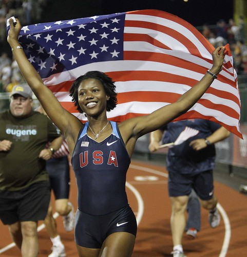
What? You thought American colors are red, white, and blue, like the flag? No no, sorry. Your colors are navy, light blue and red now, as detailed in the Nike Swift System of Dress. Deal with it. And the light blue arm-warmer things? Those make you faster because of aerodynamic fabric. Same for the shin-sleeves. And they’re good for swooshes, too. (Gigantic views here and here.)
So goes Nike’s recent chokehold on our national track and field identity — and on our Olympic identity as a whole. The basketball uniforms can be seen here, here, and here, each featuring impossible-to-read letters and numbers atop a graphic called “We The People.”
While this probably seems like another easy case of Nike-bashing, I think it’s more important to ask why Nike, and other companies (blue seems a bit dark, no?), are changing our national colors. England is blue, red, and white. Canada? Red and white. Australia? Green and yellow, sometimes with black. America? Well, that depends on which company makes the uniforms.
So, looking specifically at track and field (no time for team handball, sorry), what are America’s colors anyway? Better take a look:
1984: Made by Kappa, better known for soccer apparel. Mostly red.
1988: Mostly red again, also by Kappa (see side panel).
1992: Nike joins the party with a pretty tame design. Red, white, and blue — that’s us.
1996: Navy blue, that’s you. This design also featured circles on the side panels. You know, for … uh … something.
2000: Nike to USA — Hey, your flag doesn’t match our uniforms. We’ll make a new one for you if you like. The back panels were red, by the way. Nice.
2004: Welcome back, America. Your blue is still too dark, but at least it’s close to the flag.
2008: And … we’re back to the navy-and-light-blue thing. I’m sure you’ve noticed the track and field uniforms also feature the “We The People” graphic on the back.
Look for it to soon be permanently ratified upon our collective consciousness.
Raffle Results: Paul here. My bad for forgetting to announce that David Neuman and Troy Ragsdale are the winners of last week’s Yankee Stadium DVD raffle. Congrats to them, and my repeated thanks to James Craven for donating the DVDs.
Uni Watch News Ticker: CFL news from Dave Delisle, who reports that the Edmonton Eskimos have replaced their helmet logo with a 60th-anniversary mark, as you can see here. “I can’t recall a team replacing their primary logo with an anniversary logo in any sport,” he writes. “Usually those are placed separately on the uniform, like a shoulder patch. The Eskimos are doing this for the full season.” ”¦ The Minaya-ized Mr. Met T-shirt is now available in several colors and at a fair price. ”¦ Tour de France note from Matt Zegarski, who writes: “In recent years, many riders who wear a leader’s jersey have been wearing matching pants and helmet, but Team CSC-Saxo Bank have been bucking this trend, as seen in these photos of Frank Schleck and Carlos Sastre. I don’t know if it’s because team boss Bjarne Riis put the kibosh on it, or because of their clothing supplier, Craft. Either way, it’s a classic look.” ”¦ “I’m the art director of Gator Country magazine in Gainesville,” writes Jason Farmand. “For our football preview issue coming up, we commissioned an artist to paint Tim Tebow for the cover — in a way he’s never been seen before. I thought you’d like to see that.” ”¦ Turns out Spider-Man is a Mets fan (or at least he was back when Shea had the great metal exterior panels). Those screen grabs are from this hilarious video, sent my way by James Poisso, who says, “It’s amazing what you can find on YouTube!” ”¦ Astros catcher Humberto Quintero is switching to a hockey-style mask (with thanks to Ryan Patrick). ”¦ “Mr. Flat Brim himself, Joba Chamberlain, wore a curled brim on his Dunkin’ Donuts cap at a promotional appearance the other day,” notes Tyler Kepner. … MLS All-Star Game observations, courtesy of Kenn Tomasch: “For the first time since a sponsor logo started appearing on the front of the MLS All-Stars shirts in 2004, it was Pepsi and not Sierra Mist this time around. You can’t tell by that photo, but because Landon Donovan (who didn’t start, by the way) had dibs on the #10 shirt (for some reason, seniority, probably), Chicago’s Cuauhtemoc Blanco wore #70. No, that’s not the year of his birth (he was born in 1973), but the odd thing is that MLS’s number fonts are so craptacular this year that #70 looks a lot like #10 (and vice versa). All the 7s on all the shirts look like 1s. (Sorry, no good photo of that.) David Beckham, as always, wore long sleeves — not, as some speculate, because he wants to cover up his ample tattoos, but just because he prefers long sleeves, even when he plays in MLS’s summer heat (he’s never played in Phoenix, though). What’s funny is that West Ham’s Dean Ashton wore long sleeves in the first half but switched to short sleeves in the second half and scored in each jersey (still looking for a photo of that). Meanwhile, Steve Nash of the Phoenix Suns, whose hometown is Vancouver, wore a Vancouver Whitecaps 1979 throwback jersey while announcing that he’s part of the ownership group looking to grab one of two MLS expansion teams for 2011.”
Winter Classic 2009 logo
link
I think it’s pretty good. I like how it’s modeled after the Wrigley sign:
link
NHL logo could have been place a little better I think. Looks like a bad cut and paste job to me…
On the topic of anniversary logos, the Boston Bruins had a variation of THIS logo (link) from 1932 – 1948, before switching to THIS logo (link) for the team’s 25th anniversary in the 1948-49 season. The team used a spoked “B” logo from then on.
Didn’t some college football teams replace their helmet logos with the “100” decal back in ’69?
Not pros, I know, and honestly don’t remember for sure. Wanna say that, like, Purdue for example used the “100” instead of “P”…on one side anyway.
Although, back then, in many cases was replacing a player’s number on side of helmet…so might not be quite the same thing.
Lance also worse yellow with black shorts.
link
The all yellow strip was prominent on the time trials in my mind because it is a unitard to reduce all drag, whereas regular stages, such as the climbs have zippered tops only with their regular shorts.
However, Lance did wear the blue shorts in rain a time trial.
link
Pantani did the multicolor as well
link
Jan Ullrich
link
[quote]MLS All-Star Game observations, courtesy of Kenn Tomasch: “For the first time since a sponsor logo started appearing on the front of the MLS All-Stars shirts in 2004, it was Pepsi and not Sierra Mist this time around. You can’t tell by that photo, but because Landon Donovan (who didn’t start, by the way) had dibs on the #10 shirt (for some reason, seniority, probably), Chicago’s Cuauhtemoc Blanco wore #70. No, that’s not the year of his birth (he was born in 1973), but the odd thing is that MLS’s number fonts are so craptacular this year that #70 looks a lot like #10 (and vice versa). All the 7s on all the shirts look like 1s. (Sorry, no good photo of that.) David Beckham, as always, wore long sleeves – not, as some speculate, because he wants to cover up his ample tattoos, but just because he prefers long sleeves, even when he plays in MLS’s summer heat (he’s never played in Phoenix, though). What’s funny is that West Ham’s Dean Ashton wore long sleeves in the first half but switched to short sleeves in the second half and scored in each jersey (still looking for a photo of that). Meanwhile, Steve Nash of the Phoenix Suns, whose hometown is Vancouver, wore a Vancouver Whitecaps 1979 throwback jersey while announcing that he’s part of the ownership group looking to grab one of two MLS expansion teams for 2011.” [/quote]
I actually thought the black shirt with blue shorts looked horrible.
Could it be that the hard to read names on the back of the basketball jerseys are intentionally hard to read to elevate the team above the individual player?
[quote comment=”281791″]Could it be that the hard to read names on the back of the basketball jerseys are intentionally hard to read to elevate the team above the individual player?[/quote]
I’m going to go with crappy design…
[quote comment=”281791″]Could it be that the hard to read names on the back of the basketball jerseys are intentionally hard to read to elevate the team above the individual player?[/quote]
Then don’t even have names on the jersies.
Another day another post by Paul complaining about Nike. It is getting old, blah blah blah, striped socks, blah blah blah, nike sucks, blah blah blah, logo creep, blah blah blah, I like to live in the past I don’t like anything contemporary.
Humberto Quintero isn’t just wearing the new hockey style mask, he took Brad Ausmus’ extra mask and modified it to have extra padding in the crown.
Also, I’m surpried Paul didn’t screen cap the “Mets” outfielder from that Electric Company clip…whoever wrote/directed the clip must be a yankees fan…
[quote comment=”281794″]Another day another post by Paul complaining about Nike. It is getting old, blah blah blah, striped socks, blah blah blah, nike sucks, blah blah blah, logo creep, blah blah blah, I like to live in the past I don’t like anything contemporary.[/quote]
Who knew Phil Knight was a uniwatch reader?
[quote comment=”281794″]Another day another post by Paul complaining about Nike. It is getting old, blah blah blah, striped socks, blah blah blah, nike sucks, blah blah blah, logo creep, blah blah blah, I like to live in the past I don’t like anything contemporary.[/quote]
um, Paul didn’t write this one. sorry.
After link, one thing I noticed was that all the players were wearing their pants high. I couldn’t see one player wearing pajama style. Call me an optimist seeing something good out of something terribly bad.
[quote comment=”281793″][quote comment=”281791″]Could it be that the hard to read names on the back of the basketball jerseys are intentionally hard to read to elevate the team above the individual player?[/quote]
Then don’t even have names on the jersies.[/quote]
Ummm … yes they link.
Bryan, it doesn’t help your case when you tout other countries sticking with their actual colors when the picture you show claiming Canada is red and white is actually red, white AND BLACK. Same with Australia. Green, yellow, AND BLACK. (You acknowledge the black in Australia, but still…your two examples and you couldn’t find any pics supporting your claim?!)
For all of the effort that Nike put into trashing the track and field uniforms, they really phoned in the cycling kits:
link
It looks almost like our national colors have been specifically re-calibrated to match the Hampton Inn logo.
Could it be that Nike is so committed to “blue state” causes that they can’t stomach any red?
[quote comment=”281789″]Lance also worse yellow with black shorts.
link
The all yellow strip was prominent on the time trials in my mind because it is a unitard to reduce all drag, whereas regular stages, such as the climbs have zippered tops only with their regular shorts.
However, Lance did wear the blue shorts in rain a time trial.
link
Pantani did the multicolor as well
link
Jan Ullrich
link
Lance wore all-yellow only once — in link.
[quote comment=”281788″]Didn’t some college football teams replace their helmet logos with the “100” decal back in ’69?
Not pros, I know, and honestly don’t remember for sure. Wanna say that, like, Purdue for example used the “100” instead of “P”…on one side anyway.
Although, back then, in many cases was replacing a player’s number on side of helmet…so might not be quite the same thing.[/quote]
Louisiana Tech and East Tennessee both wore the “100” on one side of the helmet and regular logo on the other in the 1969 Grantland Rice Bowl featuring Terry Bradshaw. Several good pictures at this site: link
[quote comment=”281799″][quote comment=”281793″][quote comment=”281791″]Could it be that the hard to read names on the back of the basketball jerseys are intentionally hard to read to elevate the team above the individual player?[/quote]
Then don’t even have names on the jersies.[/quote]
Ummm … yes they link.[/quote]
Bryan, you misread my comment.
[quote comment=”281800″]Bryan, it doesn’t help your case when you tout other countries sticking with their actual colors when the picture you show claiming Canada is red and white is actually red, white AND BLACK. Same with Australia. Green, yellow, AND BLACK. (You acknowledge the black in Australia, but still…your two examples and you couldn’t find any pics supporting your claim?!)[/quote]
But the fundamental national colors remain — those unis are predominantly red and white, or green and yellow. Navy and light blue, with a splash of red and white in the logo, are not our colors. It’s part of a 12-year pattern by Nike, and it sucks.
[quote comment=”281805″][quote comment=”281799″][quote comment=”281793″][quote comment=”281791″]Could it be that the hard to read names on the back of the basketball jerseys are intentionally hard to read to elevate the team above the individual player?[/quote]
Then don’t even have names on the jersies.[/quote]
Ummm … yes they link.[/quote]
Bryan, you misread my comment.[/quote]
I did. I do that from time to time. All apologies.
Possible explanation why the Pepsi logo was used on MLS All Star jerseys instead of Sierra Mist:
The match was in Toronto, and since Sierra Mist is not sold in Canada, the sponsors (PepsiCo) decided to go with a more ubiquitous brand.
[quote comment=”281799″][quote comment=”281793″][quote comment=”281791″]Could it be that the hard to read names on the back of the basketball jerseys are intentionally hard to read to elevate the team above the individual player?[/quote]
Then don’t even have names on the jersies.[/quote]
Ummm … yes they link.[/quote]
Bryan, it doesn’t so THEY don’t…. it says THEN don’t. As in, if you’re all about the team above the individual, why even put individual names on the back.
[quote comment=”281790″]
I actually thought the black shirt with blue shorts looked horrible.[/quote]
They looked like a rec team was wearing their 2nd jersey, but not a whole 2nd strip. My theory was that they were wearing shorts from a previous All-Star game. They wore all blue last year, but it was a different shade.
[quote comment=”281720″][quote comment=”281713″][quote comment=”281705″][quote comment=”281699″][quote comment=”281696″]Joe — do you know if the O’s wore an orange-front helmet in ’75-’76 with that orange-front cap? I’ve been trying to get an answer to that for a while now.[/quote]
to clarify your question…you’re asking if they wore a helmet which link, yes?
cuz, im checking for pics now[/quote]
Yes. Reason I ask is because, as you know, they now wear more than one cap, but only one helmet. I collected replica helmets when I was a kid and I got the white-front one, but never saw the orange-front one for sale.[/quote]
Here’s an Orioles game program. Interesting cover…
link
That is a great find — but it’s 1977, so, even though the bat boy is wearing the ’75-’76 orange cap, the team wore the white cap and helmets for games. Weird that the bat boy would wear a cap from the previous season. If you find that orange helmet, let me know. I haven’t seen it in any baseball cards or pictures from those years, though there are pictures of the orange cap.[/quote]
That program is probably the best evidence I’ve seen yet that the O’s did not wear a matching orange-front helmet with the orange-front cap. It’s probably a picture taken from 1976, even though the program is for the middle of 1977. Why else would the bat boy be wearing an orange-front cap?
[quote comment=”281809″][quote comment=”281799″][quote comment=”281793″][quote comment=”281791″]Could it be that the hard to read names on the back of the basketball jerseys are intentionally hard to read to elevate the team above the individual player?[/quote]
Then don’t even have names on the jersies.[/quote]
Ummm … yes they link.[/quote]
Bryan, it doesn’t so THEY don’t…. it says THEN don’t. As in, if you’re all about the team above the individual, why even put individual names on the back.[/quote]
I miss read the comment too. Oops….
And note how the bat boy is wearing a soft cap! No way that’d be allowed these days.
[quote comment=”281812″]
I miss read the comment too. Oops….[/quote]
Me too! Weird.
[quote comment=”281810″][quote comment=”281790″]
I actually thought the black shirt with blue shorts looked horrible.[/quote]
They looked like a rec team was wearing their 2nd jersey, but not a whole 2nd strip. My theory was that they were wearing shorts from a previous All-Star game. They wore all blue last year, but it was a different shade.[/quote]
No…I believe that is the 2008 Adidas short design. Black and blue is an excellent combination, but it would have been much better with black shorts and blue shirts instead of the opposite.
With the Eskimos anniversary logo, they were going to put it on the jersey, but since the spaces available were taken up by sponsorship patches, the equipment manager decided to put the decal on the helmets. The plan was originally for the decals to be only on for the season opener at home, but looks to have since changed to the entire season
[quote comment=”281812″]
“I can’t recall a team replacing their primary logo with an anniversary logo in any sport,” he writes.[/quote]
It happens regularly in minor-pro and junior hockey.
I can probably list off a dozen hockey teams off the top of my head right now who have done it. But I won’t. ;o)
[quote comment=”281808″]Possible explanation why the Pepsi logo was used on MLS All Star jerseys instead of Sierra Mist:
The match was in Toronto, and since Sierra Mist is not sold in Canada, the sponsors (PepsiCo) decided to go with a more ubiquitous brand.[/quote]
Yep – in Canada, Pepsi holds the rights to and distributes 7-Up, it makes no sense at least from a Canadian perspective
According to the Sporting News, our favorite named minor league hockey team the Iowa Chops called Brett Favre’s agent to see if he wanted to play with them. Anything to get the name of your team in the paper I guess.
You HAVE to love Michael Johnson’s gold shoes. Those things are the best ever!
[quote comment=”281806″]
But the fundamental national colors remain — those unis are predominantly red and white, or green and yellow. Navy and light blue, with a splash of red and white in the logo, are not our colors. It’s part of a 12-year pattern by Nike, and it sucks.[/quote]
I dunno, I guess I’m just seeing red, white and blue AND light blue in the Nike designs. The official blue of the US flag is indeed a dark/navy blue. This was discussed a few weeks ago when the Stars & Stripes caps popped up in baseball and people wondered why they were navy.
“England is blue, red, and white.”
GREAT BRITAIN’s colo(u)rs are red, white, and blue.
ENGLAND’s colo(u)rs are red & white
[quote comment=”281822″]“England is blue, red, and white.”
GREAT BRITAIN’s colo(u)rs are red, white, and blue.
ENGLAND’s colo(u)rs are red & white[/quote]
Darn. You beat me to it. Although the huge “GBR” might have given it away….
Interesting, though – the United Kingdom doesn’t send a soccer team to the Olympics, since they only have individual national teams for England, Scotland, Northern Ireland and Wales.
They’re trying to put a unified UK soccer team together for the 2012 Olympics in London, but Scotland is dragging its heels….
I totally remember that Electric Company episode with Spidey and The Wall.
Good point about the red, white and black for Canada, though Canada has been using black in its uniforms (hockey in particular) for quite a while.
But the Canada uniforms have been very controversial this year, after years of iconic and popular uniforms (remember the poor boy caps in SLC in 2002) the design has gone completely off the rails this year. These beauties have to be seen to be believed.
link
[quote comment=”281824″]Turns out Spider-Man is a Mets fan (or at least he was back when Shea had the great metal exterior panels). [/quote]
There was a recent issue of Spider-Man that an artist drew with Peter Parker wearing Yankees paraphernalia that drove some of the more, shall we say, hardcore Spidey fans bananas.
Apparently it’s canon that Peter Parker is a die-hard Mets fan and someone forgot to do some fact-checking before putting the book out.
[quote comment=”281804″][quote comment=”281788″]Didn’t some college football teams replace their helmet logos with the “100” decal back in ’69?
Not pros, I know, and honestly don’t remember for sure. Wanna say that, like, Purdue for example used the “100” instead of “P”…on one side anyway.
Although, back then, in many cases was replacing a player’s number on side of helmet…so might not be quite the same thing.[/quote]
Louisiana Tech and East Tennessee both wore the “100” on one side of the helmet and regular logo on the other in the 1969 Grantland Rice Bowl featuring Terry Bradshaw. Several good pictures at this site: link
Bradshaw has a different number font than his offensive linemen.
[quote comment=”281826″]“Mr. Flat Brim himself, Joba Chamberlain, wore a curled brim on his Dunkin’ Donuts cap at a promotional appearance the other day”[/quote]
Hope Joba didn’t try to flatten it out; those pre-curved brims are near impossible to flatten out……
[quote comment=”281824″]I totally remember that Electric Company episode with Spidey and The Wall.[/quote]
how about the episode where Spidey fought the guy who stole kids’ ice cream cones and sat on them?
BTW Morgan Freeman is great in that clip as the ump.
Hey, what happened to the winners of the OKC design contest?
I don’t get the complaint. The blue in the American flag is clearly a dark shade of navy. You can argue about the design or the addition of the powder blue if you like (however, as evidenced by the black in the Canada and Australia designs you linked, it’s hardly a strictly Nike thing to add an extra color), but if matching the flag colors is your main concern, I don’t see how you can complain about the navy. It’s pretty much a perfect match with the star block of the flag as far as I’m concerned. In fact, it’s the 1992 design that you seem to prefer that has the inaccurate blue shade.
[quote comment=”281791″]Could it be that the hard to read names on the back of the basketball jerseys are intentionally hard to read to elevate the team above the individual player?[/quote]
Then why put NOB at all, not like we don’t know who they are anyway…
[quote comment=”281831″]Hey, what happened to the winners of the OKC design contest?[/quote]
Whoops. I thought Uni Watch’s next column meant here today, not the next on ESPN.
what i really love, is how proudly the nike swoosh is stitched on this jersey, as seen at the hockey hall of fame
link
whole jersey
link
sorry for the poor-quality images
(for those of you who aren’t flag scholars, that’s North Korea’s IIHF jersey)
I never heard that Dora the Explorer and Mr. Met had ever hooked up…now they have a kid?!
It might also be worth noting that two of the three examples used – England and Australia – are using colors that are not on their flag. England’s flag is only red and white. Australia’s: red, white, navy blue. Still, those colors have become tradition for those countries’ sport teams, and not a Nike edict.
I have (not actually have in my possession, but I have pictures) a few interesting jerseys out of the old United Hockey League (recently changed name to International Hockey League). You mentioned that you’ve never seen a team replace their primary logo with an anniversary logo, I can give you a few examples.
1. Quad City Mallards (folded to become Quad City Flames of American Hockey League)
Regular jersey at the time (worn season before anniversary year): link , link
Anniversary Jersey (worn full season): link , link
2. Flint Generals (Still in International Hockey League)
Regular Jerseys (not exact years, but within a couple year window): link , link
Anniversary Jersey (worn full season; Note jersey number on hip): link
3. Muskegon Fury (Still in International Hockey League)
Regular Jerseys: link
Anniversary Jerey (worn opening night only): link
2002 Colonial Cup Champions Jersey (probably only 1 game, opening night maybe; Can’t be certain there): link
3 Time Colonial Cup Champions Jersey (worn opening night 2005 only): link
Oops…I guess the Brits use the Union Jack for the Olympics, since they will be Great Britain and not just England. I don’t fact check. That’s why I don’t get the big bucks like Bryan and Paul…
link
The exact shades of red, white, and blue to be used in the flag are specified as follows:
Color…….. Pantone ..RGB Values
Dark Red 193 C (191,10,48)
White Safe (255,255,255)
Navy Blue 281 C (0,40,104)
[quote comment=”281837″]It might also be worth noting that two of the three examples used – England and Australia – are using colors that are not on their flag. England’s flag is only red and white. Australia’s: red, white, navy blue. Still, those colors have become tradition for those countries’ sport teams, and not a Nike edict.[/quote]
In the Olympics, there is no “England” it is part of the “United Kingdom” with Northern Ireland, Scotland, Wales. which uses red white and blue of the Union Jack link as their Flag and colors. Soccer is a different story because each country has its own Football Association, which means that you see red and White for England, Blue and White for Scotland, etc..
This may have been mentioned, but scroll down here to photo of Ball State backfield and check out #15, who I assume is the QB.
link
[quote comment=”281842″]This may have been mentioned, but scroll down here to photo of Ball State backfield and check out #15, who I assume is the QB.
link
Well, ONE of those guys went on to become an Oriole (seems to be some confusion in the cutline).
Thanks for clarifying, Mike. But England’s soccer team uses navy blue as a main color: link
I guess the point is that there are many examples of countries using colors outside of their flag colors for sports uniforms (the Dutch soccer team also comes to mind).
[quote comment=”281811″]
That program is probably the best evidence I’ve seen yet that the O’s did not wear a matching orange-front helmet with the orange-front cap. It’s probably a picture taken from 1976, even though the program is for the middle of 1977. Why else would the bat boy be wearing an orange-front cap?[/quote]
I can’t say I ever remember seeing an orange front helmet…I would say they never wore it
[quote comment=”281798″]After link, one thing I noticed was that all the players were wearing their pants high. I couldn’t see one player wearing pajama style. Call me an optimist seeing something good out of something terribly bad.[/quote]
You’re just an optimist. :)
The major league teams usually dictate how their minor league affiliates will dress, and several require their minor leaguers to wear their pants high.
The Nike bashing that goes on on this site borders on the ludicrous at times. If you would believe all the comments that have been posted (today Bryan), bout Nike on this site, you’d think Nike was ran by the soviets.
Do you really believe that evil Nike designers come up with the most offensive designs/colors they can imagine, and then force the team to wear them?
Do you really think that Nike tells teams what to wear, or do you think that maybe, JUST MAYBE, that the teams and organizations themselves are involved in the color/design/look of their uniforms?
It’s a two way street folks. It’s a conversation. Nike doesn’t inform a team of what it will wear. Teams/organizations often get choices. Both sides have their input. I didn’t see any indictment of anyone but Nike around here.
I think you have no proof that Nike sat back and said, hmmm, we’re sticking light blue in this fucker, and if anybody doesn’t like it, fuck em.
There are other companies doing worse things to pro sports, but get a free pass on this site. Maybe if Nike was based closer to new york it would be more acceptable to uniwatch folk?
[quote comment=”281790″][quote]MLS All-Star Game observations, courtesy of Kenn Tomasch: “For the first time since a sponsor logo started appearing on the front of the MLS All-Stars shirts in 2004, it was Pepsi and not Sierra Mist this time around. You can’t tell by that photo, but because Landon Donovan (who didn’t start, by the way) had dibs on the #10 shirt (for some reason, seniority, probably), Chicago’s Cuauhtemoc Blanco wore #70. No, that’s not the year of his birth (he was born in 1973), but the odd thing is that MLS’s number fonts are so craptacular this year that #70 looks a lot like #10 (and vice versa). All the 7s on all the shirts look like 1s. (Sorry, no good photo of that.) David Beckham, as always, wore long sleeves – not, as some speculate, because he wants to cover up his ample tattoos, but just because he prefers long sleeves, even when he plays in MLS’s summer heat (he’s never played in Phoenix, though). What’s funny is that West Ham’s Dean Ashton wore long sleeves in the first half but switched to short sleeves in the second half and scored in each jersey (still looking for a photo of that). Meanwhile, Steve Nash of the Phoenix Suns, whose hometown is Vancouver, wore a Vancouver Whitecaps 1979 throwback jersey while announcing that he’s part of the ownership group looking to grab one of two MLS expansion teams for 2011.” [/quote]
I actually thought the black shirt with blue shorts looked horrible.[/quote]
It sure did…actually everything looks horrible in the MLS…a select few are mediocre.
[quote comment=”281836″]“I never heard that Dora the Explorer and Mr. Met had ever hooked up…now they have a kid?!”[/quote]
Needless to say, that item’s worthless without any pictures.
[quote comment=”281849″]
Needless to say, that item’s worthless without any pictures.[/quote]
link
[quote comment=”281847″]The Nike bashing that goes on on this site borders on the ludicrous at times. If you would believe all the comments that have been posted (today Bryan), bout Nike on this site, you’d think Nike was ran by the soviets.
Do you really believe that evil Nike designers come up with the most offensive designs/colors they can imagine, and then force the team to wear them?
Do you really think that Nike tells teams what to wear, or do you think that maybe, JUST MAYBE, that the teams and organizations themselves are involved in the color/design/look of their uniforms?
It’s a two way street folks. It’s a conversation. Nike doesn’t inform a team of what it will wear. Teams/organizations often get choices. Both sides have their input. I didn’t see any indictment of anyone but Nike around here.
I think you have no proof that Nike sat back and said, hmmm, we’re sticking light blue in this fucker, and if anybody doesn’t like it, fuck em.
There are other companies doing worse things to pro sports, but get a free pass on this site. Maybe if Nike was based closer to new york it would be more acceptable to uniwatch folk?[/quote]
Seeing it’s Bryan’s/Paul’s articles to write, they can write about what they want. If they hate Nike, guess what, they can write about it. If you don’t like it, then leave/don’t read it/start own own damn site and make it a rule about not being able to speak your opinion.
what’s so bad about a white shirt that says usa on it in red and then blue shorts, like this:
link
this should be the uniform every olympics
[quote comment=”281844″]Thanks for clarifying, Mike. But England’s soccer team uses navy blue as a main color: link
I guess the point is that there are many examples of countries using colors outside of their flag colors for sports uniforms (the Dutch soccer team also comes to mind).[/quote]
England plays in white at home & red away. I don’t think that they have worn any blue since the 1990 world cup.
NASCAR’s Tony Stewart will be #14 next year, Office Depot and Old Spice being the sponsors. Just announced at a press conference.
Not sure if they unveiled the car design. They said they would, but no word.
[quote comment=”281838″]I have (not actually have in my possession, but I have pictures) a few interesting jerseys out of the old United Hockey League (recently changed name to International Hockey League). You mentioned that you’ve never seen a team replace their primary logo with an anniversary logo, I can give you a few examples.
1. Quad City Mallards (folded to become Quad City Flames of American Hockey League)
Regular jersey at the time (worn season before anniversary year): link , link
Anniversary Jersey (worn full season): link , link
2. Flint Generals (Still in International Hockey League)
Regular Jerseys (not exact years, but within a couple year window): link , link
Anniversary Jersey (worn full season; Note jersey number on hip): link
3. Muskegon Fury (Still in International Hockey League)
Regular Jerseys: link
Anniversary Jerey (worn opening night only): link
2002 Colonial Cup Champions Jersey (probably only 1 game, opening night maybe; Can’t be certain there): link
3 Time Colonial Cup Champions Jersey (worn opening night 2005 only): link
Came across another few by accident.
1. Binghampton Senators (American Hockey League)
5 year anniversary jerseys: link , link , link
2. Las Vegas Wrangers (ECHL)
Las Vegas Centenial Jersey: link
Centennial patch on centennial jersey (why?!): link
3. Hartford Wolf Pack (American Hockey Leauge)
10th Anniversary: link
4. Motor City Mechanics (Folded; United Hockey League)
First Season (worn opening night only): link
5. Seattle Thunderbirds (WHL)
25th Anniversary: link
6. Wilkes Barre-Scranton Penguins (AHL)
5th Anniversary: link
7. Muskegon Fury (AGAIN!)
I can’t find a picture, but I know they had a 10th Anniversary jersey as well, which I’m pretty sure they wore for the entire season.
[quote comment=”281852″]what’s so bad about a white shirt that says usa on it in red and then blue shorts, like this:
link
this should be the uniform every olympics[/quote]
Because it looks dated, boring and crappy. Did Joe Paterno design those uniforms?
[quote comment=”281847″]The Nike bashing that goes on on this site borders on the ludicrous at times. If you would believe all the comments that have been posted (today Bryan), bout Nike on this site, you’d think Nike was ran by the soviets.
Do you really believe that evil Nike designers come up with the most offensive designs/colors they can imagine, and then force the team to wear them?
Do you really think that Nike tells teams what to wear, or do you think that maybe, JUST MAYBE, that the teams and organizations themselves are involved in the color/design/look of their uniforms?
It’s a two way street folks. It’s a conversation. Nike doesn’t inform a team of what it will wear. Teams/organizations often get choices. Both sides have their input. I didn’t see any indictment of anyone but Nike around here.
I think you have no proof that Nike sat back and said, hmmm, we’re sticking light blue in this fucker, and if anybody doesn’t like it, fuck em.
There are other companies doing worse things to pro sports, but get a free pass on this site. Maybe if Nike was based closer to new york it would be more acceptable to uniwatch folk?[/quote]
Ya beat me to it! Thank you for saying it though!
Seriously now Nike can’t ever seem to please people on this site. There are times where they do get carried away though.
When Nike had these out, it was “too boring”
link
It seems as if “contemporary” isn’t in people’s vocabulary.
My biggest gripe with Nike–and some of other houses, too–is that they seem to be trying SO hard to be SO different, SO revolutionary, SO trendsetting that they don’t stop to consider if the design actually looks good…just as long as its distinctly “one of those cool new Nike looks” (in THEIR minds anyway).
Kinda like LeRoy Niemann’s art. When he first came on the scene his work was new and exciting. After a while it became “crank it out and call it good cuz it’s Neimann.”
There’s a difference between designing what you feel and stopping to think, “Let’s see, what would I do here?” At that point your work has become a brand outside you, and you may be too self-conscious to be as good as u once were.
Know what I’m saying?
[quote comment=”281854″]NASCAR’s Tony Stewart will be #14 next year, Office Depot and Old Spice being the sponsors. Just announced at a press conference.
Not sure if they unveiled the car design. They said they would, but no word.[/quote]
With Office Depot on board with Stewart, where does that leave Carl Edwards sponsor-wise? Not a Roush-Fenway guy, so I don’t know much about it.
[quote comment=”281788″]Didn’t some college football teams replace their helmet logos with the “100” decal back in ’69?
Not pros, I know, and honestly don’t remember for sure. Wanna say that, like, Purdue for example used the “100” instead of “P”…on one side anyway.
Although, back then, in many cases was replacing a player’s number on side of helmet…so might not be quite the same thing.[/quote]
lots of good info on this at link. Scroll down the menu to near the bottom and click “The 100 Logo”
[quote comment=”281788″]Didn’t some college football teams replace their helmet logos with the “100” decal back in ’69?
Not pros, I know, and honestly don’t remember for sure. Wanna say that, like, Purdue for example used the “100” instead of “P”…on one side anyway.
Although, back then, in many cases was replacing a player’s number on side of helmet…so might not be quite the same thing.[/quote]
here’s Archie Manning wearing the “100” at Ole Miss on the cover of the sept 14, 1970 SI:
link
[quote comment=”281858″]My biggest gripe with Nike–and some of other houses, too–is that they seem to be trying SO hard to be SO different, SO revolutionary, SO trendsetting that they don’t stop to consider if the design actually looks good…just as long as its distinctly “one of those cool new Nike looks” (in THEIR minds anyway).
[/quote]
YES! That’s the main problem — things are designed so everybody knows it HAS to be Nike. And that’s why baby blue and strange spots have found homes on USA track and field clothing — there’s no other reason for it.
As for the organization wearing it — I wonder how much they care, honestly. The free stuff’s coming in, and that’s good enough.
The Big Guy leading the pack in this picture tells me that even my Olympic dream is not over. (But I still have to work on hitting 70 feet in the shot put.)
P.S.- That Tim Tebow cover is well done. I am guessing it is also Uni-Accurate. I’d like to see a whole series of those done on this year’s Heisman hopefuls.
[quote comment=”281851″][quote comment=”281847″]The Nike bashing that goes on on this site borders on the ludicrous at times. If you would believe all the comments that have been posted (today Bryan), bout Nike on this site, you’d think Nike was ran by the soviets.
Do you really believe that evil Nike designers come up with the most offensive designs/colors they can imagine, and then force the team to wear them?
Do you really think that Nike tells teams what to wear, or do you think that maybe, JUST MAYBE, that the teams and organizations themselves are involved in the color/design/look of their uniforms?
It’s a two way street folks. It’s a conversation. Nike doesn’t inform a team of what it will wear. Teams/organizations often get choices. Both sides have their input. I didn’t see any indictment of anyone but Nike around here.
I think you have no proof that Nike sat back and said, hmmm, we’re sticking light blue in this fucker, and if anybody doesn’t like it, fuck em.
There are other companies doing worse things to pro sports, but get a free pass on this site. Maybe if Nike was based closer to new york it would be more acceptable to uniwatch folk?[/quote]
Seeing it’s Bryan’s/Paul’s articles to write, they can write about what they want. If they hate Nike, guess what, they can write about it. If you don’t like it, then leave/don’t read it/start own own damn site and make it a rule about not being able to speak your opinion.[/quote]
I thought we got to make comments and have conversations here? Do I have to toe the corporate uniwatch line and not challenge anything said on here?
oh ok. I will chant 100 times
I HATE NIKE
I HATE REEBOK
I HATE ADIDAS
I HATE PURPLE
I WILL WEAR STIRRUPS EVEN UNDER MY DRESS SLACKS
RE: Olympic track uniform.
American Gladiators?
Re: Olympic Basketball.
No Comment.
[quote comment=”281851″]Seeing it’s Bryan’s/Paul’s articles to write, they can write about what they want. If they hate Nike, guess what, they can write about it. If you don’t like it, then leave/don’t read it/start own own damn site and make it a rule about not being able to speak your opinion.[/quote]
And so speaketh one of the Uniwatch lemmings. Hey pal, you might want to try removing your nose from Paul’s posterior long enough to come up with an original thought for once in your life.
[quote comment=”281859″][quote comment=”281854″]NASCAR’s Tony Stewart will be #14 next year, Office Depot and Old Spice being the sponsors. Just announced at a press conference.
Not sure if they unveiled the car design. They said they would, but no word.[/quote]
With Office Depot on board with Stewart, where does that leave Carl Edwards sponsor-wise? Not a Roush-Fenway guy, so I don’t know much about it.[/quote]
Well, Home Depot will be looking to sponsor someone :)
[quote comment=”281846″][quote comment=”281798″]After link, one thing I noticed was that all the players were wearing their pants high. I couldn’t see one player wearing pajama style. Call me an optimist seeing something good out of something terribly bad.[/quote]
You’re just an optimist. :)
The major league teams usually dictate how their minor league affiliates will dress, and several require their minor leaguers to wear their pants high.[/quote]
The Reds are definitely one of those teams. Most teams in the Midwest League wear their socks up. In case you are looking for said pitcher, Julio Castillo, he’s here: link
[quote comment=”281867″]With Office Depot on board with Stewart, where does that leave Carl Edwards sponsor-wise? Not a Roush-Fenway guy, so I don’t know much about it.[/quote]
I believe Aflac will be the primary sponsor for his 99 car. In fact, one of the telecasts mentioned that Aflac replaced Office Depot as his primary sponsor for this season already, so it probably won’t affect him that much.
[quote comment=”281847″]There are other companies doing worse things to pro sports, but get a free pass on this site.[/quote]
That’s the biggest folk myth in the comments section. Hmmmmm, did I ever say anything about Reebok’s destruction of the NHL uniforms? Or about Adidas imposing their stripes on NBA refs and warmups and all-star uniforms? Sure, free pass….
[quote comment=”281847″]Maybe if Nike was based closer to new york it would be more acceptable to uniwatch folk?[/quote]
This isn’t the stupidest thing anyone’s ever said in the comments. But it’s close.
[quote comment=”281858″]My biggest gripe with Nike–and some of other houses, too–is that they seem to be trying SO hard to be SO different, SO revolutionary, SO trendsetting that they don’t stop to consider if the design actually looks good…just as long as its distinctly “one of those cool new Nike looks” (in THEIR minds anyway).
Kinda like LeRoy Niemann’s art. When he first came on the scene his work was new and exciting. After a while it became “crank it out and call it good cuz it’s Neimann.”
There’s a difference between designing what you feel and stopping to think, “Let’s see, what would I do here?” At that point your work has become a brand outside you, and you may be too self-conscious to be as good as u once were.
Know what I’m saying?[/quote]
NOW THIS IS THE KIND OF CONVERSATION WE SHOULD BE HAVING!
Ricko, you’re a cool guy. I’ve seen all your stuff posted on here. What’s your opinion of Nike? Is your previous message your feelings? That Nike has become too self-conscious design-wise?
I have been looking for an image of the front and back (if there was one) for the “Catholics vs. Convicts” shirt from the 1988 University of Notre Dame and University of Miami (FL) game. Even though I’m a ‘Canes fan, I was in attendance at the game and always wanted one, even if I made a replica of it. I do have a classic Miami shirt from then that said in green, “God made Notre Dame #1…” and then in orange, “Miami made them #2!” I have been able to find the one that was made for the 1990 game, but not the original. Can anyone help me at all?
link
Winter Classic T-shirts available NOW!!!
[quote comment=”281847″]Maybe if Nike was based closer to new york it would be more acceptable to uniwatch folk?[/quote]
This isn’t the stupidest thing anyone’s ever said in the comments. But it’s close.[/quote]
Haha. Just trying to fire up the ol new yorkers ;)
Paul, an example of a company that I think gets a free pass on uniwatch is Majestic. Their “turn back the clock” jerseys are often half-hearted. They get pretty close, almost there, and people iterpret those as the “real thing they wore in 1970whatever”.
Teams and Majestic should care about what they are presenting on the field, especially when they’re presenting a “whatever date” baseball game. When Majestc does this, it feels a lot dirtier to me than anything Nike does, because it feels like Majestic isn’t taking the time or investing the extra effort like M&N or Ebbets does. It feels like they’re making another jersey to sell.
[quote comment=”281870″][quote comment=”281847″]There are other companies doing worse things to pro sports, but get a free pass on this site.[/quote]
That’s the biggest folk myth in the comments section. Hmmmmm, did I ever say anything about Reebok’s destruction of the NHL uniforms? Or about Adidas imposing their stripes on NBA refs and warmups and all-star uniforms? Sure, free pass….
[quote comment=”281847″]Maybe if Nike was based closer to new york it would be more acceptable to uniwatch folk?[/quote]
This isn’t the stupidest thing anyone’s ever said in the comments. But it’s close.[/quote]
I am the LAST person that will ever defend Paul Lukas, but even I have to admit that he has been, if nothing else, equitable in ripping companies. When Reebok came out with the new NHL uniforms, he was the first one that ripped them to shreds. He gave it to them about as bad as he gives it to Nike.
And it’s always been the same fundamental point: apparel companies put all these bells and whistles on uniforms just so that people will associate the bells and whistles with that company, be it Reebok, Adidas or Nike. And it’s a sound argument that you’d be hard-pressed to counter.
Wow this Nike thing is really heating up. Well this the stance I’m taking. I’m happy with what Nike is doing in the Olympics. If you don’t like it fine, that is your opinion. I will have mine. That’s the beauty of individuality.
As much I don’t like Nike designs at times, I do think the gripes being made in today’s entry are a bit of a stretch.
There’s red, white, and blue on the uniform. The light blue looks fine to me.
If the accent color was green or purple or orange, perhaps I’d see the point.
Lame post today. Looks like uni watch blog has turned into a sports uni-themed version of Grumpy Old Men. Seriously, it seems like no matter what design Nike comes out with, this site will find something wrong with it. There is no objectivity. You really want Kappa designing the U.S. Olympic uniforms? It’s not even an American company.
Furthermore, this blog has lost its relevance. And I was a huge fan. Maybe it was inevitable that eventually you would run out of interesting things to write. Best thing about this blog now is the ticker. It’s the only thing worth checking out.
I can’t help but think that the demise of uni watch has coincided with Paul’s taking a step back and his insistence on giving Bryan such a large role, despite the obvious lack of enjoyment of his articles by the readers. Sorry Bry, but it’s true. Paul, are you really so busy/hard-headed that you are willing to stand idly by as your baby slowly dies. Google Analytics don’t lie. What a shame.
Let me preempt all the if you don’t like what we write/buzz off talk: I and many others will do precisely that.
Along with Australia not wearing even close to the same colors as there flag (I am assuming for traditional reasons)…
Italy is another Country that doesnt wear there Flag colors for any sport…they wear blue
Soccer Jersey
link
Track and Field
link
why?
Cause Blue is the Color of the House of Savoy (Which Ruled the Kingdom of Italy from 1861-1946)
or at least thats what the commentators said a few years back when i was watching a curling game of Canada vs Italy
I will try to find other countries that dont have there National Colors on there Jerseys
All I care is that its a Shade of Red, White and Blue. Don’t add gold, yellow or some other color. Black and Grays arn’t colors, and don’t really mess anything up in my book if they are added.
What I get confused about is who made the decisions for like the Netherlands to be Blaze Orange, or Australia to wear green and gold?
[quote comment=”281871″][quote comment=”281858″]My biggest gripe with Nike–and some of other houses, too–is that they seem to be trying SO hard to be SO different, SO revolutionary, SO trendsetting that they don’t stop to consider if the design actually looks good…just as long as its distinctly “one of those cool new Nike looks” (in THEIR minds anyway).
Kinda like LeRoy Niemann’s art. When he first came on the scene his work was new and exciting. After a while it became “crank it out and call it good cuz it’s Neimann.”
There’s a difference between designing what you feel and stopping to think, “Let’s see, what would I do here?” At that point your work has become a brand outside you, and you may be too self-conscious to be as good as u once were.
Know what I’m saying?[/quote]
NOW THIS IS THE KIND OF CONVERSATION WE SHOULD BE HAVING!
Ricko, you’re a cool guy. I’ve seen all your stuff posted on here. What’s your opinion of Nike? Is your previous message your feelings? That Nike has become too self-conscious design-wise?[/quote]
Yeah, I think so. I love the Oregon football and uniforms, for example. Inventive, unique, fearless in their use of color. Then when I saw the football version adding black and with the “tire tracks” on the knees, etc., I thought, “Okay, now it looks like they’re doing stuff just to do it…a kind of self-ordaining ‘Look how leading edge we continue to be! If we did it, it MUST be good.'”
Slap something together and call it Amazing? Doesn’t always work that way.
Other manufactures have their swings and misses, too. Nike just seems to be…trying to hard. Instead of saying, “Look at this team,” their works appears more concerned with “Look at our design.”
Honestly, tracking Nike’s work over the years would be in interesting study/analysis for a design class, I think.
Scott:
Even beyond the whole “corporate sponsorship” thing, THIS is what irks me. It is precisely why I got out of the design world years ago.
There is a lack of consideration for tradition, classic looks, and attempting to make something trendsetting while still remaining within some constraints of tradition.
All good art or design has constraints. Constraints (self-imposed, technological, whatever) are necessary to make the trendsetting part of the work MEAN something relatively. Otherwise it is what I used to term “masterbatory”
This is what Nike is doing, and its worse because they’re doing it to the fucking flag of the United States of America.
If I’m to design the Irish track team’s uni’s I am constrained by some pretty ugly colors (my opinion- orange and green don’t mix). So what do I do? Do I make the orange a different hue so it matches in a more modern fashion? NO. You work within the constraints AND make it good.
[quote comment=”281866″][quote comment=”281851″]Seeing it’s Bryan’s/Paul’s articles to write, they can write about what they want. If they hate Nike, guess what, they can write about it. If you don’t like it, then leave/don’t read it/start own own damn site and make it a rule about not being able to speak your opinion.[/quote]
And so speaketh one of the Uniwatch lemmings. Hey pal, you might want to try removing your nose from Paul’s posterior long enough to come up with an original thought for once in your life.[/quote]
Nope, no lemming here. I’ve disagreed with Paul in the past about lots of stuff, I was just defending the right to an opinion. Yes, Scott you too have the right for your opinion on too much Nike bashing, I just felt your comment came across as not only bashing nike bashing, but bashing the person for their opinion.
[quote comment=”281869″][quote comment=”281867″]With Office Depot on board with Stewart, where does that leave Carl Edwards sponsor-wise? Not a Roush-Fenway guy, so I don’t know much about it.[/quote]
I believe Aflac will be the primary sponsor for his 99 car. In fact, one of the telecasts mentioned that Aflac replaced Office Depot as his primary sponsor for this season already, so it probably won’t affect him that much.[/quote]
Good point. He’s been doing more spots with that stupid duck (and also Vitamin Water) than Office Depot lately.
“The basketball uniforms can be seen here, here, and here, each featuring impossible-to-read letters and numbers atop a graphic called ‘We The People.'”
Dude, if you can’t read those numbers, maybe you should get your peepers checked!
“Yeah, I think so. I love the Oregon football and uniforms, for example.”
Was supposed to say football AND BASKETBALL uniforms.
–Ricko
[quote comment=”281880″]All I care is that its a Shade of Red, White and Blue. Don’t add gold, yellow or some other color. Black and Grays arn’t colors, and don’t really mess anything up in my book if they are added.
What I get confused about is who made the decisions for like the Netherlands to be Blaze Orange, or Australia to wear green and gold?[/quote]
Netherlands wears Orange because of the Traditional House of Orange that ruled Netherlands
Australia wears Green and Gold cause i am assuming it is traditional, but i have yet to find anything on it..i am looking tho
On a lighter note…I look at the second half of the MLB season and I have to say that I’m quite pleased with the state of uniforms in this league. Although there is too much blue and red for me to tolerate but they still look good.
I have only a few corrections that I wish would be made…
-Rockies dump the sleeveless black alternate and go with short sleeved instead. ( For the record I HAVE NO PROBLEM WITH PURPLE.)
-Pirates dump their eye sore Red alternate and go for a black one with Yellow letters and numbers.
-Diamondbacks should remove “D-Backs” from their home jersey and go with their “A” logo on the left chest. I like “D-Backs” on the alternates.
-Cubs should get rid of their Blue alternate all together or get it redesigned. Swapping the secondary logo on the chest for the primary logo would be ideal.
-Padres should reconsider a different font type for front wordmark.
-Rangers should go sleeveless except for alternate.
-Rays should go back to last years uniform design and color scheme.
-Phillies should scrap blue alternate cap. Red cap would look great with alternate uniform.
-Braves should add a Red numbers with white trim on Blue alternate jersey and scrap red one.
That’s all I got.
[quote comment=”281874″][quote comment=”281847″]Maybe if Nike was based closer to new york it would be more acceptable to uniwatch folk?[/quote]
This isn’t the stupidest thing anyone’s ever said in the comments. But it’s close.[/quote]
Haha. Just trying to fire up the ol new yorkers ;)
Paul, an example of a company that I think gets a free pass on uniwatch is Majestic. Their “turn back the clock” jerseys are often half-hearted. They get pretty close, almost there, and people iterpret those as the “real thing they wore in 1970whatever”.
Teams and Majestic should care about what they are presenting on the field, especially when they’re presenting a “whatever date” baseball game. When Majestc does this, it feels a lot dirtier to me than anything Nike does, because it feels like Majestic isn’t taking the time or investing the extra effort like M&N or Ebbets does. It feels like they’re making another jersey to sell.[/quote]
Must disagree on a couple of levels.
1. Majestic makes what they are told to make. If it comes out wrong, that’s egg on the team’s face. I’m not going to fault Majestic for giving the navy pullover throwback Indians for providing belted pants unless they should be unable to make sansabelts. (Adidas had that problem with the Lakers’ teeny shorts. I think they had to outsource those.)
2. Mr. Lukas was quoted as saying “The MLB and Majestic symbols were on full display when they should have taken a holiday” in response to the Rangers-as-Senators 2.0 vs. Athletics game this year. Furthermore, has Mr. Lukas not commended the Yankees for telling the Majestic symbol to take a hike? (I’d like to think that, as a Yankees fan, my team is trying to preserve tradition, but it’s probably to avoid clashing with Adidas, the current apparel sponsor of the Bronx Bombers.)
3. Mitchell and Ness f*cks up too. They like to substitute screen-printing in favor of sewn-on everything in order to make it look more expensive and justify its $300-ish price tag. (Obvious example: retail old-school White Sox BP jerseys. Learned that from the Bill Henderson CD.)
[quote comment=”281887″][quote comment=”281880″]All I care is that its a Shade of Red, White and Blue. Don’t add gold, yellow or some other color. Black and Grays arn’t colors, and don’t really mess anything up in my book if they are added.
What I get confused about is who made the decisions for like the Netherlands to be Blaze Orange, or Australia to wear green and gold?[/quote]
Netherlands wears Orange because of the Traditional House of Orange that ruled Netherlands
Australia wears Green and Gold cause i am assuming it is traditional, but i have yet to find anything on it..i am looking tho[/quote]
Oh, of course. I just pulled that example out of my posterior. Same point: traditional colors. If a designer feels the need to change the hue to make it look “better,” they’re being at best lazy, at worst disrespectful.
BTW, I am 1/2 Aussie. Green and Gold are the national colors:
link
ahh..found it….Australia wears Green and Gold because it is the National Colors of Australia…They are the national colors because it resembles there national emblem, the golden wattle
Golden Wattle
link
If the current jerseys came out 30-40 years ago, they would be getting praised. But alas, new=bad.
Something happened to the formatting. My words start with, “Must disagree…” (Of course.)
[quote comment=”281890″][quote comment=”281887″][quote comment=”281880″]All I care is that its a Shade of Red, White and Blue. Don’t add gold, yellow or some other color. Black and Grays arn’t colors, and don’t really mess anything up in my book if they are added.
What I get confused about is who made the decisions for like the Netherlands to be Blaze Orange, or Australia to wear green and gold?[/quote]
Netherlands wears Orange because of the Traditional House of Orange that ruled Netherlands
Australia wears Green and Gold cause i am assuming it is traditional, but i have yet to find anything on it..i am looking tho[/quote]
Oh, of course. I just pulled that example out of my posterior. Same point: traditional colors. If a designer feels the need to change the hue to make it look “better,” they’re being at best lazy, at worst disrespectful.
BTW, I am 1/2 Aussie. Green and Gold are the national colors:
link
So here’s the big stumper. Why the hell did the Japan World Cup soccer team have blue kits?
[quote comment=”281894″][quote comment=”281890″][quote comment=”281887″][quote comment=”281880″]All I care is that its a Shade of Red, White and Blue. Don’t add gold, yellow or some other color. Black and Grays arn’t colors, and don’t really mess anything up in my book if they are added.
What I get confused about is who made the decisions for like the Netherlands to be Blaze Orange, or Australia to wear green and gold?[/quote]
Netherlands wears Orange because of the Traditional House of Orange that ruled Netherlands
Australia wears Green and Gold cause i am assuming it is traditional, but i have yet to find anything on it..i am looking tho[/quote]
Oh, of course. I just pulled that example out of my posterior. Same point: traditional colors. If a designer feels the need to change the hue to make it look “better,” they’re being at best lazy, at worst disrespectful.
BTW, I am 1/2 Aussie. Green and Gold are the national colors:
link
So here’s the big stumper. Why the hell did the Japan World Cup soccer team have blue kits?[/quote]
And their World Baseball Classic team, too.
link
Louisiana Ice Gators (ECHL): link and the link
Binghampton Senators (AHL): link and link.
Flint Generals (UHL): link
Hartford Wolfpack (AHL): link
Muskegon Fury (UHL): link
Seattle Thunderbirds (CHL): link
Wilkes-Barre/Scranton Penguins (AHL): link
Florida Everblades (ECHL): link
Hershey Bears (AHL): link
Bakersfield Condors (ECHL): link
Peterborough Petes (CHL): link
Sioux City Musketeers (USHL): link
Worcester IceCats (AHL): link and a link
[quote comment=”281883″]Nope, no lemming here. I’ve disagreed with Paul in the past about lots of stuff, I was just defending the right to an opinion. Yes, Scott you too have the right for your opinion on too much Nike bashing, I just felt your comment came across as not only bashing nike bashing, but bashing the person for their opinion.[/quote]
Defending the right to an opinion by attacking someone else’s opinion. Well done.
And what’s with protecting Paul’s virtue? You’d think the guy couldn’t answer for himself. Which he did. And it was a far better response than the usual “if you don’t like it go start your own blog” that his followers so lovingly embrace.
[quote comment=”281878″]
I can’t help but think that the demise of uni watch has coincided with Paul’s taking a step back and his insistence on giving Bryan such a large role, despite the obvious lack of enjoyment of his articles by the readers. Sorry Bry, but it’s true. Paul, are you really so busy/hard-headed that you are willing to stand idly by as your baby slowly dies. Google Analytics don’t lie. What a shame.
[/quote]
A quick note: My role is no larger — and likely smaller — than Vince’s when he was in the same position. I just talk louder.
i dunno if this is why japans jerseys are blue, There National colors are red and white (like there flag) but there secondary color is Blue and White
link
that site might also help us with other reasons on why National Jerseys are diffrent colors from there flags
This list of nations wearing colors not in their flag could go on forever…
New Zealand’s All Blacks
South Africa’s green and gold (similar to the Aussies)
America’s use of Purple and Teal in D2: The Mighty Ducks: link
ya, i was going to say new zealand was another country…but i was going to look for more before i listed just one
[quote comment=”281867″][quote comment=”281859″][quote comment=”281854″]NASCAR’s Tony Stewart will be #14 next year, Office Depot and Old Spice being the sponsors. Just announced at a press conference.
Not sure if they unveiled the car design. They said they would, but no word.[/quote]
With Office Depot on board with Stewart, where does that leave Carl Edwards sponsor-wise? Not a Roush-Fenway guy, so I don’t know much about it.[/quote]
Well, Home Depot will be looking to sponsor someone :)[/quote]
Home Depot is supposed to stay with the 20 team next season. I think they’re expecting Joey Logano
[quote comment=”281845″][quote comment=”281811″]
That program is probably the best evidence I’ve seen yet that the O’s did not wear a matching orange-front helmet with the orange-front cap. It’s probably a picture taken from 1976, even though the program is for the middle of 1977. Why else would the bat boy be wearing an orange-front cap?[/quote]
I can’t say I ever remember seeing an orange front helmet…I would say they never wore it[/quote]
After thinking about it and thinking about that program, I believe you’re right. Two possibilities:
(1) the photo was taken in 1977 (a year they wore white caps, not orange) and the bat boy was for some odd reason wearing an orange cap from 1976 (which doesn’t make much sense); or
(2) the photo was taken in 1976 (a year they wore orange caps) and Brooks is wearing the white helmet in the photo because they wore white helmets with the orange caps that year (this makes more sense).
Has anyone heard when CHI/DET will be unveiling what unis they’ll be wearing for the Winter Classic? I’ve read they will be wearing vintage ones as they did last year, but no date.
So here’s the big stumper. Why the hell did the Japan World Cup soccer team have blue kits?[/quote]
And their World Baseball Classic team, too.
link
This is the closest I could find, look toward the bottom of this page link
[quote comment=”281788″]Didn’t some college football teams replace their helmet logos with the “100” decal back in ’69?
Not pros, I know, and honestly don’t remember for sure. Wanna say that, like, Purdue for example used the “100” instead of “P”…on one side anyway.
Although, back then, in many cases was replacing a player’s number on side of helmet…so might not be quite the same thing.[/quote]
Texas did this:
link
Does anyone know why Jason Taylor will be permitted to wear number 55 with the Skins? NFL code states that Defensive Linemen must wear 60-69 or 90-99. I know he plays some LB, but that’s not his primary position.
Steve Nash’s home town is actually Victoria, BC, not Vancouver. (Although Victoria is on Vancouver Island.)
(Sorry if this has been mentioned already; I don’t have time to go through all the comments, but I did a quick search and didn’t find anything.)
NFL code says that defensive lineman can wear 50-59 if there are no other numbers available. All offensive linemand can wear 50-79, though.
[quote comment=”281844″]Thanks for clarifying, Mike. But England’s soccer team uses navy blue as a main color: link
I guess the point is that there are many examples of countries using colors outside of their flag colors for sports uniforms (the Dutch soccer team also comes to mind).[/quote]
That link didn’t work, but England’s current home shirt is almost entirely white, the away shirt almost entirely red.
[quote comment=”281908″]Does anyone know why Jason Taylor will be permitted to wear number 55 with the Skins? NFL code states that Defensive Linemen must wear 60-69 or 90-99. I know he plays some LB, but that’s not his primary position.[/quote]
Probably the same reason that Osi Umenyiora wears #72 even though he’s a lineman as well……?
I am glad Adidas kept it simple for Seychelles olympic athlete
Seychelles Flag
link
Track Jersey
link
[quote comment=”281910″]NFL code says that defensive lineman can wear 50-59 if there are no other numbers available. All offensive linemand can wear 50-79, though.[/quote]
That doesn’t exaplin Umenyiora, then, since he’s a D-lineman and wears #72……
And wasn’t Bruce Smith #78?
[quote comment=”281852″]what’s so bad about a white shirt that says usa on it in red and then blue shorts, like this:
link
this should be the uniform every olympics[/quote]
I didn’t care for the white jersey they wore in ’72; I always thought the best US Olympic track uniforms were from ’68 — navy shirt, big red “USA” letters, white shorts.
link
(Sorry, can’t seem to find any in color.)
[quote comment=”281863″]The Big Guy leading the pack in this picture tells me that even my Olympic dream is not over. (But I still have to work on hitting 70 feet in the shot put.)[/quote]
That reminds me of one of my favorite all-time SNL skits. Go to youtube (or similar) and look for John Belushi’s Olympics commercial. It’s classic.
Is USA the new Turkey?
link
[quote comment=”281908″]Does anyone know why Jason Taylor will be permitted to wear number 55 with the Skins? NFL code states that Defensive Linemen must wear 60-69 or 90-99. I know he plays some LB, but that’s not his primary position.[/quote]
Terrell Suggs has been playing DE and LB for years, wearing 55. Arguably, he’s taken more snaps at DE than at LB.
Perry, I agree: ’64 and ’68 track tops were the very best USA Track and Field uni treatment.
[quote comment=”281914″] NFL code states that Defensive Linemen must wear 60-69 or 90-99. [/quote]
You mean 70-79 or 90-99
[quote comment=”281917″]Is USA the new Turkey?
link
Soccer examples are rarely appropriate. There are no “home” and “away” kits. Instead, there are first choice kits and second choice kits. With this logic, “off-beat” second kits are traditional because they have to create contrast that the first choices could not do. That’s why the Liverpool Reds and Chelsea Blues will come out with yellow kits if necessary.
Now, if we establish that contrast is key, we can agree that turquoise Turkey isn’t bad because the color and mineral turquoise has a Turkish connotation, according to link.
Now back to Mr. Redemske’s original question. How did Nike out the light blue in USA? The spacious skies of “America the Beautiful?” (Sigh.) Could be worse. At least Summer Olympic uniforms jump the shark at most every four years.
Okay, i found a National Uniform that def. has an added color thats not in there flag, nor seems to have tradition behind it….i dont know if this is there olympic uniform or what, but this was it at the 2007 world track and field championship
Belgium
link
Okay, so i see the red, yellow, and black thats in there flag…i dont mind when countries use Neutral colors like white, black, or gray on there uniforms but why the blue?
Dunno, but Belgian Cycling Does it too (in a lighter link
Boonen link (again)
link
[quote comment=”281911″][quote comment=”281844″]Thanks for clarifying, Mike. But England’s soccer team uses navy blue as a main color: link
I guess the point is that there are many examples of countries using colors outside of their flag colors for sports uniforms (the Dutch soccer team also comes to mind).[/quote]
That link didn’t work, but England’s current home shirt is almost entirely white, the away shirt almost entirely red.[/quote]
I presume that his broken link intended to point towards the link, and that of the link, which incorporate a fair amount of navy.
It’s also sometimes used as an accent color on the uniforms, but not a shirt color.
Here’s Yale’s version of the 100 logo.
link
Last season, the Colorado Eagles of the Central Hockey League wore fifth anniversary logos on all of their jersey fronts.
link
Also, no picture, but I saw Jose Guillen wearing Phiten socks last night, ala Miguel Cabrera.
[quote comment=”281922″]Okay, i found a National Uniform that def. has an added color thats not in there flag, nor seems to have tradition behind it….i dont know if this is there olympic uniform or what, but this was it at the 2007 world track and field championship
Belgium
link
Okay, so i see the red, yellow, and black thats in there flag…i dont mind when countries use Neutral colors like white, black, or gray on there uniforms
but why the blue?[/quote]
Since the colours of the flag run vertically down the sides of the uniform on those track ladies, we can assume that the white and blue not included in the flag are design elements, possibly even contrasting background colours to make the flag colours stand out more.
Uniform designers and companies are ruining sports. Whoever designed the Rbk Edge jerseys, which no longer deserve the title of sweater, should be taken behind the shed and shot. Whoever designs the hats should also be shot, so they can no longer assault the eyes with their simply terrible designs. The designers befoul the legacy handed down to them with their horrible designs. The surge of ugliness can be directly traced to Adidas. When they acquired Reebok designs went downhill. Also, teams should only wear two jerseys, one for home and one for away. The teams only add third jerseys to make money, they are whores. Lastly, NOB should be eliminated, they serve no purpose, they cannot be seen by fans who sit far from the action, and they tell you who they are on television, they are useless.
Not uni-related, but a good article on the all time sports jerks:
link
[quote comment=”281929″]Uniform designers and companies are ruining sports. Whoever designed the Rbk Edge jerseys, which no longer deserve the title of sweater, should be taken behind the shed and shot. Whoever designs the hats should also be shot, so they can no longer assault the eyes with their simply terrible designs. The designers befoul the legacy handed down to them with their horrible designs. The surge of ugliness can be directly traced to Adidas. When they acquired Reebok designs went downhill. Also, teams should only wear two jerseys, one for home and one for away. The teams only add third jerseys to make money, they are whores. Lastly, NOB should be eliminated, they serve no purpose, they cannot be seen by fans who sit far from the action, and they tell you who they are on television, they are useless.[/quote]
Umm wow, is this a joke or are you really taking it that seriously. Come on, uniforms are ruining sports. It’s just what they wear, how they play is what matters.
I never said uniforms were ruining sports, I said the designers were. They put fashion ahead of tradition. Newer is not always better.
I like the design when it’s on the back of the basketball uniforms, but it looks out of place on the track ones…
Not that Wikipedia is always right… but, here is a link that details the specs of the American flag including the official colors.
link
The blue IS actually Navy Blue. Maybe not as dark as the Nike blue but it is not Royal Blue.
[quote comment=”281932″]I never said uniforms were ruining sports, I said the designers were. They put fashion ahead of tradition. Newer is not always better.[/quote]
Do you really think that designers care about sport traditions when they are required, according to their job, to remain current with emerging trends, patterns, and styles?
If you believe otherwise, you’re selling to a very small niche market, and that normally results in bankruptcy.
I don’t pay much attention to the NFL, so maybe somebody can tell me the rule about wide receiver uni numbers. I was just looking at the Broncos’ preseason roster in the Denver Post at lunch, and 8 of the 11 WRs had numbers between 10 and 19. Isn’t there some kind of restriction on that, or has it been removed? If so, will WRs numbered in the teens be to football what pajama pants are to baseball, sweeping through like Ebola?
[quote comment=”281935″][quote comment=”281932″]I never said uniforms were ruining sports, I said the designers were. They put fashion ahead of tradition. Newer is not always better.[/quote]
Do you really think that designers care about sport traditions when they are required, according to their job, to remain current with emerging trends, patterns, and styles?
If you believe otherwise, you’re selling to a very small niche market, and that normally results in bankruptcy.[/quote]
I’ll take more stock in that comment if you can find USA Olympic track singlets for sale on the retail market.
If you cannot, then this point would stand: all the athletes are doing is performing while wearing national colors. Not modeling. So why not stick to…wait for it…traditional national colors?
Bottom line on those USA Olympic uniforms, no matter who designed them?
They do nothing to suggest the celebratory aspects of the Olympics and Olympic competition. Rather, they are somber, grim and uninspired (other than perhaps by a combat video game).
They lack imagination, flair and joy.
They are…omg, they really are…
just
plain
dull.
[quote comment=”281916″][quote comment=”281863″]The Big Guy leading the pack in this picture tells me that even my Olympic dream is not over. (But I still have to work on hitting 70 feet in the shot put.)[/quote]
That reminds me of one of my favorite all-time SNL skits. Go to youtube (or similar) and look for John Belushi’s Olympics commercial. It’s classic.[/quote]
Is that the “Little Chocolate Doughnuts” one? That was great. No Bass-o-Matic, mind you, but great.
[quote comment=”281939″][quote comment=”281916″][quote comment=”281863″]The Big Guy leading the pack in this picture tells me that even my Olympic dream is not over. (But I still have to work on hitting 70 feet in the shot put.)[/quote]
That reminds me of one of my favorite all-time SNL skits. Go to youtube (or similar) and look for John Belushi’s Olympics commercial. It’s classic.[/quote]
Is that the “Little Chocolate Doughnuts” one? That was great. No Bass-o-Matic, mind you, but great.[/quote]
Yeah, “little chocolate doughnuts”. It cracks me up every time I see it.
[quote comment=”281932″]I never said uniforms were ruining sports, I said the designers were. They put fashion ahead of tradition. Newer is not always better.[/quote]
Older is not always better either. How boring would sports be if all football uniforms looked like Penn State, Alabama or the Cleveland Browns. or if all baseball uniforms were navy pinstripes?
[quote comment=”281941″][quote comment=”281932″]I never said uniforms were ruining sports, I said the designers were. They put fashion ahead of tradition. Newer is not always better.[/quote]
Older is not always better either. How boring would sports be if all football uniforms looked like Penn State, Alabama or the Cleveland Browns. or if all baseball uniforms were navy pinstripes?[/quote]
One has nothing to do with the other. Look through the history of Major League Baseball uniforms, to pick one examples, and you’ll find lots of variety.
[quote comment=”281937″][quote comment=”281935″][quote comment=”281932″]I never said uniforms were ruining sports, I said the designers were. They put fashion ahead of tradition. Newer is not always better.[/quote]
Do you really think that designers care about sport traditions when they are required, according to their job, to remain current with emerging trends, patterns, and styles?
If you believe otherwise, you’re selling to a very small niche market, and that normally results in bankruptcy.[/quote]
I’ll take more stock in that comment if you can find USA Olympic track singlets for sale on the retail market.
If you cannot, then this point would stand: all the athletes are doing is performing while wearing national colors. Not modeling. So why not stick to…wait for it…traditional national colors?[/quote]
They have an online store on the USOC website, and there are US Olympic shops open across the United States. This is one way that the USOC makes money to fund your Olympic athletes.
By having a high-profile athlete wear these designs, they figure they can sell more of them. You know, kinda like what Hanes does with some guy named Michael Jordan. I’m sure you’ve heard of him. Do you think Mike wears tighty-whiteys after being a bajillionaire? Probably not, but Hanes is making a killing by selling tighty-whiteys.
And the USOC has a store in Mall of America, for example.
Is that enough for you?
[quote comment=”281929″]Uniform designers and companies are ruining sports. Whoever designed the Rbk Edge jerseys, which no longer deserve the title of sweater, should be taken behind the shed and shot. Whoever designs the hats should also be shot, so they can no longer assault the eyes with their simply terrible designs. The designers befoul the legacy handed down to them with their horrible designs. The surge of ugliness can be directly traced to Adidas. When they acquired Reebok designs went downhill. Also, teams should only wear two jerseys, one for home and one for away. The teams only add third jerseys to make money, they are whores. Lastly, NOB should be eliminated, they serve no purpose, they cannot be seen by fans who sit far from the action, and they tell you who they are on television, they are useless.[/quote]
Please, please, tell me you’re being sarcastic. I don’t even know where to begin, but I don’t want to interrupt what could be some sort of joke, I mean, the Edge jerseys are not even close to the worst things seen on ice, and third jerseys help to break up the monotony of lengthy seasons, what’s the harm of having a extra jersey tossed into the mix every now and then? And names on the back of jerseys are bad? Well, forgive me if I don’t keep up with sports so much that I know each player simply by jersey number.
[quote comment=”281943″]
I’ll take more stock in that comment if you can find USA Olympic track singlets for sale on the retail market.
If you cannot, then this point would stand: all the athletes are doing is performing while wearing national colors. Not modeling. So why not stick to…wait for it…traditional national colors?[/quote]
As for the singlet, if it were in traditional colours, would you buy one?
All the money and lint in my pocket says no. Make an argument that you can support.
[quote comment=”281936″]I don’t pay much attention to the NFL, so maybe somebody can tell me the rule about wide receiver uni numbers. I was just looking at the Broncos’ preseason roster in the Denver Post at lunch, and 8 of the 11 WRs had numbers between 10 and 19. Isn’t there some kind of restriction on that, or has it been removed? If so, will WRs numbered in the teens be to football what pajama pants are to baseball, sweeping through like Ebola?[/quote]
The NFL allowed receivers to wear 10-19 a few years ago.
Any news on any of the new NBA jerseys this year? I know Minnesota, Sacramento, New Orleans and Orlando are getting new unis. Thanks.
[quote comment=”281921″][quote comment=”281917″]Is USA the new Turkey?
link
Soccer examples are rarely appropriate. There are no “home” and “away” kits. Instead, there are first choice kits and second choice kits. With this logic, “off-beat” second kits are traditional because they have to create contrast that the first choices could not do. That’s why the Liverpool Reds and Chelsea Blues will come out with yellow kits if necessary.
Now, if we establish that contrast is key, we can agree that turquoise Turkey isn’t bad because the color and mineral turquoise has a Turkish connotation, according to link.
[/quote]
The real issue is that Nike specifically added the colors of Turkish uniforms because they felt like it. It was not a change due to necessity.
The increase in contrast from an all-white kit versus a white shirt with turquoise shorts is not significant enough to make a difference on the pitch to the players or to the fans.
Ahem … link.
[quote comment=”281946″][quote comment=”281936″]I don’t pay much attention to the NFL, so maybe somebody can tell me the rule about wide receiver uni numbers. I was just looking at the Broncos’ preseason roster in the Denver Post at lunch, and 8 of the 11 WRs had numbers between 10 and 19. Isn’t there some kind of restriction on that, or has it been removed? If so, will WRs numbered in the teens be to football what pajama pants are to baseball, sweeping through like Ebola?[/quote]
The NFL allowed receivers to wear 10-19 a few years ago.[/quote]
Yeah, if you were new to a team. Like, receivers who had numbers in the 80s before with that team had to stay with them (like Chad Johnson), but if you were new to a team you could take a 10-19 (Plaxico Burress, Braylon Edwards, Randy Moss).
[quote comment=\”281928\”][quote comment=\”281922\”]Okay, i found a National Uniform that def. has an added color thats not in there flag, nor seems to have tradition behind it….i dont know if this is there olympic uniform or what, but this was it at the 2007 world track and field championship
Belgium
link
Okay, so i see the red, yellow, and black thats in there flag…i dont mind when countries use Neutral colors like white, black, or gray on there uniforms
but why the blue?[/quote]
Since the colours of the flag run vertically down the sides of the uniform on those track ladies, we can assume that the white and blue not included in the flag are design elements, possibly even contrasting background colours to make the flag colours stand out more.[/quote]
I dunno…dont you think its a little odd that they would use a random color (blue) on there country\’s NATIONAL jersey. But since i havnt found anything and i have been searching for a while on why there is blue in it, i am just going to have to agree with you for now that it is to make the red yellow and black to stand out
also
Nike did the exact same thing to finland\’s track uniforms as it did to the usa
link
Finlands Colors are The lighter Blue on the uniform and White, So why add the Royal Blue stripe on the sides and shoulders
[quote comment=”281950″][quote comment=”281946″][quote comment=”281936″]I don’t pay much attention to the NFL, so maybe somebody can tell me the rule about wide receiver uni numbers. I was just looking at the Broncos’ preseason roster in the Denver Post at lunch, and 8 of the 11 WRs had numbers between 10 and 19. Isn’t there some kind of restriction on that, or has it been removed? If so, will WRs numbered in the teens be to football what pajama pants are to baseball, sweeping through like Ebola?[/quote]
The NFL allowed receivers to wear 10-19 a few years ago.[/quote]
Yeah, if you were new to a team. Like, receivers who had numbers in the 80s before with that team had to stay with them (like Chad Johnson), but if you were new to a team you could take a 10-19 (Plaxico Burress, Braylon Edwards, Randy Moss).[/quote]
Okay, that’s what I was looking for when I asked about restrictions. I knew they were allowed, but I thought there was a limit, like 2 per team or something. The limitation you describe just kind of holds back the flood temporarily, given NFL roster turnover rates.
Has anyone noticed how badly the Dressed to the Nines site is for accuracy since about the early 1990s? And there are no colored jerseys at all. This is weird considering some teams primarily wear colored jerseys.
[quote comment=”281949″]Ahem … link.[/quote]
Can’t believe it. Damn.
Hi
Just wanted to clear up some debate on Australias sporting colours
Offically the Aussie sports colours are green,gold and blue.
But back in the early 1900s the Aussies would split there national colours depending on what state the game was played in ,for example they wore maroon in Queenland and sky blue in New South Wales, in the late 20s all that changed when the Australian Rugby League team wore Green Jerseys with gold bands running horizontal on the jersey , the following year to save costs it changed to a Green shirt with 2 gold Vees ,this style has pretty much remaind the same ever since.
The Australian Rugby Union team has a similer history but in the 50s changed to gold jerseys to avoid a clash with South Africa and had remained the same ever since . link is a good resourse for Ausslie Sporting colours.
regards
Les
[quote comment=”281898″][quote comment=”281878″]
I can’t help but think that the demise of uni watch has coincided with Paul’s taking a step back and his insistence on giving Bryan such a large role, despite the obvious lack of enjoyment of his articles by the readers. Sorry Bry, but it’s true. Paul, are you really so busy/hard-headed that you are willing to stand idly by as your baby slowly dies. Google Analytics don’t lie. What a shame.
[/quote]
A quick note: My role is no larger — and likely smaller — than Vince’s when he was in the same position. I just talk louder.[/quote]
I think the problem is just that people don’t like your articles as much as they liked Vince’s. Now, I mean no disrespect to you. I just think that the crowd who was/is attracted to Paul and his style for whatever reason don’t seem to like yours. Just differing preferences… But it does seem that things have taken a turn downward…
As for Nike, I agree with earlier comments that they just want whatever they put out to be recognized as Nike, whether their reaction is good or bad. And since we’re all talking about it, I guess it’s working. :(
My question comes because I have been looking around the net for this for about a year now. I have been looking for an image of the front and back (if there was one) for the “Catholics vs. Convicts” shirt from the 1988 University of Notre Dame and University of Miami (FL) game. Even though I’m a ‘Canes fan, I was in attendance at the game and always wanted one, even if I made a replica of it. I have been able to find the one that was made for the 1990 game, but not the original. Can anyone help me at all?
Regarding the anniversary sticker on the helmet (like the Eskimos), Ohio University did it in 2003 celebrating 200 years as a University. If you go to the helmet project website and Click MAC East and scroll down to the historic helmets you can see how they did so. Sorry I don’t know how to link the exact page!
link
Seriously, I’m surprised you guys were talking about teams not wearing their flag’s colors on their national team’s jerseys and neglected to mention the most egregious of the bunch: link
And as for the person who said the Reebok Edge jerseys were crap. Yes, the actual designs of them (which were created by the teams, mind you) suck miserably for the most part, but the potential is there for them to be sweet in the future. Why? Because they are the same cut of jersey that you would have found back in the ’70s. So you’re going to see the Flyers in their throwback orange jerseys this year with the cut to match. Same with the Sabres, Isles, and supposedly the Oilers. You can’t tell me you’re not looking forward to that. I can only hope teams like Philly see their boys out there looking completely badass and realize they should go back to their original design. And you would not get that look with how baggy those jerseys had become in the past couple decades.
[quote comment=”281959″]Seriously, I’m surprised you guys were talking about teams not wearing their flag’s colors on their national team’s jerseys and neglected to mention the most egregious of the bunch: link
And as for the person who said the Reebok Edge jerseys were crap. Yes, the actual designs of them (which were created by the teams, mind you) suck miserably for the most part, but the potential is there for them to be sweet in the future. Why? Because they are the same cut of jersey that you would have found back in the ’70s. So you’re going to see the Flyers in their throwback orange jerseys this year with the cut to match. Same with the Sabres, Isles, and supposedly the Oilers. You can’t tell me you’re not looking forward to that. I can only hope teams like Philly see their boys out there looking completely badass and realize they should go back to their original design. And you would not get that look with how baggy those jerseys had become in the past couple decades.[/quote]
The fact that the Dutch athletic teams wear orange for the founding father of the Netherlands, William of Orange-Nassau, was definitely discussed today. Orange is in the Dutch coat of arms, and was originally in the flag, before that stripe evolved to red. So orange is a very traditional Dutch color, believe it or not. (Fun fact: Dutch engineers used genetic breeding to make carrots orange as a tribute to the royal family. It’s hard to think of a non-orange carrot, but apparently, carrots were not always orange.)
As for the RBK Edge jerseys, those things are hideous for their stupid diaper tails alone. Will the equipment managers PLEASE get on the Rangers’ bandwagon and go straight-hemmed? Thanks.
[quote comment=”281958″]Regarding the anniversary sticker on the helmet (like the Eskimos), Ohio University did it in 2003 celebrating 200 years as a University.
Last year, Acadia University in Nova Scotia switched from their regular logo to a 50th anniversary logo on their helmet. Originally it was for homecoming weekend, but since they kept it for the next week in their nationally televised game against St. Mary’s.
UGH! Red vest alert at PNC Park
[quote comment=”281952″][quote comment=”281950″][quote comment=”281946″][quote comment=”281936″]I don’t pay much attention to the NFL, so maybe somebody can tell me the rule about wide receiver uni numbers. I was just looking at the Broncos’ preseason roster in the Denver Post at lunch, and 8 of the 11 WRs had numbers between 10 and 19. Isn’t there some kind of restriction on that, or has it been removed? If so, will WRs numbered in the teens be to football what pajama pants are to baseball, sweeping through like Ebola?[/quote]
The NFL allowed receivers to wear 10-19 a few years ago.[/quote]
Yeah, if you were new to a team. Like, receivers who had numbers in the 80s before with that team had to stay with them (like Chad Johnson), but if you were new to a team you could take a 10-19 (Plaxico Burress, Braylon Edwards, Randy Moss).[/quote]
Okay, that’s what I was looking for when I asked about restrictions. I knew they were allowed, but I thought there was a limit, like 2 per team or something. The limitation you describe just kind of holds back the flood temporarily, given NFL roster turnover rates.[/quote]
I believe during Preseason players are allowed to wear any number they’d like, but once the season starts they must follow the rules. WRs-TEs are allowed 10-19 if 80-89 are all used or retired.
Daivd Ortiz has “R.I.P. 45” written on the side of his batting helmet tonight in honor of fellow countryman Pedro Martinez’s father passing away earlier in the week.
NBA filed to copyright names for the new OKC team. I’m glad I’m not a fan of theirs (although, I’m sure Seattle fans get a little solace that the team will have one of the worst names in any sport). I’m personally hoping they go with Wind, since it’s the worst of a bad lot.
link
Robinson Cano’s jersey tonight doesn’t have the black mourning stripe on the left sleeve, for whatever reason.
Mizzou wore anniversary decals in place of the M on the their helmets back in 1990.
link
[quote comment=”281946″]
The NFL allowed receivers to wear 10-19 a few years ago.[/quote]
They still do
link
[quote comment=”281968″][quote comment=”281946″]
The NFL allowed receivers to wear 10-19 a few years ago.[/quote]
They still do
link
I never said that they banned the process…
I heard a lot of receivers prefer the numbers in the 10-19 range because it makes them look skinnier? It’s something my brother heard from somewhere else…
And picture proof of Cano’s jersey that doesn’t have the Bobby Murcer mourning stripe:
link
Taller too. I heard this from a guy I knew that played D1 at one time. As a frosh all the good numbers were taken so he was issued something in the 80s. he hated it and so did his position coach. Next year a number in the teens opened up and he took mainly because the coaches wanted him to look taller.
I think this works on Larry Fitzgerald. He’s what? 6-2 or 6-3? I think #11 makes him look taller than that out on the field.
Watching USA/CAN on ESPN. USA in white and on my 8-year old non-HD 40″ TV they don’t look too bad. You can barely see the graphic on the back and the team looks otherwise fairly classic. Also, for better or for worse, you really cant see the names on the back at all.
[quote comment=”281971″]Watching USA/CAN on ESPN. USA in white and on my 8-year old non-HD 40″ TV they don’t look too bad. You can barely see the graphic on the back and the team looks otherwise fairly classic. Also, for better or for worse, you really cant see the names on the back at all.[/quote]
That’s about the basketball unis, by the way.
[quote comment=”281889″][quote comment=”281874″][quote comment=”281847″]Maybe if Nike was based closer to new york it would be more acceptable to uniwatch folk?[/quote]
This isn’t the stupidest thing anyone’s ever said in the comments. But it’s close.[/quote]
Haha. Just trying to fire up the ol new yorkers ;)
Paul, an example of a company that I think gets a free pass on uniwatch is Majestic. Their “turn back the clock” jerseys are often half-hearted. They get pretty close, almost there, and people iterpret those as the “real thing they wore in 1970whatever”.
Teams and Majestic should care about what they are presenting on the field, especially when they’re presenting a “whatever date” baseball game. When Majestc does this, it feels a lot dirtier to me than anything Nike does, because it feels like Majestic isn’t taking the time or investing the extra effort like M&N or Ebbets does. It feels like they’re making another jersey to sell.[/quote]
Must disagree on a couple of levels.
1. Majestic makes what they are told to make. If it comes out wrong, that’s egg on the team’s face. I’m not going to fault Majestic for giving the navy pullover throwback Indians for providing belted pants unless they should be unable to make sansabelts. (Adidas had that problem with the Lakers’ teeny shorts. I think they had to outsource those.)
2. Mr. Lukas was quoted as saying “The MLB and Majestic symbols were on full display when they should have taken a holiday” in response to the Rangers-as-Senators 2.0 vs. Athletics game this year. Furthermore, has Mr. Lukas not commended the Yankees for telling the Majestic symbol to take a hike? (I’d like to think that, as a Yankees fan, my team is trying to preserve tradition, but it’s probably to avoid clashing with Adidas, the current apparel sponsor of the Bronx Bombers.)
3. Mitchell and Ness f*cks up too. They like to substitute screen-printing in favor of sewn-on everything in order to make it look more expensive and justify its $300-ish price tag. (Obvious example: retail old-school White Sox BP jerseys. Learned that from the Bill Henderson CD.)[/quote]
I think the Yankees pay MLB or Majestic, whoever, not to show the ‘m’ on the sleeves.
Does anyone know where on the Web I can buy the real old fashioned Baseball stirrups?
I want to go all out this Halloween by dressing up as a real Baseball player. A Texas Rangers player from the “Red” era”, I’ll dig one of my old sweat-stained Red Rangers Hat from the closet, Wear the Authentic Home Jersey, Red Undershirt, Red Belt, Red Stirrups (clean White Socks), maybe even Red Shoes, try to get a Red Stripe put on a pair of White Baseball Pants. Put a pair of Batting Gloves in my back pocket, Eye Black,(Real Eye Black, not the “stick ons”)
What does everyone think about this idea?
I just need to know where to buy the stir-ups.
Any help will be appreciated.
Thanks
The whole “Spider-Man is a Mets fan” was actually laid out quite nicely in a one-off story a couple of years back, but I can’t for the life of me remember which book it was in.
But, c’mon, Peter Parker grew up at Queens and the Mets allowed Spidey to get married at home plate. I figured this was common knowledge (but then again, I remember some writer attracting a lot of hate mail for positing that Spidey was a Red Sox fan after they won the first Series). :)
link.htm
Another not on the Buccos and the red vests, noticed the Parrot is wearing on one too but his ensemble has red socks. Different to see a mascot wearing something the players aren’t.
In other news looks like X. Nady is headed back to the big apple but this time it will be as a yank. He and Damasco headed to the Bronx pending physical exams.
Back to unis, just noticed Jack Wilson has his pants low again.
Well, not exactly but close. Keep in mind NFL teams start off with like 80 players in camp so the strict numbering rules are loosened for the preseason. You’ll see things like WRs in single digits and LBs in 30s and 40s but not oddities like linemen in less than 50, skill players in 70s, etc.
Personally, I’d like to see a liberalization of the NFL’s policy to be more like the college game. Not exactly, but loosen it a bit. I’d keep RBs in 20-49 and lineman in 50-79. Let WRs sport single digits and DBs sport numbers below 20. I could live with LBs in the 40s. You get the point.
One thing I’m wondering, back in the day the 80 numbers were sported by Defensive Lineman (ends) a lot. With more and more WRs opting for the teens, does anyone think we could see the return of 80s to the defensive side of the ball?
[quote comment=”281974″]Does anyone know where on the Web I can buy the real old fashioned Baseball stirrups?
I want to go all out this Halloween by dressing up as a real Baseball player. A Texas Rangers player from the “Red” era”, I’ll dig one of my old sweat-stained Red Rangers Hat from the closet, Wear the Authentic Home Jersey, Red Undershirt, Red Belt, Red Stirrups (clean White Socks), maybe even Red Shoes, try to get a Red Stripe put on a pair of White Baseball Pants. Put a pair of Batting Gloves in my back pocket, Eye Black,(Real Eye Black, not the “stick ons”)
What does everyone think about this idea?
I just need to know where to buy the stir-ups.
Any help will be appreciated.
Thanks[/quote]
baseballexpress.com has strirups. i were them in my baseball games
[quote comment=”281978″][quote comment=”281974″]Does anyone know where on the Web I can buy the real old fashioned Baseball stirrups?
I want to go all out this Halloween by dressing up as a real Baseball player. A Texas Rangers player from the “Red” era”, I’ll dig one of my old sweat-stained Red Rangers Hat from the closet, Wear the Authentic Home Jersey, Red Undershirt, Red Belt, Red Stirrups (clean White Socks), maybe even Red Shoes, try to get a Red Stripe put on a pair of White Baseball Pants. Put a pair of Batting Gloves in my back pocket, Eye Black,(Real Eye Black, not the “stick ons”)
What does everyone think about this idea?
I just need to know where to buy the stir-ups.
Any help will be appreciated.
Thanks[/quote]
baseballexpress.com has strirups. i were them in my baseball games[/quote]
Here, too….
link
I still can’t get over how ugly the A’s black alts are. They clash so badly with the batting helmets and the rest of the uniform.
Making me even crazier is that Rangers announcer Tom Grieve said tonight that he thinks they look good. Ugh.
I can’t find a picture of it, but the batting helmets used by the Brewer’s on their throwback Fridays has a raised logo like the Cubs. It is not embroidered like the Cubs though.
Another CFL nugget to go along with the Esks. I posted this photo of the tribute decal the BC Lions are wearing in honor of their late chairman Bob Ackles a few weeks ago. link
The first game they wore the sticker was on the road. when they returned home they painted the logo on the field. link
It’s not an exact copy, but can anyone else remember a time when a team placed a memorial logo (that’s similar to the one the team is wearing on a patch or sticker) on the field.
Also, watching streamling live of BC/Montreal and there’s an ad that shows what I think are Winnipeg and they have “CANADA” as their last name like the Blue Jays do for Canada Day.
I know that Canada Weekend is a big CFL weekend but does anyone know if this is something other teams do or have done in the past.
For all you Left Coasters still awake out there, Juan Pierre is wearing a camo t-shirt under his Dodgers jersey. No screen cap…
Also- I just ran across this mock up of an OKC Barons basketball uni in black and gold, only good if the team is named the Barons and if the team chooses black and gold as a color scheme.
[quote comment=”281982″]Another CFL nugget to go along with the Esks. I posted this photo of the tribute decal the BC Lions are wearing in honor of their late chairman Bob Ackles a few weeks ago. link
The first game they wore the sticker was on the road. when they returned home they painted the logo on the field. link
It’s not an exact copy, but can anyone else remember a time when a team placed a memorial logo (that’s similar to the one the team is wearing on a patch or sticker) on the field.
Also, watching streamling live of BC/Montreal and there’s an ad that shows what I think are Winnipeg and they have “CANADA” as their last name like the Blue Jays do for Canada Day.
I know that Canada Weekend is a big CFL weekend but does anyone know if this is something other teams do or have done in the past.[/quote]
Blue Bombers #44 is Tom Canada – could it have been him?
[quote comment=”281983″]For all you Left Coasters still awake out there, Juan Pierre is wearing a camo t-shirt under his Dodgers jersey. No screen cap…
Also- I just ran across this mock up of an OKC Barons basketball uni in black and gold, only good if the team is named the Barons and if the team chooses black and gold as a color scheme.[/quote]
Nice catch on Pierre.
Re: Barons. Check the date on that article. It’s been on here a dozen times for a month or more.
[quote comment=”281982″]
It’s not an exact copy, but can anyone else remember a time when a team placed a memorial logo (that’s similar to the one the team is wearing on a patch or sticker) on the field.
[/quote]
Boston Celtics have named their court in honor of Red Auerbach, and have a special logo on the floor. It does not match the memorial patch the team wore last year, but it is a permanent addition to the floor
I didnt check to see if this was mentioned, but…
The Packers’s 75th Anniversary logo, worn around ’93 and present on some retro commercially available jerseys, did include the complete team logo. It actually was comparable to the Edmonton Eskimo’s design.
Looks like this:
link
can i just point out in the above pic, that Australia’s women’s basketball team is wearing one piece uniforms?
surprised this hasn’t gotten a comment yet…