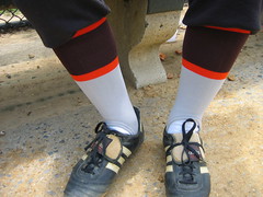
A serious thunderstorm brought yesterday’s softball game to premature end, but not before I’d road-tested a new design from the sock drawer. Let’s take a look:
This week’s design: gray with brown and orange stripes, low-cut.
Ideal for feeling like a member of: the mid-1930s St. Louis Browns.
Color-coordination factor: Tricky — it’s not like I have tons of brown/orange/gray attire. But I found a gray T-shirt with an orange logo and topped it off with a brown cap — not bad.
How they looked: A little drab, no? Not really the greatest color combo. And I didn’t love the effect of gray stirrups and white sanitaries — not enough contrast. The whole thing made me feel somewhat less than resplendent.
How I played: We only got four innings in before the rains came. I was 0-for-1 but made a nifty sliding catch on a sinking line drive to left.
I was due to lead off the next half-inning when the skies opened up. There was this incredible super-cell forming (I’m not a meteorology geek, but I went on a storm-chasing trip once, back when I was a travel writer, and I learned enough to recognize a super-cell when I see one), which was sort of majestically menacing, so we all high-tailed it out of there. Oddly, the storm didn’t hit Queens, so I got to watch the rest of the Mets game once I got home. Pinstripes with black caps/socks/sleeves — ugh.
Uni Watch News Ticker: More than a year ago I ran pics of Lou Brock wearing odd decals on both sides of his helmet during the 1975 All-Star Game. Now, thanks to Brian Finch and Jennifer Jackson of the Cardinals Hall of Fame, we finally have a better view of what those decals were: Look here and here. But here’s the thing: First, it’s not yet clear if there’s another decal on the other side (the helmet is inside an exhibit that’s not easy to get into, but Jennifer is working on it). And second, that helmet was apparently used by Bob Gibson. And no Gibson wasn’t in the ’75 ASG. So that decal was apparently used by more than one player, and not just for all-star purposes. Still trying to get to the bottom of this one. ”¦ Jeremy Brahm reports that Japan’s gymnastics uniforms for the Olympics will look like this. But what’s with the “Hulk will smash!” posture from the fellas? ”¦ Mark Kluczynski reports that the “NCAA” patch on college football officials’ jerseys will be replaced by a “CFO” patch (for “College Football Officiating”) this fall. ”¦ New uniforms for the Boy Scouts here, and for the Navy here. ”¦ Still more fuss over the LZR swimsuit. ”¦ How much do they miss NFL football in L.A.? So much that a Bengals logo has appeared on a termite-control truck (good spot by Matt Shevin). ”¦ Check out this photo of Sam McDowell. Not only does he have stirrup extensions, but one of the extensions actually changes the direction of his stirrup! ”¦ Michael Gawley found a photo of Baron Davis wearing a Dodgers cap with an upside-down “LA” logo. Details toward the bottom of this page. ”¦ Another old example of sleeved high school hoops jerseys (and I bet there are stirrups under those white socks, too). ”¦ Reprinted from Friday night’s comments: Amazing video here showing a one-legged catcher who plays in a Kentucky-based Little League. And he’s left-handed, too. ”¦ Wanna immortalize yourself in bobblehead form? Look here (with thanks to Brinke Guthrie). ”¦ Here’s a new one: Jeremy Brahm reports that some of teams in Japan’s Master League (sort of a senior’s tour for baseball) wear tassels on their caps — totally bizarre. ” “They were about 4 inches long in the first year used (2006),” says Jeremy. “But they were extended to 5 inches long last year.” ”¦ Plus one of the teams in that league has a rainbow striped batting helmet (that uni is in the running for all-time ugliest, no?) ”¦ Lots of stained sheets at Mets fans’ homes on Friday, as the Amazin’s wore blue caps, sleeves, and socks on the road for the first time in a decade, and holy shit did it look awesome. Equipment manager Charlie Samuels (aka “The guy who’s to blame for the few remaining things in this world that aren’t George Bush’s fault”) decided to trot out the blue gear to commemorate the team’s final appearance at Yankee Stadium. But here’s the thing: If you’re going to look good for a special occasion, why not look good for every occasion? Blue Mets = true Mets! ”¦ Meanwhile, in the nightcap, Pedro Martinez was displaying virtually every conceivable button configuration: fully buttoned, top button open, and the Uni Watch special. Speaking of which, I’ve decided that the open second button will henceforth be known as the Pedro Porthole, a name that was suggested by Jared Wheeler, who wins himself a free Uni Watch membership for his efforts (Jared, let me know what you want on the back of your card). ”¦ Padres and Mariners wore 1978 throwbacks on Friday night in San Diego (where this vendor apparently was never told that it’s hard to sell stuff to an empty section). Yeah, they should have had waistbands instead of belts, the M’s wore thw wrong helmets, everything was too baggy (look at the drop-shoulders on Ichiro’s jersey), blah-blah-blah, whatever. Just be glad your favorite team never dressed like either of these two. ”¦ Harry Halloran and his family recently visited Mt. Rushmore, where they stopped in at the Gutzon Borglum museum. “Apparently the workers on the sculpture, in addition to battling acrophobia and blasting dynamite, had a baseball team,” he writes. “Not only that, they had fans who were devoted enough to have special ‘sweater jackets’ made up, one of which was on display. The placard reads: ‘SWEATER: This type of sweater jacket was worn by fans who followed the Keystone/Mt. Rushmore baseball team. The emblem on the back is representative of an early design for the Memorial.’ Sure enough, if you look at the back of the sweater, the first question is, ‘Where’s Teddy?’ This is so cool on so many levels. If they’d had these for sale in the gift shop, I would’ve spent many more dollars than I already had. Unfortunately, no jerseys were on display — I would’ve been taking one of those home too, if they’d been available. Maybe the fine folks at Ebbets Field Flannels should look into this?” ”¦ Last year Mario Fontana guest-wrote a great entry about the Wiffle Ball tournaments at Little Fenway and Little Wrigley, which were for the benefit of the Travis Roy Foundation. He plans to write another entry based on this year’s tourney. If you want to donate to help support the cause, you can do so here. ”¦ Holy shit (amazing find by Mike Engle). ”¦ Negro Leagues throwback game between the Rays (dressingup as the Jacksonville Red Caps) and Pirates (representing the Pittsburgh Crawfords) on Saturday (additional pics here, here, here, here, here, and here). Interestingly, although the host Pirates didn’t wear throwback helmets, the visiting Rays did — sort of. Tim Burke explains: “Rays TV reported that when the team arrived in Pittsburgh and found the (well-designed, but sparse) uniforms waiting for them, Rays clubhouse manager Chris Westmoreland took it upon himself to acquire color-matched batting gloves and a blue ‘J’ decal to apply to the helmets for authenticity’s sake (even though, obviously, the Jacksonville Red Caps never wore batting helmets, and their caps were, well, red). He should probably be recognized for going the extra mile in this case.” Indeed! ”¦ About two hours after writing that last item, I opened my Sunday paper and found this in the coupon supplement. Hmmm, notice any similarities? ”¦ Jonee Eisen sent along some additional scorecard art by Otis Shepard (the Wrigley’s gum art director who also did some work for the Cubs), and holy shit is it amazing. Amazing cover designs here, here, and here, and check out this awesome guide to the Wrigley Field flags. ”¦ Great find by Mark Fightmaster and Robert Eden, the latter of whom writes: “Sunday’s Cincinnati paper had a little article on the day Dusty Baker stole second, third and home in a single game. It was June 27, 1984. But look at the accompanying photos — looks like the Reds were wearing their batting practice jerseys.” Personally, I would have assumed that the Reds were just wearing a solid-colored alt jersey, but as Robert points out, Cincy didn’t introduce a solid-red alternate until 1985 (the following year), and that design feature the city name, not the C-Reds logo. Indeed, the jerseys shown in the Dusty Baker photos appears to be this. A very early example of a team wearing its BP jersey for a game. Anyone know of any earlier instances, and/or if the Reds did this on a regular basis? ”¦ David Eckstein was hit by a pitch around his waistline on Saturday. As he trotted to first base, his belt buckle was flapping — the pitch had opened his belt! He addressed the situation a few moments later (with thanks to Geoff Loughton). ”¦ NSFW: topless soccer with painted-on jerseys (blame Bob Kile). ”¦ Still more Speedo LZR intrigue (courtesy of Jeremy Brahm). ”¦ Also from Jeremy: “The Polish women’s volleyball has been wearing a memorial ribbon over their flag on the front of their uniform in their matches in the FIVB World Grand Prix. It’s for former national team member Agata Mroz, who died after a bone marrow transplant while battling leukemia. Also: Looks like #17 for Italy has blue numbers, not black like her teammates, and the Turkish team is still wearing Adidas uniforms with Nike kneepads. The mark on their socks is the logo of the Turkish Volleyball Federation. ”¦ Good little Q&A article here on the Bears’ equipment manager (with thanks to Jeremy Gracyalny). … Hadn’t noticed this before, but someone on the Chris Creamer board pointed out that MLB’s “Welcome Back Veterans” caps have a star-spangled MLB logo on the back (except, of course, for the Blue Jays’ version). … I’m gonna be off the grid today (Rich Levin is having me fitted for leg irons), so play nice.
beyond pissed right now. I love tyson gay because he is more reserved and not a cocky/showman like most other 100 meter runners but seriously how do you consider this to be a tribute to Jesse Owens.
link
now on Friday when he wore this i could see it being a semi tribute.
link
just so you can see the real thing here is what it is supposed to look like
link
Blue Mets = True Mets! – – – This needs to be on a T-shirt (blue of course!)
I could be wrong, but I think the Crawfords would have worn red stirrups and red undershirts, not black…and I am a huge Pirates fan, sorry guys.
Also, if you look at the font on the “redcaps” shirt doesn’t it look suspiciously close to the Pirates font?
To all the O’s fans out there, would you rather have the “O” hat, or this!
link
Sorry, I had just linked over off their banner and though this was much better than the O.
Ladies with clinched fists for a futsal team.
link
A teacher asking his students to do well
link
Bobblehead
link
The fist in a photo shot like the one’s above and the gymnasts is a shot only taken in photo opportunity to say that they are going to do all that they can to succeed (gambaru).
You see it all the time with teams going for a tournament, championship and even for safety campaigns. But there are photographers around so, it is a good PR shot with these stances.
[quote] Padres and Mariners wore 1978 throwbacks on Friday night in San Diego (where this vendor apparently was never told that it’s hard to sell stuff to an empty section). Yeah, they should have had waistbands instead of belts, the M’s wore thw wrong helmets, everything was too baggy (look at the drop-shoulders on Ichiro’s jersey), blah-blah-blah, whatever. Just be glad your favorite team never dressed like either of these two. …[/quote]
so as not to piss off kenn, i won’t say anything more than paul has already stated…suffice it to say what was once a kitschy uni-idea is now becoming maddeningly annoying to anyone who remembered those unis in their original form
no more throwbacks with all the glaring errors and omissions…and bag the baggies
Now, thanks to Brian Finch and Jennifer Jackson of the Cardinals Hall of Fame, we finally have a better view of what those decals were: Look here and here.
Yes, that’s how I remember it. I believe they were worn on both sides of the helmet, and for no more than two seasons (If I was forced to choose, I would say only one season).
Just on first glance, the stirrups look like they could be for Virginia Tech…or the Cleveland Browns. Not that that’s necessarily a bad thing.
A quick question: have there been any professional baseball teams (major/minor/independent) whose caps have some combination of the letters T and M on them? It would be great if one of you guys out there could chip in with the answer.
Finally back from Chicago and all of you guys had me worked up for nothing. The Cubs fans were actually very nice to us all despite our sea of Orange in center field! Not a single beer dumped on us!
link
As luck would have it I scored 2 tix to the Cubs vs. Sox the next day as well. I didn’t have any gear to wear, but my buddy too the time to pose with the best high sock example we could find!
link
I commented on the Reds-wearing-BP-jerseys back in early 2007 ( link ). I can’t say absolutely that they started it before 1985, but I’m pretty sure they did. I remember Eddie Milner (who played with the Reds from 82-86) playing in a game in which they wore them, and I think they started wearing them pre-Pete Rose ’84. I’d guess ’83 or early ’84 as the first time the Reds wore them.
Anyone know why the front of the Pirates’ Negro League throwbacks said “Crawford”? Weren’t they the Pittsburgh Crawfords (pl)?
[quote comment=\”277769\”]To all the O\’s fans out there, would you rather have the \”O\” hat, or this!
link
Sorry, I had just linked over off their banner and though this was much better than the O.[/quote]
Not an O\’s fan per se, but holy crap, I love that hat. And the fact that the logo is wearing a logo hat! Awesome…
[quote comment=”277777″][quote comment=\”277769\”]To all the O\’s fans out there, would you rather have the \”O\” hat, or this!
link
Sorry, I had just linked over off their banner and though this was much better than the O.[/quote]
Not an O\’s fan per se, but holy crap, I love that hat. And the fact that the logo is wearing a logo hat! Awesome…[/quote]
Hate to kill your buzz, but both hats are God Awful.
[quote comment=”277776″]Anyone know why the front of the Pirates’ Negro League throwbacks said “Crawford”? Weren’t they the Pittsburgh Crawfords (pl)?[/quote]
I believe “Crawford’s” was actually advertising for the owners bar….I could be mistaken.
I was trying to identify the year of that Wrigley Flag Guide by the colors of the flags, only I can’t find any year (post 1945, when they won their 16th NL pennant) in which the Boston Braves wore green or the Brooklyn Dodgers wore orange. I assume they were assigned random colored flags to be more easily identifiable.
Posted these earlier re: Red Caps and Crawfords (this is for those who missed them). Both wore red socks, it looks like, with dif. white striping patterns.
(photo above Aaron)
link
(no black bill on hats; J is white only)
(can’t tell if “Crawford” or “Crawfords” from this shot)
link
I agree it’s the right way to do it, but when did the Blue Jays patriotic hats go from blue (like everyone else) to link?
As for the throwbacks … it appears to me that the throwbacks are being worn considerably more baggy than teams’ standard uniforms. Am I right, or is that an optical illusion based on the tight fit we all remember those uniforms originally looking like?
[quote comment=”277781″]Posted these earlier re: Red Caps and Crawfords (this is for those who missed them). Both wore red socks, it looks like, with dif. white striping patterns.
(photo above Aaron)
link
(no black bill on hats; J is white only)
(can’t tell if “Crawford” or “Crawfords” from this shot)
link
My mistake. Both teams’ socks are Northwestern style striping.
I have to admit, I LOVE those Padres throwbacks. I don’t even care about the baggy, belts, etc. Those particular unis were one of my favorite unis of the 70, especially the whites, and I think they may have only been worn for one or two years??? Those and the Pirates big yellow pinstripes are two I would love to see some back.
I’m down with the brown I guess.
[quote comment=”277771″][quote] Padres and Mariners wore 1978 throwbacks on Friday night in San Diego (where this vendor apparently was never told that it’s hard to sell stuff to an empty section). Yeah, they should have had waistbands instead of belts, the M’s wore thw wrong helmets, everything was too baggy (look at the drop-shoulders on Ichiro’s jersey), blah-blah-blah, whatever. Just be glad your favorite team never dressed like either of these two. …[/quote]
so as not to piss off kenn, i won’t say anything more than paul has already stated…suffice it to say what was once a kitschy uni-idea is now becoming maddeningly annoying to anyone who remembered those unis in their original form
no more throwbacks with all the glaring errors and omissions…and bag the baggies[/quote]
Saying again. If not gonna do it right, then wish TBTC be limited to pre-synthetic (1961 or earlier).
Oh, like that’s gonna happen.
I think the stirrups are cool, but wearing them with sweats is weird.
You could link.
[quote comment=”277781″](can’t tell if “Crawford” or “Crawfords” from this shot)
link
looks like the singular
I’m sorry, but can we please, PLEASE get past the fact that the baseball TBTC uniforms aren’t 100% EXACT all of the time. I guess I’m just getting a little tired of the incessant whining about the jerseys being too baggy or the helmets aren’t right or the players aren’t wearing stirrups.
Whether we like it or not (and I tend to NOT like it), the baseball uniform has evolved to a much baggier fit than it was in the 70s and 80s. This is all cyclical of course, the older wool uniforms were much baggier but when the double knits became popular the uniform cut got tighter. Today’s players apparently prefer a roomier fit. Personally, while I don’t think the uniform needs to fit like spandex, I wouldn’t mind seeing it a bit more form fitting.
Why is it that all the complaining is coming from baseball? When football teams wear throwbacks, I don’t hear anyone wondering where the sleeves are. Outside of the Lakers experiment last year, we really don’t see short shorts on the NBA throwbacks. Why then, is every single detail on the MLB throwbacks such an issue.
The way I look at it, it’s THE LOOK. Is the general look, for the most part, what the team wore during that time period? If so, than OK. Sure, it would be great if the teams did the helmets right, and when they do, I give them extra props, but if they don’t want to, no big deal. I feel the same way about belts and buttons. Sure, most of those 70s unis were pullovers and elastic waistbands but as far as I know, very few if any teams use those waistbands anymore and I can only think of one team (Stanford) that uses a pullover. Therefore, if equipment managers and uniform designers want to use the material the team has on hand to create the look, so be it, it’s not the end of the world.
When I see these throwbacks like the A’s, Padres, M’s, O’s, etc, etc, they make me smile and remember about what baseball looked like when I started getting in to it. When I started collecting baseball cards, etc.
[quote]When football teams wear throwbacks, I don’t hear anyone wondering where the sleeves are. Outside of the Lakers experiment last year, we really don’t see short shorts on the NBA throwbacks. Why then, is every single detail on the MLB throwbacks such an issue.[/quote]
because it’s baseball…that’s why
*adds dougie to kenn’s list* ;)
Am I crazy, or are those stirrups sown right on to the bottom of the Sanitary socks at the bottom? Take a close look at his plant foot.
link
[quote comment=”277778″][quote comment=”277777″][quote comment=\”277769\”]To all the O\’s fans out there, would you rather have the \”O\” hat, or this!
link
Sorry, I had just linked over off their banner and though this was much better than the O.[/quote]
Not an O\’s fan per se, but holy crap, I love that hat. And the fact that the logo is wearing a logo hat! Awesome…[/quote]
Hate to kill your buzz, but both hats are God Awful.[/quote]
Have to agree with Joe. Bad hat.
[quote comment=”277790″]Am I crazy, or are those stirrups sown right on to the bottom of the Sanitary socks at the bottom? Take a close look at his plant foot.
link
Think maybe the two stirrups sewn together for extra length are just twisted on that plant foot. I say that only cuz can’t imagine why anyone would sew stirrups to sanis. But, who knows.
I do know that if stirrups not pulled up kinda tight they’ll move around inside shoe. I used to put a hunk of training about 2″ long under my arch, perpendicular to stirrup, to hold it in position. Learned that from an MLB locker room photo I saw once. Can’t remember who they guy was, though.
[quote comment=”277792″][quote comment=”277790″]Am I crazy, or are those stirrups sown right on to the bottom of the Sanitary socks at the bottom? Take a close look at his plant foot.
link
Think maybe the two stirrups sewn together for extra length are just twisted on that plant foot. I say that only cuz can’t imagine why anyone would sew stirrups to sanis. But, who knows.
I do know that if stirrups not pulled up kinda tight they’ll move around inside shoe. I used to put a hunk of training about 2″ long under my arch, perpendicular to stirrup, to hold it in position. Learned that from an MLB locker room photo I saw once. Can’t remember who they guy was, though.[/quote]
traing TAPE, that is.
[quote comment=”277775″]I commented on the Reds-wearing-BP-jerseys back in early 2007 ( link ). I can’t say absolutely that they started it before 1985, but I’m pretty sure they did. I remember Eddie Milner (who played with the Reds from 82-86) playing in a game in which they wore them, and I think they started wearing them pre-Pete Rose ’84. I’d guess ’83 or early ’84 as the first time the Reds wore them.[/quote]
I remember them wearing them while Pete was around, just once, in 77 maybe. Of course I was just a kid then, so maybe my memory is blurred.
[quote comment=”277773″]Just on first glance, the stirrups look like they could be for Virginia Tech…or the Cleveland Browns. Not that that’s necessarily a bad thing.
A quick question: have there been any professional baseball teams (major/minor/independent) whose caps have some combination of the letters T and M on them? It would be great if one of you guys out there could chip in with the answer.[/quote]
Close…
link
Of course, being a Geography guy I see that and think “Universal Transverse Mercator”
MLB must have been reading the comments to UNIWatch when those logo-flagged hats came out… when did they switch the color of the Toronto ‘Canada Flag’ hats from navy blue to red?
[quote comment=”277794″][quote comment=”277775″]I commented on the Reds-wearing-BP-jerseys back in early 2007 ( link ). I can’t say absolutely that they started it before 1985, but I’m pretty sure they did. I remember Eddie Milner (who played with the Reds from 82-86) playing in a game in which they wore them, and I think they started wearing them pre-Pete Rose ’84. I’d guess ’83 or early ’84 as the first time the Reds wore them.[/quote]
I remember them wearing them while Pete was around, just once, in 77 maybe. Of course I was just a kid then, so maybe my memory is blurred.[/quote]
I apologize if you’ve been around and I haven’t noticed, but I’ve got to say “Toaster Poodle” has to be my favorite … what do you call it … handle? … I’ve seen on here!
(especially since there have been plenty of times I’ve wanted to shove our half poodle in …)
[quote comment=”277768″]Also, if you look at the font on the “redcaps” shirt doesn’t it look suspiciously close to the Pirates font?[/quote]
I think I’m right compare this
link
to this…
link
to this…
link
That’s not just an oops little detail, that’s intentional.
[quote comment=”277773″]Just on first glance, the stirrups look like they could be for Virginia Tech…or the Cleveland Browns. Not that that’s necessarily a bad thing.
A quick question: have there been any professional baseball teams (major/minor/independent) whose caps have some combination of the letters T and M on them? It would be great if one of you guys out there could chip in with the answer.[/quote]
No Current pro teams that I know of, but here’s on college:
link
[quote comment=”277795″][quote comment=”277773″]Just on first glance, the stirrups look like they could be for Virginia Tech…or the Cleveland Browns. Not that that’s necessarily a bad thing.
A quick question: have there been any professional baseball teams (major/minor/independent) whose caps have some combination of the letters T and M on them? It would be great if one of you guys out there could chip in with the answer.[/quote]
Close…
link
Of course, being a Geography guy I see that and think “Universal Transverse Mercator”[/quote]
Well, Middle Tennesse has just an MT, but he asked for professional teams.
[quote comment=”277798″][quote comment=”277768″]Also, if you look at the font on the “redcaps” shirt doesn’t it look suspiciously close to the Pirates font?[/quote]
I think I’m right compare this
link
to this…
link
to this…
link
That’s not just an oops little detail, that’s intentional.[/quote]
Yeah, they do. But so does the lettering on the ’61 Angels home & road, ’61 Senators home and ’62 Mets road. I guess I’m missing the point. The Red Caps font happens to be close the Pirates font. There wasn’t quite the variety of lettering available back then that there is today. And it’s accurate if you’re gonna recreate Red Caps unis. Red Caps played for only one season, and this is what Pirates wore that year.
link
The year before, though, they did wear this.
link
try again.
link
[quote comment=”277800″][quote comment=”277795″][quote comment=”277773″]Just on first glance, the stirrups look like they could be for Virginia Tech…or the Cleveland Browns. Not that that’s necessarily a bad thing.
A quick question: have there been any professional baseball teams (major/minor/independent) whose caps have some combination of the letters T and M on them? It would be great if one of you guys out there could chip in with the answer.[/quote]
Close…
link
Of course, being a Geography guy I see that and think “Universal Transverse Mercator”[/quote]
Well, Middle Tennesse has just an MT, but he asked for professional teams.[/quote]
BTW, I collect hats from obscure colleges (my rule is you have to purchase at the bookstore on campus) and this logo trend is starting to piss me off..
link
To Kek,
I strongly agree with you, its not the end of the world when teams don’t do throwbacks right. Helmets are another thing, so big deal seattle didn’t use the right helmets. To me, helmets, shoes, etc are custom fitted for a player, so why throw a player into a helmet that doesn’t fit like the one he’s been wearing for 4 months now?
That said, I think once a year each team should do a REAL throwback game, or series. three daytime games, roll back the prices in the stadium, change the ads to look like they did whenever the game is staged for, and get the uniforms right down the to T for just once a season. Have the umps do their part too. I mean, really make it seem like its 1959 or whenever you’re shooting for.
I think the M’s are overdue for a uniform overhaul. Their current uniforms are just too bland, too sterile. Not that the 1978 jerseys are that great, but maybe they can find a way to synthesize the Diego Segui Era & Ichiro Era unis (more successfully, perhaps, than the San Diego Chargers tried to reconcile past and present).
Also, the current batting helmets with the 1978 unis? To quote Jim Rome: ridiculous. –link
Werder Bremen, of the Bundesliga 1, are known for their bright green jerseys (with the occasional orange accent). This year they went with a much darker alternate/away jersey–but the thing that may of most interest is their very colorful socks.
link
I meant this coming 2008-9 year. Anyway, the socks seem to be of interest for UW. I like the colors but the Kappa logo (always too big) along with the club badge is probably too much.
I too am disappointed not to see the retro baseball unis in with their period-appropriate close-fit. When teams throwback to the ’20s, ’30s, & ’40s they always go extra baggy, so why not reverse the process. Well, one possible explanation is that it’s a whole lot easier to construct a baggy uni than a form-fitting one. There must have been a lot of tailoring that went into making those ’70s/’80s unis look sleek. Probably too much trouble to go through for just a couple of games. Jim Bouton talks about what players did to get that perfect fit in his book Ball Four, which everyone should read for many reasons.
[quote comment=”277808″]I too am disappointed not to see the retro baseball unis in with their period-appropriate close-fit. When teams throwback to the ’20s, ’30s, & ’40s they always go extra baggy, so why not reverse the process. Well, one possible explanation is that it’s a whole lot easier to construct a baggy uni than a form-fitting one. There must have been a lot of tailoring that went into making those ’70s/’80s unis look sleek. Probably too much trouble to go through for just a couple of games. Jim Bouton talks about what players did to get that perfect fit in his book Ball Four, which everyone should read for many reasons.[/quote]
That’s certainly true. I know from buying off-the-rack doubleknits back then that, being just a little baggy, they looked really dumb (see all-orange Orioles often discussed; fit in pants made what might have been an at least somewhat interering uni look just bad).
Used to squeeze into a size smaller just to make sure legs were tight.
[quote comment=\”277803\”][quote comment=\”277800\”][quote comment=\”277795\”][quote comment=\”277773\”]Just on first glance, the stirrups look like they could be for Virginia Tech…or the Cleveland Browns. Not that that\’s necessarily a bad thing.
A quick question: have there been any professional baseball teams (major/minor/independent) whose caps have some combination of the letters T and M on them? It would be great if one of you guys out there could chip in with the answer.[/quote]
Close…
link
Of course, being a Geography guy I see that and think \”Universal Transverse Mercator\”[/quote]
Well, Middle Tennesse has just an MT, but he asked for professional teams.[/quote]
BTW, I collect hats from obscure colleges (my rule is you have to purchase at the bookstore on campus) and this logo trend is starting to piss me off..
link
What\’s pissing you off Stuby? The black hat, the Under Armour wording on the brim? The all too common back and blue color combination? Or, all of the above?
I\’m going for D. All of the above
UniWatch is mentioned today on USA TODAY’s Page 3.0 in the Sports (red) section under “Web Watch” and clearly states that all proceeds of the hats worn July 4th weekend and 9/11 will go to welcomebackveterans.org.
[quote comment=”277808″]There must have been a lot of tailoring that went into making those ’70s/’80s unis look sleek. Probably too much trouble to go through for just a couple of games.[/quote]
I doubt it. I think players just wore mediums instead of XLs.
Does Paul play fastpitch, slowpitch, modified, “kitten ball” (16-inch)…what?
Anyone know?
[quote comment=”277788″]“I’m sorry, but can we please, PLEASE get past the fact that the baseball TBTC uniforms aren’t 100% EXACT all of the time.”[/quote]
Geez, Kek, what part of the word “no” don’t you understand? We nitpick on this thread because of all the damn inaccuracies.
If a 1970’s uniform with pullovers and knit-in belts is not exact, we point that out to everyone. In other words, you JUST DON’T GET IT(TM) my friend.
iJust be glad your favorite team never dressed like either of these two.
Hey, my favorite team did dress like one of these two, in 1978. Considering how they’re both playing this year, perhaps they both should be forced to continue wearing the throwbacks for the duration.
[quote comment=”277811″][quote comment=\”277803\”][quote comment=\”277800\”][quote comment=\”277795\”][quote comment=\”277773\”]Just on first glance, the stirrups look like they could be for Virginia Tech…or the Cleveland Browns. Not that that\’s necessarily a bad thing.
A quick question: have there been any professional baseball teams (major/minor/independent) whose caps have some combination of the letters T and M on them? It would be great if one of you guys out there could chip in with the answer.[/quote]
Close…
link
Of course, being a Geography guy I see that and think \”Universal Transverse Mercator\”[/quote]
Well, Middle Tennesse has just an MT, but he asked for professional teams.[/quote]
BTW, I collect hats from obscure colleges (my rule is you have to purchase at the bookstore on campus) and this logo trend is starting to piss me off..
link
What\’s pissing you off Stuby? The black hat, the Under Armour wording on the brim? The all too common back and blue color combination? Or, all of the above?
I\’m going for D. All of the above[/quote]
I was going mainly for the UNDER ARMOUR across the brim. The logo on the side isn’t enough, I guess. It is becoming fairly common on college hats.
[quote comment=”277815″][quote comment=”277788″]“I’m sorry, but can we please, PLEASE get past the fact that the baseball TBTC uniforms aren’t 100% EXACT all of the time.”[/quote]
Geez, Kek, what part of the word “no” don’t you understand? We nitpick on this thread because of all the damn inaccuracies.
If a 1970’s uniform with pullovers and knit-in belts is not exact, we point that out to everyone. In other words, you JUST DON’T GET IT(TM) my friend.[/quote]
In our defense, it DOES say “Obsessive” at the top of this page.
Also, I think that the cut of the early double knit era was so tight be comparison to what went before it (and what is now coming after it) that we really notice the difference.
Honestly, though, even if the unis aren’t always what we’d like, I’d hate to see teams give up on TBTC’s…whether the results are perfect or not, they’re just too much fun.
[quote comment=”277815″][quote comment=”277788″]“I’m sorry, but can we please, PLEASE get past the fact that the baseball TBTC uniforms aren’t 100% EXACT all of the time.”[/quote]
Geez, Kek, what part of the word “no” don’t you understand? We nitpick on this thread because of all the damn inaccuracies.
If a 1970’s uniform with pullovers and knit-in belts is not exact, we point that out to everyone. In other words, you JUST DON’T GET IT(TM) my friend.[/quote]
I tend to agree, but less aggressively. ;)
If Majestic, M&N, etc. can spend the time to make the lettering and number patterns accurate (which most aren’t really anyway) why can they spend the time making the fit accurate. The point of TBTC games is to, for a day, recreate what a game in that era would have been like as close as they can. When in actuality it looks like athletes in really cool pajamas. There is no technological blockage stopping them from doing it right. If they need someone to manage the effort I can send over my resume…I’m pretty sure I’m qualified to do it.
[quote comment=”277791″][quote comment=”277778″][quote comment=”277777″][quote comment=\”277769\”]To all the O\’s fans out there, would you rather have the \”O\” hat, or this!
link
Sorry, I had just linked over off their banner and though this was much better than the O.[/quote]
Not an O\’s fan per se, but holy crap, I love that hat. And the fact that the logo is wearing a logo hat! Awesome…[/quote]
Hate to kill your buzz, but both hats are God Awful.[/quote]
Have to agree with Joe. Bad hat.[/quote]
I still like the O’s hat – and this “angry bird” logo is … bad. Bad, bad, bad.
[quote comment=”277815″][quote comment=”277788″]“I’m sorry, but can we please, PLEASE get past the fact that the baseball TBTC uniforms aren’t 100% EXACT all of the time.”[/quote]
Geez, Kek, what part of the word “no” don’t you understand? We nitpick on this thread because of all the damn inaccuracies.
If a 1970’s uniform with pullovers and knit-in belts is not exact, we point that out to everyone. In other words, you JUST DON’T GET IT(TM) my friend.[/quote]
Perhaps you should re-read my post. It’s one thing to simply point out an inaccuracy. For example, Paul in today’s ticker mentions “Yeah, they should have had waistbands instead of belts, the M’s wore thw wrong helmets, everything was too baggy”. That’s fine, I have no problem with presenting a uniform, pointing out any inaccuracies and moving on.
What bugs me are the endless “IF YOU’RE NOT GOING TO DO IT RIGHT….” posts. I think Paul’s comments following the above quote (blah-blah-blah, whatever) sums it up. To paraphrase, we’ve been there and done that, let’s move on.
As to the issue of my “getting it” or not, trust me, most times I’m much more happier being in the “not getting it” crowd in this group!!!! I think that’s all just a matter of opinion.
Mr. Hilseberg, the point here is that we look to these TBTC games for accuracy, not for something to sleep in. Cases in point would be the Cleveland and San Diego TBTC games, the Astros’ wrong uniforms at Tampa Bay and the Friday Flashback Blue Jays where all the teams that I mentioned (including the Tribe and the M’s) wear loops and belts instead of the Sansabelts. At least the Giants did indeed GET IT(TM), but the A’s refused to play along with the late 1970’s thing (mostly because that they had Chuck Finley and a vice president named MC Hammer at that time). We’ll worry about that another time, though…
[quote comment=”277812″]UniWatch is mentioned today on USA TODAY’s Page 3.0 in the Sports (red) section under “Web Watch” and clearly states that all proceeds of the hats worn July 4th weekend and 9/11 will go to welcomebackveterans.org.[/quote]
Speaking of that promotion, I was at my local Wal-Mart and noticed some Brewers shirts that look just like the hats (with old glory in the “M” logo on a navy shirt) and since I am going to the 4th of July game this friday at Miller Park I decided to pick one up. The shirts were only $12, and they had a make shift sign at the display that said “$1 proceeds of all these shirts goes to the Welcome Back Veterans Organization”
My question is why are the 5950 hats more expensive, but I just got a t-shirt for a pretty cheap price of $12 with a $1 of that going towards the WBV.?
My other big question is what uni’s will the Brewers wear this Friday? I swear if they wear the Old Glory “M” 5950’s with their Retro pinstripes I will not be a happy camper. But I will bring my camera with me just in case there is that debacle.
[quote comment=”277818″][quote comment=”277815″][quote comment=”277788″]“I’m sorry, but can we please, PLEASE get past the fact that the baseball TBTC uniforms aren’t 100% EXACT all of the time.”[/quote]
Geez, Kek, what part of the word “no” don’t you understand? We nitpick on this thread because of all the damn inaccuracies.
If a 1970’s uniform with pullovers and knit-in belts is not exact, we point that out to everyone. In other words, you JUST DON’T GET IT(TM) my friend.[/quote]
In our defense, it DOES say “Obsessive” at the top of this page.
Also, I think that the cut of the early double knit era was so tight be comparison to what went before it (and what is now coming after it) that we really notice the difference.
Honestly, though, even if the unis aren’t always what we’d like, I’d hate to see teams give up on TBTC’s…whether the results are perfect or not, they’re just too much fun.[/quote]
Your last paragraph hits the nail on the head Ricko, I’d much rather have a 85-95% accurate throwback than none at all. Seems MLB is in another damned if you do damned if you don’t scenario.
For instance, if there were NO throwbacks, we’d complain about the lack thereof.
Also, food for thought, I know in the past there has been a lot of fun poked at those involved in sports that are of considerable girth (the football coach at Kansas comes to mind).
I’d love to hear all the intelligent comments ripping on guys like Ray King, Dmitri Young, CC Sabathia, etc if they were sporting skin tight double knits worn in the many of say Rickey Henderson!!!!
Be careful what you wish for!!!!
One more point to Kek and Joe Hilseberg before we move along onto other stuff:
At least the teams involved could have checked the “Dressed To The Nines” uniform database on the Baseball Hall of Fame’s web pages to seek out what they looked like. that’s why we’re here to pont such stuff out (no knit-in belts for example).
Okay, we better get off Phil’s lawn before he comes out here and yells at us.
If teams go it right, all you’d see here is about 40 posts saying, “Perfect. Got it right. Love it.”
Tell me that wouldn’t be boring.
If you meant me, I asked what happened to “If gonna do a job, do it right,” not “If aren’t gonna do it right, don’t do it at all.”
Big difference.
I love that they do it. Just sometimes would be fun to see them do it a little better. Nothing wrong or obsessive about that sentiment.
[quote comment=”277824″][quote comment=”277818″][quote comment=”277815″][quote comment=”277788″]“I’m sorry, but can we please, PLEASE get past the fact that the baseball TBTC uniforms aren’t 100% EXACT all of the time.”[/quote]
Geez, Kek, what part of the word “no” don’t you understand? We nitpick on this thread because of all the damn inaccuracies.
If a 1970’s uniform with pullovers and knit-in belts is not exact, we point that out to everyone. In other words, you JUST DON’T GET IT(TM) my friend.[/quote]
In our defense, it DOES say “Obsessive” at the top of this page.
Also, I think that the cut of the early double knit era was so tight be comparison to what went before it (and what is now coming after it) that we really notice the difference.
Honestly, though, even if the unis aren’t always what we’d like, I’d hate to see teams give up on TBTC’s…whether the results are perfect or not, they’re just too much fun.[/quote]
Your last paragraph hits the nail on the head Ricko, I’d much rather have a 85-95% accurate throwback than none at all. Seems MLB is in another damned if you do damned if you don’t scenario.
For instance, if there were NO throwbacks, we’d complain about the lack thereof.
Also, food for thought, I know in the past there has been a lot of fun poked at those involved in sports that are of considerable girth (the football coach at Kansas comes to mind).
I’d love to hear all the intelligent comments ripping on guys like Ray King, Dmitri Young, CC Sabathia, etc if they were sporting skin tight double knits worn in the many of say Rickey Henderson!!!!
Be careful what you wish for!!!![/quote]
SORRY! That should have read “in the manner of say Rickey Henderson!!!!”
Are there plans to make the LZR in any color besides black?
Oops, answered my own question. The TEAM USA LZR is shown about 15 seconds into this clip:
link
Thoughts from the uni-conscious?
[quote comment=”277822″]Mr. Hilseberg, the point here is that we look to these TBTC games for accuracy, not for something to sleep in. Cases in point would be the Cleveland and San Diego TBTC games, the Astros’ wrong uniforms at Tampa Bay and the Friday Flashback Blue Jays where all the teams that I mentioned (including the Tribe and the M’s) wear loops and belts instead of the Sansabelts. At least the Giants did indeed GET IT(TM), but the A’s refused to play along with the late 1970’s thing (mostly because that they had Chuck Finley and a vice president named MC Hammer at that time). We’ll worry about that another time, though…[/quote]
I’m really confused…I was arguing for the side of accuracy, not pajamas! Not sure how I got put on that other side.
[quote comment=”277824″][quote comment=”277818″][quote comment=”277815″][quote comment=”277788″]“I’m sorry, but can we please, PLEASE get past the fact that the baseball TBTC uniforms aren’t 100% EXACT all of the time.”[/quote]
Geez, Kek, what part of the word “no” don’t you understand? We nitpick on this thread because of all the damn inaccuracies.
If a 1970’s uniform with pullovers and knit-in belts is not exact, we point that out to everyone. In other words, you JUST DON’T GET IT(TM) my friend.[/quote]
In our defense, it DOES say “Obsessive” at the top of this page.
Also, I think that the cut of the early double knit era was so tight be comparison to what went before it (and what is now coming after it) that we really notice the difference.
Honestly, though, even if the unis aren’t always what we’d like, I’d hate to see teams give up on TBTC’s…whether the results are perfect or not, they’re just too much fun.[/quote]
Your last paragraph hits the nail on the head Ricko, I’d much rather have a 85-95% accurate throwback than none at all. Seems MLB is in another damned if you do damned if you don’t scenario.
For instance, if there were NO throwbacks, we’d complain about the lack thereof.
Also, food for thought, I know in the past there has been a lot of fun poked at those involved in sports that are of considerable girth (the football coach at Kansas comes to mind).
I’d love to hear all the intelligent comments ripping on guys like Ray King, Dmitri Young, CC Sabathia, etc if they were sporting skin tight double knits worn in the many of say Rickey Henderson!!!!
Be careful what you wish for!!!![/quote]
…or you’ll end up with this…
link
Even though I think it was just an offhand comment, I really enjoyed the name “Uni Watch Special” for Pedro.
Also, Mark Fightmaster has my favorite last name ever.
Sunday’s picture with the girl in the helmet.
link
Their logo says alot.
Check the collection to see the helmet.
[quote comment=”277765″]beyond pissed right now. I love tyson gay because he is more reserved and not a cocky/showman like most other 100 meter runners but seriously how do you consider this to be a tribute to Jesse Owens.
link
now on Friday when he wore this i could see it being a semi tribute.
link
just so you can see the real thing here is what it is supposed to look like
link
I consider this a creative use of duct tape…
link
[quote]we better get off Phil’s lawn before he comes out here and yells at us.[/quote]
perhaps you can refrain from using this, as well as “dammit phil”, per paul’s request, in the future
k? thanks
[quote comment=”277835″][quote]we better get off Phil’s lawn before he comes out here and yells at us.[/quote]
perhaps you can refrain from using this, as well as “dammit phil”, per paul’s request, in the future
k? thanks[/quote]
Dogone it, Phillip! I hadn’t seen that request. Am I required to live by it anyway?
[quote comment=”277836″]“I hadn’t seen that request. Am I required to live by it anyway?”[/quote]
Philip, I didn’t start the “Dammit (Inert name here)!” thing as pointed out yesterday, nor did I start the regurgitation of minor amounts in one’s oral crevice line, either. What I am just trying to say was that if we were going to rant on even more, we would stop before you came on the board and say “Get off my damn lawn” as it were.
All it was for the lack of a certain owner of a certain site that deals in the uniformity bidness of a spinoff of a popular Page Two column on ESPN.com that pops up biweekly e-mailing us from refraining from such shenanigans, mullarkey and blarney about that statement.
Now if you’ll excuse me, I have a few matters to get to on stuff.
[quote comment=”277830″]“I’m really confused…I was arguing for the side of accuracy, not pajamas! Not sure how I got put on that other side.”[/quote]
If you read through my comments once again, I too was also calling for accurate uniforms, not PJs.
[quote comment=”277823″][quote comment=”277812″]UniWatch is mentioned today on USA TODAY’s Page 3.0 in the Sports (red) section under “Web Watch” and clearly states that all proceeds of the hats worn July 4th weekend and 9/11 will go to welcomebackveterans.org.[/quote]
Speaking of that promotion, I was at my local Wal-Mart and noticed some Brewers shirts that look just like the hats (with old glory in the “M” logo on a navy shirt) and since I am going to the 4th of July game this friday at Miller Park I decided to pick one up. The shirts were only $12, and they had a make shift sign at the display that said “$1 proceeds of all these shirts goes to the Welcome Back Veterans Organization”
My question is why are the 5950 hats more expensive, but I just got a t-shirt for a pretty cheap price of $12 with a $1 of that going towards the WBV.?
My other big question is what uni’s will the Brewers wear this Friday? I swear if they wear the Old Glory “M” 5950’s with their Retro pinstripes I will not be a happy camper. But I will bring my camera with me just in case there is that debacle.[/quote]
seem to remember the Brewers saying that they go with the pinstrips all friday home games EXCEPT July 4 and one other (possibly a holiday) date…
[quote comment=”277832″]Even though I think it was just an offhand comment, I really enjoyed the name “Uni Watch Special” for Pedro.
Also, Mark Fightmaster has my favorite last name ever.[/quote]
Thanks!
[quote comment=”277837″][quote comment=”277836″]“I hadn’t seen that request. Am I required to live by it anyway?”[/quote]
Philip, I didn’t start the “Dammit (Inert name here)!” thing as pointed out yesterday, nor did I start the regurgitation of minor amounts in one’s oral crevice line, either. What I am just trying to say was that if we were going to rant on even more, we would stop before you came on the board and say “Get off my damn lawn” as it were.
All it was for the lack of a certain owner of a certain site that deals in the uniformity bidness of a spinoff of a popular Page Two column on ESPN.com that pops up biweekly e-mailing us from refraining from such shenanigans, mullarkey and blarney about that statement.
Now if you’ll excuse me, I have a few matters to get to on stuff.[/quote]
Come on now, you all should know the rules by now: if your comments show up in a yellow box, you can say whatever the f— you want. However, if you’re a gray box, you gotta play by the rules that those in the yellow boxes set, however inconsistent they seem. Don’t like it? Yellow boxes don’t care because it’s their call.
[quote comment=”277841″][quote comment=”277837″][quote comment=”277836″]“I hadn’t seen that request. Am I required to live by it anyway?”[/quote]
Philip, I didn’t start the “Dammit (Inert name here)!” thing as pointed out yesterday, nor did I start the regurgitation of minor amounts in one’s oral crevice line, either. What I am just trying to say was that if we were going to rant on even more, we would stop before you came on the board and say “Get off my damn lawn” as it were.
All it was for the lack of a certain owner of a certain site that deals in the uniformity bidness of a spinoff of a popular Page Two column on ESPN.com that pops up biweekly e-mailing us from refraining from such shenanigans, mullarkey and blarney about that statement.
Now if you’ll excuse me, I have a few matters to get to on stuff.[/quote]
Come on now, you all should know the rules by now: if your comments show up in a yellow box, you can say whatever the f— you want. However, if you’re a gray box, you gotta play by the rules that those in the yellow boxes set, however inconsistent they seem. Don’t like it? Yellow boxes don’t care because it’s their call.[/quote]
Mr. Red Box Man –
Please be kind to those who speak badly of the colored box writers. They do now know what they are saying. Sure, we may all agree with the statements that are made, but for fear of more “dead air” days, we dare not say so. Take pitty on their blogging souls. They only mean good.
[quote comment=”277838″][quote comment=”277830″]“I’m really confused…I was arguing for the side of accuracy, not pajamas! Not sure how I got put on that other side.”[/quote]
If you read through my comments once again, I too was also calling for accurate uniforms, not PJs.[/quote]
I know Jimmy…we’re on the same side here! I just didn’t understand your line, “Mr. Hilseberg, the point here is that we look to these TBTC games for accuracy, not for something to sleep in.”
That sounds like you are saying that I want the PJ’s. In my initial comment I volunteered to work for Majestic to solve the baggy problem! If you are a frequent reader of the site, you would know how much of a perfectionist I am about this stuff too.
As for the Crawfords, they were owned by the guy who ran the Crawford Grille in the Hill District of Pittsburgh (who also ran a pretty lucrative numbers business as well). So “Crawford” is basically an advertisement for the restaurant, like some bar league softball uniform.
And as for the Cardinal decals, if you look at Topps 1976 card #191 League Leaders (sorry, the only pictures I could find completely suck), Ted Simmons has that decal on his helmet, with the picture presumedly taken in 1975.
[quote comment=”277844″]As for the Crawfords, they were owned by the guy who ran the Crawford Grille in the Hill District of Pittsburgh (who also ran a pretty lucrative numbers business as well). So “Crawford” is basically an advertisement for the restaurant, like some bar league softball uniform.
And as for the Cardinal decals, if you look at Topps 1976 card #191 League Leaders (sorry, the only pictures I could find completely suck), Ted Simmons has that decal on his helmet, with the picture presumedly taken in 1975.[/quote]
Can sort of see it here…
link
[quote comment=”277845″][quote comment=”277844″]As for the Crawfords, they were owned by the guy who ran the Crawford Grille in the Hill District of Pittsburgh (who also ran a pretty lucrative numbers business as well). So “Crawford” is basically an advertisement for the restaurant, like some bar league softball uniform.
And as for the Cardinal decals, if you look at Topps 1976 card #191 League Leaders (sorry, the only pictures I could find completely suck), Ted Simmons has that decal on his helmet, with the picture presumedly taken in 1975.[/quote]
Can sort of see it here…
link
My goodness, between that logo, the ’56 left shoulder bird and the Sunday hats of today, the Cardinals are stealthfully pioneers in the Alternate Logo School, aren’t they.
[quote comment=”277846″][quote comment=”277845″][quote comment=”277844″]As for the Crawfords, they were owned by the guy who ran the Crawford Grille in the Hill District of Pittsburgh (who also ran a pretty lucrative numbers business as well). So “Crawford” is basically an advertisement for the restaurant, like some bar league softball uniform.
And as for the Cardinal decals, if you look at Topps 1976 card #191 League Leaders (sorry, the only pictures I could find completely suck), Ted Simmons has that decal on his helmet, with the picture presumedly taken in 1975.[/quote]
Can sort of see it here…
link
My goodness, between that logo, the ’56 left shoulder bird and the Sunday hats of today, the Cardinals are stealthfully pioneers in the Alternate Logo School, aren’t they.[/quote]
here…
link
There’s another, too, a single Cardinal on a bat (can’t find one).
[quote comment=”277841″]
Come on now, you all should know the rules by now: if your comments show up in a yellow box, you can say whatever the f— you want. However, if you’re a gray box, you gotta play by the rules that those in the yellow boxes set, however inconsistent they seem. Don’t like it? Yellow boxes don’t care because it’s their call.[/quote]
It’s true. I’m even sporting a smug little smirk, too.
[quote comment=”277847″][quote comment=”277846″][quote comment=”277845″][quote comment=”277844″]As for the Crawfords, they were owned by the guy who ran the Crawford Grille in the Hill District of Pittsburgh (who also ran a pretty lucrative numbers business as well). So “Crawford” is basically an advertisement for the restaurant, like some bar league softball uniform.
And as for the Cardinal decals, if you look at Topps 1976 card #191 League Leaders (sorry, the only pictures I could find completely suck), Ted Simmons has that decal on his helmet, with the picture presumedly taken in 1975.[/quote]
Can sort of see it here…
link
My goodness, between that logo, the ’56 left shoulder bird and the Sunday hats of today, the Cardinals are stealthfully pioneers in the Alternate Logo School, aren’t they.[/quote]
here…
link
There’s another, too, a single Cardinal on a bat (can’t find one).[/quote]
Here it is…
link
[quote comment=”277849″][quote comment=”277847″][quote comment=”277846″][quote comment=”277845″][quote comment=”277844″]As for the Crawfords, they were owned by the guy who ran the Crawford Grille in the Hill District of Pittsburgh (who also ran a pretty lucrative numbers business as well). So “Crawford” is basically an advertisement for the restaurant, like some bar league softball uniform.
And as for the Cardinal decals, if you look at Topps 1976 card #191 League Leaders (sorry, the only pictures I could find completely suck), Ted Simmons has that decal on his helmet, with the picture presumedly taken in 1975.[/quote]
Can sort of see it here…
link
My goodness, between that logo, the ’56 left shoulder bird and the Sunday hats of today, the Cardinals are stealthfully pioneers in the Alternate Logo School, aren’t they.[/quote]
here…
link
There’s another, too, a single Cardinal on a bat (can’t find one).[/quote]
Here it is…
link
There’s also this logo…
link
and these…
link
[quote comment=”277848″][quote comment=”277841″]
Come on now, you all should know the rules by now: if your comments show up in a yellow box, you can say whatever the f— you want. However, if you’re a gray box, you gotta play by the rules that those in the yellow boxes set, however inconsistent they seem. Don’t like it? Yellow boxes don’t care because it’s their call.[/quote]
It’s true. I’m even sporting a smug little smirk, too.[/quote]
link, your thoughts?
[quote comment=”277851″][quote comment=”277848″][quote comment=”277841″]
Come on now, you all should know the rules by now: if your comments show up in a yellow box, you can say whatever the f— you want. However, if you’re a gray box, you gotta play by the rules that those in the yellow boxes set, however inconsistent they seem. Don’t like it? Yellow boxes don’t care because it’s their call.[/quote]
It’s true. I’m even sporting a smug little smirk, too.[/quote]
link, your thoughts?[/quote]
Every swimmer dressed like that, to me, looks like “Pee Wee Herman Goes Swimming.”
[quote comment=”277823″][quote comment=”277812″]UniWatch is mentioned today on USA TODAY’s Page 3.0 in the Sports (red) section under “Web Watch” and clearly states that all proceeds of the hats worn July 4th weekend and 9/11 will go to welcomebackveterans.org.[/quote]
Speaking of that promotion, I was at my local Wal-Mart and noticed some Brewers shirts that look just like the hats (with old glory in the “M” logo on a navy shirt) and since I am going to the 4th of July game this friday at Miller Park I decided to pick one up. The shirts were only $12, and they had a make shift sign at the display that said “$1 proceeds of all these shirts goes to the Welcome Back Veterans Organization”
My question is why are the 5950 hats more expensive, but I just got a t-shirt for a pretty cheap price of $12 with a $1 of that going towards the WBV.?
My other big question is what uni’s will the Brewers wear this Friday? I swear if they wear the Old Glory “M” 5950’s with their Retro pinstripes I will not be a happy camper. But I will bring my camera with me just in case there is that debacle.[/quote]
They were talking about the hats on FSN Wisconsin during all the broadcasts this weekend and said the guys will definitely not be wearing the pinstripes. In fact, a guy showed up to the Sunday game in Minnesota in a full on uniform – socks, blue cleats, pants and jersey and Mike Cameron pulled him out onto the field during BP to play catch, etc… since he thought the guy was so cool for showing up all decked out. When they were discussing this during the game, Brian and Bill specifically mentioned that the pinstripes won’t be out on Friday.
[quote comment=”277853″][quote comment=”277823″][quote comment=”277812″]UniWatch is mentioned today on USA TODAY’s Page 3.0 in the Sports (red) section under “Web Watch” and clearly states that all proceeds of the hats worn July 4th weekend and 9/11 will go to welcomebackveterans.org.[/quote]
Speaking of that promotion, I was at my local Wal-Mart and noticed some Brewers shirts that look just like the hats (with old glory in the “M” logo on a navy shirt) and since I am going to the 4th of July game this friday at Miller Park I decided to pick one up. The shirts were only $12, and they had a make shift sign at the display that said “$1 proceeds of all these shirts goes to the Welcome Back Veterans Organization”
My question is why are the 5950 hats more expensive, but I just got a t-shirt for a pretty cheap price of $12 with a $1 of that going towards the WBV.?
My other big question is what uni’s will the Brewers wear this Friday? I swear if they wear the Old Glory “M” 5950’s with their Retro pinstripes I will not be a happy camper. But I will bring my camera with me just in case there is that debacle.[/quote]
They were talking about the hats on FSN Wisconsin during all the broadcasts this weekend and said the guys will definitely not be wearing the pinstripes. In fact, a guy showed up to the Sunday game in Minnesota in a full on uniform – socks, blue cleats, pants and jersey and Mike Cameron pulled him out onto the field during BP to play catch, etc… since he thought the guy was so cool for showing up all decked out. When they were discussing this during the game, Brian and Bill specifically mentioned that the pinstripes won’t be out on Friday.[/quote]
Thanks werthj and Nicole…
I actually saw that segment about the guy being pulled from the stands to play catch with Cam. but must have missed that party about not sporting the retro gear on the 4th of July. That makes me feel a lot better that the Crew kind of “get it”. Just like they did on their home opener, which was a Friday, they didn’t sport their retro gear because they are classy like that.
[quote]I think the stirrups are cool, but wearing them with sweats is weird.[/quote]
Agreed. That is just weird. Just buy a pair of baseball pants. Or get a pair donated from an equipment manager. I am sure that somebody could find you a pair that is getting ready to be tossed out.
[quote comment=”277855″][quote]I think the stirrups are cool, but wearing them with sweats is weird.[/quote]
Agreed. That is just weird. Just buy a pair of baseball pants. Or get a pair donated from an equipment manager. I am sure that somebody could find you a pair that is getting ready to be tossed out.[/quote]
Mr. Lukas does not like wearing polyester. That’s probably why he won’t wear modern baseball pants. That being said, I still think he should think about buying some gray sweats so that his socks can stand out better. Or luck into a pair of wool flannel pants that fit him.
[quote comment=”277812″]UniWatch is mentioned today on USA TODAY’s Page 3.0 in the Sports (red) section under “Web Watch” and clearly states that all proceeds of the hats worn July 4th weekend and 9/11 will go to welcomebackveterans.org.[/quote]
Unless a specific MLB-connected source is mentioned has having stated “all proceeds …”, I wouldn’t necessarily trust that. If they were THAT unable to answer the question when Paul asked, AND they haven’t gotten back to him with a real answer … well, I have my doubts. That could be an all-to-often played journalistic telephone game. In fact, when the announcement was made, I’m sure MLB would have been happy with every reporter in the room happily assuming all proceeds would go to the WBV fund. Why not assume that, right? That’s EXACTLY why it’s hard to trust most sources you read/hear/see in 2008. Unless they report on this site. :)
[quote]“In thwe answer to a question raised by Paul Lukas, editor of the popular UniWatch Blog, all proceeds from Major League Baseball’s “Starts and Stripes” caps program will go to the charity group Welcome back Veterans.
“That was confirmed to USA TODAY by Matt Bourne, MLB’s vice prsident of business public relations last Thursday [6/26] – two days after a question from Lukas that seemed like a brushback pitch to the assembled MLB officials.”[/quote]
There it is. Word for word. Heck, I even gave it to you verbatim. (Joke always works.)
[quote comment=”277856″][quote comment=”277855″][quote]I think the stirrups are cool, but wearing them with sweats is weird.[/quote]
Agreed. That is just weird. Just buy a pair of baseball pants. Or get a pair donated from an equipment manager. I am sure that somebody could find you a pair that is getting ready to be tossed out.[/quote]
Mr. Lukas does not like wearing polyester. That’s probably why he won’t wear modern baseball pants. That being said, I still think he should think about buying some gray sweats so that his socks can stand out better. Or luck into a pair of wool flannel pants that fit him.[/quote]
I’m not being a smartass, I know there are all manner of variations of softball. That’s why I asked if anyone knows what Paul play. Cuz looking at the photos I keep wondering, “Where’s the catcher stand? Albquerque?”
[quote comment=”277859″][quote comment=”277856″][quote comment=”277855″][quote]I think the stirrups are cool, but wearing them with sweats is weird.[/quote]
Agreed. That is just weird. Just buy a pair of baseball pants. Or get a pair donated from an equipment manager. I am sure that somebody could find you a pair that is getting ready to be tossed out.[/quote]
Mr. Lukas does not like wearing polyester. That’s probably why he won’t wear modern baseball pants. That being said, I still think he should think about buying some gray sweats so that his socks can stand out better. Or luck into a pair of wool flannel pants that fit him.[/quote]
I’m not being a smartass, I know there are all manner of variations of softball. That’s why I asked if anyone knows what Paul play. Cuz looking at the photos I keep wondering, “Where’s the catcher stand? Albquerque?”[/quote]
t-ball
[quote comment=”277858″][quote]“In thwe answer to a question raised by Paul Lukas, editor of the popular UniWatch Blog, all proceeds from Major League Baseball’s “Starts and Stripes” caps program will go to the charity group Welcome back Veterans.
“That was confirmed to USA TODAY by Matt Bourne, MLB’s vice prsident of business public relations last Thursday [6/26] – two days after a question from Lukas that seemed like a brushback pitch to the assembled MLB officials.”[/quote]
There it is. Word for word. Heck, I even gave it to you verbatim. (Joke always works.)[/quote]
Nicely done! I looked for that on the USA Today website and couldn’t find it. To bad it was reported THERE before it was here!
… speaking of quality journalism …
TOO bad
I know, I know…photos taken during BP. Just gotta see if anyone paying attention.
[quote comment=”277858″][quote]“In thwe answer to a question raised by Paul Lukas, editor of the popular UniWatch Blog, all proceeds from Major League Baseball’s “Starts and Stripes” caps program will go to the charity group Welcome back Veterans.
“That was confirmed to USA TODAY by Matt Bourne, MLB’s vice prsident of business public relations last Thursday [6/26] – two days after a question from Lukas that seemed like a brushback pitch to the assembled MLB officials.”[/quote]
There it is. Word for word. Heck, I even gave it to you verbatim. (Joke always works.)[/quote]
And they say nobody pitches inside anymore.
[quote comment=”277864″][quote comment=”277858″][quote]“In thwe answer to a question raised by Paul Lukas, editor of the popular UniWatch Blog, all proceeds from Major League Baseball’s “Starts and Stripes” caps program will go to the charity group Welcome back Veterans.
“That was confirmed to USA TODAY by Matt Bourne, MLB’s vice prsident of business public relations last Thursday [6/26] – two days after a question from Lukas that seemed like a brushback pitch to the assembled MLB officials.”[/quote]
There it is. Word for word. Heck, I even gave it to you verbatim. (Joke always works.)[/quote]
And they say nobody pitches inside anymore.[/quote]
Of course … the question now is, how are “all proceeds” determined? Like $34/hat? Or $34 minus cost of designing minus cost of redesigning the Jays cap minus cost of running press conference minus cost of asking back alley hitmen about the “possibilities” of taking care of one P. Lucas after said press conference? (i.e. $.03 per cap)
Wonder what year the Flags of Wrigley Field thing is from, anybody know? The thing that jumped out right away was the “W” and “L” flags because they’re colored wrong (based on today’s colors). The “W” flag has a blue W on a white background and the “L” flag has a white L on a blue background. Wonder what year they decided to change those colors up.
[quote comment=”277859″]“Where’s the catcher stand? Albquerque?”[/quote]
Where Bugs Bunny missed that left turn IIRC…
who’s p. lucas?
Promotion, travel, shipping, vendor commission, design fees (hope THOSE aren’t too high)…etc., etc., etc….all that is cost of sales to be subtracted from total sales. Then their are taxes on the profit…
So, yeah, probably a dime a cap, depending on how they cook the books.
[quote comment=”277866″]Wonder what year the Flags of Wrigley Field thing is from, anybody know? The thing that jumped out right away was the “W” and “L” flags because they’re colored wrong (based on today’s colors). The “W” flag has a blue W on a white background and the “L” flag has a white L on a blue background. Wonder what year they decided to change those colors up.[/quote]
Given Brooklyn’s appearance in the league, it’d be pre-1950whatever.
[quote comment=”277854″][quote comment=”277853″][quote comment=”277823″][quote comment=”277812″]UniWatch is mentioned today on USA TODAY’s Page 3.0 in the Sports (red) section under “Web Watch” and clearly states that all proceeds of the hats worn July 4th weekend and 9/11 will go to welcomebackveterans.org.[/quote]
Speaking of that promotion, I was at my local Wal-Mart and noticed some Brewers shirts that look just like the hats (with old glory in the “M” logo on a navy shirt) and since I am going to the 4th of July game this friday at Miller Park I decided to pick one up. The shirts were only $12, and they had a make shift sign at the display that said “$1 proceeds of all these shirts goes to the Welcome Back Veterans Organization”
My question is why are the 5950 hats more expensive, but I just got a t-shirt for a pretty cheap price of $12 with a $1 of that going towards the WBV.?
My other big question is what uni’s will the Brewers wear this Friday? I swear if they wear the Old Glory “M” 5950’s with their Retro pinstripes I will not be a happy camper. But I will bring my camera with me just in case there is that debacle.[/quote]
They were talking about the hats on FSN Wisconsin during all the broadcasts this weekend and said the guys will definitely not be wearing the pinstripes. In fact, a guy showed up to the Sunday game in Minnesota in a full on uniform – socks, blue cleats, pants and jersey and Mike Cameron pulled him out onto the field during BP to play catch, etc… since he thought the guy was so cool for showing up all decked out. When they were discussing this during the game, Brian and Bill specifically mentioned that the pinstripes won’t be out on Friday.[/quote]
Thanks werthj and Nicole…
I actually saw that segment about the guy being pulled from the stands to play catch with Cam. but must have missed that party about not sporting the retro gear on the 4th of July. That makes me feel a lot better that the Crew kind of “get it”. Just like they did on their home opener, which was a Friday, they didn’t sport their retro gear because they are classy like that.[/quote]
I believe the Crew will be wearing some type of stars and stripes hat to celebrate the 4th of July. I will be at the game, I hope they are not too outrageous.
[quote comment=”277868″]who’s p. lucas?[/quote]
Wow … way too close to the end of the day …
As for “Wonder what year the Flags of Wrigley Field thing is from, anybody know?” …
That’s actually changed a few times. For some reason, the idea that white flag stands for surrender comes up, and they change from W on white to W on blue … then someone realizes homes whites only make sense and it changes back …
Now I’m leaving so as to stop sticking my own foot in J. Walaitis’ mouth.
[quote comment=”277867″][quote comment=”277859″]“Where’s the catcher stand? Albquerque?”[/quote]
Where Bugs Bunny missed that left turn IIRC…[/quote]
Speaking of Albuquerque…I just remembered I have a fitted 80’s Dukes hat that’s too big for me. Never worn it. Been on shelf for probably 10 years. Red with that gold/white cartoon conquistador guy. I’m a 7 1/2 at most, so probably it’s 7 5/8.
Anybody want it? Not selling, so nothing like that. Just One UW’er to another. I’m feeling “magnanimous” (J.Lipton in Geico commercial).
If this violates a rule Bryan, please fee free to delete this post ASP.
Boston moved to Milwaukee in, what, 1953? So the flag guide is from somewhere between 1945-1953
Sorry, the BRAVES moved to Milwaukee in ’53. The city of Boston didn’t go anywhere.
The Illinois football team had a women’s clinic this weekend and some friends were able to get a sneak preview of the throwbacks they are scheduled to wear against Eastern Illinois on September 6th. Pretty sweet.
link
Rumor is the players love them and want to wear them more than once, but Nike (hisss!) put the kibosh on that.
[quote comment=”277866″]Wonder what year the Flags of Wrigley Field thing is from, anybody know? The thing that jumped out right away was the “W” and “L” flags because they’re colored wrong (based on today’s colors). The “W” flag has a blue W on a white background and the “L” flag has a white L on a blue background. Wonder what year they decided to change those colors up.[/quote]
Good eye. I noticed that too.
I sure was surprized to be reading about Paul’s troublemaking in my USA Today this morning! Well done my friend. Hehehehehehe…
Mets are wearing the hideous black hat/blue brim combo again at St. Louis tonight. Guess everybody absolutely loving the blue hat/socks on Friday (not to mention the win) wasn’t enough to keep it around. How depressing.
There won’t be a WNBA All-Star game this year.
Dissapointment abounds. Something about the Olympics in Beijing. I suggest having two games next year to make up for that. One in July to pit a international WNBA All-Star team against a USA WNBA team, the othet in August with the regular East-West format. Who’s with me on that?
Good to hear Gary and Keith tonight talking about the blue caps/socks combo from Friday afternoon. True Mets = Blue Mets!
[quote comment=”277880″]Good to hear Gary and Keith tonight talking about the blue caps/socks combo from Friday afternoon. True Mets = Blue Mets![/quote]
indeed…obviously it’s (the lack of blue caps) affecting maine & castillo’s play in the field
As an aside, why are all the fans at Busch always at least 60 years old?
If anyone cares, the changes to the Boy Scout uniform include a reduction in price made possible only because until this batch, Scout uniforms were required to be manufactured in the USA. The new ones are made in China. They should have stayed with the red numeral patches…
And the pocket on the sleeve – perfect for your smokes.
Okay, I used to watch womens’s soccer, and let me tell you, those women playing on the beach didn’t get the unis right.
I think more study is required to make sure that womens’ beach soccer uniforms are what they ought to be.
[quote comment=”277879″]There won’t be a WNBA All-Star game this year.[/quote]
what’s the wnba?
[quote comment=”277885″][quote comment=”277879″]There won’t be a WNBA All-Star game this year.[/quote]
what’s the wnba?[/quote]
Isn’t that the station Imus used to work at before it become WFAN?
[quote comment=”277886″][quote comment=”277885″][quote comment=”277879″]There won’t be a WNBA All-Star game this year.[/quote]
what’s the wnba?[/quote]
Isn’t that the station Imus used to work at before it become WFAN?[/quote]
To quote Pig Vomit in Private Parts, it’s W-N-BC, W-N-BC.
‘how’d they get fredbird‘? –keith
‘uh…redbird…fredbird’ –gary
‘oh…im so stupid’ –keith
yup
[quote comment=”277870″][quote comment=”277866″]Wonder what year the Flags of Wrigley Field thing is from, anybody know? The thing that jumped out right away was the “W” and “L” flags because they’re colored wrong (based on today’s colors). The “W” flag has a blue W on a white background and the “L” flag has a white L on a blue background. Wonder what year they decided to change those colors up.[/quote]
Given Brooklyn’s appearance in the league, it’d be pre-1950whatever.[/quote]
I scanned the flag guide out of the 47 program. That may not be the first year they used that graphic. I’ll have to dig out my other ones from the 40’s to see if it’s in any of them.
[quote comment=”277873″][quote comment=”277867″][quote comment=”277859″]“Where’s the catcher stand? Albquerque?”[/quote]
Where Bugs Bunny missed that left turn IIRC…[/quote]
Speaking of Albuquerque…I just remembered I have a fitted 80’s Dukes hat that’s too big for me. Never worn it. Been on shelf for probably 10 years. Red with that gold/white cartoon conquistador guy. I’m a 7 1/2 at most, so probably it’s 7 5/8.
Anybody want it? Not selling, so nothing like that. Just One UW’er to another. I’m feeling “magnanimous” (J.Lipton in Geico commercial).
If this violates a rule Bryan, please fee free to delete this post ASP.[/quote]Well, I’m a 7 5/8 so I guess I fit the bill. I would absolutley love to add that to my collection.
[quote comment=”277892″][quote comment=”277873″][quote comment=”277867″][quote comment=”277859″]“Where’s the catcher stand? Albquerque?”[/quote]
Where Bugs Bunny missed that left turn IIRC…[/quote]
Speaking of Albuquerque…I just remembered I have a fitted 80’s Dukes hat that’s too big for me. Never worn it. Been on shelf for probably 10 years. Red with that gold/white cartoon conquistador guy. I’m a 7 1/2 at most, so probably it’s 7 5/8.
Anybody want it? Not selling, so nothing like that. Just One UW’er to another. I’m feeling “magnanimous” (J.Lipton in Geico commercial).
If this violates a rule Bryan, please fee free to delete this post ASP.[/quote]Well, I’m a 7 5/8 so I guess I fit the bill. I would absolutley love to add that to my collection.[/quote]
Fit the bill, that’s a good one!
here’s a decathlete we can all root for to make the squad…
link … it’s gotta be the uni
usa “senior” mens basketball team (???) … is there a junior team?
link
[quote comment=”277894″]here’s a decathlete we can all root for to make the squad…
link … it’s gotta be the uni[/quote]
*NOTE THE “CRACKING” on the BIG O*
is this intentional…or did he just stretch it too far???
[quote comment=”277892″][quote comment=”277873″][quote comment=”277867″][quote comment=”277859″]“Where’s the catcher stand? Albquerque?”[/quote]
Where Bugs Bunny missed that left turn IIRC…[/quote]
Speaking of Albuquerque…I just remembered I have a fitted 80’s Dukes hat that’s too big for me. Never worn it. Been on shelf for probably 10 years. Red with that gold/white cartoon conquistador guy. I’m a 7 1/2 at most, so probably it’s 7 5/8.
Anybody want it? Not selling, so nothing like that. Just One UW’er to another. I’m feeling “magnanimous” (J.Lipton in Geico commercial).
If this violates a rule Bryan, please fee free to delete this post ASP.[/quote]Well, I’m a 7 5/8 so I guess I fit the bill. I would absolutley love to add that to my collection.[/quote]
Email you address to Paul and ask if he’ll forward it to me.
Wanna see some ugly unis on both teams?
Check out the Arizona-Grand Rapids Arena Football Game on ESPN2 right now.
A little late, but I’ve posted some photos I took at the June 22nd Giants vs. Royals Negro Leagues throwback game here:
link
So about that BlueJays cap…
Eastbay apparently corrected a mistake or something, because you now have it linked to a blue cap with the Toronto logo with Canadian flag, but with the stars and stripes MLB logo on the back…
link
You know what, I think I just noticed something. Eastbay had a red BlueJays cap for this flag thing that was previously linked earlier today that wasn’t trying to force American ideals on a Canadian brand. Since this blog ran today, though, that picture has since switched to the blue one with the stars/stripes MLB logo that is on sale through MLBShop.
Its pretty obvious what is happening. Looks like it was originally set up so that the Canadian team wouldn’t have to wear stars and stripes on that hat and they would have a hat that was strictly for their own country and heritage, but the high ups at MLB thought they couldn’t let this happened, so they decided to force the American brand on them. Unreal. Just another example of the American flag becoming more of a corporate logo than a nationalistic symbol.
Disgusting
Nike has come up with a really ugly black and white uniform for some of their sponsored athletes at the track and field trials. It appears to have a stylized version of the flag on it. A real eyesore.
It looks like CAL will have new uniforms…
link
They just showed the USA Track and Field Uniforms for the Olympics and they are UGLY! I loved the uniforms at Athens. These aren’t even Red White and Blue. They’re navy and royal blue!
(By the way– I saw some people complaining about speed suits in the comments for the weekend post– get over it. It’s a standard track uniform. The LZR swimsuits are ugly too, but no one cares about that).
[quote comment=”277896″][quote comment=”277894″]here’s a decathlete we can all root for to make the squad…
link … it’s gotta be the uni[/quote]
*NOTE THE “CRACKING” on the BIG O*
is this intentional…or did he just stretch it too far???[/quote]
well…it appears as though the ‘cracking’ is link
…somebody in beaverton isn’t happy about this