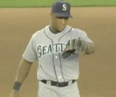
In 37-ish years of watching baseball, I’ve never seen a big leaguer do what Adrian Beltre did during last night’s Mariners/Mets game. When Brian Schneider hit a soft liner over his head (sorry about the crummy image quality for all these shots), Beltre threw his glove up in the air, which is the sort of stunt usually reserved batting practice.
“You’re not supposed to do that,” mused Mets broadcaster Gary Cohen, a philosophical lilt in his voice. “You know, technically, if you throw your glove at the ball, it’s three bases. ”¦ I mean, it’s in the rulebook, if you throw your glove at the ball. Now, I’m sure the umpires will say, ‘Look, he wasn’t throwing his glove at the ball, he was just frustratedly throwing his glove in the air after the ball had already passed.’ And that’s true, but technically”¦”
And then his voice trailed off. But Gary Cohen, technically, didn’t know what the fuck he was talking about. As the umpires correctly ruled, there’s no penalty for throwing your glove at the ball (or anywhere else) as long as there’s no contact. The relevant section of the rulebook, which I highly recommend to Mr. Cohen, can be found here.
Note that a related section of the rulebook calls for one base to be awarded if a player touches pitched ball with his mask. I remember reading an article in the late 1980s about a catcher who’d blocked a ball in the dirt and then retrieved it by nonchalantly scooping it up with his mask. The opposing manager was Gene Mauch, who scurried out to argue that this was a one-base infraction. The umpire eventually agreed, so Mauch won the argument. The only problem is that his team was losing 11-1 or something like that, and this “Win the battle, lose the war” scenario was presented in the article as a microcosm of Mauch’s entire career.
As for Beltre last night, here’s the kicker: When his glove came back down, he booted it. Rather incredibly, this guy is the A.L.’s reigning Gold Glover at third base. When I mentioned this to my ESPN colleague Jim Caple, who lives in Seattle and therefore sees Beltre play way more than I do, he responded, “He can be a little playful from time to time. If he knows he won’t confuse another fielder, he’ll occasionally try to deke the cameraman just for the fun of it.” Interesting, but it still seems pretty bush to me.
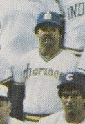
Research Project: I’m trying to compile a timeline of interesting uni-related moments in MLB All-Star Games. I’ve previously listed a bunch of such episodes here, I devoted an entire ESPN column to the 1934 uniforms, and I’ve got plenty of additional examples (Johnny Callison winning the ’64 ASG while wearing a Mets helmet, Reggie Jackson wearing a Mariners uni for the A.L. team photo in ’79 [see left], Larry Walker wearing his helmet backwards while facing Randy Johnson in ’97, etc.), but I want more. If you know of additional instances of notable uni-related moments in all-star history — or notable all-star moments in uni-related history, as the case might be — please get in touch.
Uni Watch News Ticker: Forgot to mention yesterday that the media kit from Monday’s MLB press conference included this lapel pin. Nice of them to slap the trademark symbol on a flag-based design, no? ”¦ When you’re as tall as Richie Sexson, shouldn’t they try to center your uni number a bit better? That’s a lot of acreage between the number and his waistline (with thanks to Eric Distenfeld for the pics). ”¦ That Big Brown photo with the loose horseshoe is pretty fascinating. ”¦ Interesting Japanese baseball tidbit from Jeremy Brahm: “In 1979, the Central and Pacific Leagues had their 30th anniversaries and came out with pillbox hats for each team. From what I can find, these were only used in the 1979 and 1980 Central and Pacific East-West All Star games after the season.” ”¦ Did you know Spain has an “unlucky” yellow jersey? Details here (with thanks to Patrick O’Donnell). ”¦ Reprinted from yesterday’s comments: Check out this Indians vs. Indians shot, presumably taken during a spring training intersquad game. ”¦ Maria Sharapova’s tuxedo-patterned top has real buttons and pleats — not just printed graphics, which was what I’d been expecting. Details here, here, and here, plus more Wimbledon coverage here. ”¦ The USA hoops team’s uniforms will look like this and this. ”¦ Ryan McGhee reports that the Tacoma Rainiers and Oklahoma RedHawks of the Pacific Coast League will wear special jerseys next week and auction them to benefit the Limbs for Life Foundation, which buys new prosthetic limbs for amputees who can’t afford them in the United States and takes donated limbs to foreign countries like the Dominican Republic. ”¦ “The State Farm ad on the Wrigley Field dugout railing was apparently taped over or something on Sunday night,” notes Matt Bennum. ”¦ Paul Wiederecht sent along one of the best photos I’ve ever seen of the Golden Seals’ white skates. ”¦ Also from Paul: Great page here devoted to ballpark organists, “but nothing about Fernand Lapierre from Montreal, seen playing ‘Les Expos Sont Là ‘ here.” ”¦ My mention of the unusual basketball jersey crotch extension yesterday prompted this response from sporting goods impresario Terry Proctor: “While I was at Ruby’s in Rochester, we sold a set of basketball uniforms with supporter bottoms to Geneseo High School, which is about 35 miles southwest of Rochester. We got the uniforms from Powers Mfg. Co. in Waterloo, Iowa. The players HATED the supporter bottom. Needless to say, the next uniforms Geneseo bought a couple of years later were from SandKnit, sans the supporter bottom. ”¦ While searching for something else, I came across this shot of Carlton Fisk wearing some killer striped hose. I’d forgotten about that design. ”¦ Also discovered two shots of Chet Lemon wearing some interesting windbreakers under his jersey: First, check out the collar here. And then dig this shot — looks like he’s got two windbreakers on, plus the big-collared jersey. ”¦ Nice to see that my question at Monday’s MLB press conference became the basis for the last graf of this AP item. ”¦ Doug Mooney found still more photos from the 1968 World Series showing Tigers with their uni number on the left sleeve instead of the right. First there’s this shot — that’s Bill Freehan in the background but we already knew he had the left-sleeve number. Who’s that in the foreground, though — is it Jim Northrup? That’s definitely Northrup in this shot, which appears to show a left-sleeve number as well. ”¦ Tyler Kulasza just took his annual trip to Cooperstown and sent along pics of Honus Wagner’s brim-mounted flip-down shades, a pair of gorgeous Cardinals jackets (here’s a close-up), and A.J. Burnett’s no-hitter cap (what did he have written here and here?). … The Pirates and Rays will be wearing Negro Leagues throwbacks this Saturday, honoring the Pittsburgh Crawfords and Jacksonville Redcaps, respectively (with thanks to Jerry Wolper).
A.J. Burnett’s no-hitter cap (what did he have written here and here?).
This looks like it says ‘Bishop’
[quote comment=”277045″]A.J. Burnett’s no-hitter cap (what did he have written here and here?).
This looks like it says ‘Bishop'[/quote]
Agreed, definitly Bishop.
link: link
Going back to the talk about TM and R marks on unis, every team has them one place that is sometimes visible – the Philly Tag.
link
Hey Walaitis,
It worked out…neither of us received credit for the USA Hoops unis!
I must have stumbled upon metswatchblog.com, cause I don’t see anything about uniforms in today’s topic….
:(
That article about ballpark organists is a tad outdated. When Citizens Bank Park opened in 2004, there was no room for an organ booth, so Paul Richardson was forced to play on the lower level of the park. He retired in 2006 and passed away a year later. Also, from what i understand, Nancy Faust is semi-retired and only works midweek afternoon and weekend games.
Those USA basketball jerseys are an abomination. I thought we were going to go back to classier times in USA basketball. I guess it doesn’t apply to the unis…
Also, from what i understand, Nancy Faust is semi-retired and only works midweek afternoon and weekend games.
Her decision — she lives in Wisconsin, and the commute (the previous two years with construction on the Dan Ryan; this year on the Edens) is a nightmare. So, she only plays on day games.
[quote comment=”277054″]I must have stumbled upon metswatchblog.com, cause I don’t see anything about uniforms in today’s topic….
:([/quote]
Oh, please — equipment totally counts.
Have you seen the new Cal jerseys yet? Possibly the next stage of Nike football ‘innovation?’ What’s next for custom collars– dog collar graphics on Georgia jerseys, or officer’s pins for Army and Navy?
link
(No, that’s not MICHIGAN– perhaps Nike is bitter about losing their deal and taking it out on the Golden Bears)
Does anyone else think that SI is extremely lazy with some of its photo exhibits? One of yesterday’s “Back in Time” entries related to home runs hit by Johnny Bench and Lee May in the last game played at Crosley Field in 1970.
link
So what photo do we get? Johnny Bench and Carlton Fisk in the 1975 World Series. And to make it even worse, the photo was taken in Boston, not Cincinnati. Geez.
Have you seen the new Cal jerseys? No, that’s not Michigan (perhaps Nike is bitter about losing their deal and taking it out on the Golden Bears).
link
So is this the next step in Nike football ‘innovation?’ What’s next, dog collar graphics for Georgia, or perhaps officer lapel pins for Army and Navy?
[quote]We got the uniforms from Powers Mfg. Co. in Waterloo, Iowa. The players HATED the supporter bottom. Needless to say, the next uniforms Geneseo bought a couple of years later were from SandKnit, sans the supporter bottom.[/quote]
well of course…powers sucks
Have you seen the new Cal jerseys? No, that\’s not Michigan (perhaps Nike is bitter about losing their deal and taking it out on the Golden Bears).
link
So is this the next step in Nike football \’innovation?\’ What\’s next, dog collar graphics for Georgia, or perhaps officer lapel pins for Army and Navy?
Paul-
I believe that you have two different rule infractions confused. If a players touches a fair ball with detached equipment, 3 bases. The example you use is refering to a pitched ball, which would be a 1 base infraction. Rule 7.05(j)
link
This was specifically discussed when I was at Professional Umpire School last January. 3 bases for a fair hit ball, 1 base for a pitched ball.
The normally stylish Ana Ivanovic is wearing what appears to be a burlap-sack inspired getup toady at Wimbledon.
Uni Watch, I need your help.
I am trying to find a Charleston Wheelers fitted hat. The Wheelers was the name of the minor league team here in Charleston, WV for years before later becoming the Alley Cats (and then evolving into the current incarnation; The West Virginia Power)
I have dug around the internet looking at any site I could think to look at (like; Mickey’s Place)…I have asked around with the higher ups of the WV Power (I’m the executive producer of the WV Power Radio Network) and I’ve pretty much exhausted every option I can think of in my effort to find this hat.
I need at 7 3/4 or 7 5/8 (lets say 5/8 just to be safe) and would greatly appreciate any help any of my fellow Uni Watch fans can throw my way.
If you can help me out email me or leave a comment here with any info you may have.
Thanks in advance for any help you might be able to throw my way.
The first Tiger shot is definitely Northrup and is definitely from Game 6 of the Series as he, Willie Horton, Al Kaline and Norm Cash return to the dugout after Northrup’s grand slam off of Larry Jaster.
Freehan would then walk in a 10-run inning that sent the Series to Game 7.
Red card to the Redhawks for that camo jersey. It’s bad enough to dress a bunch of supremely fit young men of military age who are playing a game instead of serving their country in soldier shirts and calling it “honoring the troops.” But it’s unforgivable to do so and get the camo pattern wrong. The U.S. armed forces now wear really attractive camo in several patterns that incidentally would look better as jersey fabric. It just hurts the brain to see teams continually use outdated camo patterns. Do the Redhawks think we’re still fighting in Vietnam or something?
[quote comment=”277065″]Paul-
I believe that you have two different rule infractions confused. If a players touches a fair ball with detached equipment, 3 bases. The example you use is refering to a pitched ball, which would be a 1 base infraction. Rule 7.05(j)
link
This was specifically discussed when I was at Professional Umpire School last January. 3 bases for a fair hit ball, 1 base for a pitched ball.[/quote]
Good call, ump — my bad. I’ll adjust the text now.
[quote comment=”277066″]The normally stylish Ana Ivanovic is wearing what appears to be a burlap-sack inspired getup toady at Wimbledon.[/quote]
apparently it’s not wind resistant either
…ana drops the first set in a breaker :(
I’m headed to Manhattan for the next three days and was wondering if there are any good shops for throwback/vintage jerseys and caps, a la Distant Replays. Anyone know?
FYI – A similar glove-throwing incident happened in the Dodgers-Diamondbacks game on May 28, 2005 at (then) Bank One Ballpark. Dodgers pitcher Duaner Sanchez threw his glove at a soft line drive in the seventh inning. Contact was made, and Luis Tererro was awarded a triple.
link
Manchester united has new away shirt available, not too bad, very simple and a nice change from last years black…
New Away Kit
Last years black shirt
Anyone know what’s on Hal Greer’s left thigh in link?
I’ve seen those new fangled leg pads that some NBA players wear. But they are usually embedded in the leg of their compression shorts. Before a few years ago (by that I mean probably like 10-12 years ago) I don’t even remember seeing thigh pads all that often. Can anyone confirm what that is?
Plus, check out that funky looking 5 on his jersey. I’ve seen plenty of 5’s that dip at that point but not like that. Not sure how much I like that.
Lastly, what’s on his right ankle? I’m assuming some sort of ankle supporter but it looks like it has some sort of cushioning.
Another correction on the organists story paul posted.
Ernie Hays retired following the 2006 season, and went out a winner with the Cardinals winning the World Series. His seat at the Busch Stadium III organ is now occupied by Jeremy Boyer (no relation to former Redbird skipper and great Clete,) who has some organ music on YouTube:
link
Oops! I meant to say Ken Boyer.
My bad!
Paul, thank you for alerting more people to the current cause of my psychosis, the 1968 Tigers numbered sleeves. I attempted to get to the bottom of it yesterday at the Tigers-Cardinals game where they were celebrating the 68 Series. The free giveaway last night was a replica jersey of that 68 road design, and they had members of that squad signing autographs at various tables around the park before the game. Bill Freehan was one of them. Unfortunately, even though I got to the park an hour and a half before game time, the jerseys were long gone and the autograph tables were closing up, so I never got to ask him my question.
On a side note, the opening pitch was Mickey Lolich throwing to Freehan and the ball sailed between Freehans legs to the backstop. It was then that I realized the Cardinals had more players in stirrups than us and we were gonna lose.
[quote comment=”277069″]Red card to the Redhawks for that camo jersey. It’s bad enough to dress a bunch of supremely fit young men of military age who are playing a game instead of serving their country in soldier shirts and calling it “honoring the troops.” But it’s unforgivable to do so and get the camo pattern wrong. The U.S. armed forces now wear really attractive camo in several patterns that incidentally would look better as jersey fabric. It just hurts the brain to see teams continually use outdated camo patterns. Do the Redhawks think we’re still fighting in Vietnam or something?[/quote]
Hey, I’m sure they researched it carefully. Probably looked at frame grabs from THE DEER HUNTER and APOCALYPSE NOW.
Besides, they probably figured if the camo was too good nobody would see the players.
Although, all that aside, it ain’t a bad looking jersey. Actually, they’re both not too bad.
Everybody, raise your hand if you like the Rainiers jersey at least better than MLB’s stars n’stripes hats.
(looks out into cyberspace) That’s one, two, three…four…you in the back? Yes? Okay, five…um, six…
[quote comment=”277077″]Oops! I meant to say Ken Boyer.
My bad![/quote]
This would be this guy, brother of Clete and Cloyd. One of my fav SI covers, cuz such a great look at the uni.
link
When you’re as tall as Richie Sexson, shouldn’t they try to center your uni number a bit better? That’s a lot of acreage between the number and his waistline
Wouldn’t look equally odd if there was an inordinate amount of space between his nameplate and his jersey numbers? I think this looks fine.
The other day our morning radio show hosts were complaining that Brandon Morrow has a big space between the two Rs in his nameplate, but he hasn’t pitched since.
A question: Do Clete Boyer and Spike Owen basically have the same first name?
(ba dum bum)
Or how ’bout this? The Cowboys once had teammates (clue: kicker and running back) with essentially the same last name in different languages.
Ponder THAT one for a while.
[quote comment=”277056″]Those USA basketball jerseys are an abomination. I thought we were going to go back to classier times in USA basketball. I guess it doesn’t apply to the unis…[/quote]
The FRONTS look good. Did we not learn anything from the All-Star game?
Regarding Richie Sexson’s jersey, I think that the numbers (and name, if there is one) come a fixed number of inches below the collar.
And I think that when they brought in the little MLB logo on the collar, they moved the names and numbers down a bit.
They seemed to use today’s relatively-large player as the standard, as link.
Contrast this with link. Even link has his number just a shade too low. It was centered link, and Greg certainly hasn’t become shorter since then!
I personally own a Mike Fontenot jersey, and am several inches taller than he is, and the number is still positioned too low. I’d much rather see the Sexson-like guys have numbers positioned too high than see all the non-behemoth players blousing out their shirts so that the bottoms of the numbers aren’t buried in their pants!
Wow, a STL Blues Uni I actually like!
link
How did they make him fly? Got to love special effects :)
That’s Red Berenson, coach of UofM hockey…
[quote comment=”277069″]Red card to the Redhawks for that camo jersey. It’s bad enough to dress a bunch of supremely fit young men of military age who are playing a game instead of serving their country in soldier shirts and calling it “honoring the troops.” But it’s unforgivable to do so and get the camo pattern wrong. The U.S. armed forces now wear really attractive camo in several patterns that incidentally would look better as jersey fabric. It just hurts the brain to see teams continually use outdated camo patterns. Do the Redhawks think we’re still fighting in Vietnam or something?[/quote]
Well, if the shoe fits….
As for the camo, I seem to recall reading that the armed forces trademarked their new camo designs, and control it pretty carefully. So it might be a case of the teams (or the Padres) just not being able to replicate it exactly.
Then again, which one would they choose? The Army? Marines? Different camos. Maybe a team with blue in its color scheme could wear the Air Force’s digital camo. But by choosing one, are they disrespecting the others?
Better just to avoid the silly dress-up after all. Good on them for raising money, they don’t need to wear Halloween costumes to do it.
[quote comment=”277074″]Manchester united has new away shirt available, not too bad, very simple and a nice change from last years black…
New Away Kit
Last years black shirt[/quote]
Oops…
“target=”_blank”> shirt
Last years black shirt
Another excuse of the color purple and ripping off a drink product mascot both being used the wrong way…if you can believe link
[quote comment=”277087″][quote comment=”277074″]Manchester united has new away shirt available, not too bad, very simple and a nice change from last years black…
New Away Kit
Last years black shirt[/quote]
Oops…
“target=”_blank”> shirt
Last years black shirt[/quote]
Gosh darn, can’t get anything to work today, apologies to all
link
link
[quote comment=”277083″][quote comment=”277056″]“Those USA basketball jerseys are an abomination. I thought we were going to go back to classier times in USA basketball. I guess it doesn’t apply to the unis…”[/quote]
“The FRONTS look good. Did we not learn anything from
the All-Star game?Oregon’s basketball uniforms?”[/quote]The NBA All-Star Game was adidias IIRC. This is Phil Knight’s School of Designs That B-squared S-squared we speak of.
[quote comment=”277088″]Another excuse of the color purple and ripping off a drink product mascot both being used the wrong way…if you can believe link[/quote]
The Grape Sox? Actually that’s so dorky it’s kinda cool…and it IS relevant to Lodi’s economy.
They could TBTC to the 70s for “Grapeful Dead” Night…or the 20s for “The Grape Gatsby”…maybe Ali would come for “I Am The Grapest” Night…
The mind boggles.
[quote comment=”277087″][quote comment=”277074″]Manchester united has new away shirt available, not too bad, very simple and a nice change from last years black…
New Away Kit
Last years black shirt[/quote]
Oops…
“target=”_blank”> shirt
Last years black shirt[/quote]
I’m dying to see this jersey now, just copy and paste the url.
[quote comment=”277075″]Anyone know what’s on Hal Greer’s left thigh in link?
Plus, check out that funky looking 5 on his jersey. I’ve seen plenty of 5’s that dip at that point but not like that. Not sure how much I like that.
[/quote]
UCLA’s 5 looks similar to that
link
[quote comment=”277089″][quote comment=”277087″][quote comment=”277074″]Manchester united has new away shirt available, not too bad, very simple and a nice change from last years black…
New Away Kit
Last years black shirt[/quote]
Oops…
“target=”_blank”> shirt
Last years black shirt[/quote]
Gosh darn, can’t get anything to work today, apologies to all
link
link
It’s an improvement only in that they now have American style home and away jerseys, of course I’m very biased. I think that every team should have a colored or striped jersey and a white one. I can’t say I’m in love with the blue though.
[quote comment=”277094″][quote comment=”277089″][quote comment=”277087″][quote comment=”277074″]Manchester united has new away shirt available, not too bad, very simple and a nice change from last years black…
New Away Kit
Last years black shirt[/quote]
Oops…
“target=”_blank”> shirt
Last years black shirt[/quote]
Gosh darn, can’t get anything to work today, apologies to all
link
link
It’s an improvement only in that they now have American style home and away jerseys, of course I’m very biased. I think that every team should have a colored or striped jersey and a white one. I can’t say I’m in love with the blue though.[/quote]
Not an improvement at all- Where’s the red? Isn’t that their traditional color?
Those numbers are too low because manufacturers place them in position to allow for NOB, whether there will be one or not.
And without NOB, is really odd.
And wrong. Looks like the one picture in the room hung 15″ above the floor.
[quote comment=”277095″][quote comment=”277094″][quote comment=”277089″][quote comment=”277087″][quote comment=”277074″]Manchester united has new away shirt available, not too bad, very simple and a nice change from last years black…
New Away Kit
Last years black shirt[/quote]
Oops…
“target=”_blank”> shirt
Last years black shirt[/quote]
Gosh darn, can’t get anything to work today, apologies to all
link
link
It’s an improvement only in that they now have American style home and away jerseys, of course I’m very biased. I think that every team should have a colored or striped jersey and a white one. I can’t say I’m in love with the blue though.[/quote]
Not an improvement at all- Where’s the red? Isn’t that their traditional color?[/quote]
In soccer, change kits don’t include the traditional team colors. Those colors themselves can become traditional, like yellow and blue for Arsenal (famous for its red and white shirts) and blue for Manchester United (famous for its red).
[quote comment=”277088″]Another excuse of the color purple and ripping off a drink product mascot both being used the wrong way…if you can believe link[/quote]
What in the living hell is a ‘Grape Sox’. Stupid.
Looks like Maria Sharapova was doing a tribute to John McCain…
link
*chuckle*
[quote comment=”277091″]“They could TBTC to the 70s for ‘Grapeful Dead’ Night…or the 20s for ‘The Grape Gatsby’…maybe Ali would come for ‘I Am The Grapest’ Night…”[/quote]
DAMN IT RICKO!
To quote that noted steroid user of the 1970’s, Terry Bradshaw…NOT FUNNY!
Cal has a gallery up that shows the various jerseys/pants, along with the new helmet.
link
I’m not wild about any of this, but I must admit that in this case the worst part of Cal’s new look isn’t Nike’s fault. Why in the world did they add that ridiculous stripe to the helmet?
[quote comment=”277099″]Looks like Maria Sharapova was doing a tribute to John McCain…
link
*chuckle*[/quote]
[quote comment=”277098″][quote comment=”277088″]Another excuse of the color purple and ripping off a drink product mascot both being used the wrong way…if you can believe link[/quote]
What in the living hell is a ‘Grape Sox’. Stupid.[/quote]
Maybe goes back to people playing ball during stomping season…legs looked like purple socks.
Yeah, that’s probably it (major eye roll).
Still have NO idea what “Sky Sox” are, though.
Bear claw comes from the Joe Kapp days (see “The Play” vs. Stanford.)
Anyone got pics of Lindsay Davenprot’s sofa
kingretro outfit from Tuesday?OK, I liked the Team USA basketball jerseys until I saw the backs. What the FUCK were they thinking when they designed that crap. It’s a disgrace to the country!
And, as Paul mentioned in his post a few days ago, when did we go away from the more traditions Royal blue color to Navy?
[quote comment=”277105″]“OK, I liked the Team USA basketball jerseys until I saw the backs. What were they
thinkingdrinking or smoking when they designed that crap? It’s a disgrace to the country!”[/quote]It’s fricking Nike for heaven’s sake. they design some of the worst craptastic, craptacular and crapalicious uniforms known to man. Hey, at least they didn’t screw around with Penn State’s football unis.
OK, I know this was the subject of a post 2 days ago, but I actually like the special hats the MLB teams will be wearing for the July 4 weekend.
But link look horrible. VERY cheap looking to me to add the waving flag embroidery to the front of the hat.
[quote comment=”277106″][quote comment=”277105″]“OK, I liked the Team USA basketball jerseys until I saw the backs. What were they
thinkingdrinking or smoking when they designed that crap? It’s a disgrace to the country!”[/quote]It’s fricking Nike for heaven’s sake. they design some of the worst craptastic, craptacular and crapalicious uniforms known to man. Hey, at least they didn’t screw around with Penn State’s football unis.[/quote]
I’ll second that with an “At least they didn’t screw around with Texas, LSU & USC’s football unis.”
[quote comment=”277099″]Looks like Maria Sharapova was doing a tribute to John McCain…
link
*chuckle*[/quote]
yeah…i must be dense, cuz im not quite getting what you’re going for here…
pls explain…k? thx
I wonder if Enos Slaughter
(link)
is related to Pedro Martinez at all because they both seem to have that second button undone.
And I still wanna know why Nike “designers” (and I use the term loosely) apparently think the earth would spin off its axis and tumble into the sun if a team wore stipes of some sort.
I know, I know, they sip their lattes, eat vegan and create “organic” uniforms, free-form expressions of the flow and movement, the joy of physical activity without the regimentation symbolized by the militaristic image such as stripes or dehumanizing legible numbers.
(Damn, I just made that it up, but it sounds like something right out of their mission statement).
Either that or they’re staring a oriental pen-and-watercolor paintings all day and they can’t help themselves.
Jesus, that’s scary either way.
Tennis player Novak Djokovic pulled a Todd Helton when he wore Nikes for his Wimbledon match this week, but whited them out, because he’s under contract from Adidas:
link
[quote comment=”277067″]Uni Watch, I need your help.
I am trying to find a Charleston Wheelers fitted hat. The Wheelers was the name of the minor league team here in Charleston, WV for years before later becoming the Alley Cats (and then evolving into the current incarnation; The West Virginia Power)
I have dug around the internet looking at any site I could think to look at (like; Mickey’s Place)…I have asked around with the higher ups of the WV Power (I’m the executive producer of the WV Power Radio Network) and I’ve pretty much exhausted every option I can think of in my effort to find this hat.
I need at 7 3/4 or 7 5/8 (lets say 5/8 just to be safe) and would greatly appreciate any help any of my fellow Uni Watch fans can throw my way.
If you can help me out email me or leave a comment here with any info you may have.
Thanks in advance for any help you might be able to throw my way.[/quote]
Joshua,
Although they currently don’t have a “Charleston Wheelers” cap ready for sale, you may want to try link They can make a custom design (for a fee) of just about any team using wool flannel and (if you wanted to) a real leather sweatband, and any size from 6 1/8- 8 3/8. Just two points of caution though, the caps are usually twice the price of regular cap ($48 wow!), and the fact that they are a mom and pop business it can take anywhere from 4-8 weeks from your order being placed to actually getting your cap. Even though the caps are pricey and took awhile for my cap to get in, I absolutely love the NY Mets 1976 pillbox cap I ordered from them last year.
Paul, apologies for this plug and testimonial.
[quote comment=”277109″][quote comment=”277099″]Looks like Maria Sharapova was doing a tribute to John McCain…
link
*chuckle*[/quote]
yeah…i must be dense, cuz im not quite getting what you’re going for here…
pls explain…k? thx[/quote]
Look at Maria’s left pant’s pocket. Now look at McCain’s left jowl
link) Now you see it?
Whenever Nike makes a horrid uniform in any other sport, someone somewhere on some internet board or blog is bound to say link I must say though in their defense (or “defence” for those of you in Canada and the UK) that they do make very good good soccer unis, though. Better than adidias or the so-called pumashit with the lowercase lettering nobs.
[quote comment=”277111″]And I still wanna know why Nike “designers” (and I use the term loosely) apparently think the earth would spin off its axis and tumble into the sun if a team wore stipes of some sort.
I know, I know, they sip their lattes, eat vegan and create “organic” uniforms, free-form expressions of the flow and movement, the joy of physical activity without the regimentation symbolized by the militaristic image such as stripes or dehumanizing legible numbers.
(Damn, I just made that it up, but it sounds like something right out of their mission statement).
Either that or they’re staring a oriental pen-and-watercolor paintings all day and they can’t help themselves.
Jesus, that’s scary either way.[/quote]
Duh. I think I can answer my own question.
Stripes are adidas. Nike doesn’t DO stripes. No stripes.
THAT’s their real mission statement, I’ll wager.
I’m not sure if anyone saw it the other day when I posted the comment, but the numbers face the pitcher on the sleeves of the Tigers.
I assume this was for television purposes so that people, most notably the broadcasters, could identify which Tiger was at the plate during the times of low-def, black-and-white televisions and poor colour television sets.
Bill Freehan had the numbers on the right-hand side at one point in his career.
link
Norm Cash was pictured in a batting stance with the numbers facing the pitcher in this photo:
link
Oops. Link malfuntion in #64. Sorry about that Chief.
Last night Kevin Youkilis made a defensive appearance in the 9th inning for the Sox game against the D’backs @ Fenway. Read an article that says he was wearing protective goggles since he had been hit in the eye with a ball during field practice the nite before… can’t find a photo though… help??
You got it, Hank! :) Thanks for the assist.
I noticed the dugout State Farm discrepancy during last night’s game as well. I kind of did a double take at the tv. Wait… Tate Arm?
[quote comment=”277114″][quote comment=”277109″][quote comment=”277099″]Looks like Maria Sharapova was doing a tribute to John McCain…
link
*chuckle*[/quote]
yeah…i must be dense, cuz im not quite getting what you’re going for here…
pls explain…k? thx[/quote]
Look at Maria’s left pant’s pocket. Now look at McCain’s left jowl
link) Now you see it?[/quote]
Ahh … now I see what you are saying. I just thought Maria was ahppy to see me. Wait … that doesn’t work either.
[quote comment=”277122″]“I just thought Maria was ahppy to see me. Wait … that doesn’t work either.”[/quote]
Philip, should we even bother to ask RWICPT why that didn’t work?
[quote comment=”277114″][quote comment=”277109″][quote comment=”277099″]Looks like Maria Sharapova was doing a tribute to John McCain…
link
*chuckle*[/quote]
yeah…i must be dense, cuz im not quite getting what you’re going for here…
pls explain…k? thx[/quote]
Look at Maria’s left pant’s pocket. Now look at McCain’s left jowl
link) Now you see it?[/quote]
ah…thanks hank
i thought she was wearing depends or something
[quote comment=”277057″]Also, from what i understand, Nancy Faust is semi-retired and only works midweek afternoon and weekend games.
Her decision — she lives in Wisconsin, and the commute (the previous two years with construction on the Dan Ryan; this year on the Edens) is a nightmare. So, she only plays on day games.[/quote]
Nancy is great! She’s the longest tenured employee of the White Sox and has a world series ring that she promised to let me wear the next time I’m in Chicago. Maybe I can talk her into letting me play some chopsticks on the organ.
[quote comment=”277123″][quote comment=”277122″]“I just thought Maria was ahppy to see me. Wait … that doesn’t work either.”[/quote]
Philip, should we even bother to ask RWICPT why that didn’t work?[/quote]
“Never put Viagra and a wet towel in the same pocket”?
Nah, that doesn’t work, either.
[quote comment=”277126″]“Never put Viagra and a wet towel in the same pocket?”[quote]
*link*
[quote comment=”277097″][quote comment=”277095″][quote comment=”277094″][quote comment=”277089″][quote comment=”277087″][quote comment=”277074″]Manchester united has new away shirt available, not too bad, very simple and a nice change from last years black…
New Away Kit
Last years black shirt[/quote]
Oops…
“target=”_blank”> shirt
Last years black shirt[/quote]
Gosh darn, can’t get anything to work today, apologies to all
link
link
It’s an improvement only in that they now have American style home and away jerseys, of course I’m very biased. I think that every team should have a colored or striped jersey and a white one. I can’t say I’m in love with the blue though.[/quote]
Not an improvement at all- Where’s the red? Isn’t that their traditional color?[/quote]
In soccer, change kits don’t include the traditional team colors. Those colors themselves can become traditional, like yellow and blue for Arsenal (famous for its red and white shirts) and blue for Manchester United (famous for its red).[/quote]
Blue was usually used for their ‘change’ kit, so that you would not have 2 teams in Red (see Liverpool, Arsenal). See here the shirt used for the 1968 European Cup final
link
They still use the blue kit as their alt, and the new white is offically known as the away kit.
Although, having just checked the man u shop , there is no alt kit listed, but then found this on message boards, new alt kit, looks about right and it is a good source.
link
[quote comment=”277124″][quote comment=”277114″][quote comment=”277109″][quote comment=”277099″]Looks like Maria Sharapova was doing a tribute to John McCain…
link
*chuckle*[/quote]
yeah…i must be dense, cuz im not quite getting what you’re going for here…
pls explain…k? thx[/quote]
Look at Maria’s left pant’s pocket. Now look at McCain’s left jowl
link) Now you see it?[/quote]
ah…thanks hank
i thought she was wearing depends or something[/quote]
Checkin’ Maria’s pockets wasn’t the first thing I looked at either. Took another, more in depth look to take in the whole picture. (Ahhh, another productive morning at the office.)
Well, since no ones rushing to offer answers to this one (which I first saw when these two guys were on camera together showing NOB and realized they practically could be switched)…
Or how ’bout this? The Cowboys once had teammates (clue: kicker and running back) with essentially the same last name in different languages.
Ponder THAT one for a while.
Danny Villanueva and Robert Newhouse.
[quote comment=”277129″][quote comment=”277124″][quote comment=”277114″][quote comment=”277109″][quote comment=”277099″]Looks like Maria Sharapova was doing a tribute to John McCain…
link
*chuckle*[/quote]
yeah…i must be dense, cuz im not quite getting what you’re going for here…
pls explain…k? thx[/quote]
Look at Maria’s left pant’s pocket. Now look at McCain’s left jowl
link) Now you see it?[/quote]
ah…thanks hank
i thought she was wearing depends or something[/quote]
Checkin’ Maria’s pockets wasn’t the first thing I looked at either. Took another, more in depth look to take in the whole picture. (Ahhh, another productive morning at the office.)[/quote]
It wasn’t the first thing I looked at either.
On a semi-related note, I didn’t realize until today that dear sweet Maria is 6 feet 2 inches tall.
Those white skates on the Golden Seals are trippy. It looks like the entire team had to put down rental deposits on their skates in order to play. link
Lemme go back to yesterday’s comments made by MPowers about trying to match Oak Tree Copper (or Burnt Umber) or even purple and gold as far as using black or white as a replacement.
The line that I used in a reply – the one that went “if you only think for a nanosecond” – may seem wrong, but there is a truth behind that statement.
Colors like Oak Tree Copper or Burnt Sienna are really hard to match according to the Pantone Matching System (or PMS, and I hope that I may be wrong on the official title of that Pantone stuff). Take the New Orleans Saints uniforms for example. How many different shades of metallic gold are there, you might ask? the helmet is one shade, the numbers on the jersey (especially with a black jersey) is another, and the pants are yet another shade of old gold. There’s a minimum of three different shaes of metallic gold on that uniform.
And don’t get me started on the Dallas Cowboys for crying out loud on their uniform mess, that has already been talked out of the order of mind numbing nonsense, but I hope they change it when they move to their new home next season to see some consistancy, and otherwise, Jerry Jones is still colorblind, but I shall digress on that point.
Also, have you ever seen the football teams at Penn State, Michigan or Southern California in white shoes? Well, not in our lifetimes, thank you. While teams flip-flop between wearing white shoes, black shoes or those retina-inducing Oregon Neon Yellow migrane making shoes, they all have stuck to tradition by wearing black shoes. the most likely time you would see that (heaven forbid) would be in a poorly written, poorly directed Hollywood movie. Hell, I’ve even seen gray gloves and accessories with those uniforms, trust me.
Bottom line: Some colors (like those at Texas) are tough to match up with, and wearing black or white shoes eases the problem. Okay, I think I better get off Philip’s lawn now before he chases me. Please feel free to carry on whatever discussions you’re speaking about.
Those GREEDY bastards…
first they do this
link
And they do this… read the discription print below the picture
link;
[quote comment=”277132″]“Those white skates on the Golden Seals are trippy. It looks like the entire team had to put down rental deposits on their skates in order to play.”[/quote]
There’s Charles Oscar Finley for you. Another good idea gone bad.
Paul,
Nice California Golden Seals pic! As you know, my membership card is based on their road uni.
Actually, there were THREE different versions of colored skates they used!
The first was a yellow skate with green trim. From there they switched to a white skate with green trim. The last incarnation was the one pictured, all white with green laces. They switched back to standard skates near the end of the 73-74 season, their last one with the green/gold color scheme.
There’s a book out about the Seals called “Shorthanded,” and it mentions how the white skates had to be painted over several times during the season to cover puck marks, etc., and how the layers of paint made the skates heavier!! As if the Seals didn’t have enough problems to contend with!!
-Jet
…oh, and at least three other teams during that era experimented BRIEFLY with colored skates – good luck if you can find the pictures!!
I have a hockey magazine cover with Garry Unger of the St.Louis Blues wearing blue skates with yellow trim!
I also remember seeing a pic in a hockey book of the Penguins with light blue skates with dark blue trim! (Their color combo before black and gold).
And I also am pretty sure the Redwings had a brief flirtation with red/white skates.
If I can find the magazine cover, I’ll email you the pic of Unger.
-Jet
Another shot of link
I’ve been meaning to say something about this for some time now, but I finally found a picture of it. I absolutely love how the Orioles treat their closer.
When closer George Sherrill comes in and finishes out the game for a save, all the players on the Orioles team link because Sherrill keeps the brim of his cap link. I think that’s brilliant.
I don’t have anything to prove it, and I can’t seem to find such information on Google, but I remember Pedro Martinez throwing his glove at a batted ball when playing for the Expos. I’m not as sure about this, but I think it actually touched the ball, giving the batter a triple.
Could Tatis have pants any link?
[quote comment=”277061″]Does anyone else think that SI is extremely lazy with some of its photo exhibits? One of yesterday’s “Back in Time” entries related to home runs hit by Johnny Bench and Lee May in the last game played at Crosley Field in 1970.
link
So what photo do we get? Johnny Bench and Carlton Fisk in the 1975 World Series. And to make it even worse, the photo was taken in Boston, not Cincinnati. Geez.[/quote]
The photos are great, but SI does take liberties with them. For example, they will have a photo gallery devoted to great rivalry games, show the two teams involved, but the photo is not from the specific game being described.
Burnt Umber is a shade of brown, not a shade of orange.
“Texas Orange” (as catalogs call it) is closer to “Rust” than to any “Umber” I’ve ever seen.
I have a Texas football jersey hanging in my closet and it ain’t any kinda brown, that’s for sure.
Not that wikipedia is gospel, but this chart had to come from SOMEWHERE.
link
[quote comment=”277139″]I absolutely love how the Orioles treat their closer.
When closer George Sherrill comes in and finishes out the game for a save, all the players on the Orioles team link because Sherrill keeps the brim of his cap link. I think that’s brilliant.[/quote]
indeed…i notice on your link you have a alternate ‘stros (black & white) 5950 with a flat brim as your primary graphic
can i ask you a question…what is it about that look that is so appealing?
also, i notice some of the topics in your daily entries were covered on UW a couple days previously…intersting
[quote comment=”277136″]Paul,
Nice California Golden Seals pic! As you know, my membership card is based on their road uni.
Actually, there were THREE different versions of colored skates they used!
The first was a yellow skate with green trim. From there they switched to a white skate with green trim. The last incarnation was the one pictured, all white with green laces. They switched back to standard skates near the end of the 73-74 season, their last one with the green/gold color scheme.
There’s a book out about the Seals called “Shorthanded,” and it mentions how the white skates had to be painted over several times during the season to cover puck marks, etc., and how the layers of paint made the skates heavier!! As if the Seals didn’t have enough problems to contend with!!
-Jet[/quote]
Is there any mention in that book about the weirdly wonderful abstract Seals logo? I still marvel at that and wonder about its origins.
[quote comment=”277117″]I’m not sure if anyone saw it the other day when I posted the comment, but the numbers face the pitcher on the sleeves of the Tigers.
I assume this was for television purposes so that people, most notably the broadcasters, could identify which Tiger was at the plate during the times of low-def, black-and-white televisions and poor colour television sets.
Bill Freehan had the numbers on the right-hand side at one point in his career.
link
Norm Cash was pictured in a batting stance with the numbers facing the pitcher in this photo:
link
Here is what I see from the 1968 World Series photos I have come across:
3 McAuliffe, right sleeve, batted left
5 Northrup, left sleeve, batted left
11 Freehan, left sleeve, batted right
23 Horton, both sleeves*, batted right
24 Stanley, right sleeve, batted right
25 Cash, right sleeve, batted left
29 Lolich, right sleeve, batted both
*If the picture Paul posted yesterday is from the 68 series, then he had it link at some point.
Also, is that link behind Lolich? If so, it looks like he might have a left sleeve number (batted left).
[quote comment=”277139″]I’ve been meaning to say something about this for some time now, but I finally found a picture of it. I absolutely love how the Orioles treat their closer.
When closer George Sherrill comes in and finishes out the game for a save, all the players on the Orioles team link because Sherrill keeps the brim of his cap link. I think that’s brilliant.[/quote]
The flat brims definitly amke them look “special”.
[quote comment=”277145″][quote comment=”277136″]
Is there any mention in that book about the weirdly wonderful abstract Seals logo? I still marvel at that and wonder about its origins.[/quote]
Actually there were two slightly different versions of that original abstract Seal logo – one is inside an “O” for Oakland, the other is inside a “C” for California. I remember there was some confusion in their first season as to what they would be called, so not sure of which one was the original and which one they changed to.
But as for the origin – who designed it, etc. – not a clue :)
-Jet
[quote comment=”277144″][quote comment=”277139″]I absolutely love how the Orioles treat their closer.
When closer George Sherrill comes in and finishes out the game for a save, all the players on the Orioles team link because Sherrill keeps the brim of his cap link. I think that’s brilliant.[/quote]
indeed…i notice on your link you have a alternate ‘stros (black & white) 5950 with a flat brim as your primary graphic
can i ask you a question…what is it about that look that is so appealing?
also, i notice some of the topics in your daily entries were covered on UW a couple days previously…intersting[/quote]
Does the team turning their brims flat remind anyone else of Bill Madison? When he put water on his crotch so the kid that peed his pants wouldn’t get made fun off.
[quote comment=”277149″][quote comment=”277144″][quote comment=”277139″]I absolutely love how the Orioles treat their closer.
When closer George Sherrill comes in and finishes out the game for a save, all the players on the Orioles team link because Sherrill keeps the brim of his cap link. I think that’s brilliant.[/quote]
indeed…i notice on your link you have a alternate ‘stros (black & white) 5950 with a flat brim as your primary graphic
can i ask you a question…what is it about that look that is so appealing?
also, i notice some of the topics in your daily entries were covered on UW a couple days previously…intersting[/quote]
Does the team turning their brims flat remind anyone else of Bill Madison? When he put water on his crotch so the kid that peed his pants wouldn’t get made fun off.[/quote]
If [that] is cool, consider me Miles Davis!
Re: Post 94
I think you guys are missing the boat on the whole idea of PMS.
The Pantone Color Matching System was developed so no one had to rely on matching colors according to broad word-based associations. For example, if everyone on this site were to think of the color “blue,” the chances of even 25% of you thinking of the EXACT same color are slim to none.
Pantone took away all that uncertainty by assigning numerical associations based on color, mixed by adding portions, or parts, of base colors to create an entire library of root colors, tints and shades. A tint is a color modified by lightening it or adding white, while a shade is a color modified by darkening it or adding black.
So the bottom line is– most design houses do not call each other up and say “Yeah, I need you to print that sticker in United States Postal Service Blue and Red.” Instead, they’ll just say “print it in PMS 286 and 151.” Everyone can mix Pantone onscreen today, plus we all have swatch books to consult them firsthand, so there’s no uncertainty left.
It’s basically about putting together a numerical language for every possible color.
[quote comment=”277139″]I’ve been meaning to say something about this for some time now, but I finally found a picture of it. I absolutely love how the Orioles treat their closer.
When closer George Sherrill comes in and finishes out the game for a save, all the players on the Orioles team link because Sherrill keeps the brim of his cap link. I think that’s brilliant.[/quote]
If by brilliant you mean idiotic, then yes — I agree with you. Bend the bill, moron!
[quote comment=”277146″][quote comment=”277117″]I’m not sure if anyone saw it the other day when I posted the comment, but the numbers face the pitcher on the sleeves of the Tigers.
I assume this was for television purposes so that people, most notably the broadcasters, could identify which Tiger was at the plate during the times of low-def, black-and-white televisions and poor colour television sets.
Bill Freehan had the numbers on the right-hand side at one point in his career.
link
Norm Cash was pictured in a batting stance with the numbers facing the pitcher in this photo:
link
Here is what I see from the 1968 World Series photos I have come across:
3 McAuliffe, right sleeve, batted left
5 Northrup, left sleeve, batted left
11 Freehan, left sleeve, batted right
23 Horton, both sleeves*, batted right
24 Stanley, right sleeve, batted right
25 Cash, right sleeve, batted left
29 Lolich, right sleeve, batted both
*If the picture Paul posted yesterday is from the 68 series, then he had it link at some point.
Also, is that link behind Lolich? If so, it looks like he might have a left sleeve number (batted left).[/quote]
We all know major league teams go through numerous sets of uniforms in a season, usually two or more sets of road and home available at all times. Since there seems to be no system to the Tigers sleeve numbers, what are the chances that the manufacturer simply messed up and one late-season set had left shoulder numbers? Or maybe the new sets for the Series were the ones messed up and there wasn’t time to redo them before first road game?
I’d say pretty good, because left shoulder numbers were the style (if the left weren’t already occupied by a patch or logo). Easy mistake for someone on production line to make if didn’t check the work order carefully.
So, the sets simply got co-mingled because the Tigers figured the hell with it, wear whichever one you want, guys.
I’m thinking of buying this ARod jersey. Do you guys think it’s definitely authentic?
link
[quote comment=”277053″]Hey Walaitis,
It worked out…neither of us received credit for the USA Hoops unis![/quote]
Yet another case of The Man keeping the Lithuanians down. I’m used to it. It may, however, just punishment for my MPowered comment yesterday, and your approval of the same.
Anyone know anything about why the Tigers belt loops are different than all other teams? The Tigers have single loops all the way around but other teams have the tunnel loops on the sides and in the back. I can’t even find a manufacture who makes the single loops all the way around.
[quote comment=”277154″]I’m thinking of buying this ARod jersey. Do you guys think it’s definitely authentic?
link
I have my reservations.
(1) The NEW YORK on the road jersey looks awfully flat (should be a noticeable radial arch.
(2) The rear number on the home jersey looks a little too bold.
(3) The rear numbers on the home and road do not appear to match in size as well as they should
(4) I find it awfully suspicious that only one features the Yankee Stadium patch, and that the Philly tags are not pictured.
(5) Is it really authentic if there is no ASG patch? (I’d have to say no, unless they disappear for the second half of the season.)
Not to mention that old saying, “If it’s too good to be true, it probably is.” Authentic jerseys for $45, no auction? Yeah right, it fell off a truck…
[quote comment=”277155″][quote comment=”277053″]Hey Walaitis,
It worked out…neither of us received credit for the USA Hoops unis![/quote]
Yet another case of The Man keeping the Lithuanians down. I’m used to it. It may, however, just punishment for my MPowered comment yesterday, and your approval of the same.[/quote]
A just sentence levied on both parties methinks!
[quote comment=”277152″][quote comment=”277139″]I’ve been meaning to say something about this for some time now, but I finally found a picture of it. I absolutely love how the Orioles treat their closer.
When closer George Sherrill comes in and finishes out the game for a save, all the players on the Orioles team link because Sherrill keeps the brim of his cap link. I think that’s brilliant.[/quote]
If by brilliant you mean idiotic, then yes — I agree with you. Bend the bill, moron![/quote]
As far as the bent brim goes … is there any functional reason for the bending, or is it purely aesthetic? If it’s purely aesthetic, it may just be a mild transition of the game. It DOES look odd to me, but that’s because it’s a relatively new phenomenon. Contrast this with the stirrup issue. That changes the way an entire uniform looks. The brim, to me, is a mild modification, and not that big a deal. Twenty years from now, on any site EXCEPT this one, people will probably be blogging something like “Look at Maddux and that odd looking bend brim on his cap. That wasn’t uncommon when he started his career, but it sure looks funny now! After each win, his teammates now bend their brims in tribute to the 500 game winner!”.
[quote comment=”277063″][quote]We got the uniforms from Powers Mfg. Co. in Waterloo, Iowa. The players HATED the supporter bottom. Needless to say, the next uniforms Geneseo bought a couple of years later were from SandKnit, sans the supporter bottom.[/quote]
well of course…powers sucks[/quote]
Dammit, Phil
From the look on this guy’s face, he read everything you wrote.
link
[quote comment=”277155″][quote comment=”277053″]Hey Walaitis,
It worked out…neither of us received credit for the USA Hoops unis![/quote]
Yet another case of The Man keeping the Lithuanians down. I’m used to it. It may, however, just punishment for my MPowered comment yesterday, and your approval of the same.[/quote]
This was for you guys.
link
[quote comment=”277154″]I’m thinking of buying this ARod jersey. Do you guys think it’s definitely authentic?
link
Any time you get to pick your size, that’s a good sign of authenticity.
[quote comment=”277162″][quote comment=”277155″][quote comment=”277053″]Hey Walaitis,
It worked out…neither of us received credit for the USA Hoops unis![/quote]
Yet another case of The Man keeping the Lithuanians down. I’m used to it. It may, however, just punishment for my MPowered comment yesterday, and your approval of the same.[/quote]
This was for you guys.
link
Bummer. I was hoping you were going to Unitas in our misery.
[quote comment=”277133″]Lemme go back to yesterday’s comments made by MPowers about trying to match Oak Tree Copper (or Burnt Umber) or even purple and gold as far as using black or white as a replacement.
The line that I used in a reply – the one that went “if you only think for a nanosecond” – may seem wrong, but there is a truth behind that statement.
Colors like Oak Tree Copper or Burnt Sienna are really hard to match according to the Pantone Matching System (or PMS, and I hope that I may be wrong on the official title of that Pantone stuff). Take the New Orleans Saints uniforms for example. How many different shades of metallic gold are there, you might ask? the helmet is one shade, the numbers on the jersey (especially with a black jersey) is another, and the pants are yet another shade of old gold. There’s a minimum of three different shaes of metallic gold on that uniform.
And don’t get me started on the Dallas Cowboys for crying out loud on their uniform mess, that has already been talked out of the order of mind numbing nonsense, but I hope they change it when they move to their new home next season to see some consistancy, and otherwise, Jerry Jones is still colorblind, but I shall digress on that point.
Also, have you ever seen the football teams at Penn State, Michigan or Southern California in white shoes? Well, not in our lifetimes, thank you. While teams flip-flop between wearing white shoes, black shoes or those retina-inducing Oregon Neon Yellow migrane making shoes, they all have stuck to tradition by wearing black shoes. the most likely time you would see that (heaven forbid) would be in a poorly written, poorly directed Hollywood movie. Hell, I’ve even seen gray gloves and accessories with those uniforms, trust me.
Bottom line: Some colors (like those at Texas) are tough to match up with, and wearing black or white shoes eases the problem. Okay, I think I better get off Philip’s lawn now before he chases me. Please feel free to carry on whatever discussions you’re speaking about.[/quote]
I daresay that those multiple shades are a deliberate choice on the part of the Saints (as the silvers are for the Cowboys). They have official pantone values for all of them, which they wouldn’t do if they were really trying to match the same color in different fabrics.
[quote comment=”277163″][quote comment=”277154″]I’m thinking of buying this ARod jersey. Do you guys think it’s definitely authentic?
link
Any time you get to pick your size, that’s a good sign of authenticity.[/quote]
I don’t know if you’re being sarcastic or not, haha.
[quote comment=”277093″][quote comment=”277075″]Anyone know what’s on Hal Greer’s left thigh in link?
Plus, check out that funky looking 5 on his jersey. I’ve seen plenty of 5’s that dip at that point but not like that. Not sure how much I like that.
[/quote]
UCLA’s 5 looks similar to that
link
As does the 5 used on the Packer’s front and back treatments, not their shoulders though:
link
[quote comment=”277159″][quote comment=”277152″][quote comment=”277139″]I’ve been meaning to say something about this for some time now, but I finally found a picture of it. I absolutely love how the Orioles treat their closer.
When closer George Sherrill comes in and finishes out the game for a save, all the players on the Orioles team link because Sherrill keeps the brim of his cap link. I think that’s brilliant.[/quote]
If by brilliant you mean idiotic, then yes — I agree with you. Bend the bill, moron![/quote]
As far as the bent brim goes … is there any functional reason for the bending, or is it purely aesthetic? If it’s purely aesthetic, it may just be a mild transition of the game. It DOES look odd to me, but that’s because it’s a relatively new phenomenon. Contrast this with the stirrup issue. That changes the way an entire uniform looks. The brim, to me, is a mild modification, and not that big a deal. Twenty years from now, on any site EXCEPT this one, people will probably be blogging something like “Look at Maddux and that odd looking bend brim on his cap. That wasn’t uncommon when he started his career, but it sure looks funny now! After each win, his teammates now bend their brims in tribute to the 500 game winner!”.[/quote]
Seeing I always thought the brim was for keeping the sun out of your eyes, bending it would block the sun from a side profile. Unlike an unbent brim.
[quote comment=”277152″][quote comment=”277139″]I’ve been meaning to say something about this for some time now, but I finally found a picture of it. I absolutely love how the Orioles treat their closer.
When closer George Sherrill comes in and finishes out the game for a save, all the players on the Orioles team link because Sherrill keeps the brim of his cap link. I think that’s brilliant.[/quote]
If by brilliant you mean idiotic, then yes — I agree with you. Bend the bill, moron![/quote]
Whether or not you like the flat-brim/bent-brim look is up to you, but what I think is brilliant is that the team is showing their support for one of their teammates, even while having a go at him at the same time.
@LI Phil: Re: “also, i notice some of the topics in your daily entries were covered on UW a couple days previously…intersting”… Of course! I love this site and want to spread the love whenever/wherever I can. I make sure to credit Uni Watch for entry fodder; a lot of the people who read what I write aren’t that huge of sports fans (at least that I know of) so I try to open them up a little bit.
[quote comment=”277157″][quote comment=”277154″]I’m thinking of buying this ARod jersey. Do you guys think it’s definitely authentic?
link
I have my reservations.
(1) The NEW YORK on the road jersey looks awfully flat (should be a noticeable radial arch.
(2) The rear number on the home jersey looks a little too bold.
(3) The rear numbers on the home and road do not appear to match in size as well as they should
(4) I find it awfully suspicious that only one features the Yankee Stadium patch, and that the Philly tags are not pictured.
(5) Is it really authentic if there is no ASG patch? (I’d have to say no, unless they disappear for the second half of the season.)
Not to mention that old saying, “If it’s too good to be true, it probably is.” Authentic jerseys for $45, no auction? Yeah right, it fell off a truck…[/quote]
Thanks for the info. The home jersey looks fake to me, but I was thinking maybe the road was legit.
Is it possible that the “BISHOP” on Burnett’s hat is a tribute to Tim Bishop? Bishop died in a DUI accident during the 1997 season; Burnett and Bishop were teammates during the ’95 and ’96 seasons in the Mets system.
120 by Mike on 06.25.08 1:06 pm | Quote
I’m thinking of buying this ARod jersey. Do you guys think it’s definitely authentic?
link…
I have my reservations.
(1) The NEW YORK on the road jersey looks awfully flat (should be a noticeable radial arch.
(2) The rear number on the home jersey looks a little too bold.
(3) The rear numbers on the home and road do not appear to match in size as well as they should
(4) I find it awfully suspicious that only one features the Yankee Stadium patch, and that the Philly tags are not pictured.
(5) Is it really authentic if there is no ASG patch? (I’d have to say no, unless they disappear for the second half of the season.)
Not to mention that old saying, “If it’s too good to be true, it probably is.†Authentic jerseys for $45, no auction? Yeah right, it fell off a truck…
Thanks for the info. The home jersey looks fake to me, but I was thinking maybe the road was legit
Just because the picture looks right doesnt mean that he will send that jersey. I would be slightly skeptical of a 200 dollar discount on a jersey though.So……….just like above ,\”if it seems to good to be true, it probably is.\”
[quote comment=”277170″][quote comment=”277157″][quote comment=”277154″]I’m thinking of buying this ARod jersey. Do you guys think it’s definitely authentic?
link
I have my reservations.
(1) The NEW YORK on the road jersey looks awfully flat (should be a noticeable radial arch.
(2) The rear number on the home jersey looks a little too bold.
(3) The rear numbers on the home and road do not appear to match in size as well as they should
(4) I find it awfully suspicious that only one features the Yankee Stadium patch, and that the Philly tags are not pictured.
(5) Is it really authentic if there is no ASG patch? (I’d have to say no, unless they disappear for the second half of the season.)
Not to mention that old saying, “If it’s too good to be true, it probably is.” Authentic jerseys for $45, no auction? Yeah right, it fell off a truck…[/quote]
Thanks for the info. The home jersey looks fake to me, but I was thinking maybe the road was legit.[/quote]
One other point (can’t believe I forgot it): What is to stop a sketchy merchant from picturing a $150 jersey, only to send you the $45 jersey you essentially paid for? Not much, I dare say. Negative feedback can only go so far…
[quote comment=”277173″]
One other point (can’t believe I forgot it): What is to stop a sketchy merchant from picturing a $150 jersey, only to send you the $45 jersey you essentially paid for? Not much, I dare say. Negative feedback can only go so far…[/quote]
Especially when he admits that the jersey pictured isn’t the one you’ll get?
Rule of Thumb: if it’s on eBay, it isn’t “authentic.” There are exceptions, but it’s true as a rule.
[quote comment=”277128″][quote comment=”277097″][quote comment=”277095″][quote comment=”277094″][quote comment=”277089″][quote comment=”277087″][quote comment=”277074″]Manchester united has new away shirt available, not too bad, very simple and a nice change from last years black…
New Away Kit
Last years black shirt[/quote]
Oops…
“target=”_blank”> shirt
Last years black shirt[/quote]
Gosh darn, can’t get anything to work today, apologies to all
link
link
It’s an improvement only in that they now have American style home and away jerseys, of course I’m very biased. I think that every team should have a colored or striped jersey and a white one. I can’t say I’m in love with the blue though.[/quote]
Not an improvement at all- Where’s the red? Isn’t that their traditional color?[/quote]
In soccer, change kits don’t include the traditional team colors. Those colors themselves can become traditional, like yellow and blue for Arsenal (famous for its red and white shirts) and blue for Manchester United (famous for its red).[/quote]
Blue was usually used for their ‘change’ kit, so that you would not have 2 teams in Red (see Liverpool, Arsenal). See here the shirt used for the 1968 European Cup final
link
They still use the blue kit as their alt, and the new white is offically known as the away kit.
Although, having just checked the man u shop , there is no alt kit listed, but then found this on message boards, new alt kit, looks about right and it is a good source.
link
That kit you linked to is a fake. It’s this past seasons Goal Keeper kit with short sleeves. The 3rd (alt) kit isn’t due to be released until September when the Champions League starts. They will be wearing it in that competition.
Other flat-brimmers for Bryan: link, link, link, link.
[quote comment=”277176″]Other flat-brimmers for Bryan: link, link, link, link.[/quote]
link
[quote comment=”277177″][quote comment=”277176″]Other flat-brimmers for Bryan: link, link, link, link.[/quote]
link[/quote]
Oh … I thought we were talking about PROFESSIONAL athletes. ;)
If it takes that much work to seek out flat-brimmers then “flat-brimmmers” aren’t that prevalent.
Contrast, for example, how quickly we could find a photo of ankle-length baggy pants.
I’ve never seen that striped stirrup that Fisk is wearing before…when the heck did the White Sox wear that? Was it during the entire 82-86 run of those uniforms?
Maybe it’s just me, but when I see a flat-brimmer, I imediatly assume the guys a douchebag. Maybe it’s because Sherril and Joba wear it that way, and they’re both fist pumping(after striking out one guy in the inning in which he gave up 3 hits and his teams up by 6) jerks.
From Baseball Reference:
On August 12, the link, 11-10 in 11 innings, with the help of an unusual play. With the potential winning run at third base, Mitch Webster of the Dodgers swings at a pitch in the dirt. When Pittsburgh rookie catcher Angelo Encarnacion casually fields the ball with his mask, Tommy Lasorda appeals, citing the rule which awards a runner two bases if a fielder uses his mask to touch a thrown ball. The umpires agree and allow the winning run to score.
Some uni notes from the Pearl Jam show at Madison Square Garden last night (no pics – sorry). I saw a current authentic Seattle (natch) Mariners road jersey, number 90 with ‘Pearl Jam’ nob. Numbers and letters were well done – looked like it could have come straight out of he Mariners clubhouse. Also saw an authentic Phillies powder blue throwback (button down), number 10 with ‘Pearl Jam’ nob – this was not a professional numbering job. Looked to be hand cut and stitched, and not in a good way. Plus there were a lot of beer league softball and soccer jerseys with number 10 and ‘Vedder’ nob (more than I could count) and one number 10 with ‘Mookie’ nob. I guess that’s a common thing for Pearl Jam fans to wear number 10/Vedder for their rec league teams. Interesting tribute.
For those wondering, the first Pearl Jam release was called ‘Ten’, reportedly in tribute to former NBA player Mookie Blaylock.
[quote comment=”277180″]I’ve never seen that striped stirrup that Fisk is wearing before…when the heck did the White Sox wear that? Was it during the entire 82-86 run of those uniforms?[/quote]
No, ’82 only. And I think Fisk is the only guy who let them show. In ’88 &’89 they had stripes again, and GM Larry Himes mandated that all players had to show at least one stripe.
[quote comment=”277183″]Some uni notes from the Pearl Jam show at Madison Square Garden last night (no pics – sorry). I saw a current authentic Seattle (natch) Mariners road jersey, number 90 with ‘Pearl Jam’ nob. Numbers and letters were well done – looked like it could have come straight out of he Mariners clubhouse. Also saw an authentic Phillies powder blue throwback (button down), number 10 with ‘Pearl Jam’ nob – this was not a professional numbering job. Looked to be hand cut and stitched, and not in a good way. Plus there were a lot of beer league softball and soccer jerseys with number 10 and ‘Vedder’ nob (more than I could count) and one number 10 with ‘Mookie’ nob. I guess that’s a common thing for Pearl Jam fans to wear number 10/Vedder for their rec league teams. Interesting tribute.
For those wondering, the first Pearl Jam release was called ‘Ten’, reportedly in tribute to former NBA player Mookie Blaylock.[/quote]
Weren’t the Phillies’ powder blues all zipper fronts?
Sometimes I come on here just for laughs reading posts that act like the sky is falling because Nike did something.
You know there are other companies out there doing equal and/or worse things to the world of jerseys, unis, kits, etc. etc. than Nike. Just because they aren’t on Nikes level of prestige doesn’t make it right. Doesn’t mean it shouldn’t be brought up. Isn’t it about time we see more bashing of Puma, Under Armor, addidas, etc??
new cal bear football uniforms here:
link
[quote comment=”277186″]Sometimes I come on here just for laughs reading posts that act like the sky is falling because Nike did something.
You know there are other companies out there doing equal and/or worse things to the world of jerseys, unis, kits, etc. etc. than Nike. Just because they aren’t on Nikes level of prestige doesn’t make it right. Doesn’t mean it shouldn’t be brought up. Isn’t it about time we see more bashing of Puma, Under Armor, addidas, etc??[/quote]
Let it fly.
The flat brim phenomenon in baseball seemed to start on the West Coast with HS and college players about 8-10 years ago, from what I can tell. I used to coach a college summer league team in TX, and the Cali guys showed up with flat brims about 1999 or 2000. When they disperse all over the country in the summers, either to pro ball or summer leagues, their fashions usually follow and show up all over the country.
The Cali ball players have always been ahead of the trends. When I was in college (late 80’s), they were the ones going back to wearing their pants high, and this caught on, and has continued somewhat in college – prior to that, no one was really pulling their pants up and showing socks in the 70’s and 80’s.
[quote comment=”277187″]“New Cal Bear football uniforms here:”
link[/quote]
PLEASE MAKE IT STOP!
Weren’t the Phillies’ powder blues all zipper fronts?This was the modern-day throw-back version they wore a few times in recent years.
[quote comment=”277183″]Some uni notes from the Pearl Jam show at Madison Square Garden last night (no pics – sorry). I saw a current authentic Seattle (natch) Mariners road jersey, number 90 with ‘Pearl Jam’ nob. Numbers and letters were well done – looked like it could have come straight out of he Mariners clubhouse. Also saw an authentic Phillies powder blue throwback (button down), number 10 with ‘Pearl Jam’ nob – this was not a professional numbering job. Looked to be hand cut and stitched, and not in a good way. Plus there were a lot of beer league softball and soccer jerseys with number 10 and ‘Vedder’ nob (more than I could count) and one number 10 with ‘Mookie’ nob. I guess that’s a common thing for Pearl Jam fans to wear number 10/Vedder for their rec league teams. Interesting tribute.
For those wondering, the first Pearl Jam release was called ‘Ten’, reportedly in tribute to former NBA player Mookie Blaylock.[/quote]
Actually, Pearl Jam was originally called Mookie Blaylock. When they changed their name, they kept — as you said — Ten, for Mookie’s number.
Pearl Jam was once known as “Mookie Blaylock”, hence a lot of Mookie references in the crownd for most shows.
Nice, Bryan!!
M-m-m-m-m-m-m-m-m-Mookie!
Sorry, my inner Stuart Scott gave in on me.
Do the vast majority of flat-brimmers have faces shaped like a musk melon, or is it that flat-brimming make them look that way?
Cuz, y’know, who doesn’t wanna emulate the little fat kid who always played right field.
Bet the girls really go for it, too.
[quote comment=”277193″][quote comment=”277183″]Some uni notes from the Pearl Jam show at Madison Square Garden last night (no pics – sorry). I saw a current authentic Seattle (natch) Mariners road jersey, number 90 with ‘Pearl Jam’ nob. Numbers and letters were well done – looked like it could have come straight out of he Mariners clubhouse. Also saw an authentic Phillies powder blue throwback (button down), number 10 with ‘Pearl Jam’ nob – this was not a professional numbering job. Looked to be hand cut and stitched, and not in a good way. Plus there were a lot of beer league softball and soccer jerseys with number 10 and ‘Vedder’ nob (more than I could count) and one number 10 with ‘Mookie’ nob. I guess that’s a common thing for Pearl Jam fans to wear number 10/Vedder for their rec league teams. Interesting tribute.
For those wondering, the first Pearl Jam release was called ‘Ten’, reportedly in tribute to former NBA player Mookie Blaylock.[/quote]
Actually, Pearl Jam was originally called Mookie Blaylock. When they changed their name, they kept — as you said — Ten, for Mookie’s number.[/quote]
Straight Cash Homey’s jersey of the day was a Mookie Blaylock jersey today, found at a Pearl Jam concert. Go figure….
link
[quote comment=”277154″]I’m thinking of buying this ARod jersey. Do you guys think it’s definitely authentic?
link
FAKE
Look at his pics of the home jersey, compared to what A-Rod’s actual numbers look like:
link
link
[quote comment=”277186″]“Isn’t it about time we see more bashing of Puma, Under Armor, addidas, etc??”[/quote]
Chris, we bash adidas for their lousy soccer design, puma for giving us loer case nobs on soccer unis and Under Armour for, well, just being Under Armour with those obnoxious ads.
UniWatch is an equal opportunity offender, member FDIC.
[quote comment=”277199″][quote comment=”277154″]I’m thinking of buying this ARod jersey. Do you guys think it’s definitely authentic?
link
FAKE
Look at his pics of the home jersey, compared to what A-Rod’s actual numbers look like:
link
link
Why is A-Rod waving hello to the first baseman? :)
No first responder caps for the Mets on 9/11 this year? =[
[quote comment=”277196″]M-m-m-m-m-m-m-m-m-Mookie!
Sorry, my inner Stuart Scott gave in on me.[/quote]
As with most Stuart Scott “signatures” that one is stolen from something in pop culture – in this case Spike Lee’s movie Do the Right Thing
[quote comment=”277202″][quote comment=”277199″][quote comment=”277154″]I’m thinking of buying this ARod jersey. Do you guys think it’s definitely authentic?
link
FAKE
Look at his pics of the home jersey, compared to what A-Rod’s actual numbers look like:
link
link
Why is A-Rod waving hello to the first baseman? :)[/quote]
The white jersey is fake, so it is safe to assume the grey jersey is as well. It looks like a much better fake though.
I believe that the Yankees are ditching the ASG patch after the game, so I do not think that the lack of that patch is a dead on give away of a fake jersey. The price is though.
[quote comment=”277202″][quote comment=”277199″][quote comment=”277154″]I’m thinking of buying this ARod jersey. Do you guys think it’s definitely authentic?
link
FAKE
Look at his pics of the home jersey, compared to what A-Rod’s actual numbers look like:
link
link
Why is A-Rod waving hello to the first baseman? :)[/quote]
A-Rod not waving … A-Rod giving High Five.
[quote comment=”277205″][quote comment=”277202″][quote comment=”277199″][quote comment=”277154″]I’m thinking of buying this ARod jersey. Do you guys think it’s definitely authentic?
link
FAKE
Look at his pics of the home jersey, compared to what A-Rod’s actual numbers look like:
link
link
Why is A-Rod waving hello to the first baseman? :)[/quote]
The white jersey is fake, so it is safe to assume the grey jersey is as well. It looks like a much better fake though.
I believe that the Yankees are ditching the ASG patch after the game, so I do not think that the lack of that patch is a dead on give away of a fake jersey. The price is though.[/quote]
Both those jerseys look fake to me.
As for the All Star patch though, the Yankees themselves are already selling Authentic jerseys with just the Yankee Stadium patch:
link
[quote comment=”277181″]Maybe it’s just me, but when I see a flat-brimmer, I imediatly assume the guys a douchebag. Maybe it’s because Sherril and Joba wear it that way, and they’re both fist pumping(after striking out one guy in the inning in which he gave up 3 hits and his teams up by 6) jerks.[/quote]
It must be you, because I’ve watched just about every O’s game this year and haven’t noticed Sherrill do this, especially since he is a closer and hasn’t been in a game where his team is up by 6.
He has said he could never bend the bill correctly, so he just leaves it flat, and he seems to be a pretty good team mate and hardly a jerk.
The vents on teh new jerseys didn’t seem to work very well for Buehrle last night.
*Linkage
link
[quote comment=”277208″][quote comment=”277181″]Maybe it’s just me, but when I see a flat-brimmer, I imediatly assume the guys a douchebag. Maybe it’s because Sherril and Joba wear it that way, and they’re both fist pumping(after striking out one guy in the inning in which he gave up 3 hits and his teams up by 6) jerks.[/quote]
It must be you, because I’ve watched just about every O’s game this year and haven’t noticed Sherrill do this, especially since he is a closer and hasn’t been in a game where his team is up by 6.
He has said he could never bend the bill correctly, so he just leaves it flat, and he seems to be a pretty good team mate and hardly a jerk.[/quote]
Then let’s pass around the collection hat and buy him one of link. (“Cap Curver”=second item from bottom on page.)
[quote comment=”277208″][quote comment=”277181″]Maybe it’s just me, but when I see a flat-brimmer, I imediatly assume the guys a douchebag. Maybe it’s because Sherril and Joba wear it that way, and they’re both fist pumping(after striking out one guy in the inning in which he gave up 3 hits and his teams up by 6) jerks.[/quote]
It must be you, because I’ve watched just about every O’s game this year and haven’t noticed Sherrill do this, especially since he is a closer and hasn’t been in a game where his team is up by 6.
He has said he could never bend the bill correctly, so he just leaves it flat, and he seems to be a pretty good team mate and hardly a jerk.[/quote]
If I’m remembering there was a game in April(too lazy to look it up) when your beloved Mr, Sherril came into a game for one out when they were up by 4 or 5 and he was pumping his fist and high fiving team mates like it was game 7 after hitting the first batter and getting the next to fly out. Stay classy Baltimore! And yes, I hold grudges.
PS, at least a few of these facts are certainly worng due to my laziness.
[quote comment=”277208″][quote comment=”277181″]Maybe it’s just me, but when I see a flat-brimmer, I imediatly assume the guys a douchebag. Maybe it’s because Sherril and Joba wear it that way, and they’re both fist pumping(after striking out one guy in the inning in which he gave up 3 hits and his teams up by 6) jerks.[/quote]
It must be you, because I’ve watched just about every O’s game this year and haven’t noticed Sherrill do this, especially since he is a closer and hasn’t been in a game where his team is up by 6.
He has said he could never bend the bill correctly, so he just leaves it flat, and he seems to be a pretty good team mate and hardly a jerk.[/quote]
Don’t get me wrong, most of my arger stems from Joba….what a stupid name while we’re at it!
[quote comment=”277213″][quote comment=”277208″][quote comment=”277181″]Maybe it’s just me, but when I see a flat-brimmer, I imediatly assume the guys a douchebag. Maybe it’s because Sherril and Joba wear it that way, and they’re both fist pumping(after striking out one guy in the inning in which he gave up 3 hits and his teams up by 6) jerks.[/quote]
It must be you, because I’ve watched just about every O’s game this year and haven’t noticed Sherrill do this, especially since he is a closer and hasn’t been in a game where his team is up by 6.
He has said he could never bend the bill correctly, so he just leaves it flat, and he seems to be a pretty good team mate and hardly a jerk.[/quote]
Don’t get me wrong, most of my arger stems from Joba….what a stupid name while we’re at it![/quote]
I’m not gonna comment on demeanor (even though I agree), I’m asking: Flat-brimmers, why do most of you wanna look like someone whose nickname should be “Lumpy”? Do you WANT to attract the fat groupies? Is that the idea? Man, talk about taking one for the team.
[quote comment=”277112″]Tennis player Novak Djokovic pulled a Todd Helton when he wore Nikes for his Wimbledon match this week, but whited them out, because he’s under contract from Adidas:
link
Must’ve been the shoes. #3 seed Djokovic just lost today in the 2nd round.
link
[quote comment=”277214″][quote comment=”277213″][quote comment=”277208″][quote comment=”277181″]Maybe it’s just me, but when I see a flat-brimmer, I imediatly assume the guys a douchebag. Maybe it’s because Sherril and Joba wear it that way, and they’re both fist pumping(after striking out one guy in the inning in which he gave up 3 hits and his teams up by 6) jerks.[/quote]
It must be you, because I’ve watched just about every O’s game this year and haven’t noticed Sherrill do this, especially since he is a closer and hasn’t been in a game where his team is up by 6.
He has said he could never bend the bill correctly, so he just leaves it flat, and he seems to be a pretty good team mate and hardly a jerk.[/quote]
Don’t get me wrong, most of my arger stems from Joba….what a stupid name while we’re at it![/quote]
I’m not gonna comment on demeanor (even though I agree), I’m asking: Flat-brimmers, why do most of you wanna look like someone whose nickname should be “Lumpy”? Do you WANT to attract the fat groupies? Is that the idea? Man, talk about taking one for the team.[/quote]
My theory. Oddly enough, the first person to wear it that way was Servet Çetin, and everyone was so scared of him they started doing it too as not to make Servet mad, and of course, lead to their untimely demise. *see teh last part of the second paragraph.
* link
oops, third paragraph
The Cap Curver is just ridiculous, and that alone is reason enough for me to appreciate the guys who don’t bother to “dial in” there desired curve.
I don’t think I ever got my curve right either, but if a cap curver is the answer, then rethink the question.
[quote comment=”277214″][quote comment=”277213″]Maybe it’s just me, but when I see a flat-brimmer, I imediatly assume the guys a douchebag. [/quote]I’m asking: Flat-brimmers, why do most of you wanna look like someone whose nickname should be “Lumpy”? Do you WANT to attract the fat groupies? Is that the idea? Man, talk about taking one for the team.[/quote]
i don’t think “fat kid who plays left field” when i see flat brims…but i do think “douchebag”
however, what is even WORSE than the flat brim itself, it the douchebag who wears it “to the side” or “backwards”…that’s just NEVER a good look…EVER…it’s not a good look on a curved brim either
unless you’re playing catcher, your cap belongs facing forward…period
My favorite Uni Watch article on ESPN.com was when Paul Lukas (with a little bit of our help) found a player for every number, each with a specific reason as to why their respective numbers were chosen. That being said, I have a story of uni-numerology to report.
From today’s (25 June) PTI, former UCLA student/athlete Kevin Love was the guest on the “Five Good Minutes” segment. Love revealed that his first choice of an NBA jersey number would be #42, his college number, which he chose to honor his favorite basketball player, Wes Unseld. He then added that if on his team, #42 were to be unavailable, he would want to switch to #41, because he was named after Wes Unseld (his middle name is Wesley).
[quote comment=”277220″]My favorite Uni Watch article on ESPN.com was when Paul Lukas (with a little bit of our help) found a player for every number, each with a specific reason as to why their respective numbers were chosen. That being said, I have a story of uni-numerology to report.
From today’s (25 June) PTI, former UCLA student/athlete Kevin Love was the guest on the “Five Good Minutes” segment. Love revealed that his first choice of an NBA jersey number would be #42, his college number, which he chose to honor his favorite basketball player, Wes Unseld. He then added that if on his team, #42 were to be unavailable, he would want to switch to #41, because he was named after Wes Unseld (his middle name is Wesley).[/quote]
EDIT: #42 for Connie Hawkins, #41 for Wes Unseld.
[quote comment=”277142″][quote comment=”277061″]Does anyone else think that SI is extremely lazy with some of its photo exhibits? One of yesterday’s “Back in Time” entries related to home runs hit by Johnny Bench and Lee May in the last game played at Crosley Field in 1970.
link
So what photo do we get? Johnny Bench and Carlton Fisk in the 1975 World Series. And to make it even worse, the photo was taken in Boston, not Cincinnati. Geez.[/quote]
The photos are great, but SI does take liberties with them. For example, they will have a photo gallery devoted to great rivalry games, show the two teams involved, but the photo is not from the specific game being described.[/quote]
Yup, that’s where that photo is from. Even if you couldn’t recognize Fisk due to a defective brain or something, the CINCINNATI on GRAY uni’s shoulda told someone.
SI, you can do better than this.
[quote comment=”277168″][quote comment=”277159″][quote comment=”277152″][quote comment=”277139″]I’ve been meaning to say something about this for some time now, but I finally found a picture of it. I absolutely love how the Orioles treat their closer.
When closer George Sherrill comes in and finishes out the game for a save, all the players on the Orioles team link because Sherrill keeps the brim of his cap link. I think that’s brilliant.[/quote]
If by brilliant you mean idiotic, then yes — I agree with you. Bend the bill, moron![/quote]
As far as the bent brim goes … is there any functional reason for the bending, or is it purely aesthetic? If it’s purely aesthetic, it may just be a mild transition of the game. It DOES look odd to me, but that’s because it’s a relatively new phenomenon. Contrast this with the stirrup issue. That changes the way an entire uniform looks. The brim, to me, is a mild modification, and not that big a deal. Twenty years from now, on any site EXCEPT this one, people will probably be blogging something like “Look at Maddux and that odd looking bend brim on his cap. That wasn’t uncommon when he started his career, but it sure looks funny now! After each win, his teammates now bend their brims in tribute to the 500 game winner!”.[/quote]
Seeing I always thought the brim was for keeping the sun out of your eyes, bending it would block the sun from a side profile. Unlike an unbent brim.[/quote]
The Giants have a reliever who wears his brim as flat as a hockey rink surface. Since Zito is pitching at 4pm I should have a screen grab of the middle relivers by the second inning or so.
Hey everyone, I thought I’d mention that I saw a mention in an blog article today that the Minnesota Timberwolves’ “pick tomorrow night will sport a cap bearing the team’s new “secondary” logo, a howling Wolf that is slightly evocative of the team’s original logo 20 years ago. The new logo will be unveiled tomorrow, with new uniforms, the first since 1996, set to be introduced in August.”
Anyone seen them ahead of time?
[quote comment=”277224″]Hey everyone, I thought I’d mention that I saw a mention in an blog article today that the Minnesota Timberwolves’ “pick tomorrow night will sport a cap bearing the team’s new “secondary” logo, a howling Wolf that is slightly evocative of the team’s original logo 20 years ago. The new logo will be unveiled tomorrow, with new uniforms, the first since 1996, set to be introduced in August.”
Anyone seen them ahead of time?[/quote]
See the third ticker item from two days ago (6/23/08)
[quote comment=”277203″]No first responder caps for the Mets on 9/11 this year? =[[/quote]
Nor the Yankees – both teams are scheduled to be off on 9/11.
[quote comment=”277223″][quote comment=”277168″][quote comment=”277159″][quote comment=”277152″][quote comment=”277139″]I’ve been meaning to say something about this for some time now, but I finally found a picture of it. I absolutely love how the Orioles treat their closer.
When closer George Sherrill comes in and finishes out the game for a save, all the players on the Orioles team link because Sherrill keeps the brim of his cap link. I think that’s brilliant.[/quote]
If by brilliant you mean idiotic, then yes — I agree with you. Bend the bill, moron![/quote]
As far as the bent brim goes … is there any functional reason for the bending, or is it purely aesthetic? If it’s purely aesthetic, it may just be a mild transition of the game. It DOES look odd to me, but that’s because it’s a relatively new phenomenon. Contrast this with the stirrup issue. That changes the way an entire uniform looks. The brim, to me, is a mild modification, and not that big a deal. Twenty years from now, on any site EXCEPT this one, people will probably be blogging something like “Look at Maddux and that odd looking bend brim on his cap. That wasn’t uncommon when he started his career, but it sure looks funny now! After each win, his teammates now bend their brims in tribute to the 500 game winner!”.[/quote]
Seeing I always thought the brim was for keeping the sun out of your eyes, bending it would block the sun from a side profile. Unlike an unbent brim.[/quote]
The Giants have a reliever who wears his brim as flat as a hockey rink surface. Since Zito is pitching at 4pm I should have a screen grab of the middle relivers by the second inning or so.[/quote]
That’s rookie Alex Hinshaw. Here’s a pic from his debut in May:
link
And in A-ball with the San Jose Giants:
link
Vizquel’s batting helmet has the “SF” decal off-center. It’s over to the right of where it should be, which is dead center.
Paul, others,
Don’t know if it’s been mentioned here yet, but Georgia’s batting helmets have numbers on the back that look like they’ve been written on in Sharpie. No pics, but if anyone can get a screengrab, it was pretty easy to see on Bryce Massanari during his third-inning AB.
[quote comment=”277229″]Vizquel’s batting helmet has the “SF” decal off-center. It’s over to the right of where it should be, which is dead center.[/quote]
I’ve seen a bunch of that with the Giants this season. Sometimes the logo is to the right and other times it’s too low (I think on Aaron Rowand), so that the bottom of the F is actually on the bill of the helmet. I wondered if it was just me…
[quote comment=”277227″][quote comment=”277223″]The Giants have a reliever who wears his brim as flat as a hockey rink surface. Since Zito is pitching at 4pm I should have a screen grab of the middle relivers by the second inning or so.[/quote]
That’s rookie Alex Hinshaw. Here’s a pic from his debut in May:
link[/quote]
brilliant quote, =bg= :)
[quote comment=”277207″][quote comment=”277205″][quote comment=”277202″][quote comment=”277199″][quote comment=”277154″]I’m thinking of buying this ARod jersey. Do you guys think it’s definitely authentic?
link
FAKE
Look at his pics of the home jersey, compared to what A-Rod’s actual numbers look like:
link
link
Why is A-Rod waving hello to the first baseman? :)[/quote]
The white jersey is fake, so it is safe to assume the grey jersey is as well. It looks like a much better fake though.
I believe that the Yankees are ditching the ASG patch after the game, so I do not think that the lack of that patch is a dead on give away of a fake jersey. The price is though.[/quote]
Both those jerseys look fake to me.
As for the All Star patch though, the Yankees themselves are already selling Authentic jerseys with just the Yankee Stadium patch:
link
It’s weird how they sell “Authentic” jerseys with the Majestic logo on the sleeve while the yanks go without the logo on the field.
I suppose they’re authentic replicas- far pricier than the replica authentics.
[quote comment=”277226″][quote comment=”277203″]No first responder caps for the Mets on 9/11 this year? =[[/quote]
Nor the Yankees – both teams are scheduled to be off on 9/11.[/quote]
i believe paul may have mentioned they (or at least the mets) will be wearing them on 9/10
[quote comment=”277232″][quote comment=”277227″][quote comment=”277223″]The Giants have a reliever who wears his brim as flat as a hockey rink surface. Since Zito is pitching at 4pm I should have a screen grab of the middle relivers by the second inning or so.[/quote]
[/quote]
brilliant quote, =bg= :)[/quote]
Zito: 6.2 IP, 4 H, 1 R, 0 BB, 4 K. That takes care of his one good start for the summer…
Keith Hernandez just said at the end of the 8th inning, that he always tried to convince Charlie Samuel to go back to the old school road uniform and he wouldn’t do it.
[quote comment=”277236″]Keith Hernandez just said at the end of the 8th inning, that he always tried to convince Charlie Samuel to go back to the old school road uniform and he wouldn’t do it.[/quote]
hey ben…
are you DVRing the game at all…and if so…can you do screen grabs?
the new “signman” SNY keeps showing has a eddie kranepool authenthic…only one problem…NOB…and its pissing me off
i think i figured out the screen grab thing…
link
see if this works…
[quote comment=”277130″]
How ’bout this? The Cowboys once had teammates (clue: kicker and running back) with essentially the same last name in different languages.
Ponder THAT one for a while.
Danny Villanueva and Robert Newhouse.[/quote]
Hang on. link was with the Cowboys from 1972-83, but link only played for them from 1965-67.
They were never teammates. link looks to be closer to the answer.
[quote comment=”277239″][quote comment=”277130″]
How ’bout this? The Cowboys once had teammates (clue: kicker and running back) with essentially the same last name in different languages.
Ponder THAT one for a while.
Danny Villanueva and Robert Newhouse.[/quote]
Hang on. link was with the Cowboys from 1972-83, but link only played for them from 1965-67.
They were never teammates. link looks to be closer to the answer.[/quote]
link
These National Championship hats for the Fresno State baseball team look awful and cheap this year… its not even 3d print and logos and they’re unstructured adjustable hats…
yuck
wtf?
link is a link link
worse than pumashit
Oh wow
check out the hair on #43 for Fresno State tonight
link
link
link
[quote comment=”277243″]Oh wow
check out the hair on #43 for Fresno State tonight
link
link
link
yeah…that’s link (click link) from monday
Thanks for the Twolves info. I had looked at the recent posts and didn’t see anything. Must have over looked it.
I think the 2nd item on Burnett’s cap is AJSR, as in A.J., Sr.
[quote comment=”277239″][quote comment=”277130″]
How ’bout this? The Cowboys once had teammates (clue: kicker and running back) with essentially the same last name in different languages.
Ponder THAT one for a while.
Danny Villanueva and Robert Newhouse.[/quote]
Hang on. link was with the Cowboys from 1972-83, but link only played for them from 1965-67.
They were never teammates. link looks to be closer to the answer.[/quote]
Ooops. My bad. Was working from an almost 40-year-old memory of watching a Cowboy game with my best college friend and coming up with that question. I guess in my mind they were both on the field that night (who knows, maybe Villanueva was AT the game or something). Anyway, I apologize. I the correct phasing of the question should have been, “The Cowboys have had two players whose names…”
Here’s another. What were the Atlanta Falcons’ original official colors?
[quote comment=”277247″]What were the Atlanta Falcons’ original official colors?[/quote]
link colors (red, black, white, gold)…the gold was thrown in so as not to piss off gt
even i know that one…you gotta do better for this board ricko
“Astros pitcher Shawn Chacon was suspended indefinitely by the team Wednesday for insubordination after reportedly grabbing general manager Ed Wade by the neck and throwing him to the ground.”
Do you think Chacon decked Wade for being the nerdiest dressed man in baseball (link)? And as a long suffering Phillies fan, I just want to go on record that I’ve been saying someone ought to deck Ed Wade since 1999.
link
[quote comment=”277249″]I just want to go on record that I’ve been saying someone ought to deck Ed Wade since 1999.[/quote]
link
[quote comment=”277219″][quote comment=”277214″][quote comment=”277213″]Maybe it’s just me, but when I see a flat-brimmer, I imediatly assume the guys a douchebag. [/quote]I’m asking: Flat-brimmers, why do most of you wanna look like someone whose nickname should be “Lumpy”? Do you WANT to attract the fat groupies? Is that the idea? Man, talk about taking one for the team.[/quote]
i don’t think “fat kid who plays left field” when i see flat brims…but i do think “douchebag”
however, what is even WORSE than the flat brim itself, it the douchebag who wears it “to the side” or “backwards”…that’s just NEVER a good look…EVER…it’s not a good look on a curved brim either
unless you’re playing catcher, your cap belongs facing forward…period[/quote]
Sorry grandpa…we’ll get off your lawn now.
[quote comment=”277248″][quote comment=”277247″]What were the Atlanta Falcons’ original official colors?[/quote]
link colors (red, black, white, gold)…the gold was thrown in so as not to piss off gt
even i know that one…you gotta do better for this board ricko[/quote]
Hey, it’s late. Served up a softball…and maybe broke my right index finger PLAYING softball tonight. So I’ll claim massive quantites of Ibuprofen lead to simple-minded UW questions. Only gold on the uni was a couple narrow stripes on the helmet. That nod to GT is similar to why Florida pro teams are averse to using burgundy & gold or royal & orange. Can’t be favoring a Gator over a Seminole…or vice versa.
How ’bout this one? When World Hockey Association formally announced its existence at a news conference in NY late in 1971, one of the franchises was slated for San Franciso. What were the team’s nickname and colors? Answers are right there in the original brochure (Paul can’t answer; he and I have already e-mailed about this).
Now THAT ain’t no softball question.
(and please forgive any typos, unacustomed as I am to nine-finger typing)
[quote comment=”277253″][quote comment=”277248″][quote comment=”277247″]What were the Atlanta Falcons’ original official colors?[/quote]
link colors (red, black, white, gold)…the gold was thrown in so as not to piss off gt
even i know that one…you gotta do better for this board ricko[/quote]
Hey, it’s late. Served up a softball…and maybe broke my right index finger PLAYING softball tonight. So I’ll claim massive quantites of Ibuprofen lead to simple-minded UW questions. Only gold on the uni was a couple narrow stripes on the helmet. That nod to GT is similar to why Florida pro teams are averse to using burgundy & gold or royal & orange. Can’t be favoring a Gator over a Seminole…or vice versa.
How ’bout this one? When World Hockey Association formally announced its existence at a news conference in NY late in 1971, one of the franchises was slated for San Franciso. What were the team’s nickname and colors? Answers are right there in the original brochure (Paul can’t answer; he and I have already e-mailed about this).
Now THAT ain’t no softball question.
(and please forgive any typos, unacustomed as I am to nine-finger typing)[/quote]
Amended…What were San Francisco’s nickname and team colors GOING TO BE? (obviously there was no “team” yet).
[quote comment=”277252″]
Sorry grandpa…we’ll get off your lawn now.[/quote]
let it be known…patrick will not be posting his mileage on the warrior baord today
[quote comment=”277254″][quote comment=”277253″][quote comment=”277248″][quote comment=”277247″]What were the Atlanta Falcons’ original official colors?[/quote]
link colors (red, black, white, gold)…the gold was thrown in so as not to piss off gt
even i know that one…you gotta do better for this board ricko[/quote]
Hey, it’s late. Served up a softball…and maybe broke my right index finger PLAYING softball tonight. So I’ll claim massive quantites of Ibuprofen lead to simple-minded UW questions. Only gold on the uni was a couple narrow stripes on the helmet. That nod to GT is similar to why Florida pro teams are averse to using burgundy & gold or royal & orange. Can’t be favoring a Gator over a Seminole…or vice versa.
How ’bout this one? When World Hockey Association formally announced its existence at a news conference in NY late in 1971, one of the franchises was slated for San Franciso. What were the team’s nickname and colors? Answers are right there in the original brochure (Paul can’t answer; he and I have already e-mailed about this).
Now THAT ain’t no softball question.
(and please forgive any typos, unacustomed as I am to nine-finger typing)[/quote]
Amended…What were San Francisco’s nickname and team colors GOING TO BE? (obviously there was no “team” yet).[/quote]
link
[quote comment=”277177″][quote comment=”277176″]Other flat-brimmers for Bryan: link, link, link, link.[/quote]
link[/quote]
Edinson Volquez
link
[quote comment=”277257″]Other flat-brimmers for Bryan: link[/quote]
not any more
/choker
what’s wrong (or at least very odd) about link?
[quote comment=”277259″]what’s wrong (or at least very odd) about link?[/quote]
f*ck…
link card
[quote comment=”277260″][quote comment=”277259″]what’s wrong (or at least very odd) about link?[/quote]
f*ck…
link card[/quote]
Lack of NOB and JNOB (jersey number on back)
[quote comment=”277261″][quote comment=”277260″][quote comment=”277259″]what’s wrong (or at least very odd) about link?[/quote]
f*ck…
link card[/quote]
Lack of NOB and JNOB (jersey number on back)[/quote]
look at the bat
[quote comment=”277253″]That nod to GT is similar to why Florida pro teams are averse to using burgundy & gold or royal & orange. Can’t be favoring a Gator over a Seminole…or vice versa.[/quote]
And the USFL Jacksonville Bulls were garnet and orange for that very same reason.
His bat appears to be of the metallic variety.
*Ting*….man, I love that sound.
[quote comment=”277242″]“Whiskey Tango Foxtrot?
“link is a link link.
“Worse than pumashit.”[/quote]
That’s South America for you. NOBs a la the Kansas City Kings, and white everything with white seperation stripes and the OLD adidas numbering from World Cup 06 Deutchland to Euro 2008. However, no all lowercase lettering. That’s what seperates pumashit from everything else.
[quote comment=”277256″][quote comment=”277254″][quote comment=”277253″][quote comment=”277248″][quote comment=”277247″]What were the Atlanta Falcons’ original official colors?[/quote]
link colors (red, black, white, gold)…the gold was thrown in so as not to piss off gt
even i know that one…you gotta do better for this board ricko[/quote]
Hey, it’s late. Served up a softball…and maybe broke my right index finger PLAYING softball tonight. So I’ll claim massive quantites of Ibuprofen lead to simple-minded UW questions. Only gold on the uni was a couple narrow stripes on the helmet. That nod to GT is similar to why Florida pro teams are averse to using burgundy & gold or royal & orange. Can’t be favoring a Gator over a Seminole…or vice versa.
How ’bout this one? When World Hockey Association formally announced its existence at a news conference in NY late in 1971, one of the franchises was slated for San Franciso. What were the team’s nickname and colors? Answers are right there in the original brochure (Paul can’t answer; he and I have already e-mailed about this).
Now THAT ain’t no softball question.
(and please forgive any typos, unacustomed as I am to nine-finger typing)[/quote]
Amended…What were San Francisco’s nickname and team colors GOING TO BE? (obviously there was no “team” yet).[/quote]
link[/quote]
Nope. That’s the LA Sharks. They were in the league from day one.
link
Russia taking on the Washington Wizards tonight :O
link
Russia playing the Washington Wizards tonight :O