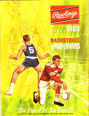
I recently scored another vintage uniform catalog. It features some particularly vibrant examples of things we’ve seen before, plus a few things I’ve never seen before. Here are the highlights:
• Good assortment of football jerseys here (the one at upper-right is unusual — you don’t normally see a raglan-sleeved football shirt) and here (love the repeating stripes on the green and black models). As usual, though, my favorite page is the listing of optional details. Interesting to see that the yellow sleeve-number panel (labeled “E26”) was already being referred to as a “TV Insert” in 1963.
• Here’s a standard assortment of football pants. What interests me is the listing of extras. First, note option K14L — I’ve never that type of harness-style color paneling before. And just above it, look at option K7L, which is described as, “Back of knee. Triangle.” Seems like something Nike or Reebok would do today, no?
• Good assortment of old-school hoops jerseys here (note that two of them are sleeved) and here. But once again, the listing of options is where the action is. I don’t think I’ve ever seen a crotch extension on a basketball jersey before. And look at item SKB — rib-knit trim at the hemline! I’d give anything to see a team actually wearing that.
• Basketball shorts are here and here, and warm-ups are here, here, and here. But here’s something that just blew me away: Ladies and gentlemen, I give you the warm-up basketball cape!
• No surprise that I like this page. But you don’t normally see socks listed by knit pattern — amazing stuff.
Cap-ital Punishment: So I attended yesterday’s press conference about MLB’s “Welcome Back Veterans” program. They had most of the star-spangled caps on display (for some reason I was really fixated on the treatment of the Angels’ halo), along with the special ball and base that will be used during this promotion. There were lots of big shots on hand, including David Wright (whose presence was disturbing for me — shouldn’t he have been taking a pregame nap or something?) and Fred Wilpon (whose presence was disturbing for other reasons), plus about half a dozen Iraq and Afghanistan vets.
I don’t like the caps at all, but the charity initiative, at least as described, is clearly a good one, with lots of organizations participating on a pro bono basis (for further details, look here). After a presentation that lasted a little over a half-hour, the floor was opened for questions. The first two of these were total softballs — a guy from MLB.com, for example, asked Wilpon, “Fred, could you tell us a little more about why this is so important to you?” Someone else asked something of a similar tenor.
There’s nothing wrong with those types of questions, of course. There’s also nothing wrong with the kind of question I then asked, which went like this:
All the materials related to this promotion say that “a portion of the proceeds” from the cap sales will go to the charity program [look at the last bullet point here, for example]. Can you tell us what percentage that portion is?
The reason I ask is that some fans — including many who have already expressed their opinions to me as news of this initiative leaked out over the weekend — may view this program as just another merchandising program to move product and generate revenue. So what portion of the cap proceeds will go to the charity? And if it’s not 100%, why not?
And man, you could practically hear them crossing my name off their Christmas card lists. MLB PR czar Rich Levin glared at me like I’d just hocked a loogie in his cappuccino or something. “The answer is that that hasn’t been determined yet,” he growled. “But this is a charity initiative — it isn’t about generating revenue.”
“I’m not suggesting otherwise,” I responded. “But there’s a certain level of cynicism out there among some fans, so I was giving you a chance to clarify…”
“We reject that,” he snapped. “We reject the cynicism.”
And that, my friends, was the end of that. No more questions, cue the photographers for glad-handing pics. Afterward, two gentlemen who were involved with the vets’ program (i.e., not MLB employees) approached me and said, “I thought it was a very good question, and I don’t think you got much of an answer.”
When I got home, I found an e-mail from a local newspaper columnist of my acquaintance. “Loved your question at the news conference,” he wrote. “Then you vanished seconds after. Did security haul you away?” Actually, I’d hung around for about 10 minutes afterward. Anyway, I wrote back, “Heaven forbid anyone should ask a non-softball question, right?” To which he responded, “The reason that he got all offended was because you nailed him! Of course it’s just another marketing initiative! LOL.”
Actually, I’m a little less cynical than that. I think it’s more that Levin, and a lot of the other MLB suits, are completely out of touch with the way fans think. And if I told him that, he’d probably say, “Oh no, that’s not true — we do all sorts of focus groups to keep us in touch with fans’ opinions,” without realizing that that’s part of the problem. These guys are so corporate, so expense account, so executive suite and boardroom, they have no freakin’ clue what it’s like to be an average baseball fan, and even less clue as to how their machinations are perceived by the rest of us. They live in a hermetically sealed bubble, sort of like a permanent luxury box. So when they come up with a nice idea — and that’s certainly what the Welcome Back Veterans program is, stupid caps or no stupid caps — they pat themselves on the back and are genuinely surprised when someone (me, in this case) has the temerity to ask a real question that requires a real answer.
Footnote: An MLB spokesman later said he’d try to find an answer to my question.
Meanwhile: About seven hours later, David Wright made an error that led to four unearned runs. He later booted another ball (initially scored an error, then changed to a base hit) and went 0-for-3 at the plate. I rest my case.
Uni Watch News Ticker: Cool-looking vintage uniform catalog ”“ which, unfortunately, I was outbid on — jersey. ”¦ Jeffrey Moulden was watching a broadcast of Vinny Testaverde’s first game at Miami (9/7/85) and was surprised to see that the ’Canes wore solid orange (additional pics here and here. ”¦ More Textile Mill League throwbacks from the Greenville Drive — I’ve set up a small slide show here (with thanks to Michael Bonasia and Billy Crowe). ”¦ “Went to an American Legion baseball game on Friday,” writes Michael Orr. “The West Columbia (SC) team does not have a uniform helmet design for their players, so the guys just wear their regular high school team helmets. This player goes to Airport High School in West Columbia, whose batting helmets apparently have side decals instead of having the logo on the front. I’ve never seen this before.” ”¦ The Cubs may be the only MLB team to use an embroidered appliqué on their batting helmets, but there’s at least one minor league team that does it: the Iowa Cubs. And look, they’ve even got the trademark symbol on there (big thanks to Dave Dolmage). ”¦ Ever since this site’s very first entry, I’ve been saying that athletes, and their uniforms, have been looking more and more like superheroes. Oregon’s football uniforms are an obvious example, but I didn’t realize Oregon had actually created little comic books for recruiting their top prospects. Unbelievable (with thanks to Greg Riffenburgh). ”¦ “The CSC cycling team has picked up a new co-sponsor, Saxo Bank,” reports Benjamin Graff. “Here’s the new jersey.” ”¦ Two promising-looking baseball exhibits currently underway at the Bennington Museum in Vermont (as forwarded by Erik Little). ”¦ “Mike Stein, a local Philly designer, was hanging outside my local coffee shop, and his tat stood out,” writes Morris Levin. “I’d know that design from the Phils’ 1976 jersey sleeve anywhere.” ”¦ Awesome article here about the organist at the College World Series. “Note the fried cheese curds on the organ,” points out Bryan. “Everything for the CWS is either fried, cheese, fried cheese, or beer.” Depressing excerpt from the article: “[Organs at ballparks] peaked in the 1960s and 1970s. Their numbers have dwindled since. The Hall of Fame’s research director, Tim Wiles, traced at least part of the beginning of the end to a change in ownership for the Mets after the 1979 season. The longtime organist Jane Jarvis was nudged out at Shea Stadium in favor of canned music. Teams wanted their music to rock, not reverberate.” ”¦ Not uni-related, but interesting nonetheless, from yesterday’s Times: “For the third consecutive game, [Mets manager Jerry] Manuel removed his starting pitcher in the middle of an inning. For the third consecutive game, the starter — this time, Mike Pelfrey — remained on the mound until the reliever arrived.” Seems to me that this used to be common years ago, but at some point pitchers began walking to the dugout as soon as the skipper arrived on the mound. Can anyone confirm or refute? Any idea when the changeover took place? ”¦ “It appears that Chris Sabo was way ahead of the Jamie Moyer curve when it comes to having a team logo on low-riding stirrups,” writes Robert Eden. “What’s all the more remarkable is that for years, Sabo had cultivated the fake stirrups look that we all know and loathe.” ”¦ Remember yesterday’s Ticker item about Bill Freehan wearing his uni number on his left sleeve during the ’68 World Series, while the other Tigers wore it on the right? Don Montgomery found another left-numbered Tiger from that same World Series: Willie Horton (who had the number on the proper sleeve earlier that year). ”¦ An injured hiker who was stranded in the Bavarian Alps was rescued after using her sports bra to signal local lumberjacks (it’s not clear whether the lumberjacks were attracted by the bra or by her bralessness), which I’m sure will lead to a new ad slogan: “Just Undo It.” ”¦ As many of you are already aware, this Virginia Tech jersey is up for sale on the web, although the Hokies haven’t yet confirmed that this will be the school’s new design. The full ensemble will apparently look like this, at least according to this blog entry (courtesy of Ryan McGhee). ”¦ “You may have heard that NY Ranger Sean Avery was an intern at Vogue,” writes Dan McCue. “He’s offered up his list of the worst sports uniforms ever. He also explains why he wanted to intern at Vogue. Best line: ‘If you feel like teasing this hockey player about an obsession of his that you might think is a little unusual, go right ahead. Just know that you may get your ass kicked by a very expensive pair of shoes — and that they’ll probably match both my belt and my shirt.'” ”¦ I’ve occasionally mentioned the Midnight Sun Game, which takes place every year in Alaska. But here’s something I hadn’t seen before: Players wearing Native Athabascan clothing prior to the 1964 game (great find by Mike Caulfield). ”¦ Speaking of finds, Jim Pericotti has discovered something I don’t think anyone else has brought up before: Maryland wears white uni numbers on their white helmets. What’s that about? ”¦ Yesterday I mentioned that Roger Federer would be wearing this logo on his sneakers. Turns out he’s also got it on his belt (good spot by Brinke Guthrie). ”¦ Jason Giambi’s mustache is getting lots of attention. … Mike Fiala just checked in from Vienna, where the European Soccer Championships have been taking place. “Adidas obviously made it their goal to win the advertising title, as they put a giant shoe for every participating country in front of Vienna’s Museumsquartier,” he writes. “Each shoe is as big as a compact car. Another annoying thing, although i haven’t seen it in person yet, is a 33m-tall Petr ÄŒech in front of one of Vienna’s best known and beloved landmarks, the Riesenrad.” But hey, when I complain about the encroachment of advertising in public spaces, I’m just being an alarmist, right?
Leave it to the guy who writes about striped socks to be the only real journalist with the guts to ask real questions.
Hooray for Paul!
Nice SI Photo compilation of link worn this year.
I must say…link may be my favorite throwback of all time.
david wright was obviously so shaken from hearing paul’s question, he made the error leading to the granny (first ever) by the mariners’ pitcher, costing the amazin’s the game
i blame you, mr. lukas, for johan’s loss
Seems odd the Orioles would go with their BP logo on the Veterans hats….any other teams do that?
Excellent coverage of the press conference. And ballsy. Well done, sir.
Good for you Paul… way to stick it to the man. I would also have been curious why these “special edition” 5950’s cost a few bucks more than the normal ones. I think it’s because the few bucks will go towards the charity, while MLB gets their original profits as normal. Sons of bitches.
Meanwhile, I went to my local Lids store in the mall yesterday just to see if they were getting any Milwaukee flag 5050’s in, and the guy at the counter, and his manager had no idea what I was talking about. Plus, I asked him if they had any original 5950’s that were cotton with the gray under bill, and again, they looked at me like I had a third eye. So i explained to the counter guy AND his manager the difference between the new 5950’s and the old ones. The manager’s response to me was, “Wow, you sure know a lot about baseball hats.” And I thought to myself that it is just 2nd nature for a Uni Watcher. But can you believe employees of Lids had no clue about 5950’s??? *sigh*
Wonder what would happan if you sent in the order form from that catalog?
I bought a 1990 pack of hockey cards a bit ago from a vintage store and inside was a card that explained a contest, mail the card into the mailing address (now it would be a website), and be entered to win tickets to the next stanley cup finals (probably 1991). I wanted to send it in to see if I would get a response like ‘That was 18 years ago you dumbass!!’
RE: Worst uniforms ever
The guy left out the Colorado Caribou and the Canucks’ unis he picked aren’t even link.
[quote comment=”276841″]Seems odd the Orioles would go with their BP logo on the Veterans hats….any other teams do that?[/quote]
Is it a Friday game? I haven’t watched the O’s all that much lately, but I think they usually wear those caps on Friday games with their black jerseys when possible.
[quote comment=”276844″]Good for you Paul… way to stick it to the man. I would also have been curious why these “special edition” 5950’s cost a few bucks more than the normal ones. I think it’s because the few bucks will go towards the charity, while MLB gets their original profits as normal. Sons of bitches.
Meanwhile, I went to my local Lids store in the mall yesterday just to see if they were getting any Milwaukee flag 5050’s in, and the guy at the counter, and his manager had no idea what I was talking about. Plus, I asked him if they had any original 5950’s that were cotton with the gray under bill, and again, they looked at me like I had a third eye. So i explained to the counter guy AND his manager the difference between the new 5950’s and the old ones. The manager’s response to me was, “Wow, you sure know a lot about baseball hats.” And I thought to myself that it is just 2nd nature for a Uni Watcher. But can you believe employees of Lids had no clue about 5950’s??? *sigh*[/quote]
It obviously should have been written “Milwaukee flag 5950’s”…not “5050’s”
…back to the program
[quote comment=”276844″]Good for you Paul… way to stick it to the man. I would also have been curious why these “special edition” 5950’s cost a few bucks more than the normal ones. I think it’s because the few bucks will go towards the charity, while MLB gets their original profits as normal. Sons of bitches.
Meanwhile, I went to my local Lids store in the mall yesterday just to see if they were getting any Milwaukee flag 5050’s in, and the guy at the counter, and his manager had no idea what I was talking about. Plus, I asked him if they had any original 5950’s that were cotton with the gray under bill, and again, they looked at me like I had a third eye. So i explained to the counter guy AND his manager the difference between the new 5950’s and the old ones. The manager’s response to me was, “Wow, you sure know a lot about baseball hats.” And I thought to myself that it is just 2nd nature for a Uni Watcher. But can you believe employees of Lids had no clue about 5950’s??? *sigh*[/quote]
It isn’t surprising, really. The employees are likely regular folks who needed a gig, whether it be selling hats, shoes or tires. Lids is just another corporate entity hiring whomever can fill the job.
It’s the mom and pop types, who start a store because they love the product (independent record stores come to mind), who will have impressive knowledge of the stuff that they sell.
[quote comment=”276846″]RE: Worst uniforms ever
The guy left out the Colorado Caribou and the Canucks’ unis he picked aren’t even link.[/quote]
I actually like the Canucks uni they showed… it’s first on my list with the blue/green stick uni as second. Hopeing to buy one and make it into a Pavel Bure 1994 Stanley Cup Final Jersey.
[quote comment=”276847″][quote comment=”276841″]Seems odd the Orioles would go with their BP logo on the Veterans hats….any other teams do that?[/quote]
Is it a Friday game? I haven’t watched the O’s all that much lately, but I think they usually wear those caps on Friday games with their black jerseys when possible.[/quote]
The lame O’s hat is indeed the Friday hat and the logo is used on the BP hat. Public Opinion among O’s fans is that this is the worst logo ever from the Birds, but it is being forced on us. With the cartoon bird a favorite among many fans (me included) I hope with the upcoming uni changes the PTB see fit to add it to some sort of uniform design.
After the NCAA got wind of the Ducks’ comic books, they were told to stop because they would have to make comic books for every single recruit, which was something that not every school could do.
Great idea to intrigue recruits, but got killed to possible NCAA violations.
[quote comment=”276846″]RE: Worst uniforms ever
The guy left out the Colorado Caribou and the Canucks’ unis he picked aren’t even link.[/quote]
He included several outfits that weren’t really uniforms at all (Serena, Anne White, Jorge Campos). Ill-conceived for sure, but not uniforms.
Speaking of finds, Jim Pericotti has discovered something I don’t think anyone else has brought up before: Maryland wears white uni numbers on their white helmets. What’s that about?
I could’ve sworn that this was mentioned before, either here or in the ESPN column. Or was it on the Chargers’ white helmets?
Correct spelling is Petr ÄŒech, vice Petr Czech.
I may not know much about fashion, but it sure looked like Venus had her dress on backwards for her Wimbledon match today.
Good for you, Paul. How the bigwigs get away without answering these honest type of questions always amazes me.
Hey, Paul: Kudos for asking the question no one had the guts to answer. Reminds me of the M*A*S*H episode where Hawkeye and Trapper try getting an incubator for the 4077. They wound up at a press conference posed as journalists and asked the general why MASH units couldn’t get an incubator. The general gives all kind of double-speak before getting totally flumoxed and they were led out of the room.
Fantastic job at the “press conference”…I’m totally impressed. The world of pro sports has become SO corporate, and every now and then someone needs to call it for what it is! Well done!
Sorry to repost from last night, but I was suprised to see no mention of the link uniforms and “unique” way of displaying (or should we say hiding?) players names. I kind of like the “anonymous” aspect of the unis, but why bother putting the names on at all?
You know the sad thing isn’t that Paul’s question was especially “ballsy” – the sad thing is that it is a very appropriate and important question that none of the other sports “journalists” thought to ask. They would rather be fed MLB propaganda so they can continue coming to press conferences with free food.
[quote comment=”276844″]Good for you Paul… way to stick it to the man. I would also have been curious why these “special edition” 5950’s cost a few bucks more than the normal ones. I think it’s because the few bucks will go towards the charity, while MLB gets their original profits as normal. Sons of bitches.
Meanwhile, I went to my local Lids store in the mall yesterday just to see if they were getting any Milwaukee flag 5050’s in, and the guy at the counter, and his manager had no idea what I was talking about. Plus, I asked him if they had any original 5950’s that were cotton with the gray under bill, and again, they looked at me like I had a third eye. So i explained to the counter guy AND his manager the difference between the new 5950’s and the old ones. The manager’s response to me was, “Wow, you sure know a lot about baseball hats.” And I thought to myself that it is just 2nd nature for a Uni Watcher. But can you believe employees of Lids had no clue about 5950’s??? *sigh*[/quote]
Good luck finding any of the older 5950’s. I haven’t seen one in awhile and they were hard to find about 6 months after the new ones came out. I haven’t even had any success finding any on the internet other than on eBay.
By the way, they were wool, not cotton.
[quote comment=”276861″]You know the sad thing isn’t that Paul’s question was especially “ballsy” – the sad thing is that it is a very appropriate and important question that none of the other sports “journalists” thought to ask. They would rather be fed MLB propaganda so they can continue coming to press conferences with free food.[/quote]
I generally agree. I appreciate all the kind words, but really, I didn’t do anything so remarkable — I just asked a simple question, one that had been on my mind for the preceding 24 hrs or so. The bigger issue is why nobody else asked anything relevant.
To be fair, though, most of the other journalists in attendance probably didn’t know as much about the initiative as I did prior to the press conference. And the reason I knew a lot about it, and had had time to think about it, is that it surfaced in Saturday’s comments on this site. So if I “done good,” it’s largely because of you guys. Thanks.
And there was no food at this event, by the way.
[quote comment=”276839″]Nice SI Photo compilation of link worn this year.
I must say…link may be my favorite throwback of all time.[/quote]
SI misclassified the Phillies uniform. It’s not a throwback per se, but rather their alternate uniform for day games. Still one of the better looking ones showcased.
[quote comment=”276854″]Speaking of finds, Jim Pericotti has discovered something I don’t think anyone else has brought up before: Maryland wears white uni numbers on their white helmets. What’s that about?
I could’ve sworn that this was mentioned before, either here or in the ESPN column. Or was it on the Chargers’ white helmets?[/quote]
I can’t remember either, but I think it’s a great idea. The white numbers just stand out enough so that guys on the bench and in the locker room can tell whose helmet is whose, while at the same time being unobtrusive enough that you don’t even notice the numbers from afar. One less thing to clutter up a clean look.
Umm… Has anyone seen these hideous MLB All-Star Game Statue of Liberty “Statues on Parade” things?
link
MLB will have some of these around NYC for the All-Star game, at 8 feet tall, and you can get your own 9 inch replica.
These designs are over-the-top when placed on a flat surface. When splashed all over lady liberty… I’m speechless.
And as a Jays’ fan, why is their a Toronto version?
[quote comment=”276863″][quote comment=”276861″]You know the sad thing isn’t that Paul’s question was especially “ballsy” – the sad thing is that it is a very appropriate and important question that none of the other sports “journalists” thought to ask. They would rather be fed MLB propaganda so they can continue coming to press conferences with free food.[/quote]
I generally agree. I appreciate all the kind words, but really, I didn’t do anything so remarkable — I just asked a simple question, one that had been on my mind for the preceding 24 hrs or so. The bigger issue is why nobody else asked anything relevant.
To be fair, though, most of the other journalists in attendance probably didn’t know as much about the initiative as I did prior to the press conference. And the reason I knew a lot about it, and had had time to think about it, is that it surfaced in Saturday’s comments on this site. So if I “done good,” it’s largely because of you guys. Thanks.
And there was no food at this event, by the way.[/quote]
The food comment was more about figuratively feeding at the MLB “trough”. A couple of years back a reporter in Kansas City asked a question that the organization deemed “inappropriate” and he ended up being banned from the press conferences for the rest of the year. That’s the kind of thing that most media companies can’t afford to have happen, so they reporters play nice, and don’t rock the boat.
[quote comment=”276856″]I may not know much about fashion, but it sure looked like Venus had her dress on backwards for her Wimbledon match today.[/quote]
venus is in the steve and barry stable, i believe, and while im sure her dress isn’t available in their stores, their current pitch is “nothing is over $8.88” …
you do the math
Way to go Paul! Too many times people do things for ‘charity’ and the charity gets a minimal percentage of the sales. If the MLB had any balls (pun intended) they’d tell the manufacturer that the hats were for charity and to, at least, provide them at cost. Then, the MLB should give 100% of the proceeds to charity.
[quote comment=”276864″][quote comment=”276839″]Nice SI Photo compilation of link worn this year.
I must say…link may be my favorite throwback of all time.[/quote]
SI misclassified the Phillies uniform. It’s not a throwback per se, but rather their alternate uniform for day games. Still one of the better looking ones showcased.[/quote]
You’re right that it’s not a strict throwback, but it is a modern interpretation of a throwback uniform.
Just like the Brewers’ throwbacks, which are widely considered as such – it’s as though the team had never changed its unform, just kept up with modern innovations.
[quote comment=”276866″]Umm… Has anyone seen these hideous MLB All-Star Game Statue of Liberty “Statues on Parade” things?
link
MLB will have some of these around NYC for the All-Star game, at 8 feet tall, and you can get your own 9 inch replica.
These designs are over-the-top when placed on a flat surface. When splashed all over lady liberty… I’m speechless.
And as a Jays’ fan, why is their a Toronto version?[/quote]
Kinda goes with this ‘hand’ thingie. Looks like a boxing glove holding an ice cream cone.
link
Watched the Braves/ Brewers last night, and after the game was over, all the Brewers starters untucked their jerseys, and the announcers even mentioned that they do it after every win. Anyone know why?
BTW, it seemed that JJ Hardy was in such a hurry to untuck his jersey that he bobbled the last play, but recovered in time to make the catch!
[quote comment=”276864″]“SI misclassified the Phillies uniform. It’s not a throwback per se, but rather their alternate uniform for day games. Still one of the better looking ones showcased.”[/quote]
Personally, I hope that it will be a one-year-only thing. I’m more partial to the traditional red pinstripes. And yeah, they also misclassified the Brewers and the Blue Jays as throwbacks, as they both wear those unis on Friday nights.
To take my mind off the sorry state of journalism today (kudos to you, though, Paul), I’ll just say that I like those Va Tech uniforms a lot, underarm colors and all.
[quote comment=”276870″][quote comment=”276864″][quote comment=”276839″]Nice SI Photo compilation of link worn this year.
I must say…link may be my favorite throwback of all time.[/quote]
SI misclassified the Phillies uniform. It’s not a throwback per se, but rather their alternate uniform for day games. Still one of the better looking ones showcased.[/quote]
You’re right that it’s not a strict throwback, but it is a modern interpretation of a throwback uniform.
Just like the Brewers’ throwbacks, which are widely considered as such – it’s as though the team had never changed its unform, just kept up with modern innovations.[/quote]
I think most of the recent “throwbacks” should be viewed like this — the Astros and their mis-lettered, botched-stripes uniform, and the Jays and their blue pajamas, are two examples. Only a few teams (Cubs ’48, Braves ’48, Indians ’50s, among others) have really gotten it right.
[quote comment=”276873″][quote comment=”276864″]“SI misclassified the Phillies uniform. It’s not a throwback per se, but rather their alternate uniform for day games. Still one of the better looking ones showcased.”[/quote]
Personally, I hope that it will be a one-year-only thing. I’m more partial to the traditional red pinstripes. And yeah, they also misclassified the Brewers and the Blue Jays as throwbacks, as they both wear those unis on Friday nights.[/quote]
What does frequency have to do with it?
[quote comment=”276875″][quote comment=”276870″][quote comment=”276864″][quote comment=”276839″]Nice SI Photo compilation of link worn this year.
I must say…link may be my favorite throwback of all time.[/quote]
SI misclassified the Phillies uniform. It’s not a throwback per se, but rather their alternate uniform for day games. Still one of the better looking ones showcased.[/quote]
You’re right that it’s not a strict throwback, but it is a modern interpretation of a throwback uniform.
Just like the Brewers’ throwbacks, which are widely considered as such – it’s as though the team had never changed its unform, just kept up with modern innovations.[/quote]
I think most of the recent “throwbacks” should be viewed like this — the Astros and their mis-lettered, botched-stripes uniform, and the Jays and their blue pajamas, are two examples. Only a few teams (Cubs ’48, Braves ’48, Indians ’50s, among others) have really gotten it right.[/quote]
I think it’s a matter of intent. The Brewers never set out to do a strict throwback with their Friday, originally Sunday, alts (though they do those as well). They wanted to do a modern interpretation, with belts, buttons and NOB. In that sense, they “got it right.”
Anyone else notice (in that SI throwback collection) that the Astros not only have non-throwback helmets, but that their current helmets use the number font that they used in the link?
[quote comment=”276844″]Good for you Paul… way to stick it to the man. I would also have been curious why these “special edition” 5950’s cost a few bucks more than the normal ones. I think it’s because the few bucks will go towards the charity, while MLB gets their original profits as normal. Sons of bitches.
Meanwhile, I went to my local Lids store in the mall yesterday just to see if they were getting any Milwaukee flag 5050’s in, and the guy at the counter, and his manager had no idea what I was talking about. Plus, I asked him if they had any original 5950’s that were cotton with the gray under bill, and again, they looked at me like I had a third eye. So i explained to the counter guy AND his manager the difference between the new 5950’s and the old ones. The manager’s response to me was, “Wow, you sure know a lot about baseball hats.” And I thought to myself that it is just 2nd nature for a Uni Watcher. But can you believe employees of Lids had no clue about 5950’s??? *sigh*[/quote]
Absolutely…you have to take into account your audience. many people don’t aspire to become Lids employees, especially those who are as uni-driven as we are.
I have the same issues with employees at the franchise shoe stores…I’ll stop in and attempt to engage in some “shop talk” with employees, even the managers, and they will often not be as informed as I am.
The blame should be mine for expecting people, mostly high school and college aged kids working at a job, not a career or profession, mind you, to delve as deeply as we enthusiasts do.
We love our unis because we Want to, not because we Have to!
[quote comment=”276874″]To take my mind off the sorry state of journalism today (kudos to you, though, Paul), I’ll just say that I like those Va Tech uniforms a lot, underarm colors and all.[/quote]
As a VT alum, I have to say, I’m starting to like those unis more than I thought I would. The photoshop mock-up definitely eases a few of my worries, but they’re still a drastic change nonetheless. I mean, those orange sleeve jerseys were such a disaster in 2005… I’ll have to wait to see them on the field before I really make up my mind.
With that said, where’s the credit for breaking this story on Friday, Paul? Not only did I provide the VT jersey and the original photoshop (which you credited to someone else today), but I also provided the new unis for UNC, Duke, Colorado, etc.
[quote comment=”276847″][quote comment=”276841″]Seems odd the Orioles would go with their BP logo on the Veterans hats….any other teams do that?[/quote]
Is it a Friday game? I haven’t watched the O’s all that much lately, but I think they usually wear those caps on Friday games with their black jerseys when possible.[/quote]
The 4th is on a Friday but Sept. 11th is on a Thursday.
MPowers…
At least when you go to Burger King, the employees know what a Whopper is.
They work at a HAT store, heck its even CALLED “LIDS”. They SHOULD know.
I’d agree with you if they worked at a big box sporting goods store.
[quote comment=”276862″][quote comment=”276844″]Good for you Paul… way to stick it to the man. I would also have been curious why these “special edition” 5950’s cost a few bucks more than the normal ones. I think it’s because the few bucks will go towards the charity, while MLB gets their original profits as normal. Sons of bitches.
Meanwhile, I went to my local Lids store in the mall yesterday just to see if they were getting any Milwaukee flag 5050’s in, and the guy at the counter, and his manager had no idea what I was talking about. Plus, I asked him if they had any original 5950’s that were cotton with the gray under bill, and again, they looked at me like I had a third eye. So i explained to the counter guy AND his manager the difference between the new 5950’s and the old ones. The manager’s response to me was, “Wow, you sure know a lot about baseball hats.” And I thought to myself that it is just 2nd nature for a Uni Watcher. But can you believe employees of Lids had no clue about 5950’s??? *sigh*[/quote]
Good luck finding any of the older 5950’s. I haven’t seen one in awhile and they were hard to find about 6 months after the new ones came out. I haven’t even had any success finding any on the internet other than on eBay.
By the way, they were wool, not cotton.[/quote]
Occasionally on the New Era website, they will have a small number of them on sale.
There is a Mom & Pop store in my area, where I found some great stirrups awhile back, that still carries some of the woll 5950’s albeit for the not so geographically popular teams, old Devil Rays etc….and no, I don’t live in Tampa!
[quote comment=”276883″]MPowers…
At least when you go to Burger King, the employees know what a Whopper is.
They work at a HAT store, heck its even CALLED “LIDS”. They SHOULD know.
I’d agree with you if they worked at a big box sporting goods store.[/quote]
Yea, but who goes into a Burger King and asks the employees from what country or region the tomatoes are from?
Thats essentially what you’re doing when you’re going into the relatively minor details like grey billed 5950’s vs the ones nowadays
I could spend all day perusing the ridiculous crap they sell on mlb.com, but with all the pink days for breast cancer and blue days for prostate cancer, this is kind of hypocritical, no…?
link
[quote]At least when you go to Burger King, the employees know what a Whopper is.[/quote]
not always…
*sigh*
[quote comment=”276883″]MPowers…
At least when you go to Burger King, the employees know what a Whopper is.
They work at a HAT store, heck its even CALLED “LIDS”. They SHOULD know.
I’d agree with you if they worked at a big box sporting goods store.[/quote]
For 7.15 an hour minus taxes, I wouldn’t be researching all of the upcoming “cap” initiatives in my downtime.
I would be going to school, or my second and third jobs to get by.
It’s all perspctive, I guess!
BTW…The Phillies new alternates are extremely well done, IMHO.
I love the Brewers modern interpretation as well.
As for others, like the Astros and Pelicans this past weekend…They were unique but with a new more discerning eye, due to UW, I was disappointed, especially by the Astros.
White spikes, fellas!
I, like most of us here, am an attention to detail disciple, Maryland’s helmet stickers: well-done. Astros’ pants stipes, batting helmets, non-matching cleats: BAD FORM!
Paul, good call on the raglan sleeves. I can’t think of many teams that have used them – the link and, of course, the Cowboys both link and link.
Wonder why it never took hold in football – aren’t raglan sleeves supposed to give you freer arm motion? I thought that is why some link link link link.
The Lids store at my mall actually has the nerve to advertise “experts” where you can give them designs and they can put it in their little Apple IIe and it stitches out your logo.
But I agree on the $7.15. And sorry to hear you have trouble at BK, Mr LI Phil.
And agreed on the Phillies alts.
or is it acquiesce?
[quote comment=”276890″]The Lids store at my mall actually has the nerve to advertise “experts” where you can give them designs and they can put it in their little Apple IIe and it stitches out your logo.
But I agree on the $7.15. And sorry to hear you have trouble at BK, Mr LI Phil.
And agreed on the Phillies alts.
or is it acquiesce?[/quote]
Attention to detail:
Look at the cleats in accordance with the uni:
link
link
Beautiful!
In contrast:
link
Lee’s attempt to disrupt the DP was a method I have never seen before, however his cleast were still maroon accented.
That kind of stuff bothers me.
Like when Texas, or LSU don’t wear cleats or gear accented with either Burnt Umber or Purple and yellow. Instead they go with black!
Poorly Done.
Those flag hats are just atrocious looking. Awful. A simple U.S.A. flag shoulder patch–as Paul has suggested, I believe–would be so much more appropriate and dignified. True, there would be little revenue generated from flag patch sales, but perhaps each club could make a sizable donation towards the veteran’s program anyway. (See how that idea goes over in the board rooms.)
Meanwhile, I have followed basketball aesthetics for many decades and have never seen one of those magnificent Rawlings warm up capes in action. I wonder why? Something to do with appendage restriction, maybe.
re: Indians getting 50’s throwbacks right. When did they do that this year? If you mean the recent game vs. Padres, yeah, they did pretty good job. Did they do a 50s game, too? I wish the Indians WOULD do a 1954 TBTC. Those unis were classic. Wahoo on the hat and sleeve, script at home, plain block on the road, no pant or jersey striping. A clean, really overlooked, underappreciated uni. Now, f you mean those alternates they’re wearing at home, that’s nothing they have ever wore before. It’s a new, old-fashioned look, yeah, but it isn’t a throwback. That uni never existed until this year.
Here’s that ’54 era uni (on the catcher, too)
link
[quote comment=”276863″][quote comment=”276861″]You know the sad thing isn’t that Paul’s question was especially “ballsy” – the sad thing is that it is a very appropriate and important question that none of the other sports “journalists” thought to ask. They would rather be fed MLB propaganda so they can continue coming to press conferences with free food.[/quote]
I generally agree. I appreciate all the kind words, but really, I didn’t do anything so remarkable — I just asked a simple question, one that had been on my mind for the preceding 24 hrs or so. The bigger issue is why nobody else asked anything relevant.
To be fair, though, most of the other journalists in attendance probably didn’t know as much about the initiative as I did prior to the press conference. And the reason I knew a lot about it, and had had time to think about it, is that it surfaced in Saturday’s comments on this site. So if I “done good,” it’s largely because of you guys. Thanks.
And there was no food at this event, by the way.[/quote]
You’re modest Paul. My dad is a retired journalist and he often gets disgusted with today’s “news readers” and TV news in general. He worries that there soon will be no “real journalist” left in this country. You know, people like you who not only asks relevant and challenging questions but also possesses the writing skills required to report the information. Unfortunately, most Americans like to get their news in two minute sound bites on television rather than reading a paper, blog or magazine.
[quote comment=”276851″][quote comment=”276847″][quote comment=”276841″]Seems odd the Orioles would go with their BP logo on the Veterans hats….any other teams do that?[/quote]
Is it a Friday game? I haven’t watched the O’s all that much lately, but I think they usually wear those caps on Friday games with their black jerseys when possible.[/quote]
The lame O’s hat is indeed the Friday hat and the logo is used on the BP hat. Public Opinion among O’s fans is that this is the worst logo ever from the Birds, but it is being forced on us. With the cartoon bird a favorite among many fans (me included) I hope with the upcoming uni changes the PTB see fit to add it to some sort of uniform design.[/quote]
I’m not a huge fan of that hat to begin with, and I think it looks twice as stupid with the stars ‘n’ stripes treatment. I’m with you, Frank. I hope that they do away with that. I loved the cartoon bird. I grew up with it (yeah, I’m from B-more too). I am glad to see they said something about bringing “Baltimore” back to the road jerseys.
JFront, I bet they’ll wear that for both days then. It’d be excessive to vet-design both hat designs. Thanks for the info, tho!
Indians ’54 road (still wore in ’56…photo for ’57 card).
link
and the home…
link
[quote comment=”276839″]Nice SI Photo compilation of link worn this year.
I must say…link may be my favorite throwback of all time.[/quote]
It’s telling that the Angels ’71 throwback game was so lame, it didn’t even make the SI gallery.
What MLB PR czar Rich Levin was thinking during his exchange with Paul: “Damn bloggers. Why won’t they stay in their parents’ basements?”
By the way, Rich, we reject your cynicism.
[quote comment=”276893″]re: Indians getting 50’s throwbacks right. When did they do that this year? If you mean the recent game vs. Padres, yeah, they did pretty good job. Did they do a 50s game, too? I wish the Indians WOULD do a 1954 TBTC. Those unis were classic. Wahoo on the hat and sleeve, script at home, plain block on the road, no pant or jersey striping. A clean, really overlooked, underappreciated uni. Now, f you mean those alternates they’re wearing at home, that’s nothing they have ever wore before. It’s a new, old-fashioned look, yeah, but it isn’t a throwback. That uni never existed until this year.
Here’s that ’54 era uni (on the catcher, too)
link
Is that a posed picture? Why would an Indian be hitting AND catching?
Bravo, Mr. Lukas.
Shouldn’t we all be outraged at the depiction of a flag on the top of the bases for the July 4 games? I doubt the cameras will bother too zoom in flags covered in dirt and being trampled on by players.
In any event, I suspect this marketing promotion will be a dud. I think the flag-wearing hoopla has subsided a lot in the past five years. Plus, the hats mostly look pretty weird. Makes you wonder how much revenue the charity will get from a 75% off hat…
[quote comment=”276899″][quote comment=”276893″]re: Indians getting 50’s throwbacks right. When did they do that this year? If you mean the recent game vs. Padres, yeah, they did pretty good job. Did they do a 50s game, too? I wish the Indians WOULD do a 1954 TBTC. Those unis were classic. Wahoo on the hat and sleeve, script at home, plain block on the road, no pant or jersey striping. A clean, really overlooked, underappreciated uni. Now, f you mean those alternates they’re wearing at home, that’s nothing they have ever wore before. It’s a new, old-fashioned look, yeah, but it isn’t a throwback. That uni never existed until this year.
Here’s that ’54 era uni (on the catcher, too)
link
Is that a posed picture? Why would an Indian be hitting AND catching?[/quote]
That was SI’s Baseall Issue that year, so photo probably was taken during spring training, possibly during an intrasquad game, but more likely just before one as a setup for the cover shot (crowd, but no umpire).
[quote]Makes you wonder how much revenue the charity will get from a 75% off hat[/quote]
75% less?
im not real good with math and numbers and stuff tho
Check out the preceding week’s cover…
Willie, the Lip and Mrs. Lip (actress Larraine Day)
link
Just because I know that we all love our Tennis….
link
[quote comment=”276898″]What MLB PR czar Rich Levin was thinking during his exchange with Paul: “Damn bloggers. Why won’t they stay in their parents’ basements?”[/quote]
For the record, when I raised my hand and was called upon to ask a question, I identified myself as “Paul Lukas, ESPN.com.”
And here is Venus Dress
link
While the Georgia Bulldogs baseball team is one win away from the College World Series title, the folks over at the Atlanta Journal-Constitution thought it would be a good time to take a poll on your favorite UGA football uniform.
Brilliant! See the poll here.
[quote comment=”276906″]And here is Venus Dress
link
link
[quote comment=”276895″][quote comment=”276851″][quote comment=”276847″][quote comment=”276841″]Seems odd the Orioles would go with their BP logo on the Veterans hats….any other teams do that?[/quote]
Is it a Friday game? I haven’t watched the O’s all that much lately, but I think they usually wear those caps on Friday games with their black jerseys when possible.[/quote]
The lame O’s hat is indeed the Friday hat and the logo is used on the BP hat. Public Opinion among O’s fans is that this is the worst logo ever from the Birds, but it is being forced on us. With the cartoon bird a favorite among many fans (me included) I hope with the upcoming uni changes the PTB see fit to add it to some sort of uniform design.[/quote]
I’m not a huge fan of that hat to begin with, and I think it looks twice as stupid with the stars ‘n’ stripes treatment. I’m with you, Frank. I hope that they do away with that. I loved the cartoon bird. I grew up with it (yeah, I’m from B-more too). I am glad to see they said something about bringing “Baltimore” back to the road jerseys.
JFront, I bet they’ll wear that for both days then. It’d be excessive to vet-design both hat designs. Thanks for the info, tho![/quote]
As a long time O’s fan I’d like to see them use linkas a throw back hat. Is my uni conservatism showing?
San Diego’s star-spangled cap doesn’t even appear to have the correct interlocking SD logo. It looks like the one used pre-2004.
[quote comment=”276891″][quote comment=”276890″]The Lids store at my mall actually has the nerve to advertise “experts” where you can give them designs and they can put it in their little Apple IIe and it stitches out your logo.
But I agree on the $7.15. And sorry to hear you have trouble at BK, Mr LI Phil.
And agreed on the Phillies alts.
or is it acquiesce?[/quote]
Attention to detail:
Look at the cleats in accordance with the uni:
link
link
Beautiful!
In contrast:
link
Lee’s attempt to disrupt the DP was a method I have never seen before, however his cleast were still maroon accented.
That kind of stuff bothers me.
Like when Texas, or LSU don’t wear cleats or gear accented with either Burnt Umber or Purple and yellow. Instead they go with black!
Poorly Done.[/quote]
Yes, bad effort by Houston, but remember that theirs was a one-time TBTC day, whereas the Phils and Pads are sporting regularly worn alternate unis, so having matching spikes makes a little more sense.
[quote comment=”276891″]“Like when Texas, or LSU don’t wear cleats or gear accented with either Burnt Umber (Oak Tree Copper) or Purple and Yellow. Instead they go with black!”[/quote]
Have you ever thought for a nanosecond that sometimes, they don’t have those colors in stock and they must be custom made for the school (or team)? Black’s merely a shortcut, as is white.
[quote comment=”276906″]And here is Venus Dress
link
I guess that whole link thing is really coming true, huh?
link.
Take this for what it’s worth, but there are reports (or at least one) on the VT message boards that are claiming that the uniforms that Eastbay released for Tech are not accurate. Apparently, the amount of orange depicted in that uniform is overdone and that basically there is no orange on the sleeves, only on the sides.
Also, they are claiming that the design is completely different from anything anyone else has out there, which would rule out these, because its basically the exact design of Minnesota’s. I’ll keep you updated if I hear any more into this.
[quote comment=”276886″]I could spend all day perusing the ridiculous crap they sell on mlb.com, but with all the pink days for breast cancer and blue days for prostate cancer, this is kind of hypocritical, no…?
link
That, and the fact that players who chew tobacco all game long as also using pink bats and wearing ribbons.
the Airport HS batting helmet in question is one they’ve used as long as i can remember…the logo is on both sides of the helmet if i’m correct.
on a side note, as a greenville drive fan, i wish that their uniforms were simpler like the mill throwbacks, not red sox unis with a different patch.
News from Euro 2008 – if yellow is considered unlucky, why did they change over from white?
link
Pretty funny about the coach turning down flowers. Almost makes me want to chase him down the street with a bouquet of daisies.
[quote comment=”276844″]Good for you Paul… way to stick it to the man. I would also have been curious why these “special edition” 5950’s cost a few bucks more than the normal ones. I think it’s because the few bucks will go towards the charity, while MLB gets their original profits as normal. Sons of bitches.
Meanwhile, I went to my local Lids store in the mall yesterday just to see if they were getting any Milwaukee flag 5050’s in, and the guy at the counter, and his manager had no idea what I was talking about. Plus, I asked him if they had any original 5950’s that were cotton with the gray under bill, and again, they looked at me like I had a third eye. So i explained to the counter guy AND his manager the difference between the new 5950’s and the old ones. The manager’s response to me was, “Wow, you sure know a lot about baseball hats.” And I thought to myself that it is just 2nd nature for a Uni Watcher. But can you believe employees of Lids had no clue about 5950’s??? *sigh*[/quote]
when were they made out of cotton?
[quote comment=”276916″]Take this for what it’s worth, but there are reports (or at least one) on the VT message boards that are claiming that the uniforms that Eastbay released for Tech are not accurate. Apparently, the amount of orange depicted in that uniform is overdone and that basically there is no orange on the sleeves, only on the sides.
Also, they are claiming that the design is completely different from anything anyone else has out there, which would rule out these, because its basically the exact design of Minnesota’s. I’ll keep you updated if I hear any more into this.[/quote]
It looks like the replica jerseys are going to look awful, but they might be okay on the field because the way the sleaves are cut on an on-field jersey. They may be okay.
Great entry today, Paul. I have mixed feelings on the hat designs though. I look at link and think, they don’t look half bad sitting on the table. But you’re right: coupled with Pittsburgh’s black and yellow or ANY black alt top and it could be a disaster.
On the subject of Lids and their employees, I talked to one awhile back who said he’s allowed to wear any hat in the store during a shift to promote the product. Sounds reasonable, except he wore it with the New Era bill sticker still on (logically – it’s unsold merchandise). Unfortunately this perpetuates my least favorite hat fashion “trend” of the day: leaving the sticker on. If the hat’s yours, take off the damn sticker – nobody wants to know you’re a 7 5/8.
[quote comment=”276841″]Seems odd the Orioles would go with their BP logo on the Veterans hats….any other teams do that?[/quote]
Probably because trying to apply stars n’ stripes to an artwork as detailed as the Orioles’ bird could only result in a visual nightmare beyond even what this promotion could stand.
Or maybe PETA threatened them over the disfiguration of an ornithologically correct representation.
The Diamondbacks should be first ballot entries to the Franchise Uni Hall of Shame for 11 seasons of atrocities. The current D’Backs logo type looks like the label for chipotle sauce. link
[quote comment=”276922″]Great entry today, Paul. I have mixed feelings on the hat designs though. I look at link and think, they don’t look half bad sitting on the table. But you’re right: coupled with Pittsburgh’s black and yellow or ANY black alt top and it could be a disaster.
On the subject of Lids and their employees, I talked to one awhile back who said he’s allowed to wear any hat in the store during a shift to promote the product. Sounds reasonable, except he wore it with the New Era bill sticker still on (logically – it’s unsold merchandise). Unfortunately this perpetuates my least favorite hat fashion “trend” of the day: leaving the sticker on. If the hat’s yours, take off the damn sticker – nobody wants to know you’re a 7 5/8.[/quote]
Yuck. The dude wears it all day and then puts it back on the self to be sold?
re: Those…hats.
Whoa, how many Native American activists you figure aren’t exactly thrilled with “Stars n’ Stripes Chief Yahoo”?
Ooops, Chief Wahoo. Sorry.
[quote comment=”276922″]Great entry today, Paul. I have mixed feelings on the hat designs though. I look at link and think, they don’t look half bad sitting on the table. But you’re right: coupled with Pittsburgh’s black and yellow or ANY black alt top and it could be a disaster.
On the subject of Lids and their employees, I talked to one awhile back who said he’s allowed to wear any hat in the store during a shift to promote the product. Sounds reasonable, except he wore it with the New Era bill sticker still on (logically – it’s unsold merchandise). Unfortunately this perpetuates my least favorite hat fashion “trend” of the day: leaving the sticker on. If the hat’s yours, take off the damn sticker – nobody wants to know you’re a 7 5/8.[/quote]
All the more reason to convince teams not to wear black jerseys! I still think the Reds and Phillies should be able to wear red versions of the Stars ‘N Stripes Hat.
Yeah, the giant holographic sticker thing needs to go away. And bend that brim too!
As someone who raises money for non-profits (charities), I am often asked about how much of a particular purchase goes to the charity. It’s a question they should be able to answer (unless the contract hasn’t been signed) fairly easily. Good for you for pushing the issue.
Glad to see that the Islanders “fisherman” jerseys didn’t make the list of worst jerseys of all time. Even though everybody hated that one, I always kind of liked it.
What are some other jersey/uniform designs that you liked that didn’t go over so well?
[quote comment=”276895″][quote comment=”276851″][quote comment=”276847″][quote comment=”276841″]Seems odd the Orioles would go with their BP logo on the Veterans hats….any other teams do that?[/quote]
Is it a Friday game? I haven’t watched the O’s all that much lately, but I think they usually wear those caps on Friday games with their black jerseys when possible.[/quote]
The lame O’s hat is indeed the Friday hat and the logo is used on the BP hat. Public Opinion among O’s fans is that this is the worst logo ever from the Birds, but it is being forced on us. With the cartoon bird a favorite among many fans (me included) I hope with the upcoming uni changes the PTB see fit to add it to some sort of uniform design.[/quote]
I’m not a huge fan of that hat to begin with, and I think it looks twice as stupid with the stars ‘n’ stripes treatment. I’m with you, Frank. I hope that they do away with that. I loved the cartoon bird. I grew up with it (yeah, I’m from B-more too). I am glad to see they said something about bringing “Baltimore” back to the road jerseys.
JFront, I bet they’ll wear that for both days then. It’d be excessive to vet-design both hat designs. Thanks for the info, tho![/quote]
Personally, I really like the Orioles Friday night home uniforms. The black jersey with white letters and numbers is simple, stylish, and easy on the eyes, and the cap with the script O’s is, too.
I also like the ornithologically-correct bird on the other caps, though. I grew up with the cartoon bird, and while I didn’t love it, I didn’t hate it, either, and I wasn’t sorry to see it go. I do remember reading that Orioles players lobbied for a change in uniform back then because other teams were making fun of the cartoon on their cap.
I’m all for putting Baltimore back on the road jerseys, but I hope we don’t go back to the cartoon bird. That was an idea whose time is past.
And while I’m at it …. I still think the Nuggets “city-scape/multi-color” uniforms were the absolute best in basketball history – and quite possibly the best ever in any sport.
There. I said it.
:-)
Oh, Paul, how you constantly have these enemies. Nike is not your friend because they want to make money. Major League Baseball is not your friend because they want to make money. The National Hockey League/Reebok marketing people aren’t your friends because they sent you an LA Kings jersey and you hate purple.
You are a funny guy, Mr. Stirrups.
I’ve just looked at the scans from that 1963 Rawlings football and basketball uniform catalog, and they’re just awesome. Could you please post a scan of the color chart and numbering/lettering pages? I, for one, would love to see some of the uniform color options available back then.
Thank you!
[quote comment=”276922″]On the subject of Lids and their employees, I talked to one awhile back who said he’s allowed to wear any hat in the store during a shift to promote the product. Sounds reasonable, except he wore it with the New Era bill sticker still on (logically – it’s unsold merchandise). Unfortunately this perpetuates my least favorite hat fashion “trend” of the day: leaving the sticker on. If the hat’s yours, take off the damn sticker – nobody wants to know you’re a 7 5/8.[/quote]
It’s obvious that leaving stickers on a hat for some reason is deemed as “cool.” I’m not sure what it is, I think it looks ridiculous. To make matters worse, most of the people you see with stickers still on their hats also are wearing them straight billed. Not sure what’s so cool about that, but I guess to each his own…
I really hope that the hats that Lids/Hat World employees wear in the store do not go back on the shelf at the end of a shift. As somebody already said, that’s completely disgusting. If they are wearing their own hats (which are also being sold in the store), I obviously don’t have a problem with that. However there’s no way I want to buy and wear a hat that’s been worn by an employee for the length of a 4-8 hour shift (That’s just 1 day of work, whose to say he/she hasn’t worn the hat for a week?!). That really makes me second guess buying a hat from a Lids/Hat World store ever again…
[quote comment=”276920″]“When were they made out of cotton?”[/quote]
Around the time link
What’s next? Green dots on the backs of the helmets? Gold “C’s” to signify 100 titles?
[quote comment=”276932″][quote comment=”276895″][quote comment=”276851″][quote comment=”276847″][quote comment=”276841″]Seems odd the Orioles would go with their BP logo on the Veterans hats….any other teams do that?[/quote]
Is it a Friday game? I haven’t watched the O’s all that much lately, but I think they usually wear those caps on Friday games with their black jerseys when possible.[/quote]
The lame O’s hat is indeed the Friday hat and the logo is used on the BP hat. Public Opinion among O’s fans is that this is the worst logo ever from the Birds, but it is being forced on us. With the cartoon bird a favorite among many fans (me included) I hope with the upcoming uni changes the PTB see fit to add it to some sort of uniform design.[/quote]
I’m not a huge fan of that hat to begin with, and I think it looks twice as stupid with the stars ‘n’ stripes treatment. I’m with you, Frank. I hope that they do away with that. I loved the cartoon bird. I grew up with it (yeah, I’m from B-more too). I am glad to see they said something about bringing “Baltimore” back to the road jerseys.
JFront, I bet they’ll wear that for both days then. It’d be excessive to vet-design both hat designs. Thanks for the info, tho![/quote]
Personally, I really like the Orioles Friday night home uniforms. The black jersey with white letters and numbers is simple, stylish, and easy on the eyes, and the cap with the script O’s is, too.
I also like the ornithologically-correct bird on the other caps, though. I grew up with the cartoon bird, and while I didn’t love it, I didn’t hate it, either, and I wasn’t sorry to see it go. I do remember reading that Orioles players lobbied for a change in uniform back then because other teams were making fun of the cartoon on their cap.
I’m all for putting Baltimore back on the road jerseys, but I hope we don’t go back to the cartoon bird. That was an idea whose time is past.
And while I’m at it …. I still think the Nuggets “city-scape/multi-color” uniforms were the absolute best in basketball history – and quite possibly the best ever in any sport.
There. I said it.
:-)[/quote]
When I was a kid, the Os were the best team in baseball in full cartoon regalia. Six AL pennants, three WS titles with that bird, none before, none since. I don’t think anyone ever laughed at Frank Robinson or Boog Powell for cartoon birds, or anything else.
[quote comment=”276858″]Hey, Paul: Kudos for asking the question no one had the guts to answer. Reminds me of the M*A*S*H episode where Hawkeye and Trapper try getting an incubator for the 4077. They wound up at a press conference posed as journalists and asked the general why MASH units couldn’t get an incubator. The general gives all kind of double-speak before getting totally flumoxed and they were led out of the room.[/quote]
“This is a press conference, the last thing I want to do is answer a lot of questions!”
[quote comment=”276913″][quote comment=”276891″]“Like when Texas, or LSU don’t wear cleats or gear accented with either Burnt Umber (Oak Tree Copper) or Purple and Yellow. Instead they go with black!”[/quote]
Have you ever thought for a nanosecond that sometimes, they don’t have those colors in stock and they must be custom made for the school (or team)? Black’s merely a shortcut, as is white.[/quote]
I have often contemplated this, and yes I understand that these colors are not readily available, as a general released item to the public!
However, as far as these two schools are concerned, they are the Highest Profile that is in Nike’s stable of schools. They, above anyone else, should have gear at the ready as opposed to some small D-3 school, whose players have to go and purchase their own gear and whose school is not on National TV Saturday afternoons and evenings during the fall.
Hooray for Paul!
No, Paul’s an obnoxious moron, but if you had read anything on here before, you had to know that.
[quote comment=”276912″][quote comment=”276891″][quote comment=”276890″]The Lids store at my mall actually has the nerve to advertise “experts” where you can give them designs and they can put it in their little Apple IIe and it stitches out your logo.
But I agree on the $7.15. And sorry to hear you have trouble at BK, Mr LI Phil.
And agreed on the Phillies alts.
or is it acquiesce?[/quote]
Attention to detail:
Look at the cleats in accordance with the uni:
link
link
Beautiful!
In contrast:
link
Lee’s attempt to disrupt the DP was a method I have never seen before, however his cleast were still maroon accented.
That kind of stuff bothers me.
Like when Texas, or LSU don’t wear cleats or gear accented with either Burnt Umber or Purple and yellow. Instead they go with black!
Poorly Done.[/quote]
Yes, bad effort by Houston, but remember that theirs was a one-time TBTC day, whereas the Phils and Pads are sporting regularly worn alternate unis, so having matching spikes makes a little more sense.[/quote]
Good point, and an allowance should be made…had these high-profile, much manicured athletes not known in advance.
For example, when Lebron and the Cavaliers visited the Knicks at MSG this past March 5th, he wore the Yankees Pinstriped edition of the Nike Air Zoom Lebron V.
link
Also, when the Cavs go to their throwback Orange and Royal Blues, Lebron is always wearing his signature shoe in matching colors:
link
link
Now, I realize that this is Lebron, but many athletes do the same.
Schools like Texas, LSU, Syracuse, and Georgetown are renowned for not matching.
This shouldn’t be a problem in the pros!
BTW…Nike was on board with the Knicks/Lebron Yankee shoe…cuz it released at NikeTown NY and House of Hoops that very day…coincidence…not really
[quote comment=”276876″][quote comment=”276873″][quote comment=”276864″]“SI misclassified the Phillies uniform. It’s not a throwback per se, but rather their alternate uniform for day games. Still one of the better looking ones showcased.”[/quote]
Personally, I hope that it will be a one-year-only thing. I’m more partial to the traditional red pinstripes. And yeah, they also misclassified the Brewers and the Blue Jays as throwbacks, as they both wear those unis on Friday nights.[/quote]
What does frequency have to do with it?[/quote]
When I think of a throwback uni, I equate it to a one-time, one-game deal where the uni is an EXACT copy of a historical style. When a team wears one that is based on an older uni style, and wears it regularly during the course of a season, I don’t consider it a true throwback. In the Phils case, their alternate is based on the 1947-49 style. Obviously, the late 40s unis did not sport a NOB and the modern font. Maybe it’s splitting hairs, but I interpret ‘throwback’ in a stricter sense.
[quote comment=”276925″]The Diamondbacks should be first ballot entries to the Franchise Uni Hall of Shame for 11 seasons of atrocities. The current D’Backs logo type looks like the label for chipotle sauce. link[/quote]
Although, I absolutely LOVE this logo:
link
[quote comment=”276940″]Hooray for Paul!
No, Paul’s an obnoxious moron, but if you had read anything on here before, you had to know that.[/quote]
Hey now!!! He is NOT a moron! You take that back right now!
I got your back, bud.
[quote comment=”276920″][quote comment=”276844″]Good for you Paul… way to stick it to the man. I would also have been curious why these “special edition” 5950’s cost a few bucks more than the normal ones. I think it’s because the few bucks will go towards the charity, while MLB gets their original profits as normal. Sons of bitches.
Meanwhile, I went to my local Lids store in the mall yesterday just to see if they were getting any Milwaukee flag 5050’s in, and the guy at the counter, and his manager had no idea what I was talking about. Plus, I asked him if they had any original 5950’s that were cotton with the gray under bill, and again, they looked at me like I had a third eye. So i explained to the counter guy AND his manager the difference between the new 5950’s and the old ones. The manager’s response to me was, “Wow, you sure know a lot about baseball hats.” And I thought to myself that it is just 2nd nature for a Uni Watcher. But can you believe employees of Lids had no clue about 5950’s??? *sigh*[/quote]
when were they made out of cotton?[/quote]
Sorry… I was in a hurry this morning, made one edit to my post, and didn’t check over my writing. I did know it was wool, and not cotton, just didn’t edit it. My bad.
The thing about the two guys at Lids last night wasn’t the fact necessarily that they knew nothing of the products they sold, but BOTH of them had on a 5950. They were wearing the caps and didn’t know anything, so that kind of bugged me. And my local Lids did have one wool 5950 of the Brewers caps… but alas, it was a size 7.
I also agree with the ascetically pleasing look of the Brewers modern day interpretation of their old uniforms. The took a lot of good old stuff, and added modern day feel to it.
OH NO, Look at what I just found!
Sorry if these have already been posted:
link
link
The front: Good
The back: Bad, real bad…print, illegible names!
[quote comment=”276947″]OH NO, Look at what I just found!
Sorry if these have already been posted:
link
link
The front: Good
The back: Bad, real bad…print, illegible names![/quote]
I like how Nike even added a swosh the back of the jersey…you can see it just to the right of the E in WADE.
[quote comment=”276948″][quote comment=”276947″]OH NO, Look at what I just found!
Sorry if these have already been posted:
link
link
The front: Good
The back: Bad, real bad…print, illegible names![/quote]
I like how Nike even added a swosh the back of the jersey…you can see it just to the right of the E in WADE.[/quote]
Will all the basketball teams have their country’s name AND their flag on the front?
[quote comment=”276943″][quote comment=”276876″][quote comment=”276873″][quote comment=”276864″]“SI misclassified the Phillies uniform. It’s not a throwback per se, but rather their alternate uniform for day games. Still one of the better looking ones showcased.”[/quote]
Personally, I hope that it will be a one-year-only thing. I’m more partial to the traditional red pinstripes. And yeah, they also misclassified the Brewers and the Blue Jays as throwbacks, as they both wear those unis on Friday nights.[/quote]
What does frequency have to do with it?[/quote]
When I think of a throwback uni, I equate it to a one-time, one-game deal where the uni is an EXACT copy of a historical style. When a team wears one that is based on an older uni style, and wears it regularly during the course of a season, I don’t consider it a true throwback. In the Phils case, their alternate is based on the 1947-49 style. Obviously, the late 40s unis did not sport a NOB and the modern font. Maybe it’s splitting hairs, but I interpret ‘throwback’ in a stricter sense.[/quote]
That’s a pretty arbitrary definition of “throwback,” if it has to be “one-time, one-game deal”.
They’re not playing for the name on the back anyway.
[quote comment=”276872″]Watched the Braves/ Brewers last night, and after the game was over, all the Brewers starters untucked their jerseys, and the announcers even mentioned that they do it after every win. Anyone know why?
BTW, it seemed that JJ Hardy was in such a hurry to untuck his jersey that he bobbled the last play, but recovered in time to make the catch![/quote]
I wrote on here a few weeks ago talking about this, and even liked a picture to it. The trend started on the Crew’s last home stand (2 weeks ago) where they won 8 of 9 games. And the description of them untucking the jersey immediately after the last out is 100% accurate. The camera doesn’t have enough time to pan to a player to view him tucked in… it really is unreal how quick they do it.
As far is why they do it… let the record speak for itself. If I’m not mistaken, the Brewers have the best record (or close to it) in baseball in the past four weeks. And they started doing this untucking right around then.
[quote comment=”276937″][quote comment=”276932″][quote comment=”276895″][quote comment=”276851″][quote comment=”276847″][quote comment=”276841″]Seems odd the Orioles would go with their BP logo on the Veterans hats….any other teams do that?[/quote]
Is it a Friday game? I haven’t watched the O’s all that much lately, but I think they usually wear those caps on Friday games with their black jerseys when possible.[/quote]
The lame O’s hat is indeed the Friday hat and the logo is used on the BP hat. Public Opinion among O’s fans is that this is the worst logo ever from the Birds, but it is being forced on us. With the cartoon bird a favorite among many fans (me included) I hope with the upcoming uni changes the PTB see fit to add it to some sort of uniform design.[/quote]
I’m not a huge fan of that hat to begin with, and I think it looks twice as stupid with the stars ‘n’ stripes treatment. I’m with you, Frank. I hope that they do away with that. I loved the cartoon bird. I grew up with it (yeah, I’m from B-more too). I am glad to see they said something about bringing “Baltimore” back to the road jerseys.
JFront, I bet they’ll wear that for both days then. It’d be excessive to vet-design both hat designs. Thanks for the info, tho![/quote]
Personally, I really like the Orioles Friday night home uniforms. The black jersey with white letters and numbers is simple, stylish, and easy on the eyes, and the cap with the script O’s is, too.
I also like the ornithologically-correct bird on the other caps, though. I grew up with the cartoon bird, and while I didn’t love it, I didn’t hate it, either, and I wasn’t sorry to see it go. I do remember reading that Orioles players lobbied for a change in uniform back then because other teams were making fun of the cartoon on their cap.
I’m all for putting Baltimore back on the road jerseys, but I hope we don’t go back to the cartoon bird. That was an idea whose time is past.
And while I’m at it …. I still think the Nuggets “city-scape/multi-color” uniforms were the absolute best in basketball history – and quite possibly the best ever in any sport.
There. I said it.
:-)[/quote]
When I was a kid, the Os were the best team in baseball in full cartoon regalia. Six AL pennants, three WS titles with that bird, none before, none since. I don’t think anyone ever laughed at Frank Robinson or Boog Powell for cartoon birds, or anything else.[/quote]
Here, here Josh. I really want the cartoon bird back as a representation of all that was good in the “Land of Pleasant Living” The Oriole Way was alive and well back then. I was ready to change to a belted pant and away from the elastic waistband and I was excited for the first orithologically correct bird, but the duck on the cap has to go.
[quote comment=”276932″][quote comment=”276895″][quote comment=”276851″][quote comment=”276847″][quote comment=”276841″]Seems odd the Orioles would go with their BP logo on the Veterans hats….any other teams do that?[/quote]
Is it a Friday game? I haven’t watched the O’s all that much lately, but I think they usually wear those caps on Friday games with their black jerseys when possible.[/quote]
The lame O’s hat is indeed the Friday hat and the logo is used on the BP hat. Public Opinion among O’s fans is that this is the worst logo ever from the Birds, but it is being forced on us. With the cartoon bird a favorite among many fans (me included) I hope with the upcoming uni changes the PTB see fit to add it to some sort of uniform design.[/quote]
I’m not a huge fan of that hat to begin with, and I think it looks twice as stupid with the stars ‘n’ stripes treatment. I’m with you, Frank. I hope that they do away with that. I loved the cartoon bird. I grew up with it (yeah, I’m from B-more too). I am glad to see they said something about bringing “Baltimore” back to the road jerseys.
JFront, I bet they’ll wear that for both days then. It’d be excessive to vet-design both hat designs. Thanks for the info, tho![/quote]
Personally, I really like the Orioles Friday night home uniforms. The black jersey with white letters and numbers is simple, stylish, and easy on the eyes, and the cap with the script O’s is, too.
I also like the ornithologically-correct bird on the other caps, though. I grew up with the cartoon bird, and while I didn’t love it, I didn’t hate it, either, and I wasn’t sorry to see it go. I do remember reading that Orioles players lobbied for a change in uniform back then because other teams were making fun of the cartoon on their cap.
I’m all for putting Baltimore back on the road jerseys, but I hope we don’t go back to the cartoon bird. That was an idea whose time is past.
And while I’m at it …. I still think the Nuggets “city-scape/multi-color” uniforms were the absolute best in basketball history – and quite possibly the best ever in any sport.
There. I said it.
:-)[/quote]
I like the black jerseys, but I’m just not a fan of the caps. But that’s the beauty of differing opinions, so it’s all good.
[quote comment=”276931″]Glad to see that the Islanders “fisherman” jerseys didn’t make the list of worst jerseys of all time. Even though everybody hated that one, I always kind of liked it.
What are some other jersey/uniform designs that you liked that didn’t go over so well?[/quote]
I’ve said bunch of times here that I love this uni
link
But not alot of people agree. Which is fine, difference in opinion is always good.
[quote comment=”276951″]They’re not playing for the name on the back anyway.[/quote]
link
[quote comment=”276943″]When I think of a throwback uni, I equate it to a one-time, one-game deal where the uni is an EXACT copy of a historical style. When a team wears one that is based on an older uni style, and wears it regularly during the course of a season, I don’t consider it a true throwback. In the Phils case, their alternate is based on the 1947-49 style. Obviously, the late 40s unis did not sport a NOB and the modern font. Maybe it’s splitting hairs, but I interpret ‘throwback’ in a stricter sense.[/quote]
You must get disappointed a lot.
It’s not easy to make an EXACT replica of a uniform from eons ago. Some fabrics aren’t made anymore. Some replication would take longer and might not be worth the time, effort and expense (I know, I know, but it’s not your money, now is it?).
The farther back you go, the harder it gets. Especially when you consider that (well, it used to be, might still be) it’s an NL rule that road jerseys have to have NOB (again, used to be, not sure if it still is, but I think so).
And if they wear it TWICE, it doesn’t count as a throwback to you?
Wow.
What else does Leviticus say about this topic?
[quote comment=”276955″][quote comment=”276931″]Glad to see that the Islanders “fisherman” jerseys didn’t make the list of worst jerseys of all time. Even though everybody hated that one, I always kind of liked it.
What are some other jersey/uniform designs that you liked that didn’t go over so well?[/quote]
I’ve said bunch of times here that I love this uni
link
But not alot of people agree. Which is fine, difference in opinion is always good.[/quote]
One thing about that uni…it was striking in person. Not saying good or bad, but was hard to ignore and seemed to have a lot energy.
Yeah, kinda esoteric, I know, but it did generate a visual reaction, that’s for sure.
You damn sure knew it was the Canucks. Guess that’s one way to say it.
[quote comment=”276958″][quote comment=”276955″][quote comment=”276931″]Glad to see that the Islanders “fisherman” jerseys didn’t make the list of worst jerseys of all time. Even though everybody hated that one, I always kind of liked it.
What are some other jersey/uniform designs that you liked that didn’t go over so well?[/quote]
I’ve said bunch of times here that I love this uni
link
But not alot of people agree. Which is fine, difference in opinion is always good.[/quote]
One thing about that uni…it was striking in person. Not saying good or bad, but was hard to ignore and seemed to have a lot energy.
Yeah, kinda esoteric, I know, but it did generate a visual reaction, that’s for sure.
You damn sure knew it was the Canucks. Guess that’s one way to say it.[/quote]
Agreed, as I have never seen it in person, it has always caught my eye more than most unis do. I just like how it was more of a ‘modern’ era jersey but kept the simple, classic look of an older era jersey.
[quote comment=”276944″][quote comment=”276925″]The Diamondbacks should be first ballot entries to the Franchise Uni Hall of Shame for 11 seasons of atrocities. The current D’Backs logo type looks like the label for chipotle sauce. link[/quote]
Although, I absolutely LOVE this logo:
link
That logo is so cool!
please tell me that there are other people out there that do like the diamondbacks logos
Um, I worked for a sports store in Canada for $8/hr and I knew all the intricate details of every NHL jersey, the majority of the AHL jerseys, and even a few other leagues.
In fact, it was required to hold a job there.
It sounds like LIDS simply wants to allow their staff to be like every other generic sports store: useless when it comes to meeting the needs of sports fans.
I asked a girl at a LIDS the other day if they had any pro-fit, green Michigan State caps with just the white image of the Trojan logo on the front because I couldn’t find one on the shelves. Her response?
“Do you see one on the shelves anywhere?”
Yeah… thanks for the attitude. Enjoy your minimum wage, .
[quote comment=”276960″][quote comment=”276944]
I absolutely LOVE this logo:
link
That logo is so cool!
please tell me that there are other people out there that do like the diamondbacks logos[/quote]
im curious as to why you like it? does it remind you of something?
just wonderin…
Not sure if this has been said, but from watching the College World Series the other night, I know that North Carolina pitchers wait at the mound and hand the ball to the guy coming in the relieve them when the manager comes out to make the change. I think I have seen this for other college teams and I think it makes sense with the idea of having a team, not individual, mindset.
As an aspiring journalist, that question you asked at the conference was AWESOME! The tough questions to nail them!
[quote comment=”276962″][quote comment=”276960″][quote comment=”276944]
I absolutely LOVE this logo:
link
That logo is so cool!
please tell me that there are other people out there that do like the diamondbacks logos[/quote]
im curious as to why you like it? does it remind you of something?
just wonderin…[/quote]
Hmmmm…last night, I turned on the Red Sox\D-Backs game for a bit. I was extremely surprised when my uni-careless wife noticed the interesting logo on Arizona’s sleeves.
Thanks for ruining it, Phil!
[quote comment=”276948″][quote comment=”276947″]OH NO, Look at what I just found!
Sorry if these have already been posted:
link
link
The front: Good
The back: Bad, real bad…print, illegible names![/quote]
I like how Nike even added a swosh the back of the jersey…you can see it just to the right of the E in WADE.[/quote]
Are the numbers bordered with silver?
Realizing that silver is not one of our nation’s colors, why not use gold instead?
Wouldn’t that be considered some kind of omen?
About the Marlyand white number stickers on their helmets, It HAS been mentioned before, because I only know about this because of this site.
About the Nike swoosh next to “E” in WADE, I’m not sure if you were being sarcastic, but I’m fairly certain that is it just the fold of the fabric and nothing else.
Looks like the Syracuse football are officially changing as Eastbay is selling them now. Confirms the video game screens
link
Syracuse jersey:
link
Remember…when linking from Eastbay:
1. Enlarge the image
2. Right Click on the image
3. Click Properties
4. Copy the URL
5. Paste that in your post
West Virginia’s is very different as well:
link
The off-centered swoosh looks really bad.
[quote comment=”276927″]re: Those…hats.
Whoa, how many Native American activists you figure aren’t exactly thrilled with “Stars n’ Stripes Chief Yahoo”?[/quote]
it makes wahoo look like hes in blackface!
[quote comment=”276965″][quote comment=”276962″][quote comment=”276960″][quote comment=”276944]
I absolutely LOVE this logo:
link
That logo is so cool!
please tell me that there are other people out there that do like the diamondbacks logos[/quote]
im curious as to why you like it? does it remind you of something?
just wonderin…[/quote]
Hmmmm…last night, I turned on the Red Sox\D-Backs game for a bit. I was extremely surprised when my uni-careless wife noticed the interesting logo on Arizona’s sleeves.
Thanks for ruining it, Phil![/quote]
(sitcom rerun reference here)
Marie Barone did a sculpture something like that, didn’t she? That even the nuns wouldn’t take?
About which Frank observed:
“Holy Crap!”
[quote comment=”276957″][quote comment=”276943″]When I think of a throwback uni, I equate it to a one-time, one-game deal where the uni is an EXACT copy of a historical style. When a team wears one that is based on an older uni style, and wears it regularly during the course of a season, I don’t consider it a true throwback. In the Phils case, their alternate is based on the 1947-49 style. Obviously, the late 40s unis did not sport a NOB and the modern font. Maybe it’s splitting hairs, but I interpret ‘throwback’ in a stricter sense.[/quote]
You must get disappointed a lot.
It’s not easy to make an EXACT replica of a uniform from eons ago. Some fabrics aren’t made anymore. Some replication would take longer and might not be worth the time, effort and expense (I know, I know, but it’s not your money, now is it?).
The farther back you go, the harder it gets. Especially when you consider that (well, it used to be, might still be) it’s an NL rule that road jerseys have to have NOB (again, used to be, not sure if it still is, but I think so).
And if they wear it TWICE, it doesn’t count as a throwback to you?
Wow.
What else does Leviticus say about this topic?[/quote]
Ok, Ok. Using the word “exact” was too narrow. But the point stands that throwbacks can be made to look as close to the original as possible with some research. And, if it proves too difficult for some teams to accomplish, then don’t do it.
I’ve never seen these Marquette untucked hoops jerseys before.
link
[quote comment=”276973″]I’ve never seen these Marquette untucked hoops jerseys before.
link
Here, too.
link
Marquette “innovated” a lot with unis under Al Maguire.
link
[quote comment=”276973″]I’ve never seen these Marquette untucked hoops jerseys before.
link
Then you haven’t lived, my friend.
those are some link on butch lee, aint they?
That’s a great question Paul, and I hope that the answer comes out at some point.
For the hats themselves, I stand by what I said yesterday in that I like most of them. I do wish the caps themselves were in the team’s real colors, but that’s a small quibble for me, since the caps will be worn like twice. For whatever it’s worth, I posted MLB’s press release and cap pics to people on another forum I’m on, and they thought it was a cool concept.
For the other points addressed in the thread:
-The people who work at Lids, I have no problem with them not knowing as much about caps as I do.
-There’s a great independently owned sports shop up in Port Jefferson, Long Island that has a lot of the old wool caps, not to mention a lot of old NFL Sideline caps. Speaking of the wool caps, doe anyone else find the polyester caps more comfortable? Maybe it’s since I have a weird head size (bigger then 7, smaller then 7 1/8 and I have long, thick hair) so I could never get a great fit out of the wool caps. I prefer the 3930’s either way honestly.
-Those All Star statues are horribly tacky. Though I still love this year’s All Star Logo, and for the first time in a LONG time, I really like the HRD jerseys.
[quote comment=”276977″]That’s a great question Paul, and I hope that the answer comes out at some point.
For the hats themselves, I stand by what I said yesterday in that I like most of them. I do wish the caps themselves were in the team’s real colors, but that’s a small quibble for me, since the caps will be worn like twice. For whatever it’s worth, I posted MLB’s press release and cap pics to people on another forum I’m on, and they thought it was a cool concept.
For the other points addressed in the thread:
-The people who work at Lids, I have no problem with them not knowing as much about caps as I do.
-There’s a great independently owned sports shop up in Port Jefferson, Long Island that has a lot of the old wool caps, not to mention a lot of old NFL Sideline caps. Speaking of the wool caps, doe anyone else find the polyester caps more comfortable? Maybe it’s since I have a weird head size (bigger then 7, smaller then 7 1/8 and I have long, thick hair) so I could never get a great fit out of the wool caps. I prefer the 3930’s either way honestly.
-Those All Star statues are horribly tacky. Though I still love this year’s All Star Logo, and for the first time in a LONG time, I really like the HRD jerseys.[/quote]
Please tell me you’re talking about Your Favorite Team in the Harbor Square Mall???
[quote comment=”276978″][quote comment=”276977″]
-There’s a great independently owned sports shop up in Port Jefferson, Long Island that has a lot of the old wool caps, not to mention a lot of old NFL Sideline caps. [/quote]
Please tell me you’re talking about Your Favorite Team in the Harbor Square Mall???[/quote]
i think he’s talking about link…
but i could be wrong
[quote comment=”276966″][quote comment=”276948″][quote comment=”276947″]OH NO, Look at what I just found!
Sorry if these have already been posted:
link
link
The front: Good
The back: Bad, real bad…print, illegible names![/quote]
I like how Nike even added a swosh the back of the jersey…you can see it just to the right of the E in WADE.[/quote]
Are the numbers bordered with silver?
Realizing that silver is not one of our nation’s colors, why not use gold instead?
Wouldn’t that be considered some kind of omen?[/quote]
Feeling unloved here … I mentioned these unis in post #22 today, and no discussion on them until MPowers did the same this afternoon. I think I’ll take my ball and go home. Whoa is me (but not in a Joey Lawrence sort of way). Guess I just need to get more MPower’d?
With the NBA draft almost here – thought this would be a nice throwback…if only it could have happened.
link
[quote comment=”276977″]For the hats themselves, I stand by what I said yesterday in that I like most of them. I do wish the caps themselves were in the team’s real colors, but that’s a small quibble for me, since the caps will be worn like twice.[/quote]
Actually, they’ll be worn three times next weekend! They’re being worn throughout the Independence Day weekend, meaning July 4th, 5th, and 6th. Three days in a row, every single team.
And on Sept. 11th, too.
[quote comment=”276979″][quote comment=”276978″][quote comment=”276977″]
-There’s a great independently owned sports shop up in Port Jefferson, Long Island that has a lot of the old wool caps, not to mention a lot of old NFL Sideline caps. [/quote]
Please tell me you’re talking about Your Favorite Team in the Harbor Square Mall???[/quote]
i think he’s talking about link…
but i could be wrong[/quote]
You might be right, but I know Your Favorite Team has always carried 5950’s. In fact I went in there after the new one’s were released and had a 20 minute conversation with the owner about how much of a disgrace it was, and how it was going to cost him a ton of money to get the new stock.
[quote comment=”276978″][quote comment=”276977″]That’s a great question Paul, and I hope that the answer comes out at some point.
For the hats themselves, I stand by what I said yesterday in that I like most of them. I do wish the caps themselves were in the team’s real colors, but that’s a small quibble for me, since the caps will be worn like twice. For whatever it’s worth, I posted MLB’s press release and cap pics to people on another forum I’m on, and they thought it was a cool concept.
For the other points addressed in the thread:
-The people who work at Lids, I have no problem with them not knowing as much about caps as I do.
-There’s a great independently owned sports shop up in Port Jefferson, Long Island that has a lot of the old wool caps, not to mention a lot of old NFL Sideline caps. Speaking of the wool caps, doe anyone else find the polyester caps more comfortable? Maybe it’s since I have a weird head size (bigger then 7, smaller then 7 1/8 and I have long, thick hair) so I could never get a great fit out of the wool caps. I prefer the 3930’s either way honestly.
-Those All Star statues are horribly tacky. Though I still love this year’s All Star Logo, and for the first time in a LONG time, I really like the HRD jerseys.[/quote]
Please tell me you’re talking about Your Favorite Team in the Harbor Square Mall???[/quote]
Yep.
Though I have been to Port Jeff Sports as well.
I realize that Paul, let me rephrase and say two instances:
Fourth of July weekend, and 9/11.
[quote]Guess I just need to get more MPower’d?[/quote]
worst…post…ever
[quote comment=”276965″]“
Thanks for ruiningDAMN IT, PHIL!”[/quote]THAT’S how it’s properly done, Mr. Powers.
[quote comment=”276985″][quote]Guess I just need to get more MPower’d?[/quote]
worst…post…ever[/quote]
I just threw up in my mouth a little.
[quote comment=”276985″][quote]“Guess I just need to get more MPower’d?”[/quote]
“Worst…Post…Ever.”[/quote]
*slaps person who said that* And now you’ve been pun-ished.
[quote comment=”276987]“
I just threw up in my mouth a little.“[/quote]Dear Mr. White:
On behalf of the UniWatchBlog membership, please cease and desist from using that phrase or else Mr. Lukas will revoke your posting privlidges for life.
Thank you.
[quote comment=”276989″][quote comment=”276987]“
I just threw up in my mouth a little.“[/quote]Dear Mr. White:
On behalf of the UniWatchBlog membership, please cease and desist from using that phrase or else Mr. Lukas will revoke your posting privlidges for life.
Thank you.[/quote]
trust me on this…you’ve made a mistake…he’s a good kid…i understand…you’re hot, you’re super fucking pissed…we’re all real emotional…but you’re barking up the wrong tree…i know this man…he wouldn’t do that…
Uh, Phillip, you do know we can’t say that, do you?
[quote comment=”276991″]Uh, Phillip, you do know we can’t say that, do you?[/quote]
one “l”
and i guess you’re not a fan of reservoir dogs either
[quote comment=”276988″][quote comment=”276985″][quote]“Guess I just need to get more MPower’d?”[/quote]
“Worst…Post…Ever.”[/quote]
*slaps person who said that* And now you’ve been pun-ished.[/quote]
Bravo, Walaitis!!!
Very well done!
I apologize for stealing your thunder…However, I did include a disclaimer: “Sorry if these have already been posted:”
And RWICP, I am thoroughly disappointed in you, for your exclamatory rebuttal to Walaitis original comment, was much worse in scope!
On a uni-note…I’m wondering what the Olympic shorts will look like since the tops are definitely SOD related.
At least Nike didn’t include camo, like with Oregons…although for the USA basketball team to be wearing camo gear, it would be quite ironic, dontcha think?
Maria in a tux
link
[quote]for the USA basketball team to be wearing camo gear, it would be quite ironic, dontcha think?[/quote]
mission accomplished
Great question, Lukas.
Also, it may have already been mentioned (and if it has been, please chastise me), but the Blue Jays cap should be red, not blue…since blue isn’t one of Canada’s colors.
[quote comment=”276994″]Maria in a tux
link
She’s more of a man than I’ll ever be.
[quote comment=”276997″][quote comment=”276994″]Maria in a tux
link
She’s more of a man than I’ll ever be.[/quote]
That’s not an empowering or MPower’ing statement, W!
On that note, I’m done…I’m goin” outside to play!
Later, UW
[quote comment=”276982″][quote comment=”276977″]For the hats themselves, I stand by what I said yesterday in that I like most of them. I do wish the caps themselves were in the team’s real colors, but that’s a small quibble for me, since the caps will be worn like twice.[/quote]
Actually, they’ll be worn three times next weekend! They’re being worn throughout the Independence Day weekend, meaning July 4th, 5th, and 6th. Three days in a row, every single team.
And on Sept. 11th, too.[/quote]
Will the Jays be wearing their’s on Canada Day? And will the proceeds of the sale of their caps go to Canadian vets of Afghanistan?
More on Maria
link
[quote comment=”276990″][quote comment=”276989″][quote comment=”276987]“
I just threw up in my mouth a little.“[/quote]Dear Mr. White:
On behalf of the UniWatchBlog membership, please cease and desist from using that phrase or else Mr. Lukas will revoke your posting privlidges for life.
Thank you.[/quote]
trust me on this…you’ve made a mistake…he’s a good kid…i understand…you’re hot, you’re super fucking pissed…we’re all real emotional…but you’re barking up the wrong tree…i know this man…he wouldn’t do that…[/quote]
The Uni Watch violations bureau will convene in no more than two (2) days and render a decision forthwith. In the meantime, don’t say shit like that.
Thank you,
Bryan Redemske
Uni Watch
Lightning RodBench Coach[quote comment=”276997″][quote comment=”276994″]Maria in a tux
link
She’s more of a man than I’ll ever be.[/quote]
mountains bow down and the seas will roar
at the sound of her name
[quote comment=”276904″]Just because I know that we all love our Tennis….
link
I think that Maria rocks the Tux!!
(as I revert back to a 15 yr old man!!)
The links to the All Star jerseys.
Anyone else like them?
I like them much better than the last several years:
American:
link
National:
link
[quote comment=”277004″]The links to the All Star jerseys.
Anyone else like them?
I like them much better than the last several years:
American:
link
National:
link
I think the reason that they’re likable this year is that they are simple. This probably comes from the fact that it’s at Yankee Stadium, and as we all know the uniforms for the HRD tend to replicate the teams color/look in some way, and the Yankees, having the most classic, and, in my opinion, best uniform in the MLB, insisted on something simple. I will without a doubt be picking up an AL jersey this year.
[quote comment=”276992″][quote comment=”276991″]“Uh, Philip, you do know we can’t say that, do you?”[/quote]
“I guess you’re not a fan of ‘Reservoir Dogs’.”[/quote]
Never saw the movie, Mr. Blue.
link
[quote comment=”277006″][quote comment=”277004″]The links to the All Star jerseys.
Anyone else like them?
I like them much better than the last several years:
American:
link
National:
link
I think the reason that they’re likable this year is that they are simple. This probably comes from the fact that it’s at Yankee Stadium, and as we all know the uniforms for the HRD tend to replicate the teams color/look in some way, and the Yankees, having the most classic, and, in my opinion, best uniform in the MLB, insisted on something simple. I will without a doubt be picking up an AL jersey this year.[/quote]
I was going to say something along those lines, but I didn’t want to sound like a snobbish Yankee fan. I want to pick up an AL jersey, but I’m also saving up right now to pick up an Authentic Yankee Jeter away jersey, with the Final Season and All Star Game patches.
Nice to see positive things said about the Phillies alternate homes.
What I like: they are only broken out for home day games, Opening Day being the one exception. This allowed the next day game at home to have special billing as being the debut of the new alternates. Though the way the team has been slumping of late, who knows if they’ll use uniforms as an inspiration to break a slump.
What I dislike: no blue batting helmets to complement the blue alternate caps. No blue undershirts to wear with the alternate set.
And no blue stirrups.
I found a pic of what the Reds’ camouflage jersey will look like. I didn’t see what the pants will look like though.
link
Here is the hat for the “Welcome Back Veterans” foundation for the Reds.
link
link
[quote comment=”277012″]I found a pic of what the Reds’ camouflage jersey will look like. I didn’t see what the pants will look like though.
link
Here is the hat for the “Welcome Back Veterans” foundation for the Reds.
link
That camo uniform for the Reds looks like a garbage bag.
Hat’s not THAT bad, but it’s certainly not one of the better adaptations of the design.
BTW, Watching Yankees/Pirates, and Pitt’s wearing their vest uniforms. What is up with the Pirate’s “Pittsburgh 250 Anniversary” patch? It looks like a “Hello, My Name Is:” sticker.
[quote comment=”276961″]Um, I worked for a sports store in Canada for $8/hr and I knew all the intricate details of every NHL jersey, the majority of the AHL jerseys, and even a few other leagues.
In fact, it was required to hold a job there.
It sounds like LIDS simply wants to allow their staff to be like every other generic sports store: useless when it comes to meeting the needs of sports fans.
I asked a girl at a LIDS the other day if they had any pro-fit, green Michigan State caps with just the white image of the Trojan logo on the front because I couldn’t find one on the shelves. Her response?
“Do you see one on the shelves anywhere?”
Yeah… thanks for the attitude. Enjoy your minimum wage, .[/quote]
Trojan? It’s a Michigan State Spartan! Point taken, though.
Umm…I read the site regularly, but I’m not a regular commenter; did I miss something? Where is the talk of Giambi and his lucky gold lamé thong with a flame-line waistband? This is the first I’ve heard of this, and it got me thinking…who else might have the same kind of “superstitious preference” for an undergarment?
Hey Paul, i was cruising the Eastbay website trying to get a look at those new VT replicas when i came across This :
link
Does anyone know anything about these “new” Cal Unis?? or am i just in the dark?
Here’s the closest pic I could find of the Pirates patch that I mentioned:
link
[quote comment=”277010″]Nice to see positive things said about the Phillies alternate homes.
What I like: they are only broken out for home day games, Opening Day being the one exception. This allowed the next day game at home to have special billing as being the debut of the new alternates. Though the way the team has been slumping of late, who knows if they’ll use uniforms as an inspiration to break a slump.
What I dislike: no blue batting helmets to complement the blue alternate caps. No blue undershirts to wear with the alternate set.[/quote]
[quote comment=”277011″]And no blue stirrups.[/quote]
I really think the alt set needs a blue outline around the Phillies’ wordmark. It would match the other typography and make the team name pop out a bit better.
I came across link in the June 3, 2008 Baseball America.
The photo is of a kid drafted out of Minot High School in North Dakota…what caught my eye is why #3 has “Planet Pizza” where his name should be.
The kid between the high five looks like he has “Sportswear” as part of his name, while #5 has “IRET”, which a Google search seems to indicate to be a link firm in the midwest.
Anyone have any scoop on this?
Watching the SF v. CLE game. Shin-Soo Choo is wearing a double-flapped helmet for the Tribe. I thought he might be a switch hitter, but it turns out he’s strictly lefty, and in his third AB Giants announcers Duane Kuiper and Mike Krukow spent his whole time at the plate ridiculing him. A sampling:
Kuiper: “I don’t think I’ve ever seen that [a two-flapper on a non-switch hitter].”
Krukow: “Not since Little League!”
——
Krukow: “Mom said, ‘I’ll let you play in the big leagues, but you gotta wear a double-flapper’ ”
——
Kuiper: “It just looks weird.”
Krukow: “It just looks bad!”
[quote comment=”277016″]Umm…I read the site regularly, but I’m not a regular commenter; did I miss something? Where is the talk of Giambi and his lucky gold lamé thong with a flame-line waistband? This is the first I’ve heard of this, and it got me thinking…who else might have the same kind of “superstitious preference” for an undergarment?[/quote]
Bryan, when the story broke, we spent a bit of time on the topic, mostly consisting of lines from “Bull Durham” regarding where roses shoud go…but a compilation of similar superstitions…I don’t recall!
I kno[quote comment=”277017″]Hey Paul, i was cruising the Eastbay website trying to get a look at those new VT replicas when i came across This :
link
Does anyone know anything about these “new” Cal Unis?? or am i just in the dark?[/quote]
I know about them. They were unveiled by the University today. Jordan Pope knows about them too. I like the pants a lot.
Craven, if you’re out there, this is for you:
This morning, in the midst of our discussions concerning mimimum wage employees and their apparent lack of devotion to their jobs, as well as the lackluster attention to detail by many professional as well as college programs, the severity of comment #73 bypassed me, so that my reply in #98 was rather passive.
For at least 25 of the 31 years that I have been on Earth, I have spent an infinite amount of time studying the intricacies of athletic uniforms, most in depth of course sneakers and cleats, as anyone even loosely associated with me would know!
To assume that I, or anyone who devotes a portion of their time to reading, posting and contributing to such a website as this, devoted to said uniform attention to detail, would not have contemplated a topic like the situation with Texas and LSU for more than a “nanosecond” would be and is preposterous.
The employees at any company, whether your local landscaper or even Nike, spent countless hours pouring over data concerning target markets and demographics.
For the people in Beaverton to drop the ball and leave out such an important aspect as matching accessories, those of which being the cornerstone or the company’s being is assenine.
For years, I have seen Texas football and basketball players either wearing black/white shoes, white/black shoes or even orange accented cleats and hoops shoes that don’t even remotely match their colors! That is pathetic.
Teams from said schools are usually slotted in Prime-Time slots that mean millions of viewers for 2 to 3 hours at a clip are basically watching a commercial for their products.
For those 25 years, I have spent rapt in attention, whether in front of the TV, or waiting for the mailman to bring SI on Friday afternoon so I could pore over every possible pic to find some missed characteristic, or even checking websites like this and Niketalk, to discuss and disseminate the information culled from those countless hours of fandom.
So too imply that I have not, for a “nanosecond” thought this one out…I really don’t know how to possibly reply to that ignorant statement>
No hard feelings, Craven…you’re a good contributor to this board and you often make me chuckle…but as Phil quoted from one of the Tarantino films from before, “You’re barkin’ up the wrong tree”!
Rant done…back to unis!
[quote]I like the pants a lot.[/quote]
are they, in a word, awesome?
Saw the Sabo picture with logo on stirrups- if that’s what it is. I guarantee you that was his own deal and that’s not a team thing. The Reds did not, as a team, have the wishbone C on their socks.
No way.
[quote comment=”277021″]Watching the SF v. CLE game. Shin-Soo Choo is wearing a double-flapped helmet for the Tribe. I thought he might be a switch hitter, but it turns out he’s strictly lefty, and in his third AB Giants announcers Duane Kuiper and Mike Krukow spent his whole time at the plate ridiculing him. A sampling:
Kuiper: “I don’t think I’ve ever seen that [a two-flapper on a non-switch hitter].”
Krukow: “Not since Little League!”
——
Krukow: “Mom said, ‘I’ll let you play in the big leagues, but you gotta wear a double-flapper’ ”
——
Kuiper: “It just looks weird.”
Krukow: “It just looks bad!”[/quote]
Didn’t Trot Nixon (also strictly lefty) very briefly experiment with the double-flapped helmet? I recall reading that he liked the fact that it felt more balanced on his head. I’ll bet he gave it up for cosmetic reasons though.
[quote comment=”276906″]And here is Venus Dress
link
Venus’s stuff, to me, is cheap. It’s some line from Steve & Barry- and they are having financial problems. You may see this line go away. I just don’t see how, as a pro, you can be helping your feet wearing $15.00 sneakers. I have had plantar fasciatis and I guarantee the padding/cushioning/construction would be better for your feet with a pair of decent Nikes/Adidas etc. You don’t need to pay 150- for sneakers, either- but 15- sounds a little skimpy on the details.
Steve & Barry: “The future looks bleak;”
link
[quote comment=”277028″][quote comment=”276906″]And here is Venus Dress
link
Venus’s stuff, to me, is cheap. It’s some line from Steve & Barry- and they are having financial problems. You may see this line go away. I just don’t see how, as a pro, you can be helping your feet wearing $15.00 sneakers. I have had plantar fasciatis and I guarantee the padding/cushioning/construction would be better for your feet with a pair of decent Nikes/Adidas etc. You don’t need to pay 150- for sneakers, either- but 15- sounds a little skimpy on the details.
Steve & Barry: “The future looks bleak;”
link
see post 30 & 69 ;)
This is my first time posting. I’m trying to put together a complete list of all members of the 1976 Atlanta Braves who wore nicknames on their jerseys. Any names would be appreciated. Also, which Brave wore “Mo” on his jersey that season? Thanks in advance.
[quote comment=”277024″]Craven, if you’re out there, this is for you:
This morning, in the midst of our discussions concerning mimimum wage employees and their apparent lack of devotion to their jobs, as well as the lackluster attention to detail by many professional as well as college programs, the severity of comment #73 bypassed me, so that my reply in #98 was rather passive.
For at least 25 of the 31 years that I have been on Earth, I have spent an infinite amount of time studying the intricacies of athletic uniforms, most in depth of course sneakers and cleats, as anyone even loosely associated with me would know!
To assume that I, or anyone who devotes a portion of their time to reading, posting and contributing to such a website as this, devoted to said uniform attention to detail, would not have contemplated a topic like the situation with Texas and LSU for more than a “nanosecond” would be and is preposterous.
The employees at any company, whether your local landscaper or even Nike, spent countless hours pouring over data concerning target markets and demographics.
For the people in Beaverton to drop the ball and leave out such an important aspect as matching accessories, those of which being the cornerstone or the company’s being is assenine.
For years, I have seen Texas football and basketball players either wearing black/white shoes, white/black shoes or even orange accented cleats and hoops shoes that don’t even remotely match their colors! That is pathetic.
Teams from said schools are usually slotted in Prime-Time slots that mean millions of viewers for 2 to 3 hours at a clip are basically watching a commercial for their products.
For those 25 years, I have spent rapt in attention, whether in front of the TV, or waiting for the mailman to bring SI on Friday afternoon so I could pore over every possible pic to find some missed characteristic, or even checking websites like this and Niketalk, to discuss and disseminate the information culled from those countless hours of fandom.
So too imply that I have not, for a “nanosecond” thought this one out…I really don’t know how to possibly reply to that ignorant statement>
No hard feelings, Craven…you’re a good contributor to this board and you often make me chuckle…but as Phil quoted from one of the Tarantino films from before, “You’re barkin’ up the wrong tree”!
Rant done…back to unis![/quote]
Before anyone gets petty and grammatical,
1. One devoted too many, substitute committed!
2. whether it’s your local landscaper
3. company’s being, is asinine
4. at a clip, are watching
5. afternoon, so I could pour
6. So to imply,
Those errors didn’t sit well with me, thus the edit!
[quote comment=”277026″]Saw the Sabo picture with logo on stirrups- if that’s what it is. I guarantee you that was his own deal and that’s not a team thing. The Reds did not, as a team, have the wishbone C on their socks.
No way.[/quote]
Yeah, they did. 1993. Several teams, including the Phillies, Twins and Rockies and (I think) Angels have had logos on socks, too. But it was when most players pulled stirrups so high (or pants so low) that only the verticals showed.
link
link
link
link
link
link
[quote comment=”277001″][quote comment=”276990″][quote comment=”276989″][quote comment=”276987]“
I just threw up in my mouth a little.“[/quote]Dear Mr. White:
On behalf of the UniWatchBlog membership, please cease and desist from using that phrase or else Mr. Lukas will revoke your posting privlidges for life.
Thank you.[/quote]
trust me on this…you’ve made a mistake…he’s a good kid…i understand…you’re hot, you’re super fucking pissed…we’re all real emotional…but you’re barking up the wrong tree…i know this man…he wouldn’t do that…[/quote]
The Uni Watch violations bureau will convene in no more than two (2) days and render a decision forthwith. In the meantime, don’t say shit like that.
Thank you,
Bryan Redemske
Uni Watch
Lightning RodBench Coach[/quote]Well played. Although I have to say it might have been a full month or so since the last Bryan-bash-fest.
[quote comment=”277032″]
Yeah, they did. 1993. Several teams, including the Phillies, Twins and Rockies and (I think) Angels have had logos on socks, too.[/quote]
link the angels did
photo courtesy of todd k
[quote comment=”277034″][quote comment=”277032″]
Yeah, they did. 1993. Several teams, including the Phillies, Twins and Rockies and (I think) Angels have had logos on socks, too.[/quote]
link the angels did
photo courtesy of todd k[/quote]
Never saw it in “real life,” but the Twins had logo-ed stirrups in Little Big League.
i thought the jays stars and stripes cap was going to be blue? on eastbay, the jays hat is red…… link
Not gonna take sides on the color-coordinated spikes discussion, but it occurs to me that perhaps it was the Texas and LSU coaches who nixed the “fancier” cleats. Maybe they’re old school enough to prefer cleats limited to a basic color and a single trim color.
I assume coaches still have SOME interest in, and control over, such things.
Don’t Texas have burnt orange trim on their white shoes? Have to admit I didn’t see them play this year—and haven’t been to the U Texas web site—but I’m pretty sure last year their white spikes did.
link
[quote comment=”277035″][quote comment=”277034″][quote comment=”277032″]
Yeah, they did. 1993. Several teams, including the Phillies, Twins and Rockies and (I think) Angels have had logos on socks, too.[/quote]
link the angels did
photo courtesy of todd k[/quote]
Never saw it in “real life,” but the Twins had logo-ed stirrups in Little Big League.[/quote]
Best way to get look at them is find photos of Kirby Puckett.
The “TC” sock…
link
The “M” sock that came with return to pins in ’87…
link
and, just for fun, from that TBTC game in ’97 in Arlington…
link
Weird, MLB still has it as blue.
link
Could the Jays have a red one for Canada Day, or something in that vain?
[quote comment=”277027″][quote comment=”277021″]Watching the SF v. CLE game. Shin-Soo Choo is wearing a double-flapped helmet for the Tribe. I thought he might be a switch hitter, but it turns out he’s strictly lefty, and in his third AB Giants announcers Duane Kuiper and Mike Krukow spent his whole time at the plate ridiculing him. A sampling:
Kuiper: “I don’t think I’ve ever seen that [a two-flapper on a non-switch hitter].”
Krukow: “Not since Little League!”
——
Krukow: “Mom said, ‘I’ll let you play in the big leagues, but you gotta wear a double-flapper’ ”
——
Kuiper: “It just looks weird.”
Krukow: “It just looks bad!”[/quote]
Didn’t Trot Nixon (also strictly lefty) very briefly experiment with the double-flapped helmet? I recall reading that he liked the fact that it felt more balanced on his head. I’ll bet he gave it up for cosmetic reasons though.[/quote]
Bronson Arroyo of the Reds wears a double flapped helmet and has been doing so ever since he came to the Reds in 2006.
[quote comment=”277014″][quote comment=”277012″]I found a pic of what the Reds’ camouflage jersey will look like. I didn’t see what the pants will look like though.
link
Here is the hat for the “Welcome Back Veterans” foundation for the Reds.
link
That camo uniform for the Reds looks like a garbage bag.
Hat’s not THAT bad, but it’s certainly not one of the better adaptations of the design.
BTW, Watching Yankees/Pirates, and Pitt’s wearing their vest uniforms. What is up with the Pirate’s “Pittsburgh 250 Anniversary” patch? It looks like a “Hello, My Name Is:” sticker.[/quote]
I agree, the Reds are better off sticking to their regular home whites. I’ve noticed they are now wearing their red alternate jerseys for all day games now. Does anyone know when that started and why? It used to be they’d only wear them on Sunday home games.
[quote comment=”277037″]Not gonna take sides on the color-coordinated spikes discussion, but it occurs to me that perhaps it was the Texas and LSU coaches who nixed the “fancier” cleats. Maybe they’re old school enough to prefer cleats limited to a basic color and a single trim color.
I assume coaches still have SOME interest in, and control over, such things.
Don’t Texas have burnt orange trim on their white shoes? Have to admit I didn’t see them play this year—and haven’t been to the U Texas web site—but I’m pretty sure last year their white spikes did.[/quote]
Only of late, since Vince Young vs. USC in the Rose Bowl have they started wearing BU accented cleats, and the problem is…not all of the players do…some wear black, some wear white with black… Very few wear white or black with BU as an accent. It it a question of the team remaining uniform with their uniforms!
ANd Nike, by not having BU shoes available, has dropped the ball.
Again, I may be misunderstanding the discussion, but here’s a Texas baseball photo from earlier this season.
link
[quote comment=”277044″]Again, I may be misunderstanding the discussion, but here’s a Texas baseball photo from earlier this season.
link
Baseball, yes…Football and Hoops, No!
[quote comment=”277043″][quote comment=”277037″]Not gonna take sides on the color-coordinated spikes discussion, but it occurs to me that perhaps it was the Texas and LSU coaches who nixed the “fancier” cleats. Maybe they’re old school enough to prefer cleats limited to a basic color and a single trim color.
I assume coaches still have SOME interest in, and control over, such things.
Don’t Texas have burnt orange trim on their white shoes? Have to admit I didn’t see them play this year—and haven’t been to the U Texas web site—but I’m pretty sure last year their white spikes did.[/quote]
Only of late, since Vince Young vs. USC in the Rose Bowl have they started wearing BU accented cleats, and the problem is…not all of the players do…some wear black, some wear white with black… Very few wear white or black with BU as an accent. It it a question of the team remaining uniform with their uniforms!
ANd Nike, by not having BU shoes available, has dropped the ball.[/quote]
This is out of the time period, and a different brand, but back when Roger Clemens was pitching for the Longhorns they wore white Riddells with burnt orange snug-ties and laces. I still have a pair of the burnt orange laces/snug-ties. They may be in their original package (know they’re in a box somewhere, and that I’ve never worn them).
I may have to dig them out for our annual Agency-versus-Rest-of-the-Company softball game in mid-July. Our jerseys are burnt orange undersleeves.
Damn, that oughta impress everyone.
Okay (lol), I’m catchin’ up now. Was thinking you were just talking baseball.
[quote comment=”277046″][quote comment=”277044″]Again, I may be misunderstanding the discussion, but here’s a Texas baseball photo from earlier this season.
link
Baseball, yes…Football and Hoops, No![/quote]
Football has started becoming more uniform: Check this PG from Spring Practice out:
link
a day late, i know–but im catching up on the site. the canes wore those orange-on-orange get-ups for that game–against florida. and lost. they have not lost to florida since and have not worn them (96% sure) since.