A while back I got a note from Tom Jacobsen, who collects game-used Denver Broncos gear and said a lot of his jerseys included special modifications that had been made by the players and/or equipment staff. It isn’t football season, but there’s never a bad time for good uni-mod photos, so here’s a sampling of Tom’s stuff, in his own words:
• “This John Elway jersey (worn 1983-86, cold-weather games only) has a sewn-in hand warmer. But they didn’t just add the pocket — a rectangle was cut out of the jersey front by the Broncos equipment staff and then this pre-fab hand warmer, made from some sort of insulated material, was sewn in from the inside, and it is warm!”
• “Ed McCaffrey made major modifications to his uniforms to give him more speed. For this 1995 jersey, he basically cut it to the length of a half shirt and then would tape it to his body to cut down on wind drag.”
• “A friend of mine has a pair of Eddie Mac’s cleats, and he actually wore them a size small and then cut a hole for the big toe because he thought they made him go faster. My friend also has these McCaffrey pants. ‘I love how he cut out almost all of the heavy, thick elastic band,’ he says. ‘He left just a few strips here and there. And you know, they actually do weigh 15 ounces less than a comparable pair of pants I had — maybe that DOES make him faster!'”
• “Dennis Smith wore vastly oversized shoulder pads. In order to fit them under his jersey, he had spandex inserts sewn under each arm, as seen in this 1994 jersey.”
• “This 1982-83 Billy Bryan jersey was a forerunner of the modern-day lineman’s style. He had the sleeves completely taken off then sewn back on at more of downward angle (similar to this 1996 Tommy Nalen model, but Tommy’s was manufactured that way to start with). He also had the sides taken in and a stretch panel added to both sides for a tighter fit.”
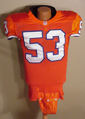
• “Remember how Bill Romanowski would add laces to his jerseys, to make them tighter? You can see where they added the eyelets here. Romo also had darts added to his shoulders. And note the adjustable crotch piece — ouch!”
It’s not clear if Romo also had a little inside pouch for stashing his, uh, vitamins, but I’m sure Tom would’ve mentioned that if it had been there. Big thanks to him for sharing his collection with us.
Uni Watch News Ticker: Japanese Olympic swimmers will be allowed to wear the LZR swimsuit (with thanks to Jeremy Brahm). ”¦ Rare sight here: Goose Gossage batting in pinstripes. This was during the 1981 World Series, when the DH was used in the World Series in alternating years, instead of depending on the home team’s rules. “I wonder if that was the only time he batted in home pinstripes,” says Eric Stengel. ”¦ Tim Stoops reports that his dad is volunteering as a marshal at the U.S. Open this weekend. Here’s a slideshow of the gear he’ll be wearing. ”¦ Fun “Twins by the Numbers” breakdown here (with thanks to Brinke Guthrie). ”¦ “I believe this is Alabama celebrating an Orange Bowl victory in 1953,” writes Travis Cuomo. “What really stuck out to me was the ‘MGR’ shirt the manager was wearing. Can’t remember ever seeing anything like that before.” Looks like they’re endorsing Coca-Cola, too. ”¦ Curt Schilling attended Game 2 of the NBA Finals and wore a Celtics jersey for the occasion (while his daughter apparently took dictation for his blog). ”¦ This page has short videos showing each of the national uniforms in the Euro 2008 tournament (with thanks to Greg DiLeo). ”¦ Reprinted from yesterday’s comments: According to the fifth-to-last entry on this Q&A page, the NFL is planning some sort of uni-based commemoration of the AFL’s 50th anniversary in 2009. ”¦ Also from yesterday: New 49ers unis in 2010. ”¦ I might have shown these before, but just in case: The excellent Fleer Sticker Project site has some awesome old NFL posters on display here and here. ”¦ Reprinted from last night’s comments: L.I. Phil notes that Todd Helton’s footwear has been alternating between Adidas and Nike lately. He used to wear fake Mizunos, as explained here. ”¦ Did you know the Giants were conducting spring training in Arizona while the team was still based in New York? I didn’t, until Kenn Tomasch sent me this and this. Both shots are from 1947. ”¦ Went out to catch Kung Fu Panda last night (pretty damn good) and saw the trailer for The Express, which looks like it has major uniform potential. ”¦ Ben Nickerson spent a good portion of last night obsessing over Kevin Garnett’s sneakers. “He’s got ‘The Finals’ and the championship trophy depicted on the inner,” he notes, and the outer is marked to denote Game 1, Game 2, Game 7 (if necessary), etc. Plus there’s a little red “KP 34” notation on the back, which is a Kirby Puckett memorial (we can add this to the very short list of cross-sport memorial gestures). Further details here.
I hate Schilling. I think he is a total asshole. But I dig the Bird jersey.
According to Retrosheet, that is Gossage’s only at bat as a Yankee, home or away.
Goose Gossage pitched for the Cubs in home pinstripes. He probably did not bat much but I am guessing he batted at home.
Somewhere on those KG special edition shoes is a tribute to Malik Sealy in addition to the one for Puckett.
[quote comment=”274873″]I hate Schilling. I think he is a total asshole. But I dig the Bird jersey.[/quote]
And what reason do you have for hating him? Did he steal your girlfriend?
[quote comment=”274876″]Somewhere on those KG special edition shoes is a tribute to Malik Sealy in addition to the one for Puckett.[/quote]
Yes, I think it’s near the tongue. They did a show bit about the shoes on “First Take” a few days back. Probably around the first game of the series.
Is it just me or does Tim Stoops’ dad have a tiny little head? (check out the pic of Tim holding the hat in his fingers)
link
1) Tomorrow (Thursday June 12th),the Cubs and Braves will be wearing 1948 throwback uniforms
to celebrate the 60th anniversary of Cubs baseball
on WGN TV.
2)All of teams in Euro 2008 are wearing narrow
black patches with RESPECT in white lettering
on the left sleeves on their jerseys.
Love how the team describes the Ed Nottle bobblehead as having “snappy stirrups”:
link
[quote comment=”274875″]Goose Gossage pitched for the Cubs in home pinstripes. He probably did not bat much but I am guessing he batted at home.[/quote]Gossage also probably pitched in 36 games with the White Sox in 1972, and he had link…in red pinstripes.
Forgot to edit out the word “probably” in that last post…
[quote comment=”274879″]Is it just me or does Tim Stoops’ dad have a tiny little head? (check out the pic of Tim holding the hat in his fingers)
link
link is a direct link to the pic that Chris is referring to.
[quote comment=”274884″][quote comment=”274879″]Is it just me or does Tim Stoops’ dad have a tiny little head? (check out the pic of Tim holding the hat in his fingers)
link
link is a direct link to the pic that Chris is referring to.[/quote]
That hat is an optional add on to a U.S. Open teddy bear in the merchandise tent. Much like the giant New Era hats in front of Angel Stadium, this little guy even had a size, which was 4 1/4″so it’s a shrunken 5950. Had it been $5 or less, I would have bought it.
Today’s entry reminded me of just how much better the Broncos’ link uniforms looked than their link unis…
The tighter the jersey, the harder it is for an opponent to grab it!
[quote comment=”274886″]Today’s entry reminded me of just how much better the Broncos’ link uniforms looked than their link unis…
The tighter the jersey, the harder it is for an opponent to grab it![/quote]
I couldn’t agree more about their old uni’s looking way better that the NFL Europe dud’s they switched too. But every Broncos fan I meet seems to love them, it defies logic.
[quote comment=”274887″][quote comment=”274886″]Today’s entry reminded me of just how much better the Broncos’ link uniforms looked than their link unis…
The tighter the jersey, the harder it is for an opponent to grab it![/quote]
I couldn’t agree more about their old uni’s looking way better that the NFL Europe dud’s they switched too. But every Broncos fan I meet seems to love them, it defies logic.[/quote]
Probably has something to do with the 2 Super Bowls won in the new unis, as opposed to the 4 SBs lost in the old ones.
[quote comment=”274877″][quote comment=”274873″]I hate Schilling. I think he is a total asshole. But I dig the Bird jersey.[/quote]
And what reason do you have for hating him? Did he steal your girlfriend?[/quote]
As a matter of fact, he did. How did you know?
[quote comment=”274888″][quote comment=”274887″][quote comment=”274886″]Today’s entry reminded me of just how much better the Broncos’ link uniforms looked than their link unis…
The tighter the jersey, the harder it is for an opponent to grab it![/quote]
I couldn’t agree more about their old uni’s looking way better that the NFL Europe dud’s they switched too. But every Broncos fan I meet seems to love them, it defies logic.[/quote]
Probably has something to do with the 2 Super Bowls won in the new unis, as opposed to the 4 SBs lost in the old ones.[/quote]
or…it could just be that bronco’s fans don’t Get It (TM)
Re: 49ers uniform change
“When I’ve spoken with Jed York on the matter in the past, he’s said that previous focus groups have been split 50-50 between the old duds and the current ones.”
So if there’s no statistical difference between change and no change, then leave everything alone. Maybe for once have a uniform, be, uniform.
Conveniently enough, KG’s socks in the Puckett tribute photo have been folded in a way that makes the NBA logo appear backward and upside-down.
Speaking of backward,
.nwod-edispu dna drawkcab raeppa ogol ABN eht sekam taht yaw a ni dedlof neeb evah otohp etubirt ttekcuP eht ni skcos s’GK ,hguone yltneinevnoC
[quote comment=”274891″][quote comment=”274888″][quote comment=”274887″][quote comment=”274886″]Today’s entry reminded me of just how much better the Broncos’ link uniforms looked than their link unis…
The tighter the jersey, the harder it is for an opponent to grab it![/quote]
I couldn’t agree more about their old uni’s looking way better that the NFL Europe dud’s they switched too. But every Broncos fan I meet seems to love them, it defies logic.[/quote]
Probably has something to do with the 2 Super Bowls won in the new unis, as opposed to the 4 SBs lost in the old ones.[/quote]
or…it could just be that bronco’s fans don’t Get It (TM)[/quote]
Yeah, that’s probably it. All in all, Denver has to be the crappiest city for sports unis.
Looking through the Fleer Sticker Project brought back the memories. Vividly recall buying a number of those posters through SI: Eagles, Vikings, Steelers, and Dolphins. The Raiders and Vikings posters maybe the best.
[quote comment=”274894″][quote comment=”274891″][quote comment=”274888″][quote comment=”274887″][quote comment=”274886″]Today’s entry reminded me of just how much better the Broncos’ link uniforms looked than their link unis…
The tighter the jersey, the harder it is for an opponent to grab it![/quote]
I couldn’t agree more about their old uni’s looking way better that the NFL Europe dud’s they switched too. But every Broncos fan I meet seems to love them, it defies logic.[/quote]
Probably has something to do with the 2 Super Bowls won in the new unis, as opposed to the 4 SBs lost in the old ones.[/quote]
or…it could just be that bronco’s fans don’t Get It (TM)[/quote]
Yeah, that’s probably it. All in all, Denver has to be the crappiest city for sports unis.[/quote]
Agreed…
Avalanche = bad from day one, worse with the Bettman Stripes.
link
Rockies = Man do I hate vests as baseball unis…
link
Nuggets = So bright it hurts my eyes
link
Broncos = Why does the whole team have orange pit stains? What the hell do they drink before games?!?
link
re: “The Express”. Ernie Davis was a helluva football player, and a class act. About time he story was told…so we don’t forget it.
[quote comment=”274885″][quote comment=”274884″][quote comment=”274879″]Is it just me or does Tim Stoops’ dad have a tiny little head? (check out the pic of Tim holding the hat in his fingers)
link
link is a direct link to the pic that Chris is referring to.[/quote]
That hat is an optional add on to a U.S. Open teddy bear in the merchandise tent. Much like the giant New Era hats in front of Angel Stadium, this little guy even had a size, which was 4 1/4″so it’s a shrunken 5950. Had it been $5 or less, I would have bought it.[/quote]
Okay, I got you now. I figured either it was a tiny hat or you had the biggest hands I’ve ever seen.
I don’t know if anyone has posted this here, yet, but there is a great website of Sport Magazine archives …
link
[quote comment=”274899″]I don’t know if anyone has posted this here, yet, but there is a great website of Sport Magazine archives …
link
Oooh, nice. I subscribed to Sport from about 1972 thru, oh, 1982ish. In 1977, I wrote a letter to the editor, which they printed — the first writing of mine that was ever published. Still have a soft spot in my heart for the mag. Wish I’d saved all my old copies….
NY Times has an interesting read for all the shoe folks here on UW.
link
Caught this in a pic from the CWS:
One of the Stanford infielders had a trubute on his wrist/forearm band: R.I.P. PQ
Any info?
link
[quote comment=”274888″][quote comment=”274887″][quote comment=”274886″]Today’s entry reminded me of just how much better the Broncos’ link uniforms looked than their link unis…
The tighter the jersey, the harder it is for an opponent to grab it![/quote]
I couldn’t agree more about their old uni’s looking way better that the NFL Europe dud’s they switched too. But every Broncos fan I meet seems to love them, it defies logic.[/quote]
Probably has something to do with the 2 Super Bowls won in the new unis, as opposed to the 4 SBs lost in the old ones.[/quote]
Though I did get a new-style jersey to celebrate winning SB XXXII, I don’t like the new look excepting the helmet and the typefaces for names & numbers. I’d agree that the popularity of the new duds has to do with the now-distant successes of their first couple of years.
Among metro areas with all major sports, Denver unis overall aren’t as good as Chicago’s, but aren’t nearly as bad those for Miami or Phoenix.
[quote comment=”274900″][quote comment=”274899″]I don’t know if anyone has posted this here, yet, but there is a great website of Sport Magazine archives …
link
Oooh, nice. I subscribed to Sport from about 1972 thru, oh, 1982ish. In 1977, I wrote a letter to the editor, which they printed — the first writing of mine that was ever published. Still have a soft spot in my heart for the mag. Wish I’d saved all my old copies….[/quote]
Can someone explain how long, or why, Staubach’s helmet had the red stripe?
[quote comment=”274894″][quote comment=”274891″][quote comment=”274888″][quote comment=”274887″][quote comment=”274886″]Today’s entry reminded me of just how much better the Broncos’ link uniforms looked than their link unis…
The tighter the jersey, the harder it is for an opponent to grab it![/quote]
I couldn’t agree more about their old uni’s looking way better that the NFL Europe dud’s they switched too. But every Broncos fan I meet seems to love them, it defies logic.[/quote]
Probably has something to do with the 2 Super Bowls won in the new unis, as opposed to the 4 SBs lost in the old ones.[/quote]
or…it could just be that bronco’s fans don’t Get It (TM)[/quote]
Yeah, that’s probably it. All in all, Denver has to be the crappiest city for sports unis.[/quote]
I disagree. Huge Bronco fan here. I was so excited to see the great jerseys today.
I don’t hate the newer jerseys, but I do love the old orange ones. The Broncos have only worn them once as a throwback a few years ago against link
But Denver doesnt have terrible sports jerseys. Atlanta, Baltimore come to mind for worse jerseys.
[quote comment=”274900″][quote comment=”274899″]I don’t know if anyone has posted this here, yet, but there is a great website of Sport Magazine archives …
link
Oooh, nice. I subscribed to Sport from about 1972 thru, oh, 1982ish. In 1977, I wrote a letter to the editor, which they printed — the first writing of mine that was ever published. Still have a soft spot in my heart for the mag. Wish I’d saved all my old copies….[/quote]
I share the sentiment. As a youth, I could not afford Sports Illustrated, but both Sport and Baseball (which was not so long-lived) graced my mailbox each month. Great magazines for the time.
[quote comment=”274904″][quote comment=”274900″][quote comment=”274899″]I don’t know if anyone has posted this here, yet, but there is a great website of Sport Magazine archives …
link
Oooh, nice. I subscribed to Sport from about 1972 thru, oh, 1982ish. In 1977, I wrote a letter to the editor, which they printed — the first writing of mine that was ever published. Still have a soft spot in my heart for the mag. Wish I’d saved all my old copies….[/quote]
Can someone explain how long, or why, Staubach’s helmet had the red stripe?[/quote]
bicentennial
paul did a column for the mothership on this back in…im guessing october…awesome article on the ‘boys quirks and shit…required reading
Gotta get one of these….
link
[quote comment=”274903″][quote comment=”274888″][quote comment=”274887″][quote comment=”274886″]Today’s entry reminded me of just how much better the Broncos’ link uniforms looked than their link unis…
The tighter the jersey, the harder it is for an opponent to grab it![/quote]
I couldn’t agree more about their old uni’s looking way better that the NFL Europe dud’s they switched too. But every Broncos fan I meet seems to love them, it defies logic.[/quote]
Probably has something to do with the 2 Super Bowls won in the new unis, as opposed to the 4 SBs lost in the old ones.[/quote]
Though I did get a new-style jersey to celebrate winning SB XXXII, I don’t like the new look excepting the helmet and the typefaces for names & numbers. I’d agree that the popularity of the new duds has to do with the now-distant successes of their first couple of years.
Among metro areas with all major sports, Denver unis overall aren’t as good as Chicago’s, but aren’t nearly as bad those for Miami or Phoenix.[/quote]
Huh???
Coyotes’ sweaters are head and shoulders above the Avalanche. (although I hate both teams, they shouldn’t have been allowed to leave Canada)
Cardinals’ uniforms are way better than the Broncos’ uniforms
Suns’ uniforms suck but the Nuggets’ really really suck.
and baseball wise they both are dog vomit.
My all-time favorite Sport Magazine cover:
link
I actually held on to this one over the years, meaning to get it framed.
I love those uniforms, despite their non-traditional appearance, and Dave Parker was the man. I commit to both of these declarations, despite not being a Pirates fan at all.
[quote comment=”274906″][quote comment=”274900″][quote comment=”274899″]I don’t know if anyone has posted this here, yet, but there is a great website of Sport Magazine archives …
link
Oooh, nice. I subscribed to Sport from about 1972 thru, oh, 1982ish. In 1977, I wrote a letter to the editor, which they printed — the first writing of mine that was ever published. Still have a soft spot in my heart for the mag. Wish I’d saved all my old copies….[/quote]
I share the sentiment. As a youth, I could not afford Sports Illustrated, but both Sport and Baseball (which was not so long-lived) graced my mailbox each month. Great magazines for the time.[/quote]
Funny this is brought up today because I was thinking of magazines yesterday. I got SI, Sport and Inside Sports back in the day and I liked Sport a lot.
The reason I was thinking of mags was I was recalling being fond of the Digests. I was a subscriber to Football Digest and I frequently purchased Hockey Digest. Before the Internet these were great resource tools because they had rosters in the back. I also loved the TV Guide (well, OLD TV Guide) size which made it easy to read, carry, etc. My junior high library had back issues of the baseball and basketball and I used to love checking out the old articles and photos.
I’m guessing these aren’t around anymore because I don’t recall seeing them lately. I know they were around as late as ’99 or ’00 because I remember receiving copies in the mail at my first apartment in Pittsburgh.
For anyone interested, I did a little NPB (Japanese baseball league) throwback uni wrap. The throwback craze has hit NPB over the last few seasons.
link
[quote comment=”274891″][quote comment=”274888″][quote comment=”274887″][quote comment=”274886″]Today’s entry reminded me of just how much better the Broncos’ link uniforms looked than their link unis…
The tighter the jersey, the harder it is for an opponent to grab it![/quote]
I couldn’t agree more about their old uni’s looking way better that the NFL Europe dud’s they switched too. But every Broncos fan I meet seems to love them, it defies logic.[/quote]
Probably has something to do with the 2 Super Bowls won in the new unis, as opposed to the 4 SBs lost in the old ones.[/quote]
or…it could just be that bronco’s fans don’t Get It (TM)[/quote]
Phil – Apologies if it appeared that I was “throwing you under the bus” yestiddy – just wanted to “break in” the new handle with a time-honored comment – meant it in jest.
Now, back to uni’s
[quote comment=”274909″][quote comment=”274903″][quote comment=”274888″][quote comment=”274887″][quote comment=”274886″]Today’s entry reminded me of just how much better the Broncos’ link uniforms looked than their link unis…
The tighter the jersey, the harder it is for an opponent to grab it![/quote]
I couldn’t agree more about their old uni’s looking way better that the NFL Europe dud’s they switched too. But every Broncos fan I meet seems to love them, it defies logic.[/quote]
Probably has something to do with the 2 Super Bowls won in the new unis, as opposed to the 4 SBs lost in the old ones.[/quote]
Though I did get a new-style jersey to celebrate winning SB XXXII, I don’t like the new look excepting the helmet and the typefaces for names & numbers. I’d agree that the popularity of the new duds has to do with the now-distant successes of their first couple of years.
Among metro areas with all major sports, Denver unis overall aren’t as good as Chicago’s, but aren’t nearly as bad those for Miami or Phoenix.[/quote]
Huh???
Coyotes’ sweaters are head and shoulders above the Avalanche. (although I hate both teams, they shouldn’t have been allowed to leave Canada)
Cardinals’ uniforms are way better than the Broncos’ uniforms
Suns’ uniforms suck but the Nuggets’ really really suck.
and baseball wise they both are dog vomit.[/quote]
The Cardinels uni’s are worse than the Broncos, IMO. Plus the Carinals had one of the best uni’s in the NFL before they ruined it, I like the Bronco’s old ones better, but they were’t great. And I kinda like the Nuggets jerseys, the sparkly satin blue just looks darling on them, really sets off teh tattoos.
#19: I understand what you’re saying, but in this case a new uniform would evoke the 1980s, which is a good thing in SF, and would replace their increasingly dated current duds (drop-shadowed block numbers?). While I don’t believe in change for the sake of change, this is one situation where it makes sense.
My ideal uniform would be the 1980s uniform, but with true gold pants like they currently have, rather than those matte tan ones of the 80s.
[quote comment=”274889″][quote comment=”274877″][quote comment=”274873″]I hate Schilling. I think he is a total asshole. But I dig the Bird jersey.[/quote]
And what reason do you have for hating him? Did he steal your girlfriend?[/quote]
As a matter of fact, he did. How did you know?[/quote]
Cause that’s one of the few reasons for truly hating a person. Especially a professional athlete who you have probably never met.
[quote comment=”274913″]Phil – Apologies if it appeared that I was “throwing you under the bus” yestiddy – just wanted to “break in” the new handle with a time-honored comment – meant it in jest.
Now, back to uni’s[/quote]
jd(fj/mfic)
yeah…j-dub’s much better…i knew ya was just havin’ fun ;)
and indeed, the new “handle” (did you happen to have a CB radio or something back in the day???-am i that old???) will be much easier for minna h and others to type (or abbreviate)
Found this pic (link) on straightcashhomey.net Doesn’t the 8 on the spreewell jersey look upside down. Was this just the way they were?
[quote comment=”274909″][quote comment=”274903″][quote comment=”274888″][quote comment=”274887″][quote comment=”274886″]Today’s entry reminded me of just how much better the Broncos’ link uniforms looked than their link unis…
The tighter the jersey, the harder it is for an opponent to grab it![/quote]
I couldn’t agree more about their old uni’s looking way better that the NFL Europe dud’s they switched too. But every Broncos fan I meet seems to love them, it defies logic.[/quote]
Probably has something to do with the 2 Super Bowls won in the new unis, as opposed to the 4 SBs lost in the old ones.[/quote]
Though I did get a new-style jersey to celebrate winning SB XXXII, I don’t like the new look excepting the helmet and the typefaces for names & numbers. I’d agree that the popularity of the new duds has to do with the now-distant successes of their first couple of years.
Among metro areas with all major sports, Denver unis overall aren’t as good as Chicago’s, but aren’t nearly as bad those for Miami or Phoenix.[/quote]
Huh???
Coyotes’ sweaters are head and shoulders above the Avalanche. (although I hate both teams, they shouldn’t have been allowed to leave Canada)
Cardinals’ uniforms are way better than the Broncos’ uniforms
Suns’ uniforms suck but the Nuggets’ really really suck.
and baseball wise they both are dog vomit.[/quote]
Coyotes new unis are fantasic in my opinion, one of the best out of the recent exbansion teams.
link
HUGE HUGE HUGE improvement over this P.O.S….
link
Still wish they were wearing these though…
link
[quote comment=”274910″]My all-time favorite Sport Magazine cover:
link
I actually held on to this one over the years, meaning to get it framed.
I love those uniforms, despite their non-traditional appearance, and Dave Parker was the man. I commit to both of these declarations, despite not being a Pirates fan at all.[/quote]
Amen, brother – Parker was The Man back in the day (mostly at the expense of my beloved Mets). I vaguely recall seeing a quote from one of the Mets catchers (Duffy Dyer, maybe?) describing Parker as “a building” – heckuva ballplayer.
And he looked good in yellow, too ;-)
I like these!
suns
link
Coyotes
link
Diamondbacks
link
Cardinals
link
I hate Schilling. I think he is a total asshole. But I dig the Bird jersey.
And what reason do you have for hating him? Did he steal your girlfriend?
I gave Schilling a lot of slack because he was on the ’93 Phils and once, when on the DL, led the charge from the dugout in a bean ball war w/ the Braves.
But the guy who called out Kobe for being a bad teammate is the same jerkoff who put a towel over his head when he left games in the ’93 post season because he was afraid to look. Just go paint some more blood on a sock and shut up. Really
[quote comment=”274918″][quote comment=”274913″]Phil – Apologies if it appeared that I was “throwing you under the bus” yestiddy – just wanted to “break in” the new handle with a time-honored comment – meant it in jest.
Now, back to uni’s[/quote]
jd(fj/mfic)
yeah…j-dub’s much better…i knew ya was just havin’ fun ;)
and indeed, the new “handle” (did you happen to have a CB radio or something back in the day???-am i that old???) will be much easier for minna h and others to type (or abbreviate)[/quote]
K….pitcher on my softball team christened me with the “J-Dub” moniker, so I’ll go with that.
Had CB back in HS (Bethpage)….and yes, you are that old. So how is that YOU get a mention in the ticker, and my contribution about the 49er’s new duds is referenced anonymoulsy? Hmmmm? ;-)
[quote comment=”274924″][quote comment=”274918″][quote comment=”274913″]Phil – Apologies if it appeared that I was “throwing you under the bus” yestiddy – just wanted to “break in” the new handle with a time-honored comment – meant it in jest.
Now, back to uni’s[/quote]
jd(fj/mfic)
yeah…j-dub’s much better…i knew ya was just havin’ fun ;)
and indeed, the new “handle” (did you happen to have a CB radio or something back in the day???-am i that old???) will be much easier for minna h and others to type (or abbreviate)[/quote]
K….pitcher on my softball team christened me with the “J-Dub” moniker, so I’ll go with that.
Had CB back in HS (Bethpage)….and yes, you are that old. So how is that YOU get a mention in the ticker, and my contribution about the 49er’s new duds is referenced anonymoulsy? Hmmmm?
;-)[/quote]
i can spell
Just a beautiful football uniform…
link
Clean, striking, and evocative of an era of greatness (and I am no fan of the Niners, either).
Seems like a pretty logical move to go back to these and undo the misguided 90’s tweaking.
[quote comment=”274925″][quote comment=”274924″][quote comment=”274918″][quote comment=”274913″]Phil – Apologies if it appeared that I was “throwing you under the bus” yestiddy – just wanted to “break in” the new handle with a time-honored comment – meant it in jest.
Now, back to uni’s[/quote]
jd(fj/mfic)
yeah…j-dub’s much better…i knew ya was just havin’ fun ;)
and indeed, the new “handle” (did you happen to have a CB radio or something back in the day???-am i that old???) will be much easier for minna h and others to type (or abbreviate)[/quote]
K….pitcher on my softball team christened me with the “J-Dub” moniker, so I’ll go with that.
Had CB back in HS (Bethpage)….and yes, you are that old. So how is that YOU get a mention in the ticker, and my contribution about the 49er’s new duds is referenced anonymoulsy? Hmmmm?
;-)[/quote]
i can spell[/quote]
touche
[quote comment=”274907″][quote comment=”274904″][quote comment=”274900″][quote comment=”274899″]I don’t know if anyone has posted this here, yet, but there is a great website of Sport Magazine archives …
link
Oooh, nice. I subscribed to Sport from about 1972 thru, oh, 1982ish. In 1977, I wrote a letter to the editor, which they printed — the first writing of mine that was ever published. Still have a soft spot in my heart for the mag. Wish I’d saved all my old copies….[/quote]
Can someone explain how long, or why, Staubach’s helmet had the red stripe?[/quote]
bicentennial
paul did a column for the mothership on this back in…im guessing october…awesome article on the ‘boys quirks and shit…required reading[/quote]
That’s right…I totally forgot…Thanks, Phil!
Check out this Sport cover of Rod Carew wearing the two-tone Twins helmet as well as that great supplemental logo that someone commented on yesterday:
link
Phil – More to the point, I CAN spell, I just can’t type
…and in Uni news: link
Most bad uniform cities have at least one saving grace – Phoenix has the Coyotes, Minneapolis/St.P has the Wild (and sort of Twins), Philadelphia used to have the Flyers before RBK (and sort of Phillies), Atlanta has the Braves.
And some good uniform cities have a turd in the punch bowl – Los Angeles has the Kings, Boston has the Patriots, New York has the Mets in black, Bay Area has the Warriors…
Denver has no saving grace in their 4 teams, all of whom look pretty bad to me. And of cities with only a couple of teams, the two worst would be Nashville and San Diego. IMHO, of course.
[quote comment=”274911″][quote comment=”274906″][quote comment=”274900″][quote comment=”274899″]I don’t know if anyone has posted this here, yet, but there is a great website of Sport Magazine archives …
link
Oooh, nice. I subscribed to Sport from about 1972 thru, oh, 1982ish. In 1977, I wrote a letter to the editor, which they printed — the first writing of mine that was ever published. Still have a soft spot in my heart for the mag. Wish I’d saved all my old copies….[/quote]
I share the sentiment. As a youth, I could not afford Sports Illustrated, but both Sport and Baseball (which was not so long-lived) graced my mailbox each month. Great magazines for the time.[/quote]
Funny this is brought up today because I was thinking of magazines yesterday. I got SI, Sport and Inside Sports back in the day and I liked Sport a lot.
The reason I was thinking of mags was I was recalling being fond of the Digests. I was a subscriber to Football Digest and I frequently purchased Hockey Digest. Before the Internet these were great resource tools because they had rosters in the back. I also loved the TV Guide (well, OLD TV Guide) size which made it easy to read, carry, etc. My junior high library had back issues of the baseball and basketball and I used to love checking out the old articles and photos.
I’m guessing these aren’t around anymore because I don’t recall seeing them lately. I know they were around as late as ’99 or ’00 because I remember receiving copies in the mail at my first apartment in Pittsburgh.[/quote]
Baseball Digest still exists… and in the same size, too.
Our local United Way chapter does an auction every year of sculptures, and this year features “garden” stuff – check the 3rd from last photo in the following slideshow – the frog sporting the striped stirrups – some artist “Gets It”
link
[quote comment=”274928″][quote comment=”274907″][quote comment=”274904″][quote comment=”274900″][quote comment=”274899″]I don’t know if anyone has posted this here, yet, but there is a great website of Sport Magazine archives …
link
Oooh, nice. I subscribed to Sport from about 1972 thru, oh, 1982ish. In 1977, I wrote a letter to the editor, which they printed — the first writing of mine that was ever published. Still have a soft spot in my heart for the mag. Wish I’d saved all my old copies….[/quote]
Can someone explain how long, or why, Staubach’s helmet had the red stripe?[/quote]
bicentennial
paul did a column for the mothership on this back in…im guessing october…awesome article on the ‘boys quirks and shit…required reading[/quote]
That’s right…I totally forgot…Thanks, Phil!
Check out this Sport cover of Rod Carew wearing the two-tone Twins helmet as well as that great supplemental logo that someone commented on yesterday:
link
…got mad hits like I was Rod Carew
[quote comment=”274931″][quote comment=”274911″][quote comment=”274906″][quote comment=”274900″][quote comment=”274899″]I don’t know if anyone has posted this here, yet, but there is a great website of Sport Magazine archives …
link
Oooh, nice. I subscribed to Sport from about 1972 thru, oh, 1982ish. In 1977, I wrote a letter to the editor, which they printed — the first writing of mine that was ever published. Still have a soft spot in my heart for the mag. Wish I’d saved all my old copies….[/quote]
I share the sentiment. As a youth, I could not afford Sports Illustrated, but both Sport and Baseball (which was not so long-lived) graced my mailbox each month. Great magazines for the time.[/quote]
Funny this is brought up today because I was thinking of magazines yesterday. I got SI, Sport and Inside Sports back in the day and I liked Sport a lot.
The reason I was thinking of mags was I was recalling being fond of the Digests. I was a subscriber to Football Digest and I frequently purchased Hockey Digest. Before the Internet these were great resource tools because they had rosters in the back. I also loved the TV Guide (well, OLD TV Guide) size which made it easy to read, carry, etc. My junior high library had back issues of the baseball and basketball and I used to love checking out the old articles and photos.
I’m guessing these aren’t around anymore because I don’t recall seeing them lately. I know they were around as late as ’99 or ’00 because I remember receiving copies in the mail at my first apartment in Pittsburgh.[/quote]
Baseball Digest still exists… and in the same size, too.[/quote]
Is that the only one? When I google for football, basketball and hockey. Searches for hockey point to The Hockey News. Wiki says Football Digest stopped printing in ’05. Can’t find anything but archives for basketball. I did notice baseball was still out there, I guess it’s not as readily availabe as it once was. Was that the flagship and the other sports started after that? That makes sense insofar as it being the only one left.
[quote comment=”274900″][quote comment=”274899″]I don’t know if anyone has posted this here, yet, but there is a great website of Sport Magazine archives …
link
Oooh, nice. I subscribed to Sport from about 1972 thru, oh, 1982ish. In 1977, I wrote a letter to the editor, which they printed — the first writing of mine that was ever published. Still have a soft spot in my heart for the mag. Wish I’d saved all my old copies….[/quote]
Oh, yeah, I remember that Jan Stephenson cover from May 1977.
I also have a Sport cover with Reggie Jackson of the A’s dressed as Gen. George Patton (then the hit film).
[quote comment=”274930″]Most bad uniform cities have at least one saving grace – Phoenix has the Coyotes, Minneapolis/St.P has the Wild (and sort of Twins), Philadelphia used to have the Flyers before RBK (and sort of Phillies), Atlanta has the Braves.
And some good uniform cities have a turd in the punch bowl – Los Angeles has the Kings, Boston has the Patriots, New York has the Mets in black, Bay Area has the Warriors…
Denver has no saving grace in their 4 teams, all of whom look pretty bad to me. And of cities with only a couple of teams, the two worst would be Nashville and San Diego. IMHO, of course.[/quote]
Adding to the discussion:
Detroit should rank up there in the “good” category now that Los Leones have ditched the black. Add Washington to the “turd in the punch bowl” category for the Wizards gold/black disaster.
Re: cities with only a couple of teams – put Kansas City at the top of the “good” category.
Watching the Portugal vs Czch game, does Cristiano Ronaldo have some kind of trashy euro mullet?
Custom fitting is why you may not want an authentic NFL jersey. My neighbor Marge, the Packers’ seamstress, says you will find authentic jerseys quite uncomfortable even if you’re in NFL shape. Most are fitted verrrrrry tightly to the body.
Most people are happier with the fit of a retail replica jersey.
[quote comment=”274935″][quote comment=”274900″][quote comment=”274899″]I don’t know if anyone has posted this here, yet, but there is a great website of Sport Magazine archives …
link
Oooh, nice. I subscribed to Sport from about 1972 thru, oh, 1982ish. In 1977, I wrote a letter to the editor, which they printed — the first writing of mine that was ever published. Still have a soft spot in my heart for the mag. Wish I’d saved all my old copies….[/quote]
Oh, yeah, I remember that Jan Stephenson cover from May 1977.
I also have a Sport cover with Reggie Jackson of the A’s dressed as Gen. George Patton (then the hit film).[/quote]
Ah, the 70’s – good times, bad hairdos
link
[quote comment=”274921″][quote comment=”274910″]My all-time favorite Sport Magazine cover:
link
I actually held on to this one over the years, meaning to get it framed.
I love those uniforms, despite their non-traditional appearance, and Dave Parker was the man. I commit to both of these declarations, despite not being a Pirates fan at all.[/quote]
Amen, brother – Parker was The Man back in the day (mostly at the expense of my beloved Mets). I vaguely recall seeing a quote from one of the Mets catchers (Duffy Dyer, maybe?) describing Parker as “a building” – heckuva ballplayer.
And he looked good in yellow, too ;-)[/quote]
Those Pirates uniforms were so SWEET. I wish they would go back to them.
[quote comment=”274936″][quote comment=”274930″]Most bad uniform cities have at least one saving grace – Phoenix has the Coyotes, Minneapolis/St.P has the Wild (and sort of Twins), Philadelphia used to have the Flyers before RBK (and sort of Phillies), Atlanta has the Braves.
And some good uniform cities have a turd in the punch bowl – Los Angeles has the Kings, Boston has the Patriots, New York has the Mets in black, Bay Area has the Warriors…
Denver has no saving grace in their 4 teams, all of whom look pretty bad to me. And of cities with only a couple of teams, the two worst would be Nashville and San Diego. IMHO, of course.[/quote]
Adding to the discussion:
Detroit should rank up there in the “good” category now that Los Leones have ditched the black. Add Washington to the “turd in the punch bowl” category for the Wizards gold/black disaster.
Re: cities with only a couple of teams – put Kansas City at the top of the “good” category.[/quote]
Yeah but these are beauties…….
link
A little foreshadowing here on the kid sitting in front?
link
[quote comment=”274936″][quote comment=”274930″]Most bad uniform cities have at least one saving grace – Phoenix has the Coyotes, Minneapolis/St.P has the Wild (and sort of Twins), Philadelphia used to have the Flyers before RBK (and sort of Phillies), Atlanta has the Braves.
And some good uniform cities have a turd in the punch bowl – Los Angeles has the Kings, Boston has the Patriots, New York has the Mets in black, Bay Area has the Warriors…
Denver has no saving grace in their 4 teams, all of whom look pretty bad to me. And of cities with only a couple of teams, the two worst would be Nashville and San Diego. IMHO, of course.[/quote]
Adding to the discussion:
Detroit should rank up there in the “good” category now that Los Leones have ditched the black. Add Washington to the “turd in the punch bowl” category for the Wizards gold/black disaster.
Re: cities with only a couple of teams – put Kansas City at the top of the “good” category.[/quote]
And Buffalo would be at the bottom for cities that have only have a few teams.
[quote comment=”274930″]Most bad uniform cities have at least one saving grace – Phoenix has the Coyotes, Minneapolis/St.P has the Wild (and sort of Twins), Philadelphia used to have the Flyers before RBK (and sort of Phillies), Atlanta has the Braves.
And some good uniform cities have a turd in the punch bowl – Los Angeles has the Kings, Boston has the Patriots, New York has the Mets in black, Bay Area has the Warriors…
Denver has no saving grace in their 4 teams, all of whom look pretty bad to me. And of cities with only a couple of teams, the two worst would be Nashville and San Diego. IMHO, of course.[/quote]
New York has that UGLY Yankees home pinstripe uniform. Worst logo in sports put on a B-O-R-I-N-G uniform.
I don’t know if anyone is following Euro 2008, but I noticed Czech Republic’s unis had an interesting little thing on them. On the front, just beneath the collar, they have two small flag patches- their own and their opponent.
Not sure if this has been posted but, here’s the 2008 World Series Logo:
link
[quote comment=”274937″]Watching the Portugal vs Czch game, does Cristiano Ronaldo have some kind of trashy euro mullet?[/quote]
Yup, seems like a growing mullet, he’ll do Barry Melrose proud!
link
[quote comment=”274945″][quote comment=”274930″]Most bad uniform cities have at least one saving grace – Phoenix has the Coyotes, Minneapolis/St.P has the Wild (and sort of Twins), Philadelphia used to have the Flyers before RBK (and sort of Phillies), Atlanta has the Braves.
And some good uniform cities have a turd in the punch bowl – Los Angeles has the Kings, Boston has the Patriots, New York has the Mets in black, Bay Area has the Warriors…
Denver has no saving grace in their 4 teams, all of whom look pretty bad to me. And of cities with only a couple of teams, the two worst would be Nashville and San Diego. IMHO, of course.[/quote]
New York has that UGLY Yankees home pinstripe uniform. Worst logo in sports put on a B-O-R-I-N-G uniform.[/quote]
Also in the “UGLY” pile for NY uniforms:
Knicks and Islanders
On top of the “BEST” pile:
J-E-T-S (IMHO)
[quote comment=”274945″]New York has that UGLY Yankees home pinstripe uniform. Worst logo in sports put on a B-O-R-I-N-G uniform.[/quote]
marty…you don’t like the yankees’ unis?
whoever would have known?
[quote comment=”274944″][quote comment=”274936″][quote comment=”274930″]Most bad uniform cities have at least one saving grace – Phoenix has the Coyotes, Minneapolis/St.P has the Wild (and sort of Twins), Philadelphia used to have the Flyers before RBK (and sort of Phillies), Atlanta has the Braves.
And some good uniform cities have a turd in the punch bowl – Los Angeles has the Kings, Boston has the Patriots, New York has the Mets in black, Bay Area has the Warriors…
Denver has no saving grace in their 4 teams, all of whom look pretty bad to me. And of cities with only a couple of teams, the two worst would be Nashville and San Diego. IMHO, of course.[/quote]
Adding to the discussion:
Detroit should rank up there in the “good” category now that Los Leones have ditched the black. Add Washington to the “turd in the punch bowl” category for the Wizards gold/black disaster.
Re: cities with only a couple of teams – put Kansas City at the top of the “good” category.[/quote]
And Buffalo would be at the bottom for cities that have only have a few teams.[/quote]
Only thing keeping St. Louis out of that spot is the Cardinals. Rams = yuck, Blues = yikes
Although you would get a good argument for Nashville: Titans = yeesh, Predators = oh, please
“Romo also had darts added to his shoulders. And note the adjustable crotch piece – ouch!”
When you balls are the size of peas, you don’t much have to worry about an uncomfortable crotch piece.
Hey all, since the discussion regarding best and worst uniforms by city has many participants, what if we did a quantifiable analysis for each city? Send in your comments, listing each team in each city (major league baseball, football, basketball, hockey only – please) and your own personal ranking for each team (10 point scale, 10 = best, 0 = Islanders), and calculate the average. Who’s in?
[quote comment=”274953″]Hey all, since the discussion regarding best and worst uniforms by city has many participants, what if we did a quantifiable analysis for each city? Send in your comments, listing each team in each city (major league baseball, football, basketball, hockey only – please) and your own personal ranking for each team (10 point scale, 10 = best, 0 = Islanders), and calculate the average. Who’s in?[/quote]
Every city that has a sports team? That’s a lot. Someone make a list…
[quote comment=”274953″]Hey all, since the discussion regarding best and worst uniforms by city has many participants, what if we did a quantifiable analysis for each city? Send in your comments, listing each team in each city (major league baseball, football, basketball, hockey only – please) and your own personal ranking for each team (10 point scale, 10 = best, 0 = Islanders), and calculate the average. Who’s in?[/quote]
Paul actually did this for an ESPN column awhile back
Interesting that in the Euro 2008 video – Holland had the Italian flag and date on both jerseys, even though they wore the orange and not the baby blue…
[quote comment=”274954″][quote comment=”274953″]Hey all, since the discussion regarding best and worst uniforms by city has many participants, what if we did a quantifiable analysis for each city? Send in your comments, listing each team in each city (major league baseball, football, basketball, hockey only – please) and your own personal ranking for each team (10 point scale, 10 = best, 0 = Islanders), and calculate the average. Who’s in?[/quote]
Every city that has a sports team? That’s a lot. Someone make a list…[/quote]
Ok this will have to be only home and away unis. No alts or third jerseys, or sunday jerseys, or ‘we only wear it when our marketing teams tells us’ unis.
[quote comment=”274953″]Hey all, since the discussion regarding best and worst uniforms by city has many participants, what if we did a quantifiable analysis for each city? Send in your comments, listing each team in each city (major league baseball, football, basketball, hockey only – please) and your own personal ranking for each team (10 point scale, 10 = best, 0 = Islanders), and calculate the average. Who’s in?[/quote]
we should only include the major sports…so islanders don’t count
jets=0 btw
Anyone else appalled by the ridiculous size of the “championship trophy” that’s adorning EVERYTHING in these NBA playoffs? Particularly on the court.
The fact that it’s 3X the size of the jump circle at the Forum II (oops Staples Center) and Boston Garden II (oops, the Banknorth, Bankone, CreditSuisseFirstBoston whateverthehellitis Garden) is over the top.
Looks so much more elegant to use only the script “The Finals” and now they’ve overloaded the floor with the trophy, which, might I add, looks like 5th grade graphic design.
Just play the game.
[quote comment=”274955″][quote comment=”274953″]Hey all, since the discussion regarding best and worst uniforms by city has many participants, what if we did a quantifiable analysis for each city? Send in your comments, listing each team in each city (major league baseball, football, basketball, hockey only – please) and your own personal ranking for each team (10 point scale, 10 = best, 0 = Islanders), and calculate the average. Who’s in?[/quote]
Paul actually did this for an ESPN column awhile back[/quote]
Dang!
Here’s the list, just for giggles:
Anaheim
Atlanta
Baltimore
Buffalo
Calgary
Charlotte / Raleigh
Chicago
Cincinnati
Cleveland
Columbus
Dallas / Ft.Worth
Denver
Detroit
Edmonton
Houston
Indianapolis
Jacksonville
Kansas City
Los Angeles
Memphis
Miami
Milwaukee / Green Bay
Minneapolis / St.Paul
Montreal
Nashville
Newark
New Orleans
New York
Oakland
Orlando
Ottawa
Philadelphia
Phoenix
Pittsburgh
Sacramento
Salt Lake City
San Antonio
San Diego
San Francisco / San Jose
Seattle
St. Louis
Tampa
Toronto
Vancouver
Washington
[quote comment=”274960″][quote comment=”274955″][quote comment=”274953″]Hey all, since the discussion regarding best and worst uniforms by city has many participants, what if we did a quantifiable analysis for each city? Send in your comments, listing each team in each city (major league baseball, football, basketball, hockey only – please) and your own personal ranking for each team (10 point scale, 10 = best, 0 = Islanders), and calculate the average. Who’s in?[/quote]
Paul actually did this for an ESPN column awhile back[/quote]
Dang!
Here’s the list, just for giggles:
Anaheim
Atlanta
Baltimore
Buffalo
Calgary
Charlotte / Raleigh
Chicago
Cincinnati
Cleveland
Columbus
Dallas / Ft.Worth
Denver
Detroit
Edmonton
Houston
Indianapolis
Jacksonville
Kansas City
Los Angeles
Memphis
Miami
Milwaukee / Green Bay
Minneapolis / St.Paul
Montreal
Nashville
Newark
New Orleans
New York
Oakland
Orlando
Ottawa
Philadelphia
Phoenix
Pittsburgh
Sacramento
Salt Lake City
San Antonio
San Diego
San Francisco / San Jose
Seattle
St. Louis
Tampa
Toronto
Vancouver
Washington[/quote]
might want to double check your list… missing Portland, so who knows what other city your missing
[quote comment=”274945″][quote comment=”274930″]Most bad uniform cities have at least one saving grace – Phoenix has the Coyotes, Minneapolis/St.P has the Wild (and sort of Twins), Philadelphia used to have the Flyers before RBK (and sort of Phillies), Atlanta has the Braves.
And some good uniform cities have a turd in the punch bowl – Los Angeles has the Kings, Boston has the Patriots, New York has the Mets in black, Bay Area has the Warriors…
Denver has no saving grace in their 4 teams, all of whom look pretty bad to me. And of cities with only a couple of teams, the two worst would be Nashville and San Diego. IMHO, of course.[/quote]
New York has that UGLY Yankees home pinstripe uniform. Worst logo in sports put on a B-O-R-I-N-G uniform.[/quote]
Wow, even I know this act is played out and I only read the comments once in a while.
[quote comment=”274933″][quote comment=”274928″][quote comment=”274907″][quote comment=”274904″][quote comment=”274900″][quote comment=”274899″]I don’t know if anyone has posted this here, yet, but there is a great website of Sport Magazine archives …
link
Oooh, nice. I subscribed to Sport from about 1972 thru, oh, 1982ish. In 1977, I wrote a letter to the editor, which they printed — the first writing of mine that was ever published. Still have a soft spot in my heart for the mag. Wish I’d saved all my old copies….[/quote]
Can someone explain how long, or why, Staubach’s helmet had the red stripe?[/quote]
bicentennial
paul did a column for the mothership on this back in…im guessing october…awesome article on the ‘boys quirks and shit…required reading[/quote]
That’s right…I totally forgot…Thanks, Phil!
Check out this Sport cover of Rod Carew wearing the two-tone Twins helmet as well as that great supplemental logo that someone commented on yesterday:
link
…got mad hits like I was Rod Carew[/quote]
Two Beastie quotes in one day…
My favorite was from Paul’s Boutique and had something to do with:
a party and some mashed potatoes…
or
“I gets eleven points for the word quagmire”
On a uni note: I don’t ever remember seeing Green as the base color for Portugal kits before.
Nike usually utilizes the maroon or even Black in WC06.
[quote comment=”274926″]Just a beautiful football uniform…
link
Clean, striking, and evocative of an era of greatness (and I am no fan of the Niners, either).
Seems like a pretty logical move to go back to these and undo the misguided 90’s tweaking.[/quote]
Everything is great about that uniform except for the pants. The overly thick stripes on the pants ruin everything. Those ugly stripes make me crazy. Why couldn’t the 49ers stick with the thin stripes such as they wore in the early-to-mid ’70s?
Well, for my money, the Reds dropping all that damned irrelevant black rescued Cincinnati from virtually unending ugliness.
So Memphis, on balance, still is looking like the winner (or loser, as the case may be).
Poor Columbus. The Blue Jackets are the best, and worst, musician in a one-man band.
Trevor Linden of the Vancouver Canucks might retire, probably get his number retired as well. Wonder what the banner will look like seeing he’s worn like 50 different versions of their uni.
Probably based off this seeing it’s the last one he wore:
link
It’d be sweet if it was this, my favorite.
link
Ooops, meant Nashville (slaps forehead)
PL / Tom Jacobsen,
Are you sure that link jersey is game worn? The number font is wrong!
[quote comment=”274968″]PL / Tom Jacobsen,
Are you sure that link jersey is game worn? The number font is wrong![/quote]
I thought they all looked too clean to be game worn too.
[quote comment=”274960″][quote comment=”274955″][quote comment=”274953″]Hey all, since the discussion regarding best and worst uniforms by city has many participants, what if we did a quantifiable analysis for each city? Send in your comments, listing each team in each city (major league baseball, football, basketball, hockey only – please) and your own personal ranking for each team (10 point scale, 10 = best, 0 = Islanders), and calculate the average. Who’s in?[/quote]
Paul actually did this for an ESPN column awhile back[/quote]
Dang!
Here’s the list, just for giggles:
Anaheim
Atlanta
Baltimore
Buffalo
Calgary
Charlotte / Raleigh
Chicago
Cincinnati
Cleveland
Columbus
Dallas / Ft.Worth
Denver
Detroit
Edmonton
Houston
Indianapolis
Jacksonville
Kansas City
Los Angeles
Memphis
Miami
Milwaukee / Green Bay
Minneapolis / St.Paul
Montreal
Nashville
Newark
New Orleans
New York
Oakland
Orlando
Ottawa
Philadelphia
Phoenix
Pittsburgh
Sacramento
Salt Lake City
San Antonio
San Diego
San Francisco / San Jose
Seattle
St. Louis
Tampa
Toronto
Vancouver
Washington[/quote]
Prediction: Chicago wins! Not a “turd” in the bunch. Of course that’s only because we’re not counting alt’s, I’m looking at you Zambrono!
I don’t know if anyone is following Euro 2008, but I noticed Czech Republic’s unis had an interesting little thing on them. On the front, just beneath the collar, they have two small flag patches- their own and their opponent.(sorry dont know how to put it into italics)
The Czech team has the date of the game (11/06/2008) under the collar of their jersey.
[quote comment=”274968″]PL / Tom Jacobsen,
Are you sure that link jersey is game worn? The number font is wrong![/quote]
it is? this link to my untrained eyes…although, obviously, it’s NOT the same jersey (since the one in the article/link has shorter sleeves)
Here’s a picture of that Czech jersey patch. Also a good shot of those ridiculous 8-bit numbers that Puma’s using.
link
And when did Donald Sutherland start coaching the Czech team?
link
[quote comment=”274960″][quote comment=”274955″][quote comment=”274953″]Hey all, since the discussion regarding best and worst uniforms by city has many participants, what if we did a quantifiable analysis for each city? Send in your comments, listing each team in each city (major league baseball, football, basketball, hockey only – please) and your own personal ranking for each team (10 point scale, 10 = best, 0 = Islanders), and calculate the average. Who’s in?[/quote]
Paul actually did this for an ESPN column awhile back[/quote]
Dang!
Here’s the list, just for giggles:
Anaheim
Atlanta
Baltimore
Buffalo
Calgary
Charlotte / Raleigh
Chicago
Cincinnati
Cleveland
Columbus
Dallas / Ft.Worth
Denver
Detroit
Edmonton
Houston
Indianapolis
Jacksonville
Kansas City
Los Angeles
Memphis
Miami
Milwaukee / Green Bay
Minneapolis / St.Paul
Montreal
Nashville
Newark
New Orleans
New York
Oakland
Orlando
Ottawa
Philadelphia
Phoenix
Pittsburgh
Sacramento
Salt Lake City
San Antonio
San Diego
San Francisco / San Jose
Seattle
St. Louis
Tampa
Toronto
Vancouver
Washington[/quote]
Charlotte and Raleigh aren’t even close to each other. Ft. Worth doesn’t have any teams. Oakland can probably be included in with SF and San Jose. Sorry, just picking nits.
Re: Giants Spring Training
After they moved to SF, they stayed in AZ (obviously) but moved spring training to a resort in Casa Grande, AZ, built specifically for the team: the Francisco Grande (still open and recently renovated). Check out photos of the resort, especially the baseball bat-shaped pool:
link
[quote comment=”274974″][quote comment=”274960″][quote comment=”274955″][quote comment=”274953″]Hey all, since the discussion regarding best and worst uniforms by city has many participants, what if we did a quantifiable analysis for each city? Send in your comments, listing each team in each city (major league baseball, football, basketball, hockey only – please) and your own personal ranking for each team (10 point scale, 10 = best, 0 = Islanders), and calculate the average. Who’s in?[/quote]
Paul actually did this for an ESPN column awhile back[/quote]
Dang!
Here’s the list, just for giggles:
Anaheim
Atlanta
Baltimore
Buffalo
Calgary
Charlotte / Raleigh
Chicago
Cincinnati
Cleveland
Columbus
Dallas / Ft.Worth
Denver
Detroit
Edmonton
Houston
Indianapolis
Jacksonville
Kansas City
Los Angeles
Memphis
Miami
Milwaukee / Green Bay
Minneapolis / St.Paul
Montreal
Nashville
Newark
New Orleans
New York
Oakland
Orlando
Ottawa
Philadelphia
Phoenix
Pittsburgh
Sacramento
Salt Lake City
San Antonio
San Diego
San Francisco / San Jose
Seattle
St. Louis
Tampa
Toronto
Vancouver
Washington[/quote]
Charlotte and Raleigh aren’t even close to each other. Ft. Worth doesn’t have any teams. Oakland can probably be included in with SF and San Jose. Sorry, just picking nits.[/quote]
I packaged Dallas and Ft. Worth (“metroplex”) together to include Arlington.
Theoretically, Anaheim could be lumped in with LA, and Newark added to the NYC total, but I was going for some way of balancing it all out. Hell, Columbus is closer to Cincy than Green Bay is to Milwaukee, but gave them their own category. Points to Ricko for the “one-man band” comment.
“Picking nits”? Never heard that one before in here
[sarcasm]
Broncos = Why does the whole team have orange pit stains? What the hell do they drink before games?!?
link…
orange gatorade
My own personal “Top 25”:
Montreal 10.00
Kansas City 9.00
Detroit 8.50
Oakland 8.50
Chicago 8.20
Cleveland 8.00
Indianapolis 8.00
Milwaukee / Green Bay 8.00
San Diego 8.00
San Francisco / San Jose 7.75
Los Angeles 7.67
Minneapolis / St.Paul 7.67
Pittsburgh 7.67
Washington 7.50
Tampa 7.33
Columbus 7.00
Dallas / Ft.Worth 7.00
New Orleans 7.00
New York 7.00
San Antonio 7.00
Seattle 7.00
Jacksonville 6.00
Newark 6.00
Orlando 6.00
Ottawa 6.00
[quote comment=”274973″]Here’s a picture of that Czech jersey patch. Also a good shot of those ridiculous 8-bit numbers that Puma’s using.
link
And when did Donald Sutherland start coaching the Czech team?
link
Kinda looks like this guy…
link
maybe if more women golfers were, uh, nevermind, but Jan Stephenson…hello
This type of thing would never make a cover today…sad really, not just what is showing, but the fact that this world is too PC now
link
[quote comment=”274980″]maybe if more women golfers were, uh, nevermind, but Jan Stephenson…hello
This type of thing would never make a cover today…sad really, not just what is showing, but the fact that this world is too PC now
link
Unless it was truly sports-related:
link
[sarcasm]
[quote comment=”274980″]maybe if more women golfers were, uh, nevermind, but Jan Stephenson…hello
This type of thing would never make a cover today…sad really, not just what is showing, but the fact that this world is too PC now
link
That’s odd, I’m never cold on teh golf course.
I think I’m typing-dyslexic
[quote comment=”274981″][quote comment=”274980″]maybe if more women golfers were, uh, nevermind, but Jan Stephenson…hello
This type of thing would never make a cover today…sad really, not just what is showing, but the fact that this world is too PC now
link
Unless it was truly sports-related:
link
[sarcasm][/quote]
Ya beat me to it J-Dub.
[quote comment=”274984″][quote comment=”274981″][quote comment=”274980″]maybe if more women golfers were, uh, nevermind, but Jan Stephenson…hello
This type of thing would never make a cover today…sad really, not just what is showing, but the fact that this world is too PC now
link
Unless it was truly sports-related:
link
[sarcasm][/quote]
Ya beat me to it J-Dub.[/quote]
Rick – Seriously, there are important sports stories to be told without resorting to cheeky covers, right?
link
Oh, wait…
[quote comment=”274963″][quote comment=”274933″][quote comment=”274928″][quote comment=”274907″][quote comment=”274904″][quote comment=”274900″][quote comment=”274899″]I don’t know if anyone has posted this here, yet, but there is a great website of Sport Magazine archives …
link
Oooh, nice. I subscribed to Sport from about 1972 thru, oh, 1982ish. In 1977, I wrote a letter to the editor, which they printed — the first writing of mine that was ever published. Still have a soft spot in my heart for the mag. Wish I’d saved all my old copies….[/quote]
Can someone explain how long, or why, Staubach’s helmet had the red stripe?[/quote]
bicentennial
paul did a column for the mothership on this back in…im guessing october…awesome article on the ‘boys quirks and shit…required reading[/quote]
That’s right…I totally forgot…Thanks, Phil!
Check out this Sport cover of Rod Carew wearing the two-tone Twins helmet as well as that great supplemental logo that someone commented on yesterday:
link
…got mad hits like I was Rod Carew[/quote]
Two Beastie quotes in one day…
My favorite was from Paul’s Boutique and had something to do with:
a party and some mashed potatoes…
or
“I gets eleven points for the word quagmire”
On a uni note: I don’t ever remember seeing Green as the base color for Portugal kits before.
Nike usually utilizes the maroon or even Black in WC06.[/quote]
Actually my “Hey Ladies” reference was yesterday but thanks for noticing!
The quagmire line (“I’m the king of Boggle, there is none higher”) is from a track on Hello Nasty. The mashed potatoes line (which was used a lot at parties I frequented in the 90s) was from a track on Ill Communication.
Yeah, I guess you could say I’m a fan of the group!!! Paul’s Boutique, Check Your Head, Ill Communication, Hello Nasty and Five Boroughs have NEVER DELETE status on my iPod. Also got 45s and LPs in the collection too.
[quote comment=”274985″]Rick – Seriously, there are important sports stories to be told without resorting to cheeky covers, right?
link
Oh, wait…[/quote]
jenny daigle is still
sofa-king hotan excellent spokesperson for her sport[quote comment=”274987″][quote comment=”274985″]Rick – Seriously, there are important sports stories to be told without resorting to cheeky covers, right?
link
Oh, wait…[/quote]
jenny daigle is still
sofa-king hotan excellent spokesperson for her sport[/quote]There is certainly and absolutely an important place for women in sports. Every effort should be taken to learn all we can about
their physical attributesthem.(My anti-spam word was “fine”)
Speaking of SI covers, this is one of my all-time favorites, mostly because these were new and radically different uniforms, and this cover was the first good look we had at them in color.
link
[quote comment=”274978″]My own personal “Top 25”:
Montreal 10.00
…[/quote]
When I first looked at the list I immediately thought Montreal as #1. Helps that they have only 1 team and their uniforms are classics.
The only deduction would be for the RBK Edge Hem. If they would have modified them like the Rangers, my dial would have gone up to 11.
[quote comment=”274973″]Here’s a picture of that Czech jersey patch. Also a good shot of those ridiculous 8-bit numbers that Puma’s using.
link
Portugal also had writing under their patch. It looked like it said something about “Czech Republic 11/06/2008.” No pics, though.
[quote comment=”274990″][quote comment=”274978″]My own personal “Top 25”:
Montreal 10.00
…[/quote]
When I first looked at the list I immediately thought Montreal as #1. Helps that they have only 1 team and their uniforms are classics.
The only deduction would be for the RBK Edge Hem. If they would have modified them like the Rangers, my dial would have gone up to 11.[/quote]
Ditto – wonder how Montreal would fare if we had to factor in the departed Expos (not exactly everyone’s cup of tea, uni-wise) or – shudder – the Alouettes: link
AACK!
[quote comment=”274989″]Speaking of SI covers, this is one of my all-time favorites, mostly because these were new and radically different uniforms, and this cover was the first good look we had at them in color.
link
That older vest cut was so much nicer than what they use now. I hate the baggy shirts, and the new cut makes guys look like their wearing shoulder pads. Man, Klu had some pipes!
[quote comment=”274993″][quote comment=”274989″]Speaking of SI covers, this is one of my all-time favorites, mostly because these were new and radically different uniforms, and this cover was the first good look we had at them in color.
link
That older vest cut was so much nicer than what they use now. I hate the baggy shirts, and the new cut makes guys look like their wearing shoulder pads. Man, Klu had some pipes![/quote]
I did like those original vest unis the Reds had. I also liked the early 1970 unis … before the polyester “t-shirts”.
[quote comment=”274961″][quote comment=”274960″][quote comment=”274955″][quote comment=”274953″]Hey all, since the discussion regarding best and worst uniforms by city has many participants, what if we did a quantifiable analysis for each city? Send in your comments, listing each team in each city (major league baseball, football, basketball, hockey only – please) and your own personal ranking for each team (10 point scale, 10 = best, 0 = Islanders), and calculate the average. Who’s in?[/quote]
Paul actually did this for an ESPN column awhile back[/quote]
Dang!
Here’s the list, just for giggles:
Anaheim
Atlanta
Baltimore
Buffalo
Calgary
Charlotte / Raleigh
Chicago
Cincinnati
Cleveland
Columbus
Dallas / Ft.Worth
Denver
Detroit
Edmonton
Houston
Indianapolis
Jacksonville
Kansas City
Los Angeles
Memphis
Miami
Milwaukee / Green Bay
Minneapolis / St.Paul
Montreal
Nashville
Newark
New Orleans
New York
Oakland
Orlando
Ottawa
Philadelphia
Phoenix
Pittsburgh
Sacramento
Salt Lake City
San Antonio
San Diego
San Francisco / San Jose
Seattle
St. Louis
Tampa
Toronto
Vancouver
Washington[/quote]
might want to double check your list… missing Portland, so who knows what other city your missing[/quote]
Also missing the city that has had a participant in three of the last four major championship events [World Series, Super Bowl, NBA Finals] – Boston!!
I’m pretty sure this is first MLB player who played for more than two teams to appear on the cover of SI every stop along the way. In fact, he may be the only one. Was gonna say Reggie Jackson, but he was never on cover during his second stint with the A’s, so technically…
link
link
link
If someone knows another, great. I just can’t think of you.
…can’t think of ONE.
(Jeez, I AM typing dyslexic)
Self-correcting.
Forgot about this one.
link
Ah, the Hawk in a nehru.
link
[quote comment=”274995″][quote comment=”274961″][quote comment=”274960″][quote comment=”274955″][quote comment=”274953″]Hey all, since the discussion regarding best and worst uniforms by city has many participants, what if we did a quantifiable analysis for each city? Send in your comments, listing each team in each city (major league baseball, football, basketball, hockey only – please) and your own personal ranking for each team (10 point scale, 10 = best, 0 = Islanders), and calculate the average. Who’s in?[/quote]
Paul actually did this for an ESPN column awhile back[/quote]
Dang!
Here’s the list, just for giggles:
Anaheim
Atlanta
Baltimore
Buffalo
Calgary
Charlotte / Raleigh
Chicago
Cincinnati
Cleveland
Columbus
Dallas / Ft.Worth
Denver
Detroit
Edmonton
Houston
Indianapolis
Jacksonville
Kansas City
Los Angeles
Memphis
Miami
Milwaukee / Green Bay
Minneapolis / St.Paul
Montreal
Nashville
Newark
New Orleans
New York
Oakland
Orlando
Ottawa
Philadelphia
Phoenix
Pittsburgh
Sacramento
Salt Lake City
San Antonio
San Diego
San Francisco / San Jose
Seattle
St. Louis
Tampa
Toronto
Vancouver
Washington[/quote]
might want to double check your list… missing Portland, so who knows what other city your missing[/quote]
Also missing the city that has had a participant in three of the last four major championship events [World Series, Super Bowl, NBA Finals] – Boston!![/quote]
My bad! Can’t see how I missed Boston – since I started my list with baseball.
I can see how I missed Portland, though [shrug].
My votes for Boston:
Red Sox – 10
Patriots – 3
Celtics – 10
Bruins – 10
Average score: 8.25
Get those Pats back in red with Pat Patriot on the helmet and then we’re almost on par with Montreal
[quote comment=”274999″]Ah, the Hawk in a nehru.
link
Mercy
[quote comment=”274996″]I’m pretty sure this is first MLB player who played for more than two teams to appear on the cover of SI every stop along the way. In fact, he may be the only one. Was gonna say Reggie Jackson, but he was never on cover during his second stint with the A’s, so technically…
link
link
link
If someone knows another, great. I just can’t think of you.[/quote]
Tom Terrific, maybe?
link
” …This page has short videos showing each of the national uniforms in the Euro 2008 tournament (with thanks to Greg DiLeo)…”
THANK YOU, PAUL. THANK YOU, GREG.
” … Reprinted from yesterday’s comments: According to the fifth-to-last entry on this Q&A page, the NFL is planning some sort of uni-based commemoration of the AFL’s 50th anniversary in 2009…”
BE STILL, MY HEART!
[quote comment=”275002″][quote comment=”274996″]I’m pretty sure this is first MLB player who played for more than two teams to appear on the cover of SI every stop along the way. In fact, he may be the only one. Was gonna say Reggie Jackson, but he was never on cover during his second stint with the A’s, so technically…
link
link
link
If someone knows another, great. I just can’t think of you.[/quote]
Tom Terrific, maybe?
link
Doh! Forgot those stops with the Red and White Sox
correction on a correction…
link
[quote comment=”275001″][quote comment=”274999″]Ah, the Hawk in a nehru.
link
Mercy[/quote]
That’s a hang wif ’em rigth there.
Stumbled across this shot of Joe Torre with a collared shirt under his jersey:
link
I keep misplacing H’s, there, I’ve pin pointed it. Step two is washing it off.
I was thinking two or more teams. Two, there’s an decent change could happen. Three or more would be a lot less likely, I’d imagine.
Clemens, maybe?
[quote comment=”274996″]I’m pretty sure this is first MLB player who played for more than two teams to appear on the cover of SI every stop along the way. In fact, he may be the only one. Was gonna say Reggie Jackson, but he was never on cover during his second stint with the A’s, so technically…
link
link
link
If someone knows another, great. I just can’t think of you.[/quote]
Not MLB, but Charles Barkley appears as a member of the Sixers, Suns, Rockets (caricature) and the Dream Team.
link
link
link
link
[quote comment=”274942″]A little foreshadowing here on the kid sitting in front?
link
Wow. That Theismann hair. Wow.
Another interesting find in the Sport cover gallery. After all of the controversy surrounding Golfweek earlier this year…
link
…it was not the first time on a sports magazine:
link
is it too early to ask #53 to say to #12…
link
/it’s time you know
Not related to the topic at hand but I HAD to share this.
I found this awesome WVU Football tshirt today at a Mountaineer Fan shop that just opened here locally.
*CLICK HERE FOR PIC*
I mean, look at that collection of awesome…right down to team colored STRIPPED SOCKS.
(damnit, Paul! I’m buying tshirts now based on the useage of stripped socks because of you/your blog!! hahaaa!)
[quote comment=”275007″]Stumbled across this shot of Joe Torre with a collared shirt under his jersey:
link
One of best lines ever. In college on spring break, my buddy turns to me and says, “Howcum every time we walk up to two girls from behind, when they turn around yours is gorgeous and mine looks like Joe Torre with t*ts.”
[quote comment=”275011″][quote comment=”274942″]A little foreshadowing here on the kid sitting in front?
link
Wow. That Theismann hair. Wow.
Another interesting find in the Sport cover gallery. After all of the controversy surrounding Golfweek earlier this year…
link
…it was not the first time on a sports magazine:
link
…and could they make the TV numbers on Plunkett’s jersey any bigger?
I also wonder if Rex Kern is thinking “Hmm, what pro team will I be playing for? Or, should I take that job as ‘Ralph Malph’ on that new TV show?”
[quote comment=”275006″][quote comment=”275001″][quote comment=”274999″]Ah, the Hawk in a nehru.
link
Mercy[/quote]
That’s a hang wif ’em rigth there.[/quote]
Stretch! Stretch!
OK, enough Hawk-isms? Where’s the love for DJ? [giggle, snort]
[quote comment=”275015″][quote comment=”275011″][quote comment=”274942″]A little foreshadowing here on the kid sitting in front?
link
Wow. That Theismann hair. Wow.
Another interesting find in the Sport cover gallery. After all of the controversy surrounding Golfweek earlier this year…
link
…it was not the first time on a sports magazine:
link
…and could they make the TV numbers on Plunkett’s jersey any bigger?
I also wonder if Rex Kern is thinking “Hmm, what pro team will I be playing for? Or, should I take that job as ‘Ralph Malph’ on that new TV show?”[/quote]
f
donnie mostrex…theismann looked like a douchebag even back then and archie DID win the role of richie cunningham[quote comment=”275017″][quote comment=”275015″][quote comment=”275011″][quote comment=”274942″]A little foreshadowing here on the kid sitting in front?
link
Wow. That Theismann hair. Wow.
Another interesting find in the Sport cover gallery. After all of the controversy surrounding Golfweek earlier this year…
link
…it was not the first time on a sports magazine:
link
…and could they make the TV numbers on Plunkett’s jersey any bigger?
I also wonder if Rex Kern is thinking “Hmm, what pro team will I be playing for? Or, should I take that job as ‘Ralph Malph’ on that new TV show?”[/quote]
f
donnie mostrex…theismann looked like a douchebag even back then and archie DID win the role of richie cunningham[/quote]Theismann: Billy Crystal’s studly (so to speak)long lost brother, perhaps?
[quote comment=”275018″]A little foreshadowing here on the kid sitting in front?
link
ya know…someone who can do a photoshop, should…
put peyton on dad…eli on rex…
and maybe throw cooper on theisman just so i don’t have to look at him…and crop plunkett
[quote comment=”275018″][quote comment=”275017″][quote comment=”275015″][quote comment=”275011″][quote comment=”274942″]A little foreshadowing here on the kid sitting in front?
link
Wow. That Theismann hair. Wow. quote]
Uni-related: Love Archie’s shoes. An earlier version of those Riddell’s were the first sort of “flashy” cleats in football, showing up widespread in ’61 on guys like R.C. Owens, Tommy McDonald, Buddy Dial, Paul Lowe and Terry Baker. Wish I still had mine from high school.
[quote comment=”275019″][quote comment=”275018″]A little foreshadowing here on the kid sitting in front?
link
ya know…someone who can do a photoshop, should…
put peyton on dad…eli on rex…
and maybe throw cooper on theisman just so i don’t have to look at him…and crop plunkett[/quote]
what if we put Olivia’s face on Plunkett’s shoulders? Instant family portrait
[quote comment=”275020″][quote comment=”275018″][quote comment=”275017″][quote comment=”275015″][quote comment=”275011″][quote comment=”274942″]A little foreshadowing here on the kid sitting in front?
link
Wow. That Theismann hair. Wow. quote]
Uni-related: Love Archie’s shoes. An earlier version of those Riddell’s were the first sort of “flashy” cleats in football, showing up widespread in ’61 on guys like R.C. Owens, Tommy McDonald, Buddy Dial, Paul Lowe and Terry Baker. Wish I still had mine from high school.[/quote]
And Joe T is sporting the Spot-bilts made so famous by some murderer who’s name escapes me…..
For our New York regulars, those Riddells turned up on people like Don Maynard, Art Powell and Del Shofner in ’61, too.
That model SpotBilt…with white padding around ankle and heel…showed up in about ’63 or ’64, I believe. Del Shofner was among first to wear THEM, too.
[quote comment=”275000″][quote comment=”274995″][quote comment=”274961″][quote comment=”274960″][quote comment=”274955″][quote comment=”274953″]Hey all, since the discussion regarding best and worst uniforms by city has many participants, what if we did a quantifiable analysis for each city? Send in your comments, listing each team in each city (major league baseball, football, basketball, hockey only – please) and your own personal ranking for each team (10 point scale, 10 = best, 0 = Islanders), and calculate the average. Who’s in?[/quote]
Paul actually did this for an ESPN column awhile back[/quote]
Dang!
Here’s the list, just for giggles:
Anaheim
Atlanta
Baltimore
Buffalo
Calgary
Charlotte / Raleigh
Chicago
Cincinnati
Cleveland
Columbus
Dallas / Ft.Worth
Denver
Detroit
Edmonton
Houston
Indianapolis
Jacksonville
Kansas City
Los Angeles
Memphis
Miami
Milwaukee / Green Bay
Minneapolis / St.Paul
Montreal
Nashville
Newark
New Orleans
New York
Oakland
Orlando
Ottawa
Philadelphia
Phoenix
Pittsburgh
Sacramento
Salt Lake City
San Antonio
San Diego
San Francisco / San Jose
Seattle
St. Louis
Tampa
Toronto
Vancouver
Washington[/quote]
might want to double check your list… missing Portland, so who knows what other city your missing[/quote]
Also missing the city that has had a participant in three of the last four major championship events [World Series, Super Bowl, NBA Finals] – Boston!![/quote]
My bad! Can’t see how I missed Boston – since I started my list with baseball.
I can see how I missed Portland, though [shrug].
My votes for Boston:
Red Sox – 10
Patriots – 3
Celtics – 10
Bruins – 10
Average score: 8.25
Get those Pats back in red with Pat Patriot on the helmet and then we’re almost on par with Montreal[/quote]
Easier for me to do it by sport:
BASEBALL
Best — AL: Baltimore, Boston, Detroit, Los Angeles (de Los Angeles), NYY. NL: Atlanta, Chicago, LA, Philadelphia, St Louis, San Francisco, Washington.
Worst — AL: Toronto. NL: Arizona, Florida.
FOOTBALL
Best — AFC: Cleveland, KC, NYJ, Pittsburgh, San Diego. NFC: Chicago, Dallas, Green Bay, NYG.
Worst — AFC: Baltimore, Tennessee. NFC: Seattle, Washington.
BASKETBALL
Best — Boston, Chicago, Detroit, LA, San Antonio.
Worst — Denver, Miami, Washington.
HOCKEY
Best — Boston, Carolina, Chicago, Detroit, Montreal, Phoenix.
Worst — Atlanta, Colorado, Florida, Nashville.
SOCCER (INTERNATIONAL)
Best — Argentina, Brazil, Cameroon, Colombia, Denmark, Germany, Ireland, Mexico, Spain.
Worst — Hard to say.
[quote comment=”275016″][quote comment=”275006″][quote comment=”275001″][quote comment=”274999″]Ah, the Hawk in a nehru.
link
Mercy[/quote]
That’s a hang wif ’em rigth there.[/quote]
Stretch! Stretch!
OK, enough Hawk-isms? Where’s the love for DJ? [giggle, snort][/quote]
Well, hopefully…..he gone!
[quote comment=”274891″][quote comment=”274888″][quote comment=”274887″][quote comment=”274886″]Today’s entry reminded me of just how much better the Broncos’ link uniforms looked than their link unis…
The tighter the jersey, the harder it is for an opponent to grab it![/quote]
I couldn’t agree more about their old uni’s looking way better that the NFL Europe dud’s they switched too. But every Broncos fan I meet seems to love them, it defies logic.[/quote]
Probably has something to do with the 2 Super Bowls won in the new unis, as opposed to the 4 SBs lost in the old ones.[/quote]
or…it could just be that bronco’s fans don’t Get It (TM)[/quote]
Actually I’m a Broncos fan and I LOVE LOVE LOVE the old orange crush jersey and can’t stand the current ones. I was thrilled when they finally won some SBs, but I hated that they couldn’t have done it in the old unis. I have been praying for a decade that they’d switch back to the old school orange unis.
[quote comment=”275026″][quote comment=”275016″][quote comment=”275006″][quote comment=”275001″][quote comment=”274999″]Ah, the Hawk in a nehru.
link
Mercy[/quote]
That’s a hang wif ’em rigth there.[/quote]
Stretch! Stretch!
OK, enough Hawk-isms? Where’s the love for DJ? [giggle, snort][/quote]
Well, hopefully…..he gone![/quote]
…and….he….grab(s) some bench
This has been the latest edition of the “Hawk Fan Club” segment here on UniWatch. Tune in again next week, and don’t be a hiney-bird
(“Inside” enough for ya, Ducks?)
I hate to say this but, as a group, Minnesota’s unis for the Big Four sports are nothing to write home about. Some people go wild for the Wild, and the all-green and white-over-green ARE kinda nice. But the red-over-green? Nah, looks like Christmas boxes from Macy’s.
The other Big Four city that strikes me as being okay but nothing special is Philadelphia. Not bad, just none that you hear people rave about.
[quote comment=”275027″][quote comment=”274891″][quote comment=”274888″][quote comment=”274887″][quote comment=”274886″]Today’s entry reminded me of just how much better the Broncos’ link uniforms looked than their link unis…
The tighter the jersey, the harder it is for an opponent to grab it![/quote]
I couldn’t agree more about their old uni’s looking way better that the NFL Europe dud’s they switched too. But every Broncos fan I meet seems to love them, it defies logic.[/quote]
Probably has something to do with the 2 Super Bowls won in the new unis, as opposed to the 4 SBs lost in the old ones.[/quote]
or…it could just be that bronco’s fans don’t Get It (TM)[/quote]
Actually I’m a Broncos fan and I LOVE LOVE LOVE the old orange crush jersey and can’t stand the current ones. I was thrilled when they finally won some SBs, but I hated that they couldn’t have done it in the old unis. I have been praying for a decade that they’d switch back to the old school orange unis.[/quote]
How about going really old school: link
Also, hidden from view on KG’s shoe, is a Malik Sealy memorial on the inside of the tongue. I don’t have a photo, but that’s the word from my sneakerhead buddies. Does anyone else have a shot of this?
did link get the ‘randy moss’ treatment?
[quote comment=”275032″]did link get the ‘randy moss’ treatment?[/quote]
I think it’s just ear bulge.
[quote comment=”275028″][quote comment=”275026″][quote comment=”275016″][quote comment=”275006″][quote comment=”275001″][quote comment=”274999″]Ah, the Hawk in a nehru.
link
Mercy[/quote]
That’s a hang wif ’em rigth there.[/quote]
Stretch! Stretch!
OK, enough Hawk-isms? Where’s the love for DJ? [giggle, snort][/quote]
Well, hopefully…..he gone![/quote]
…and….he….grab(s) some bench
This has been the latest edition of the “Hawk Fan Club” segment here on UniWatch. Tune in again next week, and don’t be a hiney-bird
(“Inside” enough for ya, Ducks?)[/quote]
Your what hurts?
[quote comment=”274999″]“Ah, the Hawk in a Nehru.”
link
YOU CAN PUT IT ON THE BOARRRRRRRRRRD…YYYYYYYYYYYESSSSSSSSS!
Come on, you knew someone was going to say that now, didn’t you?
[quote comment=”275035″][quote comment=”274999″]“Ah, the Hawk in a Nehru.”
link
YOU CAN PUT IT ON THE BOARRRRRRRRRRD…YYYYYYYYYYYESSSSSSSSS!
Come on, you knew someone was going to say that now, didn’t you?[/quote]
Get foul! It won’t.
[quote comment=”275029″]I hate to say this but, as a group, Minnesota’s unis for the Big Four sports are nothing to write home about. Some people go wild for the Wild, and the all-green and white-over-green ARE kinda nice. But the red-over-green? Nah, looks like Christmas boxes from Macy’s.
The other Big Four city that strikes me as being okay but nothing special is Philadelphia. Not bad, just none that you hear people rave about.[/quote]
Agreed – Eagles and Sixers are kinda ‘blah’, Phillies are above-average, but the Flyers? Pfft
IMHO best Big Four city is pretty much a tie between Detroit and Chicago
Some pics from the visually excruciating India v. Pakistan cricket match. Note the sponsorship on the cricket bats…
link
[quote comment=”275038″]Some pics from the visually excruciating India v. Pakistan cricket match. Note the sponsorship on the cricket bats…
link
AHH
link be the single most horrible uni in teh history of all sport
:O
Comments in an ESPN US Open preview column on Angel Cabrera smoking:
Last year, Cabrera huffed and puffed his way to the U.S. Open title. This time? No puffing needed. Though San Diego’s no-smoking policy will be waived for competitors, USGA officials said, Cabrera won’t be among those lighting up. “I felt like I didn’t want to smoke anymore, so I quit,” he said recently. “I couldn’t tell, really, if it has helped or anything for my golf game. I don’t feel any difference.”
[quote comment=”274919″]Found this pic (link) on straightcashhomey.net Doesn’t the 8 on the spreewell jersey look upside down. Was this just the way they were?[/quote]
link
Nope that’s just the way the Minnesota font is.
[quote comment=”275036″][quote comment=”275035″][quote comment=”274999″]“Ah, the Hawk in a Nehru.”
link
YOU CAN PUT IT ON THE BOARRRRRRRRRRD…YYYYYYYYYYYESSSSSSSSS!
Come on, you knew someone was going to say that now, didn’t you?[/quote]
Get foul! It won’t.[/quote]
His use of non-clichéd phrases has.
[quote comment=”275041″][quote comment=”274919″]Found this pic (link) on straightcashhomey.net Doesn’t the 8 on the spreewell jersey look upside down. Was this just the way they were?[/quote]
link
Nope that’s just the way the Minnesota font is.[/quote]
(Actual photo of Spreewell telling anyone who will listen–or anyone within earshot–how tough it is to feed a family on $7 million a year.)
[quote comment=”275039″][quote comment=”275038″]Some pics from the visually excruciating India v. Pakistan cricket match. Note the sponsorship on the cricket bats…
link
AHH
link be the single most horrible uni in teh history of all sport
:O[/quote]
Not if you’re sponsored by a salad bar.
or you’re, like, the Los Angeles Zucchini.
[quote comment=”275044″][quote comment=”275039″][quote comment=”275038″]Some pics from the visually excruciating India v. Pakistan cricket match. Note the sponsorship on the cricket bats…
link
AHH
link be the single most horrible uni in teh history of all sport
:O[/quote]
Not if you’re sponsored by a salad bar.[/quote]
Looks more like Speed Racer’s pit crew uniforms if he had Mountain Dew as a sponsor
[quote comment=”275042″][quote comment=”275036″][quote comment=”275035″][quote comment=”274999″]“Ah, the Hawk in a Nehru.”
link
YOU CAN PUT IT ON THE BOARRRRRRRRRRD…YYYYYYYYYYYESSSSSSSSS!
Come on, you knew someone was going to say that now, didn’t you?[/quote]
Get foul! It won’t.[/quote]
His use of non-clichéd phrases has.[/quote]
“…and that’s another run for the Carmines, Wimpy”
[quote]“He’s got ‘The Finals’ and the championship trophy depicted on the inner,”[/quote]
The inner is where you put your foot. The graphics shown are on the medial side of the upper. The “Game 1, 2, 3, etc.” graphics are on the lateral side of the upper, not the outer (which is simply a synonym with the upper).
I look forward to spending a good amount of time with Twins By The Numbers. What an exquisite site for a Twins fan of a certain age.
I too was a subscriber to Sport Magazine. Loved it.
[quote comment=”274880″]1) Tomorrow (Thursday June 12th),the Cubs and Braves will be wearing 1948 throwback uniforms
to celebrate the 60th anniversary of Cubs baseball
on WGN TV.
2)All of teams in Euro 2008 are wearing narrow
black patches with RESPECT in white lettering
on the left sleeves on their jerseys.[/quote]
What about the green dots on the back of the helmets, though?
[quote comment=”275050″][quote comment=”274880″]1) Tomorrow (Thursday June 12th),the Cubs and Braves will be wearing 1948 throwback uniforms
to celebrate the 60th anniversary of Cubs baseball
on WGN TV.
2)All of teams in Euro 2008 are wearing narrow
black patches with RESPECT in white lettering
on the left sleeves on their jerseys.[/quote]
What about the green dots on the back of the helmets, though?[/quote]
They’re to indicate 100 championships or summat
It is tough to tell from my internet feed, but it looks like at least Pelfrey and Delgado are wearing the black belts with the blue hats.
Brian Schnieder’s catching helmet is different than the one he normaly uses when the mets wear the blue caps.
this is the normal one:
link
[quote comment=”275053″]Brian Schnieder’s catching helmet is different than the one he normaly uses when the mets wear the blue caps.
this is the normal one:
link
Not a great shot, but this is him today:
link
[quote comment=”275051″][quote comment=”275050]“What about the green dots on the back of the helmets, though?”
“They’re to indicate 100 championships or summat.”[/quote][/quote]
Do we have a picture of someone beating a dead horse around here?
Not sure if this is just something that i never noticed and is obvious to the entire planet, but the interlocking SD on the San Diego Padre cap creates a P at the bottom left of the interlocked letters. Is this intentional? I noticed it over the past weekend watching the mets embarrass themeselves. Now its in my head its like the Fedex arrow, i can’t not notice it.
[quote comment=”275055″][quote comment=”275051″][quote comment=”275050]“What about the green dots on the back of the helmets, though?”
“They’re to indicate 100 championships or summat.”[/quote][/quote]
Do we have a picture of someone beating a dead horse around here?[/quote]
link
[quote comment=”275056″]Not sure if this is just something that i never noticed and is obvious to the entire planet, but the interlocking SD on the San Diego Padre cap creates a P at the bottom left of the interlocked letters. Is this intentional? I noticed it over the past weekend watching the mets embarrass themeselves. Now its in my head its like the Fedex arrow, i can’t not notice it.[/quote]
If you must ask yourself, “I found a logo element, is it intentional?” it is. No such thing as a designing accident.
[quote comment=”275057″][quote comment=”275055″][quote comment=”275051″][quote comment=”275050]“What about the green dots on the back of the helmets, though?”
“They’re to indicate 100 championships or summat.”[/quote][/quote]
Do we have a picture of someone beating a dead horse around here?[/quote]
link[/quote]
well…it’s technically not dead…but link
watching Giants @ Rocks- Rocks wearing the home vest. Now, weren’t the #’s on the left side way down towards the waist, with the CR more up near the chest? Now they appear more even:
link
[quote comment=”275059″][quote comment=”275057″][quote comment=”275055″]“Do we have a picture of someone beating a dead horse around here?”
link[/quote]
Thank you, Mike!
[quote comment=”275059]“Well…it’s technically not dead…but link[/quote]
DAMN IT, PHIL!
Sorry, couldn’t resist…
about the elway jersey…..did the broncos ever use the curved 7? i remember the jets and bengals using them but not the broncos.
[quote comment=”274971″]I don’t know if anyone is following Euro 2008, but I noticed Czech Republic’s unis had an interesting little thing on them. On the front, just beneath the collar, they have two small flag patches- their own and their opponent.(sorry dont know how to put it into italics)
The Czech team has the date of the game (11/06/2008) under the collar of their jersey.[/quote]
A great Uni Watch post can be done about this, but would require a lot of research. In the past, for big games (ie cup finals), certain inscriptions would go on the jersey marking the occassion. This has been going on for the past 50 years at least, but for the past 10 years, those inscriptions have become bigger and more common). Around about Euro2000 (don’t think before but not sure), Holland’s jersey included their flag and the flag of their opponent as well as the inscription. It seems the Czech’s are adopting that approach now. England used to do an inscription on the lower part of the jersey (an area that would be tucked in), though now they are doing it around the badge (there are plenty of examples on subside, though it seems like England went from around the badge to the lower positioning from 2002-2004 and then moved it back to around the badge). It seems to mainly just be a Euro thing though, I’ve never really seen it on an Asian teams jersey and rare in CONCACEF (which includes the US) as well. Maybe they are just saving it for the really big games (where the inscriptions/logs get bigger too).
As for Garnett’s shoes, here’s a little more on them: link
Finally, that Hawk picture, wow…The Swinger? That gold chain? Yesssss! That is so wrong…
[quote comment=”275060″]watching Giants @ Rocks- Rocks wearing the home vest. Now, weren’t the #’s on the left side way down towards the waist, with the CR more up near the chest? Now they appear more even:
link
i don’t think so…
link
link
link
link
you may be thinking of every other uni, however:
link, link
link
link
link
link
link link
and of course…
link
link
link
link
yeah, puma’s kits bites, blows stinks and sucks all at the same time, hence my protesting by using all lower case lettering.
[quote comment=”275066″]link[/quote]
Especially after last September making the 1964 Phillies insignificant as far as blowing a lead that big.
[quote comment=\”274938\”]Custom fitting is why you may not want an authentic NFL jersey. My neighbor Marge, the Packers\’ seamstress, says you will find authentic jerseys quite uncomfortable even if you\’re in NFL shape. Most are fitted verrrrrry tightly to the body.
Most people are happier with the fit of a retail replica jersey.[/quote]
College jerseys too. I bought a team-issue UMass football jersey off eBay and I swear it\’s tailored for Kevin Garnett. The thing goes down almost to my knees when I pull it all the way down and is tight as HELL. An athlete I am not.
[quote comment=”275058″][quote comment=”275056″]Not sure if this is just something that i never noticed and is obvious to the entire planet, but the interlocking SD on the San Diego Padre cap creates a P at the bottom left of the interlocked letters. Is this intentional? I noticed it over the past weekend watching the mets embarrass themeselves. Now its in my head its like the Fedex arrow, i can’t not notice it.[/quote]
If you must ask yourself, “I found a logo element, is it intentional?” it is. No such thing as a designing accident.[/quote]
I totally disagree, there are definitely design accidents especially when new unis are introduced. If there werent, you wouldnt see as many modifications as there are the second year after a team changes its look.
Not to get too crazy with this but if you look at the mets NY, there is an M that is created with how the ends of the Y loop. This certainly wasnt “intentional” as its the same ny the Giants used.
[quote comment=”275070″][quote comment=”275058″][quote comment=”275056″]Not sure if this is just something that i never noticed and is obvious to the entire planet, but the interlocking SD on the San Diego Padre cap creates a P at the bottom left of the interlocked letters. Is this intentional? I noticed it over the past weekend watching the mets embarrass themeselves. Now its in my head its like the Fedex arrow, i can’t not notice it.[/quote]
If you must ask yourself, “I found a logo element, is it intentional?” it is. No such thing as a designing accident.[/quote]
I totally disagree, there are definitely design accidents especially when new unis are introduced. If there werent, you wouldnt see as many modifications as there are the second year after a team changes its look.
Not to get too crazy with this but if you look at the mets NY, there is an M that is created with how the ends of the Y loop. This certainly wasnt “intentional” as its the same ny the Giants used.[/quote]
im not sure im buying that “P” in the SD
link is the logo…
link is the cap insignia
the second is even more specious than the first
the link?
i don’t see that at all
[quote comment=”275057″][quote comment=”275055″][quote comment=”275051″][quote comment=”275050]“What about the green dots on the back of the helmets, though?”
“They’re to indicate 100 championships or summat.”[/quote][/quote]
Do we have a picture of someone beating a dead horse around here?[/quote]
link[/quote]
Is that Eight Belles?……… Too Soon?
[quote comment=”275072″][quote comment=”275057″][quote comment=”275055″][quote comment=”275051″][quote comment=”275050]“What about the green dots on the back of the helmets, though?”
“They’re to indicate 100 championships or summat.”[/quote][/quote]
Do we have a picture of someone beating a dead horse around here?[/quote]
link[/quote]
Is that Eight Belles?……… Too Soon?[/quote]
ha, now that is funny
[quote comment=”275071″][quote comment=”275070″][quote comment=”275058″][quote comment=”275056″]Not sure if this is just something that i never noticed and is obvious to the entire planet, but the interlocking SD on the San Diego Padre cap creates a P at the bottom left of the interlocked letters. Is this intentional? I noticed it over the past weekend watching the mets embarrass themeselves. Now its in my head its like the Fedex arrow, i can’t not notice it.[/quote]
If you must ask yourself, “I found a logo element, is it intentional?” it is. No such thing as a designing accident.[/quote]
I totally disagree, there are definitely design accidents especially when new unis are introduced. If there werent, you wouldnt see as many modifications as there are the second year after a team changes its look.
Not to get too crazy with this but if you look at the mets NY, there is an M that is created with how the ends of the Y loop. This certainly wasnt “intentional” as its the same ny the Giants used.[/quote]
im not sure im buying that “P” in the SD
link is the logo…
link is the cap insignia
the second is even more specious than the first
the link?
i don’t see that at all[/quote]
try to ignore the diagonal in the N. The “M” I’m seeing is the vertical lines of the N and the branching diagonals of the Y.
Broncos need to bring the Orange Crush back. Navy is so over done in the NFL. They had a unique look.