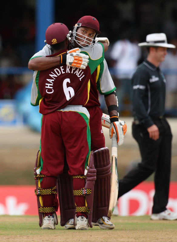
The West Indies may be a long way from, well … anywhere, but if I was a betting man, I’d say this team could find its way into Paul’s heart. Pretty much everything in this picture is a perfect compliment to this entire page (minus the funky gloves, of course). More looks here and here. But that’s not the best part. Pay close attention here, Paul: This is the team West Indies beat.
Let’s start filling out the adoption papers right now. — Bryan
Chanderpaul? But I hardly even know him!
No vertically arched lettering? They’re dead to me.
Authentic cricket is actually around the corner from Paul/Brooklyn in Queens, NYC. Tons of folks from the Caribbean, South America (Guyana) and Sub Continent Asia (India, Pakistan, Bangaladesh, etc.) all play serious cricket in local parks throughout Queens and the surrounding areas.
reprinted from last nights comments:
[quote comment=”251449″][quote comment=”251364″][quote comment=”251270″]I updated the Baltimash to include the Baltimore Skipjacks (AHL) for Marcus. If anyone can think of another Baltimore team they want in there I’ll try to work it in. This is too much fun! [/quote]
I don’t know if I’m the first person to mention this or not, but Baltimoreans have got to let go of the Colts already. For crying out loud, not only do you guys have another, completely different franchise that has won a Super Bowl, but the Colts have won a Super Bowl as the Indianapolis Colts.
Yes, I know it hurt. But you guys aren’t nearly as screwed over (now) as Seattle basketball fans will be here shortly.[/quote]
We went 13 years without a team. I hope you never get a another basketball team. Jerk![/quote]
PLEASE TAKE THE KNICKS
Jackie Chan threw out the first pitch at the Dodgers game last night… is that a link I see in his back pocket?
[quote comment=”251496″]Jackie Chan threw out the first pitch at the Dodgers game last night… is that a link I see in his back pocket?[/quote]
That looks like Jackie’s stunt double
Are the cricket players wearing regular running shoes, as opposed to spikes or cleats? What’s the story with that?
[quote comment=”251500″]Are the cricket players wearing regular running shoes, as opposed to spikes or cleats? What’s the story with that?[/quote]
they are actually kind of cleated sneakers…they look like running shoes but have little metal spikes (think metal golf spikes before courses started requiring soft spikes)
link (click on the individual links) should give you an idea
link is getting into the act as well.
[quote comment=”251509″]link is getting into the act as well.[/quote]
link about that.
[quote]link is the team West Indies beat.[/quote]
I feel like I’m missing something. That isn’t an Adidas marker (two stripes, not three), the team isn’t purple, and it isn’t that one team has a hosiery advantage, because both teams have the Sunday slacks. Help, Mr. Redemske?
Can’t wait to see what link will be wearing today at the Masters. I guess that’s his personal logo on the belt buckle and shirt sleeve and is probably an attempt to stylize his initials, but it looks a bit like, uh, somethin’ else.
[quote comment=”251511″][quote]link is the team West Indies beat.[/quote]
I feel like I’m missing something. That isn’t an Adidas marker (two stripes, not three), the team isn’t purple, and it isn’t that one team has a hosiery advantage, because both teams have the Sunday slacks. Help, Mr. Redemske?[/quote]
They look awfully purple to me.
They are purple. I mean, I guess you could argue that they’re lavender, or something, but that’s pretty much purple.
Check linkout:
Attention all link and link Fans:
AIr Jordan XV SE Braggin’ Rights: April 12
I’m more concerned about the fact that Jackie Chan appears to be wearing white jeans!
[quote comment=”251527″]Check linkout:
Attention all link and link Fans:
AIr Jordan XV SE Braggin’ Rights: April 12[/quote]
Better Comparison Pic
[quote comment=”251511″][quote]link is the team West Indies beat.[/quote]
I feel like I’m missing something. That isn’t an Adidas marker (two stripes, not three), the team isn’t purple, and it isn’t that one team has a hosiery advantage, because both teams have the Sunday slacks. Help, Mr. Redemske?[/quote]
Time to adjust the color on your computer screen buddy, Sri Lanka definitely wears purple. Check out some Sky Sports News or some other English sports news show and you’ll maybe get to see some highlights of the uglyness in action.
[quote comment=”251490″]Authentic cricket is actually around the corner from Paul/Brooklyn in Queens, NYC. Tons of folks from the Caribbean, South America (Guyana) and Sub Continent Asia (India, Pakistan, Bangaladesh, etc.) all play serious cricket in local parks throughout Queens and the surrounding areas.[/quote]
This isn’t just limited to Queens. I know for a fact that there is cricket going down every Saturday and Sunday morning in Marine Park in Brooklyn. I remember as a kid having soccer practice on Monday and seeing piles of Red Stripe bottlecaps. I wouldn’t be surprised if it is going down in Prospect Park as well.
Tom Selleck never wore link hat!
Check this out:
Attention all Georgetown and Carolina Fans:
AIr Jordan XV SE Braggin’ Rights: April 12
How come Cal can’t get any school specific Jordans designed? Guess you actually have to have a good program to get hooked up.
[quote comment=”251549″]Check this out:
Attention all Georgetown and Carolina Fans:
AIr Jordan XV SE Braggin’ Rights: April 12
How come Cal can’t get any school specific Jordans designed? Guess you actually have to have a good program to get hooked up.[/quote]
Unfortunately for us on the East Coast, we rarely, if ever, see or hear ANYTHING about Cal. I love their unis, except for the asymmetrical side stripe, but JB has really neglected them!
Blue helmet, blue pants, similarly designed jerseys, similar sized circular logos… doesn’t this Netherlands – Kazakhstan photo look almost like an intra-squad scrimmage?
link
link
Ten most miserable sports cities. I guess even tho the Giants have never won a Series in 50 years here (amazing, isn’t it) we get a pass due to 5 SBs for the Niners and 3 WS’s for the A’s.
But it gave me an idea; what metro area has the best and worst collection of unis?
A few oberservations from the Nashville Sounds home opener last night. No pics because even if I had brought the camera it was too damn cold to have taken my hands out my pockets long enough.
All the visiting Iowa Cubs players and coaches had the high cuffed pant look including 3 with real live stirrups and one guy with the Greg Maddux stripe look (may be his grandkid or something). The Cubs had the blue alt with IOWA in red vertical arch but pinch hitter Andres Torres had a blue jersey with the strolling Cub C logo.
Most of the Sounds had the pajama pant look and they lost both games of the doubleheader opening nite. No coincedence I am quite sure.
Last time I saw a Sri Lanka shirt in the flesh it was Blue…
As for the footwear, while someone has provided a link to normal spikes it looks like both of the batsmen shown are wearing normal trainers which have been spiked by a cobbler – pretty common among pros, as it lets them get the best fit and choose what spike pattern they want.
Nice to see the West Indies wearing what appears to be English Premier League style letters and numbers. Definately appears to be the same font.
Mets going with snow whites and blue caps today. But the nice surprise is that they have 4 guys going with the high pants look today: Carlos Delgado, David Wright, Oliver Perez and Luis Castillo. That’s the most I can recall an MLB team having on the field in quite some time.
Although I’m sure someone will prove me wrong; after all, we have such astute Uniwatchers out there.
Also of note in the Mets game…I count 5 visible swooshes on Schneider when he crouches behind the plate.
It saddens me to see the Braves wearing their blue alts today, for the third straight day. That being said, they have beaten the Nats in them the first two games of this series, so it may be a superstitious thing.
are jamie moyer’s bell closer to the back, or are his stirrups just twisted?
I gotta tell ya, this Adidas 3-stripe business has really gone over the edge now at the Masters. Say what you will about Nike and what they’ve done to ruin sports fashion in a lot of areas, but at least they have learned how to make some classy golf threads. These Adidas guys walking around Augusta this year are atrocious.
[quote comment=”251611″]I gotta tell ya, this Adidas 3-stripe business has really gone over the edge now at the Masters. Say what you will about Nike and what they’ve done to ruin sports fashion in a lot of areas, but at least they have learned how to make some classy golf threads. These Adidas guys walking around Augusta this year are atrocious.[/quote]
i totally agree…i own 8 or 9 adidas golf shirts, and NONE of them have any three stripe nonsense…not even a teeny 3-bar on the collar…they must really be pushing the new line on the players…who are gladly taking the cash to become walking billboards…
they (the 3-stripe stable ponys) look like SHIT this year…i could do without nike’s ‘vent panel’ (as was seen on paul casey yesterday) and some of their patterns, but compared to adidas, nike is STILL the bomb
Unfortunately for Luis Castillo, his black neoprene knee brace is peeking out from under his otherwise beautiful hiked up pants and blue socks….
[quote comment=”251580″]Last time I saw a Sri Lanka shirt in the flesh it was Blue…
As for the footwear, while someone has provided a link to normal spikes it looks like both of the batsmen shown are wearing normal trainers which have been spiked by a cobbler – pretty common among pros, as it lets them get the best fit and choose what spike pattern they want.[/quote]
link
according to the official site, it is royal blue.
Halp! I had an awesome post and it got eated!
I wonder if the braves keep winning in the blues, if they will pull them out for home? Maybe the reds instead
Nice to see the West Indies wearing what appears to be English Premier League style letters and numbers. Definately appears to be the same font.
It is. Most, if not all, teams use this font for their colored one-day and Twenty/20 uniforms. In full test cricket, the teams lose the numbers and wear all white.
[quote comment=”251574″]http://www.forbes.com/2008/04/08/sports-atlanta-seattle-biz-sports_cx_tvr_af_0408sportsmisery_slide_12.html?thisSpeed=15000
Ten most miserable sports cities. I guess even tho the Giants have never won a Series in 50 years here (amazing, isn’t it) we get a pass due to 5 SBs for the Niners and 3 WS’s for the A’s.
But it gave me an idea; what metro area has the best and worst collection of unis?[/quote]
Paul has already posted about the best/worst cities for uniforms. It’s on his Page 2 column I believe.
On an unrelated note, the Royals debuted their powder blues last night. I went to the game, and to get fans in the stands they were giving out replica powder blue Billy Butler jerseys to the first 20,000 fans. Other than the mass hysteria and borderline riot that was created in the process of handing them out, it was a great giveaway.
Surprisingly, the jerseys are not really that bad of quality. The material is as close to actual jersey material as you could get. They even gave out S,M,and XL as opposed to just XL like every other giveaway. The downside is that the numbers, insignia, and patch is all screen printed, and instead of the MLB logo on the back neck, it is the FSN logo, since they carry all of the Royals games this year.
They are wearing them today as well, as they will become their regular Sunday home jerseys. The royals blue jerseys they have worn in the past are going to be worn for Sunday road games I believe. I was pretty pleased with the way the jerseys looked on the field. Not the best, but they don’t look too bad.
[quote comment=”251611″]I gotta tell ya, this Adidas 3-stripe business has really gone over the edge now at the Masters. Say what you will about Nike and what they’ve done to ruin sports fashion in a lot of areas, but at least they have learned how to make some classy golf threads. These Adidas guys walking around Augusta this year are atrocious.[/quote]
The worst part is the 3-stripes across the back (roughly where a players name would be on a jersey). Major league logo creep right there. I’ve been trying to find a picture of it, but I haven’t found many shots of players’ backs.
Brandt Snedeker was shown talking to his caddy while playing on the 2nd hole. His caddy had his caddy uniform unbuttoned or unzipped revealing a Toronto Maple Leafs logo underneath.
Hi guys. First time caller.
Speaking of three vertical stripes (sort of), Hockey Canada’s alternate jersey suffered a sporting setback yesterday. As noted in this link (see tenth paragraph but disregard the picture that goes with it), for the first time Canada wore its black jersey in a hockey final — in this case, the link — and lost.
However, Hockey Canada did win in the link it played in black.
Royals power blues look HORRIBLE with the white pants. Completely look like an afterthought.
Really nice Indian alts today. Must be freezing in Cleveland, too..guys are wearing ski masks. Will get screengrab.
Interesting Associated Press article here from ESPN:
link
[quote comment=”251699″]Interesting Associated Press article here from ESPN:
link
Someone needs to get the Yankee brass in on the search for Jimmy Hoffa. They went drilling after that Sox jersey like a team possessed!
[quote comment=”251599″]Mets going with snow whites and blue caps today. But the nice surprise is that they have 4 guys going with the high pants look today: Carlos Delgado, David Wright, Oliver Perez and Luis Castillo. That’s the most I can recall an MLB team having on the field in quite some time.
Although I’m sure someone will prove me wrong; after all, we have such astute Uniwatchers out there.[/quote]
I also noticed that and pointed it out to 2 non Uni Watchers that I was watching the game with. Last year, I was at a Yankees game, and 3 guys in the game had high pants. A-Rod, Clemens, and Doug Mientkiewicz.
[quote comment=”251604″]Also of note in the Mets game…I count 5 visible swooshes on Schneider when he crouches behind the plate.[/quote]
Anyone see the huge adidas logo on Heilman’s undershirt? That’s the first time I’ve seen him wearing that….
Anyone see this?
People thought it was a joke, but the Yankees dug up that supposed Red Sox shirt that was supposedly buried at the new Yankee Stadium, and there was, in fact, an Ortiz jersey!
link
[quote comment=”251701″][quote comment=”251699″]Interesting Associated Press article here from ESPN:
link
Someone needs to get the Yankee brass in on the search for Jimmy Hoffa. They went drilling after that Sox jersey like a team possessed![/quote]
He must have been trying to put a replica curse on the Yankees. If you want to do something memorable that may become a part of baseball lore, at least pony up for a real jersey. Yes, expensive to buy and bury, but an eternal curse on your rival has got to be worth more than 80 dollars.
I also noticed that ESPN is already calling this Jerseygate. C’mon guys. Let’s try something new. Adding “gate” to things is lazy and dumb.
[quote comment=”251709″]Anyone see this?
People thought it was a joke, but the Yankees dug up that supposed Red Sox shirt that was supposedly buried at the new Yankee Stadium, and there was, in fact, an Ortiz jersey!
link
Yeah, about 4 posts up. The thing that gets me is that they’re looking to file criminal charges against the guy? I wonder what the charges would be? And I wonder if they would be so hard-up to go after this guy if he would have buried say a Mantle or DiMaggio jersey in the concrete for good luck.
link.
[quote comment=”251711″]If you want to do something memorable that may become a part of baseball lore, at least pony up for a real jersey. Yes, expensive to buy and bury, but an eternal curse on your rival has got to be worth more than 80 dollars.[/quote]
Yeah, but really, would anyone but Uniwatch readers really know or care about the fact that it was a replica and not an authentic?
Well, I futzed that up. (And why isn’t there an edit function here, exactly?)
Take Two on thelink
BTW, the linkis all over the Red Sox story.
Beantown-loving construction worker Gino Castignoli, who lives in The Bronx, confessed to The Post last week that he buried a Red Sox slugger David Ortiz jersey at the site last summer while working at the stadium.
the brewers are wearing their gray road jerseys in new york today, but their sleeve patches, instead of the Cheers style Brewers logo, now has a Cheers style Milwaukee logo. No picture, but I dont remember anyone bringing this up before…
[quote comment=”251730″]the brewers are wearing their gray road jerseys in new york today, but their sleeve patches, instead of the Cheers style Brewers logo, now has a Cheers style Milwaukee logo. No picture, but I dont remember anyone bringing this up before…[/quote]
That sleeve patch on the Brewers grey uniforms has always said Milwaukee instead of Brewers.
Maybe he put a curse on Papi instead with that act. Ortiz’s amazing OPS is at like .371 right now. And no, that’s not his OBP.
I guess New Era Yankees hats have other uses, besides being worn on the head:
link
trust me, Sri Lanka wear blue
[quote comment=”251574″]http://www.forbes.com/2008/04/08/sports-atlanta-seattle-biz-sports_cx_tvr_af_0408sportsmisery_slide_12.html?thisSpeed=15000
we get a pass due to 5 SBs for the Niners and 3 WS’s for the A’s.
the A’s have won 4 Ws’s in oakland…
have the cubs always had a linkon the upper left hip? the photo is from last year so it has at least been that long. anybody know when it started?
[quote comment=”251752″]have the cubs always had a linkon the upper left hip? the photo is from last year so it has at least been that long. anybody know when it started?[/quote]
1997, with the introduction of the current road uniform.
[quote comment=”251752″]have the cubs always had a linkon the upper left hip? the photo is from last year so it has at least been that long. anybody know when it started?[/quote]
they have had it for as long as i can remember at least mid-90’s for sure. link
[quote comment=”251717″]Well, I futzed that up. (And why isn’t there an edit function here, exactly?)
Take Two on thelink[/quote]
Six games in a row wearing green for the A’s. I expect gray tomorrow, as they lost today.
Here you go. Stanford Financial supports the reinvigoration of the entire West Indies commitment to Cricket through the Stanford 20/20 Tournament.
link
Check out some of these beautiful color unis from the League.
Hey. MLB, NHL, NBA and NFL, take copious notes and follow…
link
[quote comment=”251711″][quote comment=”251701″][quote comment=”251699″]
He must have been trying to put a replica curse on the Yankees. If you want to do something memorable that may become a part of baseball lore, at least pony up for a real jersey. Yes, expensive to buy and bury, but an eternal curse on your rival has got to be worth more than 80 dollars.
[/quote]
In Canada, we only send link link to curse the other guys.
link the lone Giant to wear 42.
[quote comment=”251665″]Royals power blues look HORRIBLE with the white pants. Completely look like an afterthought.[/quote]
I agree. Looks just like any other MLB softball uniform.
[quote comment=”251788″][quote comment=”251665″]Royals power blues look HORRIBLE with the white pants. Completely look like an afterthought.[/quote]
I agree. Looks just like any other MLB softball uniform.[/quote]
Same here. They spent the money to make those beautiful jerseys and they couldn’t pony up the extra money to make the matching pants?
That’s the difference between big market teams and small market teams: The Mets had entirely new uniforms made for the Civil Rights game, including some really nice pants to go with the jerseys, while the Royals, who have a history of wearing a powder blue uni, half-ass it. Sad.
damn those big market teams…
you’d think the yankees could pony up the dough for an alt uni…but obviously they’re just too cheap…
[quote comment=”251793″]damn those big market teams…
you’d think the yankees could pony up the dough for an alt uni…but obviously they’re just too cheap…[/quote]
That wasn’t my point, but you actually prove my point further: If the Yankees ever did have a throwback uni, the Steinbrenner family, without a shadow of a doubt, would spend the money to look good. And that would be on a one time deal. The Royals are going to be using the powder blues regularly as a Sunday alternate. How much sharper would they look if management had thrown in the extra dough to make a complete uniform as opposed to a blue top that looks like crap when mismatched with white pants? How stupid would it look if the Brewers went with the throwback tops but wore their regular uniform pants? Same thing.
Ignore me if this has been mentioned. I could be wrong, but I remember a few uni-watch articles devoted to alternative head gear in baseball, such as facemasks on batting helmets and such. I was skimming the wikipedia page of Charlie Manuel, manager of beloved Phillies, when I noticed an entry on his page labeled “Headgeared Helmet”. Apparently, while playing in Japan’s Professional League, Chaz took a pitch to the jaw, crushing it. Doctors told him he needed two months to recover, but Manuel came back after only 14 games sporting headgear on his helmet. I spent a few minutes trying to find visual proof, but I could not.
Here’s a link to the section of his wiki with more details:
[quote comment=”251793″]damn those big market teams…
you’d think the yankees could pony up the dough for an alt uni…but obviously they’re just too cheap…[/quote]
I stand corrected: Noy uni-related but touching upon a heated debate from last Sunday.
Joe Morgan is a moron. He just said that something was “cemented in stone”.
Jon Miller was also imploring him to take the Acela Express(Amtrak Train) down to the Bronx for Wednesday’s broadcast and Miller chided, “Don’t you know anything?”. To that, Morgan appropriatelt replied, “No, I don’t.”
[quote comment=”251800″][quote comment=”251793″]damn those big market teams…
you’d think the yankees could pony up the dough for an alt uni…but obviously they’re just too cheap…[/quote]
That wasn’t my point, but you actually prove my point further: If the Yankees ever did have a throwback uni, the Steinbrenner family, without a shadow of a doubt, would spend the money to look good. And that would be on a one time deal. The Royals are going to be using the powder blues regularly as a Sunday alternate. How much sharper would they look if management had thrown in the extra dough to make a complete uniform as opposed to a blue top that looks like crap when mismatched with white pants? How stupid would it look if the Brewers went with the throwback tops but wore their regular uniform pants? Same thing.[/quote]
do you SERIOUSLY think the royals, due to their ‘small market’ status, can’t afford powder blue pants? i guess the renovations at kauffman are causing them to cut some serious corners, huh
you can make many valid arguments about big market versus small market, but please don’t tell me the royals are in such a money-pinch they can’t afford to outfit the team in a full powder blue outfit
[quote comment=”251738″][quote comment=”251730″]the brewers are wearing their gray road jerseys in new york today, but their sleeve patches, instead of the Cheers style Brewers logo, now has a Cheers style Milwaukee logo. No picture, but I dont remember anyone bringing this up before…[/quote]
That sleeve patch on the Brewers grey uniforms has always said Milwaukee instead of Brewers.[/quote]
I’d like to see “Milwaukee” on the Jersey instead of “Brewers”….I believe ALL ROAD JERSEYS should have the city name instead of team name.
[quote comment=”251803″][quote comment=”251793″]damn those big market teams…
you’d think the yankees could pony up the dough for an alt uni…but obviously they’re just too cheap…[/quote]
I stand corrected: Noy uni-related but touching upon a heated debate from last Sunday.
Joe Morgan is a moron. He just said that something was “cemented in stone”.
Jon Miller was also imploring him to take the Acela Express(Amtrak Train) down to the Bronx for Wednesday’s broadcast and Miller chided, “Don’t you know anything?”. To that, Morgan appropriatelt replied, “No, I don’t.”[/quote]
morgan also thinks you can steal a base ‘faster’ by sliding head first (miller called him on that one too)
and giambi looks like a moron with that cap
[quote comment=”251711″][quote comment=”251701″][quote comment=”251699″]Interesting Associated Press article here from ESPN:
link
Someone needs to get the Yankee brass in on the search for Jimmy Hoffa. They went drilling after that Sox jersey like a team possessed![/quote]
He must have been trying to put a replica curse on the Yankees. If you want to do something memorable that may become a part of baseball lore, at least pony up for a real jersey. Yes, expensive to buy and bury, but an eternal curse on your rival has got to be worth more than 80 dollars.
I also noticed that ESPN is already calling this Jerseygate. C’mon guys. Let’s try something new. Adding “gate” to things is lazy and dumb.[/quote]
Hank Steinbrenner, leader of one of the proudest, tradition laden organizations in sports suggesting what should be done to fun-loving, mischeivous, baseball fan Gino Castignoli:
JackHammering Hank
[quote comment=”251805″][quote comment=”251800″][quote comment=”251793″]damn those big market teams…
you’d think the yankees could pony up the dough for an alt uni…but obviously they’re just too cheap…[/quote]
That wasn’t my point, but you actually prove my point further: If the Yankees ever did have a throwback uni, the Steinbrenner family, without a shadow of a doubt, would spend the money to look good. And that would be on a one time deal. The Royals are going to be using the powder blues regularly as a Sunday alternate. How much sharper would they look if management had thrown in the extra dough to make a complete uniform as opposed to a blue top that looks like crap when mismatched with white pants? How stupid would it look if the Brewers went with the throwback tops but wore their regular uniform pants? Same thing.[/quote]
do you SERIOUSLY think the royals, due to their ‘small market’ status, can’t afford powder blue pants? i guess the renovations at kauffman are causing them to cut some serious corners, huh
you can make many valid arguments about big market versus small market, but please don’t tell me the royals are in such a money-pinch they can’t afford to outfit the team in a full powder blue outfit[/quote]
link….wait, I hope that guy realized the Powder blue jerseys are an alternate and not a throwback.
I thought we were all on board with the Powder Blue alts?…seems like ya can’t ever please everybody on this site.
When a team uses color its “UGH! THEY’RE HIDEOUS!”
When a team is conservative its “BOOORING!”
jeez people give me a break!
[quote comment=”251800″][quote comment=”251793″]damn those big market teams…
you’d think the yankees could pony up the dough for an alt uni…but obviously they’re just too cheap…[/quote]
That wasn’t my point, but you actually prove my point further: If the Yankees ever did have a throwback uni, the Steinbrenner family, without a shadow of a doubt, would spend the money to look good. And that would be on a one time deal. The Royals are going to be using the powder blues regularly as a Sunday alternate. How much sharper would they look if management had thrown in the extra dough to make a complete uniform as opposed to a blue top that looks like crap when mismatched with white pants? How stupid would it look if the Brewers went with the throwback tops but wore their regular uniform pants? Same thing.[/quote]
I completely disagree. The Blue Jays are wearing full powder blues at home, and it looks ridiculous — because they’re wearing a road uniform AT HOME. The Royals didn’t do anything on the cheap — they just decided to wear a colored alt jersey with white pants (like many other teams), and the color happens to be powder blue.
You can say whatever you want about colored alts in general (I don’t care for them myself) or about the Royals’ poweder blue alt in particular (certainly not the worst alt design on MLB diamonds, although that’s not saying much), but don’t try to reduce this to a $$$-driven thing, cuz it’s not. In fact, as I’ve noted in recent weeks, the Royals have actually been doing the little things right lately, like improving their road sleeve patches (which I asure you cost a few extra pennies) and using direct-sewn NOB lettering instead of nameplates (ditto).
Anybody think that link looks like linklink?
[quote comment=”251805″]do you SERIOUSLY think the royals, due to their ‘small market’ status, can’t afford powder blue pants? i guess the renovations at kauffman are causing them to cut some serious corners, huh
you can make many valid arguments about big market versus small market, but please don’t tell me the royals are in such a money-pinch they can’t afford to outfit the team in a full powder blue outfit[/quote]
No, I don’t SERIOUSLY think the Royals, due to their “small-market” status, can’t afford powder-blue pants. In fact, I never said the Royals couldn’t afford to purchase the pants. I just think that small-market teams sometimes handle things differently than a big market team would.
I think it probably is a money-related issue, not one where the team can’t afford to do it, but one where management probably figured “you know what, we’re giving them the powder blue jerseys, that will probably make them happy, so let’s not bother spending the money to go full-blown with the whole uniform”, something that I don’t think a big-market team like the Mets, Yankees, etc. would do if they were in the same situation. Baseball is a business and, like every other business, money usually plays a role in how decisions are made.
That’s just my opinion, and for some reason it seems to have struck a nerve. I’m sorry about that, but your condescending responses are really uncalled for.
[quote]That’s just my opinion, and for some reason it seems to have struck a nerve. I’m sorry about that, but your condescending responses are really uncalled for.[/quote]
i apologize if you feel my responses are condescending…i prefer to think they are merely sarcastic
of course it’s your opinion and you’re entitled to it…i just grow tired of people trying to play the big market versus small market and when you try to equate spending on unis (or at least imply that), then you get my hackles up
it’s all good, james
cheers!
[quote comment=”251814″][quote]That’s just my opinion, and for some reason it seems to have struck a nerve. I’m sorry about that, but your condescending responses are really uncalled for.[/quote]
i apologize if you feel my responses are condescending…i prefer to think they are merely sarcastic
of course it’s your opinion and you’re entitled to it…i just grow tired of people trying to play the big market versus small market and when you try to equate spending on unis (or at least imply that), then you get my hackles up
it’s all good, james
cheers![/quote]
All right, i’m glad to see you guys have kissed and made up…good stuff.
The Yankees can’t really have much of a throwback, can they? They look the same way now as they did way back. An alt for the Yankees? Never. They define (maybe to themselves) baseball old school tradition.
Coincidentally linkis having link done to him by the link right now!
[quote comment=”251819″]The Yankees can’t really have much of a throwback, can they? They look the same way now as they did way back. An alt for the Yankees? Never. They define (maybe to themselves) baseball old school tradition.[/quote]
didn’t the yankees wear link once? it’s a new york black yankees jersey…i seem to recall kenny rogers starting a game in it
that could actually work, but they’d never wear it as an ‘alt’ and it’s not a throwback
[quote comment=”251824″][quote comment=”251819″]The Yankees can’t really have much of a throwback, can they? They look the same way now as they did way back. An alt for the Yankees? Never. They define (maybe to themselves) baseball old school tradition.[/quote]
didn’t the yankees wear link once? it’s a new york black yankees jersey…i seem to recall kenny rogers starting a game in it
that could actually work, but they’d never wear it as an ‘alt’ and it’s not a throwback[/quote]
I’m a Yankees fan, and I wouldn’t mind seeing a road gray with YANKEES on it, instead of NEW YORK. Make it an alt or the new road jersey, I don’t care. But it would be nice. It would either throw back to or pay respect to the 1927 Murderers’ Row (depending on how many modern liberties are taken). But if Mitchell and Ness is correct, I don’t know if I could like the number font. I like the look of it, but today, it has “Red Sox” written all over it. And Red Sox jerseys don’t seem to be welcome in, around, or under Yankee Stadium, present or future.
[quote comment=”251828″]I’m a Yankees fan, and I wouldn’t mind seeing a road gray with YANKEES on it, instead of NEW YORK. Make it an alt or the new road jersey, I don’t care. But it would be nice. It would either throw back to or pay respect to the 1927 Murderers’ Row (depending on how many modern liberties are taken). But if Mitchell and Ness is correct, I don’t know if I could like the number font. I like the look of it, but today, it has “Red Sox” written all over it. And Red Sox jerseys don’t seem to be welcome in, around, or under Yankee Stadium, present or future.[/quote]
so…link then?
Also, I was reading the March 30th post, which I had missed regarding the Midwest regional Championship Hats. I never liked the idea of the championship t-shirts, hats and the like being trotted out onto the field, ice, diamond, court or wherever it is you play. I’ll try to find it and take a picture, but back in the 1994-1995 NHL playoffs, my brother, who worked at an amazing sports apparel store in North East Philadelphia, gave me a prototype Red Wings Stanley Cup Championship t-shirt the store had received. The Red Wings didn’t even win that year.
[quote comment=”251831″][quote comment=”251828″]I’m a Yankees fan, and I wouldn’t mind seeing a road gray with YANKEES on it, instead of NEW YORK. Make it an alt or the new road jersey, I don’t care. But it would be nice. It would either throw back to or pay respect to the 1927 Murderers’ Row (depending on how many modern liberties are taken). But if Mitchell and Ness is correct, I don’t know if I could like the number font. I like the look of it, but today, it has “Red Sox” written all over it. And Red Sox jerseys don’t seem to be welcome in, around, or under Yankee Stadium, present or future.[/quote]
so…link then?[/quote]
More or less, but short sleeves.
I just don’t care for the navy/white/navy sleeve cuffs on the current roadies. They seem so out of place and clunky. Seriously, who put them there and why?
But on second thought, that jersey could benefit from a splash of white around the jersey number, if only to coordinate with the hat emblem, which would presumably stay white. Chalk THAT up as a modern liberty.
[quote comment=”251832″]Also, I was reading the March 30th post, which I had missed regarding the Midwest regional Championship Hats. I never liked the idea of the championship t-shirts, hats and the like being trotted out onto the field, ice, diamond, court or wherever it is you play. I’ll try to find it and take a picture, but back in the 1994-1995 NHL playoffs, my brother, who worked at an amazing sports apparel store in North East Philadelphia, gave me a prototype Red Wings Stanley Cup Championship t-shirt the store had received. The Red Wings didn’t even win that year.[/quote]
Africa just called. A little boy wants a new shirt.
[quote comment=”251833″][quote comment=”251831″][quote comment=”251828″]I’m a Yankees fan, and I wouldn’t mind seeing a road gray with YANKEES on it, instead of NEW YORK. Make it an alt or the new road jersey, I don’t care. But it would be nice. It would either throw back to or pay respect to the 1927 Murderers’ Row (depending on how many modern liberties are taken). But if Mitchell and Ness is correct, I don’t know if I could like the number font. I like the look of it, but today, it has “Red Sox” written all over it. And Red Sox jerseys don’t seem to be welcome in, around, or under Yankee Stadium, present or future.[/quote]
so…link then?[/quote]
More or less, but short sleeves.
I just don’t care for the navy/white/navy sleeve cuffs on the current roadies. They seem so out of place and clunky. Seriously, who put them there and why?
But on second thought, that jersey could benefit from a splash of white around the jersey number, if only to coordinate with the hat emblem, which would presumably stay white. Chalk THAT up as a modern liberty.[/quote]
wait…which jersey? the current link has white around the midnight blue #s & name…you mean ditch the current sleeve pattern on the roadies, and add the white outline around the midnight blue of the 27 uni?
[quote comment=”251836″][quote comment=”251833″][quote comment=”251831″][quote comment=”251828″]I’m a Yankees fan, and I wouldn’t mind seeing a road gray with YANKEES on it, instead of NEW YORK. Make it an alt or the new road jersey, I don’t care. But it would be nice. It would either throw back to or pay respect to the 1927 Murderers’ Row (depending on how many modern liberties are taken). But if Mitchell and Ness is correct, I don’t know if I could like the number font. I like the look of it, but today, it has “Red Sox” written all over it. And Red Sox jerseys don’t seem to be welcome in, around, or under Yankee Stadium, present or future.[/quote]
so…link then?[/quote]
More or less, but short sleeves.
I just don’t care for the navy/white/navy sleeve cuffs on the current roadies. They seem so out of place and clunky. Seriously, who put them there and why?
But on second thought, that jersey could benefit from a splash of white around the jersey number, if only to coordinate with the hat emblem, which would presumably stay white. Chalk THAT up as a modern liberty.[/quote]
wait…which jersey? the current link has white around the midnight blue #s & name…you mean ditch the current sleeve pattern on the roadies, and add the white outline around the midnight blue of the 27 uni?[/quote]
Note to self: Antecedents are useful.
The 27’s could benefit from a white accent (on the numbers at least, maybe on the front word mark as well).
The current road cuffs stink.
I still don’t know if I could dig a Red Sox font on a Yankees jersey.
Clear?
Watching the NHL playoffs last night, and saw link. All of the negative space for the Stars’ names is still in place. Have they been like this all year? Is this just ugly or unbelievably lazy?
mets are 0-2 in blue…
i’ve seen the royals powder blues in two games so far and i’m unimpressed. they look like a high school team out there (kinda like oak park high school for the locals). i wasn’t a big fan of the royal blue alts but they look much better than the powder blues.
[quote comment=”251840″]Watching the NHL playoffs last night, and saw link. All of the negative space for the Stars’ names is still in place. Have they been like this all year? Is this just ugly or unbelievably lazy?[/quote]
The whole ensemble is ugly. I won’t even mention the front jersey numbers (an unconditional pet peeve of mine) or the cheap-ass collegiate word mark on the blacks (you’re not the Rangers, so please get a f*cking crest). My other big beef: the black ensemble has almost no green, while the whites have much more green than black. It doesn’t look continuous. We hate on the New York Football Giants and the Dallas Cowboys for their lack of matching, but these guys are just as bad. (By the way, I’m sour on the Wild’s closet for the same reason. And I can’t believe the Stars used to look so darn awesome with the Star crest and the Star jersey template. Almost looked like an infinite regression. It was cool. But now it is history. Damn.)
i should have put this on my last post but i was watching the royals/twins game yesterday with my dad and pointed out to him that his twins (richfield native) had the letter M on their caps but the interlocking TC on their batting helmets and that the name patches on their backs didn’t have pinstripes on the like the jerseys did.
i don’t think i turned him into a uniwatcher but it was certainly enough to bug him for the rest of the game.
[quote comment=”251813″]
I think it probably is a money-related issue, not one where the team can’t afford to do it, but one where management probably figured “you know what, we’re giving them the powder blue jerseys, that will probably make them happy, so let’s not bother spending the money to go full-blown with the whole uniform”, something that I don’t think a big-market team like the Mets, Yankees, etc. would do if they were in the same situation. Baseball is a business and, like every other business, money usually plays a role in how decisions are made.
[/quote]
No. Sorry, you’re wrong. I talked with a Royals representative about the powder blues this winter. He said — and I’m paraphrasing here — they didn’t do a whole uniform because they didn’t want a whole uniform. They just wanted a way to get powder blue back in front of the home fans. And they didn’t want to do a throwback design like the Brewers. And, finally, a full powder blue uniform signifies a ROAD team, which doesn’t make any sense when you’re playing at home.
link a refresher course.
Aside from the obvious cold weather gear going on in the A’s vs. Indians series this past weekend, it appears that link is wearing an adidas glove – his shoes are. His pants are too long as well, as he had clearly been walking on them.
I was at the game in KC last night and aside from the whole team having the pajama pant look, the powder blues looked fabulous.
Also, Sluggerrr, the KC mascot, had his own powder blue jersey for the game. I’ll try to get a pic to Paul later.
[quote comment=”251717″]Well, I futzed that up. (And why isn’t there an edit function here, exactly?)
Take Two on thelink[/quote]
Any more shots of this? When watching on Saturday it appeared that there were two logos on the ski masks. On one side there appeared to be a MLB logo but I could not make out the other clearly. I think it might have been an A’s elephant but I am not sure.