Got a note the other day from Brian Schulz:
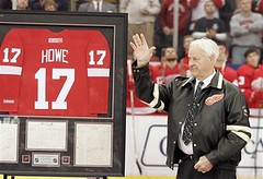
Is it just me, or does the whole thing about giving someone a framed jersey just seem pretty ridiculous? I thought about it when you recently wrote about Gordie Howe getting the No. 17 jersey from the Wings. Now, I had my jersey retired from my high school and I thought that was a pretty cool deal, because I never had an old jersey of mine from back in the days. However, these pro guys must have jerseys and mementos piled up all over the place. Do they really need another jersey framed for them?
It’s a fair point, but I think these framed jerseys are at least as much for the fans as they are for the honoree. It’s all part of the spectacle. I bet some honorees — not all, or even most, but some — just trash the framed jerseys afterward, or give them away, because their trophy rooms are already stocked to the gills.
All of which brings us, in a roundabout way, to the case of one Joe Hilseberg. By now, most of you are probably familiar with Joe, who’s been an invaluable Uni Watch contributor for years now. And unlike most of us, he’s walked the walk: He used to work in the shop that does lettering and stitching for the Orioles and Ravens, and he later used that work experience to create some unique groomsmen’s vests for his wedding.
Anyway: In late March, Joe asked for my mailing address. He didn’t elaborate, I didn’t ask him for details, and I’d forgotten all about it by this past Monday, when a package arrived. I opened it and was surprised to find this.
Pretty nice, right? It’s fairly big (about 18 inches square), and the stitching is really nice. And unlike Gordie Howe, I don’t have a big trophy room filled with treasures from my legendary career, so I was genuinely stoked to get my framed “jersey.”
There was no note inside, no card, nothing like that. What had I done to deserve such a swell present? I quickly dashed off a thank-you note to Joe. Here’s what he wrote back:
You have just received the prototype Name Frame! This is my new business/product that I’m working on right now. I’m working on doing all of the legal stuff so I can start selling them. I searched far and wide and saw that nobody offered this product — very cool, authentically done, custom-stitched jersey art.
And that leads back to you. It has been the joy of your site that made me determined to figure out a way to get back to doing something I love. Talking about jerseys, lettering, and tackle twill all of the time has really fueled my desire to make this happen. Initially I had hoped to open my own custom-lettering shop (which may be possible down the road), but that market has already been tapped. I needed something different, something fun, something people would want. Then I got my Uni Watch membership card, and that’s when it hit me: Make a full-sized framed version!
I’m targeting high schools and universities that might want to give these as an award or unique keepsake. Or maybe parents who wants one for their letter-winning child. Legally, I can’t recreate all the MLB styles, but if this takes off I don’t think it’s going to be a hard sell to MLB to start licensing these. What kid wouldn’t want one of their favorite player? And then it’s on to the NFL, NHL, NBA… It could be huge.
NameFrame.net is up right now, but it’s in the VERY early stages of development. I plan on eventually having an interactive designer application and all that jazz.
So in short, thank you for keeping my mind on jerseys, lettering, and all of the intricacies that make athletics aesthetics so enjoyable for me!
Wow — thank you, Joe, for the kind words. Glad to have provided the inspiration for your new venture.
Incidentally, those who frequent the comments section may be aware that Joe usually weighs in on the side of nameplates, instead of direct-sewn lettering. So how come my Name Frame NOB is direct-sewn?
“Honest answer: They’re a bitch to find,” says Joe. “And if I cut them myself out of material, I have to pay $10 a plate to have the edges serged. Oh, plus I knew you don’t like them. But if someone wants one, I’ll do it!”
As if that weren’t enough, two other readers sent me uni-related treasures this week. First, remember the Mets pin-up girl that Rob Ullman created for me? He just sent me the actual artwork, all signed and everything.
The kicker came on Wednesday, when I went out for a bike ride and came back to find that the UPS guy had left me a package from Mitchell & Ness historian Jared Wheeler. I opened it up, and whoa — 11 pairs of striped stirrups, including two gorgeous woolen models (plus several of them featured a really cool label design). These were a gift from Jared and M&N prexy Peter Caporino, who recently told me how he’d compiled a big backlog of stirrups back when he was outfitting the models for Sports Illustrated‘s all-time all-star team photo.
Seriously, am I a lucky fella or what? Big thanks to all these people who’ve showered me with uni-related goodness — you’re all aces.
Uni Watch News Ticker: Good assortment of Oregon jerseys, including a few prototypes, here (with thanks to that Joe Hilseberg guy). ”¦ Soccer question from Claude Reifsnyder, who writes: “In Wednesday’s Champions League match between Liverpool and Arsenal, Liverpool wore a black jersey. As I’m sure you know, all EPL teams are supposed to use the standard league font, so how did they get away with the adidas-stye font on the back of their jerseys?” ”¦ Awesome find by Jeremy Gooch, who came up with an old college photo of Jerry Rice wearing vertical sleeve stripes. ”¦ Further info on San Diego’s third base coach’s box at the very bottom of this page (with thanks to Brian Hilemon). ”¦ “Nothing makes a woman feel more petite than posing for a photo next to Boog Powell,” writes Elena Elms — unless it’s posing with the Nationals’ mascots. ”¦ What company’s logo is that? ”¦ Okay, it’s official: This whole Lego thing has gotten out of hand. Disturbing details here (blame John Latham). … Looks like the Magic will have new uniforms next season. ”¦ Did those Phillies throwbacks look totally hot or what? Lots of photos here. ”¦ Yet another Nationals player with an upside-down “I”: Paul Lo Duca (spotted, once again, by eagle-eyed Michael Zakrzewski). ”¦ Karl Anderson attended last night’s Wild/Flames game and, like all fans in attendance, received a fan-appreciation patch identical to the one that the Wild wore last night. ”¦ Let’s just be glad that Cecil Fielder never tried what Prince did yesterday. ”¦ Incidentally, you see Alfonso Soriano in that last photo? I don’t know who’s paying him to wear those eye-black stickers, but I have a feeling he’s gonna get a note from the league office pretty soon about them. ”¦ Not sure how much stock to put in this, but the rumor mills says that Iowa State’s new basketball uniforms will look like this. ”¦ The WNBA’s Atlanta Dream (yes, that’s what they’re called) just unveiled their new uni, which is about as boring as all the other WNBA unis. Details here (with thanks to David Kendrick). ”¦ Some great equipment switcheroos last night in Atlanta, as Justine DeCotis explains: “The Braves had Chris Resop, a RHP, on the mound and a left-handed batter, Adam LaRoche, was coming up for the Pirates. So, they went to the bullpen and got a Royce Ring, a LHP. But instead of taking out Resop, they took out the left fielder, Matt Diaz, and put Resop in left field. So Ring pitched to LaRoche and then they took him out and brought Resop back from left field to the mound and put Gregor Blanco into left. Resop pitched the rest of the inning. When Resop went to left, he took Diaz’s glove to wear and Diaz took Resop’s glove to the dugout. And then when Blanco came in to play the outfield he took Resop’s pitcher’s glove back out and gave it back to him.” As LI Phil is already beginning to post in a comment, the Mets did something similar during an extra-inning game around 1985ish, when they shuttled LHP Jesse Orosco and RHP Roger McDowell back and forth between the mound and the outfield depending on who was batting. ”¦ Cap question from Sean Deitrick, who writes: “What’s the deal with the Texas Rangers’ blue cap with the red “T,” which the team lists as its official road cap? I’ve e-mailed some of the beat writers for the team but haven’t gotten a response. The even appears is most video games produced since its original inception [and is also still listed as the road cap in the MLB Style Guide — PL], but it’s never used in road games and I don’t think it’s appeared in a game since Esteban Loaiza was traded. ”¦ The Mets plan to unveil “a new Shea logo” (it’s not clear if this means a new Shea Stadium logo, or a William Shea logo) at next Tuesday’s home opener. It will be displayed alongside the team’s retired numbers. Details here. … Good all-purpose hockey goalie site here (with thanks to Thomas Harris). … Jack del Rio and his suit will be around for a long time. … More about that controversial new swimsuit here. … You rarely hear about tampered boxing gloves anymore, but here’s a brutal reminder. … The New York-Penn League wants your help in designing a new logo (with thanks to Matt Nelson). But before you enter, see today’s comment #22.
I like that framed name thing a LOT. Hmmmm; birthday not til November…then Christmas…..
think think think..plot plot plot…scheme scheme scheme…
Most teams have specific manufacturer fonts for European games. Note how Man United’s link is completely different from the standard link one.
That logo on the Chest Protector is Mizuno.
Liverpool was able to get away with it because it was a UEFA match not a EPL match, I believe Man U also has a different number/name font for European matches also.
Re Liverpool in Black.
The uniform standard only applies to FA matchs (league, Carling cup,a nd FA cup).
You’ll see a lot of different uniforms and fonts from the english teams when they are playing in the champions league or in uefa cup.
Looks like we have another team that can’t get the home cap/road cap thing right.
Most EPL teams use different fonts and colors check out Arsenal link and link
that link is link.
If the question was about the chest protector, thats the Mizuno logo.
The font # on the back of that Jersey is close to Adidas but it was 4 stripes instead of 3 so thats how they got away with it. Adidas is getting pretty ridiculous with all its uniforms for all the sports they make jerseys for with those annoying freakin stripes. I will take a simple swoosh anytime!
Soriano’s eye black stickers are advertising for his own company. On a Brewers board I frequent there was a discussion in the in-game thread about them.
A quick search didn’t yield the name, so I’ll have to sort through some pages….
linkis the absolute worst thing that I have ever seen on a baseball field!
Phillies Throwbacks look like they left the white unis in some bleach and mud…washed off the red stripes and looks like someone hurled on them…kind of like the nasty looking things the Giants were in SF
[quote comment=”247374″]Re Liverpool in Black.
The uniform standard only applies to FA matchs (league, Carling cup,a nd FA cup).
You’ll see a lot of different uniforms and fonts from the english teams when they are playing in the champions league or in uefa cup.[/quote]
Some more examples of fonts of EPL teams in Europe
link
link
link
I remember the Mets shuttling Orosco and McDowell very clearly, as it was one of their more famous games in 1986 link, where Ray Knight fought Eric Davis. That put the team short on players as the game went into extra innings. It was also the game whrer George Foster signed his death warrant with the Mets by not helping out his team in the brawl.
How much is the name frame going to cost? it seems like a great idea. i have my college jersey framed but with nnob. would love something like this.
[quote comment=”247382″]Phillies Throwbacks look like they left the white unis in some bleach and mud…washed off the red stripes and looks like someone hurled on them…kind of like the nasty looking things the Giants were in SF[/quote]
I thought they looked very nice. Much better and more creative alternate uniform than most teams come up with.
I’m pretty sure that logo is link…
Well since four people beat me to the answer to the chest protector logo, I will just say that a few of those Oregon Jerseys look ok. What happened to make fall SOOOOOO far from the tree.
And that Lego ball player kid is very wierd
[quote comment=”247387″][quote comment=”247382″]Phillies Throwbacks look like they left the white unis in some bleach and mud…washed off the red stripes and looks like someone hurled on them…kind of like the nasty looking things the Giants were in SF[/quote]
I thought they looked very nice. Much better and more creative alternate uniform than most teams come up with.[/quote]
The only (minor) drawback was using the red batting helmets with the alternates. Would have looked much better with a blue batting helmet (to match the alternate cap).
The Texas A&M football team also wore vertical stripes on their jerseys from the mid to late seventies.
Wow. Most graphic designers cringe (or worse) when they see design contests like the one the New York-Penn League is holding. They are extremely unethical. They are usually a way to avoid paying fair market value for a professionally-designed logo.
At first glance It seems like a harmless and fun way to get fans involved–but this is not targeted toward children or amateurs. The call-for-entries asks for “serious artists” and requires the logo be designed using professional software. Contests like these make it difficult for professional designers to charge market value for their work when others are offering those services in exchange for a “prize packet.” Sigh.
[quote comment=”247386″]How much is the name frame going to cost? it seems like a great idea. i have my college jersey framed but with nnob. would love something like this.[/quote]
Hey guys…thanks for all of the kind words! I did not expect it to be a feature!
I’m working out the pricing, but I would say (depending on the amount of colors for the lettering) they will be in the $75 – $95 range. Does that sound appropriate to you all? The feedback would greatly help!
[quote comment=”247394″]Wow. Most graphic designers cringe (or worse) when they see design contests like the one the New York-Penn League is holding. They are extremely unethical. They are usually a way to avoid paying fair market value for a professionally-designed logo.
At first glance It seems like a harmless and fun way to get fans involved–but this is not targeted toward children or amateurs. The call-for-entries asks for “serious artists” and requires the logo be designed using professional software. Contests like these make it difficult for professional designers to charge market value for their work when others are offering those services in exchange for a “prize packet.” Sigh.[/quote]
Good insight, never would have crossed my mind.
Mizuno changed to the link from link last year.
That pricing sounds good. when thinking about it i was saying those prices. less then 100 it what i was hoping.
Frame name is a great idea. If Joe targets collegiate teams, why not provide the whole thing, since personalized twill chars is the most expensive part of a uniform? Plus schools might already have a supplier for embroidery if they wanted one for any special event. Maybe you should use this great idea to enter the uni market, your twill, stitching and fabric seem to equal any of what we see out there. Big up
Sportscenter said the last time the pitcher outfielder switch was with the mariners. 1993 i think they said, under piniella
The Mizuno “runbird” has always been the design on the shoes, not the M. The M was seen on uniforms and warmup outfits. I think that from a branding stand point, it makes better sense to have just one symbol and that’s why they changed.
I am pretty sure the Mizuno-logo thing was just a ‘logo-creep alert’ on Paul’s side. So, Paul, get over it: unless the players start paying for their gear, companies should get some advertising in return for their endorsements.
Besides, if you want to complain about anything it should be about Prince Fielder’s shoes. If you want to wear ancient-school pants, have the decency to wear black on black shoes with it at the very least.
DAMMIT PHIL.. err, PAUL!
I wanted to post about Orosco and McDowell alternating on the mound and in left field for the Mets!
Anyway… Joe’s frames look great. Is there a generic jersey under there or is it just fabric? If there’s a jersey that you can take out and wear, $75-95 doesn’t sound too steep.
(And the link reminds me a lot of link. He was #3 as a player, but later wore #33 while managing.)
Isn’t Prince Fielder just wearing his pants like they did a long long time ago, as you see worn during some of the early 1900’s throwback games?
Atlanta’s team is the Dream because the ATL was home to Dr. King, he of the “I have a dream” speech.
At the very least the WNBA has gotten away from the trend whereby they were naming teams comparable to the city’s NBA counterparts (Sting for Hornets, Sol for Heat, Mystics for Wizards, etc.). Of course, in Atlanta, which already has Hawks, Thrashers, and Falcons, another bird name probably would have been more apropos. But there aren’t that many birds that haven’t been used already . . .
When will Prince Fielder break out the floppy shoes?
[quote comment=”247404″]I am pretty sure the Mizuno-logo thing was just a ‘logo-creep alert’ on Paul’s side. So, Paul, get over it: unless the players start paying for their gear, companies should get some advertising in return for their endorsements.[/quote]
Actually, no, I was genuinely asking what logo that was. And I wasn’t complaining about it.
I haven’t been to the blog lately (got sick of the “ZOMG! His name is falling off the jersey!” chatter) so forgive me if this has been posted. There is a new museum in NYC called the Sports Museum. Perhaps Paul should check it out? Opening May 7…
link
I say $50 and it’s a hit
[quote comment=”247408″]Atlanta’s team is the Dream because the ATL was home to Dr. King, he of the “I have a dream” speech.
At the very least the WNBA has gotten away from the trend whereby they were naming teams comparable to the city’s NBA counterparts (Sting for Hornets, Sol for Heat, Mystics for Wizards, etc.). Of course, in Atlanta, which already has Hawks, Thrashers, and Falcons, another bird name probably would have been more apropos. But there aren’t that many birds that haven’t been used already . . .[/quote]
Meadowlarks . . . it’s a bird’s name, plus, it harkens to Meadowlark Lemon, the Globetrotter star who was born up the road in Wilmington, NC. Would have been especially appropriate given the roles both the Globetrotters and the city of Atlanta have played in African American culture.
Phillies unis were sweet, except the name and number fonts on the back are too modern. In fact, if they got rid of the NOB and used a retro font for the number, I’d say wear them all season!
[quote comment=”247408″]Atlanta’s team is the Dream because the ATL was home to Dr. King, he of the “I have a dream” speech.
At the very least the WNBA has gotten away from the trend whereby they were naming teams comparable to the city’s NBA counterparts (Sting for Hornets, Sol for Heat, Mystics for Wizards, etc.). Of course, in Atlanta, which already has Hawks, Thrashers, and Falcons, another bird name probably would have been more apropos. But there aren’t that many birds that haven’t been used already . . .[/quote]
Ummm … Atlanta Chicks?
[quote comment=”247374″]Re Liverpool in Black.
The uniform standard only applies to FA matchs (league, Carling cup,a nd FA cup).
You’ll see a lot of different uniforms and fonts from the english teams when they are playing in the champions league or in uefa cup.[/quote]
Right. But although UEFA doesn’t seem to care about fonts, they do impose some of their own uni rules in CL games, like their rule that shirt backs be solid color so the numbers stand out. Lots of teams with stripes on their usual shirts (e.g. Celtic, Barcelona) look pretty strange from behind when they play CL games. Here’s Celtic, for example.
link
[quote comment=”247414″]I say $50 and it’s a hit[/quote]
I’m definitely in for $50. $75 is very tempting and I would probably go for that. Then again, I tend to be on the cheap side on some things.
[quote comment=”247381″]linkis the absolute worst thing that I have ever seen on a baseball field![/quote]
I guess you have never seen a Yankees game.
[quote comment=”247408″]Atlanta’s team is the Dream because the ATL was home to Dr. King, he of the “I have a dream” speech.
At the very least the WNBA has gotten away from the trend whereby they were naming teams comparable to the city’s NBA counterparts (Sting for Hornets, Sol for Heat, Mystics for Wizards, etc.). Of course, in Atlanta, which already has Hawks, Thrashers, and Falcons, another bird name probably would have been more apropos. But there aren’t that many birds that haven’t been used already . . .[/quote]
Oh, that’s what Dr. King was talking about, the basketball team.
[quote comment=”247393″]The Texas A&M football team also wore vertical stripes on their jerseys from the mid to late seventies.[/quote]
Yes, but the Aggie stripes ran across the shoulder and down the arm. Not a bad uniform at all ….
[quote comment=”247390″][quote comment=”247387″][quote comment=”247382″]Phillies Throwbacks look like they left the white unis in some bleach and mud…washed off the red stripes and looks like someone hurled on them…kind of like the nasty looking things the Giants were in SF[/quote]
I thought they looked very nice. Much better and more creative alternate uniform than most teams come up with.[/quote]
The only (minor) drawback was using the red batting helmets with the alternates. Would have looked much better with a blue batting helmet (to match the alternate cap).[/quote]That’s the exact thought I had. Why wouldn’t they change the helmets to match the caps???
The issue with the LZR suit isnt so much the technology as it was approved for use by the powers that be. The issue is the availability, right now only the top swimmers have access and its such a superior technology that it makes the swimmers that dont have it at a massive disadvantage. This has lead to it being banned at such events as the canadian olympic trials. There is a question as to the bouyancy but its more an issue of availability right now
[quote comment=”247421″][quote comment=”247408″]Atlanta’s team is the Dream because the ATL was home to Dr. King, he of the “I have a dream” speech.
At the very least the WNBA has gotten away from the trend whereby they were naming teams comparable to the city’s NBA counterparts (Sting for Hornets, Sol for Heat, Mystics for Wizards, etc.). Of course, in Atlanta, which already has Hawks, Thrashers, and Falcons, another bird name probably would have been more apropos. But there aren’t that many birds that haven’t been used already . . .[/quote]
Ummm … Atlanta Chicks?[/quote]
Yeah…that would go over REAL well with the WNBA…[/snicker]
[quote comment=”247381″]linkis the absolute worst thing that I have ever seen on a baseball field![/quote]
Looks good on this link…
[quote comment=”247390″][quote comment=”247387″][quote comment=”247382″]Phillies Throwbacks look like they left the white unis in some bleach and mud…washed off the red stripes and looks like someone hurled on them…kind of like the nasty looking things the Giants were in SF[/quote]
I thought they looked very nice. Much better and more creative alternate uniform than most teams come up with.[/quote]
The only (minor) drawback was using the red batting helmets with the alternates. Would have looked much better with a blue batting helmet (to match the alternate cap).[/quote]
Phillies alternate unis are styled after their link uniform. (Scroll down towards bottom of page.)
In case anyone’s interested, here’s a link to the English Premier League Handbook, which outlines uni rules (and only refers to league matches): link,,12306~93486,00.pdf (WARNING: Massive PDF file). The uni rules start on page 125.
[quote comment=”247428″][quote comment=”247390″][quote comment=”247387″][quote comment=”247382″]Phillies Throwbacks look like they left the white unis in some bleach and mud…washed off the red stripes and looks like someone hurled on them…kind of like the nasty looking things the Giants were in SF[/quote]
I thought they looked very nice. Much better and more creative alternate uniform than most teams come up with.[/quote]
The only (minor) drawback was using the red batting helmets with the alternates. Would have looked much better with a blue batting helmet (to match the alternate cap).[/quote]That’s the exact thought I had. Why wouldn’t they change the helmets to match the caps???[/quote]
It would cause ownership to spend more money which they are loathe to do unless absolutely necessary.
[quote comment=”247402″]Sportscenter said the last time the pitcher outfielder switch was with the mariners. 1993 i think they said, under piniella[/quote]
Whitey Herzog did it at least once with the 80s Cardinals, involving Ken Dayley and Todd Worrell. Nothing uni-related here, I just liked typing Whitey Herzog, Ken Dayley, and Todd Worrell.
[quote comment=”247424″][quote comment=”247381″]linkis the absolute worst thing that I have ever seen on a baseball field![/quote]
I guess you have never seen a Yankees game.[/quote]
Okay we get it, you hate the yankees, Stop posting all this useless anti-yankee stuff o
[quote comment=”247434″][quote comment=”247428″][quote comment=”247390″][quote comment=”247387″][quote comment=”247382″]Phillies Throwbacks look like they left the white unis in some bleach and mud…washed off the red stripes and looks like someone hurled on them…kind of like the nasty looking things the Giants were in SF[/quote]
I thought they looked very nice. Much better and more creative alternate uniform than most teams come up with.[/quote]
The only (minor) drawback was using the red batting helmets with the alternates. Would have looked much better with a blue batting helmet (to match the alternate cap).[/quote]That’s the exact thought I had. Why wouldn’t they change the helmets to match the caps???[/quote]
It would cause ownership to spend more money which they are loathe to do unless absolutely necessary.[/quote]
Beat me to it…
As for the pic of Jerry Rice at MVSU, Nike re-created a line of collegiate jerseys for famous football stars a few years ago under the line “Tradition Defined”.
Within that line, they had jerseys for:
Rice at MVSU.
Bruce Smith @ VaTech
Barry Sanders @ OSU
E. George @ TOSU
LT @ UNC
LDT @TCU
Vincent Jackson @ Auburn
Kellen Winslow(The soldia’s father)@Missouri
link
There were more, but I can’t recall at the moment!
[quote comment=”247424″][quote comment=”247381″]linkis the absolute worst thing that I have ever seen on a baseball field![/quote]
I guess you have never seen a Yankees game.[/quote]
What are you talking about, Marty? The Yankee uniform is absolutely perfect. (Yank.) Only Penn State’s could possibly be better. (Yank.) Or maybe Notre Dame’s (Yank, yank.)
On the NY-Penn logo contest-I’M WITH SLURPEEMAN
At first I thought owwww come on, it’s just a logo contest…
BUT, they require the logo be submitted in vector format with adobe illustrator or macro freehand. How many kids have these $500 PROFESSIONAL DESIGN programs on their computer?
NY-P showed their hand, slurpeeman is right. They want professional work done on the CHEAP. BOOOO!
[quote comment=”247379″]The font # on the back of that Jersey is close to Adidas but it was 4 stripes instead of 3 so thats how they got away with it. Adidas is getting pretty ridiculous with all its uniforms for all the sports they make jerseys for with those annoying freakin stripes. I will take a simple swoosh anytime![/quote]
That is the “official” adidas specialty number – it looks better than just having 3 lines, especially on the “8”. Or you could look at it as a negative-space design, where the spaces between lines are the 3-stripes, and the lines are a sort of background. Many clubs that are sponsored by adidas use those same numbers in non-league games, mostly clubs whose leagues have a standard font, like in England. Chelsea does, as do most of the national teams that wear adidas uniforms. A couple of other posters pointed out that Nike teams (Manchester United, Arsenal, etc.) also have special Nike numbers.
UEFA (Union of European Football Associations) is not strict about the font used, but is more strict about visibility for the numbers – many teams with striped jerseys have to have a solid color back, or at least a solid panel, as can be seen on Sporting Lisbon’s shirt especially. Also, all uniforms, with particular regard to jersey front sponsors and number/letter schemes, have to be submitted to UEFA for approval before the Champions’ League starts each year, to avoid legibility issues, or potential problems distinguishing teams or violating UEFA sponsorship arrangements.
You’ll also notice that this week, Barcelona and Manchester United used their away jerseys from last year – Barcelona in orange, Man U in white. They have different change shirts this year, but decided to use the old extras – which means they must have been approved before the CL began. Chelsea also used a “3rd kit”, which most teams have but rarely use. Liverpool’s black uniform is also a 3rd kit – but when they’ve worn it before, it didn’t have “Carling” on the front. Interesting how the black shirt also has the Liverpool logo centered, instead of on the upper left like usual.
I’m surprised that nobody has commented on the fact that one of the fans in the Minnesota Wild fan appreciation patch is carrying what looks suspiciously like a Canadian flag. Wonder what the story is with that?
[quote comment=”247394″]Wow. Most graphic designers cringe (or worse) when they see design contests like the one the New York-Penn League is holding. They are extremely unethical. They are usually a way to avoid paying fair market value for a professionally-designed logo.
At first glance It seems like a harmless and fun way to get fans involved–but this is not targeted toward children or amateurs. The call-for-entries asks for “serious artists” and requires the logo be designed using professional software. Contests like these make it difficult for professional designers to charge market value for their work when others are offering those services in exchange for a “prize packet.” Sigh.[/quote]
I had the same thought when I read about the logo contest. They go on to list their “celebrity” owners like Cal Ripken, Jerome Bettis, and Bill Murray which makes it even worse that they are taking the cheap way to a new logo.
Not that I won’t enter because it’s not a bad thing to have on the ol’ resume (if I win), but it still seems like a way for a (seemingly) wealthy (enough) organization to get out of paying for a professionally designed logo.
And you’re right… real designers, who do this for a living, hate this.
I seem to remember a website where companies and organizations would post a request for a some sort of creative service to an open forum and would receive ideas and prototypes from users of the site. Does anyone know the URL to that site? I can’t remember it for the life of me.
[quote comment=”247405″]DAMMIT PHIL.. err, PAUL!
I wanted to post about Orosco and McDowell alternating on the mound and in left field for the Mets!
Anyway… Joe’s frames look great. Is there a generic jersey under there or is it just fabric? If there’s a jersey that you can take out and wear, $75-95 doesn’t sound too steep.
(And the link reminds me a lot of link. He was #3 as a player, but later wore #33 while managing.)[/quote]
i was going to post something…but at the risk of further diminishing those few brain cells i din’t destroy back in the ’80s…i’ll only say this…further research will be required but i believe davey actually did the ‘pitchers in the outfield’ more than once…i vaguely (damn college & cheap beer) remember the extra inning game with the fight which is prolly the most famous example, but i think and could be wrong that he may have done the double-switcheroo in 1985 & 1986
perhaps the many other met fans on here can confirm/deny…i’ll try to research it at lunch if no one has info
[quote comment=”247424″][quote comment=”247381″]linkis the absolute worst thing that I have ever seen on a baseball field![/quote]
I guess you have never seen a Yankees game.[/quote]
Right,or Penn State Football.
We get it already, Marty. Time for a new “joke”.
As many others have already said, teams don’t we their league mandated number fonts, they usually have new fonts made from the kit supplier. Adidas uses the one you linked to and Nike ususally makes a unique font for each team. And to the man that claimed Liverpool got away withit because the font had four stripes rather than three, you are incorrect. The four stripe font is made by adidas, therefore Liverpool, being outfitted by Adidas, has to wear the font. Maybe you can look at it by the fact there are three stripes inset in the number, breaking it up from being a solid number.
Chiming in late here on the framed jersey stuff.
Personally, I want one. I’d be more likely to buy some for friends as gifts if they could sell for closer to $50. At closer to $90, I”m probably just getting one for myself.
They are totally sweet, however, and I’m pumped to put in my order.
[quote comment=”247447″][quote comment=”247424″]linkis the absolute worst thing that I have ever seen on a baseball field![/quote]
I guess you have never seen a Yankees game.[/quote]
it was funny the first 50 times…well not really
now it’s just fucking annoying
[quote comment=”247446″][quote comment=”247405″]DAMMIT PHIL.. err, PAUL!
I wanted to post about Orosco and McDowell alternating on the mound and in left field for the Mets!
Anyway… Joe’s frames look great. Is there a generic jersey under there or is it just fabric? If there’s a jersey that you can take out and wear, $75-95 doesn’t sound too steep.
(And the link reminds me a lot of link. He was #3 as a player, but later wore #33 while managing.)[/quote]
i was going to post something…but at the risk of further diminishing those few brain cells i din’t destroy back in the ’80s…i’ll only say this…further research will be required but i believe davey actually did the ‘pitchers in the outfield’ more than once…i vaguely (damn college & cheap beer) remember the extra inning game with the fight which is prolly the most famous example, but i think and could be wrong that he may have done the double-switcheroo in 1985 & 1986
perhaps the many other met fans on here can confirm/deny…i’ll try to research it at lunch if no one has info[/quote]
Did he do it more than once? I think you might be thinking of a related example, when Davey ran out of position players in an extra-inning game and was forced to use Rusty Staub (who at that point was exclusively a pinch-hitter) in the outfield. Depending on who was betting, they kept shuttling Rusty from LF to RF and back again, trying to keep him away from the hitter’s pull field. Eventually a base hit came his way, and I vividly recall reading a newspaper account that said he “neatly fielded it on the 37th hop.”
Maybe I am biased (being a Cubs fan), but I really do think those home Cubbie pinstripes are some of the best looking jerseys in all of sports. The away jerseys are boring, the blues are comical, but those home whites are just plain gorgeous, especially with the pants up and the blue socks showing.
[quote comment=”247393″]“The Texas A&M football team also wore vertical stripes on their jerseys from the mid to late seventies.”[/quote]
What about the God-awful Temple 1970’s unis with the Northwestern stripes across the shoulders and checkerboard stripe down the sides of the pants? Why did Al Golden bring those fugly pants back this past year is beyond my imagination!
Hey Met Marty…you think the Yankees Look bad? Have you ever been to SHIT, SHEA?
And who ever said the Phillies Alts were better than most Alts…YOU ARE RIGHT…But, some of these teams need to give up on Alts. See the White SUX, Deviled Eggs, Marlins, etc…
Concerning pitchers playing other positions after leaving the mound, Whitey Herzog had the cojones to put link in right field in Game 6 of the NLCS against the Giants… in a 1-0 game, no less! (Thanks, link!)
link came on to get the final two outs in the ninth; wisely, he didn’t allow either of the Giants he faced to hit a fly ball…
[quote comment=”247450″][quote comment=”247447″][quote comment=”247424″]link is the absolute worst thing that I have ever seen on a baseball field!”
“I guess you have never seen a Yankees game.”
“It was funny the first 50 times…well not really.
“Now it’s just f***ing annoying.”[/quote][/quote][/quote]
Not as annoying as “DAMMIT, [name inserted here]!”
That goalie archive site is just amazing. Careful, you could get lost in it for hours.
[quote comment=”247437″][quote comment=”247434″][quote comment=”247428″][quote comment=”247390″][quote comment=”247387″][quote comment=”247382″]Phillies Throwbacks look like they left the white unis in some bleach and mud…washed off the red stripes and looks like someone hurled on them…kind of like the nasty looking things the Giants were in SF[/quote]
I thought they looked very nice. Much better and more creative alternate uniform than most teams come up with.[/quote]
The only (minor) drawback was using the red batting helmets with the alternates. Would have looked much better with a blue batting helmet (to match the alternate cap).[/quote]That’s the exact thought I had. Why wouldn’t they change the helmets to match the caps???[/quote]
It would cause ownership to spend more money which they are loathe to do unless absolutely necessary.[/quote]
Beat me to it…[/quote]
Do you know that for a fact? Considering that there is quite a bit of money to be made through the sales of extemporaneous equipment, couldn’t they make more money by introducing more stuff? Perhaps the players prefer keeping the amount of specialize equipment (helmets are replaced by players far less, if at all as opposed to caps) to a minimum.
My association with the Phillies organization (8 years now) has witnessed no indication that they are a “nickel & dime” operation.
Generally, this “owners are the root of all evil” gets a little old, IMO.
[quote comment=”247454″]“Hey Met Marty…you think the Yankees Look bad? Have you ever been to SHIT, SHEA?”[/quote]
Yo, Bonzie. What did I tell you yesterday about honking off LI Phil with this “Shitty Field” nonsense, other than the fact that…
a. it is in Flushing Meadows and…
b. the predecessor from the sky looks like a giant toilet seat?
Been there, done that, got the crap all over me.
[quote comment=”247374″]Re Liverpool in Black.
The uniform standard only applies to FA matchs (league, Carling cup,a nd FA cup).
You’ll see a lot of different uniforms and fonts from the english teams when they are playing in the champions league or in uefa cup.[/quote]
Liverpool used to wear the Futura letters but without the FA logo in the number. But I think the manufacturer stepped in and asked that the Reds use one of their proprietary number fonts. Kind of “subtle” advertising.
[quote comment=”247438″]As for the pic of Jerry Rice at MVSU, Nike re-created a line of collegiate jerseys for famous football stars a few years ago under the line “Tradition Defined”.
Within that line, they had jerseys for:
Rice at MVSU.
Bruce Smith @ VaTech
Barry Sanders @ OSU
E. George @ TOSU
LT @ UNC
LDT @TCU
Vincent Jackson @ Auburn
Kellen Winslow(The soldia’s father)@Missouri
link
There were more, but I can’t recall at the moment![/quote]
I’ve looked everywhere for a Matt Powers game worn Wagner jersey. You know how hard they are to find???
[quote comment=”247452″]Maybe I am biased (being a Cubs fan), but I really do think those home Cubbie pinstripes are some of the best looking jerseys in all of sports. The away jerseys are boring, the blues are comical, but those home whites are just plain gorgeous, especially with the pants up and the blue socks showing.[/quote]
They are indeed, and that’s coming from a White Sox fan. I think the Cubs(home) vs Sox(away, all gray) is the most beautiful matup in all of baseball. The Wrigley Field backdrop isn’t bad for pictures eiether.
[quote comment=”247437″][quote comment=”247434″][quote comment=”247428″][quote comment=”247390″][quote comment=”247387″][quote comment=”247382″]Phillies Throwbacks look like they left the white unis in some bleach and mud…washed off the red stripes and looks like someone hurled on them…kind of like the nasty looking things the Giants were in SF[/quote]
I thought they looked very nice. Much better and more creative alternate uniform than most teams come up with.[/quote]
The only (minor) drawback was using the red batting helmets with the alternates. Would have looked much better with a blue batting helmet (to match the alternate cap).[/quote]That’s the exact thought I had. Why wouldn’t they change the helmets to match the caps???[/quote]
It would cause ownership to spend more money which they are loathe to do unless absolutely necessary.[/quote]
Beat me to it…[/quote]
[quote comment=”247458″][quote comment=”247437″][quote comment=”247434″][quote comment=”247428″][quote comment=”247390″][quote comment=”247387″][quote comment=”247382″]Phillies Throwbacks look like they left the white unis in some bleach and mud…washed off the red stripes and looks like someone hurled on them…kind of like the nasty looking things the Giants were in SF[/quote]
I thought they looked very nice. Much better and more creative alternate uniform than most teams come up with.[/quote]
The only (minor) drawback was using the red batting helmets with the alternates. Would have looked much better with a blue batting helmet (to match the alternate cap).[/quote]That’s the exact thought I had. Why wouldn’t they change the helmets to match the caps???[/quote]
It would cause ownership to spend more money which they are loathe to do unless absolutely necessary.[/quote]
Beat me to it…[/quote]
Do you know that for a fact? Considering that there is quite a bit of money to be made through the sales of extemporaneous equipment, couldn’t they make more money by introducing more stuff? Perhaps the players prefer keeping the amount of specialize equipment (helmets are replaced by players far less, if at all as opposed to caps) to a minimum.
My association with the Phillies organization (8 years now) has witnessed no indication that they are a “nickel & dime” operation.
Generally, this “owners are the root of all evil” gets a little old, IMO.[/quote]
Not to mention that they do spend money, just in the wrong places. They did try to get Mike Lowell, and get Bedard from the orioles but didn’t have enough to get him from them. They spend money just seems to be in the wrong ways (see Eaton, Adam or Burrell, Pat).
[quote comment=”247454″]Hey Met Marty…you think the Yankees Look bad? Have you ever been to SHIT, SHEA?
And who ever said the Phillies Alts were better than most Alts…YOU ARE RIGHT…But, some of these teams need to give up on Alts. See the White SUX, Deviled Eggs, Marlins, etc…[/quote]
Dude, seriously? Are you five years old and just learned some new swear words? Grow up.
One more thing: Katie Feenstra is not the tallest player in the WNBA; Margo Dydek (7-foot-2) of the Connecticut Sun is. Dydek’s not playing this year, being preggers.
I thought those Phillies alt unis looked AWESOME. Someone quick send a phot to Indian university, and tell them to change their white to “cream” like their offical school colors. :)
I really like both the Phillies and the Indians new off white alts. The Giants have always been really cool too.
2 baseball questions:
1) I know last year the Cubs didn’t wear the blue alts, are they back this year?
2) Anyone know if the Brewers will still be wearing the Retro pinstripes this year?
thanks.
never mind the framed jersey, whats up with the black and gold Redwings jacket they gave Gordie Howe? :-(
[quote comment=”247461″][quote comment=”247438″]As for the pic of Jerry Rice at MVSU, Nike re-created a line of collegiate jerseys for famous football stars a few years ago under the line “Tradition Defined”.
Within that line, they had jerseys for:
Rice at MVSU.
Bruce Smith @ VaTech
Barry Sanders @ OSU
E. George @ TOSU
LT @ UNC
LDT @TCU
Vincent Jackson @ Auburn
Kellen Winslow(The soldia’s father)@Missouri
link
There were more, but I can’t recall at the moment![/quote]
I’ve looked everywhere for a Matt Powers game worn Wagner jersey. You know how hard they are to find???[/quote]
I’m with you. Where can I get me a Matt Powers jersey? Just awesome!
[quote comment=”247458″][quote comment=”247437″][quote comment=”247434″][quote comment=”247428″][quote comment=”247390″][quote comment=”247387″][quote comment=”247382″]Phillies Throwbacks look like they left the white unis in some bleach and mud…washed off the red stripes and looks like someone hurled on them…kind of like the nasty looking things the Giants were in SF[/quote]
I thought they looked very nice. Much better and more creative alternate uniform than most teams come up with.[/quote]
The only (minor) drawback was using the red batting helmets with the alternates. Would have looked much better with a blue batting helmet (to match the alternate cap).[/quote]That’s the exact thought I had. Why wouldn’t they change the helmets to match the caps???[/quote]
It would cause ownership to spend more money which they are loathe to do unless absolutely necessary.[/quote]
Beat me to it…[/quote]
Do you know that for a fact? Considering that there is quite a bit of money to be made through the sales of extemporaneous equipment, couldn’t they make more money by introducing more stuff? Perhaps the players prefer keeping the amount of specialize equipment (helmets are replaced by players far less, if at all as opposed to caps) to a minimum.
My association with the Phillies organization (8 years now) has witnessed no indication that they are a “nickel & dime” operation.
Generally, this “owners are the root of all evil” gets a little old, IMO.[/quote]
Long-suffering Phillies fans (of which I am one, since 1973) have been frustrated by the Giles partnership ownership group since 1982. While not necessarily correct to say they don’t spend money (witness the $100 million payroll), IMHO they just don’t spend their money very wisely. Just my opinion.
A very classy alternate uniform could have been aesthetically topped off by making the simple addition of a batting helmet matching the cap. Casual fans, I’m sure, won’t notice this, but uni-geeks like myself do. Again, just my opinion.
[quote comment=”247403″]The Mizuno “runbird” has always been the design on the shoes, not the M. The M was seen on uniforms and warmup outfits. I think that from a branding stand point, it makes better sense to have just one symbol and that’s why they changed.[/quote]
Not link. The bird appeared in 1982. The runbird originally had the logo M where the triangle appears now.
Couple of things….good link here on ballplayers in glasses….
link
Now I was a huge Mets fan then, and on April 28, 1985 in an 18 inning game against the Pirates, Davey Johnson shuttled Rusty Staub and Clint Hurdle between left and right field depending on the batter. According to Keith Hernandez in his book “If a First….” Staub fined Johnson $5 for all the times he made him run around.
On July 22, 1986, the Mets and Reds each had two guys ejected in the 10th inning (Ray Knight and Kevin Mitchell for the Mets). This forced Davey Johnson to move Gary Carter to third, and to put Ed Hearn behind the plate. He then brought in Roger McDowell to play right field (Jesse Orosco was already pitching), and for the rest of the 10th, 11th, 12th, and 13th innings, he would flip-flop the two pitchers.
Hope that clarifies that….
Frank
Actually that game went 14….and Orosco and McDowell were batting 6th and 7th in the order…which was weird.
Frank
[quote comment=”247475″]Couple of things….good link here on ballplayers in glasses….
link
Now I was a huge Mets fan then, and on April 28, 1985 in an 18 inning game against the Pirates, Davey Johnson shuttled Rusty Staub and Clint Hurdle between left and right field depending on the batter. According to Keith Hernandez in his book “If a First….” Staub fined Johnson $5 for all the times he made him run around.
On July 22, 1986, the Mets and Reds each had two guys ejected in the 10th inning (Ray Knight and Kevin Mitchell for the Mets). This forced Davey Johnson to move Gary Carter to third, and to put Ed Hearn behind the plate. He then brought in Roger McDowell to play right field (Jesse Orosco was already pitching), and for the rest of the 10th, 11th, 12th, and 13th innings, he would flip-flop the two pitchers.
Hope that clarifies that….
Frank[/quote]
So why isn’t this done more often or is it deemed too “bush league” for the MLB?
[quote comment=”247462″][quote comment=”247452″]Maybe I am biased (being a Cubs fan), but I really do think those home Cubbie pinstripes are some of the best looking jerseys in all of sports. The away jerseys are boring, the blues are comical, but those home whites are just plain gorgeous, especially with the pants up and the blue socks showing.[/quote]
They are indeed, and that’s coming from a White Sox fan. I think the Cubs(home) vs Sox(away, all gray) is the most beautiful matup in all of baseball. The Wrigley Field backdrop isn’t bad for pictures eiether.[/quote]
I’m gonna have to agree with you and my man Brett up there. Cubs away uni could use a nice blue/white/red stripe down the pant and the alternate just needs to be redone. I am a born and raised Cubs fan and I think the Sox have some sweet unis too. The home, away and alternates are all very classy. I was a bit rattled when they got rid of the vest a season ago. Chicago Sports teams as a whole has some of THE BEST uniforms in all of sports. Cubs, Sox, Bears, Bulls and Blackhawks….damn it feels good to be a Chicagoan! (well from a uniform stand point haha!)
[quote comment=”247471″][quote comment=”247461″][quote comment=”247438″]As for the pic of Jerry Rice at MVSU, Nike re-created a line of collegiate jerseys for famous football stars a few years ago under the line “Tradition Defined”.
Within that line, they had jerseys for:
Rice at MVSU.
Bruce Smith @ VaTech
Barry Sanders @ OSU
E. George @ TOSU
LT @ UNC
LDT @TCU
Vincent Jackson @ Auburn
Kellen Winslow(The soldia’s father)@Missouri
link
There were more, but I can’t recall at the moment![/quote]
I’ve looked everywhere for a Matt Powers game worn Wagner jersey. You know how hard they are to find???[/quote]
I’m with you. Where can I get me a Matt Powers jersey? Just awesome![/quote]
Rumor has it, that it was the one and only of it’s kind produced. Even more rare than a game worn Chicago Bulls #45 Jordan or anything we UWers can conjure.
Supposedly, there was a faulty widget in the mill that created the jersey only one in existance. So to put it in perspective, it truly broke the mold!
Perhaps I might be able to obtain some more visual evidence!
[quote comment=”247472″][quote comment=”247458″][quote comment=”247437″][quote comment=”247434″][quote comment=”247428″][quote comment=”247390″][quote comment=”247387″][quote comment=”247382″]Phillies Throwbacks look like they left the white unis in some bleach and mud…washed off the red stripes and looks like someone hurled on them…kind of like the nasty looking things the Giants were in SF[/quote]
I thought they looked very nice. Much better and more creative alternate uniform than most teams come up with.[/quote]
The only (minor) drawback was using the red batting helmets with the alternates. Would have looked much better with a blue batting helmet (to match the alternate cap).[/quote]That’s the exact thought I had. Why wouldn’t they change the helmets to match the caps???[/quote]
It would cause ownership to spend more money which they are loathe to do unless absolutely necessary.[/quote]
Beat me to it…[/quote]
Do you know that for a fact? Considering that there is quite a bit of money to be made through the sales of extemporaneous equipment, couldn’t they make more money by introducing more stuff? Perhaps the players prefer keeping the amount of specialize equipment (helmets are replaced by players far less, if at all as opposed to caps) to a minimum.
My association with the Phillies organization (8 years now) has witnessed no indication that they are a “nickel & dime” operation.
Generally, this “owners are the root of all evil” gets a little old, IMO.[/quote]
Long-suffering Phillies fans (of which I am one, since 1973) have been frustrated by the Giles partnership ownership group since 1982. While not necessarily correct to say they don’t spend money (witness the $100 million payroll), IMHO they just don’t spend their money very wisely. Just my opinion.
A very classy alternate uniform could have been aesthetically topped off by making the simple addition of a batting helmet matching the cap. Casual fans, I’m sure, won’t notice this, but uni-geeks like myself do. Again, just my opinion.[/quote]
Your points are all well taken. I cannot (and would not) question someone’s opinion of their wisdom and that was not what I took exception to. The statement was “they loath spending money” in general and that was why they did not spring for the blue helmets specifically and that is completely unsubstantiated and I believe it needed to be called out.
Personally, I would like the idea of the blue helmets too, but I will reserve judgment on why they didn’t do it until I hear a definitive reason.
In 1979 Pirates manager Chuck Tanner, who is my grandfather so I’ve heard this story no less than 357 times, took Kent Tekelve, a righty, off the mound and put him in left field. Grant Jackson, a lefty, was brought in to face one left handed batter. As luck would have it, the batter sent a flyball right to Teke in left, who flawlessly made the catch to end the inning.
Too bad the current Pirate outfielders can’t catch a fly ball like that.
Uni-Watchers, long time no see. I used to be a regular reader, but since losing my job about a month ago, I have neglected this, my favorite site, a little too much.
Anyway. I write now to ask for a favor… Ballsy of me, I know, but if there was any group out there that can help me it is you guys.
Basically I am in an MLB 2K8 league with some buddies. It has become kind of a tradition in our leagues that victories get bragged about by posting a picture of a hot girl wearing the winning teams apparel. Normally this isnt hard to find, but for some reason I cant find any Dodgers stuff.
Can you guys help me with some links? I would greatly appreciate it.
Just for the record, the Mets, Yanks, Red Sox and Tigers were not allowed to be chosen.
[quote comment=”247468″]I thought those Phillies alt unis looked AWESOME. Someone quick send a phot to Indian university, and tell them to change their white to “cream” like their offical school colors. :)
I really like both the Phillies and the Indians new off white alts. The Giants have always been really cool too.
2 baseball questions:
1) I know last year the Cubs didn’t wear the blue alts, are they back this year?
2) Anyone know if the Brewers will still be wearing the Retro pinstripes this year?
thanks.[/quote]
Those Phillies Alternates DID look AWESOME! I think it would have been better be just keeping their standard home cap.
1. Cubbie blue Alternates ARE back this year. They will most likely be worn when “Z” pitches.
2. I believe the Brewers are still going to wear their Throwbacks on Fridays. Don’t quote me on it though.
All I can say is, UCLA’s colors never looked so damn good . . .
link
Ahem. Another bit of interesting news related to the (Northwest Division Champs) Wild! (Hey, come on, it’s not like I root for the Red Wings and can be blase about this): After the game, they gave away their jerseys/sweaters to contest winners. Brief mention in the fifth paragraph link.
Woo-hoo! I get to watch the Christmas Unis for at least one more round–I lovethose things, despite the ugly logo.
P.S. Paul, you spelled woollen wollen. Just a FYI.
Oh, and I would definitely pay $75 for a framed version of my UniWatch Membership Card. I think it’s a fabulous idea. I would just have to figure out what scheme to use because I’d probably choose an actual team I like (such as the All-Blacks or the Wild!, or even the T’wolves away jersey) rather than the UniWatch colors.
[quote comment=”247485″]Uni-Watchers, long time no see. I used to be a regular reader, but since losing my job about a month ago, I have neglected this, my favorite site, a little too much.
Anyway. I write now to ask for a favor… Ballsy of me, I know, but if there was any group out there that can help me it is you guys.
Basically I am in an MLB 2K8 league with some buddies. It has become kind of a tradition in our leagues that victories get bragged about by posting a picture of a hot girl wearing the winning teams apparel. Normally this isnt hard to find, but for some reason I cant find any Dodgers stuff.
Can you guys help me with some links? I would greatly appreciate it.
Just for the record, the Mets, Yanks, Red Sox and Tigers were not allowed to be chosen.[/quote]
Isn’t Alyssa Milano a big Dodger fan? I think in the Dodgers Shop on their website she’s in some Dodger attire.
[quote comment=”247440″]On the NY-Penn logo contest-I’M WITH SLURPEEMAN
At first I thought owwww come on, it’s just a logo contest…
BUT, they require the logo be submitted in vector format with adobe illustrator or macro freehand. How many kids have these $500 PROFESSIONAL DESIGN programs on their computer?
NY-P showed their hand, slurpeeman is right. They want professional work done on the CHEAP. BOOOO![/quote]
True enough.
If this was really a fan contest, they would take all submissions in whatever format (even hard copy) and pay a professional to clean them up and create workable files.
[quote comment=”247480″]
I’m gonna have to agree with you and my man Brett up there. Cubs away uni could use a nice blue/white/red stripe down the pant and the alternate just needs to be redone.[/quote]
I agree with you about the dull gray road uniform, and also love the white home jersey (get the names off the backs, please). But I actually don’t mind the blue alternate. The Cubs had blue jerseys on the road for years in the Frey-Zimmer era and I wouldn’t mind seeing the blue jersey, with the new “walking bear” logo, become the only road uniform.
If they have to wear gray, at least go with a vest so that there’s some color in there. The way players wear their pants these days, with some guys the only color you see is on the cap.
Or better yet, let’s go with some link. Now that’s a timeless style, and judging from the popularity of the 1914 cap with that bear-holding-a-bat, people would love it. I think they actually wore these during the first interleague series with the White Sox in 1997.
And Paul, if you have Keith Hernandez’ “If At First…” at home (I read this as a kid and had no idea baseball players used so much profanity), you can see a picture of Rusty Staub on the move in the outfield during that famous game. He was a high-pants, stirrup guy, wasn’t he?
Hey Paul,
I have a question related to the cream colored unis the giants and Phillies wear.
Were the original unis cream colored on purpose or were they intended to be white, (but appeared cream due to the type of material?)
Here’s an link about the Giants change to cream at Willie Mays’ request.
ok i go to Wagner and i have no clue who Matt Powers is and its probably some form of blasphemy but who is he, who did he play for?
[quote]And Paul, if you have Keith Hernandez’ “If At First…” at home (I read this as a kid and had no idea baseball players used so much profanity), you can see a picture of Rusty Staub on the move in the outfield during that famous game. He was a high-pants, stirrup guy, wasn’t he?[/quote]
among the many regrets in life i have, a big one was MEETING keith and getting him to sign a copy of this book many years ago…and then giving it to my ex-best friend and best man years ago as a birthday present…i was going to purchase 2 copies … not that having mex’ sig is such a big deal of course
and btw…he’s a dick
[quote comment=”247485″]Uni-Watchers, long time no see. I used to be a regular reader, but since losing my job about a month ago, I have neglected this, my favorite site, a little too much.
Anyway. I write now to ask for a favor… Ballsy of me, I know, but if there was any group out there that can help me it is you guys.
Basically I am in an MLB 2K8 league with some buddies. It has become kind of a tradition in our leagues that victories get bragged about by posting a picture of a hot girl wearing the winning teams apparel. Normally this isnt hard to find, but for some reason I cant find any Dodgers stuff.
Can you guys help me with some links? I would greatly appreciate it.
Just for the record, the Mets, Yanks, Red Sox and Tigers were not allowed to be chosen.[/quote]
No offense. But you lost your job a month ago, and you’re worried about your MLB 2K8 league???
[quote comment=”247496″]ok i go to Wagner and i have no clue who Matt Powers is and its probably some form of blasphemy but who is he, who did he play for?[/quote]
you just unintentionally caused me to spit coffee all over my keyboard…thank god it’s dress down day at work, or i’d send you the dry cleaning bill
[quote comment=”247490″][quote comment=”247485″]Uni-Watchers, long time no see. I used to be a regular reader, but since losing my job about a month ago, I have neglected this, my favorite site, a little too much.
Anyway. I write now to ask for a favor… Ballsy of me, I know, but if there was any group out there that can help me it is you guys.
Basically I am in an MLB 2K8 league with some buddies. It has become kind of a tradition in our leagues that victories get bragged about by posting a picture of a hot girl wearing the winning teams apparel. Normally this isnt hard to find, but for some reason I cant find any Dodgers stuff.
Can you guys help me with some links? I would greatly appreciate it.
Just for the record, the Mets, Yanks, Red Sox and Tigers were not allowed to be chosen.[/quote]
Isn’t Alyssa Milano a big Dodger fan? I think in the Dodgers Shop on their website she’s in some Dodger attire.[/quote]
Yeah there is some stuff on their but unfortunately all the good stuff isnt modeled. Thanks though.
I just find it really odd. I mean, if you look around for other teams, you can find HEAPS of pics. Even NHL teams, which get virtually no love from anyone.
But for some reason, the Dodgers just dont have that many images available.
Weird.
The Phillies alts looked great! Much better than their usual pink home uniforms;)
[quote comment=”247423″][quote comment=”247414″]I say $50 and it’s a hit[/quote]
I’m definitely in for $50. $75 is very tempting and I would probably go for that. Then again, I tend to be on the cheap side on some things.[/quote]
Having worked in the industry myself, the licensing fees for the PAs (NHLPA, MLBPA, NFLPA, etc.) are ridiculous. That’s where 50% of the cost of customization goes when you take your jersey in for names and numbers.
However, if you get your own name, it should be cheaper due to no fees being charged regarding the PAs.
Will it be an “across-the-board” fee for names, Joe? Can you mount the names on the same jersey patterns of the teams?
Sorry, just want to clarify some info for my own curiosity.
Like I said its blasphemy, and I feel like a dumbass about it but im serious.
sorry about the keyboard
[quote comment=”247496″]ok i go to Wagner and i have no clue who Matt Powers is and its probably some form of blasphemy but who is he, who did he play for?[/quote]
Again, only a rumor, but the story seems to be that he might have played behind Rick Sarille, the Wagner standout, between 1995 and 1998.
The game worn jersey in question has actually been located in a linkof game worn apparel somewhere in suburban New York gathering dust.
[quote comment=”247497″][quote]And Paul, if you have Keith Hernandez’ “If At First…” at home (I read this as a kid and had no idea baseball players used so much profanity), you can see a picture of Rusty Staub on the move in the outfield during that famous game. He was a high-pants, stirrup guy, wasn’t he?[/quote]
among the many regrets in life i have, a big one was MEETING keith and getting him to sign a copy of this book many years ago…and then giving it to my ex-best friend and best man years ago as a birthday present…i was going to purchase 2 copies … not that having mex’ sig is such a big deal of course
and btw…he’s a dick[/quote]
…and he smokes! –E. Benes
Regarding this part of the Braves switch:
And then when Blanco came in to play the outfield he took Resop’s pitcher’s glove back out and gave it back to him
Is this legal? Are players allowed to swap equipment from batter to batter. I vaguely remember an ambidextrous pitcher who had a specially made glove that could be worn on either hand. I assumed he did this because it was against the rules for the bench to throw out the new glove when he needed to switch.
[quote comment=”247490″][quote comment=”247485″]Uni-Watchers, long time no see. I used to be a regular reader, but since losing my job about a month ago, I have neglected this, my favorite site, a little too much.
Anyway. I write now to ask for a favor… Ballsy of me, I know, but if there was any group out there that can help me it is you guys.
Basically I am in an MLB 2K8 league with some buddies. It has become kind of a tradition in our leagues that victories get bragged about by posting a picture of a hot girl wearing the winning teams apparel. Normally this isnt hard to find, but for some reason I cant find any Dodgers stuff.
Can you guys help me with some links? I would greatly appreciate it.
Just for the record, the Mets, Yanks, Red Sox and Tigers were not allowed to be chosen.[/quote]
Isn’t Alyssa Milano a big Dodger fan? I think in the Dodgers Shop on their website she’s in some Dodger attire.[/quote]
Came across linkthe other day (NSFW),good luck
[quote comment=”247484″]In 1979 Pirates manager Chuck Tanner, who is my grandfather so I’ve heard this story no less than 357 times, took Kent Tekelve, a righty, off the mound and put him in left field. Grant Jackson, a lefty, was brought in to face one left handed batter. As luck would have it, the batter sent a flyball right to Teke in left, who flawlessly made the catch to end the inning.
Too bad the current Pirate outfielders can’t catch a fly ball like that.[/quote]
A little off the topic, but when was the last time you saw four pitchers in the link?
Because I’m such a huge baseball guy on here (I’ve already mailed you some cash, LI Phil, for my sarcasm), Entertainment Weekly showed off their top-10 baseball movies with the start of the MLB season.
Check it out link.
[quote comment=”247485″]Uni-Watchers, long time no see. I used to be a regular reader, but since losing my job about a month ago, I have neglected this, my favorite site, a little too much.
Anyway. I write now to ask for a favor… Ballsy of me, I know, but if there was any group out there that can help me it is you guys.
Basically I am in an MLB 2K8 league with some buddies. It has become kind of a tradition in our leagues that victories get bragged about by posting a picture of a hot girl wearing the winning teams apparel. Normally this isnt hard to find, but for some reason I cant find any Dodgers stuff.
Can you guys help me with some links? I would greatly appreciate it.
Just for the record, the Mets, Yanks, Red Sox and Tigers were not allowed to be chosen.[/quote]
Good luck with the job hunt.
link
link
[quote comment=”247513″]Because I’m such a huge baseball guy on here (I’ve already mailed you some cash, LI Phil, for my sarcasm), Entertainment Weekly showed off their top-10 baseball movies with the start of the MLB season.
Check it out link.[/quote]
Should be called “Ten Baseball Movies We’ve Heard Of”
[quote comment=”247487″]All I can say is, UCLA’s colors never looked so damn good . . .
link
Sorry, I couldn’t scroll past the beautiful smile to see the UCLA colors.
[quote comment=”247394″]Wow. Most graphic designers cringe (or worse) when they see design contests like the one the New York-Penn League is holding. They are extremely unethical. They are usually a way to avoid paying fair market value for a professionally-designed logo.
At first glance It seems like a harmless and fun way to get fans involved–but this is not targeted toward children or amateurs. The call-for-entries asks for “serious artists” and requires the logo be designed using professional software. Contests like these make it difficult for professional designers to charge market value for their work when others are offering those services in exchange for a “prize packet.” Sigh.[/quote]
Or pro designers are already charging way above “market rate”
[quote comment=”247407″]Isn’t Prince Fielder just wearing his pants like they did a long long time ago, as you see worn during some of the early 1900’s throwback games?[/quote]
Yep…and just goes to show you around here it really doesn’t matter what you do…you can’t win.
[quote comment=”247394″]Wow. Most graphic designers cringe (or worse) when they see design contests like the one the New York-Penn League is holding. They are extremely unethical. They are usually a way to avoid paying fair market value for a professionally-designed logo.
At first glance It seems like a harmless and fun way to get fans involved–but this is not targeted toward children or amateurs. The call-for-entries asks for “serious artists” and requires the logo be designed using professional software. Contests like these make it difficult for professional designers to charge market value for their work when others are offering those services in exchange for a “prize packet.” Sigh.[/quote]
As a designer (and programmer, other services, etc.) I am inclined to agree. But it’s a selfish agreement, really.
This is the way a lot of things are moving. Look at things like Wikipedia, open source software, etc. People clamor to give their services away for “free” in return for payment of notoriety and the ability to put something in their resume/portfolio.
You also have to realize that, in the end, the market does decide fairly. If a designer is willing to do my logo merely for the recognition, well that is then its “worth.”
As a professional I need to separate myself above those who merely have good skills and can design kick-ass stuff. If you’re going to pay me to design something, the extra “thing” I should be able to provide is not only a nice-looking design, but expertise in designs that actively sell the brand better- that bring the client more business, not just make the client look cool. And *that* is a skill most designers do not have, and thus is worth money.
/My 2 cents.
[quote comment=”247514″][quote comment=”247485″]Uni-Watchers, long time no see. I used to be a regular reader, but since losing my job about a month ago, I have neglected this, my favorite site, a little too much.
Anyway. I write now to ask for a favor… Ballsy of me, I know, but if there was any group out there that can help me it is you guys.
Basically I am in an MLB 2K8 league with some buddies. It has become kind of a tradition in our leagues that victories get bragged about by posting a picture of a hot girl wearing the winning teams apparel. Normally this isnt hard to find, but for some reason I cant find any Dodgers stuff.
Can you guys help me with some links? I would greatly appreciate it.
Just for the record, the Mets, Yanks, Red Sox and Tigers were not allowed to be chosen.[/quote]
Good luck with the job hunt.
link
link[/quote]
link
[quote comment=”247517″][quote comment=”247394″]Wow. Most graphic designers cringe (or worse) when they see design contests like the one the New York-Penn League is holding. They are extremely unethical. They are usually a way to avoid paying fair market value for a professionally-designed logo.
At first glance It seems like a harmless and fun way to get fans involved–but this is not targeted toward children or amateurs. The call-for-entries asks for “serious artists” and requires the logo be designed using professional software. Contests like these make it difficult for professional designers to charge market value for their work when others are offering those services in exchange for a “prize packet.” Sigh.[/quote]
Or pro designers are already charging way above “market rate”[/quote]
Huh? A logo is the company’s first impression. its their Identity, who they are. It should be one of the most important items on a new company’s ‘to do’ list. (I said one of the…not the most important) Having your 12 yr old nephew design a logo for your business is just as bad as having him put an addition on your house. And for sports organizations…they make money DIRECTLY OFF the logo. I don’t think its too much to ask that the designer, who rarely sees a cent of that money, gets a decent paycheck at the beginning.
ok i go to Wagner and i have no clue who Matt Powers is and its probably some form of blasphemy but who is he, who did he play for?
Walt Hameline, The head coach at Wagner, used to ask the same question. Unfortunately, it was often from 1995 to 1998!
am i now the bum who just had his question answered by Matt Powers
[quote comment=”247516″][quote comment=”247487″]All I can say is, UCLA’s colors never looked so damn good . . .
link
Sorry, I couldn’t scroll past the beautiful smile to see the UCLA colors.[/quote]
Which one, the blondes or the brunette below her?
[quote comment=”247511″][quote comment=”247490″][quote comment=”247485″]Uni-Watchers, long time no see. I used to be a regular reader, but since losing my job about a month ago, I have neglected this, my favorite site, a little too much.
Anyway. I write now to ask for a favor… Ballsy of me, I know, but if there was any group out there that can help me it is you guys.
Basically I am in an MLB 2K8 league with some buddies. It has become kind of a tradition in our leagues that victories get bragged about by posting a picture of a hot girl wearing the winning teams apparel. Normally this isnt hard to find, but for some reason I cant find any Dodgers stuff.
Can you guys help me with some links? I would greatly appreciate it.
Just for the record, the Mets, Yanks, Red Sox and Tigers were not allowed to be chosen.[/quote]
Isn’t Alyssa Milano a big Dodger fan? I think in the Dodgers Shop on their website she’s in some Dodger attire.[/quote]
Came across linkthe other day (NSFW),good luck[/quote]
link
link
link who have trouble with their “L”‘s
Hope this helps.
If that Wild fan in the background would’ve had his free patch affixed to his jersey he would have been a shoe-in first-ballot UniWatch Hall of Famer. Too bad.
Can NHLers wear non-RBK breezers pants?
link
[quote comment=”247498″][quote comment=”247485″]Uni-Watchers, long time no see. I used to be a regular reader, but since losing my job about a month ago, I have neglected this, my favorite site, a little too much.
Anyway. I write now to ask for a favor… Ballsy of me, I know, but if there was any group out there that can help me it is you guys.
Basically I am in an MLB 2K8 league with some buddies. It has become kind of a tradition in our leagues that victories get bragged about by posting a picture of a hot girl wearing the winning teams apparel. Normally this isnt hard to find, but for some reason I cant find any Dodgers stuff.
Can you guys help me with some links? I would greatly appreciate it.
Just for the record, the Mets, Yanks, Red Sox and Tigers were not allowed to be chosen.[/quote]
No offense. But you lost your job a month ago, and you’re worried about your MLB 2K8 league???[/quote]
I wouldnt exactly say “worried”.
Would you prefer it if in between looking for jobs and sending out resumes, that I should just cry in the corner and never do anything that I think is fun?
[quote comment=”247521″][quote comment=”247517″][quote comment=”247394″]Wow. Most graphic designers cringe (or worse) when they see design contests like the one the New York-Penn League is holding. They are extremely unethical. They are usually a way to avoid paying fair market value for a professionally-designed logo.
At first glance It seems like a harmless and fun way to get fans involved–but this is not targeted toward children or amateurs. The call-for-entries asks for “serious artists” and requires the logo be designed using professional software. Contests like these make it difficult for professional designers to charge market value for their work when others are offering those services in exchange for a “prize packet.” Sigh.[/quote]
Or pro designers are already charging way above “market rate”[/quote]
Huh? A logo is the company’s first impression. its their Identity, who they are. It should be one of the most important items on a new company’s ‘to do’ list. (I said one of the…not the most important) Having your 12 yr old nephew design a logo for your business is just as bad as having him put an addition on your house. And for sports organizations…they make money DIRECTLY OFF the logo. I don’t think its too much to ask that the designer, who rarely sees a cent of that money, gets a decent paycheck at the beginning.[/quote]
and if they deem the 12 year olds work is worthy of their company so be it. Just because the “artist” thinks their work is better or worth more does not make it so.
damn strikethru!
[quote comment=”247528″]If that Wild fan in the background would’ve had his free patch affixed to his jersey he would have been a shoe-in first-ballot UniWatch Hall of Famer. Too bad.
Can NHLers wear non-RBK breezers pants?
link
I really don’t pay that much attention to the Wild, but that’s a damn nice-looking uniform.
[quote comment=”247523″]am i now the bum who just had his question answered by Matt Powers[/quote]
[quote comment=”247523″]am i now the bum who just had his question answered by Matt Powers[/quote]
Actually since you are now matriculated at such a fine institution of higher learning, you can explain why the link decided to rip off Wisconsin.
link
link
link
[quote comment=”247526″][quote comment=”247516″][quote comment=”247487″]All I can say is, UCLA’s colors never looked so damn good . . .
link
Sorry, I couldn’t scroll past the beautiful smile to see the UCLA colors.[/quote]
Which one, the blondes or the brunette below her?[/quote]
God, I went to the wrong college . . .
link
[quote comment=”247518″][quote comment=”247407″]Isn’t Prince Fielder just wearing his pants like they did a long long time ago, as you see worn during some of the early 1900’s throwback games?[/quote]
Yep…and just goes to show you around here it really doesn’t matter what you do…you can’t win.[/quote]
Sorta. I personally love the baggy pants to the knee look. But his are a little to baggie for my taste, and he has them gathered weird, like they weren’t tailered to wear them that way.
Compare link to link.
Is it just me or is one of the people holding a Canada flag in that Wild patch. Anyone else find this weird for an American team?
[quote comment=”247494″]Hey Paul,
I have a question related to the cream colored unis the giants and Phillies wear.
Were the original unis cream colored on purpose or were they intended to be white, (but appeared cream due to the type of material?)
Here’s an link about the Giants change to cream at Willie Mays’ request.[/quote]
It’s really hard to get wool to be truly white. Most of the old pre-polyester uniforms were slightly off-white. When someone asks for, say, a 1969 Mets treatment for his Uni Watch membership card, Scott and I take this into account and make the background slightly off-white.
Current off-white/cream/etc. uniforms: Giants home, Phillies alt, Indians alt. Also, the original Diamondbacks home uni (the one that was replaced last year by the current design), was off-white (which I’m guessing was done at the direction of Buck Showalter).
[quote]Having your 12 yr old nephew design a logo for your business is just as bad as having him put an addition on your house.[/quote]
so THAT’S what the
devilrays are doing…that new ballpark will be just swell[quote comment=”247523″]am i now the bum who just had his question answered by Matt Powers[/quote]
Not a bum. I was throwing some good-natured ribbing at Mr. Powers for adding himself to the Nike “Tradition Defined” line of replica jerseys.
[quote comment=”247508″][quote comment=”247496″]ok i go to Wagner and i have no clue who Matt Powers is and its probably some form of blasphemy but who is he, who did he play for?[/quote]
Again, only a rumor, but the story seems to be that he might have played behind Rick Sarille, the Wagner standout, between 1995 and 1998.
The game worn jersey in question has actually been located in a linkof game worn apparel somewhere in suburban New York gathering dust.[/quote]
I’d open the bidding on that “treasure trove” at $11.50, but you pay the shipping…
wish i had a treasure trove of game-worn apparel of my own…
[quote comment=”247512″]
A little off the topic, but when was the last time you saw four pitchers in the link?[/quote]
Ok, that’s just bizzarre. Is there any explanation for this? If you read down to the play-by-play for the game, none of the pitchers who were listed as starters at a position (Dennis Leonard, Jim Colborn and Andy Hassler actually appeared in the game. Leonard and Colborn were pinch-hit for in the 1st inning (by regular starters Hal McRae and Al Cowens) and Hassler was replaced at 1st base in the bottom of the inning by John Mayberry. Had Whitey Herzog gome off his meds for the day? Did he let his kids (or grandkids) make out the line-up card? Did he lose a bet?
[quote comment=”247465″][quote comment=”247454″]Hey Met Marty…you think the Yankees Look bad? Have you ever been to SHIT, SHEA?
And who ever said the Phillies Alts were better than most Alts…YOU ARE RIGHT…But, some of these teams need to give up on Alts. See the White SUX, Deviled Eggs, Marlins, etc…[/quote]
Dude, seriously? Are you five years old and just learned some new swear words? Grow up.[/quote]
No I am not 5, though I am 7 years old and my bad Lima Bean allows me to post here…
You must be a MUTTS Fan
I know it’s been brought up before, but UCLA seems to have trouble deciding exactly which blue they use – sometimes it’s powder, sometimes royal, and sometimes navy.
[quote comment=”247543″]I know it’s been brought up before, but UCLA seems to have trouble deciding exactly which blue they use – sometimes it’s powder, sometimes royal, and sometimes navy.[/quote]
depends on the fog layer in LA
[quote comment=”247530″][quote comment=”247521″][quote comment=”247517″][quote comment=”247394″]Wow. Most graphic designers cringe (or worse) when they see design contests like the one the New York-Penn League is holding. They are extremely unethical. They are usually a way to avoid paying fair market value for a professionally-designed logo.
At first glance It seems like a harmless and fun way to get fans involved–but this is not targeted toward children or amateurs. The call-for-entries asks for “serious artists” and requires the logo be designed using professional software. Contests like these make it difficult for professional designers to charge market value for their work when others are offering those services in exchange for a “prize packet.” Sigh.[/quote]
Or pro designers are already charging way above “market rate”[/quote]
Huh? A logo is the company’s first impression. its their Identity, who they are. It should be one of the most important items on a new company’s ‘to do’ list. (I said one of the…not the most important) Having your 12 yr old nephew design a logo for your business is just as bad as having him put an addition on your house. And for sports organizations…they make money DIRECTLY OFF the logo. I don’t think its too much to ask that the designer, who rarely sees a cent of that money, gets a decent paycheck at the beginning.[/quote]
and if they deem the 12 year olds work is worthy of their company so be it. Just because the “artist” thinks their work is better or worth more does not make it so.[/quote]
You’re right…a 12 year old that can design is no worse than a 50 year old that can design. But my point was more that it gets old hearing that Graphic Designers get paid too much. We don’t. there isn’t a whole lot of money out there. For every logo that is created for 100k, there are thousands of designers making under 50k a year. We don’t draw pictures all day which is what the general public think we do. There is knowledge behind making something look good. Knowledge gained with years of practice and education. The time that goes into an identity system goes beyond illustration time. And don’t forget, our costs of hardware and software can easily go over $5k. And fonts aren’t cheap. It all adds up into that “well above market price” you are talking about…
[quote comment=”247537″]Is it just me or is one of the people holding a Canada flag in that Wild patch. Anyone else find this weird for an American team?[/quote]
And why is one of the people holding Don King’s head aloft?
[quote comment=”247541″][quote comment=”247512″]
A little off the topic, but when was the last time you saw four pitchers in the link?[/quote]
Ok, that’s just bizzarre. Is there any explanation for this? If you read down to the play-by-play for the game, none of the pitchers who were listed as starters at a position (Dennis Leonard, Jim Colborn and Andy Hassler actually appeared in the game. Leonard and Colborn were pinch-hit for in the 1st inning (by regular starters Hal McRae and Al Cowens) and Hassler was replaced at 1st base in the bottom of the inning by John Mayberry. Had Whitey Herzog gome off his meds for the day? Did he let his kids (or grandkids) make out the line-up card? Did he lose a bet?[/quote]
I can’t remember any of the specifics but I do remember the story and If I’m remembering correctly it was to guarantee that those pitchers had the day off.
[quote comment=”247504″][quote comment=”247423″][quote comment=”247414″]I say $50 and it’s a hit[/quote]
I’m definitely in for $50. $75 is very tempting and I would probably go for that. Then again, I tend to be on the cheap side on some things.[/quote]
Having worked in the industry myself, the licensing fees for the PAs (NHLPA, MLBPA, NFLPA, etc.) are ridiculous. That’s where 50% of the cost of customization goes when you take your jersey in for names and numbers.
However, if you get your own name, it should be cheaper due to no fees being charged regarding the PAs.
Will it be an “across-the-board” fee for names, Joe? Can you mount the names on the same jersey patterns of the teams?
Sorry, just want to clarify some info for my own curiosity.[/quote]
As of right now it’s just same price across the board for all names…stock letters and numbers on solid polyester. Feel free to email with any specific details.
[quote comment=”247550″][quote comment=”247541″][quote comment=”247512″]
A little off the topic, but when was the last time you saw four pitchers in the link?[/quote]
Ok, that’s just bizzarre. Is there any explanation for this? If you read down to the play-by-play for the game, none of the pitchers who were listed as starters at a position (Dennis Leonard, Jim Colborn and Andy Hassler actually appeared in the game. Leonard and Colborn were pinch-hit for in the 1st inning (by regular starters Hal McRae and Al Cowens) and Hassler was replaced at 1st base in the bottom of the inning by John Mayberry. Had Whitey Herzog gome off his meds for the day? Did he let his kids (or grandkids) make out the line-up card? Did he lose a bet?[/quote]
I can’t remember any of the specifics but I do remember the story and If I’m remembering correctly it was to guarantee that those pitchers had the day off.[/quote]
Whitey didn’t trust himself to simply NOT send them down to the bullpen? It’s a plausible explanation, but still really, really odd.
Though I guess it’s no less odd than Billy Martin using link and Rhoden getting 2 plate appearances (he grounded out and drove in a run with a Sac Fly).
I’m clandestinely posting from work and can’t find the answer quickly and I know I’ll get it quick from you all because I know we’ve talked about it before.
Besides the Brewers, who else doesn’t have the city name on the front of their away jerseys?
[quote comment=”247558″][quote comment=”247550″][quote comment=”247541″][quote comment=”247512″]
A little off the topic, but when was the last time you saw four pitchers in the link?[/quote]
Ok, that’s just bizzarre. Is there any explanation for this? If you read down to the play-by-play for the game, none of the pitchers who were listed as starters at a position (Dennis Leonard, Jim Colborn and Andy Hassler actually appeared in the game. Leonard and Colborn were pinch-hit for in the 1st inning (by regular starters Hal McRae and Al Cowens) and Hassler was replaced at 1st base in the bottom of the inning by John Mayberry. Had Whitey Herzog gome off his meds for the day? Did he let his kids (or grandkids) make out the line-up card? Did he lose a bet?[/quote]
I can’t remember any of the specifics but I do remember the story and If I’m remembering correctly it was to guarantee that those pitchers had the day off.[/quote]
Whitey didn’t trust himself to simply NOT send them down to the bullpen? It’s a plausible explanation, but still really, really odd.
Though I guess it’s no less odd than Billy Martin using link and Rhoden getting 2 plate appearances (he grounded out and drove in a run with a Sac Fly).[/quote]
The difference there is that Rhoden was actually a pretty good hitter back in the day (not just a good hitting pitcher, but a good hitter). Whitey’s was just a gimmick to save him from himself.
[quote comment=”247559″]I’m clandestinely posting from work and can’t find the answer quickly and I know I’ll get it quick from you all because I know we’ve talked about it before.
Besides the Brewers, who else doesn’t have the city name on the front of their away jerseys?[/quote]
Orioles
[quote comment=”247559″]I’m clandestinely posting from work and can’t find the answer quickly and I know I’ll get it quick from you all because I know we’ve talked about it before.
Besides the Brewers, who else doesn’t have the city name on the front of their away jerseys?[/quote]
The Phillies have the team name both Home and Away.
[quote comment=”247562″][quote comment=”247559″]I’m clandestinely posting from work and can’t find the answer quickly and I know I’ll get it quick from you all because I know we’ve talked about it before.
Besides the Brewers, who else doesn’t have the city name on the front of their away jerseys?[/quote]
Orioles[/quote]
rays?
[quote comment=”247538″][quote comment=”247494″]Hey Paul,
I have a question related to the cream colored unis the giants and Phillies wear.
Were the original unis cream colored on purpose or were they intended to be white, (but appeared cream due to the type of material?)
Here’s an link about the Giants change to cream at Willie Mays’ request.[/quote]
It’s really hard to get wool to be truly white. Most of the old pre-polyester uniforms were slightly off-white. When someone asks for, say, a 1969 Mets treatment for his Uni Watch membership card, Scott and I take this into account and make the background slightly off-white.
Current off-white/cream/etc. uniforms: Giants home, Phillies alt, Indians alt. Also, the original Diamondbacks home uni (the one that was replaced last year by the current design), was off-white (which I’m guessing was done at the direction of Buck Showalter).[/quote]
Something along the lines of this topic: didnt the Astros wear off-white road uniforms in the late 80’s, early 90’s? How did they get away w/ that?
[quote comment=”247381″]linkis the absolute worst thing that I have ever seen on a baseball field![/quote]
Actually, any game with the Red Sox is the absolute worst thing to see on a baseball field.
[quote comment=”247547″][quote comment=”247530″][quote comment=”247521″][quote comment=”247517″][quote comment=”247394″]Wow. Most graphic designers cringe (or worse) when they see design contests like the one the New York-Penn League is holding. They are extremely unethical. They are usually a way to avoid paying fair market value for a professionally-designed logo.
At first glance It seems like a harmless and fun way to get fans involved–but this is not targeted toward children or amateurs. The call-for-entries asks for “serious artists” and requires the logo be designed using professional software. Contests like these make it difficult for professional designers to charge market value for their work when others are offering those services in exchange for a “prize packet.” Sigh.[/quote]
Or pro designers are already charging way above “market rate”[/quote]
Huh? A logo is the company’s first impression. its their Identity, who they are. It should be one of the most important items on a new company’s ‘to do’ list. (I said one of the…not the most important) Having your 12 yr old nephew design a logo for your business is just as bad as having him put an addition on your house. And for sports organizations…they make money DIRECTLY OFF the logo. I don’t think its too much to ask that the designer, who rarely sees a cent of that money, gets a decent paycheck at the beginning.[/quote]
and if they deem the 12 year olds work is worthy of their company so be it. Just because the “artist” thinks their work is better or worth more does not make it so.[/quote]
You’re right…a 12 year old that can design is no worse than a 50 year old that can design. But my point was more that it gets old hearing that Graphic Designers get paid too much. We don’t. there isn’t a whole lot of money out there. For every logo that is created for 100k, there are thousands of designers making under 50k a year. We don’t draw pictures all day which is what the general public think we do. There is knowledge behind making something look good. Knowledge gained with years of practice and education. The time that goes into an identity system goes beyond illustration time. And don’t forget, our costs of hardware and software can easily go over $5k. And fonts aren’t cheap. It all adds up into that “well above market price” you are talking about…[/quote]
Of course its not cheap to be trained, but if someone is willing to do it for less, then you are by definition overcharging. Your overcharging comes in part from your resources overcharging you. But it does not change the fact that the work can be done cheaper.
[quote comment=”247541″][quote comment=”247512″]
A little off the topic, but when was the last time you saw four pitchers in the link?[/quote]
Ok, that’s just bizzarre. Is there any explanation for this? If you read down to the play-by-play for the game, none of the pitchers who were listed as starters at a position (Dennis Leonard, Jim Colborn and Andy Hassler actually appeared in the game. Leonard and Colborn were pinch-hit for in the 1st inning (by regular starters Hal McRae and Al Cowens) and Hassler was replaced at 1st base in the bottom of the inning by John Mayberry. Had Whitey Herzog gome off his meds for the day? Did he let his kids (or grandkids) make out the line-up card? Did he lose a bet?[/quote]
Were they trying to do something similar to the Earl Weaver DH thing? Way back, Earl wrote the previous day’s pitcher as the DH just so he could keep his righty/lefty options open when the DH spot finally came up. MLB banned the practice soon after.
[quote comment=”247564″][quote comment=”247562″][quote comment=”247559″]I’m clandestinely posting from work and can’t find the answer quickly and I know I’ll get it quick from you all because I know we’ve talked about it before.
Besides the Brewers, who else doesn’t have the city name on the front of their away jerseys?[/quote]
Orioles[/quote]
rays?[/quote]
cardinals
The Syracuse Chiefs AAA Baseball Team link their brand new grass field yesterday, replacing the old worn out link.
[quote comment=”247541″][quote comment=”247512″]
A little off the topic, but when was the last time you saw four pitchers in the link?[/quote]
Ok, that’s just bizzarre. Is there any explanation for this? If you read down to the play-by-play for the game, none of the pitchers who were listed as starters at a position (Dennis Leonard, Jim Colborn and Andy Hassler actually appeared in the game. Leonard and Colborn were pinch-hit for in the 1st inning (by regular starters Hal McRae and Al Cowens) and Hassler was replaced at 1st base in the bottom of the inning by John Mayberry. Had Whitey Herzog gome off his meds for the day? Did he let his kids (or grandkids) make out the line-up card? Did he lose a bet?[/quote]
Well, I’m so glad you asked. I went to this game. When I arrived, the YS message board posted the line-ups with just the numbers and positions. When I saw 22, 48, 16 in the KC line-up, I just thought the board operator was having a bad day. NO.
The game was played a month after KC’s second trip into NY and the last game of the previous series was mysteriously rained out. It happen to coincide with a Billy vs. George crisis and the game was banged while the Yanks brass re-grouped.
Whitey Herzog was so pissed at having to come back to NY for one day that the line-up card was his personal protest. KC had two pinch-hitters in the first inning and John Mayberry was a defensive replacement for Andy Hassler.
The only thing that would have made it a little more interesting is if they started Larry Gura in place of George Brett, but George was in the original line-up.
[quote comment=”247484″]In 1979 Pirates manager Chuck Tanner, who is my grandfather so I’ve heard this story no less than 357 times, took Kent Tekelve, a righty, off the mound and put him in left field. Grant Jackson, a lefty, was brought in to face one left handed batter. As luck would have it, the batter sent a flyball right to Teke in left, who flawlessly made the catch to end the inning.
Too bad the current Pirate outfielders can’t catch a fly ball like that.[/quote]
Zack, ya beat me to it. most Pirates fans know that story because of Lanny Frattare’s propensity to tell it during radio broadcasts.
Here’s the box score: link
You’re right, Tek could teach Bay a thing or two about catching fly balls.
Can’t complain in the burgh yet though, took two out of three on the road against the Braves to start the year.
There’s an okay article in yesterdays Wall Street Journal about the future of the Gotham Lacrosse league given the demise of 2007 champion Bear Stearns. link
The obvious uni issue comes from watching the related photo slideshow. If these guys are making mega bucks on Wall Street, can’t they afford better anything better than cotton t-shirts for jerseys?
Photo show –http://online.wsj.com/article/SB120714896252883399.html
[quote comment=”247569″][quote comment=”247564″][quote comment=”247562″][quote comment=”247559″]I’m clandestinely posting from work and can’t find the answer quickly and I know I’ll get it quick from you all because I know we’ve talked about it before.
Besides the Brewers, who else doesn’t have the city name on the front of their away jerseys?[/quote]
Orioles[/quote]
rays?[/quote]
cardinals[/quote]
Angels
[quote comment=”247417″][quote comment=”247408″]Atlanta’s team is the Dream because the ATL was home to Dr. King, he of the “I have a dream” speech.
At the very least the WNBA has gotten away from the trend whereby they were naming teams comparable to the city’s NBA counterparts (Sting for Hornets, Sol for Heat, Mystics for Wizards, etc.). Of course, in Atlanta, which already has Hawks, Thrashers, and Falcons, another bird name probably would have been more apropos. But there aren’t that many birds that haven’t been used already . . .[/quote]
Meadowlarks . . . it’s a bird’s name, plus, it harkens to Meadowlark Lemon, the Globetrotter star who was born up the road in Wilmington, NC. Would have been especially appropriate given the roles both the Globetrotters and the city of Atlanta have played in African American culture.[/quote]
FYI: Way back in ’69 or so, the new Portland NBA franchise had a name-the-team contest. My own entry (with all the creativity a 9-year-old could muster) was “Pacifics.” I remember that the 2nd place entry (after Trailblazers, of course) was “Meadowlarks.” It does harken back to Meadowlark Lemon, but if I recall correctly, it’s also the state bird of Oregon.
angels
Who are the other teams besides the Mets that use multiple batting helmets (black, blue, fade)? I know the Brewers use a different helmet with their retro Unis, and I think the A’s have 2 helmets. Is there any other teams?
The Los Angeles Angels of Anaheim Orange County County USA Western Hemisphere Third Rock From the sun Milky Way galaxy.
I know, that’s been run into the ground…
[quote comment=”247576″][quote comment=”247417″][quote comment=”247408″]Atlanta’s team is the Dream because the ATL was home to Dr. King, he of the “I have a dream” speech.
At the very least the WNBA has gotten away from the trend whereby they were naming teams comparable to the city’s NBA counterparts (Sting for Hornets, Sol for Heat, Mystics for Wizards, etc.). Of course, in Atlanta, which already has Hawks, Thrashers, and Falcons, another bird name probably would have been more apropos. But there aren’t that many birds that haven’t been used already . . .[/quote]
Meadowlarks . . . it’s a bird’s name, plus, it harkens to Meadowlark Lemon, the Globetrotter star who was born up the road in Wilmington, NC. Would have been especially appropriate given the roles both the Globetrotters and the city of Atlanta have played in African American culture.[/quote]
FYI: Way back in ’69 or so, the new Portland NBA franchise had a name-the-team contest. My own entry (with all the creativity a 9-year-old could muster) was “Pacifics.” I remember that the 2nd place entry (after Trailblazers, of course) was “Meadowlarks.” It does harken back to Meadowlark Lemon, but if I recall correctly, it’s also the state bird of Oregon.[/quote]
Help me out UW, To this day, I have no inkling as to the meaning of link
[quote comment=”247394″]Wow. Most graphic designers cringe (or worse) when they see design contests like the one the New York-Penn League is holding. They are extremely unethical. They are usually a way to avoid paying fair market value for a professionally-designed logo.
At first glance It seems like a harmless and fun way to get fans involved–but this is not targeted toward children or amateurs. The call-for-entries asks for “serious artists” and requires the logo be designed using professional software. Contests like these make it difficult for professional designers to charge market value for their work when others are offering those services in exchange for a “prize packet.” Sigh.[/quote]
Of course most graphic designers cringe when they see these sort of contests. Because it further breaks down the eliteism they have enjoyed for so long. But now that high end computer designing programs are available to the “common man”, maybe it’s becoming more apparent that in some cases what separated professional designers was the tools rather than the talent?
All this whining about “ethics” & “market value” is to guilt others into letting the pro designers still have their cake.
The only ethical thing the NY-Penn League needs to be worried about should be coming up with the best logo for its brand.
And market value is getting your need met at whatever price someone is willing to do it for.
The same thing is happening in various other mediums: movies, advertising, music, publishing, etc. The realization is that the only thing that kept regular people from excelling in these areas was the prohibitive cost of producing material. Due to the ease and acessibility of the implements needed nowadays to do these things, of course the establishment is going to start screaming “foul” and trot out misnomers like “ethics” and “market value”.
Blah.
Lee
[quote comment=”247559″]I’m clandestinely posting from work and can’t find the answer quickly and I know I’ll get it quick from you all because I know we’ve talked about it before.
Besides the Brewers, who else doesn’t have the city name on the front of their away jerseys?[/quote]
Add the Angels to the list.
[quote comment=”247581″][quote comment=”247576″][quote comment=”247417″][quote comment=”247408″]Atlanta’s team is the Dream because the ATL was home to Dr. King, he of the “I have a dream” speech.
At the very least the WNBA has gotten away from the trend whereby they were naming teams comparable to the city’s NBA counterparts (Sting for Hornets, Sol for Heat, Mystics for Wizards, etc.). Of course, in Atlanta, which already has Hawks, Thrashers, and Falcons, another bird name probably would have been more apropos. But there aren’t that many birds that haven’t been used already . . .[/quote]
Meadowlarks . . . it’s a bird’s name, plus, it harkens to Meadowlark Lemon, the Globetrotter star who was born up the road in Wilmington, NC. Would have been especially appropriate given the roles both the Globetrotters and the city of Atlanta have played in African American culture.[/quote]
FYI: Way back in ’69 or so, the new Portland NBA franchise had a name-the-team contest. My own entry (with all the creativity a 9-year-old could muster) was “Pacifics.” I remember that the 2nd place entry (after Trailblazers, of course) was “Meadowlarks.” It does harken back to Meadowlark Lemon, but if I recall correctly, it’s also the state bird of Oregon.[/quote]
Help me out UW, To this day, I have no inkling as to the meaning of link[/quote]
I’ve heard that it’s supposed to be an artistic representation of a basketball game or something, 5 on 5. I like the logo, not the meaning.
[quote comment=”247460″][quote comment=”247374″]Re Liverpool in Black.
The uniform standard only applies to FA matchs (league, Carling cup,a nd FA cup).
You’ll see a lot of different uniforms and fonts from the english teams when they are playing in the champions league or in uefa cup.[/quote]
Liverpool used to wear the Futura letters but without the FA logo in the number. But I think the manufacturer stepped in and asked that the Reds use one of their proprietary number fonts. Kind of “subtle” advertising.[/quote]
This change came with Liverpool’s move from Reebok to Adidas, except for the special edition UEFA Champions League Winners’ jerseys from 2005, which had a special golden font.
[quote comment=”247562″][quote comment=”247559″]I’m clandestinely posting from work and can’t find the answer quickly and I know I’ll get it quick from you all because I know we’ve talked about it before.
Besides the Brewers, who else doesn’t have the city name on the front of their away jerseys?[/quote]
Orioles[/quote]
Angels
[quote comment=”247559″]I’m clandestinely posting from work and can’t find the answer quickly and I know I’ll get it quick from you all because I know we’ve talked about it before.
Besides the Brewers, who else doesn’t have the city name on the front of their away jerseys?[/quote]
Orioles (rather controversially — there’s been a movement to change that for some time).
Cardinals. Phillies.
[quote comment=”247589″][quote comment=”247562″][quote comment=”247559″]I’m clandestinely posting from work and can’t find the answer quickly and I know I’ll get it quick from you all because I know we’ve talked about it before.
Besides the Brewers, who else doesn’t have the city name on the front of their away jerseys?[/quote]
Orioles[/quote]
Angels[/quote]
Rays
[quote comment=”247581″][quote comment=”247576″][quote comment=”247417″][quote comment=”247408″]Atlanta’s team is the Dream because the ATL was home to Dr. King, he of the “I have a dream” speech.
At the very least the WNBA has gotten away from the trend whereby they were naming teams comparable to the city’s NBA counterparts (Sting for Hornets, Sol for Heat, Mystics for Wizards, etc.). Of course, in Atlanta, which already has Hawks, Thrashers, and Falcons, another bird name probably would have been more apropos. But there aren’t that many birds that haven’t been used already . . .[/quote]
Meadowlarks . . . it’s a bird’s name, plus, it harkens to Meadowlark Lemon, the Globetrotter star who was born up the road in Wilmington, NC. Would have been especially appropriate given the roles both the Globetrotters and the city of Atlanta have played in African American culture.[/quote]
FYI: Way back in ’69 or so, the new Portland NBA franchise had a name-the-team contest. My own entry (with all the creativity a 9-year-old could muster) was “Pacifics.” I remember that the 2nd place entry (after Trailblazers, of course) was “Meadowlarks.” It does harken back to Meadowlark Lemon, but if I recall correctly, it’s also the state bird of Oregon.[/quote]
Help me out UW, To this day, I have no inkling as to the meaning of link[/quote]
Didn’t the logo used to stand straight up and down? When it is position that way, it formed a lowercase “t” and backwards lowercase “p” for Portland Put them together “tb”.
[quote comment=”247581″]Help me out UW, To this day, I have no inkling as to the meaning of link[/quote]
The team’s “pinwheel” logo, originally designed by the cousin of former Blazer executive Harry Glickman, is a graphic interpretation of two five-on-five basketball teams lined up against each other. One side of the pinwheel is rendered in red; the other side is rendered in a monochrome color (black, silver, or white). The logo has gone from a vertical alignment to a slanted one over time.
link
hey link…love ya buddy
[quote comment=”247578″]Who are the other teams besides the Mets that use multiple batting helmets (black, blue, fade)? I know the Brewers use a different helmet with their retro Unis, and I think the A’s have 2 helmets. Is there any other teams?[/quote]
The Cubs have a home blue helmet and a road Blue with Red brim.
Worrell actually played a total of 1 2/3 innings in RF over 4 games of his career. I thought I remembered the Cards doing this switch more often than that, but maybe it just really stood out to a 8 year old.
Whitey also, apparently, did this with Rickey Horton once, as Horton has 1 complete inning in RF in 1987 (according to Baseball-Reference).
However, no one on the 85 or 87 teams has any time in LF, according to Baseball-Reference, but he had to have done it with a Left Handed reliever, and Daley is about it.
[quote comment=”247572″][quote comment=”247541″][quote comment=”247512″]
A little off the topic, but when was the last time you saw four pitchers in the link?[/quote]
Ok, that’s just bizzarre. Is there any explanation for this? If you read down to the play-by-play for the game, none of the pitchers who were listed as starters at a position (Dennis Leonard, Jim Colborn and Andy Hassler actually appeared in the game. Leonard and Colborn were pinch-hit for in the 1st inning (by regular starters Hal McRae and Al Cowens) and Hassler was replaced at 1st base in the bottom of the inning by John Mayberry. Had Whitey Herzog gome off his meds for the day? Did he let his kids (or grandkids) make out the line-up card? Did he lose a bet?[/quote]
Well, I’m so glad you asked. I went to this game. When I arrived, the YS message board posted the line-ups with just the numbers and positions. When I saw 22, 48, 16 in the KC line-up, I just thought the board operator was having a bad day. NO.
The game was played a month after KC’s second trip into NY and the last game of the previous series was mysteriously rained out. It happen to coincide with a Billy vs. George crisis and the game was banged while the Yanks brass re-grouped.[/quote]
Geez, if the Yankees “rained out” a game in 1977 every time there was a George-Billy dust-up, Reggie wouldn’t have hit his 3 home runs in the World Series because they would still be playing the 1977 REGULAR SEASON!
[quote comment=”247594″][quote comment=”247578″]Who are the other teams besides the Mets that use multiple batting helmets (black, blue, fade)? I know the Brewers use a different helmet with their retro Unis, and I think the A’s have 2 helmets. Is there any other teams?[/quote]
The Cubs have a home blue helmet and a road Blue with Red brim.[/quote]
doing this from memory, but don’t the rocks do something similar to the mets, with the stupid coolflow fade and the a ‘regular’ black?
[quote comment=”247520″][quote comment=”247514″][quote comment=”247485″]Uni-Watchers, long time no see. I used to be a regular reader, but since losing my job about a month ago, I have neglected this, my favorite site, a little too much.
Anyway. I write now to ask for a favor… Ballsy of me, I know, but if there was any group out there that can help me it is you guys.
Basically I am in an MLB 2K8 league with some buddies. It has become kind of a tradition in our leagues that victories get bragged about by posting a picture of a hot girl wearing the winning teams apparel. Normally this isnt hard to find, but for some reason I cant find any Dodgers stuff.
Can you guys help me with some links? I would greatly appreciate it.
Just for the record, the Mets, Yanks, Red Sox and Tigers were not allowed to be chosen.[/quote]
Good luck with the job hunt.
link
link[/quote]
link[/quote]
You guys all rock. Well, most of you anyway. I knew I could count on Uni-Watchers. Why? Because no one else understands our passion for Uni details and we need to stick together.
Seriously, thanks. Some of these are definitely going to be victory posts.
But seriously, did anyone else notice how hard it was for the Dodgers? Is that odd or what. I did a little research by trying to find girls in aparel from more obscure teams. Still, my word holds true. It seems like the Dodgers are just a weird anomaly. Seeing as how many sickly hot woman there are in LA, that makes it doubly strange.
[quote comment=”247541″][quote comment=”247512″]
A little off the topic, but when was the last time you saw four pitchers in the link?[/quote]
Ok, that’s just bizzarre. Is there any explanation for this? If you read down to the play-by-play for the game, none of the pitchers who were listed as starters at a position (Dennis Leonard, Jim Colborn and Andy Hassler actually appeared in the game. Leonard and Colborn were pinch-hit for in the 1st inning (by regular starters Hal McRae and Al Cowens) and Hassler was replaced at 1st base in the bottom of the inning by John Mayberry. Had Whitey Herzog gome off his meds for the day? Did he let his kids (or grandkids) make out the line-up card? Did he lose a bet?[/quote]
You wouldn’t want linkmaking out a line-up card?
P.S. He is now a member of the Phillies Class-A Affiliate in Clearwater.
Regarding the tampered gloves used in the Luis Resto-Billy Collins fight…I remember watching that fight on TV. It was on the undercard of the epic Roberto Duran-Davey Moore title bout.
Collins was a rising young fighter, but when he returned to his corner, he told his dad/trainer, “It feels like I’m getting hit with rocks.” Now we know how right he was.
Resto did some jail time for the assault, as did his trainer. Resto was also suspended for life from boxing.
For the strong-of-stomach, link
Maybe I am biased (being a Cubs fan), but I really do think those home Cubbie pinstripes are some of the best looking jerseys in all of sports. The away jerseys are boring, the blues are comical, but those home whites are just plain gorgeous, especially with the pants up and the blue socks showing.
As a Cardinals fan, it pains me to say that I have to agree. Cubs home pinstripes are one of the top 5 jerseys in baseball (Cubs, Dodgers, Yankees, Cards, Red Sox). There is nothing prettier than when the Cards and Cubs play in Wrigley for a summer day game.
Liverpool did not put Carling (a beer brand) on its kits versus Olympique Marseille at Marseille because France (and Canada too) has banned all alcohol and tobacco advertising on television. There has been a picture posted on Uniwatch in the past of Glasgow Rangers with the same thing on their kit when they played at Lyon. ManUtd wore their white change strip from last year at Roma because this year’s is black and may have been deemed too close in color to Roma’s dark red.
[quote comment=”247449″]Chiming in late here on the framed jersey stuff.
Personally, I want one. I’d be more likely to buy some for friends as gifts if they could sell for closer to $50. At closer to $90, I”m probably just getting one for myself.
They are totally sweet, however, and I’m pumped to put in my order.[/quote]
Absolutely.
I’d be more inclined to give my family (Dad #11 and brother # 12) and friends (#14 & #16 & #24) friends one and buy one myself (#2) at $50-$60 than $90-$100.
I am sure that middle and high schools would be more apt to purchase them in the $50-$60 range.
Watching the Tigers/White Sox. All the players are wearing long sleeves – or so it appears. Check out Carlos Guillen’s latest accessory:
link
[quote comment=”247605″]Liverpool did not put Carling (a beer brand) on its kits versus Olympique Marseille at Marseille because France (and Canada too) has banned all alcohol and tobacco advertising on television.[/quote]
Well, that and their shirt sponsor is Carlsberg.
[quote comment=”247609″]Watching the Tigers/White Sox. All the players are wearing long sleeves – or so it appears. Check out Carlos Guillen’s latest accessory:
link[/quote]
arent those link?
the one’s linked are for golf, but im sure they also translate to other sports
[quote comment=”247615″][quote comment=”247609″]Watching the Tigers/White Sox. All the players are wearing long sleeves – or so it appears. Check out Carlos Guillen’s latest accessory:
link[/quote]
arent those link?
the one’s linked are for golf, but im sure they also translate to other sports[/quote]
link
link seemed to have the orig pic missing
[quote comment=”247603″]Maybe I am biased (being a Cubs fan), but I really do think those home Cubbie pinstripes are some of the best looking jerseys in all of sports. The away jerseys are boring, the blues are comical, but those home whites are just plain gorgeous, especially with the pants up and the blue socks showing.
As a Cardinals fan, it pains me to say that I have to agree. Cubs home pinstripes are one of the top 5 jerseys in baseball (Cubs, Dodgers, Yankees, Cards, Red Sox). There is nothing prettier than when the Cards and Cubs play in Wrigley for a summer day game.[/quote]
I agree!
[quote comment=”247594″][quote comment=”247578″]Who are the other teams besides the Mets that use multiple batting helmets (black, blue, fade)? I know the Brewers use a different helmet with their retro Unis, and I think the A’s have 2 helmets. Is there any other teams?[/quote]
The Cubs have a home blue helmet and a road Blue with Red brim.[/quote]
Cardinals helmets match the caps — red home, navy away.
[quote comment=”247601″]You wouldn’t want linkmaking out a line-up card?[/quote]
i’d rather have link…seems to know his shit pretty well ;)
love those stirrups
[quote comment=”247598″][quote comment=”247594″][quote comment=”247578″]Who are the other teams besides the Mets that use multiple batting helmets (black, blue, fade)? I know the Brewers use a different helmet with their retro Unis, and I think the A’s have 2 helmets. Is there any other teams?[/quote]
The Cubs have a home blue helmet and a road Blue with Red brim.[/quote]
doing this from memory, but don’t the rocks do something similar to the mets, with the stupid coolflow fade and the a ‘regular’ black?[/quote]
Yes.
[quote comment=”247428″][quote comment=”247390″][quote comment=”247387″][quote comment=”247382″]Phillies Throwbacks look like they left the white unis in some bleach and mud…washed off the red stripes and looks like someone hurled on them…kind of like the nasty looking things the Giants were in SF[/quote]
I thought they looked very nice. Much better and more creative alternate uniform than most teams come up with.[/quote]
The only (minor) drawback was using the red batting helmets with the alternates. Would have looked much better with a blue batting helmet (to match the alternate cap).[/quote]That’s the exact thought I had. Why wouldn’t they change the helmets to match the caps???[/quote]
I would have liked to see blue stirrups with red stripes too. Jimmy Rollin’s red stirrups didn’t match his blue cap.
[quote comment=”247616″][quote comment=”247615″][quote comment=”247609″]Watching the Tigers/White Sox. All the players are wearing long sleeves – or so it appears. Check out Carlos Guillen’s latest accessory:
link[/quote]
arent those link?
the one’s linked are for golf, but im sure they also translate to other sports[/quote]
link
link seemed to have the orig pic missing[/quote]
Under Armor refers to them as a link They can be found at sites like Eastbay and my favorite, link.
The Phillies did wear blue helmets… link.
[quote comment=”247605″]Liverpool did not put Carling (a beer brand) on its kits versus Olympique Marseille at Marseille because France (and Canada too) has banned all alcohol and tobacco advertising on television. There has been a picture posted on Uniwatch in the past of Glasgow Rangers with the same thing on their kit when they played at Lyon. ManUtd wore their white change strip from last year at Roma because this year’s is black and may have been deemed too close in color to Roma’s dark red.[/quote]
I think that’s why Barca wore last year’s orange change strip vs. Schalke the other night too. This year’s change strip is pale blue. Schalke were wearing dark blue (not much contrast with Barca’s dark red/blue) with pale blue trim.
[quote comment=”247510″]Regarding this part of the Braves switch:
And then when Blanco came in to play the outfield he took Resop’s pitcher’s glove back out and gave it back to him
Is this legal? Are players allowed to swap equipment from batter to batter. I vaguely remember an ambidextrous pitcher who had a specially made glove that could be worn on either hand. I assumed he did this because it was against the rules for the bench to throw out the new glove when he needed to switch.[/quote]
I don’t see why it wouldn’t. Players shift positions pretty rarely mid-inning and in some cases it would even be required. OF generally have bigger gloves, infielders, smaller (pretty sure that’s how it goes). And of course there are 1st basemen and catchers with their mits. I think there are actual rules regarding max glove sizes for positions.
[quote comment=”247625″]The Phillies did wear blue helmets… link.[/quote]
is that a blue cap in nails’ back pocket?
[quote comment=”247559″]I’m clandestinely posting from work and can’t find the answer quickly and I know I’ll get it quick from you all because I know we’ve talked about it before.
Besides the Brewers, who else doesn’t have the city name on the front of their away jerseys?[/quote]
The Twins, but that’s because we use Minnesota, not Minneapolis or St. Paul.
That’s a joke, by the way, people. I’m just saying.
the framed jersey is definitely more for the fans. just like the ceremonial gift of a pick-up truck or something to an all-star game mvp. do they really need the car? i think not. fans just wanna see the hero get something for his efforts
George
[quote comment=”247390″][quote comment=”247387″][quote comment=”247382″]Phillies Throwbacks look like they left the white unis in some bleach and mud…washed off the red stripes and looks like someone hurled on them…kind of like the nasty looking things the Giants were in SF[/quote]
I thought they looked very nice. Much better and more creative alternate uniform than most teams come up with.[/quote]
The only (minor) drawback was using the red batting helmets with the alternates. Would have looked much better with a blue batting helmet (to match the alternate cap).[/quote]
I couldn’t disagree more. I think the blue caps really did not look good. But they are similar to the caps they wore with the cream-colored uniforms. They should have gone with link, NNOB, and all the players should have worn their socks like Rollins. (Really, they should have gone with red stirrups. That would have been awesome.)
[quote comment=”247632″][quote comment=”247559″]I’m clandestinely posting from work and can’t find the answer quickly and I know I’ll get it quick from you all because I know we’ve talked about it before.
Besides the Brewers, who else doesn’t have the city name on the front of their away jerseys?[/quote]
The Twins, but that’s because we use Minnesota, not Minneapolis or St. Paul.
That’s a joke, by the way, people. I’m just saying.[/quote]
This year the Rays
Wait what is so disturbing about the Lego models? I think they’re really cool what he can create, and I can’t imagine how hard. I’ve been to Legoland in Denmark and was amazed at the detail and quality of the sculptures.
[quote comment=”247616″][quote comment=”247615″][quote comment=”247609″]Watching the Tigers/White Sox. All the players are wearing long sleeves – or so it appears. Check out Carlos Guillen’s latest accessory:
link[/quote]
arent those link?
the one’s linked are for golf, but im sure they also translate to other sports[/quote]
link
link seemed to have the orig pic missing[/quote]
Those are them. I think Nike has some that are “Tiger Brand”. You can also find them at a bike shop as “arm warmers”.
Kinda nice to wear out on the links on a chilly day…you get the bulky two shirt effect going on.
Re: The only (minor) drawback was using the red batting helmets with the alternates. Would have looked much better with a blue batting helmet (to match the alternate cap).
That’s because MLB doesn’t sell a lot of batting helmets, but they sell a lot of alternate jerseys. They will spend the money to create numerous types of jerseys becuase they can sell them, but are too cheap to create the matching batting helmets.
[quote comment=”247640″][quote comment=”247616″][quote comment=”247615″][quote comment=”247609″]Watching the Tigers/White Sox. All the players are wearing long sleeves – or so it appears. Check out Carlos Guillen’s latest accessory:
link[/quote]
arent those link?
the one’s linked are for golf, but im sure they also translate to other sports[/quote]
link
link seemed to have the orig pic missing[/quote]
Those are them. I think Nike has some that are “Tiger Brand”. You can also find them at a bike shop as “arm warmers”.
Kinda nice to wear out on the links on a chilly day…you get the bulky two shirt effect going on.[/quote]
I don’t think they are Nike sleeves…I believe they are link…look at the writing on the upper elastic part
Of course its not cheap to be trained, but if someone is willing to do it for less, then you are by definition overcharging. Your overcharging comes in part from your resources overcharging you. But it does not change the fact that the work can be done cheaper.
—————————
Of course most graphic designers cringe when they see these sort of contests. Because it further breaks down the eliteism they have enjoyed for so long. But now that high end computer designing programs are available to the “common man”, maybe it’s becoming more apparent that in some cases what separated professional designers was the tools rather than the talent?
All this whining about “ethics” & “market value” is to guilt others into letting the pro designers still have their cake.
The only ethical thing the NY-Penn League needs to be worried about should be coming up with the best logo for its brand.
And market value is getting your need met at whatever price someone is willing to do it for.
The same thing is happening in various other mediums: movies, advertising, music, publishing, etc. The realization is that the only thing that kept regular people from excelling in these areas was the prohibitive cost of producing material. Due to the ease and acessibility of the implements needed nowadays to do these things, of course the establishment is going to start screaming “foul” and trot out misnomers like “ethics” and “market value”.
Blah.
Lee
The problem I have (and I am by no means speaking for everyone, or every designer) is that, really, you should be creating your brand to speak for your entire organization. A logo isn’t something that should just be thought up by some guy that thought “Hey this looks cool.” Your brand is who you are and represents you throughout your entire catalog of media.
There are a lot of designers out there trying to make a living designing brand identities for a number of different companies and organizations. These people take their jobs very seriously and expect to be compensated for their services. If the NY-P league was asking for just anyone anywhere to come up with design ideas in exchange for this prize packet they are rewarding then that would be fine with me. The fact is that they were requesting expert, professional design work done with professional software. This request is outrageous for anyone to make when their only means of compensation is tickets to games, a few hats and t-shirts and the chance to throw a baseball.
I won’t get into the pricing of the software, fonts or whatever else may be needed for a project like this. My only concern is that they are asking for professional help with a logo that will (presumably) represent their organizations for years/decades. If this is the kind of thing you are looking for then you should be paying a professional.
Just my opinion, take it or leave it. But this one really got to me. I’ve seen contests before where they just put it out there to the common man. Not someone with access to professional design software only. Those were fine with me. But, if you are requesting professional services you should be paying professional prices.
I’ve found a few things. Hope this helps[quote comment=”247485″]Uni-Watchers, long time no see. I used to be a regular reader, but since losing my job about a month ago, I have neglected this, my favorite site, a little too much.
Anyway. I write now to ask for a favor… Ballsy of me, I know, but if there was any group out there that can help me it is you guys.
Basically I am in an MLB 2K8 league with some buddies. It has become kind of a tradition in our leagues that victories get bragged about by posting a picture of a hot girl wearing the winning teams apparel. Normally this isnt hard to find, but for some reason I cant find any Dodgers stuff.
Can you guys help me with some links? I would greatly appreciate it.
Just for the record, the Mets, Yanks, Red Sox and Tigers were not allowed to be chosen.[/quote]
I’ve found a few things, but they’re not that great. Hope they help:
link
link
link
link
link
To whom it may concern;
I am having a custom football figure made from the 1976 season and in one photograph of the reference photo, this redskins player (Chris Hanburger) wore the patch on his white jersey, but I have not been able to find out whether the Redskins wore the patch for the Burgundy jersey as well. Do you have insight or information about whether NFL teams, specifically the redskins, decided to wear the bicentenial patches on only one set of jerseys or did they wear these patches throughout the season? Thanks for your time and attention in this matter.
Sincerely,
Matt Carey
Arlington, VA.
Here is the Titans new 10 Year Patch…
link
[quote comment=”247621″][quote comment=”247601″]You wouldn’t want linkmaking out a line-up card?[/quote]
i’d rather have link…seems to know his shit pretty well ;)
love those stirrups[/quote]
That guy just writes down everyboy else’s line-up (link just last night, in fact).
Stripes didn’t belong with that set, but alas, there was no choice in 1971. You are hereby ordered to send that photo to the recycle bin at once!
link
What part of the word “Craptastic”, “Craptacular” or “Crapalicious” don’ they get?(TM)
[quote comment=”247537″]Is it just me or is one of the people holding a Canada flag in that Wild patch. Anyone else find this weird for an American team?[/quote]
I think it’s just you.
link does not equal link.
[quote comment=”247643″][quote comment=”247640″][quote comment=”247616″][quote comment=”247615″][quote comment=”247609″]Watching the Tigers/White Sox. All the players are wearing long sleeves – or so it appears. Check out Carlos Guillen’s latest accessory:
link[/quote]
arent those link?
the one’s linked are for golf, but im sure they also translate to other sports[/quote]
link
link seemed to have the orig pic missing[/quote]
Those are them. I think Nike has some that are “Tiger Brand”. You can also find them at a bike shop as “arm warmers”.
Kinda nice to wear out on the links on a chilly day…you get the bulky two shirt effect going on.[/quote]
I don’t think they are Nike sleeves…I believe they are link…look at the writing on the upper elastic part[/quote]
You are correct. The pair Guillen is wearing are not Nike. But Nike has them out there…and Tiger approves. Phiten has the deal w/ MLB so it would make sense that he is sporting them.
[quote comment=”247629″][quote comment=”247625″]The Phillies did wear blue helmets… link.[/quote]
is that a blue cap in nails’ back pocket?[/quote]
Yes, they wore blue caps/helmets during the season-opening series in ’94 against the Rockies (I believe). Lost all 3 games, never to wear them again.
[quote comment=”247639″]Wait what is so disturbing about the Lego models? I think they’re really cool what he can create, and I can’t imagine how hard.[/quote]
Better yet, how ironic that someone who runs a website that by his own admission is obsessed with such things as stirrups, stripes and NOB’s says that someone else is “out of hand” and “disturbing”…
[quote comment=”247396″][quote comment=”247386″]How much is the name frame going to cost? it seems like a great idea. i have my college jersey framed but with nnob. would love something like this.[/quote]
Hey guys…thanks for all of the kind words! I did not expect it to be a feature!
I’m working out the pricing, but I would say (depending on the amount of colors for the lettering) they will be in the $75 – $95 range. Does that sound appropriate to you all? The feedback would greatly help![/quote]
sounds reaonsable. I like it!
[quote comment=”247582″]Of course most graphic designers cringe when they see these sort of contests. Because it further breaks down the eliteism they have enjoyed for so long.
[/quote]
What you call “eliteism” (sic), I call “professional pride.” And no, I’m not a professional designer.
Anyone who has invested time and training into their craft is justified in being proud of that.
[quote comment=”247582″]But now that high end computer designing programs are available to the “common man”, maybe it’s becoming more apparent that in some cases what separated professional designers was the tools rather than the talent?
[/quote]
We’ll see what the designs show – my guess is that it’s more than just the tool that separates pros from amateurs.
[quote comment=”247651″][quote comment=”247621″][quote comment=”247601″]You wouldn’t want linkmaking out a line-up card?[/quote]
i’d rather have link…seems to know his shit pretty well ;)
love those stirrups[/quote]
That guy just writes down everyboy else’s line-up (link just last night, in fact).
Stripes didn’t belong with that set, but alas, there was no choice in 1971. You are hereby ordered to send that photo to the recycle bin at once![/quote]
There, link fixed! Do you think this could get me a gig with Topps?
Were they trying to do something similar to the Earl Weaver DH thing? Way back, Earl wrote the previous day’s pitcher as the DH just so he could keep his righty/lefty options open when the DH spot finally came up. MLB banned the practice soon after.
DGC, I’m curious as to how the league could ban this. It’s not much different from a player being announced into the game and then pinch hit for. Did they rule that all the players in the starting lineup have to either take the field at least once, or come to bat at least once (in the same way that a relief pitcher must face one batter)? That’s the only explanation I can think of.
In the Japanese Central League, where you don’t have to announce your pitcher in advance, Katsuya Nomura would put another starting pitcher at first base, and then sub in the platoon partner who used the opposite hand of whatever pitcher the other team decided to use. It befuddled non-obsessed fans who thought the scoreboard operator had made a mistake.
[quote comment=”247655″][quote comment=”247629″][quote comment=”247625″]The Phillies did wear blue helmets… link.[/quote]
is that a blue cap in nails’ back pocket?[/quote]
Yes, they wore blue caps/helmets during the season-opening series in ’94 against the Rockies (I believe). Lost all 3 games, never to wear them again.[/quote]
good…because i was afraid it was either link or link
and…is his cap folded backwards?
[quote comment=”247407″]Isn’t Prince Fielder just wearing his pants like they did a long long time ago, as you see worn during some of the early 1900’s throwback games?[/quote]
Is the aspect ratio screwed up on that link, or is Prince really that goddam fat?
[quote comment=”247443″]I’m surprised that nobody has commented on the fact that one of the fans in the Minnesota Wild link is carrying what looks suspiciously like a Canadian flag. Wonder what the story is with that?[/quote]
Color scheme aside, looks to me like it may be a link state (of hockey) flag.
[quote comment=”247605″]Liverpool did not put Carling (a beer brand) on its kits versus Olympique Marseille at Marseille because France (and Canada too) has banned all alcohol and tobacco advertising on television. There has been a picture posted on Uniwatch in the past of Glasgow Rangers with the same thing on their kit when they played at Lyon.[/quote]
What? There’s a ton of alcohol advertising on link.
[quote comment=”247581″]Help me out UW, To this day, I have no inkling as to the meaning of link[/quote]
It forms a ‘t’ and a ‘b’. Relevance beyond that, I got nothin’.
[quote comment=”247513″]Because I’m such a huge baseball guy on here (I’ve already mailed you some cash, LI Phil, for my sarcasm), Entertainment Weekly showed off their top-10 baseball movies with the start of the MLB season.
Check it out link.[/quote]
What’s with the linkin “Fear Strikes Out”?
[quote comment=”247659″][quote comment=”247639″]Wait what is so disturbing about the Lego models? I think they’re really cool what he can create, and I can’t imagine how hard.[/quote]
Better yet, how ironic that someone who runs a website that by his own admission is obsessed with such things as stirrups, stripes and NOB’s says that someone else is “out of hand” and “disturbing”…[/quote]
That’s not ironic at all. Hypocritical, maybe, but I don’t see irony there.
RE: Prince Fielder, Off-Whites, etc.
Simply put, I dont see how his pants were really that bad. The worst thing ever on a baseball field? He basically looked how players did back in the “Ruth Era”. His pants were a little baggy, and pulled up higher than others, but whatever. They were WAY better than when he wears the pants low. I’d much rather have that look from everyone than the low pants.
Also, with regards to the PHI, CLE, off-white alternates. Again, I dig them for sure. But why are they so loved, when teams like SF and SD get so much flack for having ‘cream’ and ‘sand’? I’m a big Dodgers fan. Thus, not a fan at all of SF or SD. But I think both of their uni’s looks great. If ‘sand’, etc. are not liked because they are so different/not norm…then why are powder blues of KC, TOR, old ATL, etc. loved so much? It’s almost like if something is not hipster and trendy enough, it gets ripped by most. Like back to the socks for example. If a player “only” wears solid socks then it’s often noted that he looks like shit. But if he wears stirrups, then it’s the greatest thing ever. But in reality, both solid socks and stirrups have quite a bit of history in MLB.
To me, all of these, even Fielder’s pants, fall in the same category…good looking and/or could be much worse.
Thank you, and good day. :-)
[quote comment=”247664″][quote comment=”247655″][quote comment=”247629″][quote comment=”247625″]The Phillies did wear blue helmets… link.[/quote]
is that a blue cap in nails’ back pocket?[/quote]
Yes, they wore blue caps/helmets during the season-opening series in ’94 against the Rockies (I believe). Lost all 3 games, never to wear them again.[/quote]
good…because i was afraid it was either link or link
and…is his cap folded backwards?[/quote]
Based on the HBO Real Sports piece recently aired, more like link.
[quote comment=”247653″][quote comment=”247537″]Is it just me or is one of the people holding a Canada flag in that Wild patch. Anyone else find this weird for an American team?[/quote]
I think it’s just you.
link does not equal link.[/quote]
Furthermore, link is what the patch is referring to. It’s a pregame ritual at the Excel Center (which, btw, is easily the best American arena to watch a game, and I’m from Boston) to have a kid skate to Center Ice and stick the flag in the faceoff dot. Pretty cool tradition.
One other answer to someone’s question is that players do not have to wear Reebok pants. They can wear whatever brand equipment they want.
[quote comment=”247593″][quote comment=”247581″]Help me out UW, To this day, I have no inkling as to the meaning of link[/quote]
The team’s “pinwheel” logo, originally designed by the cousin of former Blazer executive Harry Glickman, is a graphic interpretation of two five-on-five basketball teams lined up against each other. One side of the pinwheel is rendered in red; the other side is rendered in a monochrome color (black, silver, or white). The logo has gone from a vertical alignment to a slanted one over time.
link
hey link…love ya buddy[/quote]
I always preferred the first explanation that I heard about the Blazers’ logo (although it’s obviously wrong) when I was a kid, that it was supposed to resemble carvings made by true ‘trail blazers’ marking their progress as they explored the Northwest in the 19th century.
[quote comment=”247665″][quote comment=”247407″]Isn’t Prince Fielder just wearing his pants like they did a long long time ago, as you see worn during some of the early 1900’s throwback games?[/quote]
Is the aspect ratio screwed up on that link, or is Prince really that goddam fat?
[quote comment=”247443″]I’m surprised that nobody has commented on the fact that one of the fans in the Minnesota Wild link is carrying what looks suspiciously like a Canadian flag. Wonder what the story is with that?[/quote]
Color scheme aside, looks to me like it may be a link state (of hockey) flag.
[quote comment=”247605″]Liverpool did not put Carling (a beer brand) on its kits versus Olympique Marseille at Marseille because France (and Canada too) has banned all alcohol and tobacco advertising on television. There has been a picture posted on Uniwatch in the past of Glasgow Rangers with the same thing on their kit when they played at Lyon.[/quote]
What? There’s a ton of alcohol advertising on link.
[quote comment=”247581″]Help me out UW, To this day, I have no inkling as to the meaning of link[/quote]
It forms a ‘t’ and a ‘b’. Relevance beyond that, I got nothin’.
[quote comment=”247513″]Because I’m such a huge baseball guy on here (I’ve already mailed you some cash, LI Phil, for my sarcasm), Entertainment Weekly showed off their top-10 baseball movies with the start of the MLB season.
Check it out link.[/quote]
What’s with the linkin “Fear Strikes Out”?[/quote]
A mismatched placket is the LEAST of this movies problems!!!
[quote comment=”247402″]Sportscenter said the last time the pitcher outfielder switch was with the mariners. 1993 i think they said, under piniella[/quote]
Yes, they did – against the Red Sox at Fenway. I was at the game with my father. Here’s the box score: link
Jeff Nelson played left field for one out, I believe.
[quote comment=”247667″]RE: Prince Fielder, Off-Whites, etc.
Also, with regards to the PHI, CLE, off-white alternates. Again, I dig them for sure. But why are they so loved, when teams like SF and SD get so much flack for having ‘cream’ and ‘sand’? [/quote]
Speaking for myself, I like the Giants home unis, especially the NNOB. I saw a game at Pac Bell (or AT & T, whatever they’re calling it this week) a few years back, and the “cream” unis look sweet under the lights.
Padres, meh, but then again, I liked the brown pinstripes from the mid-80’s.
[quote comment=”247664″][quote comment=”247655″][quote comment=”247629″][quote comment=”247625″]The Phillies did wear blue helmets… link.[/quote]
is that a blue cap in nails’ back pocket?[/quote]
Yes, they wore blue caps/helmets during the season-opening series in ’94 against the Rockies (I believe). Lost all 3 games, never to wear them again.[/quote]
good…because i was afraid it was either link or link
and…is his cap folded backwards?[/quote]
The hats were actually the same deal day game caps(although i think only weekday games). The phillies lost the first two or three games with them then quickly ditched them.
[quote comment=”247663″]Were they trying to do something similar to the Earl Weaver DH thing? Way back, Earl wrote the previous day’s pitcher as the DH just so he could keep his righty/lefty options open when the DH spot finally came up. MLB banned the practice soon after.
DGC, I’m curious as to how the league could ban this. It’s not much different from a player being announced into the game and then pinch hit for. Did they rule that all the players in the starting lineup have to either take the field at least once, or come to bat at least once (in the same way that a relief pitcher must face one batter)? That’s the only explanation I can think of.
In the Japanese Central League, where you don’t have to announce your pitcher in advance, Katsuya Nomura would put another starting pitcher at first base, and then sub in the platoon partner who used the opposite hand of whatever pitcher the other team decided to use. It befuddled non-obsessed fans who thought the scoreboard operator had made a mistake.[/quote]
I think was some sort of “starting DH must have a plate appearance” rule. It was in the excellent “Weaver on Strategy” book. One time Earl even wrote in the name of pitcher not even in the same city. If you do a google search on “Earl Weaver DH” you get a bunch of references to it.
[quote comment=”247678″][quote comment=”247663″]Were they trying to do something similar to the Earl Weaver DH thing? Way back, Earl wrote the previous day’s pitcher as the DH just so he could keep his righty/lefty options open when the DH spot finally came up. MLB banned the practice soon after.
DGC, I’m curious as to how the league could ban this. It’s not much different from a player being announced into the game and then pinch hit for. Did they rule that all the players in the starting lineup have to either take the field at least once, or come to bat at least once (in the same way that a relief pitcher must face one batter)? That’s the only explanation I can think of.
In the Japanese Central League, where you don’t have to announce your pitcher in advance, Katsuya Nomura would put another starting pitcher at first base, and then sub in the platoon partner who used the opposite hand of whatever pitcher the other team decided to use. It befuddled non-obsessed fans who thought the scoreboard operator had made a mistake.[/quote]
I think was some sort of “starting DH must have a plate appearance” rule. It was in the excellent “Weaver on Strategy” book. One time Earl even wrote in the name of pitcher not even in the same city. If you do a google search on “Earl Weaver DH” you get a bunch of references to it.[/quote]
If that’s the rule, it was enacted after the Yankees/Royals game that we were discussing earlier. Dennis Leonard (a pitcher) was in the lineup as the starting pitcher and was pinch-hit for by Hal McRae in the first inning . . .
[quote]One time Earl even wrote in the name of pitcher not even in the same city.[/quote]
yeah…but did he know that?
cuz…i could see art howe, circa 2003-04, doing that
[quote comment=”247681″]
I think was some sort of “starting DH must have a plate appearance” rule. It was in the excellent “Weaver on Strategy” book. One time Earl even wrote in the name of pitcher not even in the same city. If you do a google search on “Earl Weaver DH” you get a bunch of references to it.[/quote]
If that’s the rule, it was enacted after the Yankees/Royals game that we were discussing earlier. Dennis Leonard (a pitcher) was in the lineup as the starting pitcher and was pinch-hit for by Hal McRae in the first inning . . .[/quote]
Yeah, thanks to google books finding the actual section, Earl was writing “Steve Stone DH” in 1981. Baseball said he was messing up the pinch hitting stats.
[quote comment=”247667″]RE: Prince Fielder, Off-Whites, etc.
Simply put, I dont see how his pants were really that bad. The worst thing ever on a baseball field? He basically looked how players did back in the “Ruth Era”. His pants were a little baggy, and pulled up higher than others, but whatever. They were WAY better than when he wears the pants low. I’d much rather have that look from everyone than the low pants.
Also, with regards to the PHI, CLE, off-white alternates. Again, I dig them for sure. But why are they so loved, when teams like SF and SD get so much flack for having ‘cream’ and ‘sand’? I’m a big Dodgers fan. Thus, not a fan at all of SF or SD. But I think both of their uni’s looks great. If ‘sand’, etc. are not liked because they are so different/not norm…then why are powder blues of KC, TOR, old ATL, etc. loved so much? It’s almost like if something is not hipster and trendy enough, it gets ripped by most. Like back to the socks for example. If a player “only” wears solid socks then it’s often noted that he looks like shit. But if he wears stirrups, then it’s the greatest thing ever. But in reality, both solid socks and stirrups have quite a bit of history in MLB.
To me, all of these, even Fielder’s pants, fall in the same category…good looking and/or could be much worse.
Thank you, and good day. :-)[/quote]
I’d agree with a lot of what you said. I personally think there’s too much push from people on this site to fit the late 70’s early 80’s look. I personally prefer the Ruth era look to any other. I think Prince deserves a pat on the back for trying, but his pants were a little too baggy for me, and they were gathered wierd at his knee. I also love the low stirrup look that a lot of guys are wearing now. But I’ve also always loved the 2 tone stirrup from the old days, that’s classic to me. See link pic for a perfect example of that stirrup and good baggy pants. And yes it is one of my all-time favorite pics, my dad said he used to have a copy on his wall when he was little. I also am a big fan of the cream uni’s of the Giants, for whatever reason their version of the color looks better than the new Phillies and Indians new duds. The sand color is also pretty sweet IMO, as much as I like the grays, a little shake up is cool too.
[quote comment=”247659″]
Better yet, how ironic that someone who runs a website that by his own admission is obsessed with such things as stirrups, stripes and NOB’s says that someone else is “out of hand” and “disturbing”…[/quote]
The scent of corn flakes and urine fill the air.
*NERD ALERT*
I agree with Paul, actually. I probably own half of Denmark’s Lego, and some of these “statues” aren’t very good whatsoever. The guy’s Sox player is nowhere near the quality that Lego engineers put in, especially when it comes to the details.
The baseball stadiums were cool, but someone needs to do it up properly. The Brew Crew’s Miller Park was very interesting in terms of the retractable roof.
However, I want some realism. Scale a stadium to the size of a Lego minifig, and build from there. I want enough seats so that hundreds of “fans” can fill the stadium.
Maybe I’m a nerd, but I demand more from those who design Lego structures. After all, it was the founder of Lego who coined their company’s motto of “Only the best is good enough”.
Something I didn’t realize is that all of those pitcher-to-outfield switches happen only in the NL because the if you did that in the AL you loose the DH for the remainder of the game. I guess it is treated the same as when the DH goes into the field, but I never made the connection.
[quote comment=”247645″]
The problem I have (and I am by no means speaking for everyone, or every designer) is that, really, you should be creating your brand to speak for your entire organization. A logo isn’t something that should just be thought up by some guy that thought “Hey this looks cool.” Your brand is who you are and represents you throughout your entire catalog of media.
There are a lot of designers out there trying to make a living designing brand identities for a number of different companies and organizations. These people take their jobs very seriously and expect to be compensated for their services. If the NY-P league was asking for just anyone anywhere to come up with design ideas in exchange for this prize packet they are rewarding then that would be fine with me. The fact is that they were requesting expert, professional design work done with professional software. This request is outrageous for anyone to make when their only means of compensation is tickets to games, a few hats and t-shirts and the chance to throw a baseball.
I won’t get into the pricing of the software, fonts or whatever else may be needed for a project like this. My only concern is that they are asking for professional help with a logo that will (presumably) represent their organizations for years/decades. If this is the kind of thing you are looking for then you should be paying a professional.
Just my opinion, take it or leave it. But this one really got to me. I’ve seen contests before where they just put it out there to the common man. Not someone with access to professional design software only. Those were fine with me. But, if you are requesting professional services you should be paying professional prices.[/quote]
so in your opinion a logo should be thought up by some highly paid guy who thinks, “hey this looks cool”.
[quote comment=”247661″][quote comment=”247582″]Of course most graphic designers cringe when they see these sort of contests. Because it further breaks down the eliteism they have enjoyed for so long.
[/quote]
What you call “eliteism” (sic), I call “professional pride.” And no, I’m not a professional designer.
Anyone who has invested time and training into their craft is justified in being proud of that.
[quote comment=”247582″]But now that high end computer designing programs are available to the “common man”, maybe it’s becoming more apparent that in some cases what separated professional designers was the tools rather than the talent?
[/quote]
We’ll see what the designs show – my guess is that it’s more than just the tool that separates pros from amateurs.[/quote]
Nothing wrong with being proud of your work, but they aren’t asking you to do it for a prize packet, they are asking anyone willing to do it. No one has to, and someone who does will get a nice sense of pride in their work, and something they can use in their portfolio.
[quote comment=”247687″]Something I didn’t realize is that all of those pitcher-to-outfield switches happen only in the NL because the if you did that in the AL you loose the DH for the remainder of the game. I guess it is treated the same as when the DH goes into the field, but I never made the connection.[/quote]
Oops, didn’t see the Sox-M’s example, but it does make it more complicated.
[quote comment=”247685″][quote comment=”247667″]RE: Prince Fielder, Off-Whites, etc.
Simply put, I dont see how his pants were really that bad. The worst thing ever on a baseball field? He basically looked how players did back in the “Ruth Era”. His pants were a little baggy, and pulled up higher than others, but whatever. They were WAY better than when he wears the pants low. I’d much rather have that look from everyone than the low pants.
Also, with regards to the PHI, CLE, off-white alternates. Again, I dig them for sure. But why are they so loved, when teams like SF and SD get so much flack for having ‘cream’ and ‘sand’? I’m a big Dodgers fan. Thus, not a fan at all of SF or SD. But I think both of their uni’s looks great. If ‘sand’, etc. are not liked because they are so different/not norm…then why are powder blues of KC, TOR, old ATL, etc. loved so much? It’s almost like if something is not hipster and trendy enough, it gets ripped by most. Like back to the socks for example. If a player “only” wears solid socks then it’s often noted that he looks like shit. But if he wears stirrups, then it’s the greatest thing ever. But in reality, both solid socks and stirrups have quite a bit of history in MLB.
To me, all of these, even Fielder’s pants, fall in the same category…good looking and/or could be much worse.
Thank you, and good day. :-)[/quote]
I’d agree with a lot of what you said. I personally think there’s too much push from people on this site to fit the late 70’s early 80’s look. I personally prefer the Ruth era look to any other. I think Prince deserves a pat on the back for trying, but his pants were a little too baggy for me, and they were gathered wierd at his knee. I also love the low stirrup look that a lot of guys are wearing now. But I’ve also always loved the 2 tone stirrup from the old days, that’s classic to me. See link pic for a perfect example of that stirrup and good baggy pants. And yes it is one of my all-time favorite pics, my dad said he used to have a copy on his wall when he was little. I also am a big fan of the cream uni’s of the Giants, for whatever reason their version of the color looks better than the new Phillies and Indians new duds. The sand color is also pretty sweet IMO, as much as I like the grays, a little shake up is cool too.[/quote]
Since most players that wear the high cuffs now-adays wear colored socks instead of stirupps, I’ve always wondered why they have to be solid without any stripes. Can’t teams like the Braves, Red Sox, Orioles, Cardinals etc… with great stripped sturrup history get some socks with stripes on them. It seems so odd to me that thos has not happened. (this obviouly excludes the cardinals stupid fake stirrups. The should go with a red sock with their classic stripes)
[quote comment=”247691″][quote comment=”247685″][quote comment=”247667″]RE: Prince Fielder, Off-Whites, etc.
Simply put, I dont see how his pants were really that bad. The worst thing ever on a baseball field? He basically looked how players did back in the “Ruth Era”. His pants were a little baggy, and pulled up higher than others, but whatever. They were WAY better than when he wears the pants low. I’d much rather have that look from everyone than the low pants.
Also, with regards to the PHI, CLE, off-white alternates. Again, I dig them for sure. But why are they so loved, when teams like SF and SD get so much flack for having ‘cream’ and ‘sand’? I’m a big Dodgers fan. Thus, not a fan at all of SF or SD. But I think both of their uni’s looks great. If ‘sand’, etc. are not liked because they are so different/not norm…then why are powder blues of KC, TOR, old ATL, etc. loved so much? It’s almost like if something is not hipster and trendy enough, it gets ripped by most. Like back to the socks for example. If a player “only” wears solid socks then it’s often noted that he looks like shit. But if he wears stirrups, then it’s the greatest thing ever. But in reality, both solid socks and stirrups have quite a bit of history in MLB.
To me, all of these, even Fielder’s pants, fall in the same category…good looking and/or could be much worse.
Thank you, and good day. :-)[/quote]
I’d agree with a lot of what you said. I personally think there’s too much push from people on this site to fit the late 70’s early 80’s look. I personally prefer the Ruth era look to any other. I think Prince deserves a pat on the back for trying, but his pants were a little too baggy for me, and they were gathered wierd at his knee. I also love the low stirrup look that a lot of guys are wearing now. But I’ve also always loved the 2 tone stirrup from the old days, that’s classic to me. See link pic for a perfect example of that stirrup and good baggy pants. And yes it is one of my all-time favorite pics, my dad said he used to have a copy on his wall when he was little. I also am a big fan of the cream uni’s of the Giants, for whatever reason their version of the color looks better than the new Phillies and Indians new duds. The sand color is also pretty sweet IMO, as much as I like the grays, a little shake up is cool too.[/quote]
Since most players that wear the high cuffs now-adays wear colored socks instead of stirupps, I’ve always wondered why they have to be solid without any stripes. Can’t teams like the Braves, Red Sox, Orioles, Cardinals etc… with great stripped sturrup history get some socks with stripes on them. It seems so odd to me that thos has not happened. (this obviouly excludes the cardinals stupid fake stirrups. The should go with a red sock with their classic stripes)[/quote]
Agreed, especially with the Sox. Red sleeves and socks with a navy cap? Let’s hope that “need to change something” spirit overcomes them again as it did with that stupid change.
[quote comment=”247390″][quote comment=”247387″][quote comment=”247382″]Phillies Throwbacks look like they left the white unis in some bleach and mud…washed off the red stripes and looks like someone hurled on them…kind of like the nasty looking things the Giants were in SF[/quote]
I thought they looked very nice. Much better and more creative alternate uniform than most teams come up with.[/quote]
The only (minor) drawback was using the red batting helmets with the alternates. Would have looked much better with a blue batting helmet (to match the alternate cap).[/quote]
Exactly…it’s not as if a Major League Baseball couldn’t afford the “throwback” batting helmets???
Now, if only the numerals were “throwback” authentic…!!!
I don’t know if it has been mentioned yet, but a few things from the Brewers/Giants game today:
– Fielder is still wearing his “clown pants”. I don’t think I mind them too much, he does look a lot like Babe Ruth with his body type.
– The Brewers are not wearing their Retro Uni’s even though it is a Friday. I don’t think they are phasing them out, I think it is just because it’s opening day for them in Milwaukee.
– The Crew are wearing home Cool Base uni’s today. Which, I don’t think they had last year. I believe their Blue Alt’s were the only Cool Base models.
– Finally, the Brewers are sporting a new left arm patch this year. In years past it was just their “M” on the left sleeve, but now it is the the same style as their blue alt patch, with the state of Wisconsin in the background in gold.
I freaking LOVE link
link
[quote comment=”247667″]RE: Prince Fielder, Off-Whites, etc.
Simply put, I dont see how his pants were really that bad. The worst thing ever on a baseball field? He basically looked how players did back in the “Ruth Era”. His pants were a little baggy, and pulled up higher than others, but whatever. They were WAY better than when he wears the pants low. I’d much rather have that look from everyone than the low pants.
Also, with regards to the PHI, CLE, off-white alternates. Again, I dig them for sure. But why are they so loved, when teams like SF and SD get so much flack for having ‘cream’ and ‘sand’? I’m a big Dodgers fan. Thus, not a fan at all of SF or SD. But I think both of their uni’s looks great. If ‘sand’, etc. are not liked because they are so different/not norm…then why are powder blues of KC, TOR, old ATL, etc. loved so much? It’s almost like if something is not hipster and trendy enough, it gets ripped by most. Like back to the socks for example. If a player “only” wears solid socks then it’s often noted that he looks like shit. But if he wears stirrups, then it’s the greatest thing ever. But in reality, both solid socks and stirrups have quite a bit of history in MLB.
To me, all of these, even Fielder’s pants, fall in the same category…good looking and/or could be much worse.
Thank you, and good day. :-)[/quote]
Good point there!
I think if Prince Fielder had a good thing going there…even though his pants were just a tad baggy. I REALLY LIKE Cream/tan/off white uni’s..it’s unique and calls back to the olden days of baseball. I think “perfection” when modern and classic collide.
I liked every era of baseball INCLUDING the 70’s & 80’s…why? Because everybody had their own unique look, regardless of how bad it was.
It kinda irks me sometimes when all I see is white and blue everywhere.
What happened to the flava?
[quote comment=”247667″]RE: Prince Fielder, Off-Whites, etc.
Simply put, I dont see how his pants were really that bad. The worst thing ever on a baseball field? He basically looked how players did back in the “Ruth Era”. His pants were a little baggy, and pulled up higher than others, but whatever. They were WAY better than when he wears the pants low. I’d much rather have that look from everyone than the low pants.
Also, with regards to the PHI, CLE, off-white alternates. Again, I dig them for sure. But why are they so loved, when teams like SF and SD get so much flack for having ‘cream’ and ‘sand’? I’m a big Dodgers fan. Thus, not a fan at all of SF or SD. But I think both of their uni’s looks great. If ‘sand’, etc. are not liked because they are so different/not norm…then why are powder blues of KC, TOR, old ATL, etc. loved so much? It’s almost like if something is not hipster and trendy enough, it gets ripped by most. Like back to the socks for example. If a player “only” wears solid socks then it’s often noted that he looks like shit. But if he wears stirrups, then it’s the greatest thing ever. But in reality, both solid socks and stirrups have quite a bit of history in MLB.
To me, all of these, even Fielder’s pants, fall in the same category…good looking and/or could be much worse.
Thank you, and good day. :-)[/quote]
Terriffic post man. Couldn’t agree more with almost everything you said.
[quote]The Brewers are not wearing their Retro Uni’s even though it is a Friday. I don’t think they are phasing them out, I think it is just because it’s opening day for them in Milwaukee.[/quote]
that’s because they get it (TM)
[quote comment=”247700″]link[/quote]
[quote comment=”247700″]I freaking LOVE Opening Day in Milwaukee![/quote]
One of the best times I had before a game was tailgatin’ at County Stadium. A few years later, I got to tailgate at Lambeau Field; people in Wisconsin know how to tailgate!!
This came up yesterday, I think, but doesn’t appear to be coming up any more.
Did anyone else see Joe Crede’s neckerchief today? I finally figured out he pulled his balaclava over his head and was wearing it like a detached turtleneck. Never say that before. Of course if baseball would schedule all warm weather locales for the first two weeks we wouldn’t have to freeze…
[quote comment=”247696″]
– The Brewers are not wearing their Retro Uni’s even though it is a Friday. I don’t think they are phasing them out, I think it is just because it’s opening day for them in Milwaukee.
[/quote]
OK, I called the Brewers office, and the secretary told me there was no “retro Fridays. Sundays, or any other days” on the calendar (unlike the last two years), but aside from that she couldn’t tell me for sure whether or not the retro unis would be worn.
I love the looks of them, but given the team’s record in them the past two years, I bet they are gone.
As a professional graphic designer, I am put off by the contest that will reward professional quality work with compensation a fraction of what it’s worth.
This is the same league that has teams whose identities have been designed by the likes of Todd Radom (Cyclones), Dan Simon (ValleyCats) and the Silverman Group (Lake Monsters), just to name a few. I’llbet they were compensated substantially and appropriately for their work, and not in season tickets and t-shirts.
It’s not elitism to be insulted by what some people are willing to offer for work. Personally, I have put in years of experience and training to use software and to study composition, color theory and drawing skills into my artwork. It’s one thing if I were doing pro-bono charity work for a worthy not-for-profit organization.
But when a corporation that makes quite a bit of income of its identity and promotional material decides it wants a professional makeover but is only willing to pay a fraction of its cost, it sends an insulting message to those in the trade.
For all of those folks slamming the work of professional designers as overpriced and unnecessary, I hope you show the same maturity when your job gets outsourced to China or India because they can do it cheaper too.
[quote comment=”247687″]Something I didn’t realize is that all of those pitcher-to-outfield switches happen only in the NL because the if you did that in the AL you loose the DH for the remainder of the game. I guess it is treated the same as when the DH goes into the field, but I never made the connection.[/quote]
Not necessarily. In the AL for example, a pitcher can be placed in left field, the left fielder removed, and another pitcher brought in. In that case, you have a pitcher playing left field, a pitcher pitching, and still have the DH in the lineup.
[quote comment=”247688″][quote comment=”247645″]
The problem I have (and I am by no means speaking for everyone, or every designer) is that, really, you should be creating your brand to speak for your entire organization. A logo isn’t something that should just be thought up by some guy that thought “Hey this looks cool.” Your brand is who you are and represents you throughout your entire catalog of media.
There are a lot of designers out there trying to make a living designing brand identities for a number of different companies and organizations. These people take their jobs very seriously and expect to be compensated for their services. If the NY-P league was asking for just anyone anywhere to come up with design ideas in exchange for this prize packet they are rewarding then that would be fine with me. The fact is that they were requesting expert, professional design work done with professional software. This request is outrageous for anyone to make when their only means of compensation is tickets to games, a few hats and t-shirts and the chance to throw a baseball.
I won’t get into the pricing of the software, fonts or whatever else may be needed for a project like this. My only concern is that they are asking for professional help with a logo that will (presumably) represent their organizations for years/decades. If this is the kind of thing you are looking for then you should be paying a professional.
Just my opinion, take it or leave it. But this one really got to me. I’ve seen contests before where they just put it out there to the common man. Not someone with access to professional design software only. Those were fine with me. But, if you are requesting professional services you should be paying professional prices.[/quote]
so in your opinion a logo should be thought up by some highly paid guy who thinks, “hey this looks cool”.[/quote]
No, I never said that. Remember what I said in the first paragraph of the post? A logo represents your whole brand. A logo speaks volumes about your company. There is SO much more that goes into logo design than “Hey, this looks cool.” Like I said it’s my opinion and I’m sorry you disagree. You’re entitled to think whatever you want. But, when making a logo “looking cool” comes last in the list of things that goes into the design. Some people are trained in the art of logo design and understand all of what goes into creating a good logo. And for that they deserve to be compensated if that is what the organization is requesting. I won’t waver on that point.
Whatever you do for your job… if someone out there claimed they could come in and do it half as good without any experience for free how would you feel?
(By the way, I am in no way insinuating that amateurs can’t come up with a good logo. Just saying that there are more people out there that don’t understand good logo design — I’d say a lot of the people on here don’t understand it either and that’s not a knock on anyone… I hardly understand all of it — than there is that do understand it.)
link
Prince Fielder looking badass again today.
[quote comment=”247709″]As a professional graphic designer, I am put off by the contest that will reward professional quality work with compensation a fraction of what it’s worth.
This is the same league that has teams whose identities have been designed by the likes of Todd Radom (Cyclones), Dan Simon (ValleyCats) and the Silverman Group (Lake Monsters), just to name a few. I’llbet they were compensated substantially and appropriately for their work, and not in season tickets and t-shirts.
It’s not elitism to be insulted by what some people are willing to offer for work. Personally, I have put in years of experience and training to use software and to study composition, color theory and drawing skills into my artwork. It’s one thing if I were doing pro-bono charity work for a worthy not-for-profit organization.
But when a corporation that makes quite a bit of income of its identity and promotional material decides it wants a professional makeover but is only willing to pay a fraction of its cost, it sends an insulting message to those in the trade.[/quote]
Just my two cents, but they may be willing to “go on the cheap” because, unlike a club, a league’s mark generally is not a revenue generating property and the publicity from a contest maybe worth more than anything the logo iself could create.
This theory could possibly be proven wrong with a dynamite design, but to date, no minor league has made any impact in this area.
RE: Prince Fielder, Off-Whites, etc.
[quote comment=”247685″]But I’ve also always loved the 2 tone stirrup from the old days, that’s classic to me. See link pic for a perfect example of that stirrup and good baggy pants.[/quote]
Those are exactly the socks that I think the White Sox should go back to. White on the bottom, black on the top. Whether they’re stirrups or socks…at least they’d have some white. Imagine that.
[quote comment=”247701″]Good point there!
I think if Prince Fielder had a good thing going there…even though his pants were just a tad baggy. I REALLY LIKE Cream/tan/off white uni’s..it’s unique and calls back to the olden days of baseball. I think “perfection” when modern and classic collide.
I liked every era of baseball INCLUDING the 70’s & 80’s…why? Because everybody had their own unique look, regardless of how bad it was.
It kinda irks me sometimes when all I see is white and blue everywhere.
What happened to the flava?[/quote]
I like the 70’s and 80’s looks too, although I prefer the older ones (1950’s and earlier). I just think there’s too much emphasis towards the 70’s look on this site. Any show of respect to any era of history should get the love…and flava. :-)
Also, for you stirrup lovers, I went to the Portland Beavers opener last night. I really like the new unis…although I still will miss the red and black. Anyway, all of the bat boys had pants pulled high to show off high/medium stirrups. The franchise knows Portland and is definitely trying for the classic look. And doing a good job at it…
[quote comment=”247713″][quote comment=”247687″]Something I didn’t realize is that all of those pitcher-to-outfield switches happen only in the NL because the if you did that in the AL you loose the DH for the remainder of the game. I guess it is treated the same as when the DH goes into the field, but I never made the connection.[/quote]
Not necessarily. In the AL for example, a pitcher can be placed in left field, the left fielder removed, and another pitcher brought in. In that case, you have a pitcher playing left field, a pitcher pitching, and still have the DH in the lineup.[/quote]
Within Rule 6:10(b) “Once the game pitcher is switched from the mound to a defensive position, this move shall terminate the Designated Hitter role from the remainder of the game”
Is there some thing that overrides this provision?
[quote]Whatever you do for your job… if someone out there claimed they could come in and do it half as good without any experience for free how would you feel?[/quote]
i know how my boss would feel
i’ve stayed out of the graphic design contest debate because i don’t know the answer…but i do know this…
why should i pay for something i can get for free (speaking of which, why did i join UW??? ;) )…is the value of something determined by it’s worth…or by its cost?
every argument, of course, has three sides…your side, my side, and the truth, which lies somewhere in between
by the same token that no one is forcing any graphic designer to (in essence) give away his/her work (for a pittance, apparently), there may be someone who would…is that the club’s fault? but then you take the argument that someone else used, with somewhat faulty logic, but it was a fair argument, about losing one’s job to a third world country, because their labor force can perform your job for ten cents an hour and no bathroom breaks
that would SUCK royally if im the guy down at DSS now because my job got outsourced, but i would be stoked if i were the company who just saved a couple grand
and since we all know that we’d be getting an equal or superior product, the savings from which said company will be passing along to the consumer…or…not
so…it’s a tough call here
i can see the efficacy in the contest, but morally and ethically…don’t know about that
I hope there’s a UWer out there that can help me out here. I’m buying a Cooperstown Blue Jays home
[quote comment=”247717″]RE: Prince Fielder, Off-Whites, etc.
[quote comment=”247685″]But I’ve also always loved the 2 tone stirrup from the old days, that’s classic to me. See link pic for a perfect example of that stirrup and good baggy pants.[/quote]
Those are exactly the socks that I think the White Sox should go back to. White on the bottom, black on the top. Whether they’re stirrups or socks…at least they’d have some white. Imagine that.quote]
The link, getting along…..MLK would be proud. Had to find a way to give MLK some play on here today.
Btw, when did the White Sox start putting link on the top of their batting helmets? Never seen that before.
[quote comment=”247696″]I don’t know if it has been mentioned yet, but a few things from the Brewers/Giants game today:
– Fielder is still wearing his “clown pants”. I don’t think I mind them too much, he does look a lot like Babe Ruth with his body type.
– The Brewers are not wearing their Retro Uni’s even though it is a Friday. I don’t think they are phasing them out, I think it is just because it’s opening day for them in Milwaukee.
– The Crew are wearing home Cool Base uni’s today. Which, I don’t think they had last year. I believe their Blue Alt’s were the only Cool Base models.
– Finally, the Brewers are sporting a new left arm patch this year. In years past it was just their “M” on the left sleeve, but now it is the the same style as their blue alt patch, with the state of Wisconsin in the background in gold.[/quote]
Hmmm, Maybe the Crew switched to the “Wisconsin outlined” left sleeve patch last year. link from today’s game. link.
Or maybe, they have always had that patch on their home uni’s. I can’t believe I don’t know the answer to this. Anyone want to help me out with this?
On the Padres’ third-base coaching box:
Since when is the location of the box up to the grounds crew? From the link, Rule 1.04:
“The catcher’s box, the batters’ boxes, the coaches’ boxes, the three-foot first base lines and the next batter’s boxes shall be laid out as shown in Diagrams 1 and 2.”
Diagram 1 (on link) shows the coach’s boxes measuring 10′ by 20′, 15′ off the foul line, with the back end even with the base. Whatever the San Diego grounds crew is doing, it isn’t in the rule book.
[quote comment=”247558″][quote comment=”247550″][quote comment=”247541″][quote comment=”247512″]
A little off the topic, but when was the last time you saw four pitchers in the link?[/quote]
Ok, that’s just bizzarre. Is there any explanation for this? If you read down to the play-by-play for the game, none of the pitchers who were listed as starters at a position (Dennis Leonard, Jim Colborn and Andy Hassler actually appeared in the game. Leonard and Colborn were pinch-hit for in the 1st inning (by regular starters Hal McRae and Al Cowens) and Hassler was replaced at 1st base in the bottom of the inning by John Mayberry. Had Whitey Herzog gome off his meds for the day? Did he let his kids (or grandkids) make out the line-up card? Did he lose a bet?[/quote]
I can’t remember any of the specifics but I do remember the story and If I’m remembering correctly it was to guarantee that those pitchers had the day off.[/quote]
Whitey didn’t trust himself to simply NOT send them down to the bullpen? It’s a plausible explanation, but still really, really odd.
Though I guess it’s no less odd than Billy Martin using link and Rhoden getting 2 plate appearances (he grounded out and drove in a run with a Sac Fly).[/quote]
True, but at least Rhoden had been an NL pitcher who was decent with the bat. I’m not sure why he was the DH for that game but at least it wasn’t a complete “pull something out of your ass” move.
[quote comment=”247707″]Did anyone else see Joe Crede’s neckerchief today? I finally figured out he pulled his balaclava over his head and was wearing it like a detached turtleneck. Never say that before. Of course if baseball would schedule all warm weather locales for the first two weeks we wouldn’t have to freeze…[/quote]
that was really bugging me – i’m glad you were able to ID what it was, because it really looked weird. was his neck really that cold?
i might be in the small minority of people that would like to see a red hat with these phillies alts. something in the blue hats just doesn’t seem right. maybe using a red hat with the old “P”, and outlining in blue would look better. if you look at the pics of the phils with their red batting helmets, i think it actually looks better.
[quote comment=”247732″]On the Padres’ third-base coaching box:
Since when is the location of the box up to the grounds crew? From the link, Rule 1.04:
“The catcher’s box, the batters’ boxes, the coaches’ boxes, the three-foot first base lines and the next batter’s boxes shall be laid out as shown in Diagrams 1 and 2.”
Diagram 1 (on link) shows the coach’s boxes measuring 10′ by 20′, 15′ off the foul line, with the back end even with the base. Whatever the San Diego grounds crew is doing, it isn’t in the rule book.[/quote]
Well, MLB has never been a real stickler for those rules. For example, in Minute Maid Park the left field fence is 315 ft (and 21 ft high) while those same rules you pointed to note that it should be at least 320 ft from home. And this is in a modern park. For comparison, Fenway is listed at 310 ft down the left field line, but has a 37 ft high fence. Just one of those rules that MLB seems to ignore.
[quote comment=”247719″][quote comment=”247713″][quote comment=”247687″]Something I didn’t realize is that all of those pitcher-to-outfield switches happen only in the NL because the if you did that in the AL you loose the DH for the remainder of the game. I guess it is treated the same as when the DH goes into the field, but I never made the connection.[/quote]
Not necessarily. In the AL for example, a pitcher can be placed in left field, the left fielder removed, and another pitcher brought in. In that case, you have a pitcher playing left field, a pitcher pitching, and still have the DH in the lineup.[/quote]
Within Rule 6:10(b) “Once the game pitcher is switched from the mound to a defensive position, this move shall terminate the Designated Hitter role from the remainder of the game”
Is there some thing that overrides this provision?[/quote]
Only thing I can think of is if when the game began, the DH was not hitting for the pitcher.
[quote comment=”247686″]Maybe I’m a nerd, but I demand more from those who design Lego structures.[/quote]
That has to be one of the most absurd things I have ever heard. In a charming Uniwatch-ish way, of course.
[quote comment=”247740″][quote comment=”247719″][quote comment=”247713″][quote comment=”247687″]Something I didn’t realize is that all of those pitcher-to-outfield switches happen only in the NL because the if you did that in the AL you loose the DH for the remainder of the game. I guess it is treated the same as when the DH goes into the field, but I never made the connection.[/quote]
Not necessarily. In the AL for example, a pitcher can be placed in left field, the left fielder removed, and another pitcher brought in. In that case, you have a pitcher playing left field, a pitcher pitching, and still have the DH in the lineup.[/quote]
Within Rule 6:10(b) “Once the game pitcher is switched from the mound to a defensive position, this move shall terminate the Designated Hitter role from the remainder of the game”
Is there some thing that overrides this provision?[/quote]
Only thing I can think of is if when the game began, the DH was not hitting for the pitcher.[/quote]
Major League rules states that the Designated Hitter may bat for the starting pitcher and any subsequent pitcher and makes no mention of any other position.
In 1979 Pirates manager Chuck Tanner, who is my grandfather so I’ve heard this story no less than 357 times, took Kent Tekelve, a righty, off the mound and put him in left field. Grant Jackson, a lefty, was brought in to face one left handed batter. As luck would have it, the batter sent a flyball right to Teke in left, who flawlessly made the catch to end the inning.
The uni-related note:
Tekulve had the Stargell stars for his wins on one band of his black cap, the stars for saves on another, and the one star for making the catch in left field on the top of the cap.
And, Zack, you’re lucky to hear your grandfather tell those stories.
[quote comment=”247731″][quote comment=”247696″]I don’t know if it has been mentioned yet, but a few things from the Brewers/Giants game today:
– Fielder is still wearing his “clown pants”. I don’t think I mind them too much, he does look a lot like Babe Ruth with his body type.
– The Brewers are not wearing their Retro Uni’s even though it is a Friday. I don’t think they are phasing them out, I think it is just because it’s opening day for them in Milwaukee.
– The Crew are wearing home Cool Base uni’s today. Which, I don’t think they had last year. I believe their Blue Alt’s were the only Cool Base models.
– Finally, the Brewers are sporting a new left arm patch this year. In years past it was just their “M” on the left sleeve, but now it is the the same style as their blue alt patch, with the state of Wisconsin in the background in gold.[/quote]
Hmmm, Maybe the Crew switched to the “Wisconsin outlined” left sleeve patch last year. link from today’s game. link.
Or maybe, they have always had that patch on their home uni’s. I can’t believe I don’t know the answer to this. Anyone want to help me out with this?[/quote]
The Brewers have worn that patch on their home and blue alternate jerseys since 2000.
link was link today with the high baggy pants…
[quote comment=”247749″][quote comment=”247731″][quote comment=”247696″]I don’t know if it has been mentioned yet, but a few things from the Brewers/Giants game today:
– Fielder is still wearing his “clown pants”. I don’t think I mind them too much, he does look a lot like Babe Ruth with his body type.
– The Brewers are not wearing their Retro Uni’s even though it is a Friday. I don’t think they are phasing them out, I think it is just because it’s opening day for them in Milwaukee.
– The Crew are wearing home Cool Base uni’s today. Which, I don’t think they had last year. I believe their Blue Alt’s were the only Cool Base models.
– Finally, the Brewers are sporting a new left arm patch this year. In years past it was just their “M” on the left sleeve, but now it is the the same style as their blue alt patch, with the state of Wisconsin in the background in gold.[/quote]
Hmmm, Maybe the Crew switched to the “Wisconsin outlined” left sleeve patch last year. link from today’s game. link.
Or maybe, they have always had that patch on their home uni’s. I can’t believe I don’t know the answer to this. Anyone want to help me out with this?[/quote]
The Brewers have worn that patch on their home and blue alternate jerseys since 2000.[/quote]
Damn, I always thought on their Home uni’s it was just the “M”. My bad.
link
[quote comment=”247448″]As many others have already said, teams don’t we their league mandated number fonts, they usually have new fonts made from the kit supplier. Adidas uses the one you linked to and Nike ususally makes a unique font for each team. And to the man that claimed Liverpool got away withit because the font had four stripes rather than three, you are incorrect. The four stripe font is made by adidas, therefore Liverpool, being outfitted by Adidas, has to wear the font. Maybe you can look at it by the fact there are three stripes inset in the number, breaking it up from being a solid number.[/quote]
They only wore the BPL numbers in Europe when they were wearing Reebok kits. When adidas very quietly purchased Reebok, they switched brands. As they were the third highest selling kits in the world three years ago when the change happened.
the jays have brought out their powder blues! lookin’ good.
Is it me, or do the Jays throwback uniforms look rather… Israeli?
[quote comment=”247709″]When a corporation that makes quite a bit of income of its identity and promotional material decides it wants a professional makeover but is only willing to pay a fraction of its cost, it sends an insulting message to those in the trade.[/quote]
Exactly! We’re not talking about a design contest to design a church newsletter or a cub scout bake sale. We’re talking about an industry that will make a ton of money selling hundreds of products with this logo on it: caps, t-shirts, jerseys, sweatshirts, towels, pennants… The person who designs this logo deserves a portion of the proceeds. A logo contest deliberately bypasses a traditional designers contract and therefore any chance he/she will. The winner of this contest will wander into the team store and look at the $70 sweatshirts and wonder why he only got a totebag out of the deal. Boo!
when a side by side review is done, it’ll probably reveal many faults, but i like the feel of these jays throwbacks. just looking at the screen makes it feel like the 80’s! and the jays did it properly with throwback batting helmets too!
[quote comment=”247741″][quote comment=”247686″]Maybe I’m a nerd, but I demand more from those who design Lego structures.[/quote]
That has to be one of the most absurd things I have ever heard. In a charming Uniwatch-ish way, of course.[/quote]
How is it absurd? I want a statue that looks like a statue, not link. I didn’t order a abstract art piece.
This is why Lego engineers are 1000x better at their designs than people who say “I should build that” and then dump their bucket of Lego on the floor. They are required to build realism into their designs. People actually link.
[quote comment=”247757″]the jays have brought out their powder blues! lookin’ good.[/quote]
Lovin’ the tops, but the pajama pants look like crap.
[quote comment=”247723″]I hope there’s a UWer out there that can help me out here. I’m buying a Cooperstown Blue Jays home
[quote comment=”247754″]link[/quote]
He’s endorsing Under Elbow.
Those Blue Jays throwbacks are a thing of beauty. Most people would think they’re ugly as sin, but as a Blue Jays fan this is a gorgeous piece of team history. They didn’t halfass it – classic split lettering? Check. Classic Jays logo? Got it. White front on the caps and batting helmets? Yup. Pullovers, not buttons? Great attention to detail. The only little details they missed are the belted pants (they were originally elastic) and I think most players in the late 70s and 80s wore stirrups instead of pajama pants.
Blue Jays new Uni’s are growing on me fast…
Team went all out with Retro lids and helmets
but not jackets and blue shoes. Frank Thomas looks huge in a powder blue t-shirt.
It appears that the Shea Logo will be in reference to William Shea…
The Shea family’s connection to the Mets, after the completion of this season, will no longer hold a prominent perch in the landscape of Queens. Shea Stadium will be gone, replaced by progress in the form of Citi Field. The namesake, too, will disappear, no longer greeting commuters a few paces south of the Whitestone Bridge.
With that in mind, the Mets will honor the legacy of William A. Shea in a ceremony before their final home opener at Shea Stadium on Tuesday. Thirty members of the Shea family will be on hand to help unveil a new Shea logo, which will hang alongside the team’s three retired numbers, and travel with the Mets to Citi Field next season.
[quote comment=”247778″]It appears that the Shea Logo will be in reference to William Shea…
The Shea family’s connection to the Mets, after the completion of this season, will no longer hold a prominent perch in the landscape of Queens. Shea Stadium will be gone, replaced by progress in the form of Citi Field. The namesake, too, will disappear, no longer greeting commuters a few paces south of the Whitestone Bridge.
With that in mind, the Mets will honor the legacy of William A. Shea in a ceremony before their final home opener at Shea Stadium on Tuesday. Thirty members of the Shea family will be on hand to help unveil a new Shea logo, which will hang alongside the team’s three retired numbers, and travel with the Mets to Citi Field next season.
[/quote]http://newyork.mets.mlb.com/news/article.jsp?ymd=20080403&content_id=2488641&vkey=news_nym&fext=.jsp&c_id=nymss
[quote comment=”247773″]Those Blue Jays throwbacks are a thing of beauty. Most people would think they’re ugly as sin, but as a Blue Jays fan this is a gorgeous piece of team history. They didn’t halfass it – classic split lettering? Check. Classic Jays logo? Got it. White front on the caps and batting helmets? Yup. Pullovers, not buttons? Great attention to detail. The only little details they missed are the belted pants (they were originally elastic) and I think most players in the late 70s and 80s wore stirrups instead of pajama pants.[/quote]
I think they also missed the fact that those are ROAD jerseys!!! And is it just me or do they look a little too dark?
Someone mentioned that it looked too light (Israeli?)
Difference in lighting conditions between 80s and now, and the SkyDome and older outdoor venues might have something to do with it.
I guess we’ll get a better idea once the game photos are up.
[quote comment=”247785″]Someone mentioned that it looked too light (Israeli?)
Difference in lighting conditions between 80s and now, and the SkyDome and older outdoor venues might have something to do with it.
I guess we’ll get a better idea once the game photos are up.[/quote]
link link link
Looks like the Twins have a white pinstriped cool-base jersey this year. I just noticed it when Jason Kubel was batting in the 7th inning. There was a patch of jersey under his arm-pit that didn’t have pinstripes. And Pat Neshek (pitcher) has it too. It looks a little odd to have that spot with no pinstripes, but not as horrible as it could I guess…
this may be the last time we see ian kennedy link, seeing as how he did so well…
[quote comment=”247770″][quote comment=”247723″]I hope there’s a UWer out there that can help me out here. I’m buying a Cooperstown Blue Jays home
[quote comment=”247528″]If that Wild fan in the background would’ve had his free patch affixed to his jersey he would have been a shoe-in first-ballot UniWatch Hall of Famer. Too bad.
Can NHLers wear non-RBK breezers pants?
link
the contract was just for jerseys. personal equipment runs the gamut of companies.
The A’s are wearing their black tops and caps tonight. They look awful! The Tribe announcers blasted them at the start of the game. As for the Mets, lets hope they do the right thing and dump the black, when they open their new stadium next year.
[quote comment=”247746″]In 1979 Pirates manager Chuck Tanner, who is my grandfather so I’ve heard this story no less than 357 times, took Kent Tekelve, a righty, off the mound and put him in left field. Grant Jackson, a lefty, was brought in to face one left handed batter. As luck would have it, the batter sent a flyball right to Teke in left, who flawlessly made the catch to end the inning.
The uni-related note:
Tekulve had the Stargell stars for his wins on one band of his black cap, the stars for saves on another, and the one star for making the catch in left field on the top of the cap.
And, Zack, you’re lucky to hear your grandfather tell those stories.[/quote]
Oh, don’t get me wrong, the stories I hear I’ll never forget, I’ve just heard that one story more than any other. Not gonna lie though, I got kind of excited when I saw the Braves make that move the other night.
very odd to see link on a diamond (yes, i know they’re ‘home’ unis now)
also, the link and link kind of ruin the ‘throwbackishness’
but hey…
link
[quote comment=”247648″]To whom it may concern;
I am having a custom football figure made from the 1976 season and in one photograph of the reference photo, this redskins player (Chris Hanburger) wore the patch on his white jersey, but I have not been able to find out whether the Redskins wore the patch for the Burgundy jersey as well. Do you have insight or information about whether NFL teams, specifically the redskins, decided to wear the bicentenial patches on only one set of jerseys or did they wear these patches throughout the season? Thanks for your time and attention in this matter.
Sincerely,
Matt Carey
Arlington, VA.[/quote]
Sorry I missed this today. I would like to see the photos you are referencing, but the only patch the Skins wore before 1986 was the link. It was worn during the 1975 Hall of Fame Game and gone by at least by the regular season if not by the second preseason game, but not at all during the regular season of 1975.
I will repost this tomorrow as the hour is late and you might not see this.
The Portland Trailblazers (Trail Blazers?) logo looks like a stylized 69. Isn’t that the year they were founded?
[quote comment=”247762″][quote comment=”247709″]When a corporation that makes quite a bit of income of its identity and promotional material decides it wants a professional makeover but is only willing to pay a fraction of its cost, it sends an insulting message to those in the trade.[/quote]
Exactly! We’re not talking about a design contest to design a church newsletter or a cub scout bake sale. We’re talking about an industry that will make a ton of money selling hundreds of products with this logo on it: caps, t-shirts, jerseys, sweatshirts, towels, pennants… The person who designs this logo deserves a portion of the proceeds. A logo contest deliberately bypasses a traditional designers contract and therefore any chance he/she will. The winner of this contest will wander into the team store and look at the $70 sweatshirts and wonder why he only got a totebag out of the deal. Boo![/quote]
Not a chance. The million-dollar product are the teams, not the league. Ask 75% of Minor League Baseball fans attending a game and they couldn’t tell you a thing about what LEAGUE their team plays in. They’ll know tons about the team, the affiliation, some about the opponent, a little about the classification and next to nothing about the league.
Given a choice between a cute cartoon character, cool looking animal or cleverly captured local landmark and a staid league logo representing no one in particular, what do you think they are going to buy?
At the ballpark, whose merchandise is going to be prominently displayed and whose is going to be tucked in a corner? Minor League offices don’t have merchandise shops. The real equivalent to MLB is MiLB and their job is to promote the clubs (as they should). When was the last time you saw an American League t-shirt at the local sports shop?
There would be no good reason to spend exorbitant amounts of money on a NYP logo because it will not be returned.
[quote comment=”247799″][quote comment=”247770″][quote comment=”247723″]I hope there’s a UWer out there that can help me out here. I’m buying a Cooperstown Blue Jays home link started or how long it lasted.
I will repost this tomorrow as the hour is late and you might not see this.
[quote comment=”247818″]The Portland Trailblazers (Trail Blazers?) logo looks like a stylized 69. Isn’t that the year they were founded?[/quote]
Find the link from 1970-1991 about halfway down the page. With that positioning, it would not form a number but is consistant with the wordmark case styling.
You’ll love this Paul. Look at these beautiful link being shown off by the Cardinals’ link.
ps. Kinda new here so I hope the links worked out ok.
The A’s link don’t have the 40th Anniversary patch that the link.
In terms of Lego, nothing beats the 1:50 Fritz-Walter-Stadion (which you might remember from the USA-Italy 2006 WC game):
link
They actually exhibited this in the Kaiserslautern World Cup office. Sucker weighed literally a ton, using over 450.000 bricks.
Although the Allianz Arena is pretty sweet too, don’t know the back story behind this, looks like Legoland maybe?
link
Paul (and/or any other Mets fan),
How do you feel about Fark, Digg, 4chan, and others leading the chrage to Rickroll the Mets all season?
See this thread on Fark:
link
Just thought you’d like to know what you have to look forward to this season.
[quote comment=”247709″]Not a chance. The million-dollar product are the teams, not the league. Ask 75% of Minor League Baseball fans attending a game and they couldn’t tell you a thing about what LEAGUE their team plays in. They’ll know tons about the team, the affiliation, some about the opponent, a little about the classification and next to nothing about the league.
Given a choice between a cute cartoon character, cool looking animal or cleverly captured local landmark and a staid league logo representing no one in particular, what do you think they are going to buy?
At the ballpark, whose merchandise is going to be prominently displayed and whose is going to be tucked in a corner? Minor League offices don’t have merchandise shops. The real equivalent to MLB is MiLB and their job is to promote the clubs (as they should). When was the last time you saw an American League t-shirt at the local sports shop?
There would be no good reason to spend exorbitant amounts of money on a NYP logo because it will not be returned.[/quote]
You’re right. It’s a good point. And one I didn’t realize before I went off on a subsequent rants. But I stand behind my original post about design contests being unethical and a classless way to get around paying for the work of a professional.
[quote comment=”247830″]In terms of Lego, nothing beats the 1:50 Fritz-Walter-Stadion (which you might remember from the USA-Italy 2006 WC game):
link
They actually exhibited this in the Kaiserslautern World Cup office. Sucker weighed literally a ton, using over 450.000 bricks.
Although the Allianz Arena is pretty sweet too, don’t know the back story behind this, looks like Legoland maybe?
link
Now that’s realism! Those are awesome! That’s what I expect! :o)
More white Sox news… somewhat interesting, and slightly uni-centric.
According to link article, the Sox and Clackhawks are entering a cross-promotion agreement that will involve Jonathan Toews wandering around US Cellular Field in a White Sox link.
[quote comment=”248591″]More white Sox news… somewhat interesting, and slightly uni-centric.
According to link article, the Sox and Clackhawks are entering a cross-promotion agreement that will involve Jonathan Toews wandering around US Cellular Field in a White Sox link.[/quote]
Make that BLACKhawks… whoops.