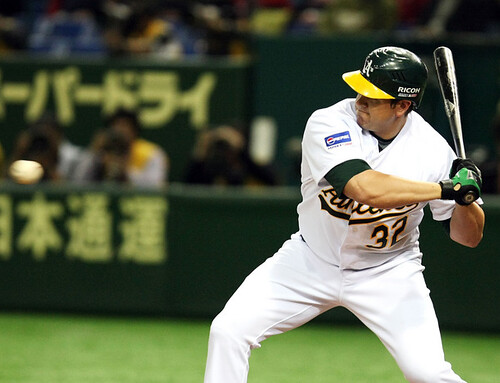
Did you wake up early to catch the A’s and Bosox? They’ve already set a new MLB record: most commercial uniform advertisers in a game. I count three: Ricoh on the helmets, Pepsi on Oakland’s sleeve (here’s another view), and EMC on Boston’s sleeve. Toss in the “Opening Series” cap patch and that thingie under the Ricoh logo (anyone know exactly what it is? I think it’s an “MLB in Japan” logo of some sort) and you’re basically just one step removed from NFL Europe.
I’ve got a new ESPN column today (here’s the link), so no full blog entry this morning. But here’s a Ticker — enjoy.
Uni Watch News Ticker: The Easter Bunny wears many uniforms. ”¦ The Minnesota Gophers hockey team is wearing “21” helmet decals in the WCHA Final Five as a tribute to Senior teammate Tom Pohl, who recently suffered a fractured skull. ”¦ Matt Ryburn notes that the the Dodgers’ 50th-anniversary patch was missing from Andruw Jones’s jersey on Saturday. ”¦ “As you are well aware, the University of Michigan is switching from Nike gear to Adidas next season,” writes Greg DiLeo. “During the transition from swoosh-world to the land of the three stripes (and the renovations to The Big House), it looks like a few swooshed merch racks from the M-Den store have been left out in the cold. Apparently it wasn’t an amicable breakup.” ”¦ “Check out Rafael Nadal’s hand,” writes Vince. “Lots of funny threads on tennis web sites speculating as to what it says. Jokes one person: ‘It says “Remember to scratch butt and bounce ball 25 times before a big point.”‘” ”¦ Will Leslie sent along some screen grabs from the upcoming Mike Myers film The Love Guru, which finds Myers playing an East Indian guru hired to help break the Maple Leafs’ long Stanely Cup curse. “Romany Malco plays the Leafs’ top player — Darren Roanoke, No. 77 — and you can see the Leafs and Kings wearing a Stanley Cup Finals patch in some scenes,” writes Will. ”¦ Yesterday I asked if anyone knew anything about the Texas Rangers wearing their road powder blues for a home game in 1974. John Philips responded with a heroically detailed account, which he posted in yesterday afternoon’s comments — check it out here. ”¦ John Cravaack, a big horse racing fan, sent along this photo of jockey Robbie Albarado wearing a football helmet. “The picture is from Last Mango stables in New Orleans,” he writes. “The winning jockey puts on a football helmet in the winner’s circle. They actually have their own helmet with the stable logo on the side. What’s the football connection, you ask? One of the stable’s major owners is Saints head coach Sean Payton.” ”¦ Jeremy Brahm reports that the Eintracht Frankfurt soccer team will not be wearing the cross-based jersey design that recently won a fan vote, because of the cross’s religious connotation. Details here. ”¦ Reprinted from last night’s comments: Check out the batboys and batgirls from the A’s/Sox game! ”¦ I’ll be attending this class tonight — let’s hope I don’t lop off a finger.
Something tells me that the greedy owners in baseball will keep adding more out-of-country games “to promote baseball”, but the main reason will be so they can fill their pockets with uniform advertisement money. To hell with traditions or history.
Shameful.
I think the patch reads “Ricoh Japan 08” with the MLB logo between Japan and 08.
link. Saw it on the frontpage.
~E~
[quote comment=”242067″]link. Saw it on the frontpage.
~E~[/quote]
Column is NOT YET FINAL. Kinda surprised they linked to it on the front page!
the logos are indeed a slippery slope…i think it’s not a matter of “if” but “when” we see them on unis in the states
link one for baroid or roidger should they ever return to play in 08 or 09
We all know that the advertising is there to generate more money for MLB, of course, but has anyone from MLB ever publicly attempted to justify why they are doing it in Japan? Do they trot out the “When in Rome . . .” excuse?
Regarding ESPN’s site: How does anyone find anything on that front page any more? It is so cluttered.
Paul: I got the RSS link to your ESPN column yesterday afternoon around 4 central.
Dang, I thought the sleeve link were a think of the past……
It is Uni Watch’s sad duty to announce that Phillies have scrapped the cool alternate cap they’ve been wearing for interleague games in recent years. On the plus side, they’ve unveiled a new throwback alternate design, based on the team’s late-’40s uni, which will be worn for selected home games. It’s flat-out gorgeous, with the exception of one small fly in the ointment: The uni numbers on the original design looked like this, so why is the throwback version going with this?
Paul, The #1 in the photo you linked to looks like the #1 used currently by the Cubs. In the past a lot of rival teams used the link. However today the team’s lettering is often a part of it’s brand. Which is the case with today’s Phillies and Cubs….and that’s my guess as to why the Phil’s have decided to use their current font.
[quote comment=”242073″]Paul: I got the RSS link to your ESPN column yesterday afternoon around 4 central.[/quote]
Yeah, my editors accidentally posted the column to a “real” URL (instead of a temporary/proxy URL) before we’d finished buffing and polishing it. It happens…
[quote comment=”242075″]It is Uni Watch’s sad duty to announce that Phillies have scrapped the cool alternate cap they’ve been wearing for interleague games in recent years. On the plus side, they’ve unveiled a new throwback alternate design, based on the team’s late-’40s uni, which will be worn for selected home games. It’s flat-out gorgeous, with the exception of one small fly in the ointment: The uni numbers on the original design looked like this, so why is the throwback version going with this?
Paul, The #1 in the photo you linked to looks like the #1 used currently by the Cubs. In the past a lot of rival teams used the link. However today the team’s lettering is often a part of it’s brand. Which is the case with today’s Phillies and Cubs….and that’s my guess as to why the Phil’s have decided to use their current font.[/quote]
Well, yes, I understand the thinking behind the Phils’ choice. But it’s not historically accurate — that’s all I was trying to point out.
2 comments
1 – as a phillies fan, thank God they got rid of those interleague hats – awful stuff
2 – have fun at that class – just got finished dissecting a pig in a bio lab, but i’m sure yours will be much better :)
Man, I love me some dot matrix sleeves.
They messed up in the Love Guru on the helmets. The NikeBauer tab on the side of the helmet is incorrect. NHL helmets have the side logo on all brands removed, so the only logo is on the front of the helmet.
From the WEEI Radio broadcast of the Sox/A’s this morning:
Dale Arnold: “There’s a guy down in front of us wearing a Red Sox jersey with a #18 on the back. It must’ve been a Johnny Damon jersey because he left the number and the ‘D-A’. He taped over the rest of it with ‘I-S-U-K-E’ for Daisuke Matusaka.”
Joe Castiglione: “Jeez, get a new shirt!”
My sentiments, EXACTLY. Joe Castig “Gets It”.
New column is now fully edited and link. If you’ve read it prior to now (9:54am eastern), you’ve missed a few items that have now been added to the text.
[quote comment=”242077″]
Well, yes, I understand the thinking behind the Phils’ choice. But it’s not historically accurate — that’s all I was trying to point out.[/quote]
Today’s “throwback” lettering hardly is ever historically accurate…even most of the M & N versions too. Is there a legal reason why they are never accurate you think, or are they just being lazy? Because some of them are real easy fixes…linkof link just have the link.
MLB has never officially taken a stance on the sponsorship in Japan, but here is the real story.
Since the beginning of the MLB Player tours in Japan, the Yomiuri Shinbun (owner of the Yomiuri Giants) and the Mainichi Shinbun (who owned the Mainichi Orions, which are now the Chiba Lotte Marines, and no ownership stake at present), would split who sponsored the tour every two or three years. This has continued until now.
Now with the Opening Games, Yomiuri gets precedence for those games because they own a portion of the Tokyo Dome and because of their historical support for MLB Tours.
The tours in the past have always had some sort of sponsorship. Now there are presenting sponsors, such as Ricoh. Without the sponsorship, the tours would have never happened.
How about sports uniforms as cosplay?
For the unknowing about this thing called cosplay, it is a Japanese term meaning “costume playing”, portraying a character from anime, books, movies, etc., at conventions, events, et al. I found these two images on the cosplay.com website involving characters in sports uniforms.
The first is two members of link from the 1979 movie The Warriors. The second is a character from an anime/manga who link in this picture.
Whoops! Wrong picture on the first post, so…
link
In the words of Kenneth Mayne “My bad!”
On the MLB.com gameday page for this morning’s game, I saw the WS 08 logo for the first time.
link
For some additional uni watching from an amateur writer, check out my link. This week looks at the Turn Ahead the Clock Jerseys with a shout out to Paul and pictures from Bill Henderson’s MLB StyleGuide. It’s a student publication, so we could really use the hits and site traffic. Thanks!
I believe this places me in the minority here, but I hate those ugly-ass Blue Jays alternates. I hate the polyester, non-button down shirts and I think the blue on blue look is pretty terrible.
And I know the Royals aren’t going with a true retro design, but I like the actual execution of that jersey much better. I like the blue on blue look, and the contrast of royal blue with light blue. I don’t see any problem with updating the look slightly and avoiding those horrid light blue pants.
Late 70s-80s unis and styles should remain mothballed in baseball, at least. The polyester and elastic era was pretty ugly and certainly not nearly as clean and solid looking as the 60s styles.
remember, that phillies uniform is BASED on the 1940’s design.
if you break it down, you’ll notice that the general template, the off white textile, the neck, sleeve and leg piping, and the hat is the “40’s contribution”.
the phillies of today make their contribution by throwing their current wordmark on the jersey front, typography on the jersey back and also on the hat.
historical accuracy to the 40’s wasnt the objective in this uniform, it was to bridge 2 eras in phillies history.
in fact, you could make a case that this uniform is completely historically accurate in the sense that it is the new 2008 home alternate uniform of the phillies, just like the rays new 2008 uniforms are historically accurate.
[quote comment=”242090″]I believe this places me in the minority here, but I hate those ugly-ass Blue Jays alternates. I hate the polyester, non-button down shirts and I think the blue on blue look is pretty terrible.
And I know the Royals aren’t going with a true retro design, but I like the actual execution of that jersey much better. I like the blue on blue look, and the contrast of royal blue with light blue. I don’t see any problem with updating the look slightly and avoiding those horrid light blue pants.
Late 70s-80s unis and styles should remain mothballed in baseball, at least. The polyester and elastic era was pretty ugly and certainly not nearly as clean and solid looking as the 60s styles.[/quote]
Sure, you might be in the minority, but, so what? If everyone liked the same things there would be nothing for us to discuss.
[quote comment=”242075″]It is Uni Watch’s sad duty to announce that Phillies have scrapped the cool alternate cap they’ve been wearing for interleague games in recent years. On the plus side, they’ve unveiled a new throwback alternate design, based on the team’s late-’40s uni, which will be worn for selected home games. It’s flat-out gorgeous, with the exception of one small fly in the ointment: The uni numbers on the original design looked like this, so why is the throwback version going with this?
Paul, The #1 in the photo you linked to looks like the #1 used currently by the Cubs. In the past a lot of rival teams used the link. However today the team’s lettering is often a part of it’s brand. Which is the case with today’s Phillies and Cubs….and that’s my guess as to why the Phil’s have decided to use their current font.[/quote]
Tell that to the Toronto Blue Jays. The STUPID wavy gray numbers and clunky names on the white homes; the better blue numbers, but same clunky names (in blue at least, not gray) on the roadies; the 100% retro link on the blues…CAN I GET SOME BLOODY CONSISTENCY PLEASE?
Sorry. I had to rant. The Jays look like an absolute train wreck. Why couldn’t the whites get the new numbers as well? Why couldn’t we get more blue for the BLUE Jays? And why, oh why, that pathetic touch of the past (and present)’s uni horror on the roads? Absolutely TERRIBLE execution.
Sarcastic not-so prediction: consistency and brand identity be damned, the Jays will keep the blues, but use purple typography on the whites and green on the gray roads, because if you can’t be consistent with your closet, you might as well coordinate with your inconsistent money.
[quote comment=”242086″]How about sports uniforms as cosplay?
For the unknowing about this thing called cosplay, it is a Japanese term meaning “costume playing”, portraying a character from anime, books, movies, etc., at conventions, events, et al. I found these two images on the cosplay.com website involving characters in sports uniforms.
The first is two members of link from the 1979 movie The Warriors. The second is a character from an anime/manga who link in this picture.[/quote]
What is it with the Japanese and weirdness? It’s like 85% of the world’s weird. strange, odd, and demented stuff comes from Japan.
[quote comment=”242092″]remember, that phillies uniform is BASED on the 1940’s design.
if you break it down, you’ll notice that the general template, the off white textile, the neck, sleeve and leg piping, and the hat is the “40’s contribution”.
the phillies of today make their contribution by throwing their current wordmark on the jersey front, typography on the jersey back and also on the hat.
historical accuracy to the 40’s wasnt the objective in this uniform, it was to bridge 2 eras in phillies history.
in fact, you could make a case that this uniform is completely historically accurate in the sense that it is the new 2008 home alternate uniform of the phillies, just like the rays new 2008 uniforms are historically accurate.[/quote]
Excellent analysis.
[quote]historical accuracy to the 40’s wasnt the objective in this uniform[/quote]
no shit sherlock
[quote]you could make a case that this uniform is completely historically accurate in the sense that it is the new 2008 home alternate uniform of the phillies[/quote]
or you could say it’s not historically accurate
/i DO like it however, despite the fact that they took a few ‘modern-day’ liberties
The Leafs and the Kings in a Cup final? Clearly, a work of fantasy.
I only saw the 10th inning, but I thought I saw Terry Francona wearing a jersey under the jacket. I know there was a lot of hub-bub over this last year and I thought Francona was claiming a medical dispensation for not wear the jersey. I guess I should have read the articles referencing this but, what gives?
[quote comment=”242090″]I believe this places me in the minority here, but I hate those ugly-ass Blue Jays alternates. I hate the polyester, non-button down shirts and I think the blue on blue look is pretty terrible.
And I know the Royals aren’t going with a true retro design, but I like the actual execution of that jersey much better. I like the blue on blue look, and the contrast of royal blue with light blue. I don’t see any problem with updating the look slightly and avoiding those horrid light blue pants.
Late 70s-80s unis and styles should remain mothballed in baseball, at least. The polyester and elastic era was pretty ugly and certainly not nearly as clean and solid looking as the 60s styles.[/quote]
AMEN, BRO!!!!!!!!!
-Jet
Thanks to John Philips for that fantastic recall of the A’s-Rangers powder-blue controversy.
Also, Paul, thanks for posting some of the pertinent comments that appeared in yesterday’s column in the afternoon/evening. I often miss those since I only have time to read Uni-Watch in the a.m. plus by the evening there are usually over 100 comments and that’s a lot to plow through…
-Jet
its not like the Kings did ANYTHING this year. might as well have had them play themselves in the Love Guru rather than get actors on skates
George
link
[quote comment=”242102″]The Leafs and the Kings in a Cup final? Clearly, a work of fantasy.[/quote]
Everytime I see the Kings current jersey, it just makes me cry for the old black and silver ones more……..
[quote comment=”242090″]I believe this places me in the minority here, but I hate those ugly-ass Blue Jays alternates. I hate the polyester, non-button down shirts and I think the blue on blue look is pretty terrible.
And I know the Royals aren’t going with a true retro design, but I like the actual execution of that jersey much better. I like the blue on blue look, and the contrast of royal blue with light blue. I don’t see any problem with updating the look slightly and avoiding those horrid light blue pants.
Late 70s-80s unis and styles should remain mothballed in baseball, at least. The polyester and elastic era was pretty ugly and certainly not nearly as clean and solid looking as the 60s styles.[/quote]
all outstanding points.
[quote comment=”242077″][quote comment=”242075″]It is Uni Watch’s sad duty to announce that Phillies have scrapped the cool alternate cap they’ve been wearing for interleague games in recent years. On the plus side, they’ve unveiled a new throwback alternate design, based on the team’s late-’40s uni, which will be worn for selected home games. It’s flat-out gorgeous, with the exception of one small fly in the ointment: The uni numbers on the original design looked like this, so why is the throwback version going with this?
Paul, The #1 in the photo you linked to looks like the #1 used currently by the Cubs. In the past a lot of rival teams used the link. However today the team’s lettering is often a part of it’s brand. Which is the case with today’s Phillies and Cubs….and that’s my guess as to why the Phil’s have decided to use their current font.[/quote]
Well, yes, I understand the thinking behind the Phils’ choice. But it’s not historically accurate — that’s all I was trying to point out.[/quote]
Honestly, I find the new uniform to be boring as heck.
And, great! A double post!
Now, I will be sporting my 1928 Phillies replica cap on Monday afternoon. That’s a fantastic design.
And, great! A double post!
Now, I will be sporting my 1928 Phillies replica cap on Monday afternoon. That’s a fantastic design.
Oy.
[quote comment=”242100″][quote]historical accuracy to the 40’s wasnt the objective in this uniform[/quote]
no shit sherlock
[quote]you could make a case that this uniform is completely historically accurate in the sense that it is the new 2008 home alternate uniform of the phillies[/quote]
or you could say it’s not historically accurate
/i DO like it however, despite the fact that they took a few ‘modern-day’ liberties[/quote]
That’s a really intelligent response…keep up the good work.
The Phillies got it absolutely right here…the jerseys look awesome. Just because something is old doesnt make it good…in my opinion they made the right upgrades to an older design.
[quote comment=”242112″]“Honestly, I find the new uniform to be boring as heck.”[/quote]
Penn State is bland in the college football uniform department, Arkansas and NC State college basketball are dull, but sometimes boring is better.
[quote comment=”242100″][quote]historical accuracy to the 40’s wasnt the objective in this uniform[/quote]
no shit sherlock
[quote]you could make a case that this uniform is completely historically accurate in the sense that it is the new 2008 home alternate uniform of the phillies[/quote]
or you could say it’s not historically accurate
/i DO like it however, despite the fact that they took a few ‘modern-day’ liberties[/quote]
how can you say ITS NOT historically accurate?
what are you comparing it too? this is a brand new, never before seen 2008 uniform.
it was never supposed to be an exact historical copy of the ashburn era phillies uni, so to compare it to that uniform and say its not accurate is inappropriate.
what “modern day liberties” were taken?
[quote comment=”242117″][quote comment=”242112″]“Honestly, I find the new uniform to be boring as heck.”[/quote]
Penn State is bland in the college football uniform department, Arkansas and NC State college basketball are dull, but sometimes boring is better.[/quote]
Not if you’re link . . .
See Marty, I just saved you the time
That second picture from the Mike Myers hockey movie…is that Bob Probert on the right side? It looks a lot like him. Hmmm…
Hopefully they’ll show you where the football comes from in the pig butchering class. Very cool.
[quote comment=”242118″]“What ‘modern day liberties’ were taken?”[/quote]
Well, the current lettering, wordmark and numbering for one, and the MLB logo on the back of the shirt and cap.
Hooray for no more White Sox sleaveless jersey’s! And I’d agree that the Blue Jays new/old blues are a little odd looking. I was always a much bigger fan of the Expos and Royals powder blue unis. And I don’t so much mind the Royals changing the font colors, although I do wish that they, and everyone for that matter, would have all the jersey font colors match. If the wordmark is blue, the numbers should be blue as well. the Phillies and Indians new alternates are pretty sweet. I don’t like the Phillies numbers font, but not because it isn’t accruate, because it’s ugly.
And, sorry I’m late to the party, but congrats Paul on the upgrade in ESPN duties!
The Washington Nationals will host the Pittsburgh Pirates for a “Grays on Grays” game on May 3rd. Should be interesting to see how they pull it off. I imagine one will have road “Grays” and the other home “Grays”….
[quote comment=”242119″][quote comment=”242117″][quote comment=”242112″]“Honestly, I find the new uniform to be boring as heck.”[/quote]
Penn State is bland in the college football uniform department, Arkansas and NC State college basketball are dull, but sometimes boring is better.[/quote]
Not if you’re link . . .
See Marty, I just saved you the time[/quote]
Boring is never good, but simple can be. There is a big difference. The UCLA basketball team have simple uniforms, but the are not boring.
Did anyone else notice that Marian Hossa’s helmet was missing the Penguins logo on the right side in last night’s game at the Islanders? The Pens’ web site has a picture of him from the game link
[quote comment=”242125″]The Washington Nationals will host the Pittsburgh Pirates for a “Grays on Grays” game on May 3rd. Should be interesting to see how they pull it off. I imagine one will have road “Grays” and the other home “Grays”….[/quote]
The Brewers and Braves have done that in Milwaukee a couple times, with Milwaukee in home 1957 Braves uniforms and Atlanta wearing the road equivalent.
I’m glad every time the Nationals wear Grays throwbacks. They should have gone with that name from the start.
[quote comment=”242123″][quote comment=”242118″]“What ‘modern day liberties’ were taken?”[/quote]
Well, the current lettering, wordmark and numbering for one, and the MLB logo on the back of the shirt and cap.[/quote]
how do you call placing “current lettering, wordmark and numbering for one, and the MLB logo on the back of the shirt and cap” taking a modern day liberty by putting it on a modern day uniform?
its supposed to be like that!
you need to understand that the phillies alternate day uniform is just that, an alternate uniform, AND NOT A THROWBACK, RETRO, OR EXACT REPRODUCTION of the ashburn era phillies uni.
it was to take elements of the 40’s uni, not BE it.
I don’t know if anyone has noticed this already, but last night I was watching sportscenter and they had womens tourney highlights and I realized the the linkare wearing a nike link. I didn’t know they were making them for the women. Does anyone know if they have been wearing these uni’s all season or if any other womens teams are wearing the SOD.
P.S. The Stanford men don’t even wear the SOD, theyre stuck with the link.
[quote comment=”242123″][quote comment=”242118″]“What ‘modern day liberties’ were taken?”[/quote]
Well, the current lettering, wordmark and numbering for one, and the MLB logo on the back of the shirt and cap.[/quote]
I really hope this was meant to be sarcastic
From the University of Colorado system, as picked up on by the Denver Post for this morning’s edition: link. That, or it’s an elaborate April Fool’s prank, which many of us hope this is. :P
I think the helmet logo says ‘JAPAN [MLB logo] 2008’ as can be seen better on the BP jersey link you posted in your espn article.
Not necessarily uni-related, but I just noticed the resemblance here: compare link to link.
The resemblance is so uncanny, that I can’t imagine it has never been mentioned before, but a search turned up nothing. So Paul, how do you feel about that uniform?
traditions are overrated. I’d rather have more uniform logos than being constantly barraged by in-game audio advertisements.
Hey, why do the opening series in Japan uniforms always contain corporate logos? These are never used stateside. The only time I have seen batting helmets or jerseys with corporate branding though has been MLB’s past two trips to Japan, where Ricoh bought adspace on the side of Yankee/Red Sock/A/Devil Ray batting helmets.
Hey, why do the opening series in Japan uniforms always contain corporate logos? These are never used stateside. The only time I have seen batting helmets or jerseys with corporate branding though has been MLB’s past two trips to Japan, where Ricoh bought adspace on the side of Yankee/Red Sock/A/Devil Ray batting helmets.
[quote comment=”242129″][quote comment=”242119″][quote comment=”242117″][quote comment=”242112″]“Honestly, I find the new uniform to be boring as heck.”[/quote]
Penn State is bland in the college football uniform department, Arkansas and NC State college basketball are dull, but sometimes boring is better.[/quote]
Not if you’re link . . .
See Marty, I just saved you the time[/quote]
Boring is never good, but simple can be. There is a big difference. The UCLA basketball team have simple uniforms, but the are not boring.[/quote]
Rather than boring or simple, I think the more appropriate term for jerseys like link and link is “classic”.
[quote comment=”242121″]That second picture from the Mike Myers hockey movie…is that Bob Probert on the right side? It looks a lot like him. Hmmm…[/quote]
I’ll bet you’re right because I read somewhere he’s supposed to make a cameo in the movie. The complete irony of that situation is that they gave Probie Tie Domi’s number to wear in the movie.
[quote comment=”242147″][quote comment=”242129″][quote comment=”242119″][quote comment=”242117″][quote comment=”242112″]“Honestly, I find the new uniform to be boring as heck.”[/quote]
Penn State is bland in the college football uniform department, Arkansas and NC State college basketball are dull, but sometimes boring is better.[/quote]
Not if you’re link . . .
See Marty, I just saved you the time[/quote]
Boring is never good, but simple can be. There is a big difference. The UCLA basketball team have simple uniforms, but the are not boring.[/quote]
Rather than boring or simple, I think the more appropriate term for jerseys like link and link is “classic”.[/quote]
People constantly refer to Penn State and the Yankees and Notre Dame as classic and to me they are boring as all heck. When I hear the term classic it just means to me that they haven’t changed the uniform design in years.
[quote comment=”242144″]traditions are overrated. I’d rather have more uniform logos than being constantly barraged by in-game audio advertisements.[/quote]
Traditions are overrated?????
Where would I even begin? Let’s do the Super Bowl on Wednesday morning. How about a one game, winner take all MLB championship? Oooo … let’s move Christmas to July so people in the southern hemisphere might have a shot at a White Christmas. Oops … White Christmas … stupid traditional wish.
…3rd attempt…
That dispute over the “christian” cross has to stop. Most muslim countries flags or jersey crests include star and crescent. Eintracht design is anything but a religious statment. It’s all about dialogue vs people who will use any excuse to get some exposure. Cantona and Zidane’s hometown flag is a link. It has the BIGGEST muslim population in Europe, and an even bigger muslim soccer fanbase among the country’s youngsters and working classes, who made their jersey the # 1 sales.
jersey history link
the filter won’t let me post so scroll till 2001, 2005, 2006 and 2007 jerseys
[quote comment=”242130″]Did anyone else notice that Marian Hossa’s helmet was missing the Penguins logo on the right side in last night’s game at the Islanders? The Pens’ web site has a picture of him from the game link[/quote]
I did see that, and I also noticed Saturday night that Petr Sykora’s wearings his wedding band under his gloves. I know I’ve heard more discussion here about football and baseball players rarely doing this, any previous knowledge about hockey players? Sorry, no screen shot – they showed it when he went to the bench after scoring a goal…
Speaking of “tradition” … I thought it was strange when MLB started marketing “Opening Day” … I mean, what person in an MLB city DOESN’T know when it’s opening day for their team? And, if they turn on SportsCenter by accident and watch the highlights, will it ONLY be because of the patches on the uniforms that clue them in to this fact?
Then, in recent years, I’ve started noticing you have “Opening Day” as well as “Opening Night” games (only place I found this to be appropriately marketed: 8/8/88 … which ended up being nothing at all by the history book) … now “Opening Series”??? Next year, will there be “Second Series”? “Third To Last Series”? When will it end?
[quote comment=”242161″]. . . as well as “Opening Night” games (only place I found this to be appropriately marketed: 8/8/88 … which ended up being nothing at all by the history book) …/quote]
Especially since, IIRC, the game got rained out and the first “official” night game at Wrigley actually took place the next night (8/9/88).
[quote comment=”242161″]Speaking of “tradition” … I thought it was strange when MLB started marketing “Opening Day” … I mean, what person in an MLB city DOESN’T know when it’s opening day for their team? And, if they turn on SportsCenter by accident and watch the highlights, will it ONLY be because of the patches on the uniforms that clue them in to this fact?[/quote]
And on the other hand we’ve got some teams playing regular season games while most are still playing exhibition games, leaving causal fans asking themselves “so is this a real game?”
Interesting how as much as not having ads on major league baseball uni’s is tradition, having ads on English football kits is now tradition.
Oy Paul! Your girlfriend got you taking up the cooking lessons as well? lol
[quote comment=”242153″]
People constantly refer to Penn State and the Yankees and Notre Dame as classic and to me they are boring as all heck. When I hear the term classic it just means to me that they haven’t changed the uniform design in years.[/quote]
Must respectfully disagree.
Not all change is good. When you look like the Yankees or Penn State (or Dodgers, or many others), there’s no need to change.
Leave change for its own sake to team who haven’t found a look that can endure.
[quote comment=”242162″][quote comment=”242161″]. . . as well as “Opening Night” games (only place I found this to be appropriately marketed: 8/8/88 … which ended up being nothing at all by the history book) …/quote]
Especially since, IIRC, the game got rained out and the first “official” night game at Wrigley actually took place the next night (8/9/88).[/quote]
Not only do I recall, I was sitting outside the park getting soaked during the rainout. I am proud to have the distinction of then being the first (and only!) person to wait outside the park at the bleacher entrance (no “Bud Light Bleachers” in 1988!), waiting to be first to get in for that next game!!!!
I can’t tell you how wonderful it was watching all the snobs who bought their way into the park that night swearing and drenched while leaving the park as their $1,000 seats bought them nothing but a lost deposit on their tux rental, where my $8 bleacher ticket got me – and 38,000 other REAL baseball fans – into the REAL first night game in the park’s history.
So, uh, yeah … IDRC! :)
[quote comment=”242164″]Interesting how as much as not having ads on major league baseball uni’s is tradition, having ads on English football kits is now tradition.
[/quote]
yes, and it looks terrible. As an outsider (American non-fan of soccer), it just looks lame to see Vodaphone or whoever dominating the jersey, with a tiny 3inch team logo relegated near the collarbone area.
I know it’s all about money, and won’t ever change, but I wish it would.
Paul-
My apologies if someone has already posted something about this, but a few days ago you mentioned the fact that the NCAA tourney patches look like they’re attached with a glue stick.
You’re not too far off. One of my good friends is a trainer for the Oklahoma State women’s team, and he was telling me the patches are indeed a single-use, adhesive backed patch (meaning the they just tossed them after the game and were given new ones before each round).
I’ll try and have him snag one after OSU’s game in New Orleans and send some pics in if I get one.
[quote comment=”242116″][quote comment=”242100″][quote]historical accuracy to the 40’s wasnt the objective in this uniform[/quote]
no shit sherlock
[quote]you could make a case that this uniform is completely historically accurate in the sense that it is the new 2008 home alternate uniform of the phillies[/quote]
or you could say it’s not historically accurate
/i DO like it however, despite the fact that they took a few ‘modern-day’ liberties[/quote]
That’s a really intelligent response…keep up the good work.
The Phillies got it absolutely right here…the jerseys look awesome. Just because something is old doesnt make it good…in my opinion they made the right upgrades to an older design.[/quote]
if you’d refer back to post #9 and todd & paul’s subsequent replies, you’d see that todd was taking umbrage with paul’s referral to the phil’s NEW uni as a “throwback”…which todd so eloquently pointed out, isn’t really a “throwback” at all, in the sense it is lacking historical correctness…hence, not ‘historically accurate’…
certain phrases on here, when not used either correctly or in the context another user is accustomed to (for example, paul feels one small swoosh on a uni constitutes ‘logo creep’…i happen to disagree, but for the sake of argument, i will accept that definition)
i believe, although i am not speaking for todd, that he was merely seeking to clarify paul’s use of the term throwback, which is another term on which we may not all agree
to some, a “throwback” is an EXACT replica of the original, but to others, it’s more of a “feel” (as this one clearly is)…would one call the “new” phillies alternate a “throwback”…that depends upon your definition…perhaps the jersey is ‘throwbackish, in that it evokes the spirit of the original while taking some ‘modern day liberties’ (all of which james eloquently stated)
that being said, i DO LIKE the
newoldretrothrowback feel and think it’s a GREAT alt…is it ‘historically accurate’? no…is it a ‘throwback’? maybe…is it ‘sweet’? hells yesnow…as far as my original comments…i was just being sarcastic
Looked like Manny had his helmet logo applied over his pine tar goop. Or was that just something I thought I saw because I was still half asleep?
OK, browsing through the web and found linkof a baseball player for the Dunn School in Los Olivos (CA). Pretty sweet, I think, until you realize that your school’s athletic teams have an link
[quote comment=”242172″]OK, browsing through the web and found linkof a baseball player for the Dunn School in Los Olivos (CA). Pretty sweet, I think, until you realize that your school’s athletic teams have an link[/quote]
“Pretty sweet uniform“, that is….the nickname? Eeew
[quote comment=”242172″]OK, browsing through the web and found linkof a baseball player for the Dunn School in Los Olivos (CA). Pretty sweet, I think, until you realize that your school’s athletic teams have an link[/quote]
I kind of like it. I mean, how many more teams named Tigers, Bulldogs or Wildcats do we need? If they were the Bed Bugs or the Head Lice it might be a little questionable.
[quote comment=”242180″][quote comment=”242172″]OK, browsing through the web and found linkof a baseball player for the Dunn School in Los Olivos (CA). Pretty sweet, I think, until you realize that your school’s athletic teams have an link[/quote]
I kind of like it. I mean, how many more teams named Tigers, Bulldogs or Wildcats do we need? If they were the Bed Bugs or the Head Lice it might be a little questionable.[/quote]
As long as the earwig doesn’t go into your brain through your ear to make you easily hypnotized. . .
I’m sure it’s been mentioned before, but a big reason for ads on soccer jerseys is because televised soccer features exactly ZERO commercial breaks outside of halftime. I would probably tolerate some advertising on NFL uniforms if it would mean the end of the heinous “TV Time out.”
[quote comment=”242181″][quote comment=”242180″][quote comment=”242172″]OK, browsing through the web and found linkof a baseball player for the Dunn School in Los Olivos (CA). Pretty sweet, I think, until you realize that your school’s athletic teams have an link[/quote]
I kind of like it. I mean, how many more teams named Tigers, Bulldogs or Wildcats do we need? If they were the Bed Bugs or the Head Lice it might be a little questionable.[/quote]
As long as the earwig doesn’t go into your brain through your ear to make you easily hypnotized. . .[/quote]
interesting:
Earwig is derived from Old English Ä“are “ear” and wicga, ‘insect’. (Wicga is in turn related to wiggle, and ultimately to other words implying movement, including way and vehicle, all from PIE *wegh-.) The name comes from the old wives’ tale that earwigs burrow into the brains of humans through the ear and therein lay their eggs. Though the notion has no basis in fact, earwigs, being curious omnivores predisposed to hiding in small holes, may well have crawled into a human ear at some time or other seeking a warm humid crevice.
[quote comment=”242180″][quote comment=”242172″]OK, browsing through the web and found linkof a baseball player for the Dunn School in Los Olivos (CA). Pretty sweet, I think, until you realize that your school’s athletic teams have an link[/quote]
I kind of like it. I mean, how many more teams named Tigers, Bulldogs or Wildcats do we need? If they were the Bed Bugs or the Head Lice it might be a little questionable.[/quote]
Methinks that I’d rather be a “Tiger, Bulldog, or Wildcat” than be associated with an insect that link, but who knows what kids are into these days? ;-)
[quote comment=”242154″][quote comment=”242144″]traditions are overrated. I’d rather have more uniform logos than being constantly barraged by in-game audio advertisements.[/quote]
Traditions are overrated?????
Where would I even begin? Let’s do the Super Bowl on Wednesday morning. How about a one game, winner take all MLB championship? Oooo … let’s move Christmas to July so people in the southern hemisphere might have a shot at a White Christmas. Oops … White Christmas … stupid traditional wish.[/quote]
Could we do a one game MLB championship? Is that possible?
What’s a White Christmas?
[quote comment=”242161″]Speaking of “tradition” … I thought it was strange when MLB started marketing “Opening Day” … I mean, what person in an MLB city DOESN’T know when it’s opening day for their team? And, if they turn on SportsCenter by accident and watch the highlights, will it ONLY be because of the patches on the uniforms that clue them in to this fact?[/quote]
I am in an MLB city, and I couldn’t tell you when “Opening Day” is for the Diamondbacks.
[quote comment=”242134″]I don’t know if anyone has noticed this already, but last night I was watching sportscenter and they had womens tourney highlights and I realized the the linkare wearing a nike link. I didn’t know they were making them for the women. Does anyone know if they have been wearing these uni’s all season or if any other womens teams are wearing the SOD.
P.S. The Stanford men don’t even wear the SOD, theyre stuck with the link.[/quote]
So, does anyone know more about this?
Speaking of renovations to The Big House, did anyone see that Penn State’s Beaver Stadium will temporarily be the largest stadium in the country the next 2 football seasons? Michigan was forced to settle a recent ADA lawsuit and must rip out 1,300 seats to accommodate additional seats for the disabled. The result is The Big House’s seating capacity being reduced to 106,201 versus Beaver Stadium’s 107,282. link
[quote comment=”242183″]I’m sure it’s been mentioned before, but a big reason for ads on soccer jerseys is because televised soccer features exactly ZERO commercial breaks outside of halftime. I would probably tolerate some advertising on NFL uniforms if it would mean the end of the heinous “TV Time out.”[/quote]
Of course, shirt sponsorship didn’t stop them placing rotating ad banners across the sides of the pitch.
No actual breaks, sure. But that doesn’t mean the game isn’t saturated with advertising.
[quote comment=”242192″][quote comment=”242183″]I’m sure it’s been mentioned before, but a big reason for ads on soccer jerseys is because televised soccer features exactly ZERO commercial breaks outside of halftime. I would probably tolerate some advertising on NFL uniforms if it would mean the end of the heinous “TV Time out.”[/quote]
Of course, shirt sponsorship didn’t stop them placing rotating ad banners across the sides of the pitch.
No actual breaks, sure. But that doesn’t mean the game isn’t saturated with advertising.[/quote]
English Soccer is like Human NASCAR
Meaning that the ads are annoying and ugly, but would seem strange without them.
Looks like Melvin Mora has a link new line of trainers.
I don’t know, I could get used to them.
Internationals don’t have shirt ads, and they seem perfectly all right to me.
Sorry, Joe, to make my meaning clear that should be “I could get used to English soccer without shirt ads.”
[quote comment=”242153″][quote comment=”242147″][quote comment=”242129″][quote comment=”242119″][quote comment=”242117″][quote comment=”242112″]“Honestly, I find the new uniform to be boring as heck.”[/quote]
Penn State is bland in the college football uniform department, Arkansas and NC State college basketball are dull, but sometimes boring is better.[/quote]
Not if you’re link . . .
See Marty, I just saved you the time[/quote]
Boring is never good, but simple can be. There is a big difference. The UCLA basketball team have simple uniforms, but the are not boring.[/quote]
Rather than boring or simple, I think the more appropriate term for jerseys like link and link is “classic”.[/quote]
People constantly refer to Penn State and the Yankees and Notre Dame as classic and to me they are boring as all heck. When I hear the term classic it just means to me that they haven’t changed the uniform design in years.[/quote]
If you really don’t like the unis you mentioned, I seriously have doubt about your taste level in general, not just sports unis. I HATE the Yankees and Notre Dame, more importantly their entitled fan bases. But I couldn’t for one second try to pretend their uni’s aren’t georgous. I have nothing against new designs, but if it ain’t broke, don’t fix it. As long as there aren’t link, link, unfinished, pointy for no reason lines and stupid fonts, make all the new uni’s you want, but don’t change the classics.
Not necessarily uni-related, but I just noticed the resemblance here: compare this guy to this guy.
The resemblance is so uncanny, that I can’t imagine it has never been mentioned before, but a search turned up nothing. So Paul, how do you feel about that uniform?
how bout this guy:
link
KIDDING! paul, don’t kill me!!! cause i kinda look like this guy:
link
LOL!
[quote comment=”242202″][quote comment=”242153″][quote comment=”242147″][quote comment=”242129″][quote comment=”242119″][quote comment=”242117″][quote comment=”242112″]“Honestly, I find the new uniform to be boring as heck.”[/quote]
Penn State is bland in the college football uniform department, Arkansas and NC State college basketball are dull, but sometimes boring is better.[/quote]
Not if you’re link . . .
See Marty, I just saved you the time[/quote]
Boring is never good, but simple can be. There is a big difference. The UCLA basketball team have simple uniforms, but the are not boring.[/quote]
Rather than boring or simple, I think the more appropriate term for jerseys like link and link is “classic”.[/quote]
People constantly refer to Penn State and the Yankees and Notre Dame as classic and to me they are boring as all heck. When I hear the term classic it just means to me that they haven’t changed the uniform design in years.[/quote]
If you really don’t like the unis you mentioned, I seriously have doubt about your taste level in general, not just sports unis. I HATE the Yankees and Notre Dame, more importantly their entitled fan bases. But I couldn’t for one second try to pretend their uni’s aren’t georgous. I have nothing against new designs, but if it ain’t broke, don’t fix it. As long as there aren’t link, link, unfinished, pointy for no reason lines and stupid fonts, make all the new uni’s you want, but don’t change the classics.[/quote]
Agreed – can we get back to “Earwig Talk” now?
;-)
[quote comment=”242202″][quote comment=”242153″][quote comment=”242147″][quote comment=”242129″][quote comment=”242119″][quote comment=”242117″][quote comment=”242112″]“Honestly, I find the new uniform to be boring as heck.”[/quote]
Penn State is bland in the college football uniform department, Arkansas and NC State college basketball are dull, but sometimes boring is better.[/quote]
Not if you’re link . . .
See Marty, I just saved you the time[/quote]
Boring is never good, but simple can be. There is a big difference. The UCLA basketball team have simple uniforms, but the are not boring.[/quote]
Rather than boring or simple, I think the more appropriate term for jerseys like link and link is “classic”.[/quote]
People constantly refer to Penn State and the Yankees and Notre Dame as classic and to me they are boring as all heck. When I hear the term classic it just means to me that they haven’t changed the uniform design in years.[/quote]
If you really don’t like the unis you mentioned, I seriously have doubt about your taste level in general, not just sports unis. I HATE the Yankees and Notre Dame, more importantly their entitled fan bases. But I couldn’t for one second try to pretend their uni’s aren’t georgous. I have nothing against new designs, but if it ain’t broke, don’t fix it. As long as there aren’t link, link, unfinished, pointy for no reason lines and stupid fonts, make all the new uni’s you want, but don’t change the classics.[/quote]
Why not? If a uniform is ugly change it. The Yankees have ugly uniforms. That interlocking is different on the hat, the helmet, the jersey and the jacket. And they all look like they were drawn by a 3rd grade kid. There is no color to it what so ever. It’s blah. And Penn State is even worse.
I just thought of something that i know can and will be answered here. When Tiger had to play half his final round Sunday and half on Monday did he wear two different red shirts? or were they two of the same shirt? I’ve heard him say he donates them to charities to auction off. I wonder if a Monday finish means he gets to keep one.
[quote comment=”242180″][quote comment=”242172″]OK, browsing through the web and found linkof a baseball player for the Dunn School in Los Olivos (CA). Pretty sweet, I think, until you realize that your school’s athletic teams have an link[/quote]
I kind of like it. I mean, how many more teams named Tigers, Bulldogs or Wildcats do we need? If they were the Bed Bugs or the Head Lice it might be a little questionable.[/quote]
Howzabout rooting for the mighty link? Ah, alumni must be proud of that name
[quote comment=”242217″]I just thought of something that i know can and will be answered here. When Tiger had to play half his final round Sunday and half on Monday did he wear two different red shirts? or were they two of the same shirt? I’ve heard him say he donates them to charities to auction off. I wonder if a Monday finish means he gets to keep one.[/quote]
My guess is that they were different shirts . . .and yet a THIRD shirt that he wore in the Match play link for Islesworth later in the day . . .
[quote comment=”242214″] And they all look like they were drawn by a 3rd grade kid. There is no color to it what so ever. It’s blah. And Penn State is even worse.[/quote]
link looks like it’s done by a 2nd grader, but people still ohh and ahh over it and they, for some reason, are considered artistic triumphs. A uniform design, like art, is also subjective. You may hate it, but I may love it.
I personally feel the Yankee’s uni is one of the greatest in sports because it is so boring, but I’m with you on the different versions of the NY….drives me nuts.
still nothing on the NCAA womens Nike sytem of dress? Am I the only person who thinks this is significant Uni news?
[quote comment=”242204″][quote comment=”242202″][quote comment=”242153″][quote comment=”242147″][quote comment=”242129″][quote comment=”242119″][quote comment=”242117″][quote comment=”242112″]“Honestly, I find the new uniform to be boring as heck.”[/quote]
Penn State is bland in the college football uniform department, Arkansas and NC State college basketball are dull, but sometimes boring is better.[/quote]
Not if you’re link . . .
See Marty, I just saved you the time[/quote]
Boring is never good, but simple can be. There is a big difference. The UCLA basketball team have simple uniforms, but the are not boring.[/quote]
Rather than boring or simple, I think the more appropriate term for jerseys like link and link is “classic”.[/quote]
People constantly refer to Penn State and the Yankees and Notre Dame as classic and to me they are boring as all heck. When I hear the term classic it just means to me that they haven’t changed the uniform design in years.[/quote]
If you really don’t like the unis you mentioned, I seriously have doubt about your taste level in general, not just sports unis. I HATE the Yankees and Notre Dame, more importantly their entitled fan bases. But I couldn’t for one second try to pretend their uni’s aren’t georgous. I have nothing against new designs, but if it ain’t broke, don’t fix it. As long as there aren’t link, link, unfinished, pointy for no reason lines and stupid fonts, make all the new uni’s you want, but don’t change the classics.[/quote]
Agreed – can we get back to “Earwig Talk” now?
;-)[/quote]
link
link
Can’t wait until this link makes it to the NHL.
[quote comment=”242221″]still nothing on the NCAA womens Nike sytem of dress? Am I the only person who thinks this is significant Uni news?[/quote]
Significant, yes. Can’t find jack in any search engines to see what other women’s teams have adopted the SOD – anybody else?
[quote comment=”242223″]Can’t wait until this link makes it to the NHL.[/quote]
link
[quote comment=”242222″][quote comment=”242204″][quote comment=”242202″][quote comment=”242153″][quote comment=”242147″][quote comment=”242129″][quote comment=”242119″][quote comment=”242117″][quote comment=”242112″]“Honestly, I find the new uniform to be boring as heck.”[/quote]
Penn State is bland in the college football uniform department, Arkansas and NC State college basketball are dull, but sometimes boring is better.[/quote]
Not if you’re link . . .
See Marty, I just saved you the time[/quote]
Boring is never good, but simple can be. There is a big difference. The UCLA basketball team have simple uniforms, but the are not boring.[/quote]
Rather than boring or simple, I think the more appropriate term for jerseys like link and link is “classic”.[/quote]
People constantly refer to Penn State and the Yankees and Notre Dame as classic and to me they are boring as all heck. When I hear the term classic it just means to me that they haven’t changed the uniform design in years.[/quote]
If you really don’t like the unis you mentioned, I seriously have doubt about your taste level in general, not just sports unis. I HATE the Yankees and Notre Dame, more importantly their entitled fan bases. But I couldn’t for one second try to pretend their uni’s aren’t georgous. I have nothing against new designs, but if it ain’t broke, don’t fix it. As long as there aren’t link, link, unfinished, pointy for no reason lines and stupid fonts, make all the new uni’s you want, but don’t change the classics.[/quote]
Agreed – can we get back to “Earwig Talk” now?
;-)[/quote]
link
link[/quote]
link
In the ESPN article today a picture of David Wright is linked to show the Shea Stadium patch in action. I realized that he is using a link. It is not his signature model which is linkwhich he used for the entirety of the 2007 season. The glove in the first pic appears to be have the same construction (open back, H-web) as his signature model, but this new model is not on the wilson website. I wonder if wilson has a new line or if this is an addition to the A2K or A2000 lines.
I was a big advocate of the Royals bringing back their powder blues. But when I saw the Blue Jays’ link, I realized that the clean look of the ’70s wouldn’t translate to the baggy, no-stirrups look of today. I think the Royals have done a nice job updating their look without looking boring like the Atlanta Braves did in the polyester era.
[quote comment=”242234″]I was a big advocate of the Royals bringing back their powder blues. But when I saw the Blue Jays’ link, I realized that the clean look of the ’70s wouldn’t translate to the baggy, no-stirrups look of today. I think the Royals have done a nice job updating their look without looking boring like the link did in the polyester era.[/quote]
Didn’t Opening Day used to start in Cincinnati for, like a century?
[quote comment=”242220″]
link looks like it’s done by a 2nd grader, but people still ohh and ahh over it and they, for some reason, are considered artistic triumphs. A uniform design, like art, is also subjective. You may hate it, but I may love it.
I personally feel the Yankee’s uni is one of the greatest in sports because it is so boring, but I’m with you on the different versions of the NY….drives me nuts.[/quote]
With you on the Yankees’ uniform greatness, but couldn’t disagree more about Pollack. You think it’s so easy, you try it.
Paul’s influence is seen on the WWL already! The boys on PTI decrying logo creep, marvelous!
On a non-uni note, I grew up in Nashville and remember each March getting tickets to see the parent club play one of their last exhibition games on the way north from spring training (and we’re talking 1980’s here, not the 1960’s). Instead of playing games in Japan for quick corporate cash, shouldn’t MLB “grow” the sport through programs like RBI Baseball and showcase the stars in non-major league cities?
I know this is not uni-related, but does anyone know what is going on with around the horn? In israel guttierez’s first show, mariotti said something about trading woody paige and tim cowlishaw. Is Are woody and tim gone? or are they just taking a break?
[quote comment=”242247″]I know this is not uni-related, but does anyone know what is going on with around the horn? In israel Gutierrez’s first show, mariotti said something about trading woody paige and tim cowlishaw. Is Are woody and tim gone? or are they just taking a break?[/quote]
trading them for Gutierrez, that is.
[quote comment=”242247″]I know this is not uni-related, but does anyone know what is going on with around the horn? In israel guttierez’s first show, mariotti said something about trading woody paige and tim cowlishaw. Is Are woody and tim gone? or are they just taking a break?[/quote]
That show is still on? How?
Regarding the 21 on the back of the Gophers’ helmets, I actually heard that it was to remember Sean Taylor.
Roger Goodell Strikes again.
link
i can not believe professional athletes actually wore these uniforms!
As far as sneakers/athetic shoes go, I tend to be conservative; my first pair of note was the original ABA adidas Americana in 72. tho I did
have an Agassi neon-phase in the late 80’s.
Anyway, I have seen some u g l y shoes in my time.
Nothing, however, prepared me for….
this.
link
Speaking of bad school nicknames…How about link
[quote comment=”242237″]Didn’t Opening Day used to start in Cincinnati for, like a century?[/quote]
For a long time. And then the Reds had to share Opening Day with the A.L. And then they had to share Opening Day with other N.L. teams. And then things went totally to hell.
[quote comment=”242251″][quote comment=”242247″]I know this is not uni-related, but does anyone know what is going on with around the horn? In israel guttierez’s first show, mariotti said something about trading woody paige and tim cowlishaw. Is Are woody and tim gone? or are they just taking a break?[/quote]
That show is still on? How?[/quote]
Woody was on the show today with “Izzy”. I don’t know about Tim “I love NASCAR and Hockey” Cowlishaw though.
[quote comment=”242258″][quote]link
i can not believe professional athletes actually wore these uniforms![/quote]
I have seen some u g l y shoes in my time. Nothing, however, prepared me for…link[/quote]
marty LOVES the caribou (which IS the plural, not carobous…but with a uni like that, does it matter???) and just ordered a pair of those kicks
that should be caribous…my bad
[quote comment=”242270″][quote comment=”242251″][quote comment=”242247″]I know this is not uni-related, but does anyone know what is going on with around the horn? In israel guttierez’s first show, mariotti said something about trading woody paige and tim cowlishaw. Is Are woody and tim gone? or are they just taking a break?[/quote]
That show is still on? How?[/quote]
Woody was on the show today with “Izzy”. I don’t know about Tim “I love NASCAR and Hockey” Cowlishaw though.[/quote]
Ah. Thanks. I don’t have cable/dish, so I am still wating for the show to be put on espn.com
[quote comment=”242271″][quote comment=”242258″][quote]link
i can not believe professional athletes actually wore these uniforms![/quote]
I have seen some u g l y shoes in my time. Nothing, however, prepared me for…link[/quote]
marty LOVES the caribou (which IS the plural, not carobous…but with a uni like that, does it matter???) and just ordered a pair of those kicks[/quote]
I beg to differ…what makes them awful to you…makes them gorgeous to a collector like me.
However, I will be passing on that release, and will insted be picking link and link up.
link
[quote comment=”242221″]“Still nothing on the NCAA womens Nike system of dress?”[/quote]
Frox on female jox?
Don’t some of them already wear dresses off the court?
[quote comment=”242135″][quote comment=”242123″][quote comment=”242118″]“What ‘modern day liberties’ were taken?”[/quote]
“Well, the current lettering, wordmark and numbering for one, and the MLB logo on the back of the shirt and cap.”[/quote]
“I really hope this was meant to be sarcastic.”[/quote]
Did I have the [/sarcasm] button on? Nope, just point out the differences, that’s all.
[quote comment=”242237″]Didn’t Opening Day used to start in Cincinnati for, like a century?[/quote]
Yes it did, and as a Reds fan, it really pisses me off that it still doesn’t.
Opening Day in the Queen City is treated as a holiday. As far as a publicly celebrated holiday goes, Opening Day there runs a close second to only Independence Day.
Just one of MANY reasons why Bud Selig’s tenure as MLB Commissioner is an effin’ tragedy. How a man that clueless got so rich is beyond me.
It seems out of place when Washington claims the Grays as their Negro league team, I know Pittsburgh has the Crawfords as well but the Grays are not the Washington Grays they were the Homestead Grays. So they played some games in Washington towards the end of their 40 year history. It doesn’t give them a claim to the team, to the point of listing Gibson and Leonard on the Washington Hall of Stars. To me its like saying the Steelers own the Steagles even though they played the majority of their games in Philadelphia, wore Philly jerseys, and is officially recognized as Phil-Pitt. Why dont we let some team from Puerto Rico lay claim to the Expos history, hell they played a couple games there and according to Washington logic thats good enough
[quote comment=”242266″]Speaking of bad school nicknames…How about link[/quote]
True, I went to Elon College (now Elon University) in the early 90s and our mascot/nickname was “The Fighting Christians”. Our logo was the Notre Dame boxing leprechan but dressing in burgandy and gold with an Amish beard and hat. At the time we didn’t even have a on-campus football stadium and we played our games at the local high-school. There was noting better than playing NAIA Division II Football at a 3A High School stadium.
New Rule, if the Dodgers and Royals are going to meet a few times next Spring Training like they did yesterday, they both cannot wear blue tops at the same time. It was brutal to watch at the game last night.
So how are people doing so far in the Uni Watch pool?
[quote comment=”242277″][quote comment=”242271″][quote comment=”242258″][quote]link
i can not believe professional athletes actually wore these uniforms![/quote]
I have seen some u g l y shoes in my time. Nothing, however, prepared me for…link[/quote]
marty LOVES the caribou (which IS the plural, not carobous…but with a uni like that, does it matter???) and just ordered a pair of those kicks[/quote]
I beg to differ…what makes them awful to you…makes them gorgeous to a collector like me.
However, I will be passing on that release, and will insted be picking link and link up.
link[/quote]
perfectly stated matt. am 97’s are one of my faves. i just wish it didnt have a pu midsole. it stains way too easy. i loved my silver pair. almost bought the gold pair too for 25 bucks once. i now wish i had.
although i am not a fan of af1’s (well, except link, i LOVE them), i do like that safari pair.
[quote comment=”242281″][quote comment=”242135″][quote comment=”242123″][quote comment=”242118″]“What ‘modern day liberties’ were taken?”[/quote]
“Well, the current lettering, wordmark and numbering for one, and the MLB logo on the back of the shirt and cap.”[/quote]
“I really hope this was meant to be sarcastic.”[/quote]
Did I have the [/sarcasm] button on? Nope, just point out the differences, that’s all.[/quote]
someone will have to explain to me excactly what “modern day liberties” are.
unless a team says, “our new uniform is designed to be an exact match to the __________ era uniform of our team, ITS ALL MODERN DAY!
there are no LIBERTIES taken.
its an 08 uniform wiht 08 stylings based on some design characteristics of a uniform from a previous era.
testing…testing..last two posts MIA….
Well, for some reason, I can’t make a post that contains a hyperlink. Curious.
[quote comment=”242258″]link
i can not believe professional athletes actually wore these uniforms![/quote]
Wow! That is really impressive. Nice find.
[quote comment=”242292″]So how are people doing so far in the Uni Watch pool?[/quote]
I’m sure I’m out of it, but so far I have 65.
(Nova =24; W.Ky =24; Kansas St =11; Marquette =6; Zona and St. Joe’s = 0)
I always enjoy Paul’s ESPN season previews. Today was no exception. The most memorable image from the article, however, was not a new uniform but the tearful Mr. Met rain check. Wonderful.
[quote comment=”242298″]Well, for some reason, I can’t make a post that contains a hyperlink. Curious.[/quote]
yeah…sometimes that happens…im not sure WHY or what link content causes that, but it gets very frustrating
if you’re trying to link to a single image (as opposed to a page), maybe try saving it to photobucket or one of the myriad free web image hosting services, and then link to that instead
[quote comment=”242293″][quote comment=”242277″][quote comment=”242271″][quote comment=”242258″][quote]link
i can not believe professional athletes actually wore these uniforms![/quote]
I have seen some u g l y shoes in my time. Nothing, however, prepared me for…link[/quote]
marty LOVES the caribou (which IS the plural, not carobous…but with a uni like that, does it matter???) and just ordered a pair of those kicks[/quote]
I beg to differ…what makes them awful to you…makes them gorgeous to a collector like me.
However, I will be passing on that release, and will insted be picking link and link up.
link[/quote]
perfectly stated matt. am 97’s are one of my faves. i just wish it didnt have a pu midsole. it stains way too easy. i loved my silver pair. almost bought the gold pair too for 25 bucks once. i now wish i had.
although i am not a fan of af1’s (well, except link, i LOVE them), i do like that safari pair.[/quote]
Those shoes will go great when todd and matt are off performing their link.
If and when the Seattle based NBA franchise (Sconics)move to OKC, they want to leave the nickname, and colors in Seattle, and start new link which means we get to start thinking of a good nickname, and color scheme for a basketball team in OKC.
MLB is turning into NASCAR!!!!
[quote comment=”242318″]If and when the Seattle based NBA franchise (Sconics)move to OKC, they want to leave the nickname, and colors in Seattle, and start new link which means we get to start thinking of a good nickname, and color scheme for a basketball team in OKC.[/quote]
All brown, because the situation smells of fecal matter. And a touch of red for the toothless conservatives in tiny Hicktown. They’re leaving Seattle for THAT!? Get Bill Simmons on the line, pronto.
dunn school, when spoken aloud, sounds more like “dunce school”. there’s a school i wouldn’t want to attend.
I just read Paul’s article in this month’s GQ. It’s basically a super-condensed version of today’s ESPN.com article, but I still like seeing his work in that magazine since most readers probably don’t know his background/experience.
[quote comment=”242239″][quote comment=”242220″]
link looks like it’s done by a 2nd grader, but people still ohh and ahh over it and they, for some reason, are considered artistic triumphs. A uniform design, like art, is also subjective. You may hate it, but I may love it.
I personally feel the Yankee’s uni is one of the greatest in sports because it is so boring, but I’m with you on the different versions of the NY….drives me nuts.[/quote]
With you on the Yankees’ uniform greatness, but couldn’t disagree more about Pollack. You think it’s so easy, you try it.[/quote]
I have tried it, I have a studio art degree from U of MD…and I carried a 3.85 GPA…not all artists have to agree with public opinion about certain pieces. I think it’s crap, you don’t…I’m OK with that.
Forget the sports…talk to me about the pork class – Any notes you can copy and share? Huge pork fan here!
Seriously!