I generally don’t care about the NFL draft until it’s over, at which point I can look in the newspaper and see who was drafted by the Giants and 49ers (because I root for them), by the Cowboys (because I hate them), and by the Lions (because it’s always amusing to ponder why Matt Millen still has a job). I can live without all the preliminaries – I don’t care who’s “on the clock,” I don’t care who tanked on the Wonderlic test, and I don’t give a rat’s ass about the scouting combine.
But I may have to revise that last part, because I’ll admit to being slightly intrigued by the color-coded shirts being worn at the combine. This may be old news to some of you, but it’s literally the first time I’ve bothered to look at photos of the combine, so forgive me if some of these questions seem a bit rudimentary:
• Looks like the shirts they wore last year were similar to but not quite the same as this year’s design. Anyone know how long they’ve been going with this basic template?
• What’s the color-coding system? At first I thought it was by position, but then I saw a defensive lineman and a linebacker both wearing green, and then a quarterback and a defensive lineman both wearing gray. And here’s a quarterback wearing red. What gives?
• How do the numbers get assigned? It clearly has nothing to with the players’ positions, since there’s a defensive lineman wearing No. 18 and a defensive back wearing No. 7, among other anomalies.
• Speaking of the uni numbers, could that font possibly be any worse?
• Why use “WO” (presumably for wideout) instead of the more conventional “WR”?
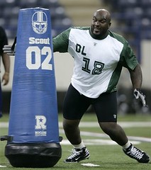
• Why does the blocking dummy have a number? Or is it just left over from 2002?
I trust that those of you who’ve been spending hours watching the NFL Network in recent days will be able to fill me in on all these details — big thanks in advance.
Uni Watch News Ticker: Joe Skiba’s long-awaited live chat will take place today at 2pm eastern on Giants.com. ”¦ Good article here about the AFL’s concussion-sensing helmets. ”¦ Dig that patch on George Halas’s jacket (with thanks to Zac Neubauer) ”¦ Cool shot of Ty Cobb taken during a tour of Japan in 1928 (with thanks to Bruce Menard, who also provided this 1905 New York Giants team portrait — note the kid with the “Mascot” jersey). ”¦ Pedro Martinez has his uni number at the center of his tire rims (nice find by Marc Rabinowitz). ”¦ Daniel Weimann notes that Sevilla FC wears a collar that mimics the Spanish flag. ”¦ What Uni Watch does for uniforms, author Trevor Paglin does for military black op patches like this and this. For a brilliantly obsessive audio slide show on this topic, look here (awesome find by Steve Hudgin). ”¦ Nick Maibroda reports that the Manitoba Moose honored the 1948 Royal Canadian Air Force hockey team by wearing kickass throwbacks last weekend (although it’s too bad about that Toyota ad). For a full gallery of pics, scroll down to the bottom of this page. ”¦ Susquehanna Industrial Tool & Die Co. frontman Michael McMahon and I were chowing down on a coupla Texas wieners at Hot Grill in Clifton, New Jersey, yesterday when I noticed that the walls were plastered with old sports photos of the local high school teams. Some good uniforms, as seen here (bizarre uni number placement!), here, here, and, my favorite, here. ”¦ I’ve pretty much stopped mentioning pink-for-cancer uni promotions, because they’ve become so common (and so annoying). But I’m gonna make an exception for the Idaho Steelheads’ upcoming “Pink in the Rink” night, which will feature a jersey with a huge-ass ribbon, fore and aft (with thanks to Brian Perkins). ”¦ Michigan State and Illinois went color vs. color last night. ”¦ Andrew Connor notes that many members of the Hawaii women’s soccer team have odd tape jobs on their thighs (additional views here, here, and here). What’s up with that?
I love me some Hot Grill! One of the sad things about going to college outside the TriState area is not getting to see those awesomely lame commercials that they have at least once a day.
the numbers for the scouting combine are assigned in each group and is to see who goes in line first. The colors are generally based on which day you go except for three qb’s who throw on all days and thats why he’s wearing red. The gray is a standard gray sweatshirt that everyone gets. I think that covers all of paul’s questions?
Paul,
I was wondering if you design at all because all you seem to do is bash everything that isn’t a classic look. What you don’t realize is that it is a task to be innovative and to think outside the box instead of re-hashing the oldies but goodies that seem to always get all the praise on this site. Although there are some things (like Oregon’s football and basketball uni’s) that give current sports design a bad name, I think you’re a little too critical of things that are just different. Lighten up a little.
Does the “WO” wide out category also incorporate tight ends? That could possibly account for it.
The NFL scouting combine numbering system is nothing special. The numbers are assigned by position in alphabetical order. On Day 1, guard Branden Albert was OL-1 while punter Durant Brooks was PK-1. Here is the link for 2008.
Paul,
Do you know what the rule is for college basketball teams to go “color vs. color”. Does one team have to have a third jersey? How about the NBA? I know the Pacers wear their yellow jersies at home and on the road. Couldn’t the Lakers wear their home yellows on the road since the Pacers do on occasion
[quote comment=”234846″]Does the “WO” wide out category also incorporate tight ends? That could possibly account for it.[/quote]
That was my first thought as well, but not a correct thought. Tight ends get their own TE designation.
No idea if it’s connected to “wideout”, but the number font looks a lot like the one used in the futuristic racing game link.
My guess is that the women’s soccer team tape job might have something to do with knee and ligament injuries…
link
[quote comment=”234856″]My guess is that the women’s soccer team tape job might have something to do with knee and ligament injuries…
link
Actually, the tape is probably more a practice known as kinesiotaping. Some people really believe in it.
link
[quote comment=”234841″]Paul,
I was wondering if you design at all because all you seem to do is bash everything that isn’t a classic look. What you don’t realize is that it is a task to be innovative and to think outside the box instead of re-hashing the oldies but goodies that seem to always get all the praise on this site.[/quote]
1) I am not a designer. Similarly, most movie critics aren’t filmmakers, most music critics aren’t professional musicians, etc. I have a point of view, based on historical perspective and an ability to communicate my thoughts. If you don’t like that point of view, no problem — I’m sure we’ll both sleep just fine tonight.
2) Being innovative and “thinking outside the box” is just lazy slang for “make sure it looks unique.” But uniqueness doesn’t mean squat if the design isn’t functional (if the type is hard to read or the colors vibrate, e.g.).
3) Whether you’re talking about design, literature, architecture, or the missionary position, the classics tend to be classic for a reason. If you want to call them “the box” and prefer to “think outside” thereof, be my guest, but you’re swimming upstream against history.
[quote comment=”234863″][quote comment=”234841″]Paul,
I was wondering if you design at all because all you seem to do is bash everything that isn’t a classic look. What you don’t realize is that it is a task to be innovative and to think outside the box instead of re-hashing the oldies but goodies that seem to always get all the praise on this site.[/quote]
1) I am not a designer. Similarly, most movie critics aren’t filmmakers, most music critics aren’t professional musicians, etc. I have a point of view, based on historical perspective and an ability to communicate my thoughts. If you don’t like that point of view, no problem — I’m sure we’ll both sleep just fine tonight.
2) Being innovative and “thinking outside the box” is just lazy slang for “make sure it looks unique.” But uniqueness doesn’t mean squat if the design isn’t functional (if the type is hard to read or the colors vibrate, e.g.).
3) Whether you’re talking about design, literature, architecture, or the missionary position, the classics tend to be classic for a reason. If you want to call them “the box” and prefer to “think outside” thereof, be my guest, but you’re swimming upstream against history.[/quote]
I seem to recall that one of Paul’s favorite new NHL unis is those of my Columbus Blue Jackets. New, modern and well done. These are far from traditional, and Paul has often used them as an example of how to do it right when not being traditional. So he is not just a one (old school) trick pony. We got your back Paul.
I would have guessed that the tape job had something to do with aiding in lateral movement, like that link says it does…
Yep, we got your back, Paul. We get it.
Man, those Moose jerseys are sweet. But I wanna rip that Toyota patch right the hell off.
I see why you like the Patterson unis, Paul. Stripes aplenty!!!
-Jet
2005 Combine – link
2006 Combine – link
2006 Combine – link
i know it’s a bit of a stretch, but when you saw link…did it remind you of link?
/a little bit?
I’ve always wondered why they don’t make the guys at the combine run the skill drills with helmets on. I can see taking it off for the shuttle or the 40, but for passing and receiving, you should make the guy wear a helmet. Not for safety, but because that’s how he’s going to have to do it in a game. I guess they don’t want a hodge-podge of college helmets mucking up the uniformity of the combine shirts. Of course, they could all wear blank helmets that just have their position and combine number. Just a thought.
That is in fact Kinesio Taping… I am 2.5 months off of ACL replacement/meniscus repair surgery and my physical therapist used the tape for a good 1-1.5 months. Seemed to work well as far as supporting my quad muscles, as well as provide support to me knee. The manner in which they taped me was supposed to help keep swelling down as well, although it doesn’t look like that in the photos of the ladies playing soccer there.
re: the tackling dummy – i didn’t watch the combine, but i’m guessing that the dummy was one in a series and the numbers were to help the defensive linemen know which one to hit next. which probably helps – in a game, their direction is not much more than “hit that guy…the one with the ball. yeah, that one.”
…and no, that font couldn’t be worse. unless it was a late-70s toronto blue jays jersey.
[quote comment=”234847″]Here is the link for 2008.[/quote]
I wonder if any of the scouts were thrown off by the listing of Virginia Tech as “VIRGINIA POLYTECH INST”?
My guess is that the blocking dummy has a number in order to give the player a target, as the technique is likely to hit the player in or near “the numbers.”
Plausible?
Numbers on tackling are essentially a targets to train linemen to keep low on their blocks or where to grab with there hands.
Based on the way the Hawaiian tape is scooping below the patella (kneecap), it looks like it could be serving the same function as link.
I know that it is not standard sports tape.
[quote comment=”234925″]Based on the way the Hawaiian tape is scooping below the patella (kneecap), it looks like it could be serving the same function as link.
I know that it is not standard sports tape.[/quote]
I think the weird taping was just a pretext for Andrew to post pics of the Hawaii girls. Hubba hubba!
The colors previously mentioned were by groups that perform certain drills together, each group does a different set each day, like d-lineman and linebackers, running backs, etc. The numbers are assigned to each group alphabetically, so those with last names beginning with A would get the smaller numbers, etc. Interesting about this, Ray Rice who wore #27 at Rutgers also was wearing #27 at the combine, luck of the draw. Last but not least, the gray sweatshirt is a piece of equipment every player gets, but it isn’t to keep them warm, they are in a dome. The sweatshirt is what they where when they are injured and not participating in any physical drills.
[quote comment=”234849″]Paul,
Do you know what the rule is for college basketball teams to go “color vs. color”. Does one team have to have a third jersey? How about the NBA? I know the Pacers wear their yellow jersies at home and on the road. Couldn’t the Lakers wear their home yellows on the road since the Pacers do on occasion[/quote]
In the NCAA for hockey, teams must go “white” versus color. There is an addition to the rule, though. Yellow, sky blue, and silver are colors that are accepted as “white.” I’m not sure about orange, but I’m assuming that it’s also a valid “white” color because Illinois also does it frequently enough in basketball – just check out 2005 where they seemed to wear it constantly (the tough thing on TV is that they wore orange while hosting Wisconsin in red). My alma mater used to frequently wear yellow/gold at home and the visiting team always wore their color threads.
[quote comment=”234911″]re: the tackling dummy – i didn’t watch the combine, but i’m guessing that the dummy was one in a series and the numbers were to help the defensive linemen know which one to hit next. which probably helps – in a game, their direction is not much more than “hit that guy…the one with the ball. yeah, that one.”[/quote]
I believe that many are just numbered the same, maybe depending on the blocking pad type, but I don’t think there is any “real” meaning behind the numbering. Maybe it’s to make sure that you hit a guy in the numbers (preferably the front ones) when blocking.
I just wanted to send a big “F U” to the New York Mets for waiting until daylight savings weekend to put tickets on sale. On top of that, why couldn’t they put them on sale on Saturday instead of Sunday? Now I have to get up at 8 AM (instead of 9 AM) to try for 2 hours to get tickets, only to be denied repeatedly…..
Thanks, Paul, for the ticker item about the black op patches. Those things are sweet! Scary, but sweet. I really like the blank, “If I tell you, I have to kill you’ patch with the lettering being black, too. I might have to get the book.
I know I am a day late and a dollar short, but I liked the Rockie/Sox black-on-black, and it made me realize that it’s possible to play that way if the pants, caps, and other accessories are markedly different from each other. Also, it’s easier in baseball because you know which team is which (i.e., the two sides don’t really intermingle).
Every blocking dummy has its own number. Sometimes the numbers represent a certain position, like this is an link. Other times, it seems link.
I know that when I played football, the numbers were used to show you the correct spots to hit the pad as if it were a real player. I also know that we had those same Rogers pads with the 02 on them. I believe there may have also been 04s but there were no 03 which leads me to believe it’s not due to the year.
Paul-
That tape design for Hawaii is for a pulled muscle.
I posted those Military Tribute Night pictures of the Moose last weekend in the comments, but I guess they went unnoticed (a common theme in hockey).
In any case, Toyota is a major sponsor of the Moose, and will be giving away a new vehicle to a fan in attendance during the April 5 game.
It’s the same as the Pepsi patch on the link (yes, that’s a Dallas Stars jersey for NHL night), the McDonald’s patch on the link, and the Brewers logo on the link.
The blocking dummy numbers let you know where you’re allowed to get away with a hold. As long as it’s between the numbers the refs don’t see it.
Reply from Obamamofdreams.com, regarding their status:
Obamaofdreams.com is closed and we are no longer able to offer any t-shirts for sale.
Morris
[quote comment=”234856″]My guess is that the women’s soccer team tape job might have something to do with knee and ligament injuries…
link
That was my impression too. Women hoopsters & soccer players being the most susepectible to blown ACLs/MCL’s– something about the center of gravity/hip wide I believe?
Love the Dr. in your article: Dr Blackadar. Ha Ha… Blackadder! funny stuff.
[quote comment=”234963″]I believe there may have also been 04s but there were no 03 which leads me to believe it’s not due to the year.[/quote]
When I was in high school all our tackling dummies were numbered 01.
I’m guessing that they always use otherwise-unused numbers such as those with leading zeroes so that people don’t start teasing the one guy on the team whose number is the same as the “dummy”.
[quote comment=”234989″][quote comment=”234856″]My guess is that the women’s soccer team tape job might have something to do with knee and ligament injuries…
link
That was my impression too. Women hoopsters & soccer players being the most susepectible to blown ACLs/MCL’s– something about the center of gravity/hip wide I believe?
Love the Dr. in your article: Dr Blackadar. Ha Ha… Blackadder! funny stuff.[/quote]
As always the lession learned here is read all the posts before posting your own stupid commentaries. sorry to have paraded my ignorance!
The Hawaii soccer tape jobs look like injury preventatives/remedies. One looks like it is attempting to keep the kneecap in place, which can pull out or strain if either of your quads are tighter than the other. Another looks like something with a hamstring, in lieu of a compression sleeve perhaps. Although I have rarely seen tape jobs on the thighs, these don’t appear to be stylistic or uniform related at all. Still interesting though.
[quote comment=”234975″]I posted those Military Tribute Night pictures of the Moose last weekend in the comments, but I guess they went unnoticed (a common theme in hockey).
In any case, Toyota is a major sponsor of the Moose, and will be giving away a new vehicle to a fan in attendance during the April 5 game.
It’s the same as the Pepsi patch on the link (yes, that’s a Dallas Stars jersey for NHL night), the McDonald’s patch on the link, and the Brewers logo on the link.[/quote]
i don’t mind the small logo on the shoulder. the only problem with the toyota logo is that its on a white background so its more visible since the jerseys are blue. (and yes teebz i saw your pics last weekend)
Those RCAF sweaters are to commemorate the 60th anniversary of that team’s gold medal win at the 1948 Winter Olympics. Back in the good old days when Canada could send a club team to the Olympics and beat other nations’ national teams!
[quote comment=”235007″][quote comment=”234975″]I posted those Military Tribute Night pictures of the Moose last weekend in the comments, but I guess they went unnoticed (a common theme in hockey).
In any case, Toyota is a major sponsor of the Moose, and will be giving away a new vehicle to a fan in attendance during the April 5 game.
It’s the same as the Pepsi patch on the link (yes, that’s a Dallas Stars jersey for NHL night), the McDonald’s patch on the link, and the Brewers logo on the link.[/quote]
i don’t mind the small logo on the shoulder. the only problem with the toyota logo is that its on a white background so its more visible since the jerseys are blue. (and yes teebz i saw your pics last weekend)[/quote]
While I agree with you, Dan, I don’t think the Moose were going to match the Toyota logo’s background color with the jersey.
They never did it on their link, and they didn’t do it for their link.
What’s weird is that the Moose do wear a Toyota logo on their black uniforms, and the Toyota logo is white on a black background.
At leats the Moose matched the socks to the promotional uniform. If the patch is the only flaw, I can live with that. :o)
[quote comment=”234982″]Reply from Obamamofdreams.com, regarding their status:
Obamaofdreams.com is closed and we are no longer able to offer any t-shirts for sale.
Morris[/quote]
Yep, MLB got ’em. Pity.
They better refund my payment.
Sorta uni related, but not as good as it sounds, here’s a story from Amsterdam about the link.
The tape on the Hawaii players legs is Kinesio Tape. Originally developed in Japan, it has been used in the United States since the mid 1990’s. It has many different uses such as the reduction of fluid/swelling as well as dealing with muscle injuries. In these pictures, it is obviously used for muscle injuries since the tape is overlaying the muscle it is supposed to be helping. Also, regarding the colors, the Japanese believe that the color of the tape renders certain properties. I have never seen black before, but typically they use a bright pinkish/red and a bright blue. The “red” is supposed to bring warmth to the muscle so you would use that color when a muscle is maybe just a little sore and you want it to feel warmer and looser. The “blue” is supposed to be more cooling, so you would use it with a more acute, painful injury. They also make a “flesh” color that is comparable to the color of a bandaid. It is supposed to blend into our skin color so it is not as obvious to us conservative Americans!
Paul,
It’s spelled link, not wonderlich.
No more Obama shirts, then go for a more linklook. They couldn’t be any worse than GWB, and make more sense than him too….
I believe there may have also been 04s but there were no 03 which leads me to believe it’s not due to the year.
Yeah, but, will a team’s tackling dummy have a number even if it was retired by the team??? Like… would the Pittsburgh Pirates tackling dummies have 1 or 4 for Meyer and Kiner???
(gosh I hope someone out there in uni-watch-land takes that post seriously. Ha-ha)
[quote comment=”235110″]I believe there may have also been 04s but there were no 03 which leads me to believe it’s not due to the year.
Yeah, but, will a team’s tackling dummy have a number even if it was retired by the team??? Like… would the Pittsburgh Pirates tackling dummies have 1 or 4 for Meyer and Kiner???
(gosh I hope someone out there in uni-watch-land takes that post seriously. Ha-ha)[/quote]
Ryan, it offends me that you’d consider the Great Ralph a dummy of any sort ! Ralph is an American treasure. :)
I am a physical therapy student with a background in atheletic training and I can confirm that the taping is kinesiotaping. Its an INSANE amount of kinesiotape, give that it runs about $13 for a small roll, but it is kinesiotaping none the less. Wrapping around the kneecap is most likely to promote proper tracking of the patella in the patellar groove of the femur. The female body is, in general, not structured for running (not being anti-women, its just an anotomical fact) due to the wider hips causing excess stress at the knee and causing the kneecap not to move correctly, resulting in alot of knee pain for many female athletes. This is what the tape jobs under the kneecap try to prevent. Bands around the thigh are to promote better quad or hamstring activation, probably following an injury.
[quote comment=”234915″][quote comment=”234847″]Here is the link for 2008.[/quote]
I wonder if any of the scouts were thrown off by the listing of Virginia Tech as “VIRGINIA POLYTECH INST”?[/quote]
They actually mentioned this in the NFL network’s coverage. Rich Eisen joked saying he wondered why the Virginia Polytechnical Institute sent so many people to the combine and said the coaches should probably watch more of their games.
Last night I saw my Rangers put a hurtin’ to the Isles. I noticed that the Isle goalie, Wade Dubielewicz, was not wearing team socks under his pads. He was wearing white stretchy sani thingies. You usually dont notice it because they are covered by the pads, but I had a good view of him and when he turned around you could see it in the back. Ranger goalie Lundqvist DID have on the team socks.
Paul has mentioned to me that some other goalies participate in this scandal, and they get away with it because of the pads. Anyboday have any more info?
Random topic but I was wondering what people think would be the most aesthetically pleasing match-up in each sport to watch, factoring in both teams uniforms …in other words what game would you flip on and say ‘it can’t look any better than this’
[quote comment=”235207″]Random topic but I was wondering what people think would be the most aesthetically pleasing match-up in each sport to watch, factoring in both teams uniforms …in other words what game would you flip on and say ‘it can’t look any better than this'[/quote]
Montreal Canadiens and Detroit Red Wings…. Game over.
[quote comment=”235213″][quote comment=”235207″]Random topic but I was wondering what people think would be the most aesthetically pleasing match-up in each sport to watch, factoring in both teams uniforms …in other words what game would you flip on and say ‘it can’t look any better than this'[/quote]
Montreal Canadiens and Detroit Red Wings…. Game over.[/quote]
No argument here
[quote comment=”235213″][quote comment=”235207″]Random topic but I was wondering what people think would be the most aesthetically pleasing match-up in each sport to watch, factoring in both teams uniforms …in other words what game would you flip on and say ‘it can’t look any better than this'[/quote]
Montreal Canadiens and Detroit Red Wings…. Game over.[/quote]
Michigan vs. Ohio State is damn good too!
[quote comment=”235207″]Random topic but I was wondering what people think would be the most aesthetically pleasing match-up in each sport to watch, factoring in both teams uniforms …in other words what game would you flip on and say ‘it can’t look any better than this'[/quote]
Bears-Packers, even without number 4.
[quote comment=”234849″]Paul,
Do you know what the rule is for college basketball teams to go “color vs. color”. Does one team have to have a third jersey? How about the NBA? I know the Pacers wear their yellow jersies at home and on the road. Couldn’t the Lakers wear their home yellows on the road since the Pacers do on occasion[/quote]
The only rule (at least, for the NCAA) is that the two teams must have “contrasting colors”… the home team is most often in white; Illinois would wear white unis when a gold-clad Iowa squad came to town.
The Lakers could probably wear their gold unis on the road, but they probably won’t… too much history with the “Forum Blue” (purple) road unis!
[quote comment=”235207″]Random topic but I was wondering what people think would be the most aesthetically pleasing match-up in each sport to watch, factoring in both teams uniforms …in other words what game would you flip on and say ‘it can’t look any better than this'[/quote]
Everytime the Packers and Bears play, I think that.
Yankees vs. Tigers
Celtics vs. Pistons
Paul: Sorry if I missed it, but what are the plans for Seattle. I think you said there’d be a gathering on March 14th, but have you picked a place or time yet?
[quote comment=”235228″][quote comment=”235213″][quote comment=”235207″]Random topic but I was wondering what people think would be the most aesthetically pleasing match-up in each sport to watch, factoring in both teams uniforms …in other words what game would you flip on and say ‘it can’t look any better than this'[/quote]
Montreal Canadiens and Detroit Red Wings…. Game over.[/quote]
No argument here[/quote]
Too much red; I’d go with Canadiens/Bruins for the contrast.
In the NFL, a Colts/Bears rematch in better weather than Supe XLI.
In the Majors, also a rematch of a recent championship: Detroit’s Old English ‘D’ versus St. Louis’ roadies — best road jerseys in the league.
To me, any really visually appealing NBA game would have to involve throwbacks. Failing that, I’d go with Celtics/Knicks because they’re (1) traditional and (2) purple-less.
Full name of Virginia Tech:
Virginia Polytechnic Institute and State University.
Why’d they leave off the state university part at the combine?
Anybody know the only Division I (Football) schools that do not end with university?
[quote comment=”235207″]Random topic but I was wondering what people think would be the most aesthetically pleasing match-up in each sport to watch, factoring in both teams uniforms …in other words what game would you flip on and say ‘it can’t look any better than this'[/quote]
Red Sox @ Tigers
[quote comment=”235254″]Full name of Virginia Tech:
Virginia Polytechnic Institute and State University.
Why’d they leave off the state university part at the combine?
Anybody know the only Division I (Football) schools that do not end with university?[/quote] or college?
[quote comment=”235207″]Random topic but I was wondering what people think would be the most aesthetically pleasing match-up in each sport to watch, factoring in both teams uniforms …in other words what game would you flip on and say ‘it can’t look any better than this'[/quote]
For baseball, I’ll cast my vote for link/link!
[quote comment=”235207″]Random topic but I was wondering what people think would be the most aesthetically pleasing match-up in each sport to watch, factoring in both teams uniforms …in other words what game would you flip on and say ‘it can’t look any better than this'[/quote]
Current or all-time?
Developing story:
link
I think the Cape Cod teams should tell MLB to screw off, wear blank unis for 2008, and then apply new nicknames in 2009.
Is MLB really that hungry for revenue?
[quote comment=”235254″]Full name of Virginia Tech:
Virginia Polytechnic Institute and State University.
Why’d they leave off the state university part at the combine?
Anybody know the only Division I (Football) schools that do not end with university?[/quote]
University of Michigan.
[quote comment=”235254″]Full name of Virginia Tech:
Virginia Polytechnic Institute and State University.
Why’d they leave off the state university part at the combine?
Anybody know the only Division I (Football) schools that do not end with university?[/quote]
All of the ones that start with “University of”?
I know … flip answer. But it does fit. Now, if you want to amend it to doesn’t start of end with College or University that might be more of a challenge.
nod to UW on this link, best uni’s on posters. At least Paul gets the credit this time.
[quote comment=”235207″]Random topic but I was wondering what people think would be the most aesthetically pleasing match-up in each sport to watch, factoring in both teams uniforms …in other words what game would you flip on and say ‘it can’t look any better than this'[/quote]
Auburn vs. Alabama in football.
[quote comment=”235259″][quote comment=”235254″]Full name of Virginia Tech:
Virginia Polytechnic Institute and State University.
Why’d they leave off the state university part at the combine?
Anybody know the only Division I (Football) schools that do not end with university?[/quote] or college?[/quote]
United States Military Academy
United States Naval Academy
United States Air Force Academy
Georgia Technical Institute (I think …. ?)
In regards to the Hawaii women’s soccer team using kinesio tape, the tape is also used to stimulate muscles on people, especially children, with cerebral palsy. My son’s physical therapist uses the tape on his feet and has used it on his neck in attempts to help stimulate and strengthen muscles and to aid in the correction of tight muscles that cause feet and hands to close and flex inward.
[quote comment=”235241″][quote comment=”235207″]Random topic but I was wondering what people think would be the most aesthetically pleasing match-up in each sport to watch, factoring in both teams uniforms …in other words what game would you flip on and say ‘it can’t look any better than this'[/quote]
Everytime the Packers and Bears play, I think that.
Yankees vs. Tigers
[/quote]
Good call on both Packers/Bears and Yankees/Tigers.
For my own part, I could mix and match from the following teams:
Yankees
Tigers
Dodgers
Red Sox (especially home)
Giants
Angels
and think “it can’t look much better than this.”
[quote comment=”235273″]Developing story:
link
I think the Cape Cod teams should tell MLB to screw off, wear blank unis for 2008, and then apply new nicknames in 2009.
Is MLB really that hungry for revenue?[/quote]
That is some Mickey Mouse bullshit there my friends. MLB leadership should be ashamed of themselves.
Why not just sign an agreement with the league saying no more teams with MLB nicknames, let ’em operated the way they have for years and be done with it.
It is a sorry world we live in folks.
[quote comment=”235285″][quote comment=”235259″][quote comment=”235254″]Full name of Virginia Tech:
Virginia Polytechnic Institute and State University.
Why’d they leave off the state university part at the combine?
Anybody know the only Division I (Football) schools that do not end with university?[/quote] or college?[/quote]
United States Military Academy
United States Naval Academy
United States Air Force Academy
Georgia Technical Institute (I think …. ?)[/quote]
link?
[quote comment=”235247″]Paul: Sorry if I missed it, but what are the plans for Seattle. I think you said there’d be a gathering on March 14th, but have you picked a place or time yet?[/quote]
Details in yesterday’s post — scroll down to “Seattle Update.”
I meant “operate”.
[quote comment=”235213″][quote comment=”235207″]Random topic but I was wondering what people think would be the most aesthetically pleasing match-up in each sport to watch, factoring in both teams uniforms …in other words what game would you flip on and say ‘it can’t look any better than this'[/quote]
Montreal Canadiens and Detroit Red Wings…. Game over.[/quote]
Canadiens in red vs. Devils in white
[quote comment=”235254″]Full name of Virginia Tech:
Virginia Polytechnic Institute and State University.
Why’d they leave off the state university part at the combine?
[/quote]
Virginia Tech is pretty particular about the way its name is used/stated/displayed, as any major entity would.
Here’s a statement that appears in every “media notes” before (at least) the football games:
While the full name of the school is Virginia Polytechnic Institute and State University, the school is commonly referred to as “Virginia Tech.” Founded in 1872, as Virginia Agricultural and Mechanical College, the university changed its named to Virginia Polytechnic Institute in 1896. Fans of the athletic department, as well as media covering the Hokies, shortened the name to VPI, but it eventually became Virginia Tech. The “State University” was added in 1970 to bring the official title to what it is today. Those covering Hokie athletics are asked to refer to the university as simply “Virginia Tech.” Virginia Tech University, VPI and SU, VPI&SU, VT or VA Tech are not recognized names and should not be used.
So the fact they are referring to the school as anything but “Virginia Tech” is a mistake.
[quote comment=”235197″]Last night I saw my Rangers put a hurtin’ to the Isles. I noticed that the Isle goalie, Wade Dubielewicz, was not wearing team socks under his pads. He was wearing white stretchy sani thingies. You usually dont notice it because they are covered by the pads, but I had a good view of him and when he turned around you could see it in the back. Ranger goalie Lundqvist DID have on the team socks.
Paul has mentioned to me that some other goalies participate in this scandal, and they get away with it because of the pads. Anyboday have any more info?[/quote]
When I went to a Carolina Hurricanes game earlier this year, I noticed goalie Cam Ward did the same thing. He had the ugliest tan socks that I’ve ever seen……
[quote comment=”235302″][quote comment=”235285″][quote comment=”235259″][quote comment=”235254″]Full name of Virginia Tech:
Virginia Polytechnic Institute and State University.
Why’d they leave off the state university part at the combine?
Anybody know the only Division I (Football) schools that do not end with university?[/quote] or college?[/quote]
United States Military Academy
United States Naval Academy
United States Air Force Academy
Georgia Technical Institute (I think …. ?)[/quote]
link?[/quote]
Yeah, I think it’s officially “Georgia Institute of Technology.” Auburn University, which was called Auburn all along, was officially known as “Alabama Polytechnic Institute” until 1960. There was a pic of the legendary Coach Shug Jordan on this site, wearing a sweatshirt emblazoned with “API”.
The hot dog on the left in the pic in the ticker looks like the one Lloyd Braun ordered from the renovated movie theater in an episode of Seinfeld. The clerk said, “Are you crazy?” because it looked so old and wrinkled. Kramer, trying to persuade Lloyd that he was sane, remarked that no, it was a perfectly sane food to eat.
[quote comment=”235328″]The hot dog on the left in the pic in the ticker looks like the one Lloyd Braun ordered from the renovated movie theater in an episode of Seinfeld. The clerk said, “Are you crazy?” because it looked so old and wrinkled. Kramer, trying to persuade Lloyd that he was sane, remarked that no, it was a perfectly sane food to eat.[/quote]
Nice Seinfeld reference!
Just a reminder…….
Less than an hour until the Joe Skiba chat on giants.com
The Citadel is I-AA (or Football Championship Subdivision)
The answer is the service academies and Georgia Institute of Technology.
Auburn was officially API until 1960, but the school was referred to as “Auburn” long before the official name change. The university is located in the town of Auburn, AL.
[quote comment=”234925″]Based on the way the Hawaiian tape is scooping below the patella (kneecap), it looks like it could be serving the same function as link.
I know that it is not standard sports tape.[/quote]
Its probably kinesiotaping (SP?) I had a HS trainer that was big on it (she had numerous knee surgeries and becae a devout follower). I let her tape me up like that once after I had tweaked my knee and it did help. That being said, llooking through those pictures, it’s hard to imagine they have that many girls coming off knee injuries, or that are injured or knicked up themself. I know girls suffer far more knee injuries than do men, but that would be a lot. Im nowhere near knowledgeable on the subject but I was taped up like that, I’m not sure it would have a purpopse were you not recovering from an injury.
[quote comment=”235277″][quote comment=”235254″]Full name of Virginia Tech:
Virginia Polytechnic Institute and State University.
Why’d they leave off the state university part at the combine?
Anybody know the only Division I (Football) schools that do not end with university?[/quote]
All of the ones that start with “University of”?
I know … flip answer. But it does fit. Now, if you want to amend it to doesn’t start of end with College or University that might be more of a challenge.[/quote]
That’s what i meant. I’m sleepy…. D-I (football) shools that do not include ‘college’ or ‘university’ in their names.
Thanks everyone for the info. I guess only playing high school sports, we didn’t get into anything terribly exciting in terms of sports medicine. Ice packs were about it.
And I think for uni matchups, I wouldn’t mind seeing Dodgers v. Cubs, even though I don’t have any real affection for either one.
ya’ll got it. Service academies and georgia tech. Propably shouldn’t have said Va. Tech has “state university’ in it’s official title, that always trips people up.
[quote comment=”235302″][quote comment=”235285″][quote comment=”235259″][quote comment=”235254″]Full name of Virginia Tech:
Virginia Polytechnic Institute and State University.
Why’d they leave off the state university part at the combine?
Anybody know the only Division I (Football) schools that do not end with university?[/quote] or college?[/quote]
United States Military Academy
United States Naval Academy
United States Air Force Academy
Georgia Technical Institute (I think …. ?)[/quote]
link?[/quote]
The Citadel is officially “The Citadel, The Military College of South Carolina”. So no-go.
[quote comment=”235300″][quote comment=”235273″]Developing story:
link
I think the Cape Cod teams should tell MLB to screw off, wear blank unis for 2008, and then apply new nicknames in 2009.
Is MLB really that hungry for revenue?[/quote]
That is some Mickey Mouse bullshit there my friends. MLB leadership should be ashamed of themselves.
Why not just sign an agreement with the league saying no more teams with MLB nicknames, let ’em operated the way they have for years and be done with it.
It is a sorry world we live in folks.[/quote]
This just goes to show you that if you accept money from someone (business, foundation, government) they are going to believe they have the right to dictate some of your operation.
Have to disagree w/Philly Bill — Cards Road unis include the navy hat — can’t be the best.
Nominate – Dodgers road unis as the best
Giants/Redskins
Bears/Packers
syracuse/Penn st.
Rangers/Bruin/Canadiens
link
The 10 Most Bizarre Athlete Superstitions
Has a couple of good uni pics
[quote comment=”235207″]Random topic but I was wondering what people think would be the most aesthetically pleasing match-up in each sport to watch, factoring in both teams uniforms …in other words what game would you flip on and say ‘it can’t look any better than this'[/quote]
Hawks/Red Wings
Yankees/Tigers
Colts/Lions (too much blue??)
Be careful now, us jackets HATE it when you screw up our name haha. That would “Georgia Institute of Technology”
That’s not Terry’s only superstition, though; he wears knee-high socks as a tribute to his father, which seems normal. The catch is that Terry wears five pairs of them whenever he’s on the court; he claims the extra hosiery is more comfortable.
while checking Virginia Military Institute’s website for our college name question, i found this…
LEXINGTON, Va.- Junior catcher Mike Roberts, who enjoyed a fantastic series last weekend, has been named to the watch list for the 2008 Coleman Company-Johnny Bench Award delivered by AT&T and Papa John’s Pizza, given annually to the top catcher in the NCAA’s Division I.
i can’t remember the last time i saw three, count ’em, three corporate mentions in the title of one award.
[quote comment=”235298″][quote comment=”235241″][quote comment=”235207″]Random topic but I was wondering what people think would be the most aesthetically pleasing match-up in each sport to watch, factoring in both teams uniforms …in other words what game would you flip on and say ‘it can’t look any better than this'[/quote]
Everytime the Packers and Bears play, I think that.
Yankees vs. Tigers
[/quote]
Good call on both Packers/Bears and Yankees/Tigers.
For my own part, I could mix and match from the following teams:
Yankees
Tigers
Dodgers
Red Sox (especially home)
Giants
Angels
and think “it can’t look much better than this.”[/quote]
If you don’t see link as perfect (except maybe for a variance in stirrup hight depending on personal preference), you might be crazy.
[quote comment=”235317″][quote comment=”235254″]Full name of Virginia Tech:
Virginia Polytechnic Institute and State University.
Why’d they leave off the state university part at the combine?
[/quote]
Virginia Tech is pretty particular about the way its name is used/stated/displayed, as any major entity would.
Here’s a statement that appears in every “media notes” before (at least) the football games:
Those covering Hokie athletics are asked to refer to the university as simply “Virginia Tech.” Virginia Tech University, VPI and SU, VPI&SU, VT or VA Tech are not recognized names and should not be used.
[/quote]
hmm…VT is not a recognized name? But isn’t that what’s on their helmets/hats?
Here is a link of a 1946 basketball game between Kewaunee and Algoma High Schools in Wisconsin (Kewaunee is the dark team and is in purple–but the photo is black and white). I just thought some people would appreciate the socks and the closeness of the crowd.
The link
may be of some interest as well. While it is not mentioned the writer was the official scorer for the Milwaukee Bucks and Marquette for many years (I don’t know for sure but it was a long time). I would think he would have a lot of good uni stories.
Random topic but I was wondering what people think would be the most aesthetically pleasing match-up in each sport to watch, factoring in both teams uniforms …in other words what game would you flip on and say ‘it can’t look any better than this’
Montreal Canadiens and Detroit Red Wings…. Game over.
…great game there, i think most “o-6” teams do great things for the eye!
but lets not forget the winter classic so soon!
Here are my 3 questions from the live Joe Skiba chat:
Q: Joe, will there be any changes with the red away jerseys next year?
A: The uniforms themselves, the home away and alternate can not change until 2010. But, we do have the option to wear the alternate jersey if we choose to, its not mandatory.
Q: Joe, what made you throw out the chipped helmet from Ahmad Bradshaw from the Green Bay game? Paul Lukas would’ve loved it!
A: The reason I threw out the chipped helmet is because I wasn’t thinking. The funny part is when you come home and watch the game, the fans actually posted the highlights of Ahmad’s painted helmet chipping apart.
Q: Joe, can you go into detail about Amani Toomer’s different jersey that he used in the playoffs? It seemed like it was tailored differently on the sides.
A: Whenever we change the pattern of our jerseys, the NFL allows us to test the pattern on certain players for a couple of games – The purpose is to make sure the new pattern performs the way the players want them to.
From the ever-readable Darren Rovell of CNBC: link.
And going back to the video game entry the other day… I believe I read someone posted that the base coaches are not wearing helmets. The same is true in MLB 08, and also all the batting practice/spring training jerseys (that I have seen anyway) all have a full button front, which we all know is completely inaccurate. They were pretty good about matching up correctly home and road jerseys and those equally awful BP hats, you think they could stop at 2 buttons.
[quote comment=”235352″]Giants/Redskins
Bears/Packers
syracuse/Penn st.
Rangers/Bruin/Canadiens[/quote]
PSU and Syracuse play each other in football in 2008 and 2009…..
Another 2 questions for Joe:
Q: Joe any ideas about using different “NY” stickers on the helmets to prevent them from falling off in cold weather next year?
A: After seeing Ahmad’s helmet in Buffalo, we actually tested a theory with our reconditioner when I noticed Ahmad keeping his helmet right next to the portable heaters on the sidelines – what we found out it, when the helmet stays that close to the heat, the paint actually heats up and it causes the paint to come off the shell. The theory proved correct when in Buffalo, against NE the first time around and GB the paint chipped. Dallas, Tampa, and the Super Bowl this did not occur.
Q: Joe, how much work will the changing of the NFL shield logo next season cause for you?
A: The league is actually sending us 1,000 patches to patch on various garments, practice pants, jerseys as well as such things as rain capes – Companies such as Nike, Reebok, and Under Armour have been notified by the updated change and will plan accordingly.
[quote comment=”235384″][quote comment=”235352″]Giants/Redskins
Bears/Packers
syracuse/Penn st.
Rangers/Bruin/Canadiens[/quote]
PSU and Syracuse play each other in football in 2008 and 2009…..[/quote]
I heard… they ended the series back when I was attending SU— JoePa was too scared of facing that ‘Option Freeze’ offense. :)
[quote comment=”235337″]The Citadel is I-AA (or Football Championship Subdivision)
The answer is the service academies and Georgia Institute of Technology.[/quote]
You asked for Division I schools. The Citadel is a Division I school – FACT!
since it appears that most of the “best uni games” combos are going to feature older, traditional teams or newer teams with traditional looks, i’d like to see what combos of newer uni styles (within last 10 years or so) people would like to see play.
NFL: Texans (blue jersey/white pants) vs. Cardinals (maroon jersey/white pants)
MLB: Brewers vs. Rays (i like their new unis)
NHL: Wild (maroon) vs Bluejackets (blue)
NBA: Houston (red) vs. Memphis (blue)
[quote comment=”235328″]The hot dog on the left in the pic in the ticker looks like the one Lloyd Braun ordered from the renovated movie theater in an episode of Seinfeld. The clerk said, “Are you crazy?” because it looked so old and wrinkled. Kramer, trying to persuade Lloyd that he was sane, remarked that no, it was a perfectly sane food to eat.[/quote]
I’m assuming it’s deep fried. I’ve had some hot dogs like that before, pretty ugly, pretty tasty, pretty long time in the bathroom.
[quote comment=”235391″][quote comment=”235337″]The Citadel is I-AA (or Football Championship Subdivision)
The answer is the service academies and Georgia Institute of Technology.[/quote]
You asked for Division I schools. The Citadel is a Division I school – FACT![/quote]
It’s still wrong.
[quote comment=”235254″]Full name of Virginia Tech:
Virginia Polytechnic Institute and State University.[/quote]
Probably because they would have to add a lot more to several schools. LSU is listed as Louisiana ST but the official full name of the school is “Louisiana State University and Agricultural and Mechanical College“. I guess they could list it as LSU A&M or Louisiana ST A&M.
[quote comment=”235392″]since it appears that most of the “best uni games” combos are going to feature older, traditional teams or newer teams with traditional looks, i’d like to see what combos of newer uni styles (within last 10 years or so) people would like to see play.
NFL: Texans (blue jersey/white pants) vs. Cardinals (maroon jersey/white pants)
MLB: Brewers vs. Rays (i like their new unis)
NHL: Wild (maroon) vs Bluejackets (blue)
NBA: Houston (red) vs. Memphis (blue)[/quote]
The Cardinals? Seriously?
[quote comment=”235389″][quote comment=”235384″][quote comment=”235352″]Giants/Redskins
Bears/Packers
syracuse/Penn st.
Rangers/Bruin/Canadiens[/quote]
PSU and Syracuse play each other in football in 2008 and 2009…..[/quote]
I heard… they ended the series back when I was attending SU— JoePa was too scared of facing that ‘Option Freeze’ offense. :)[/quote]
I’m annoyed that they haven’t rekindled their rivalry with Pitt! I may head up to the Carrier Dome this year for the game…….Sept 13th….
[quote comment=”235396″][quote comment=”235391″][quote comment=”235337″]The Citadel is I-AA (or Football Championship Subdivision)
The answer is the service academies and Georgia Institute of Technology.[/quote]
You asked for Division I schools. The Citadel is a Division I school – FACT![/quote]
It’s still wrong.[/quote]
I’m not saying that the school doesn’t include the words “college” or “university” in the name, I’m saying that the exclusion of The Citadel from the conversation because they are a Football Championship Subdivision school is wrong.
Therefore, The Citadel had as much right to be in the discussion as Auburn and other “wrong” schools.
[quote comment=”235402″][quote comment=”235389″][quote comment=”235384″][quote comment=”235352″]Giants/Redskins
Bears/Packers
syracuse/Penn st.
Rangers/Bruin/Canadiens[/quote]
PSU and Syracuse play each other in football in 2008 and 2009…..[/quote]
I heard… they ended the series back when I was attending SU— JoePa was too scared of facing that ‘Option Freeze’ offense. :)[/quote]
I’m annoyed that they haven’t rekindled their rivalry with Pitt!
I may head up to the Carrier Dome this year for the game…….Sept 13th….[/quote]
We’d drive down (well, on two ocassions) to catch the SU/PSU game down at Beaver, that rivalry was too nice to see take place on the Carrier Dome turf. Good Times, Good Times.
Too bad that SU football is in a Greg Robinson induced wilderness!
link
[quote comment=”235408″]link[/quote]
That just looks odd. I mean, if the original jersey said “THE SPURS”, then “LOS SPURS” would work … kind of (but only kind of … Really should be “LOS ESPUELAS”).
reading through all of these “best uniform match-ups” made me think. what state would you say has the best overall uniform collection, between colleges and the pros? because i’m seeing a lot of michigan teams up there, and it seems to me like an obvious answer.
[quote comment=”235197″]Last night I saw my Rangers put a hurtin’ to the Isles. I noticed that the Isle goalie, Wade Dubielewicz, was not wearing team socks under his pads. He was wearing white stretchy sani thingies. You usually dont notice it because they are covered by the pads, but I had a good view of him and when he turned around you could see it in the back. Ranger goalie Lundqvist DID have on the team socks.
Paul has mentioned to me that some other goalies participate in this scandal, and they get away with it because of the pads. Anyboday have any more info?[/quote]
Not a great pic, but look at DiPietro’s socks here. He wears the white stretchy thingies also. Typical Islander.
link
[quote comment=”235392″]since it appears that most of the “best uni games” combos are going to feature older, traditional teams or newer teams with traditional looks, i’d like to see what combos of newer uni styles (within last 10 years or so) people would like to see play.
NFL: Texans (blue jersey/white pants) vs. Cardinals (maroon jersey/white pants)
MLB: Brewers vs. Rays (i like their new unis)
NHL: Wild (maroon) vs Bluejackets (blue)
NBA: Houston (red) vs. Memphis (blue)[/quote]
I agree with half of your NBA and NHL matchups, I love the red Rockets unis and either Wild uni.
NBA: Houston(road or home) vs Milwaukee(road or home) Yep I like the Christmas unis.
NHL: Wild(home or road) vs San Jose(home or road) Yes I realize picking San Jose is sorta cheating because they use an old school style, but it is new to them.
NFL: Tennessee(white uni, light blue pants) vs The Jets(monochrome green look) I don’t care what anyone says, the Jets look good in either monochrome set. The 2 color look helps.
MLB: Padres(sand/gray) vs Nationals(whites) I guess. Not really happy with this pick but it’s the best of the “newer unis” that I could come up with.
[quote comment=”235401″][quote comment=”235392″]since it appears that most of the “best uni games” combos are going to feature older, traditional teams or newer teams with traditional looks, i’d like to see what combos of newer uni styles (within last 10 years or so) people would like to see play.
NFL: Texans (blue jersey/white pants) vs. Cardinals (maroon jersey/white pants)
MLB: Brewers vs. Rays (i like their new unis)
NHL: Wild (maroon) vs Bluejackets (blue)
NBA: Houston (red) vs. Memphis (blue)[/quote]
The Cardinals? Seriously?[/quote]
yeah. the new unis aren’t any better or any worse than the old ones. they’re just different. i like them just as much as i liked the old ones.
[quote comment=”235408″]link[/quote]
es stupid. Wouldn’t that make more sense if I said “es estupido?” Couldn’t they have at least gone with Los Espuela? Los Spurs sounds like when you don’t know the real spanish word and you just add an ‘o’ at the end of the english word.
Boston College and Virginia Military Institute are Division I schools.
[quote comment=”235412″][quote comment=”235408″]link[/quote]
That just looks odd. I mean, if the original jersey said “THE SPURS”, then “LOS SPURS” would work … kind of (but only kind of … Really should be “LOS ESPUELAS”).[/quote]
You beat me to it.
Davidson College is Division I (and ranked in the Top 25), but not for football.
Re: Los Spurs
Yeah the only thing it looks like they did was add the letter LOS above the regular Spurs wordmork. Seems kinda silly.
The way I heard the trivia question from someone else was “What Division 1A football schools do not have the word ‘university’ in their name?”
The answers:
United States Military Academy
United States Naval Academy
United States Air Force Academy
Georgia Tech
Boston College
This was several years ago, so I don’t know if any of the more recent bowl-subdivision schools could be added to the list. I did a quick check, but could not find a suitable list to check it against. It’s all how you say it, too, since if you just say Div. 1 it would include too many schools.
And for something completely different, just putting “ESPUELAS” on the Spurs unis could look really cool, and they could still make the U a spur. It’s not in the exact middle of the word, but I think they could pull it off.
For classic uni combinations, they have to be a little different. Yanks/Tigers would look too much the same. Cubs/Cards is cool, and Redskins(white)/Cowboys (blue) looks cool, partially because they’re different, and partially because the dark Cowboy unis are much more consistent in the blue department.
reading through all of these “best uniform match-ups” made me think. what state would you say has the best overall uniform collection, between colleges and the pros? because i’m seeing a lot of michigan teams up there, and it seems to me like an obvious answer.
since the Pistons went back to the red, white and Blue. Detroit makes astrong case. Chicago would have to be right up there
Best Uniform combination
NHL: Boston Bruins(Black) – Chicago Blackhawks (white) -early 70’s , in a raucous Chicago Stadium (not to mention should be the outdoor game next year in Wrigley).
NFL: Kansas City Chiefs (Red) – Green Bay Packers – on a sunny day in Kansas City
In terms of pink – there’s the one of’s promos, then there’s permanent switch. A French (France) Rubgy team has made the permenant switch. I took this from an article
“Now Guazzini, who has redesigned the Stade Français uniform in an unlikely pink, sells twice as many shirts as the French national team.”
[quote comment=”235414″]reading through all of these “best uniform match-ups” made me think. what state would you say has the best overall uniform collection, between colleges and the pros? because i’m seeing a lot of michigan teams up there, and it seems to me like an obvious answer.[/quote]
Illinois: link, link, link, link, linkof link, link, link, link, link, etc.
[quote comment=”235058″][quote comment=”234982″]Reply from Obamamofdreams.com, regarding their status:
Obamaofdreams.com is closed and we are no longer able to offer any t-shirts for sale.
Morris[/quote]
Yep, MLB got ’em.
Pity.
They better refund my payment.[/quote]
Yikes, glad I ordered mine when I did. Looks like it’ll be a collector’s item (regardless of whether or not he wins).
[quote comment=”235431″]The way I heard the trivia question from someone else was “What Division 1A football schools do not have the word ‘university’ in their name?”
The answers:
United States Military Academy
United States Naval Academy
United States Air Force Academy
Georgia Tech
Boston College
This was several years ago, so I don’t know if any of the more recent bowl-subdivision schools could be added to the list. I did a quick check, but could not find a suitable list to check it against. It’s all how you say it, too, since if you just say Div. 1 it would include too many schools.
And for something completely different, just putting “ESPUELAS” on the Spurs unis could look really cool, and they could still make the U a spur. It’s not in the exact middle of the word, but I think they could pull it off.
For classic uni combinations, they have to be a little different. Yanks/Tigers would look too much the same. Cubs/Cards is cool, and Redskins(white)/Cowboys (blue) looks cool, partially because they’re different, and partially because the dark Cowboy unis are much more consistent in the blue department.[/quote]
I think you missed Army.
[quote comment=”235420″][quote comment=”235401″][quote comment=”235392″]since it appears that most of the “best uni games” combos are going to feature older, traditional teams or newer teams with traditional looks, i’d like to see what combos of newer uni styles (within last 10 years or so) people would like to see play.
NFL: Texans (blue jersey/white pants) vs. Cardinals (maroon jersey/white pants)
MLB: Brewers vs. Rays (i like their new unis)
NHL: Wild (maroon) vs Bluejackets (blue)
NBA: Houston (red) vs. Memphis (blue)[/quote]
The Cardinals? Seriously?[/quote]
yeah. the new unis aren’t any better or any worse than the old ones. they’re just different. i like them just as much as i liked the old ones.[/quote]
Wow, I just never heard anyone say they were even OK with their new unis. Especially considering how much I loved their link. Fly issues aside, of course. I mean look at those fantastic link!
[quote comment=”235376″]hmm…VT is not a recognized name? But isn’t that what’s on their helmets/hats?[/quote]
Initials for the name on helmets is different…for example, you don’t call Purdue just “P”, but that’s what’s on the helmets.
[quote comment=”235404″][quote comment=”235396″][quote comment=”235391″][quote comment=”235337″]The Citadel is I-AA (or Football Championship Subdivision)
The answer is the service academies and Georgia Institute of Technology.[/quote]
You asked for Division I schools. The Citadel is a Division I school – FACT![/quote]
It’s still wrong.[/quote]
I’m not saying that the school doesn’t include the words “college” or “university” in the name, I’m saying that the exclusion of The Citadel from the conversation because they are a Football Championship Subdivision school is wrong.
Therefore, The Citadel had as much right to be in the discussion as Auburn and other “wrong” schools.[/quote]
Indeed, the question was “Anybody know the only Division I (Football) schools that do not end with university?” and FBS (I-AA) and FCS (I-A) are BOTH part of Division I. He never asked about just IA…
[quote comment=”235444″][quote comment=”235431″]The way I heard the trivia question from someone else was “What Division 1A football schools do not have the word ‘university’ in their name?”
The answers:
United States Military Academy
United States Naval Academy
United States Air Force Academy
Georgia Tech
Boston College
This was several years ago, so I don’t know if any of the more recent bowl-subdivision schools could be added to the list. I did a quick check, but could not find a suitable list to check it against. It’s all how you say it, too, since if you just say Div. 1 it would include too many schools.
And for something completely different, just putting “ESPUELAS” on the Spurs unis could look really cool, and they could still make the U a spur. It’s not in the exact middle of the word, but I think they could pull it off.
For classic uni combinations, they have to be a little different. Yanks/Tigers would look too much the same. Cubs/Cards is cool, and Redskins(white)/Cowboys (blue) looks cool, partially because they’re different, and partially because the dark Cowboy unis are much more consistent in the blue department.[/quote]
I think you missed Army.[/quote]
Oh … Steve, Steve, Steve …
Army == United States Military Academy at West Point
[quote comment=”235452″][quote comment=”235444″][quote comment=”235431″]The way I heard the trivia question from someone else was “What Division 1A football schools do not have the word ‘university’ in their name?”
The answers:
United States Military Academy
United States Naval Academy
United States Air Force Academy
Georgia Tech
Boston College
This was several years ago, so I don’t know if any of the more recent bowl-subdivision schools could be added to the list. I did a quick check, but could not find a suitable list to check it against. It’s all how you say it, too, since if you just say Div. 1 it would include too many schools.
And for something completely different, just putting “ESPUELAS” on the Spurs unis could look really cool, and they could still make the U a spur. It’s not in the exact middle of the word, but I think they could pull it off.
For classic uni combinations, they have to be a little different. Yanks/Tigers would look too much the same. Cubs/Cards is cool, and Redskins(white)/Cowboys (blue) looks cool, partially because they’re different, and partially because the dark Cowboy unis are much more consistent in the blue department.[/quote]
I think you missed Army.[/quote]
Oh … Steve, Steve, Steve …
Army == United States Military Academy at West Point[/quote]
MY BAD!
[quote]
MY BAD![/quote]
It’s okay. You’re forgiven. :)
That hilarious Don’t Drink And Drive hockey jersey that was posted the other day is still up for bid on Ebay!
link
Sam Cassell link #28 with the Celtics
Item #2
[quote comment=”235058″][quote comment=”234982″]Reply from Obamamofdreams.com, regarding their status:
Obamaofdreams.com is closed and we are no longer able to offer any t-shirts for sale.
Morris[/quote]
Yep, MLB got ’em.
Pity.
They better refund my payment.[/quote]
Just got an email that my ChiSox shirt shipped today, 8 days ahead of schedule. Woulda thought that if MLB got em, all outstanding orders would be cancelled and refunded.
[quote comment=”235207″]Random topic but I was wondering what people think would be the most aesthetically pleasing match-up in each sport to watch, factoring in both teams uniforms …in other words what game would you flip on and say ‘it can’t look any better than this'[/quote]
Tough calls (so I cheated).
Cardinals-Dodgers. Or Yankees-Red Sox.
Canadiens-Leafs. Or Blues-Rangers.
Browns-Raiders. Or Packers-Bears.
Knicks-Spurs. Or Celtics-Bulls.
[quote comment=”235414″]reading through all of these “best uniform match-ups” made me think. what state would you say has the best overall uniform collection, between colleges and the pros? because i’m seeing a lot of michigan teams up there, and it seems to me like an obvious answer.[/quote]
California? (Dodgers, Giants, Niners, USC, UCLA, Lakers).
Illinois is quite strong across the board in the pro sports, but neither U of I nor Northwestern do much for me.
[quote comment=”235415″][quote comment=”235197″]Last night I saw my Rangers put a hurtin’ to the Isles. I noticed that the Isle goalie, Wade Dubielewicz, was not wearing team socks under his pads. He was wearing white stretchy sani thingies. You usually dont notice it because they are covered by the pads, but I had a good view of him and when he turned around you could see it in the back. Ranger goalie Lundqvist DID have on the team socks.
Paul has mentioned to me that some other goalies participate in this scandal, and they get away with it because of the pads. Anyboday have any more info?[/quote]
Not a great pic, but look at DiPietro’s socks here. He wears the white stretchy thingies also. Typical Islander.
link
I’m guessing its mostly a comfort thing. I never wear team socks when I play for two reasons: 1) goalie jocks do not have the attached garter belt making it difficult to hold them up w/o buying a separate belt and 2) the ribbed socks are not the most comfortable thing to have right up against your legs as you play and they are typically too big. Whenever I did get a set of socks, someone would always “borrow” them when they forgot theirs. The “socks” you see in the pic are probably leggings of a full body Under Amour-esque suit that alot of goalies prefer over the old standard of a t-shirt and sweatpants.
Go Habs!
[quote comment=”235463″]Sam Cassell link #28 with the Celtics
Item #2[/quote]
Now there’s a number you hardly see in the NBA.
As for uni matchups, I miss the Hartford Whalers’ navy blue vs the white jerseys of the Rangers and Sabres.
[quote comment=”235447″][quote comment=”235420″][quote comment=”235401″][quote comment=”235392″]since it appears that most of the “best uni games” combos are going to feature older, traditional teams or newer teams with traditional looks, i’d like to see what combos of newer uni styles (within last 10 years or so) people would like to see play.
NFL: Texans (blue jersey/white pants) vs. Cardinals (maroon jersey/white pants)
MLB: Brewers vs. Rays (i like their new unis)
NHL: Wild (maroon) vs Bluejackets (blue)
NBA: Houston (red) vs. Memphis (blue)[/quote]
The Cardinals? Seriously?[/quote]
yeah. the new unis aren’t any better or any worse than the old ones. they’re just different. i like them just as much as i liked the old ones.[/quote]
Wow, I just never heard anyone say they were even OK with their new unis. Especially considering how much I loved their link. Fly issues aside, of course. I mean look at those fantastic link![/quote]
i grew up in the STL area watching the Big Red’s road games as the home games were always blackedout. i grew pretty attached the to the old unis watching Jim Hart, Pat Tilley, Ottis Anderson, EJ Junior etc. i grew less impressed with their unis with every tweak they made after moving to Arizona. most were barely noticedd by most people. a missing sleeve stripe, the elimination of the black and white outline on the numbers, the black stripe on the pants disappearing. minor to most people but they bugged me. by the time they changed the unis, i was ok with it.
link
…nice touch
/link
For anyone who wants to see the most beautiful Mets uniform of all time, SNY is running the first Mets-Yankees interleague game from 1997 (Dave Mlicki’s shutout) tonight at 7.
Enjoy.
Best Uni Matchups for College:
Football: link vs. link or link
Basketball: N/A (SOD, Adidas ruining almost everything)
Baseball: link vs. link
[quote comment=”235479″][quote comment=”235415″][quote comment=”235197″]Last night I saw my Rangers put a hurtin’ to the Isles. I noticed that the Isle goalie, Wade Dubielewicz, was not wearing team socks under his pads. He was wearing white stretchy sani thingies. You usually dont notice it because they are covered by the pads, but I had a good view of him and when he turned around you could see it in the back. Ranger goalie Lundqvist DID have on the team socks.
Paul has mentioned to me that some other goalies participate in this scandal, and they get away with it because of the pads. Anyboday have any more info?[/quote]
Not a great pic, but look at DiPietro’s socks here. He wears the white stretchy thingies also. Typical Islander.
link
I’m guessing its mostly a comfort thing. I never wear team socks when I play for two reasons: 1) goalie jocks do not have the attached garter belt making it difficult to hold them up w/o buying a separate belt and 2) the ribbed socks are not the most comfortable thing to have right up against your legs as you play and they are typically too big. Whenever I did get a set of socks, someone would always “borrow” them when they forgot theirs. The “socks” you see in the pic are probably leggings of a full body Under Amour-esque suit that alot of goalies prefer over the old standard of a t-shirt and sweatpants.
Go Habs![/quote]
Oops..it is a link. Looks like they come up over his compression pants or whatever. BTW check out the size of the orange “stripe” on his upper arm compared to other players. Kinda like the Blackhawks jerseys Paul mentioned(larger elbow section).
Indiana is pretty good also if you are into more traditional designs. College FB: Notre Dame is a classic look, as is Purdue(even though I am not a huge fan of the lighter gold) IU’s look good since they went away from the Cameron era with black. All of their BBall unis are pretty standard, but Purdue is in need of an update. Unfortunately there are rumors that they will go SOD next year. The Colts are strong and the Pacers usually aren’t horrbile. I don’t know much about Butler, ISU, BSU and the other smaller schools, but none really stick out as ugly or weird.
On a seperate note S.I.T. & Die is pretty awesome. Thanks for linking them.
[quote comment=”235515″]For anyone who wants to see the most beautiful Mets uniform of all time, SNY is running the first Mets-Yankees interleague game from 1997 (Dave Mlicki’s shutout) tonight at 7.
Enjoy.[/quote]
This, of course, doesn’t include those awful dugout jackets, with the orange left sleeve and a GIANT skyline logo at the elbow. That thing has to be a foot in diamater. Ych.
What is it with the Mets and dugout jackets??
The Hot Grill is in my neck of the woods. I never dine in though so I never bothered to check the photos on the wall. That “Team of the Century” picture is from the local merchant mag. They occasionally run stories on old Clifton High School teams. I’ll have to keep my eye out for some uni-related material.
[quote comment=”235534″][quote comment=”235479″][quote comment=”235415″][quote comment=”235197″]Last night I saw my Rangers put a hurtin’ to the Isles. I noticed that the Isle goalie, Wade Dubielewicz, was not wearing team socks under his pads. He was wearing white stretchy sani thingies. You usually dont notice it because they are covered by the pads, but I had a good view of him and when he turned around you could see it in the back. Ranger goalie Lundqvist DID have on the team socks.
Paul has mentioned to me that some other goalies participate in this scandal, and they get away with it because of the pads. Anyboday have any more info?[/quote]
Not a great pic, but look at DiPietro’s socks here. He wears the white stretchy thingies also. Typical Islander.
link
I’m guessing its mostly a comfort thing. I never wear team socks when I play for two reasons: 1) goalie jocks do not have the attached garter belt making it difficult to hold them up w/o buying a separate belt and 2) the ribbed socks are not the most comfortable thing to have right up against your legs as you play and they are typically too big. Whenever I did get a set of socks, someone would always “borrow” them when they forgot theirs. The “socks” you see in the pic are probably leggings of a full body Under Amour-esque suit that alot of goalies prefer over the old standard of a t-shirt and sweatpants.
Go Habs![/quote]
Oops..it is a link. Looks like they come up over his compression pants or whatever. BTW check out the size of the orange “stripe” on his upper arm compared to other players. Kinda like the Blackhawks jerseys Paul mentioned(larger elbow section).[/quote]
Those are the same tan socks that Canes goalie Cam Ward wears….
if anyone gets the science channel…there’s a special on now on the new nats ballpark construction…just FYI
PJ Brown rocking #93 for the Celtics tonight in his debut with them…..
[quote comment=”235540″][quote comment=”235515″]For anyone who wants to see the most beautiful Mets uniform of all time, SNY is running the first Mets-Yankees interleague game from 1997 (Dave Mlicki’s shutout) tonight at 7.
Enjoy.[/quote]
This, of course, doesn’t include those awful dugout jackets, with the orange left sleeve and a GIANT skyline logo at the elbow. That thing has to be a foot in diamater. Ych.
What is it with the Mets and dugout jackets??[/quote]
That was a league-wide design. All the teams (except the Yankees that I know of, maybe some others?) used them.
[quote comment=”235451″][quote comment=”235404″][quote comment=”235396″][quote comment=”235391″][quote comment=”235337″]The Citadel is I-AA (or Football Championship Subdivision)
The answer is the service academies and Georgia Institute of Technology.[/quote]
You asked for Division I schools. The Citadel is a Division I school – FACT![/quote]
It’s still wrong.[/quote]
I’m not saying that the school doesn’t include the words “college” or “university” in the name, I’m saying that the exclusion of The Citadel from the conversation because they are a Football Championship Subdivision school is wrong.
Therefore, The Citadel had as much right to be in the discussion as Auburn and other “wrong” schools.[/quote]
Indeed, the question was “Anybody know the only Division I (Football) schools that do not end with university?” and FBS (I-AA) and FCS (I-A) are BOTH part of Division I. He never asked about just IA…[/quote]
Except, as noted above, the Citadel doesn’t meet the criteria set down – it includes the word “college” in its official name: The Citadel – The Military College of South Carolina. So what division they’re in isn’t terribly relevant.
[quote comment=”235607″][quote comment=”235540″][quote comment=”235515″]For anyone who wants to see the most beautiful Mets uniform of all time, SNY is running the first Mets-Yankees interleague game from 1997 (Dave Mlicki’s shutout) tonight at 7.
Enjoy.[/quote]
This, of course, doesn’t include those awful dugout jackets, with the orange left sleeve and a GIANT skyline logo at the elbow. That thing has to be a foot in diamater. Ych.
What is it with the Mets and dugout jackets??[/quote]
That was a league-wide design. All the teams (except the Yankees that I know of, maybe some others?) used them.[/quote]
I remember that one. I had a Reds one with red body, white sleeve, and HUGE C-Reds logo. But you’re right, the NYY didnt go with it.
Watching MASH now on TVLand. Explain this to me. Klinger was always wearing a Toledo Mud Hens jersey, and (allegedly) a Mud Hens cap.
The jersey looks correct for the period, I guess-this would be mid 50’s.
But that’s a Texas Rangers cap. right? Or did the Mud Hens have cap first!
link
link
[quote comment=”235653″]Watching MASH now on TVLand. Explain this to me. Klinger was always wearing a Toledo Mud Hens jersey, and (allegedly) a Mud Hens cap.
The jersey looks correct for the period, I guess-this would be mid 50’s.
But that’s a Texas Rangers cap. right? Or did the Mud Hens have cap first!
T looks a little different to me
link
link
[quote comment=”235585″]if anyone gets the science channel…there’s a special on now on the new nats ballpark construction…just FYI[/quote]
I saw that the other night — very cool. I wish I could see the park in the final stages, too.
Just answered my own question. The Rangers had the cap in 71- they must’ve copied the Hens.
link
link
ALthough it says the Mud Hens were established in 65…and Klinger would’ve been wearing that in the mid-50’s. So who knows.
It turns out that MLB is having a hissy fit with the Cape Cod League. It turns out that MLB is unhappy that six teams with MLB names playing in a non-profit league. MLB wants the Cape Cod league to force those teams to wear official MLB uniforms, and here’s the kicker, force those teams that sell merchandise to pay royalties to MLB. MLB which actually donates money to the Cape Cod league might withdrawl anymore funding if conditions are not met.
Clip from the Boston Fox affiliate, which happens to have a freeze frame of a pitcher wearing his socks the “Right Way”, just before you click on it. :) link
Related text from same clip, plus local sentiment, link
Rangers hat from 72—dead match for the TMHs;
link
and this from IMDB:
The baseball cap worn by Klinger (and on occasion, Col Potter), starting in the 8th season is supposed to be a Toledo Mud Hens cap, but it’s actually a Texas Rangers cap, that the Rangers wore in the ’70s and early-’80s
[quote comment=”235607″][quote comment=”235540″][quote comment=”235515″]For anyone who wants to see the most beautiful Mets uniform of all time, SNY is running the first Mets-Yankees interleague game from 1997 (Dave Mlicki’s shutout) tonight at 7.
Enjoy.[/quote]
This, of course, doesn’t include those awful dugout jackets, with the orange left sleeve and a GIANT skyline logo at the elbow. That thing has to be a foot in diamater. Ych.
What is it with the Mets and dugout jackets??[/quote]
That was a league-wide design. All the teams (except the Yankees that I know of, maybe some others?) used them.[/quote]
Chance is correct, I seem to remember that around 1993 MLB had all teams wear those “clown jackets” with one contrasting color sleeve. All teams, except for the Yankees. Being a Mets fan, I have to thank God that this was the “final” year they wore those jackets, although a few wore the previous all royal blue jacket with the NY on the left breast(from the ’80s onward). The following year, the Mets wore a more conventional jacket, but at a price. The price was a Black jacket with Mets replacing the NY logo, with both sleeves being blue. :(
[quote comment=”235585″]if anyone gets the science channel…there’s a special on now on the new nats ballpark construction…just FYI[/quote]
It’s Friday night, so I’m watching the nature channel. There’s a special on the leopard. I like the spots!
–Cousin Jeffery
[quote comment=”235659″]“It turns out that MLB is having a hissy fit with the Cape Cod League. It turns out that MLB is unhappy that six teams with MLB names playing in a non-profit league. MLB wants the Cape Cod league to force those teams to wear official MLB uniforms, and here’s the kicker, force those teams that sell merchandise to pay royalties to MLB. MLB which actually donates money to the Cape Cod league might withdrawl anymore funding if conditions are not met.”[/quote]
link
And second, MLB PROPERTIES JUST DOESN’T GET IT!(TM)
[quote comment=”234883″]Yep, we got your back, Paul. We get it.
Man, those Moose jerseys are sweet. But I wanna rip that Toyota patch right the hell off.
I see why you like the Patterson unis, Paul. Stripes aplenty!!!
-Jet[/quote]
I, however, don’t have your back.
And I don’t mean that to be derogatory. While I’m a regular to the site and enjoy much of your insight, most of you need to get off Paul’s jock. Sometimes –gasp!– he is wrong. Hopefully Paul is smart enough to see some people can “get it” and still disagree with him on some uni-related matters.
“Getting it” doesn’t mean being Paul’s yes-man.