Note: Odd technical glitch today. Some of you are saying that today’s main entry disappeared, although it’s been quite visible all along for me. I’ve reposted it, which means some of you may be seeing it twice. If so, please add comments only to this version, not the original one. Thanks.
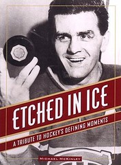
Now then: Got a note recently from Jonathan Wall, the Manager of Scouting & Player Information for the Canucks. “I was at a dinner the other night here in Vancouver and a great hockey book was given out as a gift,” he wrote. “Once I opened it, I realized you had to have it, as it was full of amazing historical pictures, many depicting jerseys and versions of jerseys that I had never seen before.”
The book, which Jonathan was kind enough to forward to me, is Michael McKinley’s Etched in Ice, which was published back in 1998. As Jonthan promised, it’s packed with great old photos, many of which are uni-notable. Here’s a sampling:
• This is an early Montreal Canadiens sweater, circa 1911-15. It’s not clear to me what the “A” stood for, or who the other team was. Anyone know?
• Meet the 1915 Vancouver Millionaires. Is that an all-time great sweater design or what?
• Here’s the most interesting photo in the book. The obvious point of interest is the crude helmet and mask being worn by the player in the center, but a more subtle detail can be found on the player with his back to us: His pants have a back pocket! I might not have noticed this myself if Jonathan hadn’t pointed it out to me. “I’ve never seen or even heard of this,” he says. “After asking around, an alumni member [at the dinner] mentioned that a lot of the pants in that day had pockets, but he didn’t know why.” Anyone..?
• This is the Canadian goalie during the 1936 Olympics. The game was played outdoors, so he’s wearing sunglasses. Not sure if his headwear is a standard cap/visor or if it’s one of those transparent tinted visors, although I’d like to think it was the latter, just because that would be so damn cool.
• Really love the uni number treatment on the Russian goalie in this 1957 shot.
• Here’s something you don’t often see: a captain’s “C” in a diamond patch.
• Speaking of diamonds, you’ve gotta love this Quebec Aces sweater.
• Here’s the Jarvis Collegiate team, circa 1912 with a young Conn Smythe seated at lower-right. As you can see, it appears that most of the players have tragedy and/or comedy patches sewn onto their sweaters. Anyone know why? Also: Love the little bulge/serif in the center of each “J” — subtle but hugely effective.
• The book has an entire chapter devoted to women’s hockey. I like this shot of the Preston Rivulettes — note that some of the sweaters had Johnny collars, while the others just had V-necks. Then there were the Buffalo Snow Birds, who according to the caption “brave[d] a 1920s winter to play a little bathing-suit shinny.” Yikes.
• No women in this photo. According to the caption: “In 1902 the North-West Mounted Police, responsible for keeping the peace in the often riotous Yukon, blew off steam by dressing as women for a ‘drag’ game in Whitehorse.” Double-yikes.
• Here’s a young Bobby Orr wearing an Oshawa Generals jersey.
• And we can add Terry Sawchuk — getting chummy here with Johnny Bower — to our list of smoking athletes.
Uni Watch News Ticker: Here’s a Barack Obama photo I hadn’t seen before, from his high school basketball days. Dig those belted shorts! ”¦ Nicole Haase just forwarded me this superb article about the dwindling state of the U.S. sock industry and, specifically, about Wigwam, a Wisconsin-based sock brand that plans to keep its operations in America (and which also happens to be my preferred brand of striped tube socks — you can buy their product here). ”¦ “The recent feature on pin-up girls wearing hockey jerseys reminds me of the strip joint Club Supersexe in Montreal, where the dancers — when they’re not onstage — walk around in their G-strings and NHL replica tops,” writes John F.J. Sullivan. “When I was there a number of years ago, one of the women had a Minnesota North Stars top on — and this was long after the team had moved. I guess the classics never go out of style.” ”¦ Look, it’s Zorro! (Thanks, Vince.) ”¦ A UK newspaper just ran one of those 10 worst-ever soccer uniforms articles (with thanks to Kevin Forrest). ”¦ Reprinted from yesterday’s comments: Great photographic retrospective of Converse sneakers here. ”¦ Remember how Larry “Mr. Diplomacy” Bowa was refusing to wear a helmet on the coaching lines and invited MLB to fine him every single game? Turns out MLB had a good rejoinder: Wear the fucking helmet already or you’ll be ejected. Bowa has now agreed to comply and, as usual, he’s being a real ray of sunshine about it. ”¦ Still more info on the coaches’ helmets (including news that the manufacturers are trying to develop a coach-specific model) here.
O’s players are sporting the link…are these the unreleased versions?
Looks like the girl seated in the Buffalo Snow Birds photo either just got hit in the face or is powdering her nose.
I felt a great disturbance in the comments, as if many posts suddenly cried out in terror and were suddenly silenced. I fear something terrible has happened.
Strange … I’m getting the regular posting for the day, but no message about some people not getting the regular posting.
[quote comment=”233410″]I felt a great disturbance in the comments, as if many posts suddenly cried out in terror and were suddenly silenced. I fear something terrible has happened.[/quote]
It’s OK, KT … Keep scrolling down. It’s like today’s post is listed twice, and the normal chatter is taking place after the second set of info. All is well with the world.
[quote comment=”233413″][quote comment=”233410″]I felt a great disturbance in the comments, as if many posts suddenly cried out in terror and were suddenly silenced. I fear something terrible has happened.[/quote]
It’s OK, KT … Keep scrolling down. It’s like today’s post is listed twice, and the normal chatter is taking place after the second set of info. All is well with the world.[/quote]
Cool article from the San Diego Union Tribune today. The photo doesn’t show it too clearly but the young Vaughn is rockin’ a Nike belt. That white spot on the front of his belt is a swoosh.
link
s.j. sharks wore white at home last night. nice to see!
[quote comment=”233402″]I felt a great disturbance in the comments, as if many posts suddenly cried out in terror and were suddenly silenced. I fear something terrible has happened.[/quote]
link
Cool article from the San Diego Union Tribune today. The photo doesn’t show it too clearly but the young Vaughn is rockin’ a Nike belt. That white spot on the front of his belt is a swoosh.
[quote comment=”233410″]I felt a great disturbance in the comments, as if many posts suddenly cried out in terror and were suddenly silenced. I fear something terrible has happened.[/quote]
don’t try to frighten us with your sorcerous ways, kenn…your sad devotion to that ancient religion has not helped you conjure up the missing posts, or given you clairvoyance enough to find larry bowa’s coaching helmet
[quote comment=”233402″]I felt a great disturbance in the comments, as if many posts suddenly cried out in terror and were suddenly silenced. I fear something terrible has happened.[/quote]
i find your lack of faith disturbing
[quote comment=”233387″][quote comment=”233343″]The Yankees are selling two “authentic” jerseys on their website. One with only the final year at Yankee stadium patch, and the other with both the Yankee Stadium and the All Star gamen patch.
Which one are they going to wear? Anybody know for sure?[/quote]
My understanding is that they’ll wear both patches up until the All-Star Game. Then they’ll remove the ASG patch for the balance of the season.
This makes sense, but it runs counter to the protocol used by other ASG hosts in recent years, all of whom have kept the ASG patches on their jerseys for the entire season.[/quote]
That’s what the team has said. I rather like it.
That picture of Conn Smythe in his days attending Jarvis Collegiate Institute is fantastic! Being an alumni student of that high school in Toronto, Ontario, it has always brought me great pride knowing such an iconic figure went to the same school that I did. According to the school website, he attended it between 1910-1912, after being kicked out of Upper Canada College for failing to pay tuition. The time frame is a little odd since I would believe that those patches were in honour of the students that went to fight in the First World War but considering he left 2 years before war broke out, I don’t think thats what it could be.
What they could be is our school crest OR military decorations as Jarvis used to have a cadets program in addition to normal academics.
You can view the crest on the left hand side of this page which displays more information about the history of the school. I will see if I can find more definitive information but for now, this is what I believe it could be.
[quote comment=”233439″][quote comment=”233387″][quote comment=”233343″]The Yankees are selling two “authentic” jerseys on their website. One with only the final year at Yankee stadium patch, and the other with both the Yankee Stadium and the All Star gamen patch.
Which one are they going to wear? Anybody know for sure?[/quote]
My understanding is that they’ll wear both patches up until the All-Star Game. Then they’ll remove the ASG patch for the balance of the season.
This makes sense, but it runs counter to the protocol used by other ASG hosts in recent years, all of whom have kept the ASG patches on their jerseys for the entire season.[/quote]
That’s what the team has said. I rather like it.[/quote]
I like it too. The last year a Yankee Stadium is a thing. It’s not like closing Riverfront Stadium, the All Star Game patch takes away from it a bit, in my opinion. Is it possible that the Yankees didn’t want the ASG patch at all, and this is a compromise with the league?
About your question about the CA logo of the Montreal Canadiens. Here’s a link to wikipedia to explain the historical significance and evolution of the logo. I could’t find a more reliable source on short notice, but I personnaly remember these facts to be exact. Here’s a brief summary of the article:
“The first logo was a large green maple leaf with a white ‘C’ in ‘Old English’ script as all of the NHA O’Brien franchises had similar logos. As the team ownership changed, the logo evolved into today’s famous logo.
After being bought in 1911 by George Kennedy, the logo was first changed to a star-like logo of the letters CAC, standing for Club Athletique Canadien. This was then changed to a large C, with an A inside.
After being bought by original Canadien player Leo Dandurant, the team regained their original name, Club de Hockey Canadien, and the H replaced the A. Thus the CH, standing for Club de Hockey Canadien (or CHC) logo was born.”
link
Sorry, here is the link.
link
Paul,
Are you receiving my emails? I think not …
I expect a full retrospective look at Favre’s Uni career in tomorrow’s blog.
We’ll miss you #4, thanks for the memories.
anyone see the the striped socks arsenal is wearing against AC milan they are pretty sick
Even Wisconsin’s graduation gowns have Adidas 3-stripe syndrome.
[quote comment=”233446″][quote comment=”233439″][quote comment=”233387″][quote comment=”233343″]The Yankees are selling two “authentic” jerseys on their website. One with only the final year at Yankee stadium patch, and the other with both the Yankee Stadium and the All Star gamen patch.
Which one are they going to wear? Anybody know for sure?[/quote]
My understanding is that they’ll wear both patches up until the All-Star Game. Then they’ll remove the ASG patch for the balance of the season.
This makes sense, but it runs counter to the protocol used by other ASG hosts in recent years, all of whom have kept the ASG patches on their jerseys for the entire season.[/quote]
That’s what the team has said. I rather like it.[/quote]
I like it too. The last year a Yankee Stadium is a thing. It’s not like closing Riverfront Stadium, the All Star Game patch takes away from it a bit, in my opinion. Is it possible that the Yankees didn’t want the ASG patch at all, and this is a compromise with the league?[/quote]
Could be.
Let me correct one thing, though – the Yankees will begin the season wearing only the YS patch. They will add the ASG patch to the other sleeve from the start of All-Star voting through the Game itself.
Then it’s back to the one patch.
[quote comment=”233461″][quote comment=”233451″]I expect a full retrospective look at Favre’s Uni career in tomorrow’s blog.[/quote]
Um, why? Dude played almost his entire career for one team — a team that made virtually no uni changes during his tenure.[/quote]
Well, there was the 1994 throwback. And the throwbacks worn in 2001, and those worn in 2003.
Not to mention that the Packers went from five sleeve stripes to three in 1997.
And in 2000, Brett wore an old cold-weather jersey (with the built-in pockets) that still had the extra stripes, apparently because Reebok hadn’t ever gotten around to making him a new one.
Hey, when you don’t make many changes, these things are important….
I’m so confused…..
Paul got linked up.
link, and Paul’s Page 2 article is linked at the bottom. Some decent history in the article too!
OK, so The Sun (truth in journalism! Hah!) posts its 10 worst naff kits without the 1978 Colorado Caribous, the 1998 Kansas City Wizards alternate, the 1994 United States World Cup kits, or even Mexico’s ugliest uniform ever: link
[quote comment=”233460″]Interesting article on CNBC about former Nike execs now marketing a sex health drug……..
link
Just do it! (if you know what I mean)
[quote comment=”233474″]OK, so The Sun (truth in journalism! Hah!) posts its 10 worst naff kits without the 1978 Colorado Caribous, the 1998 Kansas City Wizards alternate, the 1994 United States World Cup kits, or even Mexico’s ugliest uniform ever: link[/quote]
Have we missed the fact that 7 of the 10 were English kits and 3 were World Cup teams? And, hel-lo, it’s The Sun, which is an English newspaper. I’d find it odd if they had mentioned the Caribous or the Wizards.
And I kinda liked the ’94 denim. I like it better than the crap we’re wearing now.
[quote comment=”233488″][quote comment=”233455″]anyone see the the striped socks arsenal is wearing against AC milan they are pretty sick[/quote]
They’ve been wearing them all year, and they do look nice. Today was the Away kit with white/red stripped socks. The 3rd kit has similar blue/red stripped socks.
link
link[/quote]
yea that was the first champions league soccer ive seen in a while and those stripes are sick im thinking my high school should adopt these
Took about 3-4 min to finally access site..
[quote comment=”233364″][quote comment=”233361″][quote comment=”233358″]Apparently, God is retiring from the NFL.
link
ESPN will have to call its physician, as it is sure to have an erection lasting more than four hours today.[/quote]
John Madden’s will last about a week![/quote]
link
[quote comment=”233444″]The Red Sox will be wearing a navy trimmed St. Patricks Day jersey this year. Also, the jersey will be a Cool Base, instead of their normal mesh, green, red and white ones.
New ones link
Oldies link
IMO, should have used the old colors on the Cool Base jersey, navy has nothing to do with St. Patrick’s Day.[/quote]
i cant remember what jersey they wore for st. patty’s day last year, but the jersey pictured was worn for the red auerbach tribute.
the difference in what was posted here is the cool base “new” jersey is a bp jersey and follows the 08 bp jersey template. one which a few teams have advertised on shop mlb.
last seasons green jersey, the pictured auerbach tribute jersey, was different, and didnt follow the 07 bp template
[quote comment=”233482″][quote comment=”233474″]OK, so The Sun (truth in journalism! Hah!) posts its 10 worst naff kits without the 1978 Colorado Caribous, the 1998 Kansas City Wizards alternate, the 1994 United States World Cup kits, or even Mexico’s ugliest uniform ever: link[/quote]
Have we missed the fact that 7 of the 10 were English kits and 3 were World Cup teams? And, hel-lo, it’s The Sun, which is an English newspaper. I’d find it odd if they had mentioned the Caribous or the Wizards.
And I kinda liked the ’94 denim. I like it better than the crap we’re wearing now.[/quote]
What’s just as bad is they’ve included Campo’s kit as if it were a uniform when it’s a gk kit that is completely unrelated to the team kit (or should be). But I do agree, that ABA kit was major ugly — but you really can’t polish the turd that is the mexicant uniform.
the green bp jersey that the red sox (and id assume other teams who will participate in the st patty’s day tradition will wear) is shown differently on the yawkeywaystore.
link
unless those are just wrapped so tight on the mannequins that the white side panels are actually out of view and on the back/front of the mannequin.
Once more, no love for my 1991 “Bruised Banana” Arsenal kit.
link
Anyone ever see the font for the numbers on that baby? They look like they were hand cut out of red craft paper by a six year old, which just adds to the charm of the whole affair.
[quote comment=”233488″][quote comment=”233455″]anyone see the the striped socks arsenal is wearing against AC milan they are pretty sick[/quote]
They’ve been wearing them all year, and they do look nice. Today was the Away kit with white/red stripped socks. The 3rd kit has similar blue/red stripped socks.
link
link[/quote]
Oh my Gawd. There’s are 3 stripes on the socks. Is Nike giving into the craze as well?
(Sarcasm meter pegged out here.)
i think that is an awesome picture of the vancouver millionaires, there is so much good stuff in it!
i love the worn-out, hole-ridden socks, i love that theyre wearing skates outside on the grass, i love how the width of the “V” on all of the sweaters varies just a little…and i love how everyone has the same, stern look on their faces–except for that one guy in the back row (im sure his teammates had something to say about that once they saw the picture…)
That Hull shirt makes any Cincinnati Bengals uniform look tame by comparison…and that’s really saying a lot.