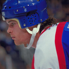
A few weeks ago I ran a Ticker item linking to this photo of Jim Kyte blow-drying his hearing aid. That led Teebz to post a comment linking to the photo you see at right — Kyte’s specially modified helmet, with ear coverings to protect his hearing aids. And that in turn led me to ask if anyone knew of other deaf athletes with specialized equipment needs.
The response was fascinating. Here’s a sampling:
• From Brad Larocque: “I remember Jim Kyte coming to our school and talking to us about playing with his impairment. He told about his trick of watching the reflections in the glass to see where everyone was on the ice, since he couldn’t hear them very well.”
• From Joe Falender: “I wear hearing aids, as I can hear about 50% in both ears. I used to play a lot of hockey, all the way up to high school. For my hearing aids, I wore the behind-the-ear model. But by the third period, or even the second period, the sweat would get into the hearing aid and it would have to be dried out, which takes about an hour or two, so I would give the hearing aid to my dad and play the rest of the game without them. Finally after being fed up with this, we got these rubbery covers that would slide over the hearing aid and protect it from the sweat. It worked like a miracle. (Nowadays I wear the in-the-cannal aids that are very small and I don’t have to worry about the sweat at all.)
• From Travis Waldron: “Not sure about the rules and regulations on hearing aids, but the University of Kentucky football team had a deaf defensive lineman, Terry Clayton, for the past four years. He couldn’t wear his hearing aids on the field because the crowd noise was magnified over everything else, creating background noise that kept him from hearing anything on the field.”
• From David Kendrick: “I am hearing-impaired and play ice hockey in a regular recreational league. I always let the refs know before the game that I don’t hear very well and ask them to cut me some slack when giving verbal commands (for example, look directly at me so I can try to read your lips). Some do, some don’t. Most of the other players have been around a few seasons and know about it. I’ve played in deaf leagues and tournaments as well. I don’t wear a hearing aid as the Jets player did, but I do wear my eyeglasses when I play. I’ve got the double smackdown: partially deaf and 20-600 nearsightedness.”
• From: Daniel Weimann: “I go to the Rochester Institute of Technology, which has the National Technical Institute for the Deaf, one of the two largest deaf schools in the country. I’m a member of the swim team and we have several deaf students, as well as a former swimmer and now a coach who are deaf or hard of hearing, ranging from cochlear implants to hearing aids. They always take their hearing aids off before they swim, of course. Sometimes they forget to turn them off in their lockers and they make high-pitched squealing sounds.”
• From: Mark Doescher: “Defensive back Martel Van Zant plays for the Oklahoma State football and is completely deaf. He has an interpreter who stays on the sidelines during practice and games and communicates between both the coaches and the player. There’s more information here”
• From Christian Bitto: “Steve Downie of the Flyers wears a hearing aid. His has a disorder caused by a car accident from when he was younger. On January 22nd, he fought David Clarkson, and at the end of the fight, as he was skating off the ice, the ref gave him his hearing aid that was knocked out. Unfortunately, I can’t find any video of the fight that goes past the refs breaking them up.”
• From: Vince Grzegorek: “Just found this article on an all-deaf soccer team in Iraq. Refs at their games have to wave a flag instead of using a whistle.”
• From Eric Hodges: “Interesting article here about the way Gallaudet University in DC used a drum to help time the snaps and how a new coach shifted things up.” [You can see the drum on the sidelines here, and there’s additional info here. — PL]
• From Joshua Wagner: “When playing football in high school, I never once considered wearing my hearing aids, because they are highly fragile machines worth thousands of dollars. As a cornerback, I merely learned the defensive signals and read them from the defensive coordinator as he was signaling to the middle linebacker in the huddle. Also, I had worked out some hand signals with my fellow players. I had an interpreter on the sidelines at all times, but I was on my own on the field. Being deaf actually made me a better player, because it forced me to be more observant by noticing subtle things, like the pressure on people’s feet and hands signaling their intent to drop back or run forward. Similarly, when running track, sometimes I would have the starter stand directly behind my starter blocks, because then they would be close enough for me to feel the starting gun rather than hearing it. In basketball, I was a point guard and my interpreter would sit next to my coach and sign what he was telling me as I dribbled the ball up. My coach would also signal a play number to me.”
Tremendous stuff. Big thanks to all who contributed, and especially to those who shared their personal experiences.
Uni Watch News Ticker: Kevin Millar shattered a pink bat the other day. ”¦ While working on last Friday’s ESPN column about the ABA, I happened upon a few shots of the Nets wearing memorial “4” patches on their warm-up shirts. Anyone know who that was for? ”¦ Pueblo Central High in Colorado pulled some major throwback action last week — dig those belts! Too bad they ruined it with those period-inappropriate headbands (with thanks to Patrick Chippeaux). ”¦ Hmmm, do the Walsh University Cavaliers look just a bit familiar? (Thanks, Vince.) ”¦ This page has a nice little video showing Mizuno reps making glove repairs and modifications for some of the Astros in spring training (with thanks to Matt Englander). ”¦ Larry Bowa is being diplomatic, as always. ”¦ OHL report from Brian Thompson, who writes: “Wanted to point your attention to last Thursday night’s game between the Belleville Bulls and the Windsor Spitfires, which was the Spitfires’ first game since captain Mickey Renaud passed away last Monday. Not only did the Spitfires come out in Mickey Renaud warmup jerseys, but so did the Bulls. After the warmups concluded, the Spitfires had a ceremony laying their Renaud jerseys on a table, revealing their game jerseys with a small memorial chest patch.” ”¦ Reprinted from Friday’s comments: Jose Reyes appears to have been stretching his pants under his heel (which got Pedro Martinez fined in 2006) the other day. ”¦ Really interesting story here about Jaromir Jagr using logo-free sticks. ”¦ We’ve talked before about the inconsistencies among teams mistaking their 10th season for their 10th anniversary (or 20th, or 30th, or whatever). But Eric Iwamoto has noticed a particularly amusing anomaly: The Giants wore this patch in 1997, but they’re now wearing this one in 2008 — 11 years later, not 10. ”¦ FC Dallas unveiled new uniforms last week (with thanks to Mark Dancer). ”¦ Wouldn’t it be better if Stephen Valiquette wore this on the front of his mask? (Thanks to Michael Romero.) ”¦ Interesting racer-back girls’ hoops jersey concept here — note the team name on the rear neckline (with thanks to Michael Orr). ”¦ According to Chad Back, Kentucky will have new hoops unis next season, as seen here and here. “Nike is calling the design ‘Secretariat,'” says Chad, “because the checkerboard design on the new unis is reminiscent of the silks that Secretariat’s jockey wore.” Yeah, patterning a uniform worn by the sports world’s tallest athletes after a design worn by the smallest athletes — that sounds like a really great idea. ”¦ AJ Brandt reports that the Flames are wearing an 18 decal in tribute to their draft pick Mickey Renaud, who passed away last week. ”¦ Georgia Tech’s women’s hoops team wore throwbacks the other day. Not as cool as this, but still pretty good (with thanks to Richard Musterer and Sean Bedford). ”¦ Aside from the obvious button issues, how does an A.L. pitcher end up with such a big dirt stain while pitching at home? (Card provided by Stuart Greenlee.) ”¦ Jeremy Brahm sent along this 2001 photo of Yakult Swallows catcher Atsushi Furuta wearing a knee brace outside his pants. Never seen that before. ”¦ Characteristically eagle-eyed branding report from Mark Mihalik: “Last year I noticed that Gary Sheffield, a longtime Nike guy, had started wearing non-Nike cleats, and he also had a unique logo on some of his gear–particularly his wristbands. In this photo, you’ll see something that looked like an S or a 3. I figured it was some kind of signature logo, but it turns out it’s actually a signature company called GS3. Even though there’s apparently absolutely nothing on the internet about this brand, I found an auction for a pair of his game-used cleats that confirms it. It’s also what his Tigers teammate Carlos Guillen was wearing through parts of last season, and both he and Sheffield have been wearing the same model so far this spring.” ”¦ Just because it was called the MLB Urban Invitational, did Southern’s coach have to leave the sticker on his brim? (Screen grab courtesy of Randy Williams.) ”¦ Buncha good spring training pics from Kenn Tomasch: Flapless helmets being worn by coaches Roberto Kelly, Mike Quade, and Ivan DeJesus (good to see that the Cubbie coaches get to wear the team’s standard embroidered felt logo appliqués), and a vendor who knows a thing or two about striped socks. ”¦ Wren Wrangler notes that Andres Nocioni was wearing tights yesterday. As you may recall, these were banned except for instances of medical necessity — can’t wait to hear if Nocioni had a doctor’s note for this one. ”¦ Last week I ran this photo of the new Oregon State baseball uniforms, but I didn’t realize they were using striped stirrups (with thanks to Mark Snider). ”¦ Numerological observation from Duncan Gee, who writes: “In the third quarter Friday night against the Sixers, the Golden State Warriors had Stephen Jackson, Mickael Pietrus, Al Harrington, Chris Webber, and Baron Davis on the court for a few minutes — Nos. 1, 2, 3, 4, and 5, respectively. Consecutive numbers maybe an East Bay thing — last year, the Oakland A’s on many occassions had Mike Piazza (#31), Jack Cust (#32), and Nick Swisher (#33) as the 3-4-5 heart of the batting order.” ”¦ On Friday I ran Paul Wiederecht‘s analysis of that old Yankee Stadium vendor’s uniform, including his mother’s recollection that the stadium’s dominant color had been green until Lou Dorfsman had the facade painted white and had the seats changed to blue. Now he’s provided a bunch of old shots that show the stadium’s green phase, as seen here, here, and here. ”¦ I’ll be on the road today, so please play nice while I’m gone. Thanks.
The #4 patch worn by the nets was for Wendell Ladner, a member of the Nets who died in a plane crash on June 24, 1975. He was a very popular player throughout the league. I guess that pic was from the 75-76 season.
Albany wore (and auctioned off) their charity sweaters last night (again, wearing red at home).
I don’t think they looked link, and the 15th anniversary crest is a cool touch.
While hoping to not reopen the now-tiresome “base coaches wearing helmets” debate, I am compelled to ask this: If base coaches are being required to wear helmets, why aren’t pitchers? They are closer to the hitters and are much less able to protect themselves from screaming line drives.
I do not support requiring either group to wear helmets, but if anyone should wear them, it is pitchers. How many more times a year is a pitcher than a base coach hurt by a hit ball?
That big dirt stain on Ervin Santana’s pants is probably from him rubbing the baseball on it.
The Red Wings also wore a #18 decal on their helmets when they played the Flames on Feb. 22. You can kind of see it in the mini-gallery here.
I’ve raced against Galludet in track & field on several occasions. They actually have an interpreter who stands next to the official to sign the commands. I don’t know if they’re able to pick up on the vibrations from the gun or if they have to “go on smoke” (which would throw me off…I never look at the official when I’m starting a race, I always stare straight down the track or down towards the ground).
I love those Oregon State unis. I’ve said it before and I’ll say it again… Brown is the most underused/misused sports uniform color. It’s too often paired up with gold and black… which is too bad because it looks great with orange (like in OSU’s case) and a few other colors (light blues, off-white or beige colors).
[quote comment=”232937″]The #4 patch worn by the nets was for Wendell Ladner, a member of the Nets who died in a plane crash on June 24, 1975. He was a very popular player throughout the league. I guess that pic was from the 75-76 season.[/quote]
Some pics of Wendell Ladner, including his classic cheesecake pose, are at the fine link site referenced by Paul in last week’s terrific ESPN column.
Sorry, my link disappeared and I’m not going to try it again…
link
I contacted the SF Giants last year to see why they weren’t recognizing the 50th season in SF in 2007 and they said they would be celebrating in 2008 because of the All-Star Game being in SF last year. Seems like they could’ve done both.Â
I bet they didn’t think anyone would even notice. Silly Giants.
I posted a blurb late the other day about the Shockometers the Arena League is using this year, but here is an article about them.
link
Those photos of Yankee Stadium are great– the first two look like stills from a Hitchcock movie.
Van Zant no longer play for the Cowboys, graduated. But there was a big hub bub for why he wasnt invited to the combine, his agent thought it might be becasue he was deaf. Cant find the article.
Aren’t Oregon State’s uniforms black and orange, not brown?
GS3=Gary Sheffield 3
is this some new company or is it some kind of sub-brand?
he apparently ASKED alan trammell for #3 when he joined the tigers (as none of the numbers from the 1984 club have been retired) and of course, tram said yes…
so he (shef) had the clothing brand BEFORE he got the number 3
anyone with any other info?
[quote comment=”232940″]That big dirt stain on Ervin Santana’s pants is probably from him rubbing the baseball on it.[/quote]
My guess was he preformed a slide for no apartent reason in warmups and then used the dirt to dirty up the ball during the game. I’m no Angels hater, just seems to conincidental for a pitcher to have a little extra “something” on their uni.
[quote comment=”232939″]While hoping to not reopen the now-tiresome “base coaches wearing helmets” debate, I am compelled to ask this: If base coaches are being required to wear helmets, why aren’t pitchers? They are closer to the hitters and are much less able to protect themselves from screaming line drives.
I do not support requiring either group to wear helmets, but if anyone should wear them, it is pitchers. How many more times a year is a pitcher
than a base coach hurt by a hit ball?[/quote]
They also have gloves. Not that that’s a good rationalization, but it is an oft-used one.
[quote comment=”232939″]While hoping to not reopen the now-tiresome “base coaches wearing helmets” debate, I am compelled to ask this: If base coaches are being required to wear helmets, why aren’t pitchers? They are closer to the hitters and are much less able to protect themselves from screaming line drives.
I do not support requiring either group to wear helmets, but if anyone should wear them, it is pitchers. How many more times a year is a pitcher
than a base coach hurt by a hit ball?[/quote]
whether or not pitchers wearing helmets was ever discussed (id say it was never an issue), id have to say that base coaches were targeted first because as every position player is focussed on the pitch and then the subsequent result from the batter, base coaches have different responsibilites. these draw their attention and focus away from the pitched result, eliminating any reaction time whatsoever.
weve all seen the the come-backer or the cap-spinner at the pitchers and it certainly looks and is scary, but at least they are looking at the play and have reaction time no matter how much of a split second it is. a base coach would never even know a ball was hit in his area.
[quote comment=”232950″]Aren’t Oregon State’s uniforms black and orange, not brown?[/quote]
Maybe, this looks brown to me though. And if it’s not it should be.
and a coach was killed last year from a batted ball – that is about all the evidence that MLB needed to institute the rule…
I know Pudge Rodriguez had some off-brand cleat, too- can’t think of the name.
PS- is it me or does that photo look like Brad Pitt
I can’t find the article, but last night I read about Ben Wallace not being able to wear his Steve and Barry’s sneakers with the Cavs, because they’re black and red (for the Bulls). Steve and Barry’s were scrambling to make him custom sneakers that were the Cavs colors.
[quote comment=”232958″][quote comment=”232950″]Aren’t Oregon State’s uniforms black and orange, not brown?[/quote]
Maybe, this looks brown to me though. And if it’s not it should be.[/quote]
Sorry, link looks brown to me.
In regards to the pic of the Georgia Tech throwbacks:
link, they are playing against Va. Tech.
The player with the ball is wearing white and black Nike Air Huarache Elite 2 basketball shoes.
Call it nitpicking, but it REALLY bothers me when a high profile team like the Hokies doesn’t match their shoes to their unis!
If you check Eastbay, those shoes are made in both a maroon as well as an orange accented colorway.
Other teams that are “habitual line-steppers” are LSU, Texas, and K-State. Of those three, I believe the only team to really have a qualm is UT because “Burnt Orange” is not a usual color used.
As I mentioned in the comments last week, Oregon State ballplayers and their striped stirrups were featured on the cover of Baseball America.
To go along with Jagr’s logo-less stick, Columbus’s link spraypaints his stick black, efectivley going logo-less.
Matt
Here’s an article about Vyborny’s stick.
link
And in regards to Kentucky’s link hoops link!
I love the tops, they look as clean, crisp, and sweet as K-State’s the other night against Kansas!
However, the shorts look AWFUL, and very Oregon-esque!
Realize that there is a definite connection between Oregon and Kentucky: link
Brooks was the head coach of Oregon football before the namesake of the link took over!
Coincidence, I think not!
Am I the only one that thinks that green-washed Yankee Stadium looks much more like a classic baseball park than the present day version?
link
link
[quote comment=”232939″]While hoping to not reopen the now-tiresome “base coaches wearing helmets” debate, I am compelled to ask this: If base coaches are being required to wear helmets, why aren’t pitchers?[/quote]
I think the real reason is that base coaches don’t have a union, so MLB can impose any rules they want. Players, obviously, have a very strong union, and you know they’d fight hard on any sort of mandate, and MLB probably figures it’s not worth the fight.
I’ve been covering the Southern baseball team for a couple of years. Head coach Roger Cador has never removed the sticker from his game hat. This was not something different for the Urban Invitational.
Speaking of deaf athletes…
link.
I am a student at Kennesaw State University. Our student section at athletic events have become known as the “Striped Crew.” Everyone wears these socks. I mean everyone, Faculty, Students, and players from the various teams. It’s crazy.
link
Fascinating stuff about deaf and hearing-impaired athletes… One of the earliest deaf ballplayers was link; he’s responsible for baseball’s umpires raising their right hand when calling a strike! Hoy couldn’t hear the ump’s call, so he asked them to give him a visual signal.
Ever since, at every level of baseball, an ump’s raised right arm means “Strike!”
[quote comment=”232959″]and a coach was killed last year from a batted ball – that is about all the evidence that MLB needed to institute the rule…[/quote]
I know, I know, we don’t want to re-open this discussion, but this little inaccuracy has been repeated often in the past few days. The Tulsa coach was hit in the neck and no helmet would have helped him.
No statments on how anybody feels about MLB coaches wearing the helmets, only correcting a fact.
Is it common knowledge that the link From afar, you can link that it isn’t a single layer.
(The O’s are also one of the worst offenders in misplacing the number on the payer’s back. There’s no NOB, but they leave a huge space above the number as if there could be. Particularly with #34 in the picture above, it looks horrible.)
This might be late, but I was perusing a colleague’s Eurosport Soccer Catalogue and there is a full page Reebok ad with French star Thierry Henry as one of their endorsers.
This is huge considering he was one of Nike’s big athletes who helped them make inroads into the world Footy scene!
[quote comment=”232966″][quote comment=”232958″][quote comment=”232950″]Aren’t Oregon State’s uniforms black and orange, not brown?[/quote]
Maybe, this looks brown to me though. And if it’s not it should be.[/quote]
Sorry, link looks brown to me.[/quote]
Definitly looks black to me, did on my home computer too.
[quote comment=”233003″]This might be late, but I was perusing a colleague’s Eurosport Soccer Catalogue and there is a full page Reebok ad with French star Thierry Henry as one of their endorsers.
This is huge considering he was one of Nike’s big athletes who helped them make inroads into the world Footy scene![/quote]
He switched after link.
[quote comment=”233002″]Is it common knowledge that the link From afar, you can link that it isn’t a single layer.
[/quote]
I didn’t know that. The Dodgers used to do that with their home uniforms – white outline against the white jersey.
[quote comment=”232937″]The #4 patch worn by the nets was for Wendell Ladner, a member of the Nets who died in a plane crash on June 24, 1975. He was a very popular player throughout the league. I guess that pic was from the 75-76 season.[/quote]
Coincidentally, some good (but non-uni-related) anecdotes about Ladner in today’s Denver Post:
link
[quote comment=”233009″][quote comment=”232966″][quote comment=”232958″][quote comment=”232950″]Aren’t Oregon State’s uniforms black and orange, not brown?[/quote]
Maybe, this looks brown to me though. And if it’s not it should be.[/quote]
Sorry, link looks brown to me.[/quote]
Definitly looks black to me, did on my home computer too.[/quote]
Looks black to me as well. Must be your monitor settings.
Nocioni is actually not wearing tights but instead just the leg portion. I dont know if that is how he can get around the rule but in the picture you can see part of his leg. They may deem them compression sleeves just as players who wear arm covers like AI or Melo dont wear sleeves in the traditional sense.
Last week I ran this photo of the new Oregon State baseball uniforms, but I didn’t realize they were using striped stirrups
How can OSU so clearly “get it” when it comes to putting together classic unis when OU constantly just flat-out embarrasses itself? Amazing those two schools are in the same state. What’s in the Kool-Aid in Eugene?
[quote comment=”233009″][quote comment=”232966″][quote comment=”232958″][quote comment=”232950″]Aren’t Oregon State’s uniforms black and orange, not brown?[/quote]
Maybe, this looks brown to me though. And if it’s not it should be.[/quote]
Sorry, link looks brown to me.[/quote]
Definitly looks black to me, did on my home computer too.[/quote]
As long as you realize that it’s OSU and they have always been black and orange, your inner voices or reason should be reassuring you!
link
I love those Oregon State unis. I’ve said it before and I’ll say it again… Brown is the most underused/misused sports uniform color. It’s too often paired up with gold and black… which is too bad because it looks great with orange (like in OSU’s case) and a few other colors (light blues, off-white or beige colors).
I too LOVE brown and orange together.
Occasionally, I’ve seen older link that have has the black paint fade to brown and they look great.>
link
[quote comment=”233011″][quote comment=”233002″]Is it common knowledge that the link From afar, you can link that it isn’t a single layer.
[/quote]
I didn’t know that. The Dodgers used to do that with their home uniforms – white outline against the white jersey.[/quote]
I remember that; it seemed somewhat pointless. What was the reason for it? Here’s link. The Phillies also did this, but with them the white layer at least set the numbers off from the pinstripes. Same with Cincinnati in the mid-’90s. Any other teams with a needless layer?
Why is Kentucky’s new shorts being called the “Secretariat” design? Shouldn’t the checkerboard be blue and white instead of color and glazed color?
[quote comment=”233020″][quote comment=”233011″][quote comment=”233002″]Is it common knowledge that the link From afar, you can link that it isn’t a single layer.
[/quote]
I didn’t know that. The Dodgers used to do that with their home uniforms – white outline against the white jersey.[/quote]
I remember that; it seemed somewhat pointless. What was the reason for it? Here’s link. The Phillies also did this, but with them the white layer at least set the numbers off from the pinstripes. Same with Cincinnati in the mid-’90s. Any other teams with a needless layer?[/quote]
Didn’t realize that the Mets did that. I agree it seems pointless.
Man oh man, do I love those white caps, though.
[quote comment=”233003″]This might be late, but I was perusing a colleague’s Eurosport Soccer Catalogue and there is a full page Reebok ad with French star Thierry Henry as one of their endorsers.
This is huge considering he was one of Nike’s big athletes who helped them make inroads into the world Footy scene![/quote]
Did linkafter the last world cup, reasons stated in the article
I’m sad to see Dallas link their link. That was one of my favorites.
[quote comment=”233013″][quote comment=”233009″][quote comment=”232966″][quote comment=”232958″][quote comment=”232950″]Aren’t Oregon State’s uniforms black and orange, not brown?[/quote]
Maybe, this looks brown to me though. And if it’s not it should be.[/quote]
Sorry, link looks brown to me.[/quote]
Definitly looks black to me, did on my home computer too.[/quote]
Looks black to me as well. Must be your monitor settings.[/quote]
Yea, after looking at it a little longer than I did before I started my work for the day I suppose it is black. Low resolution pic blown up bigger so that the quality was even worse mislead me after a quick glance.
But, as I said before, it SHOULD be brown. Looking at it as black ruins it for me. But if it was Brown, I would love it.
[quote comment=”232939″]While hoping to not reopen the now-tiresome “base coaches wearing helmets” debate, I am compelled to ask this: If base coaches are being required to wear helmets, why aren’t pitchers? They are closer to the hitters and are much less able to protect themselves from screaming line drives.
I do not support requiring either group to wear helmets, but if anyone should wear them, it is pitchers. How many more times a year is a pitcher
than a base coach hurt by a hit ball?[/quote]
Let’s put them in full body padding like the guy that the police K-9 dogs chew on in training.
Converse is turning 100. Boston.com has a photo gallery of some ealry BBall sneaks….
link
[quote comment=”233020″][quote comment=”233011″][quote comment=”233002″]Is it common knowledge that the link From afar, you can link that it isn’t a single layer.[/quote]I didn’t know that. The Dodgers used to do that with their home uniforms – white outline against the white jersey.[/quote]I remember that; it seemed somewhat pointless. What was the reason for it? Here’s link. The Phillies also did this, but with them the white layer at least set the numbers off from the pinstripes. Same with Cincinnati in the mid-’90s. Any other teams with a needless layer?[/quote]Seeing Edgardo Alfonzo reminds me of link. If those four had played for, say, the Brewers, I doubt SI would have used such hyperbole. In fact, those guys probably wouldn’t have made the cover at all.
Anywho, those white caps are kinda cool.
I consider myself a NIKE guy and I am willing to put up with their innovation, but the Kentucky shorts are AWFUL, they may have their hearts in the right place but come on….a tribute to horse racing?
I consider myself a NIKE guy and I am willing to put up with their innovation, but the Kentucky shorts are AWFUL, they may have their hearts in the right place but come on….a tribute to horse racing?
[quote comment=”233030″]I consider myself a NIKE guy and I am willing to put up with their innovation, but the Kentucky shorts are AWFUL, they may have their hearts in the right place but come on….a tribute to horse racing?[/quote]
Horse racing is probably link in Kentucky. So a tribute makes some sense.
We haven’t seen the ACTUAL shorts yet. I actually think they might look cool. The link certainly looks link on the the link being honored.
LOGO CREEP
I was watching “Major Payne” last night, the movie with Damon Wayans from 1996, and in the finals scene of the movie, the kids all have shirts on with their school’s logo, and some serious logo creep. link
Larry Bowa helmet update (from Friday’s LA Times):
“Base coaches Larry Bowa and Mariano Duncan wore helmets at the request of Torre, who received a call from assistant general manager Kim Ng on Thursday night informing him that the league was threatening to eject them if they again violated the new rule requiring them to do so.
The coaches wore caps in the Dodgers’ exhibition opener Thursday, after which Bowa spoke out strongly against the new rule that requires him to wear a helmet. “I fought Joe,” Bowa said. “But he asked me to do it for him.”
Torre said that he and General Manager Ned Colletti would discuss the matter with baseball officials in an afternoon conference call.”
The Times also ran an AP photo of Bowa with a helmet over the weekend (he was on the bench next to Torre).
I know horse racing is big there…I hope the shorts look better in real life than on the drawing board…they may look better. I might be the only one who likes Oregon’s unis, plus I actually like K-State’s SOD uniforms they look sweet. I thought Michigan would have had them by now, but since they are unfortunatly switching to adidas that wont happen.
From over the weekend…those fencers…Adidas’ logo creep is far worse than Nike. Those damn 3 stripes are everywhere and they get a bet out of control. Nike has the simple swoosh…adidas puts their logo plus the strips it is awful.
[quote comment=”233034″][quote comment=”233030″]I consider myself a NIKE guy and I am willing to put up with their innovation, but the Kentucky shorts are AWFUL, they may have their hearts in the right place but come on….a tribute to horse racing?[/quote]
Horse racing is probably link in Kentucky. So a tribute makes some sense.
We haven’t seen the ACTUAL shorts yet. I actually think they might look cool. The link certainly looks link on the the link being honored.[/quote]
link, how great did K-State look the other night?
Beasley even matched the uni with white balck and purple link, Amare Stoudemire’s signature shoe.
Here’s the photo of Bowa with his link.
[quote comment=”233025″][quote comment=”233013″][quote comment=”233009″][quote comment=”232966″][quote comment=”232958″][quote comment=”232950″]Aren’t Oregon State’s uniforms black and orange, not brown?[/quote]
Maybe, this looks brown to me though. And if it’s not it should be.[/quote]
Sorry, link looks brown to me.[/quote]
Definitly looks black to me, did on my home computer too.[/quote]
Looks black to me as well. Must be your monitor settings.[/quote]
Yea, after looking at it a little longer than I did before I started my work for the day I suppose it is black. Low resolution pic blown up bigger so that the quality was even worse mislead me after a quick glance.
But, as I said before, it SHOULD be brown. Looking at it as black ruins it for me. But if it was Brown, I would love it.[/quote]
Oregon State’s colors are black and orange. Not brown.
Brown and orange is Bowling Green.
Case closed.
[quote comment=”233022″][quote comment=”233020″][quote comment=”233011″][quote comment=”233002″]Is it common knowledge that the link From afar, you can link that it isn’t a single layer.
[/quote]
I didn’t know that. The Dodgers used to do that with their home uniforms – white outline against the white jersey.[/quote]
I remember that; it seemed somewhat pointless. What was the reason for it? Here’s link. The Phillies also did this, but with them the white layer at least set the numbers off from the pinstripes. Same with Cincinnati in the mid-’90s. Any other teams with a needless layer?[/quote]
Didn’t realize that the Mets did that. I agree it seems pointless.
Man oh man, do I love those white caps, though.[/quote]
The Mets did it because they used the same lettering and numbering on the pinstriped uniforms and that white border looked SWEET on the them.
The Stop sign on the back of Steve Valiquette is a stop sign that many children wear in minor hockey in Canada. It was created to “STOP” players from checking another player into the boards from behind. An act that is very dangerous and has left players paralayzed as a result.
Offical Ontario Hockey League Website here:
Huet from the other night in his first game as a Cap. You can see the Caps logo over the Montreal logo on his chin, but on the back of his helmet he has his new “38” over the old numbers. Problem is, the new numbers are smaller.
link
Jeremy Brahm sent along this 2001 photo of Yakult Swallows catcher Atsushi Furuta wearing a knee brace outside his pants. Never seen that before.
Troy Glaus has worn a patella brace outside of his pants while running the bases, as seen link and link
[quote comment=”233046″][quote comment=”233022″][quote comment=”233020″][quote comment=”233011″][quote comment=”233002″]Is it common knowledge that the link From afar, you can link that it isn’t a single layer.
[/quote]
I didn’t know that. The Dodgers used to do that with their home uniforms – white outline against the white jersey.[/quote]
I remember that; it seemed somewhat pointless. What was the reason for it? Here’s link. The Phillies also did this, but with them the white layer at least set the numbers off from the pinstripes. Same with Cincinnati in the mid-’90s. Any other teams with a needless layer?[/quote]
Didn’t realize that the Mets did that. I agree it seems pointless.
Man oh man, do I love those white caps, though.[/quote]
The Mets did it because they used the same lettering and numbering on the pinstriped uniforms and that white border looked SWEET on the them.[/quote]
i loved those link they only wore a few times in 1997
and as far as the “best infield ever” SI cover, i believe, at the time (september 1999), the mets were threatening to have the fewest errors in a season for an infield (not sure if that was a 162 game, or a 154 game season); if memory serves, they didn’t do it
[quote comment=”232968″]In regards to the pic of the Georgia Tech throwbacks:
link, they are playing against Va. Tech.
The player with the ball is wearing white and black Nike Air Huarache Elite 2 basketball shoes.
Call it nitpicking, but it REALLY bothers me when a high profile team like the Hokies doesn’t match their shoes to their unis!
If you check Eastbay, those shoes are made in both a maroon as well as an orange accented colorway.
Other teams that are “habitual line-steppers” are LSU, Texas, and K-State. Of those three, I believe the only team to really have a qualm is UT because “Burnt Orange” is not a usual color used.[/quote]
My biggest pet peeve in Pro and College basketball is when teams don’t match their shoes. I kind of understand it in the pros because players have separate contract with different show manufacturers, but in College, why can;t the team agree on one home/away shoe design and brand and have everyone wear them? It would look so much better. Here is a link of the Badgers this year of a team not matching and how bad it looks.
Best Huet picture of the back of the helmet I could find…..you can see the new “3” over the old “3”
link
[quote comment=”233039″]From over the weekend…those fencers…Adidas’ logo creep is far worse than Nike. Those damn 3 stripes are everywhere and they get a bet out of control. Nike has the simple swoosh…adidas puts their logo plus the strips it is awful.[/quote]
I think everyone can agree on that. I think branding like that should be relegated to the warmup gear, stripe the hell outta that stuff, leave the uni’s with just a logo.
[quote comment=”233035″]LOGO CREEP
I was watching “Major Payne” last night, the movie with Damon Wayans from 1996, and in the finals scene of the movie, the kids all have shirts on with their school’s logo, and some serious logo creep. link[/quote]
I think that would be “product placement” instead of logo creep. Like Macintosh iBooks showing up on every TV show and movie.
BTW, anyone seen the movie “Definitely, Maybe”? Ryan Reynolds character buys a pack of Marlboro reds and when they show him smoking one, its a Marlboro light. Whoops.
[quote comment=”232951″]GS3=Gary Sheffield 3
is this some new company or is it some kind of sub-brand?
he apparently ASKED alan trammell for #3 when he joined the tigers (as none of the numbers from the 1984 club have been retired) and of course, tram said yes…
so he (shef) had the clothing brand BEFORE he got the number 3
anyone with any other info?[/quote]
From what I’ve gathered, the GS3 cleats are produced specifically for Sheffield, and there’s no plans to release this model or any other GS3 model to the public. I’m not sure if the company is part of some other footwear corporation, but since there is absolutely no branding on the cleats aside from the GS3 logo, it’s highly unlikely that it’s part of one of the bigger companies out there.
What’s really interesting though (and I found this out after I passed the ticker item along to Paul) is that link of these GS3 cleats as well. I can understand why Carlos Guillen might start wearing them (he could easily just grab a pair from Sheffield since they’re teammates), but for Milledge to start wearing them as well, you’d think the company is trying to expand by adding players… an odd move for a non-retail company. It’s either that or he’s just close with Sheffield somehow, and Sheff hooked him up too.
[quote comment=”233024″]I’m sad to see Dallas link their link. That was one of my favorites.[/quote]
Personally, I think the FC Dallas road gray shirt was the second ugliest in MLS, behind only the all-gray Toronto road shirt.
My opinion: leave gray for uniforms where it belongs, only on baseball road uniforms.
I think the blue stripes make a much sharper-looking road shirt for Dallas. I would wear that thing out, where I wouldn’t been seen in public wearing white with gray horizontal stripes.
Dear Indians,
Please follow Rapid Robert’s lead and change your stirrups to link.
Your fan,
Jason
Kenny Walker was a hearing-impaired defensive lineman for Nebraska and the Denver Broncos. My favorite moment in Kenny’s career was his senior introduction on the day of his last game. The NU crowd greeted him with silent applause in sign language. Very emotional day. Here’s link He wrote a book about his experiences, called _Roar of Silence_.
Kenny Walker was a hearing-impaired defensive lineman for Nebraska and the Denver Broncos. My favorite moment in Kenny’s career was his senior introduction on the day of his last game. The NU crowd greeted him with silent applause in sign language. Very emotional day. Here’s (a href=”http://en.wikipedia.org/wiki/Kenny_Walker_(American_football)”>his Wiki article. He wrote a book about his experiences, called _Roar of Silence_.
A little late but I didn’t know that Pee Wee leagues had allstar games in Football.
RE: Walsh University’s Cavalier jerseys
Two members of the Walsh team, link and link, were teammates of Lebron James at Akron St Vincent-St Marys.
Lebron has been known to attend games too, as Walsh is about 45 minutes south of Cleveland.
[quote comment=”233060″][quote comment=”233024″]I’m sad to see Dallas link their link. That was one of my favorites.[/quote]
Personally, I think the FC Dallas road gray shirt was the second ugliest in MLS, behind only the all-gray Toronto road shirt.
My opinion: leave gray for uniforms where it belongs, only on baseball road uniforms.
I think the blue stripes make a much sharper-looking road shirt for Dallas. I would wear that thing out, where I wouldn’t been seen in public wearing white with gray horizontal stripes.[/quote]
I agree that the Toranto kit was fug all around, but I think that was more because of the red shorts they paired with it. And I agree that just looking at the jerseys alone, the new one is more marketable/wearable, but the old kit looked great on the field.
[quote comment=”232983″]Am I the only one that thinks that green-washed Yankee Stadium looks much more like a classic baseball park than the present day version?
link
link
Yes but it was renovated in order to make it more modern. The new ballpark on the outside will look classic but the inside has a mix of modern and old (the facade) stuff. Cant find a good picture, the ones on yankees.com are flash based
link
[quote comment=”233070″]I agree that just looking at the jerseys alone, the new one [FC Dallas shirt] is more marketable/wearable, but the old kit looked great on the field.[/quote]
I have to disagree. I always thought it looked like it was dirty from afar.
Bryan or Paul:
The Spam Monster ate my post. Please help. Thanks.
[quote comment=”233043″]Here’s the photo of Bowa with his link.[/quote]
As a fan that was learning to love baseball by watching the 1984 Cubs … OMG – I’m old.
[quote comment=”233074″][quote comment=”233070″]I agree that just looking at the jerseys alone, the new one [FC Dallas shirt] is more marketable/wearable, but the old kit looked great on the field.[/quote]
I have to disagree. I always thought it looked like it was dirty from afar.[/quote]
Fair enough
[quote comment=”233045″][quote comment=”233025″][quote comment=”233013″][quote comment=”233009″][quote comment=”232966″][quote comment=”232958″][quote comment=”232950″]Aren’t Oregon State’s uniforms black and orange, not brown?[/quote]
Maybe, this looks brown to me though. And if it’s not it should be.[/quote]
Sorry, link looks brown to me.[/quote]
Definitly looks black to me, did on my home computer too.[/quote]
Looks black to me as well. Must be your monitor settings.[/quote]
Yea, after looking at it a little longer than I did before I started my work for the day I suppose it is black. Low resolution pic blown up bigger so that the quality was even worse mislead me after a quick glance.
But, as I said before, it SHOULD be brown. Looking at it as black ruins it for me. But if it was Brown, I would love it.[/quote]
Oregon State’s colors are black and orange. Not brown.
Brown and orange is Bowling Green.
Case closed.[/quote]
Exactly. To say OSU’s jerseys should be brown, when it’s not a team color, is as ridiculous as teams (the Oregon Ducks, for example) adding black when it’s not a team color.
Regarding the green Yankee Stadium, there’s some really interesting stuff about it on the making of feature on the 61* dvd (the movie Billy Crystal made about the Maris-Mantle chase). They matched the paint exactly from an old stadium seat Billy Crystal owned, which was navy blue but there was a chip in it which revealed the old green. It even shows them spray painting old Tiger Stadium entirely in that green color.
[quote comment=”233055″][quote comment=”233035″]
BTW, anyone seen the movie “Definitely, Maybe”? Ryan Reynolds character buys a pack of Marlboro reds and when they show him smoking one, its a Marlboro light. Whoops.[/quote]
You saw “Definitely Maybe”?!?!? I’m questioning your fanhood.
Jonathon Papelbon left his jersey when playing the twins the other day and had to wear link.
[quote comment=”233071″][quote comment=”232983″]Am I the only one that thinks that green-washed Yankee Stadium looks much more like a classic baseball park than the present day version?
link
link
Yes but it was renovated in order to make it more modern. The new ballpark on the outside will look classic but the inside has a mix of modern and old (the facade) stuff. Cant find a good picture, the ones on yankees.com are flash based[/quote]
These are some decent shots…
link
link of the link
link has no link.
link vs link
I Hope this helps
[quote comment=”232946″]I contacted the SF Giants last year to see why they weren’t recognizing the 50th season in SF in 2007 and they said they would be celebrating in 2008 because of the All-Star Game being in SF last year. Seems like they could’ve done both.Â
I bet they didn’t think anyone would even notice. Silly Giants.[/quote]
Nah. Smart marketing. They can sell All-Star garb one year, 50th anniversary stuff the next. Why combine the two.
Just like the elimination of the traditional double-header, there are no 2-for-1s in baseball. (Or other sports for that matter.)
anyone else notice that the striping on the FC Dallas unis go along with the whole adidas three strip thing?
[quote comment=”232951″]GS3=Gary Sheffield 3
is this some new company or is it some kind of sub-brand?
he apparently ASKED alan trammell for #3 when he joined the tigers (as none of the numbers from the 1984 club have been retired) and of course, tram said yes…
so he (shef) had the clothing brand BEFORE he got the number 3
anyone with any other info?[/quote]
It is not a sub-brand but a brand he owns himself (along with other investors).
He didnt start with the company until he got to Detroit and had the #3.
[quote comment=”232962″]I know Pudge Rodriguez had some off-brand cleat, too- can’t think of the name.
PS- is it me or does that photo look like Brad Pitt[/quote]
Pudge used Verdero…a company he had some financial interest in as well at a time. Dont know if he does anymore.
[quote comment=”233089″]anyone else notice that the striping on the FC Dallas unis go along with the whole adidas three strip thing?[/quote]
Perhaps, but the link isn’t really different from the link in that respect.
[quote comment=”233079″][quote comment=”233043″]Here’s the photo of Bowa with his link.[/quote]
As a fan that was learning to love baseball by watching the 1984 Cubs … OMG – I’m old.[/quote]
More points of view regarding the coaching helmet issues (including information that equipment manufacturers are now working to create a coach-specific helmet) in this article of MLB.com:
link
[quote comment=”232946″]I contacted the SF Giants last year to see why they weren’t recognizing the 50th season in SF in 2007 and they said they would be celebrating in 2008 because of the All-Star Game being in SF last year. Seems like they could’ve done both.
I bet they didn’t think anyone would even notice. Silly Giants.[/quote]
What’s the Dodgers’ excuse? Just to stay in sync with the Giants?
link
link
[quote comment=”233051″][quote comment=”232968″]In regards to the pic of the Georgia Tech throwbacks:
link, they are playing against Va. Tech.
The player with the ball is wearing white and black Nike Air Huarache Elite 2 basketball shoes.
Call it nitpicking, but it REALLY bothers me when a high profile team like the Hokies doesn’t match their shoes to their unis!
If you check Eastbay, those shoes are made in both a maroon as well as an orange accented colorway.
Other teams that are “habitual line-steppers” are LSU, Texas, and K-State. Of those three, I believe the only team to really have a qualm is UT because “Burnt Orange” is not a usual color used.[/quote]
My biggest pet peeve in Pro and College basketball is when teams don’t match their shoes. I kind of understand it in the pros because players have separate contract with different show manufacturers, but in College, why can;t the team agree on one home/away shoe design and brand and have everyone wear them? It would look so much better. Here is a link of the Badgers this year of a team not matching and how bad it looks.[/quote]
I agree on matching the brand at the very least…I can understand not matching the style as different shoes are build for different types of players…more support for big post guys, lighter weight for speed guys, etc
[quote comment=”233093″][quote comment=”233079″][quote comment=”233043″]Here’s the photo of Bowa with his link.[/quote]
As a fan that was learning to love baseball by watching the 1984 Cubs … OMG – I’m old.[/quote]
More points of view regarding the coaching helmet issues (including information that equipment manufacturers are now working to create a coach-specific helmet) in this article of MLB.com:
link
i won’t rehash the whole helmet thing again, but seeing three spring training games over the weekend, it will take a little while to get used to seeing base coaches in hats…and while i’m opposed to their mandated use, i gotta admit it is cool to see flapless helmets again…as long as safety is the concern, though, shouldn’t they be wearing at least one earflap (in the direction facing the hitter)?
looks like link won’t be keeping his lid on when he’s on the bench tho…
[quote comment=”232996″]Fascinating stuff about deaf and hearing-impaired athletes… One of the earliest deaf ballplayers was link; he’s responsible for baseball’s umpires raising their right hand when calling a strike! Hoy couldn’t hear the ump’s call, so he asked them to give him a visual signal.
Ever since, at every level of baseball, an ump’s raised right arm means “Strike!”[/quote]
Don’t forget Dummy Taylor, who pitched for the Giants in the early 1900’s. Despite being deaf, he was a notorious umpire baiter. He was once ejected for cursing out an ump in sign language.
How big is Paplebon? That jersey does not look nearly as big on him than it does on Manny.
[quote comment=”233099″]How big is Paplebon? That jersey does not look nearly as big on him than it does on Manny.[/quote]
link is 6’4″; 230 lbs
link is 6’0″; 190 lbs
[quote comment=”233056″][quote comment=”232951″]GS3=Gary Sheffield 3
is this some new company or is it some kind of sub-brand?
he apparently ASKED alan trammell for #3 when he joined the tigers (as none of the numbers from the 1984 club have been retired) and of course, tram said yes…
so he (shef) had the clothing brand BEFORE he got the number 3
anyone with any other info?[/quote]
From what I’ve gathered, the GS3 cleats are produced specifically for Sheffield, and there’s no plans to release this model or any other GS3 model to the public. I’m not sure if the company is part of some other footwear corporation, but since there is absolutely no branding on the cleats aside from the GS3 logo, it’s highly unlikely that it’s part of one of the bigger companies out there.
What’s really interesting though (and I found this out after I passed the ticker item along to Paul) is that link of these GS3 cleats as well. I can understand why Carlos Guillen might start wearing them (he could easily just grab a pair from Sheffield since they’re teammates), but for Milledge to start wearing them as well, you’d think the company is trying to expand by adding players… an odd move for a non-retail company. It’s either that or he’s just close with Sheffield somehow, and Sheff hooked him up too.[/quote]
Perhaps there is some type of Tampa connection.
link.
link
link has his own line of nike now…note the “RF” at the base of the button crease of his collar
i knew he had “RF” hats but i’d not seen the new mark on his clothing until now…i don’t know if this is brand new, but it’s new to me
The state basketball playoffs are going on here in Utah and the local news featured a kid from a small town who is playing with a disablity. While not uni related, I thought this may go along with today’s topic. link was easier to access for most of you than the local news video. This kid is remarkable.
The Sun today listed their link.
If anyone wants more uni-related content from an amateur, check out my columns link
We are a student-run website/magazine for the University of Virginia and we could really use and appreciate the site hits. Please bookmark if you enjoy the column or any other features on the site. Thanks!
[quote comment=”233043″]Here’s the photo of Bowa with his link.[/quote]
DANG, but Larry Bowa looks like Casey Stengel!
[quote comment=”233104″]link has his own line of nike now…note the “RF” at the base of the button crease of his collar
i knew he had “RF” hats but i’d not seen the new mark on his clothing until now…i don’t know if this is brand new, but it’s new to me[/quote]
That’s a custom thing. We sell those shirts at my work and there’s no monogram. I don’t know what’s up witht he perforations, though (maybe they’re just spilled water).
[quote comment=”233094″][quote comment=”232946″]I contacted the SF Giants last year to see why they weren’t recognizing the 50th season in SF in 2007 and they said they would be celebrating in 2008 because of the All-Star Game being in SF last year. Seems like they could’ve done both.
I bet they didn’t think anyone would even notice. Silly Giants.[/quote]
What’s the Dodgers’ excuse? Just to stay in sync with the Giants?
link
link[/quote]
maybe they’re not including the strike shortened season of 94
[quote comment=”233109″][quote comment=”233104″]link has his own line of nike now…note the “RF” at the base of the button crease of his collar
i knew he had “RF” hats but i’d not seen the new mark on his clothing until now…i don’t know if this is brand new, but it’s new to me[/quote]
That’s a custom thing. We sell those shirts at my work and there’s no monogram. I don’t know what’s up witht he perforations, though (maybe they’re just spilled water).[/quote]
Actually, it looks like they ARE link. This shirt probably just hasn’t been released for sale yet.
[quote comment=”233083″][quote comment=”233055″][quote comment=”233035″]
BTW, anyone seen the movie “Definitely, Maybe”? Ryan Reynolds character buys a pack of Marlboro reds and when they show him smoking one, its a Marlboro light. Whoops.[/quote]
You saw “Definitely Maybe”?!?!? I’m questioning your fanhood.[/quote]
Yeah, I know I’ll probably get my man-card revoked for this, but its a pretty good movie.
[quote comment=”233081″][quote comment=”233045″][quote comment=”233025″][quote comment=”233013″][quote comment=”233009″][quote comment=”232966″][quote comment=”232958″][quote comment=”232950″]Aren’t Oregon State’s uniforms black and orange, not brown?[/quote]
Maybe, this looks brown to me though. And if it’s not it should be.[/quote]
Sorry, link looks brown to me.[/quote]
Definitly looks black to me, did on my home computer too.[/quote]
Looks black to me as well. Must be your monitor settings.[/quote]
Yea, after looking at it a little longer than I did before I started my work for the day I suppose it is black. Low resolution pic blown up bigger so that the quality was even worse mislead me after a quick glance.
But, as I said before, it SHOULD be brown. Looking at it as black ruins it for me. But if it was Brown, I would love it.[/quote]
Oregon State’s colors are black and orange. Not brown.
Brown and orange is Bowling Green.
Case closed.[/quote]
Exactly. To say OSU’s jerseys should be brown, when it’s not a team color, is as ridiculous as teams (the Oregon Ducks, for example) adding black when it’s not a team color.[/quote]
Fine, I’ll use different words. I wish OSU had brown in it’s color scheme since the uniform would look so much better if it was brown. I guess I should have said that in the first place.
I was probably confused because brown is a major color in their link. But I suppose that’s just because a black beaver would look horrible. I don’t pay all that much attention to OSU anyway, so I’m not all that familiar with their color scheme.
Those great Oregon State uni’s remind me of Baltimore AL 1901 (I hope the link works):
link
[quote comment=”233011″][quote comment=”233002″]Is it common knowledge that the link From afar, you can link that it isn’t a single layer.
[/quote]
I didn’t know that. The Dodgers used to do that with their home uniforms – white outline against the white jersey.[/quote]
They have a black tackle twill layer outside of the orange on their black alternates as well…I think the reasoning is that the twill buckles and just looks crappy when you use a single layer, so doubling up on it will give it some weight and stability.
[quote comment=”233106″]The Sun today listed their link.[/quote]
That #3 worst kit, Conventry reminds me of the backs of link. Both of which I actually think are pretty sharp. But, I bet the Coventry kit had a bit smaller shorts.
[quote comment=”233113″][quote comment=”233081″][quote comment=”233045″][quote comment=”233025″][quote comment=”233013″][quote comment=”233009″][quote comment=”232966″][quote comment=”232958″][quote comment=”232950″]Aren’t Oregon State’s uniforms black and orange, not brown?[/quote]
Maybe, this looks brown to me though. And if it’s not it should be.[/quote]
Sorry, link looks brown to me.[/quote]
Definitly looks black to me, did on my home computer too.[/quote]
Looks black to me as well. Must be your monitor settings.[/quote]
Yea, after looking at it a little longer than I did before I started my work for the day I suppose it is black. Low resolution pic blown up bigger so that the quality was even worse mislead me after a quick glance.
But, as I said before, it SHOULD be brown. Looking at it as black ruins it for me. But if it was Brown, I would love it.[/quote]
Oregon State’s colors are black and orange. Not brown.
Brown and orange is Bowling Green.
Case closed.[/quote]
Exactly. To say OSU’s jerseys should be brown, when it’s not a team color, is as ridiculous as teams (the Oregon Ducks, for example) adding black when it’s not a team color.[/quote]
Fine, I’ll use different words. I wish OSU had brown in it’s color scheme since the uniform would look so much better if it was brown. I guess I should have said that in the first place.
I was probably confused because brown is a major color in their link. But I suppose that’s just because a black beaver would look horrible. I don’t pay all that much attention to OSU anyway, so I’m not all that familiar with their color scheme.[/quote]
Maybe you’re right, sorta. You can’t match black with brown, that’s a fashion faux pas. Me thinks if they name their school the Beavers, and wish to showcase said beaver in their logo, they need to “ditch the black” and adopt a Browns-ish color scheme. Then all of your wildest dreams will come true!
Just heard Steven A. Smith on his radio suggesting that the NBA should change their league link from a silhouette of linkto one of link. Thoughts?
Maybe you’re right, sorta. You can’t match black with brown, that’s a fashion faux pas. Me thinks if they name their school the Beavers, and wish to showcase said beaver in their logo, they need to “ditch the black” and adopt a Browns-ish color scheme. Then all of your wildest dreams will come true!
Thanks,
That’s exactly what I just said. But you’re right… that is what they need to do. Black is (almost) always a cop out, I guess mostly when new teams adopt it as part of their official colors. I don’t know the history of Oregon State. Have they always been black and orange?
Those renderings of the Kentucky uniforms have been making the rounds on UK message boards for a while now. I almost sent them to Uniwatch myself but I have not been able to establish any level of credibility as to their authenticity.
IMO, the shorts part is not the real deal. Notice the location of the “jock tag.” By rule it can’t be located on a visible portion of the uniform because that would be more than one visible Nike logo. It would also represent a first for Nike as I have never seen a jock tag anywhere but the hem of the jersey.
[quote comment=”233120″][quote comment=”233106″]The Sun today listed their link.[/quote]
That #3 worst kit, Conventry reminds me of the backs of link. Both of which I actually think are pretty sharp. But, I bet the Coventry kit had a bit smaller shorts.[/quote]
link unis are indeed made by Nike however, they are just a Nike World Horns member, wearing what seems to be a version of the older, link link.
[quote comment=”233125″]Those renderings of the Kentucky uniforms have been making the rounds on UK message boards for a while now. I almost sent them to Uniwatch myself but I have not been able to establish any level of credibility as to their authenticity.
IMO, the shorts part is not the real deal. Notice the location of the “jock tag.” By rule it can’t be located on a visible portion of the uniform because that would be more than one visible Nike logo. It would also represent a first for Nike as I have never seen a jock tag anywhere but the hem of the jersey.[/quote]
They actually more closely resemble compression shorts!
[quote comment=”233126″][quote comment=”233120″][quote comment=”233106″]The Sun today listed their link.[/quote]
That #3 worst kit, Conventry reminds me of the backs of link. Both of which I actually think are pretty sharp. But, I bet the Coventry kit had a bit smaller shorts.[/quote]
link unis are indeed made by Nike however, they are just a Nike World Horns member, wearing what seems to be a version of the older, link link.[/quote]
I just clicked on another gallery from the St. Bonaventure website and much to my dismay, look at what link was wearing!
Talk about using link!
[quote comment=”233124″]Maybe you’re right, sorta. You can’t match black with brown, that’s a fashion faux pas. Me thinks if they name their school the Beavers, and wish to showcase said beaver in their logo, they need to “ditch the black” and adopt a Browns-ish color scheme. Then all of your wildest dreams will come true!
Thanks,
That’s exactly what I just said. But you’re right… that is what they need to do. Black is (almost) always a cop out, I guess mostly when new teams adopt it as part of their official colors. I don’t know the history of Oregon State. Have they always been black and orange?[/quote]
In 1890 the college became known as Oregon Agricultural College (OAC). Orange was adopted as the school color, with black as the background. link
The Bonnies links don’t work directly, so:
1. Click on the link provided
2. Click on View Other galleries
3. St.BU/New Mexico will be there
I think the only difference between TOSU and UNM are the number fonts!
I think that GS3 is just a clever spin off of Gary Sheffield #3 since that is his number
link
I was checking out my schools football website and I found some pretty cool pictures of our team, teams we played, and former players.
1965 link posing for a picture on what I believe is where the New York Giants played their first ever game back in 1928.
Some link back in 1977.
The away team with the team name on their link in 1983
An alumni at Northeastern with an unusual uni item. Anyone know what the link is for?
And one of our best players with some link going on
An alumni at Northeastern with an unusual uni item. Anyone know what the #40 is for?
That’s not “40.” That’s the 4 from the “64” TV number on top and the conference patch below.
[quote comment=”233135″]I was checking out my schools football website and I found some pretty cool pictures of our team, teams we played, and former players.
1965 link posing for a picture on what I believe is where the New York Giants played their first ever game back in 1928.
Some link back in 1977.
The away team with the team name on their link in 1983
An alumni at Northeastern with an unusual uni item. Anyone know what the link is for?
And one of our best players with some link going on[/quote]
Don’t think thats a 40, it looks like some type of patch. You can kinda see it on the guy’s jersey in the background
[/quote]Maybe you’re right, sorta. You can’t match black with brown, that’s a fashion faux pas. Me thinks if they name their school the Beavers, and wish to showcase said beaver in their logo, they need to “ditch the black” and adopt a Browns-ish color scheme. Then all of your wildest dreams will come true![/quote]
well, if you can’t match black with brown then you can’t really match orange with black since brown is, from a color theory perspective, really just an orange color.
[quote comment=”233135″]I was checking out my schools football website and I found some pretty cool pictures of our team, teams we played, and former players.
1965 link posing for a picture on what I believe is where the New York Giants played their first ever game back in 1928.
Some link back in 1977.
The away team with the team name on their link in 1983
An alumni at Northeastern with an unusual uni item. Anyone know what the link is for?
And one of our best players with some link going on[/quote]
Don’t think thats a 40, it looks like some type of patch. You can kinda see it on the guy’s jersey in the background
[quote comment=”233135″]An alumni at Northeastern with an unusual uni item. Anyone know what the link is for?[/quote]
that appears to be a patch and not a “0”…what looks like “40” is, i think, part of the “64” with only the “4” visible from his TV number…looks like he has a distant replays’ pennant underneath the shoulder number on the opposite side of his uni
[quote comment=”233138″][/quote]Maybe you’re right, sorta. You can’t match black with brown, that’s a fashion faux pas. Me thinks if they name their school the Beavers, and wish to showcase said beaver in their logo, they need to “ditch the black” and adopt a Browns-ish color scheme. Then all of your wildest dreams will come true![/quote]
well, if you can’t match black with brown then you can’t really match orange with black since brown is, from a color theory perspective, really just an orange color.[/quote]
I’ve always been told, and recently more so from a coupld friends in the fashion design world, that there’s 2 colors you never wear with black, navy blue and brown.
[quote comment=”233055″][quote comment=”233035″]LOGO CREEP
I was watching “Major Payne” last night, the movie with Damon Wayans from 1996, and in the finals scene of the movie, the kids all have shirts on with their school’s logo, and some serious logo creep. link[/quote]
I think that would be “product placement” instead of logo creep. Like Macintosh iBooks showing up on every TV show and movie.
BTW, anyone seen the movie “Definitely, Maybe”? Ryan Reynolds character buys a pack of Marlboro reds and when they show him smoking one, its a Marlboro light. Whoops.[/quote]
Havent seen it but, Red and lights dont have diff. colored filters in other countries
Ok, I think I found twins separated at birth.
Andres Nocioni:
link
and
Jim from The Office:
link
Quote button doesn’t seem to be working. Who knows the manual way to do it?
You guys are right. It is a conference patch of some sort(cant read it any any picture I found).
I thought it looked a lot like a 0.
[quote comment=”233145″]Quote button doesn’t seem to be working. Who knows the manual way to do it?[/quote]
it does work…it’s just that in that string there is a “[/” + “quote]” thrown in there at the beginning
[quote comment=”233143″][quote comment=”233055″][quote comment=”233035″]LOGO CREEP
I was watching “Major Payne” last night, the movie with Damon Wayans from 1996, and in the finals scene of the movie, the kids all have shirts on with their school’s logo, and some serious logo creep. link[/quote]
I think that would be “product placement” instead of logo creep. Like Macintosh iBooks showing up on every TV show and movie.
BTW, anyone seen the movie “Definitely, Maybe”? Ryan Reynolds character buys a pack of Marlboro reds and when they show him smoking one, its a Marlboro light. Whoops.[/quote]
Havent seen it but, Red and lights dont have diff. colored filters in other countries[/quote]
Its supposed to be in Manhattan, but they may have filmed in Toronto or something. It was a white filter.
Paul, I had a post eaten about the NBA logo. Thanks!
[quote comment=”233134″]I think that GS3 is just a clever spin off of Gary Sheffield #3 since that is his number
link
Ummm yeah…think we realized that…that would be the obvious reason for the logo…doesnt address him producing his own shoes though.
Those Pueblo Central kids look like their rehearsing a Broadway musical, not warming up to play hoops…
Nice throwbacks, but maybe they just need to know how to wear them.
Wendell Ladner was killed aboard a plane crash at JFK airport in 1975, from windshear, the Nets retired his #.
[quote comment=”233009″][quote comment=”232966″][quote comment=”232958″][quote comment=”232950″]Aren’t Oregon State’s uniforms black and orange, not brown?[/quote]
Maybe, this looks brown to me though. And if it’s not it should be.[/quote]
Sorry, link looks brown to me.[/quote]
Definitly looks black to me, did on my home computer too.[/quote]
I agree. I see nothing brown on these uniforms. Black and orange is clear on my screen. You guys who see brown might want to check your monitor settings.
Found this
vid while searching for something else. I wonder how much different the process for other helmet types (Schutt DNA, ION, Regular Ridell).
PS: How much do you think Ridell payed for their helmet to be used?
For a team being called Armani Jeans Milano i’m surprised with the relatively low amount of logo creep
link
[quote comment=”233060″][quote comment=”233024″]I’m sad to see Dallas link their link. That was one of my favorites.[/quote]
Personally, I think the FC Dallas road gray shirt was the second ugliest in MLS, behind only the all-gray Toronto road shirt.
My opinion: leave gray for uniforms where it belongs, only on baseball road uniforms.
I think the blue stripes make a much sharper-looking road shirt for Dallas. I would wear that thing out, where I wouldn’t been seen in public wearing white with gray horizontal stripes.[/quote]
Worst thing is the hoops don’t go all the way around anymore. They left the back open so the number would show up better.
Think FC Dallas changed their road unis so they wouldn’t closely resemble the new link jerseys?
[quote comment=”233171″]Found this
vid while searching for something else. I wonder how much different the process for other helmet types (Schutt DNA, ION, Regular Ridell).
PS: How much do you think Ridell payed for their helmet to be used?[/quote]
I would guess they didnt pay one cent…actually I know they didnt pay anything.
I know it’s late but I figured someone would be interested in this hockey sweater I just found on ebay
link
Sorry if that came out all weird, I’ve been reading the blog for months now but this is my first post.
[quote comment=”233202″]I know it’s late but I figured someone would be interested in this hockey sweater I just found on ebay
link
Sorry if that came out all weird, I’ve been reading the blog for months now but this is my first post.[/quote]
Welcome!
[quote comment=”233091″][quote comment=”232962″]I know Pudge Rodriguez had some off-brand cleat, too- can’t think of the name.
PS- is it me or does that photo look like Brad Pitt[/quote]
Pudge used Verdero…a company he had some financial interest in as well at a time. Dont know if he does anymore.[/quote]
Looks like pretty expensive stuff.
link
[quote comment=”233101″][quote comment=”233099″]How big is Paplebon? That jersey does not look nearly as big on him than it does on Manny.[/quote]
link is 6’4″; 230 lbs
link is 6’0″; 190 lbs[/quote]
I wouldn’t put too much stock into those Baseball-reference.com height & weight specs.
No way these are accurate:
link
link
[quote comment=”233122″]Just heard Steven A. Smith on his radio suggesting that the NBA should change their league link from a silhouette of linkto one of link. Thoughts?[/quote]
No way. Jerry West IS the NBA logo. Also, IIRC, Pete Rose is the logo for MLB.
[quote comment=”233207″][quote comment=”233122″]Just heard Steven A. Smith on his radio suggesting that the NBA should change their league link from a silhouette of linkto one of link. Thoughts?[/quote]
No way. Jerry West IS the NBA logo. Also, IIRC, Pete Rose is the logo for MLB.[/quote]
I always thought is was Musial for some reason.
[quote comment=”233207″][quote comment=”233122″]Just heard Steven A. Smith on his radio suggesting that the NBA should change their league link from a silhouette of linkto one of link. Thoughts?[/quote]
No way. Jerry West IS the NBA logo. Also, IIRC, Pete Rose is the logo for MLB.[/quote]
No, no, no. Harmon Killebrew. MLB claims that it isn’t modeled after any one player, but Harmon is the one credited with it, rightly or wrongly.
SI’s Reilly (guy on the last page) did a column about a deaf high school’s football team awhile back.
Paul link of the Jazz is wearing a jersey that says “Milisap” on the back.
D’oh! False alarm–it was a crease in his jersey. It actually does say Millsap correctly.
[quote comment=”233122″]Just heard Steven A. Smith on his radio suggesting that the NBA should change their league link from a silhouette of linkto one of link. Thoughts?[/quote]
First off, SAS talks to hear himself speak.
Second off, not everything in the NBA has to be about Michael Jordan, who’s the next Michael Jordan, what Michael Jordan meant, what will Michael Jordan do next, or God help me, I never saw Michael Jordan actually play.
There have been a lot – a LOT of fantastic players in 60+ years of the NBA. There have been enough to go around, so that Michael Jordan doesn’t have to have the goddamn pantheon all to himself.
Regardless of whether or not Michael Jordan deserves to be added to something, the truth is that Jerry West doesn’t deserve to be removed from anything.
NHL Update: Montreal at San Jose. The home team wearing white, visitors in red. Wonder why the switch?
[quote comment=”233226″][quote comment=”233122″]Just heard Steven A. Smith on his radio suggesting that the NBA should change their league link from a silhouette of linkto one of link. Thoughts?[/quote]
First off, SAS talks to hear himself speak.
Second off, not everything in the NBA has to be about Michael Jordan, who’s the next Michael Jordan, what Michael Jordan meant, what will Michael Jordan do next, or God help me, I never saw Michael Jordan actually play.
There have been a lot – a LOT of fantastic players in 60+ years of the NBA. There have been enough to go around, so that Michael Jordan doesn’t have to have the goddamn pantheon all to himself.
Regardless of whether or not Michael Jordan deserves to be added to something, the truth is that Jerry West doesn’t deserve to be removed from anything.[/quote]
I agree with most of this. But it’s not inappropriate to question why a league dominated by African-American players for a generation now should still have a logo based on a white player. Some logos are more timeless than others; the NBA logo, it seems to me, no longer reflects the league it purports to represent.
[quote comment=”233206″][quote comment=”233101″][quote comment=”233099″]How big is Paplebon? That jersey does not look nearly as big on him than it does on Manny.[/quote]
link is 6’4″; 230 lbs
link is 6’0″; 190 lbs[/quote]
I wouldn’t put too much stock into those Baseball-reference.com height & weight specs.
No way these are accurate:
link
link[/quote]
i don’t think the weight’s are accurate, but im pretty sure the heights are
i always thought manny was 6’5″…6’9″ with the dreds
Well, other than maybe the part in his hair, it doesn’t really read as a white guy to me. He’s awfully generic.
This would seem to fall into the “if it’s not broken” category.
You might as well re-draw it to eliminate the short-shorts, if we’re worried about it not representing the players. :p
I always thought that the link were the only team to wear the NBA logo on the right shoulder. I didnt know the link did in the 90s too.
[quote comment=”233235″]I always thought that the link were the only team to wear the NBA logo on the right shoulder. I didnt know the link did in the 90s too.[/quote]
The link is bad, but I’ll assume that was when they had numbers on the upper left chest instead of the chest. At that rate, I’d guess the Charles Barkley Suns did the same. The Washington Wizards also have the right-side West on their alternates.
[quote comment=”233236″][quote comment=”233235″]I always thought that the link were the only team to wear the NBA logo on the right shoulder. I didnt know the link did in the 90s too.[/quote]
The link is bad, but I’ll assume that was when they had numbers on the upper left chest instead of the chest. At that rate, I’d guess the Charles Barkley Suns did the same. The Washington Wizards also have the right-side West on their alternates.[/quote]
the hawks pic is the one of dikembe mutumbo which was posted above…to see it, just click the link, and when the “bad cache” comes up, block and copy it and open the link in a new window
[quote comment=”233141″][quote comment=”233135″]An alumni at Northeastern with an unusual uni item. Anyone know what the link is for?[/quote]
that appears to be a patch and not a “0”…what looks like “40” is, i think, part of the “64” with only the “4” visible from his TV number…looks like he has a distant replays’ pennant underneath the shoulder number on the opposite side of his uni[/quote]
it’s the patch for the former Atlantic 10 conference.
is it just my connection or do the pix from the flicker website take forever and a day to load? i don’t seem to have that problem with the other webhosting sites.
[quote comment=”233230″][quote comment=”233226″][quote comment=”233122″]Just heard Steven A. Smith on his radio suggesting that the NBA should change their league link from a silhouette of linkto one of link. Thoughts?[/quote]
First off, SAS talks to hear himself speak.
Second off, not everything in the NBA has to be about Michael Jordan, who’s the next Michael Jordan, what Michael Jordan meant, what will Michael Jordan do next, or God help me, I never saw Michael Jordan actually play.
There have been a lot – a LOT of fantastic players in 60+ years of the NBA. There have been enough to go around, so that Michael Jordan doesn’t have to have the goddamn pantheon all to himself.
Regardless of whether or not Michael Jordan deserves to be added to something, the truth is that Jerry West doesn’t deserve to be removed from anything.[/quote]
I agree with most of this. But it’s not inappropriate to question why a league dominated by African-American players for a generation now should still have a logo based on a white player. Some logos are more timeless than others; the NBA logo, it seems to me, no longer reflects the league it purports to represent.[/quote]
Definitely not: look at link!
[quote comment=”233226″]
Regardless of whether or not Michael Jordan deserves to be added to something, the truth is that Jerry West doesn’t deserve to be removed from anything.[/quote]
first, has the nba ever acknowledged that west indeed is the player depicted? ive seen the photo comparison of the pic that supposedly is the muse, but have they ever made an official statement? i dont know.
next, outstanding point about west, kt.
and even if the nba were to say, “we need to rebrand” and update the logo to look, say, more representative of its makeup, wouldnt you think that they would go out of their way to make sure it wasnt a generalized silhouhette of any one player?
plus, in 30 years they would have to change it again, to reflect the general make up of european and foreign born players (which might simply bring us back to the west silhouette!)
[quote comment=”233230″]I agree with most of this. But it’s not inappropriate to question why a league dominated by African-American players for a generation now should still have a logo based on a white player. Some logos are more timeless than others; the NBA logo, it seems to me, no longer reflects the league it purports to represent.[/quote]
now, as someone who has played basketball his whole life i understand the importance of ambidexterity when it comes to the dribble and in short range shooting.
but its also not inappropriate to question why a league dominated by right handed players, should still have a logo depicting a left handed player.
again it seems to have a logo, it no longer, if ever, represents.
[quote comment=”233230″]I agree with most of this. But it’s not inappropriate to question why a league dominated by African-American players for a generation now should still have a logo based on a white player. Some logos are more timeless than others; the NBA logo, it seems to me, no longer reflects the league it purports to represent.[/quote]
It represents greatness.
Greatness knows no color, does it?
I mean, I see your point, Paul, but I’m not sure that the raison d’etre of a league logo is to reflect the ethnic makeup of its players, is it? It smacks of political correctness run amok to me.
In other news, I hope you’ll write about hockey on Tuesday. :)
And the next thing you know, we’ll have an MLB logo depicting a hispanic player. That’s where this seems to be headed.
good idea KT… should we explore a change to the Harmon Killebrew MLB logo for one w/ Jose Reyes’ popcorn hairdo’?
Before the PC police descend upon me, I’m hispanic so go away.
New Under Armour unis for Hawaii Football
link
link
New Under Armour unis for Hawaii Football:
link
link