For most of my life, I feel like color schemes have pretty much made sense. There are color combos I really like, like green/gold/maroon, and ones that I don’t like, like most pastel combinations. But whether I like them or not, I feel like most of the combinations I’ve seen over the past four decades have made a certain kind of intuitive sense.
Lately, though, I’ve been seeing color schemes that I simply don’t understand. Foremost among these is pale blue and brown, which I now see practically everywhere. Doesn’t work for me at all, but it’s obviously working for someone, because it’s becoming unavoidable.
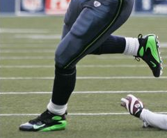
I also don’t get the Seahawks’ combination of steel blue and neon snot. The latter hue makes no sense — it doesn’t match up with or complement, um, anything. It just sticks out out like a sort whatsis. And I say that as a guy who’s a lifelong fan of green.
So it was pretty horrifying to see lots of the Seahawks wearing green-trimmed footwear on Saturday. I mean, really, is this any way for an NFL player to look? Or this? The term “offensive line” has never been more literally accurate. Looks like some of the players even wore green shoelaces (as if Matt H.’s green-trimmed muff weren’t bad enough). Seriously, is there anyone who doesn’t think this looks way better?
Even worse, the fans seem to be embracing the radioactive jade shade. Fortunately, the ’Hawks will be playing in Green Bay next weekend, so we should see fans with a greater sense of decorum.
In other NFL news from the weekend:
• Matt Hasselbeck broke a thigh pad in the third quarter, which led to third-stringer Charlie Frye pulling down his pants and removing one of his own pads to give to Hasselbeck. Details in the middle of this page (with thanks to Nick Collecchi).
• I’ve written several times about the Giants’ curved nameplates, which match up with one of the rear jersey seams. But Mike Slesinski has spotted something new: Amani Toomer appeared to be wearing a completely different tailoring template yesterday, which (among other things) had the effect of pushing his nameplate much lower. Mike also thinks Toomer’s front tailoring pattern is new, and that his red triangle patch at the base of the collar is wider, although I’m not sure about either of those claims. Joe Skiba, fill us in!
• Did you see that new Mac commercial with the football referee? He’s clearly supposed to be an NFL ref, since he goes under the hood for a video review, but he’s not wearing NFL zebra stripes or NFL socks. More egregiously, his pants are cuffed WAY too low — lame. (Thanks to Randy Williams, John Okray, Chad Todd, and Phil Hecken for the screen grabs.)
Uni Watch News Ticker: The Portland Lumberjax are taking their name rather literally (with thanks to Travis Demers). ”¦ Mr. Horse Collar is changing uni numbers next season (with thanks to Patrick Nance). ”¦ Good catch by Jon McKay who noticed two officials wearing white hats during the Independence Bowl (apparently the umpire lost his black cap). ”¦ Friday’s entry about players wearing earplugs led to this from Andy Head: “Freddy Garcia, then pitching for the Mariners, pitched with earplugs in for much of the 2003 season because he had suffered perforated eardrums from flying on numerous team flights with a cold the previous season.” ”¦ Bit of a pad controversy for Rick Dipietro. ”¦ Bruce Menard sent along this awesome old St. Louis Cardinals team portrait. Dig those double-breasted jackets! ”¦ Check out the bizarre pants Washington State wore in the 1994 Alamo Bowl (additional pics here, courtesy of Jon V. Buerstatte). ”¦ At the 2:28 mark of this video clip, you’ll see something rare: Randy Moss with an “R. Moss” nameplate, which he apparently wore for one game in 2000 (good find by Nick Noyes). ”¦ You expect to see plenty of logo creep in a game called the Under Armour All-Star Game, but this is still a bit much (with thanks to Brandon Pratt). ”¦ Fun bit here about Les Miles’s hat (as forwarded by Minna H.). ”¦ The other day I asked if anyone knew the story behind Fresno State’s three different-colored merit decals. Anthony Johnson found the answer here). ”¦ Interesting FNOB find by Roy Ellingsen, who writes: “I’ve just returned to Norway after a quick visit to the Czech Republic. There, I saw that Sparta Prague’s leading points scorer, Petr Ton, wears ‘Ton Petr,’ as you can just about see here, right below the number. It’s common to use family name before given names in Eastern Europe. Petr Nedved, for example, wears ‘Nedved P.'” ”¦ Speaking of FNOB, Erik Little was watching some old Rams footage and spotted Ron Brown with the rare double-decker FNOB (road jersey too, but poor image quality). He also spotted this guy. “Not sure who that is,” he writes. “The only Rams LB with #59 that I can confirm is Bob Brudzinski. Not really a good shot, but the surname seems lowered to allow for a first name (à la Ron Brown’s jersey).” Can anyone shed more light on this one? ”¦ Stripe-o-rama yesterday, as Stoke City faced Newcastle in Round 3 of the FA Cup (with thanks to Morris Levin). ”¦ “Damaso Marte, who plays for the Pittsburgh Pirates, is playing in the Dominican Winter League for the Tigres del Licey,” writes Jean Oliva. “He’s wearing No. 143, since his regular number (43) is retired by the team.” ”¦ Speaking of uni numbers, scroll down to the middle of this page for a history lesson in Cubs uni number protocol (good find by Jeremy Brahm). ”¦ “I was at the Bruins game on Sunday afternoon and noticed something I’d never seen before,” writes Jeffrey Israel. “People were getting their jerseys personalized as they waited in the middle of the Garden concourse.” … I had planned to bid on that Packers dickey, but the price got way out of hand — dang.
Mark Jerue was 59 for the Rams from 1983-89- looks more like his name was lowered due to the neck roll
I was at the Independence Bowl. The reason there were two white hats is that one of the other referees was injured on a play, and the reserve referee entered the game in his place. The reserve referee also had an “R” on the back of his shirt. My guess is that he had an “R” and a white hat so he could replace any official on the field, including the Referee.
Why are the Jags’ captain patches on their white jerseys teal? Seems like they should be black given the fact that black is the dominant color in their road unis.
I hate when players change their #’s, Roy Williams was my favorite player for the longest time. I always liked 13, and the 31, it worked out perfect. Now he has to go ruin it, just so he can hide from the refs when he horse collars someone next season.
Wasn’t one of the reasons that the NFL made the change to its refs’ unis so that they could protect the brand from things like Mac commercials ?
And I woudln’t give the Mac people too much trouble over the attention to detail, I get the impression that they pride themselves on low production quality.
Take your pick, Paul : Snot Green or Purple ?
I’m sure I am alone in this, but I actually like the Seahawks electric shade of lime…and I liked that all the offensive linemen wore matching shoes, too.
There was something weird in the Giants-Bucs game, though. Giants cornerback R.W. McQuarters looked to be wearing some sort of pink or purple band-aid under one of his eyes for the game. No pic. Anybody else see this?
~E~
[quote comment=”199024″]Giants cornerback R.W. McQuarters looked to be wearing some sort of pink or purple band-aid under one of his eyes for the game. No pic. Anybody else see this?[/quote]
It’s a link. He’s been wearing it at least since last season.
It looks like a 26 on that dickey’s tag which would, if it’s a 60s Packer, make it Herb Adderley.
I am in no sense a Cubs fan at all, but that link talking about the history lesson of Cubs uniforms made little sense. I distinctly remembered many a Cub in a single digit number roaming the outfield or behind the plate in the 70’s (Jose Cardinal, Rick Monday & Randy Hundley come to mind). In a search to make sure I wasn’t nuts, I found this interesting link:
link
More Cubs info, though, than this Sox fan can handle.
“it doesn’t match up with or complement, um, anything.”
paul- you spelled compliment wrong
“People were getting their jerseys personalized as they waited in the middle of the Garden concourse.”
Looks like they have a bunch of pre-cut and pre-sewn numbers and letters, so it should only take a skilled seamstress 30 mins or less to do a full jersey.
I’ve seen that before…used to do it at Orioles Fan-Fest while people waited.
[quote comment=”199032″]”it doesn’t match up with or complement, um, anything.”
paul- you spelled compliment wrong[/quote]
No I didn’t. Two different words. One is about saying something nice about someone; the other is about two things going well together.
From Peter King’s article on link…
“I think the nicest gestures of the week belong to Dallas safety Roy Williams and the Redskins. Washington listed the late Sean Taylor as their starting safety for Saturday’s playoff game. On the other hand, Williams, who was named to the Pro Bowl as a replacement for Taylor, said he will have something special for the Taylor family in Honolulu, and this is what it is: He’ll switch from his uniform number, 31, and wear Taylor’s number, 21, for the game. A brilliant idea and nice tribute to the memory of a man who’s been an inspiration to players and people in and out of the Washington organization.”
[quote]Even worse, the fans seem to be embracing the radioactive jade shade. Fortunately, the ’Hawks will be playing in Green Bay next weekend, so we should see fans with a greater sense of decorum.[/quote]
link fans travel well too
[quote]as if Matt H.’s green-trimmed muff weren’t bad enough[/quote]
phew…i thought that pic was gonna be NSFW or worse
Paul, it’s Portland LumberJax. Like Red/White Sox only more lame. There’s another NLL franchise that didn’t get the stupid name memo. The Chicago Shamrox.
link
Correct me if I’m wrong but isn’t that green stripe on the Seahwaks pants matching the color green in the eye of the Seahawk logo?
i absolutely loved the way the seahawks decided to take that lil’ neon stripe out of the collars and give it more visibility. i’ve always liked how they decided to “throw in” a unique non-traditional color and it’s good to see that they took some time to use it in other places.
if they keep this to a playoff phenomenon it would be perfect. it reminds me of what the 76ers (and i think the eagles, too) used to do when they wore black shoes for the playoffs.
[quote comment=”199034″]“People were getting their jerseys personalized as they waited in the middle of the Garden concourse.”
Looks like they have a bunch of pre-cut and pre-sewn numbers and letters, so it should only take a skilled seamstress 30 mins or less to do a full jersey.
I’ve seen that before…used to do it at Orioles Fan-Fest while people waited.[/quote]
link still do. Get one 3/29 at OPACY
i personally love the brown and baby blue combo. are there any sports teams that actually use it?
[quote comment=”199050″]i personally love the brown and baby blue combo. are there any sports teams that actually use it?[/quote]
Don’t give Wyoming any ideas . . . .
[quote comment=”199050″]i personally love the brown and baby blue combo. are there any sports teams that actually use it?[/quote]
I do too. Ranks right up there with the claret and sky blue of Aston Villa and West Ham – great, distinctive color combinations that work precisely because no ad agency would ever select them.
[quote comment=”199034″]“People were getting their jerseys personalized as they waited in the middle of the Garden concourse.”
Looks like they have a bunch of pre-cut and pre-sewn numbers and letters, so it should only take a skilled seamstress 30 mins or less to do a full jersey.
I’ve seen that before…used to do it at Orioles Fan-Fest while people waited.[/quote]
I saw it at a Blues game over the holidays. But they weren’t sewing them on–they just use a heat press to basically iron on the twill nameplates and numbers.
I’m thinking it was maybe Subway that has a commercial currently out there with NFL referees too? I can’t find it online…but maybe it will jog someone’s memory.
[quote comment=”199050″]i personally love the brown and baby blue combo. are there any sports teams that actually use it?[/quote]
I like the color combo too. I’m not sure it would work in the sports world though. I don’t see it looking good on any sports uniforms.
[quote comment=”199034″]“People were getting their jerseys personalized as they waited in the middle of the Garden concourse.”
Looks like they have a bunch of pre-cut and pre-sewn numbers and letters, so it should only take a skilled seamstress 30 mins or less to do a full jersey.
I’ve seen that before…used to do it at Orioles Fan-Fest while people waited.[/quote]
Bigger clubs do this in England – soccer numbers are heat-pressed, so you can go to a stadium, buy a customized jersey and wear it during the game.
Tufts University uses the link
[quote comment=”199049″][quote comment=”199034″]“People were getting their jerseys personalized as they waited in the middle of the Garden concourse.”
Looks like they have a bunch of pre-cut and pre-sewn numbers and letters, so it should only take a skilled seamstress 30 mins or less to do a full jersey.[quote]
I’ve seen this done at Flyers games for the last 2 seasons. They don’t sew the numbers and letters on, they use a heat press.
[quote comment=”199062″]Tufts University uses the link[/quote]
here’s a working link
I got some hoop-striped blue/brown socks for Christmas. I have no idea what I’ll wear them with.
[quote comment=”199059″]I’m thinking it was maybe Subway that has a commercial currently out there with NFL referees too? I can’t find it online…but maybe it will jog someone’s memory.[/quote]
Yea they do. He comes out and apologizes for a bad call and says he will make an equally bad one against the other team later. I don’t think it specifies if it’s college or NFL. Here it is on youtube.
link
I saw the refs in Seattle wearing the cold weather gear – what was the game time temp on Saturday?
I can’t say I necessarily like the Seahawks color combo, but the green reminds me of a neon green/yellow world’s loudest whistle that I used to use for lifeguarding. That sort of goes with the “stormy sea” color of the jersey. My .02 on what they were going for.
I am a huge fan of baby blue and brown link.
But, I’m not a fan of neon green (or any neon for that matter) on a sports uniform. It just don’t look right.
You know what is an more bizarre site than Washington State’s pants in those Alamo Bowl pictures? Baylor University in a bowl game.
Yes, the neon green matches the eye in the Seahawks’ logo.
But if you remember the original logo, the eye was an emerald green, Seattle being known as the “Emerald City.”
A team in Japan wears a blue and green color scheme, Bellmare Shonan.
link
Here’s a seahawk logo with no green:
sorry, here’s that link:
link
[quote comment=”199034″]“People were getting their jerseys personalized as they waited in the middle of the Garden concourse.”
Looks like they have a bunch of pre-cut and pre-sewn numbers and letters, so it should only take a skilled seamstress 30 mins or less to do a full jersey.
I’ve seen that before…used to do it at Orioles Fan-Fest while people waited.[/quote]
They also do this at every Mets game in the clubhouse store, located near the field level.
[quote comment=”199059″]I’m thinking it was maybe Subway that has a commercial currently out there with NFL referees too? I can’t find it online…but maybe it will jog someone’s memory.[/quote]
You’re talking about the commercial with the ref in the #85 jersey (which is coincidentally NFL red Ed Hochuli’s number) who basically says “I goofed on the call, but I’ll make up for it by screwing the other team on the next call”.
[quote comment=”199079″][quote comment=”199034″]“People were getting their jerseys personalized as they waited in the middle of the Garden concourse.”
Looks like they have a bunch of pre-cut and pre-sewn numbers and letters, so it should only take a skilled seamstress 30 mins or less to do a full jersey.
I’ve seen that before…used to do it at Orioles Fan-Fest while people waited.[/quote]
They also do this at every Mets game in the clubhouse store, located near the field level.[/quote]
The Washington Capitals do it at their main team store (which doesn’t have much of anything). To make it wasier on fans,they will even bring it to your seat so you don’t have to go back and pick it up. The Maple Leafs do it as well, but they have souvenier stands every 5 feet at Air Canada.
[quote comment=”199055″][quote comment=”199050″]i personally love the brown and baby blue combo. are there any sports teams that actually use it?[/quote]
I do too. Ranks right up there with the claret and sky blue of Aston Villa and West Ham – great, distinctive color combinations that work precisely because no ad agency would ever select them.[/quote]
i posted this saturday 01.05.08:
[quote comment=”198350″]just browsing thru some FA cup footy photos, and i noticed link and link both look like they took their uni inspiration from link…or is it vice versa?[/quote]
link is where Seattle got the look.
I think the reason Moss had an R on his nameplate was because his cousin was on the team. He was an offensive lineman named Zefross Moss or something like that. It was probably the only game he was ever active for.
I noticed the Seahawk fans had a lot of their old blue in the stands too. I think some of them wish they never changed. Me too.
Not sure if this was picked up before…
ESPN’s John Buccigross had this in his January 3rd column about where the NHL should have the next outdoor game in the States:
Fenway Park: The small confines of Fenway, especially the Green Monster seats, would provide Boston Garden-like camera angles. The Green Monster would also be a great shield for north and northeast winds. The Bruins-Blues, wearing vintage 1970 uniforms, would be a nice matchup. Bruins-Canadiens is another obvious pick. Or you could play off the Yankees-Red Sox thing and go Rangers-Bruins. This also provides two large television markets that should bring great ratings.
To correct above, I meant to say his brother Eric Moss.
…Bruce Menard sent along this awesome old link…
My favorite part of this photo is the little boy in front, with “MASCOT” on his shirt. He’s even identified in the caption as the mascot.
[quote comment=”199035″][quote comment=”199032″]”it doesn’t match up with or complement, um, anything.”
paul- you spelled compliment wrong[/quote]
No I didn’t. Two different words. One is about saying something nice about someone; the other is about two things going well together.[/quote]
Your right, my bad
[quote comment=”199085″][quote comment=”199055″][quote comment=”199050″]i personally love the brown and baby blue combo. are there any sports teams that actually use it?[/quote]
I do too. Ranks right up there with the claret and sky blue of Aston Villa and West Ham – great, distinctive color combinations that work precisely because no ad agency would ever select them.[/quote]
i posted this saturday 01.05.08:
[quote comment=”198350″]just browsing thru some FA cup footy photos, and i noticed link and link both look like they took their uni inspiration from link…or is it vice versa?[/quote][/quote]
Didn’t somebody answer that on Saturday?
Aston Villa used the color scheme first, having adopted it in the nineteenth century. West Ham adopted them around 1899, having gotten a set of second-hand kits from Aston Villa.
The Phillies are some serious Johnny-Come-Latelys when it comes to claret and blue.
[quote comment=”199100″]Not sure if this was picked up before…
ESPN’s John Buccigross had this in his January 3rd column about where the NHL should have the next outdoor game in the States:
Fenway Park: The small confines of Fenway, especially the Green Monster seats, would provide Boston Garden-like camera angles. The Green Monster would also be a great shield for north and northeast winds. The Bruins-Blues, wearing vintage 1970 uniforms, would be a nice matchup. Bruins-Canadiens is another obvious pick. Or you could play off the Yankees-Red Sox thing and go Rangers-Bruins. This also provides two large television markets that should bring great ratings.[/quote]
I, along with the rest of the country, am tired of New York and Boston being the current centerpieces of the sports landscape.
However, I guess it’s unavoidable.
“his pants are fuced WAY too low”
Fuced? Is that a real word? Did you make it up? Or is it a typo? I’ve been fucing my baseball pants just below the knee forever, I just didn’t know it.
[quote comment=”199105″][quote comment=”199085″][quote comment=”199055″][quote comment=”199050″]i personally love the brown and baby blue combo. are there any sports teams that actually use it?[/quote]
I do too. Ranks right up there with the claret and sky blue of Aston Villa and West Ham – great, distinctive color combinations that work precisely because no ad agency would ever select them.[/quote]
i posted this saturday 01.05.08:
[quote comment=”198350″]just browsing thru some FA cup footy photos, and i noticed link and link both look like they took their uni inspiration from link…or is it vice versa?[/quote][/quote]
Didn’t somebody answer that on Saturday?
Aston Villa used the color scheme first, having adopted it in the nineteenth century. West Ham adopted them around 1899, having gotten a set of second-hand kits from Aston Villa.
The Phillies are some serious Johnny-Come-Latelys when it comes to claret and blue.[/quote]
yes they did chase…i should have posted the full list of responses, but im at work and time is precious…i just wanted to show the color schemes of the two teams you mentioned and rather than search for pics, i figured it was just easier to repost…sorry for the confusion
-cheers
[quote comment=”199022″]
Take your pick, Paul : Snot Green or Purple ?[/quote]
The link managed to think that combining the colors was a good idea…no wonder we never supported them.
*sorry…should be CHANCE…
/my bad
Pretty Sure Randy Moss wore “R. Moss” because his brother Eric was signed to a contract. I remember my grandpa thought he got me Randy’s autograph, but later found out it was Eric’s.
link
[quote comment=”199049″][quote comment=”199034″]“People were getting their jerseys personalized as they waited in the middle of the Garden concourse.”
Looks like they have a bunch of pre-cut and pre-sewn numbers and letters, so it should only take a skilled seamstress 30 mins or less to do a full jersey.
I’ve seen that before…used to do it at Orioles Fan-Fest while people waited.[/quote]
link still do. Get one 3/29 at OPACY[/quote]
That’s funny on levels Paul will understand!
[quote comment=”199106″]
I, along with the rest of the country, am tired of New York and Boston being the current centerpieces of the sports landscape.
However, I guess it’s unavoidable.[/quote]
With nearly 8% of the nation’s population living in NYC and Boston, it is kinda unavoidable.
[quote comment=”199113″][quote comment=”199105″][quote comment=”199085″][quote comment=”199055″][quote comment=”199050″]i personally love the brown and baby blue combo. are there any sports teams that actually use it?[/quote]
I do too. Ranks right up there with the claret and sky blue of Aston Villa and West Ham – great, distinctive color combinations that work precisely because no ad agency would ever select them.[/quote]
i posted this saturday 01.05.08:
[quote comment=”198350″]just browsing thru some FA cup footy photos, and i noticed link and link both look like they took their uni inspiration from link…or is it vice versa?[/quote][/quote]
Didn’t somebody answer that on Saturday?
Aston Villa used the color scheme first, having adopted it in the nineteenth century. West Ham adopted them around 1899, having gotten a set of second-hand kits from Aston Villa.
The Phillies are some serious Johnny-Come-Latelys when it comes to claret and blue.[/quote]
yes they did chase…i should have posted the full list of responses, but im at work and time is precious…i just wanted to show the color schemes of the two teams you mentioned and rather than search for pics, i figured it was just easier to repost…sorry for the confusion
-cheers[/quote]
Cool. No worries.
RE: Wazoo’s weird 1994 Alamo Bowl pants. It seems to me those pants popped up on a few teams that year. I think NC State wore them in a bowl, but I have to find photo proof.
[quote comment=”199049″][quote comment=”199034″]“People were getting their jerseys personalized as they waited in the middle of the Garden concourse.”
Looks like they have a bunch of pre-cut and pre-sewn numbers and letters, so it should only take a skilled seamstress 30 mins or less to do a full jersey.
I’ve seen that before…used to do it at Orioles Fan-Fest while people waited.[/quote]
link still do. Get one 3/29 at OPACY[/quote]
They’ll do it for you at Columbus Blue Jackets games. They recommend you give them one period to finish. They also do it at RedsFest for the Cincinnati Reds. Usually around 20 minutes or so.
Saw a weird style of NOB in the Premier League recently — Aston Villa’s Luke Moore’s nameplate read
“Moore. L”
with the period, for some reason, following his last name rather than his initial. This is the best pic I could find:
link
[quote comment=”199111″]”his pants are fuced WAY too low”
Fuced? Is that a real word? Did you make it up? Or is it a typo? I’ve been fucing my baseball pants just below the knee forever, I just didn’t know it.[/quote]
Yikes — should be (and now is) “cuffed.” Sometimes I’m writing these things late at night and don’t proofread as well as I should….
I love the lime green accent color in the Seahawk’s uniform. It’s such a nice contrast from the darker blues and thus really pops. That being said, Mike Holmgren, and possibly myself, are not ready for an alternate jersey featuring this lime green. In any case, I have yet to see one that I like, or, that I thought worked. It seems, Holmgren’s attitude is if the players like it and they play well, I’m for it, yet, nothing past just an accent color. I tend to agree. The green in the Seahawks wordmark on Leonard Weaver’s visor is especially hip:
linkLeonard Weaver’s Visor
link
[quote comment=”199034″]“People were getting their jerseys personalized as they waited in the middle of the Garden concourse.”
Looks like they have a bunch of pre-cut and pre-sewn numbers and letters, so it should only take a skilled seamstress 30 mins or less to do a full jersey.
I’ve seen that before…used to do it at Orioles Fan-Fest while people waited.[/quote]
They do this at Citizens Bank Park for Phillies games. They do jersey customization in the Alley Store in Ashburn Alley.
I don’t have a problem with the neon accents on the Seahawks. I find their entire mono-chromatic home style so hideous that nothing can really make it much worse. I don’t dislike their color options, I just wish they would pair it with white or grey pants.
[quote comment=”199131″]I love the lime green accent color in the Seahawk’s uniform. It’s such a nice contrast from the darker blues and thus really pops. That being said, Mike Holmgren, and possibly myself, are not ready for an alternate jersey featuring this lime green. In any case, I have yet to see one that I like, or, that I thought worked. It seems, Holmgren’s attitude is if the players like it and they play well, I’m for it, yet, nothing past just an accent color. I tend to agree. The green in the Seahawks wordmark on Leonard Weaver’s visor is especially hip:
linkLeonard Weaver’s Visor[/quote]
I am. I would love to see an alternate lime green jersey, even better if it were paired with green pants!!!
[quote comment=”199084″][quote comment=”199079″][quote comment=”199034″]“People were getting their jerseys personalized as they waited in the middle of the Garden concourse.”
Looks like they have a bunch of pre-cut and pre-sewn numbers and letters, so it should only take a skilled seamstress 30 mins or less to do a full jersey.
I’ve seen that before…used to do it at Orioles Fan-Fest while people waited.[/quote]
They also do this at every Mets game in the clubhouse store, located near the field level.[/quote]
The Washington Capitals do it at their main team store (which doesn’t have much of anything). To make it wasier on fans,they will even bring it to your seat so you don’t have to go back and pick it up. The Maple Leafs do it as well, but they have souvenier stands every 5 feet at Air Canada.[/quote]
I’ve seen this at just about every professional sporting event I’ve gone to (Flames, Angels, Mariners, even some junior hockey games).
Beware though. While they usually are twill numbers they are only heat pressed, so the durability is pretty average (this coming from a guy that has 2 letters peeling on his Angels jersey). You’re way better off to wait a week or two and get the letters stitched.
Two quick Tampa comments:
First, I believe yesterdays’s Buccaneers playoff game was the first time they wore white for a home playoff game. I know they wore red in their home games in ’97, ’99, ’02, and ’05. I am almost certain they wore orange in their only other home playoff apperance in their 2 home games in ’79 against the Eagles and Rams.
Also, as far as the ticker’s note on the Bruins customizing your jersey during the game, add the Lightning to the list of teams that customize your jersey during the game. The St Pete Times Forum has a station on the concourse next to the team store. I’m not sure if they sew on or heat apply.
just browsing thru some FA cup footy photos, and i noticed link and link both look like they took their uni inspiration from link…or is it vice versa?[/quote]
It’s vice-versa; Villa’s been using that combination since the late 1800’s.
Football uniforms with matching jersey/pants color never look good.
[quote comment=”199031″]I am in no sense a Cubs fan at all, but that link talking about the history lesson of Cubs uniforms made little sense. I distinctly remembered many a Cub in a single digit number roaming the outfield or behind the plate in the 70’s (Jose Cardinal, Rick Monday & Randy Hundley come to mind). In a search to make sure I wasn’t nuts, I found this interesting link:
link
More Cubs info, though, than this Sox fan can handle.[/quote]
After a quick perusal of that site, it looks as if the “College of Coaches” wore numbers in the “60”s rather than the single-digits cited in that Japanese article…
Of course, when the Cubs hired link, he declared he was the (expletives deleted) MANAGER, and not some (expurgated) “Head Coach”… and wore the #2 he’d worn since his days as the shortstop for the link Cardinals, and as manager for both the Dodgers and Giants.
And as a Cards fan, I chuckled at the listing for Lou Brock as #24 with the Cubbies…
[quote comment=”199129″][quote comment=”199111″]”his pants are fuced WAY too low”
Fuced? Is that a real word? Did you make it up? Or is it a typo? I’ve been fucing my baseball pants just below the knee forever, I just didn’t know it.[/quote]
Yikes — should be (and now is) “cuffed.” Sometimes I’m writing these things late at night and don’t proofread as well as I should….[/quote]
That’s funny. I was confused by “fuced” as well, but just thought, “Geez, look at the vocabulary on this guy.”
[quote comment=”199140″]I don’t have a problem with the neon accents on the Seahawks. I find their entire mono-chromatic home style so hideous that nothing can really make it much worse. I don’t dislike their color options, I just wish they would pair it with white or grey pants.[/quote]
QFT. Their “Gloom Blue”, which I guess matches the Seattle weather, sucks so bad, the Neon gren highlights actually look OK with it. I’m not a fan of grey pants, but at least they would match the rainclouds. :) White pants would look much better.
Now a neon-green jersey? Well, it would likely instantly be the WORST NFL jersey ever.
[quote comment=”199149″]Two quick Tampa comments:
First, I believe yesterdays’s Buccaneers playoff game was the first time they wore white for a home playoff game. I know they wore red in their home games in ’97, ’99, ’02, and ’05. I am almost certain they wore orange in their only other home playoff apperance in their 2 home games in ’79 against the Eagles and Rams.
quote]
IMO, the Bucs have the best white unis in the entire NFL. They should wear the white jersey/pewter pants combo for all their home games. I don’t dislike the red at all, just prefer the white.
[quote comment=”199144″][quote comment=”199131″]I
………. I would love to see an alternate lime green jersey, even better if it were paired with green pants!!![/quote]
Something like this might work:
link
[quote comment=”199162″][quote comment=”199140″]I don’t have a problem with the neon accents on the Seahawks. I find their entire mono-chromatic home style so hideous that nothing can really make it much worse. I don’t dislike their color options, I just wish they would pair it with white or grey pants.[/quote]
QFT. Their “Gloom Blue”, which I guess matches the Seattle weather, sucks so bad, the Neon gren highlights actually look OK with it. I’m not a fan of grey pants, but at least they would match the rainclouds. :) White pants would look much better.
Now a neon-green jersey? Well, it would likely instantly be the WORST NFL jersey ever.[/quote]
As soon as I wrote “grey pants” I realized I made a mistake. White would really be the only choice.
[quote comment=”199162″][quote comment=”199140″]I don’t have a problem with the neon accents on the Seahawks. I find their entire mono-chromatic home style so hideous that nothing can really make it much worse. I don’t dislike their color options, I just wish they would pair it with white or grey pants.[/quote]
QFT. Their “Gloom Blue”, which I guess matches the Seattle weather, sucks so bad, the Neon gren highlights actually look OK with it. I’m not a fan of grey pants, but at least they would match the rainclouds. :) White pants would look much better.
Now a neon-green jersey? Well, it would likely instantly be the WORST NFL jersey ever.[/quote]
Imagine this….in Seattle….
link
[quote comment=”199021″]I hate when players change their #’s, Roy Williams was my favorite player for the longest time. I always liked 13, and the 31, it worked out perfect. Now he has to go ruin it, just so he can hide from the refs when he horse collars someone next season.[/quote]
Referees? They’re hiding him from the other team! Note to NFL offenses: Starting next season, throw it to the guy who’s closest to #38, not #31.
Boooo link! I got a new Stars jersey for Christmas and I’m stunned at the low quality of something that cost $150. Jerseys with three-layered numbers like the link don’t have the numbers sewn on.
Seahaks blue goes great with denim
[quote comment=”199168″][quote comment=”199144″][quote comment=”199131″]I
………. I would love to see an alternate lime green jersey, even better if it were paired with green pants!!![/quote]
Something like this might work:
link
My eyes…my eyes!!
[quote comment=”199168″][quote comment=”199144″][quote comment=”199131″]I
………. I would love to see an alternate lime green jersey, even better if it were paired with green pants!!![/quote]
Something like this might work:
link
i think i just regurgitated vomitus into my alimentary system and oral cavity
[quote comment=”199160″][quote comment=”199129″][quote comment=”199111″]”his pants are fuced WAY too low”
Fuced? Is that a real word? Did you make it up? Or is it a typo? I’ve been fucing my baseball pants just below the knee forever, I just didn’t know it.[/quote]
Yikes — should be (and now is) “cuffed.” Sometimes I’m writing these things late at night and don’t proofread as well as I should….[/quote]
That’s funny. I was confused by “fuced” as well, but just thought, “Geez, look at the vocabulary on this guy.”[/quote]
I thought maybe he was trying to say his pants were fucked. Which was probably the initial reaction anyway.
[quote comment=”199179″][quote comment=”199168″][quote comment=”199144″][quote comment=”199131″]I
………. I would love to see an alternate lime green jersey, even better if it were paired with green pants!!![/quote]
Something like this might work:
link
i think i just regurgitated vomitus into my alimentary system and oral cavity[/quote]
Clever, Phil, very clever. And glad to see I wasn’t the only one who had that thought about Hasselbeck’s “muff”.
[quote comment=”199179″][quote comment=”199168″][quote comment=”199144″][quote comment=”199131″]I
………. I would love to see an alternate lime green jersey, even better if it were paired with green pants!!![/quote]
Something like this might work:
link
i think i just regurgitated vomitus into my alimentary system and oral cavity[/quote]
and back to my point, that it really might only work as an accent.
re: color schemes
some of the newer fashion color schemes are a welcome change to my visual palate.
in my opinion the light blue/light brown combo that PL spoke of is quite appealing… (and it looks so sexy on a hot chick)
i also like the light blue/burgundy that west ham and aston villa put out. i think its a solid combination that looks really bold when there are equal parts of each color together, and not when one works as an accent for the other.
[quote comment=”199181″][quote comment=”199160″][quote comment=”199129″][quote comment=”199111″]”his pants are fuced WAY too low”
Fuced? Is that a real word? Did you make it up? Or is it a typo? I’ve been fucing my baseball pants just below the knee forever, I just didn’t know it.[/quote]
Yikes — should be (and now is) “cuffed.” Sometimes I’m writing these things late at night and don’t proofread as well as I should….[/quote]
That’s funny. I was confused by “fuced” as well, but just thought, “Geez, look at the vocabulary on this guy.”[/quote]
I thought maybe he was trying to say his pants were fucked. Which was probably the initial reaction anyway.[/quote]
I’m with felix. I thought it was fucked as well. Or, that Paul just made up a new word.
I like the pale blue/brown combo in fashion, but not in sports. I also think neon green (neon anything, really) should be banned everywhere.
As for the Seattle fans wearing the bright green–fans will wear anything as long as it’s associated with their team.
The Seahawks outclassed the Redskins in one area though (but just barely). For some reason the ‘Skins have taken to wearing socks with solid tops and have set aside their awesome striped socks. The solid topped socks would be a bit better if they had the ‘Skins gold color on the top. Most teams wear socks that contrast with their pants color. Washington’s burgundy pants/socks combo nearly spoils one of the nicest unis in the league. The Seahawks at least use their (barely) discernible pacific blue and navy in the pants/socks combo.
Paul – I think you’re all alone in not liking the powder blue/brown combo. I think it’s about as good as it gets.
They were even my wedding colors! Bridesmaids:
link
[quote comment=”199189″][quote comment=”199181″][quote comment=”199160″][quote comment=”199129″][quote comment=”199111″]”his pants are fuced WAY too low”
Fuced? Is that a real word? Did you make it up? Or is it a typo? I’ve been fucing my baseball pants just below the knee forever, I just didn’t know it.[/quote]
Yikes — should be (and now is) “cuffed.” Sometimes I’m writing these things late at night and don’t proofread as well as I should….[/quote]
That’s funny. I was confused by “fuced” as well, but just thought, “Geez, look at the vocabulary on this guy.”[/quote]
I thought maybe he was trying to say his pants were fucked. Which was probably the initial reaction anyway.[/quote]
I’m with felix. I thought it was fucked as well. Or, that Paul just made up a new word.
I like the pale blue/brown combo in fashion, but not in sports. I also think neon green (neon anything, really) should be banned everywhere.
As for the Seattle fans wearing the bright green–fans will wear anything as long as it’s associated with their team.[/quote]
True look at what Carolina Panther fans wear.
[quote comment=”199209″][quote comment=”199189″][quote comment=”199181″][quote comment=”199160″][quote comment=”199129″][quote comment=”199111″]”his pants are fuced WAY too low”
Fuced? Is that a real word? Did you make it up? Or is it a typo? I’ve been fucing my baseball pants just below the knee forever, I just didn’t know it.[/quote]
Yikes — should be (and now is) “cuffed.” Sometimes I’m writing these things late at night and don’t proofread as well as I should….[/quote]
That’s funny. I was confused by “fuced” as well, but just thought, “Geez, look at the vocabulary on this guy.”[/quote]
I thought maybe he was trying to say his pants were fucked. Which was probably the initial reaction anyway.[/quote]
I’m with felix. I thought it was fucked as well. Or, that Paul just made up a new word.
I like the pale blue/brown combo in fashion, but not in sports. I also think neon green (neon anything, really) should be banned everywhere.
As for the Seattle fans wearing the bright green–fans will wear anything as long as it’s associated with their team.[/quote]
True look at what Carolina Panther fans wear.[/quote]
Are there any crazier looking fans than that link last week?
[quote comment=”199096″]link is where Seattle got the look.[/quote]
I always think of The Simpsons when I see that shade of green: link
Seattle is afterall only hours away from Hanford, Washington, which is allegedly the most polluted nuclear site in the country.
any interest in the history of french club soccer kits? if so, here ya go!! link
I’m fairly certain EVERY NHL team does custom personalization at games now, it’s part of the RBK SYSTEM allure. I remember reading something about this when they sent out the “pre order” information to fans. You can hop into the team store at the beginning of the game and they can turn a customized jersey around for you by the 3rd period or something. Pricing starts at something upwards of 180 bucks though, and who knows how long they’re going to be using these 9% faster speed suits, sweaters, anyway?
…I guess that makes them more appealing to a Uni-Watcher, right?
I asked Paul this the other night, but he suggested I post here to see if anyone knew the definitive answer.
—
This came up while watching one of the playoff games today and I figured
if anyone would know (or could find out), it would be you.
We were saying that when we were kids, the referee had the black hat with
the white stripes and the other officials wore white hats. Obviously, it
is now the opposite.
Do you know/recall when they changed from one to the other?
Outdoor Hockey Game… I liked the throwback unis worn by Buffalo and Pitt and the coachs parkas were nice too.. I think the NHL should have another outdoor game not next year but the year after and it should be in CANADA — I could see a Toronto v. Montreal Game. Or maybe lets put it on the west coast — LA vs. Anaheim on the beach…
The Nashville Predators will heat press customization while you watch the game as well. If you want sewn on numbers, the jersey gets sent off to the same people who do the players’ jerseys. That process takes 4-6 weeks. I figured since I paid so much for the authentic it should be, well, authentic.
Seattle’s neon green to me equals link.
Which, in turn, leads to link.
im sure im in the minority, but i happen to like the link in this monochromatic scheme…and it looks fine with the burgundy socks
Re: UA Logo Creep
Since the Under Armour All-Star game had no real teams, just “Under Armour Red” and “Under Armour White,” how can there be “logo creep,” as you defined in a recent column. The only brand logo in the game, like it or not, was Under Armour, not the Packers, Buckeyes, Bears, Dolphins, etc.
Aren’t you going to complain about logo creep at the U.S. Army All-Star game in San Antonio? There were various Army-related logos all over.
No one has mentioned this, and other’s explained it as an attempt to beat the heat, but I think the Bucs white jerseys may have been a superstitious move. The Giants are undefeated in their white jerseys this season (they’re normal road uniforms), as their only road loss came at Dallas where they wore their blues.
“People were getting their jerseys personalized as they waited in the middle of the Garden concourse.”
link
Wow…is this an idea that should have happened like 25 years ago…
[quote comment=”199162″][quote comment=”199140″]I don’t have a problem with the neon accents on the Seahawks. I find their entire mono-chromatic home style so hideous that nothing can really make it much worse. I don’t dislike their color options, I just wish they would pair it with white or grey pants.[/quote]
QFT. Their “Gloom Blue”, which I guess matches the Seattle weather, sucks so bad, the Neon gren highlights actually look OK with it. I’m not a fan of grey pants, but at least they would match the rainclouds. :) White pants would look much better.
Now a neon-green jersey? Well, it would likely instantly be the WORST NFL jersey ever.[/quote]
I got my girlfriend one of the lime green fashion jerseys three years ago. (i’d post a pic, but not without her permission.) They’re like the pink, but only with the lime green. I figured it was OK, since 1) lime green is her favorite color, and 2) it’s actually a team color, if only an accent.
I can only say that it looks great on her (she gets a lot of compliments for diehard Seahawks fans), but I don’t think it would look so great on the players.
Also, count me as a fan of the lime green. Again, it works because the rest of the combo is so gloomy. If the strip of lime green didn’t exist, I’d still root for the team, but I would hate the uniforms. (I’m not really a fan of the current jerseys, but when I wear it, I get a certain joy looking at the green piping on the sleeves.)
Yea…I am going to have to disagree on a few things that today’s post brought up.
1. I love the blue and brown combo. It is funny because I am actually wearing a brown hoodie with blue lettering as I type!
2. I really don’t mind the Seahawks electric green accents at all. I think it really makes the uniform unique and it definately pops. I am sure the masses here would bitch and moan how boring their uniform would be without the “snot” color.
3. I have been meaning to say this for some time, but those Giants nameplates look HORRENDOUS! The 3D nose bumper is very cool and I hope other teams follow suit, but the “innovative” nameplates look like a kindergartener cut it out and pasted it on the back of the jerseys. Seriously bush league looking.
Anywho, I know this all a matter of taste and all, but I thought I would throw my two cents in for anyone who cared.
the seahawks didn’t always wear the monochrome in their new uni schemes…link is from an old espn page 2, as is link, which depicts what the hawks would have looked like if they had gone with link instead of link.
i think for a portion of their first and second seasons, the seahawks mixed/matched the monochromatic look with the 1/2 & 1/2 look
maybe someone can dig some 02 or 03 season pics up…i think they looked better with the mix/match than the solids
[quote comment=”199064″][quote comment=”199062″]Tufts University uses the link[/quote]
here’s a working link[/quote]
Tufts Sucks, go Trinity!!!!!!
[quote comment=”199106″][quote comment=”199100″]Not sure if this was picked up before…
ESPN’s John Buccigross had this in his January 3rd column about where the NHL should have the next outdoor game in the States:
Fenway Park: The small confines of Fenway, especially the Green Monster seats, would provide Boston Garden-like camera angles. The Green Monster would also be a great shield for north and northeast winds. The Bruins-Blues, wearing vintage 1970 uniforms, would be a nice matchup. Bruins-Canadiens is another obvious pick. Or you could play off the Yankees-Red Sox thing and go Rangers-Bruins. This also provides two large television markets that should bring great ratings.[/quote]
I, along with the rest of the country, am tired of New York and Boston being the current centerpieces of the sports landscape.
However, I guess it’s unavoidable.[/quote]
Not to bring down the ESPN hierarchy, but Buccigross is to hockey like Britney Spears is to responsible parenting. The guy knows absolutely nothing about hockey, yet someone appointed him an “expert”.
Why would the Blues and Bruins play there? How many St. Louis fans would make the trip to Massachusetts? I think the NHL should have the next game at Chicago’s Soldier Field between the Red Wings and Blackhawks, or in Montreal between the Canadiens and Bruins. 2009 is Montreal’s Centennial year, after all.
[quote comment=”199239″]Seattle’s neon green to me equals link.
Which, in turn, leads to link.[/quote]
Oh no! Not Devastator!
[quote comment=”199103″][quote comment=”199035″][quote comment=”199032″]”it doesn’t match up with or complement, um, anything.”
paul- you spelled compliment wrong[/quote]
No I didn’t. Two different words. One is about saying something nice about someone; the other is about two things going well together.[/quote]
Your right, my bad[/quote]
I think you meant to say “You’re right”.
You are dead wrong about the seahawks cleats, those are the most awsome cleats ever worn in the NFL. I also loved the hats the fans were wearing. I hope to see lots of both this weekend.
The seahawks should add more of the lime green to there jerseys or just go all lime green, it would be awsome.
No crazy, gorund-breaking jerseys… Just my simple jersey collection. If you have a minute, go see… Enjoy!
My Jersey Collection
link
[quote]Tufts Sucks, go Trinity!!!!!![/quote]
[quote comment=”199294″][quote comment=”199103″]
Your right, my bad[/quote]
I think you meant to say “You’re right”.[/quote]
we now return you to our regularly scheduled discussion of athletics aesthetics
[quote comment=”199223″]Outdoor Hockey Game… I liked the throwback unis worn by Buffalo and Pitt and the coachs parkas were nice too.. I think the NHL should have another outdoor game not next year but the year after and it should be in CANADA — I could see a Toronto v. Montreal Game. Or maybe lets put it on the west coast — LA vs. Anaheim on the beach…[/quote]
or when the Preds FINALLY move to Hamilton and have a Leafs / Hamilton game outdoors.
[quote comment=”199303″]You are dead wrong about the seahawks cleats, those are the most awsome cleats ever worn in the NFL. I also loved the hats the fans were wearing. I hope to see lots of both this weekend.
The seahawks should add more of the lime green to there jerseys or just go all lime green, it would be awsome.[/quote]
LC Greenwood had the most awesome cleats ever worn in the NFL
[quote comment=”199293″][quote comment=”199239″]Seattle’s neon green to me equals link.
Which, in turn, leads to link.[/quote]
Oh no! Not Devastator![/quote]
link = badass.
Minna, it finally happened. I got myself a Nordiques jersey.
link. It’s one of the old-school pro jerseys as well. :o)
[quote comment=”199124″]RE: Wazoo’s weird 1994 Alamo Bowl pants. It seems to me those pants popped up on a few teams that year. I think NC State wore them in a bowl, but I have to find photo proof.[/quote]
NC State did wear them in the Peach Bowl that year. Couldn’t find a good picture, though (the Peach Bowl website has a crappy shot).
link
[quote comment=”199258″]Re: UA Logo Creep
Since the Under Armour All-Star game had no real teams, just “Under Armour Red” and “Under Armour White,” how can there be “logo creep,” as you defined in a recent column. The only brand logo in the game, like it or not, was Under Armour, not the Packers, Buckeyes, Bears, Dolphins, etc.
Aren’t you going to complain about logo creep at the U.S. Army All-Star game in San Antonio? There were various Army-related logos all over.[/quote]
You know, I’m probably the most anti-Logo Creep person in here, but if Paul DIDN’T mention this one I was going to call him out on it!
I understand they’re the presenting sponsor and would expect them to have logos on the jersey and pants as well as outfitting all the players in their cleats but wow, helmet logos (link!)
The other thing that bugged were how the guys were using those 1/2″ and 1″ wristbands (that serve very little purpose) on their ankles and some even had them over their shoes as a faux-spat I guess.
They could have split the teams into north/south or east/west too, to avoid having the logo on the helmet but whether you’re a logo creep guy or not, I thought the helmets were pretty cool.
[quote comment=”199320″][quote comment=”199124″]RE: Wazoo’s weird 1994 Alamo Bowl pants. It seems to me those pants popped up on a few teams that year. I think NC State wore them in a bowl, but I have to find photo proof.[/quote]
Got it!
link
Another link! hehe
[quote comment=”199250″]im sure im in the minority, but i happen to like the link in this monochromatic scheme…and it looks fine with the burgundy socks[/quote]
I hate those. But since I hate white/white combos in football more than almost any other combo, that is not surprising. Also, the Redskins normal unis are some of my favorites, especially the not-often-seen burgandy jerseys, I wouldn’t mess with what they have now.
[quote comment=”199283″]the seahawks didn’t always wear the monochrome in their new uni schemes…link is from an old espn page 2, as is link, which depicts what the hawks would have looked like if they had gone with link instead of link.
i think for a portion of their first and second seasons, the seahawks mixed/matched the monochromatic look with the 1/2 & 1/2 look
maybe someone can dig some 02 or 03 season pics up…i think they looked better with the mix/match than the solids[/quote]
I beleive the Seahawks wore the dark jersey white pants combo in Jacksonville early inn the season a couple of years ago. I will see if I can find pics.
Actually, there are quite a few on this page. See Trant Dilfer and Hutchinson for drak over white combo, and Korin Robinson for white over dark. I think they are MUCH better than the monochrome unis they wear today.
link
Paul-
I have an explanation for the light-blue/brown color scheme you dislike so much. I am a Visual Communications Design major at Purdue University and I would be glad to explain why the color scheme is aesthetically pleasing to so many. As I’m sure you know, brown is simply a low value orange. Orange and blue are complementary colors, and thus are often paired together. The light-blue/brown combination simply pairs a high-value, mid-chroma blue with a low-value, mid-chroma orange. Since this scheme falls with the complementary color scheme, and provides a consistant chroma field, with a high contrast in value, the scheme is very successful.
The reason I think so many people have a problem with the Seattle neon-green is that it feels very out of place, (being of such high-chroma, mid-value set against the very low-chroma, low-value uniforms) and being usued in such a limited capacity.
[quote comment=”199319″]Minna, it finally happened. I got myself a Nordiques jersey.
link. It’s one of the old-school pro jerseys as well. :o)[/quote]
Dude, that totally rocks. Do you have a North Stars one too?
for those who watched even a minute of amrican gladiators last night…
it was interesting to see that the designer of the women gladiator uniforms designed them as though EACH woman gladiator was afflicted with a case of cameltosis.
[quote comment=”199352″]Paul-
I have an explanation for the light-blue/brown color scheme you dislike so much. I am a Visual Communications Design major at Purdue University and I would be glad to explain why the color scheme is aesthetically pleasing to so many. As I’m sure you know, brown is simply a low value orange. Orange and blue are complementary colors, and thus are often paired together. The light-blue/brown combination simply pairs a high-value, mid-chroma blue with a low-value, mid-chroma orange. Since this scheme falls with the complementary color scheme, and provides a consistant chroma field, with a high contrast in value, the scheme is very successful.
The reason I think so many people have a problem with the Seattle neon-green is that it feels very out of place, (being of such high-chroma, mid-value set against the very low-chroma, low-value uniforms) and being usued in such a limited capacity.[/quote]
ugh. A bit pedantic–no?
[quote comment=”199359″]for those who watched even a minute of amrican gladiators last night…
it was interesting to see that the designer of the women gladiator uniforms designed them as though EACH woman gladiator was afflicted with a case of cameltosis.[/quote]
You know Todd, I don’t even have to look at the name anymore to know it’s your comment :) And “yes”, I noticed it too.
On a separate note…link unveiled their link today.
[quote comment=”199346″]Actually, there are quite a few on this page. See Trant Dilfer and Hutchinson for drak over white combo, and Korin Robinson for white over dark. I think they are MUCH better than the monochrome unis they wear today.
link
You don’t realize what you lost until you remember it – go back to white pants Seattle!
[quote comment=”199324″][quote comment=”199258″]Re: UA Logo Creep
Since the Under Armour All-Star game had no real teams, just “Under Armour Red” and “Under Armour White,” how can there be “logo creep,” as you defined in a recent column. The only brand logo in the game, like it or not, was Under Armour, not the Packers, Buckeyes, Bears, Dolphins, etc.
Aren’t you going to complain about logo creep at the U.S. Army All-Star game in San Antonio? There were various Army-related logos all over.[/quote]
You know, I’m probably the most anti-Logo Creep person in here, but if Paul DIDN’T mention this one I was going to call him out on it!
I understand they’re the presenting sponsor and would expect them to have logos on the jersey and pants as well as outfitting all the players in their cleats but wow, helmet logos (link!)
The other thing that bugged were how the guys were using those 1/2″ and 1″ wristbands (that serve very little purpose) on their ankles and some even had them over their shoes as a faux-spat I guess.
They could have split the teams into north/south or east/west too, to avoid having the logo on the helmet but whether you’re a logo creep guy or not, I thought the helmets were pretty cool.[/quote]
Re-reading this post, I don’t think I wrote this clearly as far as my stance on Logo Creep. I said anti-Logo Creep, but I think my stance is more like anti-Paul’s stance on Logo Creep. Some of you probably know that already from my recent posts but I just wanted to clarify.
In other words, my post should be taken that even for someone that thinks logo creep is a non-issue, that the UA game was a bit much.
[quote comment=”199369″][quote comment=”199346″]Actually, there are quite a few on this page. See Trant Dilfer and Hutchinson for drak over white combo, and Korin Robinson for white over dark. I think they are MUCH better than the monochrome unis they wear today.
link
You don’t realize what you lost until you remember it – go back to white pants Seattle![/quote]
Is that picture of Anthony Simmons from the playoff game where after the overtime coin flip Hasselbeck said “We’ll take the ball because we’re gonna win!”??
That worked out well.
[quote comment=”199374″][quote comment=”199369″][quote comment=”199346″]Actually, there are quite a few on this page. See Trant Dilfer and Hutchinson for drak over white combo, and Korin Robinson for white over dark. I think they are MUCH better than the monochrome unis they wear today.
link
You don’t realize what you lost until you remember it – go back to white pants Seattle![/quote]
Is that picture of Anthony Simmons from the playoff game where after the overtime coin flip Hasselbeck said “We’ll take the ball because we’re gonna win!”??
That worked out well.[/quote]
I believe it was “We want the ball and we’re going to score.”
[quote comment=”199376″][quote comment=”199374″][quote comment=”199369″][quote comment=”199346″]Actually, there are quite a few on this page. See Trant Dilfer and Hutchinson for drak over white combo, and Korin Robinson for white over dark. I think they are MUCH better than the monochrome unis they wear today.
link
You don’t realize what you lost until you remember it – go back to white pants Seattle![/quote]
Is that picture of Anthony Simmons from the playoff game where after the overtime coin flip Hasselbeck said “We’ll take the ball because we’re gonna win!”??
That worked out well.[/quote]
I believe it was “We want the ball and we’re going to score.”[/quote]
Same result. No wonder why he’s beloved in Green Bay.
I am not a seahawks fan, and the 10 people i was watching the game with also loved the cleats and hats.
[quote comment=”199320″][quote comment=”199124″]RE: Wazoo’s weird 1994 Alamo Bowl pants. It seems to me those pants popped up on a few teams that year. I think NC State wore them in a bowl, but I have to find photo proof.[/quote]
NC State did wear them in the Peach Bowl that year. Couldn’t find a good picture, though (the Peach Bowl website has a crappy shot).
link
i distinctly remember watching that peach bowl with wsu and those pants.
i had assumed that they were building on the popularity of this design in hoops at the time
link
i remember thinking to myself, next year a ton of schools will have them…
thankfully for all of us, it never cought on…
also, notice the converse tire print uni’s on tulsa in that pic…
[quote comment=”199324″][quote comment=”199258″]Re: UA Logo Creep
Since the Under Armour All-Star game had no real teams, just “Under Armour Red” and “Under Armour White,” how can there be “logo creep,” as you defined in a recent column. The only brand logo in the game, like it or not, was Under Armour, not the Packers, Buckeyes, Bears, Dolphins, etc.
Aren’t you going to complain about logo creep at the U.S. Army All-Star game in San Antonio? There were various Army-related logos all over.[/quote]
You know, I’m probably the most anti-Logo Creep person in here, but if Paul DIDN’T mention this one I was going to call him out on it!
I understand they’re the presenting sponsor and would expect them to have logos on the jersey and pants as well as outfitting all the players in their cleats but wow, helmet logos (link!)
The other thing that bugged were how the guys were using those 1/2″ and 1″ wristbands (that serve very little purpose) on their ankles and some even had them over their shoes as a faux-spat I guess.
They could have split the teams into north/south or east/west too, to avoid having the logo on the helmet but whether you’re a logo creep guy or not, I thought the helmets were pretty cool.[/quote]
Wait, did you add color to that cartook Kek, or was it already blue and lime green? If so, that is an amazing coincedent considering todays main topic of conversation.
SB
[quote comment=”199355″][quote comment=”199319″]Minna, it finally happened. I got myself a Nordiques jersey.
link. It’s one of the old-school pro jerseys as well. :o)[/quote]
Dude, that totally rocks. Do you have a North Stars one too?[/quote]
Not yet, Felix. But I’m hunting for one at a reasonable price. If I find one, I’ll let you know. :o)
[quote comment=”199361″][quote comment=”199352″]Paul-
I have an explanation for the light-blue/brown color scheme you dislike so much. I am a Visual Communications Design major at Purdue University and I would be glad to explain why the color scheme is aesthetically pleasing to so many. As I’m sure you know, brown is simply a low value orange. Orange and blue are complementary colors, and thus are often paired together. The light-blue/brown combination simply pairs a high-value, mid-chroma blue with a low-value, mid-chroma orange. Since this scheme falls with the complementary color scheme, and provides a consistant chroma field, with a high contrast in value, the scheme is very successful.
The reason I think so many people have a problem with the Seattle neon-green is that it feels very out of place, (being of such high-chroma, mid-value set against the very low-chroma, low-value uniforms) and being usued in such a limited capacity.[/quote]
ugh. A bit pedantic–no?[/quote]
I thought this added a nice technical explanation to the color scheme discussion. For the record mark me down as a fan of the brown and blue, and as someone who feels the bright green color makes the monochromatic look suck slightly less.
On an unrelated note (but related to logo-creep). I saw a masters commercial last night, and until they actually mentioned the masters I thought it was a Nike commercial…
Re. the Cubs’ uniform number rules, in the 1950s and 1960s almost the entire National League adopted that convention, which began in the 1930s with the Cincinnati Reds. The Reds’ GM, Warren Giles, was a former football referee, and apparently he felt that baseball players would be more easily identified if they wore appropriate numerology. Giles became NL president in 1951 and by 1960 most NL teams (except for the Dodgers) had adopted this convention. Even some AL teams (Angels, Indians) tested it during the 1960s. The system started to break down later in the 1960s — the “Me Generation” of ballplayers beginning to take over — and now no team follows the Giles plan.
#119 by teamcinnamon on 01.07.08 2:17 pm | Quote
Seattle’s neon green to me equals this.
Which, in turn, leads to this.
Oh no! Not Devastator!
Devastator = badass.
i just LOVE a Uniwatch transformers reference!!! awesome find!
#120 by Teebz on 01.07.08 2:18 pm | Quote
Minna, it finally happened. I got myself a Nordiques jersey.
Check it out. It’s one of the old-school pro jerseys as well. :o)
thats a real beauty teebz!!! classic!
[quote comment=”199361″][quote comment=”199352″]Paul-
I have an explanation for the light-blue/brown color scheme you dislike so much. I am a Visual Communications Design major at Purdue University and I would be glad to explain why the color scheme is aesthetically pleasing to so many. As I’m sure you know, brown is simply a low value orange. Orange and blue are complementary colors, and thus are often paired together. The light-blue/brown combination simply pairs a high-value, mid-chroma blue with a low-value, mid-chroma orange. Since this scheme falls with the complementary color scheme, and provides a consistant chroma field, with a high contrast in value, the scheme is very successful.
The reason I think so many people have a problem with the Seattle neon-green is that it feels very out of place, (being of such high-chroma, mid-value set against the very low-chroma, low-value uniforms) and being usued in such a limited capacity.[/quote]
ugh. A bit pedantic–no?[/quote]
I thought this post was very informative. I like learning new things, even in an entertainment-based forum. Adam, keep up the lucid work, man.
Teebz, I am green (but not neon green) with envy over the Nordiques’ jersey.
However, if you get a North Stars one, you know I’m going to have to kill you for it, right?
question to uni watch nation…
does anyone else own the the majestic therma base fleece pullovers worn by mlb?
ive gotten 2 since christmas and they are turning into some of my favorite shirts.
just curious of what you all thought.
[quote comment=”199379″][…] In defense of Lime Green Nation
Recently, Paul Lucas of UniWatch devoted a post regarding his befuddlement as to why the Seattle Seahawks and their fans have fallen in love with the uniform’s lime green accents. Several chose words, such as “neon snot” and “radioactive jade shade,” were used to disparage the accent color, which only appears on the symbol in the eye of the seahawk, which is done in the style of Northwest Native American artwork. A few commentators came to the defense of the color, but they’re probably Seahawks fans like me, so the view is likely biased. […][/quote]
The article states that no NFL Team is just blue and white. The Colts are just blue and white and their unis look great.
The Seahawks use of the neon green is wonderful if only just because they are the only team who uses it (that I know of) and fans who wear it instantly identify themsleves as link.
Take the cap off that guy and there is still little doubt about which football team he supports!
[quote comment=”199416″][quote comment=”199379″][…] In defense of Lime Green Nation
Recently, Paul Lucas of UniWatch devoted a post regarding his befuddlement as to why the Seattle Seahawks and their fans have fallen in love with the uniform’s lime green accents. Several chose words, such as “neon snot” and “radioactive jade shade,” were used to disparage the accent color, which only appears on the symbol in the eye of the seahawk, which is done in the style of Northwest Native American artwork. A few commentators came to the defense of the color, but they’re probably Seahawks fans like me, so the view is likely biased. […][/quote]
The article states that no NFL Team is just blue and white. The Colts are just blue and white and their unis look great.[/quote]
the article also states:
[quote]The color combination is a hit with the ladies. So explain this to me guys. Generally, I bemoaned the loss of the original uniform with the silver helmets and the royal blue jersey. However, when I talk about the Seahawks with a person of the opposite sex, there’s generally a comment in there about how the new uniforms are so much better than the old. Now, this might mean that the Hawks are now fashionable. It might mean that the Hawks are more metro (AND THEY ARE). It doesn’t matter. If the ladies are happy, then I’m happy. (There’s a sad consequence to this, however. The Hawks sell a nifty lime green fashion jersey. It’s analogous to the pink jerseys other teams sell. Now, the case isn’t too severe, but that means that the lime green trim is similar to a team wearing pink accents on their jerseys. NO TEAM wears pink accents because that’s way too girly. What does this say about the Seahawks?)
BONUS: wearing a lime green bonnet with a nice blue-and-white Seahawks jacket looks pimp.[/quote]
so…lime green’s a hit with the ladies AND a hawks jacket ‘looks pimp’
/sounds more like lyme disease than lime nation
[quote comment=”199416″][quote comment=”199379″][…] In defense of Lime Green Nation
Recently, Paul Lucas of UniWatch devoted a post regarding his befuddlement as to why the Seattle Seahawks and their fans have fallen in love with the uniform’s lime green accents. Several chose words, such as “neon snot” and “radioactive jade shade,” were used to disparage the accent color, which only appears on the symbol in the eye of the seahawk, which is done in the style of Northwest Native American artwork. A few commentators came to the defense of the color, but they’re probably Seahawks fans like me, so the view is likely biased. […][/quote]
The article states that no NFL Team is just blue and white. The Colts are just blue and white and their unis look great.[/quote]
I wouldn’t say the Colts unis are great. On a scale of A-F, personally I give them a C or a D. Not in any way offensive, but high on the boring scale. Uniforms can be traditional and at the smae time not boring (see Bears, Chicago), but I find the Colts pretty dull.
[quote comment=”199425″][quote comment=”199416″][quote comment=”199379″][…] In defense of Lime Green Nation
Recently, Paul Lucas of UniWatch devoted a post regarding his befuddlement as to why the Seattle Seahawks and their fans have fallen in love with the uniform’s lime green accents. Several chose words, such as “neon snot” and “radioactive jade shade,” were used to disparage the accent color, which only appears on the symbol in the eye of the seahawk, which is done in the style of Northwest Native American artwork. A few commentators came to the defense of the color, but they’re probably Seahawks fans like me, so the view is likely biased. […][/quote]
The article states that no NFL Team is just blue and white. The Colts are just blue and white and their unis look great.[/quote]
the article also states:
[quote]The color combination is a hit with the ladies. So explain this to me guys. Generally, I bemoaned the loss of the original uniform with the silver helmets and the royal blue jersey. However, when I talk about the Seahawks with a person of the opposite sex, there’s generally a comment in there about how the new uniforms are so much better than the old. Now, this might mean that the Hawks are now fashionable. It might mean that the Hawks are more metro (AND THEY ARE). It doesn’t matter. If the ladies are happy, then I’m happy. (There’s a sad consequence to this, however. The Hawks sell a nifty lime green fashion jersey. It’s analogous to the pink jerseys other teams sell. Now, the case isn’t too severe, but that means that the lime green trim is similar to a team wearing pink accents on their jerseys. NO TEAM wears pink accents because that’s way too girly. What does this say about the Seahawks?)
BONUS: wearing a lime green bonnet with a nice blue-and-white Seahawks jacket looks pimp.[/quote]
so…lime green’s a hit with the ladies AND a hawks jacket ‘looks pimp’
/sounds more like lyme disease than lime nation[/quote]
Which ‘ladies’ are these? Not the ones who actually watch sports, I would posit. Certainly not me. Then again, I am no lady. And we all know how I feel about pink.
[quote comment=”199412″][quote comment=”199361″][quote comment=”199352″]The reason I think so many people have a problem with the Seattle neon-green is that it feels very out of place, (being of such high-chroma, mid-value set against the very low-chroma, low-value uniforms) and being usued in such a limited capacity.[/quote]
ugh. A bit pedantic–no?[/quote]
I thought this post was very informative. I like learning new things, even in an entertainment-based forum. Adam, keep up the lucid work, man.
[/quote]
I agree – not pedantic at all. Thanks, Adam – nice to know that my personal aesthetics are backed up by science.
[quote comment=”199429″][quote comment=”199416″][quote comment=”199379″][…] In defense of Lime Green Nation
Recently, Paul Lucas of UniWatch devoted a post regarding his befuddlement as to why the Seattle Seahawks and their fans have fallen in love with the uniform’s lime green accents. Several chose words, such as “neon snot” and “radioactive jade shade,” were used to disparage the accent color, which only appears on the symbol in the eye of the seahawk, which is done in the style of Northwest Native American artwork. A few commentators came to the defense of the color, but they’re probably Seahawks fans like me, so the view is likely biased. […][/quote]
The article states that no NFL Team is just blue and white. The Colts are just blue and white and their unis look great.[/quote]
I wouldn’t say the Colts unis are great. On a scale of A-F, personally I give them a C or a D. Not in any way offensive, but high on the boring scale. Uniforms can be traditional and at the smae time not boring (see Bears, Chicago), but I find the Colts pretty dull.[/quote]
Lemme see if I can beat Marty Met to this . . .
If you really want to see dull, you should see the Yankees or Penn State . . .
[quote]Which ‘ladies’ are these? Not the ones who actually watch sports, I would posit. Certainly not me. Then again, I am no lady. And we all know how I feel about pink.[/quote]
so, minna, if i (or any other UW) were to be seen boppin around in some lime green getup in downtown st. paul, you’d not be instantly attracted? im shocked ;)
(come to think of it, if anyone were seen outside of qwest in a getup like that, they might be ostrasized at best and quite possibly shot, at worst)
/nice use of “posit” too
Why do professional soccer [“football”] uniforms [“kits”] need to make the players look like living billboards? Isn’t there a better way to credit the sponsors?
Did anyone else notice that the competitors for American Gladiators were wearing Under Armour clothing with the logos shoddily covered up? It looks like they just put white tape over the shoulder logos and colored in the ones on the shorts… what they couldn’t get the sponsorship?
You would think they would be able to but oh well….
And why were the Gladiators all wearinf black and silver? I remember in the orginal show they wore red white and blue because they were AMERICAN Gladiators, not members of the Evil Empire….
[quote comment=”199392″][quote comment=”199355″][quote comment=”199319″]Minna, it finally happened. I got myself a Nordiques jersey.
link. It’s one of the old-school pro jerseys as well. :o)[/quote]
Dude, that totally rocks. Do you have a North Stars one too?[/quote]
Not yet, Felix. But I’m hunting for one at a reasonable price. If I find one, I’ll let you know. :o)[/quote]
Awesome. I’m thinking link, link or link
[quote comment=”199445″]Awesome. I’m thinking link, link or link[/quote]
dude…gilles meloche becomes a transformer?
/on a side note, the pic of trots with bobby smith reminded me of how great the isles, and their sweaters, once were
Funny you should mention brown and light blue…
here’s the t-shirt I’m sporting today: link
why can’t the seahawks just use grey or silver? it’d look much nicer.
The Under-20 World Hockey Championships just finished – Canada won for the fourth time in a row. But that’s not what matters. There was a kid on the Swedish team with a 17 character nameplate – Magnus Pääjärvi Svensson. I couldn’t find a great shot but this gets the picture across.
link
He’s sitting in the foreground – you can even make out the three umlauts if you look closely.
[quote comment=”199438″][quote comment=”199429″][quote comment=”199416″][quote comment=”199379″][…] In defense of Lime Green Nation
Recently, Paul Lucas of UniWatch devoted a post regarding his befuddlement as to why the Seattle Seahawks and their fans have fallen in love with the uniform’s lime green accents. Several chose words, such as “neon snot” and “radioactive jade shade,” were used to disparage the accent color, which only appears on the symbol in the eye of the seahawk, which is done in the style of Northwest Native American artwork. A few commentators came to the defense of the color, but they’re probably Seahawks fans like me, so the view is likely biased. […][/quote]
The article states that no NFL Team is just blue and white. The Colts are just blue and white and their unis look great.[/quote]
I wouldn’t say the Colts unis are great. On a scale of A-F, personally I give them a C or a D. Not in any way offensive, but high on the boring scale. Uniforms can be traditional and at the smae time not boring (see Bears, Chicago), but I find the Colts pretty dull.[/quote]
Lemme see if I can beat Marty Met to this . . .
If you really want to see dull, you should see the Yankees or Penn State . . .[/quote]
Ha Ha Ha. and By the way I LOVE the Seahawks uniforms. Not a fan of the team by any means, but thought they looked great on Saturday.
[quote comment=”199050″]i personally love the brown and baby blue combo. are there any sports teams that actually use it?[/quote]
Tufts University wears brown and baby blue. They play D-III sports and are known as the Jumbos, after the Elephant.
Also, regarding the Seahawks, Seattle is the Emerald City and if you stopped to notice you would see that every Seattle pro sports team has green in their uni; Mariners, Sonics, Seahawks and Thunderbirds. It surprises me that no one picked up on this before, especially since all of Pittsburgh’s teams where black and gold for a similiar reason.
Big Ten family portrait
link
My favorite soccer club has some link. Were I a fan of one of their competitors, I’d probably think they looked a little clownish. As a loyal Phobian, however, I walk out my door when ever possible in link and feel like a million bucks.
I happen to dig the Seahawks’ limited use of neon green but I also understand why there is such a discrepancy between fans and non-fans of the team when it comes to liking, or not, the color choice.
I LOVE the Seahawks green. I think it complements their blue very well. Face it, not every team is gonna look completely retro. Also, that lumberjacks jersey is friggin sweet.
Check out this off center Tootoo link I saw at a Preds game recently…It looks like the name is centered with the numbers instead of the jersey itself…
[quote]all of Pittsburgh’s teams where black and gold for a similiar reason.[/quote]
of course…but not always
link, link, link
[quote comment=”199168″][quote comment=”199144″][quote comment=”199131″]“I would love to see an alternate lime green jersey, even better if it were paired with green pants!!!”
“Something like this might work:”
link
Zee Goggles… Zey Do NOTHING!!!
[quote comment=”199415″]question to uni watch nation…
does anyone else own the the majestic therma base fleece pullovers worn by mlb?
ive gotten 2 since christmas and they are turning into some of my favorite shirts.
just curious of what you all thought.[/quote]
I have one of the old ones, which I love. I was not sold on the Thermabase version. I did get one of the NFL sueded fleece hoodies for Christmas…fantastic!
[quote comment=”199168″][quote comment=”199144″][quote comment=”199131″]“I would love to see an alternate lime green jersey, even better if it were paired with green pants!!!”
“Something like this might work:”
link
Zee Goggles… Zey Do NOTHING!!!
[quote comment=”199429″][quote comment=”199416″][quote comment=”199379″][…] In defense of Lime Green Nation
Recently, Paul Lucas of UniWatch devoted a post regarding his befuddlement as to why the Seattle Seahawks and their fans have fallen in love with the uniform’s lime green accents. Several chose words, such as “neon snot” and “radioactive jade shade,” were used to disparage the accent color, which only appears on the symbol in the eye of the seahawk, which is done in the style of Northwest Native American artwork. A few commentators came to the defense of the color, but they’re probably Seahawks fans like me, so the view is likely biased. […][/quote]
The article states that no NFL Team is just blue and white. The Colts are just blue and white and their unis look great.[/quote]
I wouldn’t say the Colts unis are great. On a scale of A-F, personally I give them a C or a D. Not in any way offensive, but high on the boring scale. Uniforms can be traditional and at the smae time not boring (see Bears, Chicago), but I find the Colts pretty dull.[/quote]
It’s all a matter of opinion really. The Colts are one of my favorite uniforms. I just like the way they look. I do like the Bears unis better but don’t feel that you need three colors to not be boring. The Colts blue jerseys pop on TV and I find them far from boring.
[quote comment=”199449″]Funny you should mention brown and light blue…
here’s the t-shirt I’m sporting today: link
Original Jim rocking the blue and brown! Now, THAT is an attractive combo.
LI Phil, you come anywhere near me wearing neon green, and I will either A) run amok, frothing at the mouth, B) kick you in the bollocks, or C) laugh my fool head off.
And can someone fix the bold and italics (it wasn’t me that broke the board this time).
[quote comment=”199468″][quote comment=”199168″][quote comment=”199144″][quote comment=”199131″]“I would love to see an alternate lime green jersey, even better if it were paired with green pants!!!”
“Something like this might work:”
link
Zee Goggles… Zey Do NOTHING!!![/quote]
just closin the tags…i hope
[quote comment=”199471″][quote comment=”199168″][quote comment=”199144″][quote comment=”199131″]“I would love to see an alternate lime green jersey, even better if it were paired with green pants!!!”
“Something like this might work:”
link
off?
[quote comment=”199471″][quote comment=”199168″][quote comment=”199144″][quote comment=”199131″]”I would love to see an alternate lime green jersey, even better if it were paired with green pants!!!”
“Something like this might work:”
Zee Goggles… Zey Do NOTHING!!![/quote]
one last try
[quote comment=”199315″][quote comment=”199293″][quote comment=”199239″]Seattle’s neon green to me equals link.
Which, in turn, leads to link.[/quote]
Oh no! Not Devastator![/quote]
link = badass.[/quote]
I had that set as a kid, but the shoulder broke and couldnt ever get the five back to Devastator again.
haha
i was thinking that same thing when i went into that pic gallery
[quote comment=”199472″][quote comment=”199429″][quote comment=”199416″][quote comment=”199379″][…] In defense of Lime Green Nation
Recently, Paul Lucas of UniWatch devoted a post regarding his befuddlement as to why the Seattle Seahawks and their fans have fallen in love with the uniform’s lime green accents. Several chose words, such as “neon snot” and “radioactive jade shade,” were used to disparage the accent color, which only appears on the symbol in the eye of the seahawk, which is done in the style of Northwest Native American artwork. A few commentators came to the defense of the color, but they’re probably Seahawks fans like me, so the view is likely biased. […][/quote]
The article states that no NFL Team is just blue and white. The Colts are just blue and white and their unis look great.[/quote]
I wouldn’t say the Colts unis are great. On a scale of A-F, personally I give them a C or a D. Not in any way offensive, but high on the boring scale. Uniforms can be traditional and at the smae time not boring (see Bears, Chicago), but I find the Colts pretty dull.[/quote]
It’s all a matter of opinion really. The Colts are one of my favorite uniforms. I just like the way they look. I do like the Bears unis better but don’t feel that you need three colors to not be boring. The Colts blue jerseys pop on TV and I find them far from boring.[/quote]
Jets aren’t boring and only use white and green.
[quote comment=”199473]LI Phil, you come anywhere near me wearing neon green, and I will either A) run amok, frothing at the mouth, B) kick you in the bollocks, or C) laugh my fool head off.
And can someone fix the bold and italics (it wasn’t me that broke the board this time).[/quote]
[note to self: avoid neon green at all costs]
[quote comment=”199445″][quote comment=”199392″][quote comment=”199355″][quote comment=”199319″]Minna, it finally happened. I got myself a Nordiques jersey.
link. It’s one of the old-school pro jerseys as well. :o)[/quote]
Dude, that totally rocks. Do you have a North Stars one too?[/quote]
Not yet, Felix. But I’m hunting for one at a reasonable price. If I find one, I’ll let you know. :o)[/quote]
Awesome. I’m thinking link, link or link[/quote]
i think you should go with link …and if you could go back in time, you could also have gone link jersey, too.
[quote comment=”199461″]Check out this off center Tootoo link I saw at a Preds game recently…It looks like the name is centered with the numbers instead of the jersey itself…[/quote]
I’ve seen his jersey as J. TooToo a few times, which has struck me as weird because I doubt there are too many Tootoo’s running around. That nameplate looks like it had the J on it and doesn’t now.
[quote comment=”199457″]Big Ten family portrait
link
This poster is spectacular. At the Kohl Center in Madison they have displays by decade (oddly named “the decade of the 19–‘s”) and this poster is up in one of the display cases.
[quote comment=”199469″][quote comment=”199415″]question to uni watch nation…
does anyone else own the the majestic therma base fleece pullovers worn by mlb?
ive gotten 2 since christmas and they are turning into some of my favorite shirts.
just curious of what you all thought.[/quote]
I have one of the old ones, which I love. I was not sold on the Thermabase version. I did get one of the NFL sueded fleece hoodies for Christmas…fantastic![/quote]
by “old ones” i assume you mean the ones that arent mock mesh on the exterior and fleeced inside.
[quote comment=”199488″][quote comment=”199445″][quote comment=”199392″][quote comment=”199355″][quote comment=”199319″]Minna, it finally happened. I got myself a Nordiques jersey.
link. It’s one of the old-school pro jerseys as well. :o)[/quote]
Dude, that totally rocks. Do you have a North Stars one too?[/quote]
Not yet, Felix. But I’m hunting for one at a reasonable price. If I find one, I’ll let you know. :o)[/quote]
Awesome. I’m thinking link, link or link[/quote]
i think you should go with link …and if you could go back in time, you could also have gone link jersey, too.[/quote]
Also a good choice. Let’s try link
man, this clemens presser is freaking crazy!
[quote comment=”199503″]man, this clemens presser is freaking crazy![/quote]
Recap in 50 words or less! Go!
[quote comment=”199412″]
However, if you get a North Stars one, you know I’m going to have to kill you for it, right?[/quote]
The best time to hit up ebay is after Christmas, Minna. Just remember that. ;o)
My death in a North Stars jersey would be alright.
People, if I could find a pro, old-school North Stars jersey, it would have to be link.
The guy was a classic old-school player!
[quote comment=”199514″]People, if I could find a pro, old-school North Stars jersey, it would have to be link.
The guy was a classic old-school player![/quote]
Or link… man, the Stars had some great players!
For what it is worth, my wife and two daughters (ages 21 and 17) really like the Seahawks neon green and thought the new shoes that were sported by most Seahawks players last weekend were terrific. They noticed all of the neon green hats worn by fans in the stands and really thought they were cool, too.
Given that this site is all about “the obsessive study of athletics aesthetics”, I’d say that anything uniform related that is actually NOTICED by casual fans and engenders such a positive reaction from them is true phenomenon. How often can you say that?
You North Stars fans need to get yourselves a link sweater!
[quote comment=”199042″]Paul, it’s Portland LumberJax. Like Red/White Sox only more lame. There’s another NLL franchise that didn’t get the stupid name memo. The Chicago Shamrox.
link
I work for the lumberjax so back off i know the x instead of ck does normaly suck but in this case it fits and dont diss my job
[quote comment=”199520″]You North Stars fans need to get yourselves a link sweater![/quote]
Here’s the good link to link
[quote comment=”199521″][quote comment=”199042″]Paul, it’s Portland LumberJax. Like Red/White Sox only more lame. There’s another NLL franchise that didn’t get the stupid name memo. The Chicago Shamrox.
link
I work for the lumberjax so back off i know the x instead of ck does normaly suck but in this case it fits and dont diss my job[/quote] also, thats the alternate jersey
Giants cornerback R.W. McQuarters looked to be wearing some sort of pink or purple band-aid under one of his eyes for the game. No pic. Anybody else see this?
It’s a SpongeBob Band-Aid. He’s been wearing it at least since last season.
McQuarters wore a bandaid on his face all during his time with the Bears. I believe it was usually a plain one.
Also, I really enjoyed seeing Matt Hasselback with real, smudged eyeblack on yeserday.
I think that it’s great that Seattle uses the neon green in their unis. Anything to take your eyes away from the rest of the uniform is a plus. Looks like someone drank a gallon of blue raspberry Kool-Aid and then threw up. Bring back the blue/silver/green combo. One of the best looking unis of all time.
[quote comment=”199472″][quote comment=”199429″][quote comment=”199416″][quote comment=”199379″][…] In defense of Lime Green Nation
Recently, Paul Lucas of UniWatch devoted a post regarding his befuddlement as to why the Seattle Seahawks and their fans have fallen in love with the uniform’s lime green accents. Several chose words, such as “neon snot” and “radioactive jade shade,” were used to disparage the accent color, which only appears on the symbol in the eye of the seahawk, which is done in the style of Northwest Native American artwork. A few commentators came to the defense of the color, but they’re probably Seahawks fans like me, so the view is likely biased. […][/quote]
The article states that no NFL Team is just blue and white. The Colts are just blue and white and their unis look great.[/quote]
I wouldn’t say the Colts unis are great. On a scale of A-F, personally I give them a C or a D. Not in any way offensive, but high on the boring scale. Uniforms can be traditional and at the smae time not boring (see Bears, Chicago), but I find the Colts pretty dull.[/quote]
It’s all a matter of opinion really. The Colts are one of my favorite uniforms. I just like the way they look. I do like the Bears unis better but don’t feel that you need three colors to not be boring. The Colts blue jerseys pop on TV and I find them far from boring.[/qFor some reason the Colts switch to gray facemasks and striped socks a couple years ago really improved the look of their uni. I hate they dropped the sock stripes this year though.
[quote comment=”199472″][quote comment=”199429″][quote comment=”199416″][quote comment=”199379″][…] In defense of Lime Green Nation
Recently, Paul Lucas of UniWatch devoted a post regarding his befuddlement as to why the Seattle Seahawks and their fans have fallen in love with the uniform’s lime green accents. Several chose words, such as “neon snot” and “radioactive jade shade,” were used to disparage the accent color, which only appears on the symbol in the eye of the seahawk, which is done in the style of Northwest Native American artwork. A few commentators came to the defense of the color, but they’re probably Seahawks fans like me, so the view is likely biased. […][/quote]
The article states that no NFL Team is just blue and white. The Colts are just blue and white and their unis look great.[/quote]
I wouldn’t say the Colts unis are great. On a scale of A-F, personally I give them a C or a D. Not in any way offensive, but high on the boring scale. Uniforms can be traditional and at the smae time not boring (see Bears, Chicago), but I find the Colts pretty dull.[/quote]
It’s all a matter of opinion really. The Colts are one of my favorite uniforms. I just like the way they look. I do like the Bears unis better but don’t feel that you need three colors to not be boring. The Colts blue jerseys pop on TV and I find them far from boring.[/quote]
For some reason the Colts switch to gray facemasks and striped socks a couple years ago really improved the look of their uni. I hate they dropped the sock stripes this year though.
(Sorry, think I got it right this time).
link link link…
i guess they never cut off liquor sales in zee link link
[quote comment=”199495″][quote comment=”199469″][quote comment=”199415″]question to uni watch nation…
does anyone else own the the majestic therma base fleece pullovers worn by mlb?
ive gotten 2 since christmas and they are turning into some of my favorite shirts.
just curious of what you all thought.[/quote]
I have one of the old ones, which I love. I was not sold on the Thermabase version. I did get one of the NFL sueded fleece hoodies for Christmas…fantastic![/quote]
by “old ones” i assume you mean the ones that arent mock mesh on the exterior and fleeced inside.[/quote]
I have 2 Therma Base sweatshirts, both Red Sox models. I have a red one from the 03/04 season, it’s comfortable but very snug around the cuffs. I have a blue one from this season, and it’s a little baggier. Both are very comfortable.
[quote comment=”199250″]im sure im in the minority, but i happen to like the link in this monochromatic scheme…and it looks fine with the burgundy socks[/quote]
The all white is fine with me. I like it! But it’s the burgundy pants with the solid socks that looks odd.
The NHL jerseys that are being made at the Garden are heat pressed crap just like the NHL store in Manhattan. The numbers/names fall off after a couple washes. They are trying to be like the EQT NFL jerseys that look like theyre sewn on but not.
[quote comment=”199024″]I’m sure I am alone in this, but I actually like the Seahawks electric shade of lime…and I liked that all the offensive linemen wore matching shoes, too.
There was something weird in the Giants-Bucs game, though. Giants cornerback R.W. McQuarters looked to be wearing some sort of pink or purple band-aid under one of his eyes for the game. No pic. Anybody else see this?
~E~[/quote]
You are not alone….
I’m a man who isn’t afraid of color so I LOVE the neon green trim on the Seahawks uni’s (one of my favs in the NFL.) I don’t know about the lineman’s shoes…logo and trim in that color is fine but not the entire midsole. It’s a bit much.
My living room decor has been brown and sky blue for the past year and 4 months already…it’s a very refreshing color combo. I may have to change it soon if everybody and their momma start doing the same color scheme.
Watching BCS game…looks like the Buckeyes have a 99 memorial decal on the back (directly in the middle of the back of their helmet) and then also a 23 decal on the back right of the helmet (could 23 represent the first man off the bench? is there someone who it is for?)
…or have they both been there all year and i am late to the party…
[quote comment=”199516″][quote comment=”199514″]People, if I could find a pro, old-school North Stars jersey, it would have to be link.
The guy was a classic old-school player![/quote]
Or link… man, the Stars had some great players![/quote]
link
SB
all i know is we better see TBDBITL and script ohio at the half
/hang on sloopy
i want to know people’s opinions on lsu’s unis. i think they’re pretty ugly. i think the purple jerseys would look better, giving the uni a little bit of dark coloration with all that white and gold.
LSU wearing Jordan brand cleats:
link
[quote comment=”199571″]LSU wearing Jordan brand cleats:
link
it’s interesting to note the three different stripe patterns on the shoulder, sleeve band, and pants.
Here is a view of the back of tOSU’s helmets…you can see the 23, 24, and 99 decals.
link
[quote comment=”199567″]i want to know people’s opinions on lsu’s unis. i think they’re pretty ugly. i think the purple jerseys would look better, giving the uni a little bit of dark coloration with all that white and gold.[/quote]
there aren’t a lot of teams that look good in purple, IMHO, even as an accent color…but LSU looks far better in link than link…even the link uni sucks, although i like it better than the standard
for some reason, the only team i like in purple is link
don’t know why that is, maybe because it’s not a deep purple
[quote comment=”199577″]Here is a view of the back of tOSU’s helmets…you can see the 23, 24, and 99 decals.
link
here’s a link
there’s a LOT of shit on that lid: flag, pennant, bsc sticker, pride stickers, warning label, and 5 numbers
In the Allstate commercial with the kicker where no one knows his name, it shows him wearing a single bar facemask, like Morten Anderson did (or was it Gary Andersen?)
[quote comment=”199579″][quote comment=”199567″]i want to know people’s opinions on lsu’s unis. i think they’re pretty ugly. i think the purple jerseys would look better, giving the uni a little bit of dark coloration with all that white and gold.[/quote]
there aren’t a lot of teams that look good in purple, IMHO, even as an accent color…but LSU looks far better in link than link…even the link uni sucks, although i like it better than the standard
for some reason, the only team i like in purple is link
don’t know why that is, maybe because it’s not a deep purple[/quote]
yeah neither the purple or white look good imo, but the purple at least breaks up all their light colors. i think a yellow jersey with white pants would look better, with normal stripes, not on the shoulder, and with a revamped helmet. yes, i know that’s still a lot of light color, but i think it would look better than what they have.
[quote comment=”199202″]Paul – I think you’re all alone in not liking the powder blue/brown combo. I think it’s about as good as it gets. They were even my wedding colors! Bridesmaids:
[/quote]
I was just about to mention powder blue/brown as a popular set of wedding colors these days. Of course, the bridal-industrial complex probably refers to the combo as “Tiffany Blue and Chocolate.”
[quote comment=”199283″]the seahawks didn’t always wear the monochrome in their new uni schemes…link is from an old espn page 2, as is link, which depicts what the hawks would have looked like if they had gone with link instead of link.
i think for a portion of their first and second seasons, the seahawks mixed/matched the monochromatic look with the 1/2 & 1/2 look
maybe someone can dig some 02 or 03 season pics up…i think they looked better with the mix/match than the solids[/quote]
The Seahawks went monochrome blue at home since they got the new uniforms. For two seasons, they wore the white top/blue pants on the road. Pics link and link.
Then during a losing streak, they went all white against the Ravens to change their luck. They stuck with the all white on the road ever since. That’s off memory.
They have never worn blue top and white pants except for the season opener against the Jags in Jacksonville a few years back.
Pics link, link, and link.
They also went blue top/white pants during the preseason, but never during the regular season.
link.
It has been decided that they would stick with the all white on the road and the monochrome at home.
Brockton Rox have used the brown and blue to good effect:
link
[quote comment=”199566″]all i know is we better see TBDBITL and script ohio at the half
/hang on sloopy[/quote]
Don’t get me wrong, OSU has a great band… but I say the link has the best link in the link
When you say Wisconsin…you’ve said it all!
“You know the night is fallin
And the musics callin
And we’ve got to get down to swingtown”
[quote comment=”199028″][quote comment=”199024″]Giants cornerback R.W. McQuarters looked to be wearing some sort of pink or purple band-aid under one of his eyes for the game. No pic. Anybody else see this?[/quote]
It’s a link. He’s been wearing it at least since last season.[/quote]
So why has no one jumped on this one? Why the Spongebob thing? Is it some tribute to his kids or is there some sort of other hidden meaning?
[quote comment=”199596″][quote comment=”199566″]all i know is we better see TBDBITL and script ohio at the half
/hang on sloopy[/quote]
Don’t get me wrong, OSU has a great band… but I say the link has the best link in the link
When you say Wisconsin…you’ve said it all!
“You know the night is fallin
And the musics callin
And we’ve got to get down to swingtown”[/quote]
fck fox and fck allstate for not showing script ohio
/does ‘sonsin owe steve miller royalty everytime they play swingtown?
[quote comment=”199599″][quote comment=”199596″][quote comment=”199566″]all i know is we better see TBDBITL and script ohio at the half
/hang on sloopy[/quote]
Don’t get me wrong, OSU has a great band… but I say the link has the best link in the link
When you say Wisconsin…you’ve said it all!
“You know the night is fallin
And the musics callin
And we’ve got to get down to swingtown”[/quote]
fck fox and fck allstate for not showing script ohio
/does ‘sonsin owe steve miller royalty everytime they play swingtown?[/quote]
Don’t know about the royalties, but Steve Miller went to ‘Sconnie in the 60’s so maybe he gave them special permission since he is an alum. I have a friend who plays in the band, so I’ll ask her next time I see her.
P.S. I have heard horror stories of tryouts for the UW Band, and the practices as well. It takes a hell of a lot to be a member of that marching band. To make this uni related, they have some pretty kick ass band uni’s IMHO.
And the script “Ohio” was at the start of the game, but I agree…it should have been done at the half as well.
[quote comment=”199057″][quote comment=”199034″]“People were getting their jerseys personalized as they waited in the middle of the Garden concourse.”
Looks like they have a bunch of pre-cut and pre-sewn numbers and letters, so it should only take a skilled seamstress 30 mins or less to do a full jersey.
I’ve seen that before…used to do it at Orioles Fan-Fest while people waited.[/quote]
I saw it at a Blues game over the holidays. But they weren’t sewing them on–they just use a heat press to basically iron on the twill nameplates and numbers.[/quote]
As part of the disaster that is the RBK edge uniforms, sewn name/numbers on new replicas is a thing of the past. The new steampressed ones aren’t that bad, at least better than I thought, and definitely make customizing much easier as has been shown by the previous posters. The one thing that will truly rankle any purist (and annoyed me when I received one as a holiday gift) is that the replicas with the steampressed names/numbers is that they have “fake” stitching (ie lines around the name/numbers to replicate what it would look like if it was stitched), a true disgrace!
I think that the Seachickens’ design is so dark when they go dark-on-dark, they need the drastic pop of the neon green. If they had a normal design, I don’t think it would look that good. (I personally like the novelty of it, and I really think a neon green helmet stripe would be exciting…)
Now that the NCAA has added the “BCS Championship Game,” will the sponsor of the game rotate in the same way the championship game did before this game? Was the sponsor last year Tostitos when the game was in Glendale, and will it be FedEx next year, in Miami? Allstate has incorporated its wordmark into the top of the 50 yard line logo, plus the hands logo is at both 25 yd lines.
As LSU currently leads by 21 points, it appears this will be one of those rare occurrences of a superior uniform losing to an inferior design, although LSU doesn’t look so bad, with some crazy UMiami/Oregon/Texas Tech look.
[quote comment=”199580″][quote comment=”199577″]Here is a view of the back of tOSU’s helmets…you can see the 23, 24, and 99 decals.
link
here’s a link
there’s a LOT of shit on that lid: flag, pennant, bsc sticker, pride stickers, warning label, and 5 numbers[/quote]
LSU’s warning decal seems to be abnormally large
I don’t mind Seattle’s mono look since there is some contrast with the navy socks, I am dreading watching San Diego and Jacksonville this weekend with the leotard look of the the same color pants and socks. At least the Giants will be wearing their blues against Dallas.
OSU had 4 or 5 number stickers on the back of their helmet. I saw 99, 23, and 2 or 3 others, anyone know who they are for?
[quote comment=”199118″][quote comment=”199106″]
I, along with the rest of the country, am tired of New York and Boston being the current centerpieces of the sports landscape.
However, I guess it’s unavoidable.[/quote]
With nearly 8% of the nation’s population living in NYC and Boston, it is kinda unavoidable.[/quote]
And over 10% of the U.S. population is in California. By your reasoning, the A’s-Angels should be on ESPN every damn week.
A day late and a dollar short thanks for the pics.
[quote comment=”199391″][quote comment=”199324″][quote comment=”199258″]Re: UA Logo Creep
Since the Under Armour All-Star game had no real teams, just “Under Armour Red” and “Under Armour White,” how can there be “logo creep,” as you defined in a recent column. The only brand logo in the game, like it or not, was Under Armour, not the Packers, Buckeyes, Bears, Dolphins, etc.
Aren’t you going to complain about logo creep at the U.S. Army All-Star game in San Antonio? There were various Army-related logos all over.[/quote]
You know, I’m probably the most anti-Logo Creep person in here, but if Paul DIDN’T mention this one I was going to call him out on it!
I understand they’re the presenting sponsor and would expect them to have logos on the jersey and pants as well as outfitting all the players in their cleats but wow, helmet logos (link!)
The other thing that bugged were how the guys were using those 1/2″ and 1″ wristbands (that serve very little purpose) on their ankles and some even had them over their shoes as a faux-spat I guess.
They could have split the teams into north/south or east/west too, to avoid having the logo on the helmet but whether you’re a logo creep guy or not, I thought the helmets were pretty cool.[/quote]
Wait, did you add color to that cartook Kek, or was it already blue and lime green? If so, that is an amazing coincedent considering todays main topic of conversation.
SB[/quote]
I assure you that is totally by accident. That was a simple google images search that took me all of 10 seconds (if that)!
[quote comment=”199608″][quote comment=”199118″][quote comment=”199106″]
I, along with the rest of the country, am tired of New York and Boston being the current centerpieces of the sports landscape.
However, I guess it’s unavoidable.[/quote]
With nearly 8% of the nation’s population living in NYC and Boston, it is kinda unavoidable.[/quote]
And over 10% of the U.S. population is in California. By your reasoning, the A’s-Angels should be on ESPN every damn week.[/quote]
and with the exception of the spankees (and now, with the playoffs, the g-men), how is NY the centerpiece of the sports landscape?
boston, yes…but last i checked they are WS champs, have a 16-0 football team, and the celts are on pace for 70 wins…it kills me, but they deserve it, for now at least
[quote comment=”199582″]In the Allstate commercial with the kicker where no one knows his name, it shows him wearing a single bar facemask, like Morten Anderson did (or was it Gary Andersen?)[/quote]
That would be more of a link (or link) facemask.
link, for comparison.
osu=042
The Seahawks actually DO have neon green on their uniform and logo (the eye on the hawk), so I don’t see what’s so wrong with the green as opposed to something like the Bengals’ neon orange. The colors are supposed to reflect the Northwest’s natural scenery and wildlife with blues and greens. I happen to like the Seahawks’s uniforms a lot more than others. Deion Branch began wearing neon gloves when he first came over, then the team gave out green gloves to fans, and it went from there. Better than being monochromatic. And so I never appreciated Madden 2006 getting the uniform wrong– blue shirts and WHITE pants at home? What? Seahawks get no respect.
[quote comment=”199598″][quote comment=”199028″][quote comment=”199024″]Giants cornerback R.W. McQuarters looked to be wearing some sort of pink or purple band-aid under one of his eyes for the game. No pic. Anybody else see this?[/quote]
It’s a link. He’s been wearing it at least since last season.[/quote]
So why has no one jumped on this one? Why the Spongebob thing? Is it some tribute to his kids or is there some sort of other hidden meaning?[/quote]
I think it’s his attempt to be ghetto, like people wearing small backpacks and wearing looney toon XXXXL shirts
[quote comment=”199603″]“Now that the NCAA has added the “BCS Championship Game,” will the sponsor of the game rotate in the same way the championship game did before this game? Was the sponsor last year Tostitos when the game was in Glendale, and will it be FedEx next year, in Miami?”[/quote]
Yes, then citi gets the 2010 game in Pasadena.
I noticed the 5 different numbers on Ohio State’s helmets and kept bringing it up to the guys I was watching the game with, to the point I think they were pretty annoyed with me. I have no idea what they stood for but there was the black 99, the two obvious red 23 and 24 to the left and right of the stripe and then less obvious to the right of the stripe near the bottom were the players number and 83 in red with no background color.
link
Ottawa Senators captain Daniel Alfredsson lost a bet and had to wear a Team Canada jersy during team practice. Look what logo just happened to be link…
Thank God someone else thinks the Seahawks slipped up in large fashion on their new color scheme
I’ve got some info on the Number decals on the OSU helmets
#23 is for Tyson Gentry parylzyed in the spring game a either this past spring or 2 springs ago
#24 is for Ron Springs(Shawn Springs Father)
#99 is for Bill Wills I belive the first Black player at OSU they retired his jersey on Nov 3rd and he later died on Nov 27th He is in the College and Pro Hall of Fame
and the only other number should be the players number
pluss all the buckeye leaves
[quote comment=”199657″]link[/quote]
Stevie Wonder’s a musical genius.
9:08 and no post, this is bullshit
[quote comment=”199682″]I’ve got some info on the Number decals on the OSU helmets
#23 is for Tyson Gentry parylzyed in the spring game a either this past spring or 2 springs ago
#24 is for Ron Springs(Shawn Springs Father)
#99 is for Bill Wills I belive the first Black player at OSU they retired his jersey on Nov 3rd and he later died on Nov 27th He is in the College and Pro Hall of Fame
and the only other number should be the players number
pluss all the buckeye leaves[/quote]
There’s 5 numbers total, not 4.
link
There’s 2 on the bottom right. One is obviously the player’s number, but what is the other one?
I think I jsut realised where the idea for using Neon Green as a contrast on Dark Blue came from – back around 1999 (I’m fairly sure it was when I was in High School) Adidas flooded the UK, and probably some other markets with Navy clothes trimmed with the 3 stripes in a colour they simply listed as “Slime”…
I think that overall the Seahawks have one of the ugliest Unis in the NFL (not a fan of the Jax Teal look either) but I don’t mind the Neon trims, but then the two teams I play for play in Purple and Orange respectively (I’ve got cool Nike Cleats where you can swap the colours of the Swoosh logos to match your kit).
Do an teams in the NFL still have striped socks? I get the feeling that the single colour socks with the white half sock are now mandatory.
[quote comment=”199590″][quote comment=”199283″]the seahawks didn’t always wear the monochrome in their new uni schemes…link is from an old espn page 2, as is link, which depicts what the hawks would have looked like if they had gone with link instead of link.
i think for a portion of their first and second seasons, the seahawks mixed/matched the monochromatic look with the 1/2 & 1/2 look
maybe someone can dig some 02 or 03 season pics up…i think they looked better with the mix/match than the solids[/quote]
The Seahawks went monochrome blue at home since they got the new uniforms. For two seasons, they wore the white top/blue pants on the road. Pics link and link.
Then during a losing streak, they went all white against the Ravens to change their luck. They stuck with the all white on the road ever since. That’s off memory.
They have never worn blue top and white pants except for the season opener against the Jags in Jacksonville a few years back.
Pics link, link, and link.
They also went blue top/white pants during the preseason, but never during the regular season.
link.
It has been decided that they would stick with the all white on the road and the monochrome at home.[/quote]
The link I had from yesterday shows the Seahawks in dark jerseys/white pants vs. the Chargers as well.
link
they kept that white top/blue pants look while they were still in the AFC
At least the neon green matches the helmet radio dot – they got lucky in that regard (unless they somehow influenced the choice of color)…
SMH at the score of that Minnesota game mentioned in the post…