Okay, it’s official: The Bears have a serious problem with their helmet decals. It’s been brewing for a couple of seasons now, as the occasional player has shown up with a broken wishbone-C logo on his noggin. But last night it was practically a pandemic, as Alex Brown, Olin Kreutz, and Adrian Peterson all sported headwear malfunctions.
Giants equipment czar Joe Skiba has mentioned to me that helmet decals get more brittle in cold weather. But the NFL has been playing winter games for decades, and I don’t ever recall seeing a rash of decal destruction like the one currently being exhibited by da Bears. Decal guru Chris Willis, if you’re reading this (and I know you are), any idea what’s going on here?
Speaking of helmet decals, both teams were still wearing the “21” memorial decal for Sean Taylor. No surprise that the ’Skins would continue to wear it for the rest of the season (they’re still wearing their “21” jersey patch, too), but I raised an eyebrow upon seeing the Bears wearing it, since NFL deaths don’t usually get the league-wide memorial treatment for more than one week. In fact, none of the league’s three off-season deaths (Darrent Williams, Damien Nash, and Marquise Hill) resulted in league-wide remembrances. The last player to get memorialized by all 32 teams was, I believe, Pat Tillman in 2004, and that was only for one week.
Two other notes from this game:
• Mike Engle notes that Todd Collins was sporting double sock stripes.
• And Todd Davis points out that Mike Sellers appears to be the latest convert to the Schutt Ion helmet (here’s another view).
(Special thanks to John Okray for the screen grabs.)
Uni Watch News Ticker: Giants equipment director Joe Skiba cryptically advises us that we keep an eye on Plaxico Burress’s nose bumper this Sunday. ”¦ Speaking of Skiba, he’s been featured in a series of video reports on the Giants’ web site. You can see the latest one, which is about tailoring footwear for specific field conditions, is available on the team’s home page. ”¦ Reprinted from yesterday’s comments: Twin City Knitting is marketing a set of team-logo stirrups. Very nice, although I’d prefer to see a higher foot opening. ”¦ The Royals’ powder blue alt jersey doesn’t look as bad with the white pants as I had expected. Certainly no worse than any other solid-over-white MLB combo (although that isn’t saying much). ”¦ Speaking of the Royals, Steve Johnston reports that Alex Gordon is switching uniform numbers, going from 7 to 4. … Here’s something you don’t often see: Kari Lehtonen wearing a practice jersey that he had already autographed (with thanks to Jeff McRae). ”¦ Coupla excellent NOB finds by Jere Smith: First, check out Rudy Tomjanovich wearing “Rudy T.” And if you go to the 1:18 mark of this video clip, you’ll see several views of Elvin Hayes wearing “E” (complete with the world’s biggest quote marks), as seen here and here. … Great Uni Watch party last night in Boston — big crowd, really great people, and a reporter from the Globe was there to cover the event. Only problem is that I kept getting distracted by a TV screen that was featuring the Bruins/Habs game, which was a serious thing of uni beauty. Full party details coming next week. … It has come to my attention that communiqués sent to me via the “Contact” link at the top of the page haven’t been getting through lately. So if you want to get in touch, just e-mail me directly.
Nope. Still don’t like the powder blue alts (and I like the solid on top, white pants combo). I just don’t think pastels translate well into unis. I really prefer the Blue Jays gray road unis.
Pictures! We want pictures of the Boston ‘do! At least, I do. So, there will be an article in the Globe about it? How cool is that?
Hm. I don’t like commenting this early in the morning pre-coffee gulp.
John Mayberry goes to two powder blue unveilings in one week! That’s gotta be some kind of record.
Question, since none of the royal players know how to where their pants, does anyone know wht color their socks will be? Royal or Powder?
Those Royals unis are sharp. Really sharp. Wish I could have made it last night to Beerworks. Sounds like a a good time.
I am not a fan of powder blues generally, and in this instance I really don’t like the darker blue used on the chest. If the Royals wanted to do a throwback, why did throw in the darker blue?
[quote comment=”182641″]Question, since none of the royal players know how to where their pants, does anyone know wht color their socks will be? Royal or Powder?[/quote]
Royal.
re: 21 pride sticker
is it possible da bears were wearing it because they were playing the skins? perhaps no other teams will be donning it this weekend; also, is it possible that whomever plays the monsters of the midway the rest of the season will be sporting the 21 as well?
/just a thought
***not “monsters of the midway*** … it’s too early…i mean whomever is playing the skins the rest of the season
/sorry
I agree that the darker blue font on the Royals’ powder blue doesn’t look right. link, it’s no contest.
I don’t like it with the white pants. Did they think it had to be with white pants because they plan on wearing it at home?
As a proud Packers fan I enjoying watching da Bears helmet decals fall apart just like their season.
[quote comment=”182646″]re: 21 pride sticker
is it possible da bears were wearing it because they were playing the skins? perhaps no other teams will be donning it this weekend; also, is it possible that whomever plays the monsters of the midway the rest of the season will be sporting the 21 as well?
/just a thought[/quote]
I’m thinking it might be more related to the fact that the Bears only had a few days of turn around with a Thursday game away. Perhaps removing the 21s got lost in the multitude of things crammed into the shorter week?
The powder blue with the white pants looks pretty good.
I don’t have pictures, but I was watching the Pens-Flames games last night and the jerseys were flat out ugly. It wasn’t even the colors and graphic design of them that made ’em ugly, it was the cut. Seams everywhere, and the white Pens jerseys were so thin you could kinda see the darker colors from their gear underneath.
It just looked bush league.
I like the powder blues. Esp since those teams use blue in their color scheme. Now if the Phillies trot out a set of PB unis again or god forbid the astros or someone, then we’ll have probs….
[quote comment=”182656″]The powder blue with the white pants looks pretty good.
I don’t have pictures, but I was watching the Pens-Flames games last night and the jerseys were flat out ugly. It wasn’t even the colors and graphic design of them that made ’em ugly, it was the cut. Seams everywhere, and the white Pens jerseys were so thin you could kinda see the darker colors from their gear underneath.
It just looked bush league.[/quote]
Scotty, watched that game and thought the same thing. Being that you’re in WV, are you a Pens’ fan? (If so, how ’bout that shootgoal from Letang?!)
Another thing that kind of bugged me were the Flames’ jerseys with the Canadian flag on one shoulder and the Alberta flag on the other. I’m not crazy about that, it’s not like they’re the only team in canada… or even Alberta for that matter! To a lessor extent it’s like when teams from Texas fell the need to incorporate the state flag into their kits.
That should have said “shootout goal”. My bad
Is the Bears ‘C’ hollow in the middle? I guess it must be if it’s coming off like that. Perhaps they should switch to a solid sticker with blue in the center. Either that or use more stickum.
“Have you tried staples?” –Bill Murray, Scrooged
Oh, how great the NBA used to be before it instituted that rule where players have to have their last names on their jerseys. Pete Maravich had “Pistol” (complete with quotation marks) on his Hawks and first Jazz jerseys, Elvin Hayes had “E,” etc.
Yup Kek, I sure am a Pens fan! I’d love to come see a game sometime, but I don’t think I want to take out a mortgage on my house to do it. Hockey tickets are insanely overpriced. Almost every sporting event ticket is nowadays, but I’ll save that rant for another day. ;0)
Letang’s goal was great, but the one that had my jaw on the floor was the shorthanded goal by Malone! Wow! That was simply a thing of beauty.
Those Royals powder blues look better than expected with the white pants. They looked dreadful on the little drawings (is there an official name for those template drawings?) but in the second picture, they sort of made me a convert. I mean, mind you, I thought the Blue Jays pullover jerseys were kind of nice-looking, so where does that get me?
Anyway, seems like most of the off-season changes this year have been (knock on wood) for the better, with the obvious exception of the Tampa Bay not-Devil Rays putting their uniform through the Bland-Machine.
[quote comment=”182642″]Those Royals unis are sharp. Really sharp. Wish I could have made it last night to Beerworks. Sounds like a a good time.[/quote]
They would have looked better if the colors were reversed on the “Royals” scripts.
From what I recall, the Bears were very sympathetic to the passing of Taylor, stating that if the ‘skins needed more time, the bears would oblige. Perhaps they did it as a sign of solidarity.
[quote comment=”182679″][quote comment=”182642″]Those Royals unis are sharp. Really sharp. Wish I could have made it last night to Beerworks. Sounds like a a good time.[/quote]
They would have looked better if the colors were reversed on the “Royals” scripts.link[/quote]
The link didn’t come through…link.
PL,
You might be able to shed some light on this. Based on those “equipped” webisodes (which are freaking awesome by the way) Skiba is always in khaki shorts.
Is he one of those guys that wears shorts all the time, no matter what the temperature? He seems like it…
link
gotta echo some of the sentiments here on the new unis…(1) they should have gone ALL powder blue, including pants; (2) they should have gone WHITE for their script logo, not royal
new unis, with just the shirt, look like every other team who sports the ‘alt’ jersey, just that this one is powder blue
Also it looks like the “link” technique is making it’s way throughout the league. I first noticed it with the link, but it has been found on the link and link too. I’m sure the Redskins do it too, but I couldn’t find a close enough photo.
Has anyone else noticed how the Bears “Wishbone C” is not even symmetrical? The top of it does not extend as far as the bottom portion. It looks bad when you really focus on it.
i dont know if “skeeb” reads this column or not, but i see that he referred to the vick 5 as the elite td.
curious if that is the new name nike is running with on this shoe, or if it is a generic one that he created for the piece.
[quote comment=”182652″]I agree that the darker blue font on the Royals’ powder blue doesn’t look right. link, it’s no contest.
I don’t like it with the white pants. Did they think it had to be with white pants because they plan on wearing it at home?[/quote]
Bo Jackson would make wearing dresses while playing baseball look cool.
Rather than gnash my teeth over the Pens-Flames eyesore, I am going to bask in the glory of those Habs-Bruins pics. Now that is classic uniform design. That is classic-looking hockey. Especially since the B’s returned to that killer early 70’s look with the yellow shoulder bar with white trim on the black jerseys.
During this past Sunday’s Bears v. Giants game, Bears linebacker Hunter Hillenmeyer also succumbed to the torn helmet decal. As a lifelong Bears enthusiast, I have never seen the torn decal until this season. Very odd……
equipment managers probably took so much time repairing the messed up bears decals that they said “f” it, and left the 21 decal on. ha-ha
i actually love the royals look! powder blue and white is pretty sharp. love the royal too!!!
agreed, the pens jerseys look really bad! last years scheme was just fine! ugh, i hate those jerseys! and i’m a huge pens fan! letang is awesome…
THANK GOODNESS the nba makes players use their last names. could you imagine the absolute crap that would be on the back of jerseys?!?! i mean, look at some of the dumb, useless, self-made nicknames rappers use!!!
re: Royals unis – I think that if the pants were PB, then the white lettering would work as it had in the past. With the PB top and white pants, the blue lettering makes “Royals” pop out more. White lettering on a PB jersey with white pants would look very bland, as evidenced in the drawings. Not bad looking unis, though.
royals powder blues >>> jays powder blues
but they are not throwbacks and should not be treated/referred to as such.
I just sent an email to the Bears through their website about the stupid helmet stickers and suggested moving to painting the logo on there. I guess I’ll see if I hear anything back.
[quote comment=”182689″]Has anyone else noticed how the Bears “Wishbone C” is not even symmetrical? The top of it does not extend as far as the bottom portion. It looks bad when you really focus on it.[/quote]
Ewww…I noticed it on ESPN a second after you said it. Definitely makes the decal less attractive.
Sure, the game looked good, but Bruins have been horrible lately. Seems like they’re hoarding backup goalies..is Fernandez/Auld/Rask going to be the new fourth line?
Not digging the powder blues for KC. Maybe if the lettering were white, like the numbers?
Did anyone see that high school game on ESPN2 last night?
Kari Lehtonen:
What you even see less than a Autographed Practice jersey being worn, is a Goalie having his Mask painted up for a video game. That chick on his mask is from Final Fantasy X, a popular RPG for the PS2. Sort of lame if you ask me.
link
last week seeing the 21 sticker on helmets got me thinking about how teams not wearing the sticker the rest of the season get them off the helmets. anybody know how this is done?
[quote comment=”182710″]last week seeing the 21 sticker on helmets got me thinking about how teams not wearing the sticker the rest of the season get them off the helmets. anybody know how this is done?[/quote]
Well, if they’re made with the same adhesive as the Bears’ helmet decal, it shouldn’t be too difficult, right?
I really like the Royals new jerseys, they are really sharp
Love the link picture with the two guys fighting
I think the royal blue looks fine, I also wouldn’t mind it being all white. The problem is that the team name is in royal and the rest, numbers and player name, are white. That’s pretty ugly, pick one and stick to it.
I’m very excited that I’ll be at the game where the powder blues will make their on field debut against the Twins on April 11. I think they look great… get those babies out in the sun at Kauffman, and they’ll look even better!
On an unrelated note, I posted a video that’s an “oldie but goodie” from the 1984 Minnesota State Hockey Tournament link. The 2 things of note are:
#1 – Cooperall HEAVEN
#2 – The beloved clear boards of the late St. Paul Civic Center. They were the only clear hockey boards in North America, and to my knowledge, there aren’t any today. The ones from St. Paul were sold to a rink in Sweden or Finland in 1995.
[quote comment=”182700″]THANK GOODNESS the nba makes players use their last names. could you imagine the absolute crap that would be on the back of jerseys?!?! i mean, look at some of the dumb, useless, self-made nicknames rappers use!!![/quote]
so, you wouldn’t appreciate a return to link
Thoughts on the Royals’ jerseys —
* They really should have retained the powder blue pants. With the white pants, it just looks (as others have mentioned) like another alternate jersey.
* How about powder blue socks to match the jersey, and a powder-blue stripe on the pants instead of royal? That would make the white pants look a little less bad.
* What’s with the dark blue border around the numbers and name on the back? And why isn’t the name vertically arched like it was during the Buddy Biancalana days? And the font is slightly different — originally, the 1 had a bse on it, and there were small serifs on the 2, 4, and 7.
But it’s still better than gray. Nothing’s as boring as gray polyester.
Post #26
“Has anyone else noticed how the Bears “Wishbone C” is not even symmetrical? The top of it does not extend as far as the bottom portion. It looks bad when you really focus on it.”
…funny, must be a “C” thing… take a close look at the Montreal Canadiens logo! It doesn’t look symetric. Any thoughts??? Or am I seeing things???
I don’t think anybody mentioned it yet, but if you check the pics on the Royals website (it’s a Java gallery – no link), it looks like they’re going to ditch the black shoes and go back to blue for the alt jerseys.
Kreutz had dinged Cs link.
Mike Sellers has been wearing the Ion for several weeks now. Check comment #66 on 11/18.
Someone asked about good places to buy striped socks the other day, and I was browsing soccer.com when i found link
I’ve never seen stripes that thin on socks before. That’s simply awesome. I had to buy a pair immediately, and of course I had to go with this
link
Go Purple!
Perhaps the NFL may allow all teams to wear the 21 decal in remembrance of Sean Taylor as he was killed in during the season versus Darrent Willams, etc. who passed away in the off-season? With LT now wearing his flag decal, this may be next on our watchdog list.
check out these classic link
[quote comment=”182719″]Post #26
“Has anyone else noticed how the Bears “Wishbone C” is not even symmetrical? The top of it does not extend as far as the bottom portion. It looks bad when you really focus on it.”
…funny, must be a “C” thing… take a close look at the Montreal Canadiens logo! It doesn’t look symetric. Any thoughts??? Or am I seeing things???[/quote]
Technically its not due to the little serif thing on the top of the C but if you got rid of that it would by symetrical.
[quote comment=”182641″]Question, since none of the royal players know how to where their pants, does anyone know wht color their socks will be? Royal or Powder?[/quote]
Does it matter what color if the players are all going to wear their pants like they did at the unvieling. They could go sockless.
[quote comment=”182708″]Did anyone see that high school game on ESPN2 last night?[/quote]
Yeah I did. I knew St. Eds was a wrestling powerhouse, but I didn’t realize they were stacked at basketball too. I guess that’s what happens when you can recruit.
It would have been nice of the Royals could have least worn stirrups for the unveiling instead of all the guys wearing pajama pants….
This may have been covered but does anyone have the history of the wishbone C and why the Red and Bears get to both wear it?
Just askin’……
Are we sure that Gordon is switching numbers? It looks like perhaps he might have been wearing a different number because John Mayberry was wearing #7 and didn’t want to be caught wearing the same number (much like it’s a fashion faux-pas for two women to wear the same dress to a party).
[quote comment=”182710″]last week seeing the 21 sticker on helmets got me thinking about how teams not wearing the sticker the rest of the season get them off the helmets. anybody know how this is done?[/quote]
they’re basic stickers with a fairly strong adhesive but can be easily peeled off. they’re not as thick or adhesive as helmet decals, but they aren’t your run of the mill award sticker you can get in 3rd grade.
most teams change decals that are damaged (torn, paint marks, etc) before every game and they peel off easily.
[quote comment=”182684″]link
gotta echo some of the sentiments here on the new unis…(1) they should have gone ALL powder blue, including pants; (2) they should have gone WHITE for their script logo, not royal
new unis, with just the shirt, look like every other team who sports the ‘alt’ jersey, just that this one is powder blue[/quote]
I always thought the white lettering on the Royals’ powder blue jerseys looked terrible, so I’m in favor of the royal blue script, but what I really don’t like is the script and number being different colors (except the Dodgers — it works for them, probably just because they’ve been doing it for 50+ years). I’d rather see white script with a white number than a mix, but royal for both would be best. Oh, and definitely ix-nay on the PB top with white pants — baseball uniforms should be… uniform. Jerseys should always match the pants. Otherwise, go play softball.
Alex Gordon did wear No. 4 at Nebraska, so a switch to that number isn’t unlikely.
[quote comment=”182737″]Are we sure that Gordon is switching numbers? It looks like perhaps he might have been wearing a different number because John Mayberry was wearing #7 and didn’t want to be caught wearing the same number (much like it’s a fashion faux-pas for two women to wear the same dress to a party).[/quote]
It’s noted in the article link.
[quote comment=”182705″][quote comment=”182689″]Has anyone else noticed how the Bears “Wishbone C” is not even symmetrical? The top of it does not extend as far as the bottom portion. It looks bad when you really focus on it.[/quote]
Ewww…I noticed it on ESPN a second after you said it. Definitely makes the decal less attractive.[/quote]
It’s not just the decal. It’s the same on all the merch and on the field. It’s especially easy to notice on the field with the yardlines to measure from.
Any chance that the oddity in the C designs is similar to the rip in the Clemson paw logo?
The Thrashers have worn auto’d jerseys on the ice before, with their link specials.
Also, the Oilers did it last season on Mark Messier night…can’t find a decent pic with a working link, though.
It could be, because the link use a similar wishbone C and it’s symetrical. If anything, the Reds’ C is longer on top.
Check this out: link How interesting!
[quote comment=”182749″]Any chance that the oddity in the C designs is similar to the rip in the Clemson paw logo?[/quote]
[quote comment=”182752″]It could be, because the link use a similar wishbone C and it’s symetrical. If anything, the Reds’ C is longer on top.[/quote]
Sorry I’m stringing these all together. The link also used the wishbone for a while, and it seems to be symmetrical.
Love the powder blue Royals threads. All they need now is this link
William and Mary unveiled its new logos:
link (scroll down for all four)
As you may remember, William and Mary was forced to change because its old logo was hostile and abusive:
link
I think the new ones are pretty lame.
[quote comment=”182714″]Love the link picture with the two guys fighting[/quote]
Me too. but I wonder what Don Cherry has to say about the guy getting punched in the face shield?
[quote comment=”182684″]link
gotta echo some of the sentiments here on the new unis…(1) they should have gone ALL powder blue, including pants; (2) they should have gone WHITE for their script logo, not royal
new unis, with just the shirt, look like every other team who sports the ‘alt’ jersey, just that this one is powder blue[/quote]
good to see jose guillen (with his looming suspension) was all smiles at the uni unveiling. it’s not like we’re going to see him in real action on opening day…
[quote comment=”182754″][quote comment=”182749″]Any chance that the oddity in the C designs is similar to the rip in the Clemson paw logo?[/quote]
[quote comment=”182752″]It could be, because the link use a similar wishbone C and it’s symetrical. If anything, the Reds’ C is longer on top.[/quote]
Sorry I’m stringing these all together. The link also used the wishbone for a while, and it seems to be symmetrical.[/quote]
Add the Cleveland Indians to the wishbone mix.
[quote comment=”182765″][quote comment=”182684″]link
gotta echo some of the sentiments here on the new unis…(1) they should have gone ALL powder blue, including pants; (2) they should have gone WHITE for their script logo, not royal
new unis, with just the shirt, look like every other team who sports the ‘alt’ jersey, just that this one is powder blue[/quote]
good to see jose guillen (with his looming suspension) was all smiles at the uni unveiling. it’s not like we’re going to see him in real action on opening day…[/quote]
I didn’t recognize Jose Guillen without his familiar #6.
What happened to the old #11, Ross Gload?
[quote comment=”182716″]
#2 – The beloved clear boards of the late St. Paul Civic Center. They were the only clear hockey boards in North America, and to my knowledge, there aren’t any today.[/quote]
Isn’t that where the WHA Minnesota Fighting Saints used to play??
[quote comment=”182753″]Check this out: link How interesting![/quote]
Wow, it took me a while to notice the helmet
[quote comment=”182668″]
Another thing that kind of bugged me were the Flames’ jerseys with the Canadian flag on one shoulder and the Alberta flag on the other. I’m not crazy about that, it’s not like they’re the only team in canada… or even Alberta for that matter! [/quote]
I actually like that fact about the Flames jerseys. The lack of shoulder patches (and well, anything else) on the Leaf jerseys really makes them look kinda drab.
[quote comment=”182769″][quote comment=”182716″]
#2 – The beloved clear boards of the late St. Paul Civic Center. They were the only clear hockey boards in North America, and to my knowledge, there aren’t any today.[/quote]
Isn’t that where the WHA Minnesota Fighting Saints used to play??[/quote]
I can’t quite tell, but are link?
[quote comment=”182753″]Check this out: link How interesting![/quote]
Funny…something else in that picture jumped out at me first though.
LOVE the Royals powder blues. Royal shoes with those will look great too.
[quote comment=”182773″][quote comment=”182769″][quote comment=”182716″]
#2 – The beloved clear boards of the late St. Paul Civic Center. They were the only clear hockey boards in North America, and to my knowledge, there aren’t any today.[/quote]
Isn’t that where the WHA Minnesota Fighting Saints used to play??[/quote]
I can’t quite tell, but are link?[/quote]
Yes and yes. That pic is of the Saints at the St. Paul Civic Center.
good to see jose guillen (with his looming suspension) was all smiles at the uni unveiling. it’s not like we’re going to see him in real action on opening day…
I didn’t recognize Jose Guillen without his familiar #6.
What happened to the old #11, Ross Gload?
He’s still on the Active Roster, but no number provided. Don’t see anything in the KC Star about the number change (i.e. if Guillen paid Gload for the number).
Also interesting is that new GM wore #22 and that the Royals roster has 2 #1s.
[quote comment=”182714″]Love the link picture with the two guys fighting[/quote]
I dont, that Montreal player should take his helmet off, fightin’ with a visor on is dirty dirty. DIRTY dirty.
[quote comment=”182770″][quote comment=”182753″]Check this out: link How interesting![/quote]
Wow, it took me a while to notice the helmet[/quote]
Helmet?….what helmet?…there’s a Helmet?
I dont, that Montreal player should take his helmet off, fightin’ with a visor on is dirty dirty. DIRTY dirty.
It’s also a penalty, like fighting with gloves on, over and above the fighting penalty.
I cant even validate whether this was actually in a story or not, but there’s chatter on a few Cleveland sports message boards that Kellen Winslow did an interview for Penthouse and talked about uniform changes in the near future for the Browns.
I am guessing/hoping that if this “interview” is even true, it’s just wishful thinking on K2’s part, and far from reality. My reasoning is that the owner, Randy Lerner, was the one behind bringing back a more “old school” look with gray facemasks and black shoes.
I tried to google the crap out of anything that would turn up this interview, and just came up with threads on other message boards about the same thing, so again, I dont know if this interview is actually even out there or not. Here’s what started the thread on the board, for what it’s worth:
Quote:
However the one thing that was discussed that may be of some interest to fellow Browns fans was the topic of the uniforms.
Kellen says that ” You know what? We’re in the process of changing that. Next year, your gonna see some new uniforms for the Cleveland Browns. This is really a big part of what Braylon Edwards and I have been talking about for a long time. It may be something similar to what the Broncos have. It’s time for a change. Sometimes people live in the past in Cleveland. That’s fine, but this team is trying to build an identity and start up something new .”
[quote comment=”182757″]William and Mary unveiled its new logos:
link (scroll down for all four)
As you may remember, William and Mary was forced to change because its old logo was hostile and abusive:
link
I think the new ones are pretty lame.[/quote]
I rather like the new logo. Granted, it doesn’t have that antique feel like the link did. Especially the ones labeled “1990s.” I really dig the 1969 logo too.
The new logo intrigues me as a designer mostly. I find it interesting that they went with a near mirror image. I think the idea was to have the ‘M’ look like the mirror image of the ‘W’ but their design fails with the ampersand. Why choose one that does not translate well when it’s turned on it’s head. True, there is no ampersand that turns on it’s head to look the same, but, they could have gone with the ‘+’. But, at the same time that kind of reminds me of link. A little immature, I would say.
But, couldn’t they also have gone without the ampersand as they had done in the past? Just have the W and M next to each other, maybe at an angle. That way, the mirror image thing would work.
Kind of like link.
[quote comment=”182804″]I dont, that Montreal player should take his helmet off, fightin’ with a visor on is dirty dirty. DIRTY dirty.
It’s also a penalty, like fighting with gloves on, over and above the fighting penalty.[/quote]
nope.
[quote comment=”182838″][quote comment=”182804″]I dont, that Montreal player should take his helmet off, fightin’ with a visor on is dirty dirty. DIRTY dirty.
It’s also a penalty, like fighting with gloves on, over and above the fighting penalty.[/quote]
nope.[/quote]
Starting a fight with a visor on is a penalty. Caps captain Chris Clark got hit with an instigator penalty on top of his fighting major because of his visor.
[quote comment=”182835″]I cant even validate whether this was actually in a story or not, but there’s chatter on a few Cleveland sports message boards that Kellen Winslow did an interview for Penthouse and talked about uniform changes in the near future for the Browns.
I am guessing/hoping that if this “interview” is even true, it’s just wishful thinking on K2’s part, and far from reality. My reasoning is that the owner, Randy Lerner, was the one behind bringing back a more “old school” look with gray facemasks and black shoes.
I tried to google the crap out of anything that would turn up this interview, and just came up with threads on other message boards about the same thing, so again, I dont know if this interview is actually even out there or not. Here’s what started the thread on the board, for what it’s worth:
Quote:
However the one thing that was discussed that may be of some interest to fellow Browns fans was the topic of the uniforms.
Kellen says that ” You know what? We’re in the process of changing that. Next year, your gonna see some new uniforms for the Cleveland Browns. This is really a big part of what Braylon Edwards and I have been talking about for a long time. It may be something similar to what the Broncos have. It’s time for a change. Sometimes people live in the past in Cleveland. That’s fine, but this team is trying to build an identity and start up something new .”[/quote]
suppose that is true. it would be sad to see something like that done because someone like kellen winslow wants to “start something new”.
first of all, kellen, learn to ride a motorcylce so you can actually help your team to wins, and perhaps get to the playoffs.
second of all, what you have accomplished in football, college or pro couldnt hold the jock of the cleveland browns franchise (past and present) with their accomplishments and history.
keep you mouth shut about the unis, and play football, you are, after all, a soldier.
[quote comment=”182770″][quote comment=”182753″]Check this out: link How interesting![/quote]
Wow, it took me a while to notice the helmet[/quote]
What helmet?
[quote comment=”182835″]Next year, your gonna see some new uniforms for the Cleveland Browns. This is really a big part of what Braylon Edwards and I have been talking about for a long time. It may be something similar to what the Broncos have. It’s time for a change.[/quote]
lookin’ forward to that
was joey porter ridin’ in K2’s sidecar when he gave that interview?
The Royals “powder blues” look good…unfortunately, they are a minor league team in a minor league city!!!!
Three words, Kellen:
Not. Gonna. Happen.
If they did make a major overhaul, Drew Carey would say “The Price Is WRONG, B****ES!”
[quote comment=”182728″]check out these classic link[/quote]
Good slideshow in general. One thing I notice more now that I’m a devoted Uni Watcher is uniform brands, especially in college football, where it’s not standard across all teams. It’s amazing how prevalent Nike is now for coll. football. Many unis from the late 80s and early 90s don’t have obvious branding, and other brands are hardly used today in NCAAF, like Reebok, Easton, and Russell.
[quote comment=”182880″][quote comment=”182728″]check out these classic link[/quote]
Good slideshow in general. One thing I notice more now that I’m a devoted Uni Watcher is uniform brands, especially in college football, where it’s not standard across all teams. It’s amazing how prevalent Nike is now for coll. football. Many unis from the late 80s and early 90s don’t have obvious branding, and other brands are hardly used today in NCAAF, like Reebok, Easton, and Russell.[/quote]
link
link
link
link
Does anybody have a better shot of Kari Lehtonen’s helmet? Is that a pinup girl on there?
Will the Royals now have 2 alts, the royal and the powder, or are they dropping the royal?
Or are the Powders a “home” alt, and the royal a “road” alt?
Sorry, probably could have looked before I asked about Lehtonen’s helmet. Found this:
link
[quote comment=”182890″]Sorry, probably could have looked before I asked about Lehtonen’s helmet. Found this:
link
Kari Letthemin needs to have a mask with a picture of a groin and “Fragile” sticker across it they way he comes up gimpy so many times.
[quote comment=”182852″][quote comment=”182770″][quote comment=”182753″]Check this out: link How interesting![/quote]
Wow, it took me a while to notice the helmet[/quote]
What helmet?[/quote]
That’s still funny?
Royals look ok, best change for nexy year is the Phillies 3rd uniform and hat.
[quote comment=”182905″][quote comment=”182852″][quote comment=”182770″][quote comment=”182753″]Check this out: link How interesting![/quote]
Wow, it took me a while to notice the helmet[/quote]
What helmet?[/quote]
That’s still funny?[/quote]
No, it isn’t. I just hadn’t read all of the posts before I posted mine.
Have to say, I really like those Royals alternates. The Blue Jays however, look very odd, probably most likely due to the pants.
I agree that the darker blue font on the Royals’ powder blue doesn’t look right. Compared to this thing of beauty, it’s no contest. I don’t like it with the white pants. Did they think it had to be with white pants because they plan on wearing it at home?
It’s baseball. They can f things up with the best of them… I mean Google George Brett 1977 and copy the damn thing.
link
This is so hard? And yes, the light blue is terrific.
[quote comment=”182848″]Starting a fight with a visor on is a penalty. Caps captain Chris Clark got hit with an instigator penalty on top of his fighting major because of his visor.[/quote]
Instigator penalty for a visor? While I don’t doubt him getting the penalty, there isn’t any additional mandatory penalty for a fighter wearing a visor.
There used to be a rule in the NHL where if a player with a visor didn’t remove his helmet during the fight, there would be an extra minor penalty given. Even when that rule was in place, the NHL refs never enforced it.
NHL rule 47.6 if now states that if a player who is wearing a visor instigates a fight and doesn’t remove the visor prior to fighting shall be given an unsportsmanlike conduct penalty. On top of the instigator penalty.
I can recall numerous Mike Richards (Flyers) scraps where he’s visored up and had no additional penalty.
With over half the league in visors (boo) this would be a sure fire for Bettman to further ruin the NHL by eliminating fighting.
[quote comment=”182884″][quote comment=”182880″][quote comment=”182728″]check out these classic link[/quote]
Good slideshow in general. One thing I notice more now that I’m a devoted Uni Watcher is uniform brands, especially in college football, where it’s not standard across all teams. It’s amazing how prevalent Nike is now for coll. football. Many unis from the late 80s and early 90s don’t have obvious branding, and other brands are hardly used today in NCAAF, like Reebok, Easton, and Russell.[/quote]
link
link
link
link[/quote]
It looks like the Colorado uni is similar to the Dallas Cowboys uni with the string at the v-neck.
[quote comment=”182957″][quote comment=”182884″][quote comment=”182880″][quote comment=”182728″]check out these classic link[/quote]
Good slideshow in general. One thing I notice more now that I’m a devoted Uni Watcher is uniform brands, especially in college football, where it’s not standard across all teams. It’s amazing how prevalent Nike is now for coll. football. Many unis from the late 80s and early 90s don’t have obvious branding, and other brands are hardly used today in NCAAF, like Reebok, Easton, and Russell.[/quote]
link
link
link
link[/quote]
It looks like the Colorado uni is similar to the Dallas Cowboys uni with the string at the v-neck.[/quote]
what i miss is that Big 8 logo. i’ve never been a fan of the big 12.
[quote comment=”182835″]
Quote:
However the one thing that was discussed that may be of some interest to fellow Browns fans was the topic of the uniforms.
Kellen says that ” You know what? We’re in the process of changing that. Next year, your gonna see some new uniforms for the Cleveland Browns. This is really a big part of what Braylon Edwards and I have been talking about for a long time. It may be something similar to what the Broncos have. It’s time for a change. Sometimes people live in the past in Cleveland. That’s fine, but this team is trying to build an identity and start up something new .”[/quote]
Cleveland fans would go apoplectic. They were very adamant about getting the Browns name, records, colors, uniform and everything back in that city. There was a countdown clock to kickoff in the downtown mall a couple years before they were even back.
I am predicting it won’t happen, but if it did it would probably be reversed pretty fast.
Back, post-coffee. An interesting Steeler uni-related (sorta) story on SI.com about Willie Parker and his rubber sleeves:
link.
I gotta say, I still hate the powder blues now that I am wide awake. And, Mark in Shiga, I like gray polyester. Ok, not the polyester part, but the gray part. I would take gray over powder blue any day.
To recap: Black, silver, and red are the three best uniform colors (would love to see a uni with all three. I am sure there are some, but I just can’t think of any), with any dark color and gray a good bit behind. Then, way far at the end of the pack would be powder/baby blue. Pink doesn’t even belong on the grid.
This has been killing me because I can’t find it. Does anyone remember that interactive map that allowed you to click on a location and find out that area’s top-three favorite MLB teams? I think it may have been a study conducted through a university. It was so cool, but all I keep finding is that Nike Countries of Baseball thing.
Little help?
[quote comment=”182767″][quote comment=”182754″][quote comment=”182749″]Any chance that the oddity in the C designs is similar to the rip in the Clemson paw logo?[/quote]
[quote comment=”182752″]It could be, because the link use a similar wishbone C and it’s symetrical. If anything, the Reds’ C is longer on top.[/quote]
Sorry I’m stringing these all together. The link also used the wishbone for a while, and it seems to be symmetrical.[/quote]
Add the Cleveland Indians to the wishbone mix.[/quote]
Can’t forget the Twins.
[quote comment=”182972″]This has been killing me because I can’t find it. Does anyone remember that interactive map that allowed you to click on a location and find out that area’s top-three favorite MLB teams? I think it may have been a study conducted through a university. It was so cool, but all I keep finding is that Nike Countries of Baseball thing.
Little help?[/quote]
Do you mean this link?
[quote comment=”182980″][quote comment=”182972″]This has been killing me because I can’t find it. Does anyone remember that interactive map that allowed you to click on a location and find out that area’s top-three favorite MLB teams? I think it may have been a study conducted through a university. It was so cool, but all I keep finding is that Nike Countries of Baseball thing.
Little help?[/quote]
Do you mean this link?[/quote]
Yes!! Thanks!
[quote comment=”182835″]
Quote:
However the one thing that was discussed that may be of some interest to fellow Browns fans was the topic of the uniforms.
Kellen says that ” You know what? We’re in the process of changing that. Next year, your gonna see some new uniforms for the Cleveland Browns. This is really a big part of what Braylon Edwards and I have been talking about for a long time. It may be something similar to what the Broncos have. It’s time for a change. Sometimes people live in the past in Cleveland. That’s fine, but this team is trying to build an identity and start up something new .”[/quote]
That is fucked up. I’m sorry but the Browns are gonna look like absolute shit. Kellen should have his ass kicked.
I like some (maybe alot) of the traditional stuff, but not all of it, and certainly not just BECAUSE it is old and traditional. I’m with Kellen on this one, but hopefully it it something better than the Broncs unis.
And honestly, I don’t mind the Browns unis, but the pumpkin helmet is what could use a change.
re: Browns
again, i really doubt there’s much truth to it. if it did somehow happen, i would imagine it would go over as well as the 49ers helmet redesign did…
link
Wicked pissed that I forgot about last night’s party in Boston…I’m not forgetting another one – i swear.
Hope it was a blast.
saw this on deadspin today:
A blog link the best fictional uniforms of all time.
On watching the post game show on comcast sports net here in dc, they said a rumor that the redskins were going to be fined for putting the 21 on the jersey, and that Snyder asked what ammount to put on the fine check he’d send. Is this rumor? I can’t find this news anywhere on the net.
[quote comment=”182981″]That is fucked up. I’m sorry but the Browns are gonna look like absolute shit. Kellen should have his ass kicked.[/quote]
don’t forget, link is a link
Yo, Stan, #93
Royals, minor league?? No, no my friend the Royals play in the AL. The cardinals and their buddies in the NL are in the minors.
While searching Chicago Bears photos to see how far back the non-symmetrical “C” goes back, I came across link of Walter Payton. Looks like the Bears have had the same decal supplier for years. It’s torn like the new ones.
[quote comment=”183001″]And honestly, I don’t mind the Browns unis, but the pumpkin helmet is what could use a change.[/quote]
that pumpkin helmet, is a thing of beauty here in NE Ohio… its tradition. The Browns are not changing anything!
[quote comment=”183023″]saw this on deadspin today:
A blog link the best fictional uniforms of all time.[/quote]
Just a note on the Pittsburgh Pisces, The roof of the Civic (Mellon) Arena does open up. However it is cost prohibitive.
[quote comment=”183060″][quote comment=”183023″]saw this on deadspin today:
A blog link the best fictional uniforms of all time.[/quote]
Just a note on the Pittsburgh Pisces, The roof of the Civic (Mellon) Arena does open up. However it is cost prohibitive.[/quote]
Actually, because of the scoreboard on one end of the arena, it doesn’t open all the way anymore.
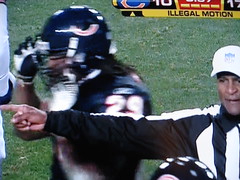
Does anyone that watched the ‘Skins/Bears game also happen to be a “Sarah Silverman Program” viewer as well? If so, I cannot believe how much last night’s ref sounded like the Mini Coffee character from the Cookie Party episode of Sarah Silverman.
Totally un-unirelated, but I wanted to see if I’m the only one that noticed it. Probably.
The Pistons are wearing throwbacks tonight against the Bulls’ stupid black pinstripe alts. The Pistons look pretty good. I noticed that Jason Maxiell has a throwback Pistons logo on his headband (I can’t remember headbands ever having anything but the NBA logo on them), but the old three-leaf Adidas logo on the other side, 180 degrees around. So much for David Stern keeping brands off of the game uniforms.
[quote]I noticed that Jason Maxiell has a throwback Pistons logo on his headband (I can’t remember headbands ever having anything but the NBA logo on them), but the old three-leaf Adidas logo on the other side[/quote]
couple of pistons have that…they just showed a bench shot and i saw at least 2 players have the adidas logo
[quote comment=”182850″][quote comment=”182835″]I cant even validate whether this was actually in a story or not, but there’s chatter on a few Cleveland sports message boards that Kellen Winslow did an interview for Penthouse and talked about uniform changes in the near future for the Browns.
I am guessing/hoping that if this “interview” is even true, it’s just wishful thinking on K2’s part, and far from reality. My reasoning is that the owner, Randy Lerner, was the one behind bringing back a more “old school” look with gray facemasks and black shoes.
I tried to google the crap out of anything that would turn up this interview, and just came up with threads on other message boards about the same thing, so again, I dont know if this interview is actually even out there or not. Here’s what started the thread on the board, for what it’s worth:
Quote:
However the one thing that was discussed that may be of some interest to fellow Browns fans was the topic of the uniforms.
Kellen says that ” You know what? We’re in the process of changing that. Next year, your gonna see some new uniforms for the Cleveland Browns. This is really a big part of what Braylon Edwards and I have been talking about for a long time. It may be something similar to what the Broncos have. It’s time for a change. Sometimes people live in the past in Cleveland. That’s fine, but this team is trying to build an identity and start up something new .”[/quote]
suppose that is true. it would be sad to see something like that done because someone like kellen winslow wants to “start something new”.
first of all, kellen, learn to ride a motorcylce so you can actually help your team to wins, and perhaps get to the playoffs.
second of all, what you have accomplished in football, college or pro couldnt hold the jock of the cleveland browns franchise (past and present) with their accomplishments and history.
keep you mouth shut about the unis, and play football, you are, after all, a soldier.[/quote]
NO chance they’ll EVER change. It’s a heritage thing, Kellen. BTW. Has he ever DONE anything? WON anything? No, I thought not.
Best fictional uniform ever is the NY Knights.
[quote comment=”183099″]Best fictional uniform ever is the NY Knights.[/quote]
I’m partial to the original Bad News Bears unis.
[quote comment=”183106″][quote comment=”183099″]Best fictional uniform ever is the NY Knights.[/quote]
I’m partial to the original Bad News Bears unis.[/quote]
heh…chico’s bail bonds
you can link for only $159 too
[quote comment=”183077″]The Pistons are wearing throwbacks tonight against the Bulls’ stupid black pinstripe alts. The Pistons look pretty good. I noticed that Jason Maxiell has a throwback Pistons logo on his headband (I can’t remember headbands ever having anything but the NBA logo on them), but the old three-leaf Adidas logo on the other side, 180 degrees around. So much for David Stern keeping brands off of the game uniforms.[/quote]
Anyone know what year or era these are from?
[quote comment=”183088″][quote comment=”182850″][quote comment=”182835″]I cant even validate whether this was actually in a story or not, but there’s chatter on a few Cleveland sports message boards that Kellen Winslow did an interview for Penthouse and talked about uniform changes in the near future for the Browns.
I am guessing/hoping that if this “interview” is even true, it’s just wishful thinking on K2’s part, and far from reality. My reasoning is that the owner, Randy Lerner, was the one behind bringing back a more “old school” look with gray facemasks and black shoes.
I tried to google the crap out of anything that would turn up this interview, and just came up with threads on other message boards about the same thing, so again, I dont know if this interview is actually even out there or not. Here’s what started the thread on the board, for what it’s worth:
Quote:
However the one thing that was discussed that may be of some interest to fellow Browns fans was the topic of the uniforms.
Kellen says that ” You know what? We’re in the process of changing that. Next year, your gonna see some new uniforms for the Cleveland Browns. This is really a big part of what Braylon Edwards and I have been talking about for a long time. It may be something similar to what the Broncos have. It’s time for a change. Sometimes people live in the past in Cleveland. That’s fine, but this team is trying to build an identity and start up something new .”[/quote]
suppose that is true. it would be sad to see something like that done because someone like kellen winslow wants to “start something new”.
first of all, kellen, learn to ride a motorcylce so you can actually help your team to wins, and perhaps get to the playoffs.
second of all, what you have accomplished in football, college or pro couldnt hold the jock of the cleveland browns franchise (past and present) with their accomplishments and history.
keep you mouth shut about the unis, and play football, you are, after all, a soldier.[/quote]
NO chance they’ll EVER change. It’s a heritage thing, Kellen. BTW. Has he ever DONE anything? WON anything? No, I thought not.[/quote]
We’re talkin’ about a guy who wore link ugly piece of crap uni in college. He probably misses the garishness.
While I wholeheartedly believe Kellen Winslow is a total douchebag, when the “Browns” were returning to Cleveland, I thought it was a bad idea to go back to the same unis and name. That team is NOT the Browns, and it put unneeded pressure on the team to live up to something they couldnt easily do. Look at how the league screwed the team over, treating them as an established team and not an expansion franchise. I know I am in the minority, but its little matter, I gave up on the NFL when the Browns left Cleveland.
ps- I wish I could have made it to the Boston meet up last night, but stuff came up at work.
[quote comment=”183114″][quote comment=”183077″]The Pistons are wearing throwbacks tonight against the Bulls’ stupid black pinstripe alts. The Pistons look pretty good. I noticed that Jason Maxiell has a throwback Pistons logo on his headband (I can’t remember headbands ever having anything but the NBA logo on them), but the old three-leaf Adidas logo on the other side, 180 degrees around. So much for David Stern keeping brands off of the game uniforms.[/quote]
Anyone know what year or era these are from?[/quote]
1957-58
link
[quote comment=”183067″][quote comment=”183060″][quote comment=”183023″]saw this on deadspin today:
A blog link the best fictional uniforms of all time.[/quote]
Just a note on the Pittsburgh Pisces, The roof of the Civic (Mellon) Arena does open up. However it is cost prohibitive.[/quote]
Actually, because of the scoreboard on one end of the arena, it doesn’t open all the way anymore.[/quote]
1/2 Right, It is because of the scoreboard but the scoreboard is in the middle of the arena.
The scoreboard that caused it to not be able to open anymore was installed in 1995. I believe it had something to do with the weight of the board and how it was attached to the building but I am not completely sure.
Great time at the Boston get-together last night. Nice bunch of fellow uniform aficionados.
I have a theory about the broken decals on the Bears uniforms, but I’m not sure if it holds much water…
Are the decals splitting on specific brands of helmets, or is it team-wide? Maybe there’s a new finish being used on some different models or brands that prevents the adhesive from adhering properly during cold and inclement weather.
Just throwing it out there…
And I’m watching the Appalachian State-Richmond game tonight, and have an observation: Richmond’s coaching staff wears adidas-branded clothing, but the football team’s uniforms are Wilson.
And I’m watching the Appalachian State-Richmond game tonight, and have an observation: Richmond’s coaching staff wears adidas-branded clothing, but the football team’s uniforms are Wilson.[/quote]
Also, The Wilson logo placement is not consistent from jersey to jersey. The Quarterback and most of the rest of the team have sleeve logos whereas the Running Back has a right chest logo.
The Warriors are in their ’74-’75 blue throwbacks tonight, and looking sharp. The cameras also showed a glimpse of the cheers leaders wearing the knee-high 3 striped athletic socks. Man that looked really sexy on the ladies.
link
Maybe so, but it is really cool to me.
[quote comment=”183023″]saw this on deadspin today:
A blog link the best fictional uniforms of all time.[/quote]
[quote comment=”183106″][quote comment=”183099″]Best fictional uniform ever is the NY Knights.[/quote]
I’m partial to the original Bad News Bears unis.[/quote]
Agreed. I think that I’ll wear mine tomorrow in order to protest the Bears being overlooked.
I hate all the stuff that gets stuck on the back of football helmets, particularly college helmets. Numbers, flags, etc.
Solution: Move some stuff to the nose bumper. Take the American flag. Not as a political statement, but should the flag really be on the BACK of the helmet anyway? How patriotic is that?
Or move it (and numbers, etc) to the rear bumper that most helmets have. Do you really need the team name there? That’s what most teams put there. Anything to clean up the back of the helmet.
Great gifts ideas! Another…old time baseball gloves from link
Detroit Pistons should use this as a secondary logo…link
Also, who knew Dave DeBusschere was a member of Kriss Kross?! link
link
Royals roster:
Gload is wearing 7 this year.
my eyes!!!
link
these new hawks uniforms are dreck. did the same people that conned the devil rays out of green make these things?!?